Pantone - Autumn/Winter - 2021 - London Palette: Green Bee, Downtown Brown, and Olive Branch

Hi everyone! November is zooming along and I am still trying to get back into some sort of rhythm, not only here on the blog, but in life. Anyone who suffers from a long term illness can relate to what I am talking about. Not being able to sleep for such a long period of time and still dealing with unresolved symptoms make it hard to get back to what I would say is a normal routine. However, I know there are people who are struggling with much worse situations and I am thankful that I am able to do as much as I can. In fact, this past weekend, we were able to travel to celebrate my mother-in-law’s 80th birthday with her, so that was good.

Unfortunately, there has also been other difficult things along the way. My son-in-law lost his grandfather this past week and I know that has been a great loss for the whole family. He was a dear man, a wonderful painter and loved his family, so he will be missed. As many of you can relate, it seems as we get older, we see loss happening around us at a more frequent pace. This too is part of life, and for me knowing God is holding me and my loved ones during these times, makes it a little less painful.

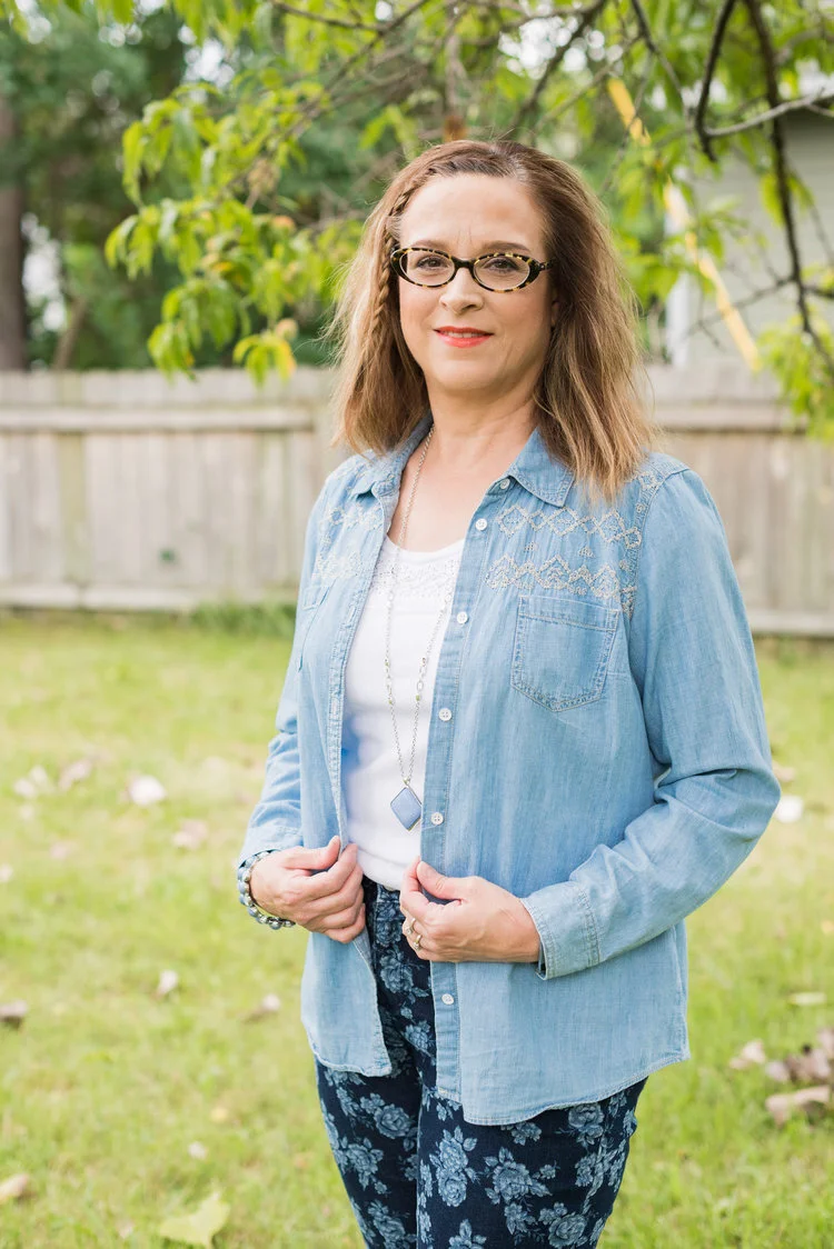
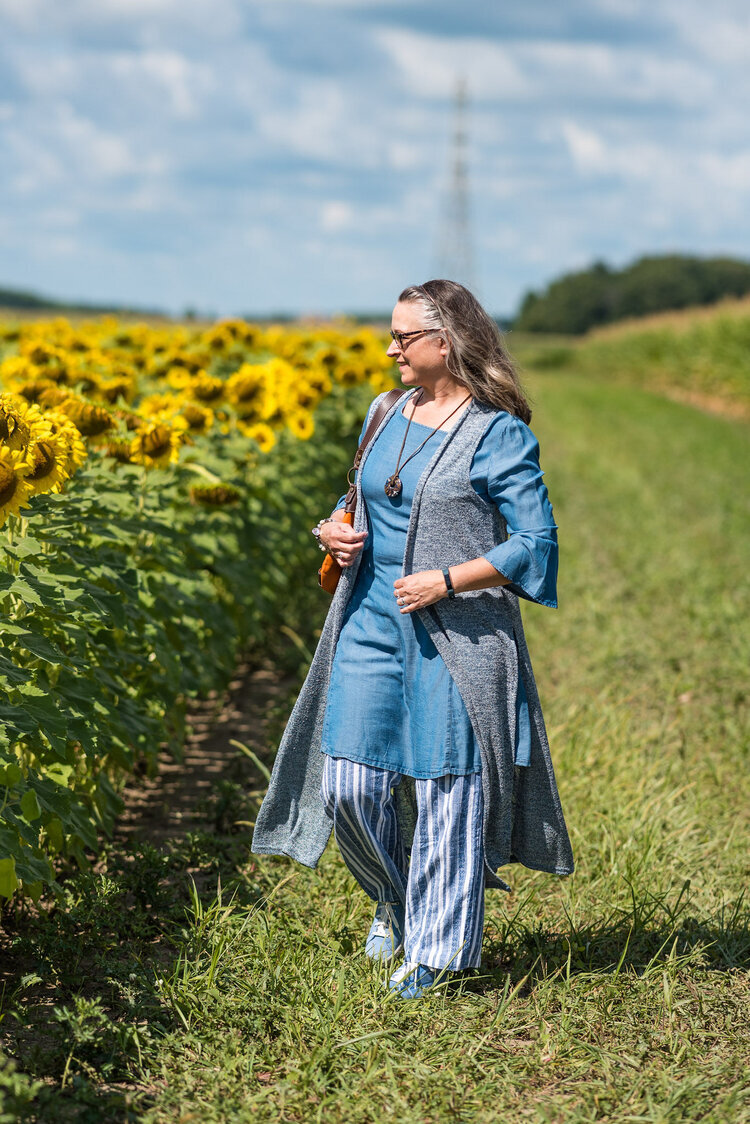
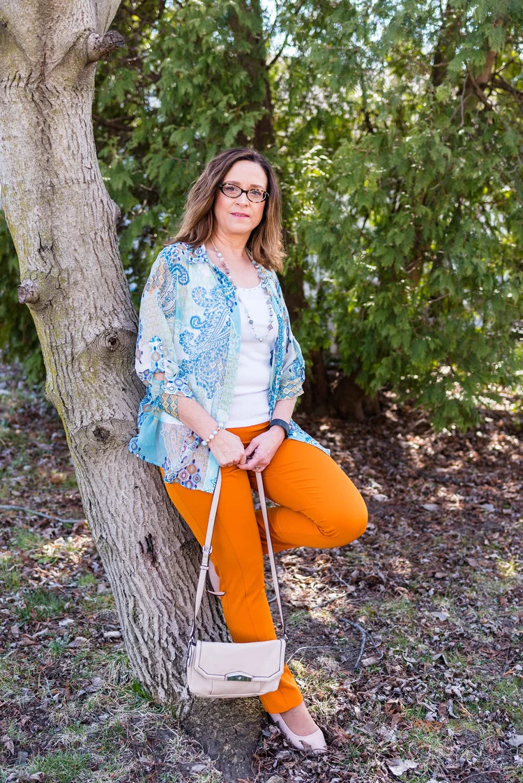
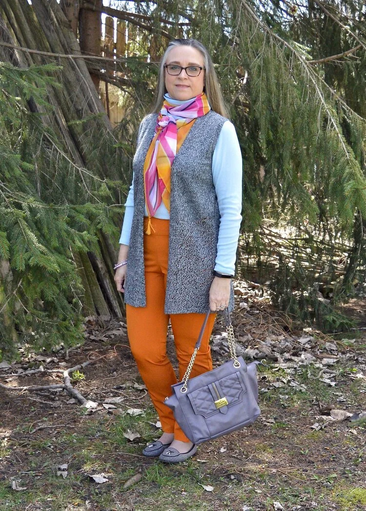
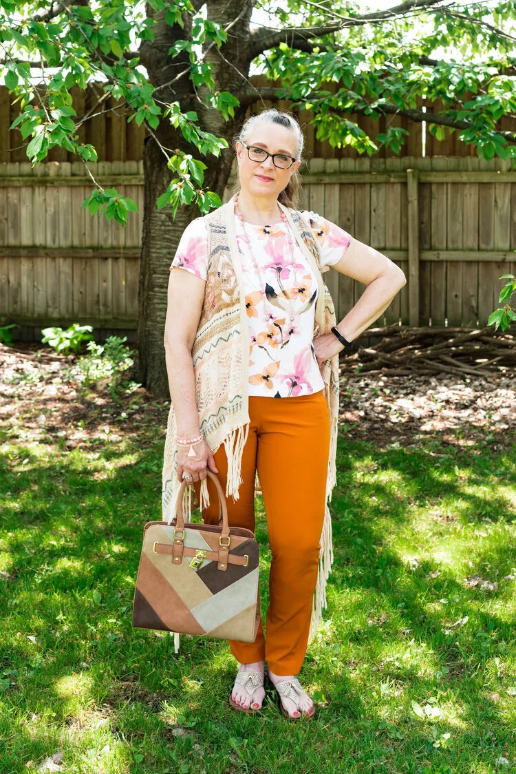
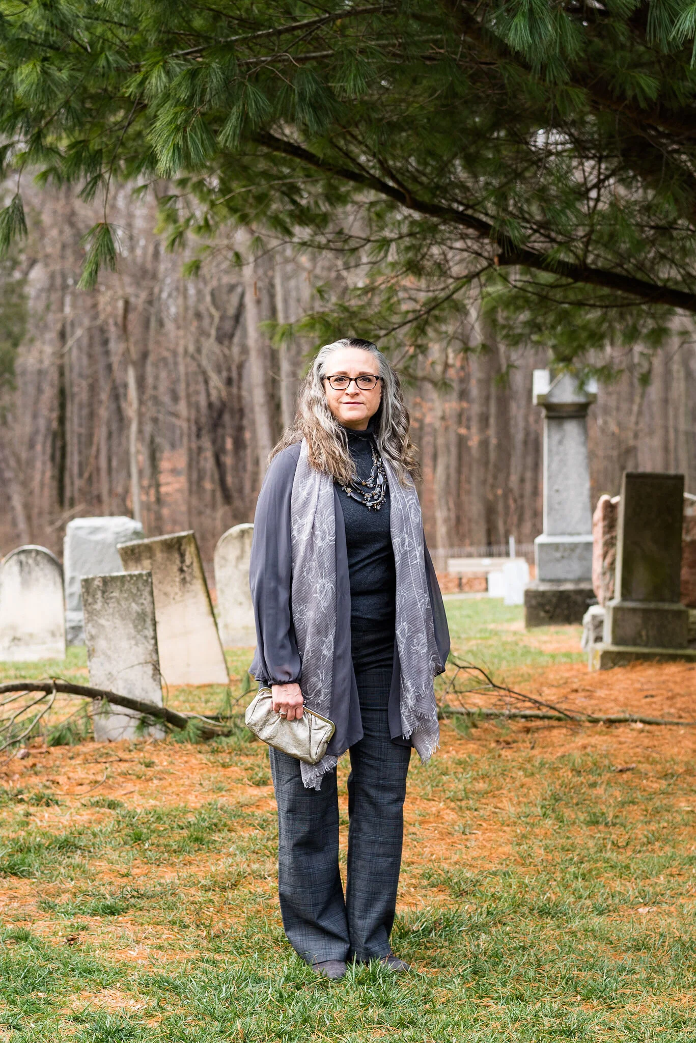
Now on to another outfit. As I said last week, while I am wildly behind, I decided to go ahead and show you these Pantone London Palette outfits as possible sources of inspiration for Thanksgiving Day wear. Many of you will be celebrating with friends or family and it is a good reason, to get out of those sweat pants and dress up a little bit, if just for your own mental well being.

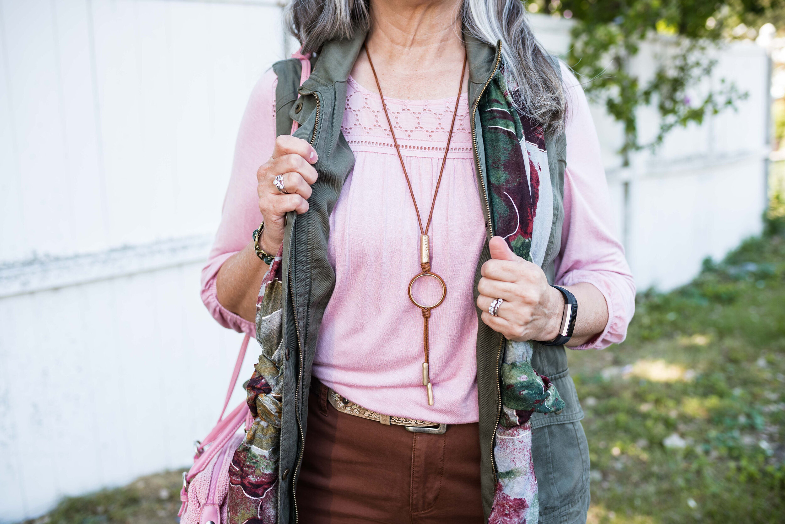
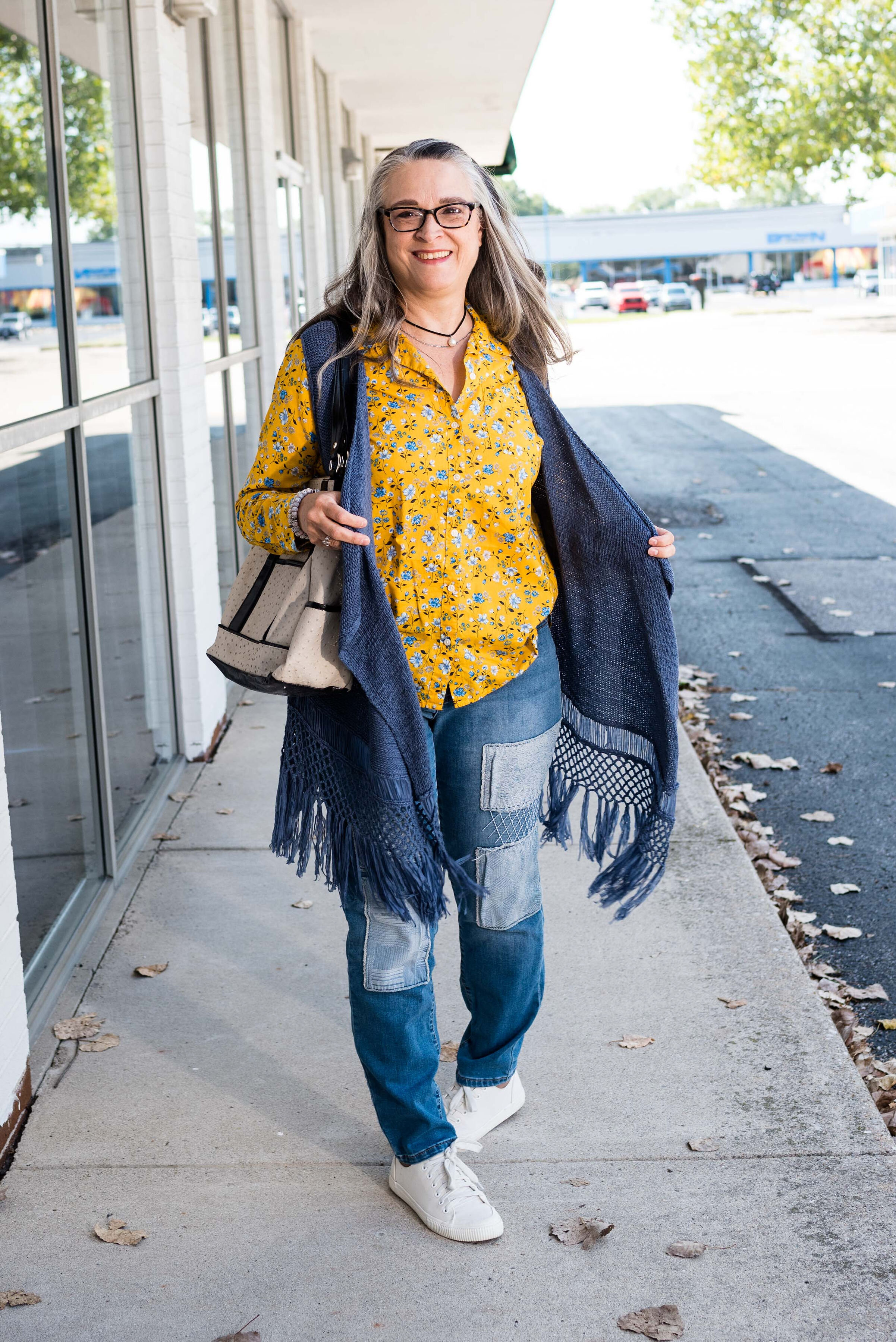
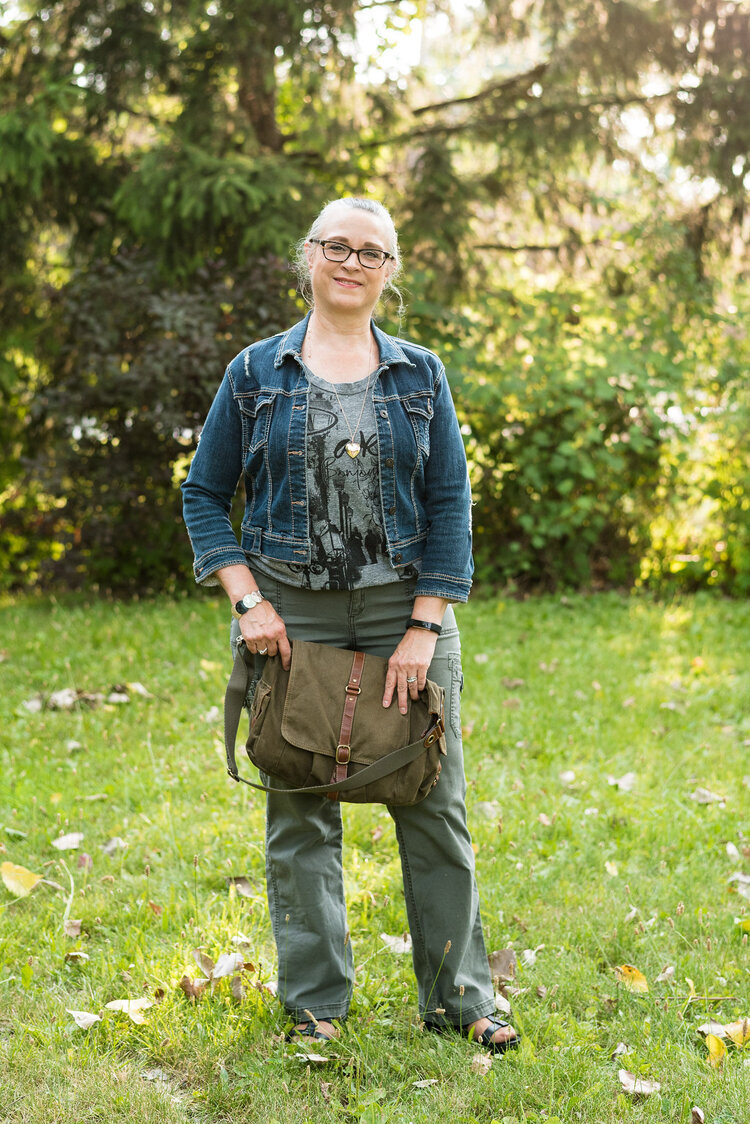
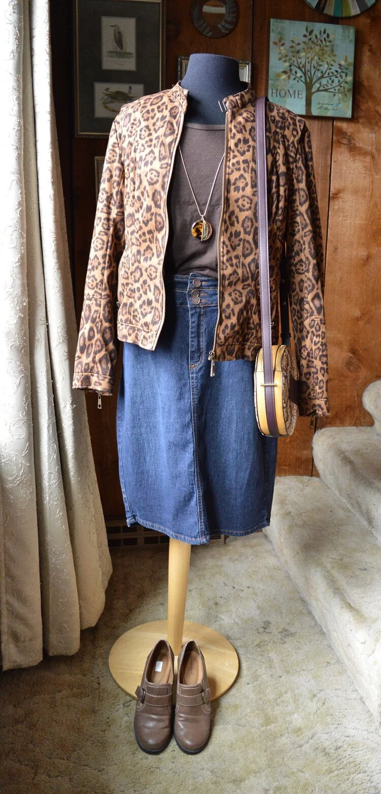
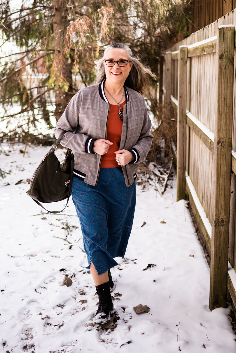
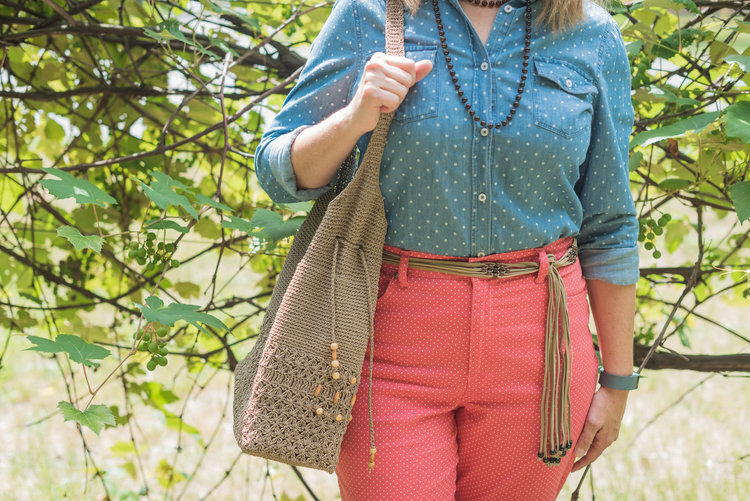
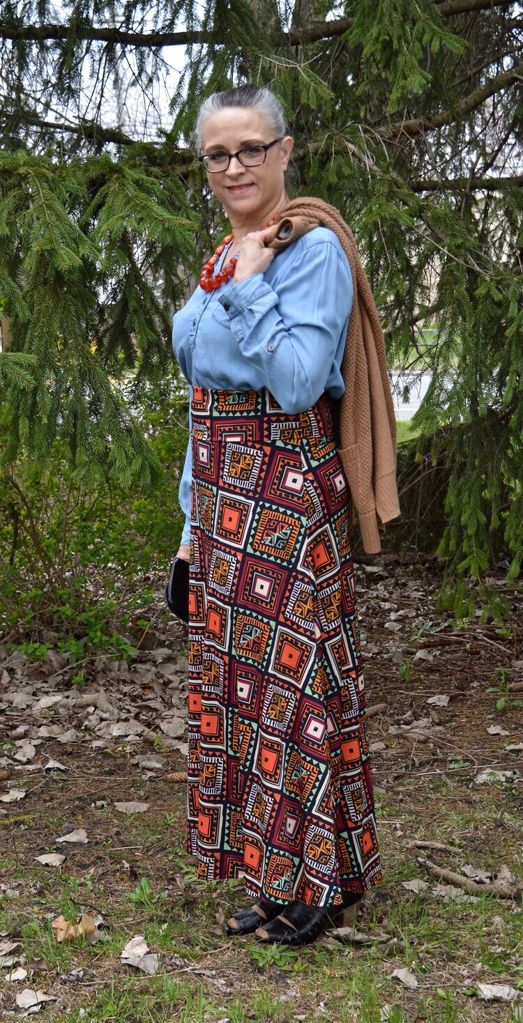
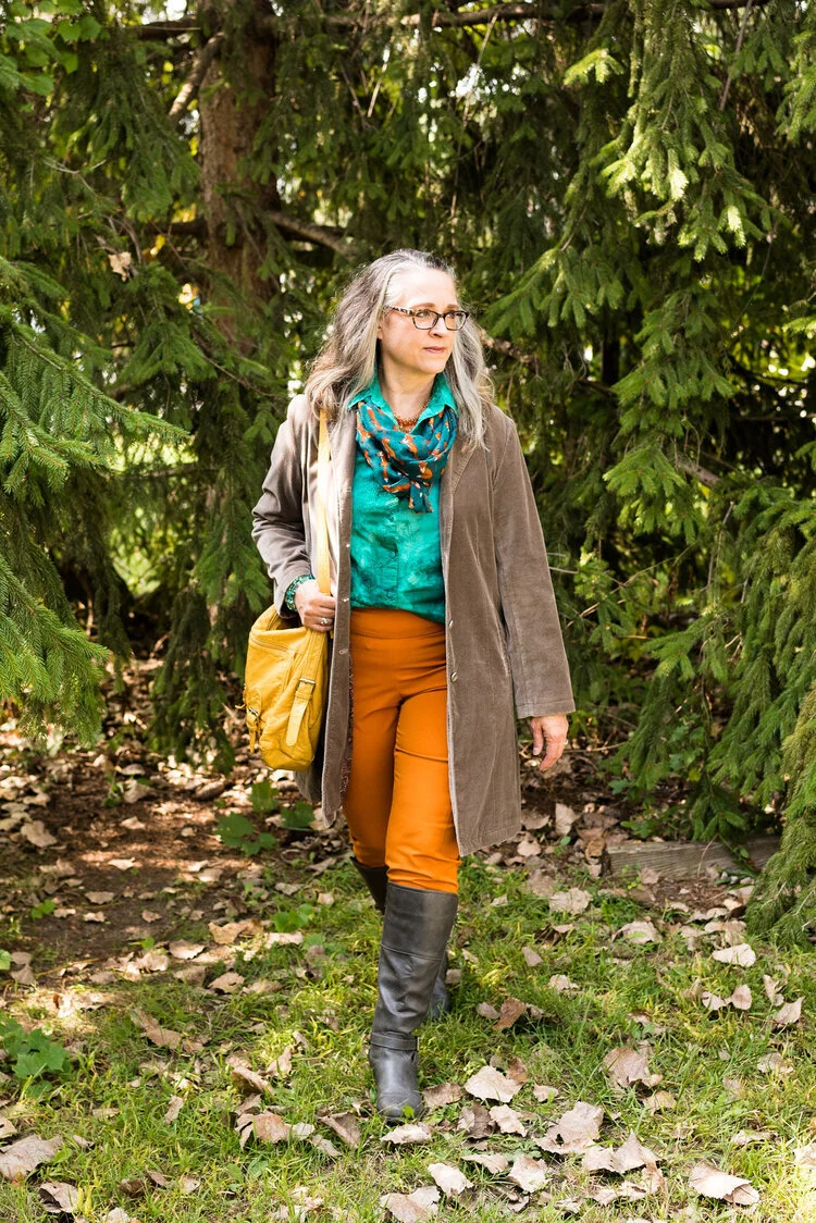
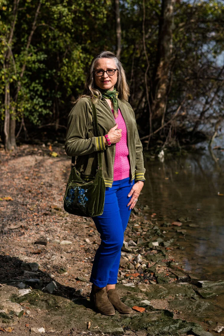
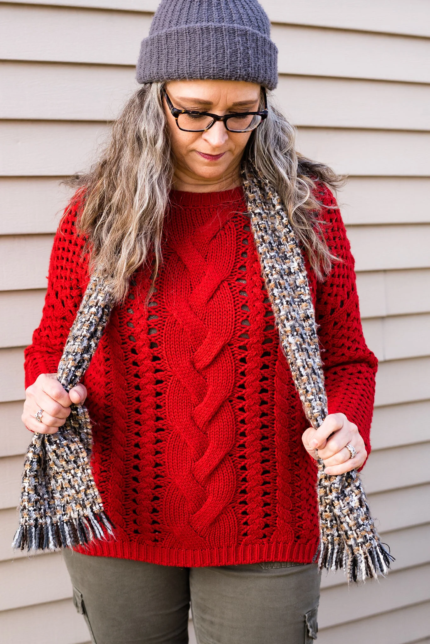
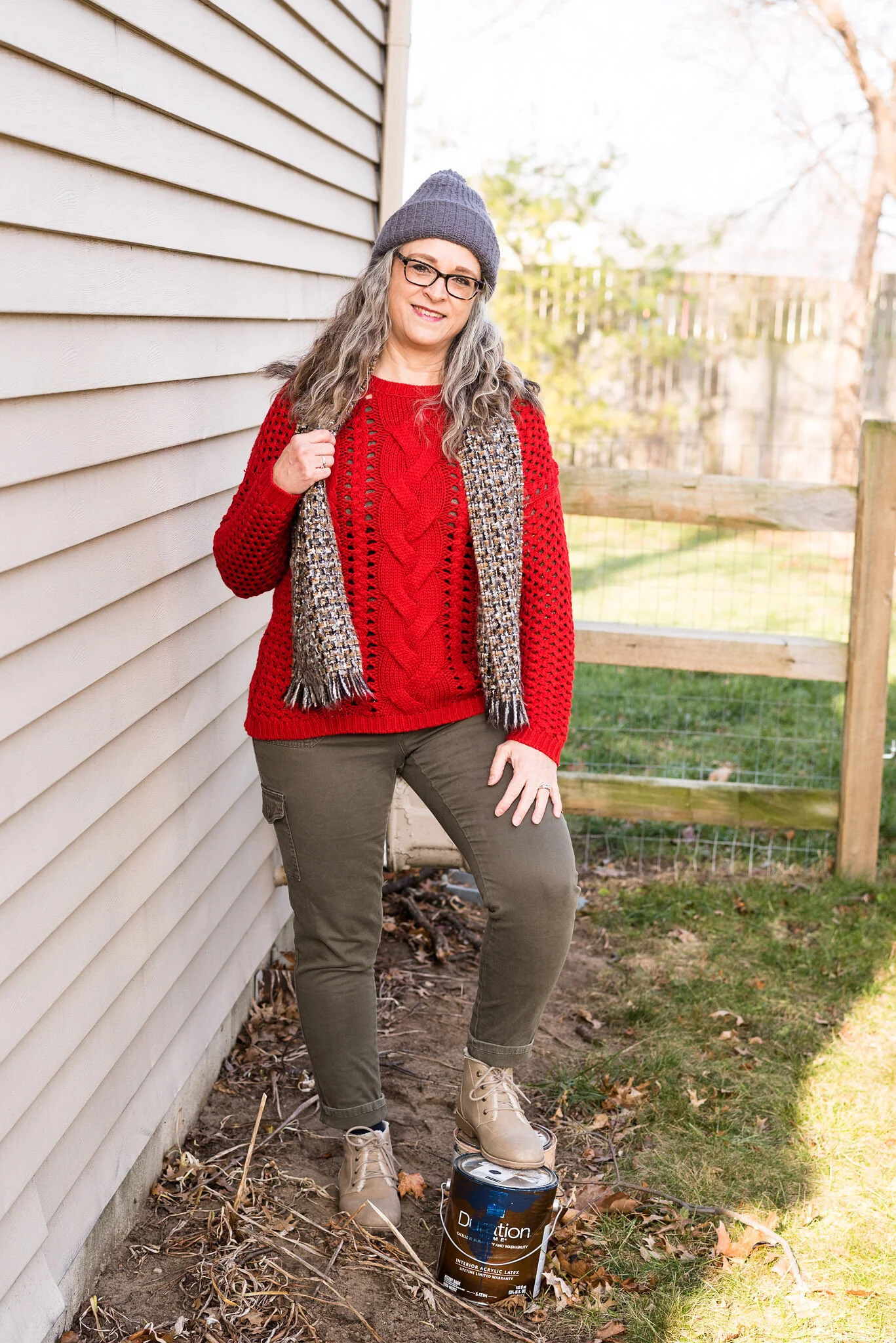
You can’t go wrong with a pair of trousers, a pretty top and a fun scarf and bag. Obviously, you can pick your colors, but I chose to combine these earthy tones for a look that is a mix of military meets, moto chic.

My Downtown Brown moto jacket is a thrifted piece that I have styled on the blog before. It is a brand called Celebrity Works. I do like this medium milk chocolate brown. Browns can be tricky to wear, especially when they contain a little too much gray or a little more red, or well, you get the idea. A true brown is hard to find, but I think this brown hits the mark, so thank you Pantone for that one.

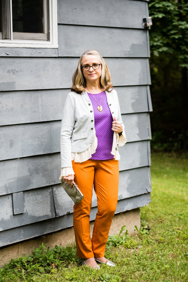
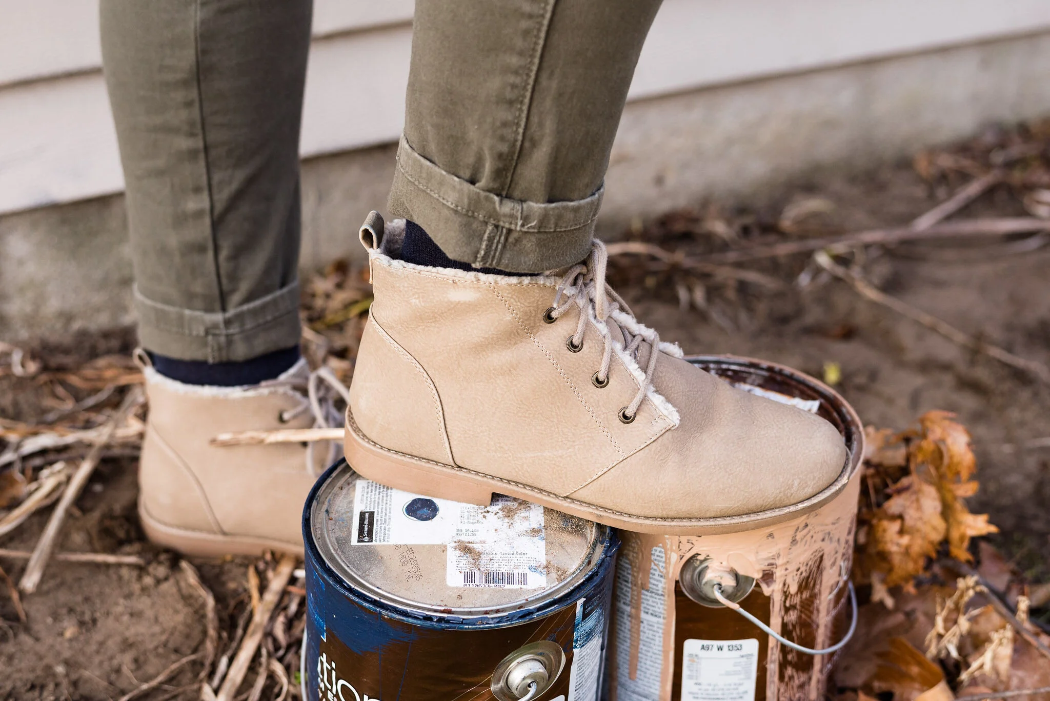
You’ve seen my Olive Branch pants numerous times on the blog as well. As I look at them in these pictures, I am thinking I might need to find a replacement pair. These are starting to look worn and really don’t look very flattering. Of course that may have had something to do with my chubby thighs. Ha, ha. These were Gloria Vanderbilt brand and I probably got them at Kohl’s.

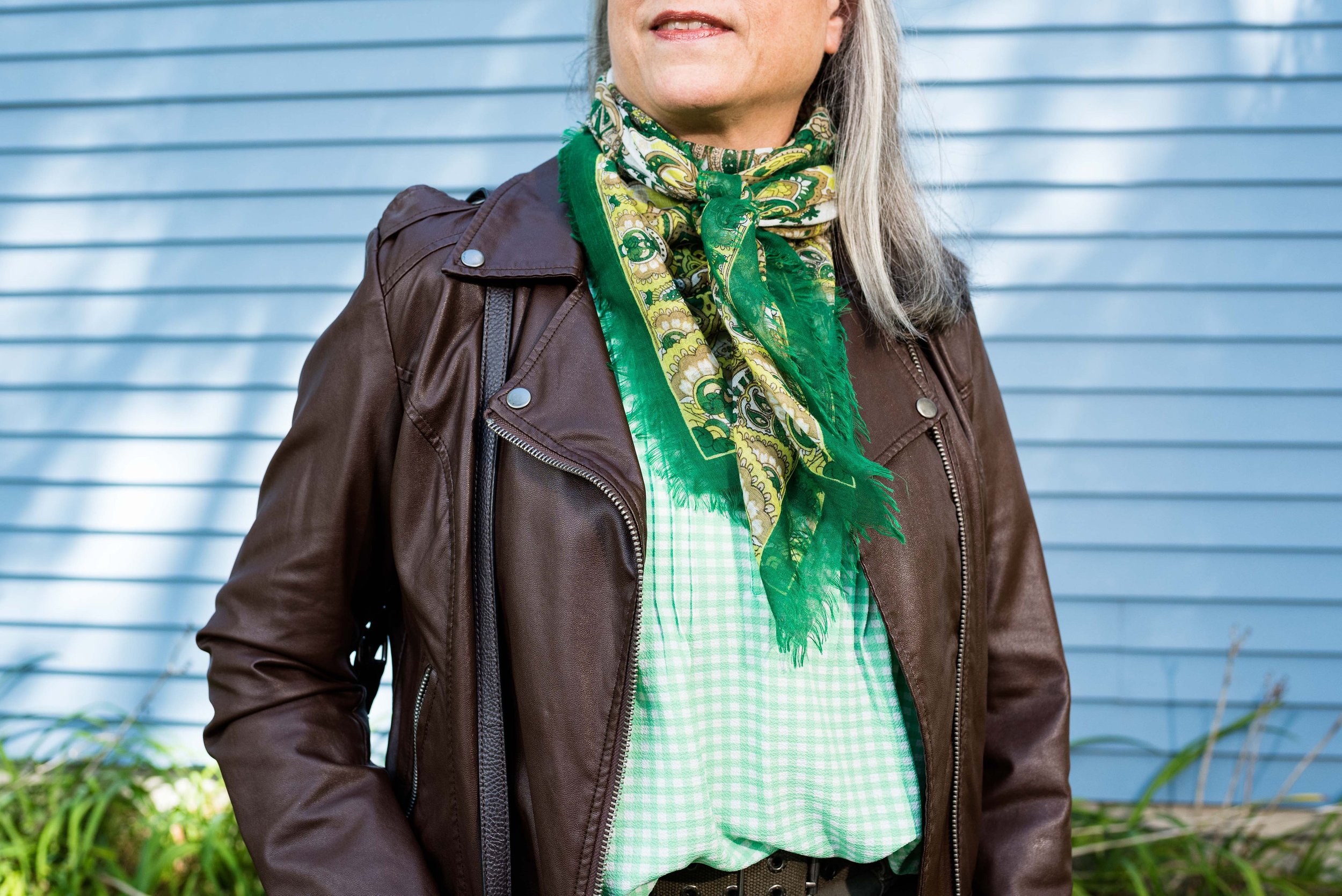
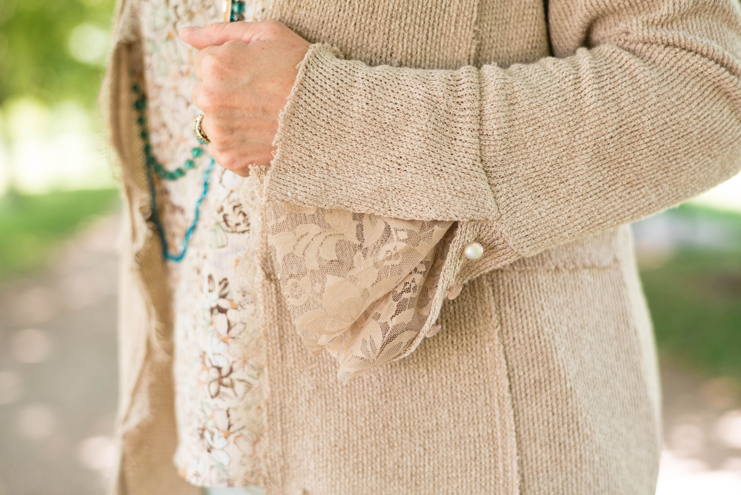
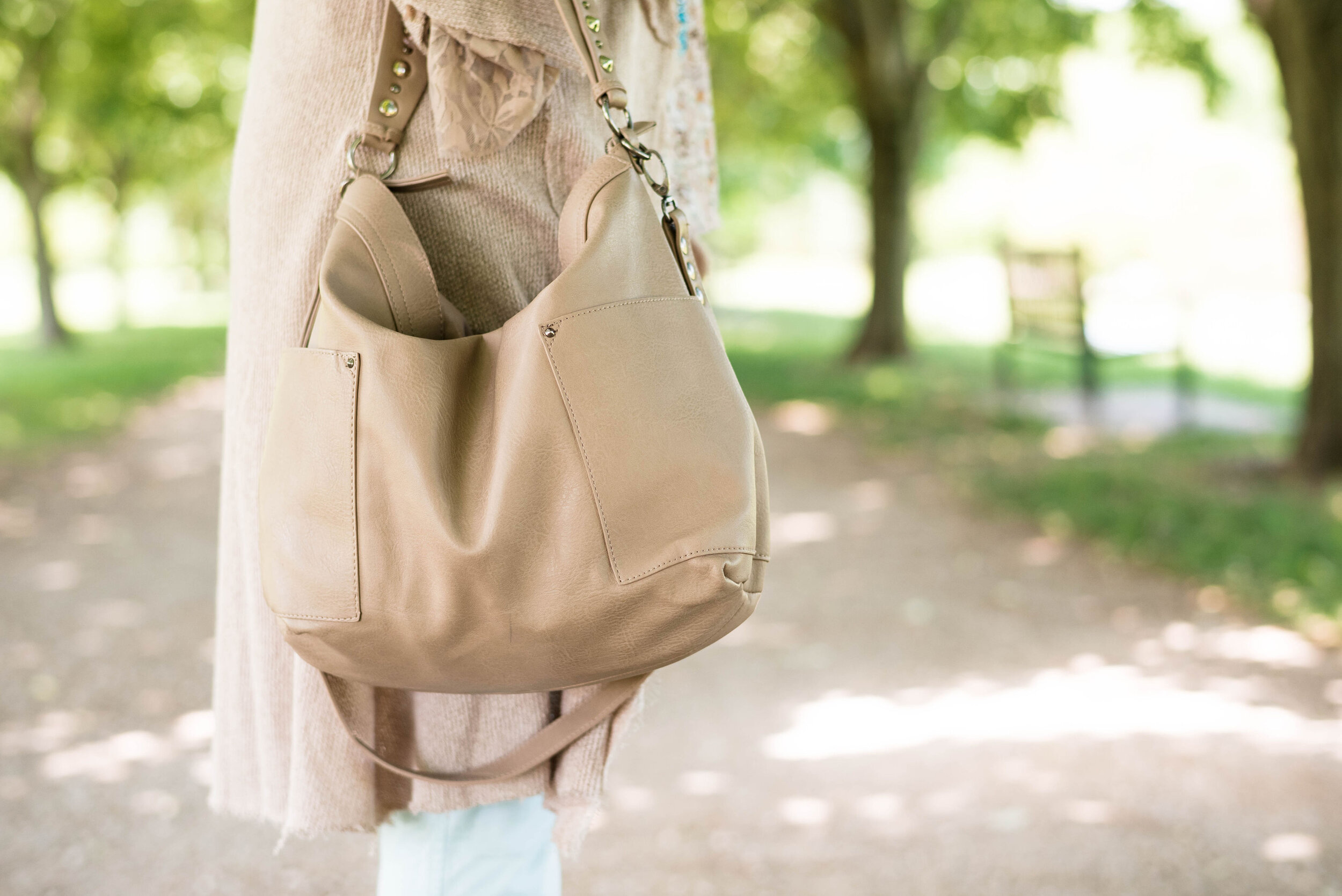
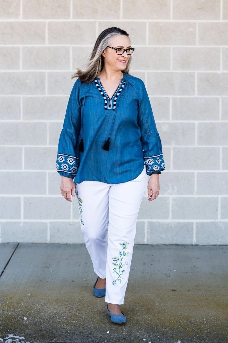
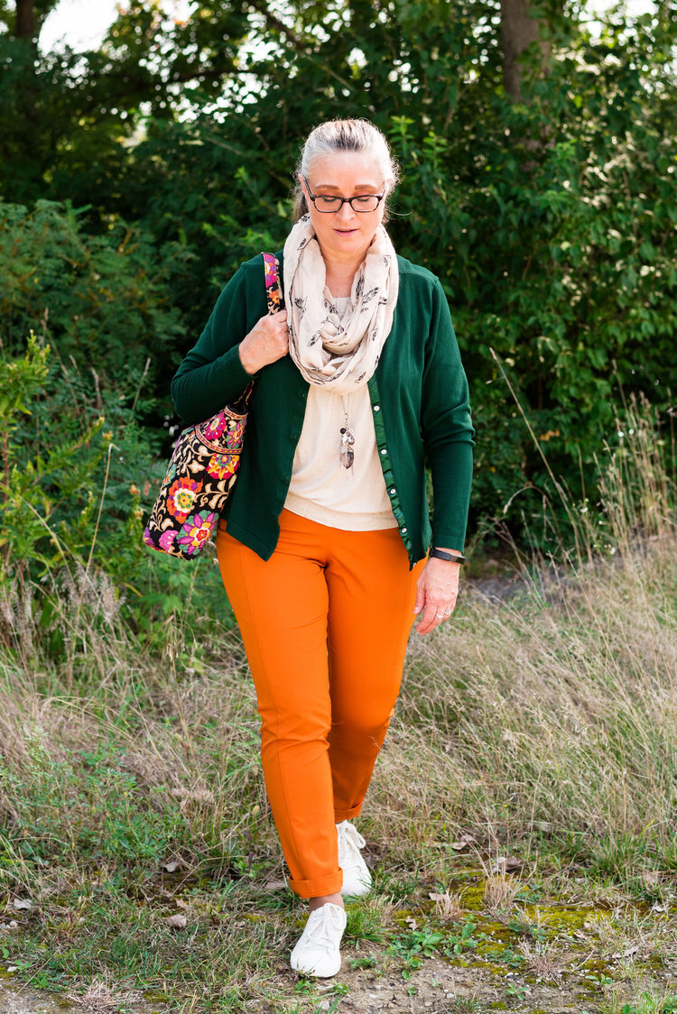
For the Green Bee color I chose a thrifted Studio Works popover top that I did the front tuck on, which gave it the blouson effect. I also added the Green Bee paisley print scarf. The thought to add the Dana Buchman floral bag was a last minute addition, but I like how it pulled everything together. A fun floral bag is a great addition to your wardrobe, especially when it can serve multiple season duty. This one works just as well in spring, summer and fall.

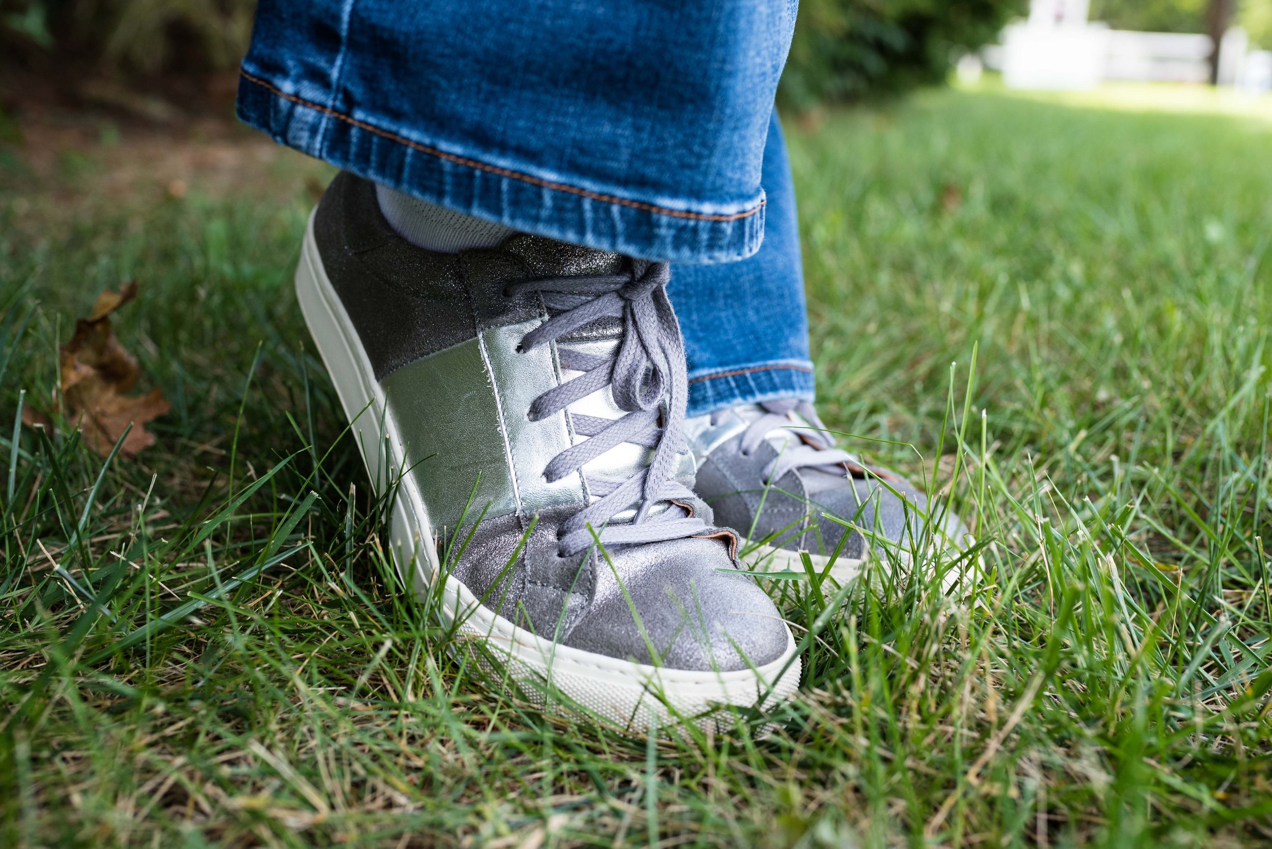
I chose my trusty Olive Branch SO ankle boots for my shoes. My ankle boots definitely get used in these cooler fall temps.

What do you think of these colors? Would you wear an outfit like this to your Thanksgiving celebration? I’d love to hear your thoughts, so leave me some love in the comments below.

I am including a few shopping links. These are affiliate links and are brought to you at no extra cost. If you click on a link, I get a few cents. If you purchase something through one of my links I get a few more pennies. I appreciate every penny! All opinions are my own. Please note, I am not familiar with all of the retailers I list in my links, so be sure to read and understand their return policies in case something doesn’t fit or isn’t to your liking.

I hope you enjoyed today’s post. Until next time, have a great day.

Photo credit Jessica Trumbull with Rebecca Trumbull.

Pantone - Autumn/Winter - 2021 - London Palette: First Blush, Ibiza Blue and Ultimate Gray

Due to my longer than usual absence from the blog because of my illness, I am going to bypass the wrap up of the New York Palette and the Intro to the London Palette for the Pantone 2021 color series and jump right into the London Palette, so that I can get this series concluded and get on with new content. I have been trying to give a more daily content on Instagram, which now also shows up on my regular Facebook account, but unfortunately, I have not been posting over on my Granny page. I guess I should start doing that as well. You would think all of these things would just be linked together. A few of the meds I am on are making my brain a bit dopey, so bear with me as I try to get things back into some sort of regular routine.

Here we are again, looking at a pastel pink on the fall color palette. I know pastels in fall are no longer taboo, but my brain still looks at this and thinks, “What a great spring outfit!” Maybe I should have paired First Blush with one of colors that seem more Autumnal to me, like Tomato Cream or Downtown Brown, but I liked the combination of blue and pink, so this is what you get.

My Ibeza Blue plaid shirt is a thrifted Faded Glory piece. I used this same plaid shirt in the spring for the French Blue color that was on the New York Palette. You can see that post here. You’ve seen these thrifted, distressed Lane Bryant jeans numerous times on the blog as they are one of my faves.

My First Blush jacket is also a repeat from my closet. Originally a Christopher and Banks purchase, this faux leather piece has some knit panels on the sides and under the arms to allow ease of movement and stretch. I added the scarf to bring in a little bit of added interest and additional color, plus with this being a fall outfit, the need for a scarf seemed more likely.

Ultimate Gray, once again makes its appearance on the London Palette, so I used this for my accessories in the metal chain belt, thrifted fold over bag and my silver sneakers. The only thing I did differently was the rose gold pendant. I just liked the way the color popped against the blue plaid.

While this look is certainly not what we would typically think of for the holidays, if you are more into pastel colors, this is a great casual look for that Thanksgiving celebration, especially if it involves a bit of shopping afterwards.

I’m including a few shopping links for you to look over. Remember to order soon for Christmas. We have all heard how things are taking longer and some things are back logged so be sure to get your orders in, or even better, don’t deal with that added stress and try to buy local. That is what I am thinking about doing at least for part of my shopping this year.

These are affiliate links. All opinions are my own.

Photo credit Jessica Trumbull with Rebecca Trumbull.

Pantone - Autumn/Winter - 2021 - New York Palette: Adobe, Rhodonite and Olive Branch

Due to my illness, I have neglected this little blog for a few weeks. While we are still trying to get all symptoms under control and actually find diagnoses for said symptoms, I hope to be able to get back to some semblance of regular posting, so please bear with me. To all of you who have been so supportive and loving on Facebook and Instagram, thank you. Your kind words, thoughts and prayers have been so appreciated.

The last two colors on the New York Palette for the Pantone Autumn/Winter series are my favorites. Adobe is certainly what I expect on a fall color palette and Rhodonite is a completely different blue, that I think works fabulously for the fall season. Once again, I am using Olive Branch as my classic color. As I have mentioned before, olive works well with so many other colors, and makes the transition from one season to another, smooth and seamless.

Adobe.jpg

These thrifted Michael Kors jeans might be just a smidge lighter than Adobe, but I think they work quite well. I know the world is saying skinny jeans are not in right now, but I like my skinnies and I will continue to wear them. Sure I will wear other silhouettes as well, but I especially favor skinnies in the cool weather to wear with boots.

pantonefallcolortrendsadobe-1.jpg

The dark blue tunic top, is an older Christopher and Banks piece. After I put the outfit together, I realized the tunic is less like the Rhodonite color, while the bluish purple in the print of the jacket is a closer fit.

pantonefallcolortrendsadobe-10.jpg

My jacket is a thrifted Christopher and Banks piece. It fits similarly to a jean jacket and the print is perfect for bringing on all the fall feels.

pantonefallcolortrendsadobe-11.jpg

My thrifted olive bag is Fossil brand. This is a great piece if you want something you can throw all sorts of things into. Ha, ha. A hobo bag is a good choice for travel, as it easily fits into many different spaces and yet has plenty of room for all the goodies.

You can see in the previous two pictures, I kept my jewelry simple by adding a few olive bracelets and a string of olive beads.

pantonefallcolortrendsadobe-13.jpg

You’ve seen numerous pairs of SO ankle boots on the blog, because I have them in SO many different colors. Ha, ha. See what I did there? These are great little ankle boots for fall and work with jeans, trousers, skirts and even dresses. Apparently, the affiliate program I work with is no longer using Kohl’s as one of their retailers, so here are links to the Kohl’s website for a few different styles of ankle boots. Here is the Averyy, the Chantilly, and the Barb 2. These are not an expensive boot, and that is one of the reasons I like them. They also still look pretty good after a number of seasons, but then, I don’t wear the same pair every day. I am not getting any sort of compensation to recommend these boots, I just really like them.

pantonefallcolortrendsadobe-7.jpg

What do you think of these colors? Do you like this outfit? Let me know your thoughts by leaving me some love in the comments.

I’m including a few shopping links, although it was very hard to find this color in the pants. Anyway, these are affiliate links, brought to you at no extra cost. If you purchase something through one of my links, I get a few cents. You are not charged any extra to make a purchase through my blog.

Photo credit Jessica Trumbull with Rebecca Trumbull.

Pantone - Autumn/Winter - 2021 - New York Palette: Pale Rosette, Root Beer and Olive Branch

I want to start off with an apology for my lack of consistency with the blog lately. It has been a rough couple of months and I just haven’t had the motivation to post as regularly. It seems every time I want to make more of an effort at getting more disciplined or being more consistent, I get blindsided by something. At the beginning of the summer it was a broken wrist. Mid summer, I came down with this stuff, that still has me coughing. I just have no idea if I will ever be back to “normal”, whatever that was.

There have been some good bits along the way as well. Early summer we were able to take my in-laws on a nice trip up through the Upper Peninsula, down through Michigan and back to our place where they enjoyed visiting family for a few days. I also got to see my mom, two different weeks and spend time with her. That also afforded me the opportunity to see my best girlfriend, and do some thrifting. On September 19th, our second grandson arrived. He is a doll and I am enjoying opportunities here and there to see him, even if I do have to wear a mask. He’s been born into a world of half blue faces, but that is okay, if we can give him a healthier start. He, my daughter and son-in-law are doing well.

Today’s outfit revolve around three colors on the Pantone New York Palette that I thought combined well into a work wear ready fall outfit.

PaleRosette.jpg

I am still trying to get used to seeing pastels during the fall season. This year, they were quite popular and besides this pale pink, also included a pretty lavender. I guess, we like what we like right, so pastels for me might be more of a spring and summer color scheme, while rusts, browns and burgundies are the colors I reach for in the fall. While we still live in a free country, you are in control of what colors you wear when. Ha, ha.

pantonefallcolortrendspalerosette-8.jpg

The Pale Rosette, 3/4 length tee is a thrifted piece, and a brand called Suzanne Betro. It is actually a longer tunic, but I just tucked it in for this outfit. I love the detailing at the bodice.

pantonefallcolortrendspalerosette-6.jpg

You’ve seen my Olive Branch utility vest on the blog before when I did my series on olive pieces. This vest isn’t quite the right shade. Who would have thought there are so many shades of olive? Another clearance find from Kohl’s, I don’t have a ton of Mudd pieces as it typically has more of a junior’s fit, but the few that I have, I really like.

You’ve also seen these brown trousers when I talked about wide leg pants back in the spring. I am not a big fan. I have enough bulk on my bottom. However, I will hang on to this pair, as I like the color, and occasionally it is nice to have a different option when it comes to pants. These were thrifted and are St. John’s Bay brand.

I added the multi-print scarf to add an extra dimension of color and interest to the outfit. I like how it ties the whole look together.

You can also see the fun necklace I scored while thrifting at the local shop around the corner. I have found some great jewelry there. I goes perfectly with the pants.

pantonefallcolortrendspalerosette-9.jpg

Even though this little thrifted, Rosetti bag screams summer, I thought it was a great way to keep this outfit looking modern and updated, yet still in tune with the fall vibes.

My SO snakeskin print boots were a clearance purchase from Kohl’s last season. I haven’t really had the opportunity to wear them very much, so hopefully this season they will be out and about.

pantonefallcolortrendspalerosette-10.jpg

What do you think of these colors? Do you like them combined? Do you like them each separately?

pantonefallcolortrendspalerosette-1.jpg

I’d love to hear your thought, so leave me some love in the comments.

As I usually do, I am adding a few shopping links in things similar to these colors. These are affiliate links. All opinions are my own.

Thanks for following along on the blog. I hope you are having a great week.

Photo credit Jessica Trumbull with Rebecca Trumbull.


Pantone - Autumn/Winter - 2021 - New York Palette: Mykonos Blue, Spring Lake and Coconut Cream

It seems that every Pantone color palette that comes through the Institute has at least one, if not two blues on it. Blue is a color that everyone can wear, whether you wear dark classic navy, casual comfortable chambray or tropical hues that take you to the beaches of the Caribbean. I have a lot of blue in my closet, but then, I have a lot of every color in my closet. Ha, ha. Blue is great for pairing with many other colors. I pair denim with every color and denim definitely falls in the range of blues. Today’s blues are wearable and most likely already in your wardrobe.

SpringLake.jpg

My colors did not really line up with these blues. Oh well, that is part of the challenge of doing this series. I don’t always get the match spot on, but that is okay. The point is to take things you already have and do something similar. It doesn’t matter if your blues are a perfect match or not. All of these pieces were things I already had.

When I picked out these pieces I really thought the pants and the vest would have matched better to Spring Lake, but now looking at the picture the pants seem to match better with the Mykonos Blue. The vest, which does seem to lean a little bit toward a gray undertone, was too dark to match the Spring Lake color. However, the patches on the pants seem to lean a little more in that direction.

pantonefallcolortrendsspringlake-2.jpg
pantonefallcolortrendsspringlake-20.jpg

The vest is a thrifted Relativity piece. I have styled this on the blog before. You can see it worn with a graphic tee. The jeans which I have styled on the blog before are thrifted and a brand called Est. 1946 Denim. You can see how I wore them with a graphic tee and cozy sweater here. Looking at the above picture, I should have rolled up the cuffs on the jeans.

When you have an asymmetrical vest with fringe, you just have to twirl!

My yellow mini floral print button down is a thrifted Old Navy piece. I decided to leave it completely untucked to add to the ultra casual vibe of this outfit.

pantonefallcolortrendsspringlake-5.jpg

I was trying to go for the Coconut Cream idea in my accessories, but again, things didn’t match up exactly. My bag was a hand-me-over from my daughter. This Miche brand bag actually has interchangeable outer shells, so for this look I used the cream colored one.

pantonefallcolortrendsspringlake-14.jpg
pantonefallcolortrendsspringlake-16.jpg

My sneakers are thrifted Mossimo.

pantonefallcolortrendsspringlake-17.jpg

What do you think of these colors? Do you like to wear blue? What color blue is your favorite?

pantonefallcolortrendsspringlake-8.jpg

Thanks for following along with the blog. I appreciate all of your clicks, likes and comments.

I am including a few shopping links for you to look over. These are affiliate links. All opinions are my own.

Have a great day.

Photo credit Jessica Trumbull with Rebecca Trumbull.

Pantone - Spring/Summer - 2021 - London Palette - Beach Glass, Blue Atoll and Macchiato

We’ve reached the end of the Pantone - London Palette series with these last three colors which make me think of tropical seas and sandy beaches. Like Tuesday’s post, where I combined two different greens from the palette, today’s post combines two summery blues for a light, airy, warm weather look.

beachglass.jpg

I started figuring this outfit out with my light blue, thrifted Sonoma crop pants. Though they are a bit lighter than the Beach Glass color, I think they still work. I pull these out every spring and summer as a light weight alternative to denim.

beachglasspantoneoutfitideas-1.jpg

My multi-print top is another thrift store find. I just loved the soft colors and print on this popover blouse. It has no tag in it, so I have no idea what the brand was. The print has the light Beach Glass blue, as well as the darker Macchiato.. You’ll see a close up in the next photo.

For the darker Blue Atoll color I decided to add a few pieces of jewelry. I had some long, opera length beads and decided to do some layering with the necklaces. I also added a beaded bracelet, that appears to better match the Beach Glass color.

beachglasspantoneoutfitideas-7.jpg

For the Macchiato color, I played around with several pieces, but everything seemed too yellow. This longer sweater was a recent purchase from Cracker Barrel. While they are a restaurant, they also have what they call an Old Country Store. The store is filled with all sorts of items from old fashioned candy, beautiful home decor, quilts, jewelry, cards, music and clothing. If you click on the link, it will take you to the sweater and it is on sale. Whoo, hoo. If you like it snatch it up. Here are a few photos to show you the details of this pretty piece and the movement. It is a light weight material, so it will be great for spring, summer and fall.

beachglasspantoneoutfitideas-13.jpg
beachglasspantoneoutfitideas-14.jpg
beachglasspantoneoutfitideas-15.jpg
beachglasspantoneoutfitideas-16.jpg
beachglasspantoneoutfitideas-17.jpg
beachglasspantoneoutfitideas-18.jpg

My bag is Madden brand; a clearance find from Kohl’s. My perforated peep toe shoes are Sonoma brand and another Kohl’s purchase from a few years ago.

beachglasspantoneoutfitideas-9.jpg
beachglasspantoneoutfitideas-11.jpg
beachglasspantoneoutfitideas-12.jpg

What do you think of these three colors? I really like how this outfit turned out and think the color combination is great for summer. Do you have these colors in your closet?

beachglasspantoneoutfitideas-6.jpg

I’m including a few other shopping links for you to look over. The Cracker Barrel sweater link is not part of the affiliate program, but I wanted to offer it to you, in case you really like the sweater. The rest of the shopping links are through the affiliate program. Every time you click on a link I get a few pennies, and I appreciate every click.

Have a great weekend!

Graphic and photo credit Rebecca Trumbull.

Pantone - Spring/Summer - 2021 - London Palette - Pickled Pepper, Orange Ochre and Sphagnum

For today’s outfit I decided to combine the two greens that were on the London Palette. Both Pickled Pepper and Sphagnum are great green shades for summer time. While Pickled Pepper is one of the main palette colors, Sphagnum is one of the palette classic colors. Olive is a great neutral and goes with just about every color out there, so Sphagnum, (which is actually a type of moss), makes for the perfect classic color.

pickledpepper.jpg

My Pickled Pepper popover top is Sonoma from Kohl’s a few years ago. This top is easy to wear, as well as cool for these hot, humid days. I don’t usually prefer to wear sleeves with elastic, but as long as the elastic isn’t cutting off the circulation in my arms I’m okay with it.

pickledpepperpantoneoutfitideas-12.jpg

My Sphagnum utility vest is Mudd brand, and was another clearance purchase from Kohl’s a few seasons ago.

pickledpepperpantoneoutfitideas-4.jpg

These light wash jeans were a recent thrift find. A brand called Ella Moss, this brand is available at stores like Nordstrom, Bloomingdales, Amazon, Dillards, and others. I like the cropped length and the high waist of this pair.

For the Orange Ochre color, I grabbed my thrifted, orange suede bag and a fun pendant choker. It is much easier to include a brighter color, if you do it with accessories.

pickledpepperpantoneoutfitideas-9.jpg
pickledpepperpantoneoutfitideas-7.jpg

I had to show off my new clearance Converse sneakers from DSW. They are very comfy and I love the blue color. They are similar in color to my thrifted Keds, which are showing a bit of wear, so these were a great find.

pickledpepperpantoneoutfitideas-11.jpg

Here are a few silly pictures. I was jumping for joy. Ha, ha.

pickledpepperpantoneoutfitideas-5.jpg
pickledpepperpantoneoutfitideas-6.jpg

What do you think of these colors? Do you like to wear green? Do you have Sphagnum (olive) in your closet? I would love to hear from you. I’m including a few shopping links for you to look over. These are affiliate links. All opinions are my own.

pickledpepperpantoneoutfitideas-3.jpg

Graphic and photo credit Rebecca Trumbull.

Pantone - Spring/Summer - 2021 - London Palette - Purple Rose, Lava Falls and Baby's Breath

Today’s colors are a blend of pastel purple, bold red and creamy off white. I have always loved purple, but it really isn’t a color I regularly wear. I easily got on board with Purple Rose which is a medium purple that goes well with many other colors, especially things like brown, olive and navy. Why, then did I decide to pair it with a fierce red like Lava Falls? Because I always like to show you things outside the box. It is not very often, that I think to put purple and red together.

purplerose.jpg

The factor that clinched the deal on putting these colors together, was that my thrifted Old Navy, Lava Falls, paisley popover top had both of these colors in it. How fortuitous was that? Ha, ha. This is a fun, tunic type shirt that has short sleeves, and the interesting details of a shirt tail hem line and a lace up v-neck. I love the paisley print too, which always reminds me of the 70’s.

The Croft and Barrow cardigan is older and I like I said, doesn’t get a lot of regular wear, but i just love the color so I keep it around.

purplerosepantoneoutfitideas-2.jpg

You’ve seen these creamy, Baby’s Breath, thrifted, St. John’s Bay ankle pants on the blog before. I really think this look would have been cuter with a creamy denim pencil skirt or a pair of Bermuda shorts, but I don’t have either of those. I am not as fond of the silhouette, but it is okay, just not great.

purplerosepantoneoutfitideas-7.jpg

I didn’t need to wear a necklace and this long opera length beaded strand is exactly the same color as the top, but sometimes I like the subtle texture and shine of a piece, even if it is a similar color. Wrapping this long strand of beads around my neck makes it look like I have on a choker.

purplerosepantoneoutfitideas-8.jpg

I added a few beaded bracelets with similar reds, although there is plenty going on in the top, so it wasn’t really needed. Often, less is more.

purplerosepantoneoutfitideas-9.jpg

My thrifted Simply Vera, Vera Wang cross body bag is making another appearance. This is a great little bag for the warmer months. The off white color goes perfectly with the Baby’s Breath color of the pants.

purplerosepantoneoutfitideas-10.jpg

These Steve Madden platform sneakers were a new purchase from DSW. I had a coupon and I had been looking at this type of sneaker since last summer. I finally took the plunge. They are not something I would use for walking, but they are cute for a casual day of picnicking or window shopping.

purplerosepantoneoutfitideas-4.jpg

What do you think of these colors? Do you think you would ever combine red with purple? I’d love to hear your thoughts, so leave me some love.

I am including a few shopping links in these colors, so if you have time, give those a look. I hope you have a wonderful weekend!

Graphic and photo credit, Rebecca Trumbull.

Pantone - Spring/Summer - 2021 - London Palette - Pirouette, Indigo Bunting and Polar Night

As always, with the Pantone color series, I find their choice of names for their colors intriguing. Today’s colors center on a pretty purply pink, called Pirouette, which, of course, makes me think of a ballerina. Indigo Bunting is a pretty blue, much like the bird after which it is named. I have had the privilege of seeing an Indigo Bunting flitting through the trees at one of our local metro parks a few years back. They regularly reside in Ohio in the summer time, but like to hang out in abandoned fields, scrubby bush areas and areas with red cedar trees, none of which I have around my house. Polar Night, much like its New York partner Inkwell, is a very dark navy blue.

pirouette.jpg

This fun, multi-print dress is a few years old and was a Kohl’s clearance purchase. I really like many of the pieces by Vera Wang, made specifically for this retailer and called Simply Vera by Vera Wang. These are the pieces that real world women like myself can afford and wear. I have styled this dress, like a tunic for a trip we took to Florida a few years ago. You can see that post here. The dress really contains all three colors, except that its blue borders on being more of a teal.

londonpantonecoloroutfitideapiurouette-8.jpg

I decided to add the bright blue sweater, another Christopher and Banks cardi, as my attempt at the Indigo Bunting. It is a tad bit bluer and maybe brighter, but I think it works well. I would have never thought to pair it with this dress, but I like how it looks.

This is me being silly as I commune with nature. Ha, ha.

londonpantonecoloroutfitideapiurouette-5.jpg

I centered all my accessories around the necklace that is perfectly Pirouette. Since the beads are strung along a silver chain, I went for silver as my accessory color of choice. My thrifted silver clutch and my SO ballerina flats makes the outfit just a little more dressy.

londonpantonecoloroutfitideapiurouette-12.jpg
londonpantonecoloroutfitideapiurouette-14.jpg
londonpantonecoloroutfitideapiurouette-15.jpg

What do you think of these colors? Would you wear them? Do you have any of these colors in your closet? Let me know what you think by leaving me a comment here on the blog or on Facebook.

londonpantonecoloroutfitideapiurouette-9.jpg

Don’t forget, I also post on Instagram and typically you’ll see more of what I wear on a regular basis. Right now my daily looks are very casual, since I am not working, but you’ll definitely get to see more of my clothes, that don’t make it to the blog.

As usual, I am including a few shopping links for these colors. These are affiliate links, but all opinions are my own.

Have a great day!

Graphic and photo credit, Rebecca Trumbull.

Pantone - Spring/Summer - 2021 - London Palette: Illuminating, Marigold and Ultimate Gray

Illuminating and Ultimate Gray are the two colors of the year, so just like I did for the New York Palette, I decided to pair the two colors together and for this one I added Marigold, which was also on the New York palette.

illuminating.jpg

We decided to go to the Toledo Botanical Gardens again for these pictures and we did come across some beautiful blooms. This particular bush is a rhododendron. I just did some research and found out that all azaleas are rhododendrons, but not all rhododendrons are azaleas. Whether you like azaleas or rhododendrons they are all beautiful.

Once again, I chose my recently thrifted bright yellow jacket to serve as the Illuminating color. The jacket is D&Co. (Denim and Co.). It has a nice stretch to it and I like the 3/4 length sleeves for a change of pace.

londonpantonecoloroutfitideailluminating-8.jpg

I’ve styled my medium yellow tee on the blog before. You can see it styled with a leopard print skirt. Having tees in a variety of colors comes in handy when you want to put an outfit together. This thrifted tee is Apt. 9 brand.

My Gloria Vanderbilt jeans were another Kohl’s clearance find. They are soft and stretchy, so great for my fluctuating weight. I say fluctuating, but it really doesn’t go up and down. It either stays the same or goes up. Ha, ha.

londonpantonecoloroutfitideailluminating-11.jpg

I wanted my accessories to make a statement since the outfit itself was not overwhelmingly interesting. I found this pretty layered necklace in gray tones somewhere along the way. I think it was a thrift shop nearby. I added a few beaded bracelets to tie the jewelry together.

When I decided on the thrifted tan loafers, I knew my Nine West snakeskin print circle bag would be the perfect piece to complete the whole look and bring everything together.

londonpantonecoloroutfitideailluminating-13.jpg
londonpantonecoloroutfitideailluminating-15.jpg
londonpantonecoloroutfitideailluminating-16.jpg

What do you think of these colors together? Do you like the lighter yellow of Illuminating or the richer tone of Marigold? I’d love to hear your thoughts in the comments below. I appreciate when you give me your feedback. It can be kind of lonely as a blogger, when I don’t know if anyone is reading my content or looking at my posts, so I really love to hear from you.

londonpantonecoloroutfitideailluminating-10.jpg

I am including a few shopping link for you to enjoy. These are affiliate links and are brought to you at no cost. If you click on a link I get a few pennies and I appreciate all of your clicks. I do not get paid to write my blog, I do it as a hobby and as a service to whomever wants to follow along. I hope that I inspire you to take a second look at your wardrobe and see new ways to put things together, that you never thought of before.

Photo and graphic credit Rebecca Trumbull.

Pantone - Spring/Summer - 2021 - London Palette - Intro

I am finally getting around to sharing the Pantone London Palette with you. It has been hard to get things posted in a timely fashion. Even though I would normally try to get these colors to you, much earlier in the Spring, I figure they are meant for spring and summer, so we are still okay. Today’s post will introduce you to the colors and give you a few little sneak peeks from our recent photo shoot.

londonspring2021.jpg

These are all great colors for spring and summer. The palette is a nice mix of warm and cool colors and there is likely to be a color for everyone. The classic colors, while still showcasing your typical navy, gray and creamy white, also includes a soft light brown and an mossy olive green. I really like the blues included with this palette. They make me think of tropical waters and blue skies.

Enjoy these sneak peeks.

pantonefashionideassummer-1.jpg
pantonefashionideassummer-3.jpg
pantonefashionideassummer-4.jpg
pantonefashionideassummer-5.jpg
pantonefashionideassummer-6.jpg

Be sure to check back on Thursday for the first outfit in this series. I hope you had a lovely Memorial Day weekend.

Photo and graphic credit Rebecca Trumbull.

My Favorite Denim Pieces

For the last few week I have been looking back at some older posts, due to scheduling conflicts and my own lack of motivation and energy to bring you a lot of new content. I do apologize for that, but this does offer you a look at different pieces that are worth investing in due to their reusability. Since we as fashion bloggers, thrifters and purchasers of fashion are wanting to be more conscious of how our choices affect the environment we are learning that sustainable fashion is important for the future of our world.

Sustainability at its finest starts even before the actual manufacture of clothing. While more companies are jumping on the sustainability wagon, we must admit there are literally tons of used clothing going into landfills, that could be part of this sustainability loop. Thrift stores are part of this loop and are helping to give new life to second hand pieces. Bloggers, Instagrammers and others are working their accounts to show you new ways to wear the clothes that are already in your closet, or at least encourage you to shop second hand.

This week I decided to focus on the favorite denim pieces in my closet. Denim has always been my go to fabric for every day outfits. Whether you like jeans, denim skirts, or denim jackets, everyone can get onboard with having a few work horse denim pieces in their wardrobe.

Piece 1 - Cropped Denim Jacket

This is one of the first cropped pieces I found that I really liked and still use repetitively. There is something about the silhouette of a cropped denim jacket that to me, makes it a little more versatile. I feel like it dresses up better than a standard jean jacket, but some of that might also be the wash. A darker wash will always look more dressy as opposed to a lighter or more acid washed piece. You can wear a piece like this with a casual dress, a classy maxi dress, leopard print, a longer tunic and jeans, and a pair of utility pants.

Denim+jacket+outfit.jpeg
denim+jacket+outfit (1).jpeg
Piece+perfect+-+cropped+denim+jacket.jpeg
Picture by me.

Picture by me.

Summer+style+-+leopard+print+skirt+-+casual.jpeg
color+crash+course+-+brown+and+navy (1).jpeg
Actual+Amy+-+olive+pants,+graphic+tee+and+cropped+denim+jacket.jpeg

Piece 2 - Denim Skirt

Since jeans are my first choice for most of my causal outfits, I am not going to include them in this post, but I will say, that most of my favorite jeans I have picked up at thrift stores. The ability to try on different styles, silhouettes and brands, many of which I wouldn’t have ever thought to shop, have provided me with several pairs that are on repeat during most of the year. If you are more of a skirt or dress kind of girl, then a denim skirt is a great casual alternative to jeans.

Just so you know, the first skirt is from a few years ago and I got rid of it, because I outgrew it. The last two pieces were just unique, so I picked them up, but my most used piece would be the darker wash pencil skirt in the middle number of photos. If you are looking for a denim skirt, that is the wash and style I would recommend. I recently thrifted a longer light wash one, so we’ll see how that gets styled this summer. Stay tuned.

denim+skirt+outfit.jpeg
denim+skirt+outfit (1).jpeg
Denim+Daze+2.jpeg
Denim+Daze+2 (1).jpeg
Mavis+and+Maureen.jpeg
Photo by me.

Photo by me.

Print+mixing+-+spring+2019 (1).jpeg
Kickin+it+with+kimonos+-+yellow+floral.jpeg

Piece 3 - Denim Vest

Another piece that I really love is a denim vest. So far I only have one and that is my Christopher and Banks piece, but I would like to find a few others including a longer one that ties and a more traditional vest shaped piece. These are things I add to my thrifting list and keep and eye out for. If I never find one, no big deal, but if I do, I’ll grab it.

image-asset (1).jpeg
Pantone+Spring+2017+-+Niagara.jpeg
Holiday+outfit+-+casual+-+skirt.jpeg
Wearing+vests+in+the+summer+-+denim.jpeg
Denim+vest+-+casual.jpeg
Denim+Daze+2.jpeg
Spring+Trends+2020+-+Maxi+Dresses,+Psychedelic+Prints+and+Vests.jpeg

Unique Denim Pieces

Since my love for denim extends to all areas of my wardrobe, I also wanted to include a few unique pieces with their own special embellishments or characteristics.

Embroidery

Any sort of embellishment on denim is fun, but I do love embroidery.

Denim+Daze+2 (1).jpeg
color+play+-+bathroom+tiles.jpeg
Eyelettopspringtrends-2.jpeg

Chambray

While not technically denim, we group this with denim due to its similar washes and uses. Whether it is a button down, a popover or a dress, chambray is a great denim substitute for the warm temperatures of spring and summer.

chambray+shirt.jpeg
denim+with+denim.jpeg
Pantone+Spring_Summer+2020+-+Faded+denim,+Orange+Peel+and+Lark.jpeg
Denim+Daze+2 (2).jpeg
National+Wholesale.jpeg
Chambray+dress+with+pants+and+long+vest.jpeg

I hope you enjoyed this look back at a few of my favorite denim pieces. I am including a few shopping links for you to look over. These are affiliate links. All opinions are my own.

Photo credit where not specified, Rebecca Trumbull.

Why You Should have a Pair of Colored Pants - Orange

I thought I would do one more week on colored pants. This denim wearing diva, never imagined in all my years that I would learn to love brightly colored pants, but I have. I do remember when I was young, being a child of the sixties and seventies, I had a pair of bright red, cuffed bell bottom pants that I loved to wear to school. I am not sure what drew me away from the bright colored bottoms, except maybe that feeling of not wanting to be noticed or seen. I still struggle with that bit, but now I don’t worry so much about what other people are thinking or looking at. That is not my problem. I do try to dress modestly, but I love my bright colors and think they help to make me happy. This week I want to focus on my orange pants.

These orange pants were a clearance purchase at JC Penney about four years ago. They are Worthington brand, have a side zipper and an extra seam towards the front, giving the leg a long, lean line and less bulk around the middle, for a more streamlined look. The waist sits near my natural waist, so a little less of the spare tire problem. Here are past posts from the blog where I used these pants.

Outfit 1 - Orange with Sheer Light Blue Top

Pantone+Spring+2017+-+Island+Paradise.jpeg

I love the summery vibe of this outfit. The light blue, sheer top over the white tank combined with the bright orange pants seems very fitting for dinner under the palm trees at a tropical resort.

Outfit 2 - Orange Pants with a Dress

Spring+Transition+-+floral+dress.jpeg

This is one of my favorite outfits with these pants. It just happened that I found this dress at H&M and that the orange in the dress matched perfectly with the pants. I have no problem with women wearing shorter dresses. I know lots of women who will wear them with bike shorts underneath, so nothing is revealed if they blow up or if they bend over. I personally do not have the legs to wear a shorter dress, so wearing pants with a dress has become something I do more often. It is a fun way to display a short piece without any worry of revealing veiny legs or other leg flaws.

Outfit 3 - Orange with Bright Purple and Gray

Pantone+Fall+2018+-+Russet+Orange,+Ultra+Violet+and+Quiet+Gray.jpeg

Who would have thought to pair bright purple with orange? Well, I did and I think it turned out perfectly. I think the light gray jacket over the top helps to pull this whole look together. The pretty leaf necklace ties the orange pants to the purple top. This is a trick you can do to bring cohesiveness to an outfit that might seem a little outside the color box.

Outfit 4 - Orange with Dark Green

Pantone+-+Autumn_Winter+-+2019+-+Orange+Tiger+and+Eden.jpeg

Once again, you see a color block pattern, but one that is complimented by the printed accessories in the form of a leaf print scarf and a Vera Bradley tote bag. Since this was a more casual look, I added a hem roll to the bottom of the pants. This would be a great outfit to wear for an early fall shopping trip.

Outfit 5 - Orange with Marled Black Vest

Transitional+spring+outfit.jpeg

Vests are a great way to transition from cooler seasons to warmer ones and warmer ones to cooler ones. They keep our cores warm, but our arms from being bound under bulky sweaters or coats. The focal point of this outfit, was not the pants, but the scarf, but I drew on the colors in the scarf to create the complete look.

Outfit 6 - Orange with an Asymmetrical Vest

Pantone+Spring_Summer+2020+-+Flame+Orange,+Blossom+and+Cuban+Sand.jpeg

The solid colored orange pants are the grounding point in this outfit that is filled with busy prints. The floral tee, the open weave asymmetrical vest and the patchwork bag would probably be too much, if the pants were also printed. The bright orange once again announces that summer is just around the corner.

Outfit 7 - Orange with Teal, Gray and Yellow

Pantone+-+Autumn_+Winter+-+2020+-+London+Palette+-+Exuberance,+Ultramarine+Green+and+Sleet.jpeg

Here we are, back to fall. Orange is a no brainer for fall outfits, but we often reach for rust or darker versions of orange. However, I think I have shown that this bright orange is perfect spring through fall. You probably could even dress it up for winter with a chunky fisherman sweater and some suede ankle boots. This particular pair of pants is lighter weight, so if I wore them in the winter, I might put a pair of tights underneath.

So what do you think of orange pants? For all practical purposes I think more women would choose a bright blue pair rather than the orange, but what I wanted to show you is that there are so many different ways to style a bright colored pair of pants and still have a classy outfit that you can wear for a night out with the hubby, a lunch with friends or to a summer picnic. Pick your favorite color and get a pair of bright colored pants now.

I plan on showing you another outfit on Thursday with these same pants that has a more work oriented feel. Be sure to check back then.

I am leaving you with shopping links for a variety of bright colored pants. I hope you find a pair that will be perfect for you. These are affiliate links. All opinions are my own.

Photo credit Rebecca Trumbull.

Why You Should have a Pair of Colored Pants - Bright Blue

I am going to take a temporary hiatus from the Pantone series until my daughter and I can get together for a real photo shoot. I just think the pictures look so much better when she does them. She is the professional after all. In the mean time, I thought I would take the opportunity to talk about a few different clothing pieces that I think are essential to every woman’s wardrobe.

This week I would like to look at colored pants. I know many of us like to wear darker colors on the bottom to draw less attention to that part of our body. We usually have black, navy and perhaps a dark brown. Those who are a bit more bold might venture into the neutral category with tan or beige colored pants. Some will even dare to wear white in the warmer weather. If you are like me, you wear jeans more than anything else, even in the summer time, but I want to encourage you to purchase a pair of pants in a bolder, brighter color.

Today, I want to look back at a few of my outfits from the last few years of blogging. I want to show you why having a pair of bright blue pants is a way to expand your closet and give you additional outfit ideas. I got these pants from shopping a friend’s closet. They are not my favorite pair of pants due to the fit of the waist, so I usually only use them for blog pictures. However, if I ever come across a pair that fits better, I will definitely make the investment, so I can wear them on a more regular basis.

Outfit 1 - Bright blue with light blue.

Chasing+away+the+winter+blues+-+bluer+than+blue.jpeg

If you have been following my blog since the beginning you will probably recognize these outfits. The beauty of a bright blue pair of pants is that they look so classy whether you are dressing them up, like this outfit or dressing them down. I love this combination of bright, bold blue with the lighter pastel blue of the sweater and scarf. The bright blue still makes my lower half look slimmer and doesn’t draw extra attention to that area. See the original post here.

Outfit 2 - Bright blue with a print.

Print+Mixing+-+spring+2019.jpeg

I like having the option of pairing a pretty print top with something other than jeans and these bright blue pants were the perfect compliment to this top and the bomber jacket. Remember, things don’t have to match, though I personally love it when things have some color in common. I think it makes an outfit look more polished and cohesive, but that is just my personal opinion. You can see the original post here.

Outfit 3 - Bright blue with a print kimono.

Pantone+Spring_Summer+-+2019+-+Fiesta+&+Princess+Blue.jpeg

Once again we are pairing the bright blue with a pretty print. An observation I want to make is the color blocking trend. Color block is not one of my favorite ways to style an outfit, but when you do something like this where you take two solid colors and top it with a fun, summer time print, you come up with an outfit that would be perfect for a graduation party, a picnic or a dinner date. Obviously, you could do this with a white, black or navy pair of pants, but doesn’t the bright blue just make this outfit so much more fun? See the original post here.

Outfit 4 - Bright blue with olive.

Pantone+-+Autumn_Winter+-+2019+-+fruit+dove+and+galaxy+blue.jpeg

I am all about olive. I think olive is such a great neutral and it really goes with any other color. I love the cozy vibe of pairing bright blue with the more muted military olive. This is a great combination for fall as the weather is changing, and becoming cooler. The bright blue still gives the outfit a summer feel, but pairing it with olive makes me think of shorter days and crispy leaves. See the original post here.

Outfit 5 - Bright blue with color blocking.

Pantone+Spring_Summer+2020+-+Classic+Blue,+beetroot+purple+and+oyster+mushroom.jpeg

This outfit was an attempt at color blocking. Again, it is not my favorite thing to do, but once again, I think the bright blue pants takes this outfit up a notch. You could definitely do a similar look with navy, black or white, but the bright blue adds a dimension of color and pizzazz to the look that other colors will not. There are occasions that call for black, especially when you want to look more elegant and classic, but for most of us the events we are going to attend are more conducive to a look that is a bit more relaxed and fun. See the original post here.

Outfit 6 - Bright blue with dark blue.

Pantone+Fall_Winter+2020+-+New+York+Palette+-+Classic+Blue,+Ultramarine+Green+and+Blue+Depths.jpeg

The last outfit I want to share pairs my bright blue pants with a navy blazer. I like this combination. Just like the pairing of the bright blue with pastel blue, this look creates a pretty contrast between two completely different blues. This is a great look for the office. The bright blue is not garish or overdone when paired with the navy blazer. The whole look epitomizes polish and professionalism. If I still had an office job, I would definitely wear this look. See the original post here.

Do you have a bright blue pair of pants in your closet? If not, does this post make you think differently about wearing them? I am going to include a few shopping links for bright blue pants, just in case you are now convinced you need a pair. Ha, ha. These are affiliate links. All opinions are my own.

Photo credit Rebecca Trumbull.


Actual Amy - Home Alone - Getting into Mischief

Merry Christmas everyone! I intended to have this post done yesterday, but I was cooking and wrapping. We celebrated with both daughters, our son-in-law and grandson, this morning, but last night we spent a few hours watching a movie and having snacks with our younger daughter and grandson, so there was additional prep. Needless to say, I never even got this post started. Now that brunch and the gift opening is over, we have some quiet time this afternoon to relax.

It is a gloriously snowy day. My younger girl is calling it a Christmas miracle and I told her it was my gift from the King of Kings. Whatever you want to call it, we were all rather happy that it was finally a White Christmas. Everyone seemed very pleased with their gifts and I got a lot of nice things as well, including a new printer and a steamer. No more wrinkly clothes for blog pictures. Yay! I also got a bunch of new books, a trilogy by Brandon Sanderson and a few books on writing. I am very excited and am looking forward to the new year, to try to establish some reading and writing habits (as well as some better physical habits).

This post is going to be short and mostly about the pictures. This red sweater and olive utility pants outfit was inspired by Home Alone. This movie is another favorite. Both the first and second movies with Macaulay Culkin playing, mischievous and resourceful, Kevin McCallister as the young boy, who is left home alone when their large extended family goes on a trip really, are the best out of the Home Alone series. The first one follows Kevin as he protects his home from bumbling bandits Marv and Harry and the second one follows Kevin in NYC, once again outwitting and out maneuvering Harry and Marv as they try to take down a NYC toy store. Both movies are full of painful looking physical comedy and even moments that pull at your heart strings.

Enjoy the pictures and have a wonderful Christmas day!

Actual Amy - Home Alone
Actual amy - HOme Alone
Actual Amy - Home Alone

This open weave red sweater was a treasure I found at our local American Cancer Society Discovery Shop around the counter. I love the look of this thrifted piece and it is actually quite warm with a long sleeve tee underneath.

Actual Amy - Home Alone

My olive utility pants I have styled with many things on the blog before. They were a JC Penny purchase a number of years ago and are Gloria Vanderbilt brand. You can see them with other olive utility pieces and with other neutrals from this past fall Pantone series.

Actual Amy - Home Alone

This old gray hat was actually my hubby’s, but it worked for this outfit. My scarf was from a few years ago.

Actual Amy - Home Alone

These fuzzy, sherpa lined ankle boots are SO brand and a Kohl’s clearance purchase from last year.

Actual Amy - HOme Alone

I hope you enjoyed this post. Have a blessed, peaceful Christmas!

Photo credit Rebecca Trumbull.


A Dickens' Christmas - The Ghost of Christmas Yet to Come

These photos were taken in a local graveyard. No disrespect was intended to the families of those laid to rest in its borders, nor to the spirits who might walk its paths.

Probably the spookiest of Dickens’ Christmas spirits is the Ghost of Christmas Yet to Come. This specter is darker and more formidable than either of the previous phantasms. In both of my favorite movie versions of the story, the Ghost of Christmas Yet to Come is personified as a dark, flowing, faceless creature who stands head and shoulders above Ebenezer Scrooge and who never speaks. He simply points his long, skeletal like fingers to what he wants Ebenezer to see.

When I started thinking about an outfit to typify this gruesome ghoul, I knew I wanted to go with gray colors. I thought gray, rather than a stark black spoke more to the shaded veil our futures seem to be. No one can know the future, but God alone, and I personally would rather not have the so called privilege of knowing what is to be, except that blessed assurance of life with Him, after I die.

A Dickens' Christmas - The Ghost of Christmas Yet to Come

There was no doubt, I wanted these pictures, done in a graveyard. The most telling scene in the movie version of A Christmas Carol, is when the Ghost of Christmas Yet to Come brings Scrooge to a lonely, forsaken graveyard. In his creepy, speechless manner, the Ghost points to a specific, unattended grave, which in overwhelming despair, Ebenezer wipes aside the snow and sees his own name engraved on the stone.

I wanted my look to be work appropriate, so I chose pieces that created a classic monochrome look, but still gave the illusion of movement. I also wanted the layers.

A Dickens' Christmas - The Ghost of Christmas Yet to Come

My plaid Style & Co trousers have been around quite a while. I honestly can’t remember if I bought these new or if I got them at a thrift store. Style & Co are still sold at Macy’s.

A Dickens' Christmas - The Ghost of Christmas Yet to Come

My gray turtleneck is Worthington brand. Once again, I have had this piece for years and I don’t remember if I got it new at JCPenney’s, or if I thrifted it. Not only is my memory in need of help, so is my waistline. I know the above picture is not the most flattering, but ladies, this is the real me at the current moment. I have a spare tire or maybe two, and I am probably in the worst shape I have been in, in years, due to achey joints, not eating well and not enough exercise. I can’t blame it all on the pandemic, as much as I would like to. Most of it is my very undisciplined nature. Maybe you can relate. I hope so. I really don’t want to feel like I am the only one in this rocky boat. Ha, ha. I am really hoping, that once this busy holiday time is over, I can try to implement a few changes. Never give up!

The light weight shrug that I put over the turtleneck is also Worthington brand. This piece I did buy new at Penney’s. It has an asymmetrical hem, so the longer front pieces can be tied, to create a different look. You can see how I wore it tied with a black maxi dress.

A Dickens' Christmas - The Ghost of Christmas Yet to Come

My long, wide scarf was not only a purply gray color, but it had bugs on it, which somehow seemed fitting with the grave theme.

You know me, I had to try keeping in character. Ha, ha. I do look like a fitting specter to haunt this old graveyard, especially in black and white.

A Dickens' Christmas - The Ghost of Christmas Yet to Come

Here are my grays together.

A Dickens' Christmas - the Ghost of Christmas yet to come

Since this was meant to be an outfit, one could actually wear for work, or for a night out, I did have to style it with a few accessories. I chose silver and gray to maintain the monochrome look. A small silver clutch, to give it a bit of bling, a three strand statement necklace and my dark gray Impo ankle boots completed the look.

A Dickens' Christmas - The ghost of christmas yet to come
A Dickens' Christmas - The Ghost of Christmas yet to come
A Dickens' Christmas - The Ghost of Christmas Yet to Come

What do you think of this look? Do you think it personified the Ghost of Christmas Yet to Come without looking too much like a costume? A monochrome look in any color can be an easy, fun and interesting way to change up your wardrobe and still look like you put thought and effort into your outfit. Monochrome doesn’t have to be an exact match, but just be pieces with the same color hues and tones. Adding texture is also the perfect way to make a single color scheme look go from boring to fabulous.

A Dickens' Christmas - The Ghost of Christmas yet to come

This was the last post in my Dickens’ Christmas series. I certainly hope you enjoyed my interpretations of one of my favorite Christmas stories. Be sure to check back on Thursday for a very mischievous, Actual Amy post. Until then, have a great week.

Photo credit Rebecca Trumbull.

This week, I am not including any shopping links, for outfits. I hope to resume regular style posts after the first of the year.

Have a great week and a very Merry Christmas!