Pantone Fall/Winter 2020 - New York Palette - Peach Nougat, Sandstone & Military Olive
Welcome to another round of Pantone colors. If you are new to my blog, the Pantone Color Institute is an entity that comes up with color palettes for two seasons a year - Spring/Summer and Fall/Winter. These color palettes are referred to by members of the interior design and fashion community for designing spaces and clothing full of color and vibrancy. Many of their palette colors are meant to create a feeling of peace, unity and confidence whether at the office or on the runway.
Since becoming a Fashion Blogger in 2016 I have been drawn to the Pantone color palettes as a way to find inspiration for putting together outfits from the clothes in my closet. I enjoy all colors, so for me the two palettes put out by the Institute are a way to challenge myself to look at colors I might not normally wear in a different light. I hope you enjoy this series.
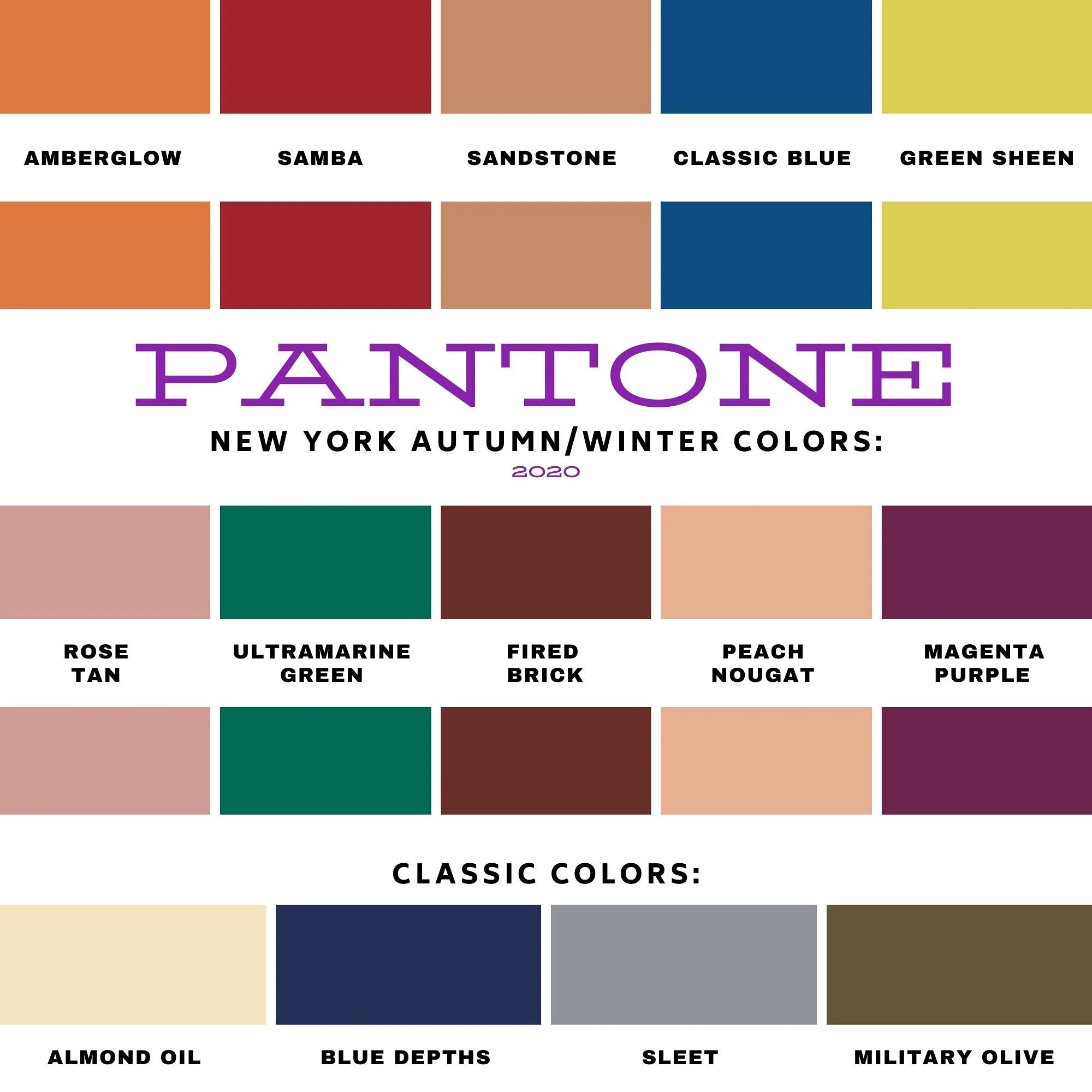
I am going to start with the New York Palette. You can see the entire palette at the end of this post. Instead of doing an intro the color palettes for both New York and London, I am just going to jump right in to the New York colors. As per usual, I am going to combine two palette colors with a classic color, which is also shown on the palette.
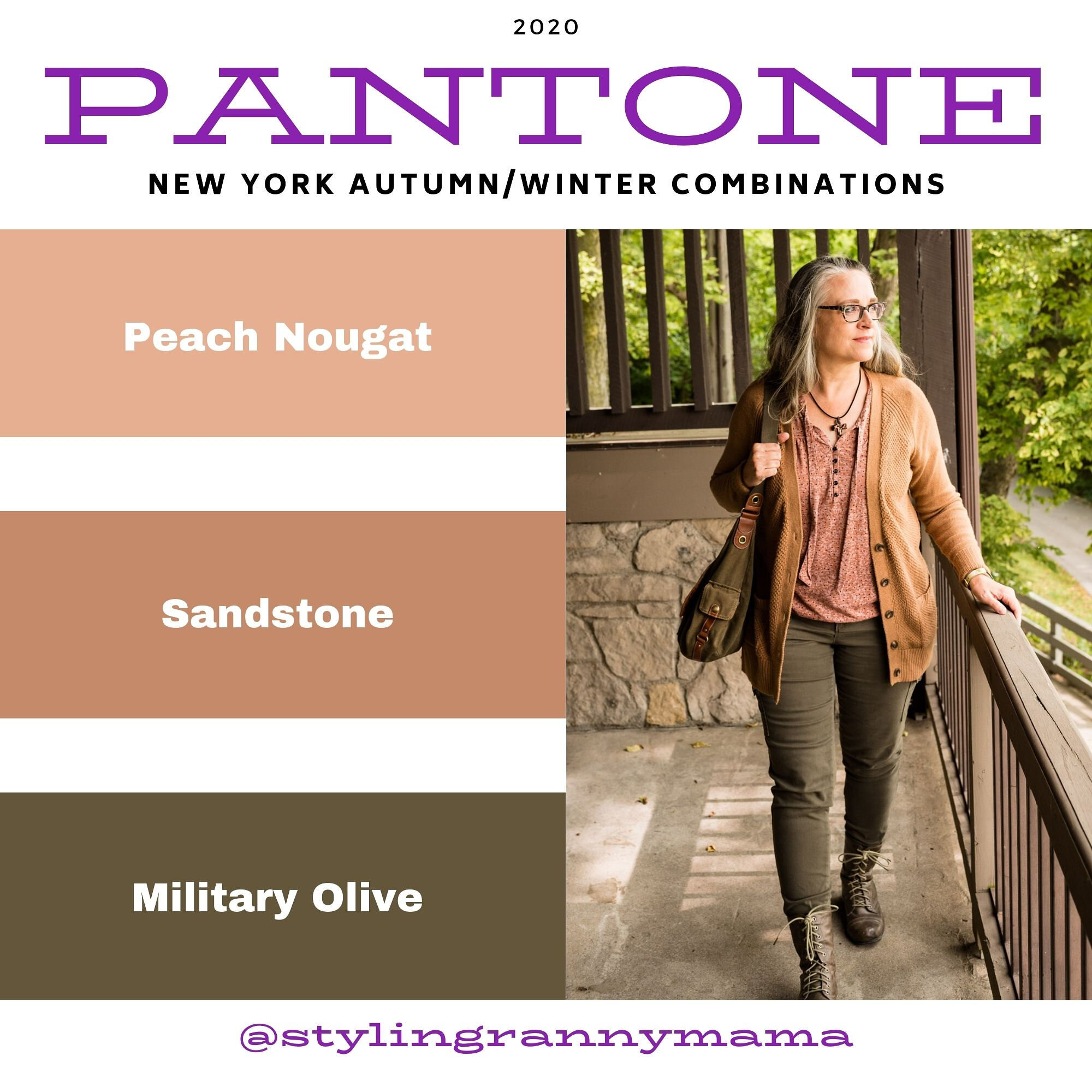
There are a number of these lighter more pastel tans on both palettes this season. This is not a color I would normally reach for, however, if you are more into pastels and lighter shades both Peach Nougat and Sandstone might be good for you.
When I originally put this outfit together I thought the sweater was more like Sandstone, but now seeing the pictures, it is much too yellow. However, the thrifted, tie-front tee has both colors in it, so I am making that my Pantone piece for both colors in this post. Even so, I do like the way this outfit came together with a rather neutral vibe.
My camel colored, waffle knit, thrifted cardigan is Old Navy brand. I love this piece and it is the perfect weight for these changing temps. I like that it is a little longer, has pockets and will go with just about anything in my closet. It is showing a little bit of pilling, but these days, if we can wear distressed jeans, why not wear pilly sweaters. Ha, ha.
My Gloria Vanderbilt utility pants have been a staple in my wardrobe and you have seen these appear on the blog over and over. I am so thankful they are stretchy, because my weight has fluctuated over the last few years about eight pounds, up and down, many of you know the feeling. At least with pants that have some flex you can still wear them, even when your weight is up a bit. This year Military Olive is on the New York palette as a Classic Color and on the London palette as a main color. Not sure why that is, but you’ll see I use the color both ways, once you see the London palette colors.
This cross necklace was the perfect accompaniment for this outfit. It goes so well with the shirt, it looks like they are made to go together.
Keeping the look ultra casual allowed me to carry this fabulous hobo bag from Fossil. Also a thrift find. Shhhh! Don’t tell my hubby. He claims I have too many purses. Is that even a thing? Ha, ha.
Lastly, I chose these well worn, thrifted combat boots from Falls Creek. I have had these for quite a while and they are definitely showing their wear, but again, if you like a grunge look, like I occasionally do, then well worn is just right.
What do you think of these colors? Do you have any of these in your closet? Are you a pastel kind of girl, or do you like richer, bolder colors? Leave me some love in the comments. It means a lot to hear from you!
Here is the New York Fall/Winter 20/21 color palette.
I hope you will follow along as I continue this color series. I’ve included a few shopping links, for you to peruse. These are affiliate links. All opinions are my own. Have a great day!
Photos and graphics Rebecca Trumbull.


