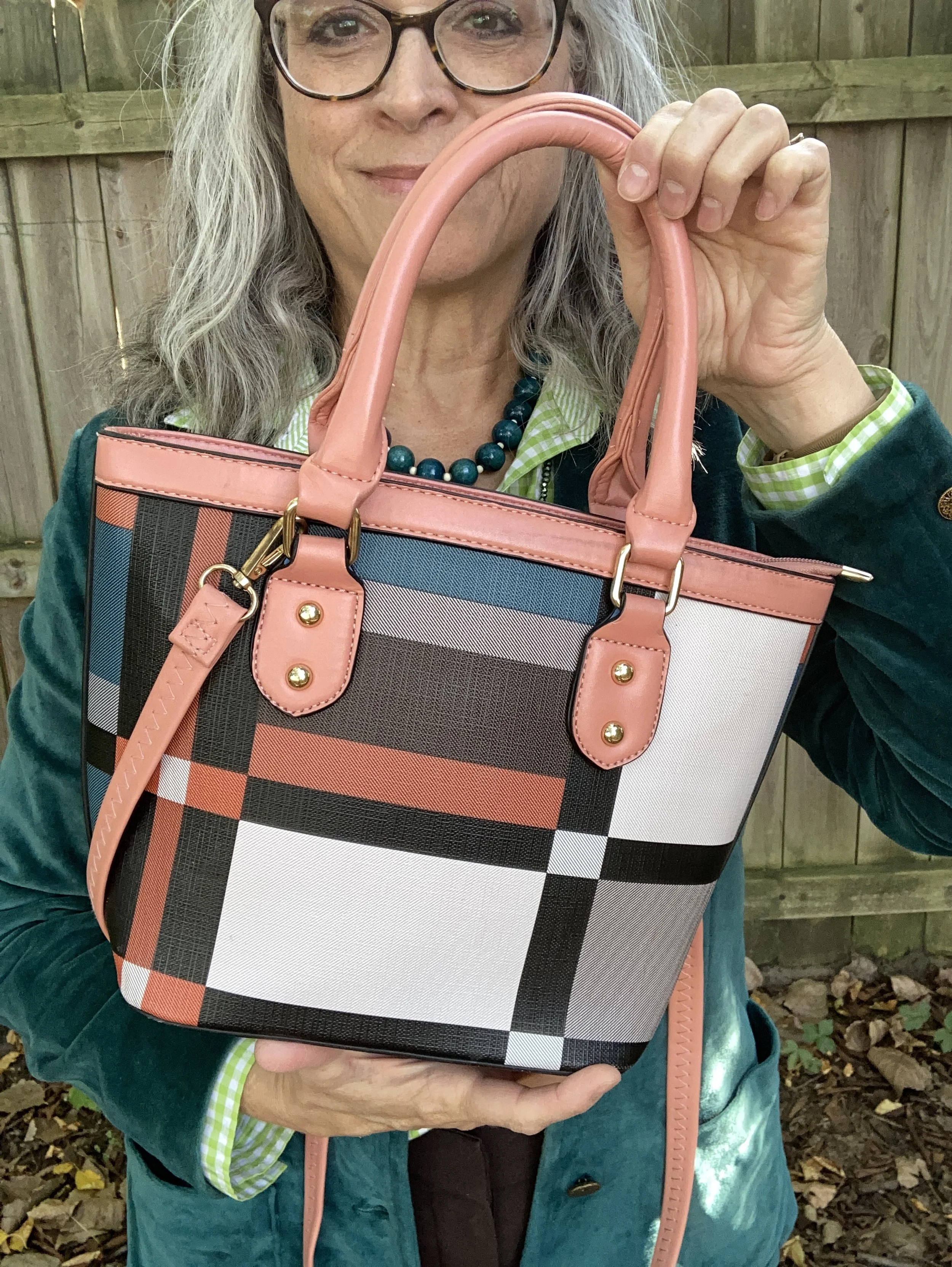
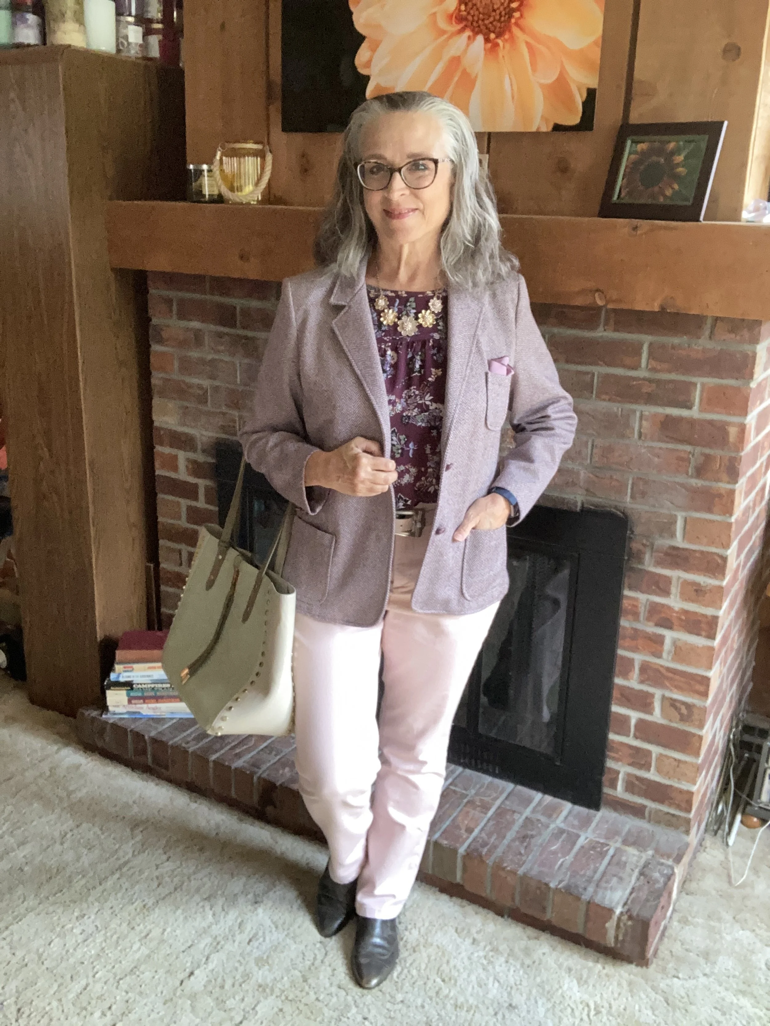
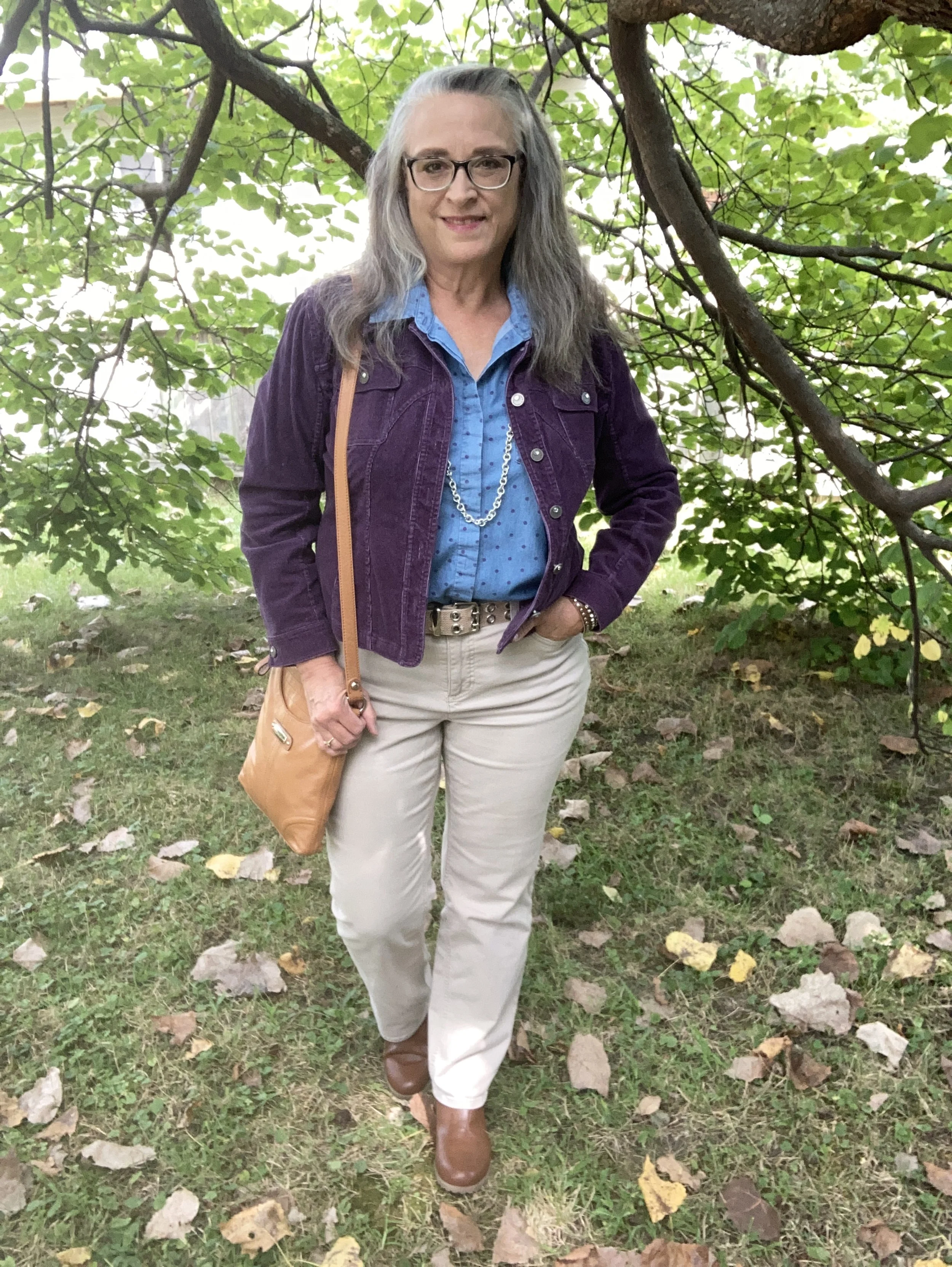
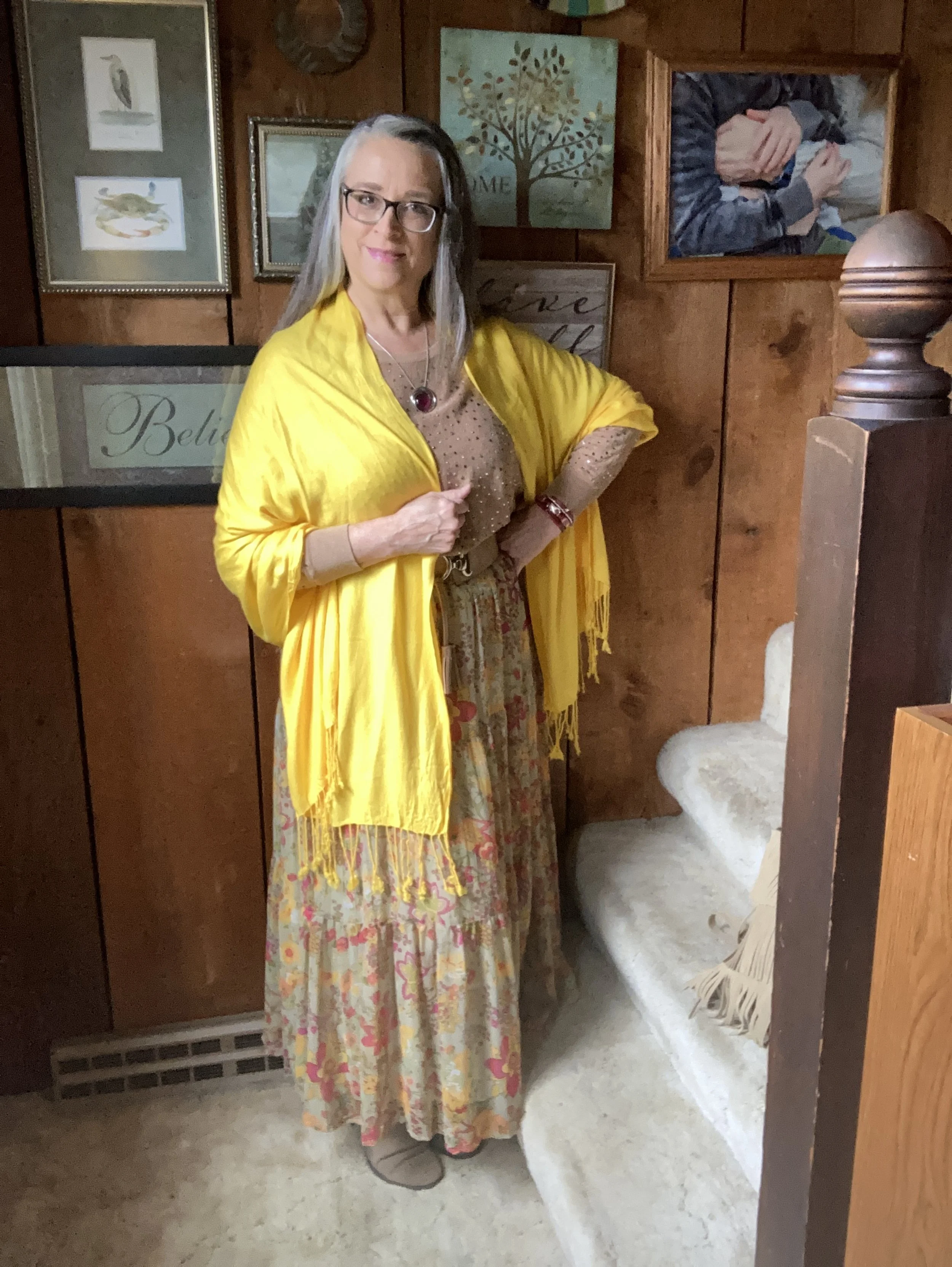
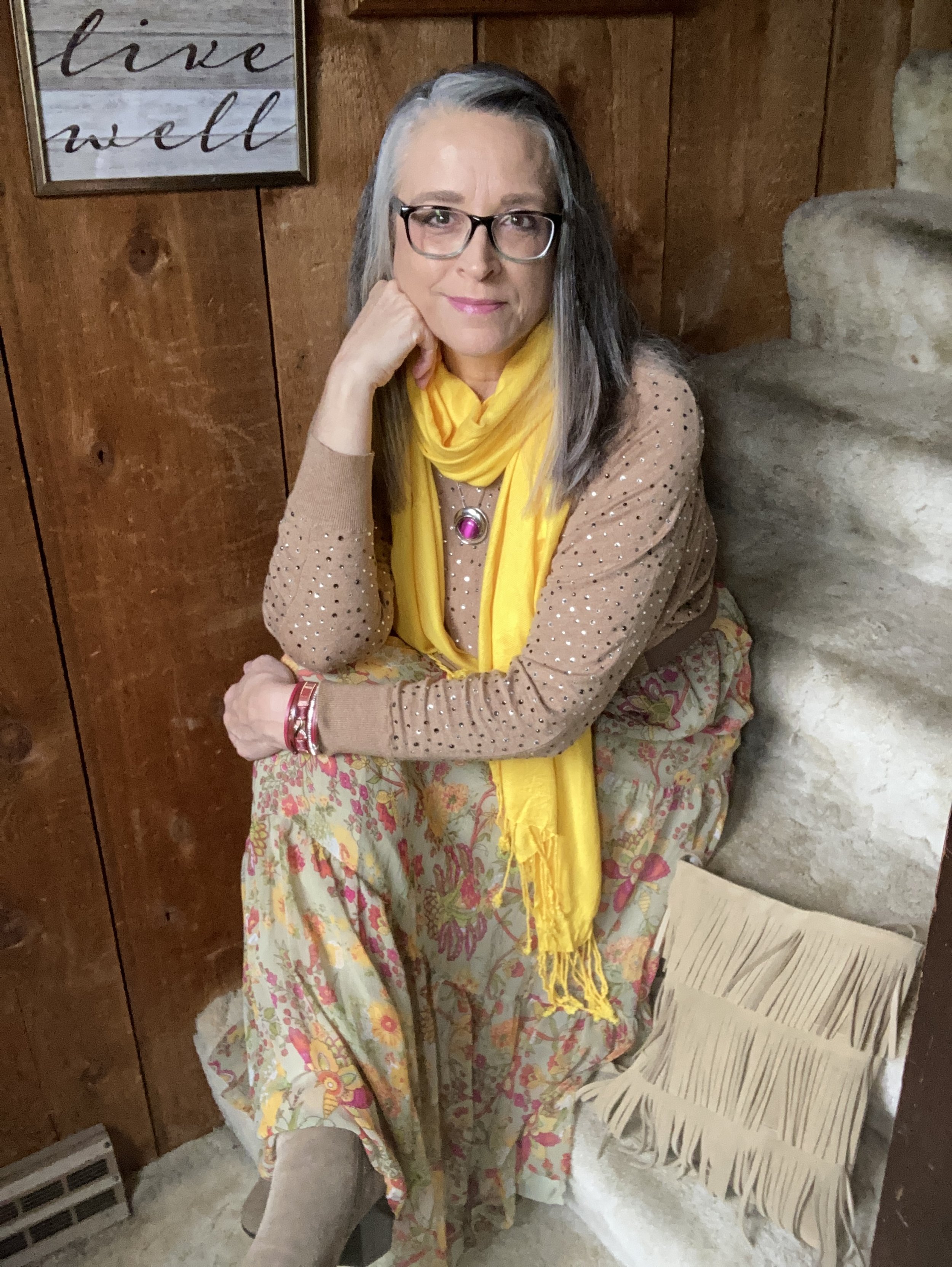
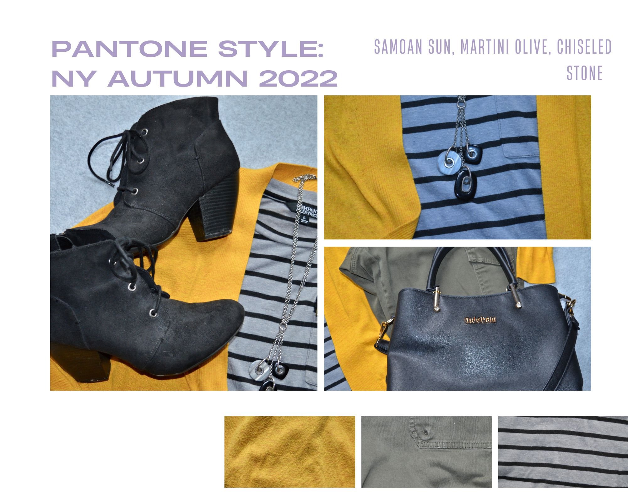
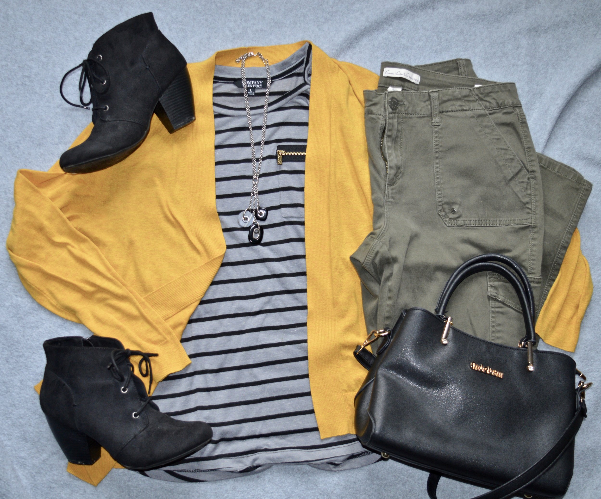
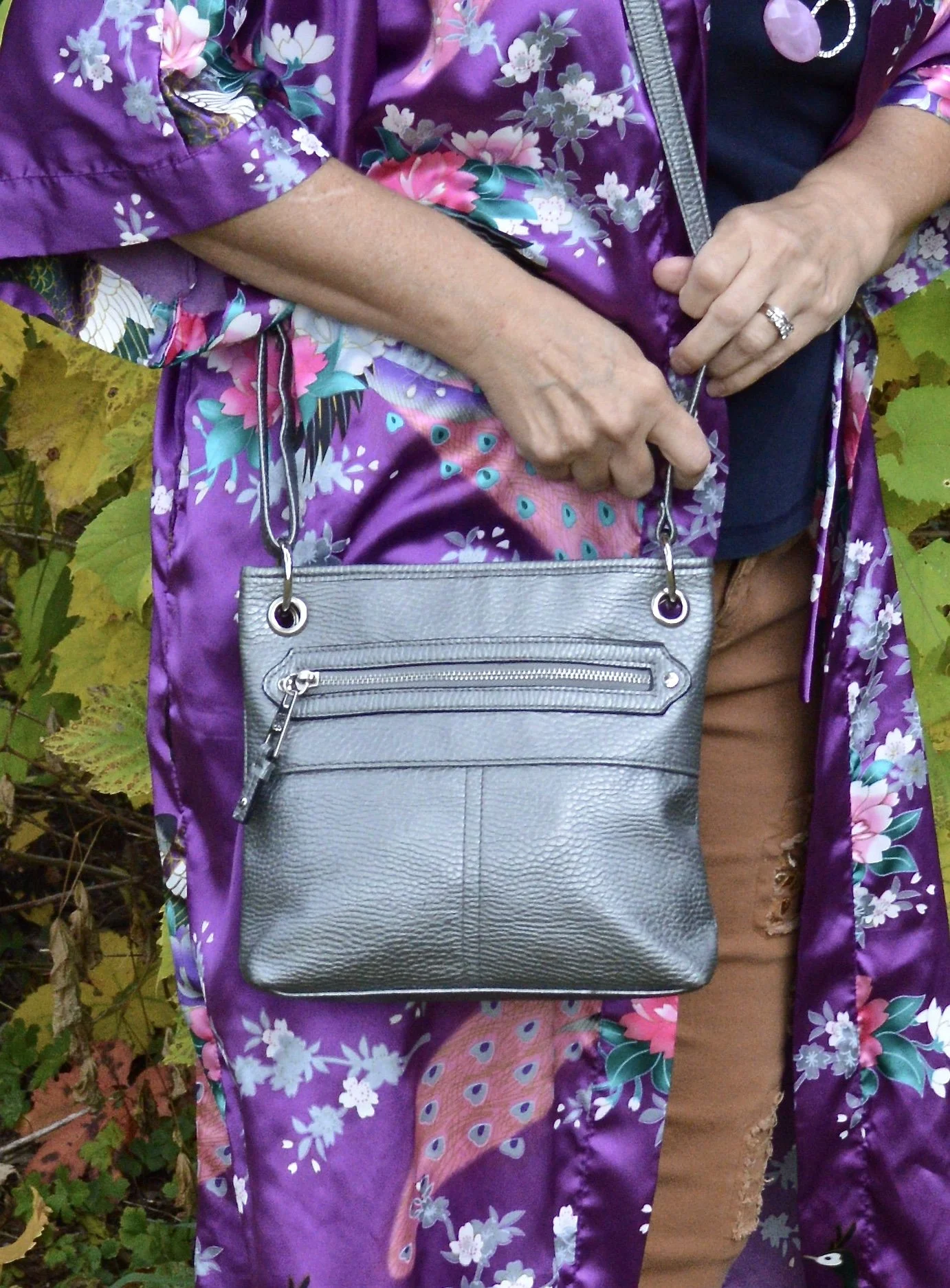
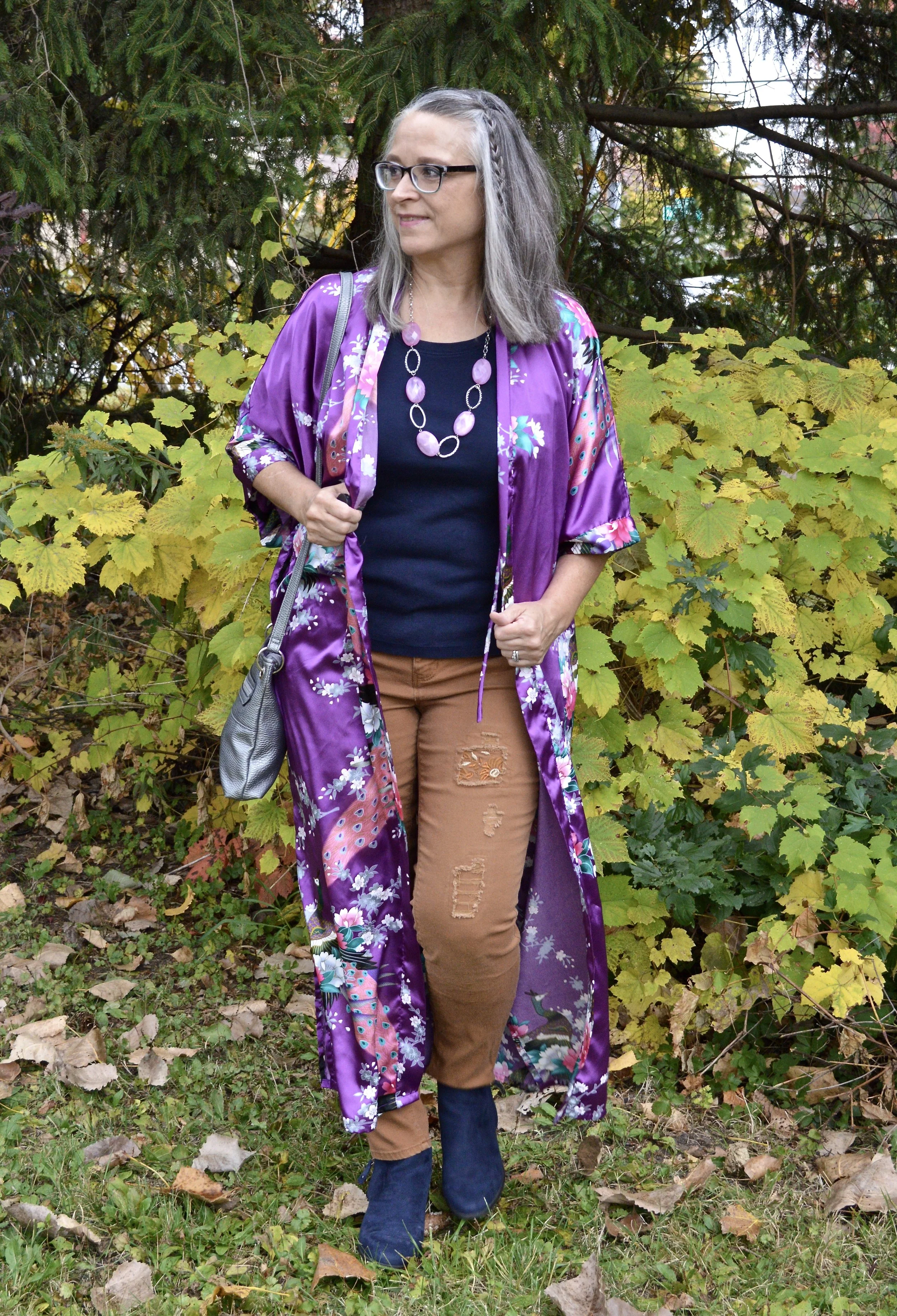
Pantone Autumn/Winter 2025 - London Color Palette: Hot Chocolate, Fig and Cumulous Cloud

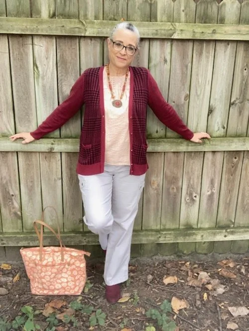
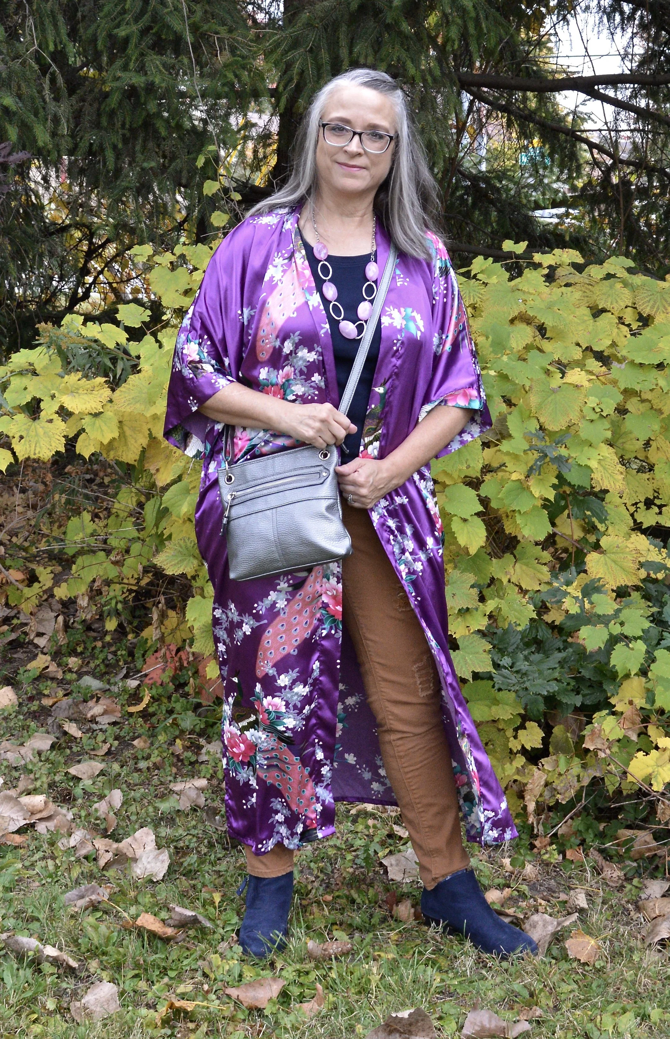
These are the last three colors on the London Color Palette for Autumn/Winter 2025. These are not exact matches, but you can see the actual colors in this pin. I would not have thought to pair these three colors together, but these are what was left after using the other colors on the palette. The reality is, you can pair any colors and create a beautiful outfit by focusing on textures and accessories. Let’s look at the details.

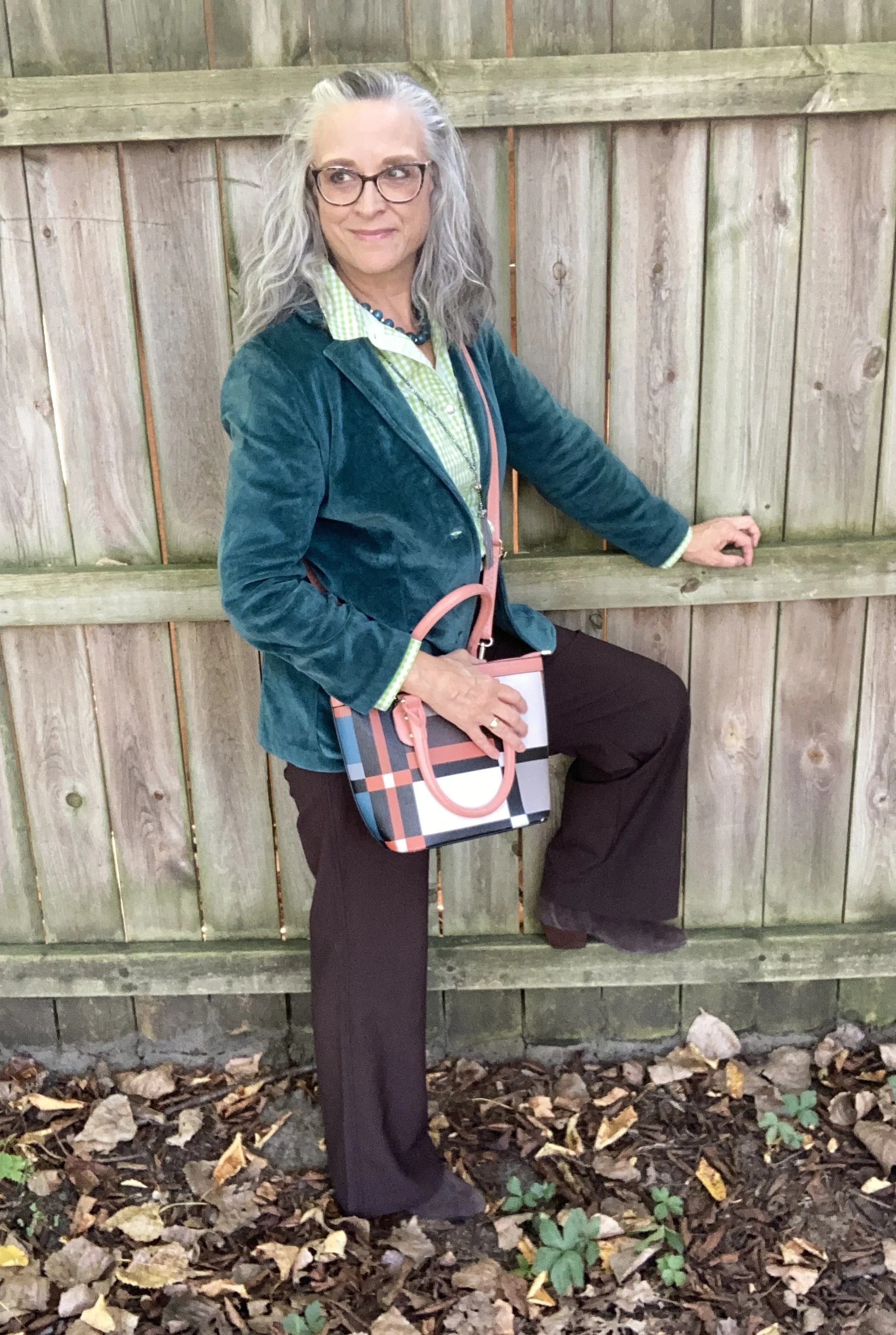
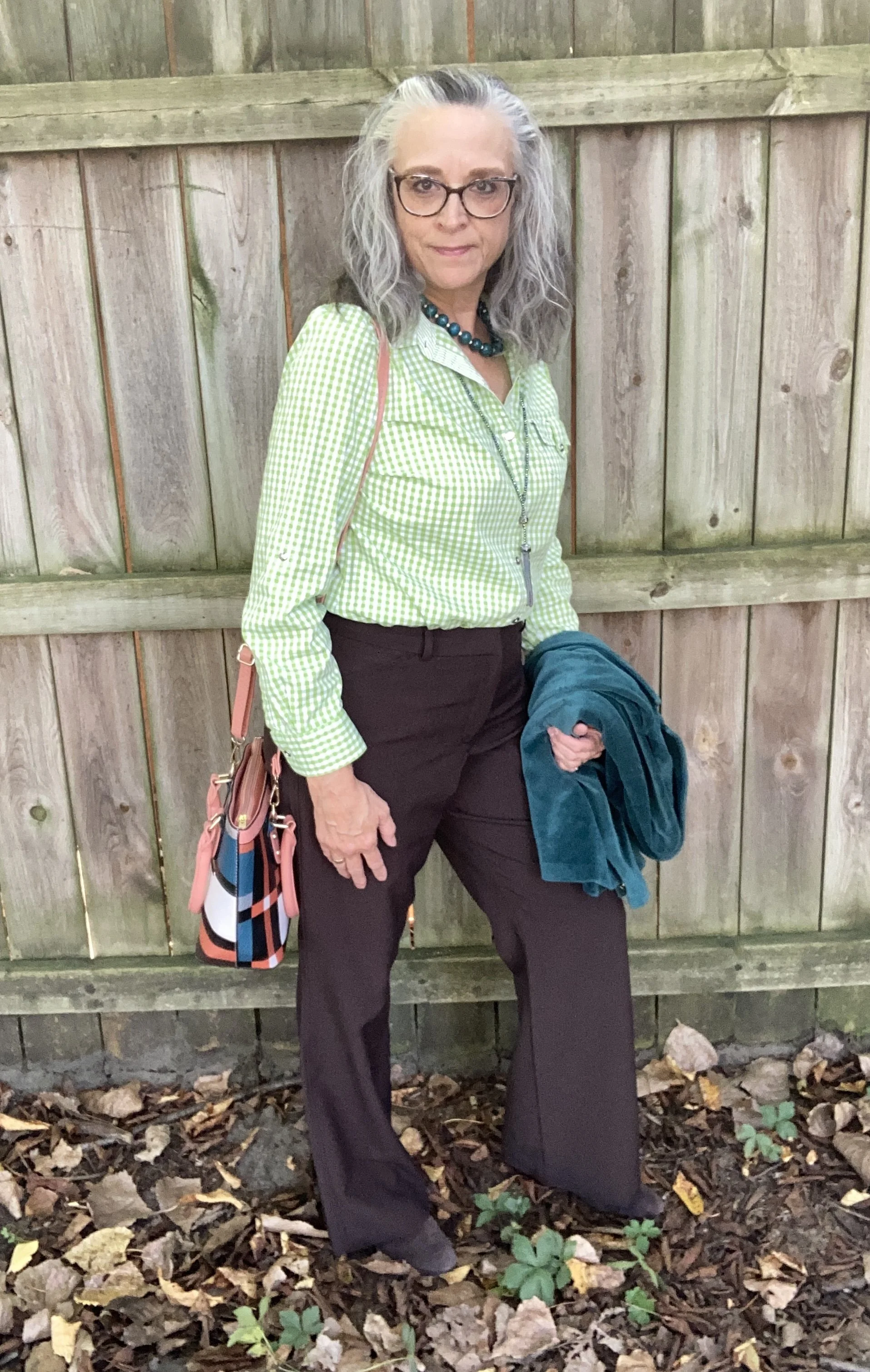
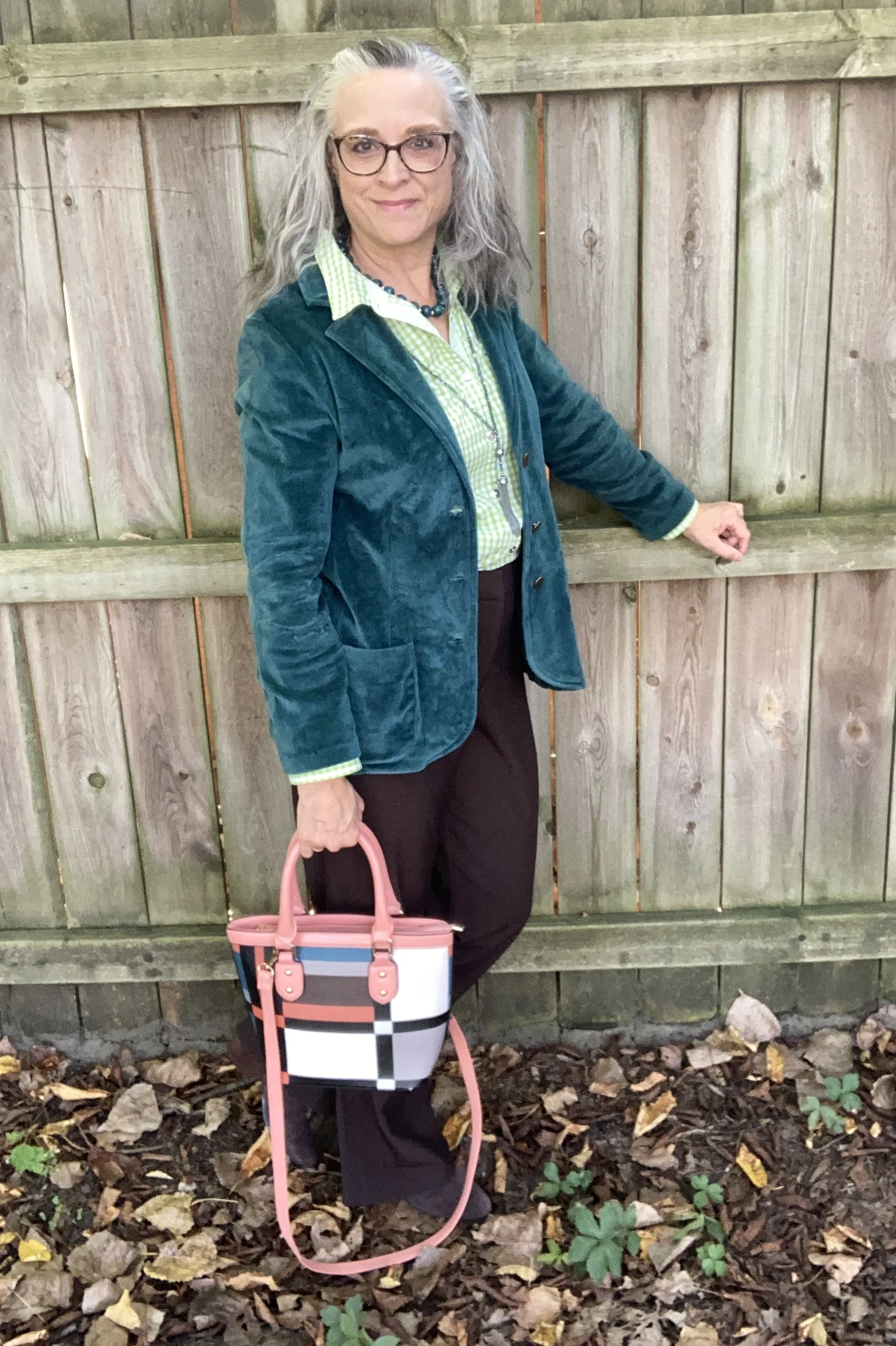
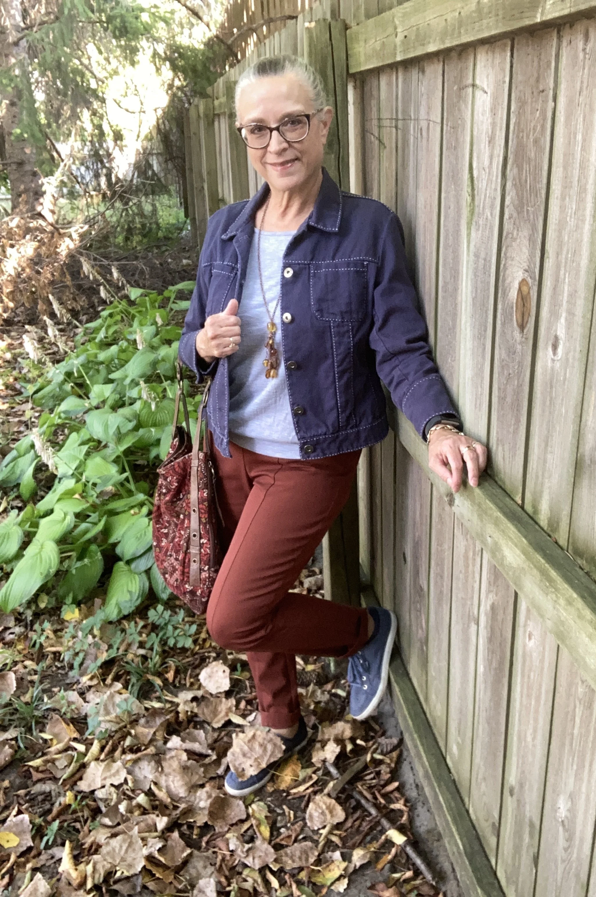
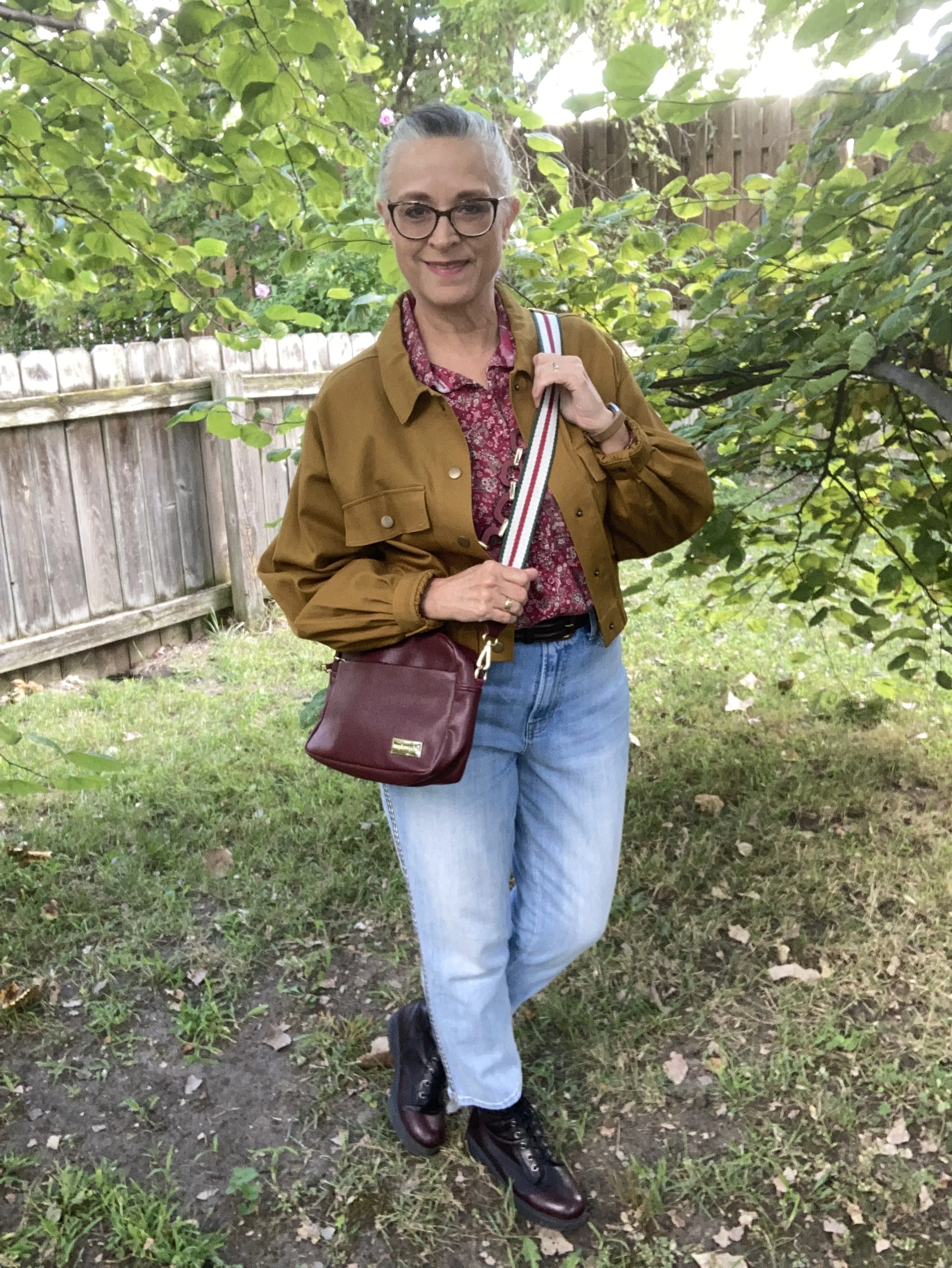
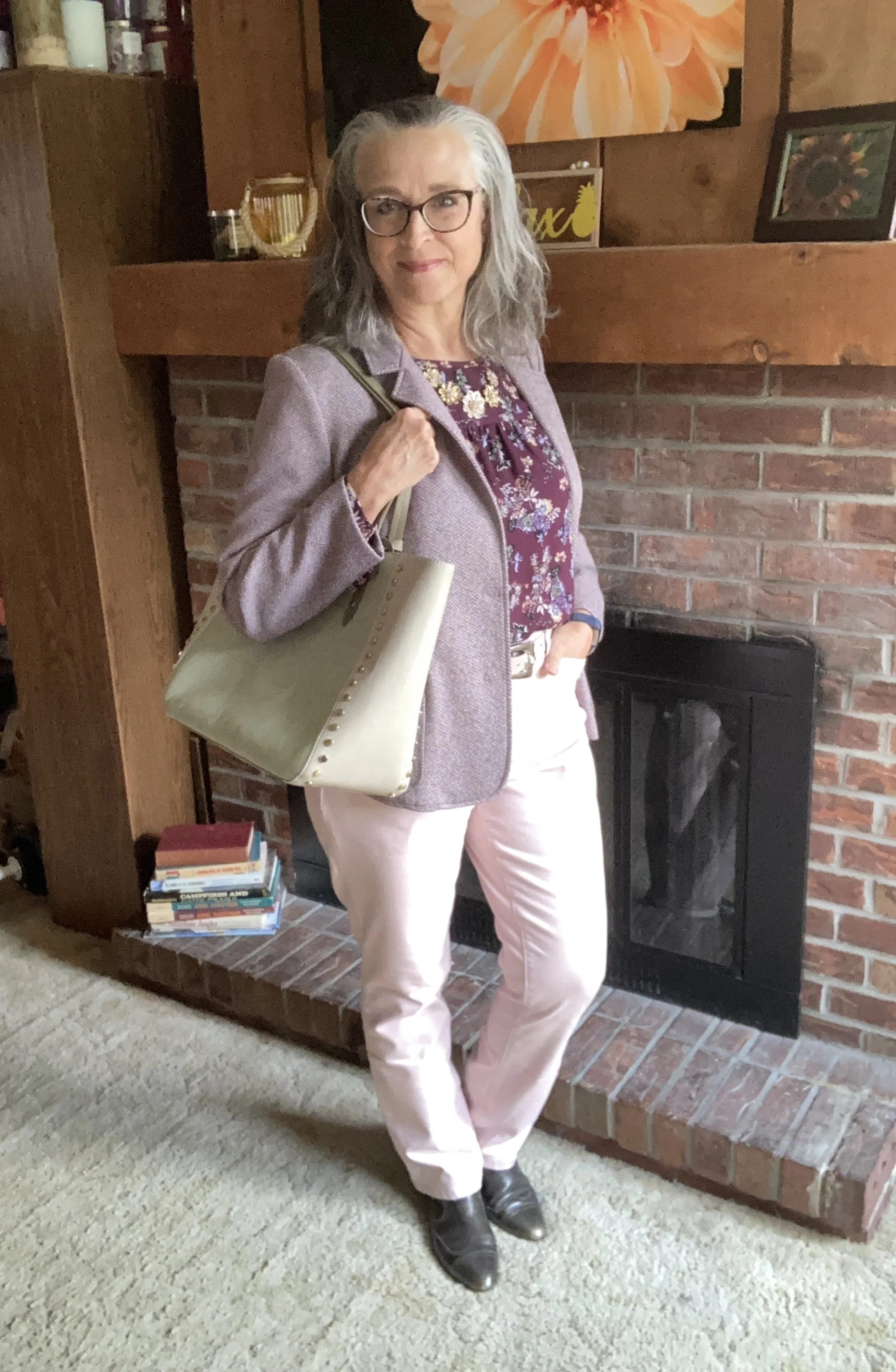
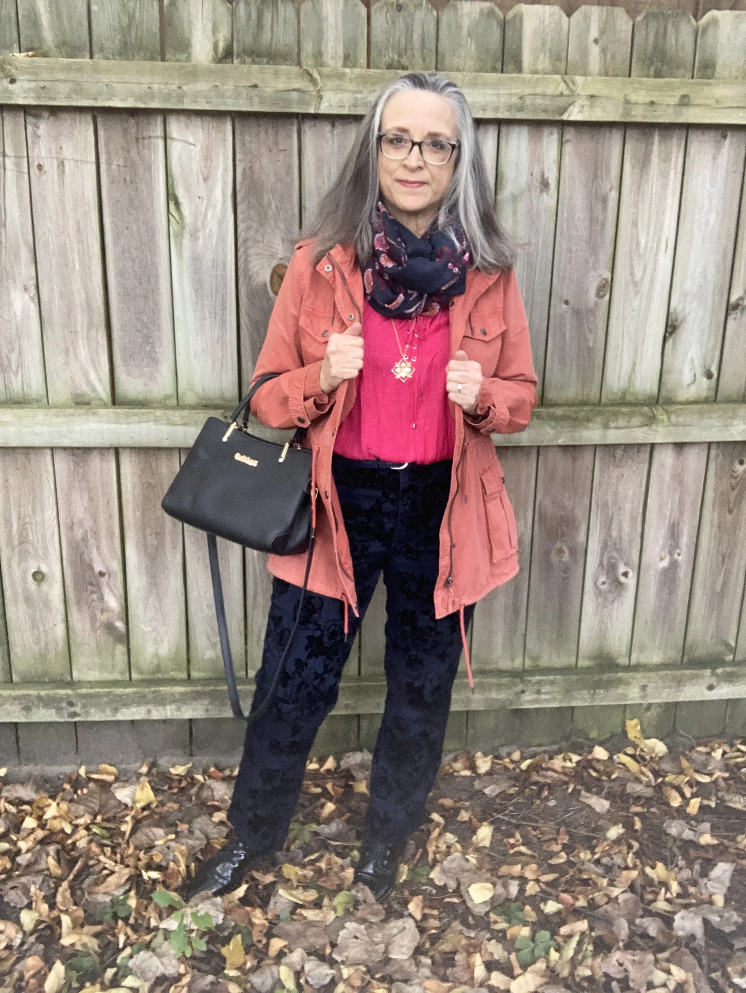
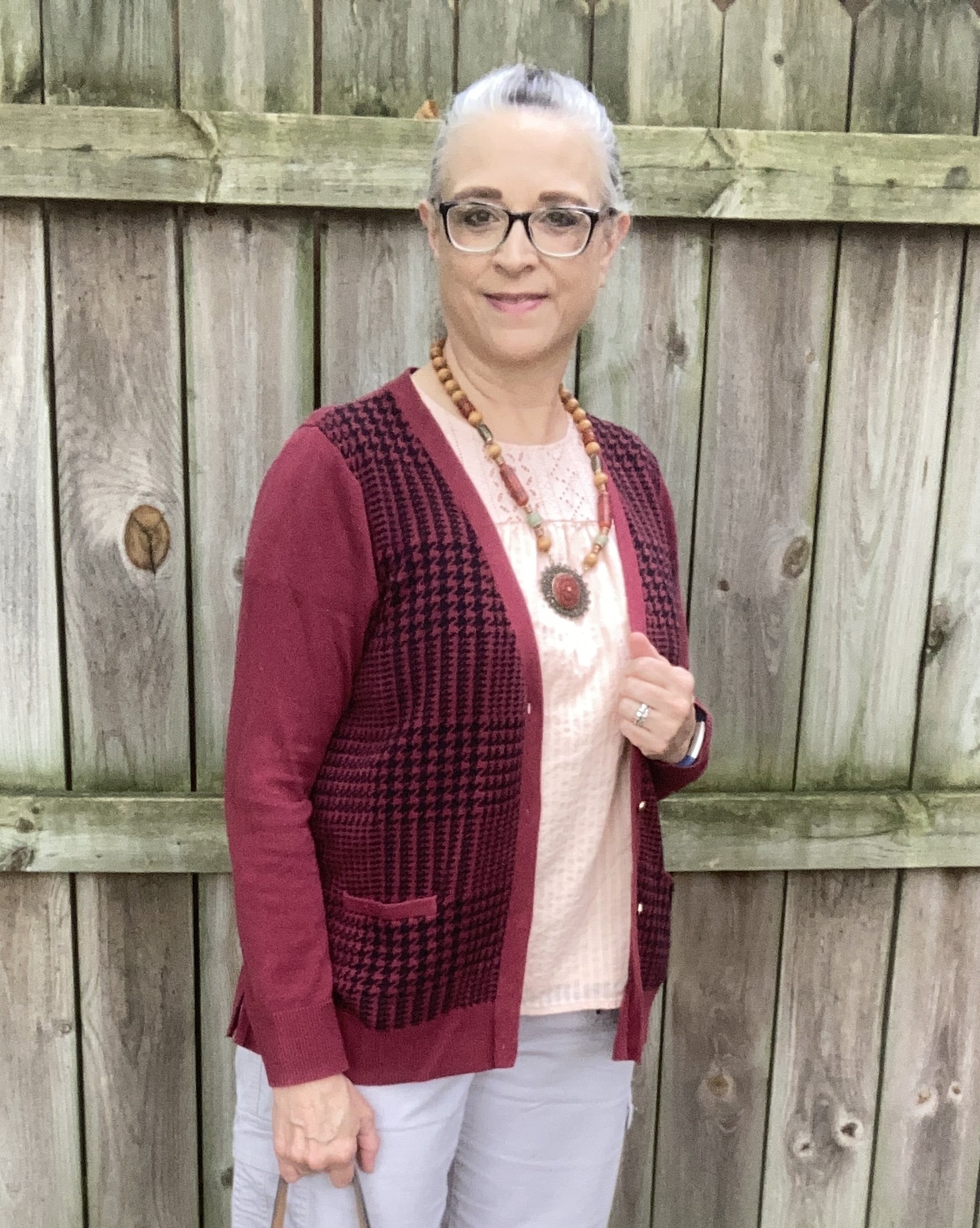
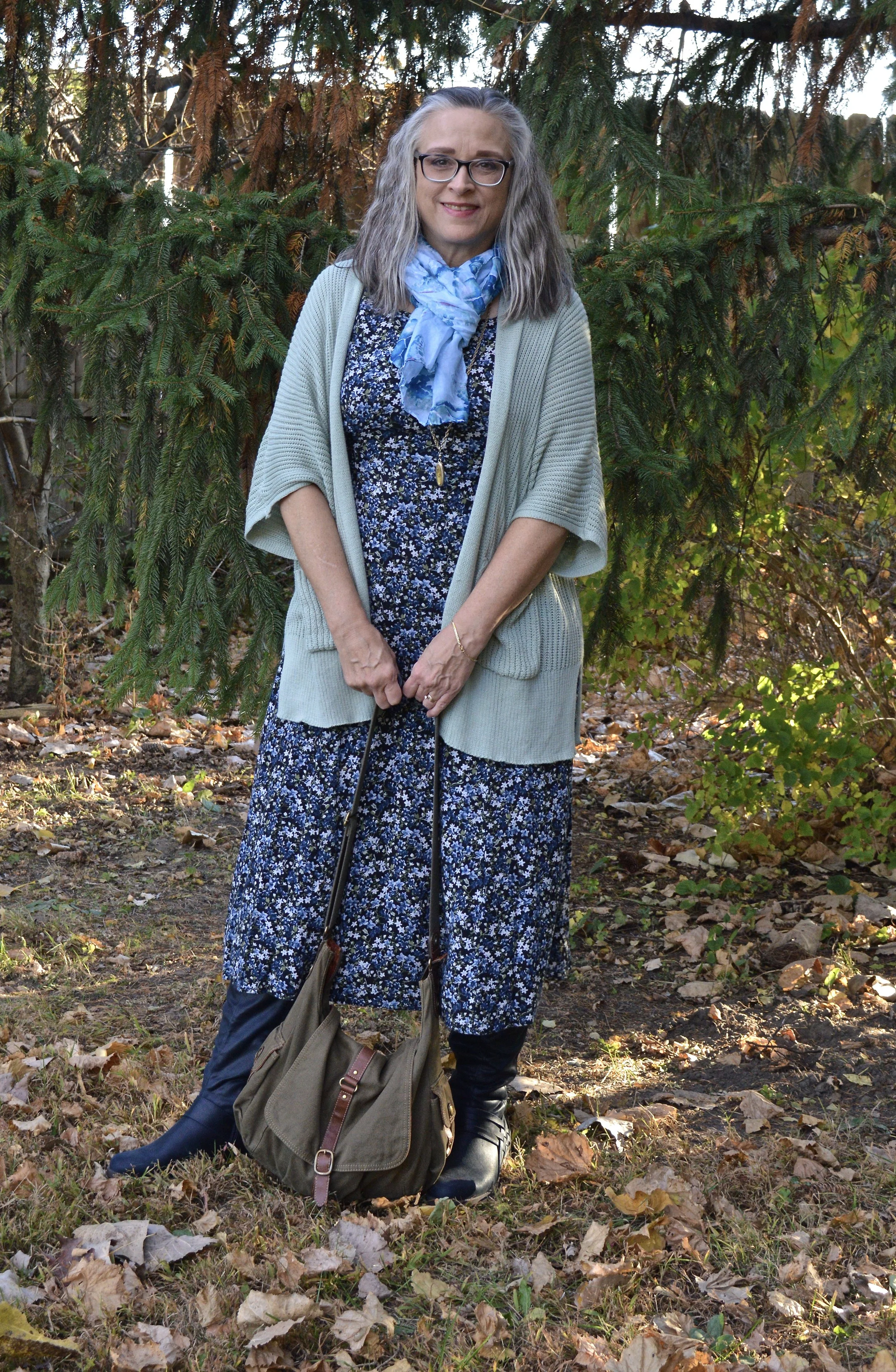
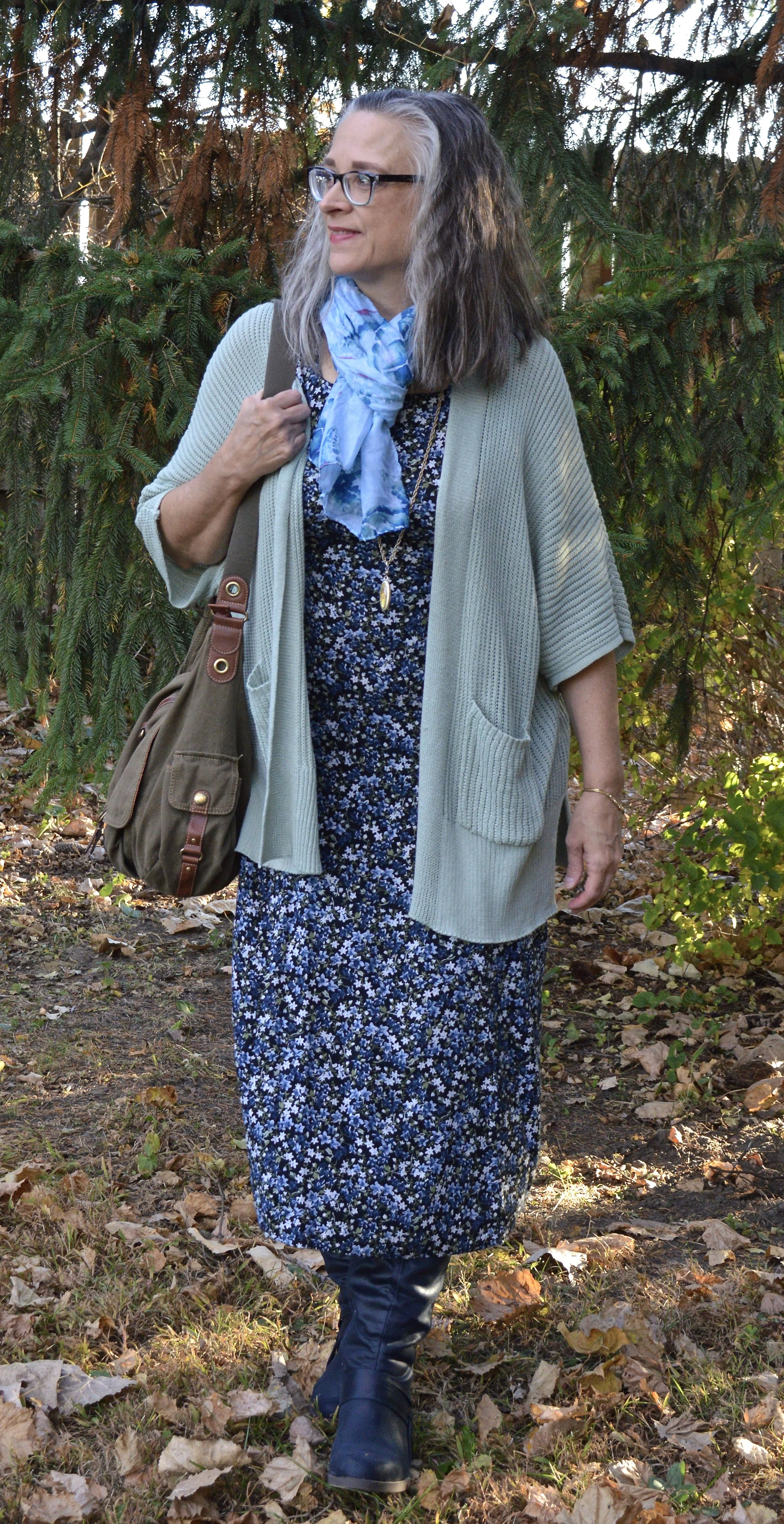
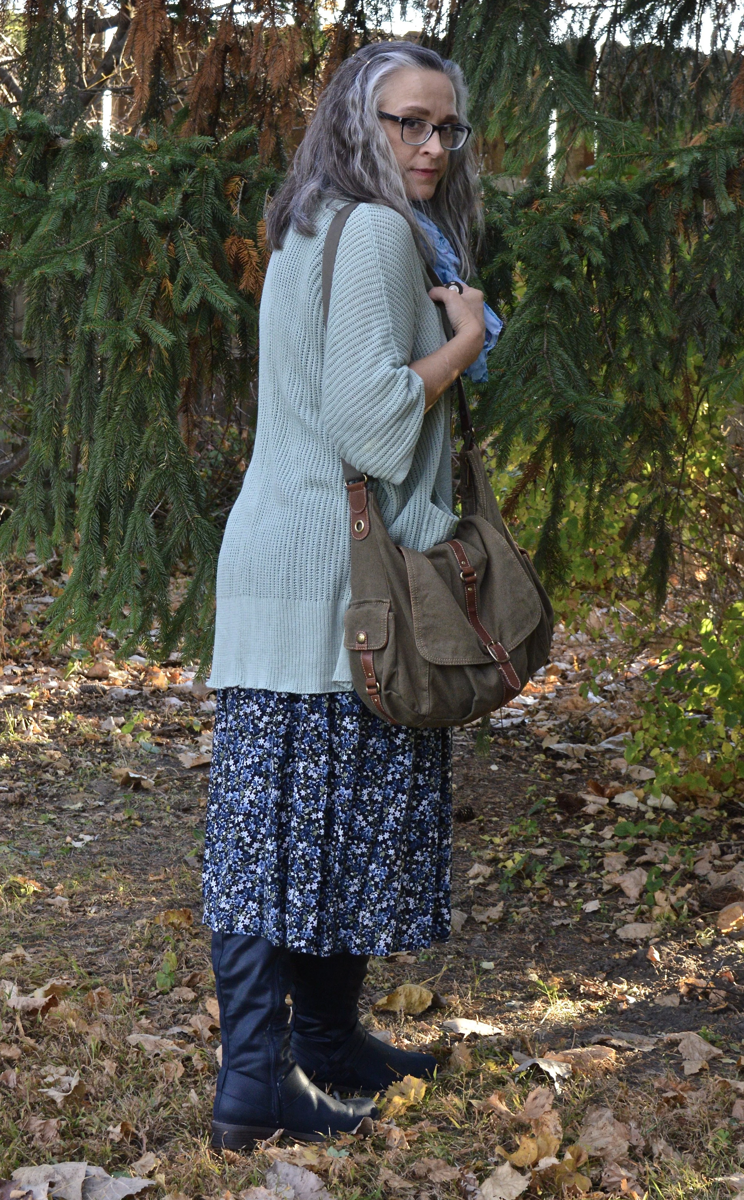
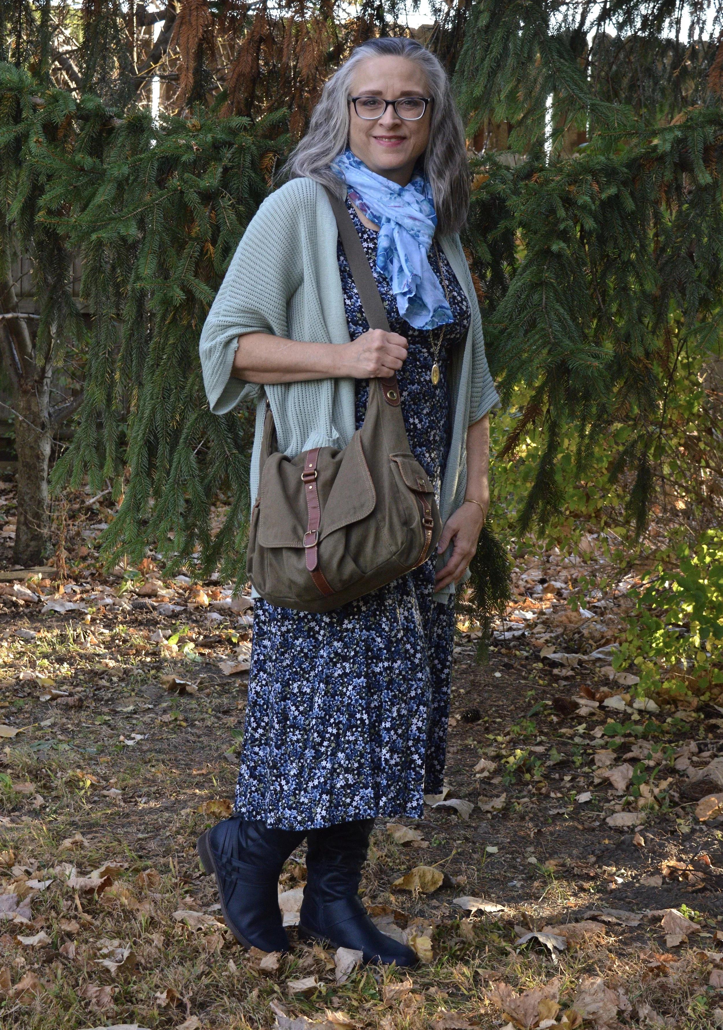
This is a very basic, casual look, but we are all at different stages in life and an outfit like this is perfect for a day of running errands and meeting your girlfriends for lunch. It is comfortable, and warm. Today, I am starting something new. For each piece I am wearing I am going to add a Why I Like It sentence or two, to help you understand my Fashion Philosophy a little better.

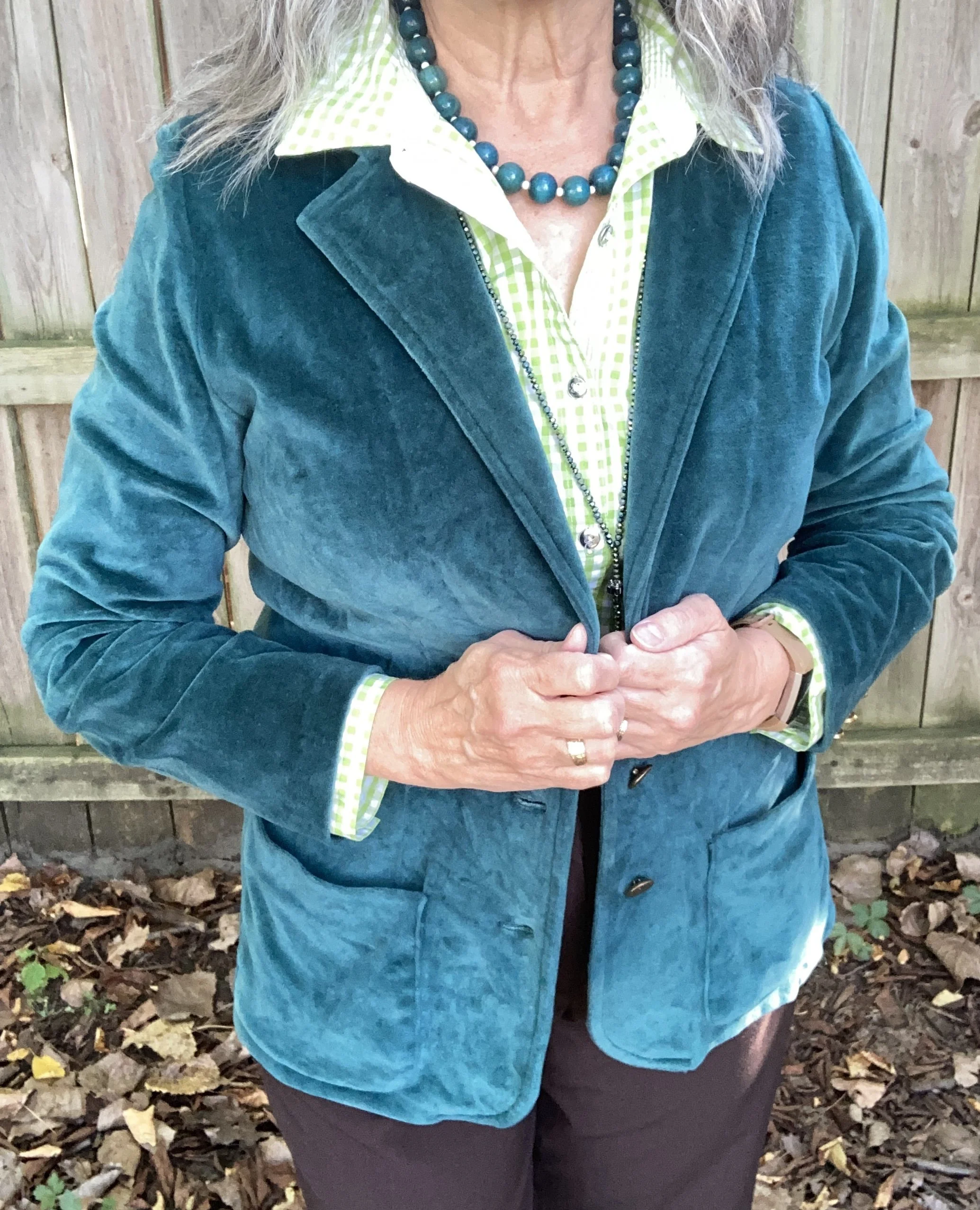
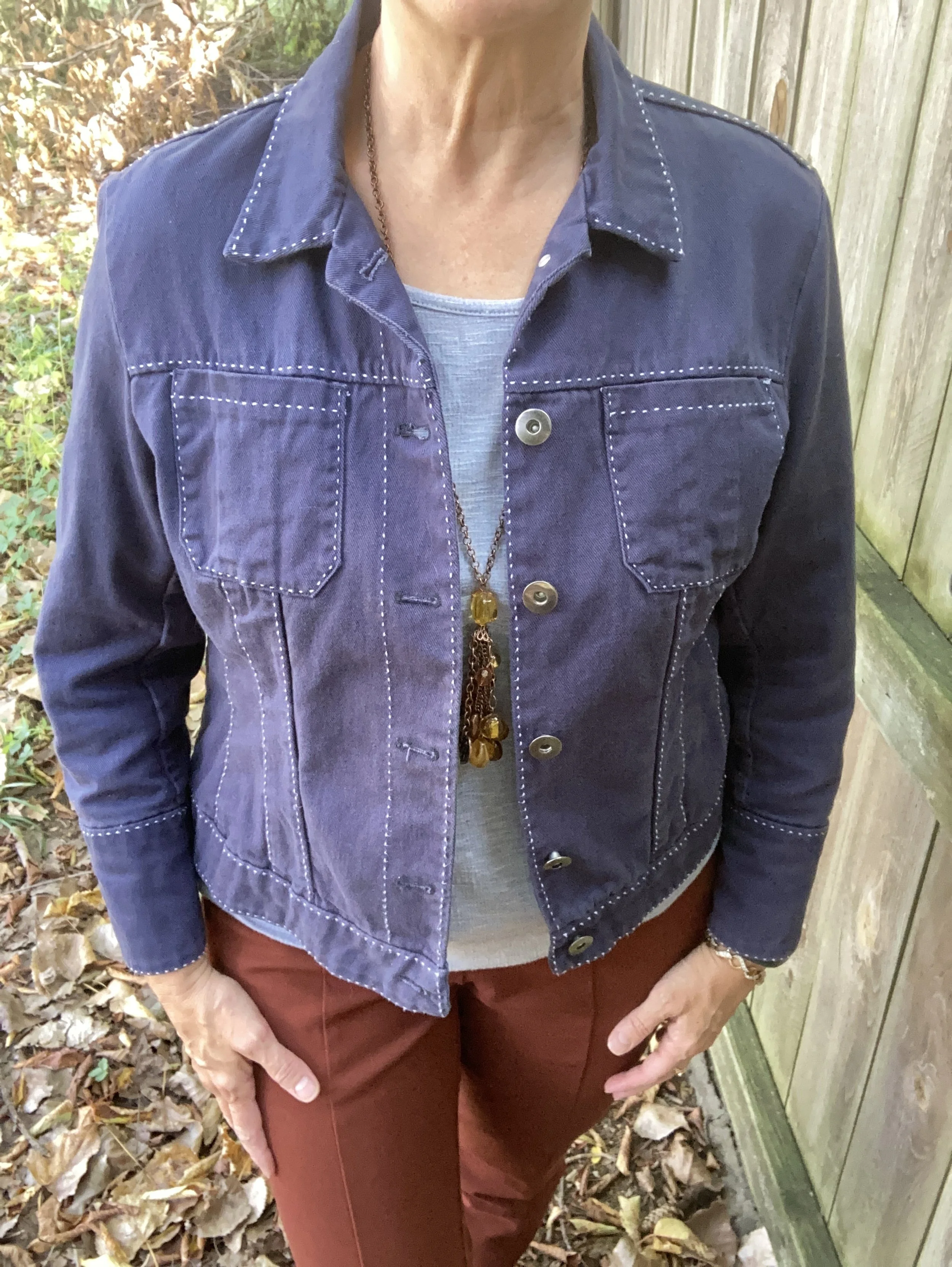
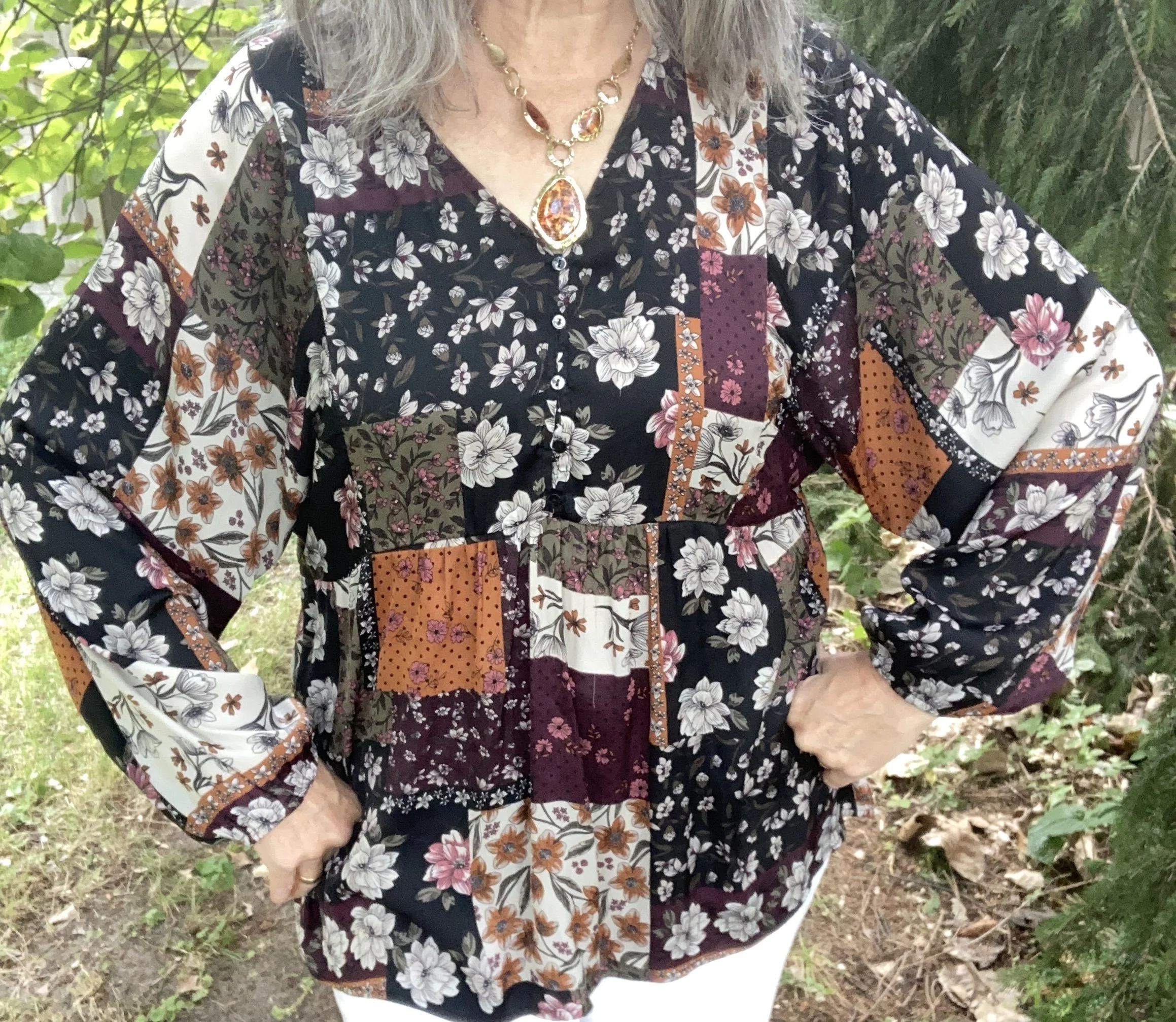
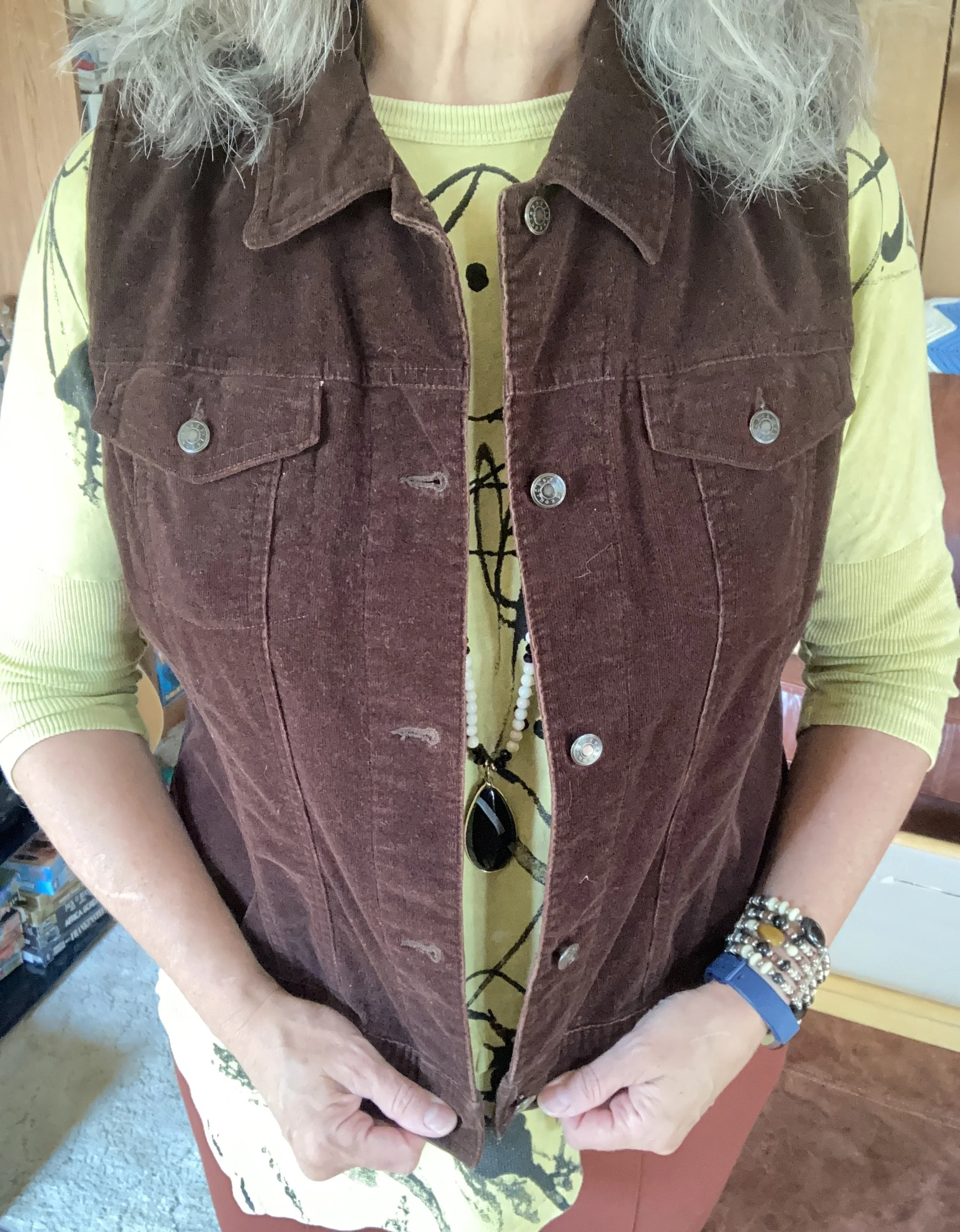
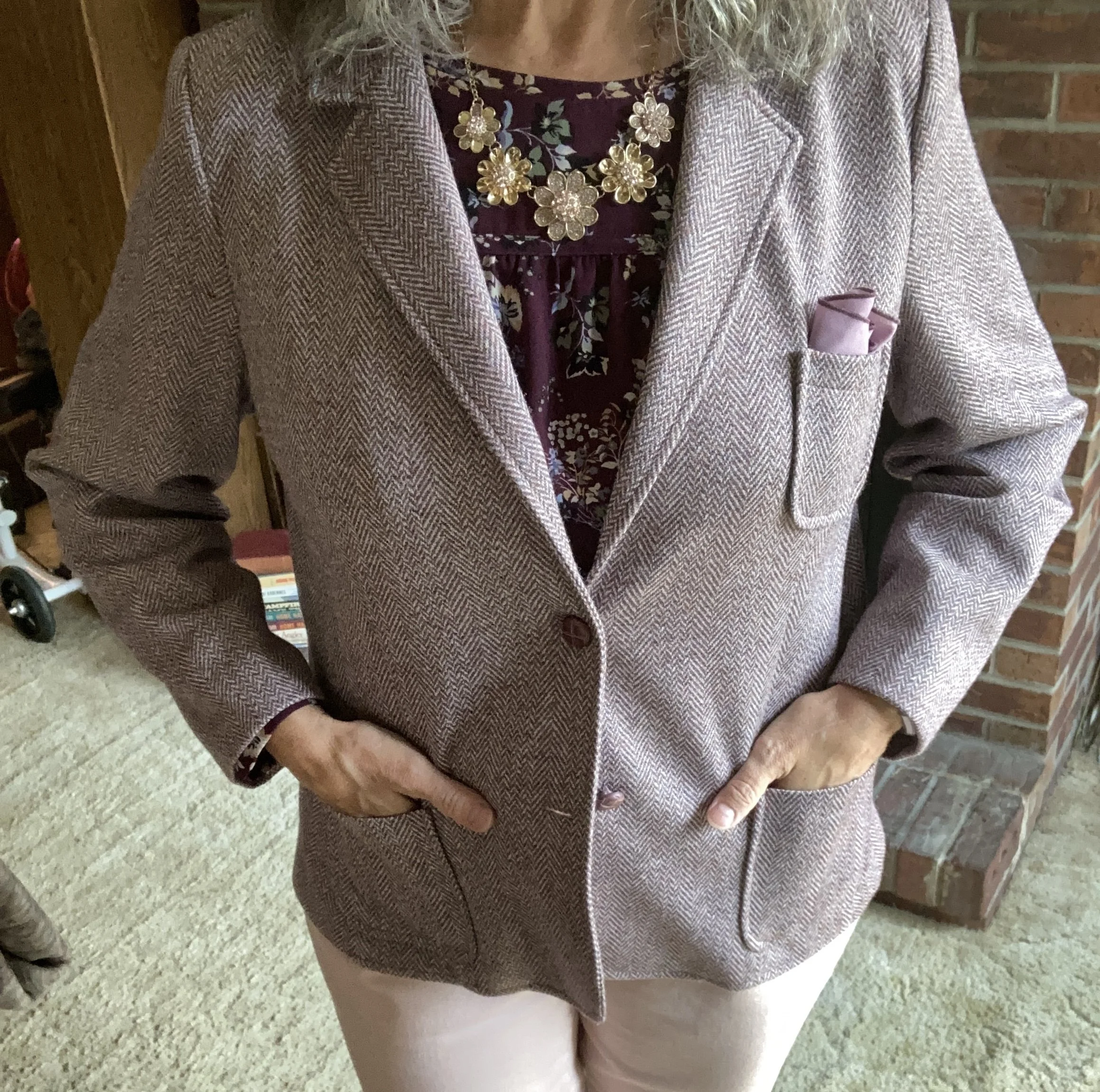
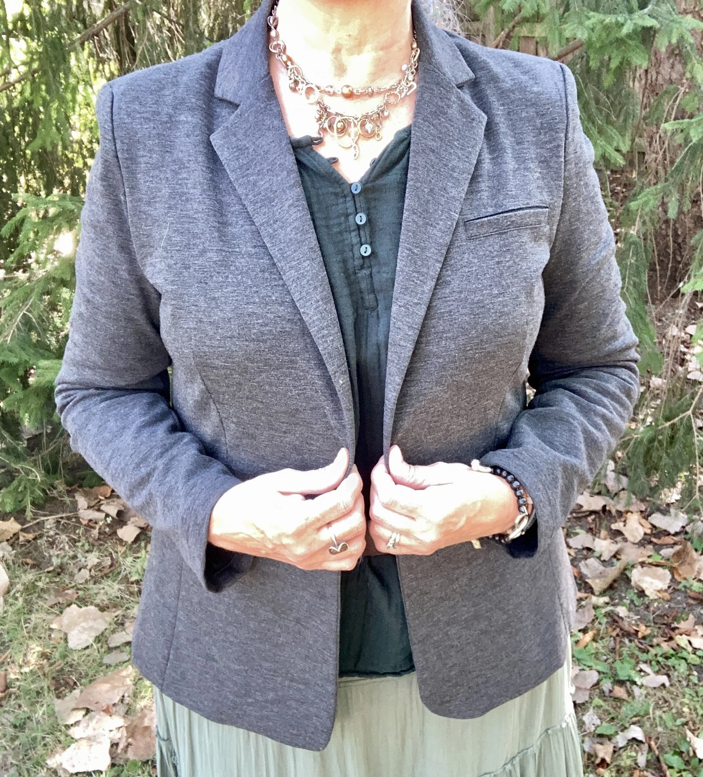
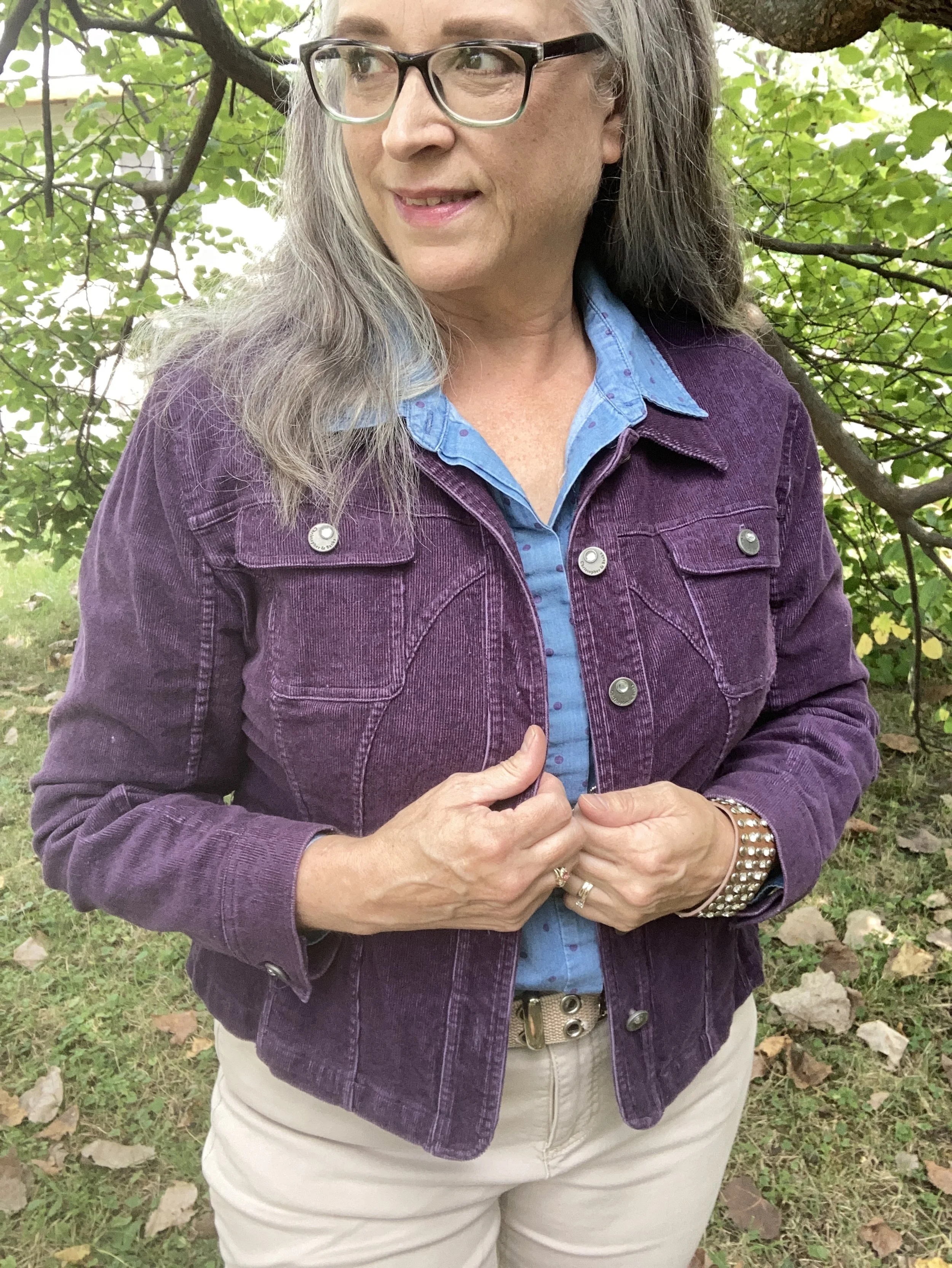
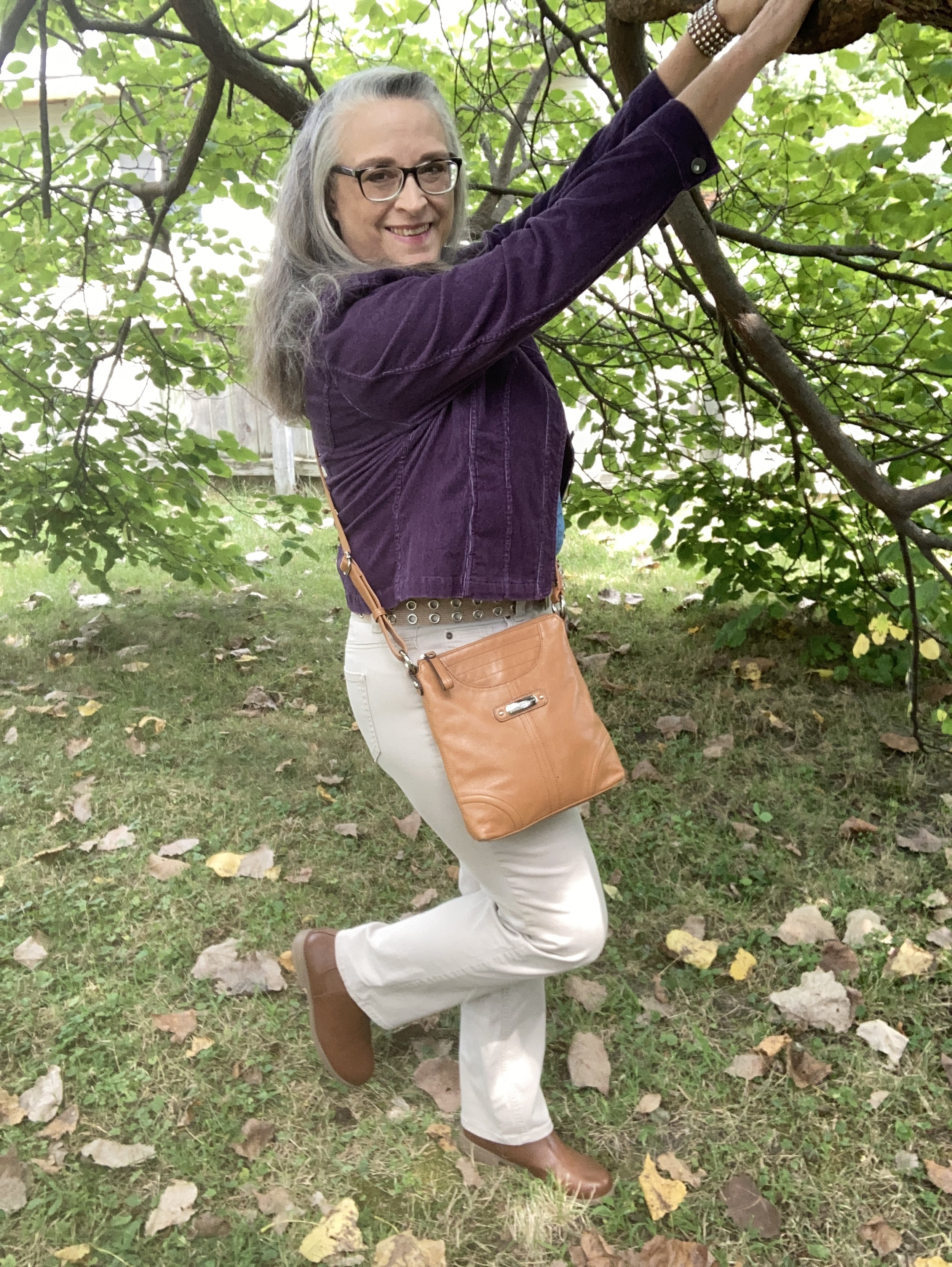
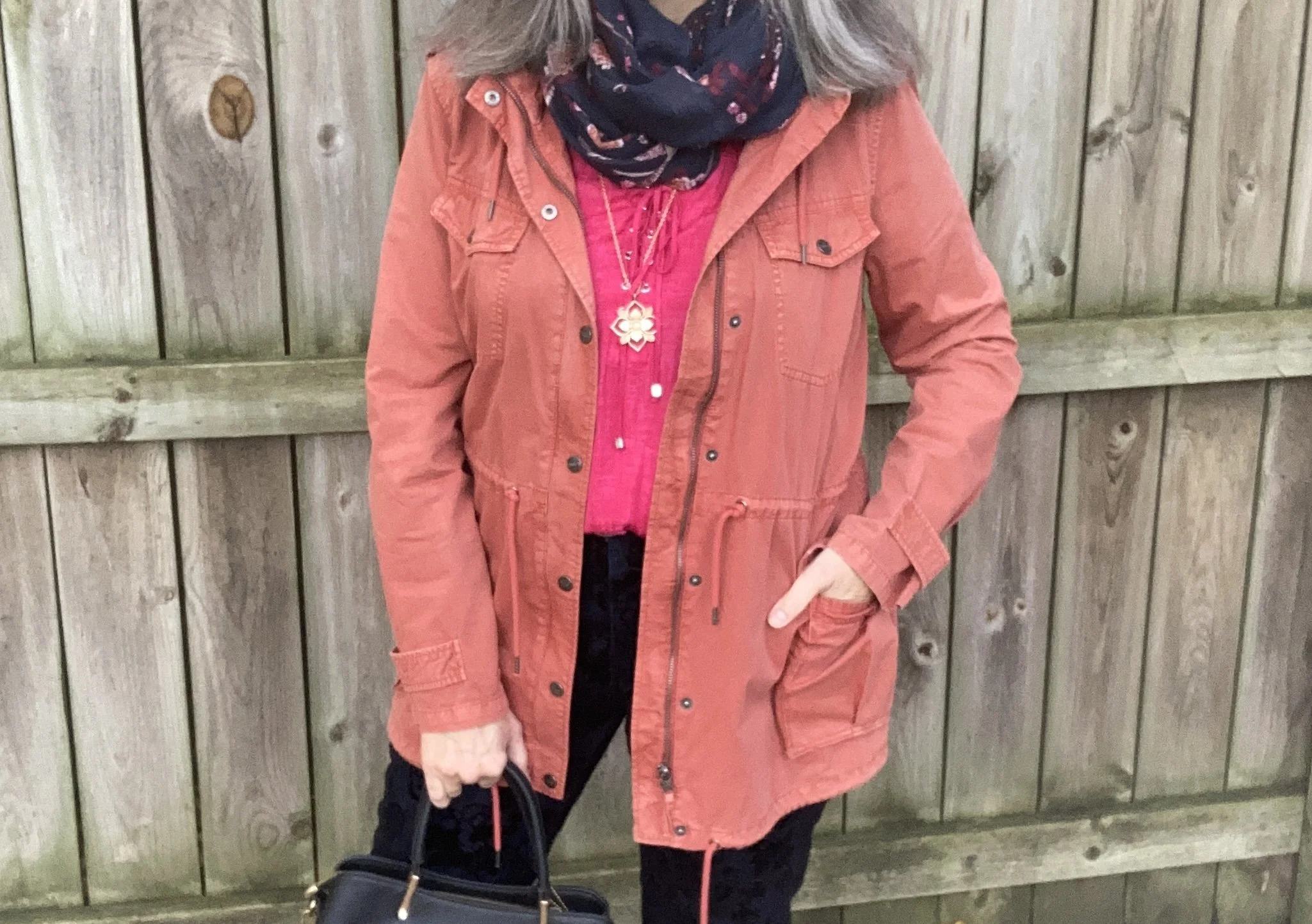
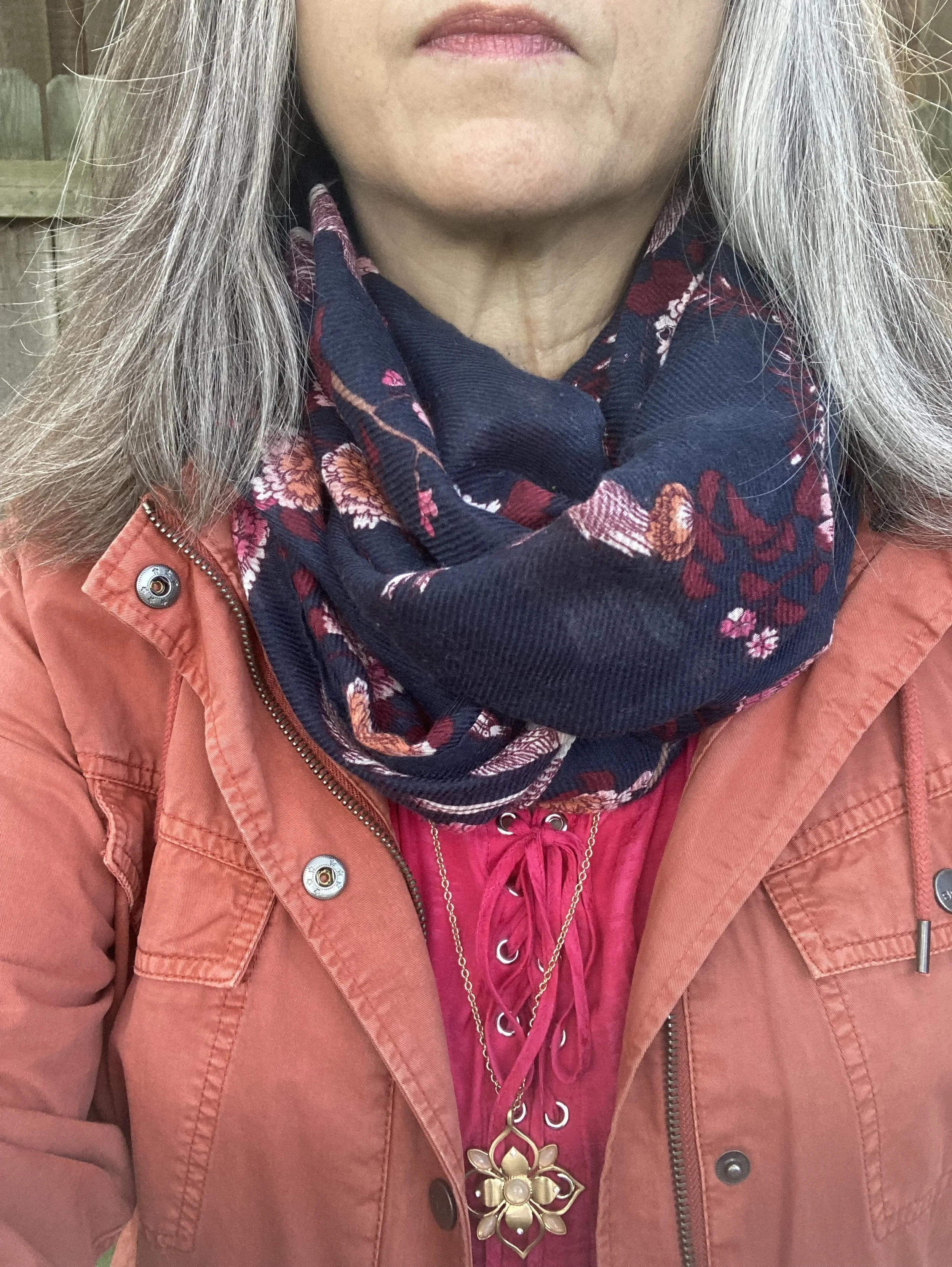
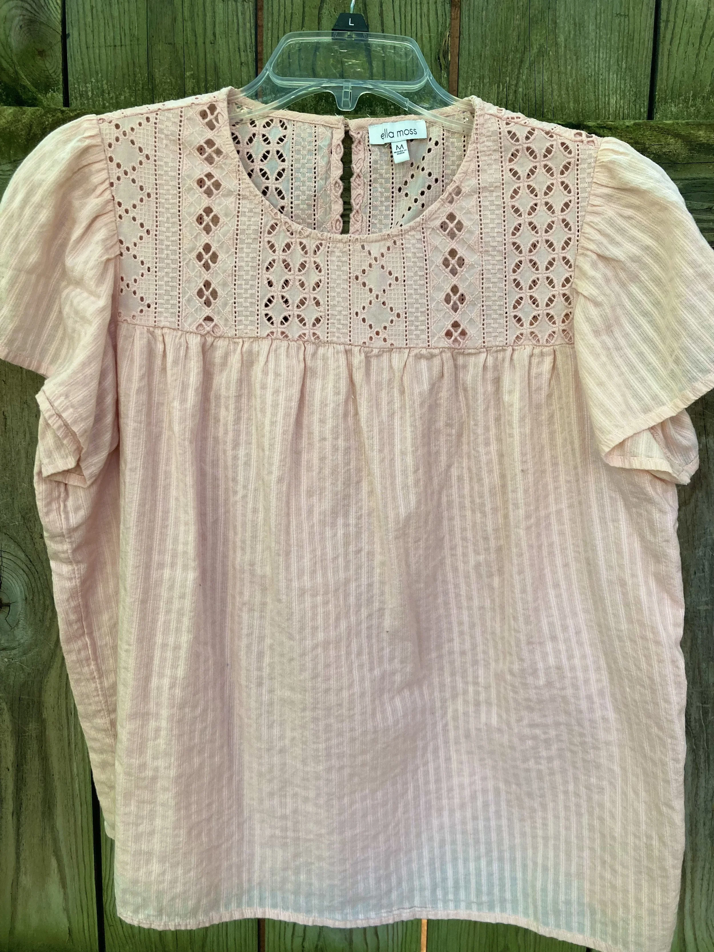
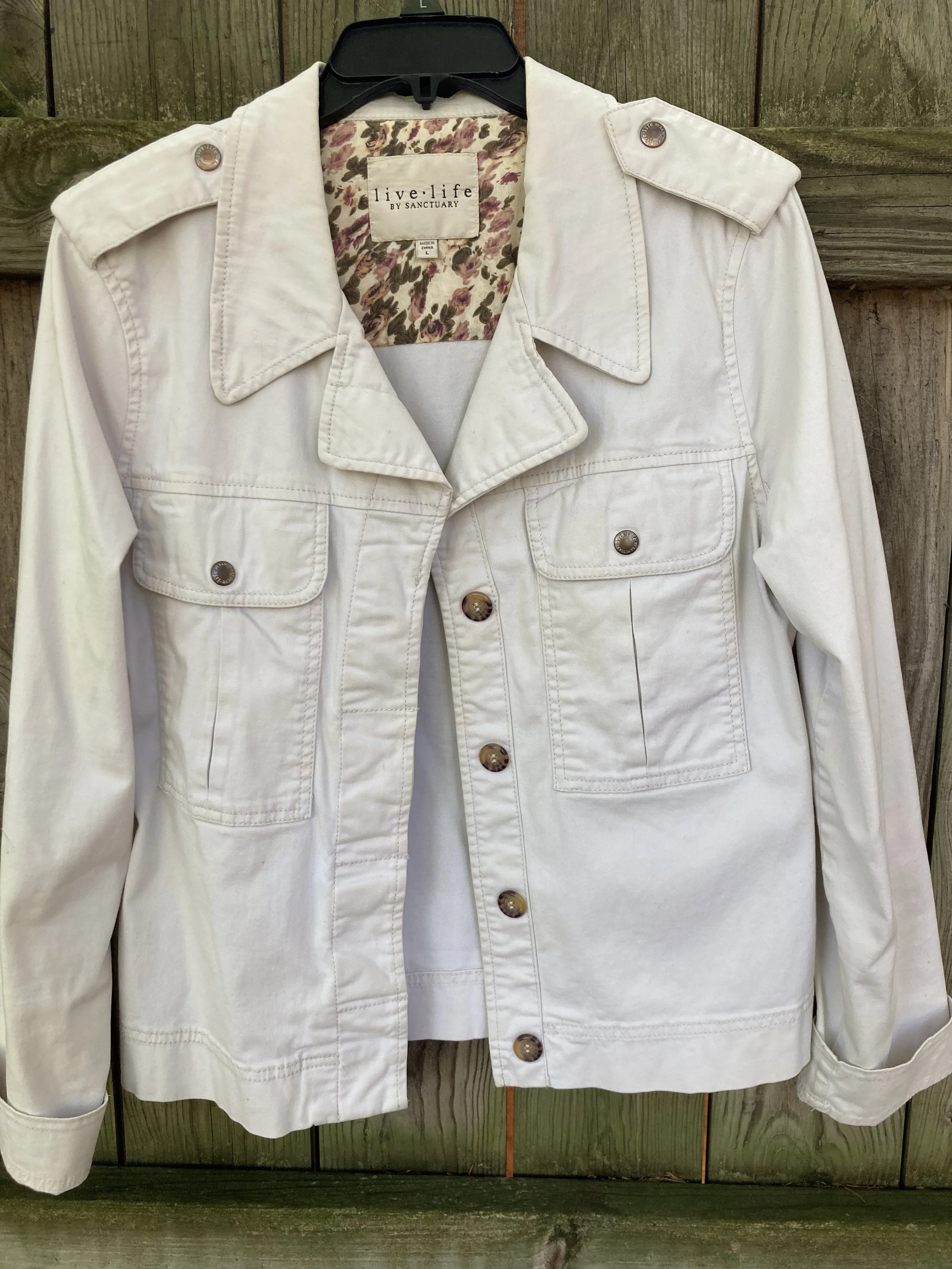
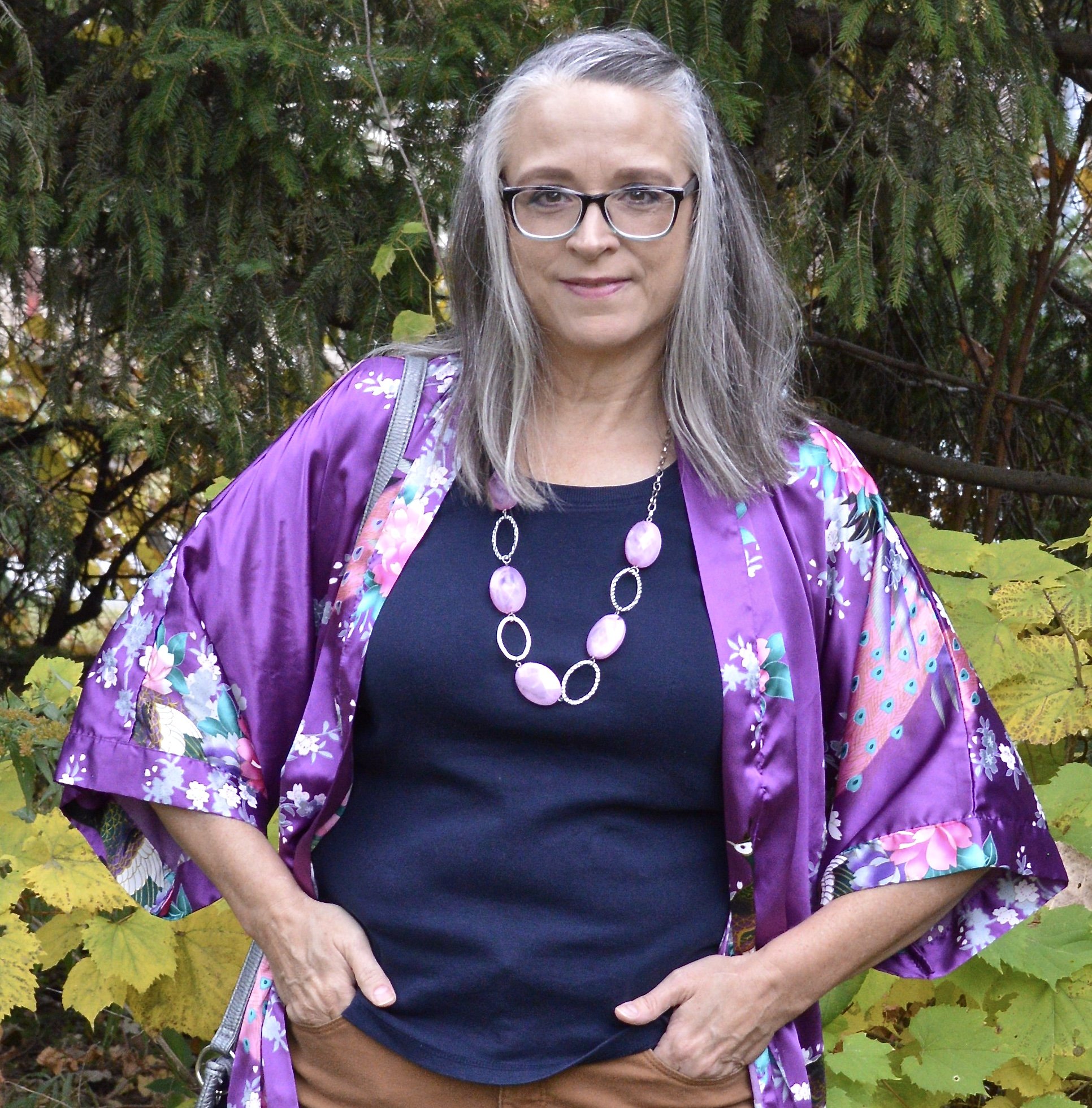
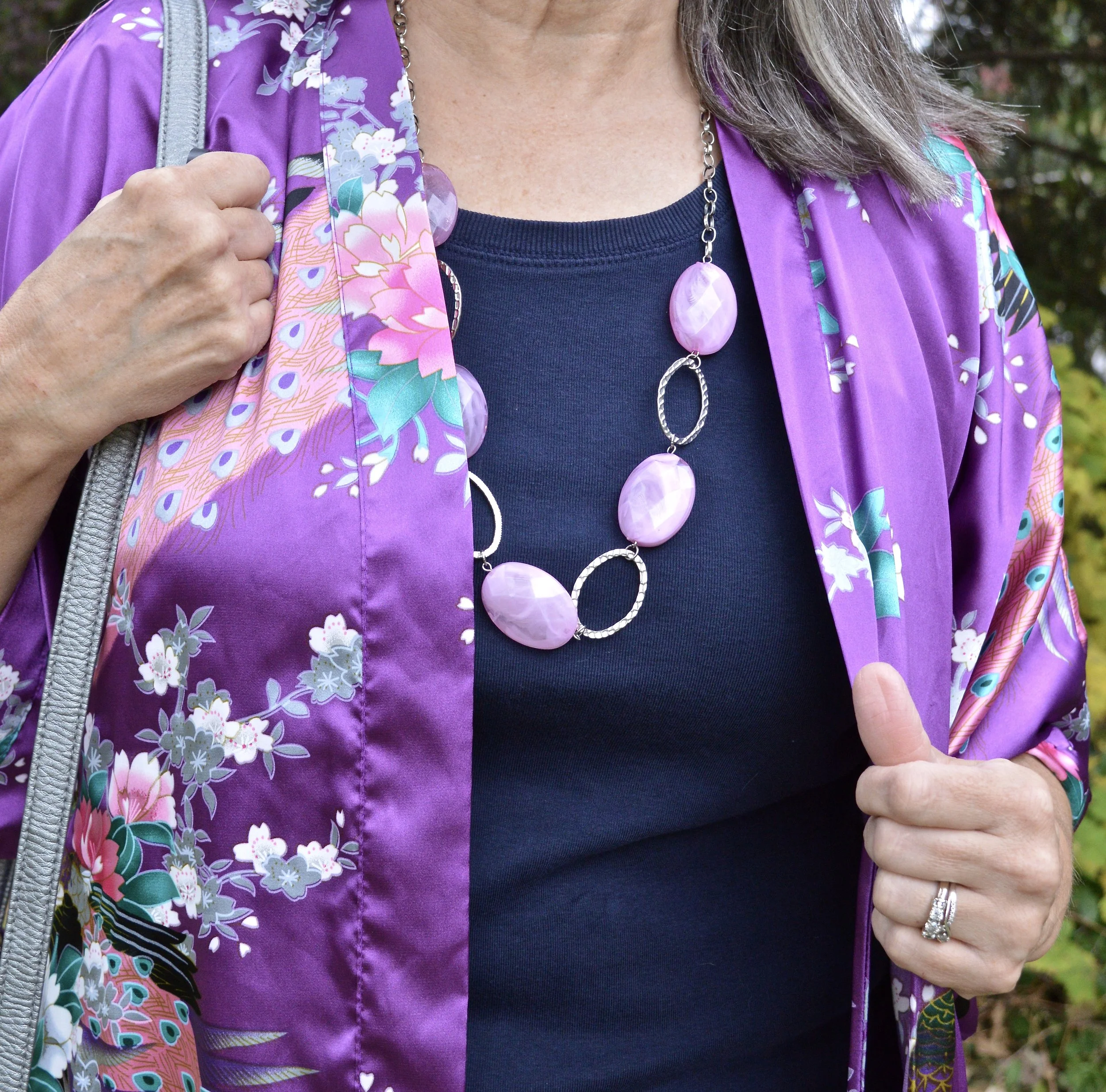
Let’s start with my Cumulous Cloud, Christopher & Banks vest. This medium gray is not a color I reach for very often, but I do have a few pieces that are similar to this color. I think it can be a great neutral, but the medium to light grays have a tendency to wash me out, but I don’t let that keep me from wearing the color, I just try to find other ways to bring more color to my face, like a scarf, or even my makeup scheme. I didn’t do as well with that for this outfit, but I still like how this look turned out.

Why I Like It: I have always been a vest girl, and while I am not thrilled with the color, I do love the texture on the front of this piece. It is also a perfect neutral to pair with many other pieces and colors.

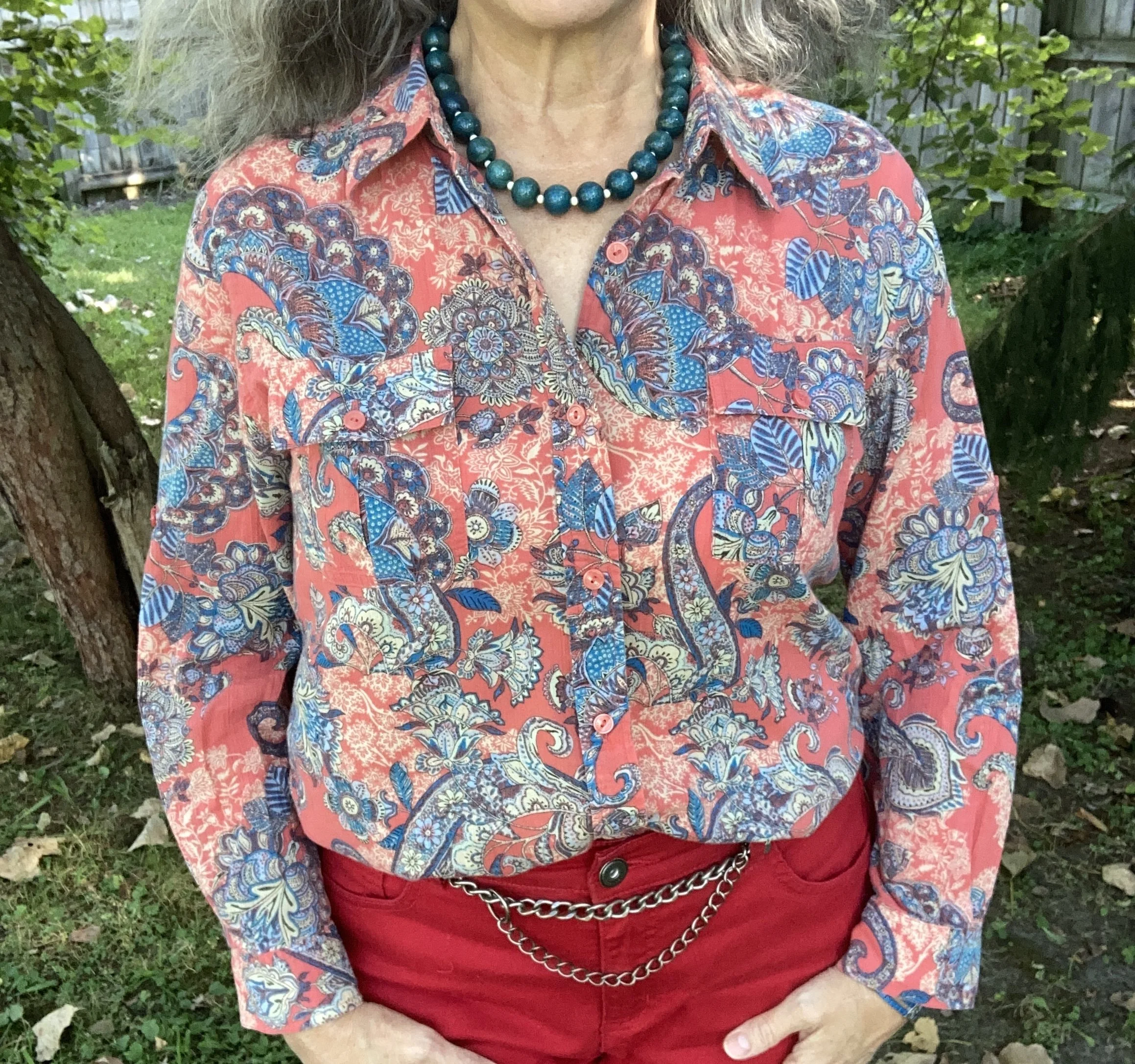
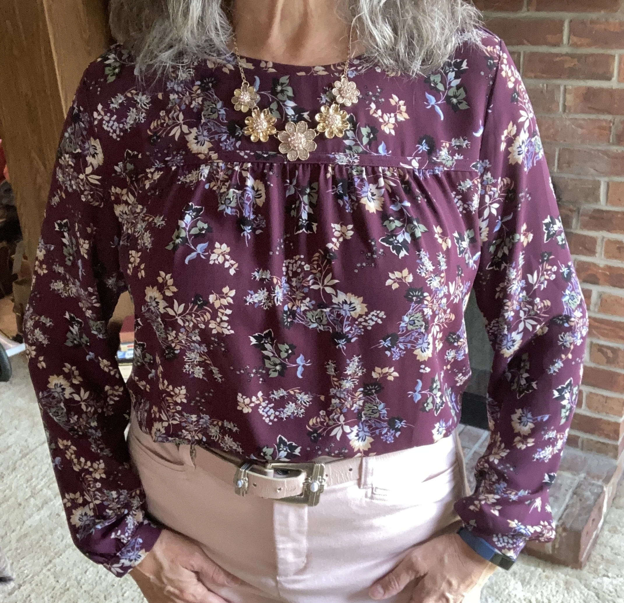
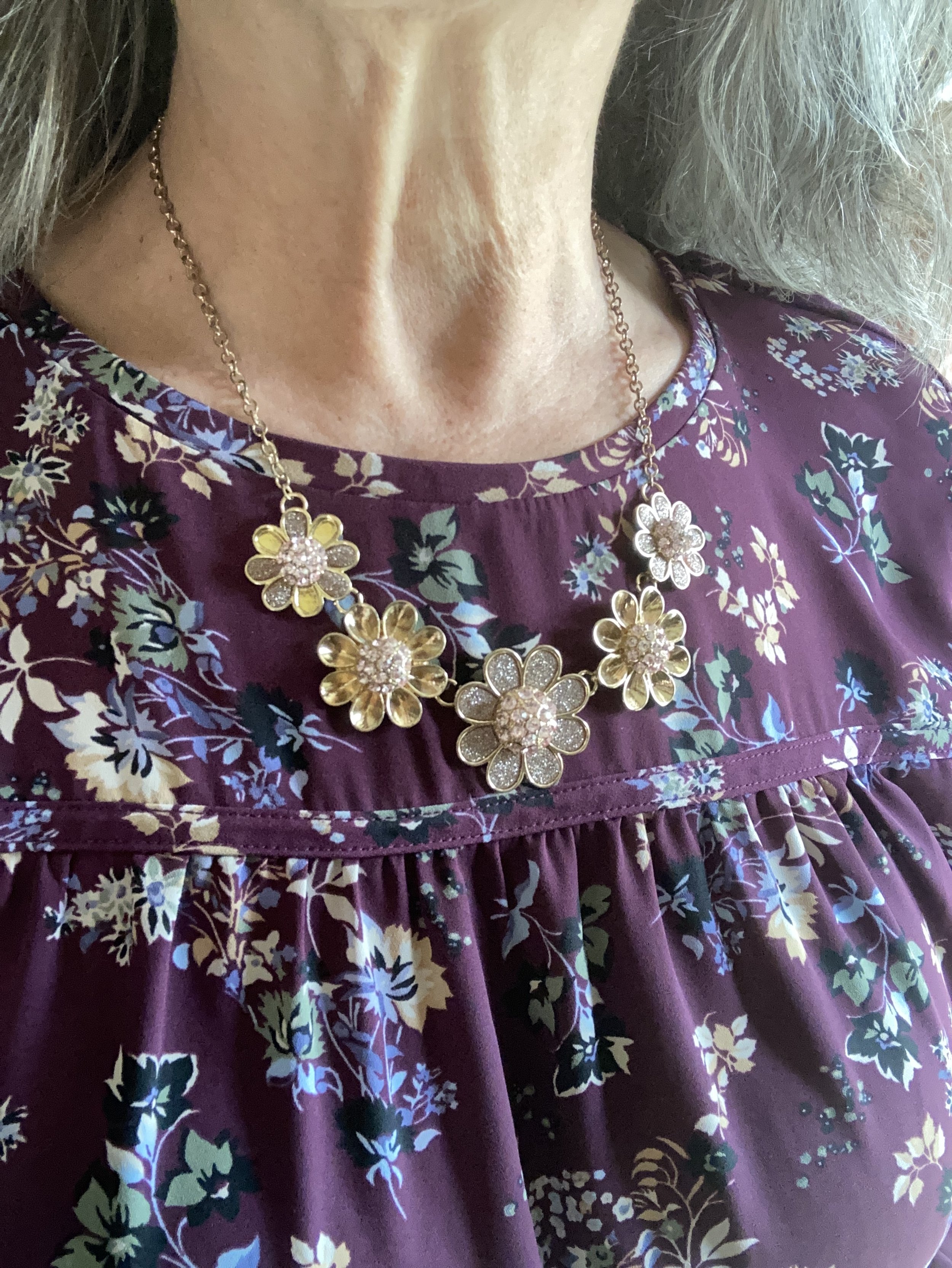
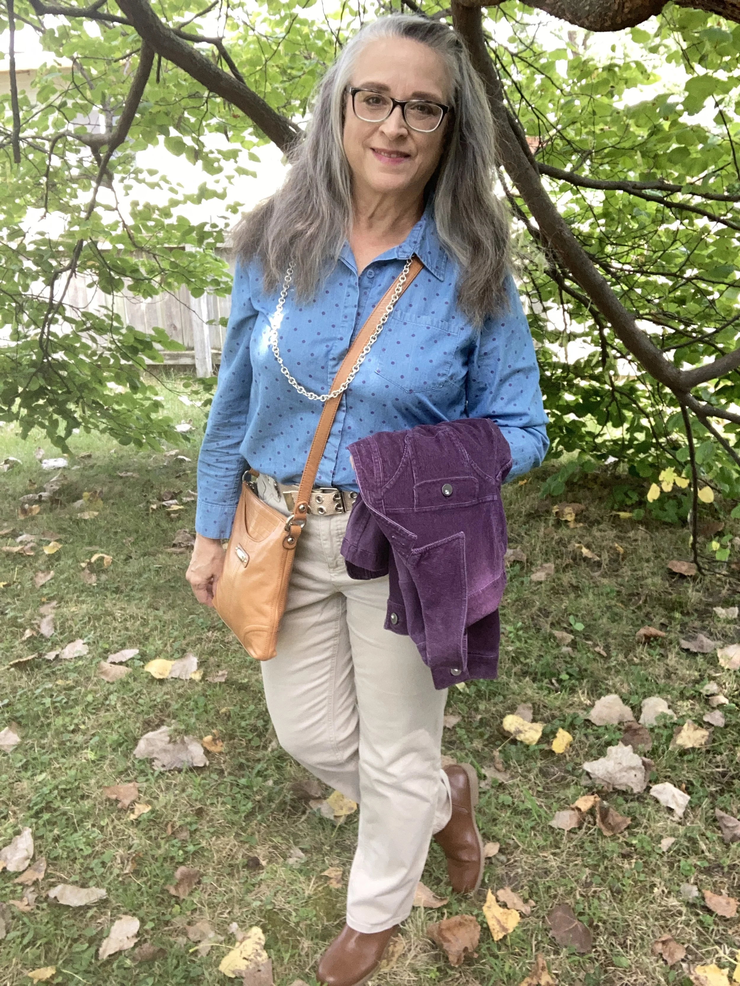
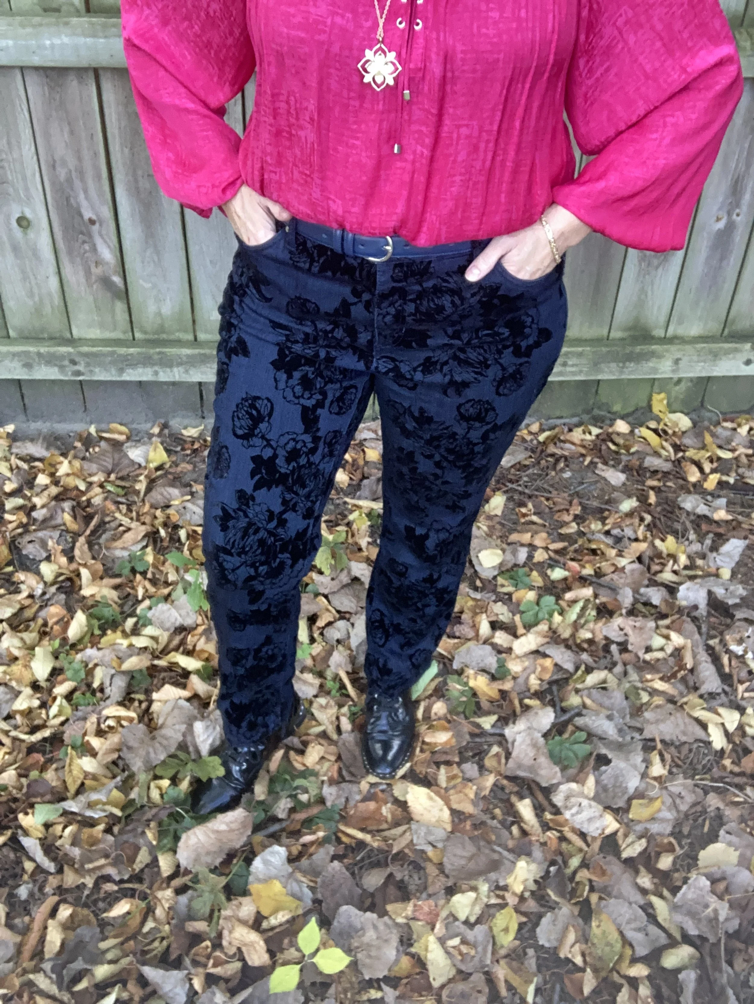
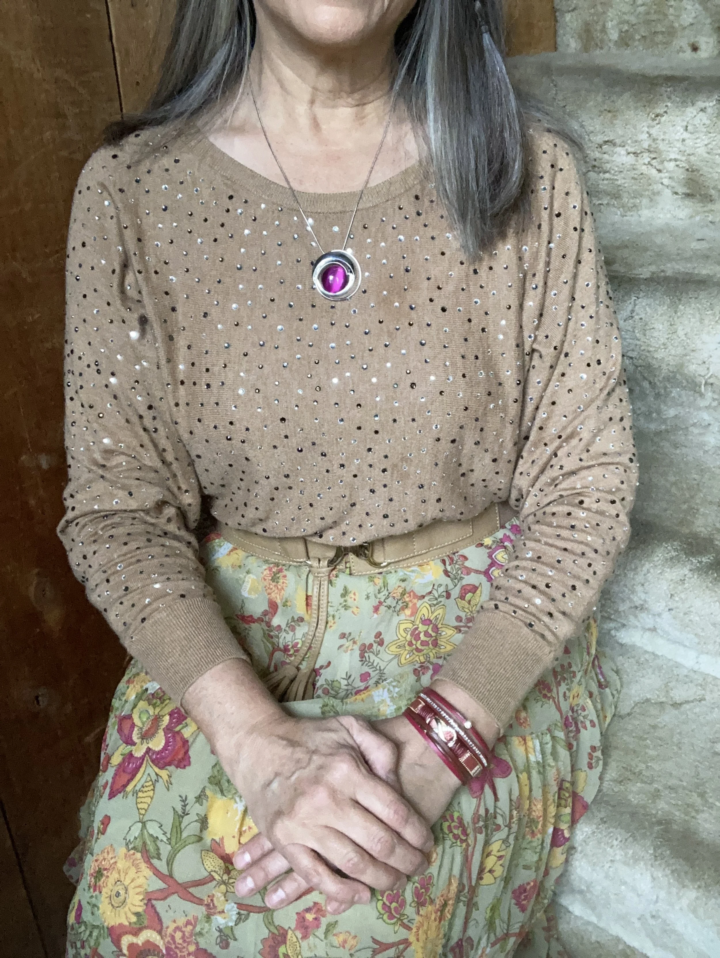
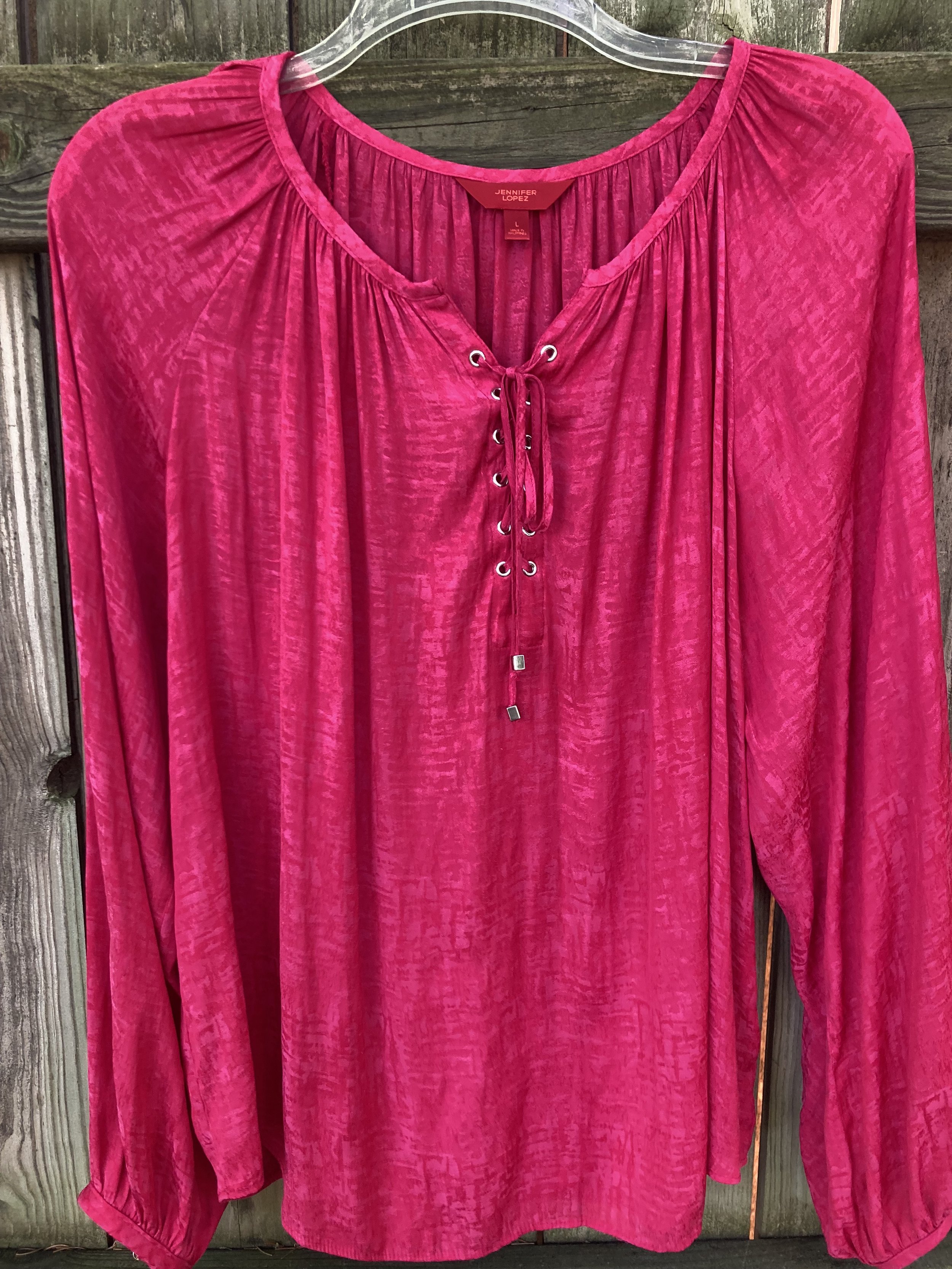
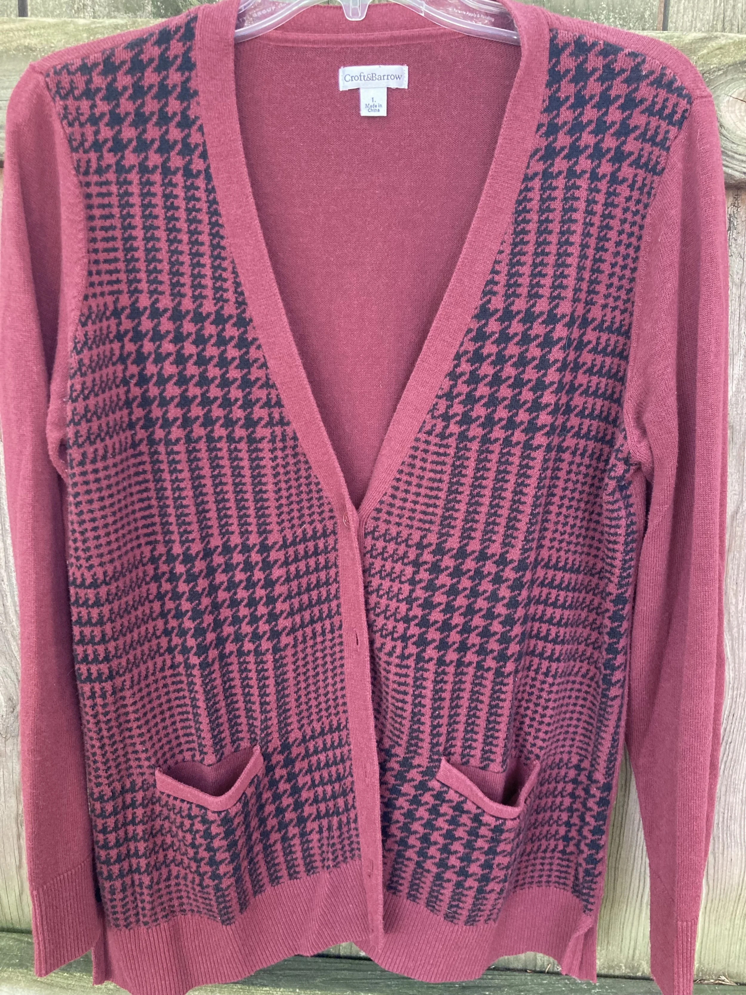
My Fig button down is a thrifted Van Heusen men’s shirt. I probably could have found a shirt that was closer to the almost reddish purple, but I ran out of steam. Burgundy might be a better choice.

Why I Like It: It’s purple, what other reason do I need? Ha, ha. There is something about the simplicity of a man’s button down. There’s no lace, no texture, just a basic shirt with a nice pattern. Sometimes simple, masculinity is a nice change from feminine frills.

This color was not popular on my affiliate website, so you are on you own for finding dark purple pieces. If you do a Google search there are a things that pop up.

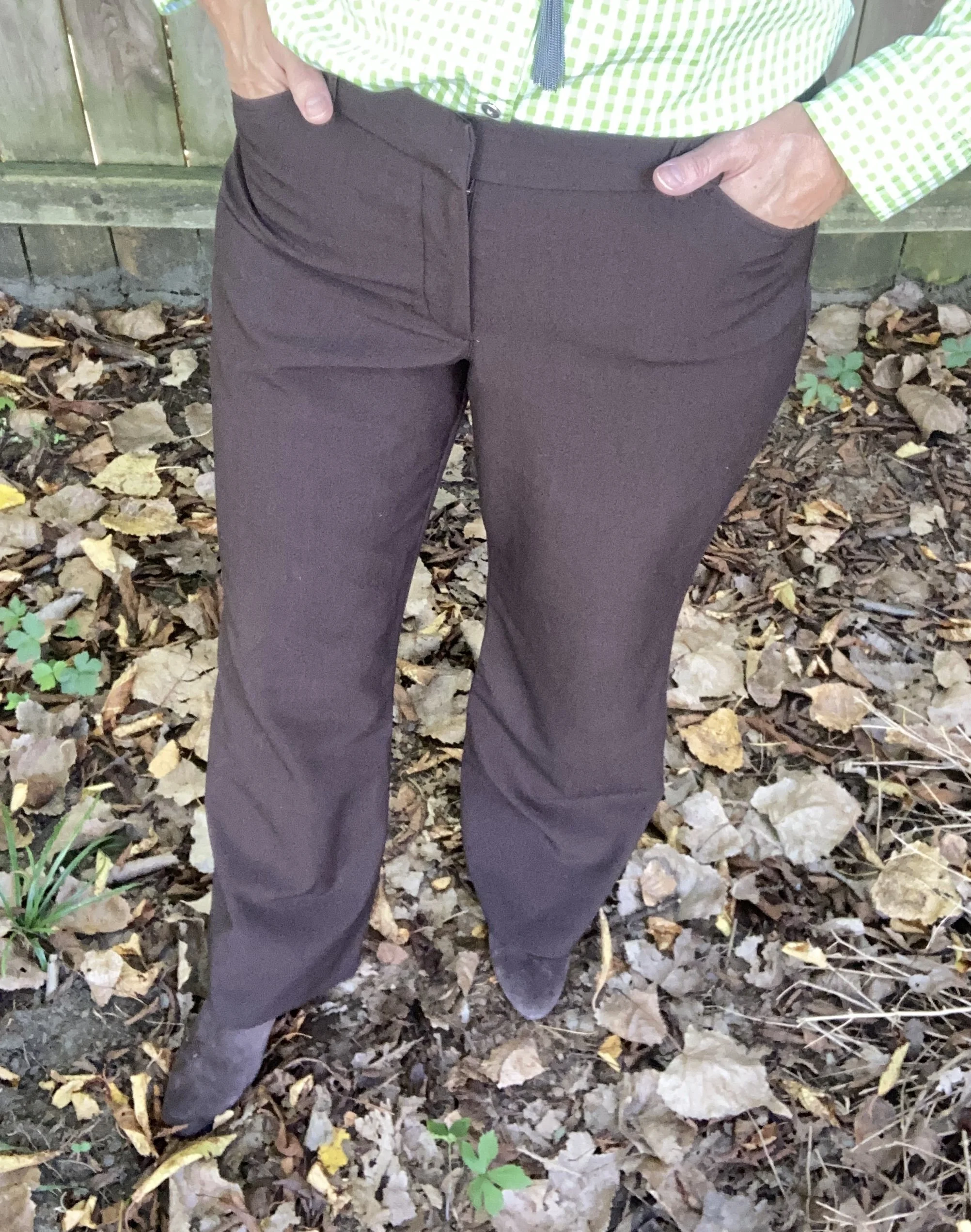
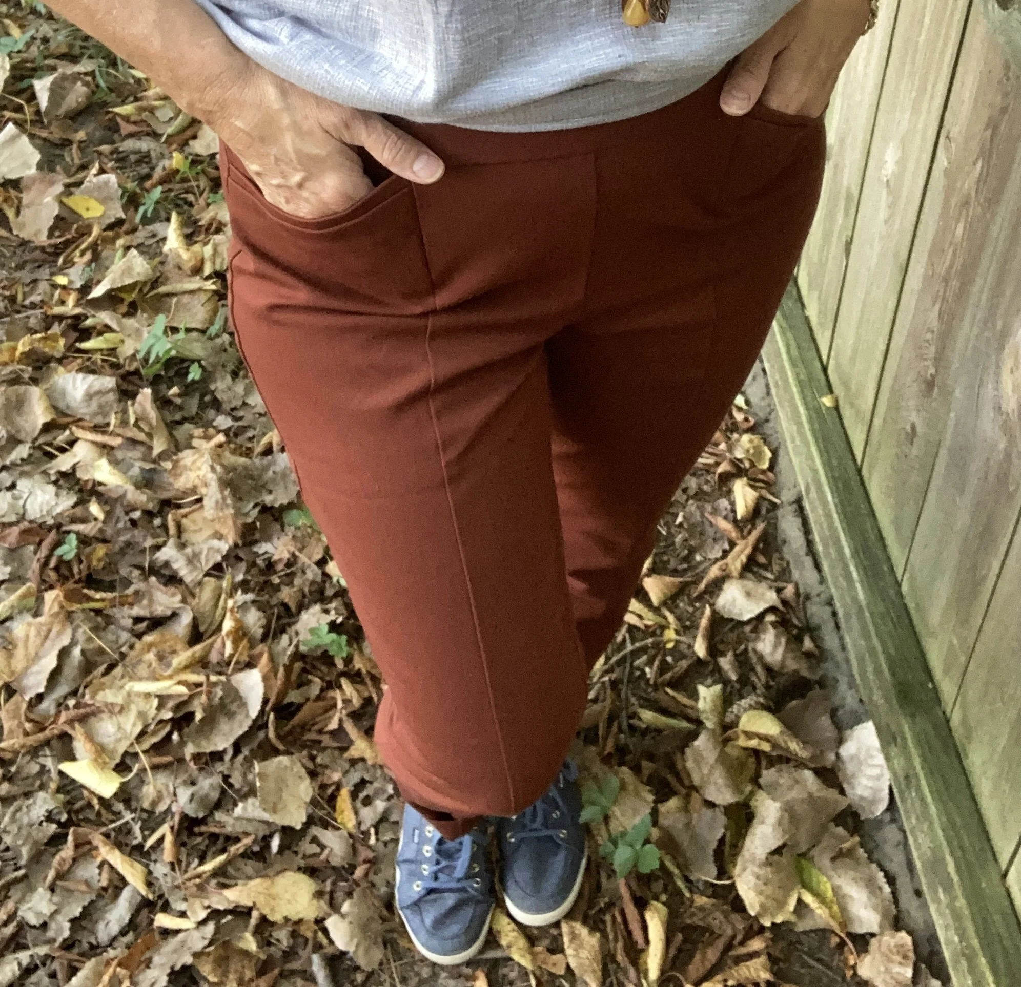
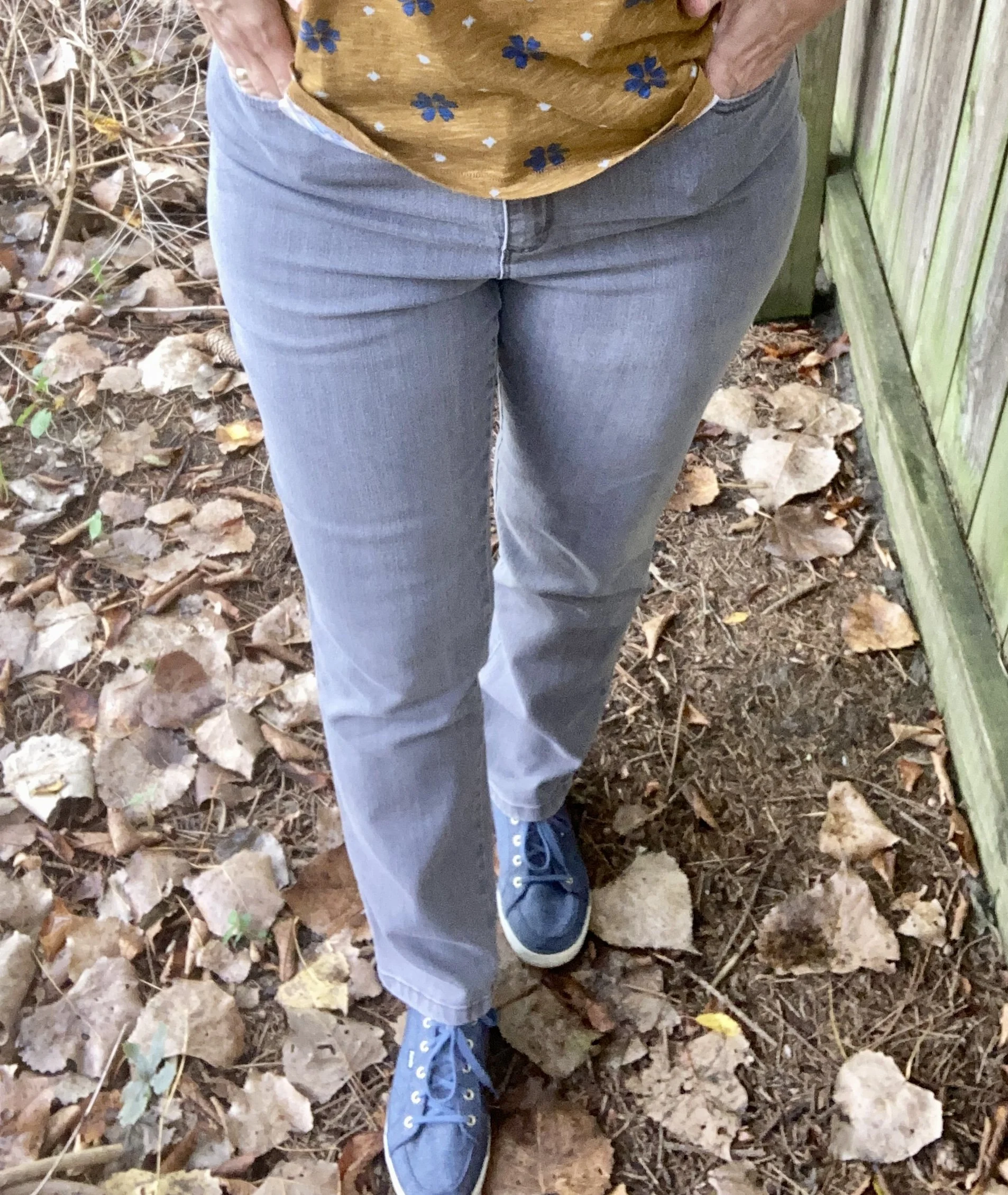
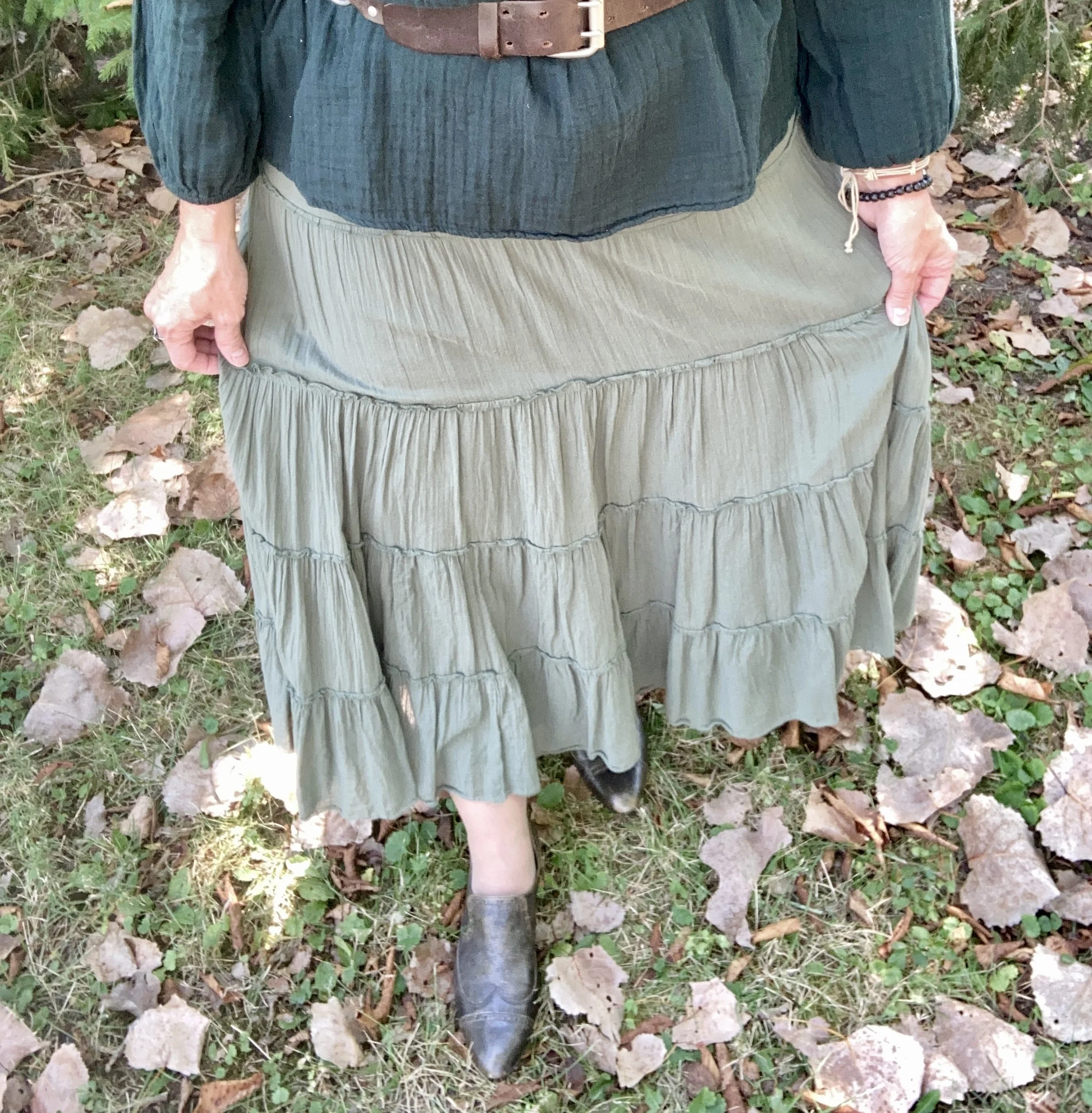
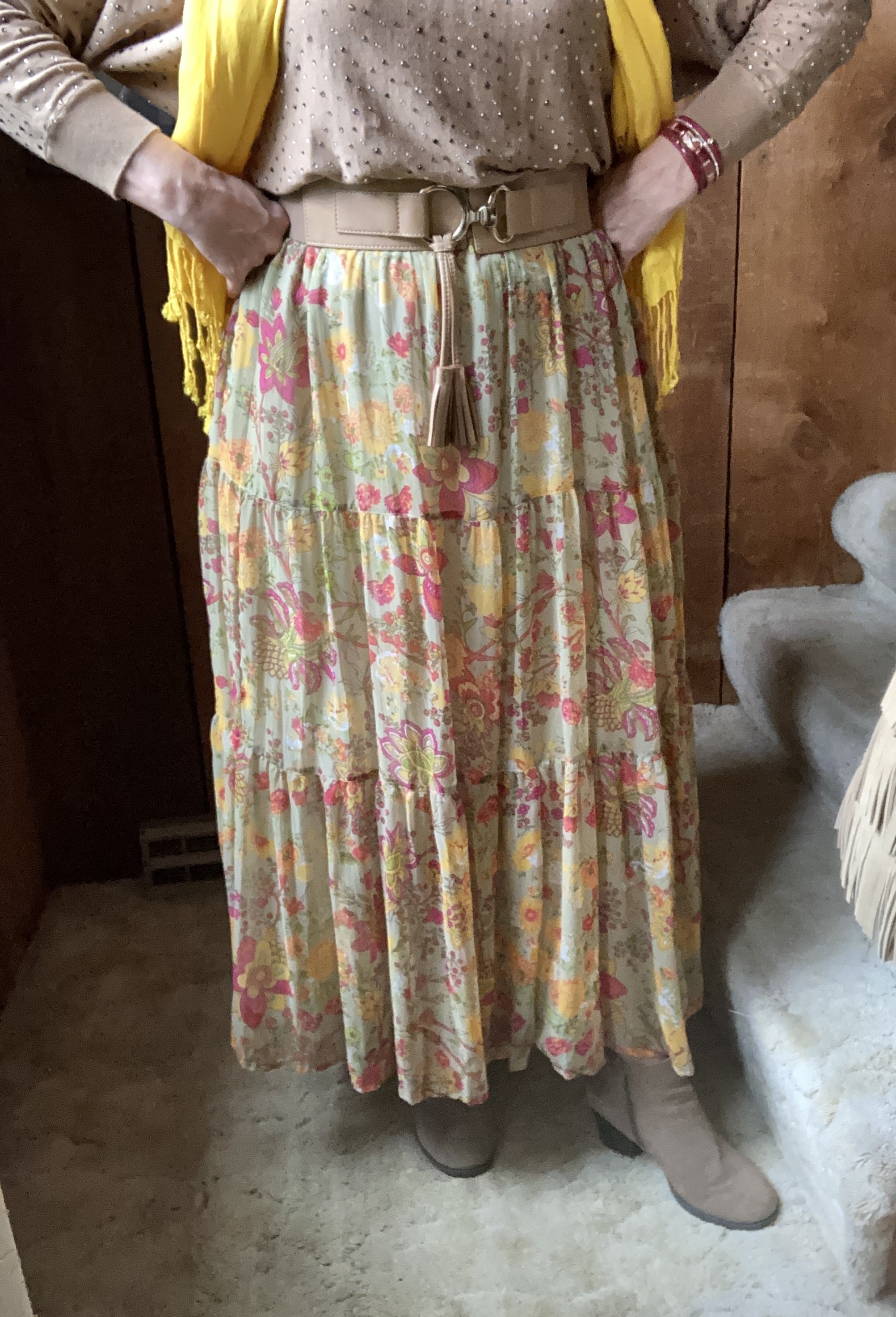
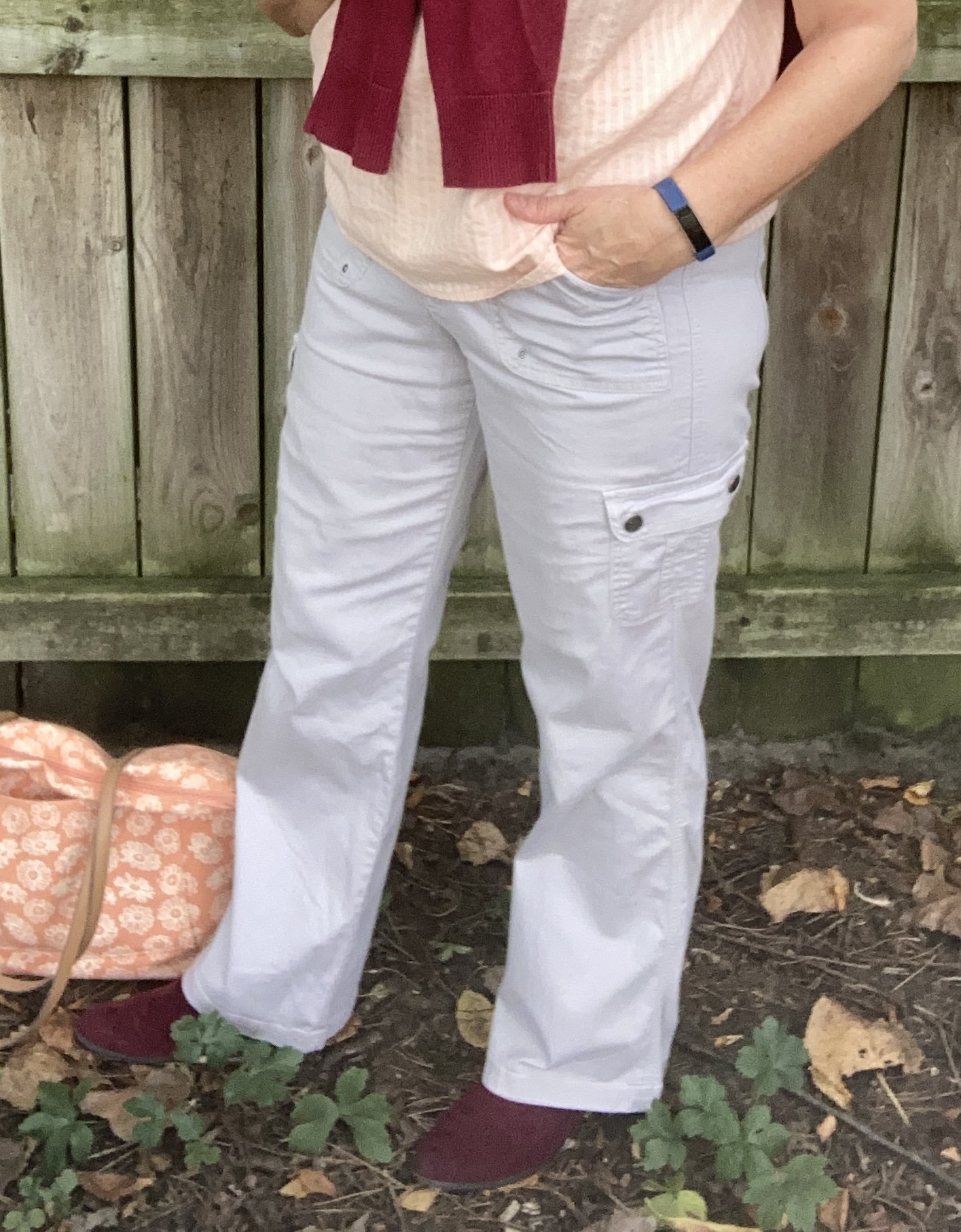
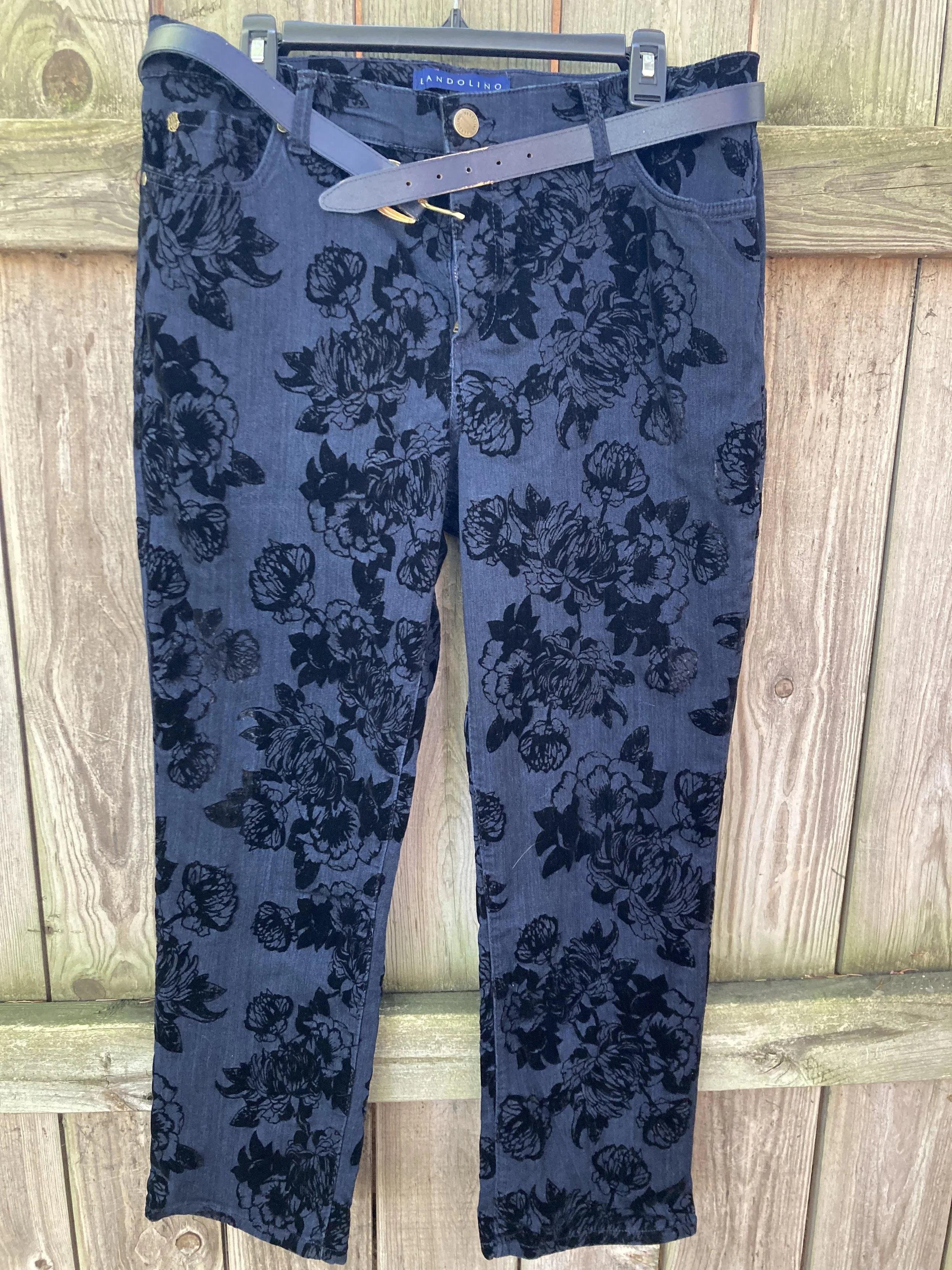
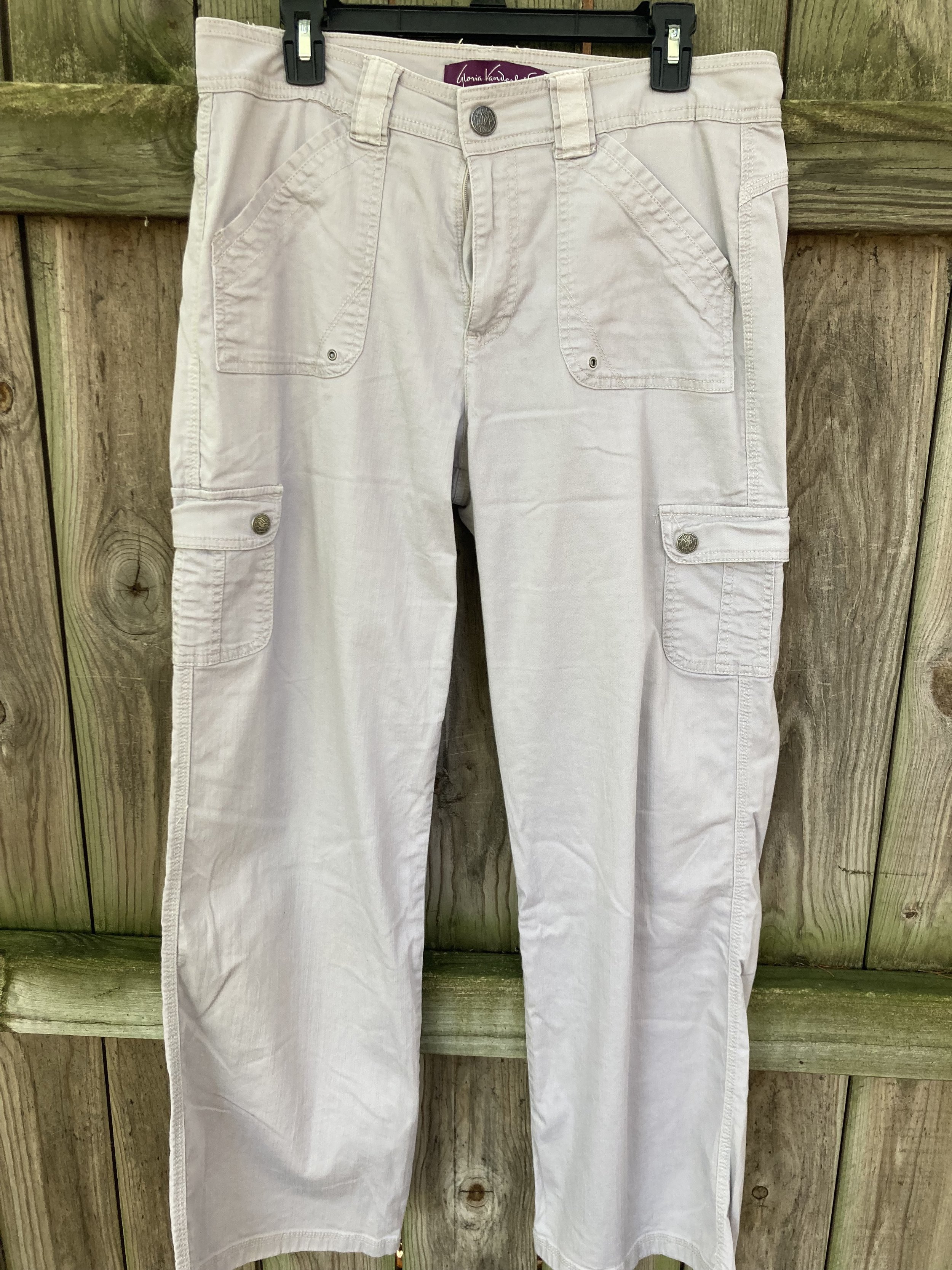
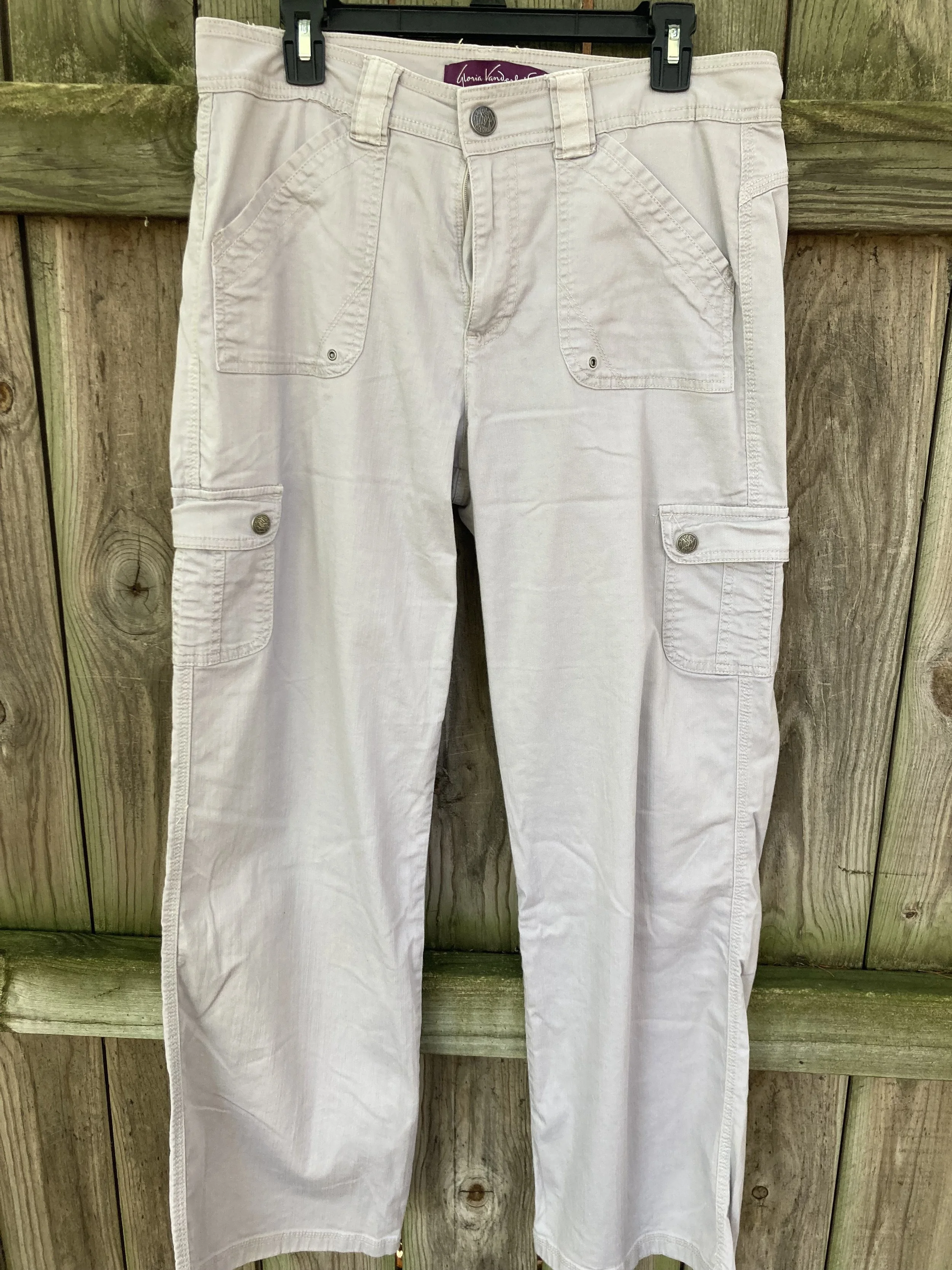
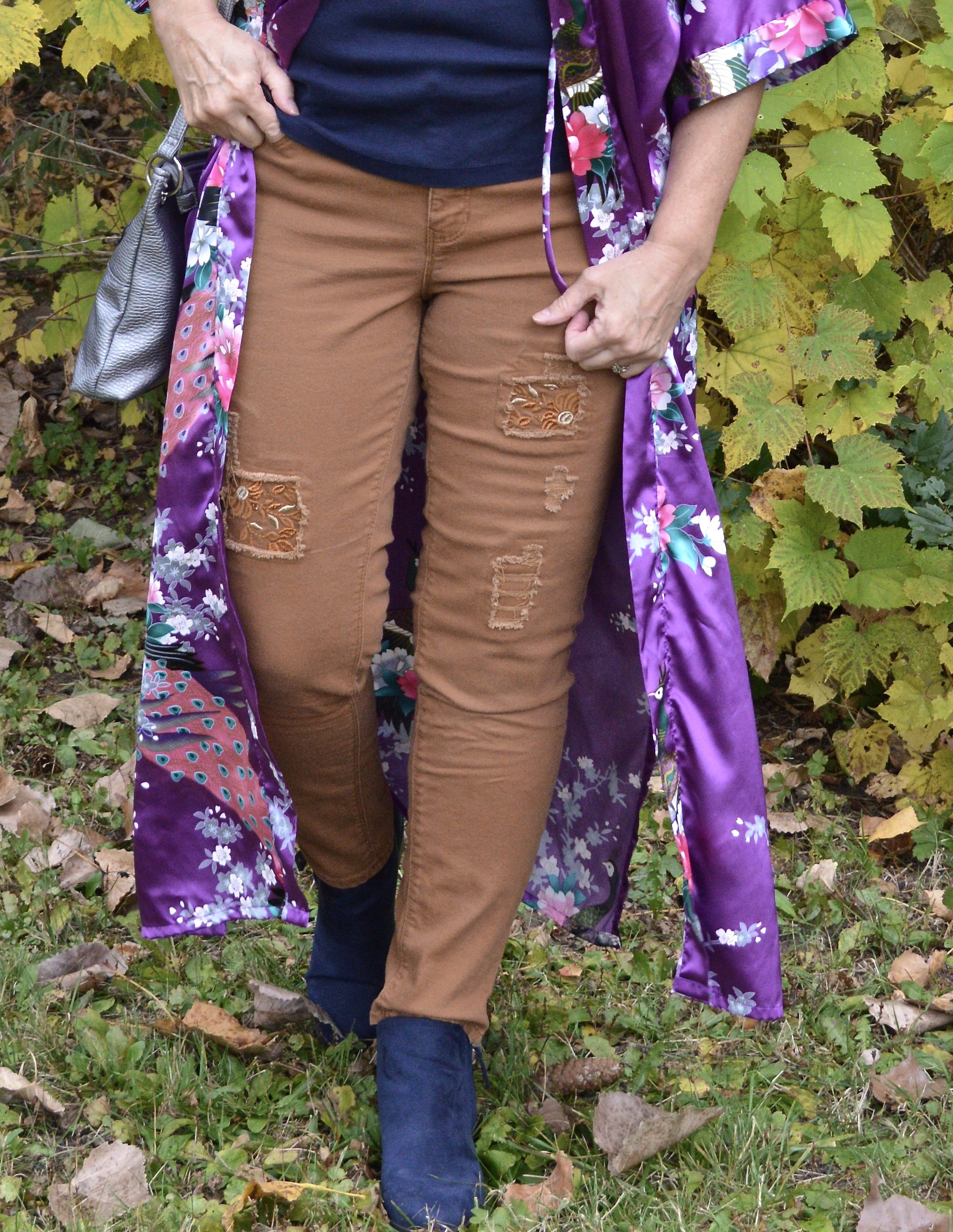
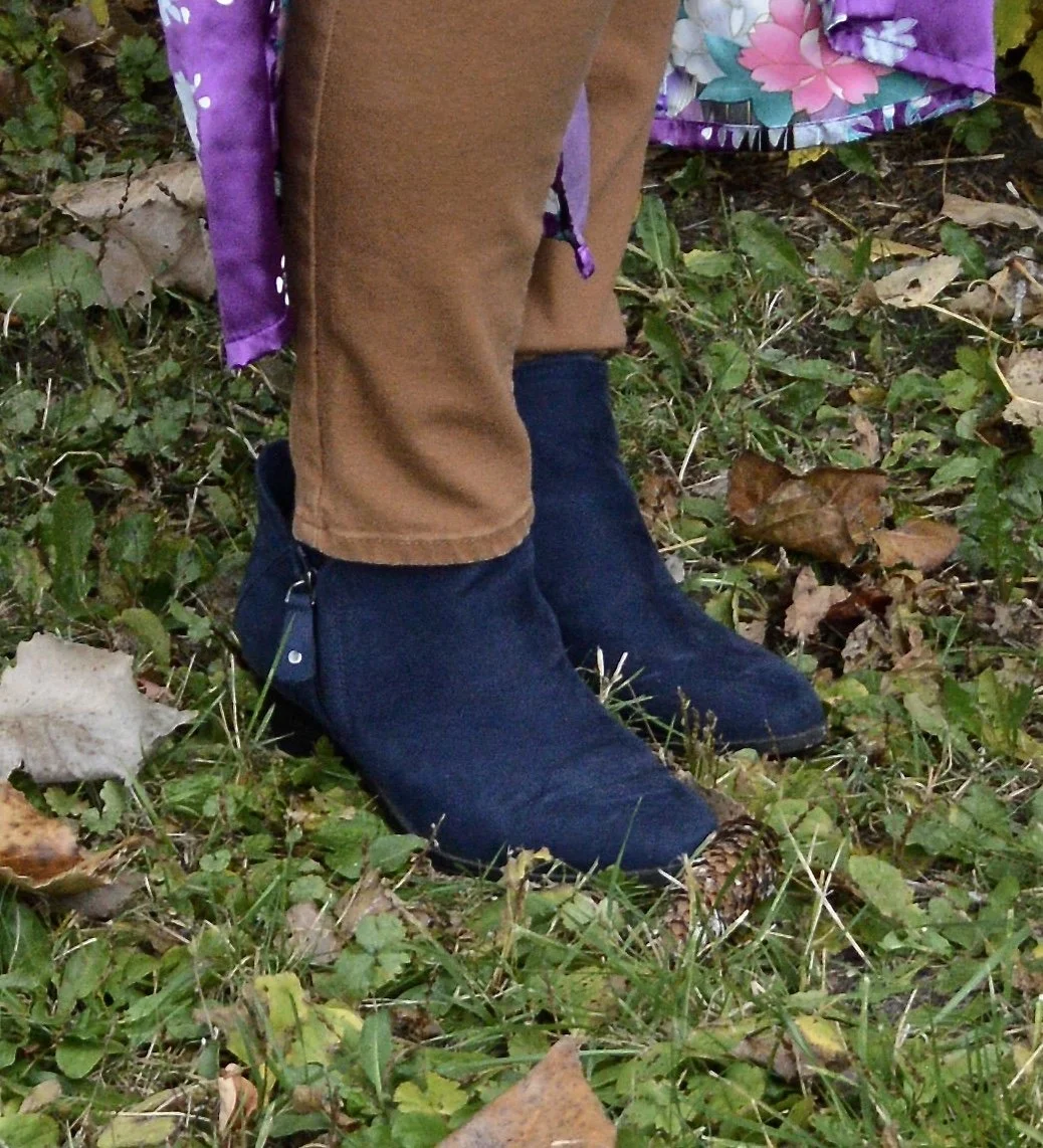
Next up is the color Hot Chocolate. This color was on the New York Palette (you can see that post here), and these thrifted SO jeans are a little light, but again, it is what was closest in my closet.

Why I Like It: I have always liked the casual vibe of a utility pant, coat or vest. The fact that these are also jeans makes it even more fun, plus I was thrilled to find jeans in a different color. Any brown pants I have are dress pants.

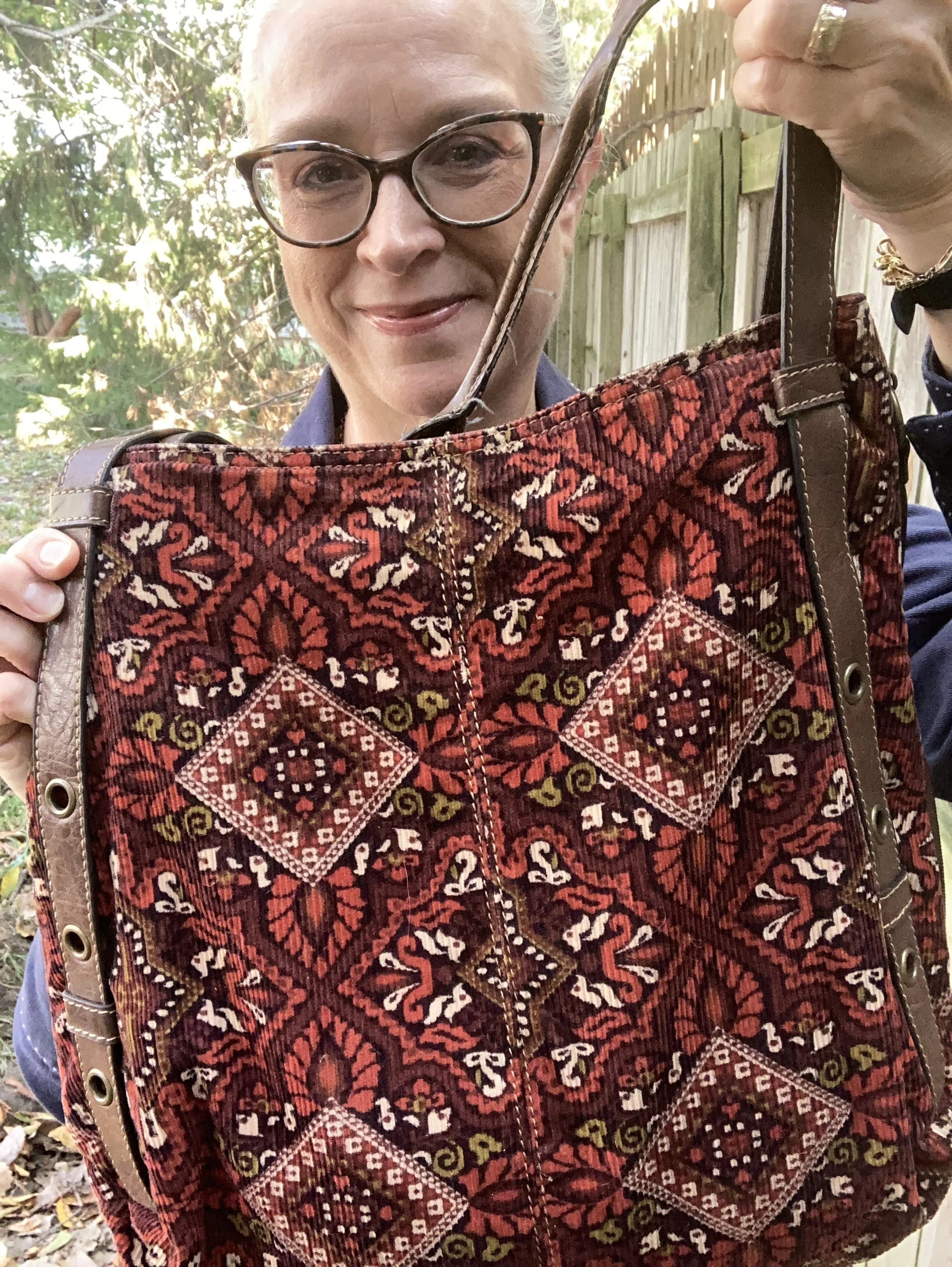
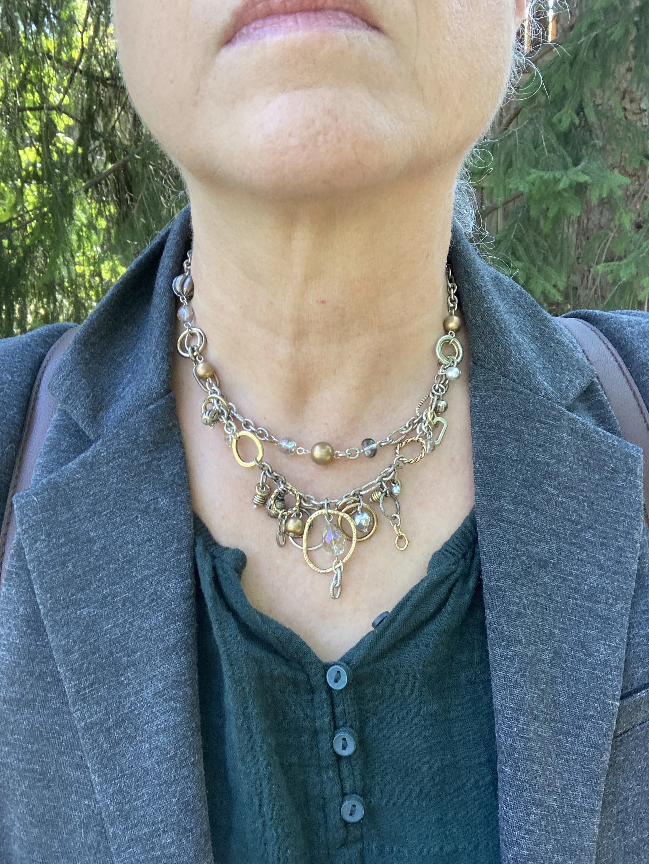
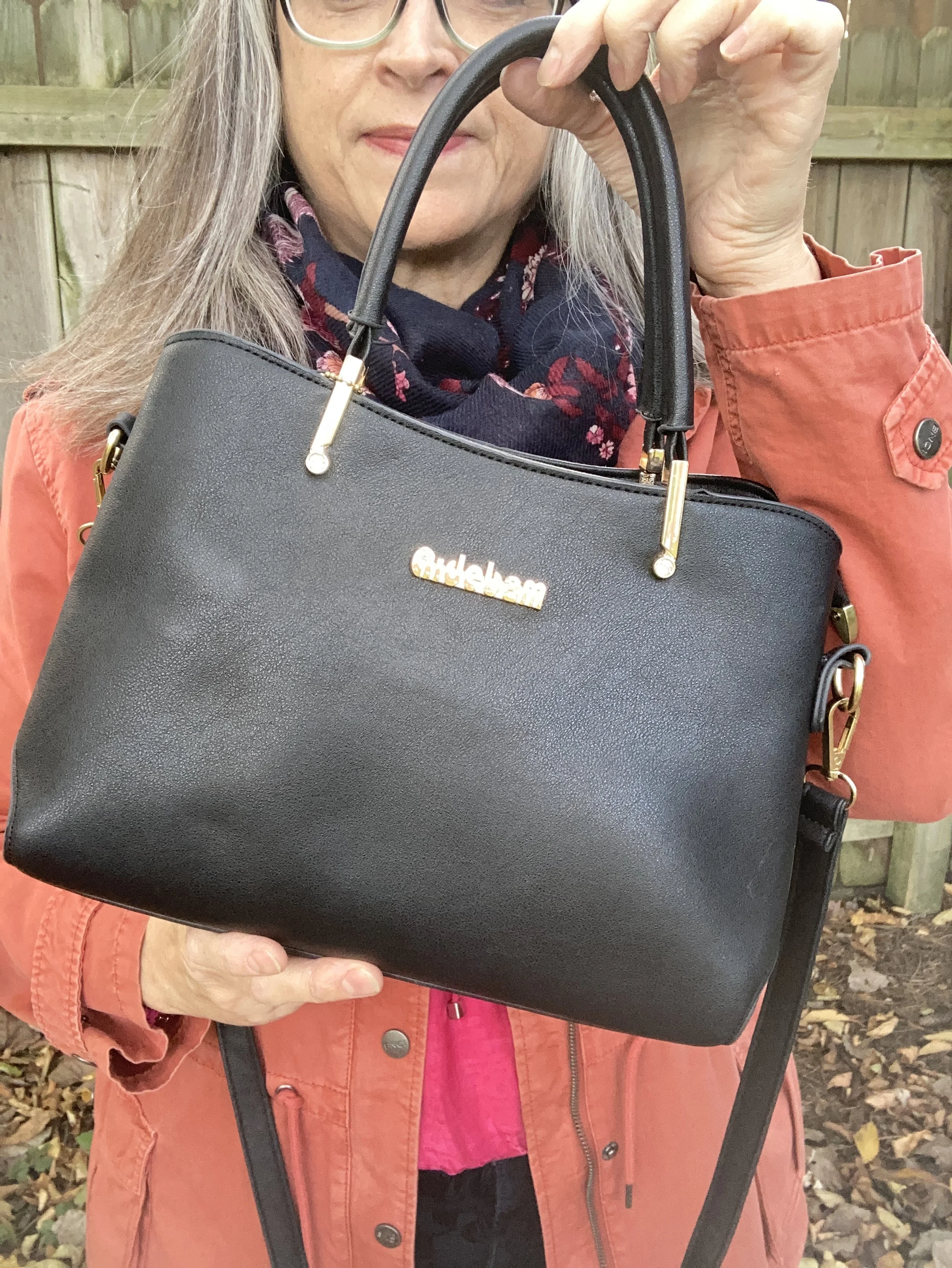
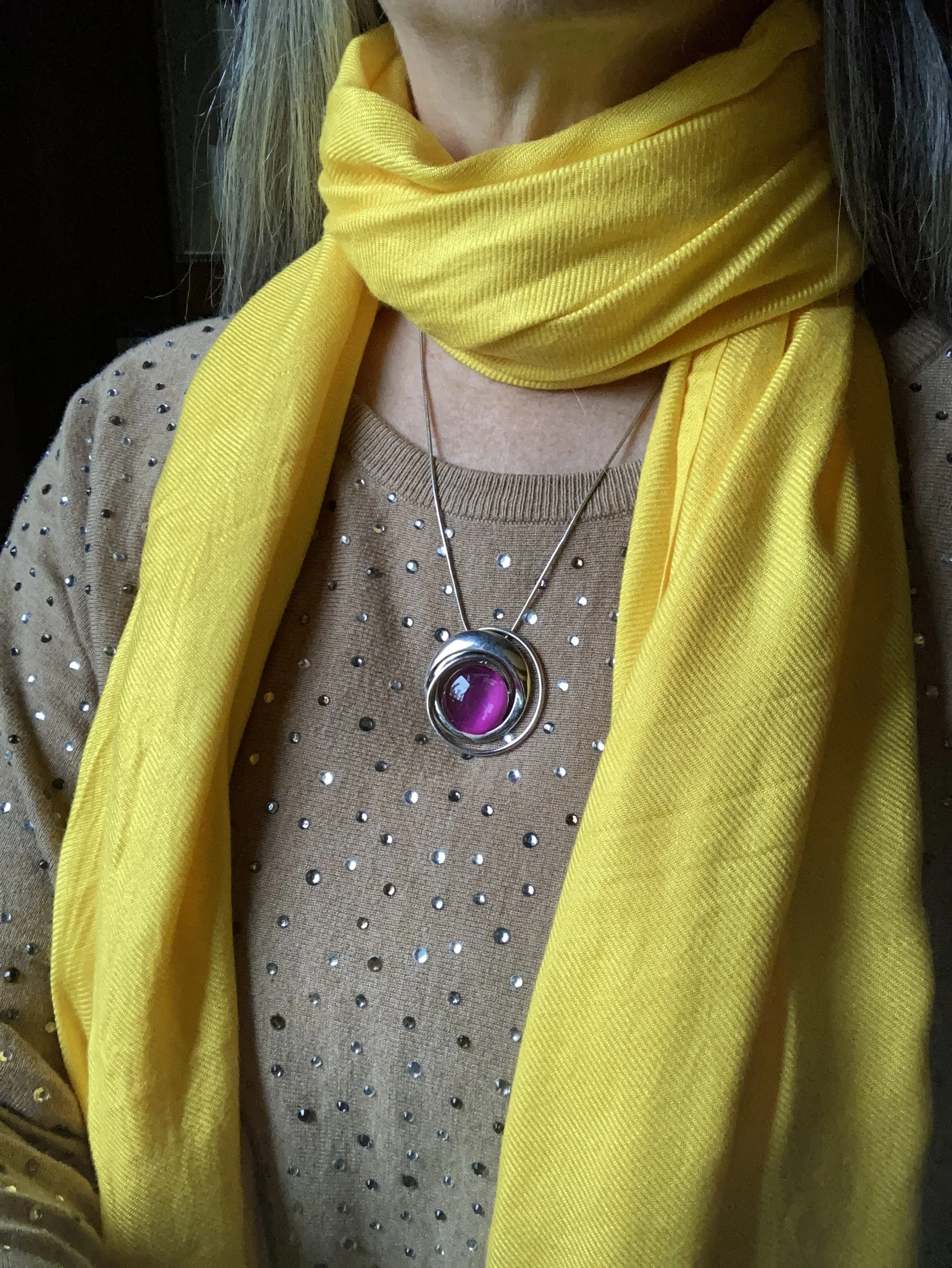
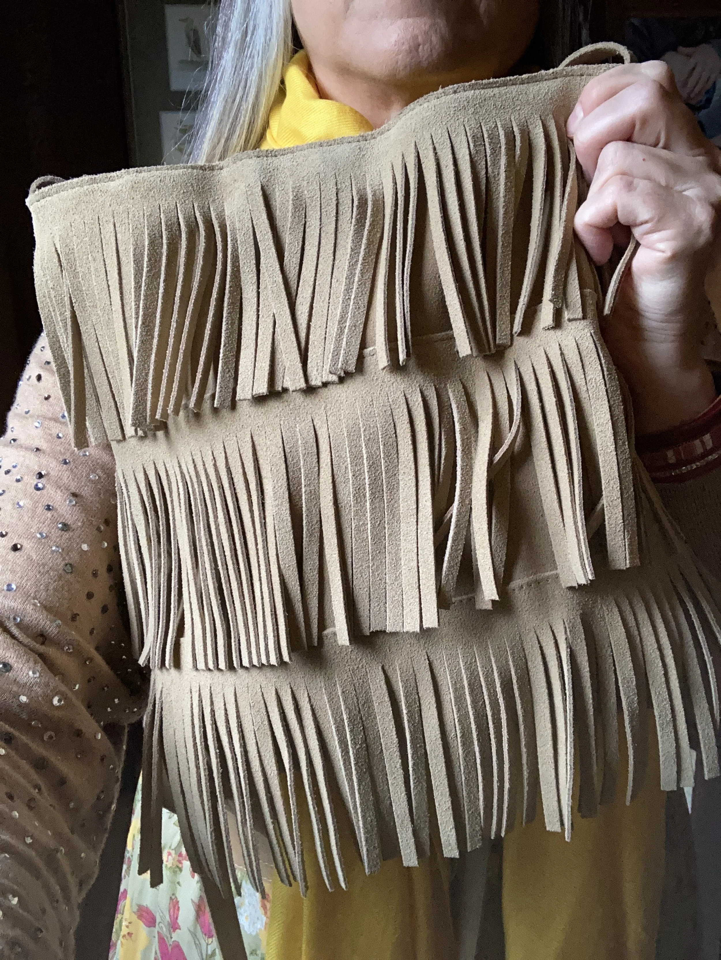
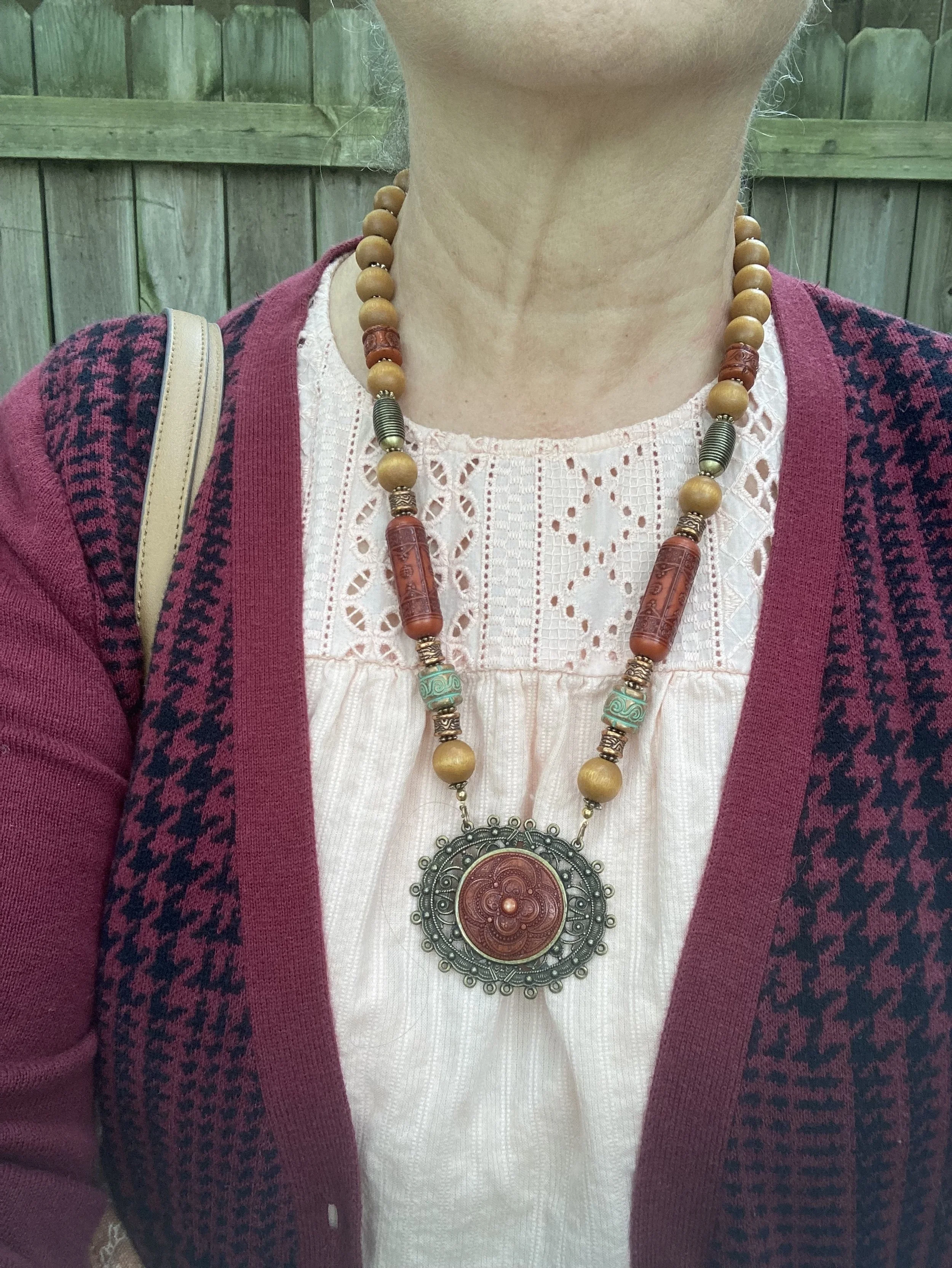
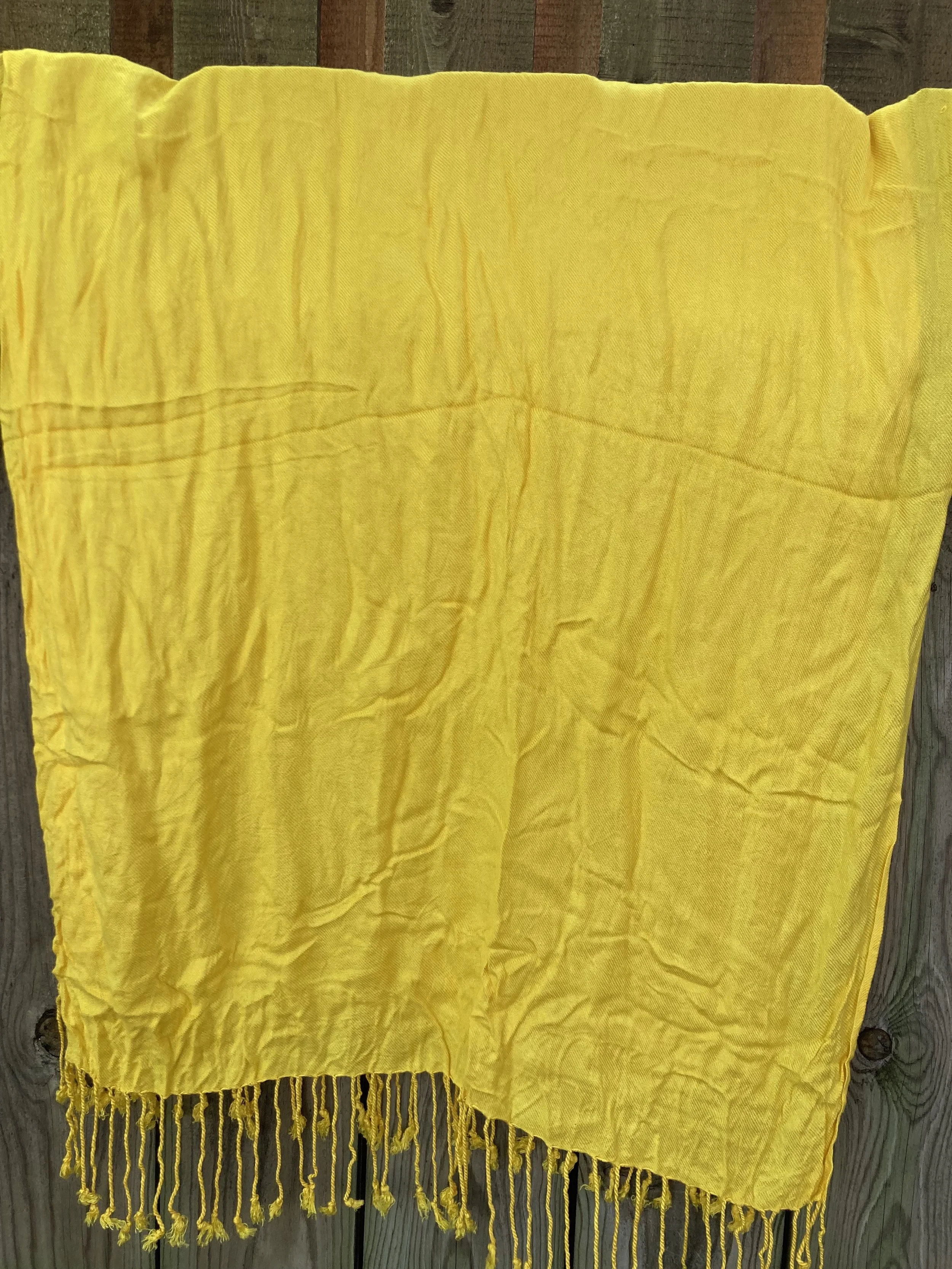
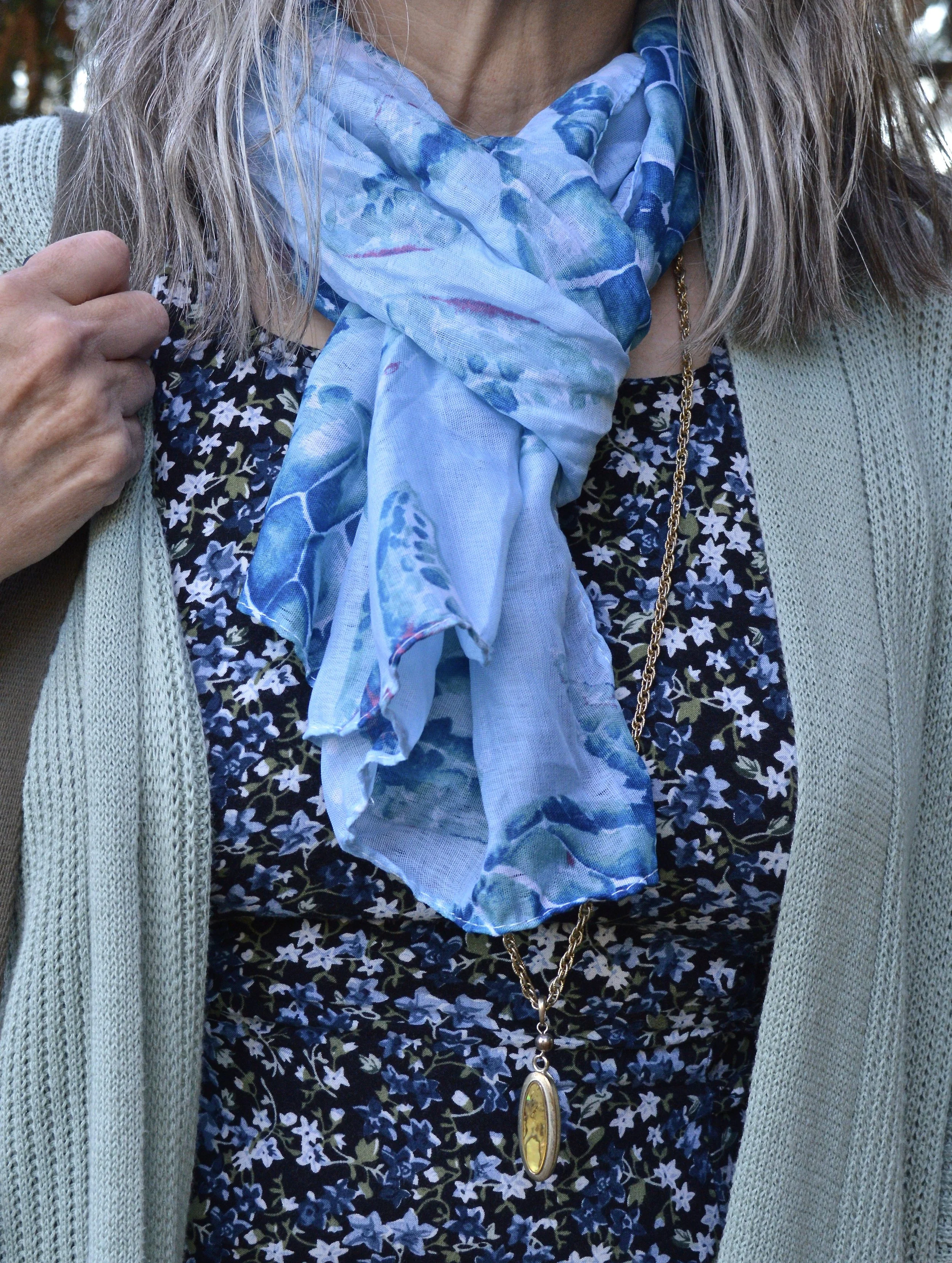
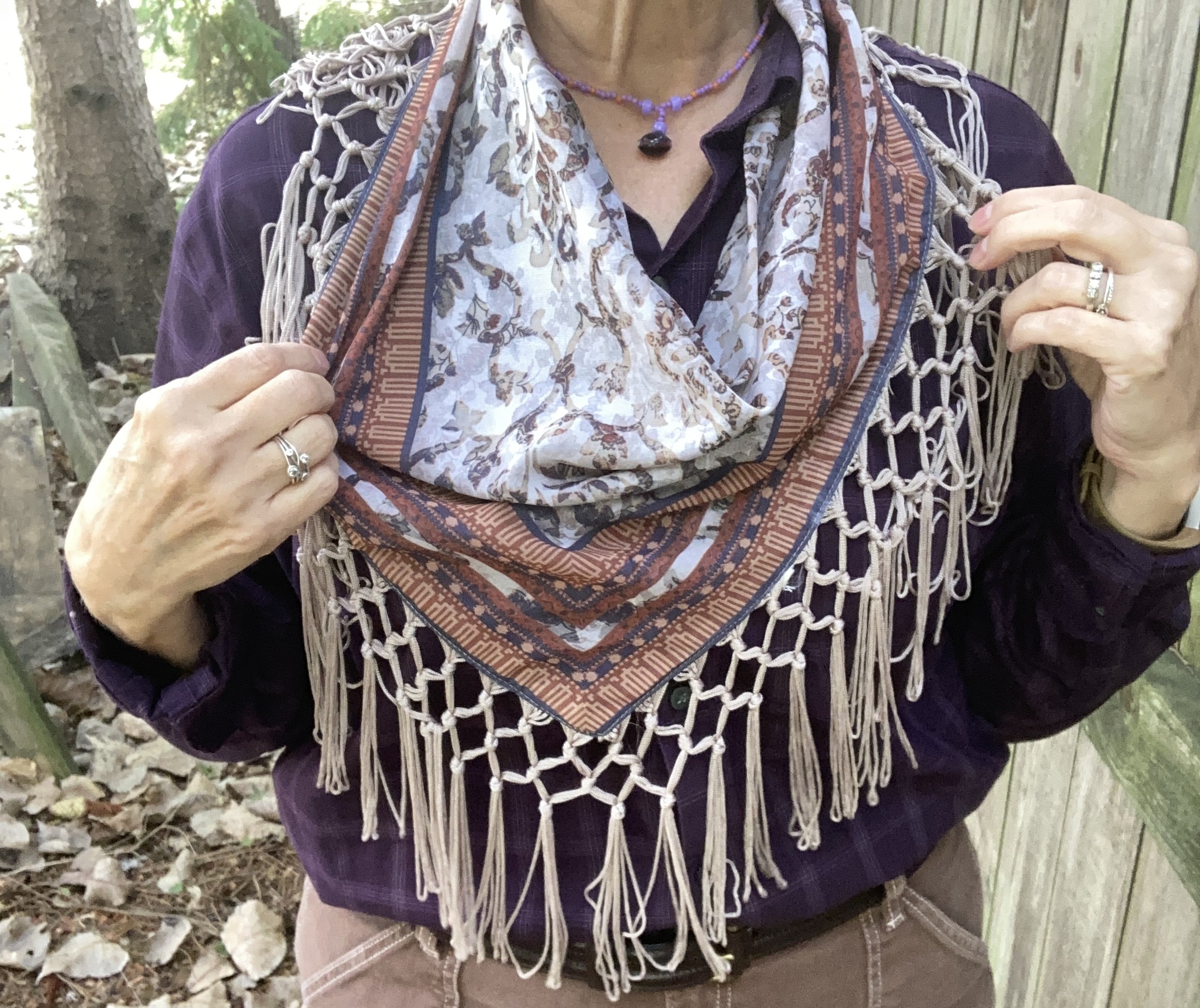
I tried this look with several iterations of layered necklaces, but it just wasn’t working. Finally, I started going through my scarves and immediately knew this thrifted piece was the perfect accompaniment.

Why I Like It: I specifically liked it for this outfit due to the inclusion of every color - Cumulous Cloud, Hot Chocolate and Fig. I think it pulls the whole look together. I bought it because it is different. It is not the traditional square or oblong scarf, and it has that beautiful fringe detail.

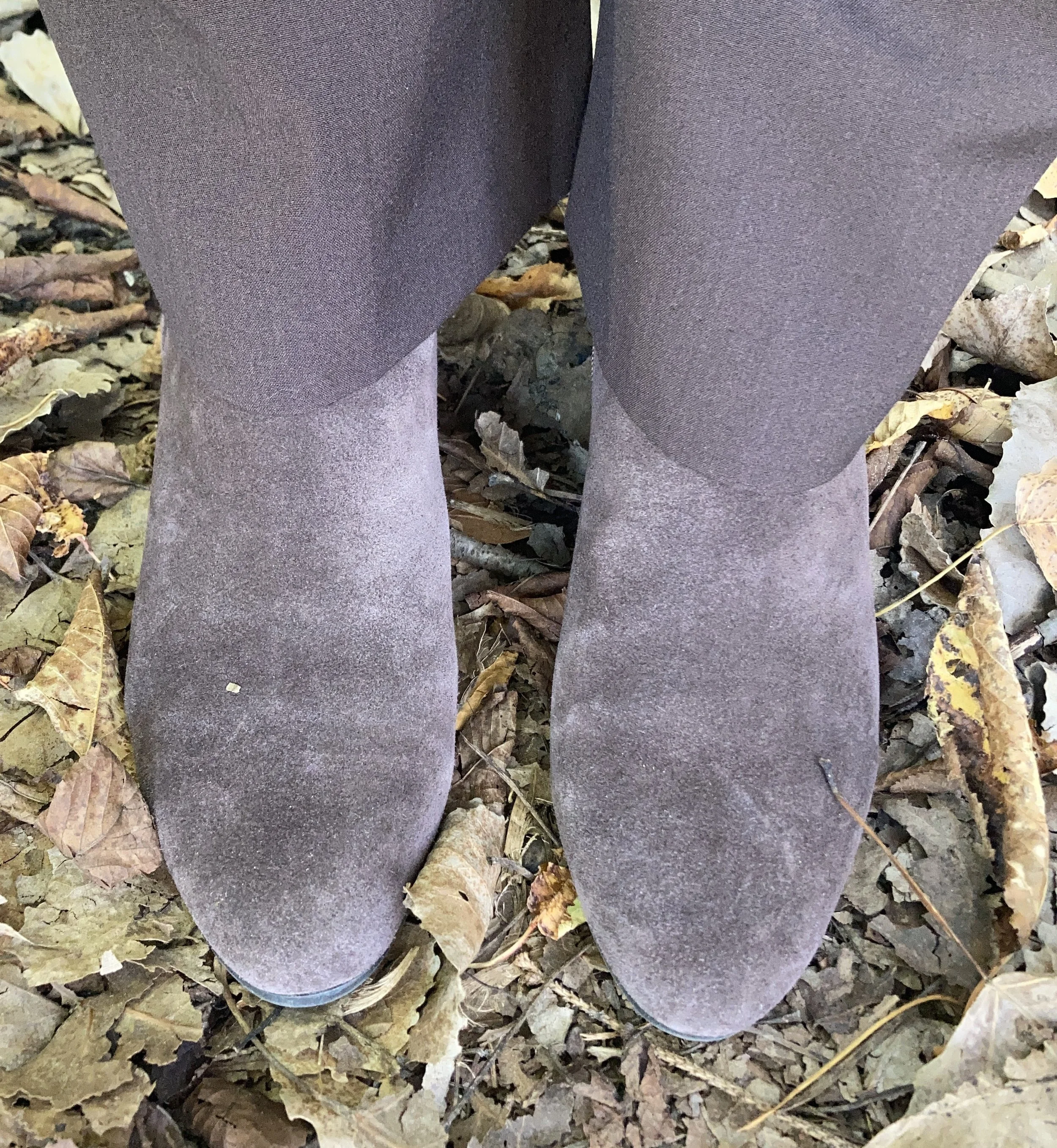
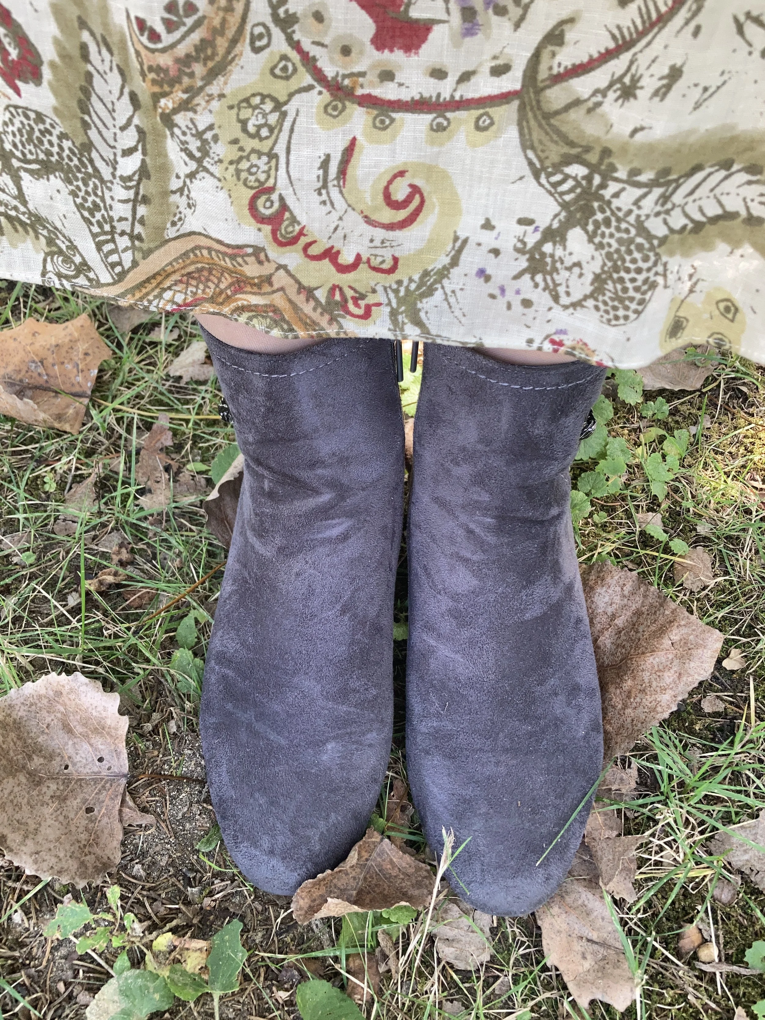
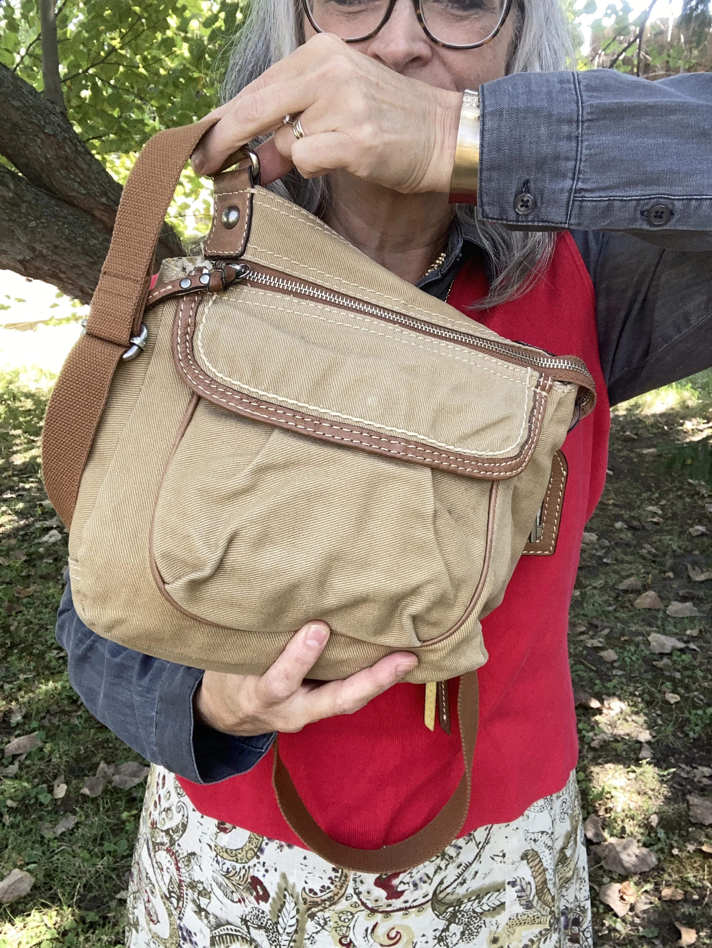
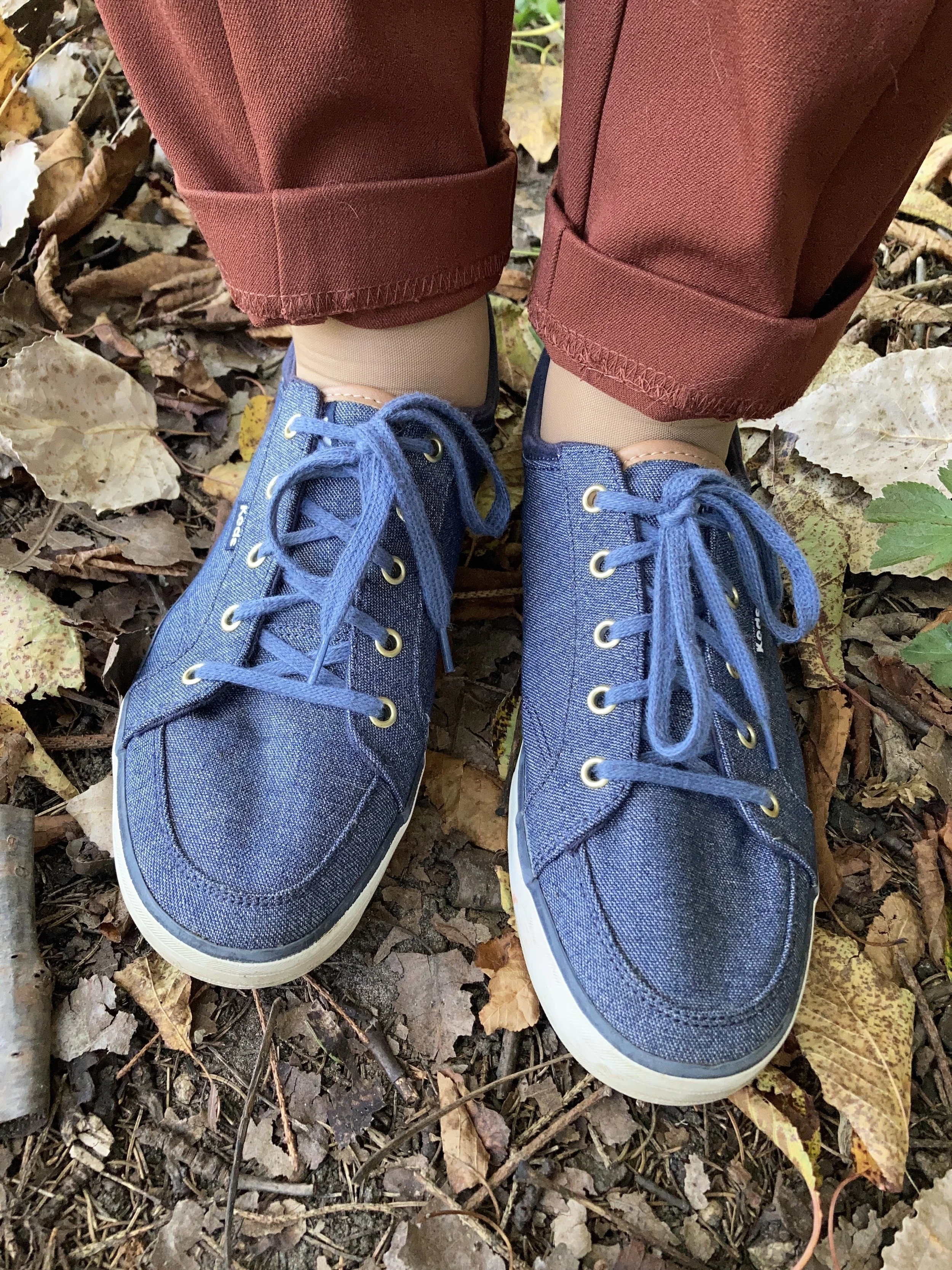
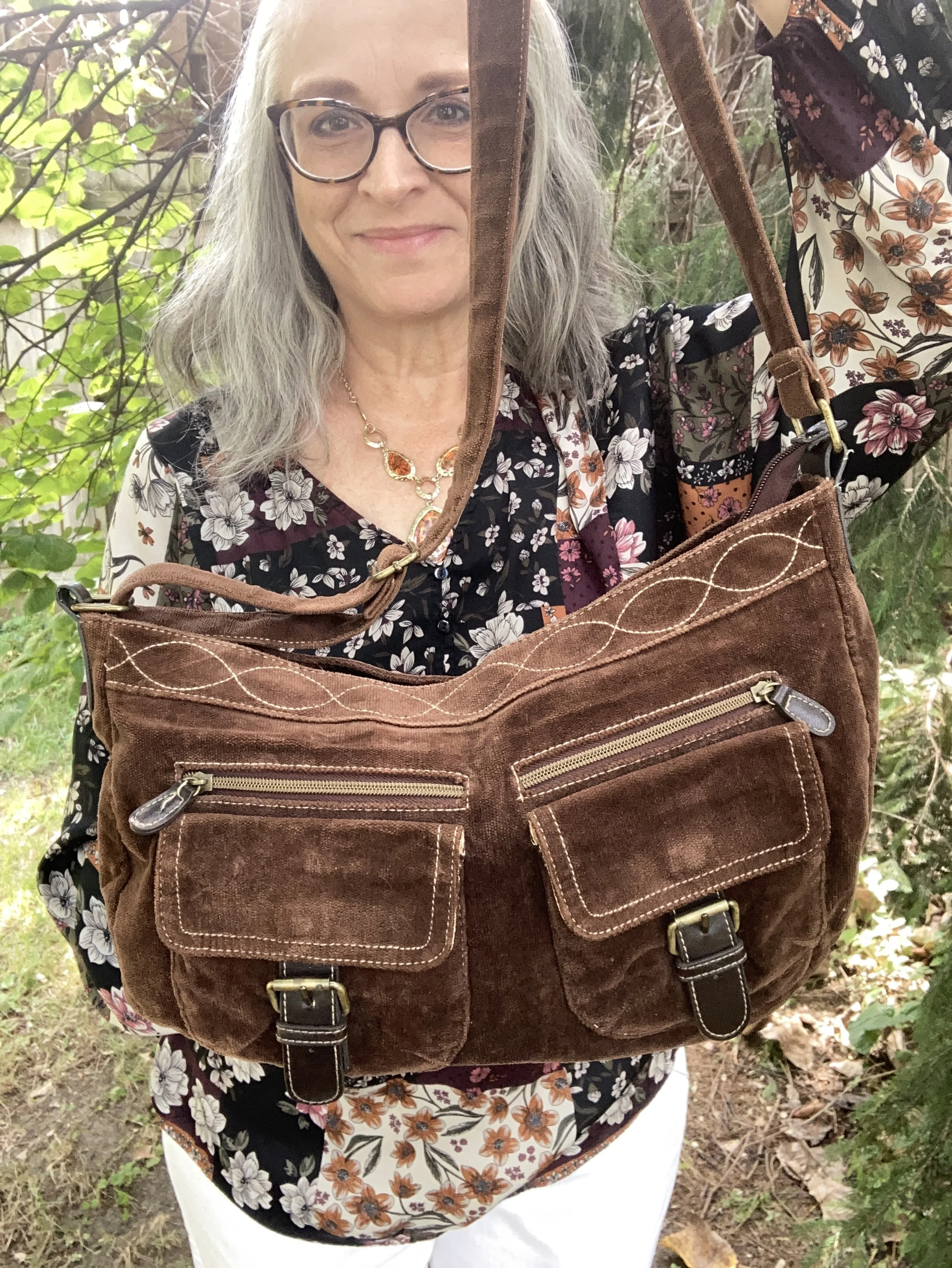
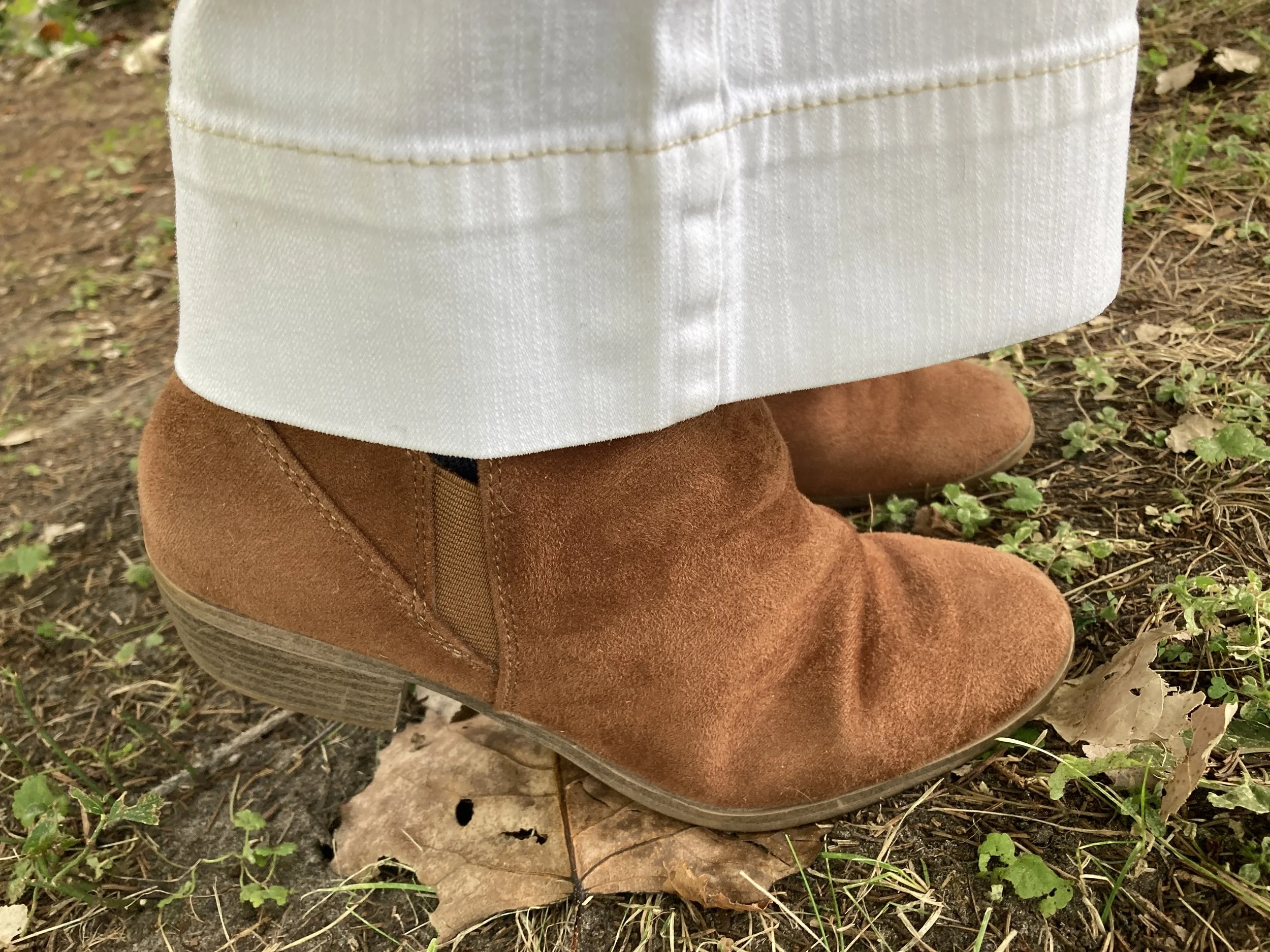
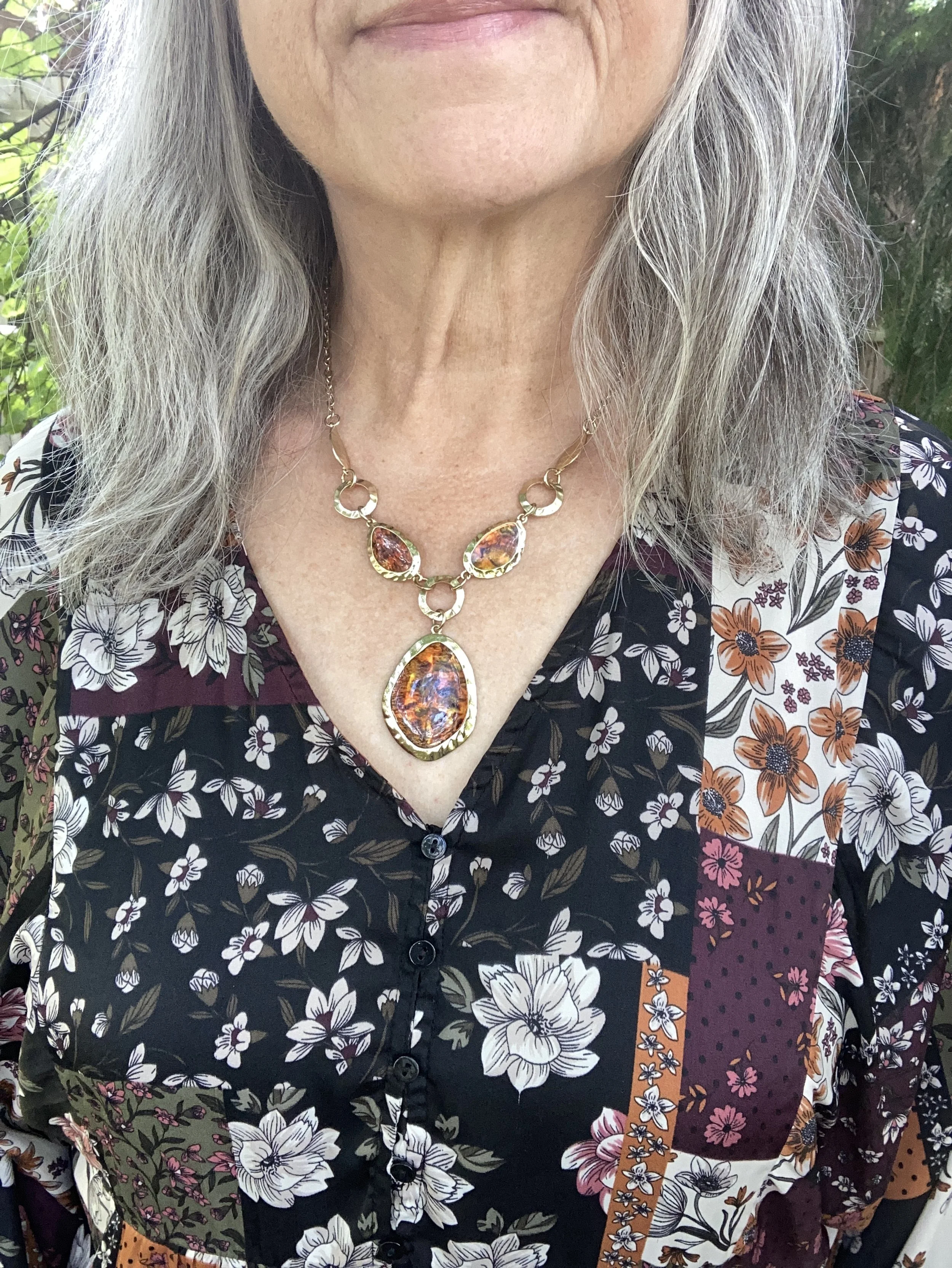
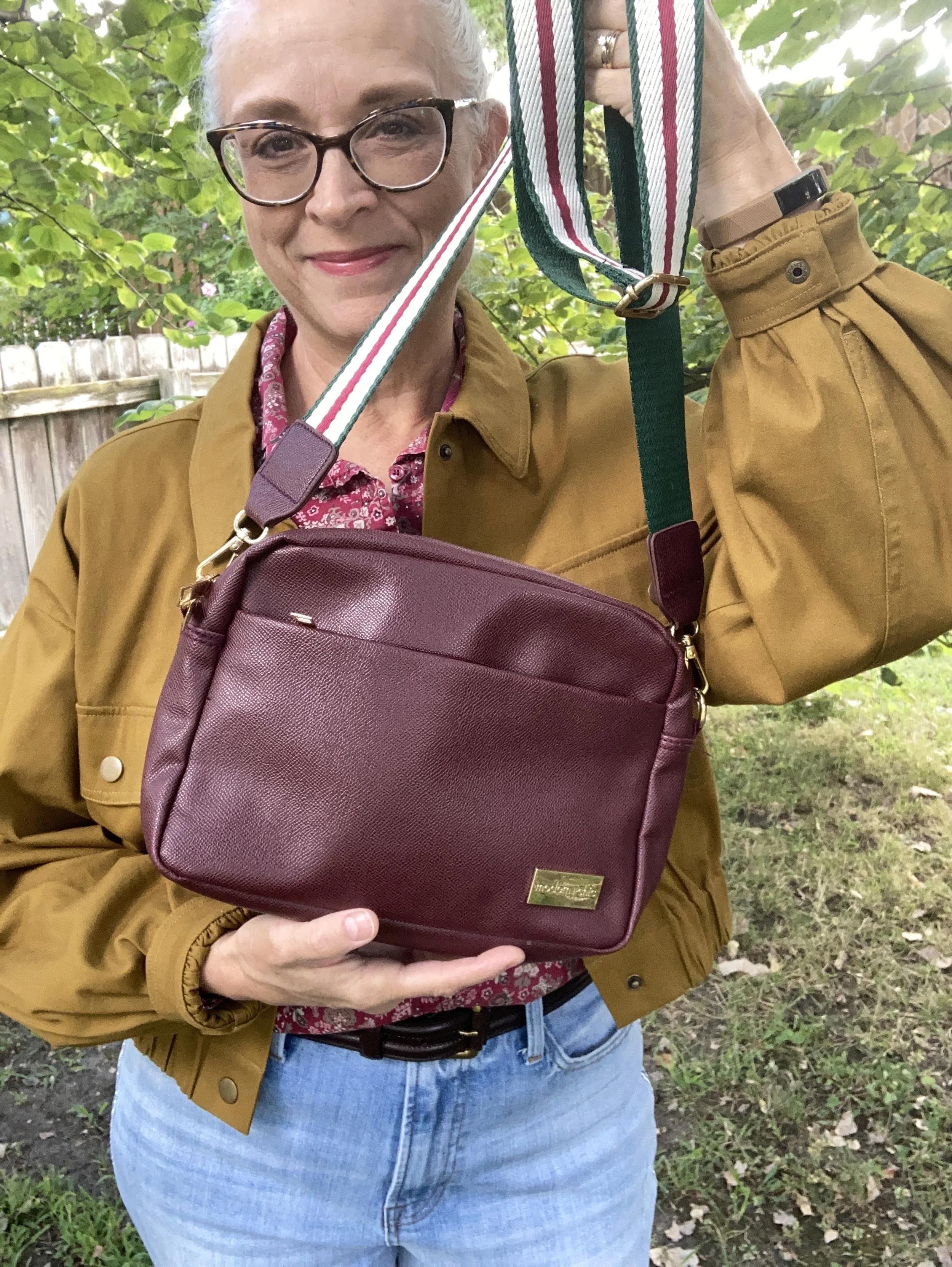
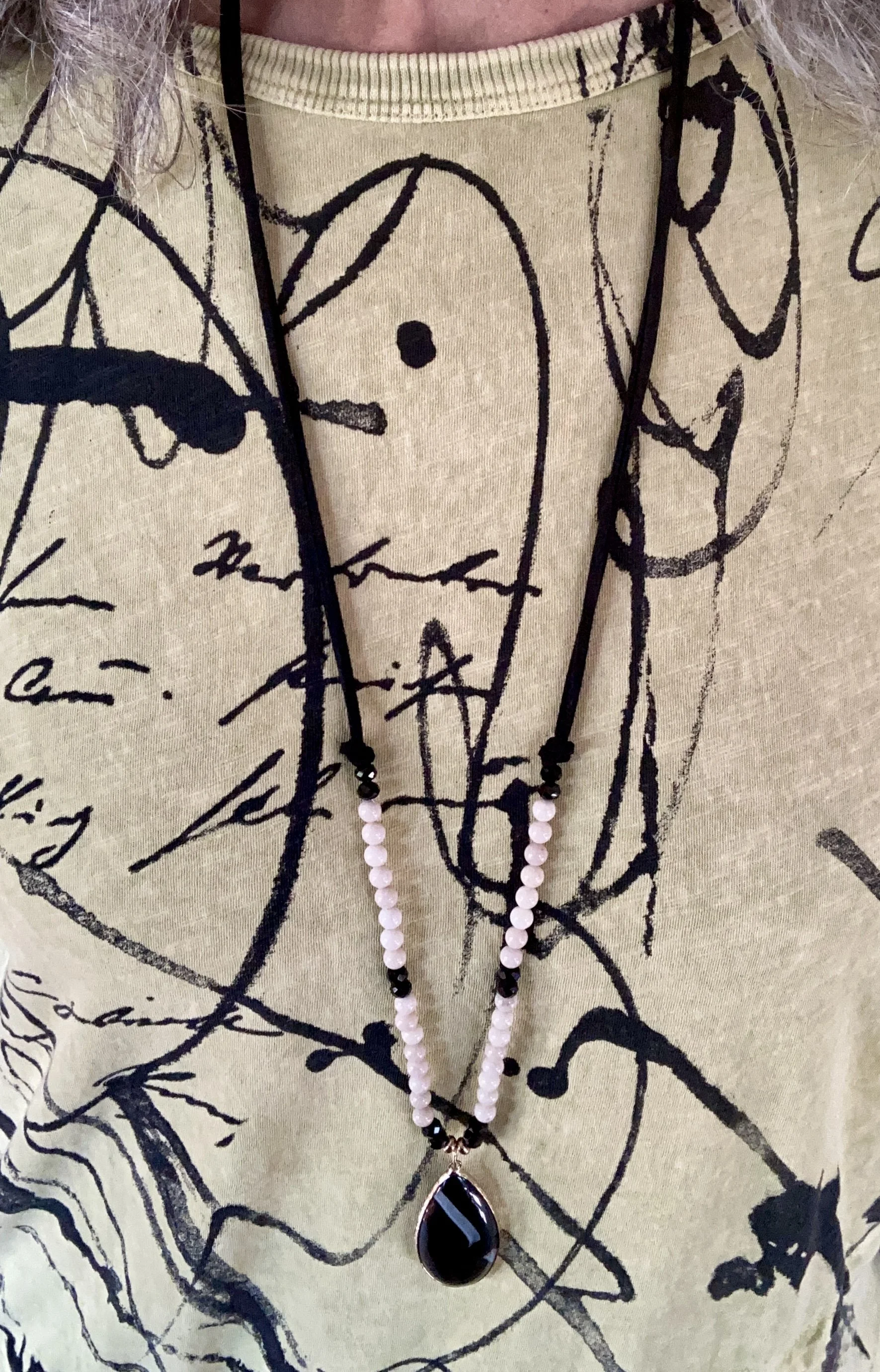
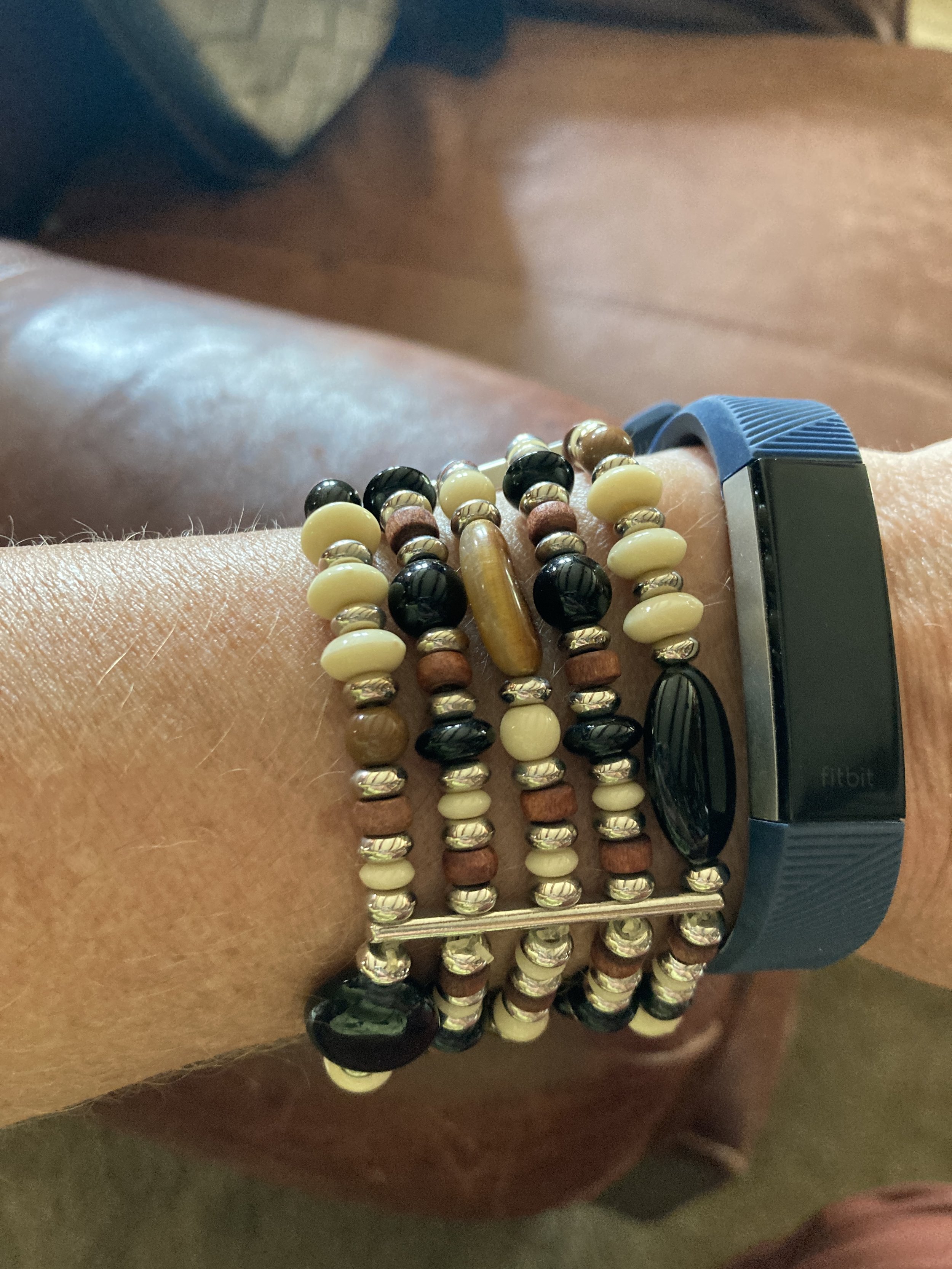
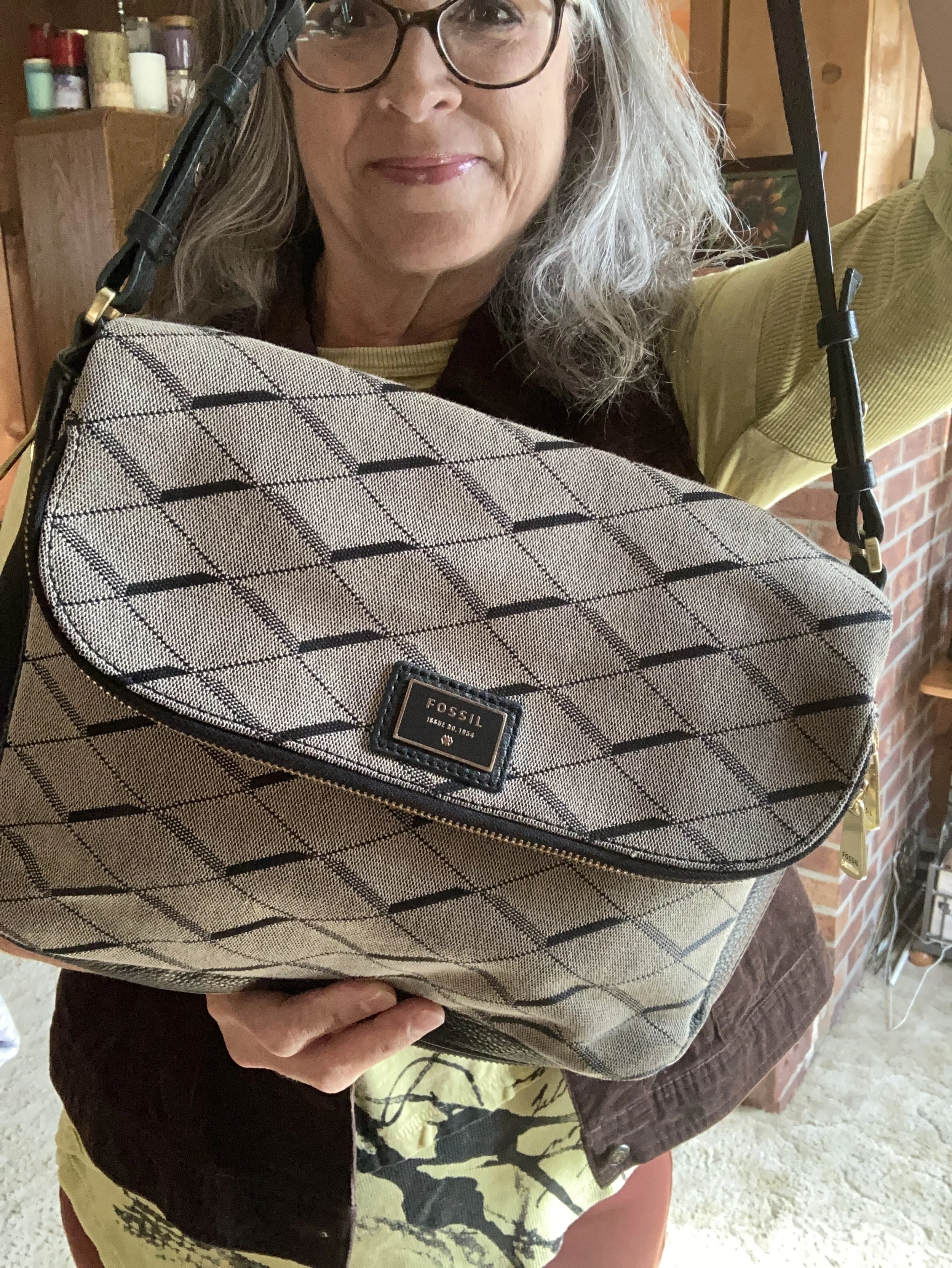
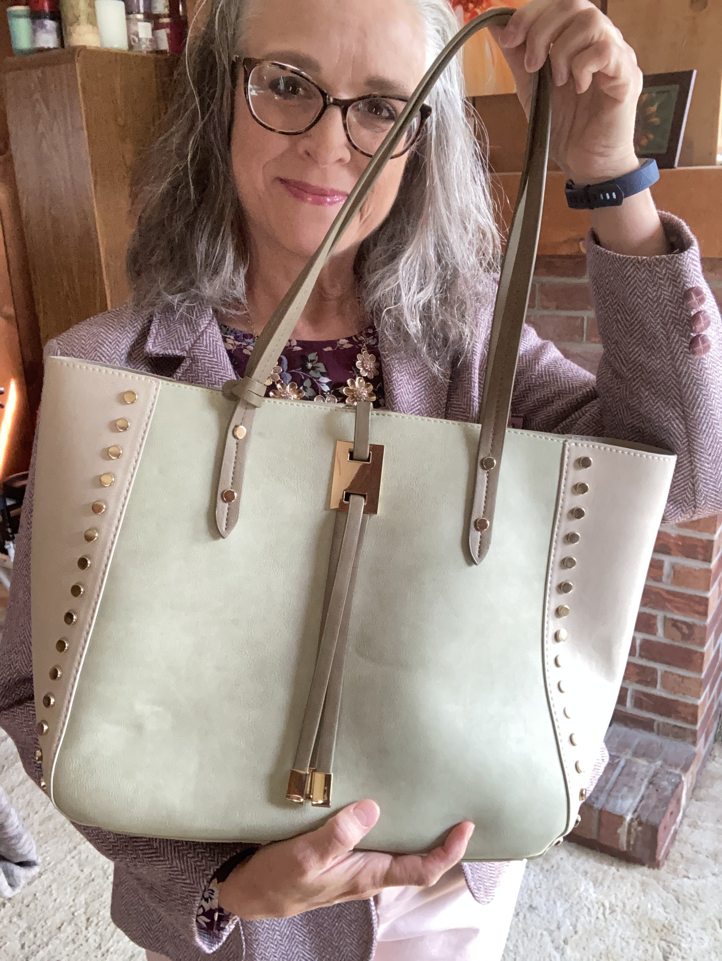
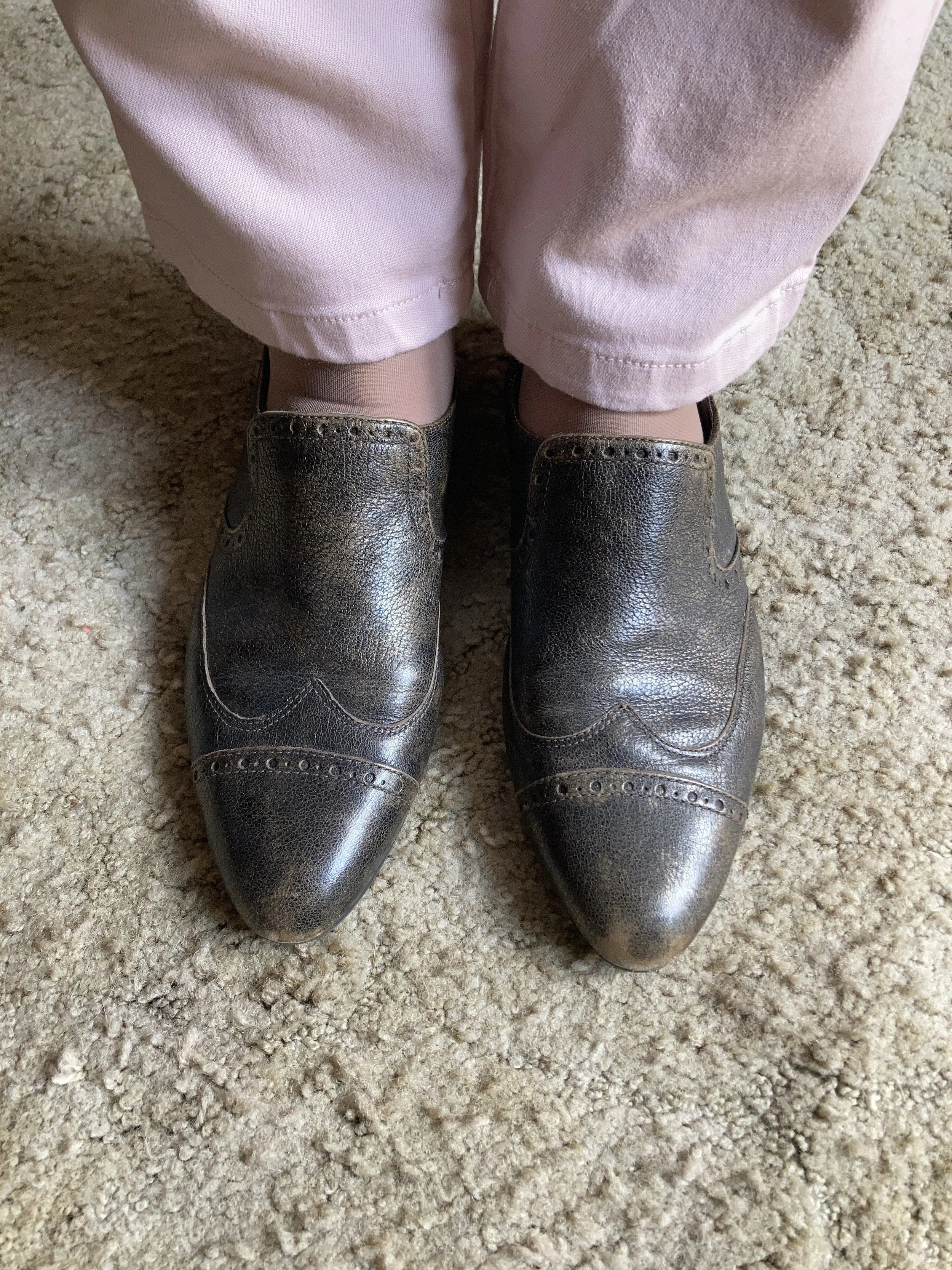
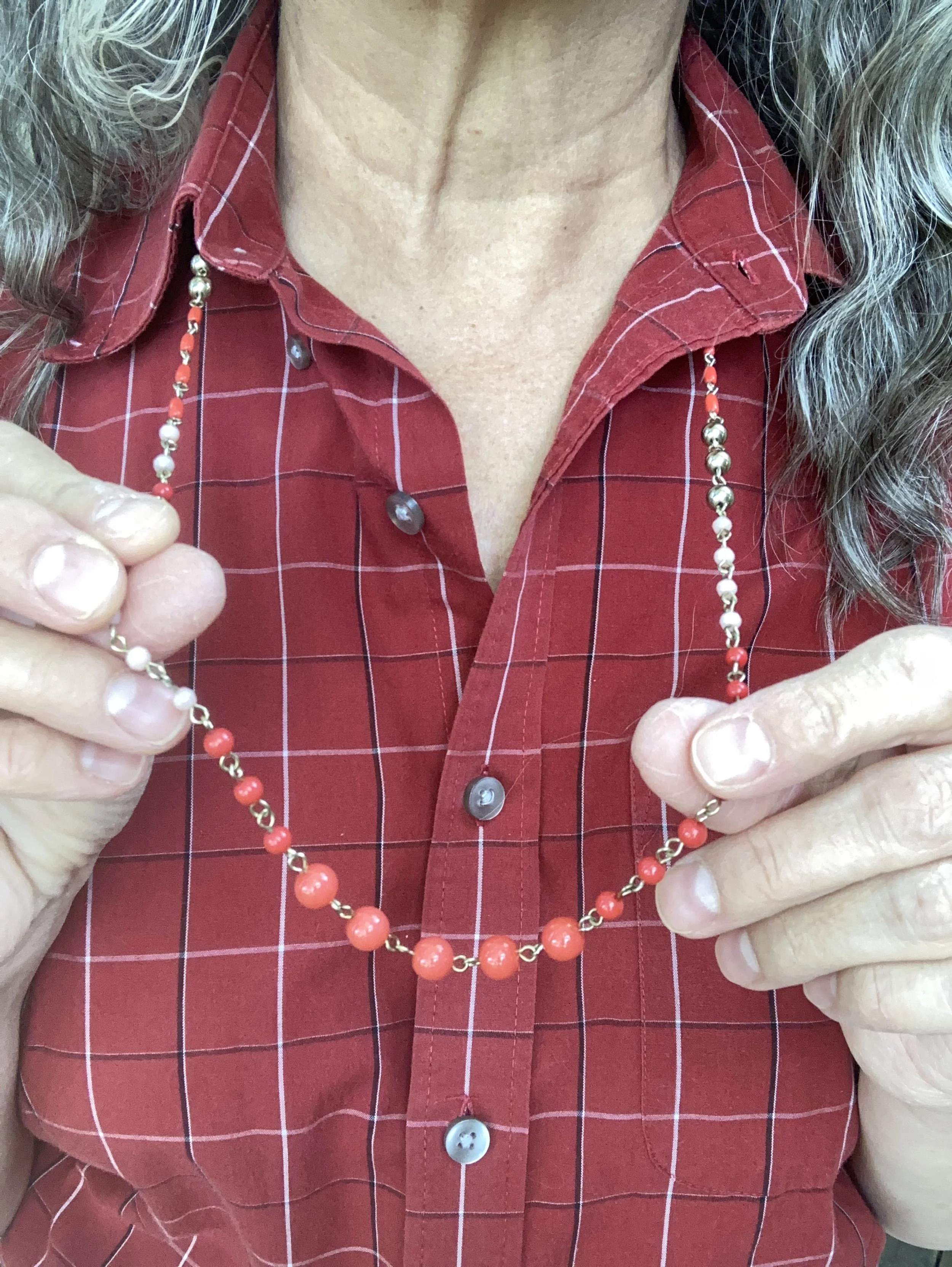
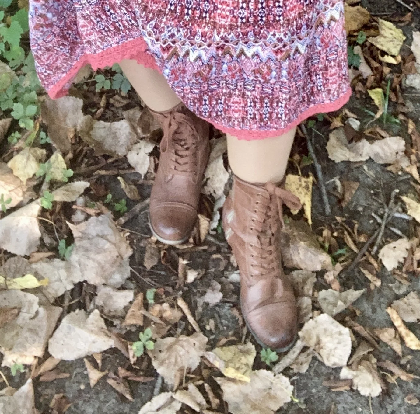
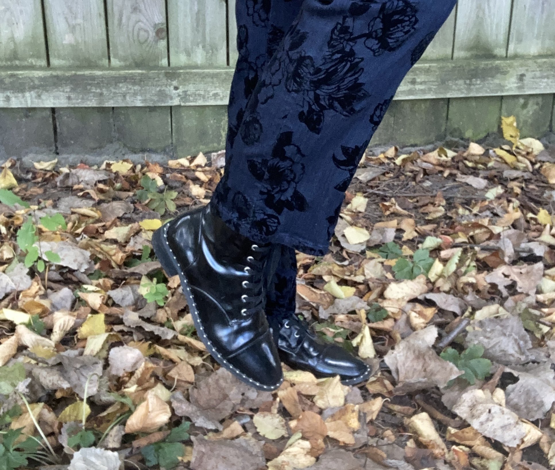
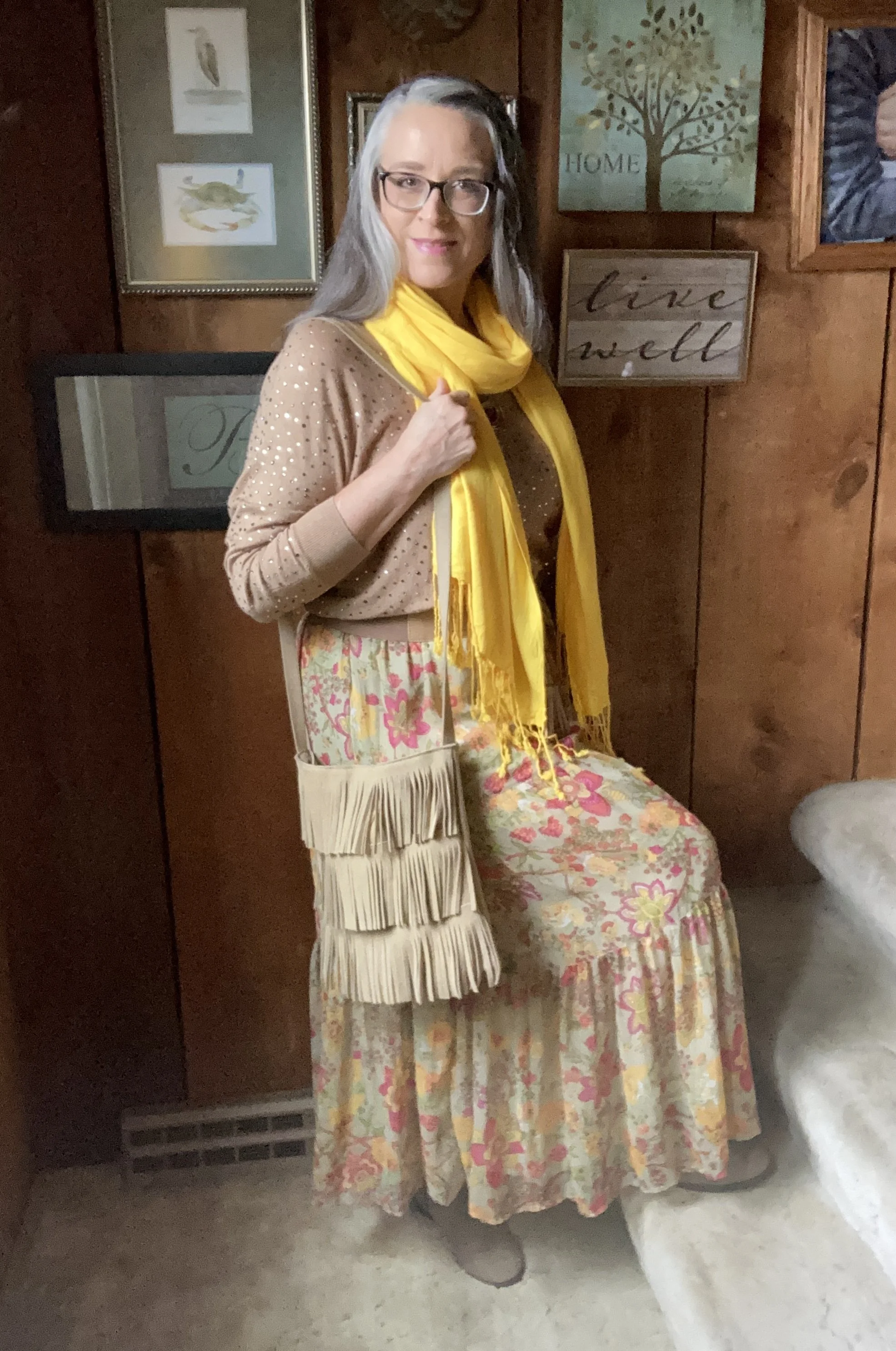
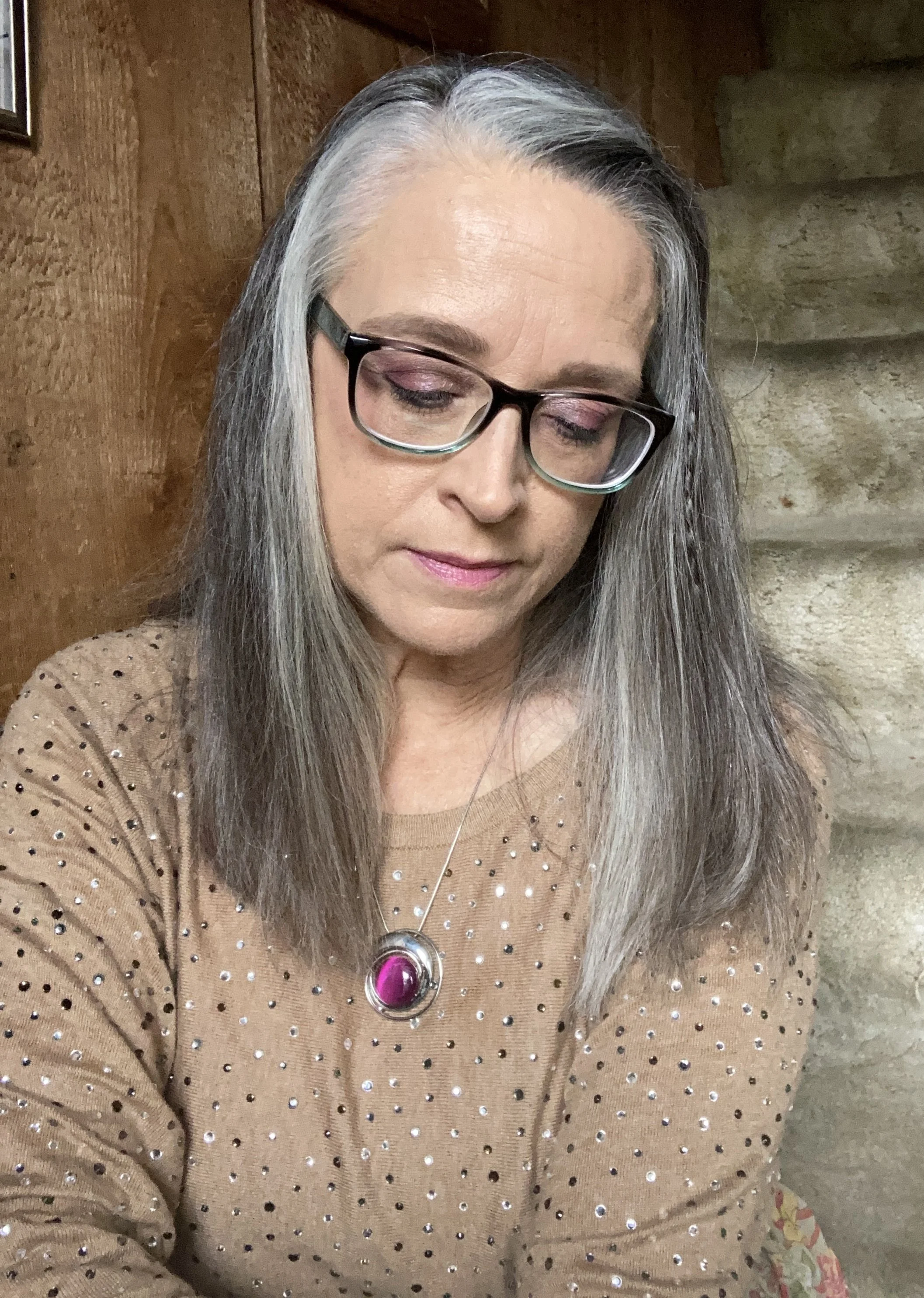
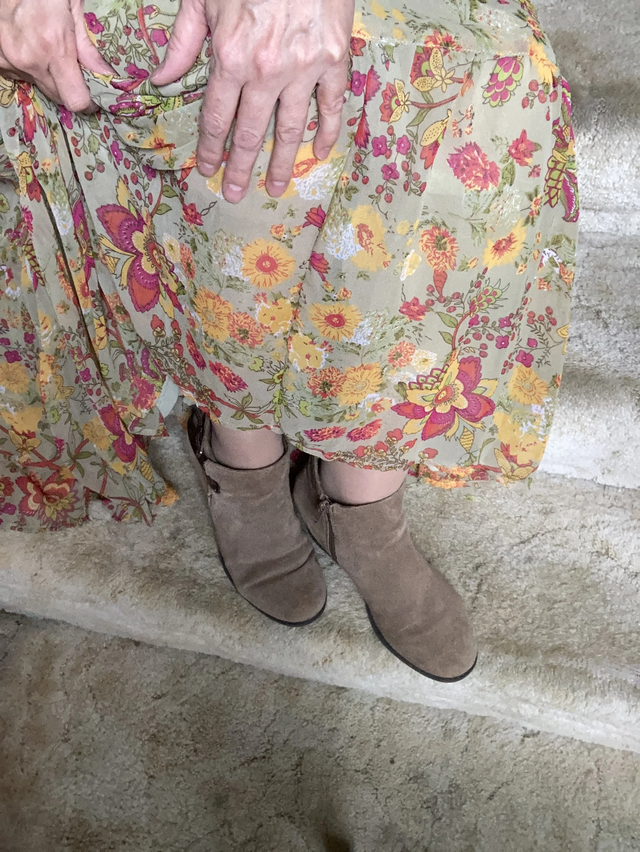
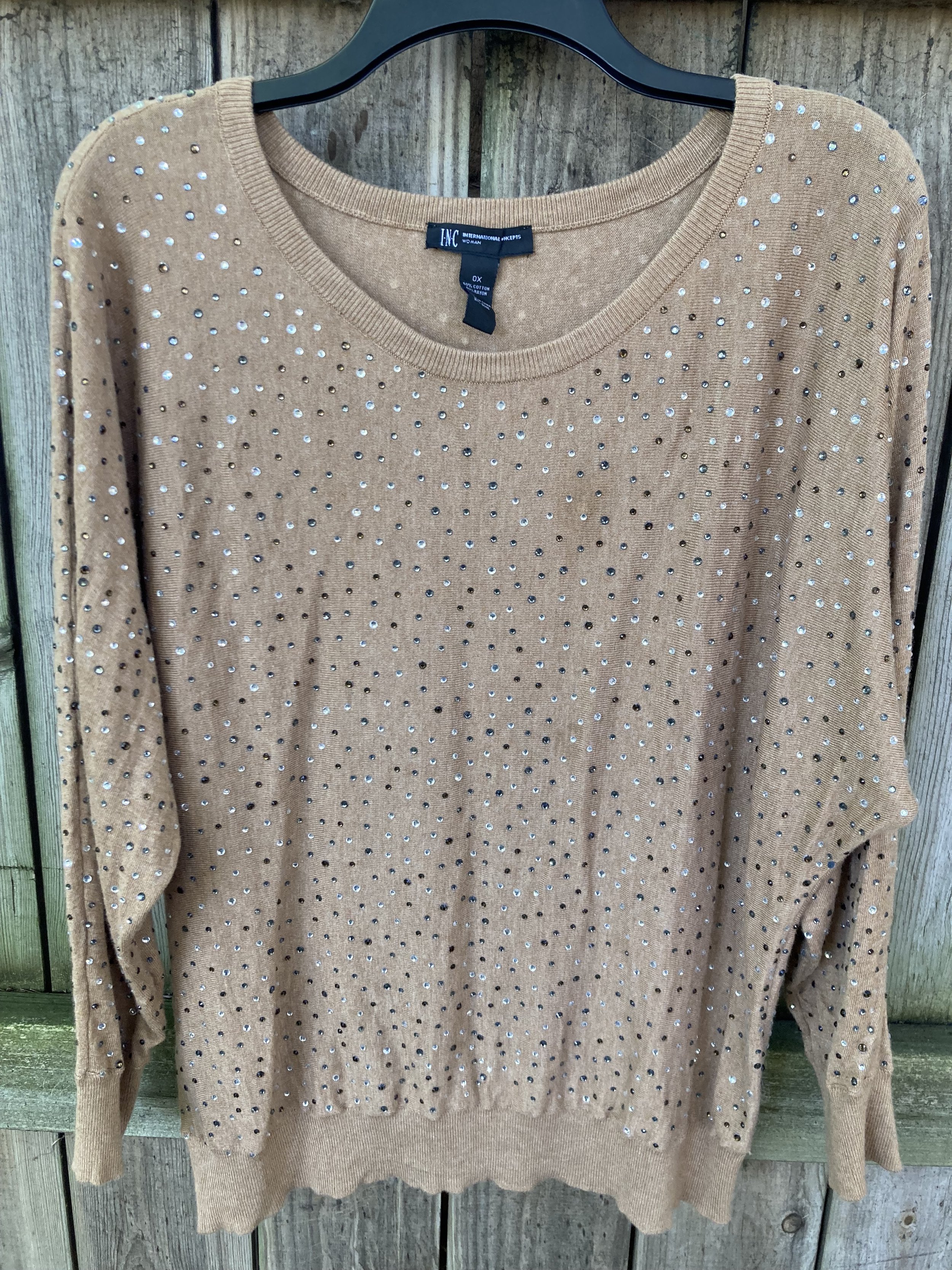
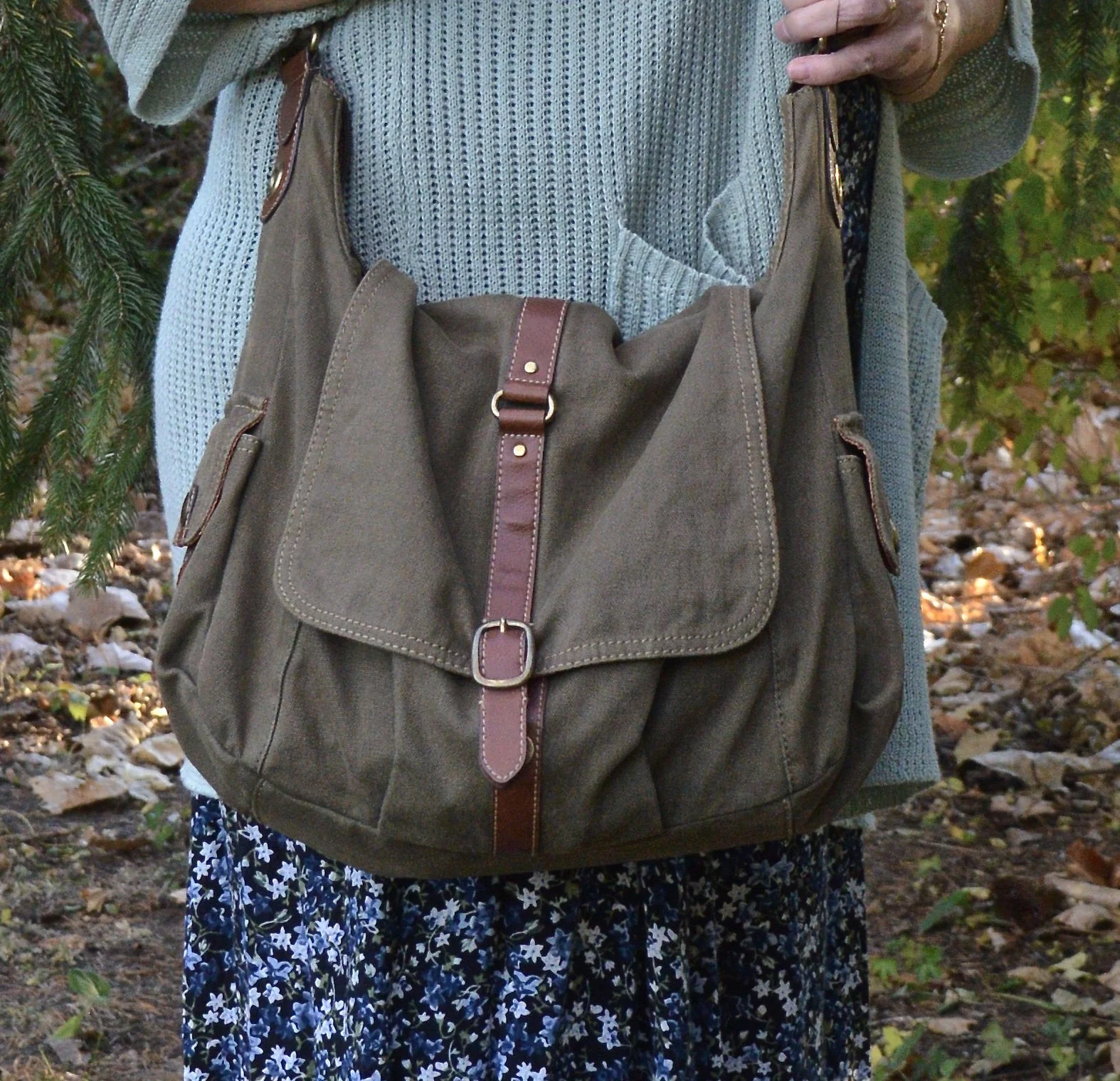
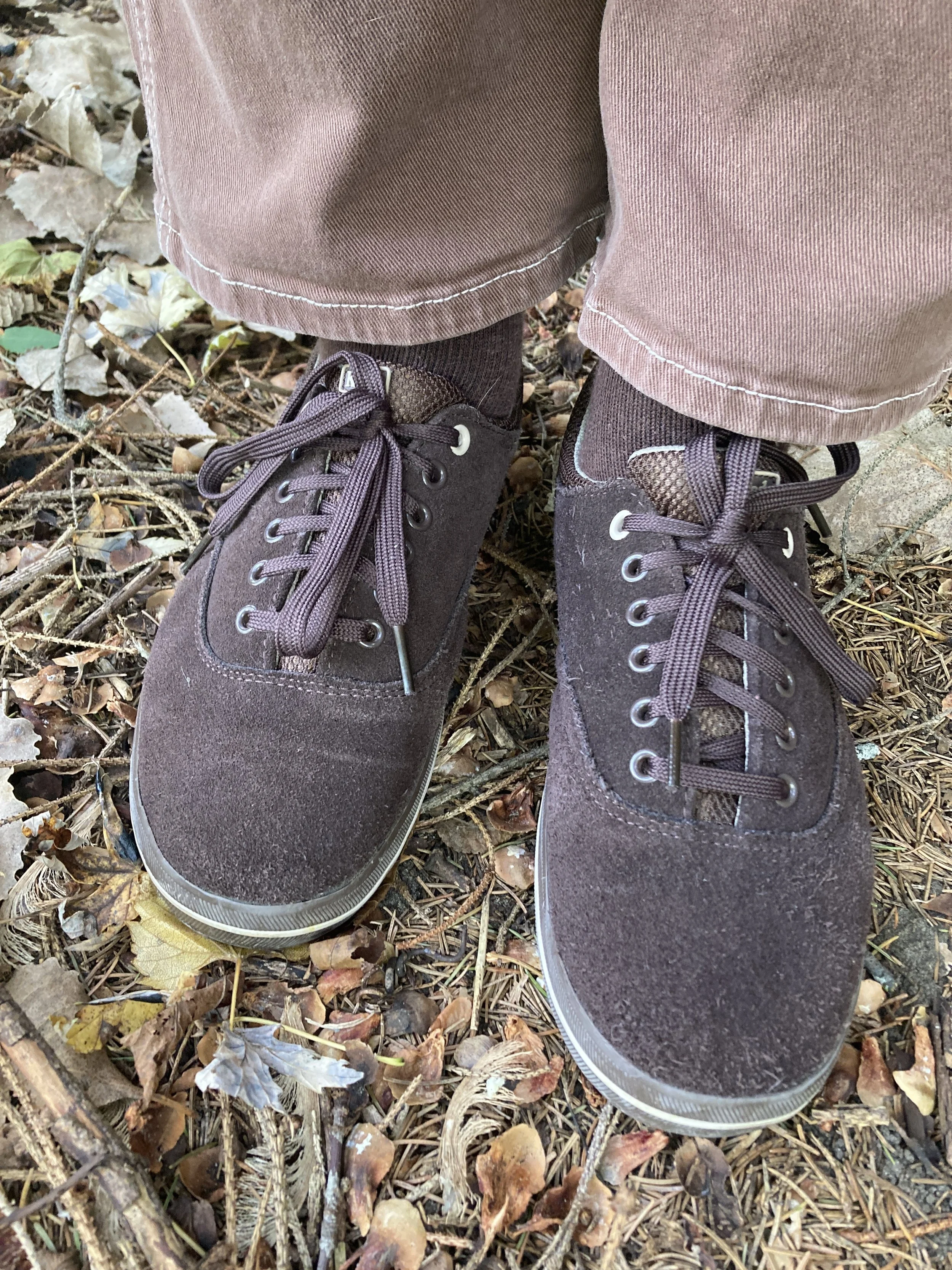
Finally, I chose my thrifted, suede Keds sneakers, a cute backpack for my bag, and a simple bead necklace that was made years ago by my oldest daughter.

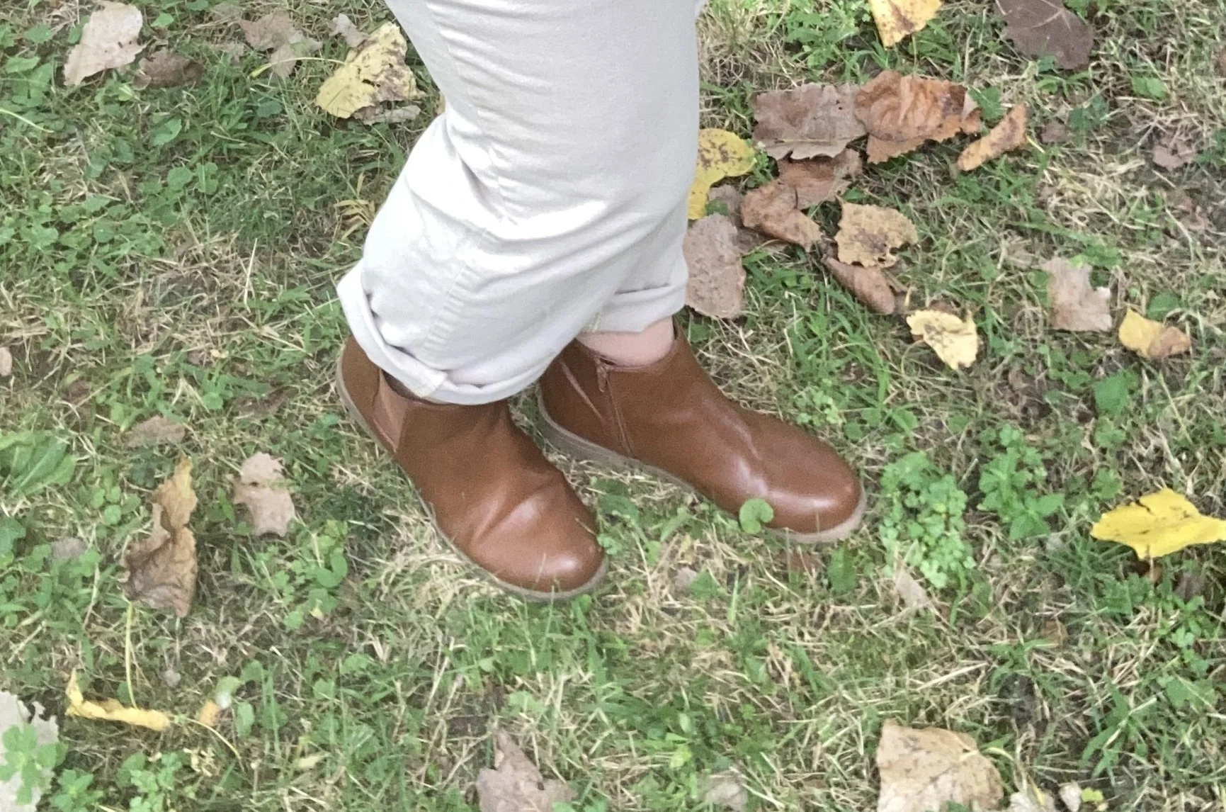
Why I Like It: The sneakers are more like shoes than sneakers due to their being dark brown and made of suede. I know these things aren’t even an issue any more, but back in the day, sneakers were white and typically not suede.

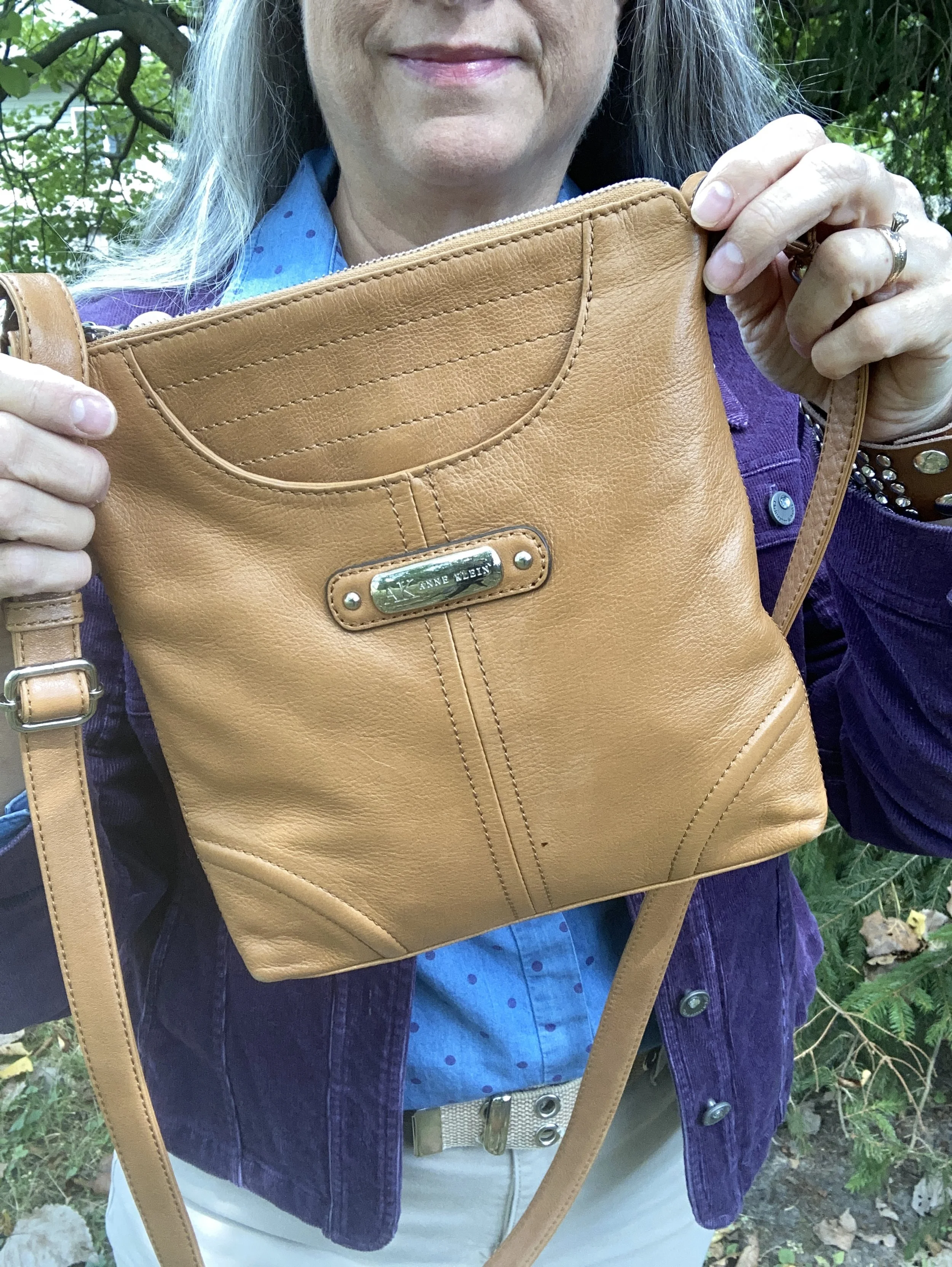
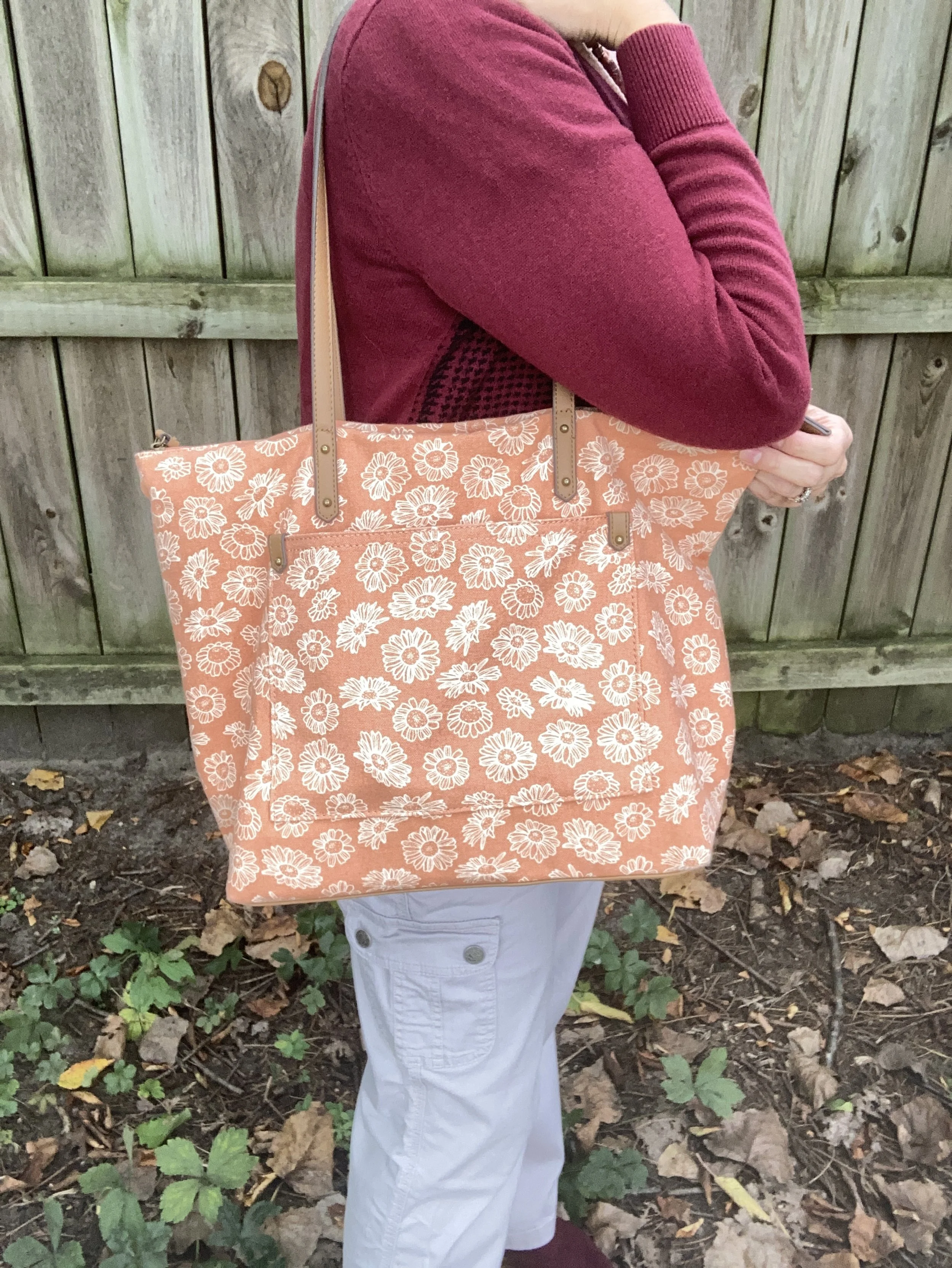
The backpack bag was a purchase made in the last couple of years as a travel item. I think I got it at our local Meijer.

While my daughter originally made this necklace when she was into beading and trying to sell jewelry, I obtained it when she was getting rid of a bunch of stuff. I love the color and the cute little dangly bead.

What do you think of these colors? Would you wear a casual outfit like this? What pieces do you have in your closet in these colors? I love to have your feedback so feel free to leave a comment or two.

I’ve included a few shopping links for you to look over. These are affiliate links. What I have found with these Pantone colors is that they are not always available at the retailers used with the affiliate, so that is why you don’t see links for everything. However, this is for your inspiration and to get you to look at your closet with new eyes.

I hope you have a great weekend!

Pantone Autumn/Winter 2025 - London Palette: Salted Lime, Fanfare and Chocolate Martini

We are well into October and the last four days have felt like the middle of July rather than fall. We are hopefully heading into a cool down in a day or two. Midwest weather has always been rather chaotic with fluctuating temperatures, times of endless rain, or months of drought. Right now things are very dry, the trees have hardly any color to them, and our cars are regularly covered with dust.

For today’s look I wanted to combine the two greens on the Pantone Autumn/Winter London palette. Just like I combined Lavender Blue and Crown Blue, today I am pairing Salted Lime, a medium, citrus green, and Fanfare, a tealy green. I chose Chocolate Martini for my classic color and I like the earthy vibe of this look. You can see the London palette colors by clicking on this link.

The star of this show is the Fanfare, velvet jacket that I recently thrifted. While not true velvet, it certainly looks the part. I found this piece and immediately threw it into my cart. When I tried it on, I knew it was coming home with me. It was obviously hand made as it still had the rough, inner seams with no finished edges, and no label of any kind.

Salted Lime is not a color I have a lot of. When it comes to greens I like the darker more moody hues of olive and forest green. I also like deep tones like emerald and jungle green. However, I do keep a few pieces that are this lime color. This thrifted, Jaclyn Smith, gingham button down has been around for a number of years. You can see this top as a shacket over a graphic tee, worn under a graphic tee, and worn with a plaid skirt,

My Chocolate Martini pants were purchased new when I was still working as an assistant manager at a university bookstore. These are Worthington brand and I got them at JCPenney. They have a wider leg and are a bit long so I like to pair them with something that has a small heel.

I chose my Nine West heeled ankle boots, which match the pants perfectly. A tip for making your legs look longer and leaner is to match your pants and your shoes. I got these a couple of years ago at Kohl’s.

I went for a layered jewelry look with a short wood bead necklace and a long beaded pendant necklace with fringe.

I wanted to add a pop of color and remembered this cute color block bag I had thrifted last year. It is just a cheap bag and has no brand name in it, but I thought it was extremely cute and fun. I think it works beautifully to add an element of extra color to this outfit.

What do you think of these colors? Do you have any of these in your closet? If not, which one would you like to add? Be sure to leave a comment or too. It helps my blog and it always encourages me.

This picture below, definitely needs a caption! What would you put on it?

I have included a few shopping links. These are affiliate links and are brought to you at no extra cost. These are retailers that are available through the affiliate and I cannot speak as to the quality of the pieces offered, so just be sure before you order something that you know the retailer’s return policy. If you purchase an item through my blog using one of my links, I get a little commission. I appreciate all your purchases as they help me keep the blog going. All opinions are my own.

Have a great week!

Pantone Autumn/Winter 2025 - London Palette: Poppy Red, Bronze Mist and Dark Gull Gray

Can you believe September is almost over? Here in the midwest it doesn’t exactly feel like fall. The leaves are changing, the sun’s angle is different and the days are growing shorter and shorter, but our temps have been summery. I really don’t mind the blue skies and high 70’s or low 80’s, but I am ready for the cool down, and the return to all that is cozy, including hot tea and cocoa, baking things in the oven and the sweet layers of sweaters and scarves.

We are looking at another trio of colors from the Pantone London Autumn/Winter 2025 color palette. You can see the colors in this Pinterest pin.

Today’s look gets a power punch from Poppy Red. You might remember this color from the New York palette. It is definitely a mood lifter. You can see the New York post here. Today I decided to pair this bright red with Bronze Mist, which is a similar color to the NY Bronze Brown, just a bit more yellowy green. I also chose the color Dark Gull Gray from the classic palette. I styled the shirt two ways, left out and tucked in, so I will include pictures for both.

I found this bright Poppy Red, Sandra knit shell at a thrift store and thought it would work perfectly for a knit vest. I paired it with a second hand Dark Gull Gray, Falls Creek button down. I believe this may be a man’s shirt as it is quite big on me for a large, but who knows. Sizes are so different these days.

This Jones Wear skirt I have styled multiple times on the blog and even though I don’t wear skirts very often, this is still one I reach for. I chose this for the snippets of Bronze Mist color in the pattern. It is fully lined, but light enough to wear in the warmer weather, and warm enough to wear in the winter with tights and a pair of boots. You can see it with a maroon cardigan, a green suede jacket, a yellow top, and a green pullover sweater.

Since I was using the Dark Gull Gray color I chose my Impo ankle boots that I bought on clearance at DSW a few years ago, to balance the look out. Even though fall is the time we put our flip flops away and get out our boots, it is still too warm here to keep boots on for very long…at least for me. I love ankle boots in the cooler weather, and when it gets really cold, then I pull out the taller boots.

I chose this thrifted Fossil bag, as I thought it gave a nod to the Bronze Mist color, even though it isn’t a perfect match.

Do you like these colors together, or do you think they are odd? Do you have this bright Poppy Red in your wardrobe? Which version of this outfit do you like better, tucked in or left out? I love to hear your thoughts so leave me some love.

I’ve included a few shopping links for a few of the pieces to give you some similar color choices, but it was hard to find any sort of skirt in a similar color. These are brought to you at no extra cost. These are affiliate links. All opinions are my own.

I hope you are having a great week!

Pantone Autumn/Winter 2025 - London Palette: Lavender Blue, Chili Oil and Crown Blue

As we start the London Color Palette this week you will recognize a few of the same colors that were on the New York Palette. Chili Oil and Crown Blue are two of those. You can see the London palette colors by checking out this pin on my Pinterest board. For today’s look and a one other look from this palette I decided to combine colors that fall into the same color category. Today I combined the pastel Lavender Blue with the classic Crown Blue, along with Chili Oil for a casual chic color block look.

The leaf is not part of the outfit! Ha, ha. Watch the following and you’ll know why. We have an immense Cottonwood tree in our yard and the leaves start to carpet the grass from the beginning of August. Even with all the leaves on the ground there are still leaves on the tree…and the sticks!! Eye, yie, yie. The stick shed from Cottonwoods is crazy.

You saw this Crown Blue thrifted Coldwater Creek piece just a few weeks ago. See the post here in case you missed it. This is a retailer that has many pretty and practical pieces, but they are a touch out of my price range, that is why I like to find different brands at thrift stores to try them out.

Lavender Blue is the London pallet’s pastel. I have two pullover tops in this color. It is a purply blue that is hard to match with anything, so an outfit like this allows it to stand on its own. This piece is Apt. 9 and was purchased at Kohl’s a number of years ago. I had to show off the beautiful lace inset on the back, even though it was concealed under the jacket. You can see how I styled this in another fall outfit with a white skirt.

My Chili Oil pants are Chico’s So Slimming, which I bought on sale a number of years ago. These are ponte pants. I never thought I would like a knit pant like this, but I do. I do not wear them often as I look at them more as a dress or work pant, but it was fun to get them out for this outfit. You saw them a few weeks ago when I styled them with Lemon Grass and French Roast.

I felt like keeping it casual, and thought it would be a nice contrast to the previous look with these pants which was more dressed up. It is amazing how accessories like shoes and bags can change a look. I chose my denim Keds as a nod back up to Crown Blue jacket. I also gave the pants a cuff, which in this look keeps it a bit more casual.

My corduroy axcess bag is very old, but I love the colors and keep it hanging around, even though my current go to’s for bags are cross body and smaller.

My jewelry is a simple pendant charm necklace. I like that the coppery color goes with the Chili Oil vibe of the pants, and makes the pastel top seem more fall appropriate.

What do you think of this outfit? Do you like these colors? Do you like to wear a color block look?

I am including a few shopping links for you. These are affiliate links and are provided to give you ideas, inspiration and possible shopping options. If you use one of my links to make a purchase, I get a little commission, and believe me at this point in time, all the pennies count.

Have a super Tuesday!

Pantone Autumn/Winter 2025 - New York Palette: Brandied Melon, Hot Chocolate and Bright White

Today I am showing you outfit #5 from my Pantone Autumn/Winter New York Palette series. This is the last trio of colors from this fall palette, and hopefully next week I’ll start the London color palette. You can see the original colors in this Pinterest pin.

Today’s outfit revolves around a mellow orange named Brandied Melon, a soothing brown reminiscent of Hot Chocolate, and Bright White, mimicking the gorgeous clouds we see meandering through the late summer sky.

I chose this unique, thrifted patchwork top for the pops of Brandied Melon. I love the boho vibe and the variety of colors and print. I looked up this brand, Style & Co, and found that Macy’s was the original retailer. I always find it interesting that I will find a certain brand and then find more pieces of that brand as I thrift. I must be drawn to them for a reason.

My Bright White Gloria Vanderbilt jeans have been around for years. I purchased them new at JC Penney, and use them whenever I need a pair of crisp, white pants that are both casual and dressy. I have a hard time photographing white, or any lighter colors outside. Oh well, not worries. You get the idea. You can see these jeans styled with a yellow sweater, a floral kimono, a velvet jacket, a fall jacket, with a white top and sweater, a black vest, and a multi print top. There are more, but you get the idea. White pants are not restricted by any season and go with every color.

Since the top didn’t contain any browns, I added my thrifted Hot Chocolate corduroy bag. I love this roomy, casual bag, and the strap is long enough I can use it like a cross body bag.

I kept my accessories simple. My faux suede, SO ankle boots were from Kohl’s a number of years ago. My necklace was from a few years ago.

If the weather was cooler, I could easily add a longer cardigan for another layer by picking another color in the top. It would look great with olive, black, white, and even the Mauve Wine (see my first outfit in this series, here.)

What do you think of these colors? Do you wear white all year round, or just in the warmer months? Please leave me your thoughts in the comments or leave a comment on FB. I love to hear your ideas.

I included a few shopping links under each item. These are affiliate links. All opinions are my own. I hope yo are having a great middle of September!

Pantone Autumn/Winter 2025 - New York Palette: Bronzed Brown, Winterberry and Vapor Blue

I hope you are enjoying this Pantone color series. For the actual colors check out this pin on my Pinterest board. The Pantone Color Institute is the entity that people turn to for the trending colors for both fashion, architecture and home decor. I enjoy seeing what the colors are for each season, however, they have made it harder and harder to actually see the colors without having an account, so I appreciate those who do sharing their findings on Pinterest and other platforms.

Today’s colors are what I would call a little more reminiscent of what we tend to think of when we talk about the autumn season. Bronze Brown is a golden brown making me think of changing maple leaves and colorful sunsets, while Winterberry gives a nod to aromas soon to fill the air like cranberry and cinnamon, and Vapor Blue looks like wispy jet trails across a fading fall sky.

This seemed a bit of an odd pairing with the Bronze Brown and Winterberry, but after I put it together, I really liked how it turned out.

The Bronze Brown, Ophelia Roe jacket was a piece I got on clearance at Meijer. It actually had a pair of pants that went with it, that I bought at a later time. However, the pants seem to be a bit off. I should have taken them back right away, but sometimes you can’t tell right away something is cockeyed or sewn improperly. They are in the donation pile. I do, however, like the jacket with its utility, bomber style silhouette.

This Faded Glory floral blouse I have had for years. I don’t know why I don’t wear it more often, because I do like it. I just go right from shorts sleeves to fuzzy sweaters and sweatshirts and forget about the in between time. I honestly don’t remember if I bought it at Walmart, or if I found it at a second hand store.

You can also see my chunky berry and gold necklace, a gift from one of my daughters. I thought it went well with the casual vibe of the outfit. I also added a dark brown, almost burgundy colored leather belt that I recently thrifted. I know the trend has been no belts, but I always feel that a belt gives an outfit that finished feel, specifically when tucking a shirt in. Apparently the half tuck is no longer trendy and we are back to a full tuck or no tuck.

These Talbots jeans are also a thrift store find from this past spring/summer. If you look at the Pantone color for Vapor Blue, it really looks like a very light gray, but I feel that these jeans were representative of that faded blue sky we often see in the early morning or late evening. If the Pantone gurus say it’s blue, well okay, and this was my take! Ha, ha. I love the black and white pin striping down the outside seams of the legs.

Once I put the outfit together, I was struck by the thought that I actually could start styling boots again, so I grabbed these SO burgundy combat boots that I scored at Kohl’s a few seasons ago.

I just found this cute crossbody bag a few weeks ago when I was thrifting with my bestie back in New York. We always hit the thrift stores together, which is great fun. This is a brand called Modern Chic. I love the guitar strap vibe.

What do you think of these colors? Do you like how I put this outfit together? What would you have done differently? Please leave me some love in the comments. I appreciate my faithful few who try to comment on the regular. You always remind me why I keep doing this! Hugs to all of you.

I have included a few shopping links for you to look through. These are affiliate links which means when you purchase something through one of my links, I get a small commission. I appreciate all of your support, but most of all I appreciate that you stopped by the blog to hang out for a while.

Have a great week!

Pantone Autumn/Winter 2025 - New York Palette: Poppy Red, Lyons Blue and Crown Blue

Happy Uno Septembo! In other words happy September, happy fall and all the good things that go with it: pumpkin muffins, hot chocolate, changing leaves and football. Our weather here in the Midwest is already feeling more like fall, although there is sure to be a few more warm days before the official start of fall and even after. I have heard rumors that we are supposed to have a cold winter and these early chill days may be a forewarning to that.

Today’s outfit takes three more colors from the New York Palette and combines them in a bright, cheerful look that would be perfect for a drab fall day. Poppy Red, Lyons Blue and Crown Blue combined seamlessly when I was working on outfits for this Pantone color series. It was a natural progressions to put these three saturated colors together. To see the actual Pantone colors check out this Pinterest pin.

This whole look is thrifted, except the sneakers. It is always fun to shop my closet and find that so many of the things I bought second hand are easily useable for the current trending colors and styles. So what if a few things are slightly outdated, or not currently on as far as the fashion gurus are concerned. It’s my closet and my style, as it is your closet and your style.

Let’s take the outfit apart. The first piece I chose was this paisley button down that I have had for years. The blue colors were a good match for the Lyons Blue color which is a deeply tinted blue teal. This thrifted piece is Jones Wear Sport. I have thought numerous times of getting rid of this piece, but then I end up wearing it for some reason or other. I do love a good paisley print, just like I love my plaids!

You can also see in this photo I chose a teal necklace that leans a bit more in the green direction, but I like the contrast. In addition, for this fall statement belts are trending, so I decided to create my own statement using an old silver colored chain belt that I have had laying around for decades. It didn’t really help to hold my baggy pants up, but I like how it looks!

After the shirt I chose the pants. It seemed the perfect choice as this bright red pair are perfectly Poppy Red. I thrifted these this year as I had been looking for a red pair of pants. These are Bandolino brand. They are actually a little big now, but I don’t mind and the baggy look is another thing that is trending this fall for jeans, so get comfortable ladies!

I then remembered I had thrifted this blue jacket recently and realized it was a perfect choice for the classic color Crown Blue. This piece is Coldwater Creek brand. This is actually a petite, which I can sometimes get away with. It just gives the jacket a more cropped silhouette, which I occasionally like. I love the contrasting white stitching around the edges. I had a hard time finding anything in this exact color, but I’ve included a few links for darker denim jackets.

I decided to go with silvery gray for my accessories. I wanted something different from red, to match the pants or blue to match the jacket. I do have a bit of a matchy, matchy gene, so I was trying to push myself outside that box. While I did end up matching the bag, and the shoes with the belt, I like how it pulls the whole look together. The sneakers are Skechers and I got them a while back on clearance at Gabes. I hardly ever go into that store, but once in a while my daughter wants to make a stop there and it is fun to look. My bag was thrifted and has no label.

What do you think of these colors? Do you like them together, or would you like them each separately? It is fun to try new combinations and I hope these posts inspire you to expand your thinking on how you put colors together. Leave me some feedback in the comments.

Enjoy the many poses of Amy! Ha, ha.

I hope you are having a great beginning to the month of September! I have included a few shopping links, but these colors are hard to find, so I would say add a color you like to your thrifting list! These are affiliate links, brought to you at no extra cost. If you shop a link through me, I get a tiny commission for your purchase. I appreciate all the support. All opinions are my own.

Have a great day!

Pantone Autumn/Winter 2025 - New York Palette: Lemon Grass, Chili Oil, and French Roast

This week brings you another collection of colors from the Pantone Autumn New York color palette. Remember, I am combining colors as they inspired me, but you can take any of the colors from the palette and put them together, or maybe there are only one or two colors that you like and plan on adding to your wardrobe. This is always about what you like and how you can be inspired to look at your closet differently.

Today’s outfit is a contrast of light and dark combining the yellowy green of Lemon Grass with the classic French Roast along with the spice of Chili Oil. You can see the actual Pantone colors here.

This pale yellow top, is not a true yellow, but has just a hint of green, making it the perfect selection from my closet for the Pantone Lemon Grass. I found this a few years ago while thrifting and it is a brand called Jess & Jane. I discovered that Jess & Jane is a California based wholesale clothing company who only sells to specialty boutiques, so who knows where this piece originated from. It’s kind of fun to think of the roads some of our second hand pieces have traveled. I like the asymmetrical hemline and the funky ink spray pattern on the front. I also like the sleeve length, which is perfect for the transitional days between summer and fall.

I remembered that I still had these rusty, Chili Oil, Chico’s So Slimming ponte pants that I had purchased on sale a few years ago. Ponte pants are made from a thick, stretchy, double-knit fabric called Ponte di Roma. They offer a more flattering line than regular leggings due to the specially made seams and more support. I don’t wear dress pants very often these days as I no longer have an office job, but I hang onto things for now, because who knows when I may have to go back to work outside the home.

To add a bit of texture and a layer for cooler temps I reached for this thrifted Crazy Horse by Liz Claiborne corduroy vest. It does a fairly good job of mimicking the French Roast dark brown color on the New York classic palette. I love this piece as it is structured, but also has a bit of stretch making it easier to wear.

I kept my jewelry simple, as the top, vest and pants do the talking. A long black and white, beaded pendant necklace, and a stack, bead bracelet with browns, creams, blacks and a touch of yellow threw in a bit more texture and interest. I didn’t think to swap out my blue Fit Bit band for a brown or white one. Ha, ha.

I chose black for my shoes and bag to tie to the black print on the top. My bag is a thrifted Fossil shoulder bag, and my shoes are Aerosoles that I purchased a number of years ago from DSW. I really like both of these. The bag is a great fall and winter choice, and the heels are comfortable (for as comfy as a heeled shoe can be when you don’t wear them very often - ha, ha).

What do you think of these Pantone colors? Would you wear these colors together? Do you like Lemon Grass, Chili Oil or French Roast the best? Which of these colors do you already have in your closet? Leave me a comment or two. It helps my blog to grown and reminds me why I do this!

I have included a few shopping links. Thank you so much for making an occasional purchase through my links. That gives me a tiny bit of income. I cherish all of your support. These are affiliate links brought to you at no cost. All opinions are my own.

I hope you are having a great week!

Pantone Autumn/Winter 2025 - New York: Primrose Pink, Damson, and Mauve Wine

I am making an attempt to get back on track on my Fashion page, by introducing the Pantone Autumn/Winter 2025 color palettes. I thought if I started a little earlier, you could take the inspiration and actually shop your closets for some of these colors to wear this fall. Starting with the New York palette, I hope to also cover the London Palette next month.

Today’s outfit is a pretty work wear look that uses the palette’s lightest color Primrose Pink, paired with the medium Damson purple and the darker Mauve Wine. I really like how these colors work together, giving a nod to the parting pastels of summer and to the incoming darker hues of fall. You can see the actual colors in one of the Pantone pins on my Pinterest board here.

I got dressed, did my makeup and was all set to take pictures outdoors and then it decided to pour. By the time I took these shots the sun was coming out again, but the grass and trees were soaked, so I decided to stay in doors.

I went through a few color combination iterations before I finally settled on this trio, but I really like how it turned out. Let’s look at all the pieces.

I decided to use this thrifted herringbone blazer for the Damson medium purple color. My photos don’t do the purple color justice, but it is what it is. This is a vintage piece from a U.S. manufacturer called Cape Cod Match Mates. The research I did said these were made in the 1970’s and 80’s. The pieces are easy wear, durable, and a stretchy polyester blend that holds its shape well. It also said they mostly made patterns that were bold and fun. I have one other blazer by them that is a darker blue and red plaid. You can see that on my Instagram page, here.

The Mauve Wine color of my floral blouse is actually under the Classic Colors on the New York palette. I was surprised. Usually, the classics are more neutrals or dark navy blues or black. It was nice to have a different option and this color is one I love for the fall and winter. This piece is a second hand Loft brand. Dark florals are always a winner for fall.

My Primrose Pink pants have made an appearance on the blog before. These Christopher and Banks trousers are a great choice when I want to look a little more dressy. You can see them styled here in a casual Easter outfit,

Since there was a tiny bit of green in my blouse, I reached for this Charming Charlie tote bag that I have had for a few years. I thought it keeps the summer element in the outfit along with the pink pants, after all we have about five more weeks of summer before the actual seasonal change.

I added a sparkly necklace just to add a bit of pizzazz!

These slip on Oxfords are an older second hand find and brand called Enzo-Angiolini. I don’t often wear anything other than casual shoes like sneakers and my Converse since I no longer have an office job, but I do hang on to shoes like these so I have options if I ever need to dress up a bit.

What do you think of these colors? Which of these three do you like the best? I always enjoy getting your feedback so leave me a comment or two.

I’ve included a few shopping links for you to look through. These links are brought to you at no cost. These are affiliate links. If you purchase an item through my link I get a small commission. I appreciate all you support. All opinions are my own.

Have a great week!

Color Play: Pantone Autumn/Winter NY Palette - Tomato Cream, Moonstruck and Buckthorn Brown

Today I am combining the last three colors from the Pantone Autumn/Winter 2024 New York Palette. Tomato Cream will definitely remind you of the familiar soup. I still have cans of Campbell’s Tomato Soup in my pantry and use them regularly. My mom always used water to make the soup when I was growing up, but when I got married to a Wisconsin man who loved dairy I learned to use half a can of milk and half a can of water, or if I have skim milk, I use a full can. It makes the soup creamier and it takes on this orangey red color.

Moonstruck is a medium gray and reminds me of the gray skies of fall and winter that just hang around, but don’t produce any rain or snow. For this sufferer of Seasonal Affective Disorder those gray clouds are the worst! Just rain or snow, already. Ha, ha.

Buckthorn Brown is an earthy sunshine color. It tends towards yellowish gold, but is not truly yellow. I think their idea was buckskin, but without the bad press that animal skins or prints have for many people. I do not have an issue with leather, but I do prefer it is sustainably and responsibly sourced. Fast fashion is not good for our environment and certainly not for animals who are used just to make a buck…pardon the pun! That being said, I do like this color. It is a nice change from our darker browns, and gives our wardrobes a peppy vibe.

My outfit for these last three colors is very casual. This is more in line with my every day looks, so for those of you who are not working, or are working from home, this might be for you.

To see the actual Pantone Autumn/Winter 2024 New York Palette colors just click on the link. I do the best I can to match the colors with what I have in my closet, so they differ slightly.

My Tomato Cream Tahari open front cardigan was a clearance find from TJMaxx a few years ago. You can see how I styled that with a white sleeveless sweater, a fall graphic tee, and in a monochrome fall look from last year.

My Gloria Vanderbilt Moonstruck jeans have been around for a while. It seems every time there is a Pantone series, I bring these out as there is always some sort of gray. You can see them styled with a red and white striped tee, and with a red plaid blazer.

Buckthorn Brown is really more of a brownish gold or yellow, but I thought this Sonoma tee from Kohl’s was a pretty good match. Kohl’s has always been a great place to find basics like short and long sleeve tees, pullover sweaters for the cooler weather and fun tees with holiday motifs. I don’t shop there much any more due to my lack of need for clothing, and due to my love of thrifting. Ha, ha.

I kept my accessories pretty minimal. My necklace was a more recent thrift find, and might seem a little to fancy for this casual look, but I like the contrast of dressy and casual, and the color goes well with the Tomato Cream cardi.

I chose blue for my bag and my sneakers, just to play off the blue flowers in the tee. My bag is an old thrift find, a brand called Nine & Co. My sneakers are Keds.

What do you think of these colors? What did you think of this fall’s New York palette? What colors were your favorites? I’d love to get your feedback, so leave me a comment or two.

I’m including a few shopping links. These are affiliate links. All opinions are my own.

Have a great weekend, everyone!

My Style: Pantone Autumn/Winter 2024 NY Palette - Fern, Adventurine, and Dark Gull

I wanted to continue the Pantone color series, but I also wanted to stick to my monthly posts, so for today’s look I am combining three of the Pantone NY palette colors into another style I like, but haven’t as much experience in: Dark Academia.

Academia fashion draws their ideas from university influences both real and imagined. Think of looks combining plaids, tweeds, cozy sweaters, pleated skirts, houndstooth patterns and other vibes associated with higher education. Dark Academia (click on the links to see a few of my pins on Pinterest) uses the darker, moodier end of the color spectrum, while Light Academia chooses pastels, and lighter shades, but in similar textures, styles and patterns. While some looks may include preppy, these are not specifically prep school leanings. I think of Dark Academia as outfits with a Detective Noir slant, but with more fun accessories like back packs, boots and plaid skirts.

This is my take on the Dark Academia style using the colors Fern, Adventurine, and Dark Gull.

To start off, I chose this thrifted, Old Navy, tiered Fern skirt. Tiered skirts are not really part of the academic vibe, but at the current moment I don’t have anything green in pants or a skirt that would have fit both the color and the style. However, I think this worked pretty well. You can see how I styled this skirt before on the blog with a colorful kimono, with a sheer floral top, and with a colorful fall jacket.

This second hand, Old Navy green top I chose is a tad darker than the Adventurine color, but it is pretty close. I found this gauzy piece recently at the second hand shop around the corner. I have always loved gauze tops. They are so pretty, comfortable, and while we often think of them as warm weather pieces they are perfect to layer a jacket or sweater over.

This thrifted, Mossimo, Dark Gull blazer was a hand-me-over from my daughter. I have always liked a dark gray, better than a light gray, so I am naturally drawn to pieces this color. To me they are classy looking, but aren’t black, so a good choice when you don’t want to go as formal as black.

On Pinterest most of the accessories revolving around academic fashion are simple pendant necklaces, leather, or faux leather boots, loafers and oxfords and back packs or bags. There are also scarves, but our weather is still too hot for those. I decided to focus on silver as the belt over my shirt has silver links and buckles. I also chose a thrifted pair of shoes, a brand called Enzo Angiolini, that are like loafers, but also like oxfords. Ha, ha. And yes my collar is crooked in the first two pictures. Ha, ha.

What do you think of these three Pantone colors? Do you like the Dark Academia vibe? How would you change this type of outfit to make it your own? I’d love to hear your thoughts, so leave me some love in the comments below.

I’m including a few shopping links for pieces that would fall into the Dark Academia style. These are affiliate links brought to you at no extra cost. All opinions are my own.

Shopping Our Closets: Pantone Autumn/Winter 2024 NY - Red Orange, Scarlet Smile and Baritone Blue

The best part about having a closet full of color is that I can almost always come close to matching the Pantone color palettes, whether for spring or fall. I do try to come as close as possible to the palette colors, but it is not a science. It is meant to be a fun exercise in trying new color combinations that you might not normally try.

Today’s outfit is a fun combination of Red Orange, Scarlet Smile, and Baritone Blue. I think this look would be great for work, or for a fall festival or party.

For this outfit I started with this recently thrifted Notations prairie skirt. It has the Red Orange color throughout. I am a sucker for tiered maxi skirts and especially like the boho feel of the fall colored print. Seeing as the skirt has a variety of colors I am looking forward to trying out a few other ways to style this. It is light weight, so for this shoot I added a slip, but that’s just my personal preference. In the cooler weather I would also add heavier tights.

I had a different top picked out that leaned more towards a reddish pink, but looking at Scarlet Smile again, I opted for this men’s Van Heusen, plaid, short sleeve number. It gives the look a touch of a masculine feel. You certainly could make it much more feminine by choosing a top with ruffles, lace or puffy sleeves.

To bring in the darker classic Baritone Blue, which is basically navy, I chose my Sonoma utility jacket from Kohl’s with the embroidered sleeves. I thought the embroidery added a nice element and pulled the whole look together.

Once I had the outfit figured out, it was an easy choice to add a simple bead and metal necklace in the Red Orange color, my brown, thrifted combat boots, and my thrifted Simple Vera, Vera Wang, bag. Unfortunately, once I was finished with the shoot this bag went in the dumpster. I know of no way to stop the fake leather bags from peeling. If anyone knows a cure, let me know. Ha, ha.

What do you think of these colors? do you have any of these in your closet? Would you wear these colors together? I love to hear your thoughts, so be sure to take the time to comment.

I’m including a few shopping links for you to look at. These are affiliate links. All opinions are my own.

Have a great day!

Outfit Inspiration: Pantone Autumn/Winter 2024 NY Palette: Italian Plum, Winter Sky, and White Swan

This week’s inspiration came from the Pantone Color Institute’s Autumn/Winter 2024 New York Palette. The three colors I am featuring were fairly easy to find in my wardrobe. My colors may not match spot on, but they are close enough. Feel free to look at the exact colors as given by the Pantone company by clicking on the above link. This week the two main palette colors are the dark purple called Italian Plum, and the blue called Winter Sky. The creamy color is from the classics palette and is called White Swan.

My Italian Plum corduroy jacket is a thrifted Christopher & Banks piece. It is actually a petite large, but I like that it has more of a cropped look. I like the different seams on this piece, and corduroy is perfect for cooler weather.

Style Tip: Shop sizes outside your normal because sizing is different across many manufacturers, and you might like how the piece looks if it is a bit shorter, longer or oversized.

Here are a few possibilities, but there isn’t much out there in this color.

My polka dot Winter Sky top is another Christopher & Banks piece that I bought on a sale back when we had a store in our area. A chambray piece the purple dots were a fun addition to the normal denim style shirt.

My light colored White Swan pants are Croft & Barrow brand from Kohl’s clearance a few years ago. They are plain and simple and sometimes that is just what an outfit calls for.

Style Tip: Not every outfit needs pants or skirts that are texturized or embellished. Sometimes, the simpler the better. Plain pants are typically better for work if you don’t have a uniform provided by the company.

I kept my accessories fairly simple as well. I opted for tan as my color of choice for both my bag and boots since that seems to be trending this fall. I also chose silver as my jewelry color.

What do you think of these Pantone colors? I love purple anyway, so this darker color is a fave, especially for fall. Do you think the a chambray shirt would have worked with this purple jacket and lighter colored pants even if it didn’t have the purple dots on it?

I hope you enjoyed this post. Let me know your thoughts on these colors. Have a great week!

Shopping links are affiliate links, but all opinions are my own.

Pantone Autumn/Winter 2023 - New York Palette: Viva Magenta, Red Orange, and Eclipse

I have been wandering in the wilderness for a few weeks trying to maneuver the hard bits of life and the emotional drain that comes with it. That said, I want to keep bringing you content as often as I can and I appreciate your support and patience during these times when I am struggling.

Getting back to my Pantone color series we are looking at another combination of colors from the Autumn/Winter New York Palette. This trio is perfect for fall and I thought the classy, casual vibe of this outfit would be great for your Thanksgiving Day festivities.

I really like how this outfit turned out. Let’s look at each piece.

This Viva Magenta top was actually a piece I gifted to my daughter, but it ended up on her get rid of pile, so of course I snatched it back. Ha, ha. I have so few really classy, dress tops and I just love the bishop sleeves on this piece.

This Red Orange utility jacket was one of the first few utility pieces that I bought, so I have had it for six years. I purchased this at Nordstrom Rack because I fell in love with the color. You can see another Pantone post I did using this piece here.

Another thrift find, these Eclipse pants are so fun with their embellished velvet flowers. I have a feeling I will be pulling these out multiple times for the holidays. Not only are they unique, but they are comfy.

The accessories really pulled this whole look together. The scarf actually had all of the colors in it. My bag, and patent leather ankle boots added a classy element to the outfit, and the pendant necklace was a nice finishing touch.

What did you think of this outfit? Do you like these colors? Do you have these colors in your closet? Let me know what you think in the comments.

I hope you are having a great week!

Pantone Autumn/Winter 2023 - New York Palette: Rose Violet, High Visibility, and Doe

Today I am bringing you another outfit in my Pantone Autumn/Winter color series. I find these colors on the Pantone website. My renditions of their color palette may not always be an exact match, but I shop my closet and try to find the pieces that come as close as possible to their color choices. I want you to be able to shop your wardrobe as well. You may not have all of these colors in your closet like I do, but you will certainly have two or three. The idea is to take those colors and use them in new ways to make outfits you never thought of before.

I love the boho vibe of this outfit. The bright colors, tiered skirt and fringe bag are all indicative of many Bohemian outfits.

I was having a hard time decided which piece to use for the Rose Violet color. It is a bright, fuchsia pink and though I had my Button Front Maxi Dress from Closet52 (no longer in business), it was too overwhelming. I felt the bright pink and the bright yellow were needed in small doses, thus this fun, thrifted, tiered maxi skirt.

I added the old Christopher and Banks cat eye necklace to pull the Rose Violet color upwards, and I also wore make up allowing for a softer version of the bright pink on my face.

My Doe colored sweater was a fabulous thrift find. I thought the neutral color with the glistening, metallic dots would be great for the up coming holidays with a versatility that allows for dressing up or down.

High Visibility is certainly so. This bright yellow is so cheerful and definitely a pick-me-up on a cloudy, rainy day. Again, the skirt uses a paler version of the yellow to keep the outfit completely compatible through out.

Here is another way to wear the pashmina.

My accessories remained in the neutral shade to allow the bright pink and yellow to be the focal points for the outfit. The sweater is quite long, hanging below my bottom so I tucked it in and added the belt. It brings additional interest, texture and gives me a more refined hour glass silhouette.

I added the thrifted fringe bag, and my older suede ankle boots which have a low heel helping to keep the skirt off the floor.

What do you think of this outfit? Do you like the combination of bright colors with more neutral colors? What would you do differently? I love to hear your ideas and thoughts, so leave me some love in the comments.

I hope you enjoyed this outfit featuring the Pantone New York Palette colors: Rose Violet, High Visibility, and Doe.

No shopping links this week, but I hope you are having a great day and a good week. Check back next Tuesday for another outfit post.

Pantone Autumn/Winter 2023 - NY Palette: Tender Peach, Red Dahlia, and Silver Birch

It was fun last week to hear your thoughts on how to combine these Pantone colors. I had my outfits already picked out, otherwise I might have tried some of your suggestions. Today’s outfit takes two of the more subdued colors and pairs them with a darker hue for an outfit that’s perfect for work, a child’s school event or even a casual date night with your significant other.

It is always fun shopping my closet for these colors. Everything in today’s outfit is thrifted except the boots and the bag. Let ‘s look at each piece in color order.

Tender Peach

I found this top last spring thrifting. I fell in love with the eyelet across the top around the neckline. It is a cotton fabric and fully lined making an under layer unnecessary. The bell sleeves make it a great summer piece, but obviously it works well for spring and summer as well.

Style Tip:

If you struggle with wearing solid colors choose pieces that have texture to create interest and draw the eye away from areas that might make you more self conscious.

Red Dahlia

This color is a staple in my fall and winter wardrobe. No matter what you call it: maroon, berry, Red Dahlia…it is a color that adds depth and classiness to any outfit. This cardigan with its black houndstooth pattern and gold toned buttons was a great addition to my closet and since pulling it out for this series, I’ve decided it really needs more time out it public.

Style Tip:

Adding a few patterns like houndstooth, herringbone, or chevron to your closet can boost your closet’s outfit potential. Try finding pieces in the forms of jackets, vests, cardigans or skirts that can quickly put together with other pieces to make simple looks that exude classic style.

Silver Birch

These cargo pants are actually a tad light for the Pantone Silver Birch color, but you get the idea. Silver Birch is a light gray, like oxford, but even lighter with a different hue. The cargo pants keep the outfit looking casual, but not as casual as my distressed jeans.

Style Tip:

Never say never when it comes to color. I have heard many older women say, “I can’t wear gray.” Gray is a great neutral and you most certainly can wear it on your bottom. In addition, try out various shades and hues of gray and you will realize not all colors are created equal. Oxford, cobalt, charcoal, steel, silver are all shades of gray, but each one has it’s own tones and hues. Find the one that works for you. If that doesn’t work, remember you CAN wear the gray, just add a scarf near your face that compliments your coloration.

The rest of my outfit came together with my accessories. The necklace was actually given to me by my spouse who found it at a garage sale. He knows I love costume jewelry, so every once in a while he will surprise me with a special piece he found.

I bought my Sonoma bag a few years ago on Clearance from Kohl’s. It’s just a roomy tote bag, but I thought the peachy, orange pattern went well with the Tender Peach color of the top.

I am always excited to be able get out my ankle boots in the fall. These ESpirit burgundy boots are regularly worn all through the fall and winter.

So what did you think of this color combination? What Pantone colors would you have combined with either Tender Peach or Red Dahlia? I’d love to hear your thoughts.

I’m including a few shopping links to look at. These are affiliate links. All opinions are my own.

Have a great day!

Pantone Autumn/Winter 2023 - New York Palette

The following are my renderings of the Pantone Color Institute’s Fall 2023 New York Palette. These are not going to be exact representations, but close to what the palette consists of. For actual color comparisons go to Pantone.

Happy fall everyone! The season is official and the leaves are beginning their seasonal change here in the midwest. My husband and I got out for a hike on Sunday afternoon and it was beautiful. It was actually a little warm for my preferences, but a lovely day to take a walk. The leaves around here are just showing touches, but many of those swatches are vibrant. I’m sorry Pantone, but no one creates a color palette like the God of Creation! These are few shots I took with my phone.

I am going to introduce the New York fall palette to you today. I decided to take pictures of the corresponding color pieces from my wardrobe to give you an idea of what the colors look like. Next week I will actually start showing you the outfits. In the mean time you can try to guess how I might put these pieces together, or you can come up with your own combinations, just for fun. Let me know in the comments which colors you would put together.

Tender Peach

As Pantone often does they include a few pastels. I am not as much a pastel girl, but I know many of you are, so it is fun to think about how I would include a pastel in a fall outfit.

Rose Violet

This hot pink fuchsia color is bright and sassy. Originally, I was going to use my fuchsia dress from Closet52, but it just wasn’t coming together, so I opted for this thrifted skirt with the Rose Violet flowers. I am not even sure what happened to Closet52. I can no longer find their website. So crazy, the way things come and go so fast.

Viva Magenta

This is the Pantone Color of the Year. You can see the post I did on that earlier this year. This is a lovely, bright color that really works in all seasons, and just about everyone can wear it, but it is hard to find.

Red Orange

This is a color we often equate with fall, especially when we think of changing leaves. The red orange can be easier to wear for some than a true orange. Either way it is a great fall color.

Red Dahlia

Fall wouldn’t be complete without some sort of maroon, burgundy or berry color. Red Dahlia is more towards the maroon side. This picture doesn’t really do it justice. The sweater is a dark maroon, but for some reason it kept looking lighter and more red. Silly phone photos!

High Visibility

Pantone almost always has some sort of bright yellow on its fall palettes. This is another color reminiscent of the changing leaves and sunflowers that are in full bloom at the end of summer.

Persian Jewel and Carnival Glass

These two colors you know will go together for my future outfits. They both were hard colors to find in my closet. I actually had a few pieces that met the Carnival Glass qualifications, but the Persian Jewel is a particular blue akin to Periwinkle, which is a purply blue. I do not have much of that particular blue in my wardrobe.

Burnt Sienna

This earthy orange is another fall staple in my opinion. It goes so well with many other colors and exudes that autumn feel.

Kohlrabi

This bright green works well with the fall palette, once again mimicking the changing tones of the leaves as they grown pale in comparison to their spring attire.

Classic Colors

As always the Pantone color palettes include a few classic colors that work well as foundational or accessory colors.

Coconut Milk

Not a pure, snow white, but not a true cream or ivory, this white does well for casual pieces like this jacket.

Eclipse

This dark, midnight blue is reminiscent of a fall, night sky as after the sun has completely set. A close cousin to navy, this blue is versatile enough to wear with any color.

Doe

This soft, light brown exudes warmth and can replace other common neutral colors like beige, tan, or camel.

Hot Fudge

A dark brown that can be the perfect color to ground an outfit, weather as a skirt or pair of pants or as a pair of boots or leather bag.

Silver Birch

This light gray is the perfect transition color for fall, when you are not ready for the dark grays like oxford or charcoal. This is another color that will combine with just about anything.

So there you have all the fall colors. The next few weeks I will show you which colors I combined to make five fall worthy looks.

What are your favorite colors? Which colors would you combine to make an outfit? Which of these colors do you have in your closet. I look forward to hearing your thoughts.

Have a great Tuesday!

Pantone Autumn/Winter 2022 - New York Palette: Samoan Sun, Martini Olive and Chiseled Stone

Today is my last post for the Pantone Autumn/Winter 2022 New York palette series. I decided to do a flat lay for a change due to several factors that are affecting my ability to get posts done. The first is time. I do not know where time goes, but it sure seems like I have less of it than ever before and I am not even working a regular job right now. Second, I injured my knee a few years ago and recently I tweaked it and it has been very painful. I have an appointment Thursday to have it checked out, but I knew it was going to be hard to get pictures done with changing clothes, running up and down the stairs and going outside, so I thought a flat lay the next best thing.

The three colors today’s outfit revolved around are great colors for fall and I think this outfit would be perfect for a casual Thanksgiving celebration. My yellow Samoan Sun sweater is a thrifted Old Navy piece. It has more orange undertones to it, but I still think it works great for this outfit.

My Chiseled Stone striped tee is another thrift find from a brand called Company Ellen Tracy. I looked up Ellen Tracy and it is a clothing retailer with some nice pieces. You can check it out by clicking on the link. The brand seems to exude class and modesty. Prices are a tad high for my limited resources, but I like to show you retailers you might be interested in. If I had the money, I would definitely shop this brand more often.

My Martini Olive utility skinny pants have made multiple appearances on the blog. They are Gloria Vanderbilt brand. You can see these pants styled with a floral bomber, a light weight pullover, a snakeskin print jacket, a floral dress, a lace vest, and a floral dress as a jacket.

My accessories were simple and I chose to emphasize the black to coordinate with the stripes in the tee.

I love this simple charm pendant necklace. It adds a touch of interest to almost any outfit without being overly garish. I couldn’t even tell you where I got it, but knowing my past shopping habits it was either thrifted, or bought at Kohl’s or JC Penney. Ha, ha.

I’ve shown you this black Aidebam bag on the blog before. I got this one from Amazon, but Amazon’s inventory changes pretty regularly and I don’t see this exact style on there anymore. I will include a few shopping links at the end. Here is a very similar one.

These black boots are a very recent thrift find. They were my size and I loved the “witchy” vibe of them. They are a brand called Rampage. I have a wedding coming up and right now I am planning to build my outfit around one of two pairs of ankle boots. I also found a blue velvet pair, another thrifting treasure that I wasn’t lookin for, (but I was). I hope to do a blog post next week on what to wear to a fall wedding using the outfit I come up with. Keep a look out.

Style Tip - The right shoes or boots with an outfit can absolutely make the outfit. If you are not sure about which pair of shoes to wear when going to an event or celebration, try on a few different pairs. Remember, heels of any height will upgrade a look, even when wearing distressed jeans and a tee. If you are going for a more casual look, then think flatter souls and a heel that is an inch or less.

I hope you enjoyed this flat lay and the conclusion of my Pantone series. From now through the end of the the year I hope to bring you holiday inspired and winter looks. Leave me a comment or two, letting me know what you thought of this outfit. Which was your fave in the series? 1 - Lava Falls, Amazon, and Arctic Wolf, 2 - Orange Tiger, Nosegay, and Autumn Blonde, 3 - Rose Violet, Caramel Cafe, and Polar Night, 4 - Waterspout, Midnight and Loden Frost or today’s.

I am including a few shopping links for you to look over. Remember these are affiliate links, which are brought to you at no extra cost. You do not pay anything extra to purchase something through one of my links. In fact, it helps me by putting a few cents into my pocketbook. I really appreciate every little bit.

Have a great week!

Pantone Autumn/Winter 2022 - New York Palette: Waterspout, Midnight and Loden Frost

Today’s Pantone Autumn/Winter colors include a bright blue, a dark blue and a light green. Waterspout is a bright aqua blue which seems an odd choice for an autumn palette, but the color gurus will do what they do, and actually it is rather nice to have a few brighter, lighter choices as the days get shorter and the skies begin to gray. Midnight is not really like the midnight blue crayon we all had in our big boxes of Crayolas growing up, but perhaps more like the night sky just after the sun sets, but before the stars start to come out. Loden Frost is a sage green with a little bit of depth and richness.

So far in this series, I think this is my favorite outfit. I like the combination of blues and greens and thought it was an appropriate look for a warm fall day.

I’ve styled this thrifted dress before on the blog. I have had it for years and it is getting a little snug since all my weight has done its post menopausal thing and moved to my mid section. Ha, ha. But that is the beauty of layering. You don’t notice it as much. This is a brand called Oliva Rose, however, there are numerous brands out there with that name, so I have no idea where it originated.

I found this Maurice’s brand sweater at a thrift store. I really like Maurice’s, but I try to stay out of that store. They have so many cute things every season. I like their tees, tops and jeans, but I wait for good sales and coupons, because things cost more now than ever. I am also really trying to curb my buying all around.

My sea turtle scarf is from the dollar store. Back when my oldest was pregnant and we were putting together the shower the theme was Sea creatures. I found a few cute scarves for game give aways and this was a left over. My necklace was a product of two different thrifted pieces that ended up breaking, so I put them together.

My olive Fossil hobo bag is also thrifted. It is another work horse in my closet and is continually in and out of rotation. Fossil brand is a good quality brand and while I never buy them full price, I do love when I can find one on clearance or at a thrift store. This one is a great utility bag with multiple pockets and compartments for everything you need.

I found these navy boots last year online at Kohl’s. They are Journee brand. I am not too adventurous when it comes to my boot colors. I like browns, black, and gray, but I thought it would be nice to have a navy pair, specifically of knee high boots, for a different vibe. Do you like your boots to be a more basic color, or do you like a bright, bold look for your feet?

I hope you enjoyed this post. Let me know what you think of these colors. I am including a few shopping links. These are affiliate links. When you click on a link, I get a few pennies. When you purchase the item through the provided link, I get a little bit more. I appreciate all you clicks. All opinions are my own.

I hope you are having a great week.

Pantone Autumn/Winter 2022 - New York Palette: Rose Violet, Caramel Cafe, and Polar Night

As I continue the Pantone Autumn/Winter color series, I want to remind you my graphics are interpretations of the colors and do not match exactly. I have provided links to the Pantone website and the colors, so you can see what they actually look like. This week’s colors are a combination of a bright pinky purple, an earthy caramel brown and a deep navy. My Rose Violet is definitely too purple. If you click on the link you can see it really is more of a Fuchsia pink than purple. I don’t know why I thought my kimono was the right color. Oh well, I still think it makes for a bright, interesting outfit, even if the colors aren’t exact.

I received this beautiful silk robe from my younger daughter when she and her sister gave me my spa day for my birthday this past January. I really only wear robes in the winter when it is cold, so I thought this pretty piece deserved to be showcased.

Style Tip: Think outside the box when it comes to your clothing pieces. A bathrobe might suddenly be the perfect topper for a holiday party, or your cute checked pj pants might be a great addition to your casual Friday work wear routine.

I was having a hard time smiling when I took these pictures. I still feel tired and the dreary weather wasn’t helping my sinus headache. My hair is a bit fly away too. Oh well, you don’t follow me so that I’ll show you fake pictures and phony smiles. This is the real me, so thanks for loving me anyway! Ha, ha.

My Polar Night tee is an older Christopher and Banks piece. I like to have multiple solid colored tees in short sleeve and long sleeve versions strictly for the purpose of layering, either under pieces like this or just for added warmth under a pullover sweater.

You’ve seen these Stitch Star patchwork jeans on the blog before. I think they worked well for the Caramel Cafe color. The last two times I combined them with red. See the red sweater, and the red knit vest. I think they work well with the purple and with the navy colors.

Style Tip: Don’t be afraid to try new color combinations. You might find you like something even better than your regular go to choices, plus it makes you feel almost a bit daring stepping outside your comfort zone.

I kept my accessories simple. I liked the contrast of the navy tee with the pale purple necklace. I also chose my thrifted silver cross body bag.

I thought the navy SO ankle boots were a compatible choice with the navy tee, but a pair of caramel or cognac colored books would have worked too and the similar color would elongate the leg.

What do you think of these colors? Would you wear a kimono like this anywhere but the house? I’d love to hear your thoughts. I’m including a few shopping links. Enjoy shopping and remember these are affiliate links brought to you at no added cost. If you click on a link I get a few cents. I appreciate all your clicks.

I hope you are having a wonderful October. We have had some beautiful days and the leaves have been just gorgeous. I will not be posting next week as we are taking a few days away with our family, but look for more posts on the blog the following week and as usual I will be posting regularly on Instagram and Facebook.

Have a great weekend!