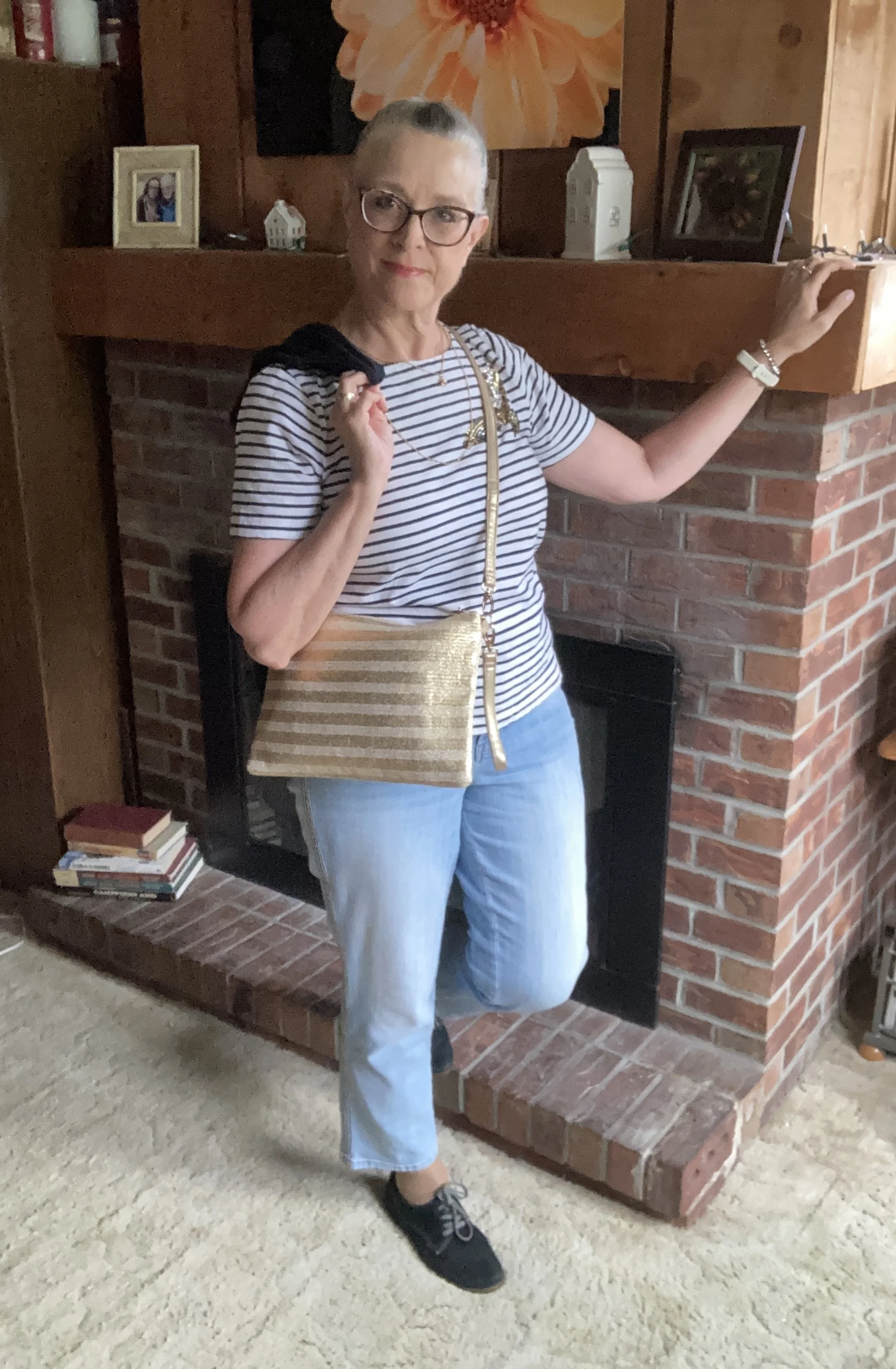
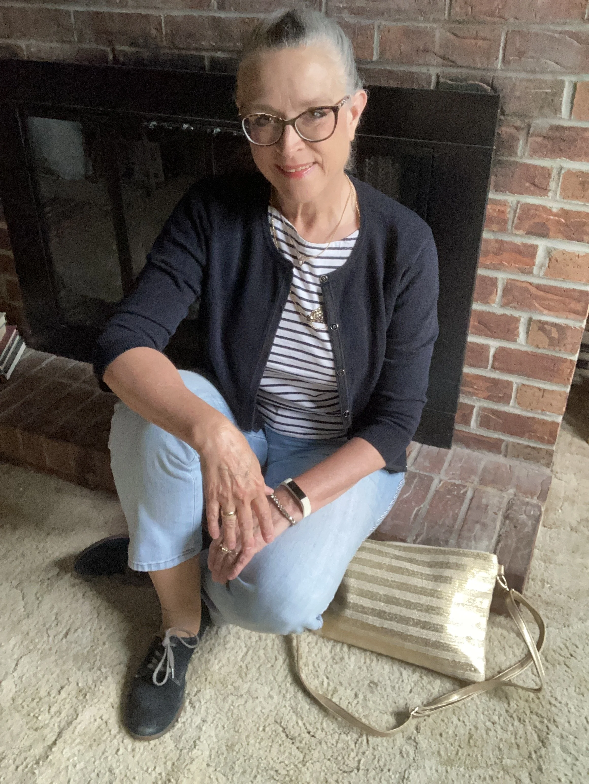
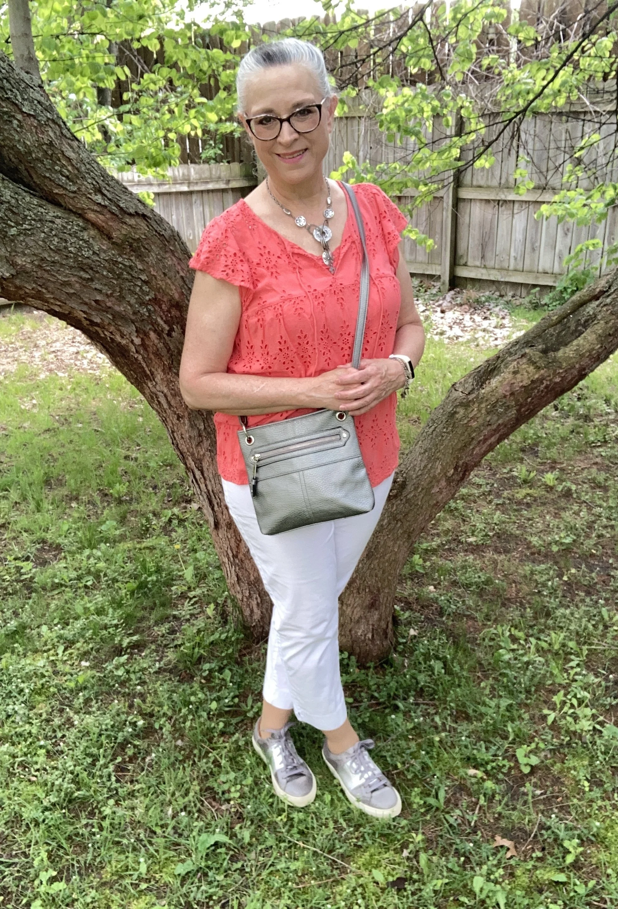
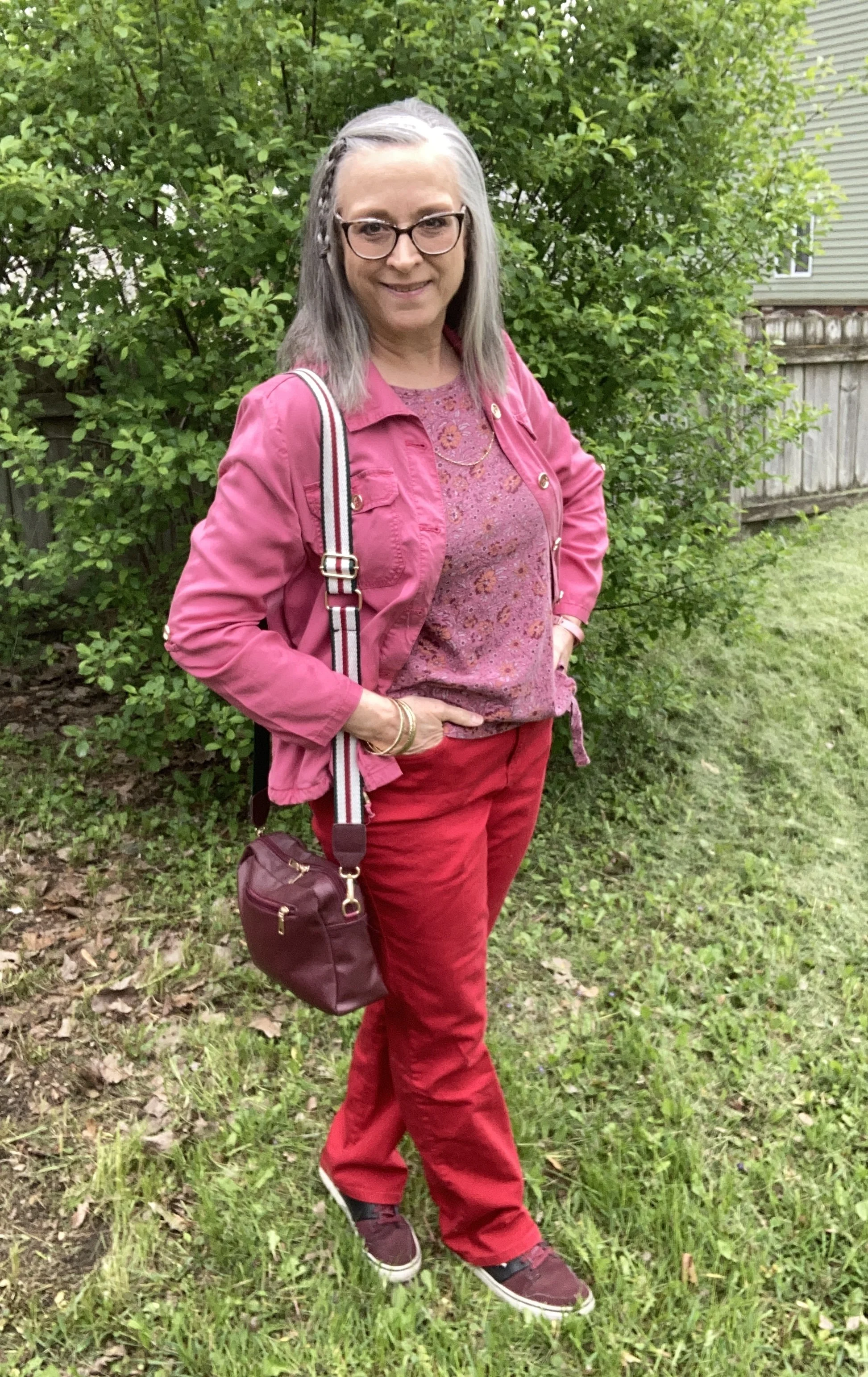
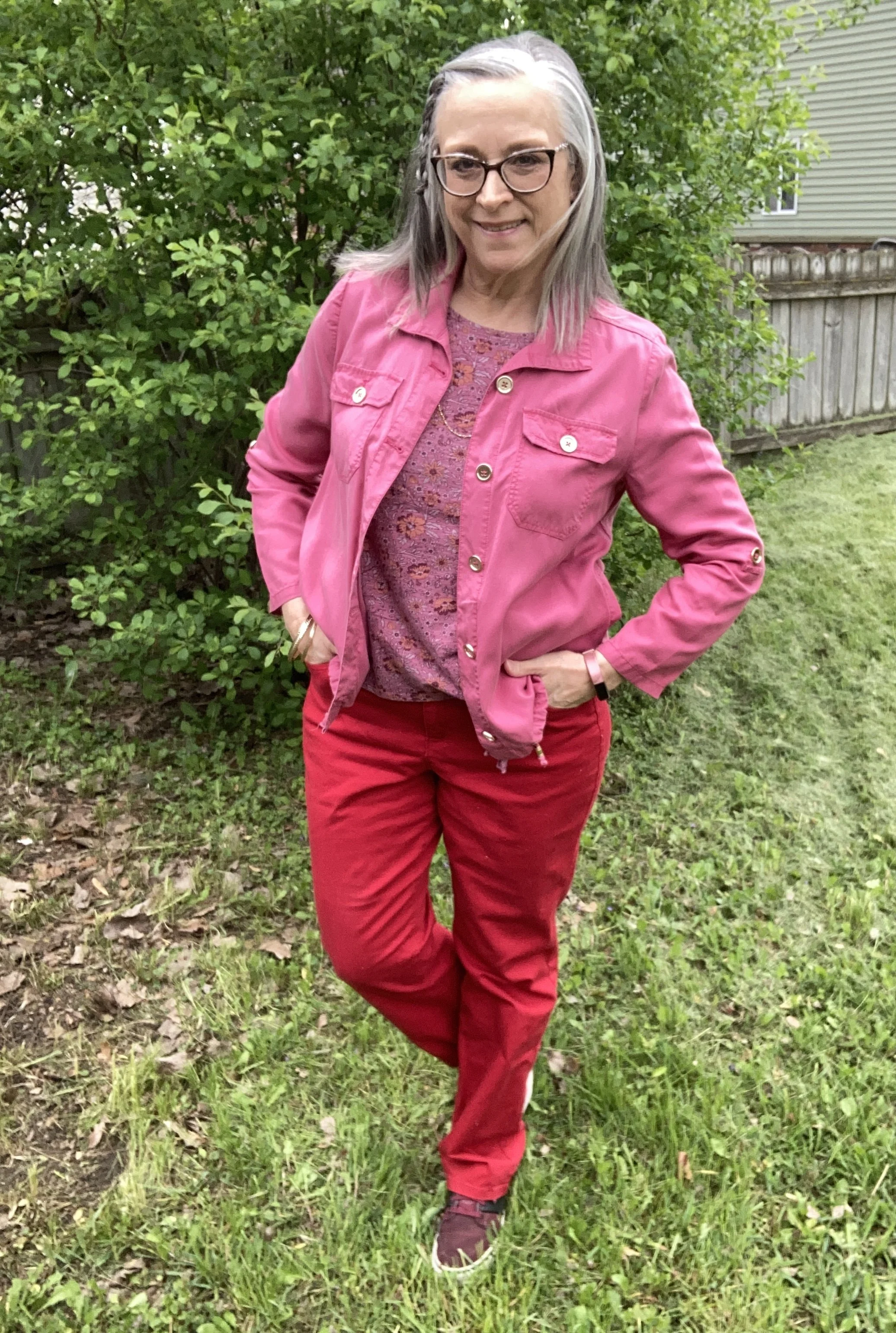
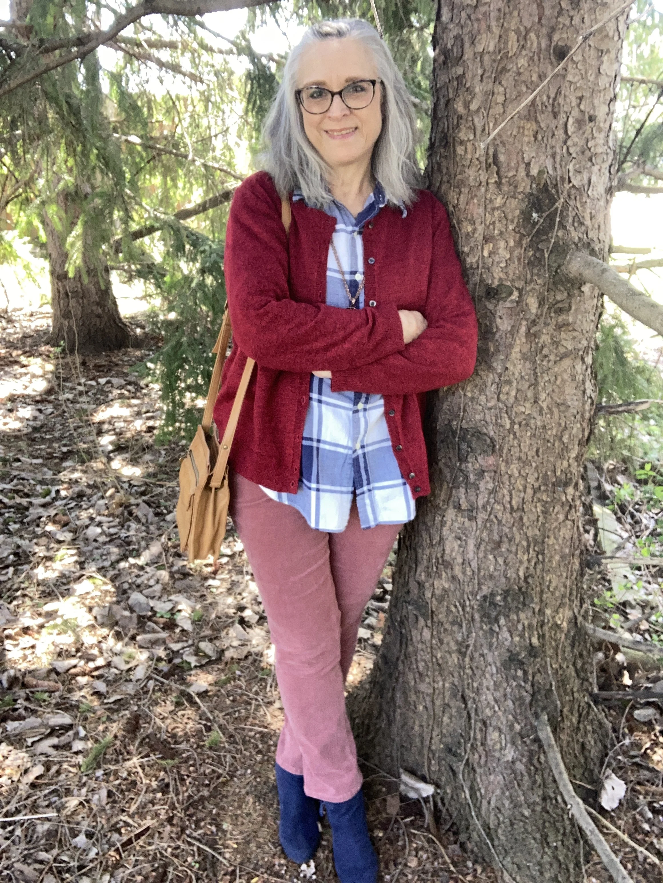
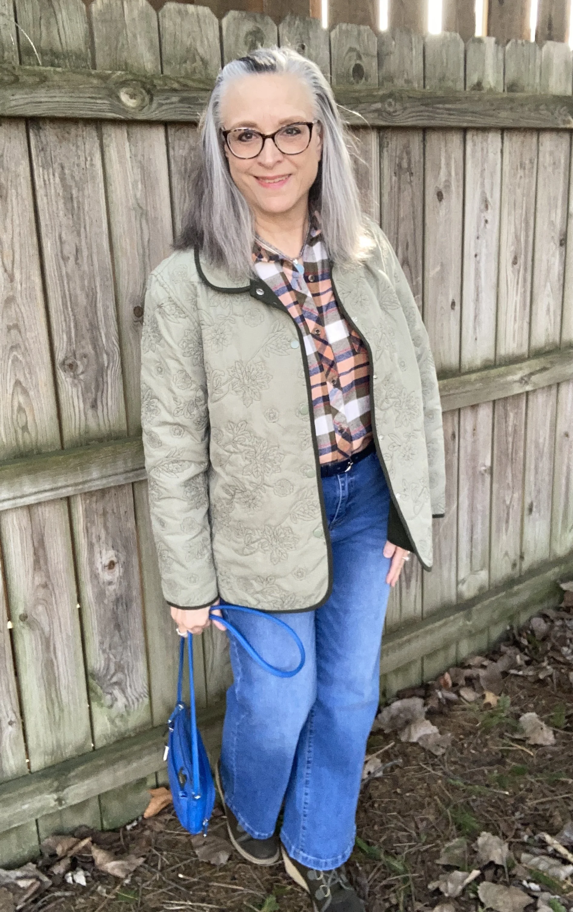
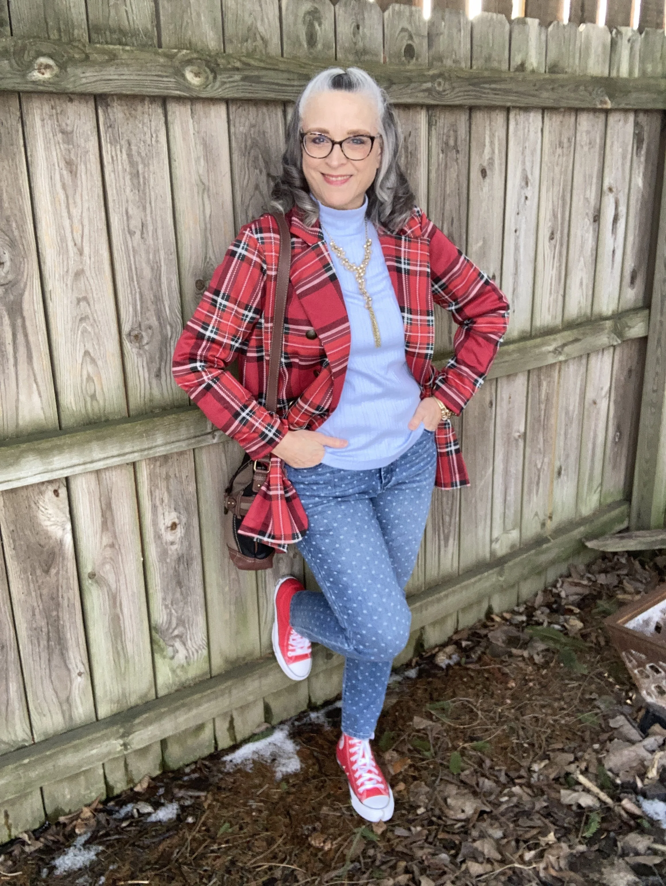
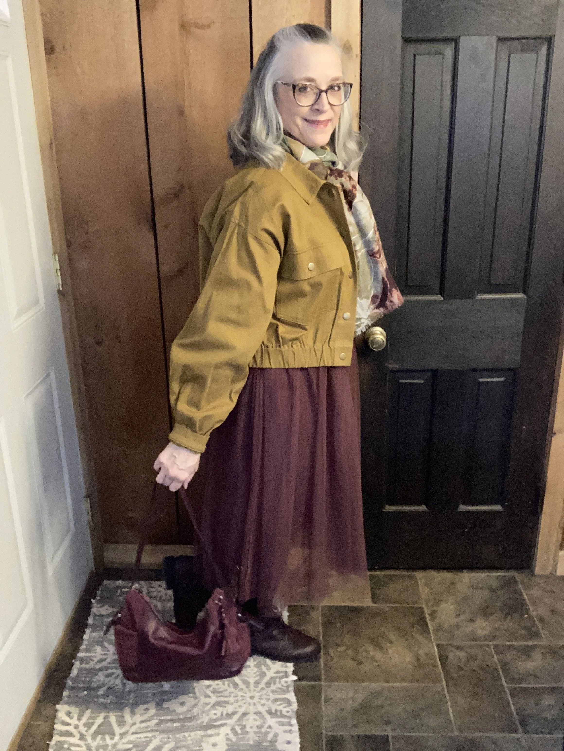
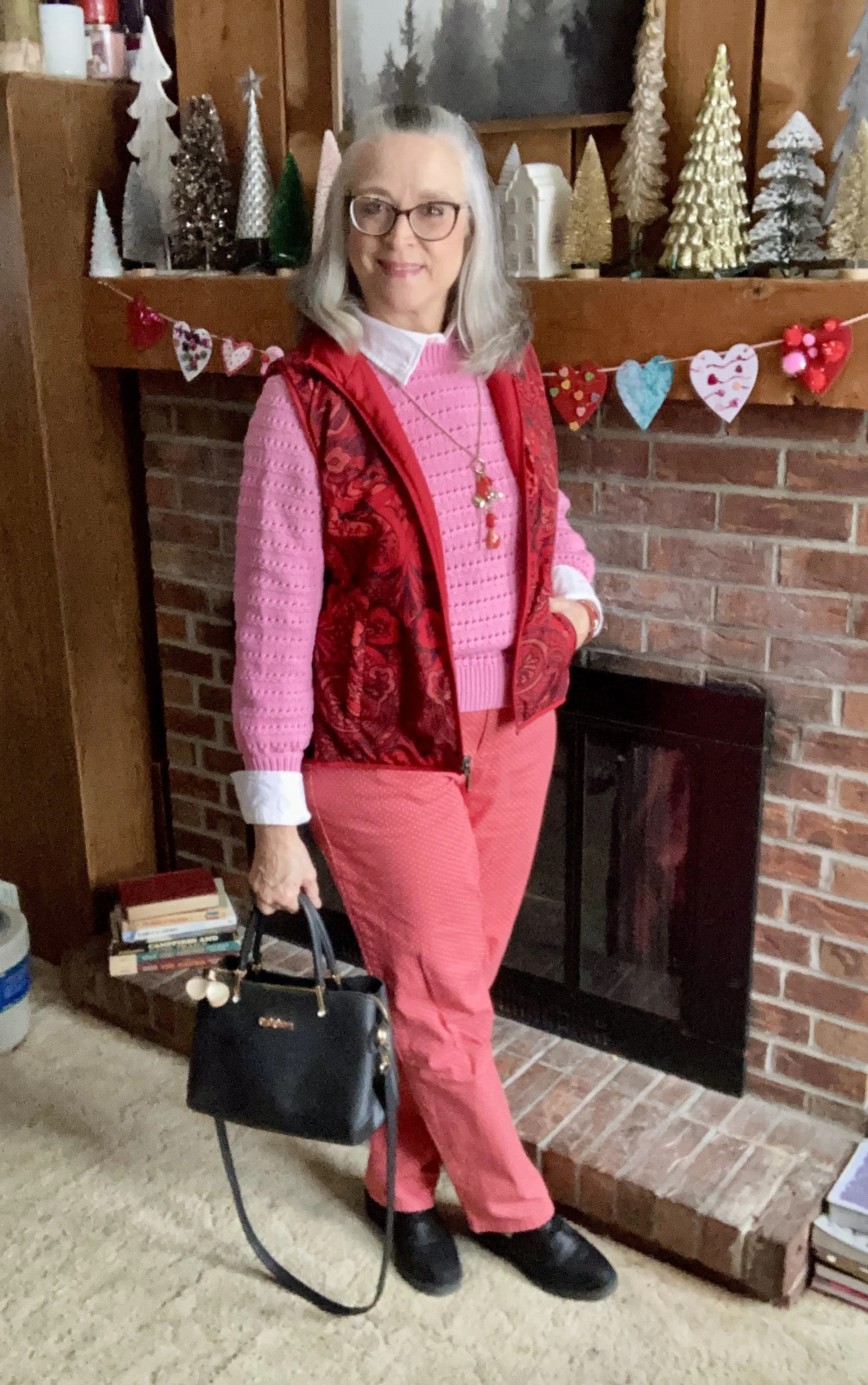
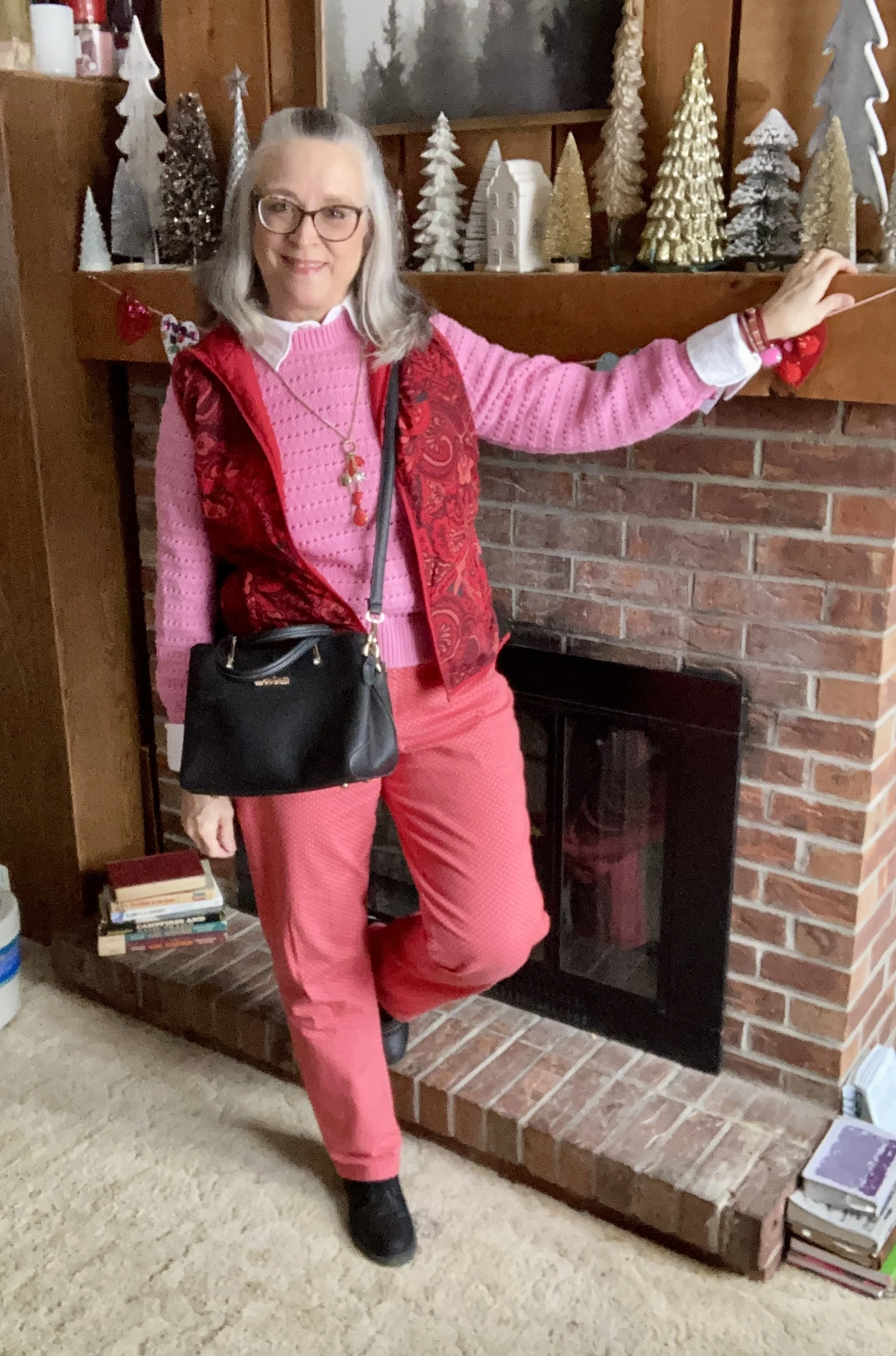
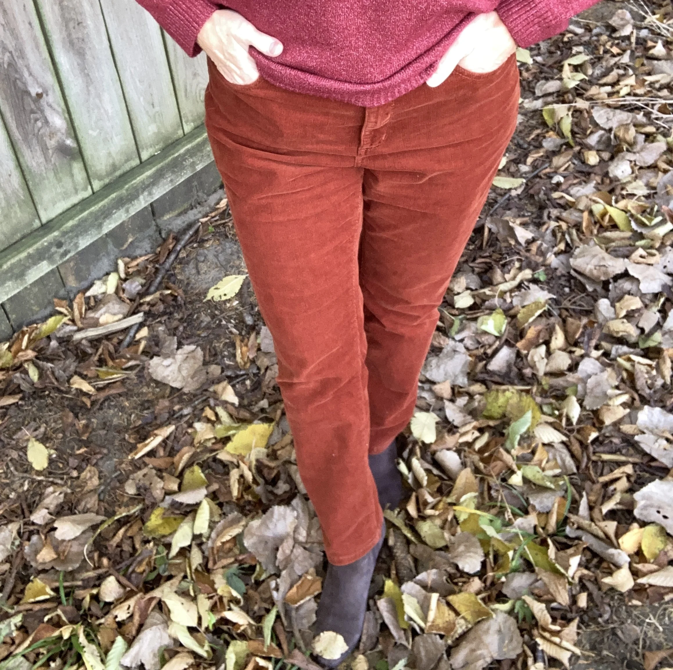
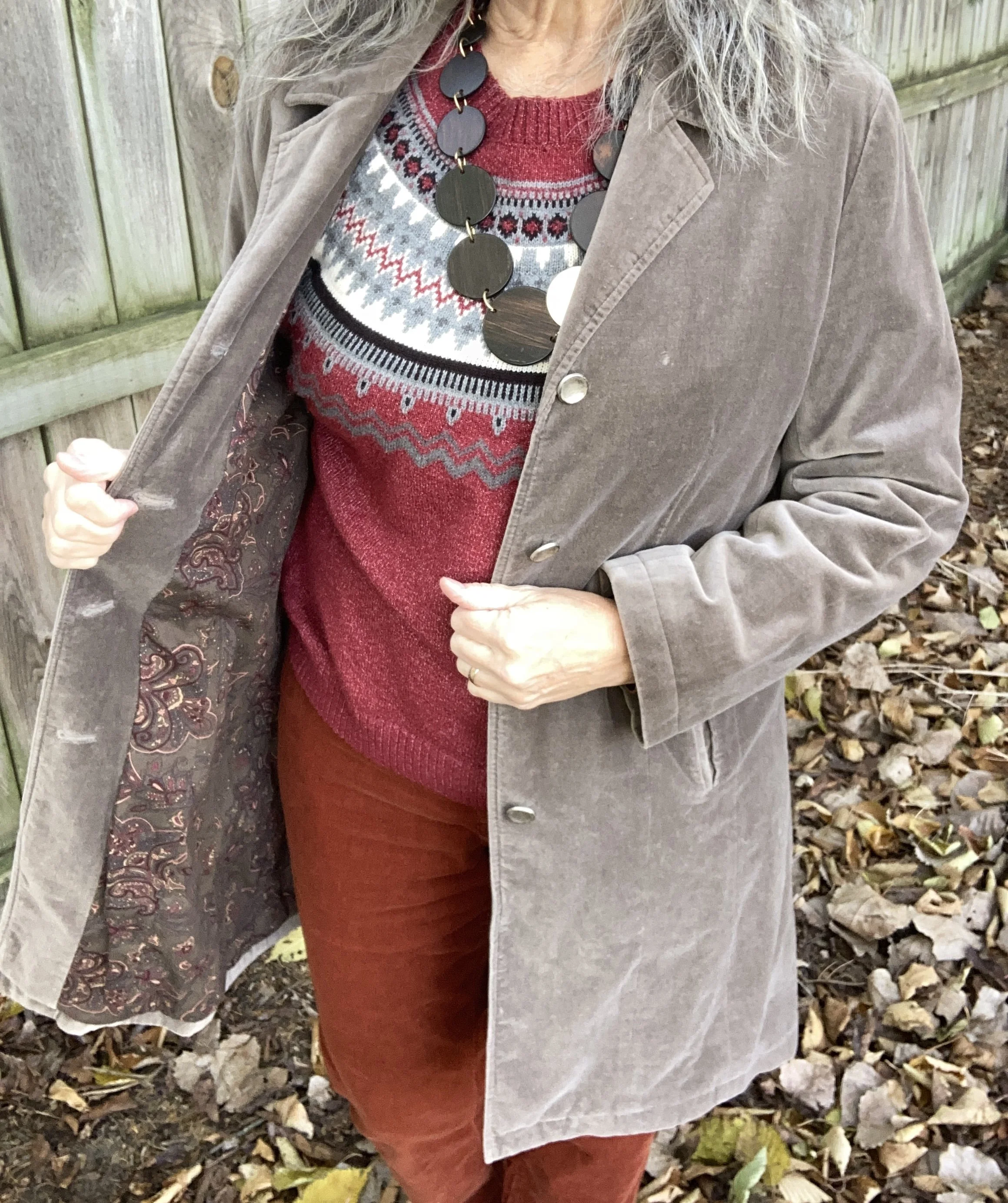
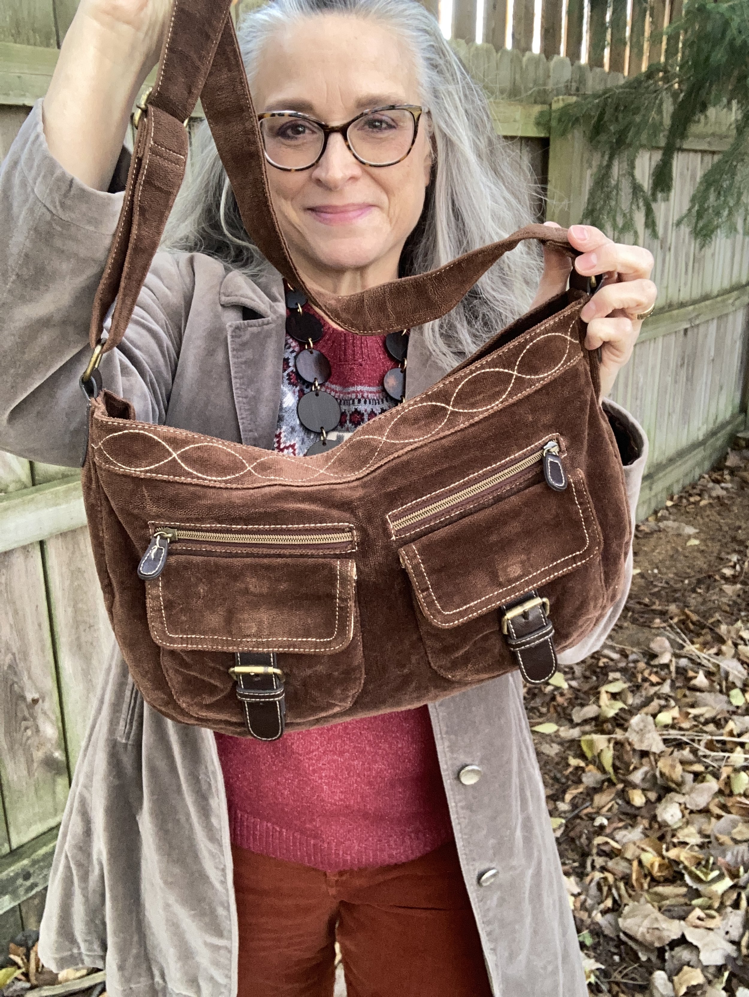
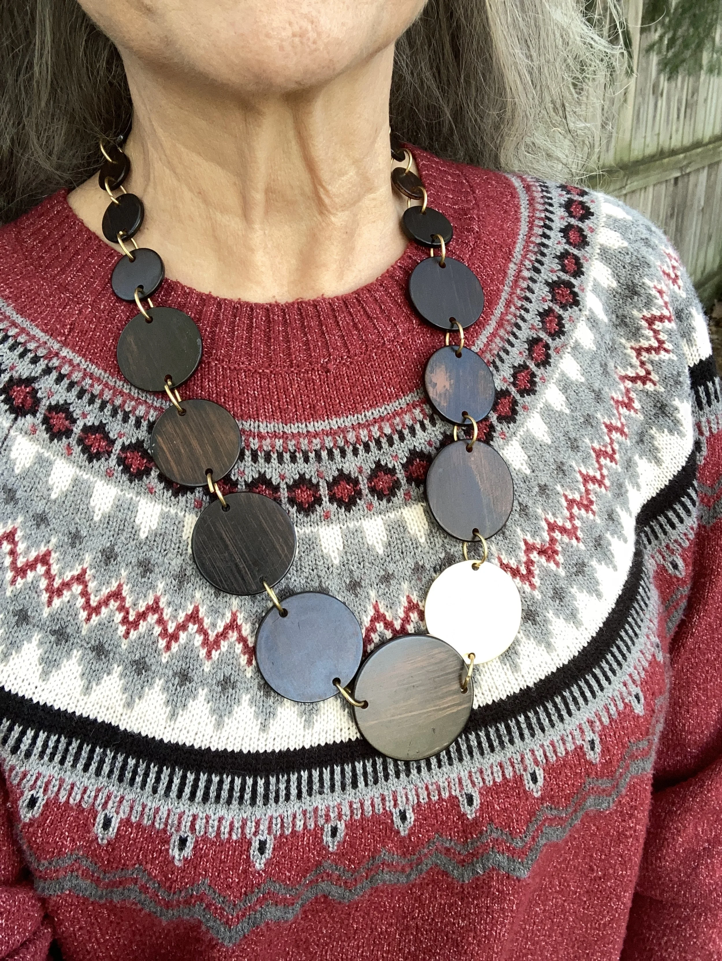
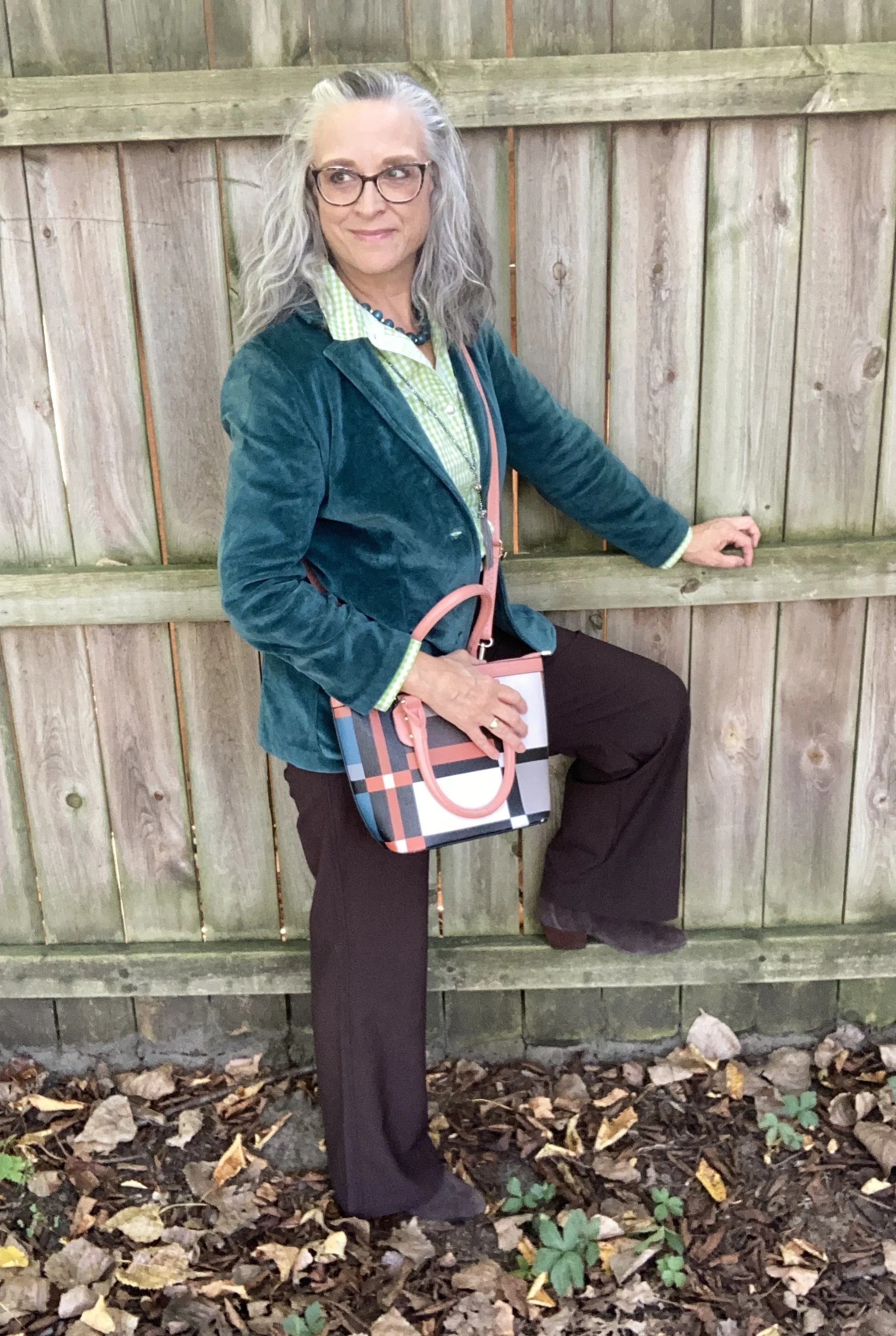
My Style: Pre July 4th Look
It is hard to believe the first full day of summer, the longest day of the year is already past and we are heading towards Independence Day, the 250th birthday of our country. When we celebrated the 200th birthday I was 12 years old and I do remember going to the parade and seeing fireworks. It was a big deal. No matter who you are, what you believe or who you voted for, I hope we all can set aside the negativity and simply enjoy the freedom and benefits we have living in the United State of America, and that for just a little while we can concentrate on all that we have to be thankful for.
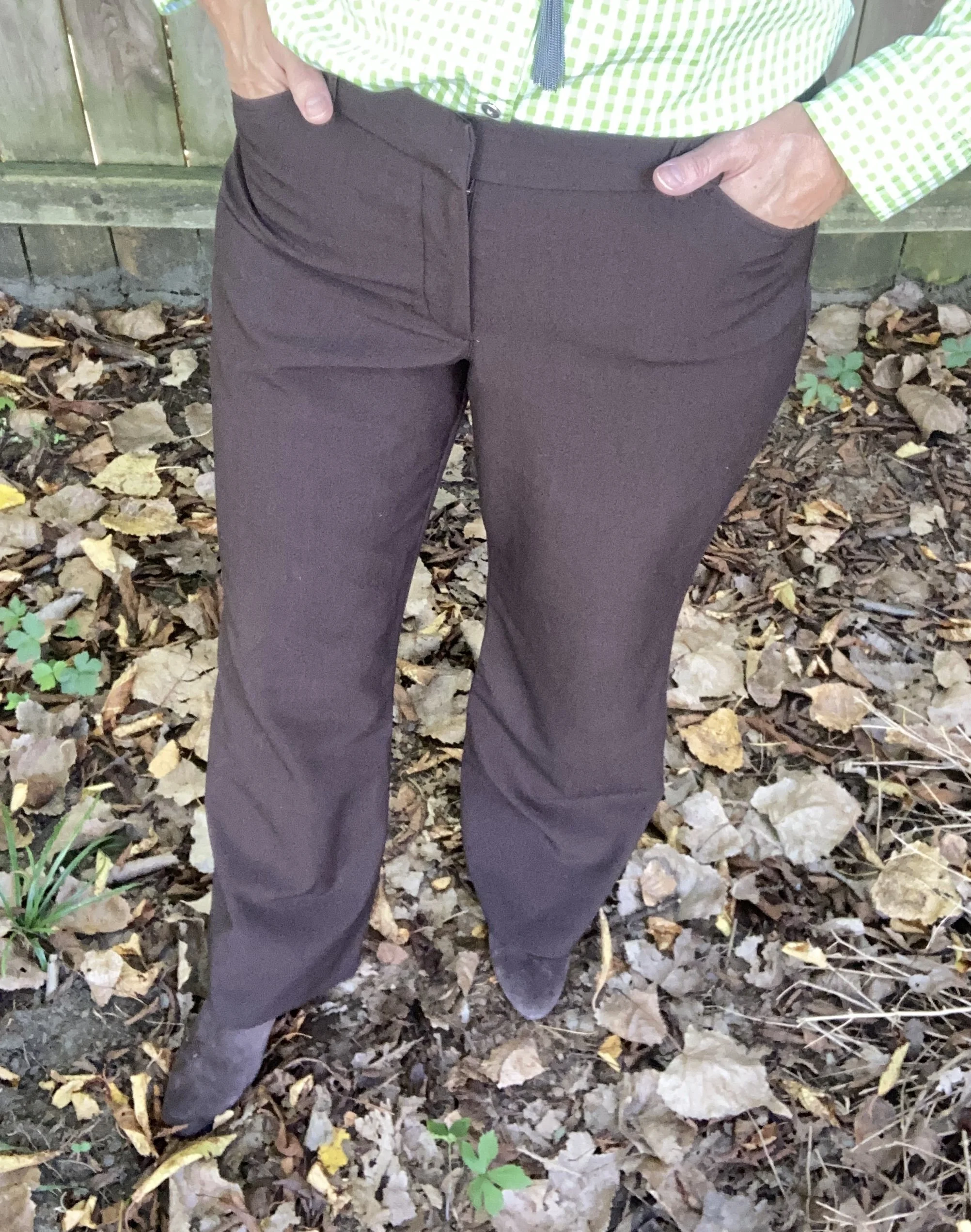
Today’s outfit revolves around this idea of celebration of the red, white and blue.
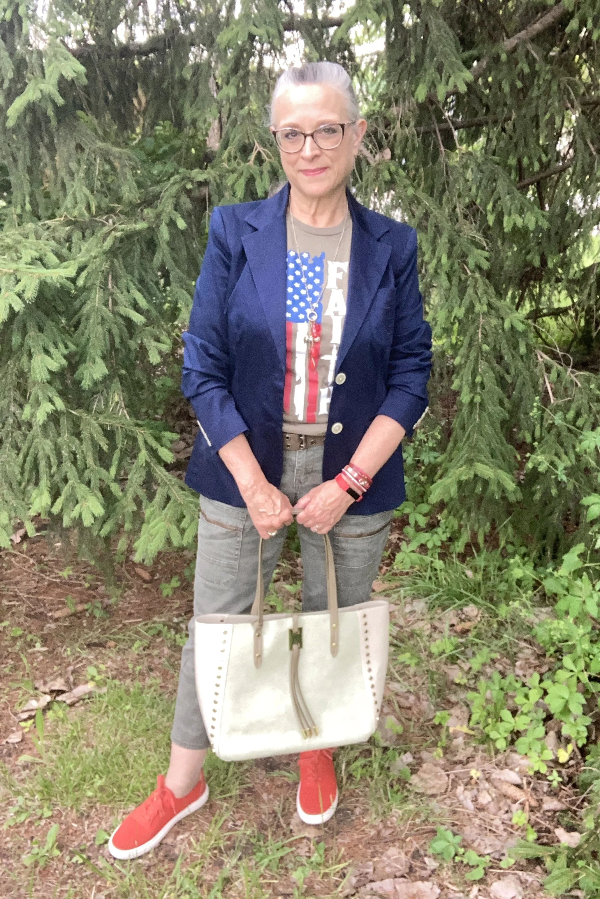
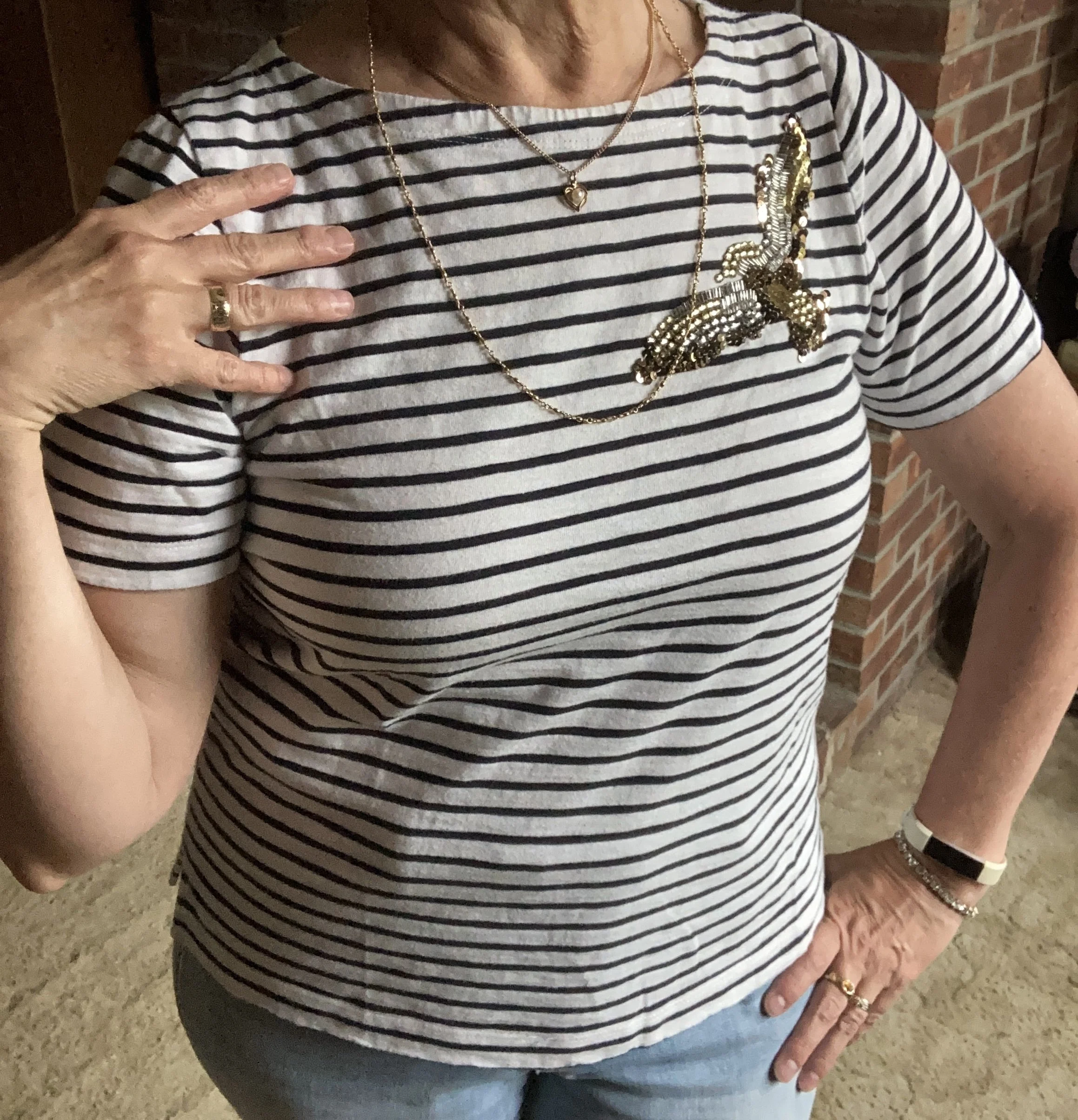
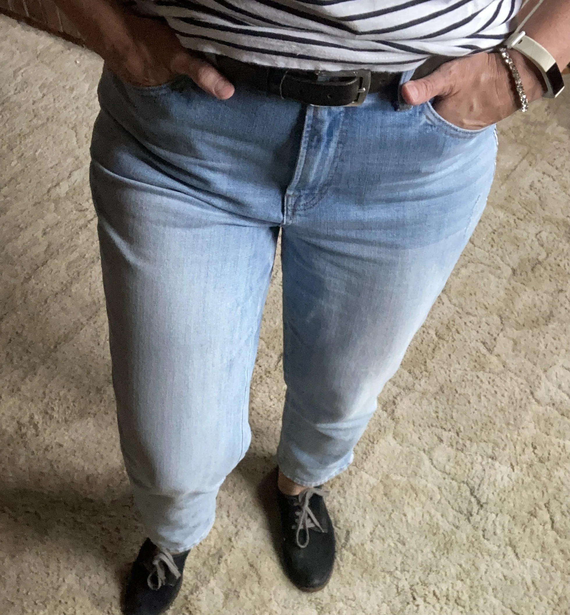
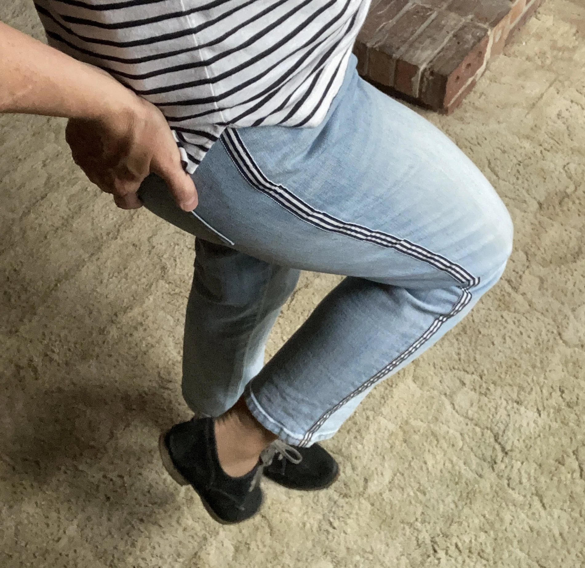
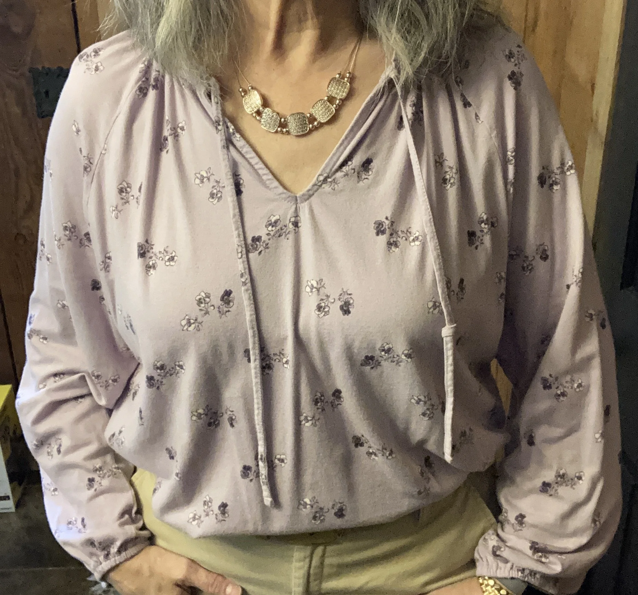
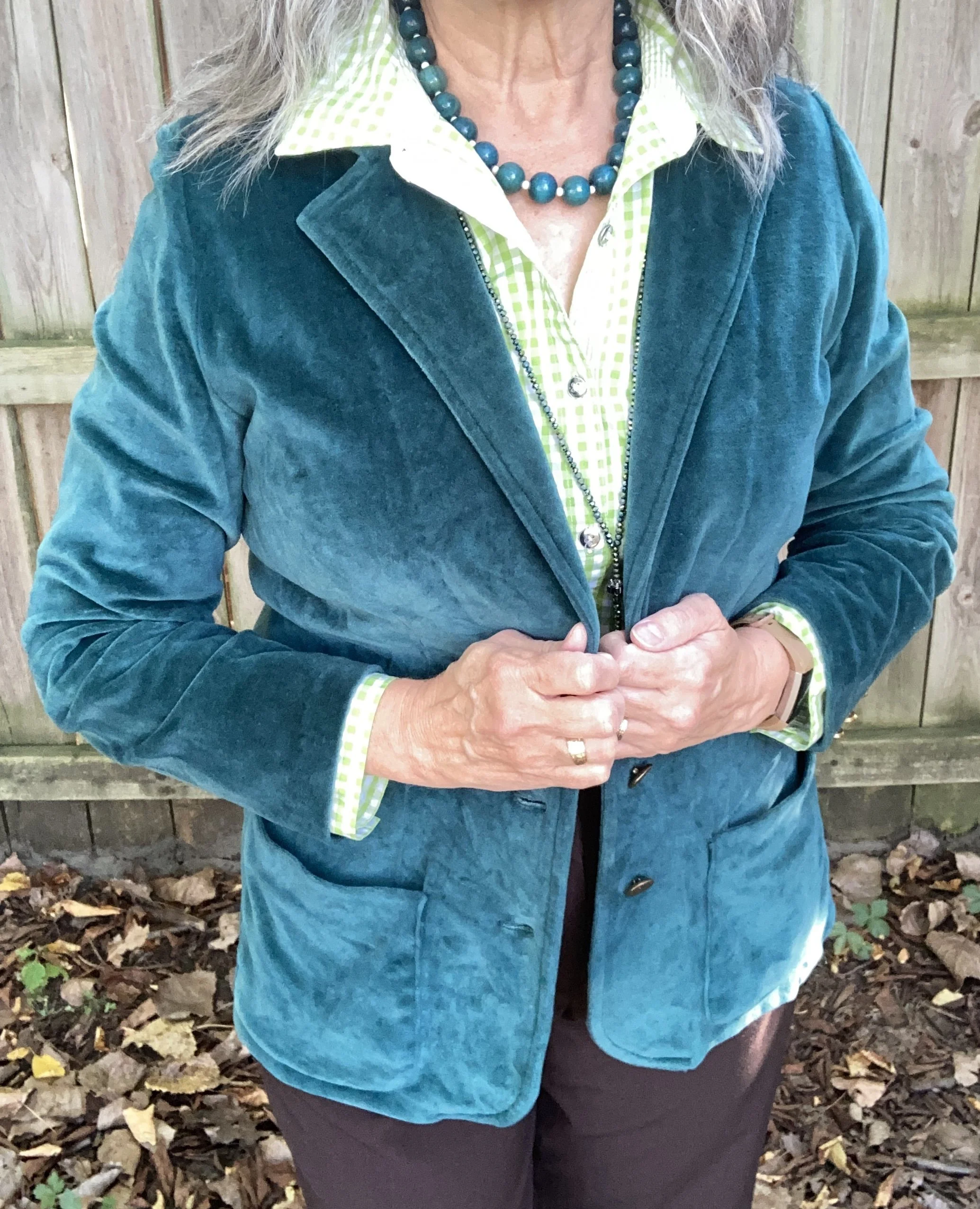
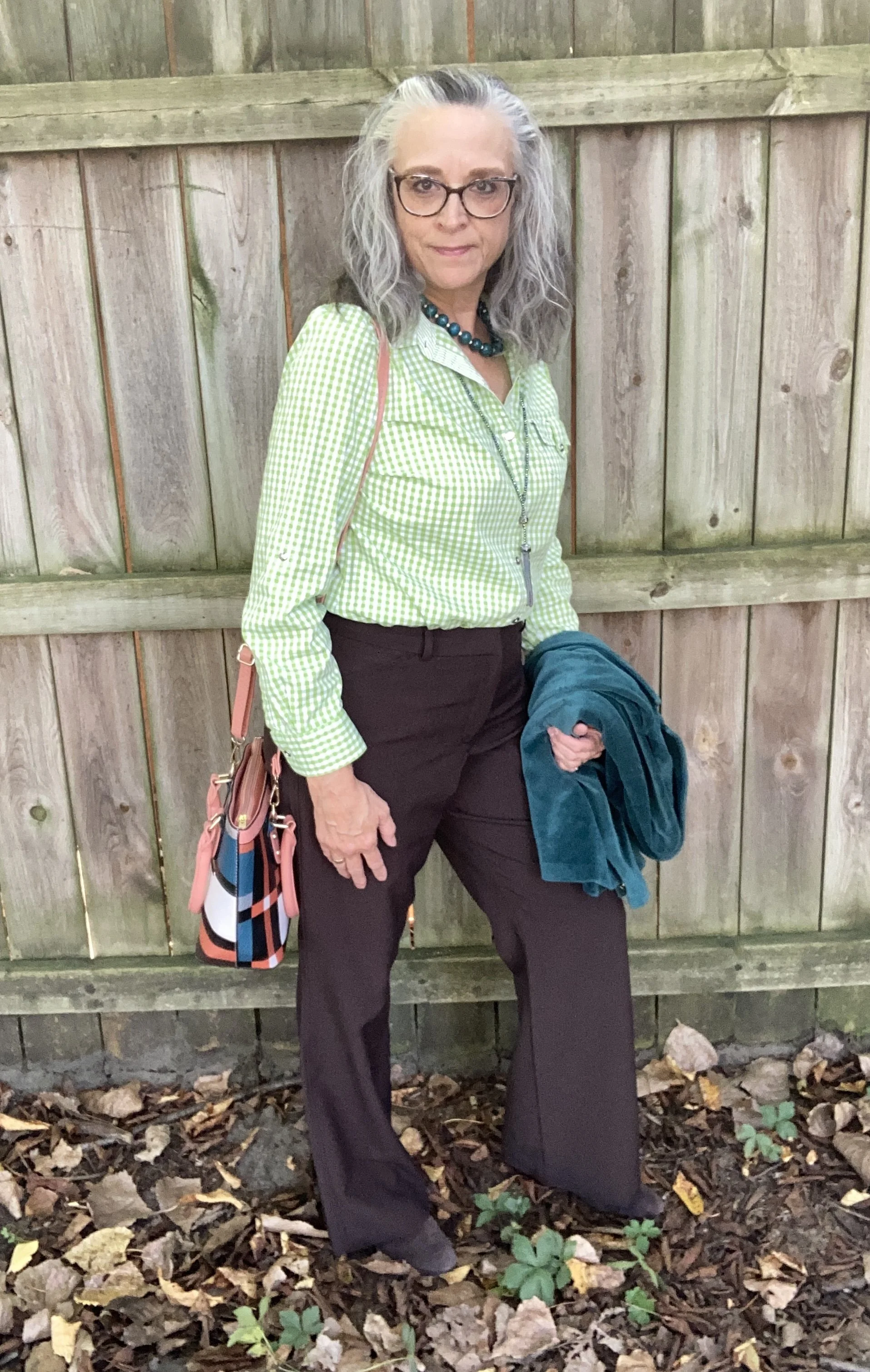
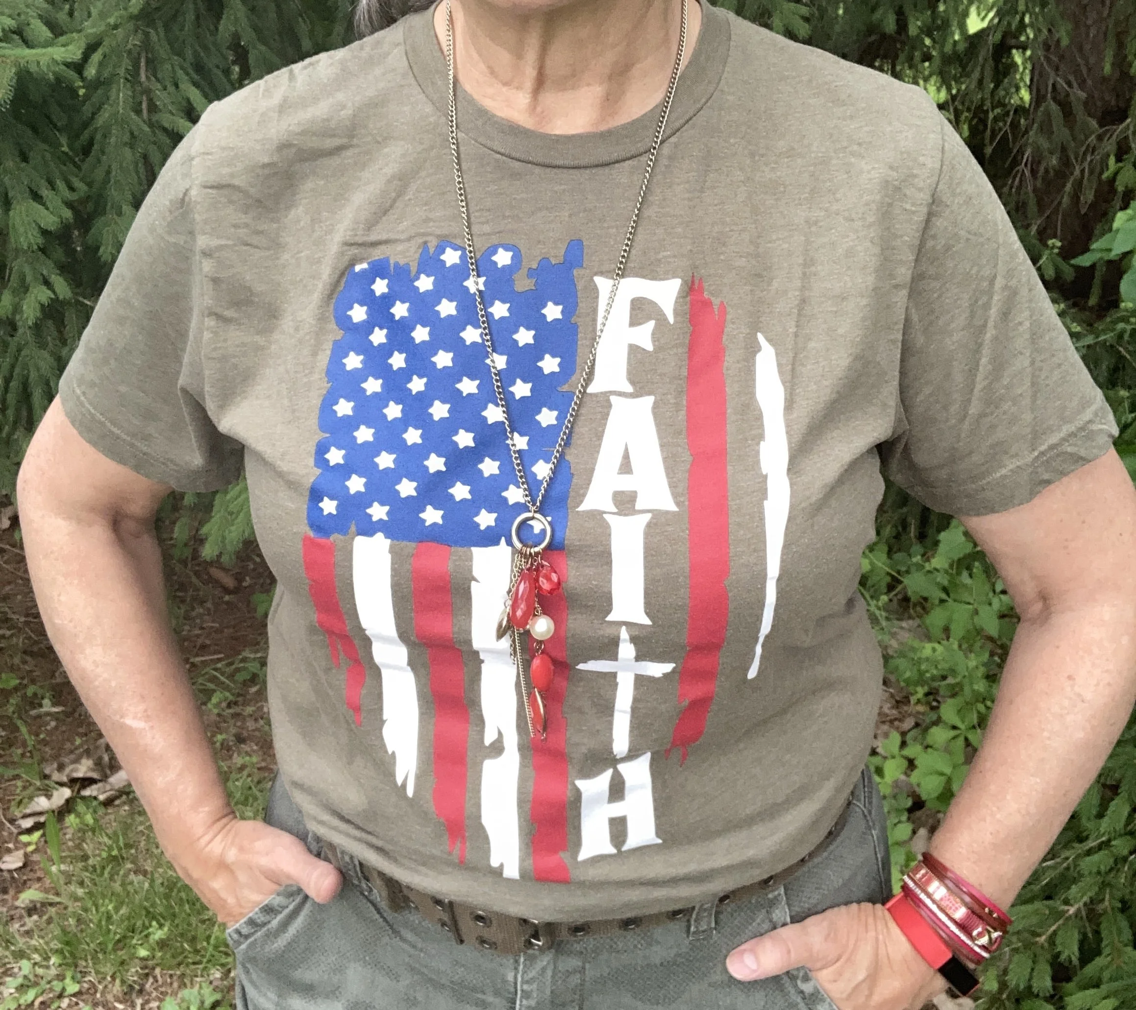
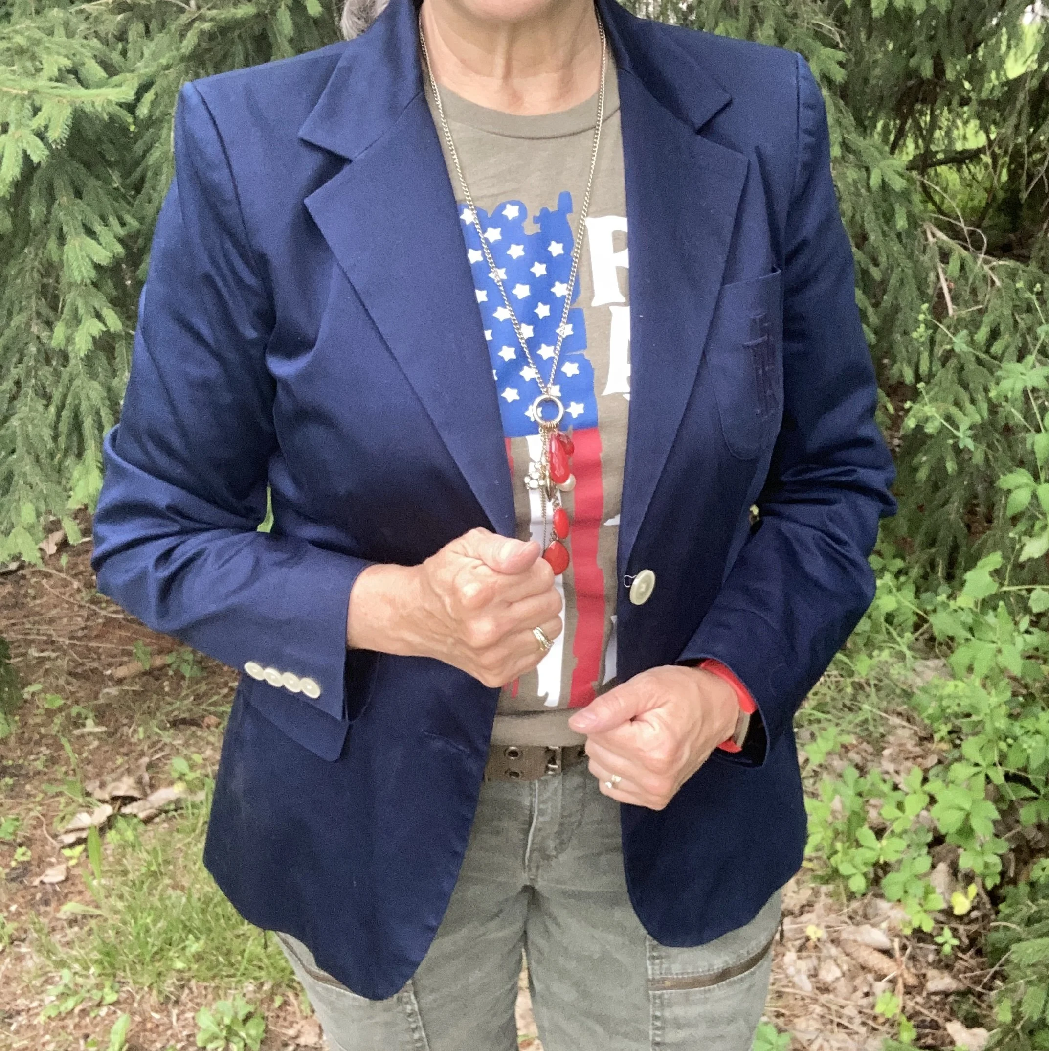
I didn’t really want to go full on red, white and blue, so I chose olive green as the back drop for the rest of the outfit. I started with this Love in Faith tee that I purchased a few summers ago. If you have followed me for a while you probably know my love for this online retailer. They do not pay me to endorse their products, I just love their faith-based tees for their fun graphics, their soft material and their decent pricing. Here are a few of this year’s patriotic tees.
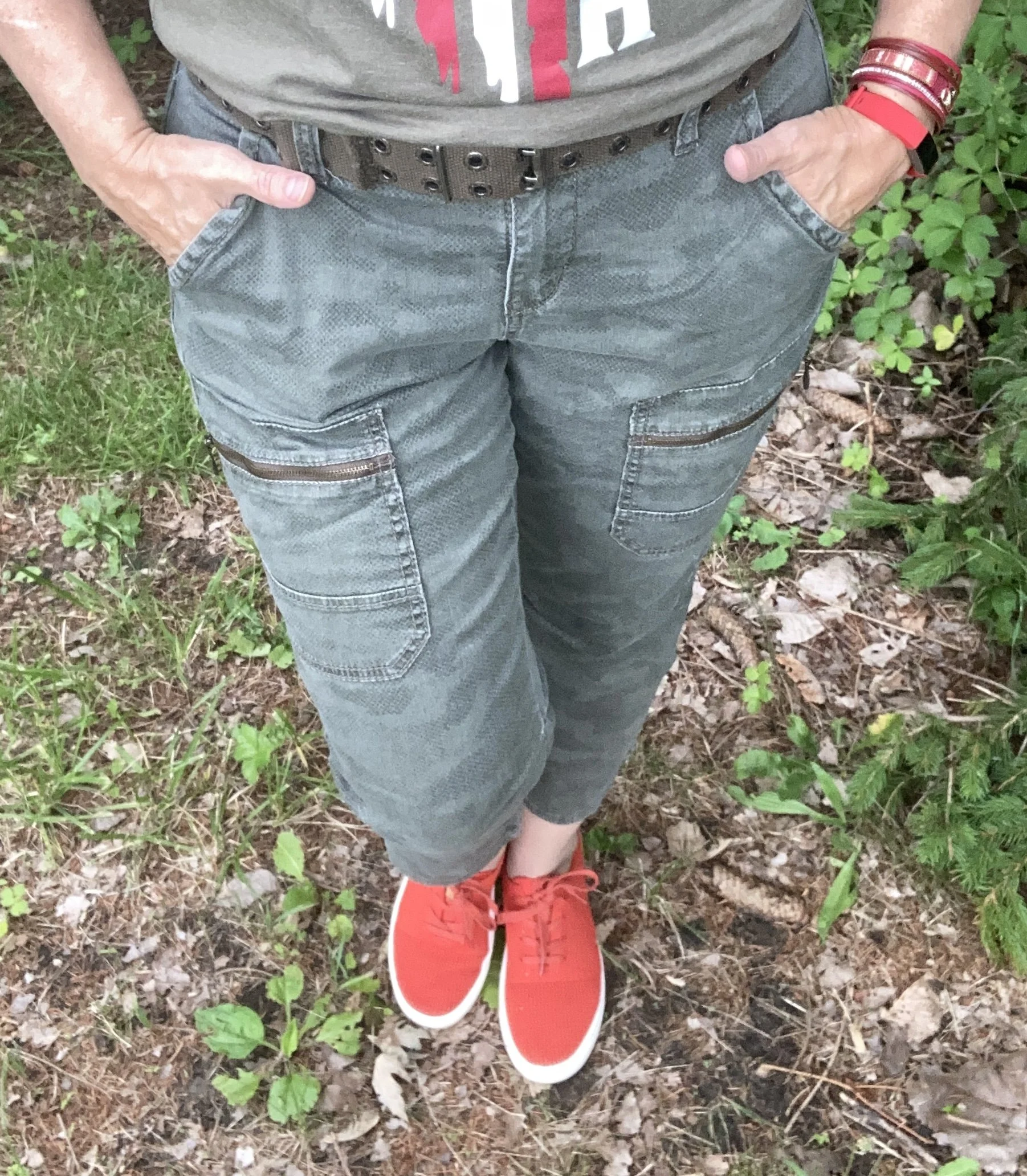
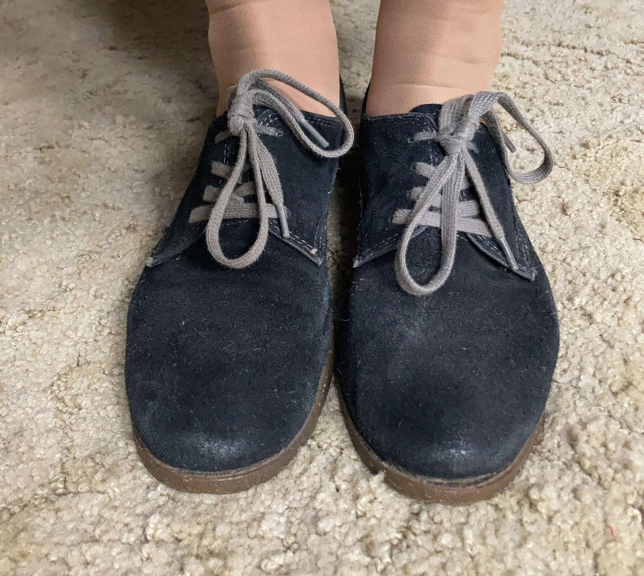
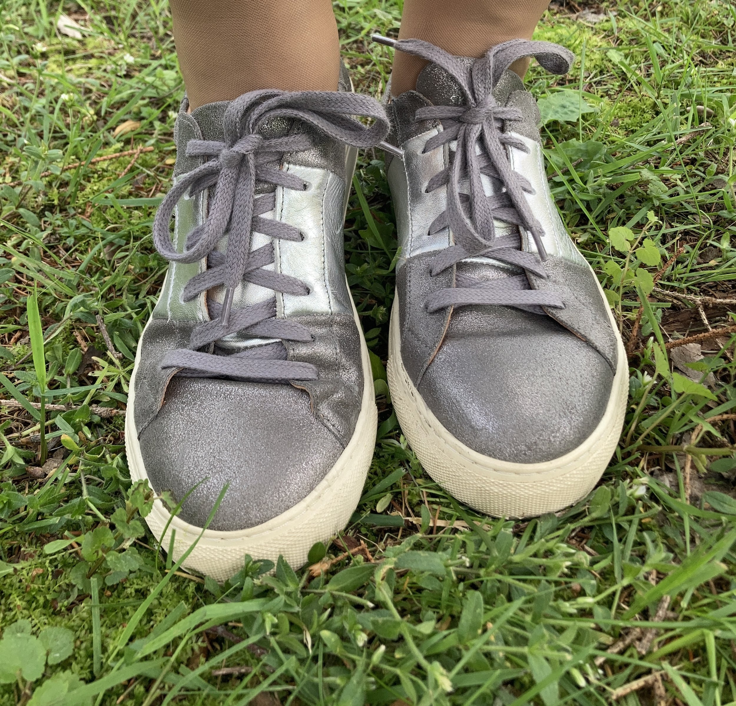
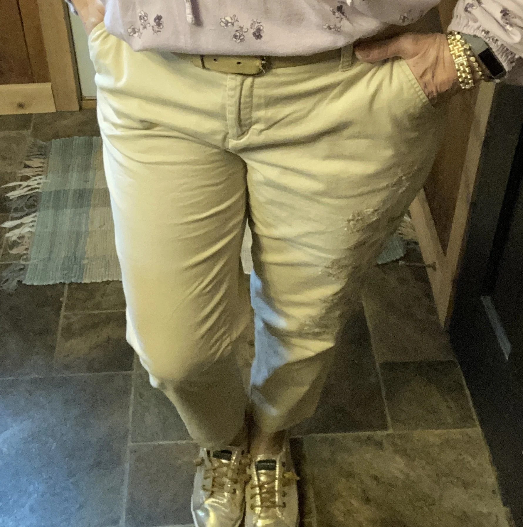
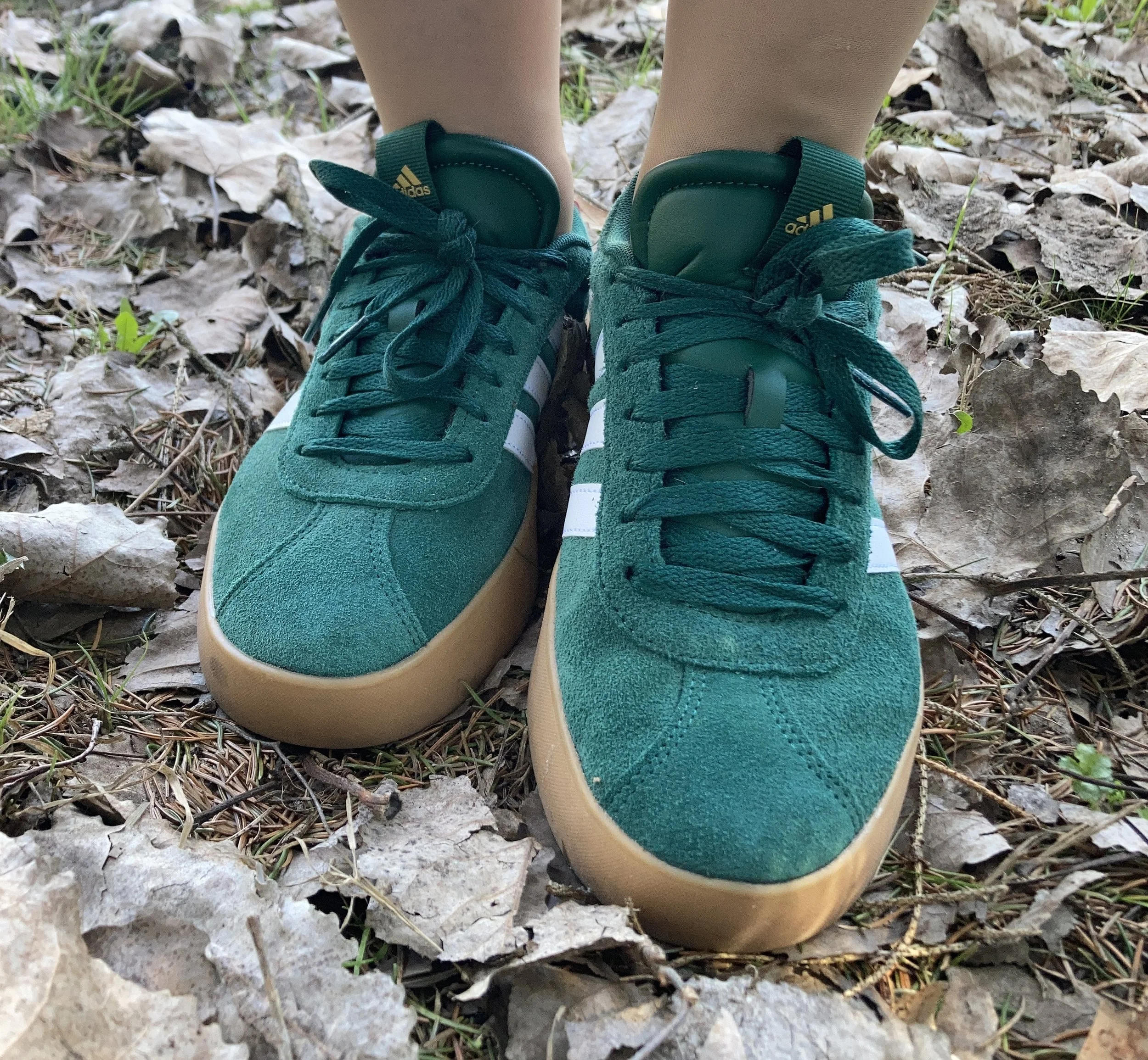
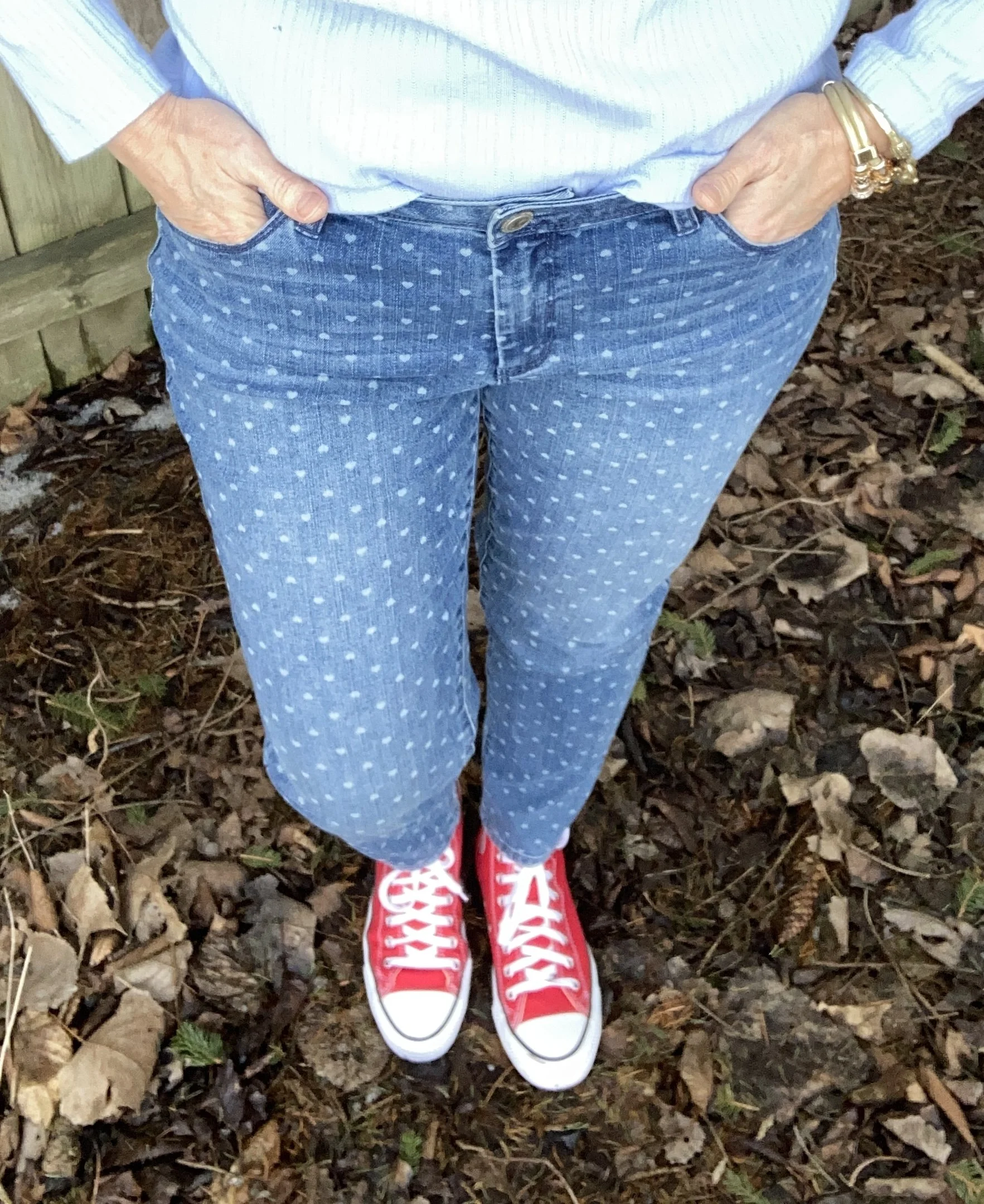
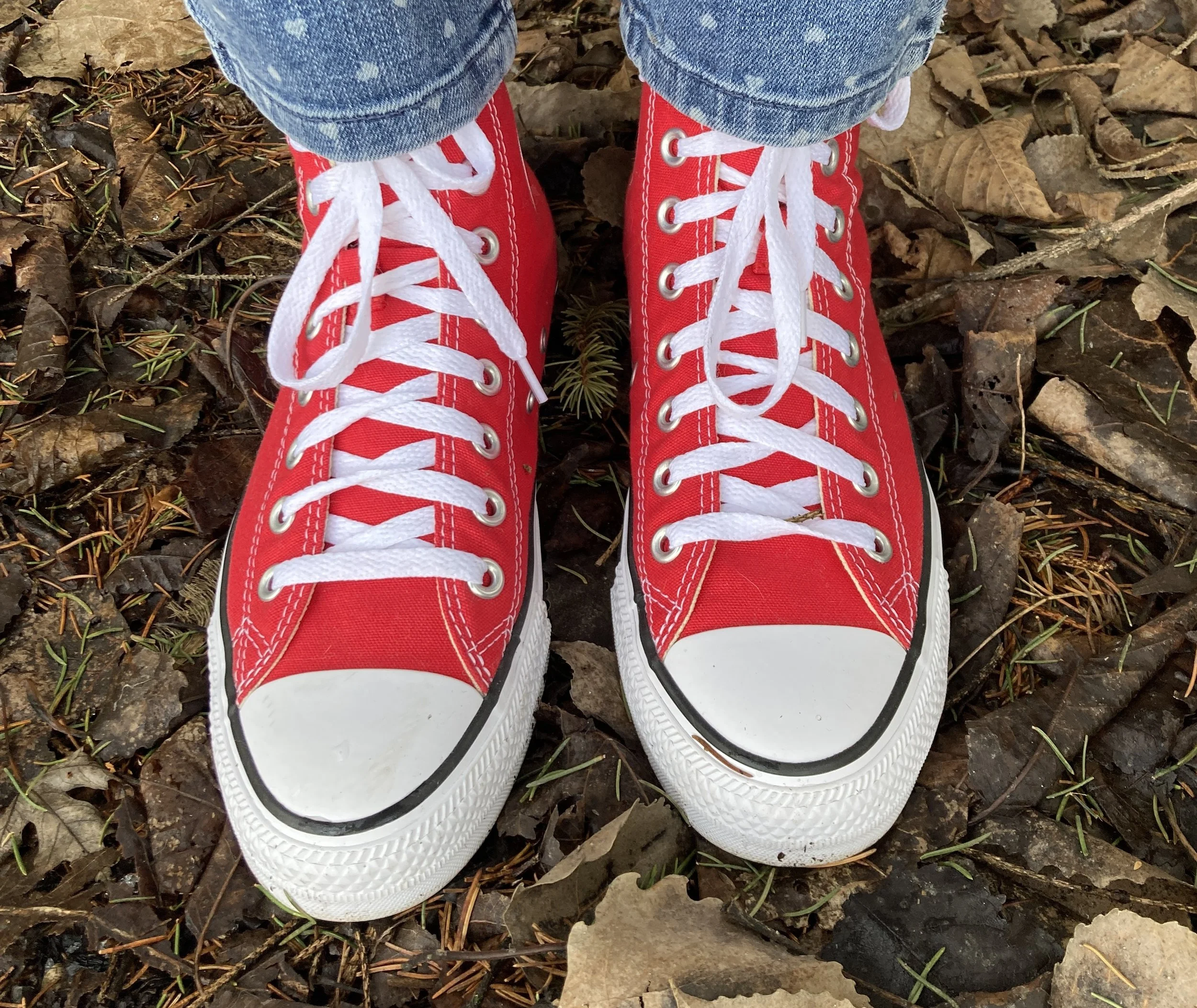
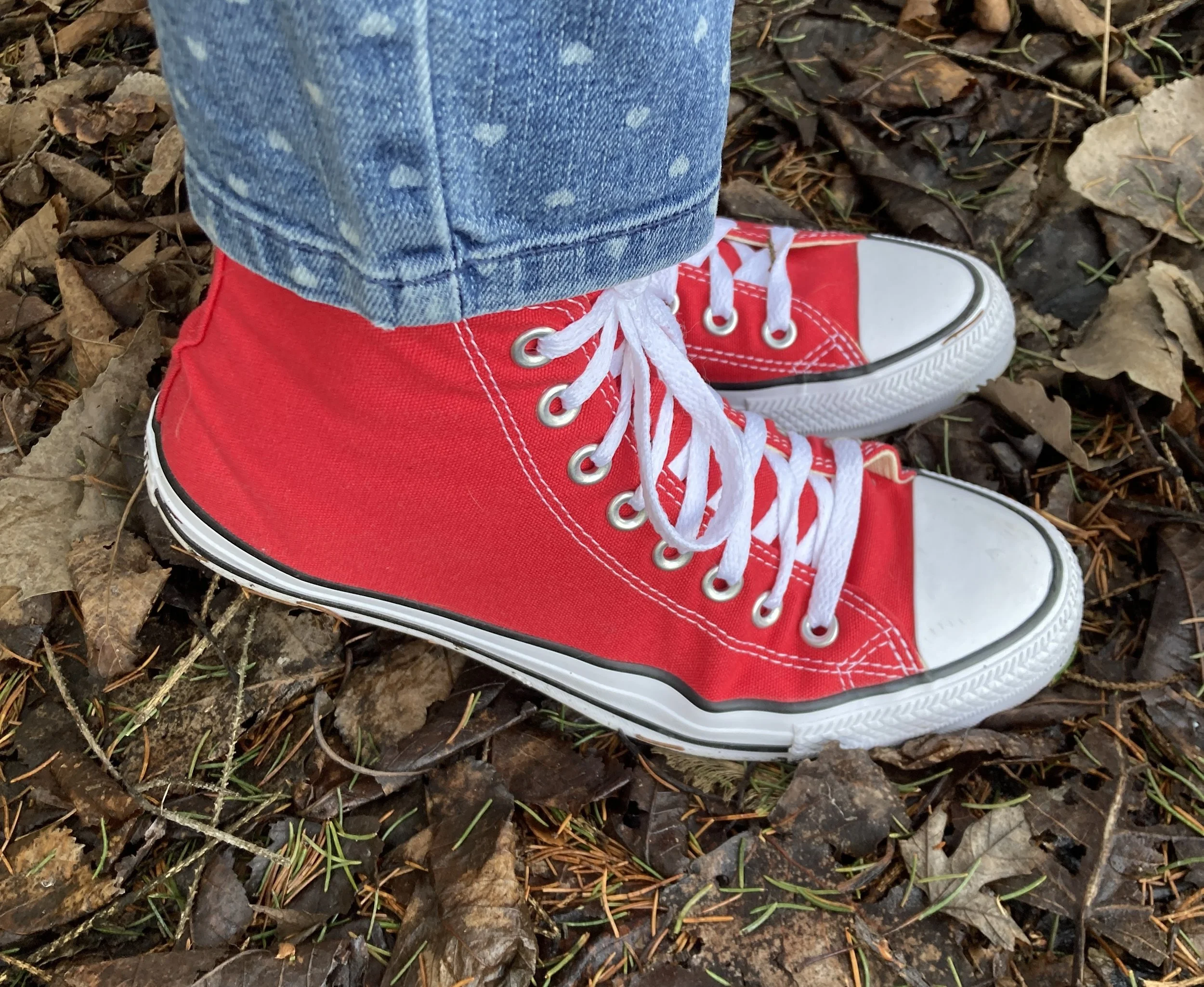
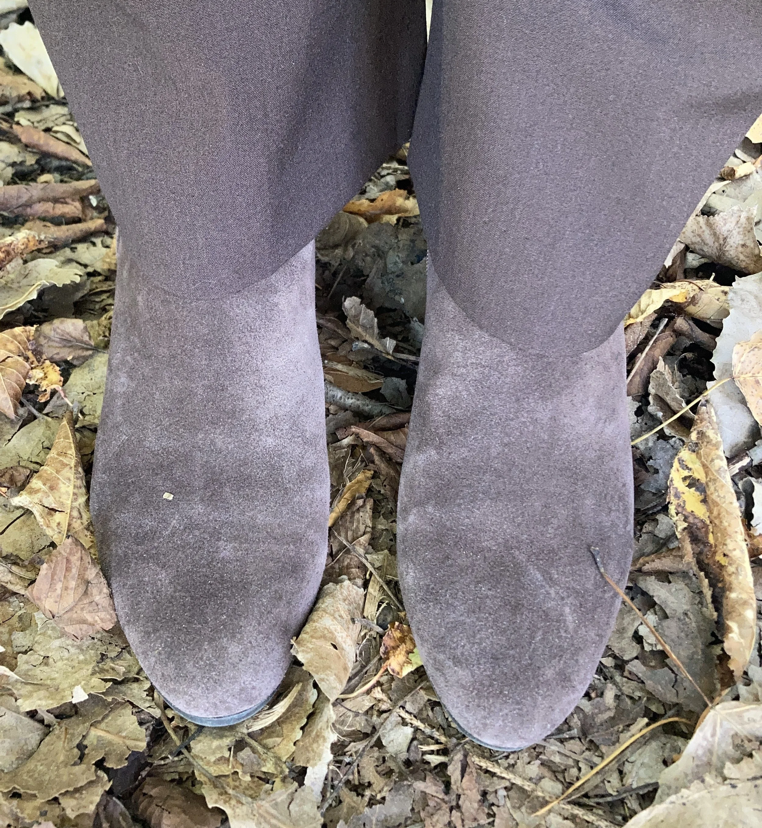
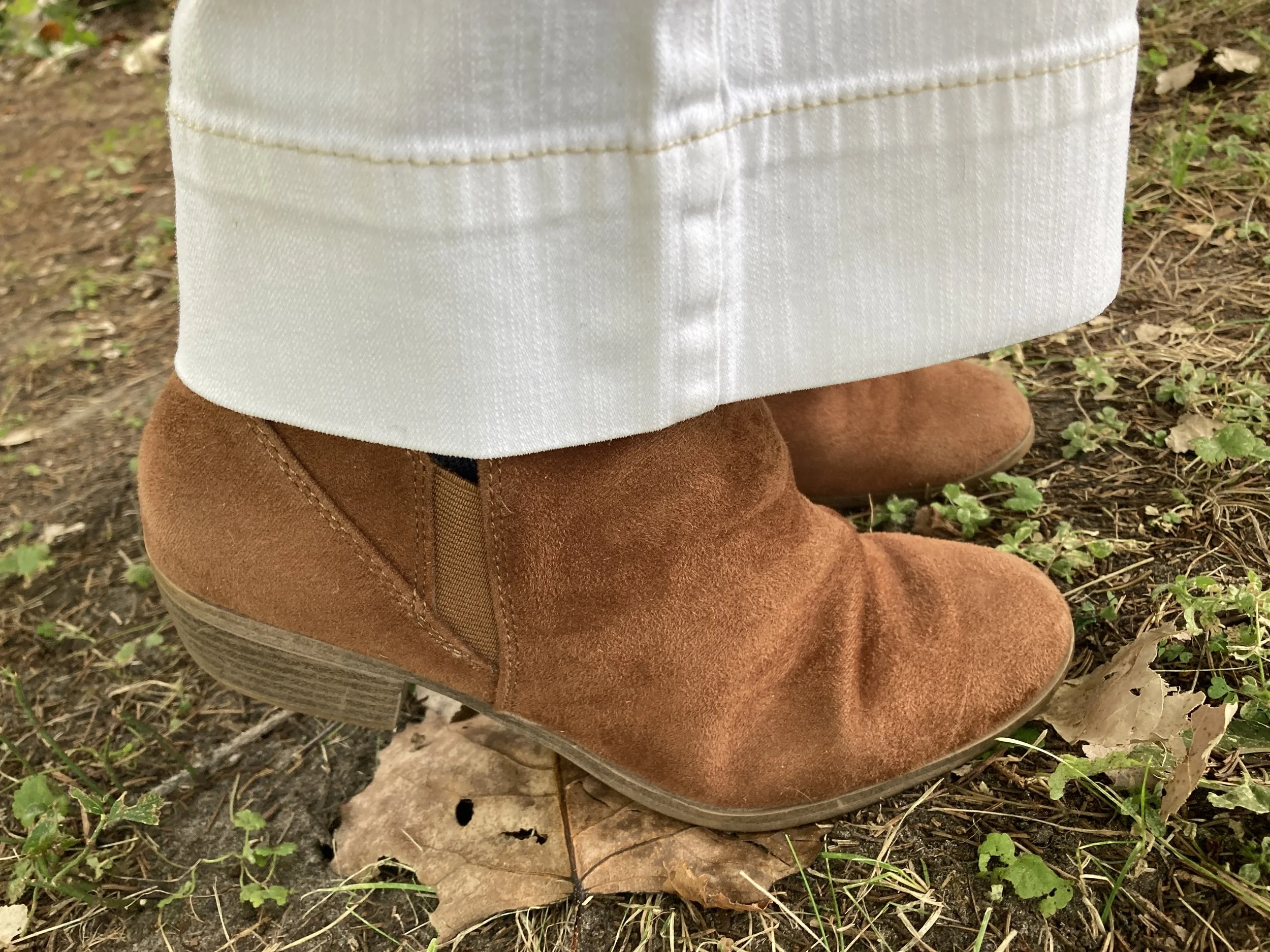
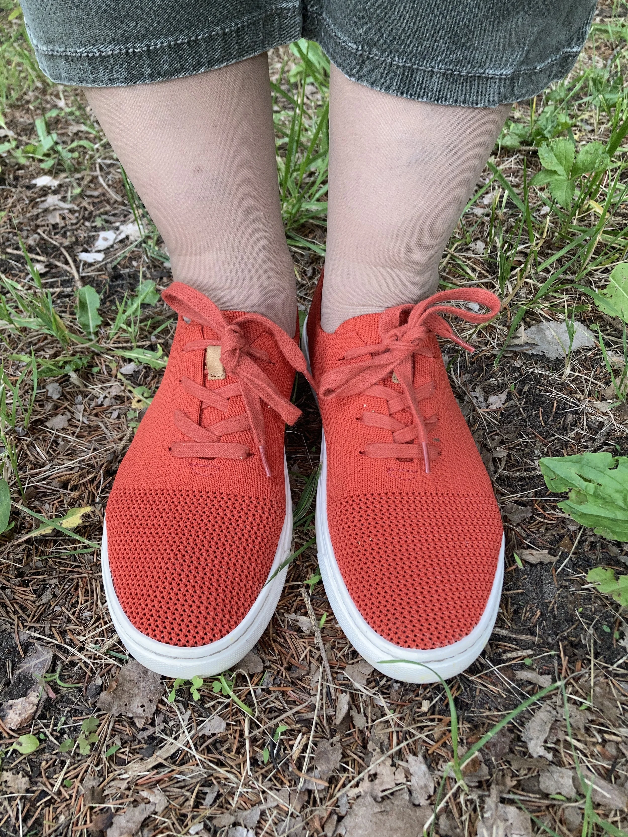
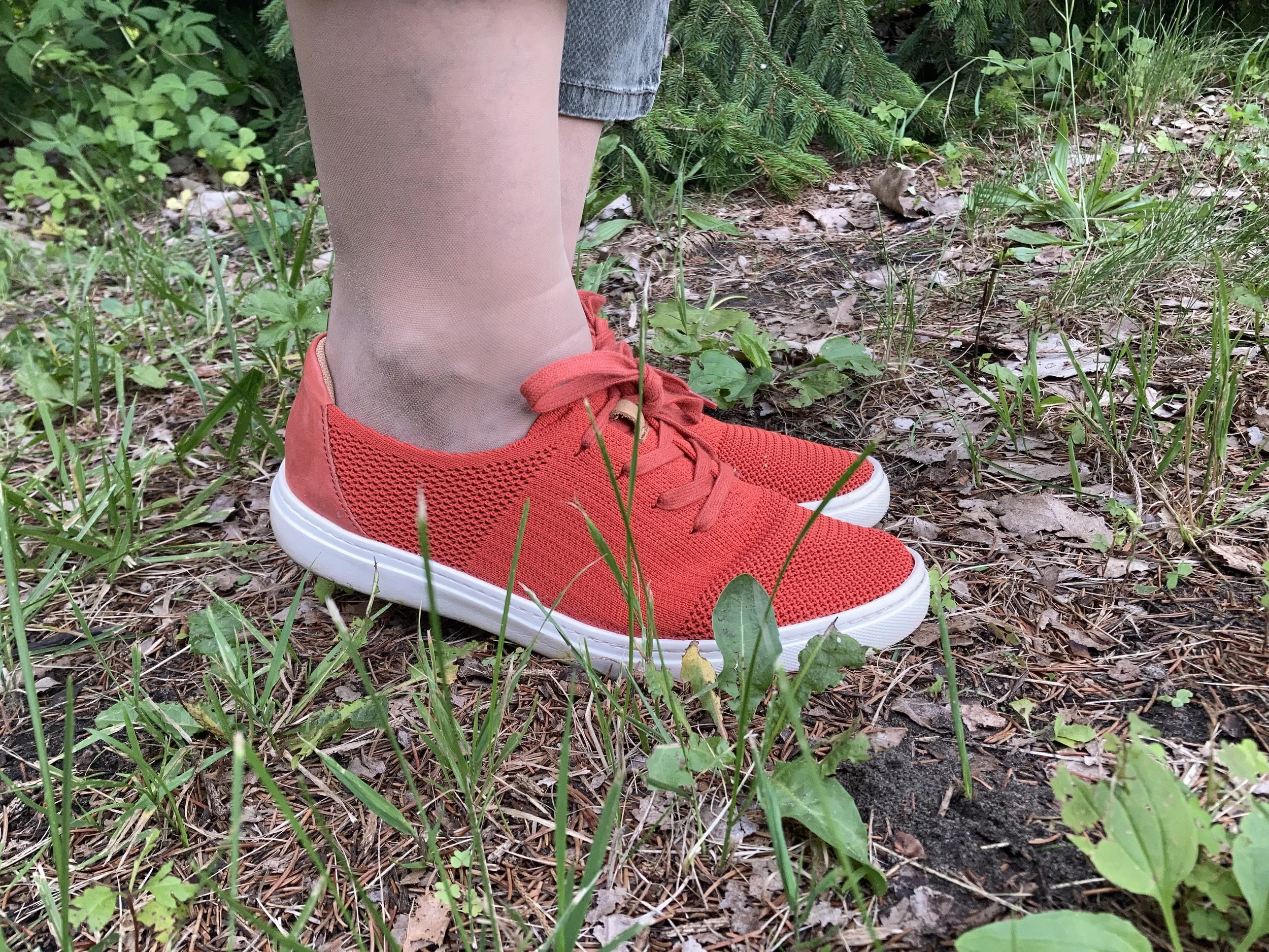
The next thing I chose were my shoes. I got these red, Comfortiva sneakers at a thrift store a couple years ago and I just love them as a fun alternative to white sneakers for summer. I found these for $1. It really does pay to check out second hand stores on the regular. You may not find exactly what you are looking for, but you might just find something you would have never tried otherwise. Here are some possible red options from DSW.
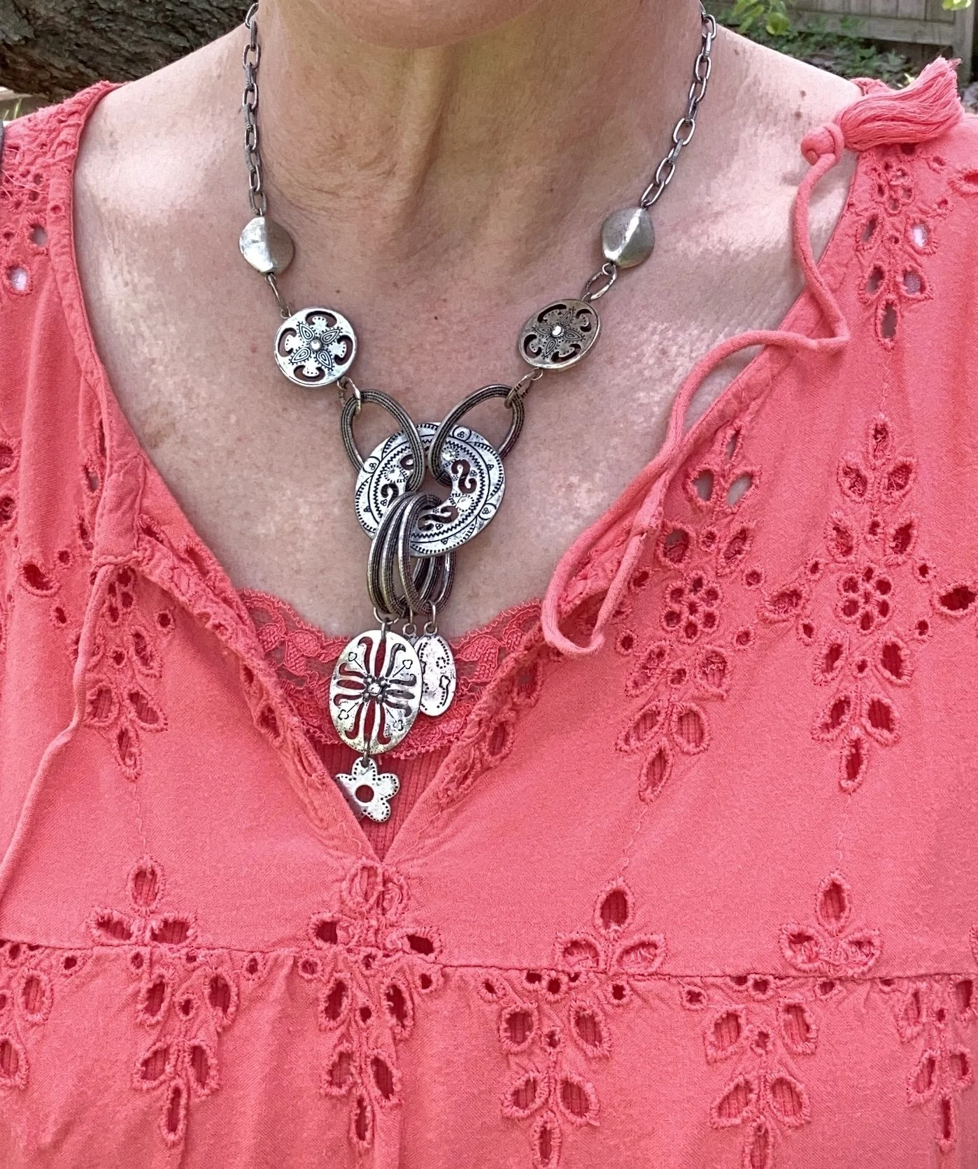
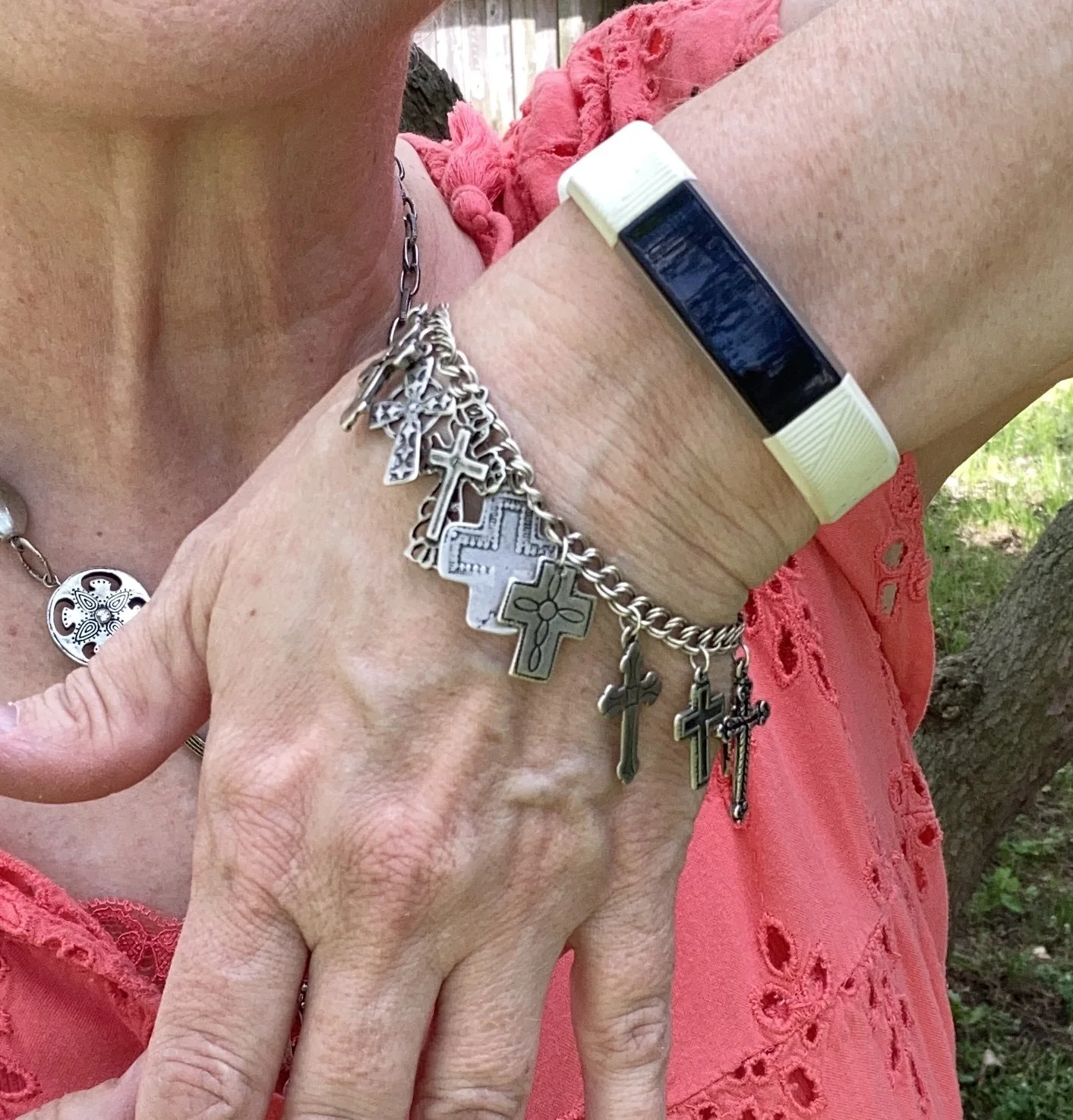
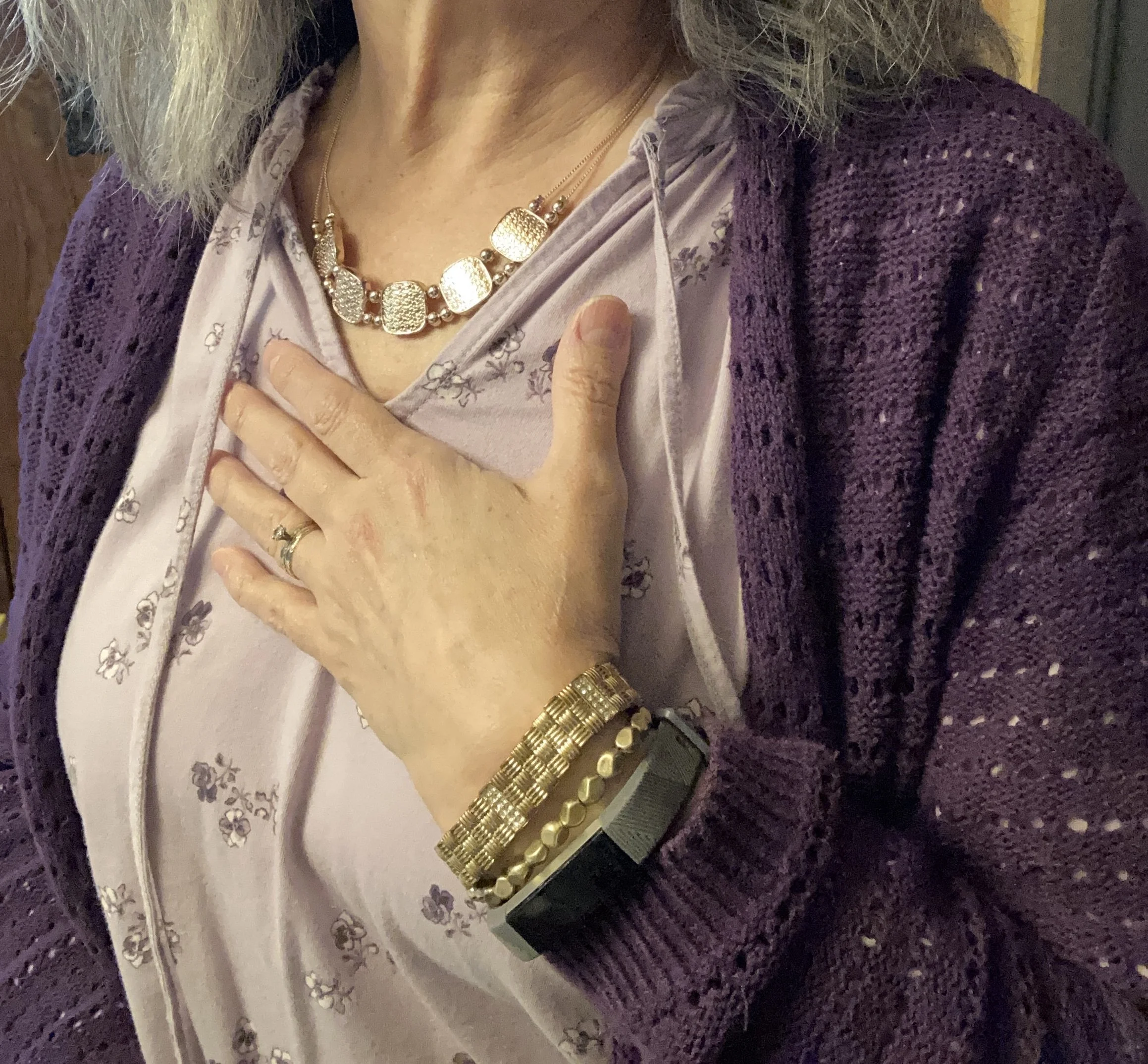
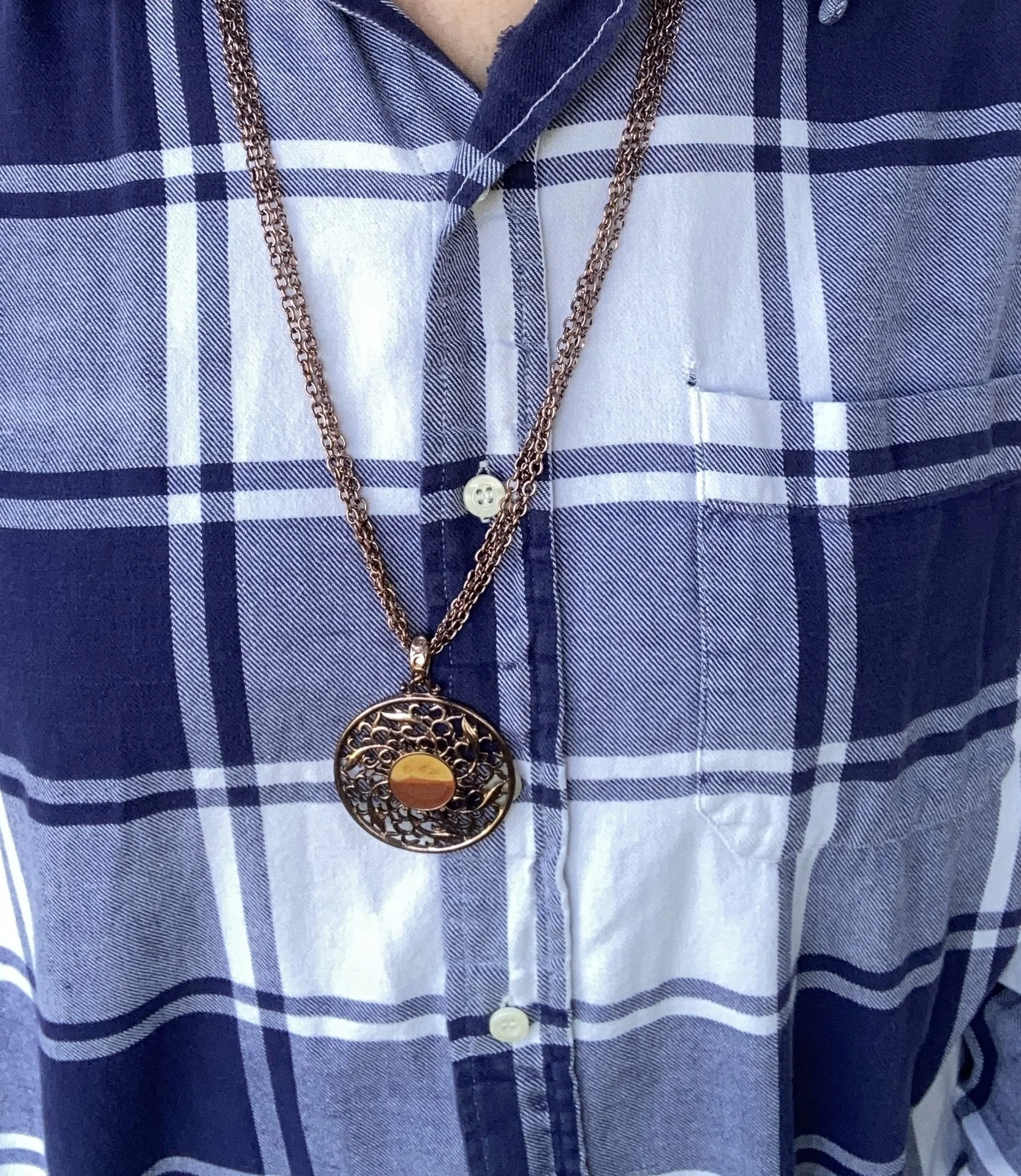
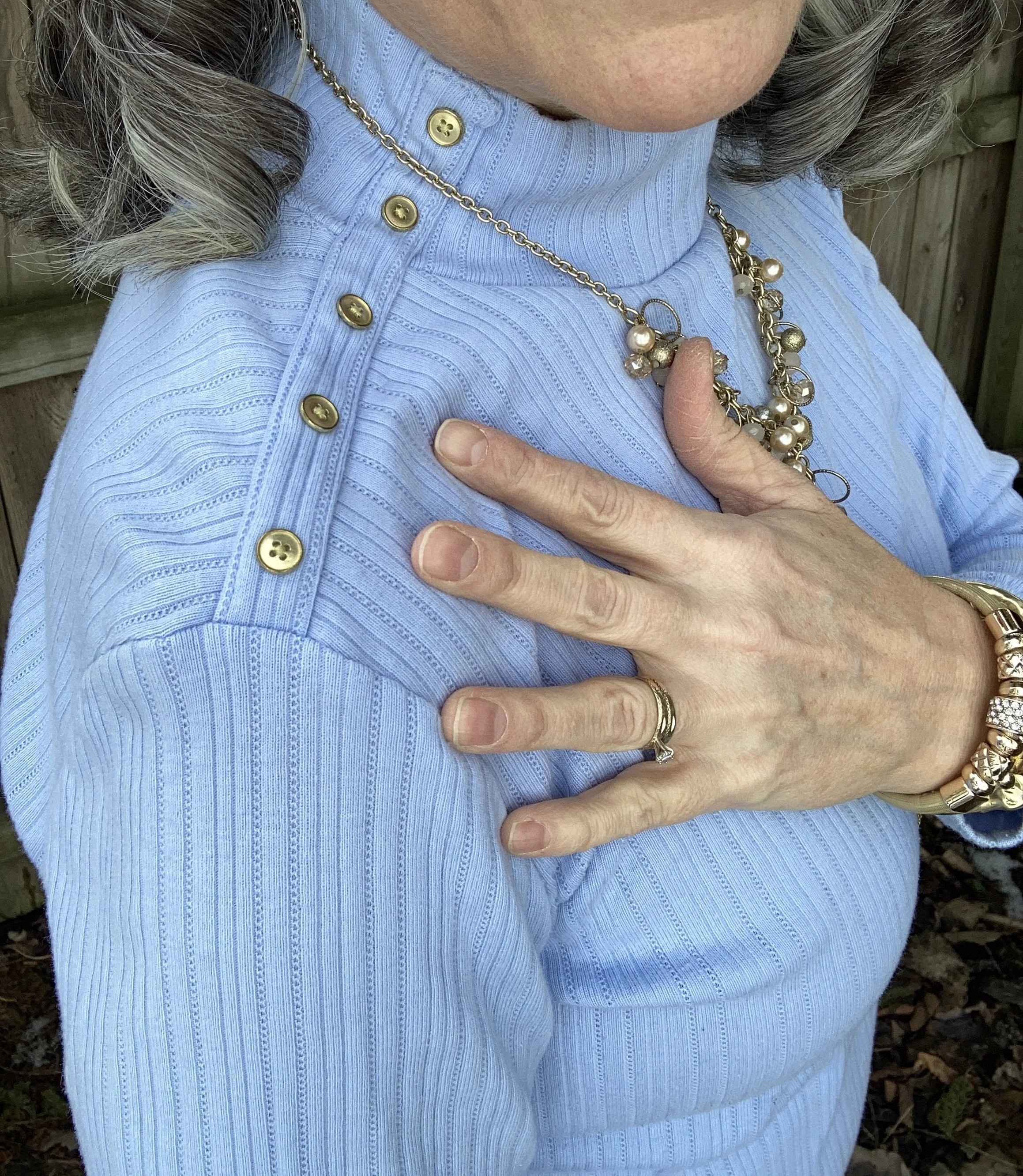
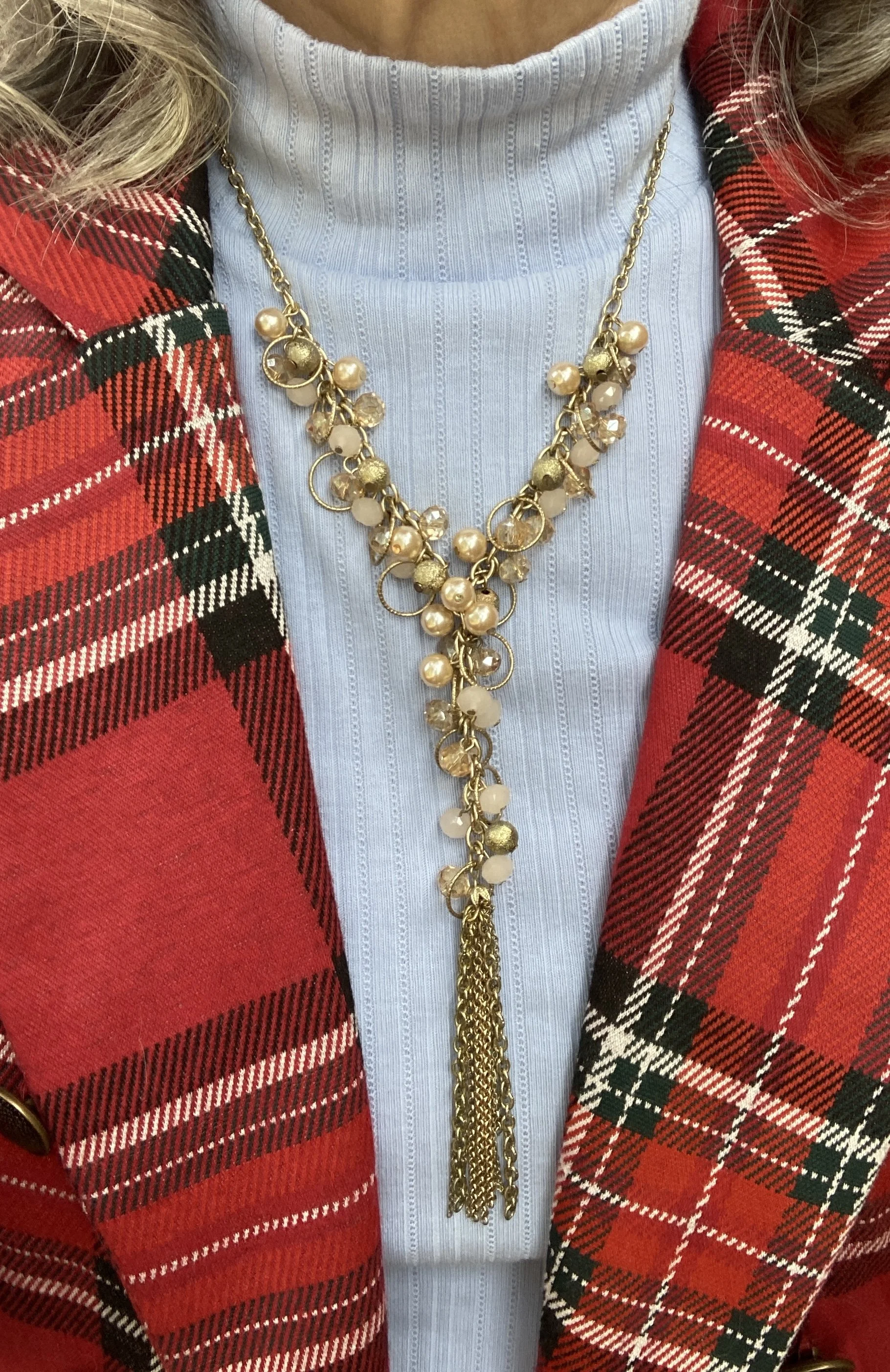
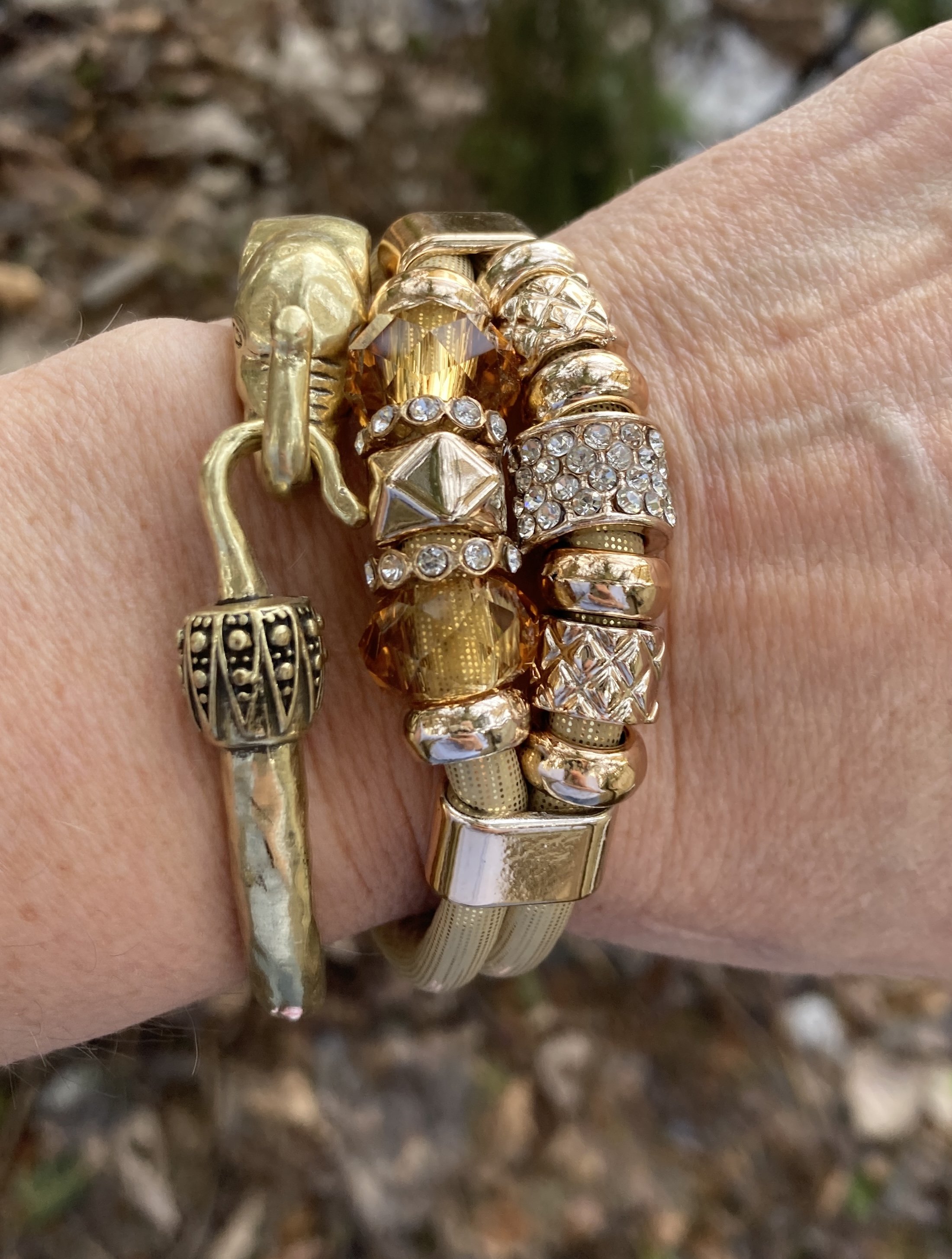
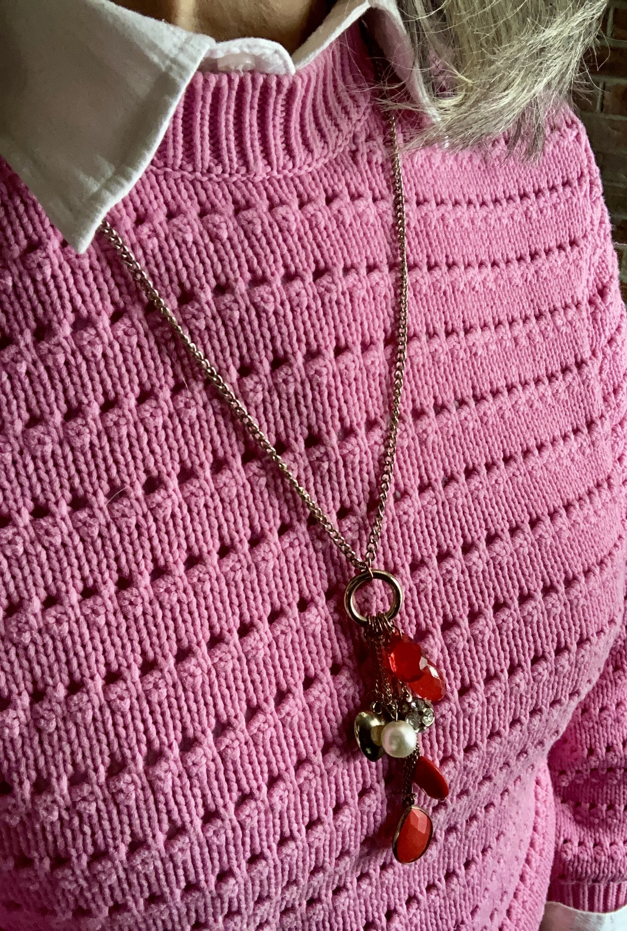
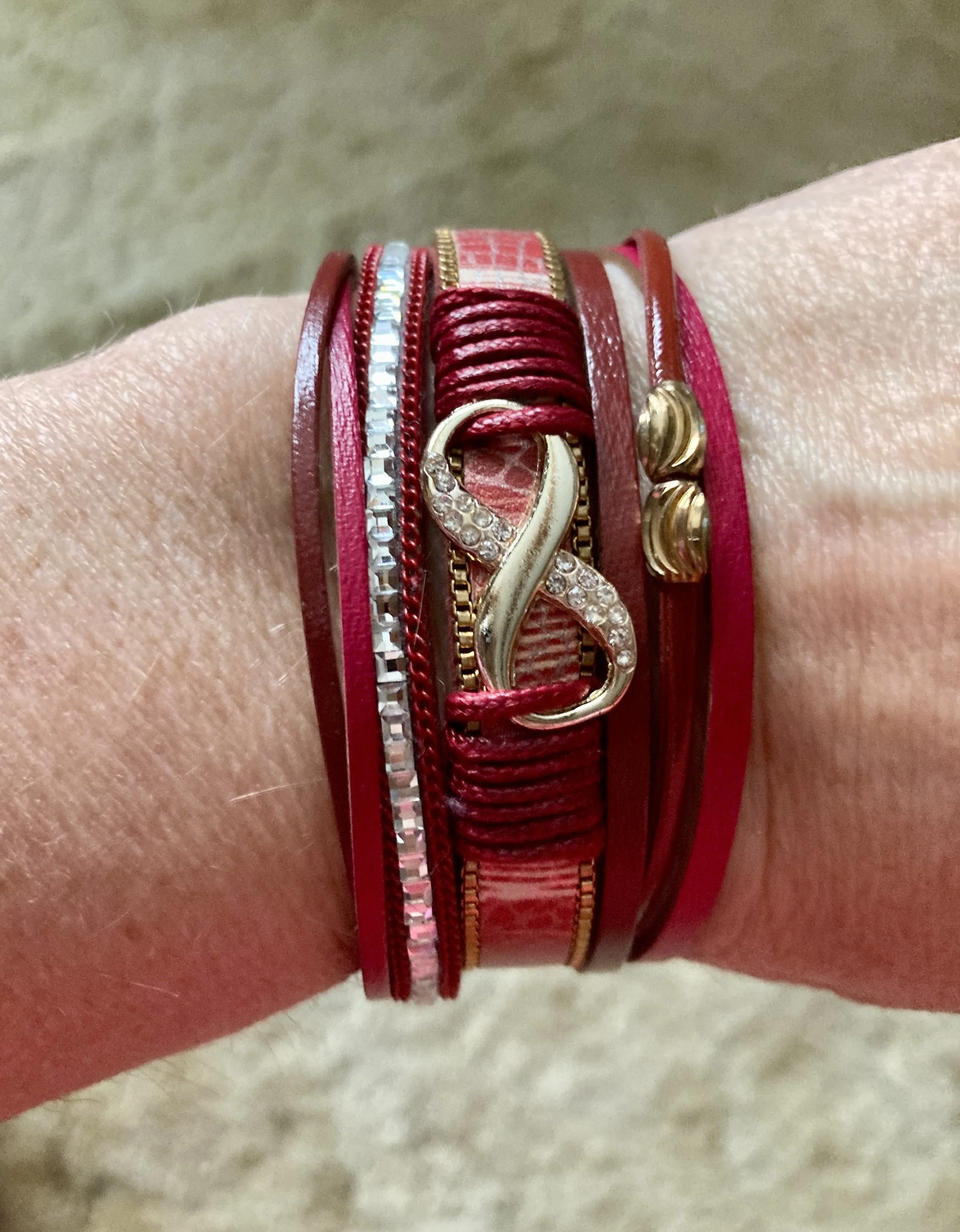
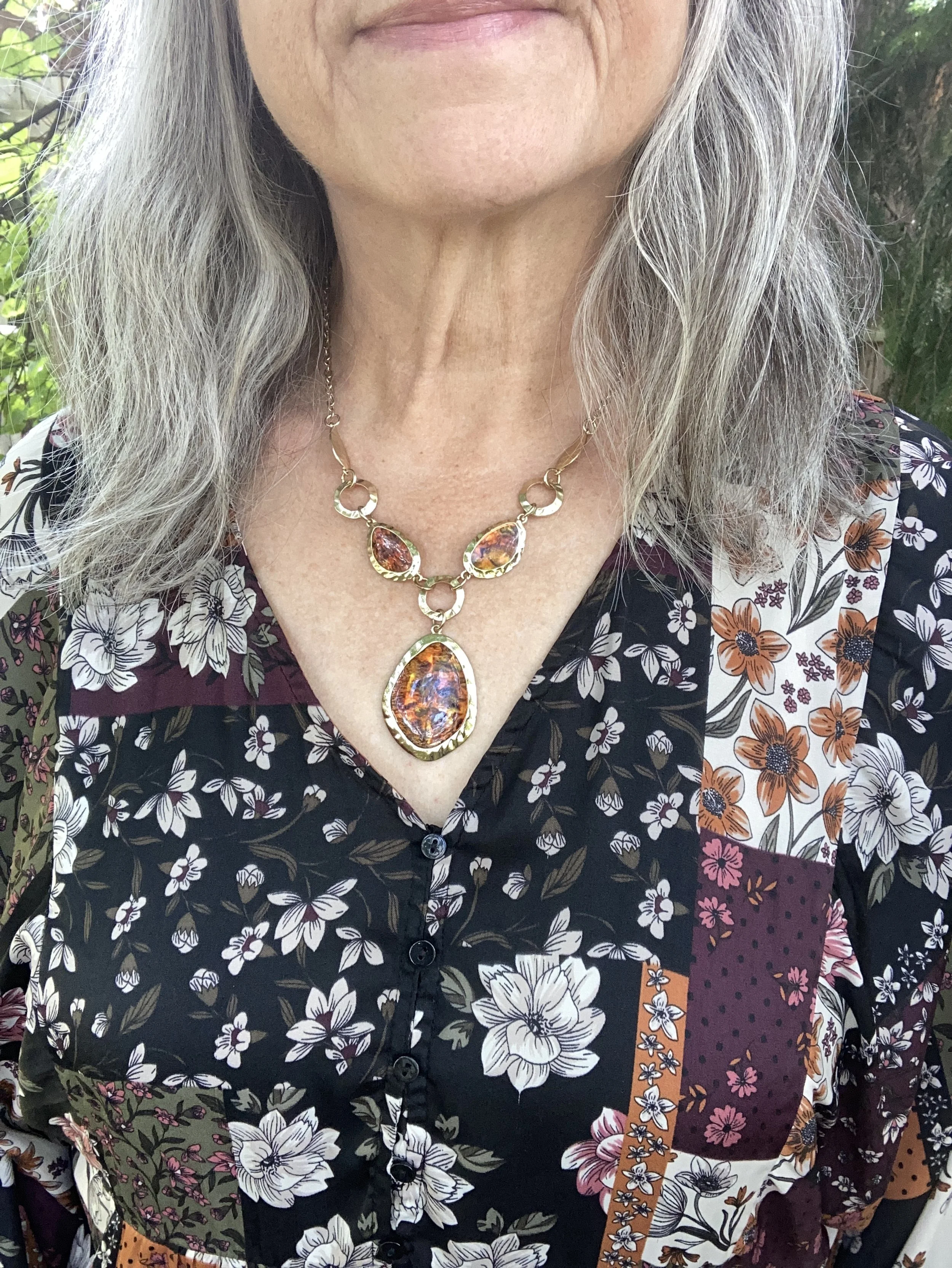
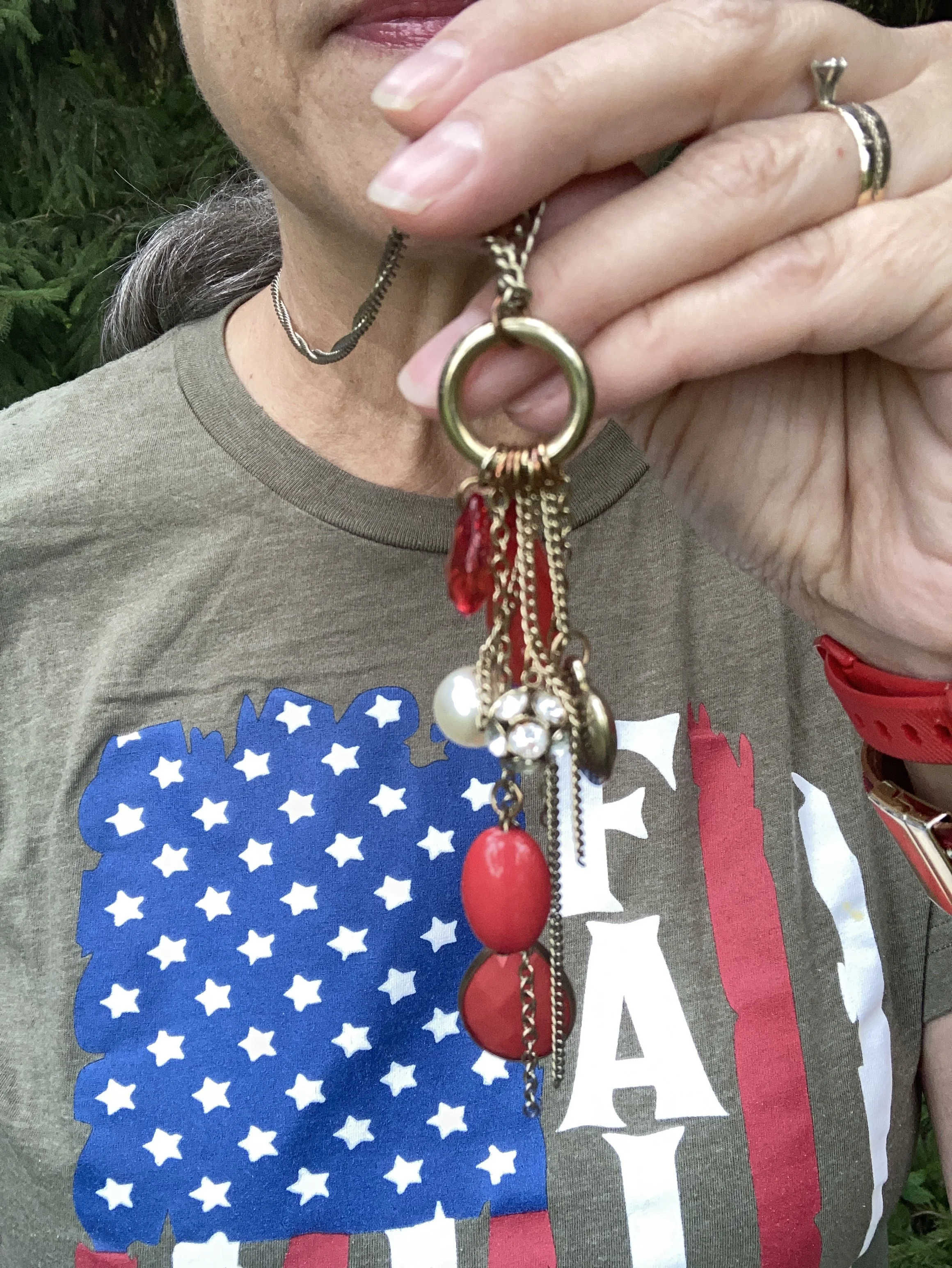
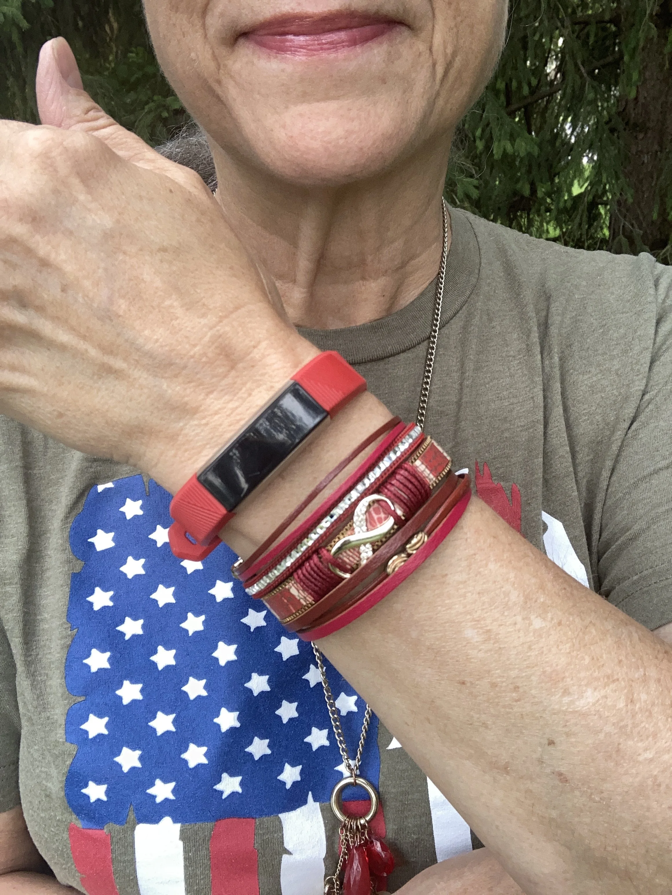
I also chose red jewelry.
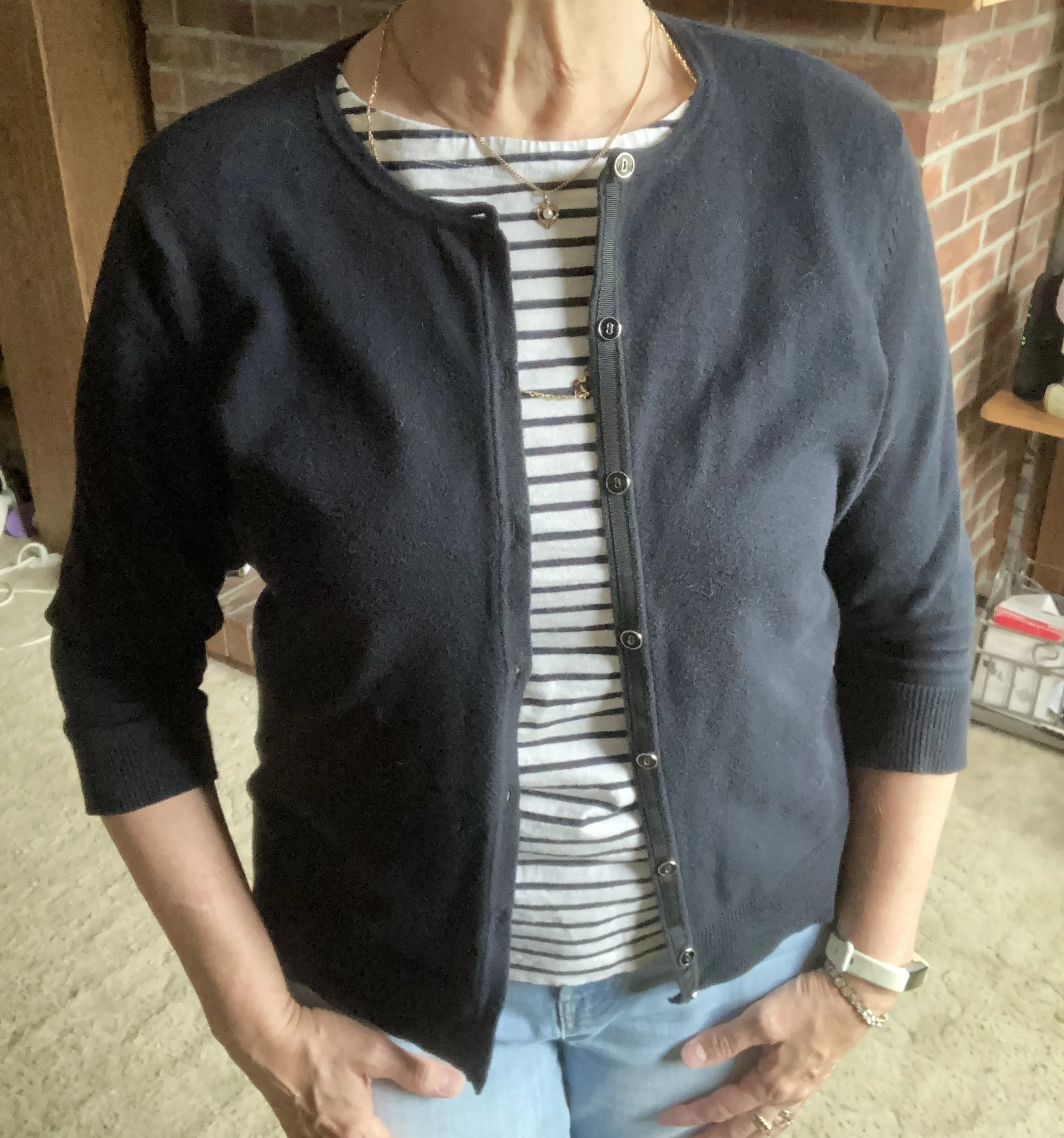
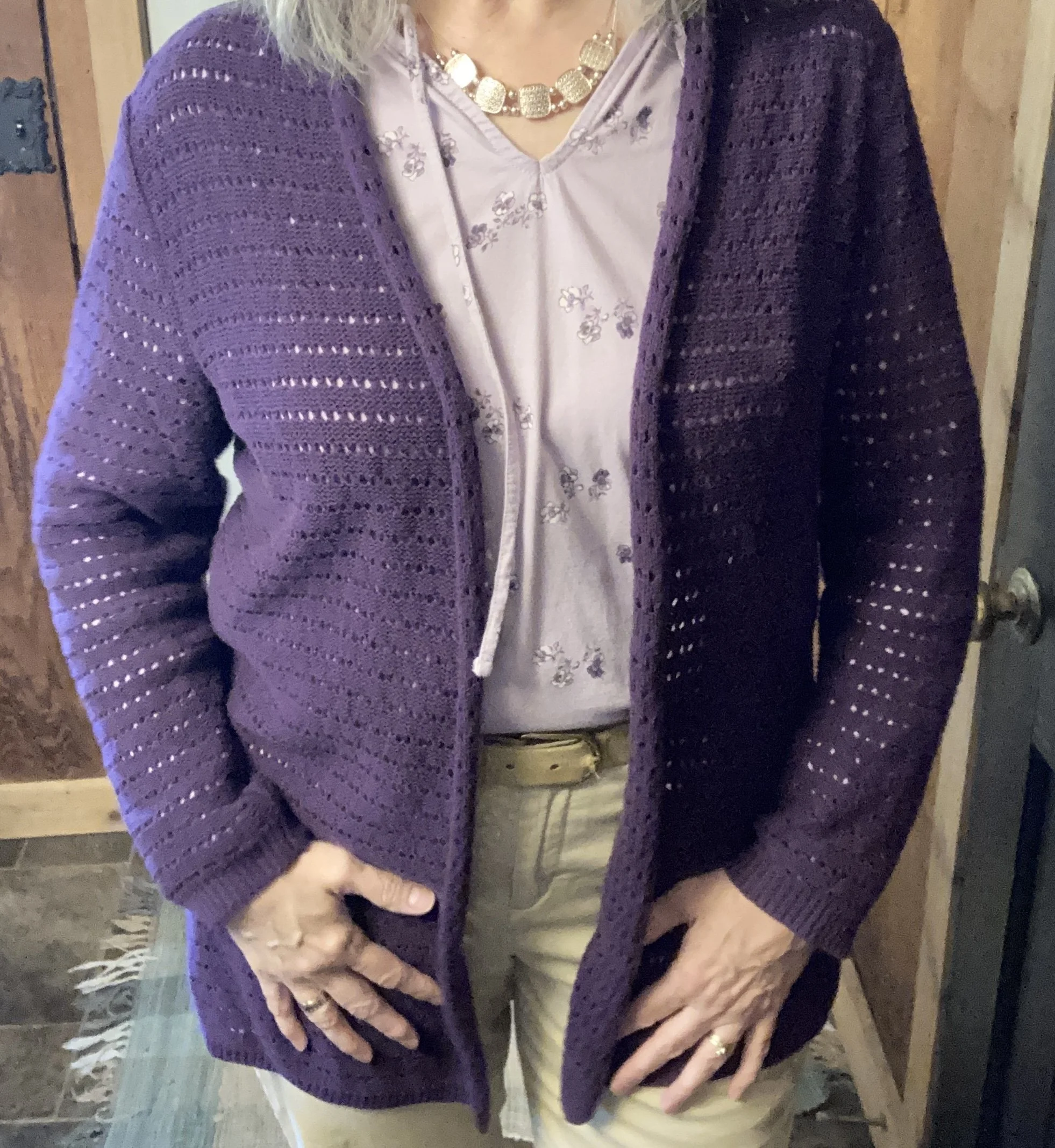
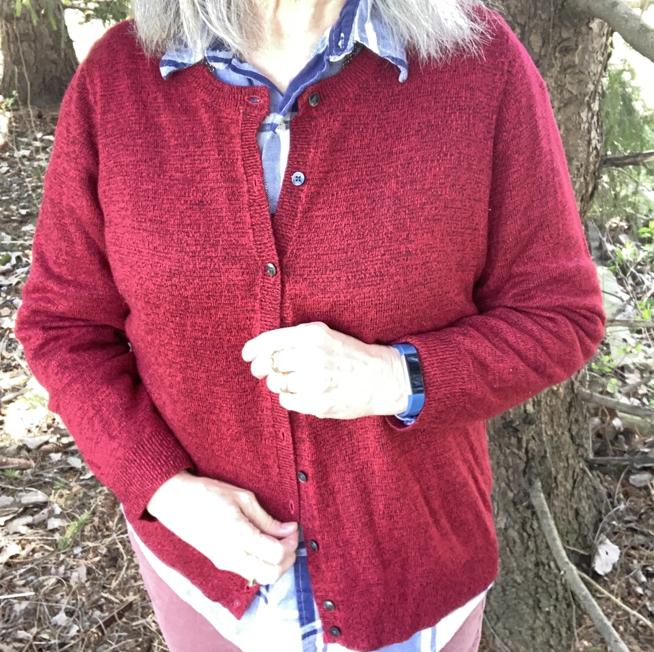
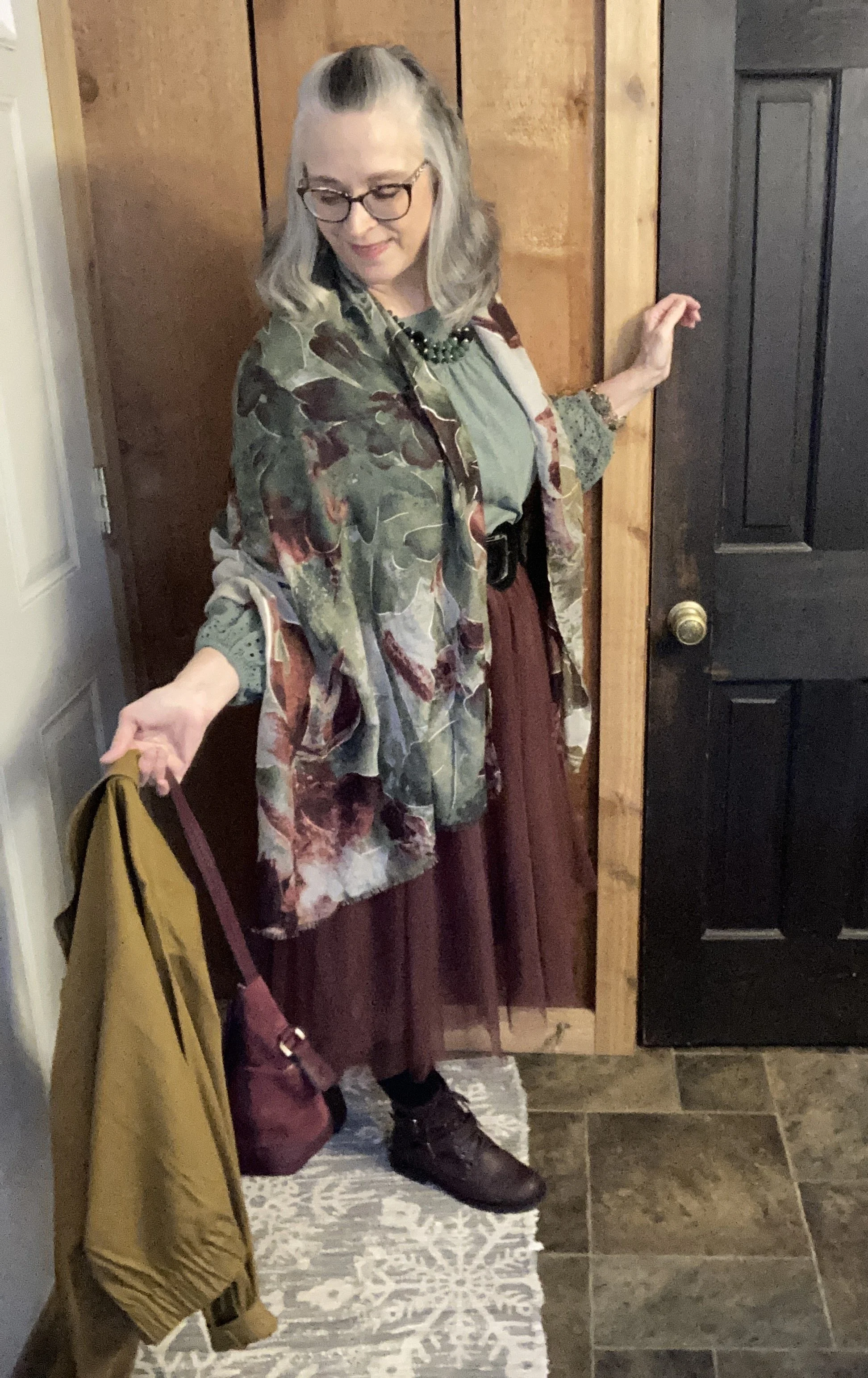
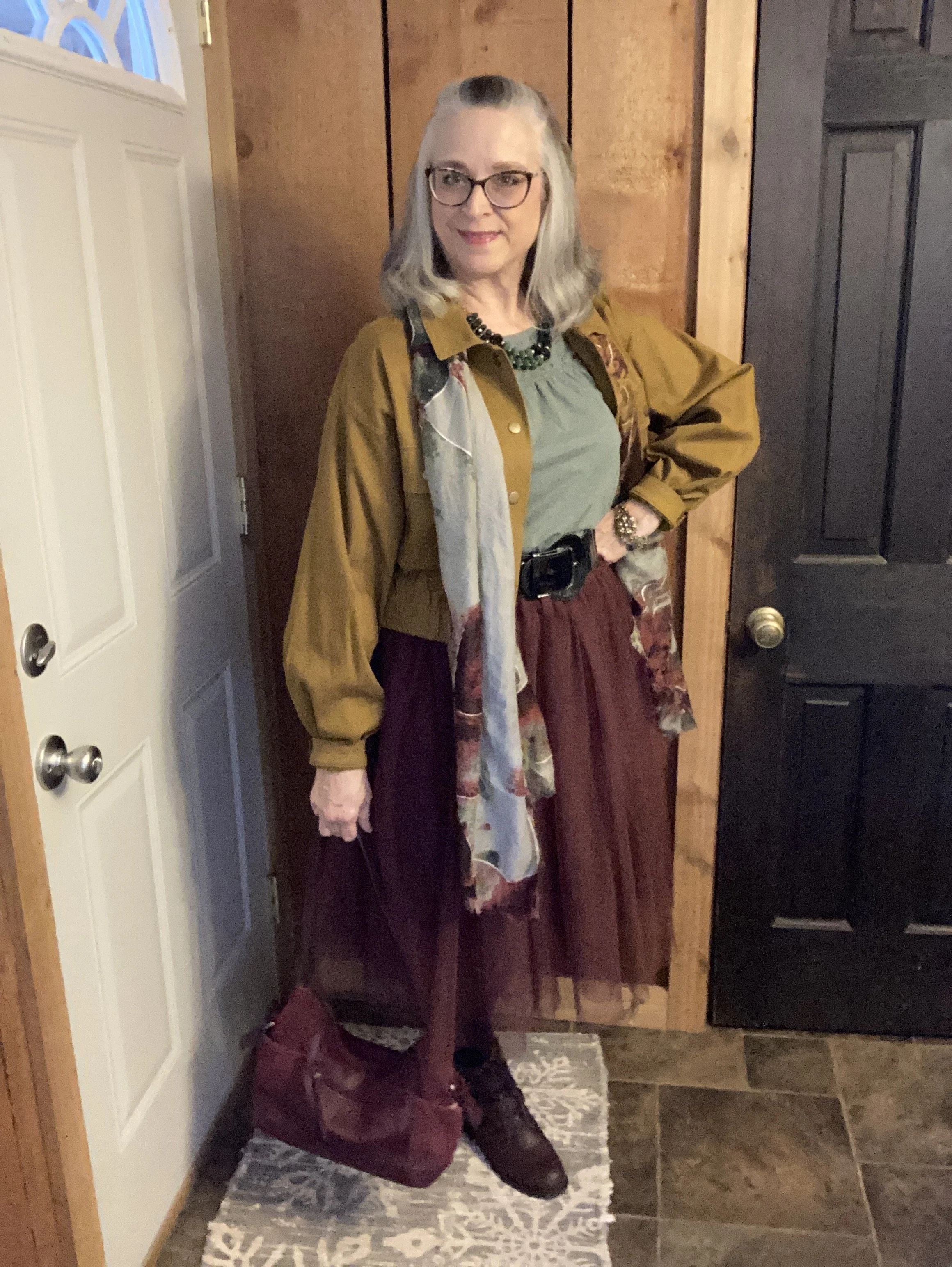
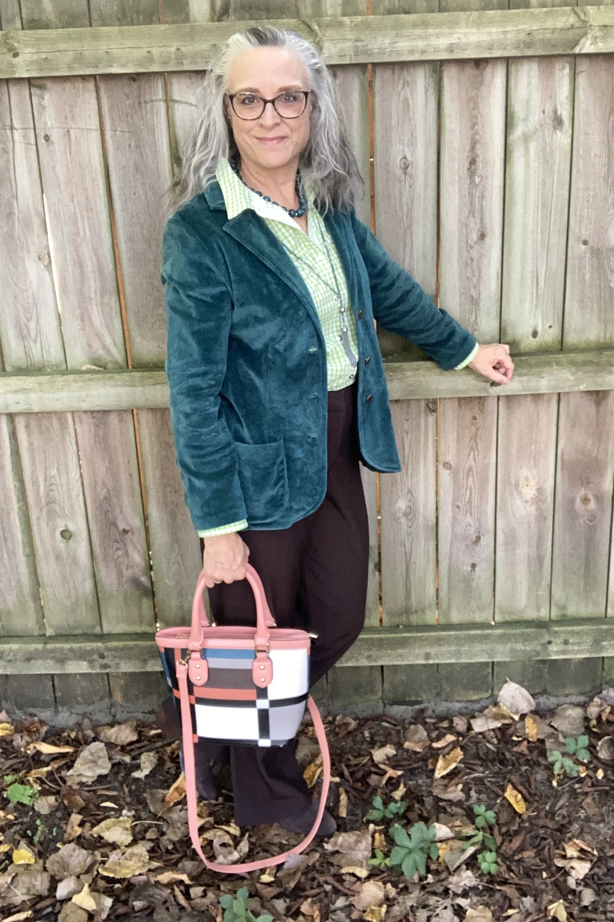
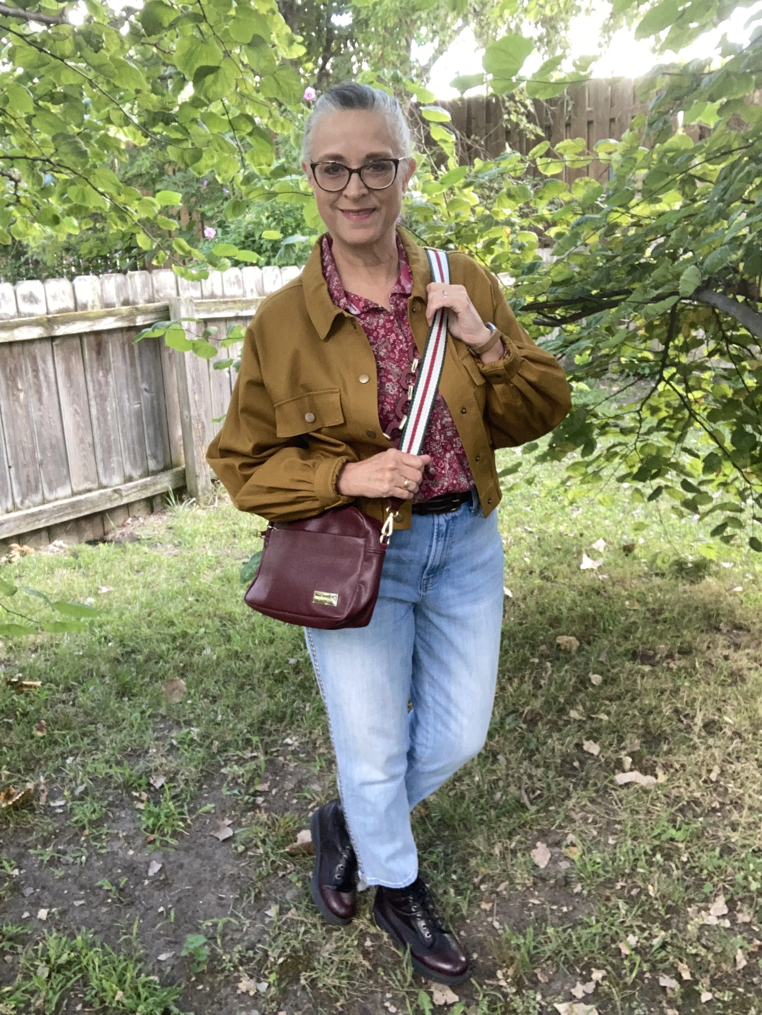
At the last minute I decided to add a topper and chose my thrifted Ralph Lauren navy blazer. I might have chosen a lighter weight cardigan, but I was trying to get these pictures taken so I could get this post up for Tuesday. I like the juxtaposition of the classier, structured blazer with the more casual vibe of the tee, pants and sneakers, but I also wonder if the cardigan would have been a better choice. Oh well, live and learn. Here is a pretty one from Land’s End, Chico’s, and Kohl’s.
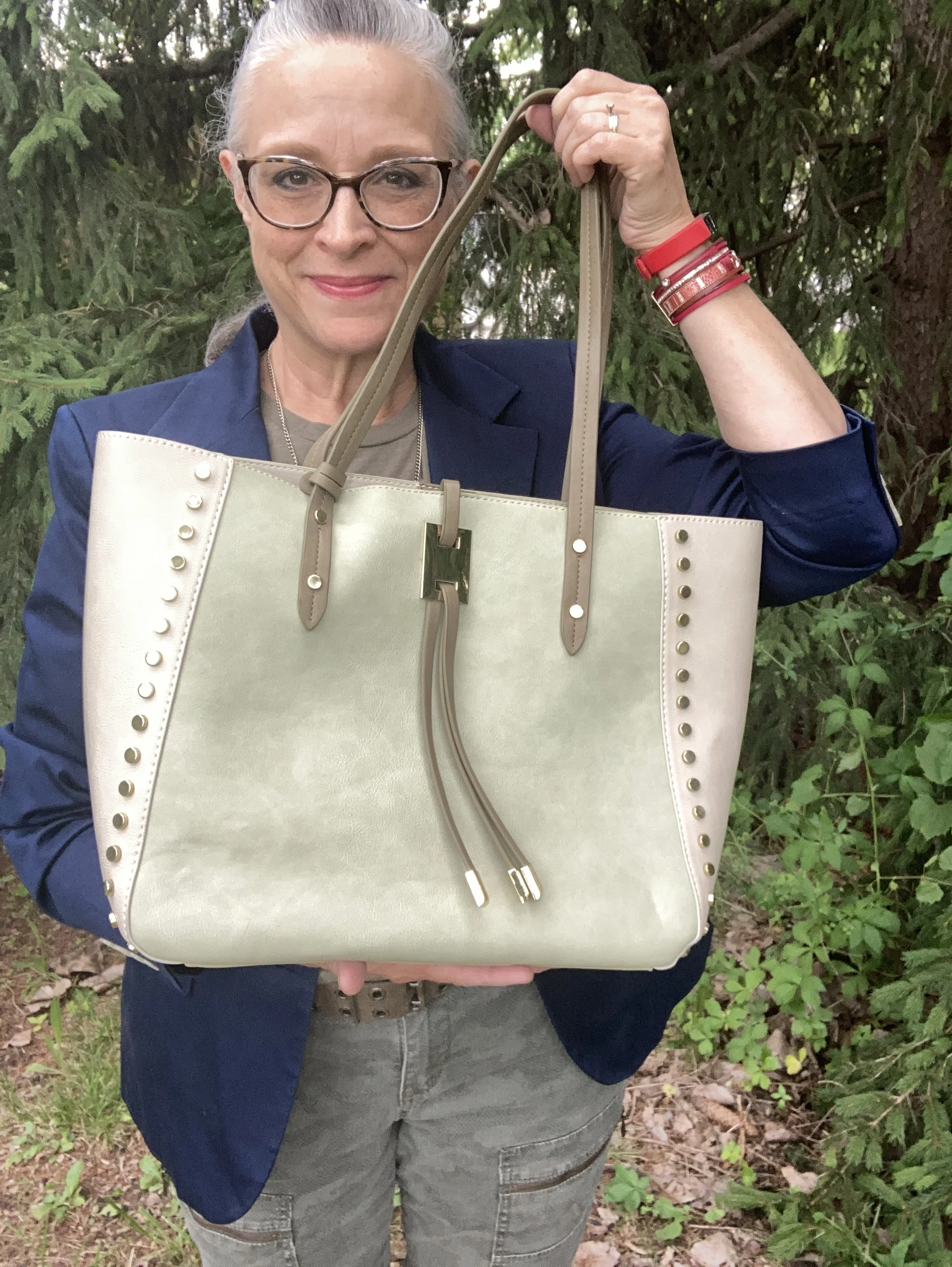
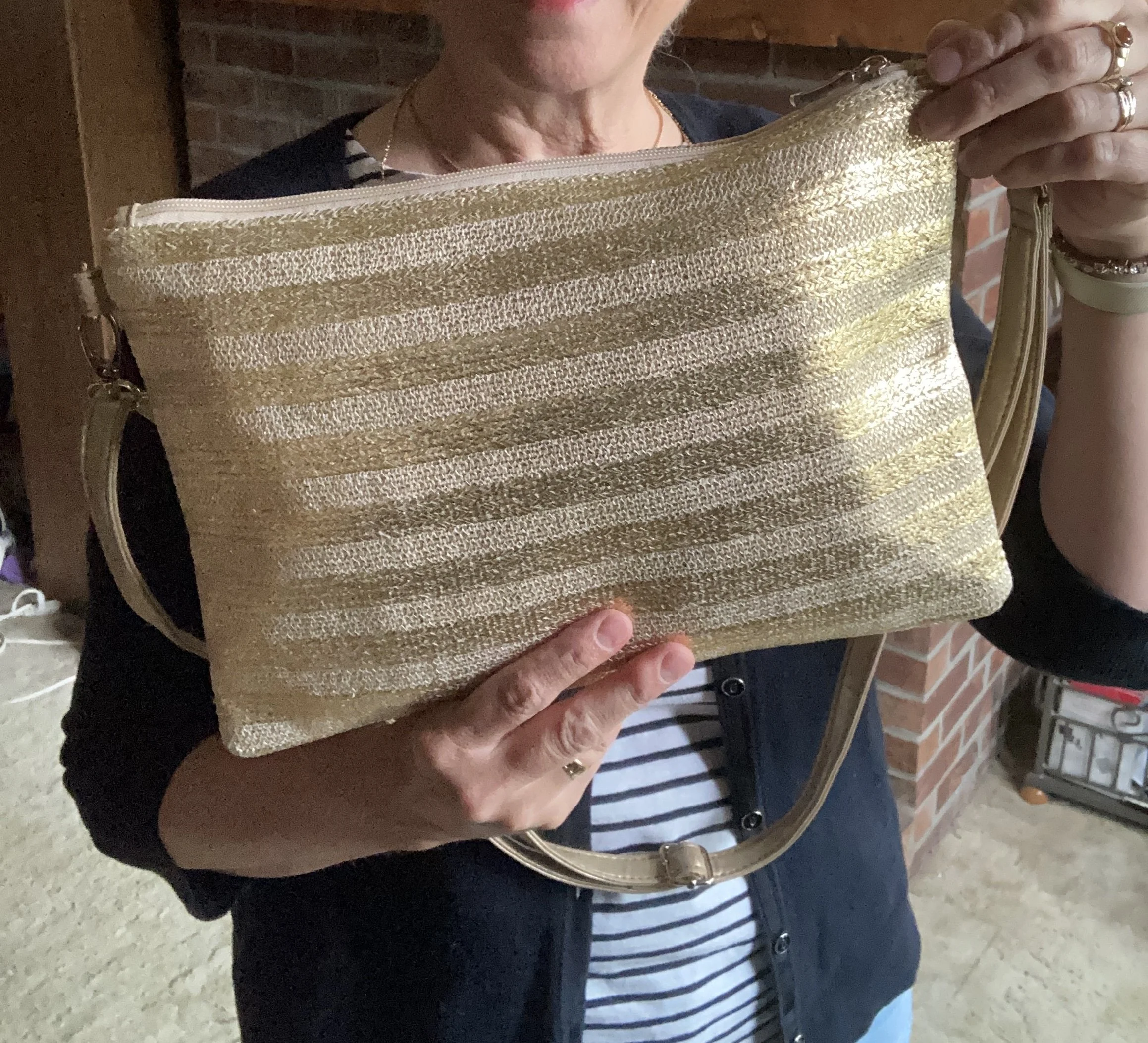
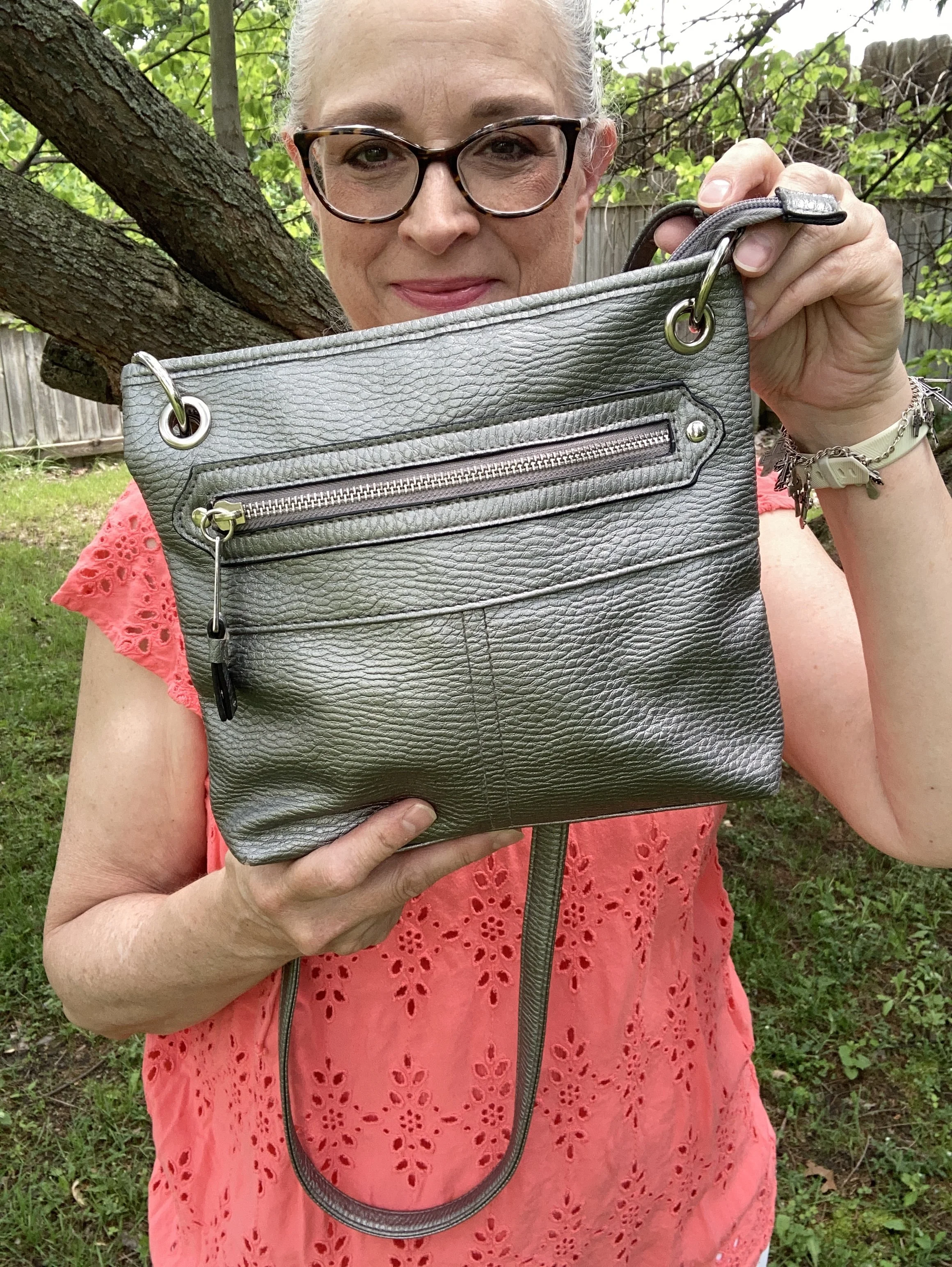
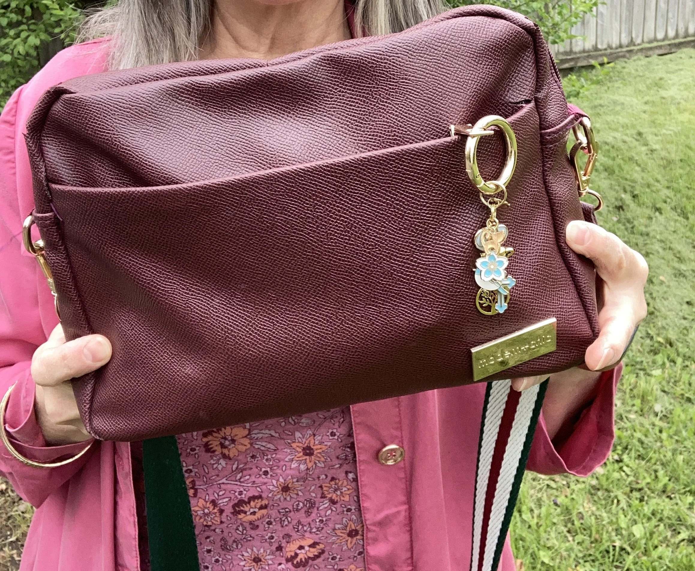
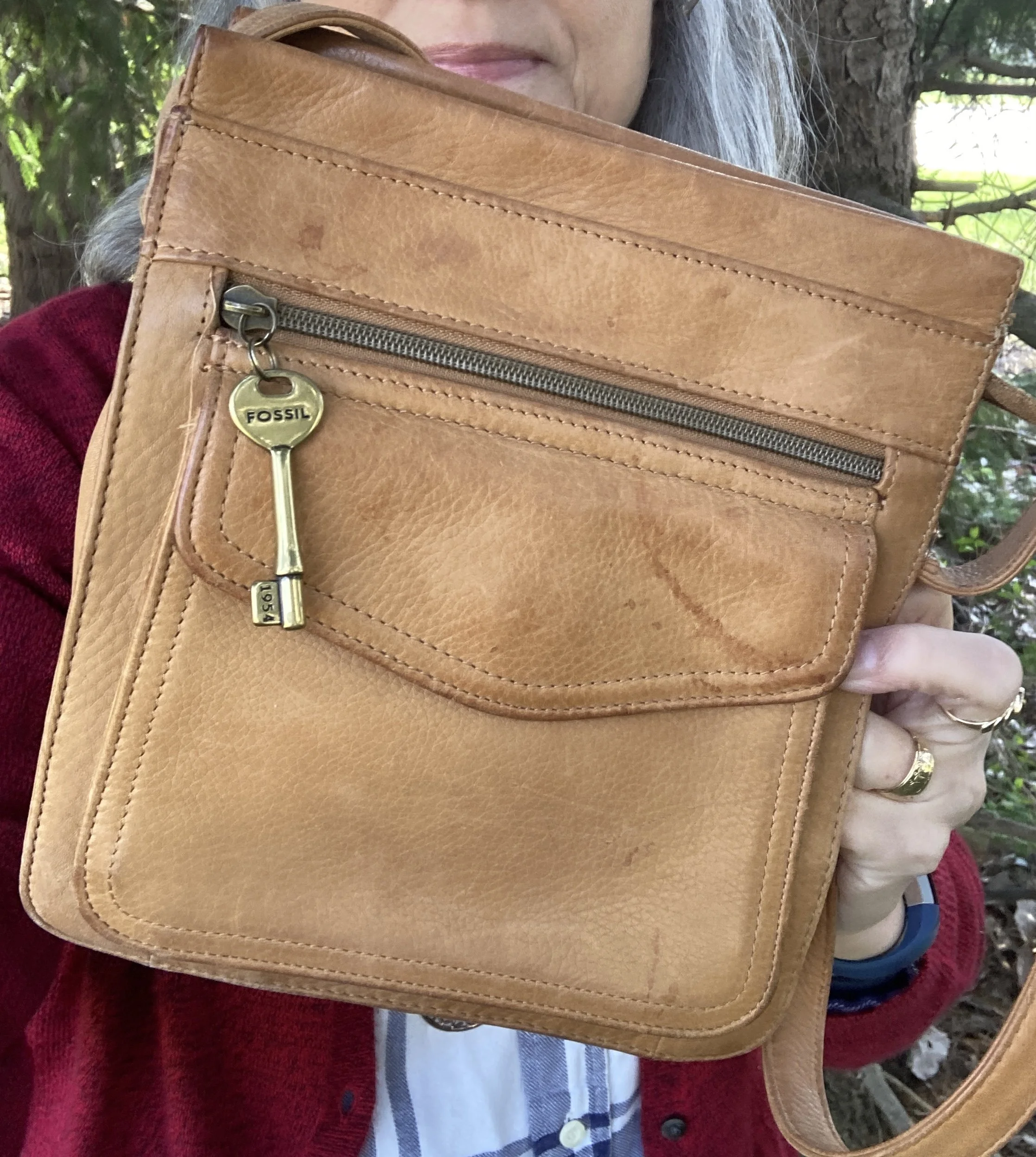
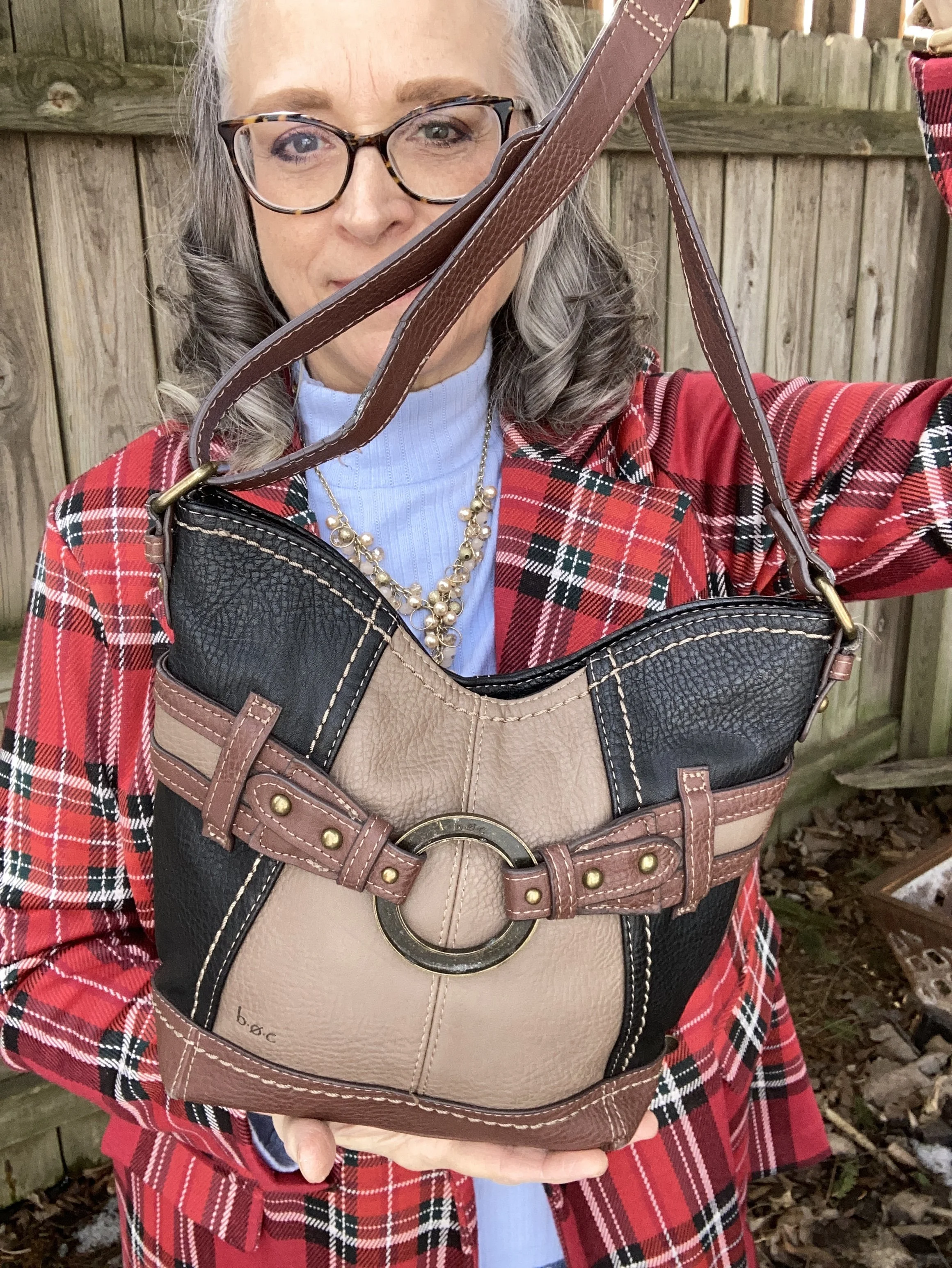
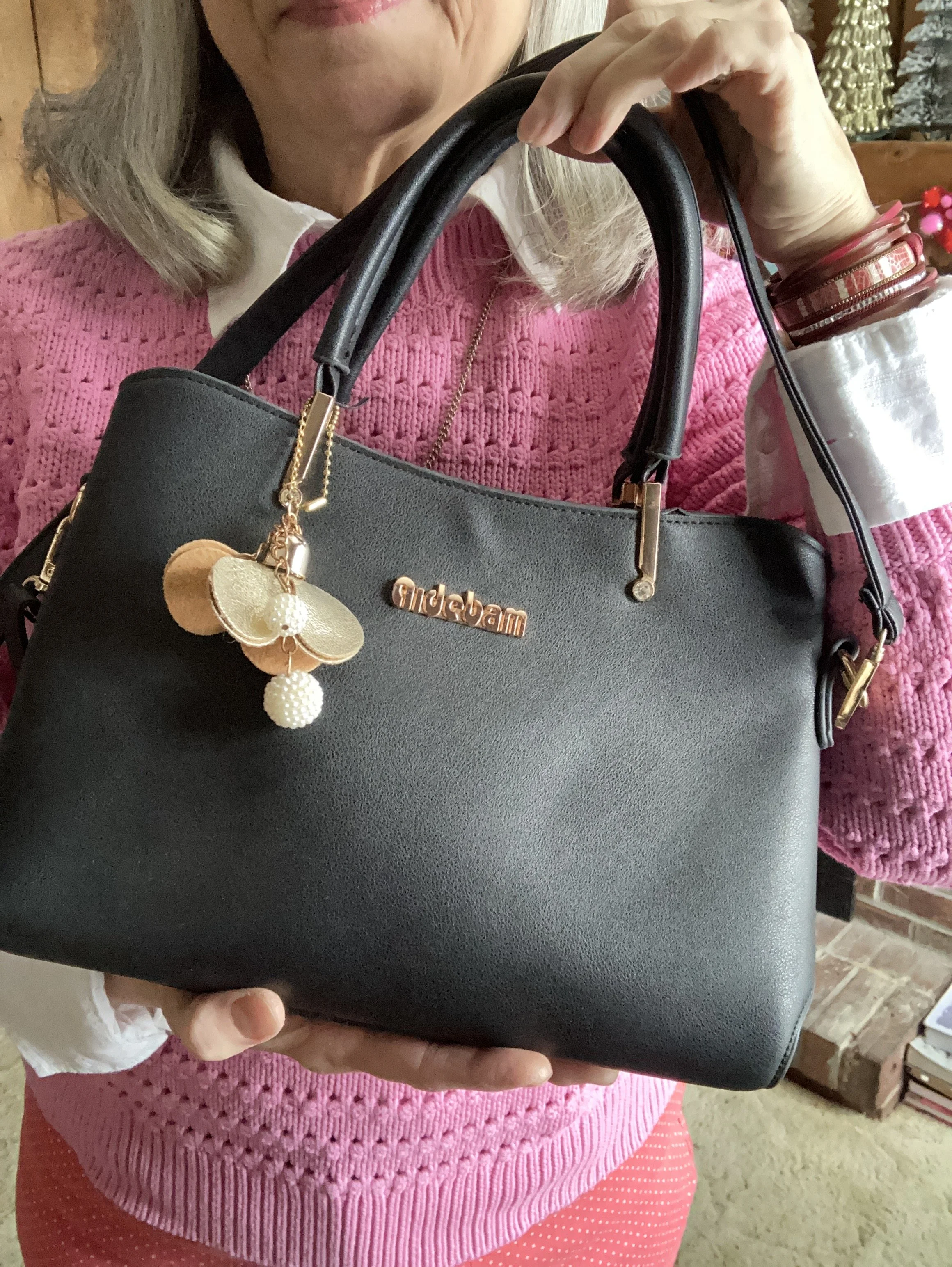
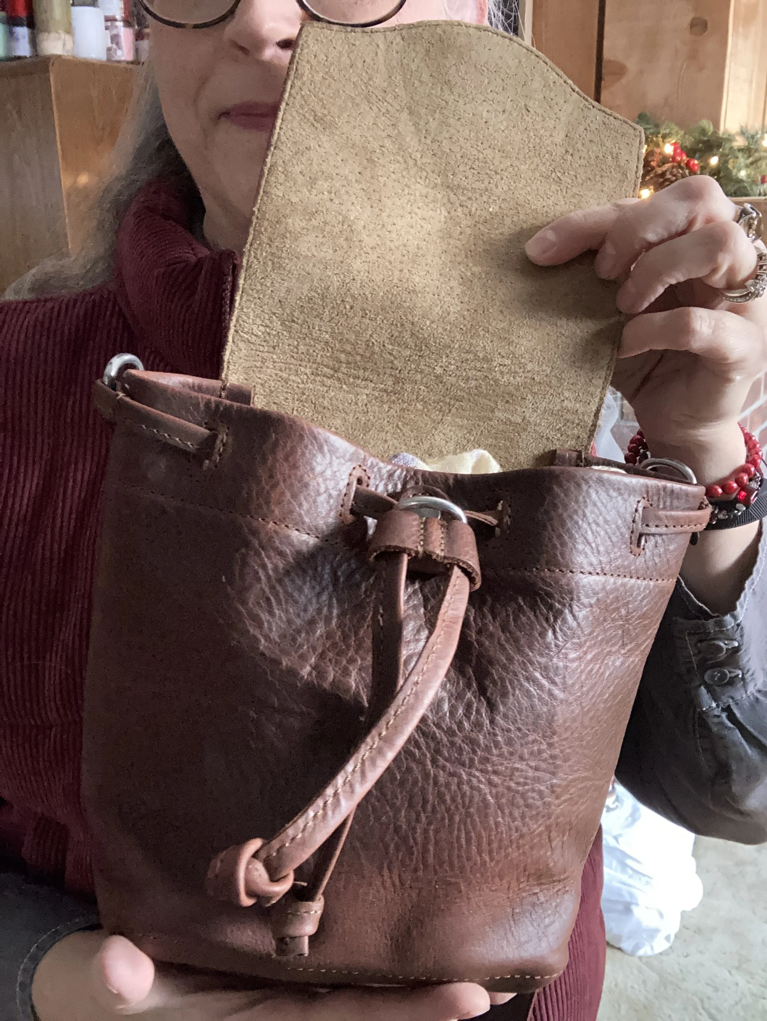
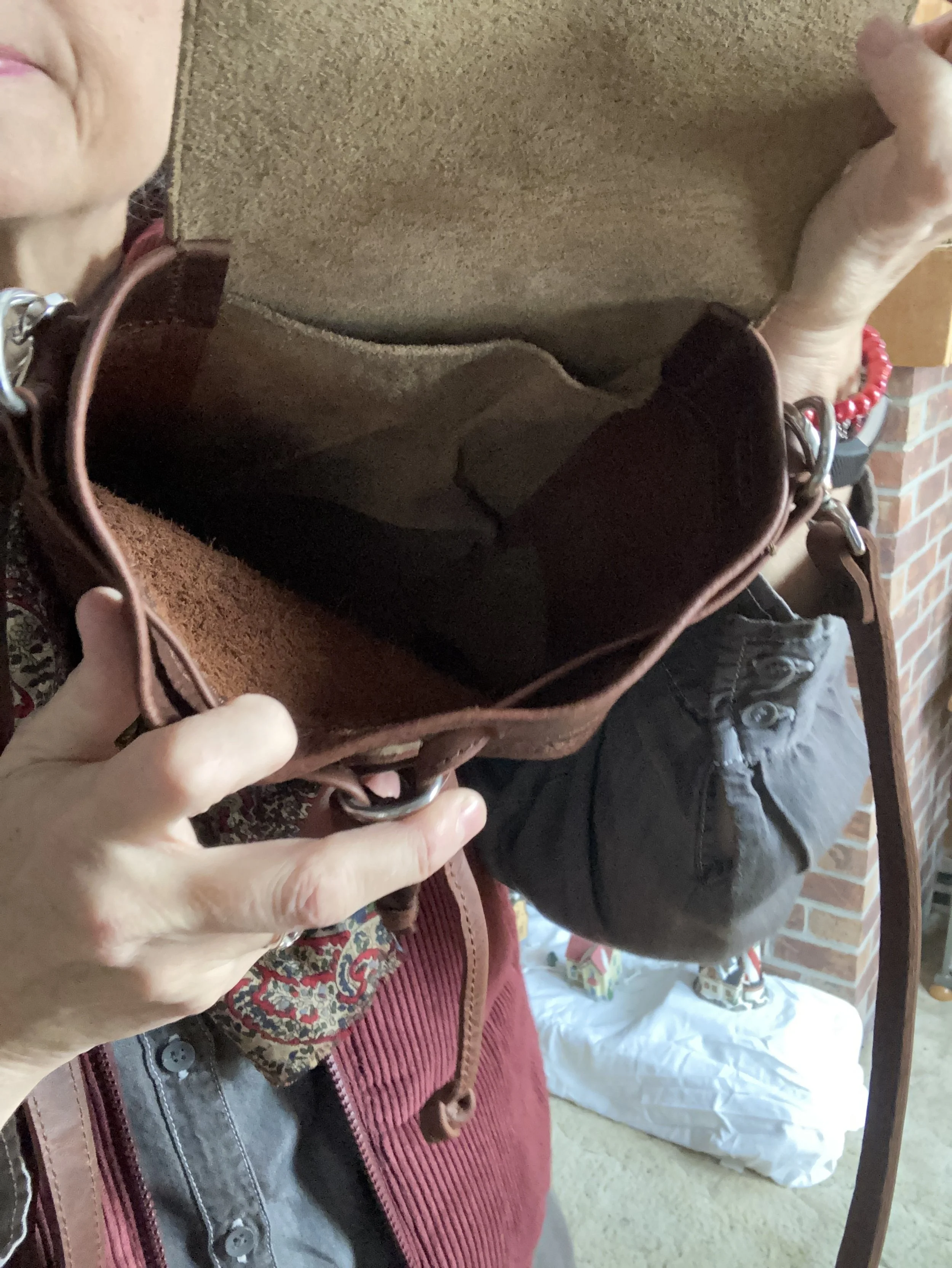
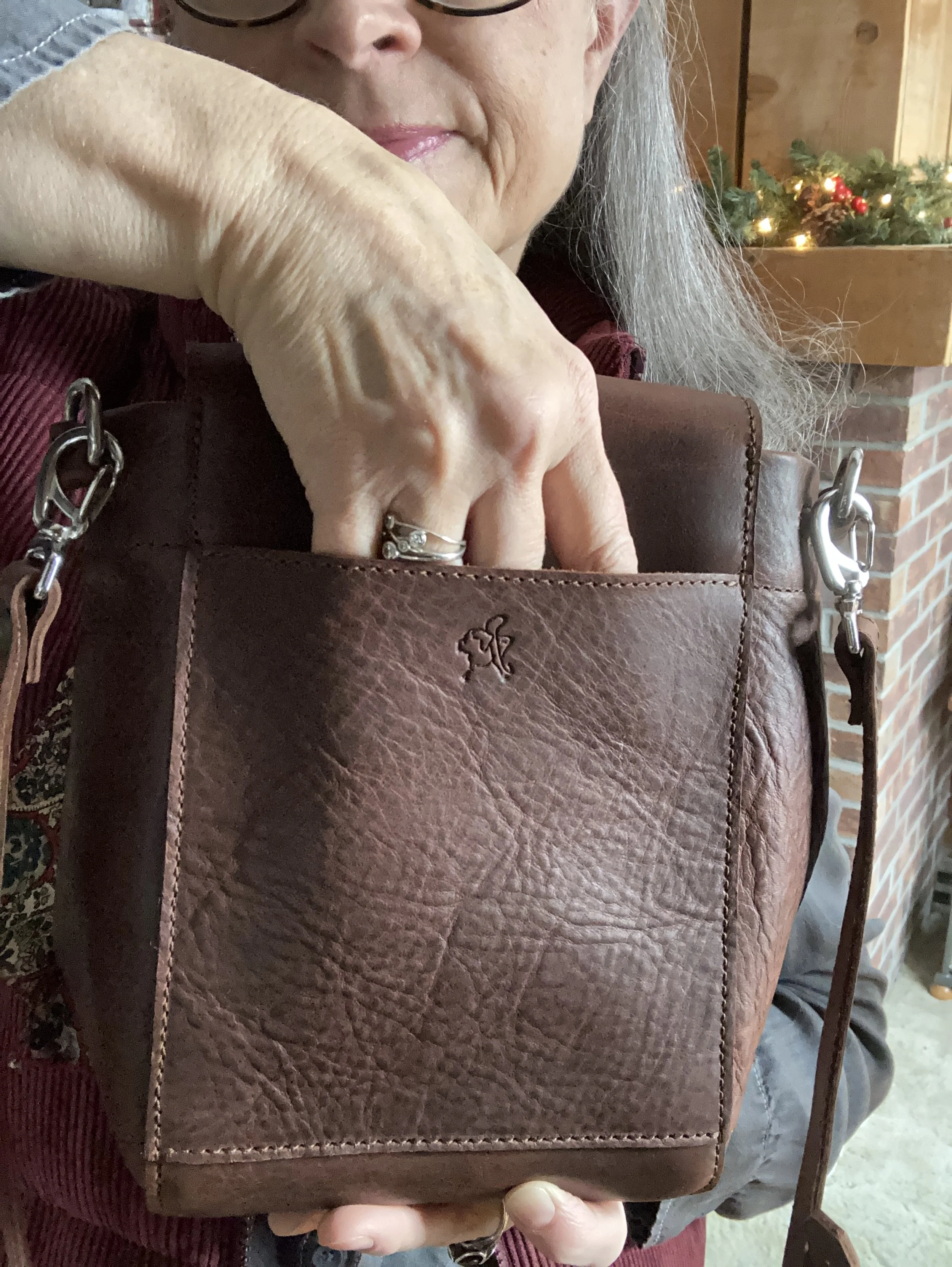
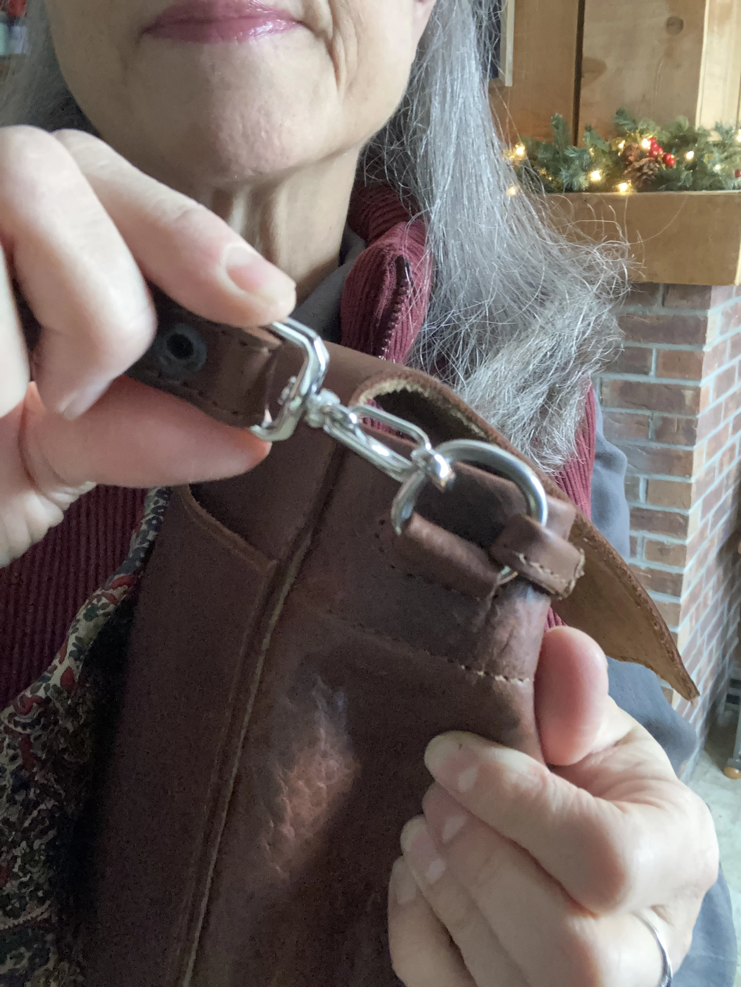
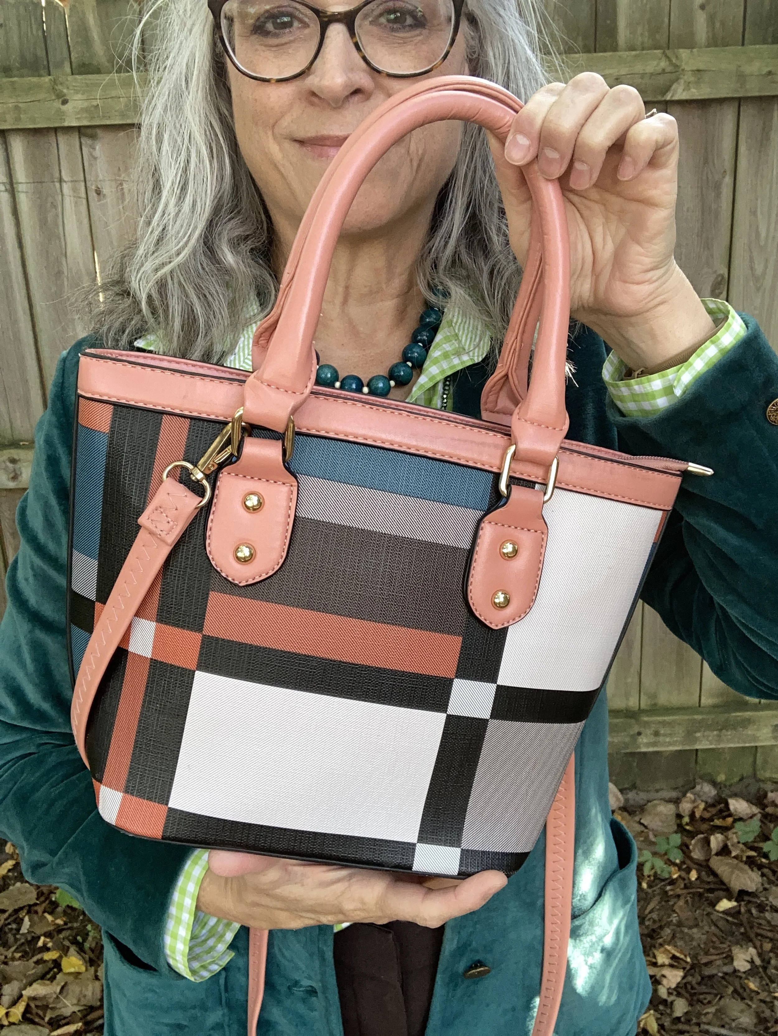
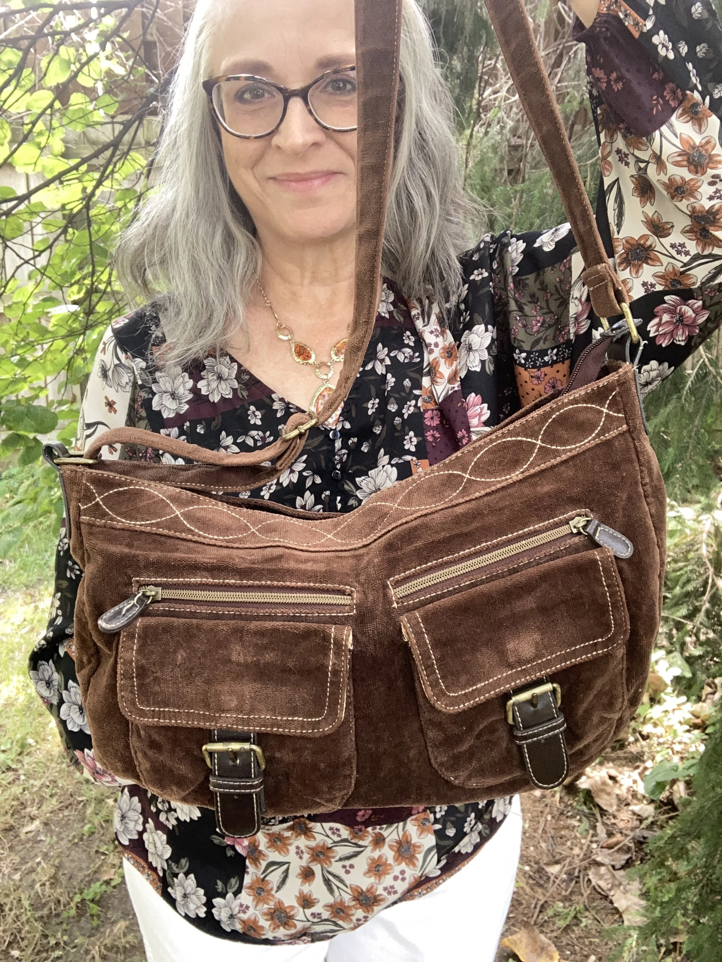
The last piece I chose was my Charming Charlie tote bag from a number of years ago.

What do you think of this outfit? Do you like to dress up for holidays like the 4th of July? What kind of outfit will you be wearing for our country’s 250th birthday? I love to hear you thoughts, so leave me some love in the comments.
Thank you for all of your support, and have a wonderful week!