Styling Into the Holidays
Over the next few weeks as we head towards Christmas and the end of the year, I thought I would devote my fashion posts to outfits with a holiday vibe. From casual to dressy we know the holidays can call for all manner of outfits from Christmas pjs to glitzy New Year’s Eve style. You know I am all about casual, but I will try to throw in a bit of fun and frivolity too.
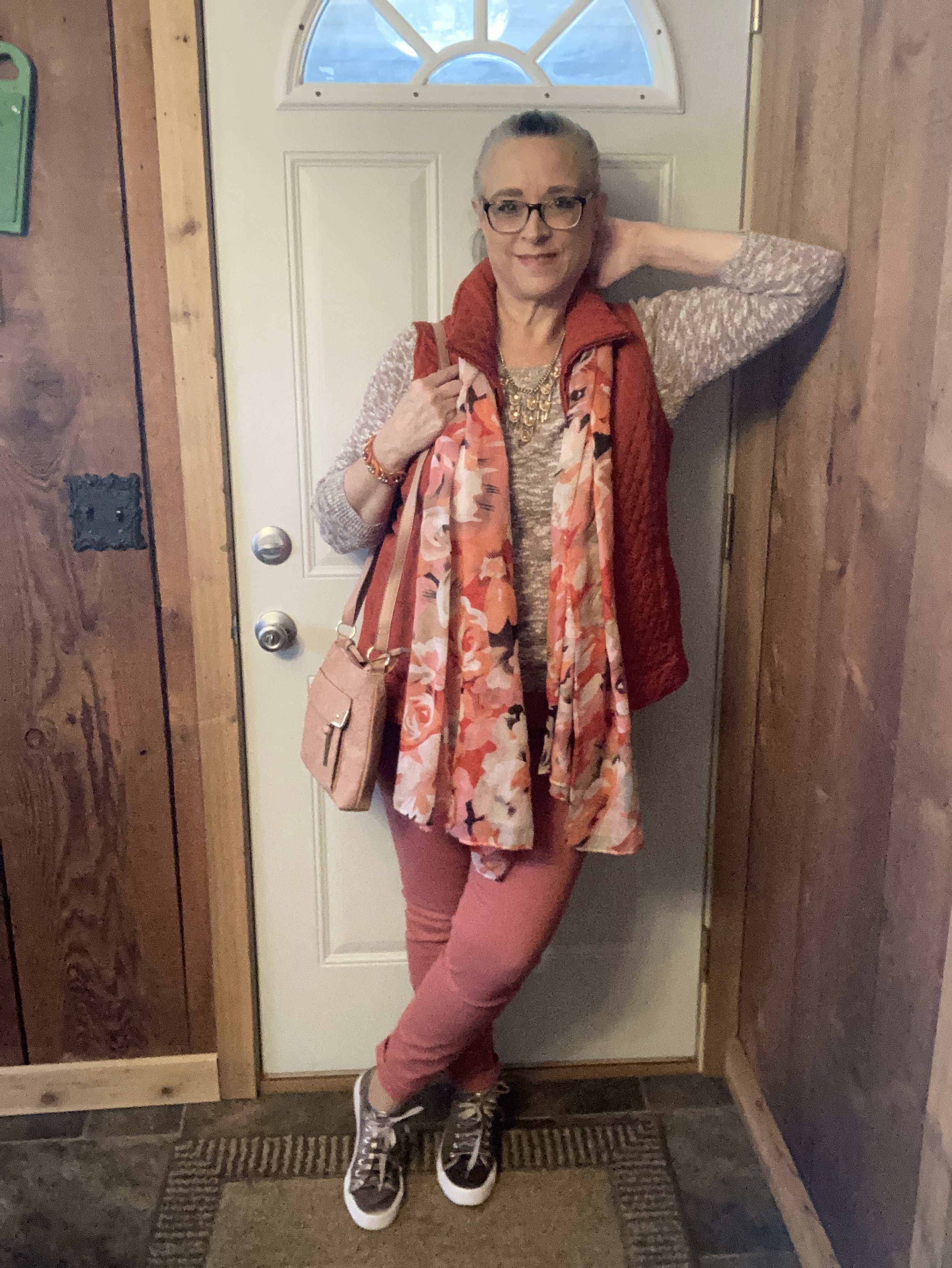
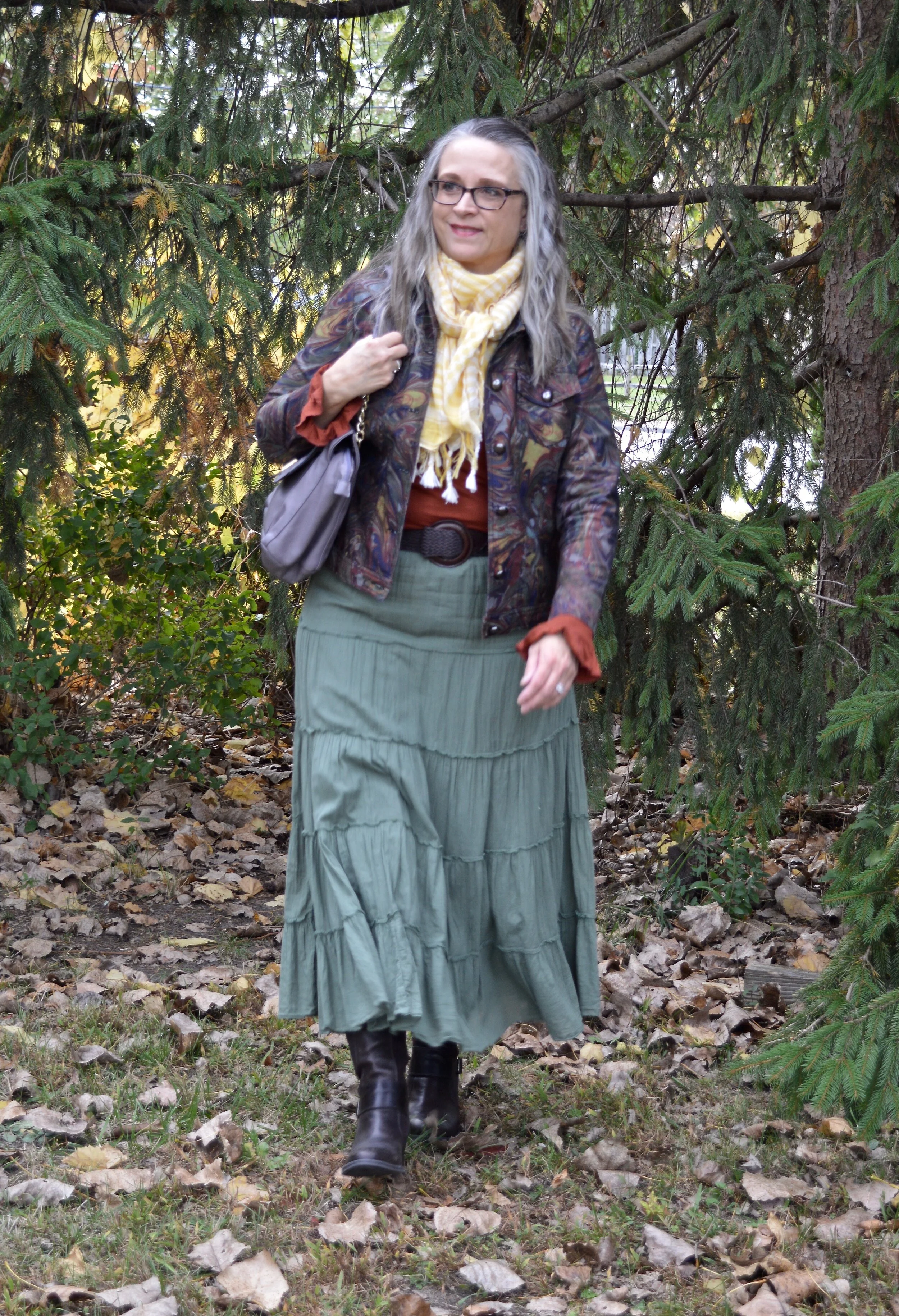
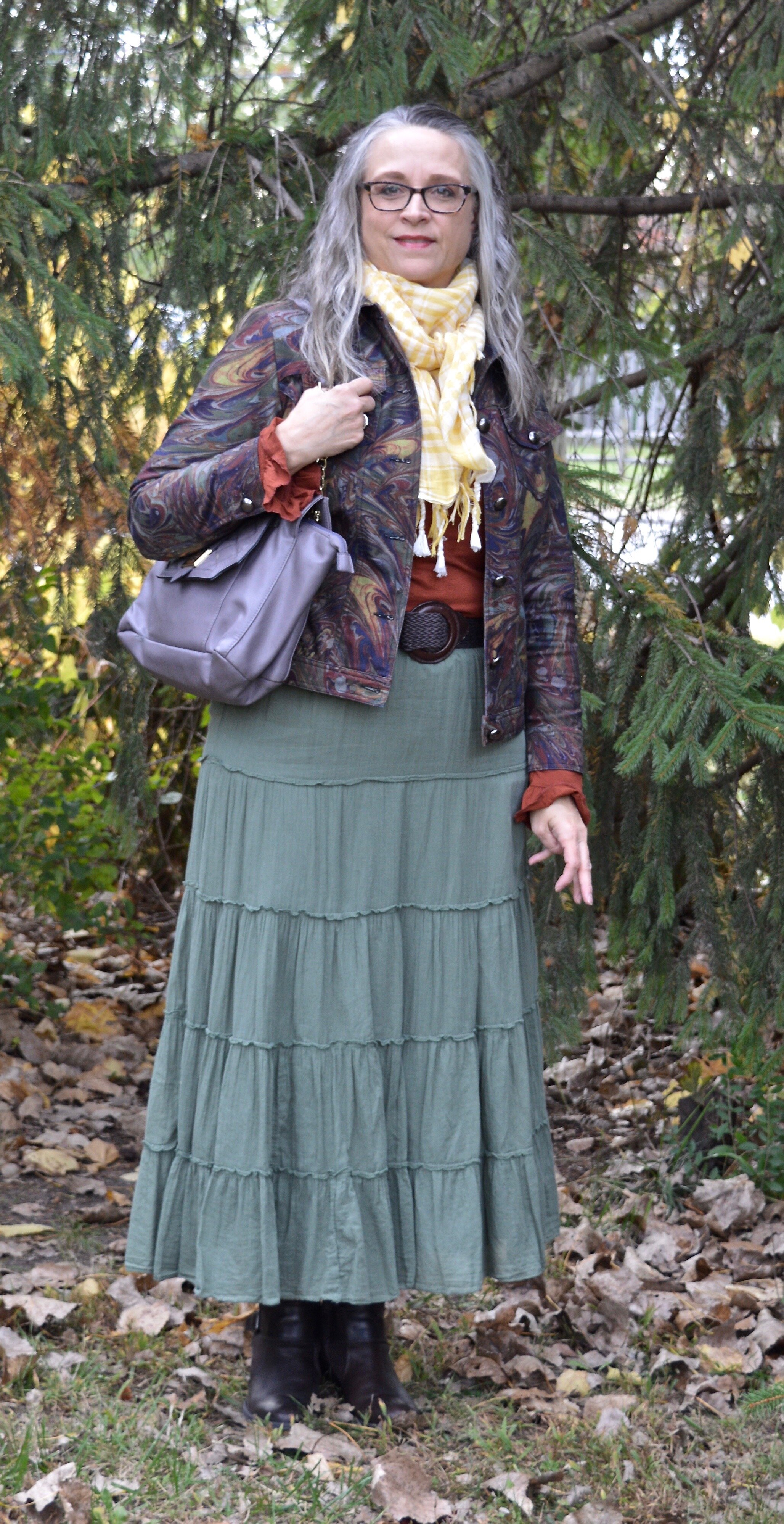
Today’s look is very casual and would be perfect for some holiday shopping or errand running as you take your packages to the post office to mail off to family members far away. It would also serve to trim the tree after you drag all those Christmas boxes up from the basement or down from the attic. I wanted an outfit that was casual, but also festive. Let me know if you think I achieved my goal.

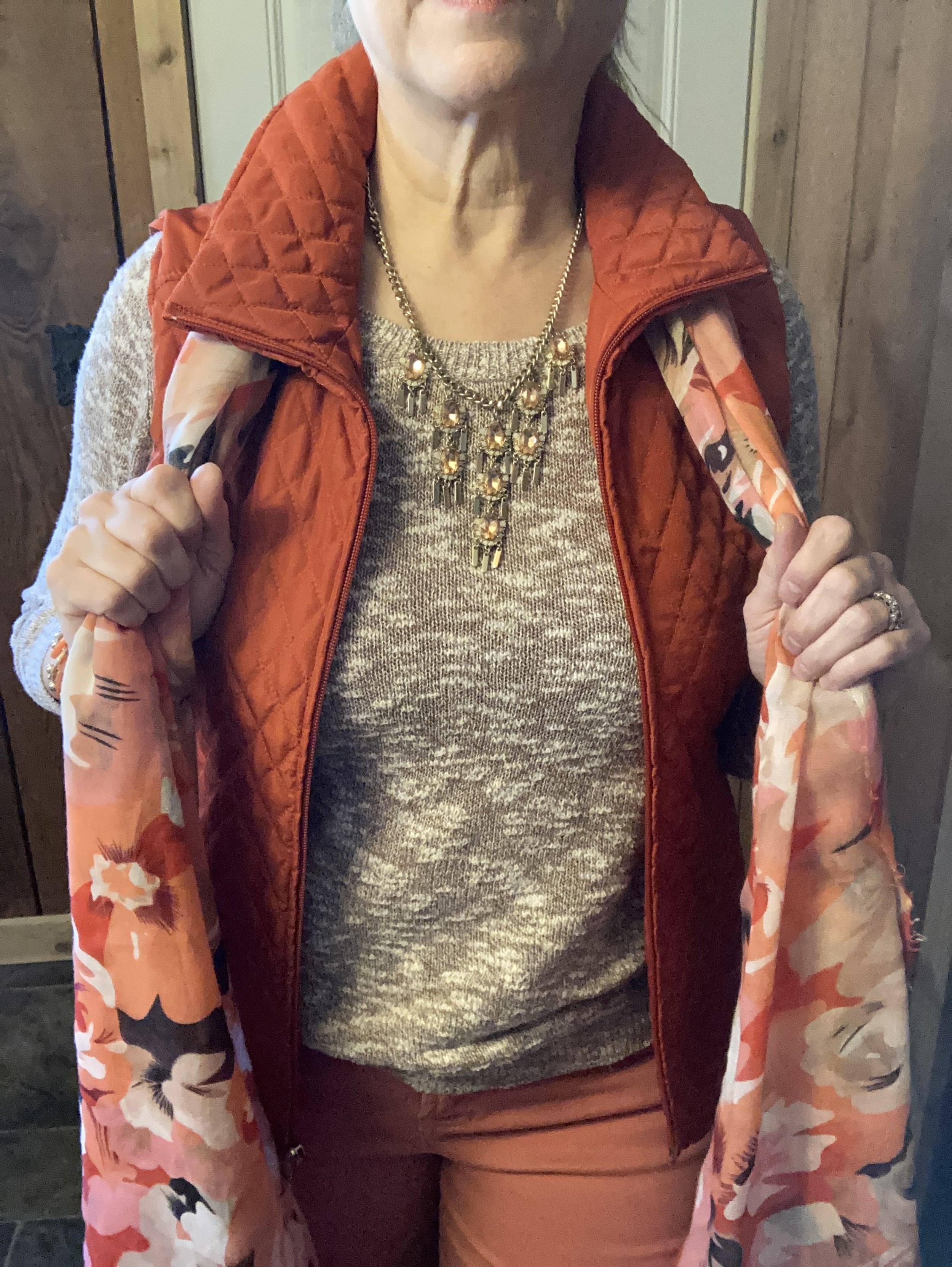
I have a number of Christmas specific tees, sweaters, sweatshirts and vests that I like to pull out every year to make their December appearance. This tee from Love In Faith is very basic, but that is what I like about it. It can be paired with just about any topper, and I love the sentiment.
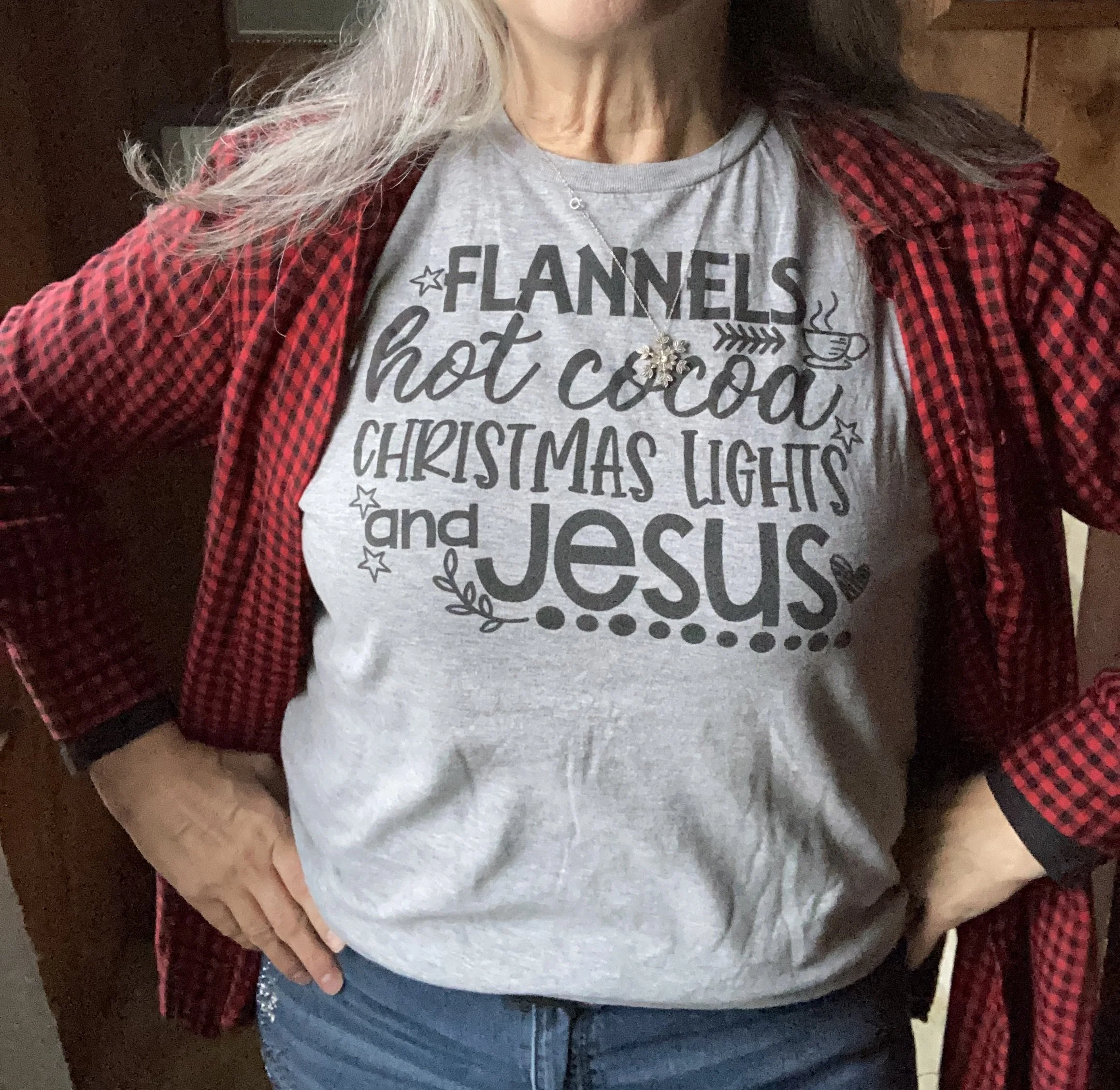
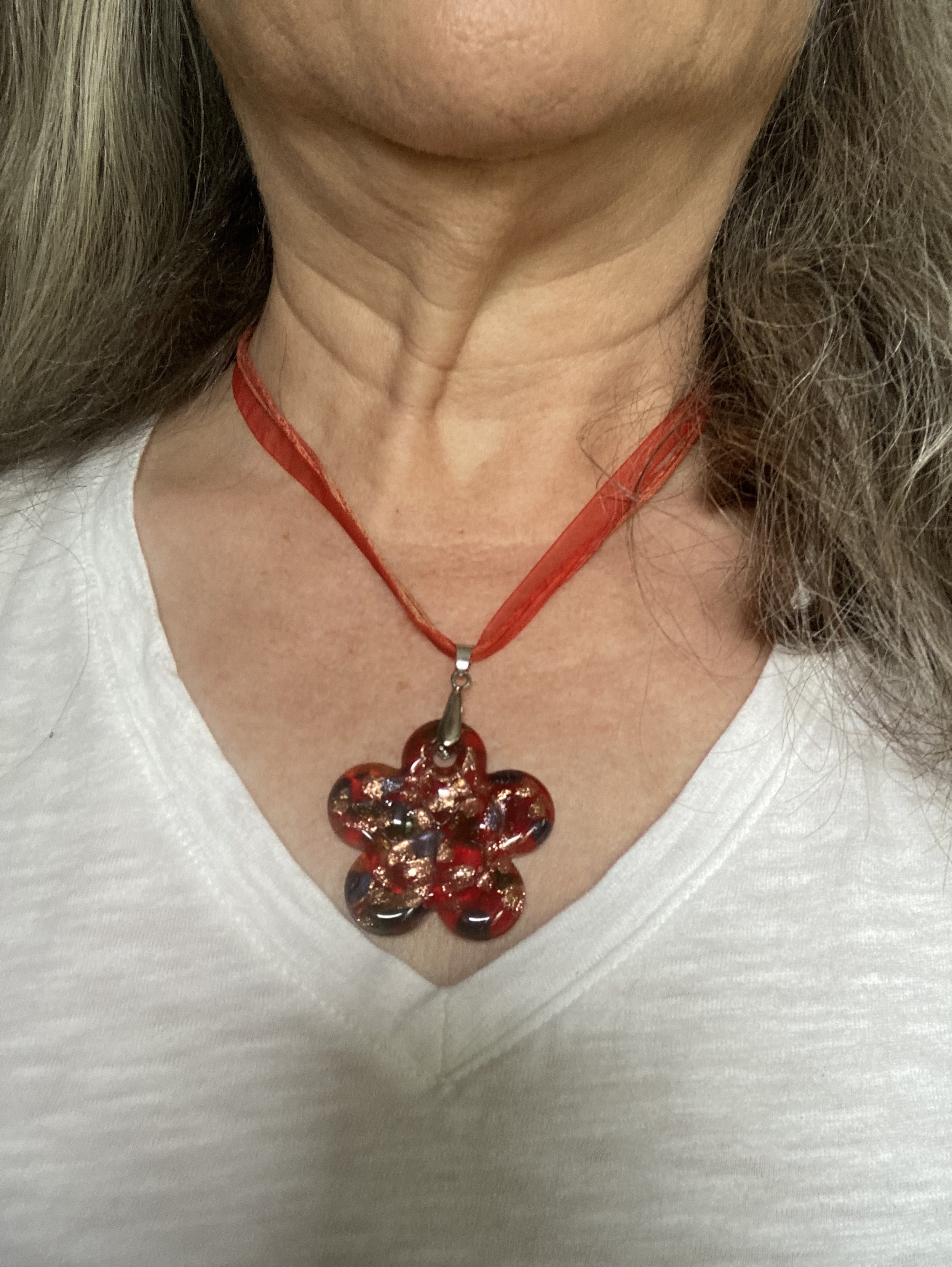
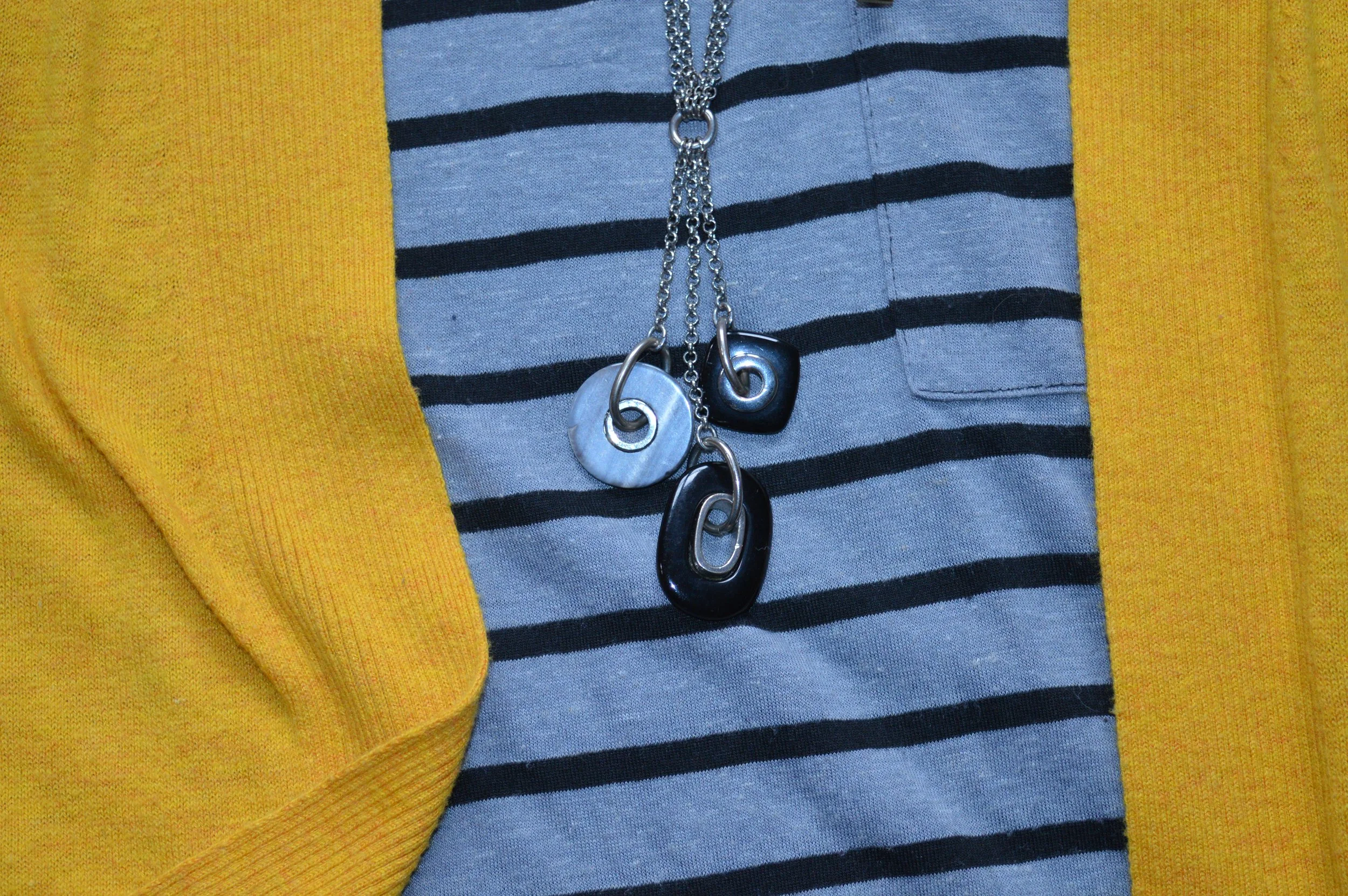
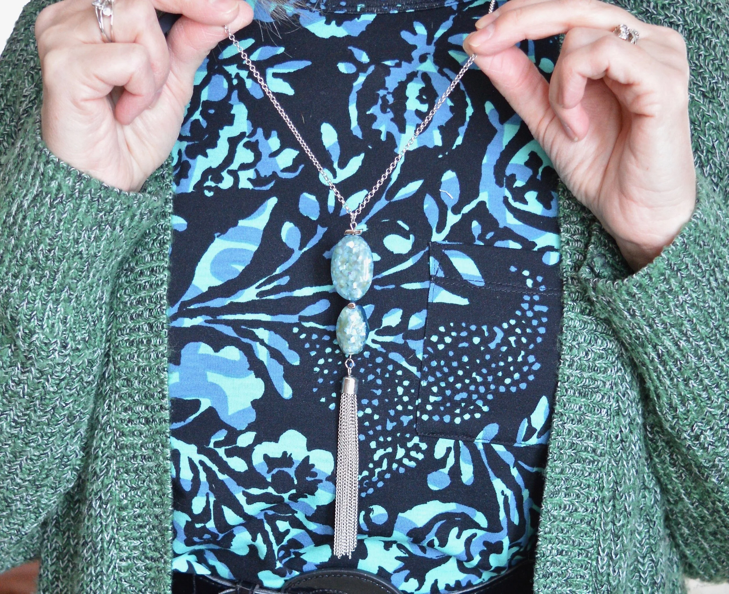
You can just barely make out my snowflake necklace, which was the only piece of jewelry besides my wedding rings that i put on. It was slightly askew, and maybe I should have chose something more colorful. What would you have paired with this tee and topper, or would you not add any jewelry?
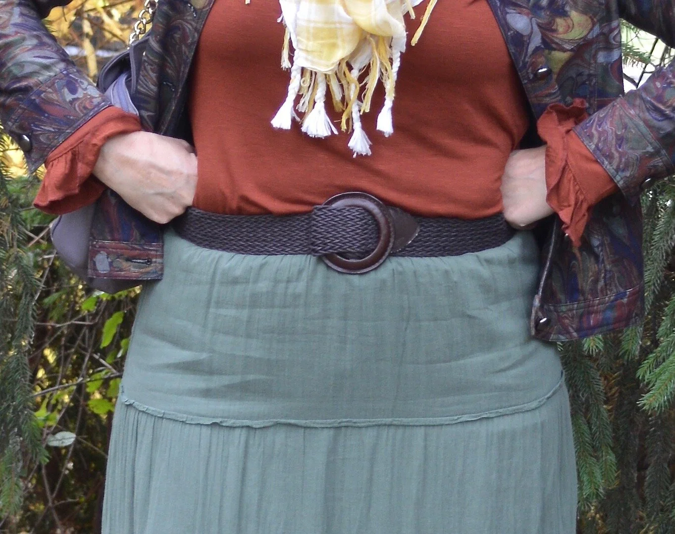
Once I chose this tee, I knew I wanted something red plaid as a topper. I am also wearing a thrifted long sleeve tee under the tee for extra warmth. I thought about one of my two red plaid blazers, but decided the red and black checked button down a better choice for the casual vibes. Buffalo plaid, which is a larger checked plaid, is always popular at Christmas, so I thought this worked well. This piece is thrifted Old Navy brand.

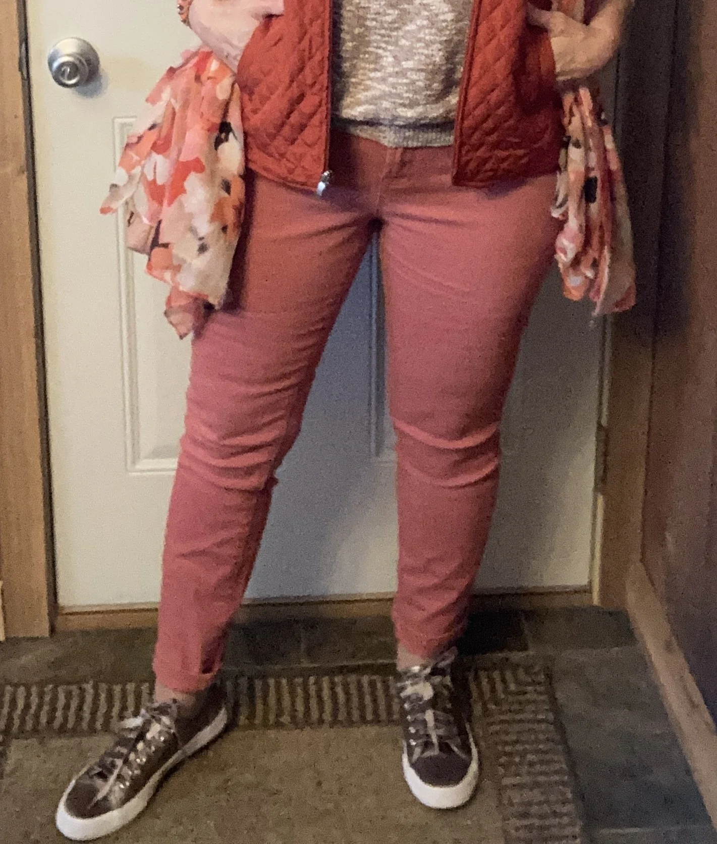
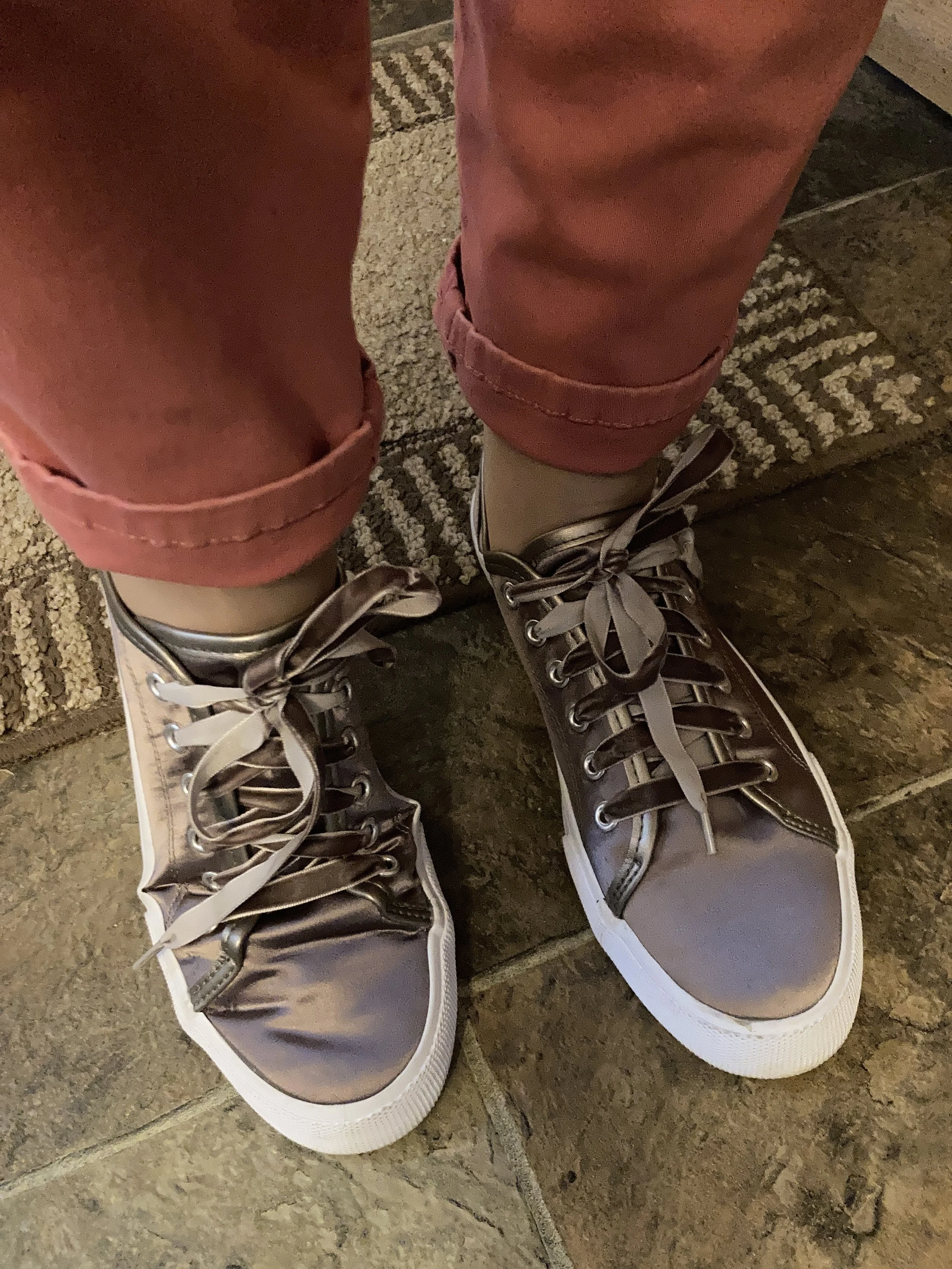
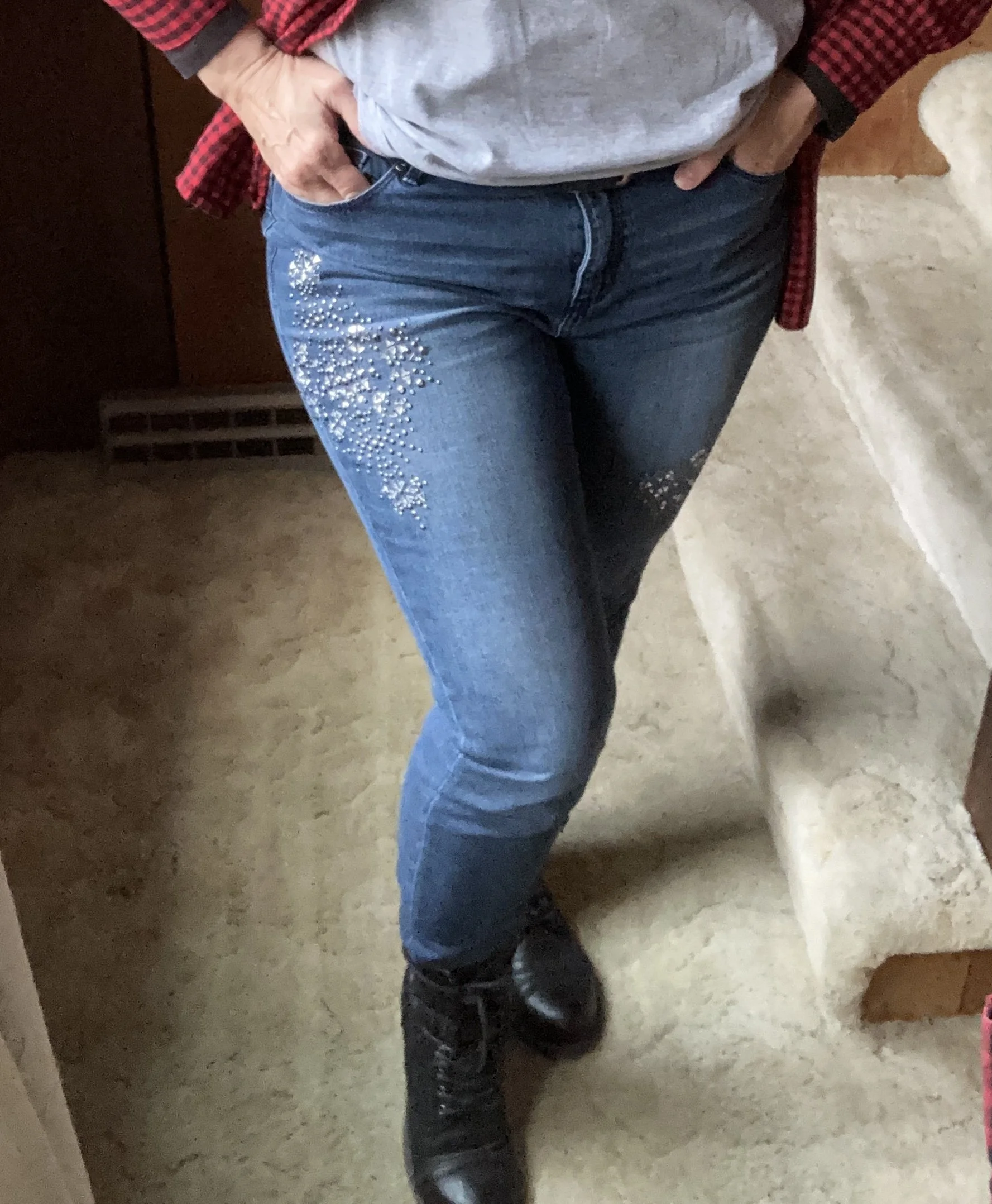
The only reason I reached for these sparkly, embellished Juicy Couture skinnies was that I had worn them a while ago and didn’t want to throw them in the wash until they had a second wear. Ha, ha. Sometimes inspiration is as simple and practical as a load of laundry. I just saw the other day that Taylor Swift is making skinnies popular again, and tucking them into ankle or combat type boots is okay by her, (click on the link to see the article). Ha, ha. So you see, I have been trendy all along!
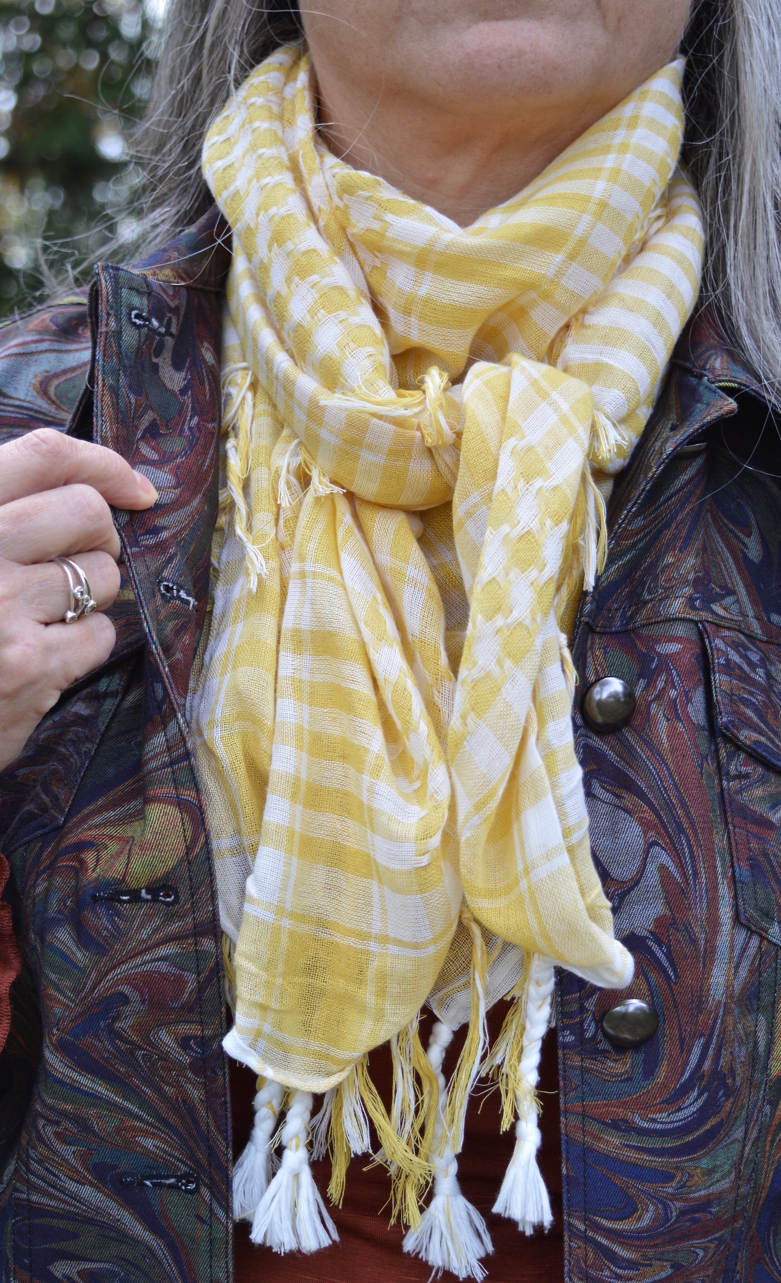
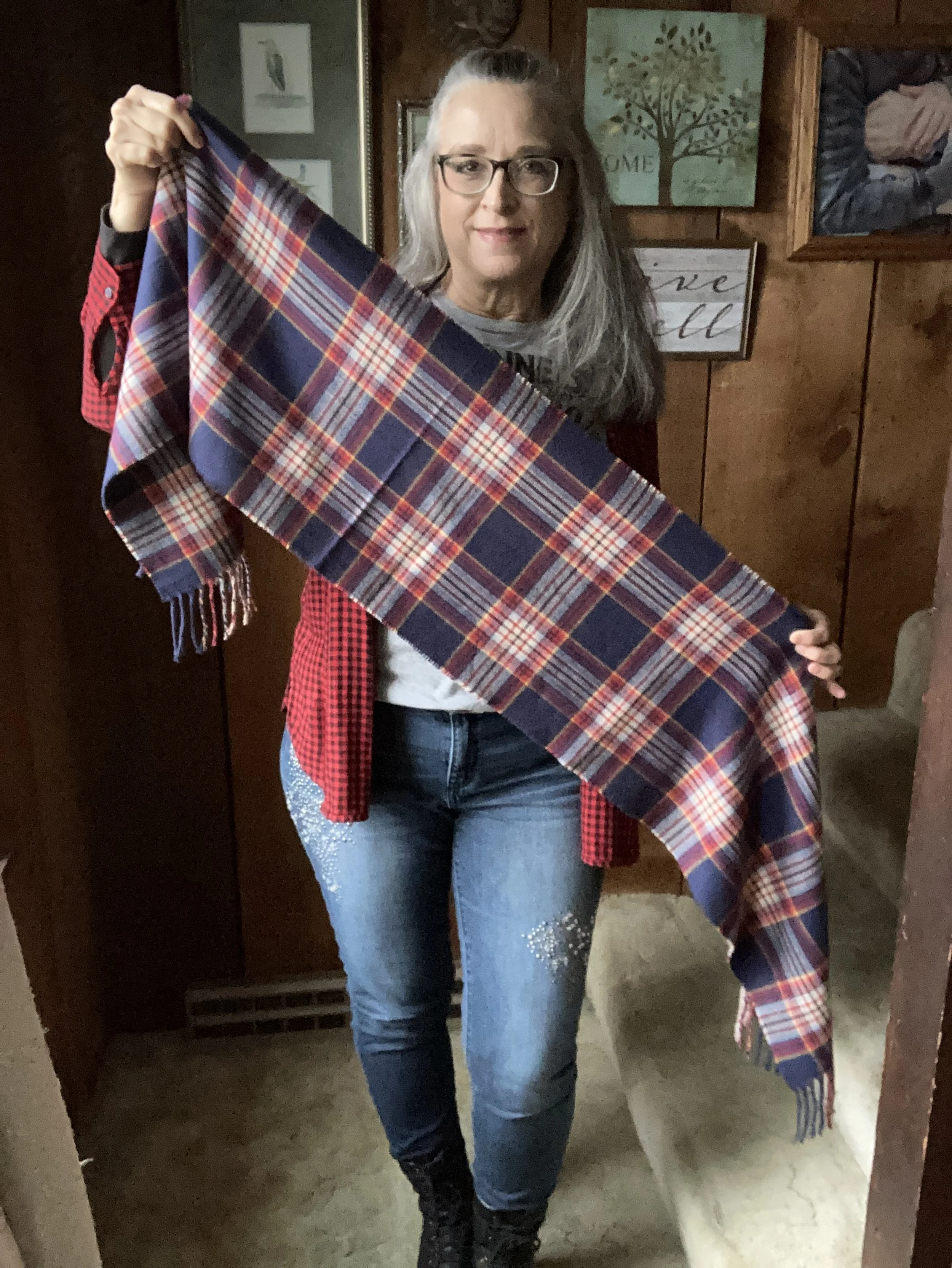
I wanted to add a scarf for a little more festive color, and warmth, so I ended up with this pretty plaid number that I got from Kohl’s last year.
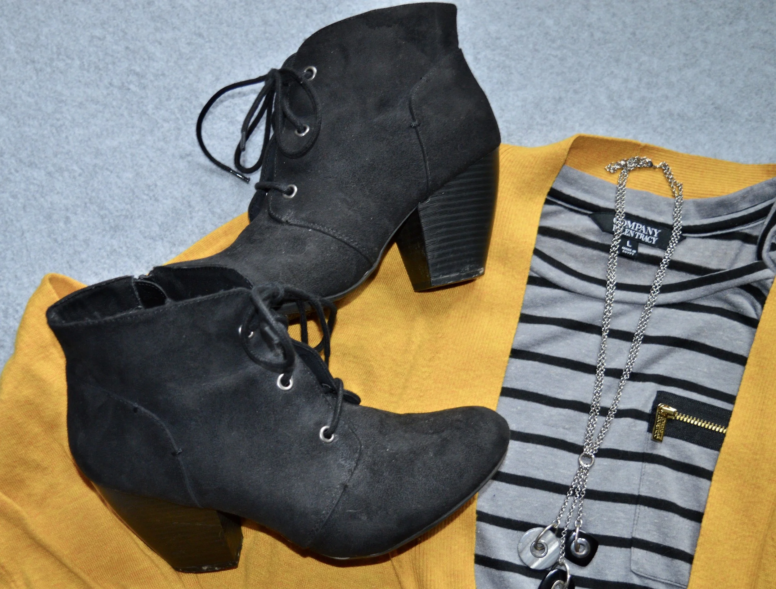
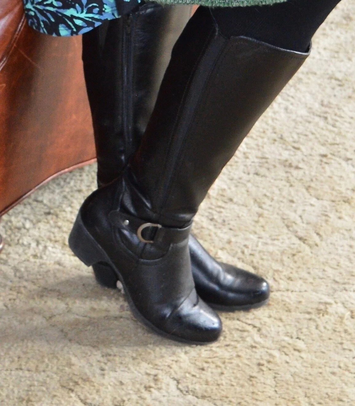
These black combat boots were thrifted last year and they continue to be worn frequently. They are already getting that “distressed” look, but because they are black it isn’t as noticeable. These are Joe Boxer brand and I’ve styled them on the blog before.

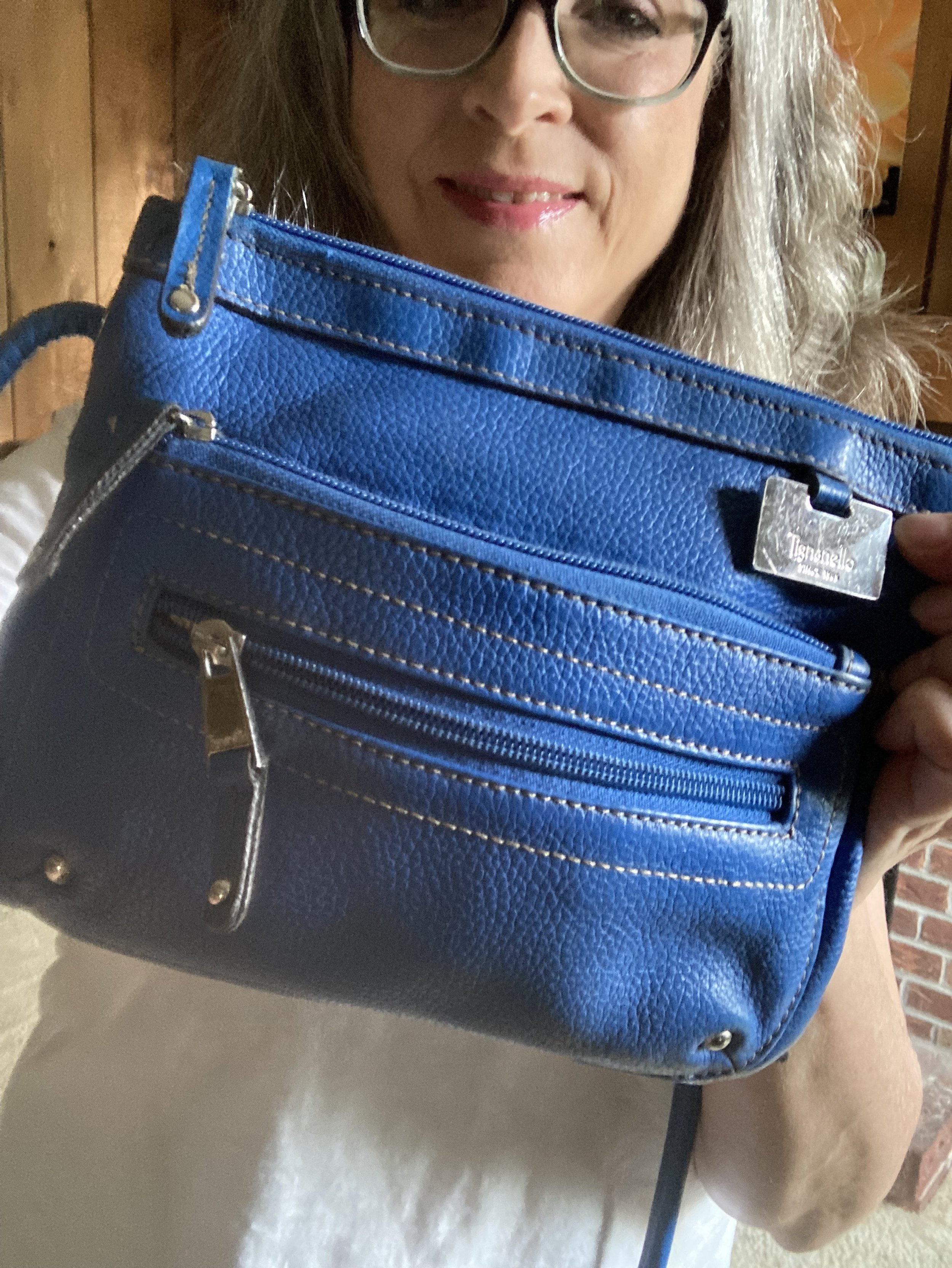
This Buffalo plaid tote bag was the final piece and even though I am stirring the check and plaid pot, I think it works. What do you think?

What do you think of this outfit? What would you wear for a casual day out, or for trimming the tree? Let me know in the comments. I always love your feedback.


I’m including a few shopping links for you to look over. Christmas is on the way, so be sure to look for yourself or others. These are affiliate links, but all opinions are my own.
I hope you are having a great day!