Pantone Fall 2017 - The New York Palette - Grenadine and Butterum
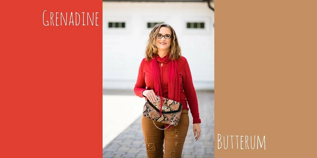
I want to continue my look at the Pantone 2017 Fall color palette this week, but now we are venturing into the New York colors. Whereas for the London palette, I paired the two colors together that were directly parallel to one another, for the New York palette I decided to pick the color pairings that appealed to me.
Grenadine is named after the bright red syrup that is used to make drinks. It traditionally is derived from the pomegranate. Obviously, when the Pantone gurus chose to name this color they hit the mark with this bright red. Butterum has many similarities to the London color Toast. I felt that these two colors made a fun pairing and enjoyed putting this outfit together.
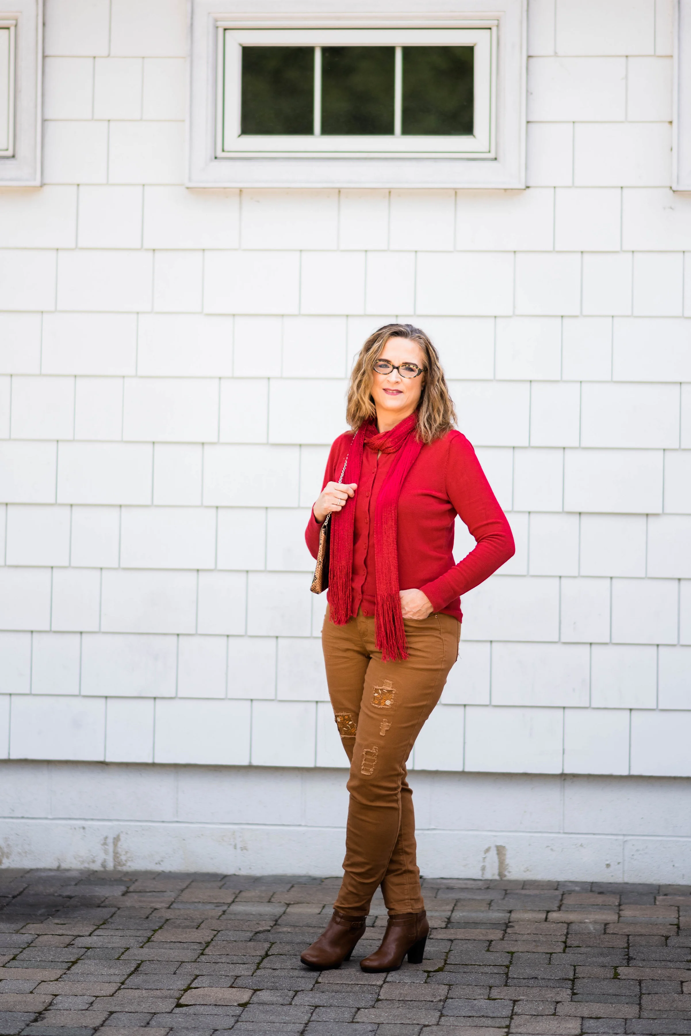
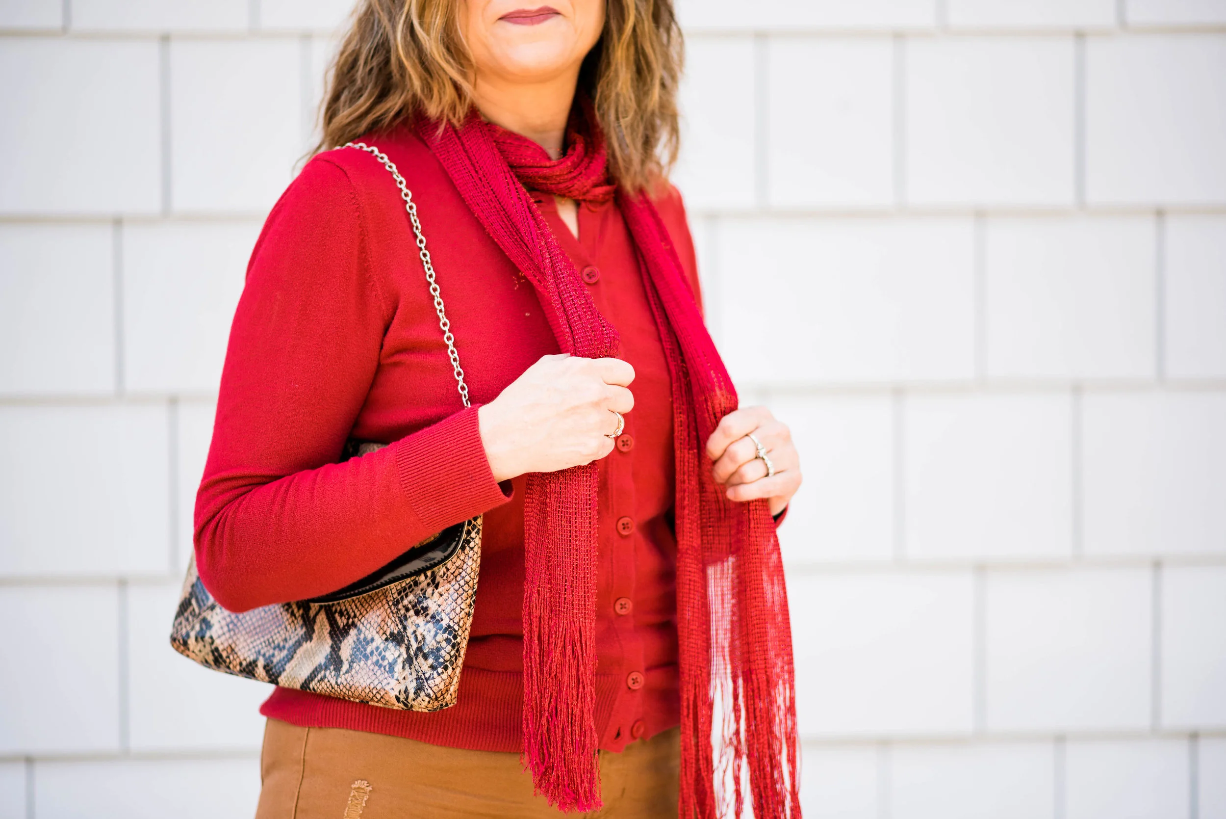
My top is a simple button up cardigan that I have had for some time. It is Merona which is a Target brand. Here is a similar one from Macy's. Instead of a necklace I added a silky fringe scarf.
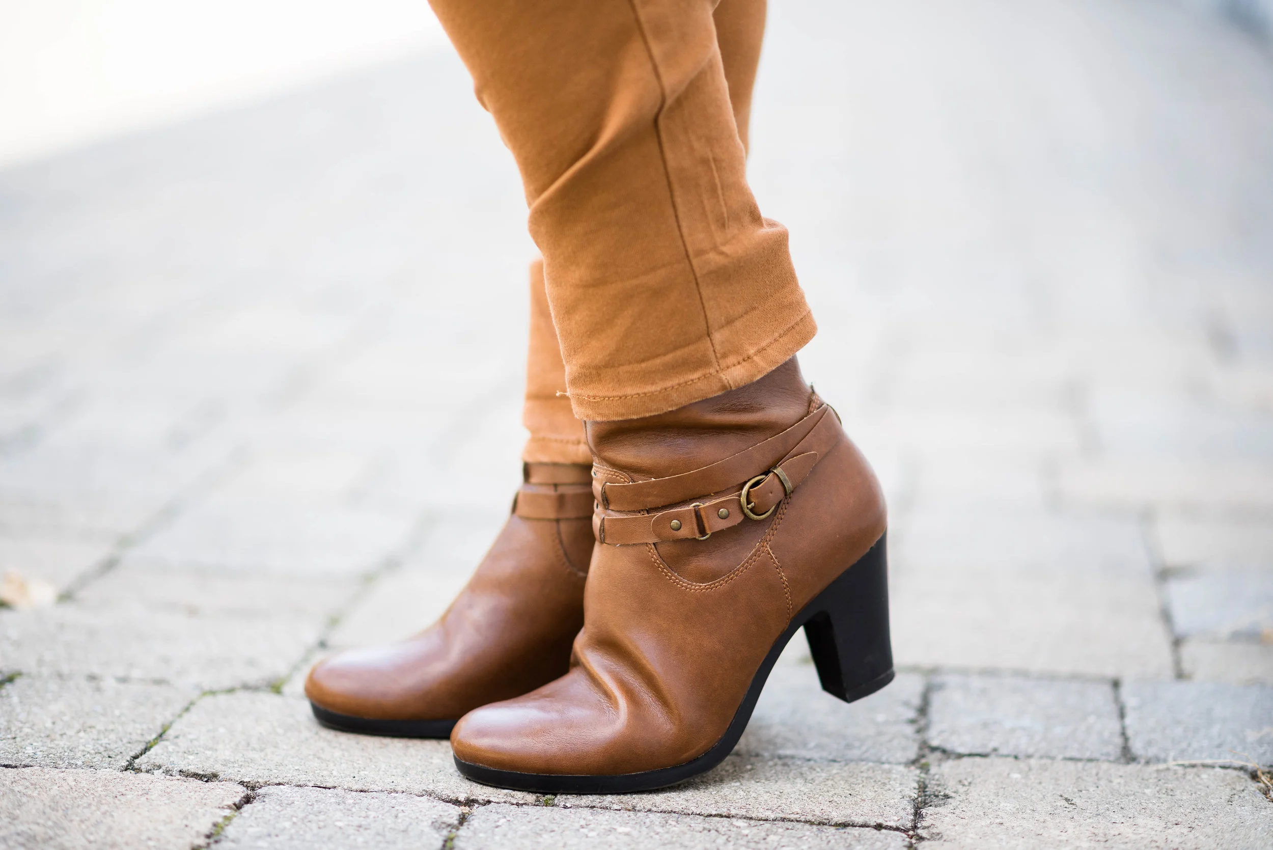
I kept my accessories minimal. My boots, which are Aerosoles, are a close enough match to the pants that it gives me that longer line. Matching your pants with your shoes can elongate your legs making you look leaner, and taller.
Here is a similar color boot from Aerosole. Here is a fun pair from DSW. There are so many fun ankle boots out right now in every color and heel height.
My only other accessory is my snakeskin clutch. I thought this connected with the outfit well because of the color combination. I like this clutch because it has a short chain, so I can also put it over my shoulder if I need both hands free.
Here are a few other fun bags.
What do you think of this color combination? Red is trending this fall and whether it be Grenadine or Flame Scarlet or something in between, you will be stylin' if you are the lady in red.
I've listed a few shopping options below. This post contains affiliate links. All opinions are my own.
Photo credit Rebecca Trumbull. Make up Rachel Christensen.
Thanks for stopping by the blog!


