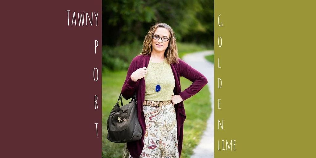
Layering Love - A Leopard Print Jacket

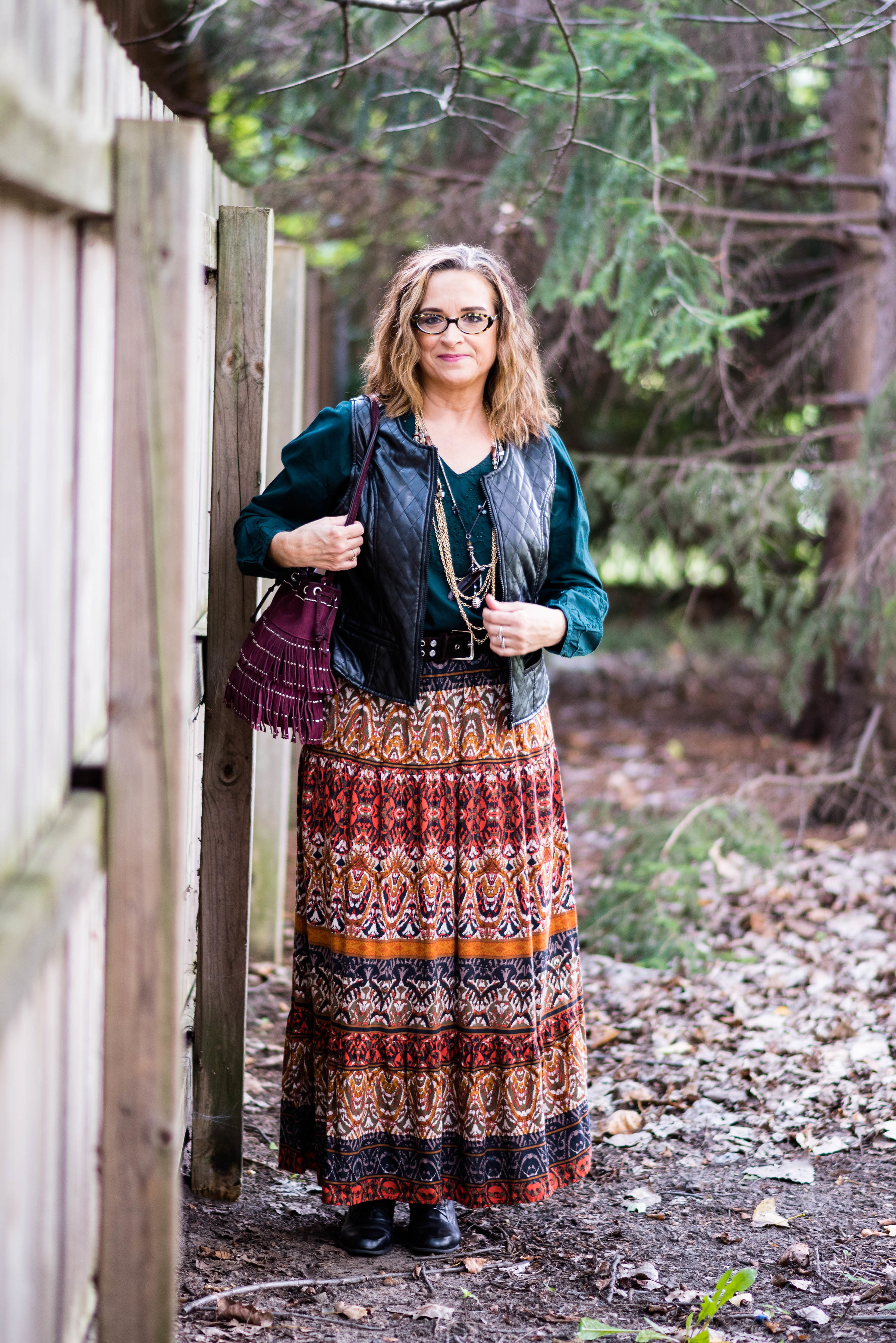
Every now and then I come across a piece in a store I just love. Sometimes I don't know I'm in love until I try it on, other times I can tell as soon as I see or feel it. When I saw this leopard print jacket on the clearance rack at JC Penney, I had to touch it. When I felt its soft velvety texture, I had to try it on. When I tried it on, I said, "This is coming home with me."

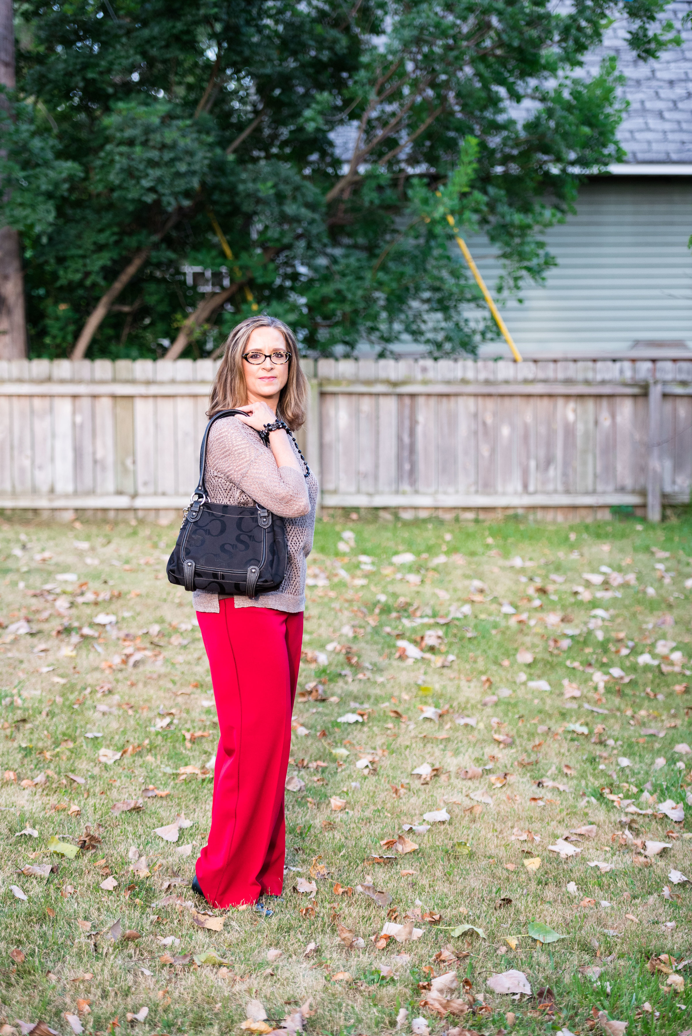
I tried to take pictures outside, but it was only 11 degrees. Which would have been doable, if the camera hadn't decided it was too cold to be outside. I kept trying to use the remote and it wasn't having it! Ha, ha. I did take a few photos right next to the house, but when I looked at them I realized I had an electric meter coming out of my head, and green mold decorating the aluminum siding. I want to be real, but maybe not that real! Instead you get indoor pictures with bits of clutter and Christmas decorations here and there. I probably should take down the Christmas decor pretty soon. What do you think? How many of you still have Christmas up at your house? Please tell me, I am not the only one.

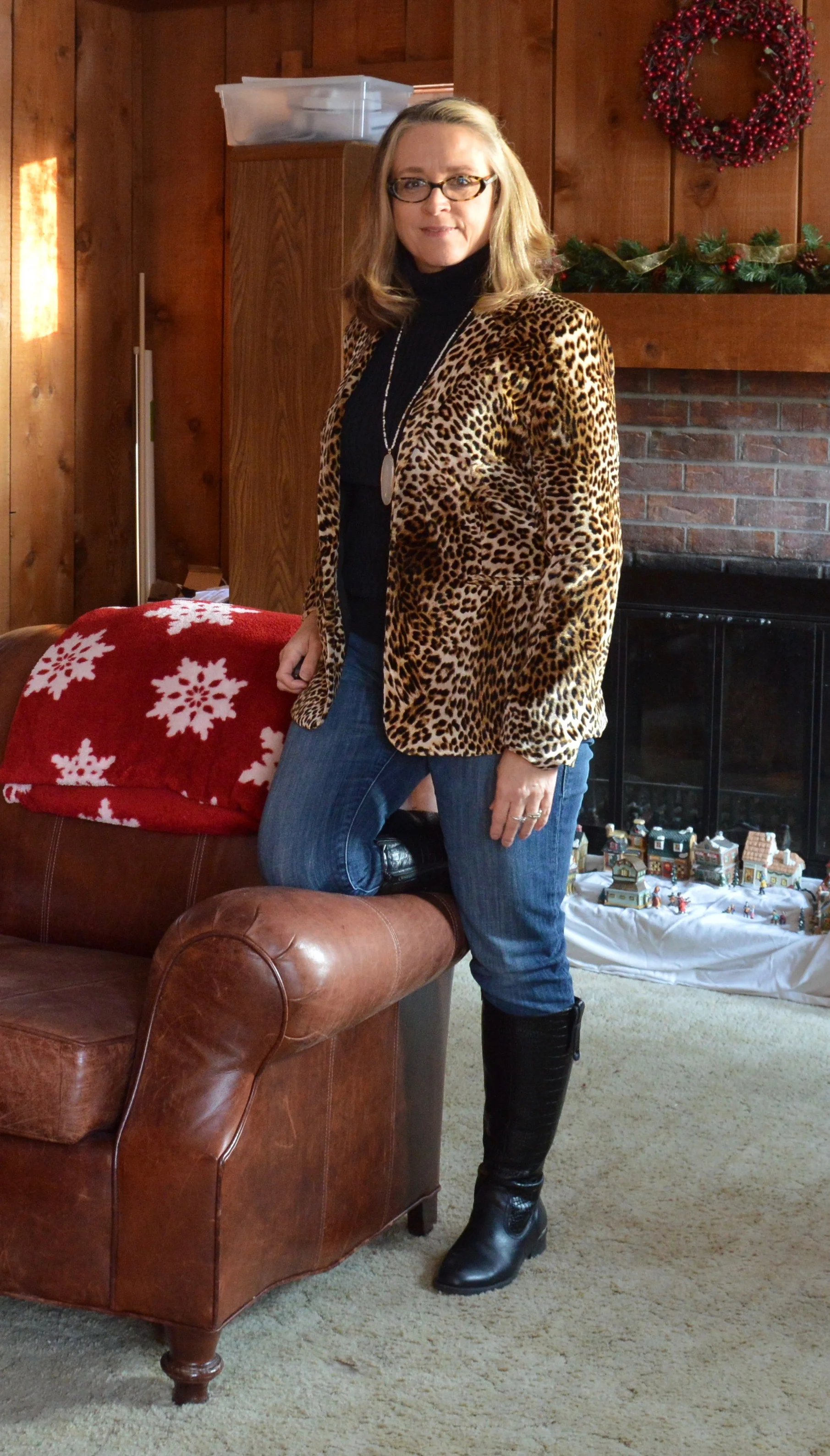
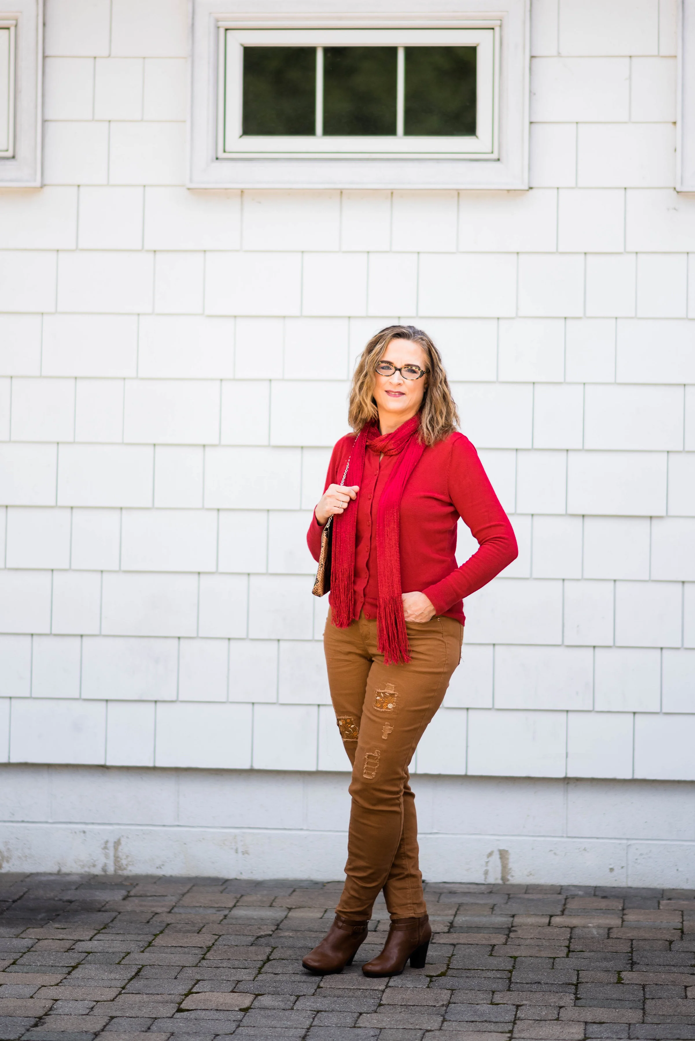
I wore this outfit to work and I was so glad. The heat was off on one side of the store. Did I mention it was only 11 degrees? Of course it was the side with the cash registers, so anytime we had a customer we had to leave our toasty back office and go to the cold side...sort of like the dark side, but you don't get a light saber. This Libby Edelman jacket and Croft and Barrow turtleneck kept me warm and cozy all day. Here is the link to the jacket online. I'm not sure why, but the it is still full price, unless you buy more than one thing, and they only have small sizes left.

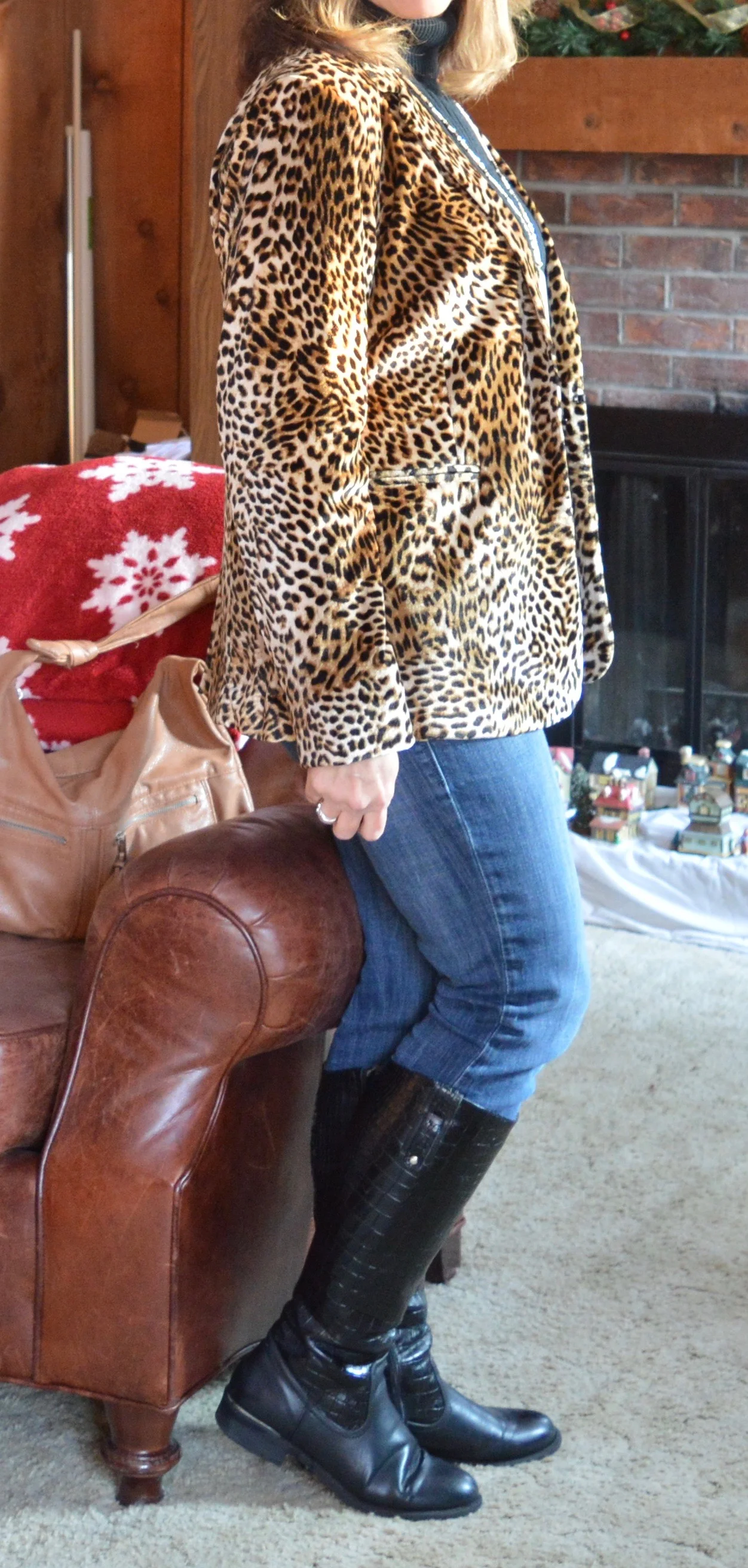
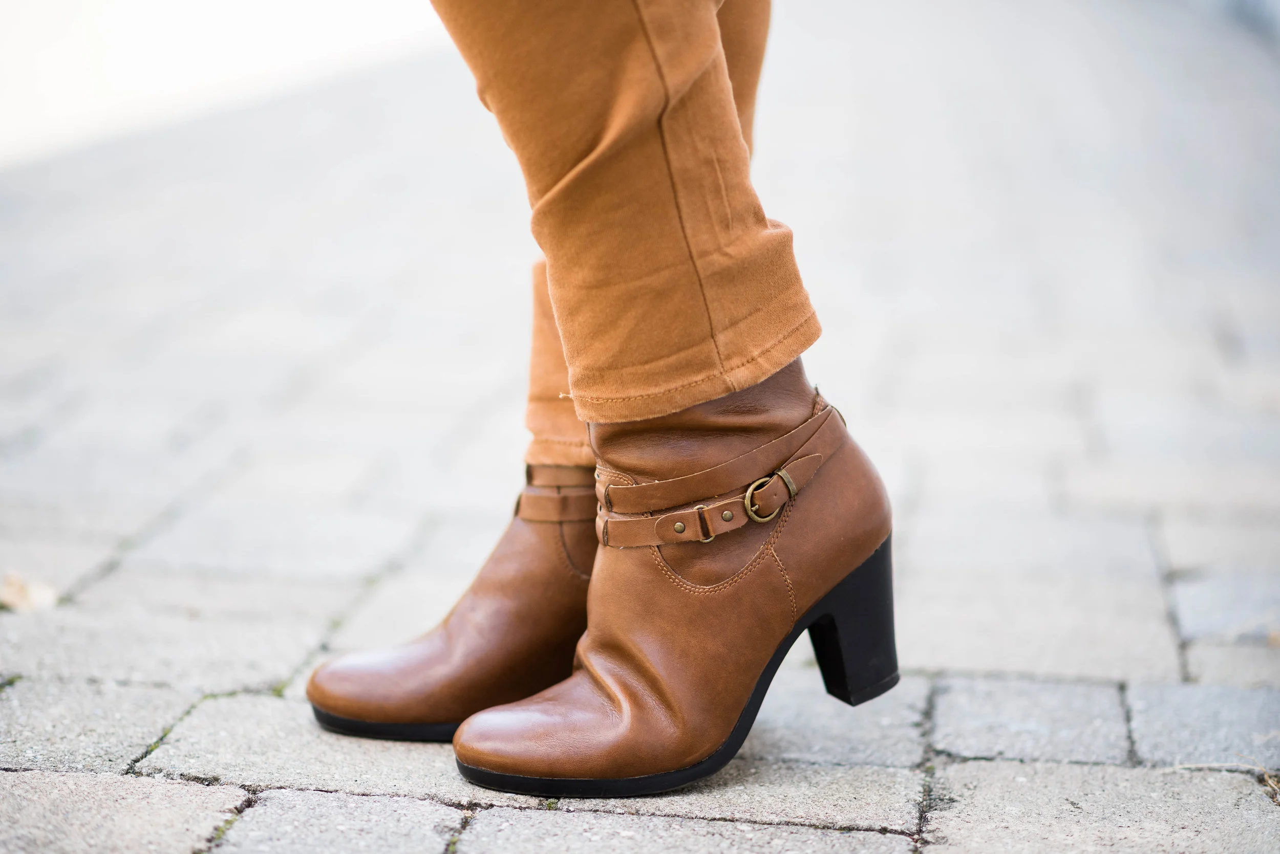
For this casual work look, I paired the jacket with my Rock & Republic skinny jeans, and my Rialto black riding boots. 

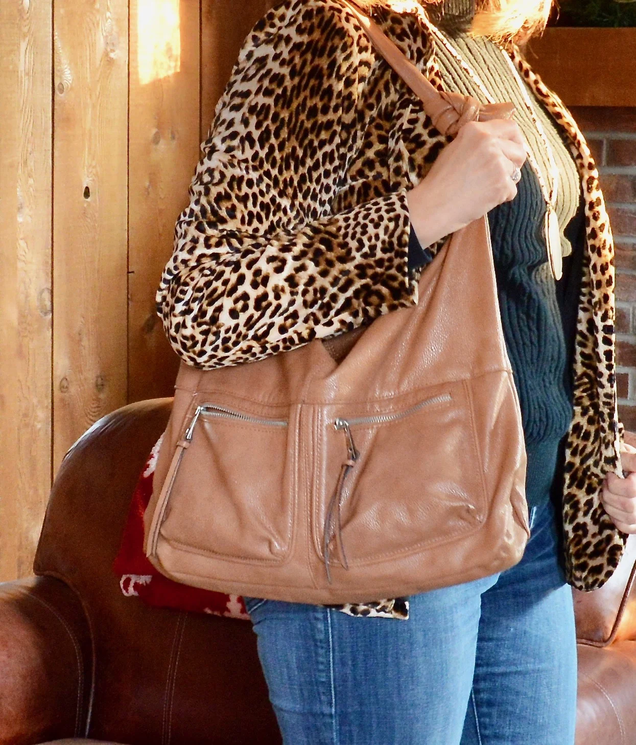
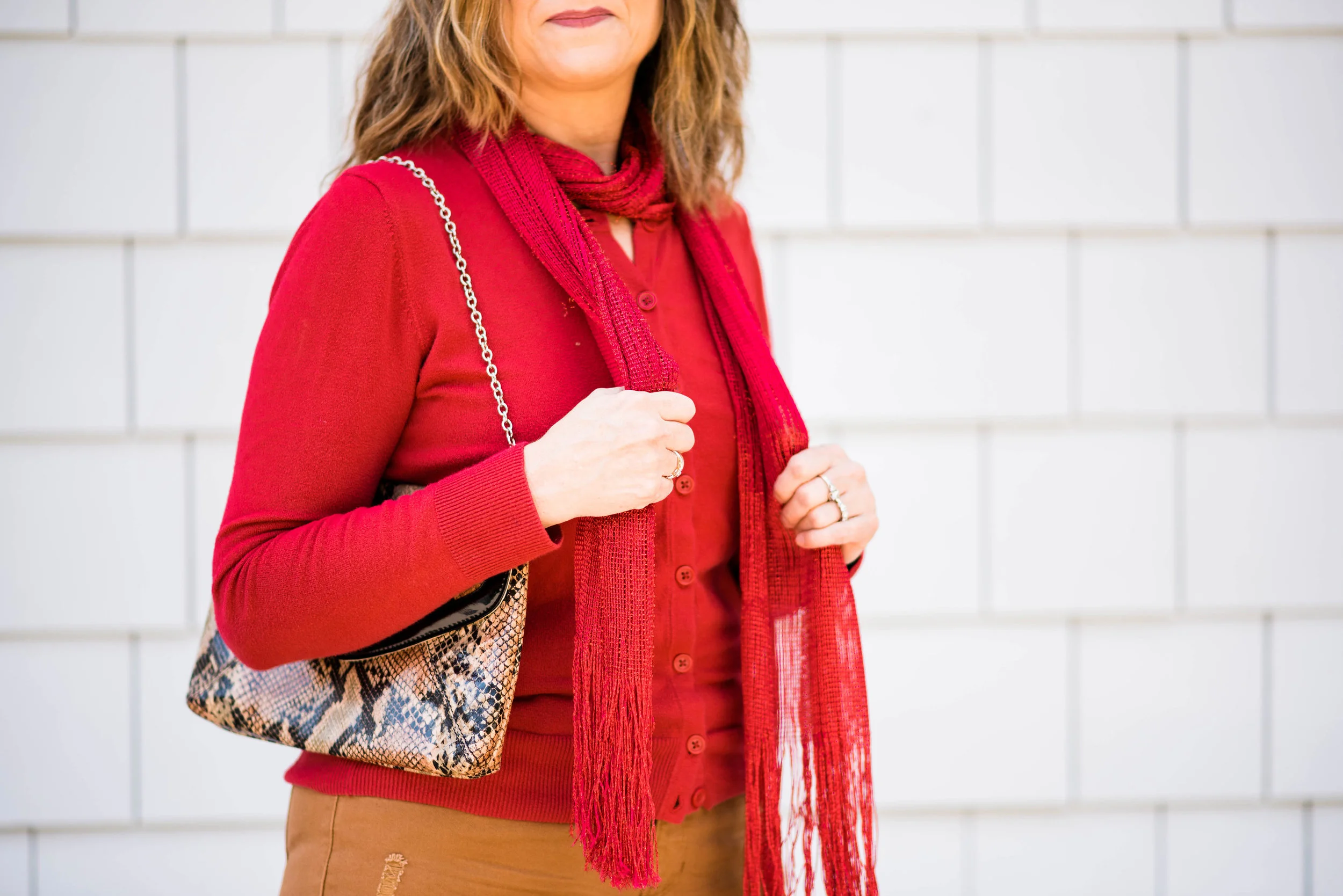
I chose my Butterum hobo bag and added a simple beaded pendant necklace that I just found at Penney's on clearance. I thought it linked well with the colors in the jacket. 

I think this jacket would look fantastic with a red or burgundy dress or skirt, as well as navy or even cobalt blue pants. A leopard print jacket like this can be worn with many other pieces for both dressy and casual occasions. What do you think? Would you wear a jacket like this?

Be sure to leave me some love in the comments section. I appreciate your input.

Here are a few shopping options. This post contains affiliate links. All opinions are my own. 

Monday linking up with Catherine of Not Dressed as Lamb. Friday linking up with Jo-Lynne of Jo-Lynne Shane. 

Holiday Outfit - Casual - Skirt

In this series on holiday outfits I wanted to give you options that you can use for Thanksgiving or Christmas. Although, by the time this series is done, Thanksgiving will be over. I can't believe it is on Thursday. I just took out my turkey this morning to start thawing. How many of you are cooking on Thursday? I really don't mind the work. When I have a special occasion I like to cook. When life is busy my spouse and I will eat out a couple times a week, so when I get the chance to cook, I do enjoy it. The clean up, not so much! Ha, ha

For this week's post I took a leopard print skirt and designed a casual and comfortable outfit that still looks chic and festive. 

Like I did last week, I'll organize this in a way that will help you build a holiday outfit from pieces that you already own. 

1. Pick a casual skirt that you like to wear. I doesn't have to have a print, but prints are fun. In keeping with the time of year, maybe choose a piece that has darker colors or more fall-like tones. Length is up to you. Mini's, maxi's or something in between all work as the foundation for a festive holiday outfit. 

The thing that makes this Jones, NY leopard print, pencil skirt more casual is its texture. It is made of narrow wale corduroy. Corduroy is very close to a ridged velvet. The fabric has the same soft feel, so it is comfortable and movable. Another thing that makes this skirt more casual is the belt loops and front zipper. I have another leopard print skirt that I styled on the blog here, but I feel it is more dressy. It is a smooth chino type fabric with a structured waist that buttons on the side. i'll admit they look pretty similar and I will probably get rid of one of them at some point, but for now, I am guilty of owning two leopard print skirts. Ha, ha. 

Another great casual skirt that you could easily dress up for the holidays is a denim one. Denim is the perfect back drop for all sorts of pretty combinations that stay casual, but still say holidays.

2. Pick a festive companion piece. For my outfit I chose two companion pieces, an open weave pullover sweater with gold threads, and a denim vest with silver bling on the yoke. This sweater is Covington and the vest is Christopher & Banks

The bling gives the outfit a holiday feel without being a top that has the actual holiday on it. If you don't have a top with bling choose a vest or sweater in the season's color. A rich burgundy or maroon will work great for Thanksgiving or Christmas. Even a deep purple or rusty orange will give an outfit a holiday vibe. 

3. Pick your jewelry. If you have a more blingy top you might want to forgo the jewelry, lest you feel like a Christmas decoration, but if you think the more the better, then welcome to my world. The goal is overstatement versus understatement

I chose a brassy necklace that had a few beads that matched the Butterum color in the skirt. The brassy chain also goes with the brass buckle on my belt. Sometimes mixing metals can clash, but I think in this outfit it works because no one metal takes center stage. They all compliment and work together with other colors in the outfit.

If your outfit pieces have no bling, then you can layer on the jewelry. Try multiple layers of gold or silver necklaces, or mix them up. Gold and silver can look gorgeous on a backdrop of burgundy, dark purple or deep navy. Think about what you own and try different pieces until you find something that makes you say, "I really like how that looks." Chances are, other people will think so too.

4. Add a bag. To pull together the browns in the skirt and the necklace I reached for my Butterum hobo bag. It is roomy enough to fill with additional items for a trip to see the family for dinner or even to tuck a light weight shawl for someone else's cooler home. 

5. Don't forget your shoes. Once again I reached for my Impo gray suede ankle boots. You can see I also went for a dark brown pair of tights, for full coverage of my legs. 

I chose these as they are dressy, but not too dressy. They are warm and I thought the gray color went well with the gray sweater. You could also wear knee hight boots, over the knee boots or even a pair of Keds or Converse sneakers for an even more casual look. The classier your shoes are the more dressed up the outfit will look. Heels, to me always make a dressy statement. You'll see more of that in the next four posts as we get into dressier looks. 

I hope you enjoyed seeing this outfit in my holiday series and I hope it provided some inspiration for you to create a holiday look from your own closet. 

Photo credit Rebecca Trumbull

Here are a few cute skirts and boots to shop for. This post contains affiliate links. All opinion are my own.

The Pantone Fall 2017 Recap

What I want to do for this week's post is give you a recap of all the Pantone Fall 2017 colors. Instead of taking up too much of your time, reviewing what was already said about each outfit, I think you are all smart enough to go back and revisit the original post on each color combination if you want to see and read more. 

For those of you who have been following me for a while, you already know my philosophy behind using the Pantone colors on my blog. For those of you who are new here, I love color and whether it be in God's creation, a painting or an outfit, I love to see how various colors combine and contrast to create stunning visual displays. Pantone gives me a spring board from which to choose color combinations for my outfits. That being said, here are the outfits from this year's fall colors.

The London Palette

Flame Scarlet and Otter 

Here is a look at the outfits side by side. 

What is your personal favorite? I'd be interested to hear. Mine is the Royal Lilac and Golden Olive. I loved the richness of both of these colors, the comfort of the outfit and the Bohemian vibe that I felt it portrayed. I also felt that I looked the best in these colors, which is a revelation since I have never thought of myself as looking good in yellow. So much for those ideas that we had in the past!

The New York Palette

Grenadine and Butterum 

Here are the outfits side by side. 

Which one of these color combinations did you like the most? Over all, I liked the New York Palette better than the London Palette. I felt the colors were deeper, richer and easier to find and work with than some of the London colors. If I had to pick one favorite I wouldn't be able to. I like the boldness of Grenadine and Butterum, the classic feel of Ballet Slipper with Neutral Gray, the perfect blend of Navy Peony and Marina, the tropical contrast of Tawny Port and Golden Olive and the fall perfection of Autumn Maple and Shaded Spruce. 

What is lovely about these colors is that you could pair any one with a totally different combination than I have and come up with an equally awesome outfit. How about Grenadine with Marina, Neutral Gray with Shaded Spruce or Autumn Maple with Navy Peony. That is the beauty of finding inspiration in the Pantone color palettes. There is so much you can do with them, long after these colors become obsolete. The Pantone Color Institute has already put out their Spring palettes! Yikes! For a sneak peek at those just click on the one you want to see: London Palette or New York Palette

To see any of my original posts on this series just click on the link above the picture. I hope you enjoyed this series on the Fall 2017 Pantone colors. 

I have decided to postpone my series on camouflage until the new year, so I will be starting a series on dressing for the holidays, next Tuesday. On Thursday I'll be starting a series on layering, which is one of my favorite things to do. I hope you'll join me.

Pantone Fall 2017 - The New York Palette - Marina and Navy Peony

I wan't sure about pairing the two blues together that appear on the New York palette, but after mulling it over, I decided to give it a try. Navy Peony is the only color that appeared on both the Pantone London palette and the New York palette this fall. While many of the other colors came close to being similar such as Grenadine and Scarlet Flame or Butterum, Toast and Copper Tan, Navy Peony seemed to be embraced all over. I have heard it said that navy is the new black and is a go to for styling an outfit that is classic and slimming. 

Marina is a lighter blue and reminded me of the beautiful fall sky on a sunny day. Going along with that idea, I decided to add white pants, keeping the outfit light and bright, but still filled with warm layers for a perfect fall transitional outfit. 

For my Navy Peony piece I chose an Isaac Mizrahi denim dress that I found at a thrift store. This dress was made for Target, but Mizrahi no longer has an affiliation with Target. I thought the dress, which comes with an attached belt would make a great jumper or, as in this case, the perfect cool weather longer length vest. It has a row of white buttons up the front and two roomy pockets at the sides. For this outfit I left it unbelted and open. Here is a navy longer length utility vest that would work. 

The Marina button up top is a thrifted Dana Buchman brand from Kohl's. I was looking for a few blouses that I could wear out or tucked in, but that didn't have a lot of bulk to them. This is a silky poly blend and layers well under the heavier vest. 

The pants I have styled before on the blog and are Gloria Vanderbilt boot cut jeans. I'll list a few other shopping links at the end for similar options.

We took these pictures at a local Toledo Metropark named Wildwood. We are very fortunate to have numerous beautiful parks throughout the Toledo area boasting great walking trails and historicbuildings such as this old school house which is still used for various events. 

To keep my outfit still connected to the changing colors of fall, I decided to add a few cognac or Butterum accessories. 

The boots are thrifted Aerosoles and the bag is thrifted New Directions. Here are a cute pair of similar colored boots from DSW. Here is a cute bag from Nordstrom Rack. This color is perfect for fall, not to too dark and not too light. It gives any outfit a warm, toasty feel. 

i also went for the browns in my simple bead necklace and hinged bead bracelet. 

What do you think of this color combination? Do you have many navy pieces in your closet? Be sure to take them out and start wearing them and you'll be right in style. I'd love to hear from you either in the comments section below or leave me a message on Facebook. You can also follow me on Instagram and Pinterest. I appreciate all your support.

This post contains affiliate links. All opinions are my own.

Join me Thursday where I will be feature another Fun Fall Look. See you then.

Photo credit Rebecca Trumbull. Make up Rachel Christensen.