November Styles - Flannel, Denim and Fur

For the month of November, I decided to take a closer look at some of the prints, colors, and textures that are trending this fall. It is hard to slow down and not let our minds go straight from Halloween to Christmas, but I want to take a deep breath and just enjoy fall before winter sets in. We’ll have time for holiday vibes in a few weeks, but for now just sit back and enjoy the changing leaves as they begin their descent to the ground, and savor the scents and tastes that come back around this time of year, like cider, pumpkin, and the outdoor smells of the changing season.

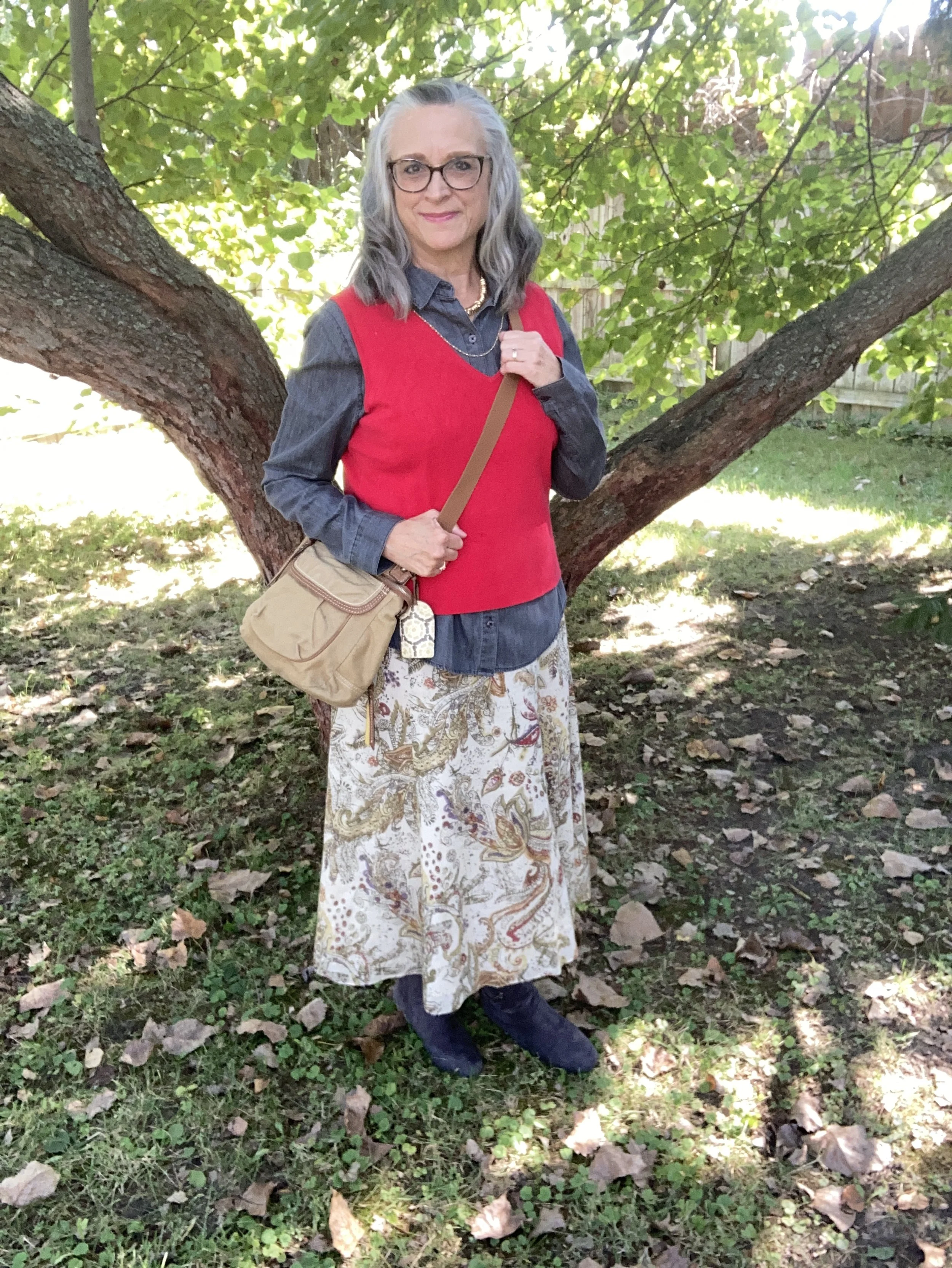
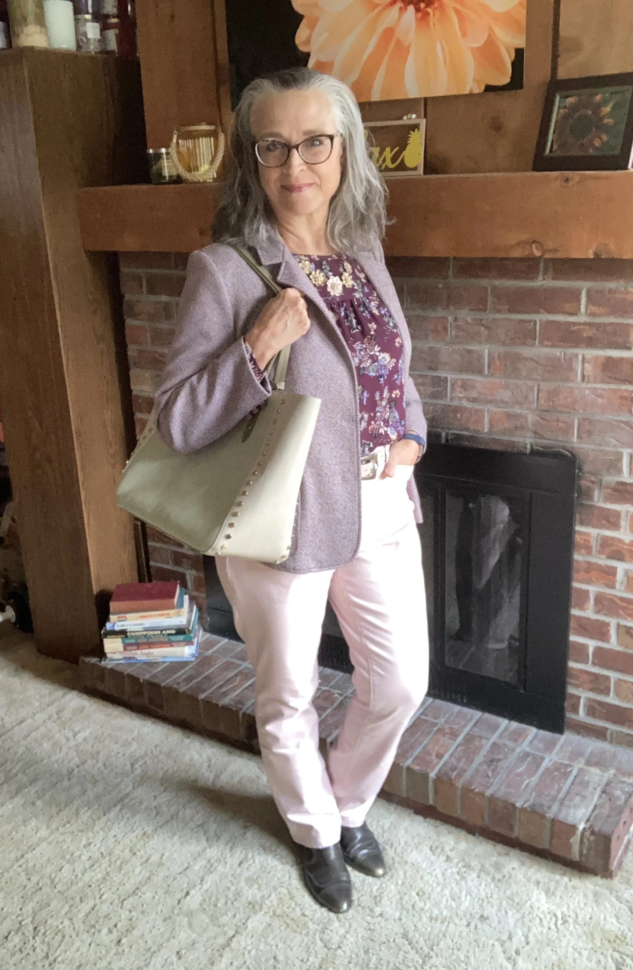
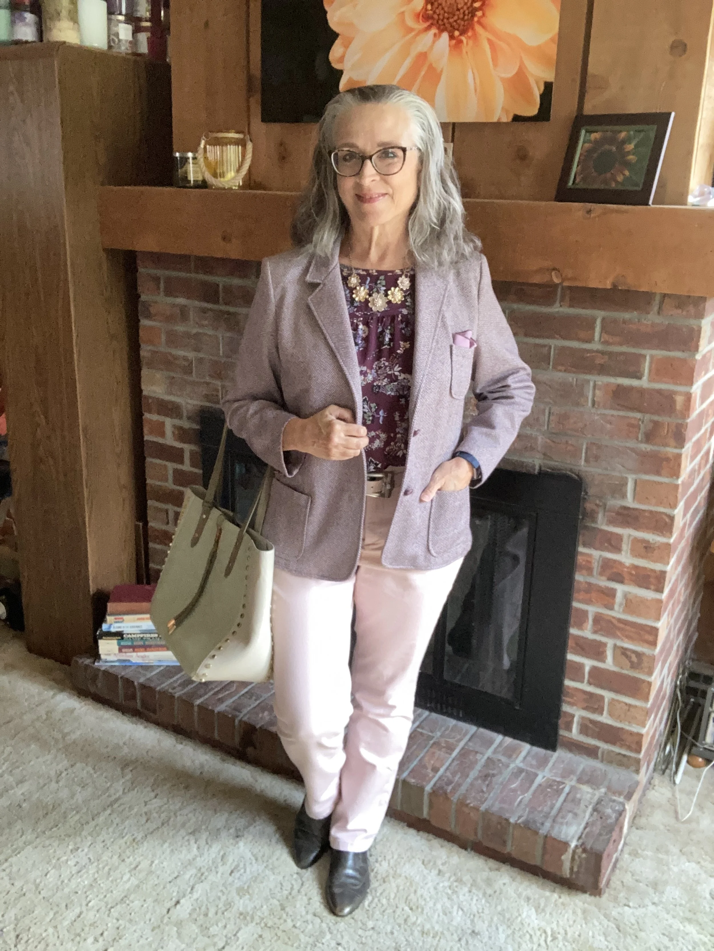
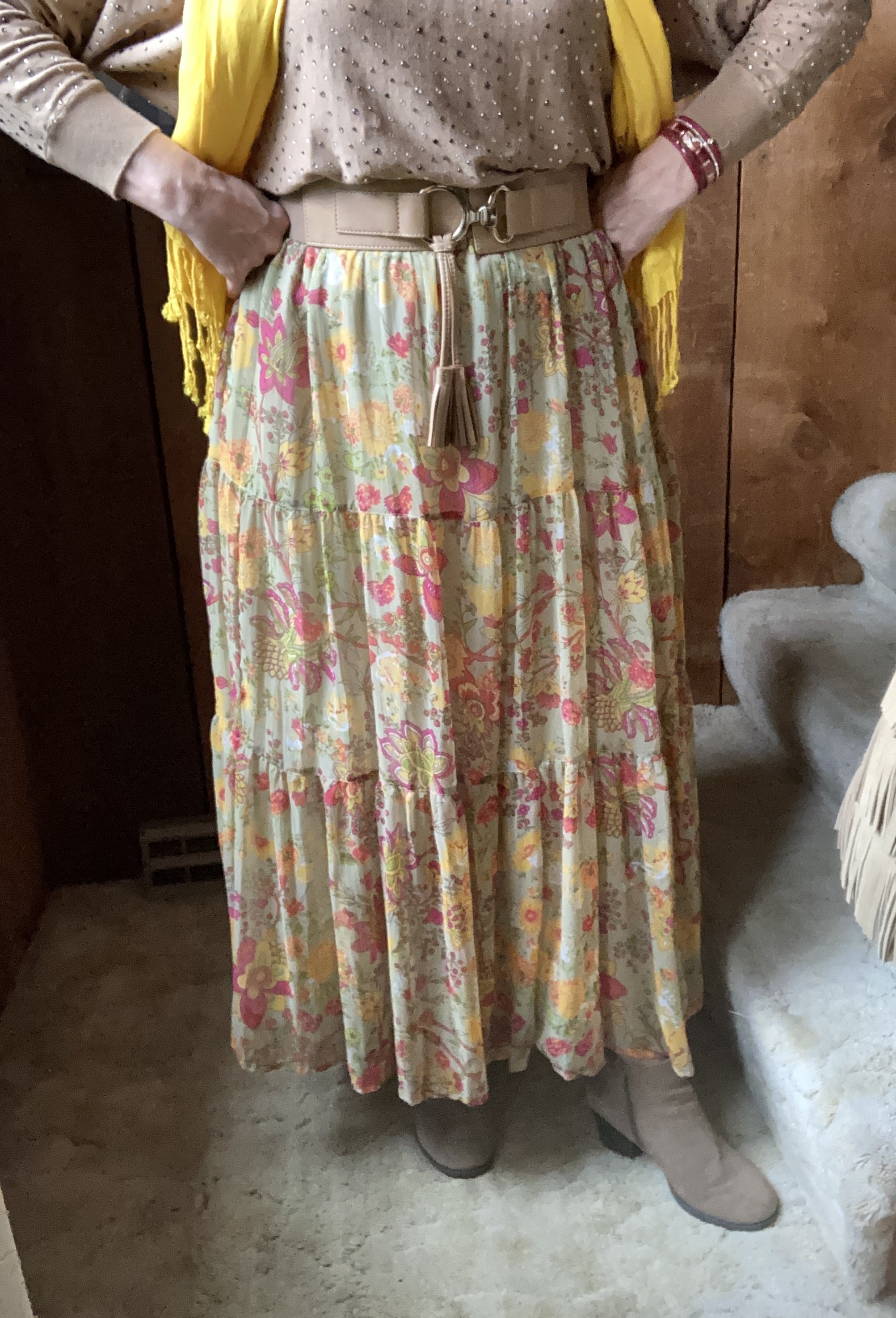
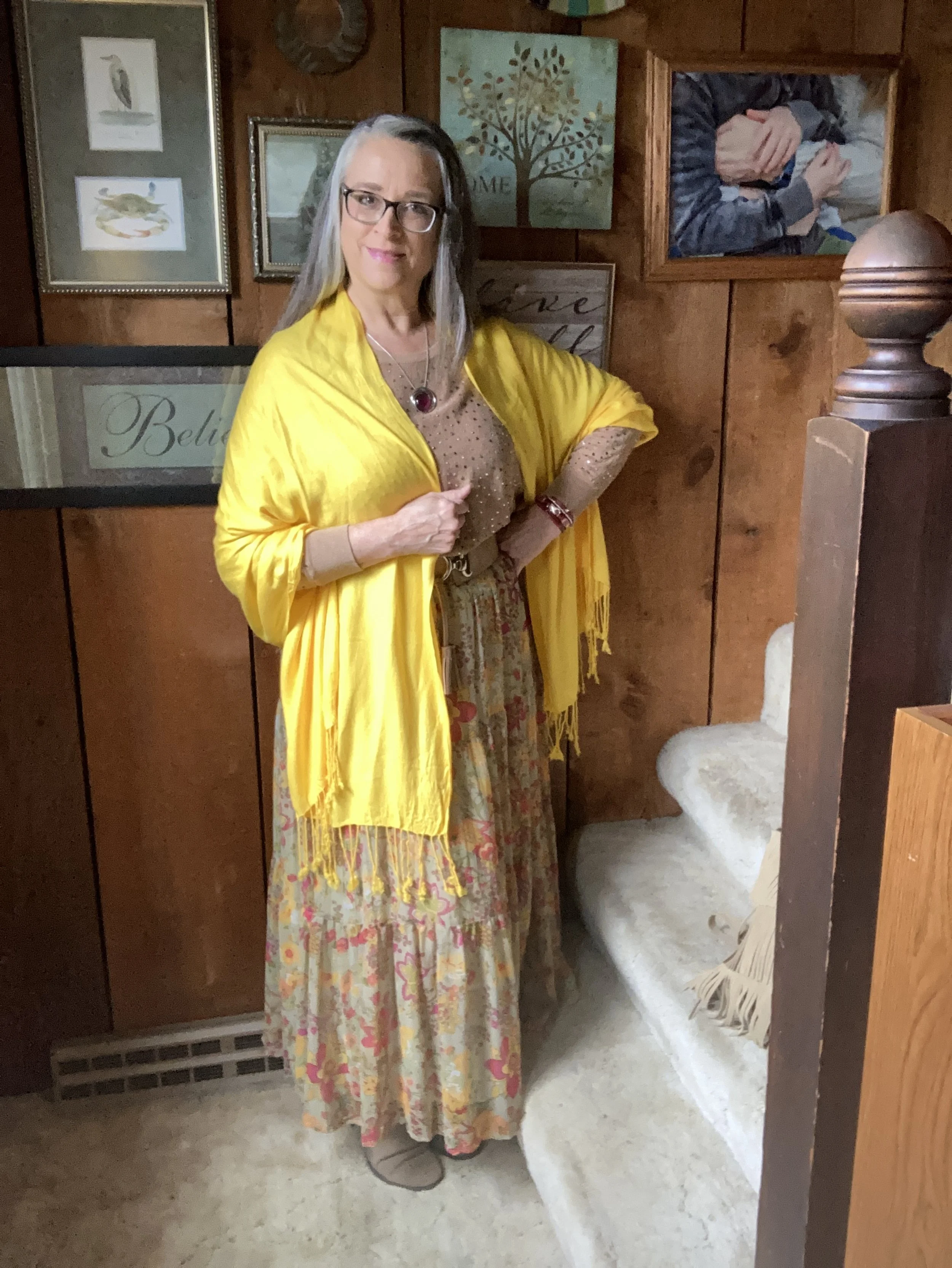
For today’s outfit I am drawing on three pieces of inspiration from a few of the fashion gurus on what was trending for Autumn 2025: earthy plaids, full skirts and luxuriously textured outerwear.

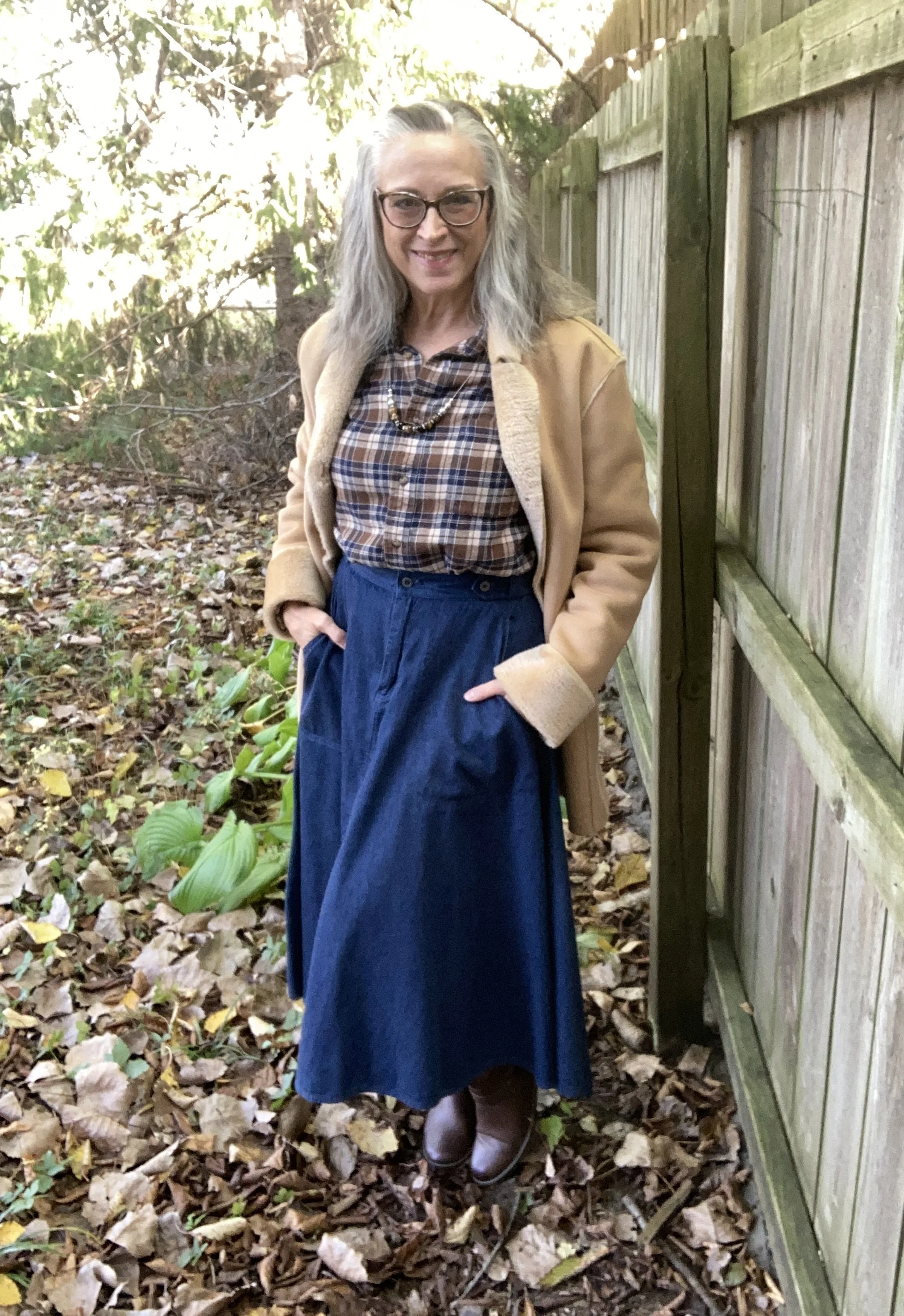
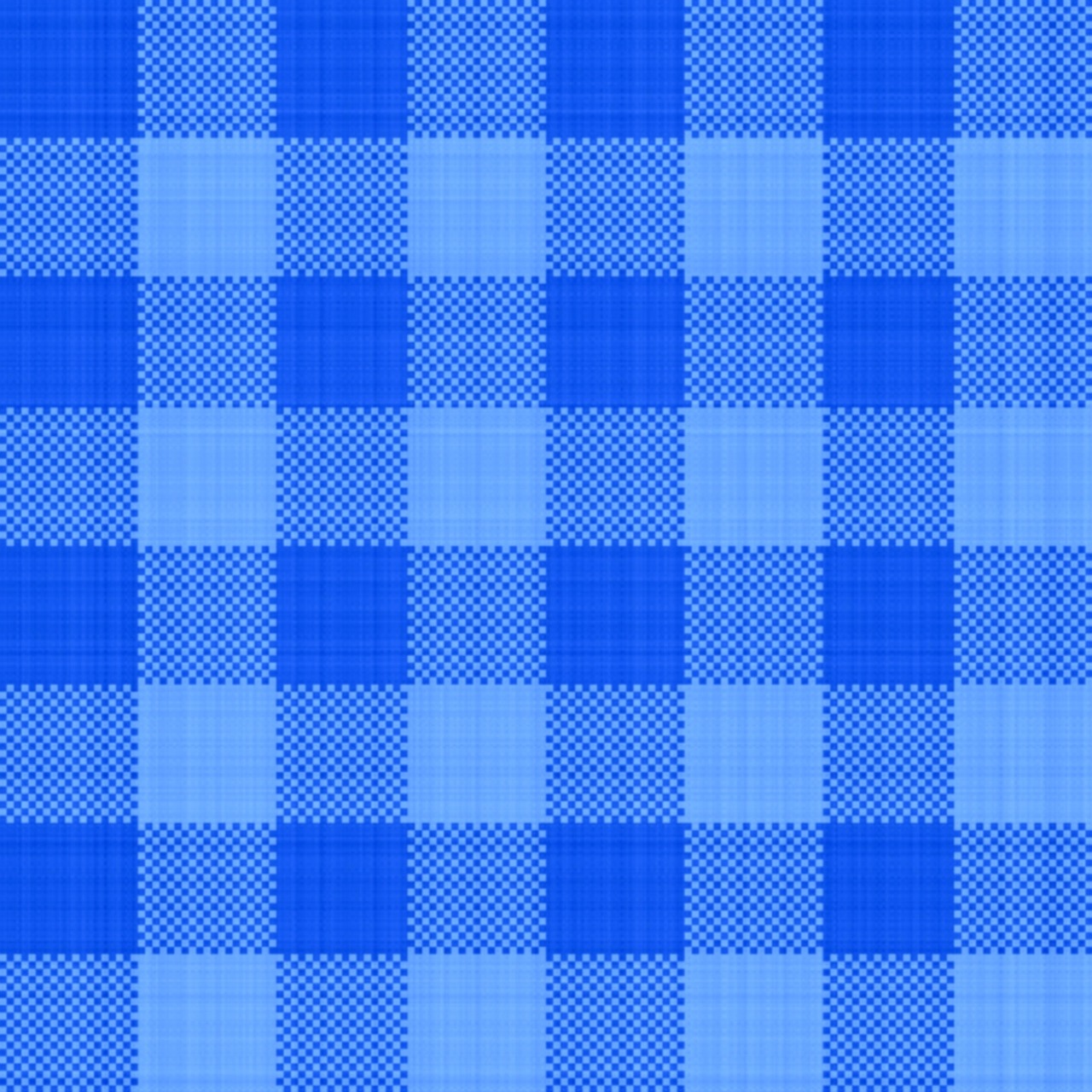
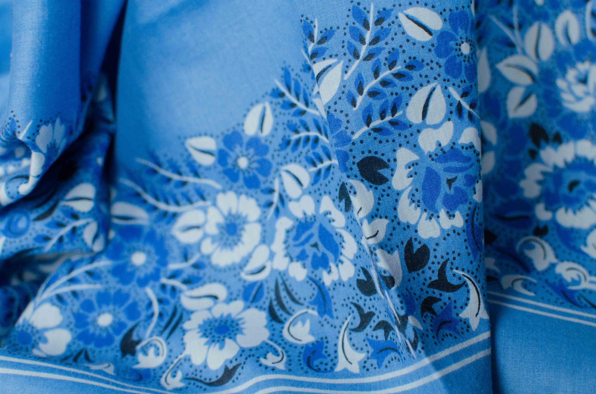
Plaid always comes around for fall, at least in my closet it does. I love my flannel shirts, my wool blazers and my plaid pants and skirts. This year plaid is back in earthy browns and rusts on the runway. See this article from Glamour. I guess you could say I was going for the Town and Country Chic vibe with this outfit.

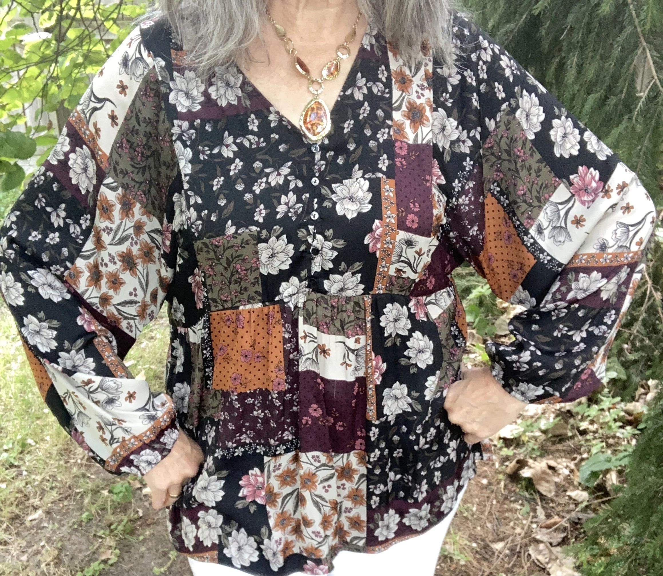
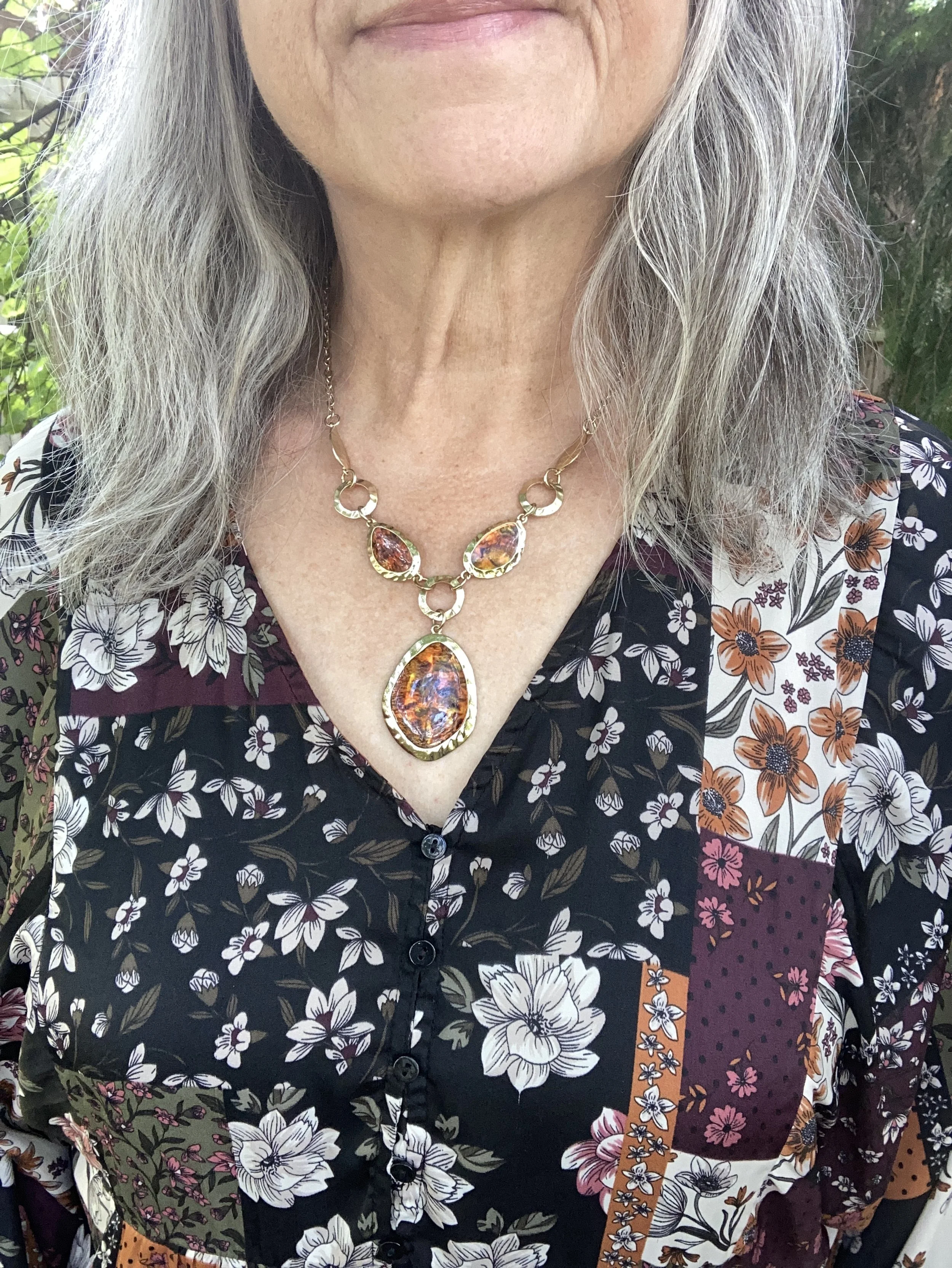
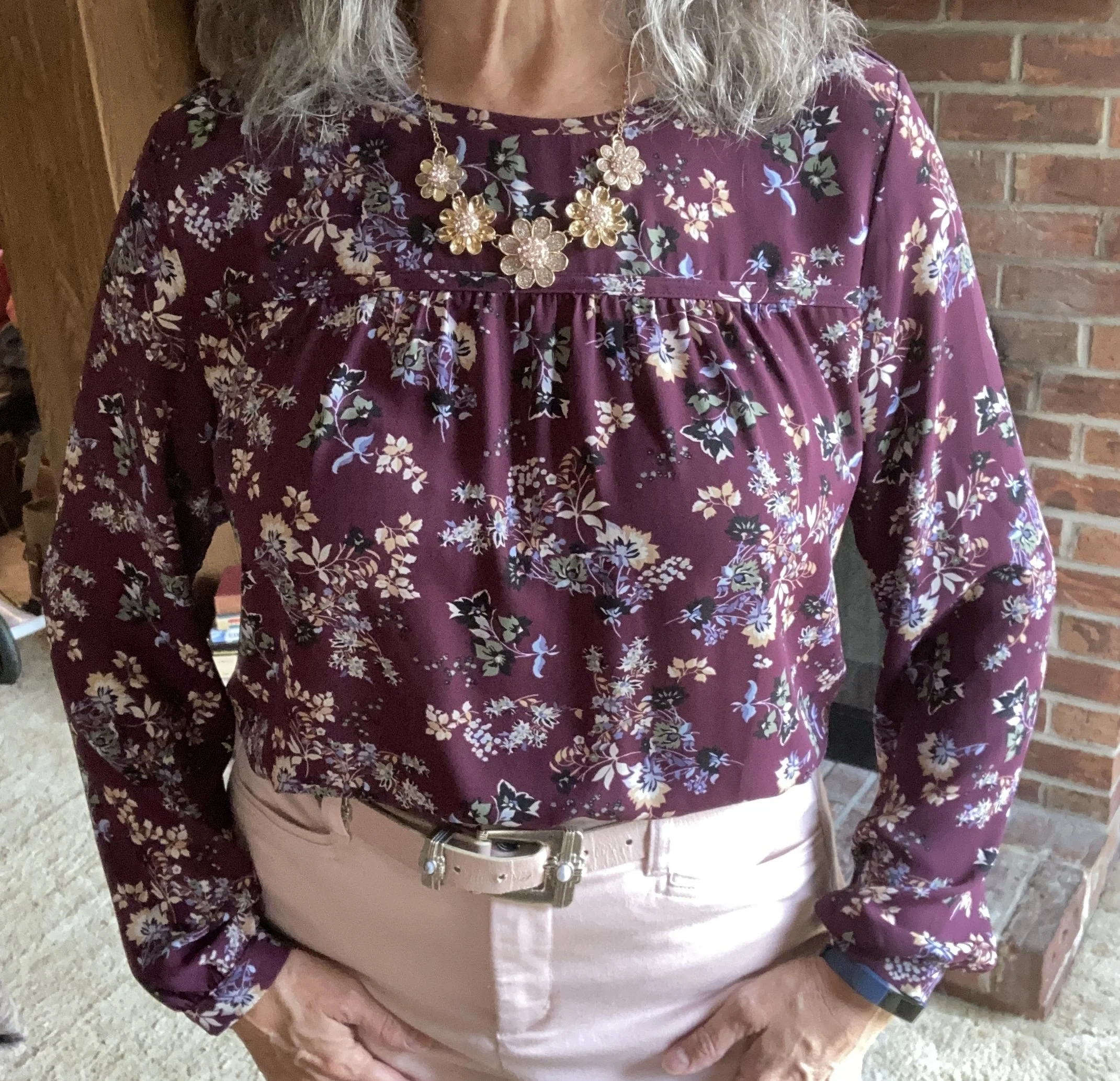
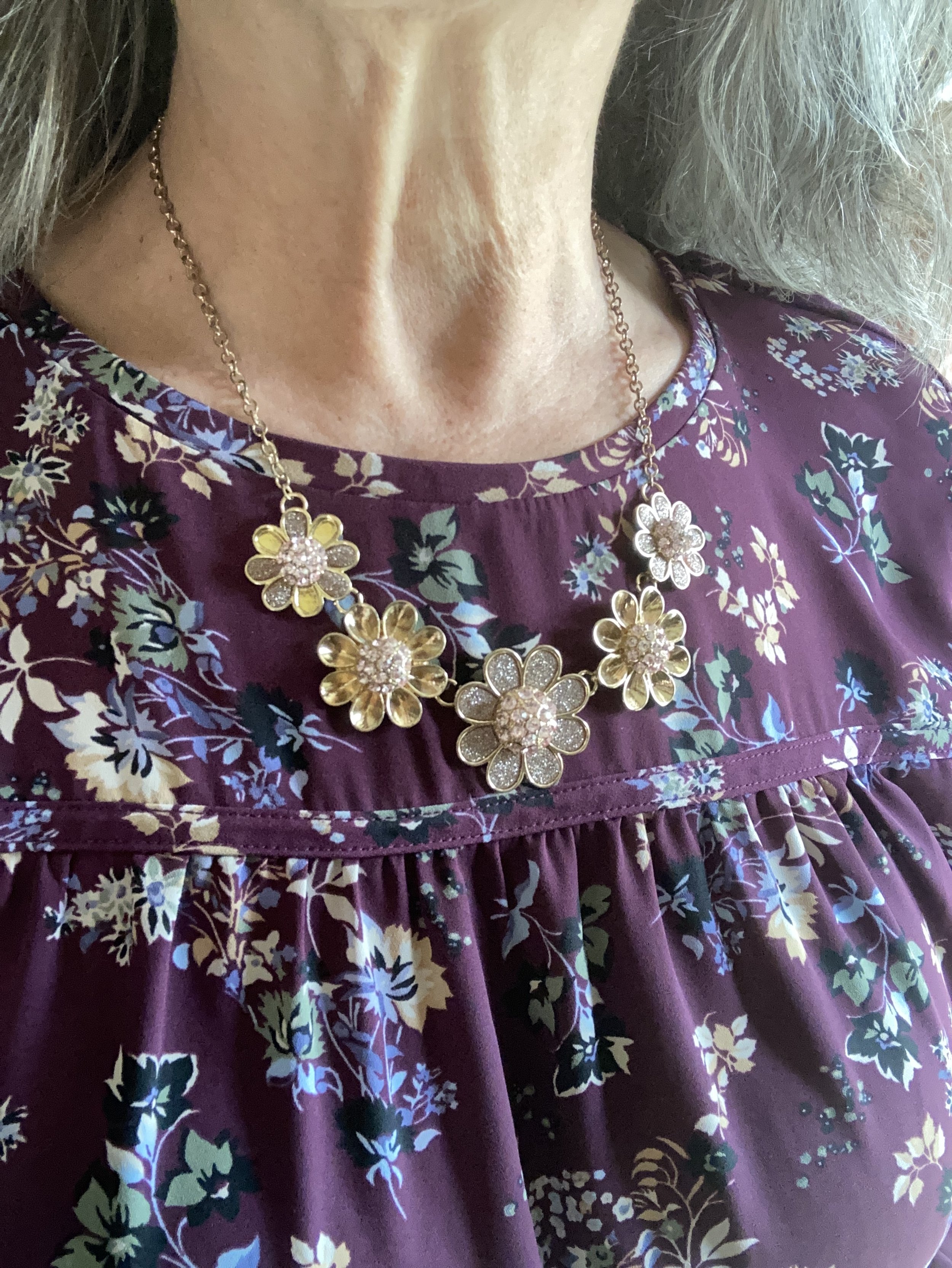
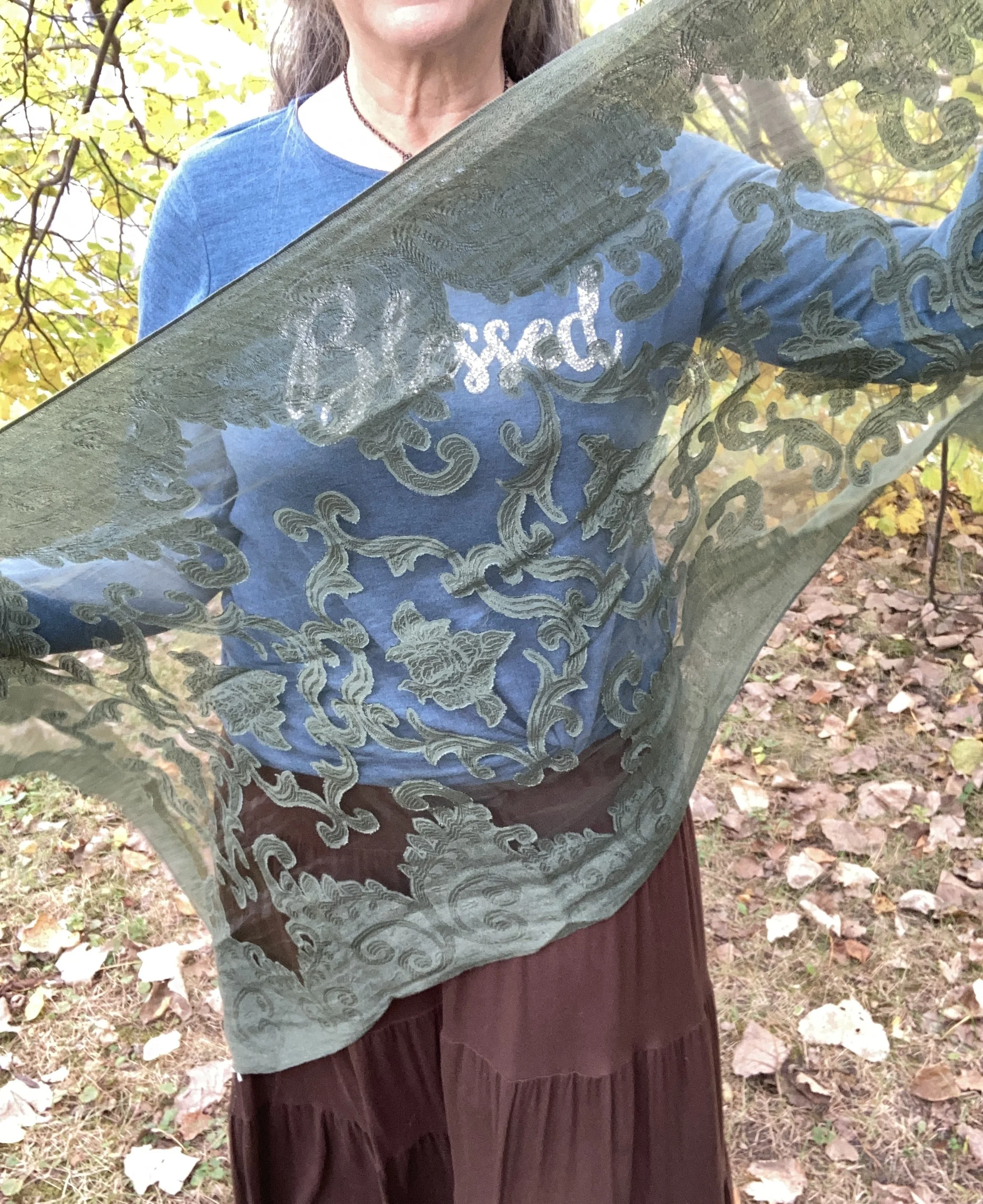
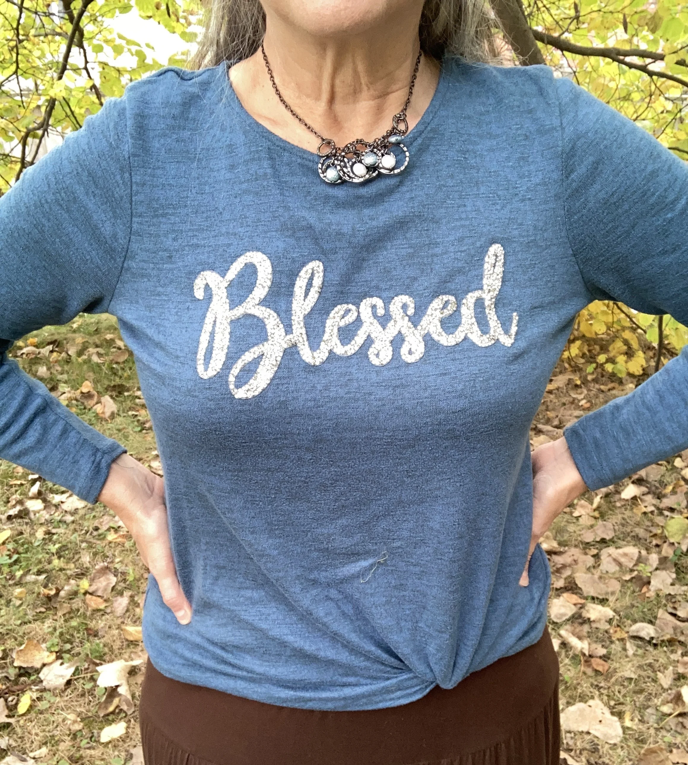
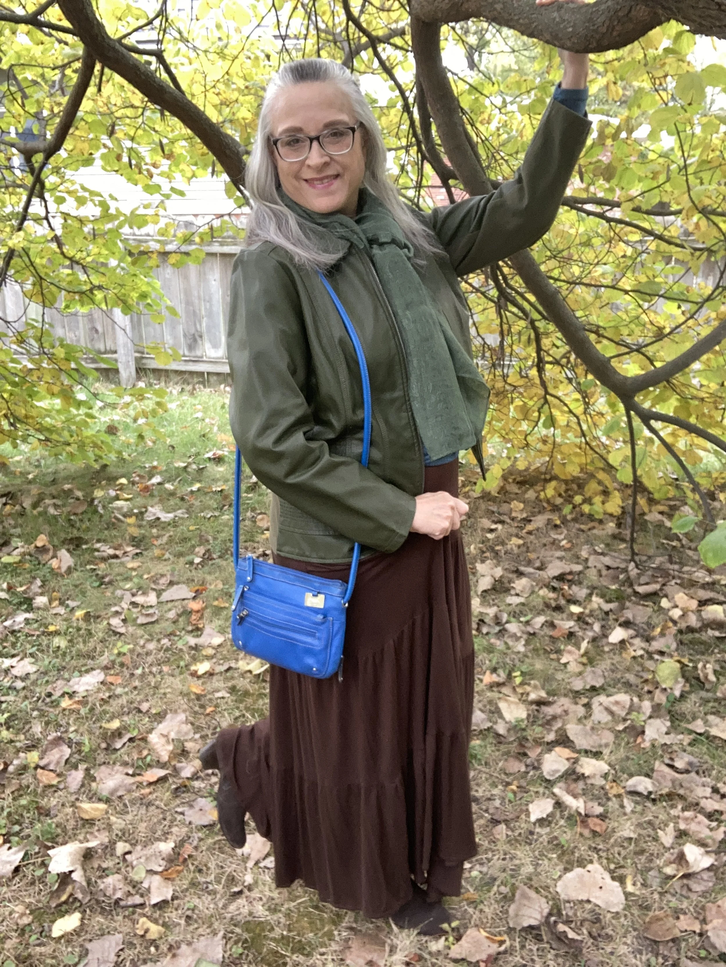
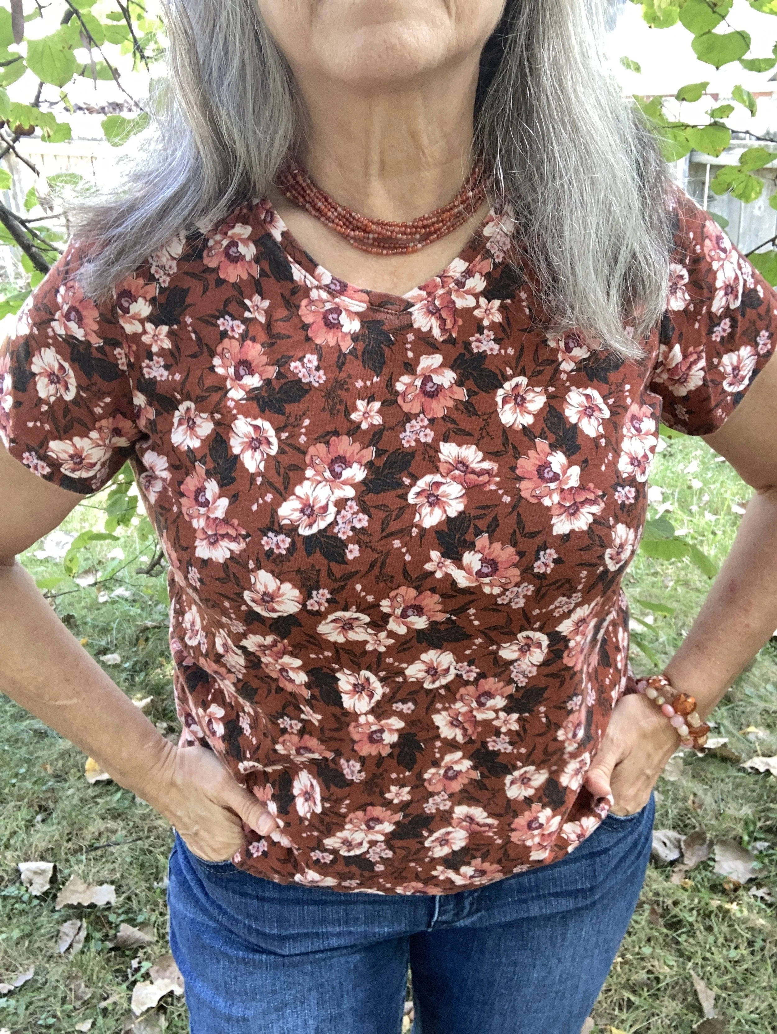
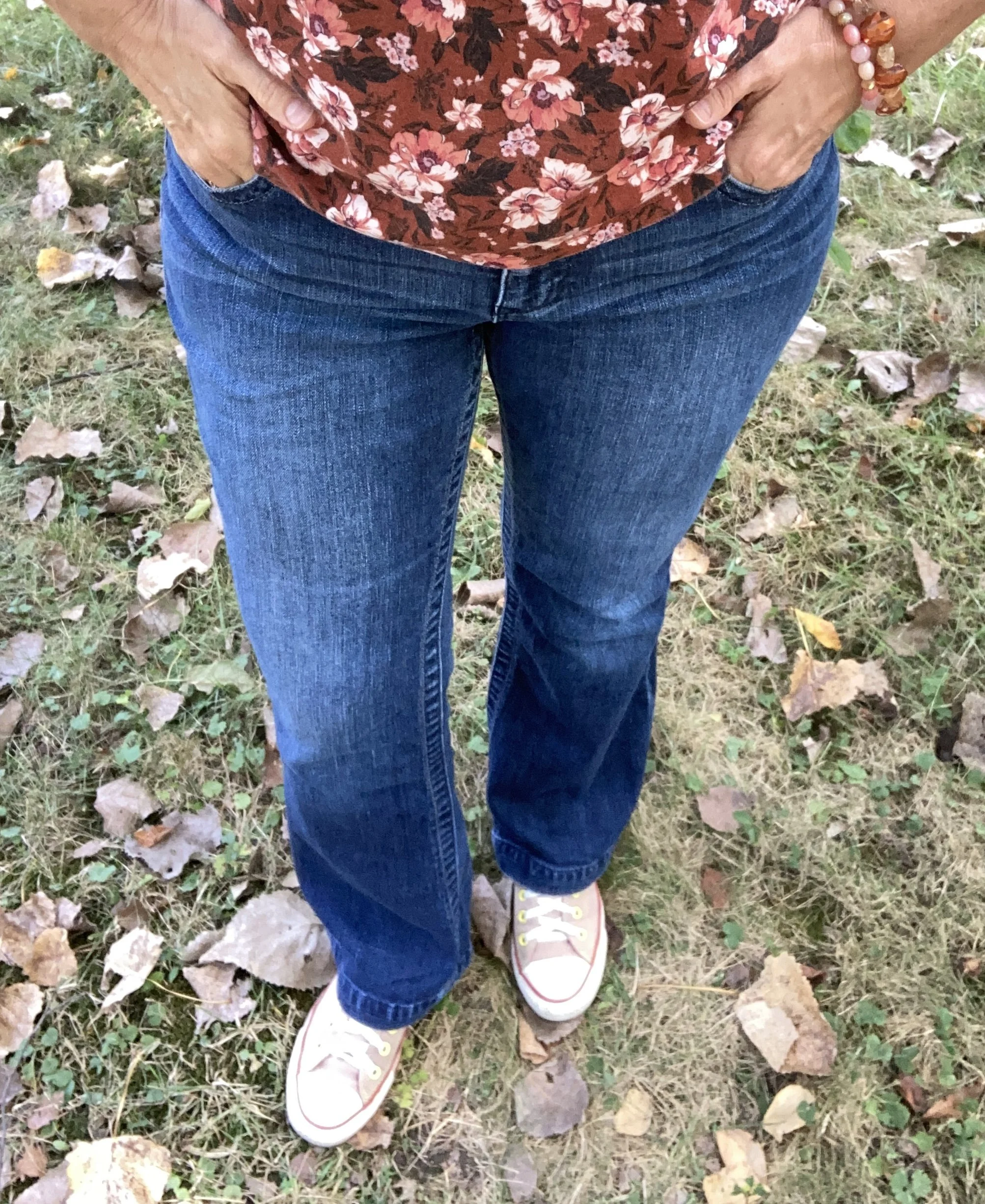
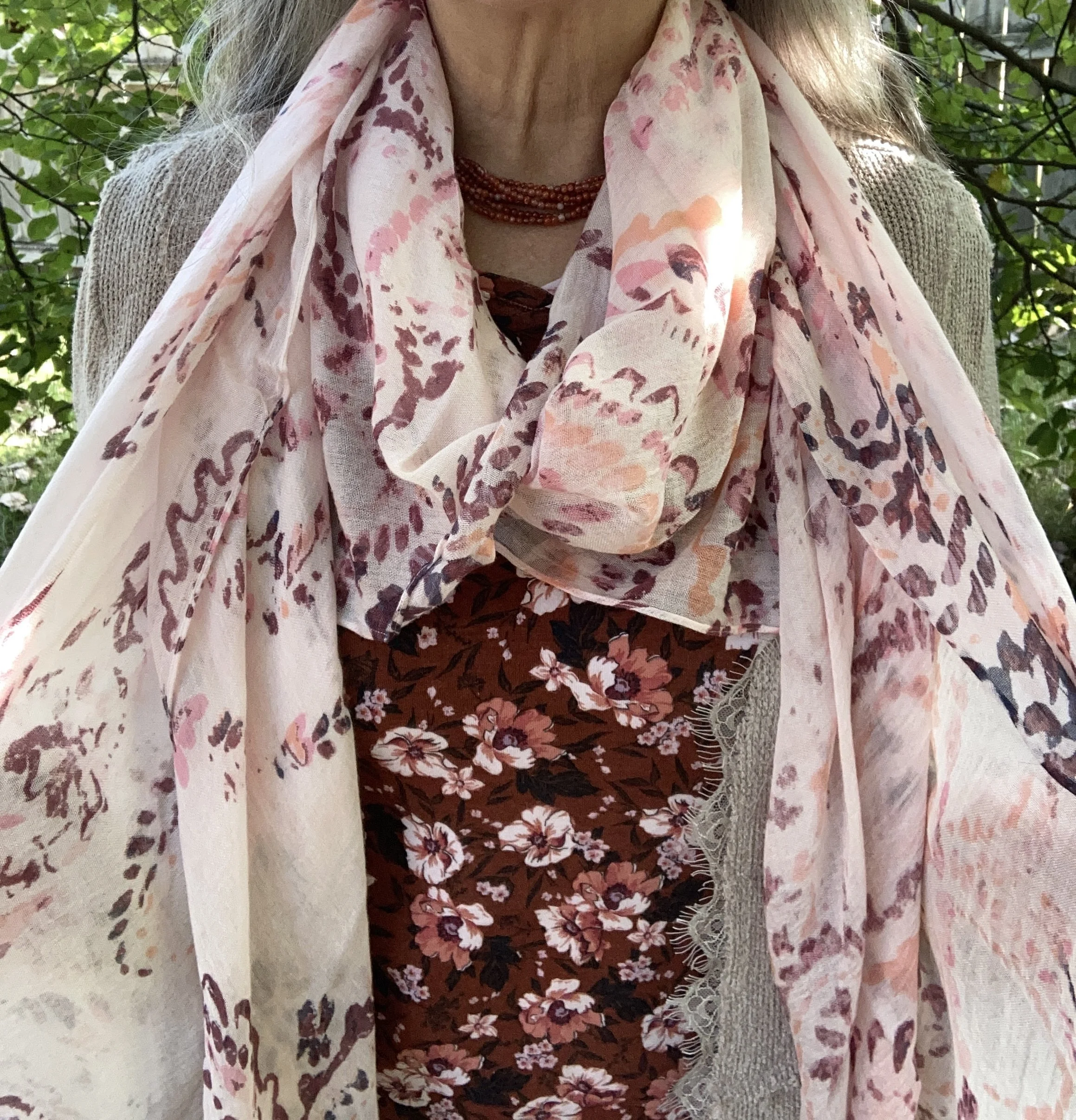
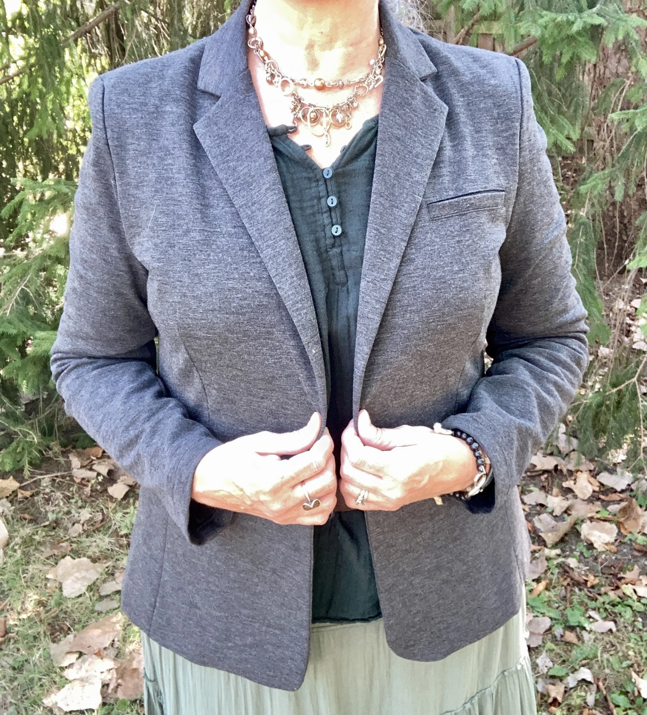
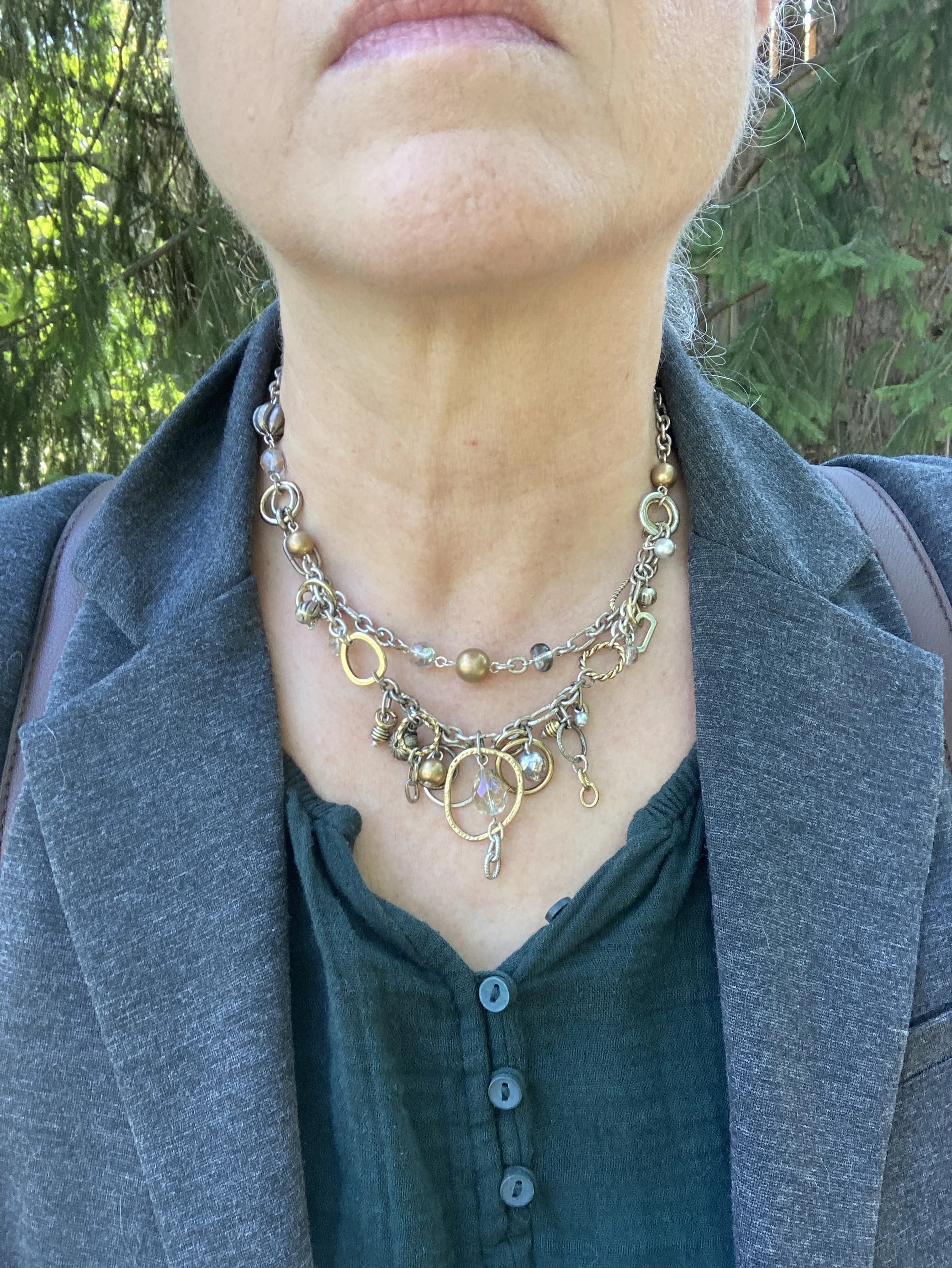
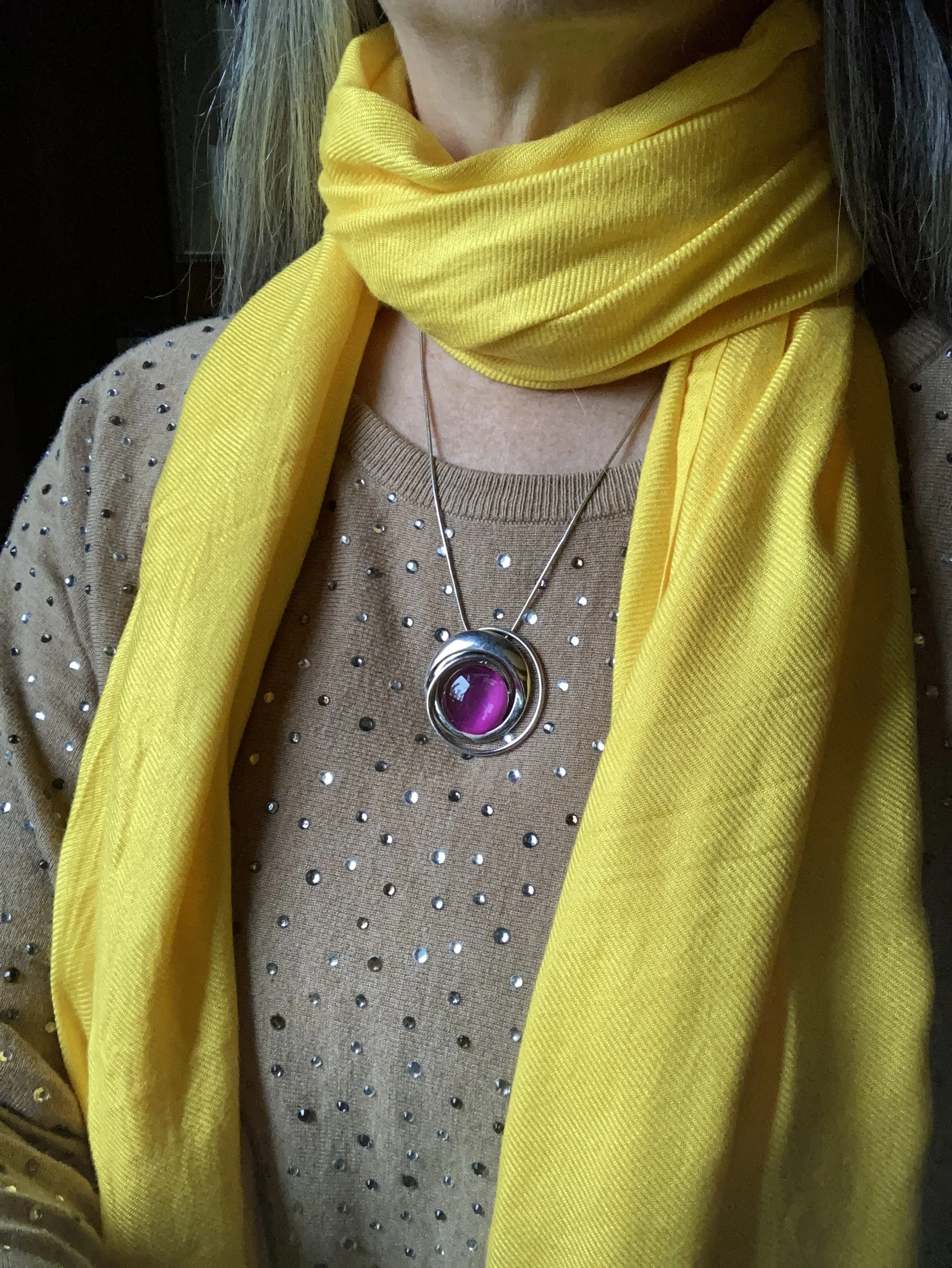
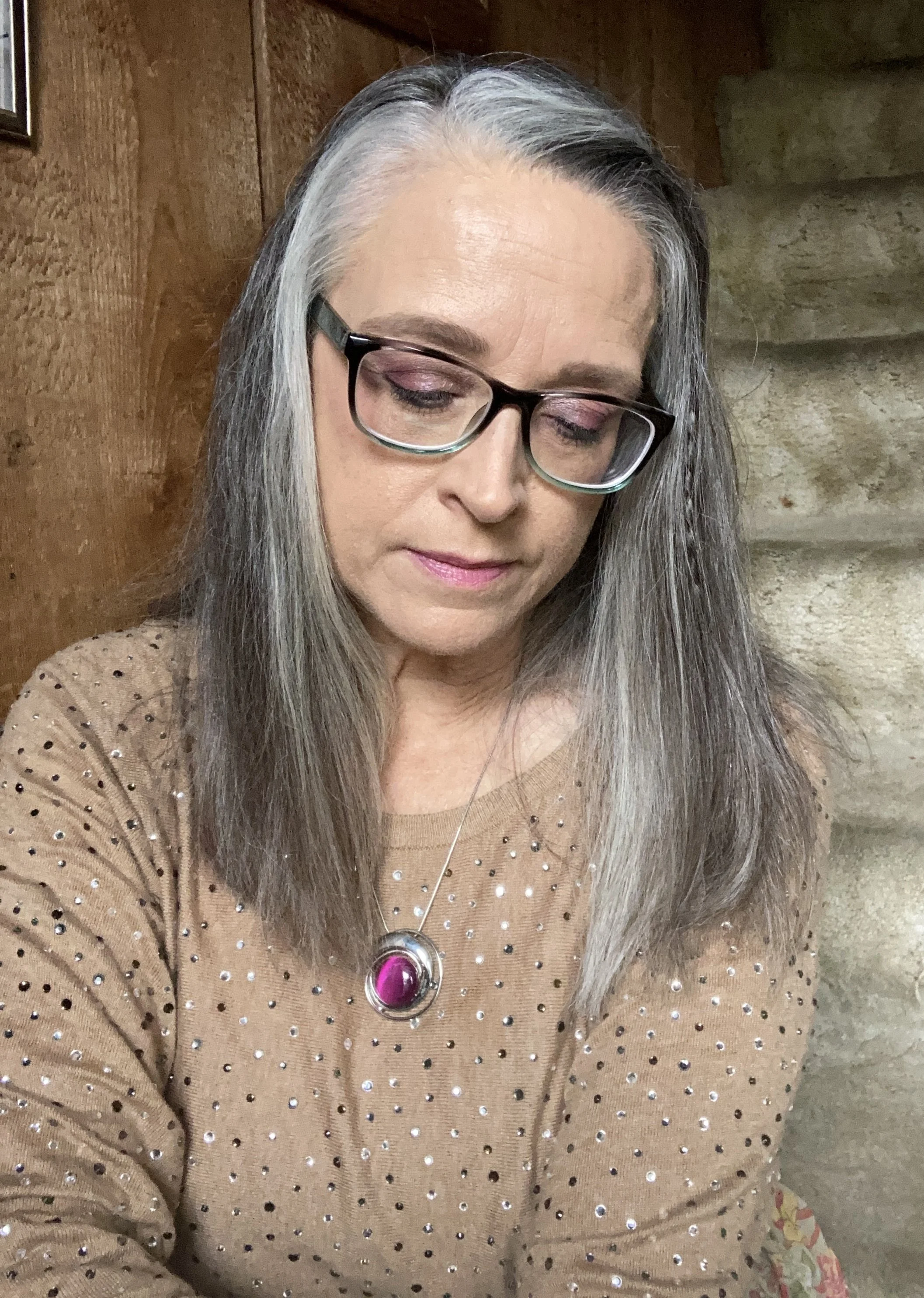
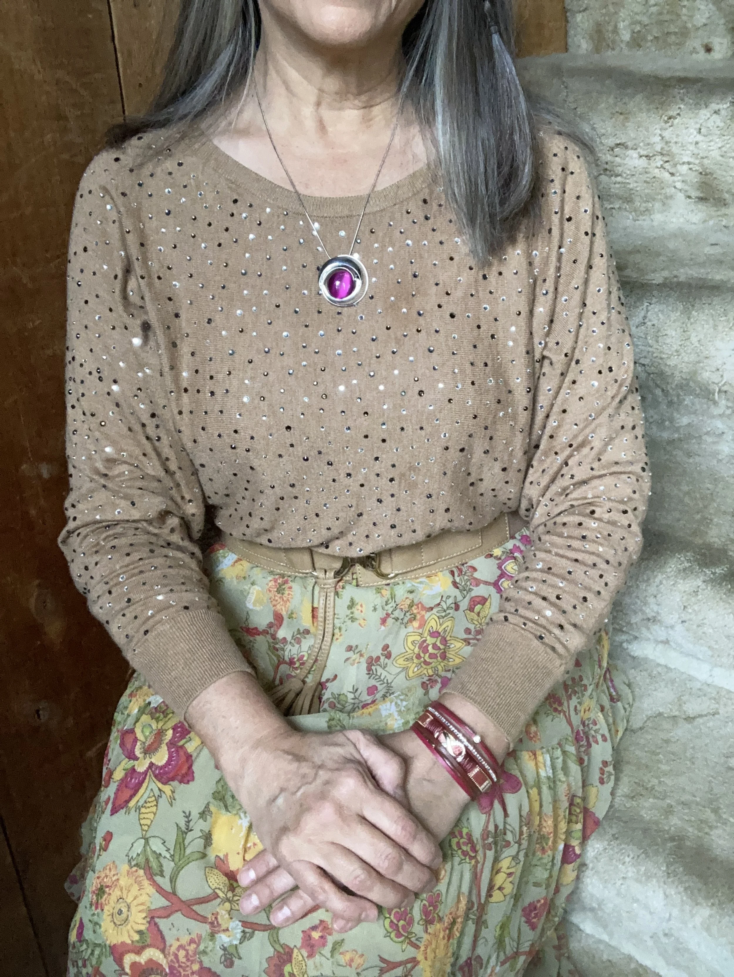
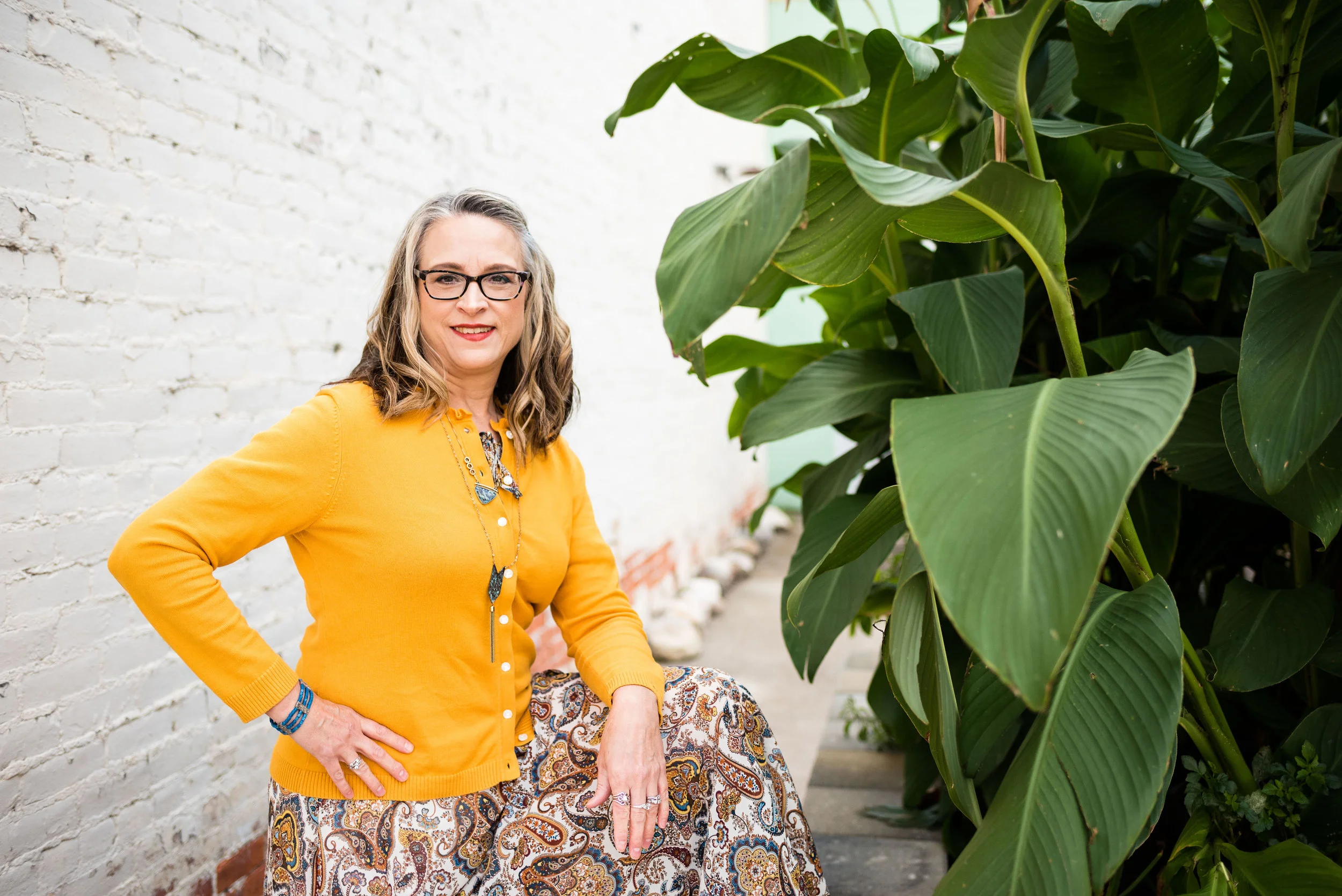
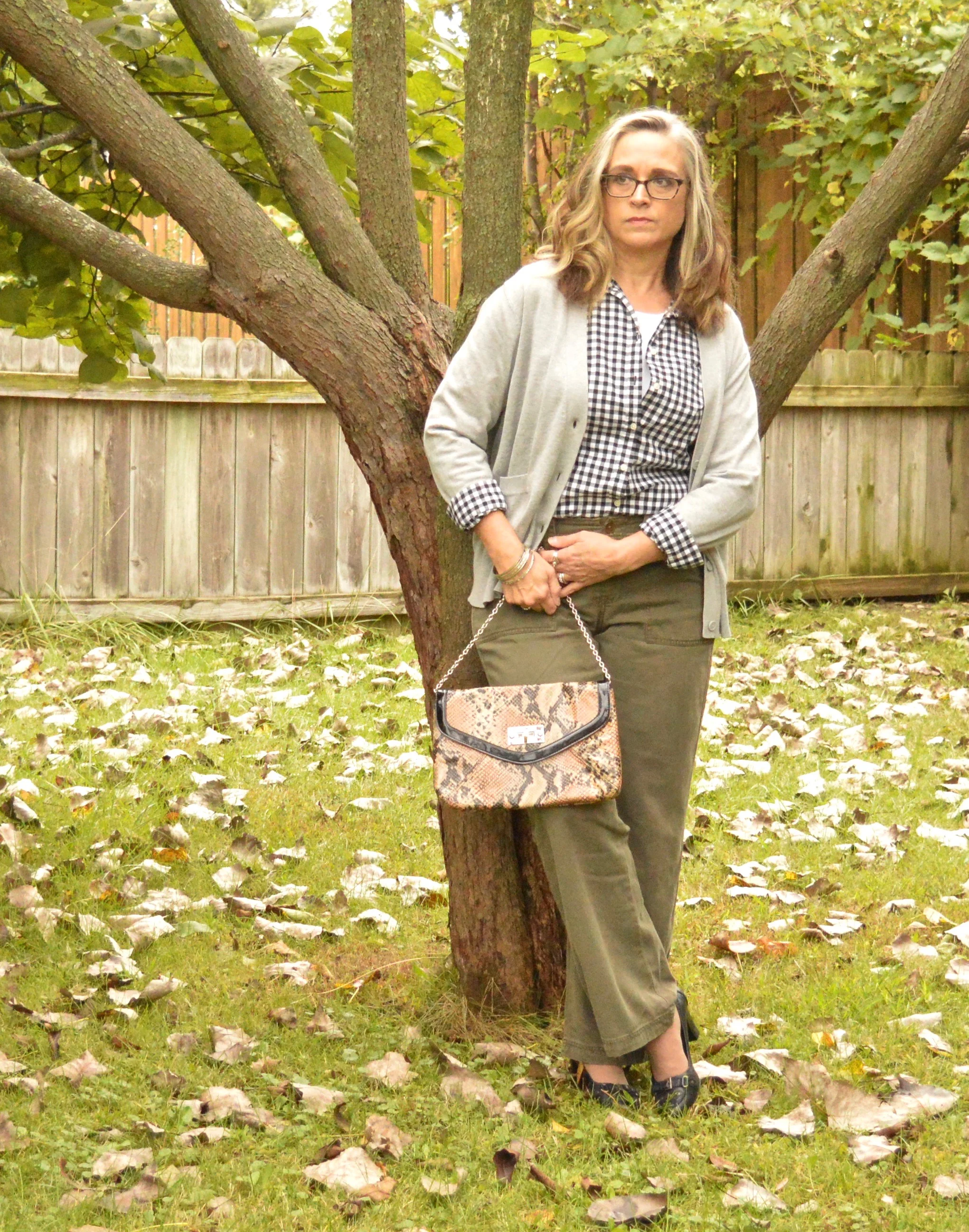
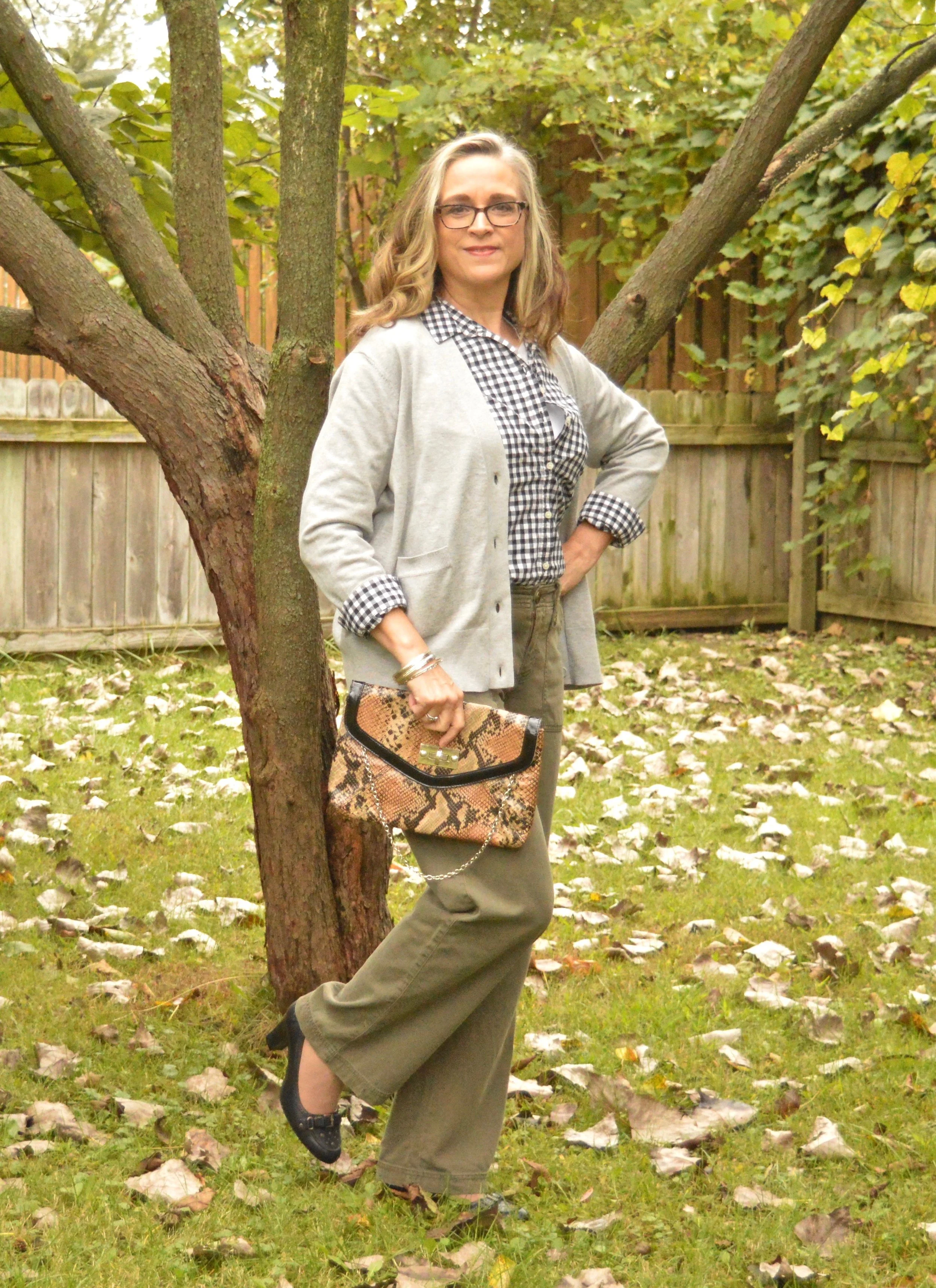
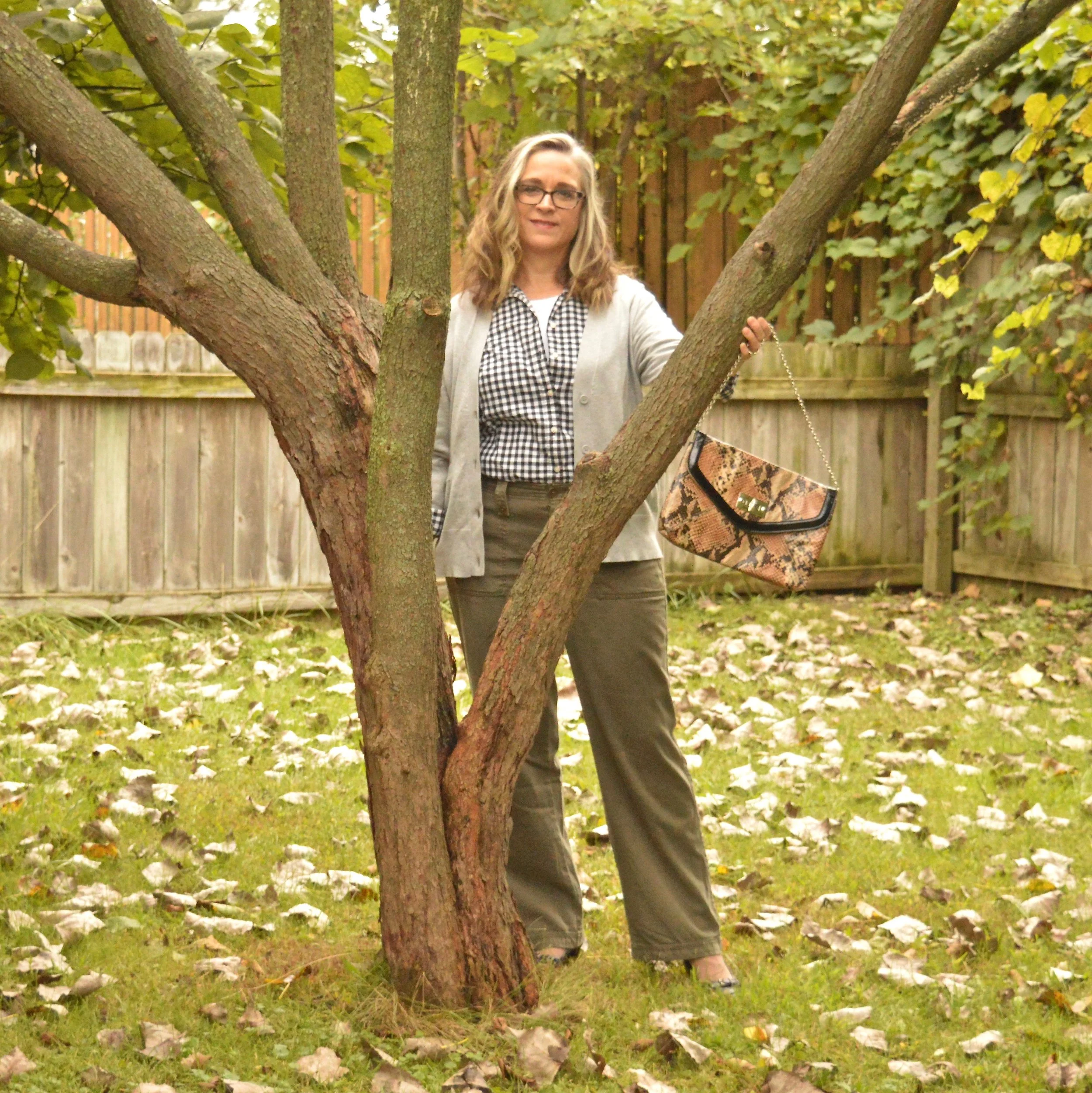
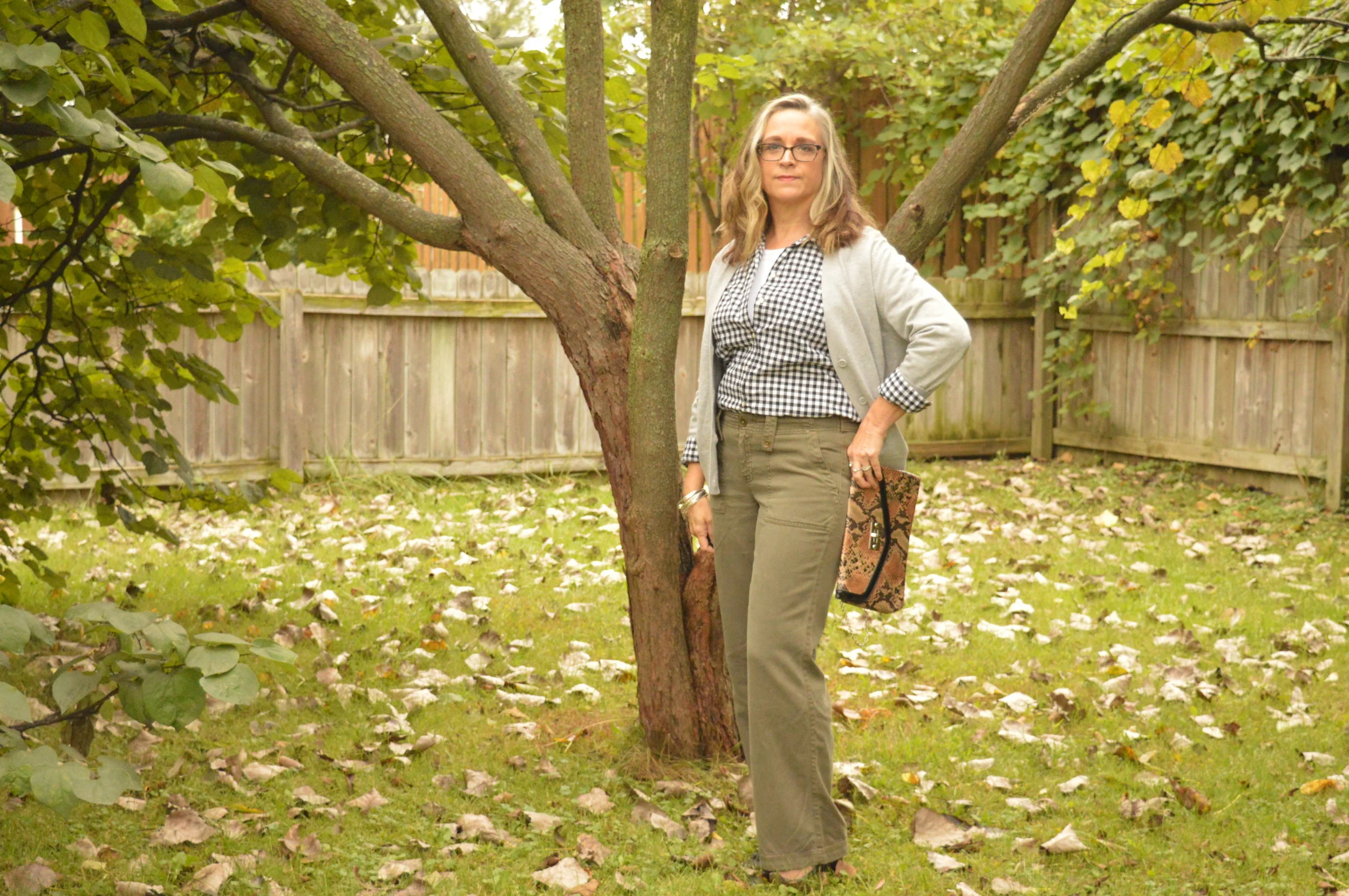
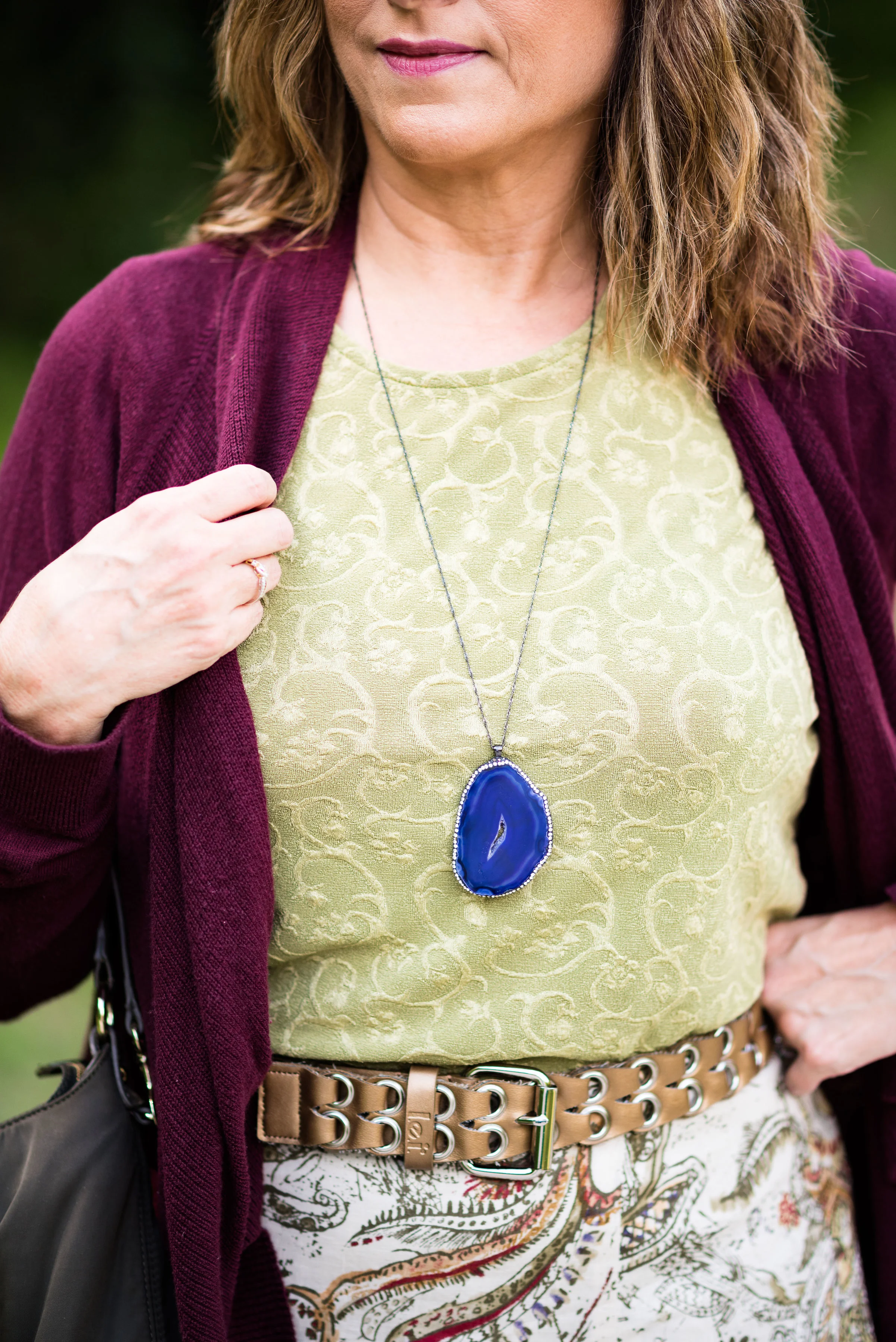
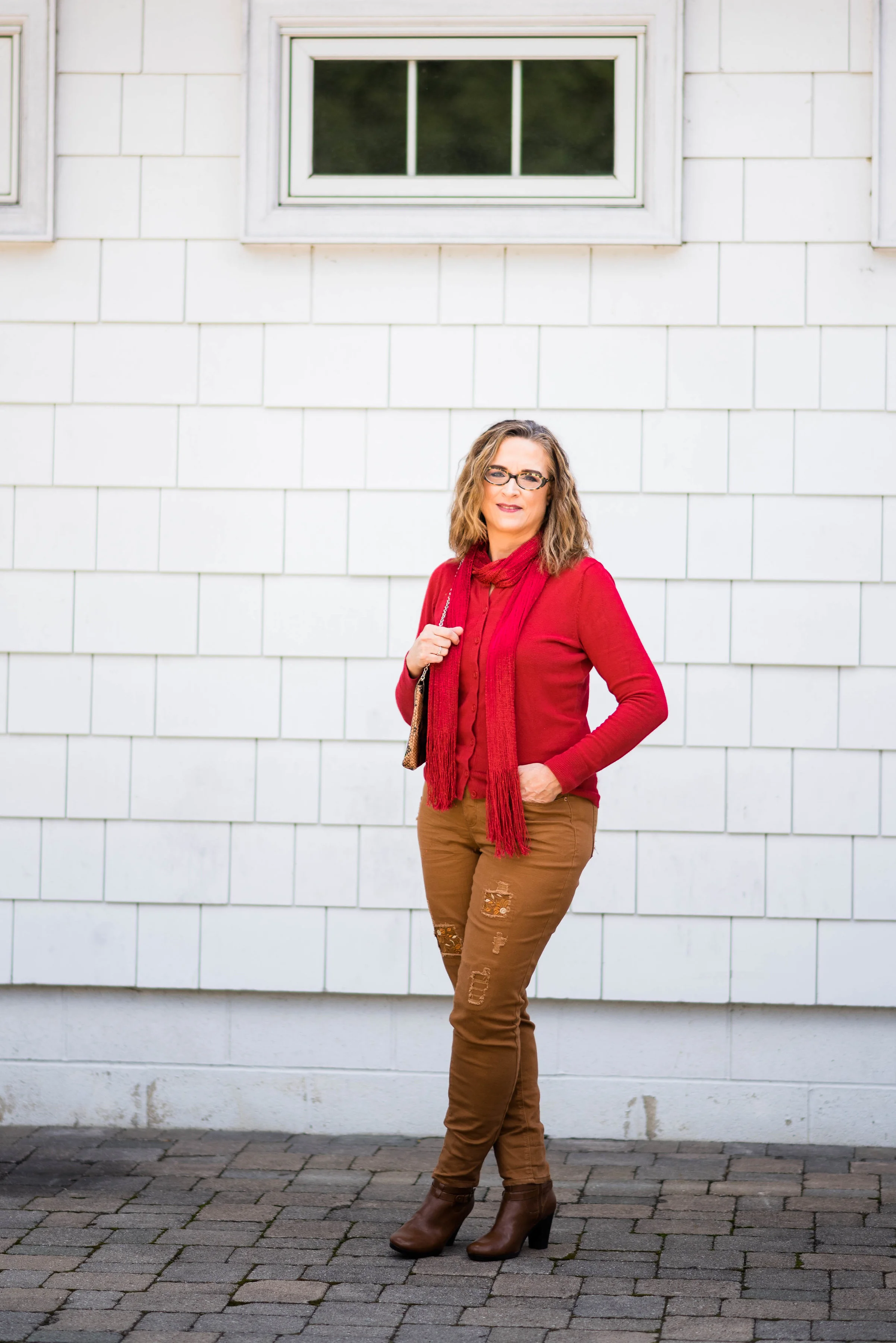
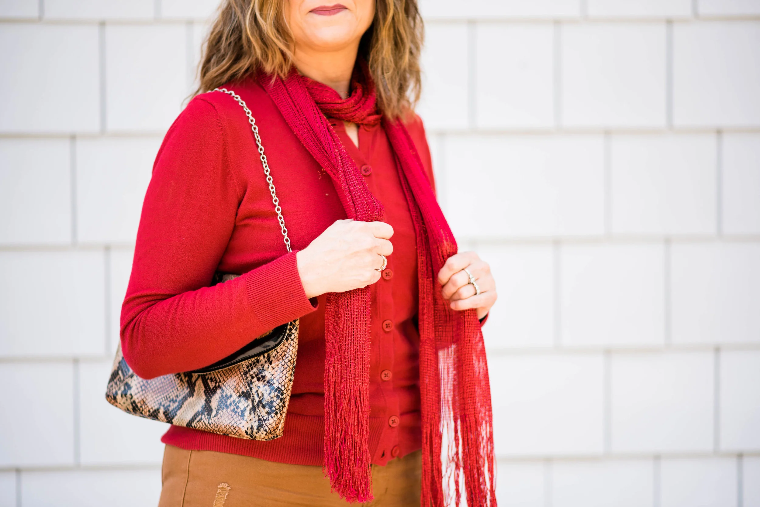
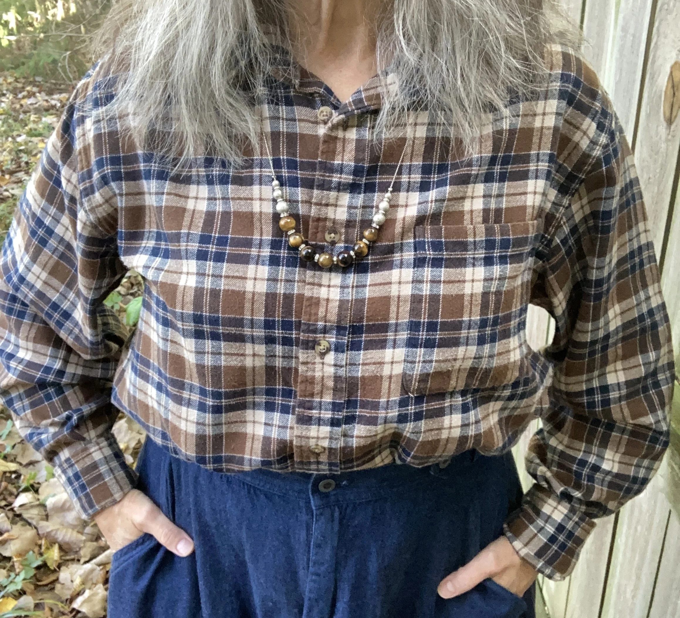
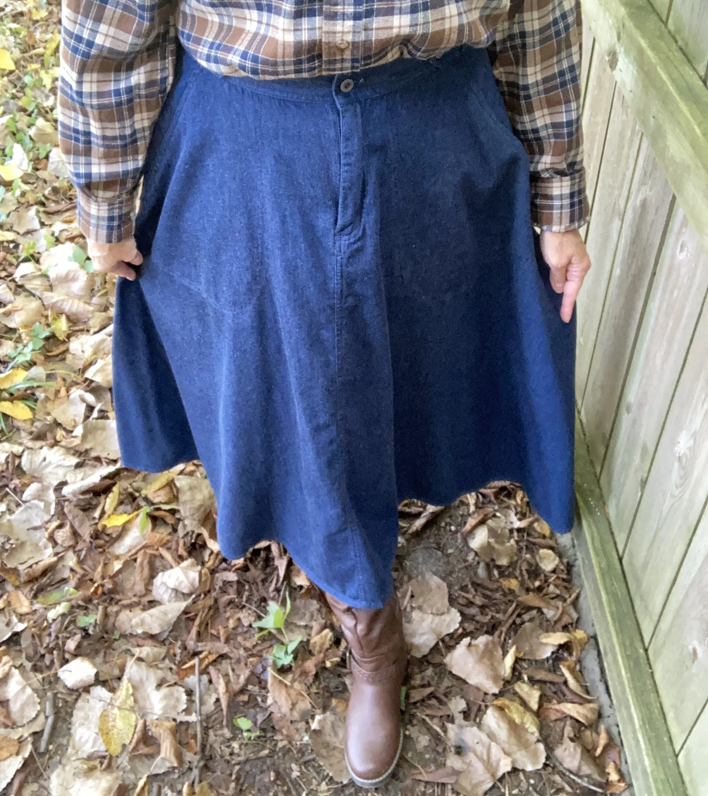
For this look, I started with the plaid, flannel shirt. It is a men’s Croft & Barrow shirt from Kohl’s. It actually belonged to my hubby, but he never wore it, so I confiscated it. Ha, ha. I love flannel, oversized shirts and while this one is not very feminine, I enjoyed the challenge of making it into a more feminine look by adding the skirt. The shirt has both the dark, earthy brown and the dark blue, so it seemed perfect for the look I was trying to achieve. I also added the silver and brown beaded necklace for a little extra femininity.

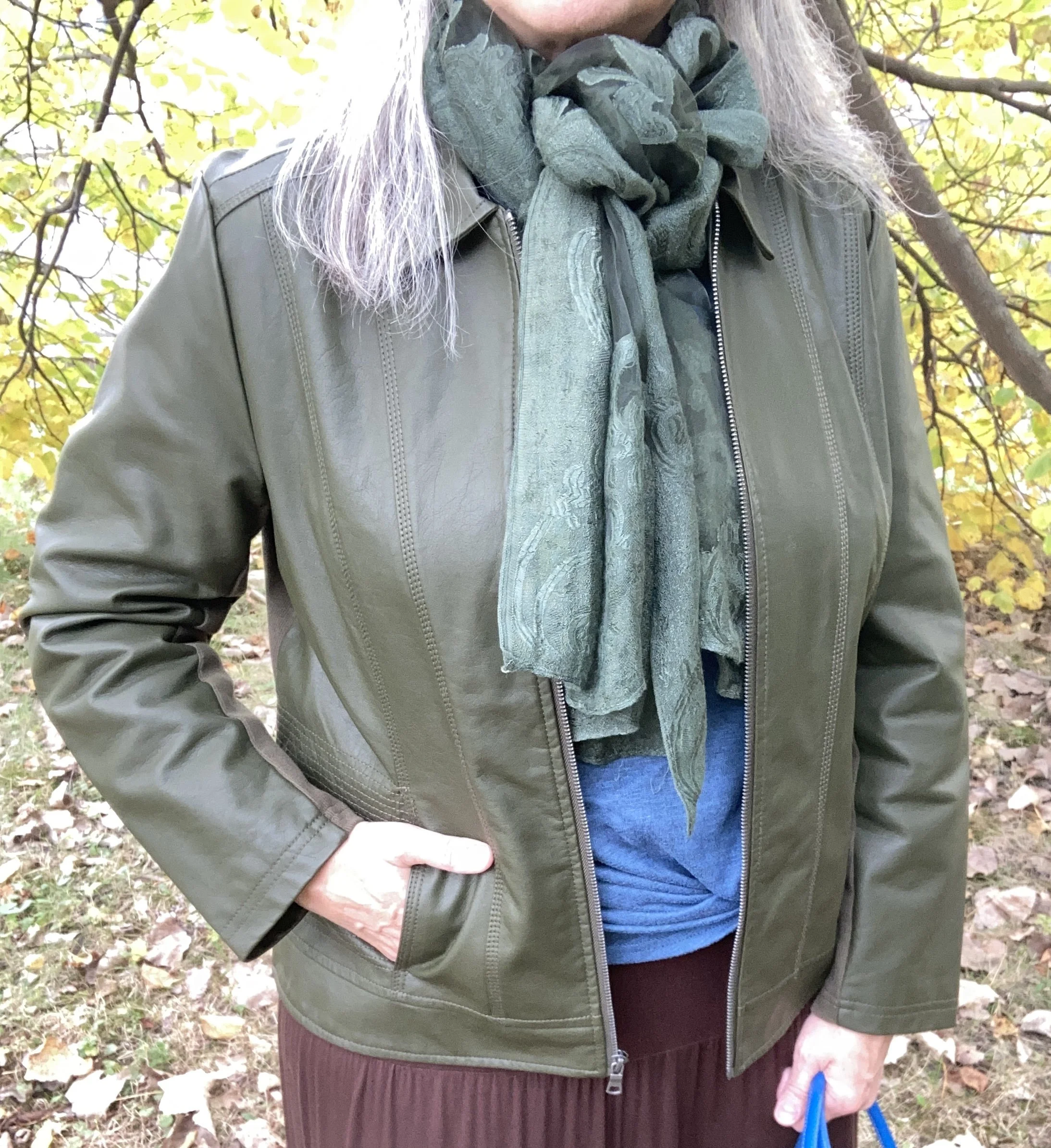
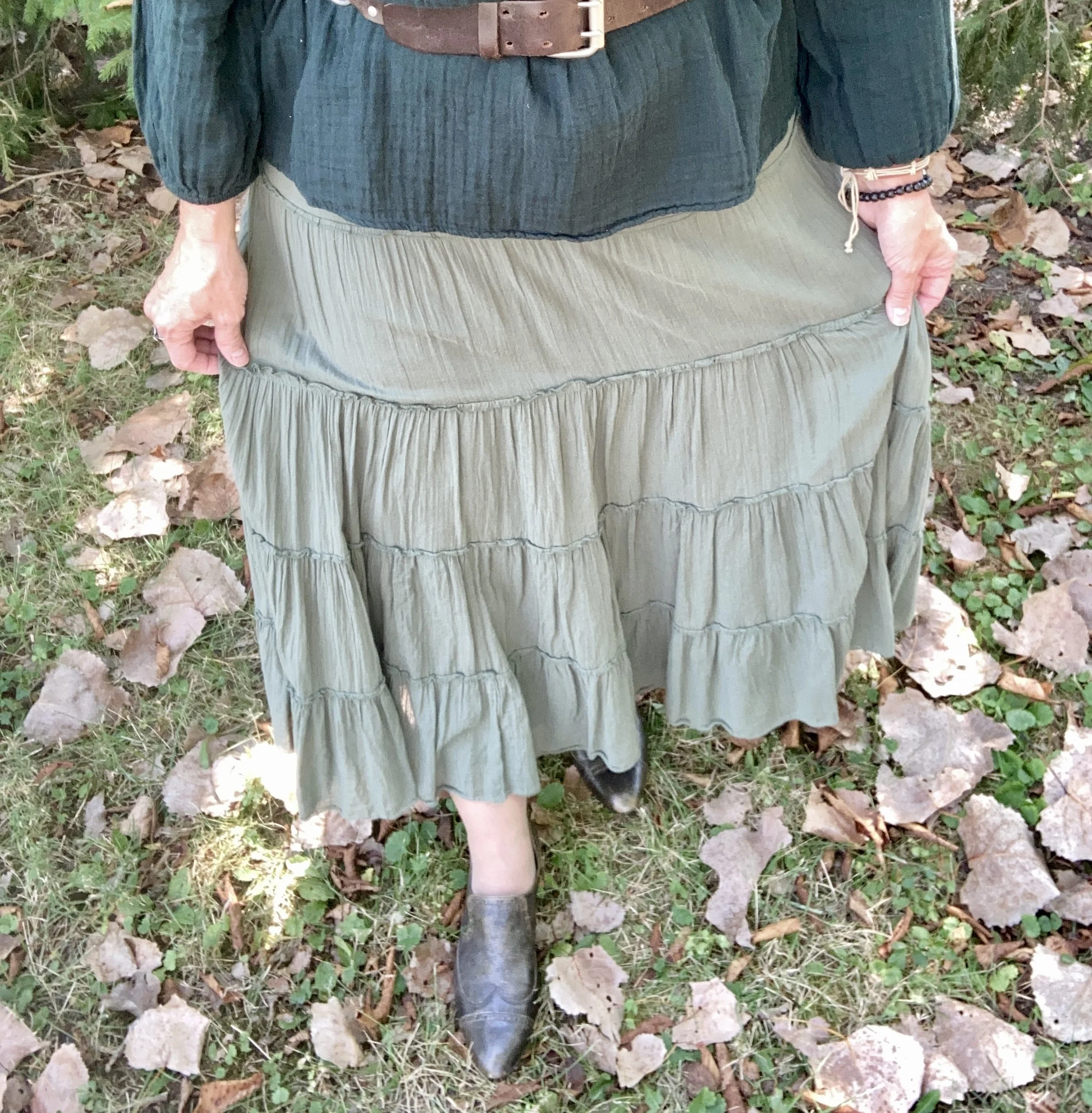
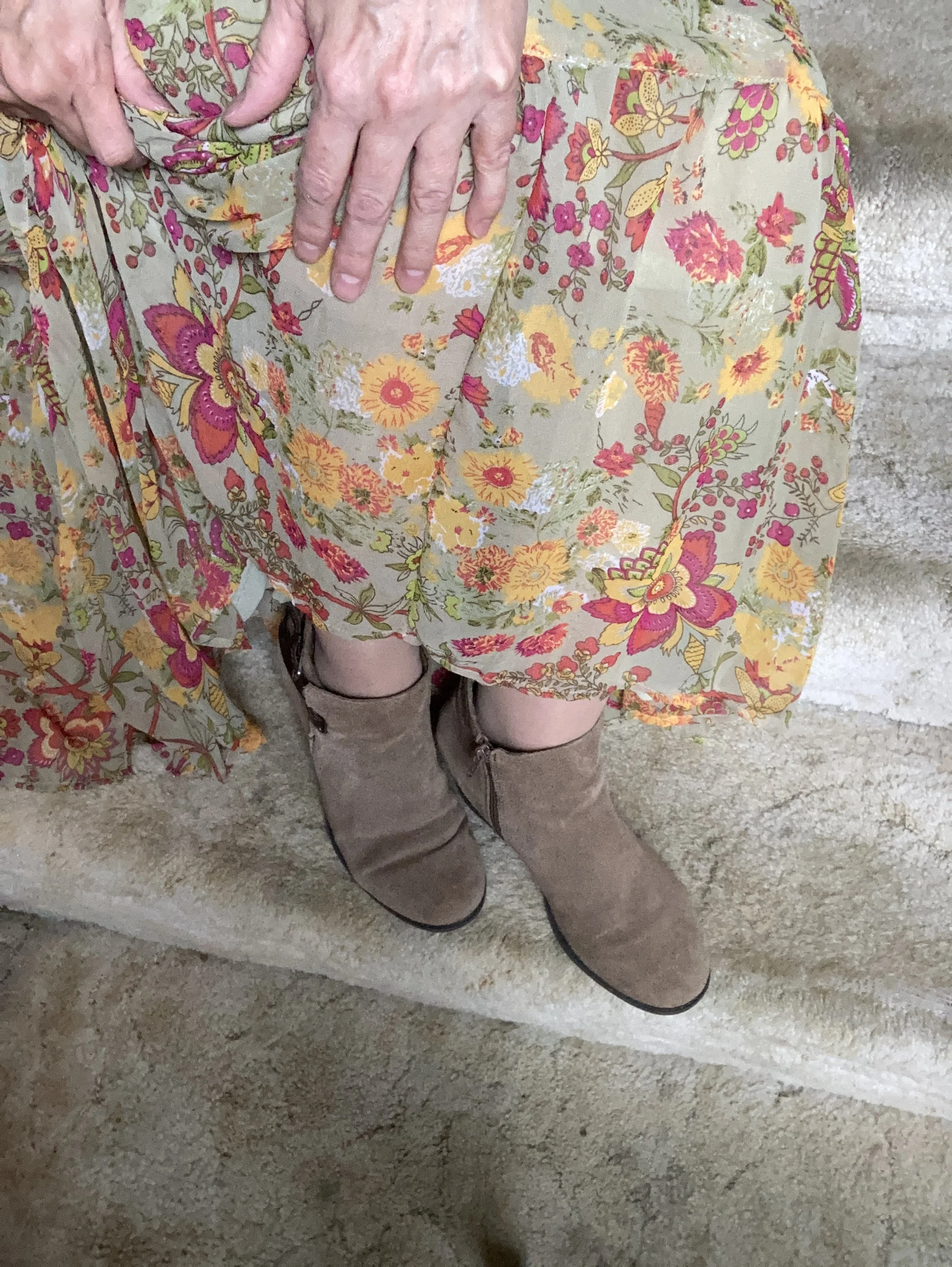
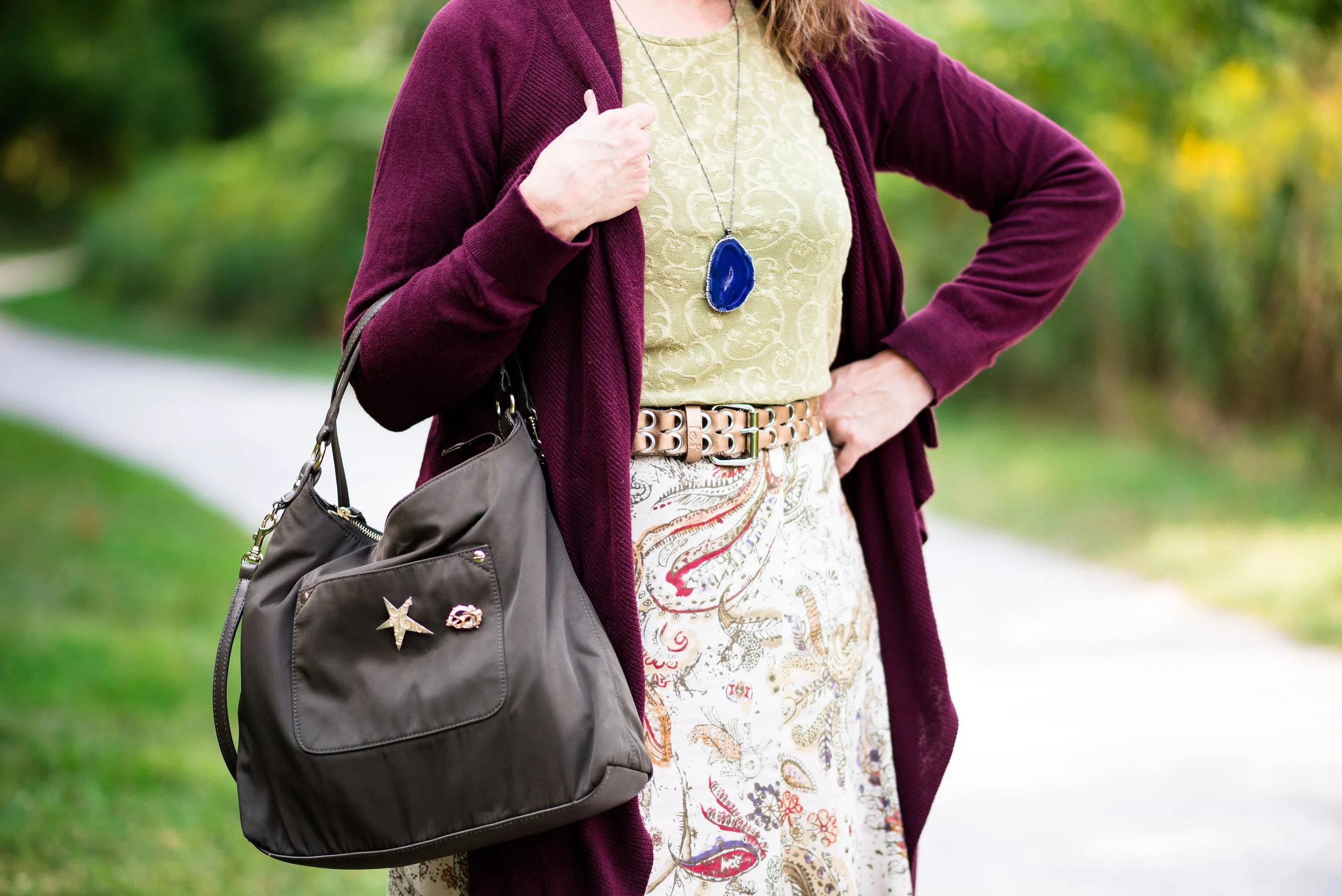
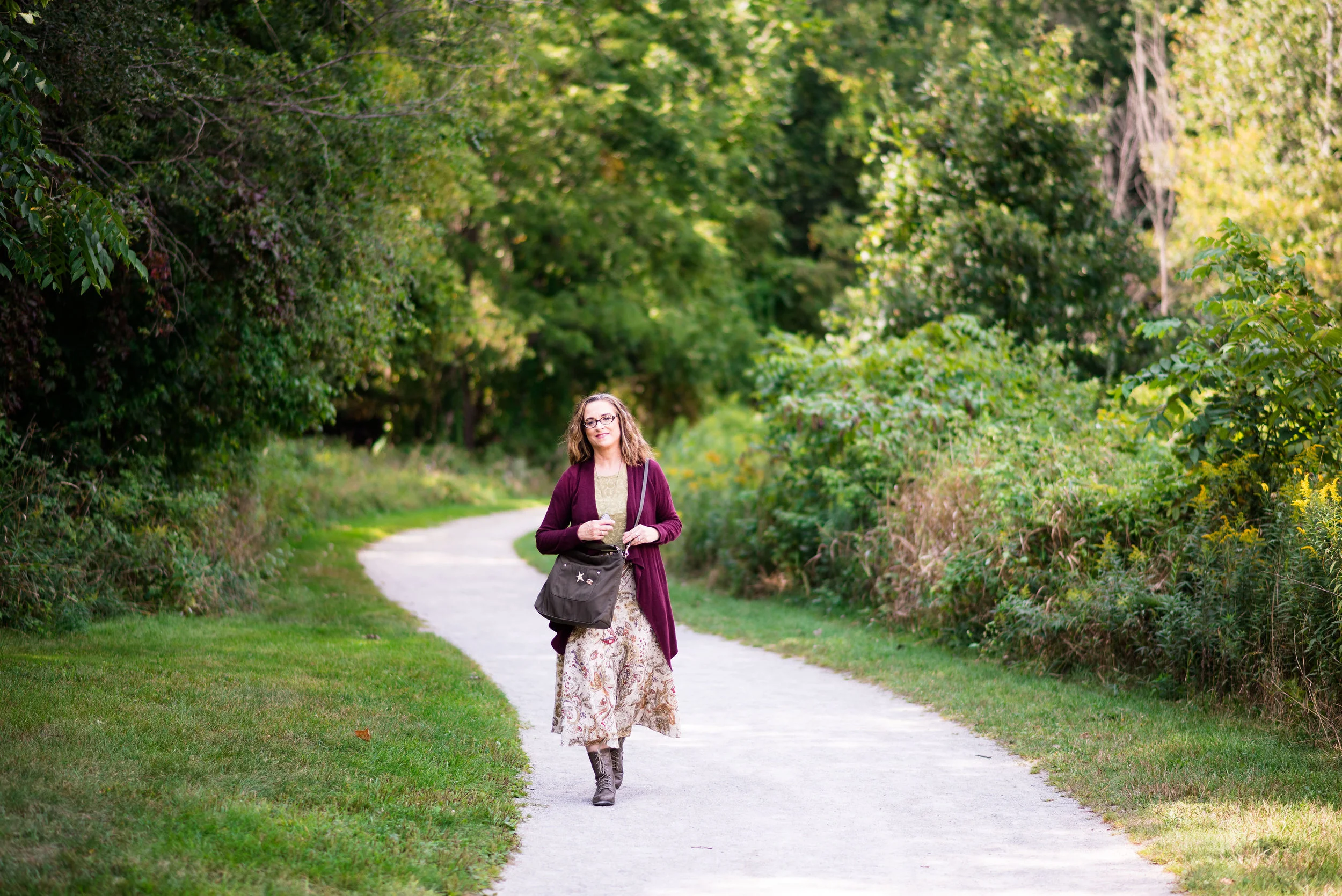
My dark wash denim skirt was a thrift find a few years ago. It is a Liz Claiborne - Liz Sport piece. What’s not to love about this full, midi length skirt? It even has pockets. It is a medium weight so easily wearable all year round, and perfectly twirl worthy. You can see this piece styled previously on the blog with a fair isle sweater, and with an olive military jacket.

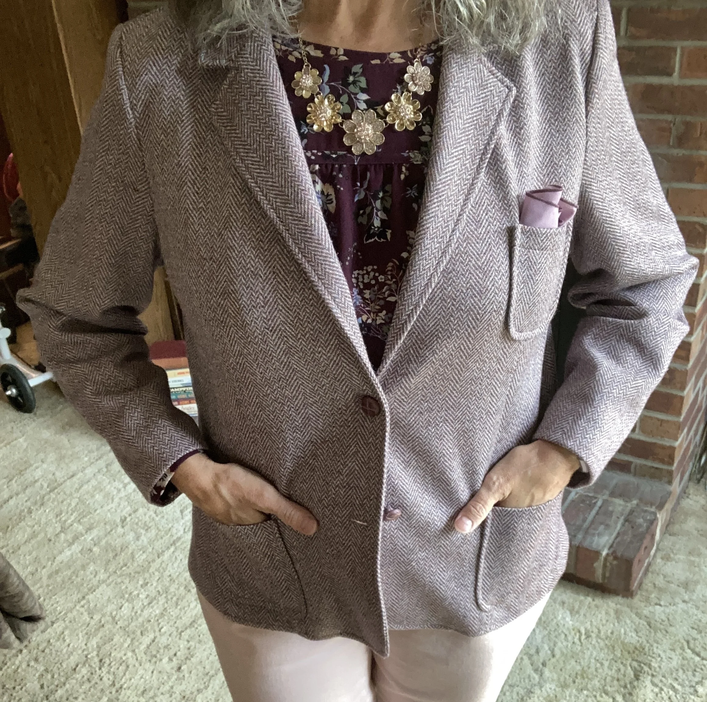
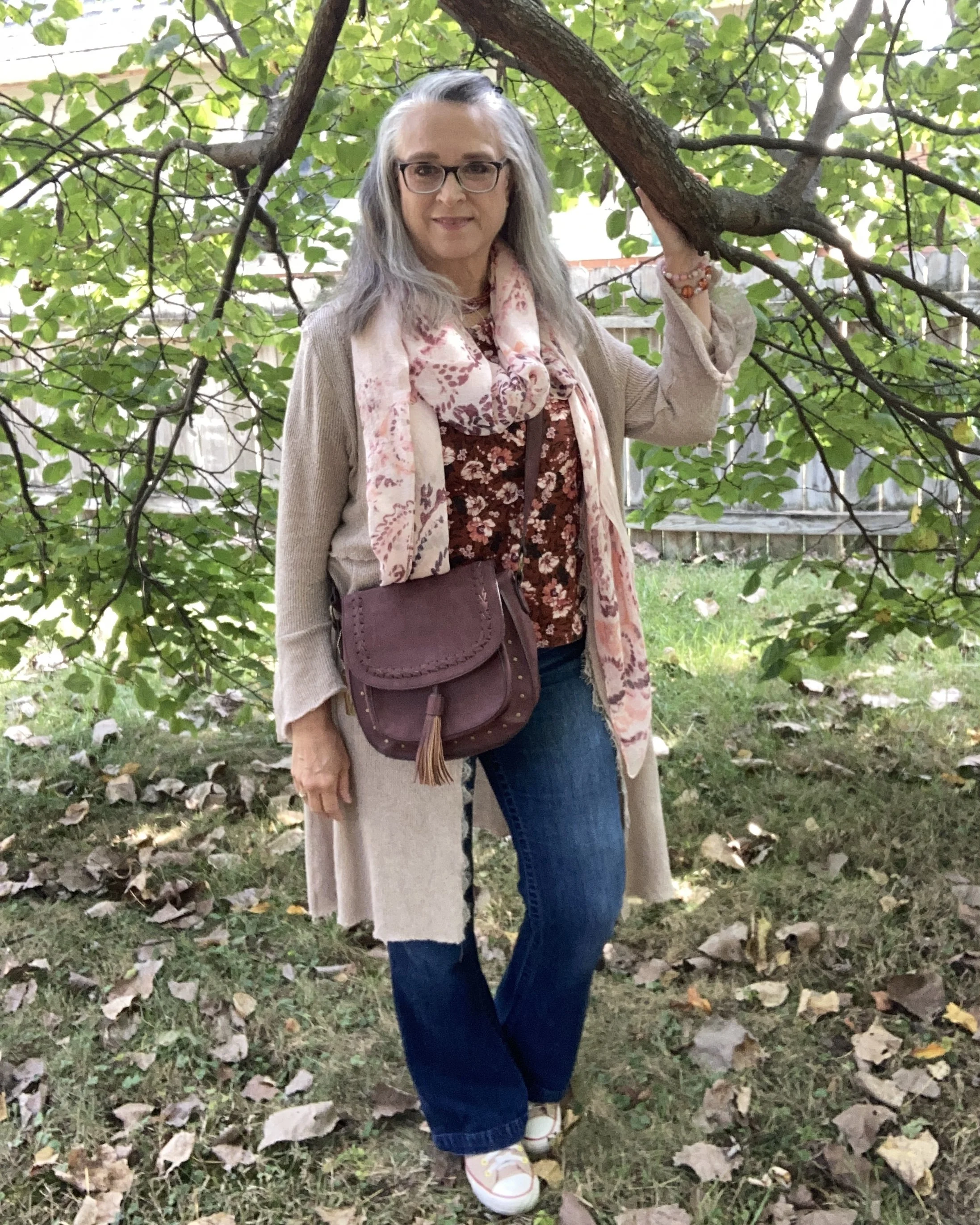
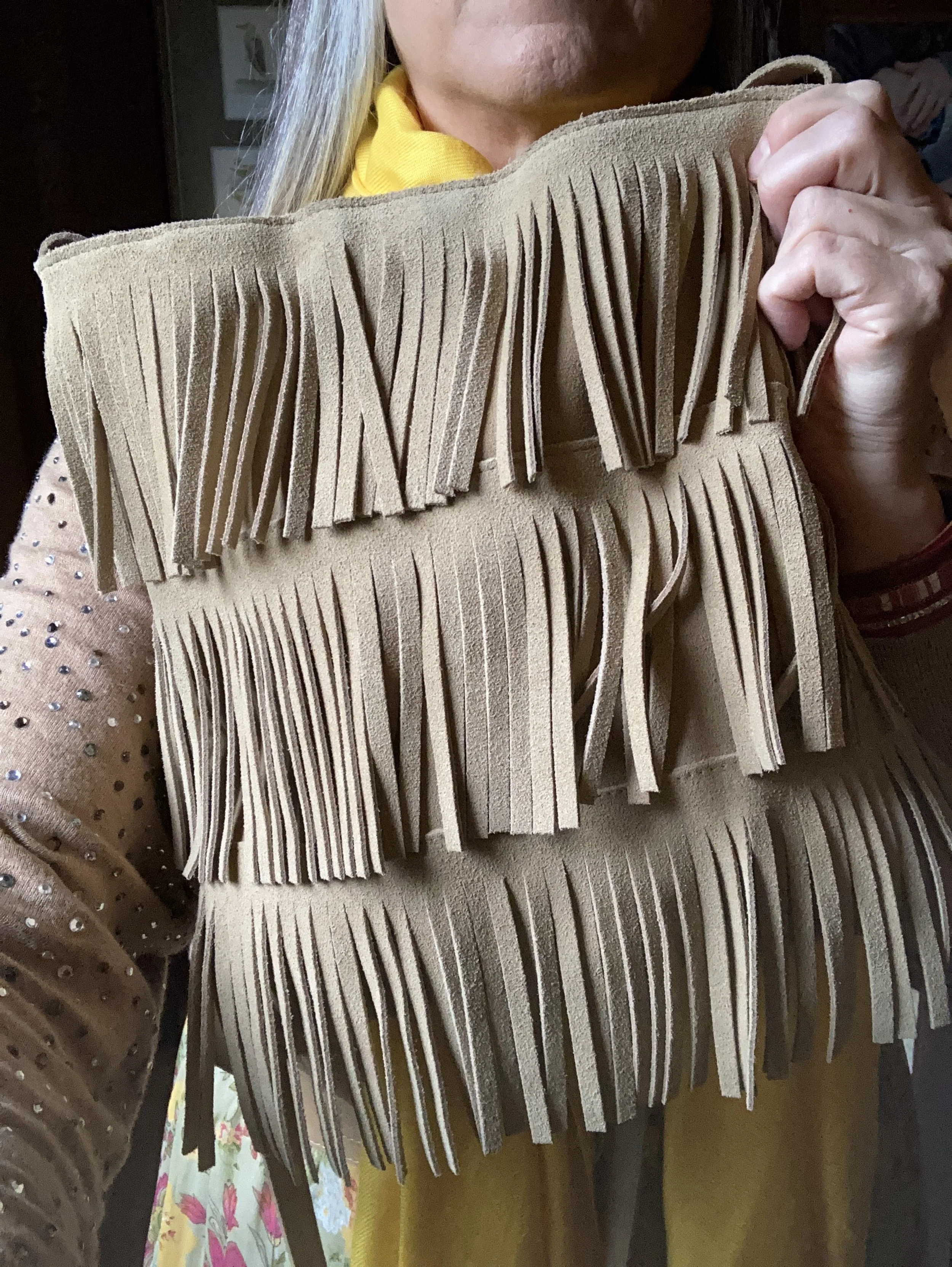
My Emma James, (an older offshoot of Liz Claiborne) faux fur and faux suede coat is another second hand find. I nabbed this one four years ago as soon as I found it and tried it on. I love the way these types of jackets can be used dressed up or down and the neutral color means it can go with anything. You can see another outfit I wore this coat with here.

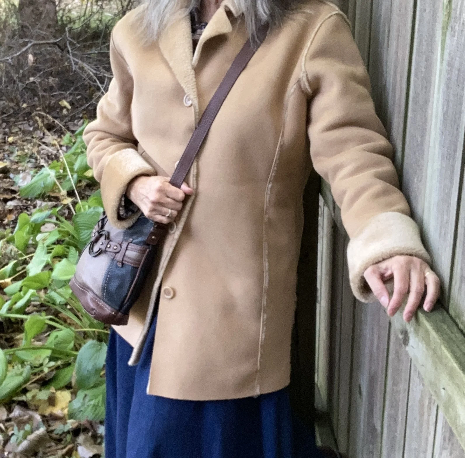
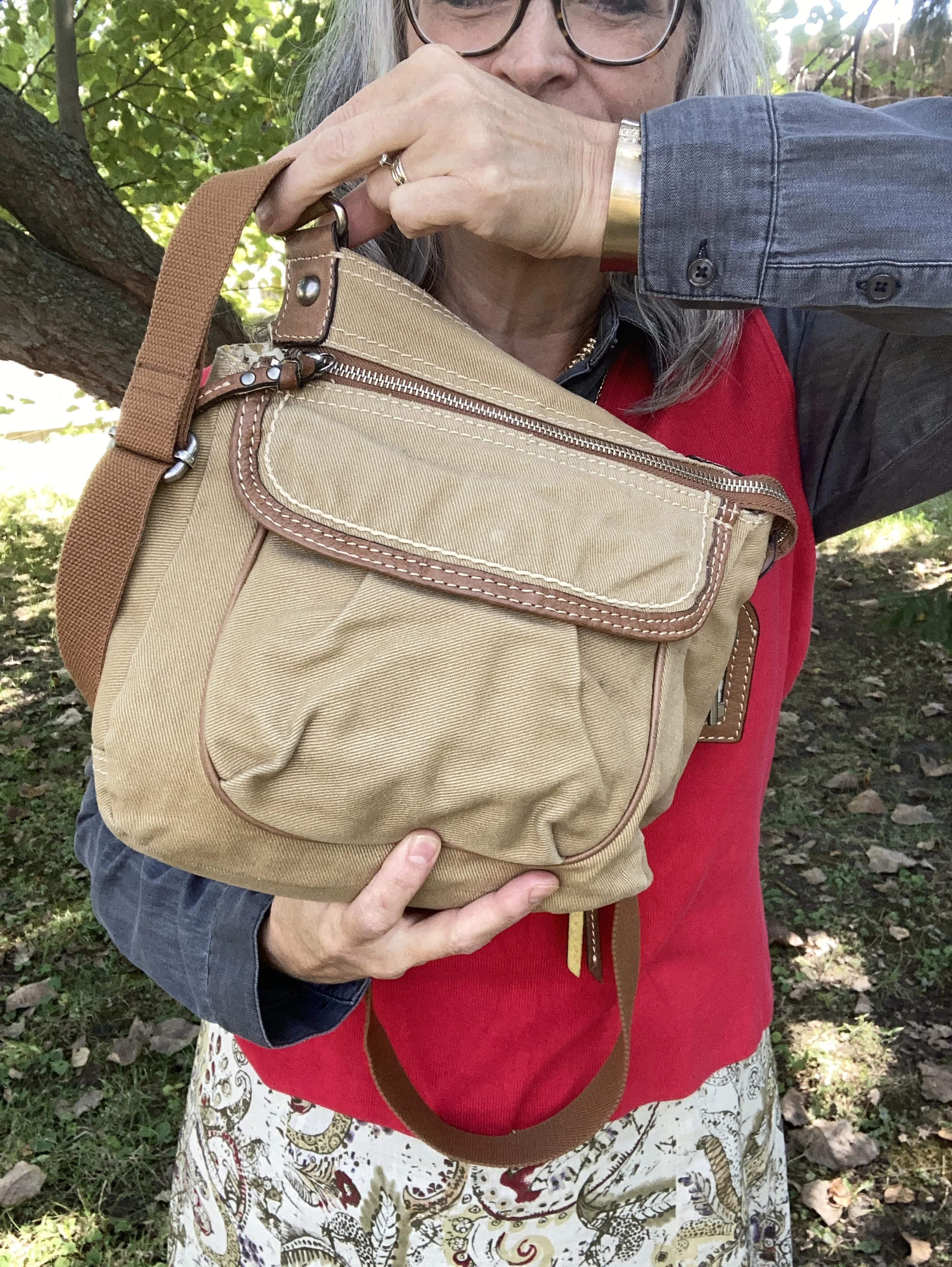
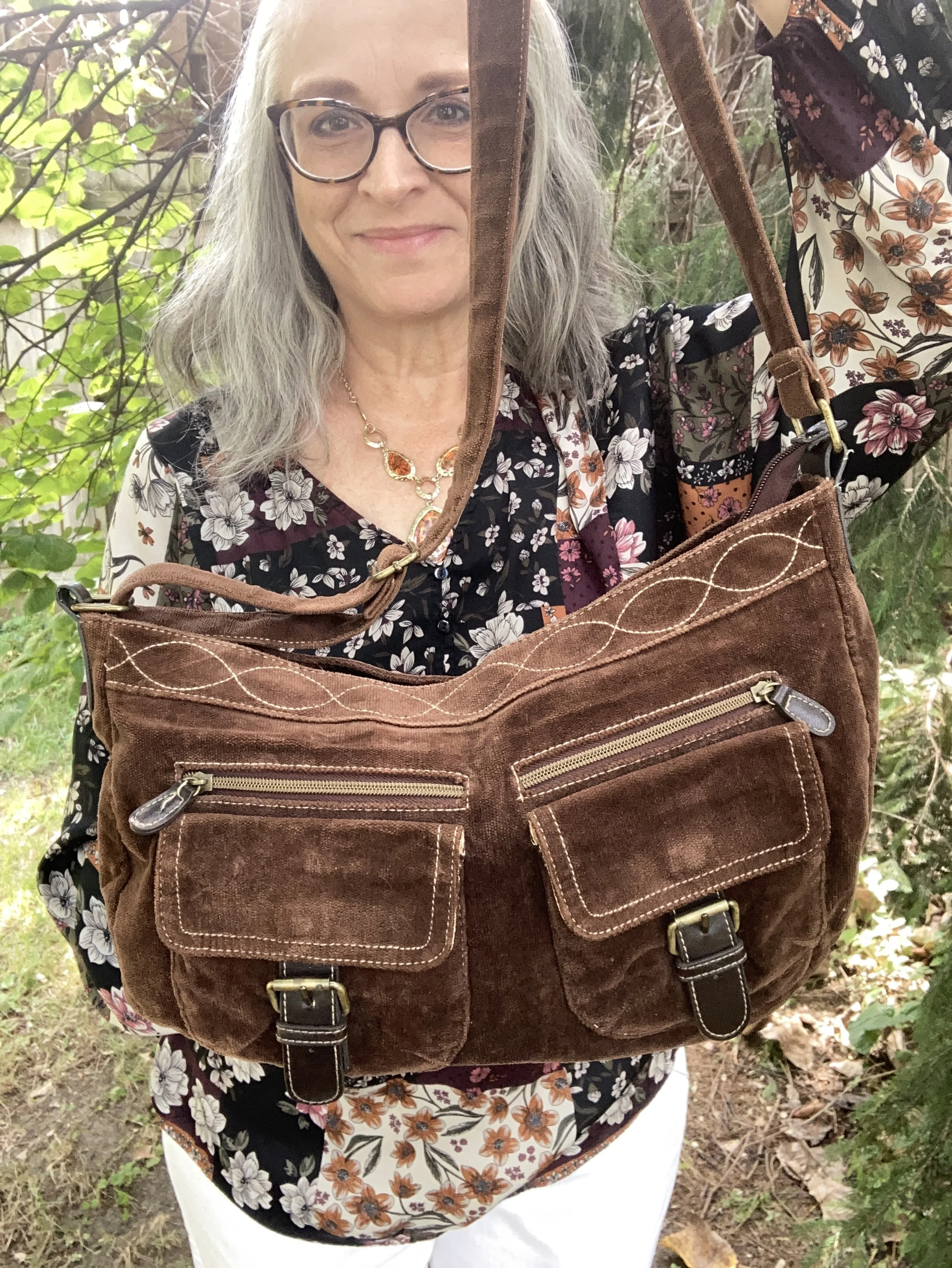
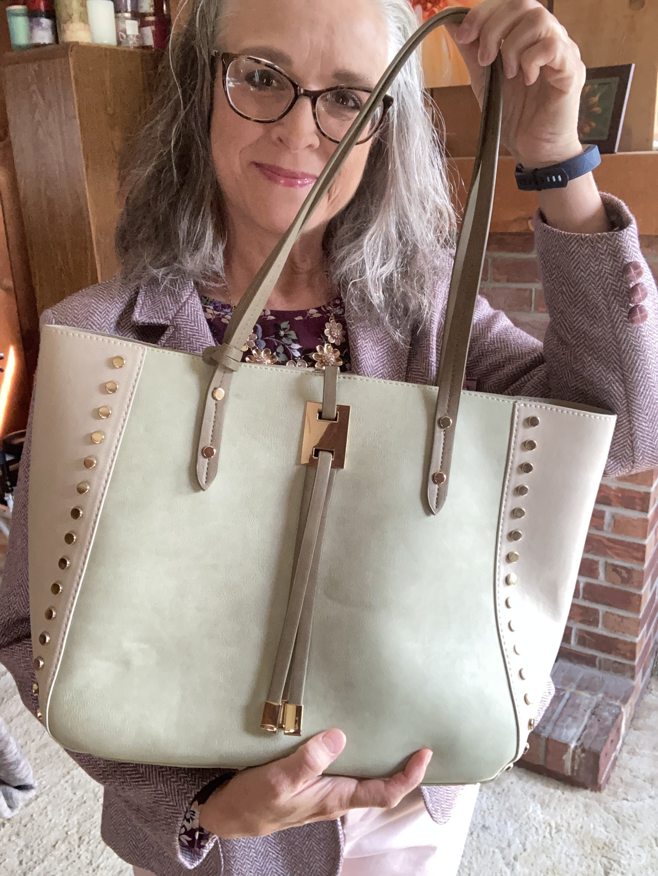
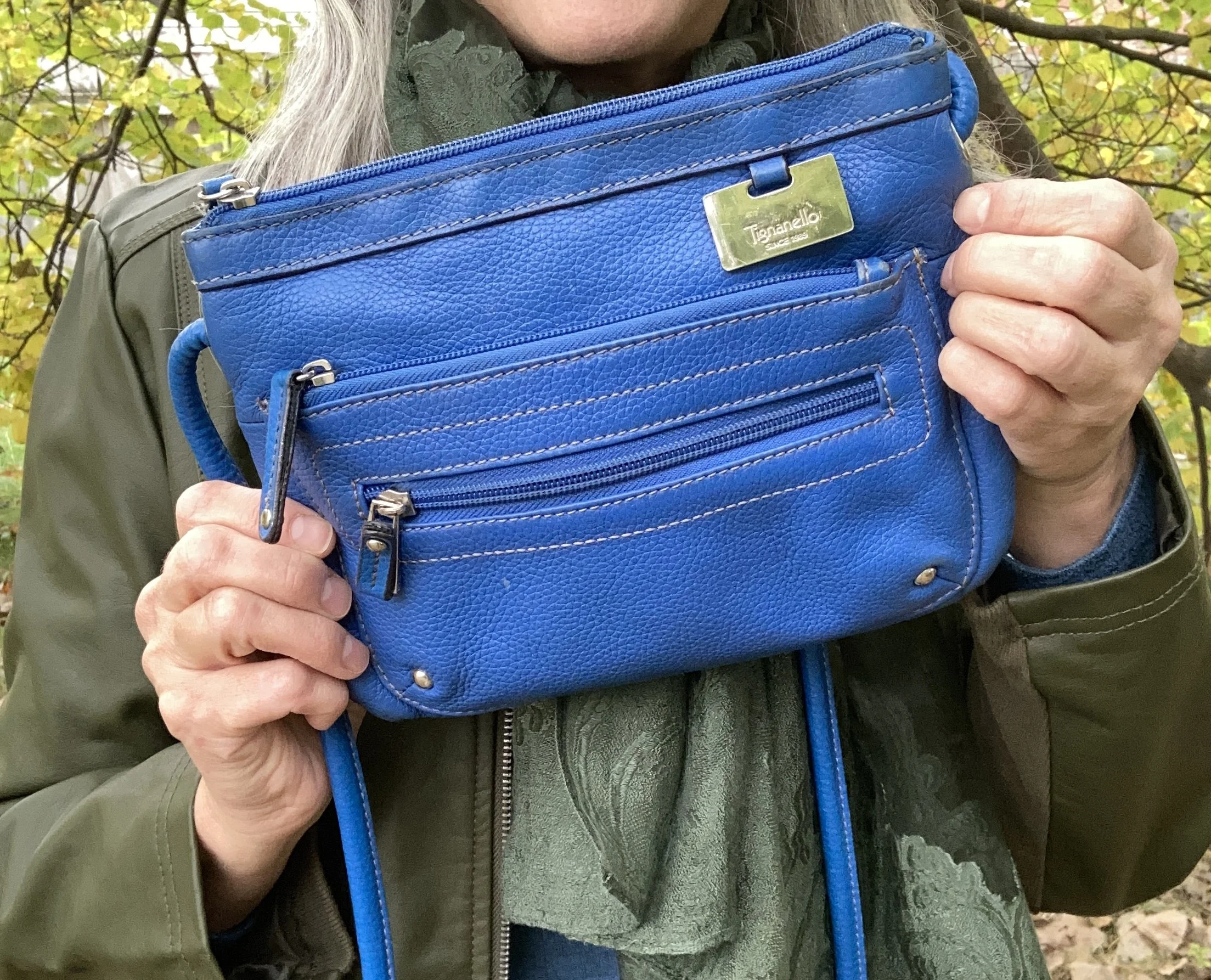
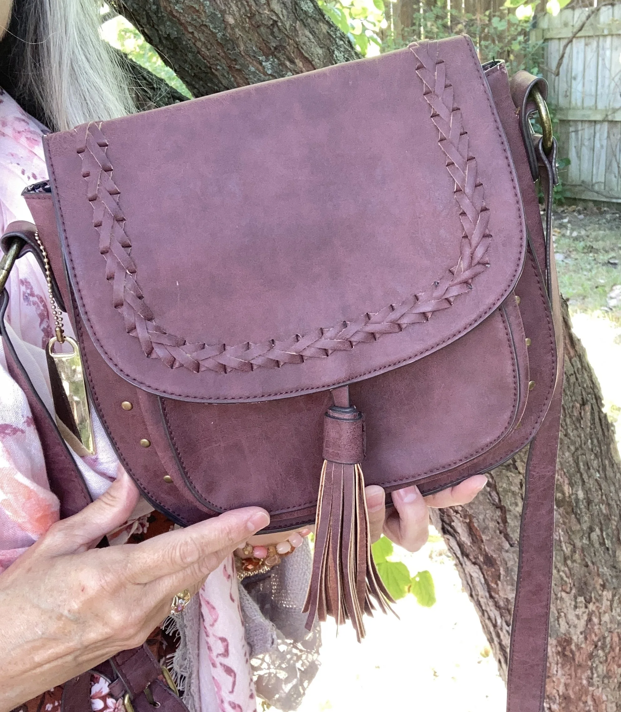
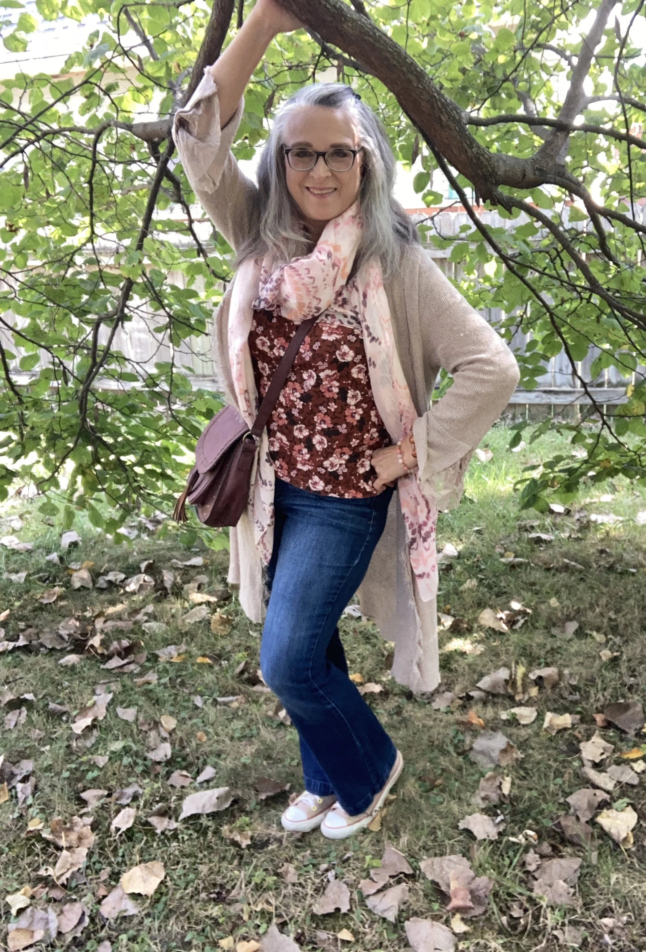
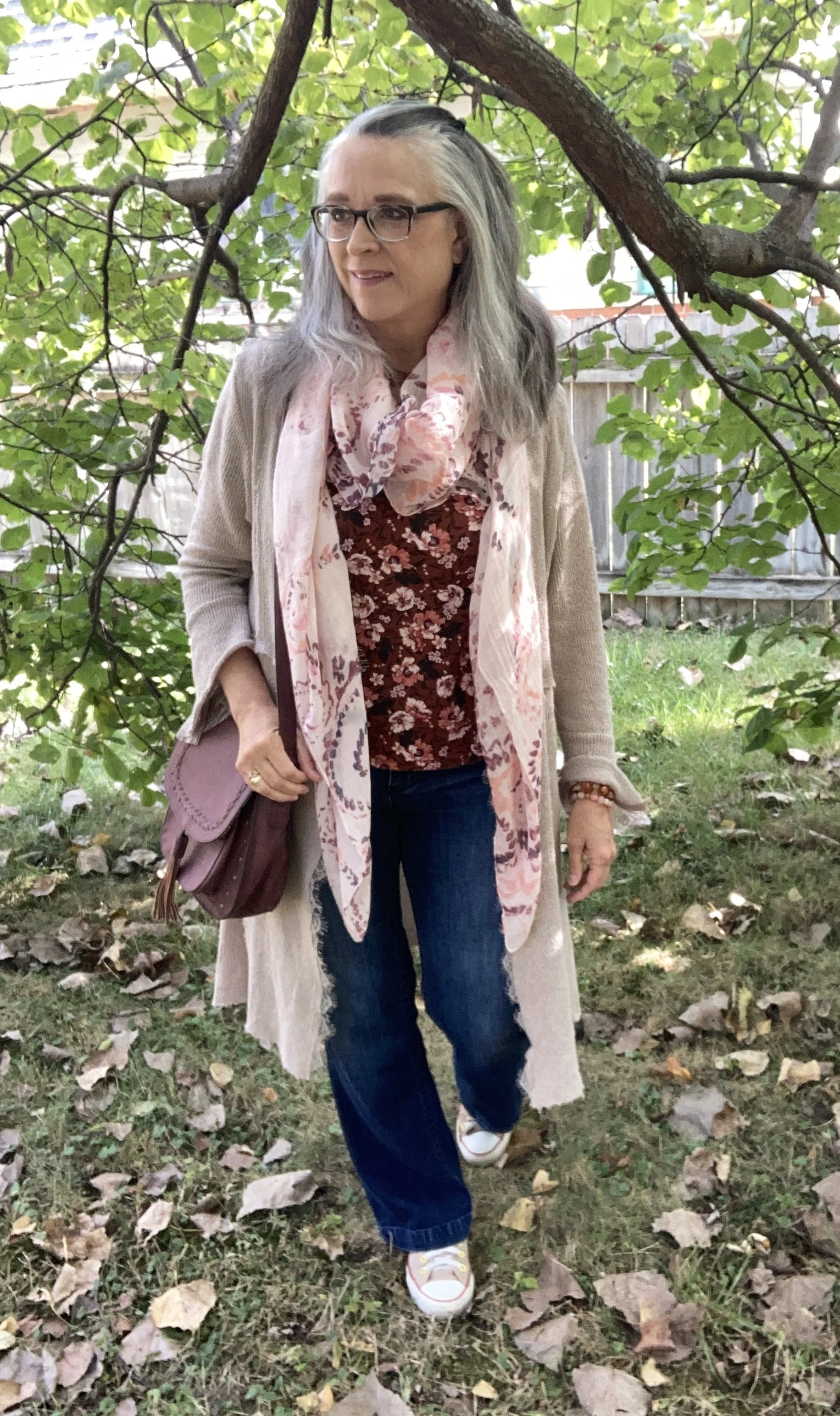
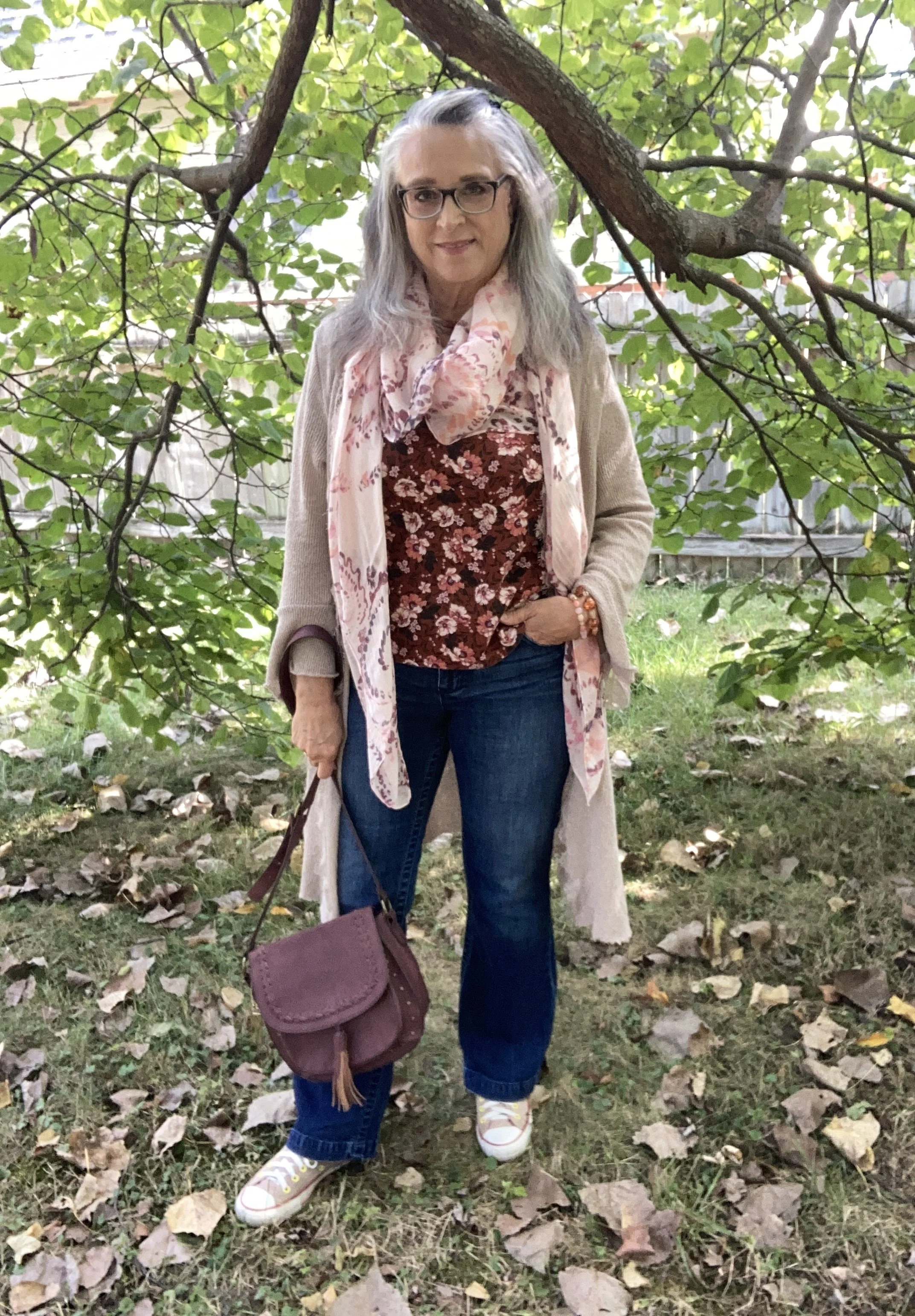
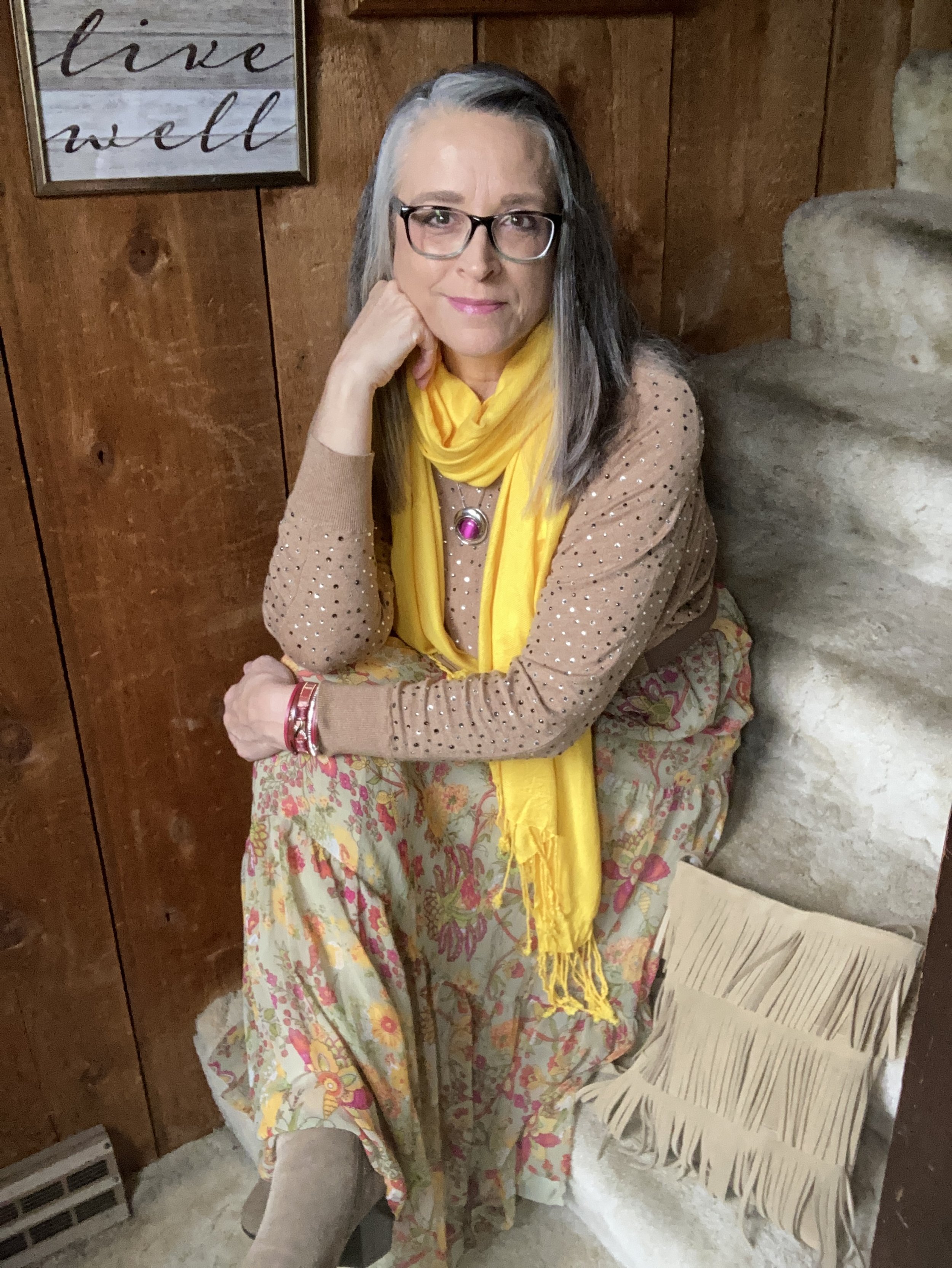
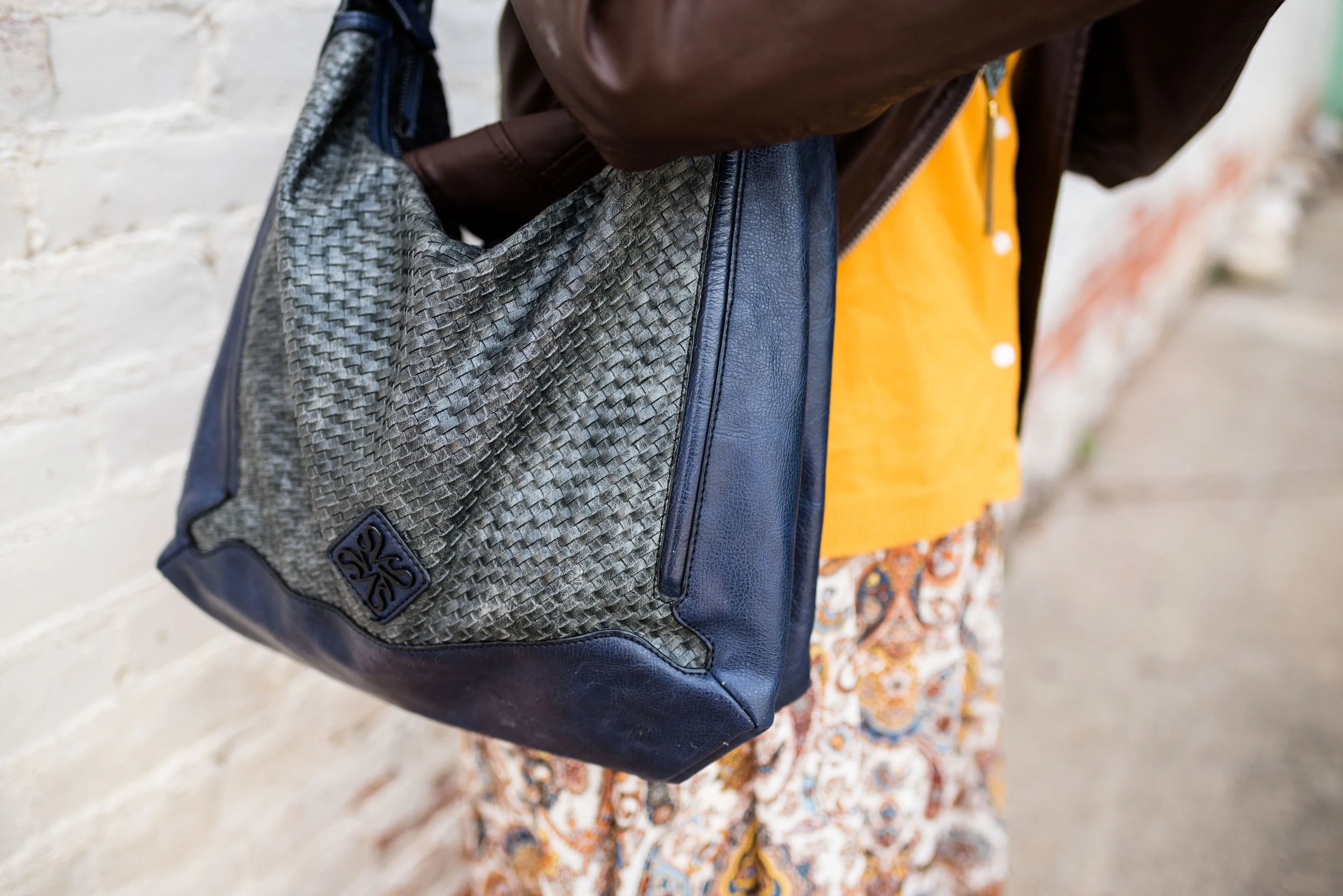
I kept my accessories minimal to keep the focus on the outfit. My b.o.c. bag was a hand me over from my best girlfriend in NY. She is an avid thrifter too, and always finds great things, some of which she passes my way.

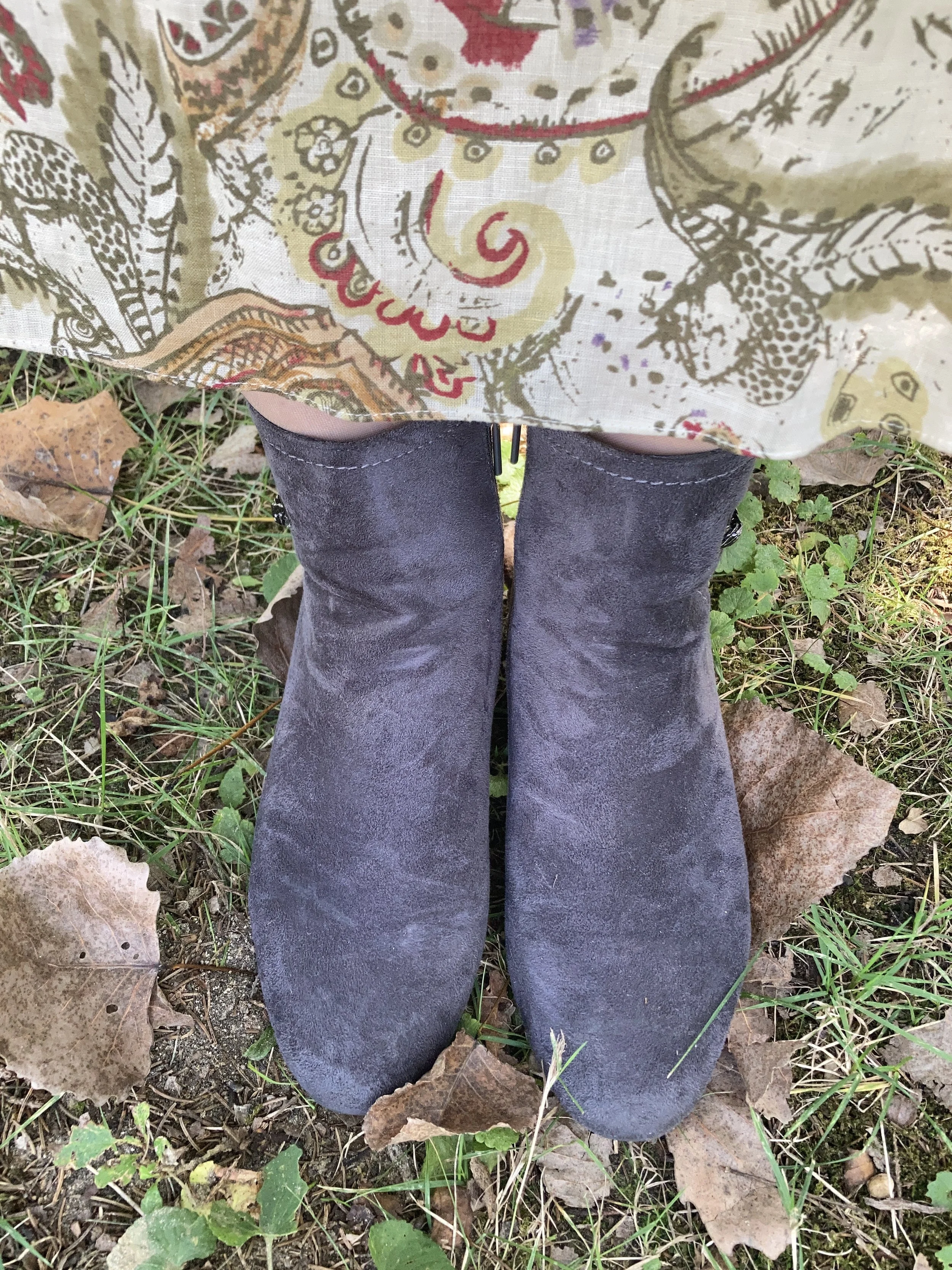
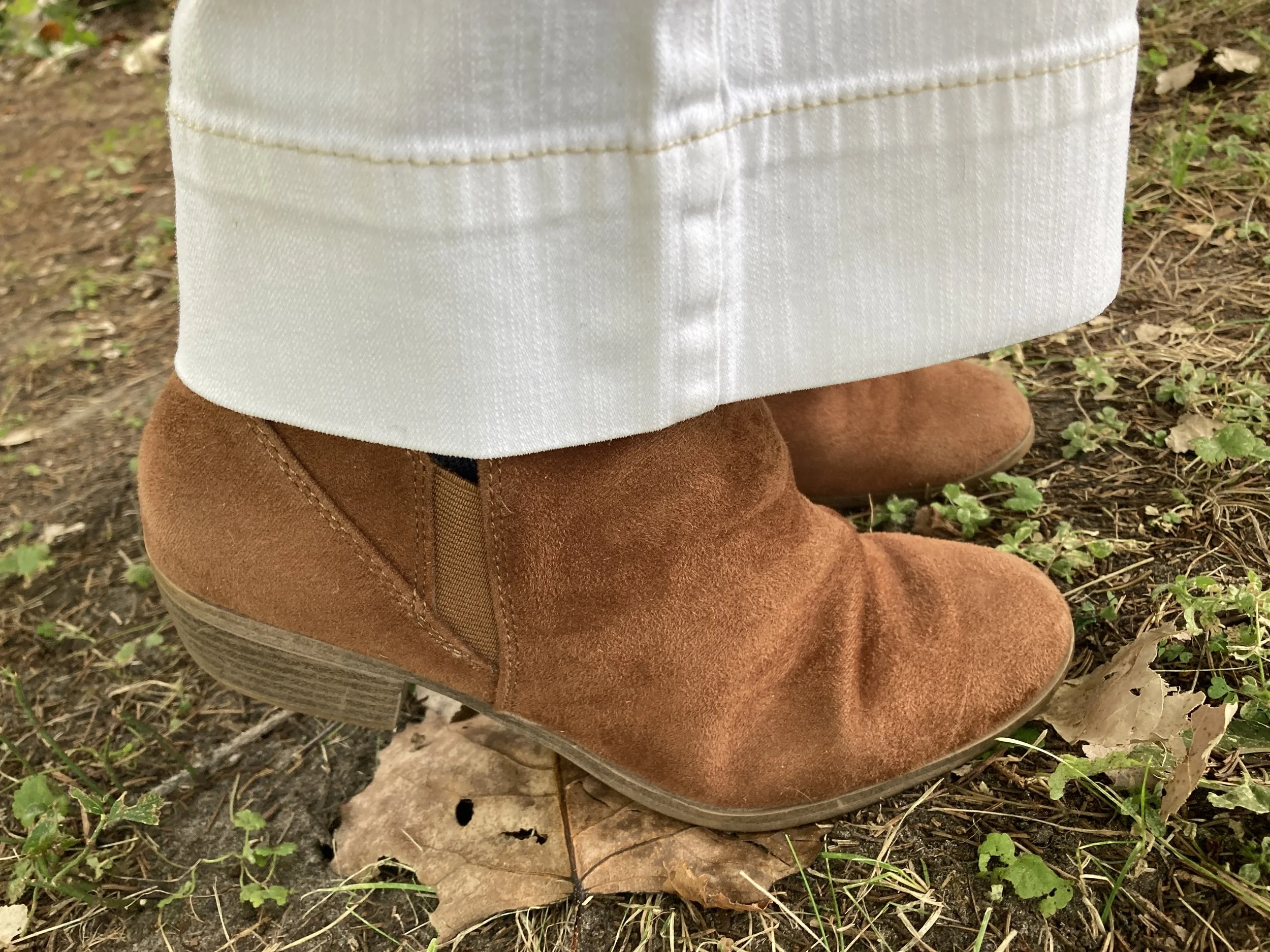
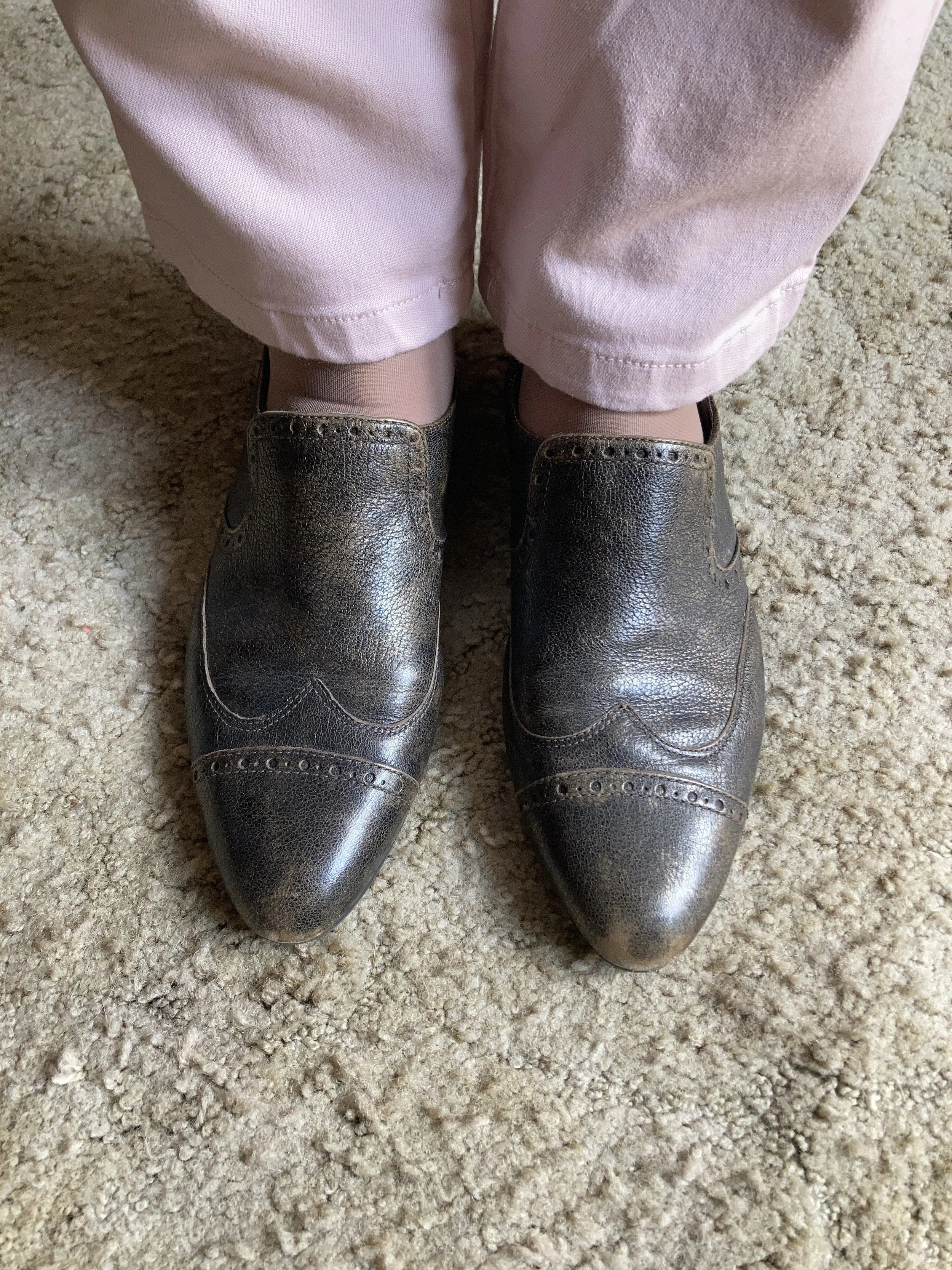
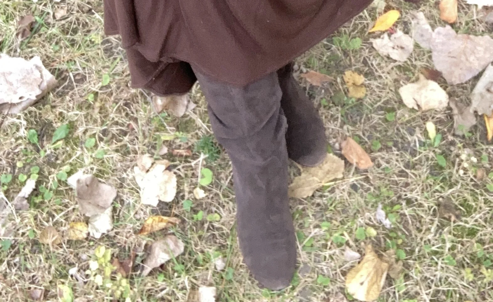
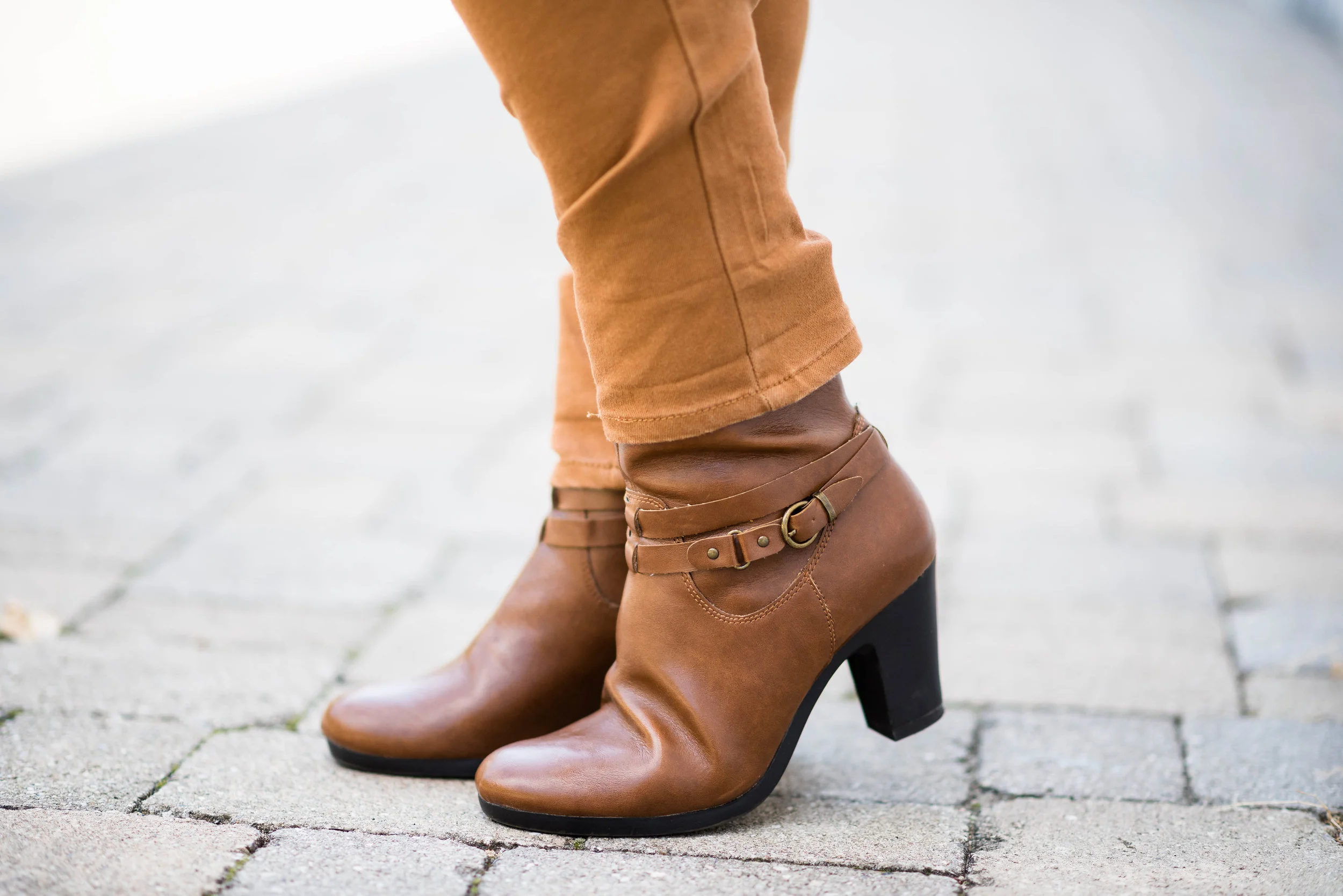
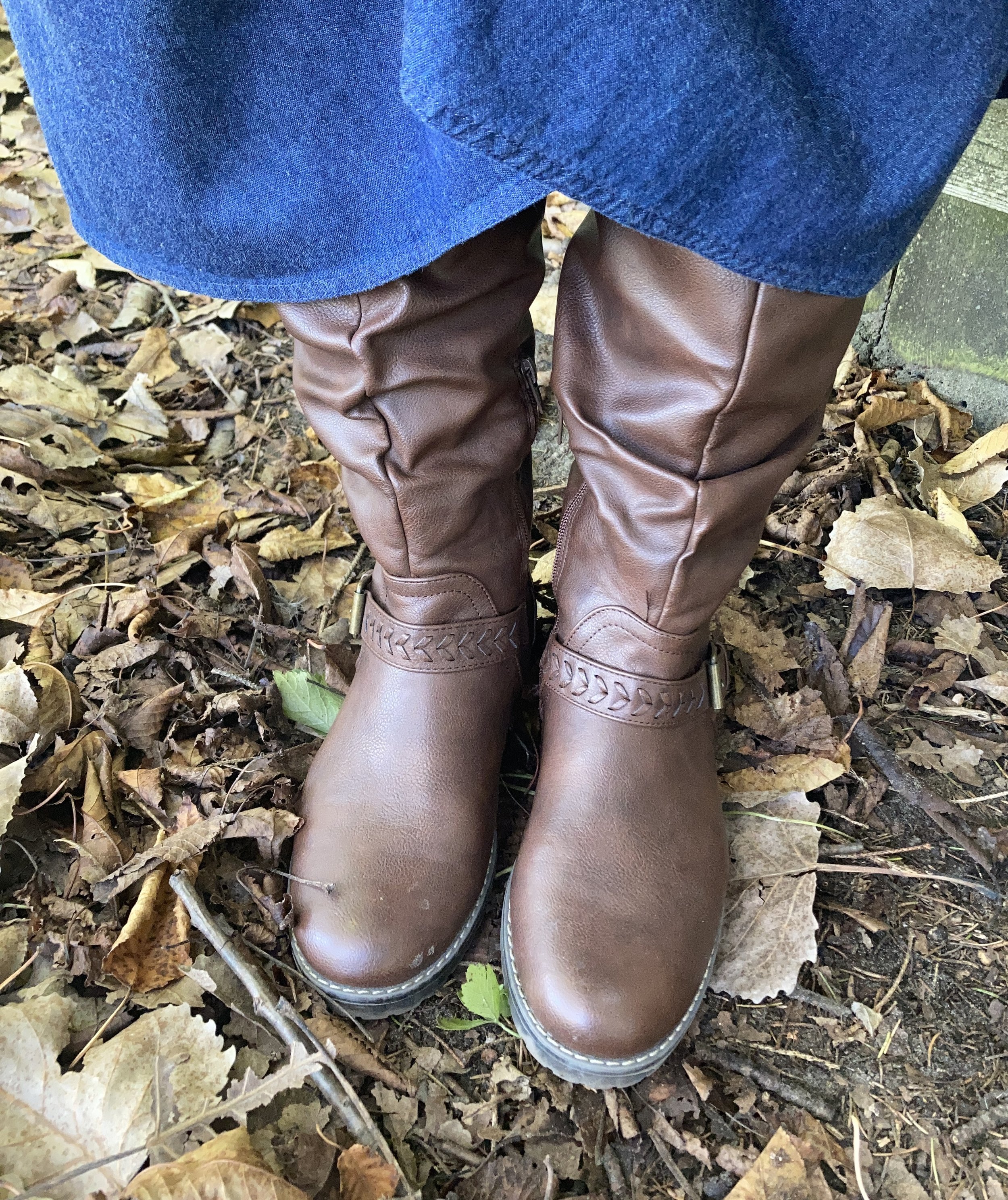
My boots are thrifted. I find a lot of boots at second hand stores when I am not looking for boots. Right now I am looking for a few new pairs of combat boots and do you think I can finding anything second hand? Nope! I also haven’t been thrifting in a while so that might be another reason. Ha. ha. These are a brand called XOXO. The are faux leather, but still look pretty good so they were a good find. Apparently, you can find this brand on Amazon.

What do you think of this outfit? Do you think I hit the Town and Country vibe? I’d love to hear your thoughts, so leave me a comment or two. I always appreciate your interactions with my little blog.

I’m including a few shopping links for you to look over. These are affiliate links brought to you at no extra cost. If you purchase an item through one of my links I get a little commission. I appreciate every think you do to support me and the blog.

Have a great week!

Pantone Autumn/Winter 2025 - London Palette: Poppy Red, Bronze Mist and Dark Gull Gray

Can you believe September is almost over? Here in the midwest it doesn’t exactly feel like fall. The leaves are changing, the sun’s angle is different and the days are growing shorter and shorter, but our temps have been summery. I really don’t mind the blue skies and high 70’s or low 80’s, but I am ready for the cool down, and the return to all that is cozy, including hot tea and cocoa, baking things in the oven and the sweet layers of sweaters and scarves.

We are looking at another trio of colors from the Pantone London Autumn/Winter 2025 color palette. You can see the colors in this Pinterest pin.

Today’s look gets a power punch from Poppy Red. You might remember this color from the New York palette. It is definitely a mood lifter. You can see the New York post here. Today I decided to pair this bright red with Bronze Mist, which is a similar color to the NY Bronze Brown, just a bit more yellowy green. I also chose the color Dark Gull Gray from the classic palette. I styled the shirt two ways, left out and tucked in, so I will include pictures for both.

I found this bright Poppy Red, Sandra knit shell at a thrift store and thought it would work perfectly for a knit vest. I paired it with a second hand Dark Gull Gray, Falls Creek button down. I believe this may be a man’s shirt as it is quite big on me for a large, but who knows. Sizes are so different these days.

This Jones Wear skirt I have styled multiple times on the blog and even though I don’t wear skirts very often, this is still one I reach for. I chose this for the snippets of Bronze Mist color in the pattern. It is fully lined, but light enough to wear in the warmer weather, and warm enough to wear in the winter with tights and a pair of boots. You can see it with a maroon cardigan, a green suede jacket, a yellow top, and a green pullover sweater.

Since I was using the Dark Gull Gray color I chose my Impo ankle boots that I bought on clearance at DSW a few years ago, to balance the look out. Even though fall is the time we put our flip flops away and get out our boots, it is still too warm here to keep boots on for very long…at least for me. I love ankle boots in the cooler weather, and when it gets really cold, then I pull out the taller boots.

I chose this thrifted Fossil bag, as I thought it gave a nod to the Bronze Mist color, even though it isn’t a perfect match.

Do you like these colors together, or do you think they are odd? Do you have this bright Poppy Red in your wardrobe? Which version of this outfit do you like better, tucked in or left out? I love to hear your thoughts so leave me some love.

I’ve included a few shopping links for a few of the pieces to give you some similar color choices, but it was hard to find any sort of skirt in a similar color. These are brought to you at no extra cost. These are affiliate links. All opinions are my own.

I hope you are having a great week!

Pantone Autumn/Winter 2025 - New York Palette: Brandied Melon, Hot Chocolate and Bright White

Today I am showing you outfit #5 from my Pantone Autumn/Winter New York Palette series. This is the last trio of colors from this fall palette, and hopefully next week I’ll start the London color palette. You can see the original colors in this Pinterest pin.

Today’s outfit revolves around a mellow orange named Brandied Melon, a soothing brown reminiscent of Hot Chocolate, and Bright White, mimicking the gorgeous clouds we see meandering through the late summer sky.

I chose this unique, thrifted patchwork top for the pops of Brandied Melon. I love the boho vibe and the variety of colors and print. I looked up this brand, Style & Co, and found that Macy’s was the original retailer. I always find it interesting that I will find a certain brand and then find more pieces of that brand as I thrift. I must be drawn to them for a reason.

My Bright White Gloria Vanderbilt jeans have been around for years. I purchased them new at JC Penney, and use them whenever I need a pair of crisp, white pants that are both casual and dressy. I have a hard time photographing white, or any lighter colors outside. Oh well, not worries. You get the idea. You can see these jeans styled with a yellow sweater, a floral kimono, a velvet jacket, a fall jacket, with a white top and sweater, a black vest, and a multi print top. There are more, but you get the idea. White pants are not restricted by any season and go with every color.

Since the top didn’t contain any browns, I added my thrifted Hot Chocolate corduroy bag. I love this roomy, casual bag, and the strap is long enough I can use it like a cross body bag.

I kept my accessories simple. My faux suede, SO ankle boots were from Kohl’s a number of years ago. My necklace was from a few years ago.

If the weather was cooler, I could easily add a longer cardigan for another layer by picking another color in the top. It would look great with olive, black, white, and even the Mauve Wine (see my first outfit in this series, here.)

What do you think of these colors? Do you wear white all year round, or just in the warmer months? Please leave me your thoughts in the comments or leave a comment on FB. I love to hear your ideas.

I included a few shopping links under each item. These are affiliate links. All opinions are my own. I hope yo are having a great middle of September!

Pantone Autumn/Winter 2025 - New York Palette: Poppy Red, Lyons Blue and Crown Blue

Happy Uno Septembo! In other words happy September, happy fall and all the good things that go with it: pumpkin muffins, hot chocolate, changing leaves and football. Our weather here in the Midwest is already feeling more like fall, although there is sure to be a few more warm days before the official start of fall and even after. I have heard rumors that we are supposed to have a cold winter and these early chill days may be a forewarning to that.

Today’s outfit takes three more colors from the New York Palette and combines them in a bright, cheerful look that would be perfect for a drab fall day. Poppy Red, Lyons Blue and Crown Blue combined seamlessly when I was working on outfits for this Pantone color series. It was a natural progressions to put these three saturated colors together. To see the actual Pantone colors check out this Pinterest pin.

This whole look is thrifted, except the sneakers. It is always fun to shop my closet and find that so many of the things I bought second hand are easily useable for the current trending colors and styles. So what if a few things are slightly outdated, or not currently on as far as the fashion gurus are concerned. It’s my closet and my style, as it is your closet and your style.

Let’s take the outfit apart. The first piece I chose was this paisley button down that I have had for years. The blue colors were a good match for the Lyons Blue color which is a deeply tinted blue teal. This thrifted piece is Jones Wear Sport. I have thought numerous times of getting rid of this piece, but then I end up wearing it for some reason or other. I do love a good paisley print, just like I love my plaids!

You can also see in this photo I chose a teal necklace that leans a bit more in the green direction, but I like the contrast. In addition, for this fall statement belts are trending, so I decided to create my own statement using an old silver colored chain belt that I have had laying around for decades. It didn’t really help to hold my baggy pants up, but I like how it looks!

After the shirt I chose the pants. It seemed the perfect choice as this bright red pair are perfectly Poppy Red. I thrifted these this year as I had been looking for a red pair of pants. These are Bandolino brand. They are actually a little big now, but I don’t mind and the baggy look is another thing that is trending this fall for jeans, so get comfortable ladies!

I then remembered I had thrifted this blue jacket recently and realized it was a perfect choice for the classic color Crown Blue. This piece is Coldwater Creek brand. This is actually a petite, which I can sometimes get away with. It just gives the jacket a more cropped silhouette, which I occasionally like. I love the contrasting white stitching around the edges. I had a hard time finding anything in this exact color, but I’ve included a few links for darker denim jackets.

I decided to go with silvery gray for my accessories. I wanted something different from red, to match the pants or blue to match the jacket. I do have a bit of a matchy, matchy gene, so I was trying to push myself outside that box. While I did end up matching the bag, and the shoes with the belt, I like how it pulls the whole look together. The sneakers are Skechers and I got them a while back on clearance at Gabes. I hardly ever go into that store, but once in a while my daughter wants to make a stop there and it is fun to look. My bag was thrifted and has no label.

What do you think of these colors? Do you like them together, or would you like them each separately? It is fun to try new combinations and I hope these posts inspire you to expand your thinking on how you put colors together. Leave me some feedback in the comments.

Enjoy the many poses of Amy! Ha, ha.

I hope you are having a great beginning to the month of September! I have included a few shopping links, but these colors are hard to find, so I would say add a color you like to your thrifting list! These are affiliate links, brought to you at no extra cost. If you shop a link through me, I get a tiny commission for your purchase. I appreciate all the support. All opinions are my own.

Have a great day!

Pantone Autumn/Winter 2025 - New York: Primrose Pink, Damson, and Mauve Wine

I am making an attempt to get back on track on my Fashion page, by introducing the Pantone Autumn/Winter 2025 color palettes. I thought if I started a little earlier, you could take the inspiration and actually shop your closets for some of these colors to wear this fall. Starting with the New York palette, I hope to also cover the London Palette next month.

Today’s outfit is a pretty work wear look that uses the palette’s lightest color Primrose Pink, paired with the medium Damson purple and the darker Mauve Wine. I really like how these colors work together, giving a nod to the parting pastels of summer and to the incoming darker hues of fall. You can see the actual colors in one of the Pantone pins on my Pinterest board here.

I got dressed, did my makeup and was all set to take pictures outdoors and then it decided to pour. By the time I took these shots the sun was coming out again, but the grass and trees were soaked, so I decided to stay in doors.

I went through a few color combination iterations before I finally settled on this trio, but I really like how it turned out. Let’s look at all the pieces.

I decided to use this thrifted herringbone blazer for the Damson medium purple color. My photos don’t do the purple color justice, but it is what it is. This is a vintage piece from a U.S. manufacturer called Cape Cod Match Mates. The research I did said these were made in the 1970’s and 80’s. The pieces are easy wear, durable, and a stretchy polyester blend that holds its shape well. It also said they mostly made patterns that were bold and fun. I have one other blazer by them that is a darker blue and red plaid. You can see that on my Instagram page, here.

The Mauve Wine color of my floral blouse is actually under the Classic Colors on the New York palette. I was surprised. Usually, the classics are more neutrals or dark navy blues or black. It was nice to have a different option and this color is one I love for the fall and winter. This piece is a second hand Loft brand. Dark florals are always a winner for fall.

My Primrose Pink pants have made an appearance on the blog before. These Christopher and Banks trousers are a great choice when I want to look a little more dressy. You can see them styled here in a casual Easter outfit,

Since there was a tiny bit of green in my blouse, I reached for this Charming Charlie tote bag that I have had for a few years. I thought it keeps the summer element in the outfit along with the pink pants, after all we have about five more weeks of summer before the actual seasonal change.

I added a sparkly necklace just to add a bit of pizzazz!

These slip on Oxfords are an older second hand find and brand called Enzo-Angiolini. I don’t often wear anything other than casual shoes like sneakers and my Converse since I no longer have an office job, but I do hang on to shoes like these so I have options if I ever need to dress up a bit.

What do you think of these colors? Which of these three do you like the best? I always enjoy getting your feedback so leave me a comment or two.

I’ve included a few shopping links for you to look through. These links are brought to you at no cost. These are affiliate links. If you purchase an item through my link I get a small commission. I appreciate all you support. All opinions are my own.

Have a great week!

Color Play - A Pinterest Fall Color Palette

I have been collecting color palettes on Pinterest for quite a while, so I thought it would be fun to revisit that board and see what I could pull up for a fun fall color combination. This is the pin I drew my inspiration from and I used the swatch labeled Fall Fashion. I liked all the color combos, but I guess I wasn’t feeling overly adventurous, so went with the more conservative of the bunch.

This is a rich, earthy combination for fall, and I like how the green and brown are more sedate while the bright blue is a lovely pop of color. When I saw the color swatch I knew the olive would be a good color choice for a topper, as I have a number of sweaters and jackets in that color.

My faux leather moto jacket is an older Christopher and Banks piece. I like that it is simple, light weight and it has stretchy cloth panels on both sides and along the backs of the sleeves. They no longer seem to make these types of jackets, but always keep an eye out at thrift stores. In addition, real leather is always more suitable for longer wear and tear. Be sure to check out the Jacket Maker website for quality leather pieces at more reasonable prices.

I added this thrifted green scarf, because fall is always a good time for a scarf! This was a fun find as I didn’t have too many green scarves and I love the delicate look of it.

I was also dressing for an Instagram challenge today and the theme had to do with bling. This cute joei & iBlessed” top was a gift from my oldest a few years ago and I do love it. It is the perfect weight for a cool fall day, and the sparkle makes it top notch in my book. You can also see the necklace I added. One can never have too many accessories on at one time, right? Ha, ha. In reality, if this was a work outfit, I would most likely take the jacket and scarf off while at the office, so the necklace works.

I have worn this skirt multiple times on the blog. It is St. John’s Bay brand and was purchased from JCPenney a number of years ago. You can see this skirt paired with a spotted tee, a bookish vest, and more recently a fringe vest.

My boots are second hand old, but they are real suede, so with a little TLC I will keep them indefinitely. They are a brand called Kelly & Katie.

My blue cross body bag is thrifted Tignanello brand.

Do you think these colors work well together? What colors from the Pinterest Autumn palette did you like best? Please leave a comment or two. I appreciate your input.

I’m including a few shopping links for block heeled boots, tiered skirts and faux leather moto jackets. These are affiliate links brought to you at no extra cost. All opinions are my own.

I hope you are having a great week!

Shopping Our Closets: Fall Florals

I don’t know about you, but I love the rich, vibrant colors of fall. Unlike spring and summer when we focus more on white, navy and all manner of pastels, fall allows us to indulge in dark maroons and earthy browns; golden yellows and rusty oranges. I love floral pieces in any season, but I especially love the dark florals of fall and winter. I am hoping you have a few fall florals in your closets and you will join me in putting together an outfit with those pieces as a focal point. Whether it is a top, a scarf, a bag or a skirt, fall florals make for outfits that are fun, whimsical and stylish.

For my fall floral I chose a thrifted Croft & Barrow tee. The rusty background, pinky reds in the flowers and the black leaves are a perfect choice for this fall look.

This top is just a basic Croft & Barrow tee. It fits well, and is perfectly comfy. It is a great piece for these early fall days where the temps are starting to get cooler, but it isn’t yet full on sweater weather yet.

I also chose simple beaded jewelry in similar fall tones.

I was going for a casual look, so chose jeans as my bottoms, but you could easily dress this up with a pair of black dress pants, or a rust or white colored skirt. These thrifted, boot-cut jeans are Apt. 9 brand.

My fun duster was a purchase from Cracker Barrel General Stores a few years ago. They always have beautiful holiday displays of their products and fun seasonal clothing. I would buy many more pieces there, but I just have a hard time paying full retail prices for anything I don’t really need. This is a brand called Linda Anderson.

My accessories really completed this casual look. I chose my thrifted Converse sneakers, my burgundy saddle bag purse, and an oversized, light weight, thrifted scarf. I like how the scarf has a similar color vibe to the tee, yet it is completely different. It also makes for a fun print mix.

What do you think of this outfit? Do you have any fall florals in your closet? If so, what sort of pieces do you have? I think it would be fun to style a fall outfit around a floral bag, scarf, skirt or dress. Let me know you thoughts.

I hope you enjoyed this post and that it provided a bit of inspiration for you in shopping your closet to build a fall outfit around a fall floral piece.

I’m including a few fall florals, bags and scarves below. These are affiliate links brought to you at no extra cost. If you purchase an item through one of my links, I get a few cents. I appreciate all you do to support the blog.

I hope you are having a great week!

Color Play: Pantone Autumn/Winter NY Palette - Tomato Cream, Moonstruck and Buckthorn Brown

Today I am combining the last three colors from the Pantone Autumn/Winter 2024 New York Palette. Tomato Cream will definitely remind you of the familiar soup. I still have cans of Campbell’s Tomato Soup in my pantry and use them regularly. My mom always used water to make the soup when I was growing up, but when I got married to a Wisconsin man who loved dairy I learned to use half a can of milk and half a can of water, or if I have skim milk, I use a full can. It makes the soup creamier and it takes on this orangey red color.

Moonstruck is a medium gray and reminds me of the gray skies of fall and winter that just hang around, but don’t produce any rain or snow. For this sufferer of Seasonal Affective Disorder those gray clouds are the worst! Just rain or snow, already. Ha, ha.

Buckthorn Brown is an earthy sunshine color. It tends towards yellowish gold, but is not truly yellow. I think their idea was buckskin, but without the bad press that animal skins or prints have for many people. I do not have an issue with leather, but I do prefer it is sustainably and responsibly sourced. Fast fashion is not good for our environment and certainly not for animals who are used just to make a buck…pardon the pun! That being said, I do like this color. It is a nice change from our darker browns, and gives our wardrobes a peppy vibe.

My outfit for these last three colors is very casual. This is more in line with my every day looks, so for those of you who are not working, or are working from home, this might be for you.

To see the actual Pantone Autumn/Winter 2024 New York Palette colors just click on the link. I do the best I can to match the colors with what I have in my closet, so they differ slightly.

My Tomato Cream Tahari open front cardigan was a clearance find from TJMaxx a few years ago. You can see how I styled that with a white sleeveless sweater, a fall graphic tee, and in a monochrome fall look from last year.

My Gloria Vanderbilt Moonstruck jeans have been around for a while. It seems every time there is a Pantone series, I bring these out as there is always some sort of gray. You can see them styled with a red and white striped tee, and with a red plaid blazer.

Buckthorn Brown is really more of a brownish gold or yellow, but I thought this Sonoma tee from Kohl’s was a pretty good match. Kohl’s has always been a great place to find basics like short and long sleeve tees, pullover sweaters for the cooler weather and fun tees with holiday motifs. I don’t shop there much any more due to my lack of need for clothing, and due to my love of thrifting. Ha, ha.

I kept my accessories pretty minimal. My necklace was a more recent thrift find, and might seem a little to fancy for this casual look, but I like the contrast of dressy and casual, and the color goes well with the Tomato Cream cardi.

I chose blue for my bag and my sneakers, just to play off the blue flowers in the tee. My bag is an old thrift find, a brand called Nine & Co. My sneakers are Keds.

What do you think of these colors? What did you think of this fall’s New York palette? What colors were your favorites? I’d love to get your feedback, so leave me a comment or two.

I’m including a few shopping links. These are affiliate links. All opinions are my own.

Have a great weekend, everyone!

My Style: Pantone Autumn/Winter 2024 NY Palette - Fern, Adventurine, and Dark Gull

I wanted to continue the Pantone color series, but I also wanted to stick to my monthly posts, so for today’s look I am combining three of the Pantone NY palette colors into another style I like, but haven’t as much experience in: Dark Academia.

Academia fashion draws their ideas from university influences both real and imagined. Think of looks combining plaids, tweeds, cozy sweaters, pleated skirts, houndstooth patterns and other vibes associated with higher education. Dark Academia (click on the links to see a few of my pins on Pinterest) uses the darker, moodier end of the color spectrum, while Light Academia chooses pastels, and lighter shades, but in similar textures, styles and patterns. While some looks may include preppy, these are not specifically prep school leanings. I think of Dark Academia as outfits with a Detective Noir slant, but with more fun accessories like back packs, boots and plaid skirts.

This is my take on the Dark Academia style using the colors Fern, Adventurine, and Dark Gull.

To start off, I chose this thrifted, Old Navy, tiered Fern skirt. Tiered skirts are not really part of the academic vibe, but at the current moment I don’t have anything green in pants or a skirt that would have fit both the color and the style. However, I think this worked pretty well. You can see how I styled this skirt before on the blog with a colorful kimono, with a sheer floral top, and with a colorful fall jacket.

This second hand, Old Navy green top I chose is a tad darker than the Adventurine color, but it is pretty close. I found this gauzy piece recently at the second hand shop around the corner. I have always loved gauze tops. They are so pretty, comfortable, and while we often think of them as warm weather pieces they are perfect to layer a jacket or sweater over.

This thrifted, Mossimo, Dark Gull blazer was a hand-me-over from my daughter. I have always liked a dark gray, better than a light gray, so I am naturally drawn to pieces this color. To me they are classy looking, but aren’t black, so a good choice when you don’t want to go as formal as black.

On Pinterest most of the accessories revolving around academic fashion are simple pendant necklaces, leather, or faux leather boots, loafers and oxfords and back packs or bags. There are also scarves, but our weather is still too hot for those. I decided to focus on silver as the belt over my shirt has silver links and buckles. I also chose a thrifted pair of shoes, a brand called Enzo Angiolini, that are like loafers, but also like oxfords. Ha, ha. And yes my collar is crooked in the first two pictures. Ha, ha.

What do you think of these three Pantone colors? Do you like the Dark Academia vibe? How would you change this type of outfit to make it your own? I’d love to hear your thoughts, so leave me some love in the comments below.

I’m including a few shopping links for pieces that would fall into the Dark Academia style. These are affiliate links brought to you at no extra cost. All opinions are my own.

Pantone Autumn/Winter 2023 - New York Palette: Rose Violet, High Visibility, and Doe

Today I am bringing you another outfit in my Pantone Autumn/Winter color series. I find these colors on the Pantone website. My renditions of their color palette may not always be an exact match, but I shop my closet and try to find the pieces that come as close as possible to their color choices. I want you to be able to shop your wardrobe as well. You may not have all of these colors in your closet like I do, but you will certainly have two or three. The idea is to take those colors and use them in new ways to make outfits you never thought of before.

I love the boho vibe of this outfit. The bright colors, tiered skirt and fringe bag are all indicative of many Bohemian outfits.

I was having a hard time decided which piece to use for the Rose Violet color. It is a bright, fuchsia pink and though I had my Button Front Maxi Dress from Closet52 (no longer in business), it was too overwhelming. I felt the bright pink and the bright yellow were needed in small doses, thus this fun, thrifted, tiered maxi skirt.

I added the old Christopher and Banks cat eye necklace to pull the Rose Violet color upwards, and I also wore make up allowing for a softer version of the bright pink on my face.

My Doe colored sweater was a fabulous thrift find. I thought the neutral color with the glistening, metallic dots would be great for the up coming holidays with a versatility that allows for dressing up or down.

High Visibility is certainly so. This bright yellow is so cheerful and definitely a pick-me-up on a cloudy, rainy day. Again, the skirt uses a paler version of the yellow to keep the outfit completely compatible through out.

Here is another way to wear the pashmina.

My accessories remained in the neutral shade to allow the bright pink and yellow to be the focal points for the outfit. The sweater is quite long, hanging below my bottom so I tucked it in and added the belt. It brings additional interest, texture and gives me a more refined hour glass silhouette.

I added the thrifted fringe bag, and my older suede ankle boots which have a low heel helping to keep the skirt off the floor.

What do you think of this outfit? Do you like the combination of bright colors with more neutral colors? What would you do differently? I love to hear your ideas and thoughts, so leave me some love in the comments.

I hope you enjoyed this outfit featuring the Pantone New York Palette colors: Rose Violet, High Visibility, and Doe.

No shopping links this week, but I hope you are having a great day and a good week. Check back next Tuesday for another outfit post.

Summer Maxi Dress for Fall

I’m sure many of you have heard about transitional dressing. This has to do with taking a clothing piece from one season and changing it up to make it wearable in the next season. With our seasons here in the mid west being so varied, it is essential to have pieces that can be worn for more than one season. Perhaps that is one of the reasons I love jeans. You can wear them any time of year. Ha, ha. However, this is not going to be a post about jeans. You already know how much I love those! This post focuses on a summer maxi dress that was a new purchase from late last spring.

Some of you who regularly follow me might remember this dress from my summer series on maxi dresses. You can see the whole dress and the original post here. This bohemian style maxi boldly stated it wanted to come home with me when I saw it on the rack at Nordstrom Rack this past May. I knew as soon as I tried it on that it would be a versatile piece and would easily take me from summer into fall.

In order to make the light weight dress fall ready I decided I needed layers. I knew I wanted to style it with knee high boots to add warmth on the lower level. While I didn’t wear tights for this photo shoot, I would add them if I was going to have the dress on for a longer period of time.

I do love wearing boots. They are a great way to change up an outfit and add warmth. With so many styles from ankle booties to over the knee types what is not to love. And now there are so many more colors!

Here are a few brown pairs, that I like at decent price points.

To add layers at the top I chose this thrifted sunflower yellow sweater cardigan. The brand name is Callaway. A simple cardigan adds a warm layer without a lot of bulk and they come in so many pretty prints and colors. Here are a few to look at. With Christmas coming, I am sure you need ideas for all those girls on your list. Ha, ha.

In addition to the sweater I also grabbed my thrifted brown moto jacket. I have styled this many times on the blog. It is one of my favorite thrift finds and most often I wear it as an extra layer in the winter time, rather than as an outerwear jacket. For this particular fall day this and the sweater were just the right amount of layers.

Here are a few shopping options.

My accessories are pretty simple. This layered necklace I found somewhere or other on the clearance rack. The nice thing about these types of necklaces is there is no work involved. Some days that is just exactly what I need.

My bag is a navy Vera Wang bag that is also thrifted.

One of the things that I like about fashion blogging is learning new ways to use my clothes. It used to be that we had our summer clothes and our winter clothes. I still go through the process of putting things away and pulling out different things each season, simply because I am a clothes horse and there is no way I could have all my clothes out at the same time. Also, I tend to reach for what is in my comfort zone. In the winter I like to be warm, so I like my heavy sweaters and added layers. In the summer I like less layers and lighter material. However, since I have started blogging I have learned that there are ways to extend the seasonal pieces and get more wear out of them. This outfit is the perfect example.


I hope you enjoyed this post. Leave me some love in the comments. I always like to hear your point of view.

This post contains affiliate links. If you click on a shopping link I get a few cents. If you make a purchase through a link I get a little commission. I appreciate all your clicks.

Have a great day.

Photo credit Rebecca Trumbull. Make up Rachel Christensen.


Outfit Inspiration - Gingham and Olive

This week’s Outfit Inspiration comes from a Christopher & Banks add that I received in the mail. I love to try to copy the outfits that many retailers put in their advertisements and catalogues, because it gives me a source for a well thought out outfit, without me having to come up with the idea. I still have to shop my closet and try to find similar enough pieces to create the look, but the inspiration was provided by someone else.

When I saw the classic combination of a gingham button up with olive pants I knew it was an outfit I could easily replicate from pieces in my closet. This is what I came up with.

Since olive is treated as a neutral these days you can wear it with any other color and it works. Case in point, for this outfit I am pairing these olive trousers with a black and white gingham blouse, a white tank underneath to add interest and a gray casual cardigan.

This is an outfit I would easily wear to work. While the outfit is fairly neutral you can easily jazz it up by adding color in your accessories. I chose to keep my look more neutral all over. I have on black loafer heels, which I have worn on the blog before, and decided to carry my thrifted snakeskin clutch, since animal prints are trending right now. I opted for a few silver bangles and no other jewelry. I felt there was enough going on with the gingham check and the layers, although you could easily add a necklace or a pretty colored scarf to wake the outfit up a bit.

This gingham blouse was thrifted and is Old Navy brand. The white sweater tank that I have on underneath was also thrifted and is George brand. The original photo that I took the inspiration from showed the model with her top tucked in and no belt, even though the pants had belt loops. I wanted to stick to the original outfit as much as possible, but next time I will add a belt. I just think it makes an outfit look more polished. I have an olive colored one that would have worked perfectly with these pants.

My gray sweater is from H&M. I had a gray sweater, very similar to this, but it was showing wear, so I was glad to find this as a replacement.

Here is a picture of the shoes taken on a different occasion. They are a sturdy, practical heel, but still look stylish while being fairly comfortable. These were thrifted and are ANA brand.

Here are a few more photos I thought I’d share just for fun:

I was having fun with this red bud tree. Unfortunately, the poor thing is half dead.

That’s all I have for today. I hope you enjoyed this post. I’d love the hear your feedback. Don’t forget to follow me on Instagram.

Have a wonderful weekend!

Pantone Fall 2017 - The New York Palette - Tawny Port and Golden Lime

This week's color combination is a blend of a dark maroon and a more subtle green. Tawny Port is described on the Pantone site as "Taking the red family to new depths..." I think of it as more of purple than a red, but then purple is made up of red and blue. Golden Lime takes on a more tropical hue, so I though pairing these two colors would make for an interesting outfit. 

These pictures were taken at Wildwood Metropark here in Toledo. This is an amazing park and so close to home. It used to be the estate of Champion Spark Plug magnate Robert Stranahan. The park boasts the original Manor house and outbuildings, as well as acres of trails, a covered bridge and boardwalk. It is used for everything from family picnics to all manner of photo opportunities. In December the Manor house will be decorated for Christmas and thousands of people will come to take a tour. 

For today's pics we just found a piece of trail to take pictures on.

I've had this skirt, which is Jones Wear Brand, for a while. Honestly, I don't even remember where I got it. Ha, ha. However, it is a fun skirt with it's whimsical pattern and colors. It is fully lined and would be considered either midi or tea length, depending on what chart you look at. 

This open waterfall cardi is ANA brand. It probably leans more towards purple than what Tawny Port actually is, but I think It works well. The Tawny Port splotches in the skirt actually are more red. It is amazing how you can pair something with a color that has both red and blue in it's undertones and it will lean toward the color of the piece you have on.

This faux lace top from Croft and Barrow appears more green in person, but you get the idea. I like these types of tops as they give the appearance of lace, but you don't have to wear a cami underneath. This one is a silky, stretchy material, so very easy to wear and wash. 

You can also see I added a gold belt to bring out that color in the skirt as well, plus it adds a point of interest and texture as well as defining my shape. I chose this bluish purple agate necklace as the skirt has just a little bit of this color in it too. 

My bag is thrifted and you can see I've used it before in this post. This dark olive bag from Talbots has two handles. One allows you to use it as a top handle hobo bag and the other as a cross body bag. It is nice to have options. 

I was really stumped when it came to what shoes to wear. My casual side won out in the end and I went for the combat boots. These are thrifted and are Falls Creek brand. Falls Creek is a brand sold at Meijer

I thought this was a fun outfit for fall. It is comfy, cozy and for cooler weather could be made wearable by swapping out the short sleeve stretchy tee for a long sleeve top and adding heavier tights under the skirt. 

I hope you enjoyed this post. I've included a few shopping links for Tawny Port and Golden Lime. This post contains affiliate links. All opinions are my own. 

Have a great week and don't forget to stop back on Thursday for another Fun Fall Look.

Photo credit Rebecca Trumbull. Make up Rachel Christensen.

Monday linking up with Catherine of Not Dressed as Lamb. Tuesday linking up with Shelbee of Shelbee on the Edge and Jess of Elegantly Dressed and Stylish

Fall 2017 Trends - Textures

A few weeks ago, I was reading a post from Liz of With Wonder and Whimsy. You might recall that Liz and I did a collaboration back in the spring on the Pantone 2017 Spring colors. You can see our posts here and here. Earlier in September Liz posted an article entitled, Texture is Trending this Fall at dressbarnClick on the title and it will take you to her post. Texture is, indeed, trending this fall, not only at dressbarn, but all over. Liz inspired me, like she often does, to do my own post using a few textured pieces that I already had in my closet.

Texture 1 - Lace

Lace seems to be around to stay. I've been seeing it in stores for a few seasons now, so I decided to show you one of my favorite lace pieces. 

For these pics today, I decided to wear the same pair of Daisy Fuentes pants from Kohls for each outfit. It appears that Kohls no longer carries the Fuentes line. Here is a similar look. 

This lace top I bought a number of years ago. It is Apt. 9 brand (Kohls) and is made of a stretch lace that is easy to get on and off. I just threw a tank top of a similar color underneath, but it would look pretty with colored camis or tanks as well. The Victorian neckline is not at all binding. These types of necklines are also in this fall. 

In this picture you can see the detail on the top. It really can be an elegant piece to wear, whether you dress it up or down. 

I decided on the gold, woven clutch as a little bit of extra texture. 

Here are some shopping options for lace tops. I love that middle one from Anthropologie.

Texture 2 - Knits

Cozy knits are once again the rage this fall. I am looking forward to cooler weather so I can start wearing more layers and snuggle into the warmth of all manner of sweaters, scarves and boots. 

For this look I pulled an oversized pullover out of my closet that I got a few years ago from Charlotte Russe. I love the color of this sweater. It is also heavy, but not overwhelmingly so. The perfect choice for this time of year when temps are just starting to fall. After our week long heat wave here in the mid west, the weather looks to be heading in the fall direction soon. 

For this look, I also added a faux fur infinity scarf, recently thrifted. Fur is another texture that is trending right now. When I spotted this little leopard number (pun intended), I knew it was going home with me. Leopard is still in. Let's see, leopard and fur in a scarf - sold!

You can't see them, but I am also wearing my leopard flats from Christopher and Banks. It looks like is is time to do some raking.

Here are some shopping options for cozy knits and fur.

Texture 3 - Velvet

Velvet is another trend that seems to be making a big come back. We saw it last fall/winter and here it is again. Almost every clothing store add that I see has several styles made in velvet or what we would call faux velvet. You can find, dresses, tops, jackets and more made in this soft, shimmery material.

For this shoot, I chose a Christopher and Banks top that I got at the end of the season last year, so this was my first opportunity to wear it. 

Velvet is always a classic look and just like lace you can dress it up or dress it down. This particular top has an embellished neckline, so I chose to not wear any necklaces. I did, however, throw on a couple of bracelets. You can also see the sleeves are slit, which adds interest. 

Since I was going for a more monochrome look, I added my silvery clutch and pewter heels, to keep the look simple.

Here area few shopping links for velvet tops and shoes. Aren't they fun?

i hope you enjoyed this look at some of the texture trends for this fall. Which is your favorite and why? I'd love to hear from you. Leave me a comment in the comments box here on the blog, or you can leave me a comment on Facebook.

Don't forget to check out my Pinterest and Instagram pages as well. I try to add new things at least once or twice a week. 

This post contains affiliate links. All opinions are my own.

Thanks for stopping by the blog and have a great fall weekend!

Color Crash Course

The forth in a series of monthly columns on Thursdays, the Color Crash Course, will focus on color. Color is an important part of how we dress. Sometimes I pick my outfits according to color. Let's say pink. Maybe for a few days I pick something pink to center my outfits around. Usually it is a top or a cardigan or jacket. Now that I am learning more, I might pick a bag with pink in it and center my outfits around that bag, or maybe it is a statement necklace or a scarf. Color brings depth and dimension to our outfits.

Pantone is the gold standard in the fashion and interior design industry for determining seasonal colors. For example in the spring they came out with colors called Serenity Blue and Rose Quartz. You can see the outfits I designed around those colors here (Serenity) and here (Rose Quartz). Fall colors are now out and include names like Airy Blue, Sharkskin and Lush Meadow. I look forward to Pantone's seasonal color report because I like to draw on their ideas as a spring board for my own outfits. You might wonder how I do this without going out and buying a whole new wardrobe. Think small. I recently found a clutch at a thrift store in the green spectrum of Lush Meadow. I also own a number of items that would qualify as Sharkskin. My colors may not be exact matches to Pantone's, but again, they provide a spring board for my own fashion designs. Cyndi Spivey of Grace and Beauty did a great overview of Pantone's Fall color line up in her post Fall Fashion Color Report.

While I will be focusing in September on those fall colors put out by Pantone, this column will not be limited to those colors only. I want to use this 4th Thursday of the month to encourage you to try different color combinations as well as revisit some of the old classics. Have you ever thought, "I would never wear those colors together!" You know the saying, never say never! These days anything goes. Brown with black, red with pink, orange and green, you name it, it can go together. It's all about shades and undertone. Maybe you have also thought, "I'd never wear denim with denim or like color with like color." Again, never say never. Next month this column will feature a post on wearing denim with denim. If you can't wait that long, see what Janeane did of Designing From My Closet. She nailed the denim with denim look.

Occasionally, I will also look at pattern mixing. Mixing patterns is new to me, so I am still learning, but it will be fun to experiment. I would love your input. In the comments section below let me know what colors you like to wear, or what colors you have never thought to put together. Let's have fun with color!

Top pictures Pixabay. Bottom pictures Rebecca Trumbull.