Beautiful Blogger Bests - Monochrome with Print and Texture

This week on my Beautiful Blogger Best column, I am featuring the lovely Liz of With Wonder and Whimsy. Liz is a firey red head who is not afraid to wear any color and has a knack for styling outfits that are feminine, flirty and fabulous. 

Today I am referencing Liz's post Outfit Formula: Monochrome, Texture, and Print. To check out her original post just click on the link. The neat thing is, Liz was taking something she learned from another blogger Janeane of Designing from My Closet. I featured Janeane in my original Beautiful Blogger Bests column on styling an outfit around a bag. See that post here

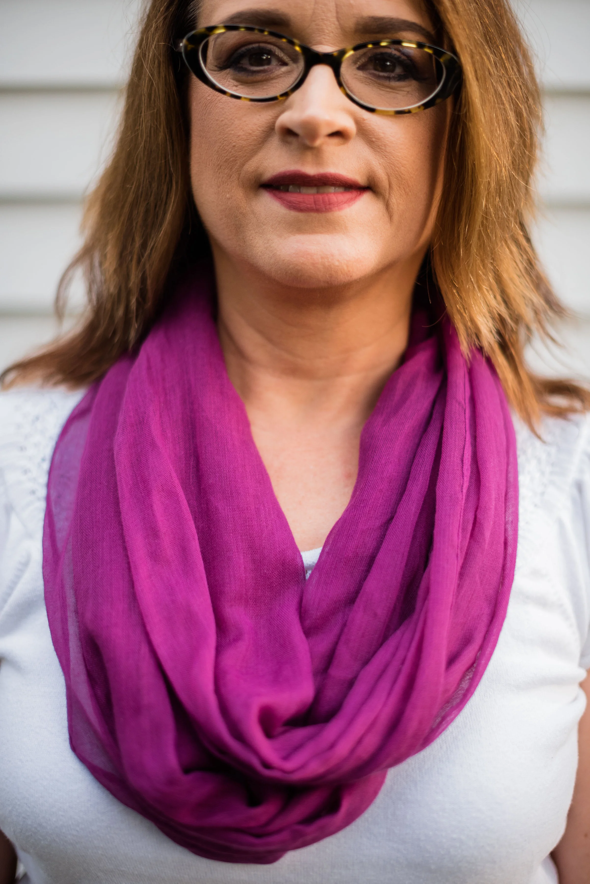
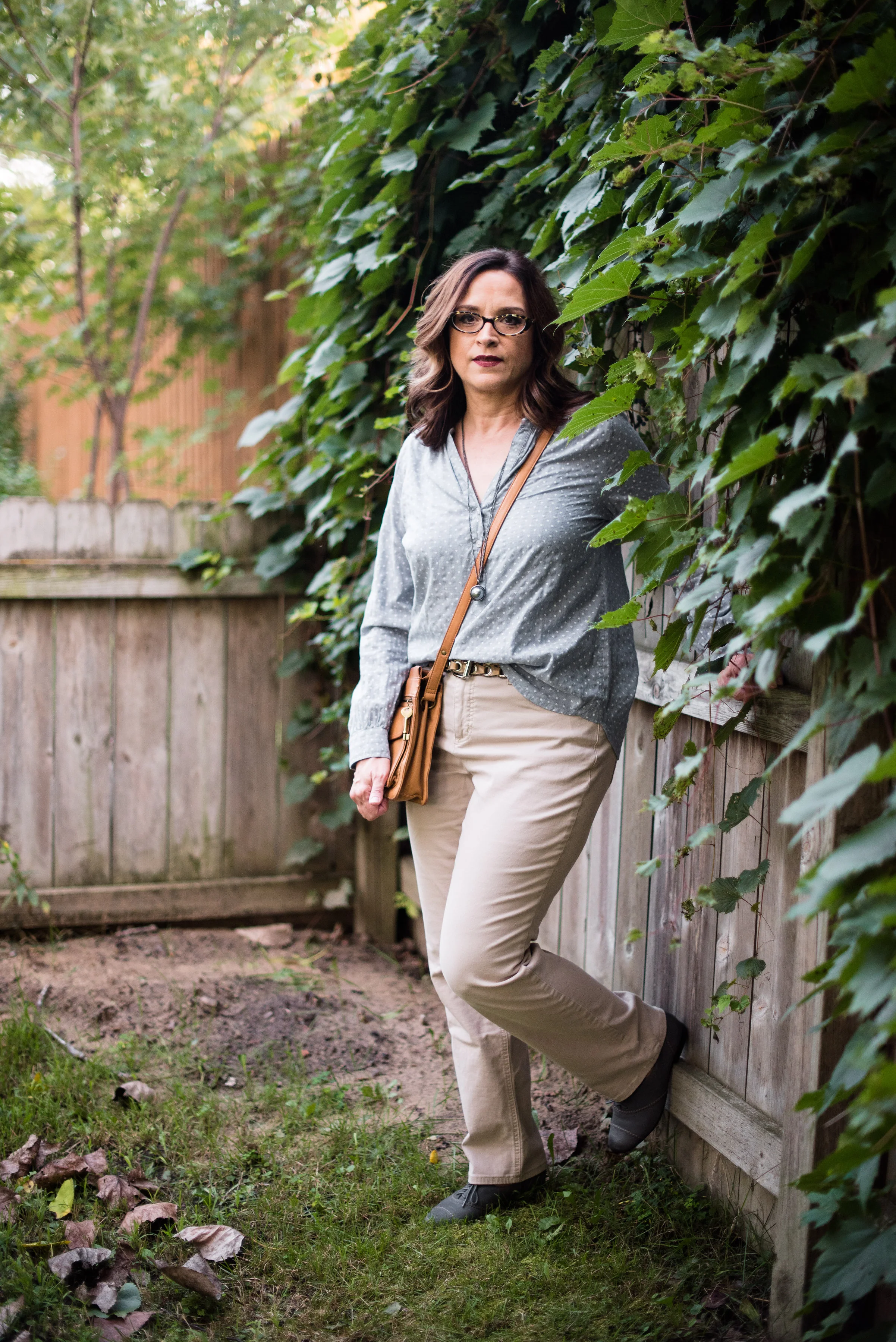
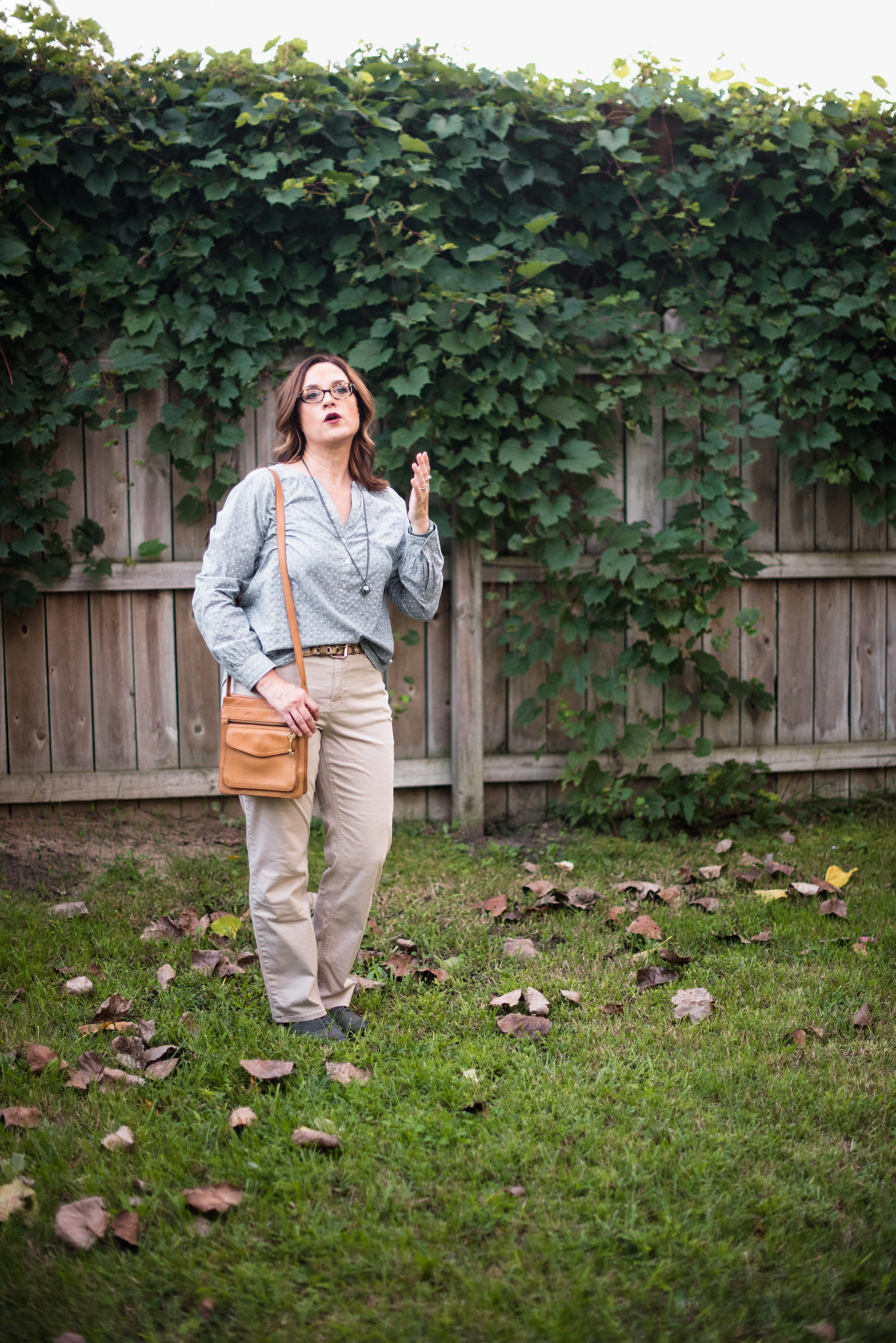
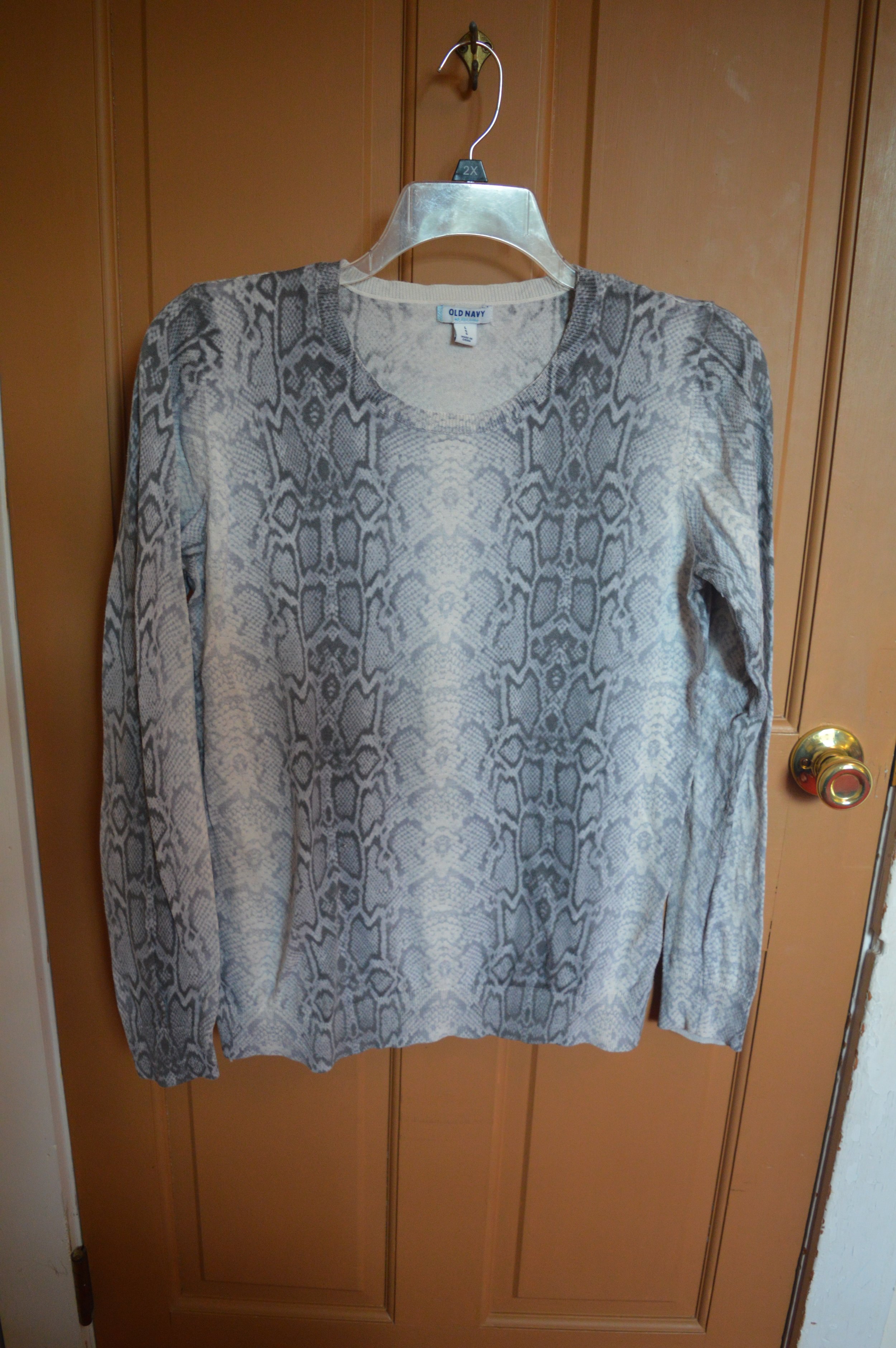
In her post Liz styles an outfit using the colors black and white. If you follow Liz you know this is not her norm. She loves pastels and lace, colors and frills, but she wanted to challenge herself to step outside her norm. The challenge for me was to put an outfit together that had two basic colors, a print and some texture. This is what I came up with.

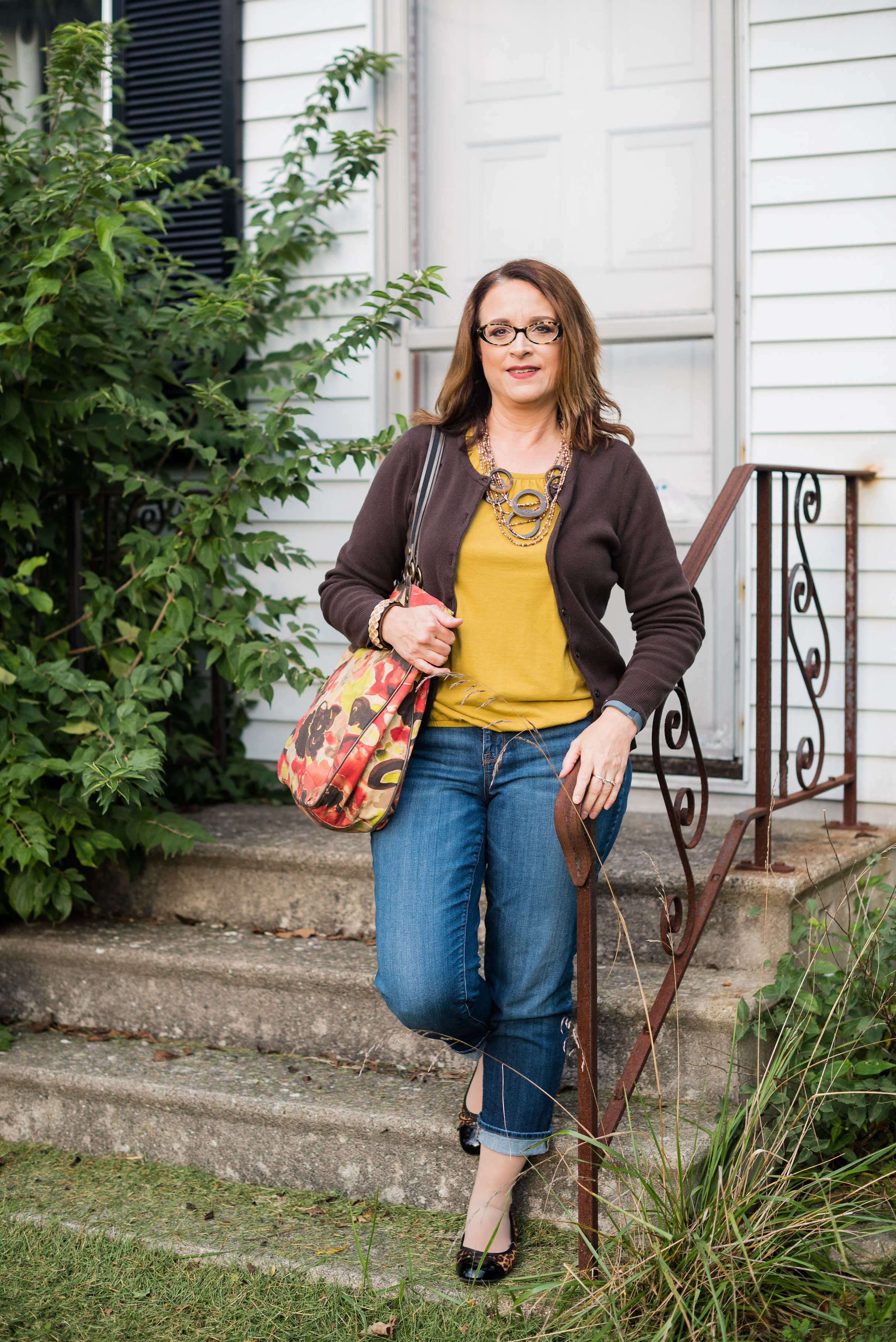
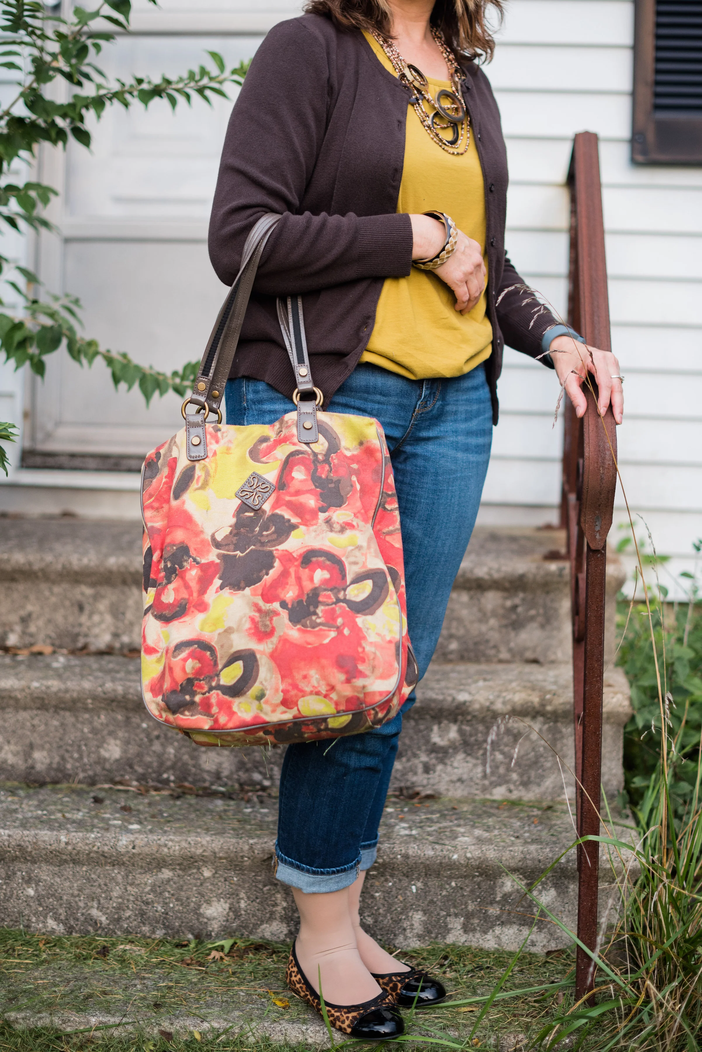
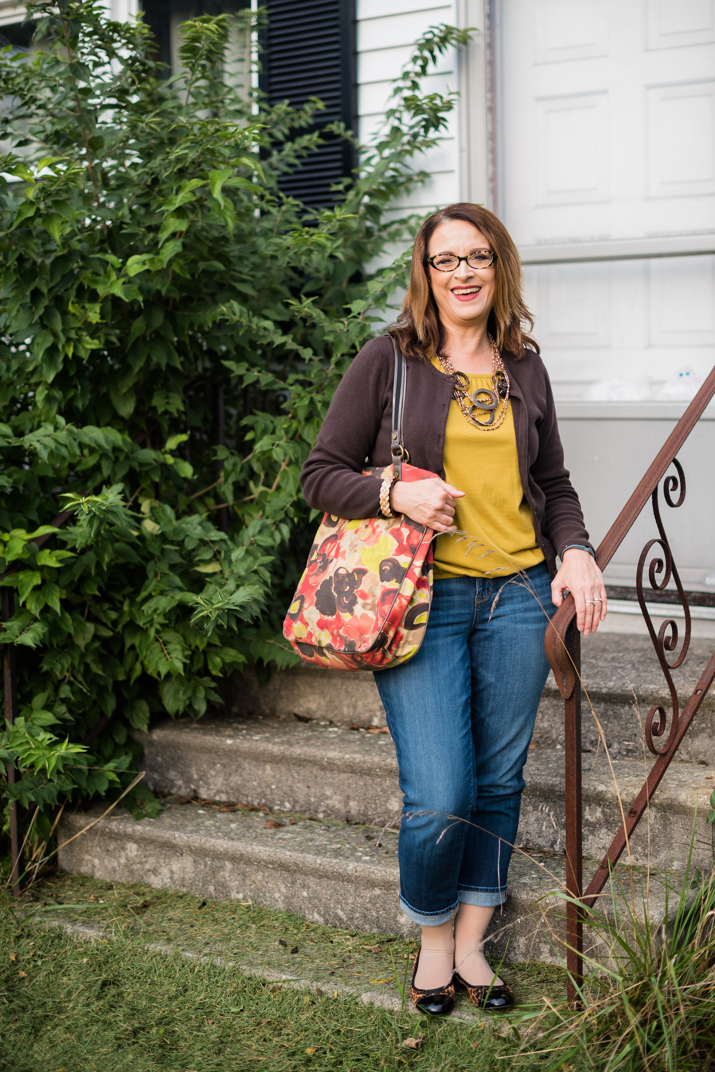
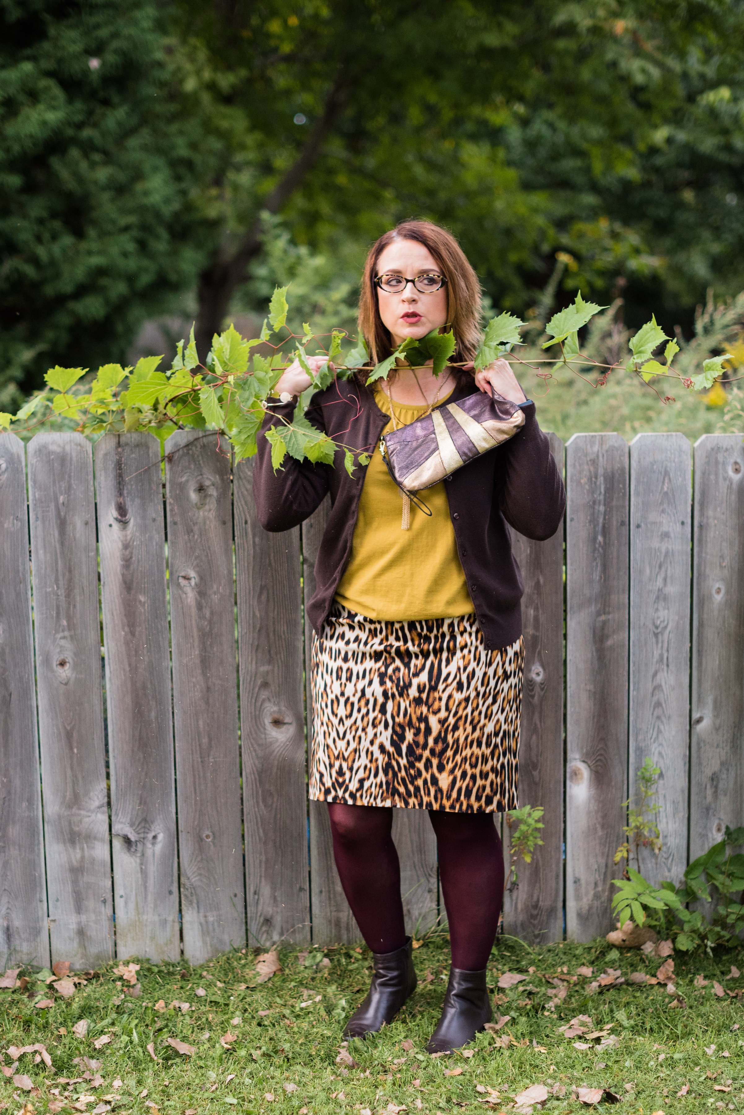
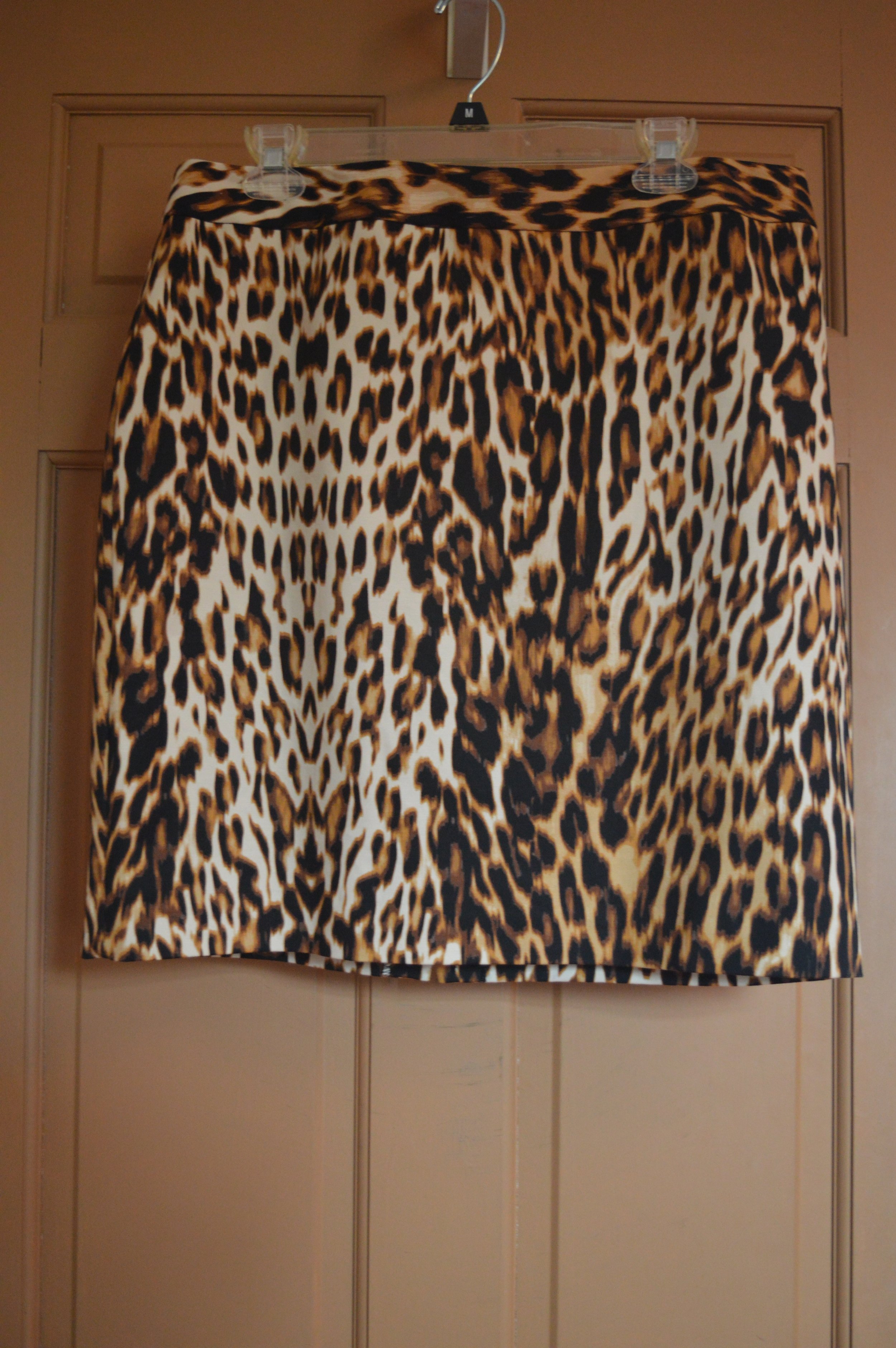
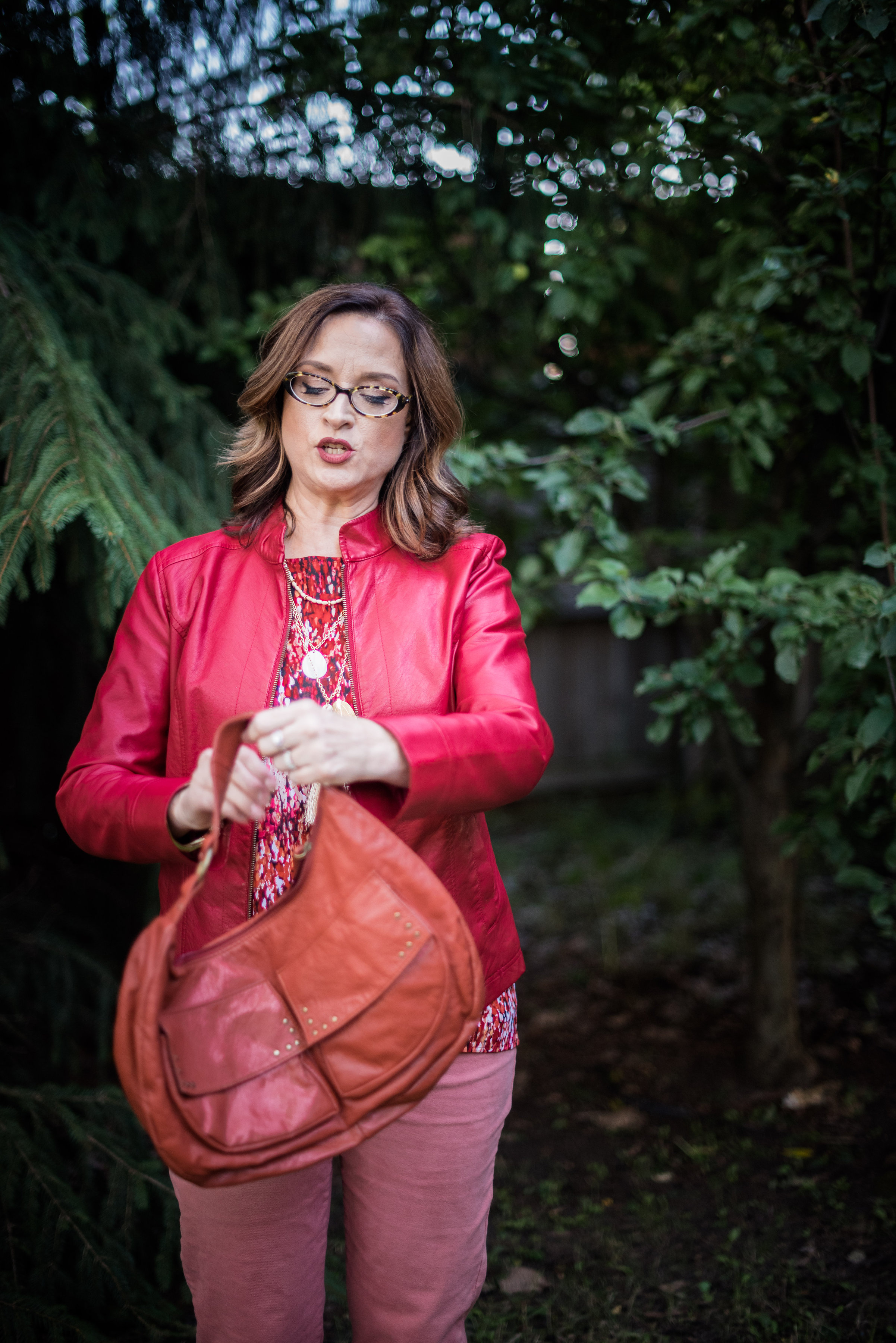
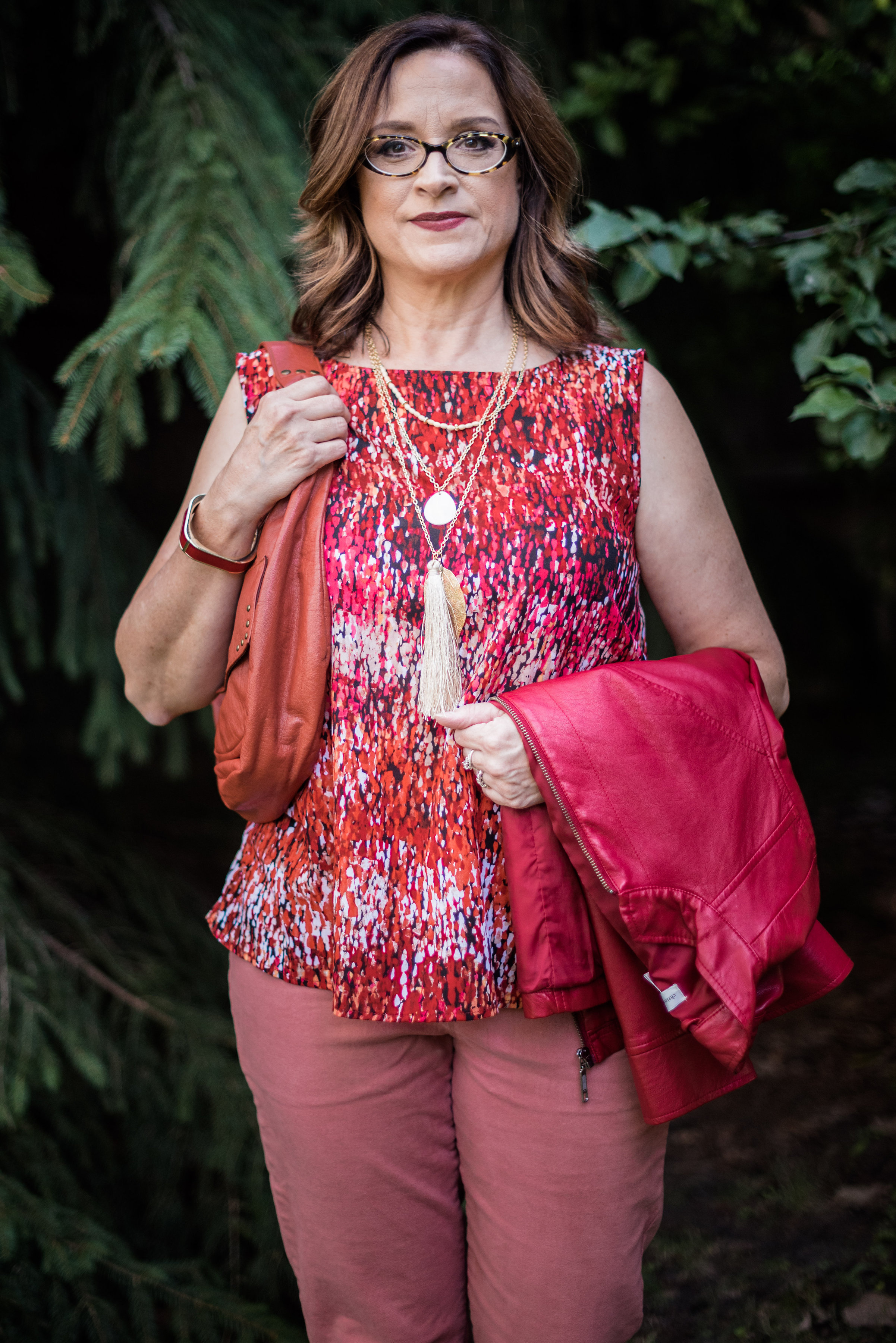
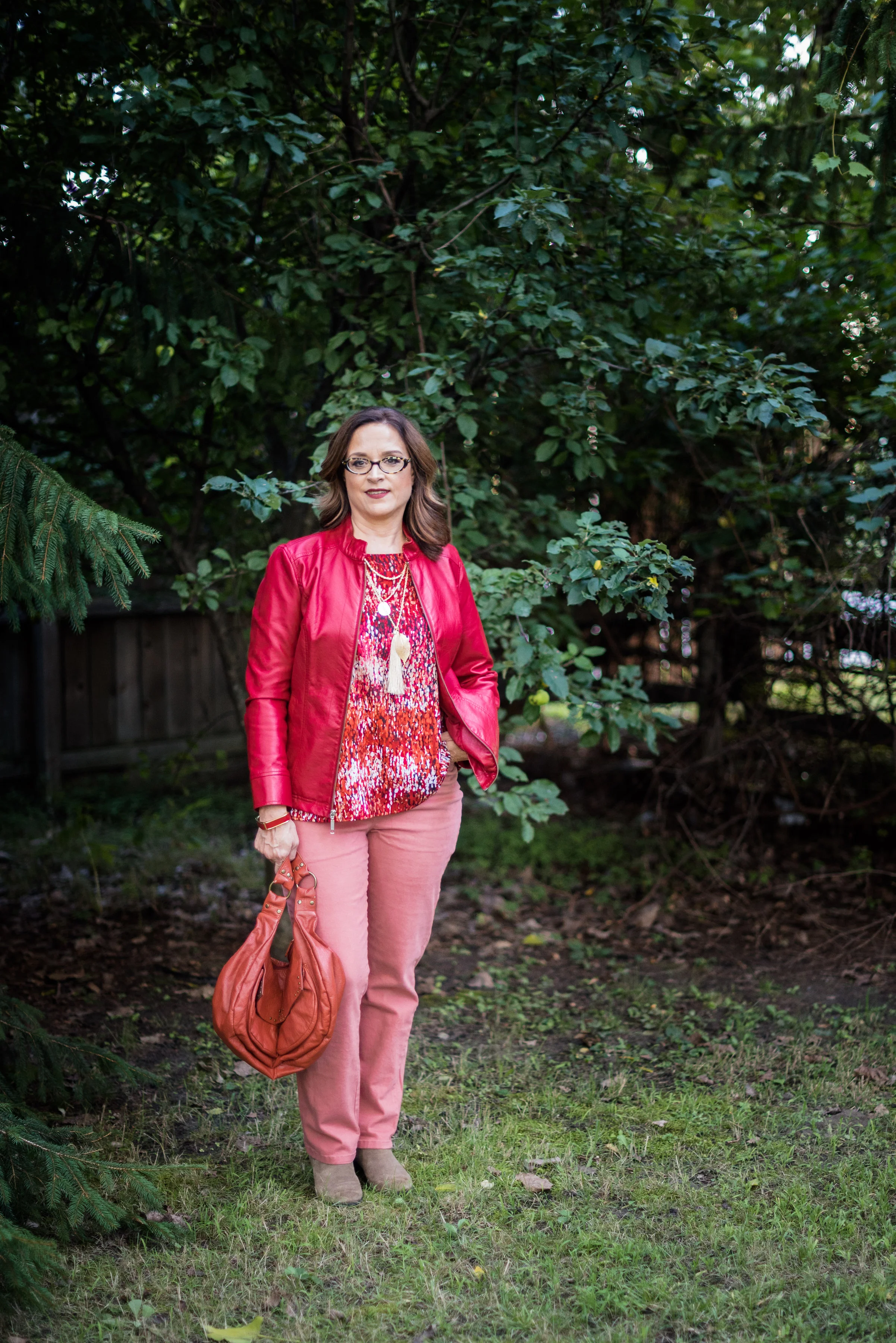
This photo was taken on one of the last really hot afternoons we had before it started to cool down and become more fall like. Thus, I look a tad wilty. The skirt is thrifted and the top is actually a tunic that I recently acquired from Charming Charlie's end of the season sale. I put the tunic on and then layered the skirt over top.

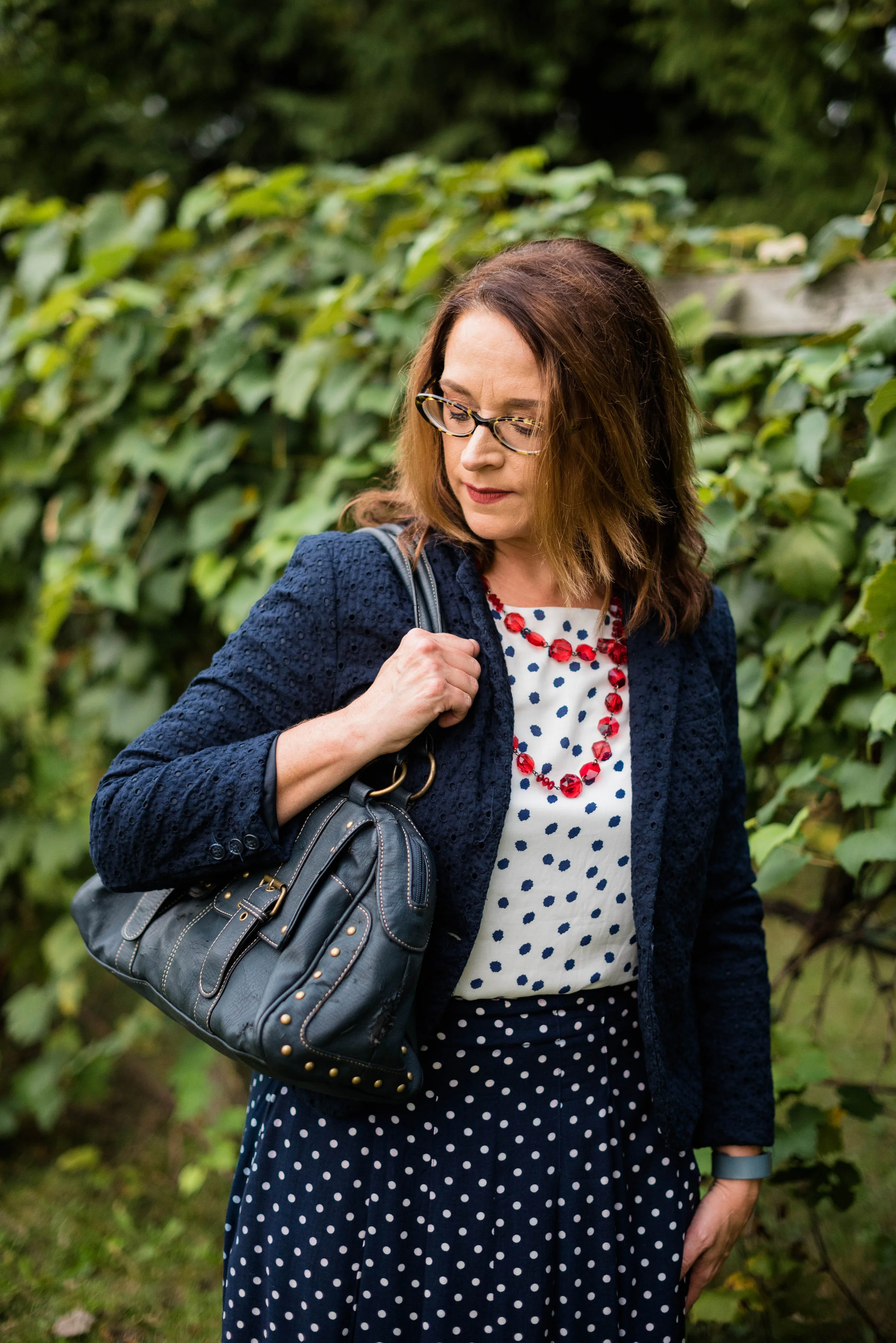
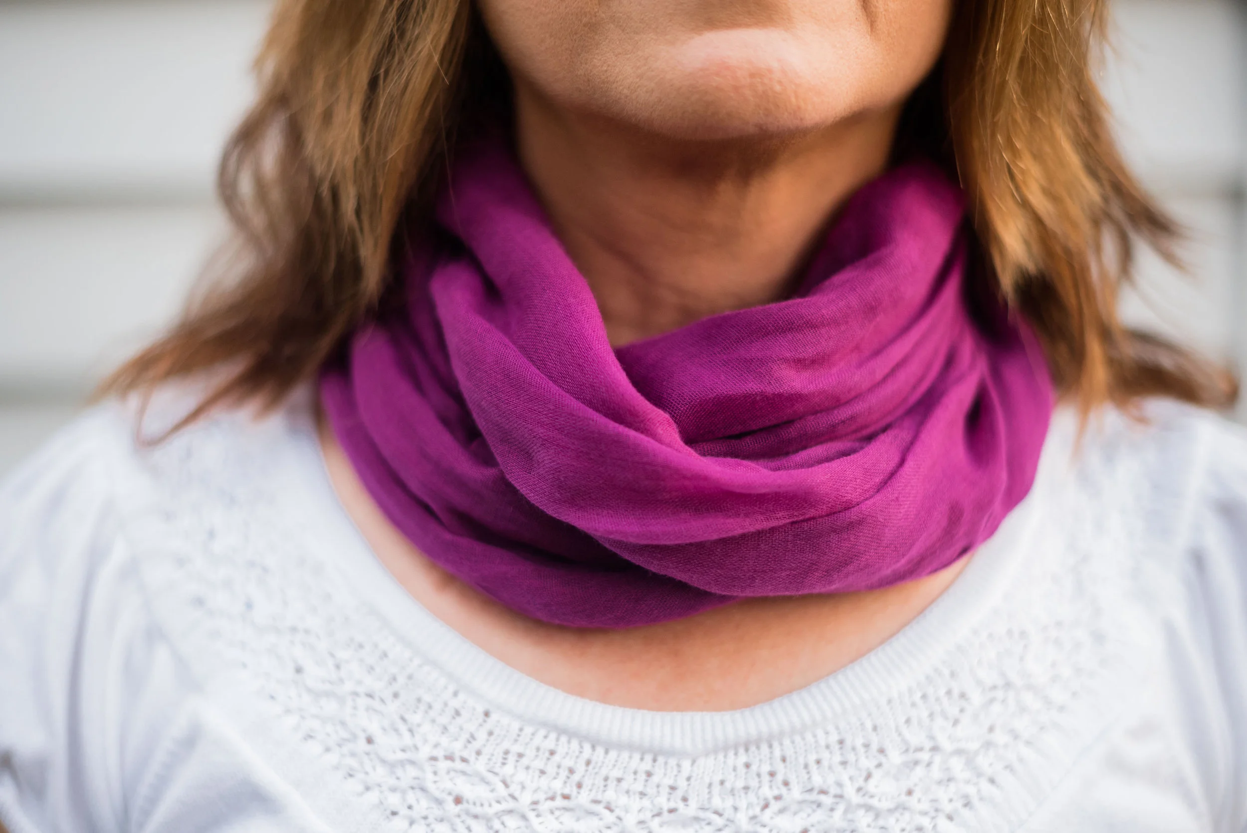
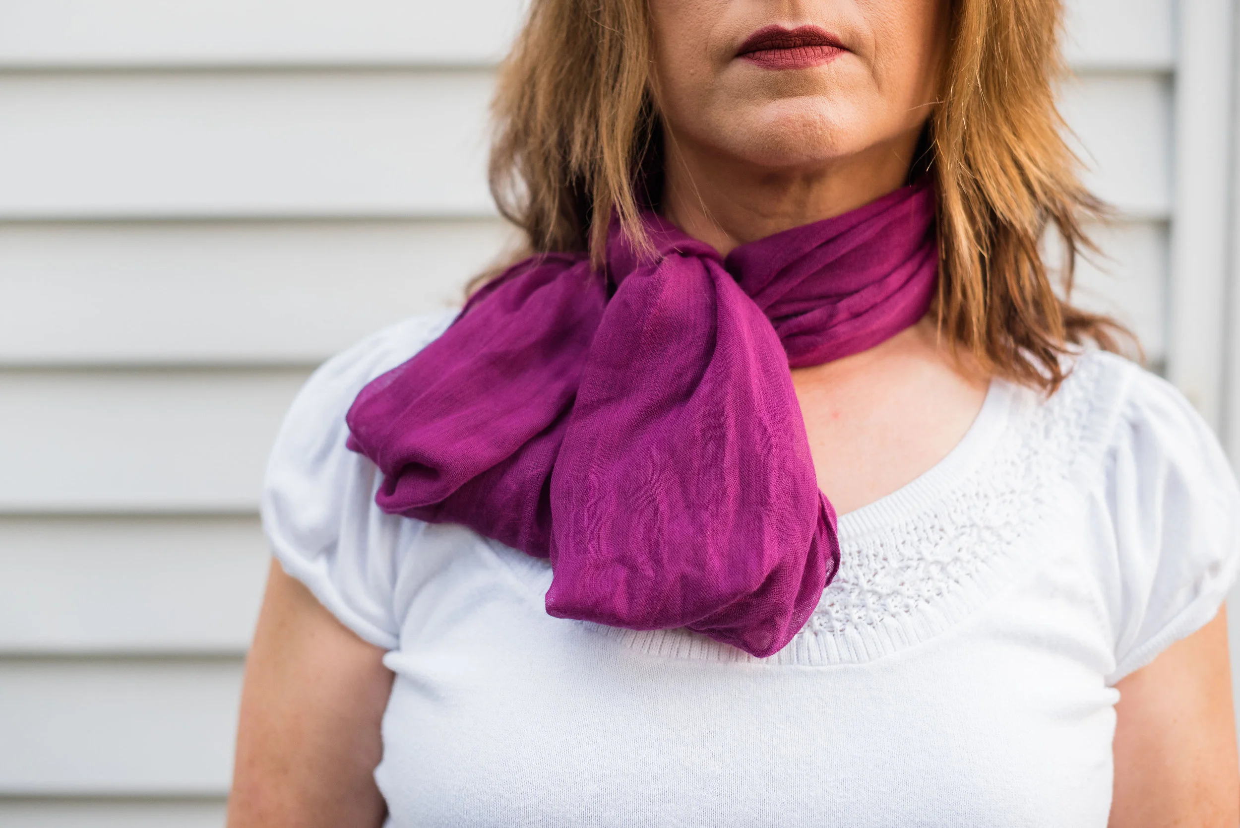
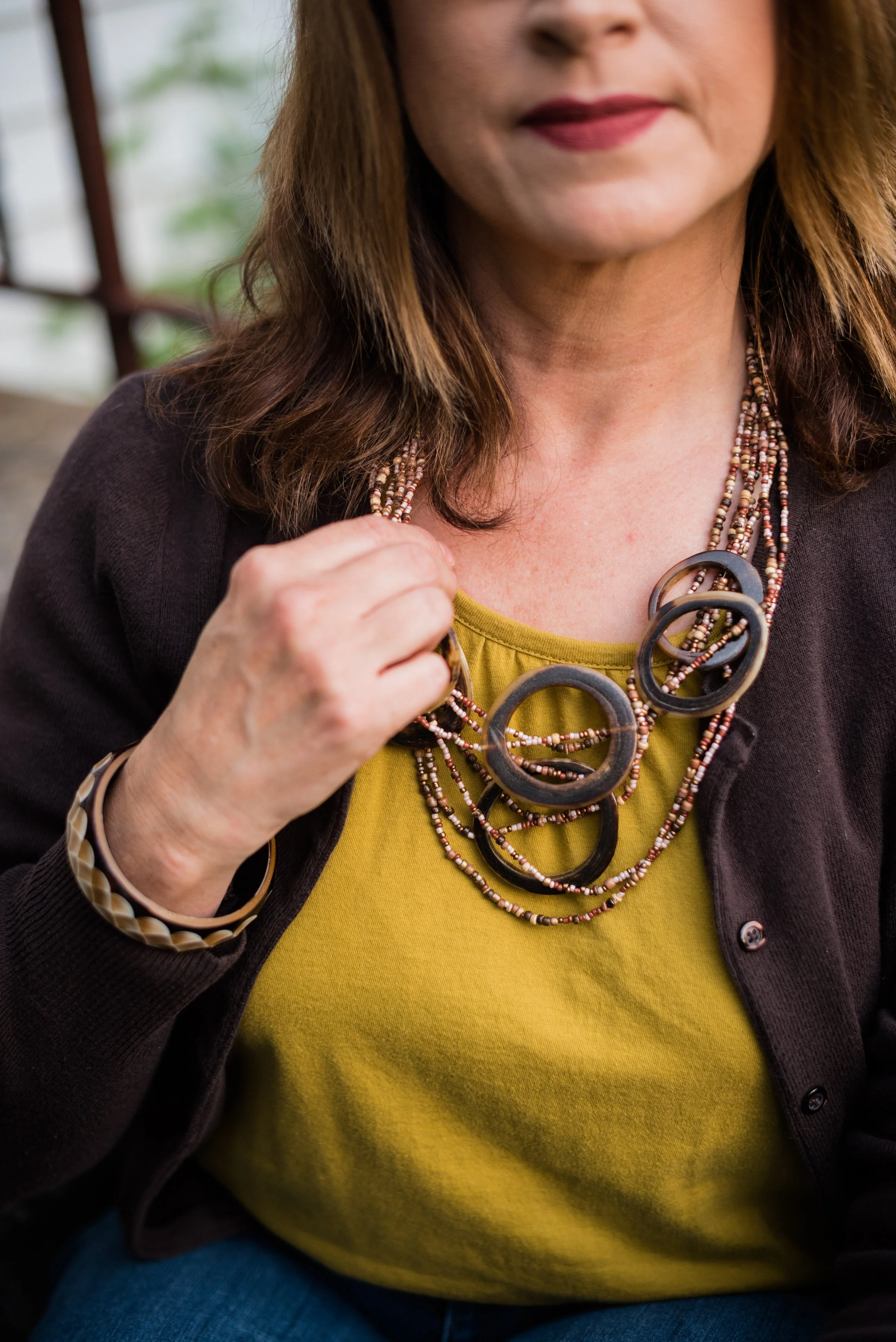
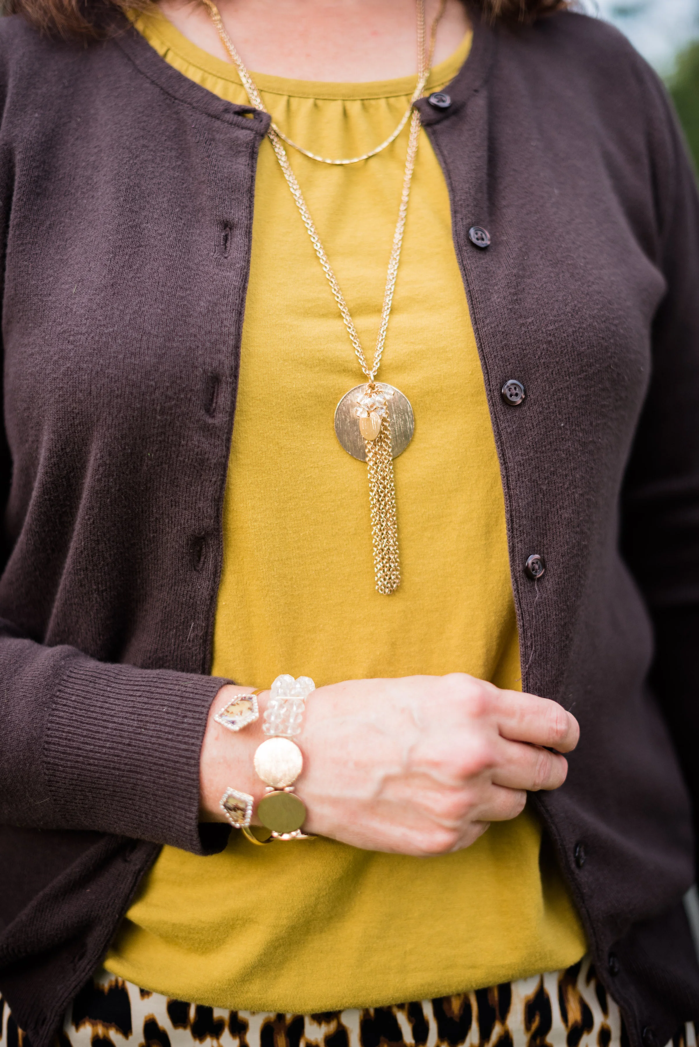
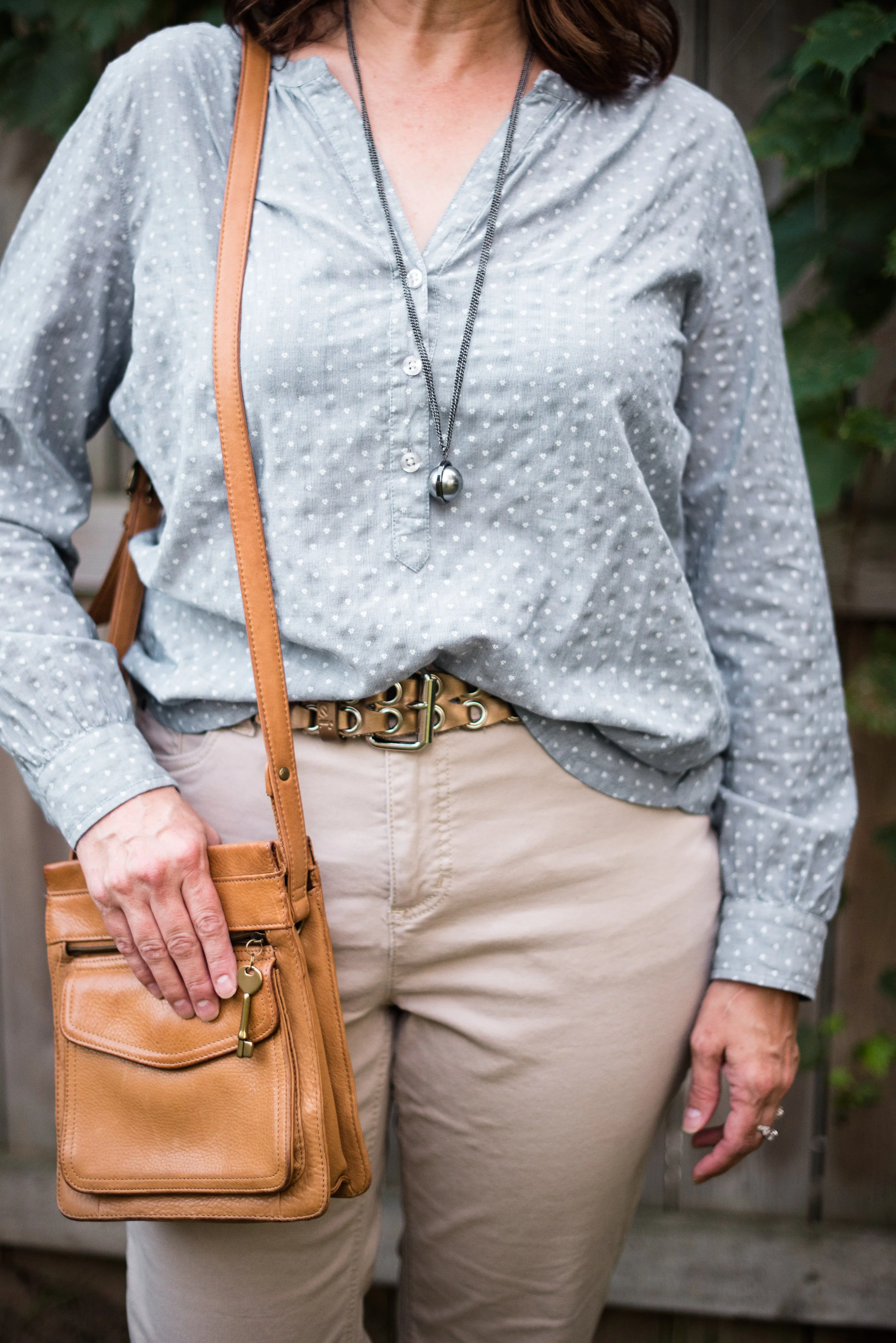
The eyelet jacket and the bag with it's gold rivets and extra buckles add great elements of texture to this otherwise monochrome outfit. I did cheat by adding the red beads, but I love the contrast of the red against the white and blue. The large beads also add additional texture to the look.

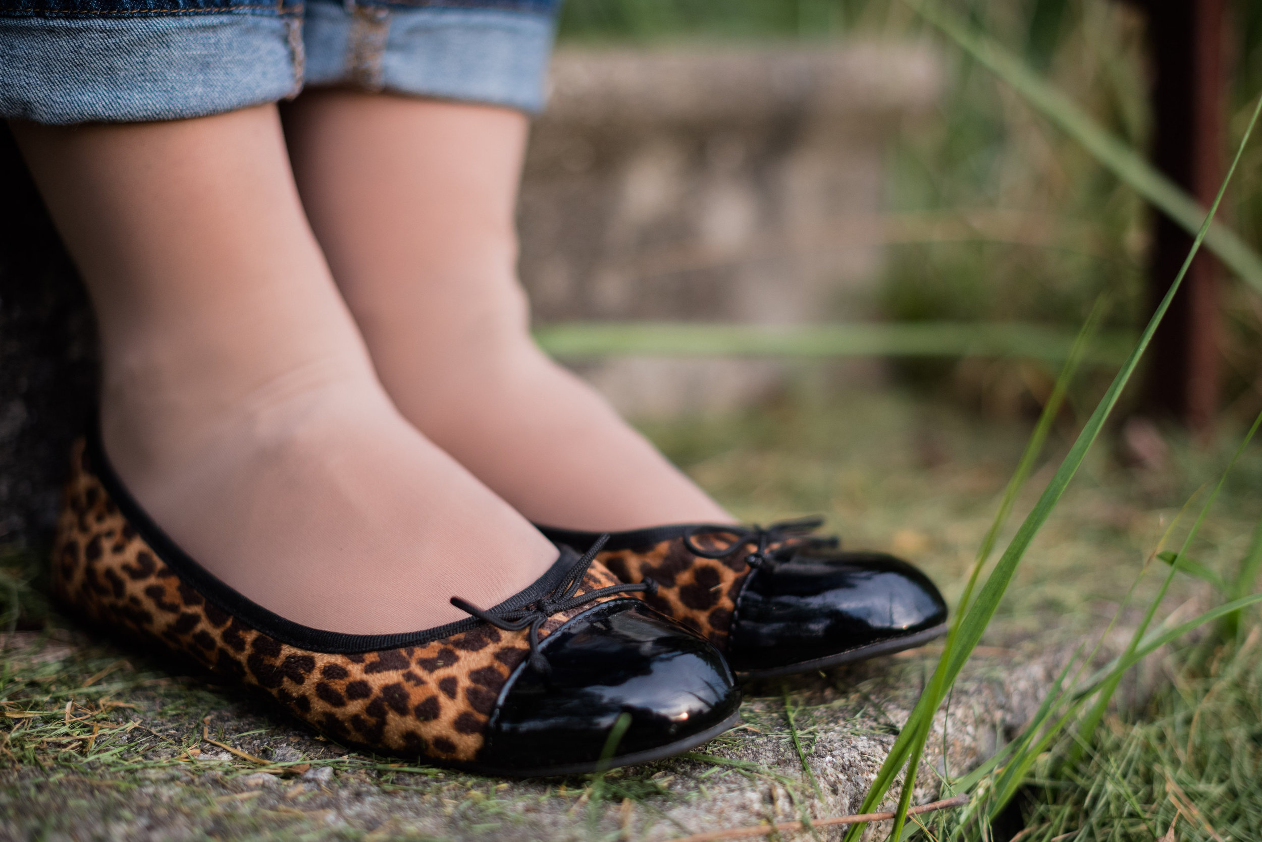
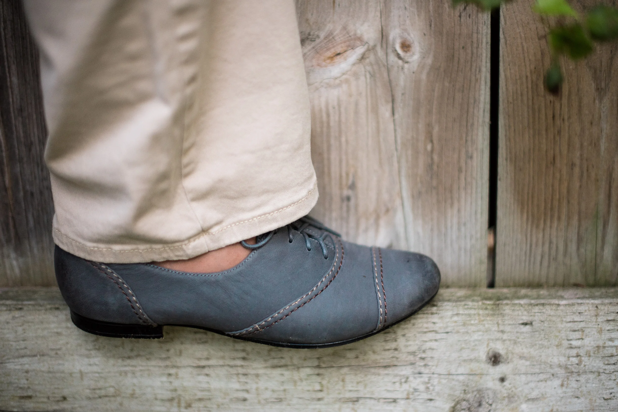
These are my navy loafer heels. Funny thing, I really didn't know what this type of shoe was called. That just shows I am still a newbie to the fashion world, so I thought, "Well they look a bit like a loafer, but with a heel." I typed in loafer heels and up they popped. Isn't the internet amazing? Ha, ha. This is a great shoe to wear with a skirt for a more casual look or with pants for a more dressed up look. Funny how that works!

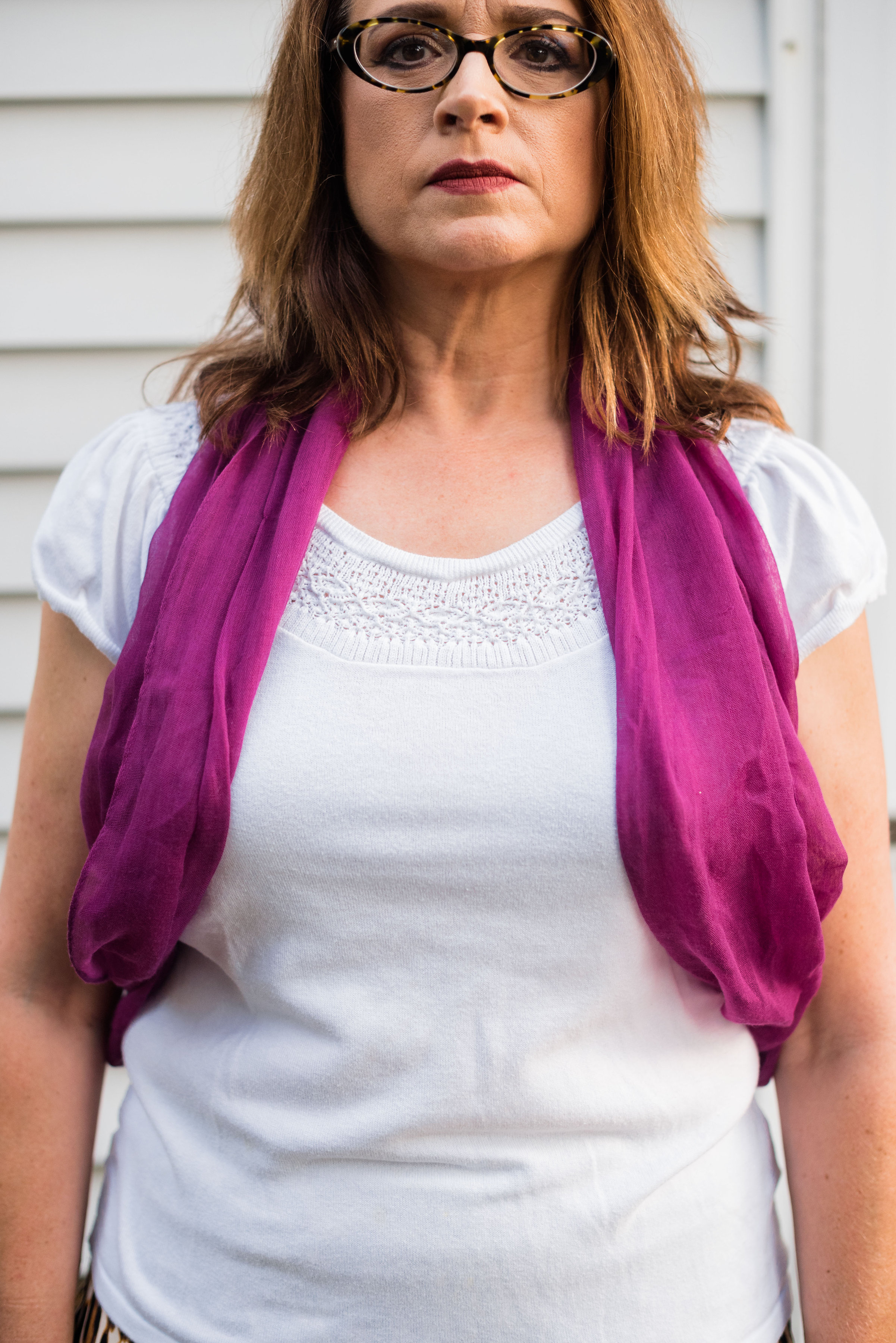
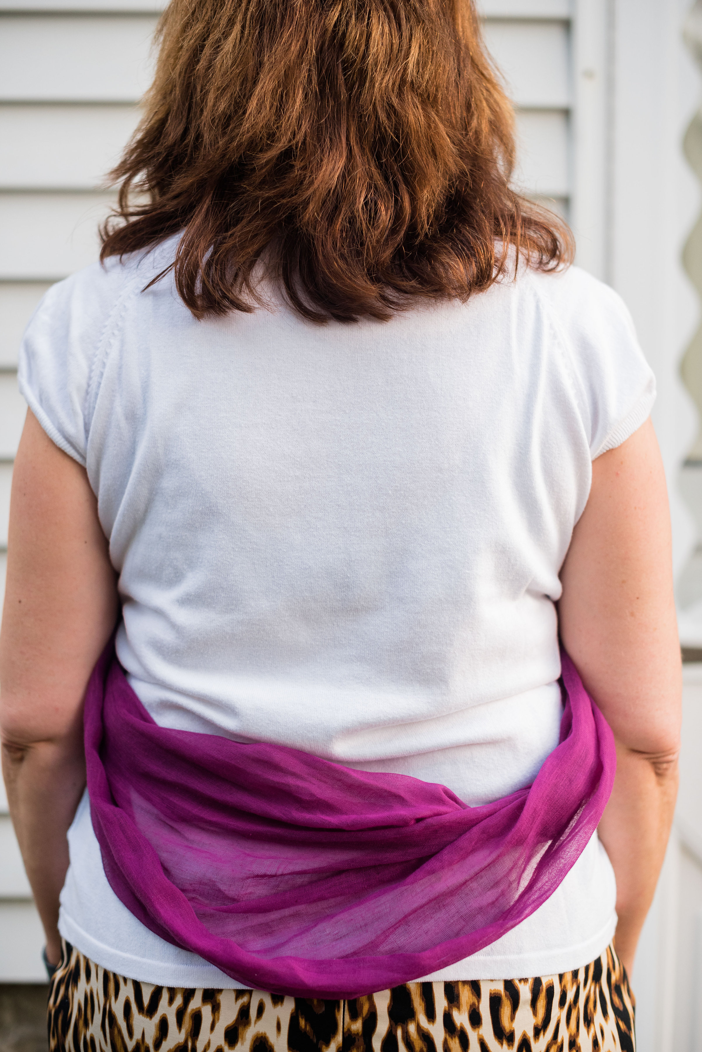
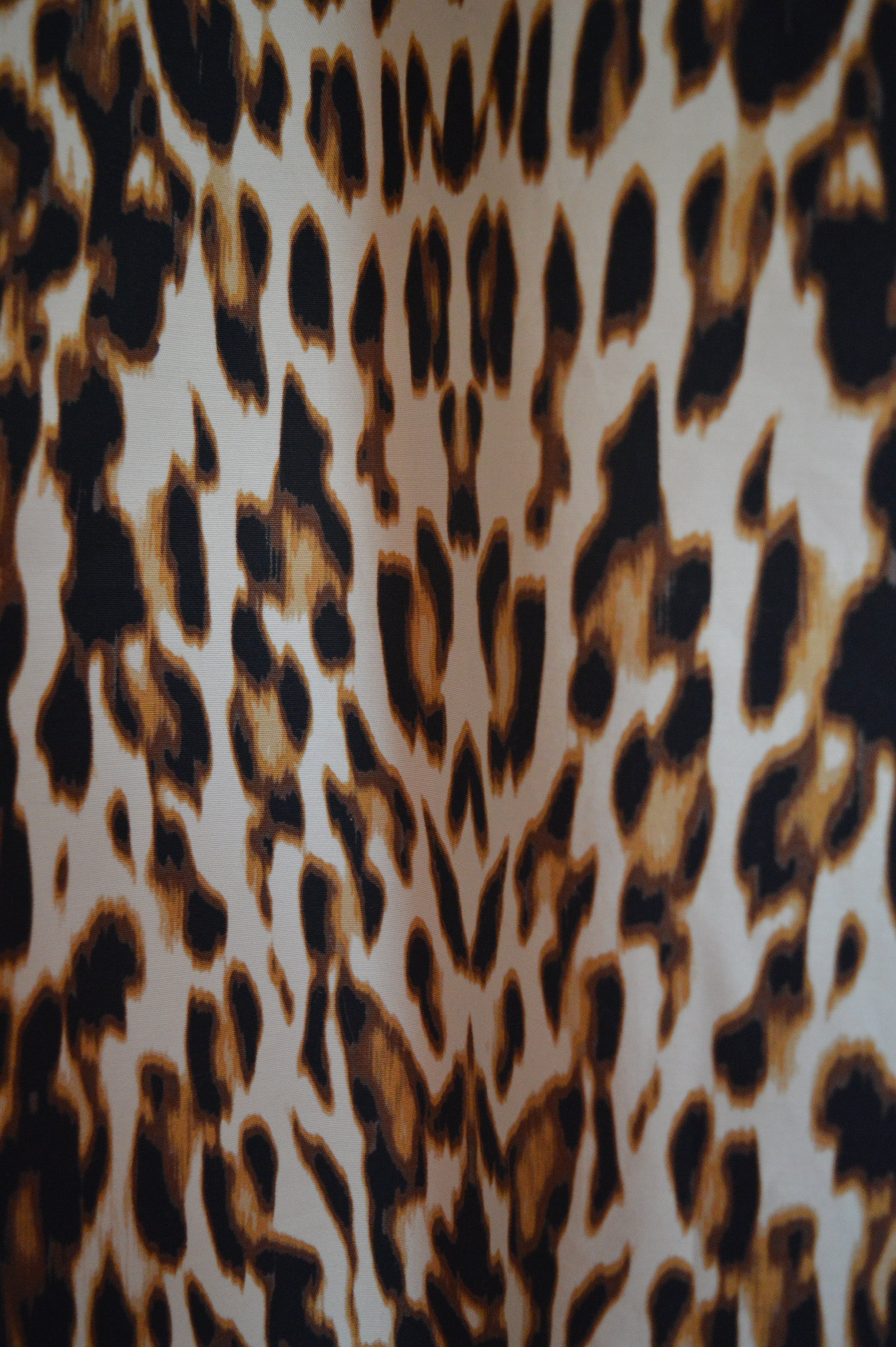
Are you seeing spots? I'm thinking this would have looked better with a belt of some sort. What do you think?

So there you have it. I am so thankful to all the beautiful bloggers that I follow. Liz has been a great inspiration to me, not only with her knowledge of fashion, but with her kind and attentive comments on my fashion posts. Be sure to click on her link and give her some love. 

Check back next week for more fashion fun! Have a great weekend!

Photo credit Rebecca Trumbull. Make up Rachel Christensen.

Shopping Options (I chose black for the color):

Polka Dot Dress - Kohl's - $69.99

Black Eyelet Jacket - Jacket Society - $155.00

or

Bomber Eyelet Jacket - Macy's - $55.99

Black Loafer Heels - Belk - $89.00

Black Tote - JC Penney - $85.00


Awesome Accessories - The Infinity Scarf

Whenever I see the word, infinity, all I can hear in my head is Buzz Lightyear saying, "To infinity and beyond!" The word infinity as defined by Webster means to have no limits or end. So how exactly Buzz could go to infinity and beyond is quite beyond me! Ha, ha. I may not understand the physics behind infinity, but I am here today to tell you how to wear an infinity scarf.

Basically an infinity scarf has no end. It is a loop. The following are pictures, albeit goofy ones, of me showing the different ways you can wear this type of scarf. I wore a white top and chose a bright colored scarf so you could get a better idea of what each style looks like. I do want to preface this by saying, I did this outside, on an 80 plus degree evening, without a mirror to look at what I was doing. Ha, ha. As I said, my daughter and I both agreed, next time we will figure out a different way to do this type of thing.

1. The first and probably most common is the simply double loop:

2. Next is the triple loop:

3. Here is the end through the loop. This is accomplished by putting the whole scarf behind your neck, then bringing both ends forward. Now take the one "end" and put it through the "loop" of the other end. Pull it so it is as snug as you want it to be. If you wanted it a little looser you could use a pretty pin or brooch to hold it in place.

4. This one is done by simply tying the scarf rather than looping it.

5. Next is the vest. This one didn't turn out in the picture as I had practiced it in front of a mirror, but you get the idea. It is a simple way to add a pop of color or pattern to an outfit. I'm showing you the front and the back. Sorry for my mug shot!

6. Finally I did a shawl type look, by taking the whole scarf open, putting it over my head, so my shoulders are inside the loop, then gathering the front excess and making a simple knot.

I hope you enjoyed this post on how to wear an infinity scarf. For a whole different take on scarves and other ways to wear them check out Janeane at Designing From My Closet. In Three Unconventional Ways to Style a Large Scarf she shows three great ways for taking those big scarves and adding them to more than just your neck. In an earlier post she shows how to wear a variety of scarves. Check out How to Wear a Scarf

What about you? Do you like to wear scarves. I have three drawers full of scarves and I love to wear them. I am even excited about finding more different ways to add them to my waist, bag or wrists. I hope you found today's post helpful. Let me know what you think.

Have a great rest of the week.

Photo credit Rebecca Trumbull. Make up Rachel Christensen.

Pantone Fall 2016 - Warm Taupe

When I think of the color taupe I think of it more as a paint color, not necessarily a color I would wear. However, over the years I have realized that taupe is another one of those colors that can be paired with many other colors. For this post, I decided to keep the look clean and classic, by pairing Pantone's Fall 2016 color Warm Taupe with black.

Here I am checking out what is left in our little grape arbor. Unfortunately, this year, we hardly ate any of the grapes. The squirrels were much quicker at harvesting them, than we were.

To keep my look classic, as I said, I paired my shimmery taupe top with my patterned black ankle pants. I kept the bag similar to the top and the shoes black to go with the pants. However, I could see this outfit taken up a notch with the pop of a red sweater or a teal colored bag or pair of shoes. The warm taupe would easily harmonize with many bright colors.

These two pictures show you more detail. The top is basically a tee shirt, having the tee material in the back and the shimmery material in the front. The other picture shows you the detail of the lace pattern on the black crop pants and the added dimension on the multicolored taupe bag.

The only other colors I added to the outfit was in a single strand of fall colored beads and the blush color of the bracelets. Here you can better see the sparkly detail on the top.

What do you think of my take on Warm Taupe? Is this a color you have in your closet? If not, would you wear it? I'd love to have your input.

Help me out. If you follow me, but haven't subscribed to my blog, do so today. If you are a subscriber leave me a comment either in the comments section below or on Facebook. You can also like and follow me on Instagram. I'm also starting to used Pinterest too. Any of my pics can be pinned to your Pinterest boards by clicking on the little red P button in the top left corner of the picture. Thanks for taking the time to visit my blog and have a great day.

Photo credit Rebecca Trumbull. Make up Rachel Christensen.

Shopping Options:

Taupe top - Chico's - $79.98, Chico's - $34.99

Black patterned crop pants - Nordstrom Rack - $42.97

Taupe bag - Target - $34.99

Black block heels - Macy's - $80.00

Fall beads - Chico's - $45.00

Monday linking up with Catherine of Not Dressed As Lamb. Tuesday linking up with Jess of Elegantly Dressed and Stylish. Wednesday linking up with Tania of 50 is Not Old and Allison of Sydney Fashion Hunter. Thursday linking up with Nicole of High Latitude Style. Friday linking up with Nancy of Nancy's Fashion Style , Jennie of A Pocketful of Polka Dots and JoLynne Shane on the Fashion Friday Link Up

Piece Perfect - Basic Cardigan

I'm pretty sure most of us have, what I would term, a basic cardigan. What makes it a cardigan is that it serves the function of a sweater and usually has long sleeves, along with a button up or zip up front. In today's fashion world, cardigans are anything but basic. There are sleeveless, short sleeve, 3/4 sleeve and long sleeved versions. There are buttons, snaps, toggles and zippers. There are also versions that have no closures, such as tie front and fly away. They vary in length from short to long and anything in between. However, I think a wardrobe is incomplete without the basic cardi.

Today I am styling a brown cardigan two ways. I will not admit to the number of basic cardis that I have, just as I will not admit to the actual number of sweaters that are residing on various shelves throughout my home. Just don't ask my hubby. Ha, ha. For me, brown is a fairly basic fall color, so that is what I chose for my outfits.

1. A Casual Look -

For this basic look I styled the brown cardi over a Spicy Mustard tee. You'll see this top again in the Pantone Fall 2016 color line up when I feature it in a few weeks. I added my comfy boyfriend jeans. 

My accessories included a large multi colored tote which pulls together the browns and the yellows. I also wore a bead and antler necklace that I found on clearance at Cabela's. In keeping with the natural theme I added a simple wood bracelet. To finish off the look I wore my leopard print flats.

2. A Dressed Up Look - 

For this look I kept the same Spicy Mustard tee and basic brown cardigan. Instead of boyfriend jeans I wore eggplant colored hose and a leopard print skirt

In choosing my accessories I went for the purple, gold and brown. My jewelry was mainly gold with a few clear beads. My ankle boots were brown and the small clutch pulled in the purple of my hose. 

Here's the two looks side by side.

Yes, the vine is trying to eat me! 

So there you have it, my take on styling a basic cardigan. I think a cardi is a great piece to invest in, whether you have a couple or one in many different colors. They are versatile and an easy addition to any outfit casual or dressy. 

I hope you enjoyed this piece perfect edition. Let me know what color cardi's you have in your closet. I love to have your feedback. Have a great weekend.

Photo credit Rebecca Trumbull. Make up Rachel Christensen.

Shopping for Cardigans:

JCrew Factory - $32.50

Target - $15.99

Christopher and Banks - $24.00

H&M - $14.99

Saturday linking up with Catherine of Not Dressed As Lamb in the Saturday Share Link Up.

Pantone Fall 2016 - Sharkskin

When I think of sharkskin, I think of every range of gray imaginable from light to dark and everything in between. After all they don't call the ominous star of Jaws, the Great Gray, or the Great Blue. The shark that starts eating people near Amityville, NY is called a Great White. However, the color Sharkskin on Pantone's Fall 2016 color palette could be classified as the gray we often think of when we think of sharks. The range of shades within this color varies, just like the large fish that swim the ocean waters, from light gray to dark gray. 

When I first started searching my closet for a piece that would represent this color, I wasn't able to find just exactly what I was looking for. Every time I would compare a sweater or top to the shade found in Pantone's site, it just didn't match. There is a clarity to Sharkskin that speaks to clear fall days and bright new fallen snow. So what follows is my take, one that I am not completely satisfied with, but then that is all part of the learning process.

This popover top is from Loft, though I found it at a thrift store. The light gray background falls in the lighter shade of Sharkskin and is then pocked with white spots. I paired the light gray with a light pair of khakis.

Here's a close up of the top. I did a front tuck to give a bit of shape to the outfit. The pendant necklace is a simple ball which also mimics a darker shade of Sharkskin. I added a gold belt with silver rivets and buckle. For a bag I chose my cognac cross body. For shoes I went with my Sharkskin gray oxfords.

And, just so you don't think I forgot, here is my silly picture. I look like I am practicing for the opera. Ha, ha.

For another great post on Sharkskin check out Liz at With Wonder and Whimsy. She does a beautiful job styling this new neutral.

I hope you enjoyed this post on Sharkskin. Is this a color you would wear? How would you style this color? I'd love to hear your comments. Thanks for hanging out here on the blog. Be sure to check back on Thursday for a look at my Piece Perfect column where I'll be styling a simple cardigan.

Photo credit Rebecca Trumbull. Make up Rachel Christensen.

Shopping Options:

Popover top - JC Penney - $19.99

Khakis - Old Navy - $20.00

Cognac Cross Body Bag - Target - $27.99

Oxford Shoes - Macy's - $49.00

Ball pendant - Target - $15.99

Monday linking up with Catherine of Not Dressed As Lamb. Tuesday linking up with Jess of Elegantly Dressed and Stylish and Tania of 50 is Not Old in the Ageless Style Link Up. Wednesday linking up Allison of Fash Packing by Sydney Fashion Hunter. Thursday linking up with Nicole of High Latitude Style. Friday linking up with JoLynne Shane in the Fashion Friday Link Up , Nancy of Nancy's Fashion Style and Jennie of A Pocketful of Polka Dots

The Season of Fall

Today's post centers on the season of Fall. Autumn officially started a week ago to the day on the calendar and the weather has changed to reflect the beginning of this glorious season. My husband and I spent this past Saturday raking the leaves that had already fallen and enjoying a fire in our fire pit in the evening, while sipping on mugs of tea. It was cool enough that I threw on a hoodie. 

As the temperatures begins to fall our thoughts turn to changes in our wardrobes. As you can see from my Tuesday posts, the Pantone Fall color report included rich reddish brown and jewel tone green, as well as yellow and red reminiscent of the leaves that we will be raking out of our yards. But the colors are not the only thing that changes with the seasons. Our choice of clothing pieces change as well.

In the past we have usually put our whites and pastels away and opted for darker colors. Now anything goes. I have seen a number of articles and bloggers feature ways to wear white well into the season. Deborah of Fabulous After 40 shares three distinct outfits for wearing white into the fall in her article Can You Wear White After Labor Day?  JoLynn Shane, one of the many wonderful bloggers I follow, shared her take on wearing white jeans in the fall. Her White Jeans Outfit for Fall post is worth reading. You'll see me styling a pair of white jeans in an upcoming post in a few weeks. 

Since we are going to keep our whites out, we might as well rethink those pastels. Here is a good article from the site Bustle called 7 Ways to Wear Pastels in the Fall written by Emily McClure. While this article is from a year ago, her tips are just as applicable today. The one statement that really stands out to me is:

When it comes to styling pastels, it’s all about adding in different textures. Personally, I love pairing pastel pieces with suede or leather in the fall, as it’s such a lovely juxtaposition of sweet and edgy staples. However, if you’re into bold prints and colors you may want to add bits of pastels as well. Bold cranberry pieces mix great with mint and cool blues. Basically, pastels are for everyone, all the time.
— Emily McClure

I love that she talks about adding textures. That is something I am just learning how to do. I also like that she says, "...pastels are for everyone, all the time." Now, does every pastel look good on every complexion or skin tone, maybe not, but you can find the pastels that work for you, or as she says, mix textures. Choose a light pink top under a edgy wine colored moto jacket and maybe throw on a scarf that complements your skin tone. 

Liz of With Wonder and Whimsy, another beautiful blogger I follow, does a perfect job of pairing pastels with fall pieces in this post titled, Color Palettes featuring Pantone's Sharkskin GrayYou can see how she combines light blue and light pink with the darker, edgier Pantone Sharkskin Gray.

In addition to colors, we also think about patterns and how they change in the fall as well. This year in the stores and on the runways we are seeing animal prints like leopard, snakeskin, zebra stripes and tiger stripes. Leopard seems to be the rage right now. Here area a few of my own photos of pieces in my wardrobe.

As you can see in the above pics, I have a few things that have the snakeskin pattern. It is a fun pattern and can go with many different colors, depending on if you want to dress it up or dress it down. 

And just like on the fashion runways and in the stores, leopard print has turned up a few places in my closet. In addition to this fun skirt, I have a button up short sleeve blouse and a pair of flats which turn up occasionally in a blog post. 

Besides the animal prints I have mentioned, florals are also trending, but whereas in the summer the florals were light and backed by whites and pastels, the fall florals are darker shades backed by navy, wine and black. Check out Gemma's take on florals on her blog post The Cherry Blossom Midi Dress. This is the perfect floral look for transitioning to fall. 

Besides colors and patterns the other thing that significantly changes as we move into fall are the textures. Summer fabrics are usually light weight, breathable and moveable. The whole point is to keep you cool. As our weather changes, especially in the northern part of the country, our fabrics become heavier, bulkier and warmer. As women we still appreciate breathability and movement in our clothes, especially if you are menopausal, but we like textures that are soft to the touch and make us feel cozy. Cozy, after all, drums up images of roaring fires, hot cocoa and good books. 

One of the trending textures for fall is velvet. This jacket (which will be featured in a future post) is not real velvet, but it is so soft. Real velvet can be somewhat stiff, so I like this "faux velvet" if you will. It is moveable and fairly light weight.

There are so many other things we can talk about as the season of fall takes center stage. Our shoes transition into boots; our light weight sweaters transition into light weight jackets which transition into trench coats and we pull out scarves to accessorize and add warmth to our necks. Our sweaters become longer and eventually heavier and we begin adding hose or tights to our once bare and sun tanned legs. As I write this, I feel a little sad, but also excited because as you know I am a woman of layers and as the cool weather closes in, I get to create new and interesting outfits full of layers of texture, color and depth. And that will be fun!

Pantone Fall 2016 - Riverside Blue

I have plenty of blue in my closet. Blue just seems to be one of those colors that appeals to me in so many shades and textures and styles. So when I saw that there were two blues in the Pantone Fall 2016 color line up, I was excited to search my closet and see what I could come up with. I showed you how I styled Airy Blue in this post here. Today's post features Riverside Blue.

This blue is a medium blue and I think would look good on everybody. Never say never to a color. So often it is more about how you put an outfit together than whether it is a good color for you. It is true that some colors can make a person look washed out or even peckish, but a color can still be worn on the body while adding a sweater or jacket or scarf closer to the face to brighten up your look.

I found this 3/4 length sleeve tee at a thrift shop and found that it matched the subtle blue lines in this pair of dress pants that I've had for some time, making this an easy outfit to throw on for work. What I especially liked on this top was the embellishment around the neckline.

Here you can see the detail. The lines are raised and the blue threads are interspersed with silver ones. Because of that, I decided to keep my jewelry simple and opted for a cute cross necklace.

I decided to add a little pop of extra color with this mustard and white tote bag. We often think of yellow as a summer color, but it is a fall color as well, think leaves and goldenrod and sun flowers. 

Here you get a better look at my shoes. I featured this pair of oxfords in my Great Transitional Shoe post which you can view here.

Do you like Riverside Blue or Airy Blue better? I think blue is a great color for everyone to wear and because there are so many shades everyone can find a blue that suits them. I hope you enjoyed this post. Let me know in the comments section below or leave me a comment on my Facebook page. 

You can also follow me on Instagram, though I am still working on doing more with that. I don't have a smart phone, so I have to take a pic and then send it to my daughter who posts it for me. I know, I am so living in a cave. Ha ha. At least I am a fashionable cave woman, don't ya think?

Check back on Thursday for a look at the changes our wardrobes make as we move into Fall. Until then have a great week. 

Photo credit Rebecca Trumbull. Make up Rachel Christensen.

Shopping Options:

Blue Top - JCrew - $29.99

Plaid Trousers - Lord and Taylor - $89.00

Tote Bag - Macy's - $46.20

Black Oxfords - DSW - $59.95

Monday linking up with Catherine of Not Dressed As Lamb. Tuesday linking up with Jess of Elegantly Dressed and Stylish. Wednesday linking up with Tania of 50 is Not Old. Thursday linking up with Nicole of High Latitude Style. Friday linking up with Nancy of Nancy's Fashion Style and JoLynn Shane on Fashion Friday link up and with Jennie of A Pocketful of Polka Dots

Color Crash Course - Orange and Red

Since I have started blogging, I find myself thinking more and more, how do I do something outside the box. I'm not talking about wearing a sheer dress with little or next to nothing underneath like some glitzy stars might. I'm referring to wearing colors that we don't normally think of putting together or mixing prints. 

I decided on today's color combination because I was thinking about fall. It occurred to me that my favorite maple trees often blush orange and red as they are changing from their summer to autumn wardrobes. I love the look of these two colors on trees, but how would it look on me? That was enough to inspire today's post.

When I told my daughter/photographer the colors I was intending to pair up, she said something like, "Wow! You are really going bold aren't you?" Ha, ha. 

As you can see part of mixing bold colors without looking like some sort of walking torch or neon sign, is to combine differing shades, textures and fabrics into a cohesive and complimentary unit.

I decided to go with the coral jeans for a more muted orange color and a softer texture. The sleeveless blouse contains orange, red, black and even some pinkish, orangish something or other. You can tell I am not an interior designer or a fashion designer. 

Since there is so much going on in the top I decided I needed an accessory that was elegant, simple and a completely different color. I really like this gold and cream three strand necklace. The shortest layer is a simple beaded chain, the middle layer holds a pendant that looks to be made of shell and the longest layer ends in a long cream colored tassel with a gold filagree leaf. The nice part is they are all connected at the clasp point, meaning I can't wear them separately, but I wouldn't really want to.

Of course, I had to get a silly picture in there. But these photos show off the red jacket. This jacket is one of the ones you might have seen in my post on faux leather jackets which you can see here. It is a rich, vibrant red and has a bit of a sheen to it, so dresses up or down. I used the same burnt orange bag that I styled for Tuesday's Pantone Potter's Clay post (see that here).

Since ankle boots are so on trend right now, I wore my suede tan and brown booties. These are comfy with a low heel and easy to get on and off with an inside zipper.

One more look at the whole outfit. So what do you think? Would you wear this color combination? What do you think I could have done differently? Let me know in the comments section below. I love to hear from all of you and want your ideas and input. 

Have a great weekend and Happy First Day of Fall.

Photo credit Rebecca Trumbull. Make up Rachel Christensen.

Shopping Options:

Red Faux Leather Jacket - Macy's - $104.99

Printed Blouse - 6pm - $24.99

Coral Jeans - NYDJ - $59.98

Tan Suede Ankle Boots. - DSW - $79.94

Triple Strand Gold Necklace - BaubleBar - $42.00