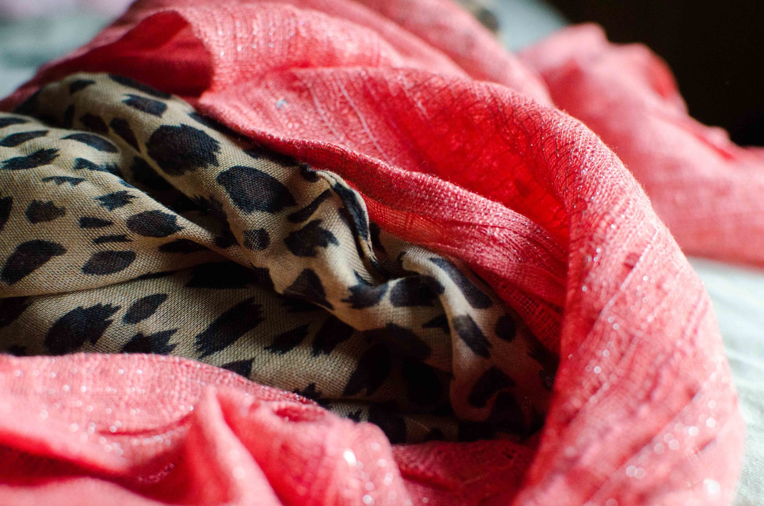
Color Play - Red and Orange Cream

As you know, the reason I like to play with color is to force myself to get out of my own preconceived box regarding color combinations. Most of us are familiar and comfortable with combinations like navy with white in the summer, or rust with yellow in the fall. We tend to stay away from those combinations that look like restaurant decor - think yellow and red (McDonalds), or team colors - yellow and green (Green Bay Packers), unless we are putting on our work uniform or going to a football game. However, I like the challenge of finding different or unusual color combinations allowing me to make better use of the clothing I already have in my closet.

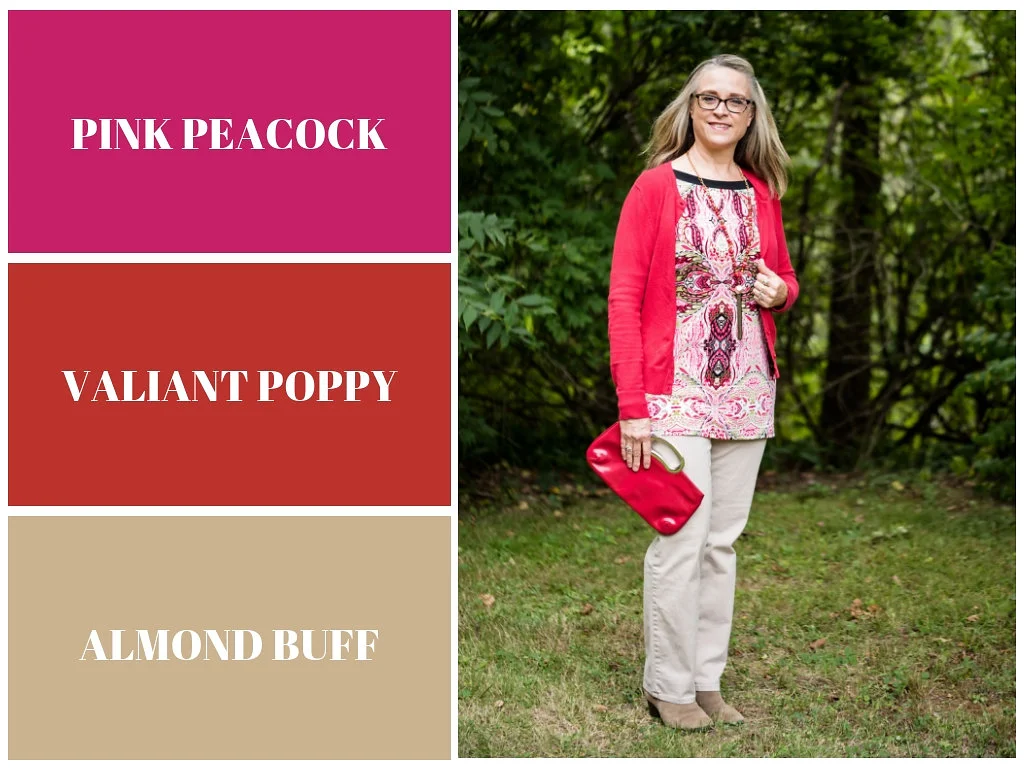
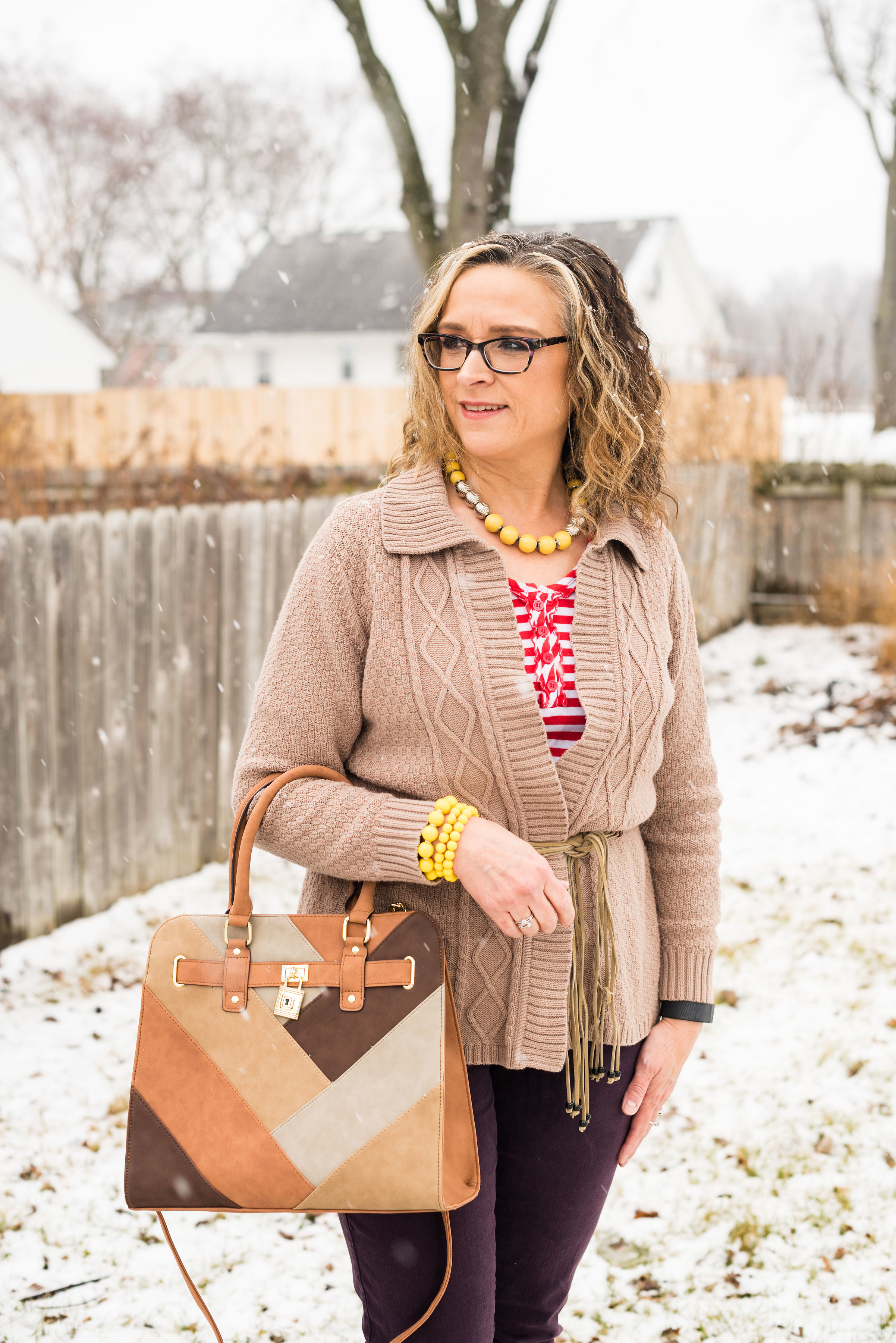
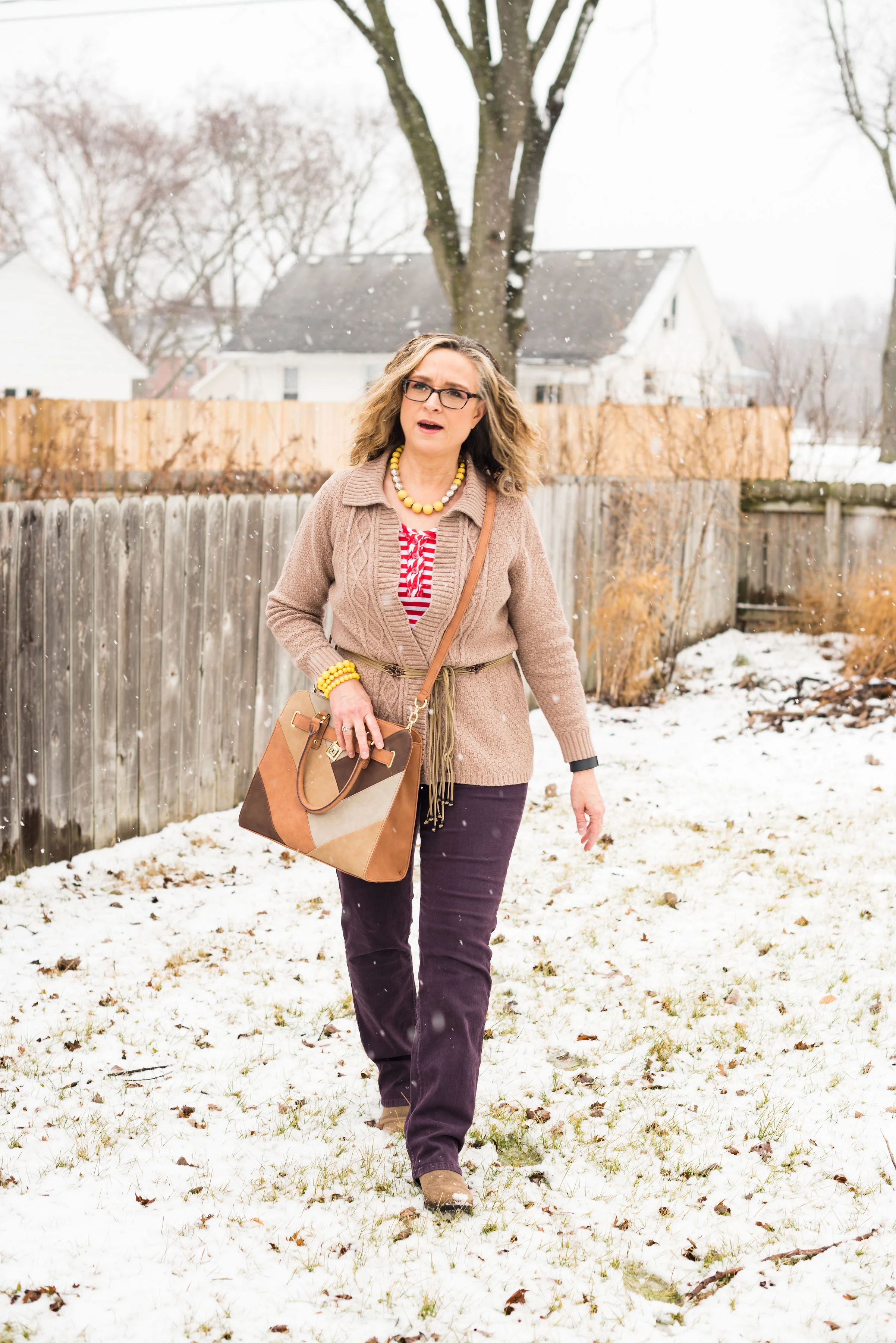
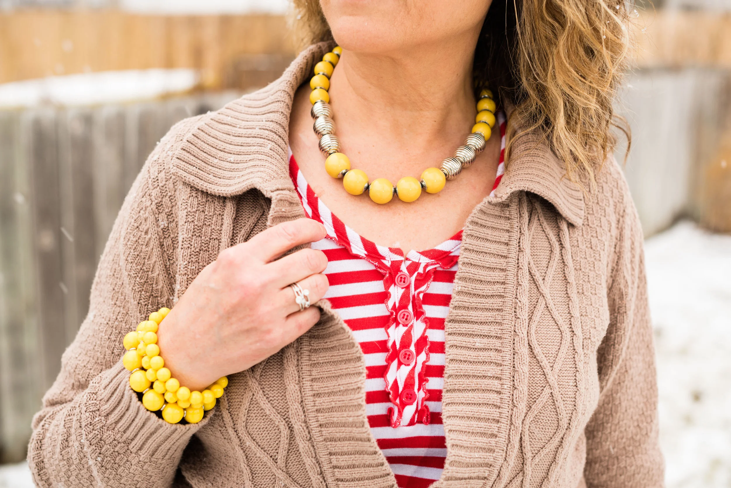
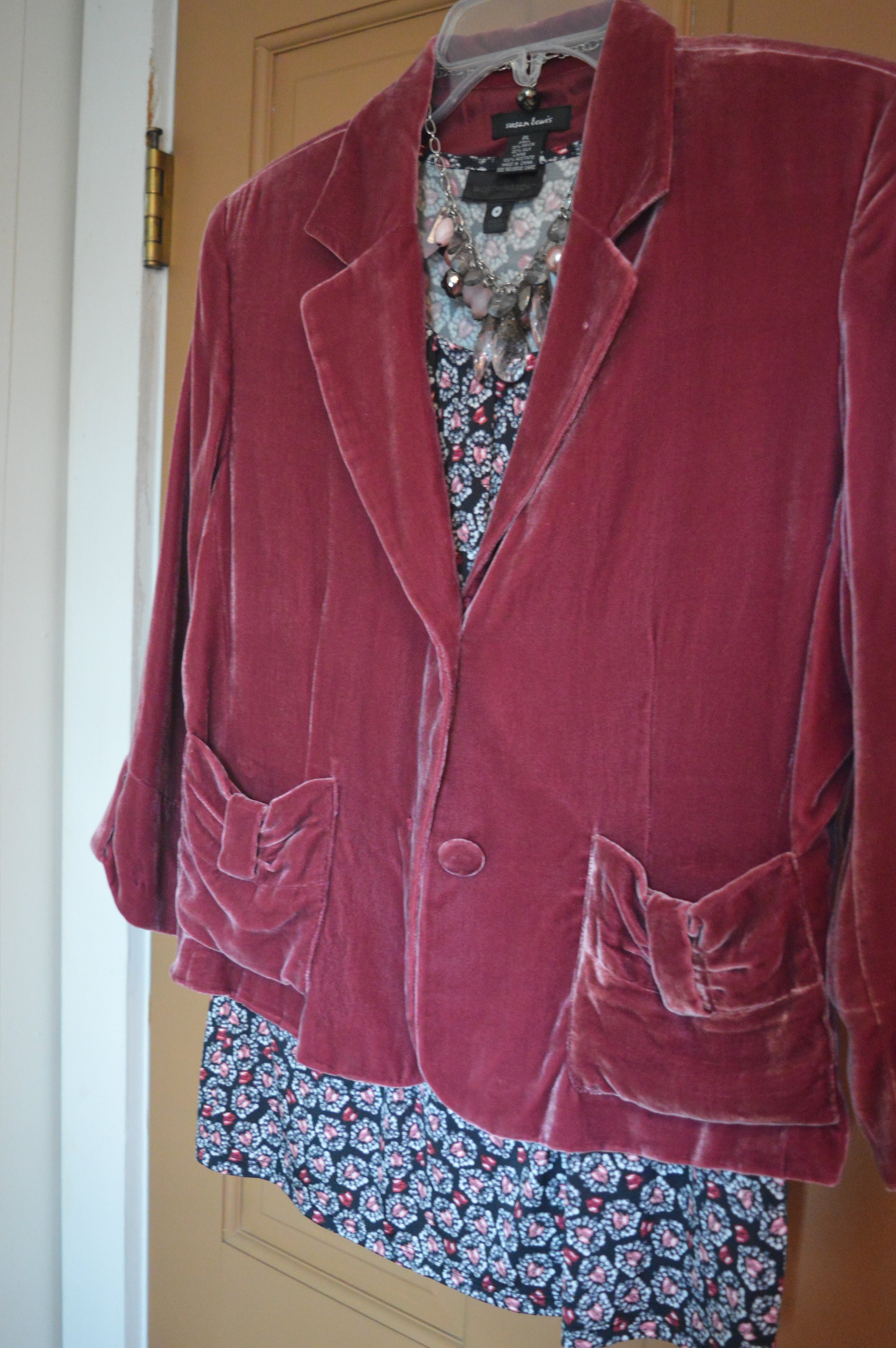
Today’s outfit revolves around two new pieces I got in the last month: a red and white striped top and a creamy light orange eyelash cardigan.

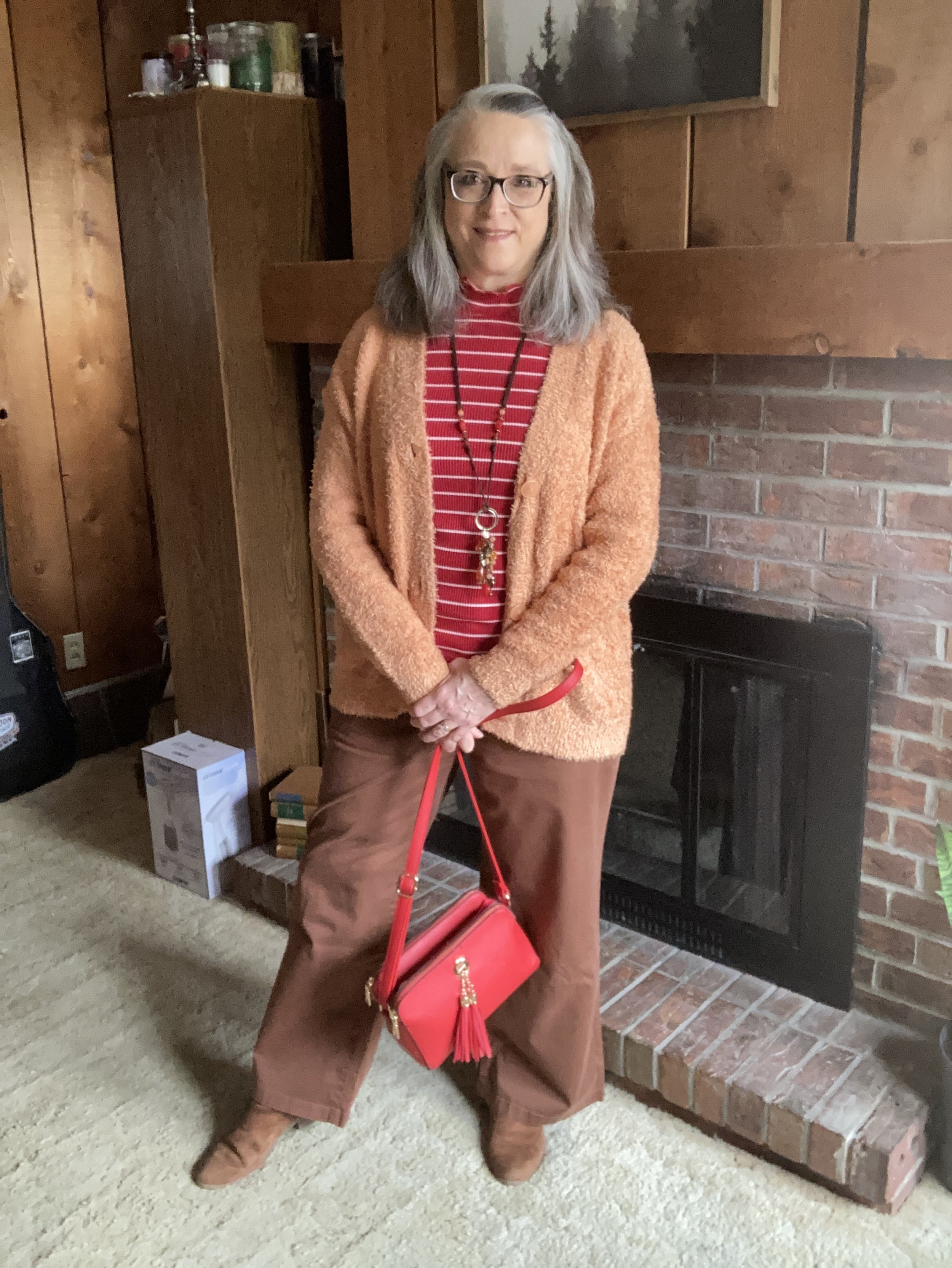
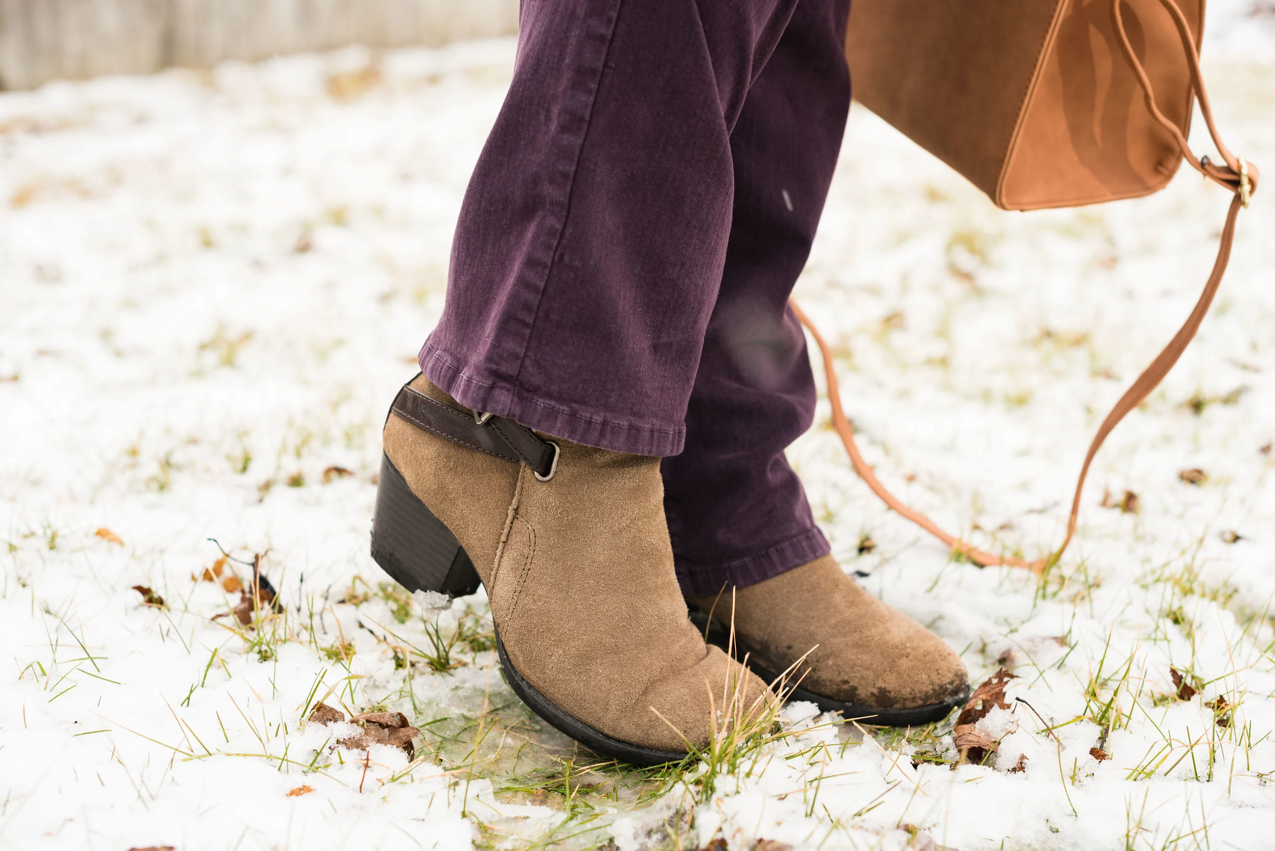
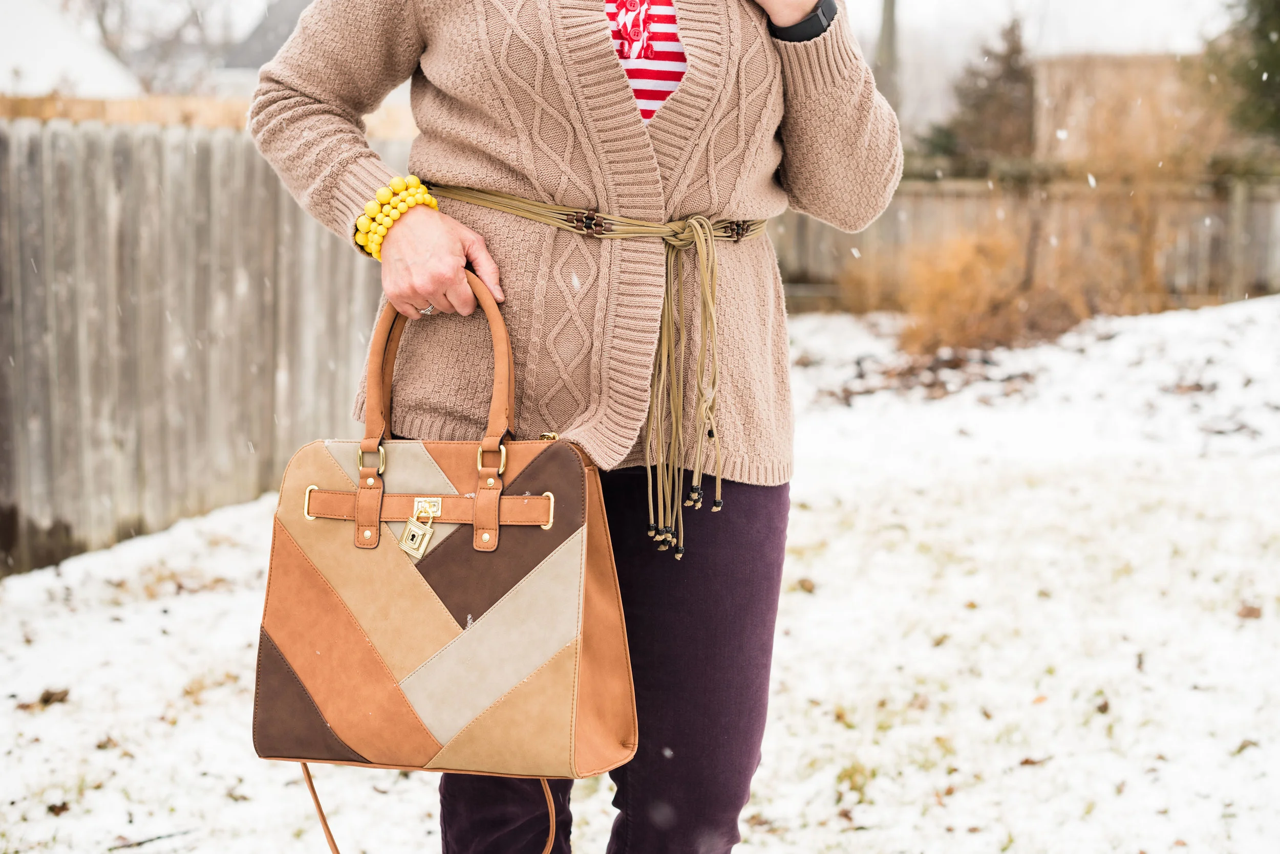
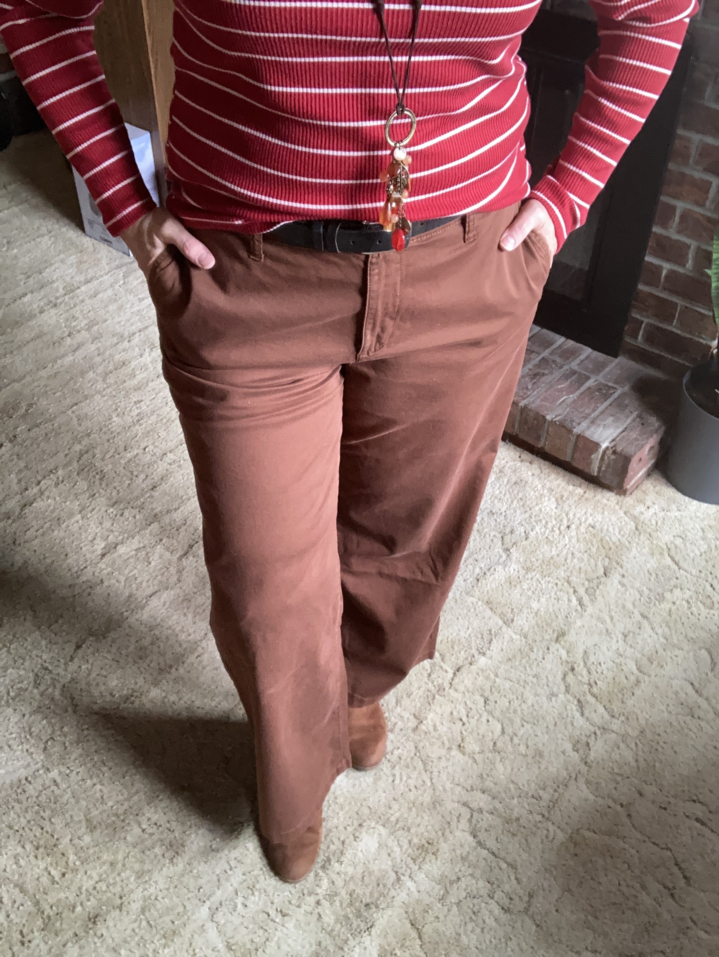
I pulled out my thrifted St. John’s Bay wide leg pants. The only reason I chose these was so I could wear my knee brace without it being seen. Ha, ha. But I actually like the way the outfit turned out. Wide legs seemed to have jumped off the trend-go-round until next time, but that is no reason to get rid of them, if you have a pair. Every once in a while it is nice to wear something outside the trend box, just because it is comfortable and the right color.

My bright red striped mock turtleneck tee is from Maurices and was another great deal. I love stripes anyway. I have a few tops that are white with red stripes, but when I saw this red with skinny white stripes, I grabbed it. It is very soft and comfortable.

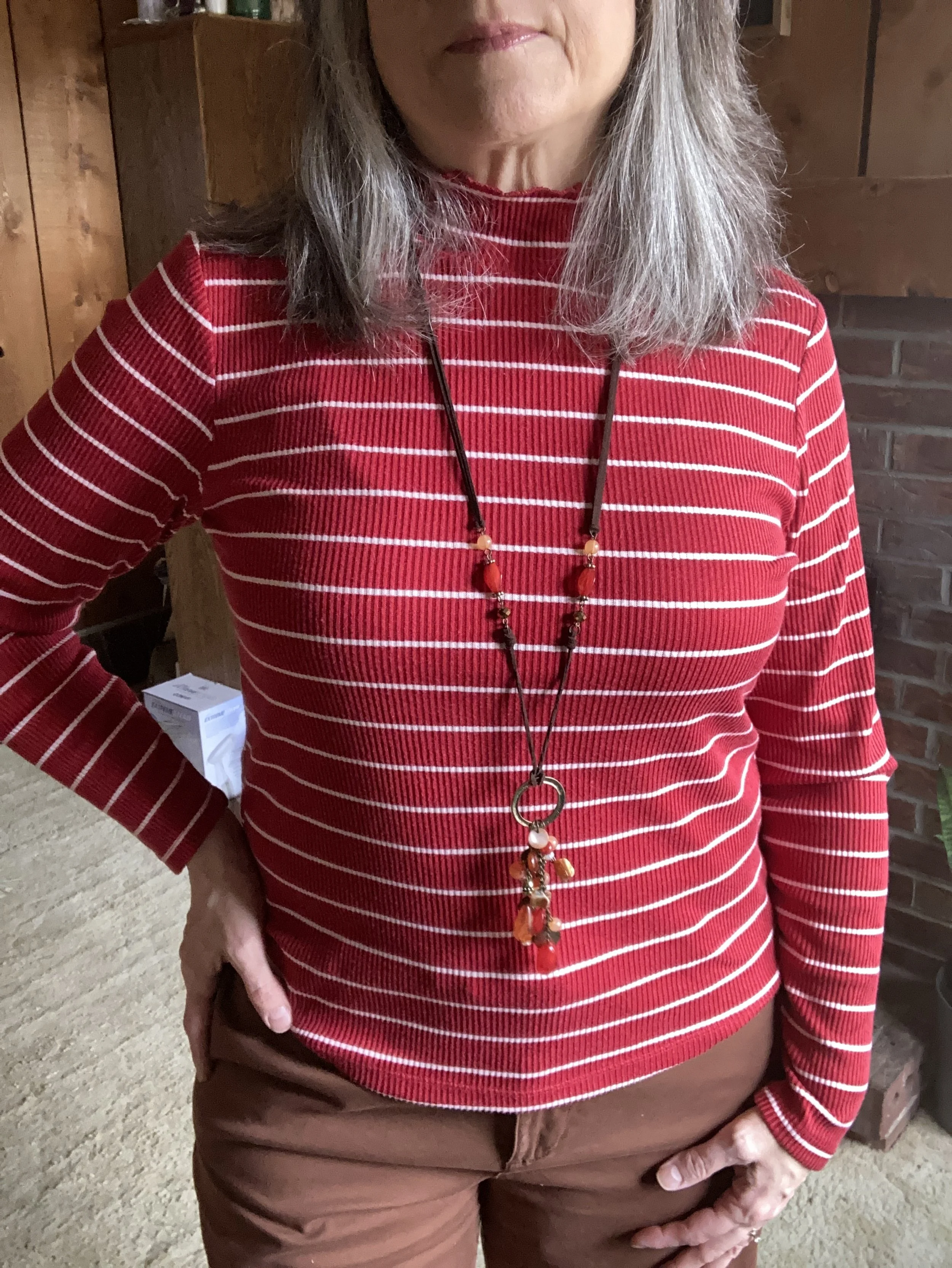
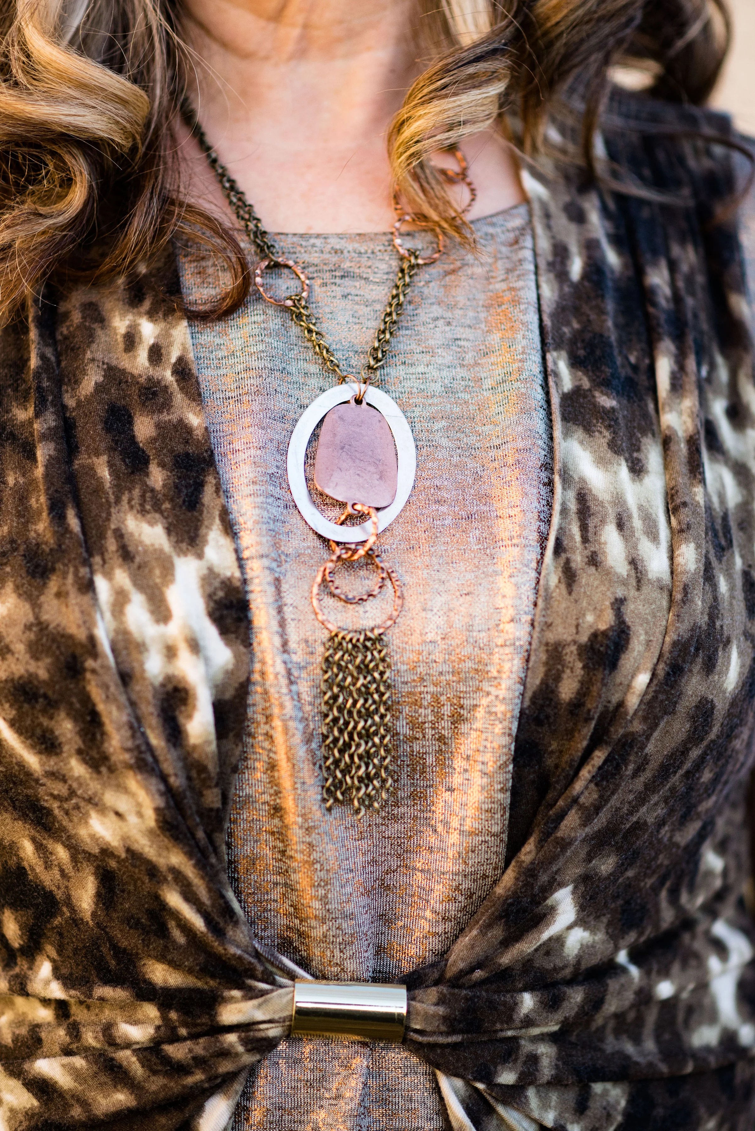
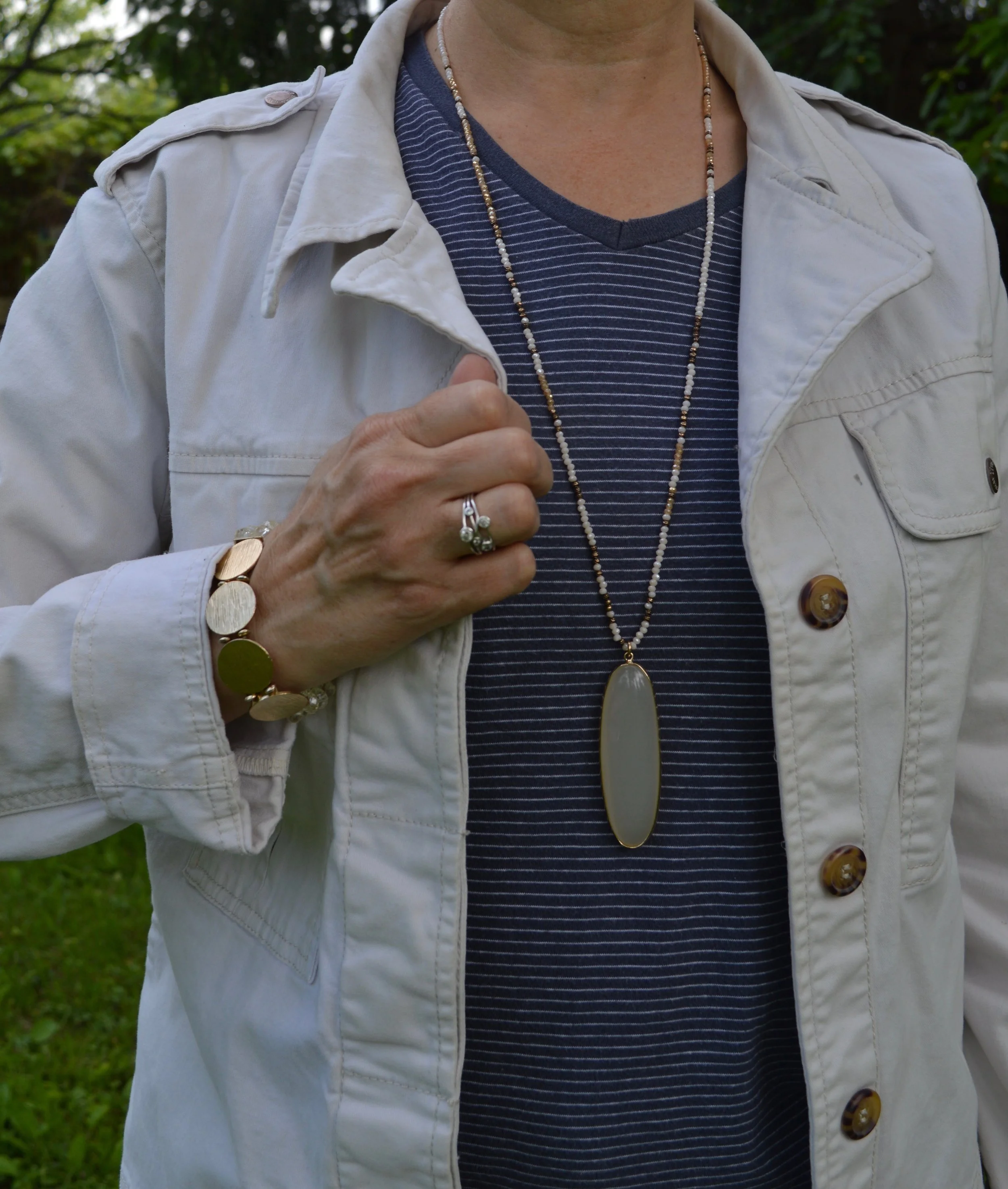
I also added a long pendant necklace with reds for a bit of fun.

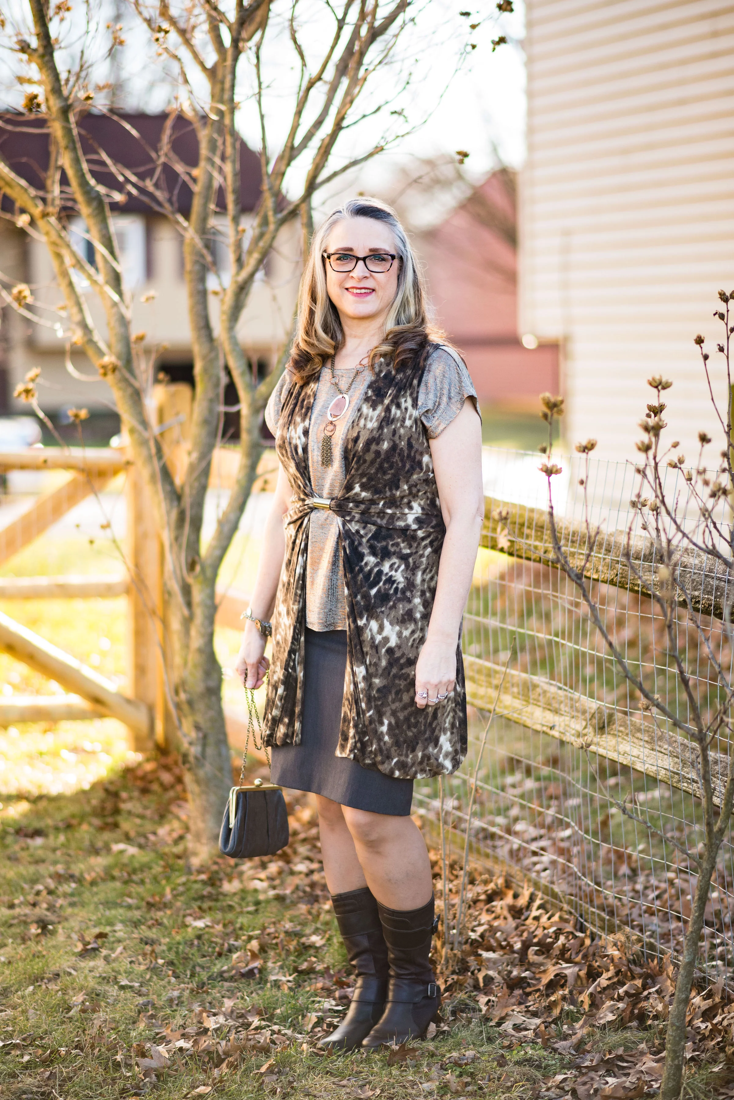
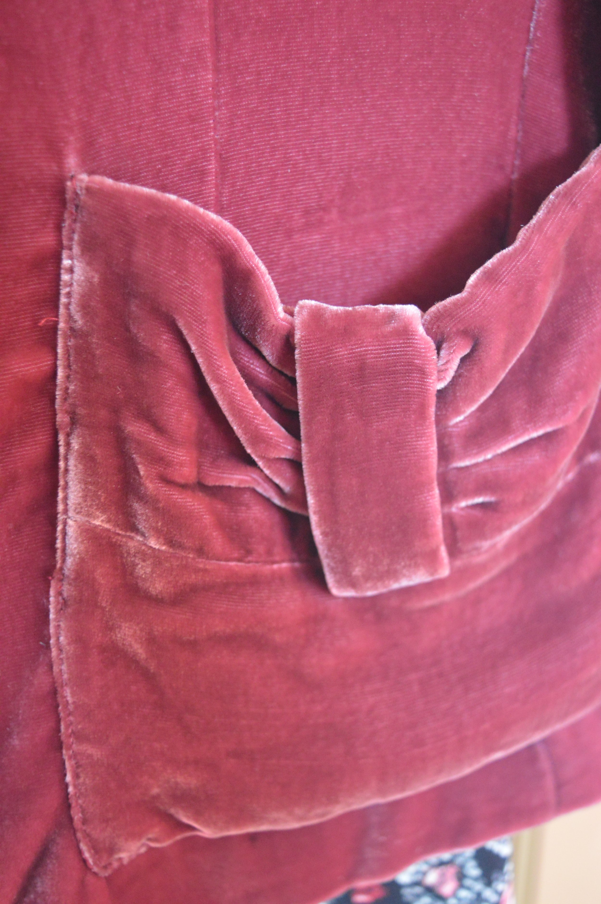
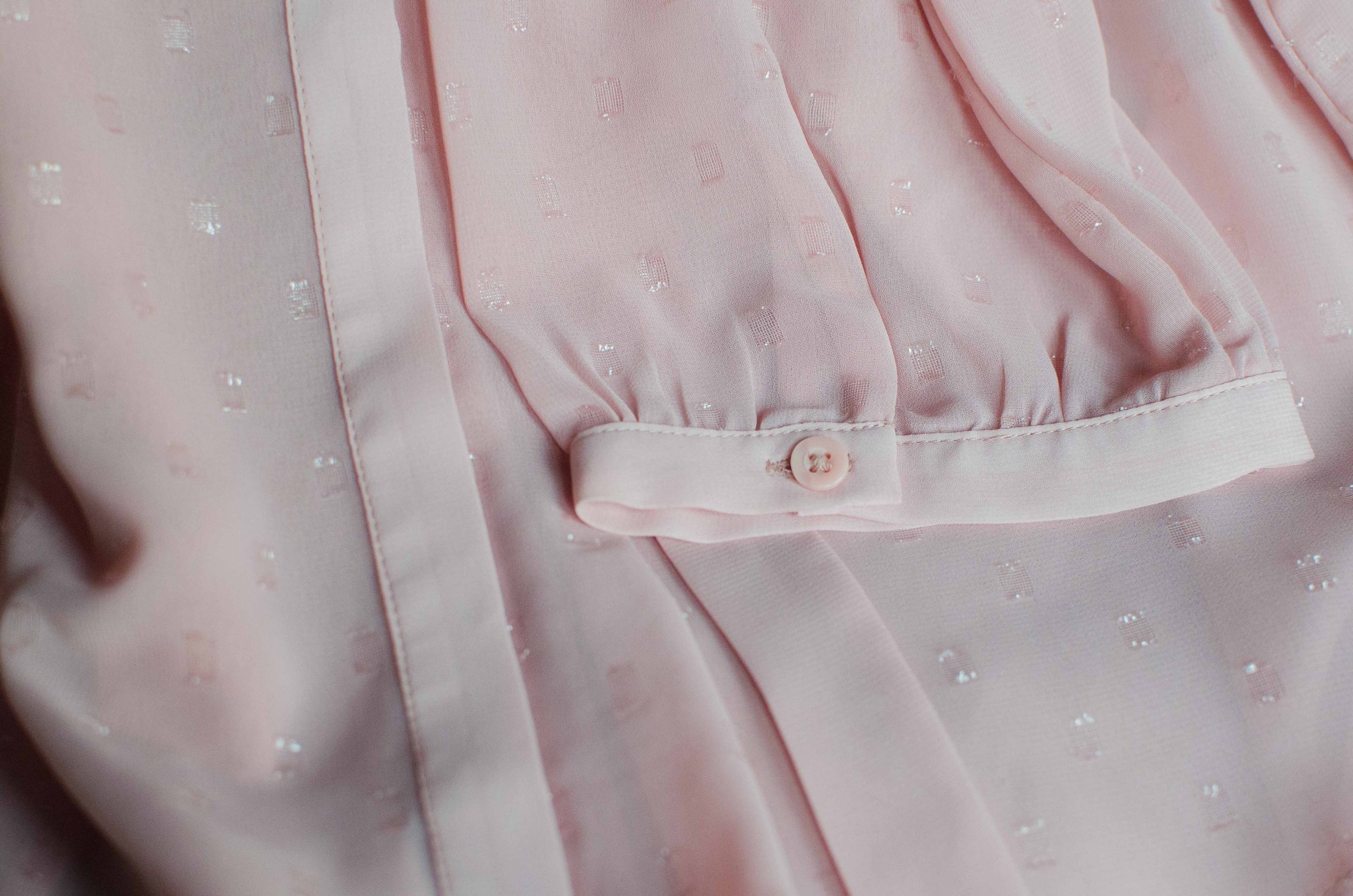
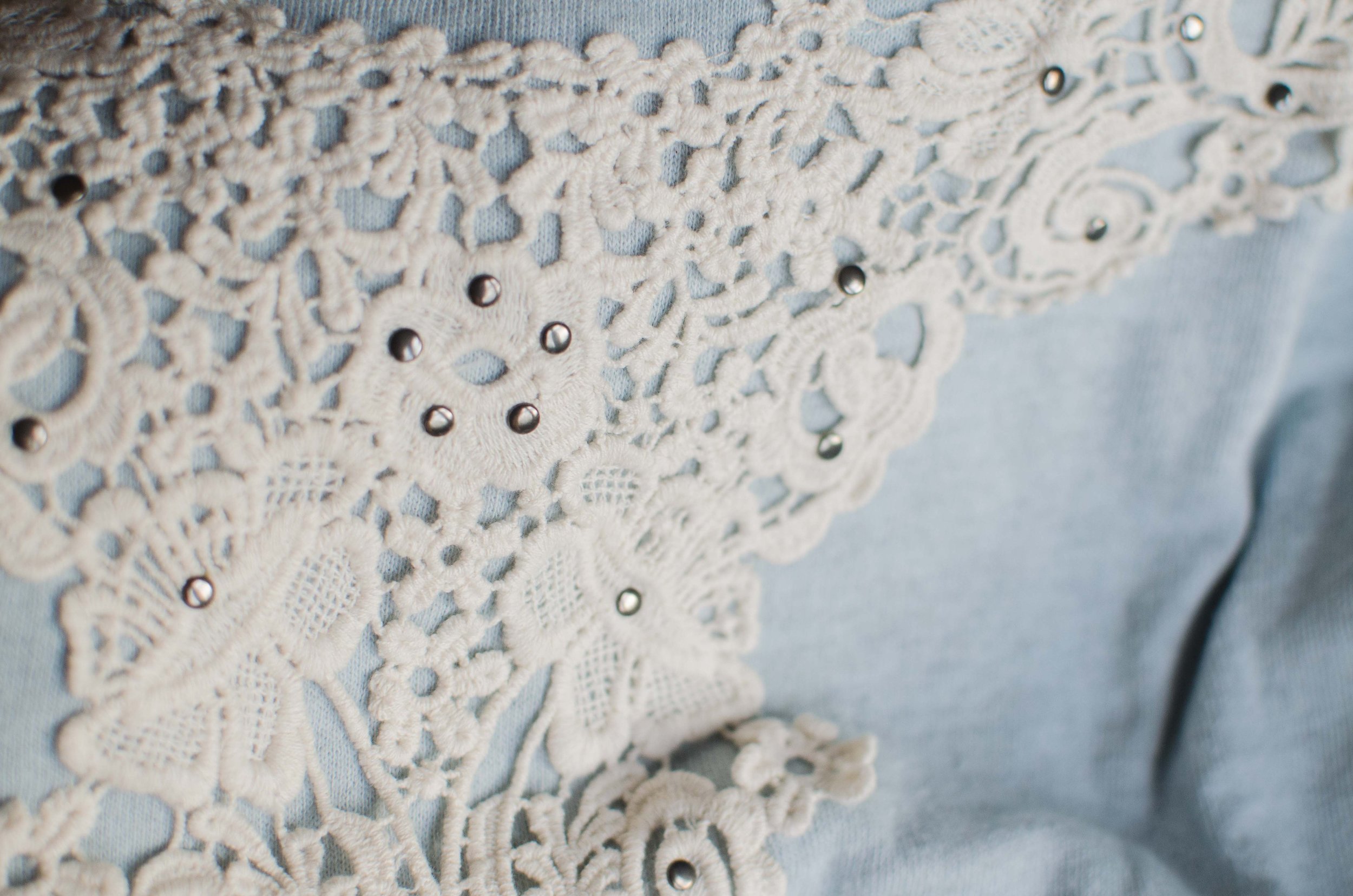
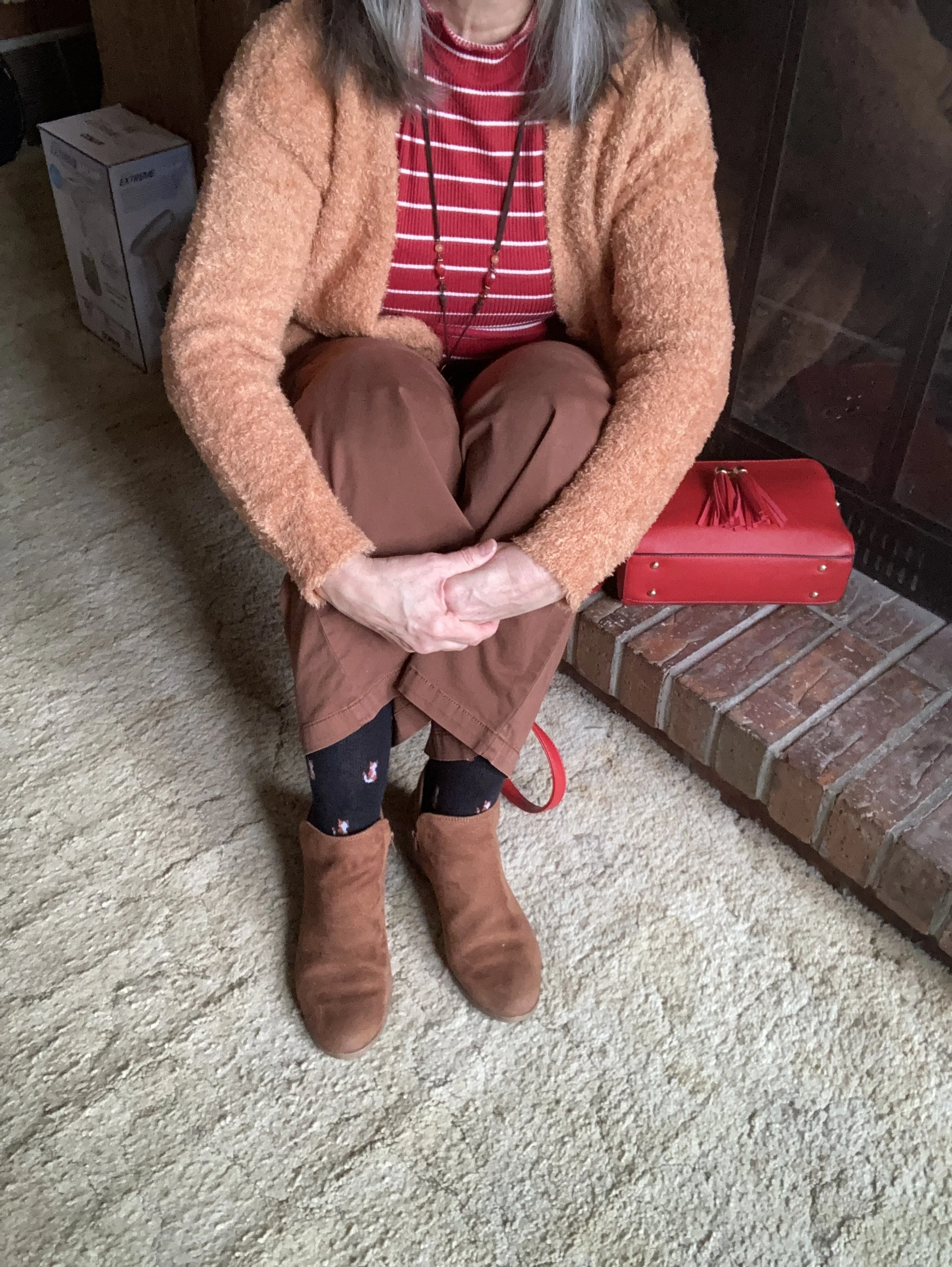
This wonderfully fuzzy chenille eyelash sweater is the bomb. I love the fun texture and the luxurious softness of the knit. It is also extra cozy, so I have a feeling it will be popping up here and there throughout the chaotic weather of spring. I found this on the clearance rack at our local Meijer.

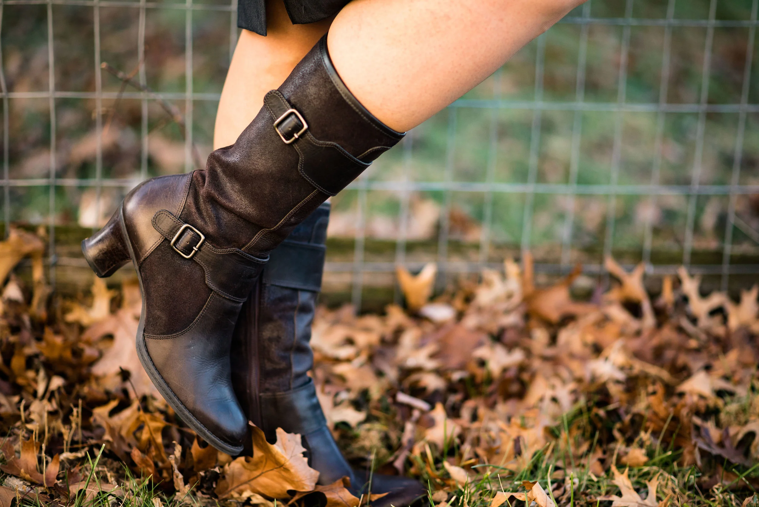
I used my red top handle bag again for the Valentine’s red color and added my SO ankle boots which matched my pants fairly well. However, silly me, didn’t think to put on my brown socks…ha, ha. Oh well, the little foxes match quite well.

Style Tip: To make your legs look longer and leaner match your shoe to your pants (and your socks :)). You can get the same effect with tights and boots of the same color.

What do you think of this color combination? I think it is fun and different, but not so different that it doesn’t work. Let me know what you think by leaving me some love in the comments.

I am including a few shopping links for you to look over. These are affiliate links, but all opinions are my own. These are provided for your benefit and do not cost you anything to click on.

Have a wonderful Tuesday!

Pantone - Autumn/Winter - 2019 - London Palette Recap

It’s time for a recap of the all the Pantone - Autumn/Winter -2019 - London Palette colors. There were things about these colors that I liked better than the New York Palette, but each of them had colors that I felt comfortable wearing. I’ll explain my favorite from this series after a review of the outfits.

Outfit 1 - Merlot and Antique Moss

Outfit 2 - Cranberry and Chicory Coffee

Outfit 3 - Summer Fig and Bluestone

Outfit 4 - Butterscotch and Grapeade

Outfit 5 - Crabapple and Forest Biome

Outfit 6 - Galaxy Blue and Hazel

I am having a hard time picking just one outfit from this series that I liked the best. I really liked Cranberry and Chicory Coffee. I have always been a fan of browns, but I just love the result when it is combined with the medium pinky red of Cranberry. I also like the long line of this outfit and I think the long Rutabaga open front cardi helped with the illusion.

My next fave would be the boho vibe of Butterscotch and Grapeade. If you would have asked me a few years ago if I would wear an outfit with these two colors together, I would have said no way. Yellow and purple? You have to be kidding, but there is something whimsical about this outfit and the color combination is only part of it. The colors are happy and fun, but the print of the skirt, the fringe bag and the fun textured boots really give this outfit its bohemian style.

Finally, I really like the last outfit. Even though, I wouldn’t necessarily wear a color like Hazel all on it’s own, I do like the way this color pairs so well with the grays and the blues in outfit. I also like the subtle plaid print mixing. It is obvious, but it doesn’t overwhelm the eye like some print mixing is capable of doing.

Well, I’ve told you my favorites, now tell me yours. I love to hear your feedback.

i hope you enjoyed this Pantone - Autumn/Winter series. If there is anything else you would like to see, with regards to the Pantone Color Institute you can check out their website. Just click on the link.

Have a great Tuesday!

Photo credit Rebecca Trumbull.


Mixing Metals

There was a time, back in the stone age, when women were not allowed to mix metals in their outfits. Why, there was a time when women were not allowed to mix patterns, or wear white after Labor Day, or wear pants. How things have changed. Many of these changes have been good, especially when it comes to fashion and the average woman. Now women can wear their floral blouse under a striped sweater and get all manner of compliments. A woman can wear white all winter long if she so desires, and us gals have been wearing pants for a very long time.

Many of the changes that have come about in the last few years, I have had to get used to. I was brought up to only wear white between Memorial Day and Labor Day. I keep my white pants out now and even though I don’t reach for them as often as some women might, it is not because of a rule that no longer exists. It took me a while to get the print mixing thing figured out, but now I print mix with the best of them.

One of the more subtle changes in the fashion world that I have been adjusting to is to mix metals. In other words it is now acceptable to wear gold with silver with copper with bronze with brass and pewter. Anything goes. My daughter suggested I take the challenge and make it my own, so this outfit is my first intentional attempt at metal mixing.

I started the outfit with the gold metallic top that I got for Christmas. It is a cute piece that my hubby got for me from a retailer named Marshall’s, with a little help from our daughter. It is a top that I will wear more when the weather warms up.

The fun snakeskin print vest I found in my daughter’s get rid of pile. One man’s junk is another man’s treasure, right? The front of the vest comes together with a metallic piece that holds the fabric in place. I couldn’t resist taking this fun topper home and even though it has a little wear, it doesn’t show due to the animal print. I am already thinking about how I can style this more casually for a great date night look.

I decided to go with a pencil skirt for a work wear or date night appropriate outfit. I like the streamlined look of a pencil skirt, especially under a more voluminous topper.

For my next metal, I put on a necklace that I also thrifted from my daughter. I thought the mix of copper, silver and brassy colors made this the perfect statement piece for this outfit. Using a necklace like this makes it easy to mix metals.

I got these leather boots at a local thrift store. Real leather, heels and fun details made me take these home with me.

My finishing touch on the metal mixing was to grab my little gray clutch with the brassy chain and edging and a mixed metals charm bracelet. The silver rings are my daily choice for hand wear, so I almost always have those on and the wedding band is white gold.

I like how this outfit turned out. The browns and grays are similar to the silver and coppers of the metals. This outfit is earthy with a touch of shimmer and shine.

What do you think? Do you like to mix metals? Do you like to wear outfits with shimmer or bling?

I’ve included a few shopping links for you to look over. Thanks for hanging out on the blog.

Photo credit Rebecca Trumbull.

Have a great weekend!


Pantone Fall 2018 Recap

After a series like the Pantone color one, I usually like to do a recap post, to show you all the colors and the outfits I styled using those colors into one post. These colors this season were not what I would call common fall colors. I usually think of fall colors as being richer and darker hues like deep burgundies, earthy browns and garden oranges that make us think of pumpkins and fall leaves. While the Pantone Fall 2018 had a few colors that fit into my typical fall color box they had numerous ones that clearly stepped outside that box. Colors like Limelight, Mellow Rose and Crocus Petal provided a pastel palette choice for those who like to think brighter and lighter when the seasons change.

Enjoy this review of my Pantone Fall 2018 outfits.

What did you think of this color palette this year? Do you like lighter, pastel colors or go for richer, darker colors when fall rolls around? Do you like to think outside the seasonal color rules, or are you like me and look forward to the seasons bringing you back to those colors you are familiar with and enjoy at that time of year? It really doesn’t matter any more. The joy of fashion today is that you can decide what you like to wear at any time of year.

I like that Pantone had added the classic colors to the color palette for each season. It allows me to add a more toned down color to each outfit keeping the outfit colorful, but no overly so. it would be easy to add a touch of any of these colors to a more neutral outfit. For instance, if you wanted to go for a monochrome look using a navy like Sargasso Sea, you could add a little color by throwing on a bright Russet Orange scarf or some Limelight colored beads. If you normally dress in more neutral tones try adding just a touch of color in your accessories to make your outfits more interesting and visible.

I hope you enjoyed this series. Check back on Thursday for more fashion fun.

Photo credit Rebecca Trumbull.

Outside the Box - Floral Dress with Combat Boots

I have never been especially adventurous with fashion. My style is somewhat classic with a tomboy edge and a dash of boho meets warrior princess, or at least that is what I would like to think. I am not overtly feminine, though I do like pink and especially love lace. As I revealed in last week’s Ordinary Amy post, I like motorcycle jackets, blue jeans and boots or tennis shoes. The premise for having a column called Outside the Box, is exactly that, to get me thinking outside my own fashion box.

This week’s outfit is what I would call motorcycle mayhem meets feminine flirt. Let me know if you agree.

I often see bloggers who put together outfits that I would have never dreamed of doing. Not because they are so bold or daring, but because my mind would just never think to combine combat boots, fishnet stockings and a floral dress.

I began this outfit journey with the floral dress. I picked this up at Gabes this past spring with the thought in mind that it would be a great fall piece. Bright florals on a dark background make me think more of cooler weather and sipping hot cocoa. It’s not that you couldn’t wear these colors in the spring and summer, but there is something seasonal about certain color combinations.

I know fashion is not contained neatly in one box and many in the fashion world are strongly pushing against the stereotypes of weight and age, which is awesome, and I fully support. However, there is also a push against traditional fashion ideas, such as not wearing white before or after the summer months, or allowing seasonal color changes to affect what we wear. I’m fine with many of these ideas, but fashion is also about wearing what we want to wear. I like darker colors in the fall and winter and brighter colors in the spring and summer. That is just me!

What really drew me to this little floral number besides the print were the bell sleeves. You can’t see them really well in these photos, but they add a fun element to the piece.

During the summer, when my hubby and I were on vacation in Wisconsin, I went with my mother-in-law to a department store that was going out of business. They were just getting started with their sales and we spent our time looking at shoes. It was then, I came across these boots.

Just like motorcycle jackets, I love combat boots. This is now my third pair and I love the embellishments on these. I’ve included a few shopping links at the end of similar pairs. These zip on the inner ankle so are easy to get on and off. I thought the contrast of the floral dress with the combat boots was a look that was outside my norm.

To give the outfit another more feminine edge I added the fishnet tights. These are a heavier weight than true fishnet stockings. I didn’t even remember I had these until I started looking through my hose bin! I saw these and said, “Yes, this is it!” The outfit would be just as fun with a pair of sweater tights in a dark or a bright color like red or cream. I do like darker on the bottom for the thinning factor.

Because the dress is so busy, I kept my accessories minimal. I put on my yellow pendant necklace and added a faux leather cross body bag for a last touch of tough girl.


This bag makes me think of a motorcycle saddle bag. I’m a little preoccupied! My hubby had a Harley before we ever met, and I keep trying to convince him we need to get one in our old age. Ha, ha.

What do you think? Would you wear combat boots with fishnet stockings and a dress? It even sounds odd, but I actually think it works. I’d love to hear your thoughts.

I have been having some issues with people commenting on my blog. For some reason it lets some people comment and not others. I have contacted my platform support team to see if the issues are on my end. Sometimes it can be the browser you are using. Squarespace tries to keep current with changes and updates in multiple browsers so it can take time. If you can’t comment right away, please try again later. I do apologize for the problems. You can also give me feedback on Facebook as well. I appreciate your thoughts and support.

Have a great weekend!


Pantone Fall 2018 - Red Pear, Nebulas Blue and Sargasso Sea

Last week, I introduced you to this fall’s Pantone color palette. Now that I am just getting started with my series, I noticed their website already has the color palettes up for Spring 2019. I understand that in the fashion and interior design industries they always need to be one step ahead, or all of a sudden things have gone out of trend and disappeared. That reminds me of a verse from the book of Ecclesiastes which was written by King Solomon.

That which has been is that which will be,
And that which has been done is that which will be done.
So there is nothing new under the sun.
— Ecclesiastes 1:9 (NASB)

Even a man as wise as Solomon, knew there was nothing new under the sun. Look at the movies and books that are currently out. It is pretty much the same story, just written with different characters and a different setting. Heck, how many times have they revisited Spider Man and Predator? Ha, ha. That being said, the color palettes that come out are really nothing new. They call them by different names, make one a little more blue based or yellow based and say they are fresh and new.

However, I do enjoy color and I like to create outfits using color in combinations that may be new or different, at least for me. Following the color palettes that Pantone puts out each season allows me to do just that.

Here are the first of this fall’s palette.

Red Pear and Nebulas Blue are on both the London and New York palettes. Sargasso Sea is one of the classic colors or what I like to refer to as a grounding color. Red Pear borders on a maroon and my pants are really too red, while my version of Nebulas Blue appears spot on. Sargasso Sea is navy by any other name, but even there you can see all the different shades of navy. My Ralph Lauren thrifted blazer is almost too blue, while Sargasso Sea seems to have more gray in it. I think my loafer heels and bag are a little bit closer to the Pantone color.

I added this colorful bandana for a scarf as a way to bring together the red and blue and add a pop of yellow.

The blazer, shoes and bag were all thrifted. The bag is Simply Vera Wang; the blazer is Ralph Lauren and the loafer heels are Relativity. Everything you see in this outfit with the exception of the scarf I have styled on the blog before. It just goes to show that our closets are a great place to look for new color combinations and outfits.

What do you think of these colors? Do you think these colors represent the fall season? Why or why not? I’d love to hear your thoughts.

I have received a few messages that people are having problems commenting on my blog posts. If you an issue, please let me know. I contacted the help team for the platform that I use when I had a problem in the past and they said they couldn’t see any problem on their end. If you have an issue, please shoot me an email, so I can see how widespread the problem is.


I’ve included a few shopping links. These are affiliate links, which means I get a few cents if you click on it. All opinions are my own.

Instagram Review

I am going to be out of town visiting my mom for her 92nd birthday, so for today's post, I thought I would forego my usual Outfit Inspiration post and just show you some of the outfits from my Instagram feed. Now that I have a smart phone, and have been taught how to post pics and so on, I am enjoying the ease of throwing on an outfit and quickly posting it to IG. The thing I like about Insta is that it allows you to see a more realistic view of how I dress. 

The outfits I post on my blog, are ones that I would wear, given the opportunity, but often real life gets in the way and I find it easier to just throw on a pair of skinny jeans and a pretty top in order to chase my grandson around, go grocery shopping, do laundry and so on. The following are just a few of those everyday outfits that I frequently reach for. 

Plaid Dress with Skinnies

Striped Tee with Embroidered Chinos

Yellow Ankle Pants with Multi-print Tee

Eyelet Top with Skinnies

White Ankle Pants with Floral Kimono

Distressed Crop Jeans with Multi-print Top

These are just a few of the outfits you'll see in my Instagram feed. Do you like this post? Do you follow me on Instagram? I'm still a work in progress and I appreciate all of you who have subscribed to my blog. If you read my posts, but haven't subscribed just fill in the info in the subsciption box and I'll put you on my email list. I only email once a week, because I know how full our in boxes can get. You can follow me on Instagram and I am also working on putting more things on my Pinterest boards so check those out as well. 

Have a great weekend!

Ordinary Amy - White Denim Jacket

I have always loved denim. Traditional blue denim is still my favorite, but I also love colored. Today there are so many wonderful colors of denim to choose from. What is it about denim that I love so much? 

When I was growing up, I lived in the country. We had a good sized yard and fields all around, as well as a creek behind the house that my brothers and I used to traverse, fish, catch turtles and frogs in and ice skate on in the winter time. Being that I was a tomboy, my clothing pieces of choice were jeans and tees, or sweatshirts in the cooler weather. When I got my first denim jacket I thought I was the coolest thing around. Even now, slipping into a denim jacket always makes me feel like a girl who can take on the world. Denim is tough, and durable and that is how I feel when I wear it. It helps that denim today has spandex and other stretchy fabrics in it, to make it comfortable as well. 

My jeans are my new loves! They are Rock & Republic brand from Kohl's. My favorite part are the zippers. Ha, ha. I know! It's the simple things. In addition they are extremely comfortable. Everything in this outfit is thrifted and obscure brands except the gray Keds, the jeans and the jewelry. 

The jacket is Live - Life by Sanctuary, which seemed to be available at Sears and K-Mart stores in the past. Sanctuary does have its own website, which you can visit by clicking on the name and they also have pieces at NordstromMacy's, and Anthropologie.  

This no name tee, is a bit big, but it is comfy and casual and sometimes that is just what I need. You can see that I am not overly done with my make up. I always put make up on, but sometimes in a more simplistic and minimal way. 

I added this Cold Water Creek woven bag for a pop of color. I love the texture of it. Here is a fuzzy close up. I wasn't on my photography game when I took these. 

My good old Keds! 

Jeans and denim are great for those days you just want to be comfortable, but still want to look put together. 

How about you, friends? Do you like denim? Is a denim jacket one of your go to items, or you more of a sweater kind of gal? As always I love to hear you thoughts. 

I've included a few shopping links for other Sanctuary jackets. None of these are the traditional denim jacket like I have on, but they are cute! 

Have a great weekend everyone! 

Spring Transition - Striped Jacket

This last outfit in my Spring Transition series features a striped jacket that I got from Christopher & Banks. This jacket was one of the first purchases I made from Christopher & Banks after I became familiar with the retailer. The material is a heavy weight cotton, almost like a denim or canvas. This jacket makes me think of an old time train conductor's suit or hat. Actually, I think I used to have a hat that looked very similar to this pattern. 

The jacket has long sleeves that can be rolled up and kept in place with a snap tab. It has a full zipper and a thick collar that can be stood up and kept in place with drawstrings. This makes the jacket a great piece for a cool summer evening outing as you can lengthen the sleeves and zip it up all the way, to keep yourself a bit cozier. 

i am not sure why these jeans are so wrinkly. These are ANA brand. A dark wash skinny ankle jean is a great piece to transition to the warmer weather. In fact, when the heat goes up, I just turn up a pair of pants like these to form a cuff and have a pair of crop pants. 

This red tee has 3/4 length sleeves and a lace up v-neck. The lacing makes for a fun added detail. I found this Chaps tee on the clearance rack at Kohl's

For shoes I chose my SO floral flats. Yes, I have three pairs of these fun and comfy shoes. They are great to wear with jeans, skirts and would probably be cute with shorts. Here is a link for the same flats, but in different colors. I have fairly narrow feet and they fit me perfectly. 

I chose my green Style & Co. bag, just because the shoes have a little bit of green in them. I added the blue fringe dangle to add a little bit of fun to an otherwise plain bag. 

To add a little bit of jewelry, I threw on a couple bracelets. 

This is a very casual outfit and you could easily put your own version of this together with your own jeans, tee, jacket and shoes. You could even use a pair of fun sneakers like Keds, Converse or Vans, if you don't like the ballerina flat option. If you like a little more color, you could use a hand bag that has a bright, fun pattern or a jacket with a floral pattern. This is easily an outfit that you can put together from things you already have in your closet. 

Let me know what you think. What would your version of this outfit include? I love hearing your thoughts.

This is a late post today. My hubby and I just got back from our vacation late last night and I spent most of the day trying to restock the fridge, unpack and, of course, I had to pick up my Grandson from school. It was his last day, so summer officially has begun.

I hope this post finds you well. Until next time, thanks for stopping by the blog. 

Pantone Spring 2018 - Spiced Apple, Warm Sand and Nile Green

We are moving right along in our Pantone Spring 2018 color series. For those of you who may be new to my blog, the Pantone Color Institute are the go-to entity for fashion and design color choices. Twice a year, spring and fall, the Institute puts out a palette of colors, from which many designers find their color inspiration. As a blogger, who loves color, I enjoy building outfits around these colors as well. 

This week, I am featuring two of the colors from the London Palette along with the foundational color of Warm Sand. Say hello to Spiced Apple and Nile Green. 

As I said, last week, the last three posts for this spring series will feature indoor pictures. My daughter and I finally gave up on the snow that was falling fast and wet on the day we took these photos. 

Spiced Apple is a brownish red, bordering on maroon. My skirt might be a tad dark, but you get the idea. This faux leather skirt is a fun, thrifted piece that I have found to be quite versatile. This one is Worthington brand. I topped the skirt with another thrifted piece. This floral, ruffled, bell sleeve blouse is a brand called Sunny Leigh. The blouse contains snippets of Nile Green and I thought it went well with the reddish brown skirt. I added a beaded necklace that also was the Nile Green color. 

I threw the Warm Sand open weave vest over the top as my grounding color. I feel the vest not only adds a layer of warmth for these chilly spring days, but also adds textural interest. 

The bag I am carrying is a bit more yellow than the Nile Green, but it works with the outfit as a whole and without having the color tab right next to the bag, you wouldn't be able to really tell. 

You've seen these cobalt blue heels before on the blog. They go perfectly with the darker shade of blue in the top, so I thought they would be a good pop of color to complete the outfit. 

What do you think of these colors? While I do like both colors, I would not say these are my favorites. Nile Green is a tad light for my taste and the Spiced Apple is a color I would fee better in, come fall. However, it is fun to try out these different colors, because you never know when one of them will strike you in a way that makes you fall in love with it. 

I've included a few shopping links. These are affiliate links, which means if you click on a link, I get a few cents. If you purchase something through one of my links, I get a little commission. All opinions are my own. 

Photo credit Rebecca Trumbull. Make up Rachel Christensen

Monday linking up with Catherine of Not Dressed as Lamb. Tuesday linking up with Shelbee of Shelbee on the Edge and Jess of Elegantly Dresses and Stylish

Another Outfit Inspired by Eva Trends - Spell Color Cape Sweater

A few weeks ago, I styled an outfit with a piece I had received from Eva Trends. Eva Trends is an online retailer that features trendy pieces that are infused with bold colors, touchable textures and styles that defy what society classifies as the norm. Most of their pieces are made of materials like linen, silk and cotton and have a relaxed, oversized silhouette. 

When Eva Trends contacted me to see if I would want to work with them, I wasn't sure about whether the styles were well suited to the fifty and above crowd. In all reality, we are often consumed with making ourselves appear stylish without added bulk. However, when I received the three pieces they let me pick from their website, I quickly realized that it isn't about the size of the piece you put on, but what you do with it, that makes it work. 

In my first post for Eva Trends I styled a tasseled knit sweater. You can see that post and how I styled it here. Today's post is centered around a piece they call a Spell Color Split Cape Sweater. What drew me to this piece was that is was something outside my norm. See last week's post .  I have never had cape tops or poncho tops before, so when I saw this bright red, brown and tan number, I thought it would be a great way to break out of my box. 

I am going to be showing you a combination of indoor and outdoor pictures, because I added a few more detailed pics inside that I forgot to add outside. 

The cape sweater has 3/4 length sleeves. I wore a red, long sleeved tee underneath, which matched the color on the sweater perfectly. As you can see it is a cape, poncho, sweater and turtleneck all wrapped into a weighty wool and polyester blend. It did not feel itchy at all and I loved the thickness of the fabric. I felt like I was wearing a blanket! 

In this pic, you can see the split sides. The beauty of a style like this is two fold. First, movement. There is no way this piece is going to constrict my movement, unless I clumsily get it stuck in a door, and believe me, I am possible of that feat! Second, layering. You know how I love my layers. This fun piece could be layered over a simple tee as, I did here, or over something much more bulky like a sweater and even over a tunic or dress. 

In this photo you can see how wide this piece is. This is typical for Eva Trends. I think I would like this a tad bit more if it were about six inches longer. The next two photos are from a few different angles. 

As you can see from these photos, I styled this piece with my Rock & Republic skinny jeans and a pair of Clarks low heeled boots. I think this works because, it helps to trim down the bulk. While Eva Trends caters to a more relaxed baggy look, I like to have balance. I feel that if I have bulk on the top, I need to trim down the bottom and vice versa. The same would be true if I wore a bulkier skirt or pants, then I would want to have a more fitted look up top. A heel also helps to elongate the leg, thus making the legs have a sleeker look. 

If you think something like this would be to overwhelming for you, there is also the idea of adding a belt. This piece is a little heavy to belt, but I made it work. 

I changed my boots for this look, just to go a little more casual. 

Here is a closer look at my jewelry. I liked the silver tones against this bright topper. 

I am completely sold on this fun split cape sweater. With spring coming I won't be wearing this much until fall, but I will be looking forward to pulling it out again, when the weather cools.

Eva Trends is extending a a 15% discount if you visit their site and use the code AC15. Give their site a visit. You might just find something you want to try. 

The cape sweater in this post was gifted to me by Eva Trends. All opinions are my own. 

Pantone Spring 2018 - Pink Lavender, Blooming Dahlia and Emperador

Welcome to the third installment in my Pantone Spring 2018 series. The first week I showed you Chili Oil, Arcadia and Lime Punch.  Last week I featured Ultra Violet, Cherry Tomato and Meadowlark.  This week I am going to style an outfit that revolves around Pink Lavender, Blooming Dahlia and Emperador. 

I wish these photos were a little more spring like; more like the weather today, when I am working on this post which is brilliant sunshine and temps in the 50's, However, working with my photographer means scheduling shoots when she is available, so we make the best of it. In this pic, it almost looks like I am at a studio with a winter background, but I can tell you we were definitely outside and it was cold!!

Pink lavender is a very pretty purply pink. I happened to have this short sleeve Croft and Barrow faux lace tee in my closet and it matched perfectly. My husband also picked up this necklace at a garage sale and thought I would like it. I did! I've told him, any time he sees costume jewelry at estate sales or garage sales to take a peek and pick up things he thinks I might like. I'm pretty easy to please when it comes to jewelry! 

Emperador is a chocolate brown. I often wonder at how they come up with the names for the colors on each season's palette. Some are obvious. Pink Lavender looks like pink and lavender mixed together, but Emperador? I googled the word and a brandy company came up. Brandy is more of an amber color, so I am not sure if that is what they were thinking when they gave this brown it's name. I'm not an alcohol drinker, at all, but if you are interested here is a link to Emperador

My moto jacket is thrifted and is a brand called Celebrity Pink. This brand is sold at stores like Macy's and Burlington Coat Factory. Here is a similar jacket. Mine is a nice faux leather with a silver zipper and snaps. I should have taken a picture with the jacket zipped up. 

This skirt from dressbarn I have featured on the blog last summer in my Marvelous Maxis series. It is roz & Ali brand. The skirt with its fun, whimsical, floral pattern is fully lined and the perfect transition piece for spring. I thought it gave the illusion of Blooming Dahlia, even though it isn't an exact representation. Plus I felt the outfit benefited from a pattern. 

I added a stretchy woven belt to the skirt and chose to carry my George satchel for a bit of that classic color, Warm Sand. I also slipped on my suede American Eagle ankle boots. 

What do you think of these colors? Do you have any of these in your closet? I think all three of these can be great to combine with stronger classic colors like navy, green or black. If you are not real fond of a particular color because you don't think it looks good on you, don't be afraid to try a smattering of the color in the form of an accessory such as a necklace, bracelet or even a bag. That is a wonderful way to add color without letting it overwhelm you. 

Let me know your thoughts on these colors and my outfit. I love hearing from you! 

Here are a few shopping links for you. These are affiliate links which means if you click on a link I get a few pennies. If you purchase through one of my links I get a little commission. I appreciate your clicks! All opinions are my own. 

Photo credit Rebecca Trumbull. Make up Rachel Christensen

Thursday linking up with Nicole of High Latitude Style. Friday linking up with Nancy of Nancy's Fashion Style. 


Ordinary Amy - Denim Love

If you follow fashion bloggers at all, then you see loads of cute outfits and put together looks, that sometimes leave you feeling a bit overwhelmed. I know I feel that way. There are many bloggers who show lovely outfits and gorgeous photos. For me they are a source of inspiration, but they can also be a source of dissatisfaction.

There are times I come away from looking at another blog feeling like I want to crawl under a rock! Unfortunately, I feel that way more often than I would like in the long winter months. I want to hide and become invisible, yet, at the same time, I want to be noticed and recognized for something, not sure what, but for something. This is a dichotomy I have struggled with most of my life. Being an introvert often leaves me being misunderstood as aloof or stuck up. It also puts an added burden on my shoulders to push myself outside my comfort zone. That alone, is not a bad thing. It forces me to grow and learn as an individual. It has helped me to overcome fear and be able to reach out to others who have similar feelings. 

Unfortunately, it also weighs on me most of the time. I never really feel free to express myself or my opinions. Yes, I am one of those individuals who has had my opinions shot down, laughed at and even ignored. Obviously, that makes it harder to be confident and bold, not only when it comes to my writing, but to my fashion as well. I often reach for what is comfortable.

When I was growing up, my mom always hung the laundry out on the clothes line when the weather was nice. I remember when I was really young, we still had a ringer washer. I always thought washing day was so much fun, because my mom would let me help her feed the clothes through the ringer, which squeezed the excess water out. I loved to put my hands in the cold rinse water, especially on hot summer days. When I was tall enough, my mother would let me help her hang clothes on the lines outside that ran from our house to a large maple tree.

I used to play amongst the flapping clothes, imagining they were the curtains to a stage where I would be a singer. There weren't many kids in our neighborhood, as we lived out in the country, so I learned to play by myself using my imagination. Sometimes I would sing a story and other times I would imagine I was lost in the jungle and dinosaurs were after me. To this day, I still love to imagine and I also love to do laundry. Hey, everyone should have at least one household chore they like to do! 

When I took these pictures a few weeks ago, the temps had gotten up into the mid fifties. I had a set of sheets and a few smaller throw blankets to wash, so I decided to hang them outside. Ever since those early years, I have loved how things hung outside, smell! 

This is me. Denim, cozy knit vest, sneakers and a little bit of jewelry. I am wearing my Christopher and Bank jeans. The knit vest I have worn on the blog before here. It is Chaps brand. Chaps is a brand found at Kohl's. It has a little higher price point than some of their other brands, but the quality is good. Sizing seems to run a little small, so I usually size up. I found this vest on clearance.

In the above picture you can see some of my pearl jewelry and details on the shirt and vest. The polka dot chambray shirt is SO brand and was thrifted. And looky there, I did some print mixing! Ha, ha. 

Once again, my satchel, from Walmart is making another appearance on the blog. I love the neutral colors and the firm structure. Many of the bags I use are more a hobo bag and slouch when put down. This one is a tote and stands up well. Here is the same one.

I'm also wearing my Keds sneakers that I have had for a while. Here is another cute navy pair, or there is this slip on

What is your go to outfit, when you want something comfortable, but don't want to just hang out in your sweats or pjs? Let me know by leaving a comment below. I love hearing from you!

I hope you enjoyed this post and that you'll have a wonderful weekend! 

I've included a few shopping links for similar items. These are affiliate links, meaning if you click on a link, I get a few cents. If you purchase something through my blog, I get a little commission. I appreciate all you do. All opinions are my own. 

Friday linking up with Nancy of Nancy's Fashion Style

Pantone Spring 2018 - Ultra Violet, Cherry Tomato and Meadowlark

Welcome to the second installment in my Pantone Spring 2018 series. Since last fall the Pantone Color Institute has been featuring two color palettes for both the fall and spring seasons. With two palettes to choose from there are so many more color combinations to create fun outfits. 

For today's outfit I combined three more colors. All three of these colors are found on both the New York and London palettes. This week my classic grounding color is Warm Sand. I am glad that the four classic colors were added this year to the palette. Sailor Blue, Harbor Mist, Warm Sand and Coconut Milk are the perfect colors to either use as a foundation for an outfit or to accent a more colorful outfit with accessories. Last week I wore Coconut Milk (white) jeans as the grounding color for my three more colorful pieces. You can see that post here

Ultra violet is a lively medium purple. These jeans, which are Not Your Daughter's Jeans, are not truly Ultra Violet, but these colors serve as guidelines for putting an outfit together, not rules. If you don't have the exact shade in your wardrobe, then try a different shade. The outcome will still be a stylish, colorful outfit.

The Cherry Tomato striped tee is has 3/4 length sleeves and a small line of ruffles around the button area at the top. 

For Meadowlark yellow, I added my bright yellow bracelets and necklace. I love how adding just a touch of color can really make a statement. I don't wear a lot of yellow, but using it as an accent in my accessories is a great way to still incorporate the color into my outfit. 

Everything in this outfit is thrifted except the jewelry, purse and shoes. When I bought this sweater it had toggle closures. I'm not a big fan of toggles, so I took them off and simply use the sweater as an open front cardi, or in this case, I added a belt. I thought this worked quite well, as pairing purple and red can be a little bit overwhelming. The sweater really helps to break up the two more bold colors. 

My suede Sonoma ankle boots are old, but I thought they were perfect for this outfit. The pants are very long, so the heel on the boot helps and they are that sandy color, like the sweater, belt and bag. The bag was a recent purchase from Walmart

Do I look like I'm running for the house in this last pic? Ha, ha. It was a cold day when we took these photos as you can no doubt tell by the snow.

I hope you enjoyed this look at more of the Pantone Spring 2018 colors. Dig around in your closet and see if you have any of these colors. I bet you would be surprised at how many you do have!

I've shared a few shopping links below. These are affiliate links. All opinions are my own. 

Photo credit Rebecca Trumbull. Make up Rachel Christensen.

Monday linking up with Catherine of Not Dressed as Lamb. Tuesday linking up with Shelbee of Shelbee on the Edge and Jess of Elegantly Dressed and Stylish

Pantone Spring 2018 - Introduction to the New York and London Palettes

This spring, the Pantone palette is full of pastels. Both the New York and the London palette have a number of overlapping colors that instantly say spring. I am excited about introducing this series to you and even though the colors have been on the Pantone website since last fall, I feel that the end of February and beginning of March are the perfect times to introduce spring colors. 

I'll confess, up until a few days ago, I couldn't even think about spring. As much as I want it to be here, I know there are still cold days ahead. However, with a forecast of temps in the forties and fifties, I think I can finally blog about spring, knowing that it will soon be here in all of its splendor.

The above graphic as well as the photos in this post are done by Rebecca Trumbull. Rebecca, not only takes amazing photos of all varieties from pets, to weddings, to seniors, to models, she also dabbles with managing social media accounts. If you need someone to manage your social media Rebecca might be a good choice. She is organized, has strong business savy and knows her way around the internet. (She didn't ask me, or pay me to advertise, I get something better, she's my daughter!)

As you can see by comparing the two palettes there are seven overlapping colors that appear on both palettes. These are :

Cherry Tomato - an orangey red described as "...impulsive....demanding attention...courageous..."

Blooming Dahlia - a peachy salmon.."subtly alluring...with understated appeal."

Meadowlark - a pretty yellow, described by Pantone as "glistening with joy and illuminating the world around us."

Pink Lavendar - lavender with a little more pink and a little less blue. Described as, "..soft and romantic...that charms with its soothing sense of quiescence."

Ultra Violet - Medium purple with a "complex and magical" hue. This is Pantone's choice for Color of the Year

Almost Mauve - this ultra light blush is perfect for using as a neutral and pairing with any other color. 

Lime Punch - appropriately named, this color makes me think of citrus fruit and warm sunny days. 

In addition to these duplicate colors each palette has five other colors:

New York Palette

Little Boy Blue - the color of sunny skies and a feeling of "expansiveness"

Chili Oil - think spicy for this deep reddish brown. 

Arcadia - a green with blue undertones, reminiscent of tropical waters.

Emperador - a rich chocolate brown.

Spring Crocus - described as a "...witty and flamboyant...fuchsia shade...."

London Palette

Palace Blue - not quite royal, but "...sparkling with energy...."

Ash Rose - a more earthy darker pink.

Nile Green - reminiscent of sage and honeydew melons.

Spiced Apple - similar to Chili Oil, but with a deeper brown.

Rapture Rose - a pinky red "...that brings flirtatious charm to the Spring 2018 palette."

In addition to each palettes' twelve colors, this year they added four Classic Colors which can be used with any palette choice for a foundation from which to build an outfit. These are the same for both New York and London and are:

Sailor Blue - dark navy.

Harbor Mist - light to medium gray.

Warm Sand - tan with more yellow tones.

Coconut Milk - white to off white. 

The following photos are some sneak peaks at my series that will start next week, where I will feature outfits using two or three of the palette colors as well as a classic color. 


I hope you'll join me next week as I begin my Pantone Spring 2018 series. Check back on Thursday for my Old Becomes New column. 

Have a great day. 

Monday linking up with Catherine of Not Dressed as Lamb. Tuesday linking up with Shelbee in The Spread the Kindness link up and Jess of Elegantly Dressed and Stylish. Friday linking up with Nancy of Nancy's Fashion Style

Spring Trends

I know most other bloggers have already been talking about the trends for Spring 2018, which makes perfect sense since the Spring clothes are already in the stores. But I have never been one to keep up and I have a hard time thinking about Spring clothes, when it is still in the teens at night. We are supposed to get some warmer weather this next week, so maybe that will get my Spring sap moving...ha, ha. 

Photo credit Rebecca Trumbull

In the mean time, I thought I would at least talk about what is up and coming for Spring this year.

Romance is In

Flowing fabrics, and florals highlight the romantic vibe that seemed to be taking the runways by storm.I like this trend, because it is feminine and flirty. 

Here is a piece in my collection. While it is not made from flowy fabric, it is bursting with florals and the bell sleeves add a romantic touch. I'll be styling this little dress at a later date. 

Shimmer and Shine

Dressing in shiny tops, dresses or tops isn't just for night time any more. Now you can wear your shimmer to the office. Pair a glittery top with a pair of jeans, ankle boots and a cute bag and you are ready for shopping with your gal pals. Add a denim jacket to a party looking skirt and you are ready for work. 

I've styled this top on the blog before. You can see that post here

The Check Please

Checks and plaid are still holding their own as a go to pattern. Now they are being found on bags, hats, tops with embroidery, pants and jackets. Colors vary from cool blues and reds to warm peaches and pinks. 

I pulled these two pieces out of my closet and when I took the picture I thought, hey those pieces could be worn together for some fabulous print mixing. 

Lucious Lavender

I have always been a fan of purple in all its varying shades. This spring the shades range from Pantone's Color of the Year, Ultra Violet, to the soft pastel of lavender. Which ever shade you choose purple is a must have item for this spring. Don't wear purple on a regular basis, add a pop of color with these pretty shoes and bags. 

I couldn't pass up this beautiful lavender sweater from Ralph Lauren when I was out thrifting. You will probably see this on the blog soon too. 

Fabulous Fringe

This trend seems to be hanging around for the long run. While it isn't prevalent everywhere for every season, it does seem to appear here and there, especially on bags and shoes. Fringe is a fun textural element to add to any outfit.

You've seen this on the blog before too. No need to run out and buy new things when they are already hanging in the closet. Original post on this vest here

This post contains affiliate links. All opinions are my own. 

Have a great day. 

Tuesday linking up with Jess of Elegantly Dressed and Stylish and Shelbee of Shelbee on the Edge. 

The Season of Fall

Today's post centers on the season of Fall. Autumn officially started a week ago to the day on the calendar and the weather has changed to reflect the beginning of this glorious season. My husband and I spent this past Saturday raking the leaves that had already fallen and enjoying a fire in our fire pit in the evening, while sipping on mugs of tea. It was cool enough that I threw on a hoodie. 

As the temperatures begins to fall our thoughts turn to changes in our wardrobes. As you can see from my Tuesday posts, the Pantone Fall color report included rich reddish brown and jewel tone green, as well as yellow and red reminiscent of the leaves that we will be raking out of our yards. But the colors are not the only thing that changes with the seasons. Our choice of clothing pieces change as well.

In the past we have usually put our whites and pastels away and opted for darker colors. Now anything goes. I have seen a number of articles and bloggers feature ways to wear white well into the season. Deborah of Fabulous After 40 shares three distinct outfits for wearing white into the fall in her article Can You Wear White After Labor Day?  JoLynn Shane, one of the many wonderful bloggers I follow, shared her take on wearing white jeans in the fall. Her White Jeans Outfit for Fall post is worth reading. You'll see me styling a pair of white jeans in an upcoming post in a few weeks. 

Since we are going to keep our whites out, we might as well rethink those pastels. Here is a good article from the site Bustle called 7 Ways to Wear Pastels in the Fall written by Emily McClure. While this article is from a year ago, her tips are just as applicable today. The one statement that really stands out to me is:

When it comes to styling pastels, it’s all about adding in different textures. Personally, I love pairing pastel pieces with suede or leather in the fall, as it’s such a lovely juxtaposition of sweet and edgy staples. However, if you’re into bold prints and colors you may want to add bits of pastels as well. Bold cranberry pieces mix great with mint and cool blues. Basically, pastels are for everyone, all the time.
— Emily McClure

I love that she talks about adding textures. That is something I am just learning how to do. I also like that she says, "...pastels are for everyone, all the time." Now, does every pastel look good on every complexion or skin tone, maybe not, but you can find the pastels that work for you, or as she says, mix textures. Choose a light pink top under a edgy wine colored moto jacket and maybe throw on a scarf that complements your skin tone. 

Liz of With Wonder and Whimsy, another beautiful blogger I follow, does a perfect job of pairing pastels with fall pieces in this post titled, Color Palettes featuring Pantone's Sharkskin GrayYou can see how she combines light blue and light pink with the darker, edgier Pantone Sharkskin Gray.

In addition to colors, we also think about patterns and how they change in the fall as well. This year in the stores and on the runways we are seeing animal prints like leopard, snakeskin, zebra stripes and tiger stripes. Leopard seems to be the rage right now. Here area a few of my own photos of pieces in my wardrobe.

As you can see in the above pics, I have a few things that have the snakeskin pattern. It is a fun pattern and can go with many different colors, depending on if you want to dress it up or dress it down. 

And just like on the fashion runways and in the stores, leopard print has turned up a few places in my closet. In addition to this fun skirt, I have a button up short sleeve blouse and a pair of flats which turn up occasionally in a blog post. 

Besides the animal prints I have mentioned, florals are also trending, but whereas in the summer the florals were light and backed by whites and pastels, the fall florals are darker shades backed by navy, wine and black. Check out Gemma's take on florals on her blog post The Cherry Blossom Midi Dress. This is the perfect floral look for transitioning to fall. 

Besides colors and patterns the other thing that significantly changes as we move into fall are the textures. Summer fabrics are usually light weight, breathable and moveable. The whole point is to keep you cool. As our weather changes, especially in the northern part of the country, our fabrics become heavier, bulkier and warmer. As women we still appreciate breathability and movement in our clothes, especially if you are menopausal, but we like textures that are soft to the touch and make us feel cozy. Cozy, after all, drums up images of roaring fires, hot cocoa and good books. 

One of the trending textures for fall is velvet. This jacket (which will be featured in a future post) is not real velvet, but it is so soft. Real velvet can be somewhat stiff, so I like this "faux velvet" if you will. It is moveable and fairly light weight.

There are so many other things we can talk about as the season of fall takes center stage. Our shoes transition into boots; our light weight sweaters transition into light weight jackets which transition into trench coats and we pull out scarves to accessorize and add warmth to our necks. Our sweaters become longer and eventually heavier and we begin adding hose or tights to our once bare and sun tanned legs. As I write this, I feel a little sad, but also excited because as you know I am a woman of layers and as the cool weather closes in, I get to create new and interesting outfits full of layers of texture, color and depth. And that will be fun!

Beautiful Blogger Bests - Wearing Fringe - Accessories

This week's featured beautiful blogger is Jodie of Jodie's Touch of Style. Jodie's blog specifically caters to women ages 50 and over. She offers a multi-generational perspective on fashion by using herself (50's), her step mom, Nancy (60's) and her mom, Charlotte (70's) to model in all of her fashion posts. You can read more about Jodie and her two other beautiful family members and models on her About page. 

Jodie is a fantastic fashion blogger based in Colorado. She is down to earth, creative and honest, not only about fashion, but about herself. I anticipate Jodie's posts as she models everything from tee shirt dresses, to faux leather skirts, to wearable art, for all three decades. 

Today's post was inspired by a series of posts Jodie did last spring on wearing fringe. Jodie did a three part series which you can see by clicking on these links: Fringe 1 (On a Clothing Item), Fringe 2 (On a Necklace), and Fringe 3 (On an Accessory). 

I have decided to divide this up as well, with my first post today dedicated to fringe on accessories. Somewhere down the line I will dedicate another post to fringe on clothing. 

Fringe on a Scarf:

Fringe on a bag:

Fringe on a necklace - a tassel:

Fringe on a bracelet:

Fringe on a poncho:

I would also include shoes with the accessories, but my moccasin pics weren't ready, so I will include those in my next fringe post at a future date.

As you can see there are many ways to wear fringe and what was once a style statement of the 60's has made a strong resurgence and is probably here to stay. I will say that Jodie was really the inspiration behind my getting on the fringe band wagon. 

Jodie of Jodie's Touch of Style is a fashion blogger that actual women can follow and be inspired by. Be sure to visit her site and give her some love. 

Next Tuesday we will feature another of Pantone's Fall 2016 color choices and my Color Crash Course on Thursday will spotlight red and orange, just in time for fall. I hope you will be back for more fun on Stylin' Granny Mama.

Have a great weekend!

Photo credit Rebecca Trumbull (all except bracelet photos). Make up Rachel Christensen.

Fringe finds:

Scarf - JC Penney - $22.40

Bag - Kohl's - $36.00

Tassel Necklace JCrew Factory - $23.50

Tassel Bracelet - Nordstrom Rack - $12.97

Poncho - Macy's - $36.99

Beautiful Blogger Bests

This is the third column I am adding to my fashion blog. When I started thinking about blogging my daughter told me I needed to follow other blogs to see how people set up their pages, what they were talking about and so on. I have simply fallen in love with some of the other blogs I follow. 

Pixabay

I have found ideas, inspiration, motivation and encouragement through other bloggers. So in honor of their wonderful blogs and their great ideas, I have decided to do a feature once a month focusing on an idea that I saw on another blogger's post, by showing you my own version of their idea. Of course I want to give them all the credit, so I will be including links back to the original posts that inspired me.

Here are a few of the fashion bloggers that I love to follow:

Jodie's Touch of Style - Jodie is a retired cosmetic dentist. She has taken fashion, interior decorating and design classes and uses the things she has learned to enhance her knowledge of fashion for women over 50. I love how Jodie uses three generations of models; herself (50's), her step-mom, Nancy (60's) and her mom, Charlotte (70'). Many of the items you see, she has found at thrift stores, which is right up my alley. Jodie is a sweet, down to earth person, who wants to encourage all women to find their own style. I will be featuring a number of ideas from Jodie because I have learned so much from her. 

Designing From My Closet - Janeane is a beautiful soul. Being an interior designer she has easily translated that ability into her fashion. She, like Jodie and myself, loves to create from her own closet, using pieces that she already has, or buying more inexpensively via thrift stores, using coupons and Poshmark. Janeane has inspired me in so many ways and has made me think more about intentional dressing. Dressing not just for an occasion, but looking at our style as a way to convey an image, emotion or message. 

With Wonder and Whimsy - Liz has her own style and I love to see what she posts each time. Her style is full of color, lace and well, whimsy. Liz is not afraid to try new things and doesn't let her beautiful red hair keep her from wearing certain colors. She looks beautiful in them all! Whether she's styling an outfit up or an outfit down, Liz creates a cohesive look that inspires and motivates me to give new things a try. 

A Pocketful of Polka Dots - Jennie is an administrative assistant and a blogger. She is the mother of 4 boys and hit a point in her 40's where she decided to do things differently, going from wearing mainly black to all sorts of color. She loves shoes and you'll love her collection too! I haven't been following Jennie for quite as long as the others, but I really like her style. Being a fan of casual dressing, I love her take on wearing jeans, Converse sneakers, tee- shirts and blazers. 

Not Dressed as Lamb - Catherine is a well known, award-winning,  blogger from the UK. Her sense of style is supported by the idea that no one should tell you what you can and cannot wear...no matter how old you are. She has no fear of mixing colors, patterns or textures. She knows how to bring a pop of color to a more subdued palette, but can also create an awesome outfit around something as unique as a pair of yellow pants. Catherine believes women should be able to wear what they want, when they want and look stylish while doing it.  

These are only 5 of the bloggers I follow and there are many more out there including Elegantly Dressed and Stylish, High Latitude Style, Petite Over 40, JoLynne Shane, Grace and Beauty, Fifty is Not Old and more. As I learn and grow as a fashion blogger, I hope to expose those of you who follow me to even more of the beautiful bloggers that inspire me. The more I read and learn, the more I can't wait to try new ideas. 

Be sure to check back next month for my first Beautiful Blogger inspired post. Have a great weekend!