My Style: Denim Jacket Outfit for Spring - Two Ways
There is nothing that says warmer weather like a denim jacket. These warm weather pieces are the perfect weight when you just need a little something for the air conditioning or for a cooler evening outdoor event. Fortunately, there is no reason to wait until it is warmer. We can start wearing our beloved jean jackets during these transitional weather times as the temps fluctuate from 70’s one day to 40’s the next. “Oh my sinuses!!”
Style Tip: When styling a jean jacket for the cooler and unpredictable spring weather just look at them as you would a button down cardigan, a utility jacket or your favorite blazer. A denim jacket in any wash will make an outfit interesting, youthful and provide an extra layer when the weather isn’t quite ready to stay put.
I thought it would be fun, and beneficial to show you how to style a jean jacket two ways. The first will be for a dressed up look suitable for lunch with friends, a night out with your significant other, or even for the office or church. The second will be more casual for a day of chasing the grandkids, or getting the groceries.
Look 1 - White Button Down
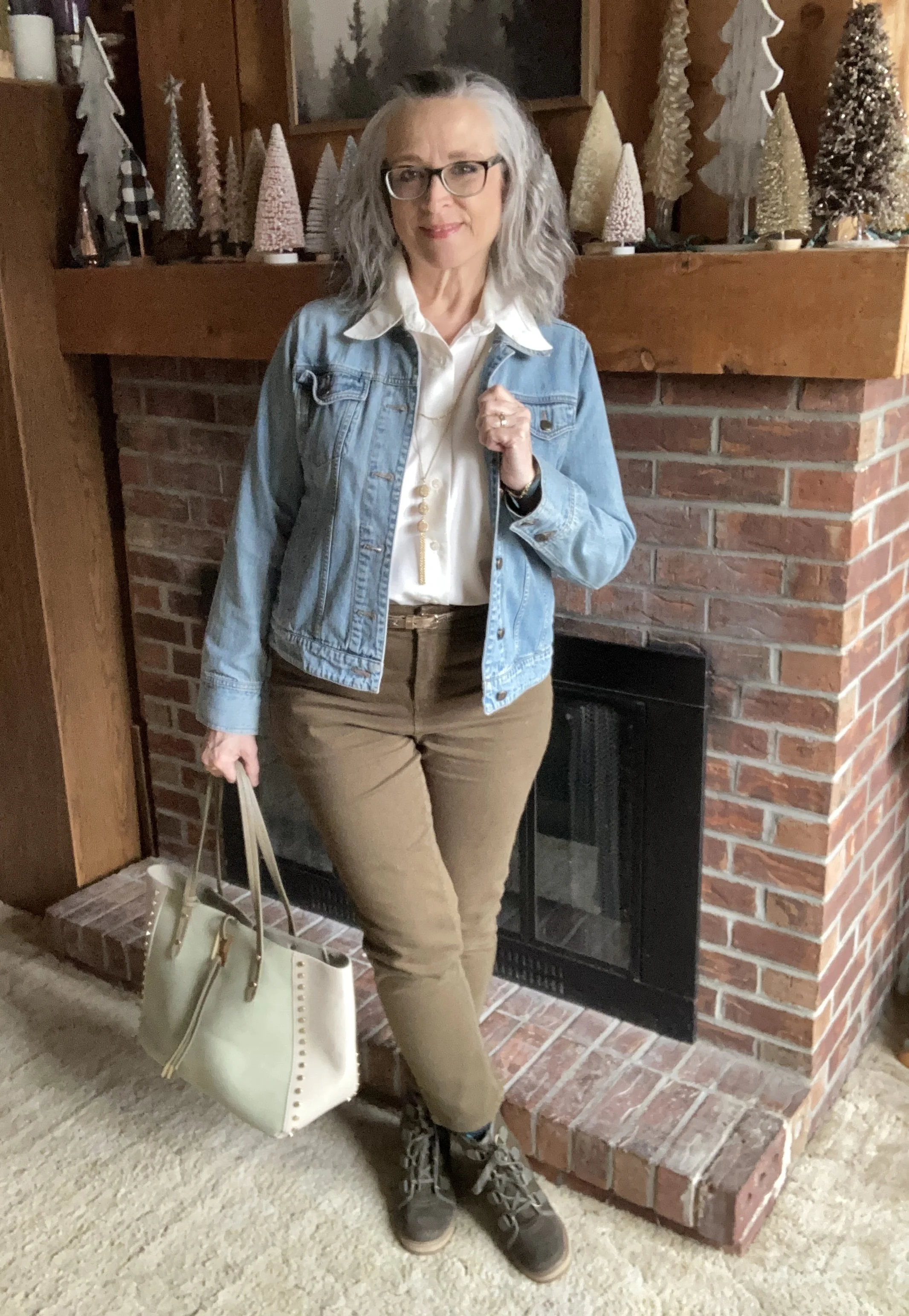
I did some research this past week on styling white button down shirts. It seems these pieces that once were reserved for the work place or maybe church are now chic and elegant with any type of outfit. Listen to this YouTube Video which gave me some great ideas for styling a collared white button down. The thought to use it for this blog post on styling a denim jacket for spring seemed like the perfect way to introduce this idea.

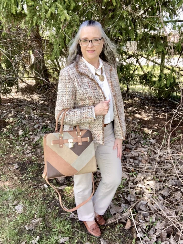
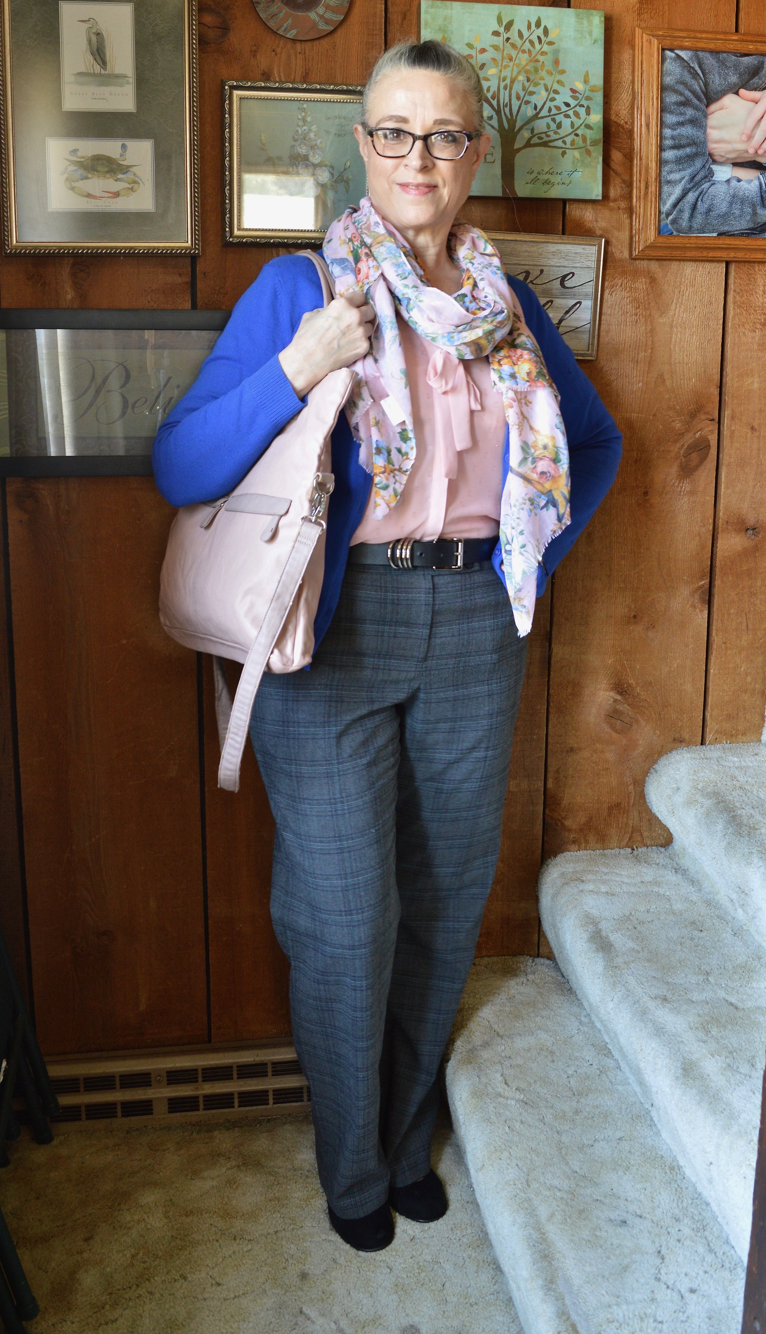
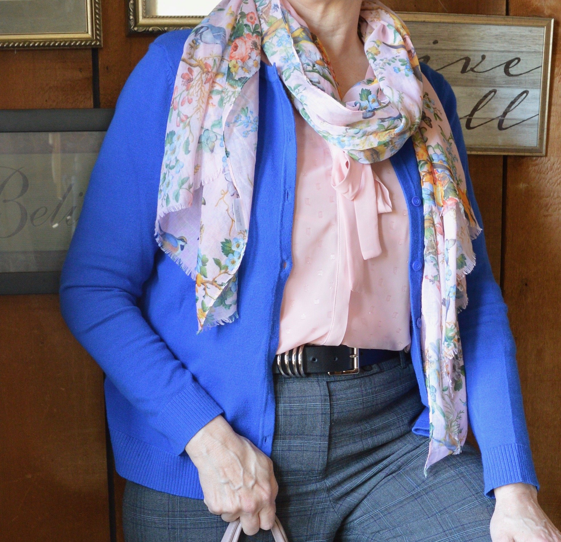
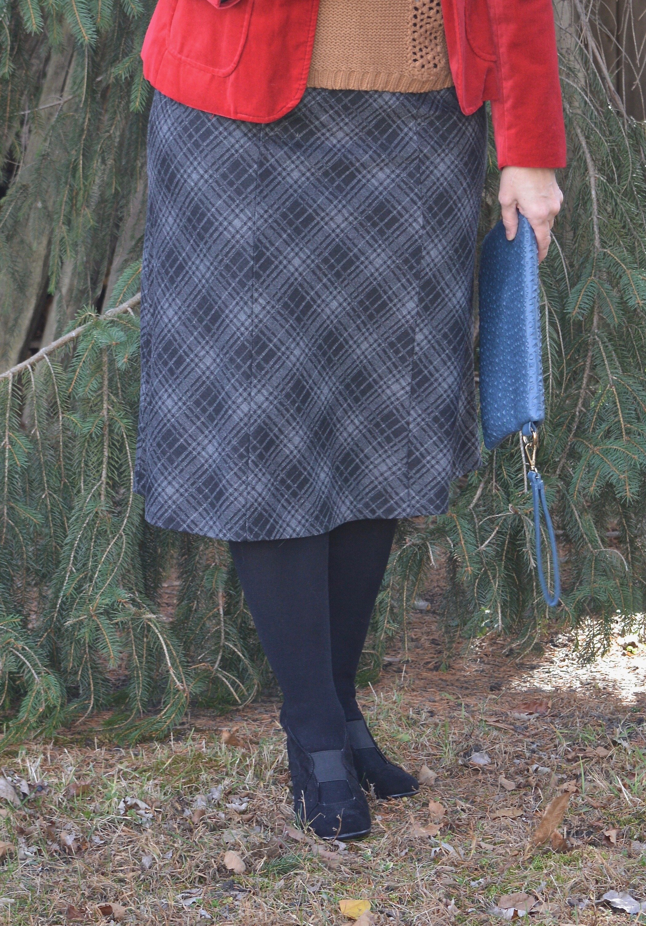
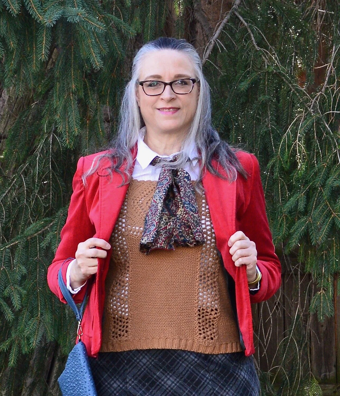
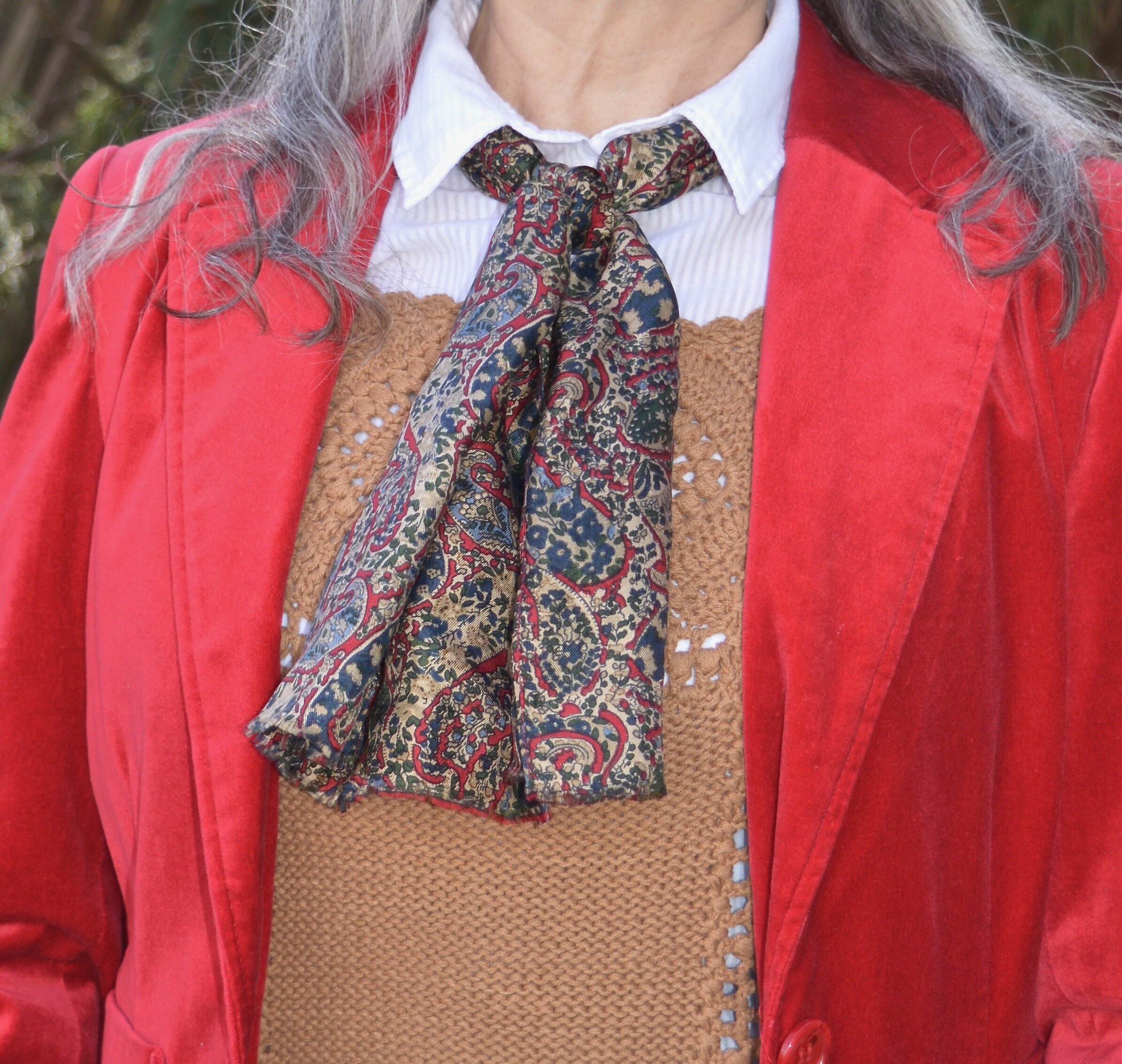
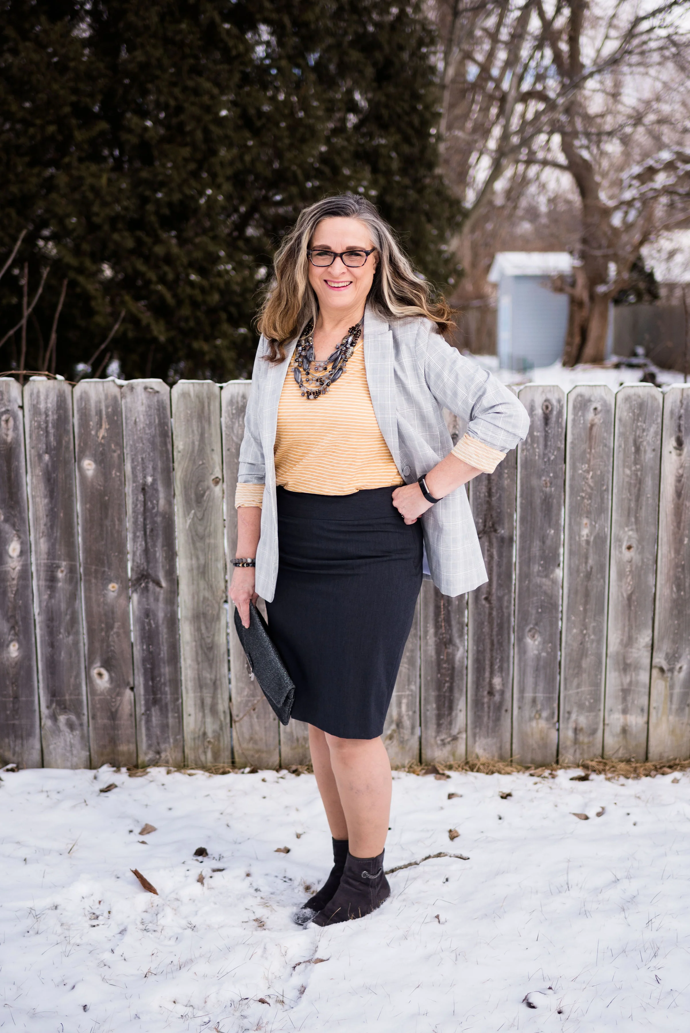
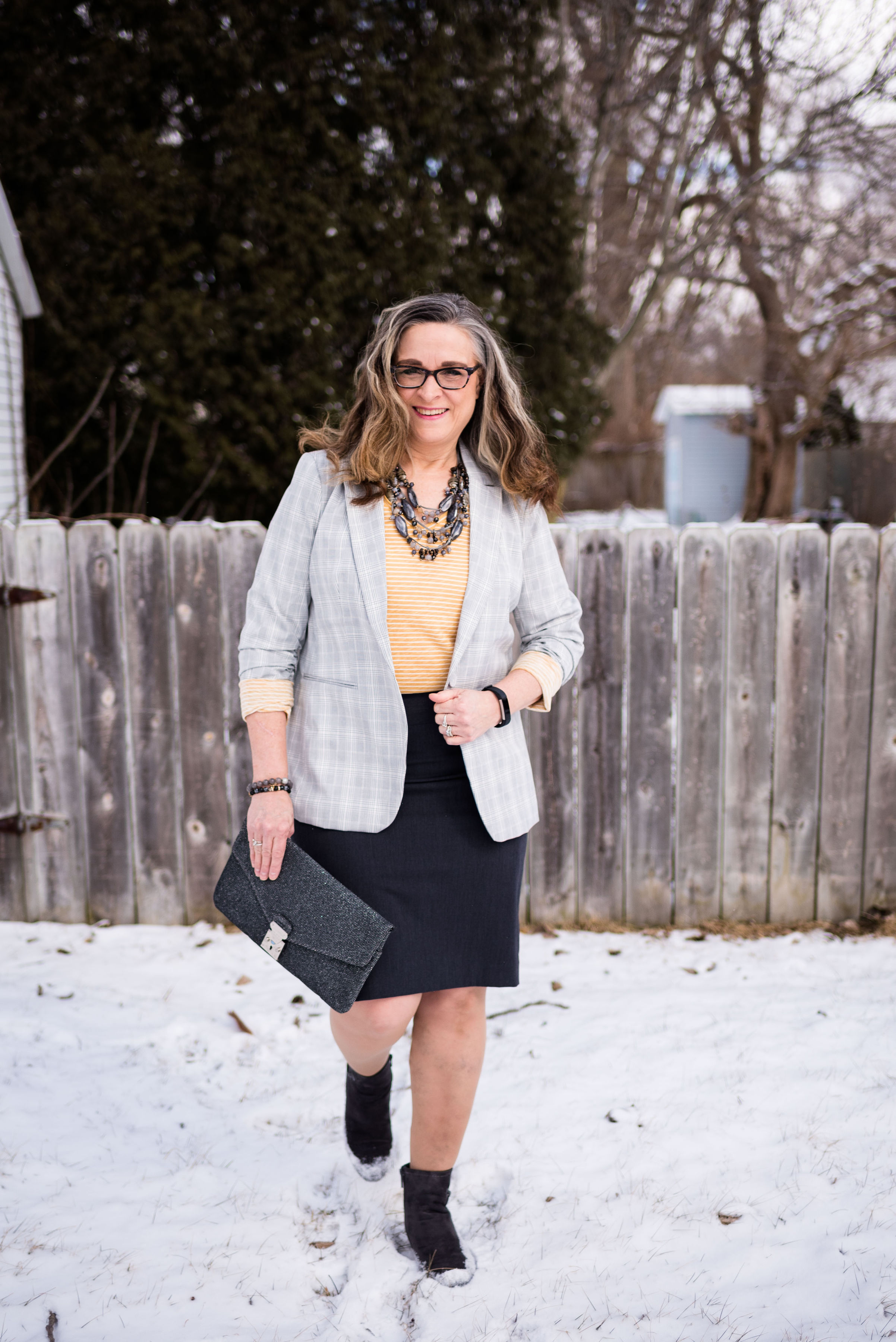
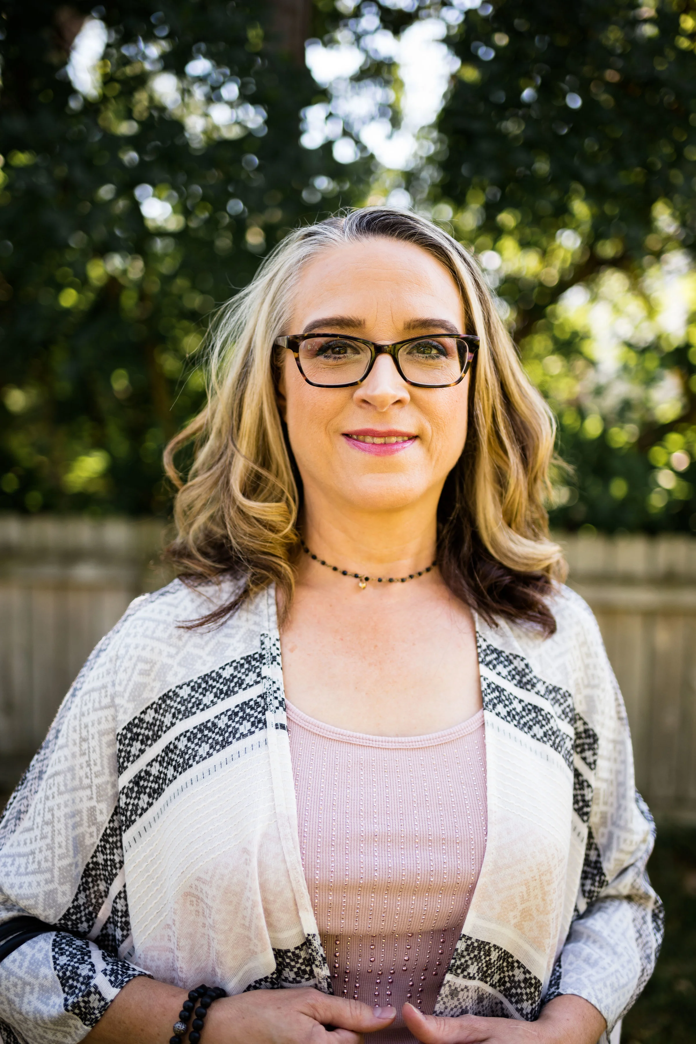
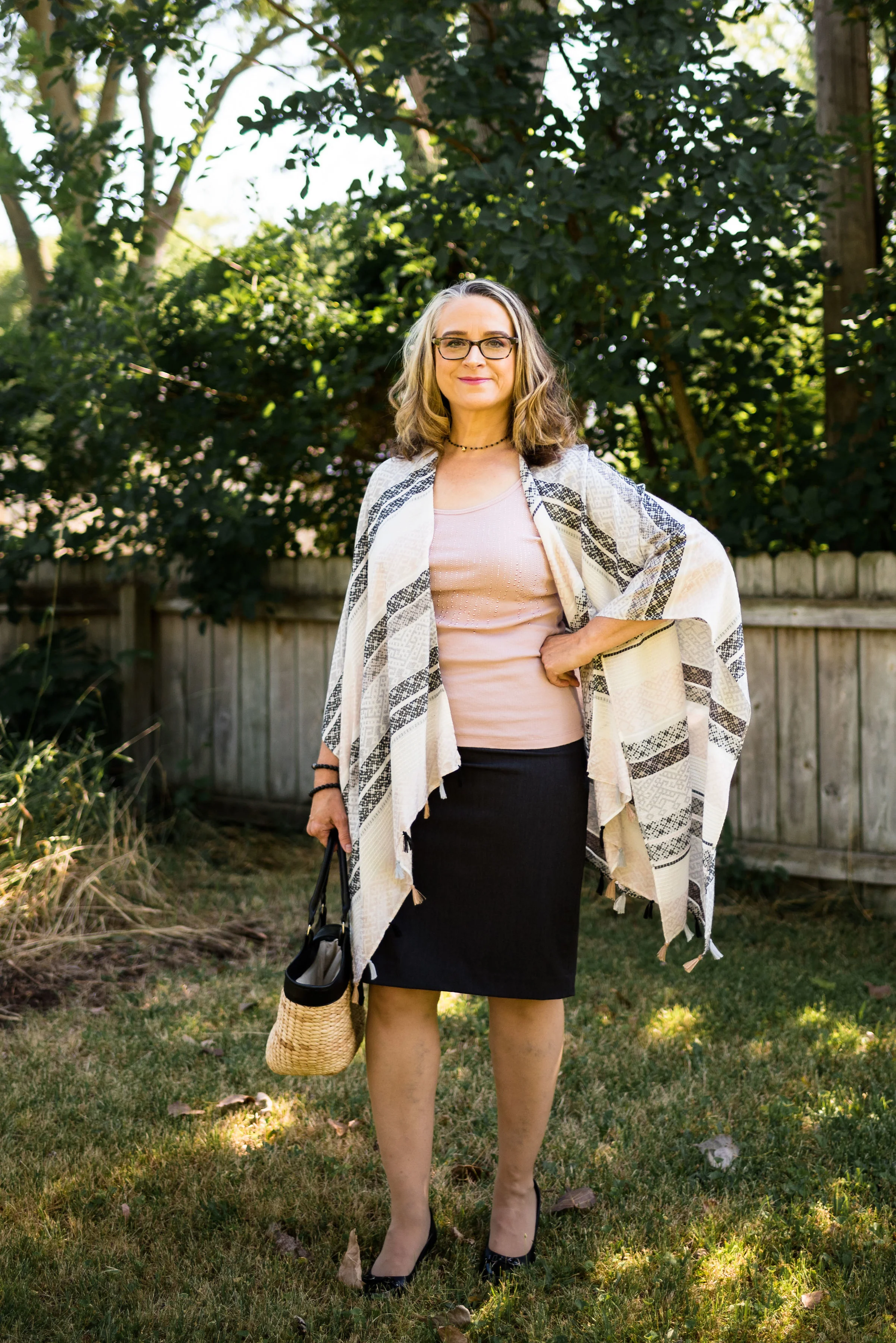
This thrifted Christopher and Banks piece is actually an XL. Typically, the idea behind a classic white button down is that it be a bit more structured, but the fix for a bigger, boxier piece like this is to merely tuck it in.
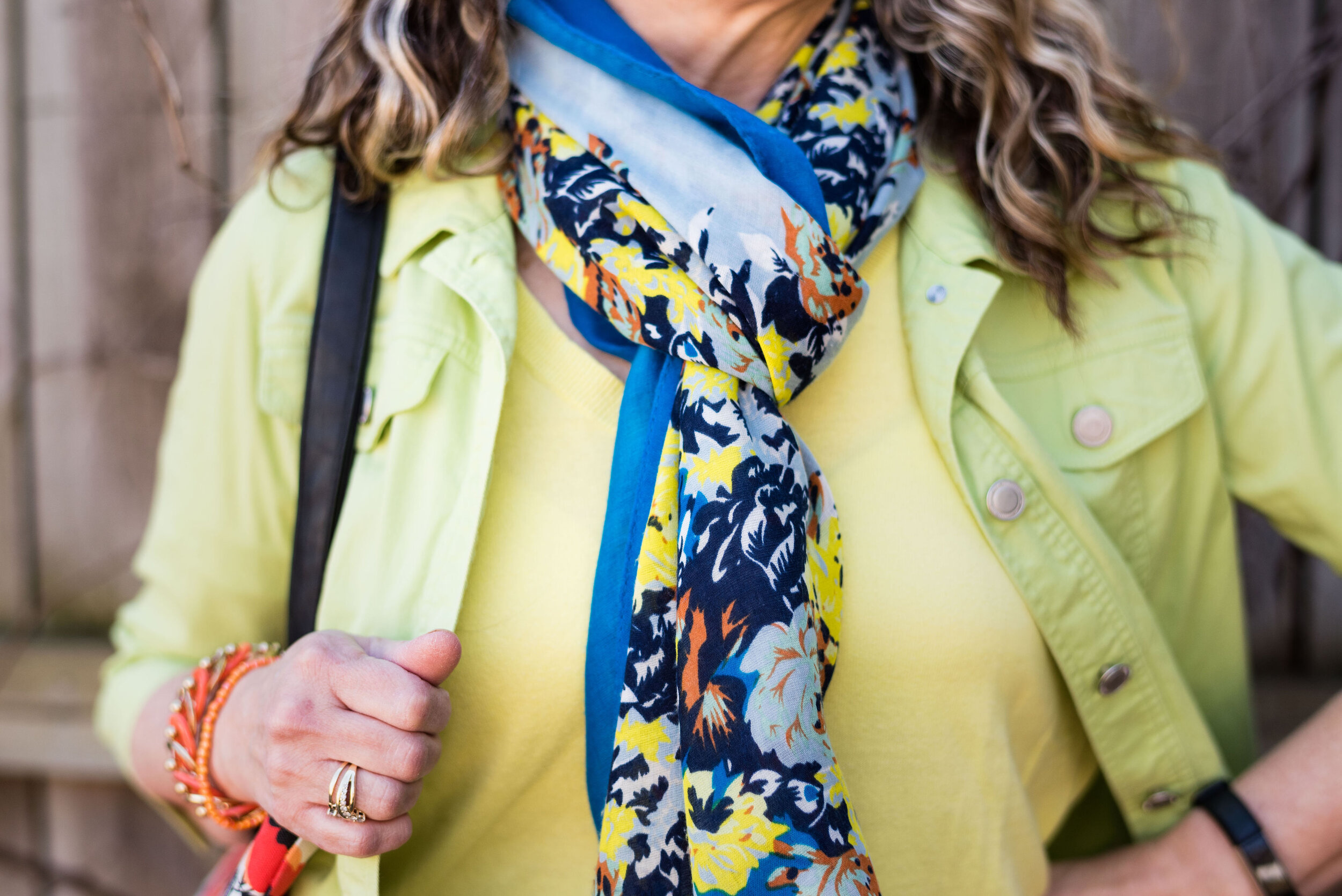
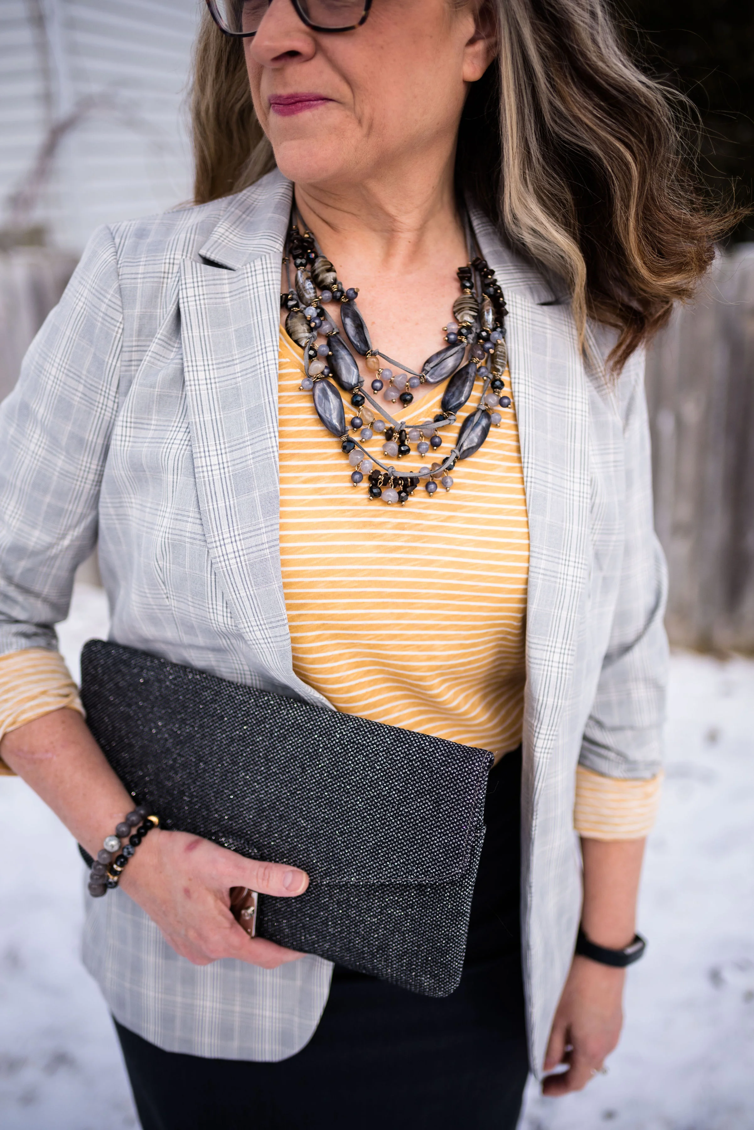
Style Tip: Choose the white that works for you. I am not as much into stark white, and lean more towards an ivory, pearl or very light cream. Find what works best for your complexion.

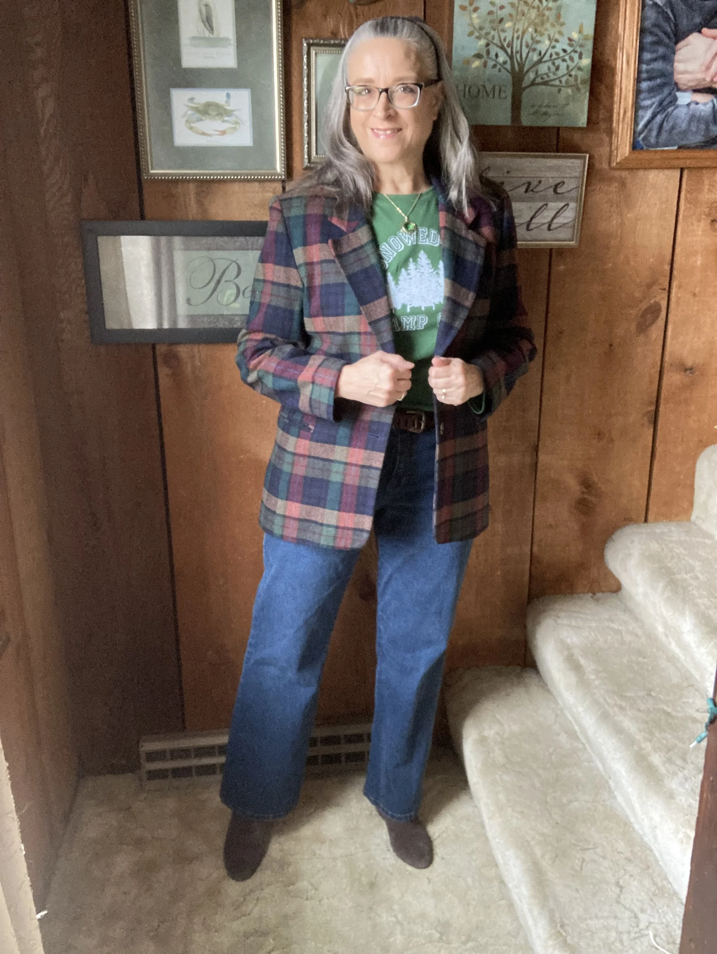
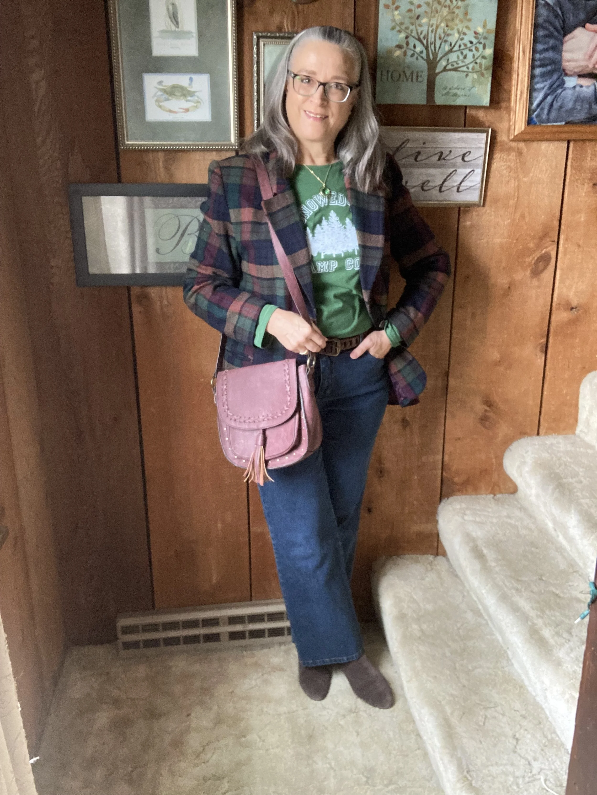
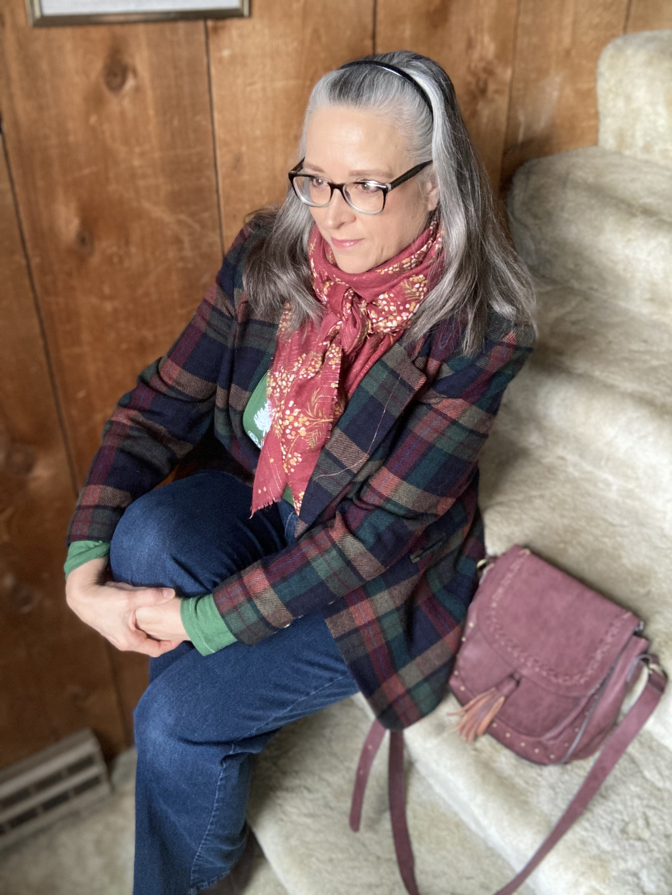
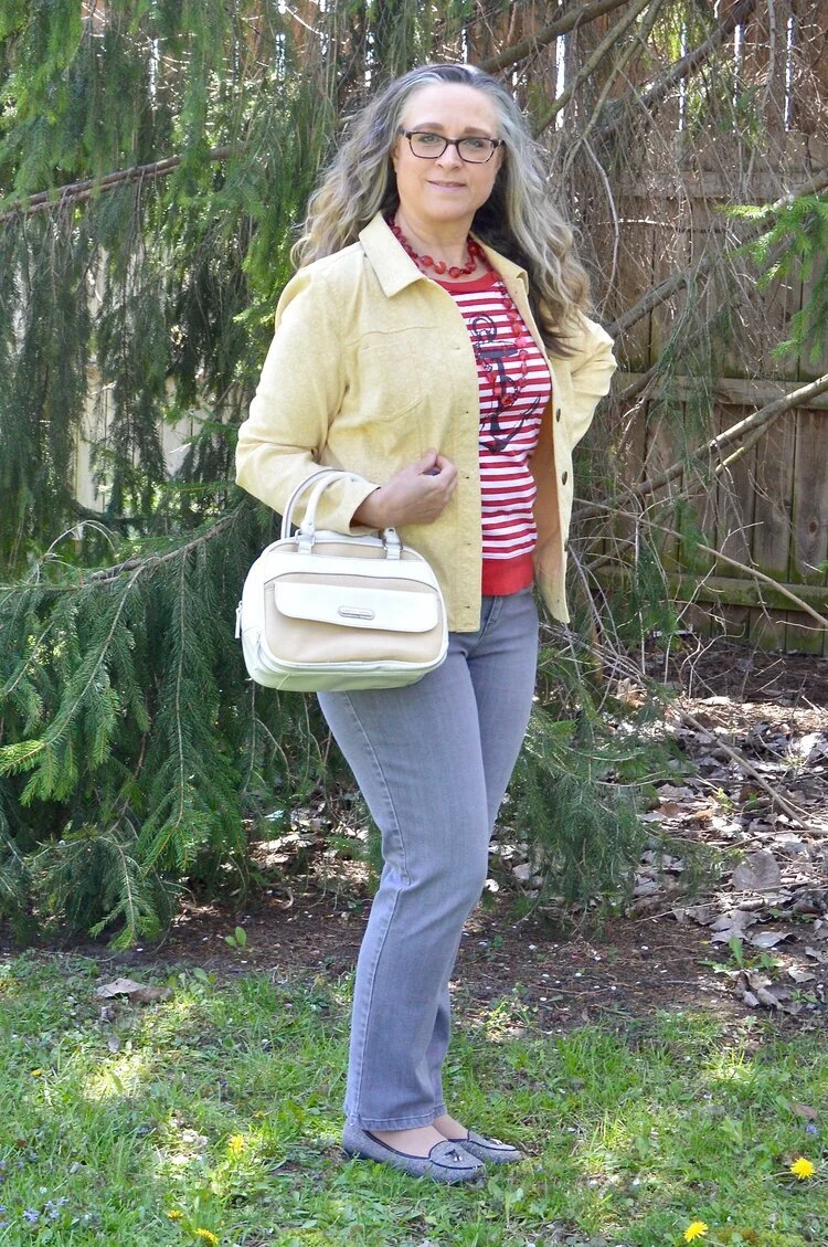
I’ve had this basic denim jacket for a number of years. It is Massini brand and I bought it at our local Meijer. I have numerous jean jackets. Here is one in a military style, a cropped one, one with floral applique, a medium brown, a white one, and a yellow one with 3/4 length sleeves. I do have a couple more, but I haven’t taken outfit photos with them yet. I know! How many denim jackets does a girl need? A basic one is really all that your wardrobe requires, but you know me and my clothes horse issues. Ha. ha.
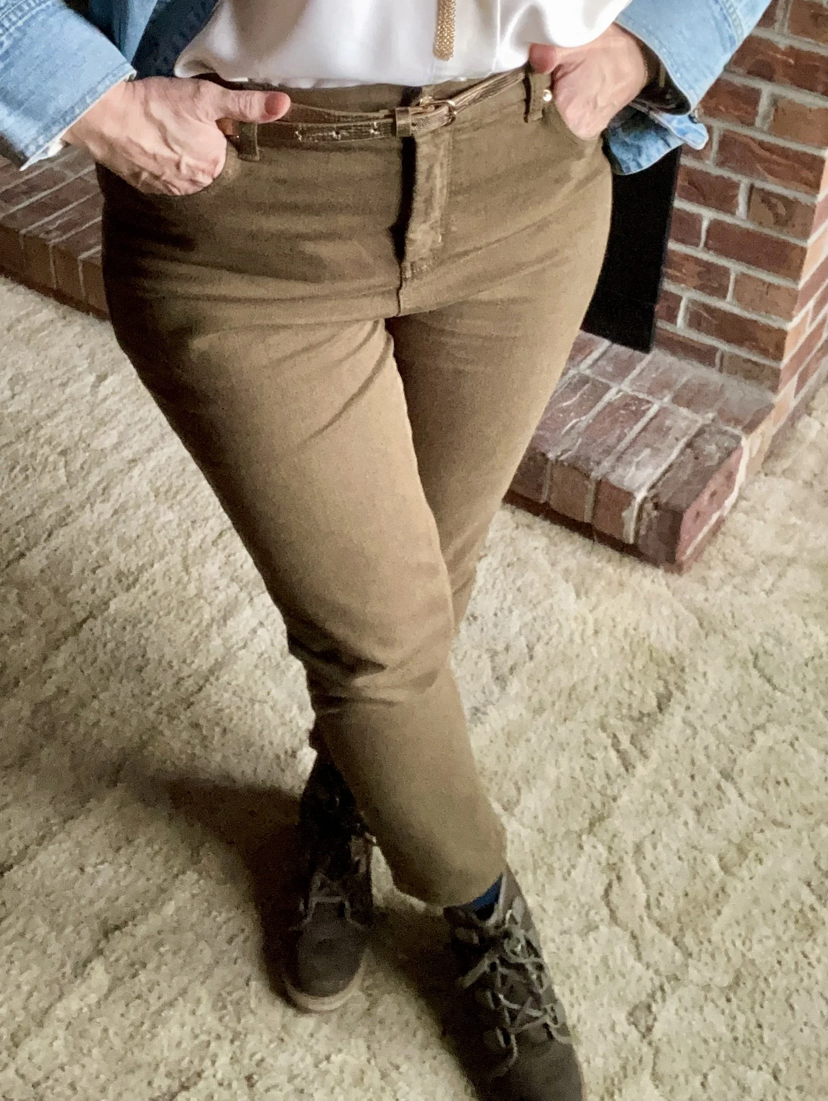
These hand-me-over slim cut pants are Chico’s brand. A few years ago my best friend was cleaning out her closet and let me go through the bags. That is always fun to do!


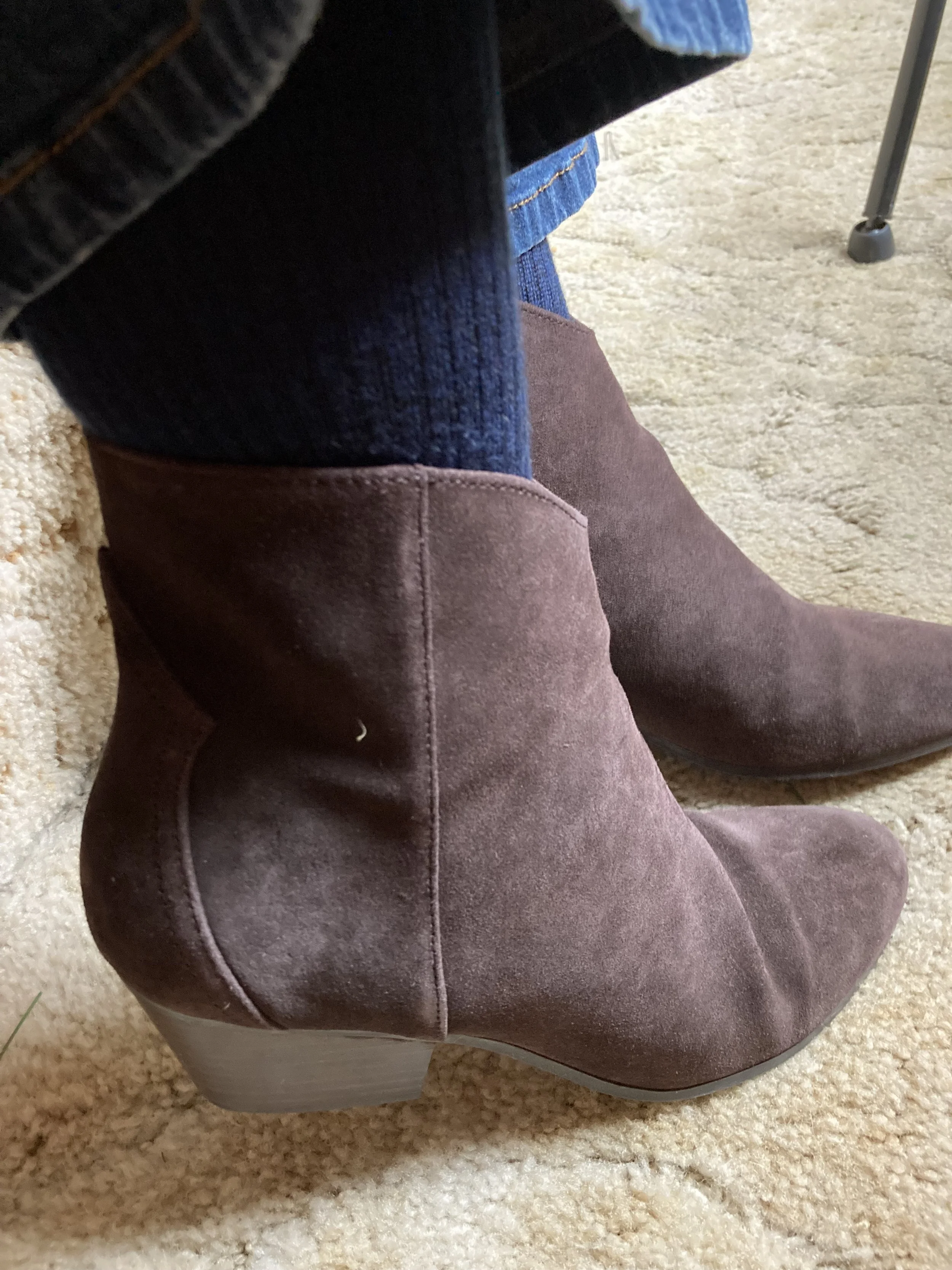
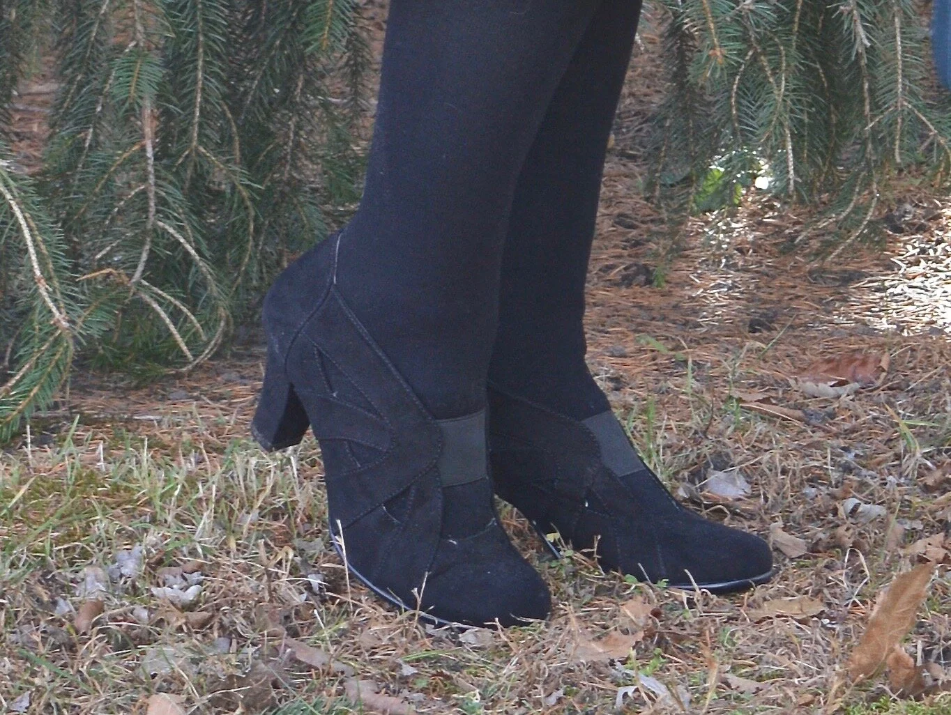
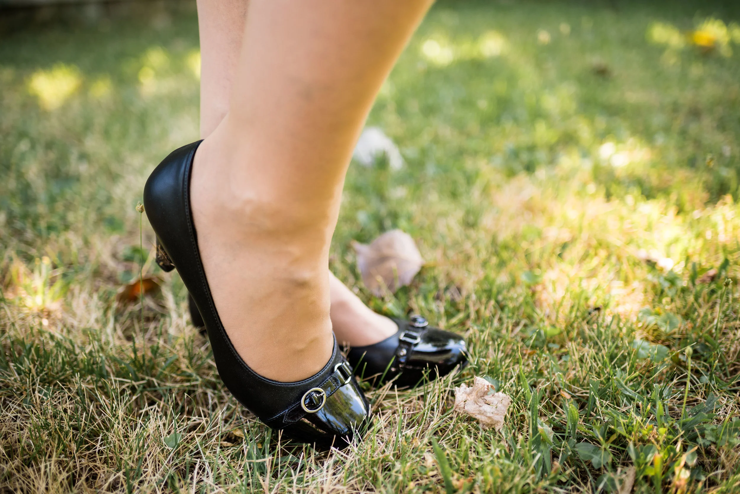
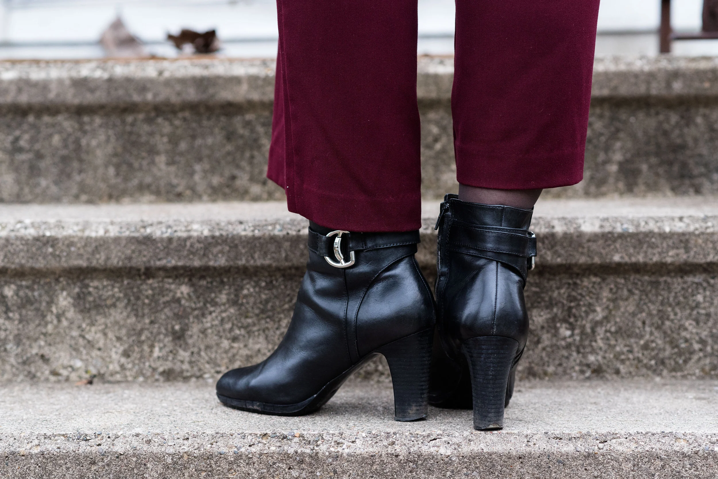
For my shoes, I grabbed these thrifted, Merona, wedge ankle boots. I thrifted them last year and hadn’t really had the opportunity to wear them. When I put them one, I was pleasantly surprised at how comfy they are. I definitely need to think of some more ways to style these.
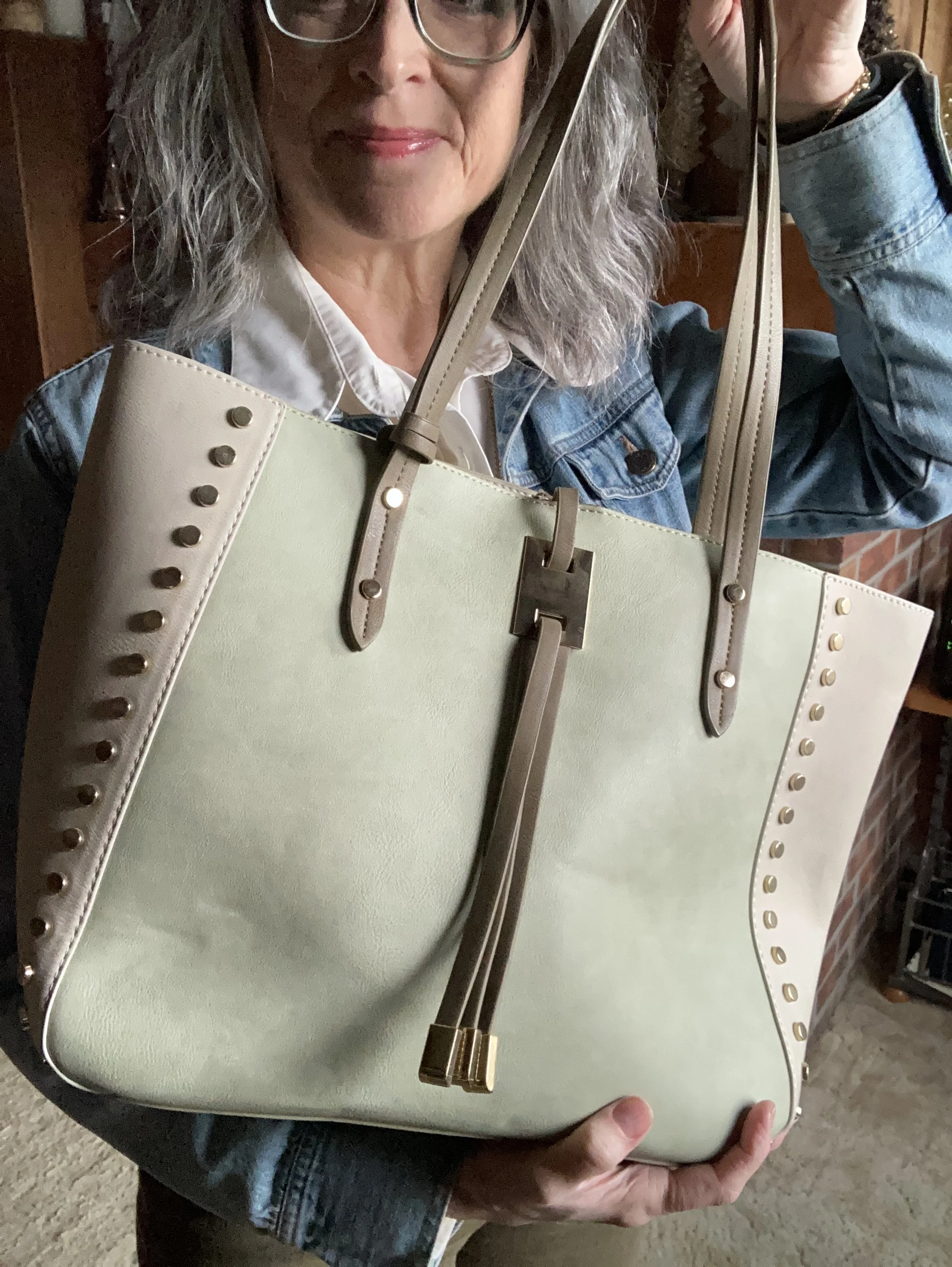
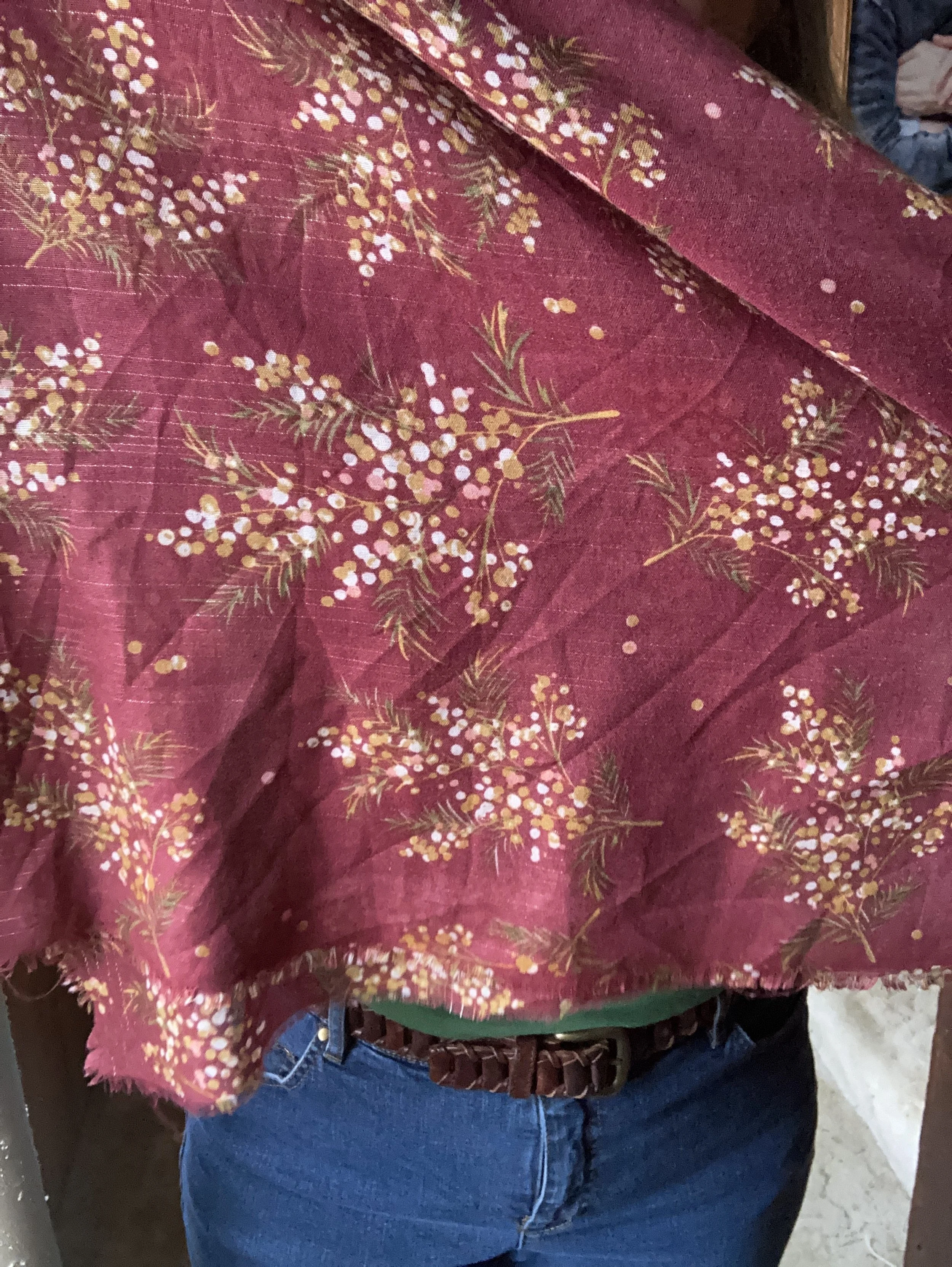
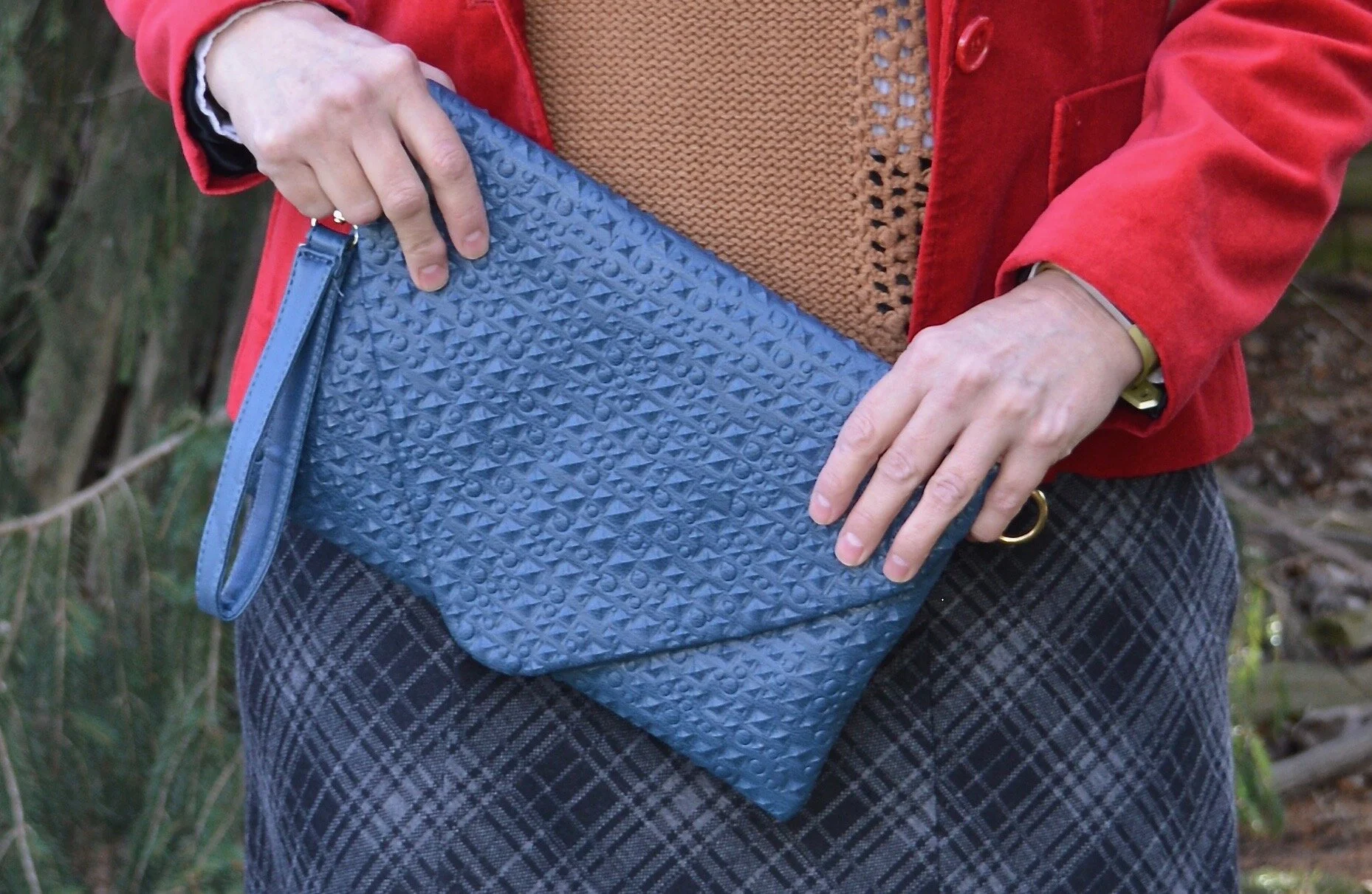
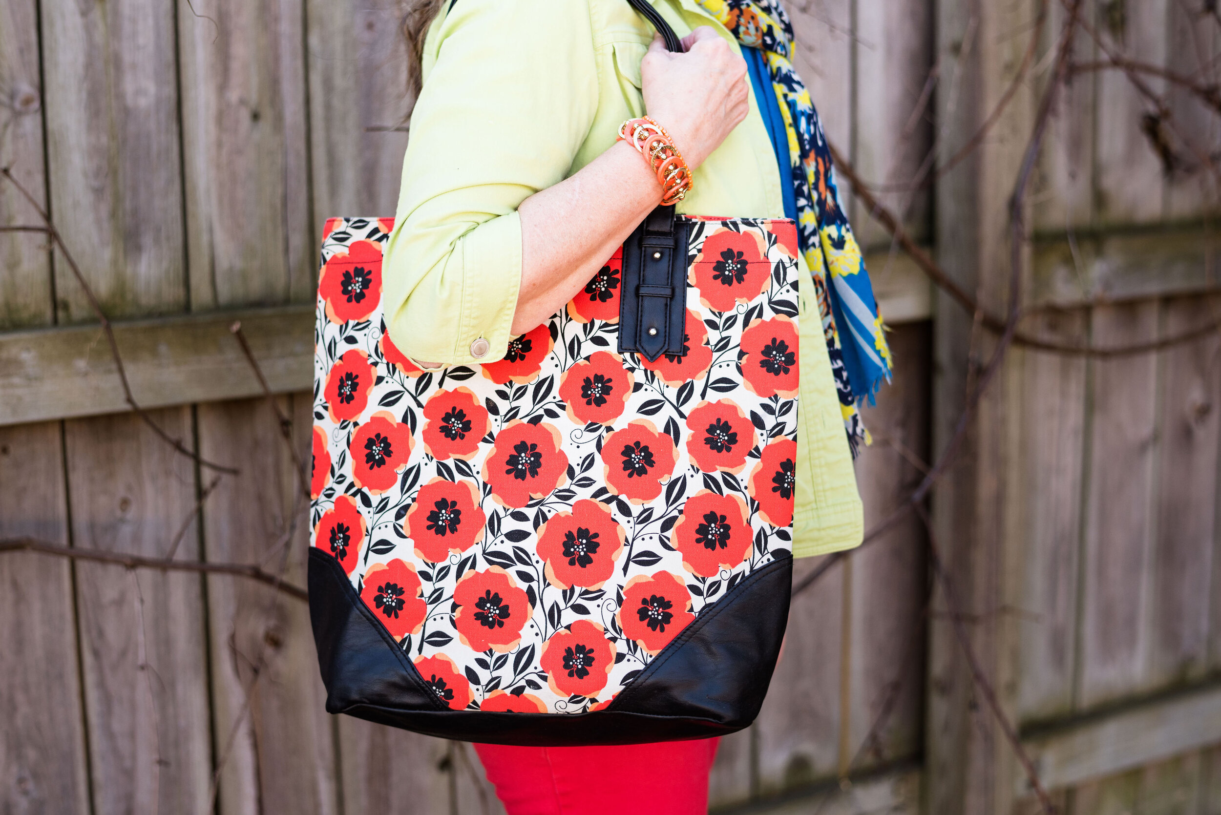
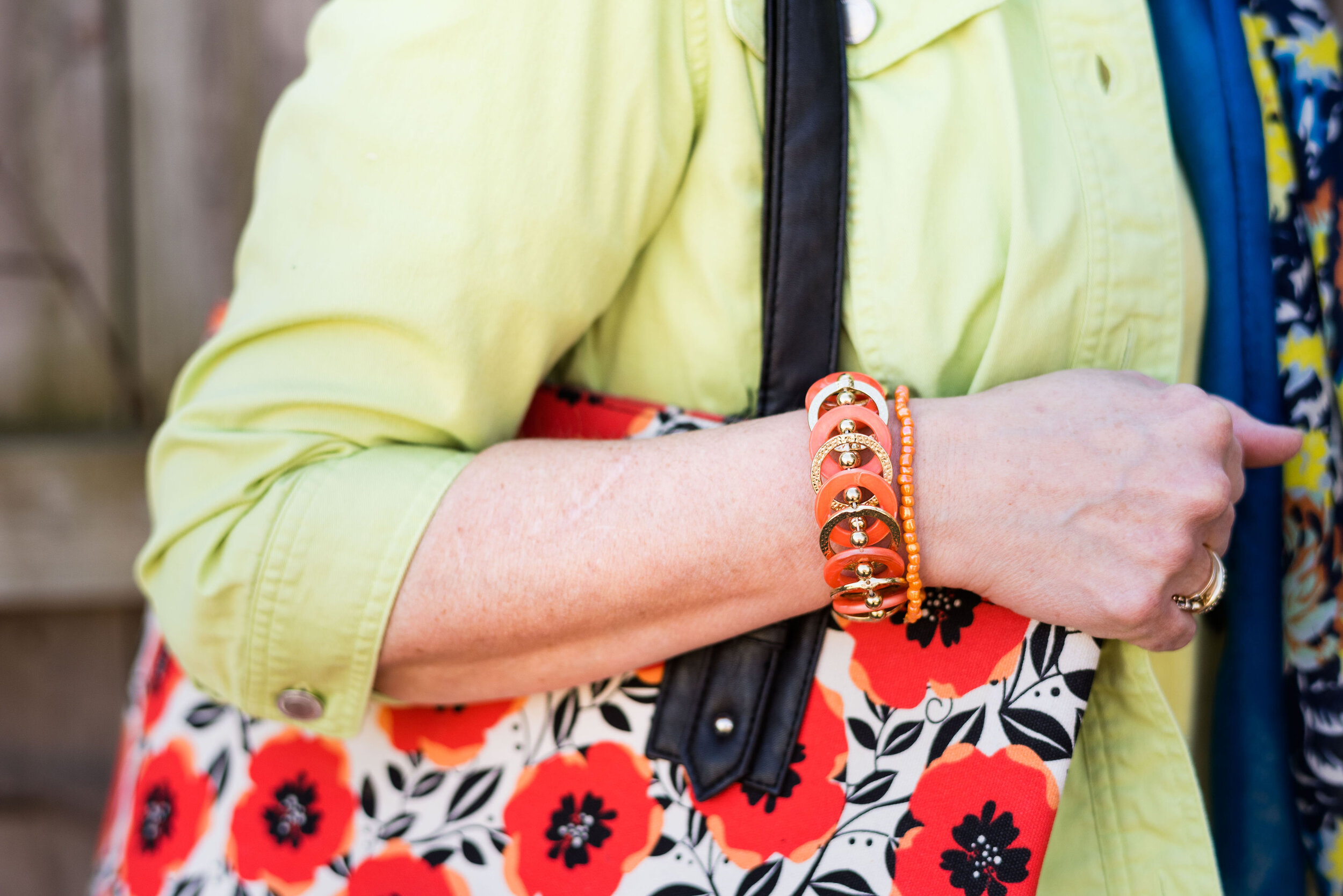
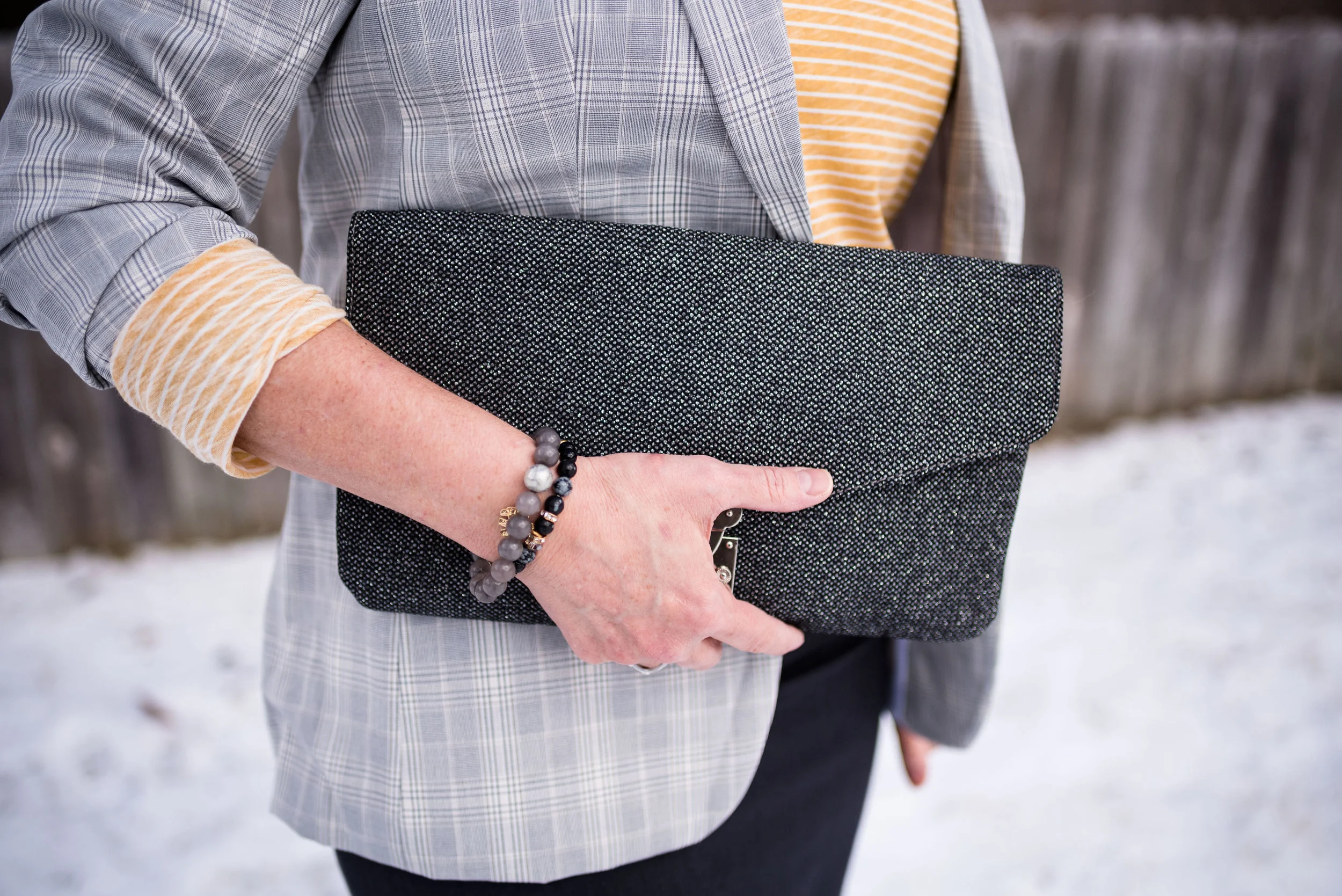
My tote bag was from Charming Charlie’s back when we still had a store at our mall. I love this room piece and with the two tone color and gold rivets feel like it is great for dressing up.
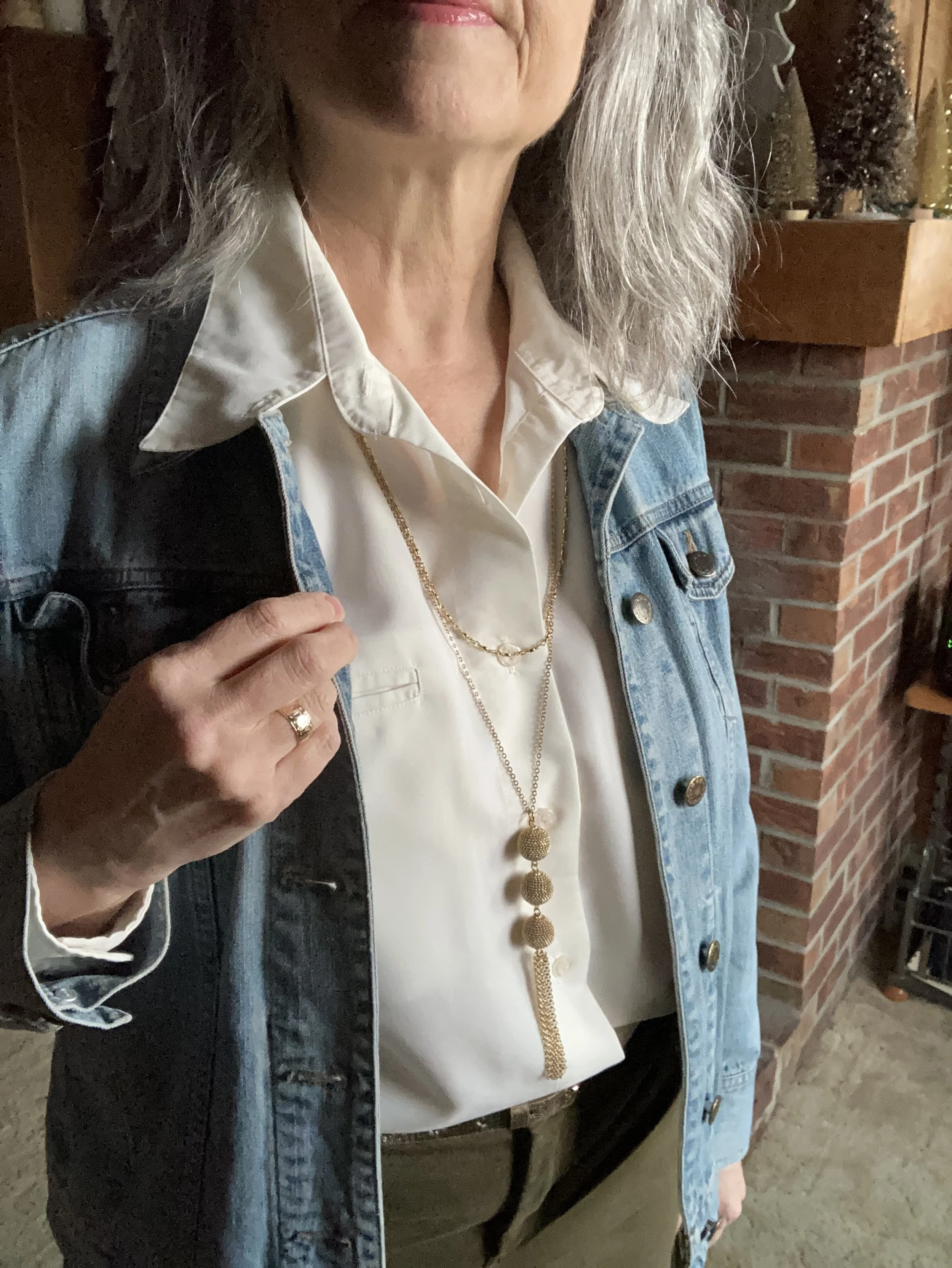
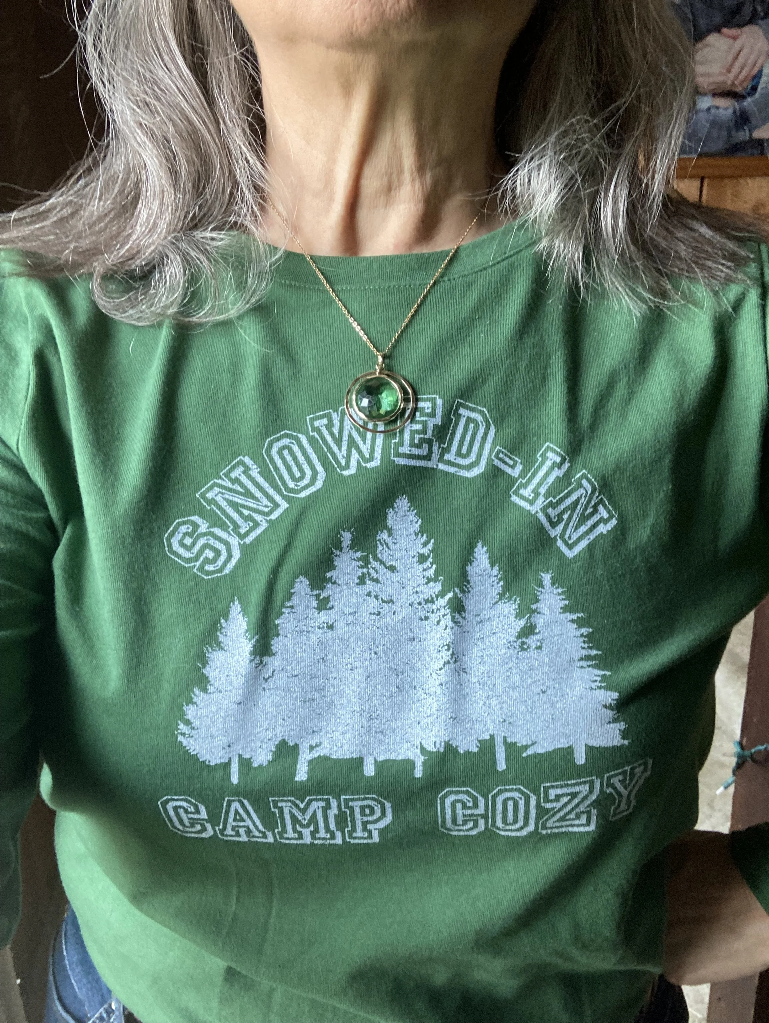
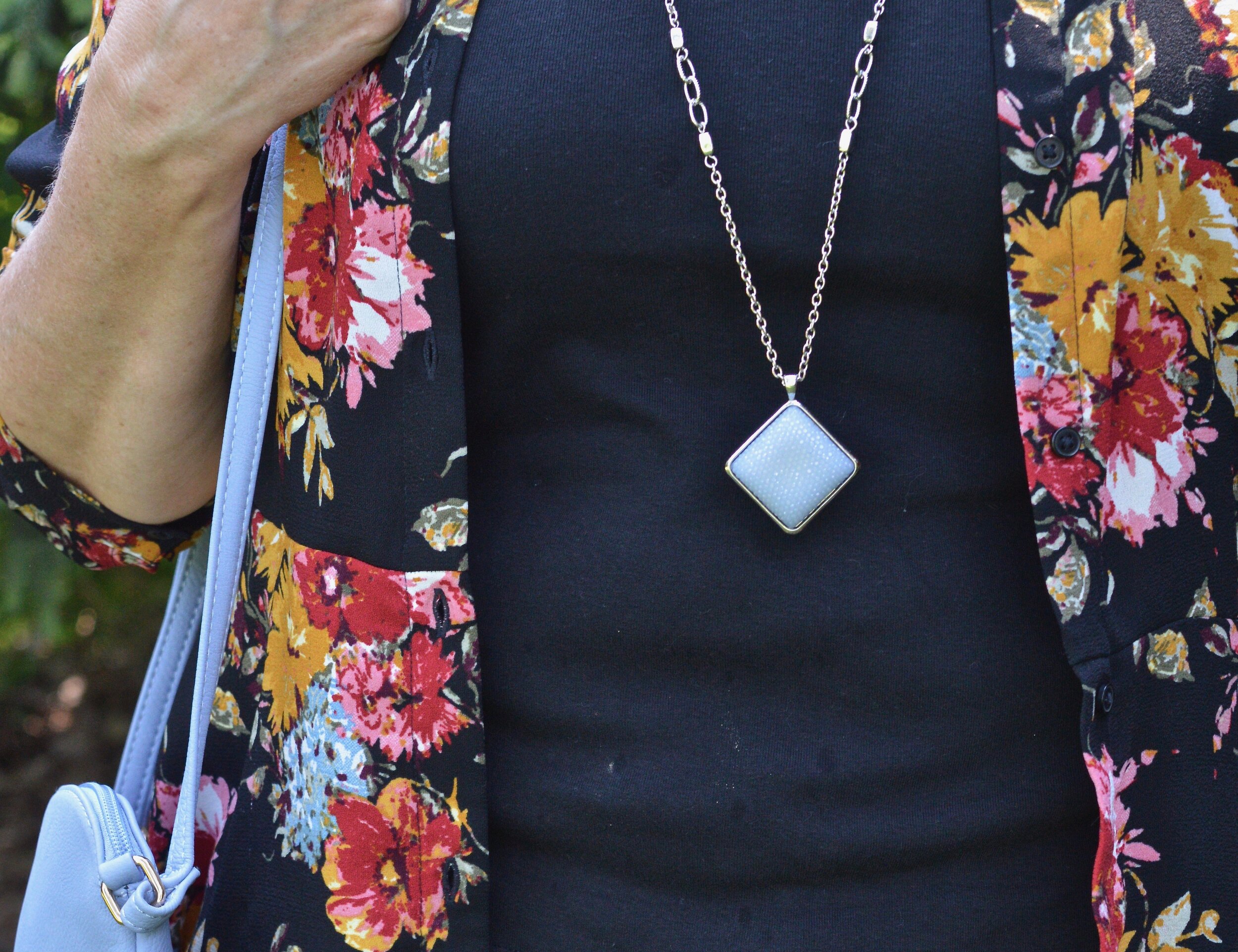
Gold tones seemed the perfect accompaniment for this outfit. Layering necklaces is still a think so feel free to layer it on.
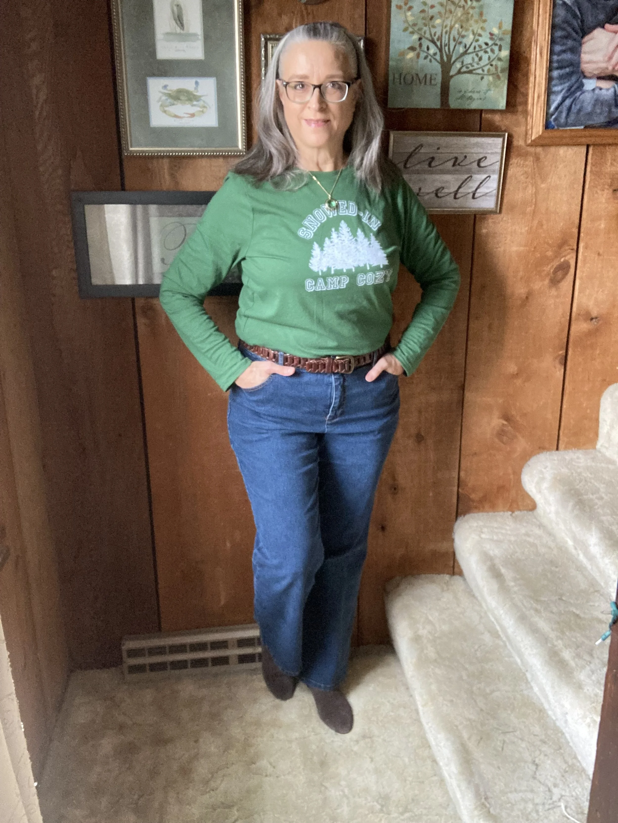
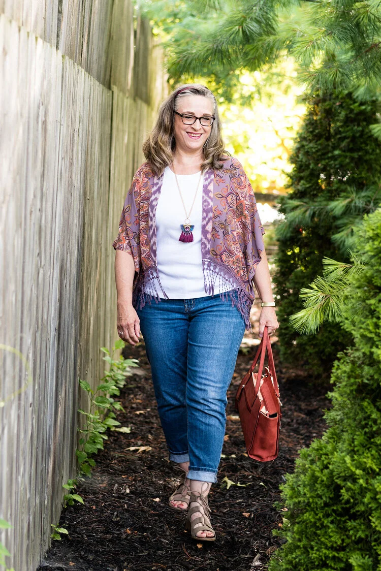
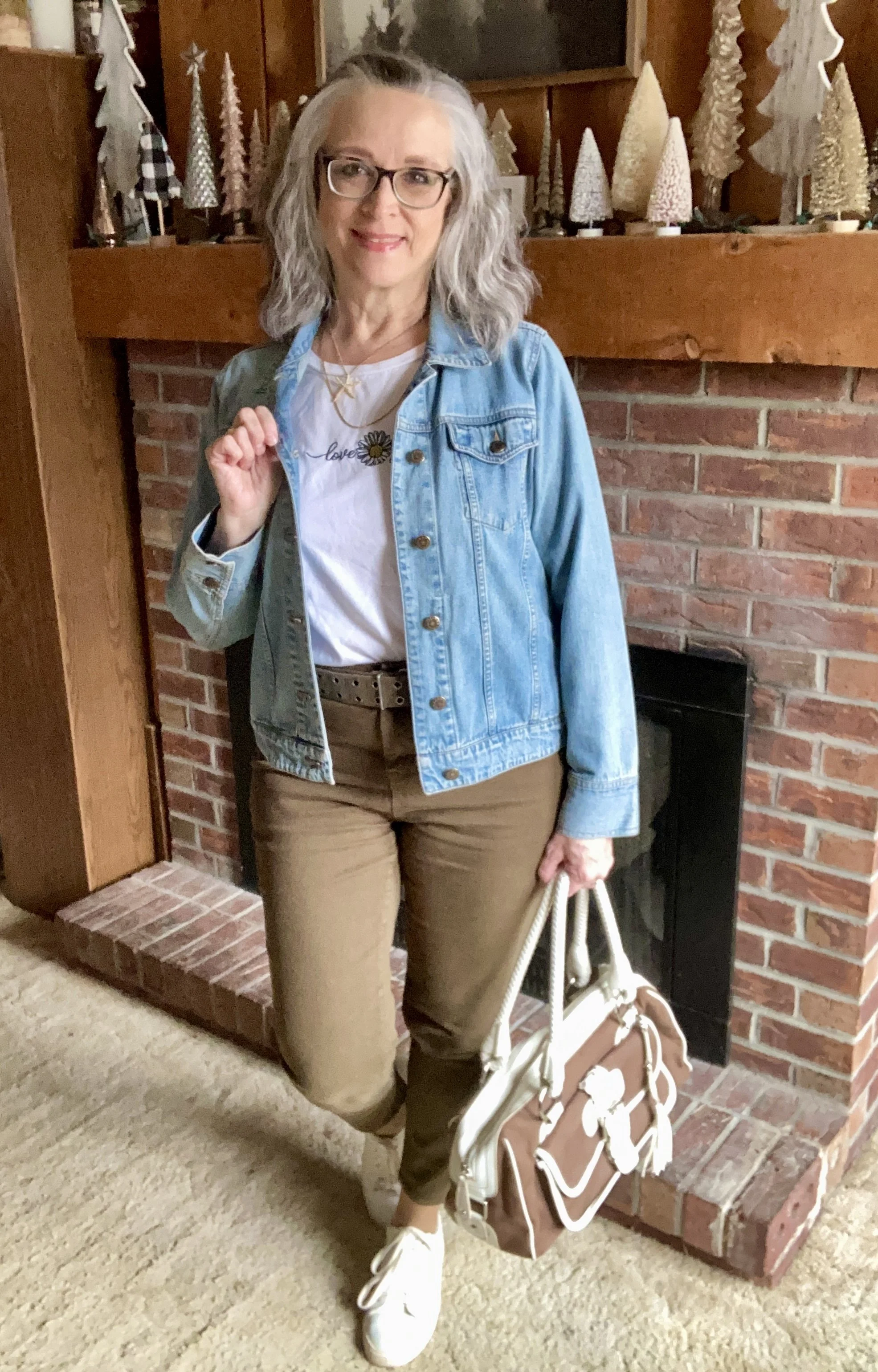
Look 2 - White Tee

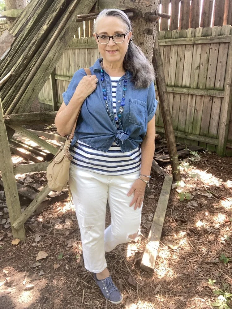
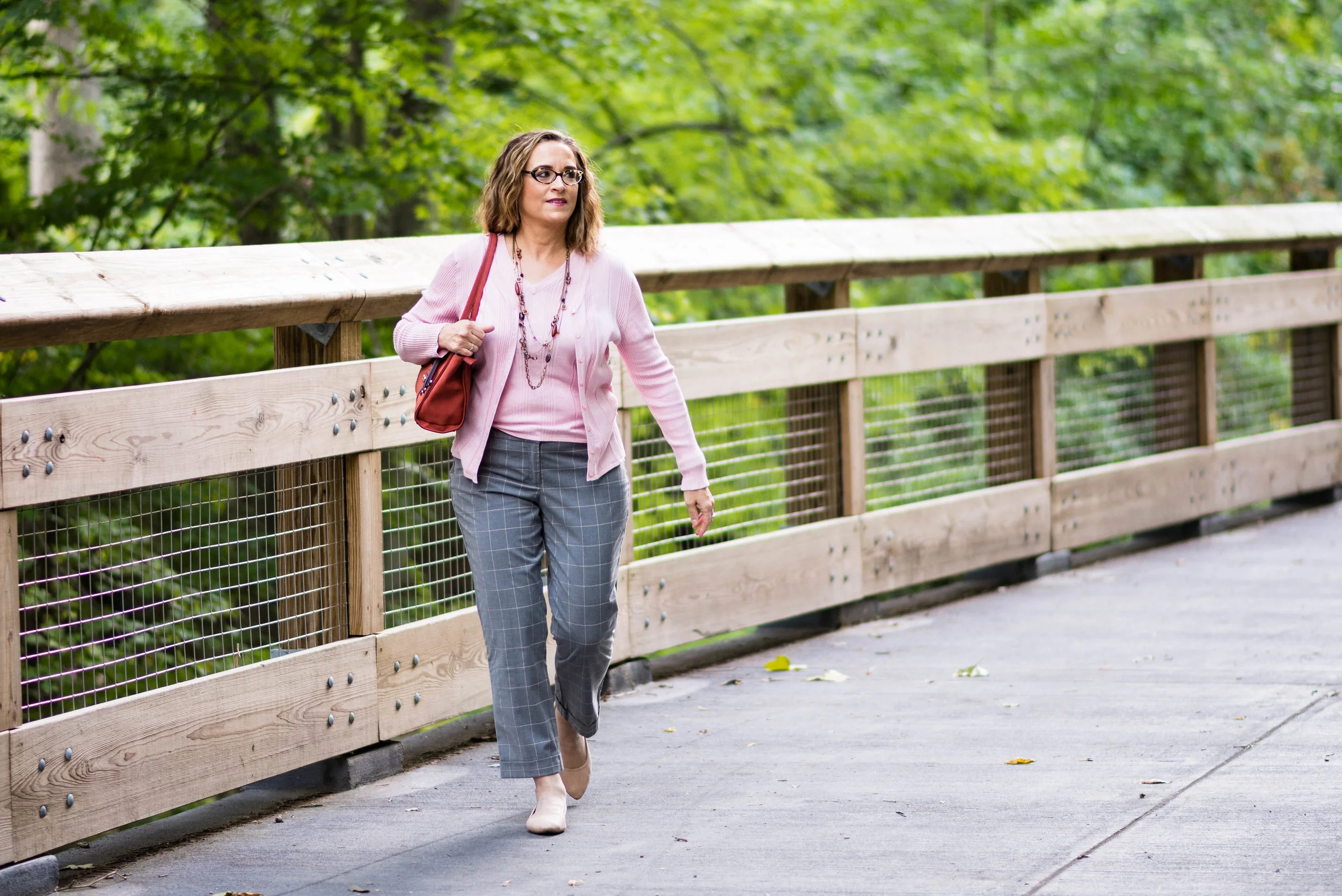
The beauty of this type of outfit is that it is easy to swap out just a few pieces to make the outfit completely different for the changing aspects of your life. Swap out the dressier button down for a white tee. I chose a long sleeve, graphic tee.

I got this cute “love yourself” tee with the appliqued daisy before I started my #75hardstylechallenge . This is a brand called Ultra Flirt and I bought it at the thrift shop around the corner when they were having a 50% off sale which they do at the end of each month. You can also see, I swapped out my narrow metallic belt for this wider olive one, which also makes the outfit more casual. This shirt is a cropped piece, so could also be worn out with not belt.

I chose white my white Steve Madden sneakers from DSW. These are starting to show some wear, but I will clean them up with a bit of dish soap, baking soda and a toothbrush and they will get me through one more summer.
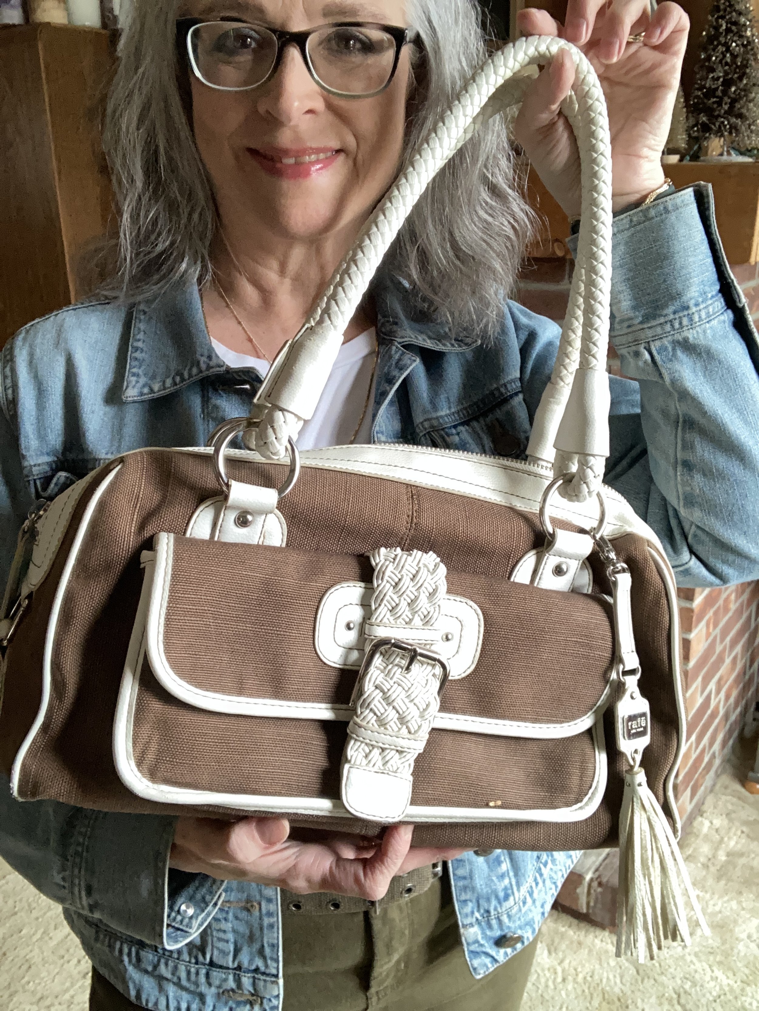
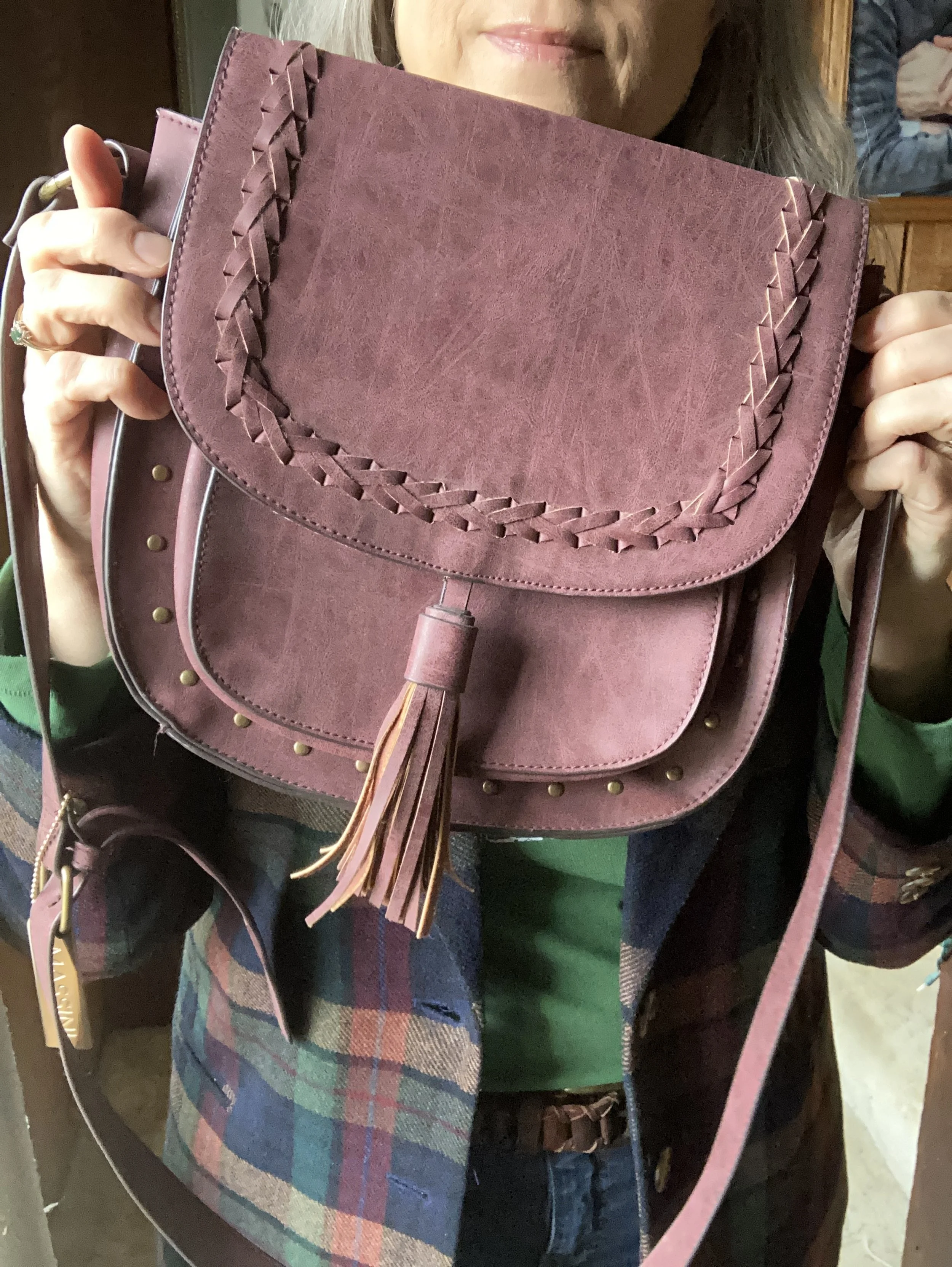
Since brown bags are trending, I thought I would pull out this thrifted Rafe for Target bag. I definitely want to use this for the summer. It is quite roomy and seems very durable and it has a pretty printed cloth liner.
Here are the two outfits side by side. What do you think? Do you have a denim jacket in your closet? Will you be taking it out for spring? Would you style it the same way as you would a blazer or cardigan to get more wear out of these fun warm weather pieces?

I hope you enjoyed this post. I’m providing a few shopping links for you to look over. These are affiliate links. All opinions are my own.