Color Play - Brown and Pale Green

Brown is a color that not everyone likes to wear, but you know me and my motto which is all colors for all women. Color and how we wear it and look good in it has to do with shades of color, and placement of the color on our bodies.

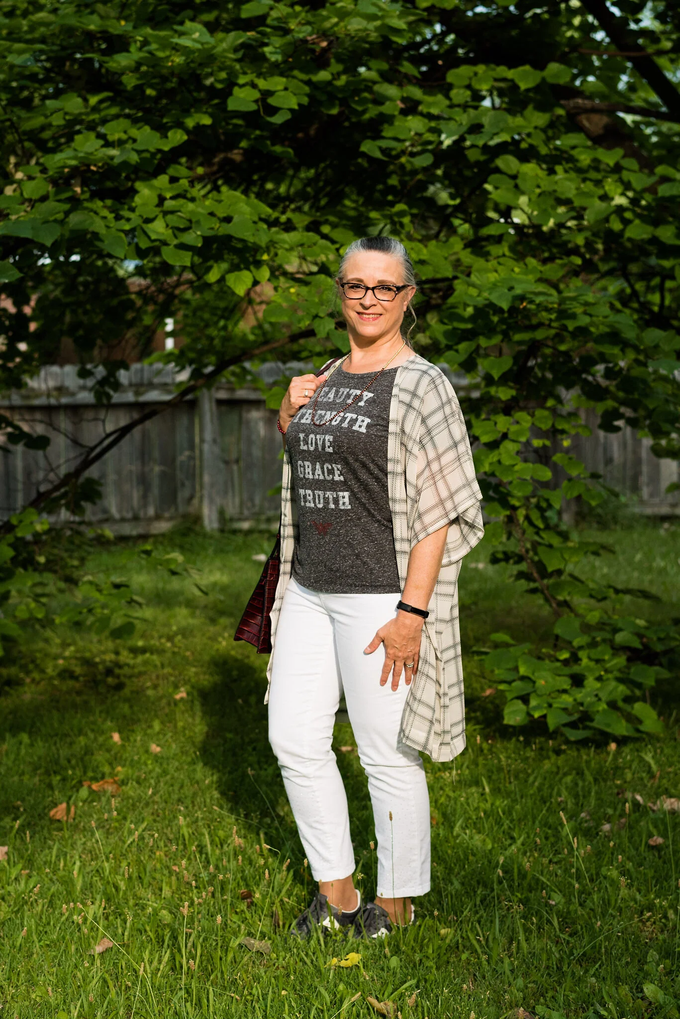
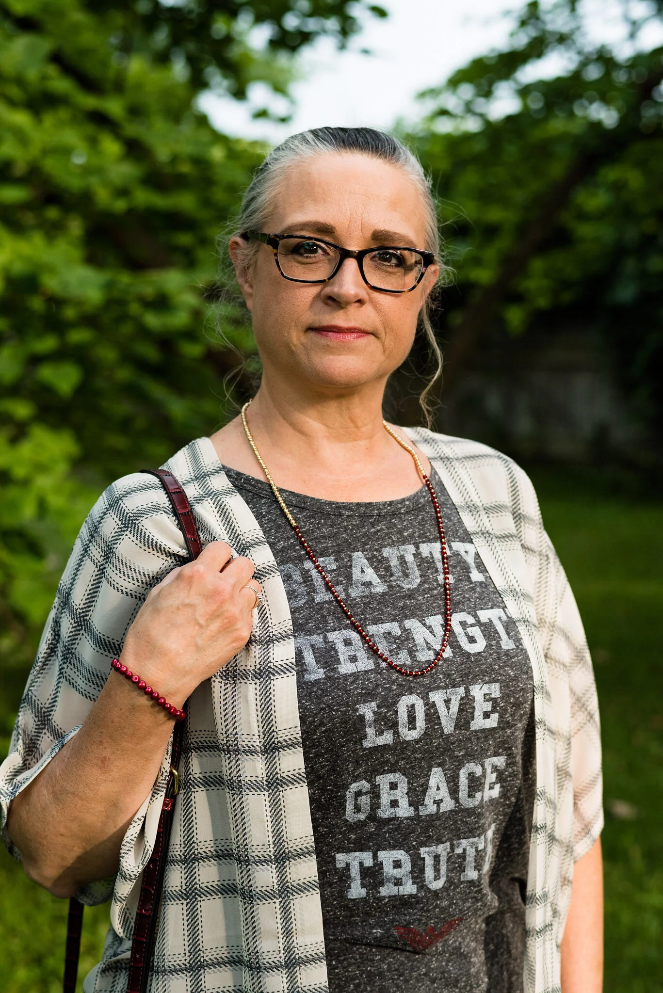
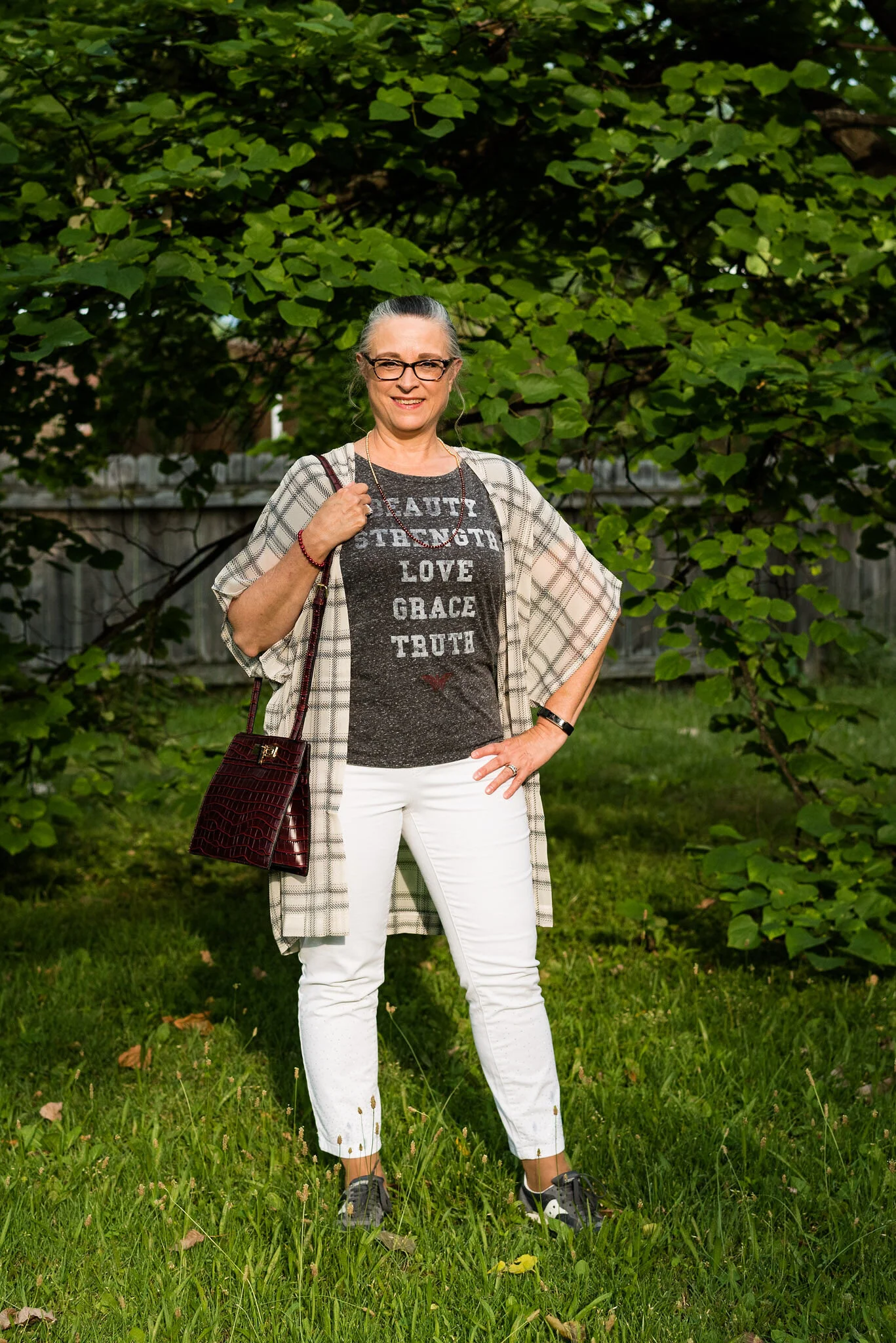
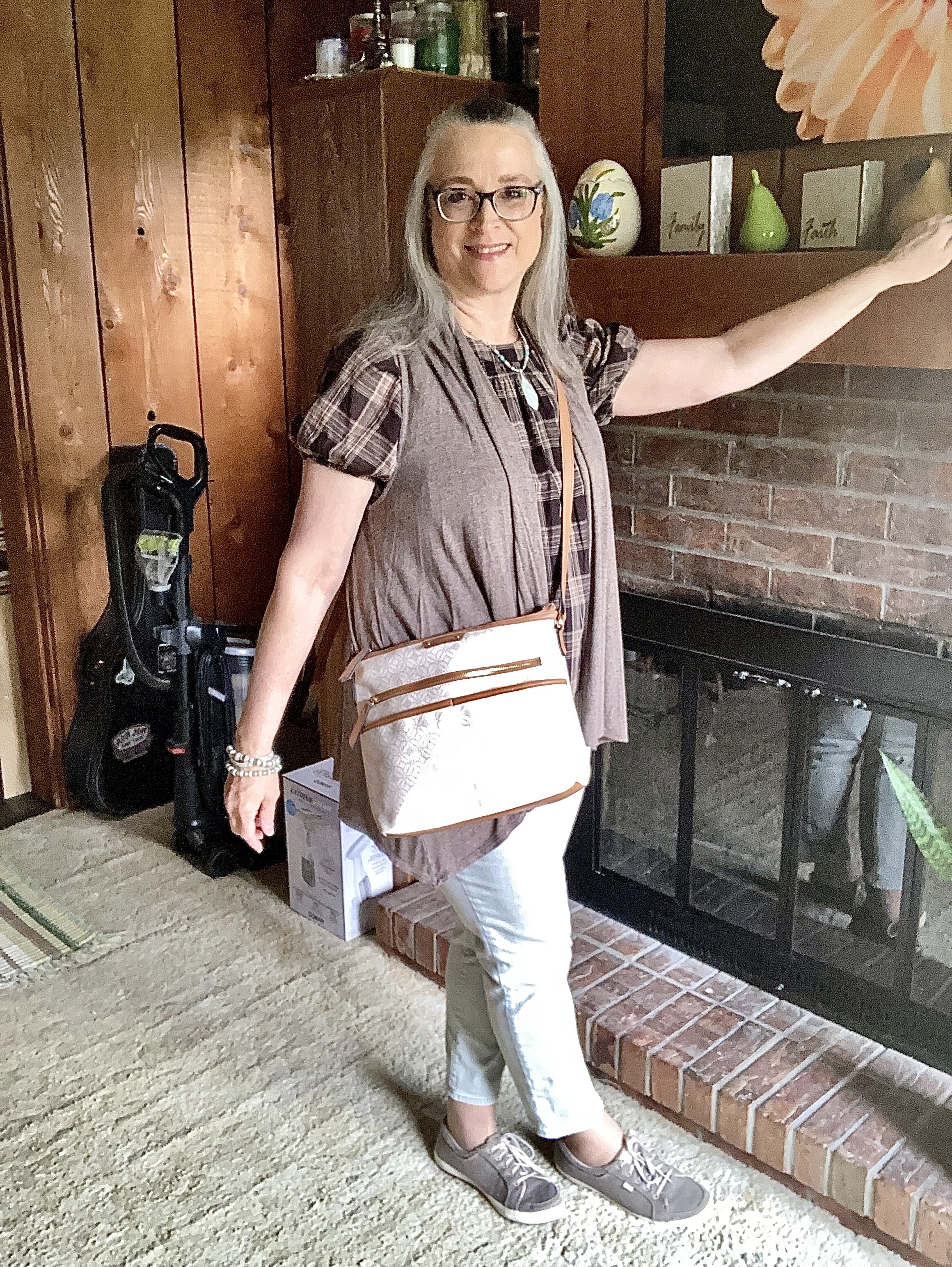
Today I am showing you an outfit that uses different browns, as well as different pale greens. The thought that brown and green go well together is not new, just think about trees and their branches. Many of the color combinations we see in nature work in the fashion world too.

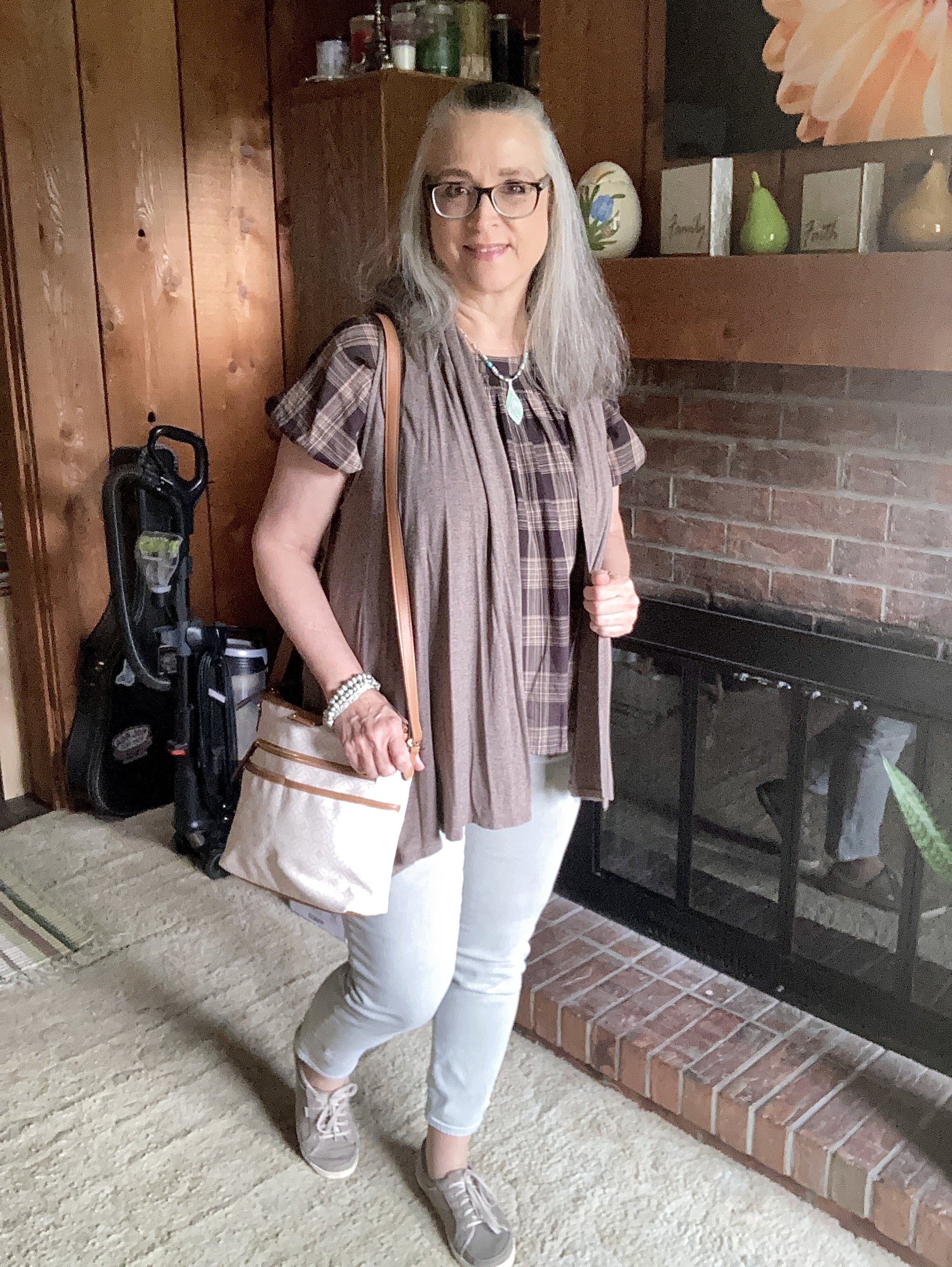
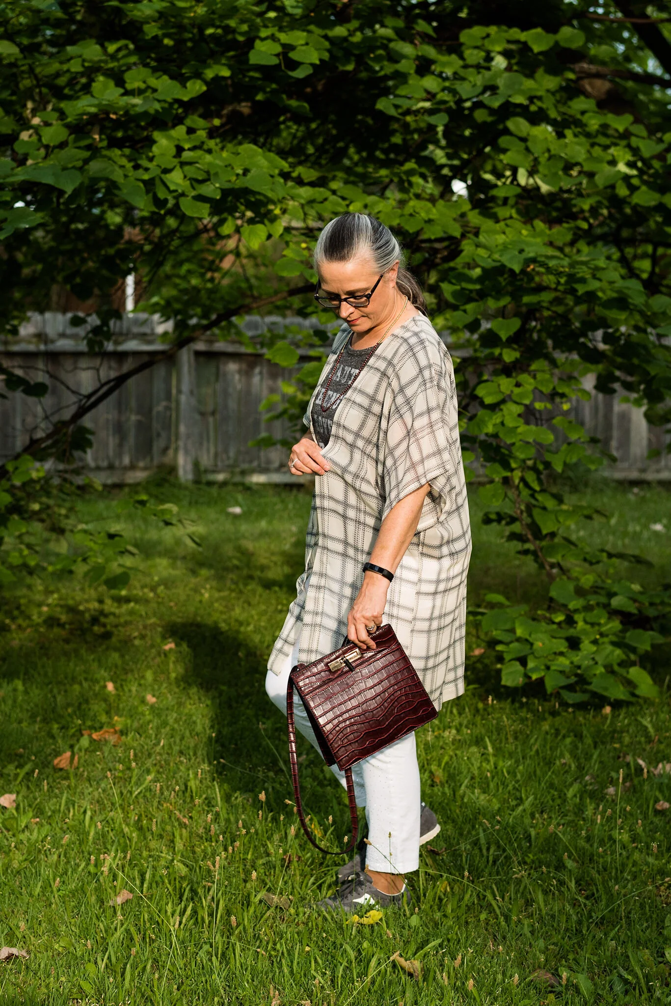
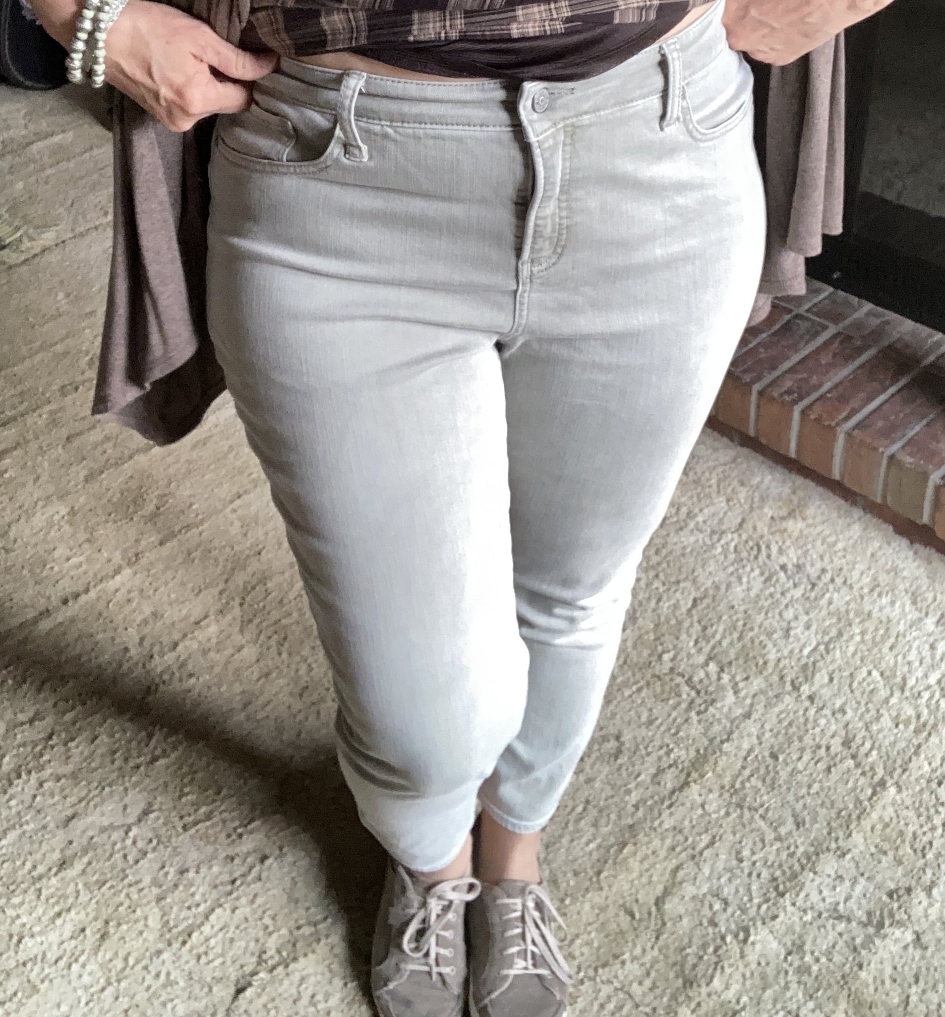
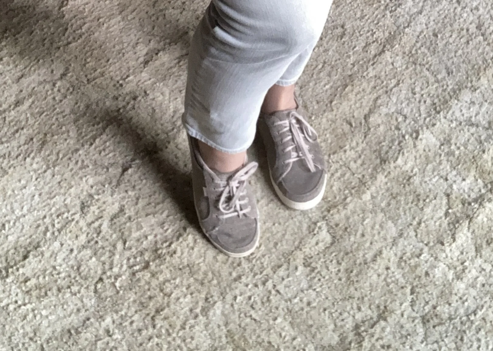
It is hard to tell that these pants are actually green, but they are. They almost look gray, but when you set them next to a gray pair of pants, they definitely have a green tint. I found these recently on a thrift run and they are Chico’s Girlfriend style.

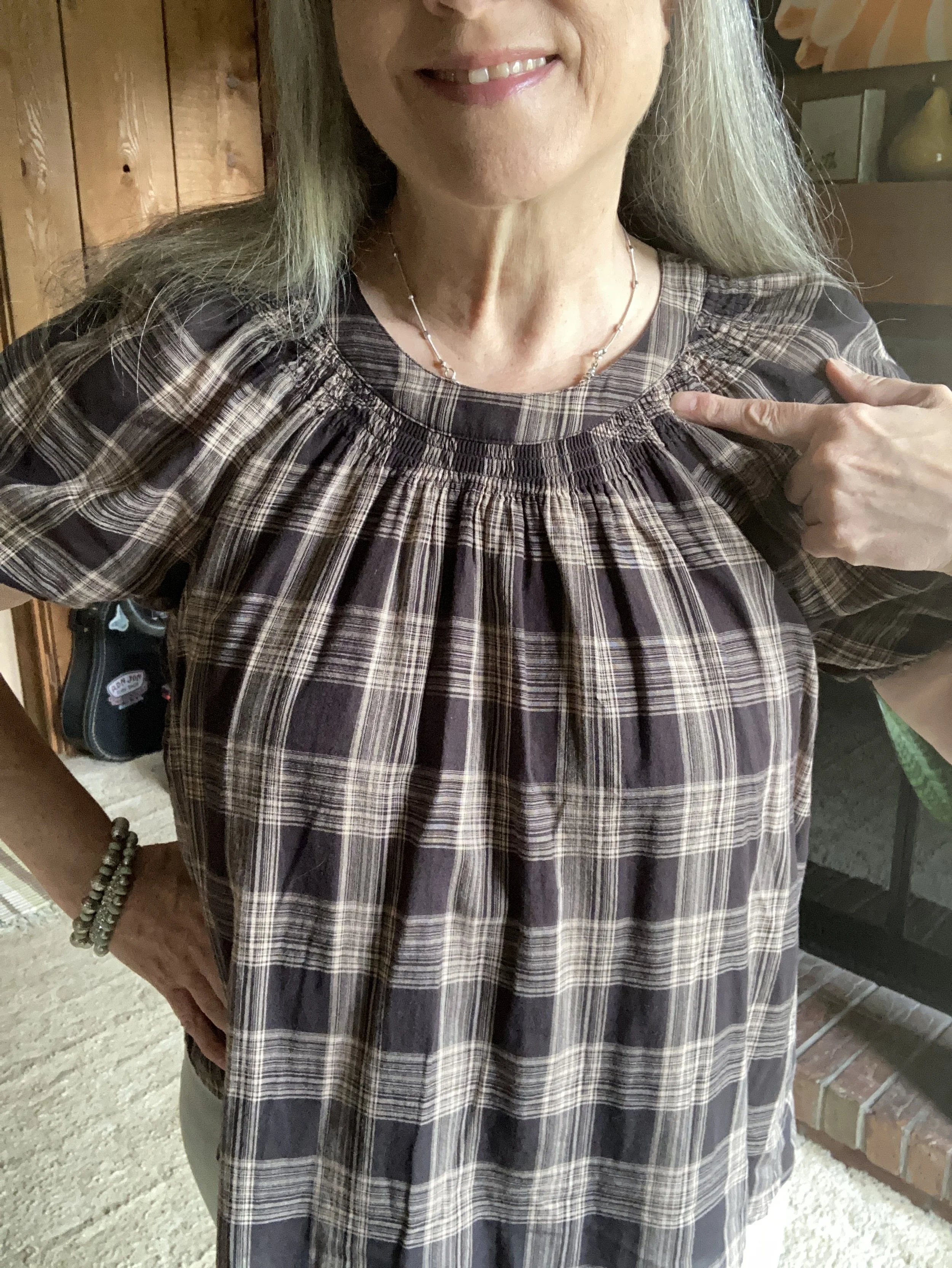
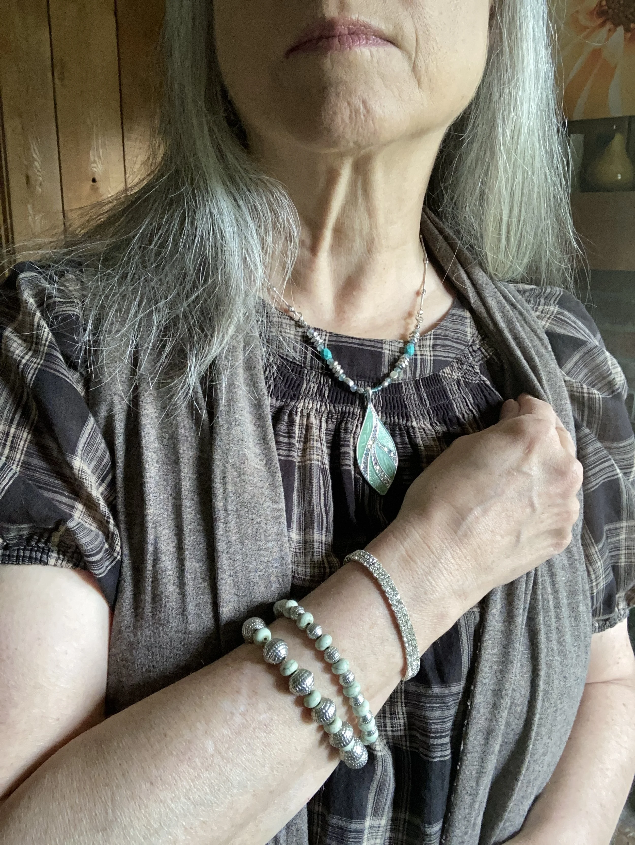
My plaid brown top was also a thrift find and is Lauren Conrad brand. I love the poofy sleeves and the smocking around the neckline. The fact that it is brown and plaid are what ultimately made me buy it. I have a hard time finding the color brown, especially for summer weight clothing. This one is perfect for the season. Of course, it also helps hide one thousand sins, you know the ones, the extra ice cream sin, the extra serving of potato chips sin, the double serving of just about any kind of chocolate sin…Ha, ha. Ugh! I can’t even really taste things right now, but I just keep on eating.

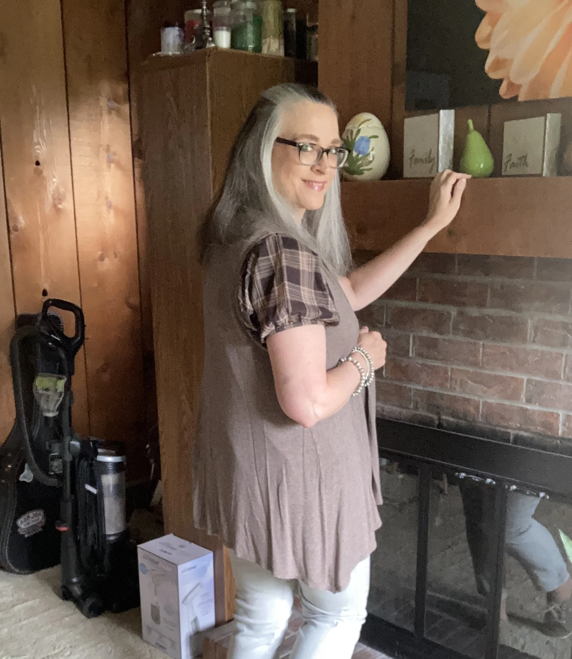
I added this other second hand treasure, the Apt. 9 vest, for interest and to tone down the volume of the top. The vest adds its own volume, but I think together it looks cute .

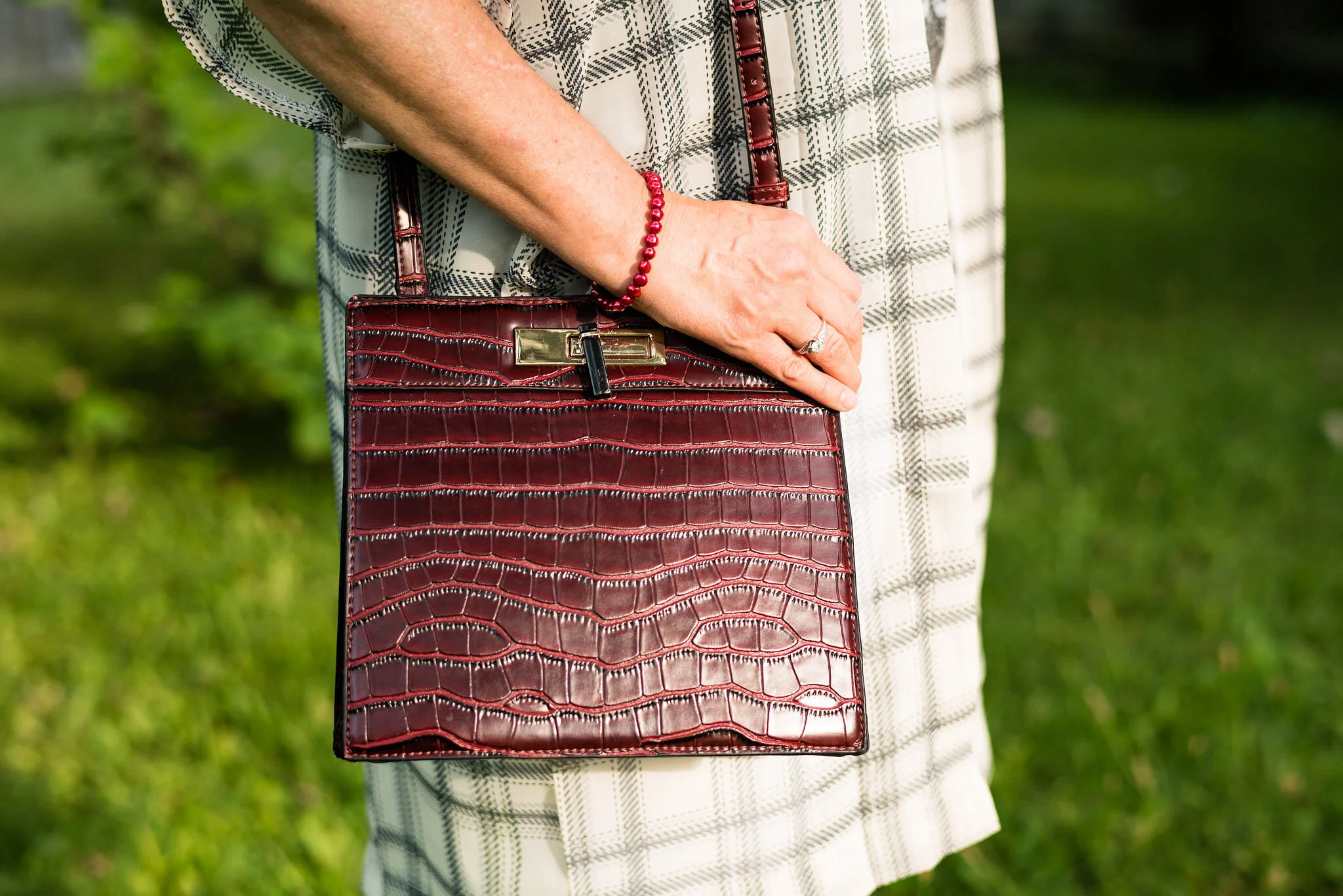
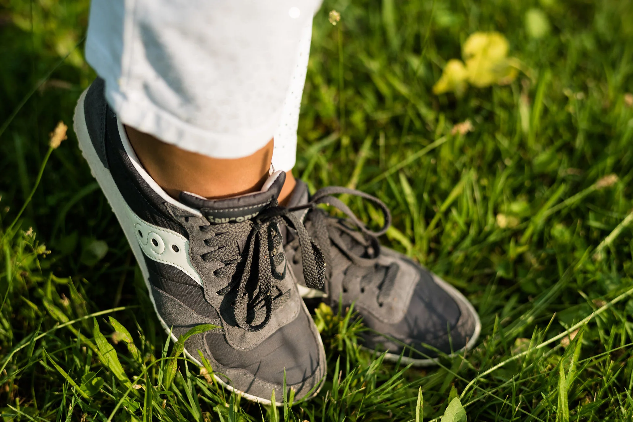
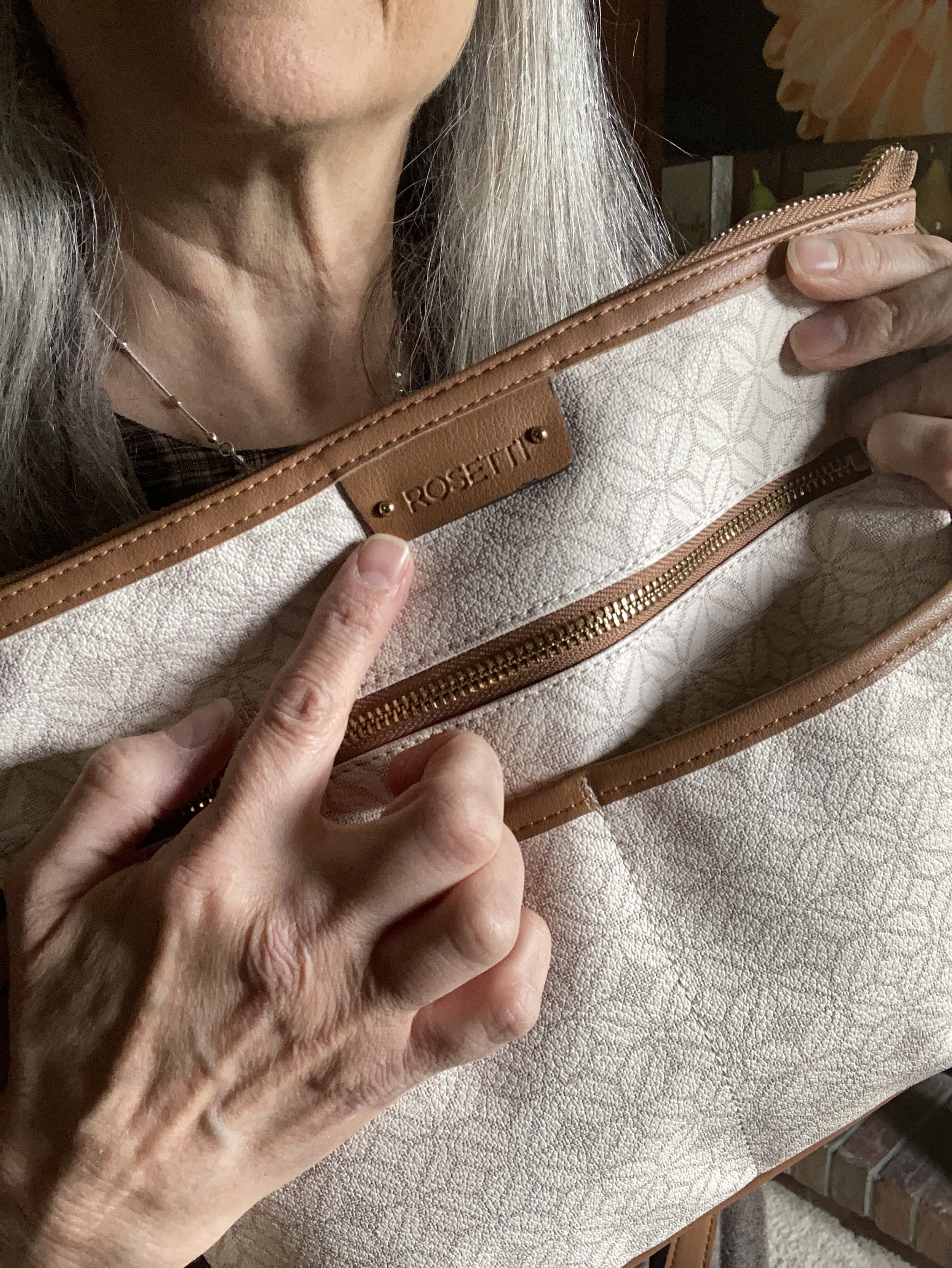
For accessories I added my Keds sneakers, a minty green necklace and some beaded bracelets with mint and silver like the necklace. I am also showing off this Rosetti bag that I recently found at a thrift store.

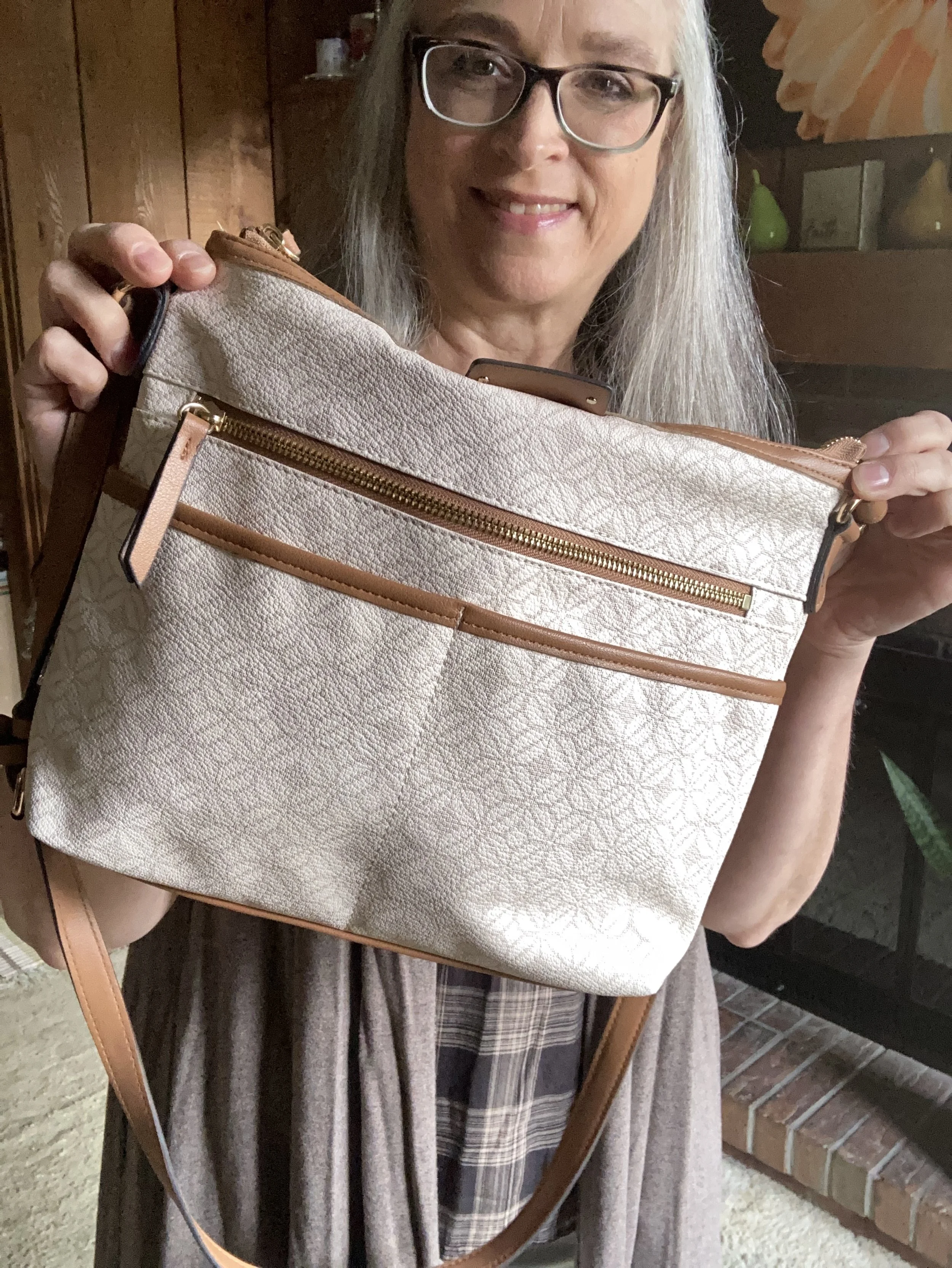
The only things in this outfit that aren’t second hand are the necklace, bracelets and sneakers. It is a satisfying feeling to be wearing an entire outfit that didn’t end up in a land fill.

What do you think of this outfit? I would like to hear your thoughts, so leave me some love in the comments below, or leave a comment on my Facebook page.

I hope you are having a marvelous week.

No shopping links today, but if you appreciate the blog and the content I put on here please consider buying me a coffee. Just click on the link below.

Buy Me a Coffee.

Pantone - Spring/Summer - 2021 - London Palette: Illuminating, Marigold and Ultimate Gray

Illuminating and Ultimate Gray are the two colors of the year, so just like I did for the New York Palette, I decided to pair the two colors together and for this one I added Marigold, which was also on the New York palette.

illuminating.jpg

We decided to go to the Toledo Botanical Gardens again for these pictures and we did come across some beautiful blooms. This particular bush is a rhododendron. I just did some research and found out that all azaleas are rhododendrons, but not all rhododendrons are azaleas. Whether you like azaleas or rhododendrons they are all beautiful.

Once again, I chose my recently thrifted bright yellow jacket to serve as the Illuminating color. The jacket is D&Co. (Denim and Co.). It has a nice stretch to it and I like the 3/4 length sleeves for a change of pace.

londonpantonecoloroutfitideailluminating-8.jpg

I’ve styled my medium yellow tee on the blog before. You can see it styled with a leopard print skirt. Having tees in a variety of colors comes in handy when you want to put an outfit together. This thrifted tee is Apt. 9 brand.

My Gloria Vanderbilt jeans were another Kohl’s clearance find. They are soft and stretchy, so great for my fluctuating weight. I say fluctuating, but it really doesn’t go up and down. It either stays the same or goes up. Ha, ha.

londonpantonecoloroutfitideailluminating-11.jpg

I wanted my accessories to make a statement since the outfit itself was not overwhelmingly interesting. I found this pretty layered necklace in gray tones somewhere along the way. I think it was a thrift shop nearby. I added a few beaded bracelets to tie the jewelry together.

When I decided on the thrifted tan loafers, I knew my Nine West snakeskin print circle bag would be the perfect piece to complete the whole look and bring everything together.

londonpantonecoloroutfitideailluminating-13.jpg
londonpantonecoloroutfitideailluminating-15.jpg
londonpantonecoloroutfitideailluminating-16.jpg

What do you think of these colors together? Do you like the lighter yellow of Illuminating or the richer tone of Marigold? I’d love to hear your thoughts in the comments below. I appreciate when you give me your feedback. It can be kind of lonely as a blogger, when I don’t know if anyone is reading my content or looking at my posts, so I really love to hear from you.

londonpantonecoloroutfitideailluminating-10.jpg

I am including a few shopping link for you to enjoy. These are affiliate links and are brought to you at no cost. If you click on a link I get a few pennies and I appreciate all of your clicks. I do not get paid to write my blog, I do it as a hobby and as a service to whomever wants to follow along. I hope that I inspire you to take a second look at your wardrobe and see new ways to put things together, that you never thought of before.

Photo and graphic credit Rebecca Trumbull.

A Dickens' Christmas - The Ghost of Christmas Past

Today’s outfit draws its inspiration from Charles Dickens’ ghostly apparition of Christmas Past. Before the visitation of the three ghostly characters, Scrooge is visited by the ghoulish presence of his former business partner in life, Jacob Marley. Jacob warns Scrooge that he will be visited by three spirits, for the hopeful purpose of his redemption. The first of these paranormal beings makes their appearance when the bell tolls one.

The idea of drawing fashion inspiration from a ghost, might seem a stretch of the imagination, but I do like a challenge. If you have watched a version of A Christmas Carol, you probably saw the Ghost of Christmas Past as a being dressed in white garments, sometimes shining and sometimes in an unearthly, ethereal manner as if floating and flowing in some unseen breeze. Two of my favorite movie versions of A Christmas Carol are the 1984 drama with George C. Scott, and the 1992 musical, The Muppet Christmas Carol. Surprisingly, the Muppet version stays fairly true to the original tale by Charles Dickens. Both versions are filled with amazing scenery, typical old time London and excellent veteran actors, (the Muppet version stars Michael Caine as Scrooge).

A Dickens' Christmas - The Ghost of Christmas Past

We often shy away from white in the colder weather. It has long been a color we wear in spring and summer. Obviously, things have changed immensely over the last decade, especially as more and more women have access to fashion blogs and more reasonably priced clothing. White is now a year round color choice. It stands true to reason, that if we live in colder areas in the winter, our white pieces will have to be compatible for those frigid temps. This is where layering, fabric choices and textures all come into play.

My daughter and I didn’t have a lot of time for pictures, so we went, once again, to the Toledo Botanical Gardens. They have so many interesting sculptures, garden areas and small buildings used for various events. These metal arches provided the perfect backdrop for an other worldly vibe.

A Dickens' Christmas - The Ghost of Christmas Past

When I started thinking about an all white outfit, I knew that most of my pieces were not a true white. Not everyone can wear a crisp white near their face, but most people can pull off an ivory or a cream. All of these pieces, except the scarf, have more of a cream, or ivory tint to them.

A Dickens' Christmas - The Ghost of Christmas Past

My long, Apt. 9, chenille sweater was a piece my daughter was getting rid of. It wasn’t really her style, so when I saw it, I took it home, figuring I could always just wear it around the house as a cozy topper for casual days. As I thought about how to make this outfit look flowing, but also updated and fashionable, I knew this sweater would be perfect.

A Dickens' Christmas - The Ghost of Christmas past

The blouse I have on under the sweater is a recent thrift store find and will be more useful in the warmer weather, but the color went well with everything else. The brand is called Mango, and when I saw the embroidery on it, I knew it was calling my name.

I also added this white scarf from The Jacket Society, that I bought a few years ago. You can’t see it in this photo, but the scarf has tiny silver threads through out, so I thought it added an extra element of texture and shine.

The silver snowflake pendant just seemed appropriate for a ghostly, Christmas outfit.

A Dickens' Christmas - The Ghost of Christmas Past

I chose silver for my accessories, to represent the shimmering appearance that many of the Ghosts of Christmas past seemed to have. Perhaps the shimmering details represented good memories from Christmases long ago; or maybe the light represents the idea that we can learn from our past, thus becoming better people. Whatever your interpretation of the details, I think silver looks very pretty with white.

My silver, sparkly clutch has been a regular on the blog. My SO ballerina flats are from Kohl’s.

A Dickens' Christmas - The Ghost of Christmas Past

My cream colored St. John’s Bay corduroys have been around for a few years and were an original purchase at JC Penney.

A Dickens' Christmas - The Ghost of Christmas Past

I really like this outfit. It is something I would feel completely comfortable and warm in and could be worn to a special Christmas outing or just a family dinner, where I don’t have to do the cooking. If I cooked in this it wouldn’t be white anymore. Ha, ha. Here are a few other fun pictures from our shoot.

A Dickens' Christmas - The Ghost of Christmas Past

The wind was helping me look a little more ghostly. Too bad we didn’t have fog. Ha, ha.

What did you think of this outfit? Do you think I pulled off showing how taking inspiration from the Ghost of Christmas Past translated into a chic, modern look that could be worn to work, out on a date or to a Christmas concert?

I’m including a few shopping links for you to look over. These are affiliate links. All opinions are my own.

Be sure to stop back on Thursday for another Christmas movie inspired outfit.

Photo credit Rebecca Trumbull.


KIckin' It with Kimonos - Gray and White Plaid

Today, I am beginning a series on wearing kimonos. My kimono collection has grown in size and I really love how they can dress up an outfit and give it a whole different feel and look. The kimono has been around for hundreds of years and were, at one point in time, the traditional garb in Japanese cultures. Today most instances of kimono wear in Japan are for more formal occasions and typically worn by older people as a way to honor others at funerals and weddings. They are also used for cultural festivals and plays.

In the fashion world the pieces we refer to as kimono are only similar to their predecessors in the cut of the fabric. While traditionally the kimono was made of specific types of fabric such as hemp or for more formal occasions, silk, today the kimono is found in all fabrics and sizes. The word itself has come to embrace a much broader meaning and type of piece than what it was traditionally. Now anything we thrown on over a top that is long, flowy and has sleeves we refer to as a kimono, even though some of these pieces are actually more specifically called ponchos, capes, and ruanas.

Today’s look revolves around a kimono I found at Kohl’s online in the clearance section. I didn’t have anything that was plaid, as far as a kimono goes, so I thought it would be a fun addition to my collection.

Kickin' It with Kimonos - Gray and White Plaid
KIckin' It with Kimonos - gray and white plaid

This piece is shaped more like a traditional kimono, coming down to my knees and sewn in a t-shape with the side seems and attached sleeves. This Apt. 9 kimono is light weight and a bit see through, which is no problem since I am wearing it over other things.

I wanted to keep the look more monochrome, yet when searching for a top to wear, I knew this Wonder Woman tee would be perfect. I found this tee a few years ago when the movie came out and I just love the message. I love words, as you no doubt know since I am a writer, but I like when the words that are being displayed, either on our walls at home, or on our clothing, mean something significant.

Kickin' it with Kimonos - gray and white plaid

You can see the small, red, Wonder Woman insignia at the bottom of the list of words. I pulled out that color by choosing a few red accessories. My necklace and bracelet are both just simple chains of beads. My structured bag was a recent thrift store find. I like the color and the texture and thought it will be a great bag for fall, but why not use it in the summer too?

Kickin' it with kimonos - gray and white plaid

You’ve seen these Christopher and Banks, pull on, white ankle pants numerous times on the blog. They are a staple in my closet for summer outfits where I want white pants.

Kickin' it with kimonos - gray and white plaid

I wore my Saucony, gray and white sneakers to complete this casual look.

Kickin it with kimonos - gray and white plaid

So what do you think of this outfit? Frankly, right now, with as hot as it has been I have been wearing as few layers as possible. Ha, ha. However, a kimono is a great way to add a layer for those air conditioned places, that we all are not supposed to go to right now! Eye, yie, yie.

Kickin' it with kimonos - gray and white plaid

I’m including a few shopping links. These are affiliate links. All opinions are my own. Have a fabulous Tuesday!

Photo credit Rebecca Trumbull.


Pantone - Autumn/Winter - 2019 - Peach Pink and Biking Red

These are the last two colors from the Pantone - Autumn/Winter - New York palette. Peach Pink is reminiscent of coral, which never really seemed like a fall color to me, but I must remember that the old rules don’t apply…at least to some things. I know many people buy into the old adage, the rules are meant to be broken, but I don’t always believe that is the best mindset to have, and that mindset trickles down to our children and our grandchildren. As far as rules, I think that many of them are in place for our protection and our benefit. Rules like, look both ways before you cross the street, floss your teeth once a day and eat your fruits and veggies are not bad. Actually, they are for our well being. Rules about color, really no longer apply, so I am okay with wearing white after Labor Day and wearing coral in October. Why not?

The other color in this ensemble is a dark red. It reminds me of the Brick Red from my Crayola Crayon box. How many of you remember those wonderful boxes of crayons? I used to obsess about having all the similar colors arranged by shade in my box. I didn’t want to hunt around for Brick Red, so I put it in the “red” section. Ha, ha.

As you can see, once again, my colors were not perfect matches. You will see I did a little better with the London Palette, which I will be introducing on Thursday.

The heavy gauge sweater is Candies brand from the Koh’s clearance rack at end of last winter’s season. I find this is the best time to shop for those pieces you want for the season, if you don’t want to pay full price. I have found most of my non-thrifted clothing pieces this way.

My Peach Pink tank top was a thrift find from a few years ago. It is Eddie Bauer brand. You’ll be able to see the ruching on the neckline in an upcoming picture.

My Paloma gray pleated skirt was also a Kohl’s clearance find a few years ago and is Apt. 9 brand.

My chunky wood ring necklace is making an appearance again. I love this necklace my daughter gave me for Christmas. It is so handy for making a statement and pulling the colors in an outfit together. A necklace like this works much the same way a scarf will, but without the added heat around your neck.

My little thrifted Houndstooth bag works both as a satchel and a cross body. The shoulder strap is inside the bag, but can easily be taken out and attached so I can wear this for hands free activities.

I really like these black Aerosole heels. They are comfortable and stay on my feet with no slipping or sliding. I decided to add the dark tights at the last minute for two reasons. The first was to keep the leg more monochrome and thus make the legs look longer. The other was to make the outfit seem more ready for fall weather. The day we took these pics it was hot!

What do you think of this outfit? Is this something you would wear? Do you like these Pantone colors? Why or why not? I’d love to hear from you, so leave a comment or two.

I’ve included a few shopping links. These are affiliate links. All opinions are my own.

Photo and graphic credit, Rebecca Trumbull.

Have a great day.