Pantone Spring/Summer 2020 - Recap
I hope you have enjoyed this Pantone color series. Today I just want to show you a recap where you can see all the outfits in one post. Here we go.
New York Palette
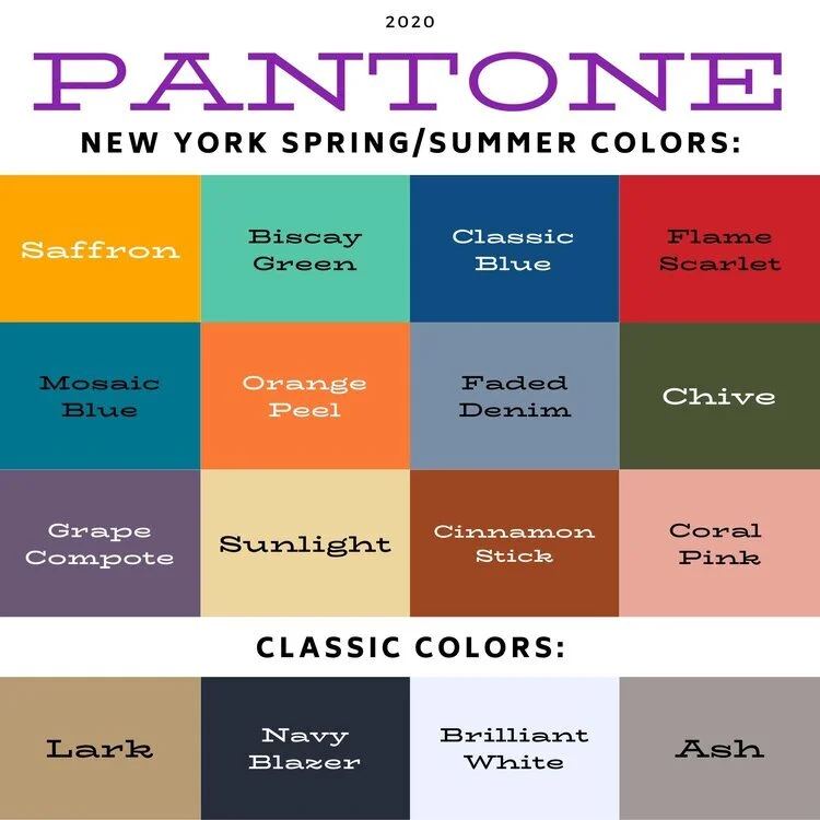
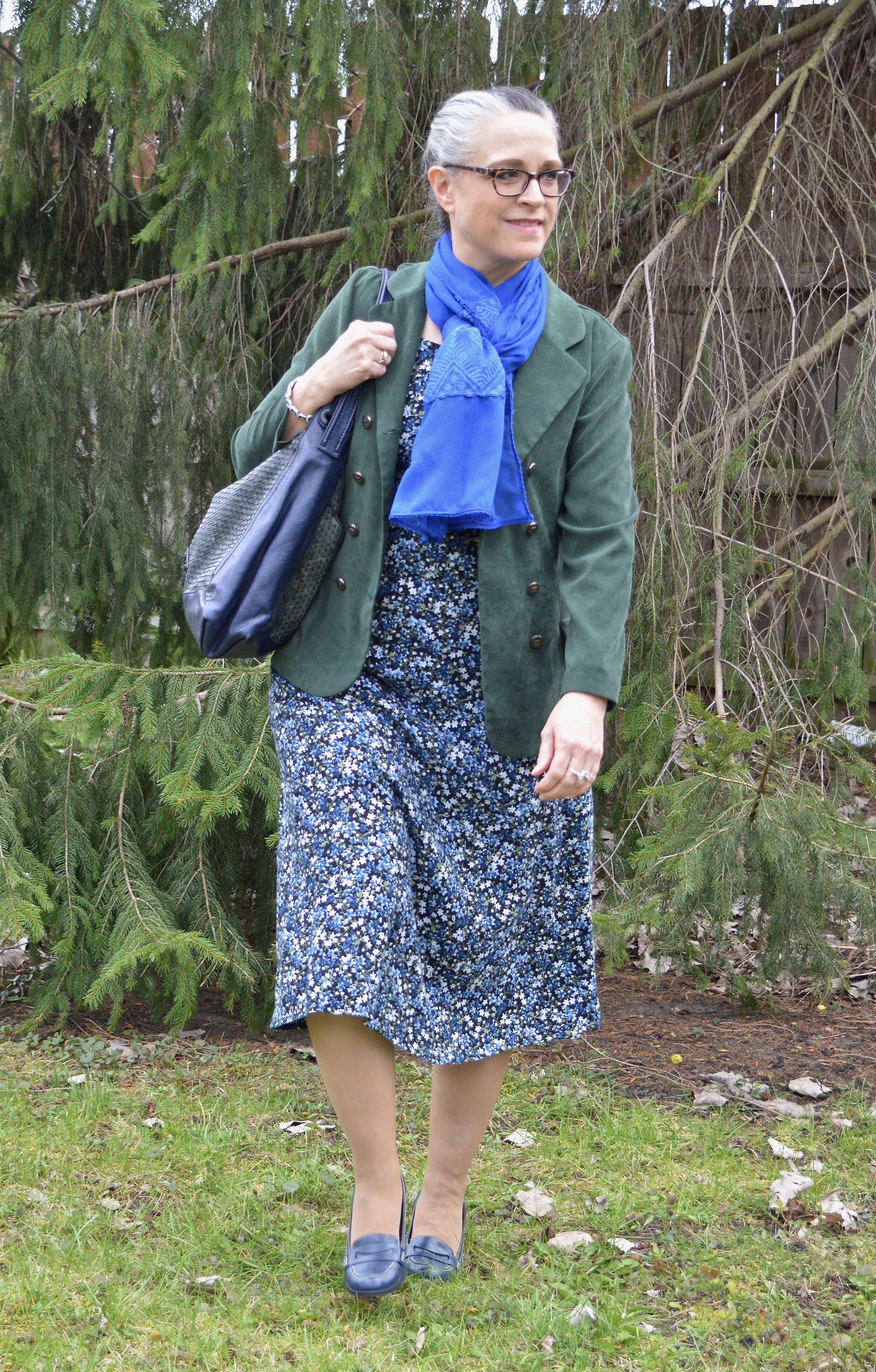
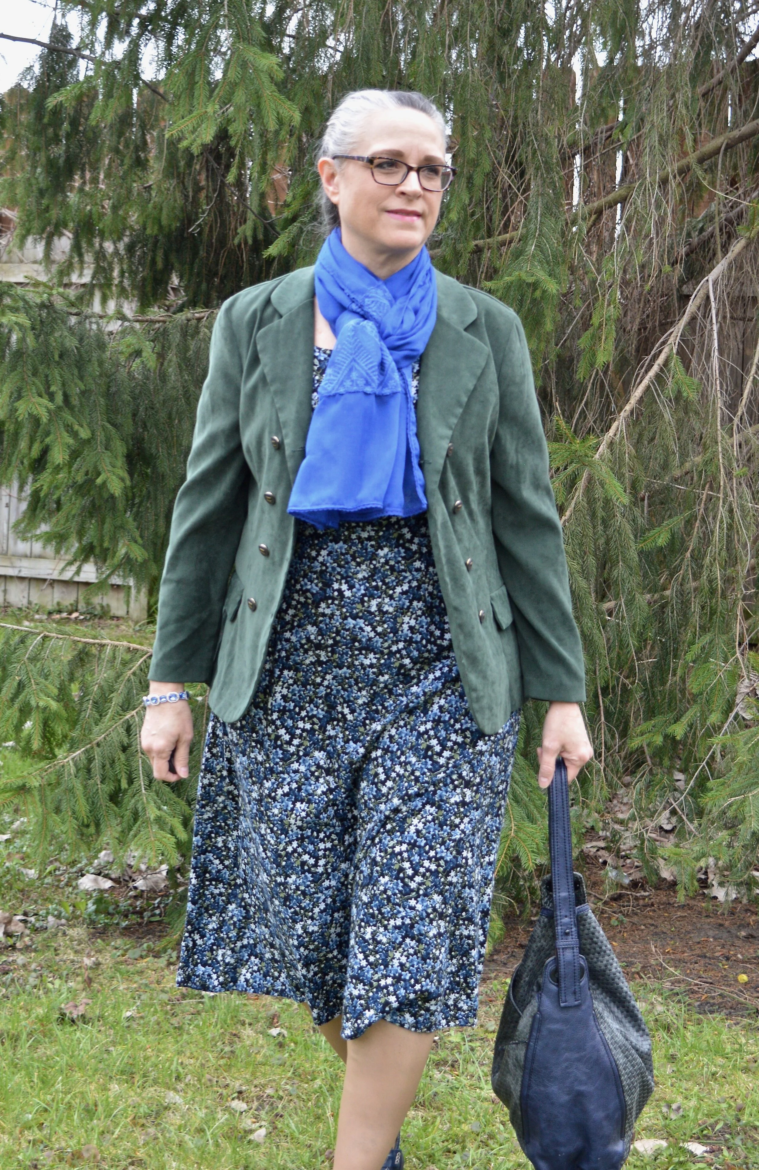
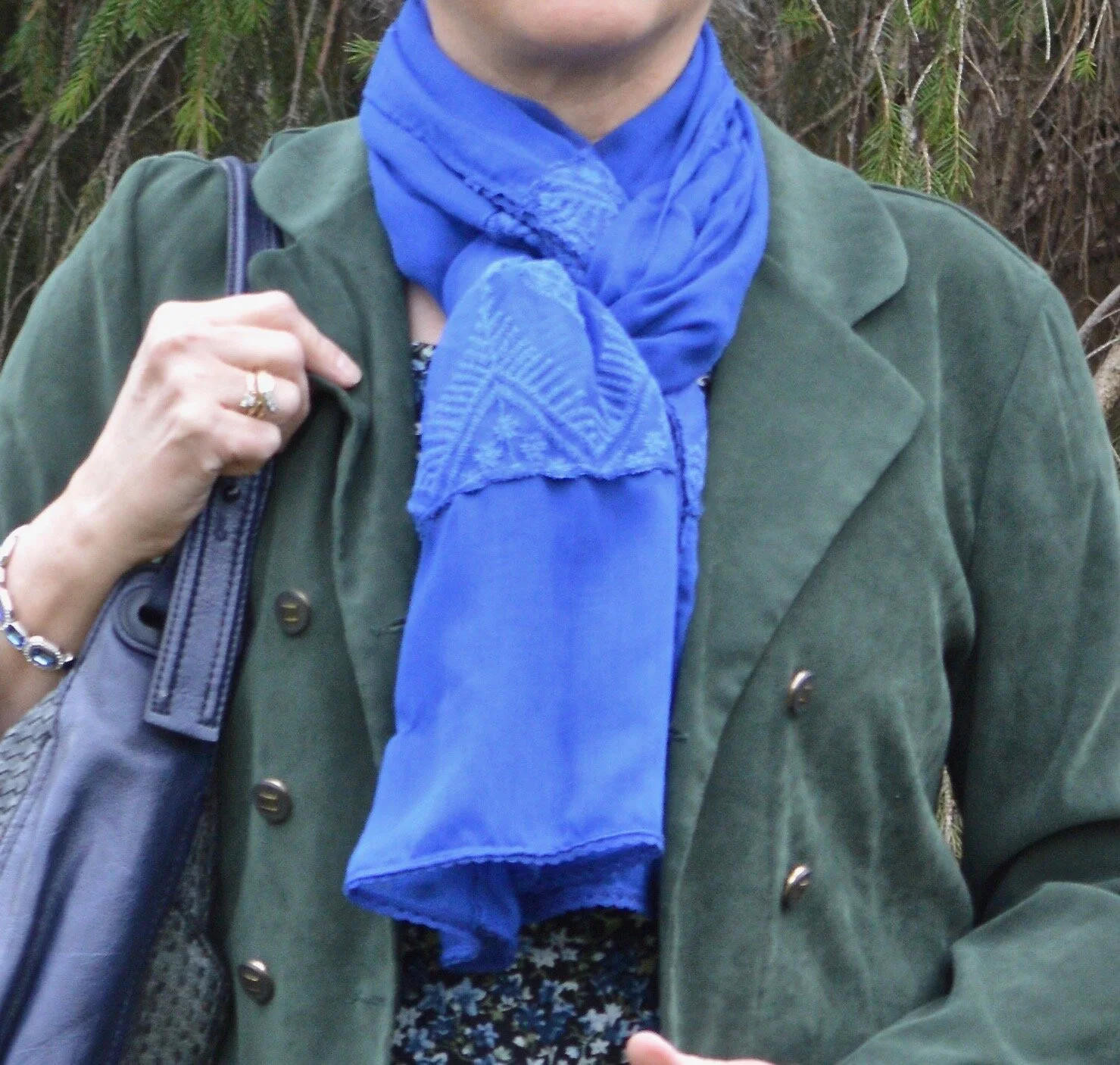
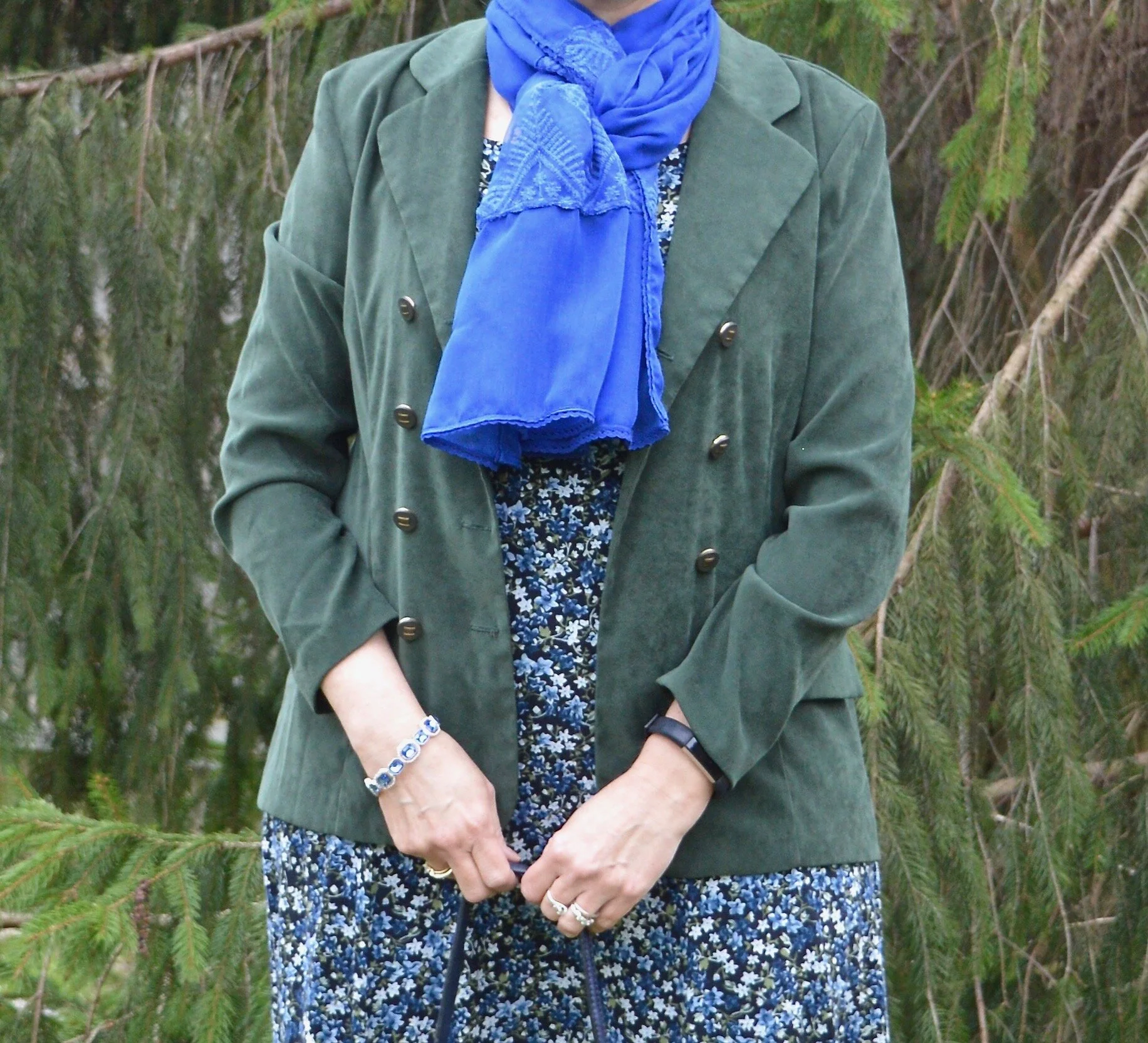
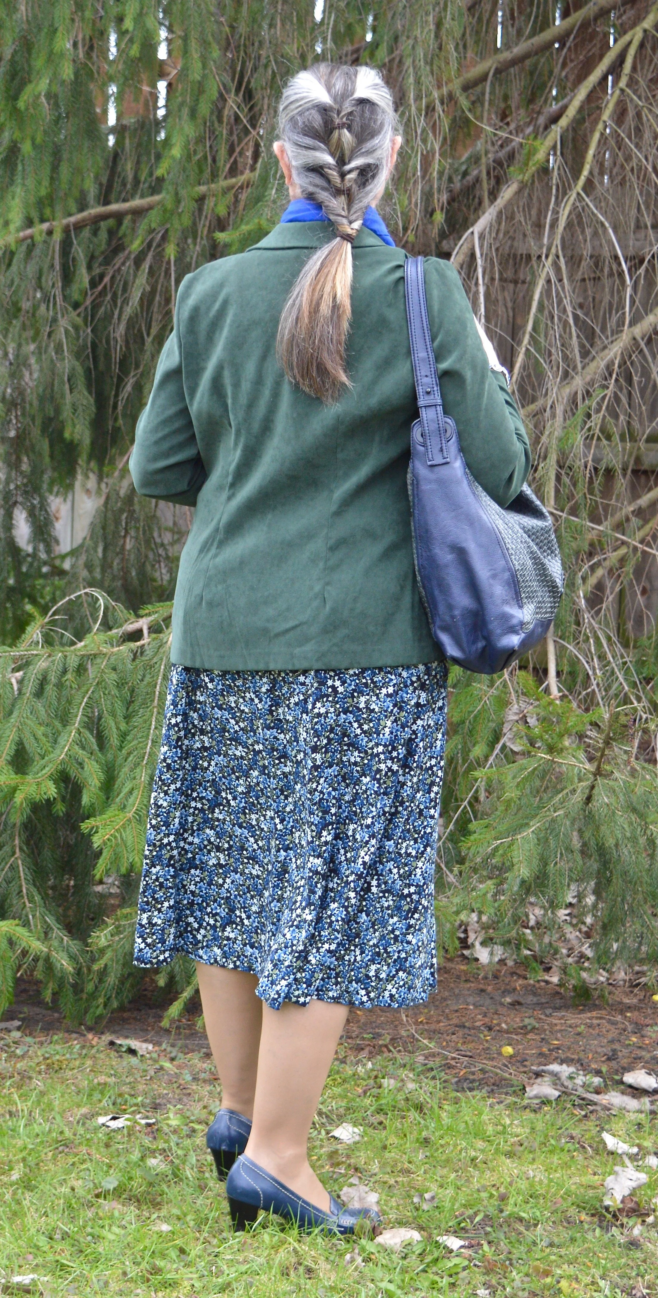
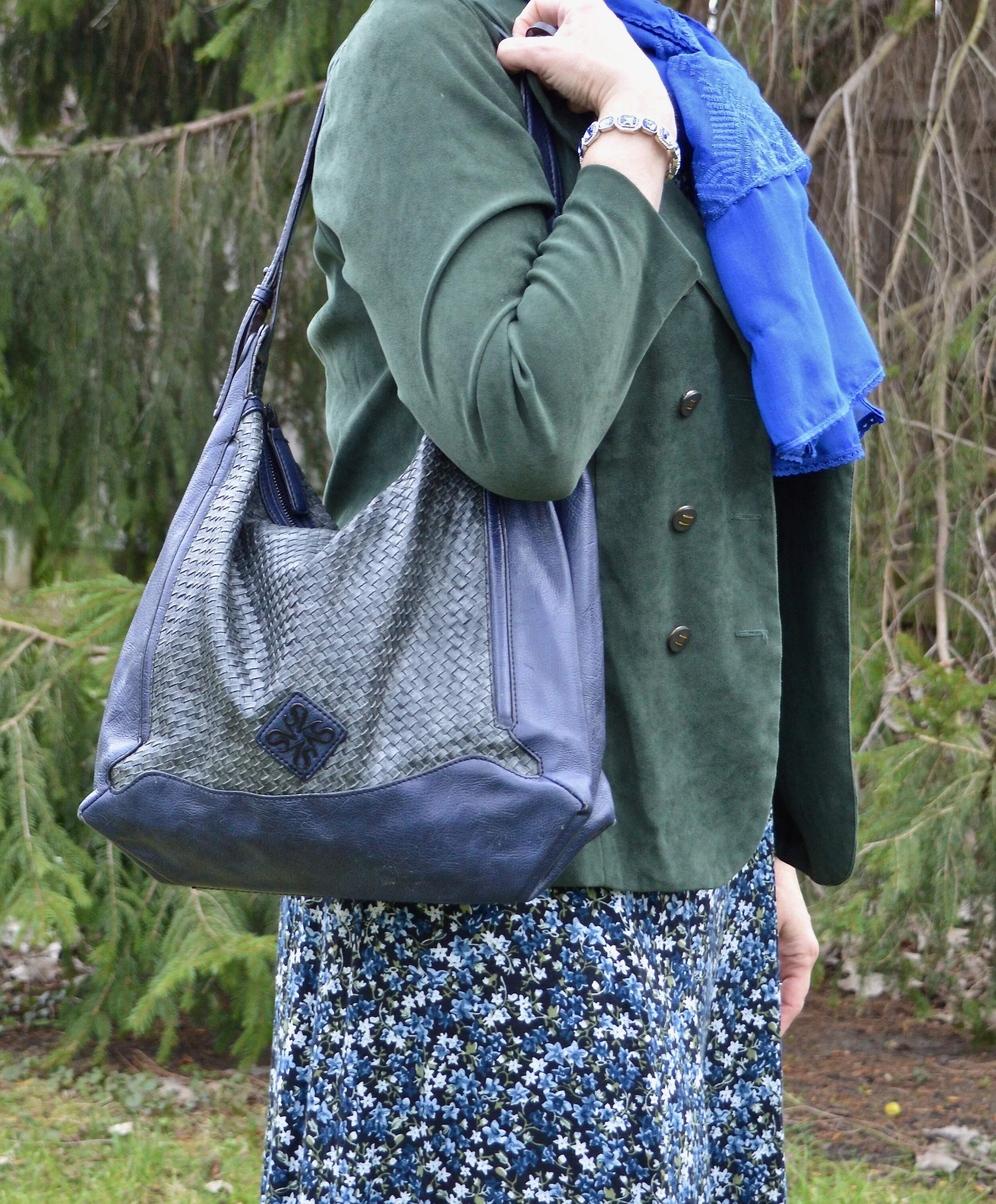
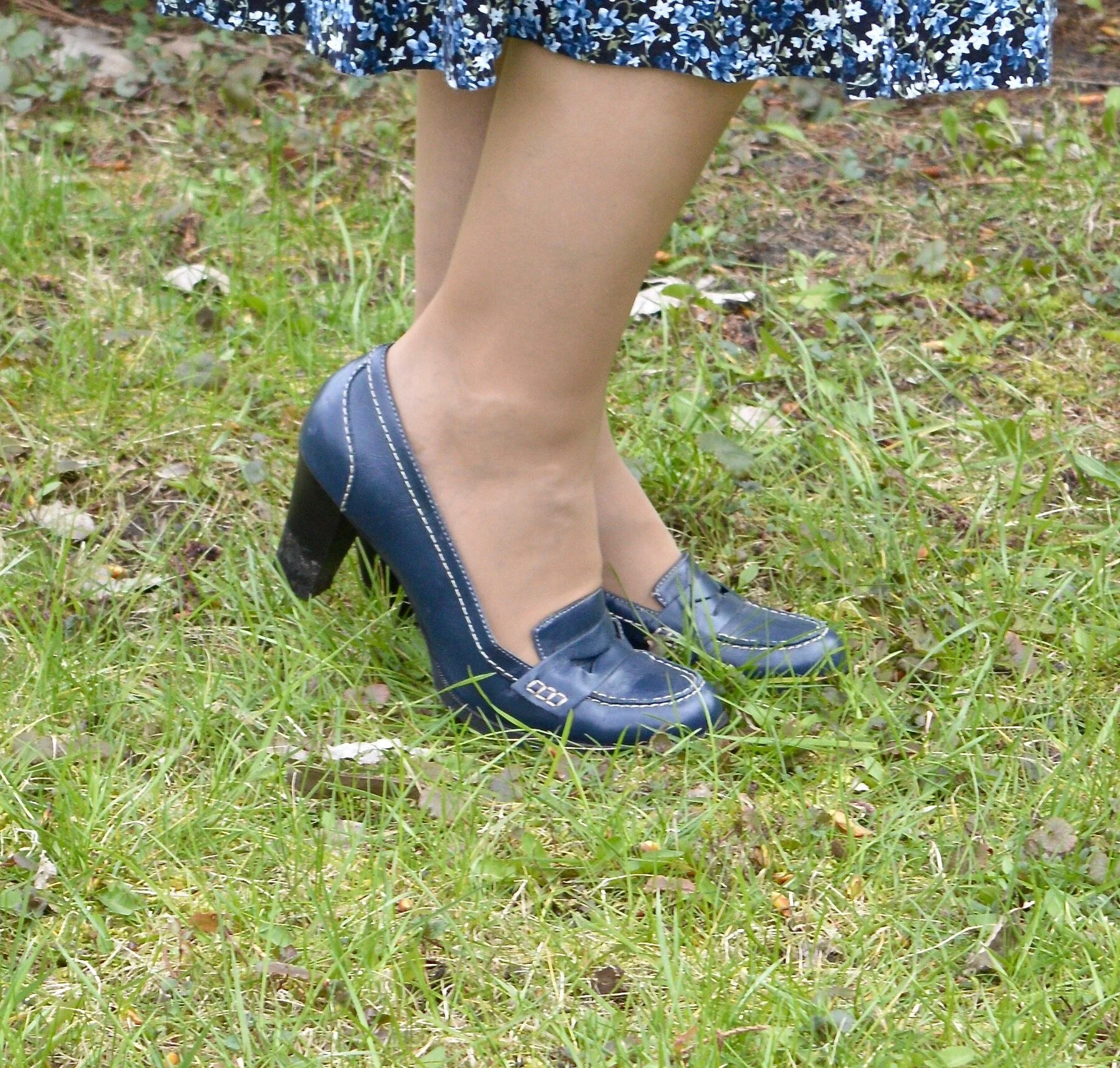
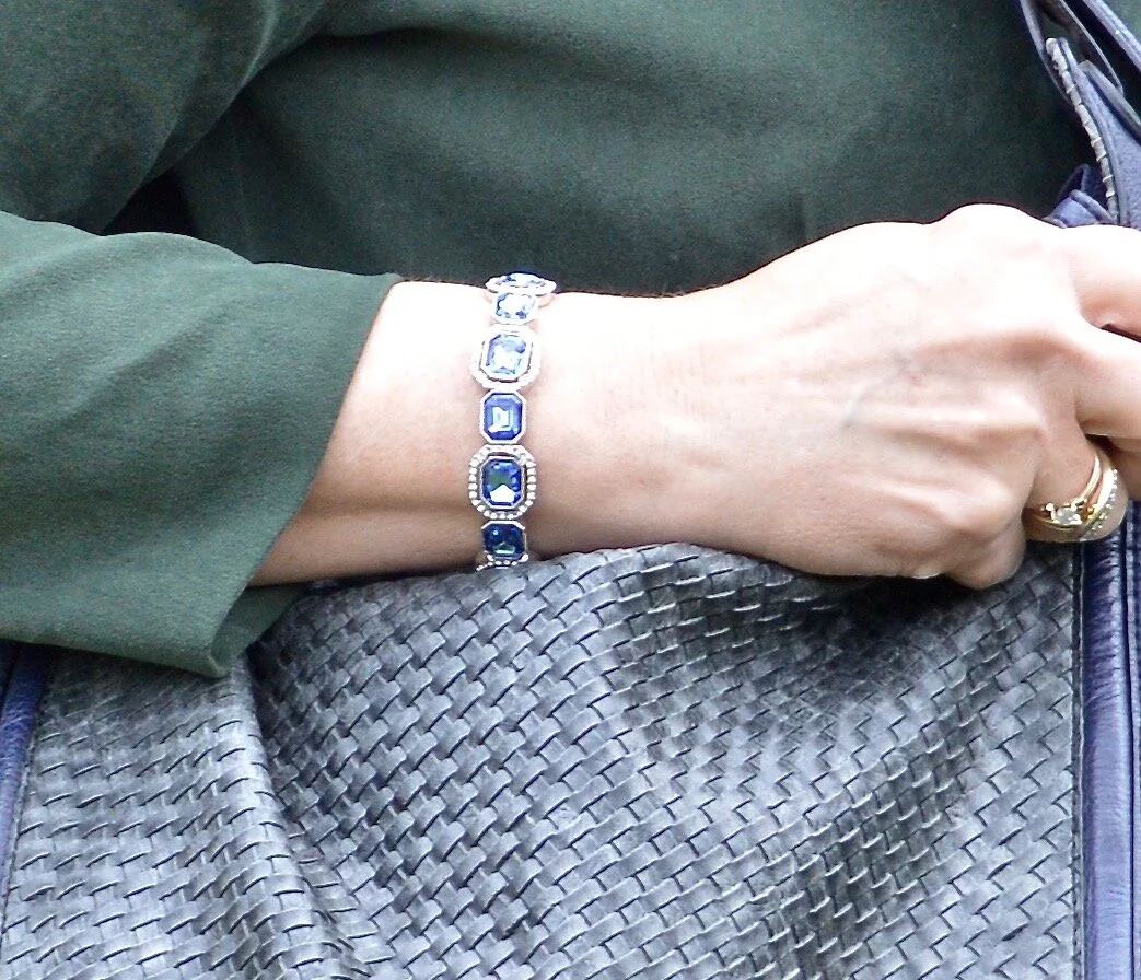
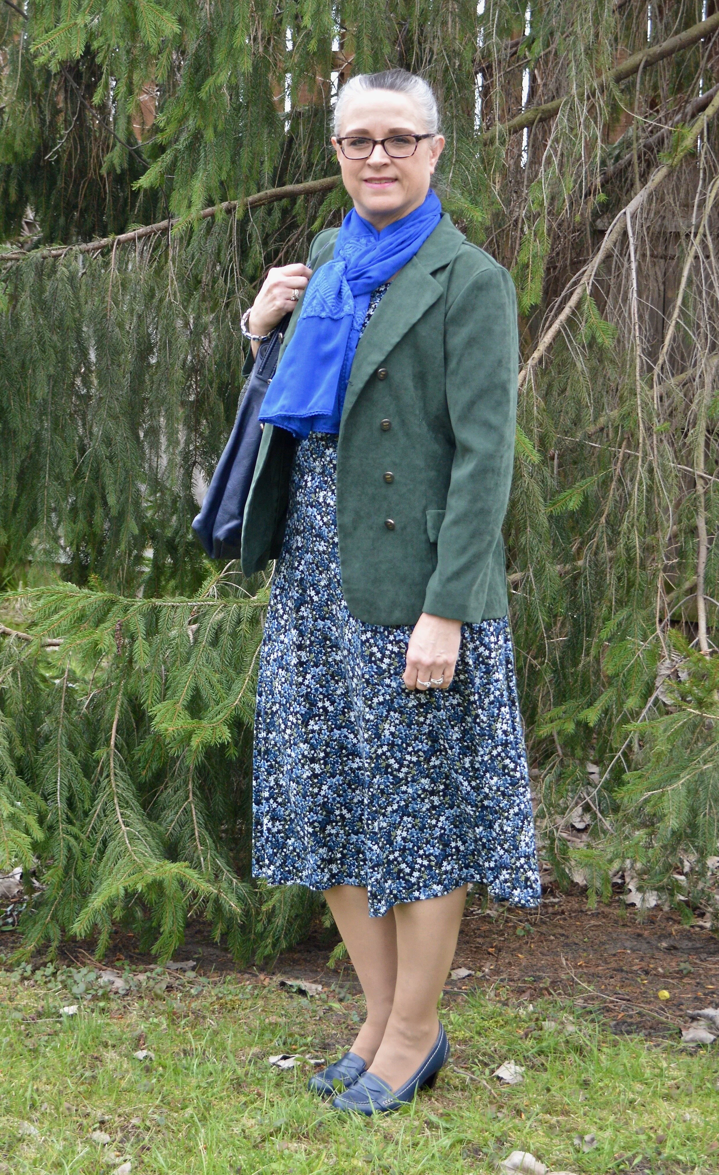
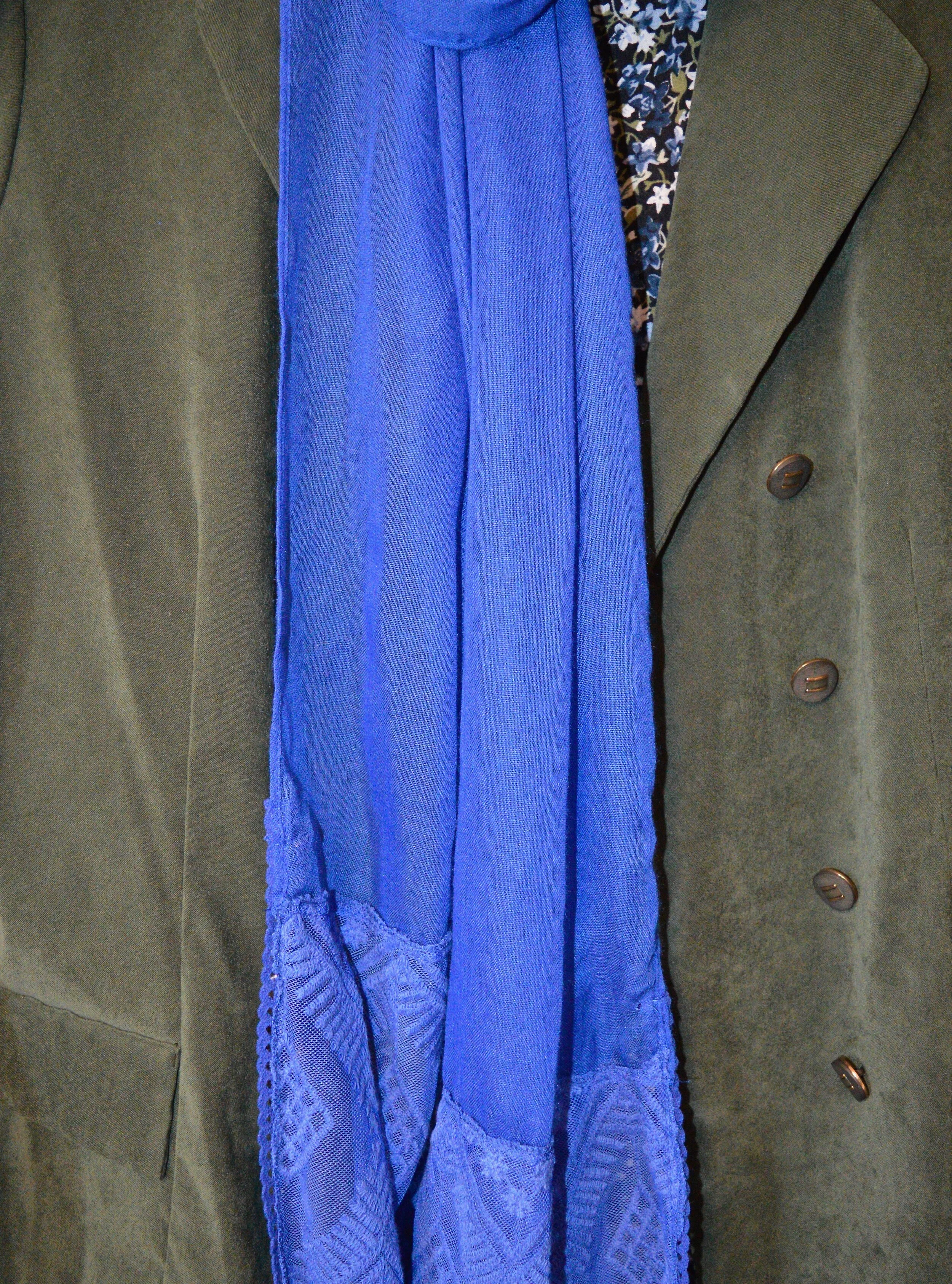
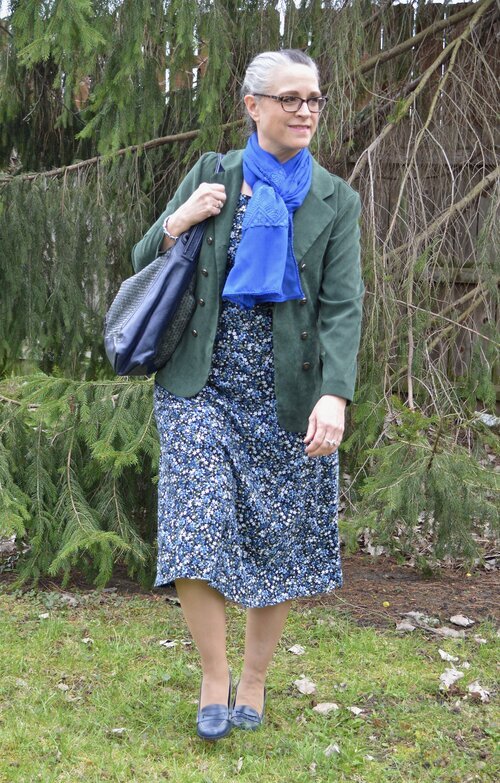
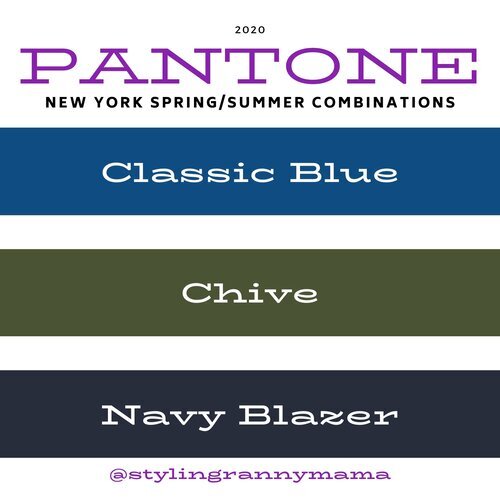
Classic Blue, Chive and Navy Blazer
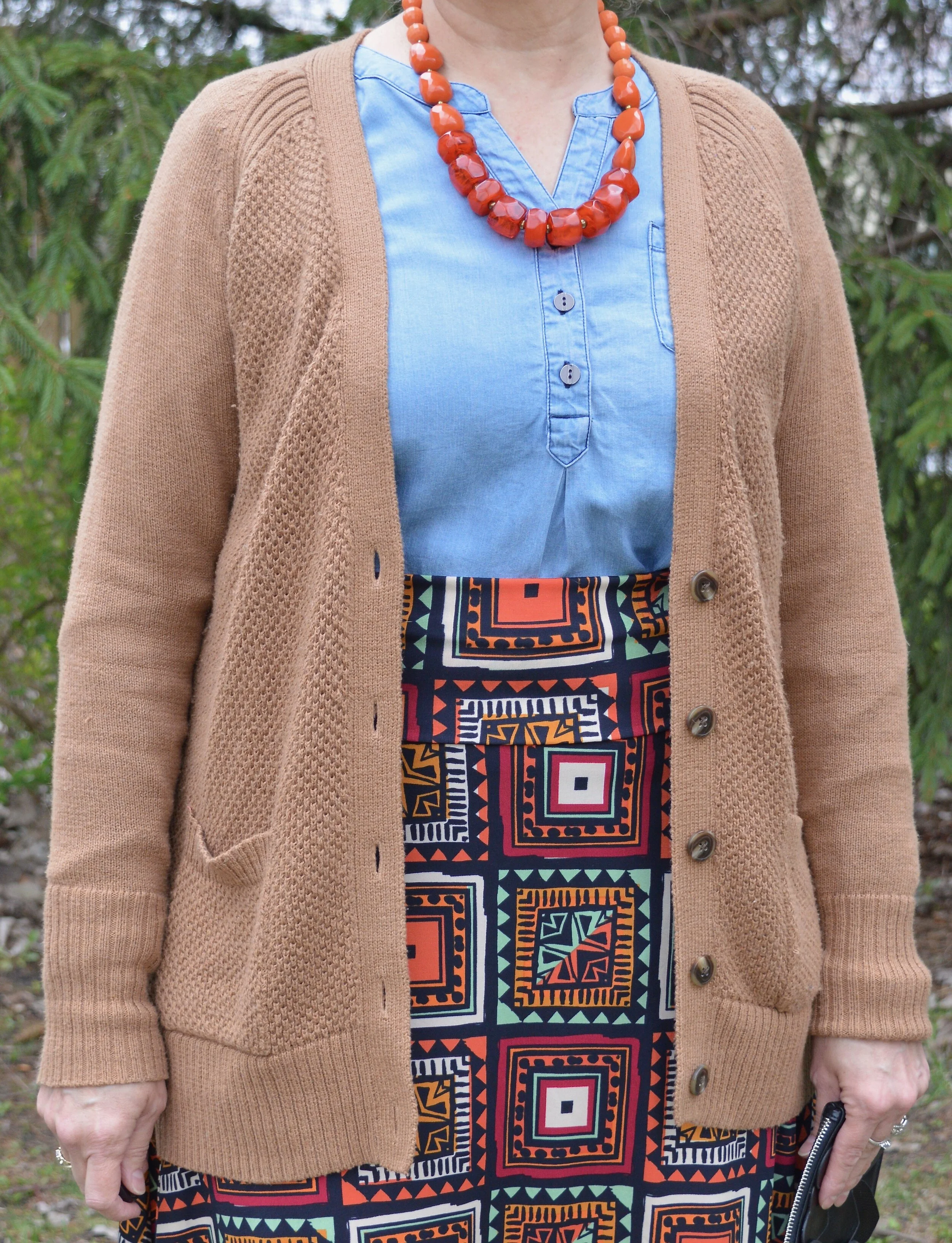
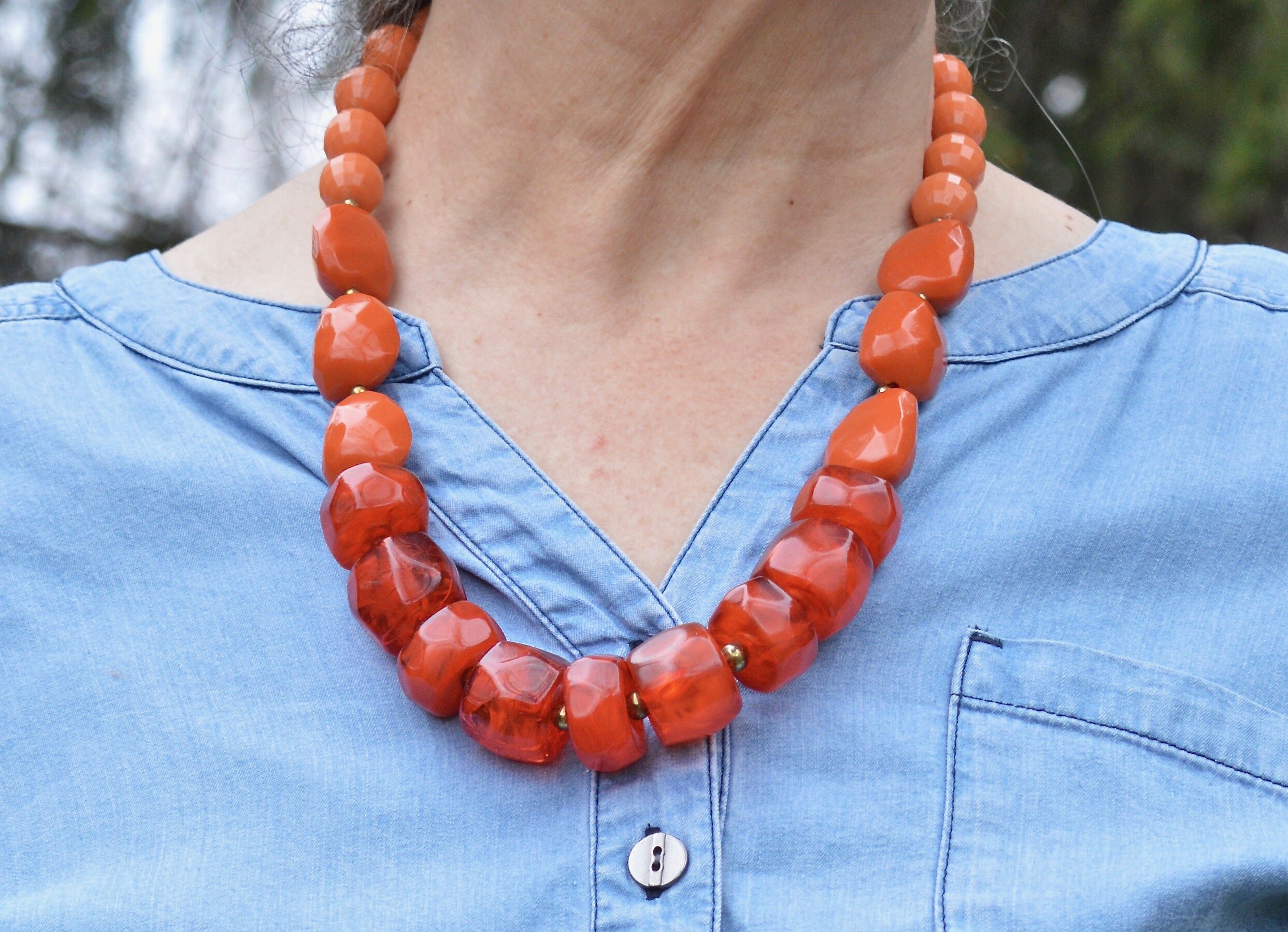
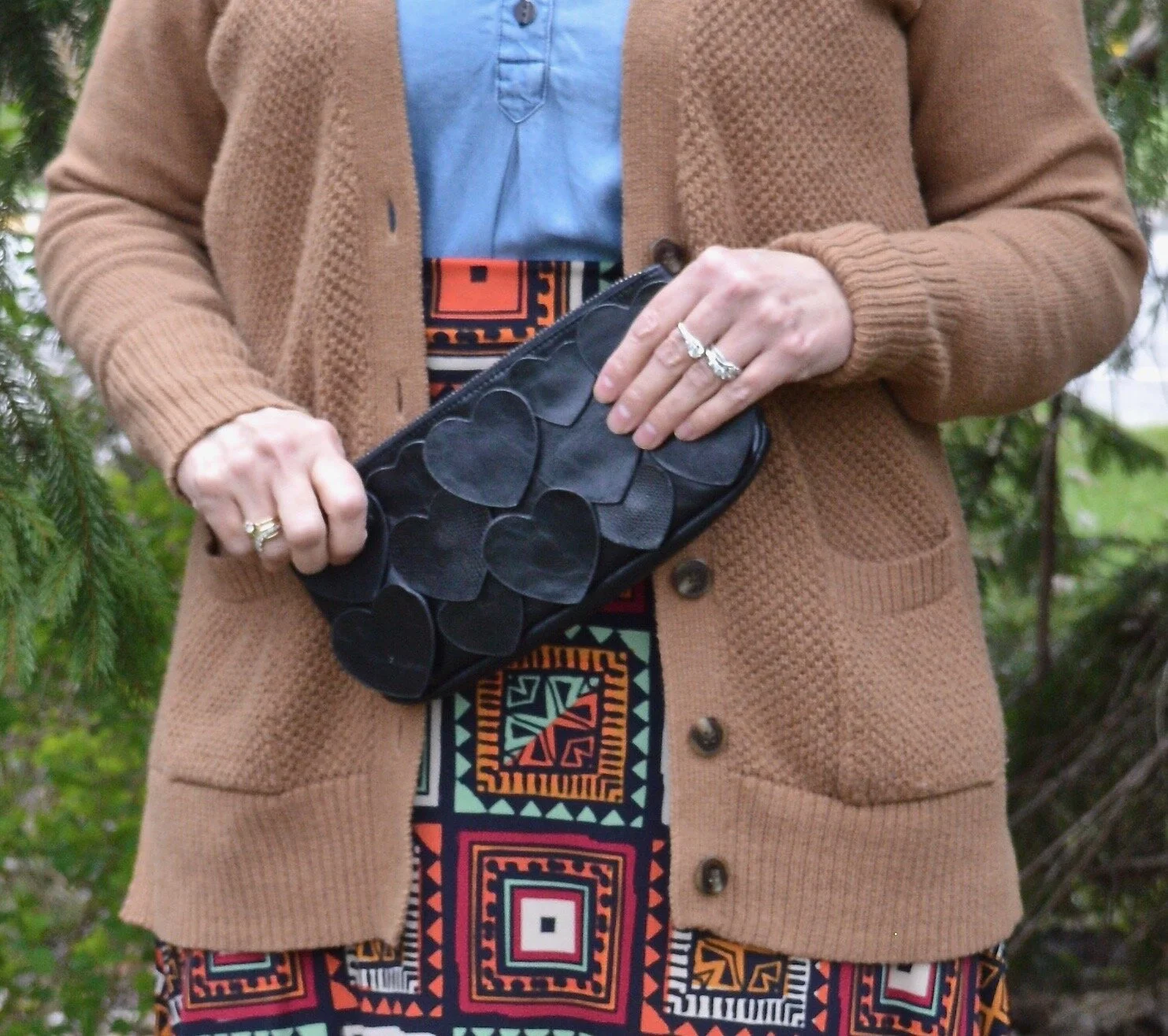
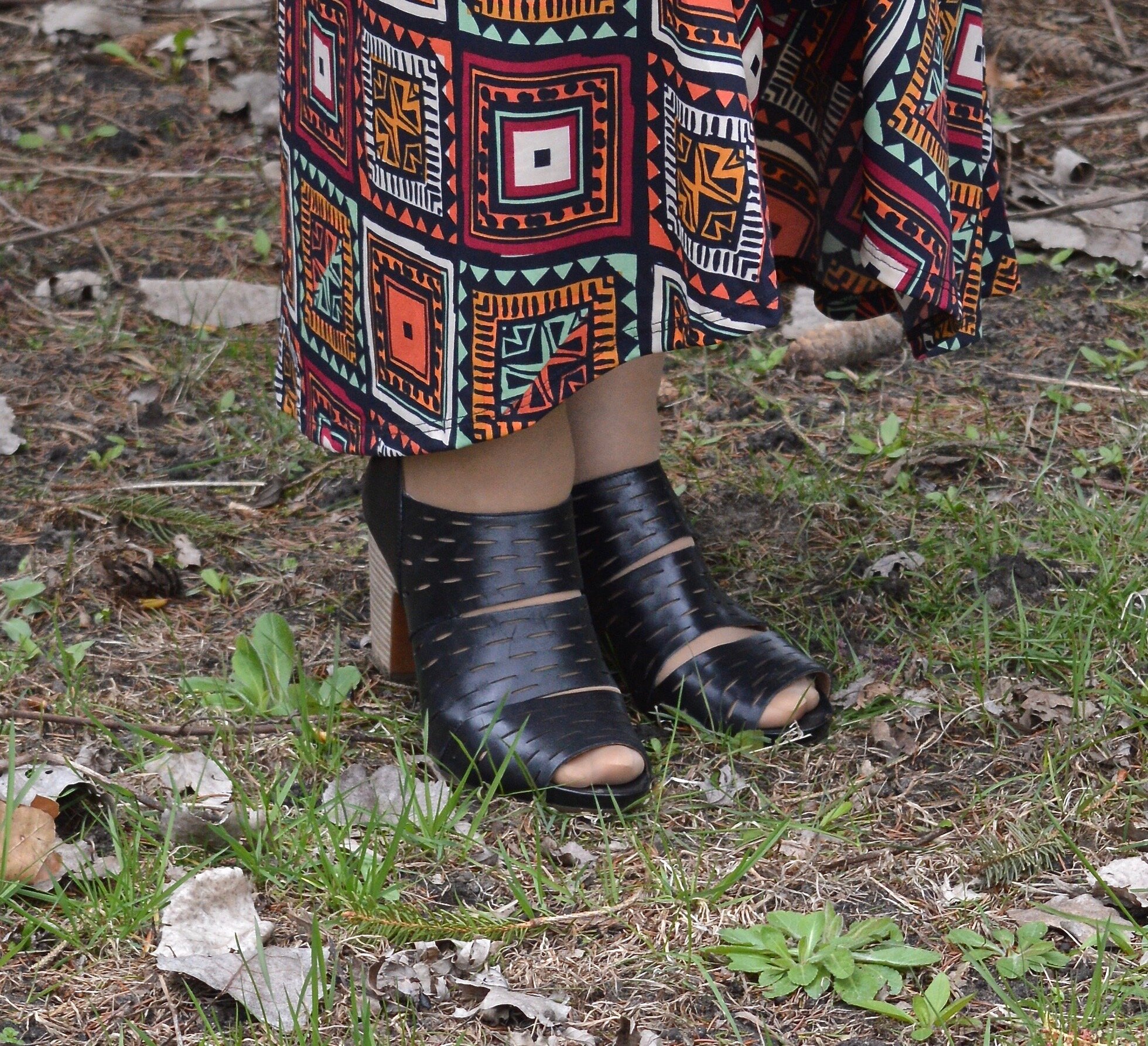
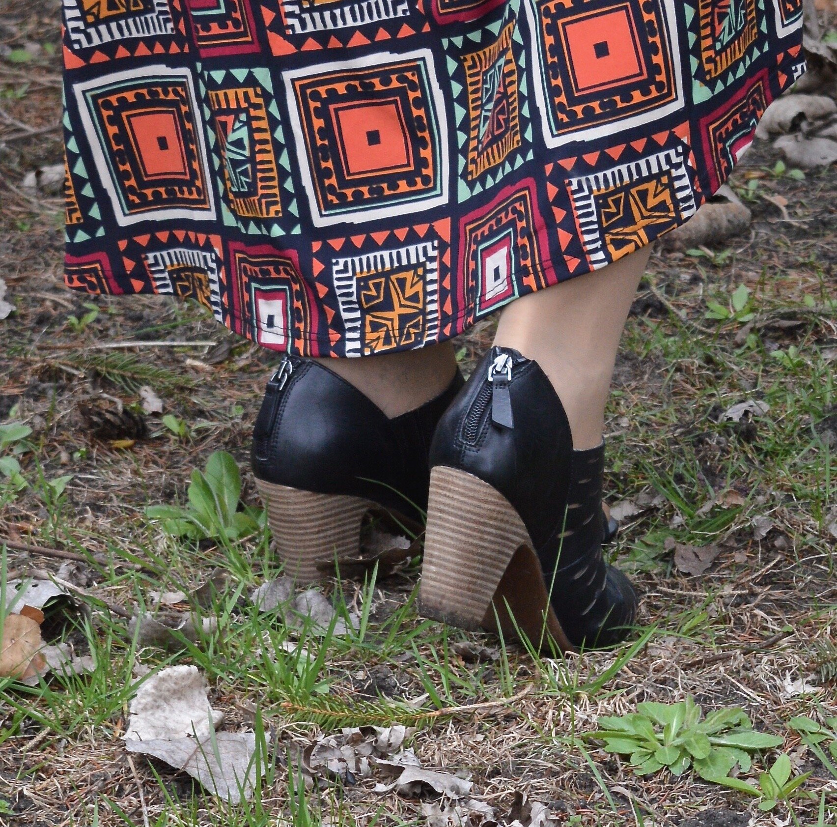
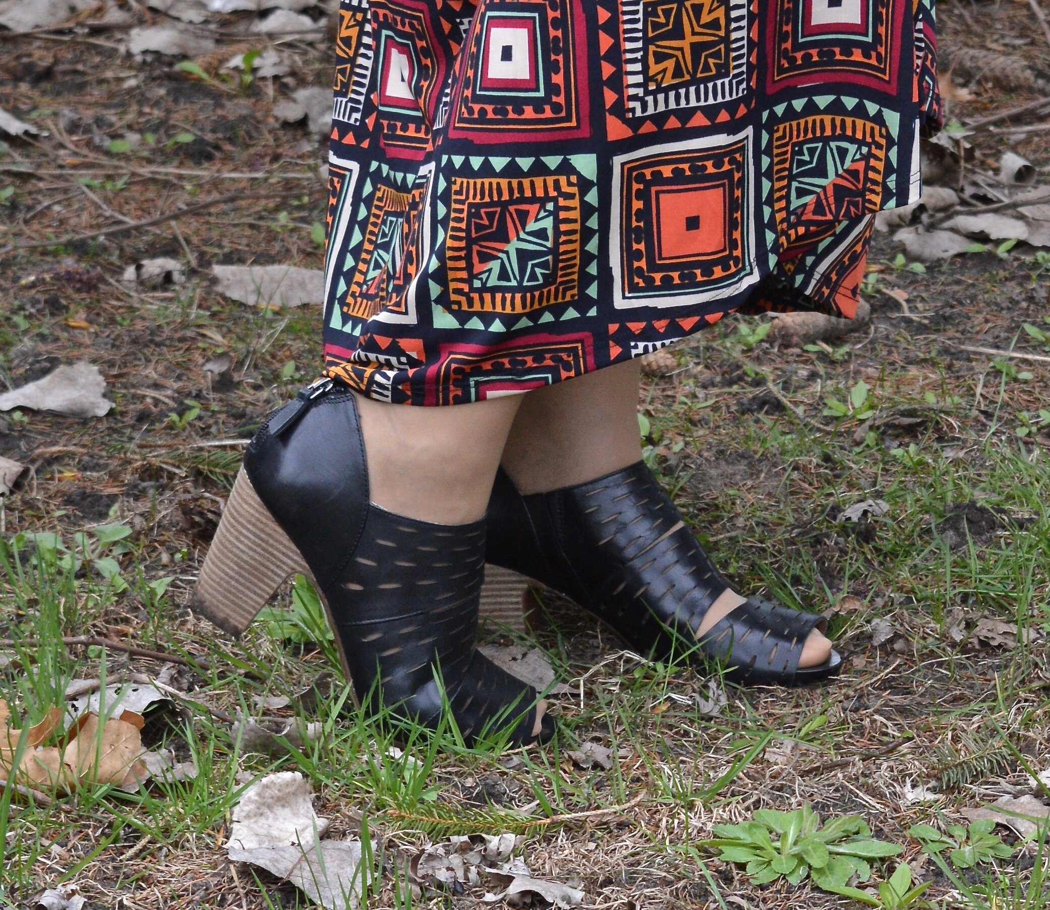
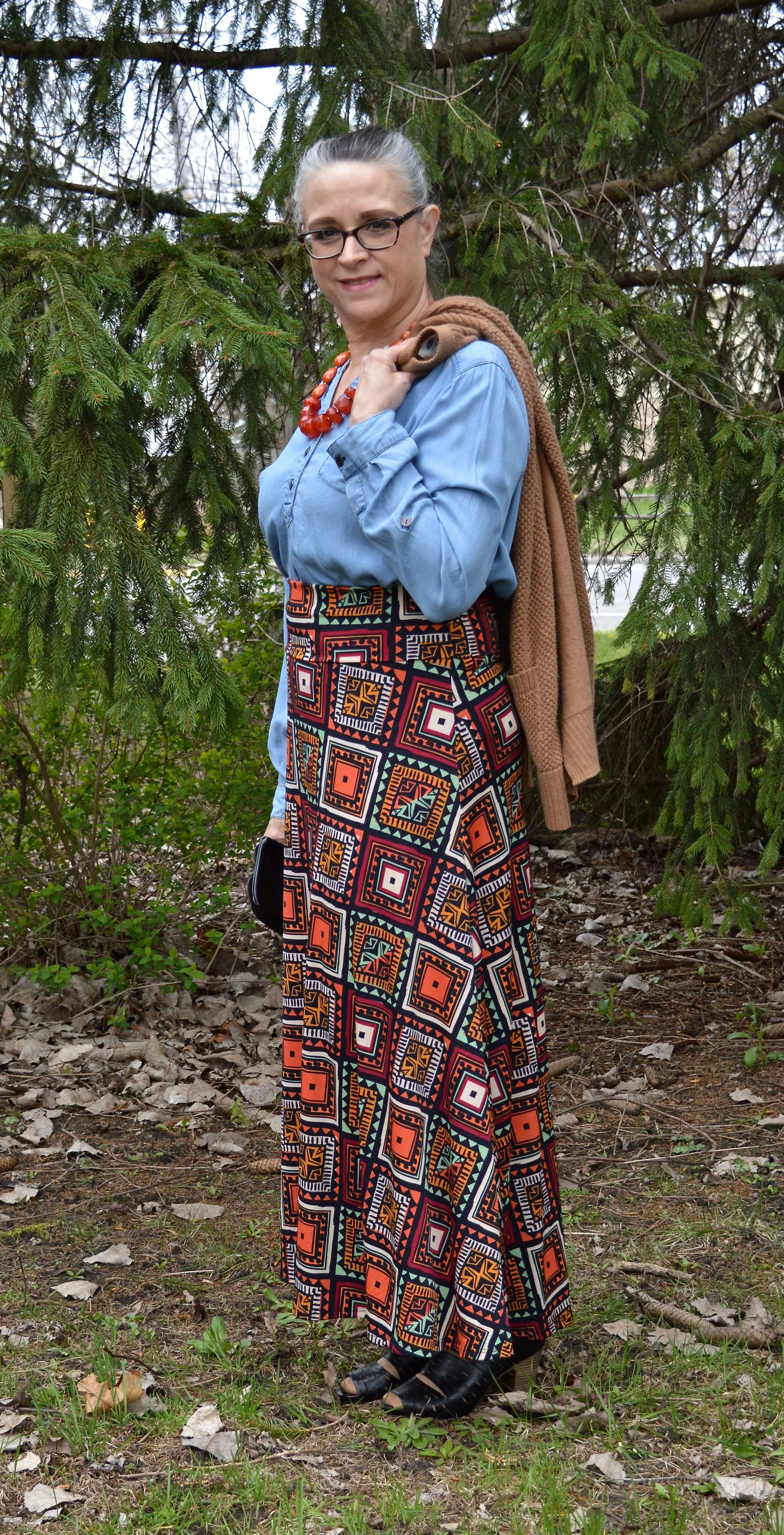
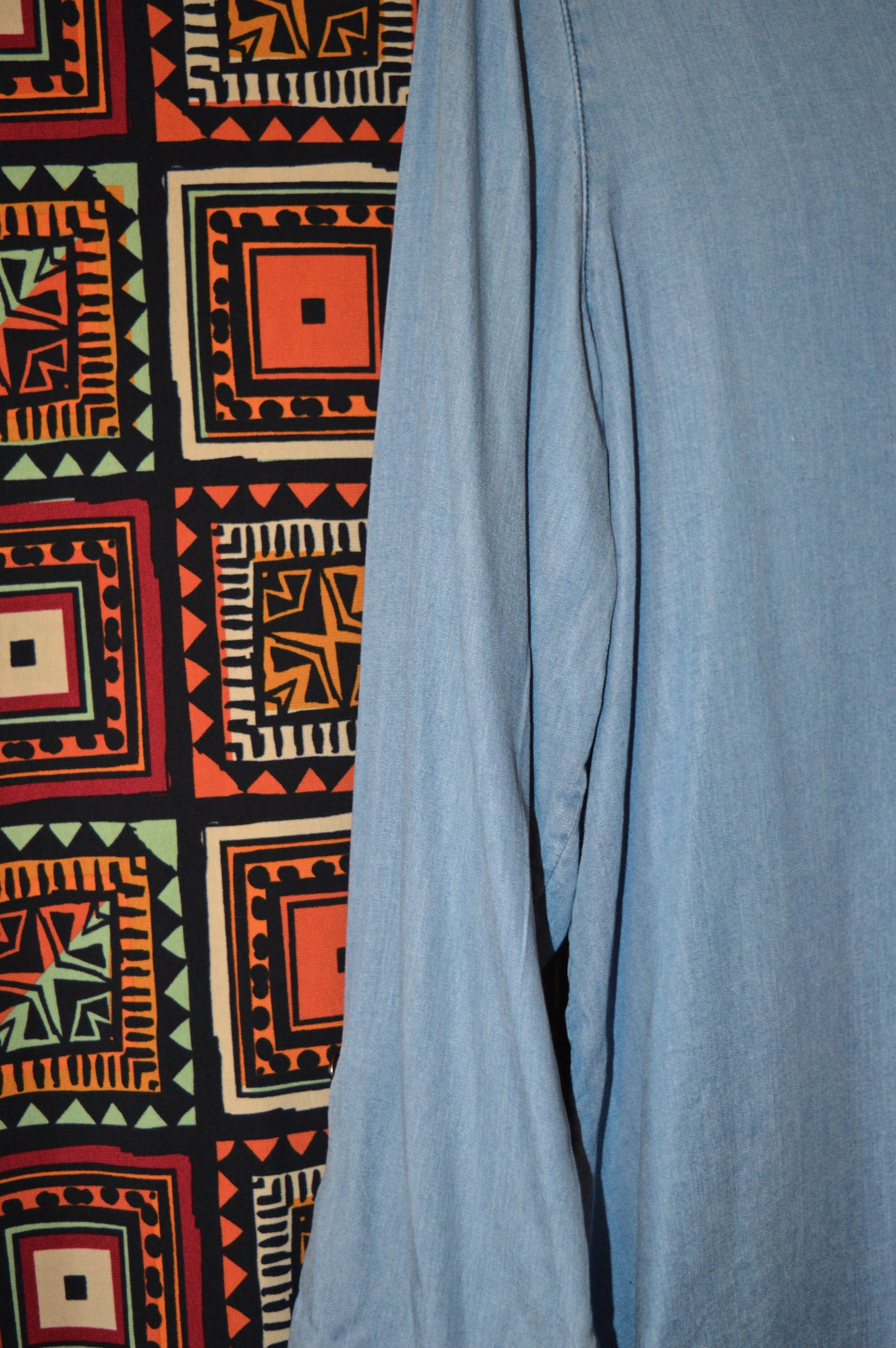
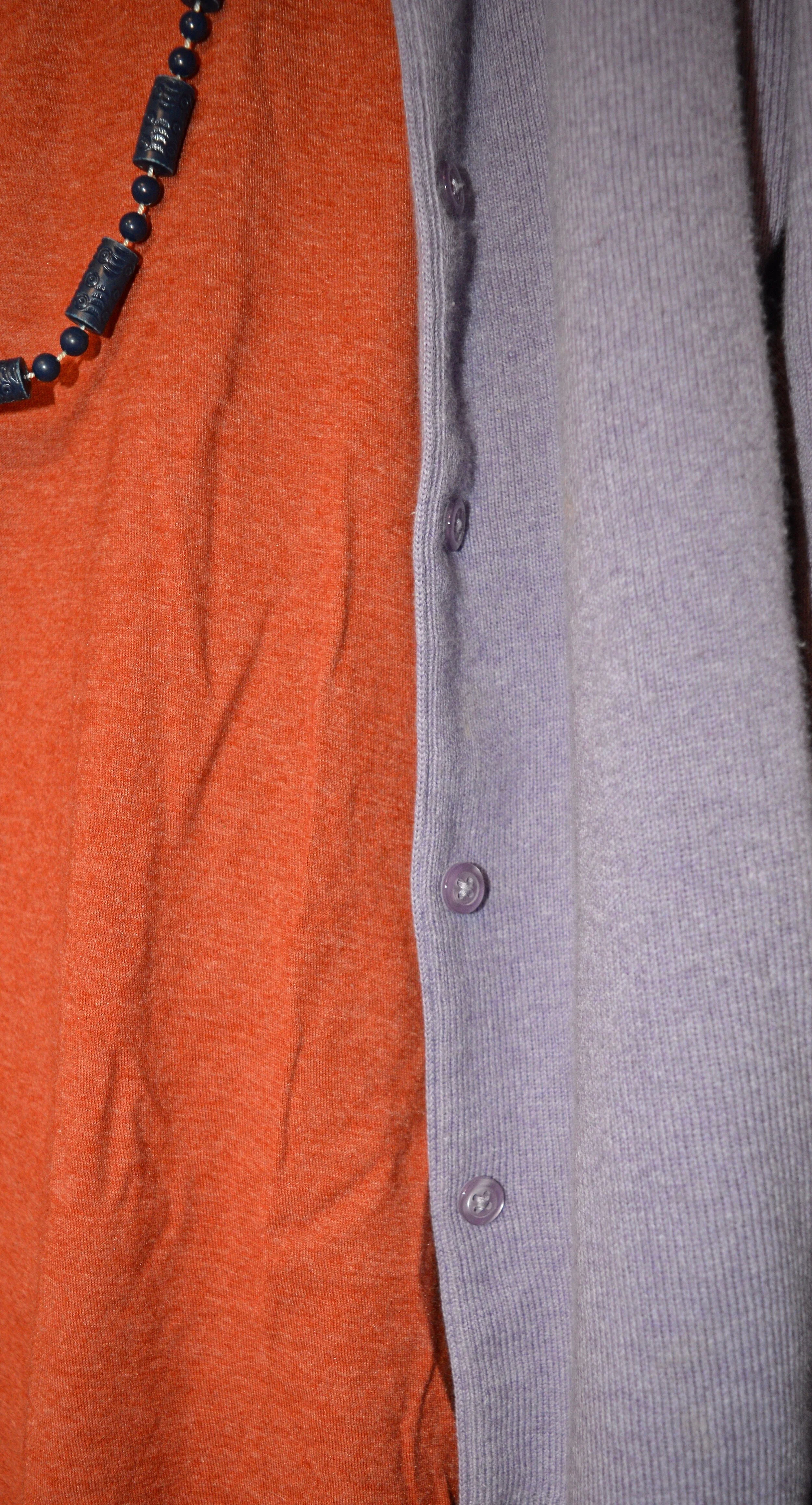
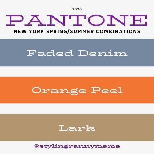
Faded Denim, Orange Peel and Lark

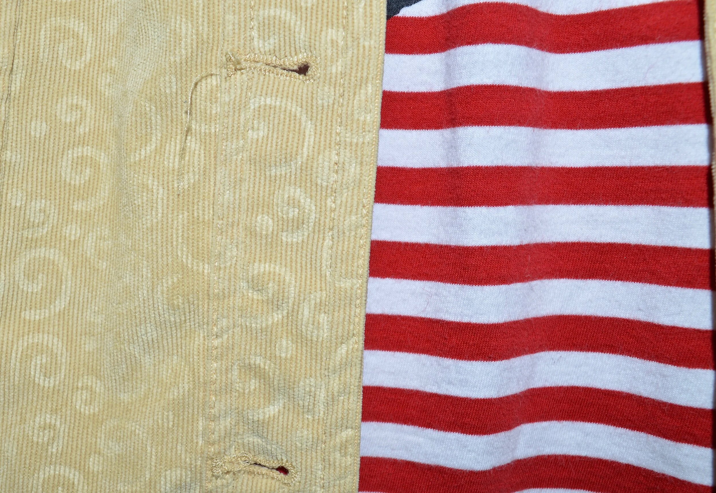
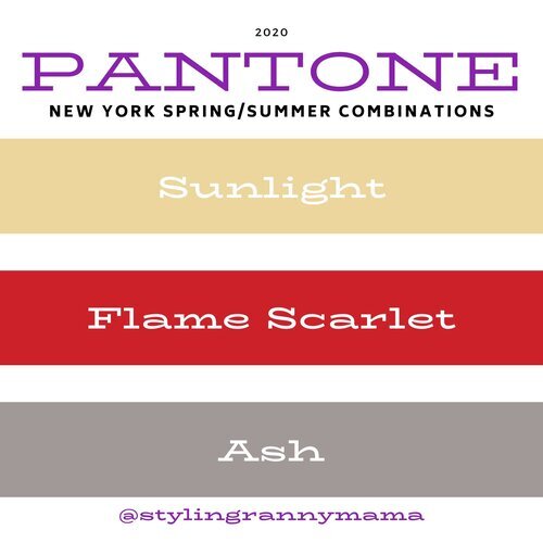
Sunlight, Flame Scarlet and Ash

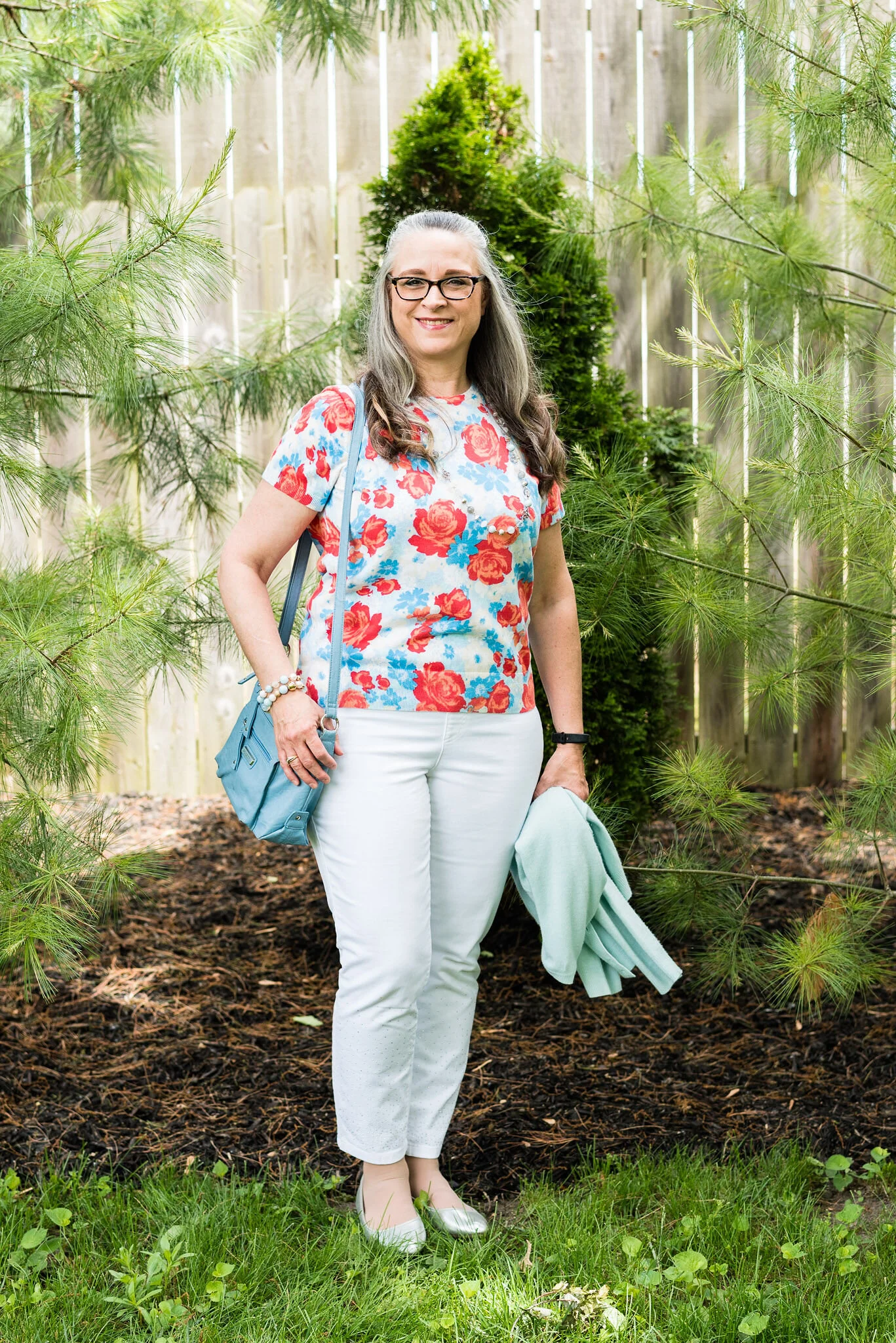
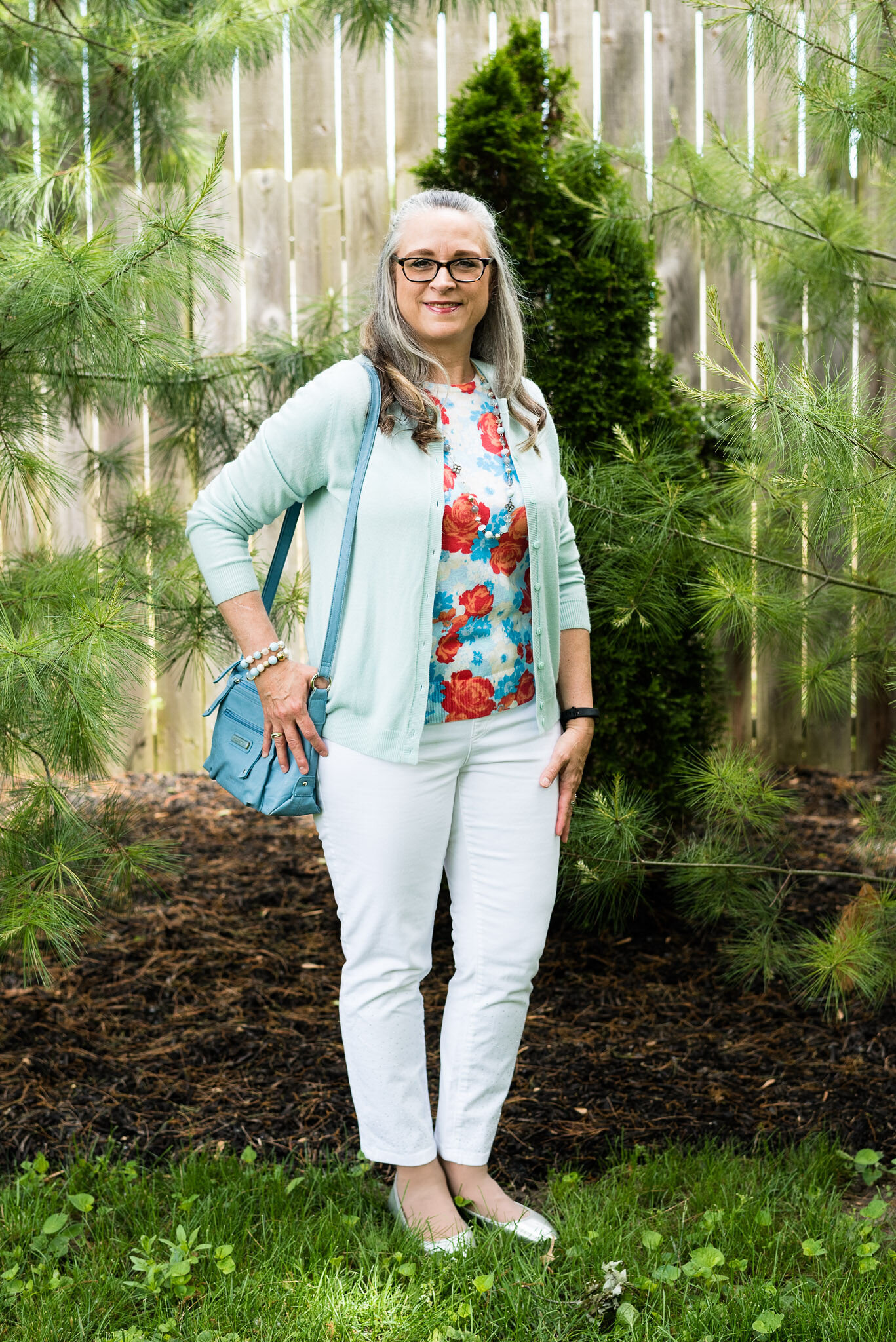
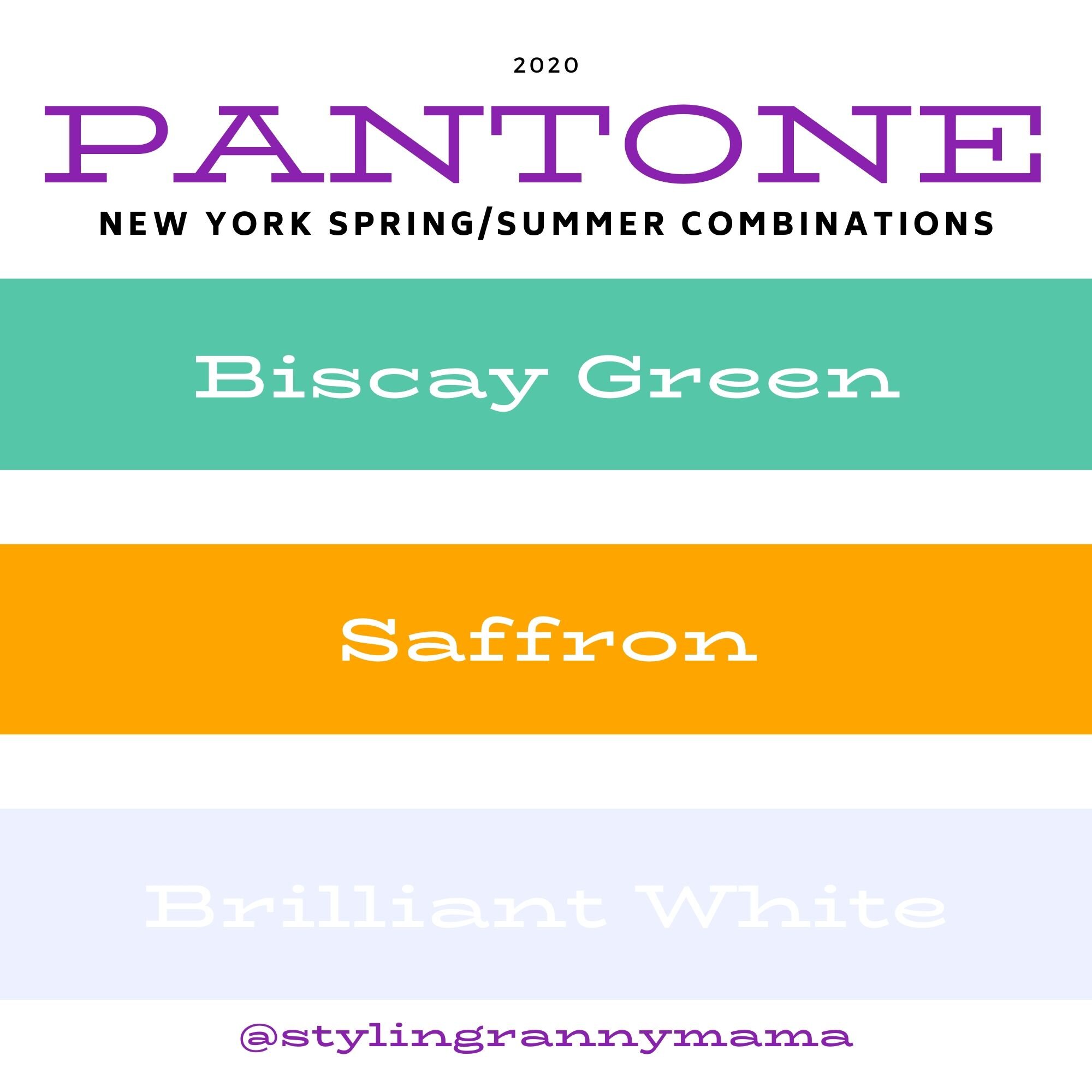
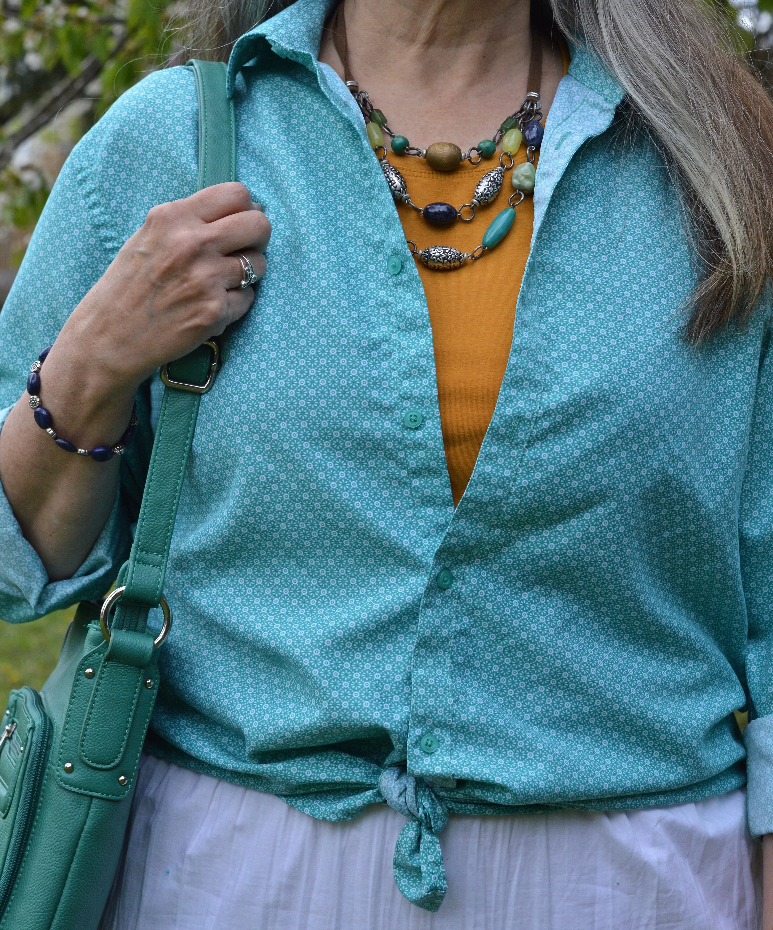
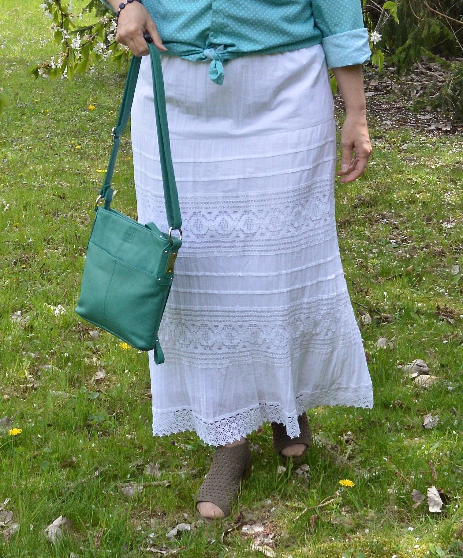
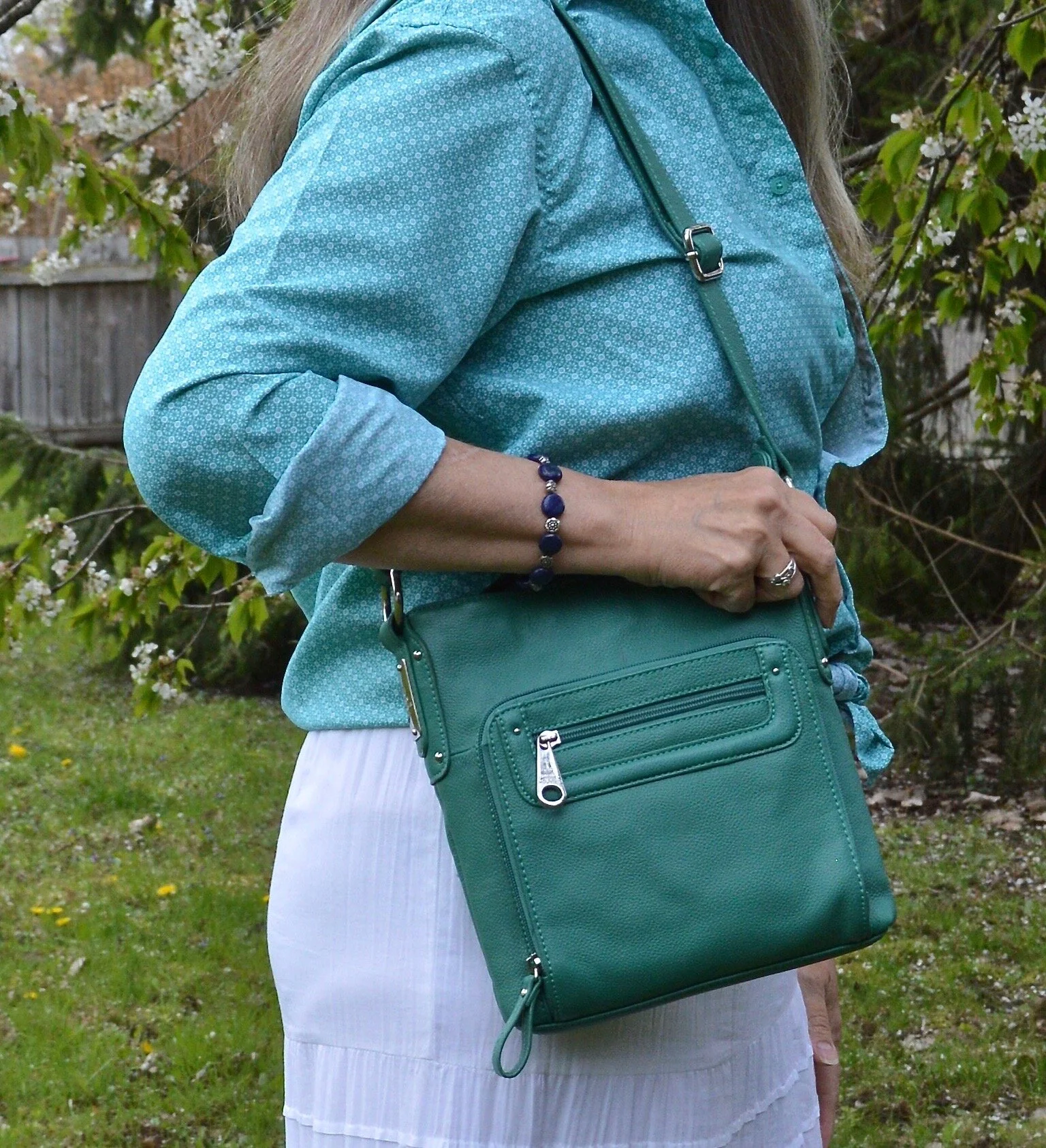
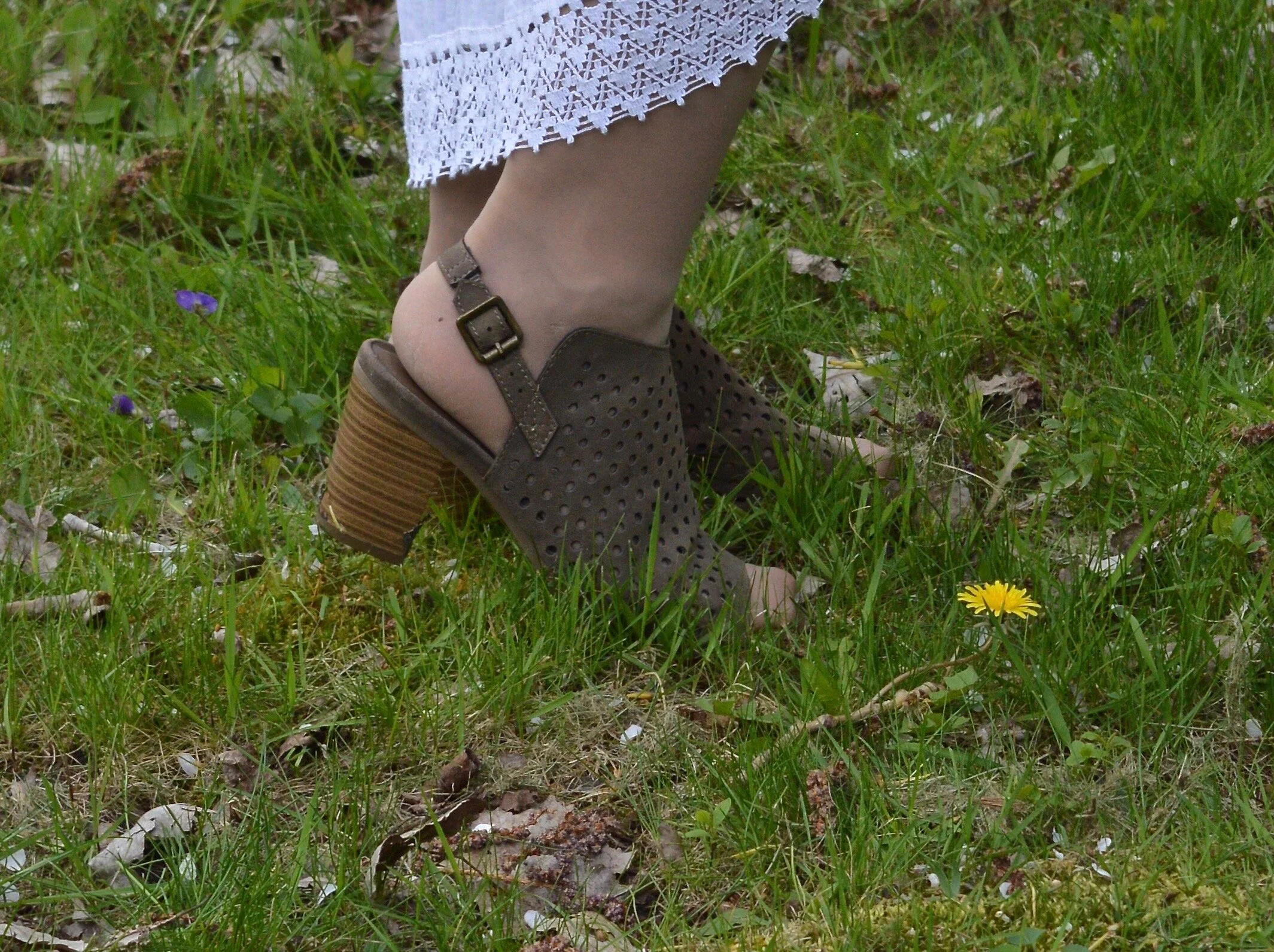
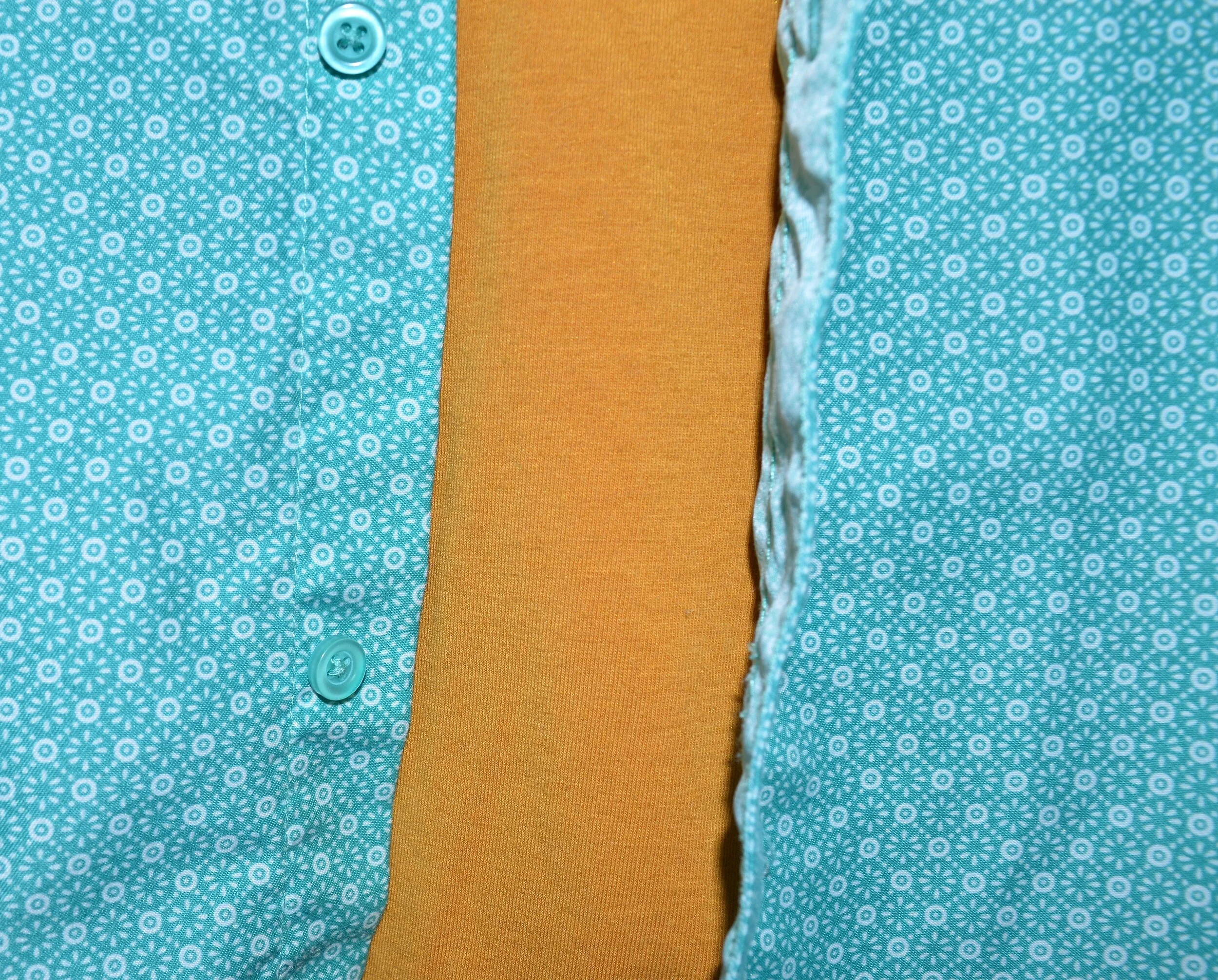
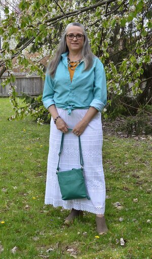
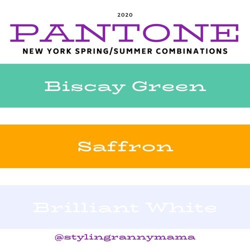
Biscay Green, Saffron and Brilliant White
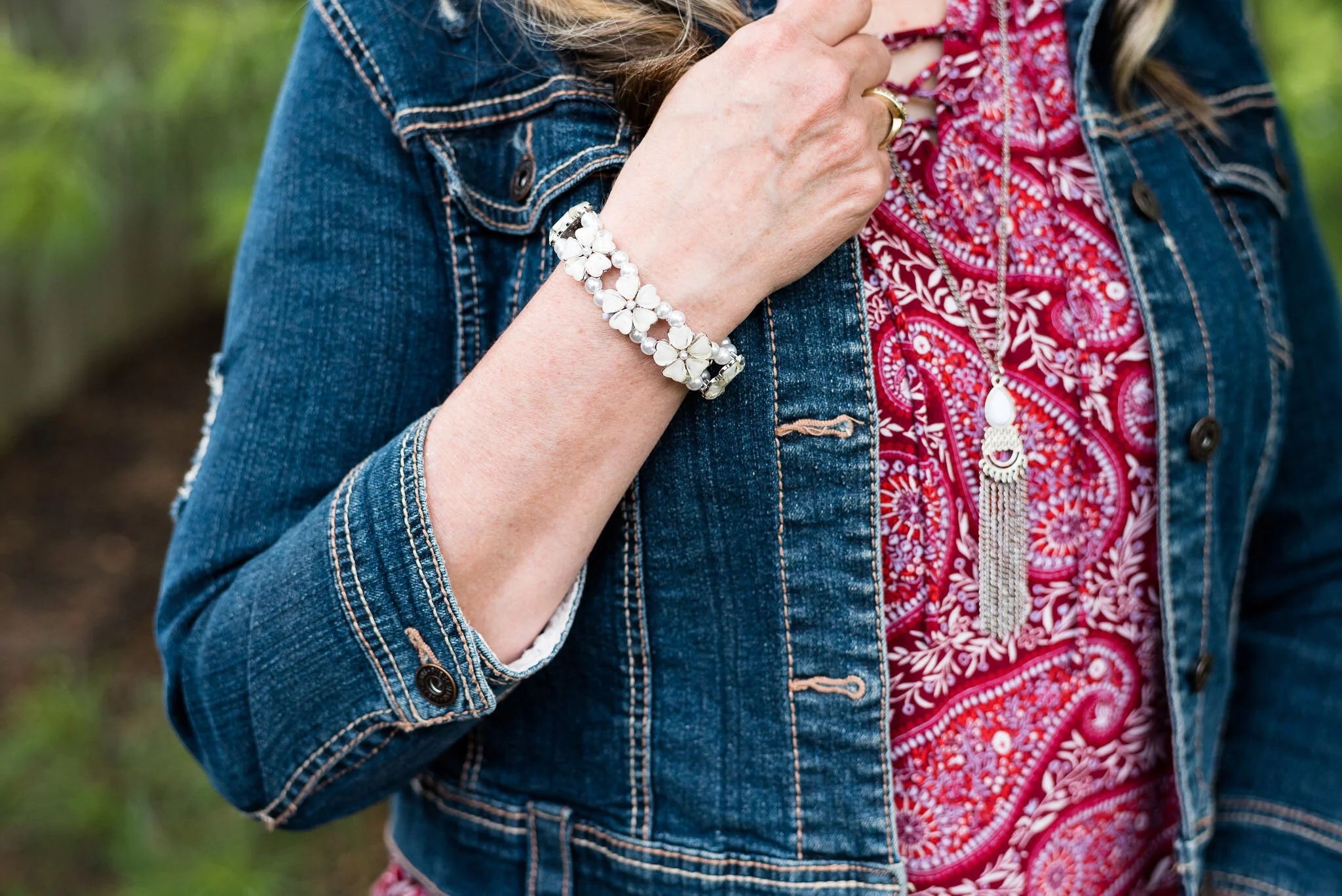
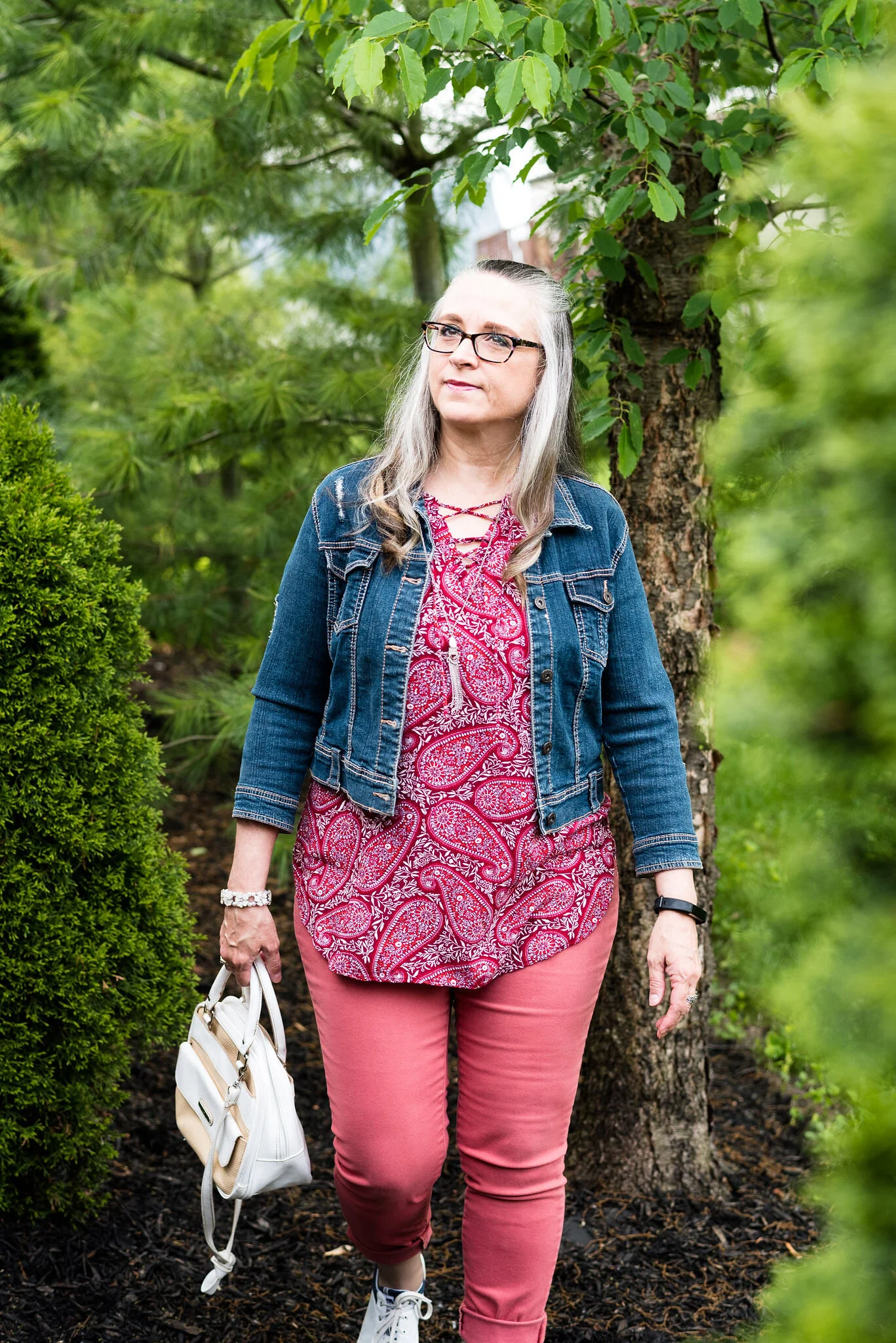
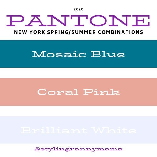
Mosaic Blue, Coral Pink and Brilliant White

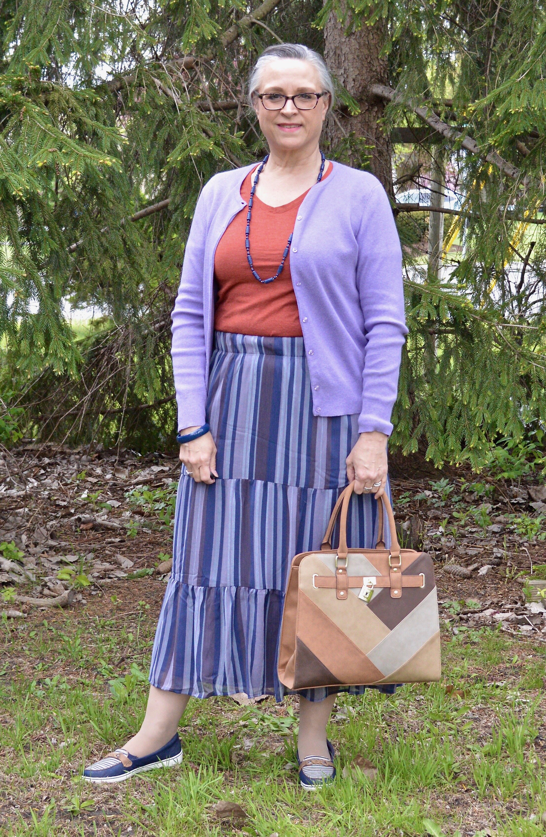
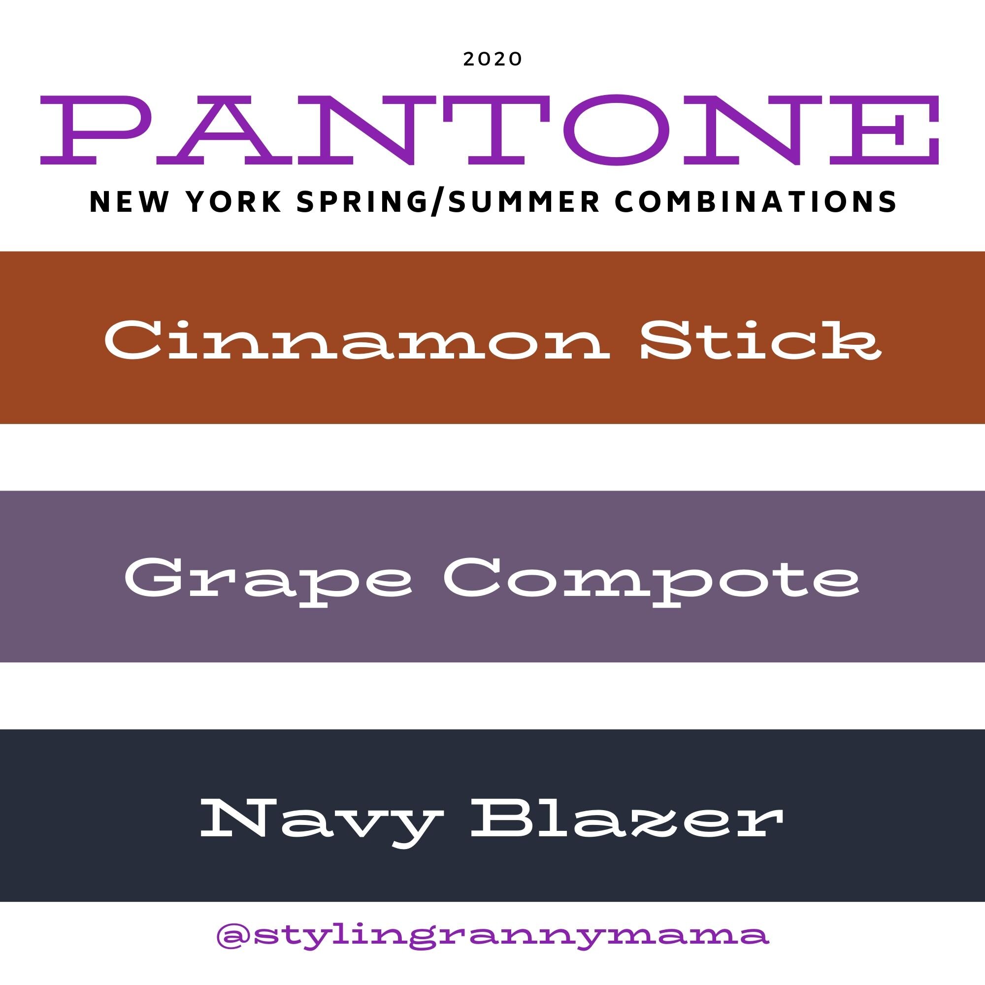
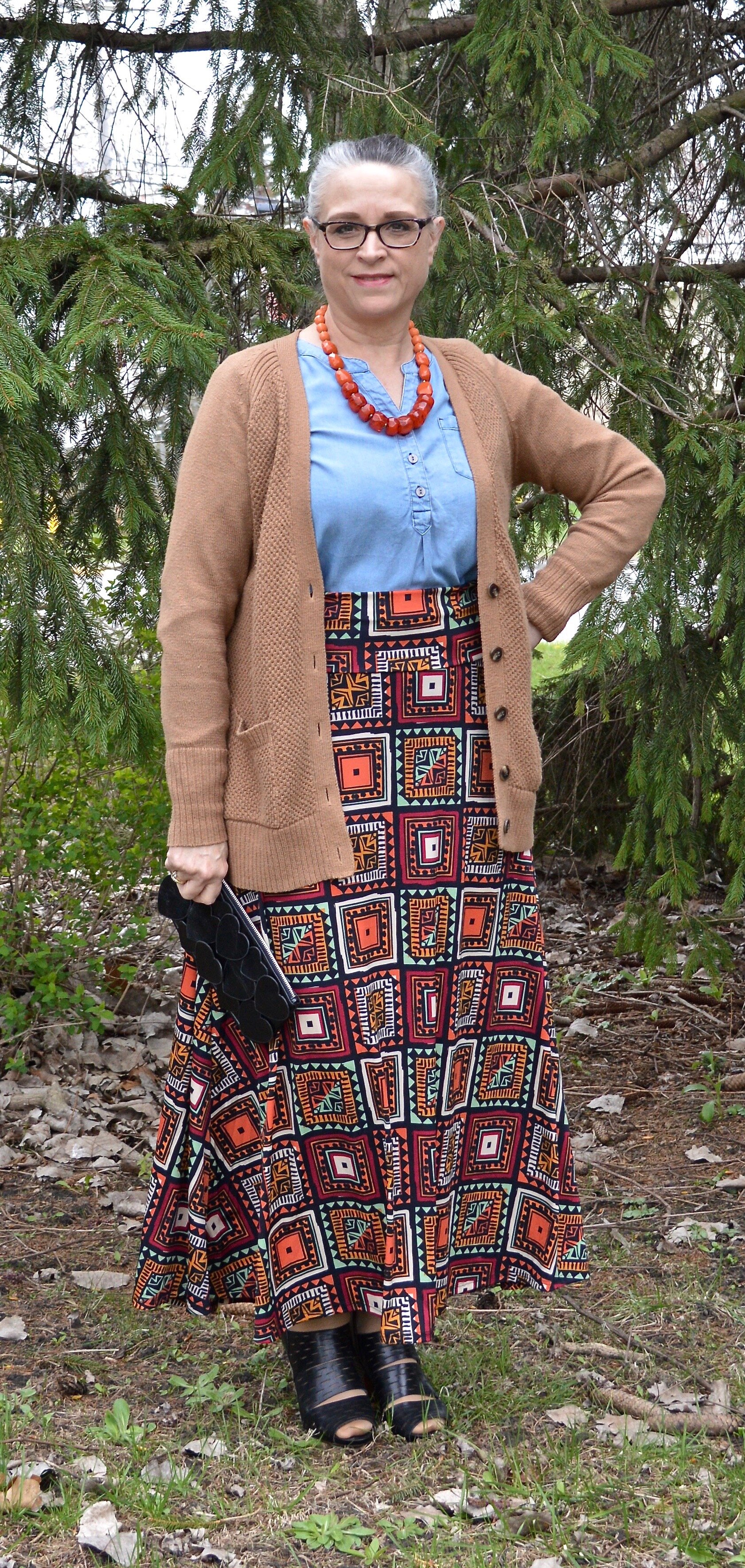
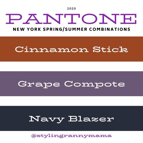
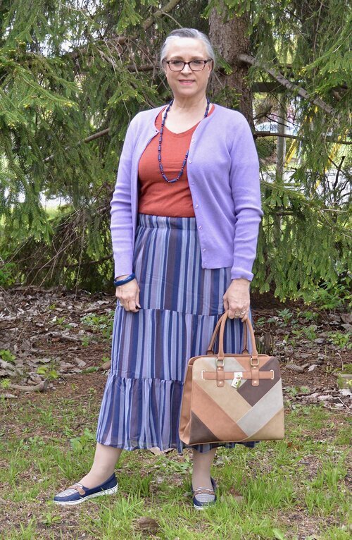
Cinnamon Stick, Grape Compote and Navy Blazer
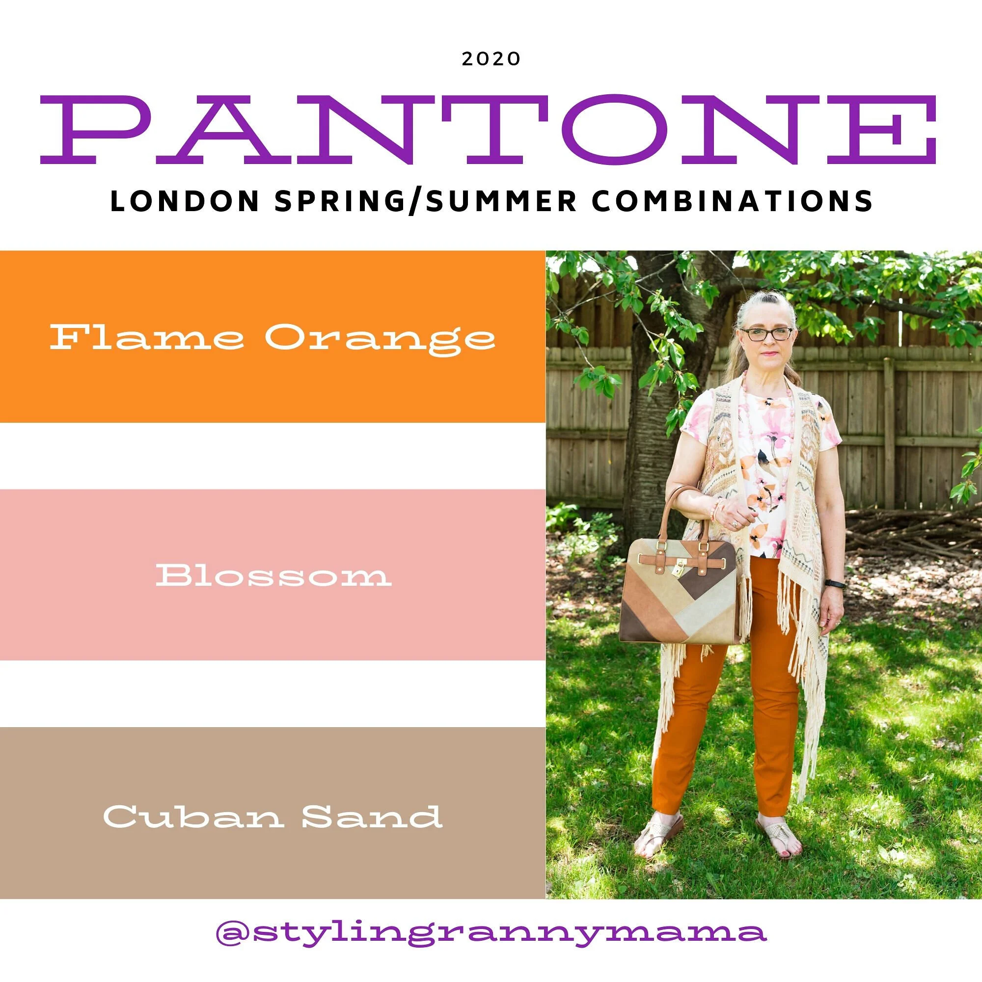
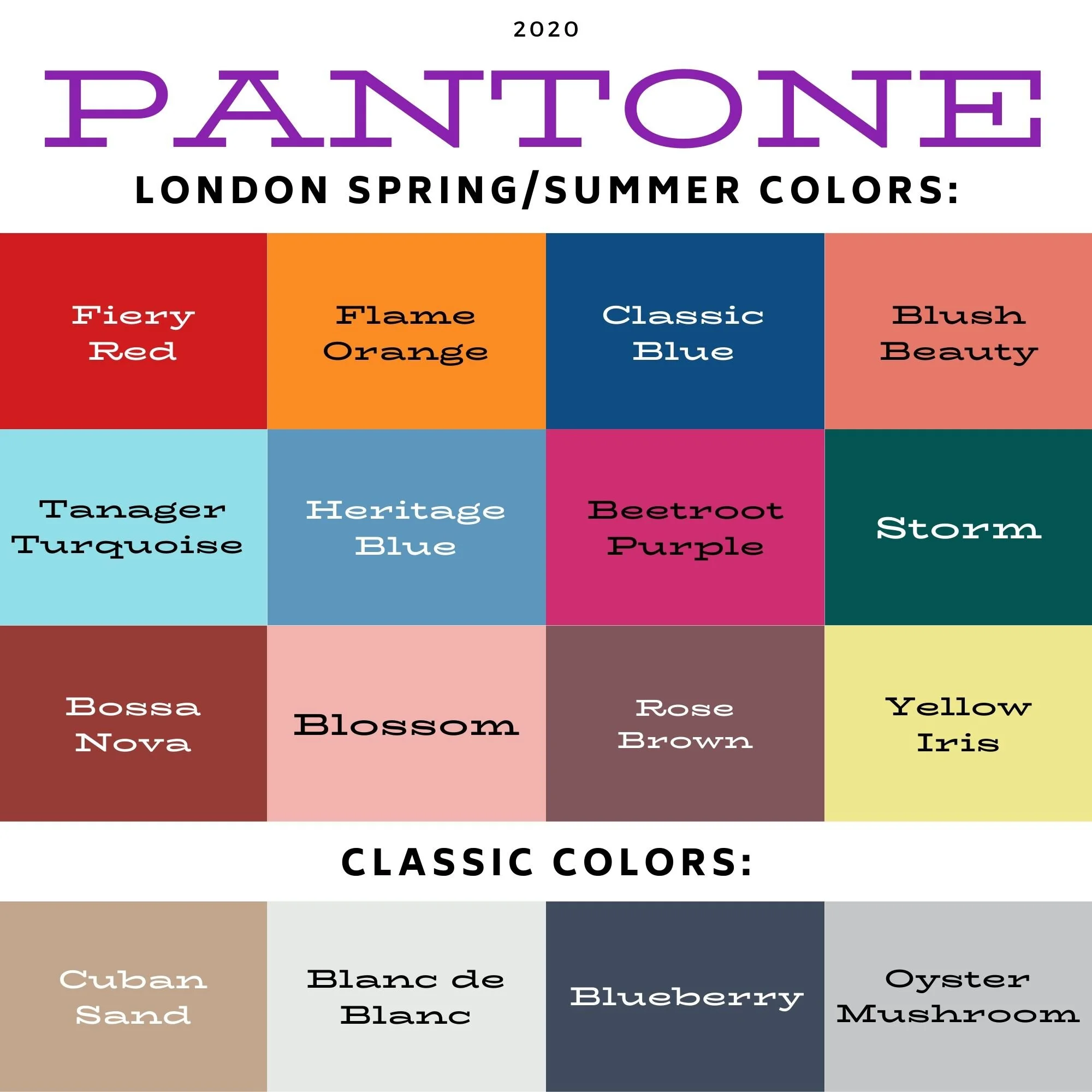
London Palette
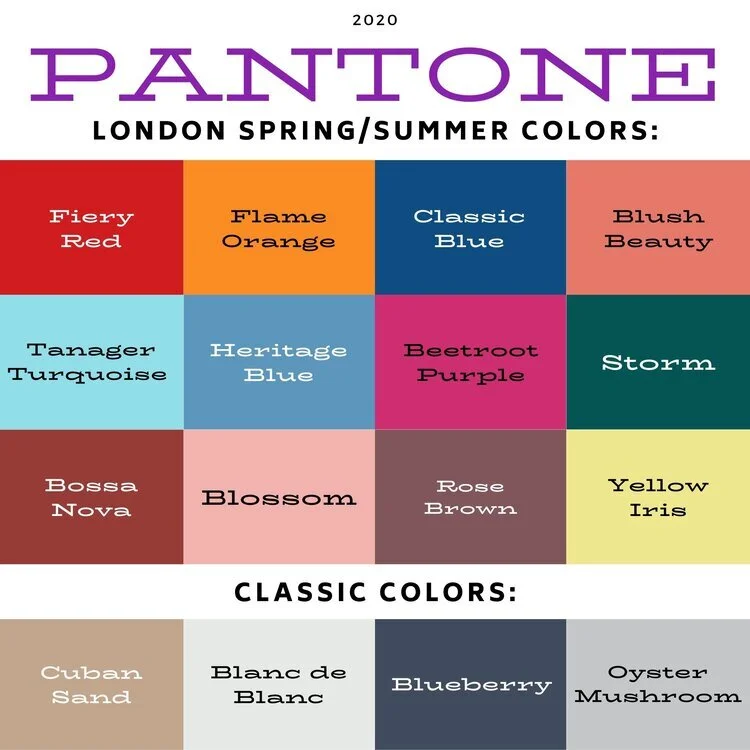
Classic Blue, Beetroot Purple and Oyster Mushroom

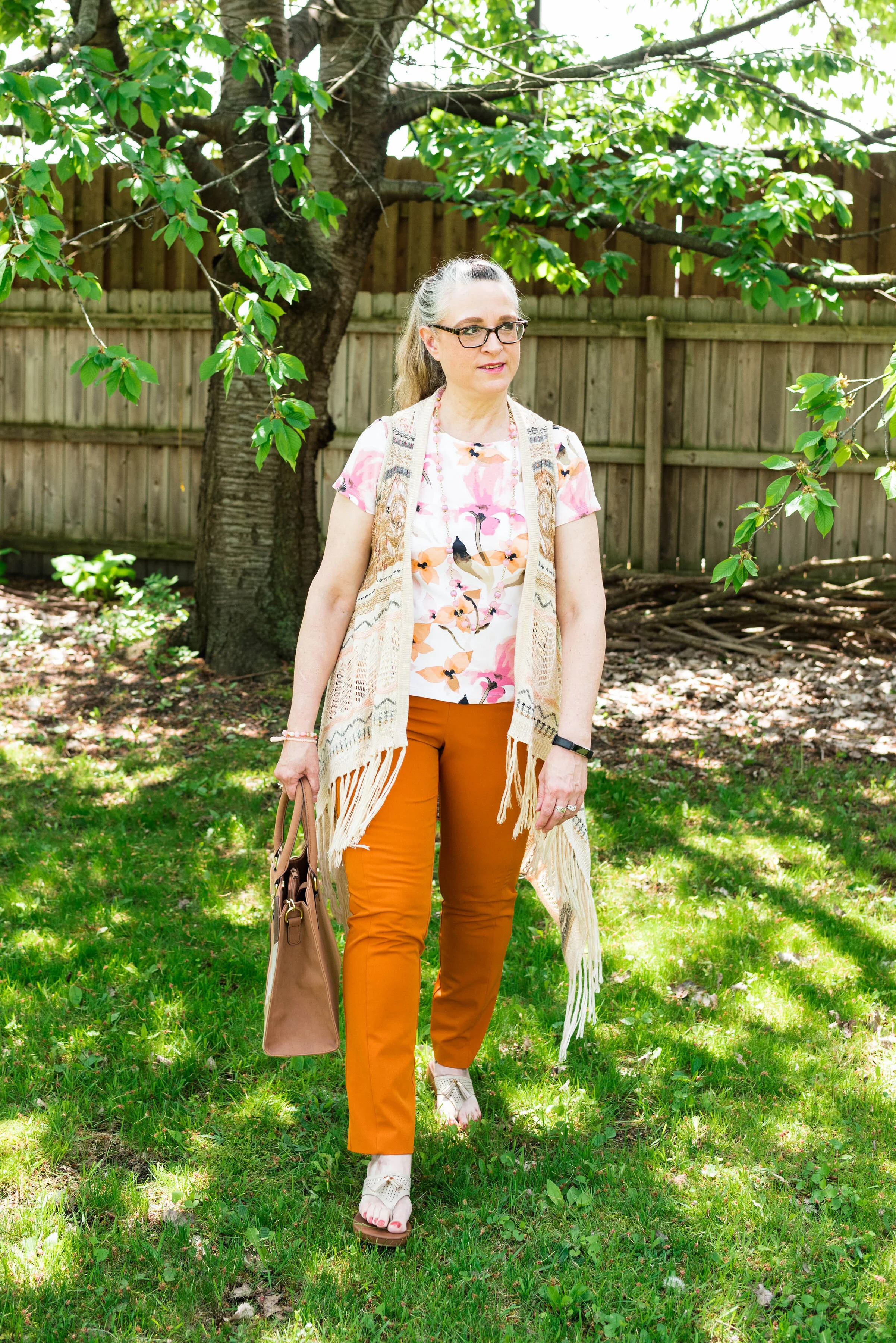
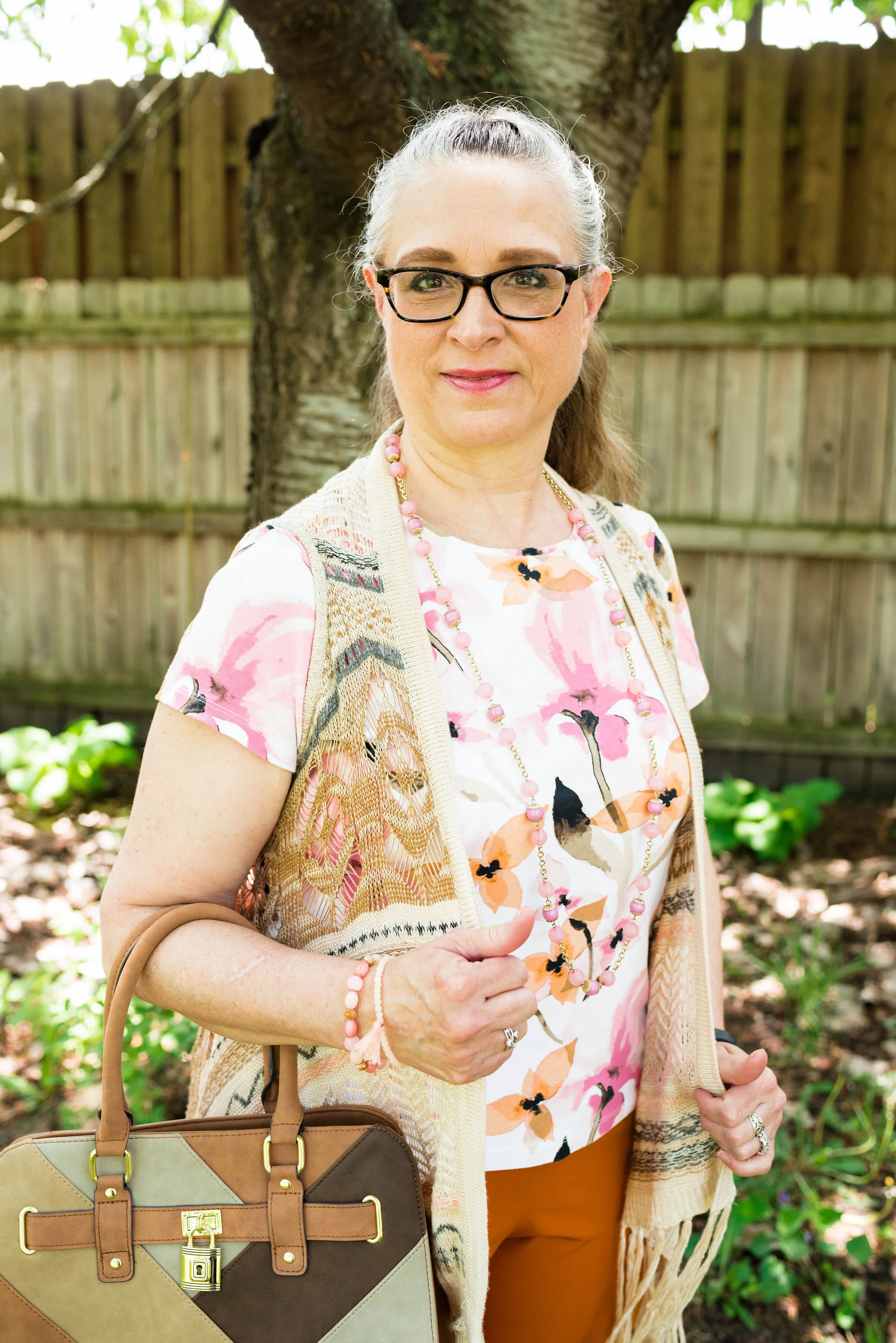
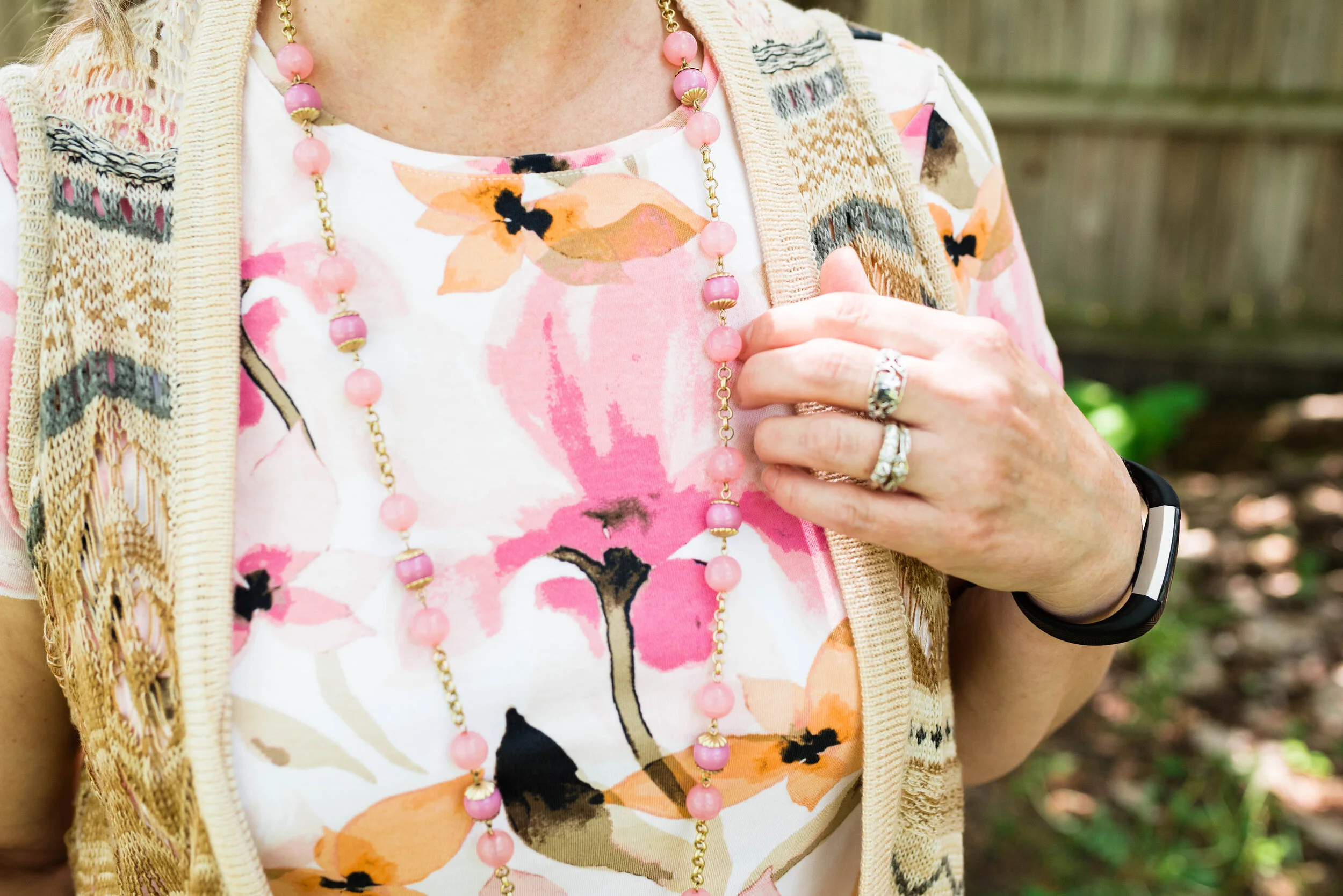
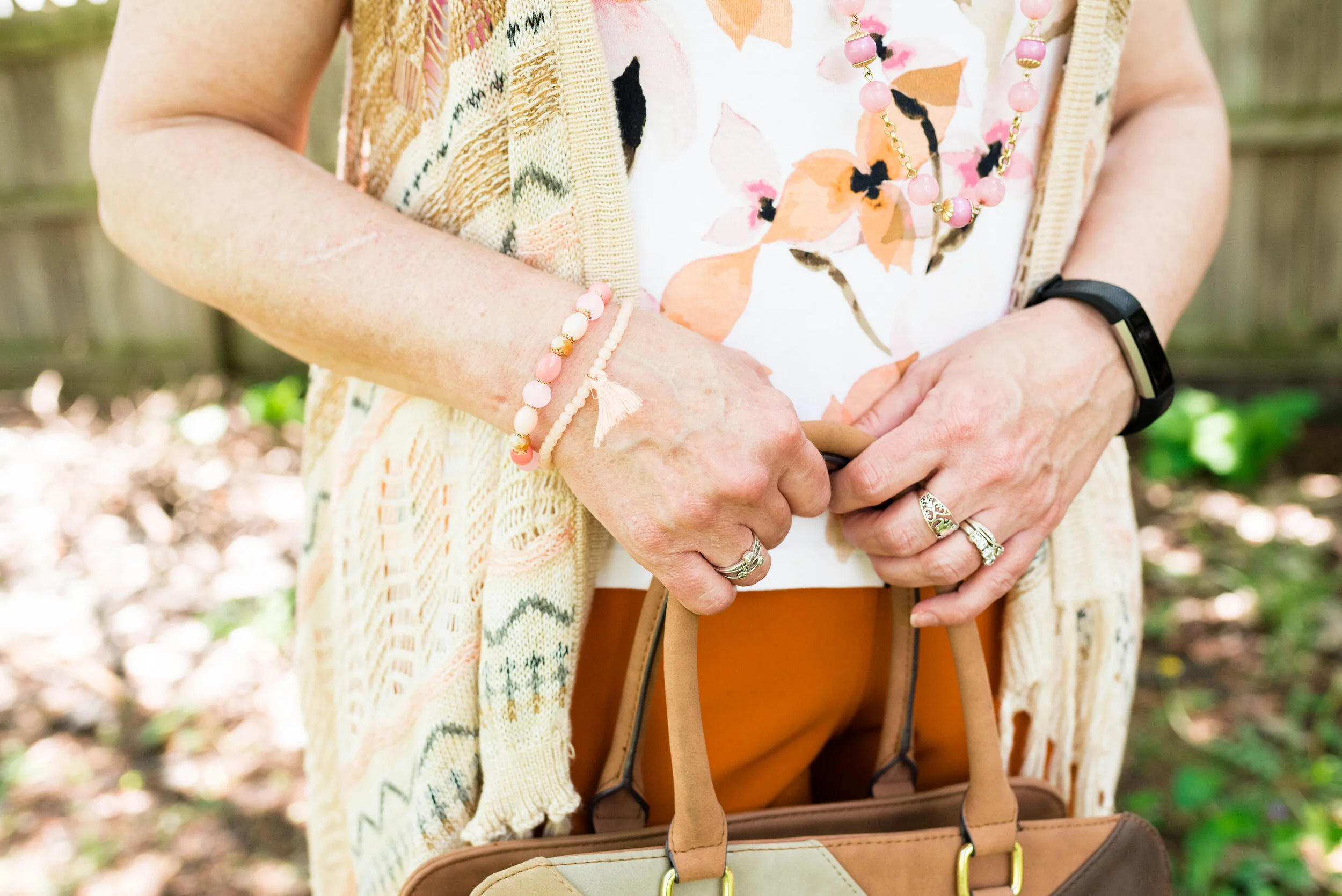
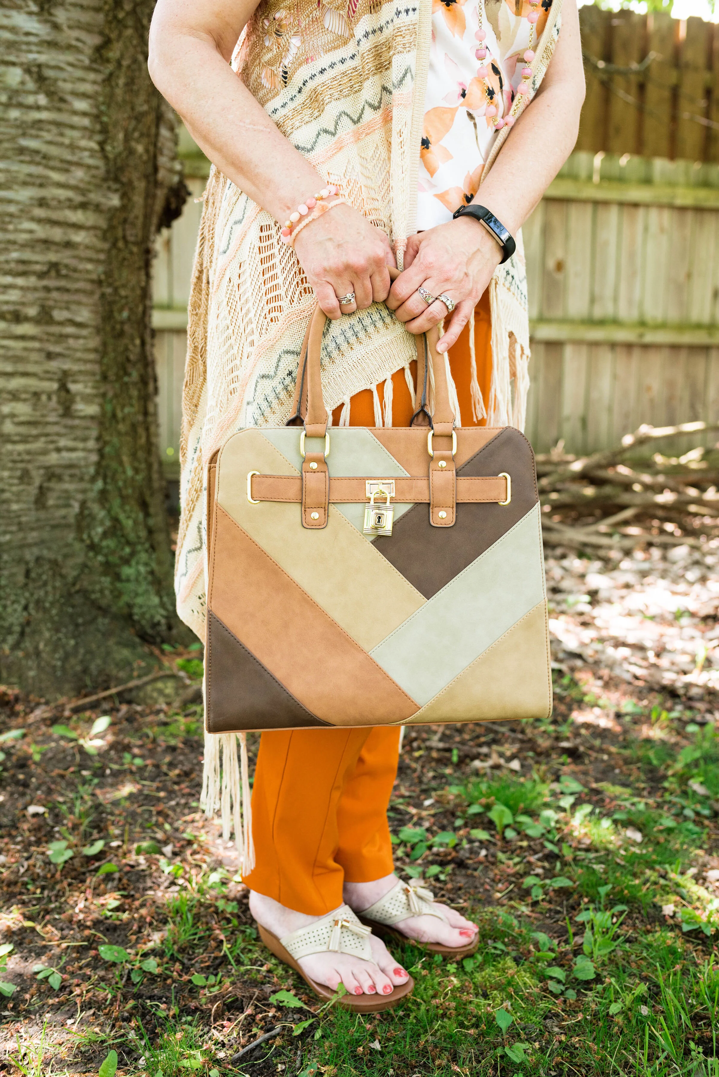
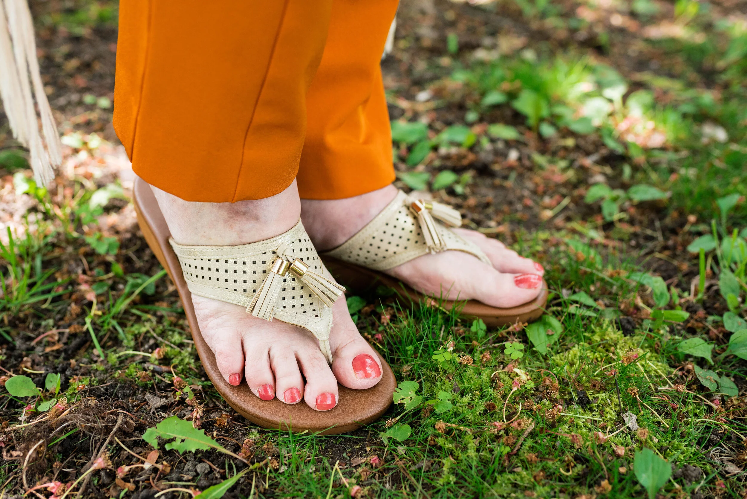
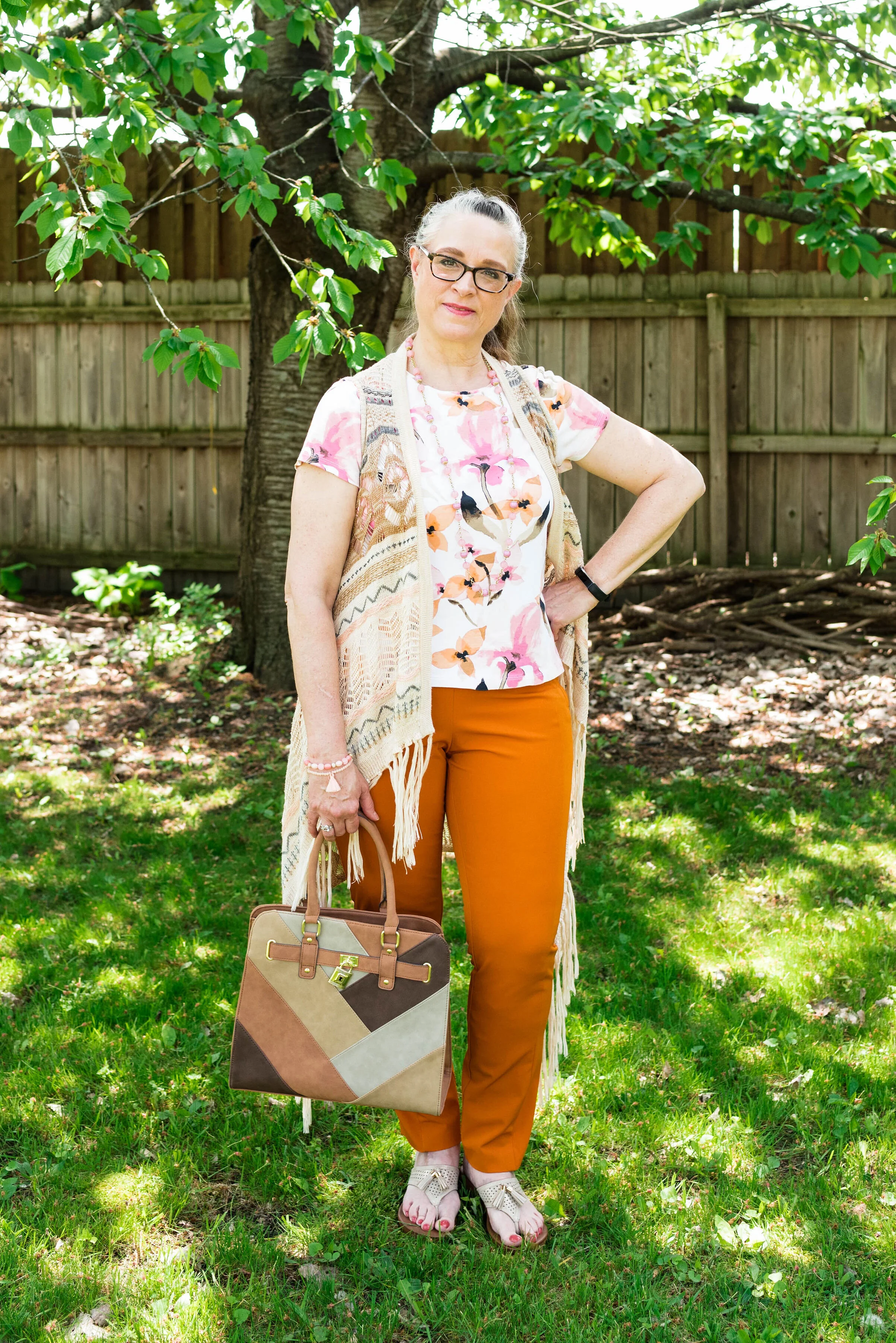
Flame Orange, Blossom and Cuban Sand

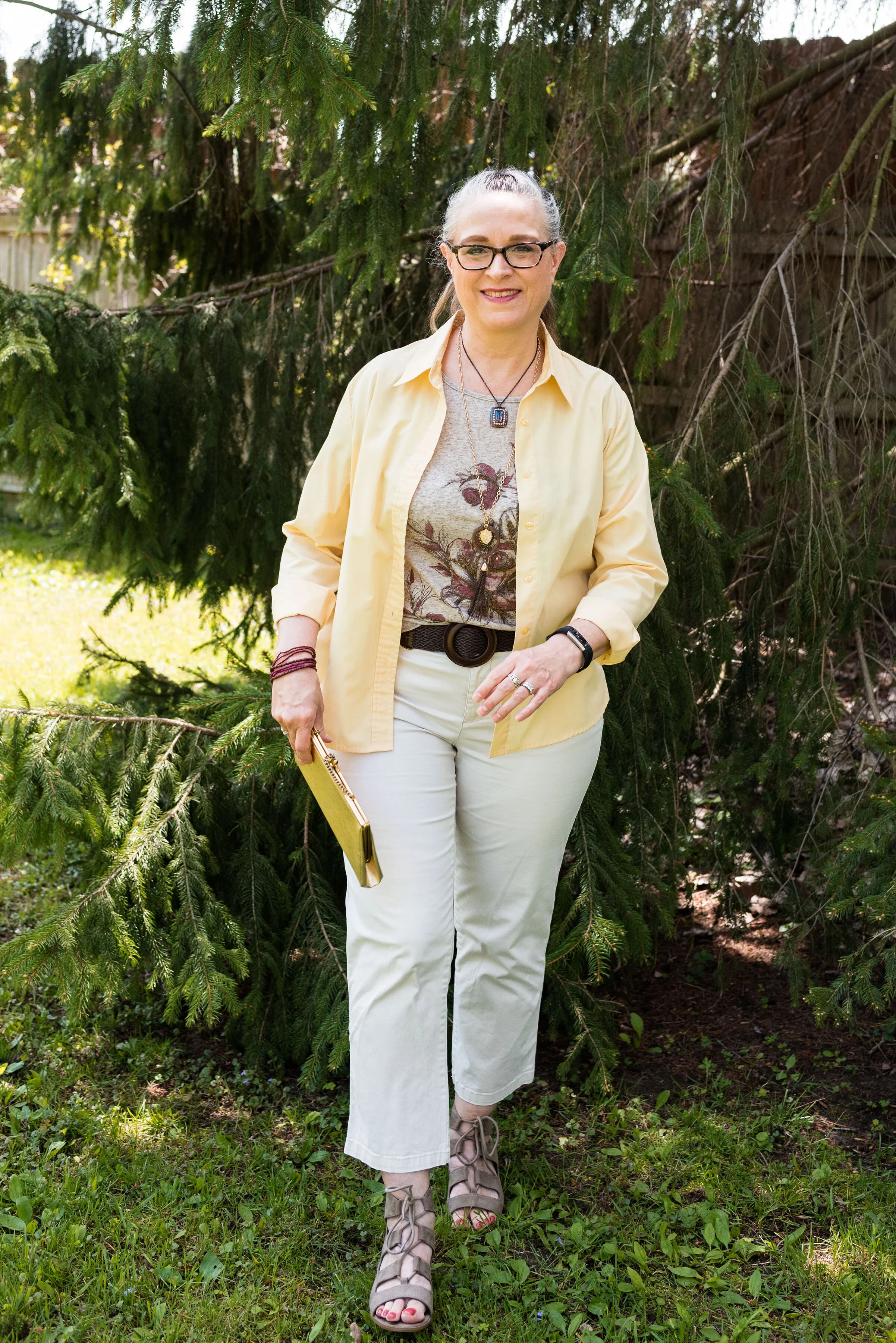
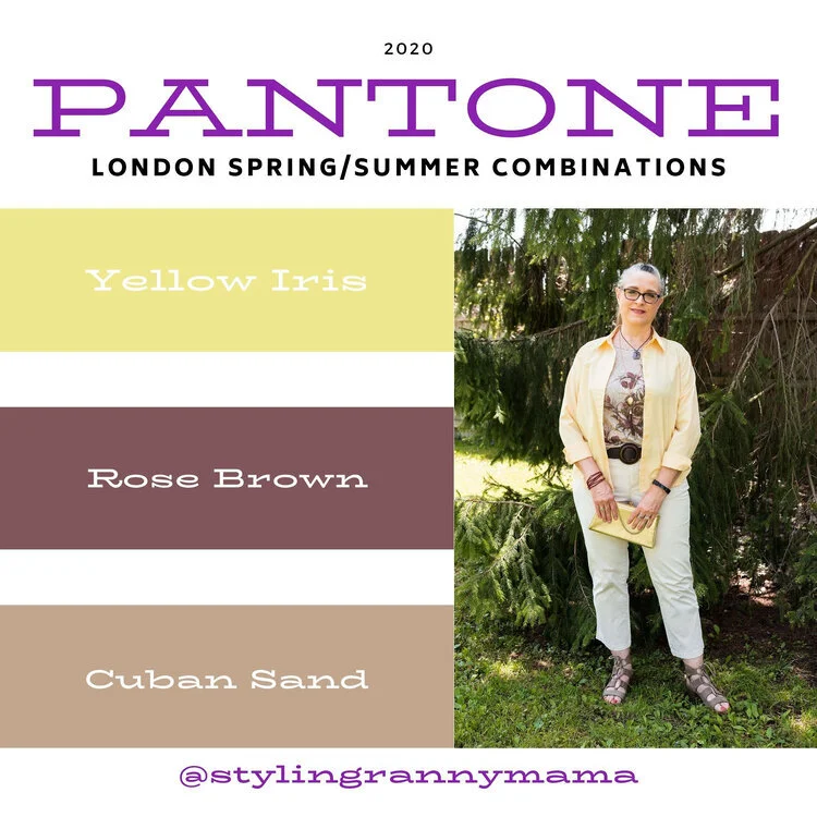
Yellow Iris, Rose Brown and Cuban Sand
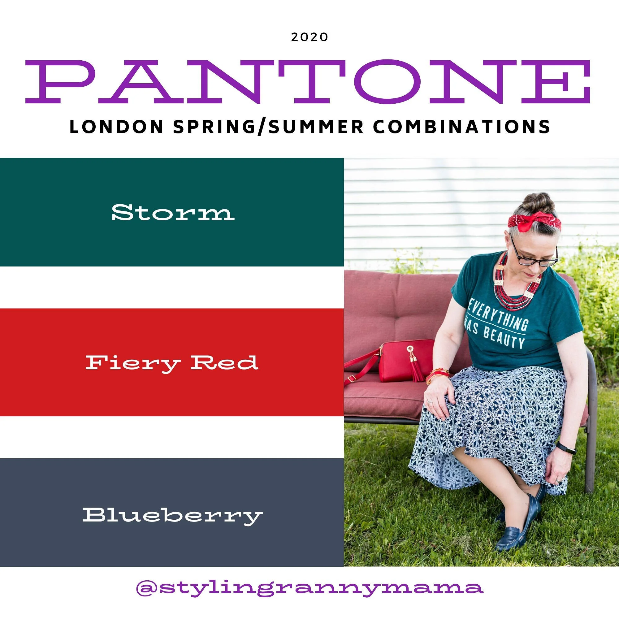
Storm, Fiery Red and Blueberry
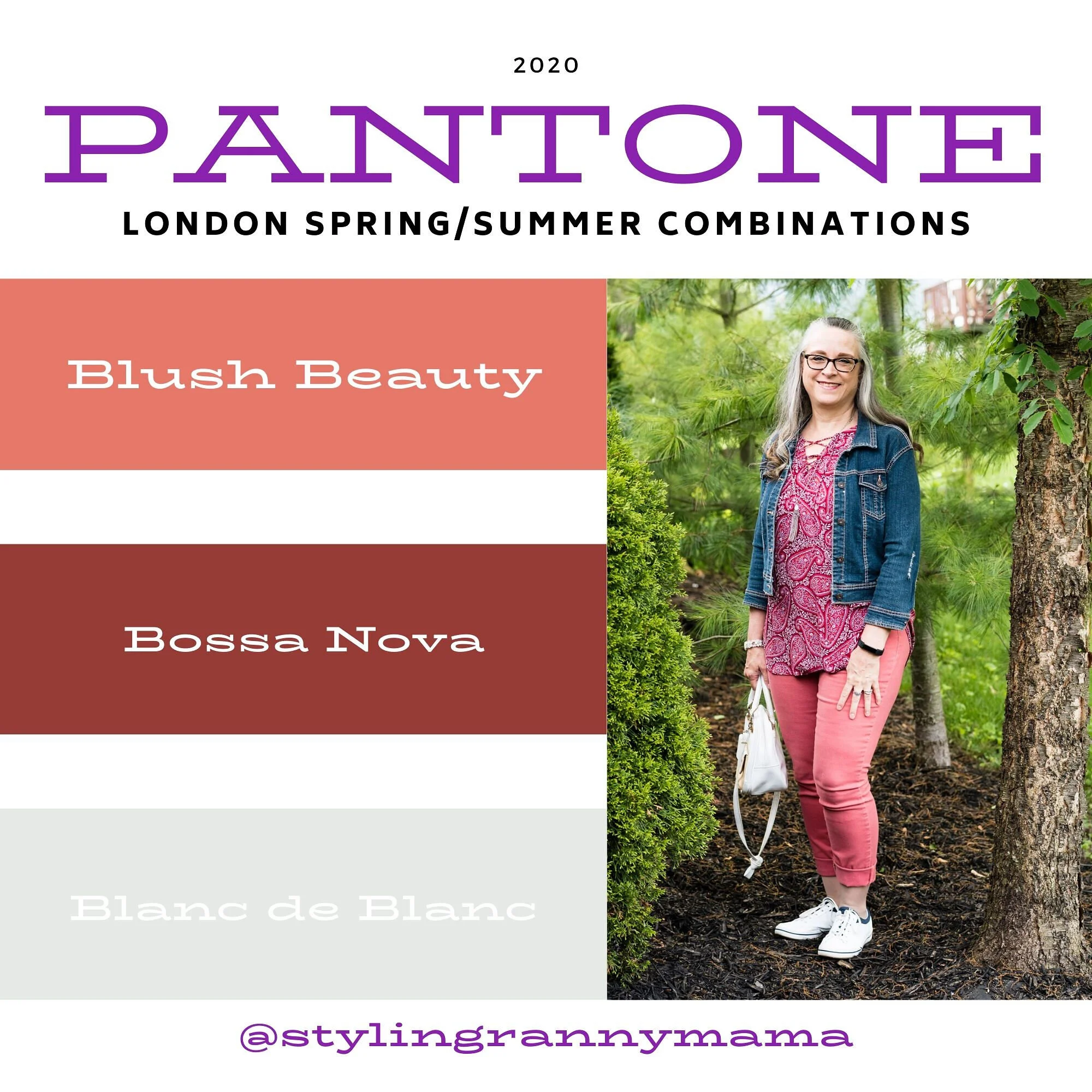
Blush Beauty, Bossa Nova and Blanc de Blanc
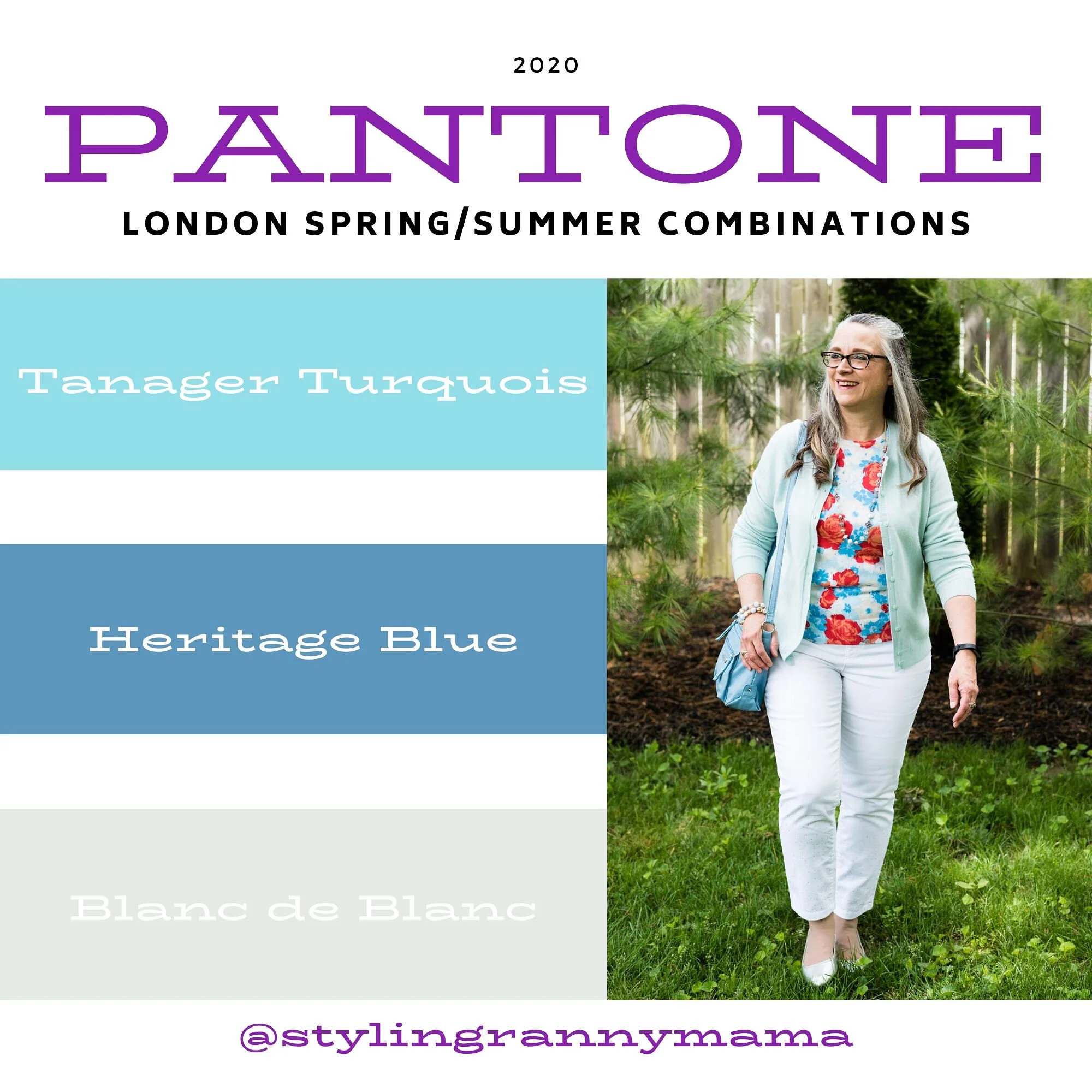
Tanager Turquoise, Heritage Blue and Blanc de Blanc
Which color palette was your favorite? Which outfit did you like the best? I would love to hear your thoughts. I hope you all have a wonderful weekend. We will be celebrating Father’s Day with our kids on different days, since schedules wouldn’t allow for everyone getting together. God bless each of you with peace and joy.
All graphics and London color palette photos by Rebecca Trumbull.