Pantone Spring/Summer - 2020 - Classic Blue, Beetroot Purple and Oyster Mushroom
I am now starting the Pantone Spring/Summer London color palette. Once again, as you saw in the intro post from last Thursday these colors vary across the spectrum from blues and reds, to greens and purples. I like the variety in the Spring/Summer palette this year. There really are so many ways you could combine and wear these bright colors, so let my combinations be a spring board for your own creative style. Try combining different colors that you already have in your closet, rather than going out and purchasing new pieces. In addition, if you are more of a classic color kind of gal, think of these brighter colors as accent colors for choices in your jewelry, shoes, bags and scarves.
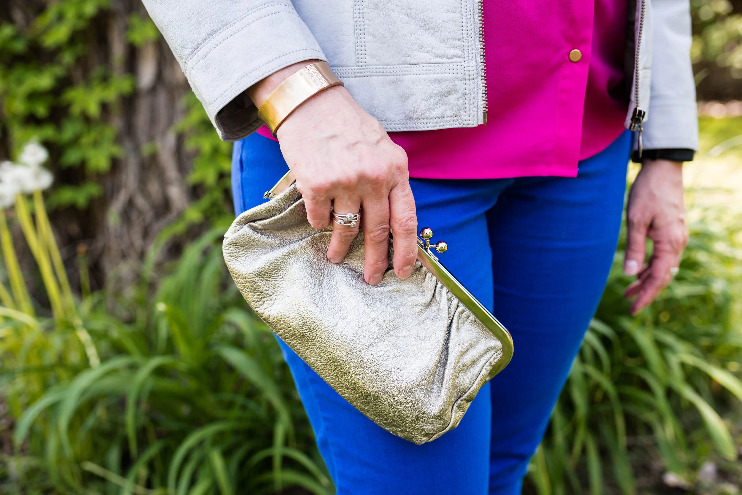
Once again, I am starting the series with the Pantone Color of the Year, which for 2020 is Classic Blue. These Ruby Rd. pants are a bit more like royal blue, but I thought they worked well enough. These pants were from a friend’s closet when she no longer wanted them. I have styled these repeatedly on the blog. You can see them with a blue sweater, a pink sweater, a plaid bomber jacket, and a colorful kimono.
My Beetroot Purple button up top is a piece I picked up from my daughter who was getting rid of it. It is A New Day brand. I would call this color fuschia, but I am not the one making up the names. Ha, ha. They can call it whatever they want, but basically it is a bright pink.
This light gray, or Oyster Mushroom moto jacket is another thrifted piece and Christopher and Banks brand. I love when I can find brands I already love at a thrift store. Especially older styles and colors that aren’t around any more. This is a simple, no frills jacket, which makes it perfect for this kind of outfit when the color is doing the talking.
I decided to do a mixed metals sort of thing with my accessories. The statement necklace and bracelet take on the gold hue of my shirt buttons, while my clutch and simple gladiator sandals go for more of a silvery look.
What do you think of these colors? Do you think the bright blue and pink is too bold? What would you wear these colors with? Leave me a comment or two below. I love to hear from you.
I hope you are enjoying learning more about the Pantone color palettes.
I am including a few shopping links. These are affiliate links which means if you click on a link I get a few cents. I blog for a hobby, but a few cent here and does help to defray the cost of my platform. I appreciate every click and purchase, but even more I appreciate your kind comments on the blog and the emails some of you send me. Thank you.
Photo credit and graphic Rebecca Trumbull.


