Color Play - Pantone Spring 2023 - NY Palette: Fiery Red, Empire Yellow, Blue Perennial, Light Aqua

Today I am looking at a color combining technique that is known as color blocking. Color blocking is the combination of solid colors creating distinct blocks of color. I don’t use the color block technique very often because I love prints. Many times I will combine something like a pair of jeans with a vest or sweater in a solid color, combined with a print top. I guess in that case I am almost always doing a type of color blocking. However, jeans are a type of material that don't typically look solid. Does that make sense to anyone else out there besides myself? Ha, ha.

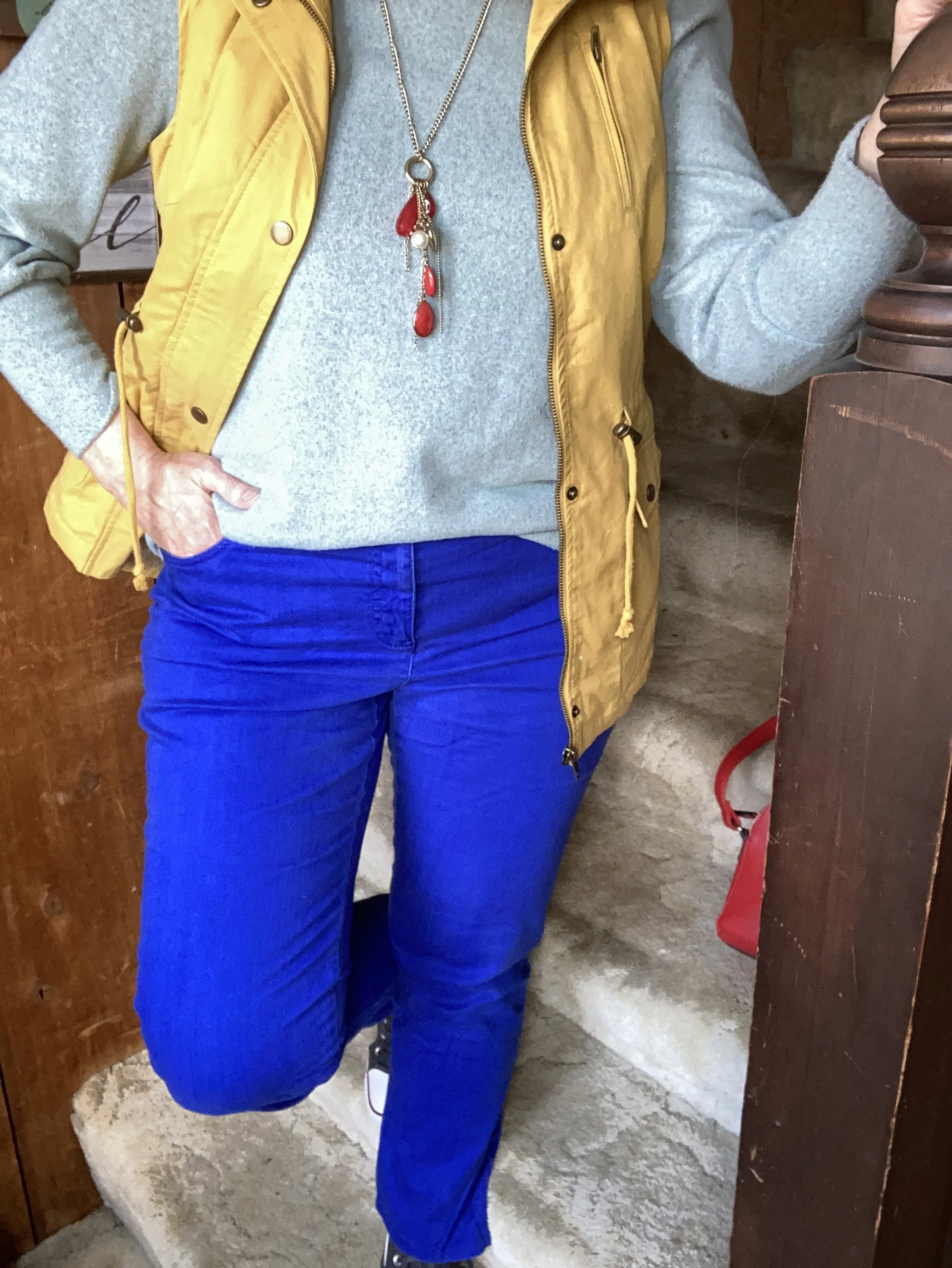
This outfit is bright and colorful and a great ensemble for the crazy fluctuating temperatures of spring.

The color block technique is a great way to combine one color with another without worrying if they match. The whole point is to combine different colors to create a fun, statement worthy outfit. All of these pieces have been in my closet for a while. I have worn each of them separately, and I have worn the vest and pants together before, but not this combination.

My Light Aqua top is Massini brand and was a clearance find from Kohl’s a few years ago. It is a medium weight knit with a cozy feel.

My secondhand pants have made numerous appearances on the blog and are Ruby Rd. brand. You can see a number of my posts in this one post, Why You Should Have a Pair of Colored Pants - Bright Blue. While I don’t pull these out real frequently for my day to day outfits. I have used them over and over for a special occasion or for the blog.

This yellow vest is a brand called Love Tree. I really like this piece. It came with a detachable hood, and the inside of the vest has a fuzzy, warm sherpa lining. I think I got this at a local boutique, but I actually cannot remember. I know, I know! Too many clothes. I’ll save my clothing muses for another day.

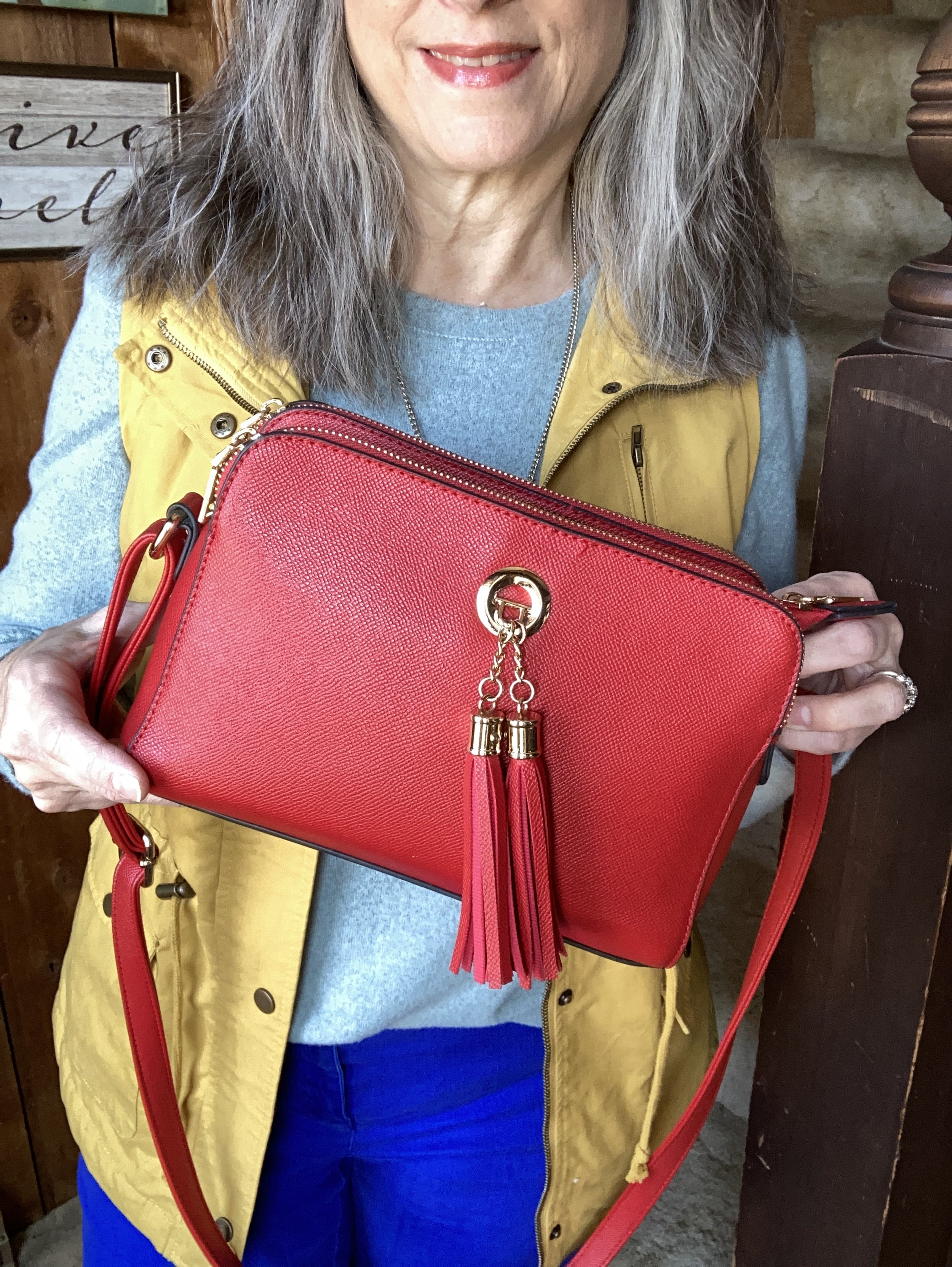
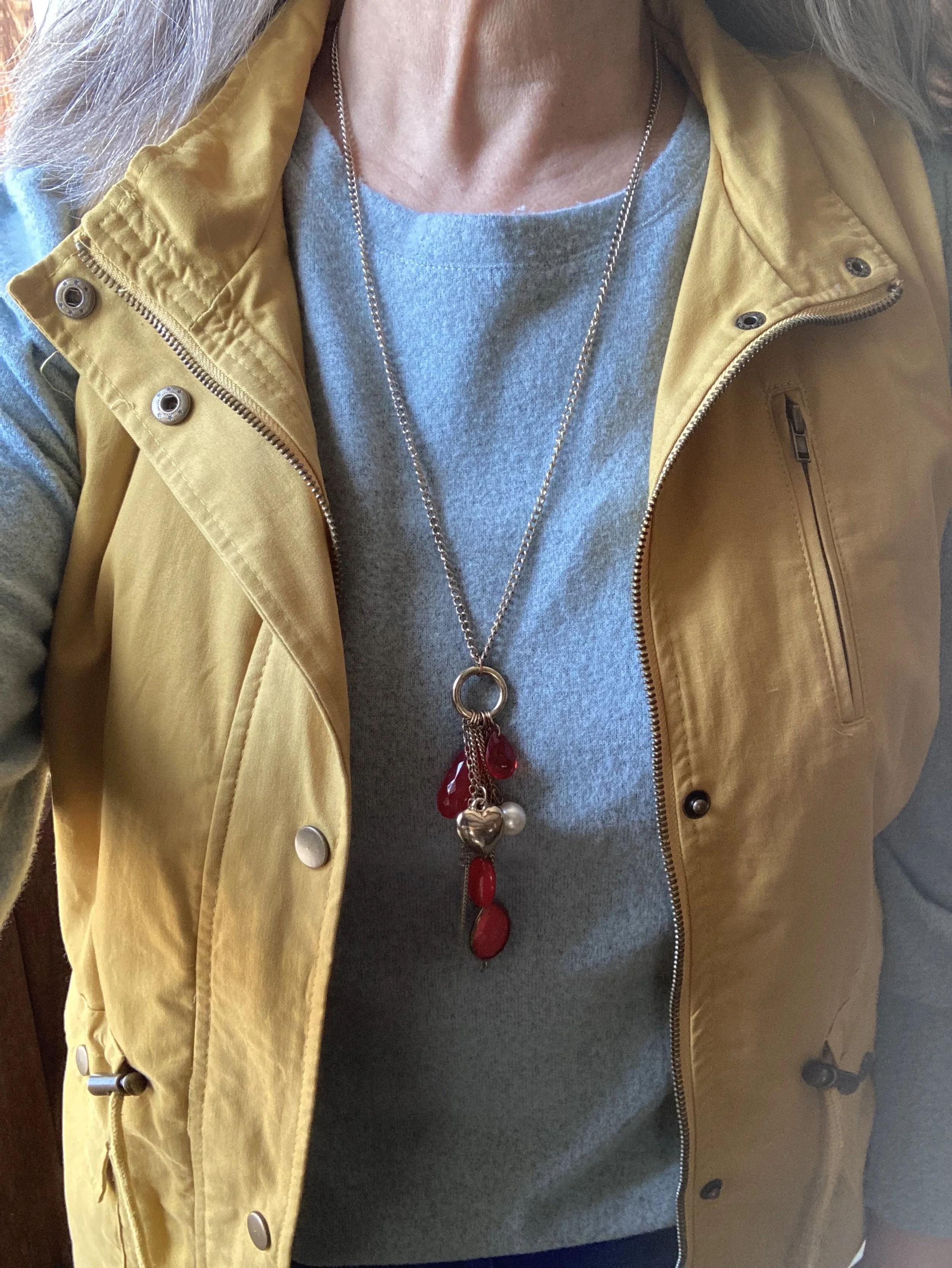
I decided to focus on Fiery Red as an accent color, so my bag, and my pendant charm necklace do the trick. Isn’t it cool, how the red pops against this already colorful outfit? I have this crossbody bag in a similar style, but different brand (both from Amazon), in black. They are great bags with three separate compartments to keep all your things organized. They are not huge, but big enough for the essentials. I’ll give a few shopping links below. A crossbody bag has become my regular go to, because I like the hands free approach. This is especially helpful when you are chasing grandkids, or shopping.

I really wasn’t sure which shoes to wear, and the only reason I ended up with my high top mesh Converse was due to the red stripe around the sole. Ha, ha. Really, my thought process for putting an outfit together is not all that complex. I tried the outfit with a pair of white sneakers first, but it just didn’t look right. I think the heaviness of the fabrics and the vest needed something a little less springy, but I also didn’t want to use knee high boots as those seemed too wintery…thus the Converse.

So what do you think of this outfit? Do you like the color blocking technique? Tell me about an outfit where you have used it. Your comments mean so much to me. You are the reason I keep this blog going, so it is wonderful to hear from you.

Please feel free to show your support for me and the blog by using my Buy Me a Coffee link. When you contribute to my page I can use that money to buy a treat when I am working on the blog at a coffee shop. I appreciate all your support.

I’m including a few shopping links. I only make money off of these links if you purchase something through a link, however, I bring these to you to give you ideas. All opinions are my own.

Have a great Tuesday!

Why You Should have a Pair of Colored Pants - Bright Blue

I am going to take a temporary hiatus from the Pantone series until my daughter and I can get together for a real photo shoot. I just think the pictures look so much better when she does them. She is the professional after all. In the mean time, I thought I would take the opportunity to talk about a few different clothing pieces that I think are essential to every woman’s wardrobe.

This week I would like to look at colored pants. I know many of us like to wear darker colors on the bottom to draw less attention to that part of our body. We usually have black, navy and perhaps a dark brown. Those who are a bit more bold might venture into the neutral category with tan or beige colored pants. Some will even dare to wear white in the warmer weather. If you are like me, you wear jeans more than anything else, even in the summer time, but I want to encourage you to purchase a pair of pants in a bolder, brighter color.

Today, I want to look back at a few of my outfits from the last few years of blogging. I want to show you why having a pair of bright blue pants is a way to expand your closet and give you additional outfit ideas. I got these pants from shopping a friend’s closet. They are not my favorite pair of pants due to the fit of the waist, so I usually only use them for blog pictures. However, if I ever come across a pair that fits better, I will definitely make the investment, so I can wear them on a more regular basis.

Outfit 1 - Bright blue with light blue.

Chasing+away+the+winter+blues+-+bluer+than+blue.jpeg

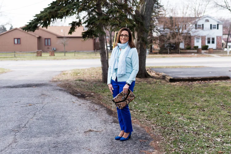
If you have been following my blog since the beginning you will probably recognize these outfits. The beauty of a bright blue pair of pants is that they look so classy whether you are dressing them up, like this outfit or dressing them down. I love this combination of bright, bold blue with the lighter pastel blue of the sweater and scarf. The bright blue still makes my lower half look slimmer and doesn’t draw extra attention to that area. See the original post here.

Outfit 2 - Bright blue with a print.

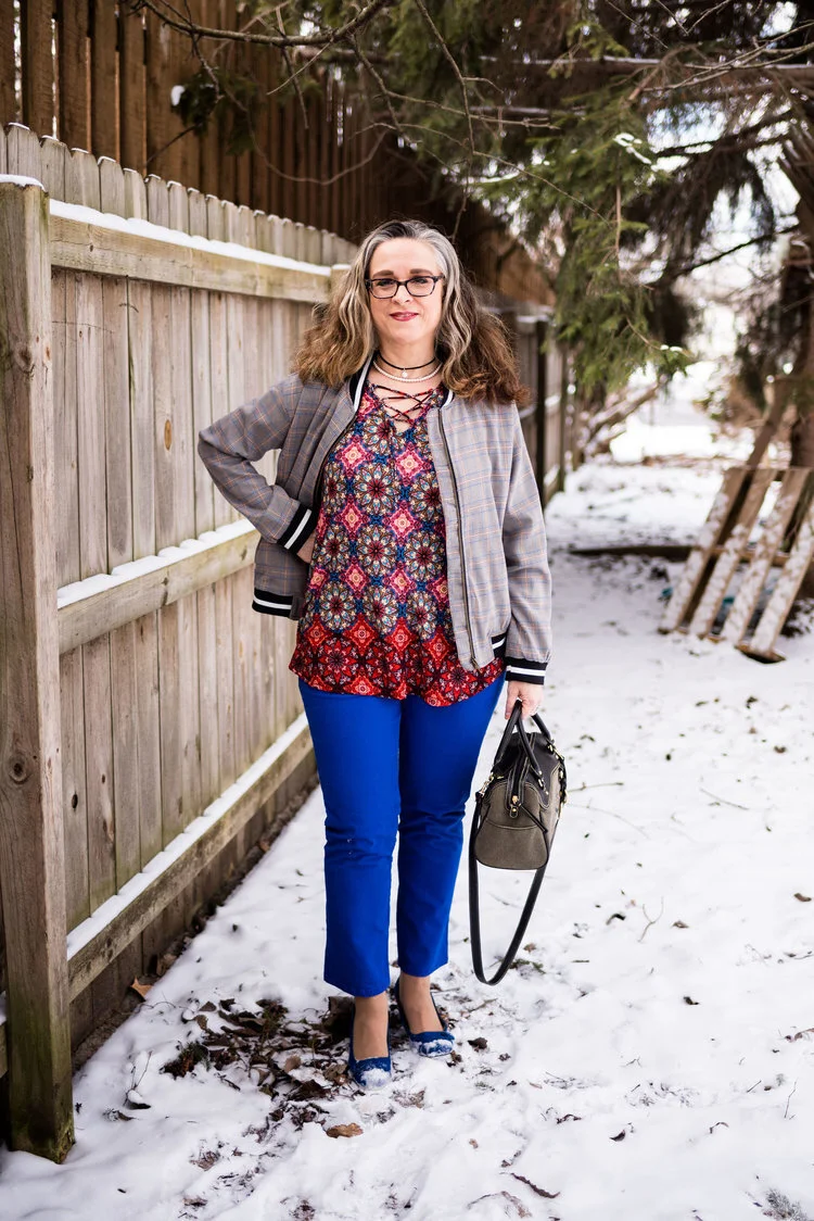
Print+Mixing+-+spring+2019.jpeg

I like having the option of pairing a pretty print top with something other than jeans and these bright blue pants were the perfect compliment to this top and the bomber jacket. Remember, things don’t have to match, though I personally love it when things have some color in common. I think it makes an outfit look more polished and cohesive, but that is just my personal opinion. You can see the original post here.

Outfit 3 - Bright blue with a print kimono.

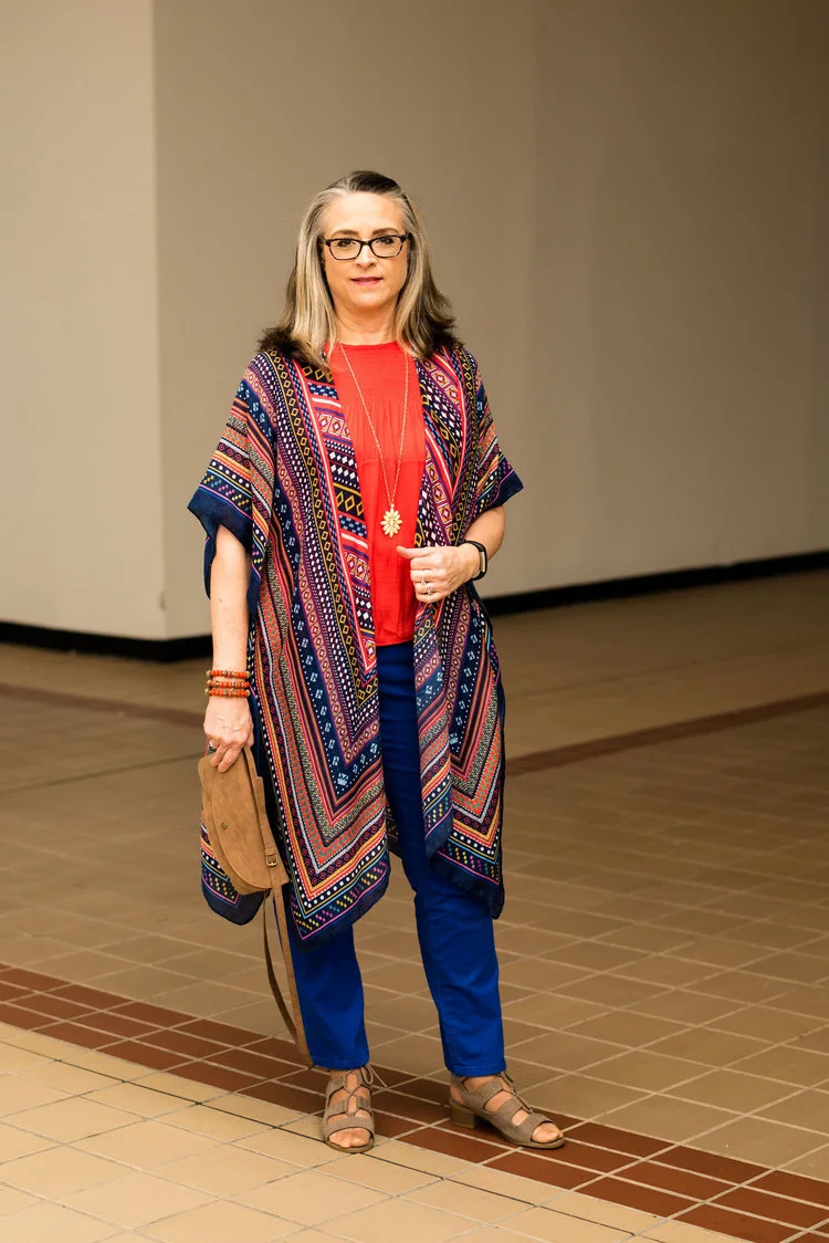
Pantone+Spring_Summer+-+2019+-+Fiesta+&+Princess+Blue.jpeg

Once again we are pairing the bright blue with a pretty print. An observation I want to make is the color blocking trend. Color block is not one of my favorite ways to style an outfit, but when you do something like this where you take two solid colors and top it with a fun, summer time print, you come up with an outfit that would be perfect for a graduation party, a picnic or a dinner date. Obviously, you could do this with a white, black or navy pair of pants, but doesn’t the bright blue just make this outfit so much more fun? See the original post here.

Outfit 4 - Bright blue with olive.

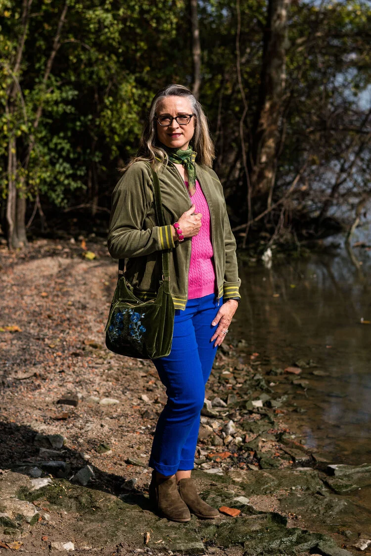
Pantone+-+Autumn_Winter+-+2019+-+fruit+dove+and+galaxy+blue.jpeg

I am all about olive. I think olive is such a great neutral and it really goes with any other color. I love the cozy vibe of pairing bright blue with the more muted military olive. This is a great combination for fall as the weather is changing, and becoming cooler. The bright blue still gives the outfit a summer feel, but pairing it with olive makes me think of shorter days and crispy leaves. See the original post here.

Outfit 5 - Bright blue with color blocking.

Pantone+Spring_Summer+2020+-+Classic+Blue,+beetroot+purple+and+oyster+mushroom.jpeg

This outfit was an attempt at color blocking. Again, it is not my favorite thing to do, but once again, I think the bright blue pants takes this outfit up a notch. You could definitely do a similar look with navy, black or white, but the bright blue adds a dimension of color and pizzazz to the look that other colors will not. There are occasions that call for black, especially when you want to look more elegant and classic, but for most of us the events we are going to attend are more conducive to a look that is a bit more relaxed and fun. See the original post here.

Outfit 6 - Bright blue with dark blue.

Pantone+Fall_Winter+2020+-+New+York+Palette+-+Classic+Blue,+Ultramarine+Green+and+Blue+Depths.jpeg

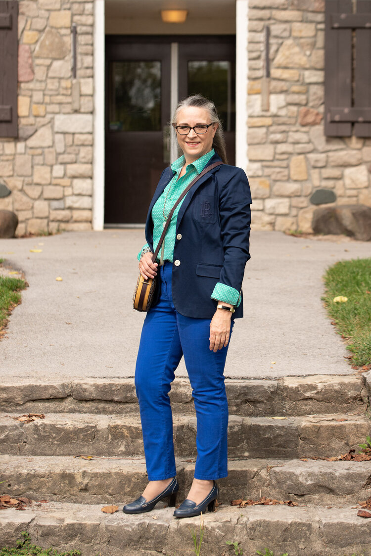
The last outfit I want to share pairs my bright blue pants with a navy blazer. I like this combination. Just like the pairing of the bright blue with pastel blue, this look creates a pretty contrast between two completely different blues. This is a great look for the office. The bright blue is not garish or overdone when paired with the navy blazer. The whole look epitomizes polish and professionalism. If I still had an office job, I would definitely wear this look. See the original post here.

Do you have a bright blue pair of pants in your closet? If not, does this post make you think differently about wearing them? I am going to include a few shopping links for bright blue pants, just in case you are now convinced you need a pair. Ha, ha. These are affiliate links. All opinions are my own.

Photo credit Rebecca Trumbull.


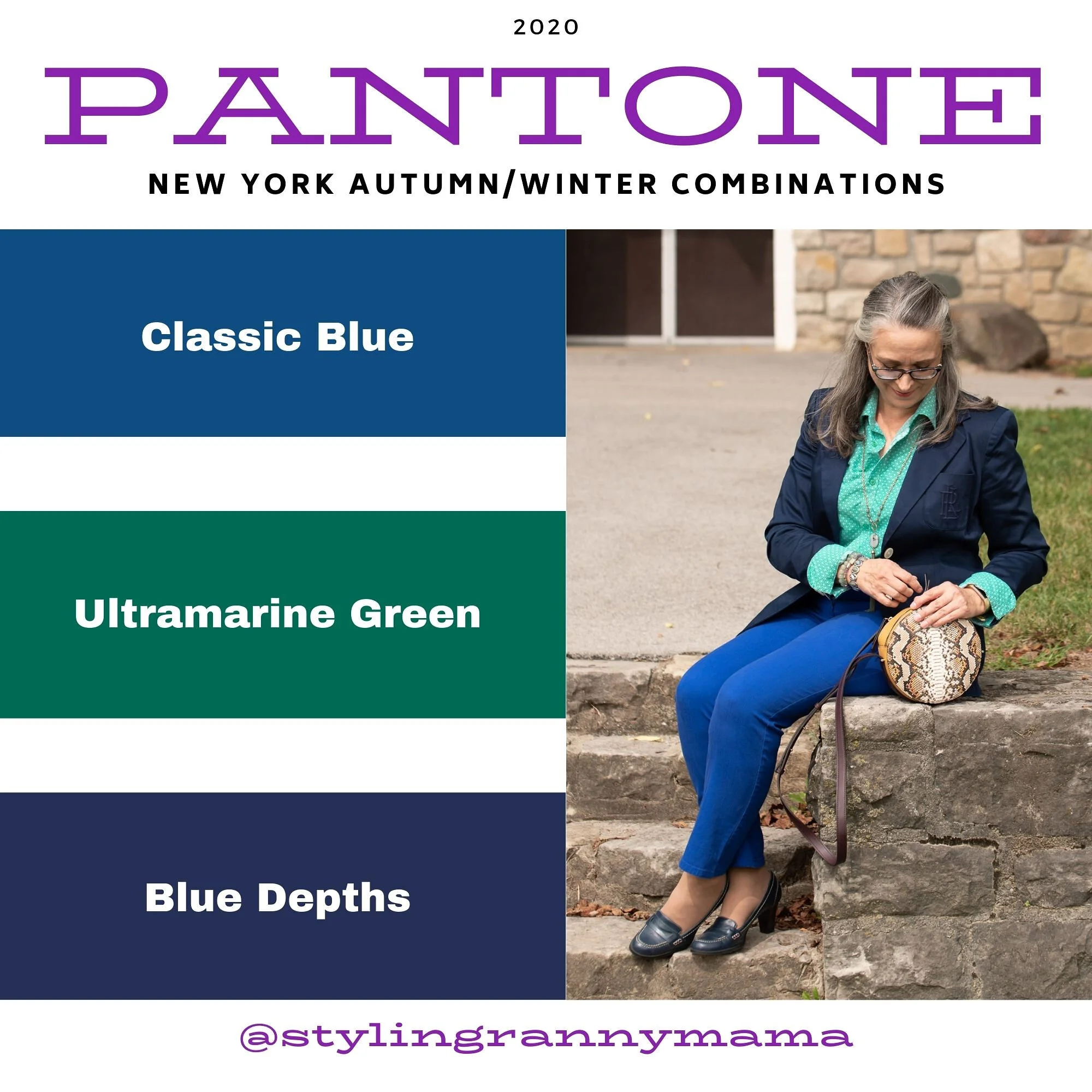
Pantone Fall/Winter 2020 - New York Palette - Classic Blue, Ultramarine Green and Blue Depths

The Pantone Color of the Year is Classic Blue , so once again we are featuring this medium blue color in the Pantone series. Back in January I showed you this color paired with a furry bomber jacket and plaid skirt. You can also see this color with a multi-print midi dress and with a bright pink top. Classic Blue is a blue that just about anyone can wear. If you prefer not to have this pretty blue to close to your face you could carry it in a lovely bag, or wear it as a brooch pinned on your lapel. I’ll provide a few shopping links at the end with various options.

Pantone Fall/Winter 2020 - New York Palette - Classic Blue, Ultramarine Green and Blue Depths

I didn’t really have anything that seemed to perfectly match the Ultramarine Green, at least not until after the fact. My button up is actually a thrifted men’s shirt; a brand called Zylos. It has very small greenish blue print with white and almost has more of an aqua feel to it. Oh well, I have long ago given up on the idea of trying to be perfect. Ha, ha. You can see a closer look at the pattern, and see my thrifted, fringe, pendant necklace. Actually, the necklace is probably a closer match to the Pantone green.

Pantone Fall/Winter 2020 - New York Palette - Classic Blue, Ultramarine Green and Blue Depths

My Classic Blue pants were a thrifted piece from shopping a friend’s closet. They are Ruby Road brand and I have styled them over and over on the blog. You can see them with a light blue sweater and scarf, Beetroot purple top from last spring’s series, an olive velvet jacket, a plaid bomber jacket, and a multi-print kimono.

Pantone Fall/Winter 2020 - New York Palette - Classic Blue, Ultramarine Green and Blue Depths

I also threw on a few beaded bracelets, just for fun. Sometimes wearing a scarf or jewelry isn’t so much to help with the outfit as a whole, but just to enjoy something I have. Since I rarely go any where other than the grocery store, I occasionally throw on some bracelets, just because I have them and they are pretty.

Pantone Fall/Winter 2020 - New York Palette - Classic Blue, Ultramarine Green and Blue Depths

I thought this outfit would be perfect for my round Nine West snakeskin print bag. It think it adds an element of fall color to this more classic looking outfit.

Pantone Fall/Winter 2020 - New York Palette - Classic Blue, Ultramarine Green and Blue Depths.

My shoes are my old stand by thrifted Relativity loafer heels. If I had an office job, I would probably wear these a lot. They are a nice height for a stacked heel and fairly comfortable.

Pantone - Fall/Winter 2020 - New York Palette - Classic Blue, Ultramarine Green and Blue Depths

What do you think of these colors? Do you like the Classic Blue, or do you prefer the darker tones of Blue Depths? Do you like the color Ultramarine? As it is in the graphic, it seems to be more of a forest green color, which I do like. I like how these three colors worked together into an outfit that would be perfect for a day at the office or a date night with your significant other.

My life would not be complete if I didn’t leave you with a silly picture to make you smile. When I was trying to pose, I almost fell down. Ha, ha.

Pantone - Fall/Winter - 2020 - New York Palette - Classic Blue, Ultramarine and Blue Depths

I hope you enjoyed this post and I hope you’ll leave me a comment or two. Life is lonely around here, so I love to hear from my internet and long distance friends.

I’m including a few shopping links for you to peruse. These are affiliate links. That means when you click on a link I get a few pennies. All opinions are my own.

Graphic and photo credit Rebecca Trumbull.


Pantone Spring/Summer - 2020 - Classic Blue, Beetroot Purple and Oyster Mushroom

I am now starting the Pantone Spring/Summer London color palette. Once again, as you saw in the intro post from last Thursday these colors vary across the spectrum from blues and reds, to greens and purples. I like the variety in the Spring/Summer palette this year. There really are so many ways you could combine and wear these bright colors, so let my combinations be a spring board for your own creative style. Try combining different colors that you already have in your closet, rather than going out and purchasing new pieces. In addition, if you are more of a classic color kind of gal, think of these brighter colors as accent colors for choices in your jewelry, shoes, bags and scarves.

Pantone Spring/Summer 2020 - Classic Blue, Beetroot Purple and Oyster Mushroom

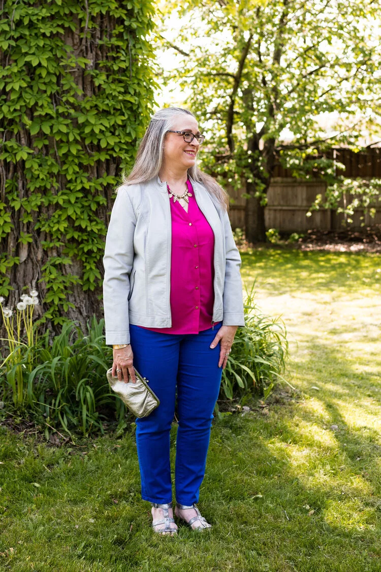
Once again, I am starting the series with the Pantone Color of the Year, which for 2020 is Classic Blue. These Ruby Rd. pants are a bit more like royal blue, but I thought they worked well enough. These pants were from a friend’s closet when she no longer wanted them. I have styled these repeatedly on the blog. You can see them with a blue sweater, a pink sweater, a plaid bomber jacket, and a colorful kimono.

Pantone - Spring/Summer 2020 - Classic Blue, Beetroot Purple and Oyster Mushroom

My Beetroot Purple button up top is a piece I picked up from my daughter who was getting rid of it. It is A New Day brand. I would call this color fuschia, but I am not the one making up the names. Ha, ha. They can call it whatever they want, but basically it is a bright pink.

Pantone Spring/Summer 2020 - Classic Blue, Beetroot Purple and Oyster Mushroom

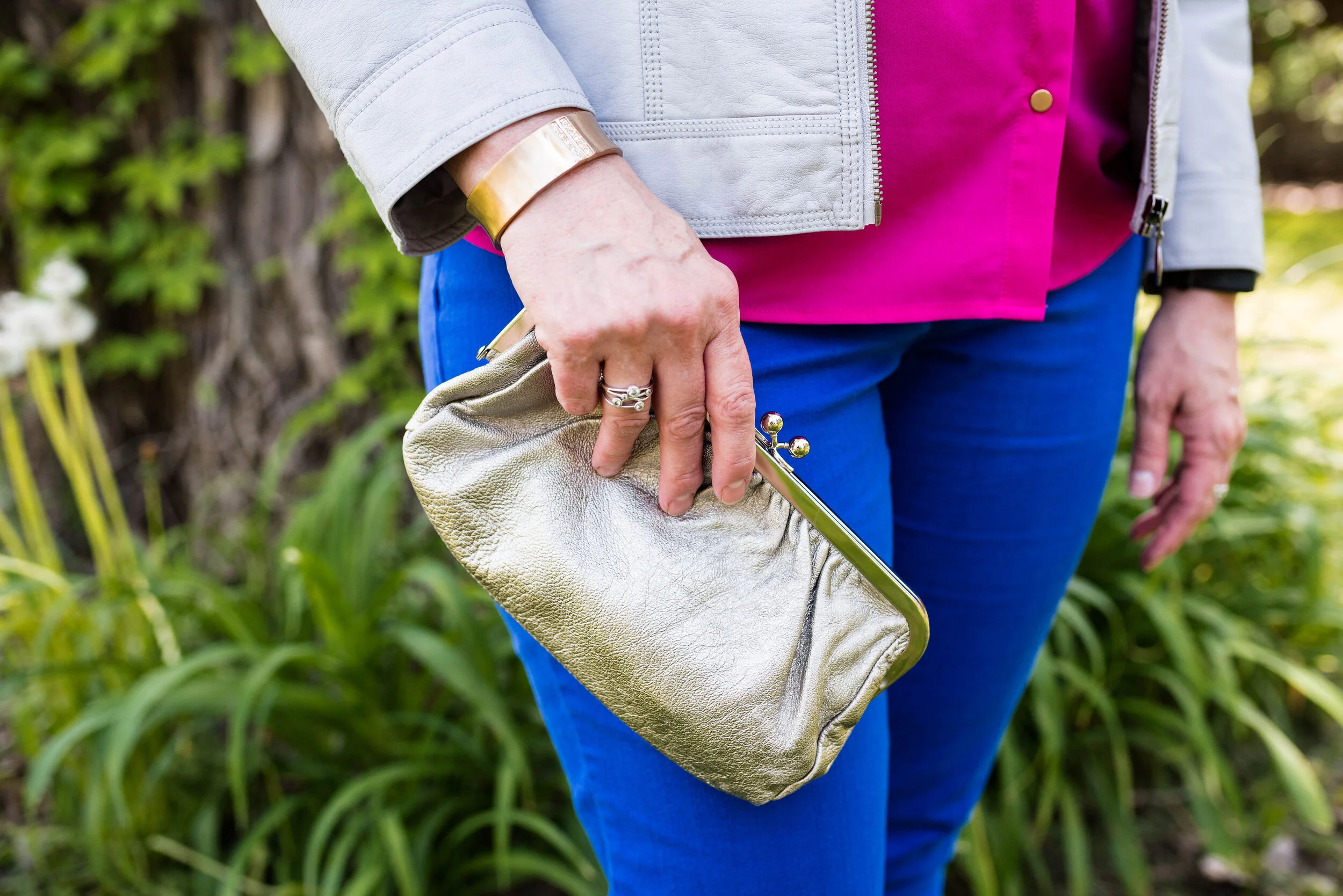
This light gray, or Oyster Mushroom moto jacket is another thrifted piece and Christopher and Banks brand. I love when I can find brands I already love at a thrift store. Especially older styles and colors that aren’t around any more. This is a simple, no frills jacket, which makes it perfect for this kind of outfit when the color is doing the talking.

Pantone Spring/Summer 2020 - Classic Blue, Beetroot Purple and Oyster Mushroom

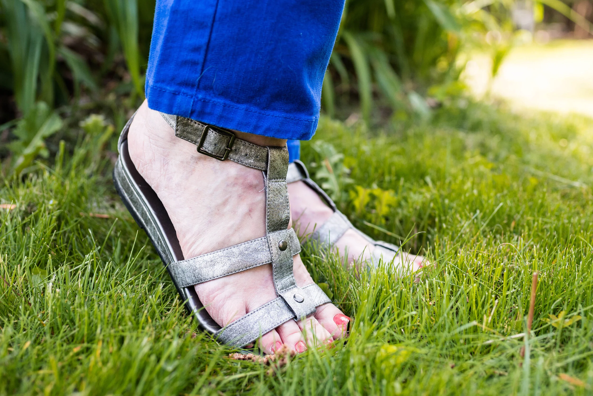
I decided to do a mixed metals sort of thing with my accessories. The statement necklace and bracelet take on the gold hue of my shirt buttons, while my clutch and simple gladiator sandals go for more of a silvery look.

Pantone Spring/Summer 2020 - Classic blue, beetroot purple and oyster mushroom
Pantone Spring/Summer - 2020 - Classic blue, beetroot purple and oyster mushroom

What do you think of these colors? Do you think the bright blue and pink is too bold? What would you wear these colors with? Leave me a comment or two below. I love to hear from you.

Pantone Spring/Summer 2020 - Classic Blue, beetroot purple and oyster mushroom

I hope you are enjoying learning more about the Pantone color palettes.

I am including a few shopping links. These are affiliate links which means if you click on a link I get a few cents. I blog for a hobby, but a few cent here and does help to defray the cost of my platform. I appreciate every click and purchase, but even more I appreciate your kind comments on the blog and the emails some of you send me. Thank you.

Photo credit and graphic Rebecca Trumbull.