Color Play - Fall Color Mix

What better time to play with color than in the fall? I love the bright hues of red, orange and gold, as well as the moodier tones of burgundy, brown and forest green. I have found many Pinterest pins on fall color combos, so drew some of my inspiration from those. The pieces I chose are perfect for this in between time where the days can still be warm but the mornings and evenings cool. Today, took a turn towards the cooler side and I am typing this post with a cup of hot cocoa at my side. I need the milk for calcium, but thought this morning I would add a little chocolate and pop it in the microwave. Yum!

Color Play - Fall Color mix

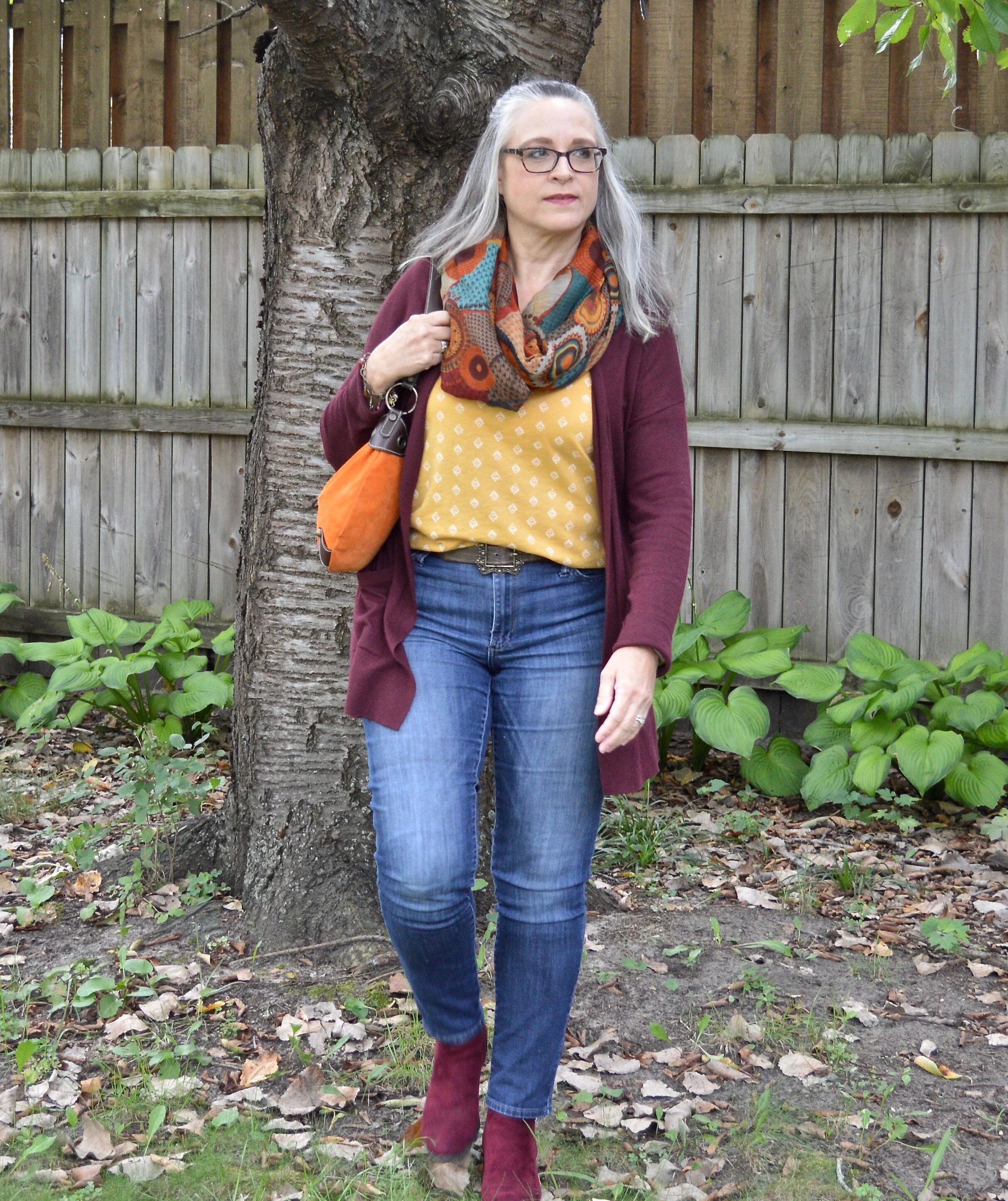
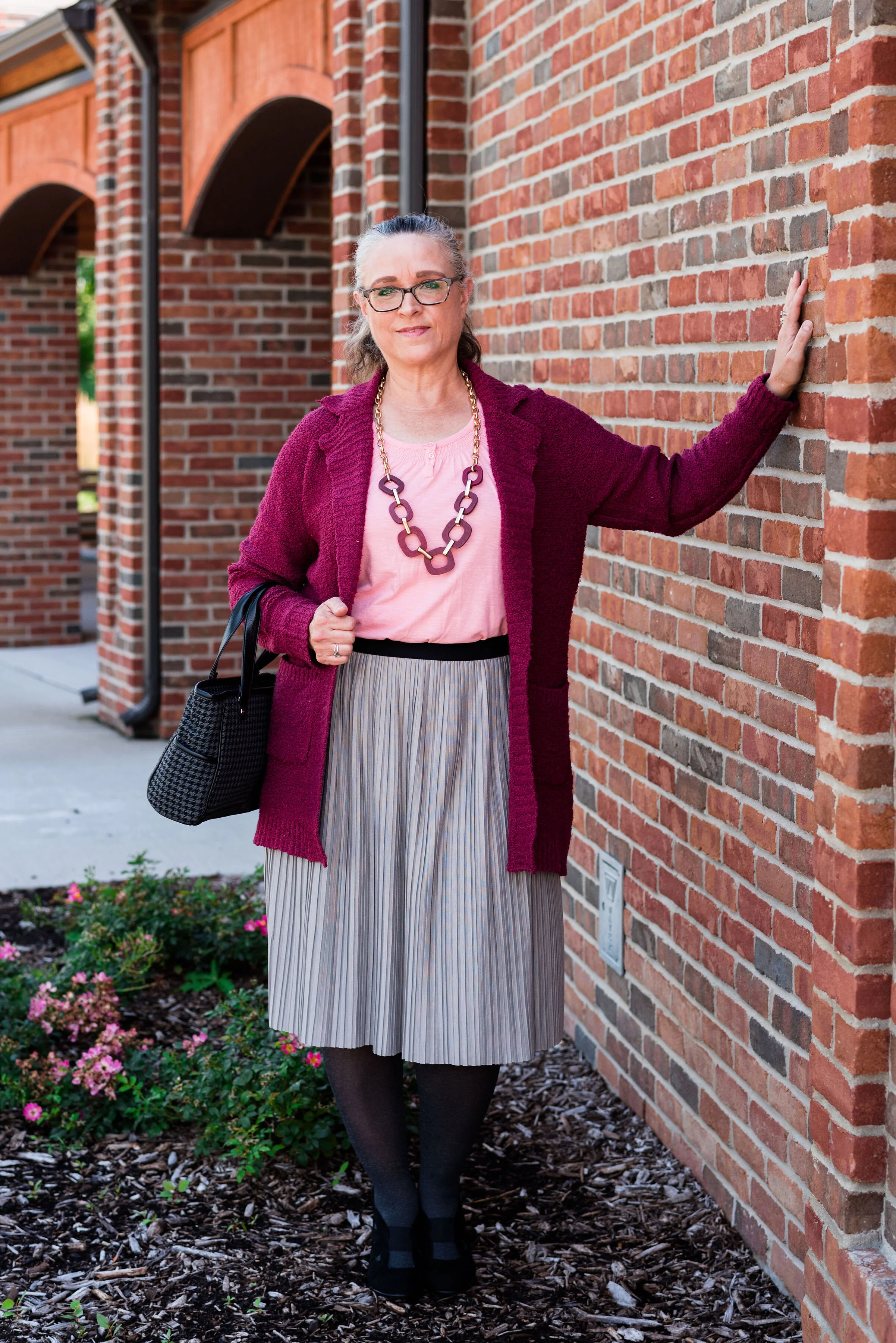
When I started looking for my Warm Spice colors, I knew I wanted to used my burgundy SO sweater, which was a Kohl’s purchase last year. I have another one just like this in a light pink, which you will see on the Pantone series coming up. I also got two sizes. This one is a large and the light pink is an extra large. I liked the way each fit for different reasons, so I got both. Ha, ha. You can see the side detailing below.

Color play - fall color mix

Yellow was the next color in the Pinterest Warm Spice Pin, so I chose a thrifted short sleeve Sonoma tee with a small white pattern.

I also, knew I wanted this to be a cozy, casual look so opted for my Rock & Republic straight leg jeans.
Color play - fall color mix

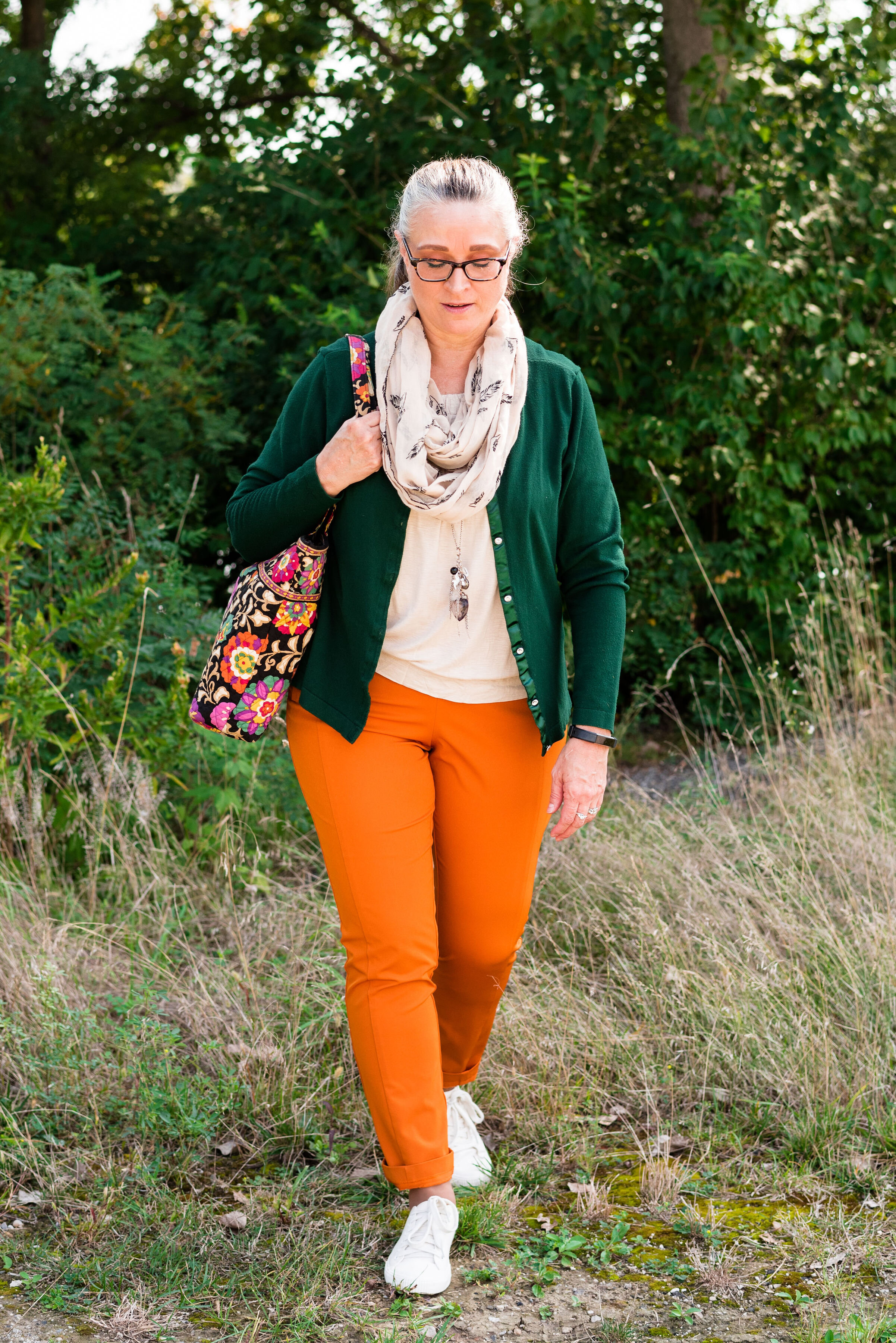
The third color is orange. I wasn’t sure, at first, how I was going to pull that off, and then I saw this infinity scarf hanging in my closet. This was another thrift store find. I love getting scarves, bags and jewelry at thrift stores, because there are so many different choices and you can’t be the prices. I absolutely love athe fall vibe of this piece. It contains all those colors I think of when I think of fall and the pattern is reminiscent of the 1970’s. You can see I did a bit of print mixing as well.

Color play - fall color mix

With the mix of orange in the scarf, I thought it would be fun to add another pop of orange away from my face with the addition of this thrifted orange suede bag. It may be small, but this little number packs a powerful color punch.

Color play - fall color mix

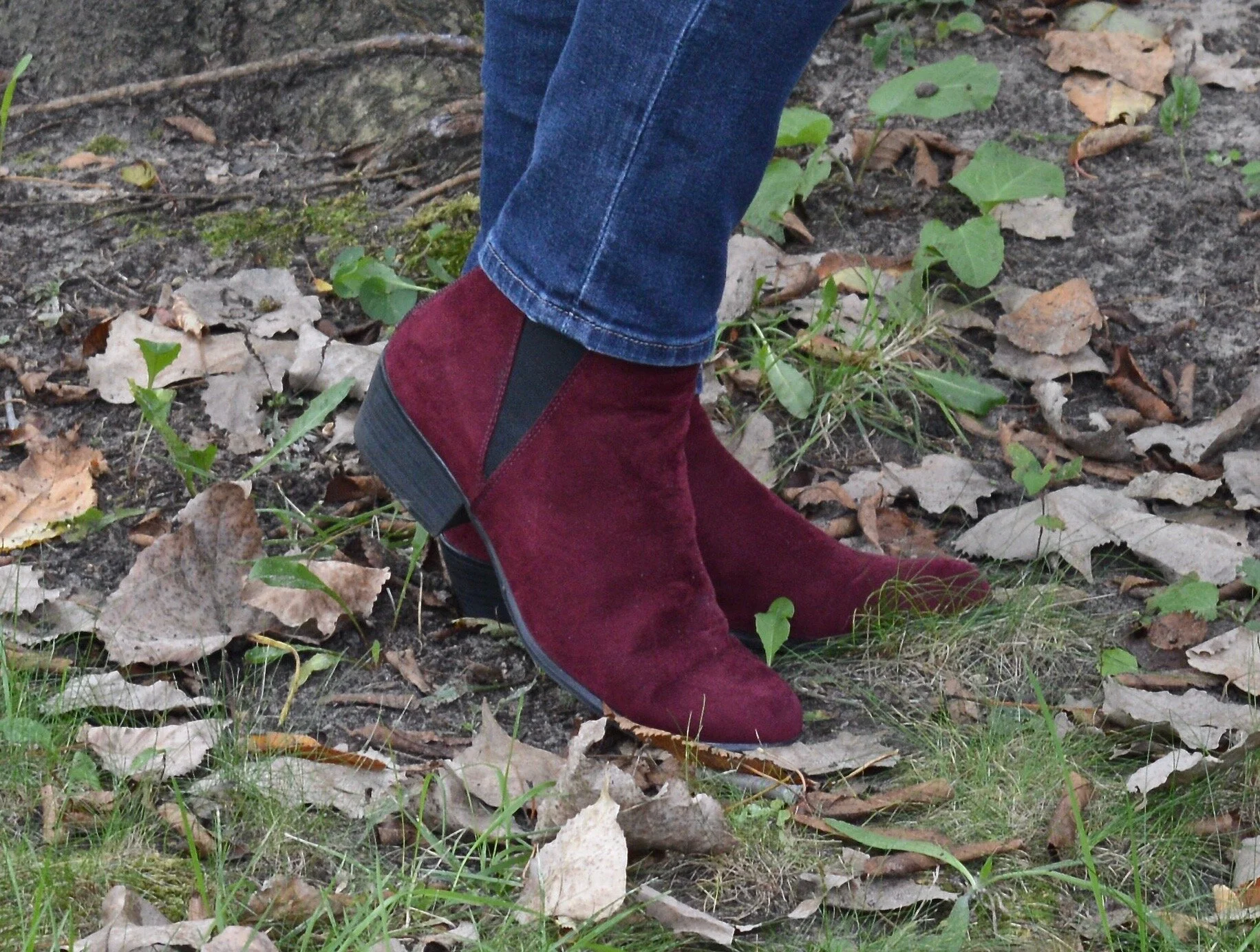
It seemed the natural choice to also reach for my Spirit faux suede ankle boots, to balance out the whole look. I love all of my boots, but especially enjoy wearing these ankle boots in the late summer and early fall. Only 5 days until the first day of fall. Whoo, hoo. I have already noticed Halloween decorations in yards and Christmas items in the stores. Eye, yie, yie.
Color play - fall color mix

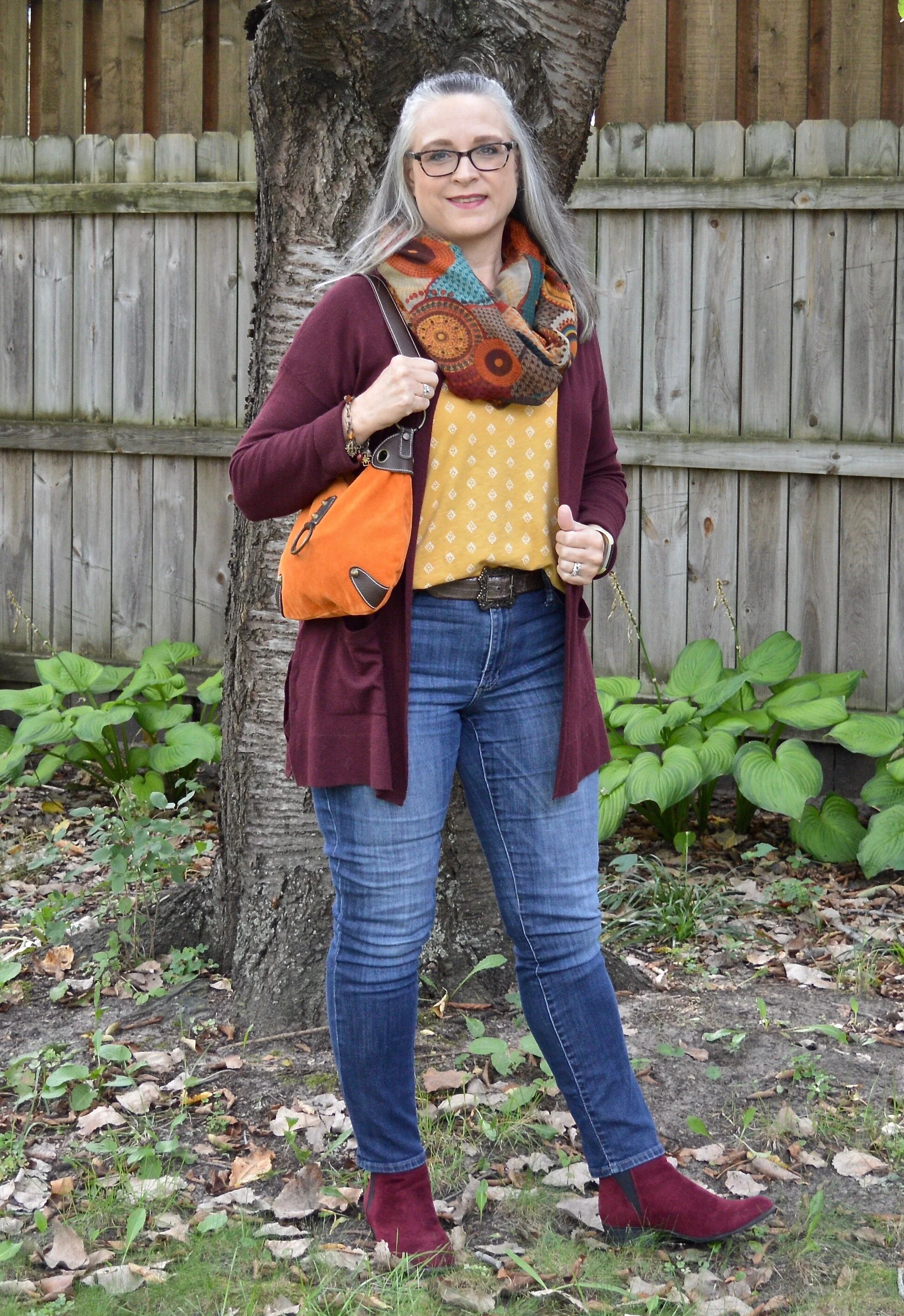
The only jewelry I added was a fun charm bracelet with a bit of fall color.

Color play - fall color mix

What did you think of this outfit? Would you wear these colors together?
Color play - fall color mix

I hope you are having a good week. I have been busy. My grandson’s 10th birthday was Tuesday. He was supposed to have a small friend party, but one of the boys got sick and with our #covidlife as it is currently we had to cancel. We hope to reschedule for a future date. My husband and I went over and I made a cake and he got to open some presents. This weekend, we are going out to Maumee Bay State Park for one night at the lodge as a part of the birthday celebration. Quintin’s mom and he will go with us and our other daughter and her hubby will join us for dinner. We find ways to make life work, even in our current circumstances.

I am including a few shopping links. These are affiliate links. All opinions are my own.

I hope to get my faith post up tomorrow, so be sure to check back for that. Have a great weekend!






Pantone - Autumn/Winter - 2019 - Merlot and Antique Moss

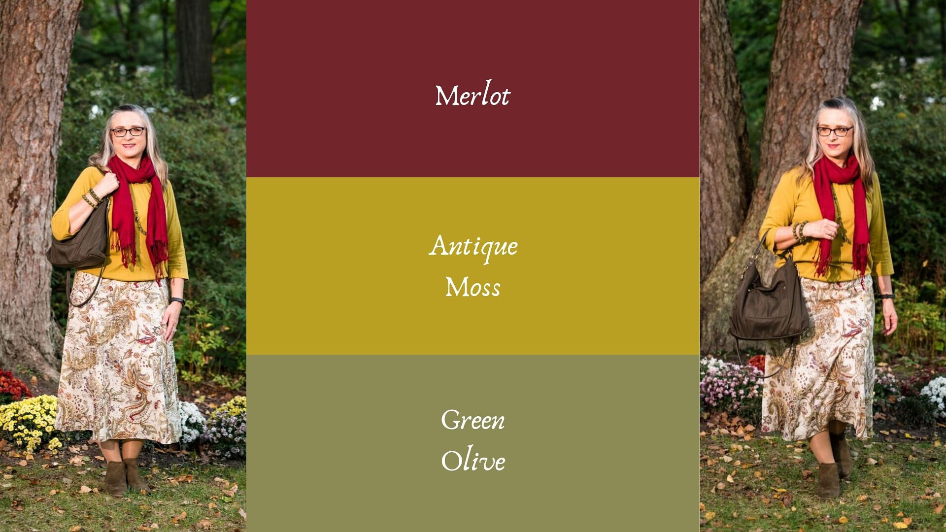
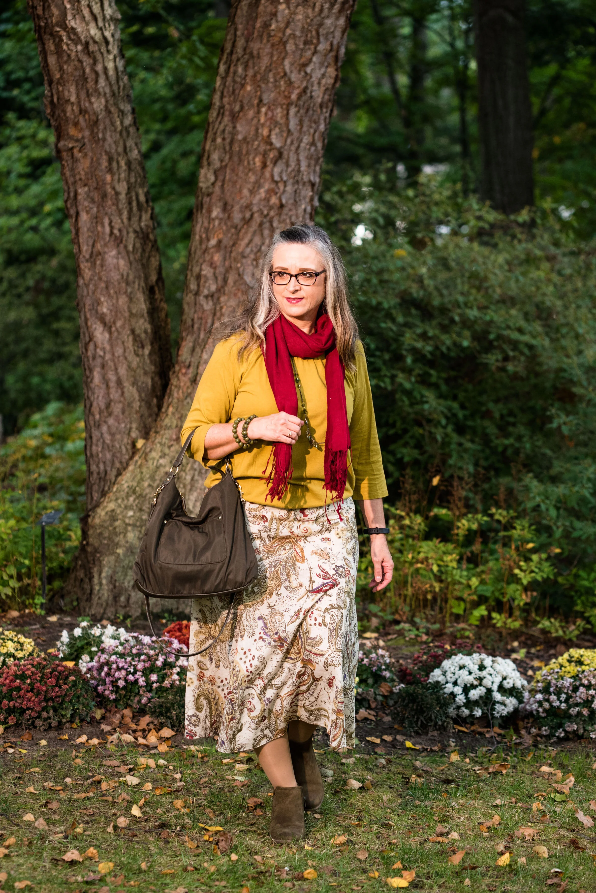
The first two colors from the Pantone - Autumn/Winter - London palette that I am featuring are Merlot and Antique Moss. As you can imagine, Merlot, like the wine is a rich burgundy red, while Antique Moss is a yellowy green. Often when we think of pairing red and yellow, we are concerned we will come out looking like an advertisement for McDonald’s, but let me reassure you these two colors pair in a perfectly un-Ronald like way and I love the combination.

The London color palette classic colors were just a bit different. Green Olive is comparable to Guacamole from the New York palette, with a little more of a gray tinge. My version of olive in my accessories is much darker, but you get the idea.

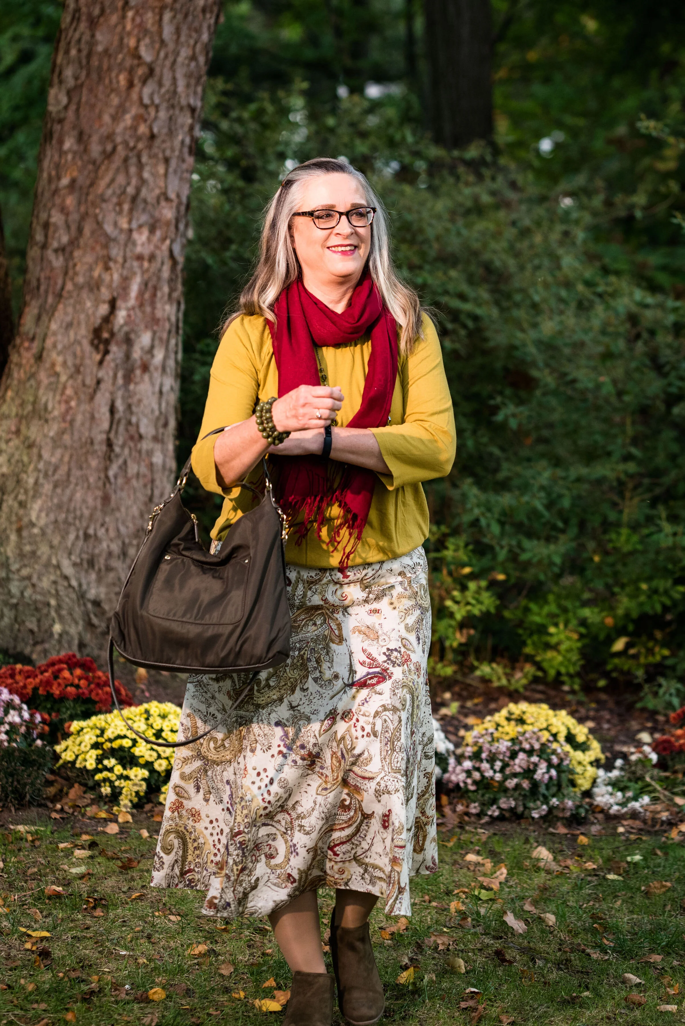
This Jones Wear skirt you’ve seen on the blog before. I styled it for the Pantone Fall 2017 New York Palette in a very similar fashion. I even used the same dark olive bag. Ha, ha. You can see that post here. I also used it this past spring for the Pantone Spring/Summer 2019 colors. You can see that post here. In addition you can see it with a green cardigan, here. I keep coming back to this skirt, because it works so well for these color schemes due to the reds and greens in the print of the skirt. I could easily used this printed skirt for a Christmas outfit as well, so you might see it come up again later this year. I love a versatile piece and when I purchased this skirt, I never knew how often I would use it for the blog.

We took the pictures for this series at the Toledo Botanical Gardens, which are just down the street from where my daughter lives. The gardens are beautiful in all seasons and with walking paths through the grounds, it is a lovely place to visit and I don’t do it nearly enough. In the picture below, I am watching several bus loads of kids scramble on to the grounds and thinking, “Oh boy!” Ha, ha.

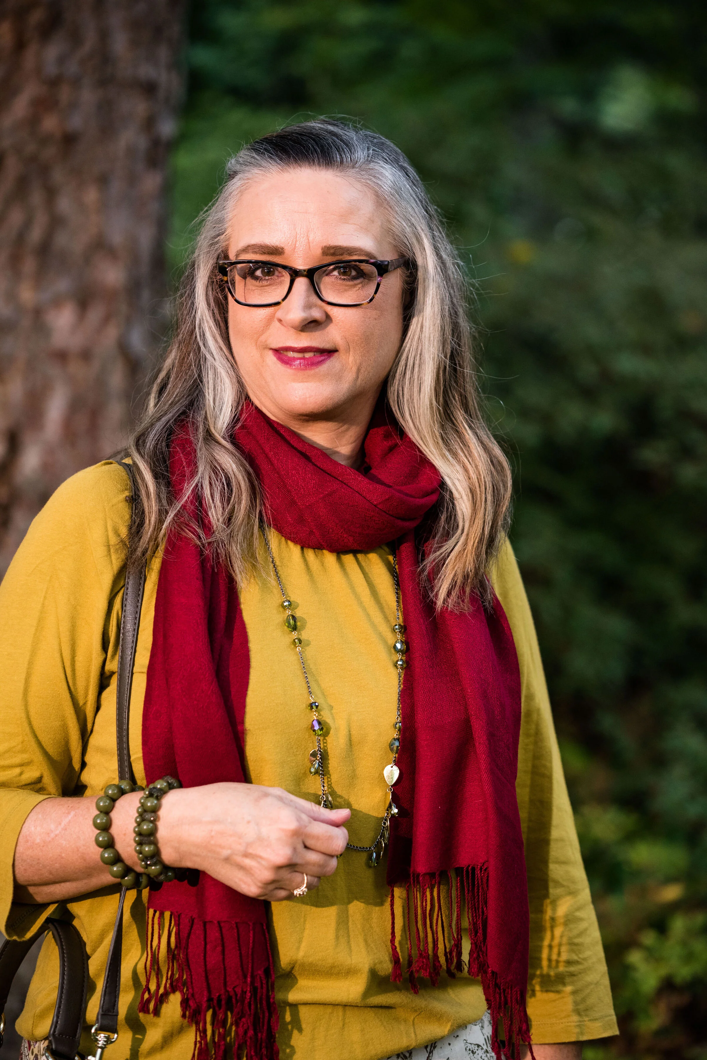
I obtained this red scarf from a friend’s closet. It looked a little more like Merlot, when it was in the low light of my closet, but here it looks much brighter. However, It is not a true red, but more of a burgundy. My 3/4 sleeve tee, I’ve worn on the blog before too. It is a thrifted Sonoma piece and has elastic on the bottom, which allows for freedom of movement and bulge camouflage. Ha, ha. You can see the tee styled with boyfriend jeans and a leopard print skirt here, and with a snakeskin print skirt here.

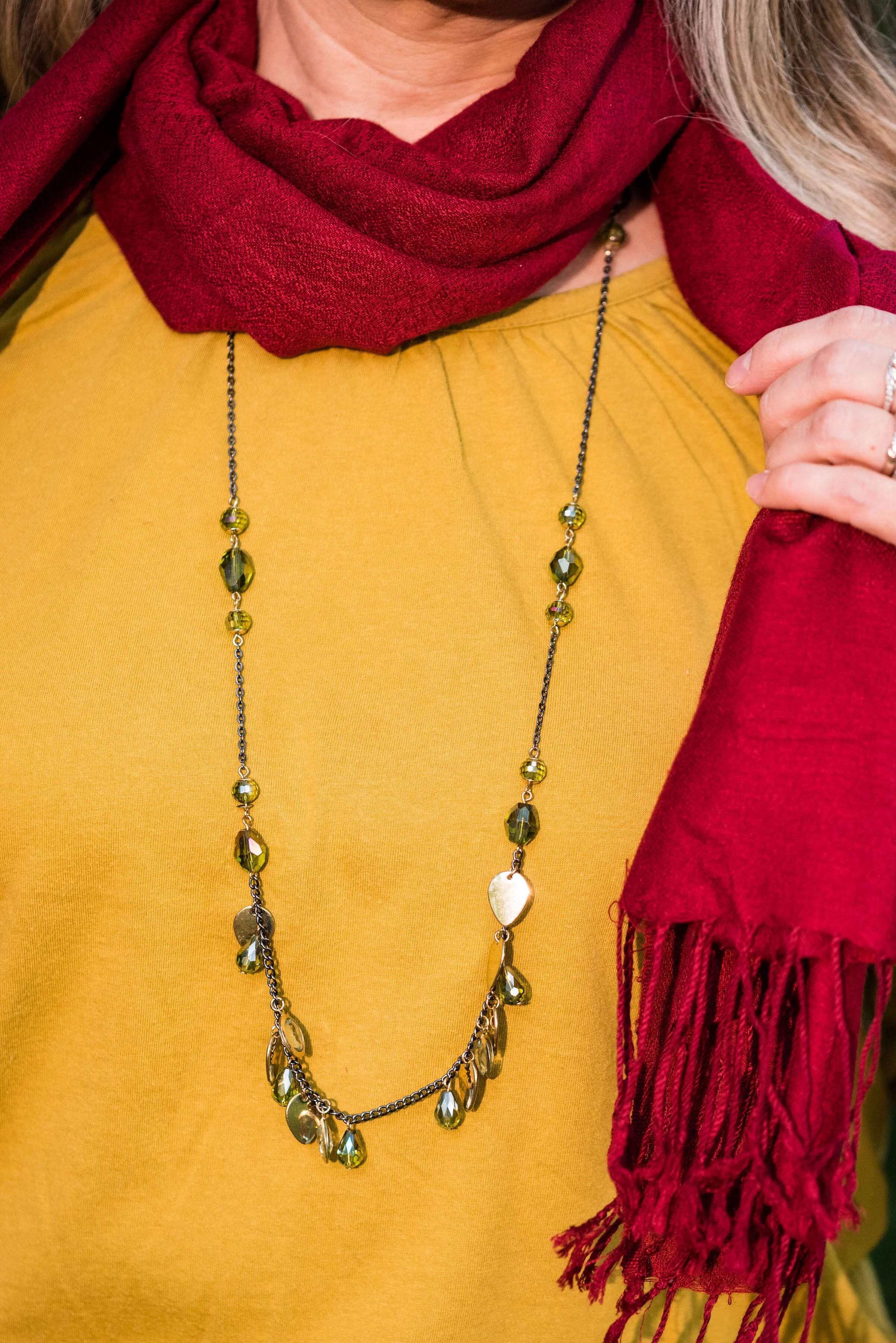
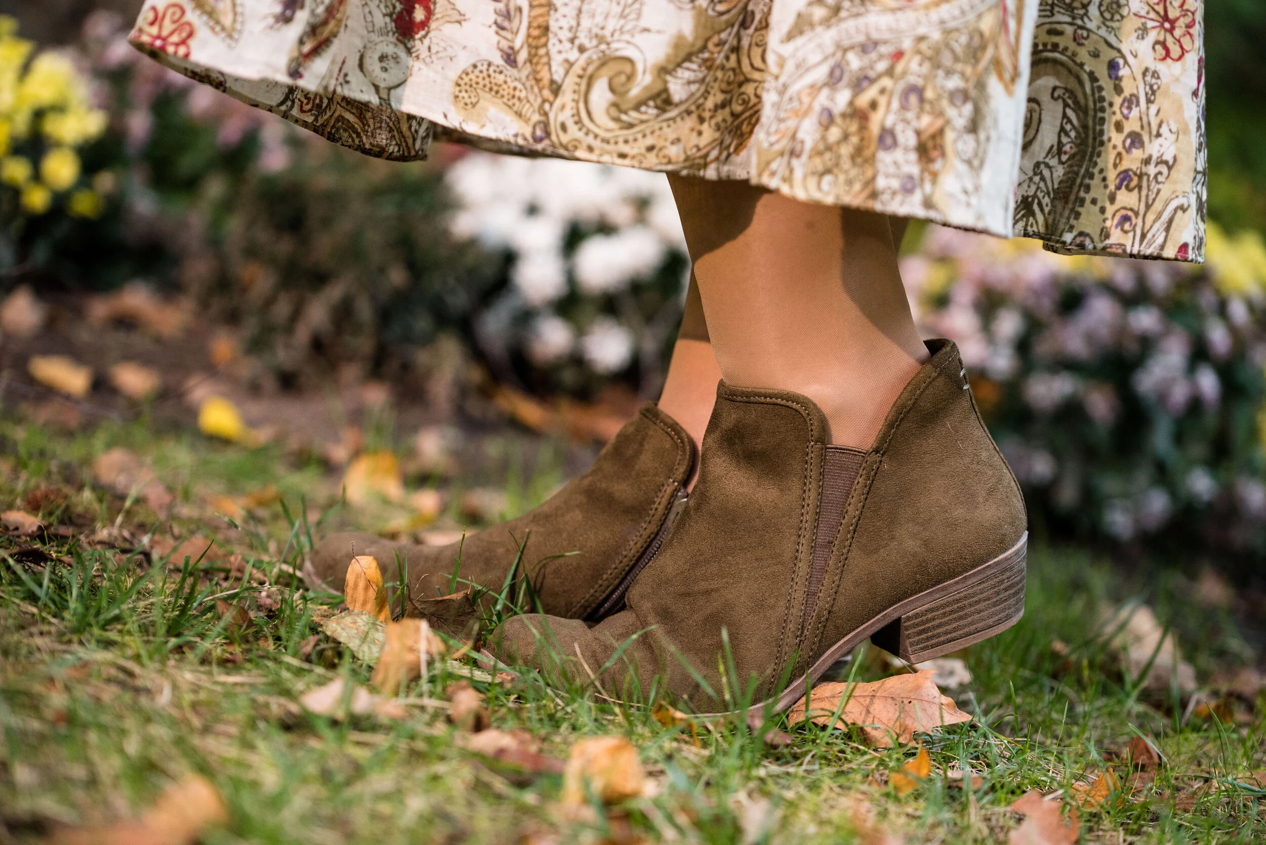
As I said earlier, I opted for olive green accessories which included my necklace, bracelets, thrifted bag and SO booties.

What do you think of these colors? Would you wear either of these? Would you wear them together? I’d love to have your feedback. Your support means a lot to me. I always respond to your comments. Just check back in a few days if you are interested in my reply.

I’m including a few shopping links for Merlot and Antique Moss if those colors got you excited. These are affiliate links, which means I get a few cents when you click on a link. All opinions are my own.

Photo and graphic credit Rebecca Trumbull.


Pantone - Autumn/Winter - 2019 - New York Palette Recap

I was going to start the Pantone London color palette today, but decided to do a recap of all the New York colors. Some people have told me they like to see all of the outfits and colors together in one post, so here we go.

Outfit 1 - Chili Pepper and Bluestone

Outfit 2 - Fruit Dove and Galaxy Blue

Outfit 3 - Crème de Pêche and Rocky Road

Outfit 4 - Sugar Almond and Dark Cheddar


Outfit 5 - Orange Tiger and Eden

Outfit 6 - Peach Pink and Biking Red

I hope you enjoyed this look at the Pantone - Autumn/Winter - 2019 - New York palette. Which outfit was your favorite? I’d love to hear your thoughts.

Next week I’ll be starting the Pantone - Autumn/Winter - 2019 - London palette. Believe it or not, the only two overlapping colors this year were Galaxy Blue and Bluestone. Be sure to check that out next week.

Thank you all for being a part of my blogging journey. If you ever have something you would like to see me feature on the blog, send me an email. I’m open to new ideas and value your opinions and support.

Have a fabulous weekend!

Photo credit Rebecca Trumbull.