Outfit Inspiration: Gray Days of Spring

We all yearn for the warmer temps and sunshine of spring. We want to see the trees budding into flower and leaf, and smell the fragrance of flowers on the breeze. We are ready to tear off our winter layers, and pull out the tees, light weight sweaters and jackets, and allow our ankles and toes to see the sun. Unfortunately, here in the midwest, spring mosey’s along as if trying to decide whether it wants to settle in, or just bypass our area and let winter reign a while longer until summer blazes into place.

Today’s outfit was inspired by the weather. It is gray, damp, and chilly. There is a chilly breeze blowing, which doesn’t help it feel more spring like. On day’s like these I am still reaching for layers. However, I like to keep the layers visibly lighter and more spring-like in their appearance.

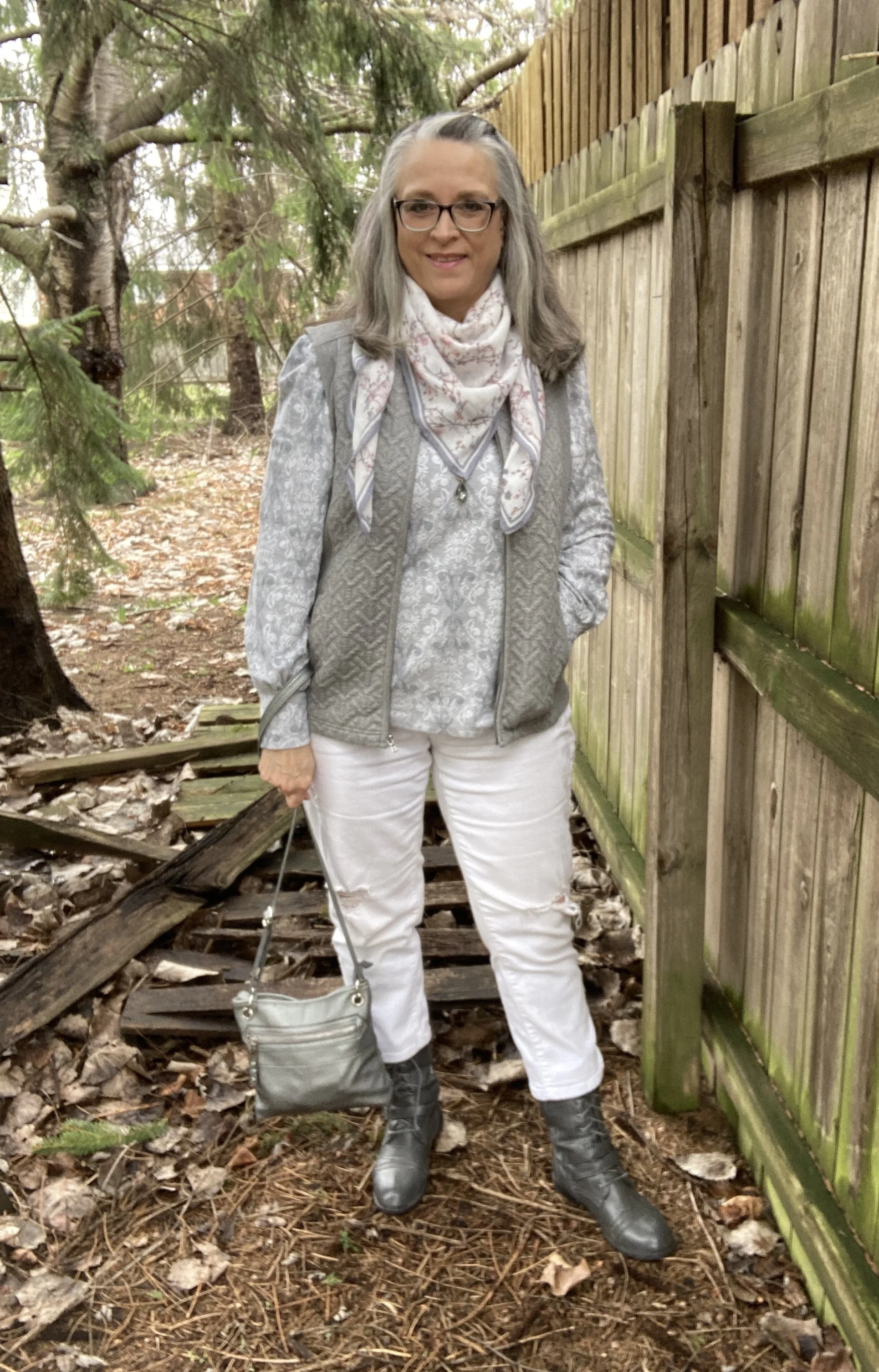
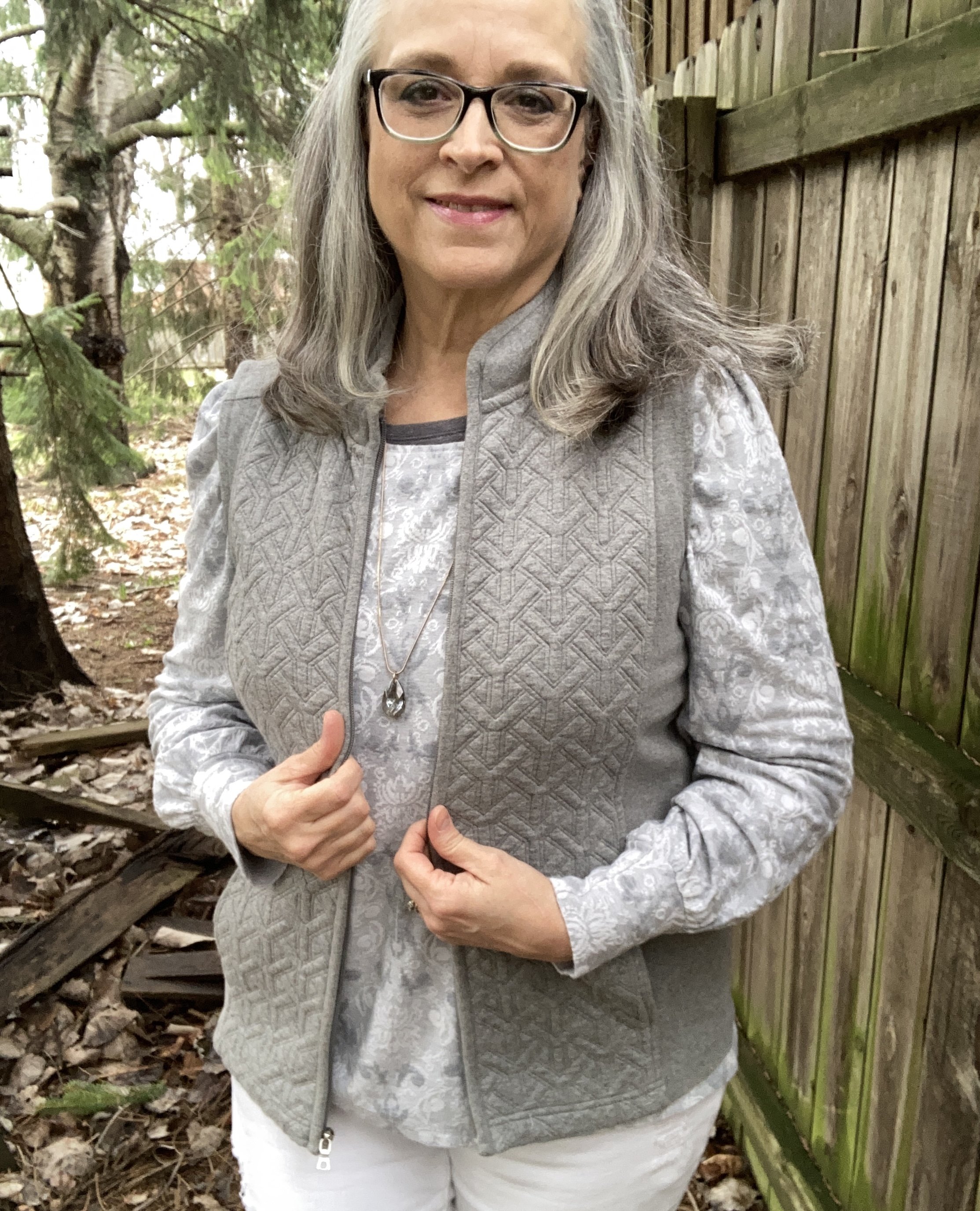
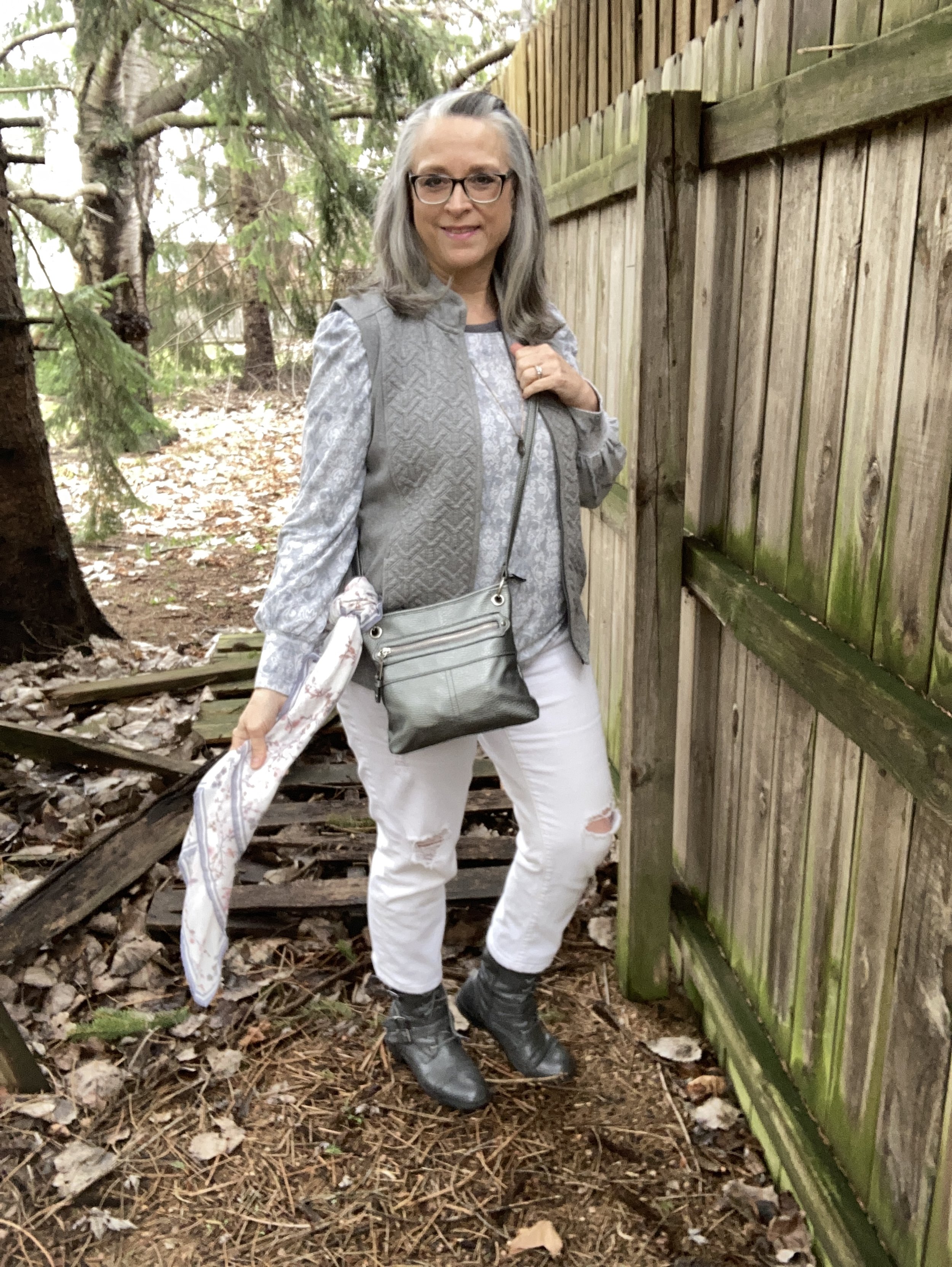
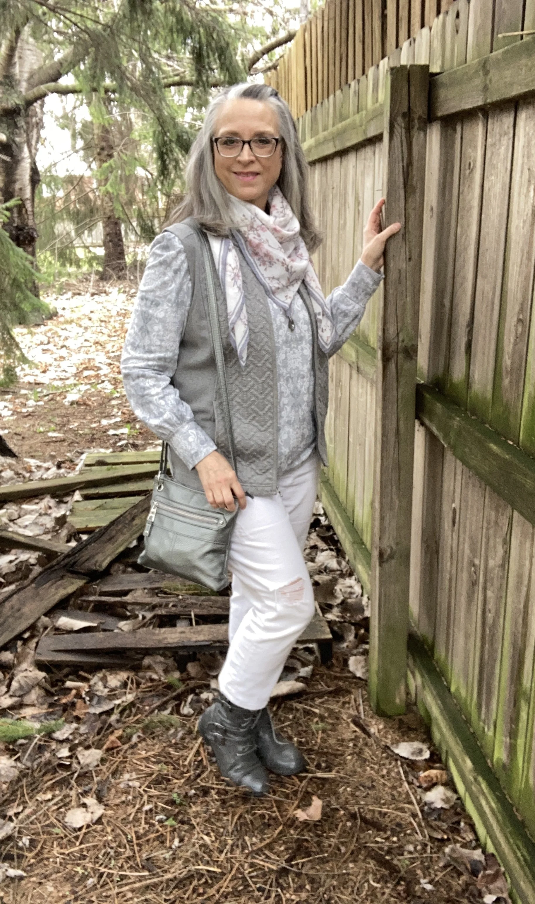
The outfit started around this recently thrifted Rose & Olive knit top. I love the print and after a little research I am not sure if I would call this a Damask, or Ikat inspired pattern. It is quite unique and along with the puffed sleeves and wider banded wrists give the top a very elegant feel. I think it would look lovely with a dark gray skirt or pair of trousers, or a black maxi skirt or jumper. Even pairing it with a dark navy would be fun. You can see I layered a darker gray, long sleeve tee underneath as an extra layer to keep me warm.

Once I chose the top, I thought the best way to give it a more spring feel was to pair it with a light colored pair of pants, so I chose these white, thrifted, distressed Stylus brand cropped jeans. These are very comfy and I am looking forward to wearing them more when the weather gets warmer.

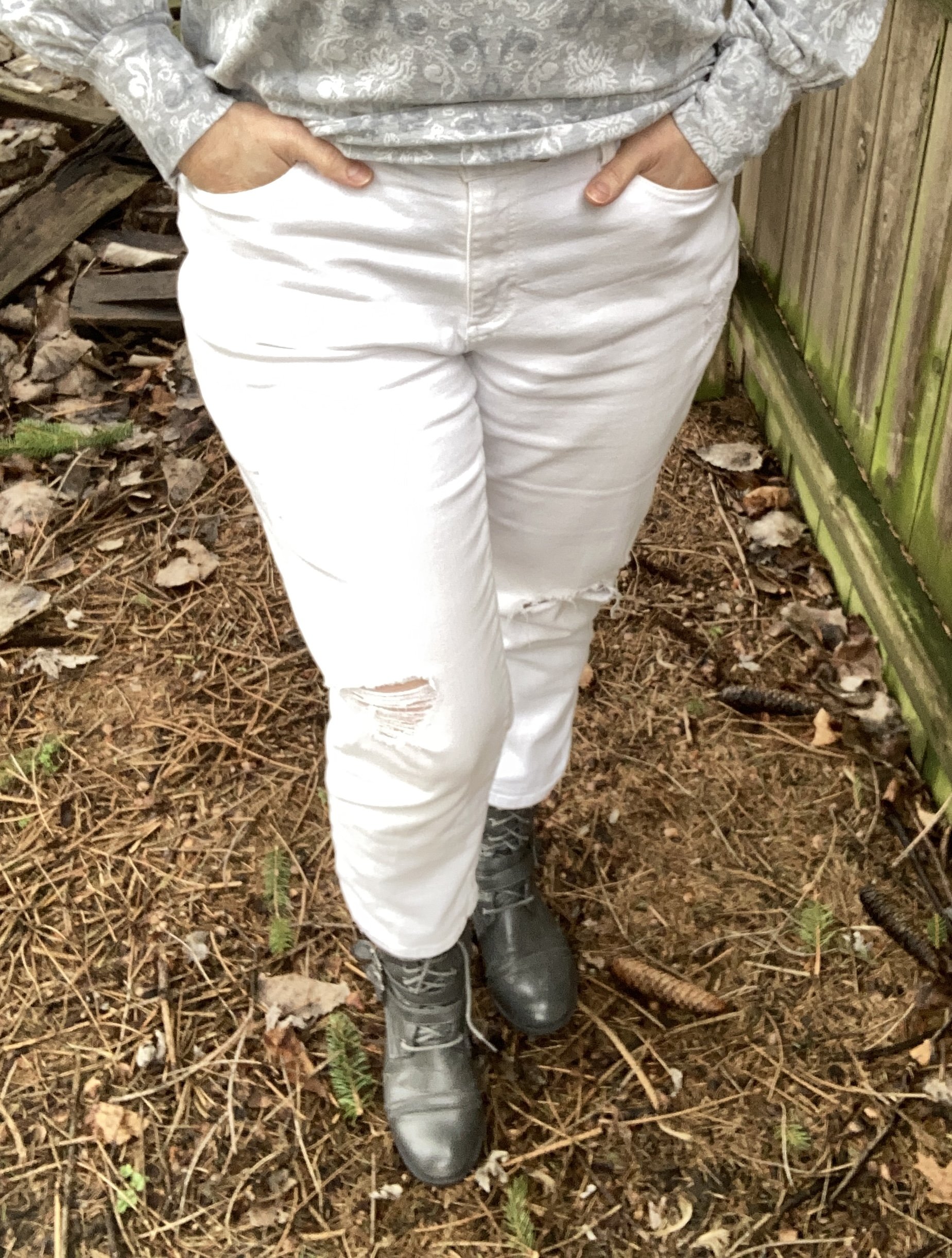
Yes, my shoelace is untied, and I didn’t notice until late in the day. Ha, ha.

I knew I would need one other light layer so I reached for my years old, Christopher and Banks vest. This is a great piece and I regularly wear it as a light layering piece or as a great way to cover some of my middle age bulge. :)

I knew I would gravitate towards my thrifted gray moto boots and my current thrifted gray cross body bag as the perfect accessories to keep a monochromatic feel.

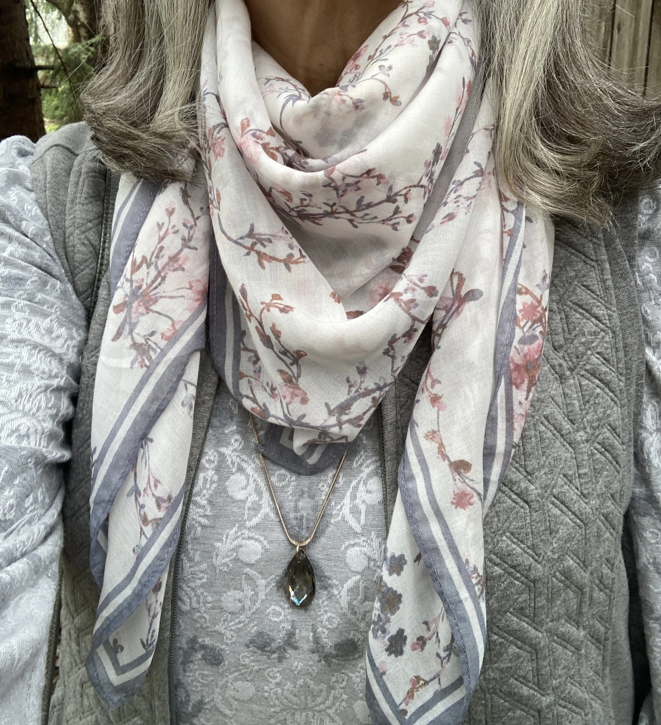
I didn’t want the outfit to be too bland, so I added a sparkly pendant necklace with a tear drop gray jewel, and a cherry blossom scarf, both thrift finds. A girl has to have a little sparkle and glam even if she is just dressing casual. You just never know what a day will bring. I ended up meeting a friend for coffee at a near by coffee shop and I felt very comfy and stylish.

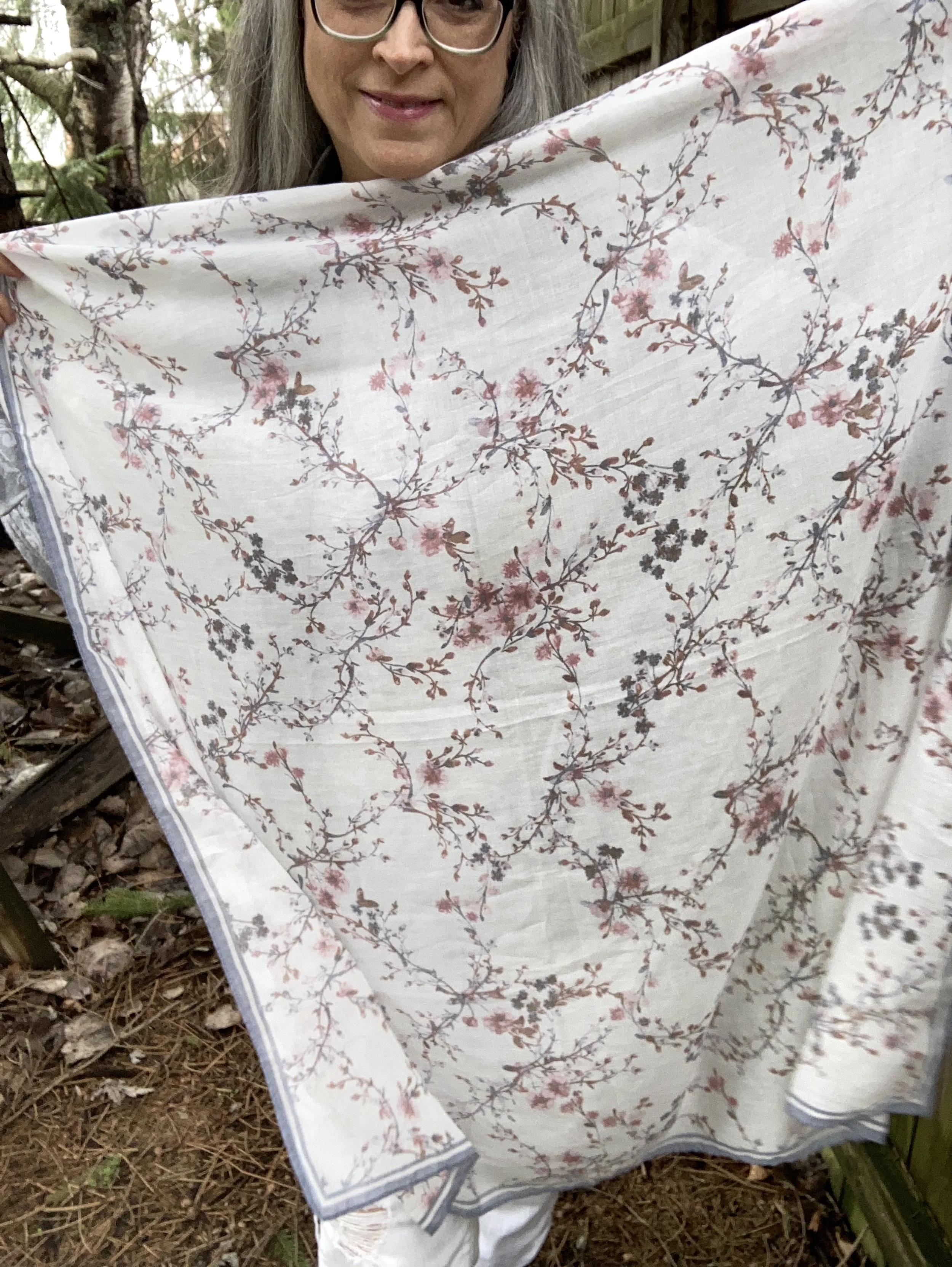
Of course if you get too warm through out the day, you can always remove the scarf and add it to your bag.

What do you think of this outfit? Do you think it evokes the feeling of a gray, spring day? Do you think the scarf and pendant necklace good additions to make the outfit a tad bit more interesting?

I hope you enjoyed this post. I hope that these fashion ideas help you use the clothes already in your closet to create new outfits that will make you feel fresh and confident.

Style Tip: You can make a look like this using any two colors. I chose gray and white, but you might choose navy and tan, or mint green with pale yellow. See what is in your closet and go for it. The outfit formula is simple: top, pants or skirt, vest, shoes, bag, and your choice of accessories. Have fun!

I hope you have a wonderful week.

Pantone Fall 2018 Recap

After a series like the Pantone color one, I usually like to do a recap post, to show you all the colors and the outfits I styled using those colors into one post. These colors this season were not what I would call common fall colors. I usually think of fall colors as being richer and darker hues like deep burgundies, earthy browns and garden oranges that make us think of pumpkins and fall leaves. While the Pantone Fall 2018 had a few colors that fit into my typical fall color box they had numerous ones that clearly stepped outside that box. Colors like Limelight, Mellow Rose and Crocus Petal provided a pastel palette choice for those who like to think brighter and lighter when the seasons change.

Enjoy this review of my Pantone Fall 2018 outfits.

What did you think of this color palette this year? Do you like lighter, pastel colors or go for richer, darker colors when fall rolls around? Do you like to think outside the seasonal color rules, or are you like me and look forward to the seasons bringing you back to those colors you are familiar with and enjoy at that time of year? It really doesn’t matter any more. The joy of fashion today is that you can decide what you like to wear at any time of year.

I like that Pantone had added the classic colors to the color palette for each season. It allows me to add a more toned down color to each outfit keeping the outfit colorful, but no overly so. it would be easy to add a touch of any of these colors to a more neutral outfit. For instance, if you wanted to go for a monochrome look using a navy like Sargasso Sea, you could add a little color by throwing on a bright Russet Orange scarf or some Limelight colored beads. If you normally dress in more neutral tones try adding just a touch of color in your accessories to make your outfits more interesting and visible.

I hope you enjoyed this series. Check back on Thursday for more fashion fun.

Photo credit Rebecca Trumbull.

Pantone Fall 2018 - Pink Peacock, Valiant Poppy and Almond Buff

Welcome back to outfit number three in this fall’s Pantone color series. Today I am featuring two colors which the Pantone site describes as a “bright and bold dramatic pink” and a “brave and outgoing red.” I didn’t go into this series thinking I would pair these two colors, but when I started looking for the pink and decided on this multi-print tunic, it was only natural to choose another color in the tunic to pair with it, which obviously turned out to be red. I have always thought of pairing red and pink as a Valentine’s Day idea, but when I began putting this outfit together, I saw a subtle shift from cupids and hearts to fall apples and fuzzy pink slippers.

This tunic is a brand called East Fifth and while I can’t remember, I think I got it at JC Penney. Although, when I checked on their website, it looks like they currently only carry East Fifth shoes. and a few bags. I have styled this tunic on the blog before. You can see that post here.

When I realized I had this thrifted Merona cardigan, I knew that would add the perfect pop of red, in addition to my red clutch.

To keep the outfit grounded I picked the Pantone color Almond Buff from the classic palette. These pants are a little on the light side to truly mimic the color, but my swede ankle boots are a closer match. Yes, I am doing the Robot.

The pants are Croft and Barrow brand. The boots are Sonoma. Both items were from Kohl’s.

I chose my bright red clutch to add to the Valiant Poppy vibe. Because the tunic is so busy the only jewelry I added was a gold bangle bracelet and the pink and red tassel necklace, which as you can see, blends in with the top, but still adds a little textural detail.

Isn’t it funny that I bought this necklace a while back, never realizing that Pink Peacock and Valiant Poppy would be a thing, or that I would end up pairing these two colors on the blog? This next picture is just me at my silliest! Ha, ha.

Would you combine these two colors? Do you think they are what we would classify as fall colors? I’d love to hear you thoughts. It means a great deal to me when you take the time to stop by, read my posts and comment (when technology is cooperating). I have learned a lot from your comments, especially when you share, how you would have done it differently or what you like about a particular post, so keep it up.

Be sure to check back Thursday for a new Old Becomes New post, where I’ll be sharing a colorful blazer styled in a fall outfit. I need your help to decide whether I should keep it or not. Until then, have a great day.

I’ve included a few shopping links for pink tops and red bags, just for fun. These are affiliate links which means I get a penny or two when you click on a link. If you purchase something through my site, I get a little commission.

Photo credit Rebecca Trumbull.