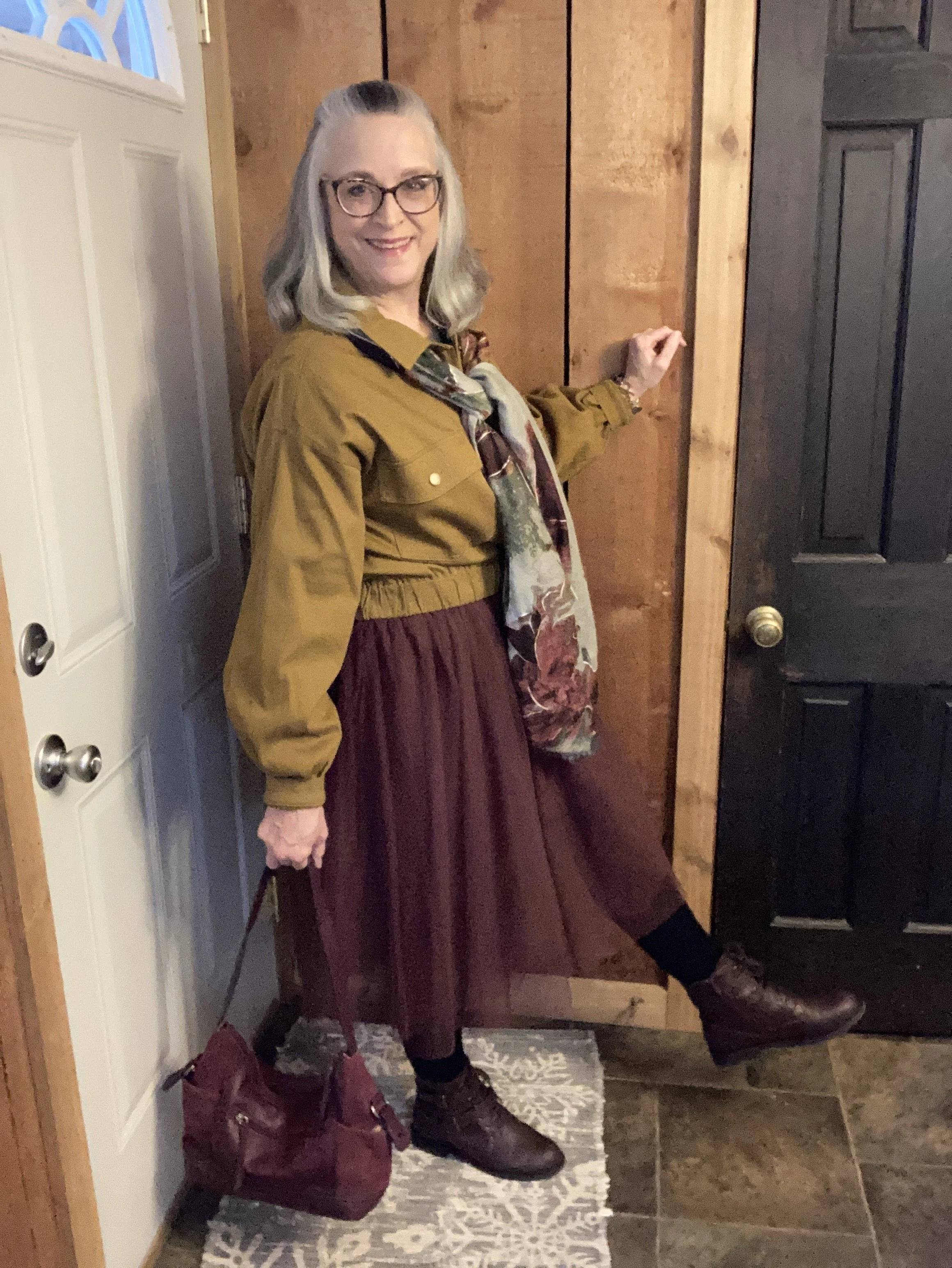
Pantone Spring/Summer 2026 - New York Palette: Burnished Lilac, Amaranth, and Angora
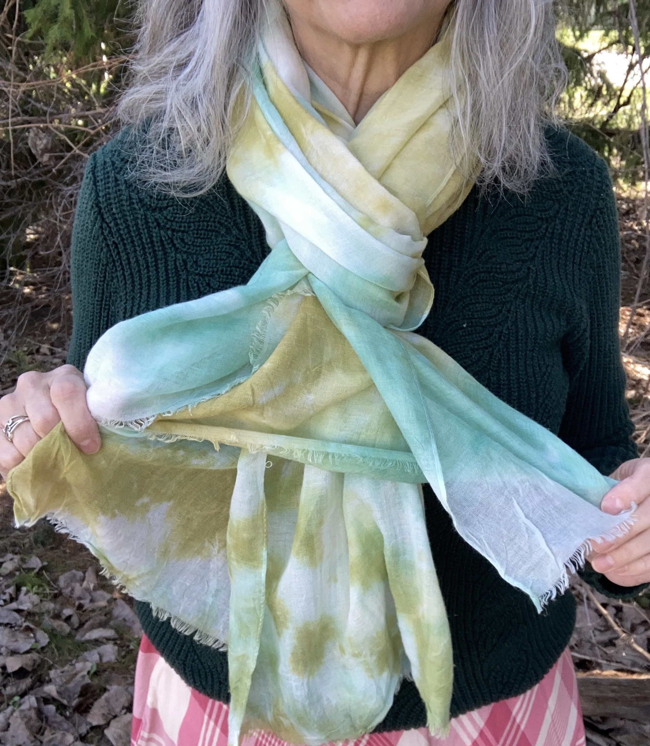
Sorry, I was not able to get this post up last week. This is the last set of colors from the Pantone Spring/Summer 2026 New York Palette. Today’s colors consist of two purples at opposite ends of the spectrum, Burnished Lilac, and Amaranth; and a perfect summer neutral named Angora. You can see all the colors on the palette by checking out this pin.
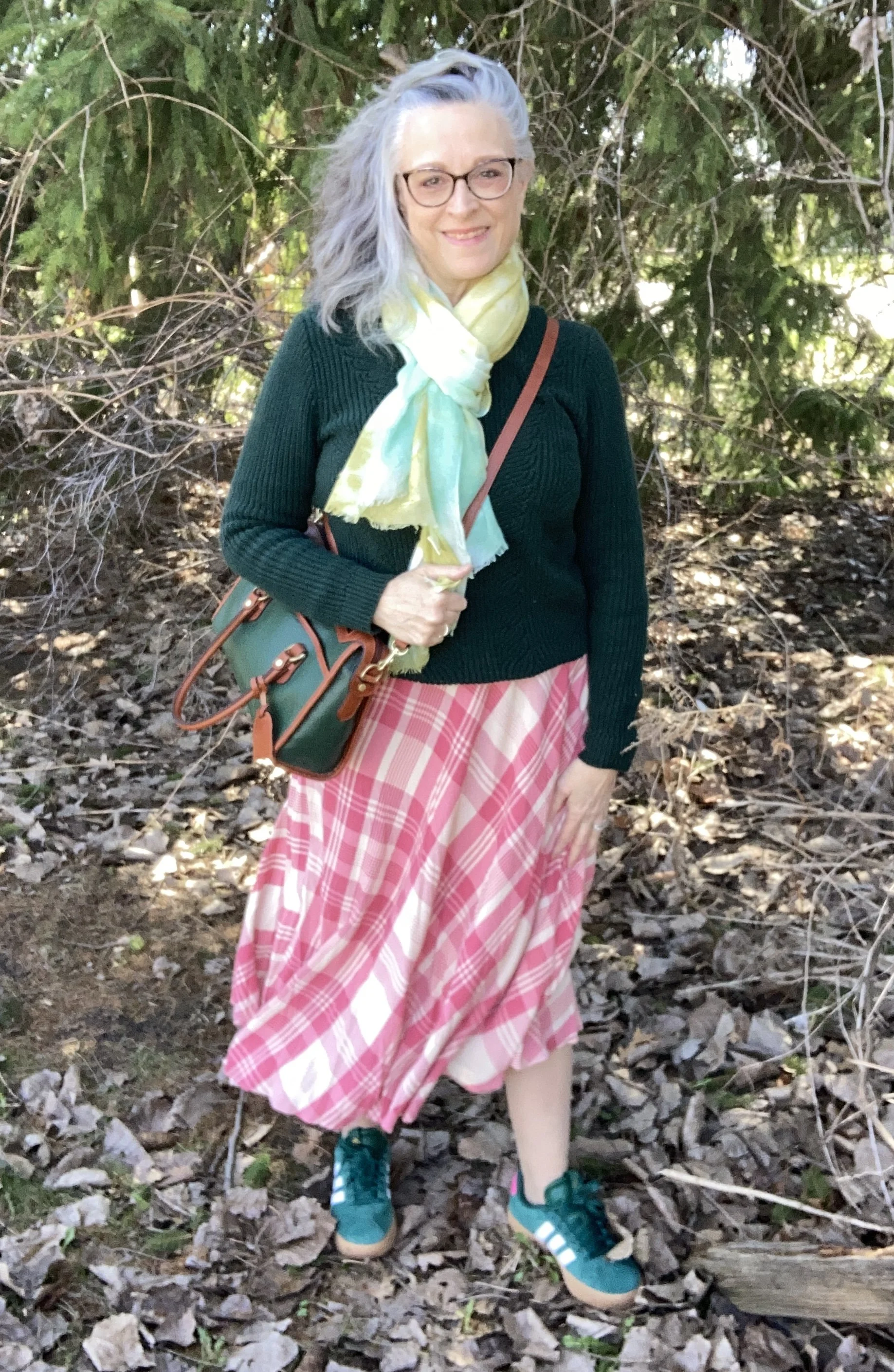
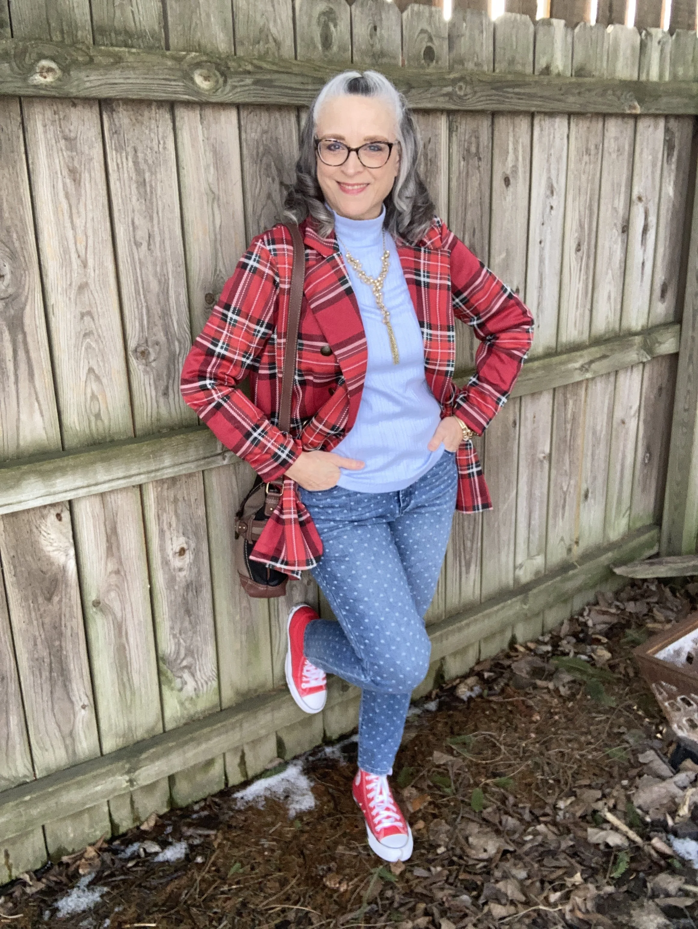
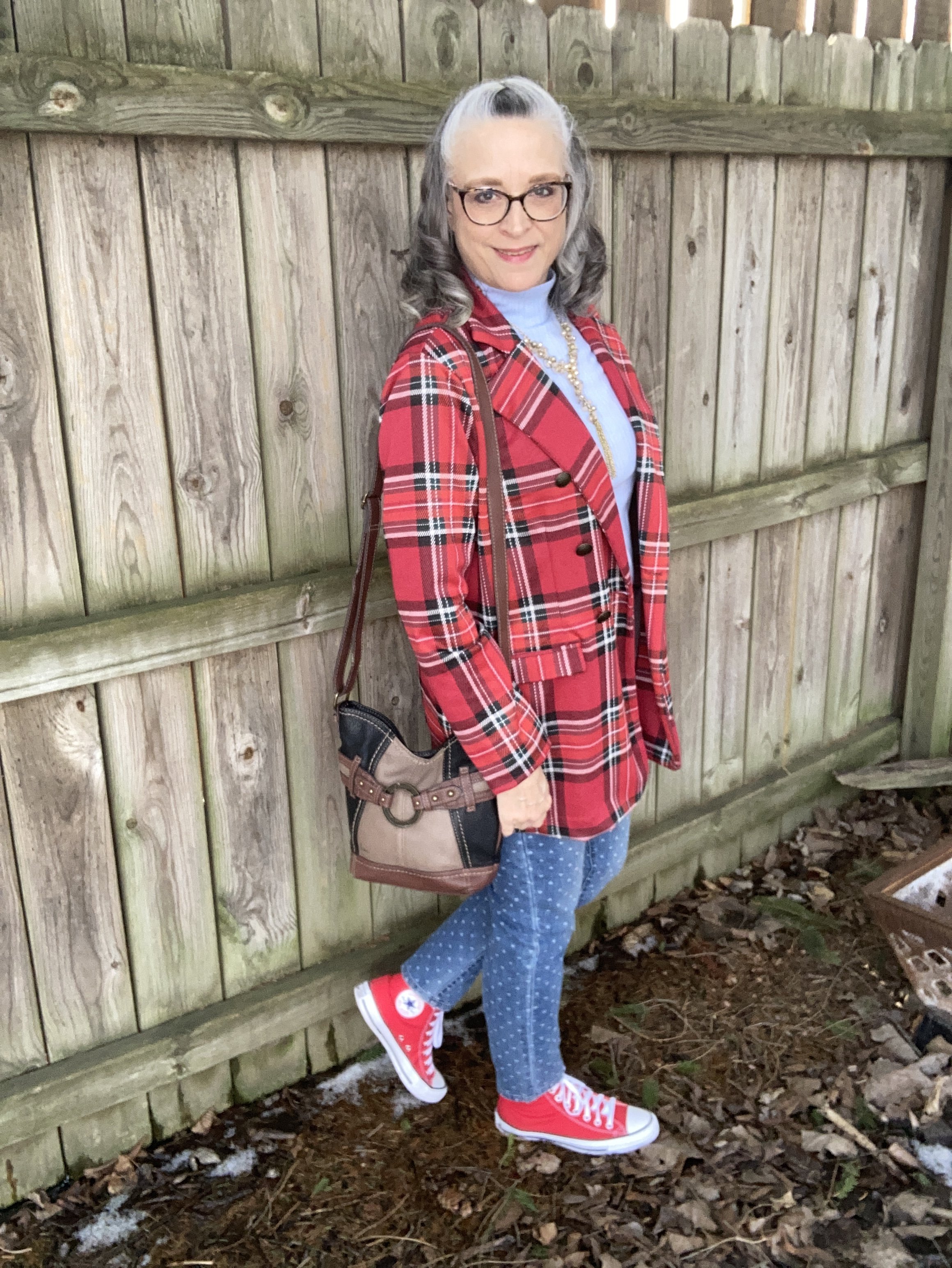
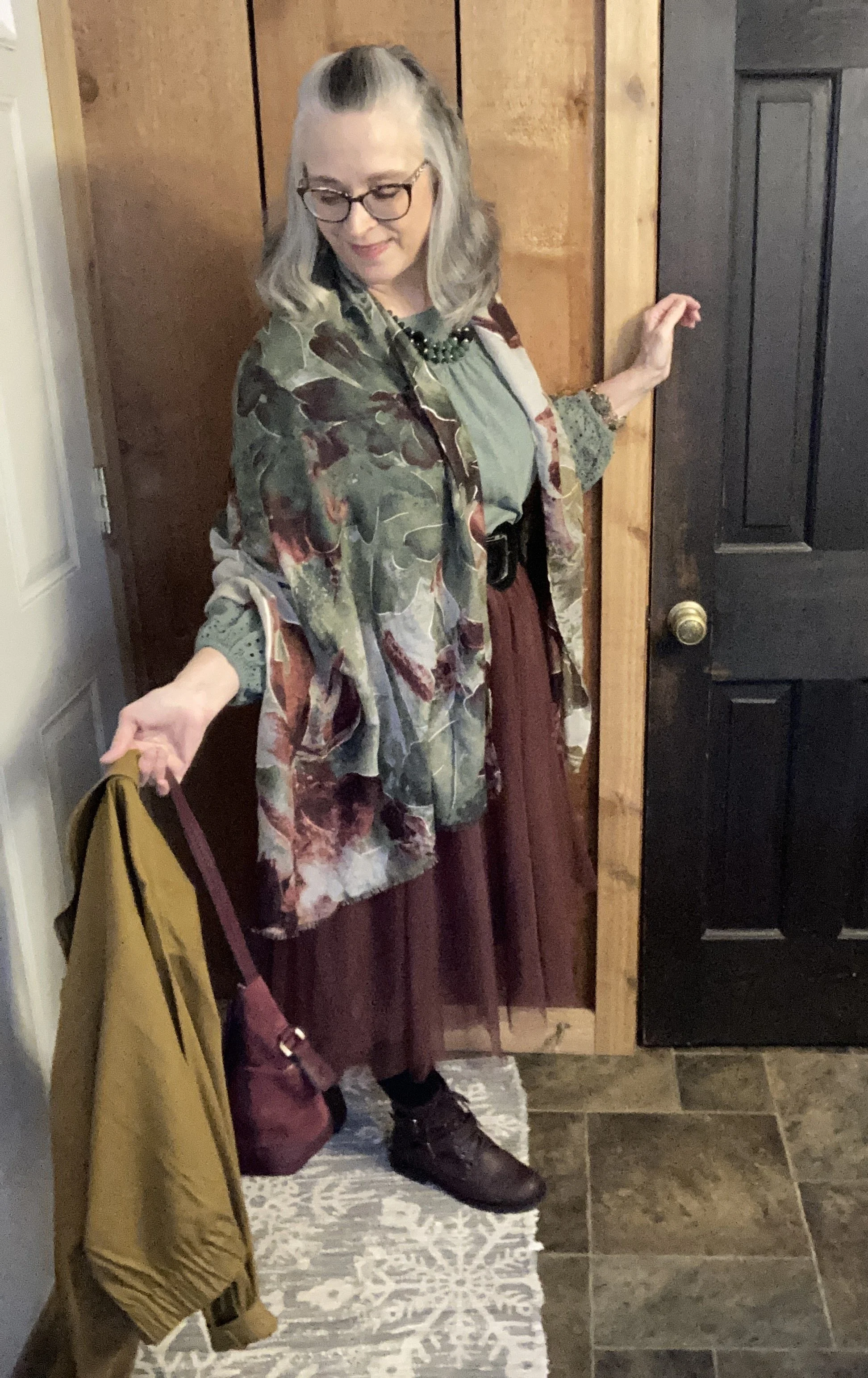
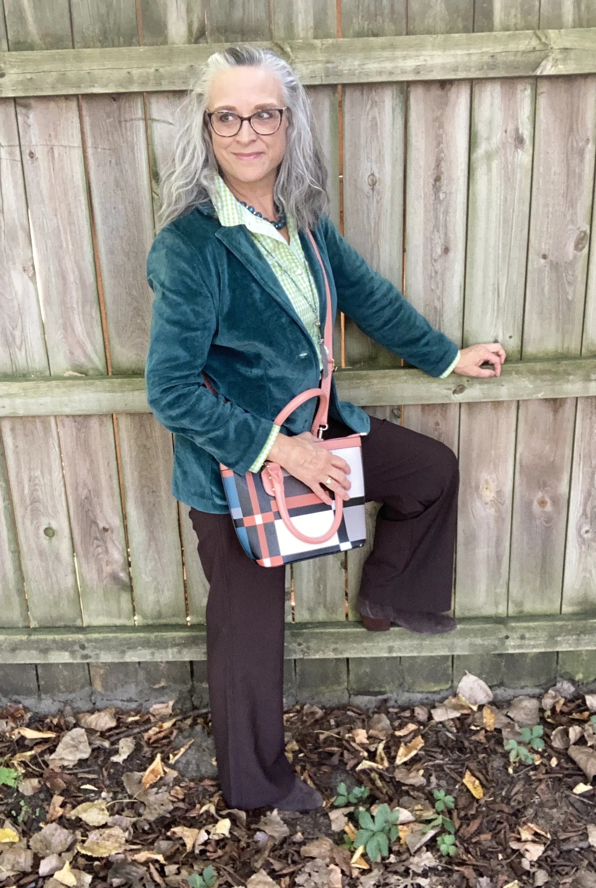
I decided to take pictures inside today, though the lighting outside would have been great on this overcast afternoon. However, I am feeling extra fatigued and might be coming down with something, so I decided to keep it easy by staying inside.
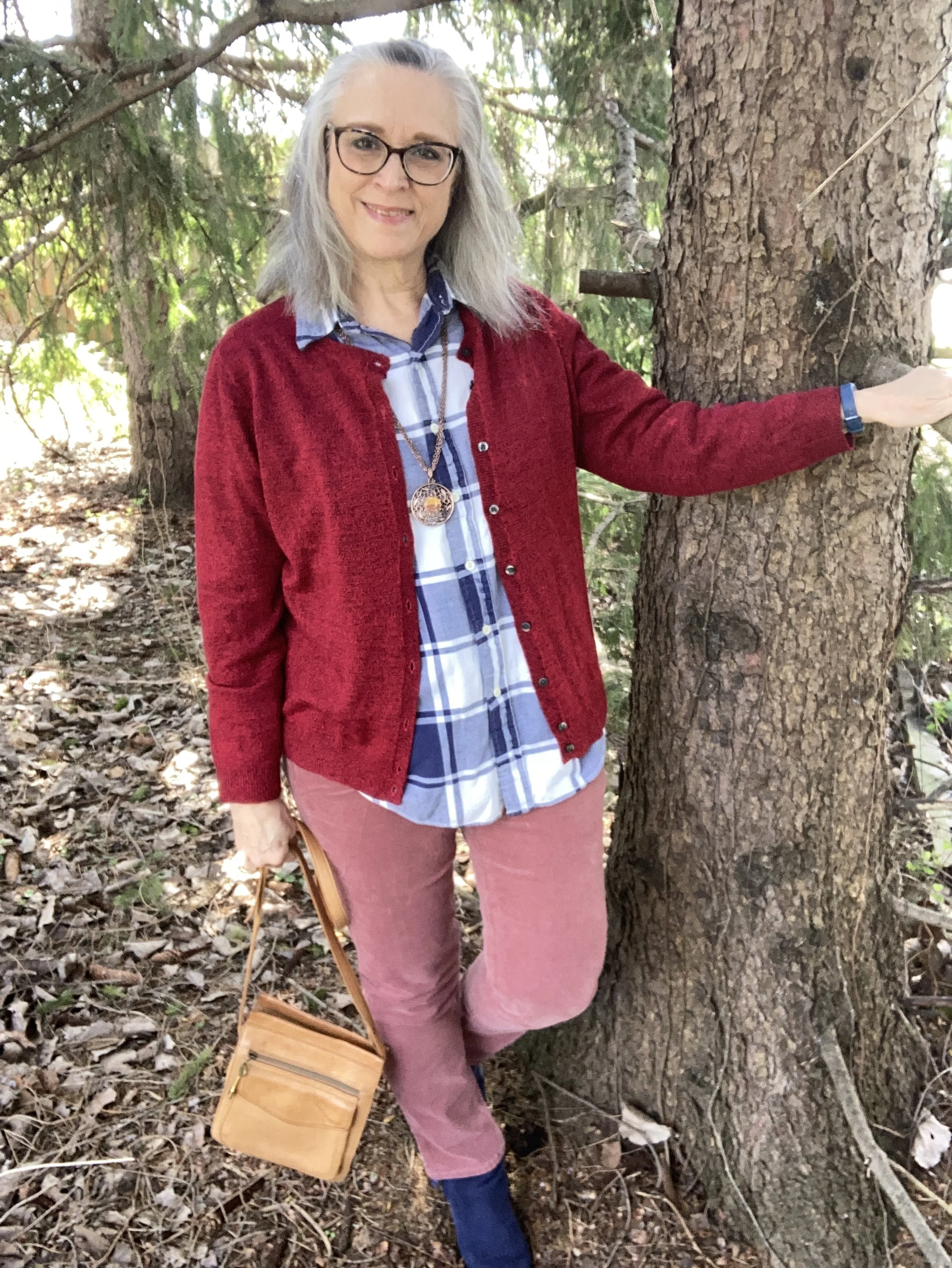
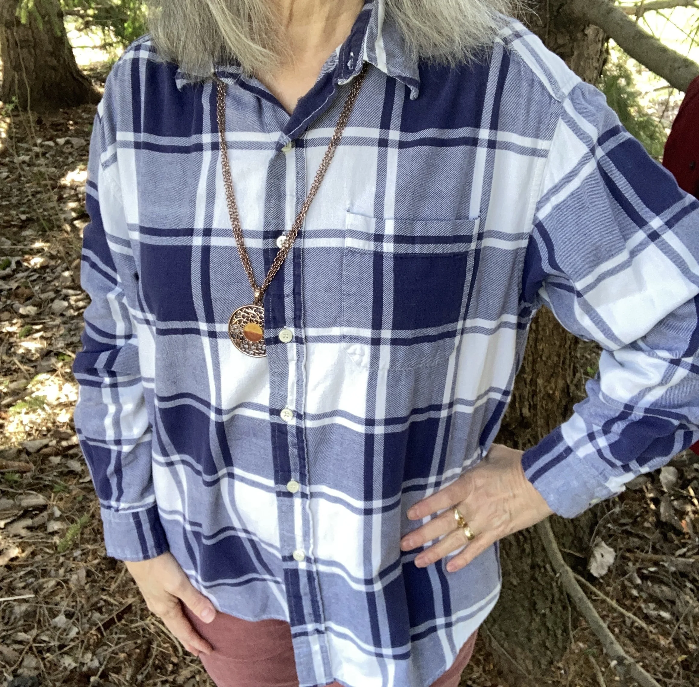
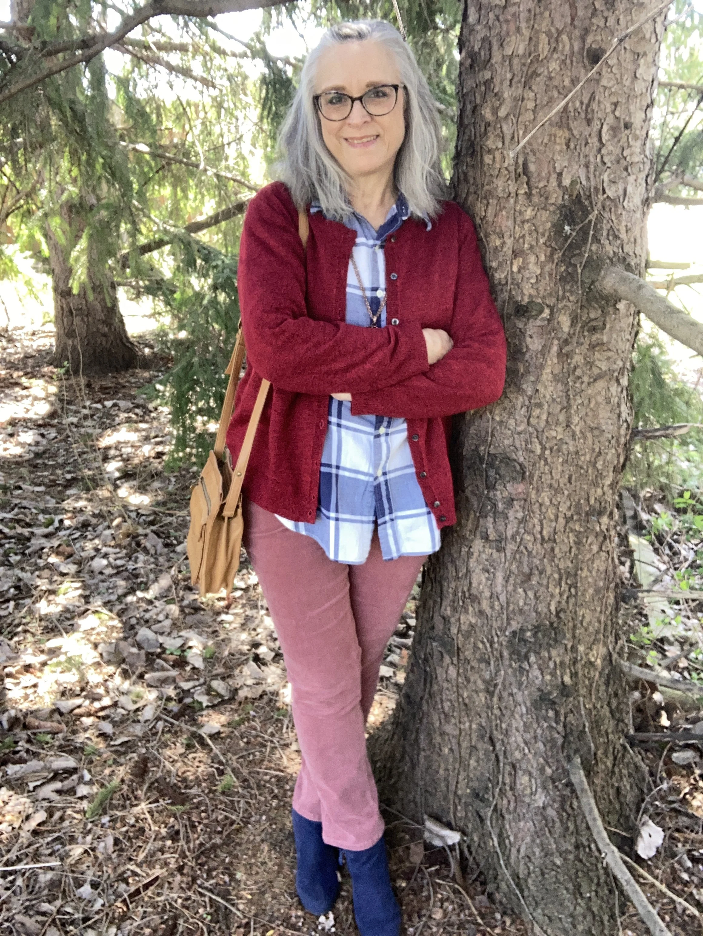
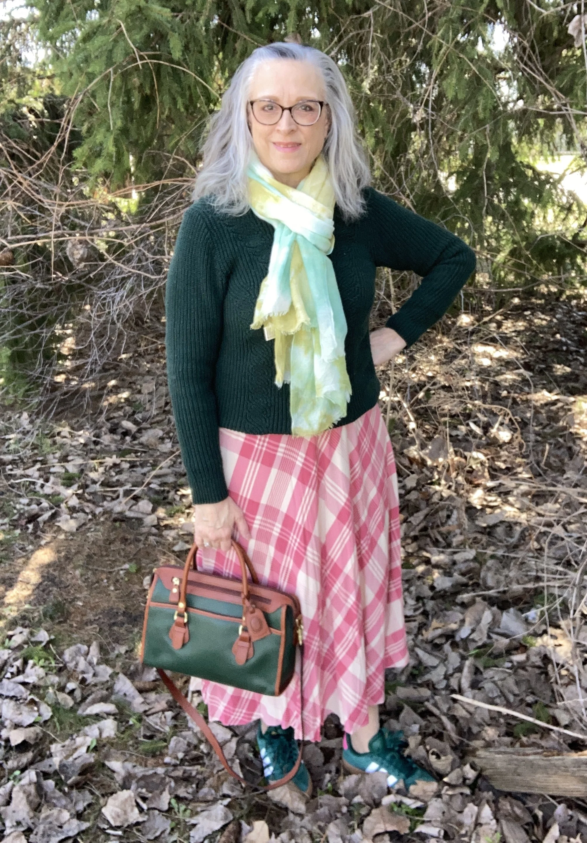
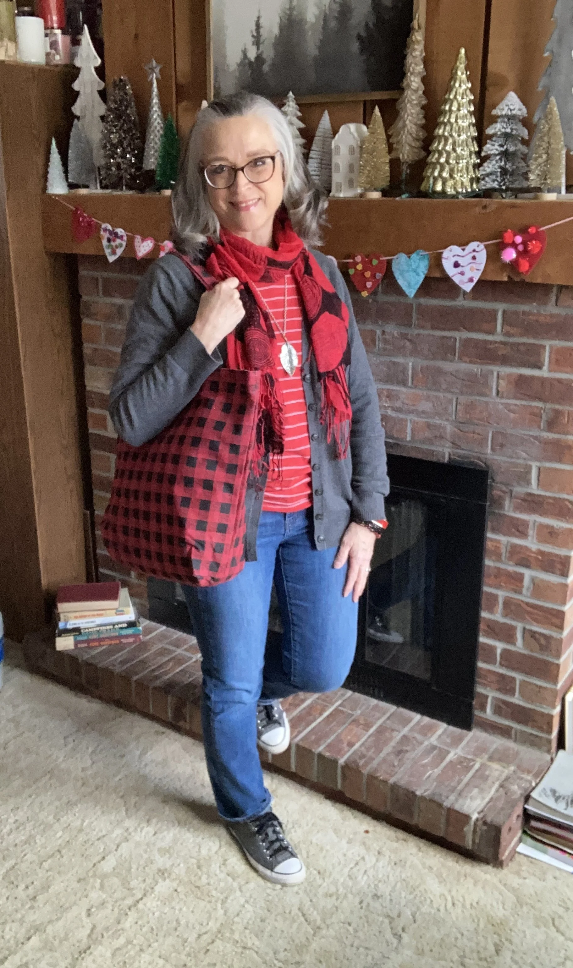
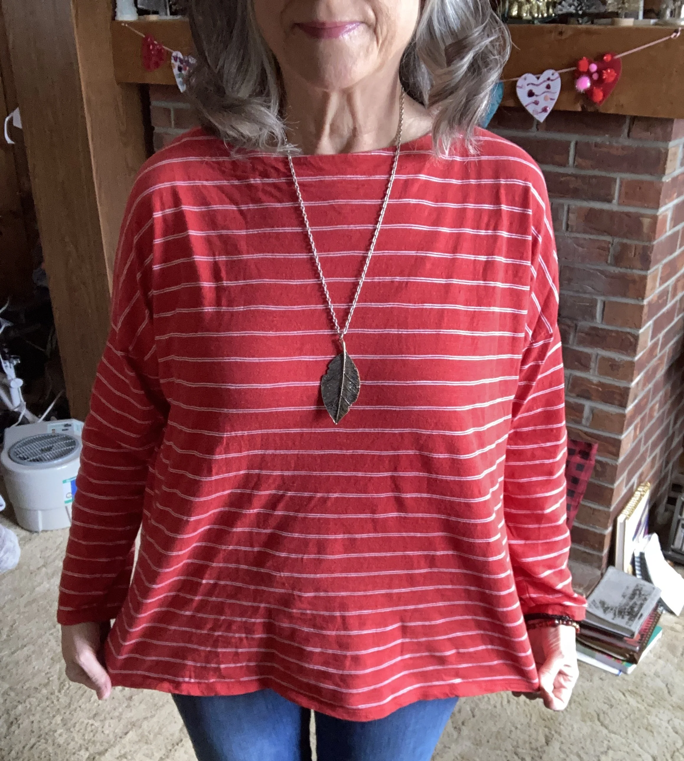
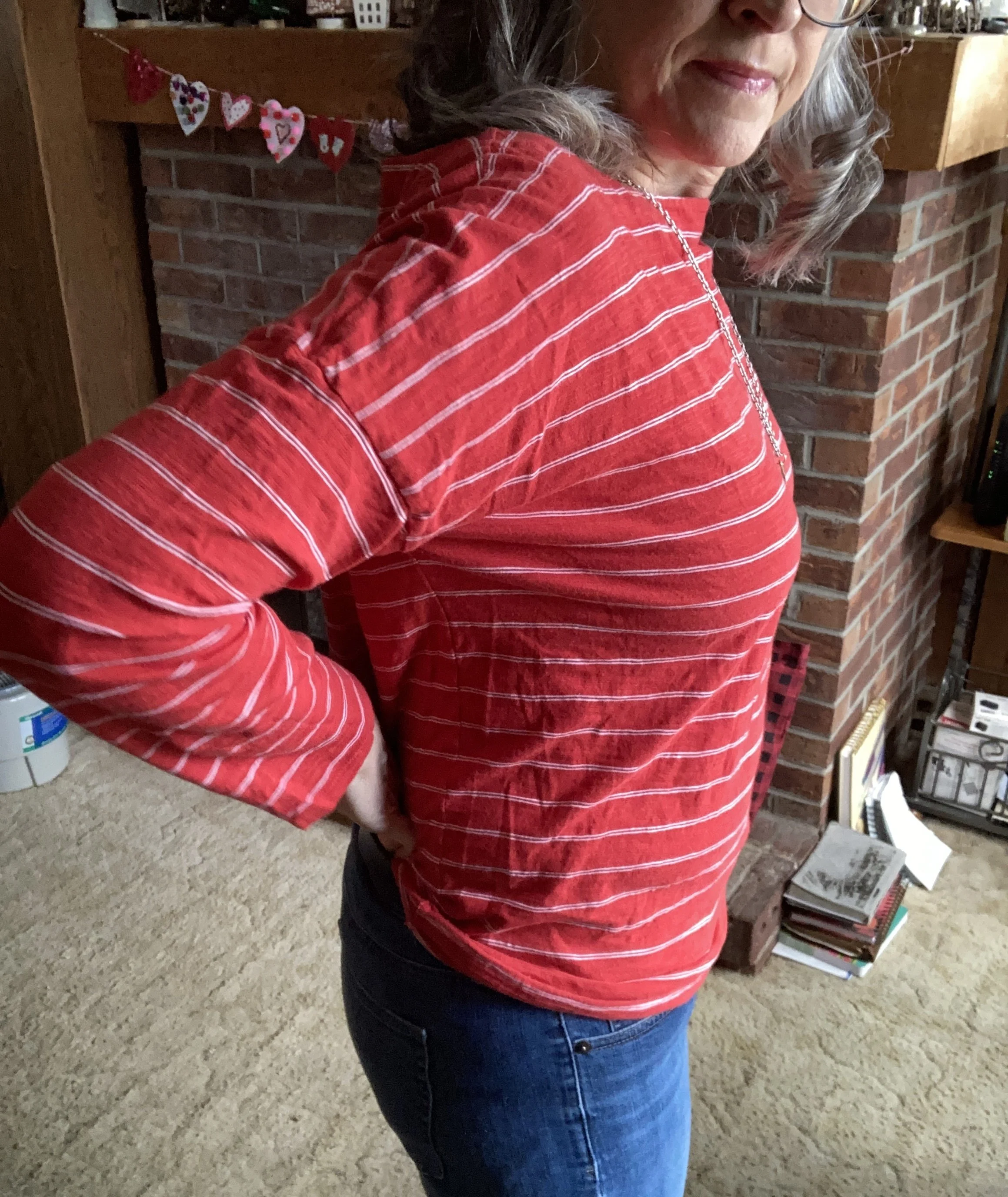
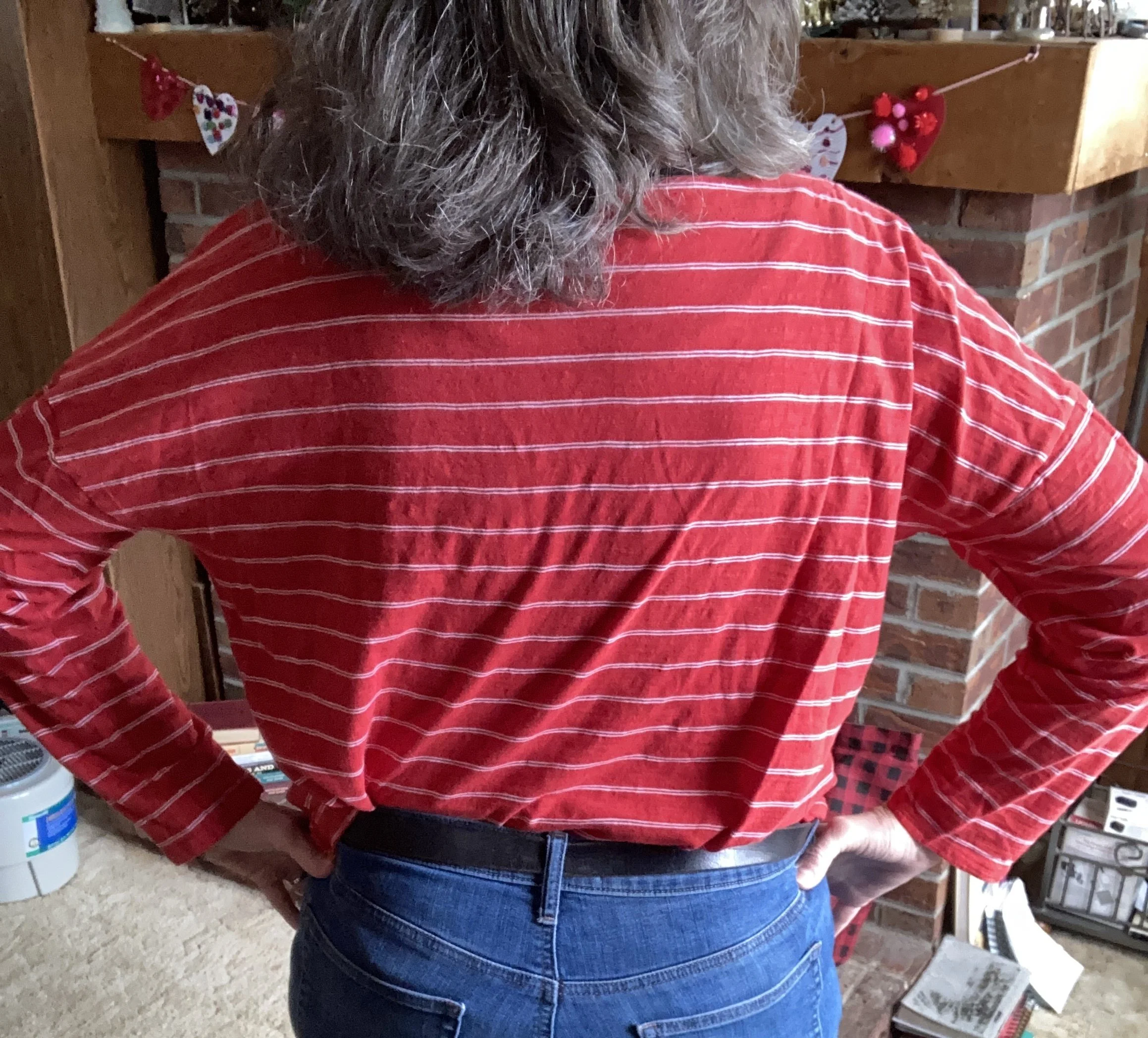
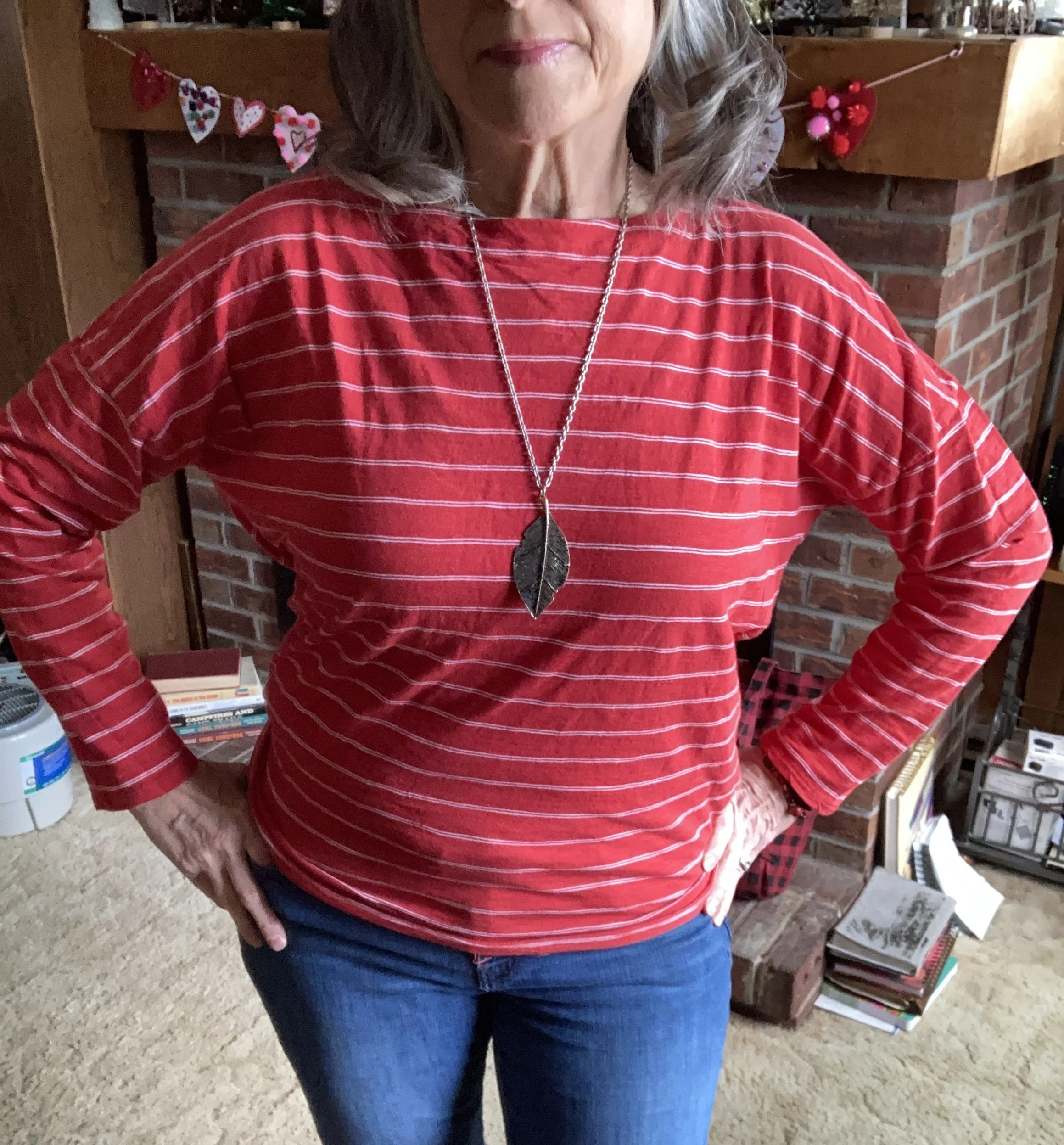
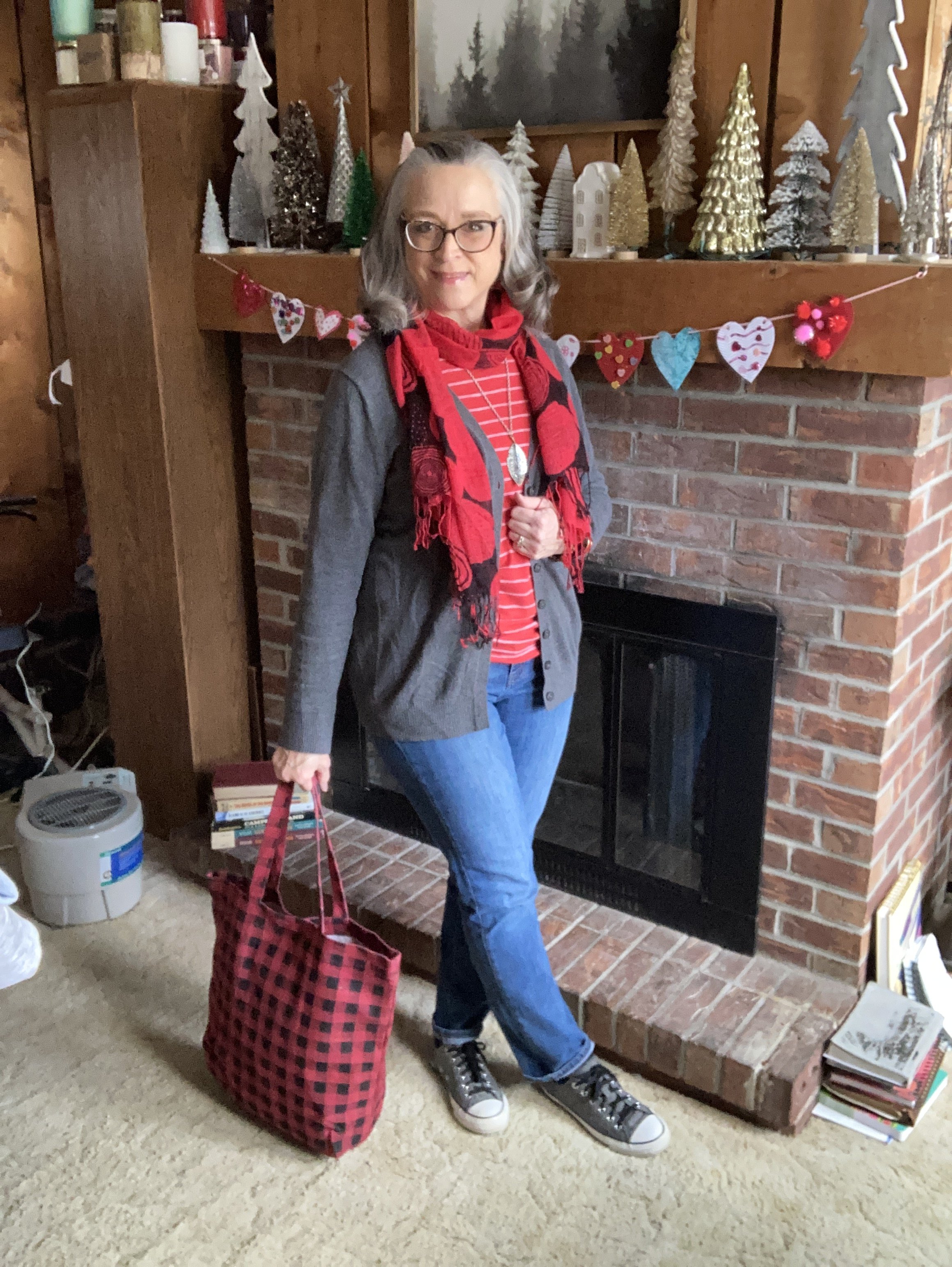
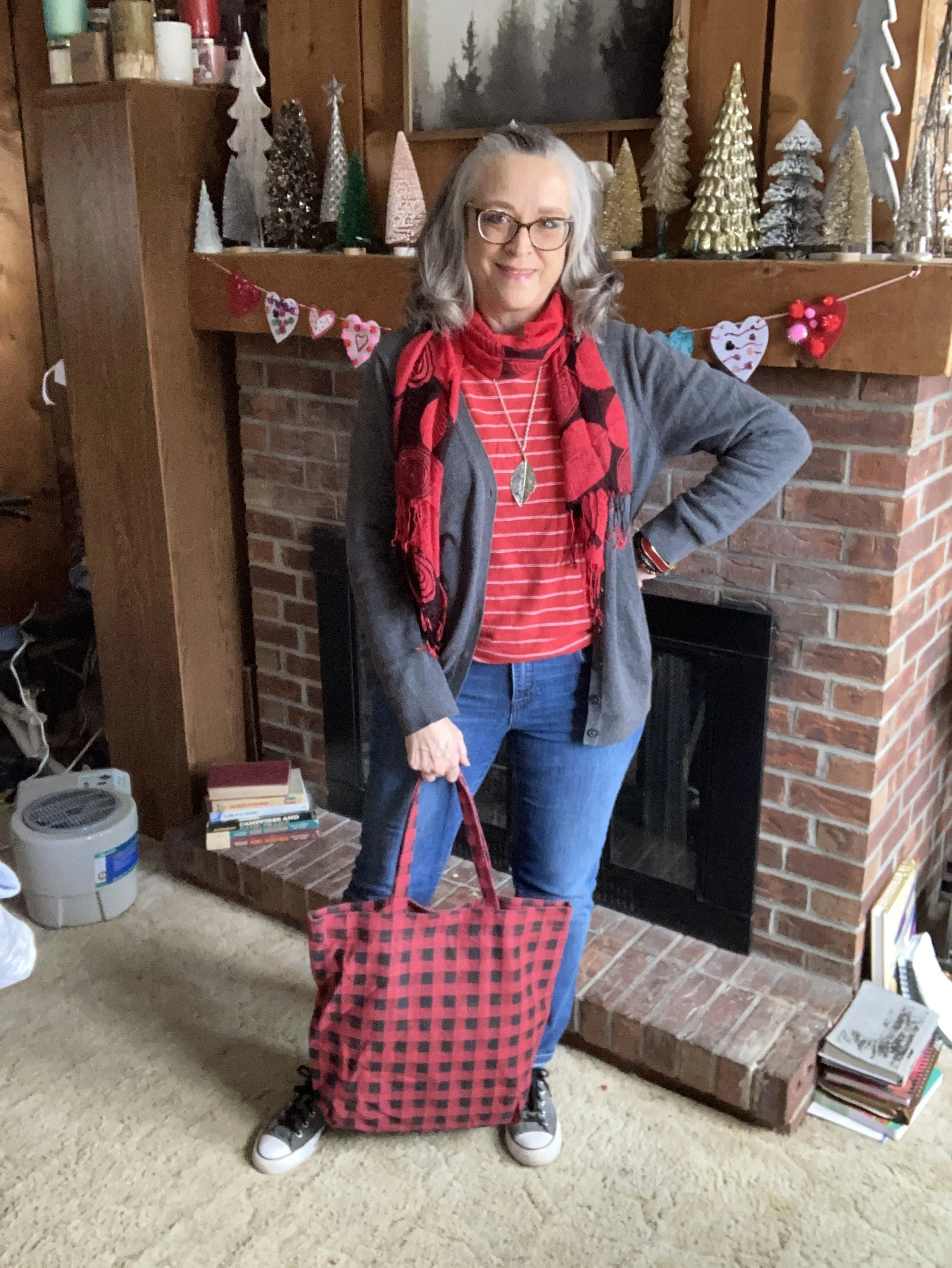
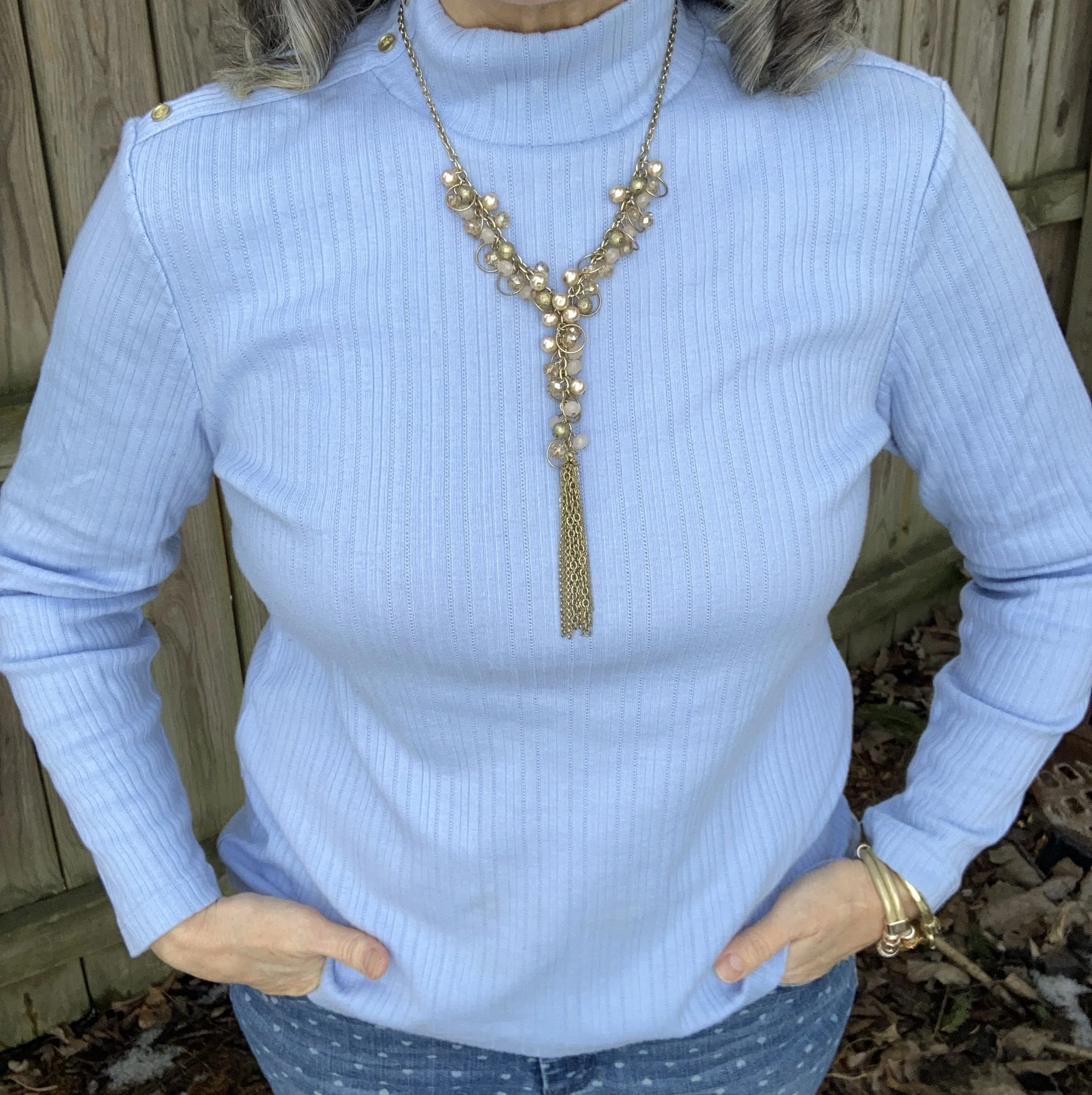
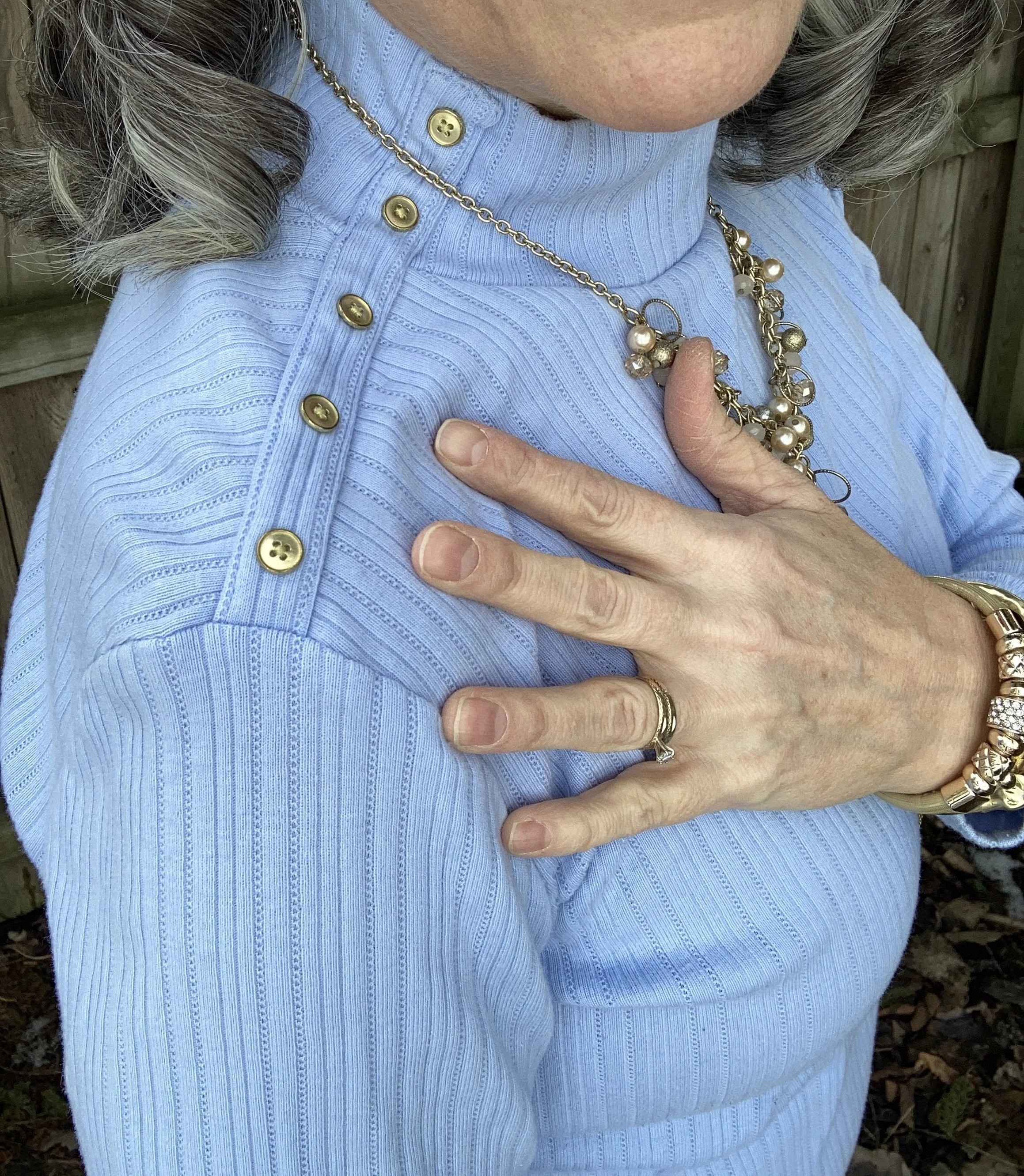
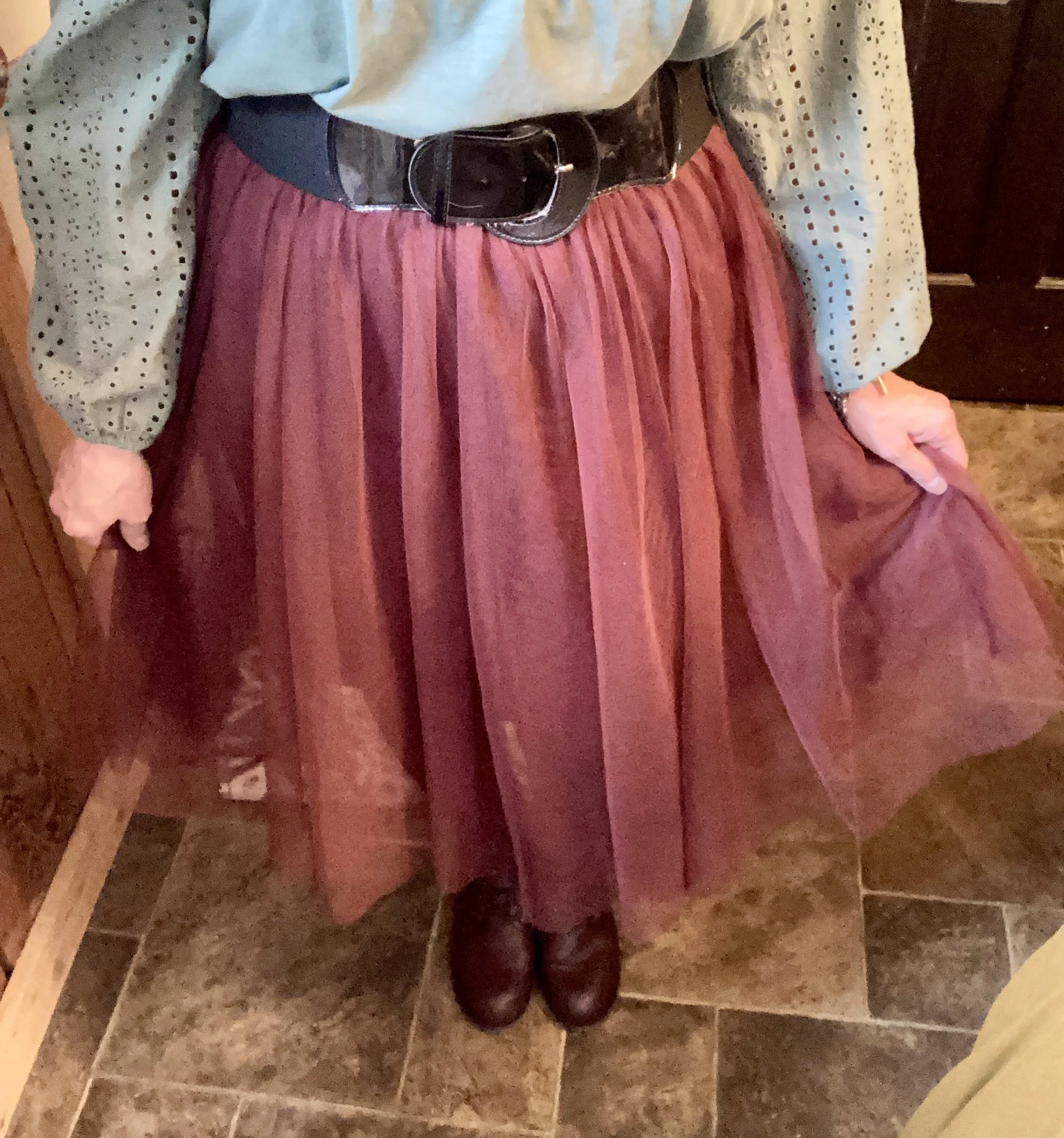
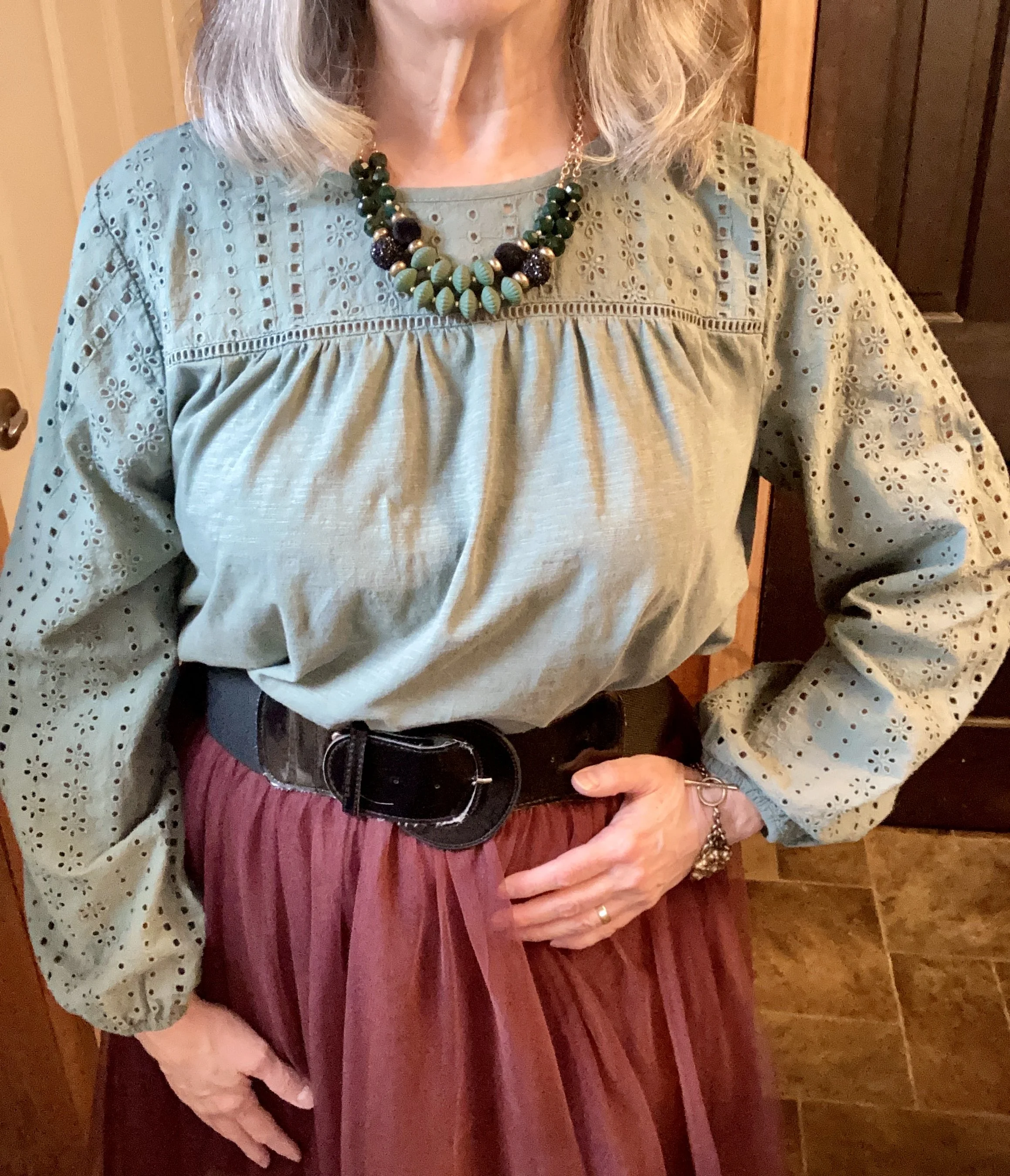
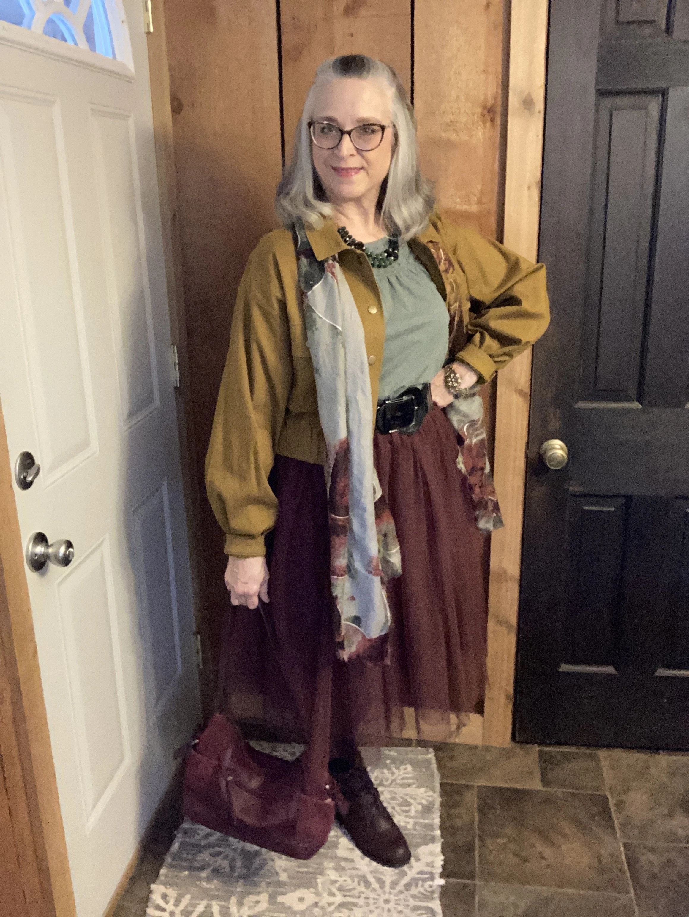
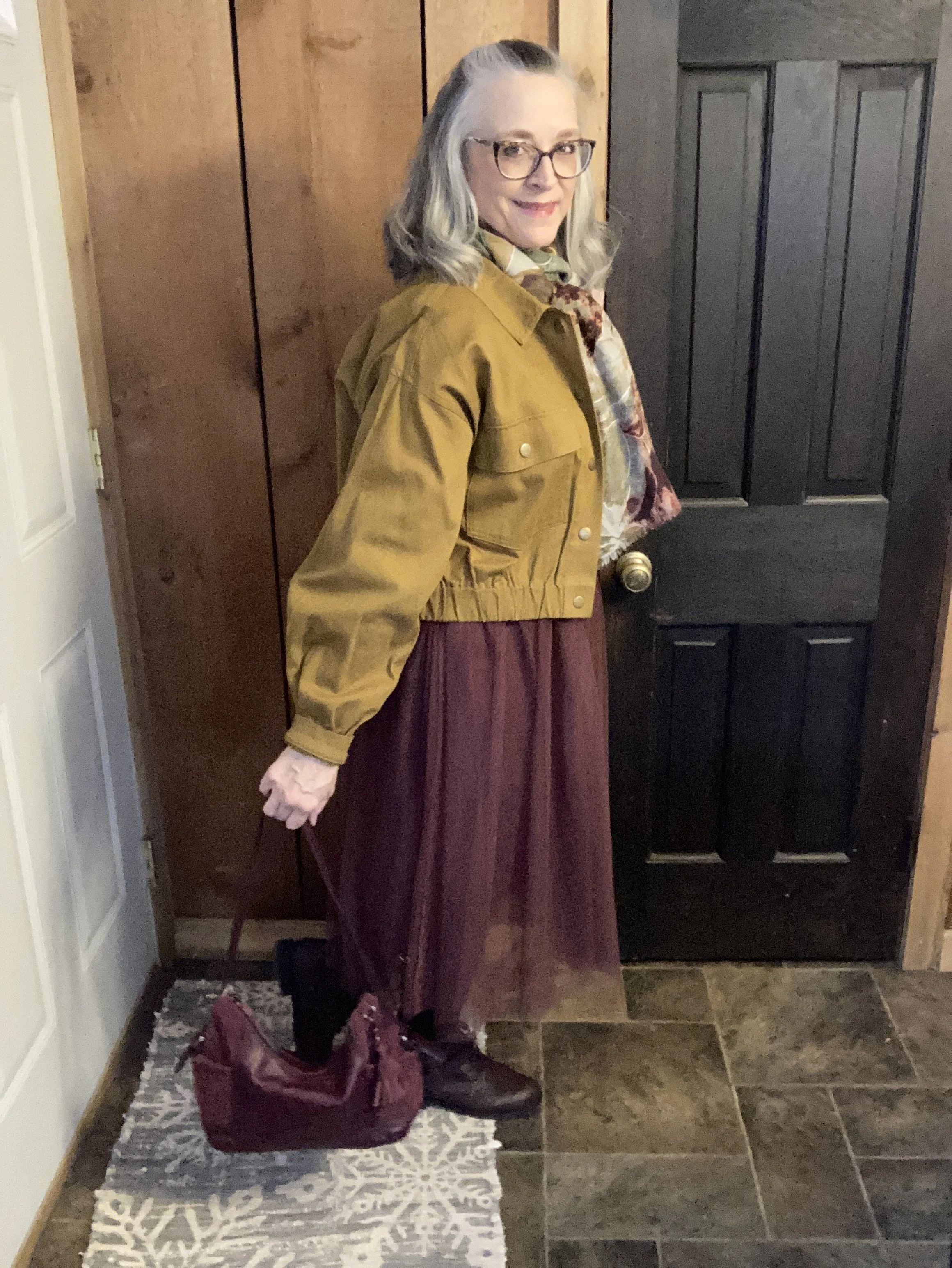
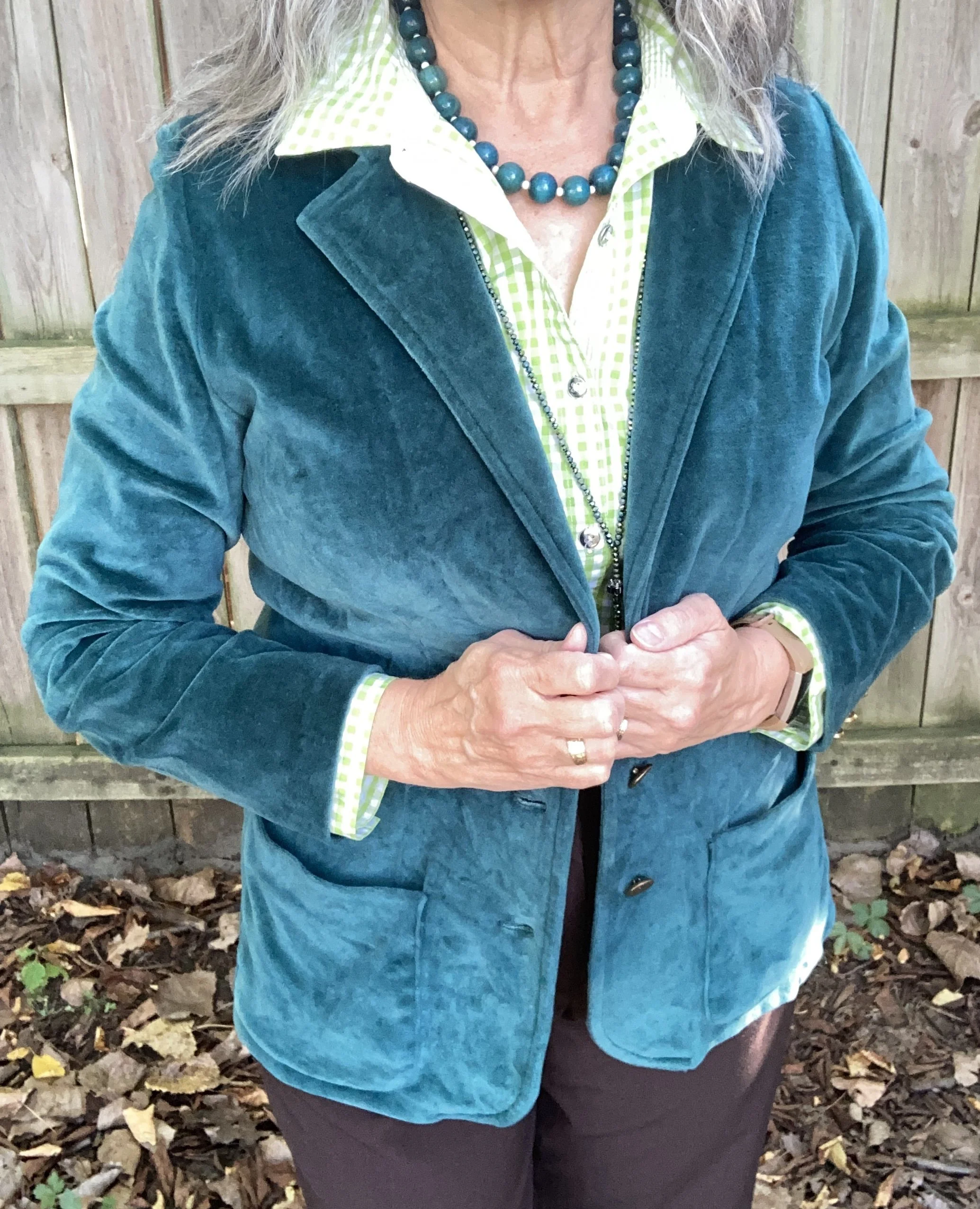
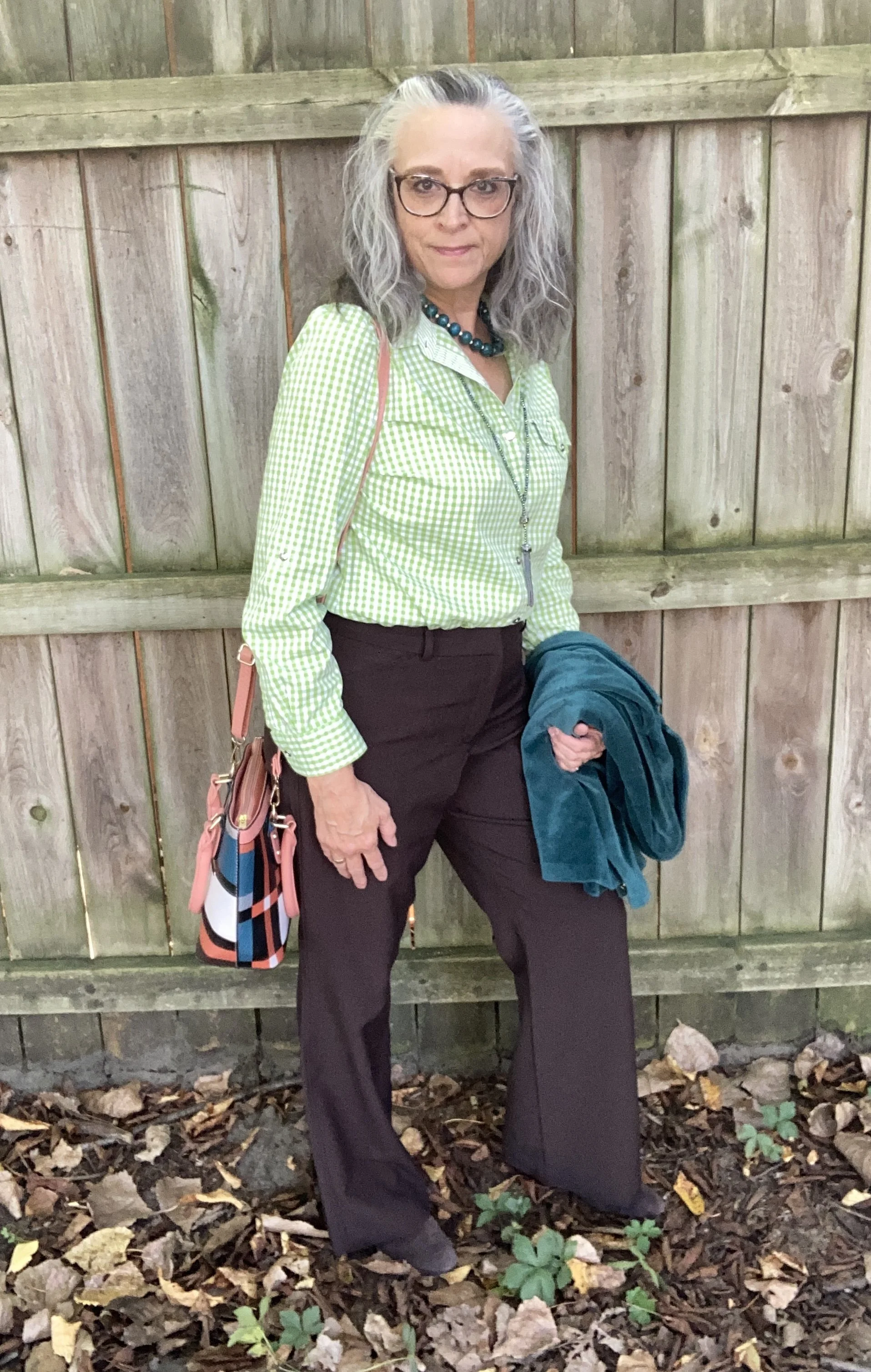
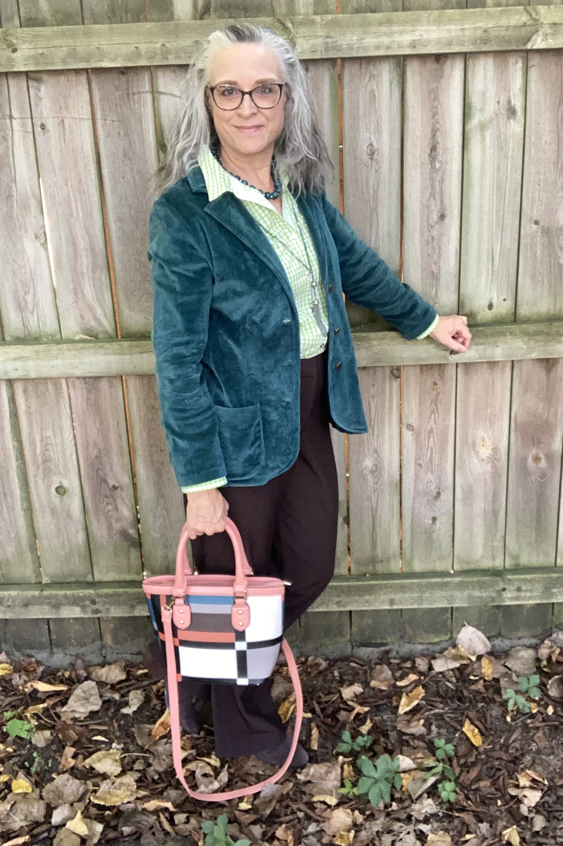
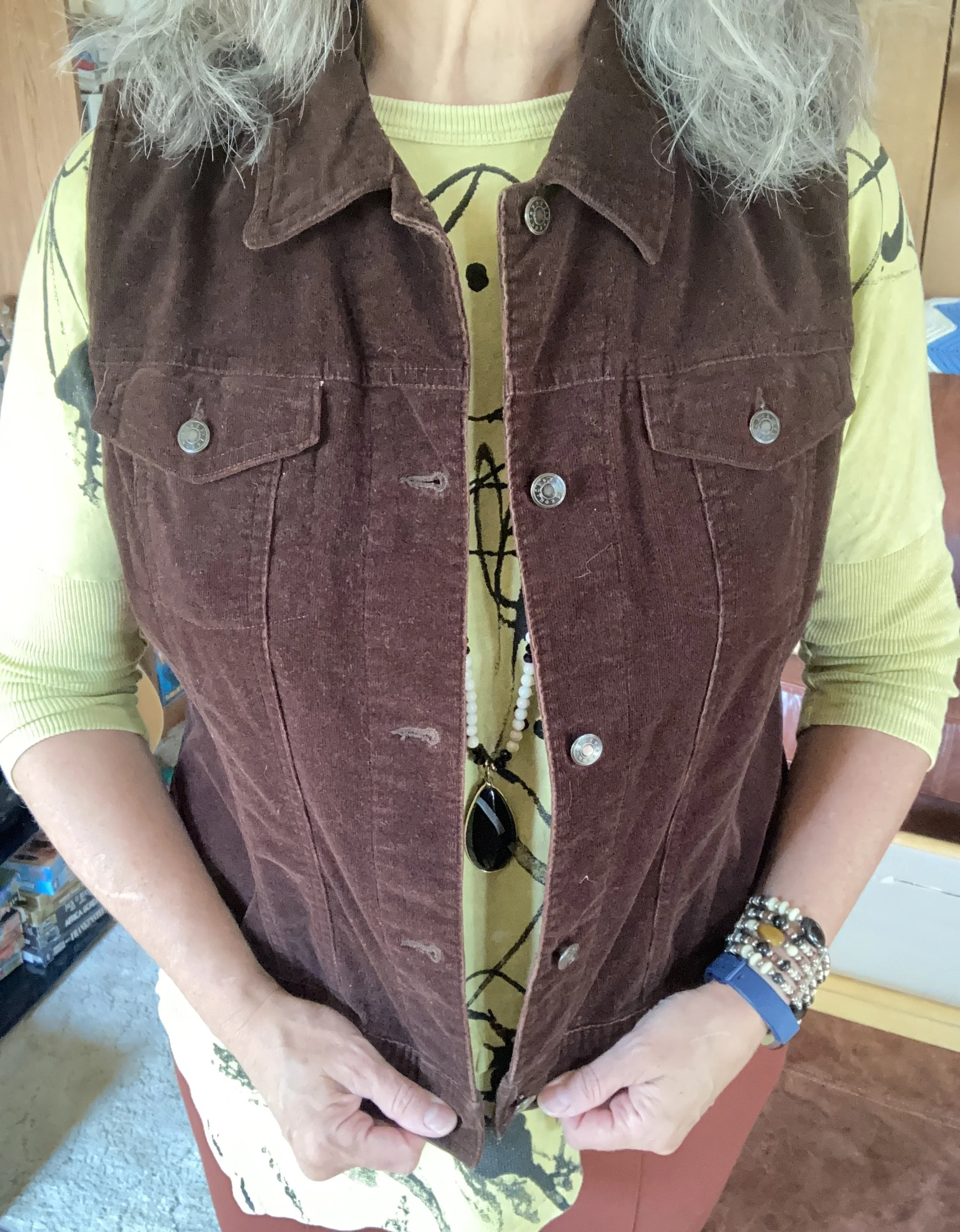
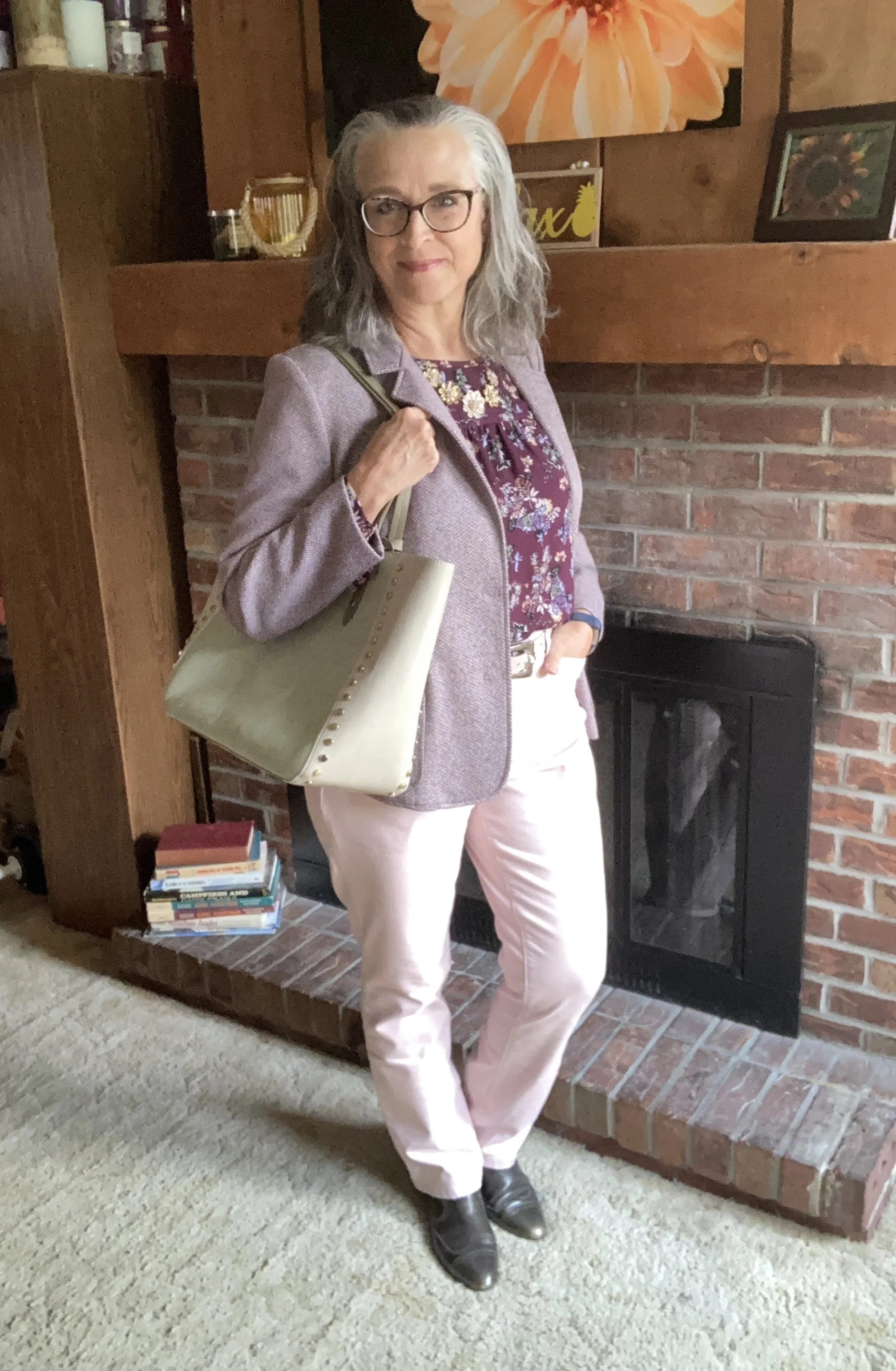
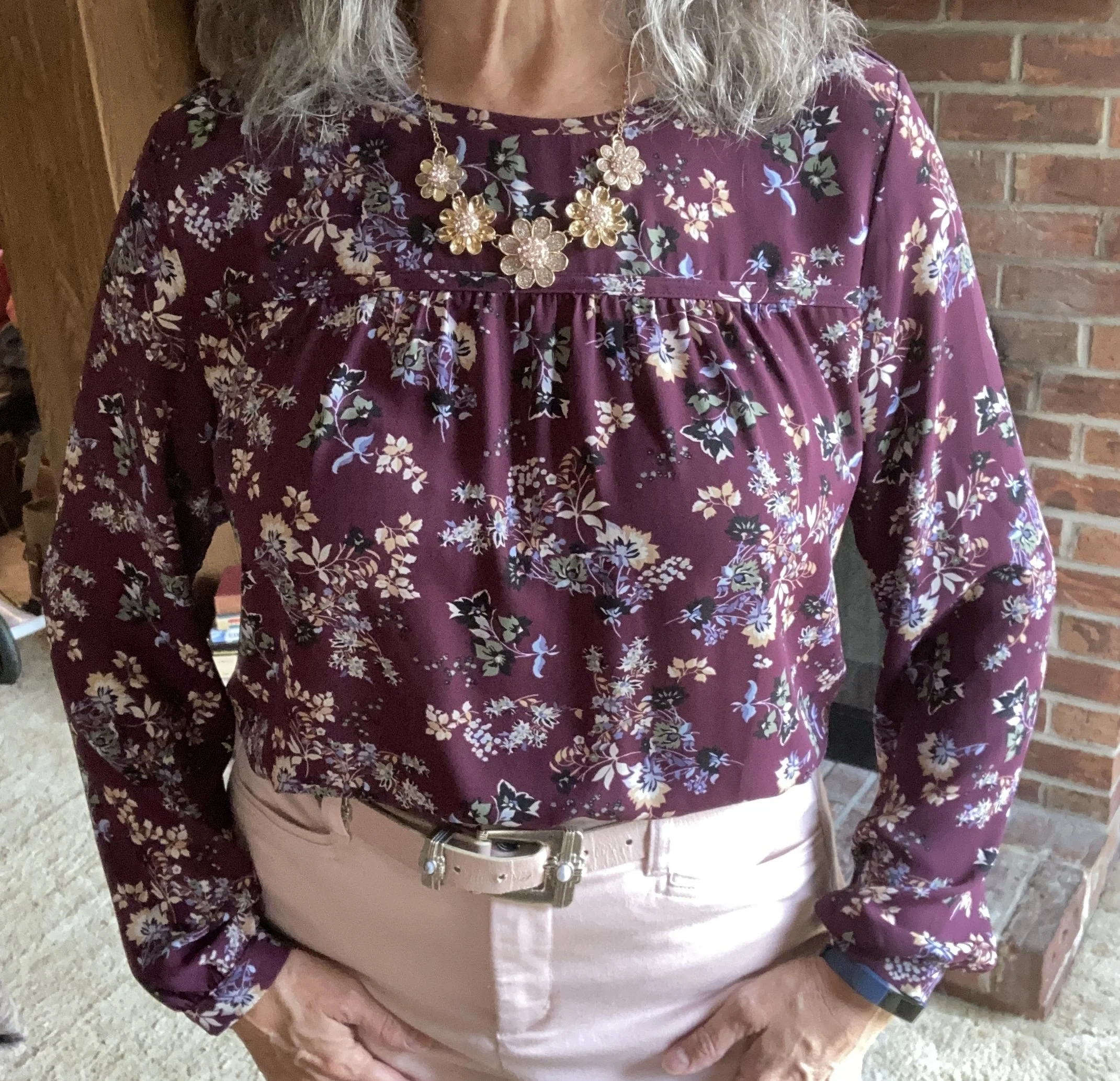
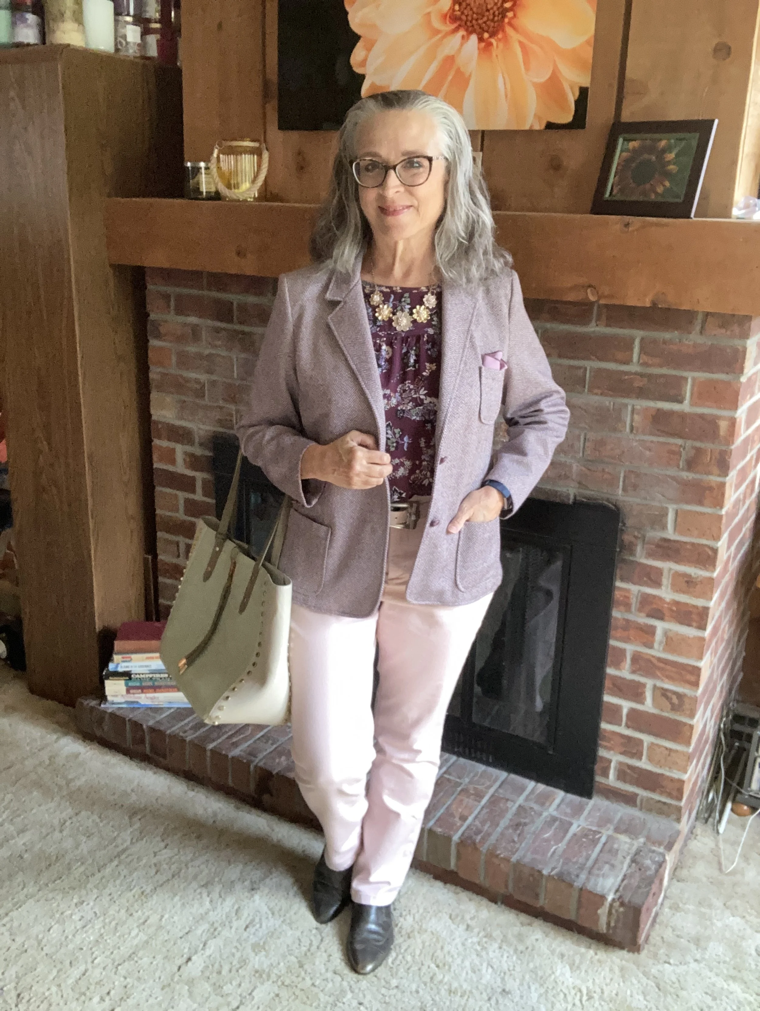
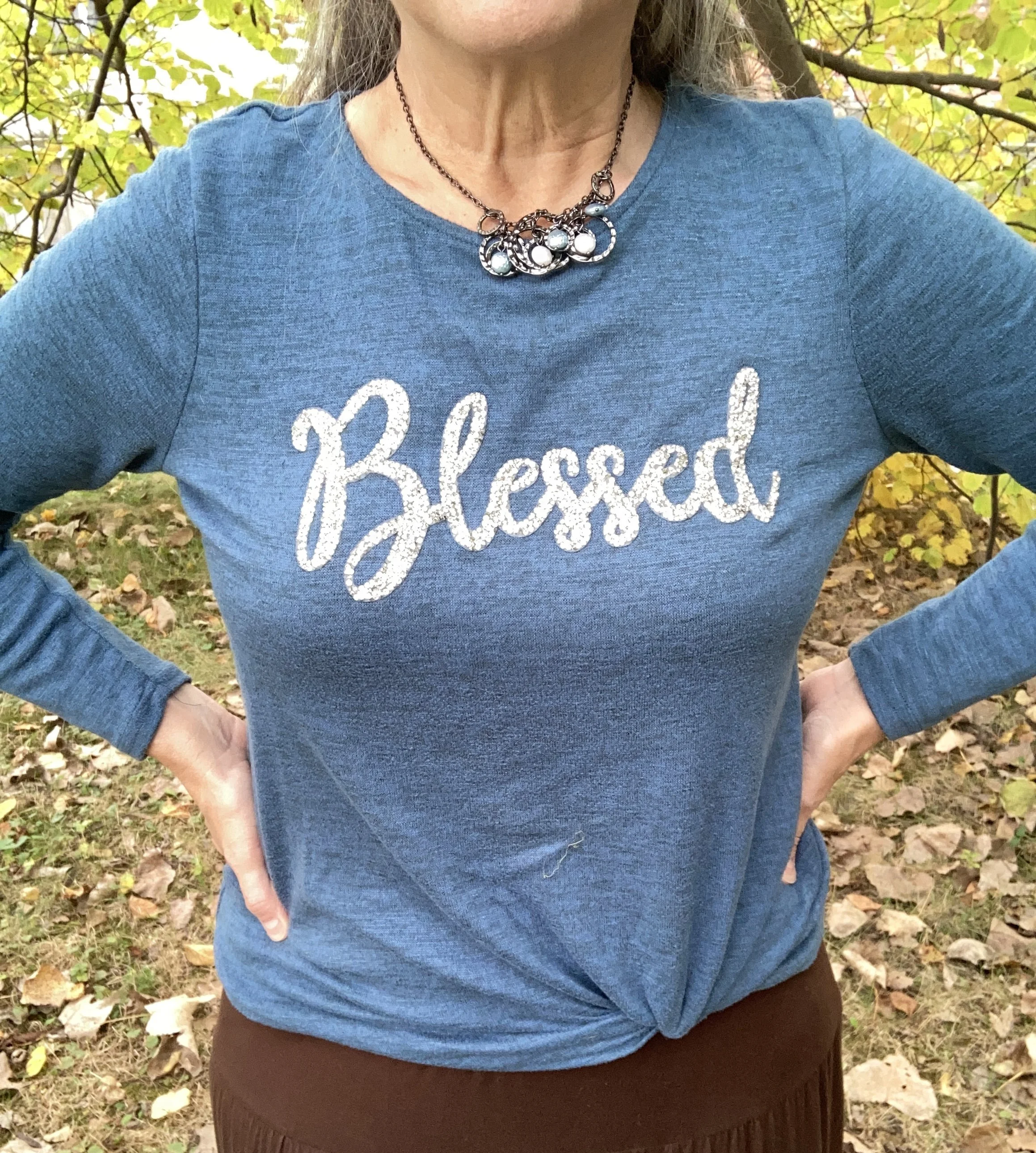
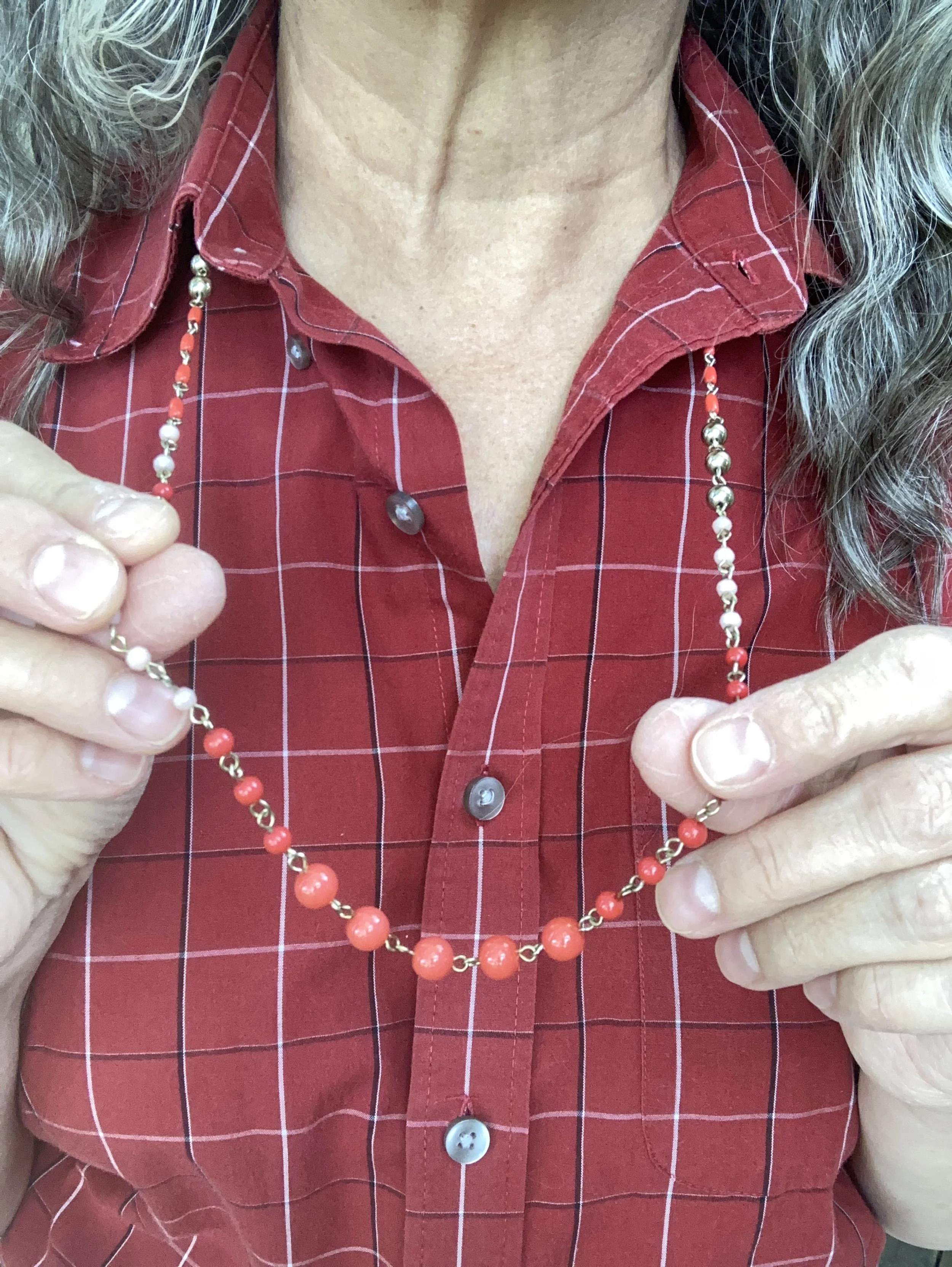
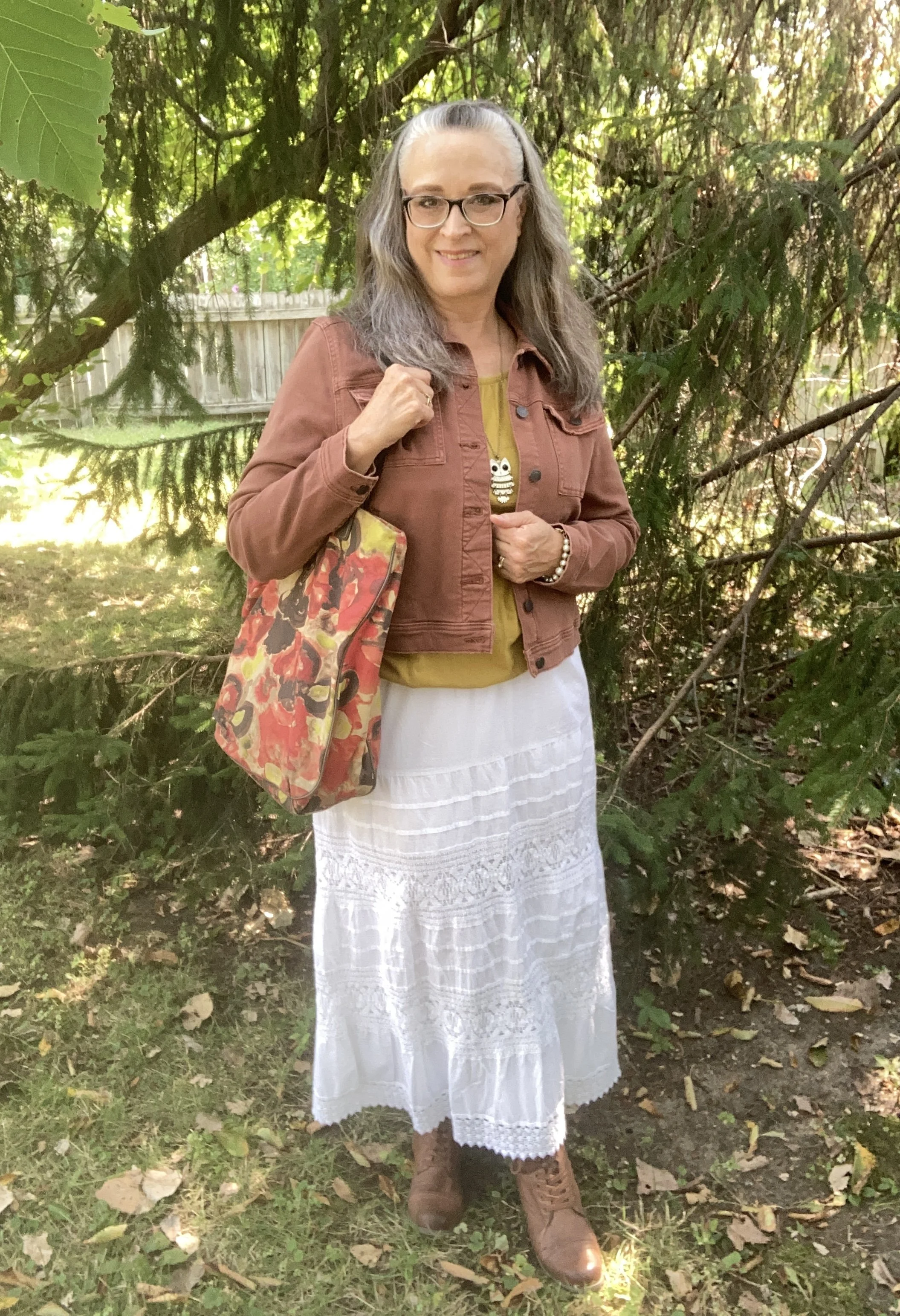
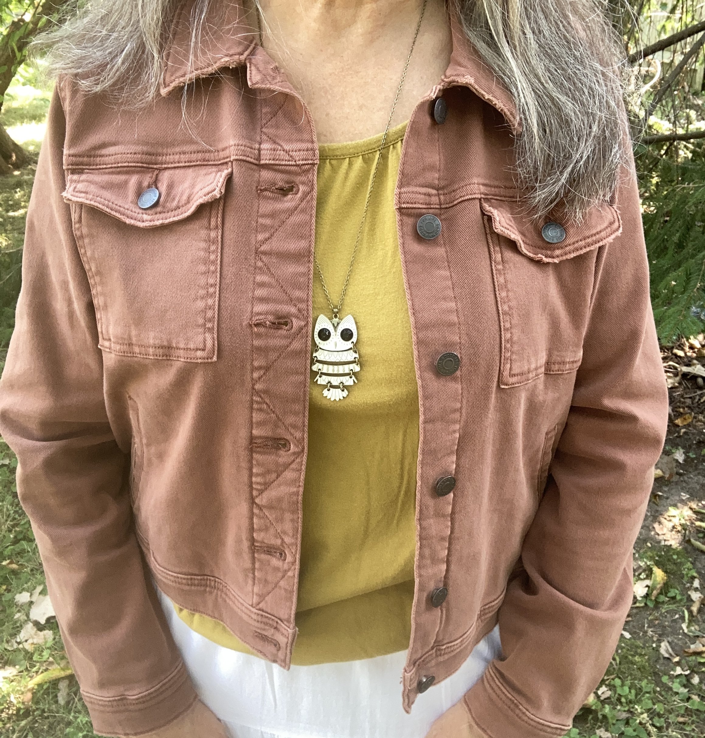
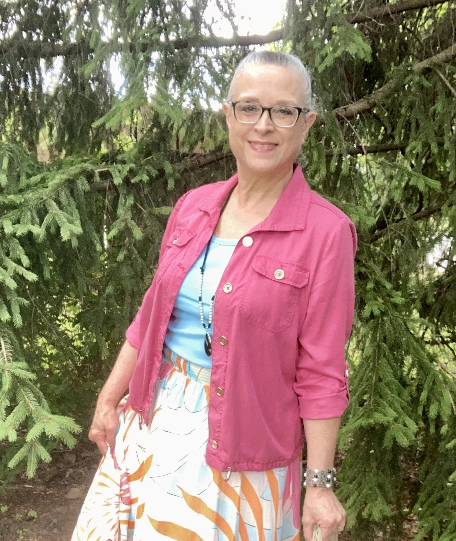
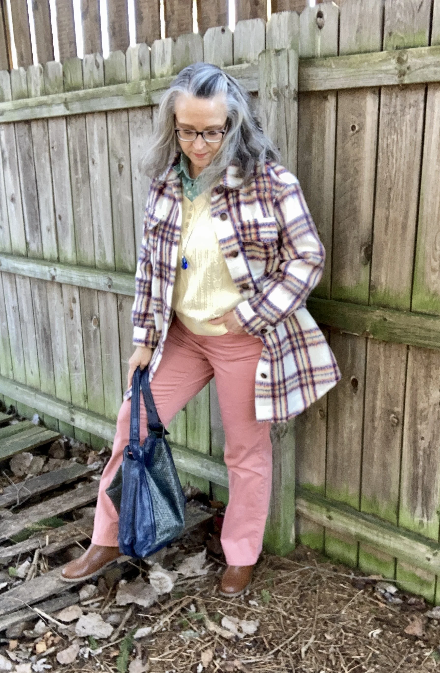
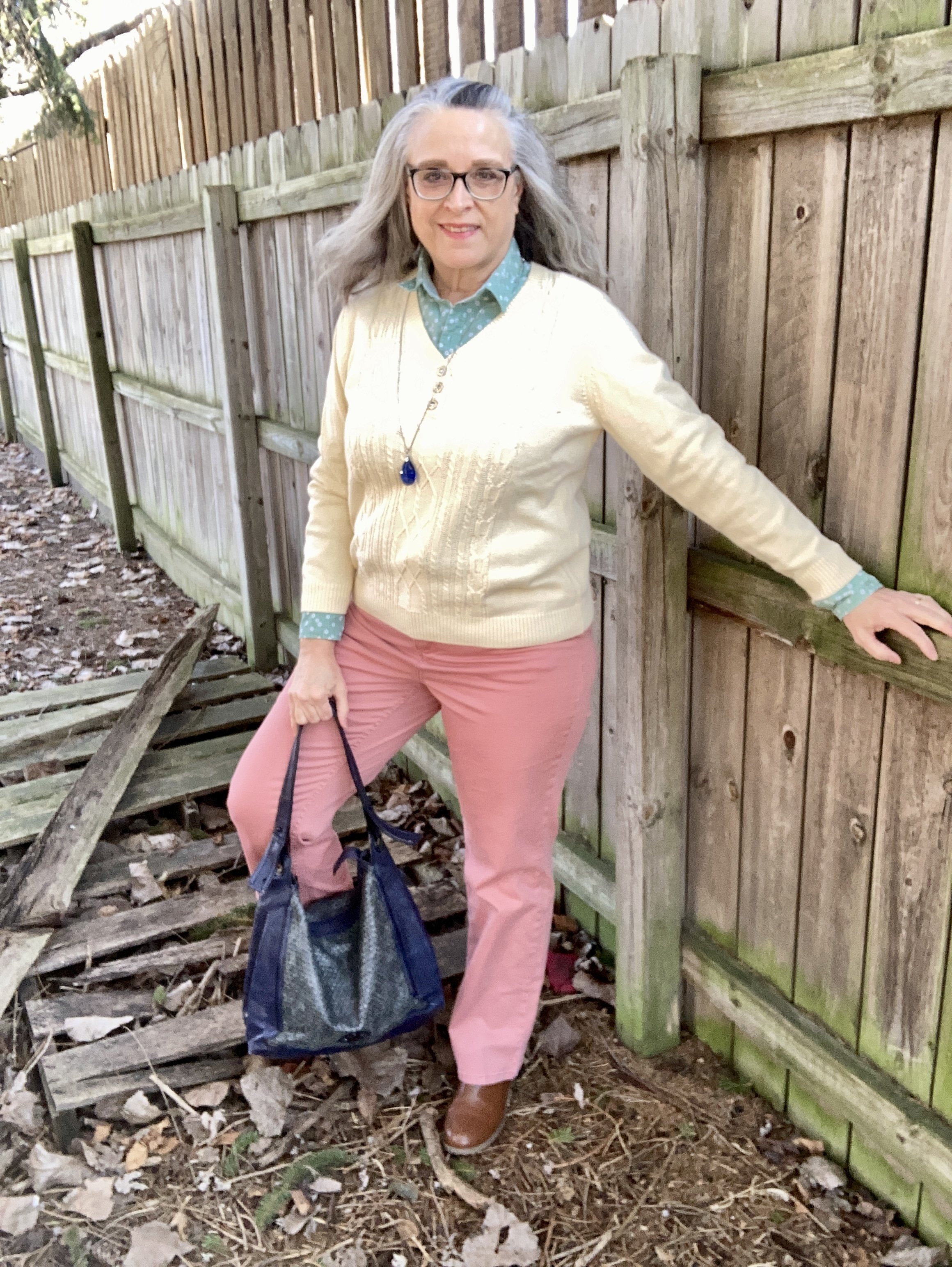
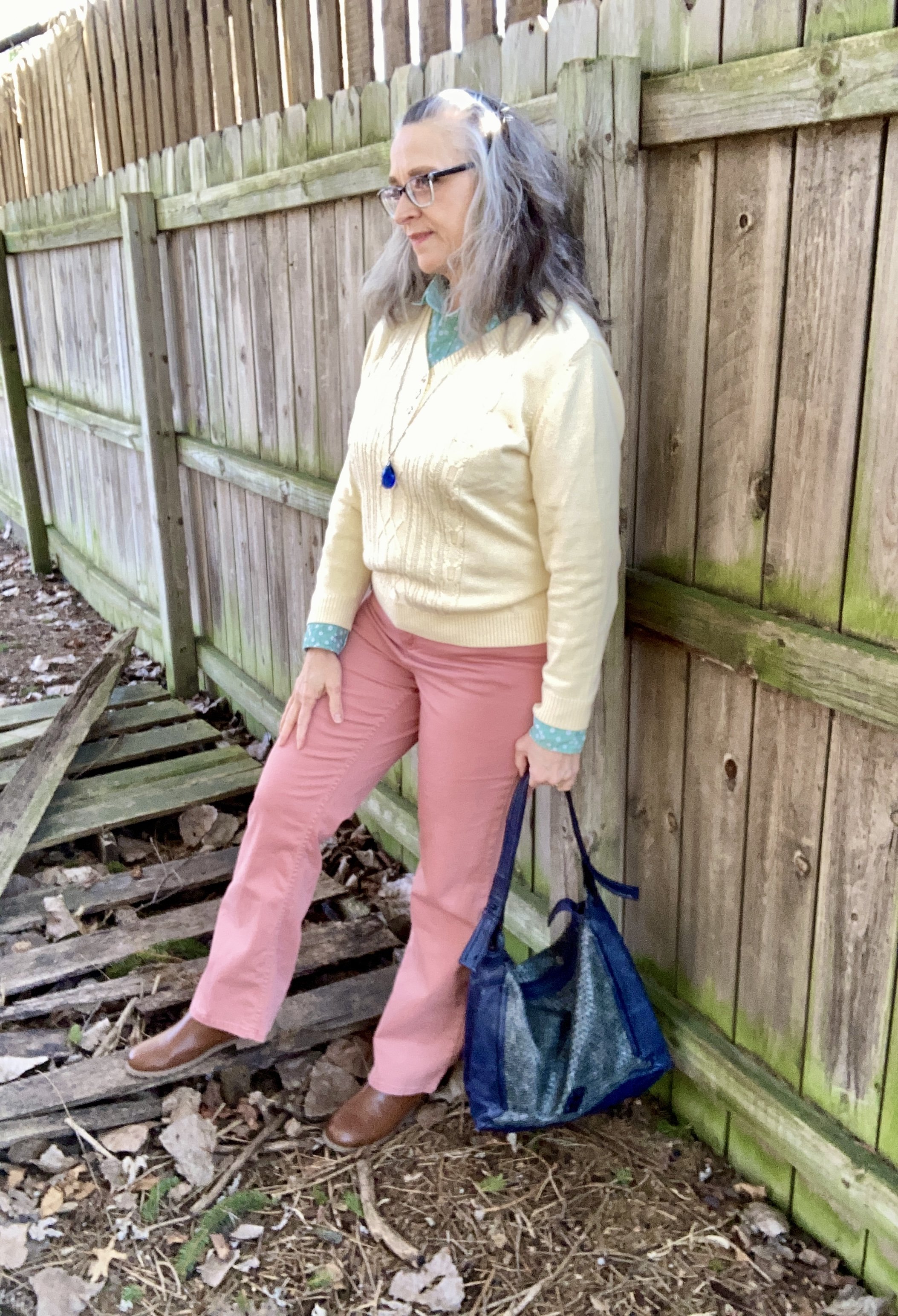
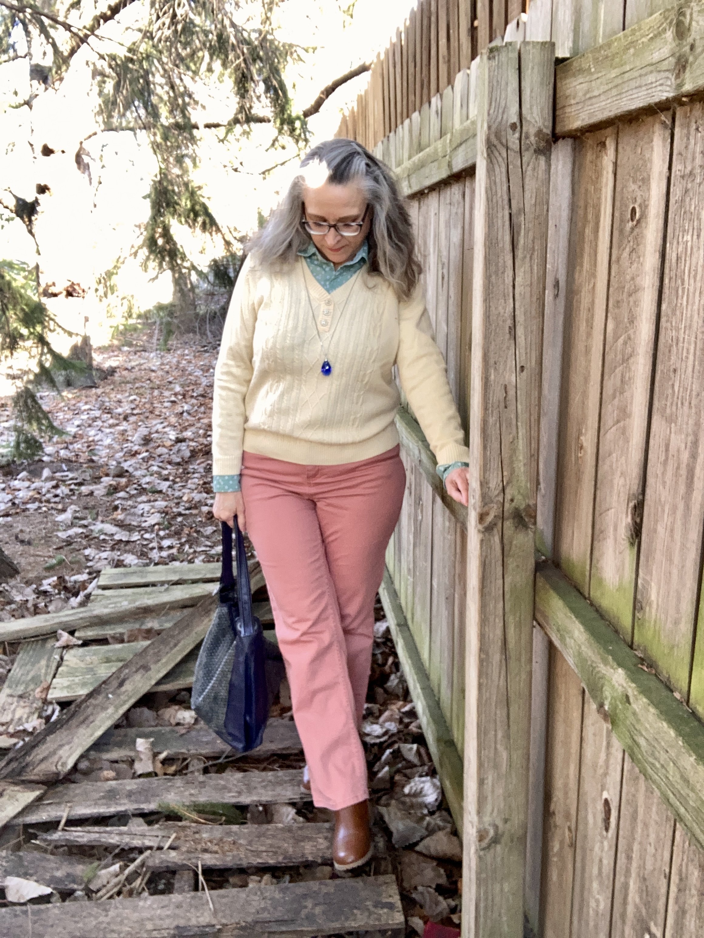
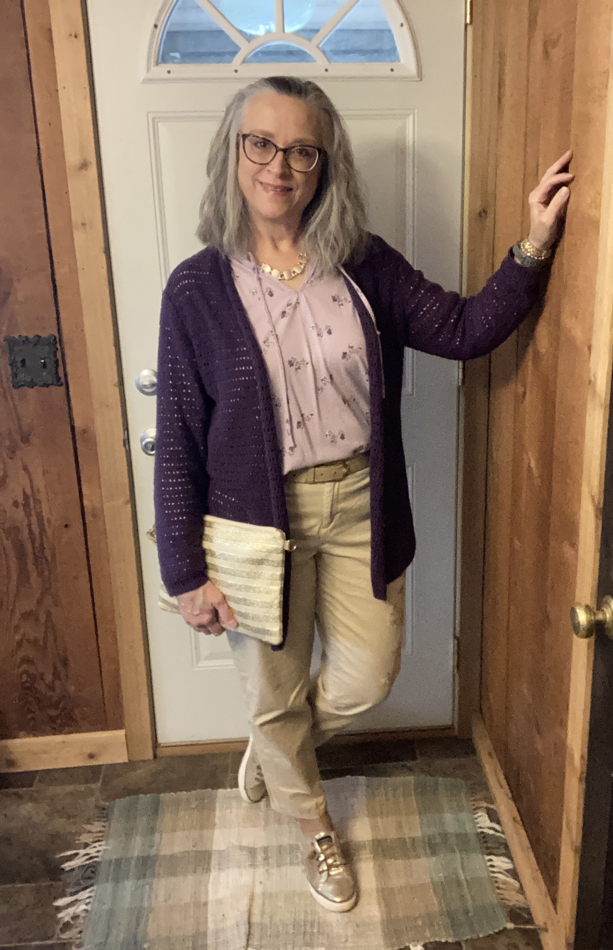
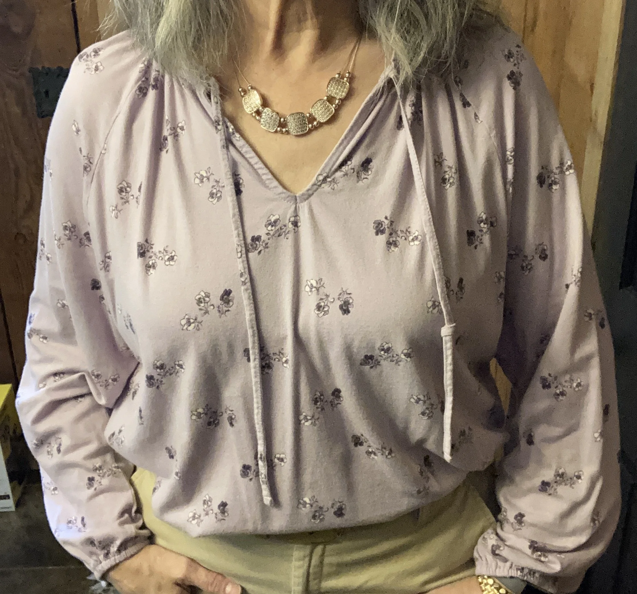
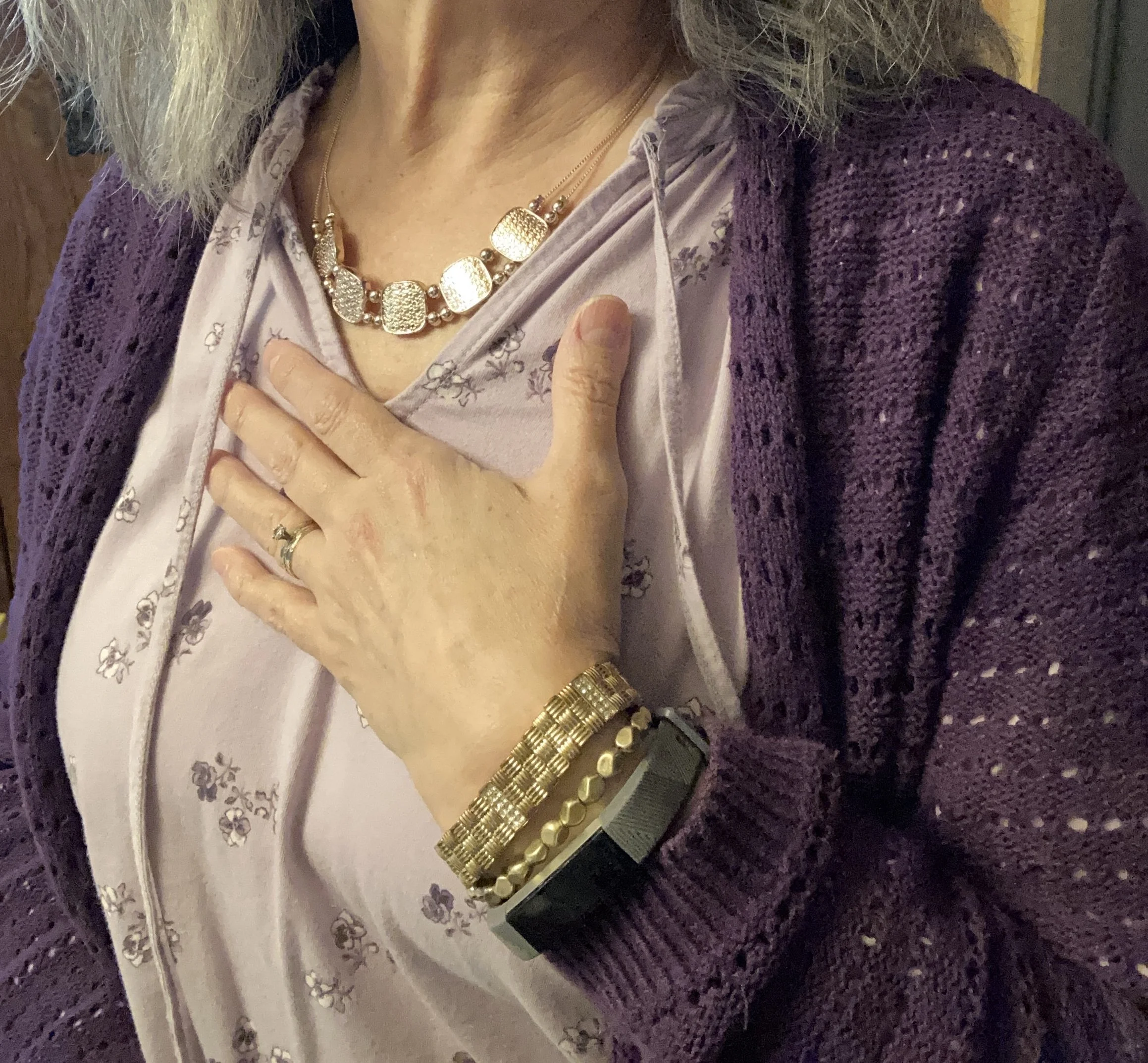
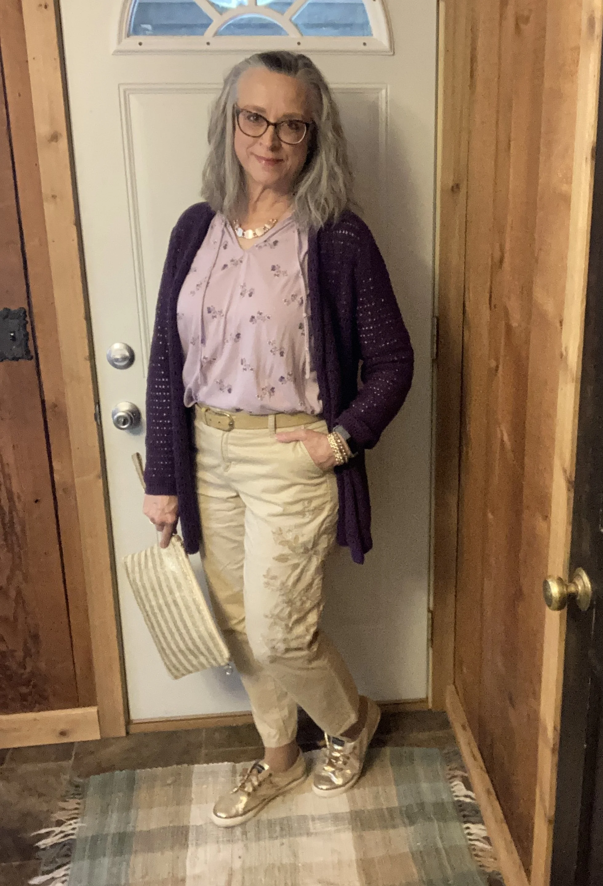
The first piece I want to focus on today is the pale purple, Burnished Lilac mini floral print tee. This was a thrifted Chaps piece, and I love the print, the color and the ruffled neckline and elastic wrists. The shopping links I have included are pale purple, but nothing quite matches the Burnished Lilac color. Here is a cute eyelet sleeved tee, a basic v-neck tee, and a pretty bow tie blouse.
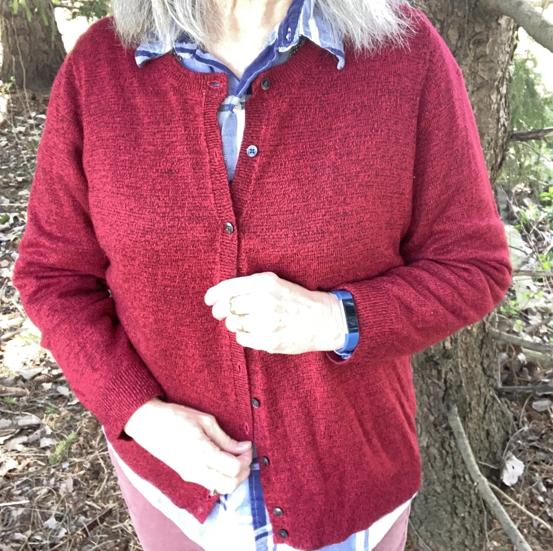
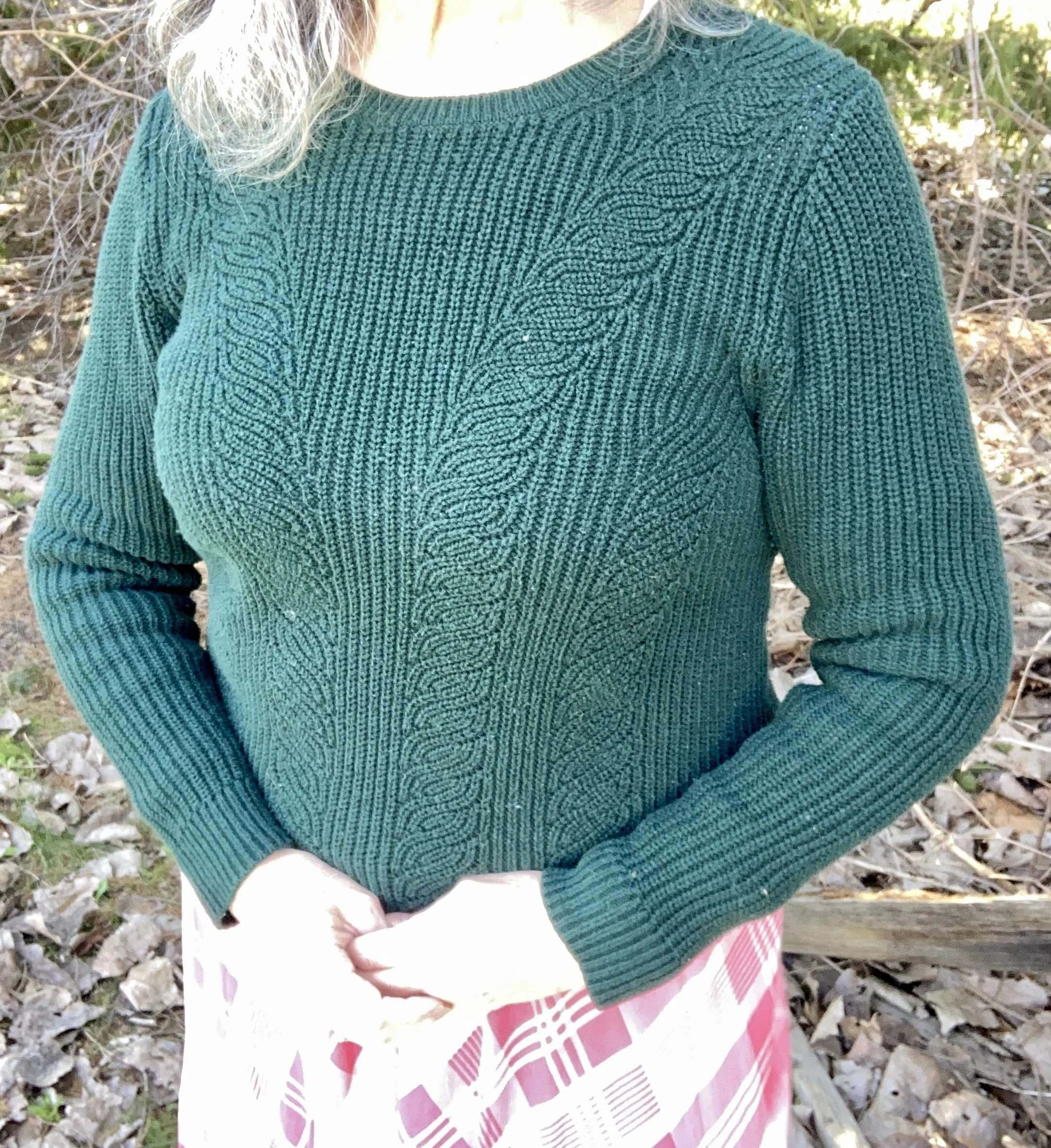
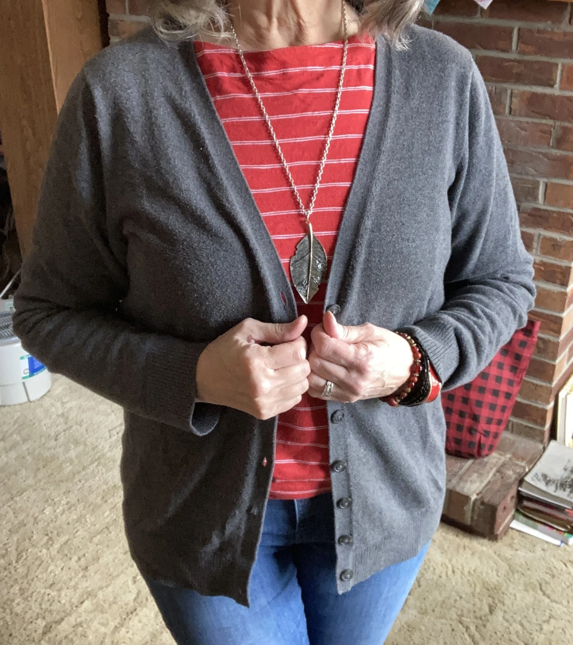
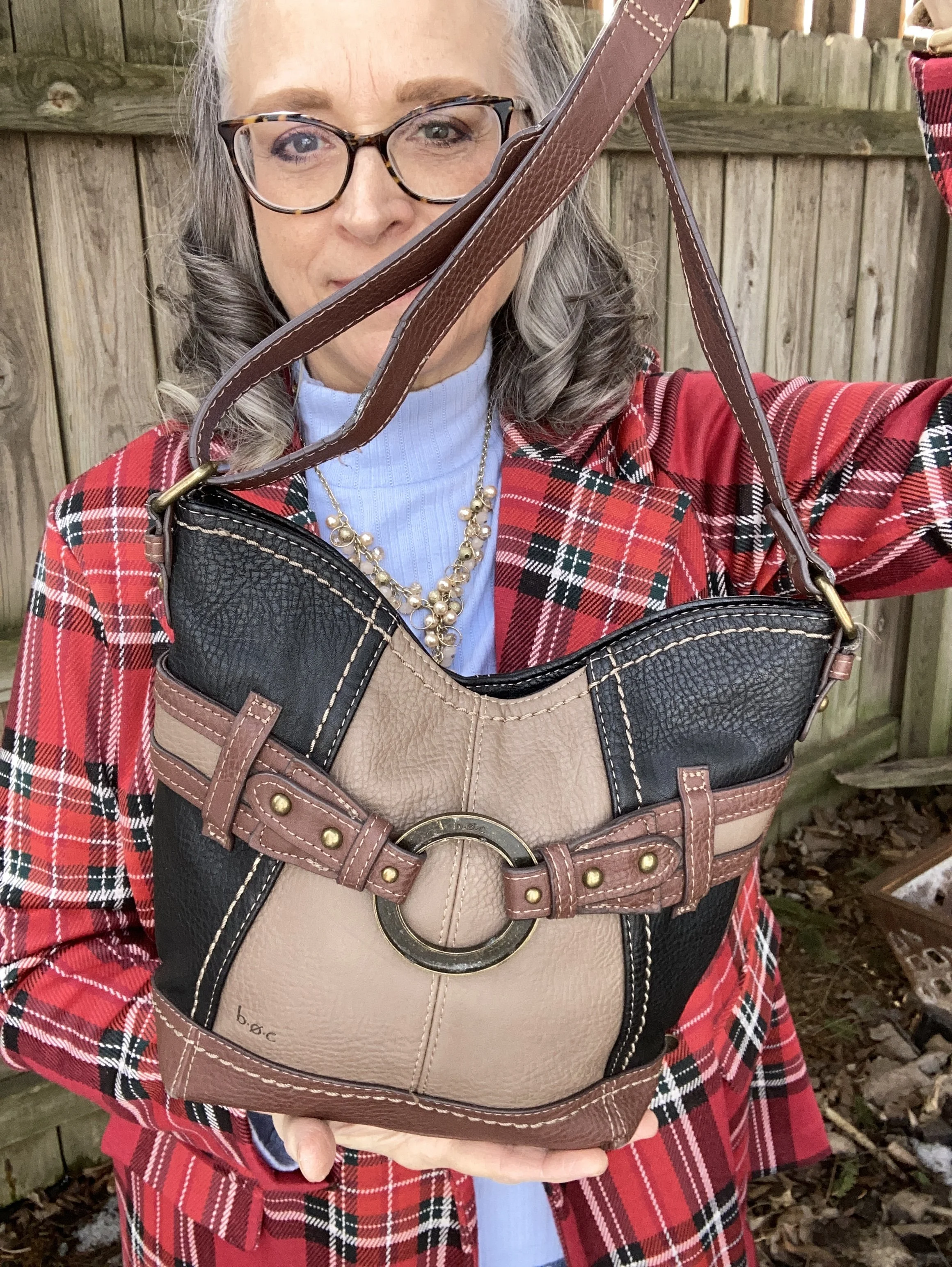
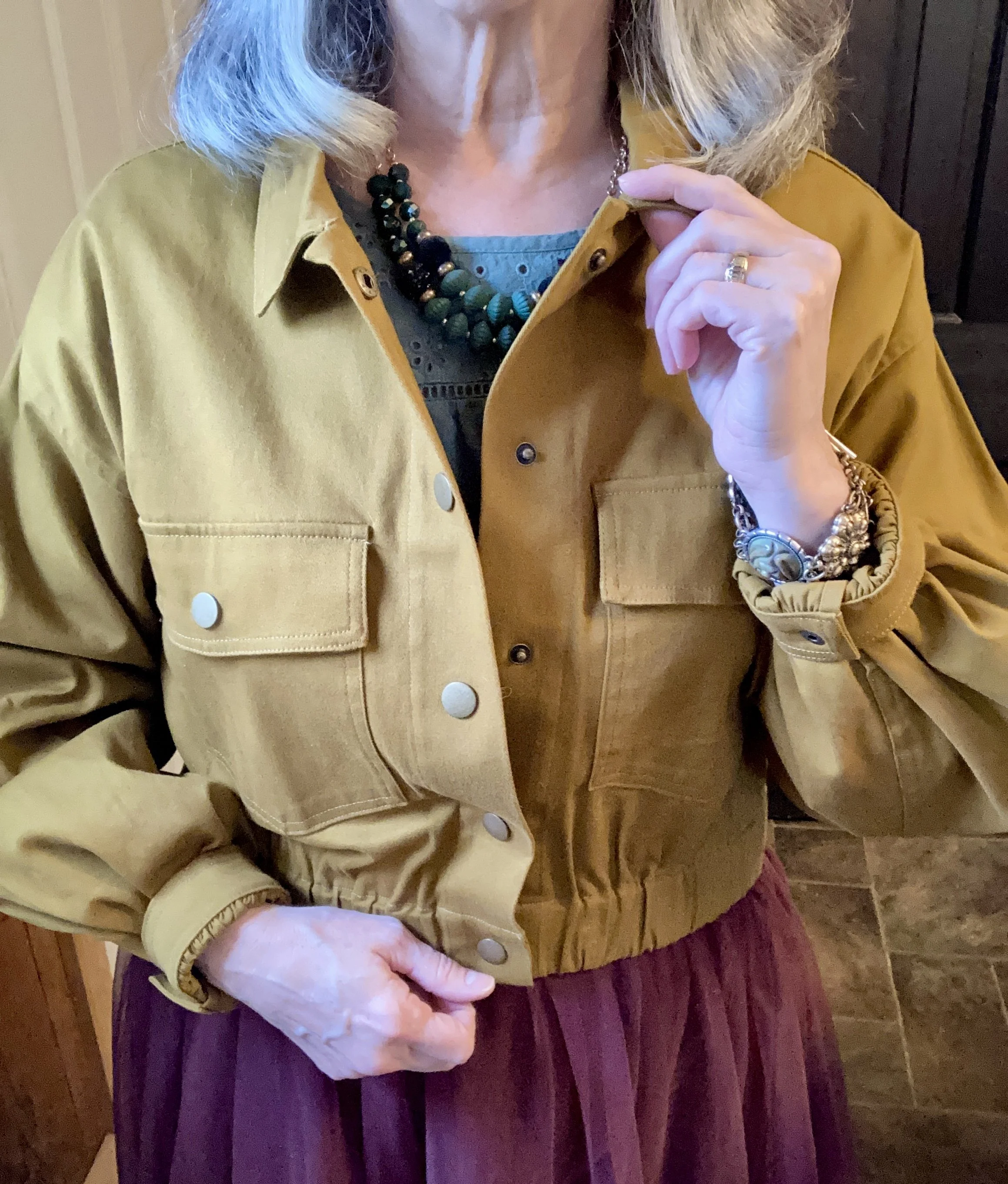
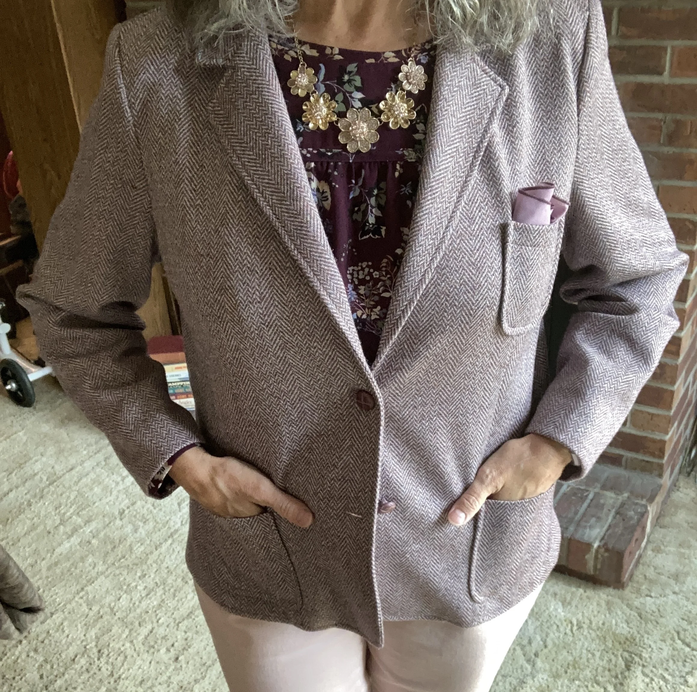
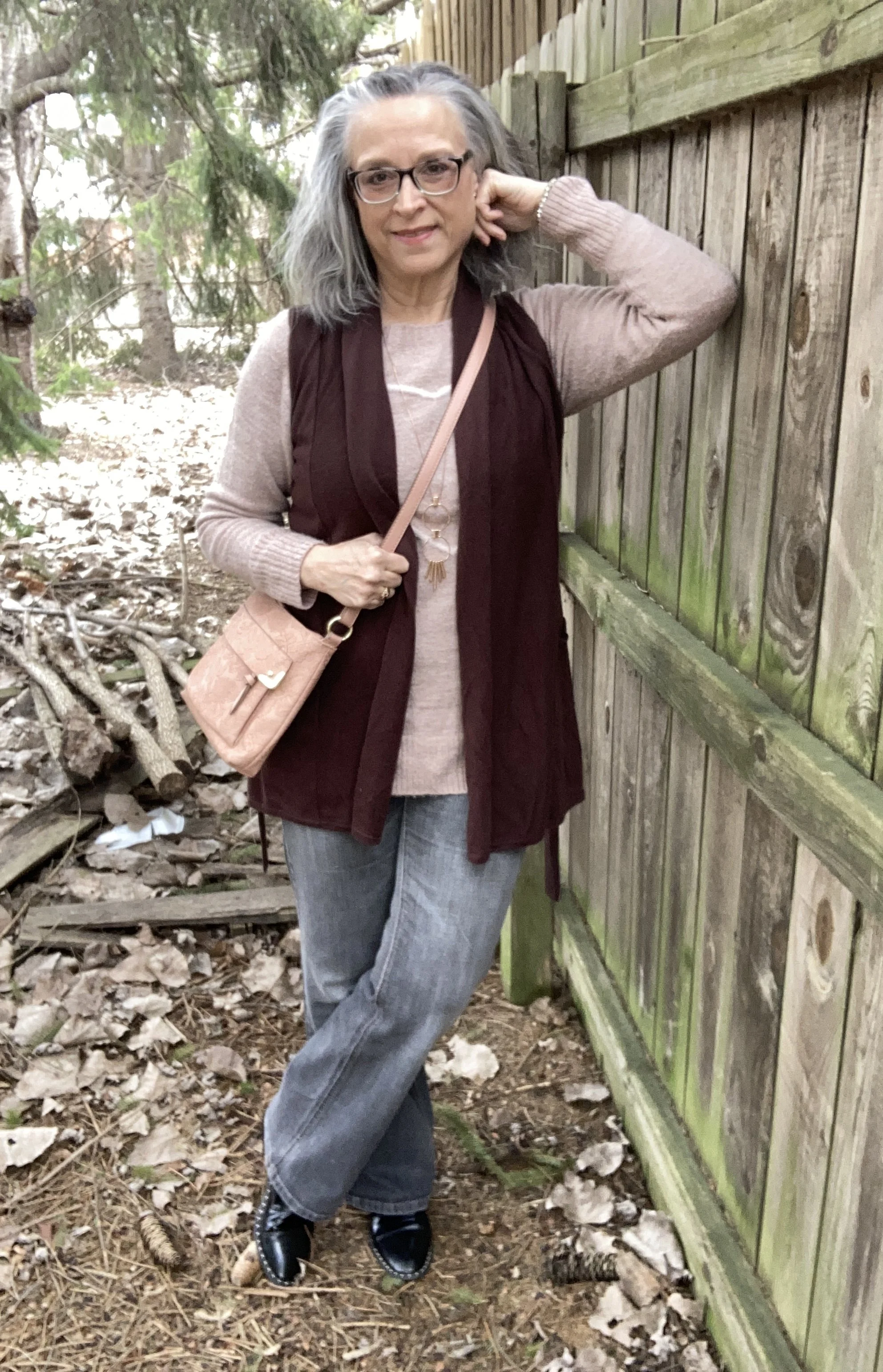
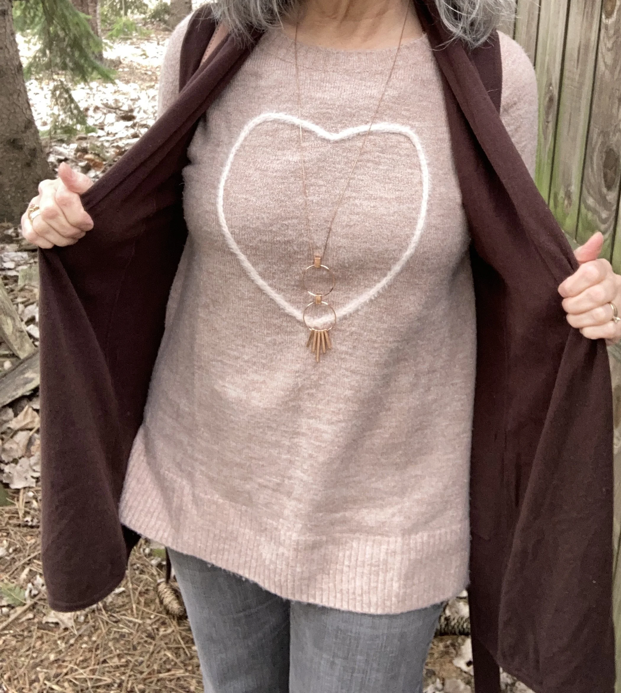
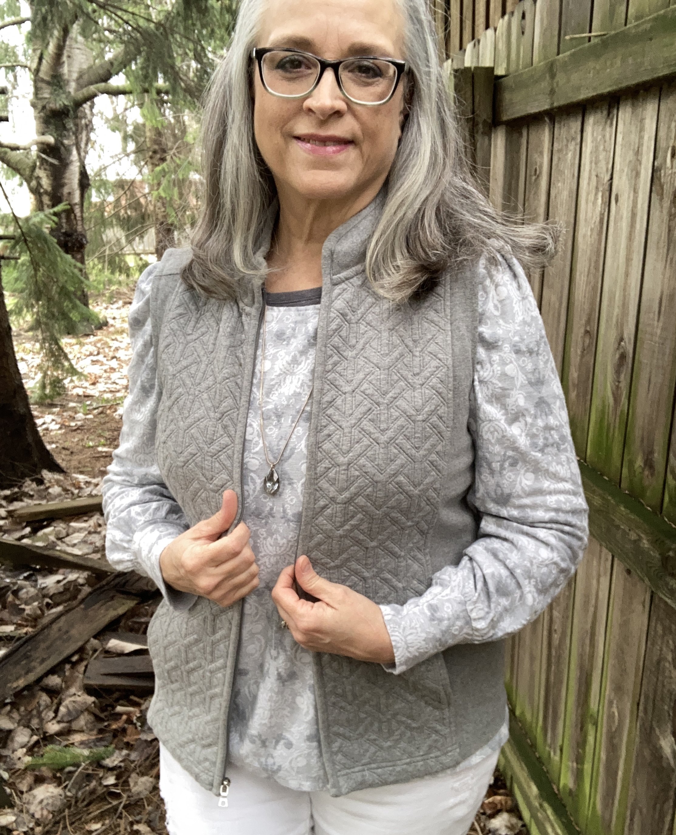
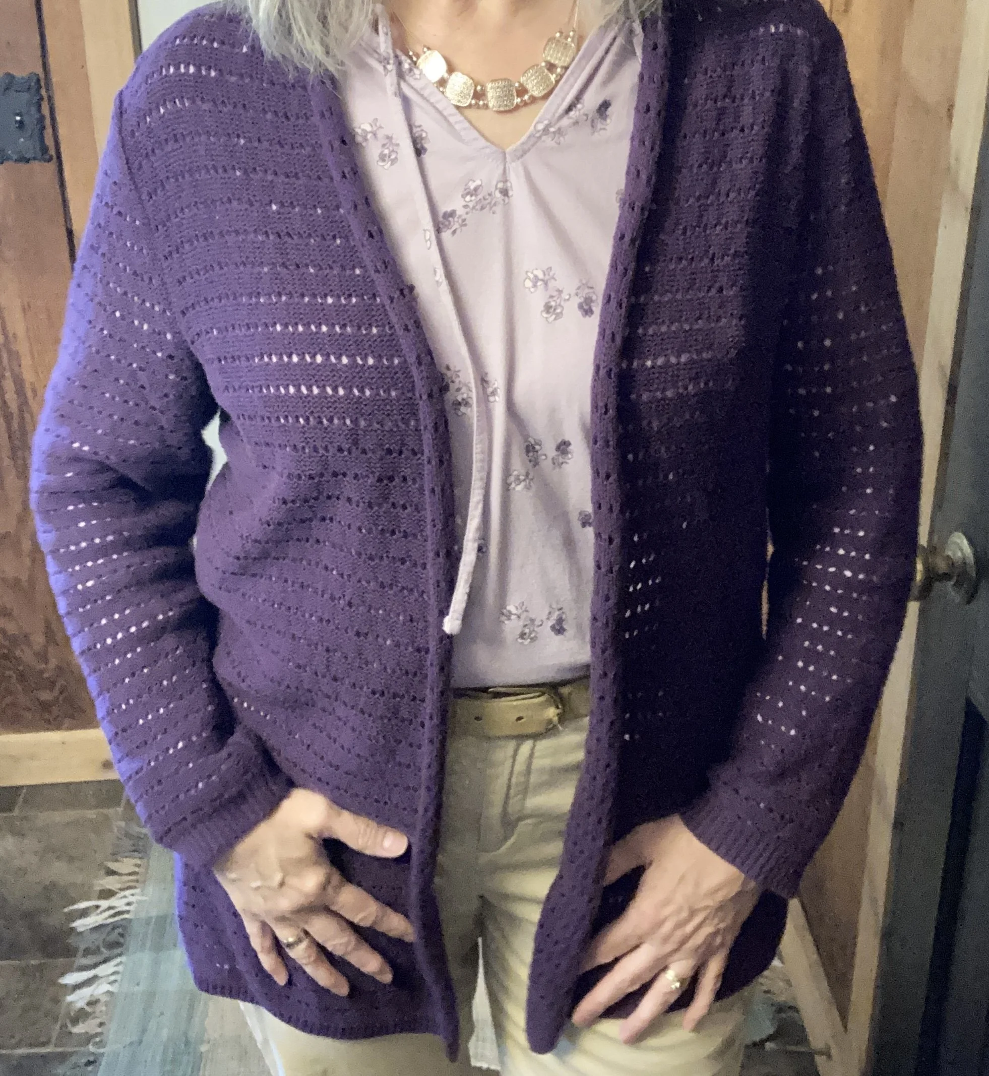
For the darker Amaranth purple I chose this thrifted Christopher & Banks open front cardigan. I thought the open weave of the fabric would make it perfect for spring, summer and fall. Here is a page of purple cardigans from Amazon. I cannot speak to the quality, but usually if you read a few reviews you can get a sense for whether the product is worth purchasing.
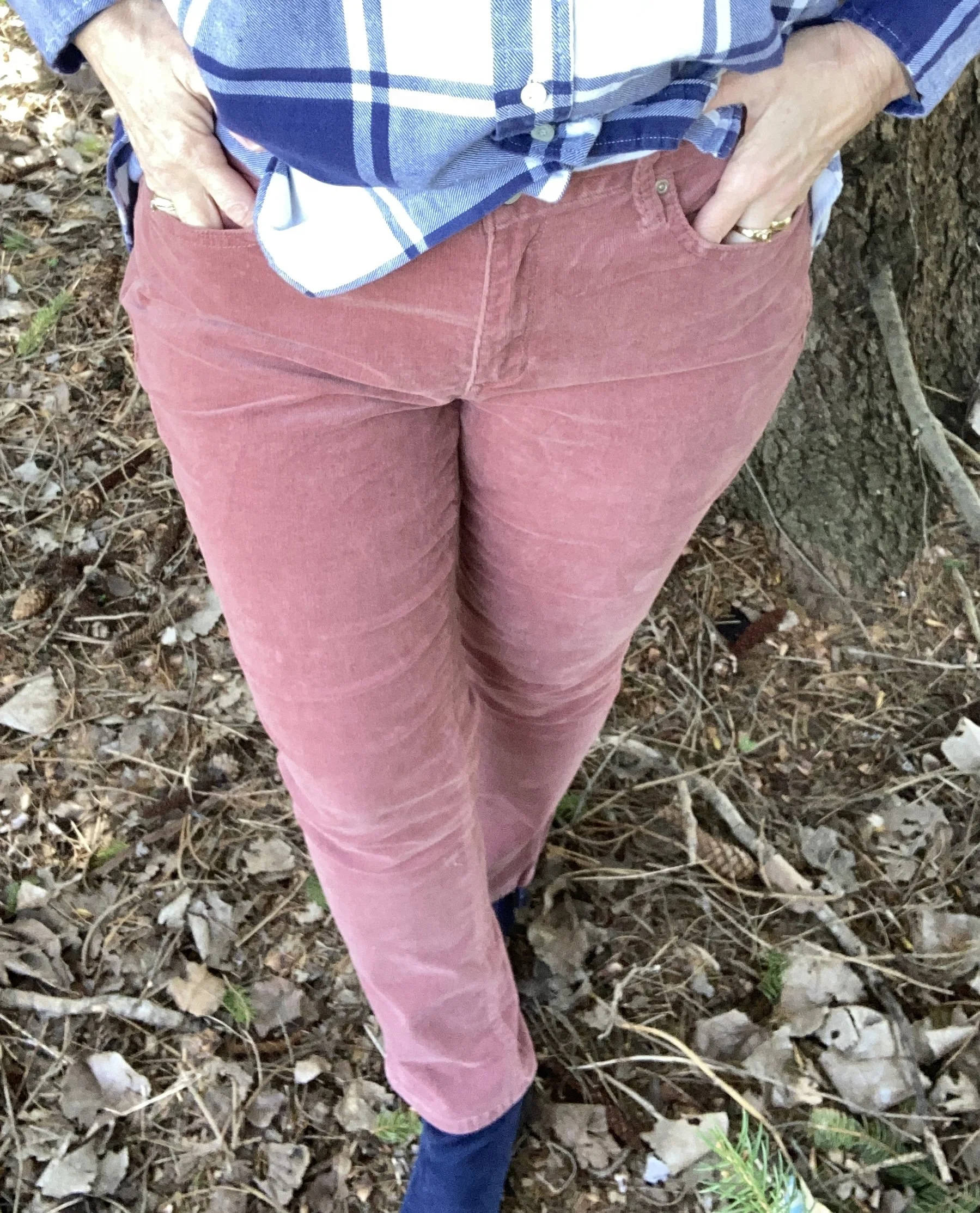
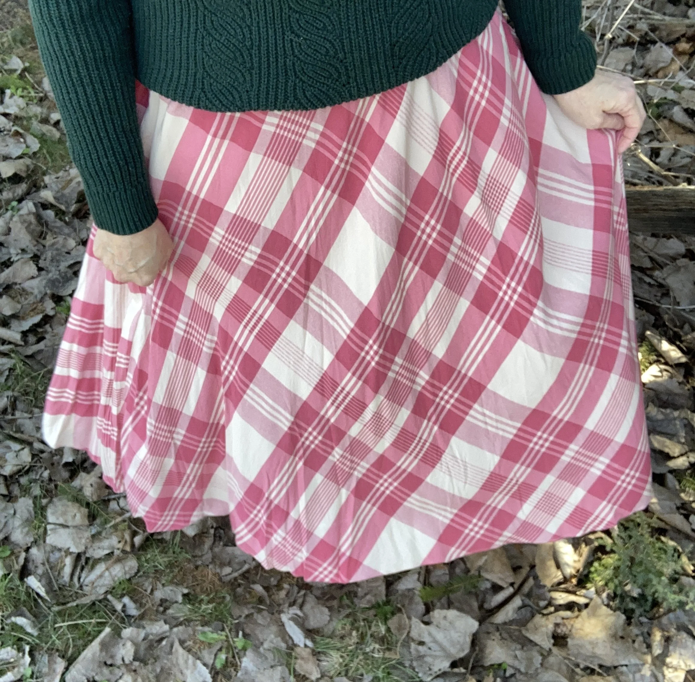
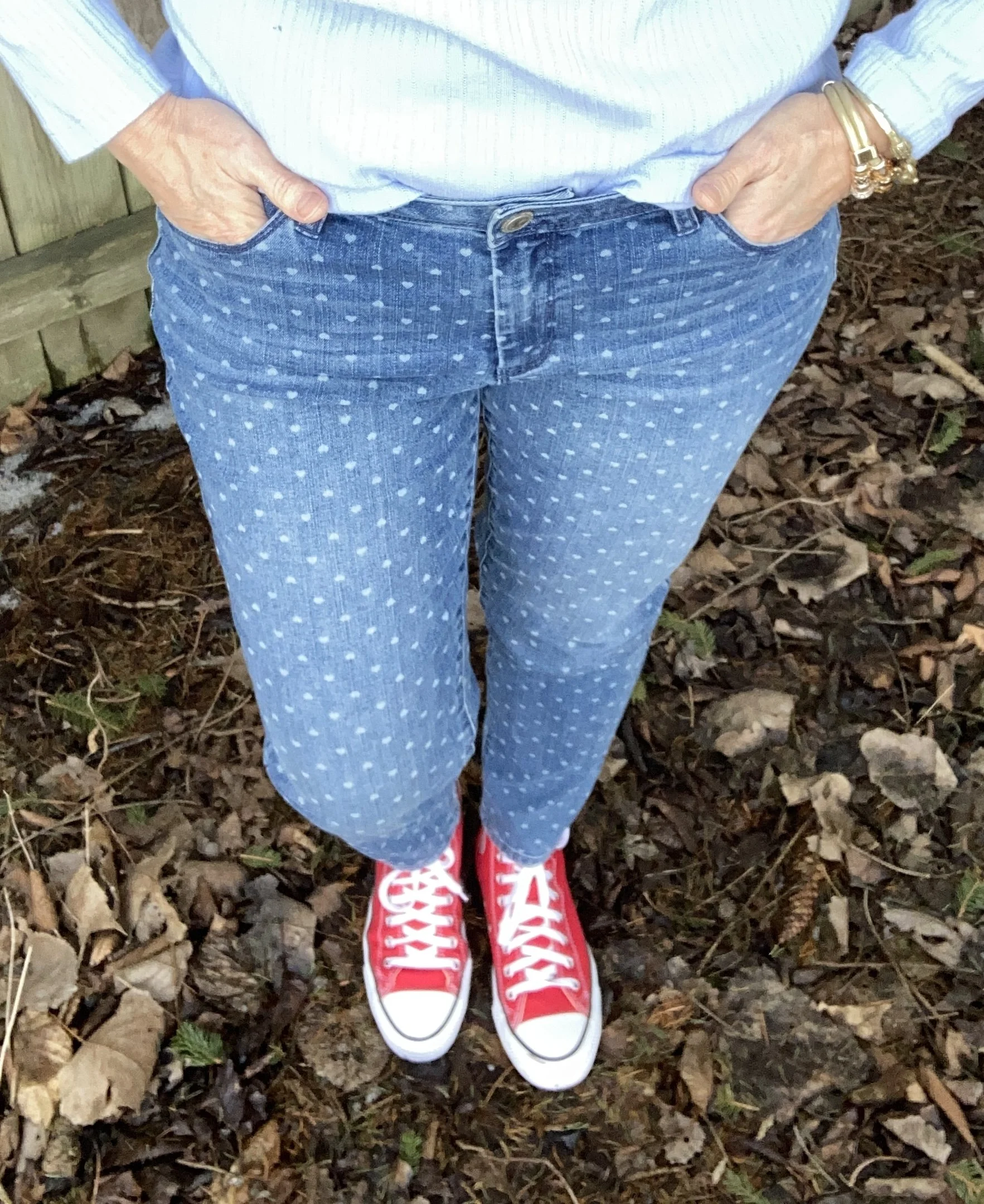
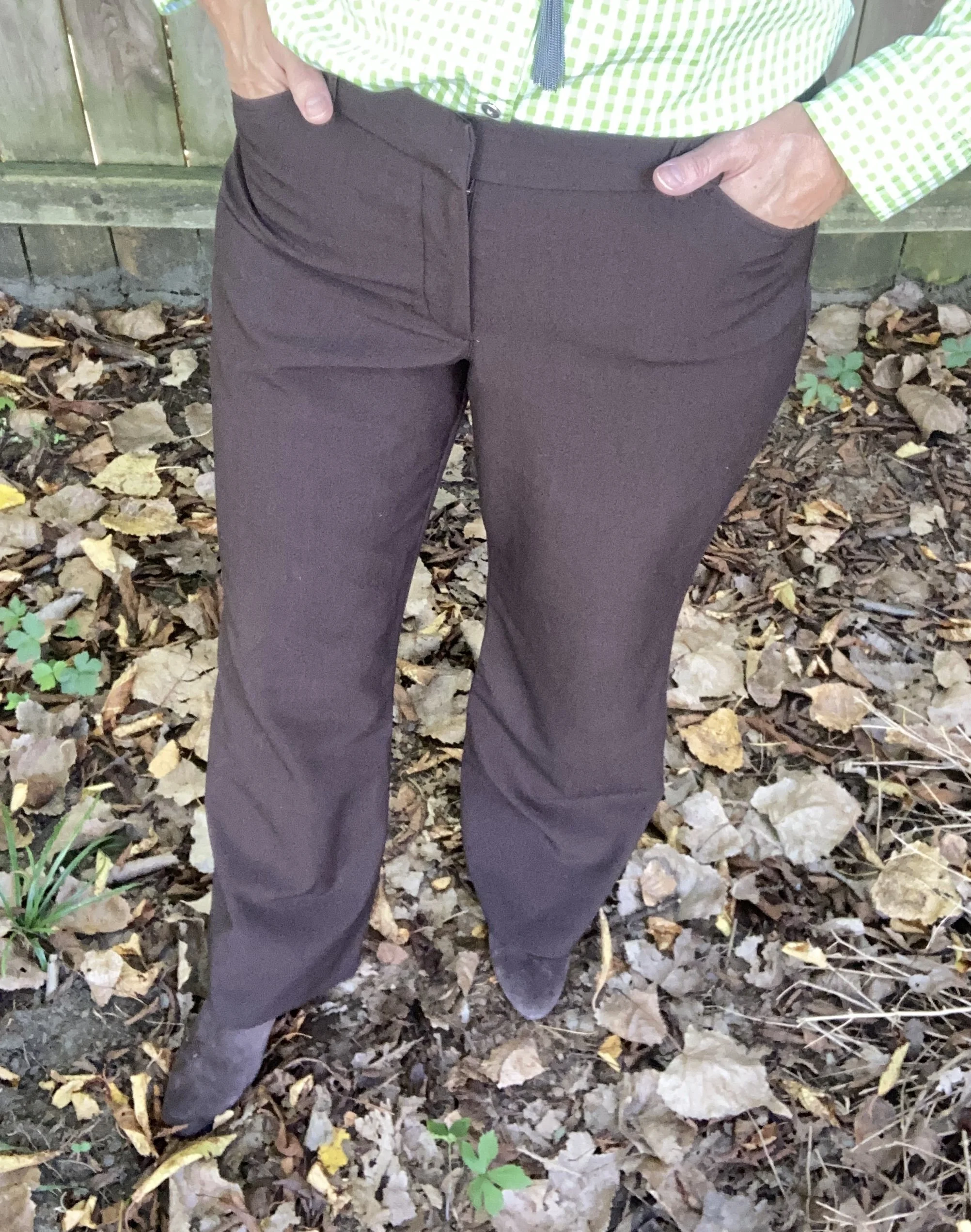
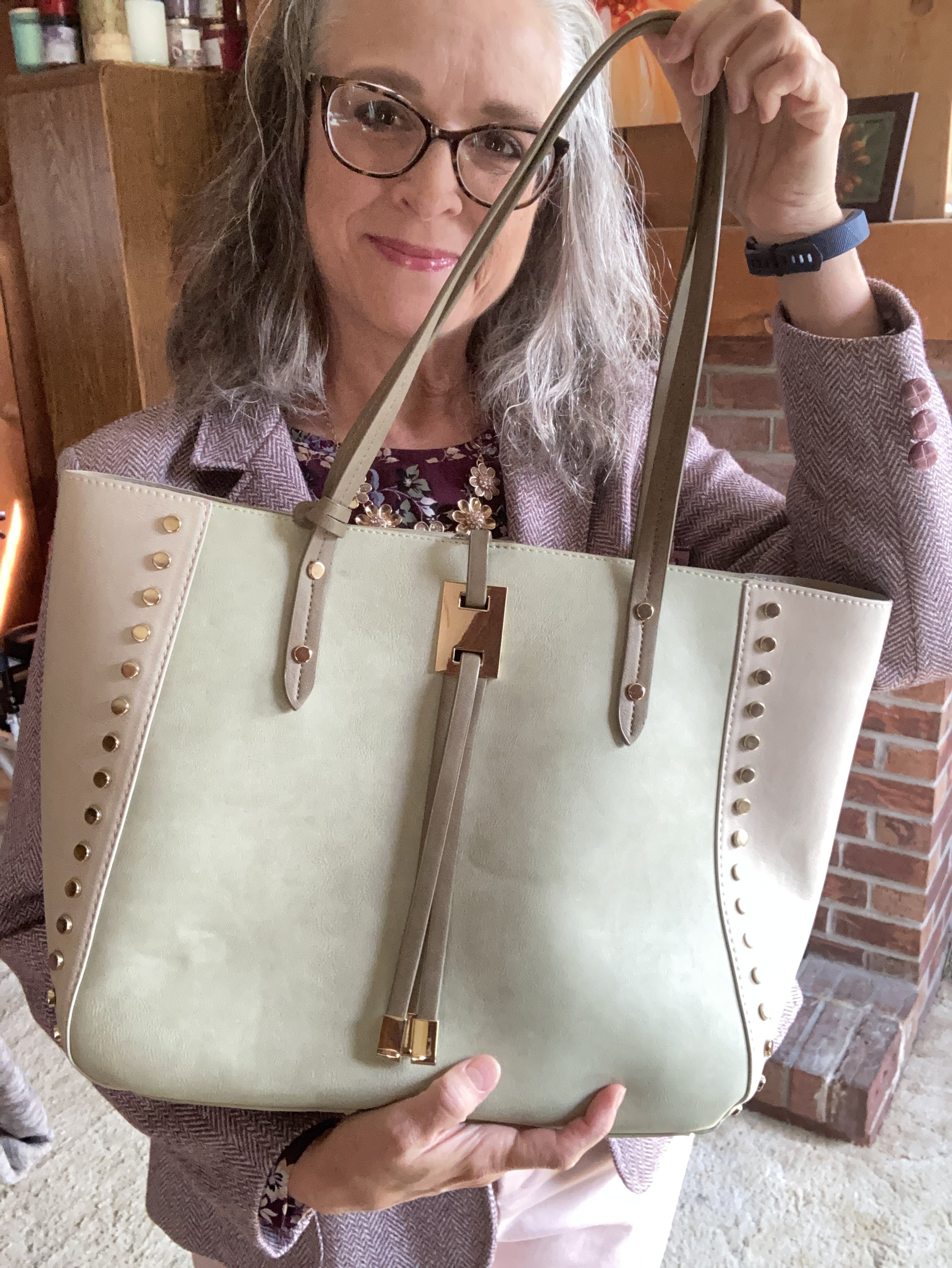
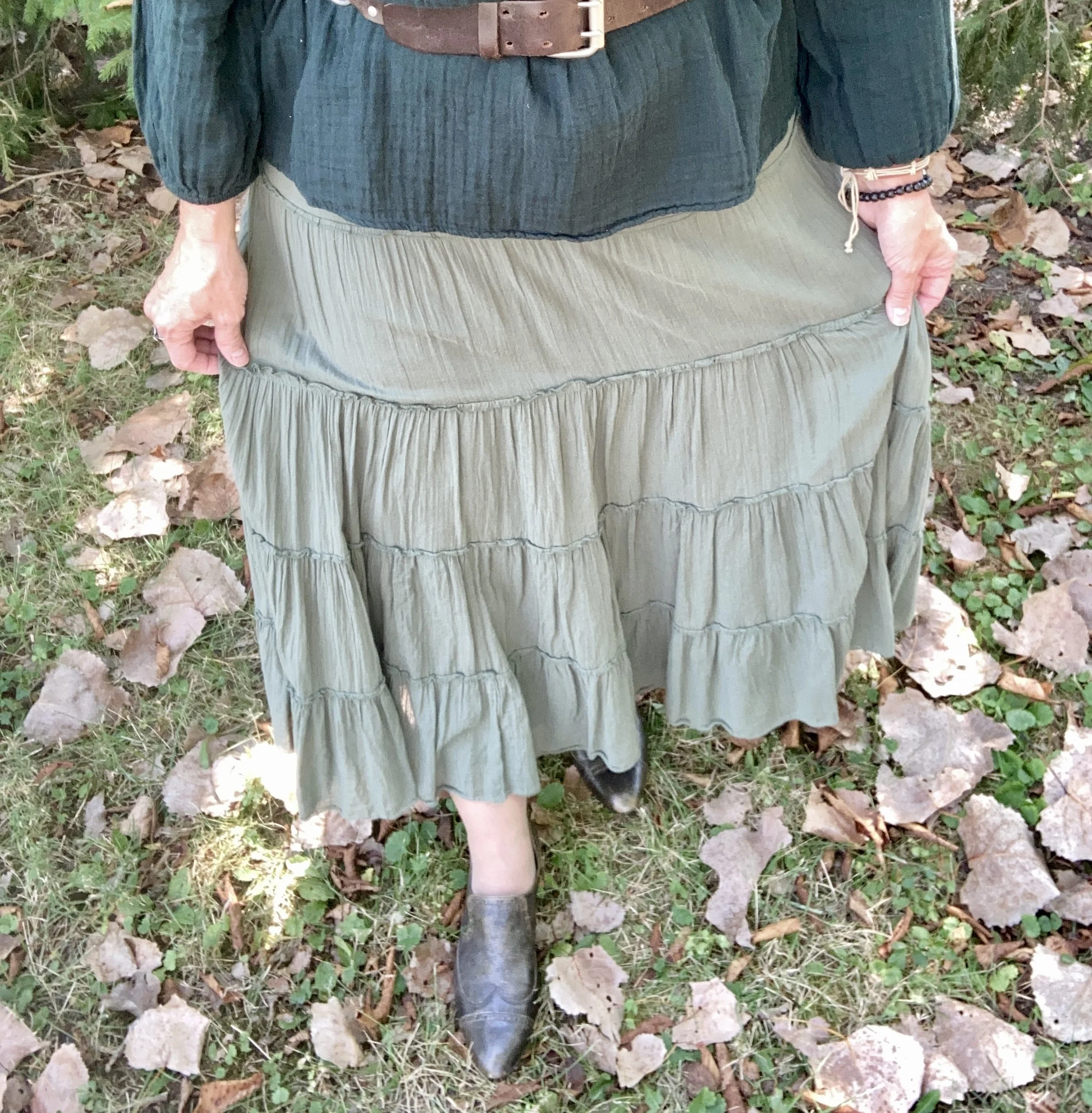
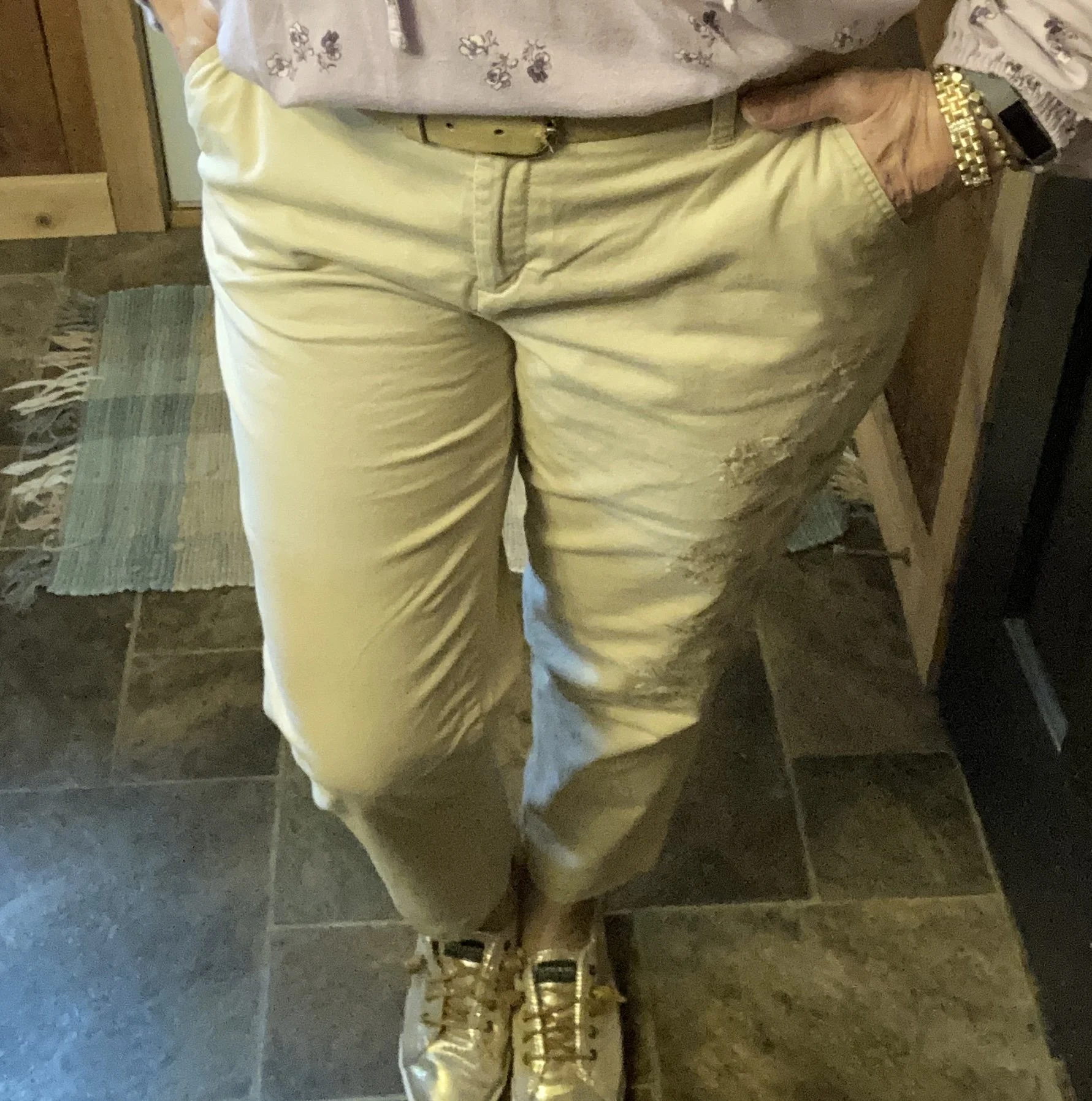
For my Angora color, I chose these light weight Liz Claiborne ankle pants that I got from JC Penney a number of years ago. I loved the embroidery on the leg and these come out every summer. Here are a few possibilities from JC Penney.
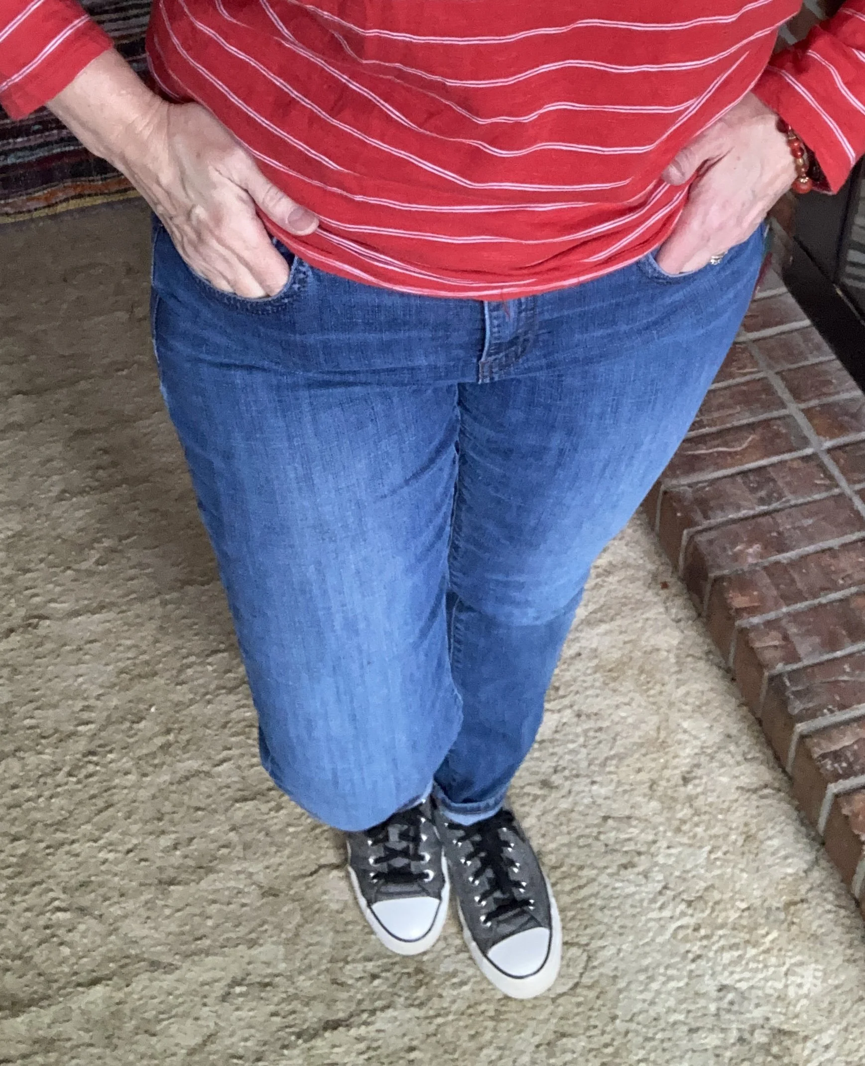
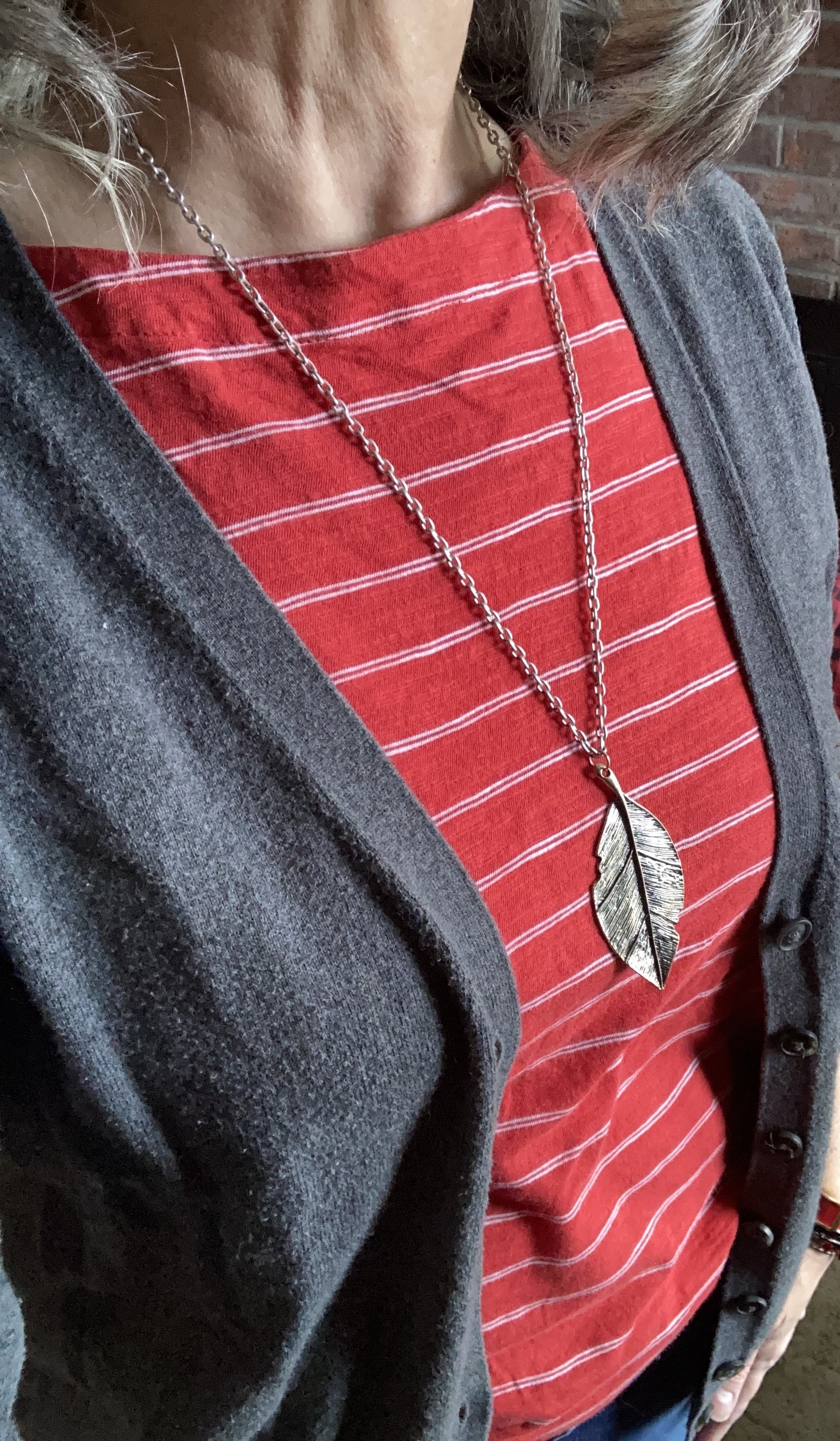
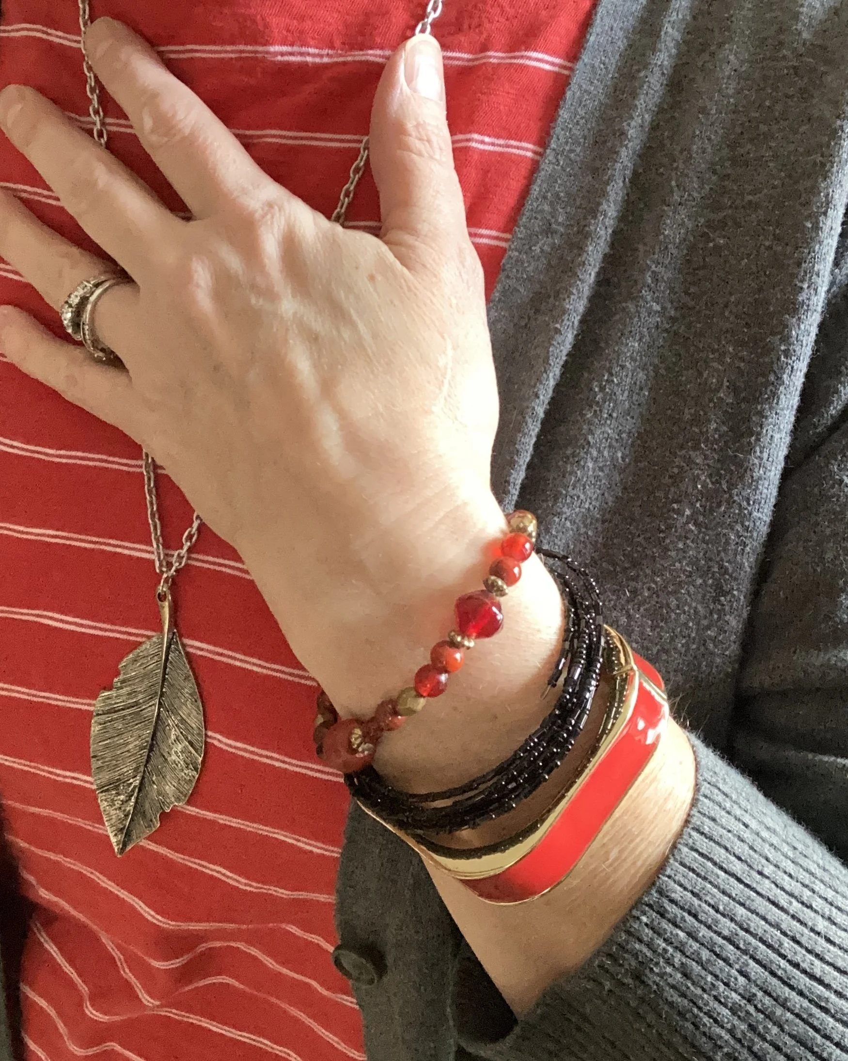
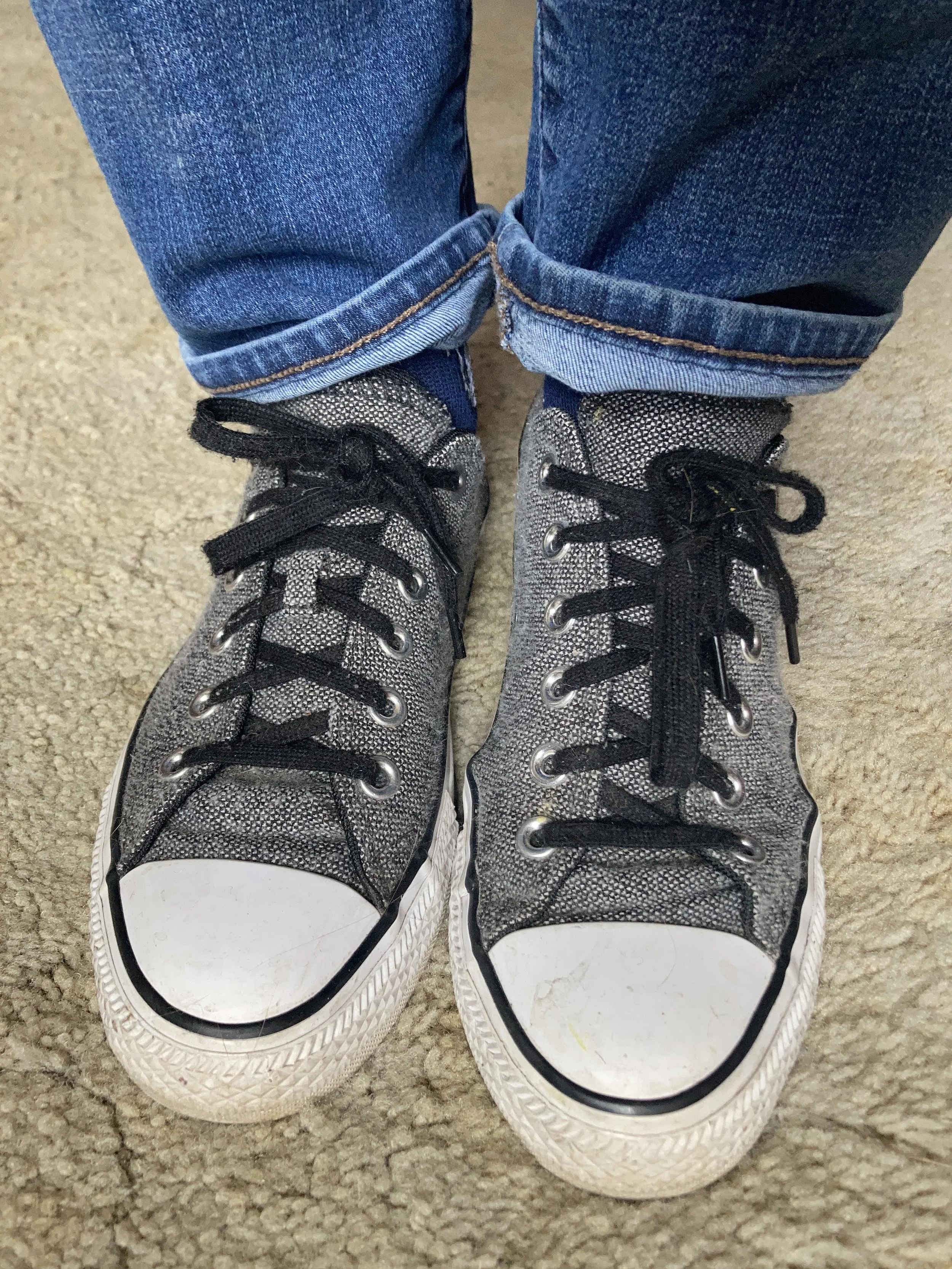
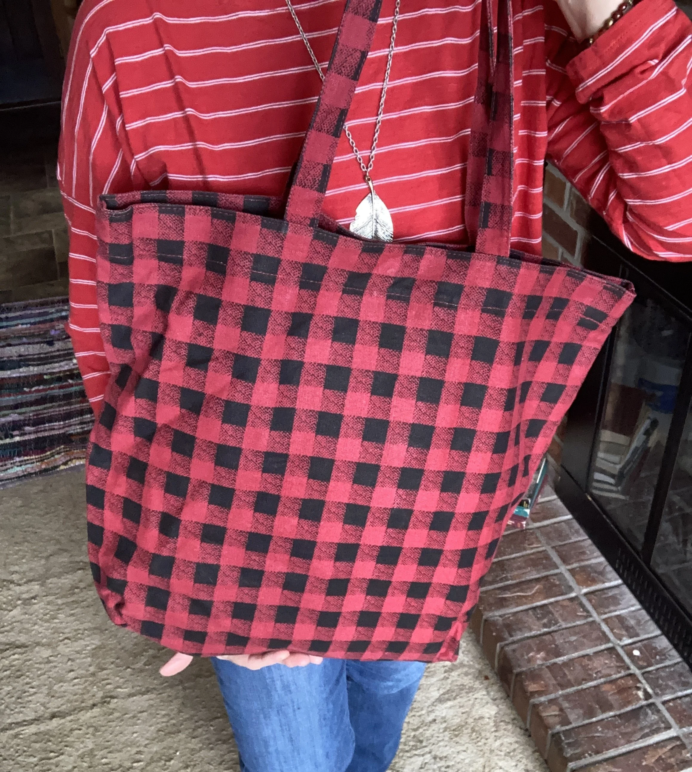
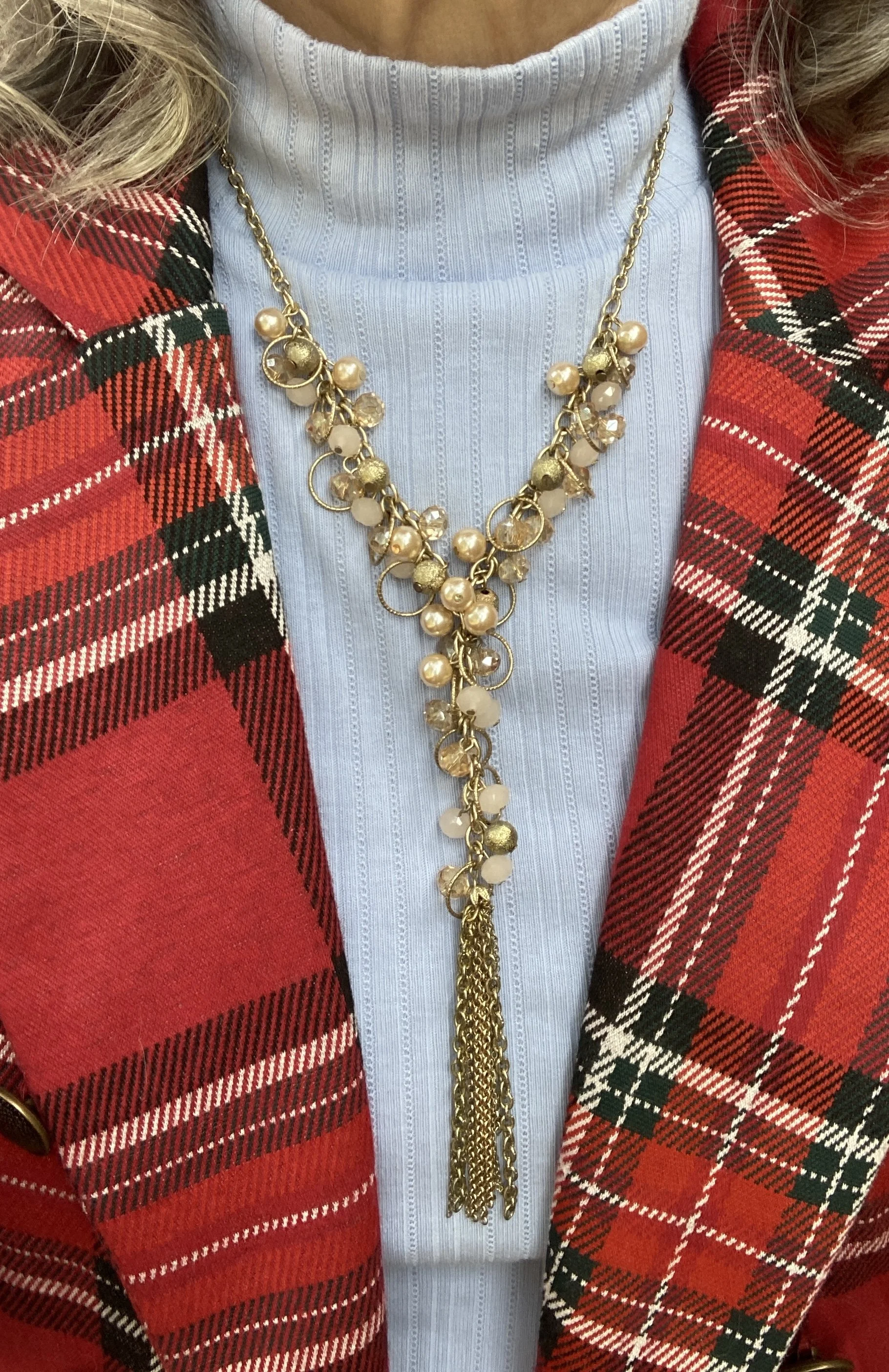
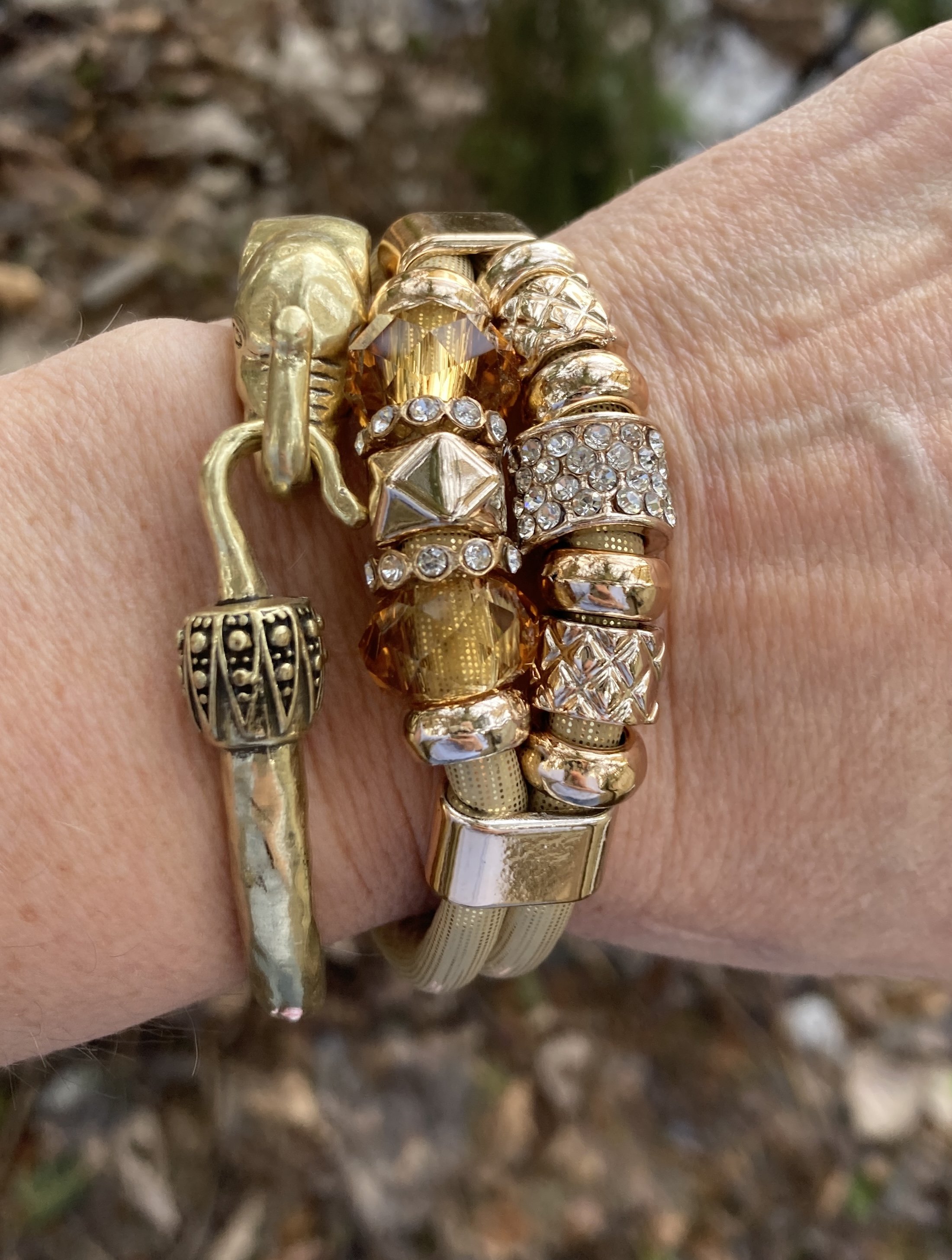
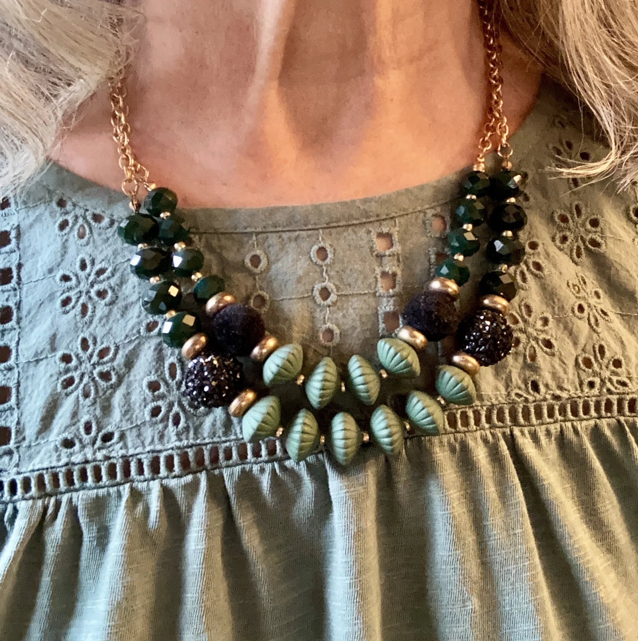
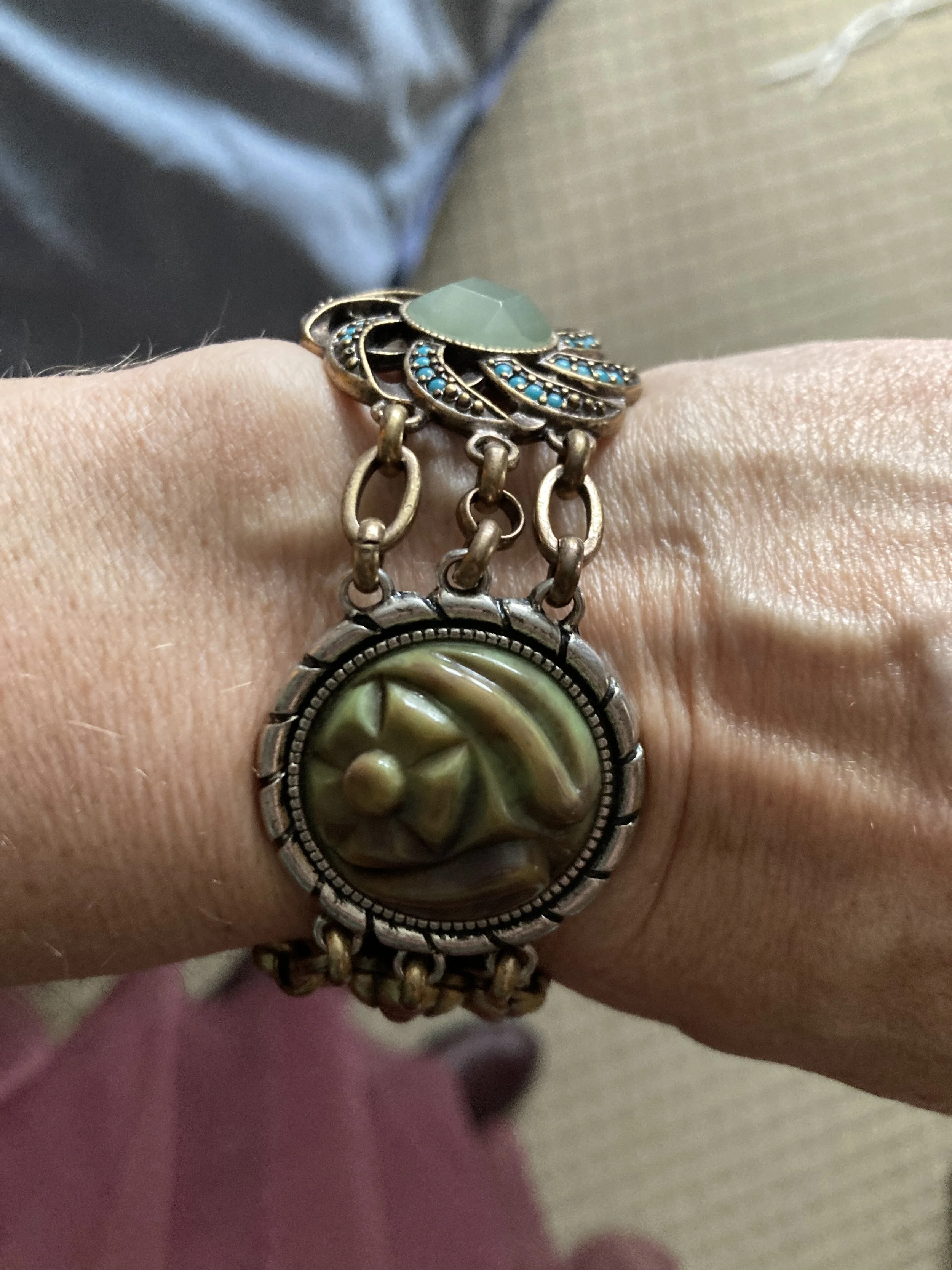
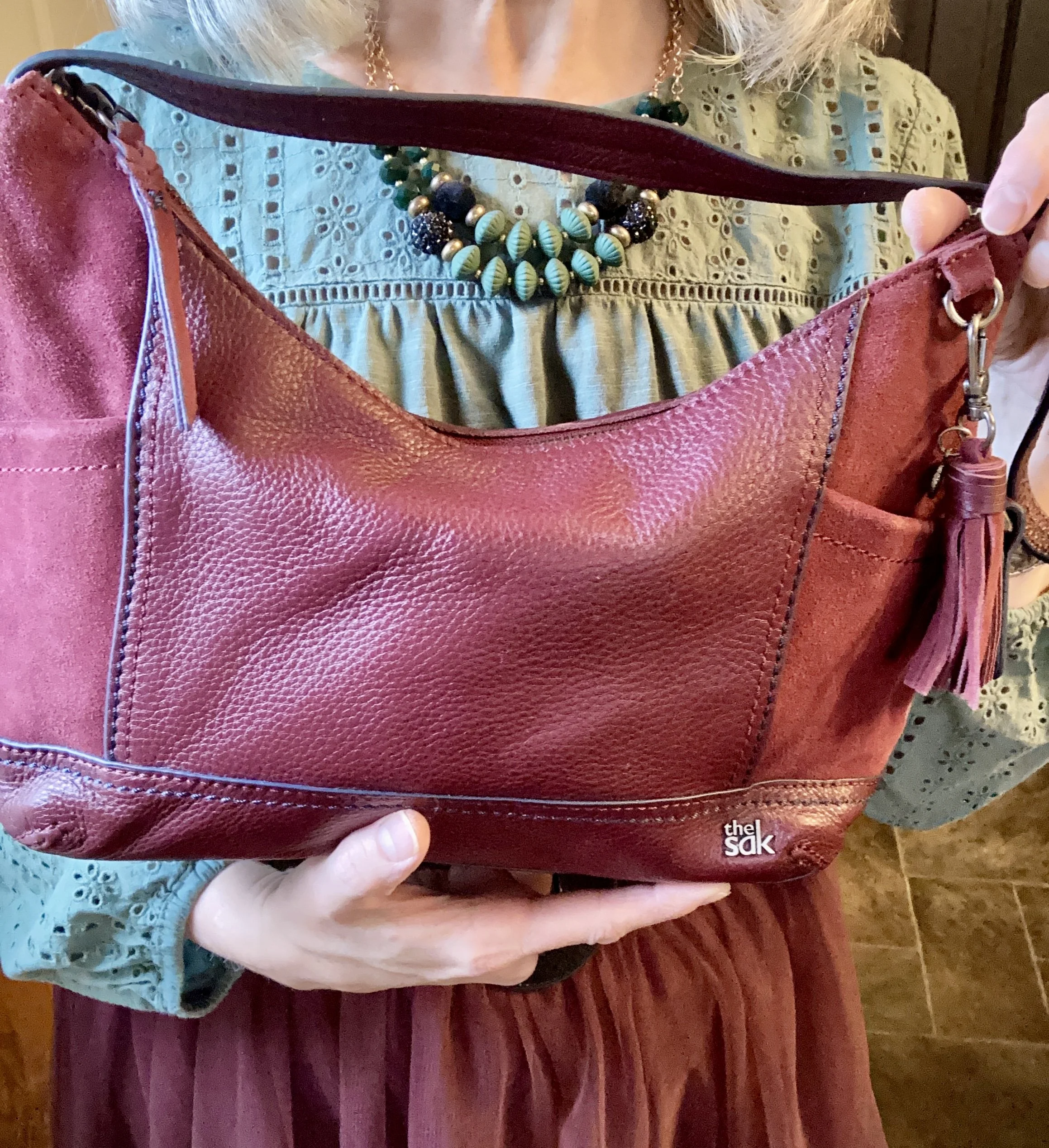
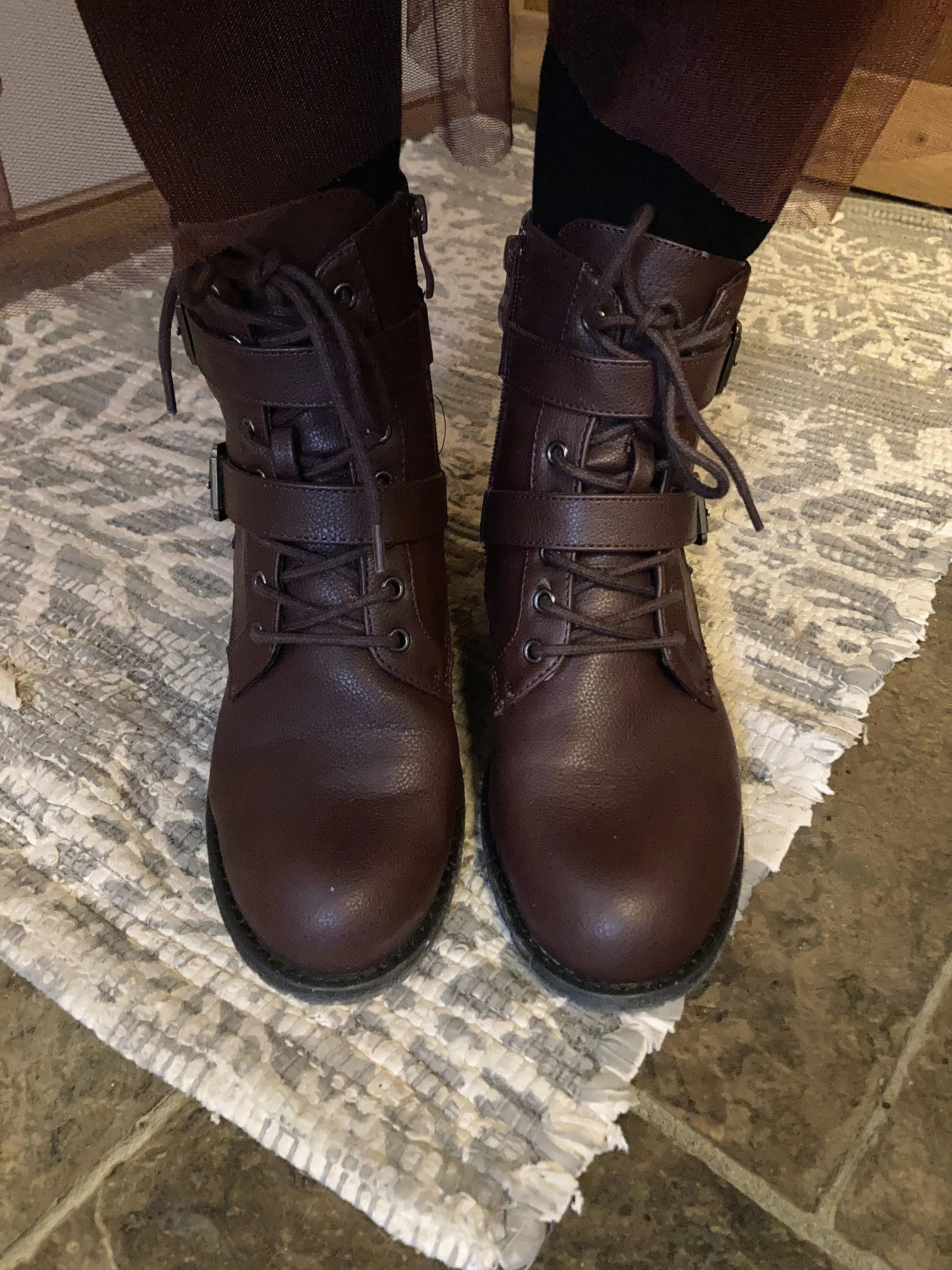
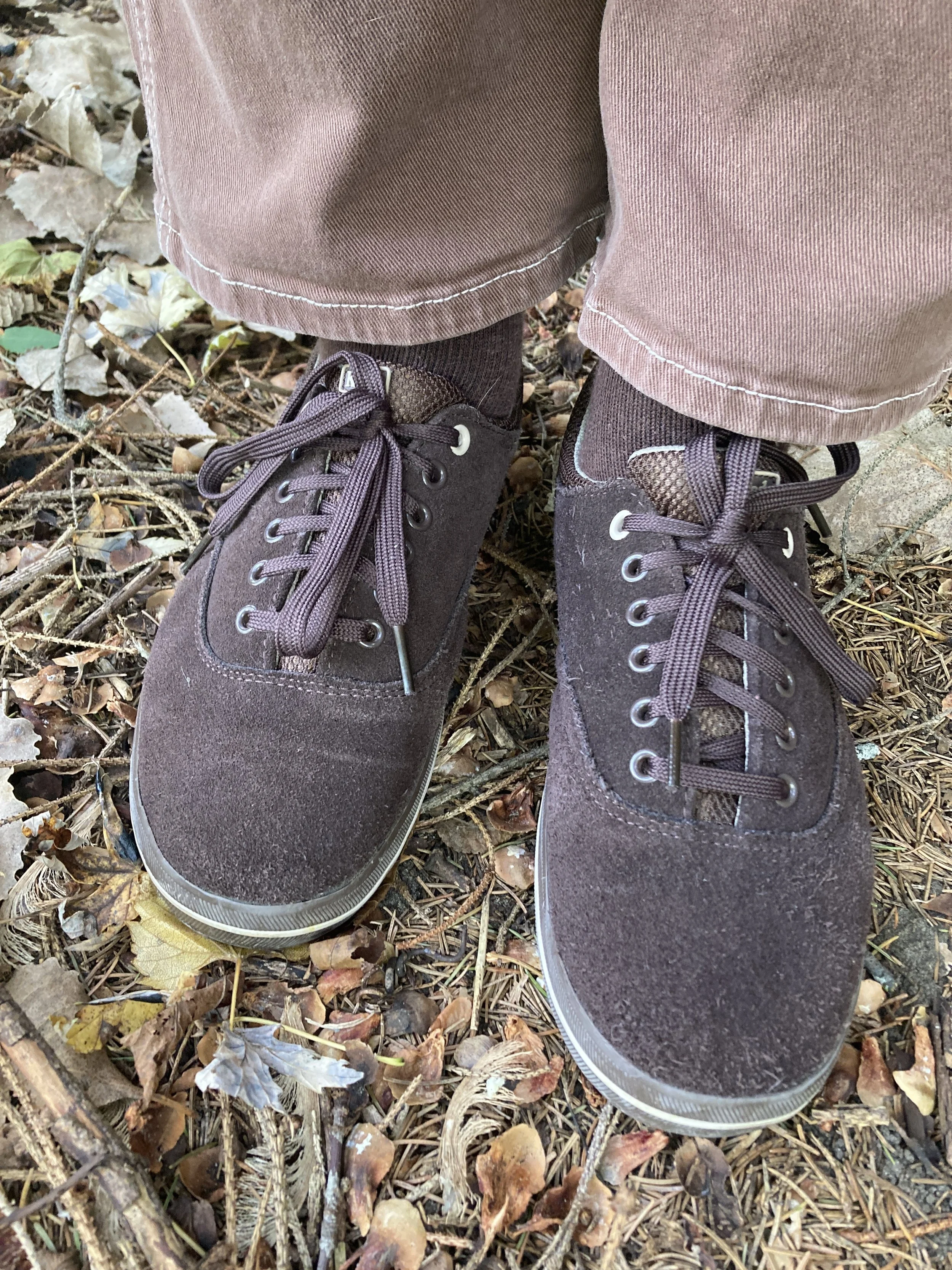
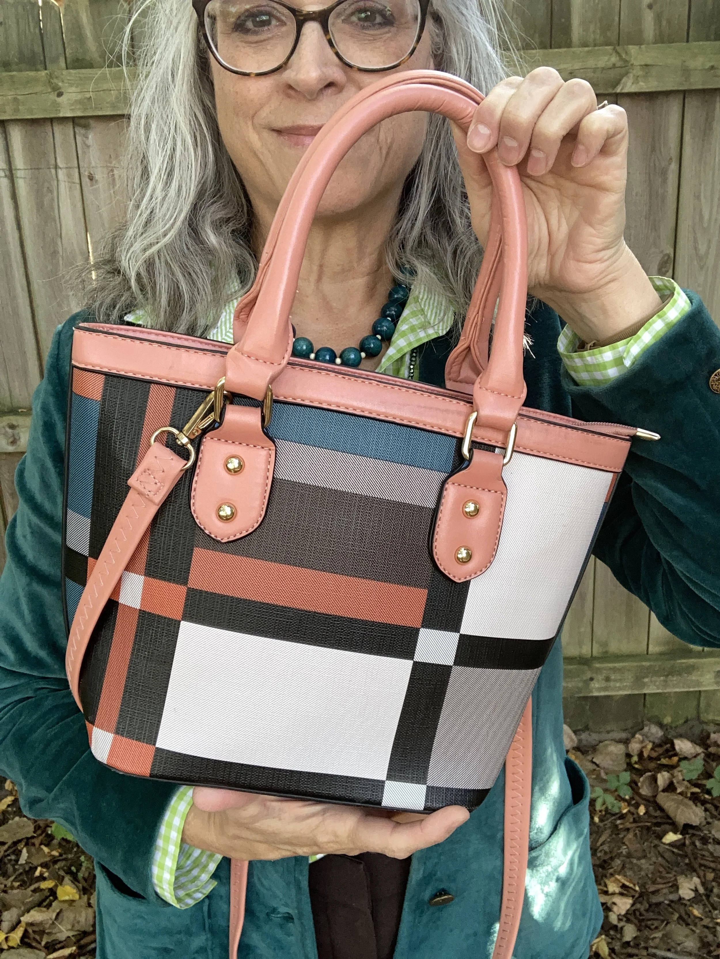
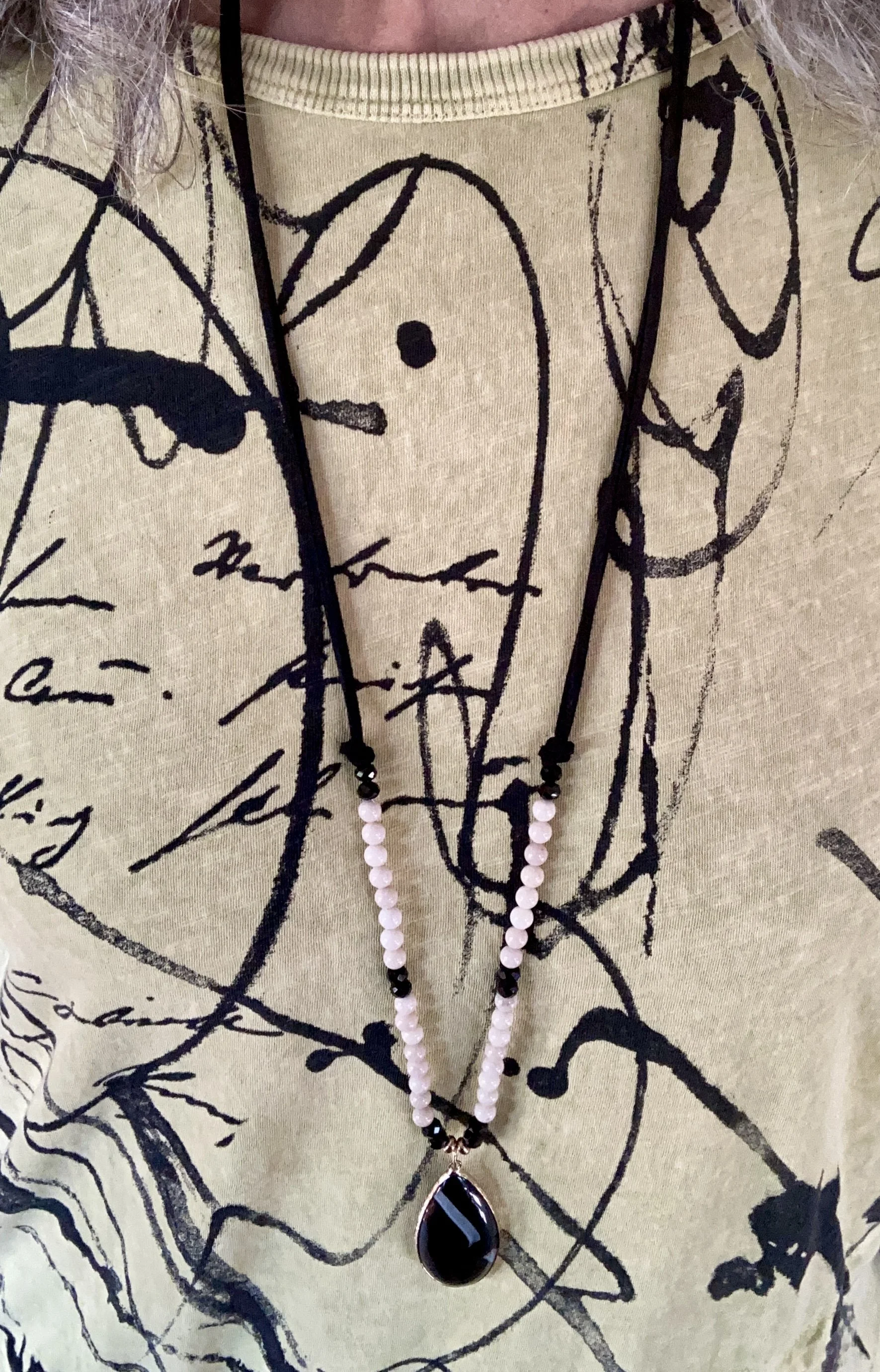
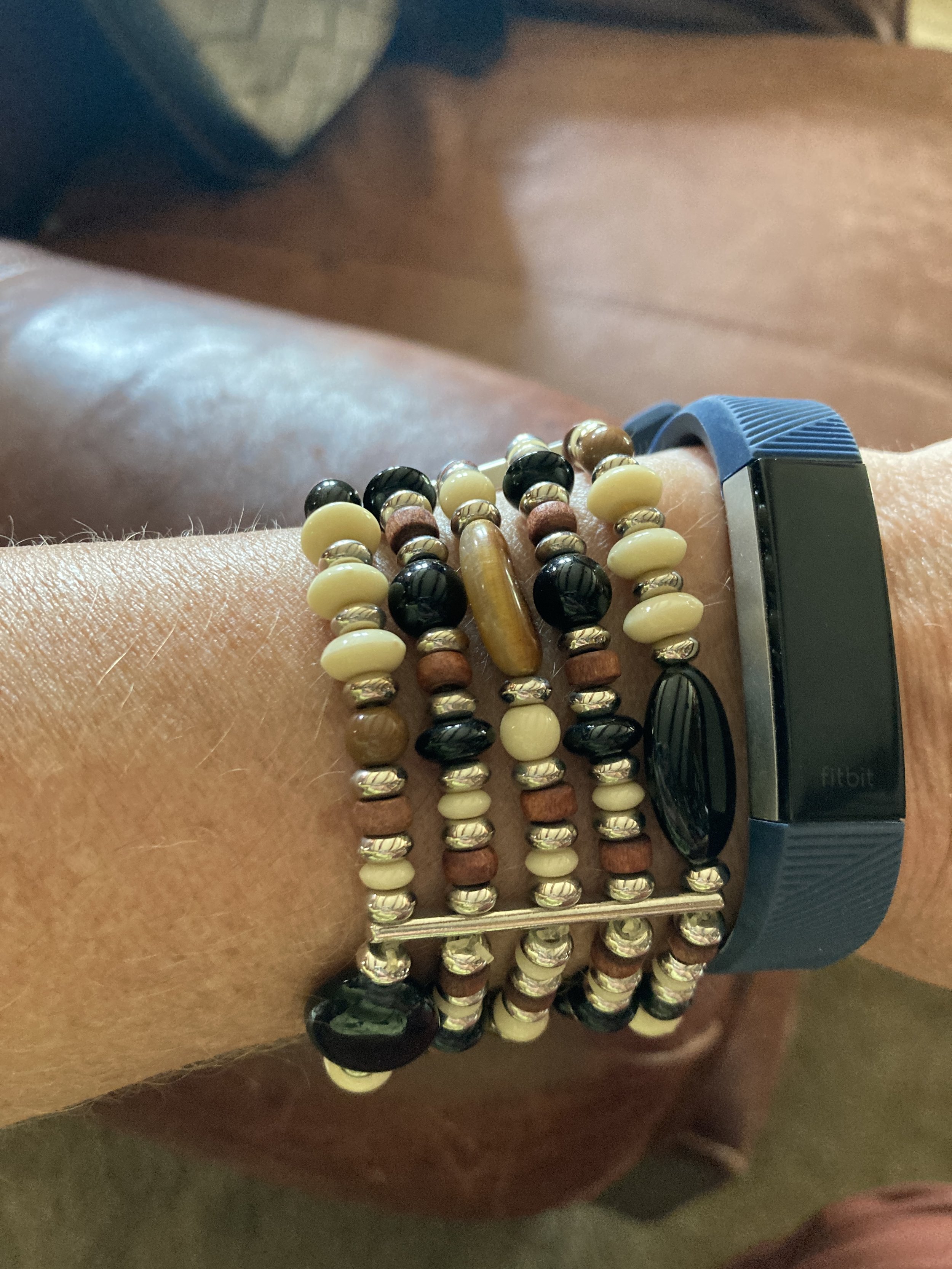
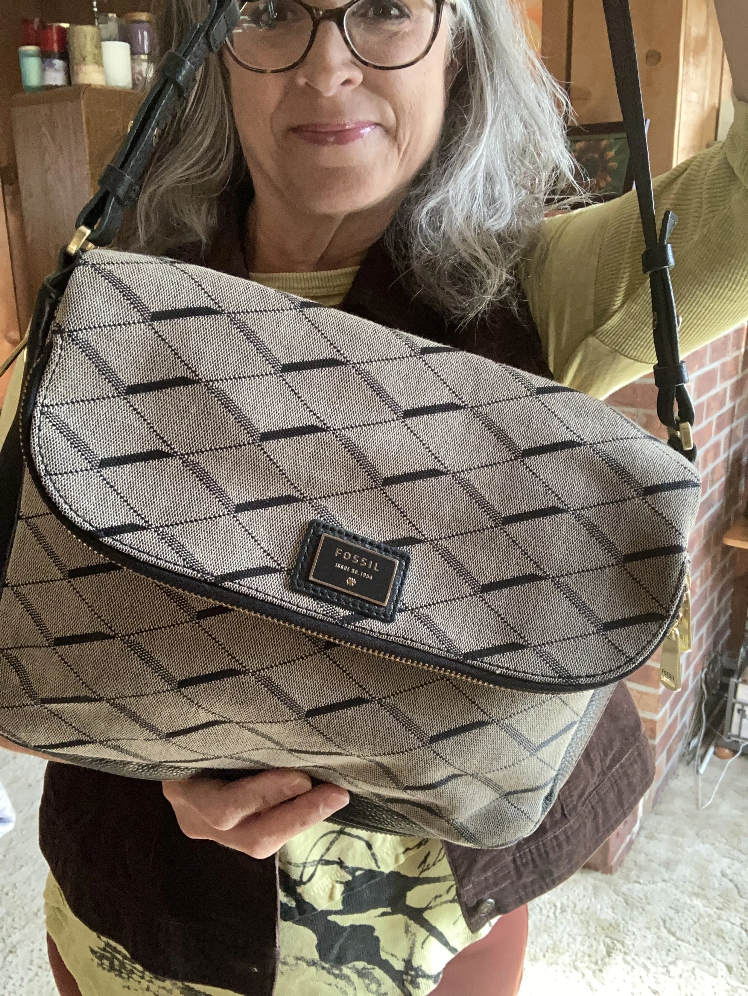
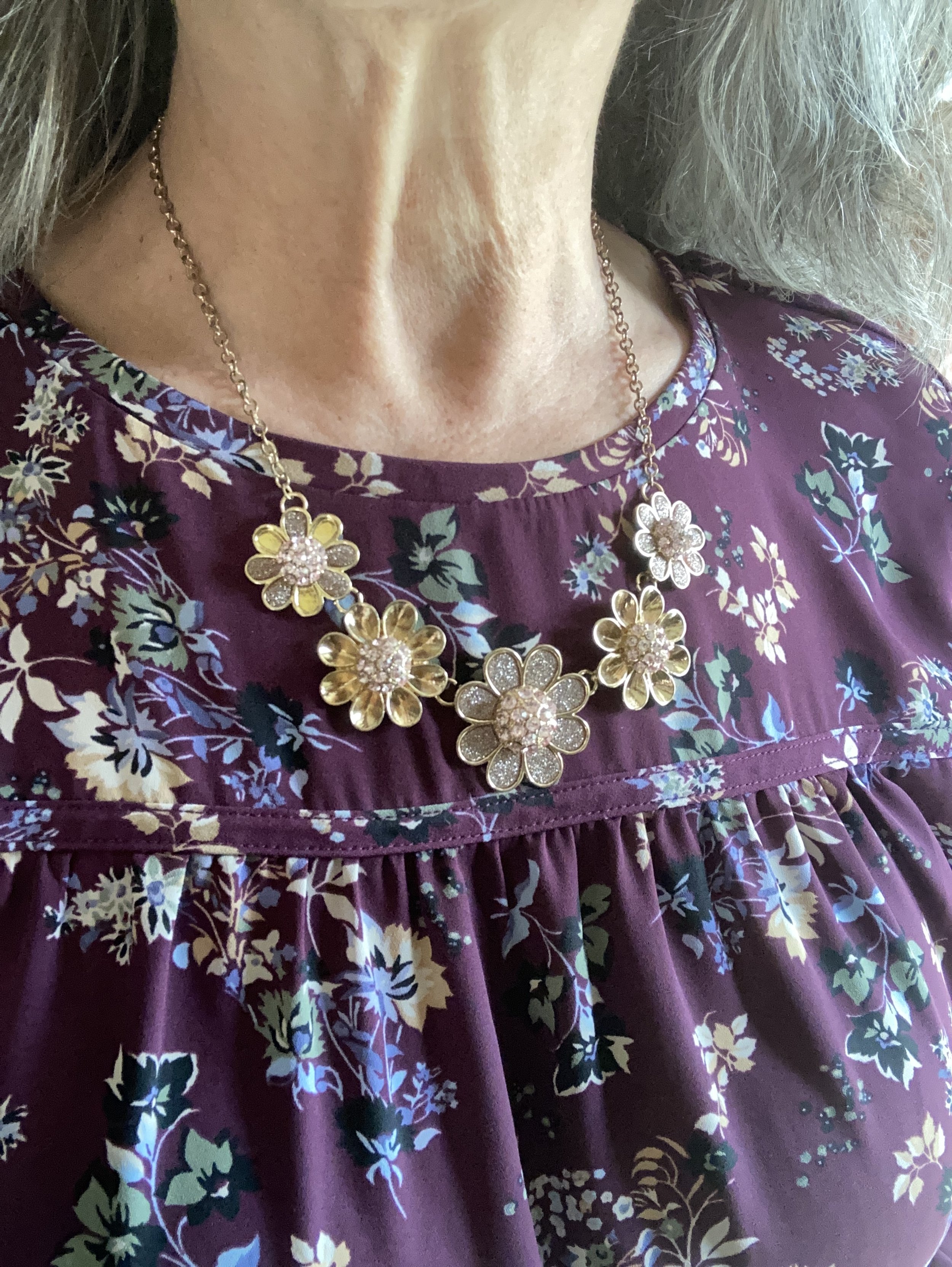
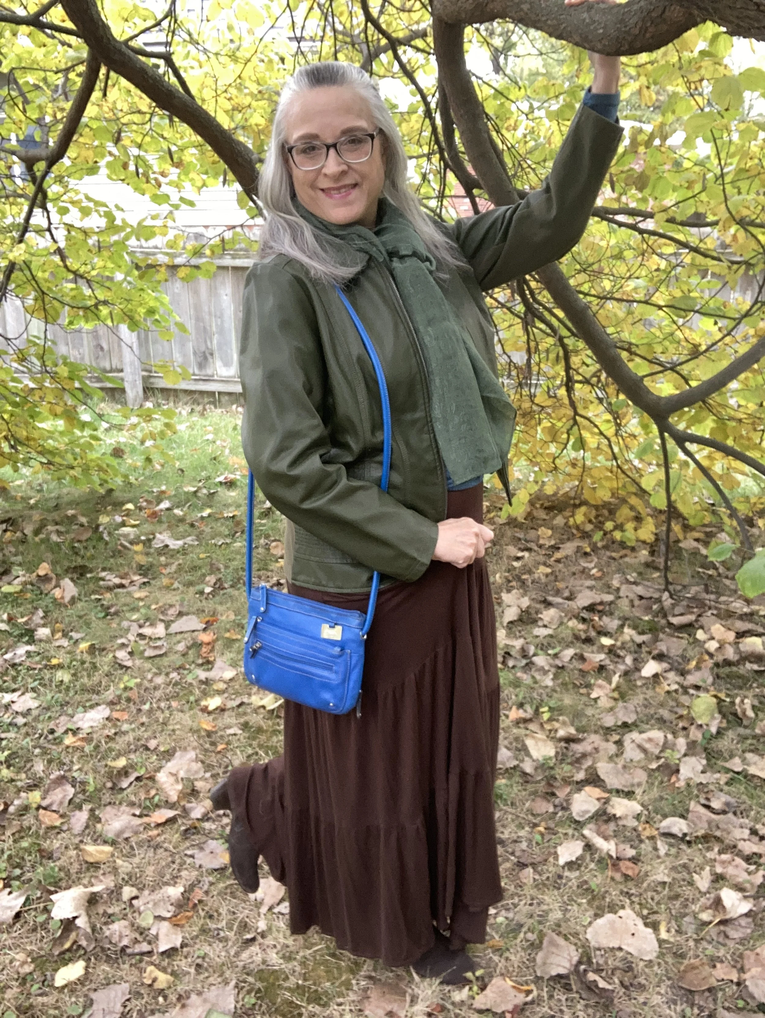
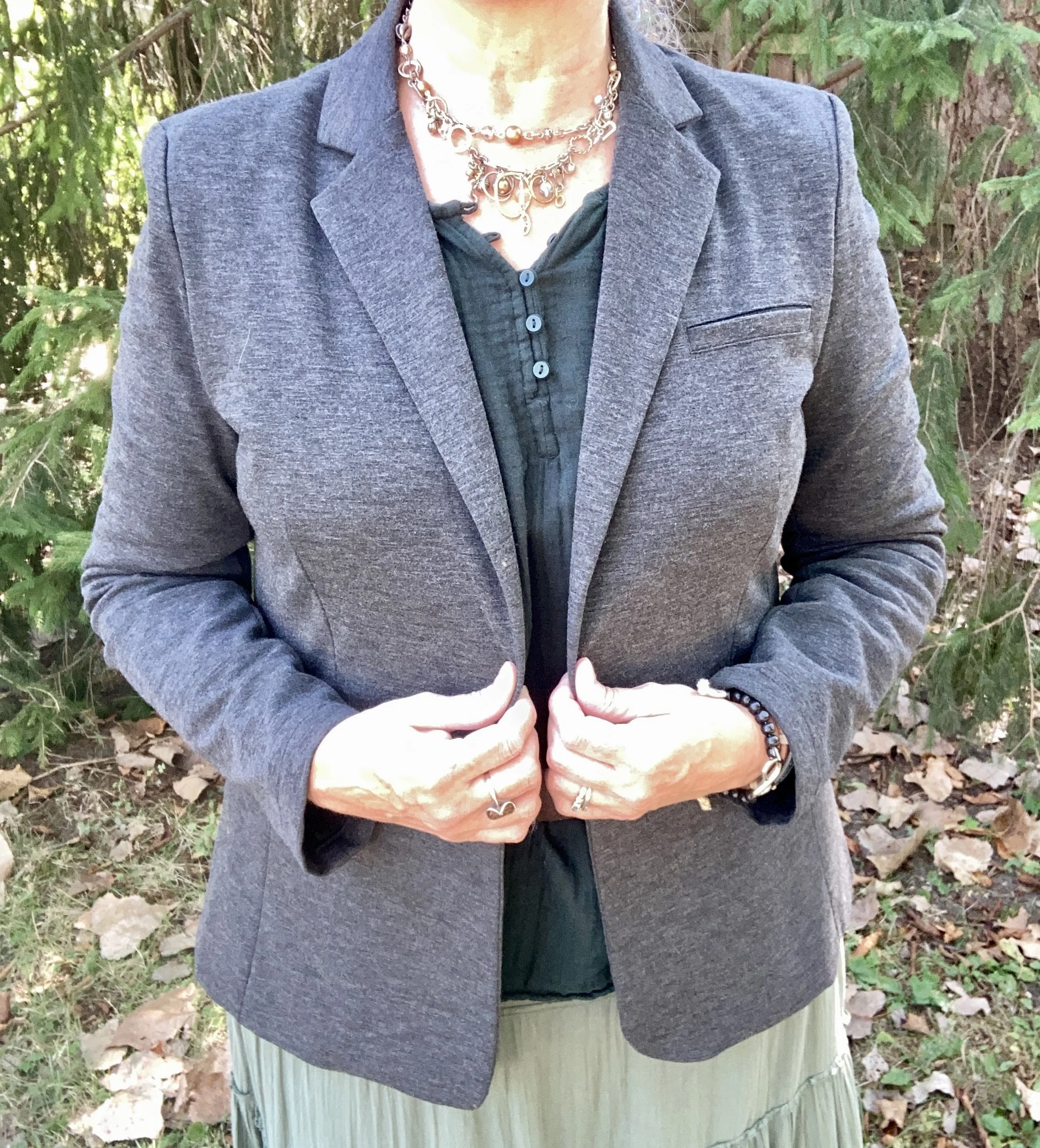
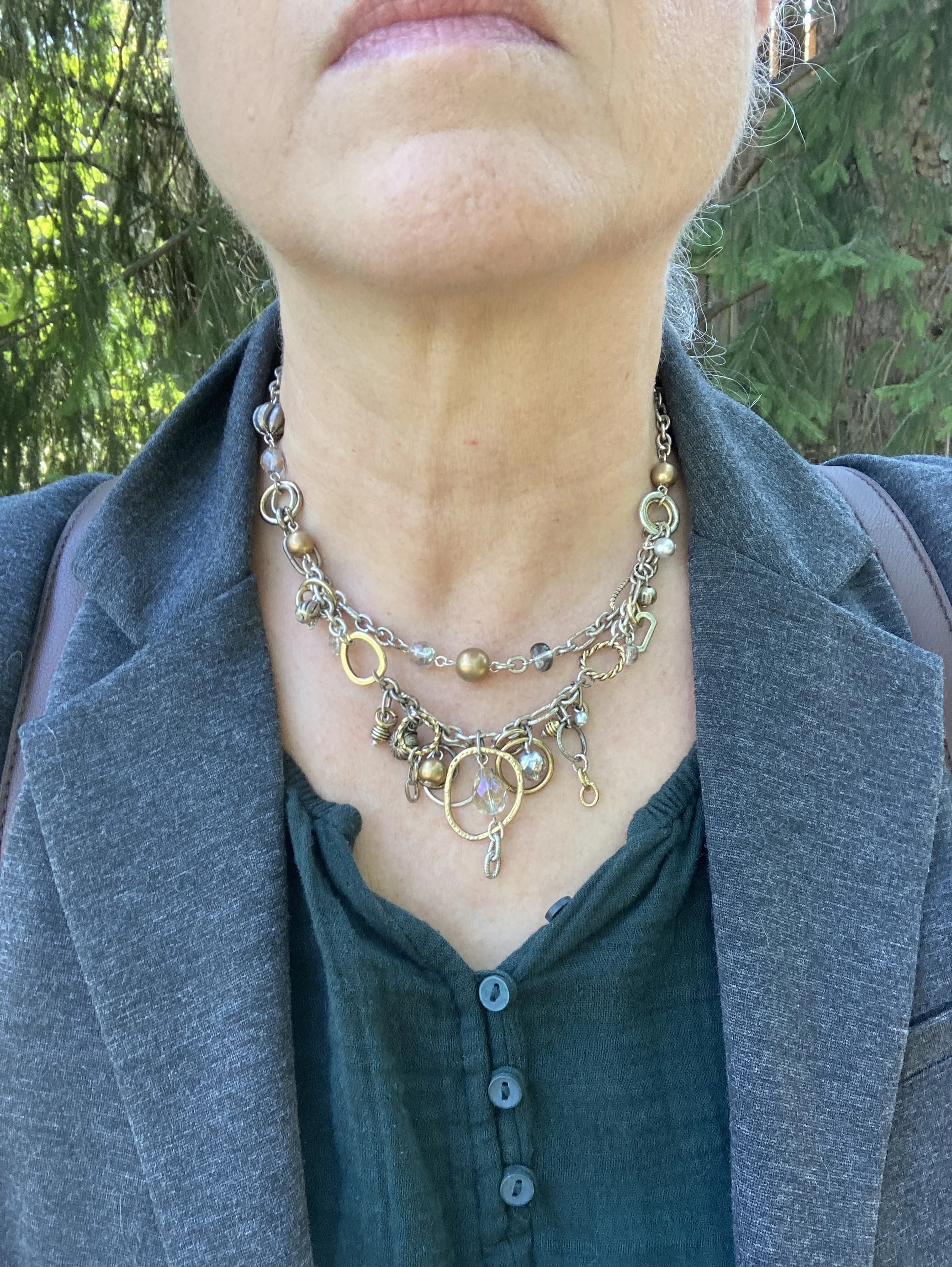
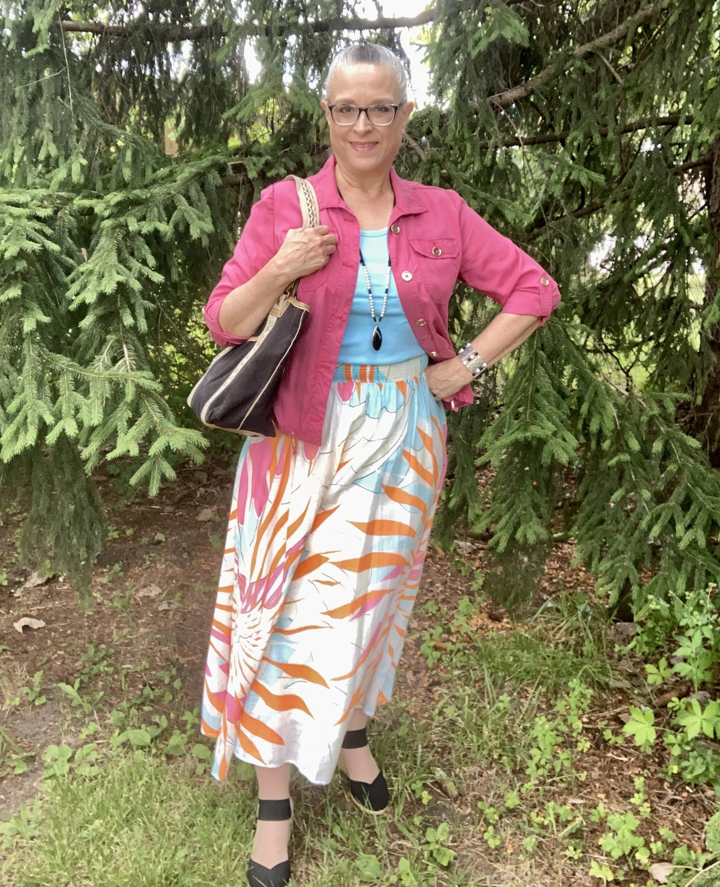
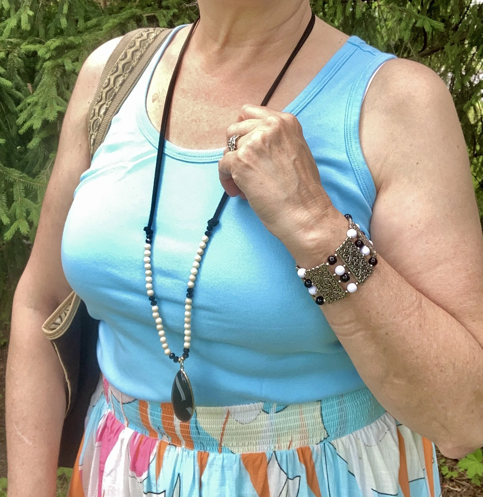
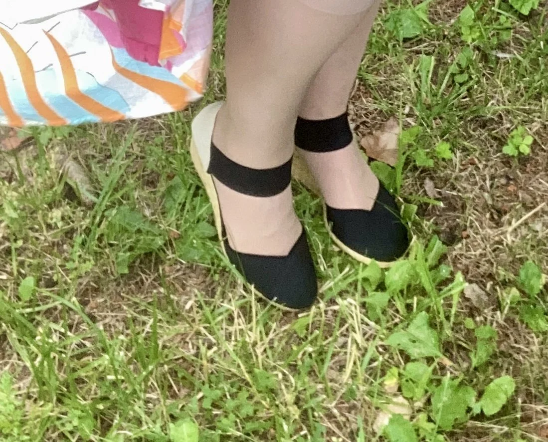
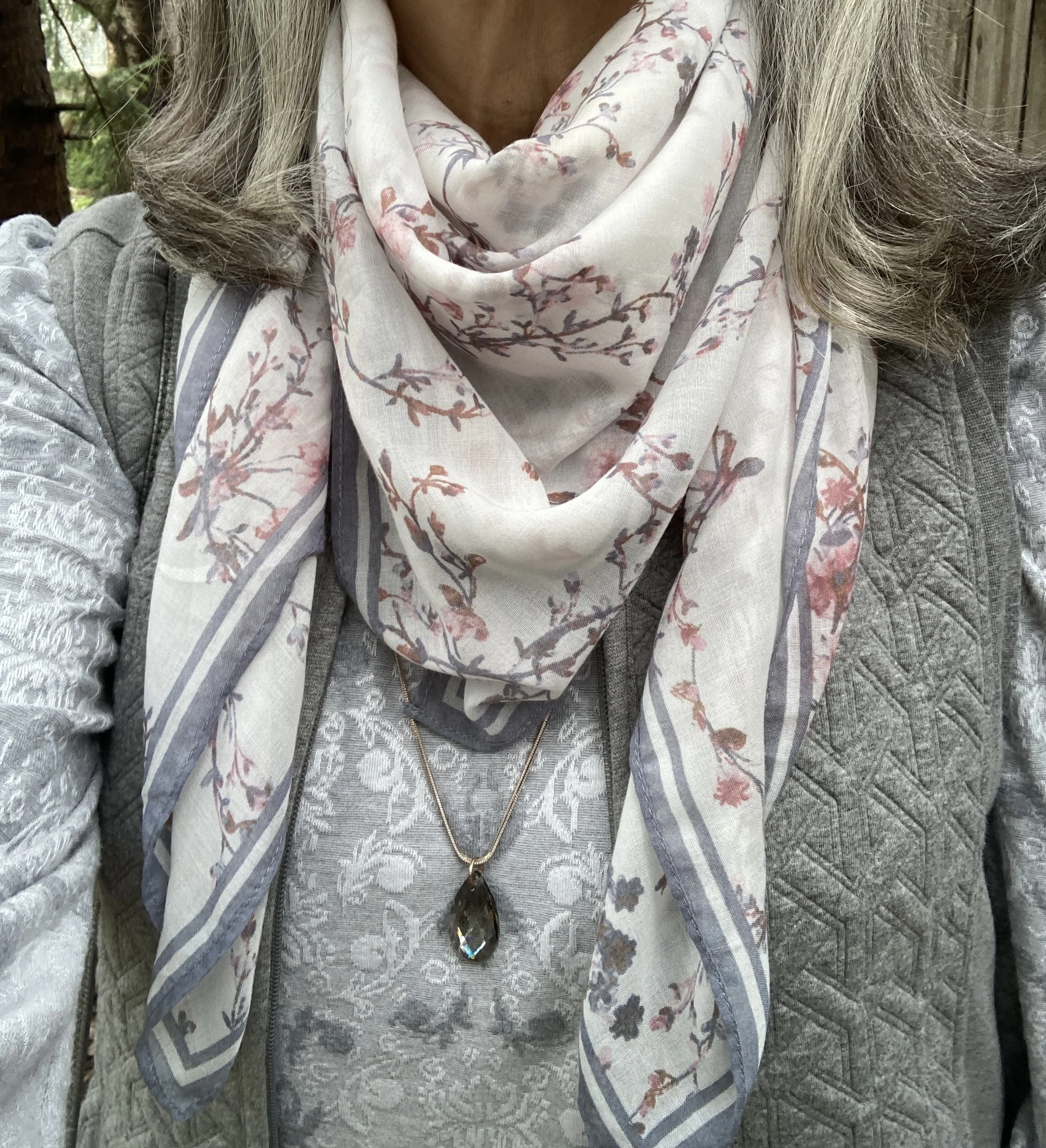
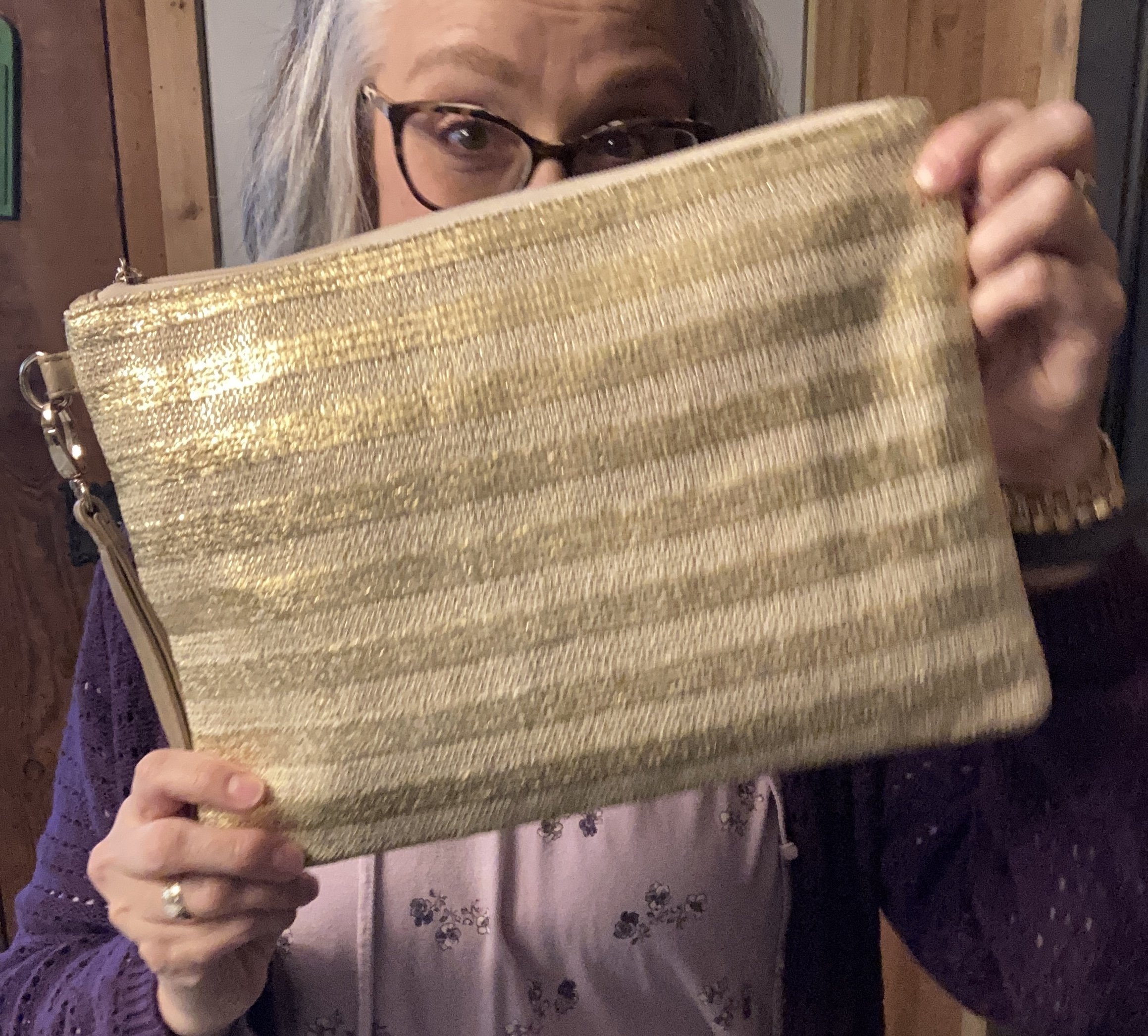
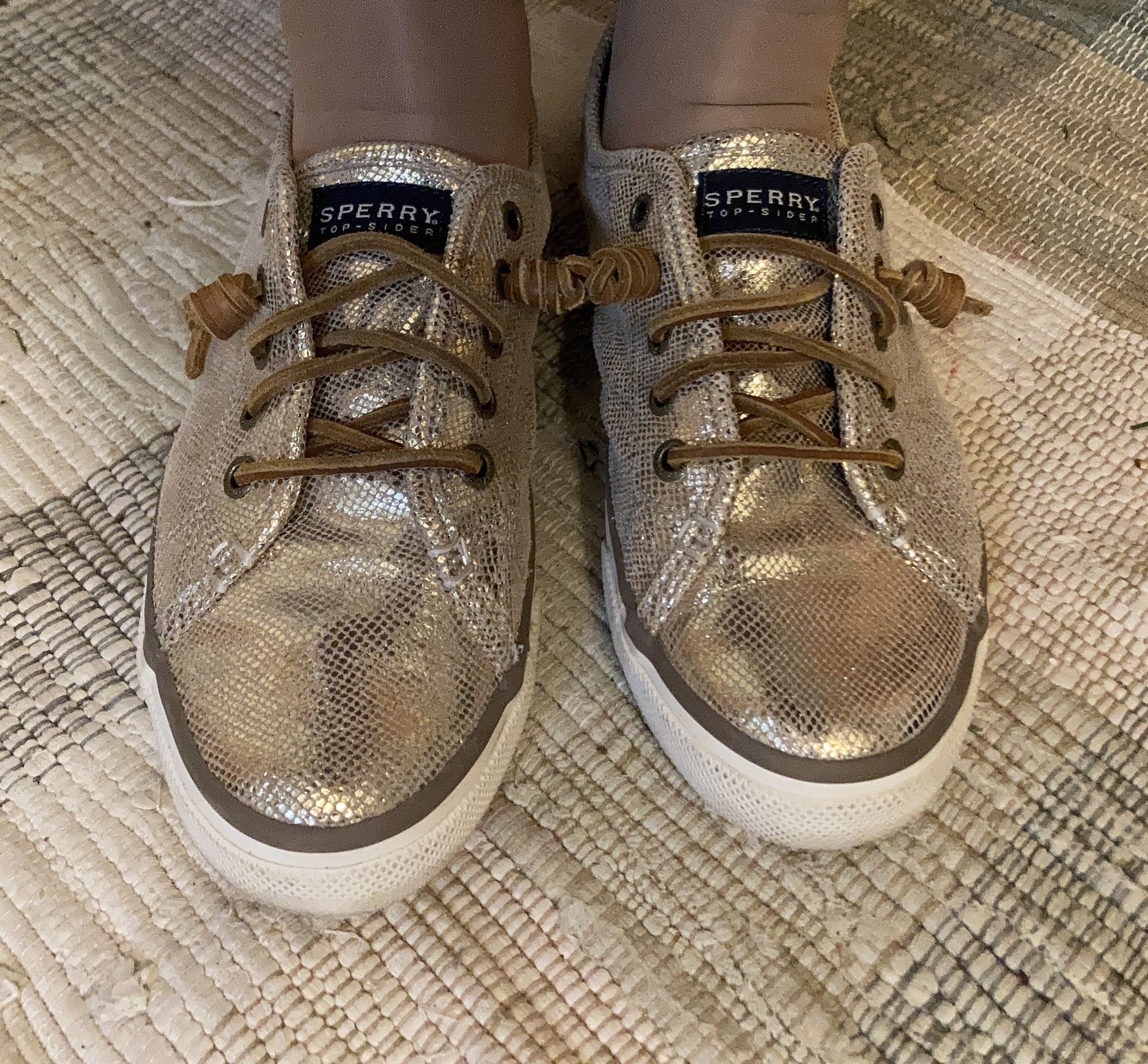
I chose gold for my accessories to give the outfit a tiny bit of bling. The necklace was second hand from a friend and the bracelets are old. The gold, striped clutch is thrifted and a brand called icing. My gold sneakers are second hand Sperry’s. Here are some pretty gold clutches from DSW. Here are few gold sneakers from DSW, Keds, and Skechers.
What do you think of these Pantone colors? Do you have these in your closet? I always love your feedback, so leave me a comment or two. These shopping links are provided for your benefit. I do not get any sort of commission or kick back for sharing them with you.
Thank you for stopping by and supporting the blog. Have a great week!