Outfit Inspiration: Pinterest - Winter Pastels
I turned to Pinterest again to search my boards for outfit inspiration. I finally chose this outfit. I typically use these pins as spring boards to build an outfit. While the outfit from Pinterest is lovely and I could totally see myself wearing something like it, I wanted to do something a little bit different. Unfortunately, I am not real thrilled with how this turned out. I decided to post it anyway, because we are ever changing human beings and we are not always spot on, no matter what social media influencers make you think.
I have always wanted to keep this blog real. I am a real person with health issues, mental struggles and emotional ups and downs. This affects my content. It affects how often I post and how put together my outfits look. This past weekend when I took these pictures I was really struggling with fatigue. Being still undiagnosed with what caused my health crisis back in 2021 my body seems to struggle with being at “full health” most of the time. It’s okay. This is life and I am thankful I can still do things and still bring you content even if it is not always perfect.
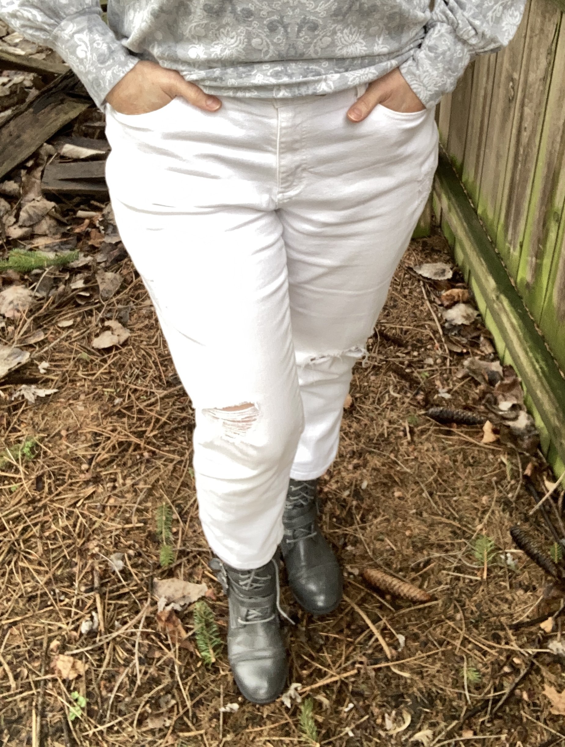
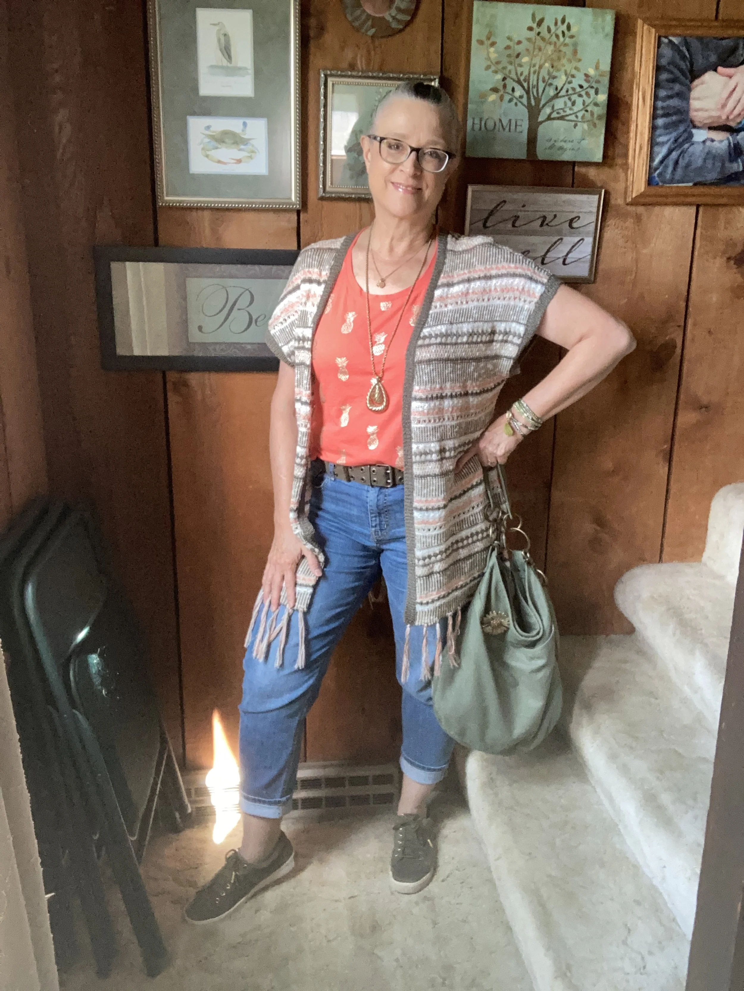
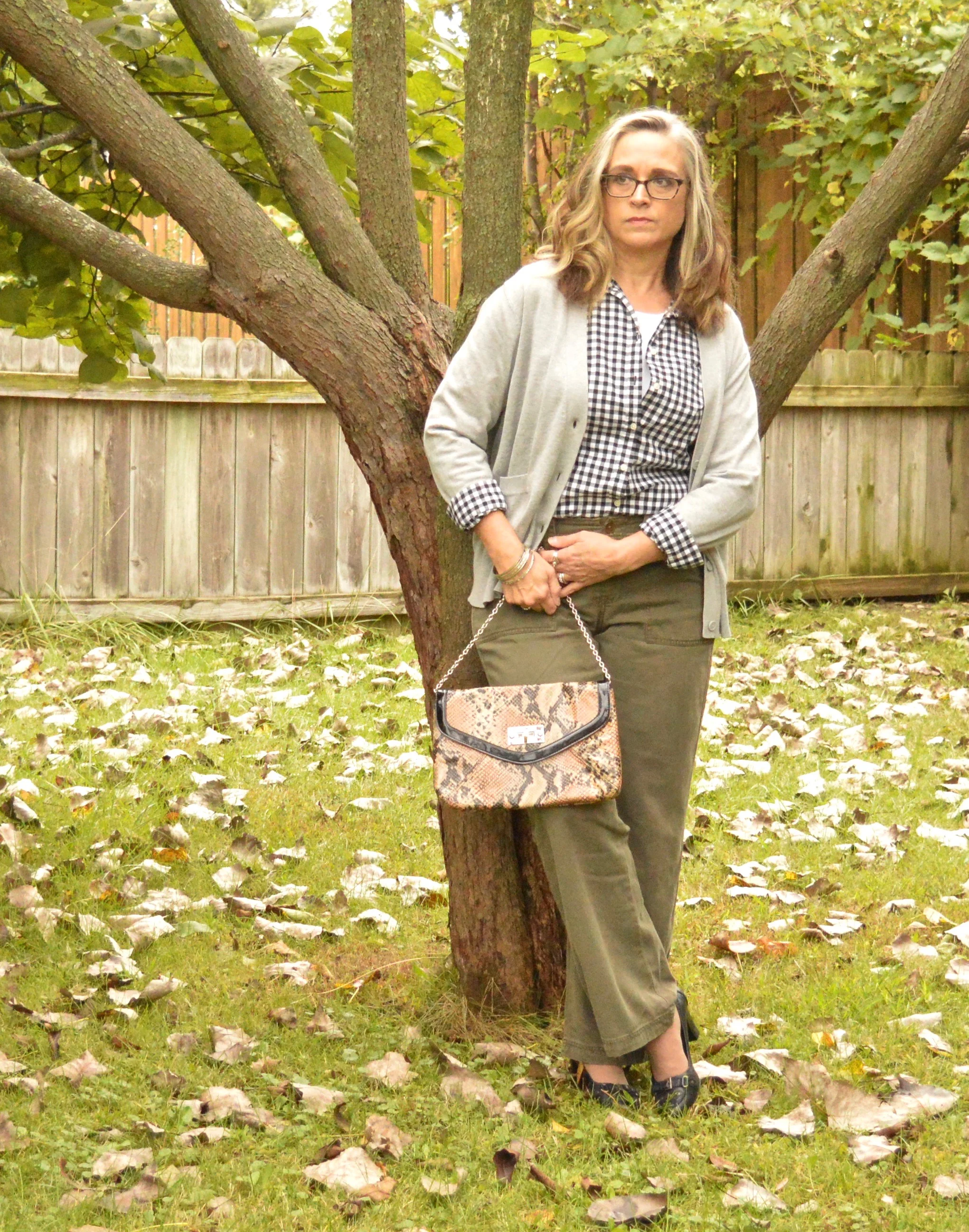
That being said, I am currently on a journey to do what I can to be healthier. At the suggestion of my digestive health doctor, due to a hiatal hernia, I am trying to lose a few pounds and eat healthier. I joined Weight Watchers and it is helping me to make better choices, as well as lose weight through tracking and portion control. I left in the picture of my pants, even though they look silly, but you can see they are a bit baggy and slouchy due to some of the weight loss.

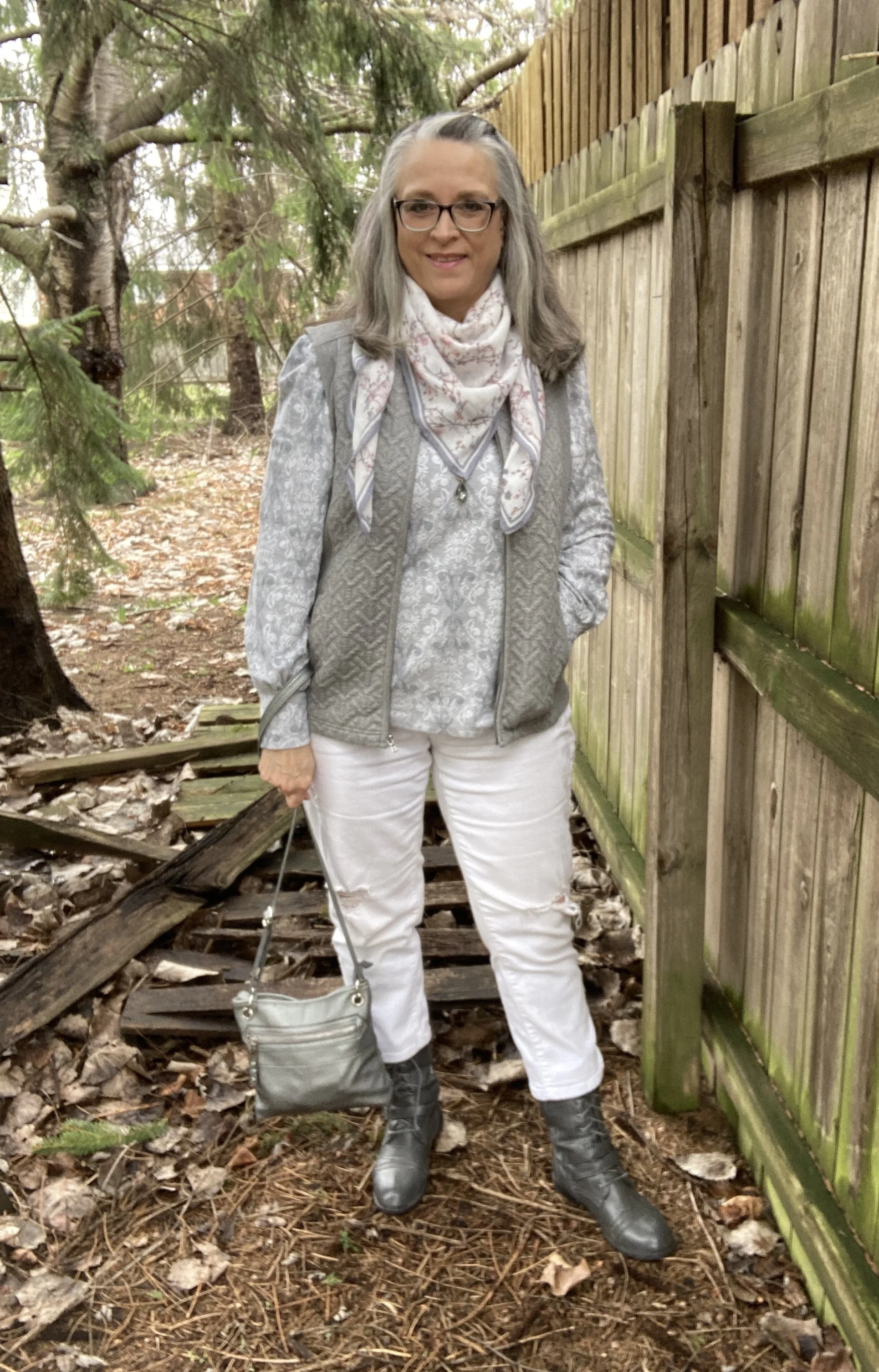
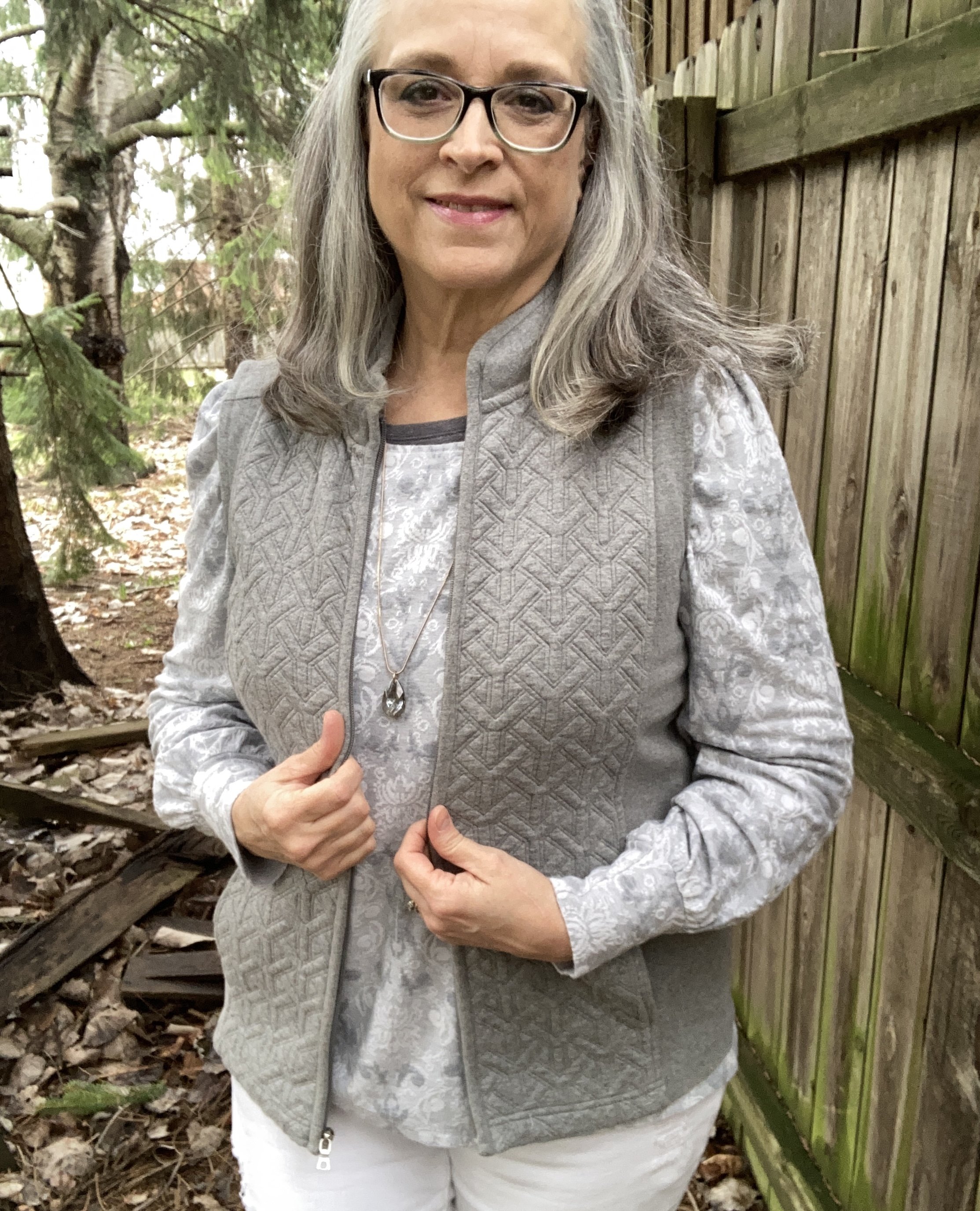
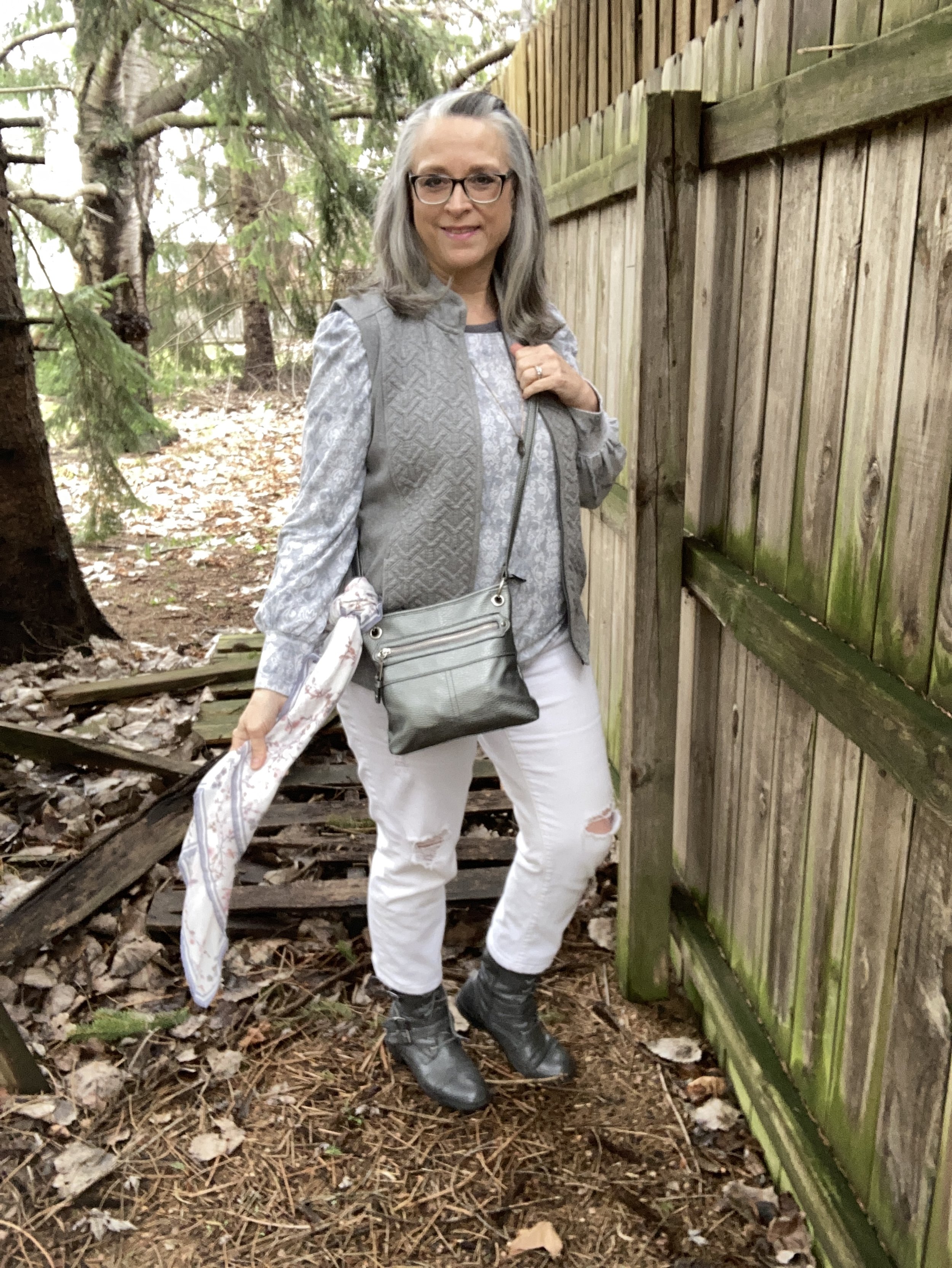
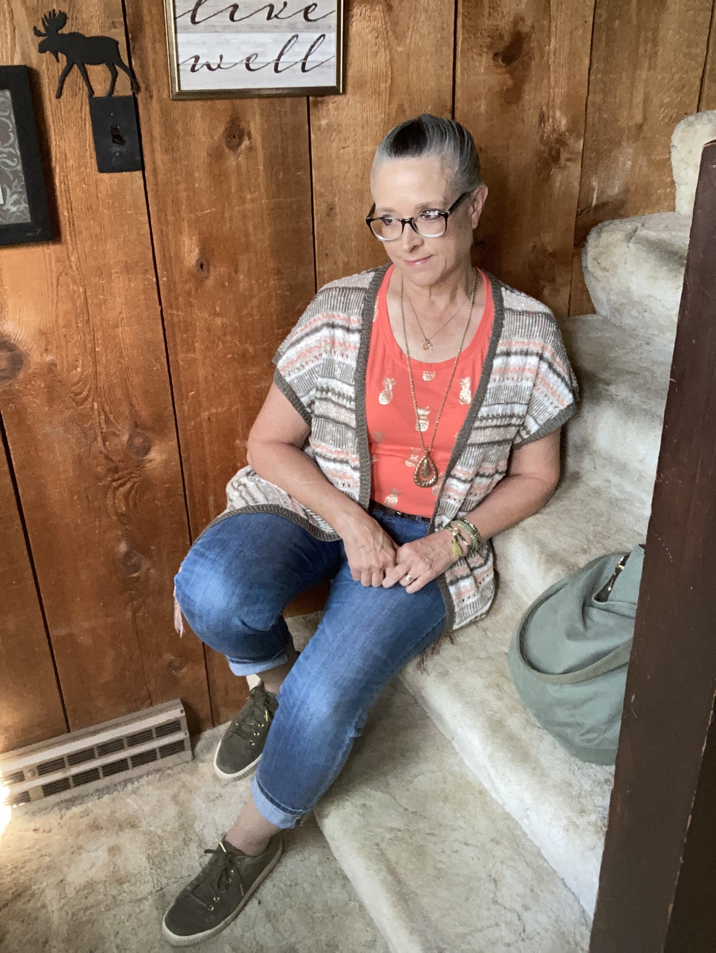
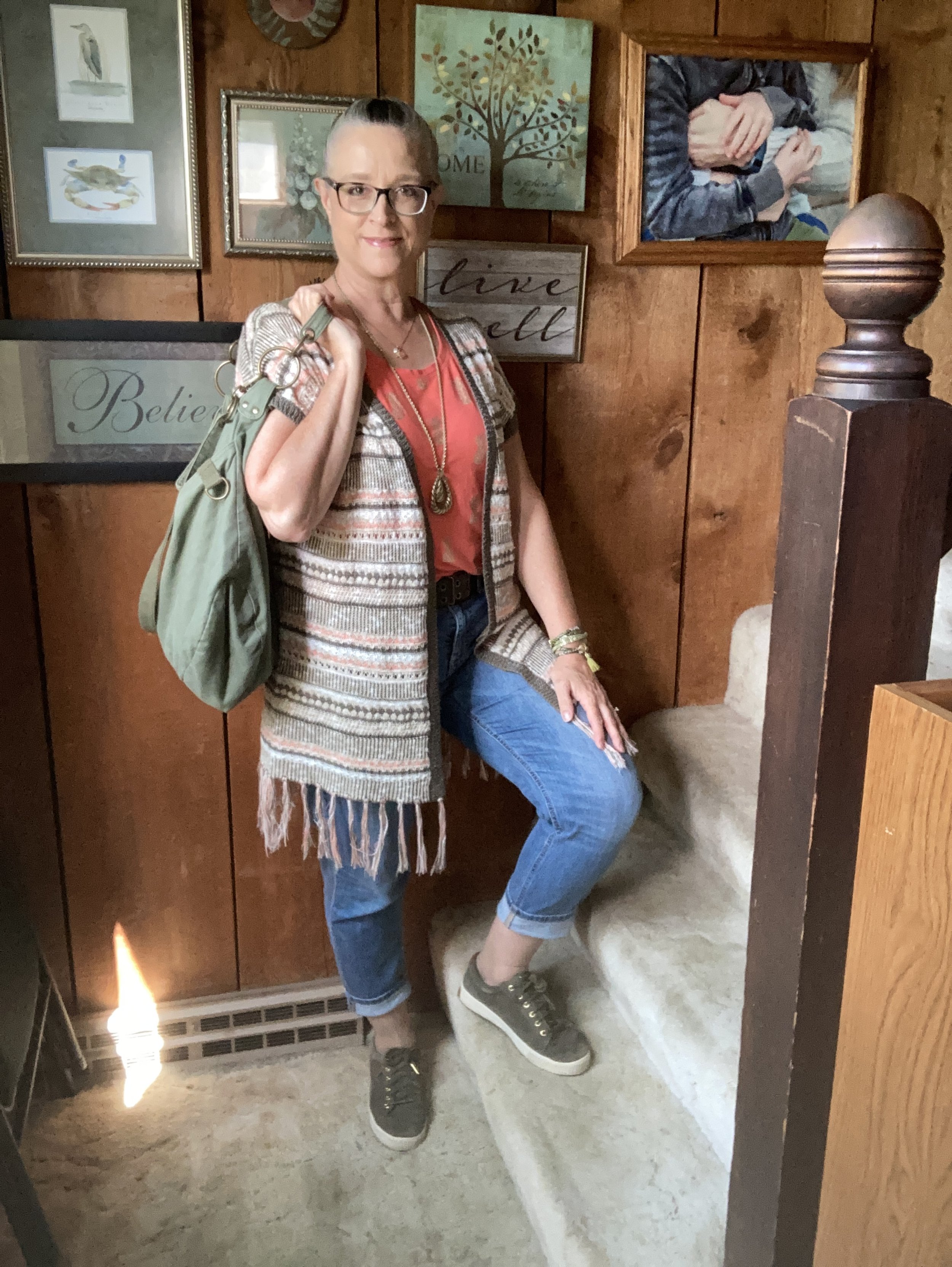
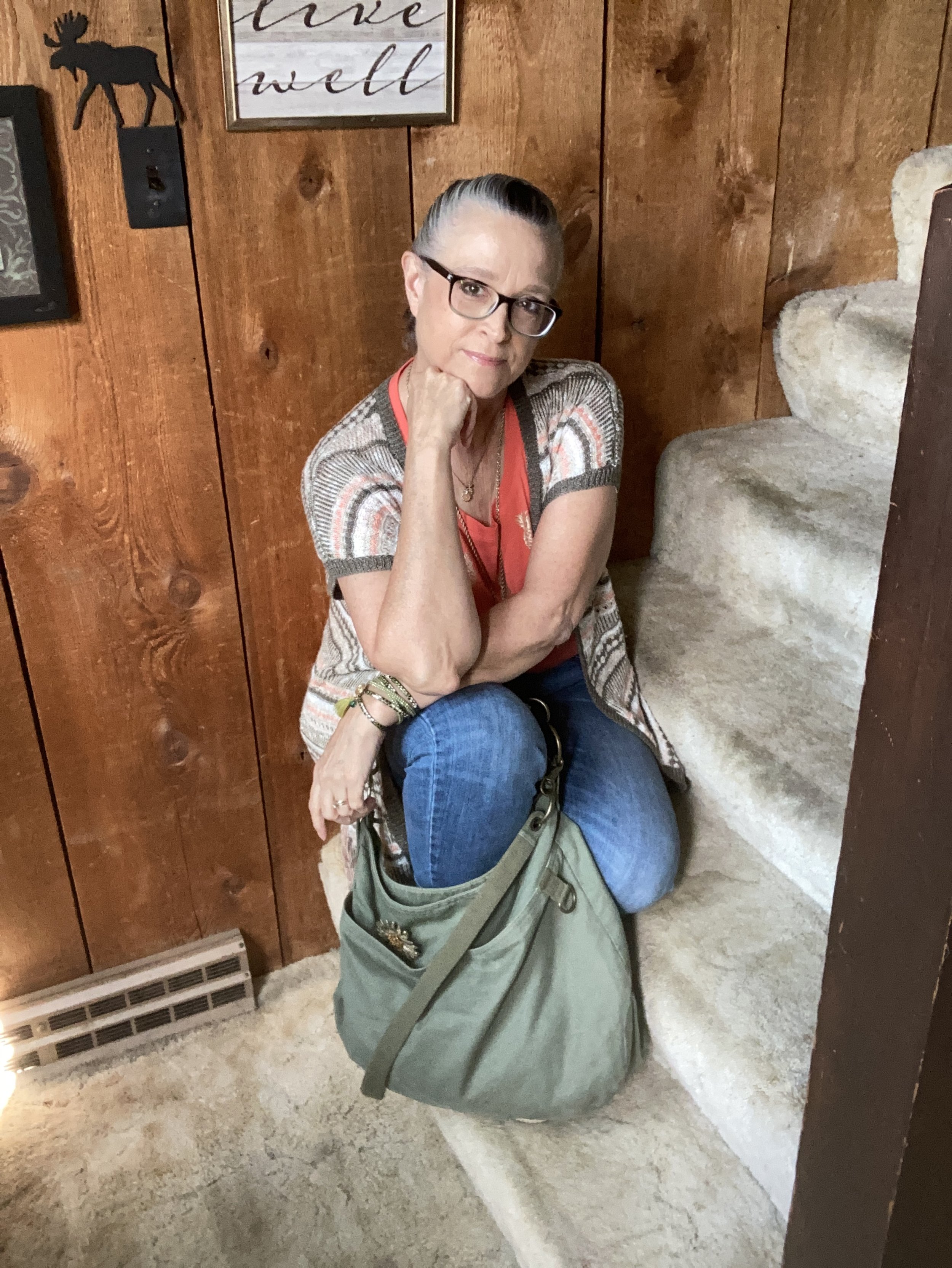
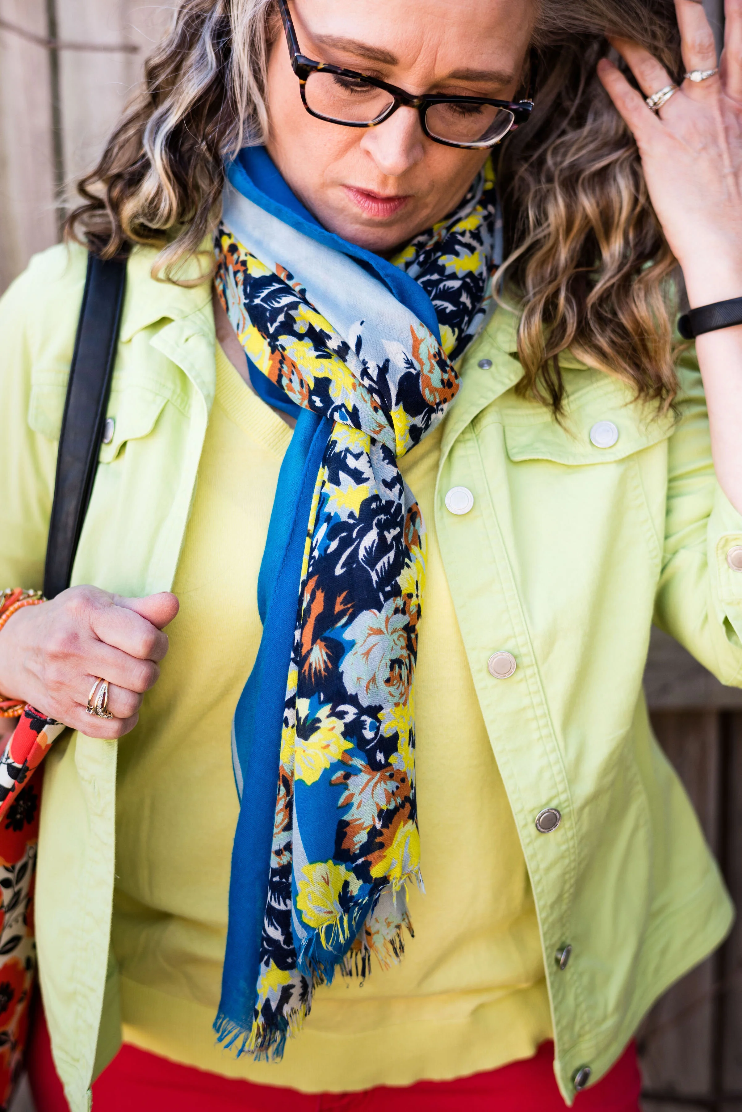
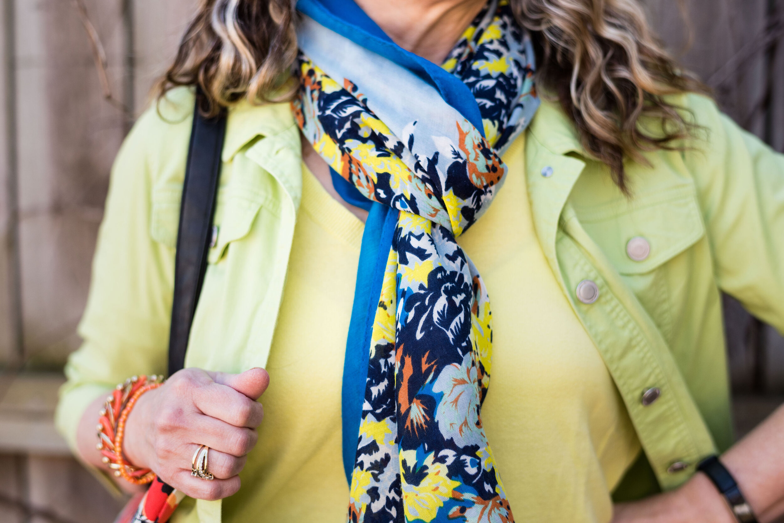
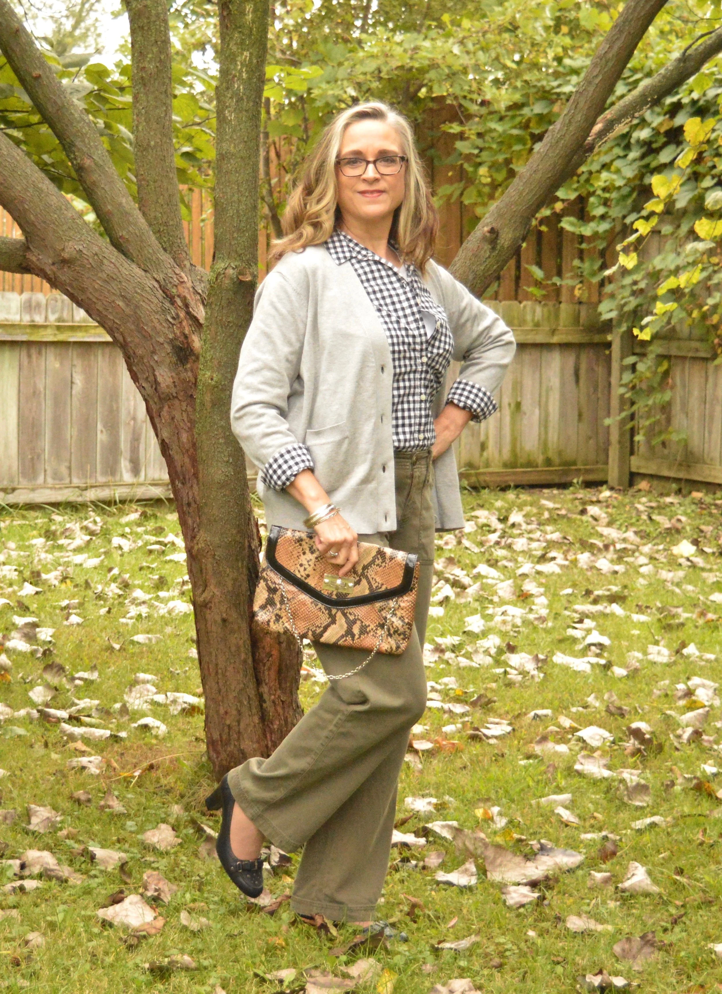
I decided to use my pastel green, open front, Christopher and Banks sweater instead of a similar colored pullover that I could have used. I love this light colored, textured piece.

Style Tip: If you are getting tired of the darker colors we often reach for in the colder months try changing things up a bit by throwing in a few pastels or super bright colors to give your day a boost.
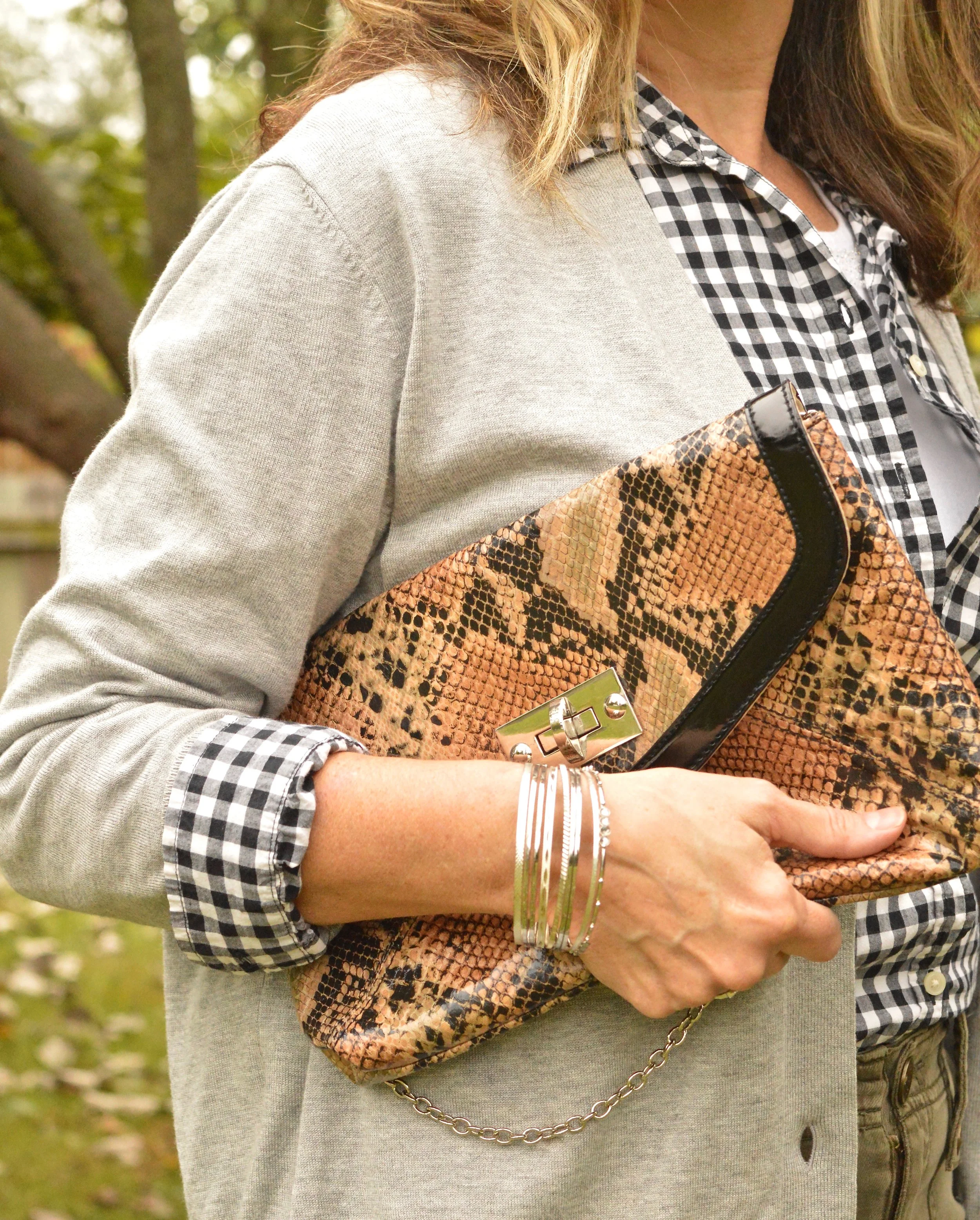
My thrifted Oxford gray, Sonoma pullover sweater is a light weight piece that works much like a long sleeve tee, but has the fun detailing of the ribbed bottom, boat neck, and wrists.

Style Tip: Look for light weight sweaters at thrift stores or end of season sales to add to your basics pile of layering pieces.
These Stitch Star jeans from Meijer are definitely showing their wear and will probably need to be passed along one day soon.

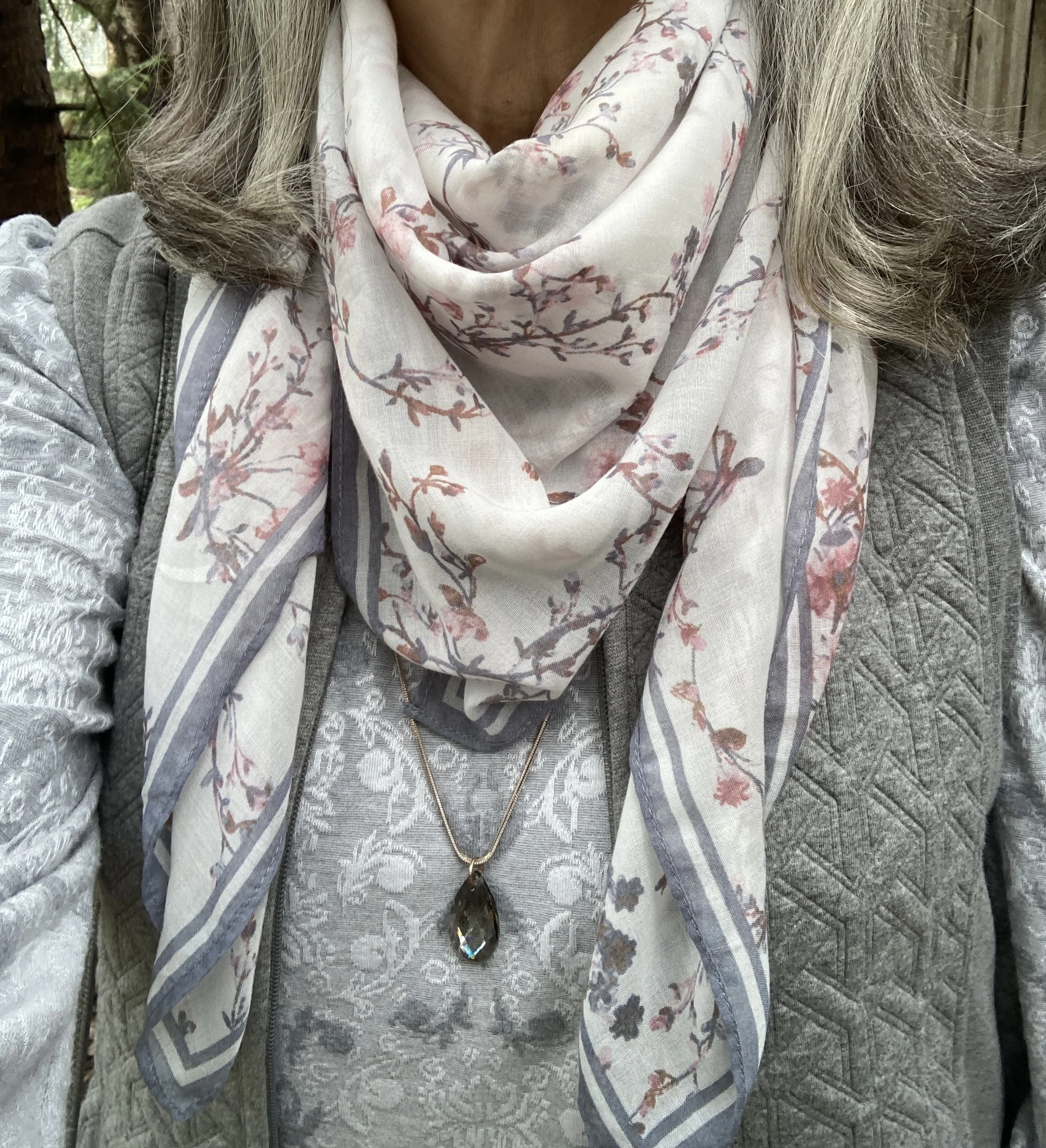
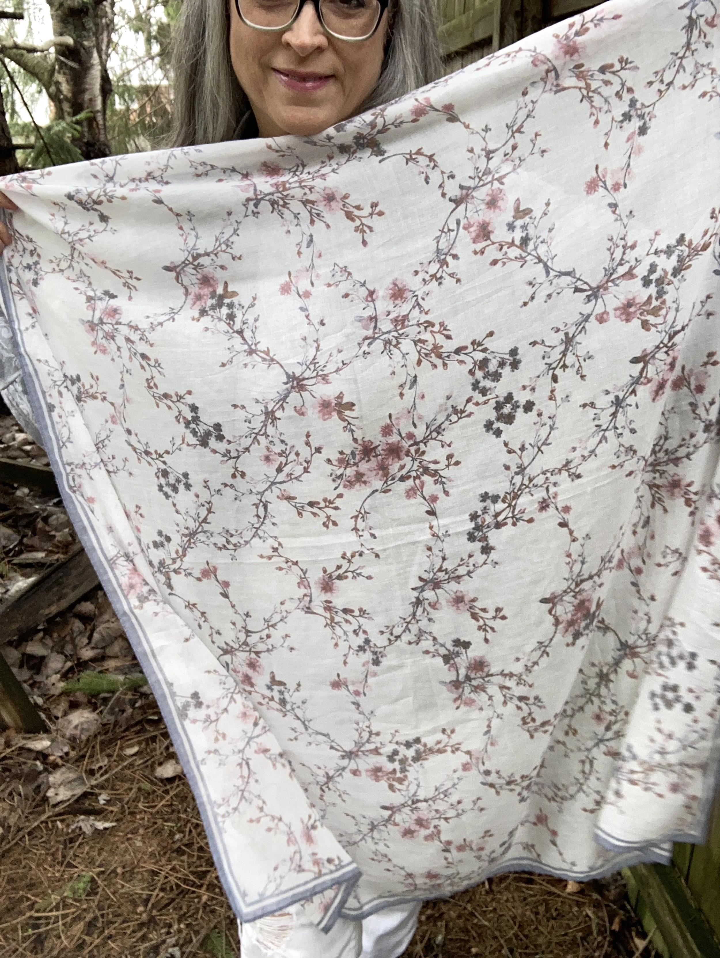
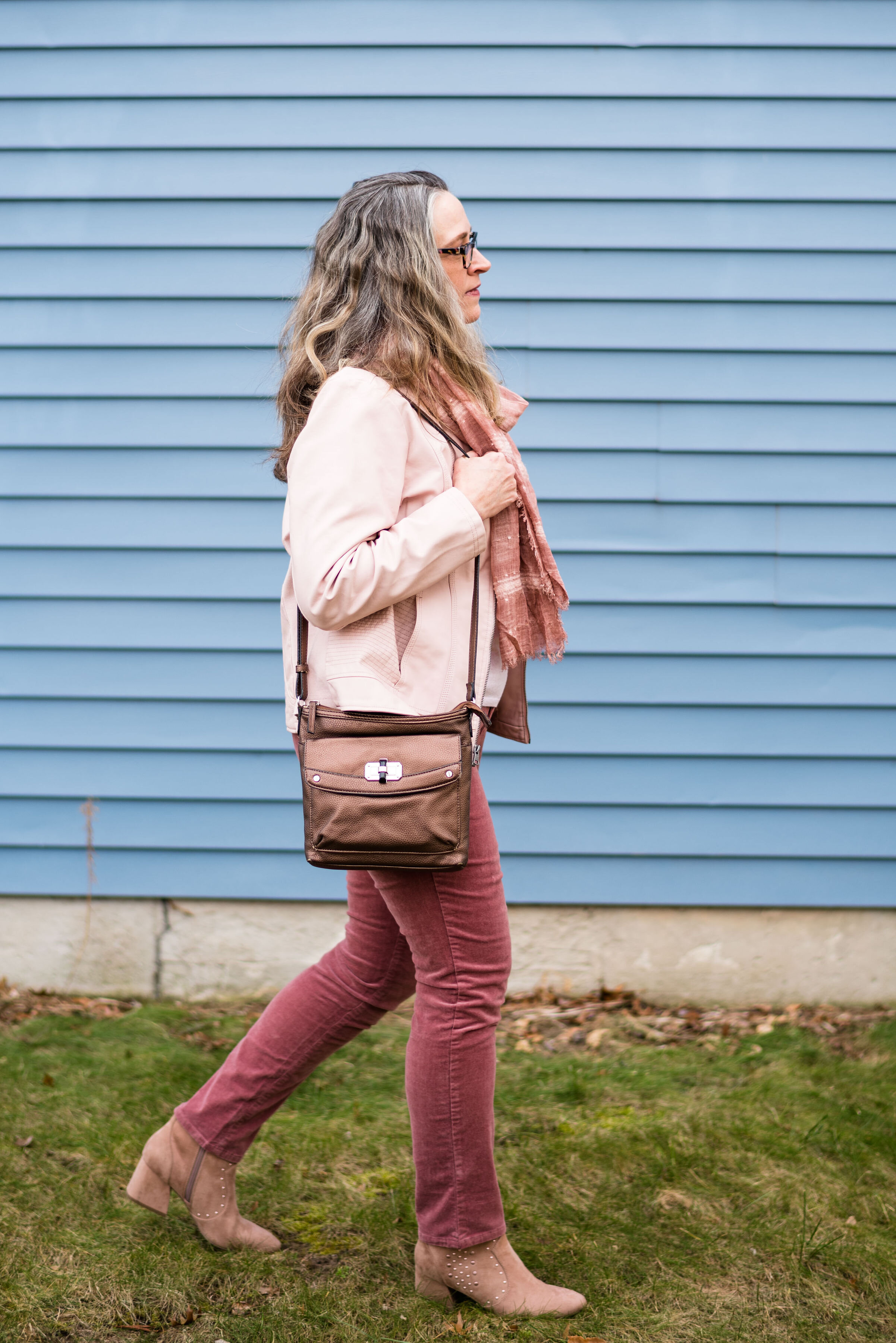
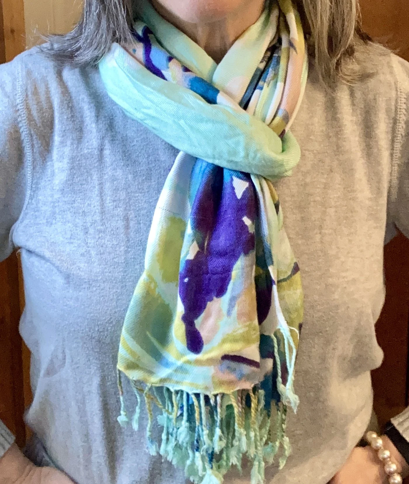
I wanted a similar scarf to the original pin with a touch of another pastel color. Theirs was more of a purply pink, so I pulled out a scarf that had the light green, but also some splashes of purple and pale pink,
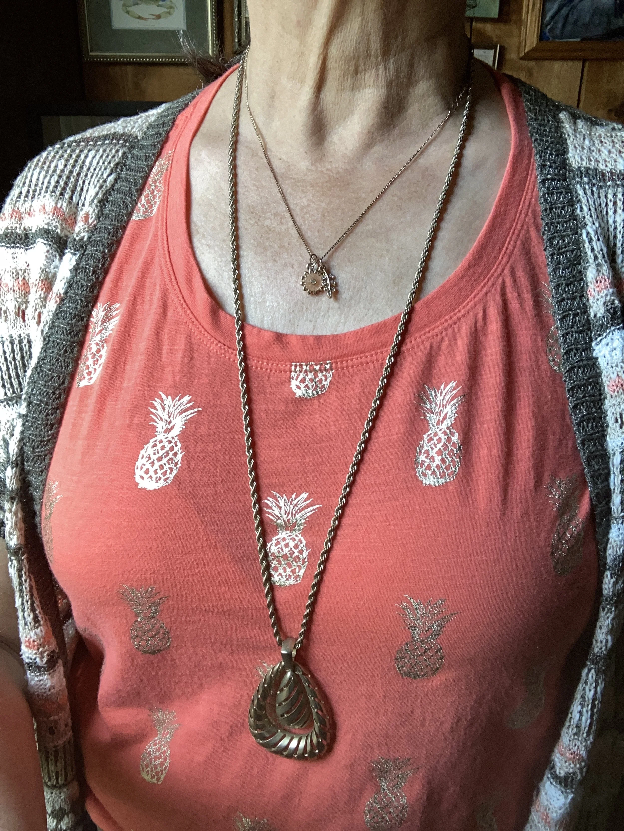
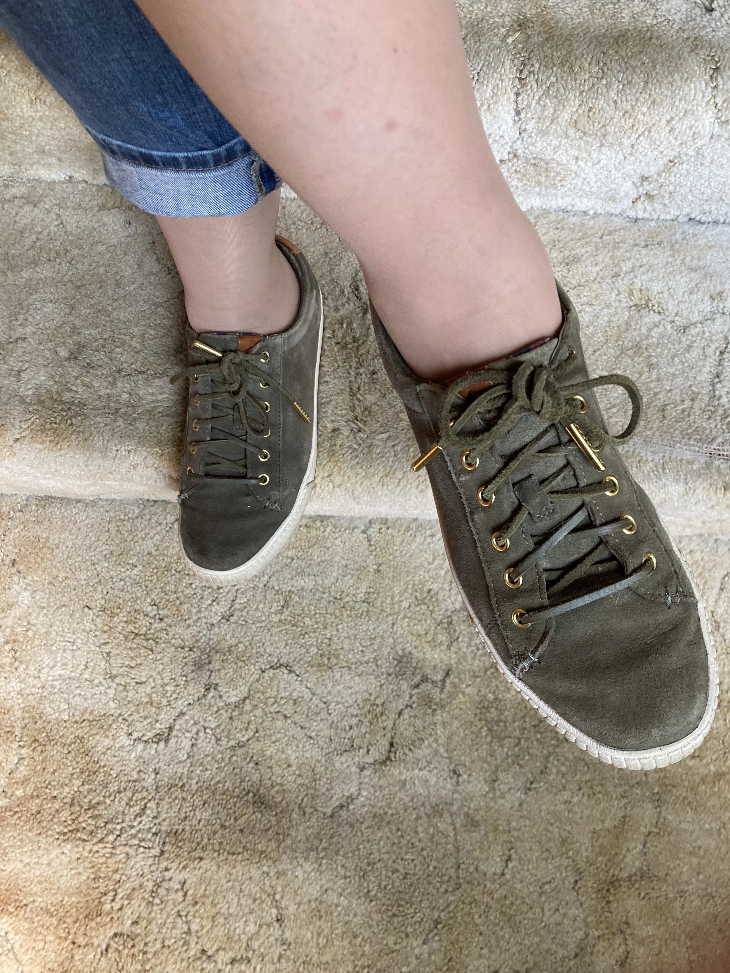
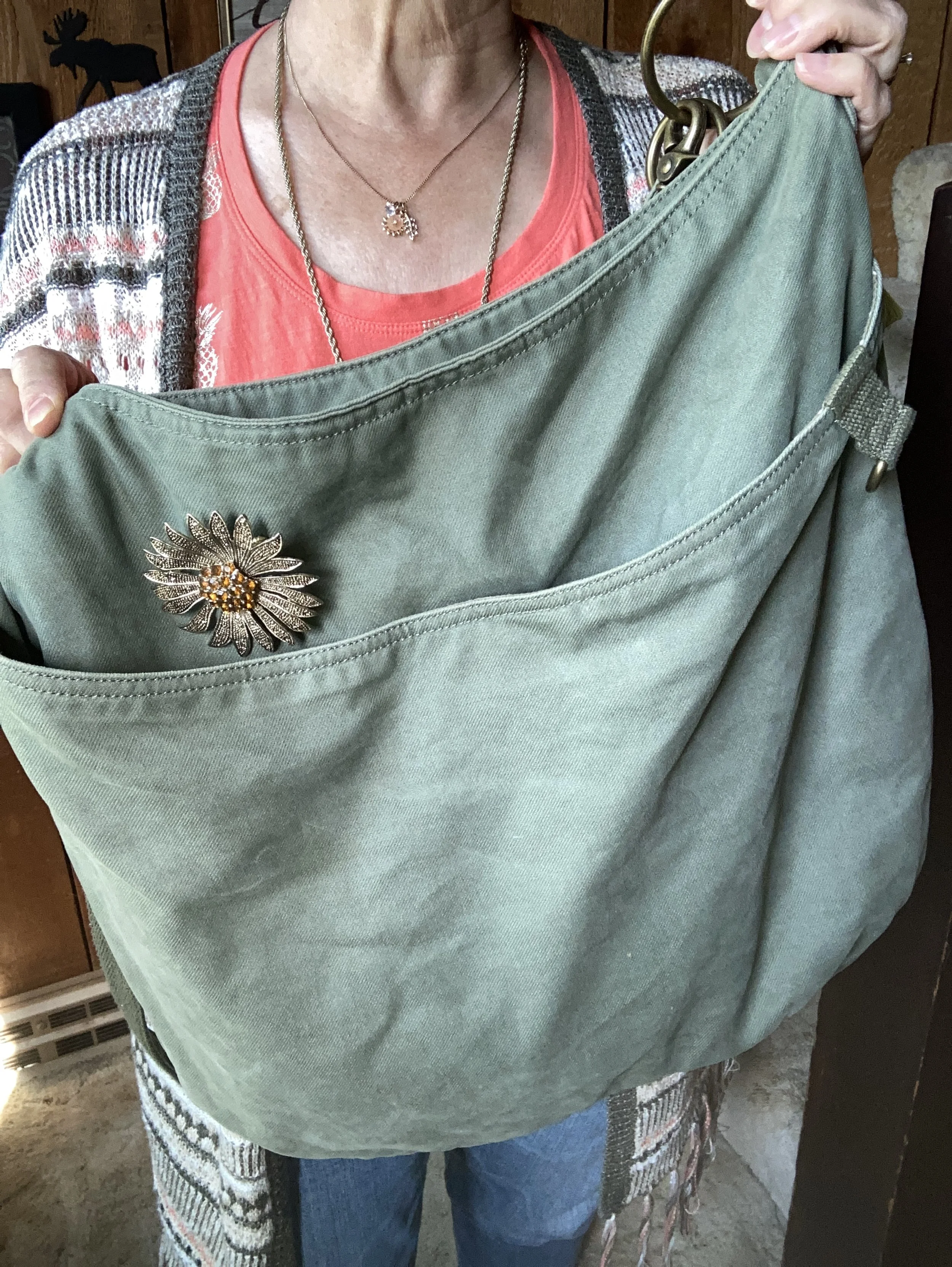
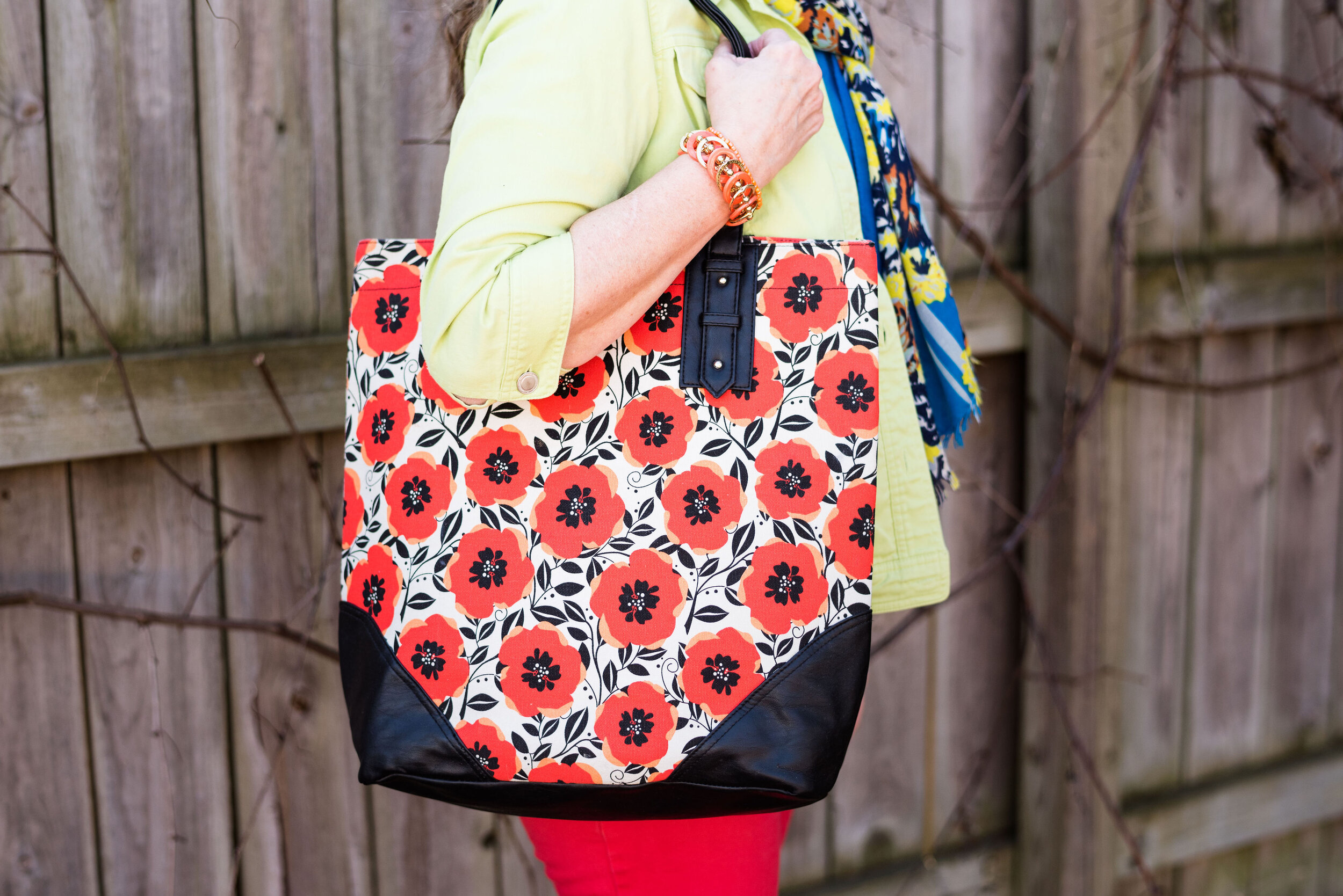
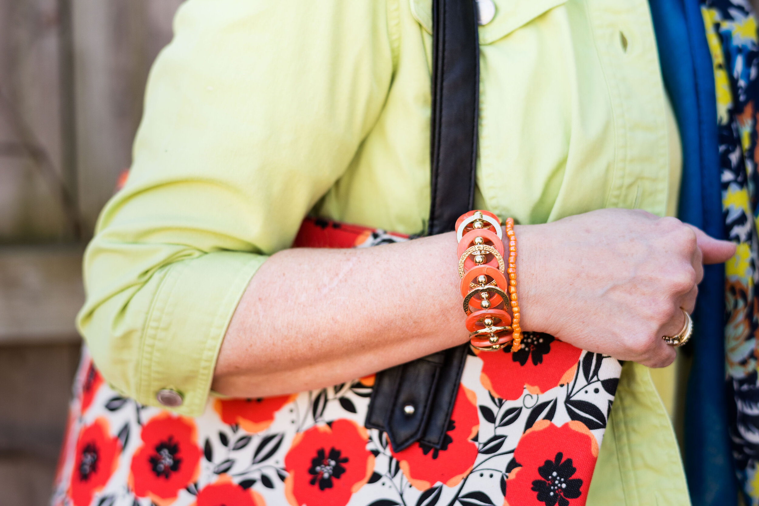
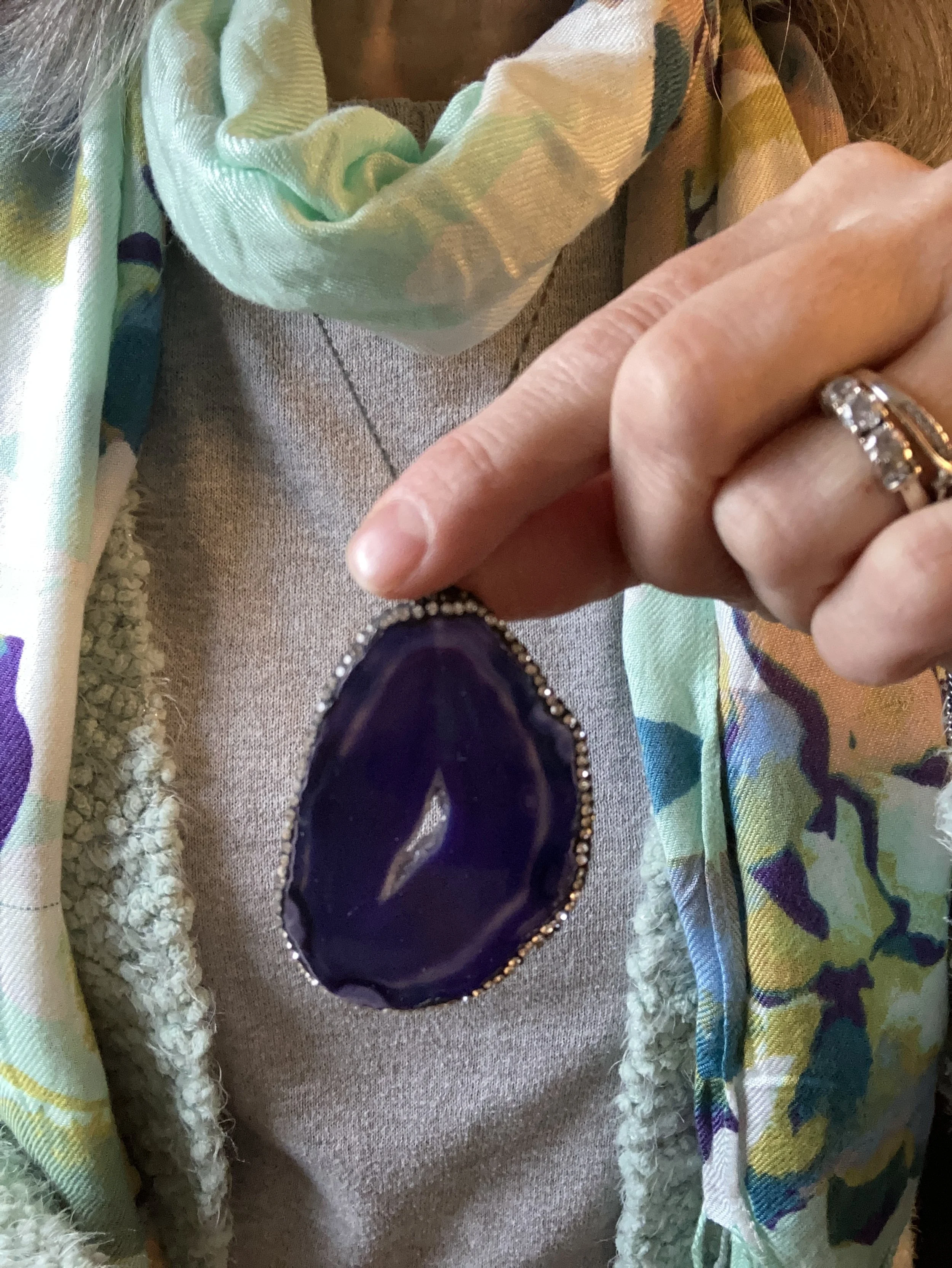
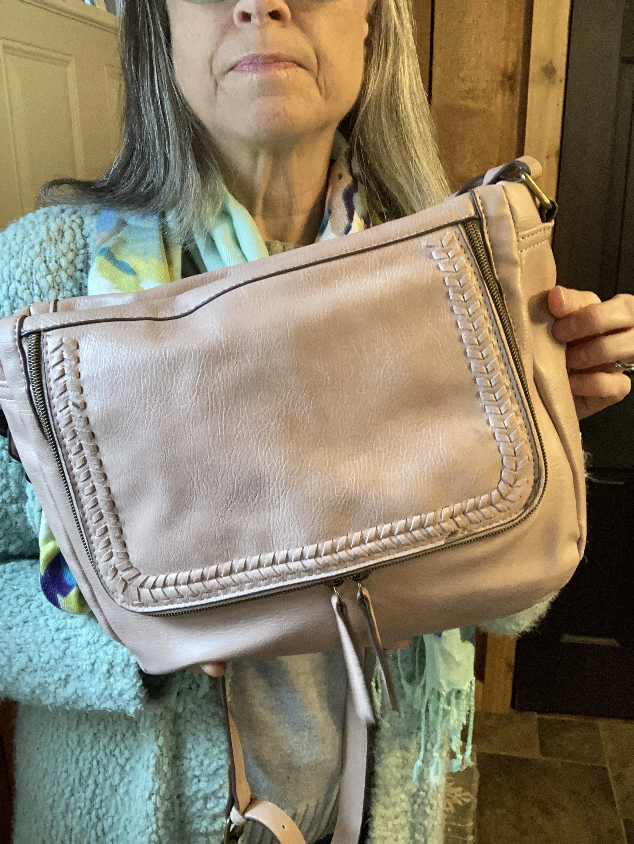
I chose pale pink for my other accessories, except my necklace which is dark purple agate. My cross body bag and my metallic Circus by Sam Edelman combat boots are both thrifted.

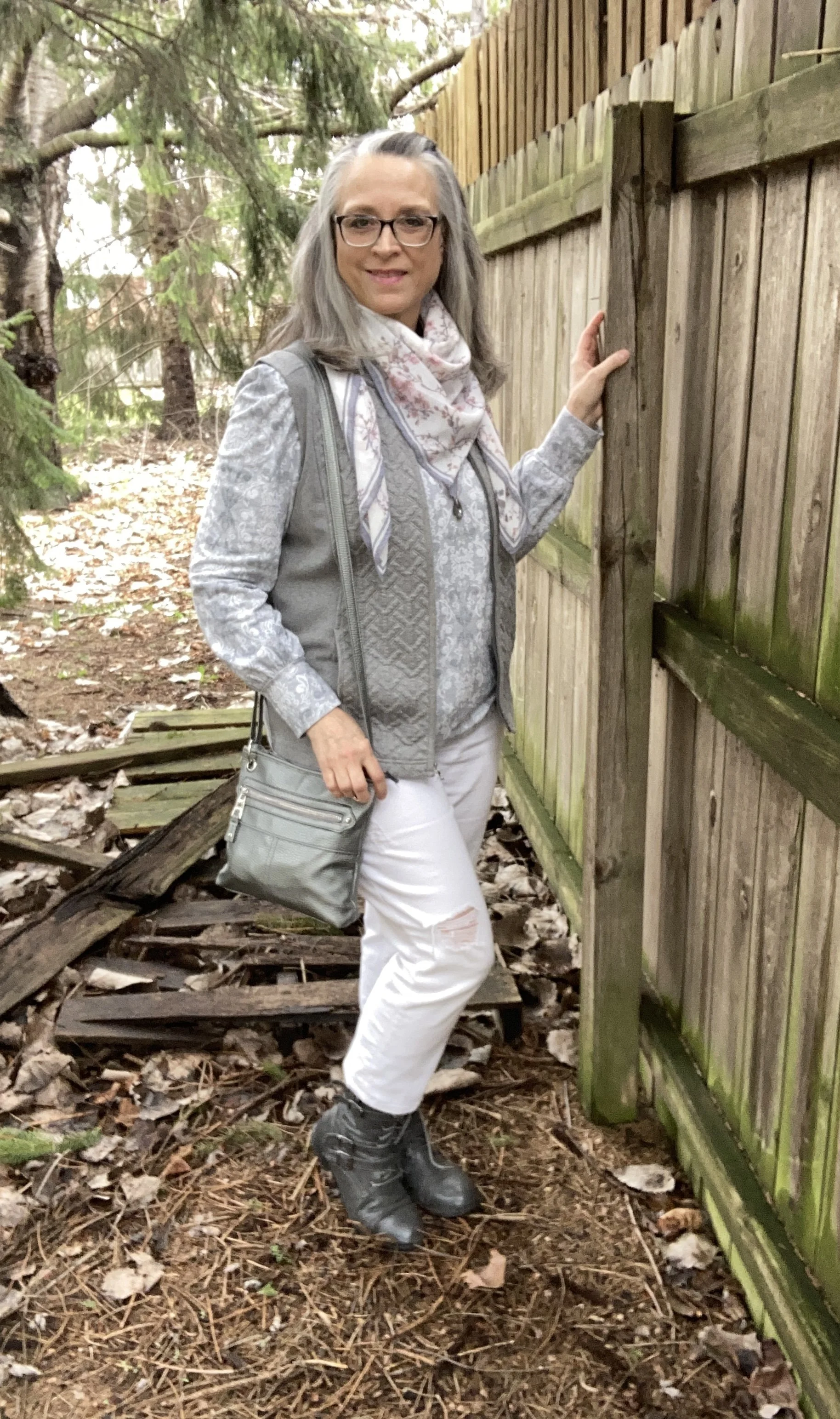
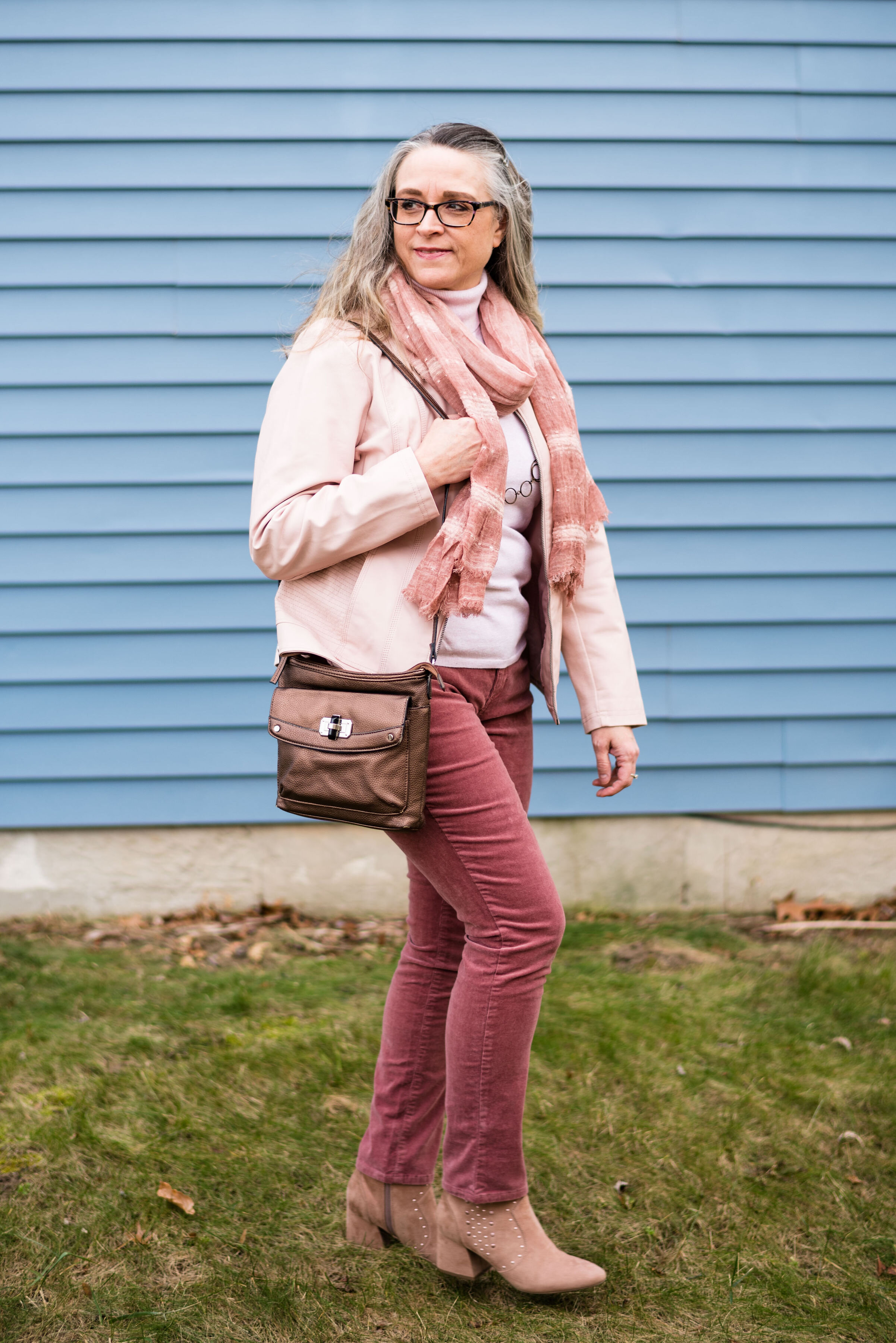
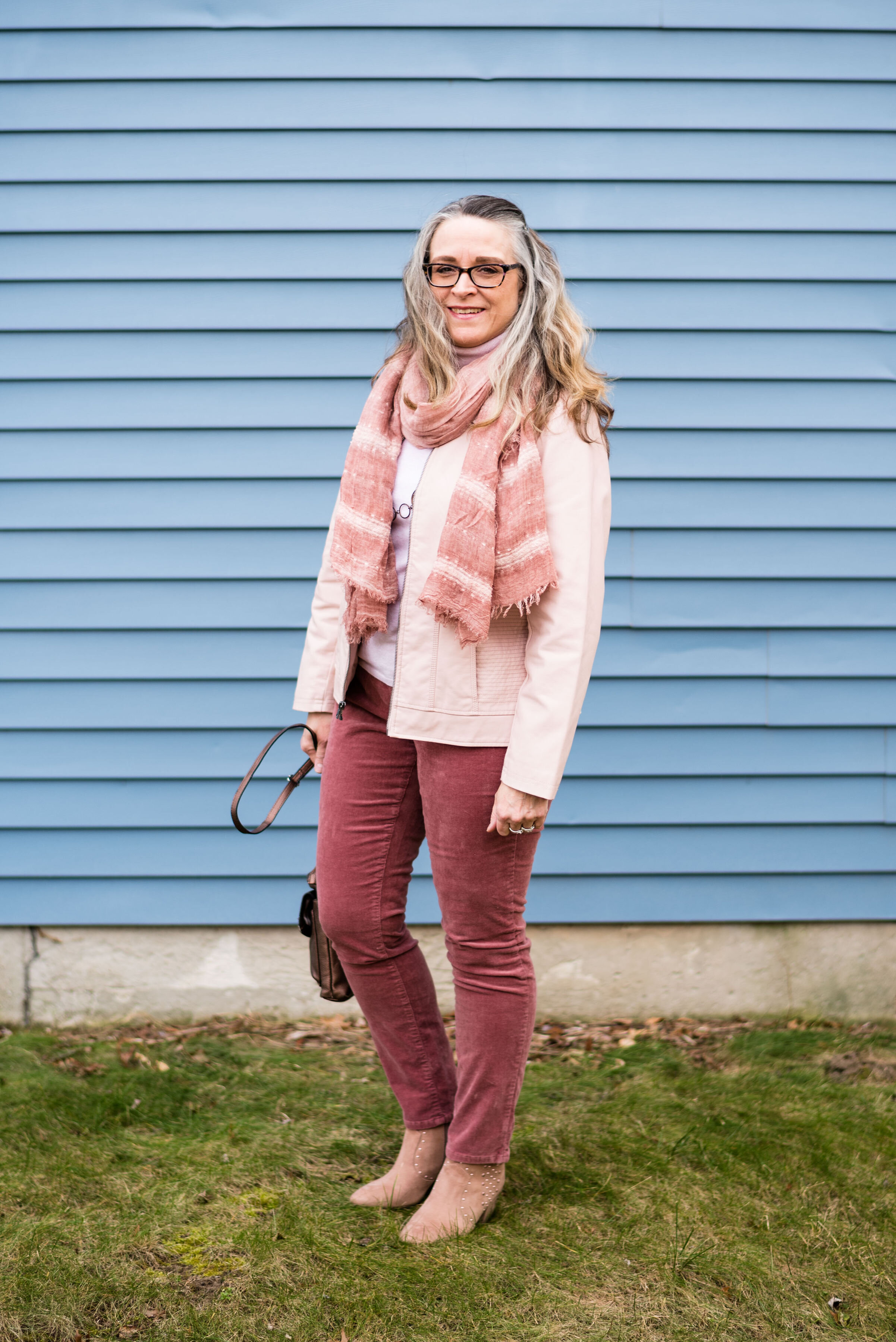
I thought I would add pictures to show you a few other ways to wear the scarf with this outfit.


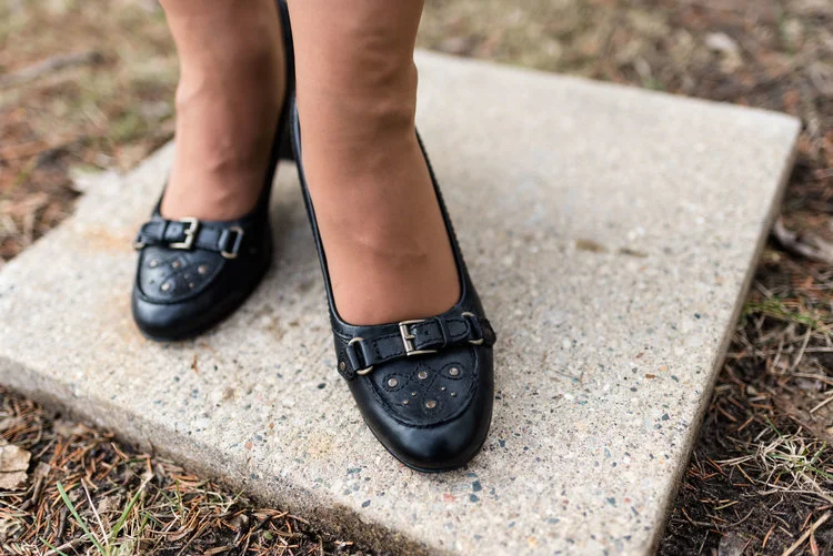
What do you think of this outfit? I think the overall concept is a good one: cardigan, light weight sweater, pants/jeans, scarf and accessories. However, if I did it again I think I would swap out the the faded jeans for a dark black pair. I am also still not sold on the metallic combat boots. I am not sure why. I think they are adorable when I look at them, but when I put them on I feel unsettled. Ha, ha. Yes I do have an emotional relationship with my clothes.
Let me know what your thoughts are. I always love your feedback.
No shopping links this week. Be sure to stop by the blog on Thursday for another Mulling it Over Post where I continue to dive deep into Romans 8.