February Outfits: Colorful Combo 1 - Pink, Red and Salmon
Hi everyone! I am making an attempt to get back in the saddle as they say, or in my case, get back to posting on my blog. January was a difficult month, as I lost my mom on Christmas Day, traveling for the funeral and then ending up with the flu. I wanted to take the month off as a way to lean in to grieving, but I ended up leaning in to trying to recover from illness and nurse my spouse back to health. Yikes! Anyway, I am going to give it a go for February and we’ll see how things develop.
I decided to focus my attention on the month of hearts including both Valentine’s Day and The American Heart Association’s Heart Awareness month. This month I will be featuring outfits with the colors of “love”: pink, red, burgundy, purple, white and everything in between. I decided to do a few different color combinations. I hope you enjoy these outfits.
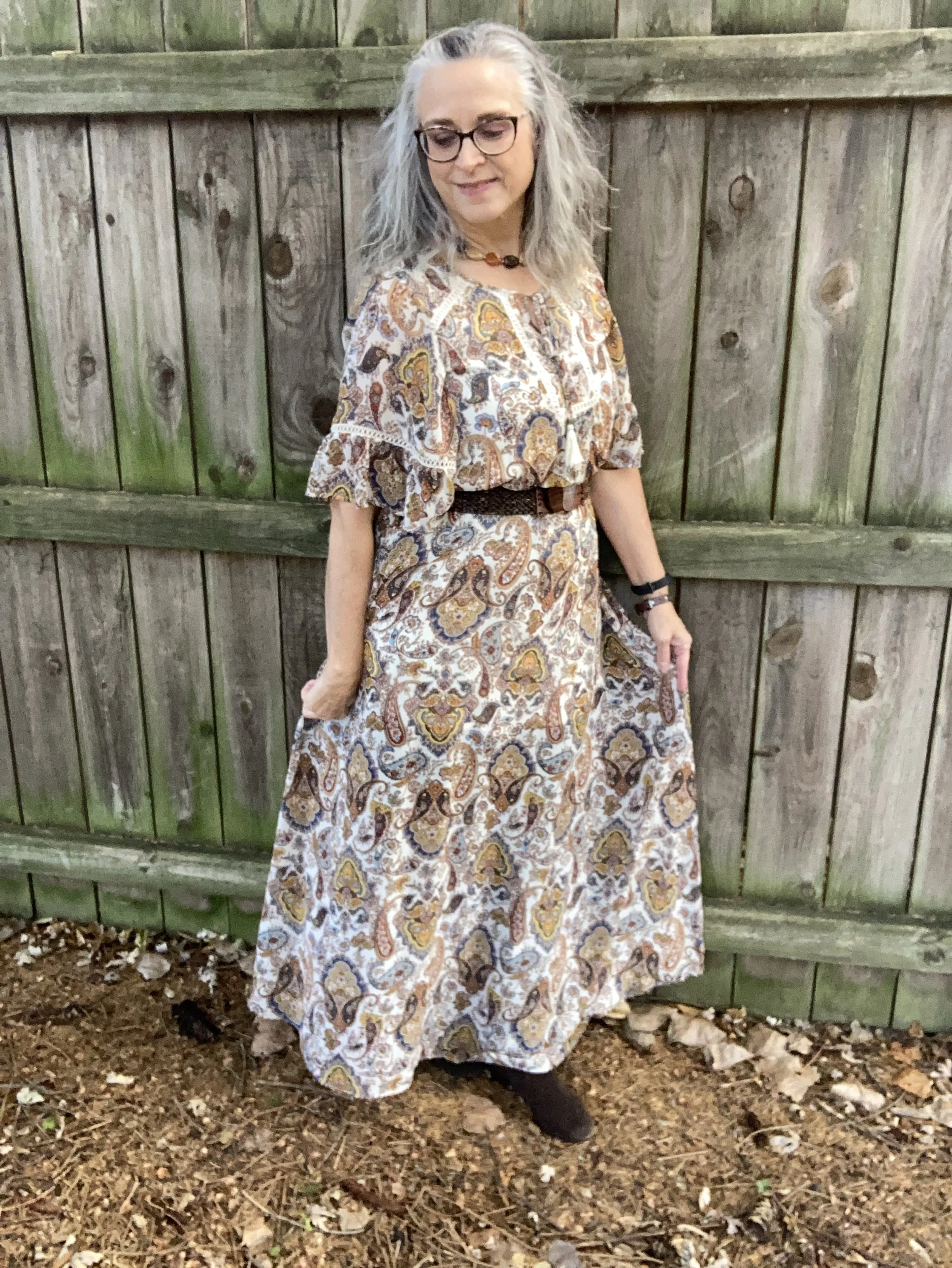
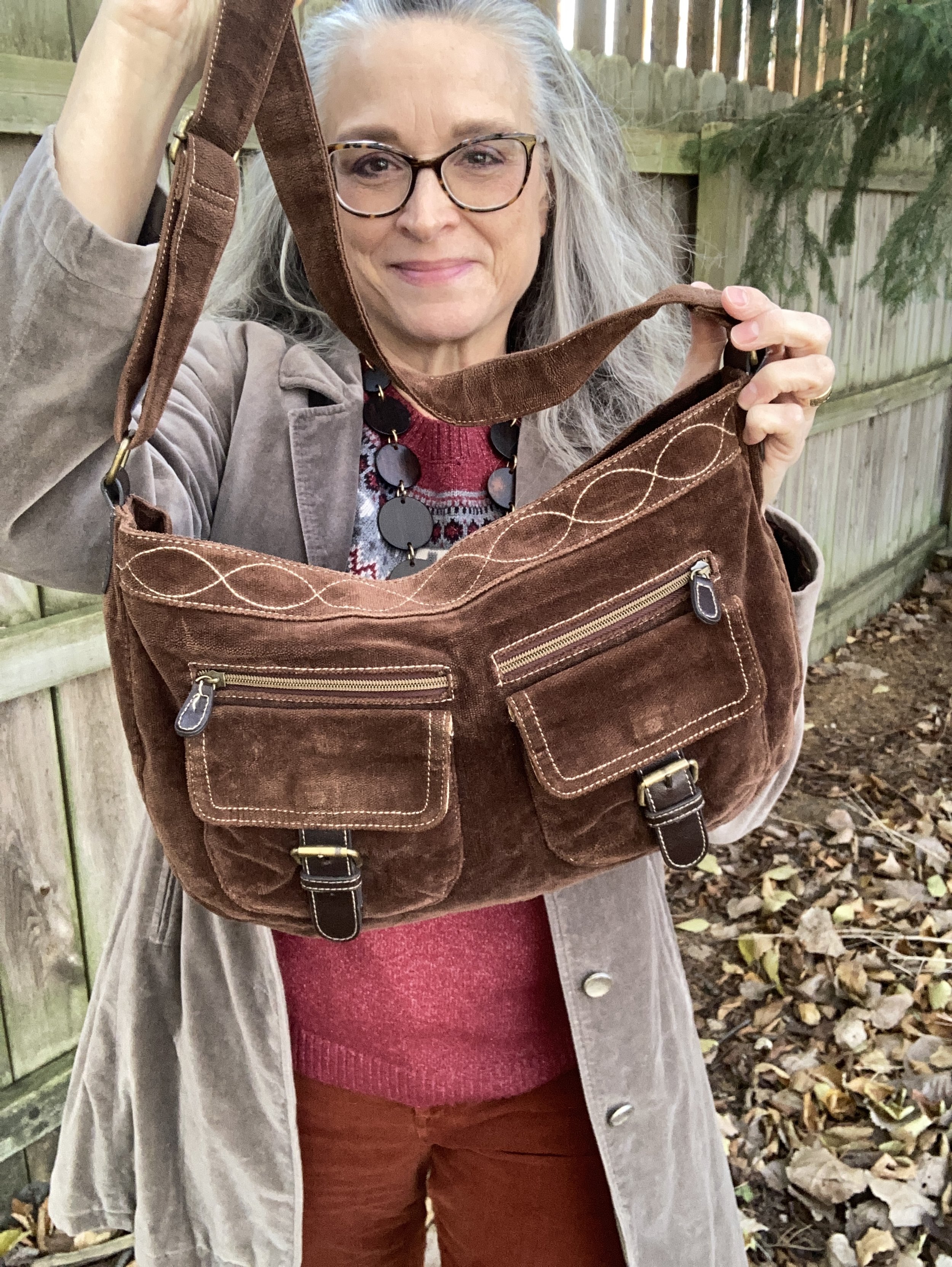
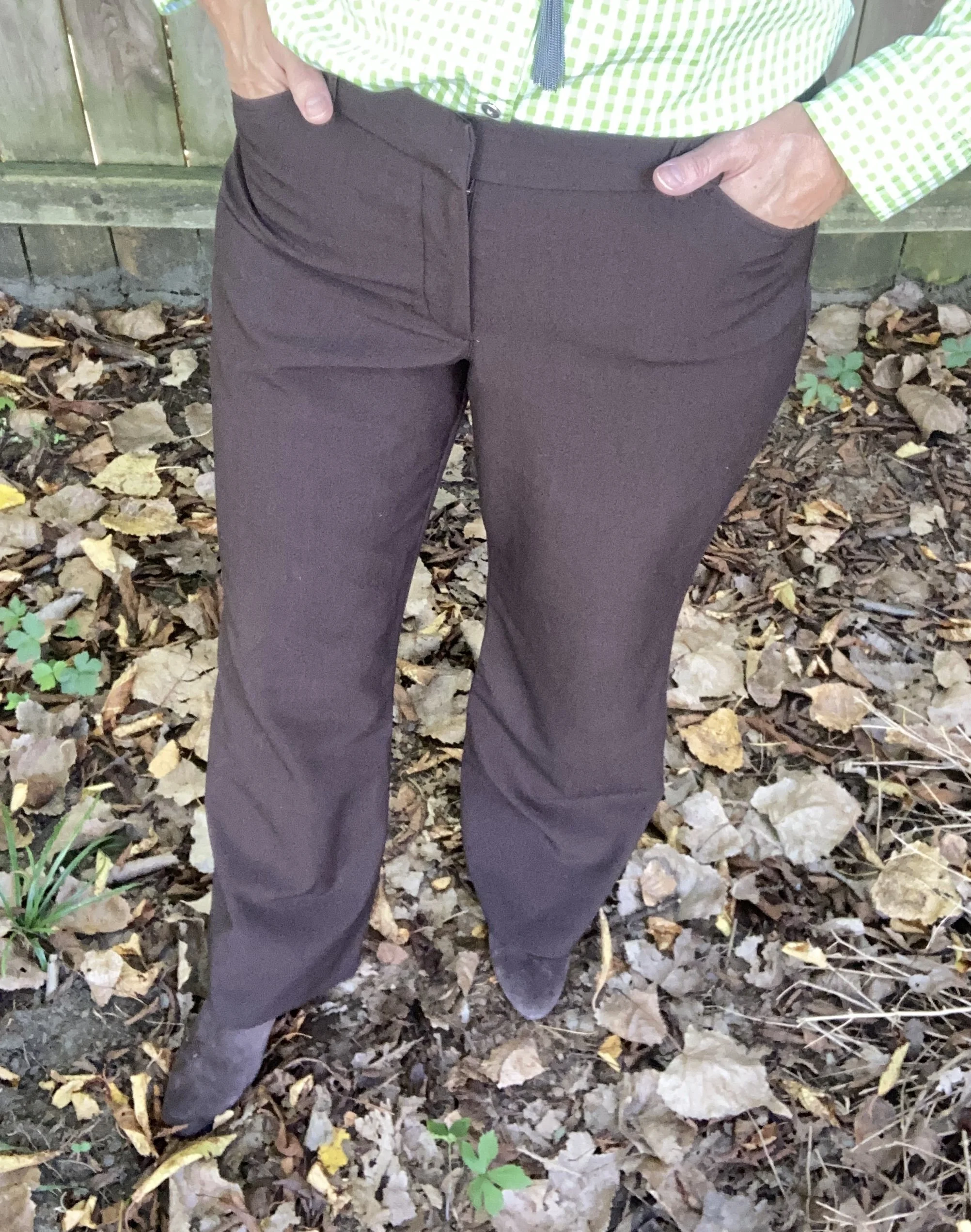
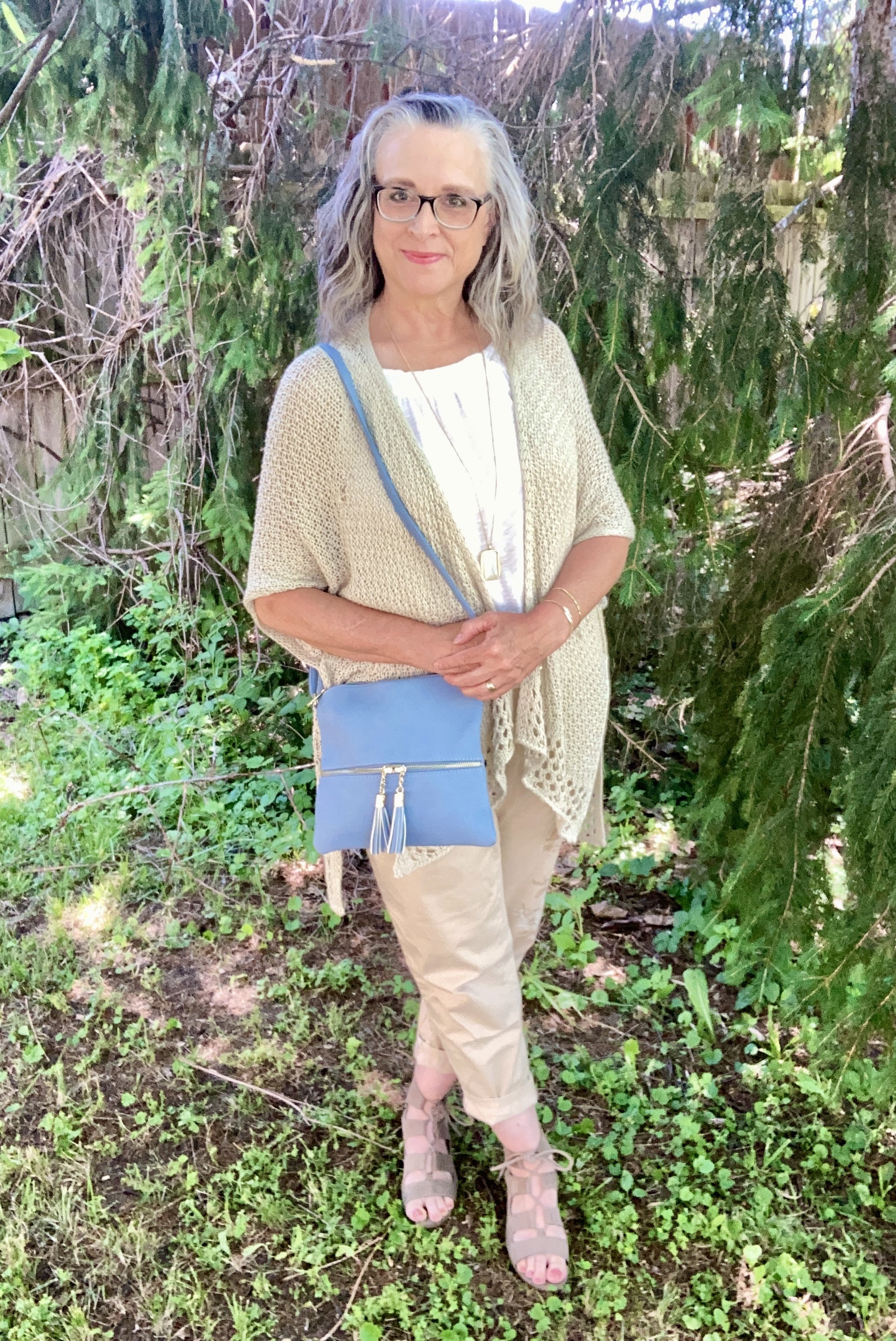
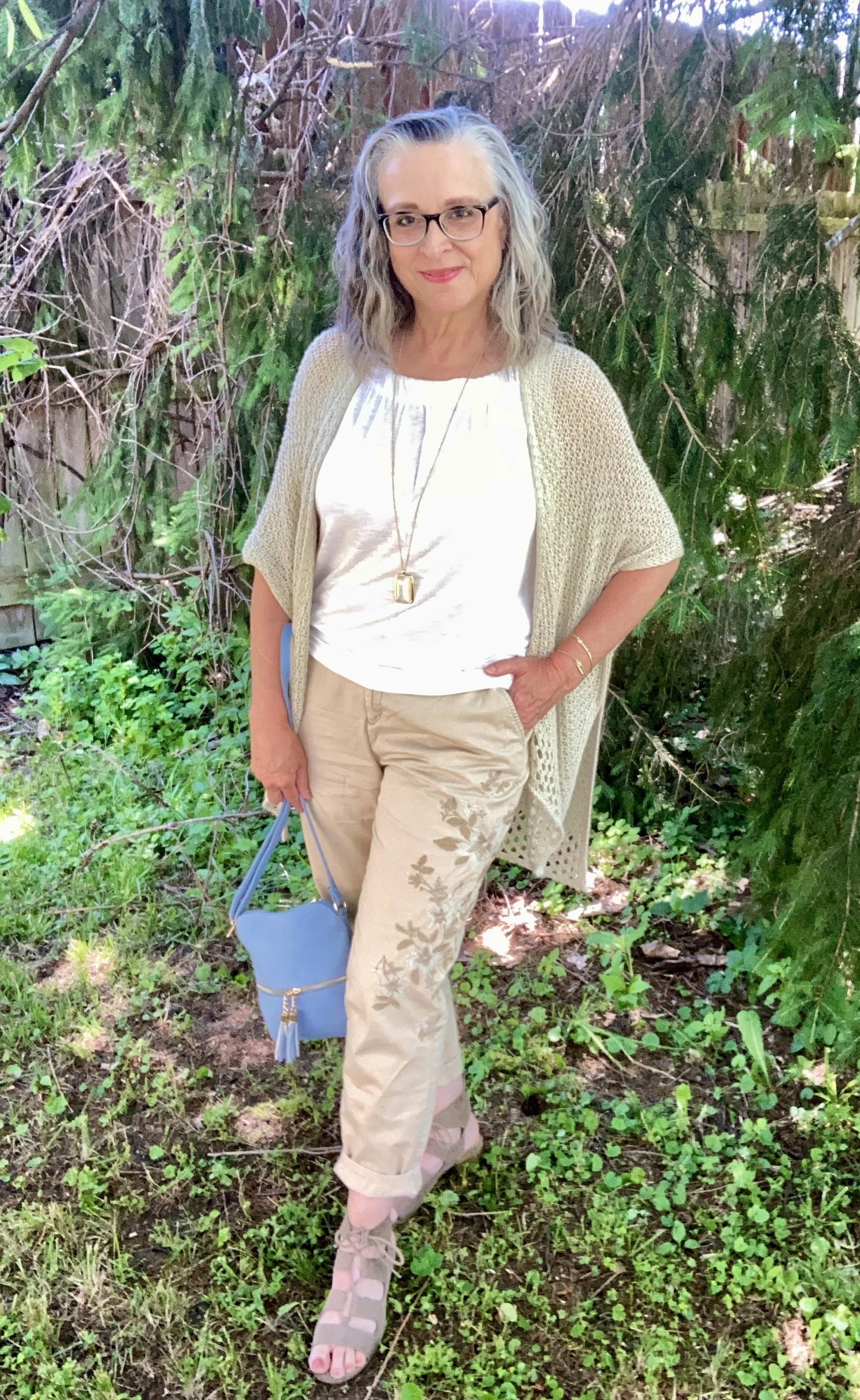
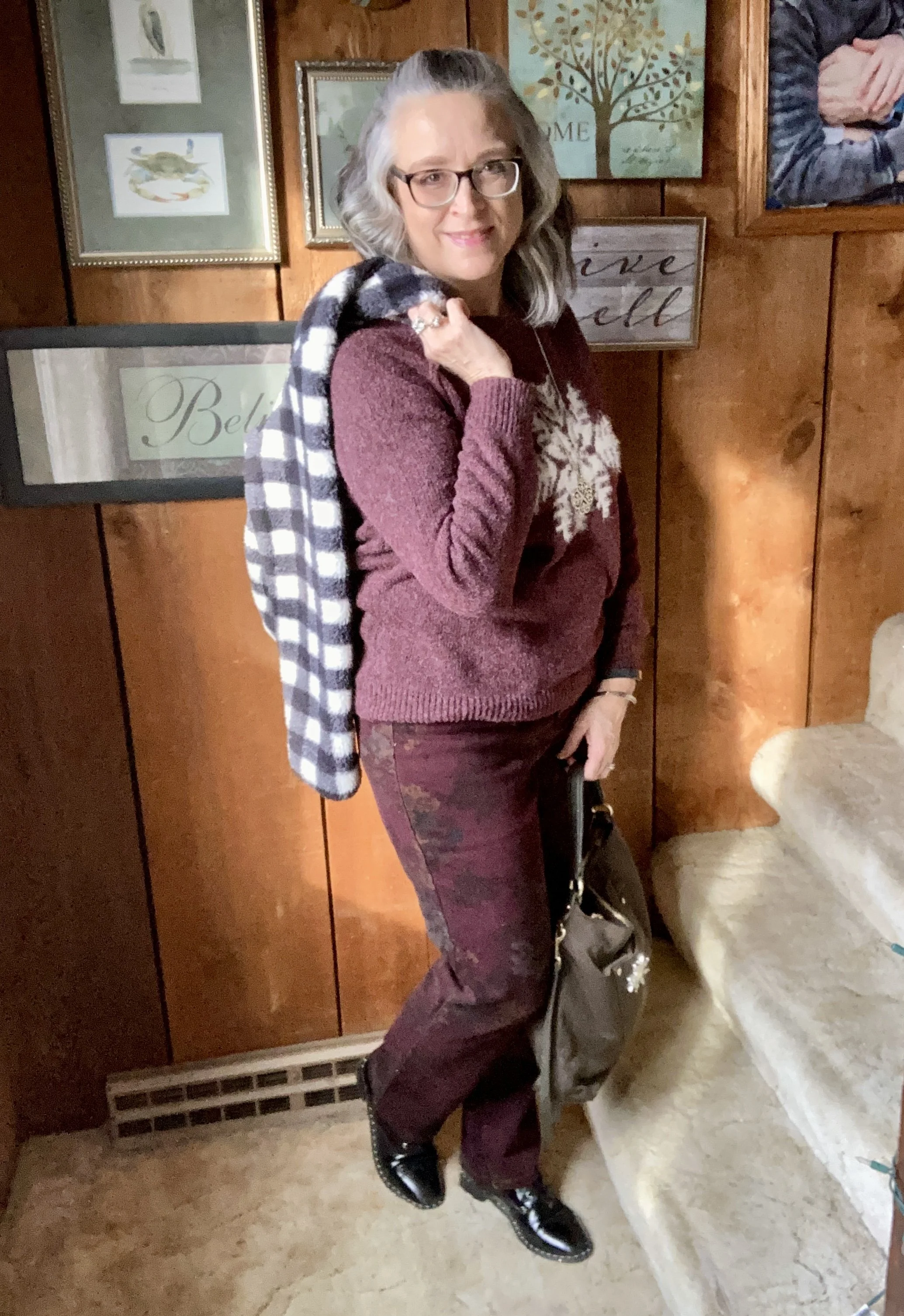
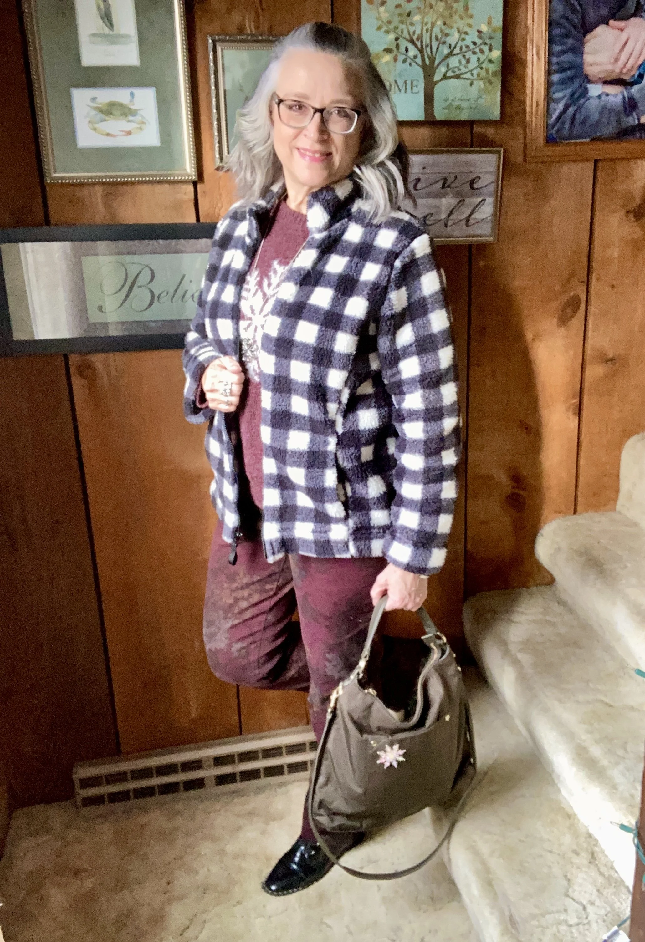
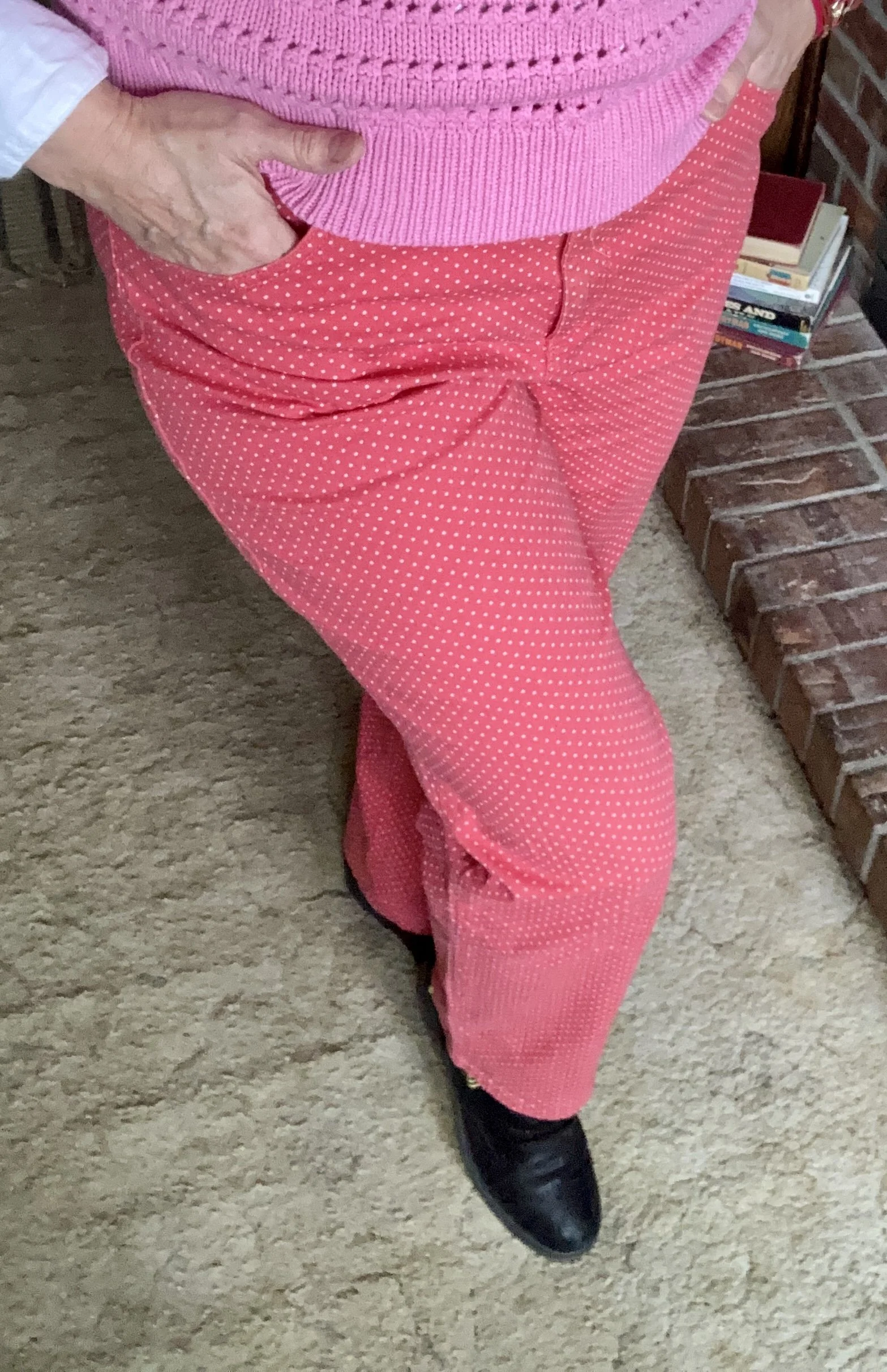
I apologize that these pictures are so grainy. I need a new phone, but haven’t gotten around to it yet. Also, my pants are very wrinkled. I took these yesterday and just wasn’t feeling like I had very much energy. Between grief, Seasonal Affective Disorder and my ongoing health issues, I didn’t feel like ironing. Ha, ha.
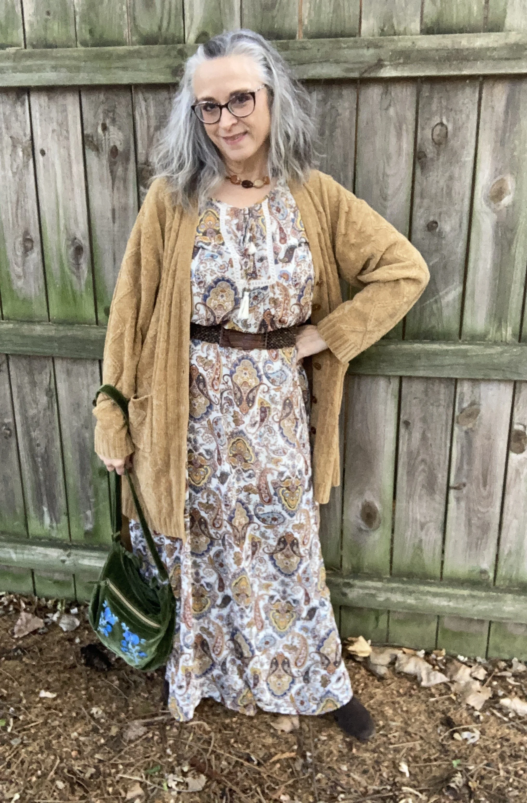
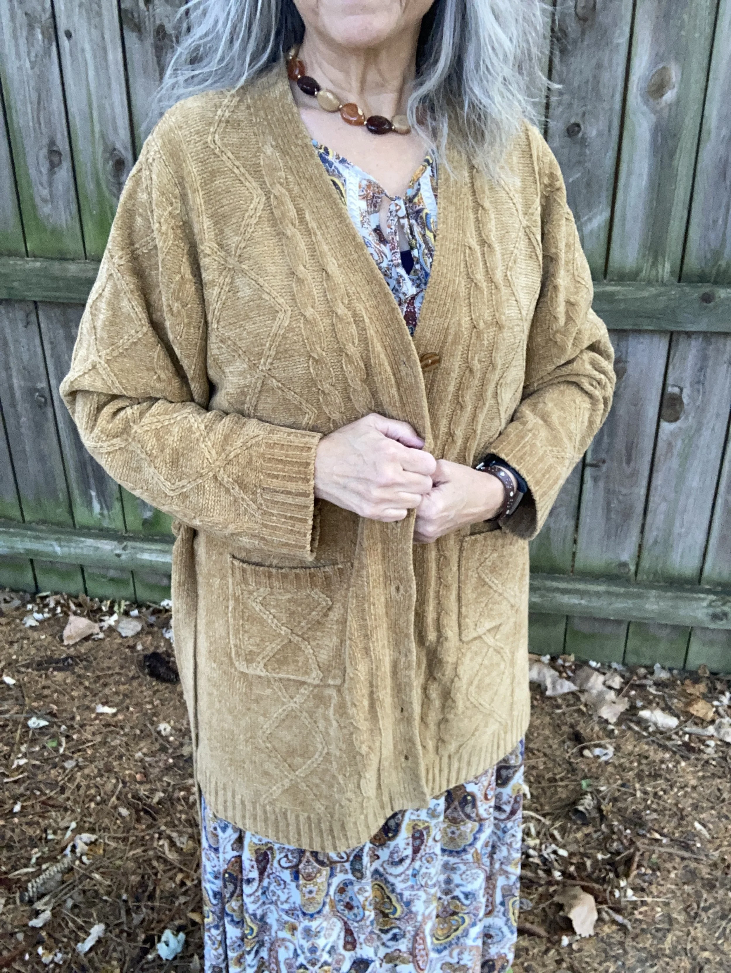
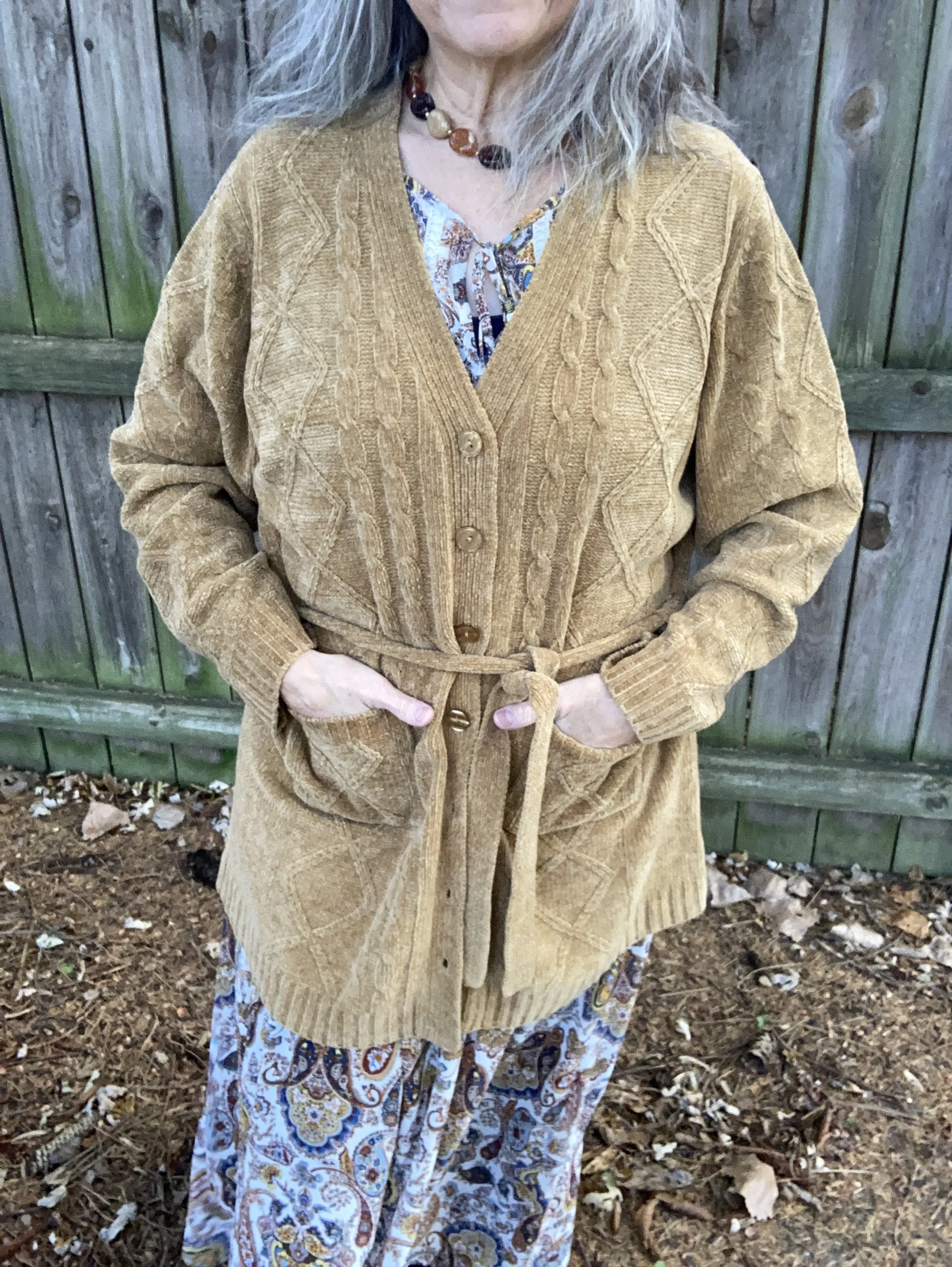
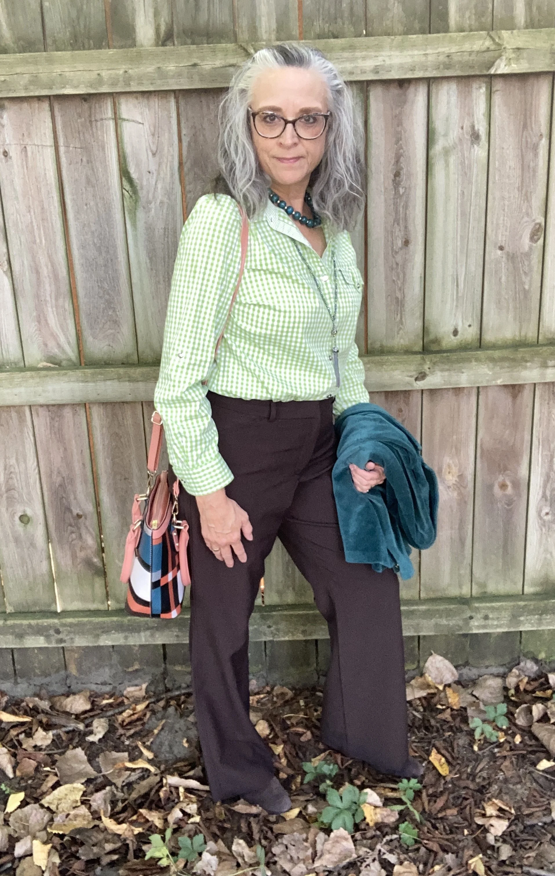
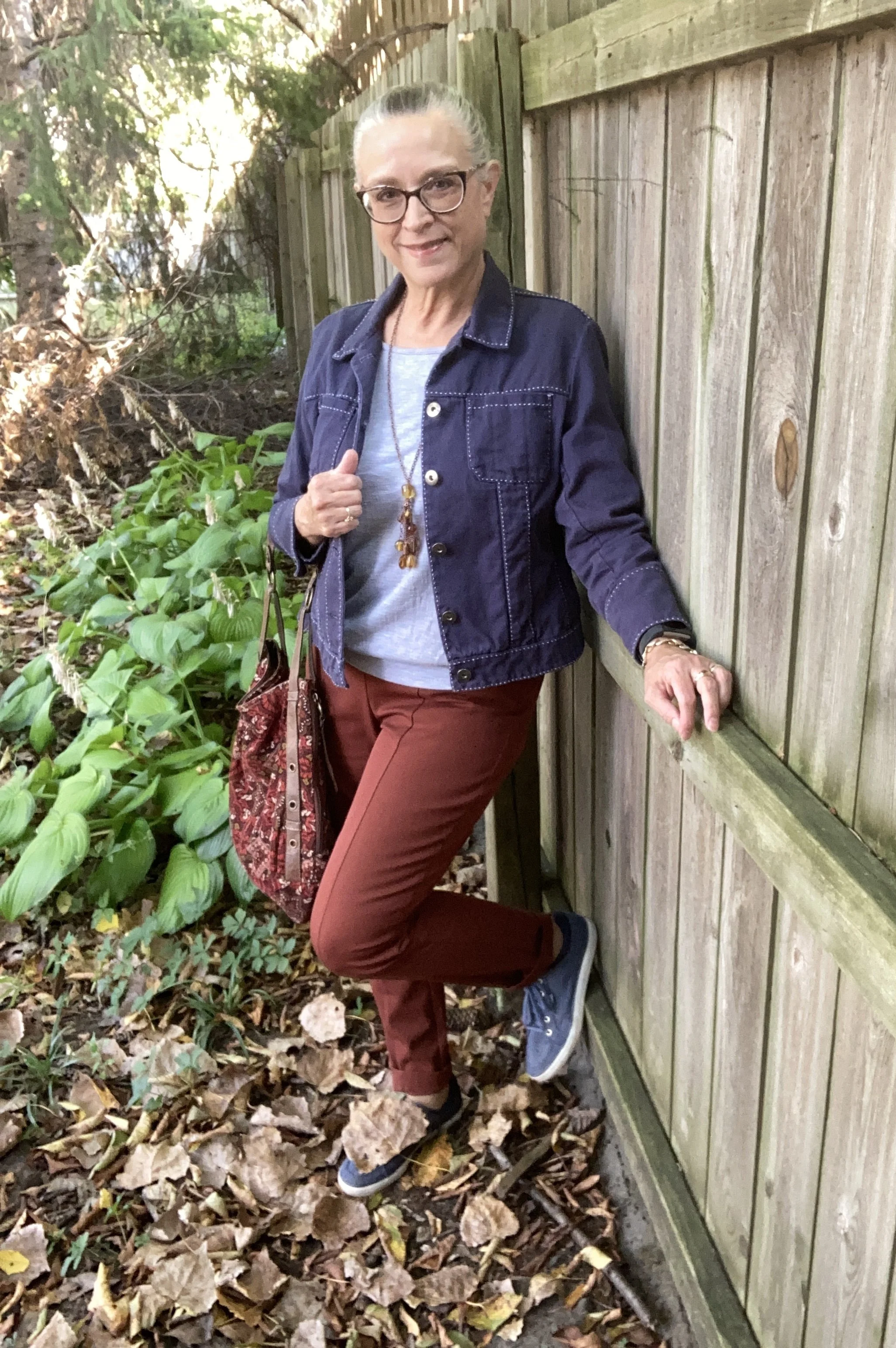
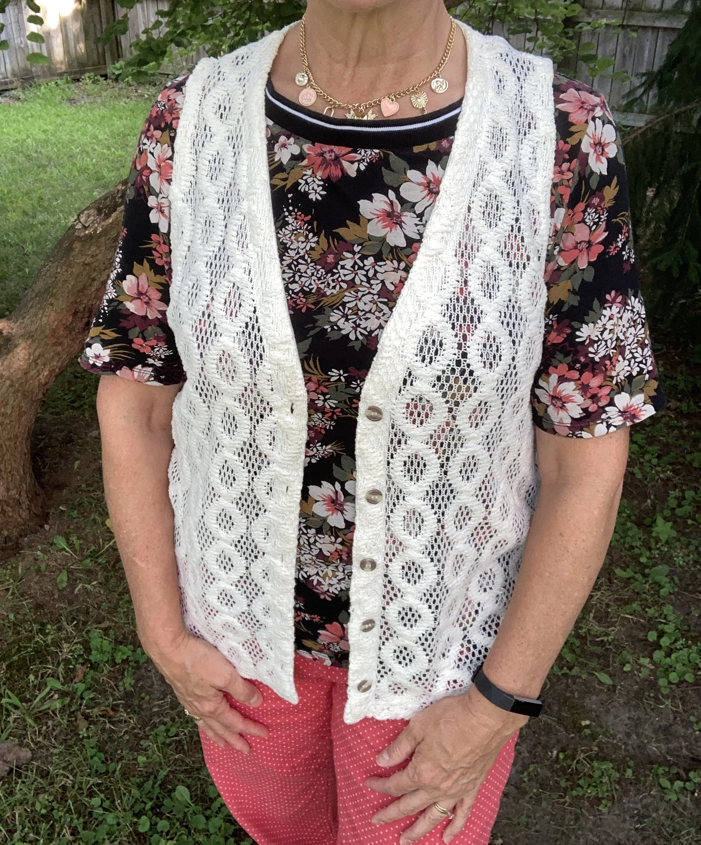
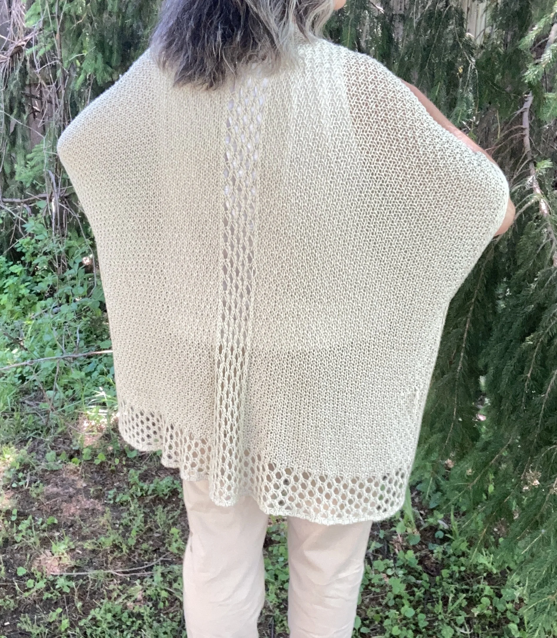
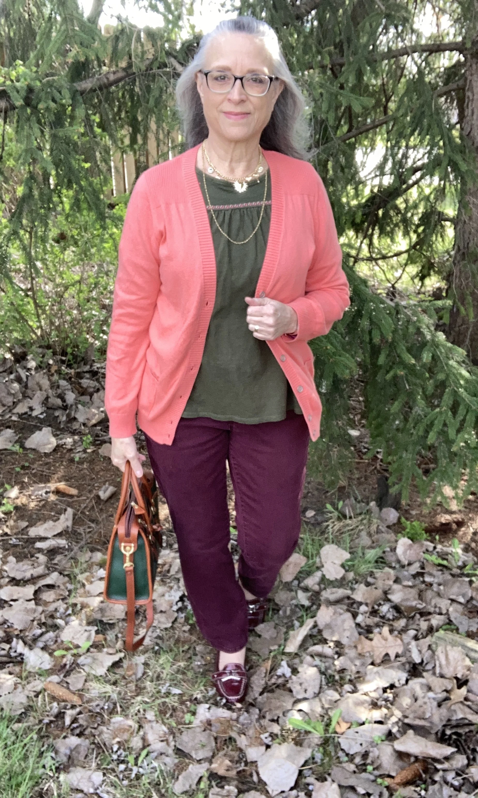
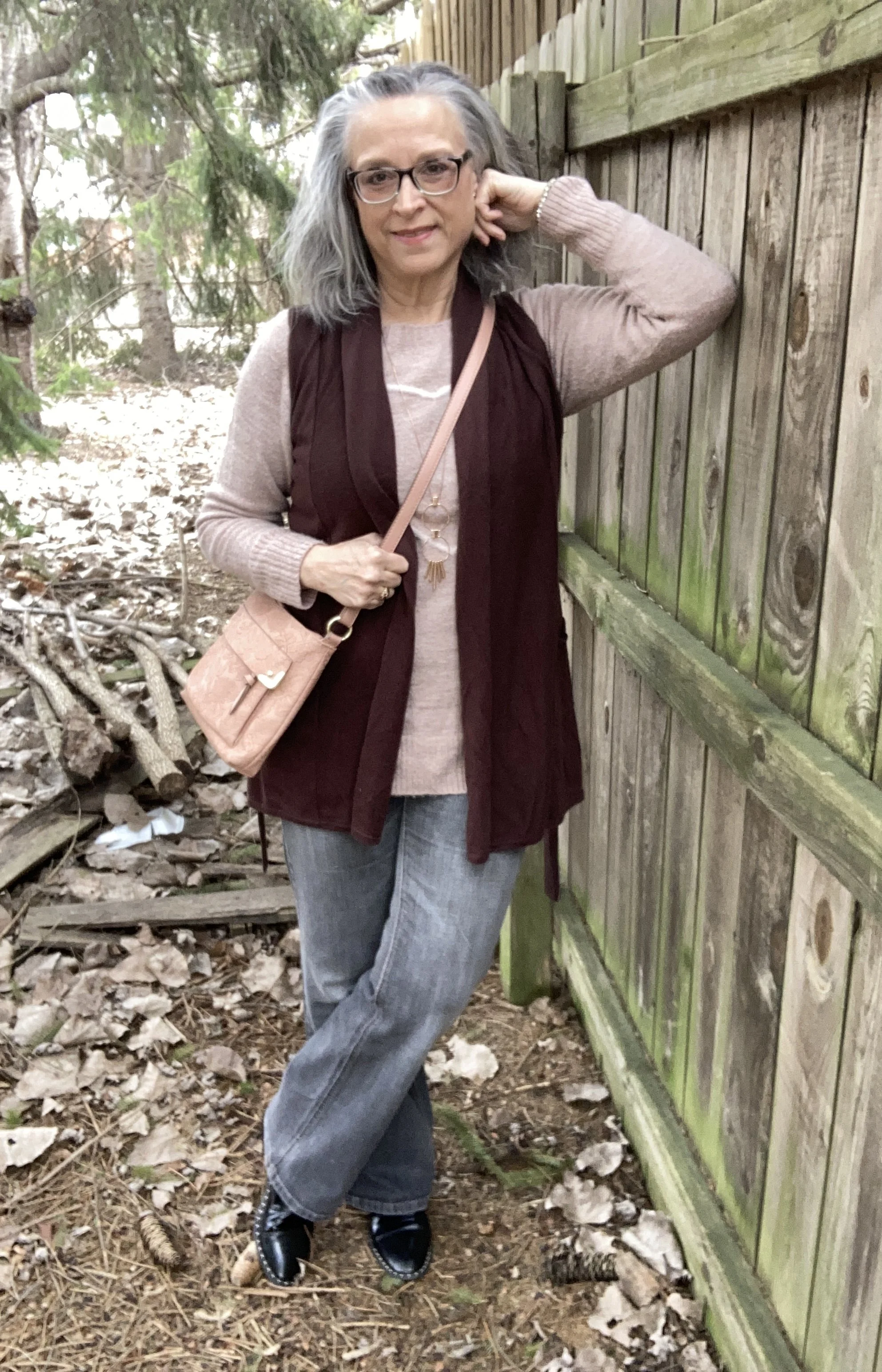
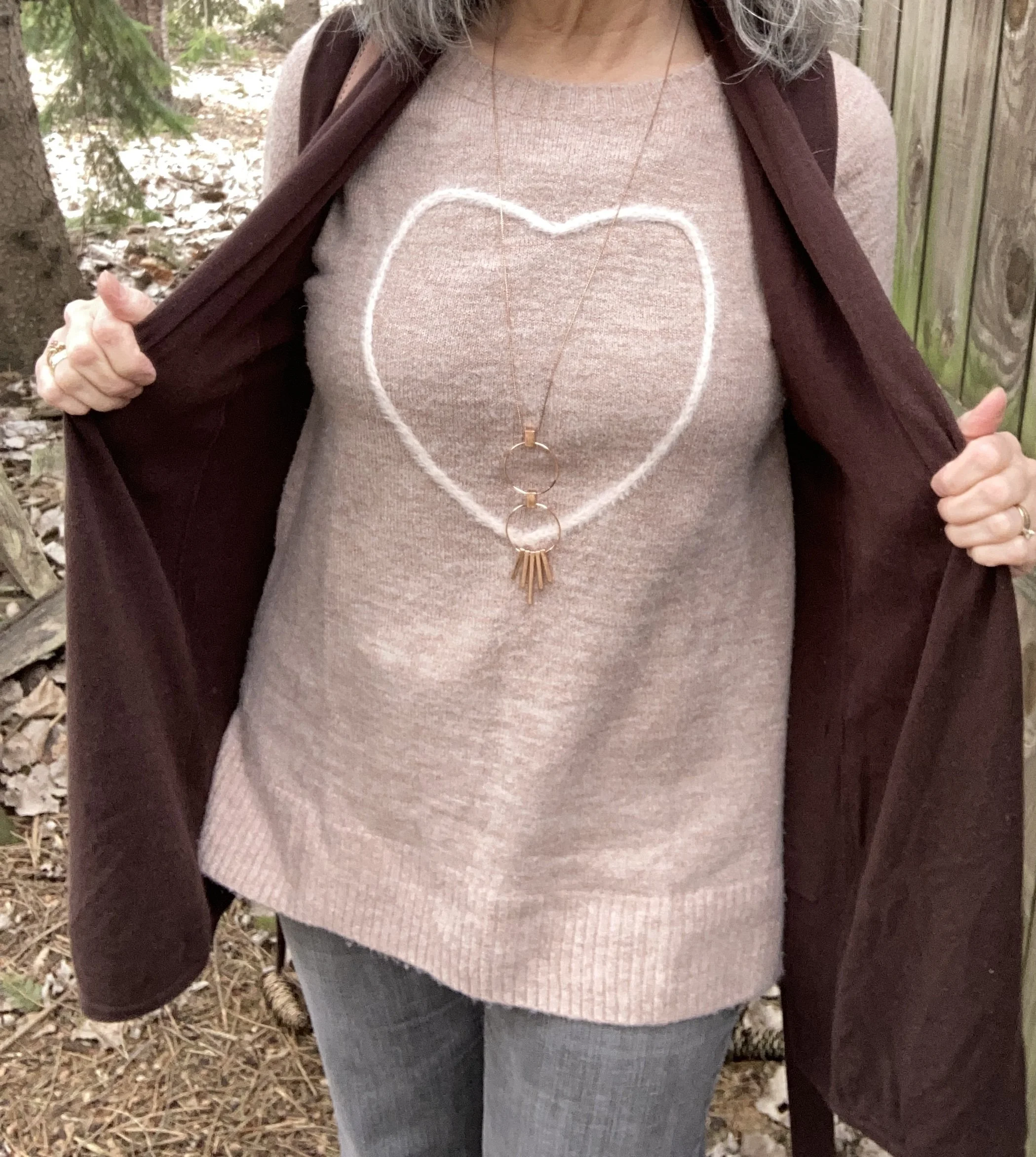
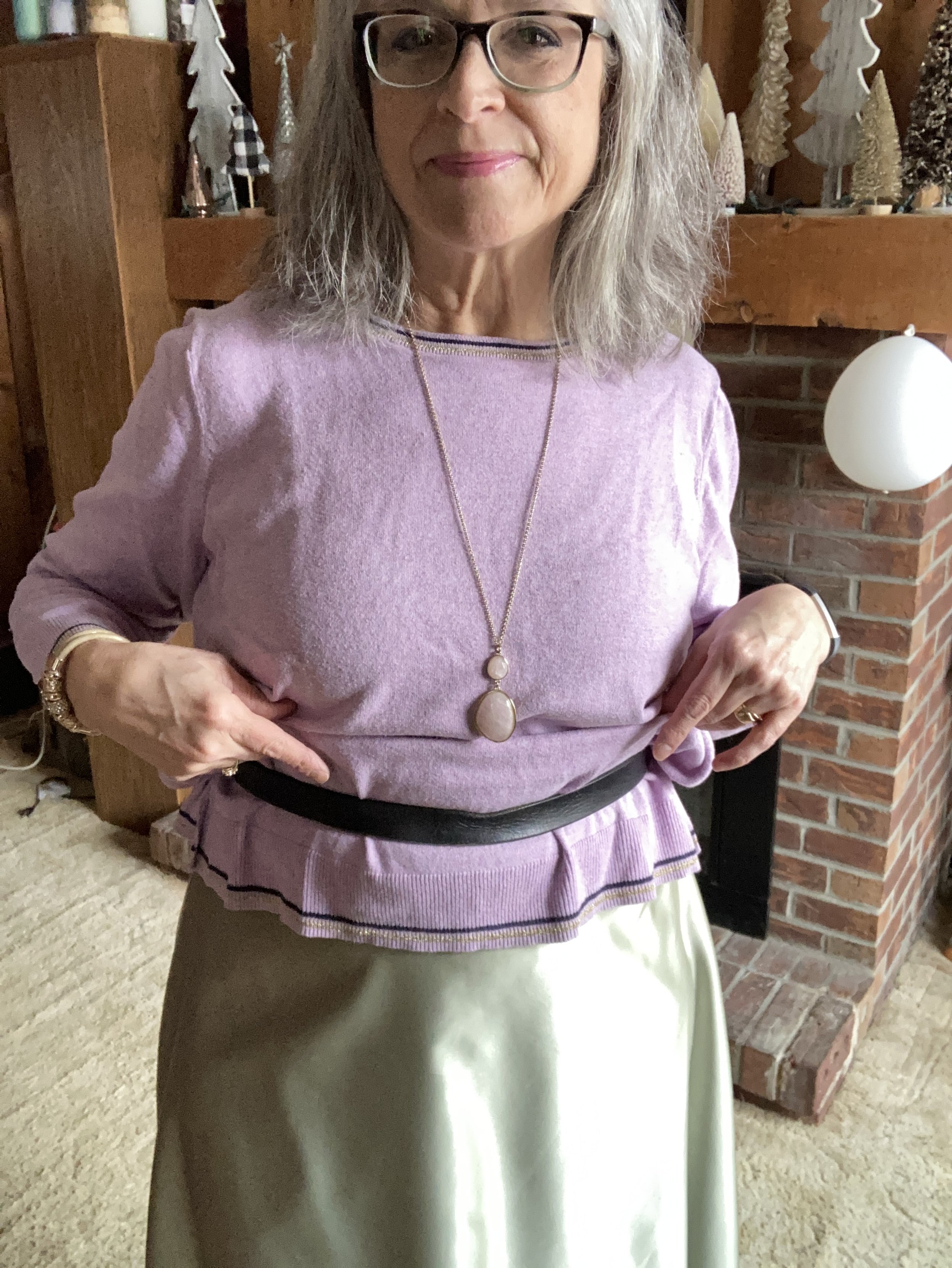
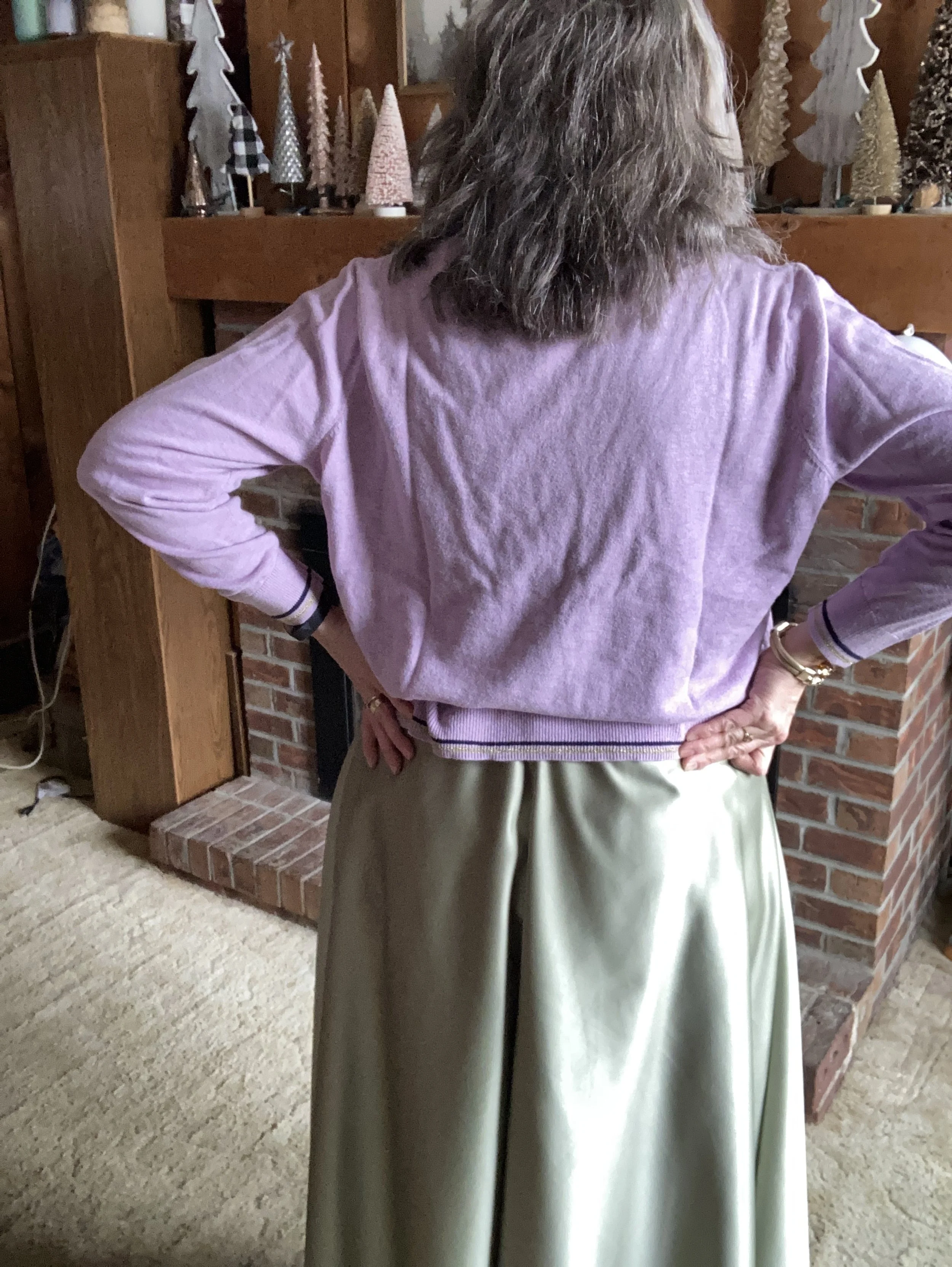
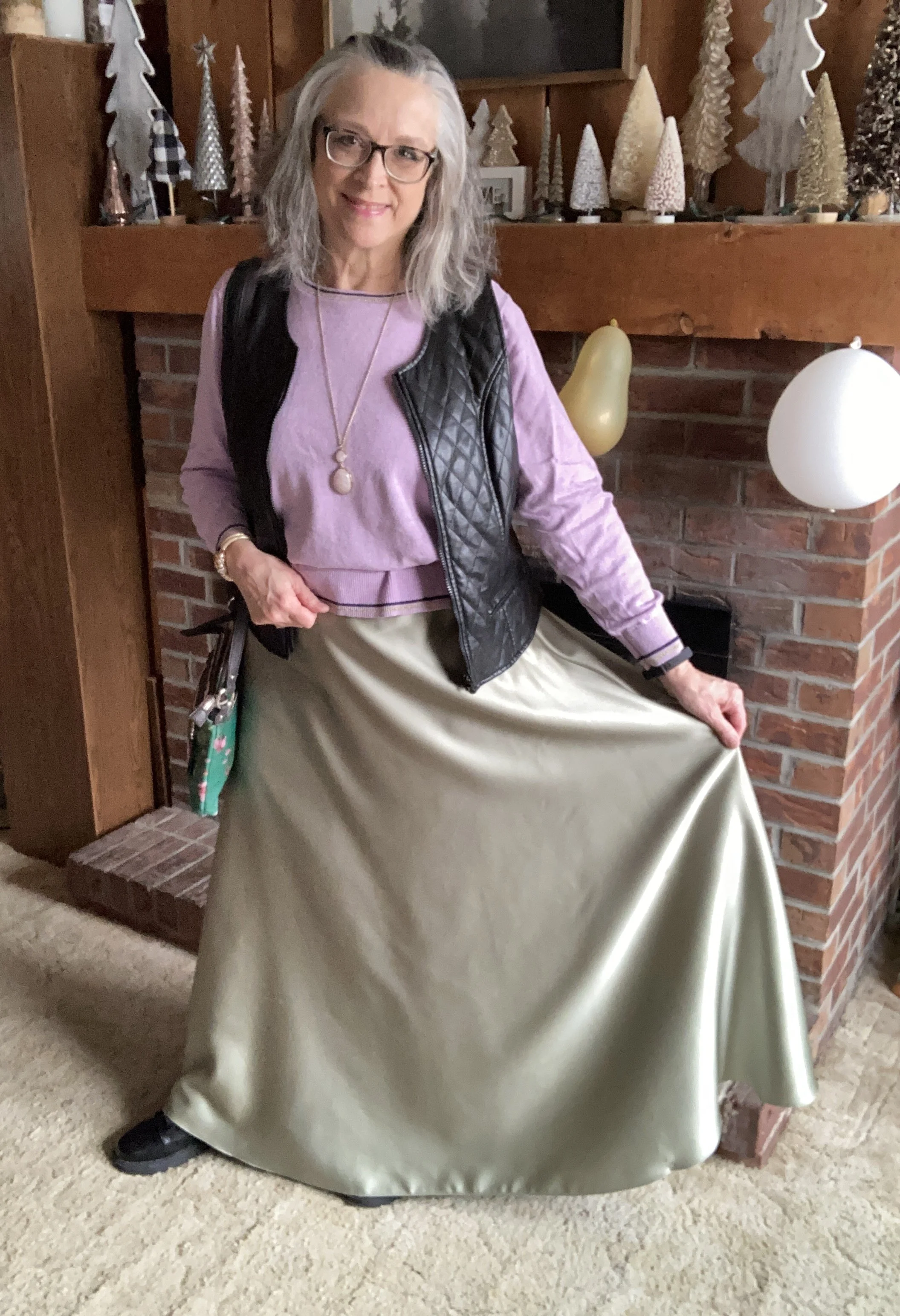
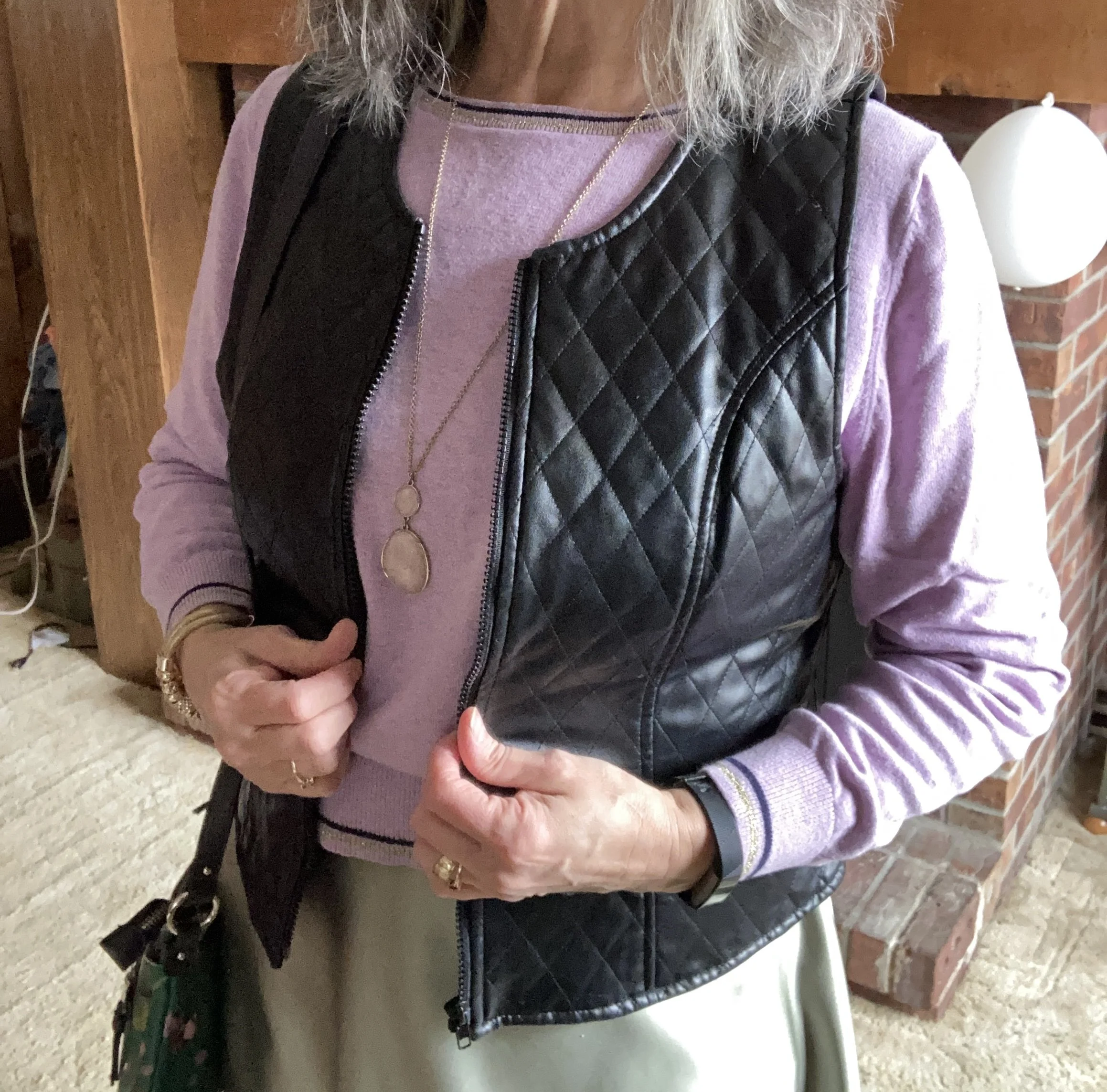
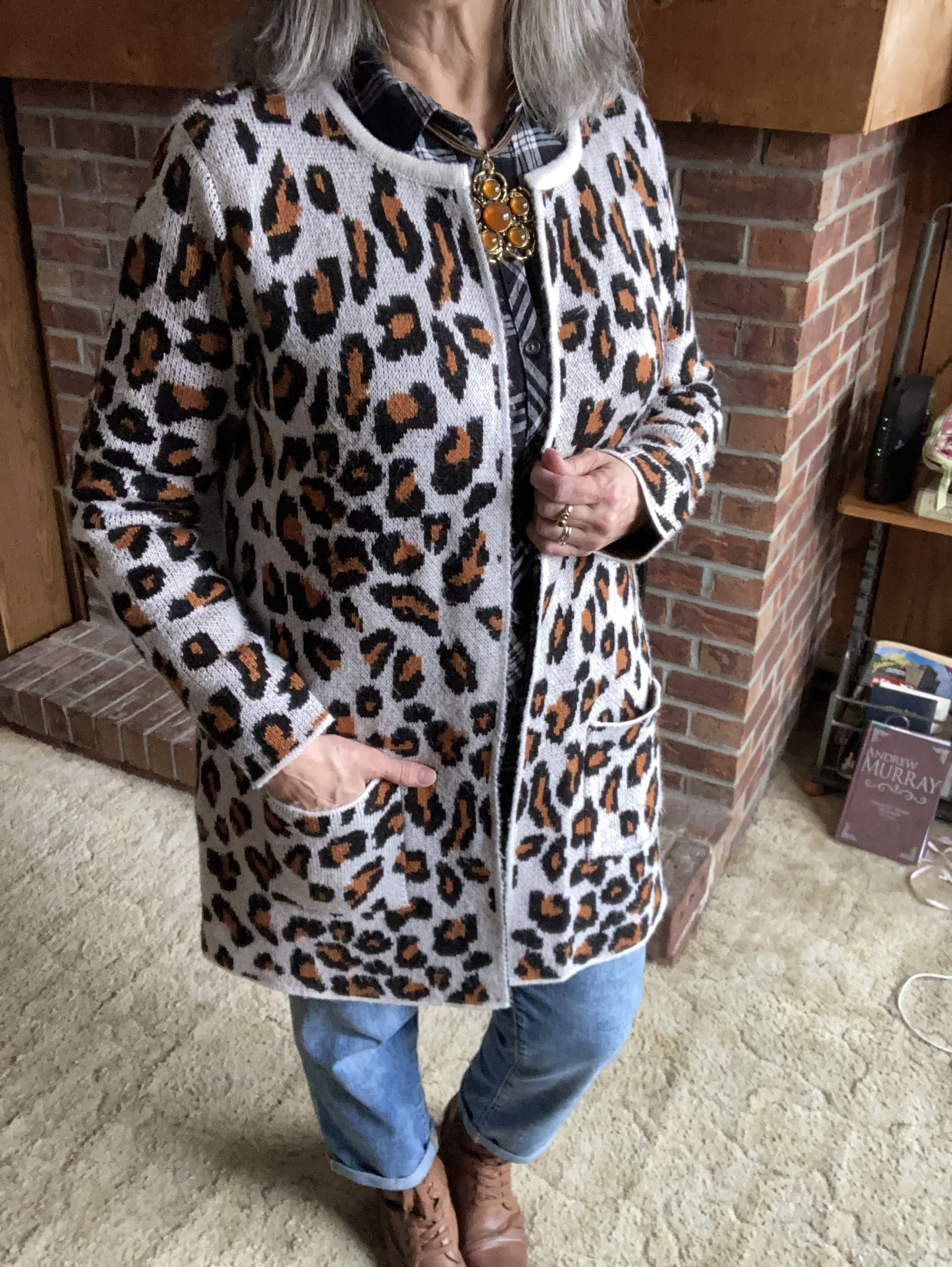
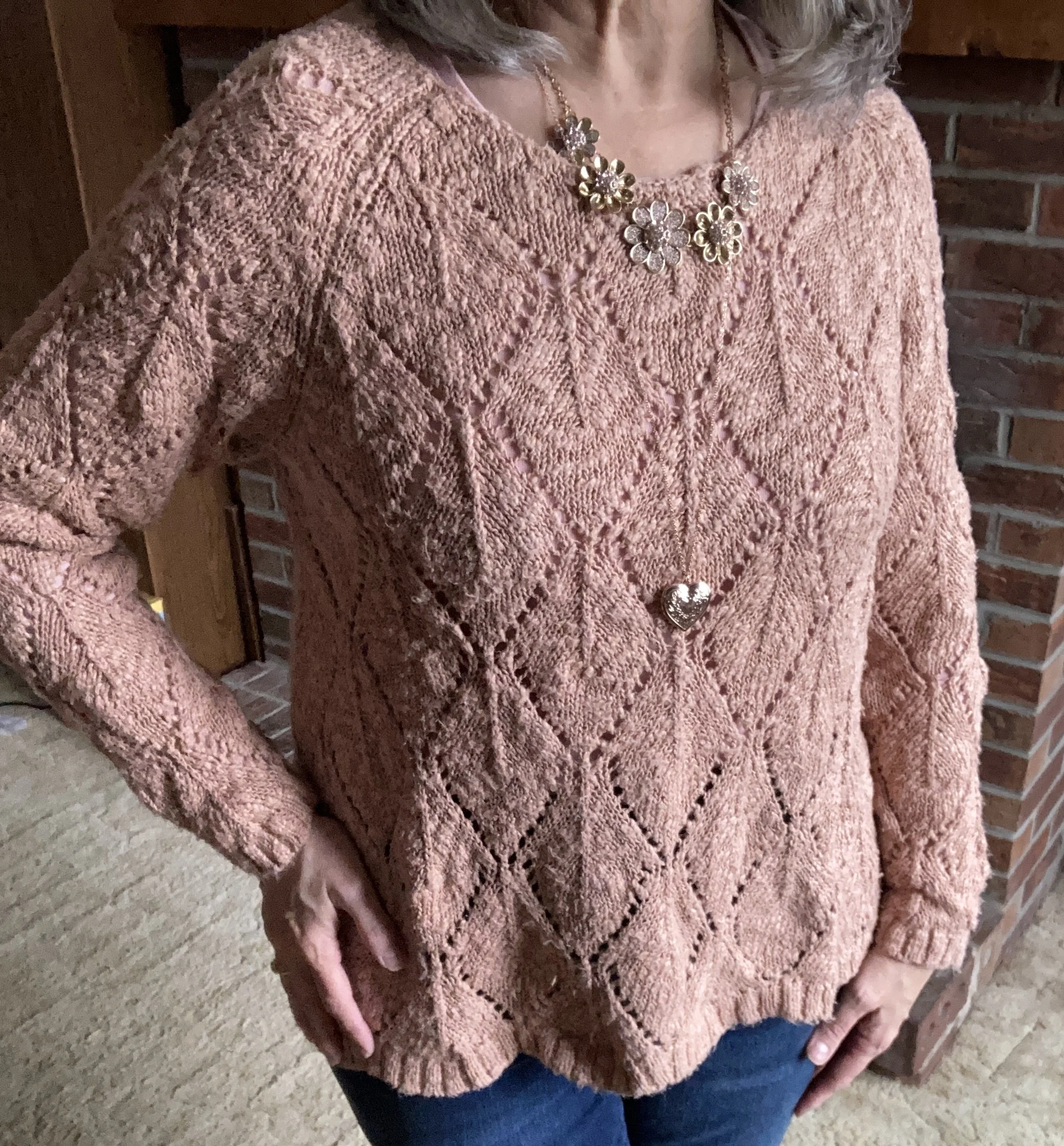
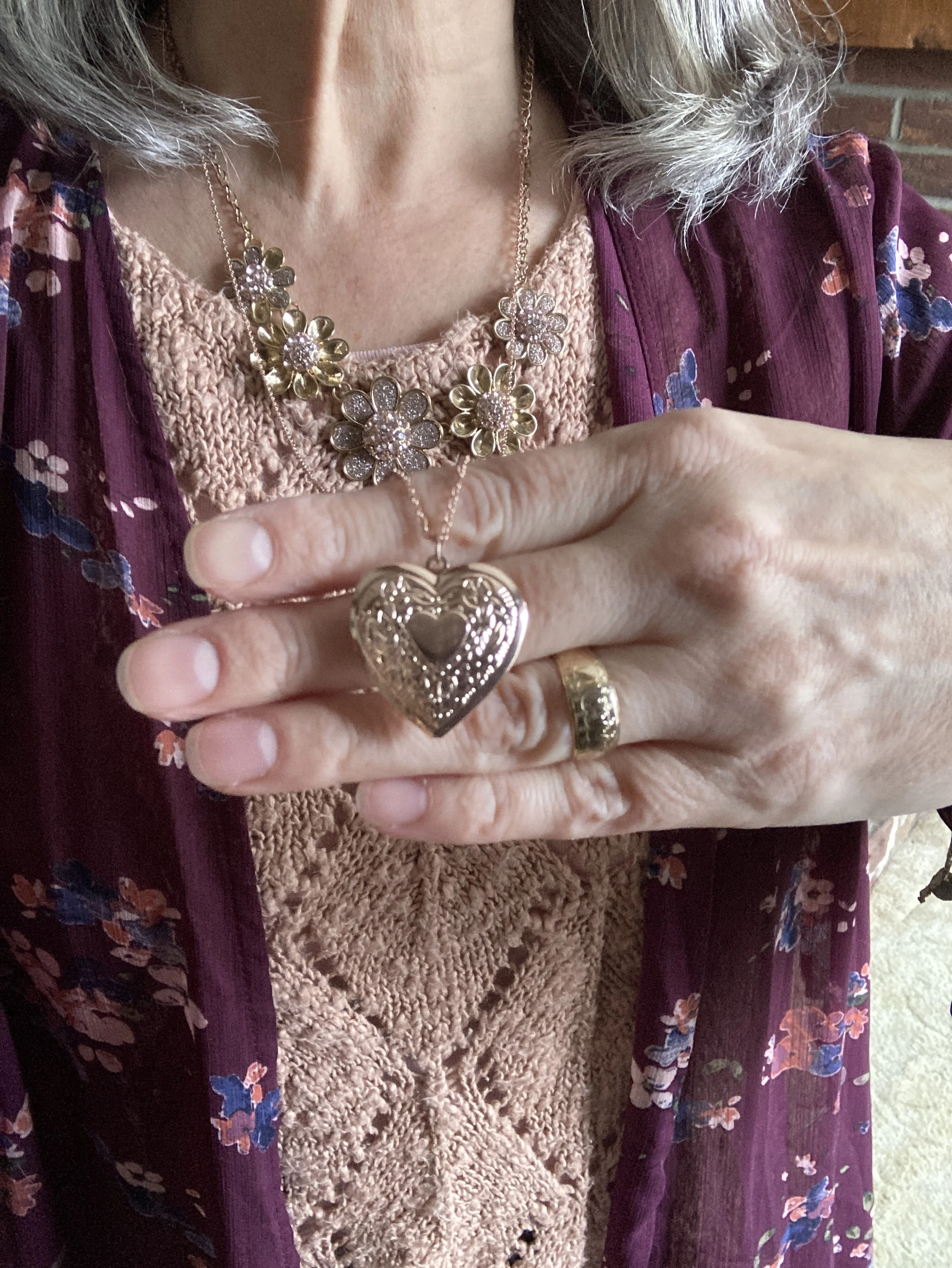
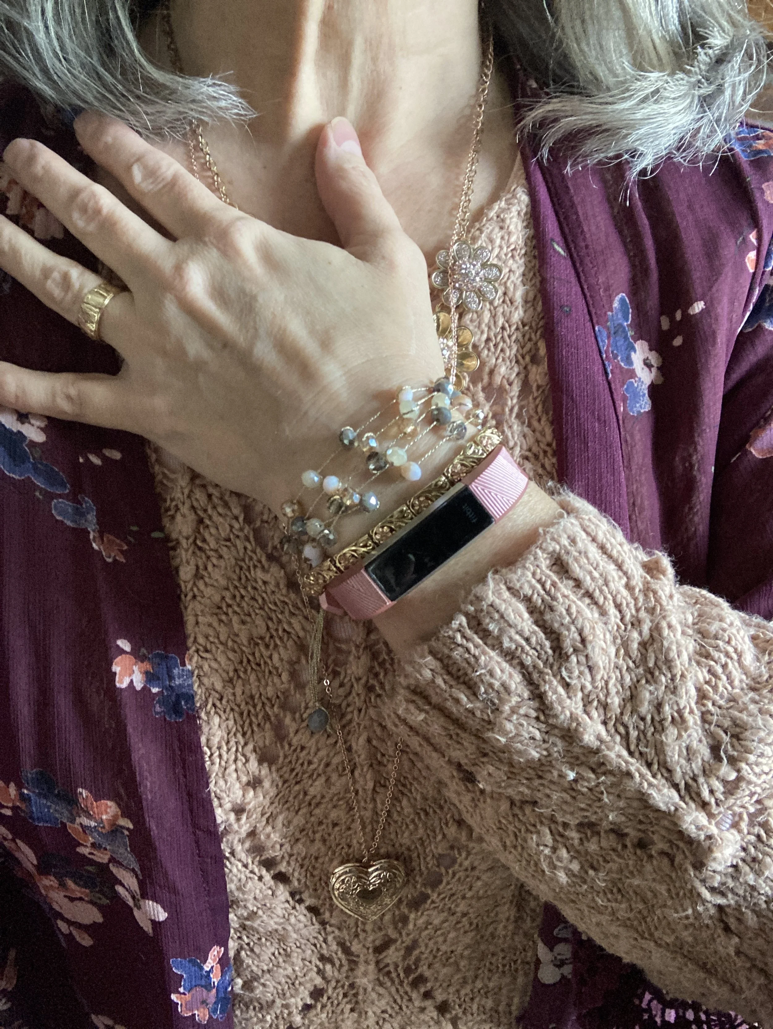
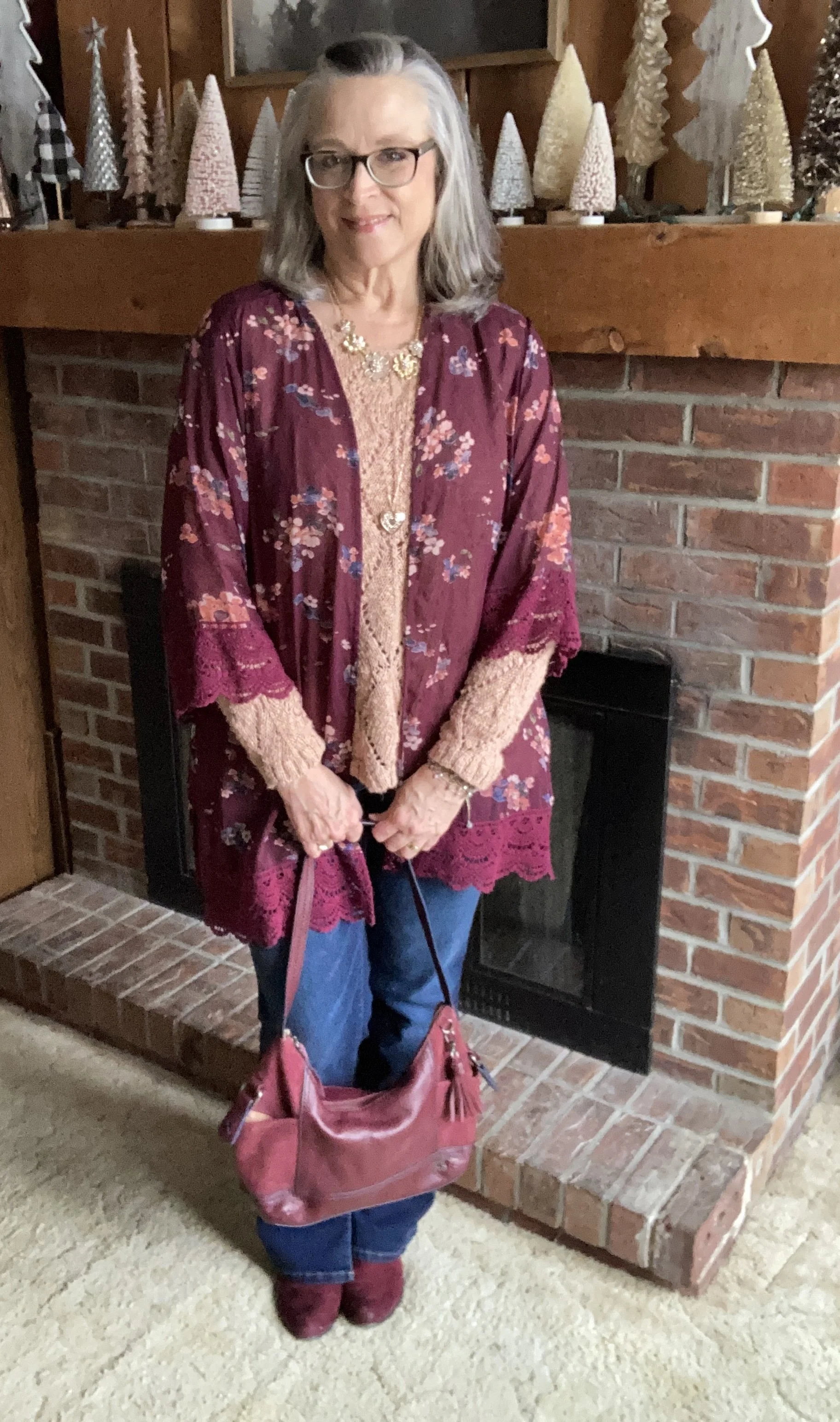
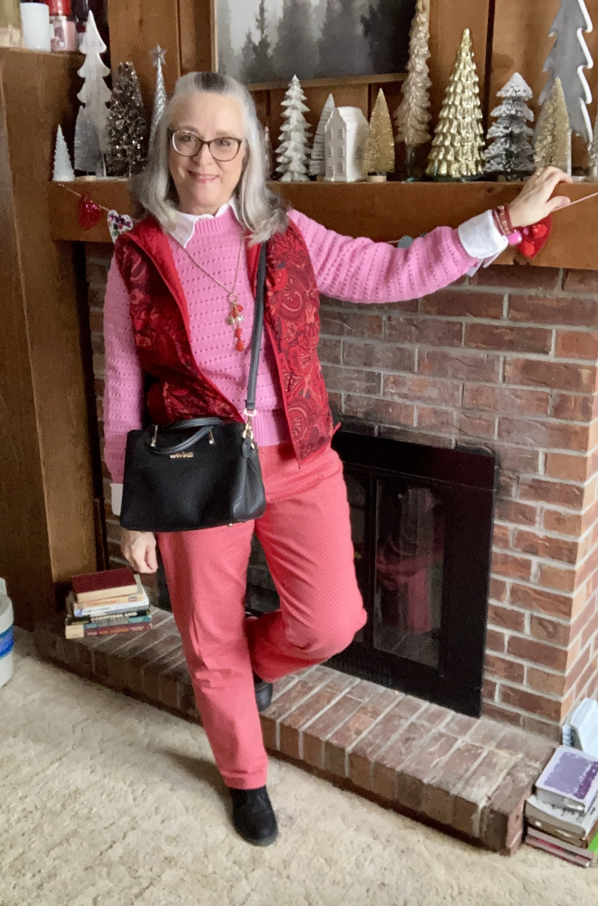
Let’s look at how I put this look together. The first piece I chose was this fun, bubblegum pink, pullover sweater. This is a thrifted piece, and looked to have a tag, but no longer has one. It is a heavier piece and doesn’t have a lot of stretch, so if I gain too much weight, or when the temperature warms up I won’t be wearing it. However, I love the color, the open weave and the cuffed sleeves and bottom.
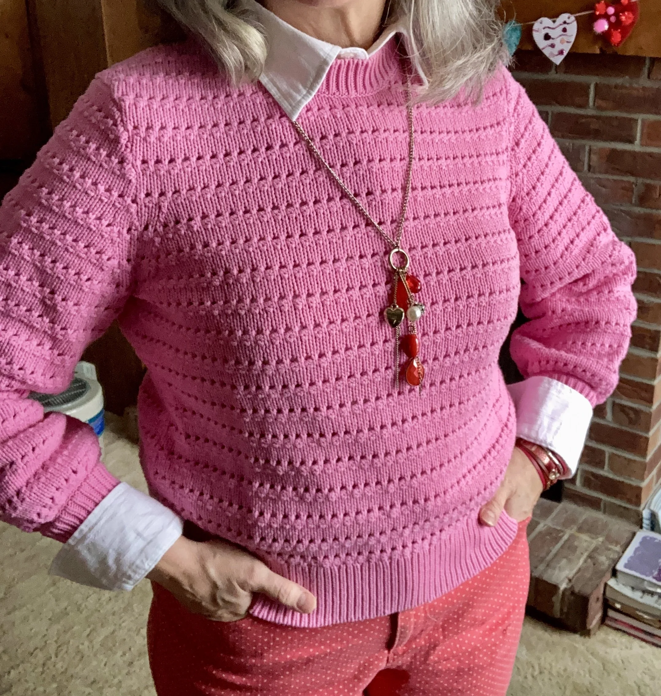
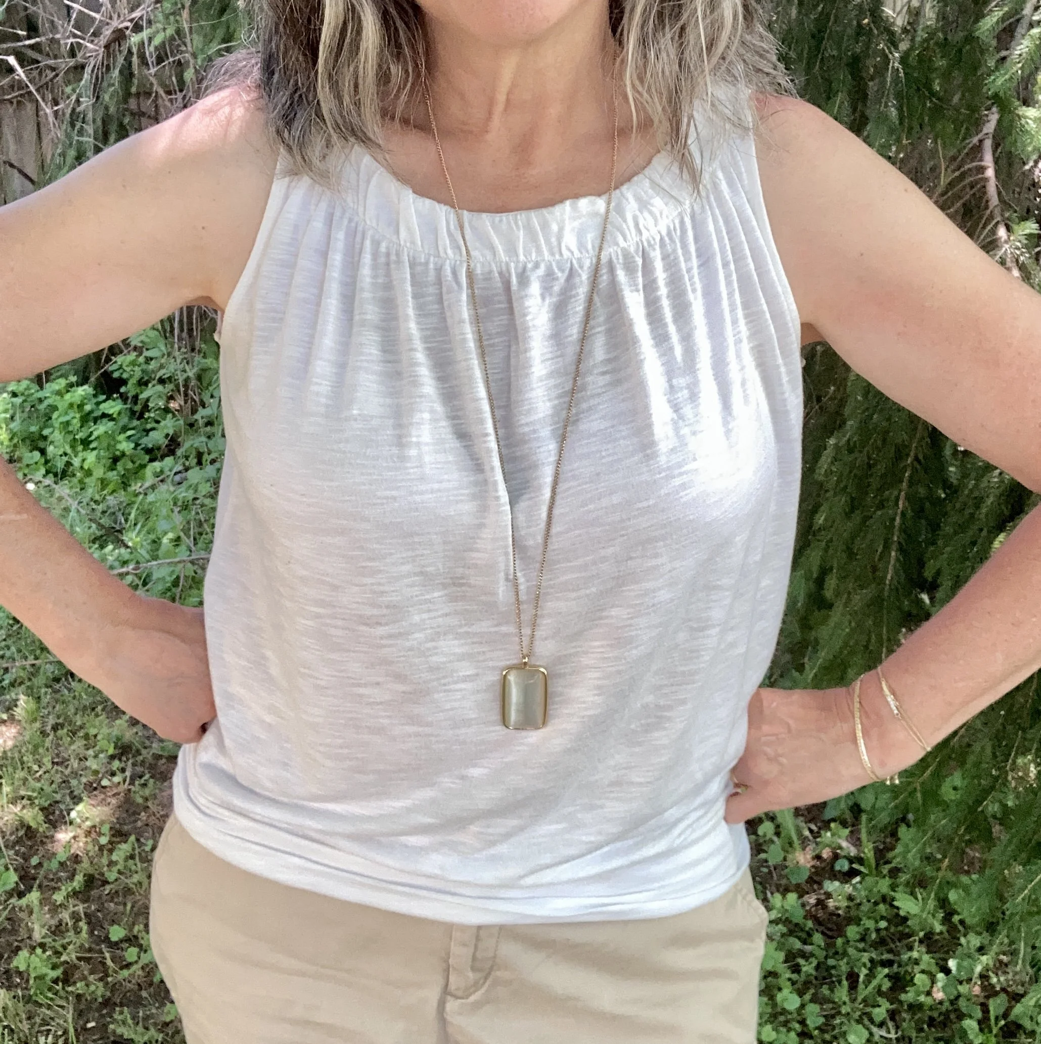
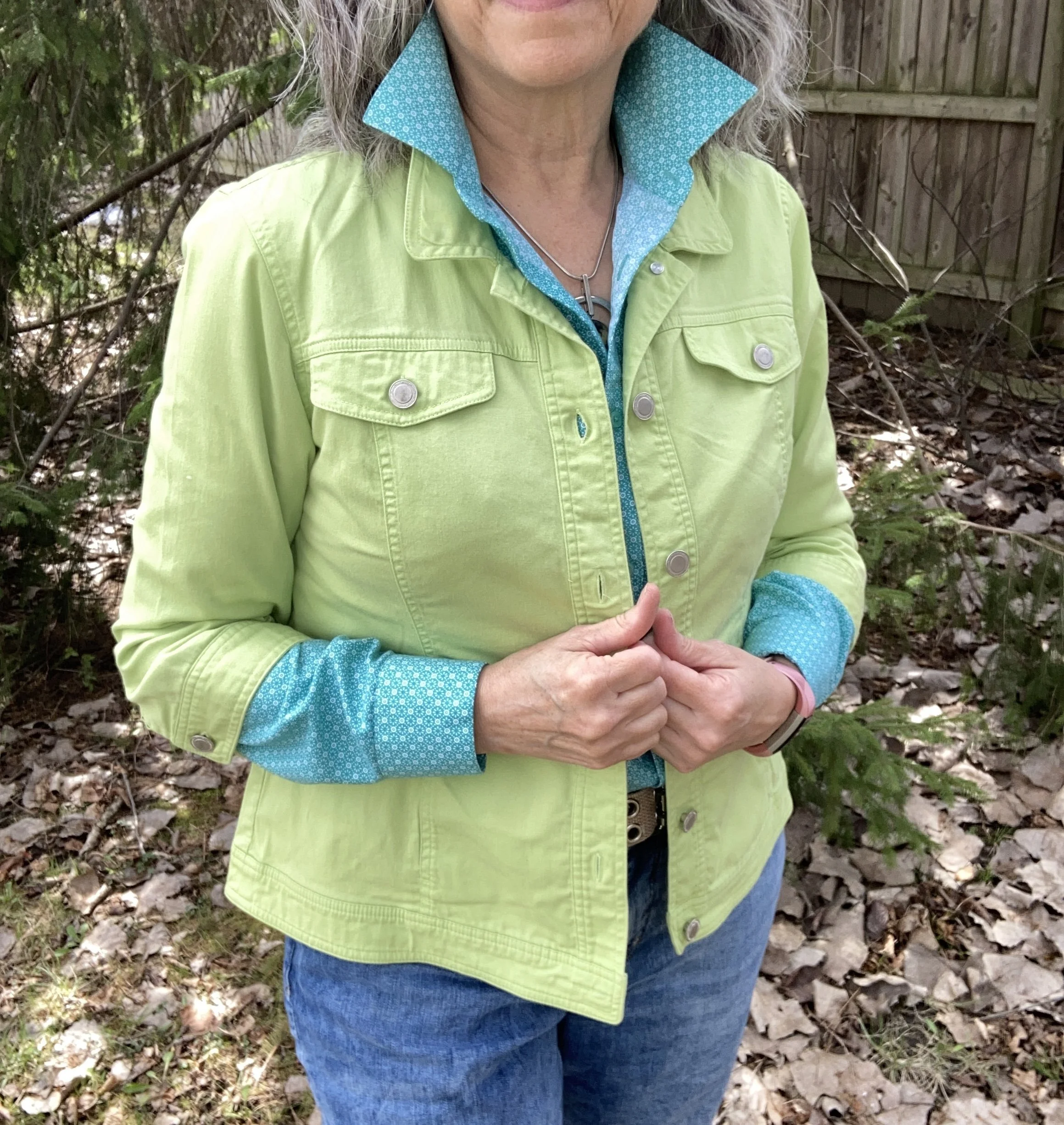
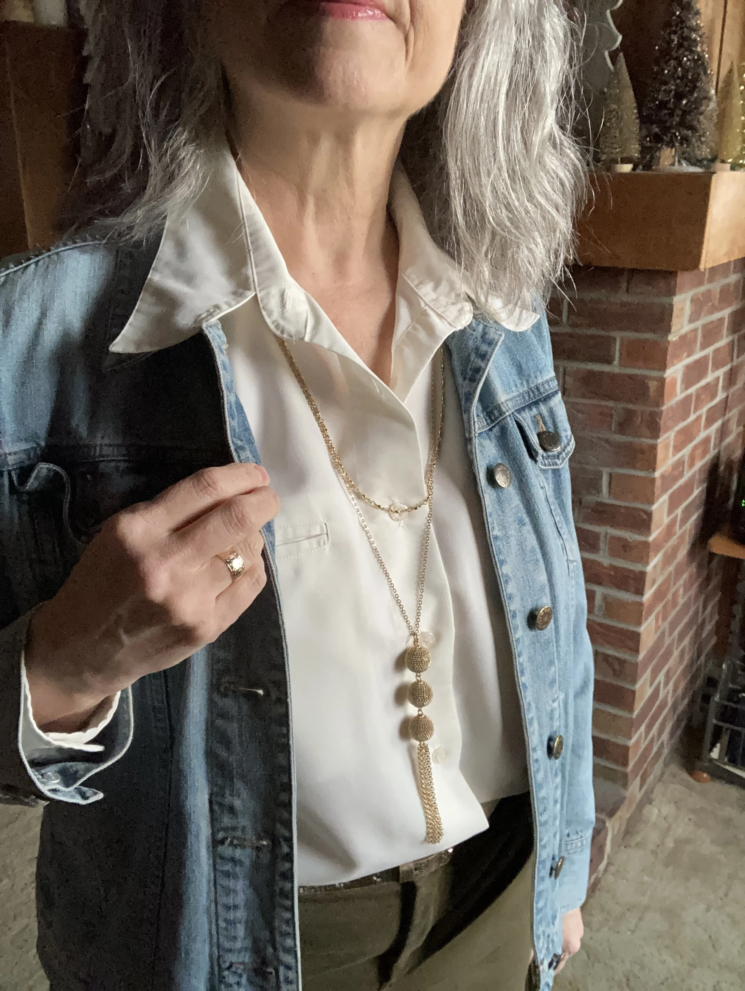
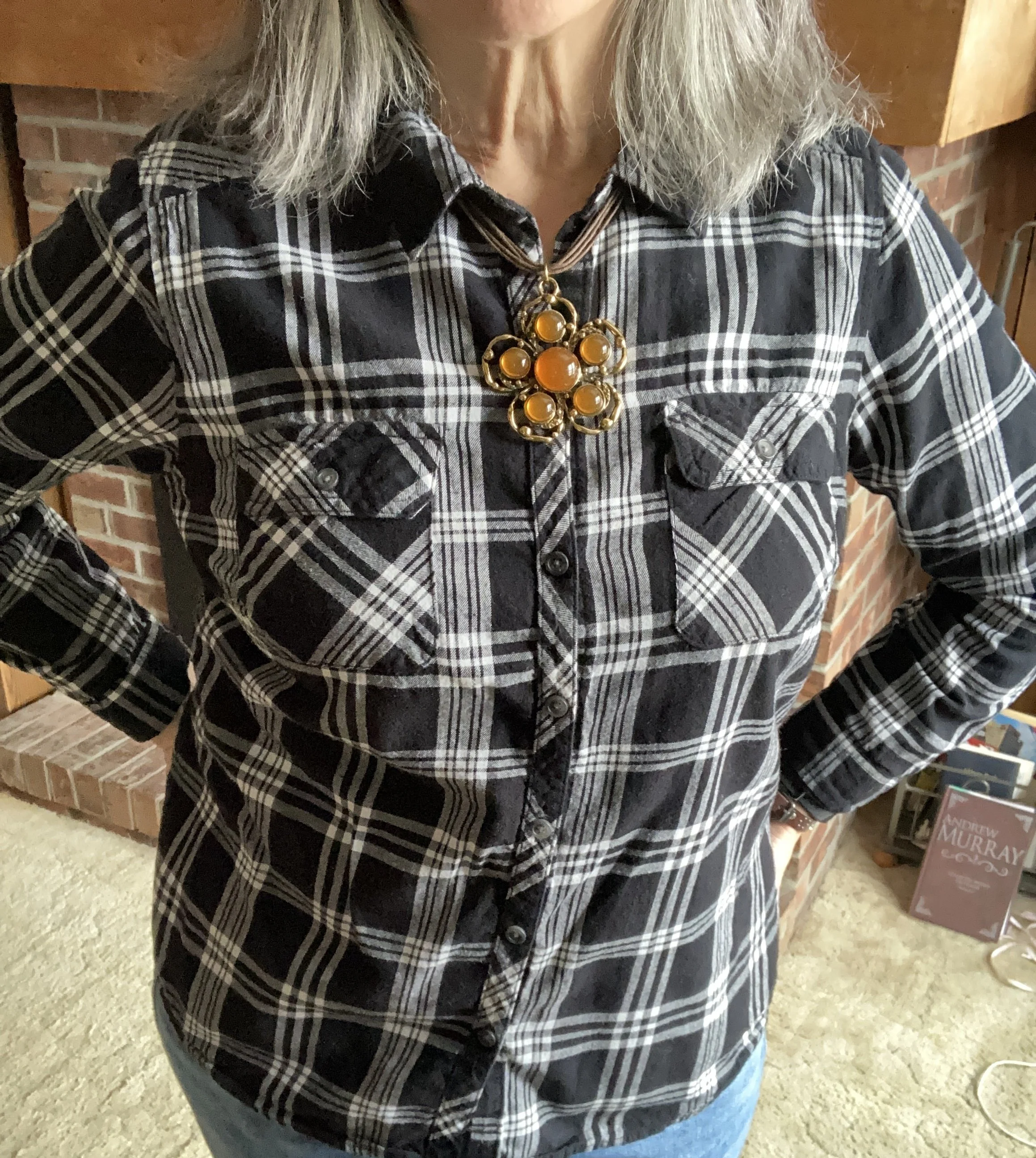
Just for a bit of contrast I added the white button down shirt underneath. I like the pop of white and feel like it ties in well with the polka dots on the pants. This is a thrifted, men’s shirt; a brand called At Collins. I will try to show it to you in the spring as a shacket. It has some beautiful white embroidery on it, but when I put it on for this post, I realized it is itchy, so it will probably be worn most over another shirt. :)
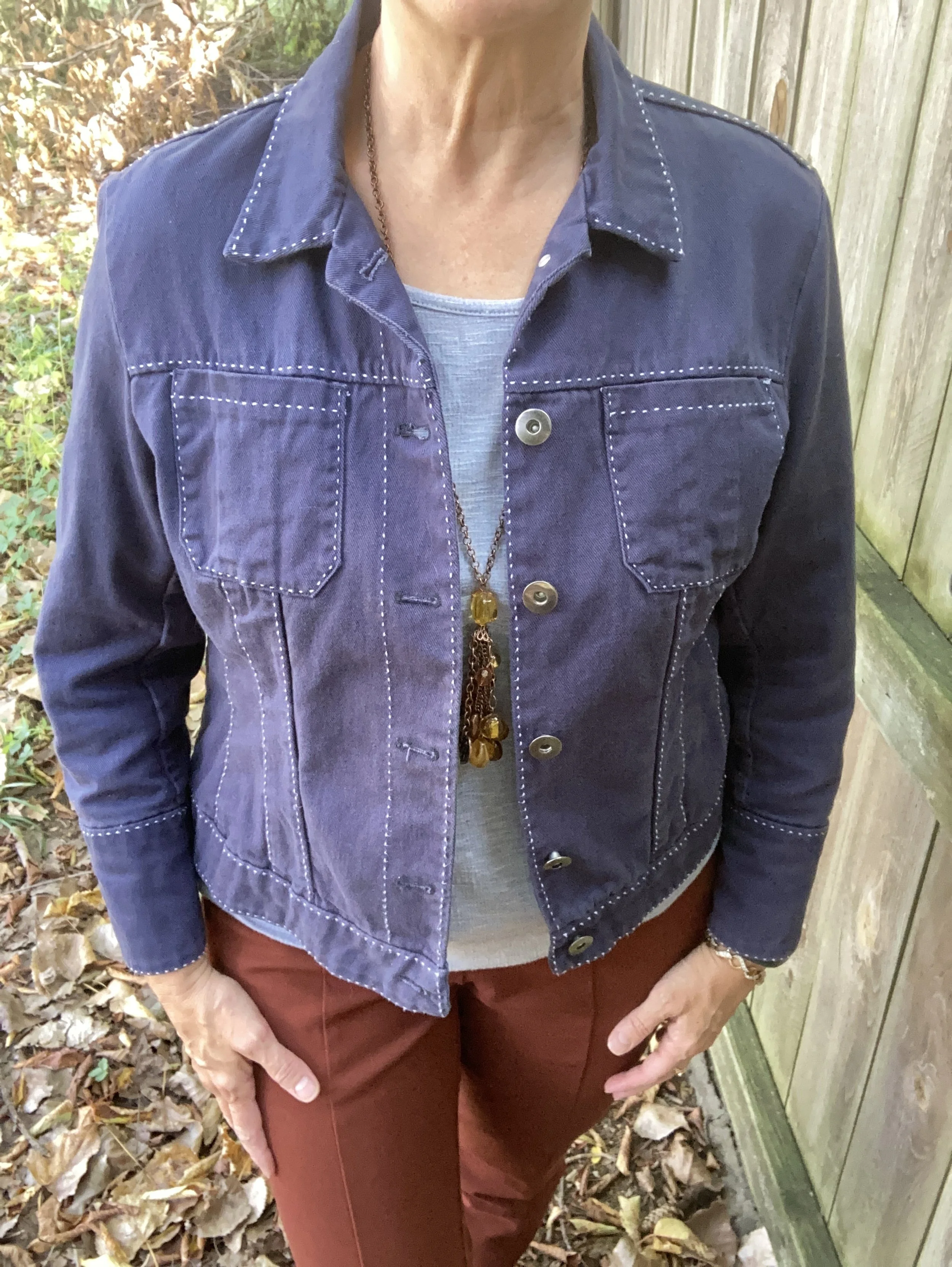
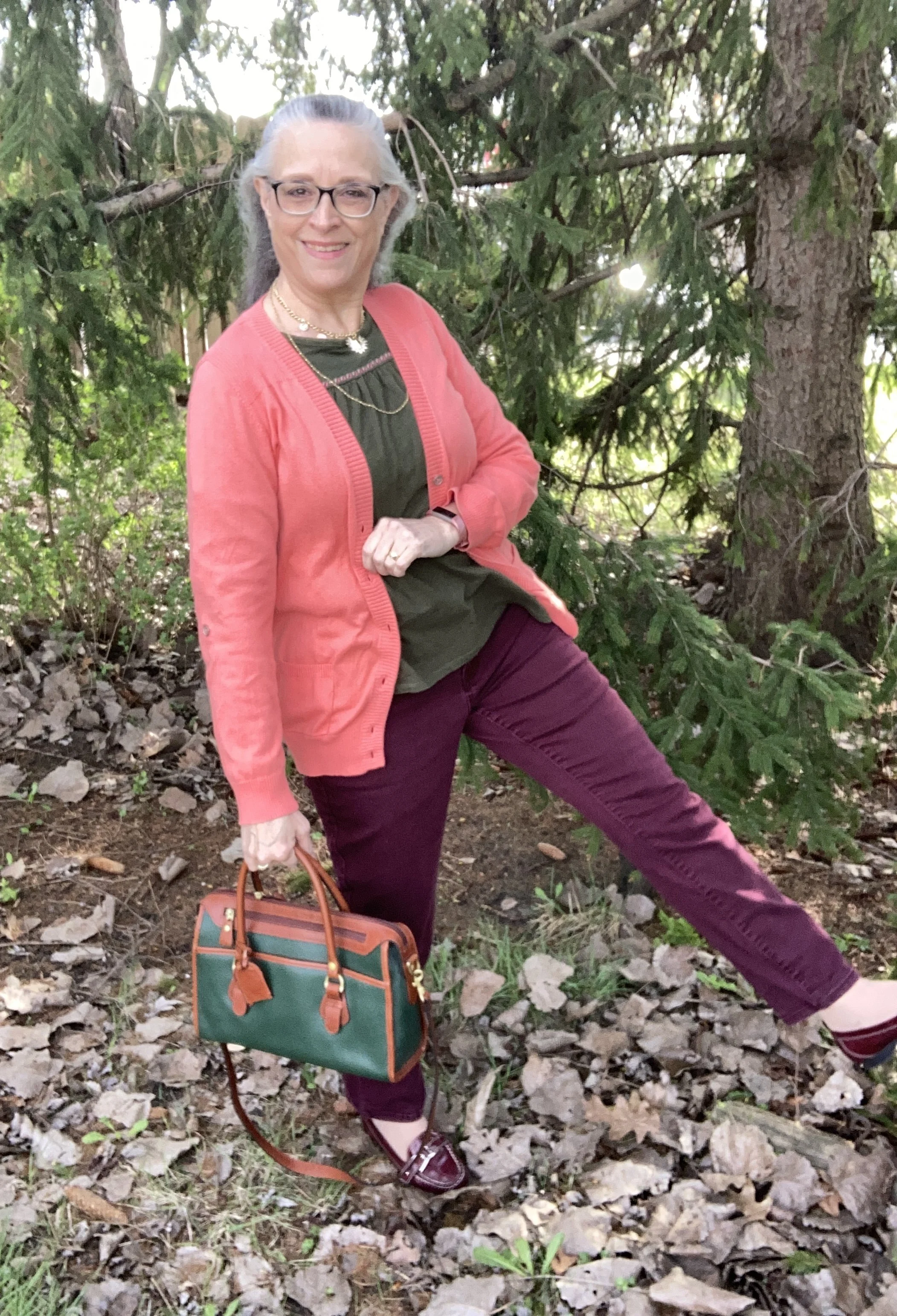
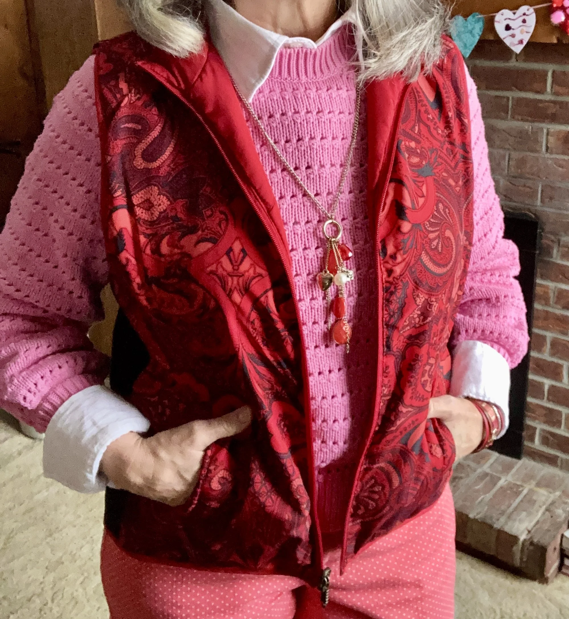
After I chose the pullover I decided to go with the red vest. I am becoming more comfortable with these bright color combinations and they are a definite dopamine boost in these drab winter months. This is another second hand piece and is reversible, so all red (with the black stretch) on one side and then this floral pattern on the other side. This was another piece without a tag, as many reversible pieces are.
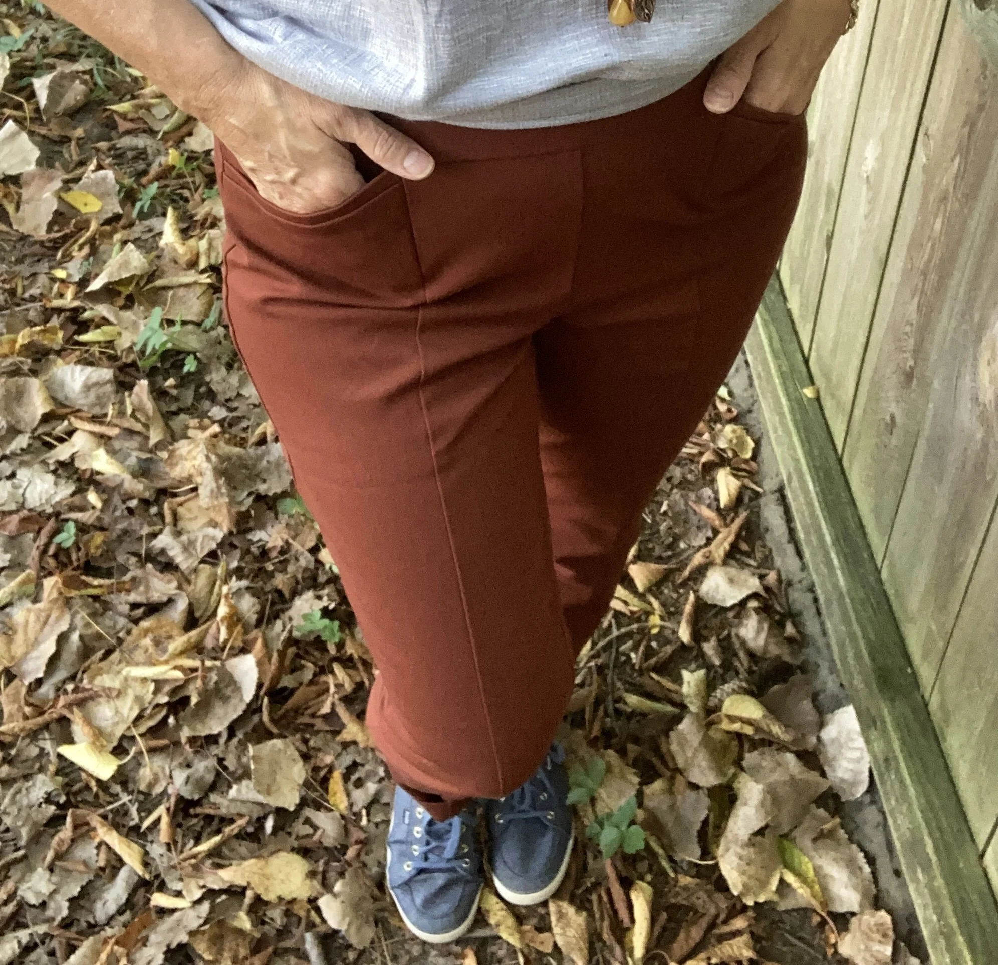
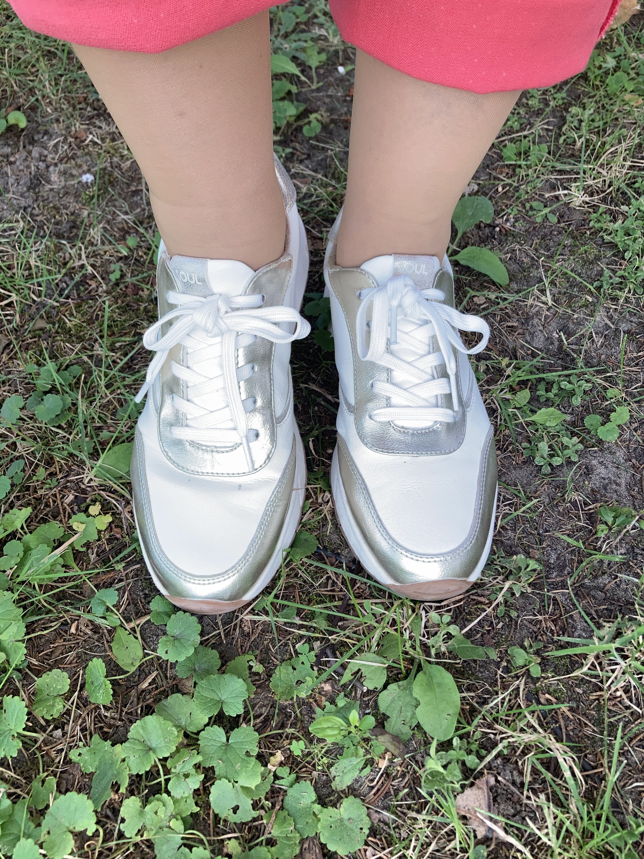
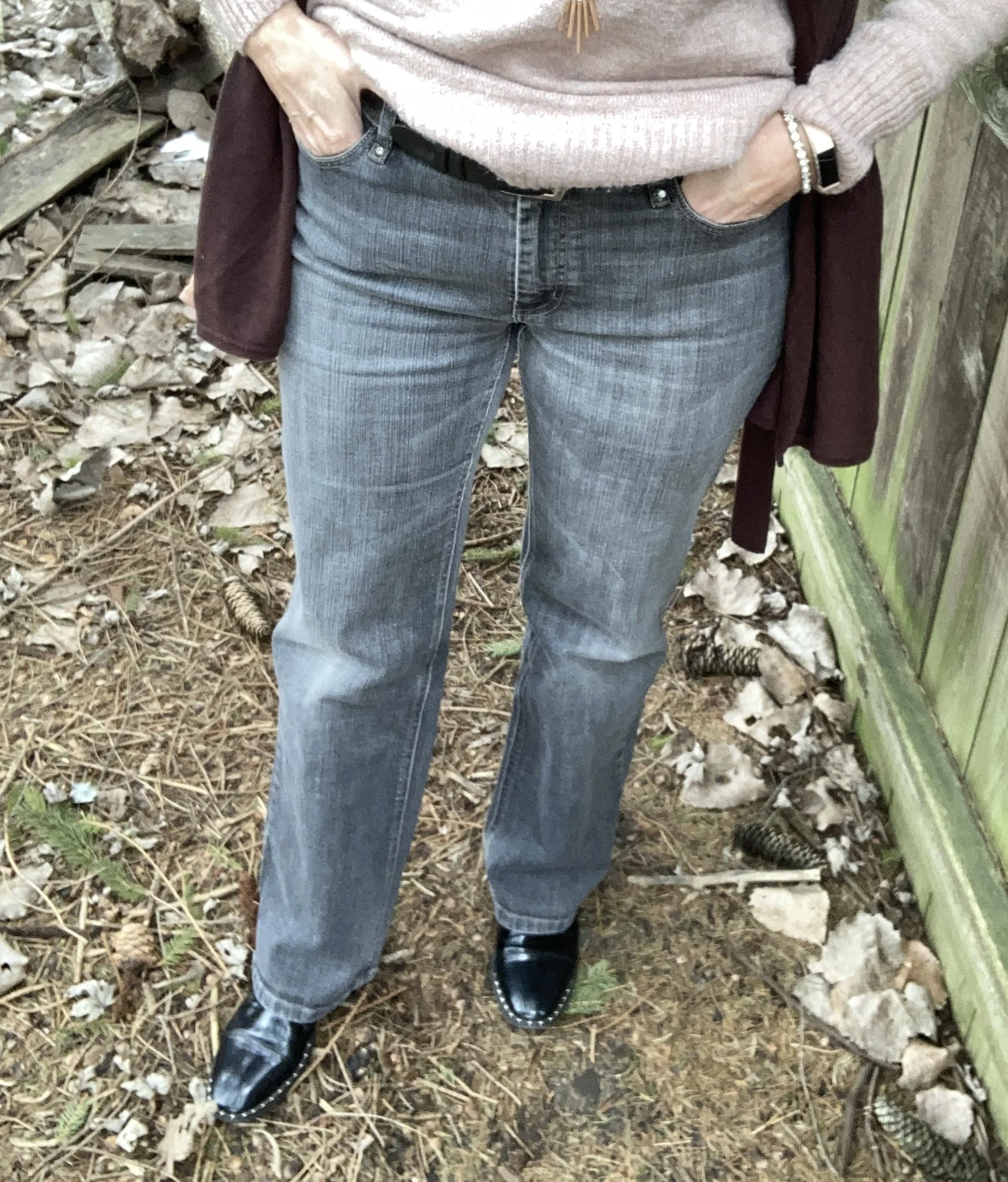
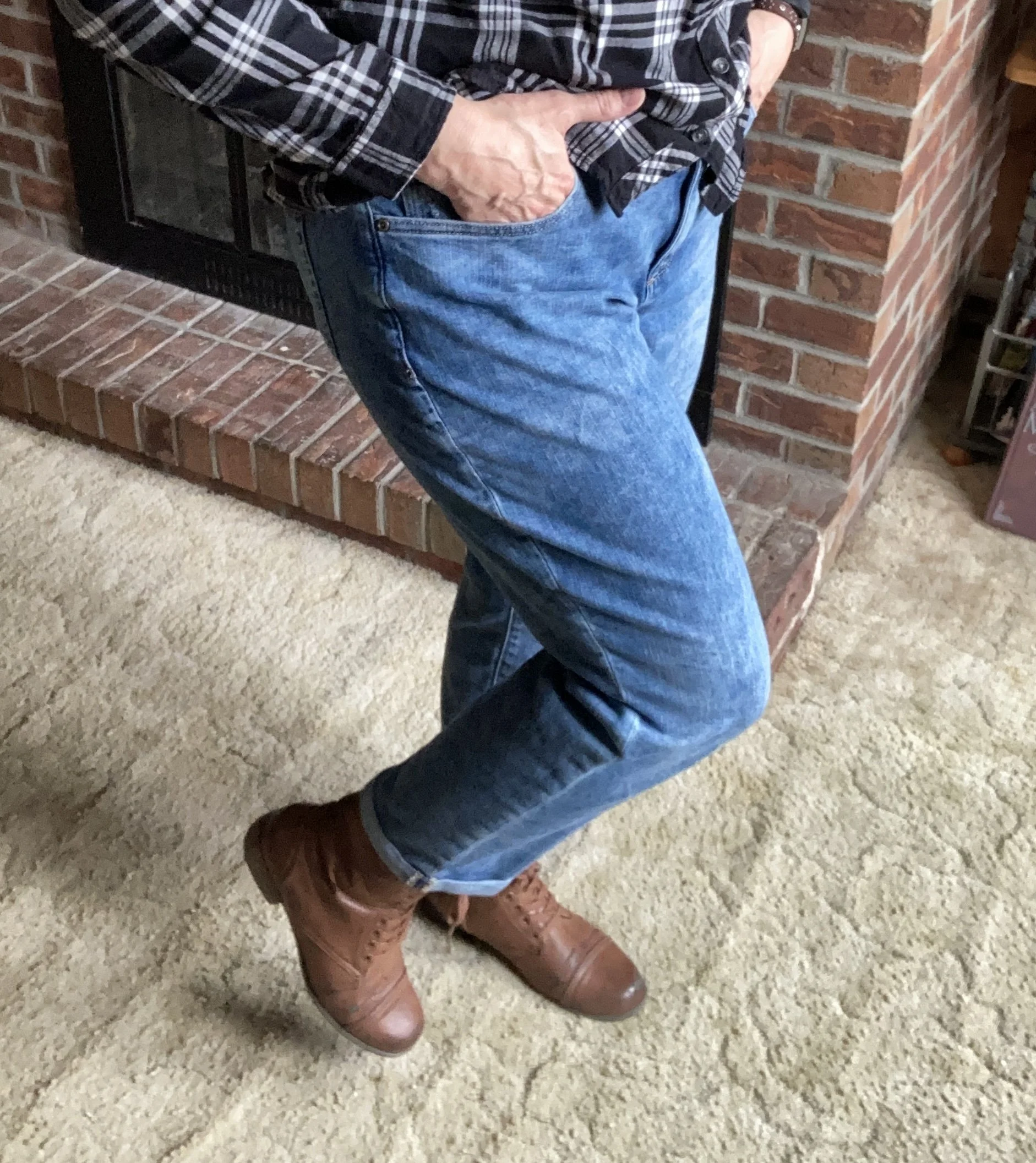
I was going to just grab a pair of jeans, but then I thought, why not try another bright color, so I reached for these thrifted Gloria Vanderbilt pants that I have had for a number of years. I had worn these a while back so they were folded on a shelf waiting for another wear. Do you launder your pants every time you wear them, or do you wear them a few times before washing? I always get at least two or three wears out of a pair of pants as long as they haven’t gotten spilled on and don’t smell.
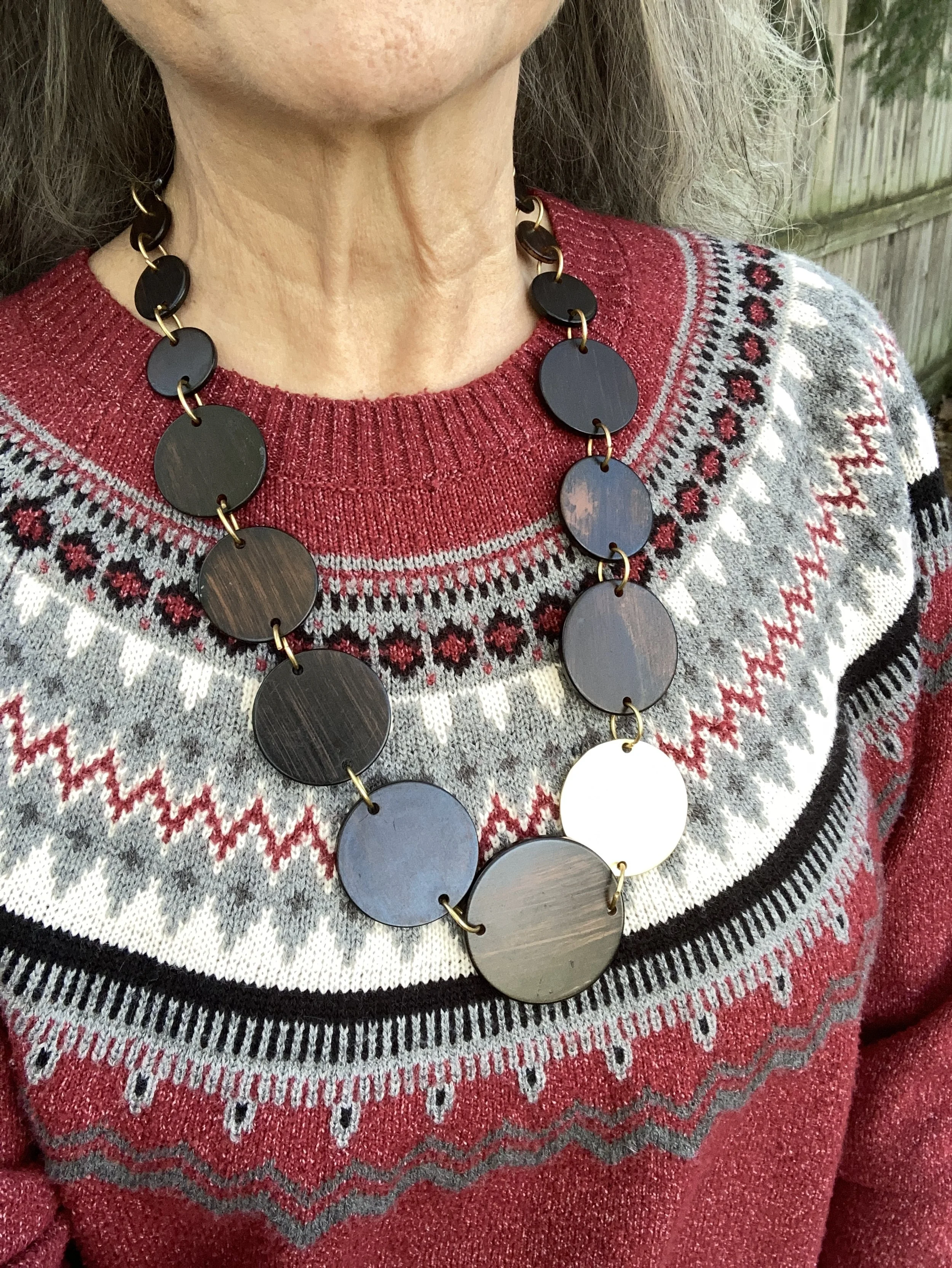
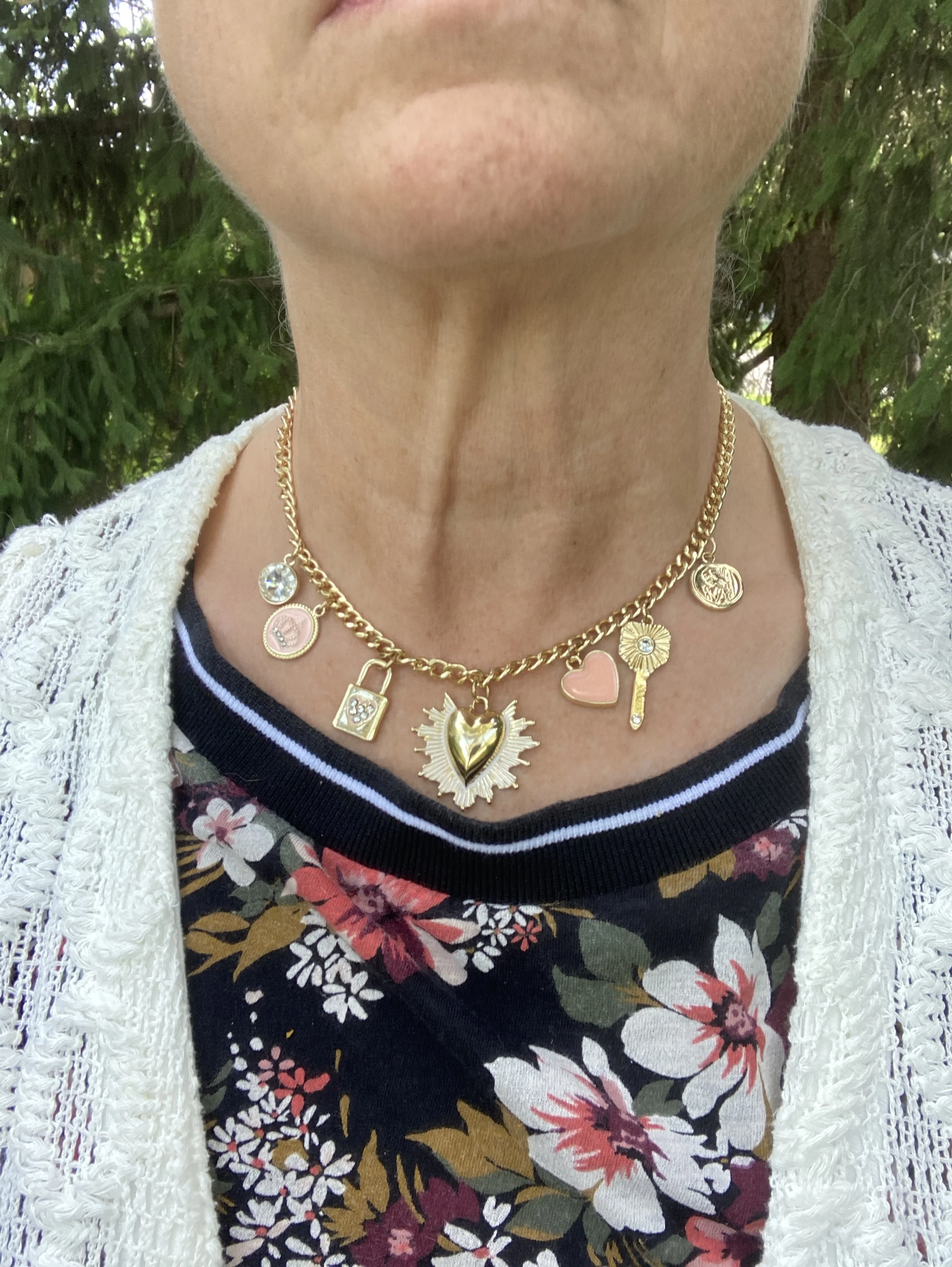
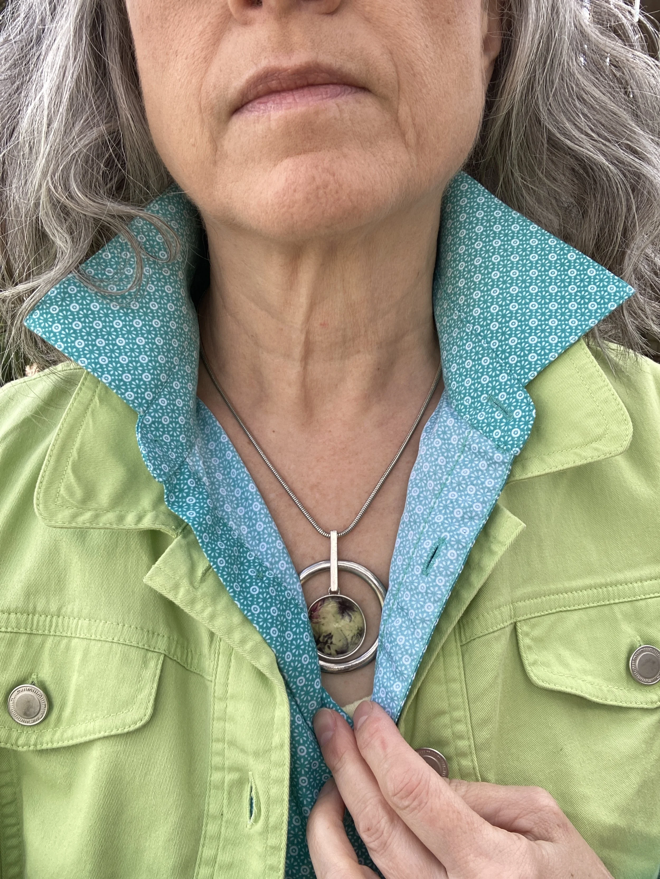
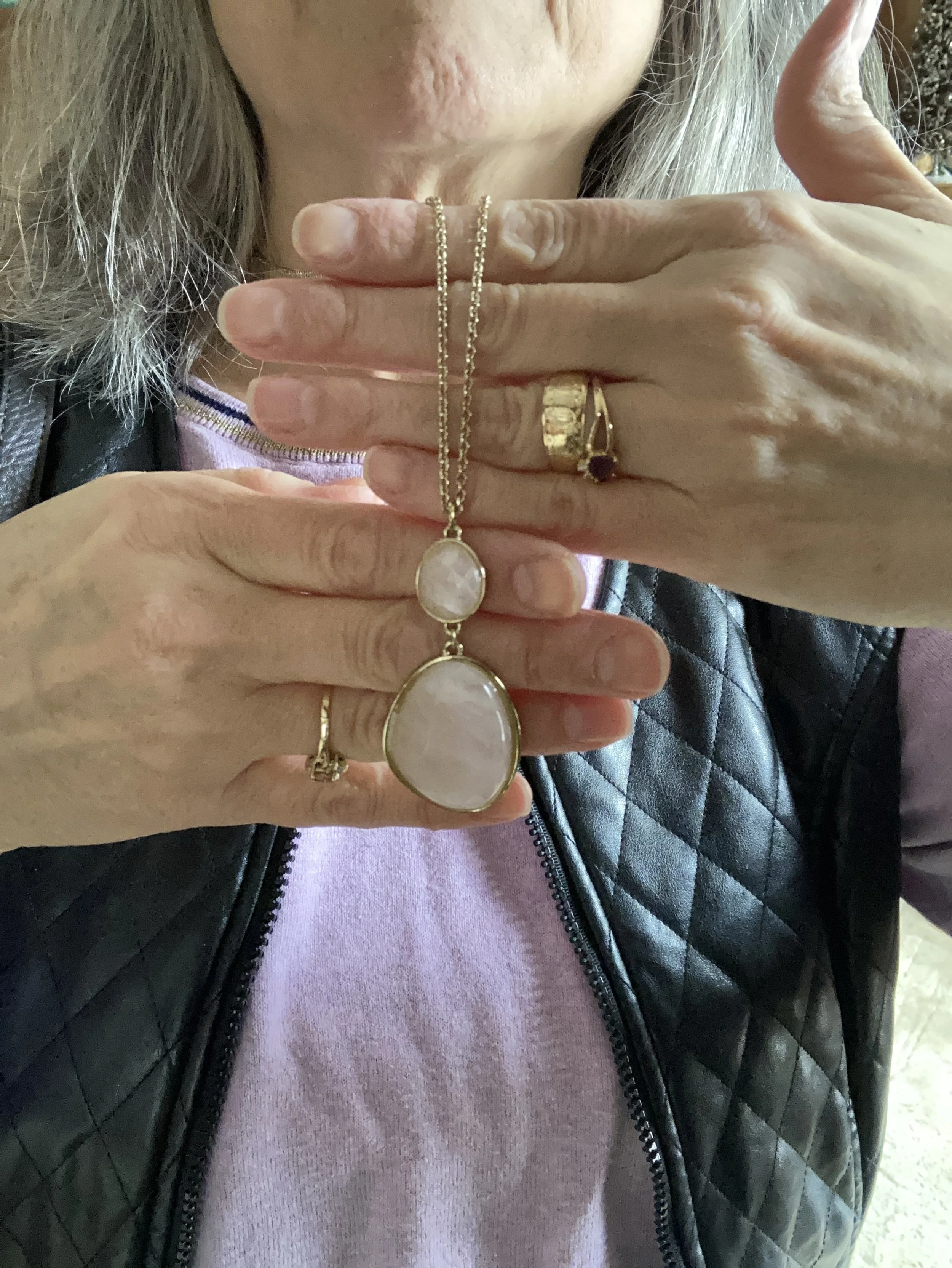
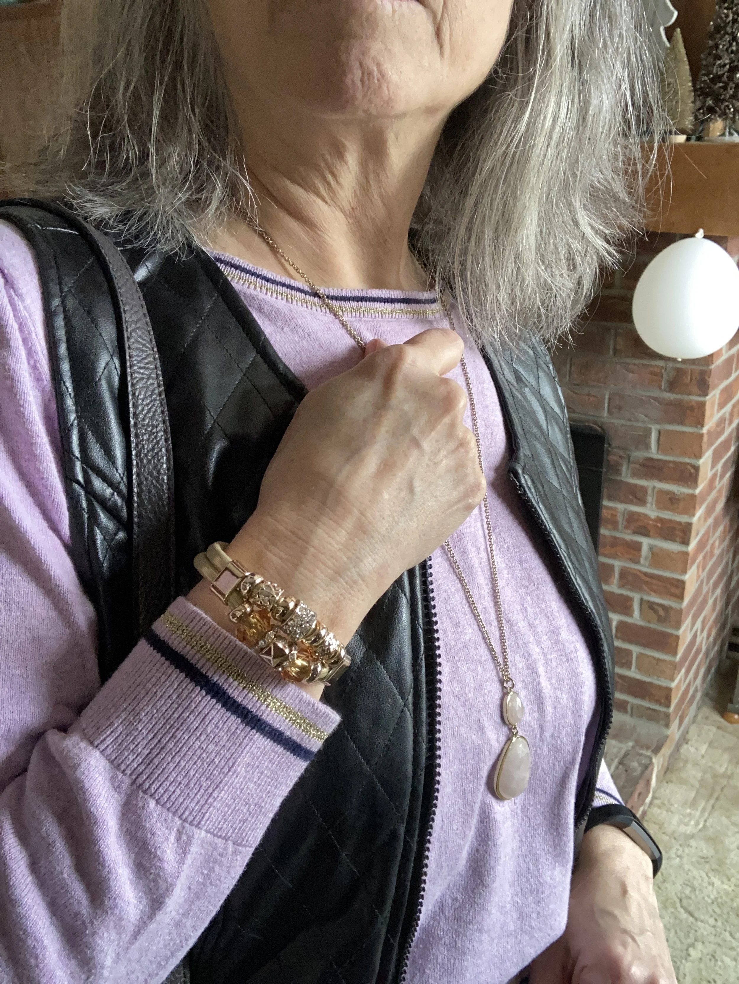
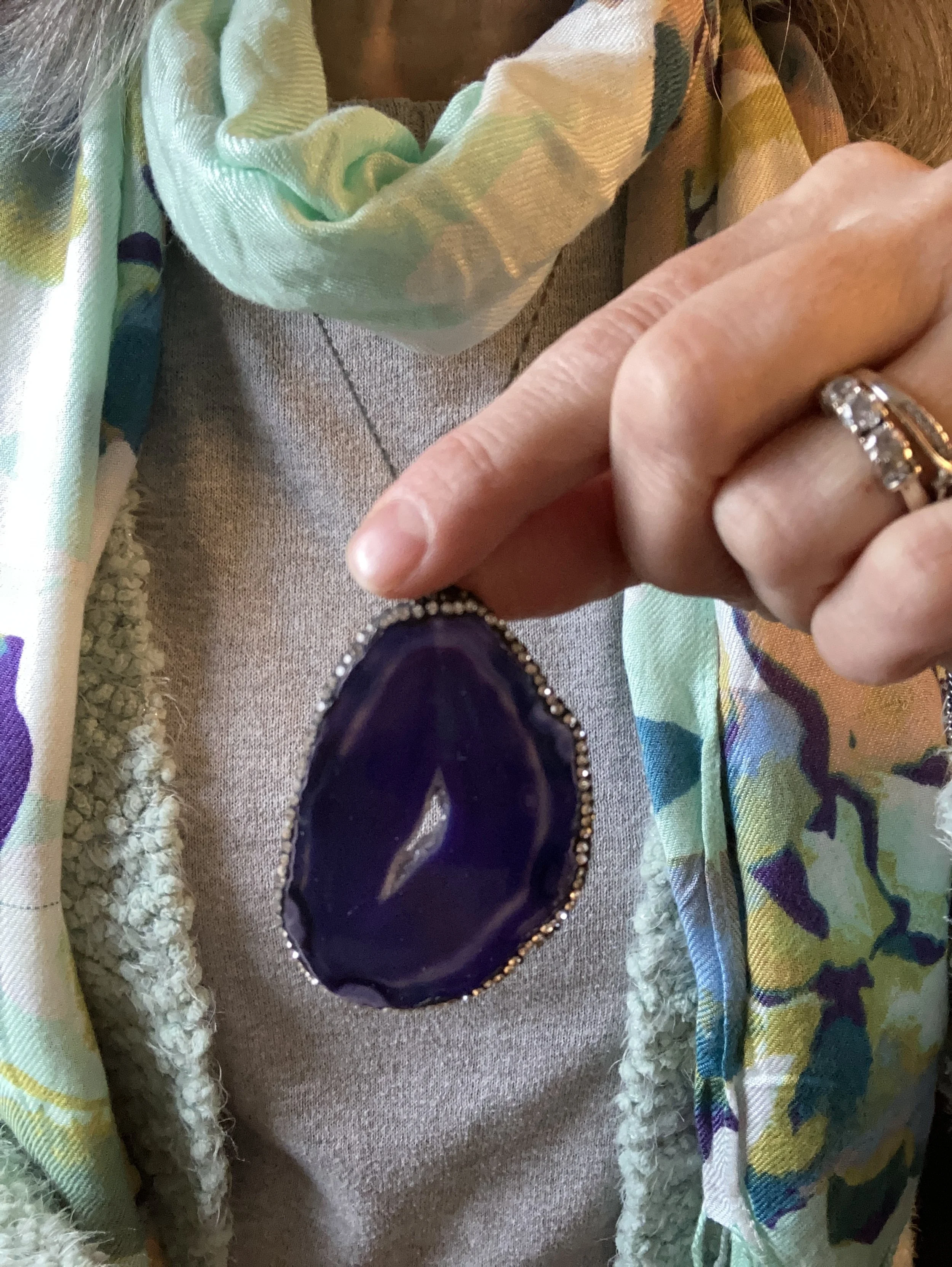
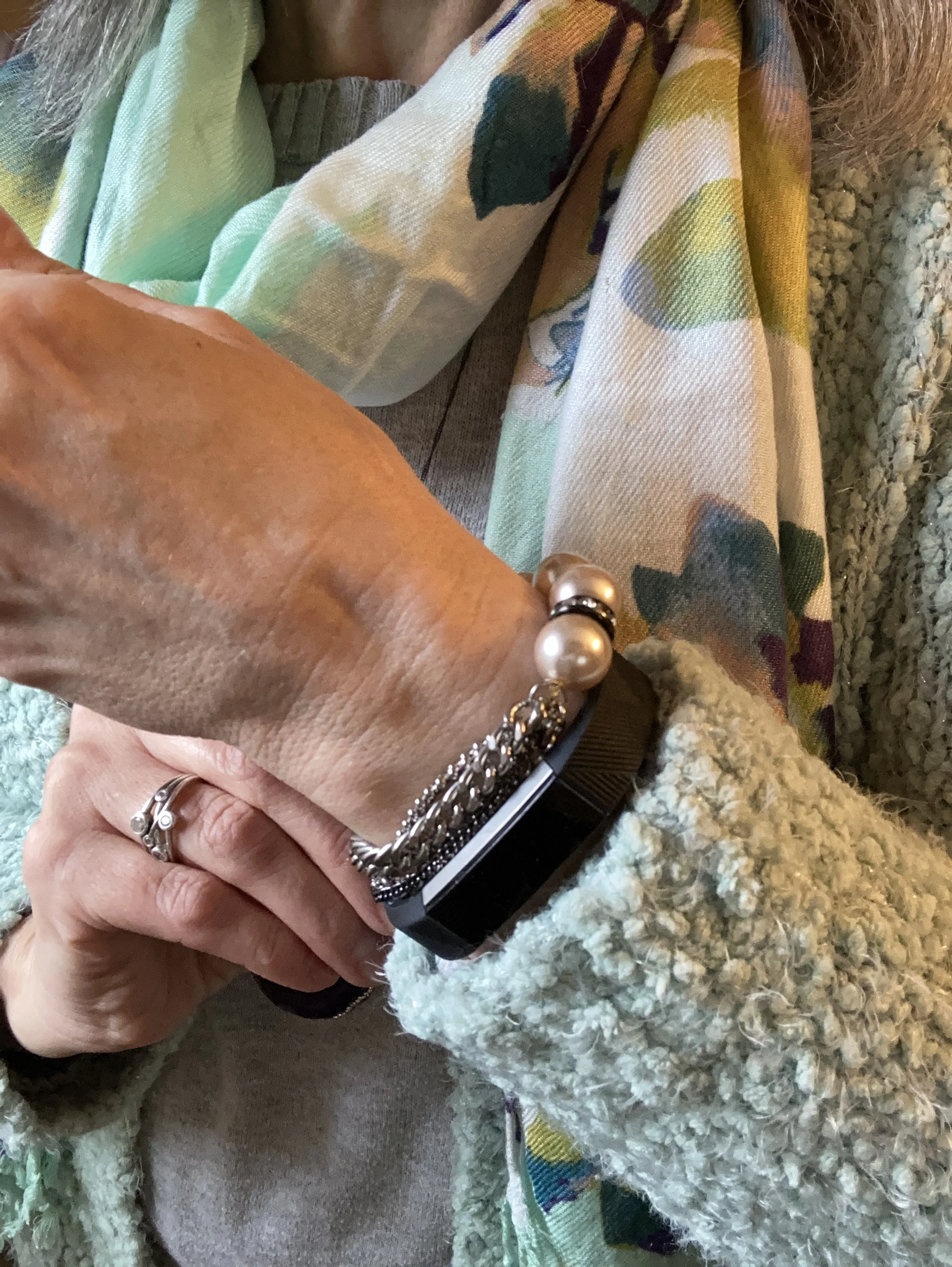
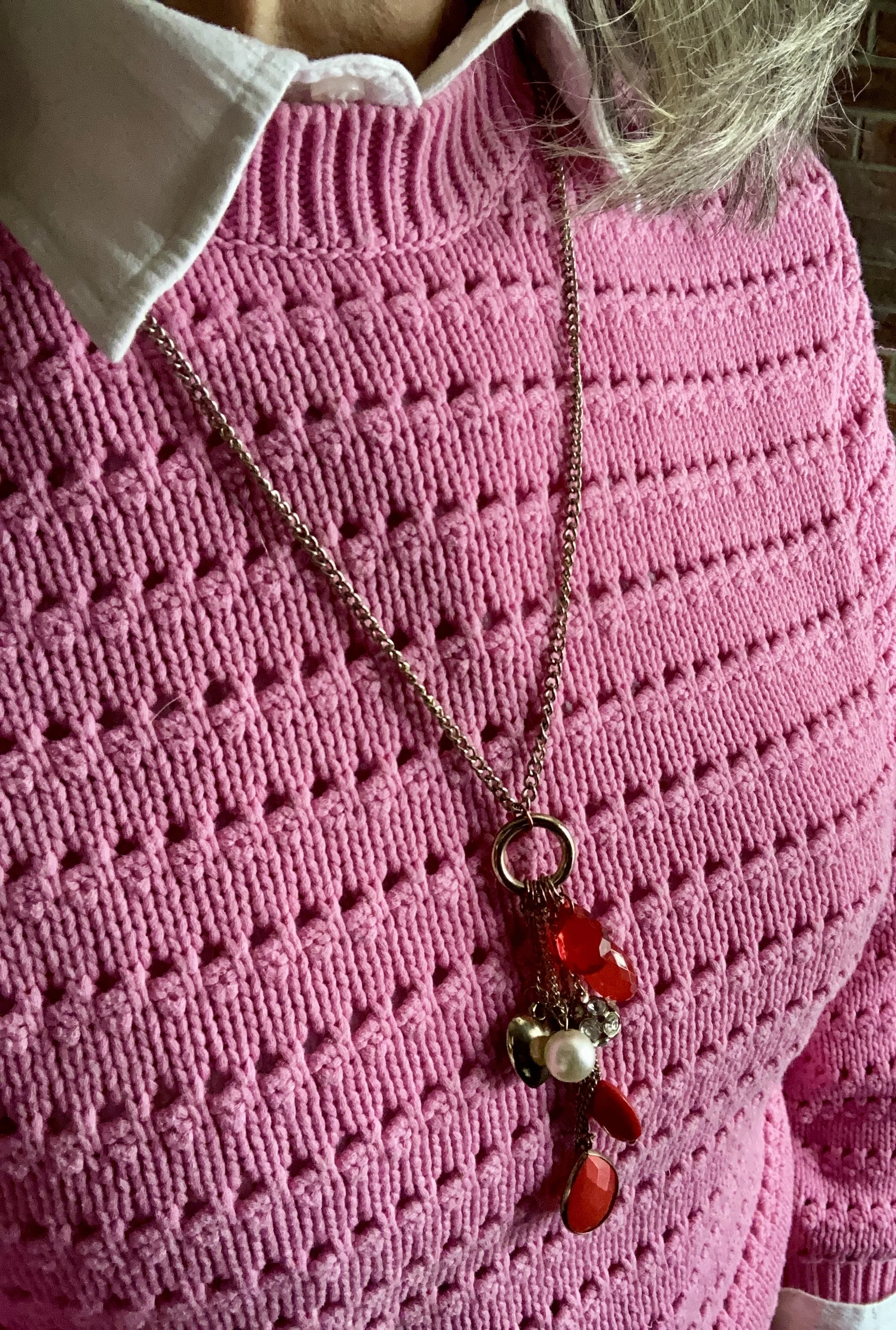
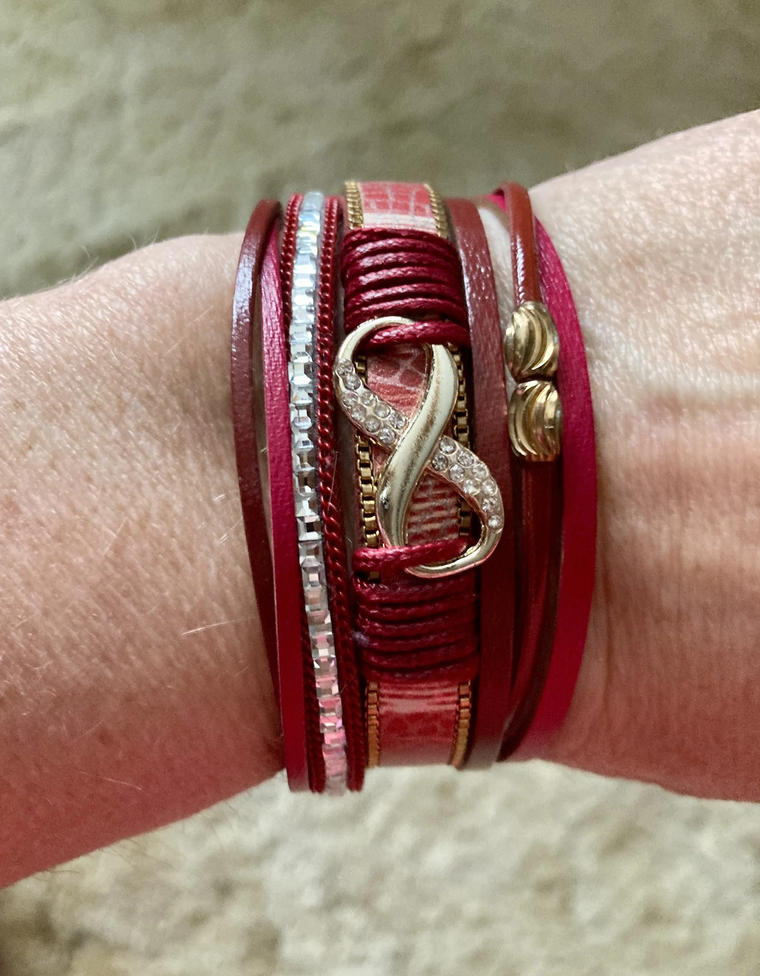
The outfit has a lot going on with the multiple layers and the print on the vest, but I did add a couple of pieces of jewelry. My charm necklace is old, but still a fave when I want something red, and my bracelet was a more recent thrift find.
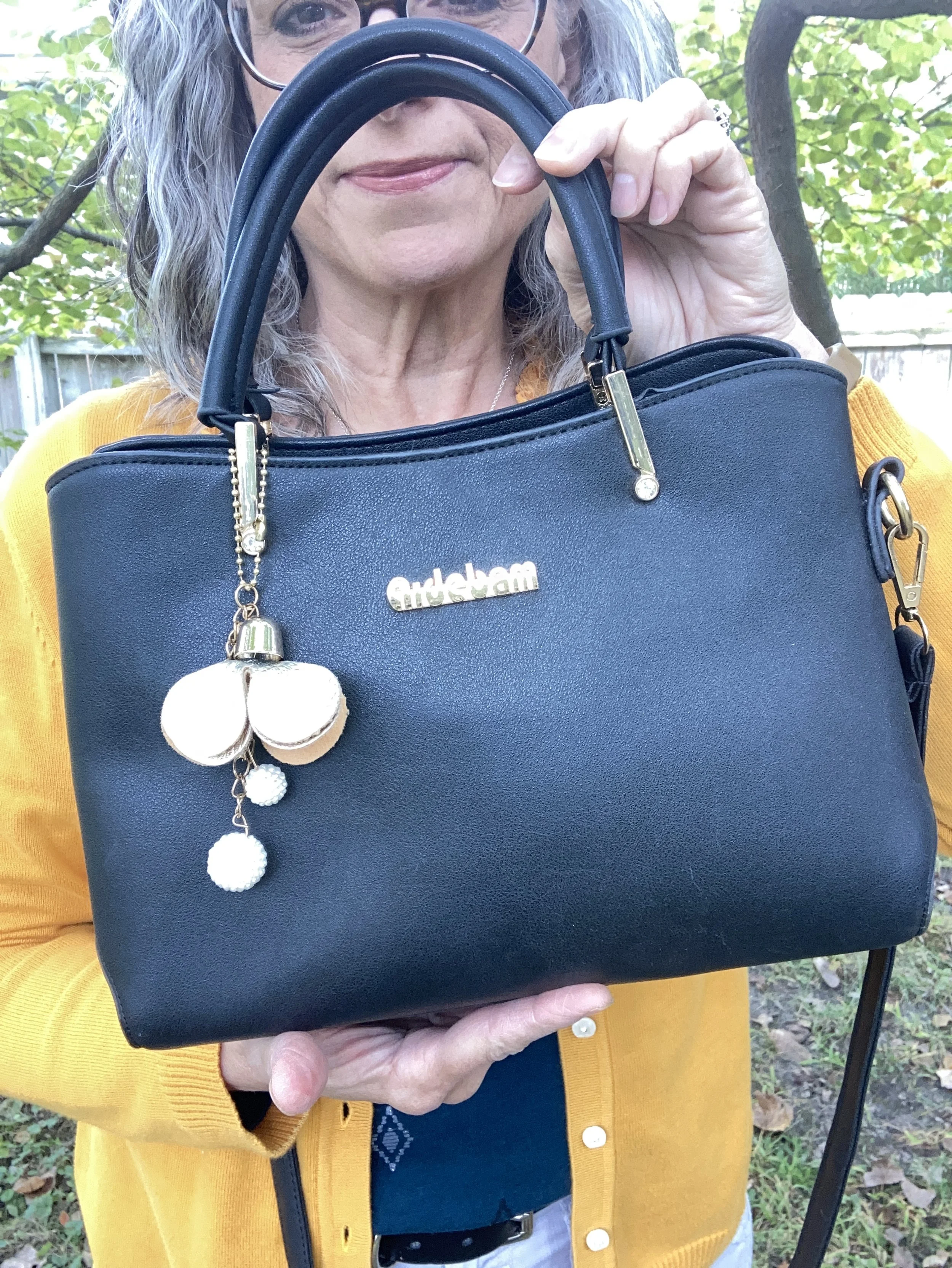
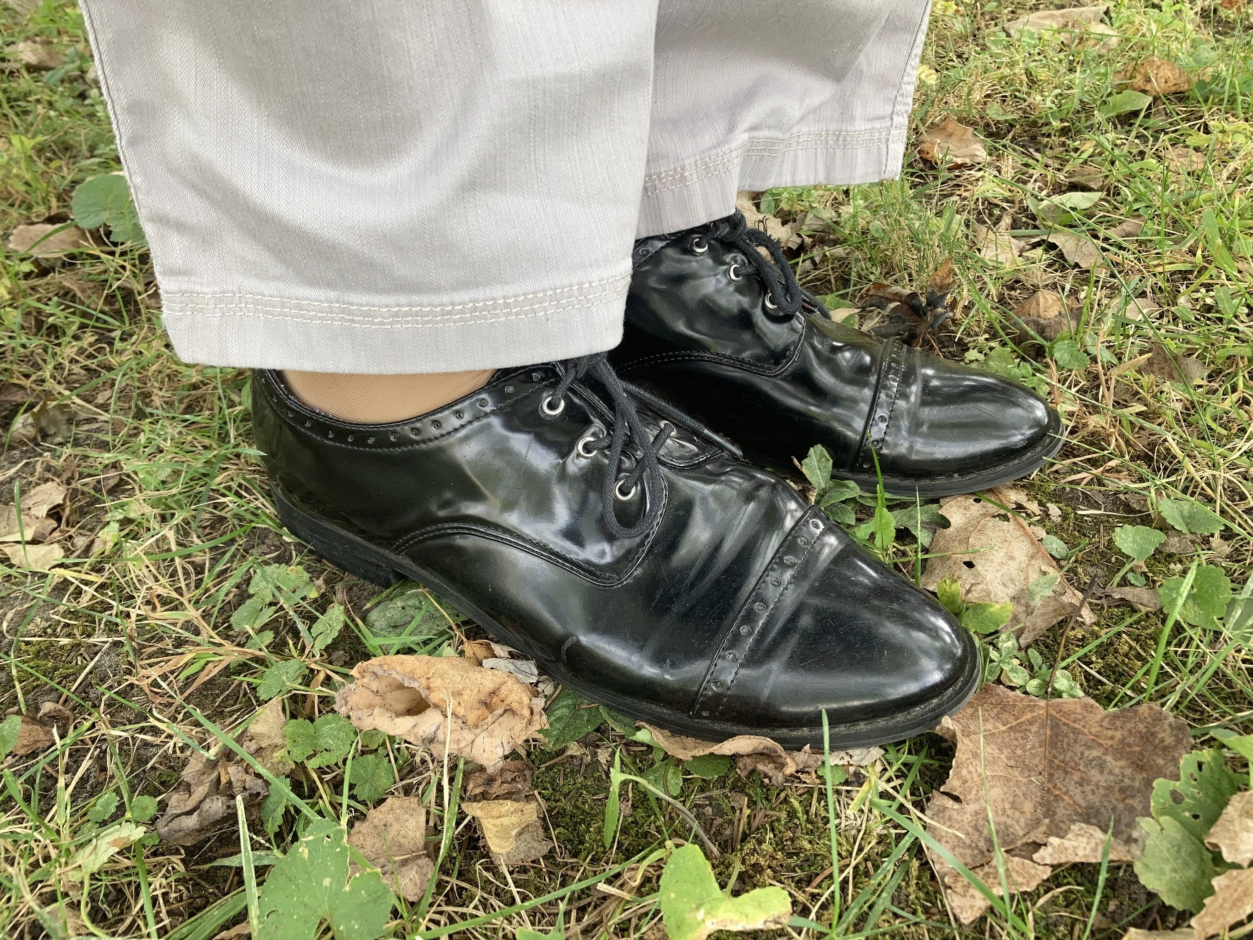
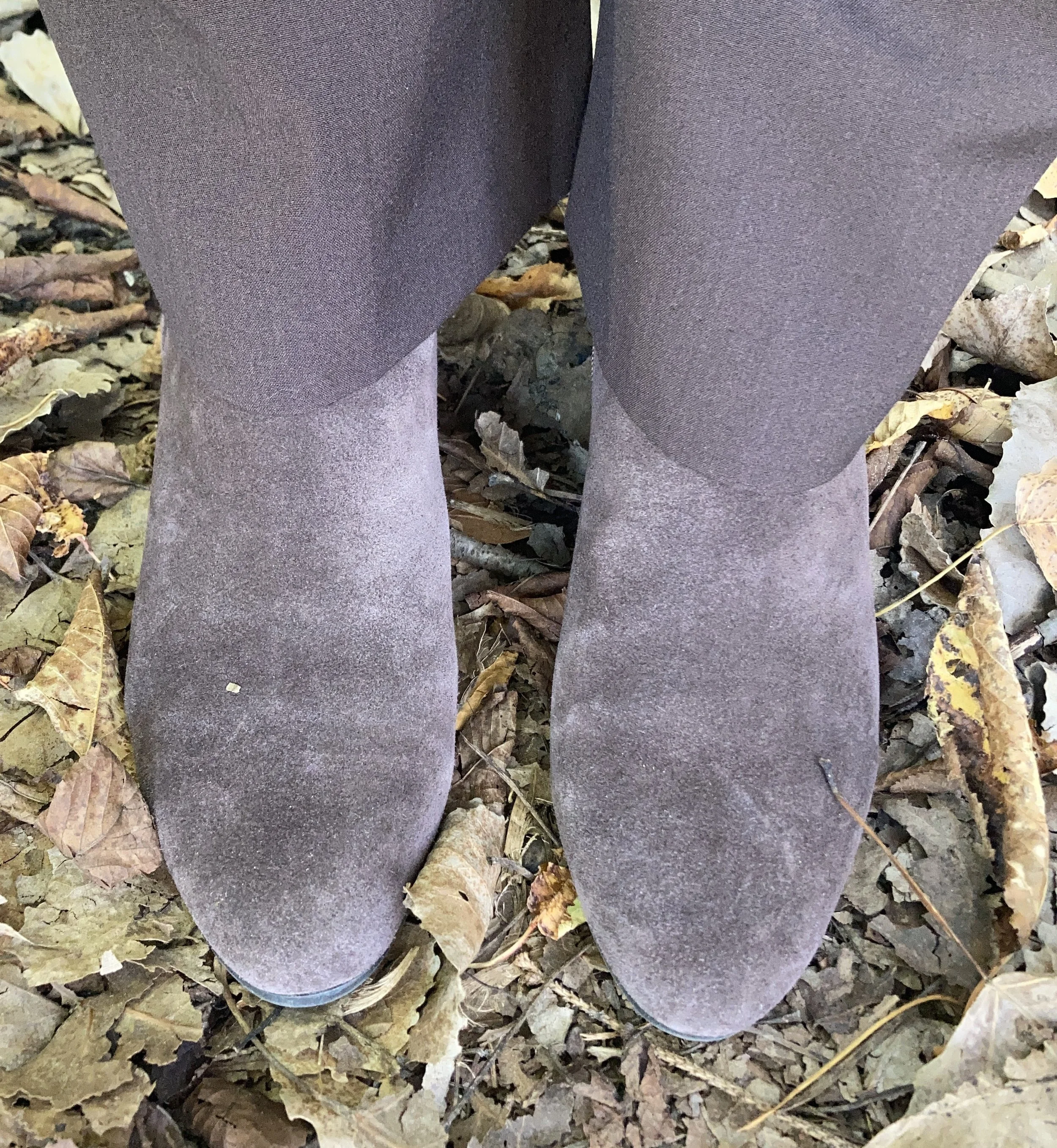
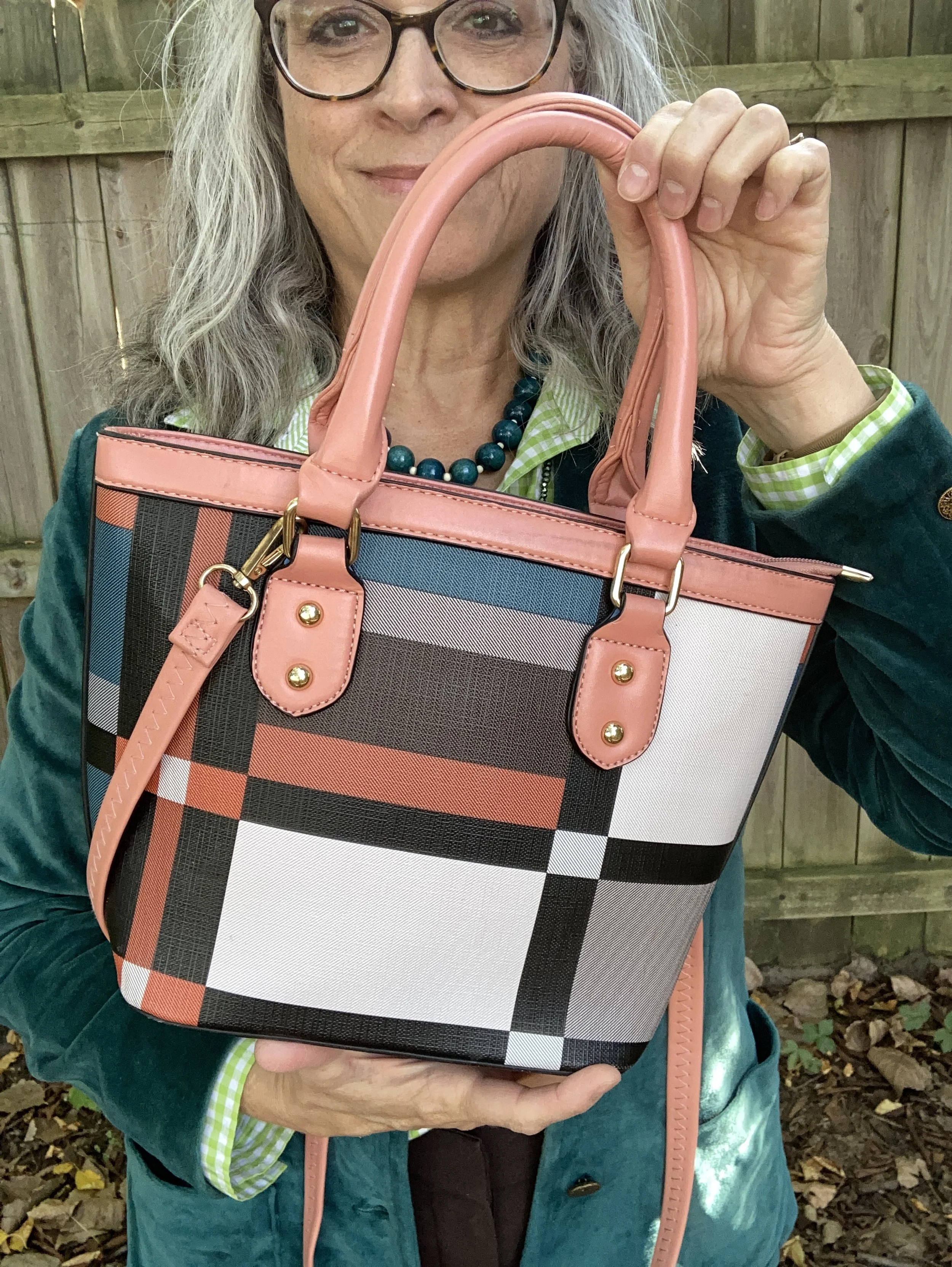
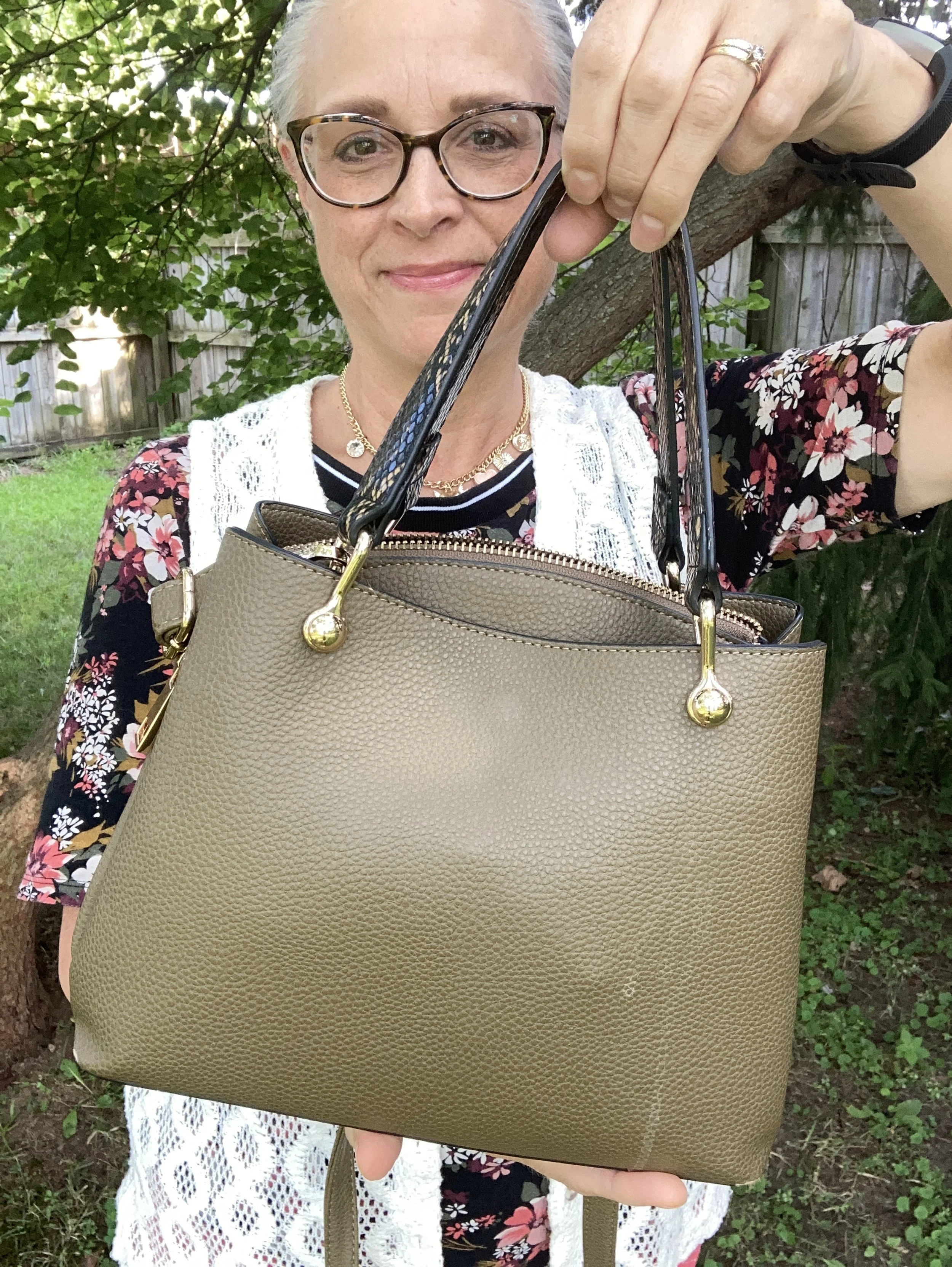
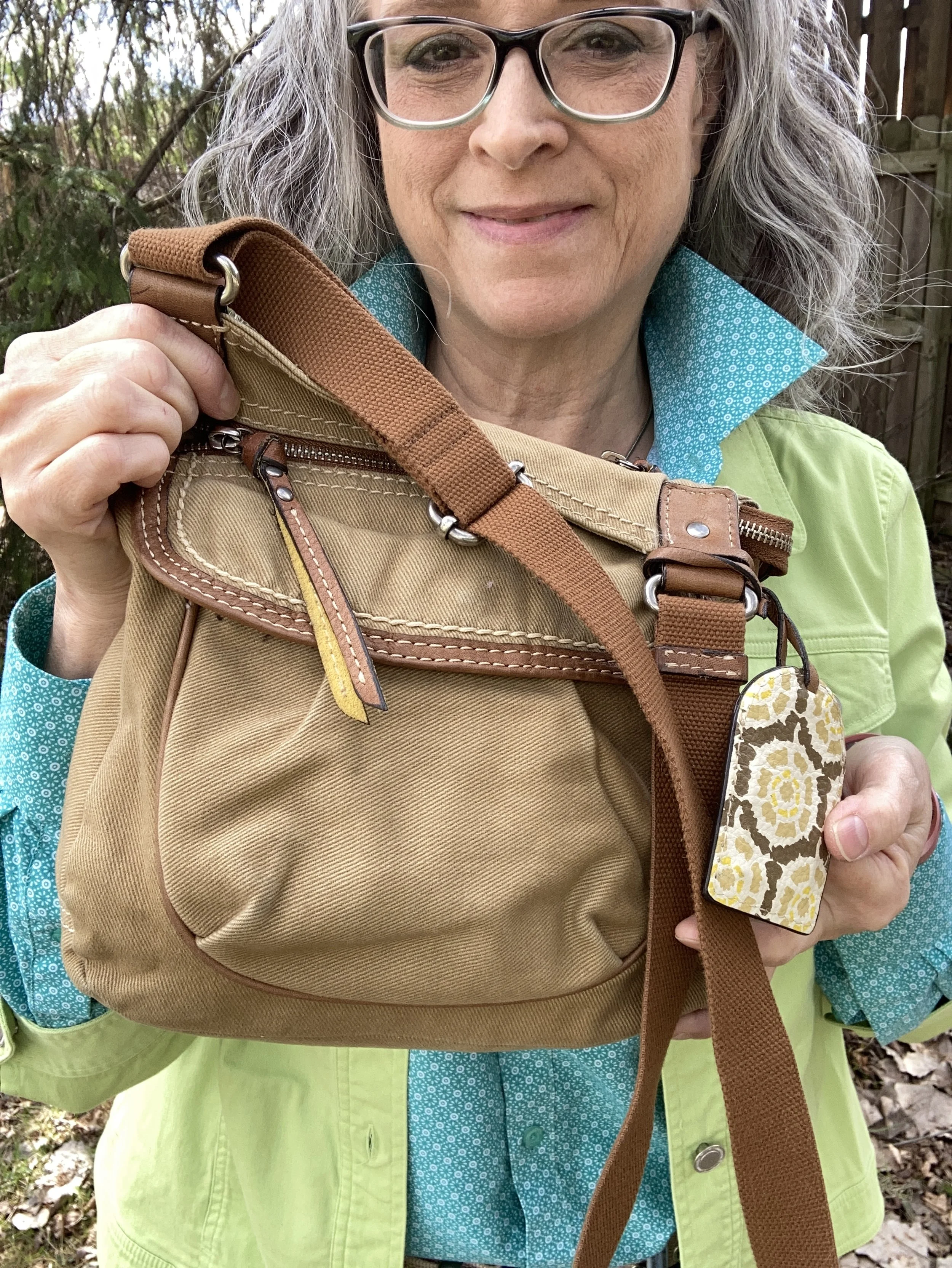
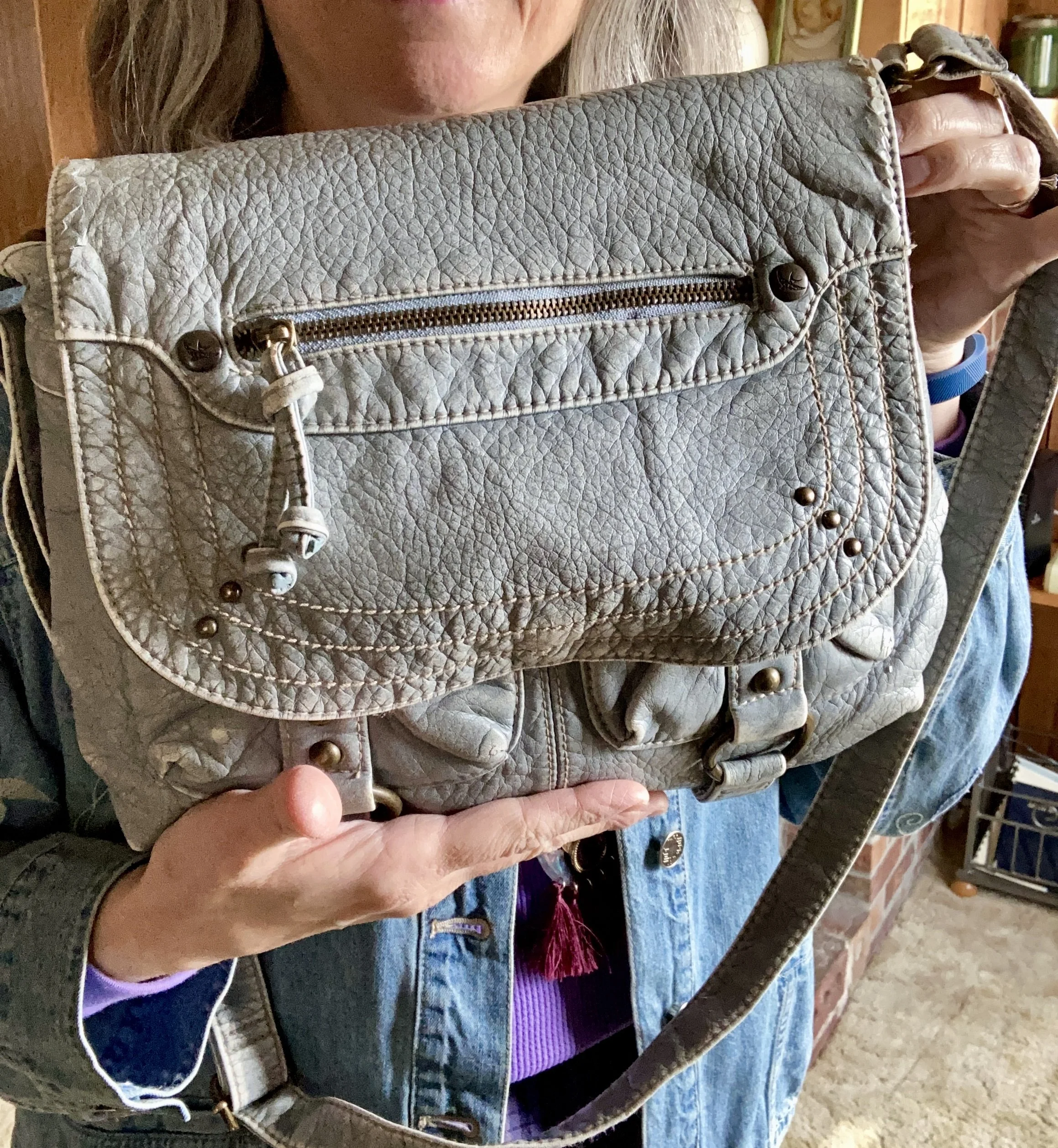
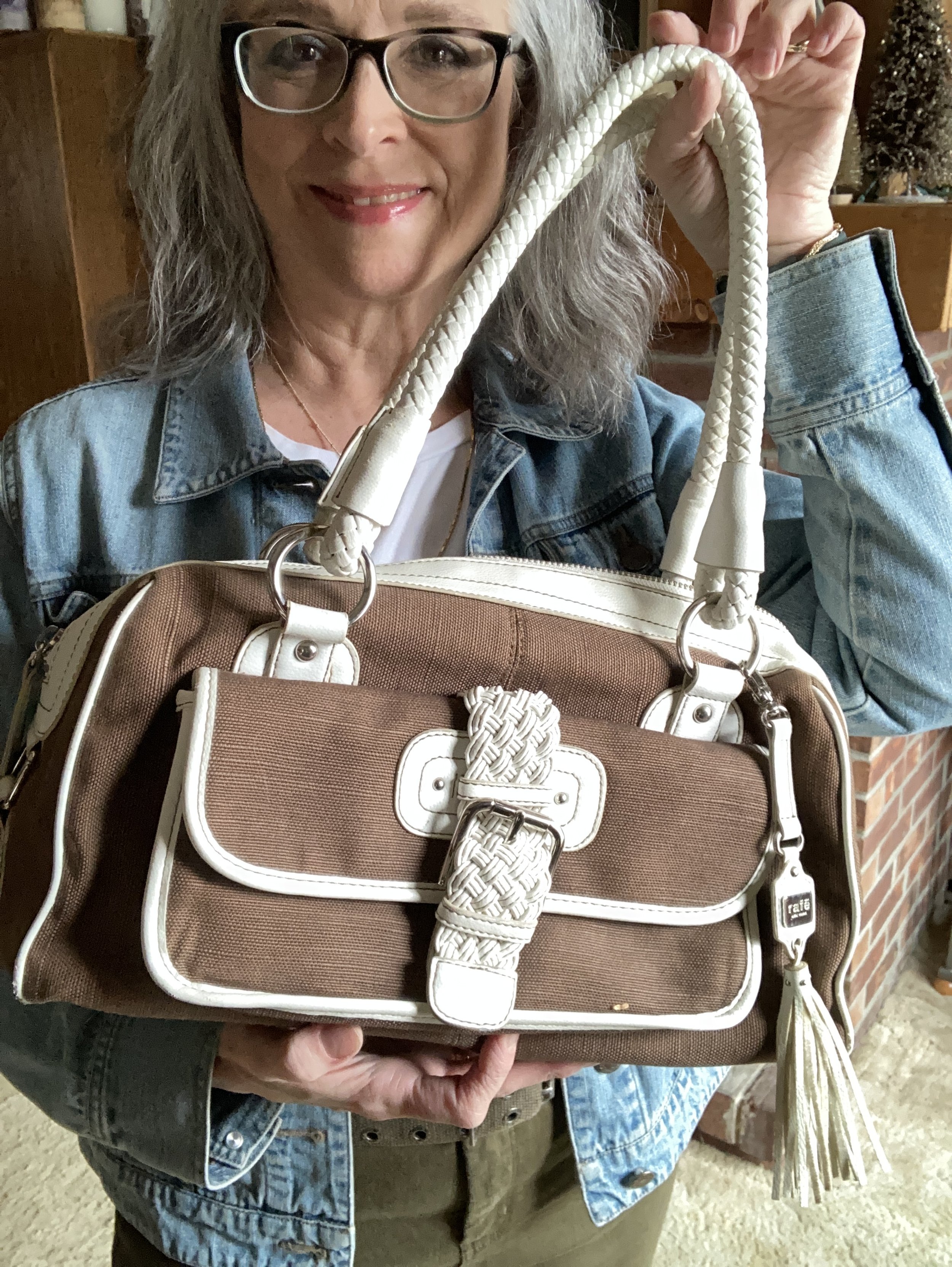
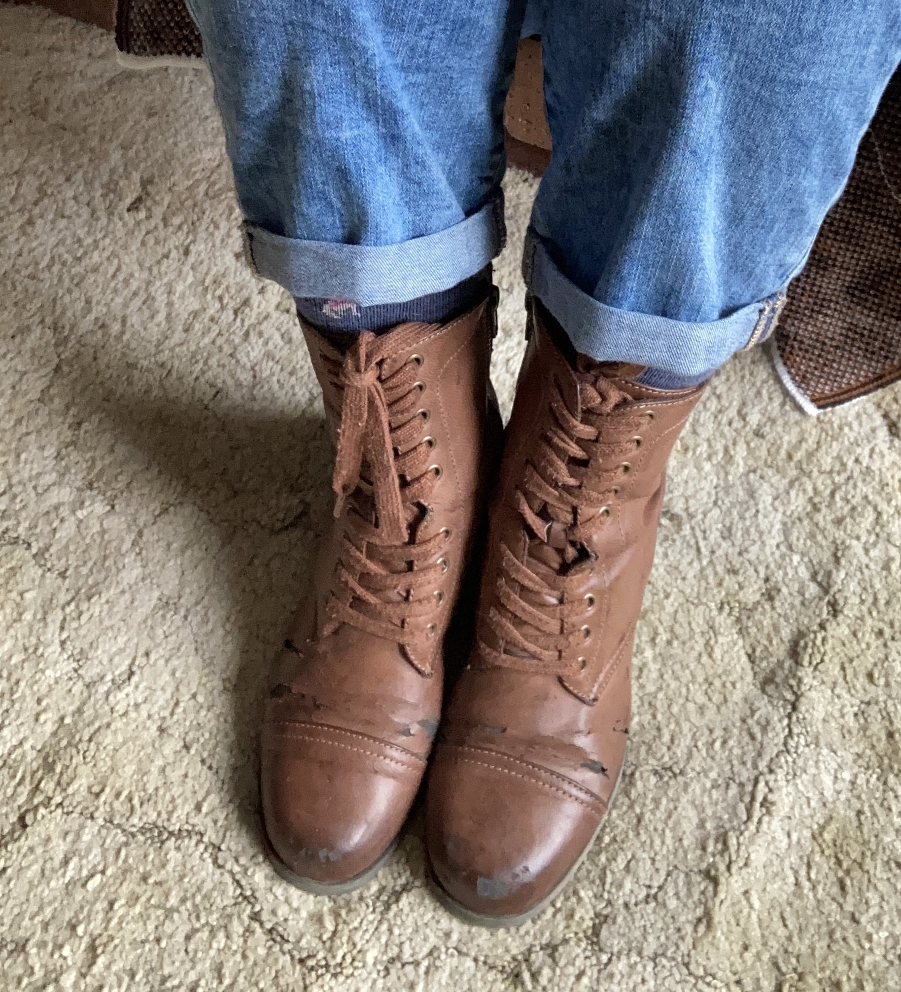
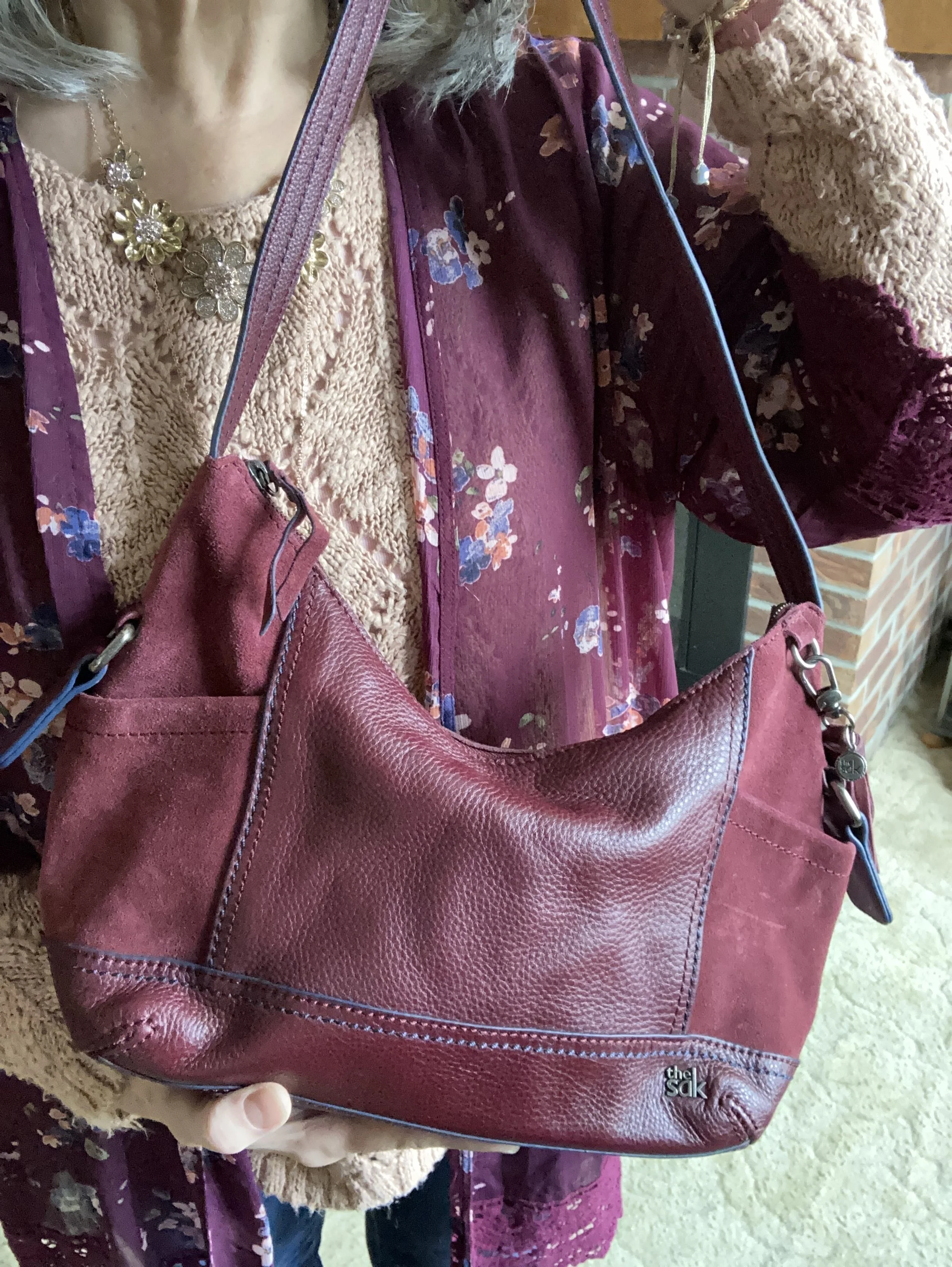
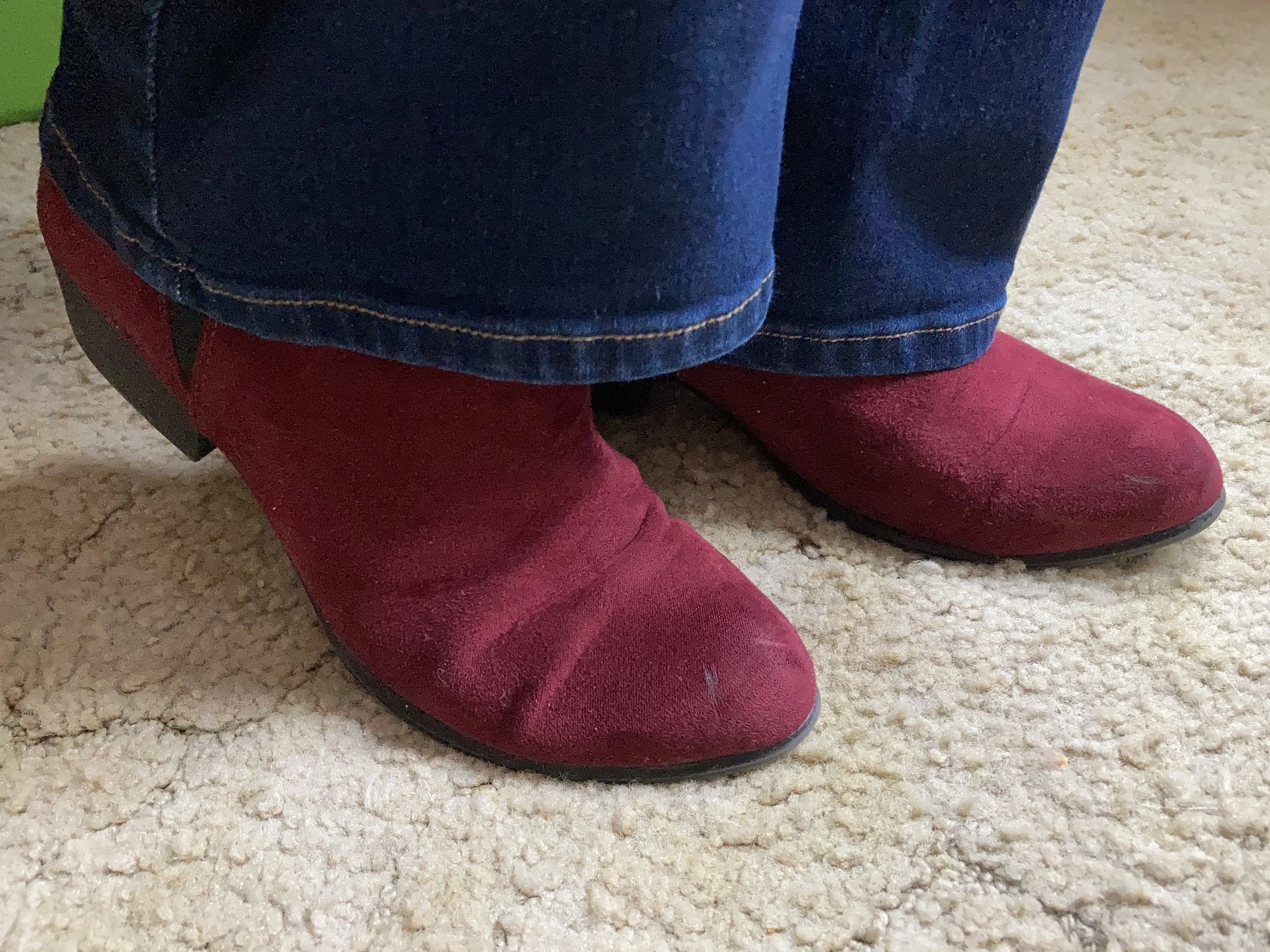
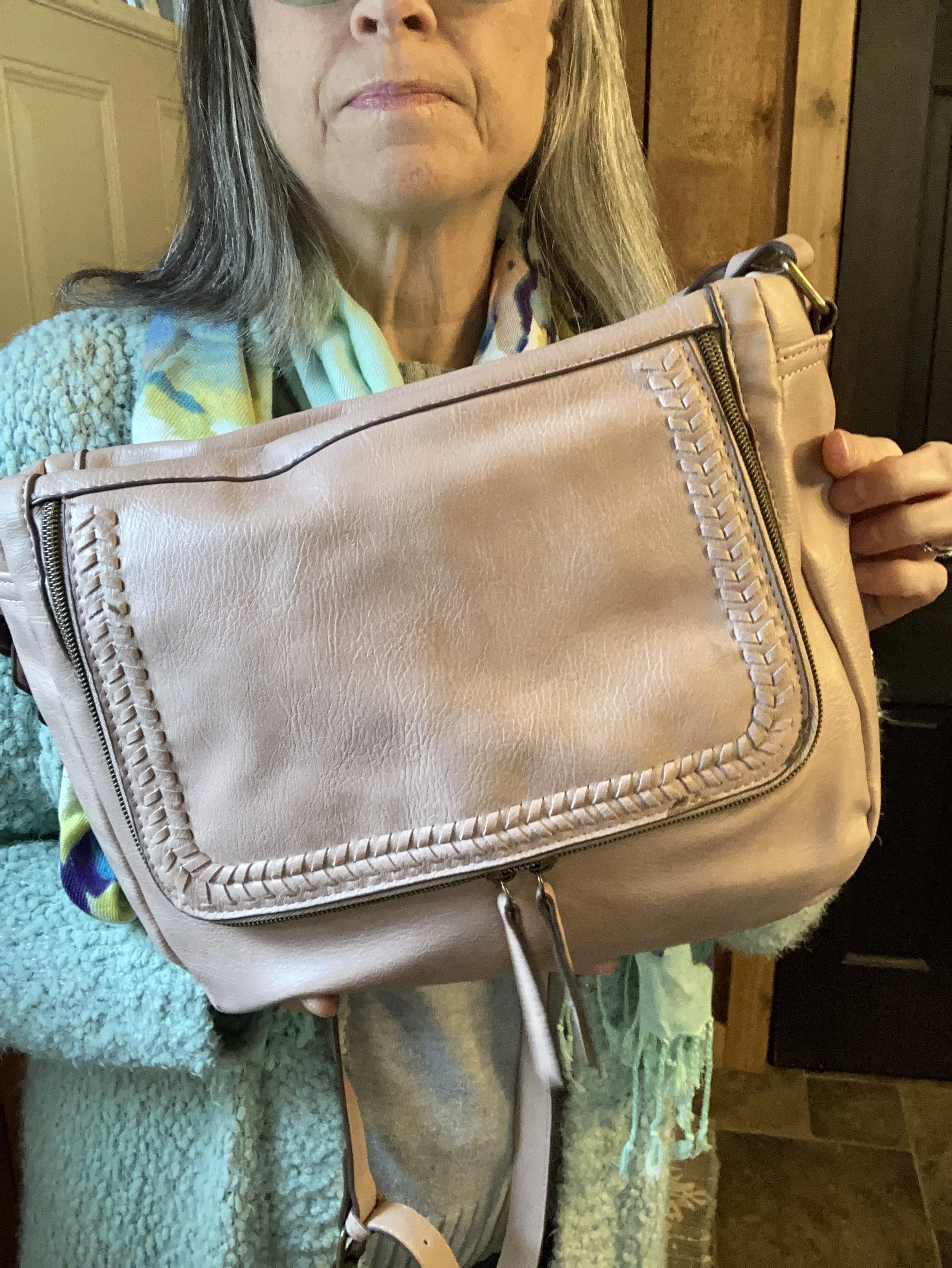
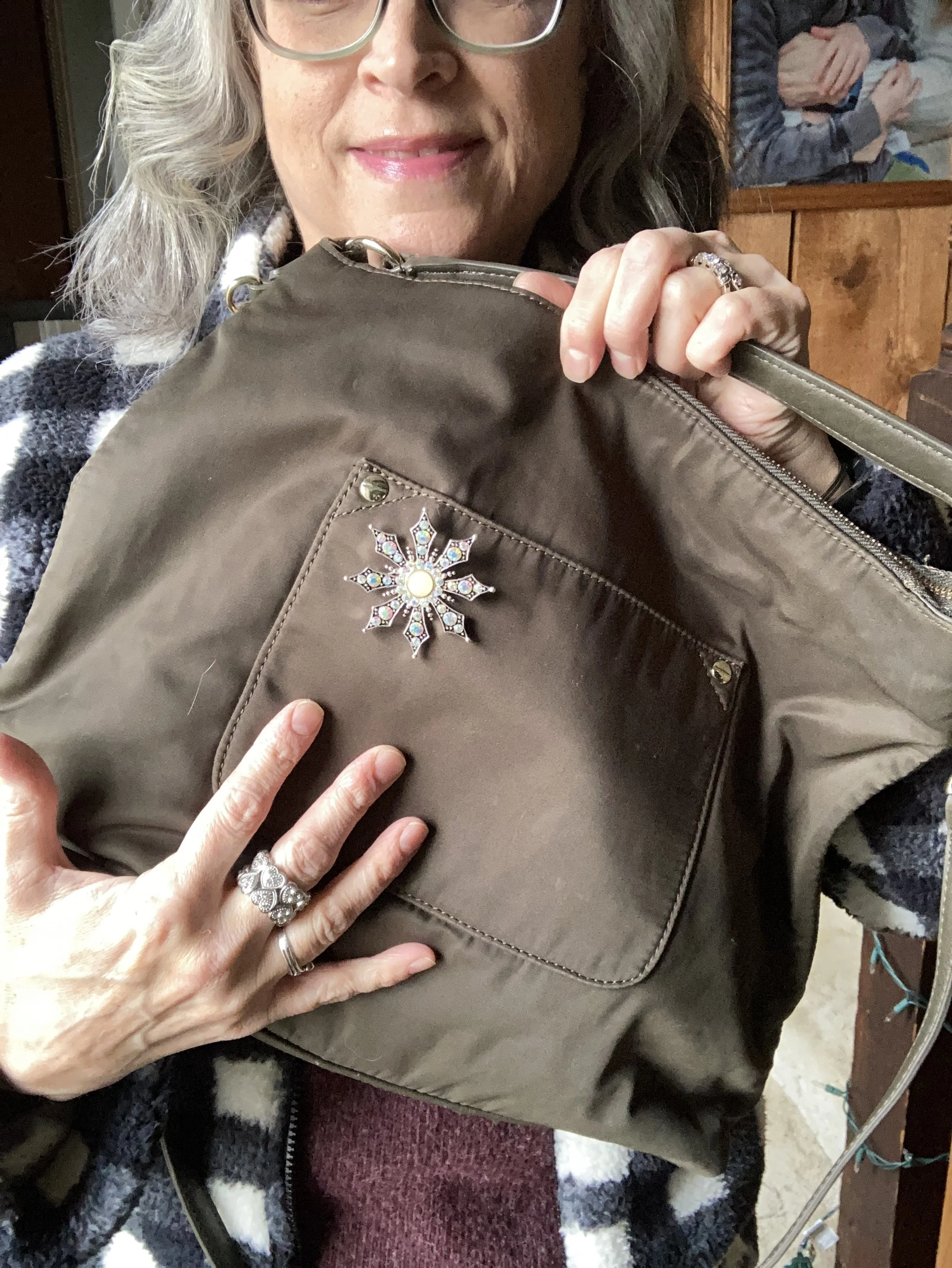
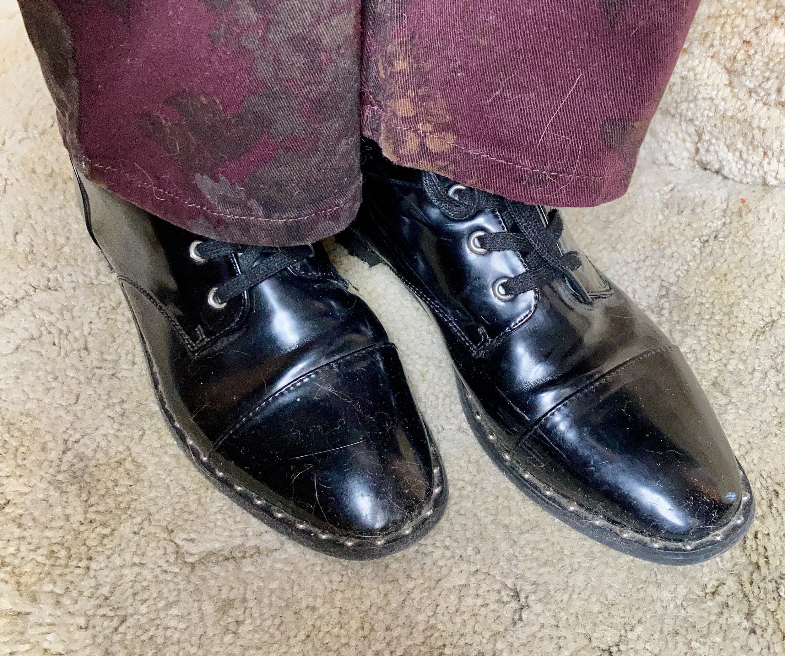
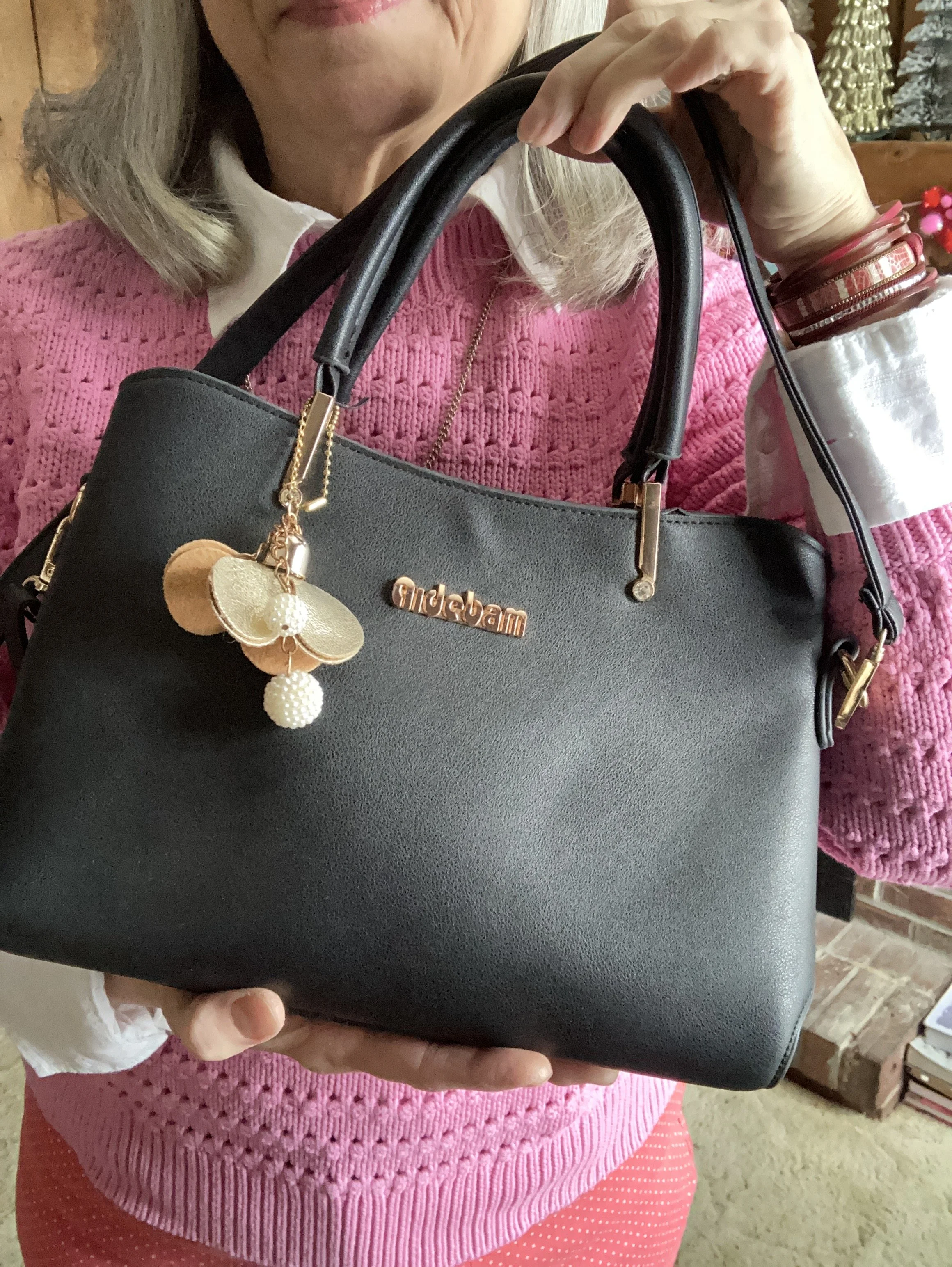
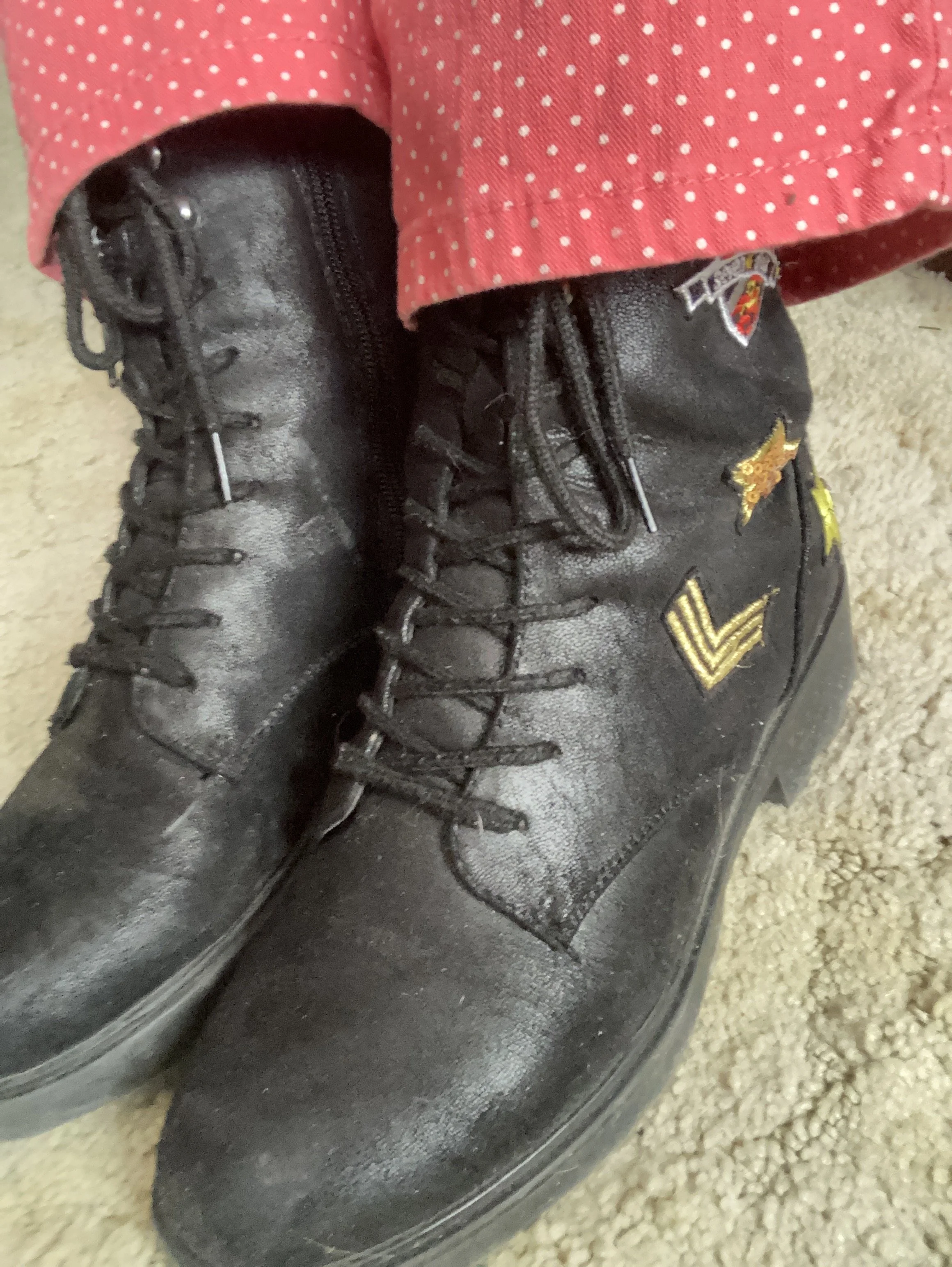
I went with basic black for my shoes and bag. Since it is still winter, and there is a little black in the vest I thought it would be a good choice. My bag has been on the blog before. It was gifted to me a few years ago for Christmas, and is a brand called Aidebaum. My combat boots are Seven Dials and were purchased a number of years ago. You can tell up close they are getting a little worn. Ha, ha.
What do you think of this outfit? Do you like to wear bright colors or you more of a fan of muted tones? I’d love to hear your thoughts, so leave me a comment or two below, or on Facebook. I also post regularly on Instagram, so if you have an account please follow.
No shopping links today. Have a great Tuesday evening!