Color Play: Building an Outfit Around a Bag

When I found this cute color block bag on a recent thrift store run, I knew I had to style an outfit around it. The colors are perfect for spring, summer and fall, and for me, the size is just right. I have gotten away from carrying large bags, because they tend to bother my shoulders. Even a cross body bag that is larger becomes problematic because I put too much stuff in it. You know the saying, “If it’s big, fill it up!” Ha, ha. I may have just made that up.

Aren’t the colors on this piece so cute? This has no brand name on it anywhere.

There were lots of choices I could have went with for an outfit. For a little while I was looking at a white maxi, but decided to save that for another day. I also pulled out a pair of coral pants, but ended up with the look you see here.

For this look I decided to have a similar color block vibe to the bag. I am looking forward to using this bag again for inspiration with a print mixing outfit.

I was pretty sure I wanted to use this thrifted teal blazer as it matched so well with the bag. Obviously this is a great outfit for these spring days where the temps fluctuate, but once summer hits the heavier layers will disappear. This blazer is a brand called Weekenders. It is a medium weight with a longer silhouette, and textured cuffs that match the shawl lapels.

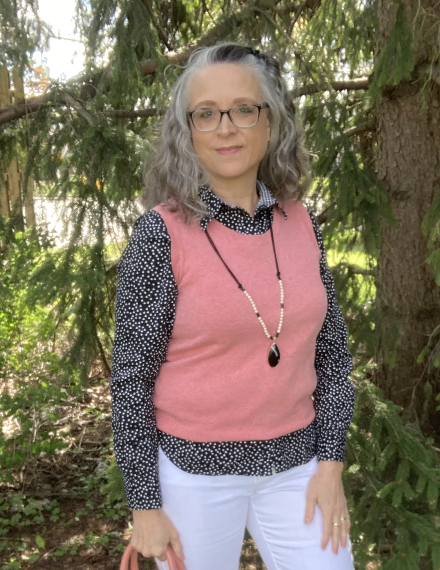
Once I decided on the white Gloria Vanderbilt jeans that I have had for years, and can still squeeze into…and I do mean squeeze…I knew I wanted a coral piece to match the coral in the bag, so I chose this thrifted Cherokee shell, which I decided to use as a knit vest.

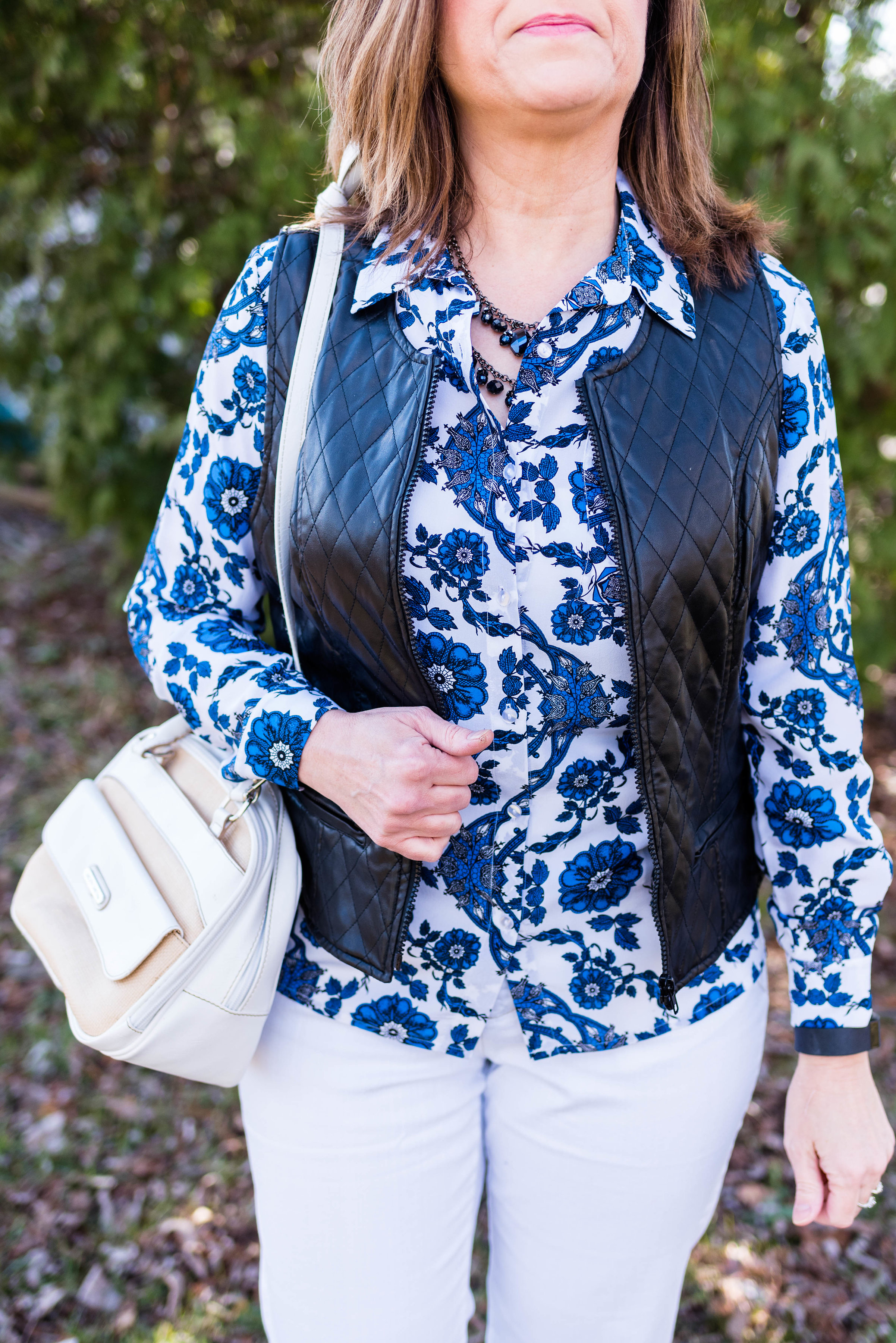
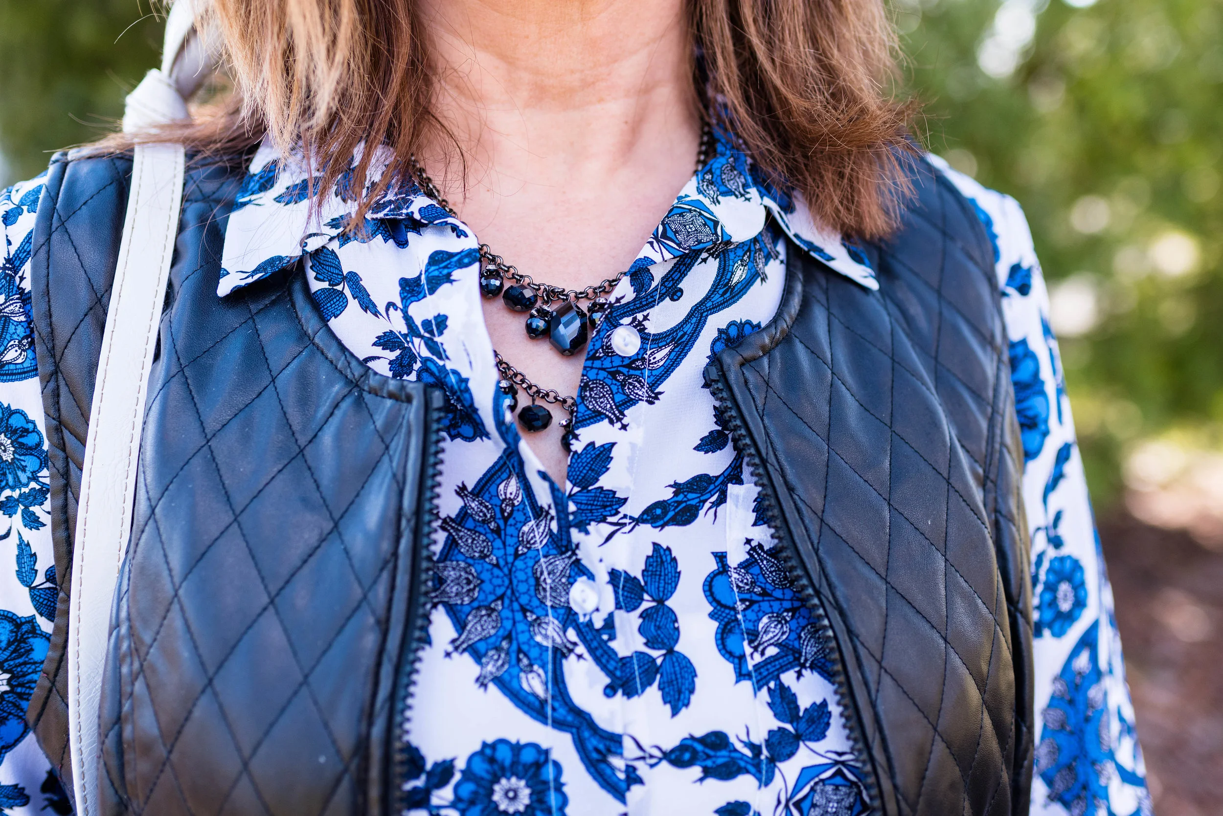
I also wanted to add a little black, so decided on this thrifted Chaps blouse with polka dots. Once I had that the only jewelry I added was this fun pendant necklace I found at the second hand shop around the corner.

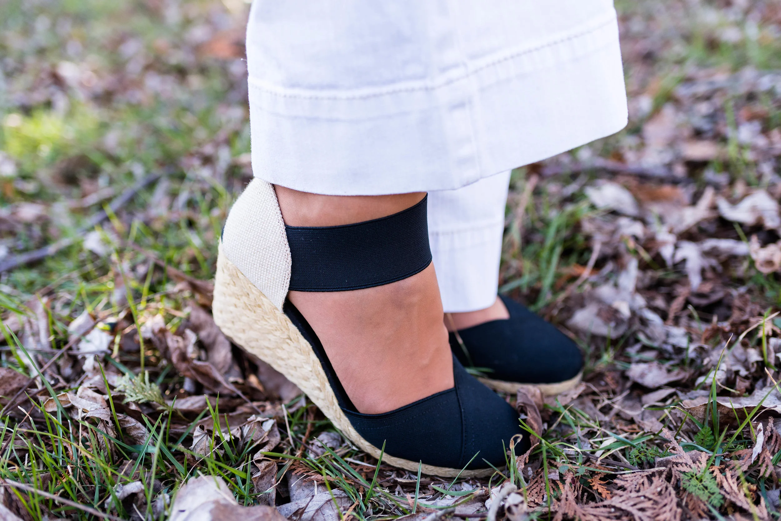
I have always like the classy look of oxford shoes, so I pulled out this black patent leather pair I have from my days as an assistant manager at the bookstore. These are a brand called Sugar.

Do you have a bag that you can use to inspire an outfit? Have you ever tried building an outfit around a fun, colorful bag? What do you think of this outfit? Would you wear something like this? I would love to hear your thoughts.

I’m including a few shopping links for you. I bring these to you at no extra cost. These are affiliate links which means I get a few cents if you click on a link, and a bit more if you purchase something through one of the links I provide. I appreciate all your support. All opinions are my own.

Have a super week!

Having Fun with Layers - Light Weight Kimono

I am sure most of us have one or two kimonos in our closets. Typically, we only pull out these light weight pieces when the weather warms up enough that we can show them off over our spring or summer outfits. Kimonos are really more of an accessory than they are an actually clothing item. They are meant to accentuate or be the focal point of an outfit, much like a statement necklace or a scarf. For this reason, I thought it would be fun to show how we can use a kimono while it is still cold, by using it in the same manner, but over an outfit with heavier layering pieces.

Having fun with layers - light weight kimono
Having Fun with layers - light weight kimono

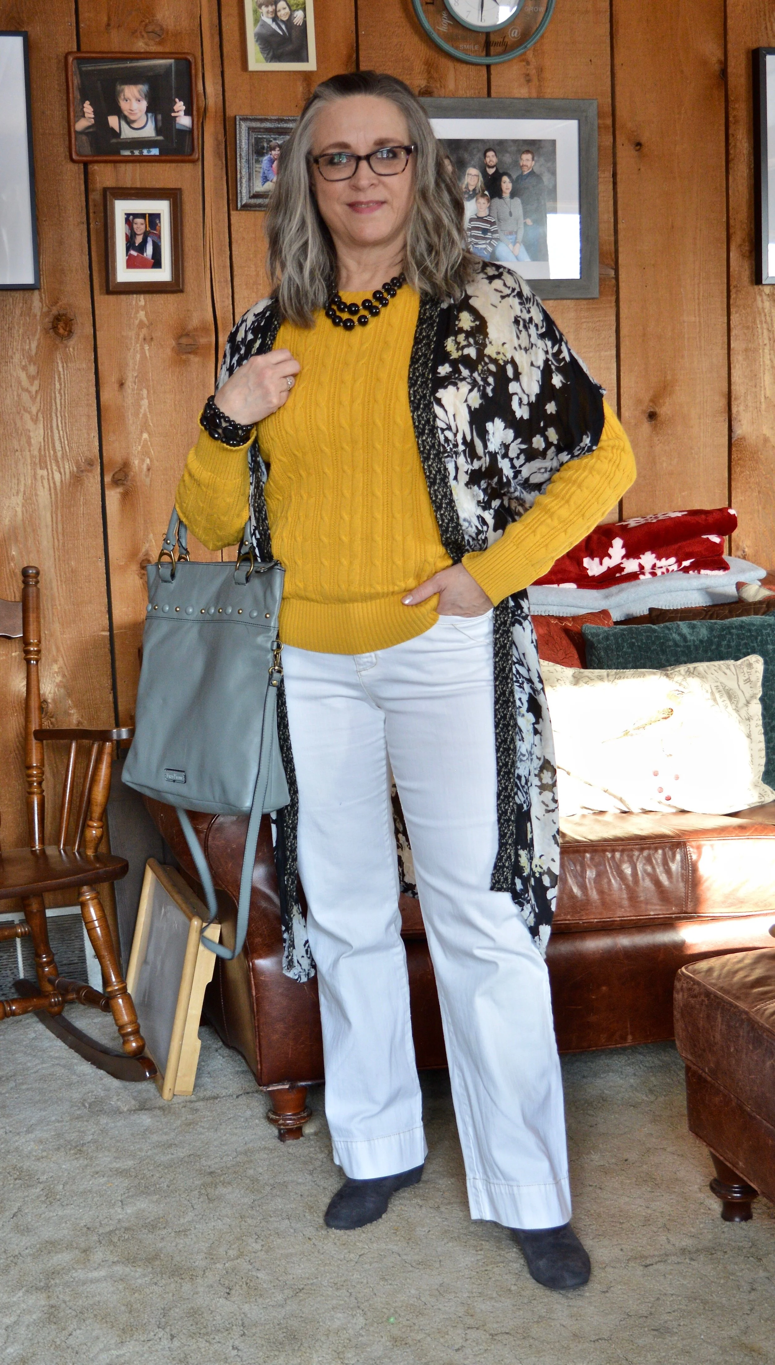
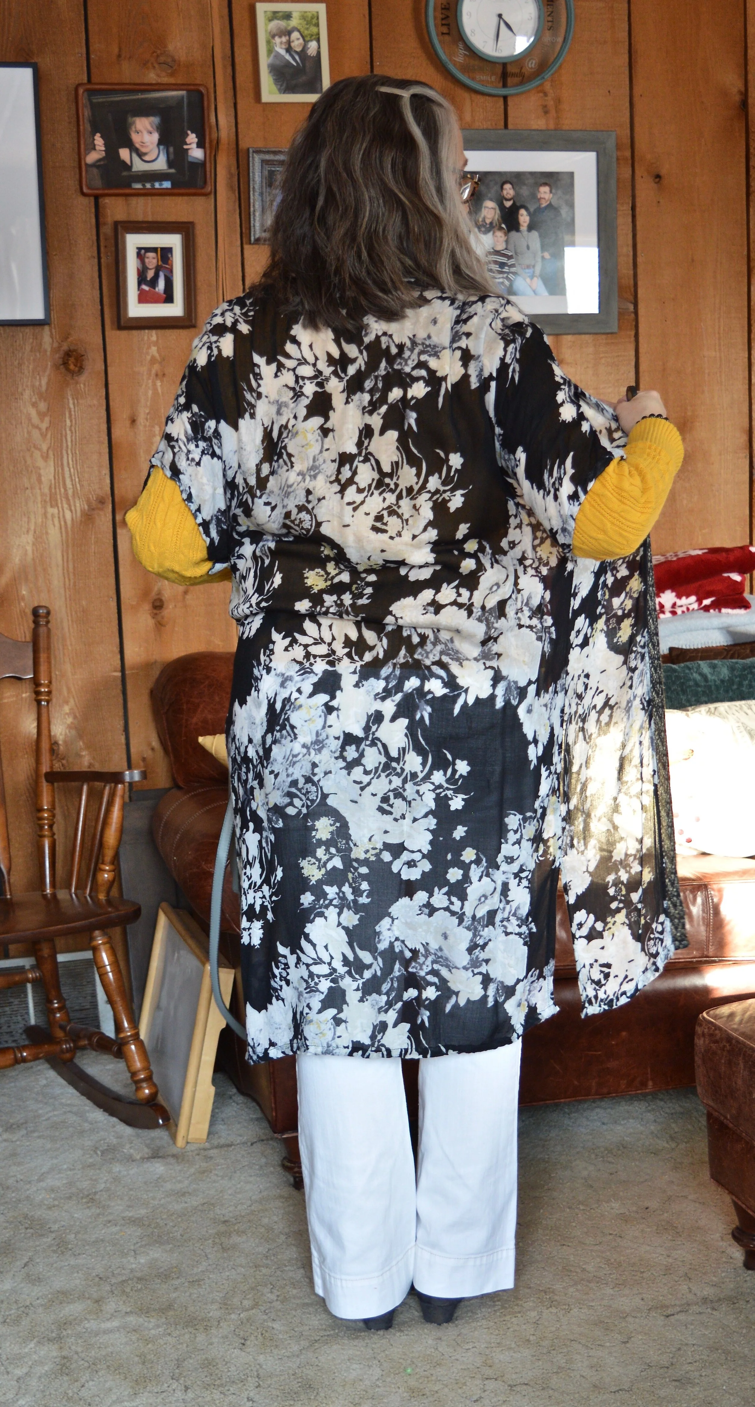
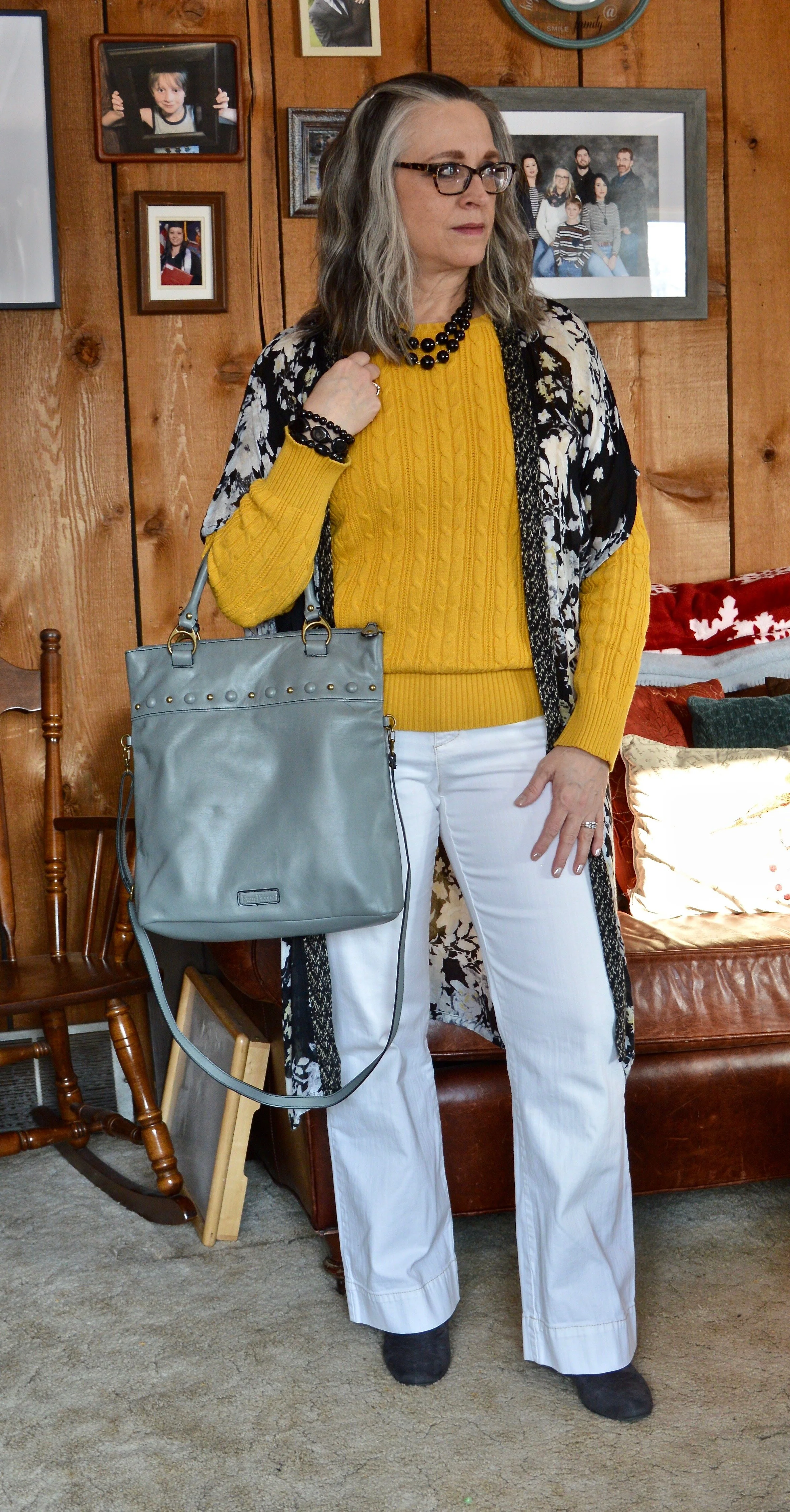
This kimono was a clearance find at Kohl’s a few summers ago. It is actually a bit small for me, but since I don’t have to worry about closing the front, I just let it hang open, almost more like an open front cardi or vest. You can see the pretty floral detail, but what you can’t see is that there is also a spattering of light yellow here and there in the pattern. That is why I wore it over the bright yellow sweater.

Having fun with layers - light weight kimono

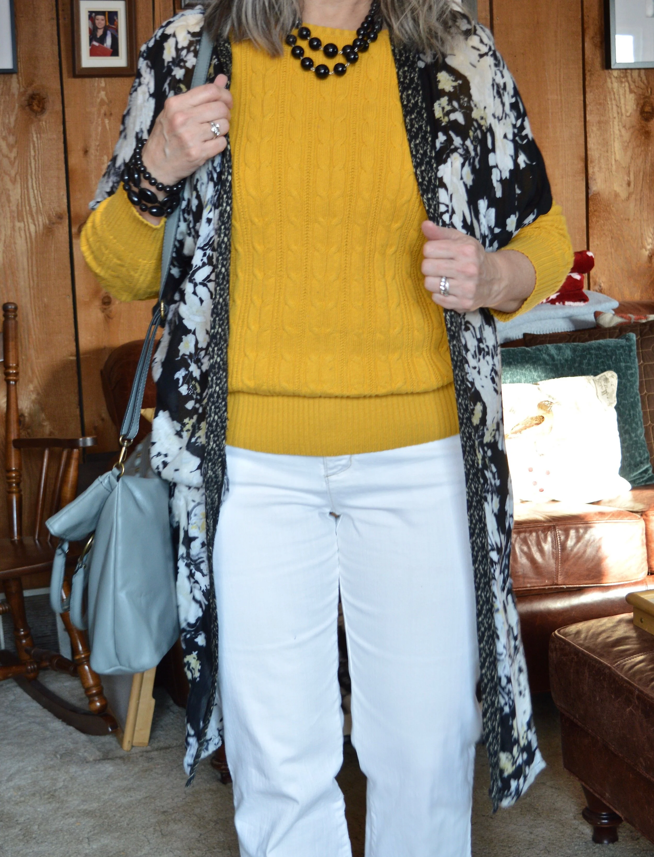
I love this pretty yellow, St. John’s Bay, cable knit sweater that I got at JC Penney over a year ago. Cable knit sweaters are definitely a staple in my cold weather wardrobe. They are comfortable and can be worn along or with a collared shirt sticking out as an additional layer.

You’ve seen these Gloria Vanderbilt jeans on the blog many times and I swear by this particular pair of white jeans. So far I can still fit into them, which is a good thing, because a heavy weight pair of white jeans, that don’t show through are hard to come by. Ha ha.

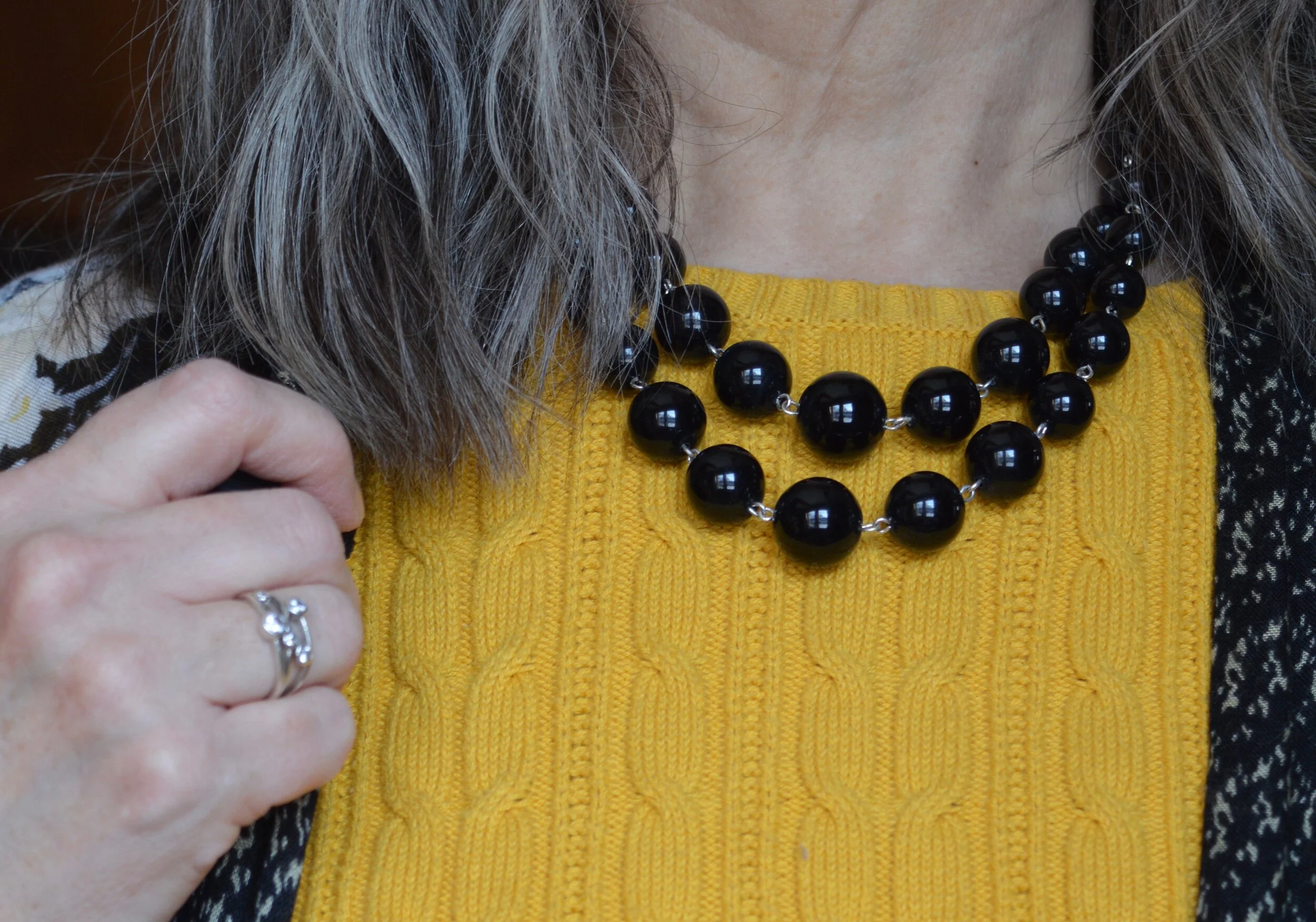
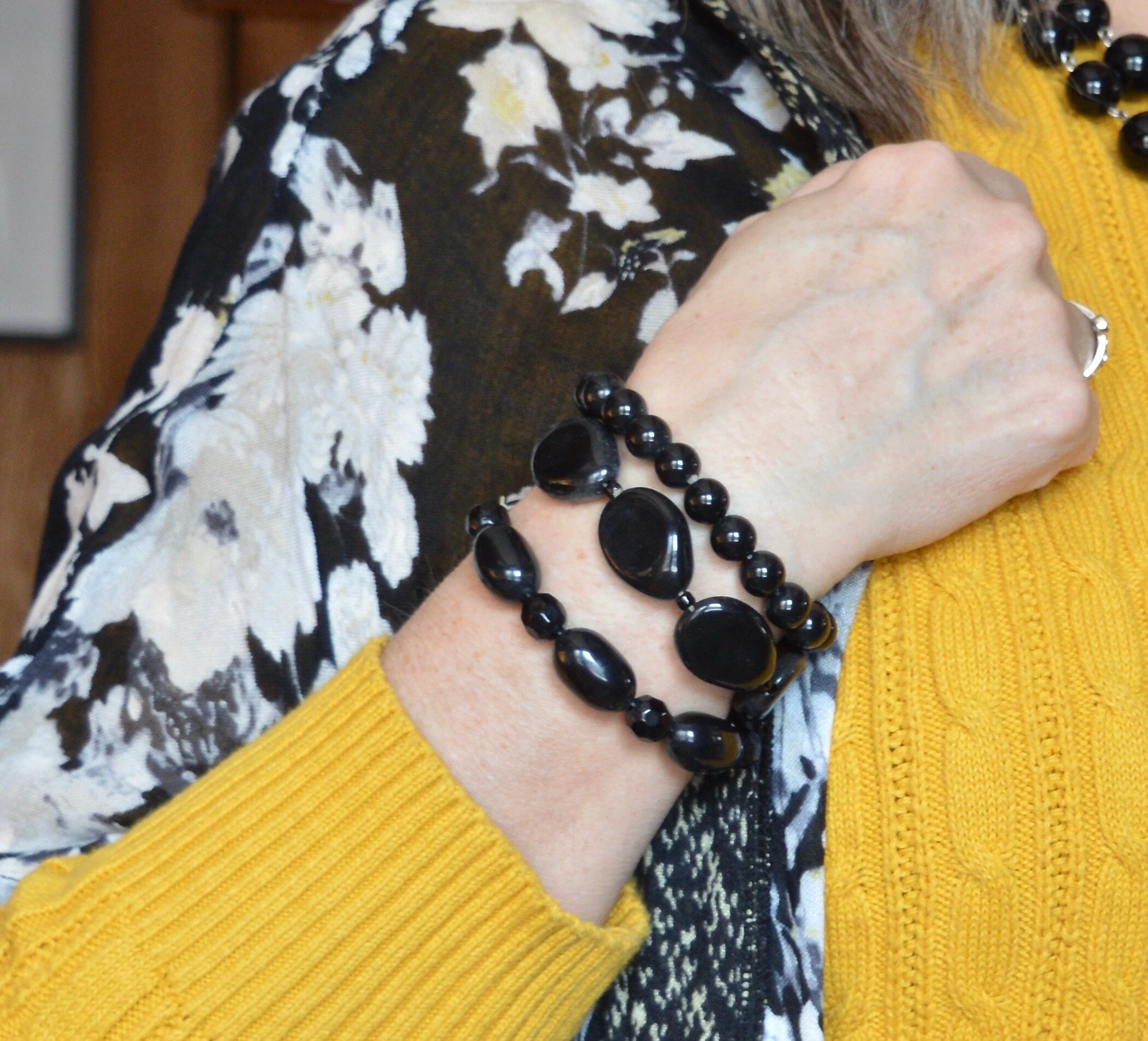
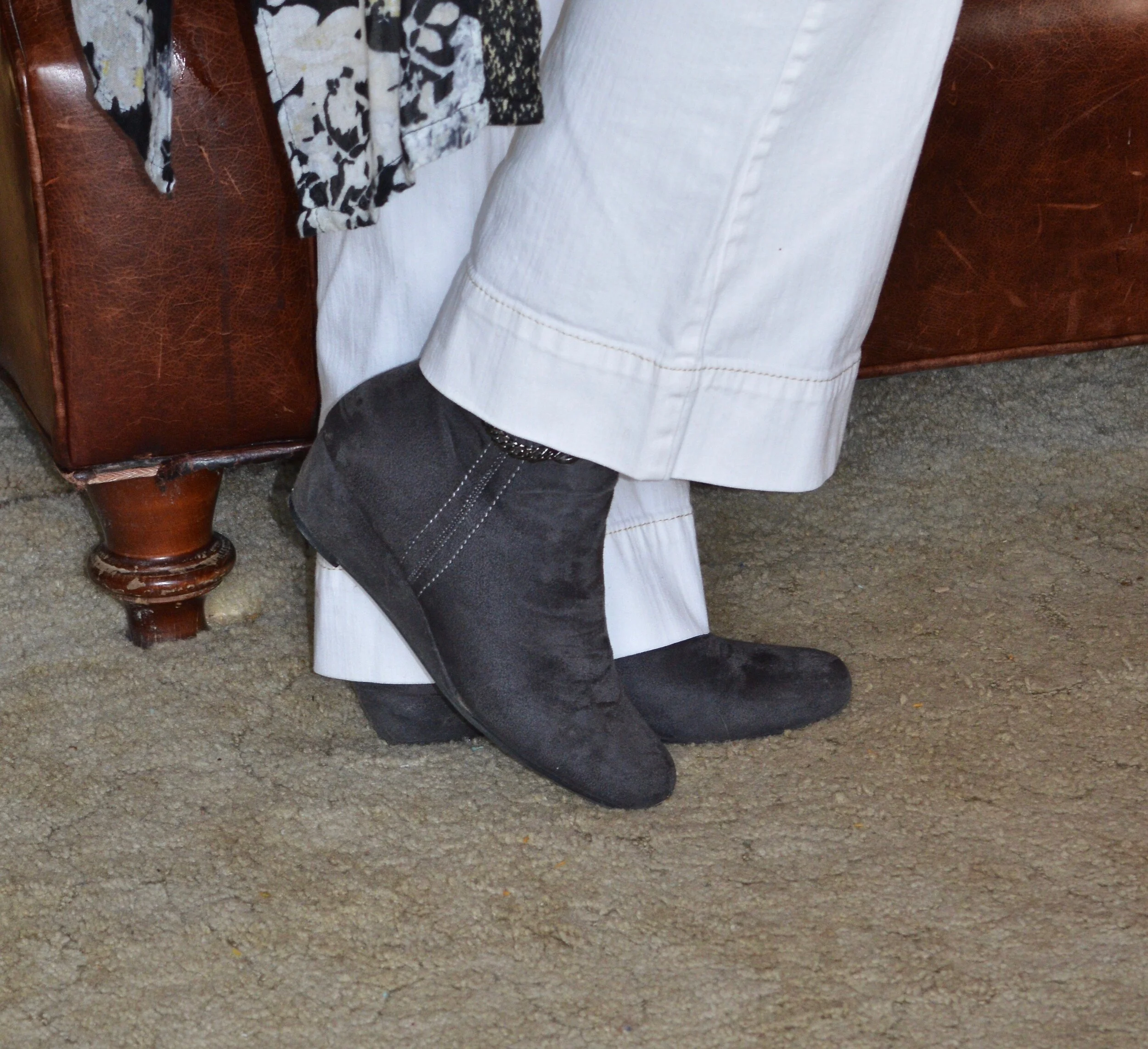
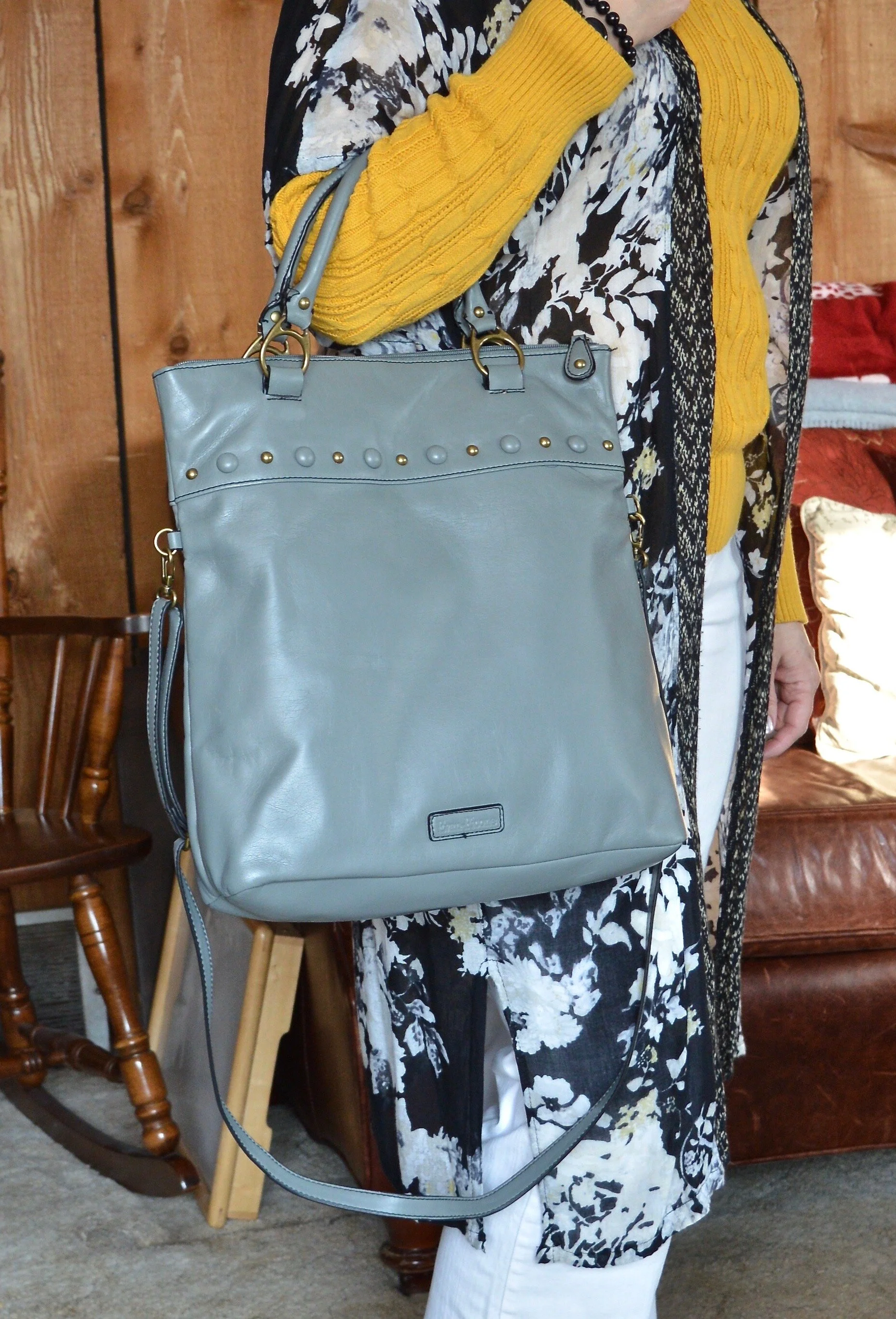
I didn’t really need to add a whole lot to my look since the kimono does the bulk of the work. I added some black beads, both at the neck and on my wrist. I also opted for gray Impo ankle boots, and a thrifted Evan-Picone bag. Like my blush New York and Co. bag, this gray piece serves as both a tote, a crossbody and a clutch.

Having fun with layers - light weight kimono

I hope this post will inspire you to pull out that kimono in your closet and give it some love.

I’m including a few shopping links for you to look over. These are affiliate links. All opinions are my own.

Have a great evening.

Pantone - Autumn/Winter - 2020 - London Palette - Strong Blue, Military Olive and Jet Stream

Happy Thursday friends! Are you all as tired as I am. When morning comes I feel like I could just stay in bed for days. I am sure some of it has to do with our current Covid life. It really is extremely disheartening to see the numbers keep rising and know that there is really nothing different we can do, other than keep on keepin’ on. I implore, those of you who don’t wear masks, to at least consider it for the sake of others. These are very hard times. Do what you can to keep yourself busy and involved in life as much as you can. I have been spending a lot of time alone, when I am not with my family and I don’t think it is good for me. As an introvert, I enjoy my alone time, but I seriously feel like my brain is turning into slush. Anyone else feeling the “squishy brain syndrome”? I have also noticed a lax in my creativity. Going places and doing different things has always fed my creative brain, but being stuck at home, well, it isn’t very interesting. Ha, ha. What do you other creatives do to keep the creative vibes flowing? I’d love to have some feedback.
Today’s outfit centers around another medium blue, olive and white. Strong Blue could be a close cousin of Classic Blue. I was fortunate to have just found this graphic tee while thrifting. I think it matched the color perfectly and I really like the message. I can do the get up part, and being kind isn’t too hard, but being awesome is a bit of a stretch. Ha, ha.

Pantone - Autumn/Winter - 2020 - Strong Blue, Military Olive and Jet Stream

This tee is a brand called Gildan. Once again, I have been exposed to a brand I had never heard of before, by thrifting. This is a basics retailer, selling tees, underwear, sweatpants and hoodies for men, women and children.

Pantone - Autumn/Winter - 2020 - London Palette - Strong Blue, Military Olive and Jet Stream

When we looked at the New York palette, Military Olive was a classic color. If you remember I wore it with Peach Nougat and Sandstone for that palette. You can click here to see the outfit again. For this look I just wanted to do something different from a solid colored sweater or jacket, and then I remembered I had this thrifted plaid piece. This is Jones NY brand and is part wool, so I can’t wear it without something long sleeved underneath. I made an exception with this outfit, because I knew I wouldn’t have it on very long. Wool makes me itch. I doesn’t matter if it is rich Merino wool or cashmere, my skin can tell the moment I put it on.

Pantone - Autumn/Winter - 2020 - London Palette - Strong Blue, Military Olive and Jet Stream

My Gloria Vanderbilt jeans have been on the blog numerous times before. They are a heavier weight, so perfect for the cooler temps of fall, winter and spring. They are really a little too white compared to the Jet Stream color which almost has a hint of tan or gray to it.

My military belt, SO ankle boots and beaded bracelets all have the Military Olive vibe.

Pantone - Autumn/Winter - 2020 - London Palette - Strong Blue, Military Olive and Jet Stream
Pantone - Autumn/Winter - 2020 - London Palette - Strong Blue, Military Olive and Jet stream
Pantone - Autumn/Winter - 2020 - Strong Blue, Military Olive and Jet Stream

I also added a heart necklace that has a sort of greenish colored stone. I think this used to belong to one of my daughters, who did not want it any more, so I snatched it. Ha, ha.

Pantone - Autumn/Winter - 2020 - London Palette - Strong Blue, Military Olive and Jet Stream

While my bag is not really Military Olive it does have an olive leaning and the blue flowers go well with the blue of the tee.

Pantone - Autumn/Winter - 2020 - London Palette - Strong Blue, Military Olive and Jet Stream

What do you think of this color combination? I like olive and blue together and I feel that olive goes with so many different blues, and really with so many different colors. It really can be used as a neutral in many situations.

Pantone - Autumn/Winter - 2020 - London Palette - Strong Blue, Military Olive and Jet Stream

I hope you are enjoying the colors on the London Palette. It is fun to experiment with color, especially when you discover, that color you thought you couldn’t wear, looks fabulous on you. Have a great rest of your week. I am including some shopping links for you to look over. These are affiliate links and are brought to you at no cost to you. If you click on a link, I get a few pennies. I offer these as a way for you to shop similar items in my posts. Since most of my items are from my closet or thrifted, I try to find items as close to mine as possible. All opinions are my own.

Keep in mind, the holidays are quickly approaching, so these shopping links may also offer you a way to shop for others you need to buy for. Enjoy.

Graphic and photo credit Rebecca Trumbull.


Color Play - More Fall Mixing

My daughter has come into her very busy season and has numerous editing projects on her plate from all sorts of clients, so my Pantone - Autumn/Winter - London Palette series is going to be delayed for a little bit. In the mean time I am falling back to my Thursday columns, so today’s is based on, of all things, fall colors. You just aren’t going to get away from my obsession with color. Ha, ha.

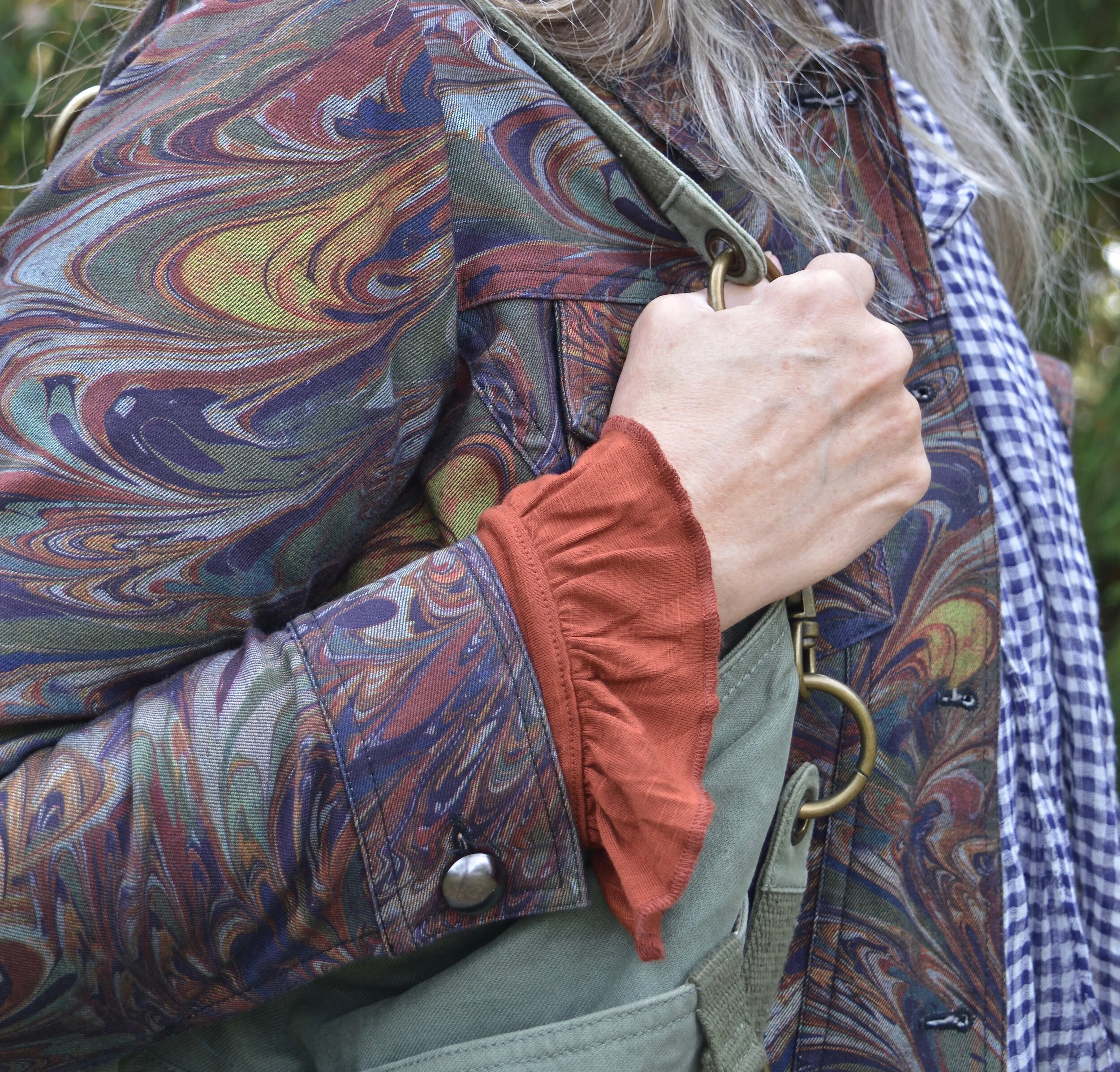
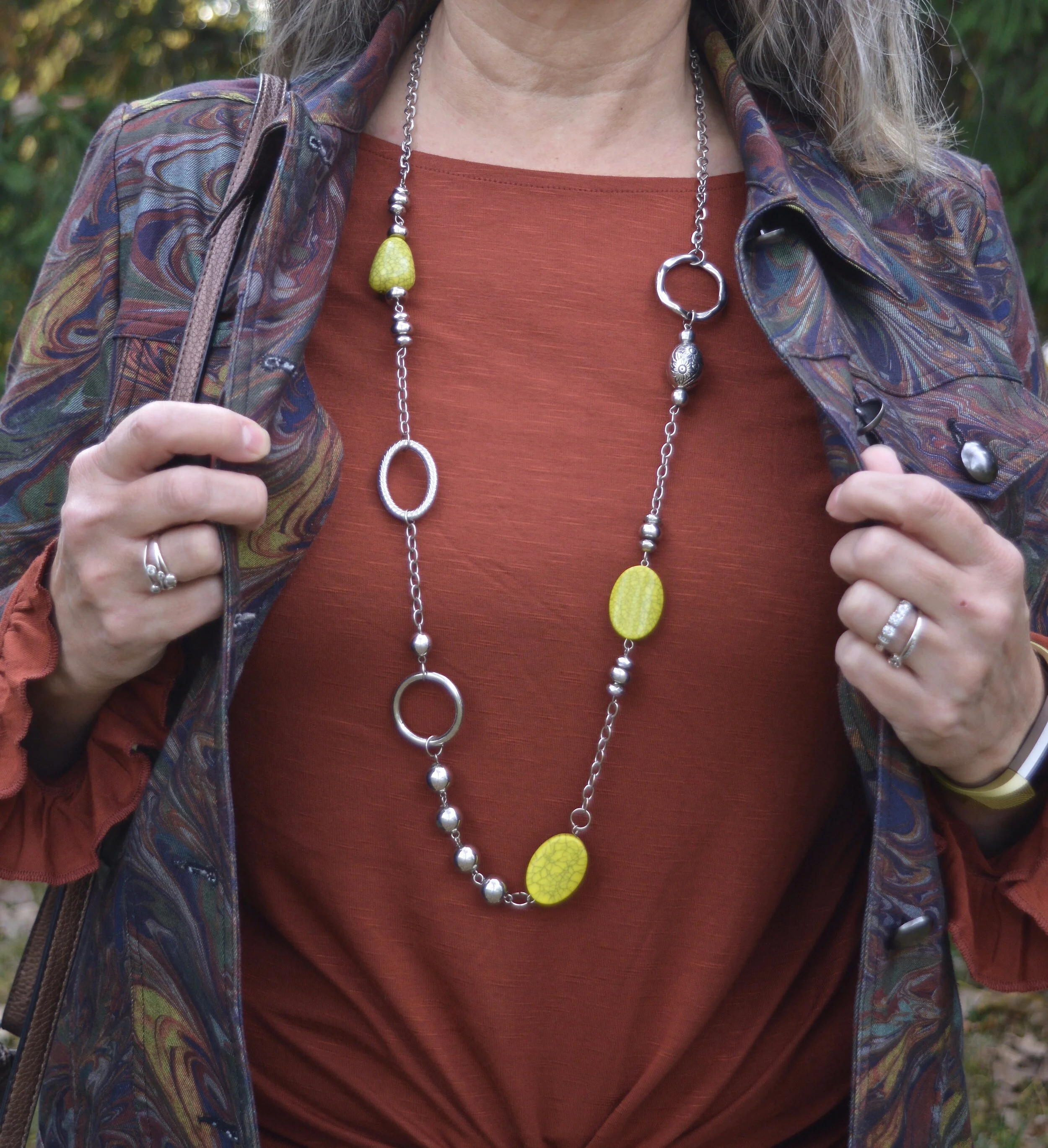
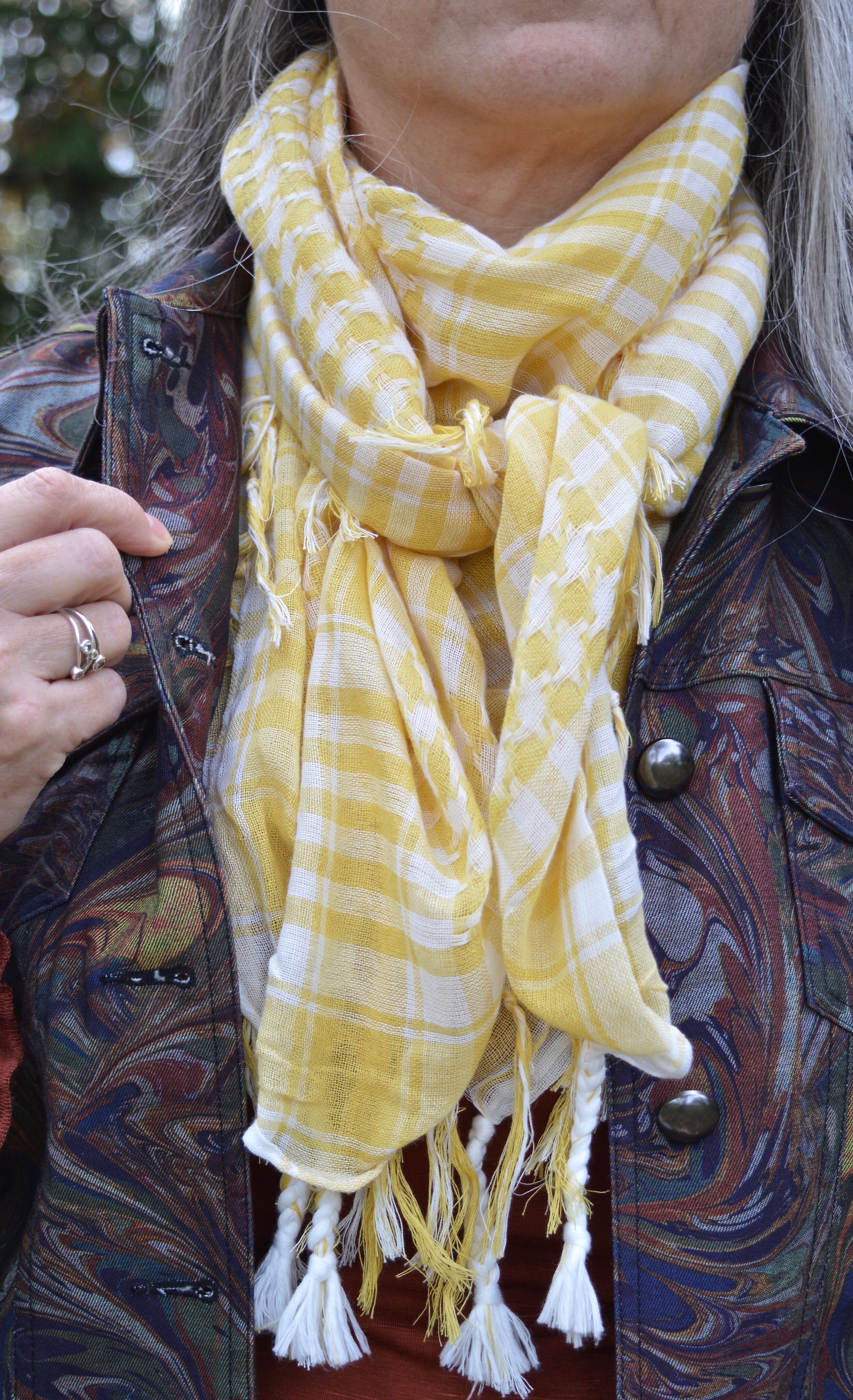
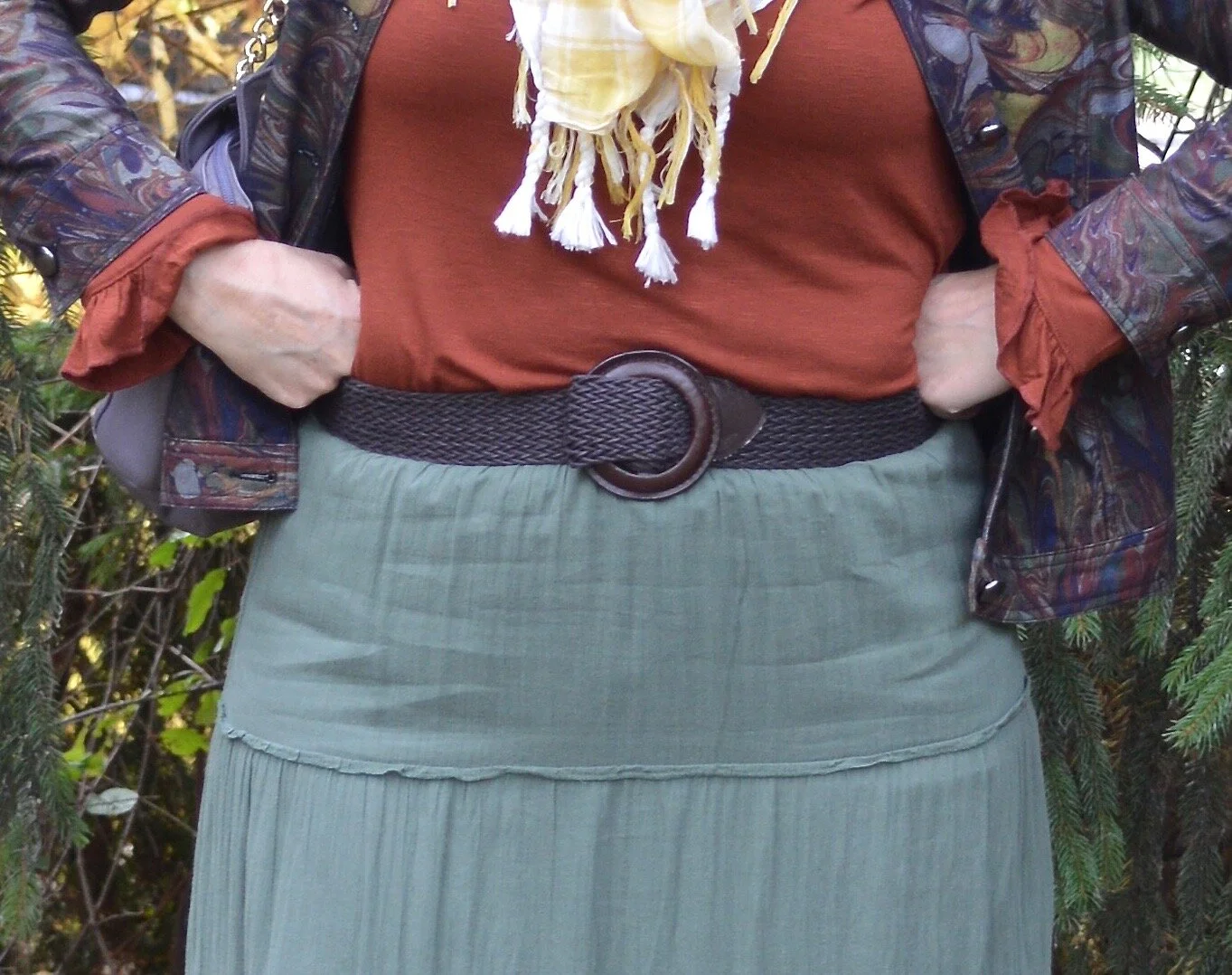
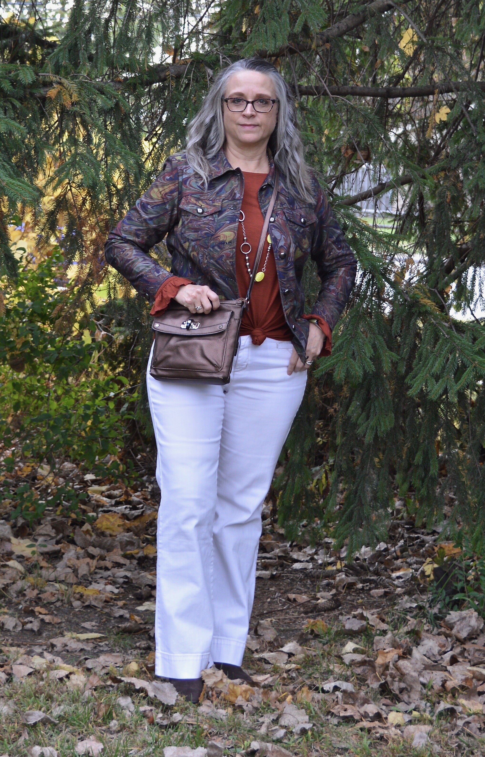
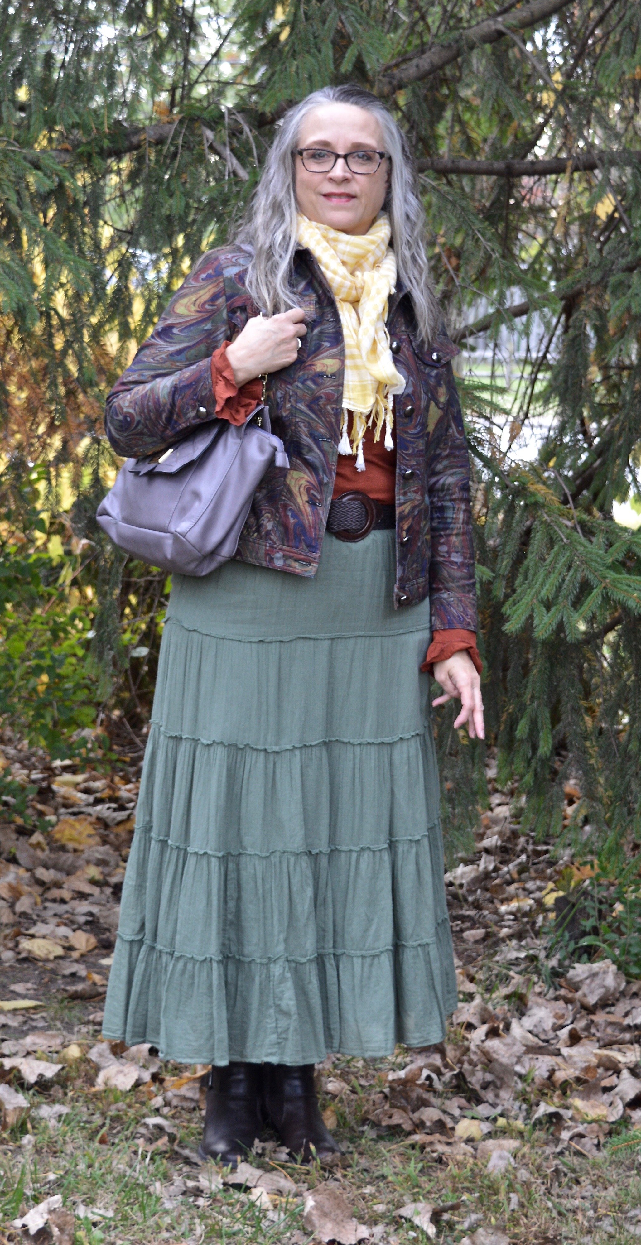
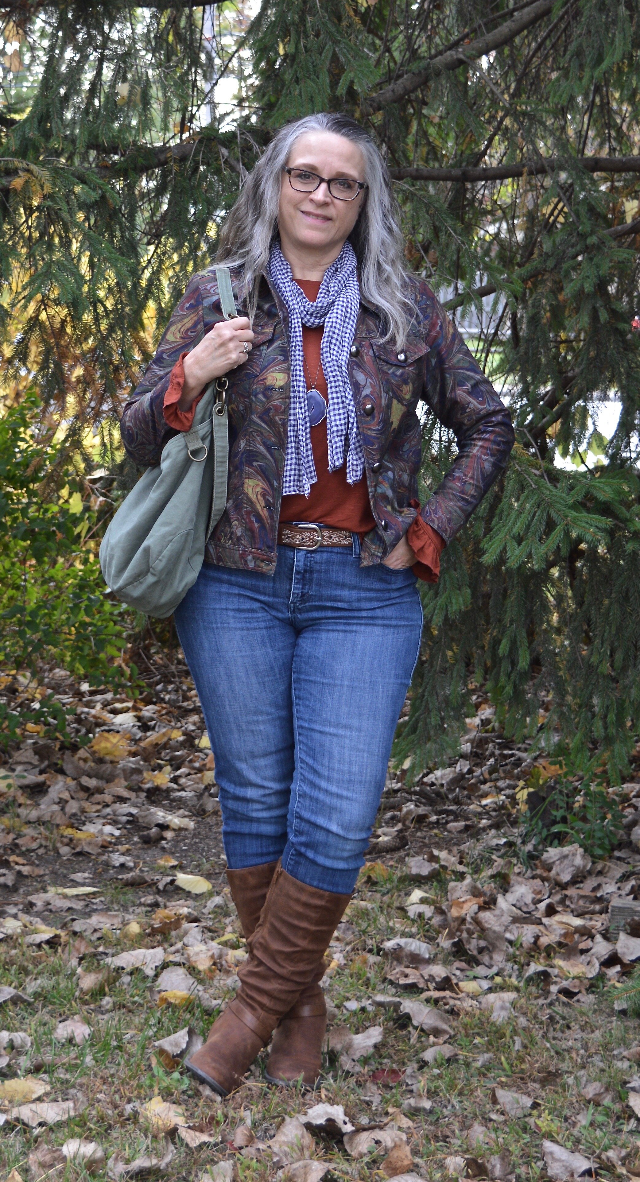
Today’s outfits are centered around a thrifted Christopher and Banks jacket. I absolutely love the muted frenzy of colors and I knew it would be something I could wear repeatedly throughout fall, winter and spring. This is the back of the jacket. It is shaped and feels somewhat like a denim jacket, though the material seems a little less stiff. I paired the jacket with a rusty colored long sleeve tee that I got last year at Maurices. I am going to show you three ways these two pieces can be styled for different looks.

DSC_0034.jpg

Look 1 - With Jeans

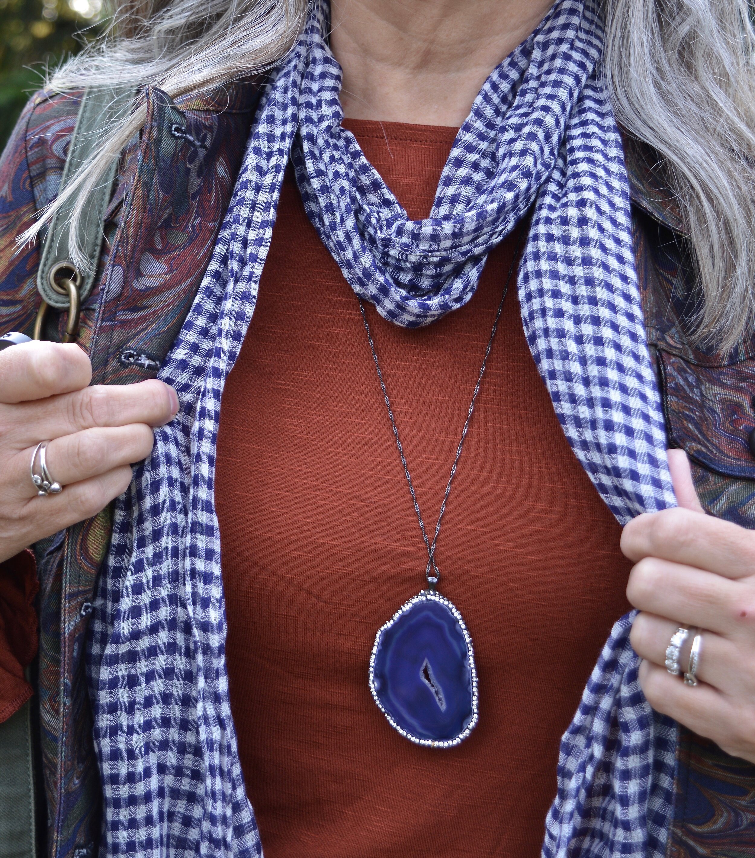
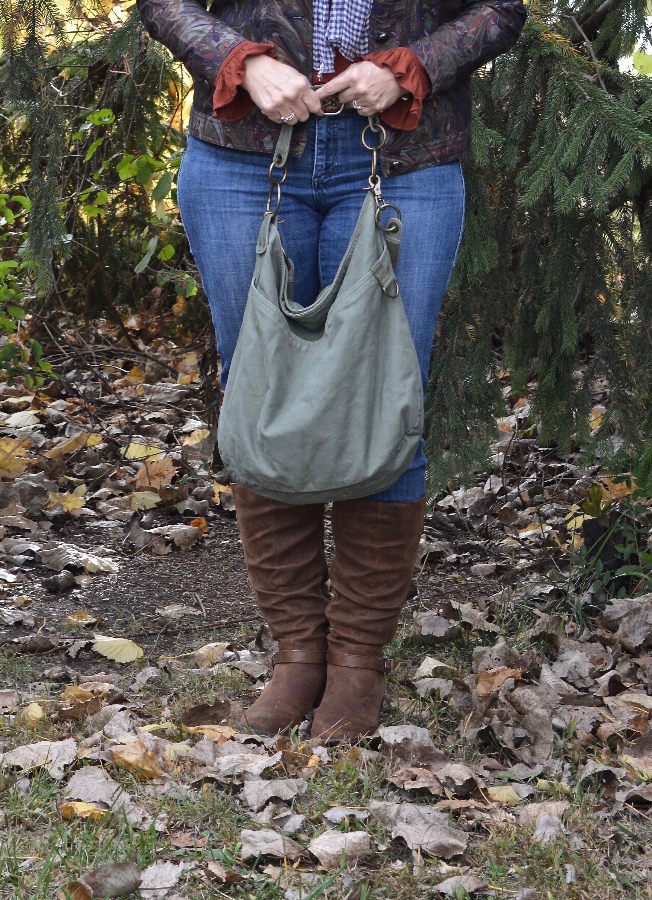
This first look was what I wore on the day I took these pictures. This is a simple look with my Rock & Republic jeans that I have had for years. I added my Sonoma faux suede boots to keep the fall color scheme intact, then I added my purple agate pendant necklace and a purply blue gingham scarf. The last piece to add was the thrifted olive hobo bag. I love the little ruffle on the sleeve hem on the tee. The sleeves on this jacket were the perfect length to let the sleeves stick out.

DSC_0004.jpg
Color play - fall mix
Color Play - fall mix

Look 2 - With White Jeans

For this look I swapped out the regular jeans fro my white Gloria Vanderbilt pair. I also removed the scarf, put on a different necklace and changed the bag and boots. White all year round is simple the rage, and that is one trend I am willing to put up with. These jeans are especially suited to the cooler weather, because they are a heavier weight. They also have a wider leg, so it is easier to get taller boots under them.

Color play - fall mix
Color Play - fall mix

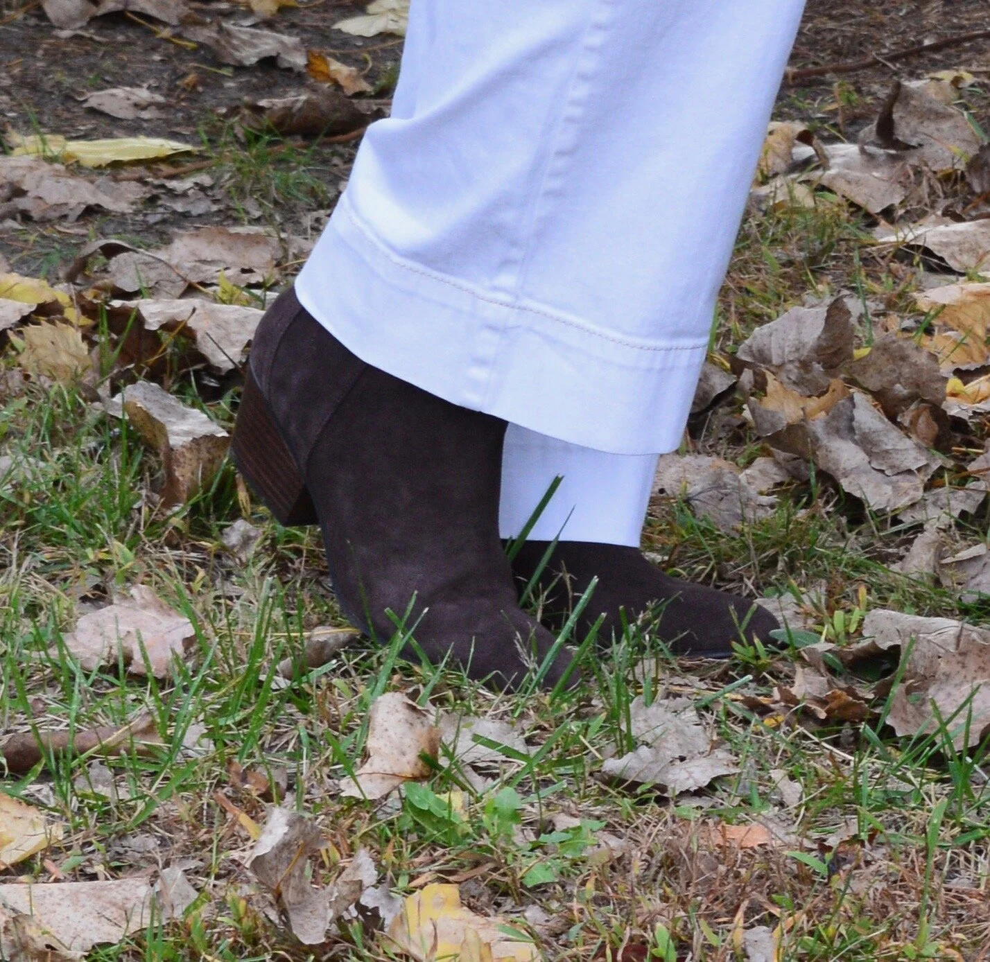
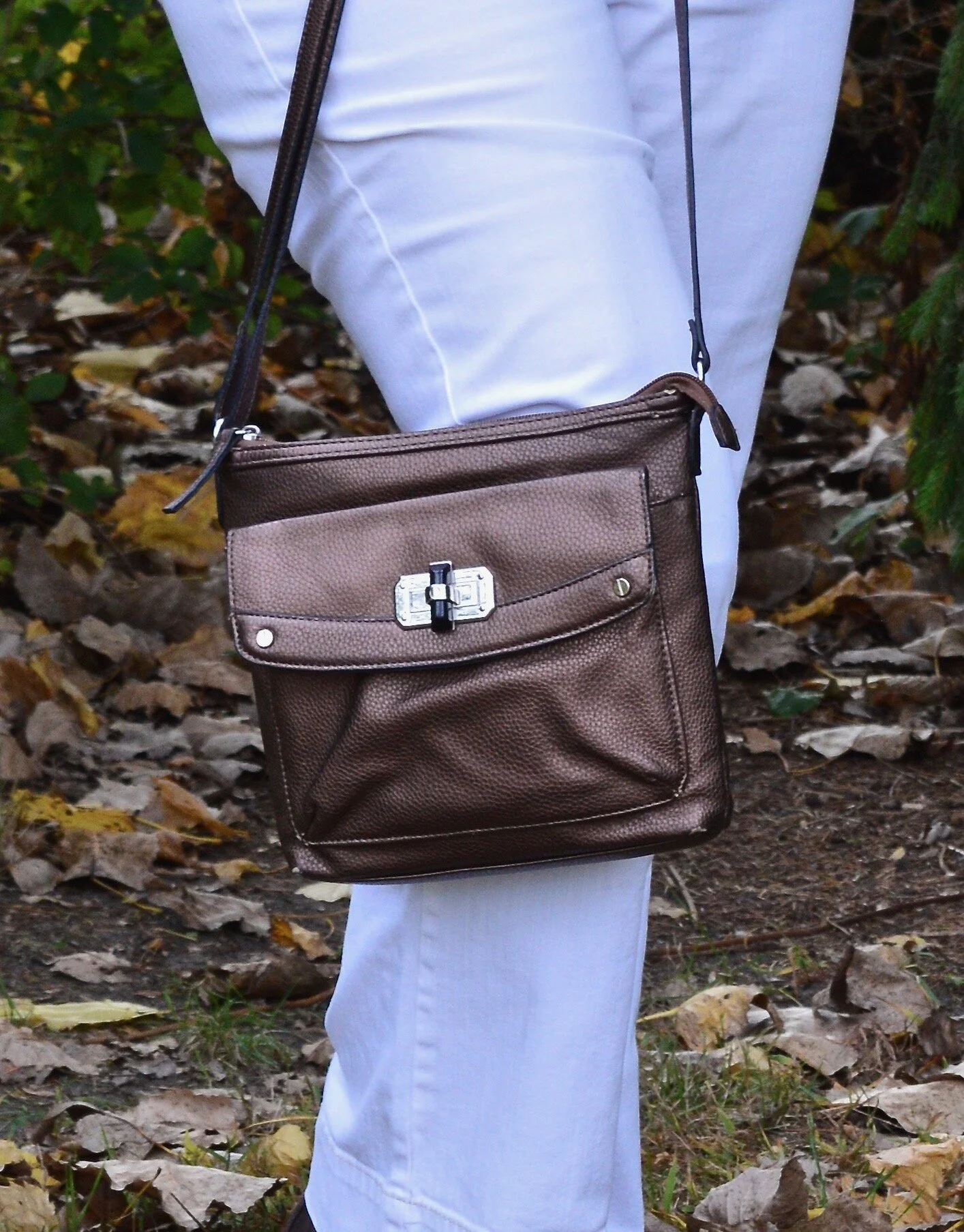
These brown ankle boots are a new pair I ordered from Kohl’s. I just love my suede and faux suede ankle boots and wear them all the time. I decided to add this dark brown Nine West pair to my collection because they were on sale and I had a coupon. To go with the boots I chose my thrifted bronzy colored shoulder bag.

Color Pay - fall mix
Color Play - fall mix

Look 3 - Green Skirt

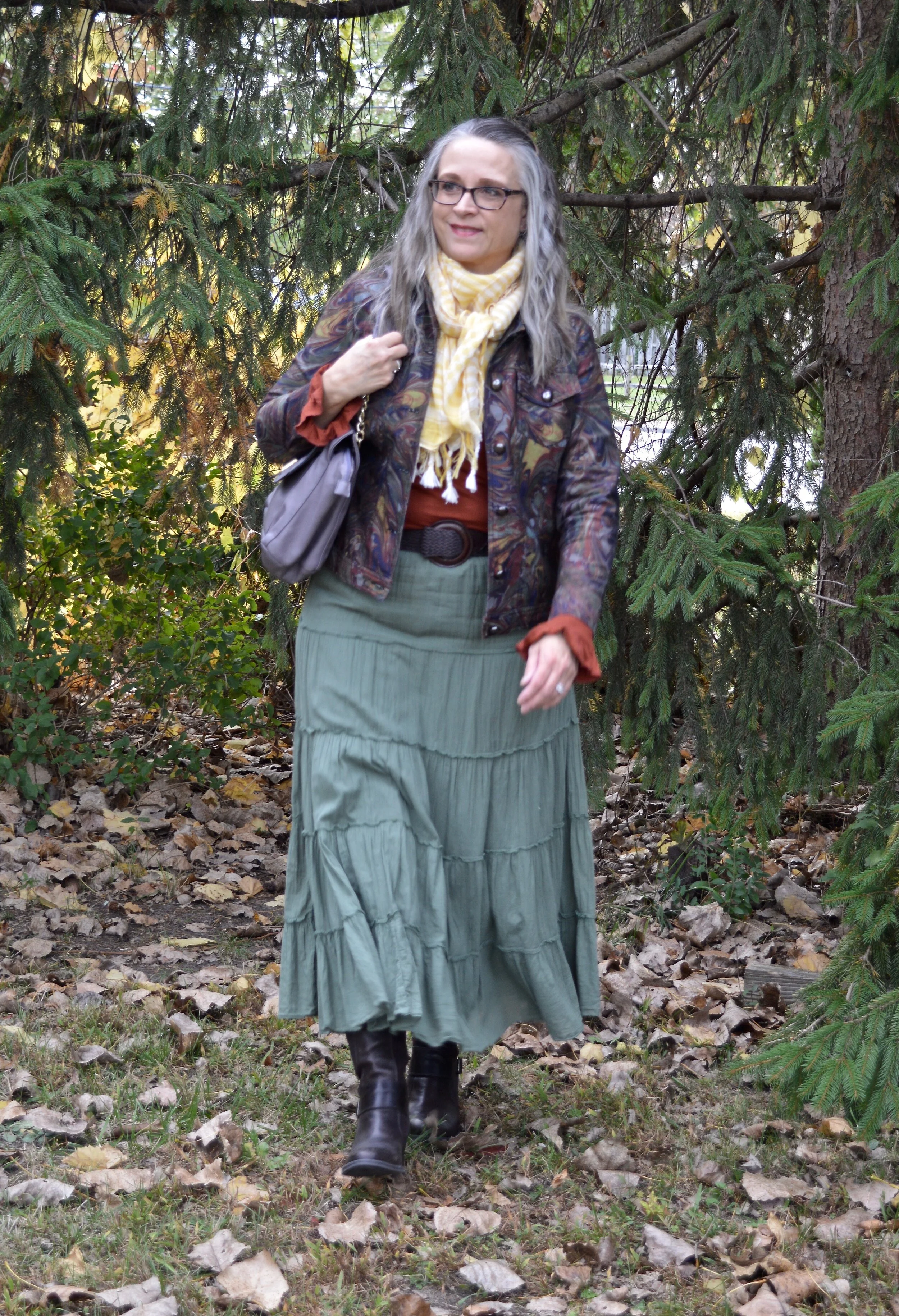
In the final look I chose my thrifted Old Navy tiered skirt, which I have styled numerous other times on the blog. I also added a pale yellow gingham scarf that I bought from the Jacket Society three years ago. Nora always has such unique and beautiful pieces. Be sure to check out the scarves and wraps here. I swapped out my bronze bag for this purple Nicole bag with gold chain handle accents, and my ankle boots for these thrifted mid-calf leather heeled boots. You can see I also added a woven belt that goes with the boots, just for some fun added texture and contrast.

Color play - fall mix
DSC_0031.jpg
Color play - fall mix
Color Play - fall mix

Here are all three outfits side by side. Which one do you like best? Do you have a colorful jacket that you were thinking of getting rid of because you never wear it? How about trying some of these ideas and making your wardrobe work for you?


I hope you enjoyed this post. Let me know your thoughts on these outfits. Tomorrow I will have a new Faith post on the blog, so be sure to stop by and check that out.

Have a great day!

I’ve included a few shopping links for printed jackets. These are affiliate links. It does not cost you anything to click on a link to shop, but it might pay me a few cents. Enjoy!


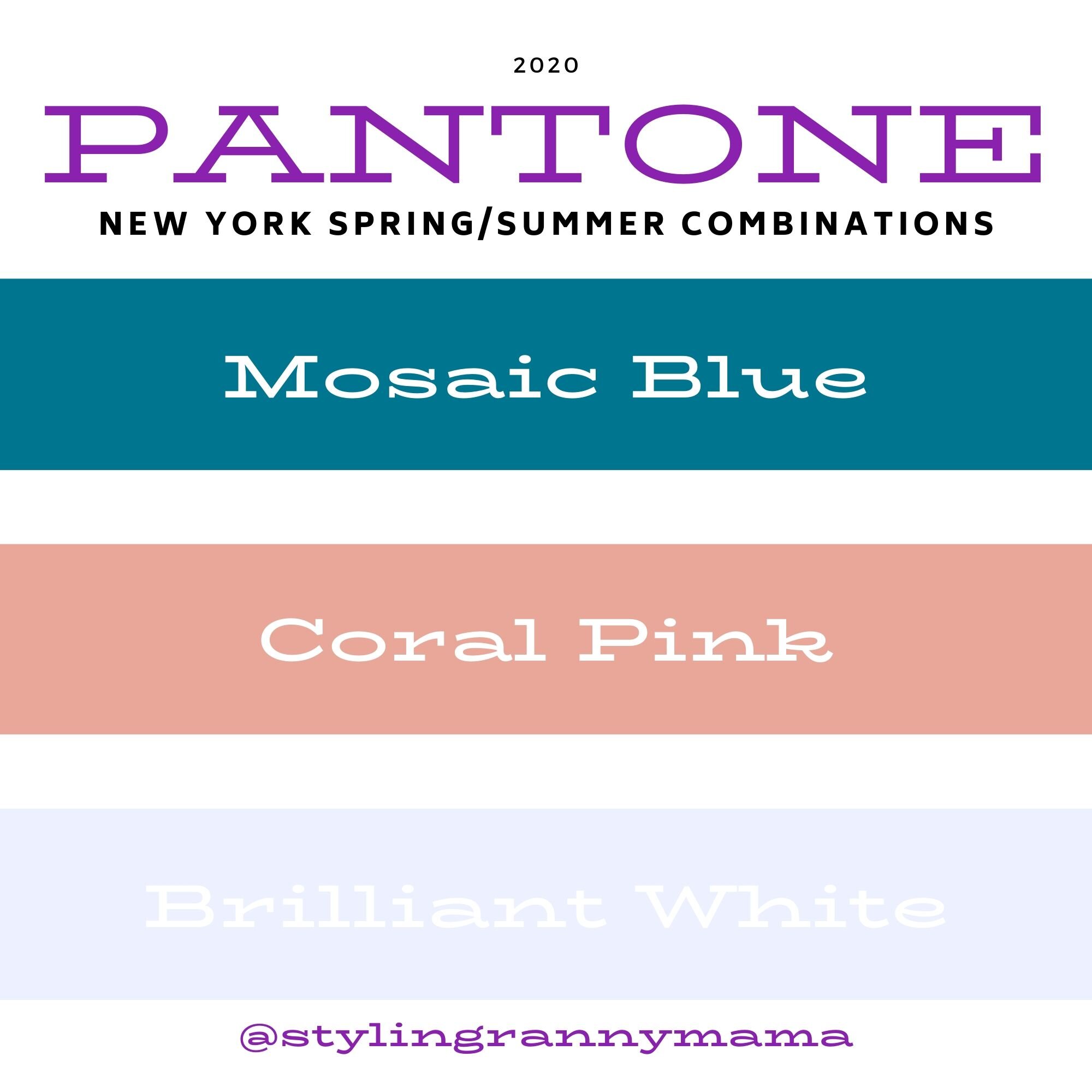
Pantone Spring/Summer 2020 - Mosaic Blue, Coral Pink and Brilliant White

Today features another pretty blue and a version of a coral color that comes around almost every summer. Just like Biscay Green, Mosaic Blue makes me think of tropical waters, blue skies and palm trees. Coral Blush reminds me of the light pink peonies that used to grow in my mother’s yard every spring. I have always loved peonies for their beautiful, large blooms and delicate scent. Once again, I am pairing these two lovely colors with Brilliant White from the Classic collection of colors.

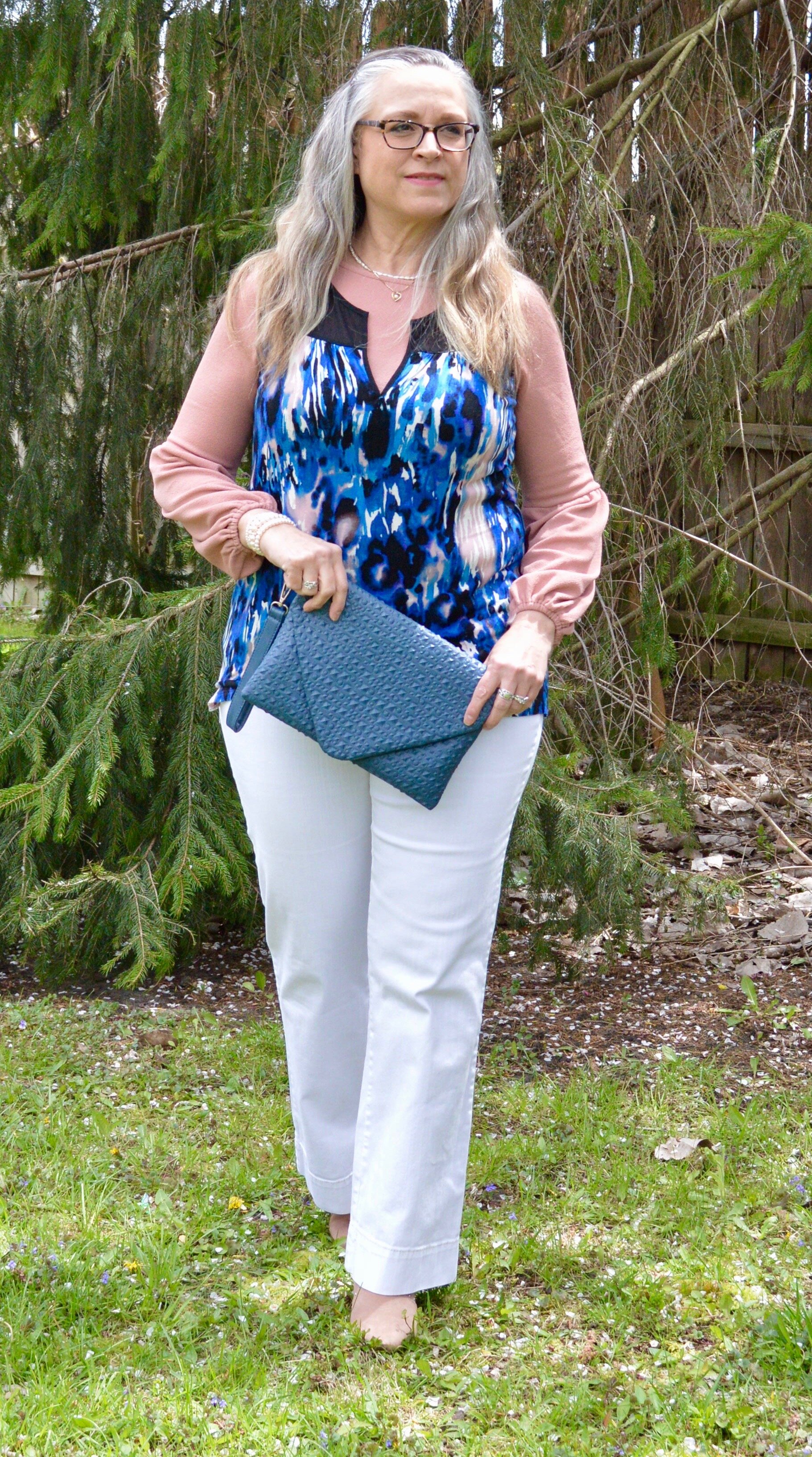
The sleeveless, abstract print top is from a Kohl’s clearance rack a few years ago. I have always liked Vera Wang’s Simply Vera line at Kohl’s, but have to be choosy about which pieces I buy because of the fit. I love the bright, abstract patterns and the way she combines different textures and styles all in one piece. Her pieces have a little bit higher price point than what I normally like to pay, so I try to find pieces on clearance. The only problem with that is I often miss out on some really fun, eclectic looks because they sell out quickly. You can see some of the other Simply Vera pieces I have styled on the blog by clicking on the links: thrifted navy bag, thrifted cross body bag, embroidered skinny jeans, a floral top, and summer dress.

DSC_0018 (2).jpg

The Coral Pink long sleeve top that I put underneath matches the Coral Pink splotches in the Vera top perfectly. Obviously if it was warmer I wouldn’t have had to layer, but it is spring here in the midwest. Ha, ha. This coral colored piece is also a Kohl’s clearance find and is Lauren Conrad brand. Lauren Conrad is another brand I like from Kohl’s, but again, unless I find it on the clearance rack I don’t usually buy her pieces. I do love her take on pastels and feminine details.

Pantone Spring summer 2020 - Mosaic Blue, Pink Coral and Brilliant White

I’ve also styled these Gloria Vanderbilt jeans from JC Penney on the blog before. These are my favorite white jeans, as they are thick and fit fairly well, even with my extra COVID pounds. Ha, ha. I like the flared style for a little dressier look and they go well with heels.

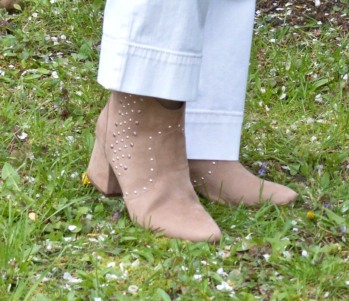
For my accessories, I thought some pearls would look good. I also grabbed my blue textured clutch and my blush SO ankle boots. Obviously, when the weather warms up I’ll exchange my ankle boots for sneakers and sandals, but these light colored booties work well for spring.

Pantone Spring/summer 2020 - Mosaic Blue, Coral Blush and Brilliant White
Pantone Spring/Summer 2020 - Mosaic Blue, Coral Pink and Briliiant White
Pantone Spring/Summer 2020 - Mosaic Blue, Coral Pink and Brilliant White

What do you think of these colors? Do you have either of these colors in your closet? I think both of these colors would look good on many complexions. Sometimes coral can be too orange, but this seems to be a happy medium.

Pantone Spring/Summer 2020 - Mosaic Blue, Coral Pink and Brilliant White

Did you like this post? If you did, do my blog some good by hitting the like button and by leaving a comment. I appreciate all your feedback.

I’m leaving you with a few shopping links to enjoy. These are affiliate links and all you clicks give me a few cents here and there. Thank you for that as well. All opinions are my own.

Graphic designed by Rebecca Trumbull.


Spring Trend - Scarf Prints

As I mentioned in last Tuesday’s Spring Trend post on crafted pieces, print mixing is bigger and better than ever. One of the patterns that you will see gracing the stores is scarf print. Scarf prints started a come back back in the fall of last year, but seem to be showing up more and more. Scarf prints are an easy way to mix prints effortlessly. The prints are already picked out for you and all you have to do is take it off the hanger and decide what you want to wear it with. Whether you choose jeans, skirts, leggings, shorts or some other combination, scarf prints will leave you feeling like a print mixing pro.

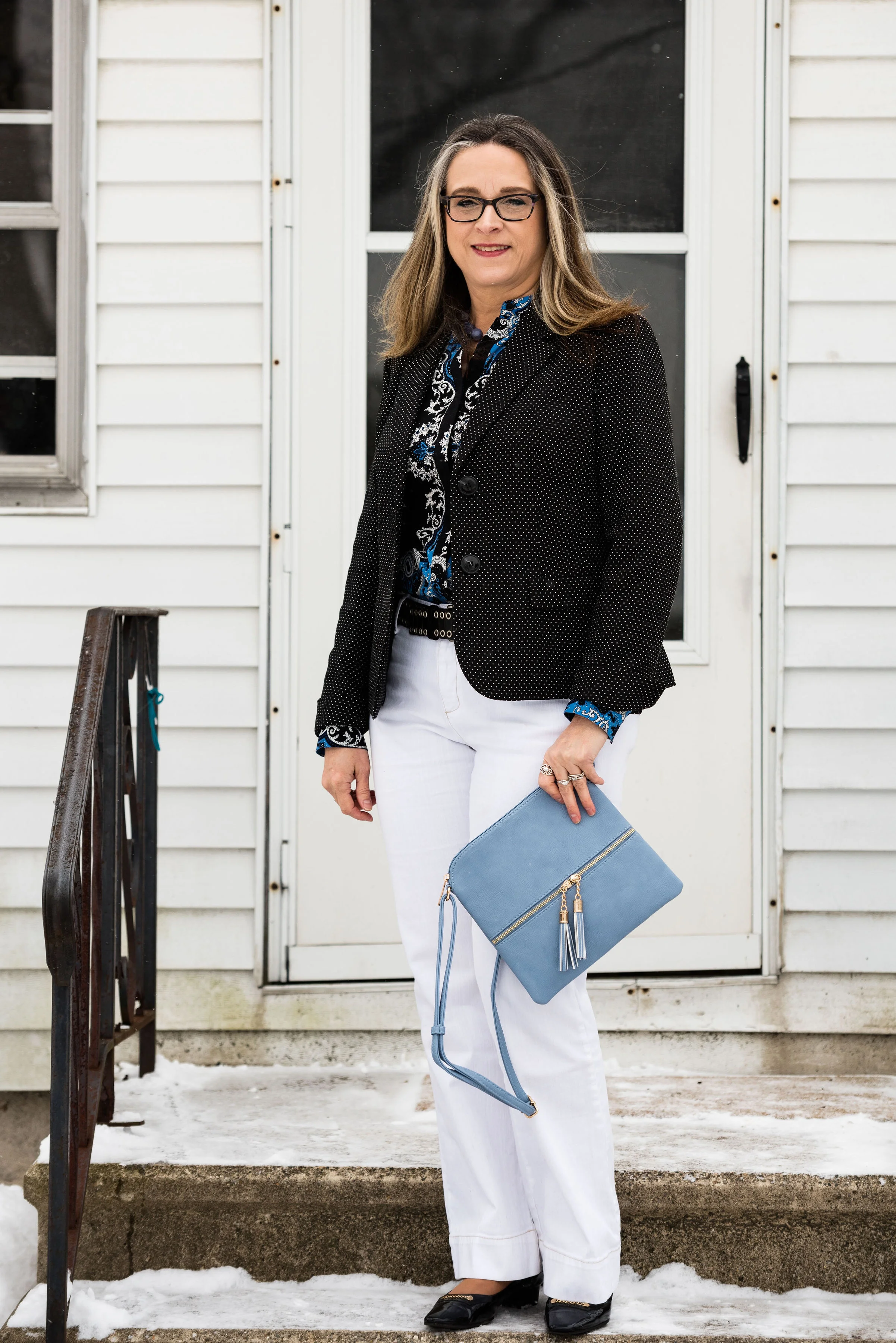
I’ve had this Apt. 9, scarf print blouse for eons. Every time I think about getting rid of it, I end up hanging on to it. Now I am glad I did. I wish I would have thought to have taken a picture of the blouse without the jacket on, but it was freezing outside and we were just trying to get the pictures finished.

I did the front tuck with the blouse and added a black studded leather belt, just to add a little more interest and texture.

I thought my white Gloria Vanderbilt jeans the perfect bottom piece for this look, to make it more spring-like. While white can be worn all year round, I am a bit of a traditionalist, in that, I like to keep my whites more for spring, summer and a bit into fall. I do agree that white is a great color even in the winter and can really brighten up an otherwise mundane time period. I guess that is one of the reasons I would rather have snow in the winter time, than just brown grass and gray trees.

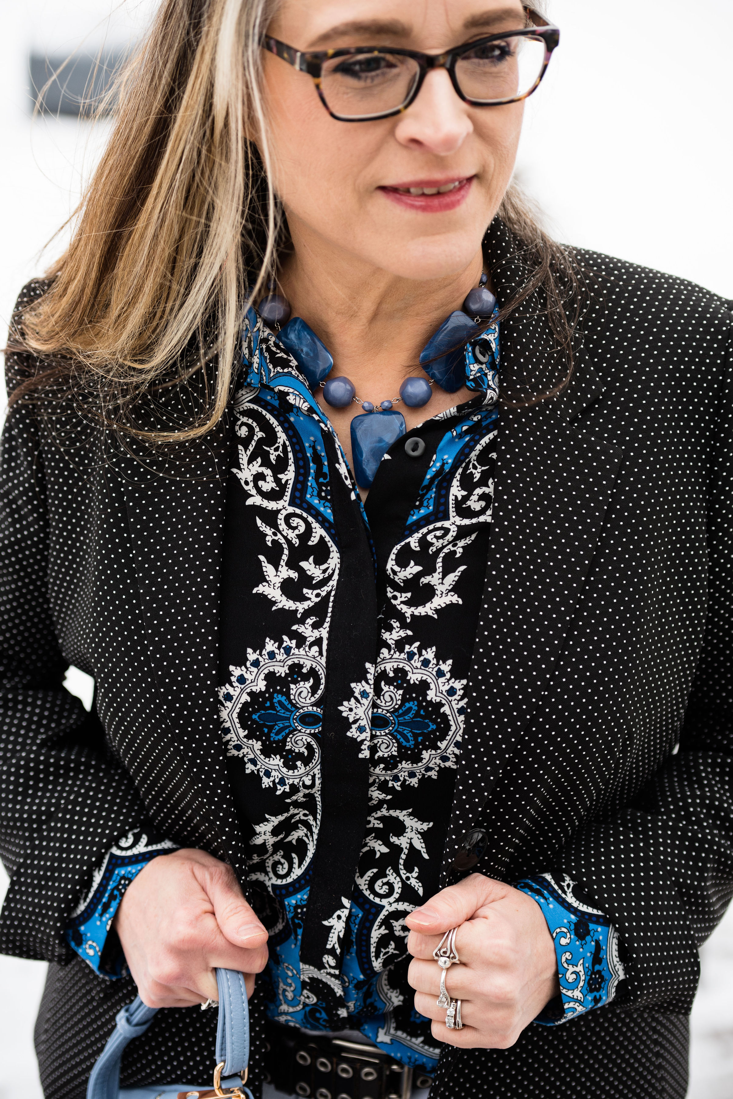
Since the emphasis was meant to be on print mixing, I decided to add my Black Label, Evan Piccone polka dot blazer. A JC Penney clearance find, this cute little number goes with so many things and is the perfect way to add a print to any outfit without going over the top. You can also see in this picture the blue bead necklace that I chose to wear. This was another hand-me-over from my daughter. It is fun to have girls to be able to swap stuff with.

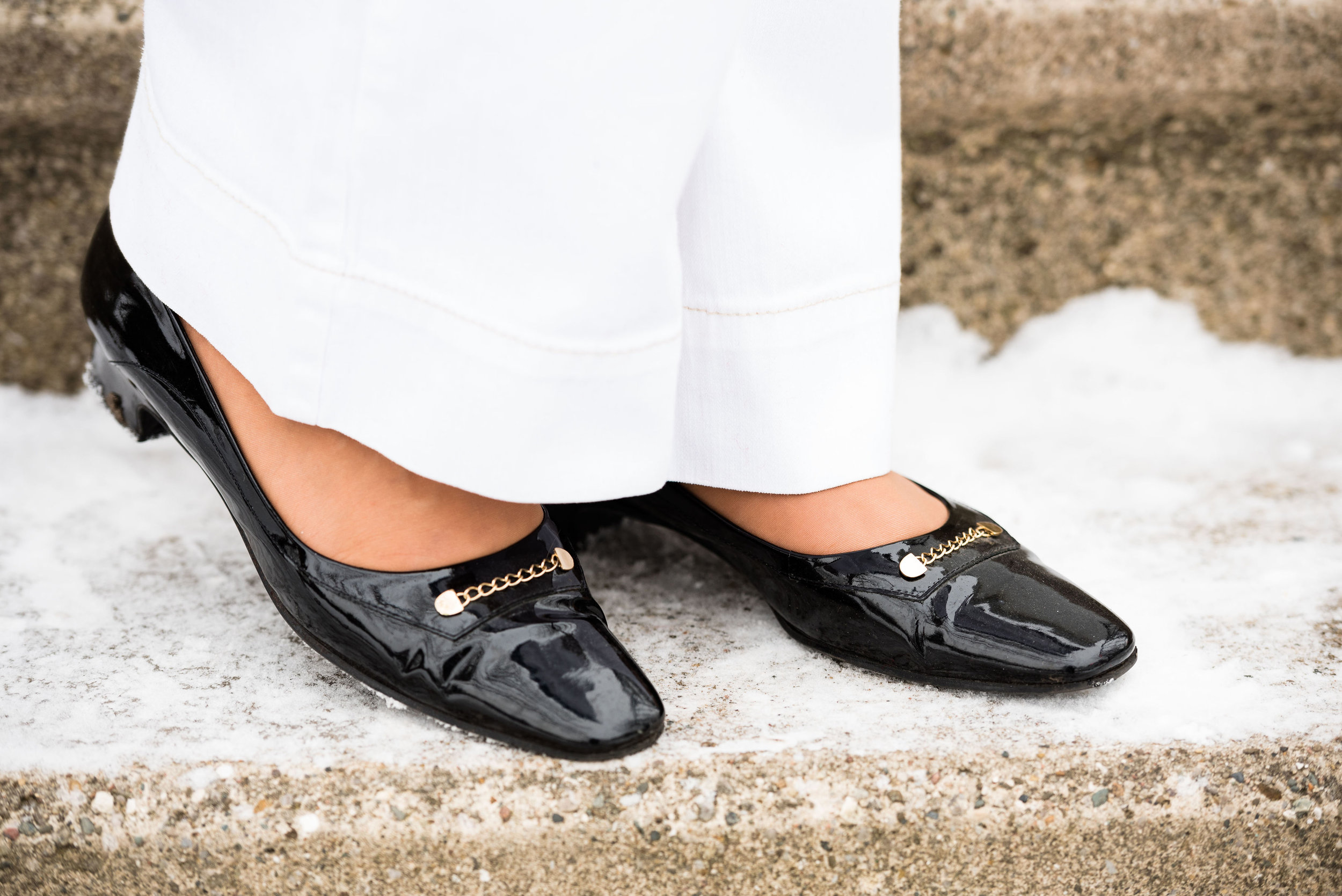
These Easy Spirit black patent leather block heels I’ve styled on the blog before. I like the lower heel and that the toe is not pointy, but also not rounded. The bit of gold is the perfect amount of bling.

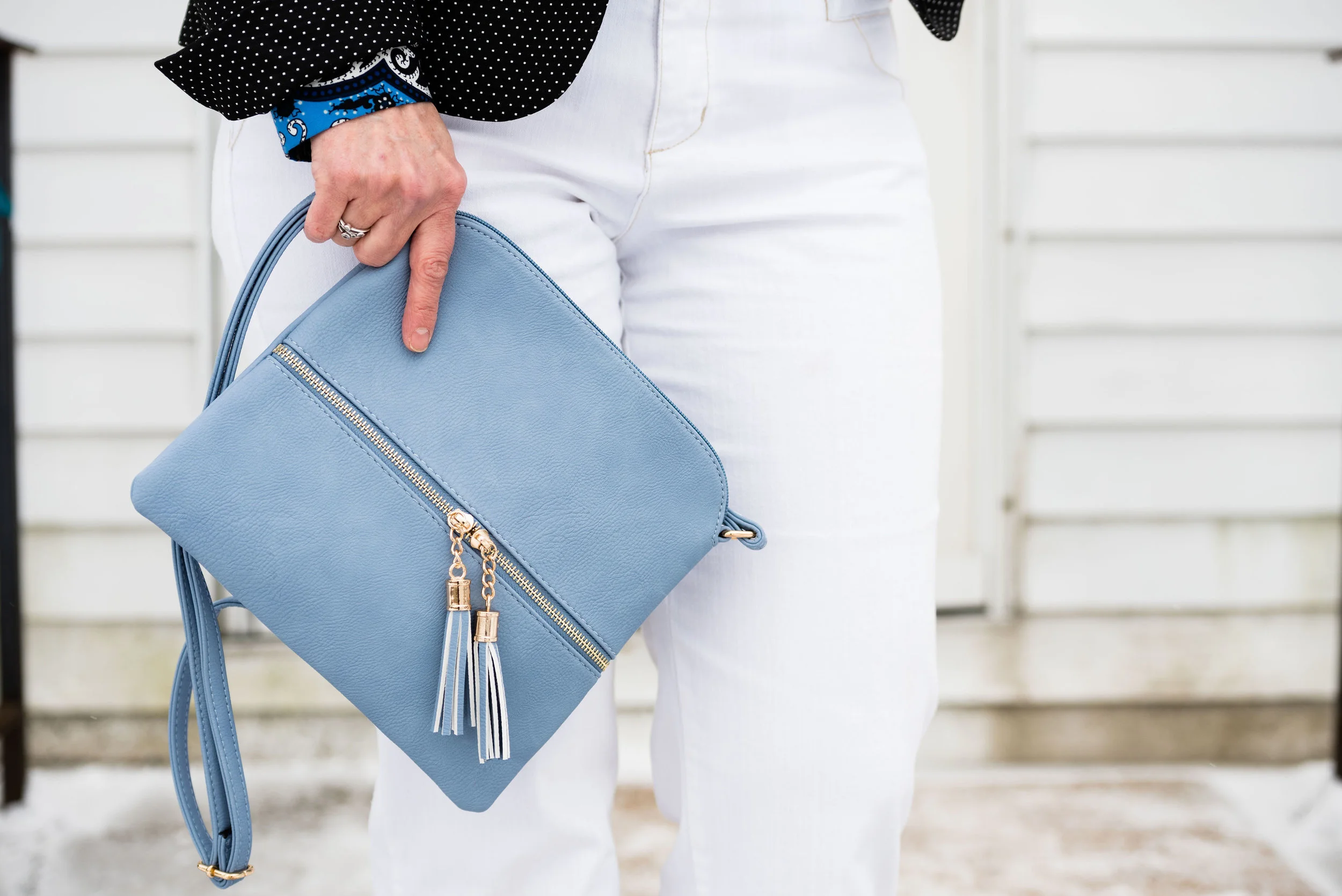
This cute cross body bag was a Christmas gift from my younger daughter. Both my girls do a good job picking out gifts for me. The light blue color is perfect for spring and compliments the blue in the blouse.

What do you think of scarf prints? Do you own any scarf print items? How do you like to wear your scarf prints? How do you like to wear your scarves? Leave me some thoughts in the comments.

I’ve included a few shopping links for scarf print items. Please enjoy looking these over. These are affiliate links. If you click on a link, I get a few cents. If you purchase something through my site, I get a little commission. All opinions are my own.

Thanks for stopping by the blog today. Have a great Tuesday.

Photo credit Rebecca Trumbull. Make up Rachel Christensen.

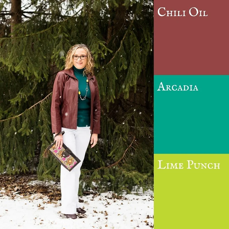
Pantone Spring 2018 - Chili Oil, Arcadia and Lime Punch

As I sit here beginning to type this, it is snowing some of the largest snowflakes I have ever seen! Just two days ago it was almost sixty and now Old Man Winter is back. We expected that, however. Winter will end and spring will come. To help us along it is time to start my Spring Pantone color series. 

I feature the Pantone colors twice a year, spring and fall. The reason I do this is simple. I love color! When I first discovered the Pantone Institute and began keeping track of their seasonal color palettes, I thought it was fun to see all the pretty colors they came up with. Frankly, now I am obsessed. I love to see the new colors each season and try to build outfits around those colors. 

Last week I introduced you to this year's spring palettes for both New York and London. There is a good deal of overlap this year. Considering there are twelve colors on each palette I was relieved for the duplicates. I wasn't about to subject you to that long of a series, just on color. This time around I am combining up to three colors in each outfit, plus a foundational color using one of the featured classic colors as well. 

These pictures will not look very springy, seeing as it was a blustery, snowy day when we had our shoot, but I think they look pretty, even if the wind was whipping and I was freezing. 

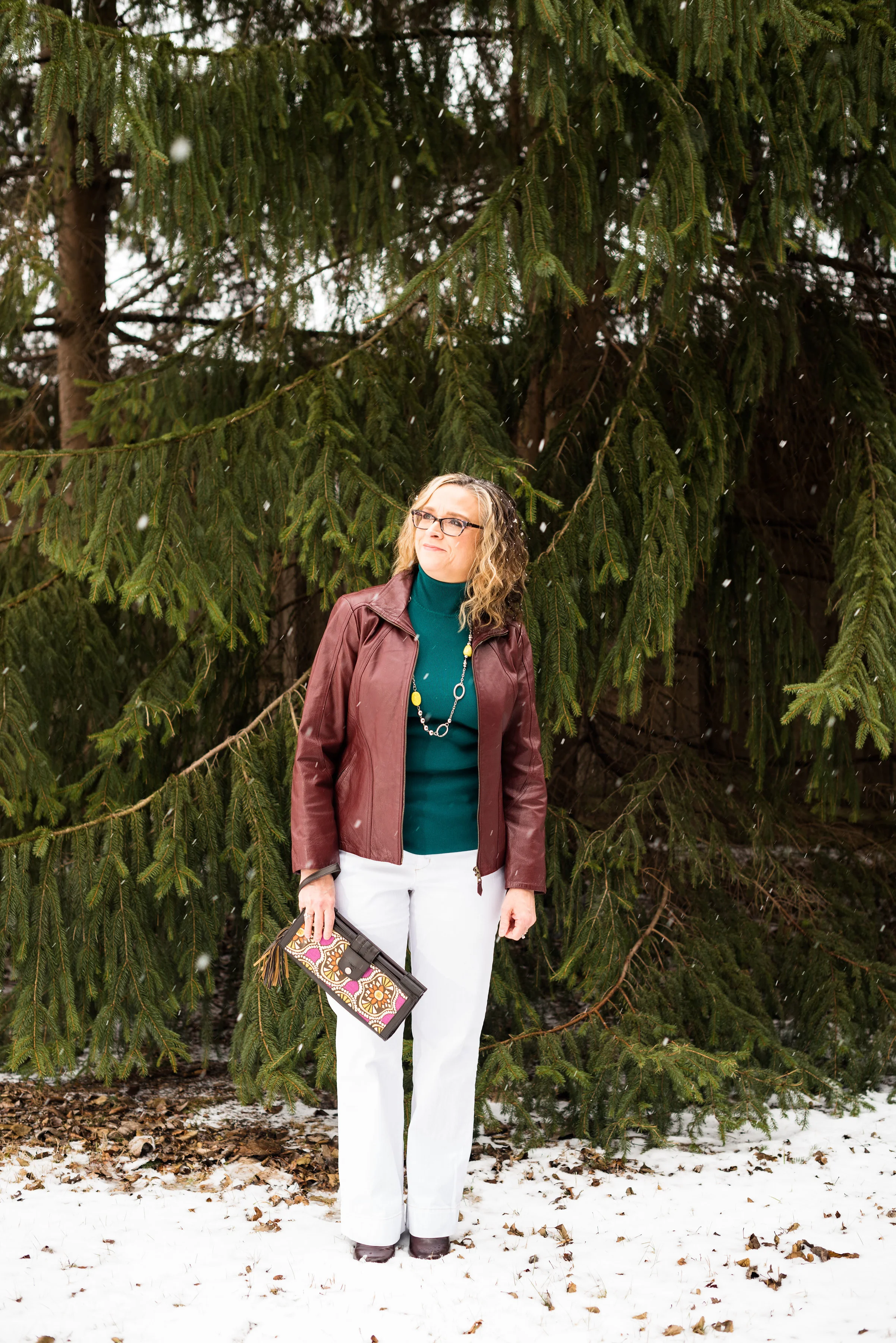
These three colors are spicy and fun! Chili Oil and Arcadia are on the New York palette, while Lime Punch is featured on both. My classic color for this outfit is Coconut Milk, or white. 

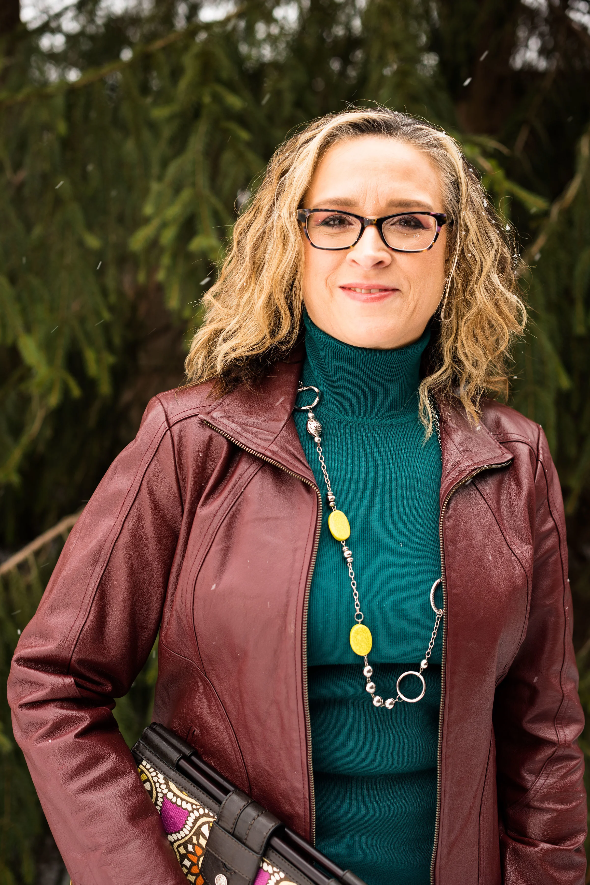
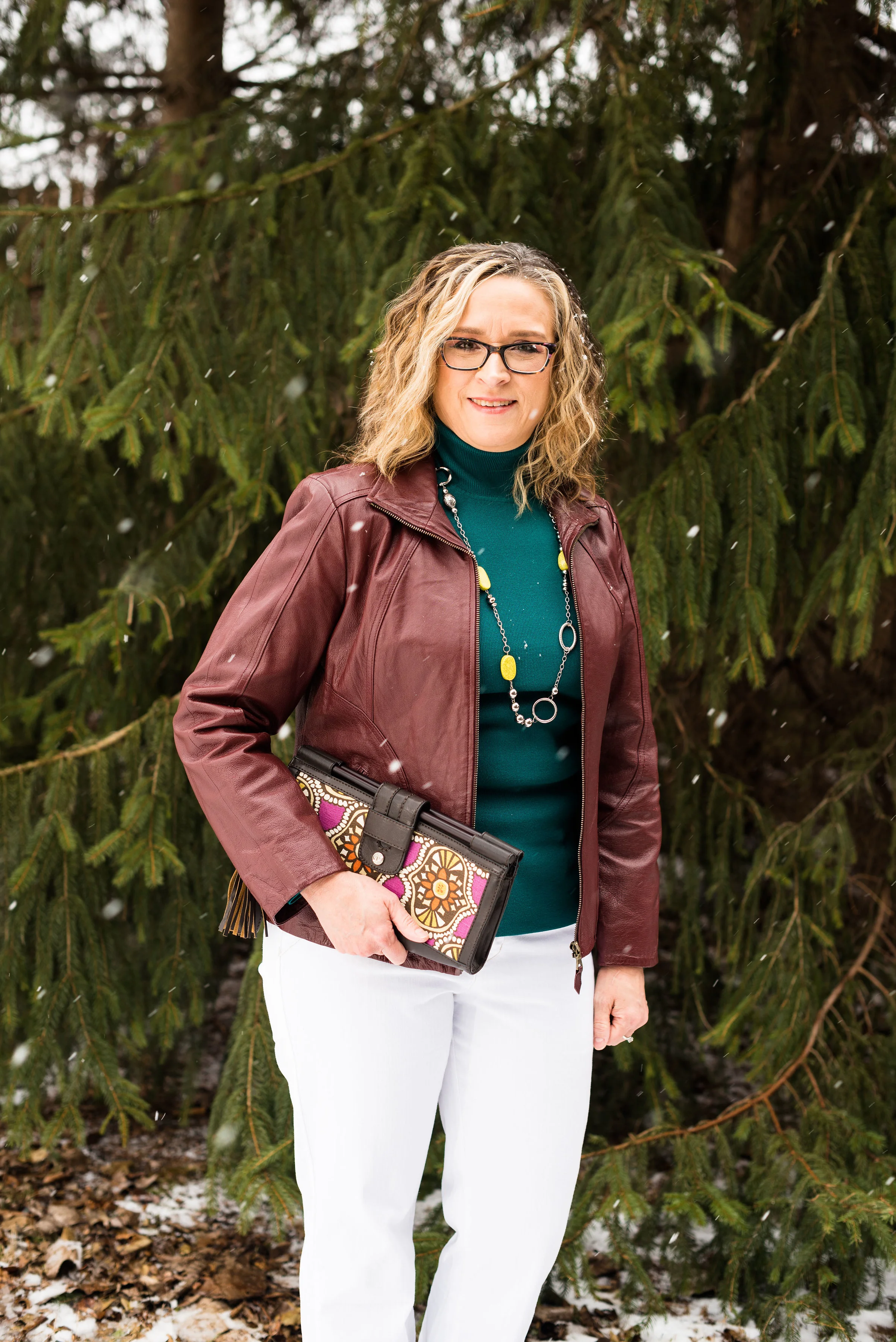
This thrifted Covington jacket worked perfectly as a Chili Oil piece. Not quite brown and not quite red, this color makes me think of Mexican fiestas and earthy tones. Arcadia partners well with the heat of Chili Oil, as if to cool the temperatures before things get too hot. Then throw in just a smidge of Lime Punch and you have a great transitional outfit. Still warm and grounded, but with just enough color to make you giddy for spring. 

The Arcadia turtleneck sweater is a recent purchase from Chico's. This sweater is soft, stretchy and not at all itchy. They don't seem to have this color any more, unfortunately, but I'll include a few links at the end for similar colored items. 

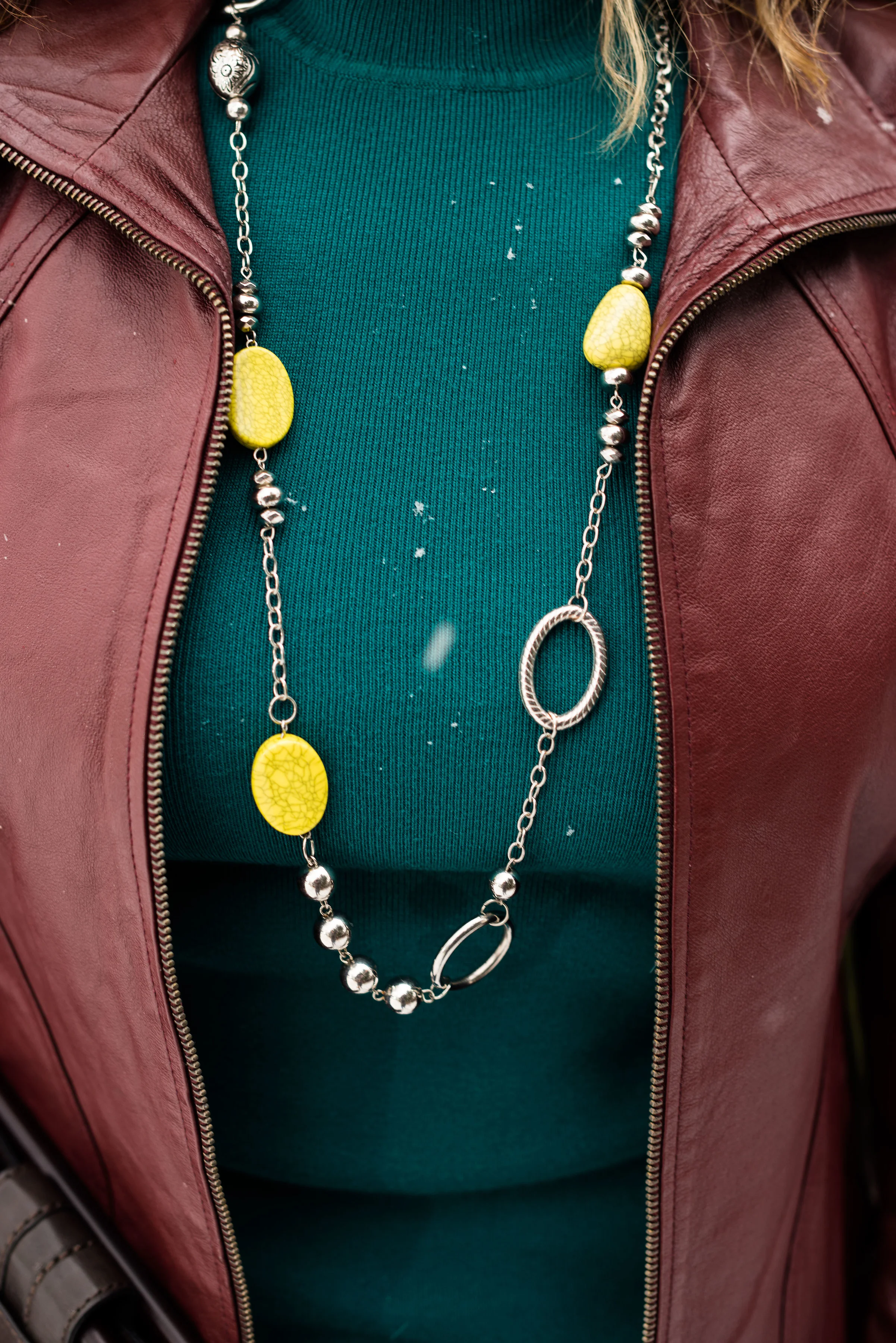
I found this cute metal and bead necklace at a thrift store. The Lime Punch beads are a nice contrast from yellow or green. 

Once again, I am wearing my Gloria Vanderbilt white jeans. I think white really helped this outfit to pop and to be a great transitional outfit for spring. 

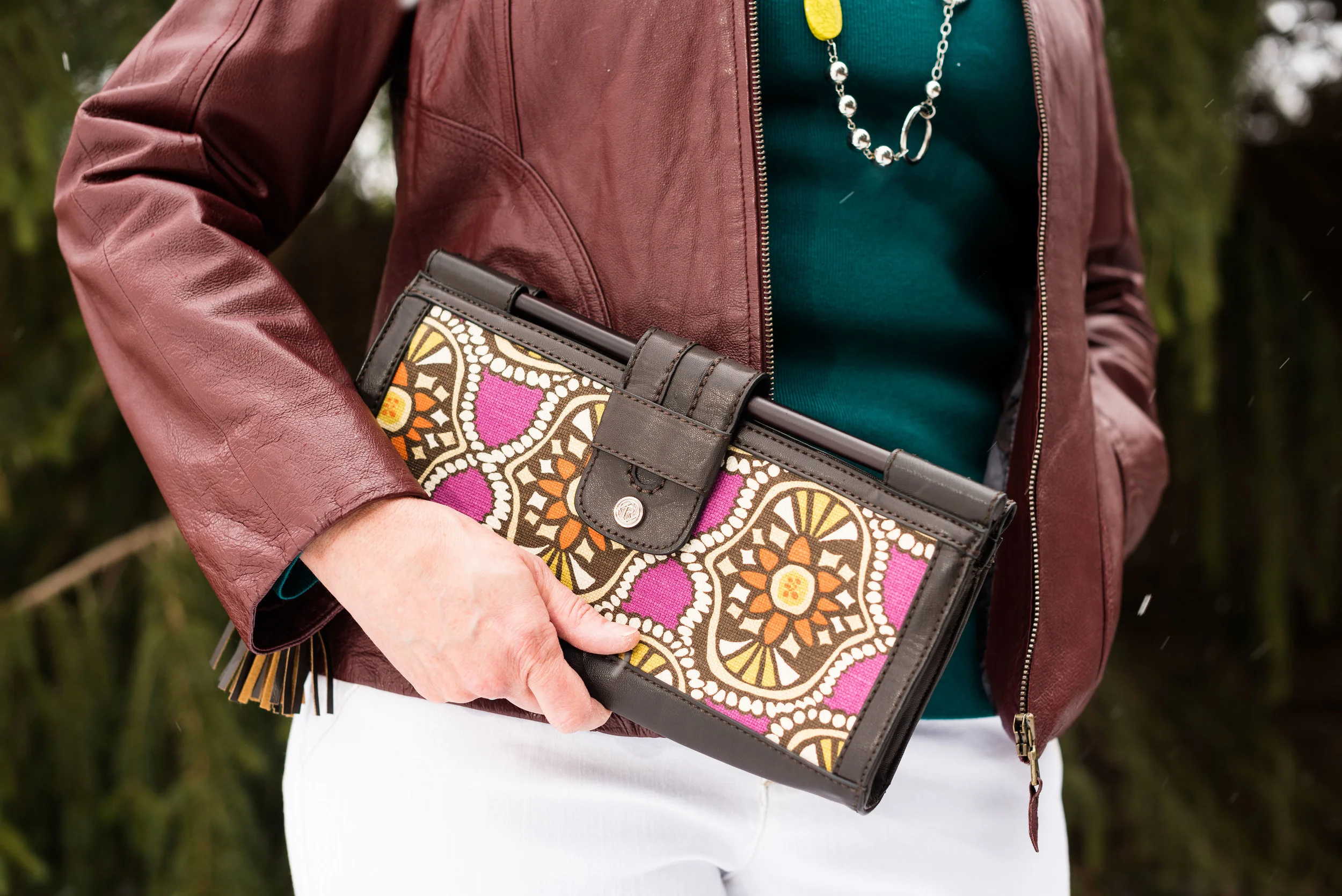
For my bag I chose this cute little thrift store find from Relic. The yellows in the bag are very similar to the Lime Punch color of my necklace. I thought this was a unique piece and I think it works very well to add print to this otherwise solid colored outfit. 

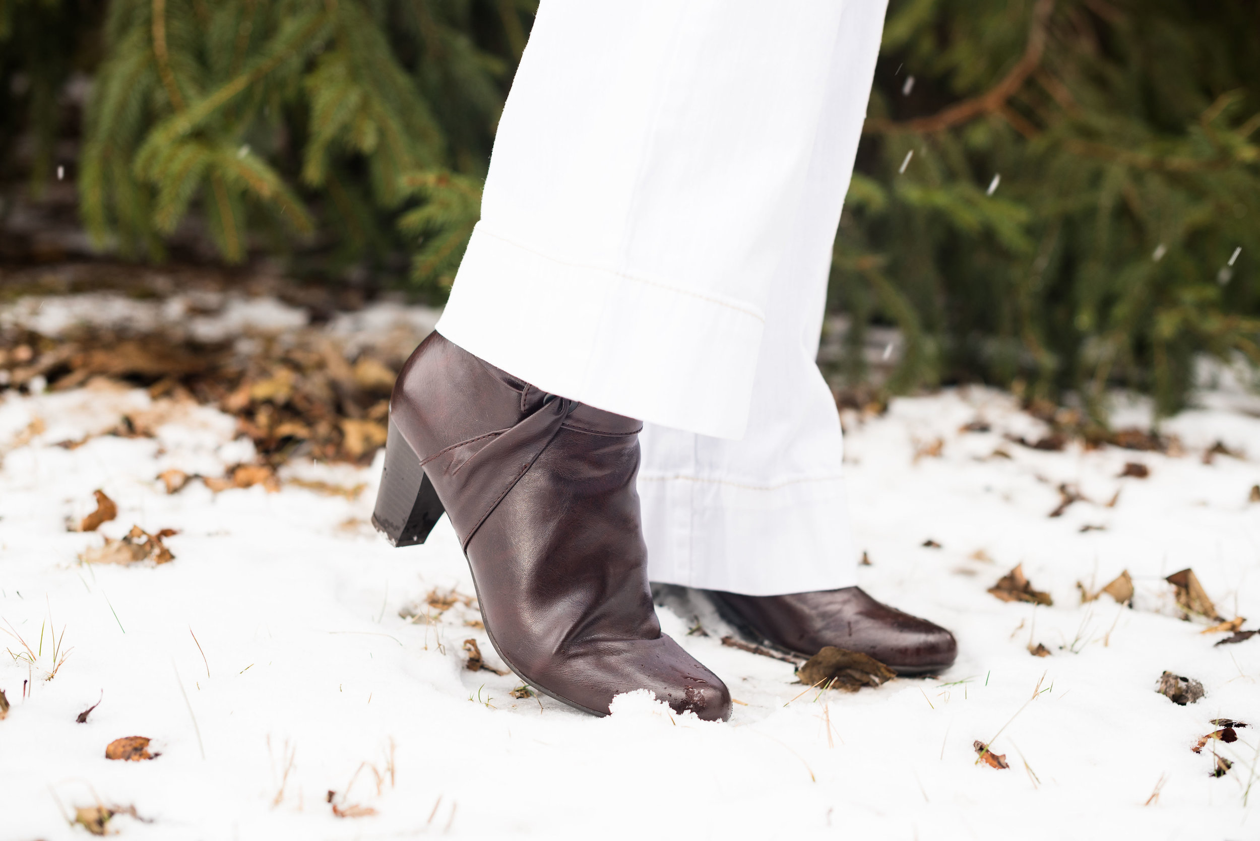
For my shoes I chose this pair of dark burgundy heeled ankle boots. I like the different twist these Life Stride boots have on the side. It is sort of like ruching for a shoe!

What do you think of these Pantone colors? Which is your favorite on this outfit? I've been seeing a lot of Arcadia various places, but Lime Punch is a fun color for the warmer weather. I also like the international flavor of Chili Oil....so many colors and so little time! Ha, ha.

I hope you enjoyed this post. I'd love to hear from you, so leave me some love! 

Photo credit Rebecca Trumbull. Make up Rachel Christensen

This post contains affiliate links. If you click on a shopping link I get a few pennies, if you purchase something through one of my links, I get a little commission. All opinions expressed are my own. 

Monday linking up with Catherine of Not Dressed As Lamb. Tuesday linking up with Jess of Elegantly Dressed and Stylish and Shelbee in the Spread the Kindness link up. Friday linking up with Jennie of A Pocketful of Polka Dots and Jo-Lynne of Jo-Lynne Shane


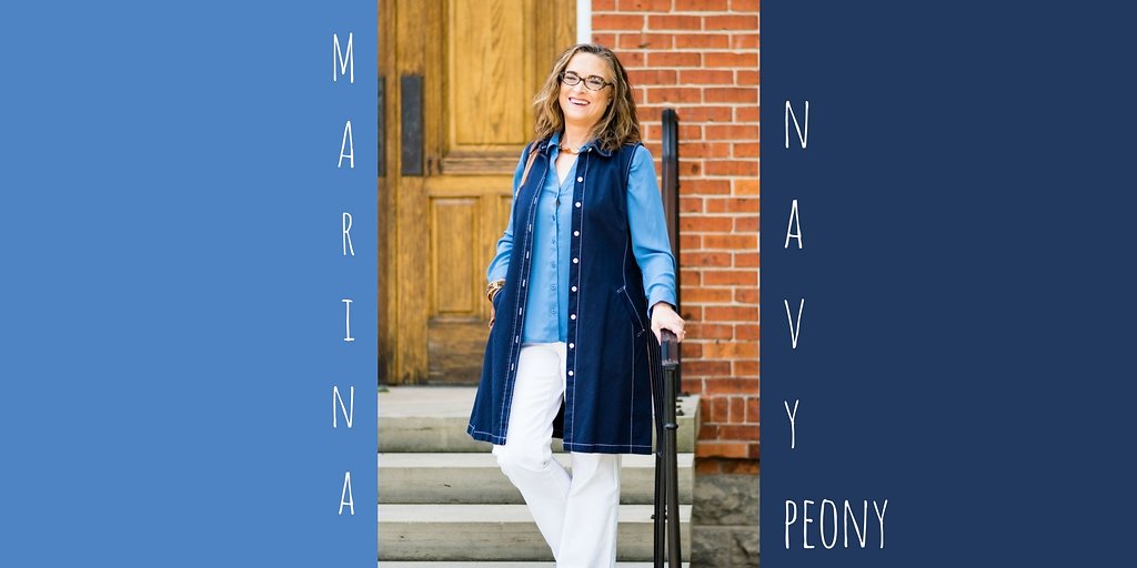
Pantone Fall 2017 - The New York Palette - Marina and Navy Peony

I wan't sure about pairing the two blues together that appear on the New York palette, but after mulling it over, I decided to give it a try. Navy Peony is the only color that appeared on both the Pantone London palette and the New York palette this fall. While many of the other colors came close to being similar such as Grenadine and Scarlet Flame or Butterum, Toast and Copper Tan, Navy Peony seemed to be embraced all over. I have heard it said that navy is the new black and is a go to for styling an outfit that is classic and slimming. 

Marina is a lighter blue and reminded me of the beautiful fall sky on a sunny day. Going along with that idea, I decided to add white pants, keeping the outfit light and bright, but still filled with warm layers for a perfect fall transitional outfit. 

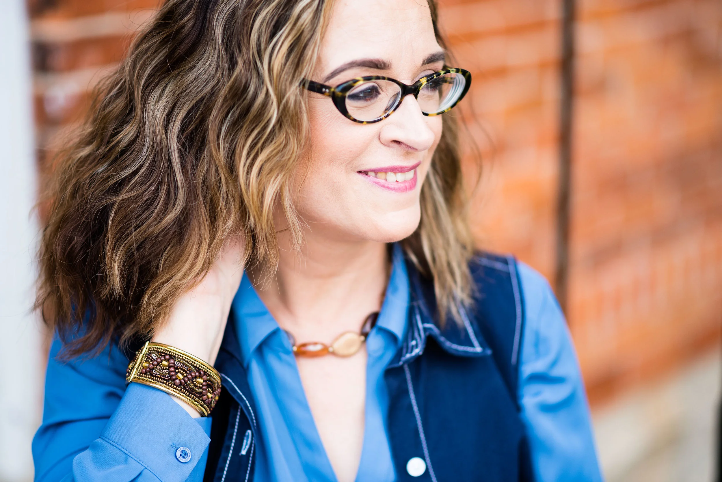
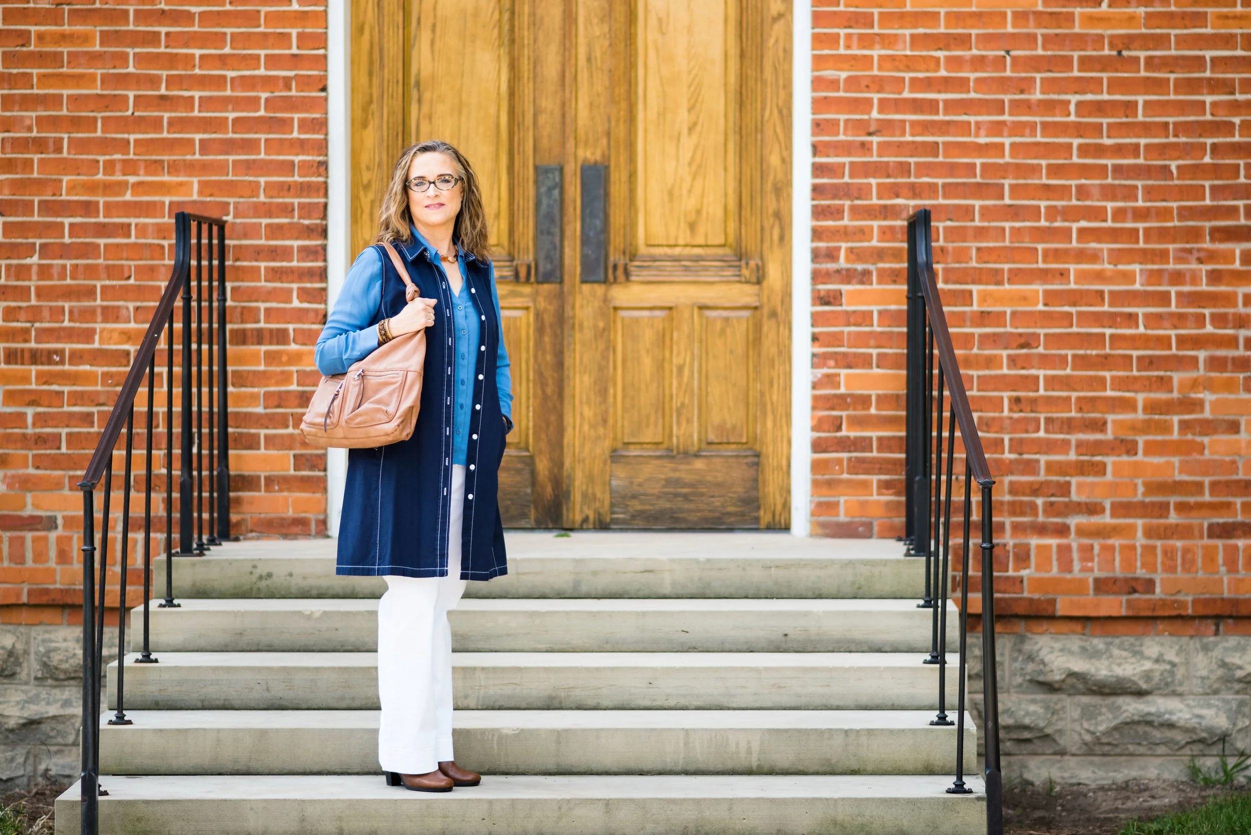
For my Navy Peony piece I chose an Isaac Mizrahi denim dress that I found at a thrift store. This dress was made for Target, but Mizrahi no longer has an affiliation with Target. I thought the dress, which comes with an attached belt would make a great jumper or, as in this case, the perfect cool weather longer length vest. It has a row of white buttons up the front and two roomy pockets at the sides. For this outfit I left it unbelted and open. Here is a navy longer length utility vest that would work. 

The Marina button up top is a thrifted Dana Buchman brand from Kohl's. I was looking for a few blouses that I could wear out or tucked in, but that didn't have a lot of bulk to them. This is a silky poly blend and layers well under the heavier vest. 

The pants I have styled before on the blog and are Gloria Vanderbilt boot cut jeans. I'll list a few other shopping links at the end for similar options.

We took these pictures at a local Toledo Metropark named Wildwood. We are very fortunate to have numerous beautiful parks throughout the Toledo area boasting great walking trails and historicbuildings such as this old school house which is still used for various events. 

To keep my outfit still connected to the changing colors of fall, I decided to add a few cognac or Butterum accessories. 

The boots are thrifted Aerosoles and the bag is thrifted New Directions. Here are a cute pair of similar colored boots from DSW. Here is a cute bag from Nordstrom Rack. This color is perfect for fall, not to too dark and not too light. It gives any outfit a warm, toasty feel. 

i also went for the browns in my simple bead necklace and hinged bead bracelet. 

What do you think of this color combination? Do you have many navy pieces in your closet? Be sure to take them out and start wearing them and you'll be right in style. I'd love to hear from you either in the comments section below or leave me a message on Facebook. You can also follow me on Instagram and Pinterest. I appreciate all your support.

This post contains affiliate links. All opinions are my own.

Join me Thursday where I will be feature another Fun Fall Look. See you then.

Photo credit Rebecca Trumbull. Make up Rachel Christensen.