Pantone - Spring/Summer - 2021 - New York Palette: Introduction

I am a bit behind on the Pantone colors this year. I had a hard time getting back into the swing of regularly posting, but here I am. While we are a few weeks into spring, the Pantone colors for this season are for spring and summer. I don’t pay attention too much to their time table, because they already have the colors out for the fall/winter season. Who wants to think about fall/winter when we have barely made it into spring? Ha, ha.

Just as a quick review, the Pantone Color Institute is an entity that provides the color trends for both the fashion and interior design industries. If you go to their website you can see all sorts of information from color swatches you can order to educational opportunities. Obviously, these are not the only colors that you see trending on the runways, but Pantone is easily considered a color authority by both design areas.

Every year, Pantone chooses a color of the year. Last year it was Classic Blue. In 2019 it was Living Coral. This year they picked two colors, Illuminating, a sunny yellow and Ultimate Gray, which is a classic medium gray. Typically, the colors of the year are seen on both the New York and the London Palettes. As I have done in the past I will be starting my series with the New York Palette. This year, the palettes are quite dissimilar, which makes it more interesting for me, as I pick out outfits and for you, my lovely subscribers.

Here is the New York Palette.

ClassicColors_(12).jpg

This is a mix of jewel tones and pastels, so if you lean towards one or the other, this palette will make everyone happy. Rust is a different color for summer, but I think it can work well with many of the others colors. Once again there is a selection of classic colors, which to me are helpful if you want to tone down an outfit and just accent with the brighter colors through jewelry and other accessories.

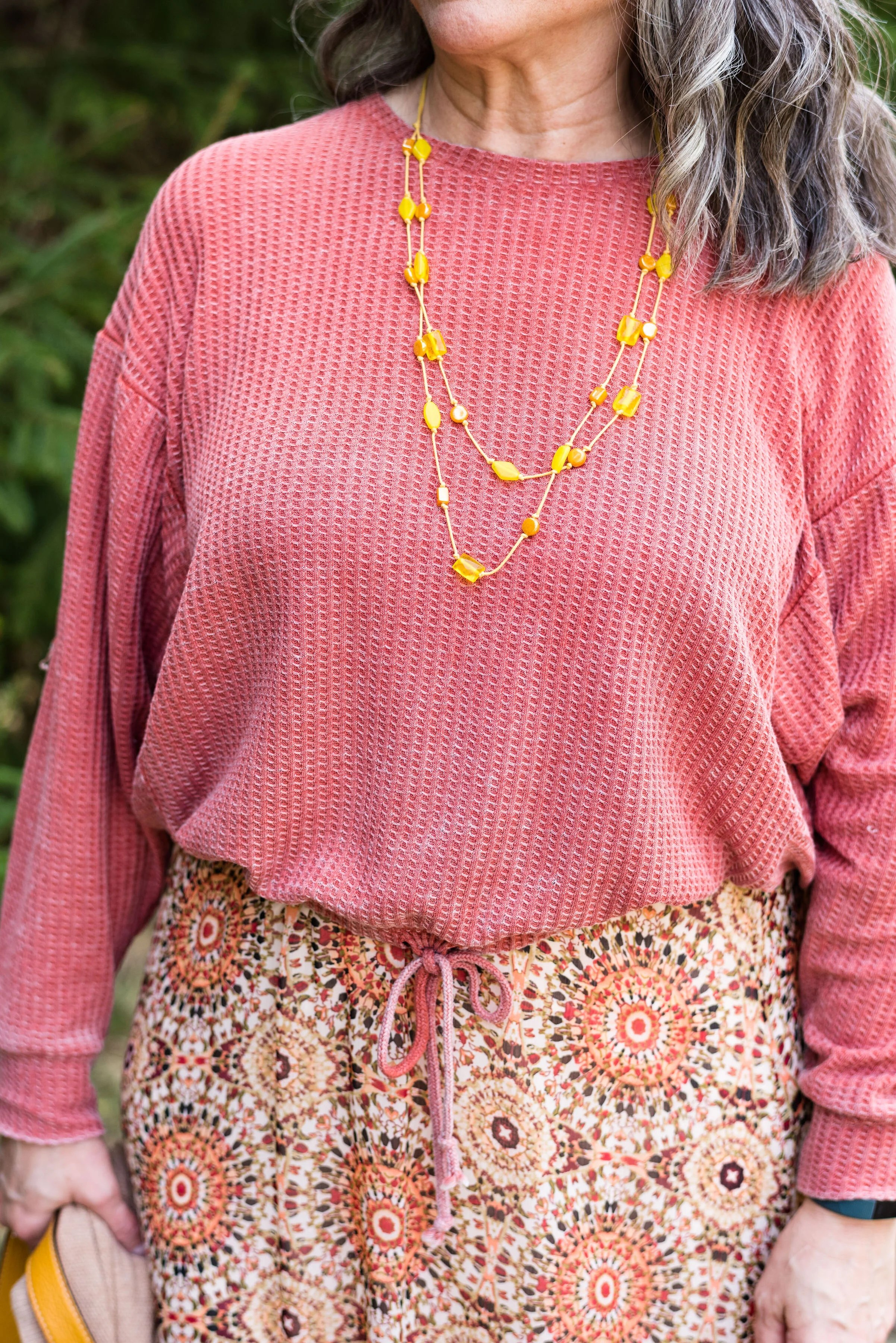
The following are a few photos from our shoot which give you some sneak peeks at how I combined these colors.

pantonespring2021preview-1.jpg
pantonespring2021preview-2.jpg
pantonespring2021preview-3.jpg
pantonespring2021preview-4.jpg
pantonespring2021preview-5.jpg
pantonespring2021preview-6.jpg

I hope you will join me on Thursday as I start the series. Have a great day!

Photo and graphic credit Rebecca Trumbull.

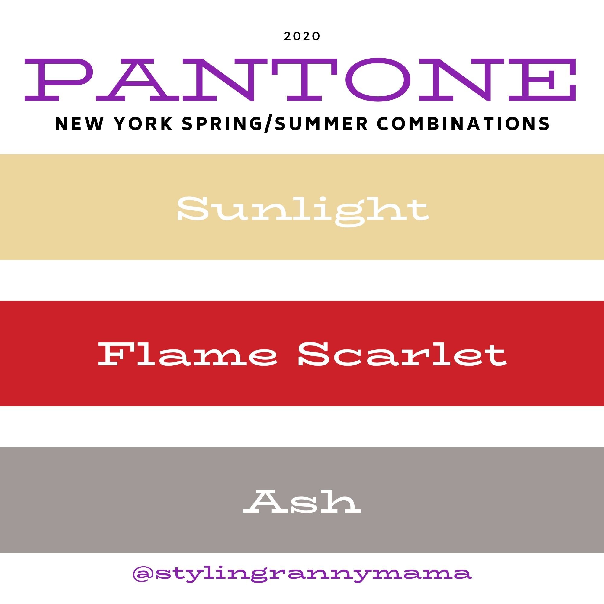
Pantone Spring/Summer - 2020 - Sunlight, Flame Scarlet and Ash

There are so many ways to combine these colors. I have had a few of you make comments about which colors you like and love to combine. Susan told me she loves today’s pale yellow, Sunlight, combined with Tuesday’s medium pale blue, Faded Denim. What a great combination. I had Karen tell me she usually veers towards the Classic colors, but suddenly realized she had a few new outfits in her closet when she saw last Thursday’s combination of Classic Blue and Chive. I would love to spend most of my blog time just talking about color combinations, because the more I do these Pantone series, the more I realize how many more beautiful combinations there are. However, I know there are other fashion topics to talk about, so I’ll keep the color talks to the Pantone series and my monthly Color Play posts, which will be back soon. Thank you, all of my beautiful subscribers, for your input and support.

Today’s color combination may not have been your first choice. When we think of combining yellow and red my mind immediately goes to McDonald’s. Anyone else have that reaction? Yellow and red seem almost clownish together, but you may change your mind when you see how a pale faded yellow pairs with a stark red. I like it. Let me know what you think.

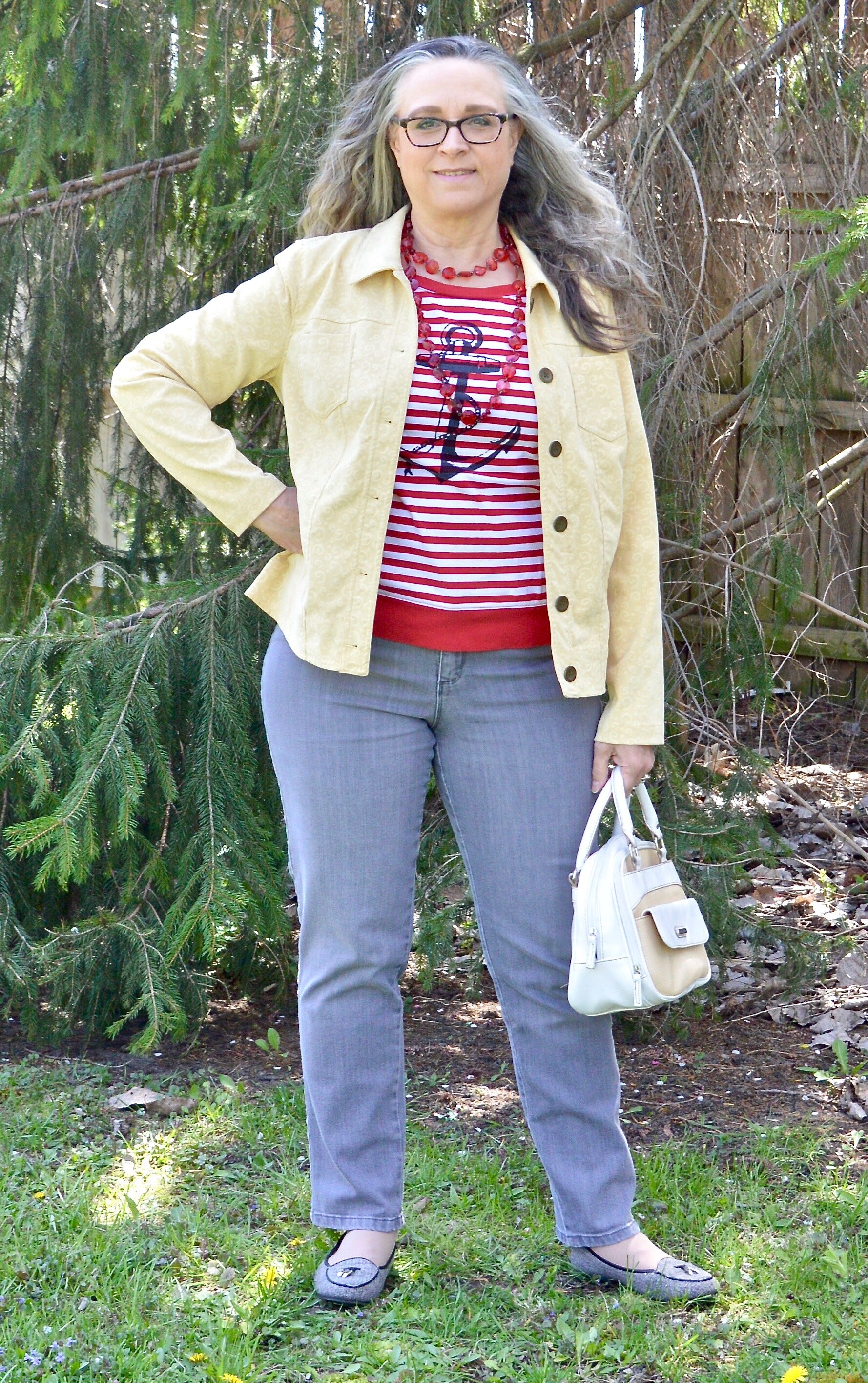
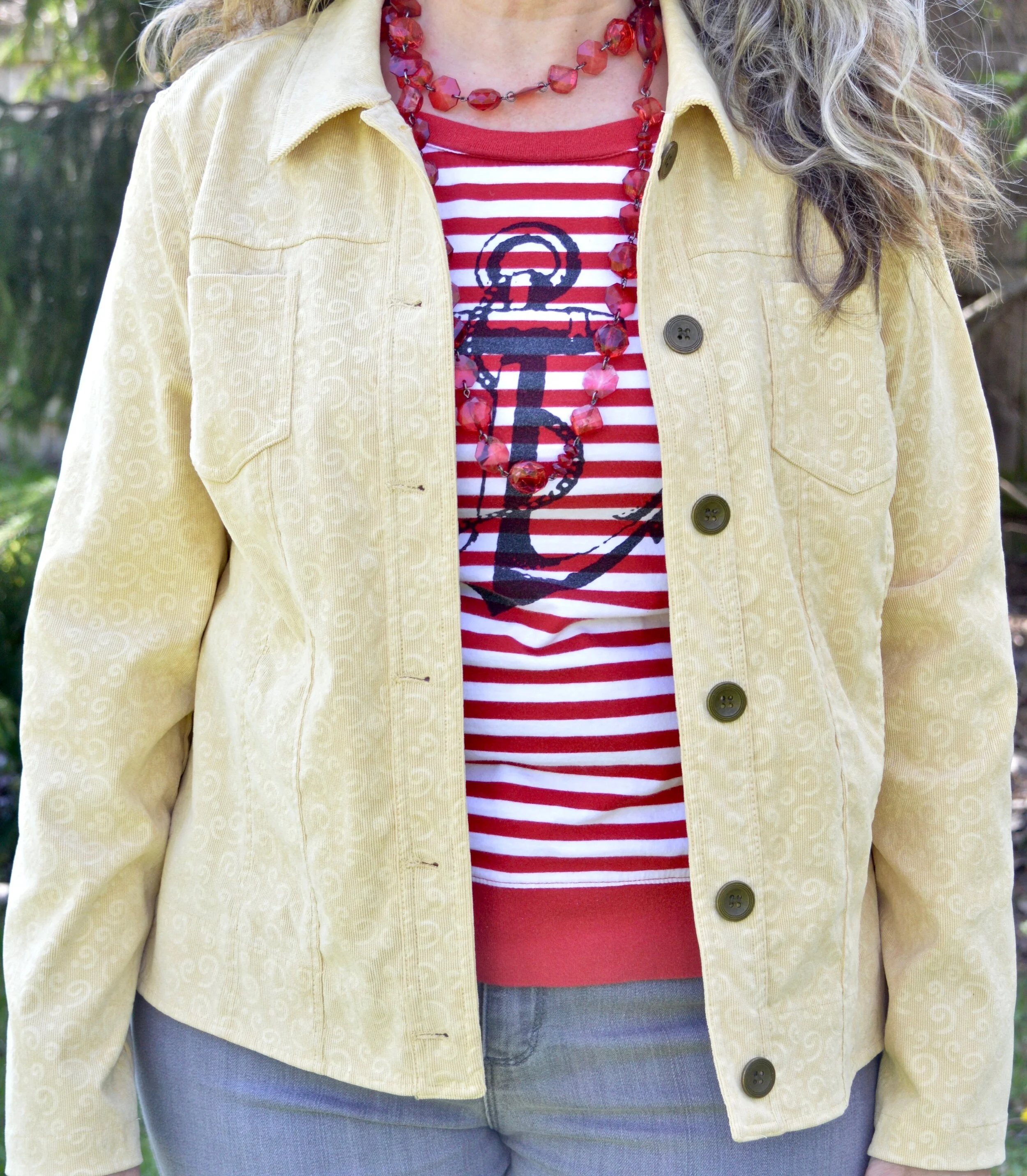
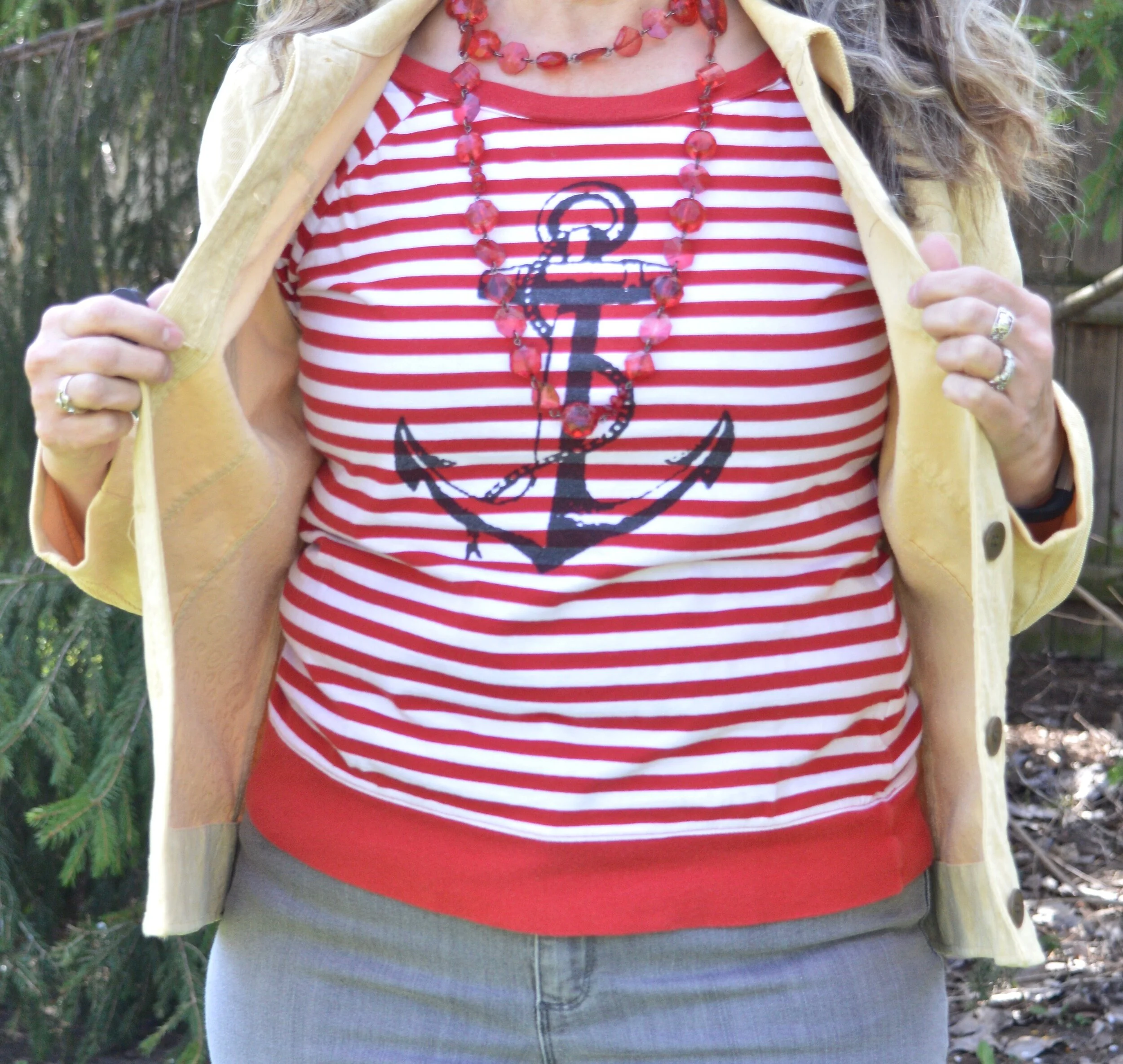
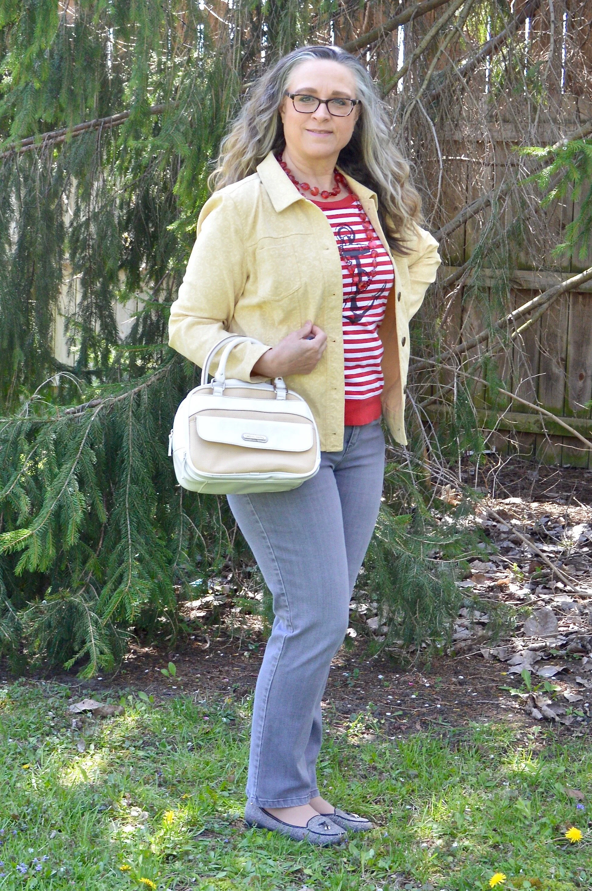
This thrifted Christopher and Banks corduroy jacket was the perfect Sunlight color. This jacket is soft, flexible, and great for those in between days when it is still cool.

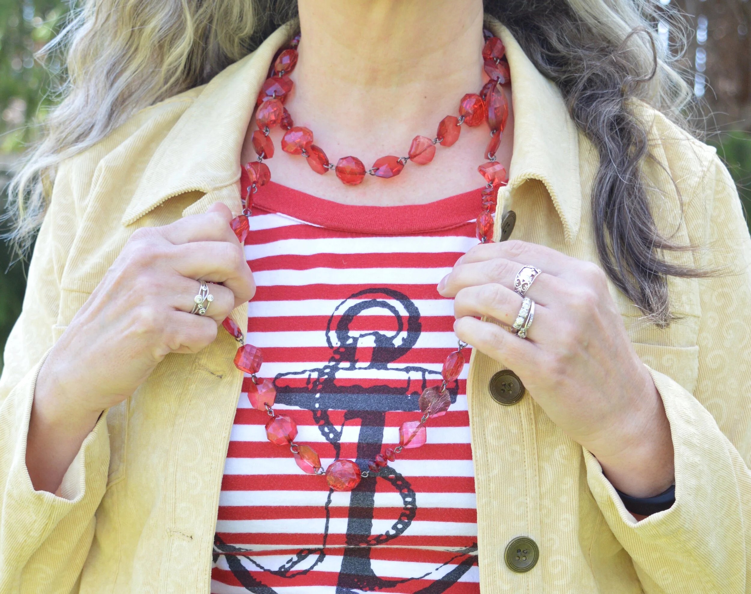
Another thrift find, this Nautica 3/4 sleeve tee is a great spring and summer staple. Not only does it have the bright Flame Scarlet and white stripes, but it bears the nautical sign of the anchor. It makes me think of the anchor of the Lord, that moors my boat in this ever stormy sea called life.

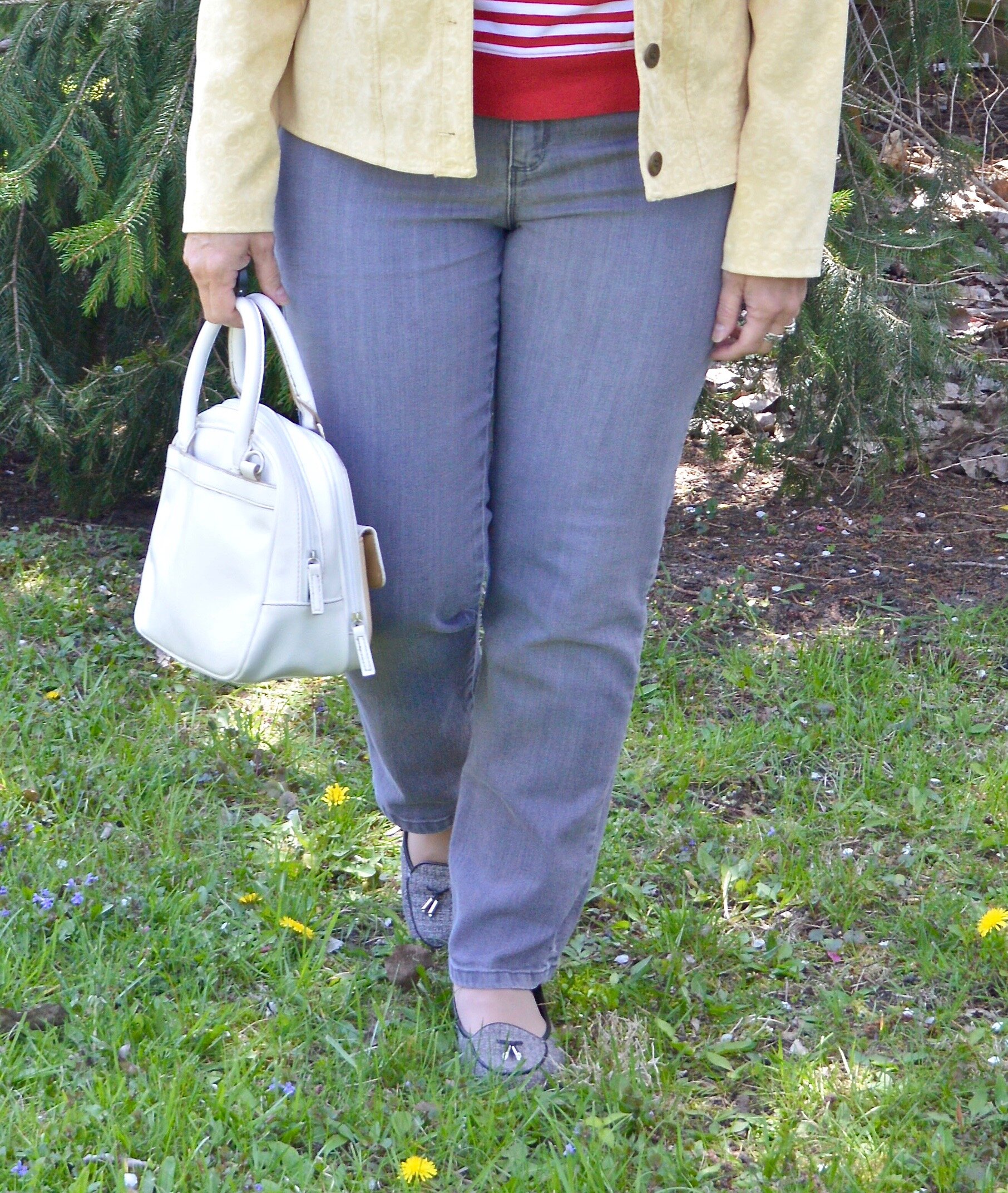
These Ash gray jeans are another thrift find, and are Gloria Vanderbilt. I used to wear Gloria’s jeans all the time, then got away from them. This pair is soft and have just enough stretch to make them so comfortable to wear. I think the length of these is great for summer. How do you like to wear your pant length in the warmer months?

I kept the jewelry minimal and threw on this opera length string of large beads. Doubling it, gives it a fun layered look.

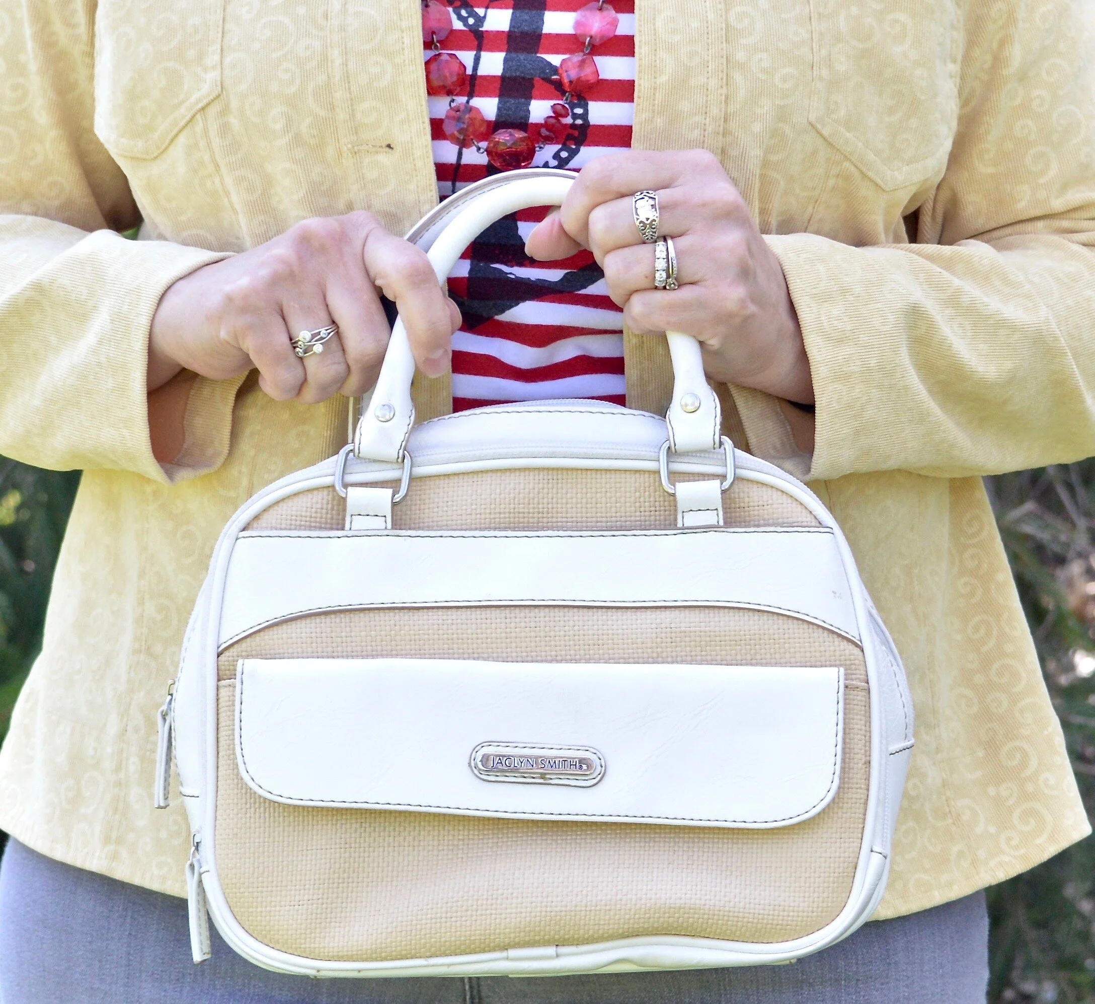
I chose this simple thrifted Jaclyn Smith top handle bag to keep the look light and fresh. This also comes with a longer strap so it can be converted into a crossbody bag. You can see how I styled this bag with white jeans, Bermuda shorts and high waisted jeans.

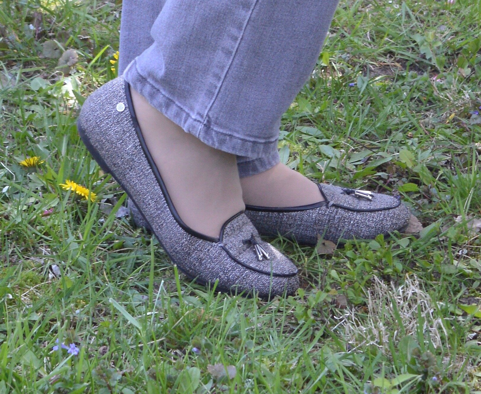
My Dana Buchman tweed loafers are making another appearance. Loafers are a great shoe for this in between time, before you really want to go out in sandals.

What do you think of this color combination? Have I changed your view on wearing red and yellow together? It would not be my first choice of colors to combine, but I am glad I did it for this series. It helps me to think outside my box. As always I love to hear you thoughts.

Graphic created by Rebecca Trumbull.

I’ve included a few shopping links which mimic this look. These are affiliate links and all opinions are my own.