Outfit Inspiration: Navy and Green Color Combo
Right now Pinterest seems to be the source of inspiration for many of my recent blog posts. I do use the occasional Instagram challenge to also find inspiration, and there are lots of places, people and things to inspire our clothing combinations. However, as you know, convenience often weighs heavily when life is busy or we are feeling tired. This is the pin that inspired today’s look.

Unlike the Pinterest pin, I used a vest, rather than a jacket, and there are other differences in accessories, and so on, but as I have said before, the point is to be inspired. I think something an fellow Instagram user posted makes sense. We want to be inspired, not influenced. Inspiration allows us to shop our own closets and put together similar looks without necessarily having to copy the look. Being influenced might include the pull to purchase pieces we don’t need or won’t actually wear.
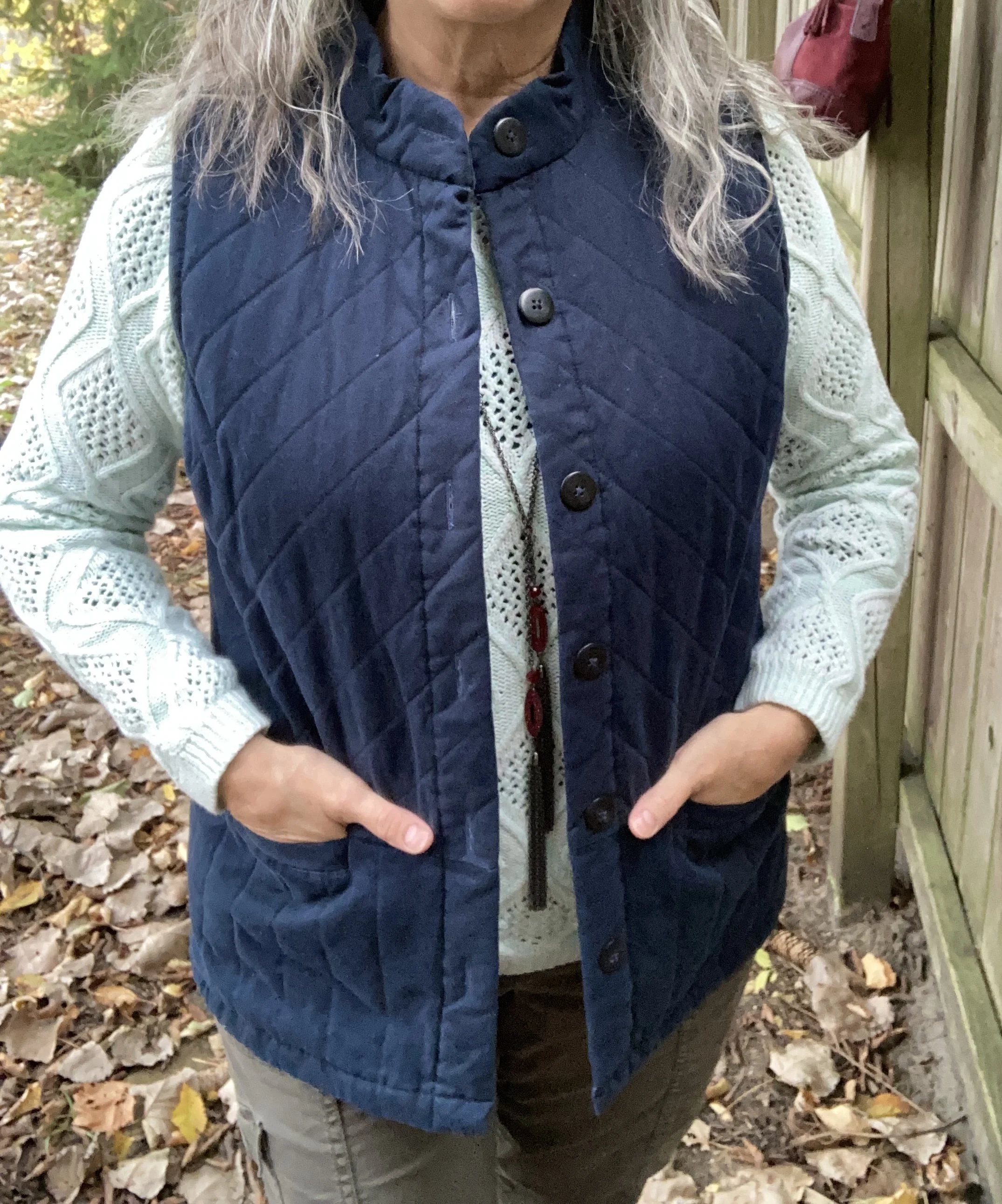
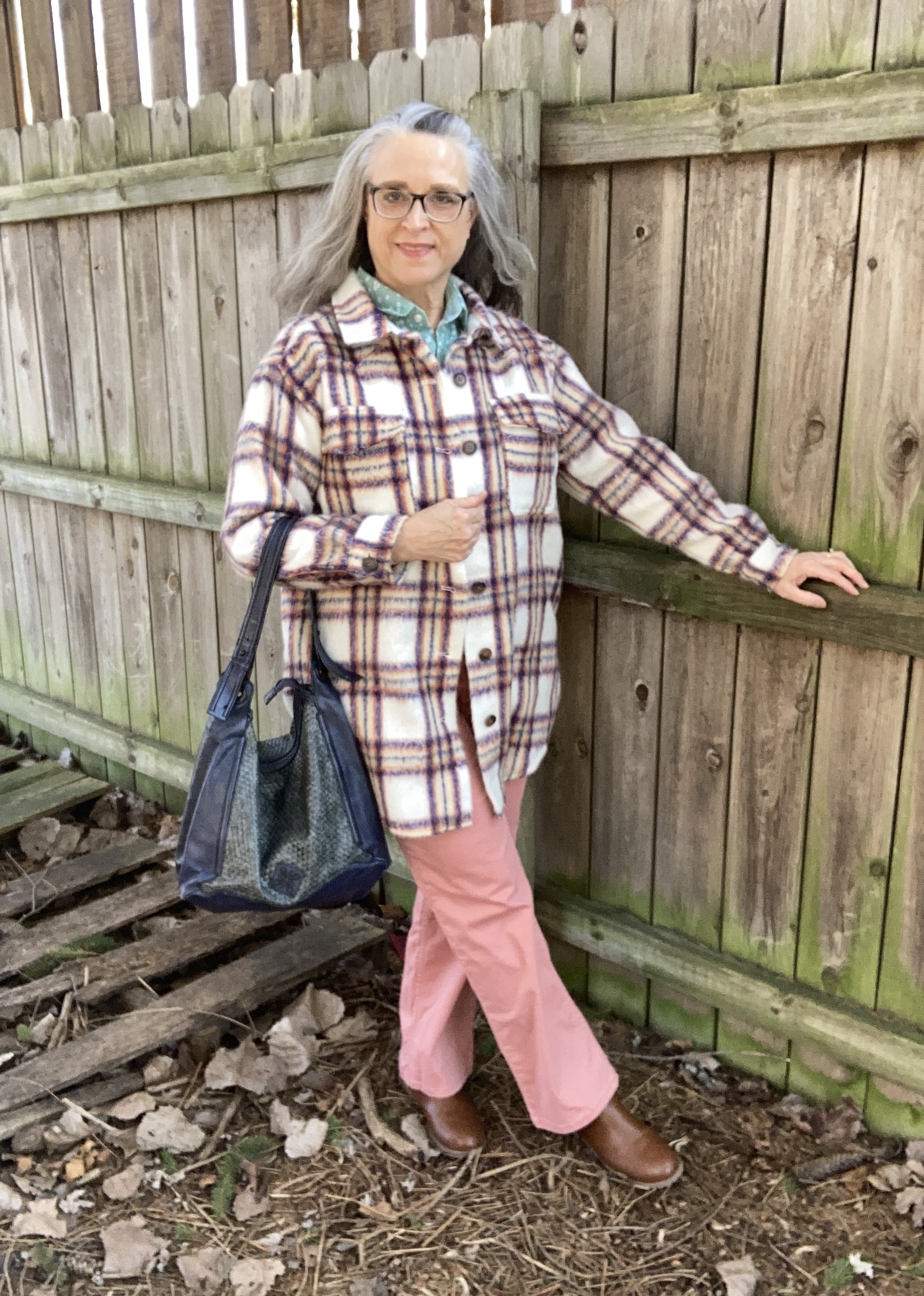
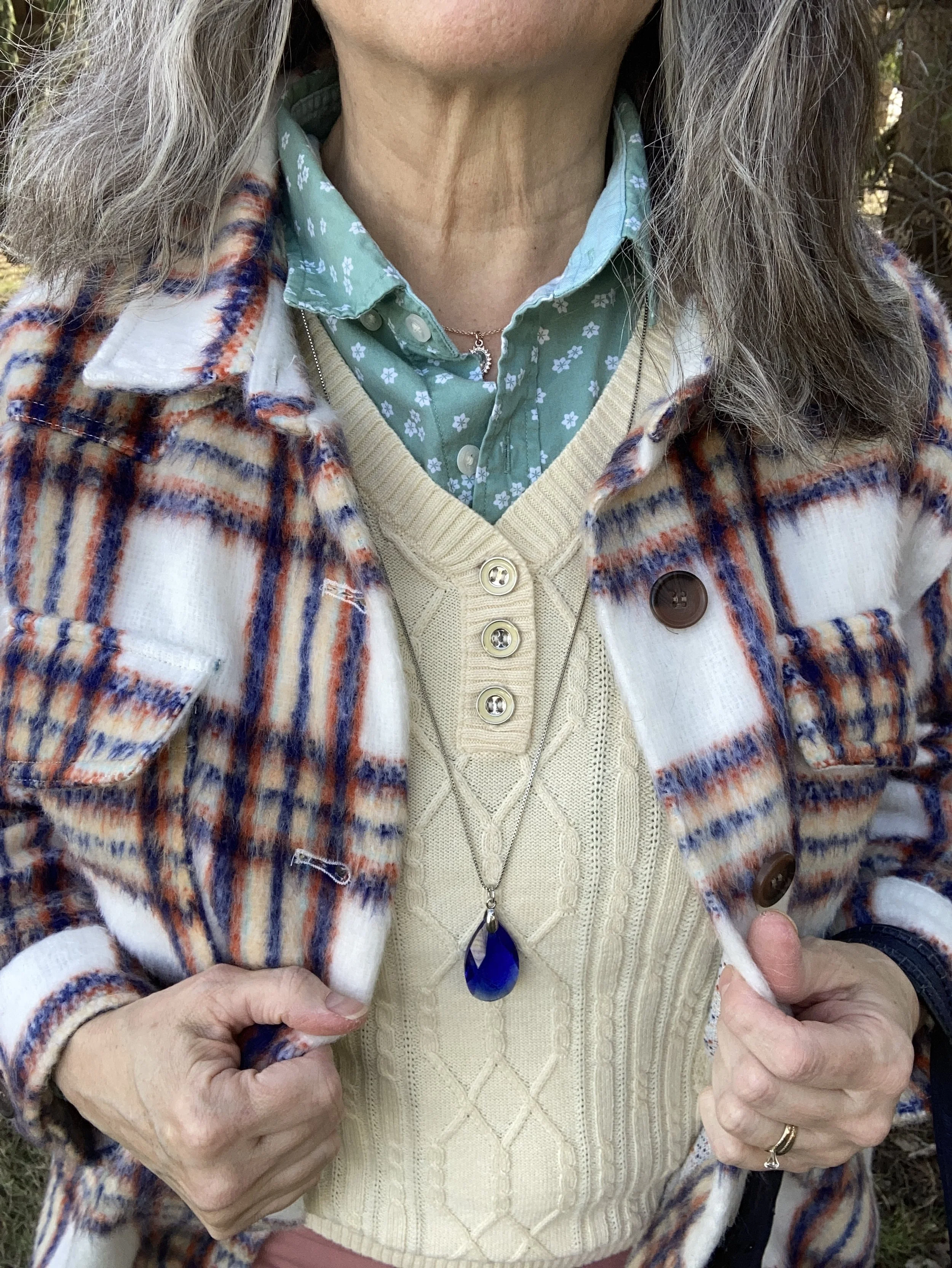
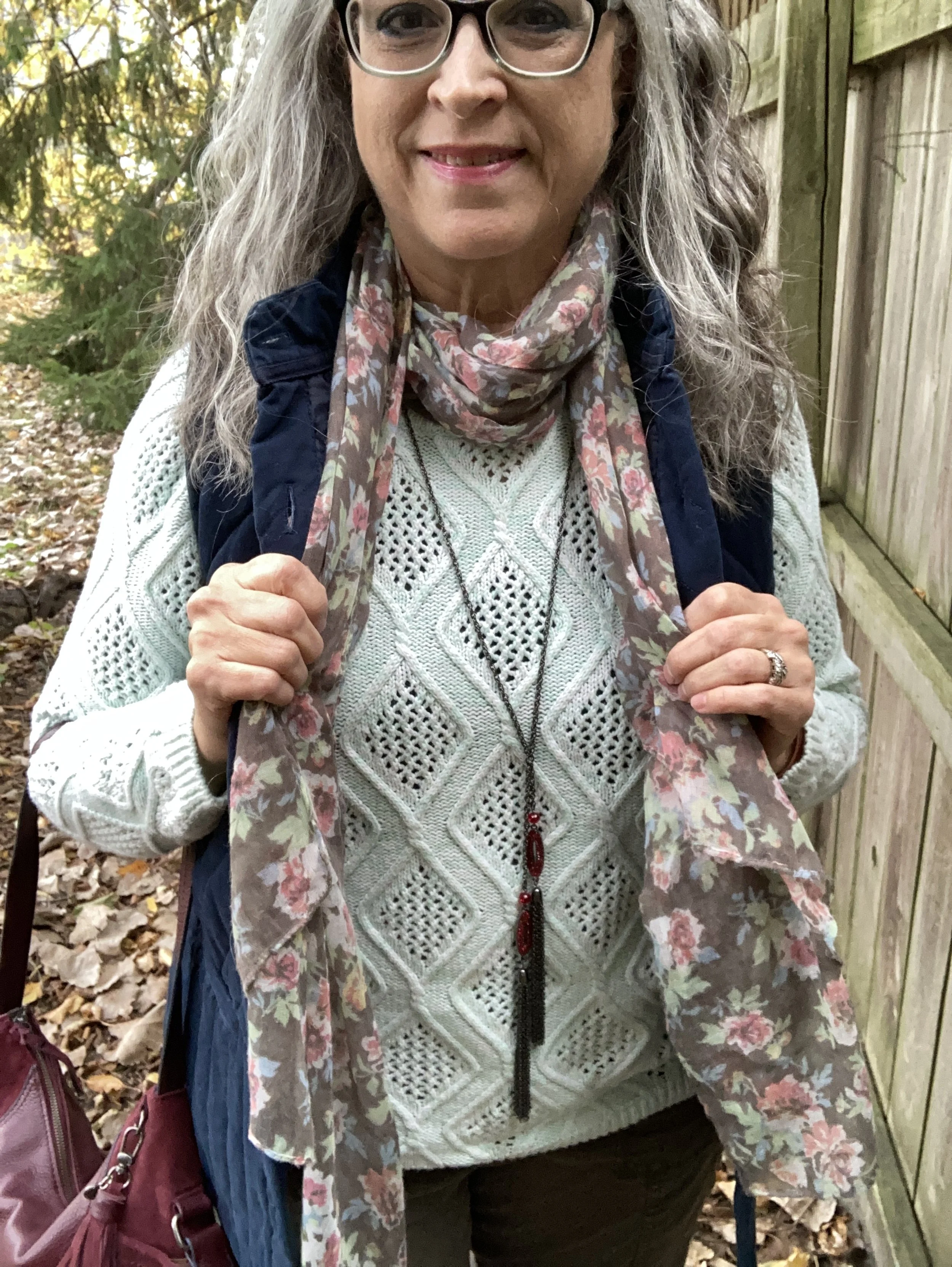
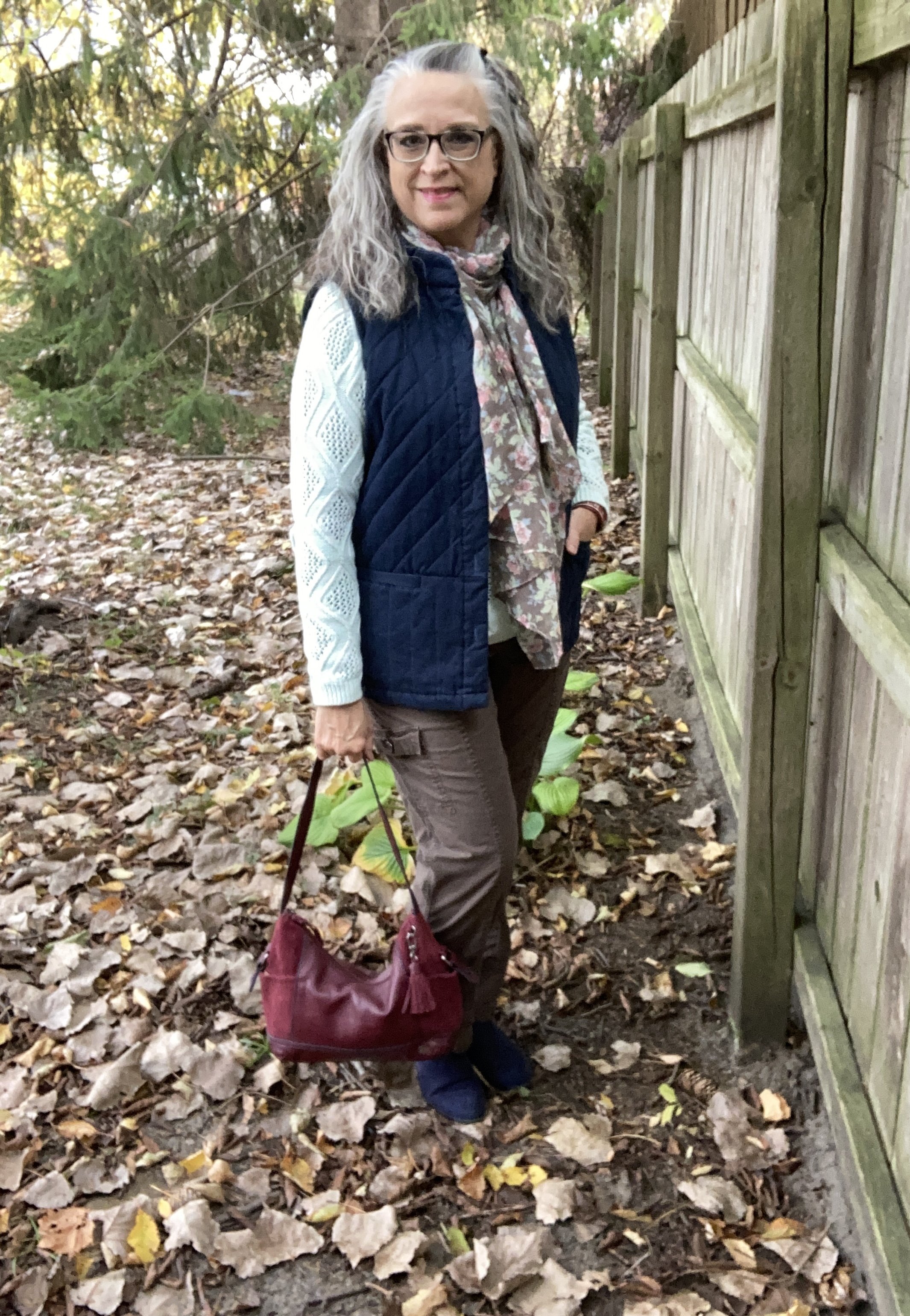
This Christopher & Banks vest is from a couple years ago. It is a great piece and the quilting definitely gives it a warm, cozy feel. I like that it is a bit longer than many of my other quilted vests, and that it has buttons instead of a zipper. I rarely wear any of my vests closed, but it is nice to have different options.
Style Tip: Before you purchase vests or jackets think about collars. Ask yourself if you prefer the collar to lay flat or stand up, or be able to do both. Think about what you will be wearing it for and how you will be styling it with your other clothing. For today’s outfit, the stand up collar works great, but those are not my first choice. I typically like a collar to lay flat, or be something similar to a shawl type collar, or in the cold weather a turtleneck will do.

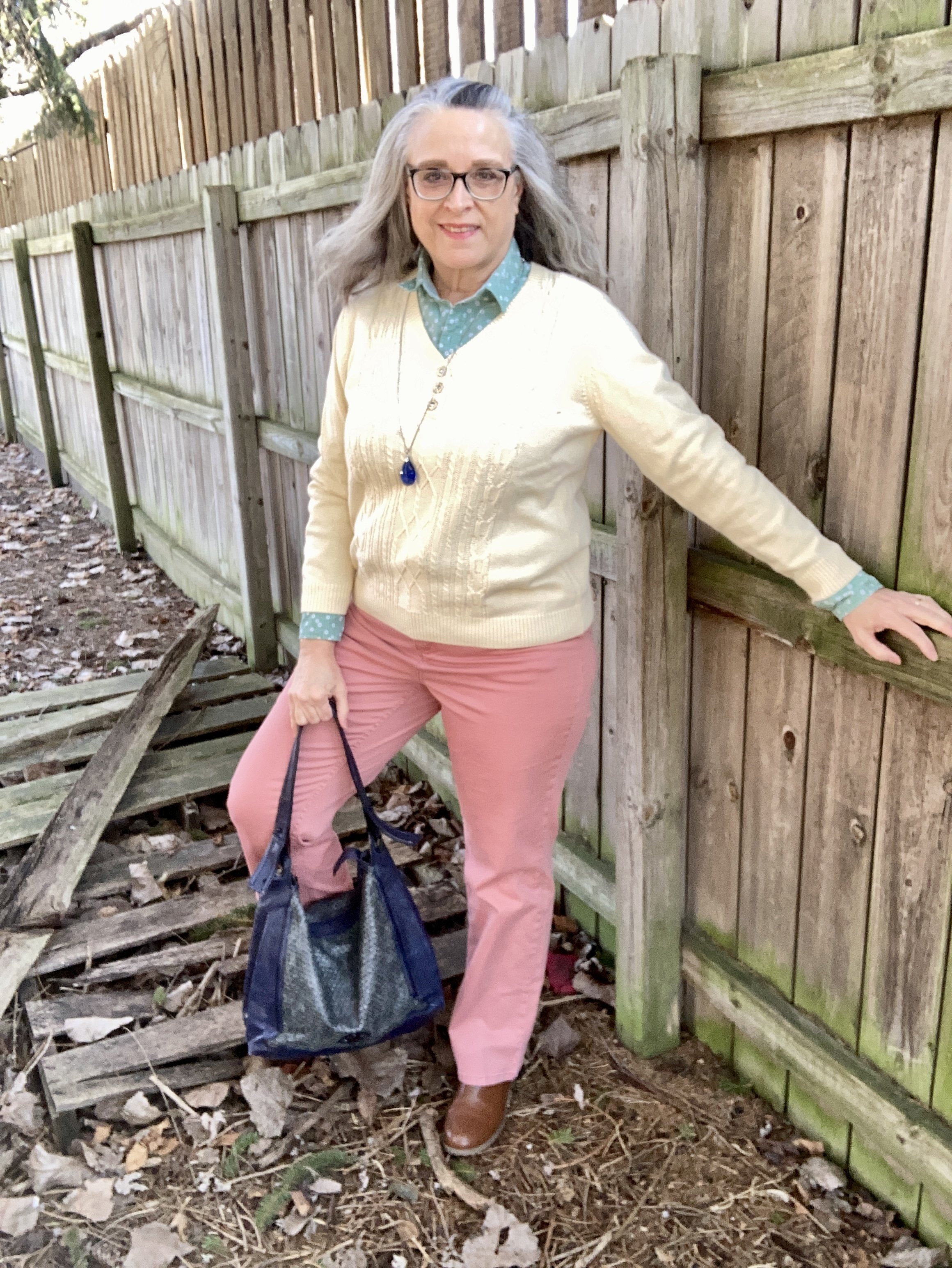
This minty green sweater is a thrifted Sonoma piece. The color and the texture were different than the other pullovers I have, so I snatched this one up. I added the reddish pendant necklace and bracelet, along with my bag as an after thought, but I think the darker reds help define the outfit as a fall look.
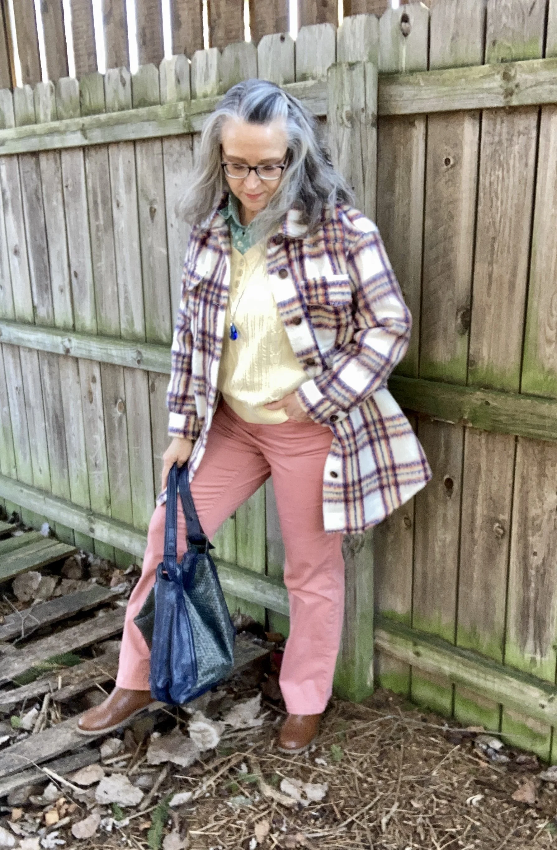
Style Tip: When it comes to transitional outfits, you may find yourself reaching for the same pieces which brings the option of pairing them together again. With a few easy adjustments you can make a fall outfit work for spring, or a spring outfit work for fall. To make this outfit passable for spring I would choose lighter colored accessories, possibly in a pastel pink.
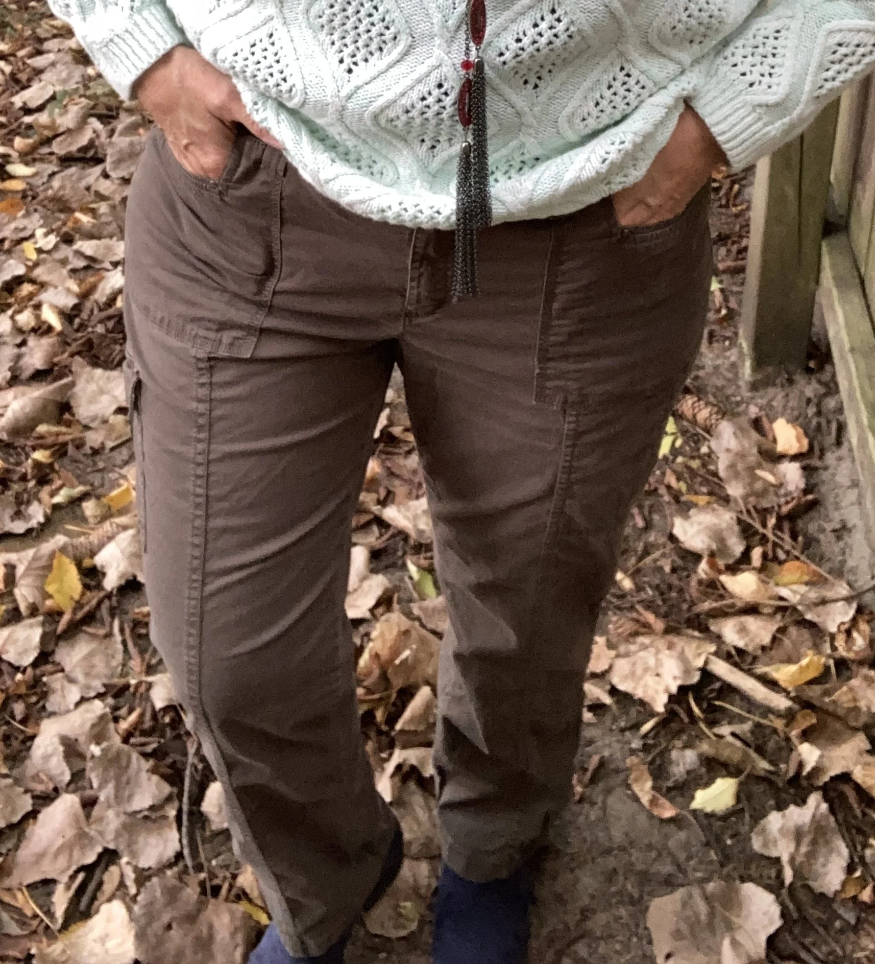
These thrifted Sonoma utility pants look brown in this picture, but they are an olive drab. I thought they worked well for this overall casual outfit.
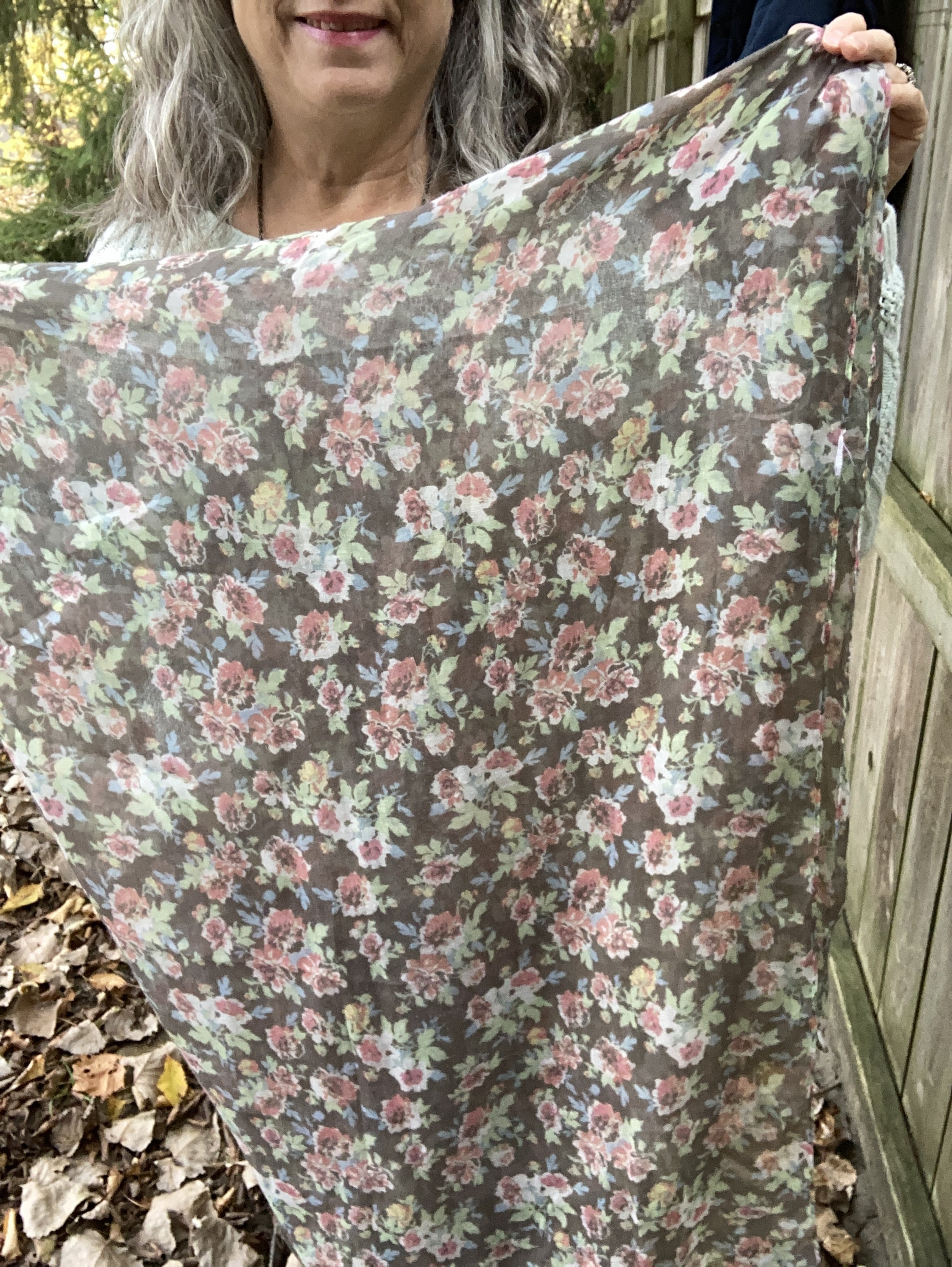
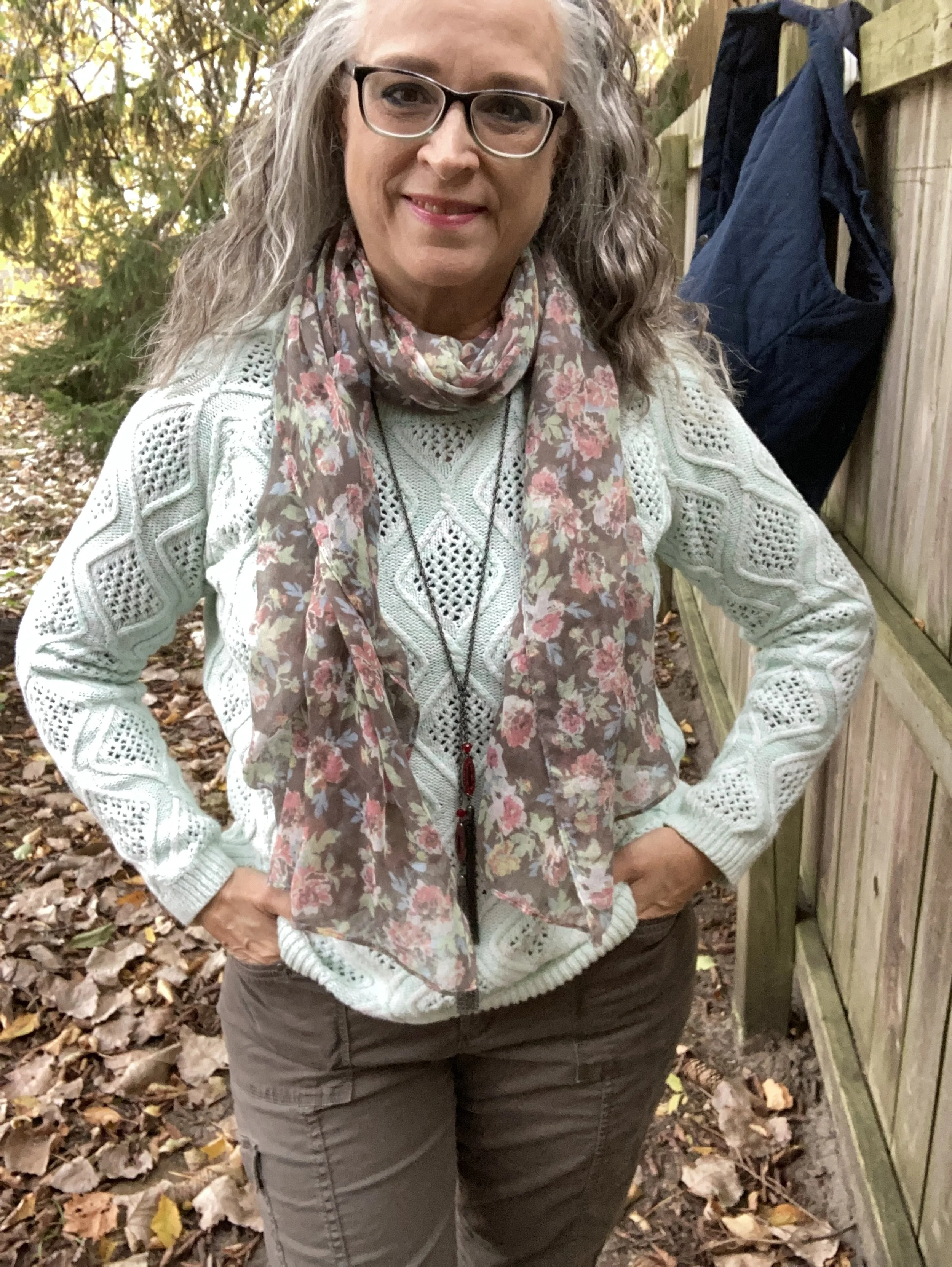
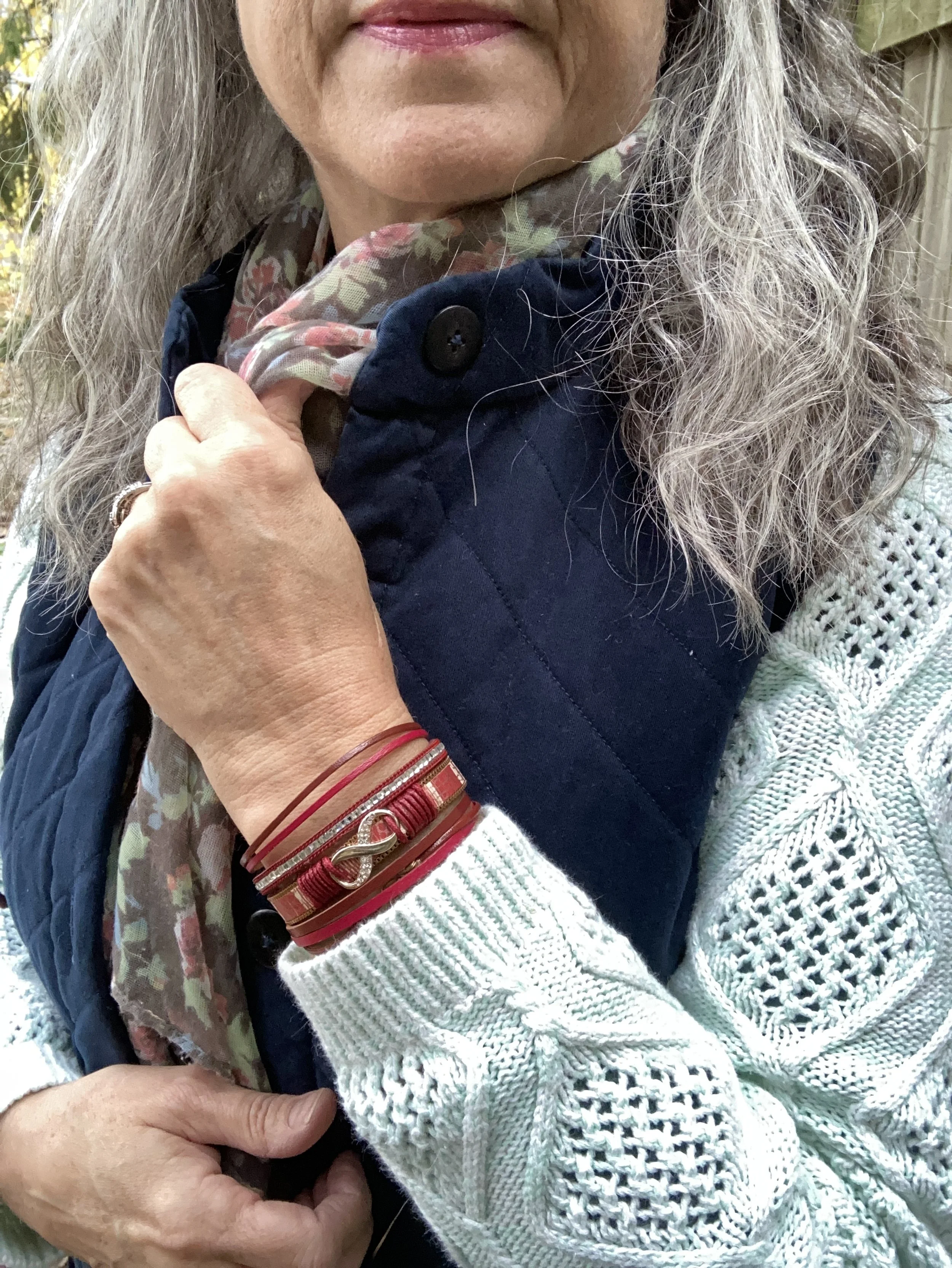
I played around with a few different scarves, one of which was a dark blue with pink and burgundy tones. I thought of pairing burgundy pants with the vest and sweater, but then decided I wasn’t quite ready for the darker colors. Thus when I saw this scarf and liked how it went with the other pieces I opted for burgundy accessories to still bring in the darker tone of fall, and I thought the burgundy went well with the pinks in the scarf.
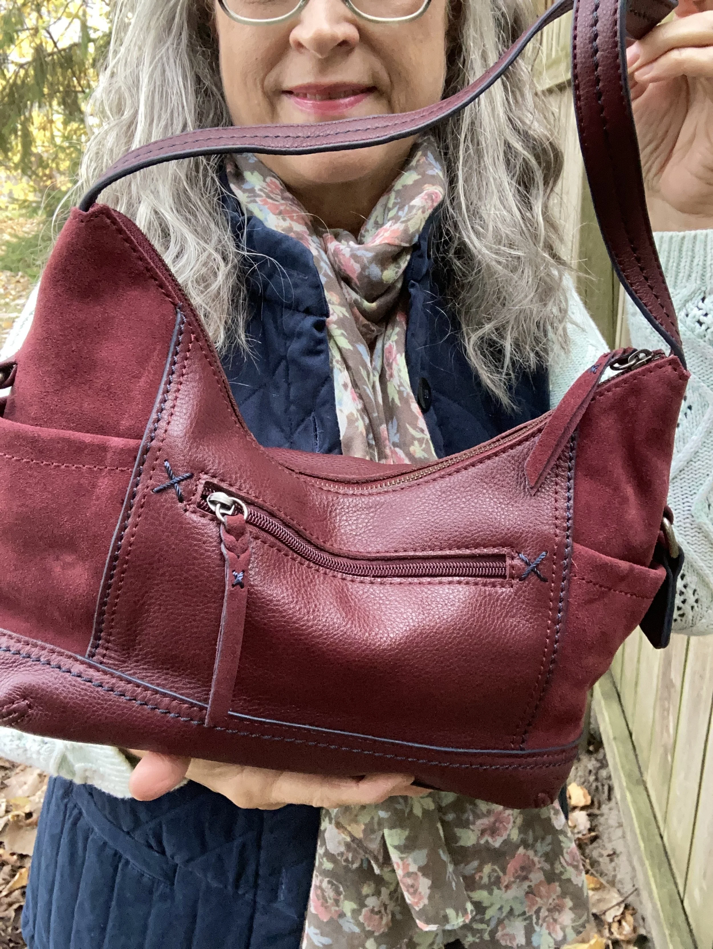
My bag is The Sak brand and it was given to me by my thrifting bestie.
My ankle boots were purchased at Kohls and are SO brand. I have had them for several years.
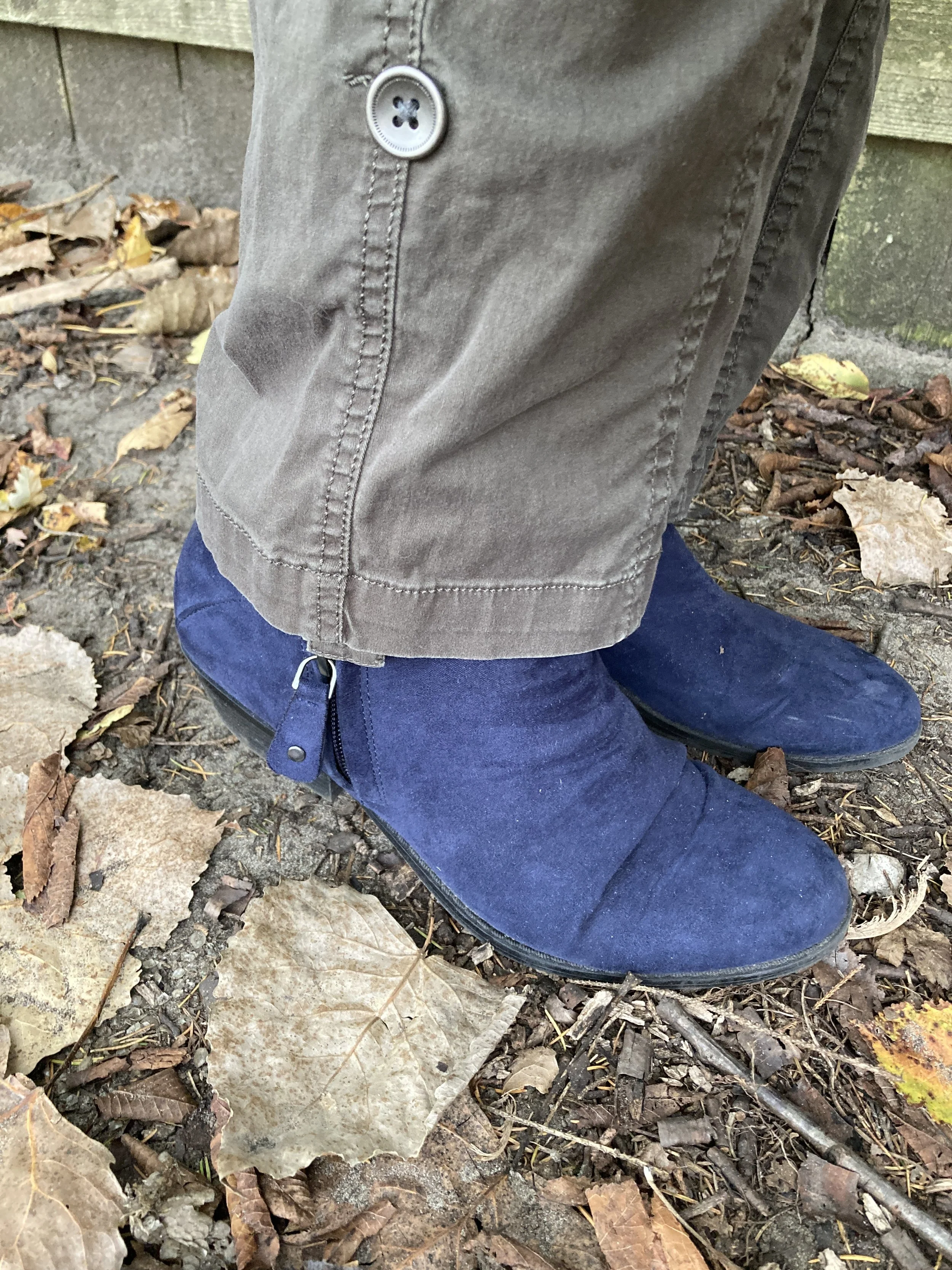
Style Tip: Should you match your shoes to your pants, your top or not at all? I think variety is the spice of life, as they say, so why not do all three. Today, I matched my shoes to my vest. Other days I might wear shoes that look more like my pants to create that longer, leaner line from hip to toe. Still on other days, I might wear a basic brown, or black boot, or I might just wear sneakers and they don’t have to match at all. Your outfit, your way, so however you want to do it is fine. The point is to be comfortable, pulled together and confident in what you are wearing.
I hope you enjoyed this post, and that it inspired you to build an outfit that combines colors, textures and accessories to make you feel good when you are in it.
I am including a few shopping links for you to look over. Think ahead, and use these links to start your Christmas shopping. These are affiliate links. All opinions are my own.
Have a wonderful Tuesday!