Pantone Spring/Summer 2026 - New York Palette: Dusty Rose, Lava Falls and Rhodonite
Another week has flown by. Can you believe it is already the middle of April? We have been having summer here in the midwest. Today it was in the 80’s so my grandson and I spend some time at the park and played outside. I don’t really like that it is this warm already. I like a more gradual warm up and truly enjoy the temps that hover around 65 to 75. Any warmer than that and I start to wilt.
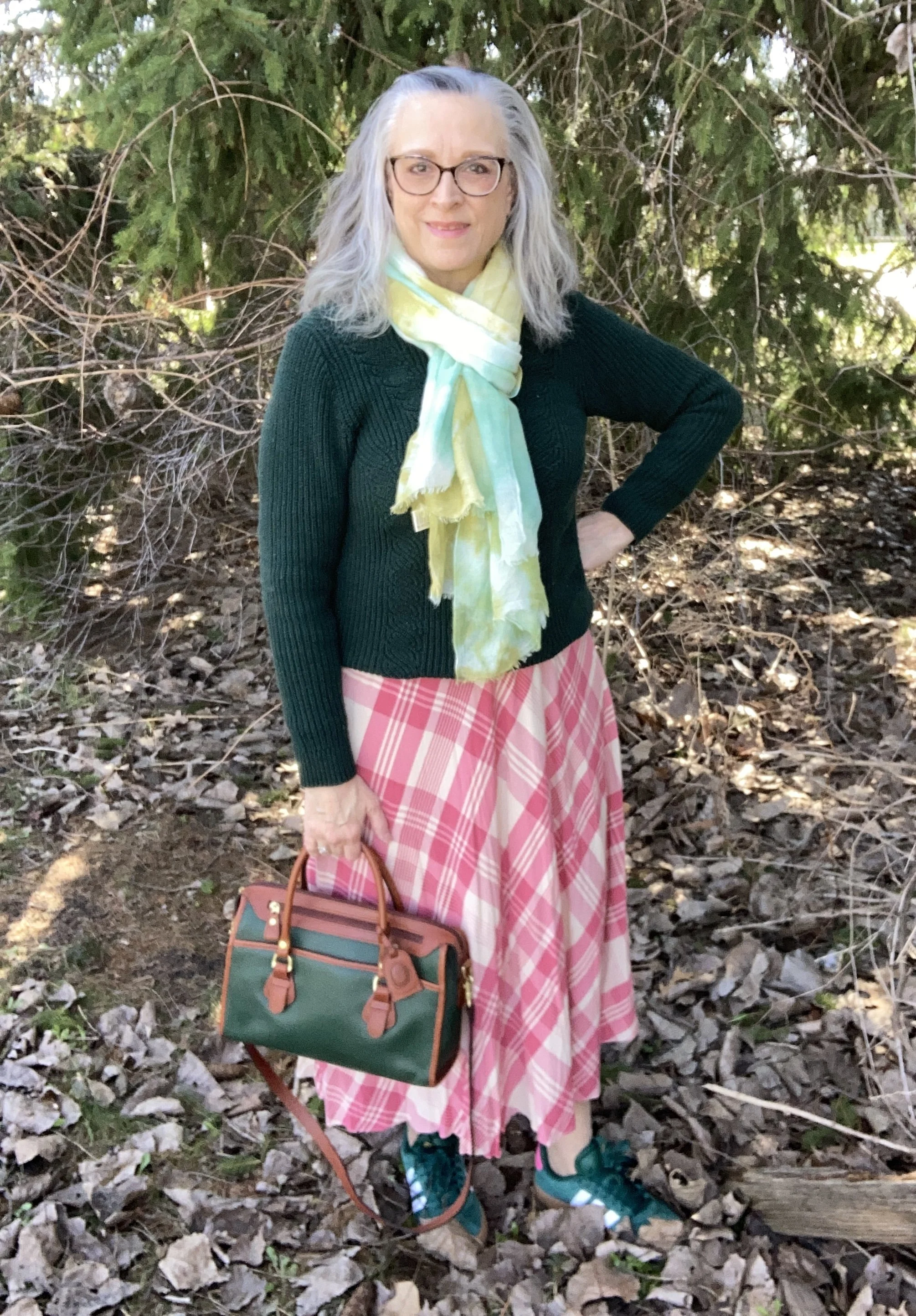
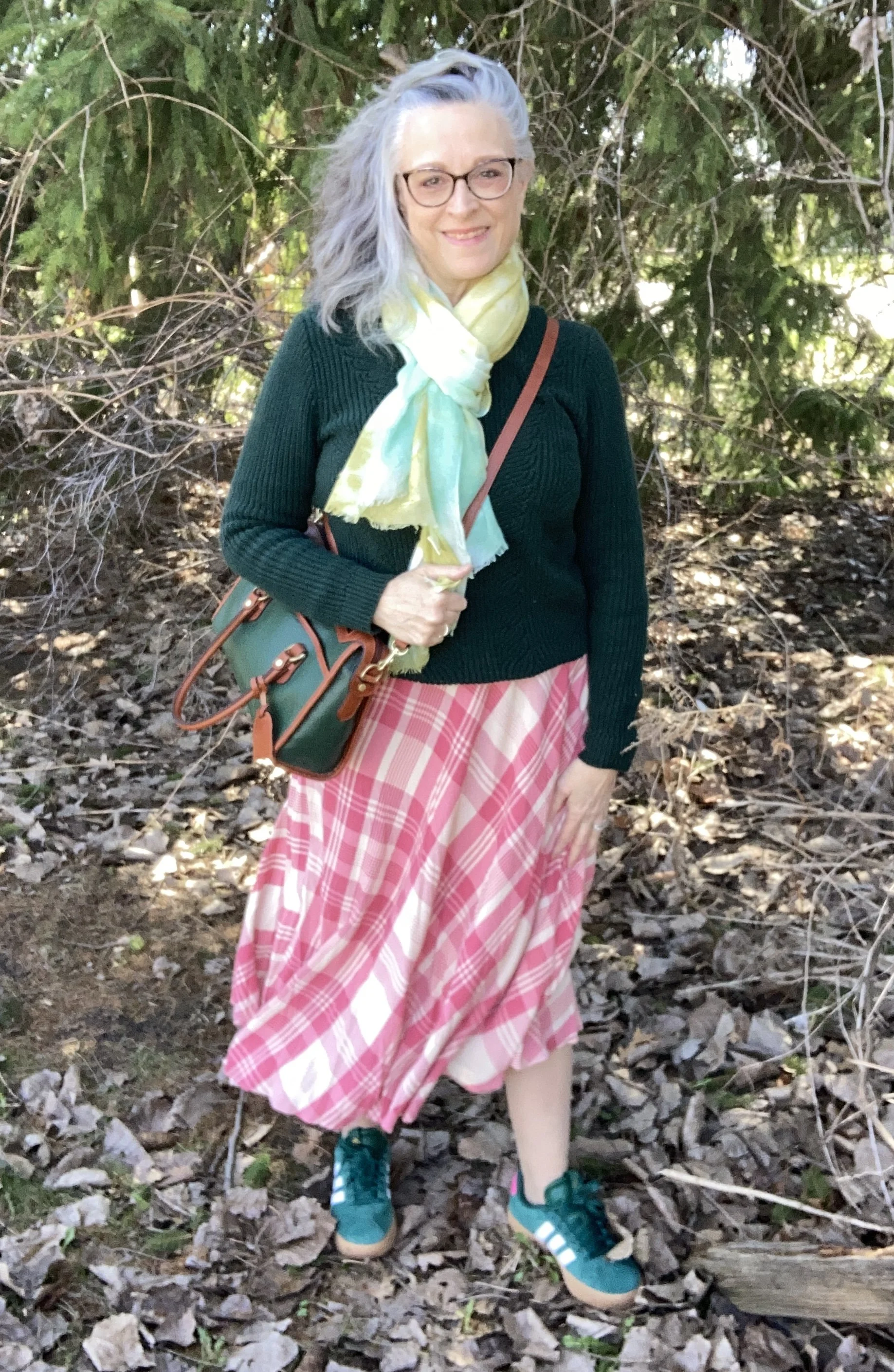
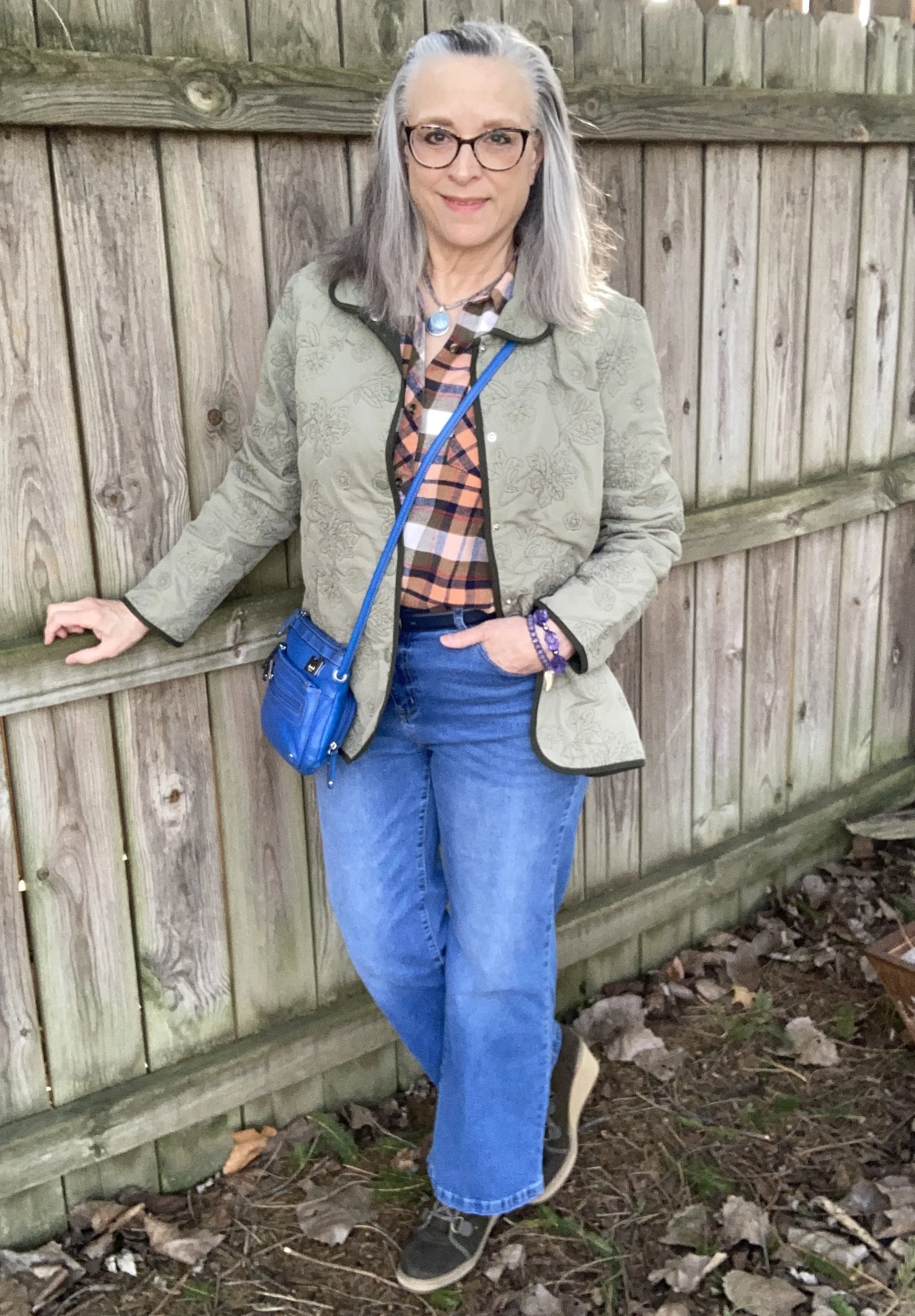
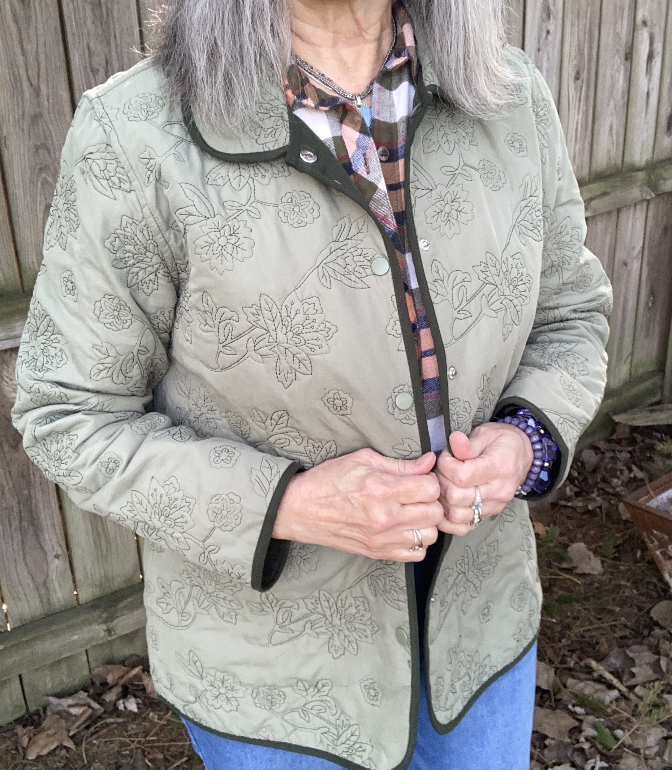
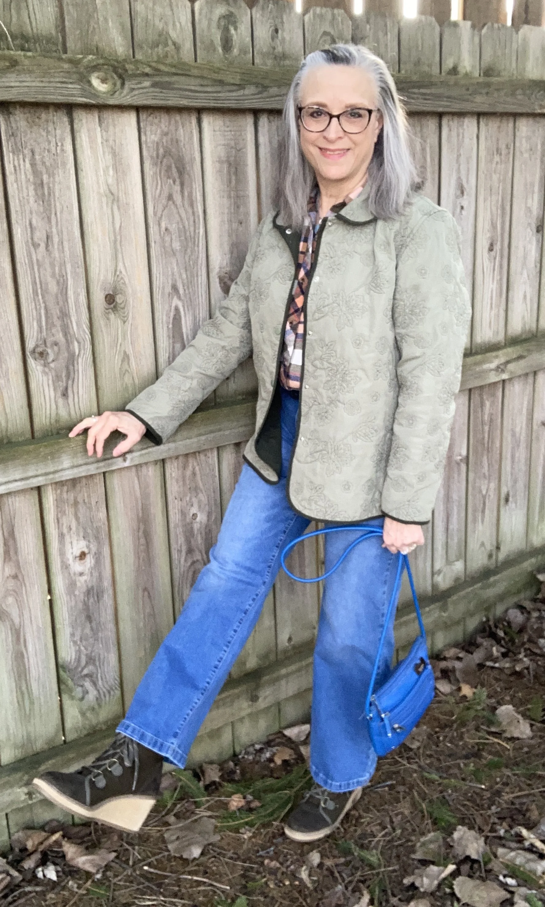
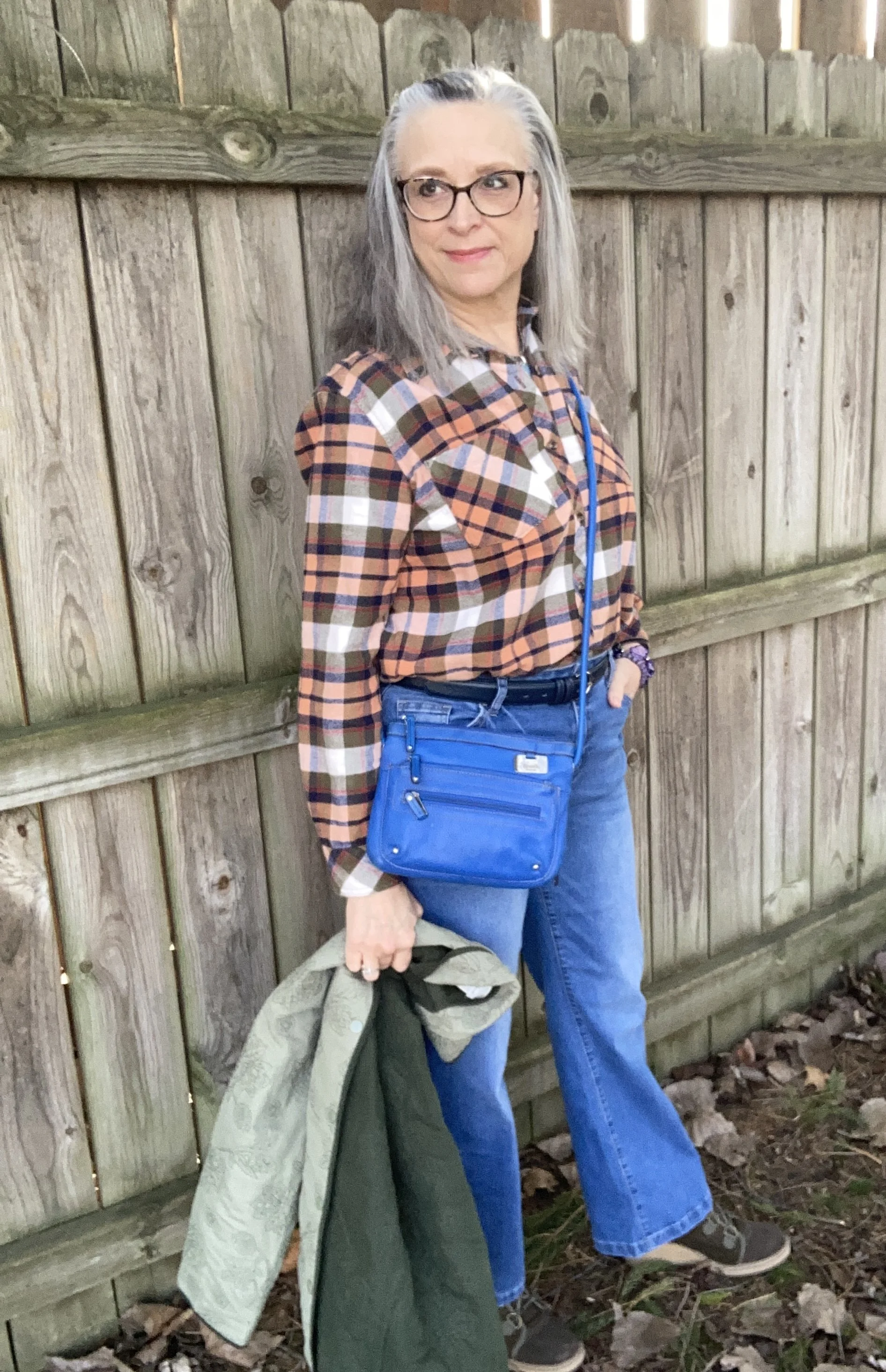
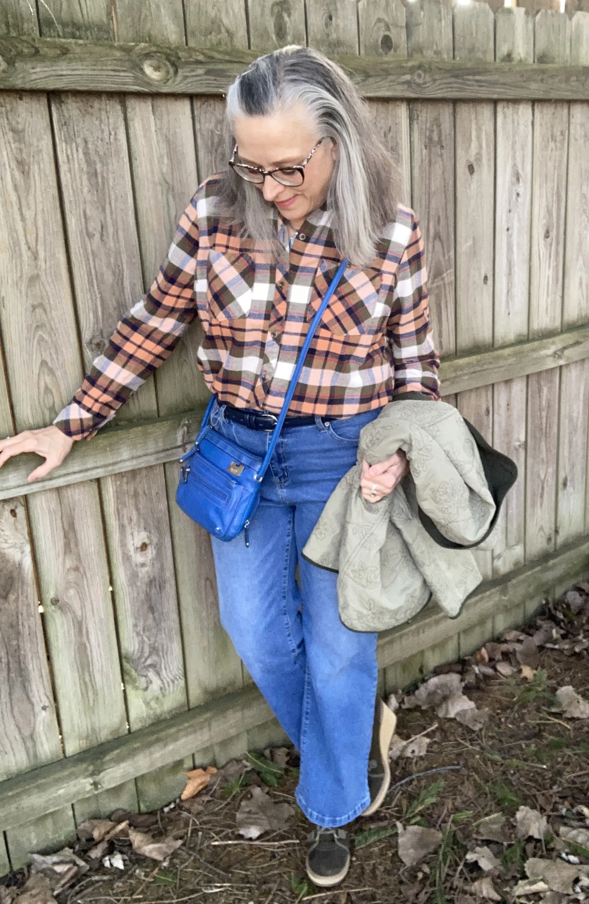
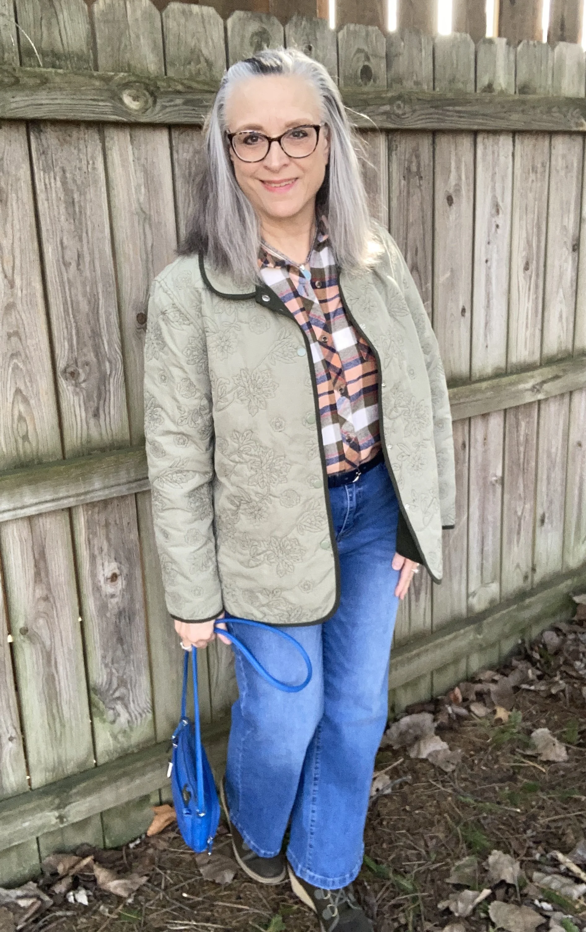
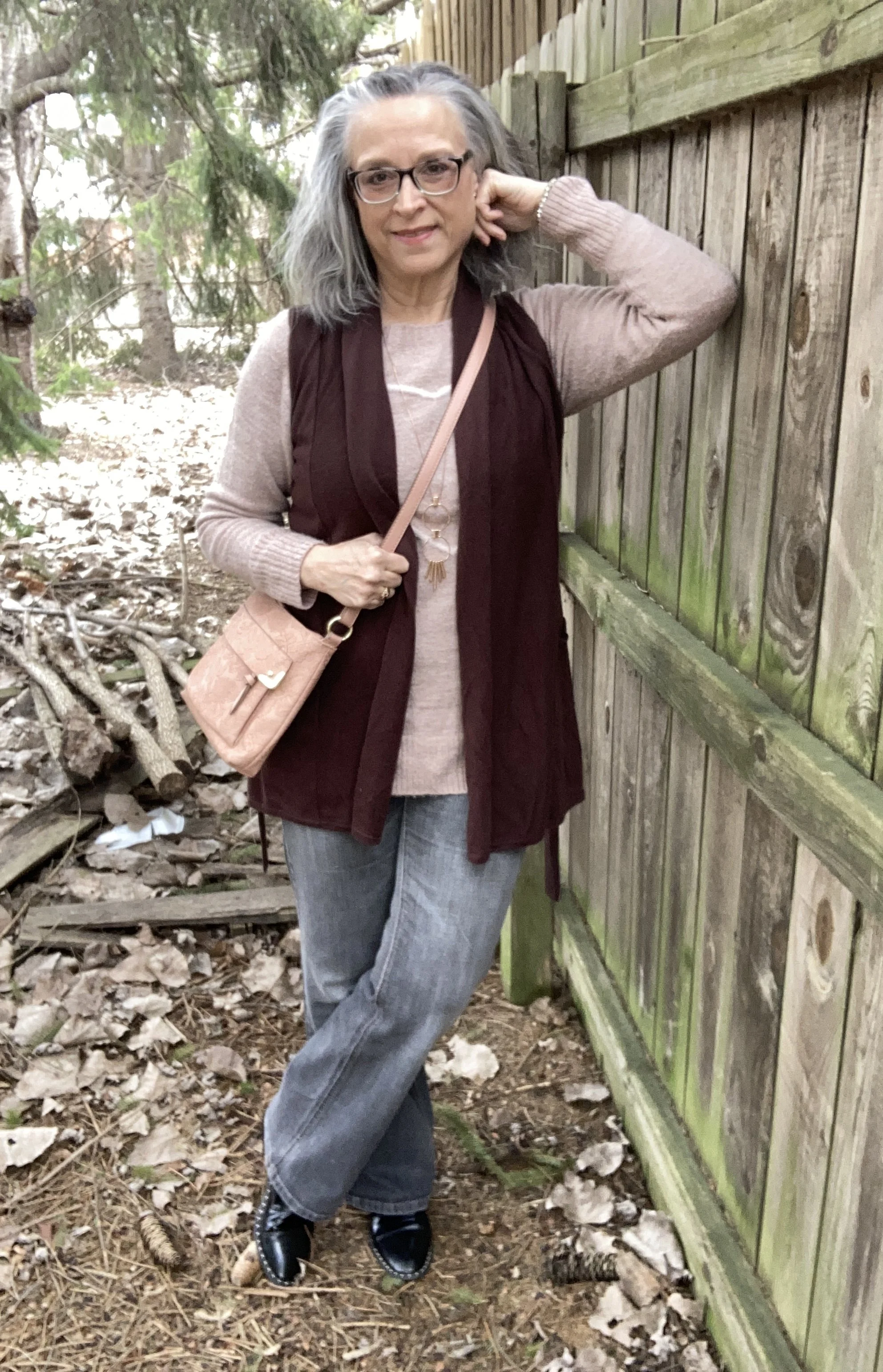
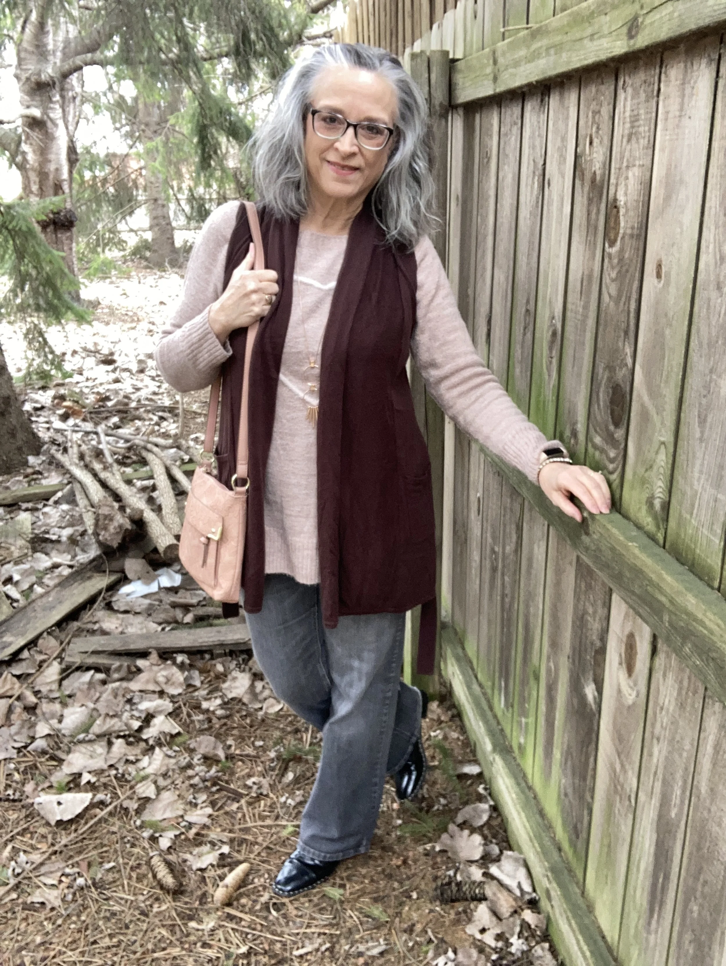
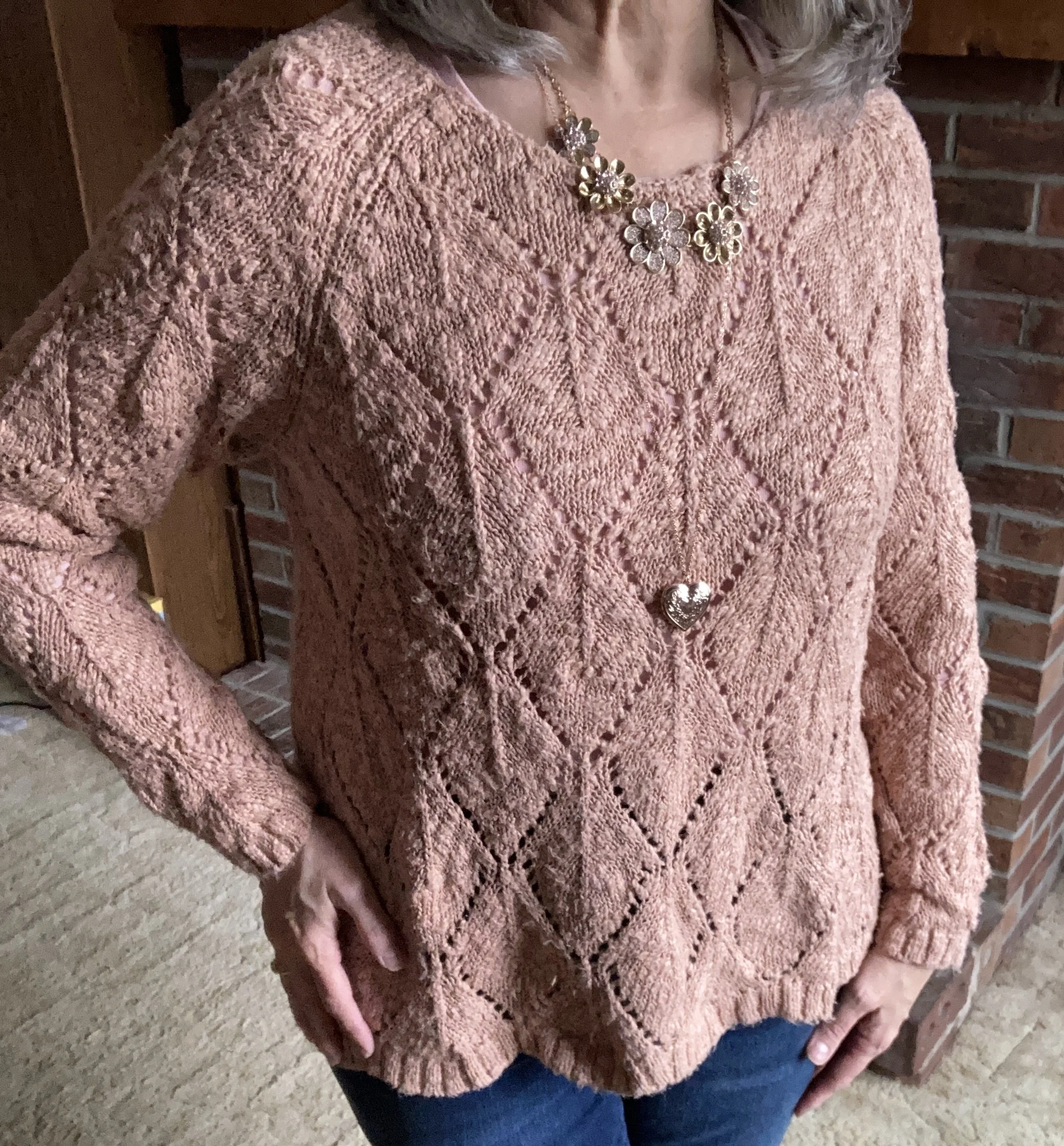
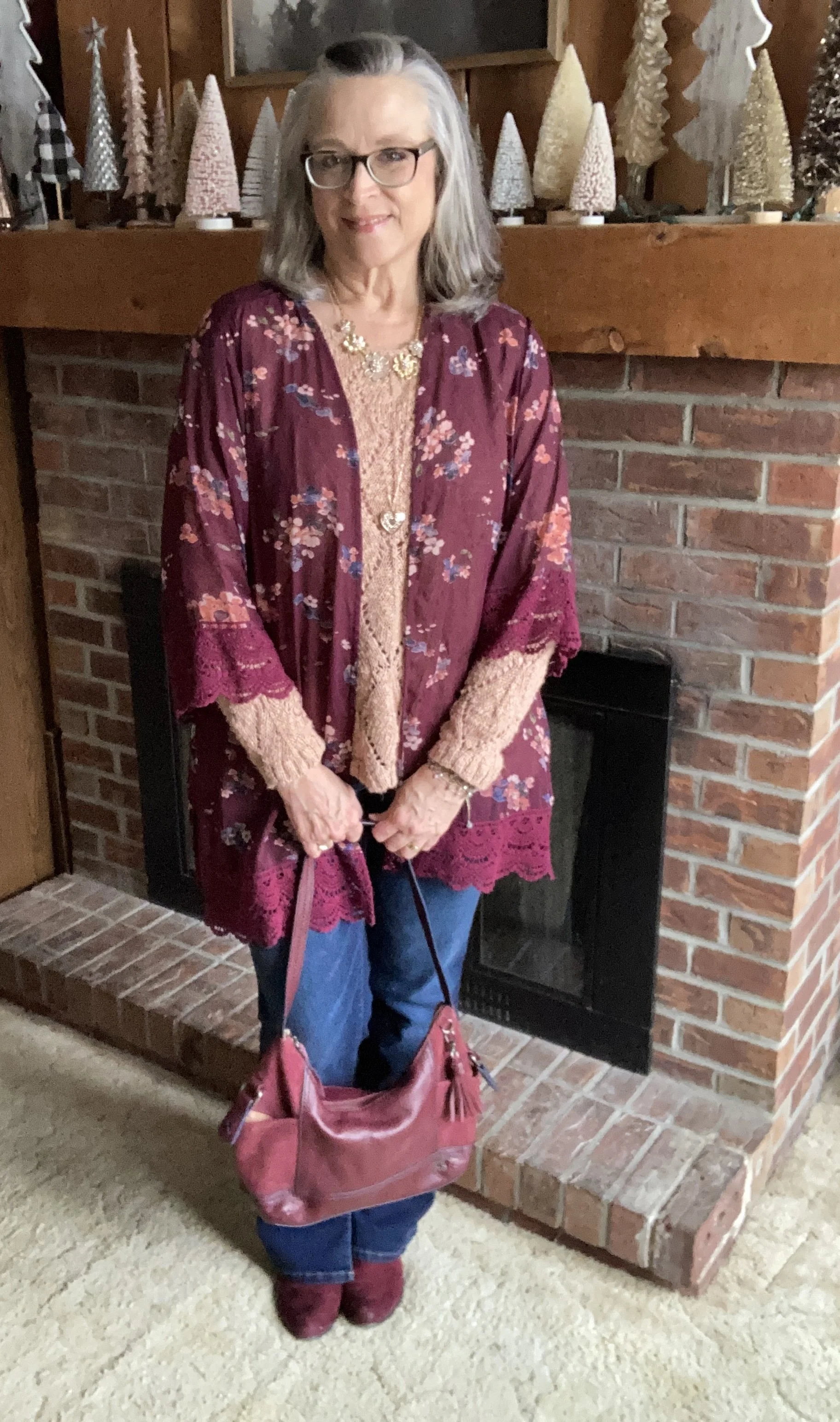
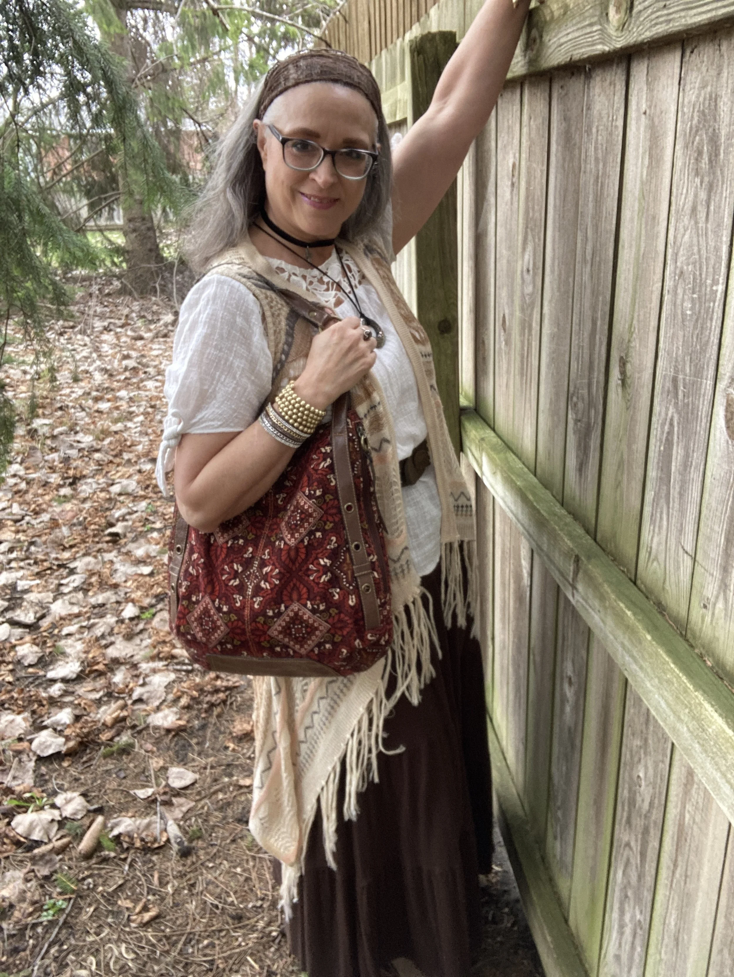
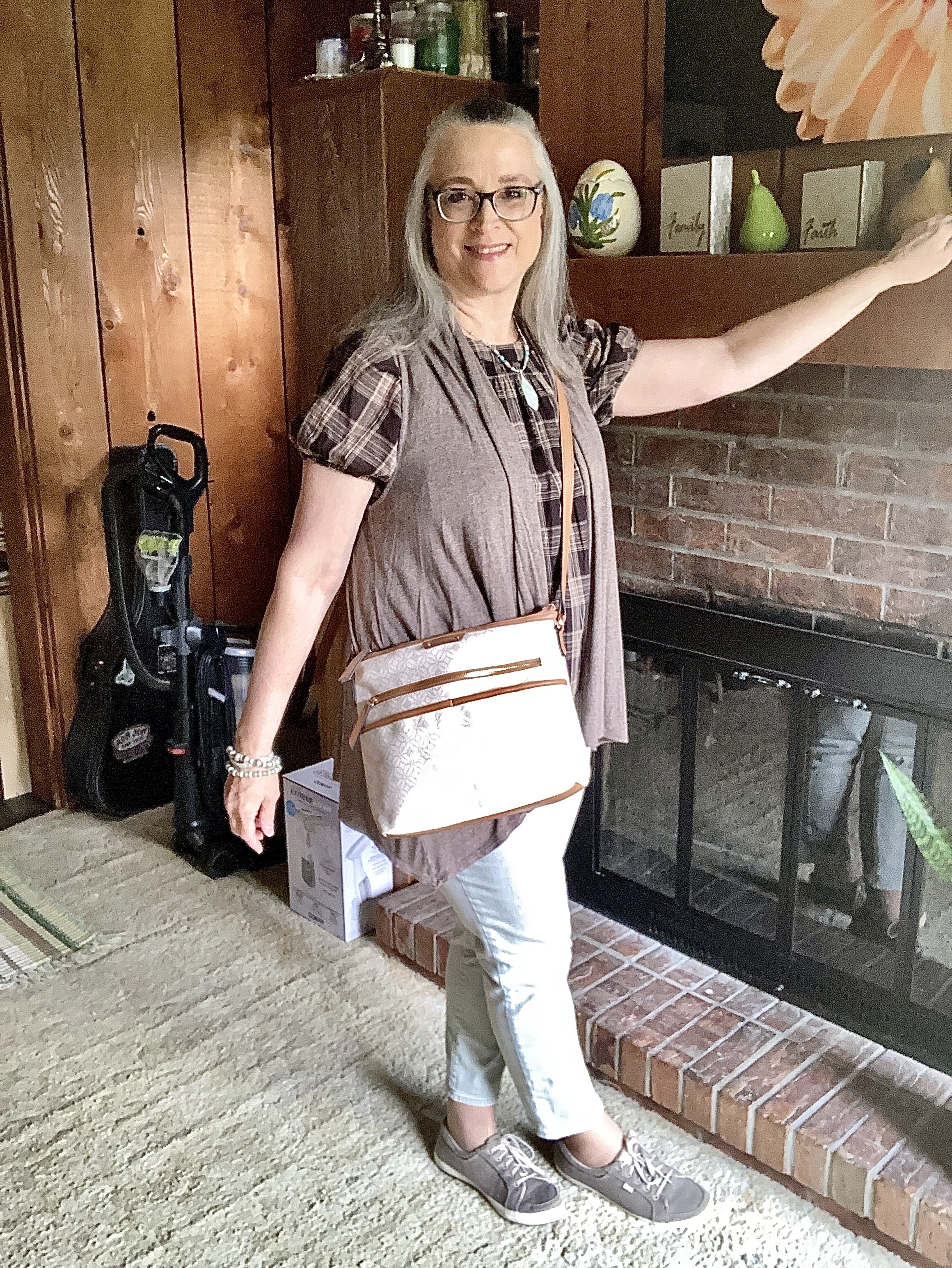
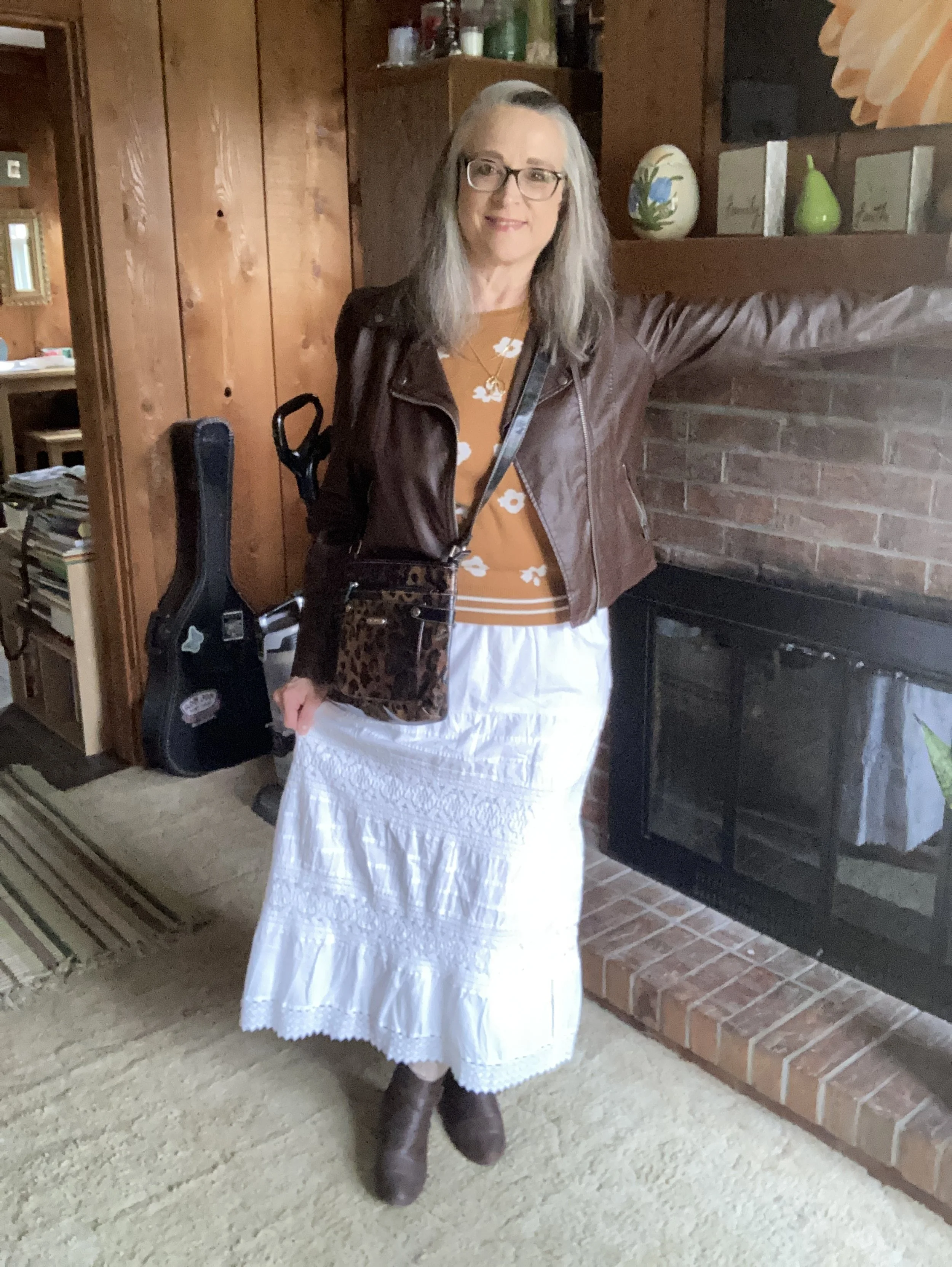
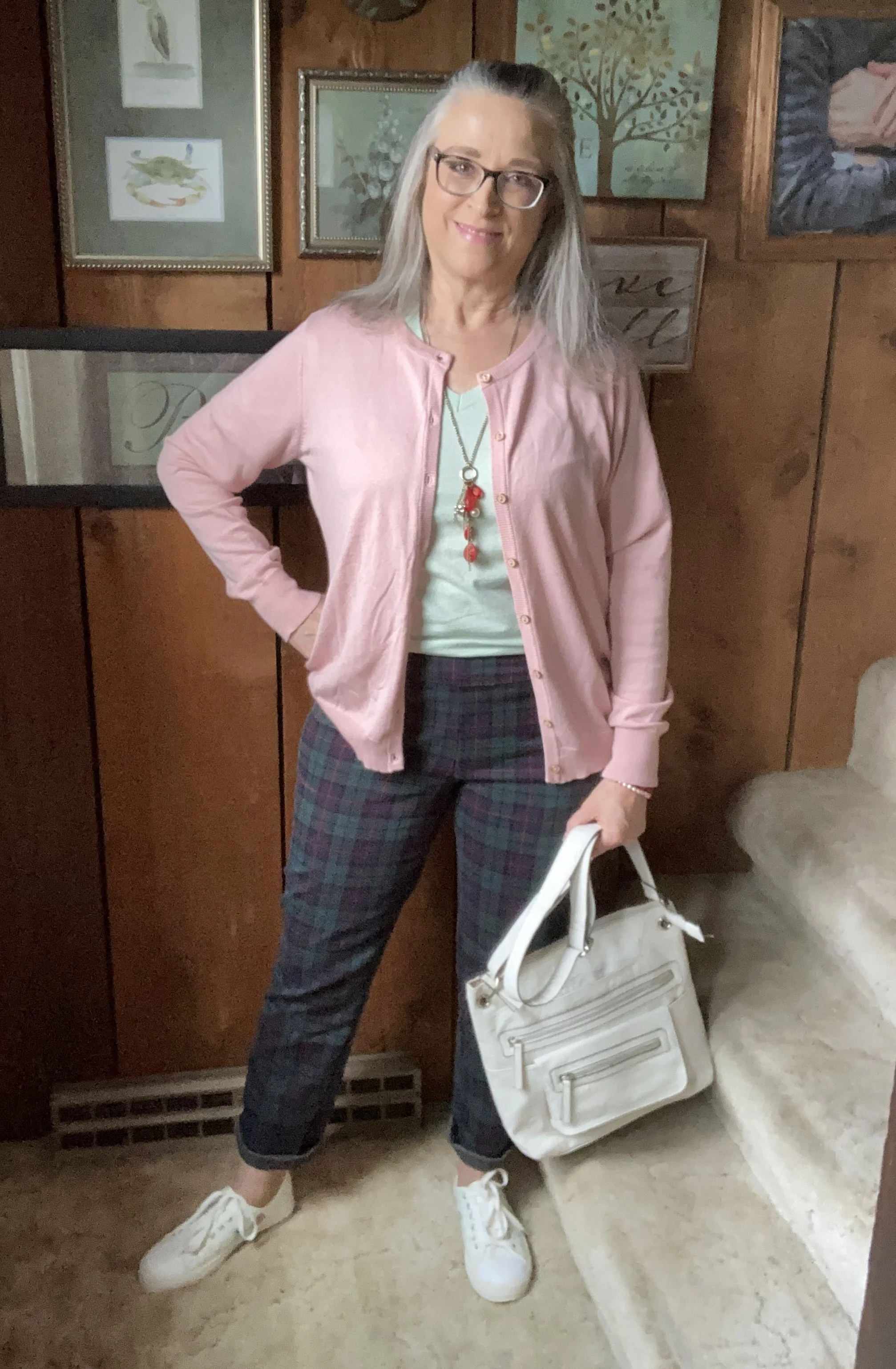
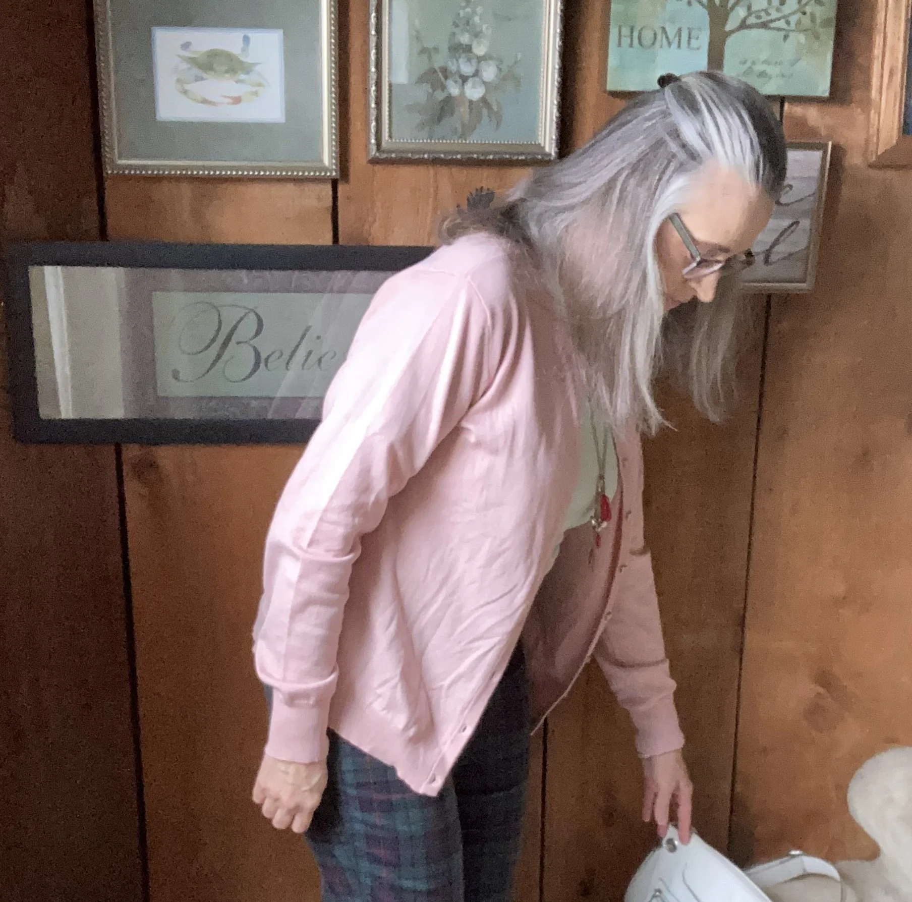
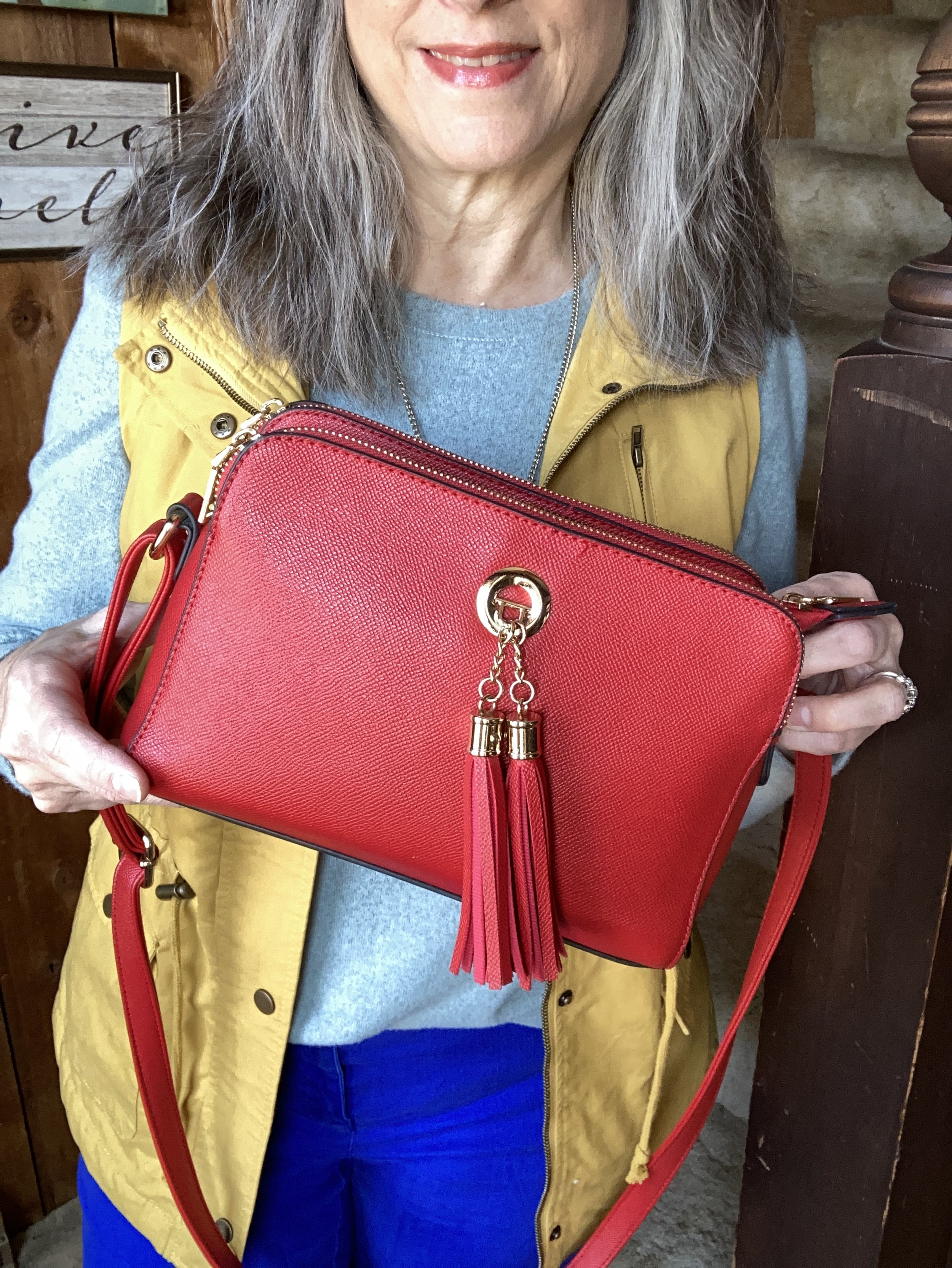
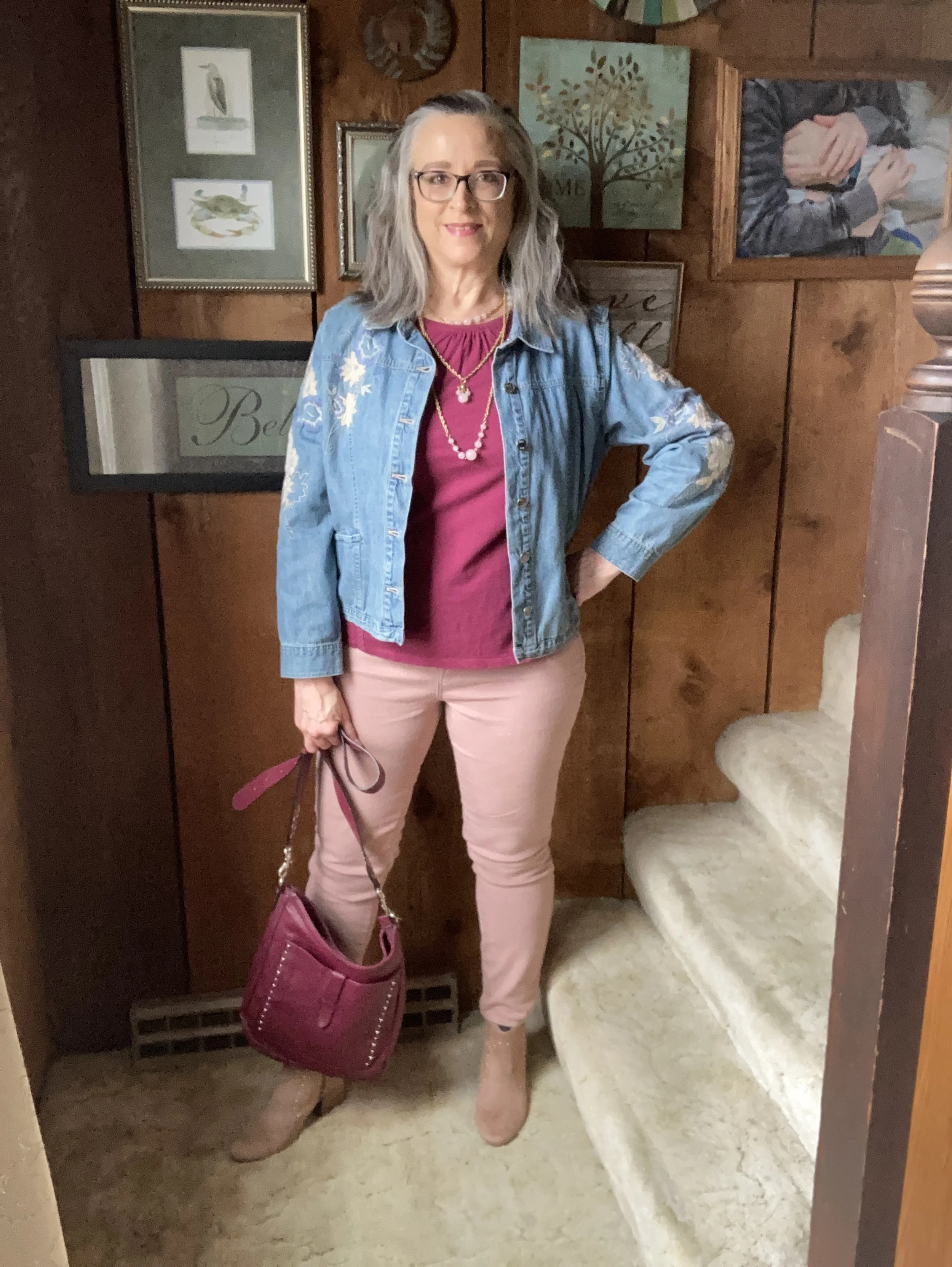
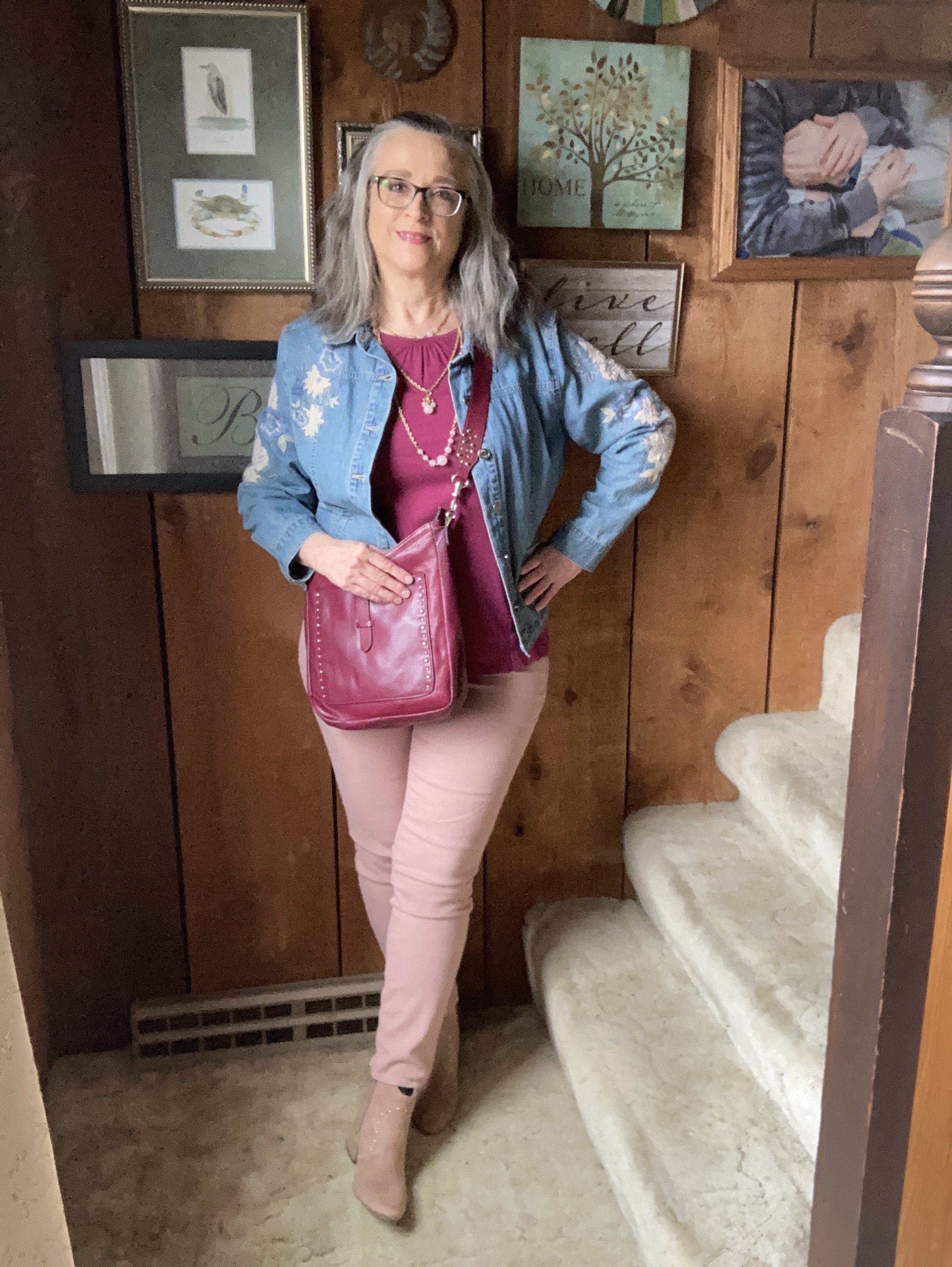
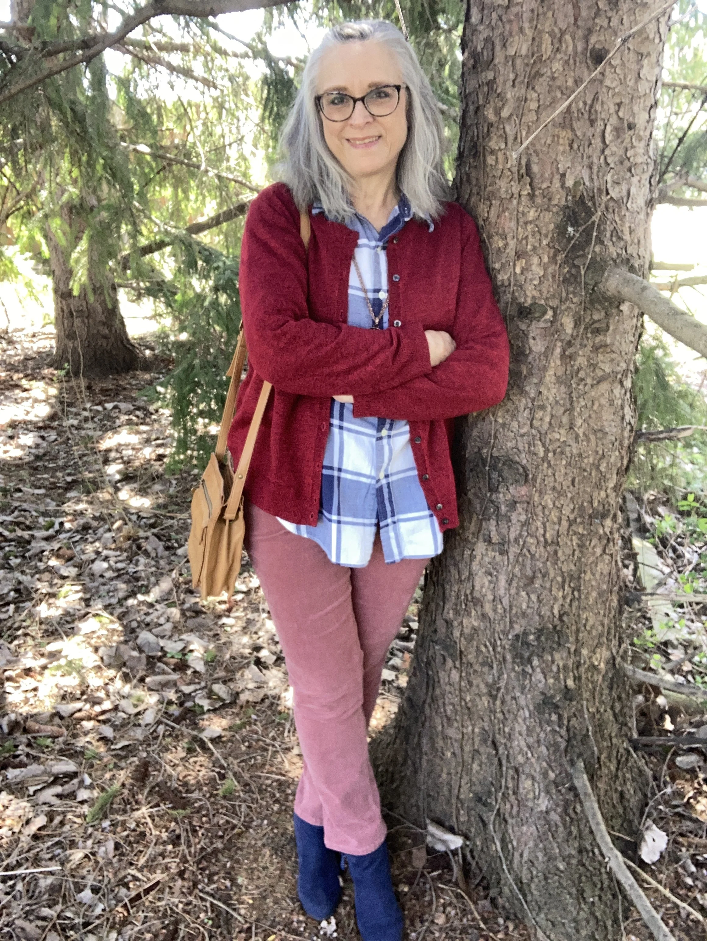
Today I put together an outfit using pieces in my closet for the next three colors on the Pantone New York Palette: Dusty Rose, Lava Falls and Rhodonite. You can see the original colors on this pin on Pinterest.
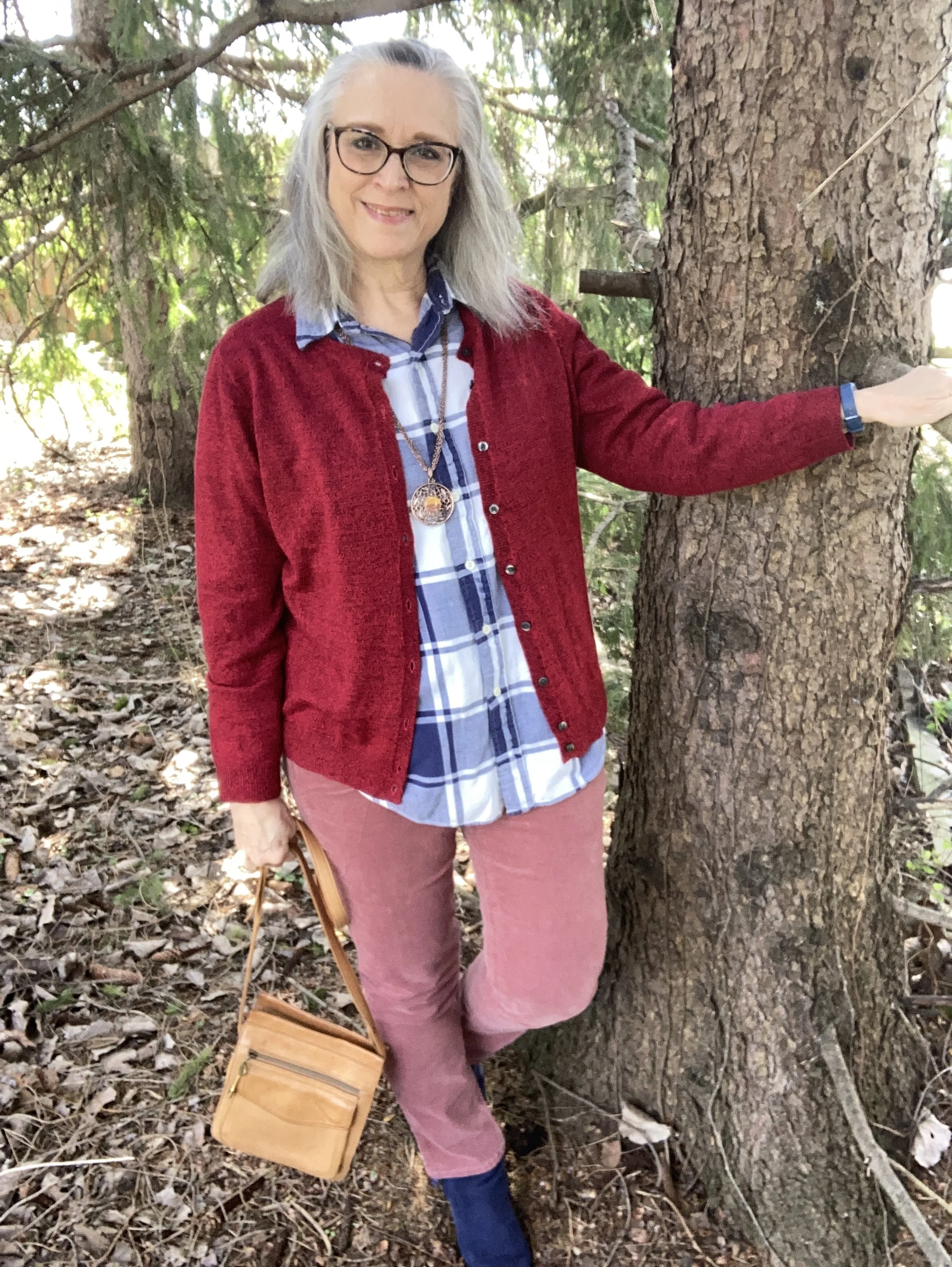
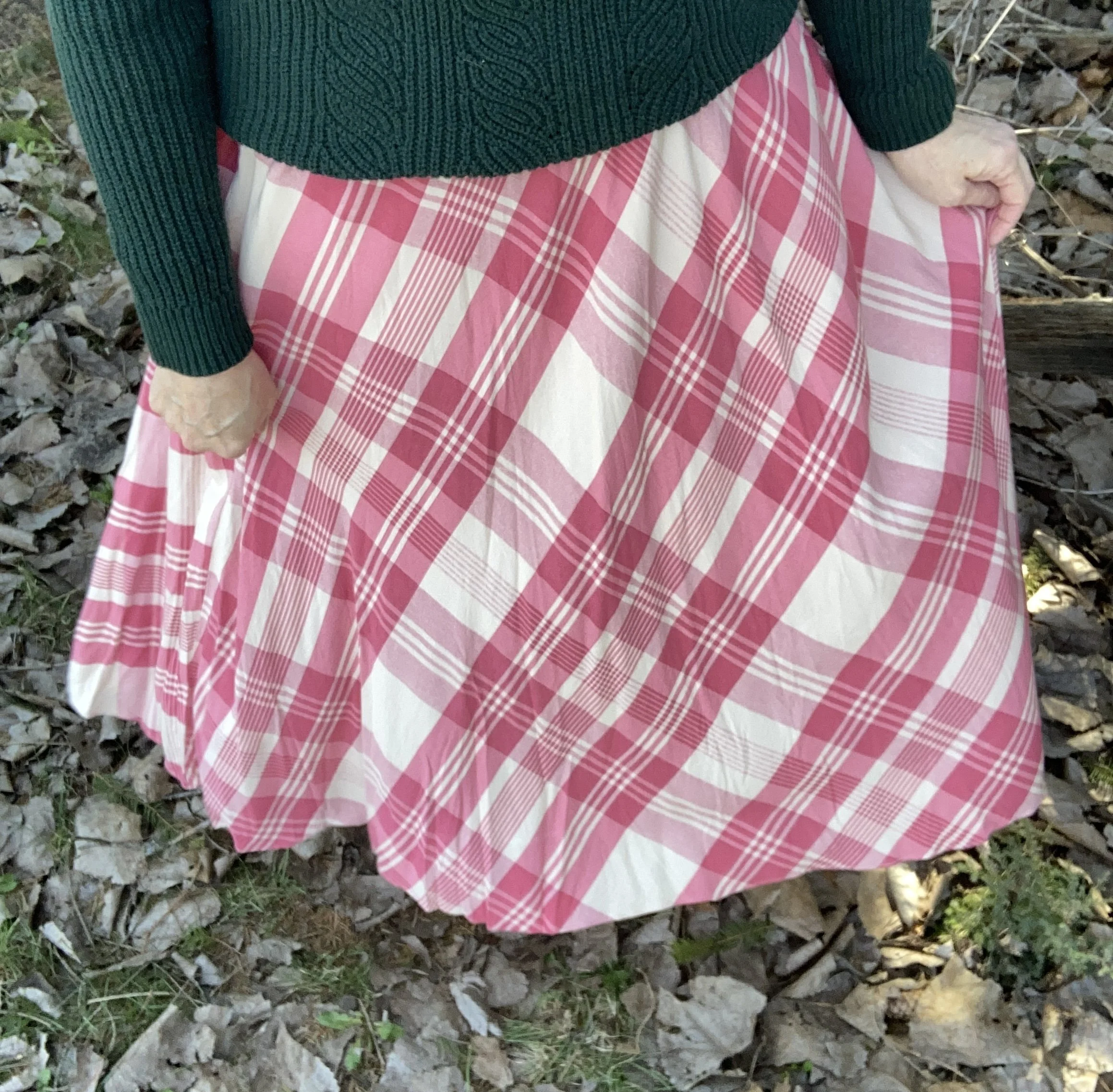
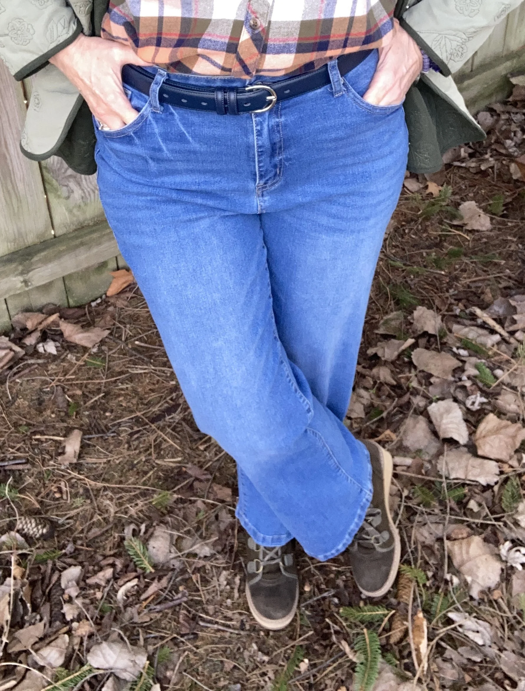
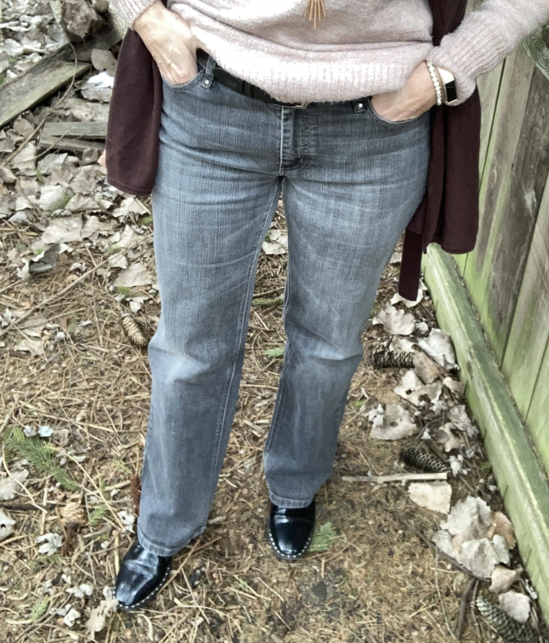
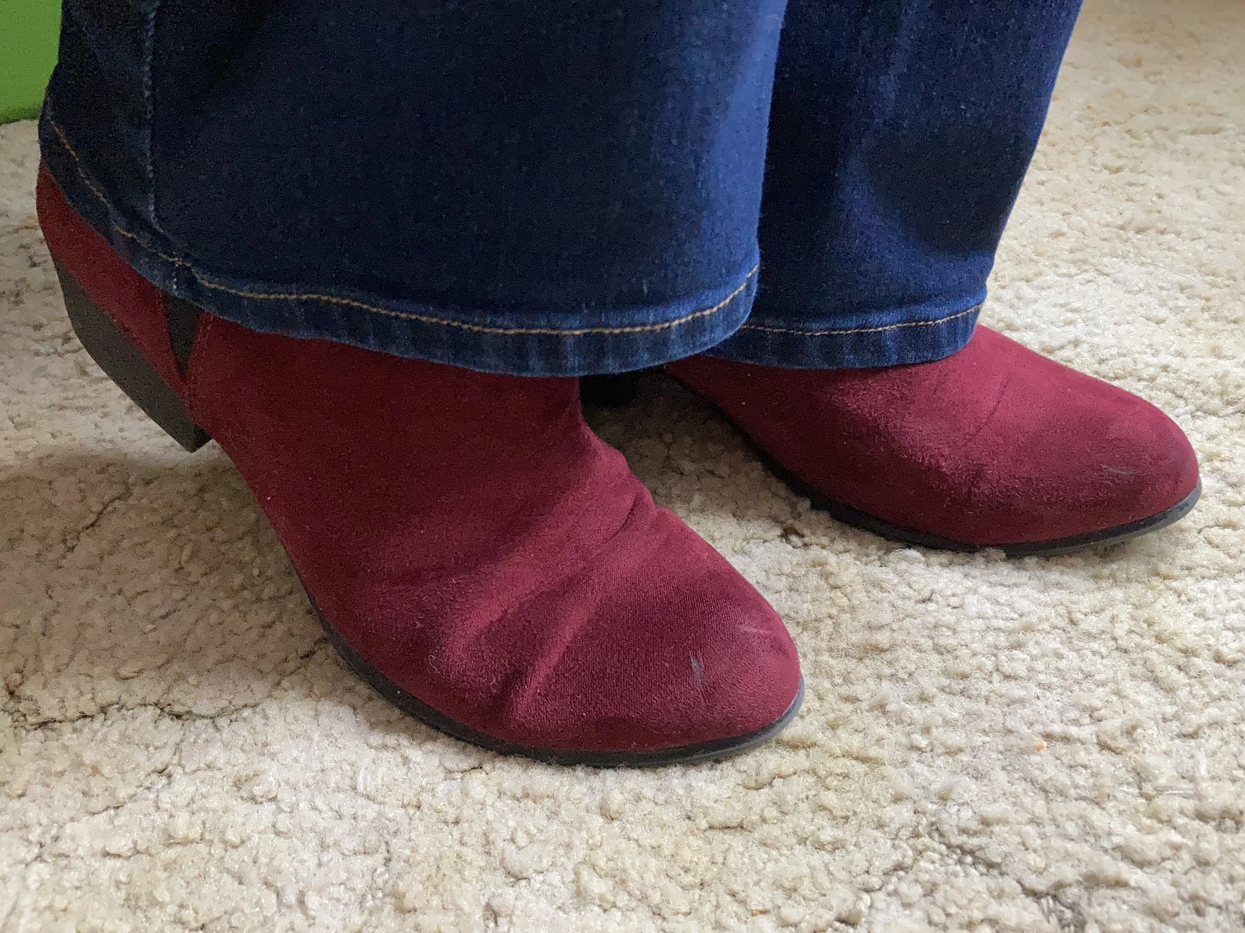
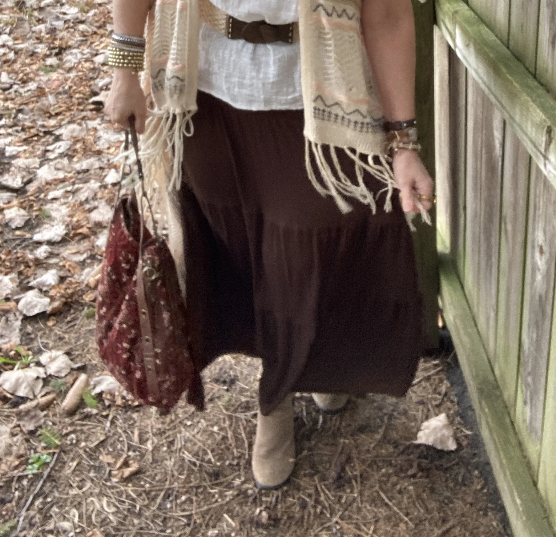
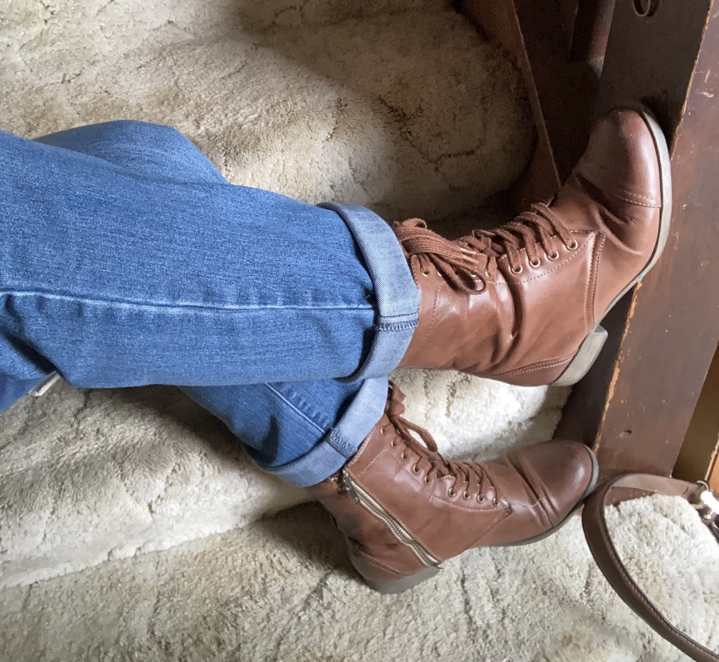
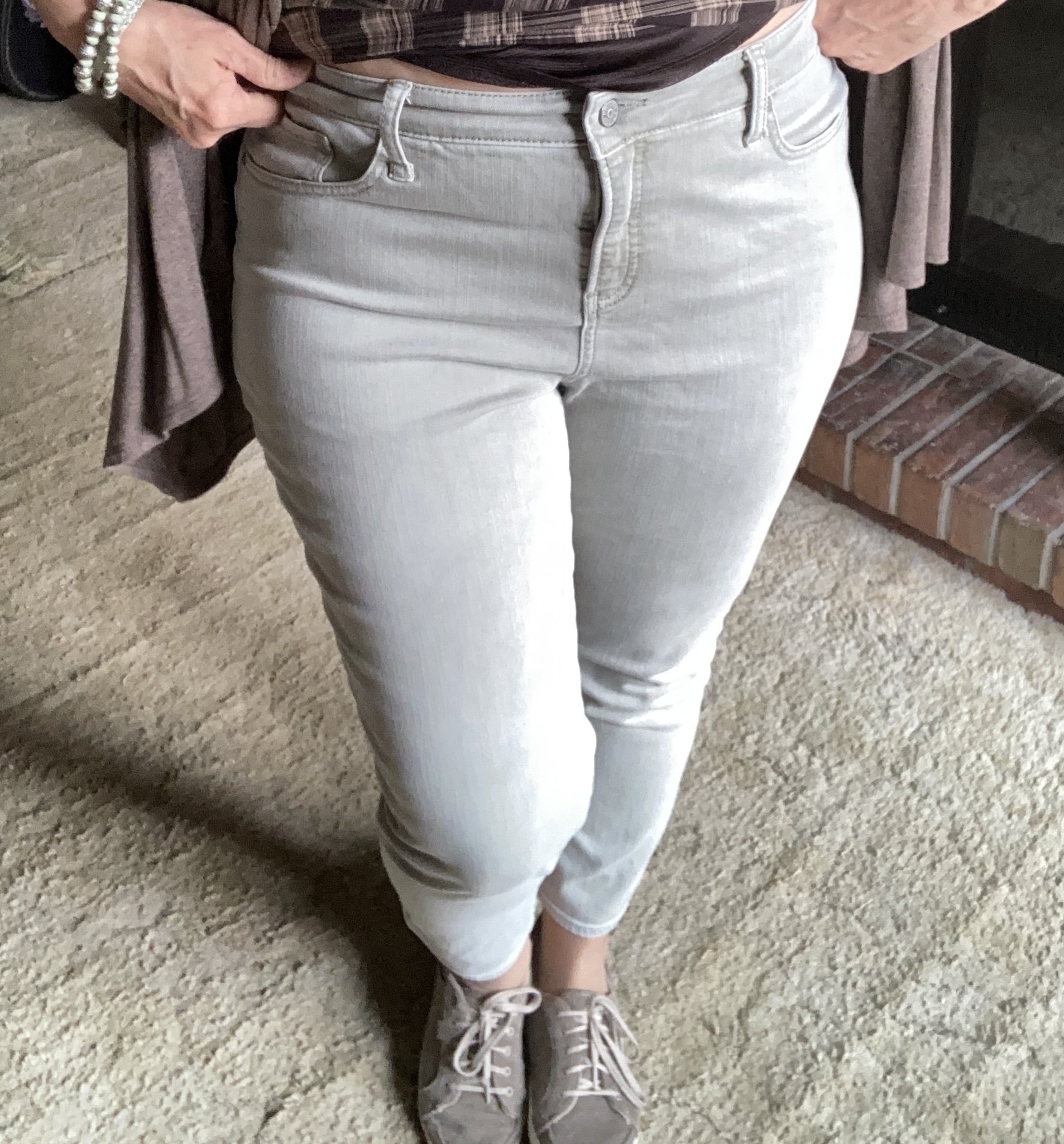
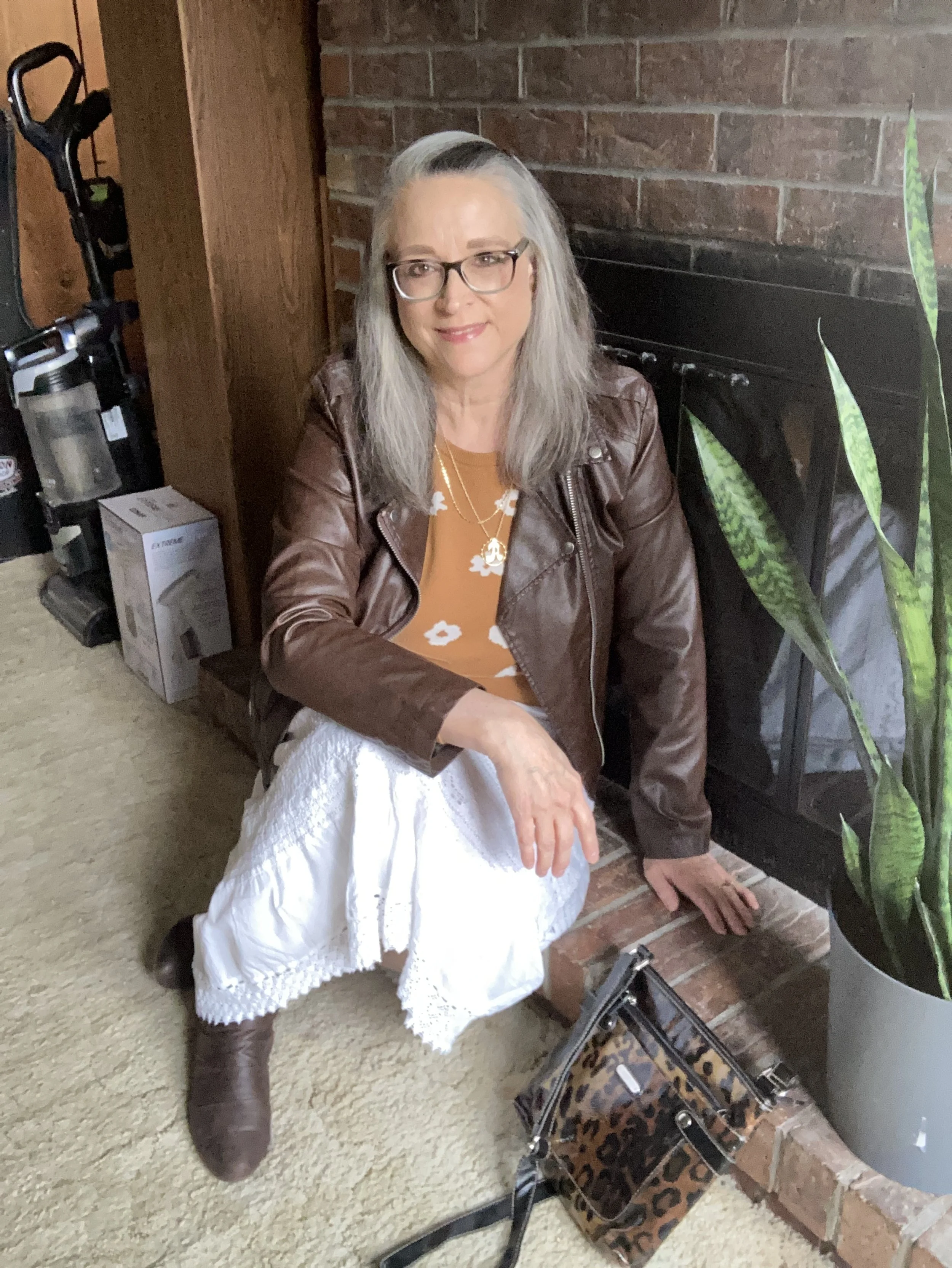
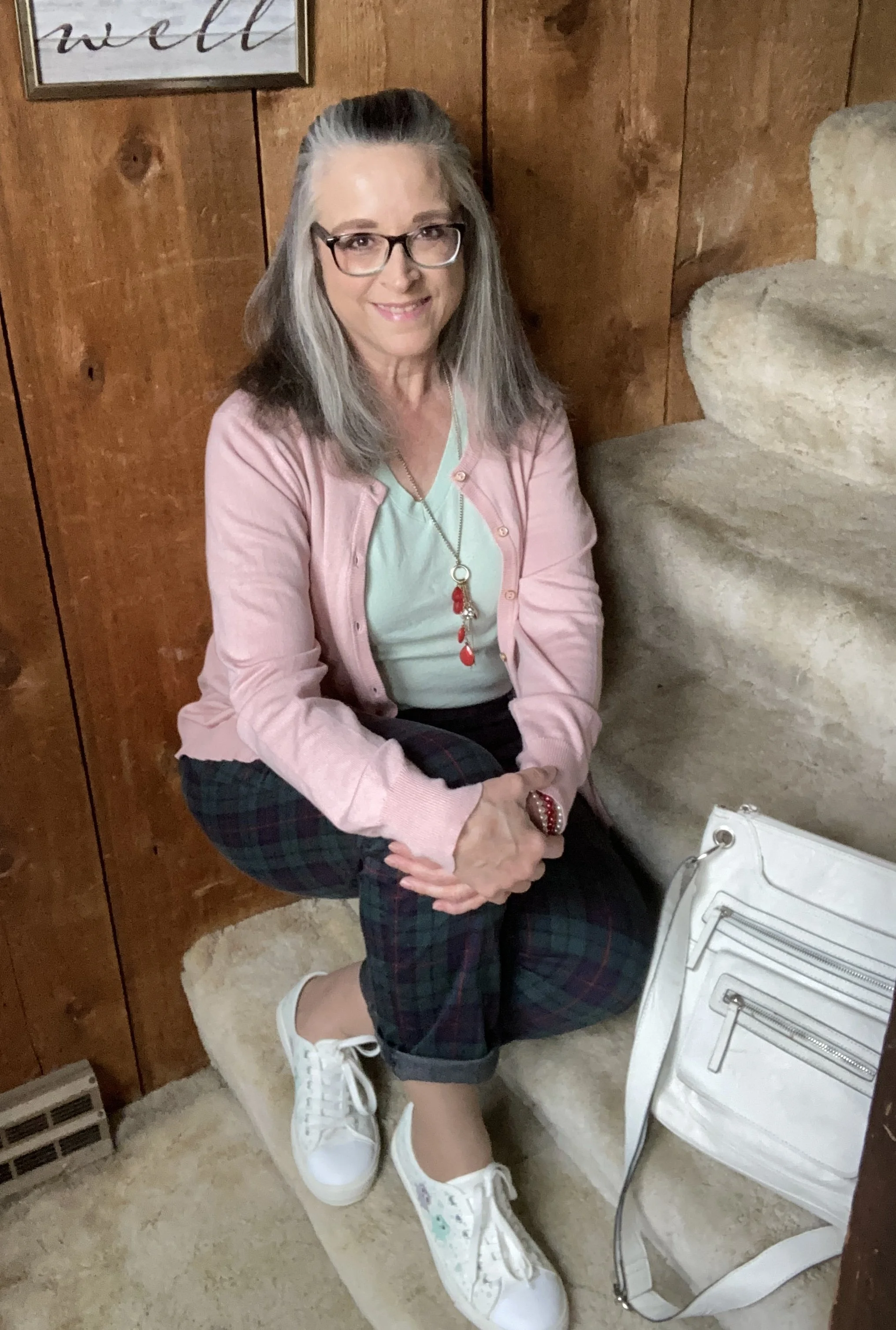
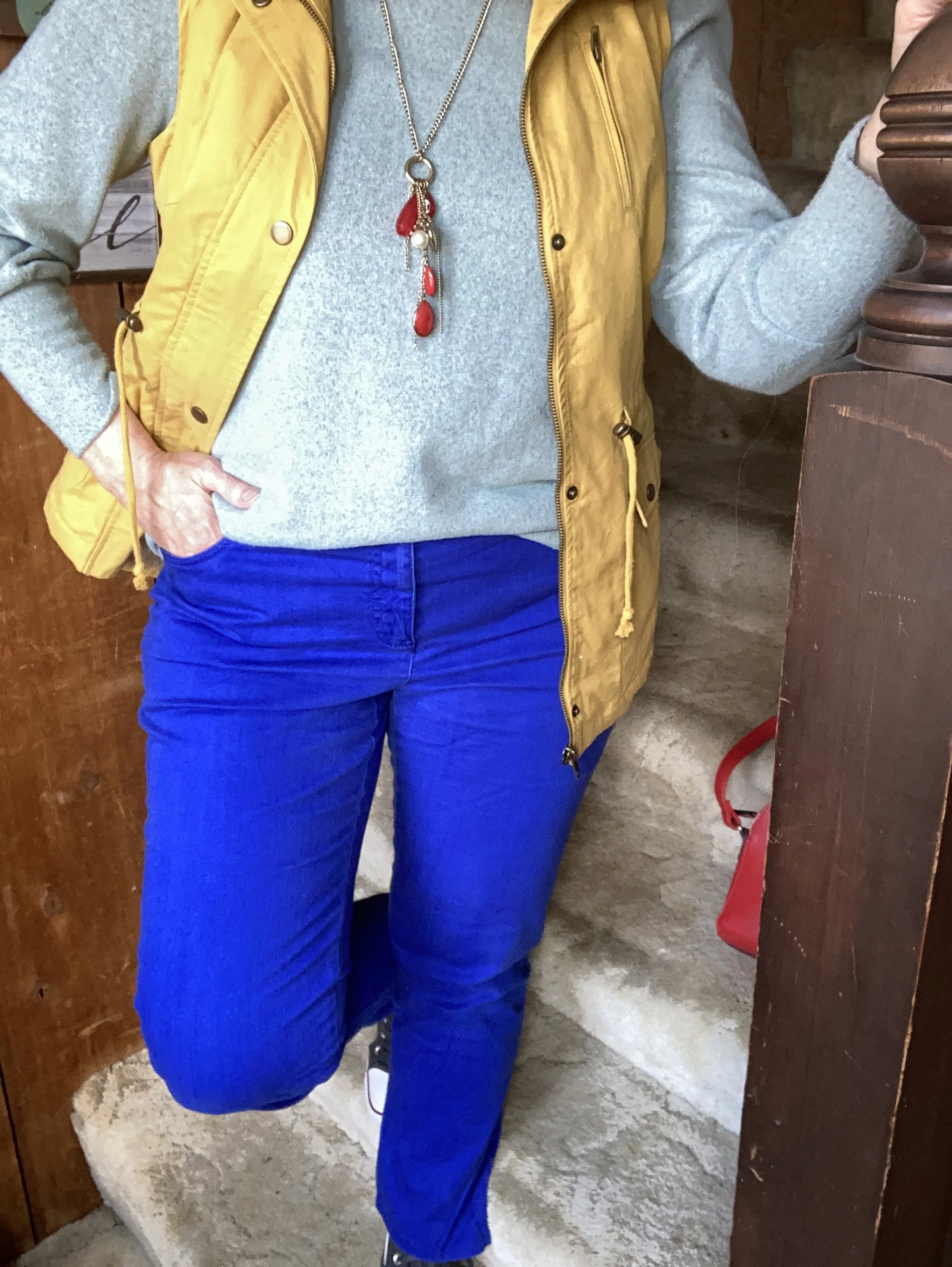
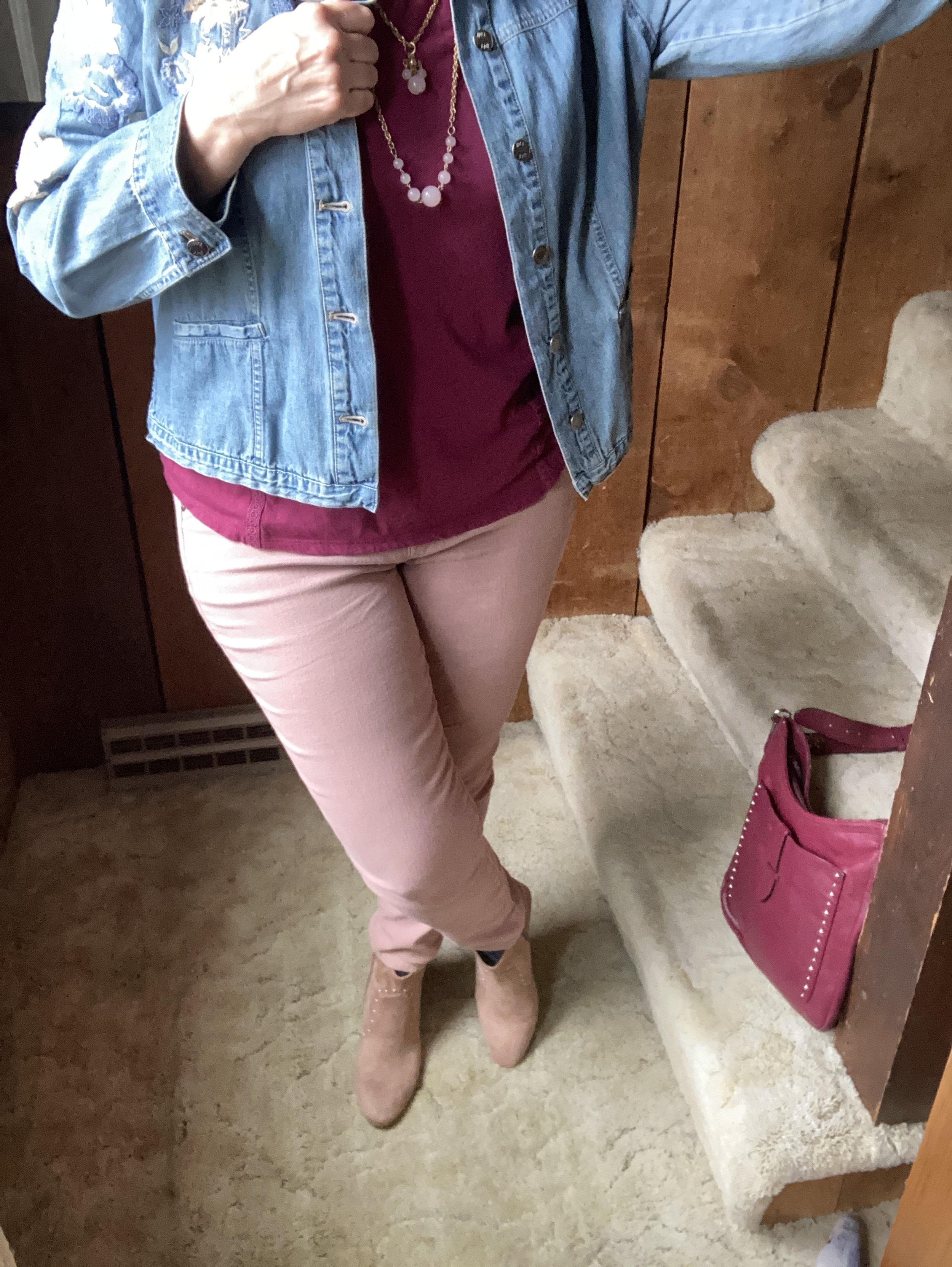
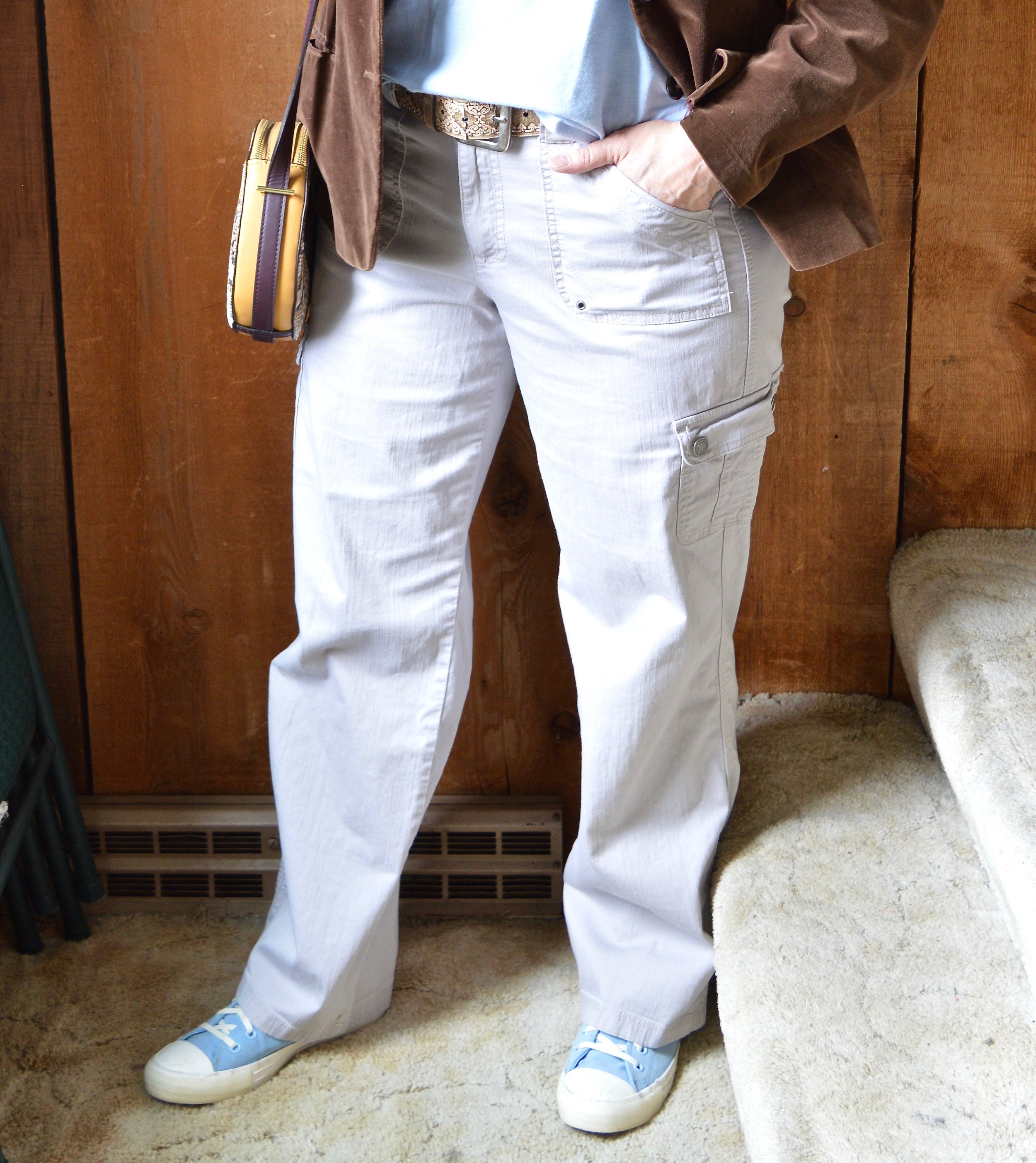
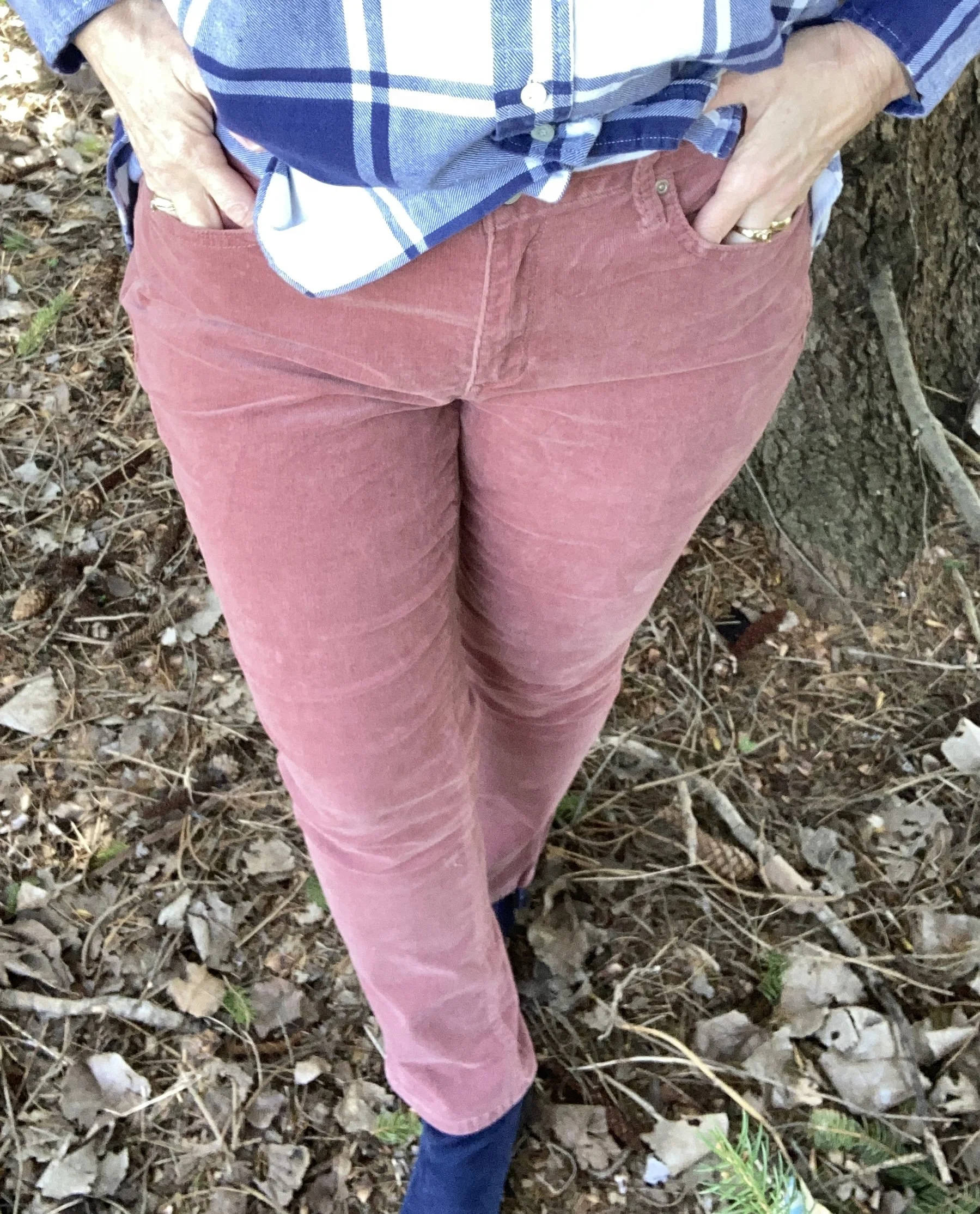
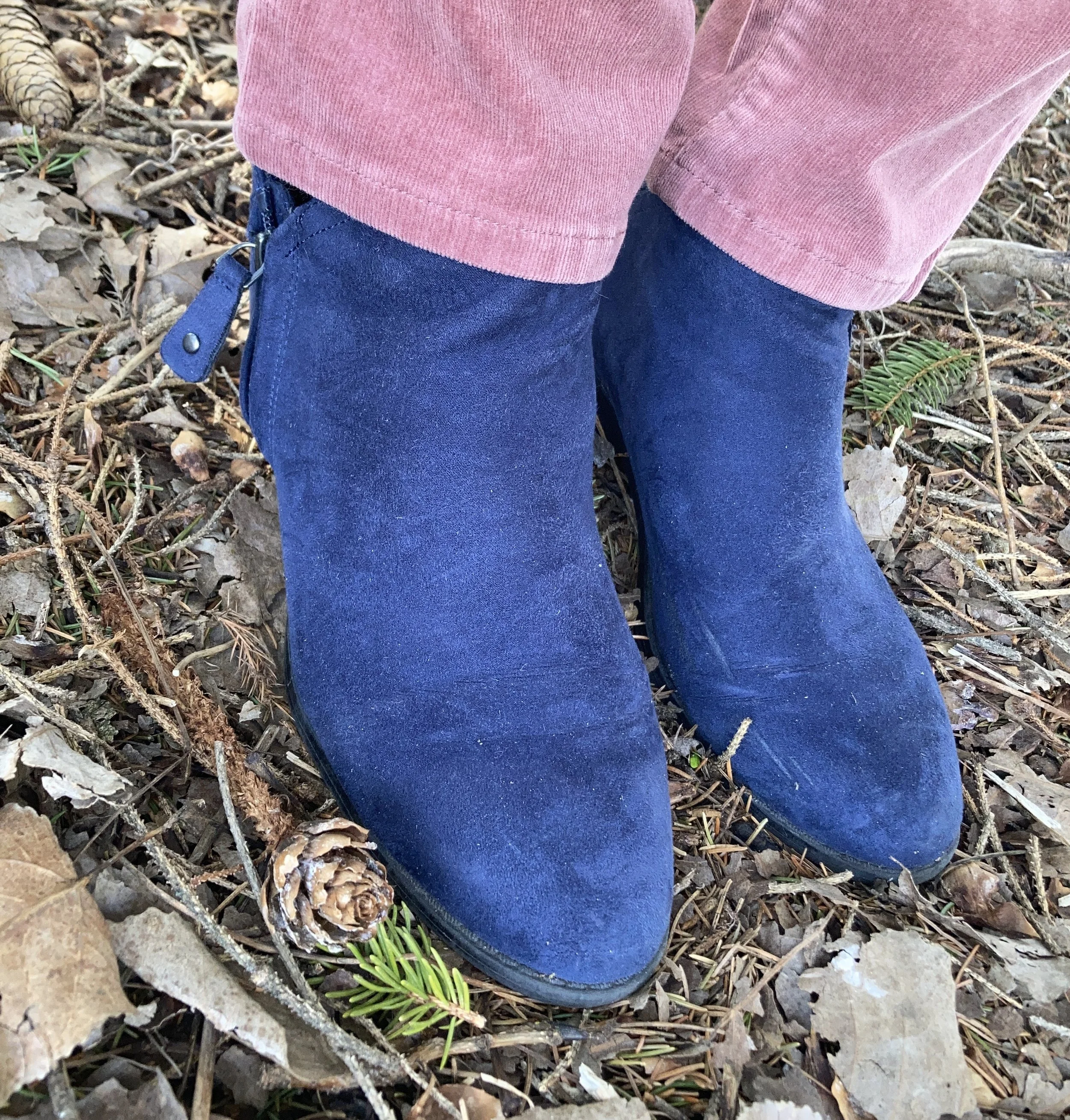
For this outfit I pulled out my Sonoma corduroy’s from Kohl’s. I love this color and think it can look pink, or even rusty depending on what other colors it is paired with. These are very comfy, though they would be even more comfy if I got back on track with my Weight Watchers app. It has been a real battle lately, and all the stress of grief, my hubby losing his job and my ongoing health issues does not help.
Here are a few similar colored pairs of pants from Chico’s, Land’s End, and Talbots.
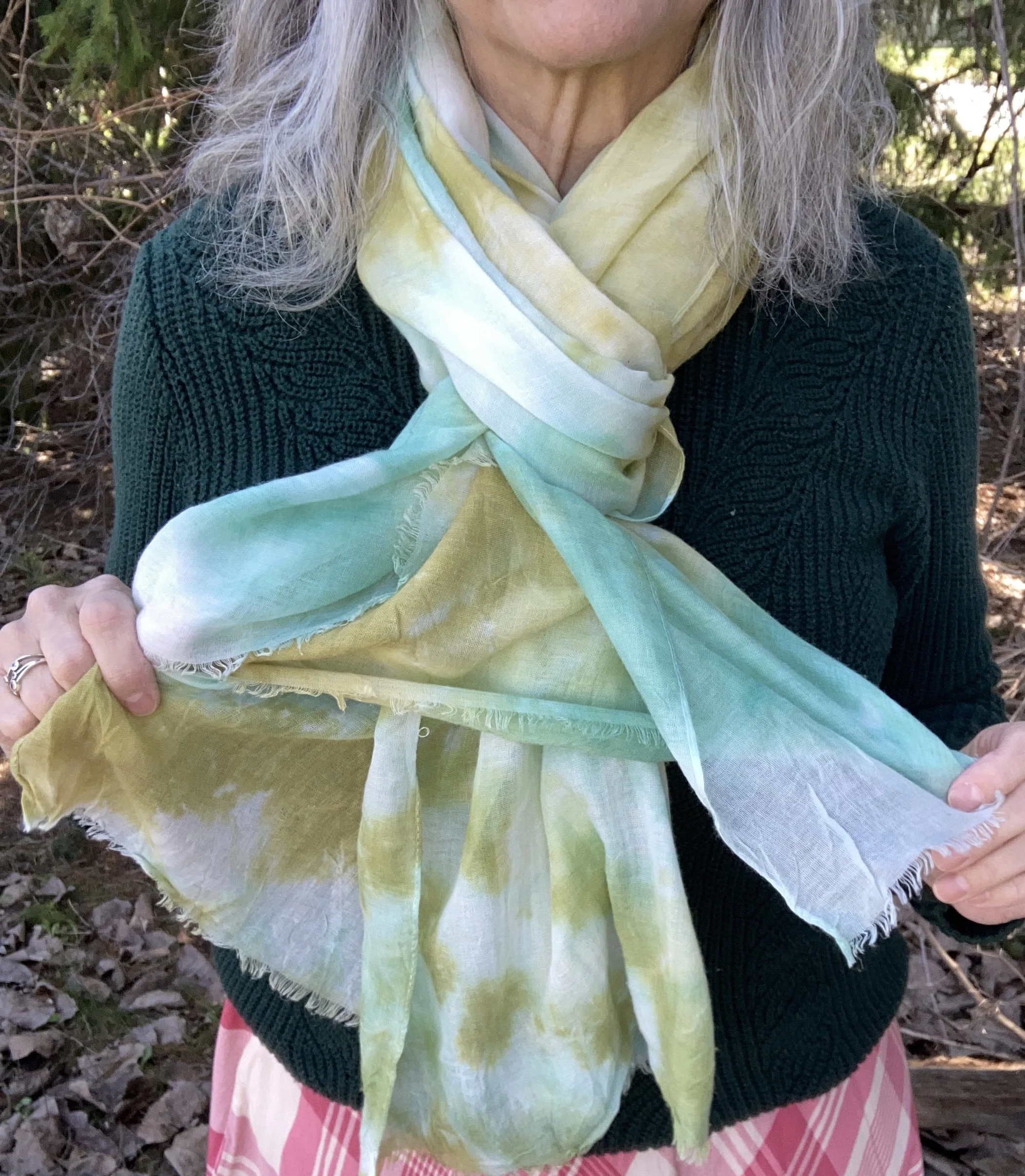
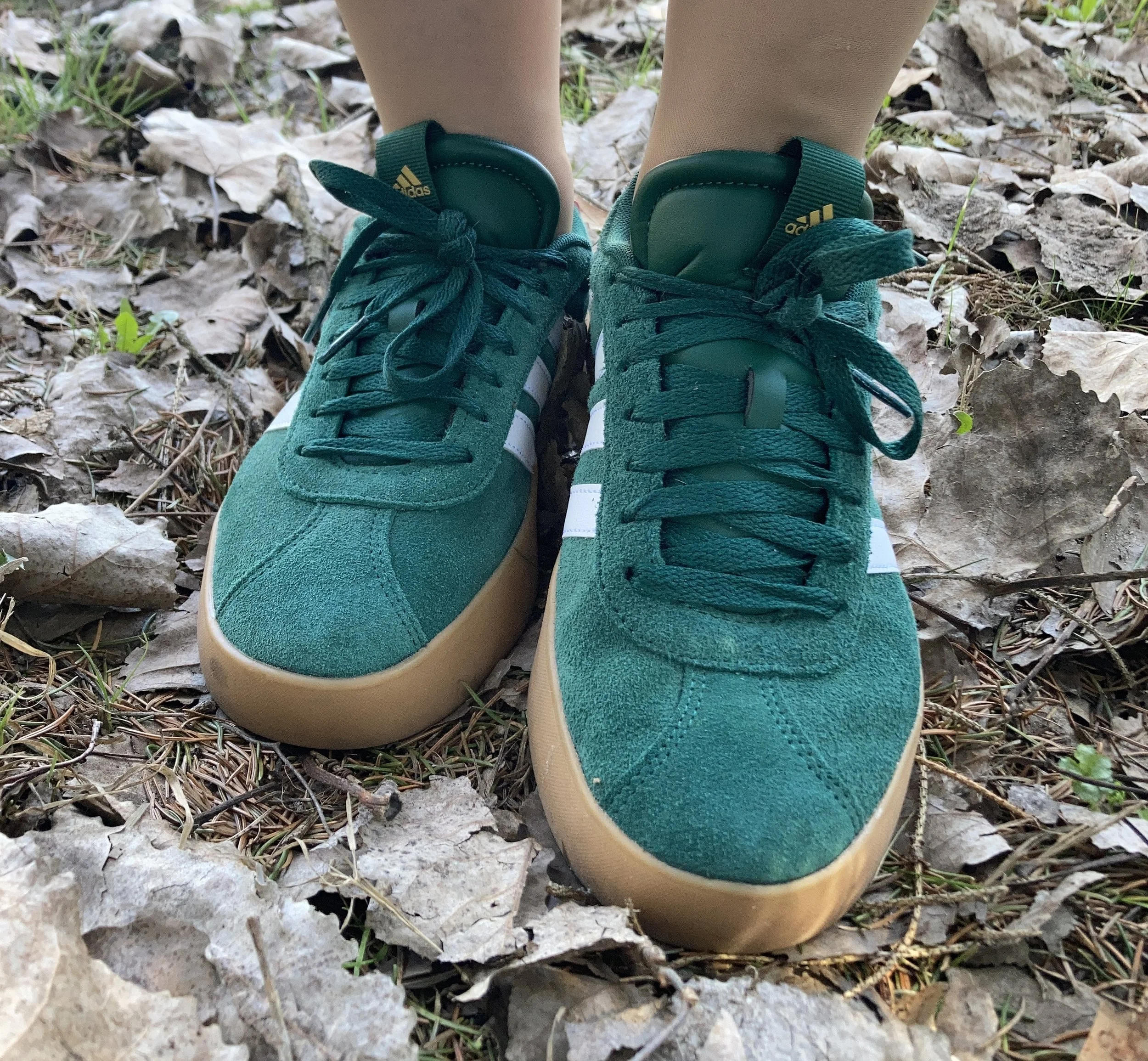
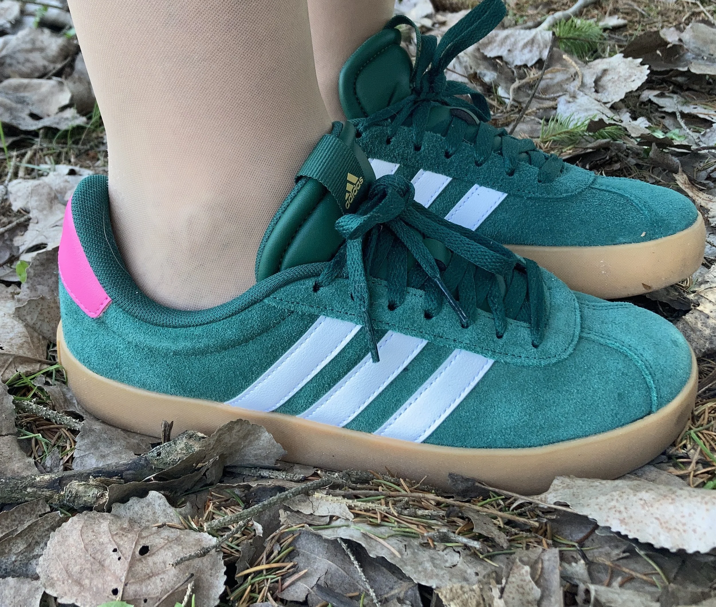
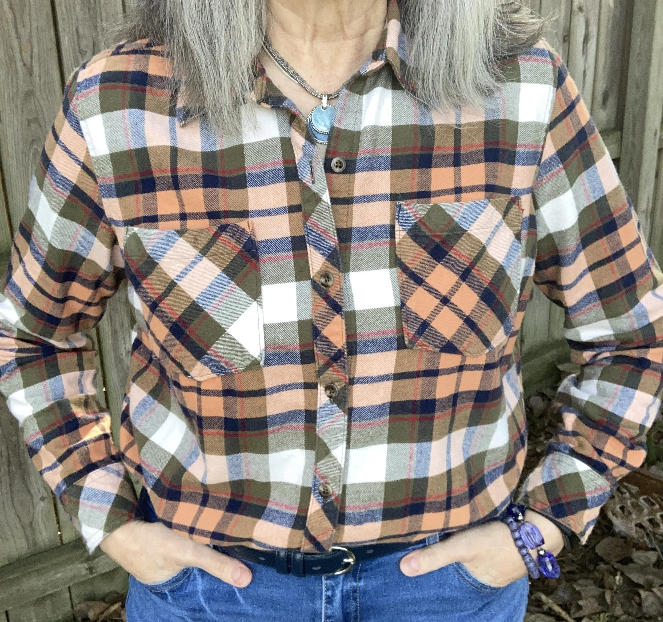
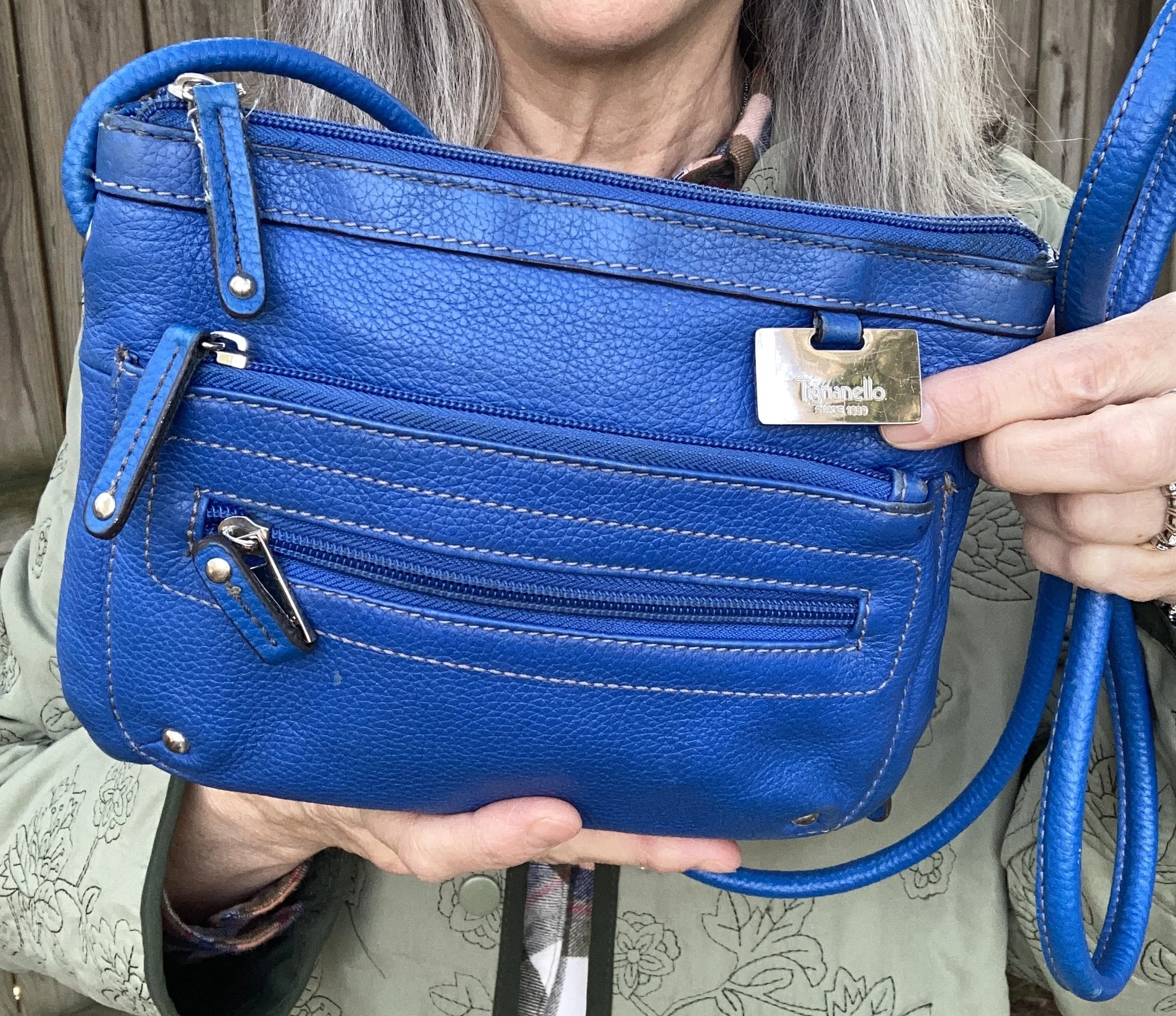
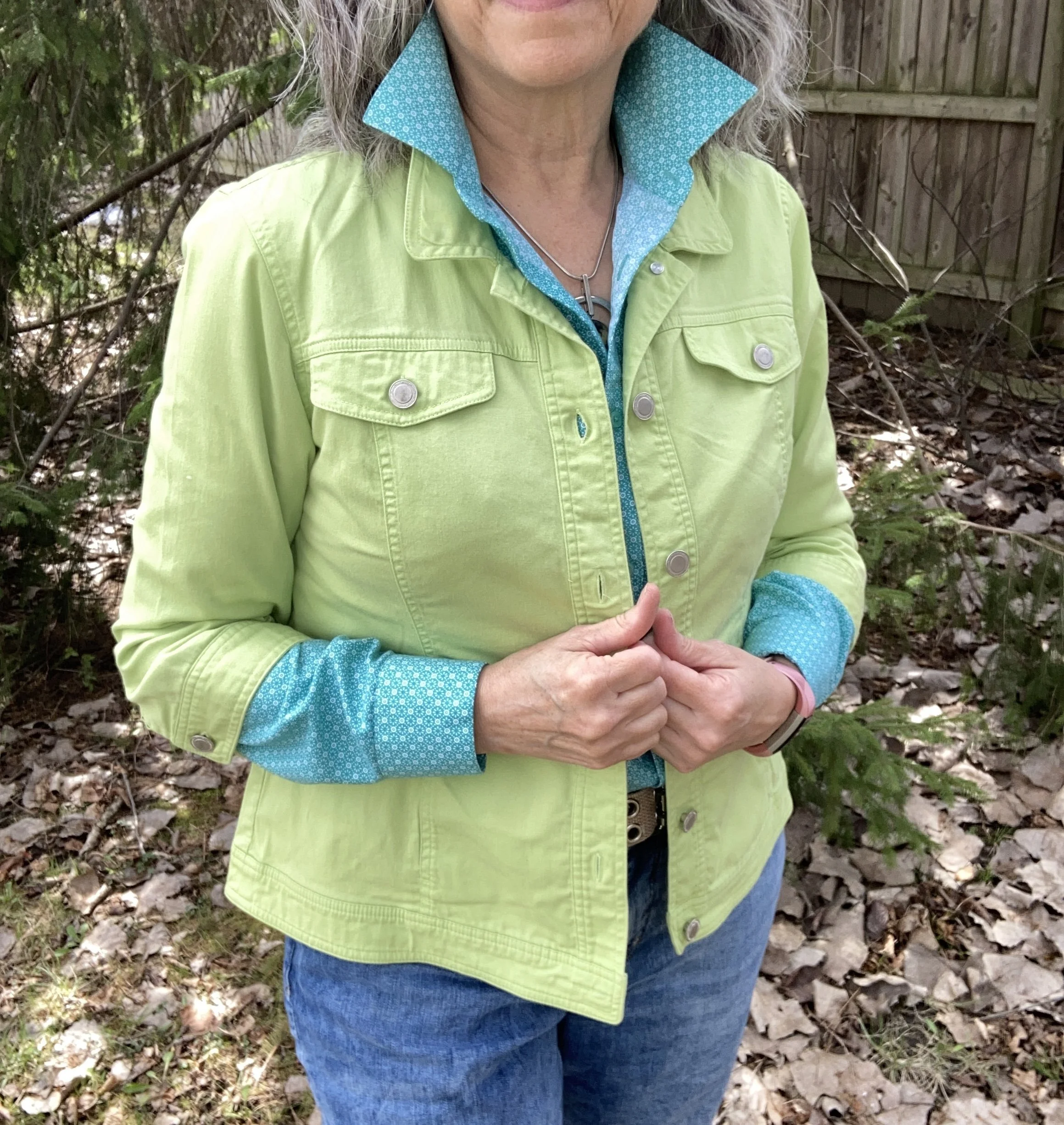
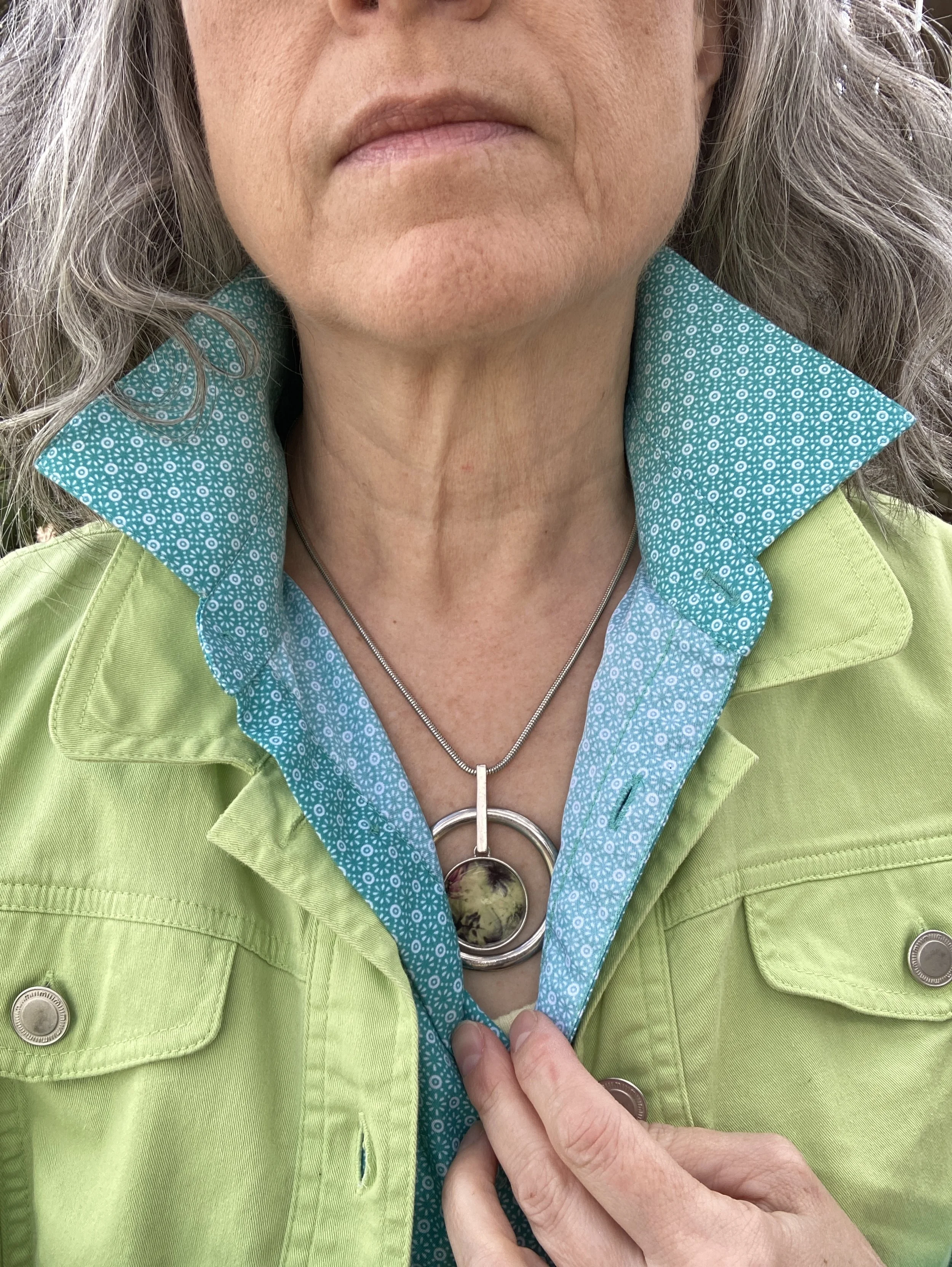
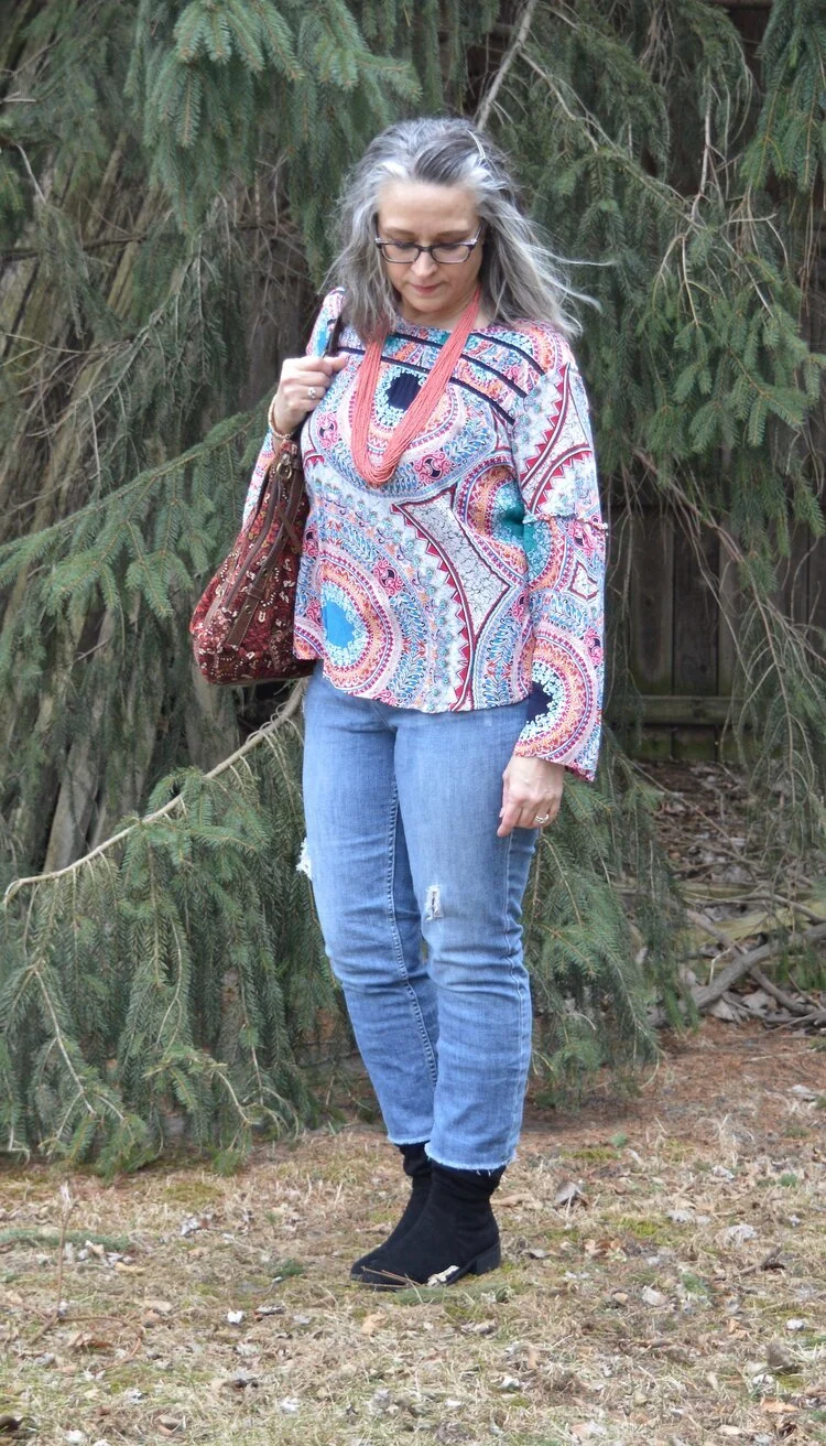
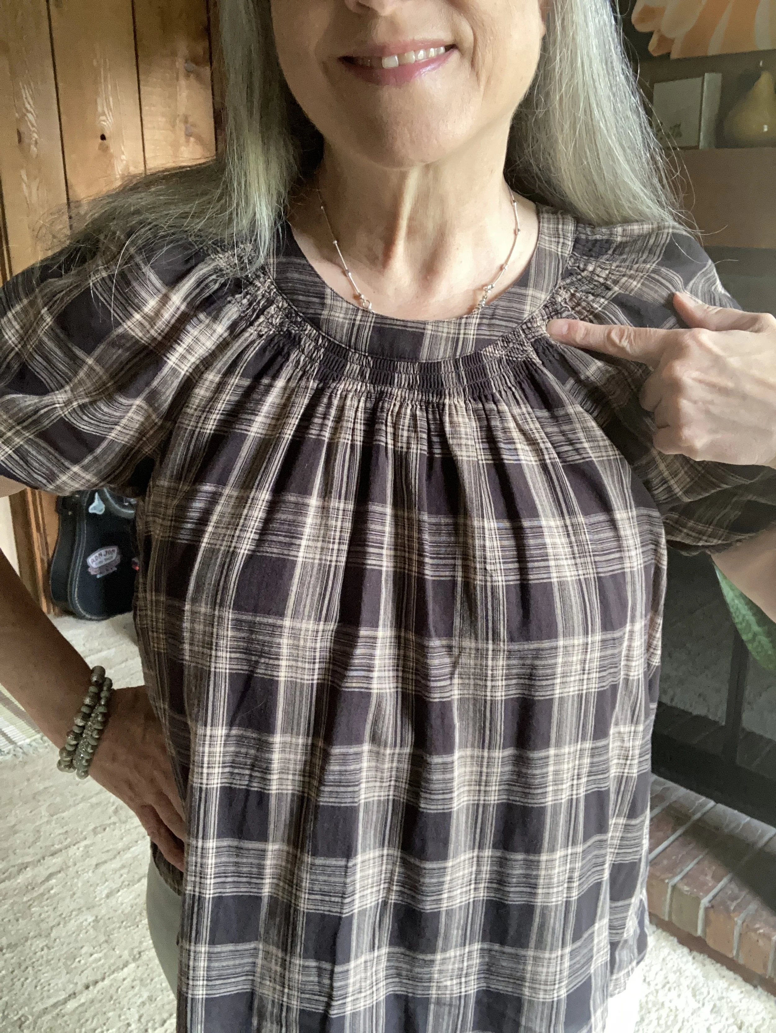
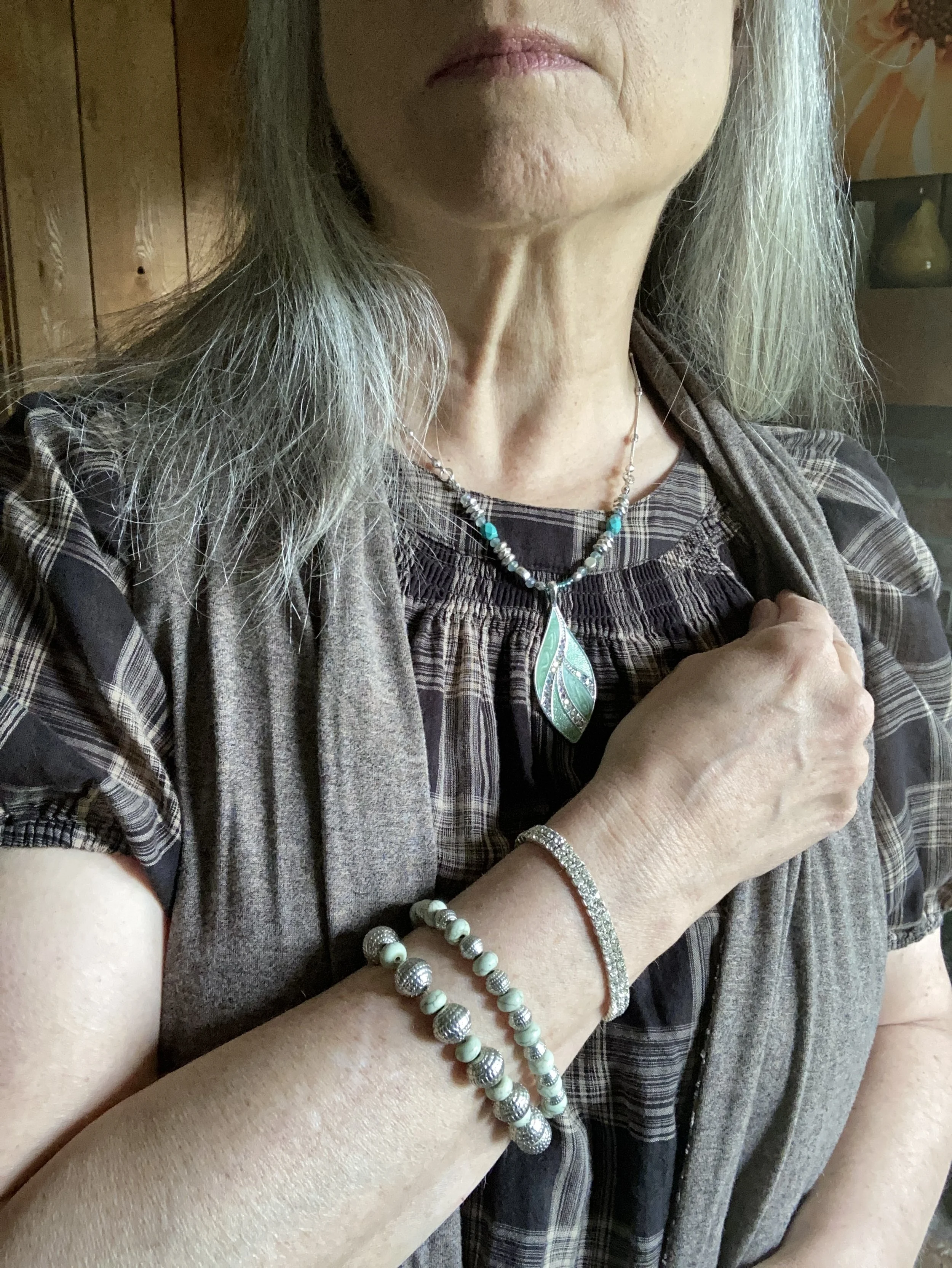
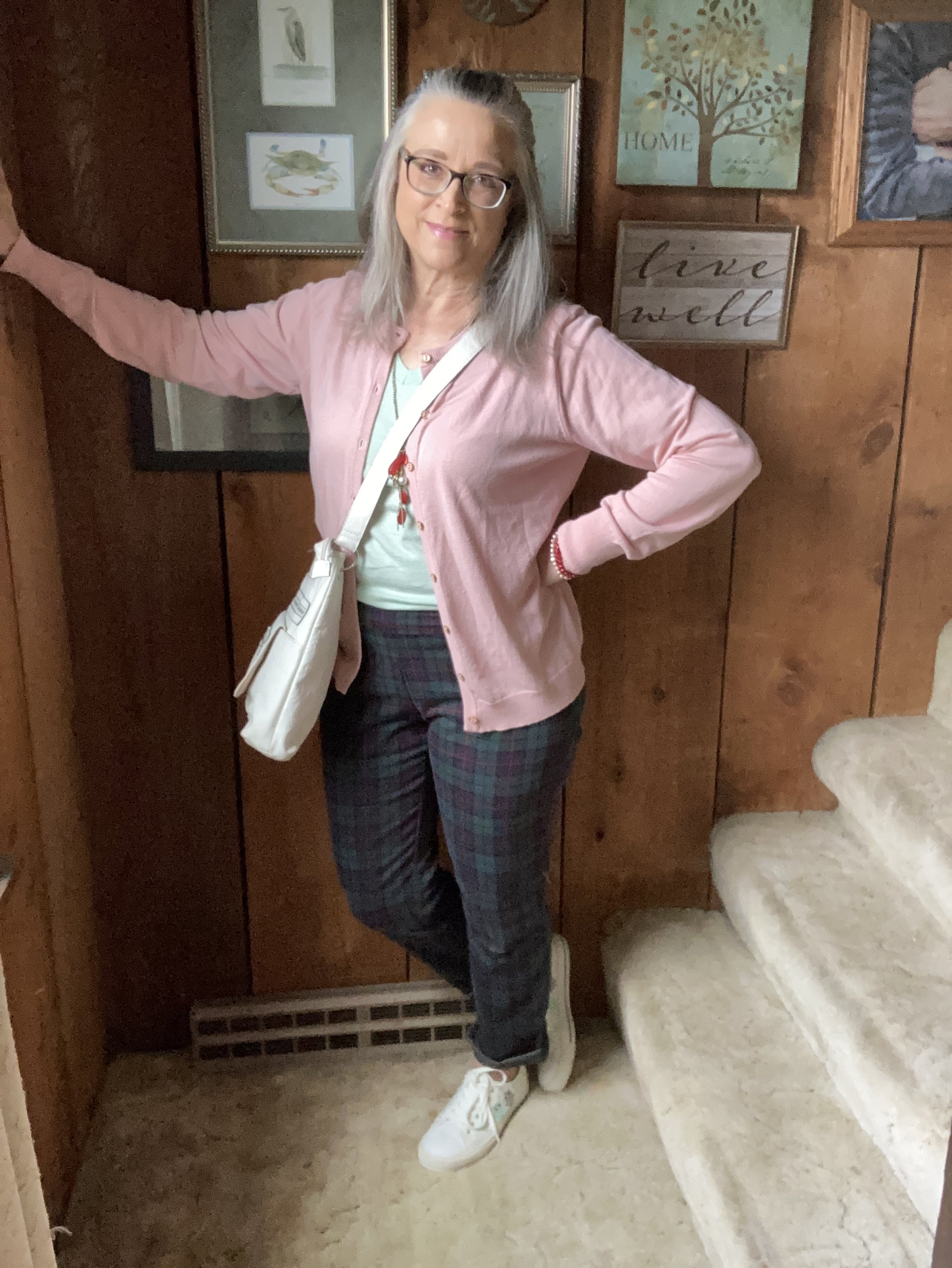
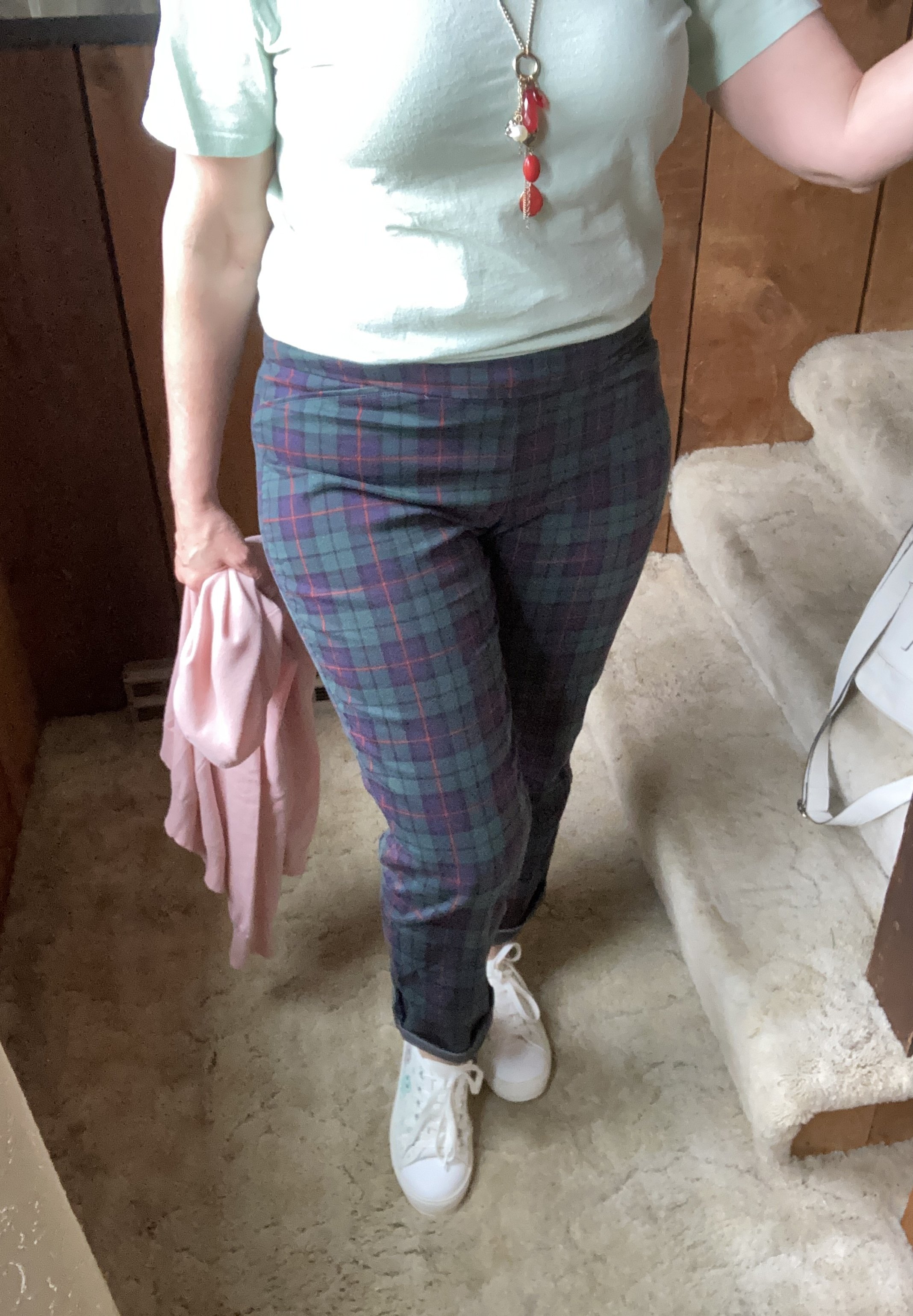
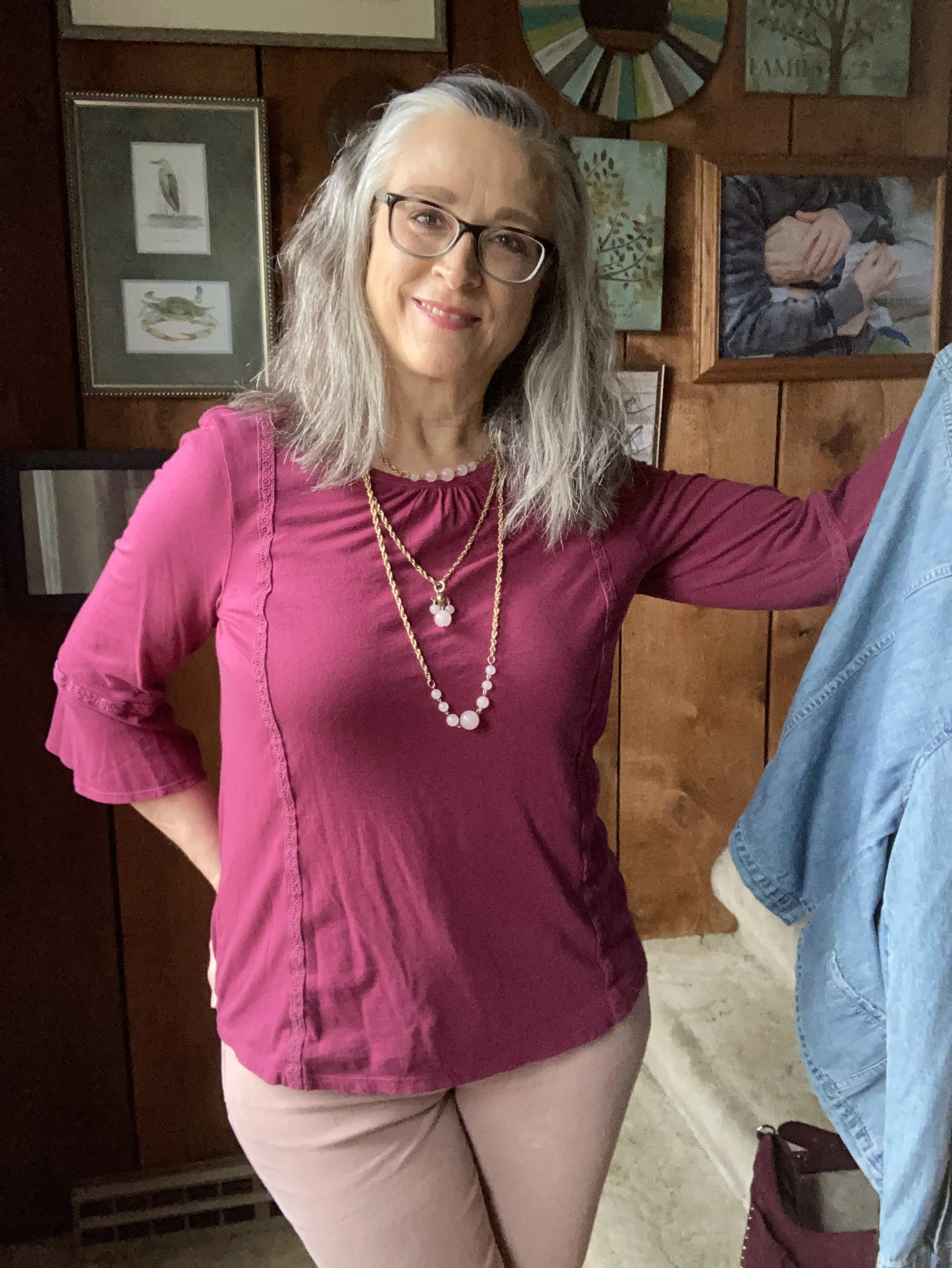
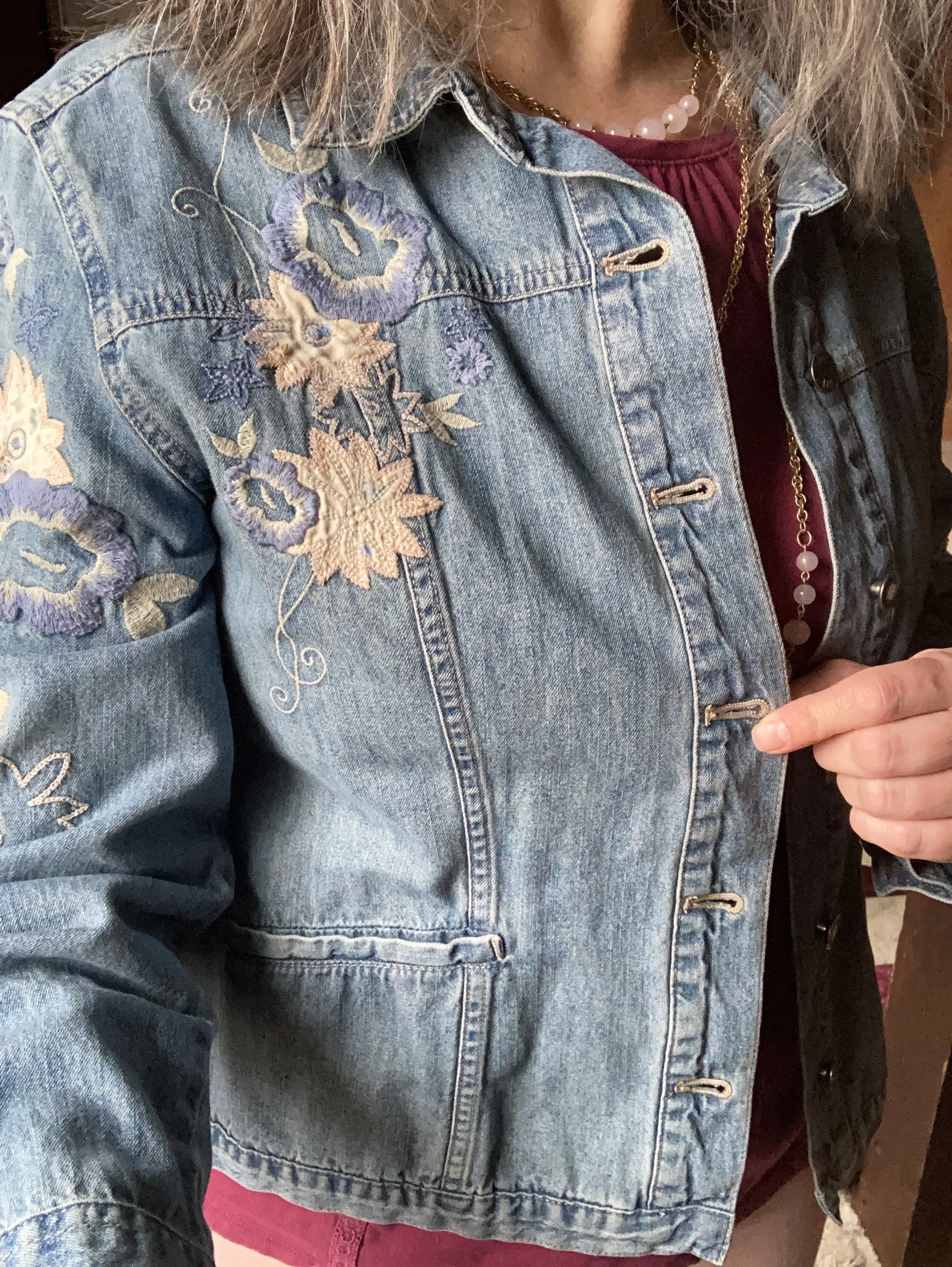
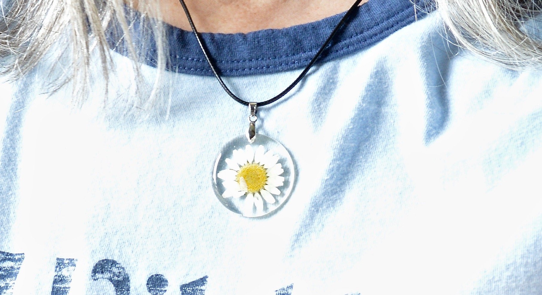
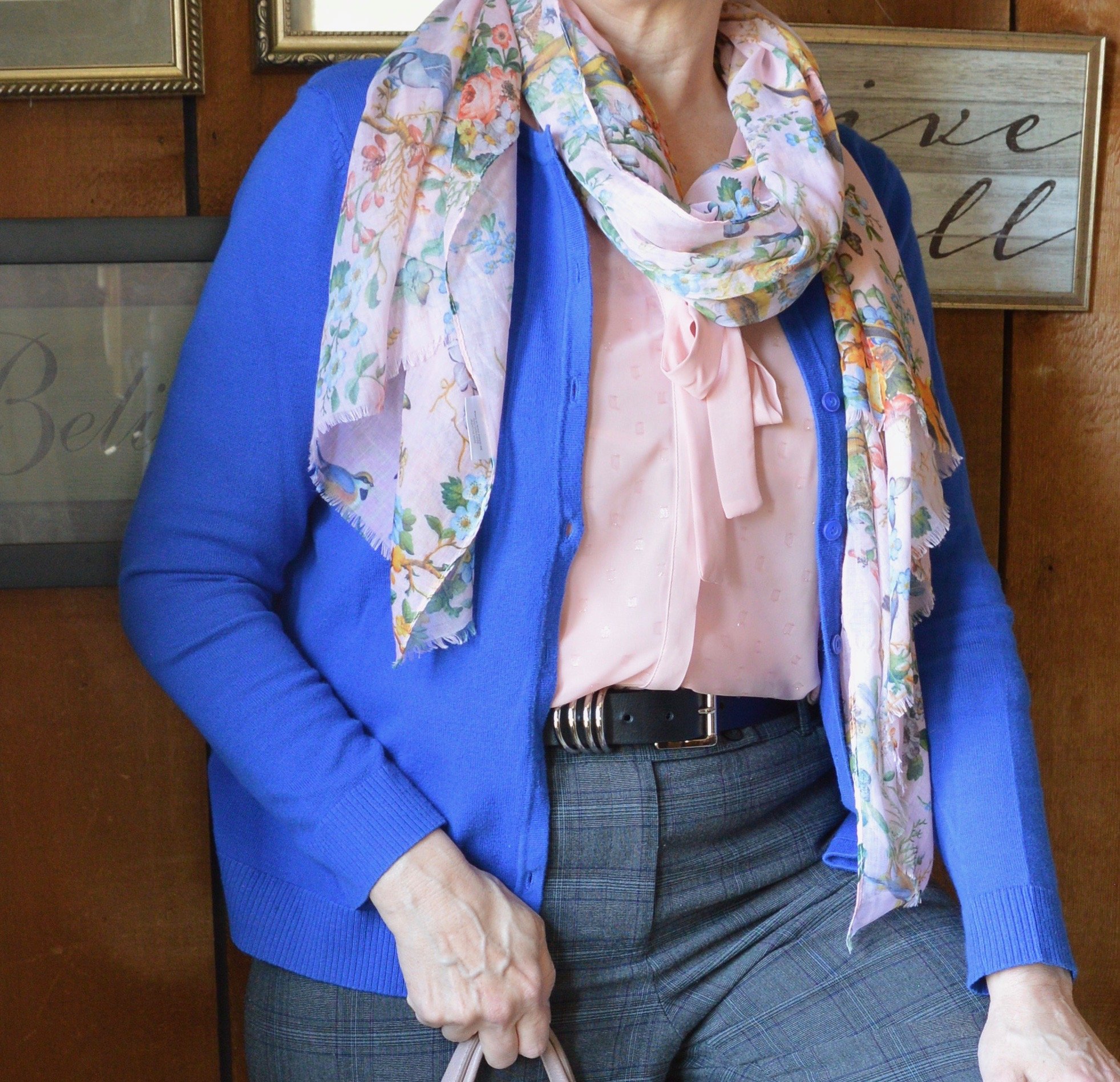
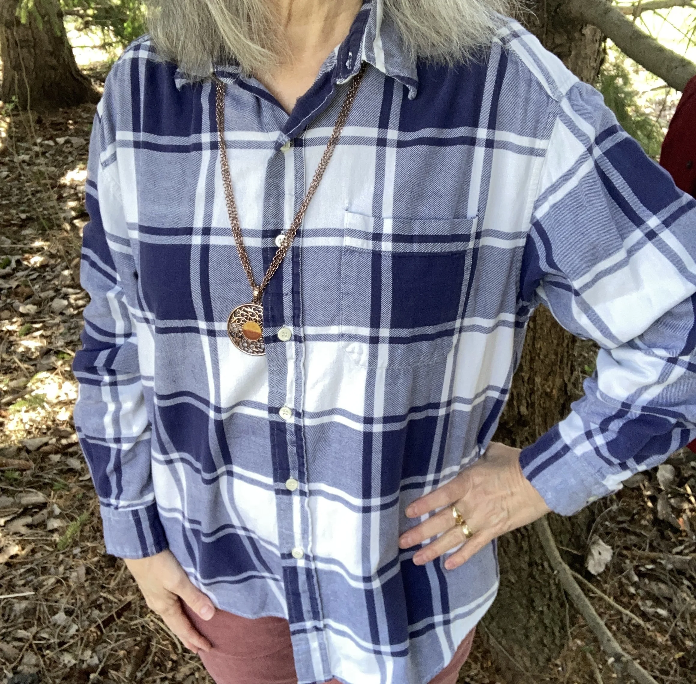
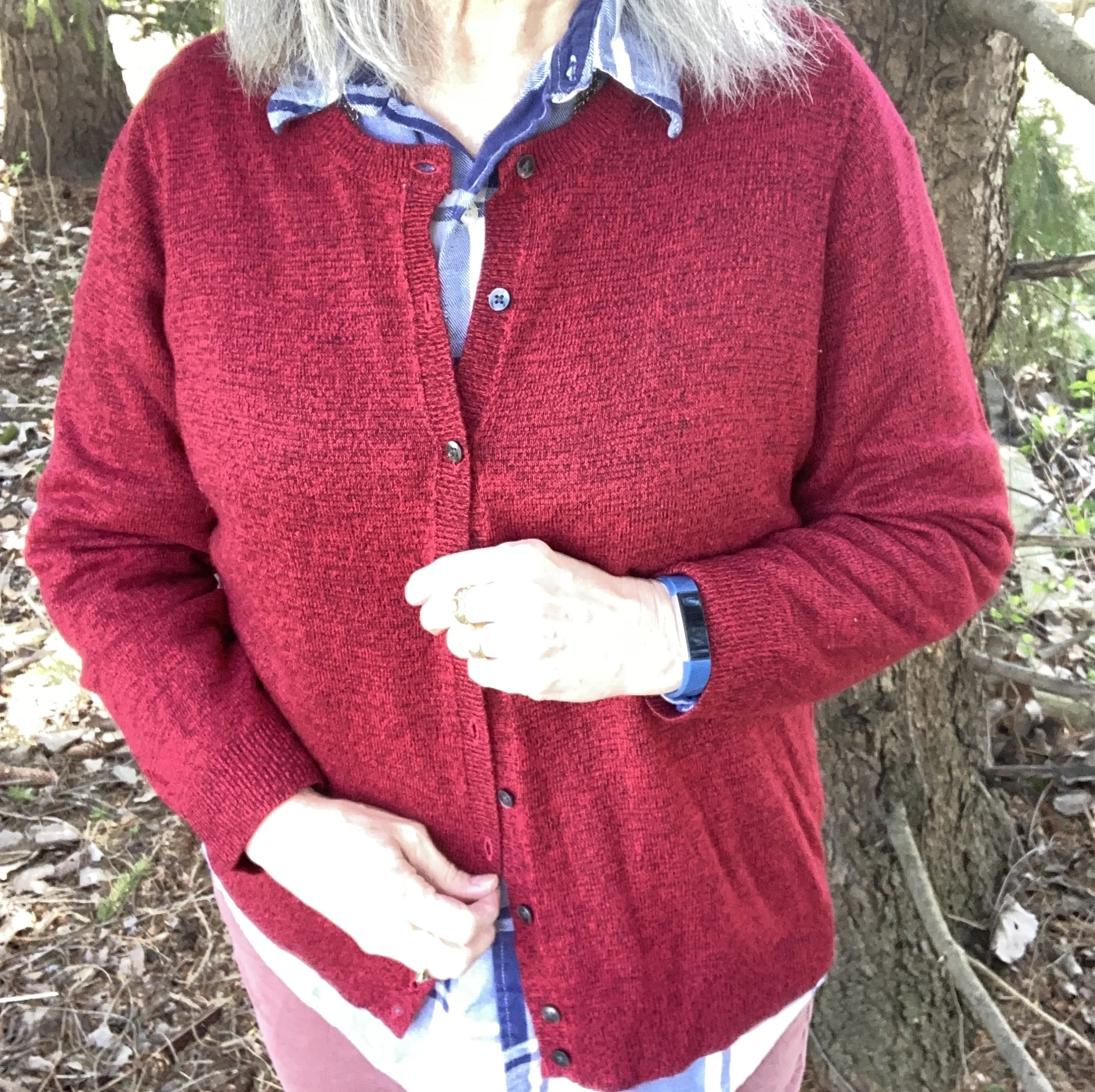
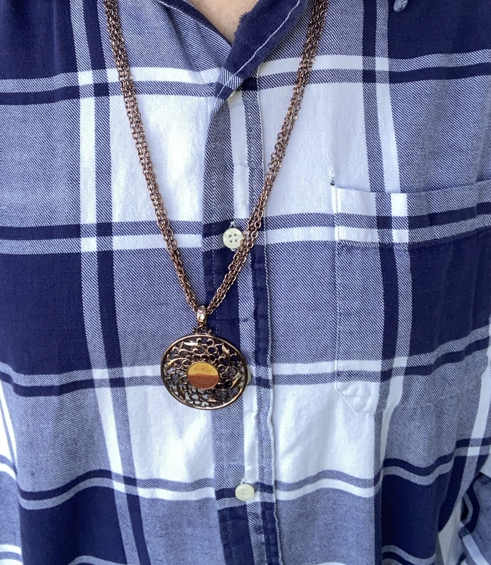
Rhodonite has been on the Pantone palette before. You can see that outfit here. This purply blue is unique as far as darker blues go, and it doesn’t always pair up with other blues, but I do like that it is different which makes it fun to find combinations to go with it. This is a thrifted Old Navy shirt, and appears to be a men’s vintage piece.
Since this color is very hard to find in clothing I am linking a few pieces in a navy blue or a dark blue for you to look at. Check out Kohl’s, J.Jill, and Land’s End.
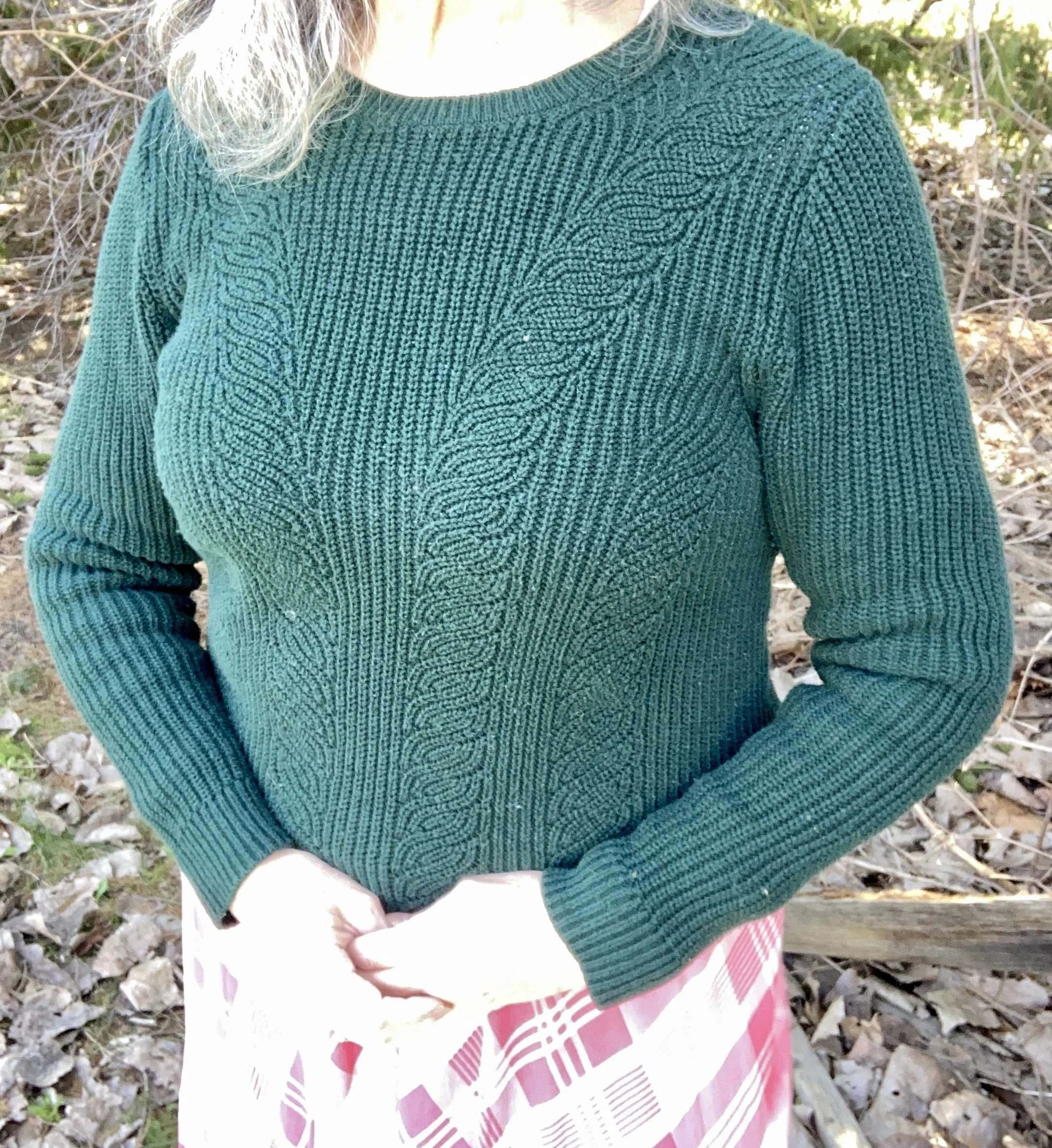
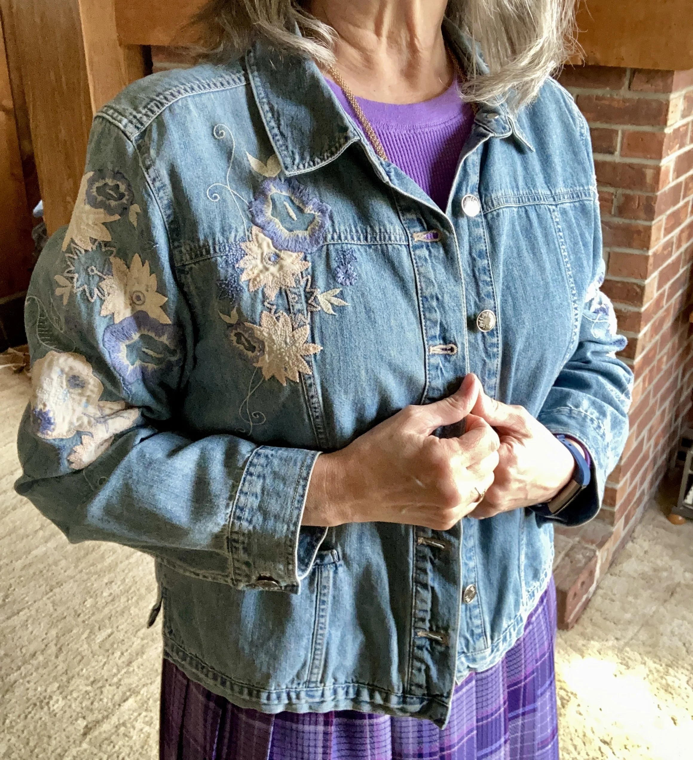
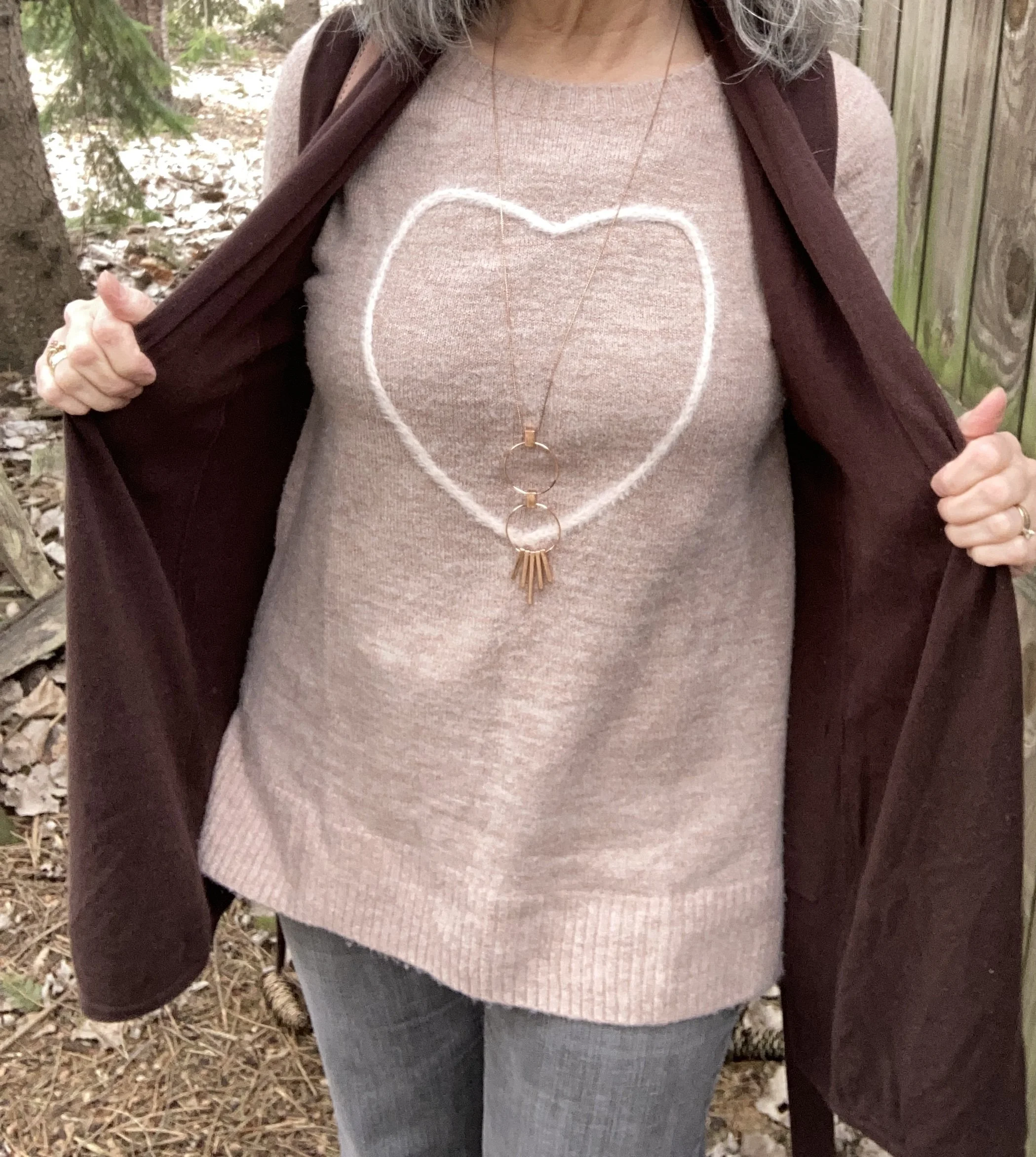
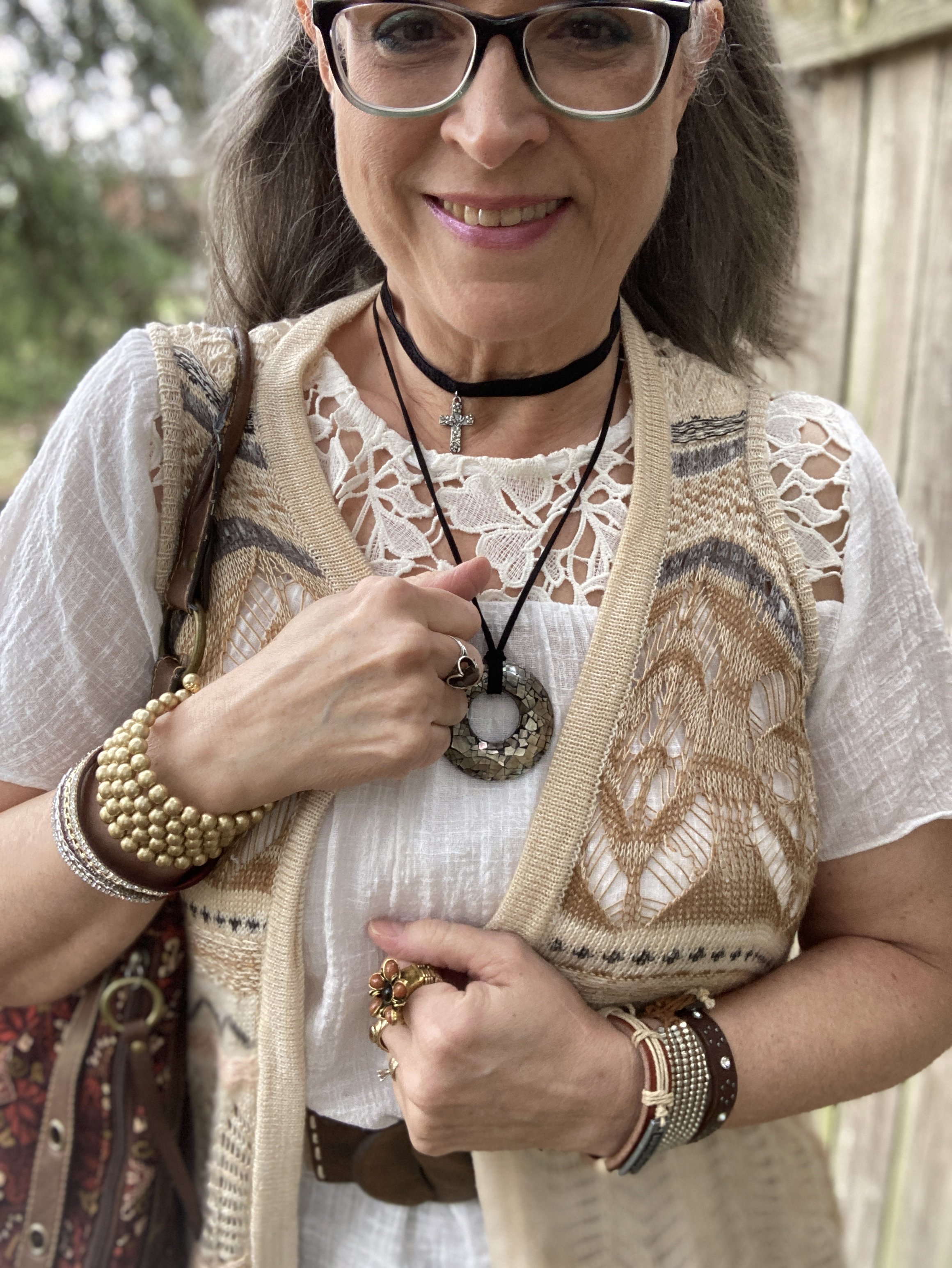
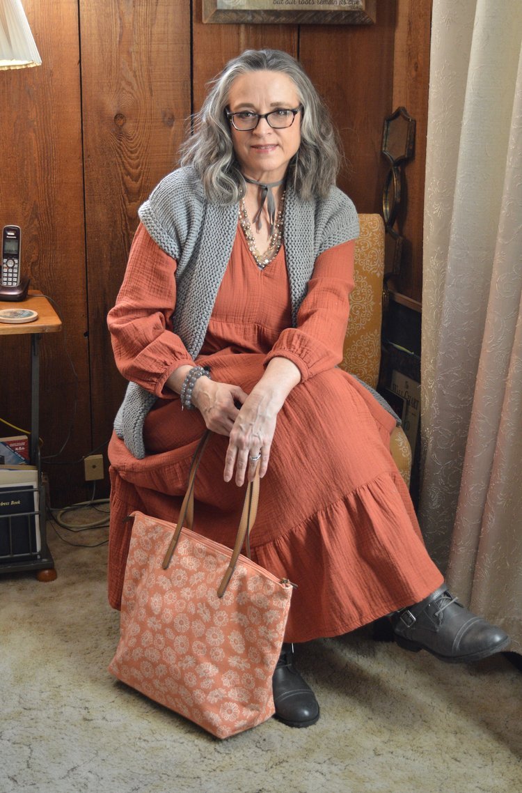
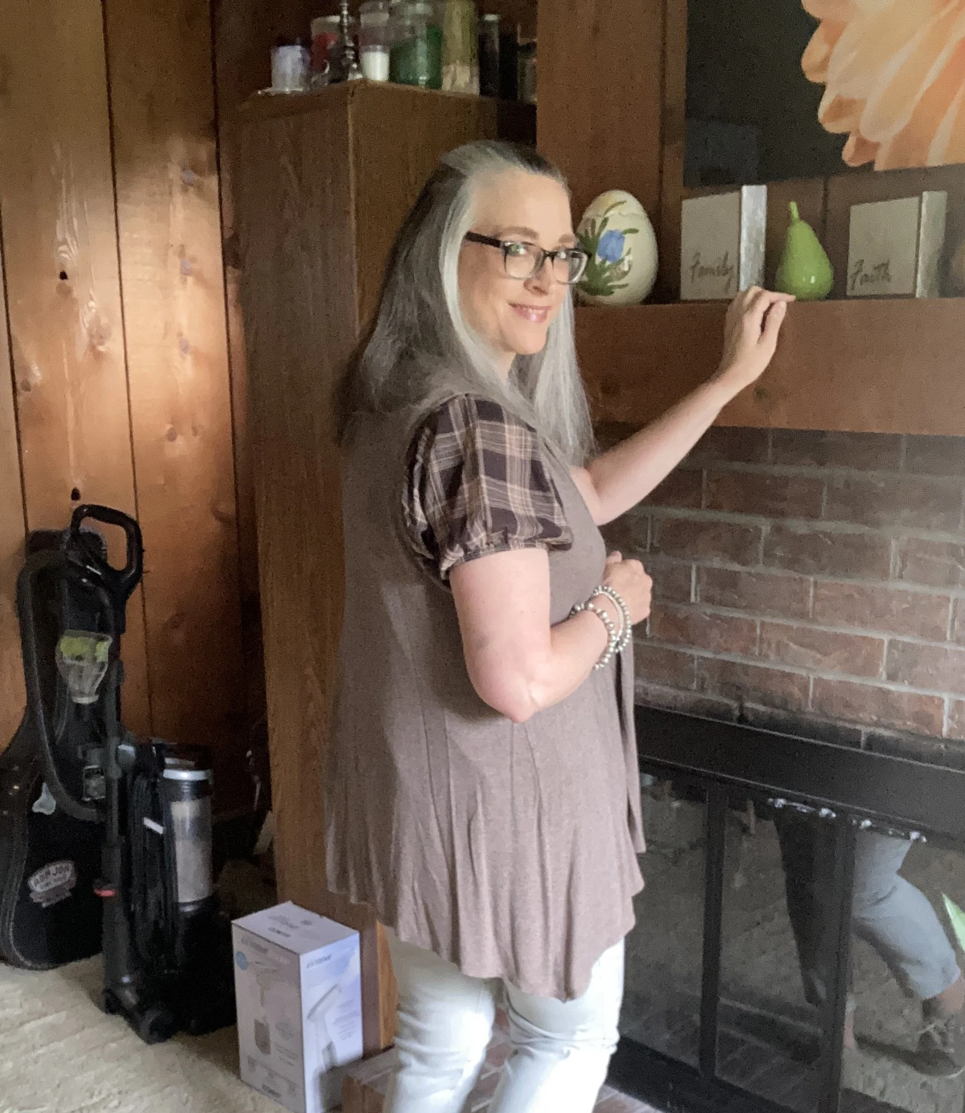
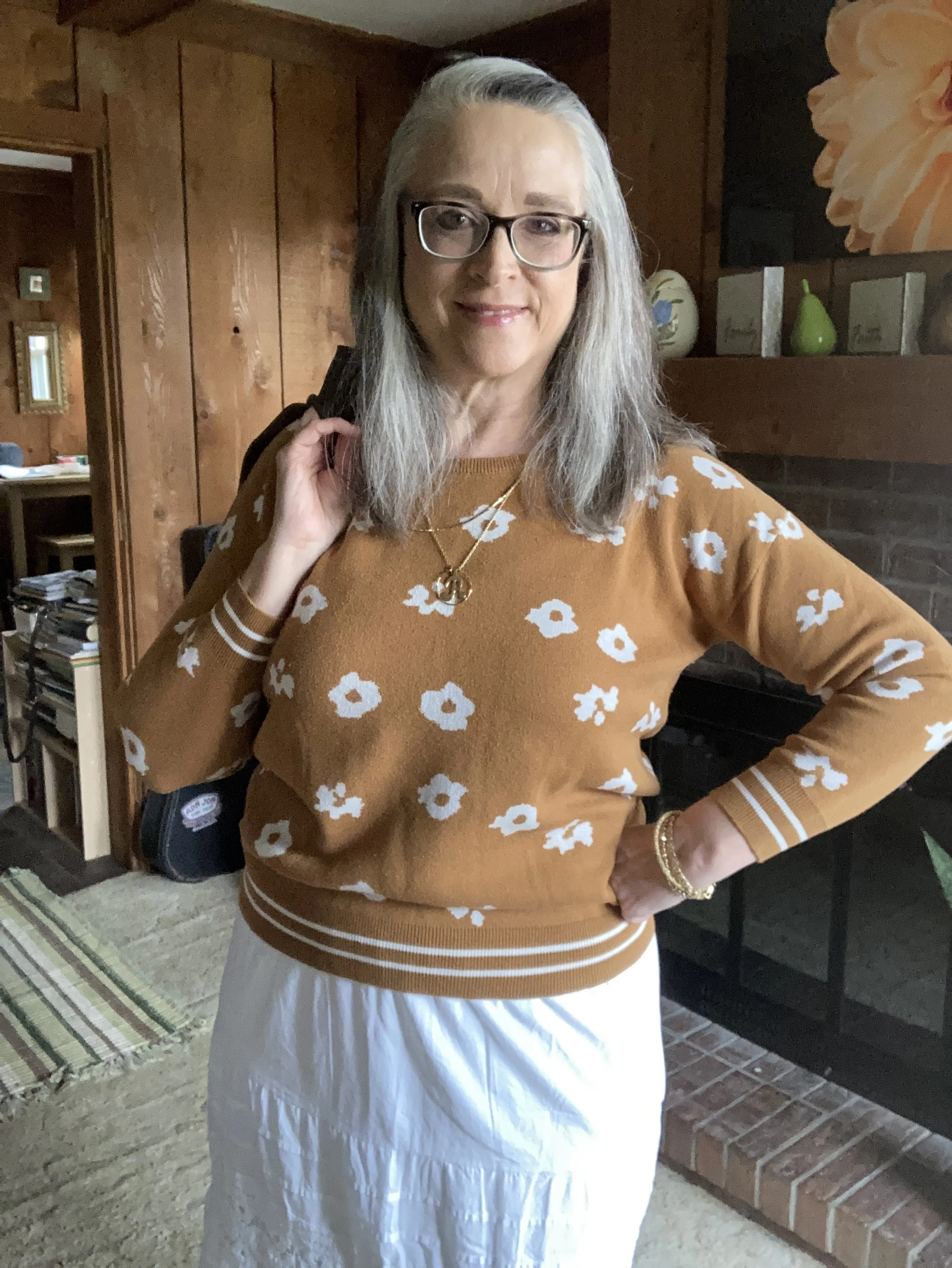
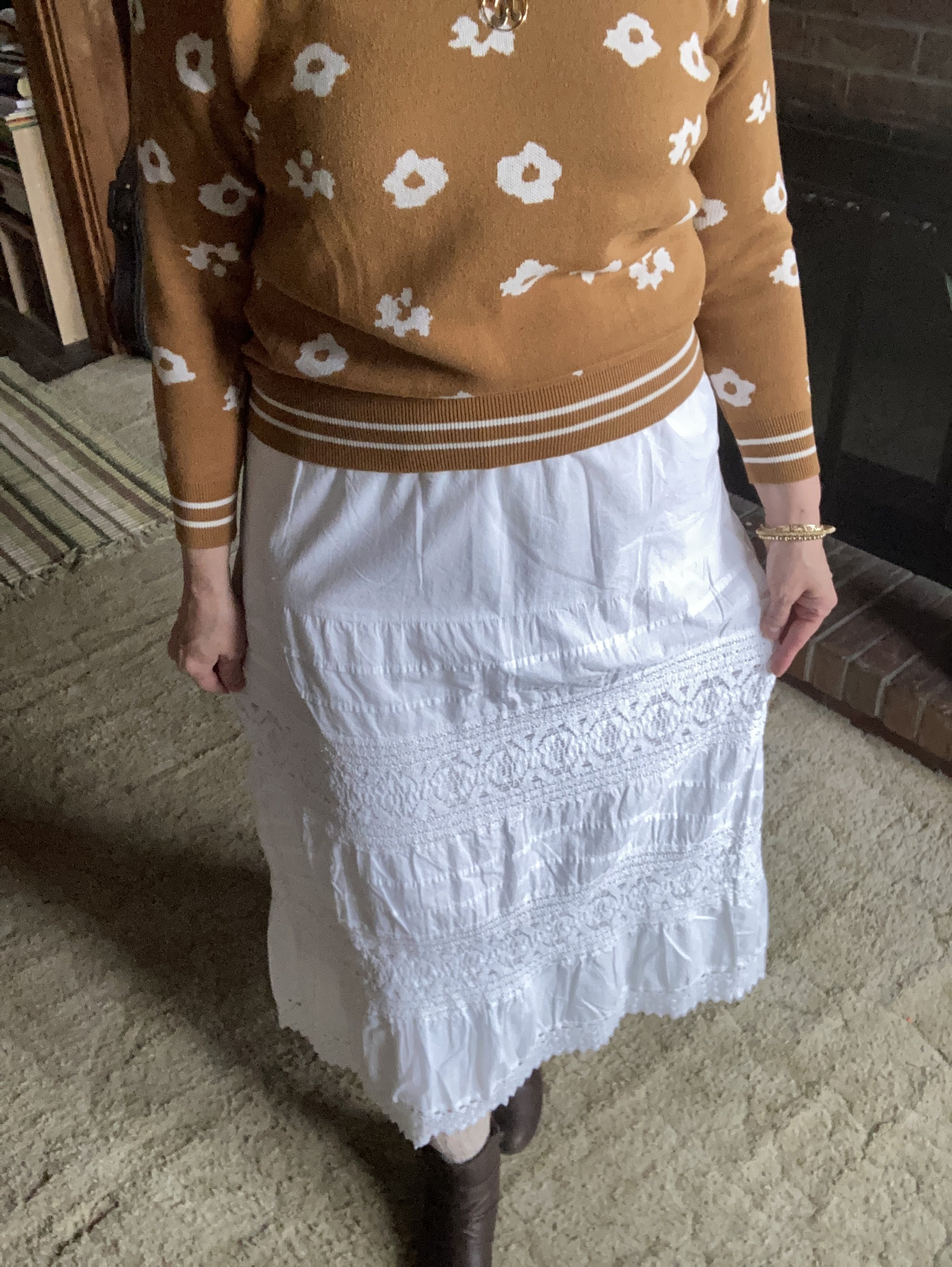
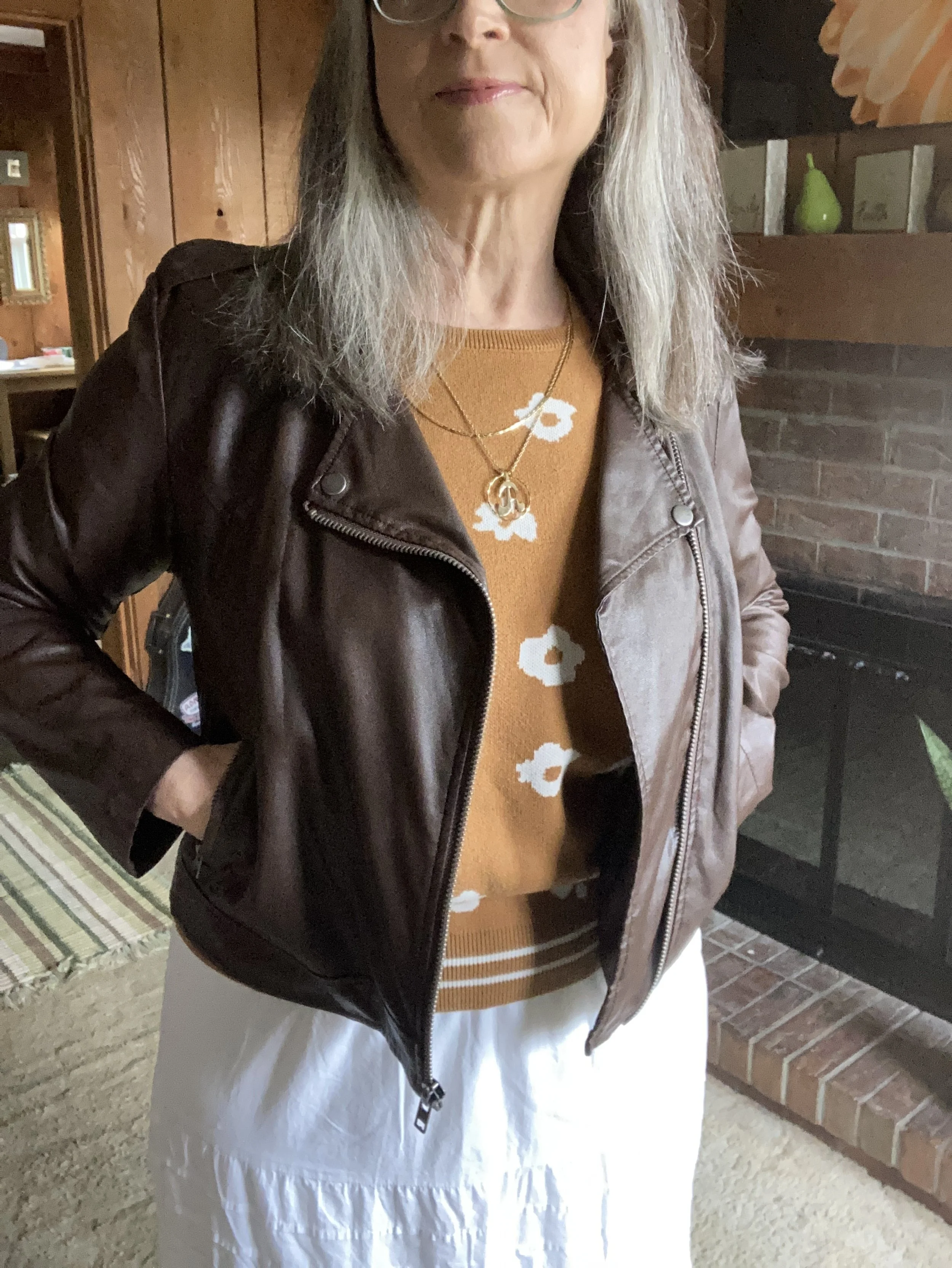
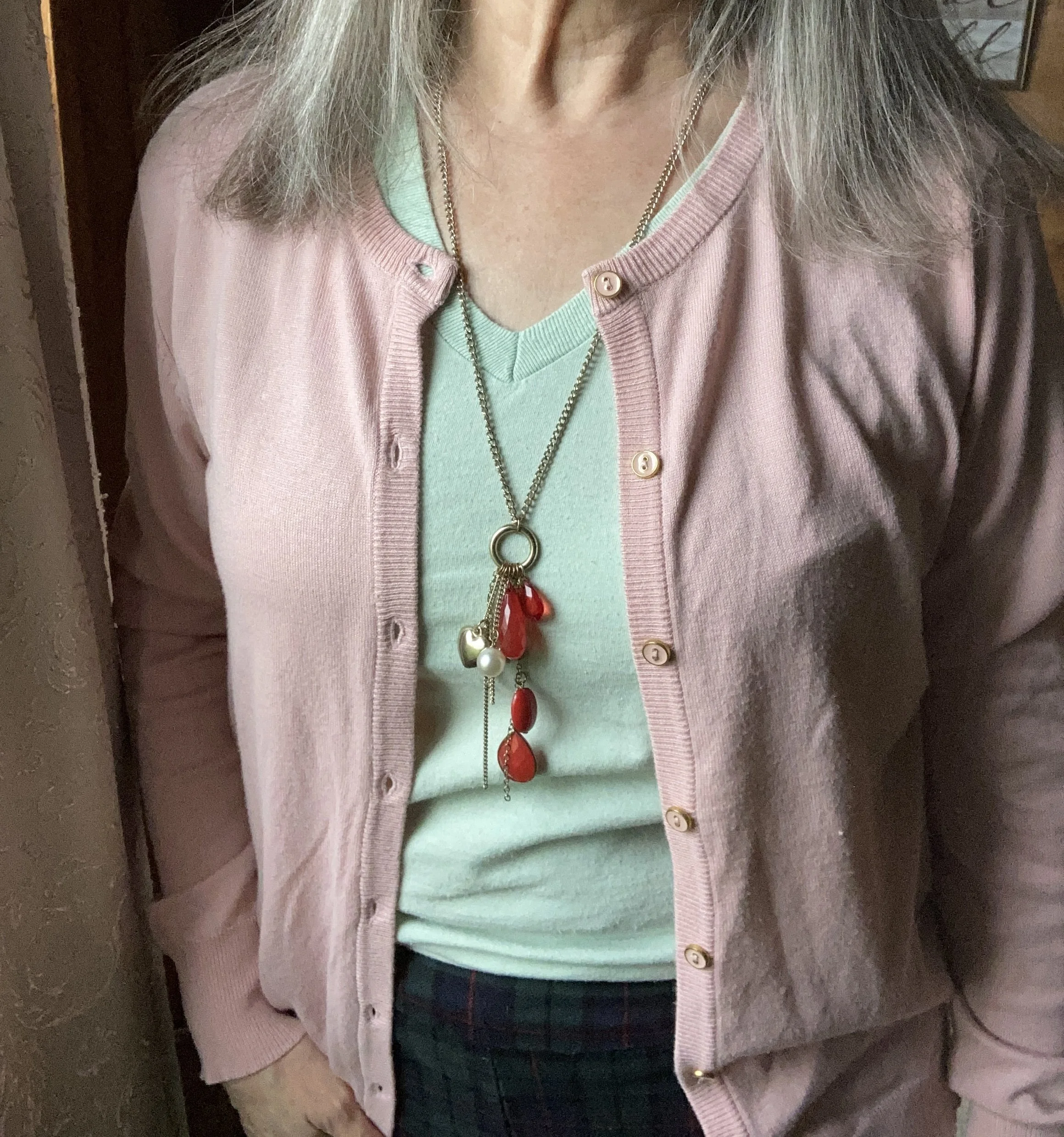
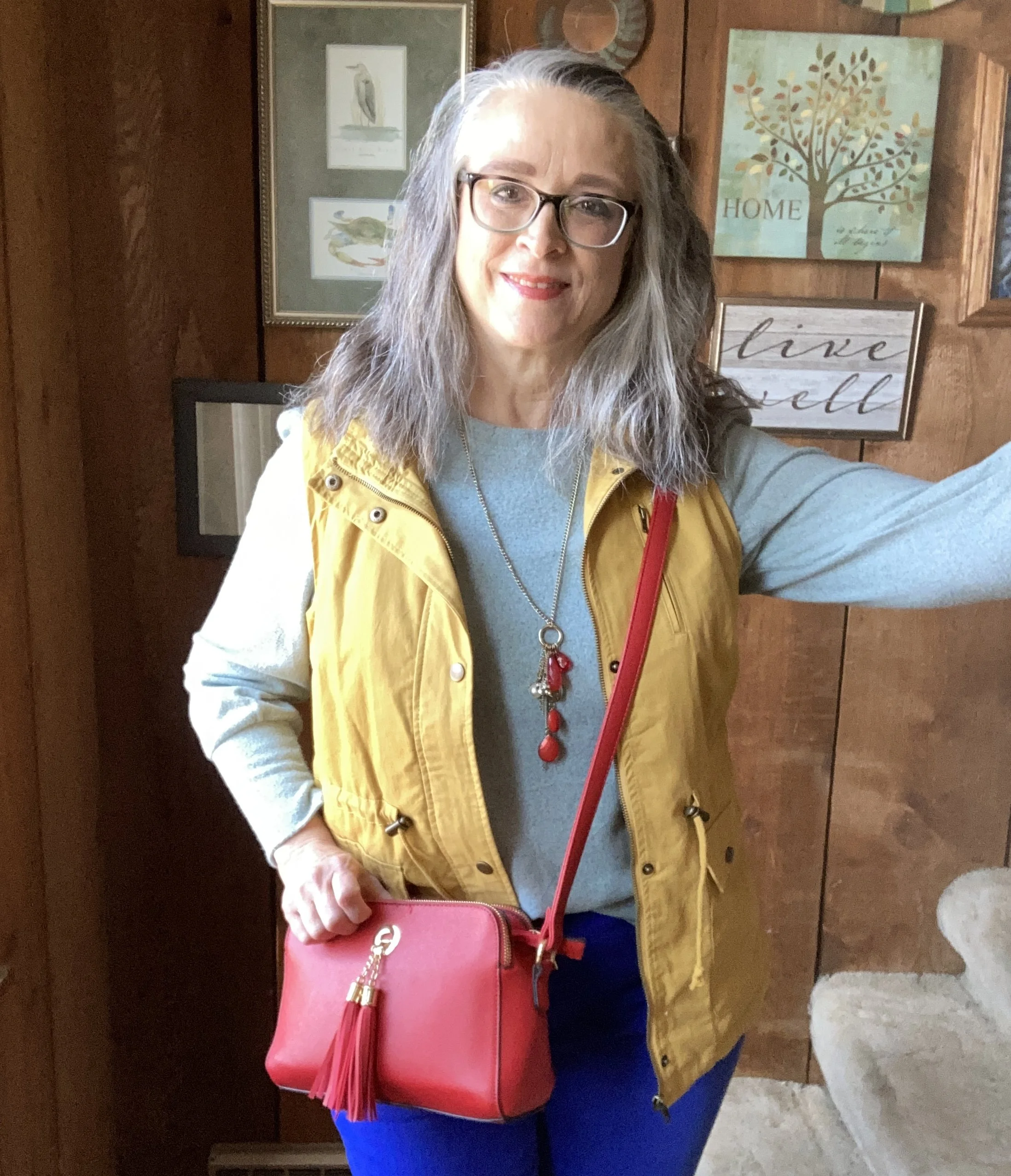
For the Lava Falls color, I decided to use this thrifted Croft and Barrow cardigan. The color has almost a burgundy tone to it, but not truly, so I thought this red sweater with the marled yarn a closer option.
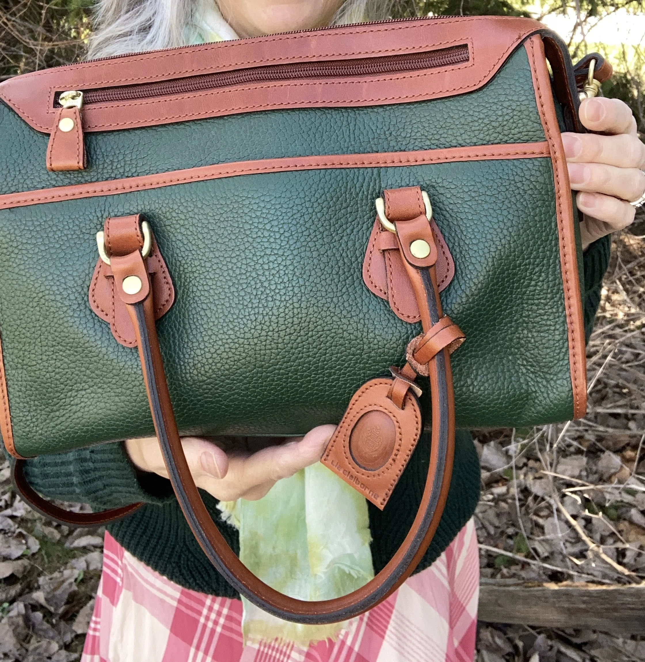
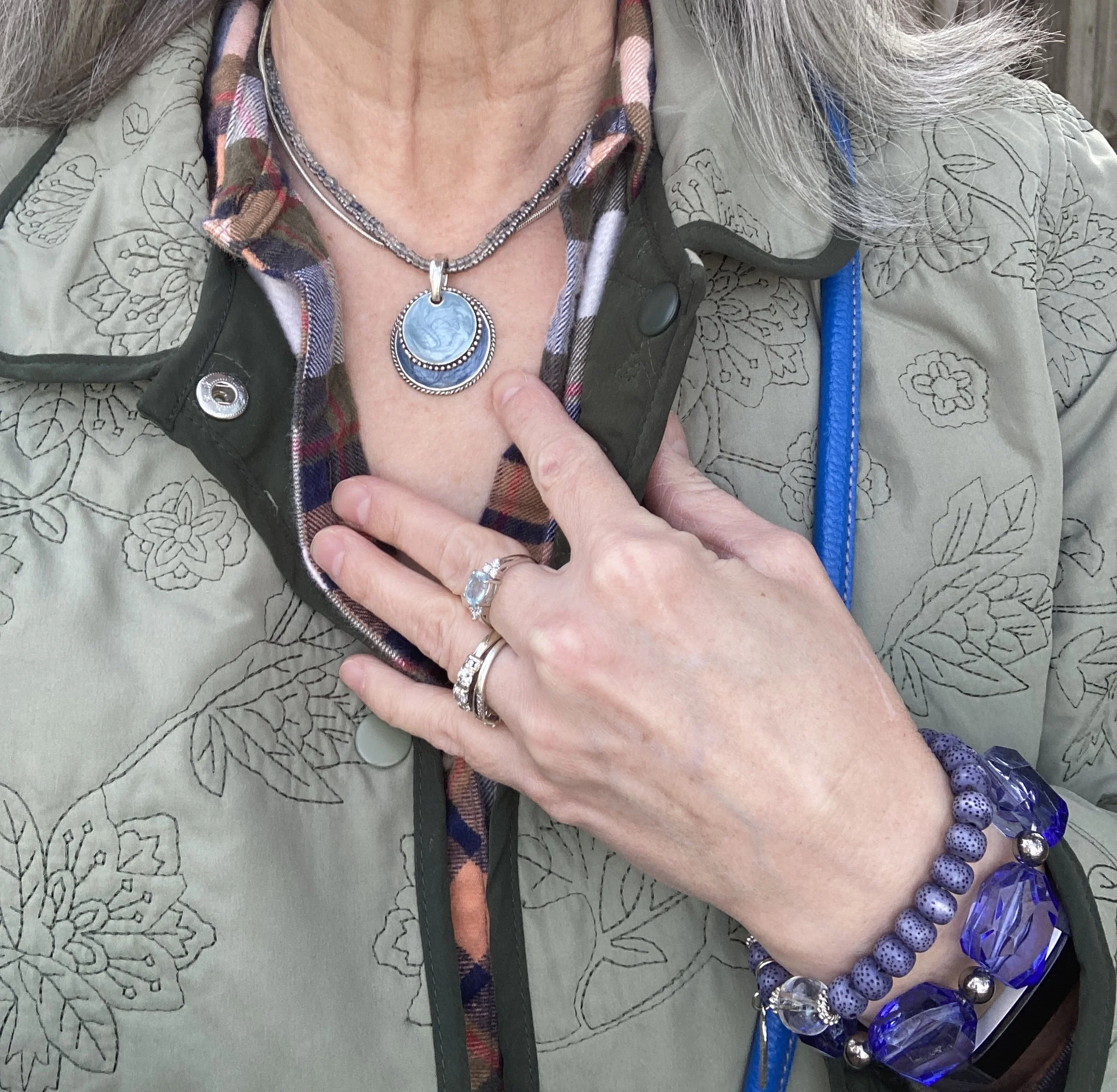
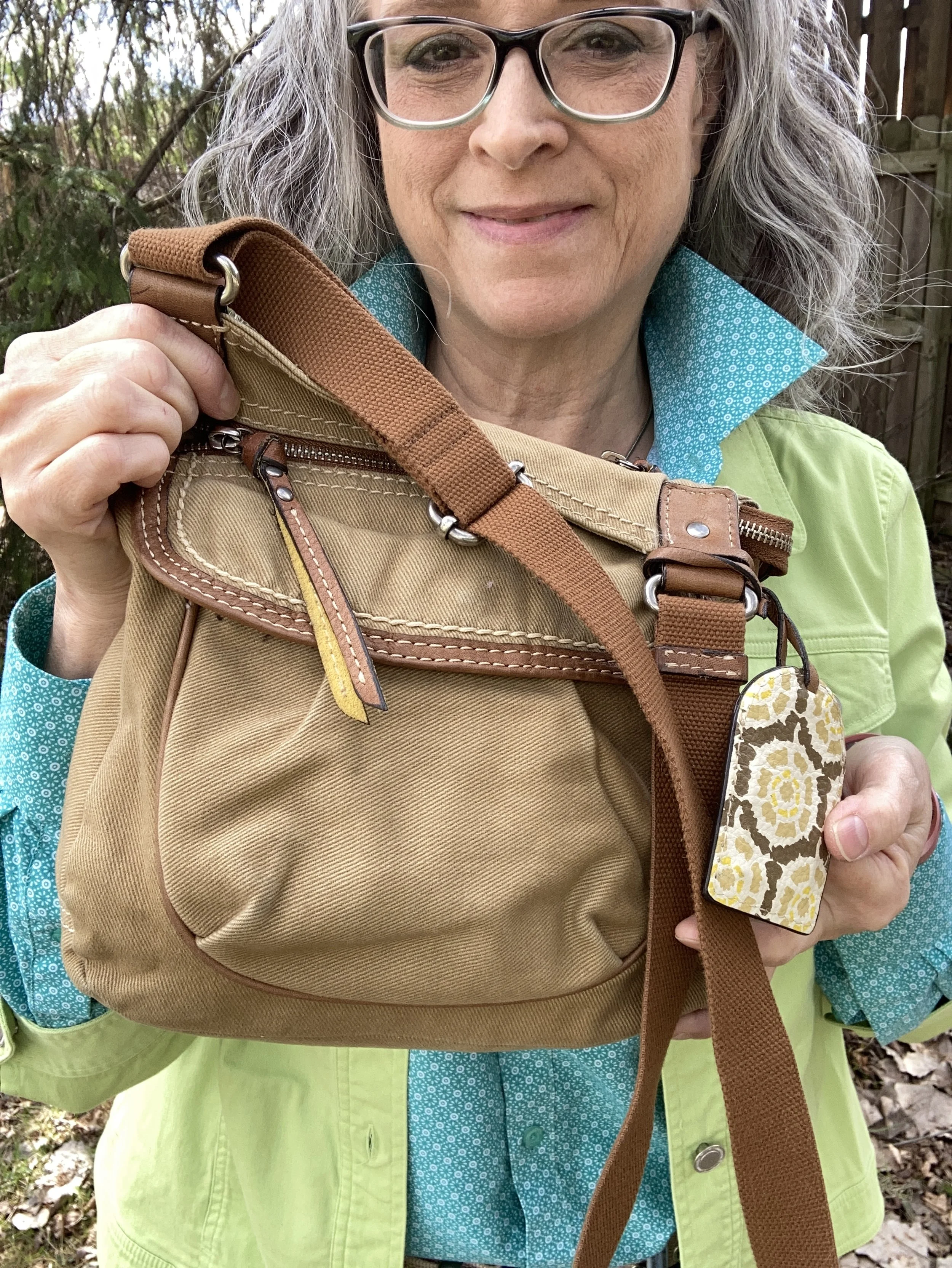
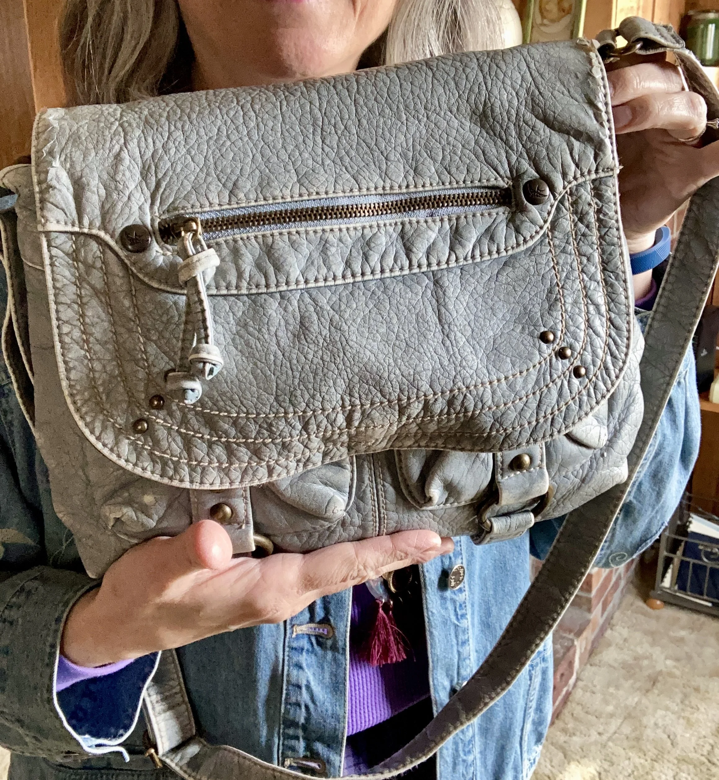
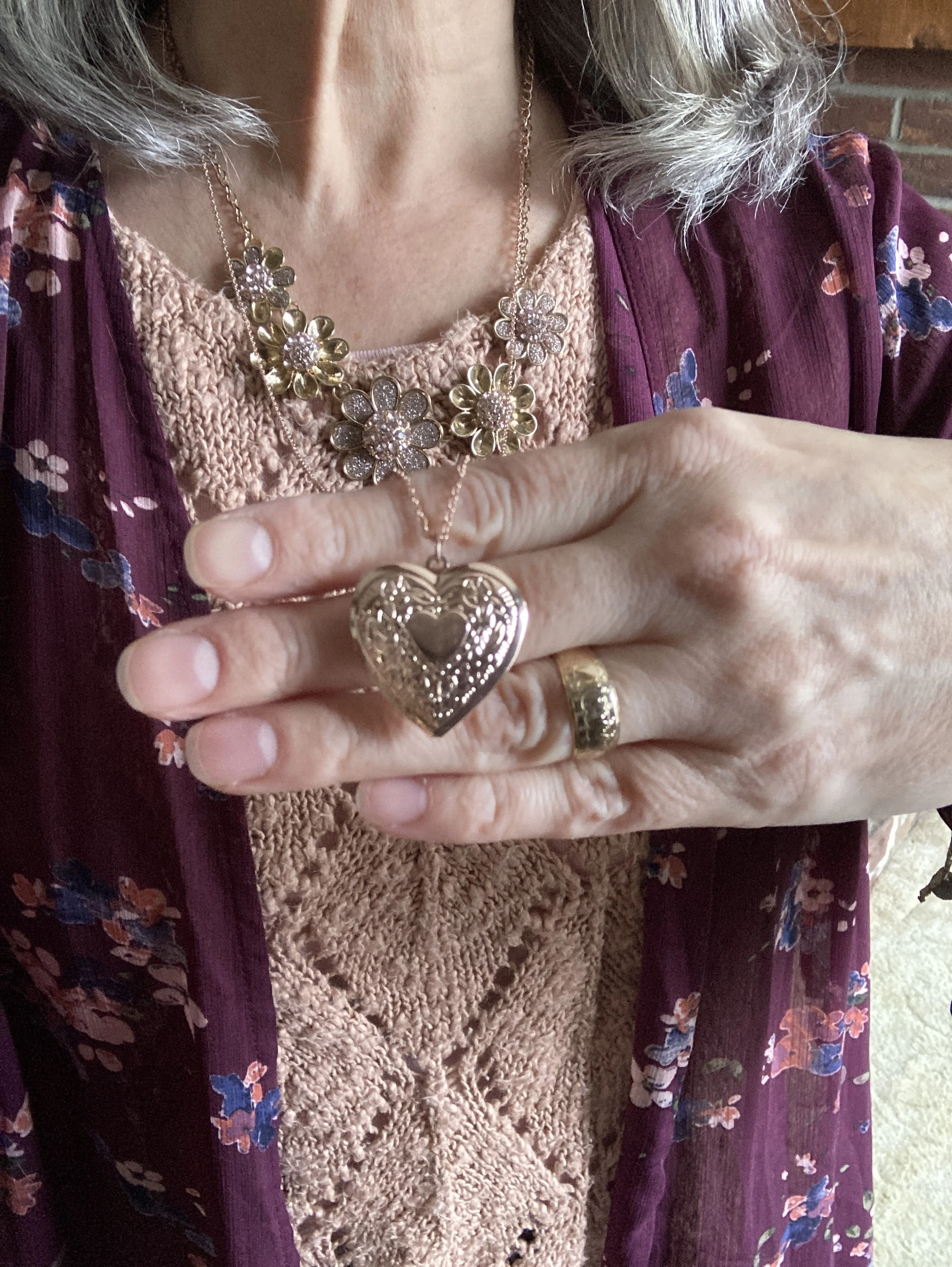
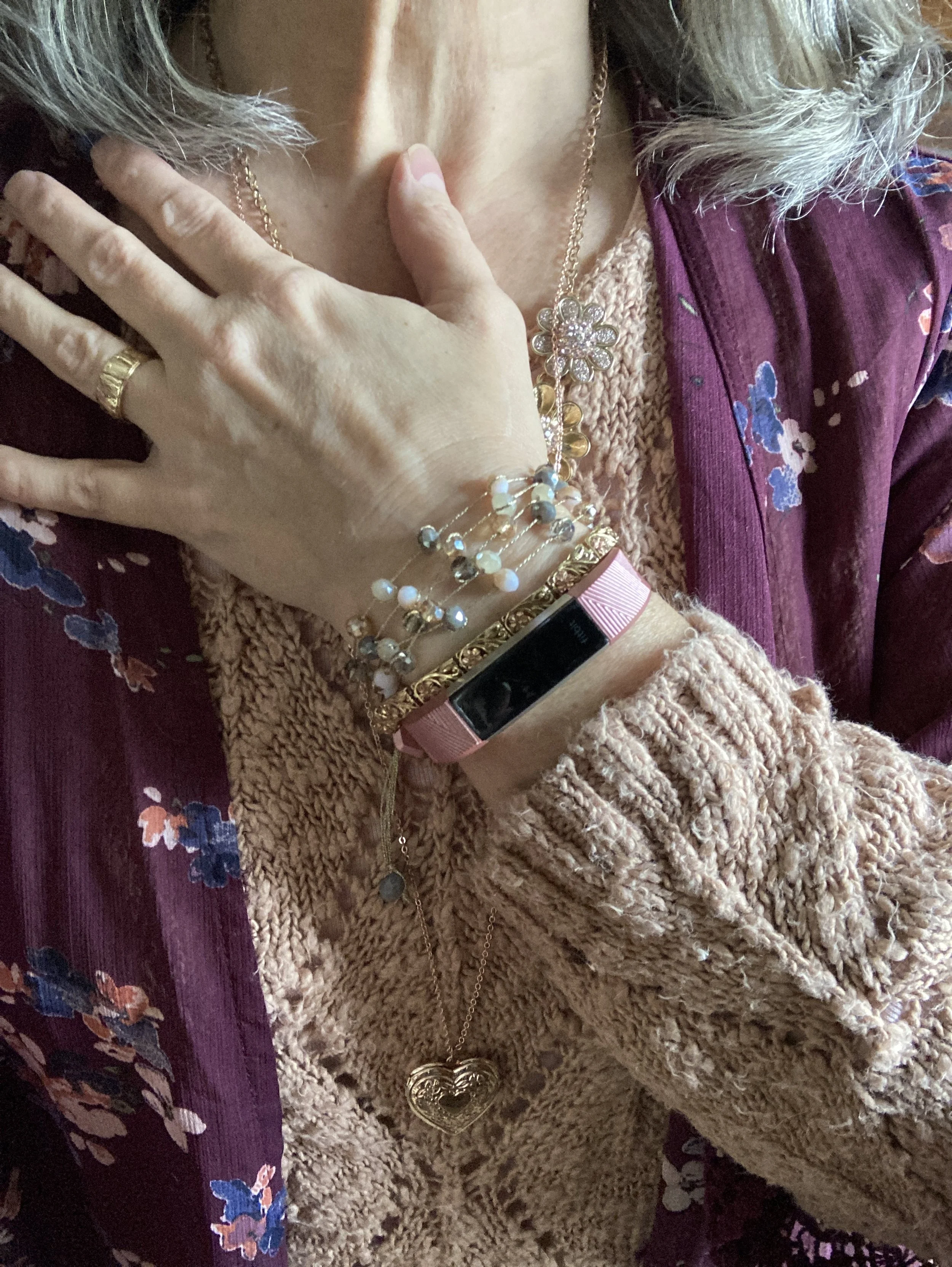
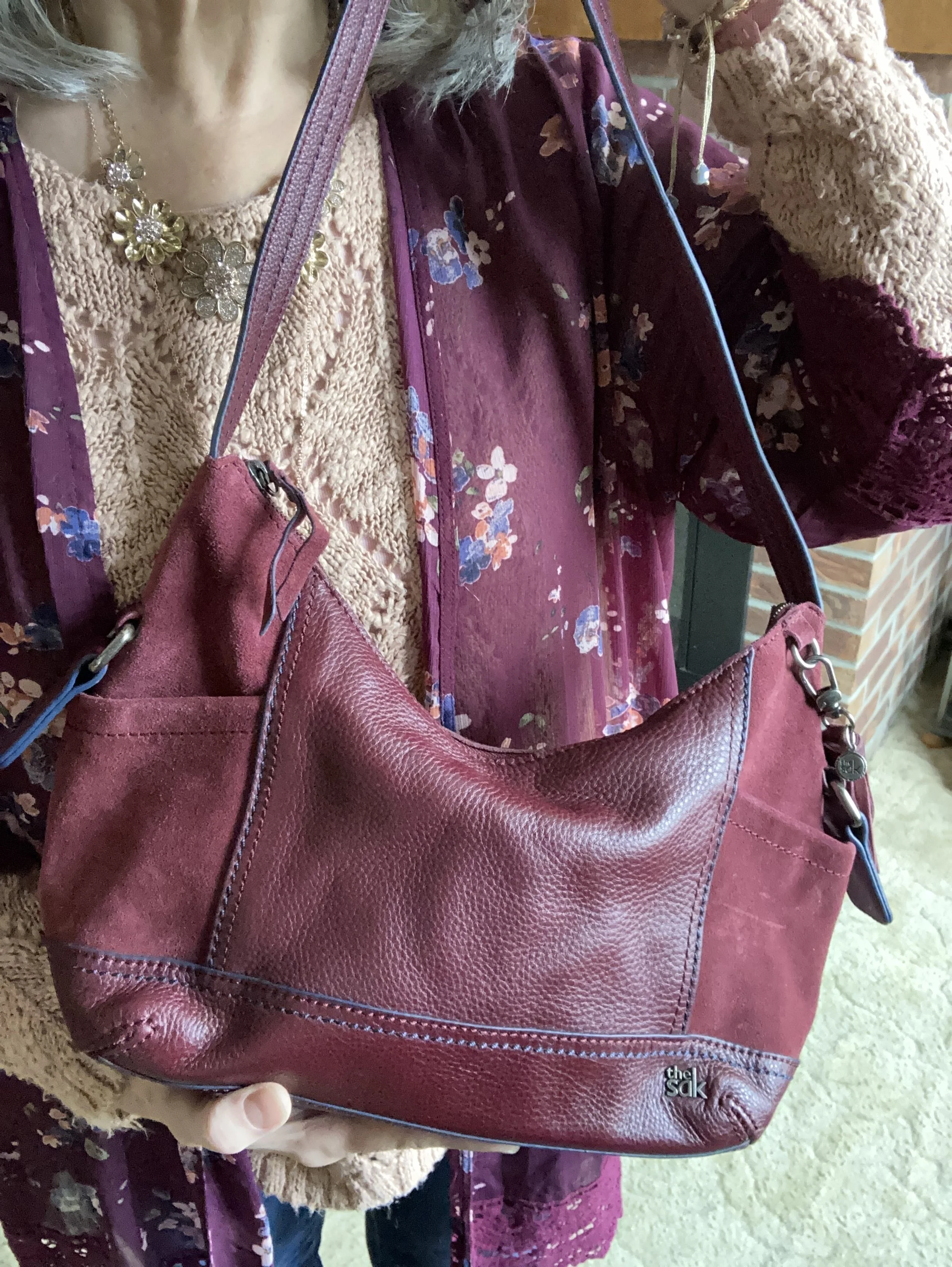
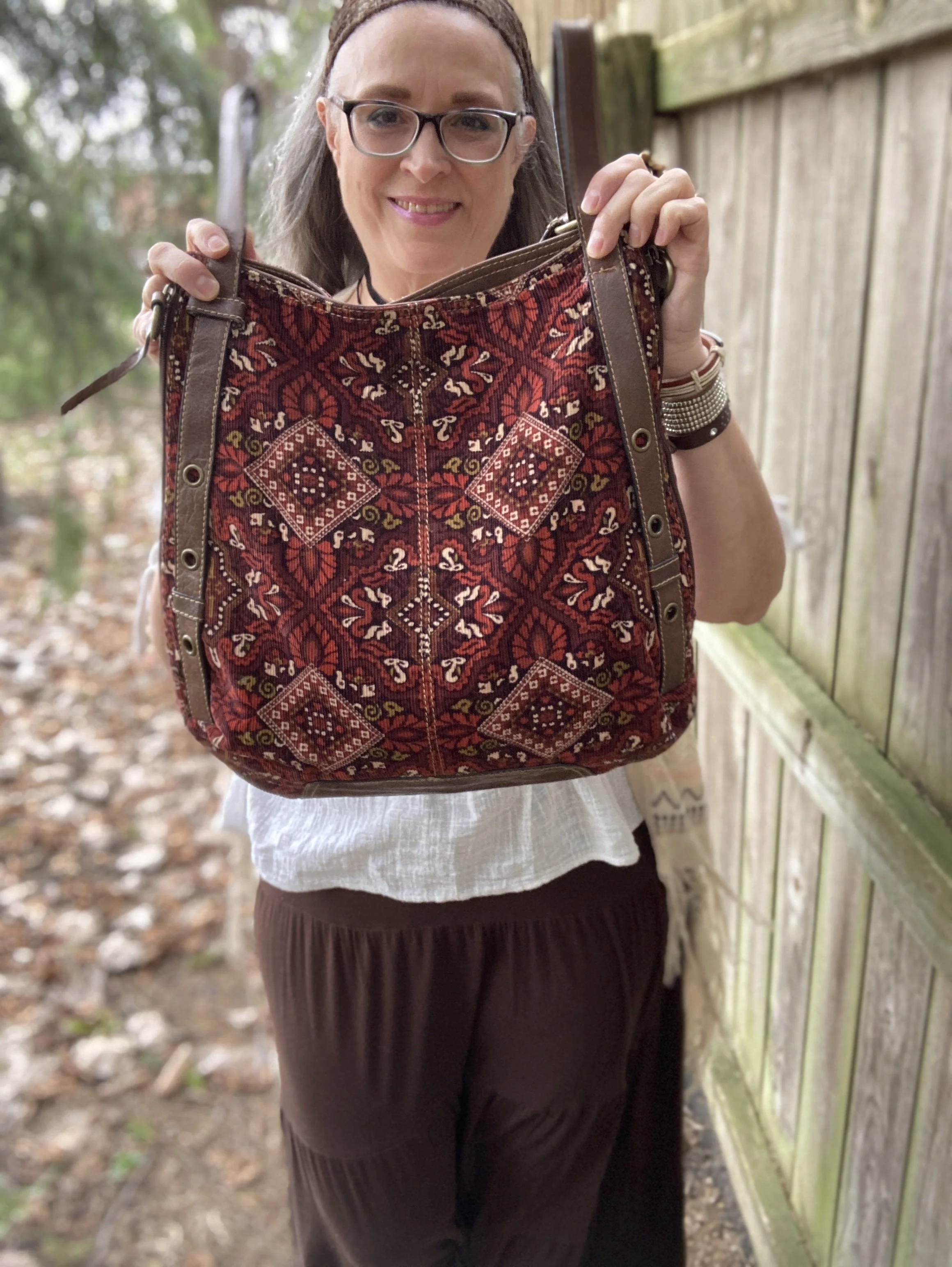
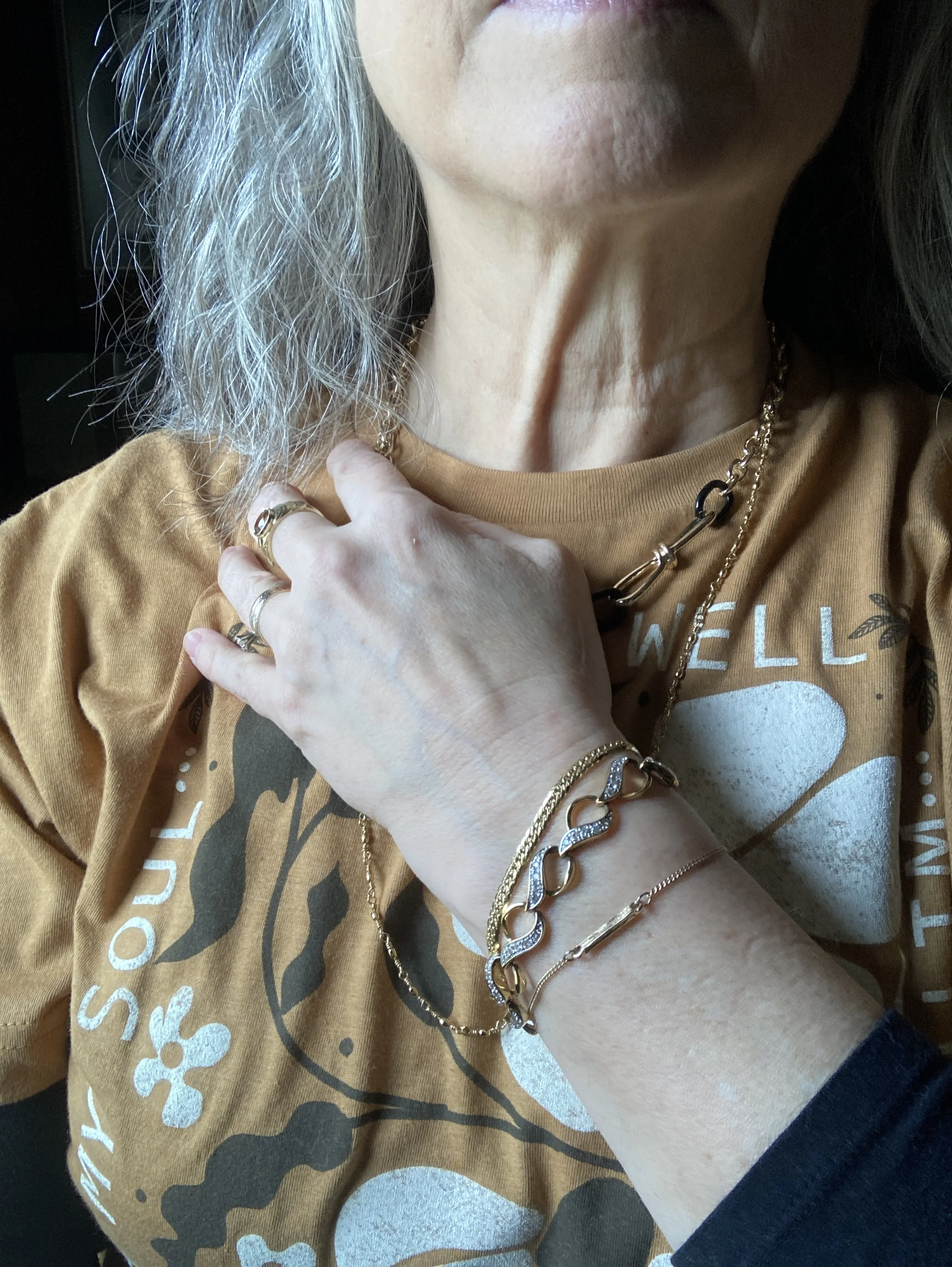
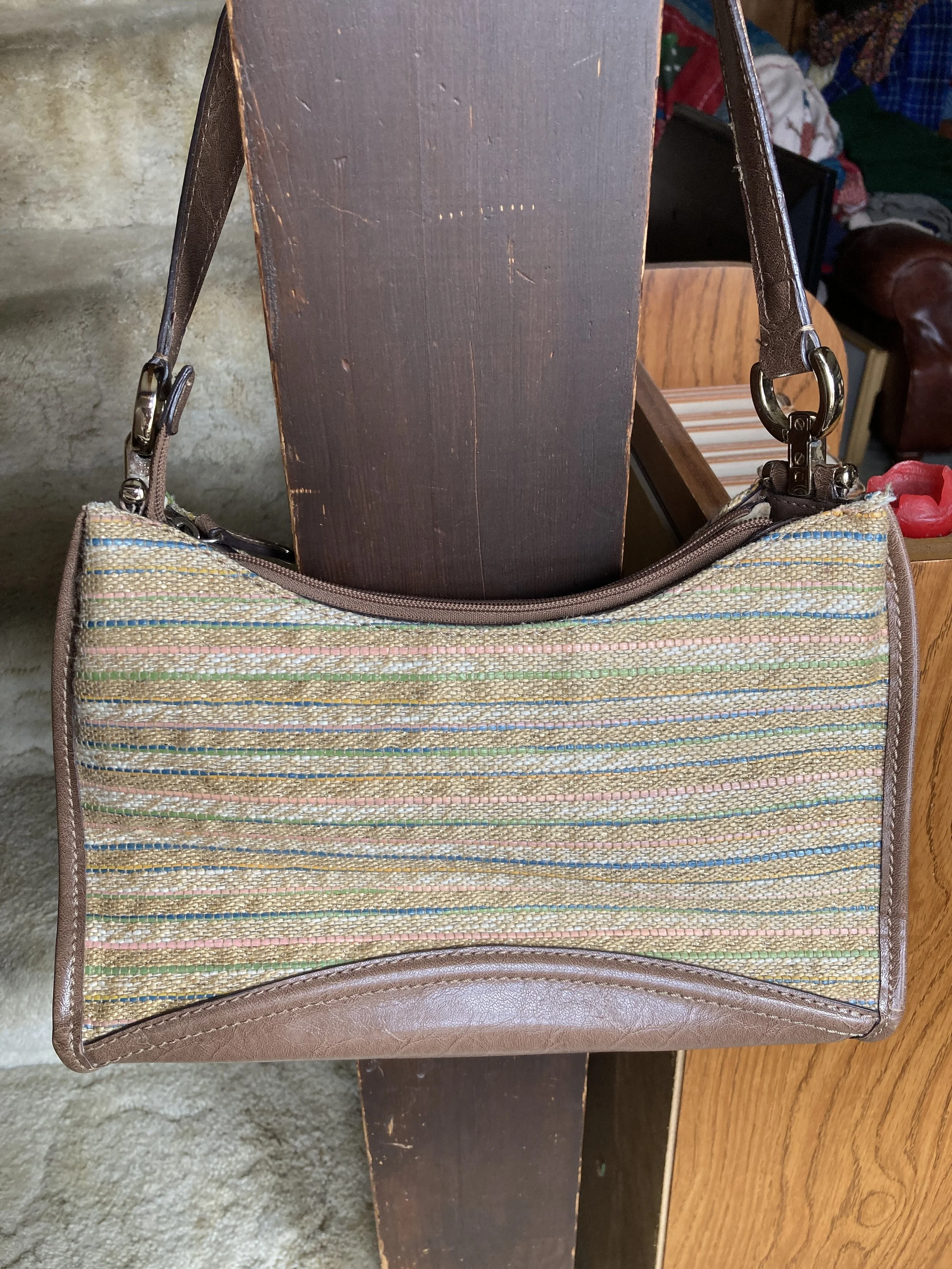
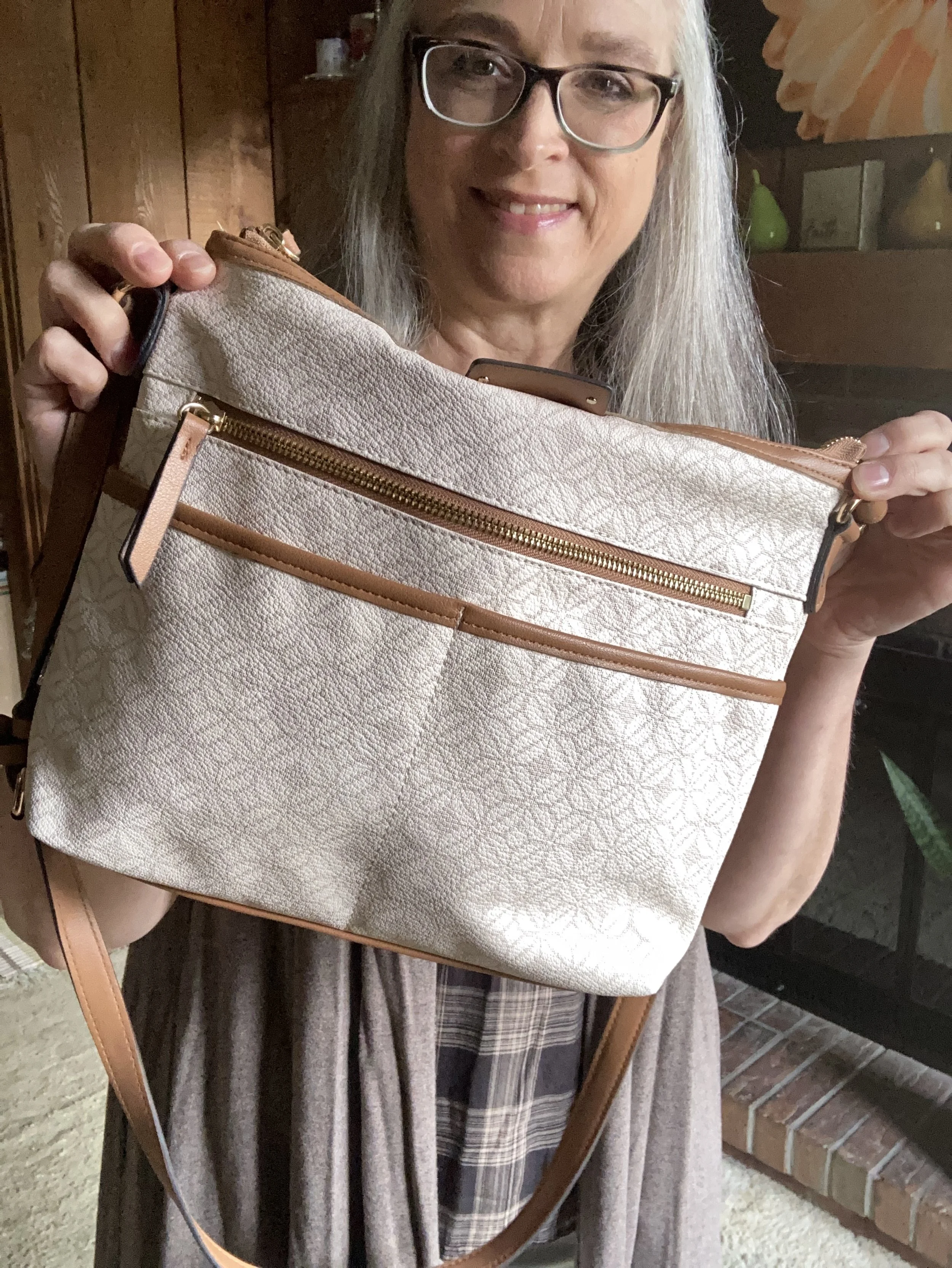
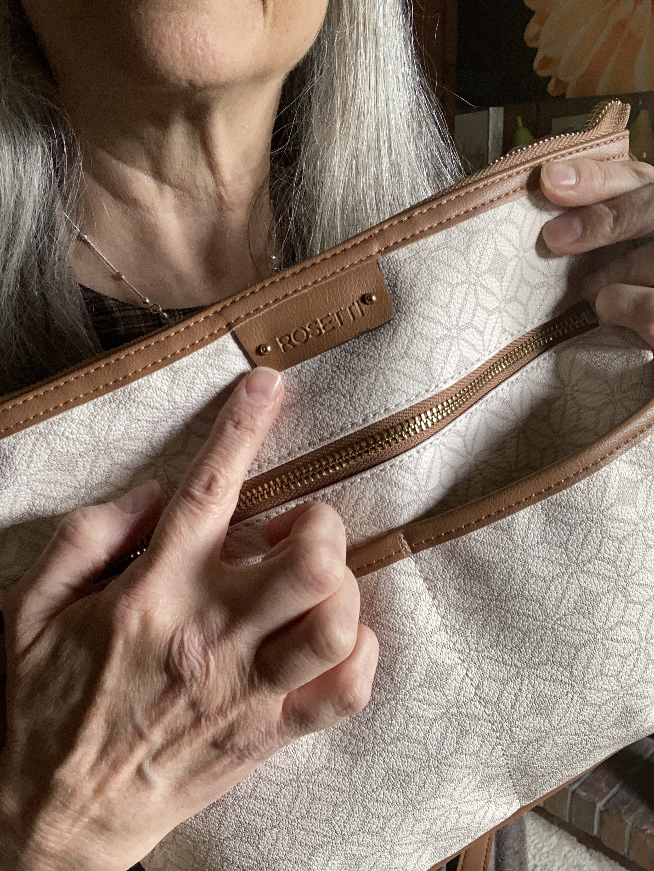
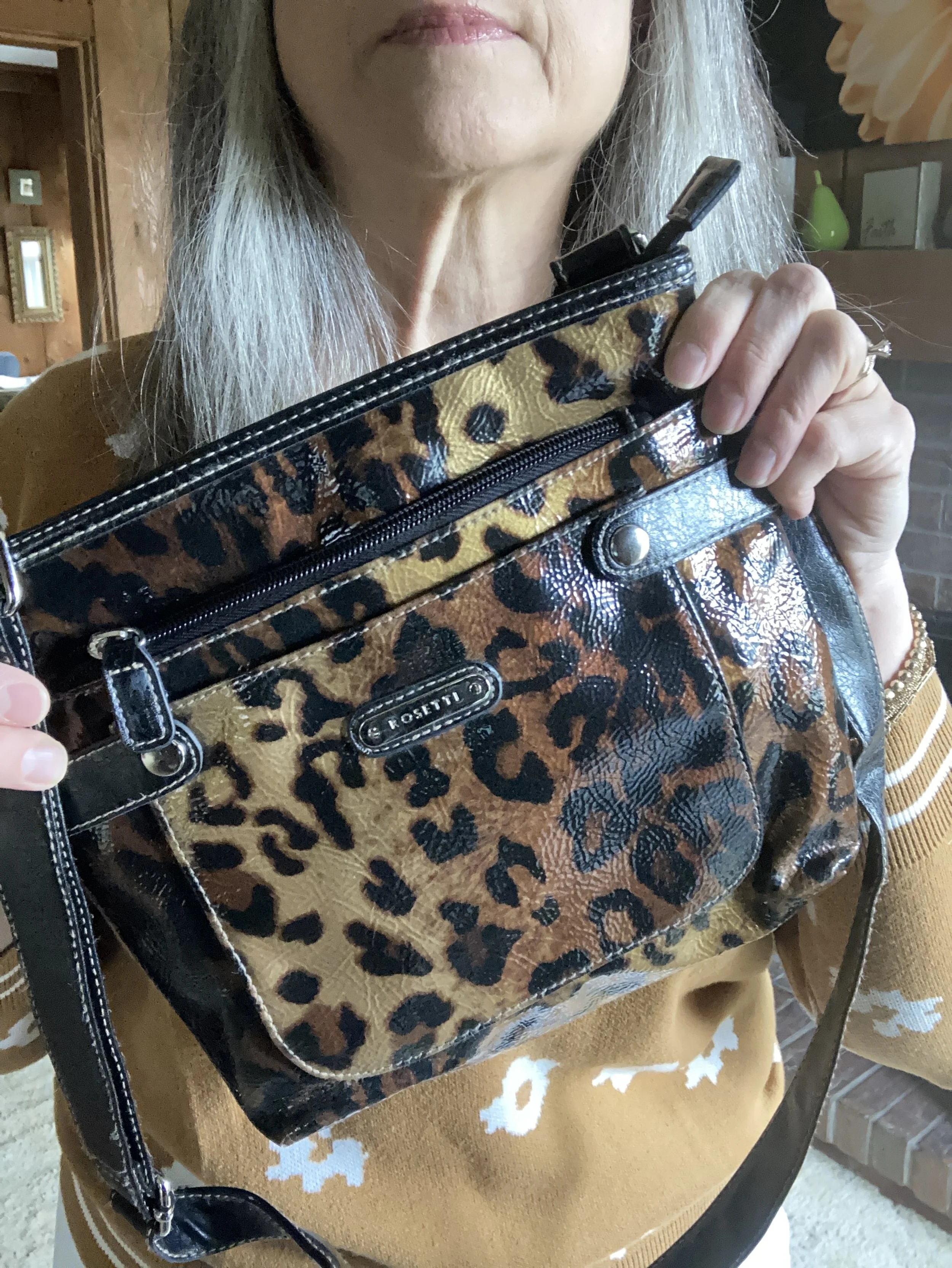
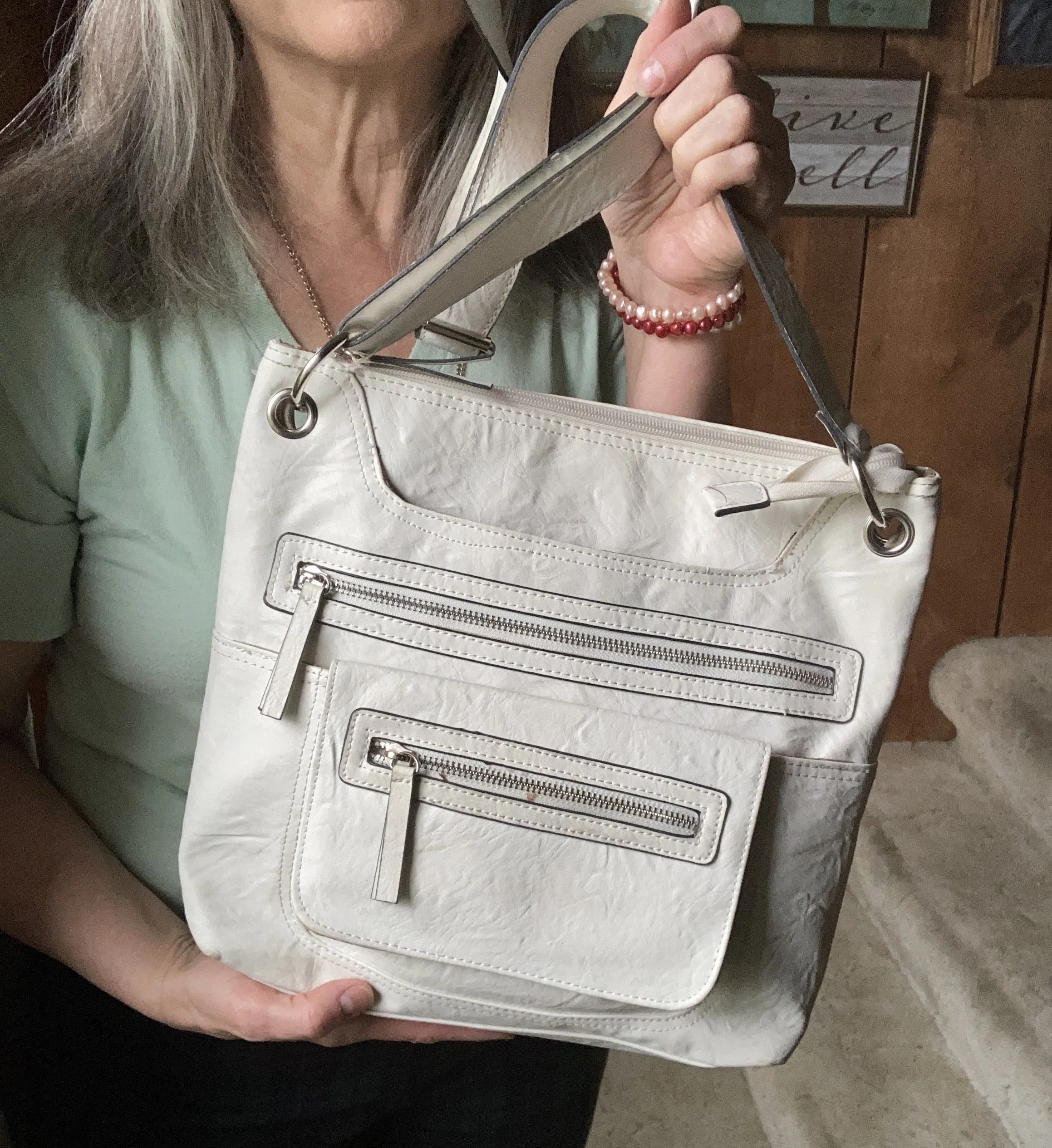
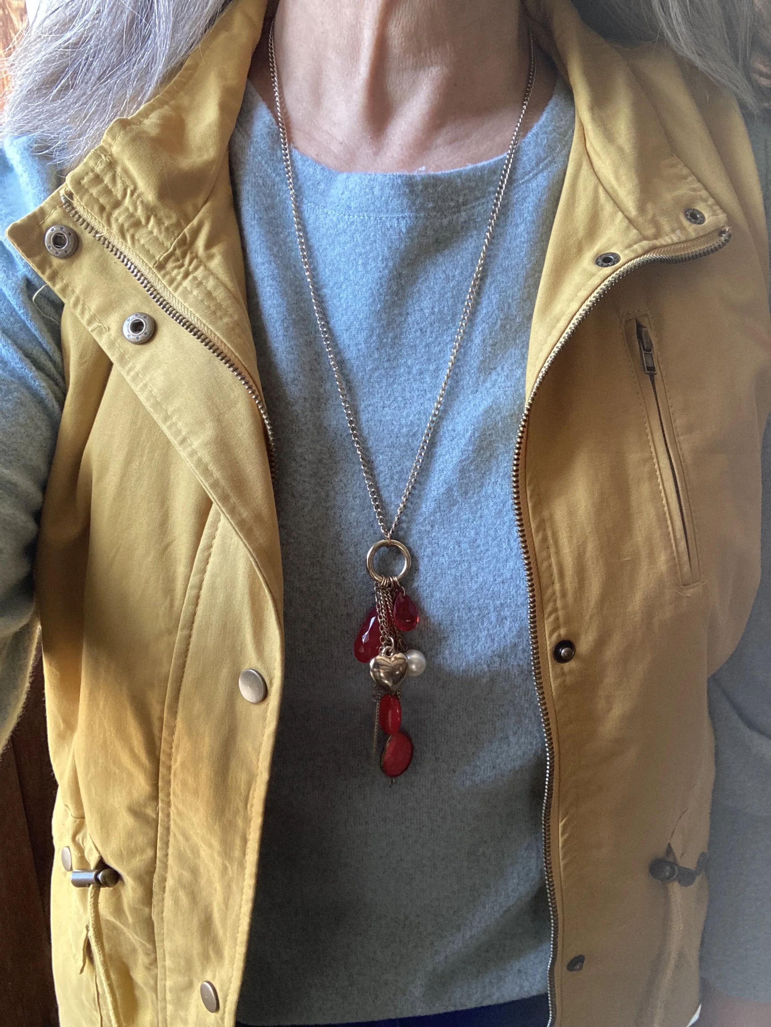
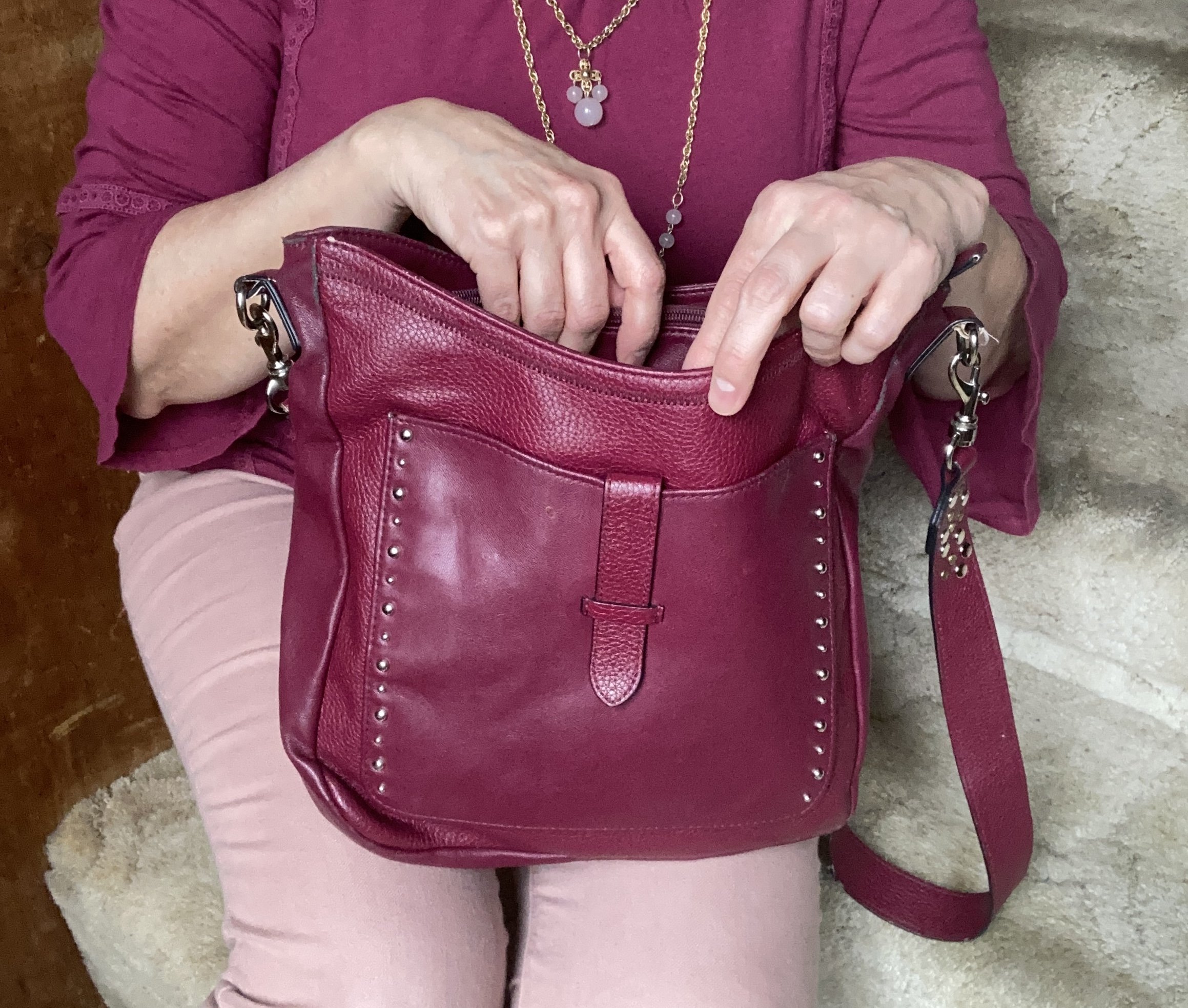
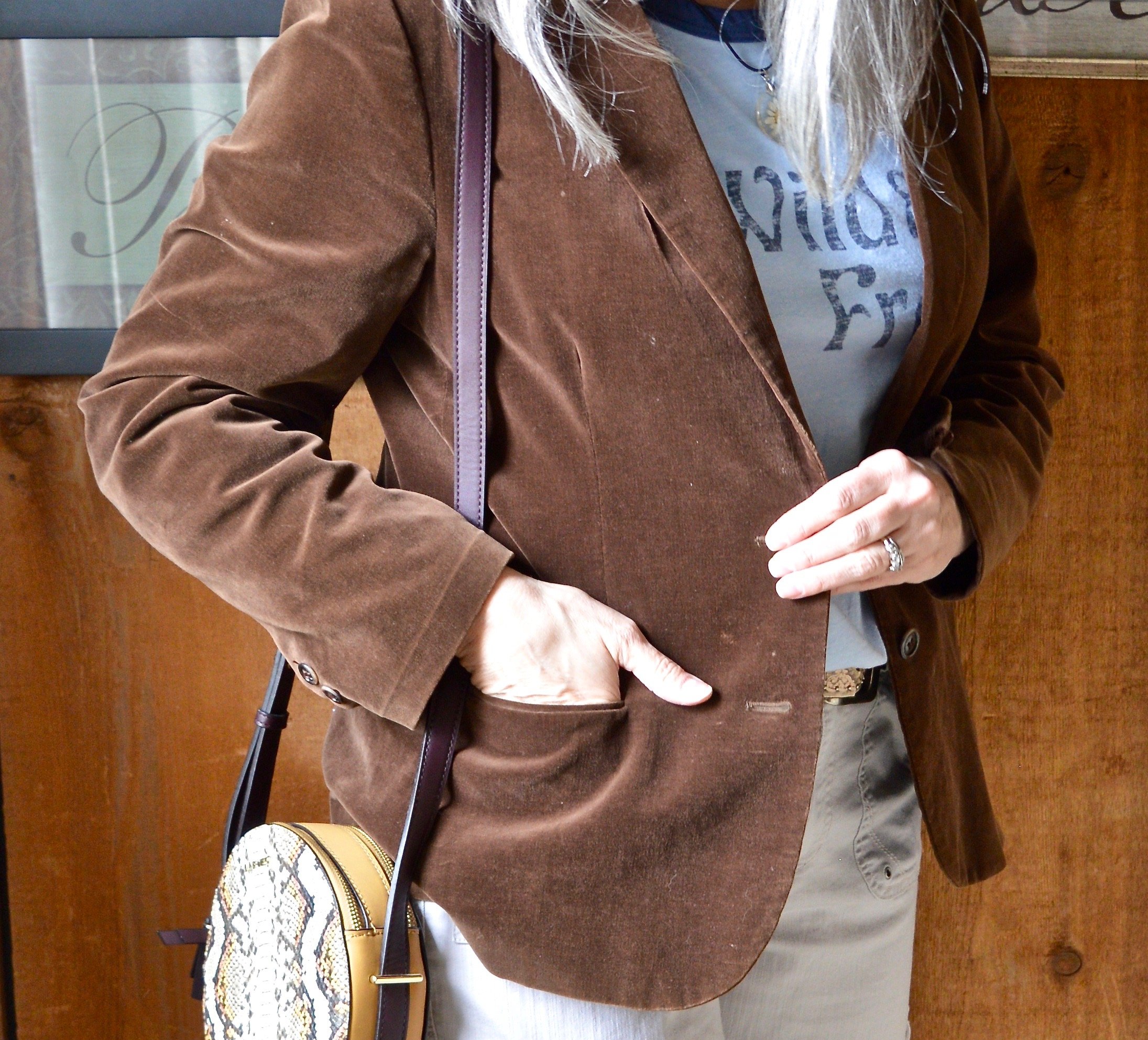
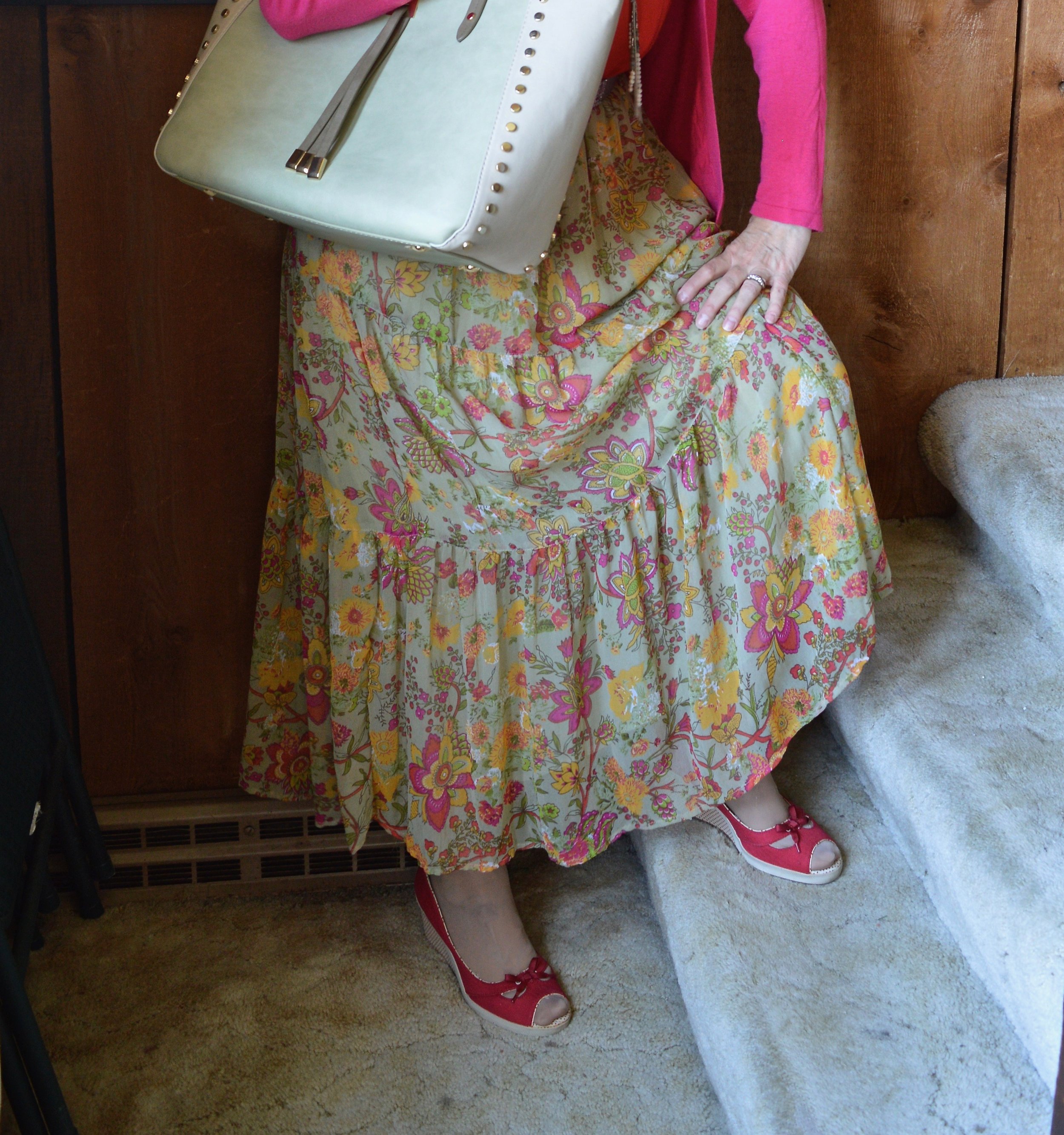
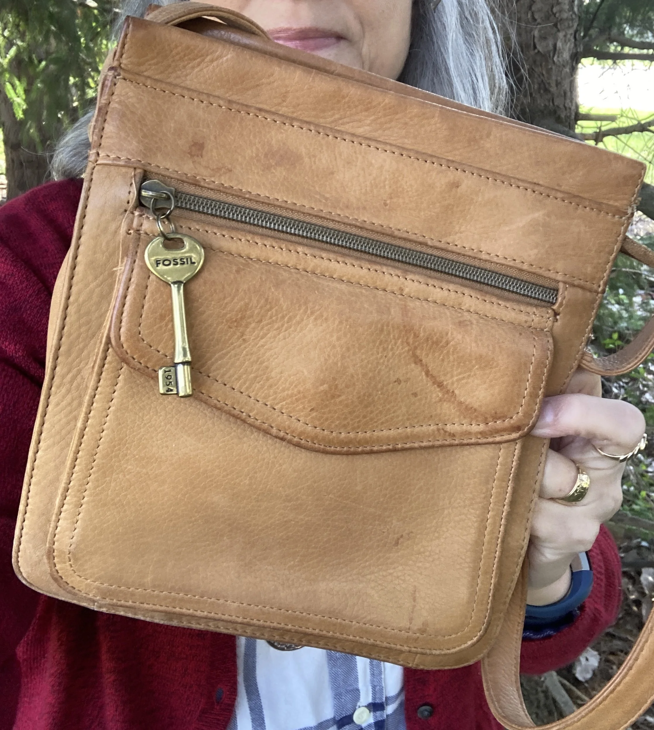
I wanted something a little different for my necklace and bag, so I chose to use similar colors with the cognac brown. I don’t remember where I got the necklace, and the bag is a thrifted, leather Fossil piece.
Here are a few bags from DSW.
What do you think of these colors? Would you have ever thought to combine these into one outfit? Out of these three colors which do you like the best?
I hope you are enjoying these Pantone colors. If you like this series and the blog, please leave me a comment or two. It helps to know there are people out there following along.
Have a great Tuesday!