Pantone - Autumn/Winter - 2021 - New York Palette: Illuminating, Fire Whirl and Ultimate Gray

Over the weekend, I became grandmother again. My oldest daughter had a little boy and we are very excited to meet him, as soon as we can. Obviously, with all the restrictions for visitors in the hospital, we were not able to meet him before he came home.

I am going to being this Autumn/Winter series, as I usually do with the New York Palette. It wasn’t until recently that the Pantone entity added the London Palette to its long list of color tools. Today’s outfit revolves around the two Colors of the Year, the sunny yellow, Illuminating and the classic gray, Ultimate Gray.

FireWhirl.jpg

In all honesty I was having a hard time putting the outfits together for this series. I think most of it had to do with being plagued by this stupid sinus stuff and cough for so long. I am finally sleeping in my bed again, but I still have a wheezy, chronic cough. We’ll see how long it takes to get some sort of resolution, or maybe it has moved in permanently, but it is a pain. It is hard to have long conversations and I cannot sing at all, not that I really could before I got this cough, but it was better than now. Oh well, life is just that way sometimes.

The other problem I think I was having, was the weather. It was so hot, I was having a hard time really getting into styling fall outfits. I love fall, and am excited about that change, but it has just been slow to actually feel like the season to wear layers. Here in my area, by Wednesday, the highs are only going to be in the 50’s. That definitely feels like fall.

pantonefallcolortrendsfirewhirl-3.jpg

You can see that I only used Illuminating in very small doses with my yellow beaded necklace and bracelets. The Fire Whirl red tank top is a thrifted Loft piece. It is actually more of an a-line or swing silhouette, so I gathered the shirt underneath in the front, then secured the little “pony tail” with a hair band. The result is to give the top a more fitted look with a fun swirl at the front.

pantonefallcolortrendsfirewhirl-12.jpg

For this outfit, it worked out that Ultimate Gray takes center stage with just a few pops of Fire Whirl and Illuminating. My thrifted, plaid, Sag Harbor trousers are actually petites, so I expect they would be closer to an ankle pant than a crop pant, but I like the way it looks, especially with my darker gray Impo booties.

pantonefallcolortrendsfirewhirl-11.jpg

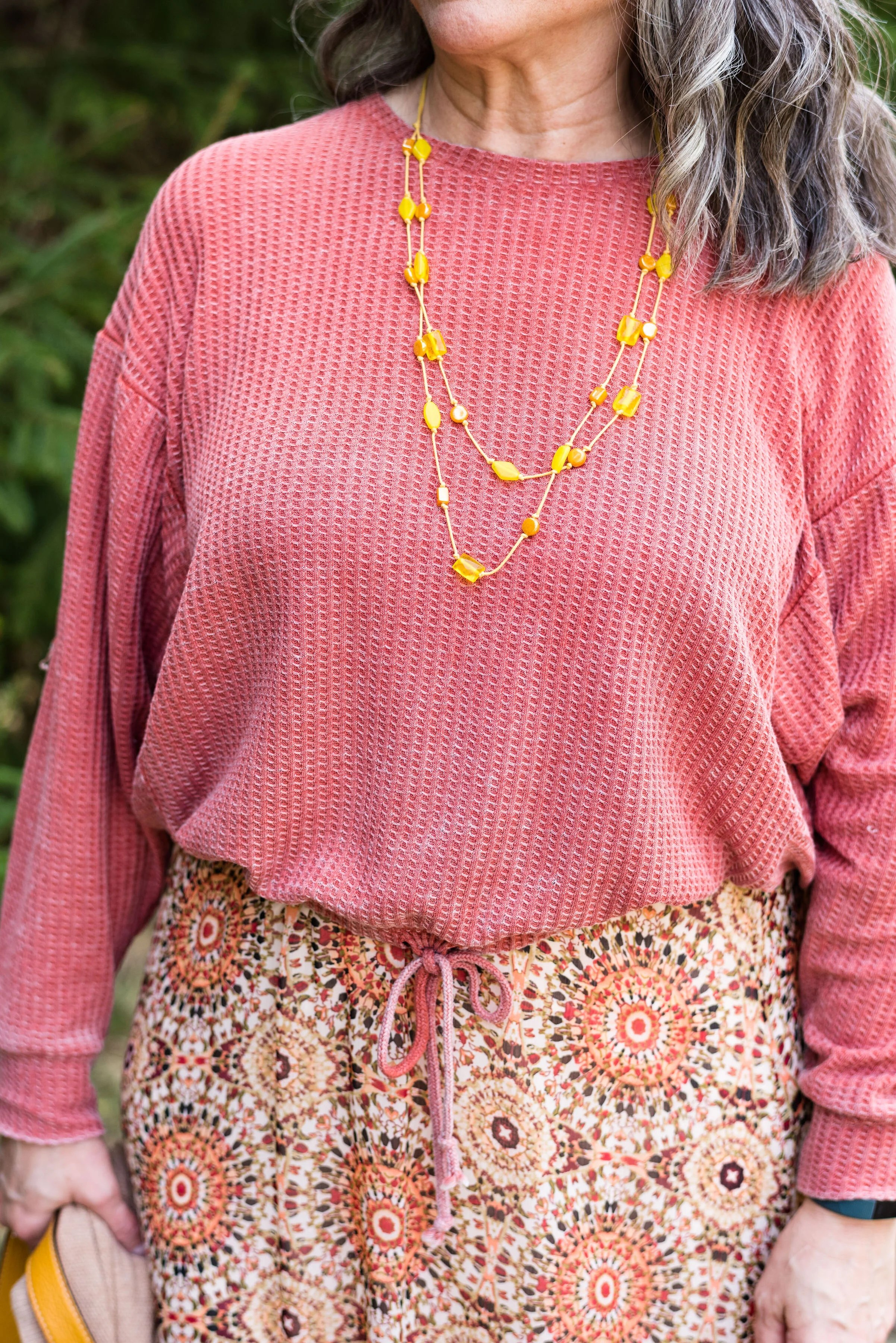
The next picture shows you a closer look a the Illuminating jewelry and the detailing on the yoke of the top. The gray moto jacket is a no name brand and I am not sure where I got it. I wanted to say it was thrifted, but for some reason, I think I bought it at a store. I really cannot remember. Is that bad? Ha, ha.

pantonefallcolortrendsfirewhirl-8.jpg

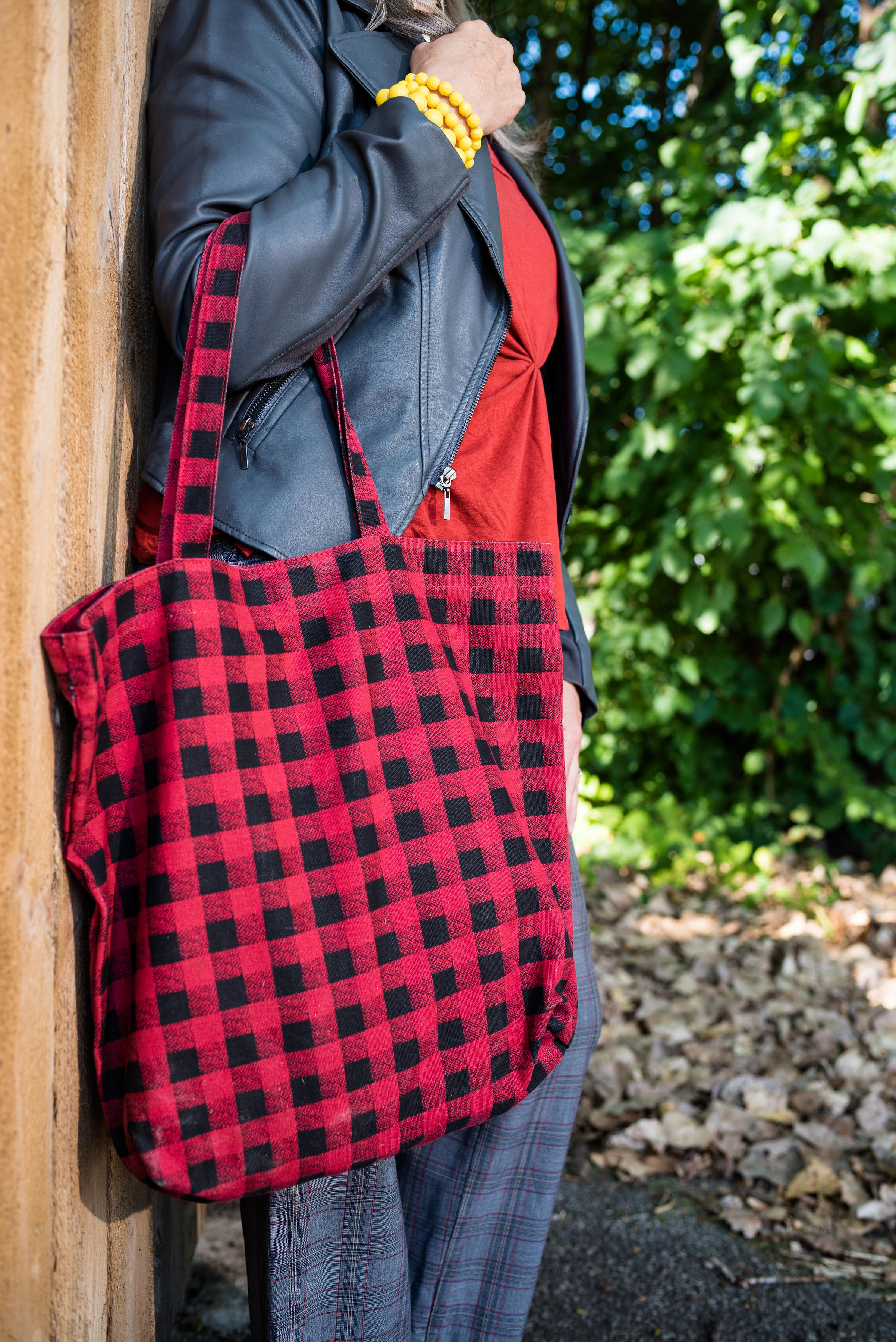
My tote bag was going to be a gift for one of my daughter’s one Christmas a few years ago and I ended up keeping it. Many times, I just end up buying too many items, so I have to return stuff, but this was a cheap purchase, I believe from Kohl’s and I really liked it.

pantonefallcolortrendsfirewhirl-9.jpg

Fire Whirl is more the color of my top, but I kind of liked the contrasting shades of red, as well as the two differing plaid patterns. It just gives the outfit a fun vibe.

pantonefallcolortrendsfirewhirl-1.jpg

What do you think of these colors? Would you pair these colors with one another? Do you have these colors in your closet? Let me know your thoughts in the comments below.

I am including a few shopping links for you to look over. These are affiliate links, brought to you at no extra cost. If you click on a link, I get a few cents, if you purchase something through my site, I get a little more. Thank you for all of your support.

Photo credit Jessica Trumbull, with Rebecca Trumbull.

Pantone - Spring/Summer - 2021 - Both Palettes with all the Outfits.

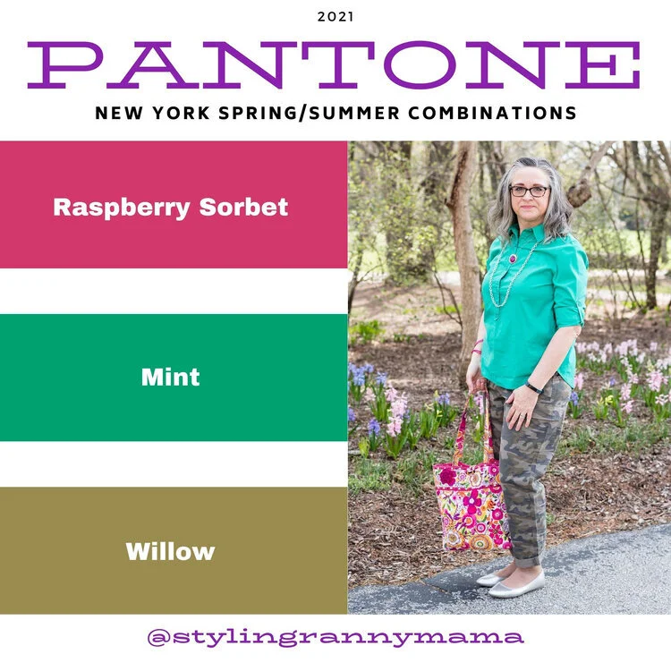
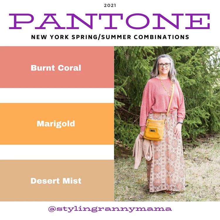
I always think it is fun to do a post featuring all the outfits from my Pantone color series. I really spread these out this year due to scheduling issues, so that’s even more of a reason to look back at all of the outfits. I will also let you know, which ones were my faves.

New York Palette

ClassicColors_(12).jpg
illuminating (1).jpeg
amethystorchid.jpeg
raspberrysorbet.jpeg
burntcoral.jpeg
frenchblue.jpeg

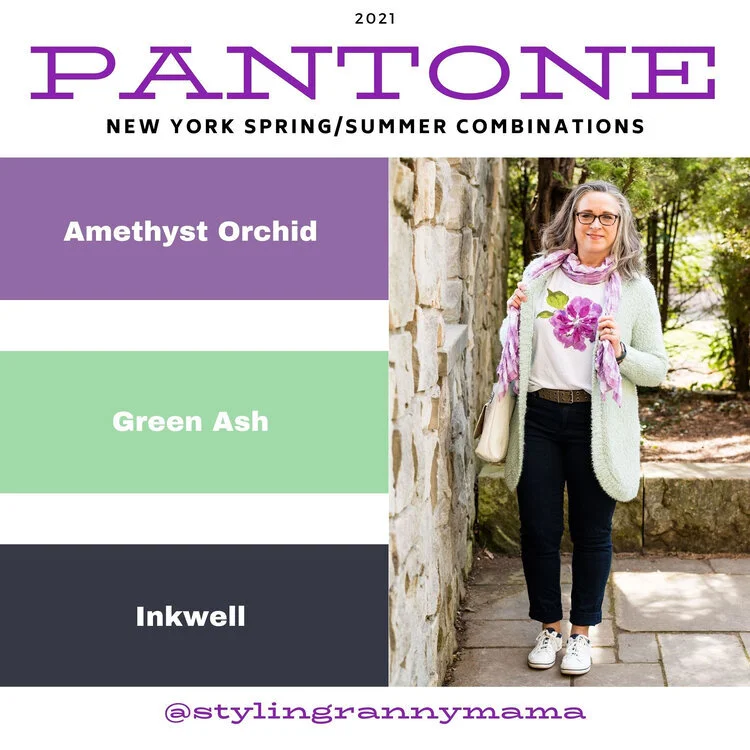
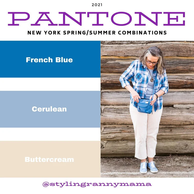
I would have to say, from the New York Palette, my favorite combination is the Amethyst Orchid, Ash Green and Inkwell. I love the contrast of the dark navy blue and the pastel colors. It just makes the outfit pop. I also love the light green with the light purple. It is a very pretty combo for spring and summer. In addition, I really liked the casual vibe of the French Blue, Cerulean and Butter Cream combo. both of these are outfits I would wear. What were your favorite colors? What is your favorite outfit from this series?

London Palette

londonspring2021 (1).jpg
illuminating (1).jpg
pirouette.jpg
purplerose.jpg
pickledpepper.jpg
beachglass.jpg

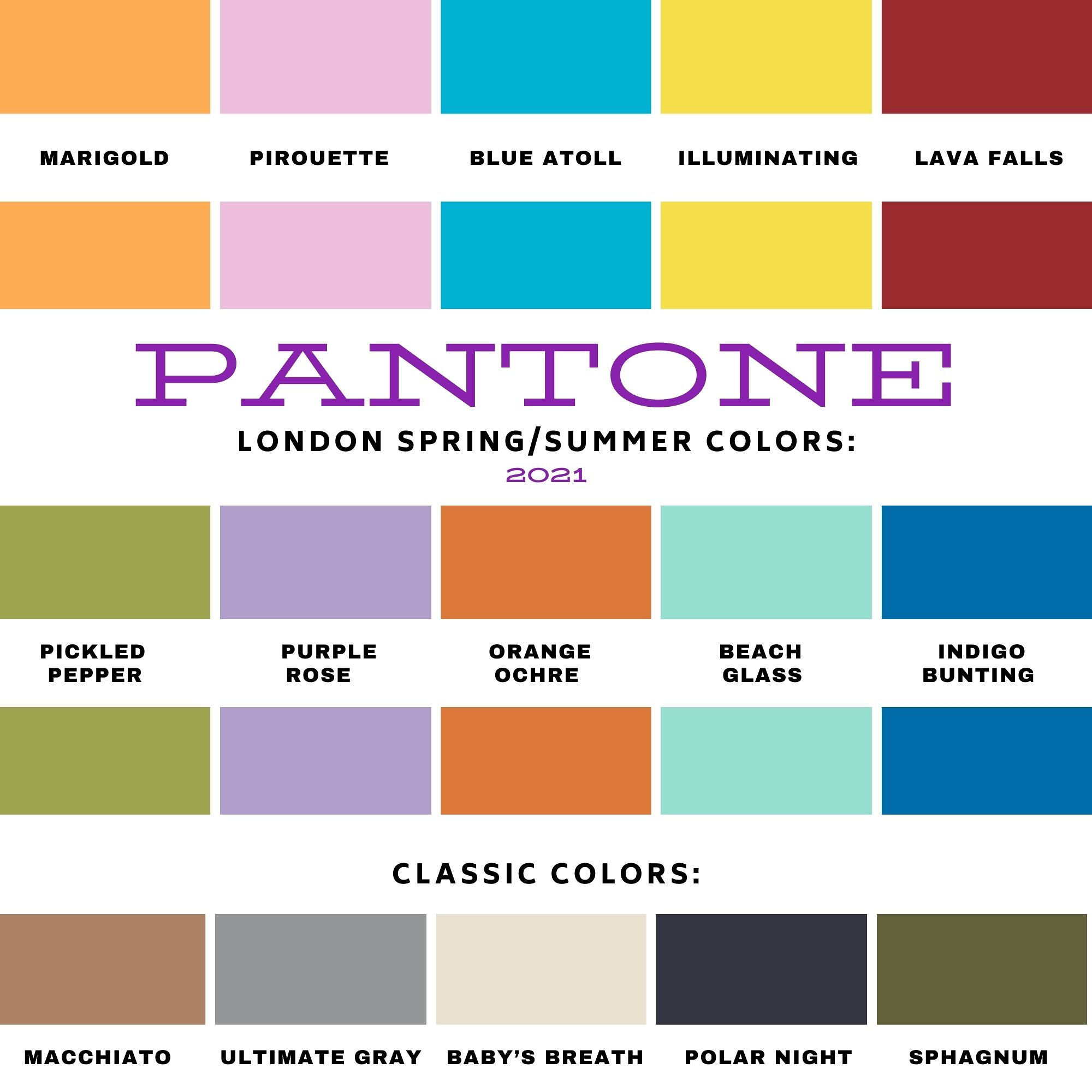
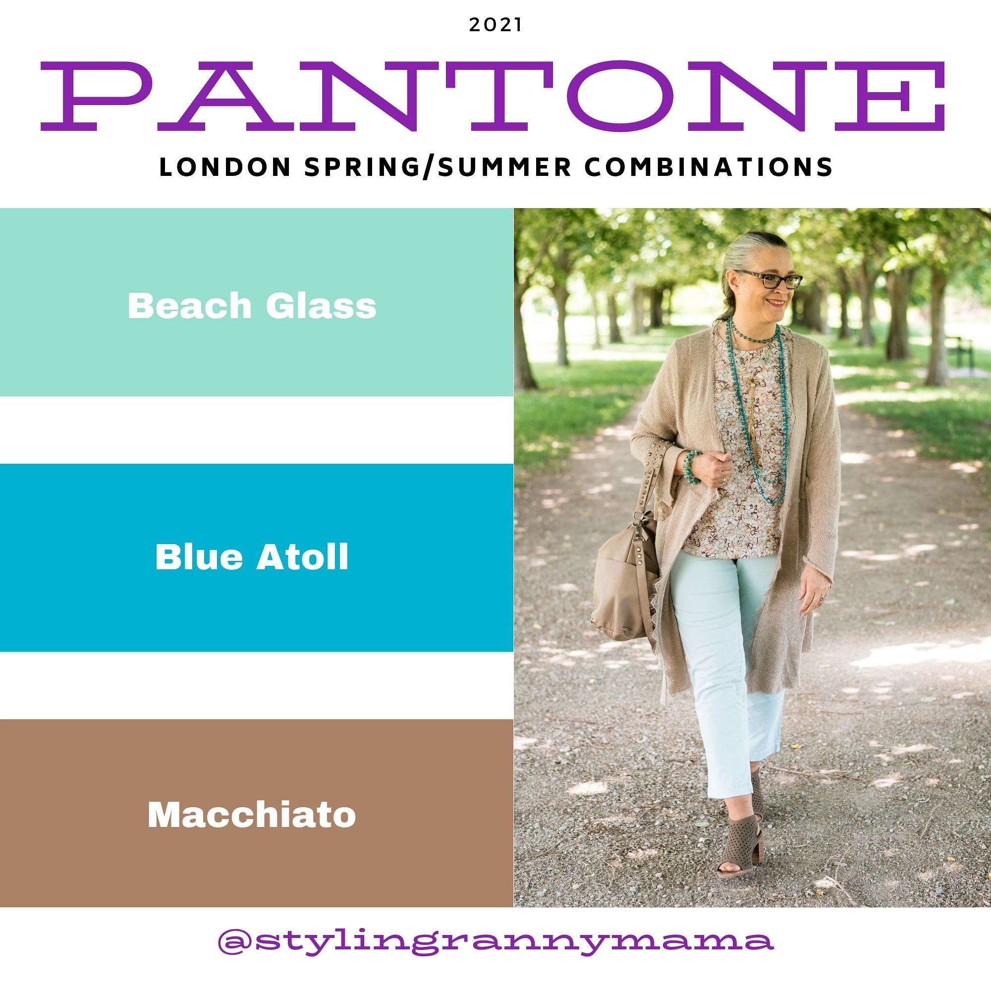
I really liked this palette over all, because I love all of the colors. My favorite combination was the outfit that I got the most positive feedback on, Beach Glass, Blue Atoll and Macchiato. There is just something so summery and uplifting about these tropical blues and warm brown. I also liked the challenge of combining Purple Rose and Lava Falls. I would have never thought to pair this medium purple with a bold red, but I think it worked. What were your favorite colors from this palette? What is your favorite outfit?

I’d love to hear back from you. Your comments help me to know if the content I am putting out is pertinent to your life. I hope that my outfits and posts are inspiring you to shop your own closet and to think outside the box when it comes to the clothing pieces you wear and how you put them together.

Have a wonderful day!

Pantone - Spring/Summer - 2021 - New York Palette: Introduction

I am a bit behind on the Pantone colors this year. I had a hard time getting back into the swing of regularly posting, but here I am. While we are a few weeks into spring, the Pantone colors for this season are for spring and summer. I don’t pay attention too much to their time table, because they already have the colors out for the fall/winter season. Who wants to think about fall/winter when we have barely made it into spring? Ha, ha.

Just as a quick review, the Pantone Color Institute is an entity that provides the color trends for both the fashion and interior design industries. If you go to their website you can see all sorts of information from color swatches you can order to educational opportunities. Obviously, these are not the only colors that you see trending on the runways, but Pantone is easily considered a color authority by both design areas.

Every year, Pantone chooses a color of the year. Last year it was Classic Blue. In 2019 it was Living Coral. This year they picked two colors, Illuminating, a sunny yellow and Ultimate Gray, which is a classic medium gray. Typically, the colors of the year are seen on both the New York and the London Palettes. As I have done in the past I will be starting my series with the New York Palette. This year, the palettes are quite dissimilar, which makes it more interesting for me, as I pick out outfits and for you, my lovely subscribers.

Here is the New York Palette.

ClassicColors_(12).jpg

This is a mix of jewel tones and pastels, so if you lean towards one or the other, this palette will make everyone happy. Rust is a different color for summer, but I think it can work well with many of the others colors. Once again there is a selection of classic colors, which to me are helpful if you want to tone down an outfit and just accent with the brighter colors through jewelry and other accessories.

The following are a few photos from our shoot which give you some sneak peeks at how I combined these colors.

pantonespring2021preview-1.jpg
pantonespring2021preview-2.jpg
pantonespring2021preview-3.jpg
pantonespring2021preview-4.jpg
pantonespring2021preview-5.jpg
pantonespring2021preview-6.jpg

I hope you will join me on Thursday as I start the series. Have a great day!

Photo and graphic credit Rebecca Trumbull.