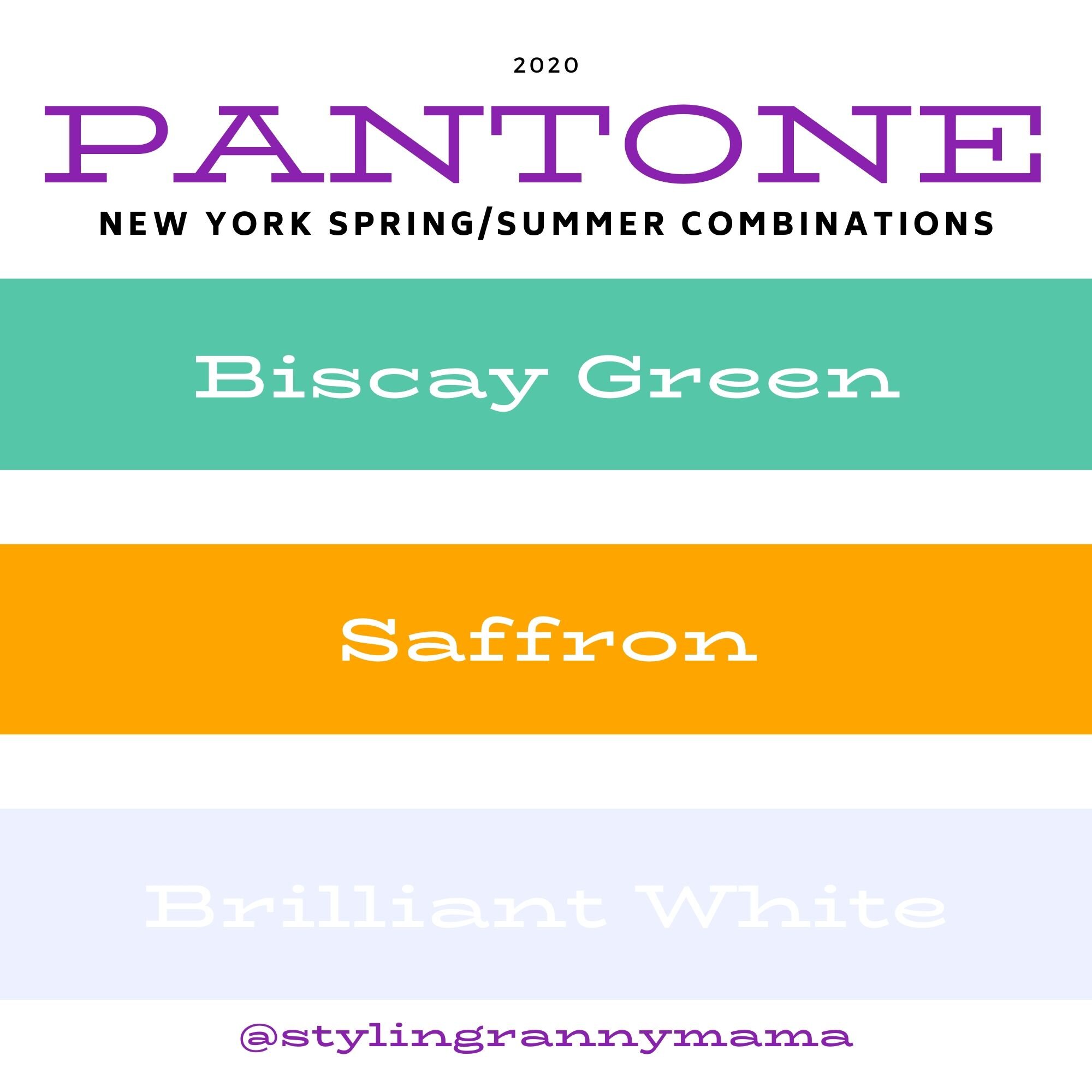
Pantone Spring/Summer 2022 - NY Palette: Gossamer Pink, Skydiver and Poppy Seed

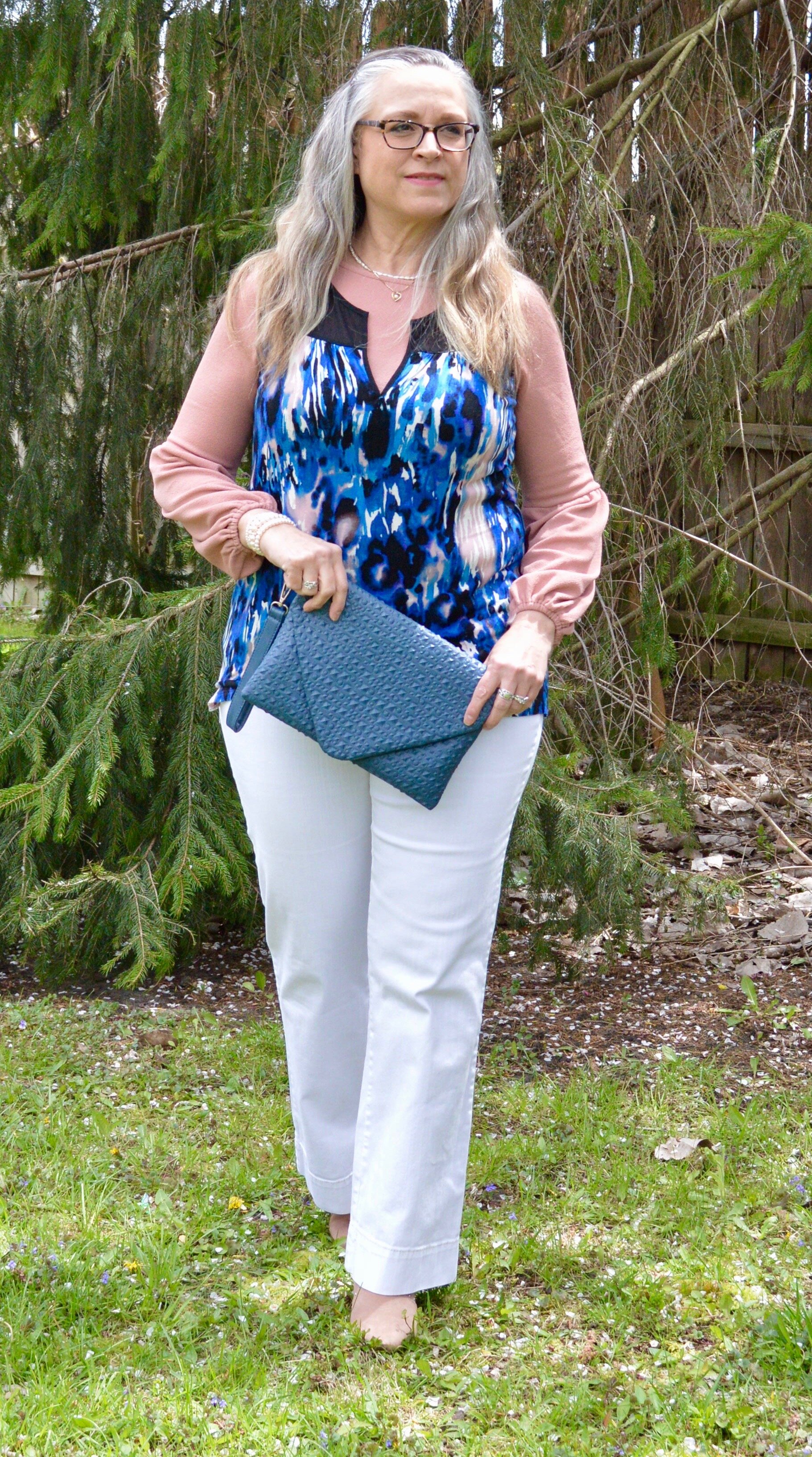
Hi everyone. It is time for another set of colors from the Pantone Spring/Summer New York Palette. These colors include the pastel Gossamer Pink, the pretty, bright, Skydiver blue, and a charcoal gray called Poppy Seed. I was glad to see a darker gray on the Classic color palette, as that has always appealed to me more than the lighter gray. These are my choices from my closet for each of these colors. To see the actual Pantone New York palette colors, click here.

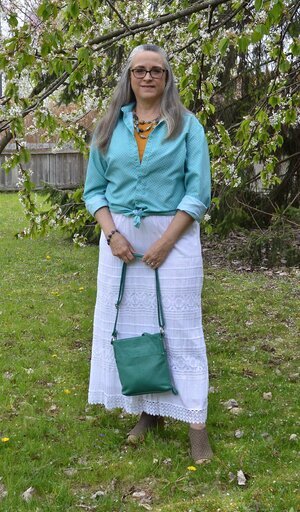
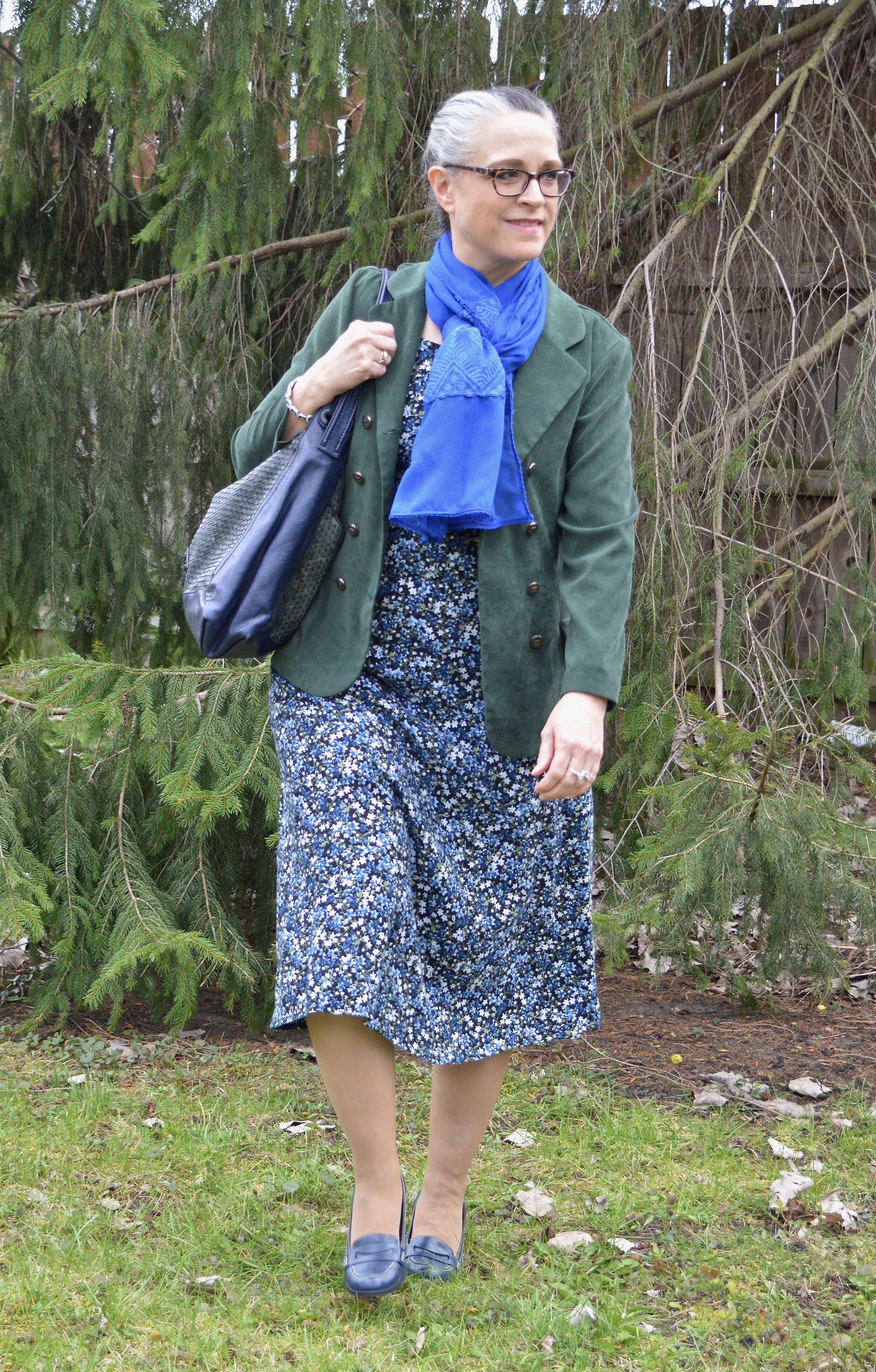
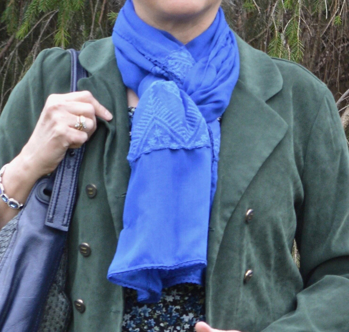
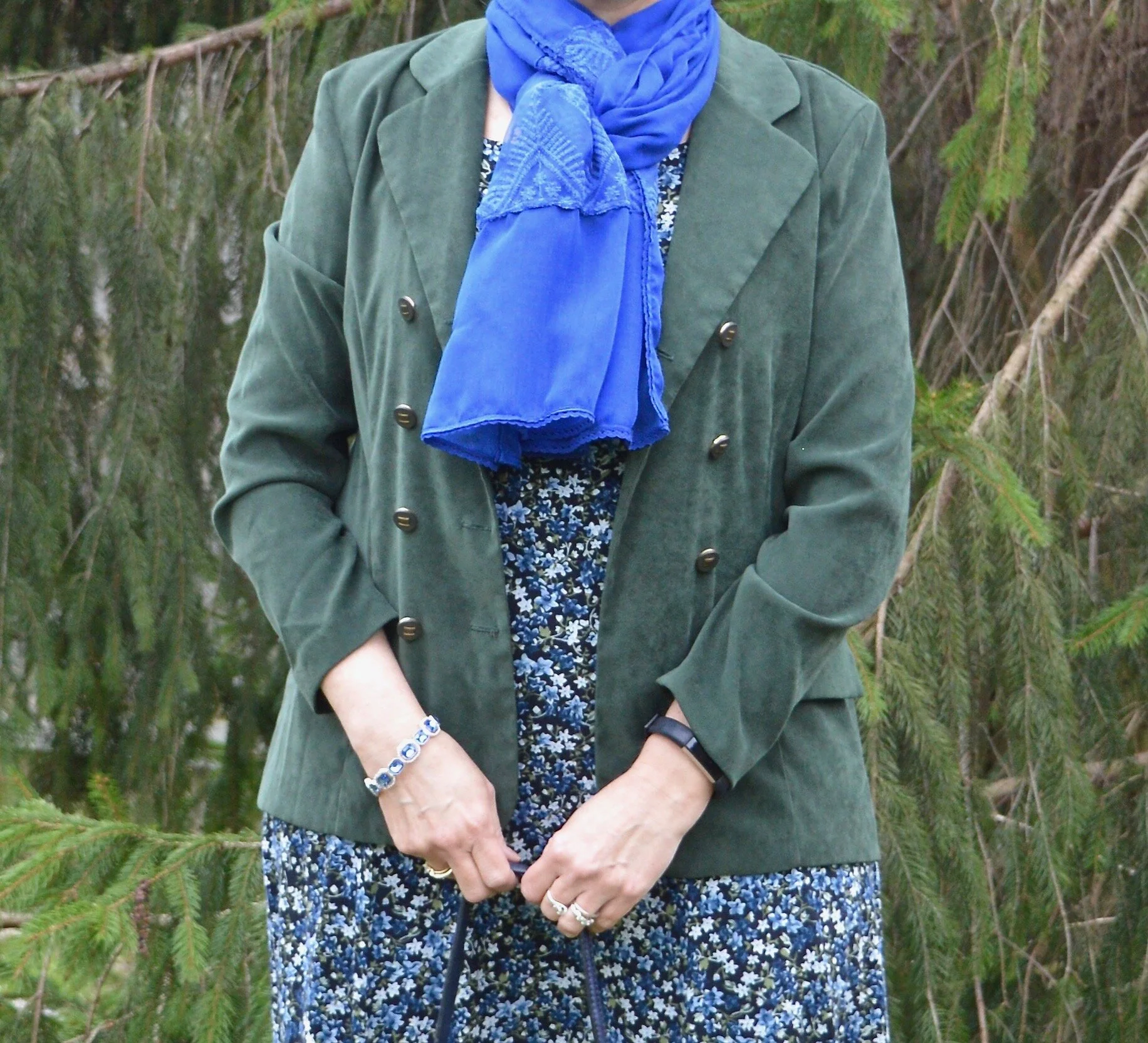
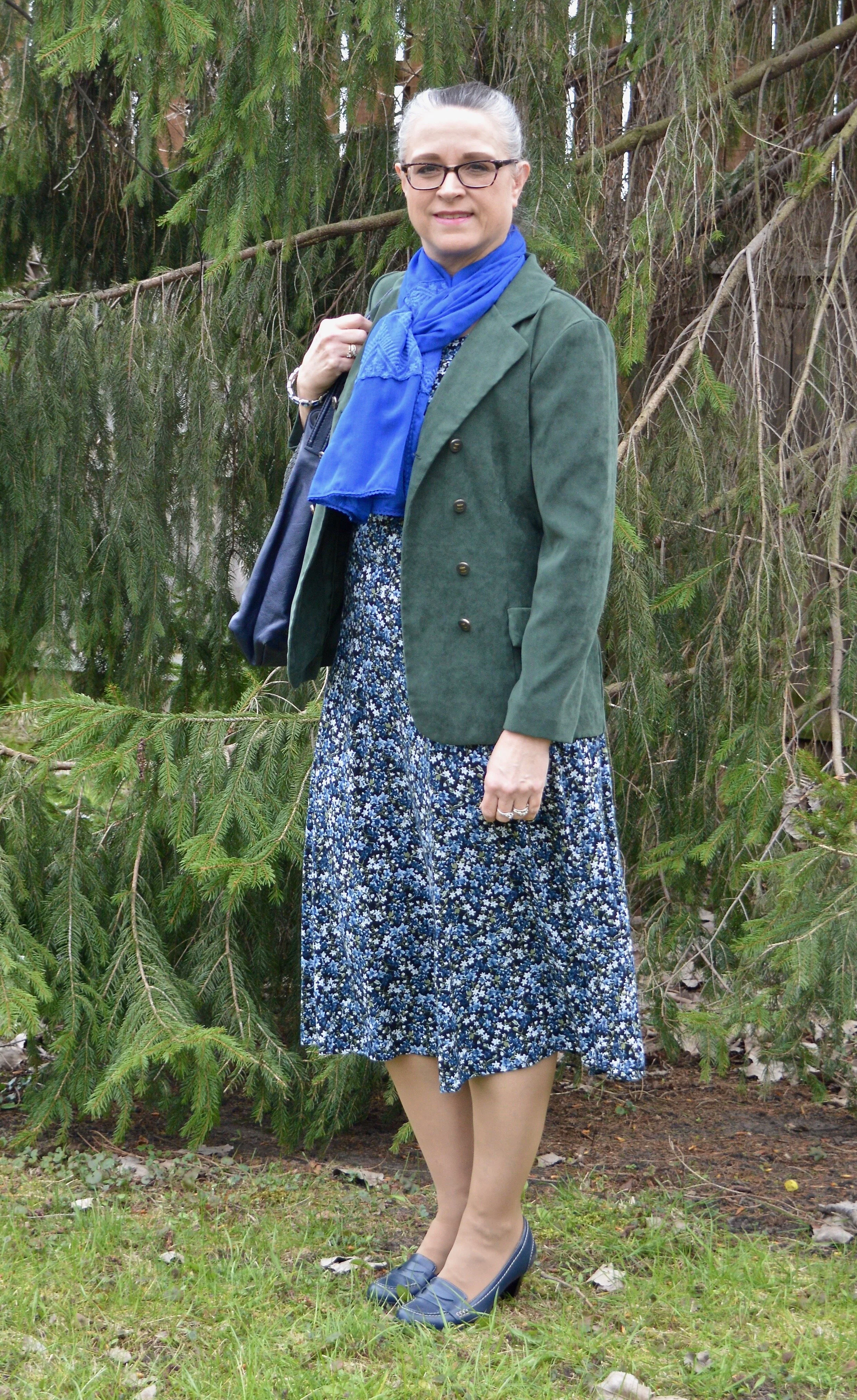
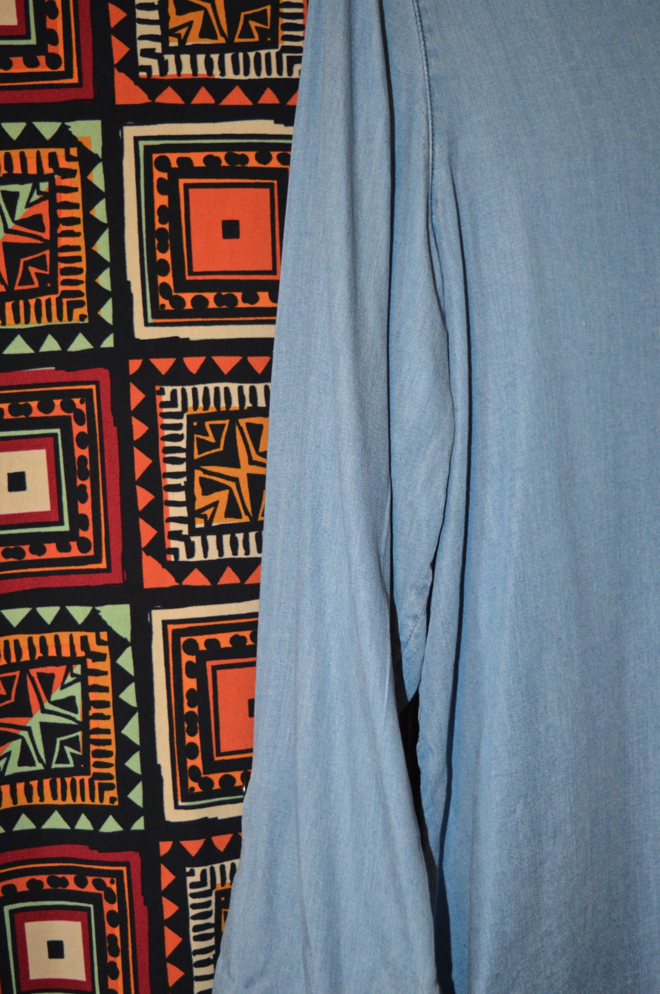
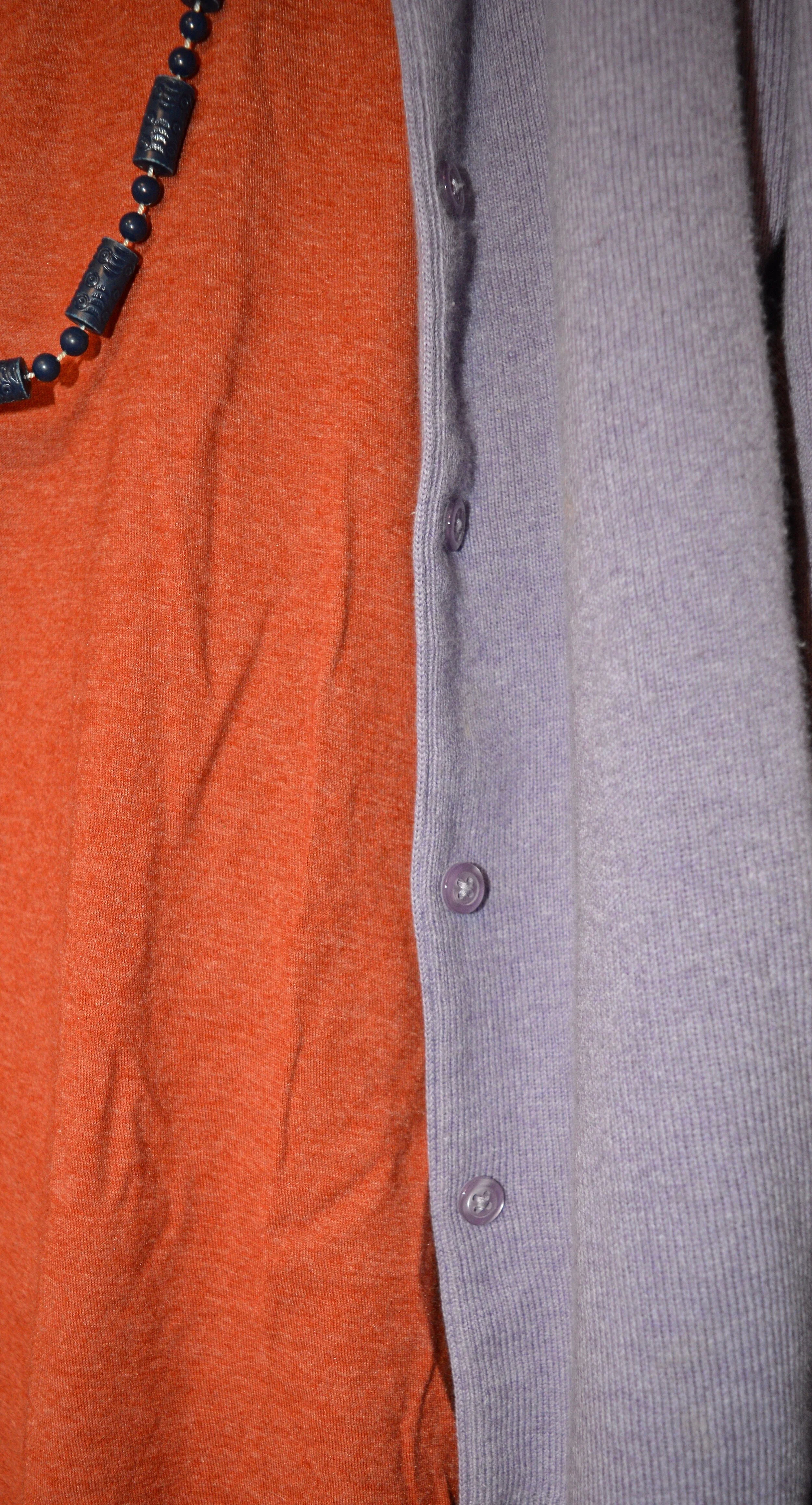
My blue cardigan is not a perfect match for the Pantone color, but I try to give you ideas for outfits with interesting color combinations, not do a paint by number. I love this light Gossamer Pink with the bright contrast of the Skydiver blue. This would have been another pretty combo for Easter, but any spring activity where you have to dress up a little would welcome these colors. This would be perfect office attire as well.

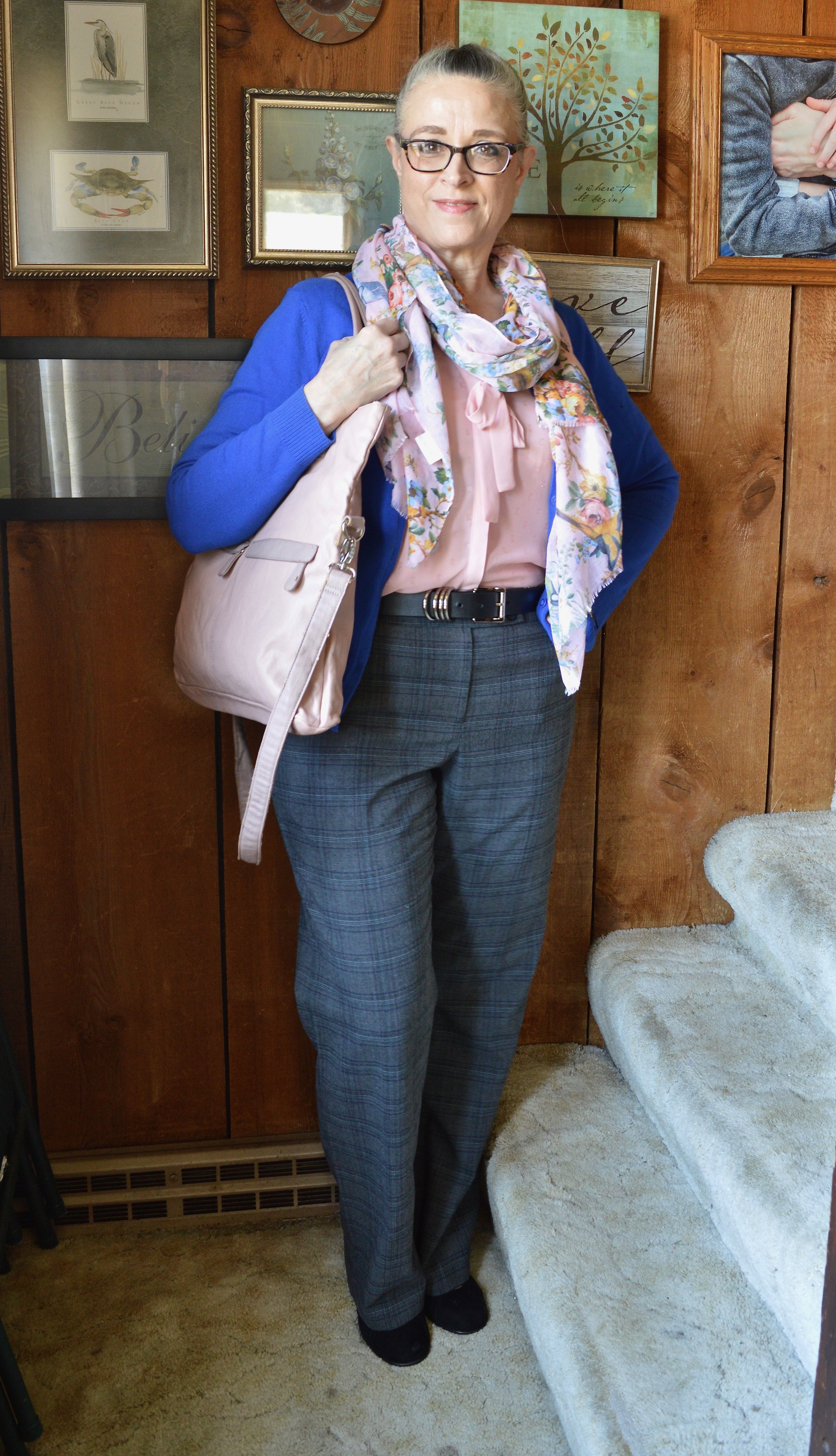
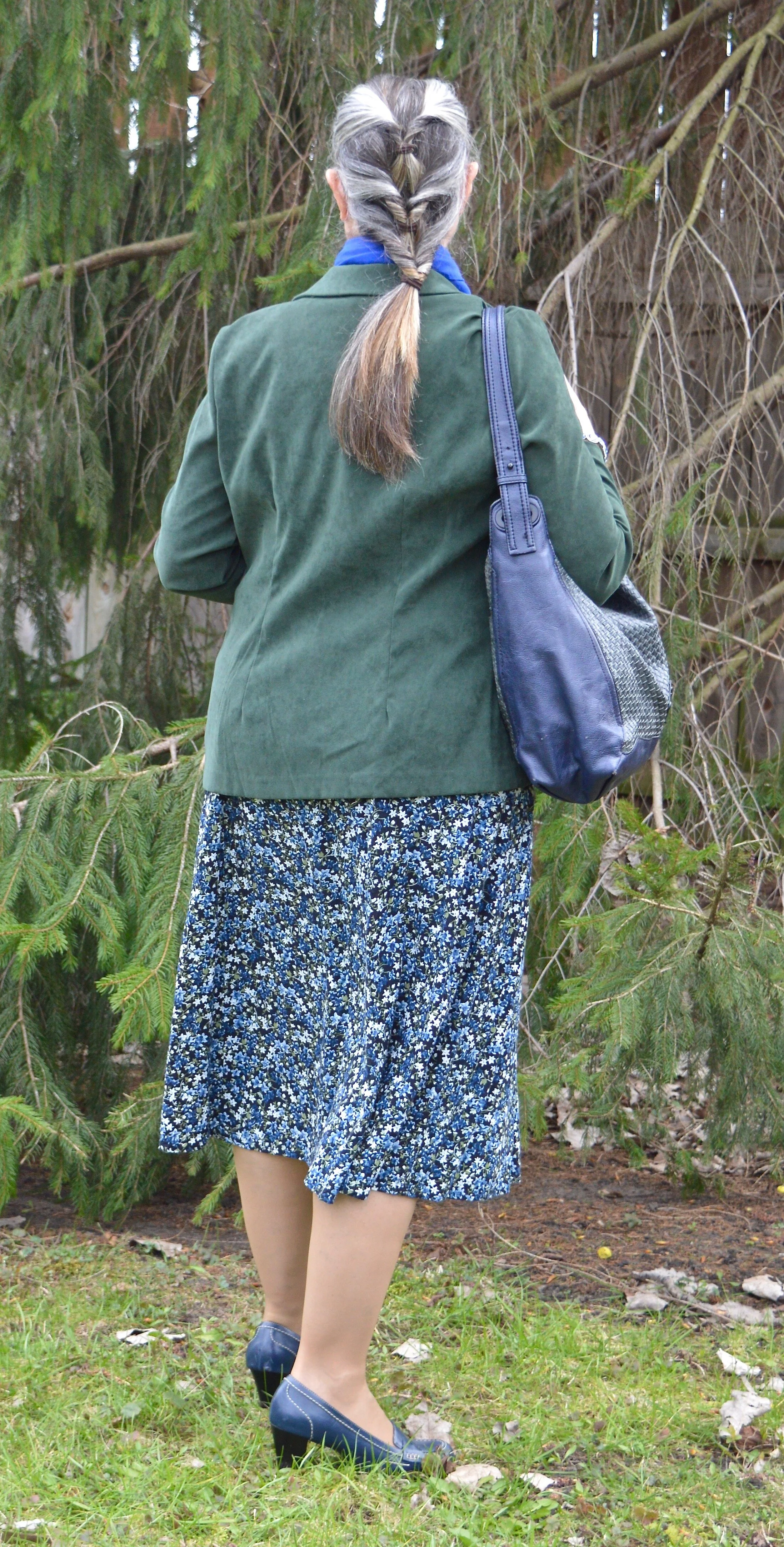
I have had this Christopher and Banks cardi for a few years. It is a lighter weight sweater that is perfect for the spring, or for summer when you need a little something in the air conditioning. They don’t seem to be carrying this same type of sweater, but you can always check here at Kohl’s for a few solids and prints on a basic button down cardigan.

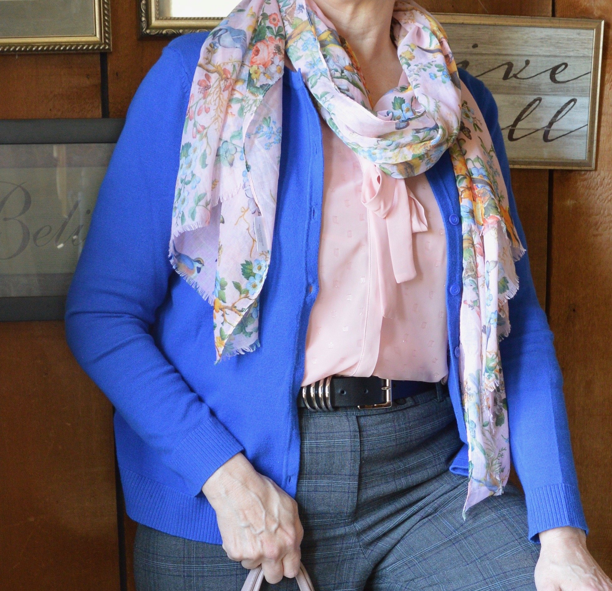
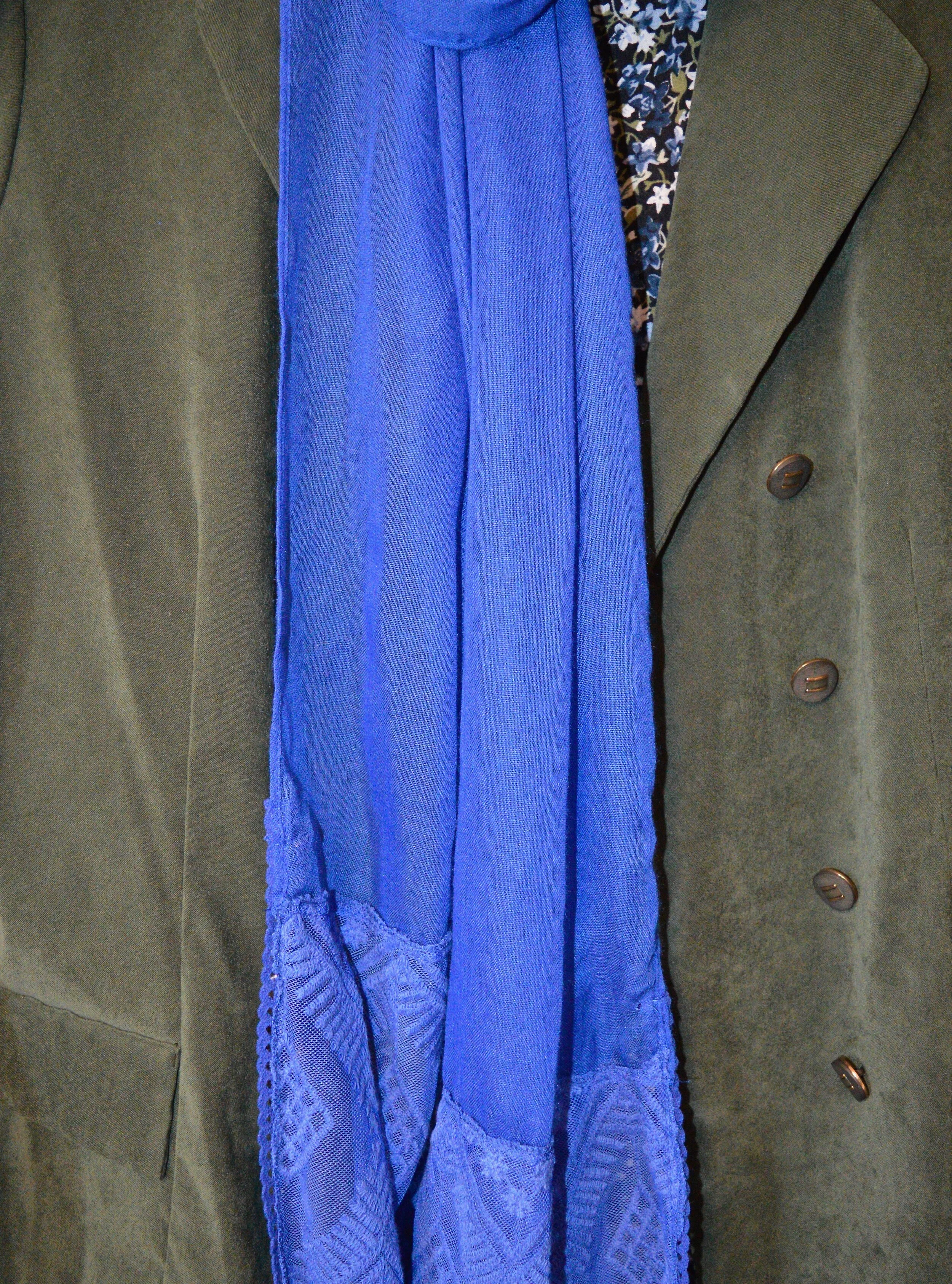
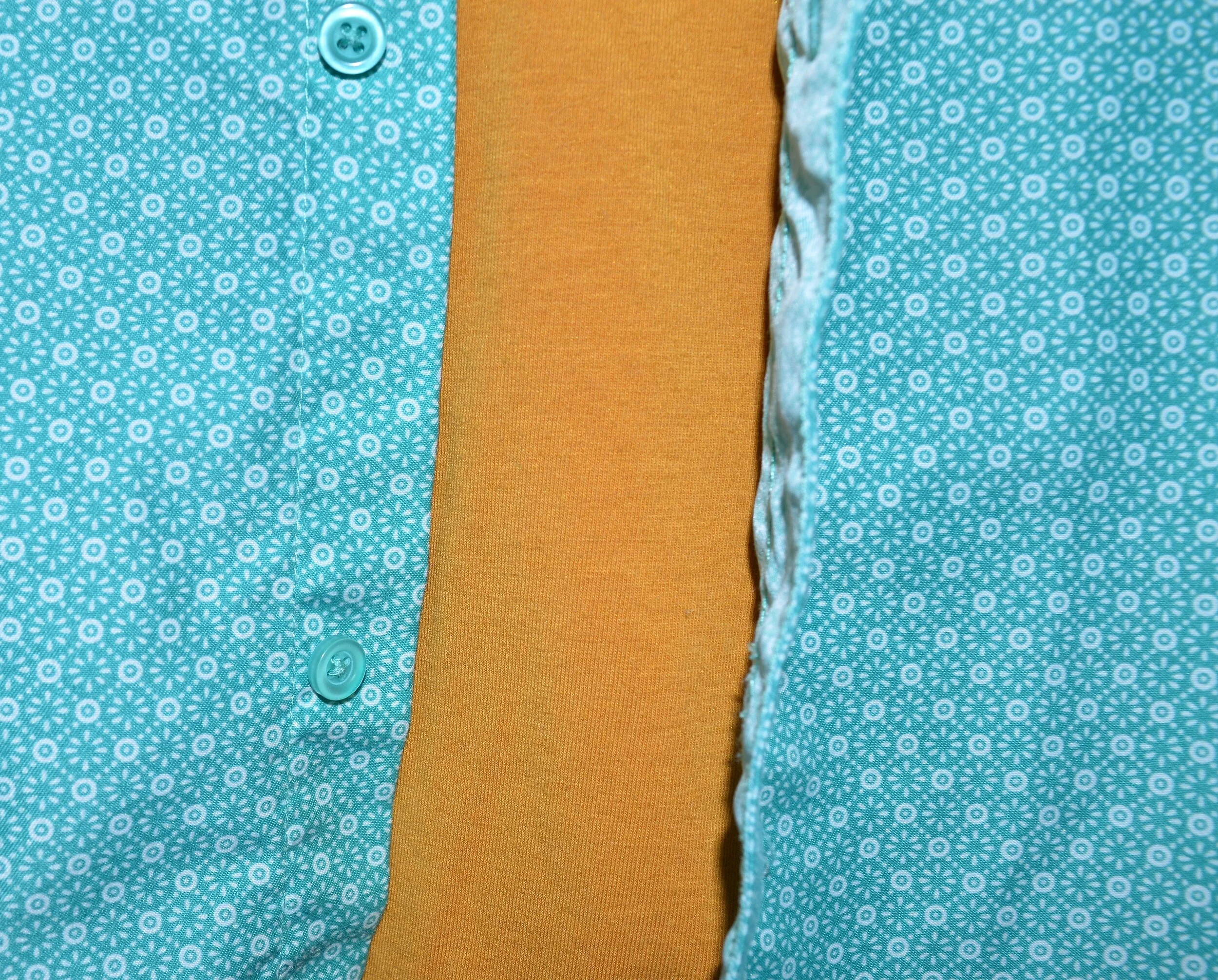
My pink blouse is Elle brand, and was a clearance purchase from Kohl’s a few seasons ago. It is a sheer material with little sparkles throughout, which are not visible in the picture. It has 3/4 sleeves and ties to make a bow. I also added this pretty spring scarf that one of my daughters gave me a few years ago.

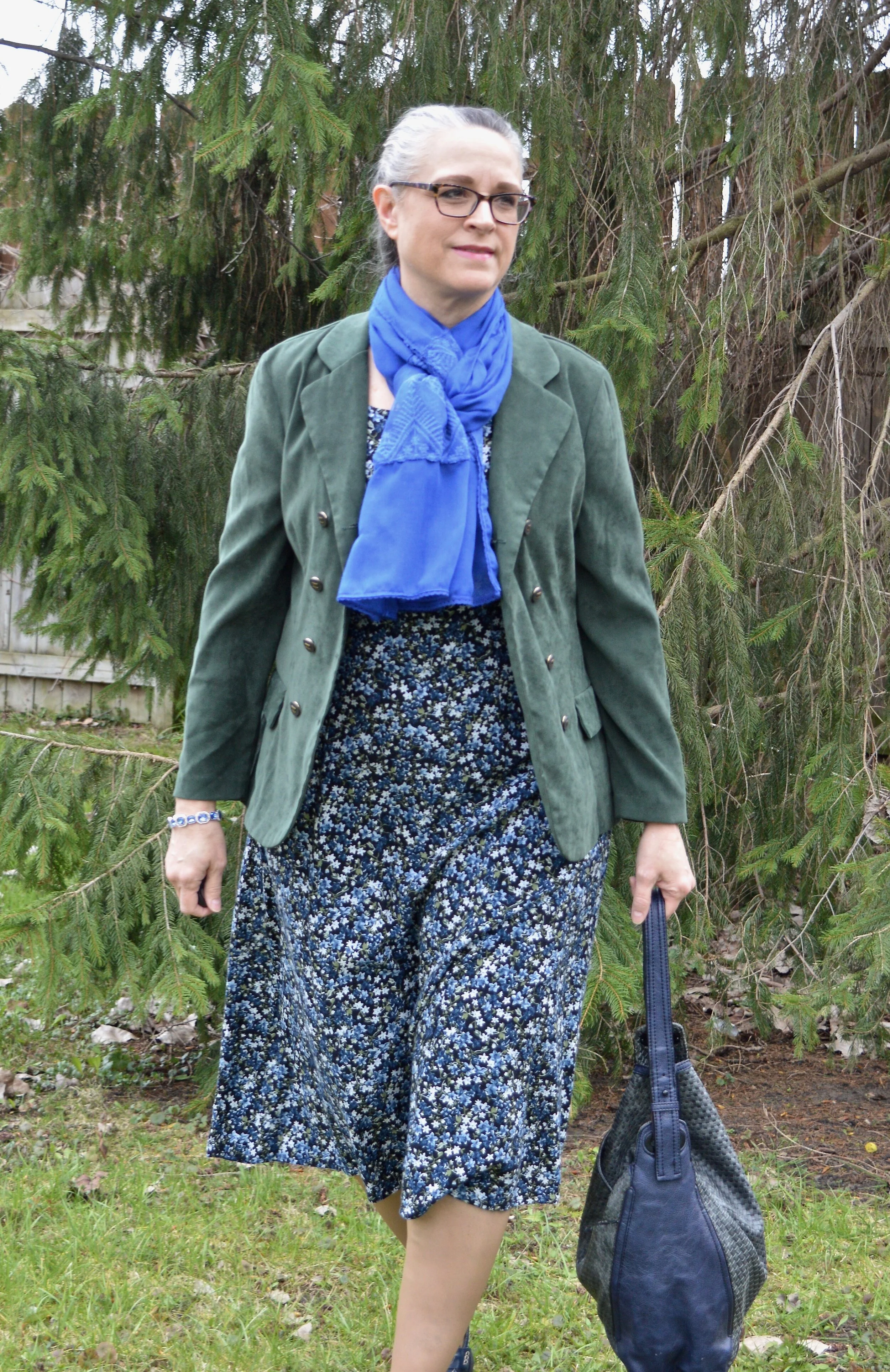
My Poppy Seed gray plaid trousers have been around forever. They are Style & Co. brand. I know Macy’s and a few other retailers sell Style & Co. brand, but I honestly can’t remember if I got these at Macy’s or if I thrifted them. Macy’s isn’t a retailer I have typically frequented, but I have gone a few times with my bestie and might have bought these on one of those trips.

My black belt was a recent thrift find.

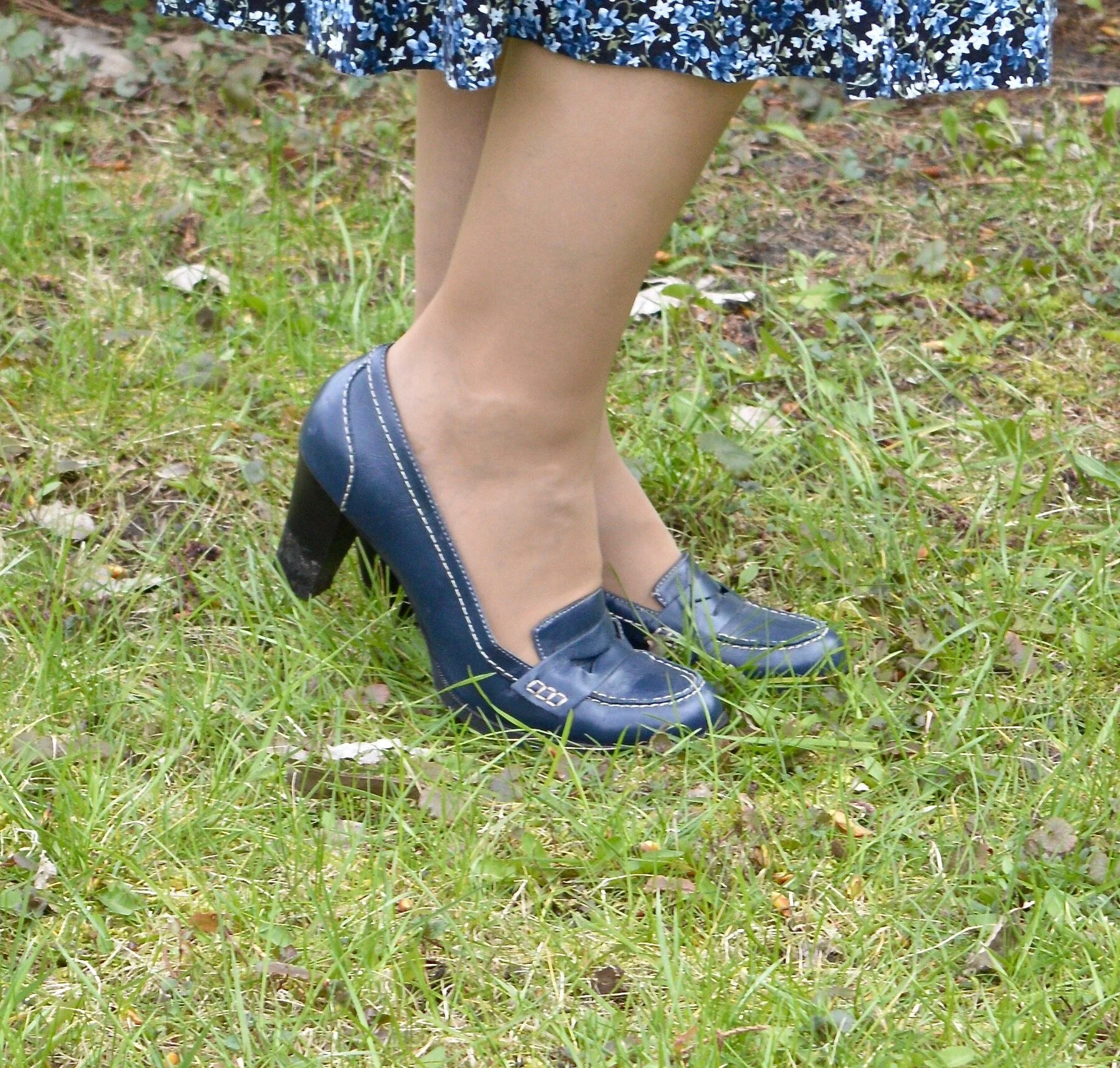
My shoes are my Aerosoles black heeled pumps. I like the lower more stocky heel in my older years. My feet are not used to wearing heels at all anymore, so when I do they have to be ultra comfortable. Aerosoles fit the bill in that regard. Check out their website for great looking shoes at reasonable prices.

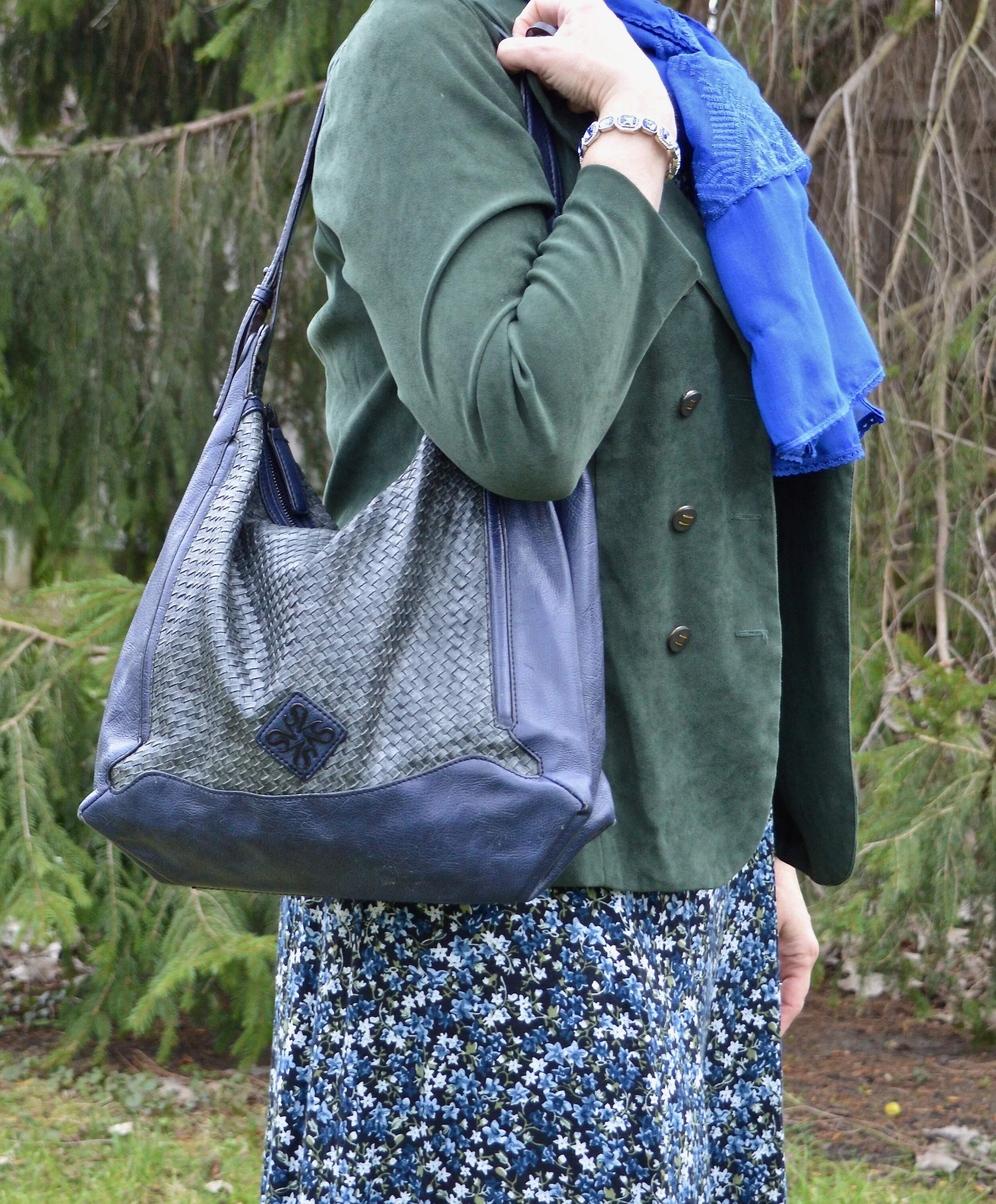
My bag is a thrifted NY & Co. and can be a tote or fold it over for a smaller clutch option.

Do you have these colors in your closet? How would you were these, with each other, or with other colors? What is your favorite spring color combination? I’d love to hear your thoughts, so leave a comment or two below.

I’m including a few shopping links below. These are affiliate links, which means I get a little money when you click on a link. These are brought to you at no cost and I appreciate all the clicks. All opinions are my own.

Have a super week everyone!

Pantone Spring/Summer 2020 - Recap

I hope you have enjoyed this Pantone color series. Today I just want to show you a recap where you can see all the outfits in one post. Here we go.

New York Palette

Pantone Spring/Summer 2020 - New York Palette

Classic Blue, Chive and Navy Blazer

Faded Denim, Orange Peel and Lark

Sunlight, Flame Scarlet and Ash

Biscay Green, Saffron and Brilliant White

Mosaic Blue, Coral Pink and Brilliant White

Cinnamon Stick, Grape Compote and Navy Blazer

London Palette

Pantone Spring/Summer 2020 London Palette

Classic Blue, Beetroot Purple and Oyster Mushroom

Pantone Spring/Summer - London Palette

Flame Orange, Blossom and Cuban Sand

Pantone Spring/Summer 2020 - London Palette

Yellow Iris, Rose Brown and Cuban Sand

Pantone Spring/Summer 2020 - London Palette

Storm, Fiery Red and Blueberry

Pantone Spring/Summer 2020 - London Palette

Blush Beauty, Bossa Nova and Blanc de Blanc

Pantone Spring/Summer 2020 - London Palette

Tanager Turquoise, Heritage Blue and Blanc de Blanc

Pantone Spring/Summer 2020 - London Palette

Which color palette was your favorite? Which outfit did you like the best? I would love to hear your thoughts. I hope you all have a wonderful weekend. We will be celebrating Father’s Day with our kids on different days, since schedules wouldn’t allow for everyone getting together. God bless each of you with peace and joy.

All graphics and London color palette photos by Rebecca Trumbull.

Pantone Spring/Summer 2020 - Mosaic Blue, Coral Pink and Brilliant White

Today features another pretty blue and a version of a coral color that comes around almost every summer. Just like Biscay Green, Mosaic Blue makes me think of tropical waters, blue skies and palm trees. Coral Blush reminds me of the light pink peonies that used to grow in my mother’s yard every spring. I have always loved peonies for their beautiful, large blooms and delicate scent. Once again, I am pairing these two lovely colors with Brilliant White from the Classic collection of colors.

The sleeveless, abstract print top is from a Kohl’s clearance rack a few years ago. I have always liked Vera Wang’s Simply Vera line at Kohl’s, but have to be choosy about which pieces I buy because of the fit. I love the bright, abstract patterns and the way she combines different textures and styles all in one piece. Her pieces have a little bit higher price point than what I normally like to pay, so I try to find pieces on clearance. The only problem with that is I often miss out on some really fun, eclectic looks because they sell out quickly. You can see some of the other Simply Vera pieces I have styled on the blog by clicking on the links: thrifted navy bag, thrifted cross body bag, embroidered skinny jeans, a floral top, and summer dress.

DSC_0018 (2).jpg

The Coral Pink long sleeve top that I put underneath matches the Coral Pink splotches in the Vera top perfectly. Obviously if it was warmer I wouldn’t have had to layer, but it is spring here in the midwest. Ha, ha. This coral colored piece is also a Kohl’s clearance find and is Lauren Conrad brand. Lauren Conrad is another brand I like from Kohl’s, but again, unless I find it on the clearance rack I don’t usually buy her pieces. I do love her take on pastels and feminine details.

Pantone Spring summer 2020 - Mosaic Blue, Pink Coral and Brilliant White

I’ve also styled these Gloria Vanderbilt jeans from JC Penney on the blog before. These are my favorite white jeans, as they are thick and fit fairly well, even with my extra COVID pounds. Ha, ha. I like the flared style for a little dressier look and they go well with heels.

For my accessories, I thought some pearls would look good. I also grabbed my blue textured clutch and my blush SO ankle boots. Obviously, when the weather warms up I’ll exchange my ankle boots for sneakers and sandals, but these light colored booties work well for spring.

Pantone Spring/summer 2020 - Mosaic Blue, Coral Blush and Brilliant White
Pantone Spring/Summer 2020 - Mosaic Blue, Coral Pink and Briliiant White
Pantone Spring/Summer 2020 - Mosaic Blue, Coral Pink and Brilliant White

What do you think of these colors? Do you have either of these colors in your closet? I think both of these colors would look good on many complexions. Sometimes coral can be too orange, but this seems to be a happy medium.

Pantone Spring/Summer 2020 - Mosaic Blue, Coral Pink and Brilliant White

Did you like this post? If you did, do my blog some good by hitting the like button and by leaving a comment. I appreciate all your feedback.

I’m leaving you with a few shopping links to enjoy. These are affiliate links and all you clicks give me a few cents here and there. Thank you for that as well. All opinions are my own.

Graphic designed by Rebecca Trumbull.


Pantone Spring/Summer - 2020 - Biscay Green, Saffron and Brilliant White

Today’s outfit revolves around three colors from the Pantone Spring 2020 New York Palette that are described as flavorful, cleansing and pristine. Saffron is a rich orangey yellow color, while Biscay Green leans towards a more soothing aqua. Both colors to me are perfect for summer and when paired with a bright white give a warm weather, party ready look.

When I saw Biscay Green on the palette, I knew that I had nearly nothing in my closet that was this pretty greenish blue, so I started keeping an eye out at my local thrift stores last fall for an item or two that would add this medium green to my closet. This oversized button-up caught my eye. It is a brand called Zylos, which appears to be a past men’s brand in dress shirts and ties. As I have mentioned before, I am liking the oversized button up shirts for a fun, casual way to dress up a pair of jeans or in this case a skirt. For this outfit, I tied the bottom of the shirt and buttoned two buttons.

Pantone Spring/Summer 2020 - Biscay Green, Saffron and Brilliant White

The Saffron colored Apt. 9 tee, is another thrift find and I have used it on the blog before for another Pantone series. Last year a similar color was called Mango Mojito and I used this same tee to represent that color. You can see that post here. I thought the color was independent enough that I didn’t need the whole tee shirt to show. The bright pop of yellow orange stands out quite nicely with the peaceful green.

Pantone Spring/Summer 2020 - Biscay Green, Saffron and Brilliant White

I’ve styled this skirt on the blog before. It is St. John’s Bay brand and I got it at JC Penney a few years ago. I was drawn to it for two reasons. The first was that it was white and it was lined. It is so hard to find white you can wear in the summer that doesn’t require a slip or some other underwear that won’t show. This skirt is completely lined. You can still see through it if you have on a dark pair of panties, like red, black or navy, but for the most part they won’t be noticeable. The other reason was the beautiful lace detailing. It is a very pretty piece and can be dressed up or down, depending if you are feeling classic or boho.

DSC_0012 (2).jpg

I have had this layered beaded necklace for a while. I really like it, but don’t think to wear it that much. When I saw how well it complimented this outfit I was excited to include it. So much of my jewelry I can’t even remember where or when I got it. Ha, ha. Maybe that’s because I have so much of it. I also included a navy beaded bracelet, which you will see in the next picture, to pair with the navy beads in the necklace.

Pantone Spring/Summer 2020 - Biscay Green, Saffron and Brilliant White

I found this bag at another thrift store when my girls took me thrifting back on my birthday in January. Ahh, those were the days, when we could get together, go shopping and get lunch. Hopefully, those days will come again. I love the color and feel of this bag. It is a brand called Stone Mountain and is very well made. It has a long handle which can be adjusted, so you can either use it for a shoulder bag or a cross body bag.

Pantone Spring/Summer 2020 - Biscay Green, Saffron and Brilliant white

My perforated peep toe shoeties are Sonoma brand and from Kohl’s. I need to paint my toes. I don’t wear sandals a lot because my feet are like my legs and covered with nasty looking varicose veins. Last fall I went to a vascular surgeon who did an ultra sound to see what could be done. Unfortunately, most of the veins in my legs are in the same bad condition, so having them worked on would provide some temporary relief, but over the course of time, they would develop the same issues. I am putting that off for now, but one day may revisit the idea.

Pantone Spring/summer -Biscay Green, Saffron and Brilliant White

Do you like these colors? How would you wear them? Remember you don’t have to put the colors together as I do. I am simply trying to show you what the colors are for the Pantone seasons and ways you might combine them. Do you wear white in the summer? Do you have a white skirt or do you prefer to wear pants, capris or shorts? I’d love to hear from you, so leave a comment or two.

Graphic designed by Rebecca Trumbull.

I’ve included a few shopping links for you. These are affiliate links. All opinions are my own.

Have a great day and be safe as the world begins to open back up!

.

Pantone Spring/Summer - 2020 - Sunlight, Flame Scarlet and Ash

There are so many ways to combine these colors. I have had a few of you make comments about which colors you like and love to combine. Susan told me she loves today’s pale yellow, Sunlight, combined with Tuesday’s medium pale blue, Faded Denim. What a great combination. I had Karen tell me she usually veers towards the Classic colors, but suddenly realized she had a few new outfits in her closet when she saw last Thursday’s combination of Classic Blue and Chive. I would love to spend most of my blog time just talking about color combinations, because the more I do these Pantone series, the more I realize how many more beautiful combinations there are. However, I know there are other fashion topics to talk about, so I’ll keep the color talks to the Pantone series and my monthly Color Play posts, which will be back soon. Thank you, all of my beautiful subscribers, for your input and support.

Today’s color combination may not have been your first choice. When we think of combining yellow and red my mind immediately goes to McDonald’s. Anyone else have that reaction? Yellow and red seem almost clownish together, but you may change your mind when you see how a pale faded yellow pairs with a stark red. I like it. Let me know what you think.

This thrifted Christopher and Banks corduroy jacket was the perfect Sunlight color. This jacket is soft, flexible, and great for those in between days when it is still cool.

Another thrift find, this Nautica 3/4 sleeve tee is a great spring and summer staple. Not only does it have the bright Flame Scarlet and white stripes, but it bears the nautical sign of the anchor. It makes me think of the anchor of the Lord, that moors my boat in this ever stormy sea called life.

These Ash gray jeans are another thrift find, and are Gloria Vanderbilt. I used to wear Gloria’s jeans all the time, then got away from them. This pair is soft and have just enough stretch to make them so comfortable to wear. I think the length of these is great for summer. How do you like to wear your pant length in the warmer months?

I kept the jewelry minimal and threw on this opera length string of large beads. Doubling it, gives it a fun layered look.

I chose this simple thrifted Jaclyn Smith top handle bag to keep the look light and fresh. This also comes with a longer strap so it can be converted into a crossbody bag. You can see how I styled this bag with white jeans, Bermuda shorts and high waisted jeans.

My Dana Buchman tweed loafers are making another appearance. Loafers are a great shoe for this in between time, before you really want to go out in sandals.

What do you think of this color combination? Have I changed your view on wearing red and yellow together? It would not be my first choice of colors to combine, but I am glad I did it for this series. It helps me to think outside my box. As always I love to hear you thoughts.

Graphic created by Rebecca Trumbull.

I’ve included a few shopping links which mimic this look. These are affiliate links and all opinions are my own.


Pantone Spring/Summer - 2020 - Faded Denim, Orange Peel and Lark

I must give the creators at the Pantone Color Institute credit for coming up with interesting names for their colors. It is especially mind boggling when they have been doing it for so long. Coming up with new words to describe color has to be no easy task. The name Faded Denim is cute and evokes memories of well worn jean jackets and tattered jeans. Orange Peel, mmmm, can’t you just smell the juicy, citrusy goodness? A Lark is a type of bird and you can see a few images of one here. On seeing the images the color will make perfect sense. On to our outfit.

The Pantone version of Faded Denim is a more of a medium wash denim that has paled a bit from repetitive washing. I chose my light wash Christopher and Banks pop over chambray top, which is a bit lighter than the Pantone color, but it serves the purpose. I’ve used this top on the blog before. You can see how I styled it with white pants, and with a denim vest. Here is a picture without the sweater, which I’ll come back to.

This Lu La Roe maxi skirt has a fun multi-colored print that includes Orange Peel. I like a printed skirt like this because I can match it up with so many different colored tops or sweaters. Even in this situation where the top is not one of the colors in the skirt, it works because the light blue goes well with all of the other colors. You probably could do this with numerous other colors.

I found this Lark (or camel by any other name), colored sweater thrifting. It is Old Navy brand. It has a bit of a grunge vibe, which I like. I thought pairing it with this more dressed up skirt and top gave the look a cozy feel.

This chunky orange necklace was perfect for this outfit and the small little black clutch with heart appliques kept the whole look from being too overwhelming. Some times a big skirt and a big sweater and a big top with a big bag, just gets to be too much.

This black pair of peep toe shoeties from Clarks are so comfy and I like the zipper on the heel. They are very easy to get in and out of.

What do you think of Faded Denim and Orange Peel? Would you wear these colors? I’d love to hear your thoughts, so leave me some love in the comments.


I’ve included a few shopping links, just for fun. These are affiliate links. All opinions are my own.

Graphic by Rebecca Trumbull.

Pantone Spring/Summer - 2020 - Classic Blue, Chive and Navy Blazer

As usual, the names for the Pantone colors always amuse me. Classic Blue is pretty normal. Obviously, Chive makes me think of green onions and as you will see, the color is a pretty dark green. Navy Blazer is one of the classic colors and is your typical navy staple, which many of us have a piece or two in our closets. Since Classic Blue is the color of the year, I decided to start with it. The idea to combine it with Chive was a natural progression when I pulled out this thrifted summer midi dress.

This outfit centers around this thrifted OliviaRose dress that I got numerous years ago. Its pretty floral print combines blue, white and green a black background. I didn’t even have to think when I pulled this out of my closet. Classic Blue and Chive were the perfect pairing. An outfit like this really can be worn year round.

This bright blue scarf was gifted to me for Christmas and I used it to introduce the Pantone Color of the Year back in January. You can see that post here.

My faux suede blazer has a little more of a blue undertone than the Chive color, but I thought it was pretty close. This thrifted ISB Inc. blazer is meant to have a double breasted appearance when buttoned, but my figure right now will not allow for that. However, I think it looks just as nice left open since there are buttons on both sides.

You can see in the next picture how nicely the blazer fits through the back. I like that it is more fitted, rather than boxy. I was also trying something different with my hair.

This thrifted Simply Vera/Vera Wang bag has made multiple appearances on the blog as has my thrifted Relativity loafer heels.

I also added my sparkly Classic Blue bracelet, which was also a Christmas gift.

If you are not into wearing bold, bright colors, then these colors would be the perfect choice for you. You could easily make this pairing more summery by adding a white skirt or crop pants instead of the darker print dress. You could also wear head to toe white with a Chive colored blazer or sweater and just a few pops of Classic Blue jewelry. There are so many options, so never say never to any color.

Do you like these colors? How would you wear them? Is this the sort of outfit you would wear? If not, what kind of outfit would you put together? I would love to hear back from you. Things are a little lonely around here. Ha, ha. I am sure you all can relate. We really need the world to get back to something more normal, even if it is not perfect.

I hope you enjoyed this post everyone. Until next time. Stay safe and healthy.

Graphic by Rebecca Trumbull.

I’ve included a few shopping links just for something to look at. These are affiliate links. All opinions are my own.


Pantone Spring/Summer 2020 - Intro: The New York Palette

Here we are again, looking at the Spring/Summer color palette for 2020. The Pantone Color Institute puts out two color palettes twice a year; the New York palette and the London palette. The palettes for Spring/Summer come out in the fall of the year before. The Fall/Winter palettes comes out around January. They are thinking much further ahead than I am. I am just gearing up to talk about the Spring/Summer palette and the fashion industry already has their color choices and styles made up for the fall and winter. It is very hard to keep up, so I don’t even try. I try to show you the seasonal trends, as those are more time focused. Colors, in my opinion are not restricted by times or seasons, although, I am one to pull out my lighter colors for spring and summer and my darker colors for fall and winter.

This Spring/Summer palette is full of colors that just about anyone can be pleased with. If you are a pastel kind of gal you will love the lighter shades of pale Sunlight, Coral Pink and Faded Denim. If you enjoy bright and bold, you’ll want to reach for Flame Scarlet, Saffron and Orange Peel. Maybe you enjoy tones that are more earthy, then you will like Chive, Classic Blue and Cinnamon Stick. Looking for color inspiration for resort wear, then take a peek at Grape Compote, Mosaic Blue and Biscay Green. In addition the Institute always includes a classic color palette if you prefer the main part of your outfit to be more neutral and conservative. This year those colors include a deep tan, called Lark, and a dark blue called Navy Blazer. Bright White and Ash are also classic options on the New York palette.

A good way to combine these colors is to take a navy blazer, a gray skirt and then add a bright pop of color like Orange Peel or Saffron in a blouse, jewelry or a bag. If you don’t normally like a bold approach to your wardrobe, this is a great way to still stay in your comfort zone, but add color in small bursts.

The way I will be pairing these, as usual is taking two of the colors and adding a pinch of a classic color to keep things from getting to outrageous. Just so you have a teaser as to what is coming up, here are a few pictures of my color combos.

Classic Blue and Chive

Faded Denim and Orange Peel

Sunlight and Flame Scarlet

Saffron and Biscay Green

Coral Pink and Mosaic Blue

Grape Compote and Cinnamon Stick

I’ll talk more about these colors and how I decided to put the outfits together when I post each of these outfits over the next couple of weeks.

Be sure to come back on Thursday to see the first outfit in the Pantone Spring/Summer 2020 New York palette.

Have a great day!

Graphic provided by Rebecca Trumbull.