Pantone Fall/Winter 2020 - New York Palette - Amber Glow, Green Sheen and Almond Oil

The colors in today’s post are more pastel, but still encompass colors we think of when fall comes to mind. Oranges and yellows are obvious as we look at the trees around us. The Almond Oil color is an off white. When I was growing up, we never wore white after labor day. Our white shoes, bags, dresses, skirts and pants were all put away until the next year. I can still remember going out shoe shopping with my mom before Easter, because that was always when we would get out our white shoes to wear to church. Obviously, those days are gone, but many people still like the idea of wearing white in the summer and darker colors during the cooler, darker months of the year. Almond Oil might be a good alternative for those of you who would rather stay away from a pure white for the Fall/Winter seasons.
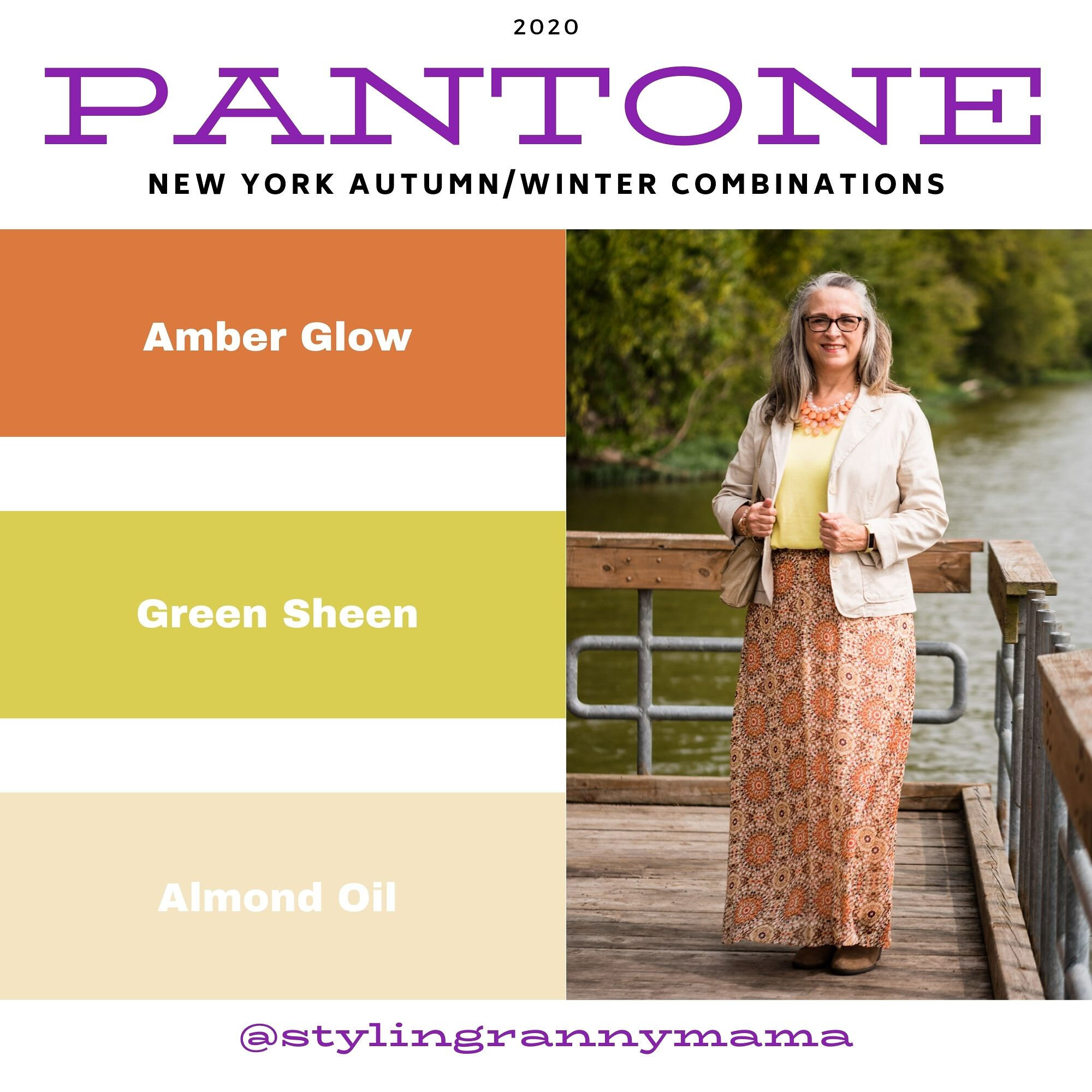
Pantone Fall/winter 2020 - Amber glow, Green Sheen and Almond oil

You’ve see this Roz & Ali maxi skirt numerous times on the blog. I got this one at dressbarn. All the dressbarn stores in the area have closed, but I know they still have a pretty major online shop, so be sure to check them out. I used this skirt last fall in the Pantone London series styled with a purple sweater. You can also see it styled with an orange tank top and a brown moto jacket.

Pantone Fall/Winter - New York Palette - Amber Glow, Green Sheen and Almond Oil

My yellowish green short sleeve sweater is a thrifted Gap piece. It is a tad big, but I like the slouchy look of it and tucking it in works great with this skirt.

Pantone Fall/Winter 2020 - Amber Glow, Green Sheen and Almond Oil

The cream colored jacket is a thrifted NY&Co. It is made of a stiff fabric with a good amount of stretch to it. It almost has a bit of a linen feel to it and it tends to be more wrinkly.

Pantone Fall/winter 2020 - Amber Glow, Green Sheen and almond oil

I opted for the orange for my jewelry. I love this tiered statement necklace and hardly ever get to wear it. I have two more in different colors. It just makes a lovely statement, especially in this outfit. It really makes the whole outfit look cohesive. Many people don’t want their outfits to have that kind of matching game, but personally I love it. There is a symmetry and completion about an outfit when it has this sort of cohesion.

Pantone Fall/Winter 2020 - Amber Glow, Green Sheen and Almond Oil

My top handle bag is another Stone Mountain thrift find. It seems to match the Almond Oil color even better than the jacket.

Pantone Fall/Winter 2020 - Amber Glow, Green Sheen, and Almond Oil

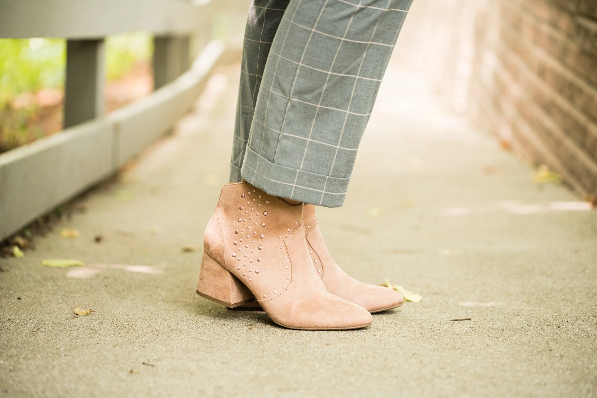
Once again, I pulled out my Sonoma suede ankle boots. The small heel gives me less of a chance for tripping over the skirt. Ha, ha.
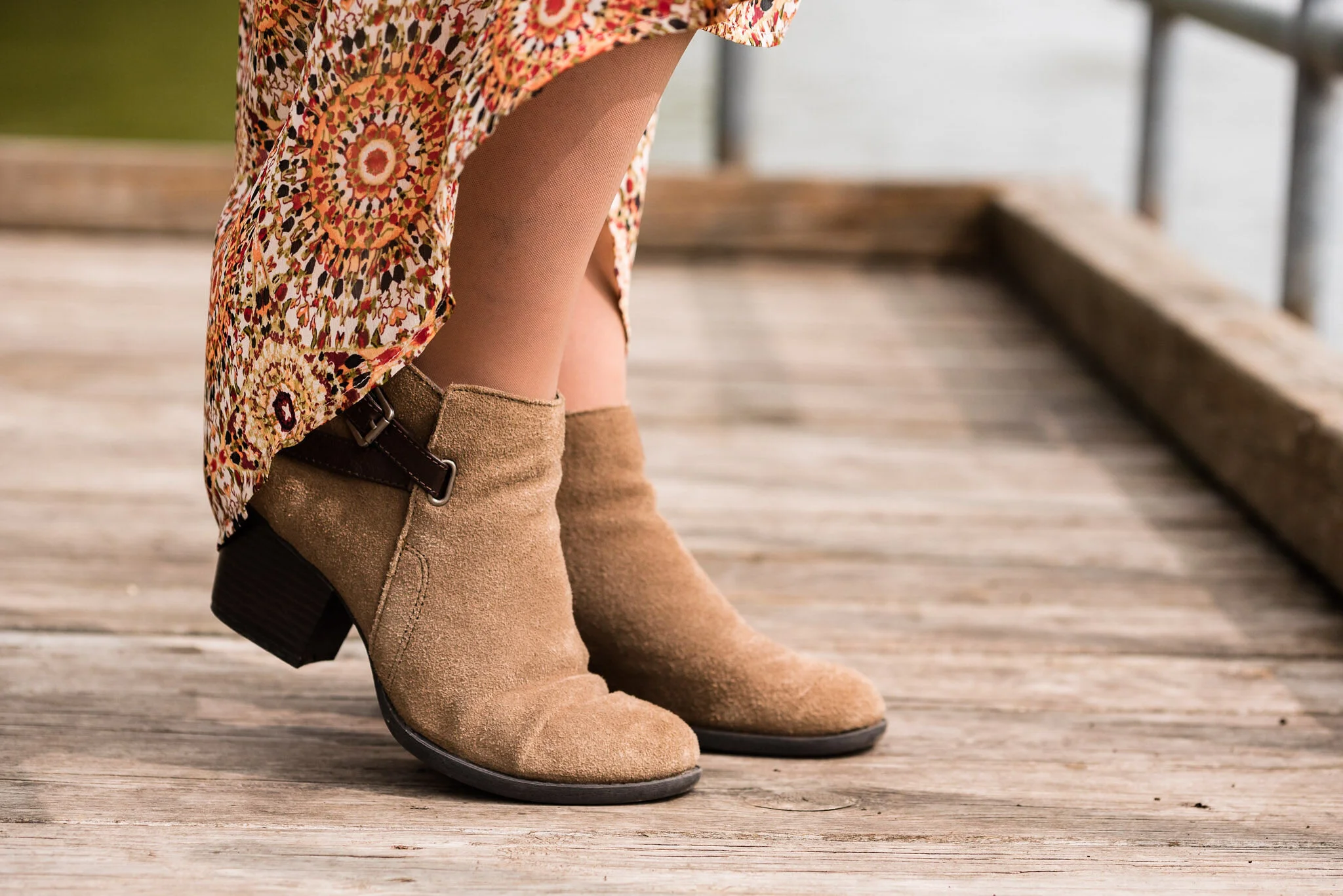
Pantone - Fall/Winter 2020 - Amber Glow, Green Sheen and Almond Oil

What do you think of these two colors? When my daughter was editing these photos, she said it seemed these two colors would grate on each other, but she really liked the outfit. Pairing a print with a solid in these colors definitely makes the outfit softer and easier on the eye. This is something I would definitely wear…if I had some place to go. Ha, ha.

Pantone Fall/Winter 2020 - Amber Glow, Green Sheen and Almond Oil

I hope you are enjoying this series. If you are leave me some love in the comments. I hope you are having a good week.

Graphic and photo credit Rebecca Trumbull.

Feel free to shop a few links below. These are affiliate links. All opinions are my own.
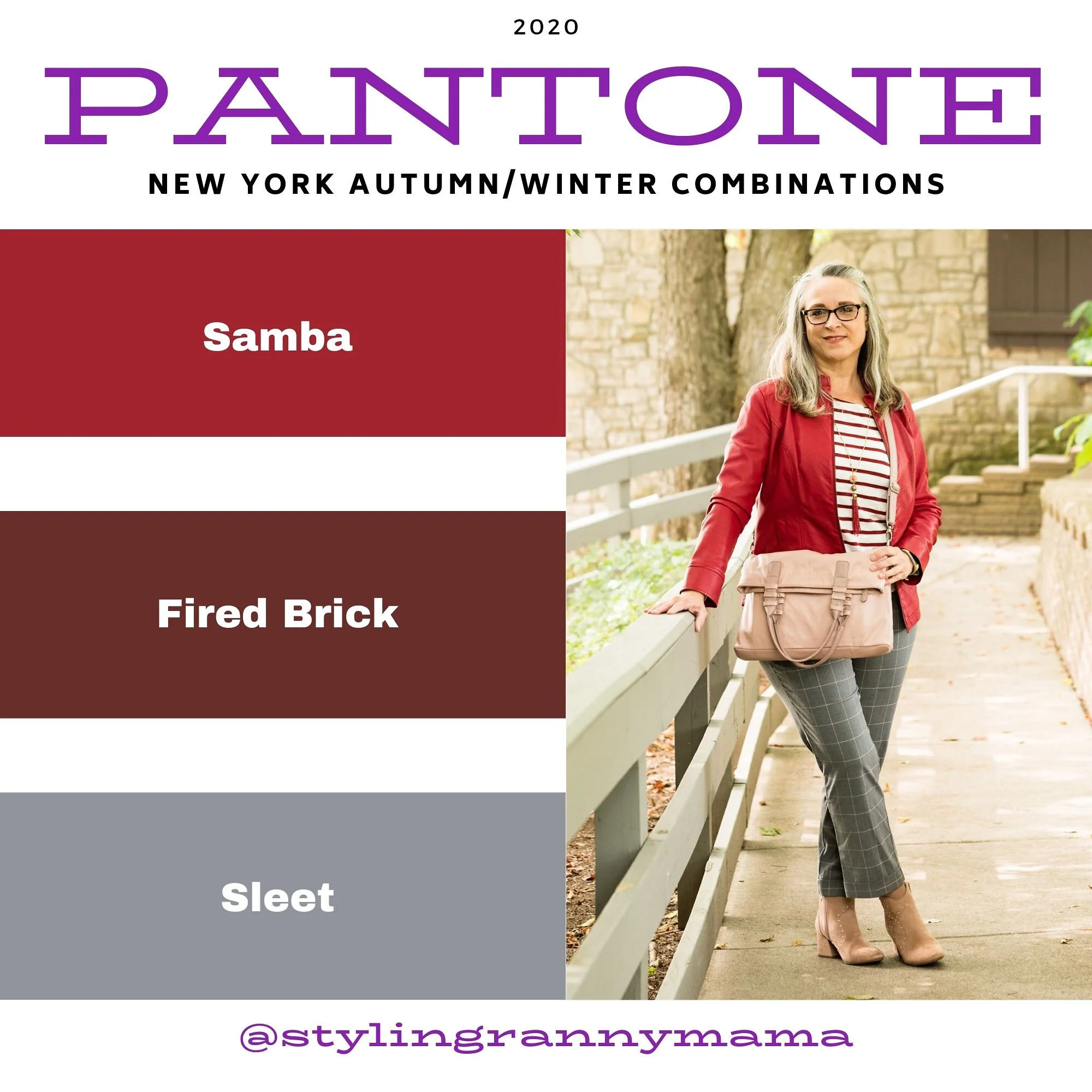
Pantone Fall/Winter 2020 - New York Palette - Samba, Fired Brick and Sleet

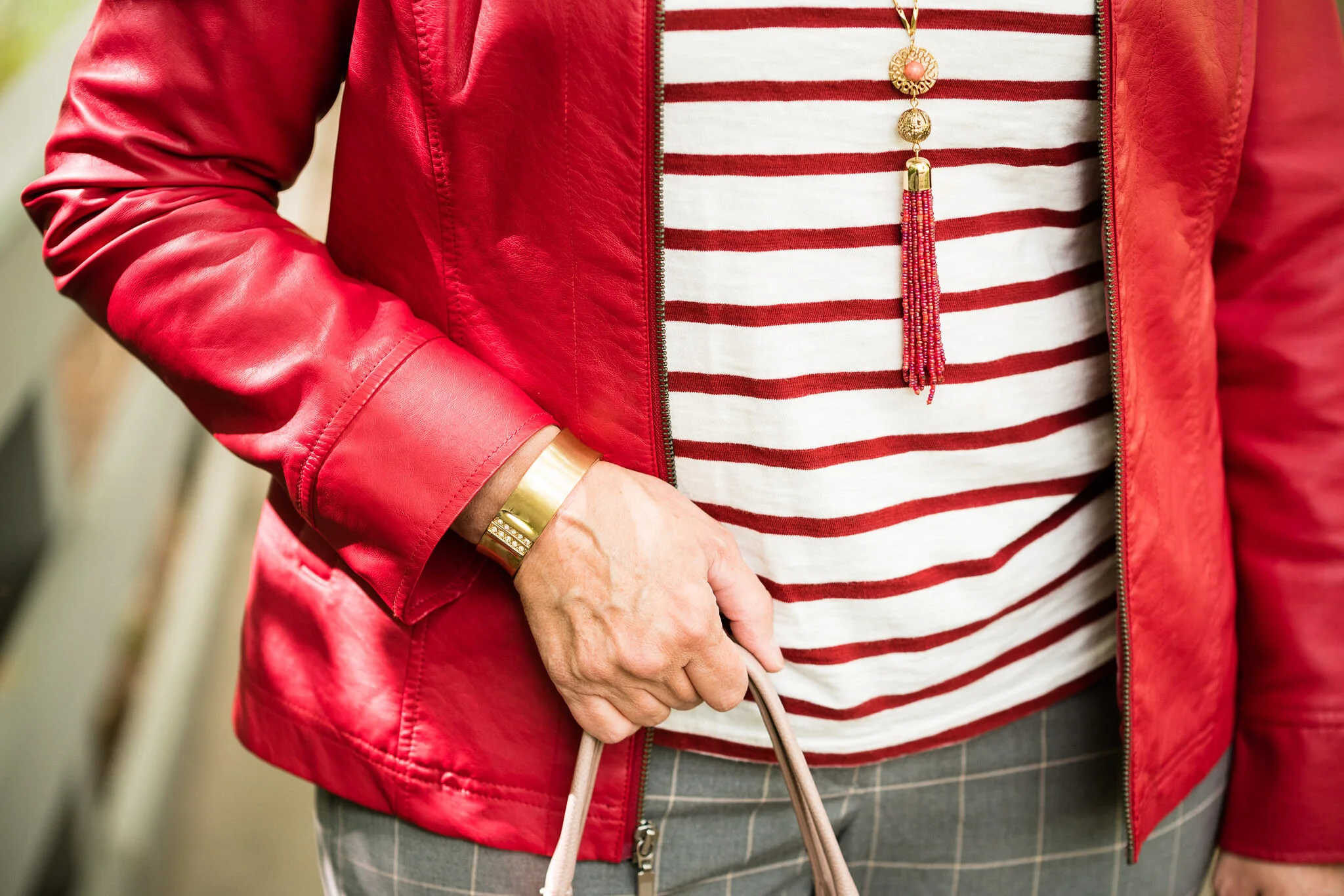
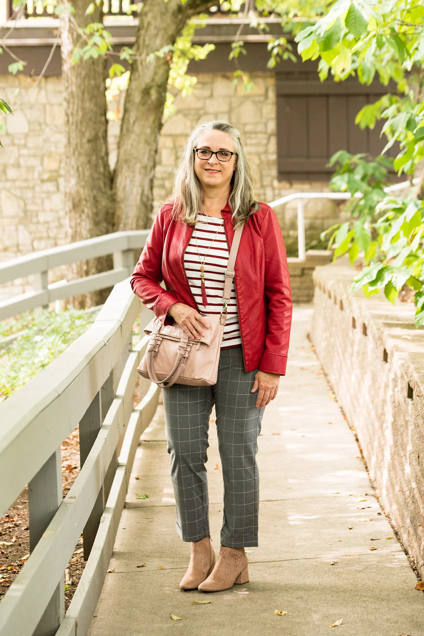
Red is not everyone’s choice of color, but this fall, both the New York and the London Color palettes offer a number of red shades that are sure to suit in one form or another. Whether you wear a whole outfit of red, red pants so they are not near your face, or just little splashes of red in your accessories, red is meant to be worn by everyone. I decided to pair these two different reds together, unfortunately the pictures don’t really pick up the Fired Brick stripes on my tee. They actually are a more brick red color. Oh well, this is about real life, so real life doesn’t always work out exactly as we planned. In fact, more often than not, it seems to be just the opposite. However, I do like this outfit, so let’s take a closer look.

Pantone Fall/Winter 2020 - Samba, Fired Brick and Sleet

I thought a little print mixing would be fun, so I pulled out these gray plaid crop pants from NY&Co. I’ve styled these on the blog before. You can see them styled with a brown moto jacket, with a silk sweater set, and with an asymmetrical vest.

Pantone Fall/Winter 2020 - Samba, Fired Brick and Sleet

My faux moto jacket is from Christopher and Banks. They do have some nice jackets, so I am always checking on their website to see what’s new. Right now they seem to have gotten away from the moto jackets, but they have this pretty plaid trucker jacket and this fun corduroy one.

sambaredfashionoutfit-8.jpg

My thrifted striped tee is Levis brand. Like I said, in person, you can tee it is a different red than the jacket, but for some reason it looks exactly the same. So many factors are involved in photography as my daughter would tell you.

Since the gray plaid has a light stripe in it that could be blush or tan or cream, I thought blush accessories would be fun and an interesting choice for a fall outfit. The thrifted blush bag you’ve see on the blog before and is also NY&Co brand. The booties are also making another appearance. I found these on clearance at Kohl’s a couple seasons ago and had to have them because they have bling. Ha, ha. they are SO brand.

Pantone Fall/Winter 2020 - New York Palette - Samba, Fired Brick and Sleet

My jewelry is very simple: a bead fringe necklace and a gold bangle bracelet.

Pantone Fall/Winter 2020 - Samba. Fired Brick and Sleet

What do you think of these colors? I do have quite a bit of red in my wardrobe, both the brighter, bolder Samba and the darker, more moody Fired Brick. What about you?

Pantone Fall/Winter 2020 - New York Palette - Samba, Fired Brick and Sleet

I hope you are enjoying this series. I am going to forego my Thursday columns for the next few weeks so I can get through the Pantone colors before we head into Halloween and the holiday season. Hard to believe we are already thinking about that.

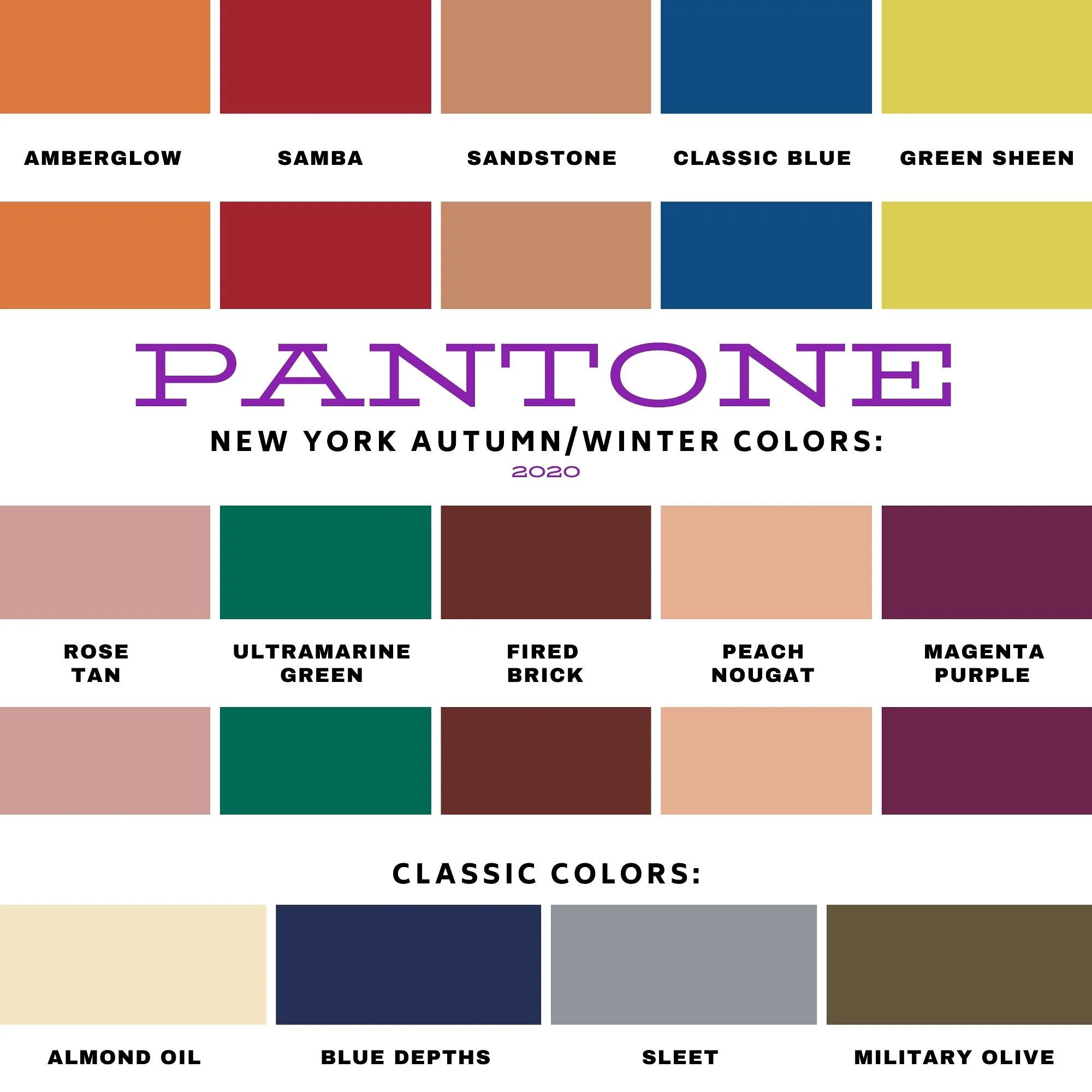
Here is another look at the entire New York Palette.

Pantone - Fall/Winter 2020 - New York Palette

Have a great week everyone.

Graphic and photo credit Rebecca Trumbull.

Here are a few shopping links. Be sure to take a look. These are brought to you at no cost to you, unless you purchase something of course. Every time you click on a link, I get a few cents. I appreciate every click. These are affiliate links. All opinions are my own.


'


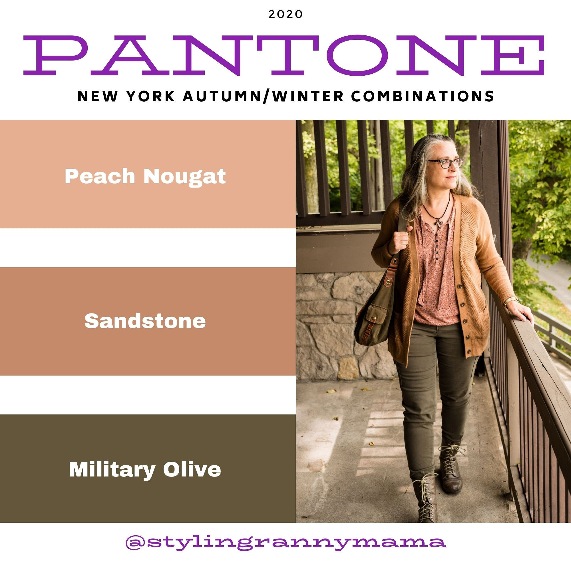
Pantone Fall/Winter 2020 - New York Palette - Peach Nougat, Sandstone & Military Olive

Welcome to another round of Pantone colors. If you are new to my blog, the Pantone Color Institute is an entity that comes up with color palettes for two seasons a year - Spring/Summer and Fall/Winter. These color palettes are referred to by members of the interior design and fashion community for designing spaces and clothing full of color and vibrancy. Many of their palette colors are meant to create a feeling of peace, unity and confidence whether at the office or on the runway.

Since becoming a Fashion Blogger in 2016 I have been drawn to the Pantone color palettes as a way to find inspiration for putting together outfits from the clothes in my closet. I enjoy all colors, so for me the two palettes put out by the Institute are a way to challenge myself to look at colors I might not normally wear in a different light. I hope you enjoy this series.

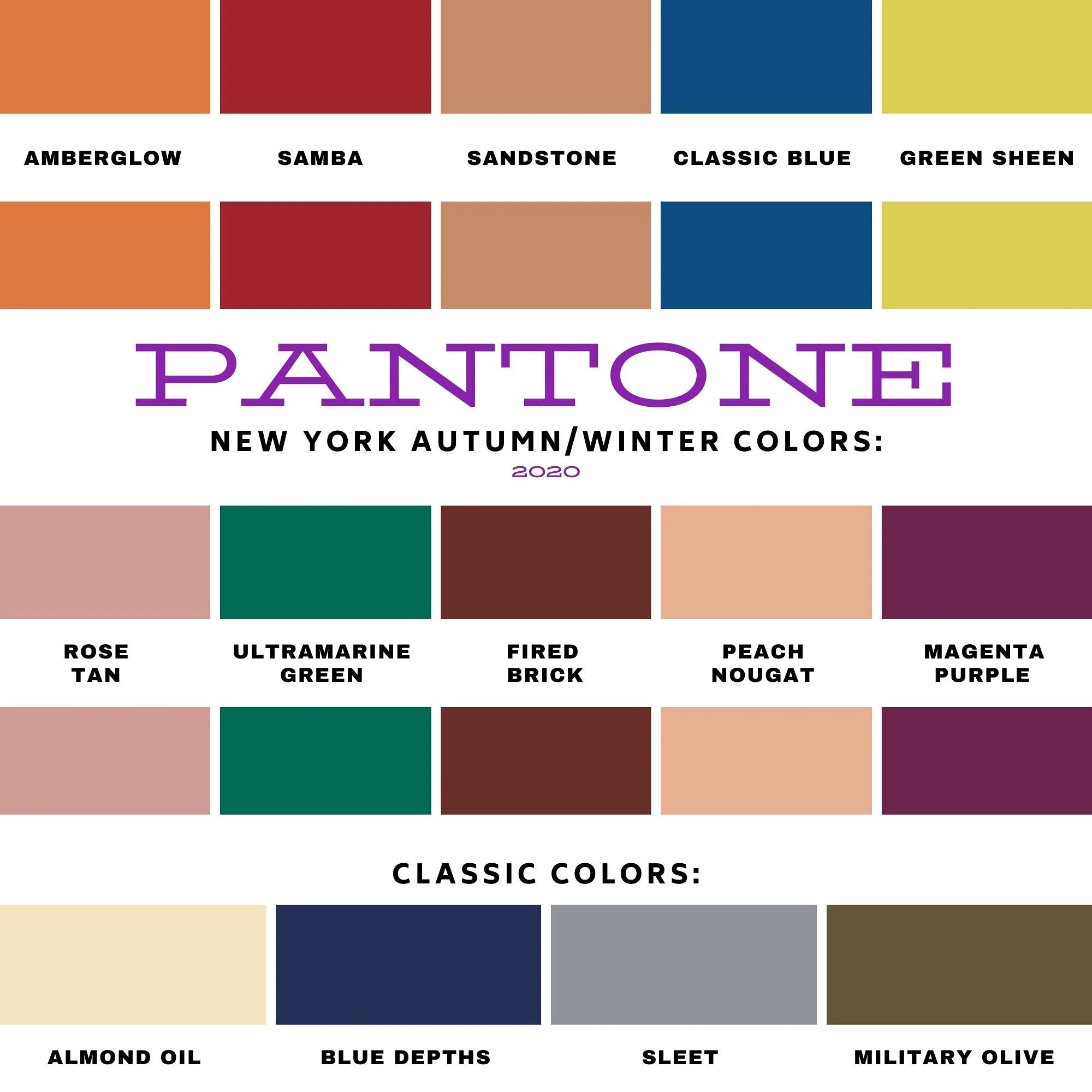
I am going to start with the New York Palette. You can see the entire palette at the end of this post. Instead of doing an intro the color palettes for both New York and London, I am just going to jump right in to the New York colors. As per usual, I am going to combine two palette colors with a classic color, which is also shown on the palette.

Pantone Fall/Winter 20/21 - Peach Nougat, Sandstone and Military Olive

There are a number of these lighter more pastel tans on both palettes this season. This is not a color I would normally reach for, however, if you are more into pastels and lighter shades both Peach Nougat and Sandstone might be good for you.

Pantone - Fall/Winter - peach nougat, sandstone and military olive.

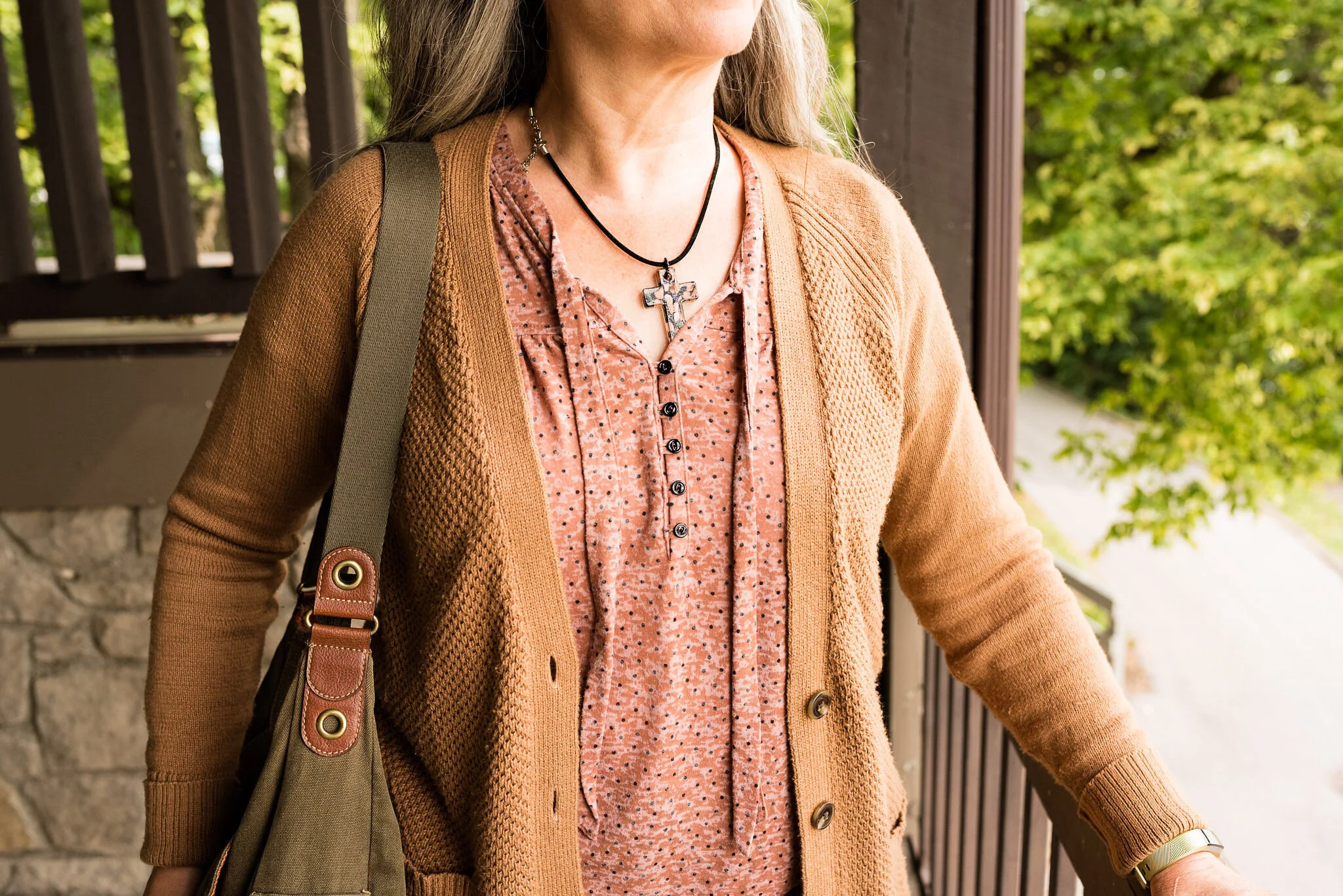
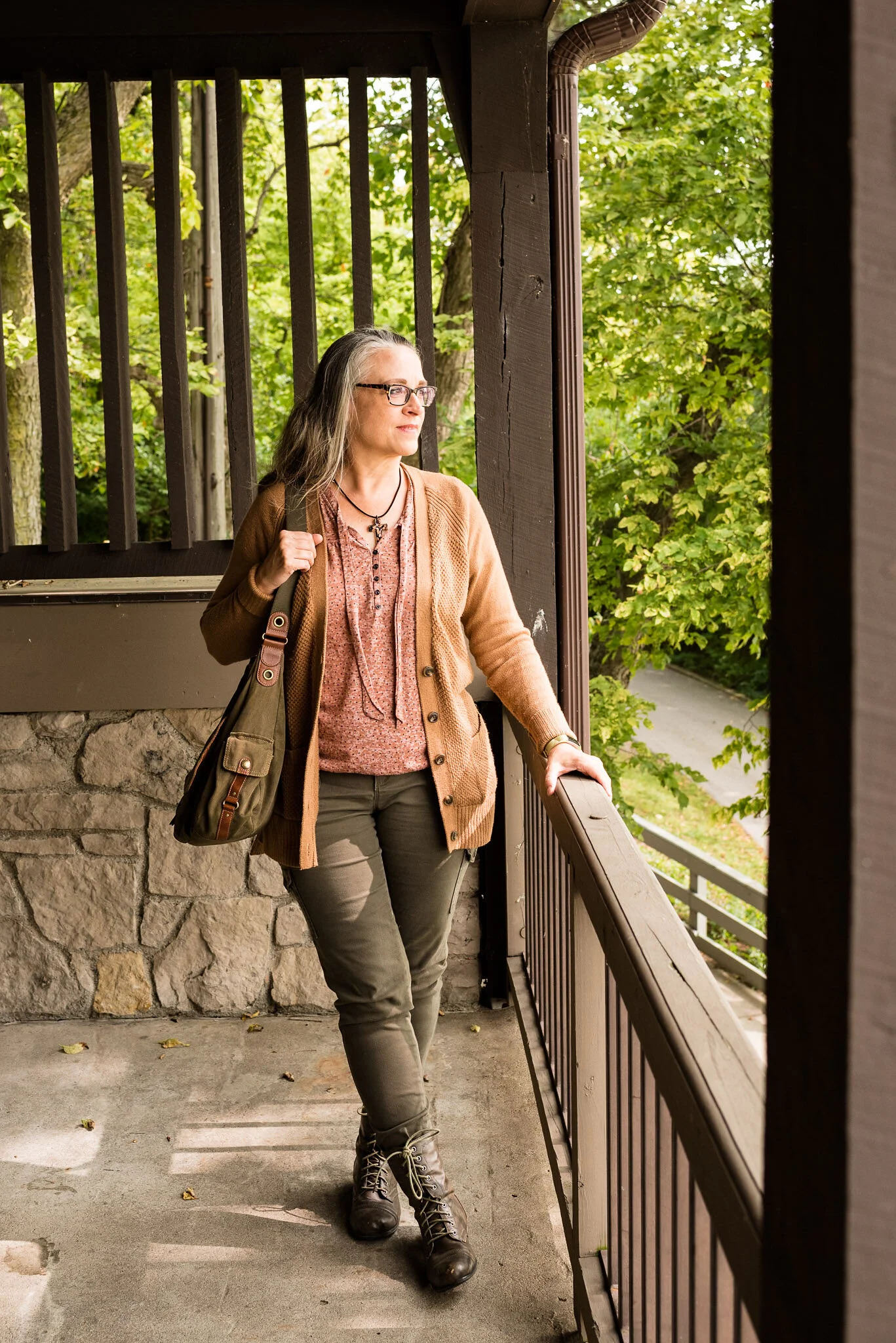
When I originally put this outfit together I thought the sweater was more like Sandstone, but now seeing the pictures, it is much too yellow. However, the thrifted, tie-front tee has both colors in it, so I am making that my Pantone piece for both colors in this post. Even so, I do like the way this outfit came together with a rather neutral vibe.

Pantone - Fall/Winter - 20/21 - Peach Nougat, Sandstone and military olive

My camel colored, waffle knit, thrifted cardigan is Old Navy brand. I love this piece and it is the perfect weight for these changing temps. I like that it is a little longer, has pockets and will go with just about anything in my closet. It is showing a little bit of pilling, but these days, if we can wear distressed jeans, why not wear pilly sweaters. Ha, ha.

Pantone - Fall/winter - 20/21 - peach nougat, sandstone and military olive

My Gloria Vanderbilt utility pants have been a staple in my wardrobe and you have seen these appear on the blog over and over. I am so thankful they are stretchy, because my weight has fluctuated over the last few years about eight pounds, up and down, many of you know the feeling. At least with pants that have some flex you can still wear them, even when your weight is up a bit. This year Military Olive is on the New York palette as a Classic Color and on the London palette as a main color. Not sure why that is, but you’ll see I use the color both ways, once you see the London palette colors.

Pantone - Fall/Winter - 20/21 - Peach Nougat, Sandstone and Military Olive

This cross necklace was the perfect accompaniment for this outfit. It goes so well with the shirt, it looks like they are made to go together.

Pantone - Fall/Winter - 20/21 - Peach Nougat, Sandstone and Military Olive

Keeping the look ultra casual allowed me to carry this fabulous hobo bag from Fossil. Also a thrift find. Shhhh! Don’t tell my hubby. He claims I have too many purses. Is that even a thing? Ha, ha.

Pantone - Fall/Winter - 20/21 - Peach nougat, sandstone and military olive

Lastly, I chose these well worn, thrifted combat boots from Falls Creek. I have had these for quite a while and they are definitely showing their wear, but again, if you like a grunge look, like I occasionally do, then well worn is just right.

Pantone - Fall/winter - 20/21 - Peach nougat, sandstone and military olive

What do you think of these colors? Do you have any of these in your closet? Are you a pastel kind of girl, or do you like richer, bolder colors? Leave me some love in the comments. It means a lot to hear from you!

Here is the New York Fall/Winter 20/21 color palette.

Pantone - New York Fall/Winter 20/21

I hope you will follow along as I continue this color series. I’ve included a few shopping links, for you to peruse. These are affiliate links. All opinions are my own. Have a great day!

Photos and graphics Rebecca Trumbull.