Shopping Our Closets: Featuring Pantone 2025 London Palette Colors - Airy Blue and Passion Flower
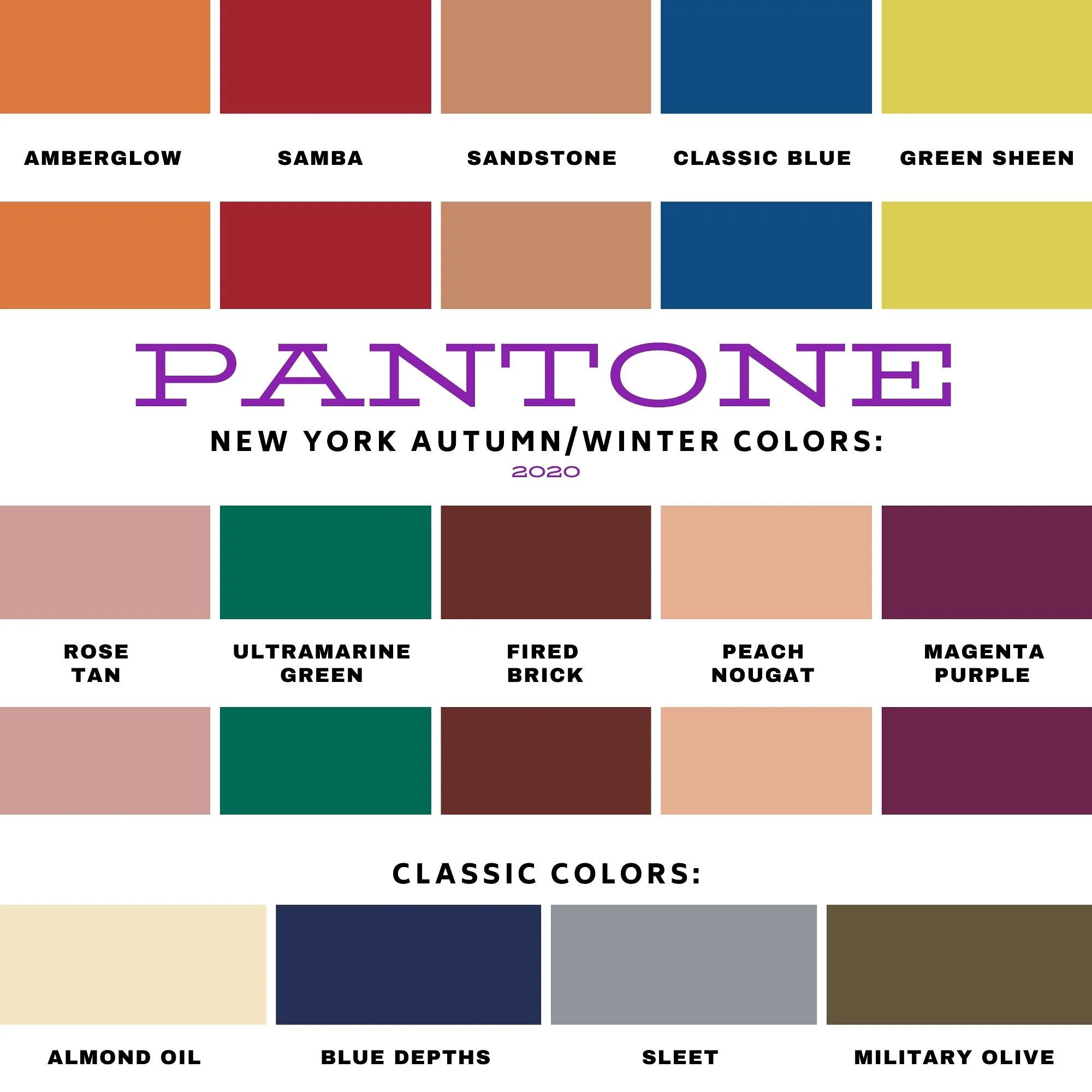
I will no longer be featuring a series on the twice yearly Pantone color palettes, because it is no longer free to access. This year they have stopped showing the colors in their articles unless you sign up for an account. This was apparently due to an disagreement between Pantone and Adobe the platform that provided the color palettes. Pantone wanted customers to have direct access to the color libraries, but now it costs a subscription price of $15/month or $90/year. This is unfortunate for those of us who enjoy seeing the new colors. However, I was able to find a pin on Pinterest that shows the colors and you can see that here.

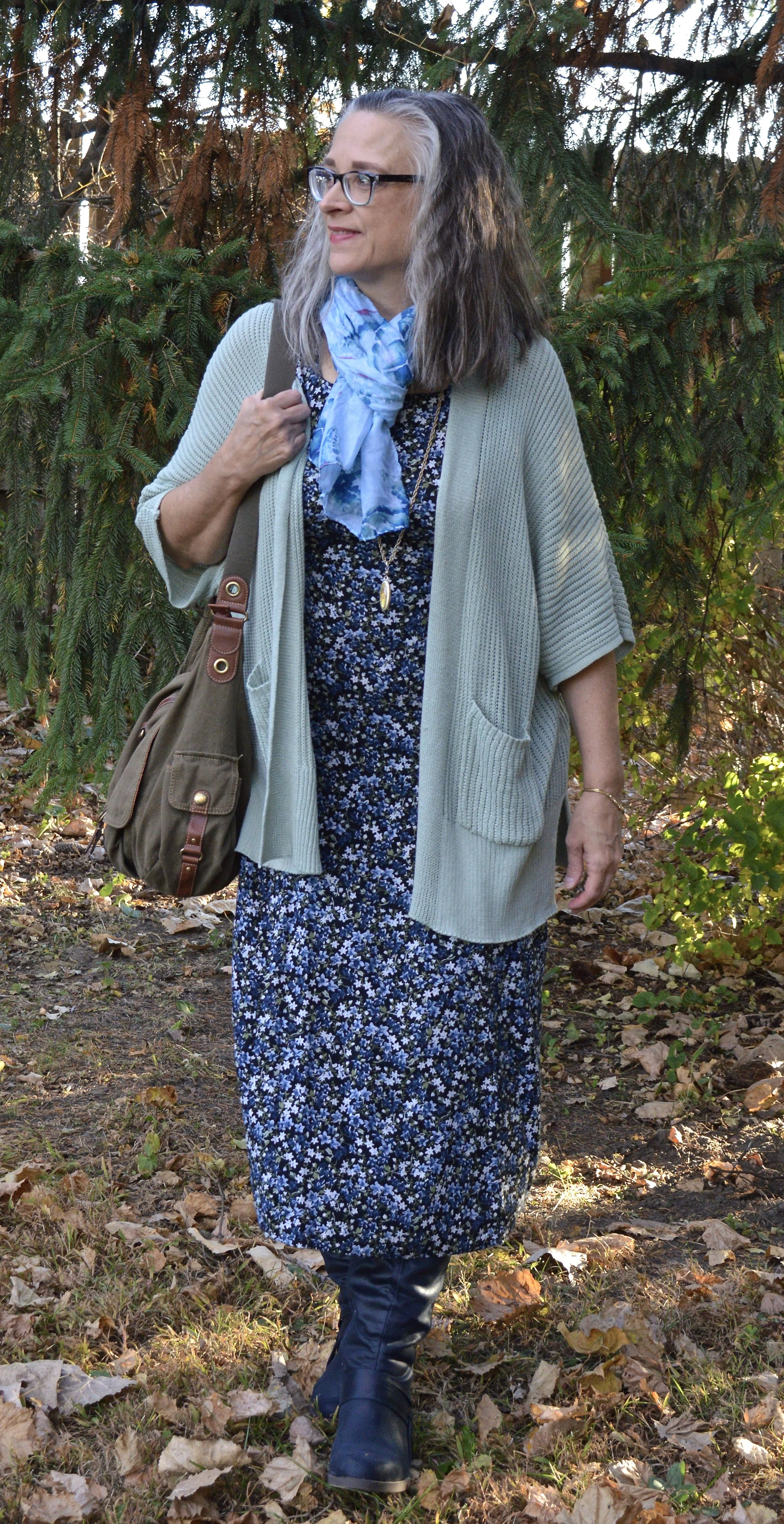
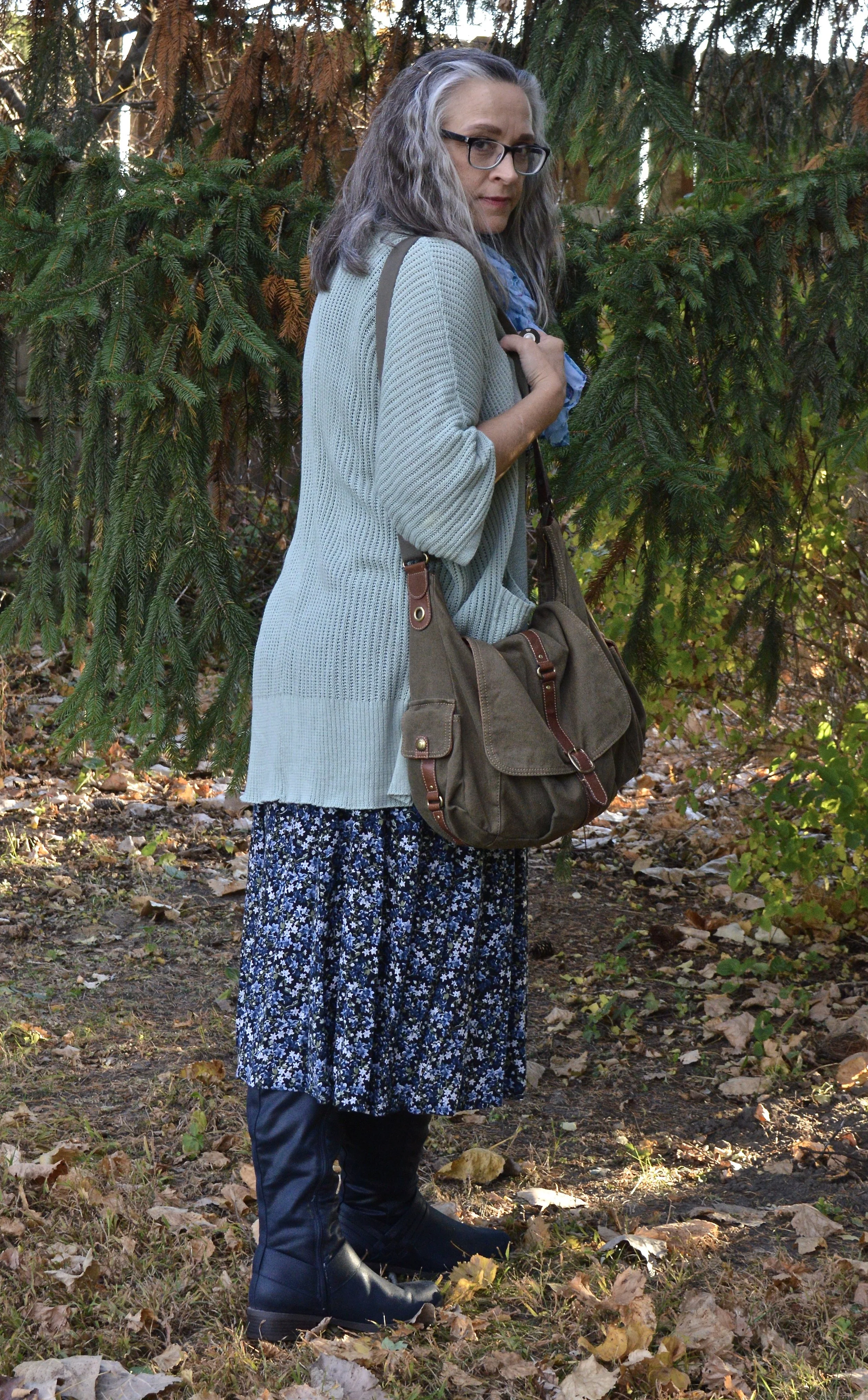
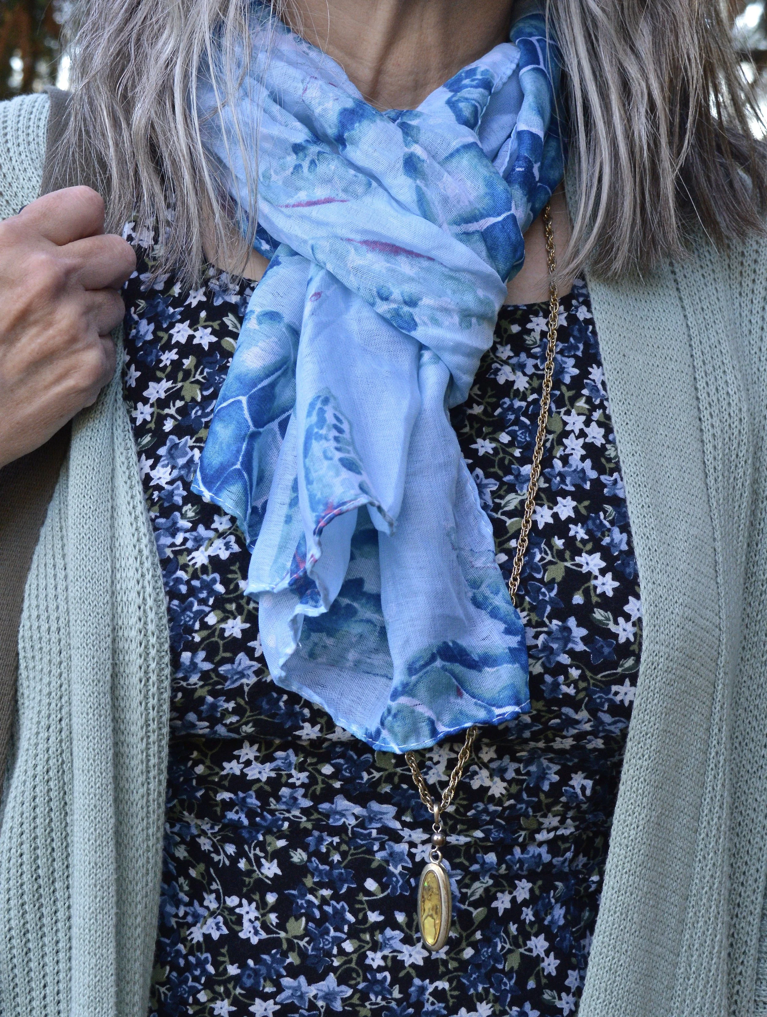
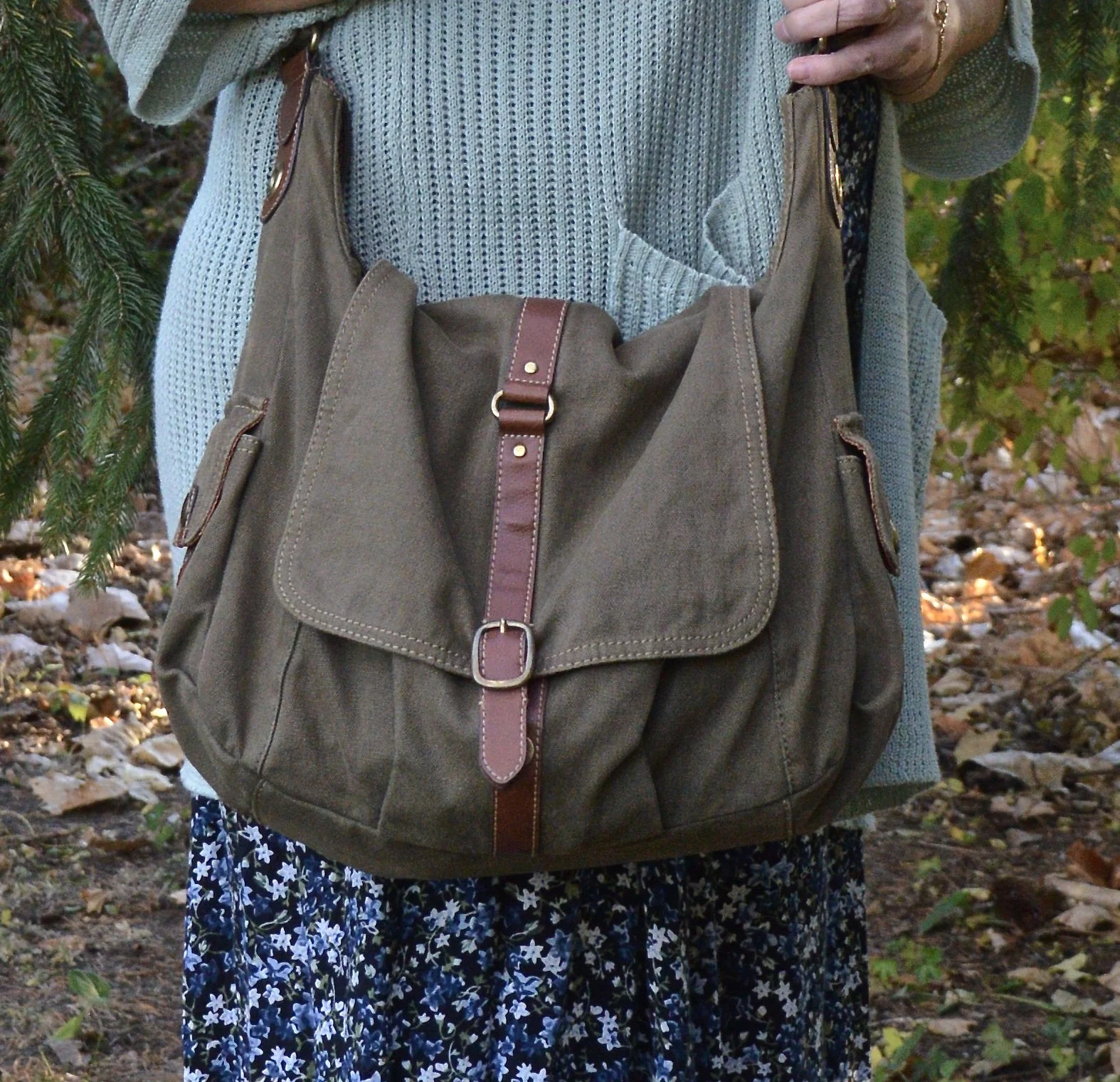
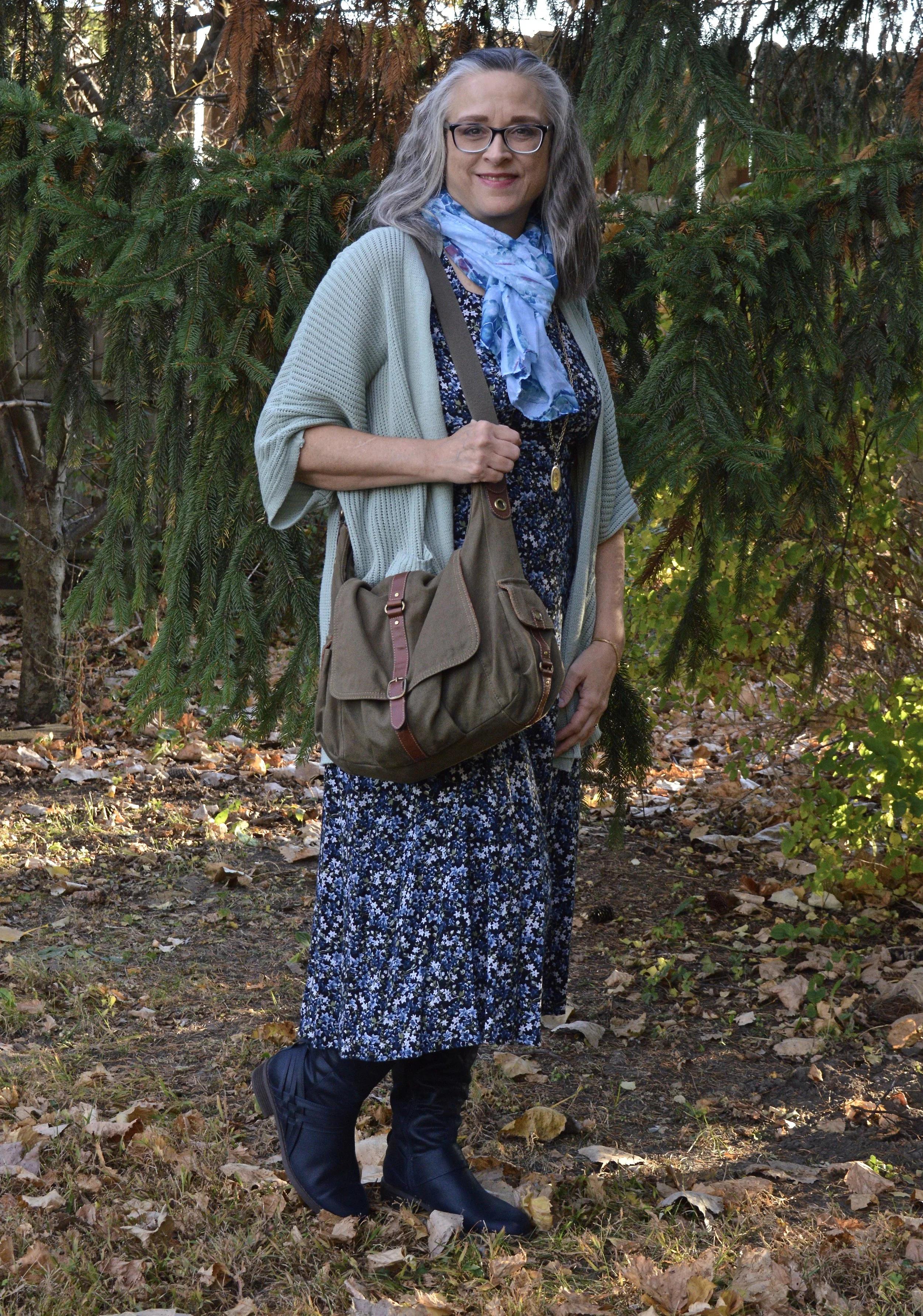
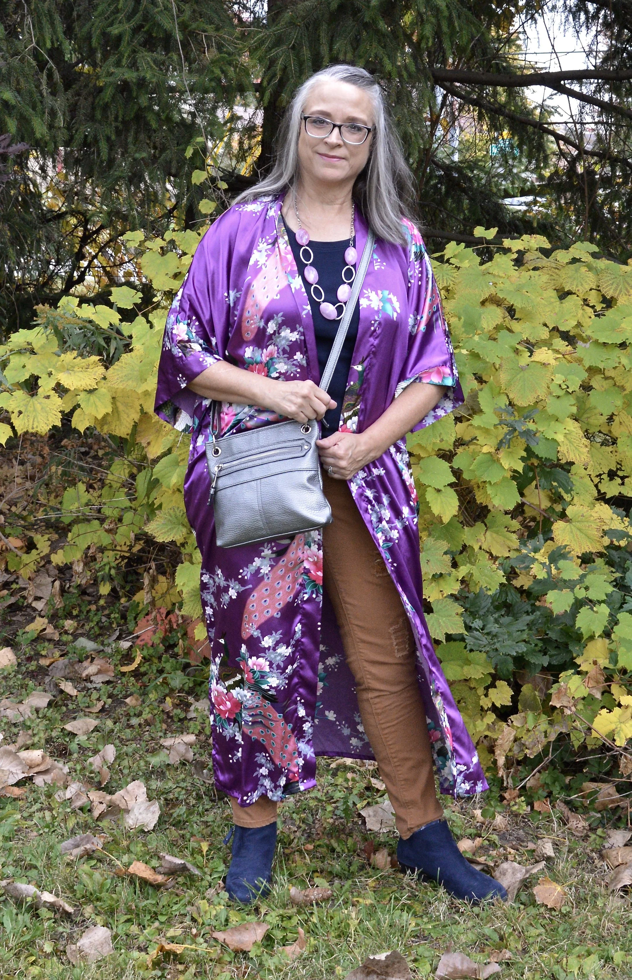
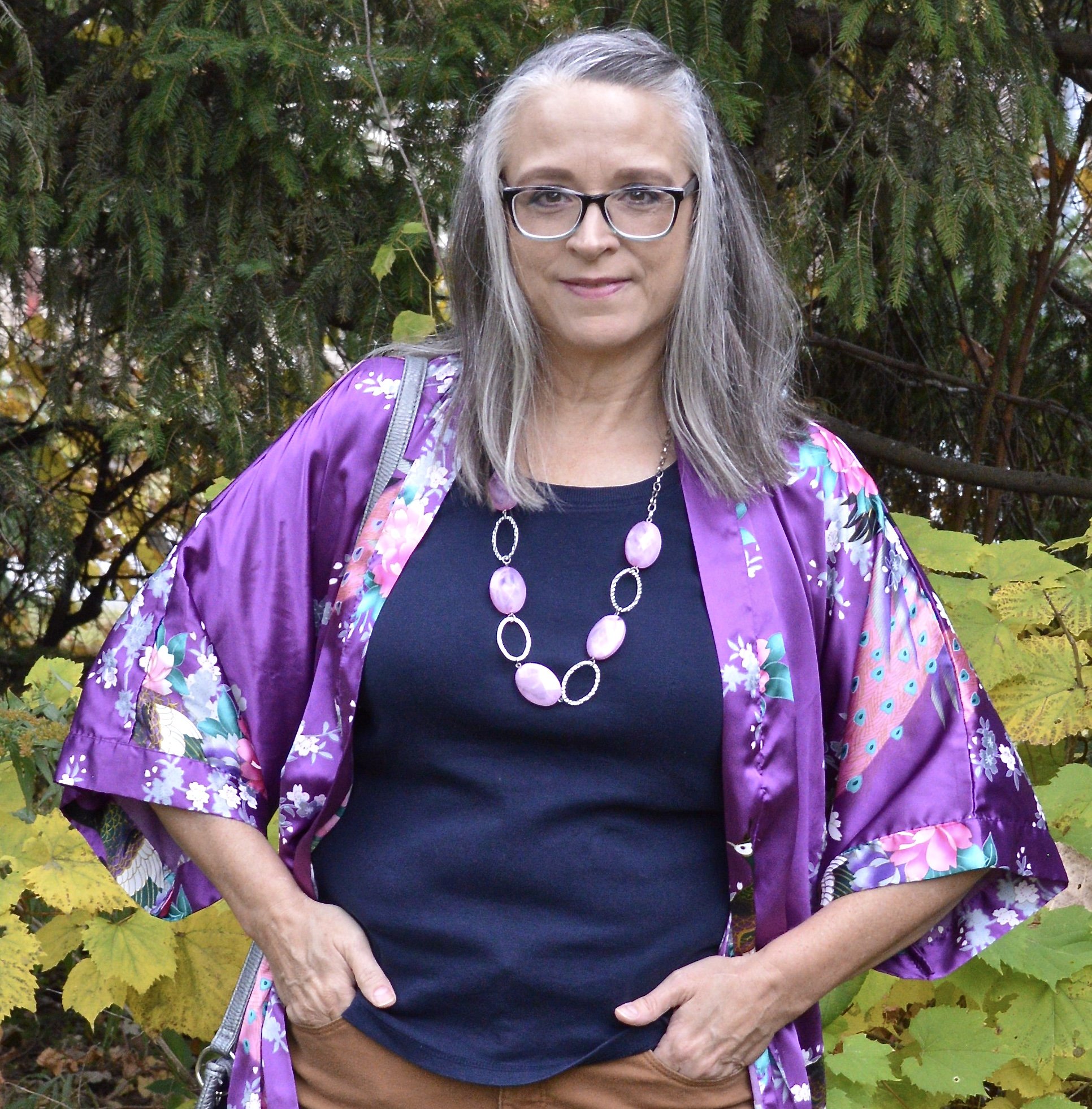
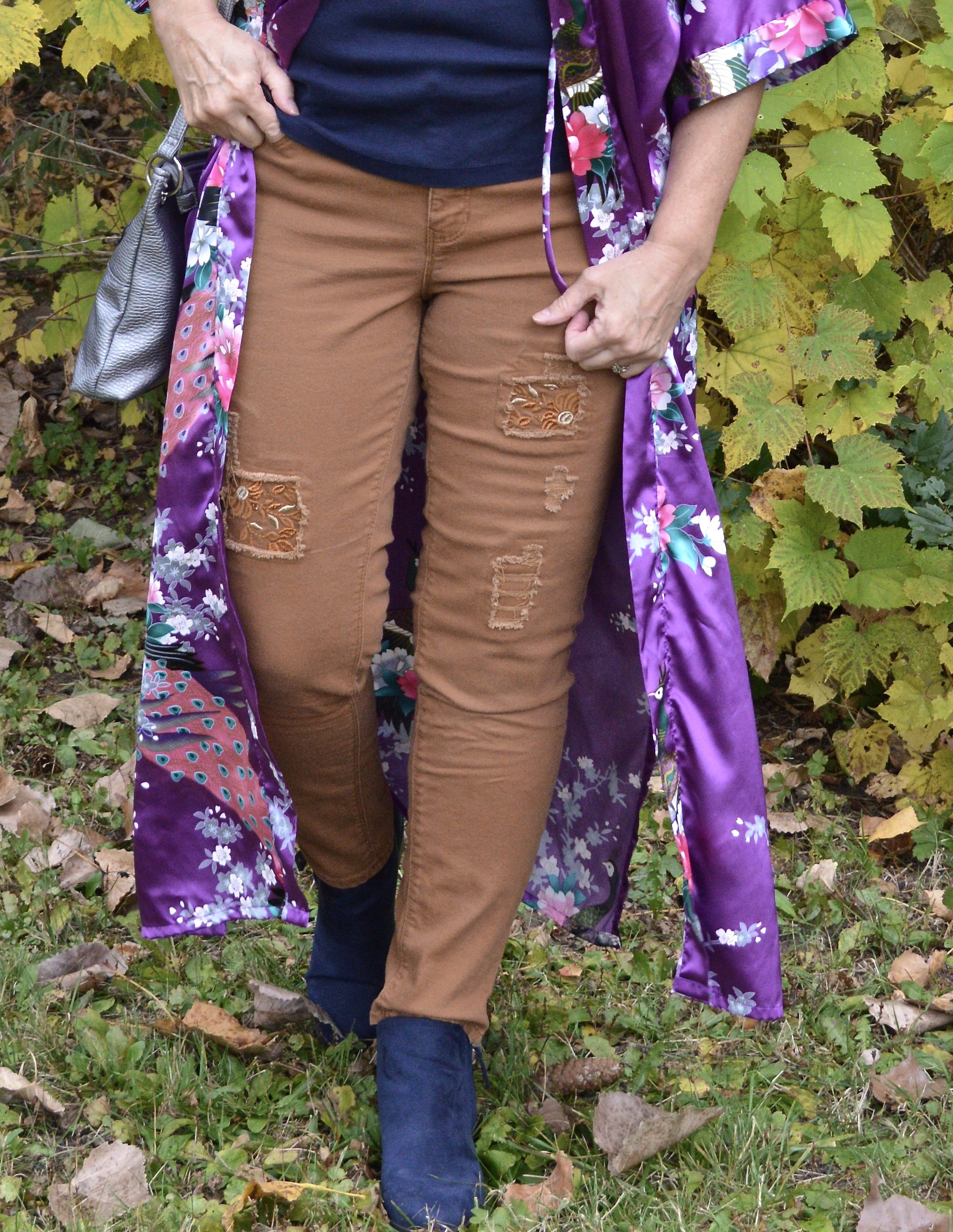
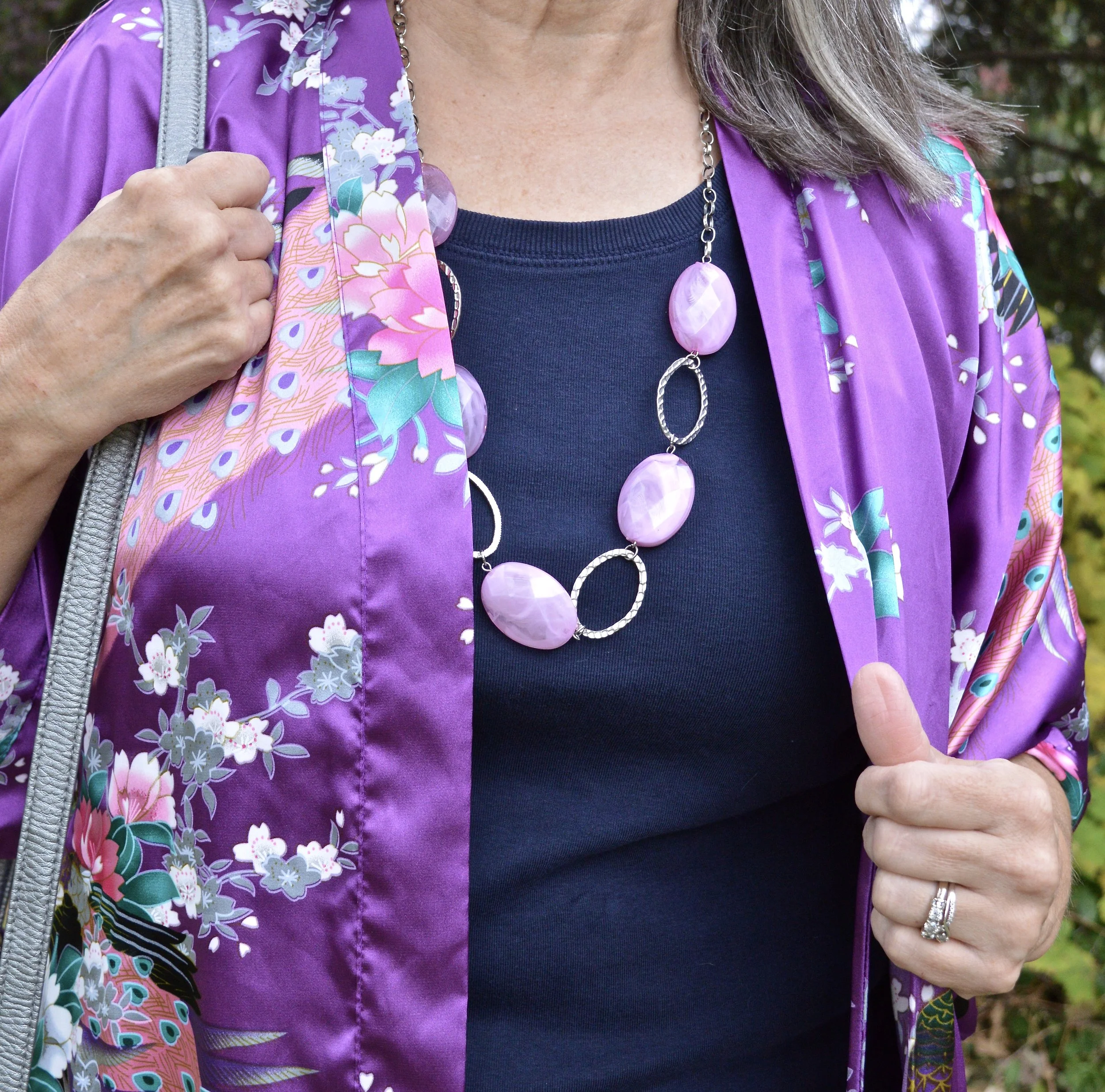
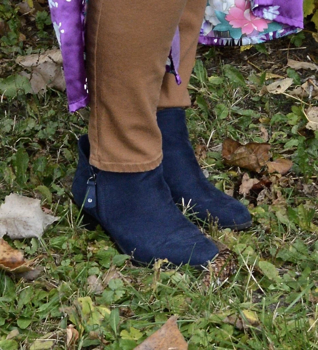
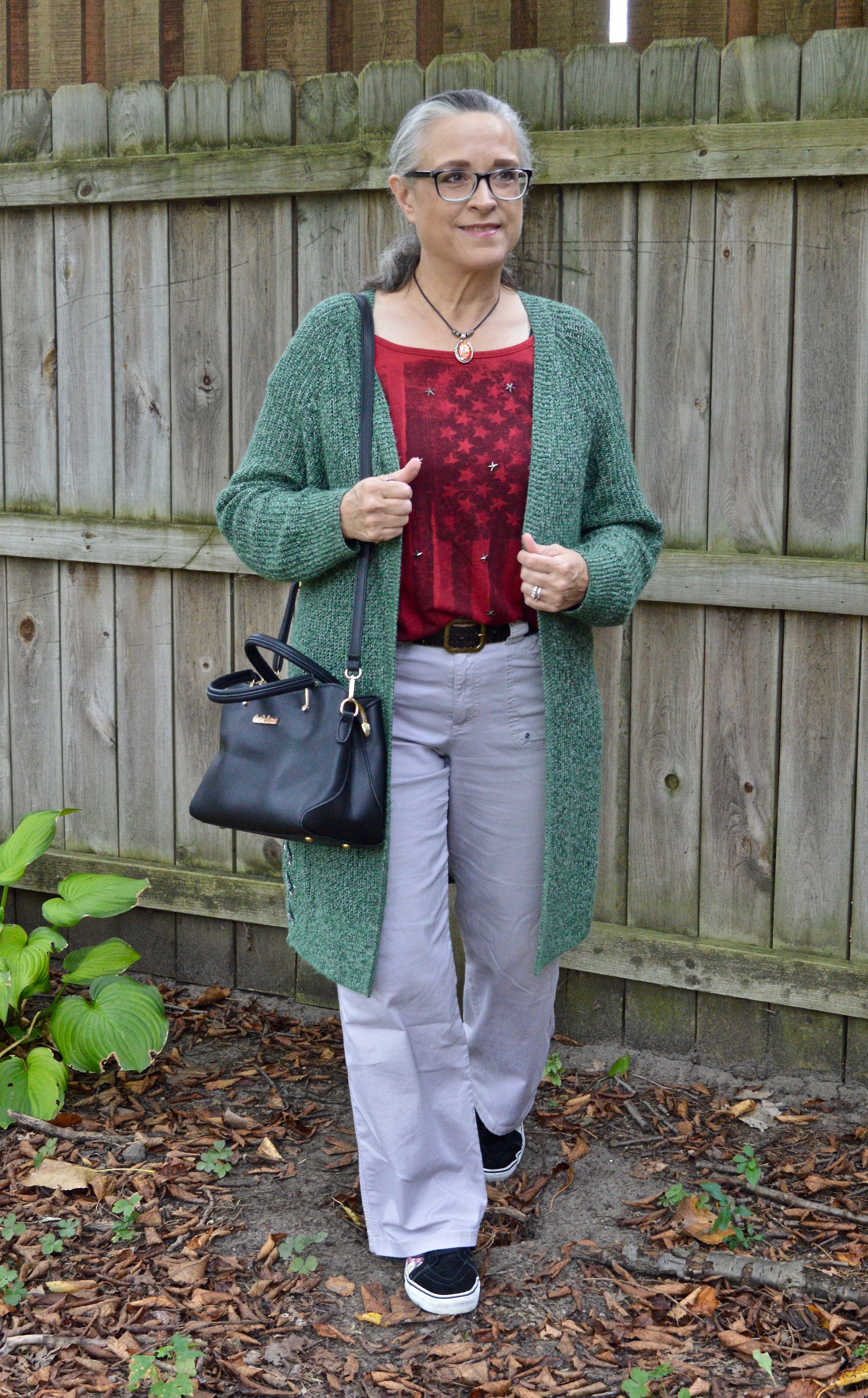
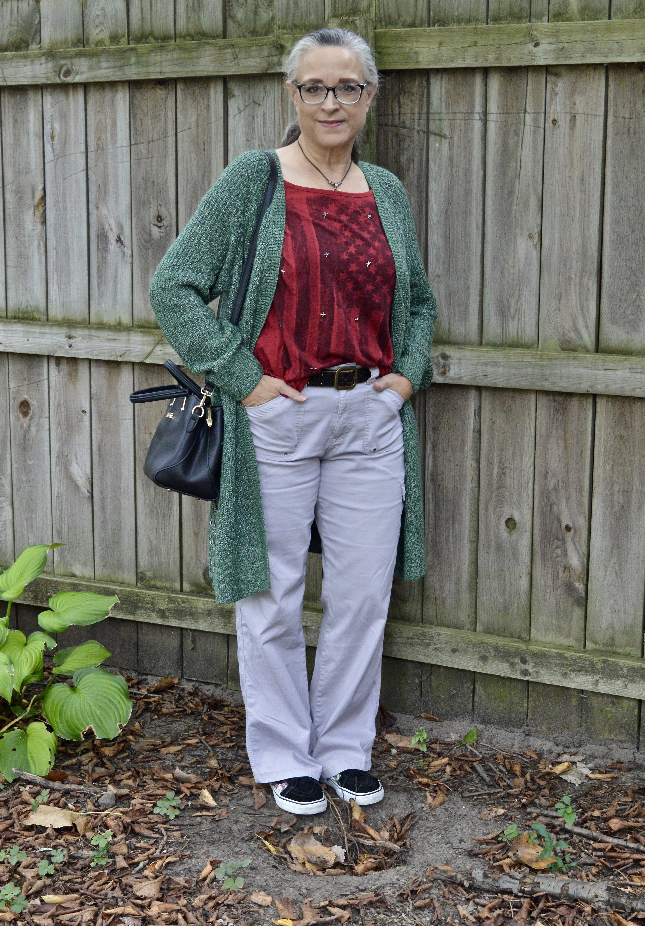
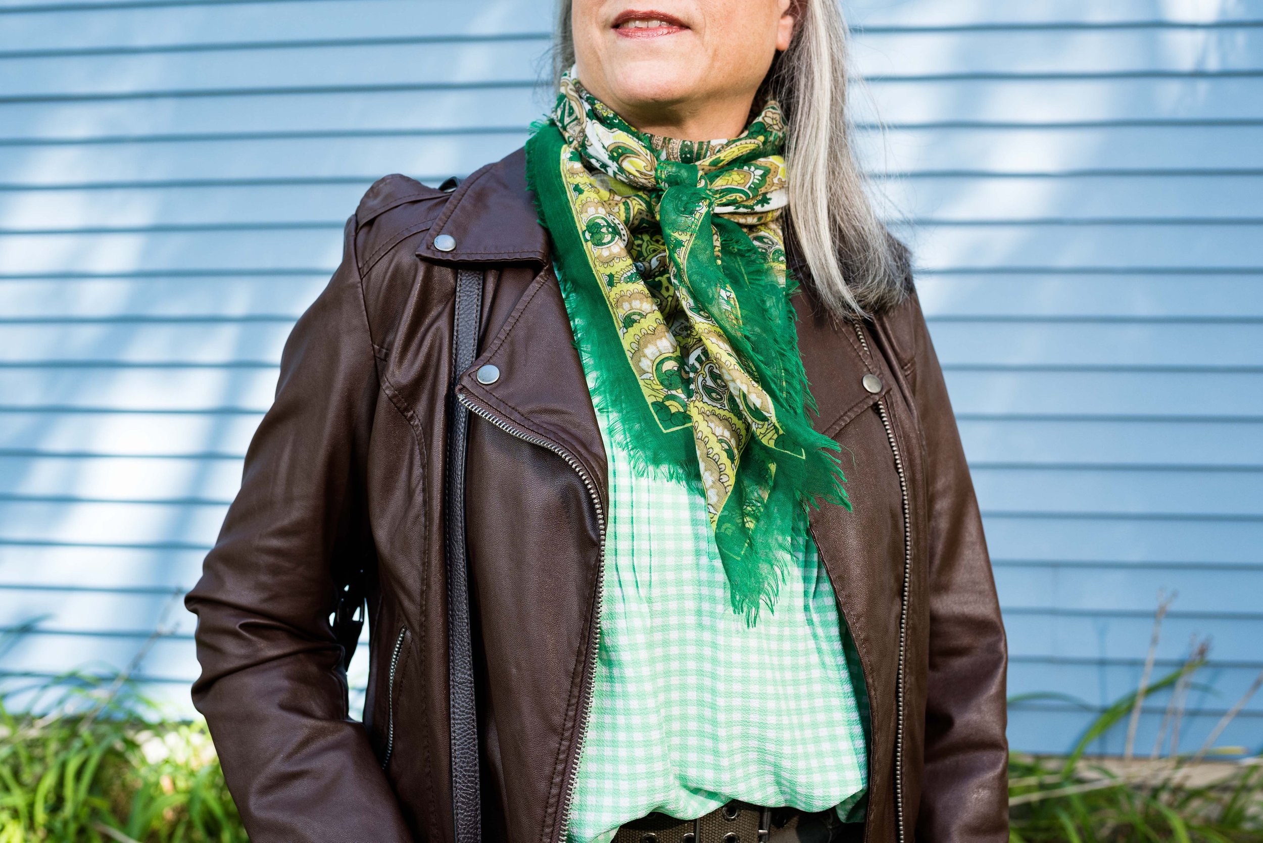
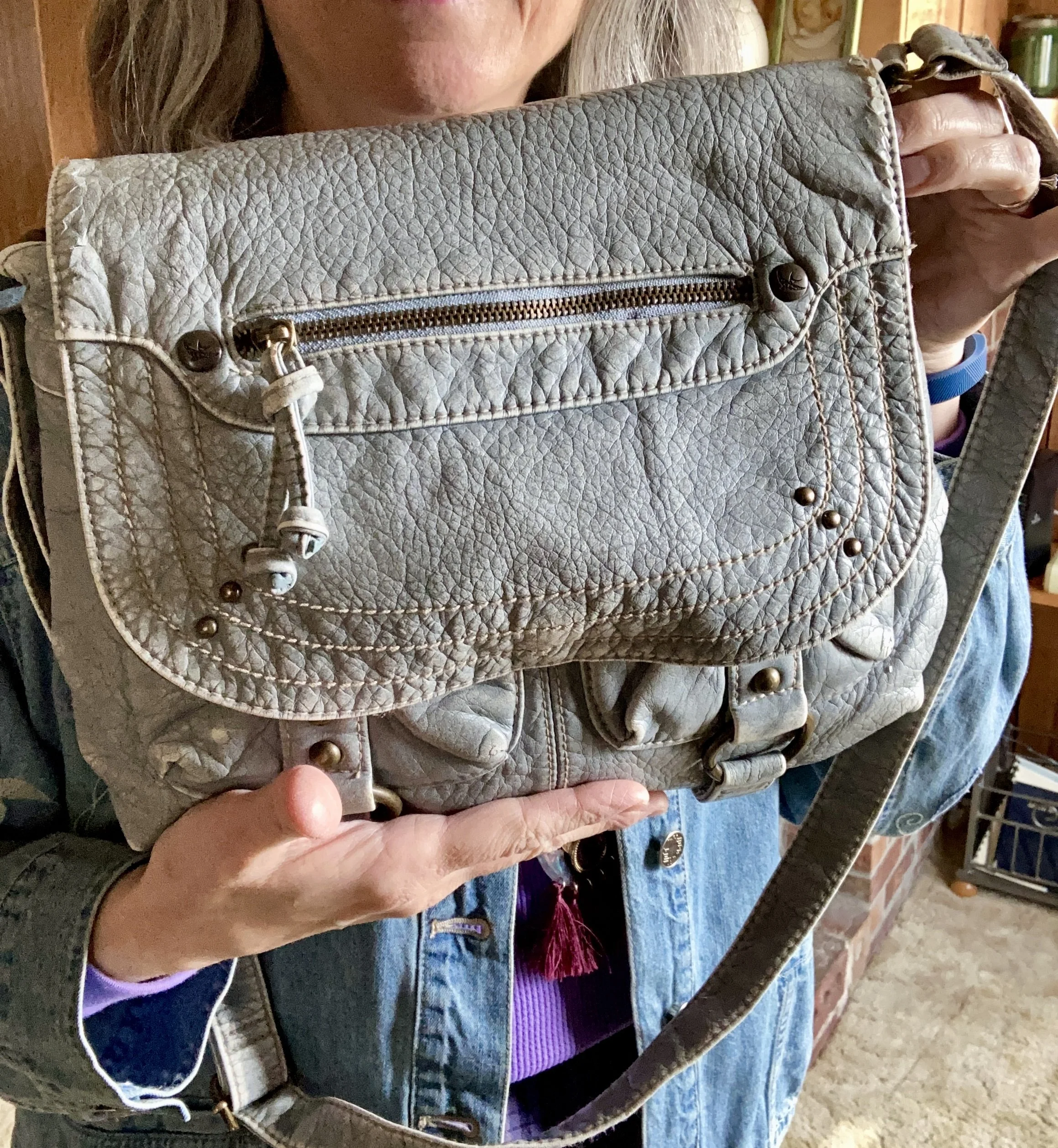
It is hard for me to show you warm weather looks when it is still so chilly outside, but I made an attempt with this outfit’s bright colors and fun denim jacket. It just happened that this purple which they are called Passion Flower is one of my favorite colors. I thought it paired well with the lighter Airy Blue of the denim and my vintage-ish shoulder bag. Let’s take a closer look at the details.
There are two stars in this outfit.
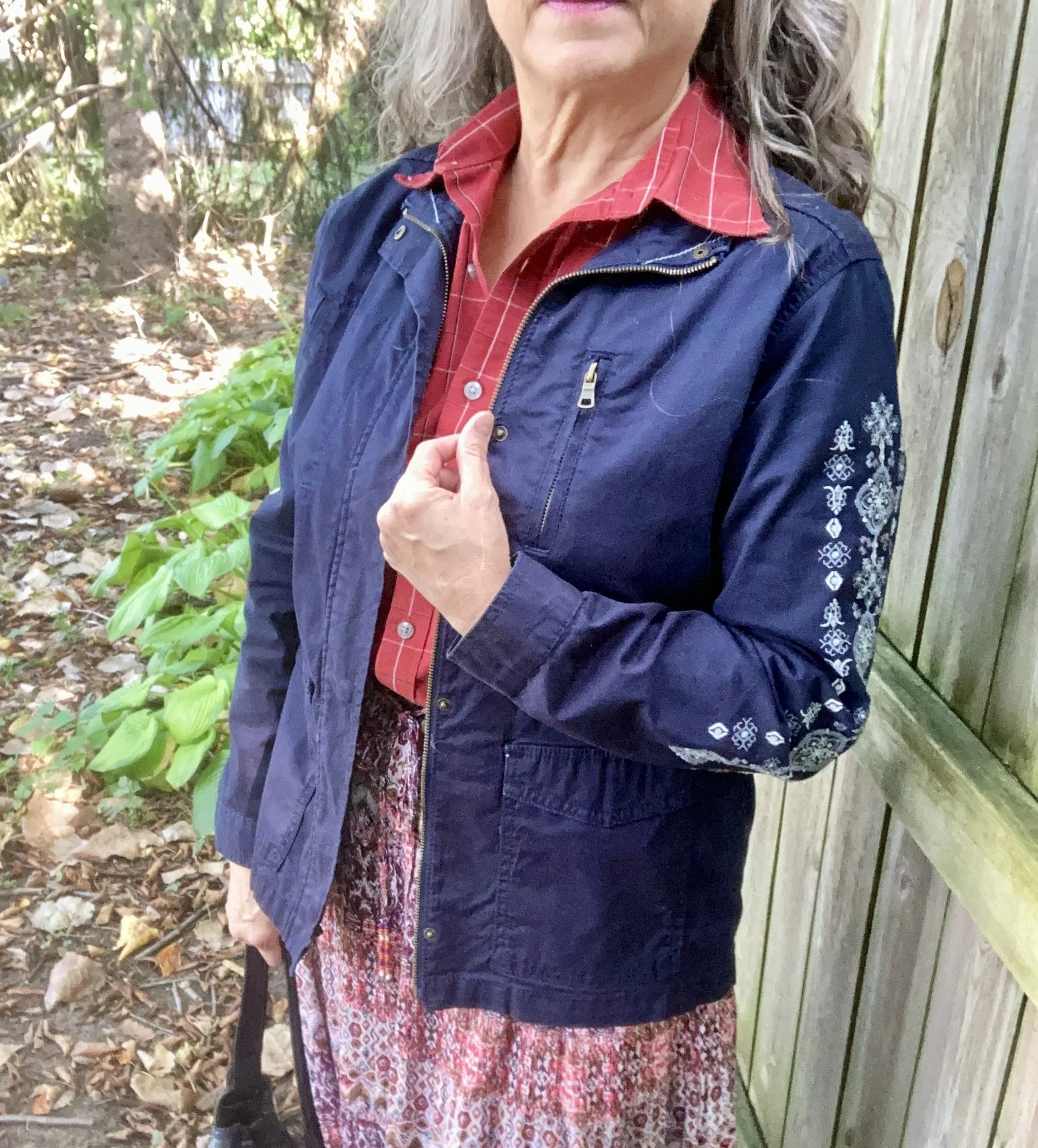
Star #1 - Embroidered Denim Jacket
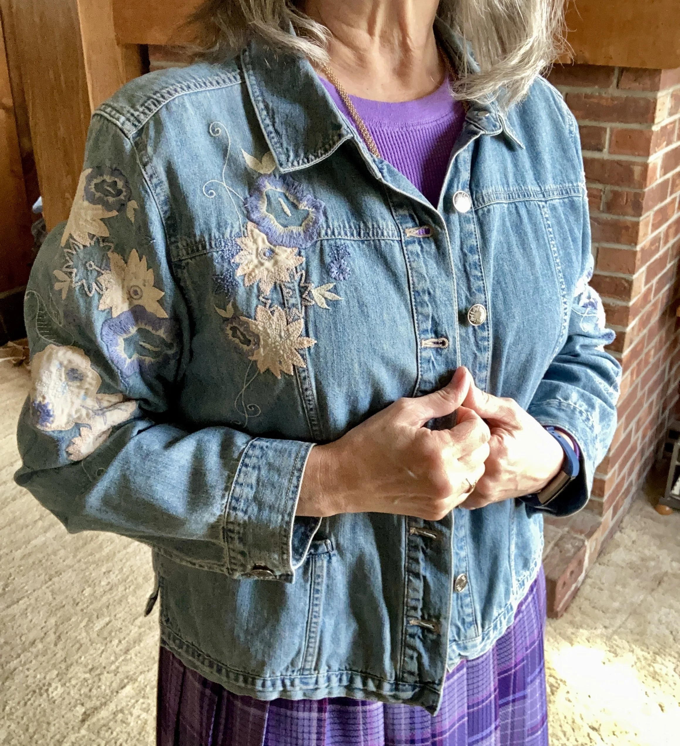
You may have seen this beautiful, thrifted J. Jill Denim piece on the blog before. Click to see it styled with a head to toe denim outfit, a floral maxi dress, pink pants and a berry top, and a white maxi skirt. This is definitely a piece that I will be hanging on to.
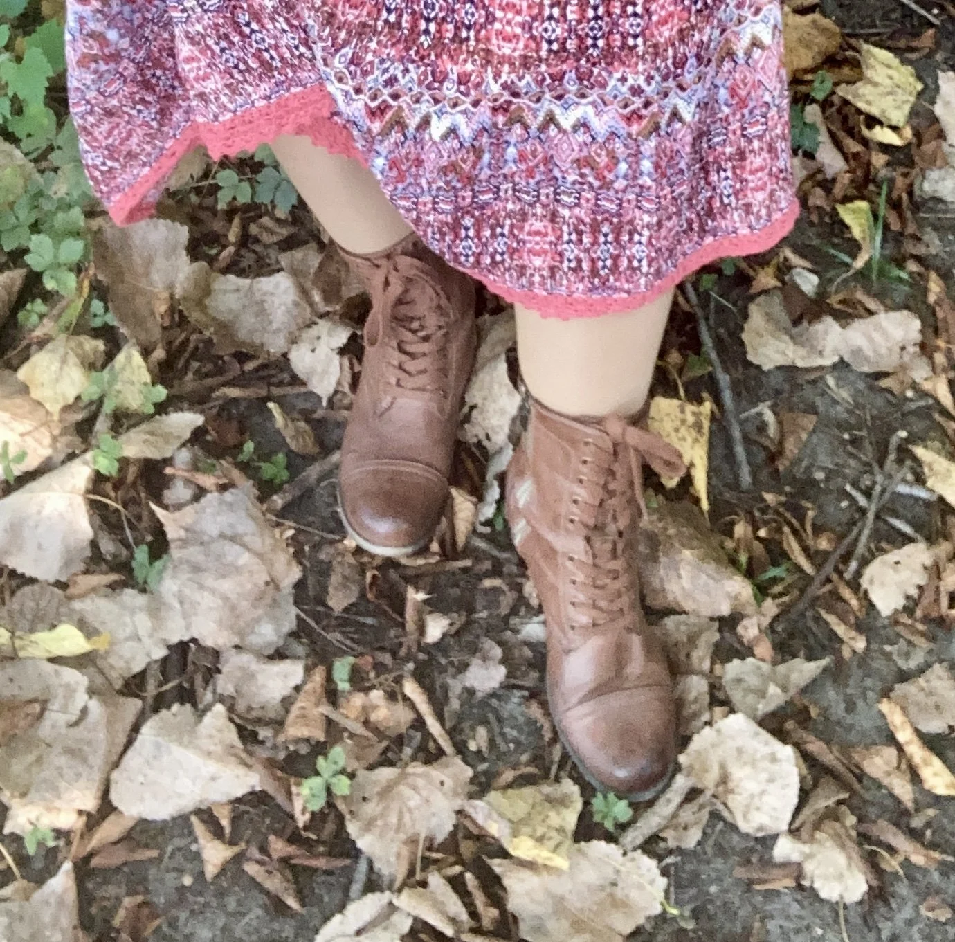
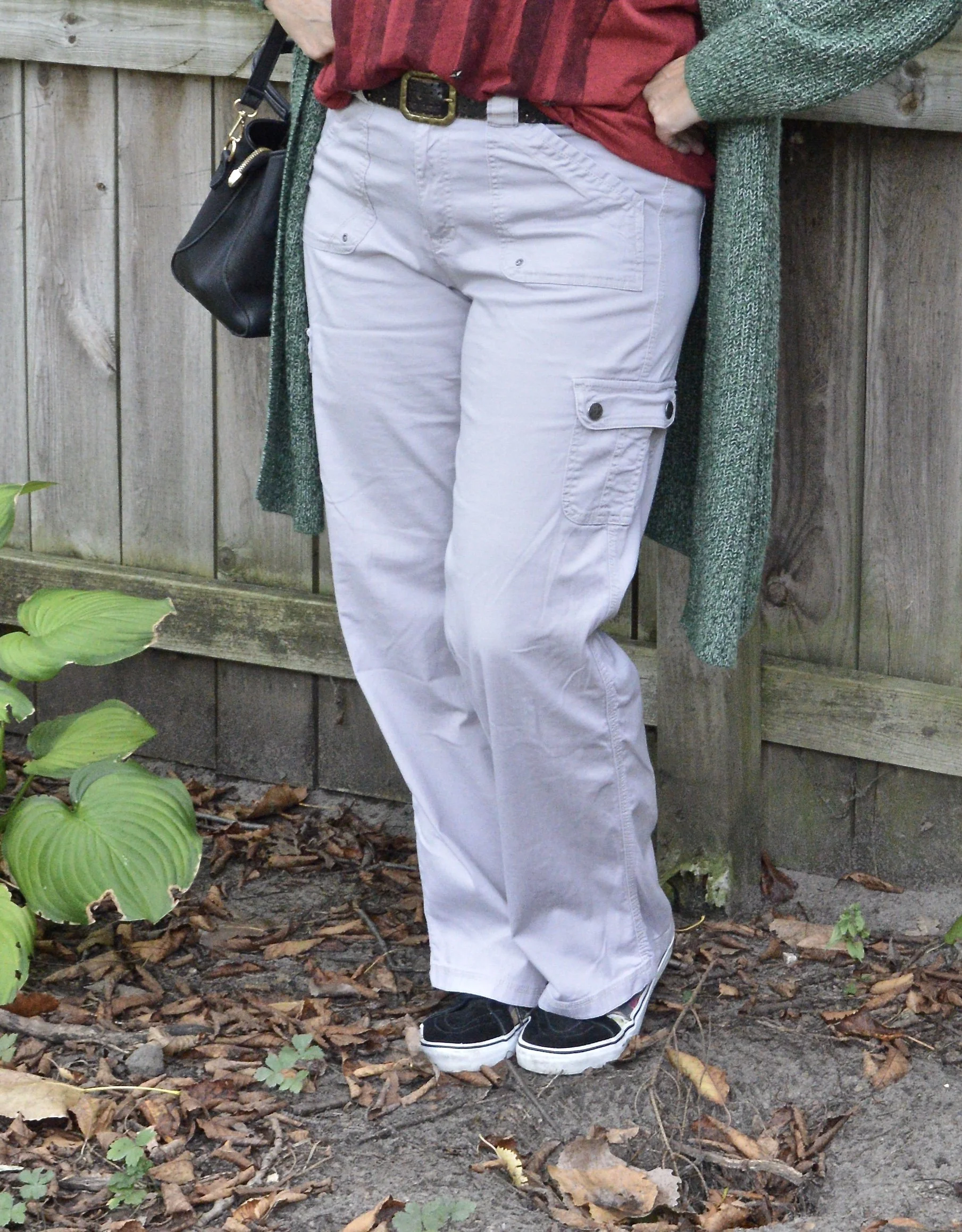
Star #2 - Pleated Skirt

I bought this the last time I went thrifting before I started the #75hardstylechallenge . It was a tad tight around the waist, but I had started Weight Watchers and was hopeful that it would fit better as I lost weight, and indeed it does. It is still a tad snug, so no sit ups while I am wearing it, but who would be doing sit ups in a skirt anyway? Ha, ha.
This gorgeous piece is Pendleton brand, so very well made. I wish I could afford their clothing, but I will just have to keep my eye out when I start thrifting again. I did have two other Pendleton pieces, a blazer I still have which you can see here and here, and another blazer, here, which I do not have any longer.
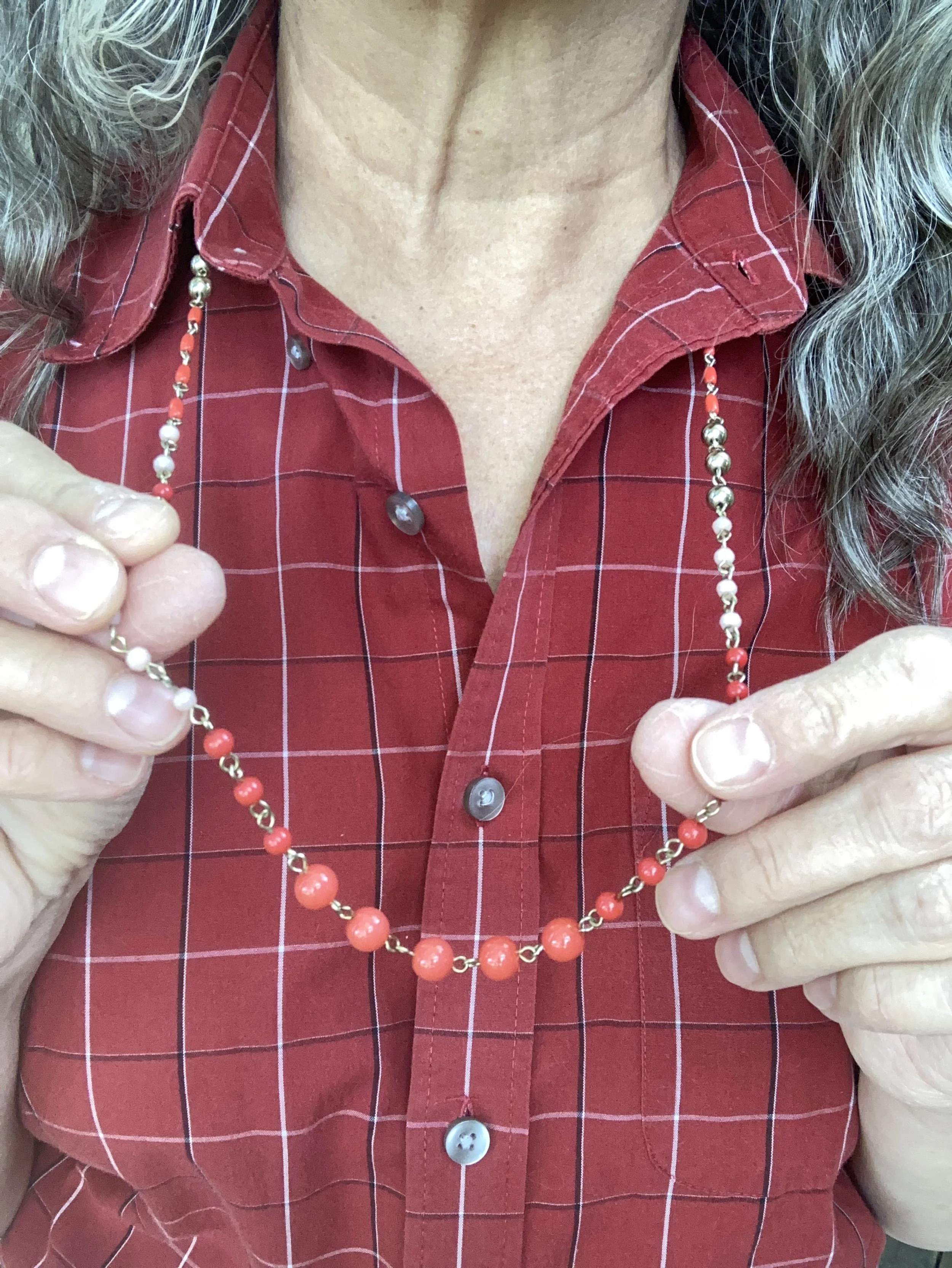
I had this purple Time and Tru, thermal long sleeve tee from a previous thrifting occasion and it matches perfectly.


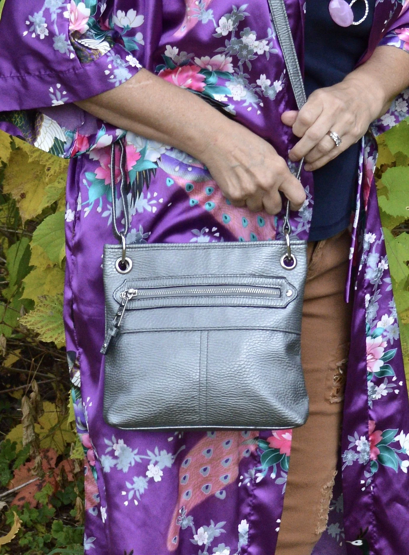
Finally, my light blue shoulder bag, another thrift find is a brand called Sparrow True. On the label inside it says, “Inspired by Vintage Treasures of an Undiscovered Past.” I like that.
What do you think of this outfit? Do you own any Pendleton products? What has been your best find either at a thrift store or a regular retail store? I’d love to hear from you. Your input and feedback always makes my day and helps me to keep posting.


I’ve included shopping links for you to peruse. These are affiliate links. All opinions are my own.
Have a great week everyone and thanks for following along on the blog.