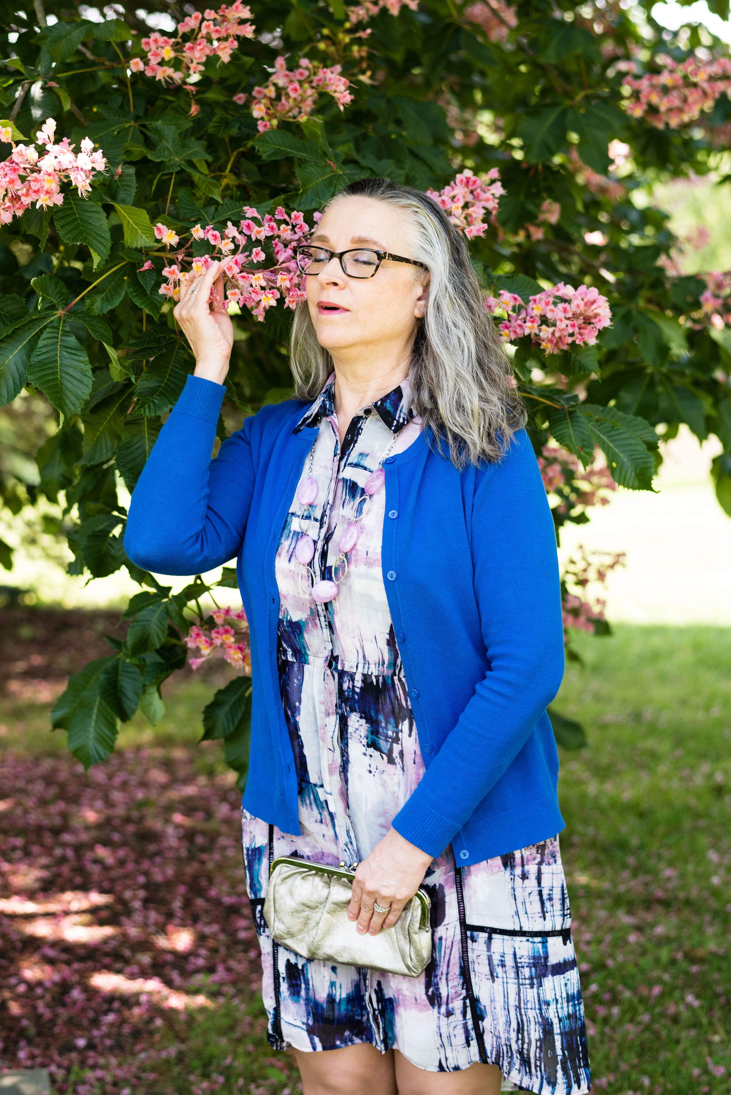
Pantone - Autumn/Winter - 2021 - New York Palette: Fuchsia Fedora, Leprechaun, and Coconut Cream

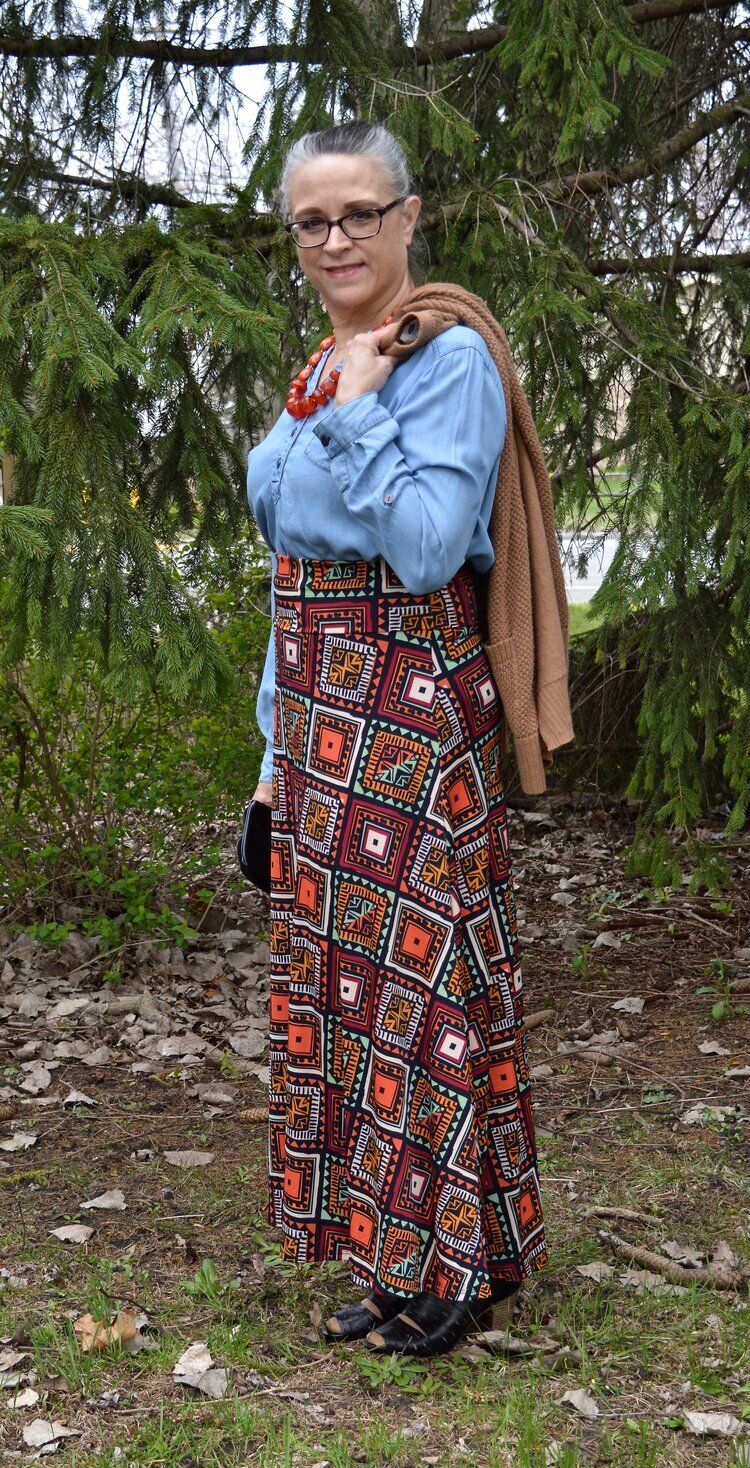
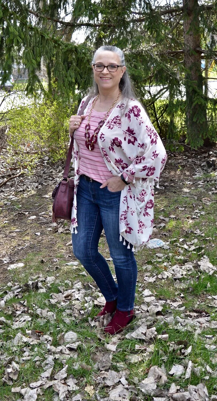
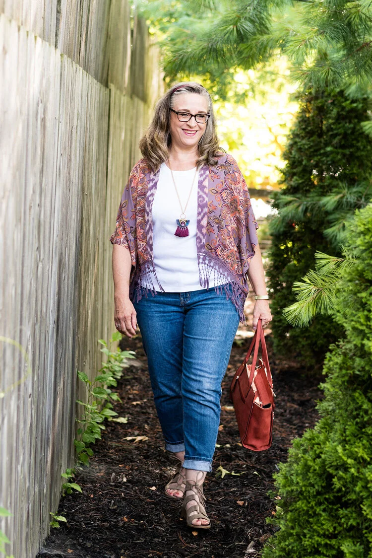
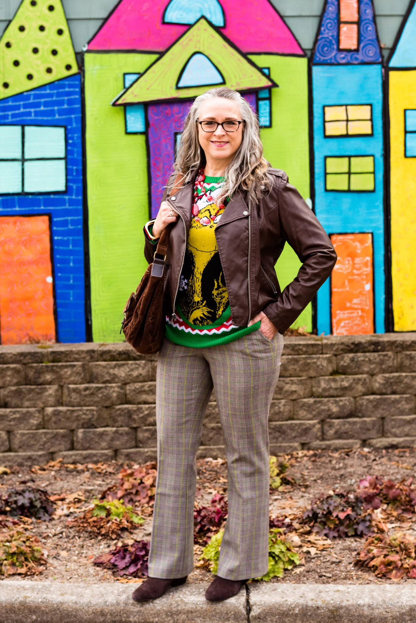
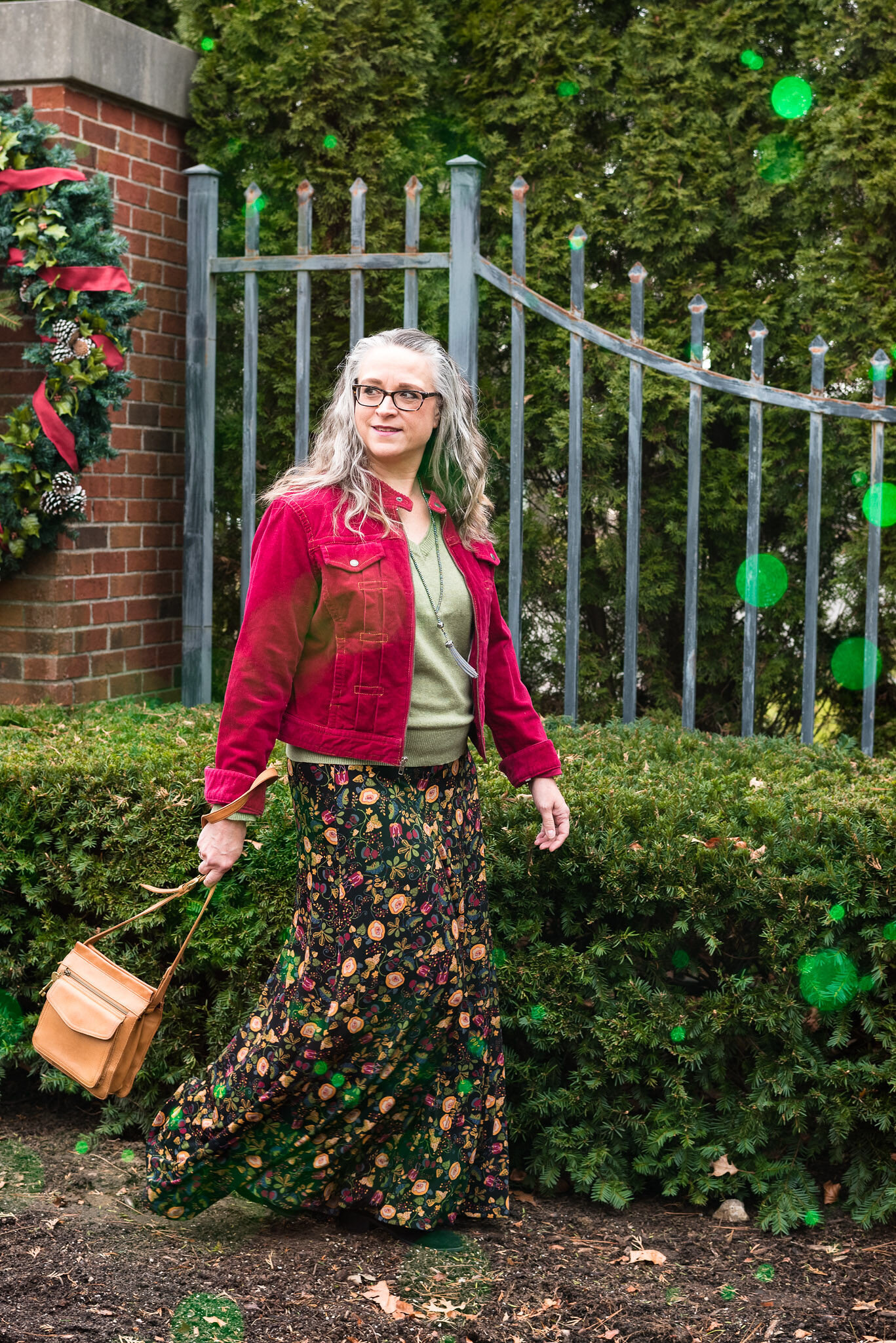
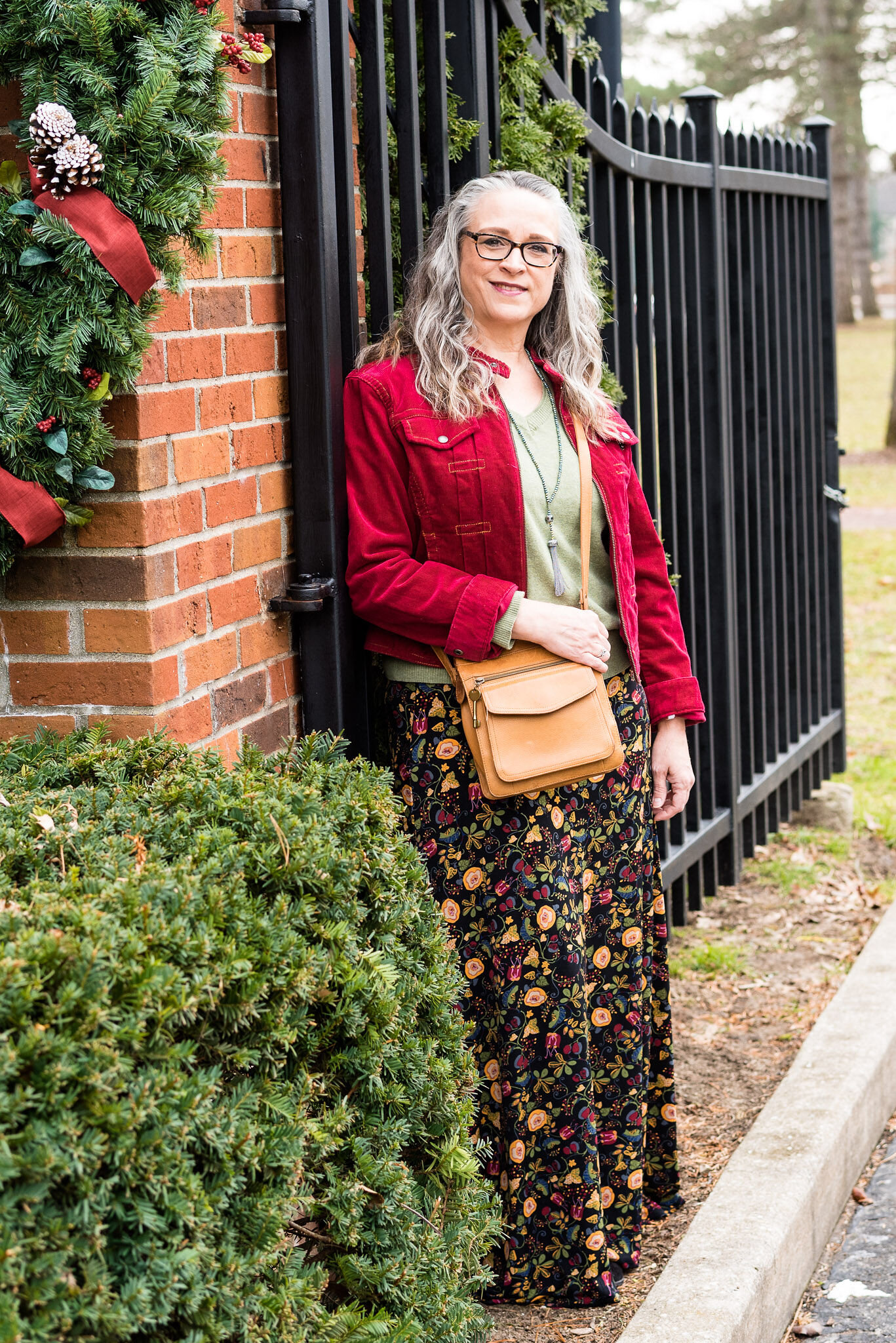
The colors I am showing you today were ones that surprised me a bit for a fall palette. The bright Fuchsia Fedora is not a color that I have very many pieces in, thus why I used it more as an accessory color. Leprechaun was also a different choice. I was thinking there would be a darker, more forest green color, but this bright, cheeky color is what appeared on the palette. However, that is one of the reasons I like doing this color series. It forces me to think outside the box.

FuschiaFedora.jpg

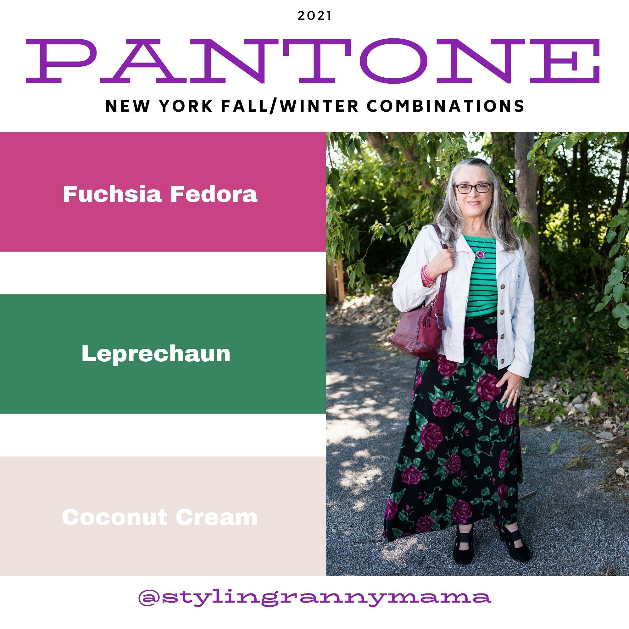
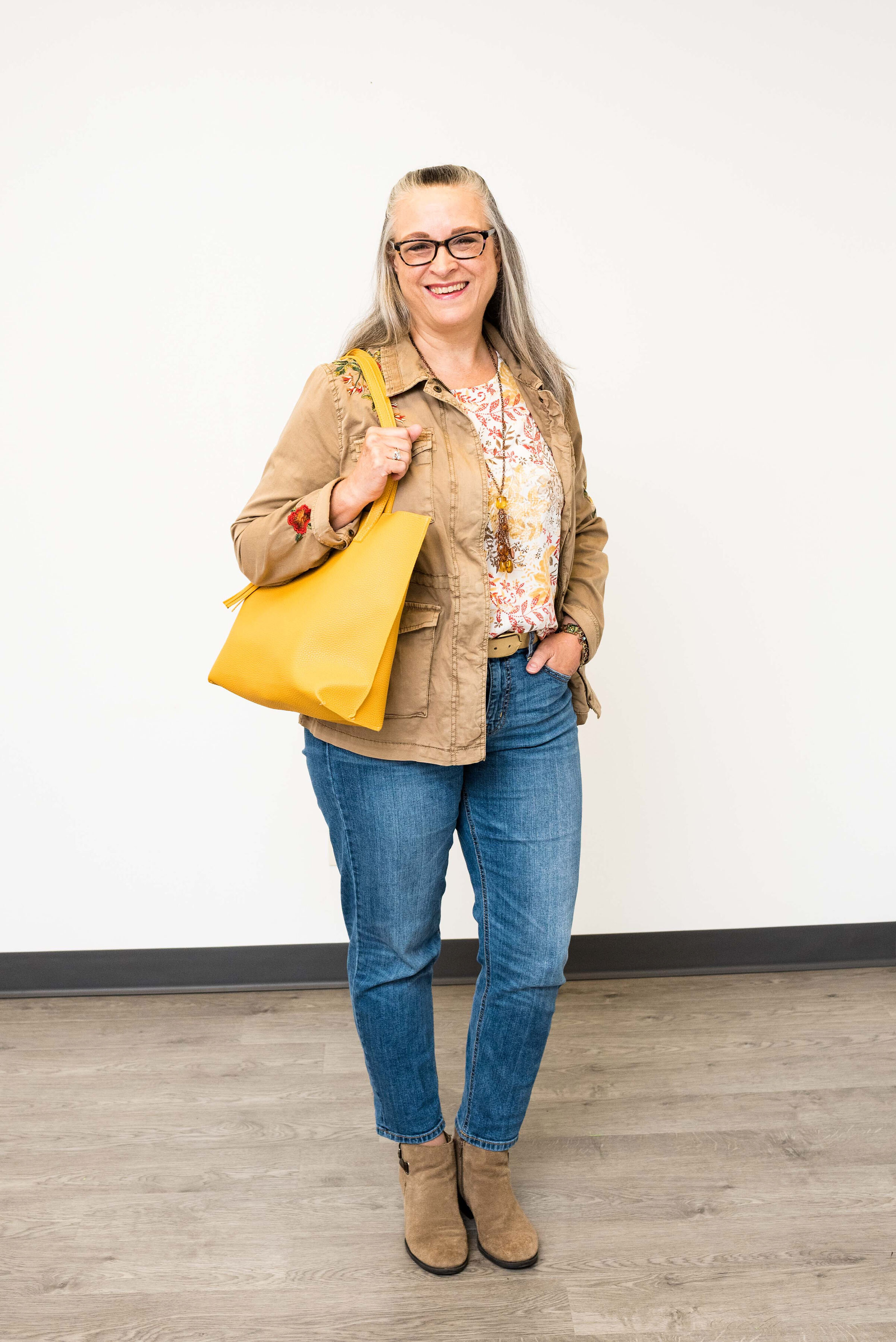
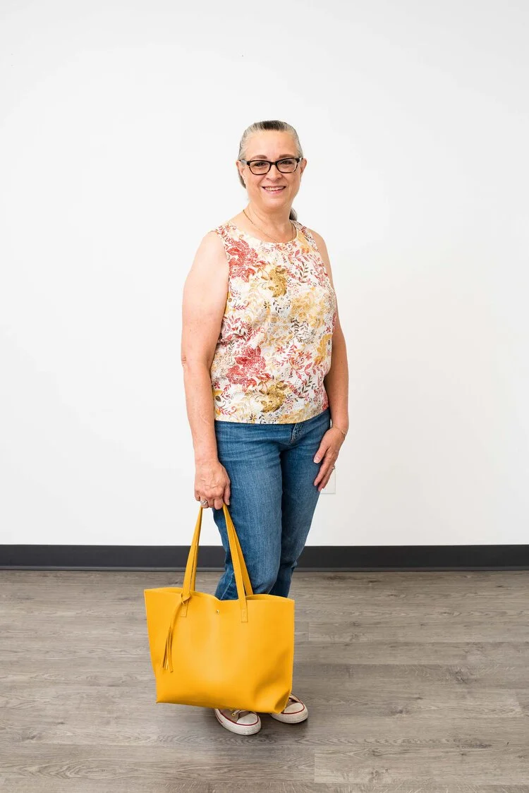
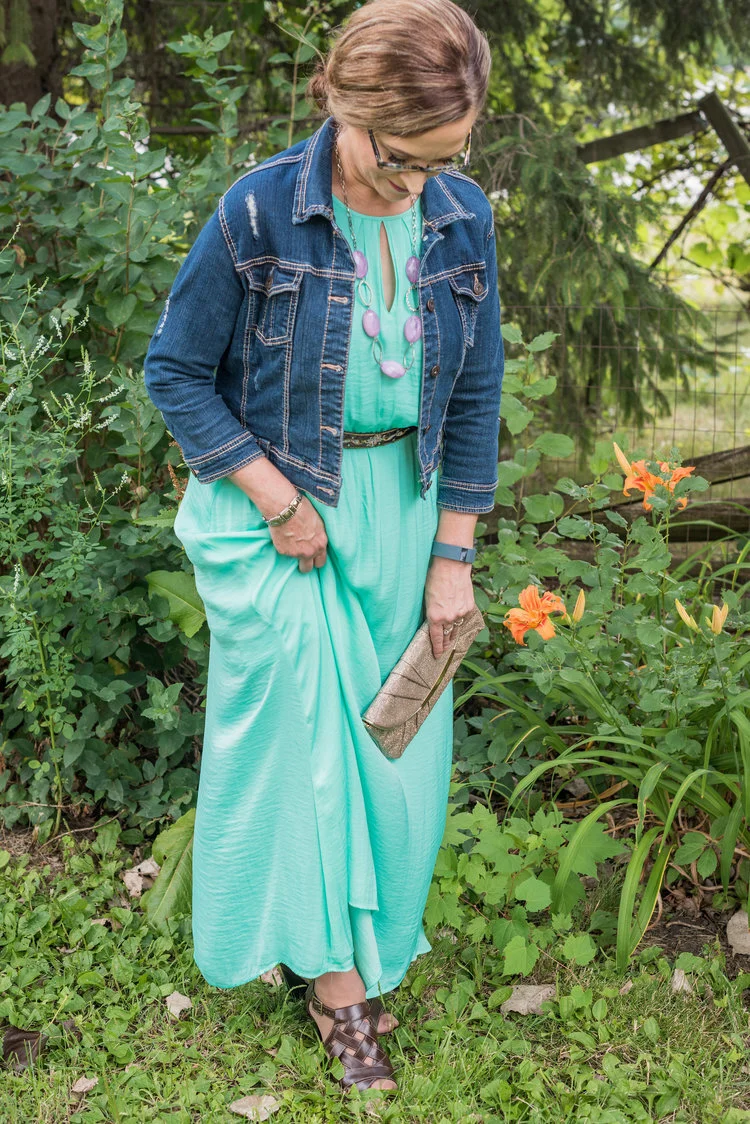
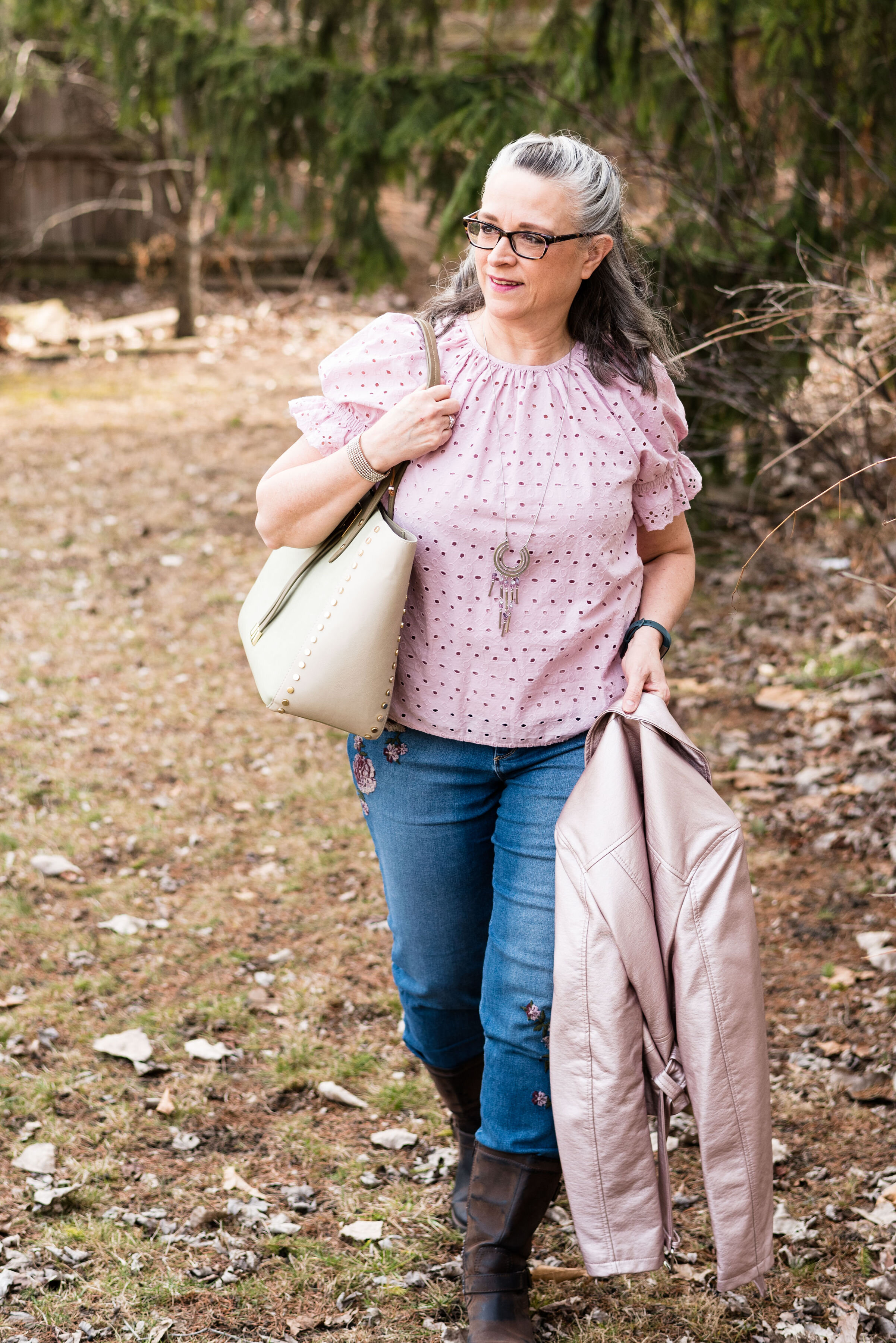
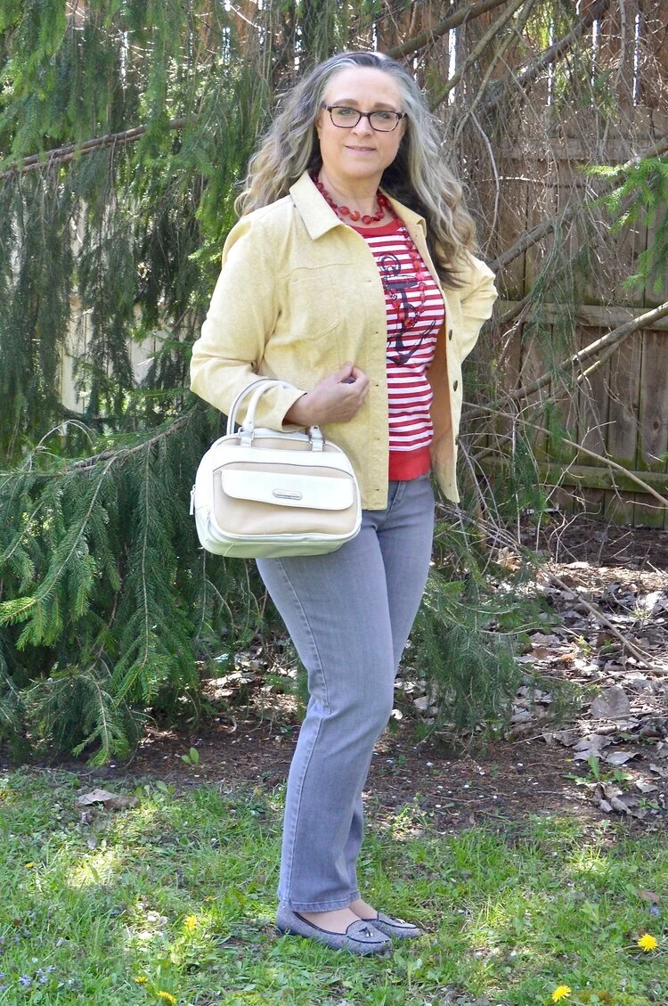
Even though I wasn’t particularly fond of these colors for fall, I actually liked the way this outfit turned out. Even though the light jacket looks nothing like Coconut Cream, these colors and their combinations are just guidelines for us. Not rules…and just for fun….

I loved The Pirates of the Caribbean movie, and that whole idea of rules versus guidelines was amusing as it kept coming up in the movie and was used according who benefited the most. I guess we could take a lesson from that when we look at our closets. The combinations you put together are for your benefit. You get to decide what you like and what you don’t. You make the choice of what colors or prints to put together, and whether you want to buy into the trends or not. I think we can safely say those fashion “rules”, are really more like “guidelines.” My job as a fashion blogger is to give you ideas of how to make these combinations and hopefully inspire you to think outside your own boxes.

pantonefallcolortrendsfuchsiafedora-10.jpg

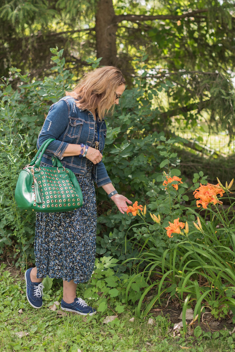
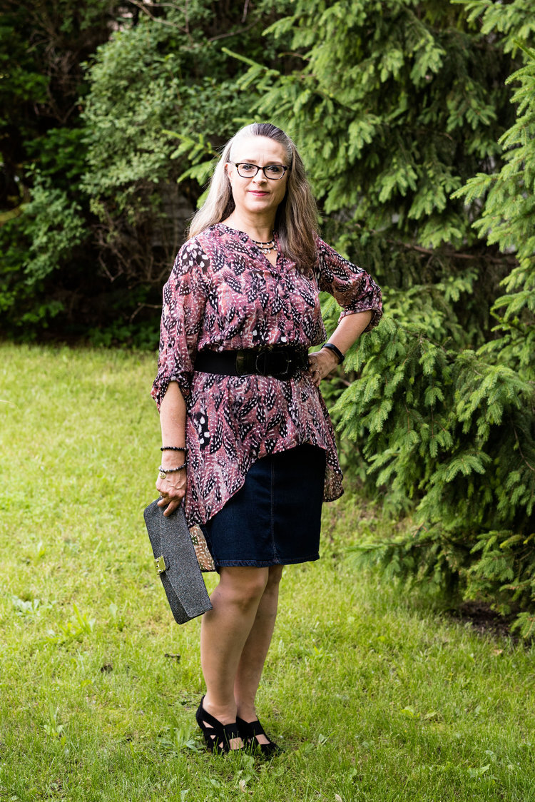
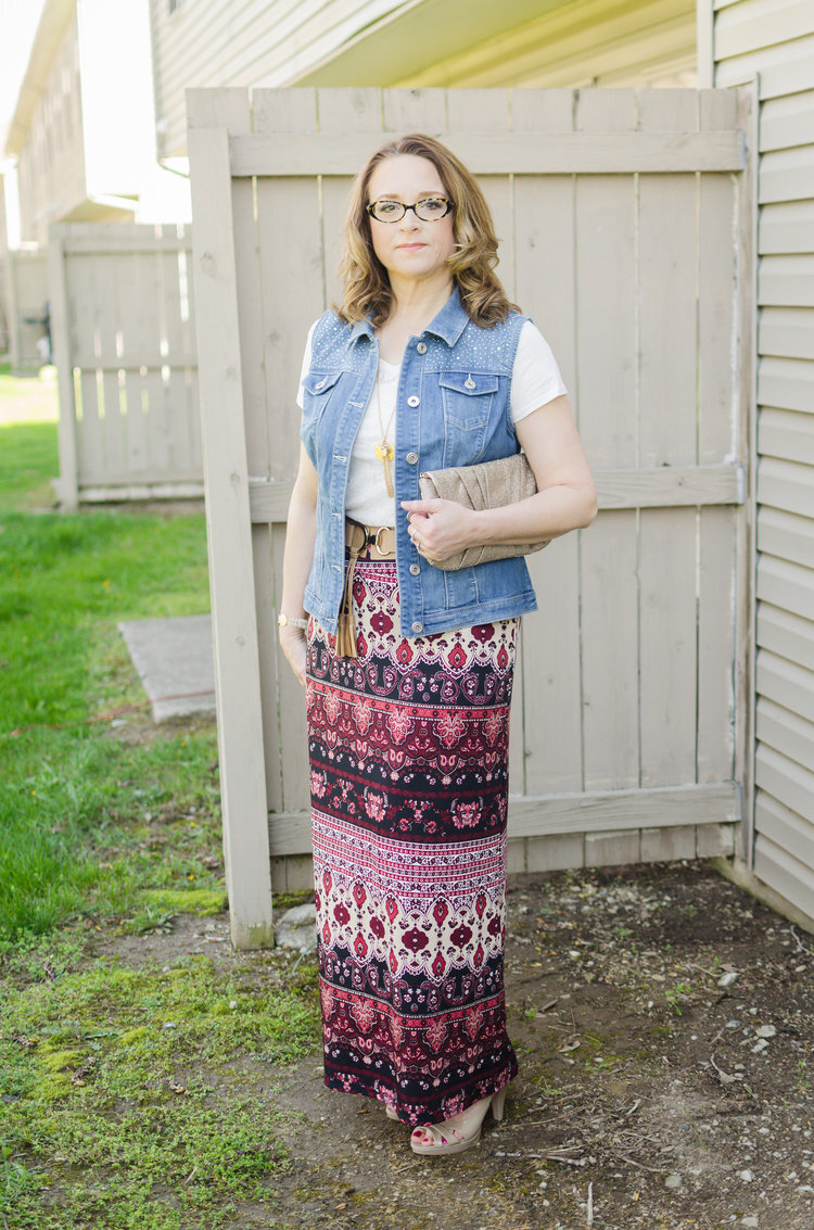
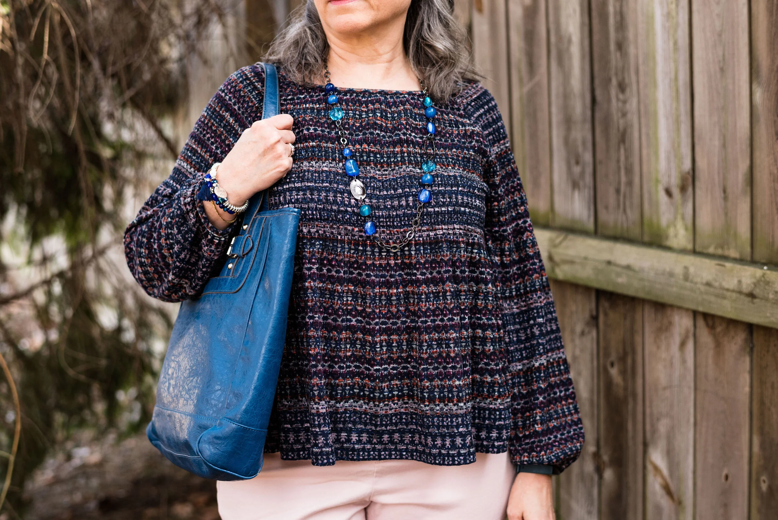
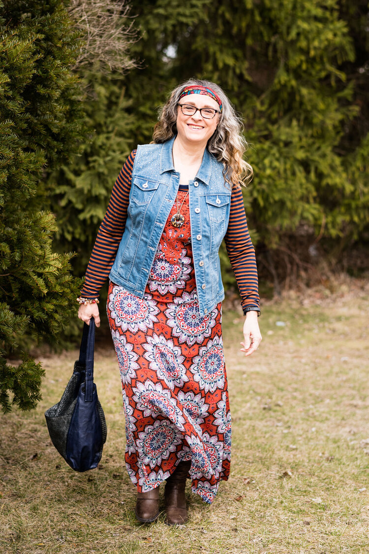
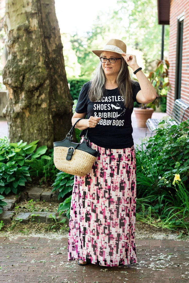
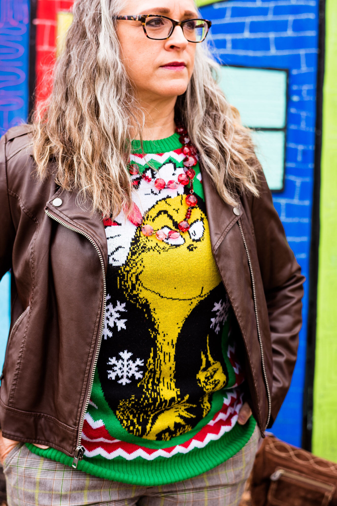
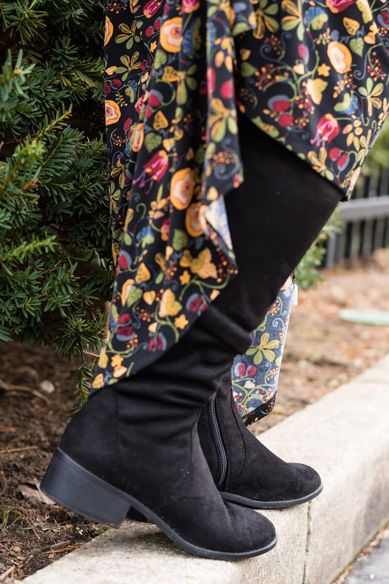
My LuLaRoe skirt was the perfect choice to build this outfit around. I actually had the thrifted striped tee already pulled out as a match for Leprechaun, and as I started figuring out which colors and pieces to put together, I remembered this skirt. I always have a little celebration party when pieces come together. When I try things on I do a little dance in front of the mirror and say, “This is it!” Ha, ha. The stripes in the tee are actually navy, but with the two prints taking center stage, you can’t really tell the colors are different.

pantonefallcolortrendsfuchsiafedora-3.jpg

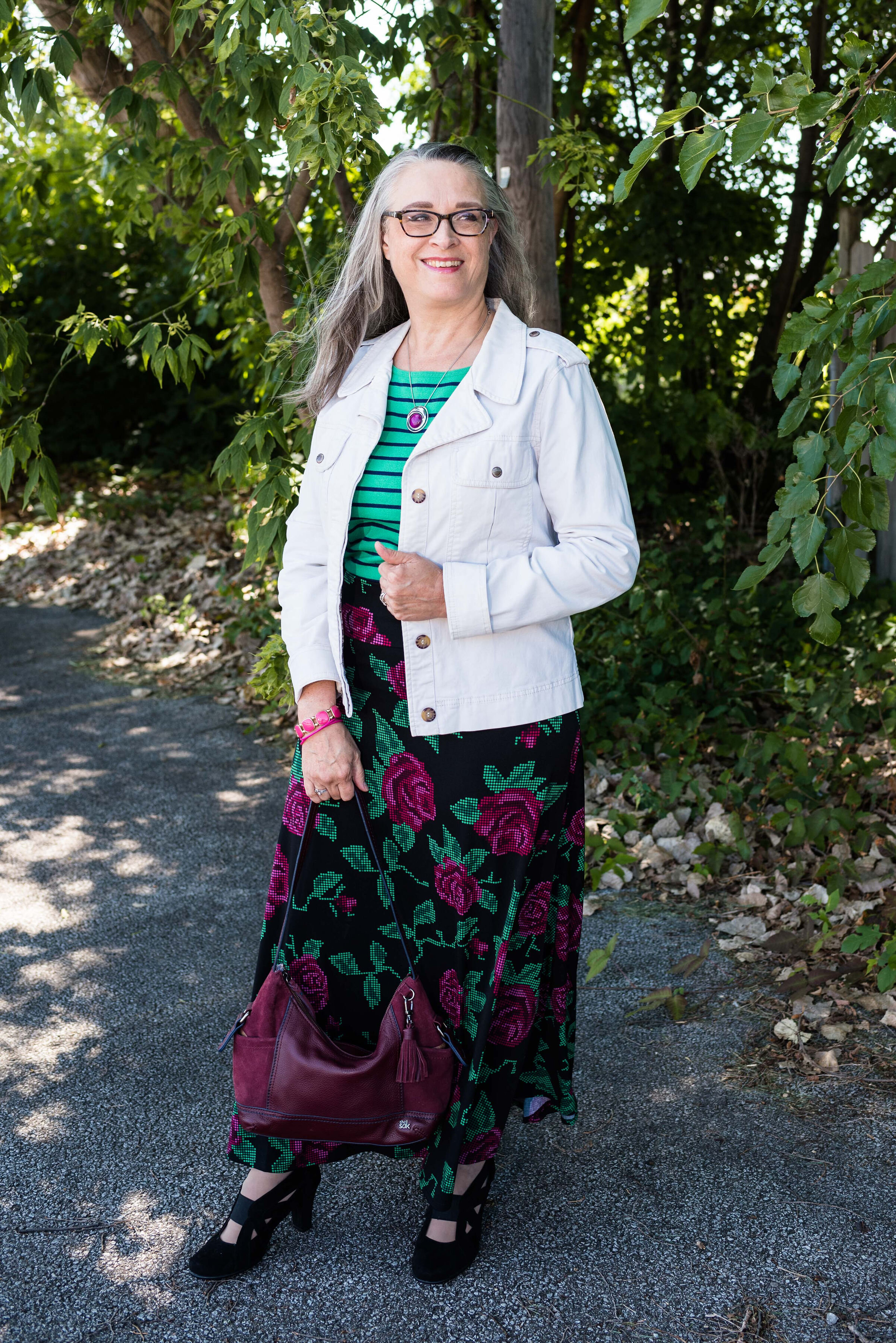
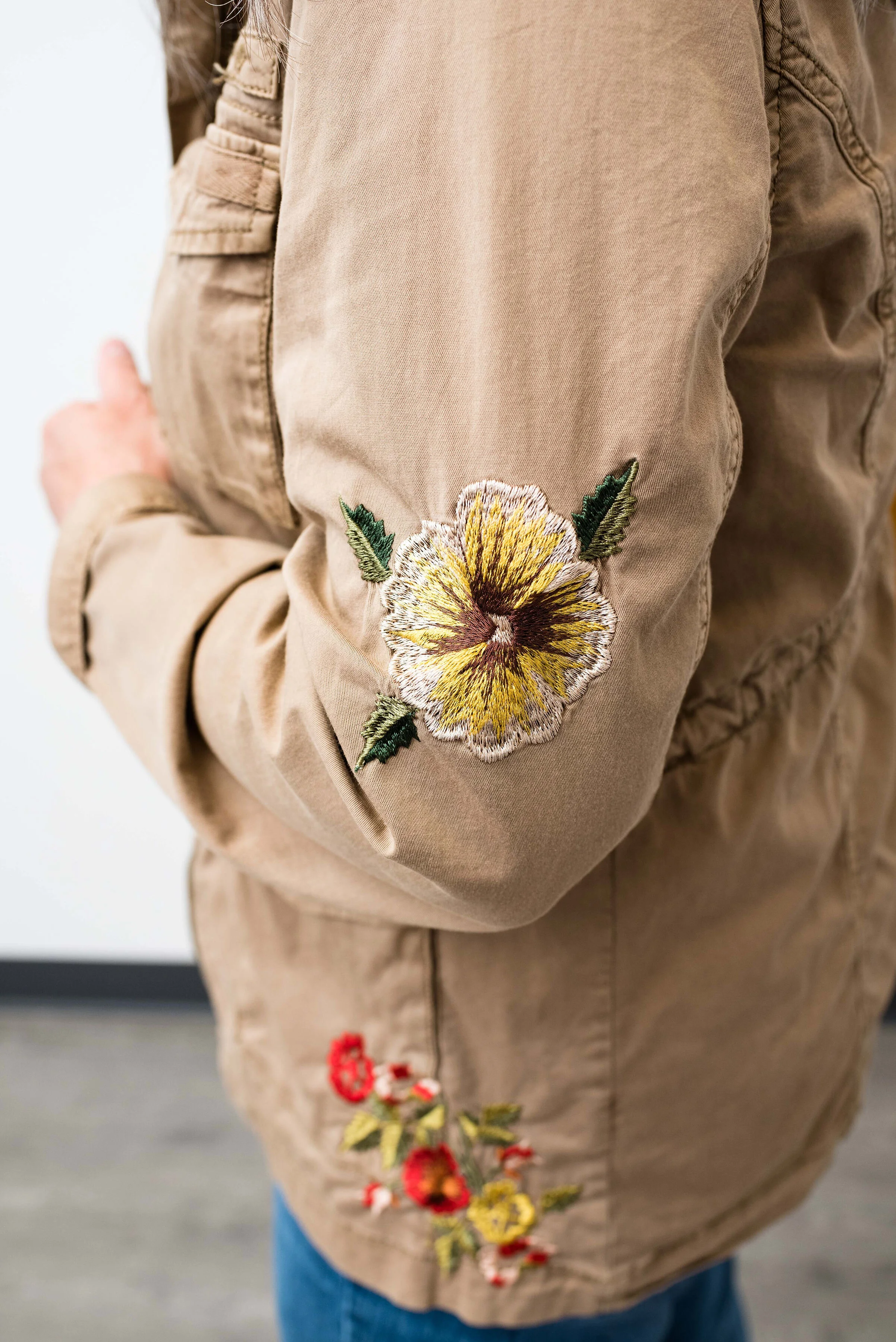
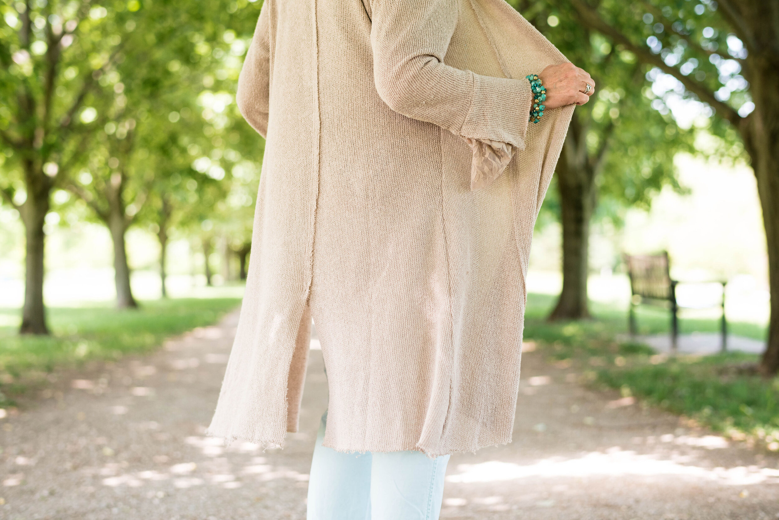
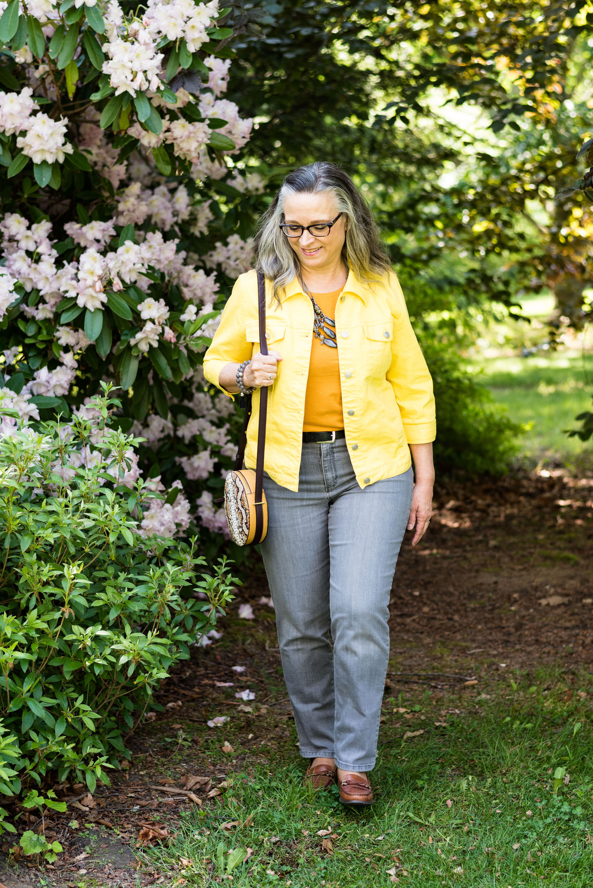
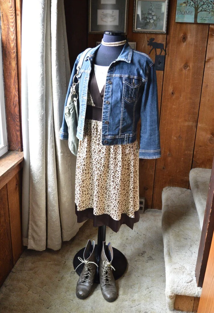
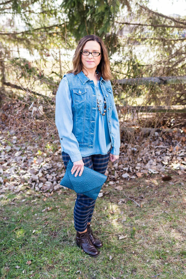
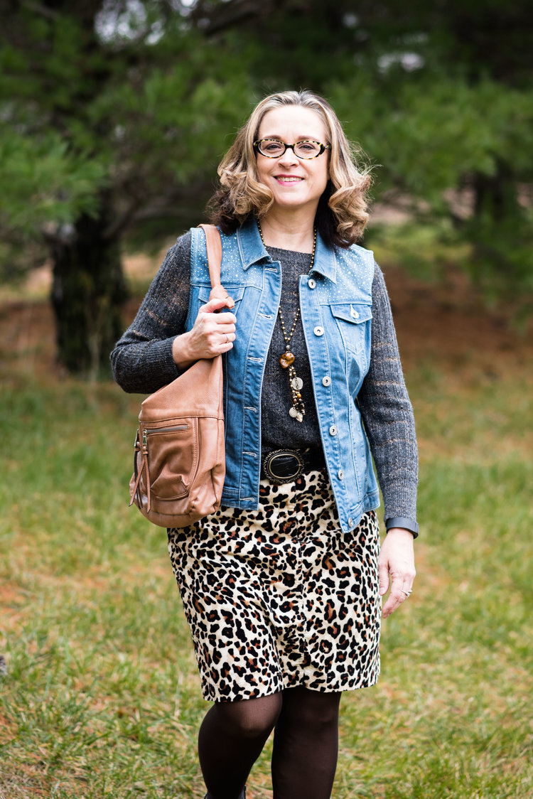
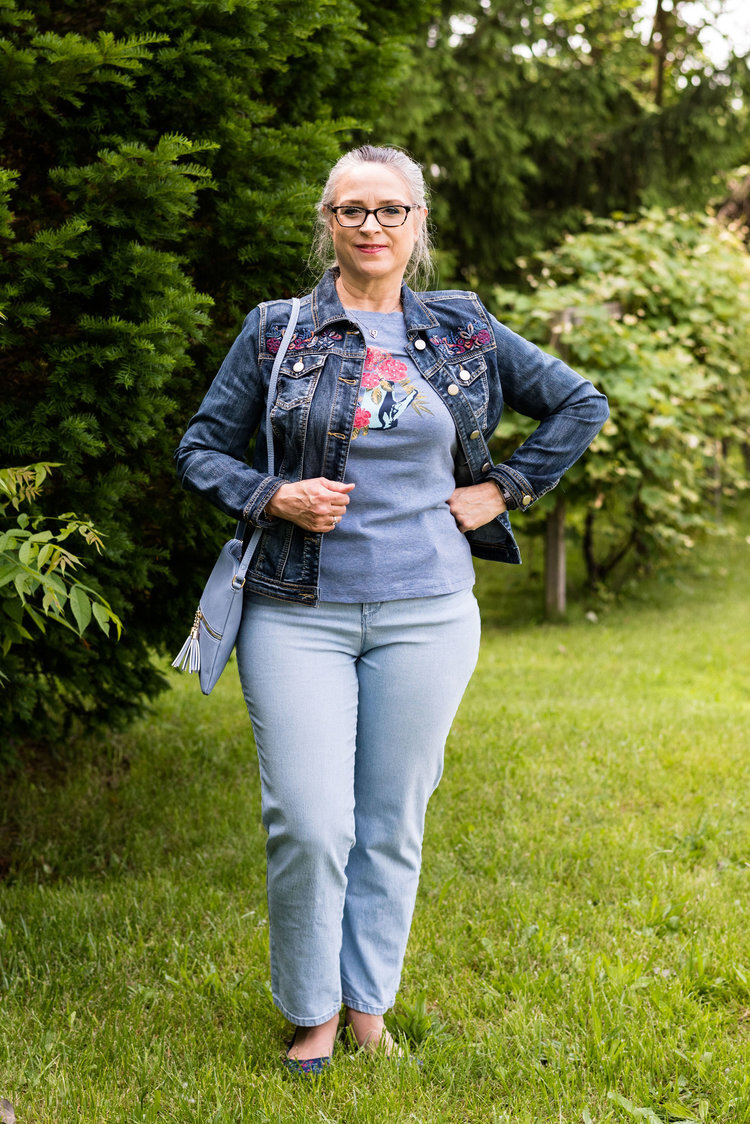
My cream jacket by Sanctuary is a thrifted piece you have seen before on the blog. You can see it with a leopard print skirt and with my bright blue pants. It is actually more of a canvas than a denim, but it works much the same as a denim jacket providing light weight coverage for cooler weather and adding a casual touch to a dressier outfit.

pantonefallcolortrendsfuchsiafedora-5.jpg

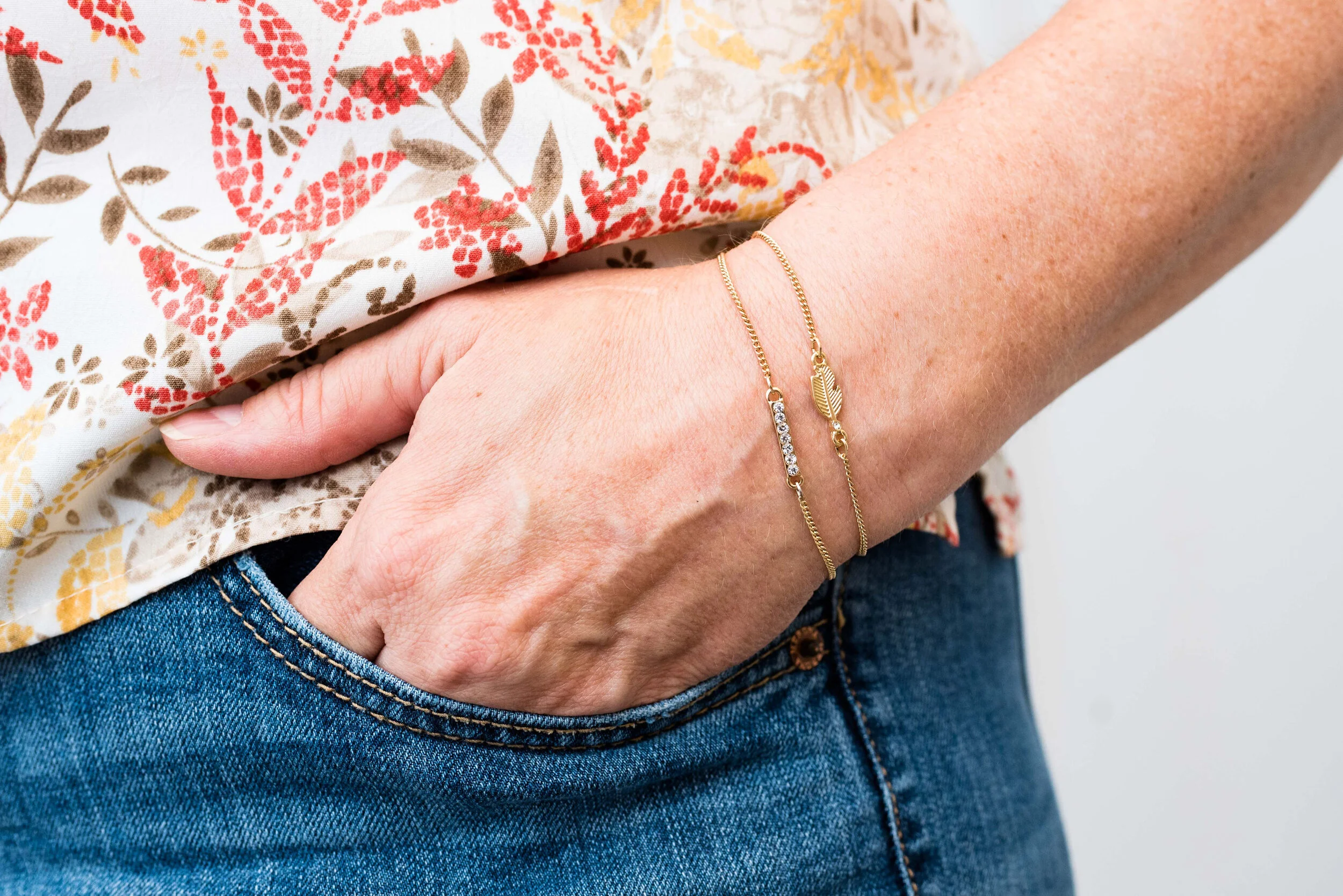
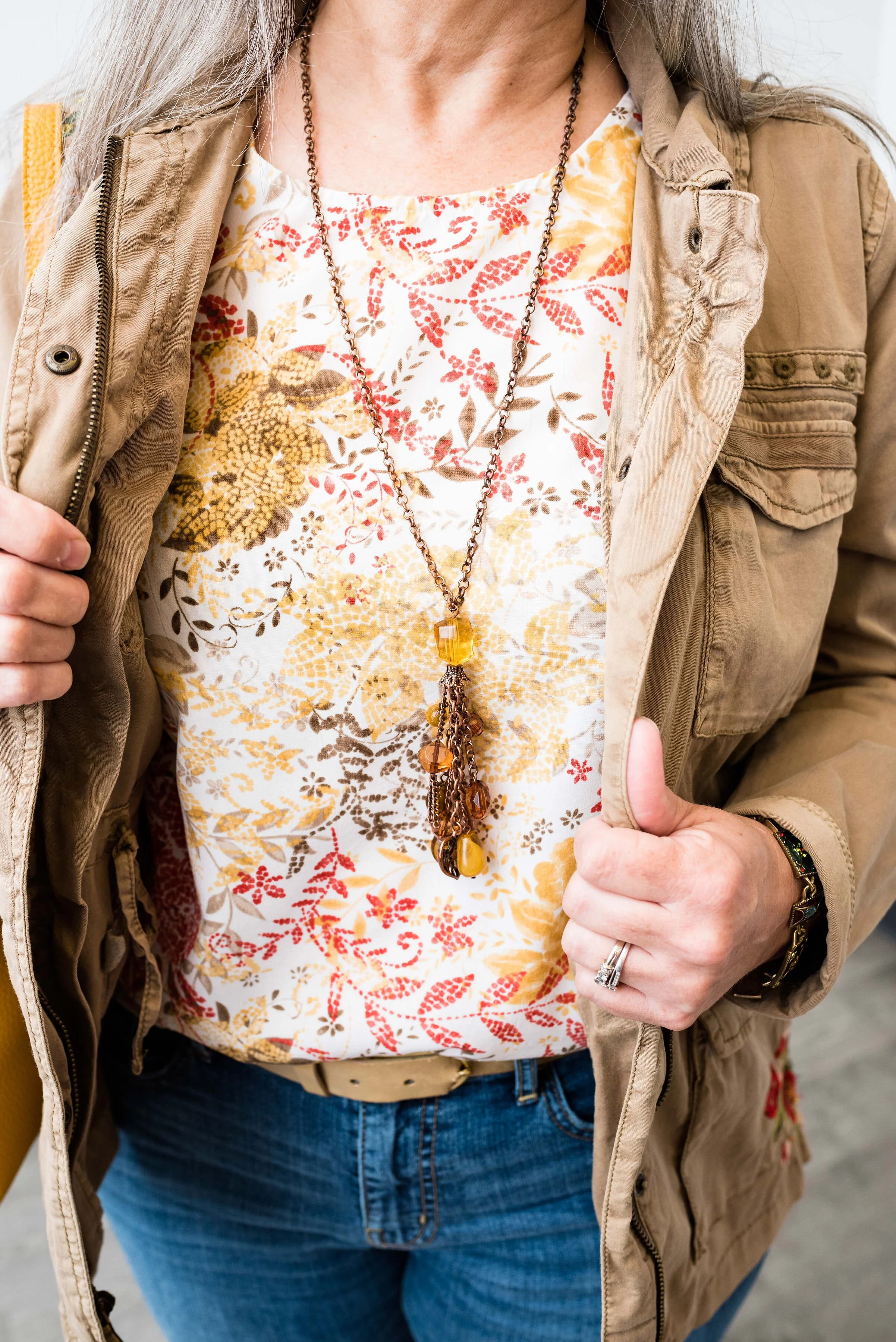
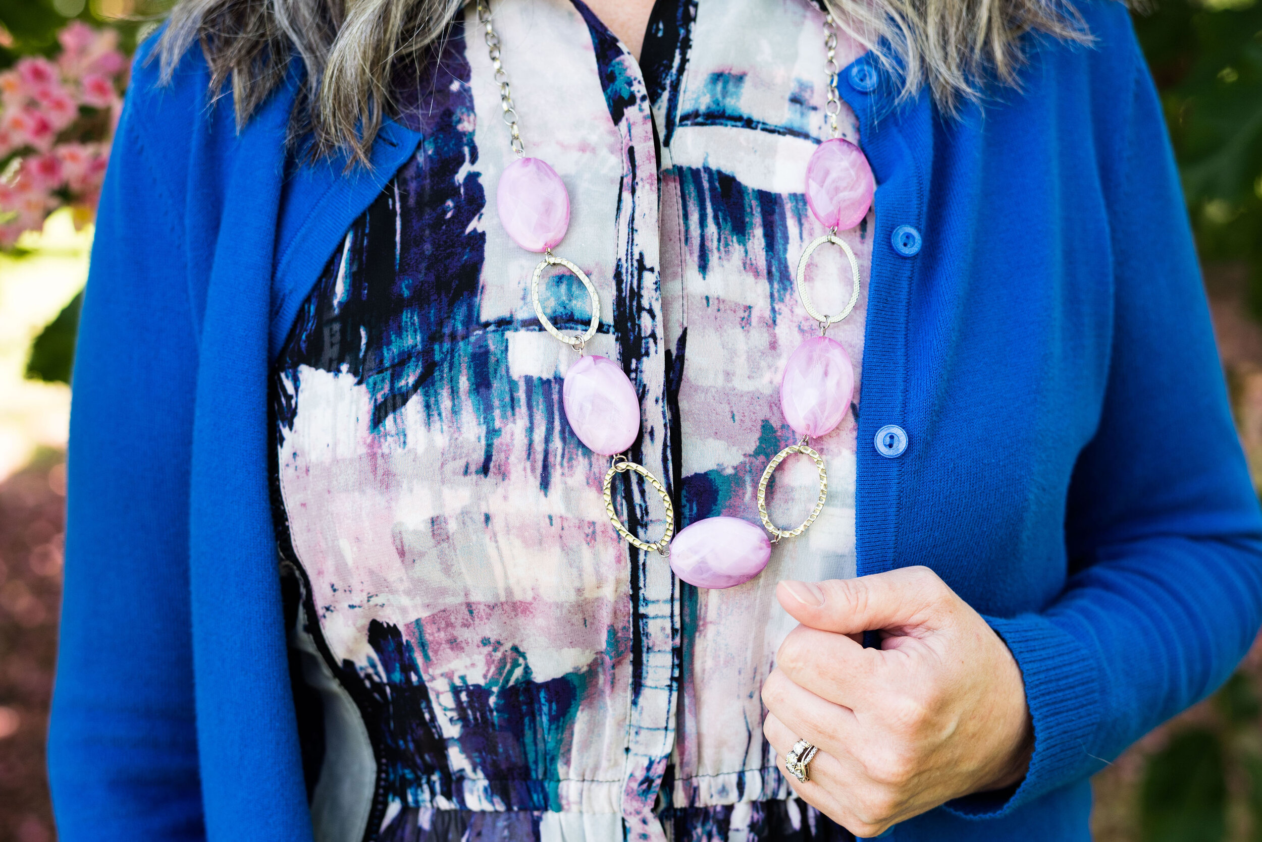
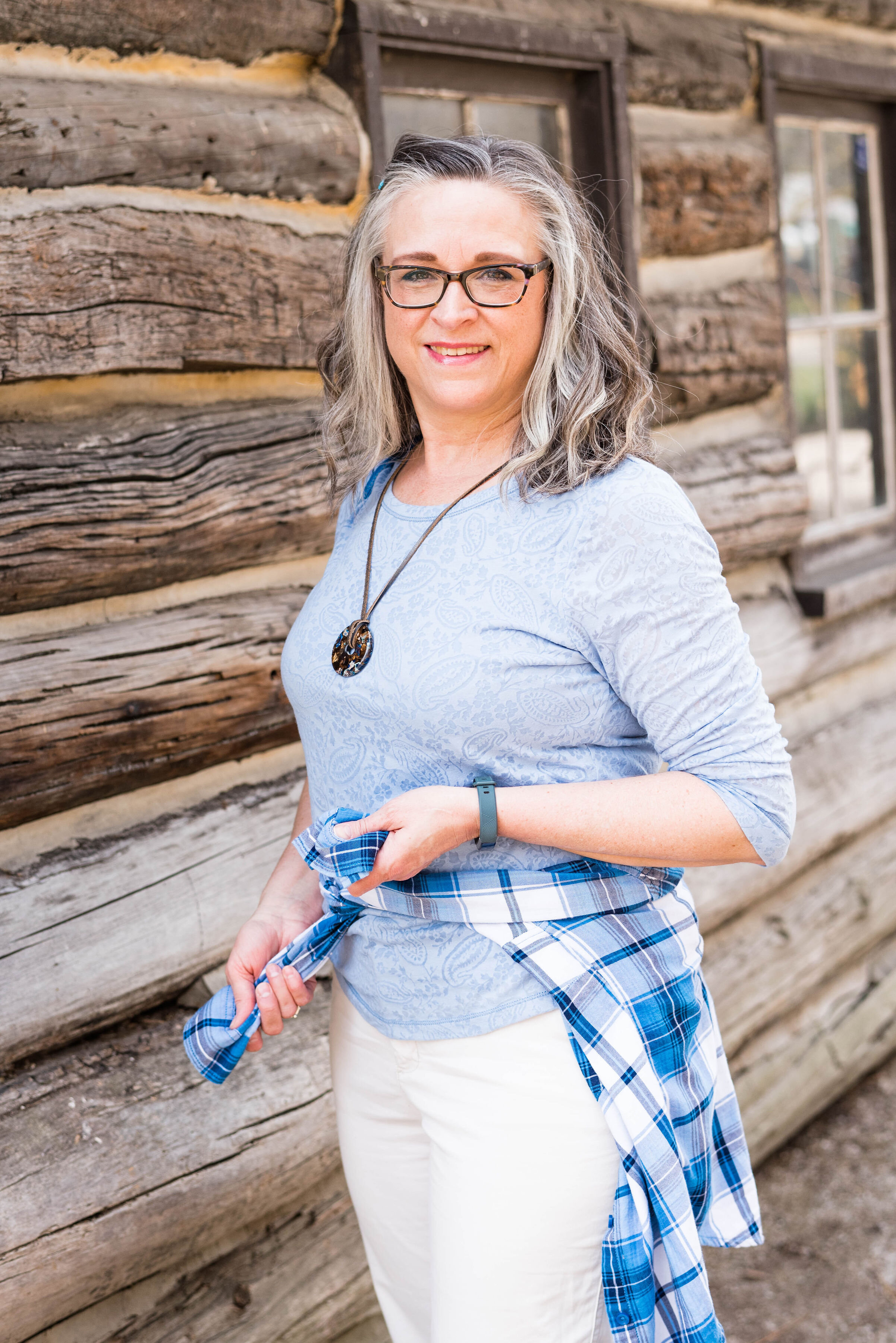
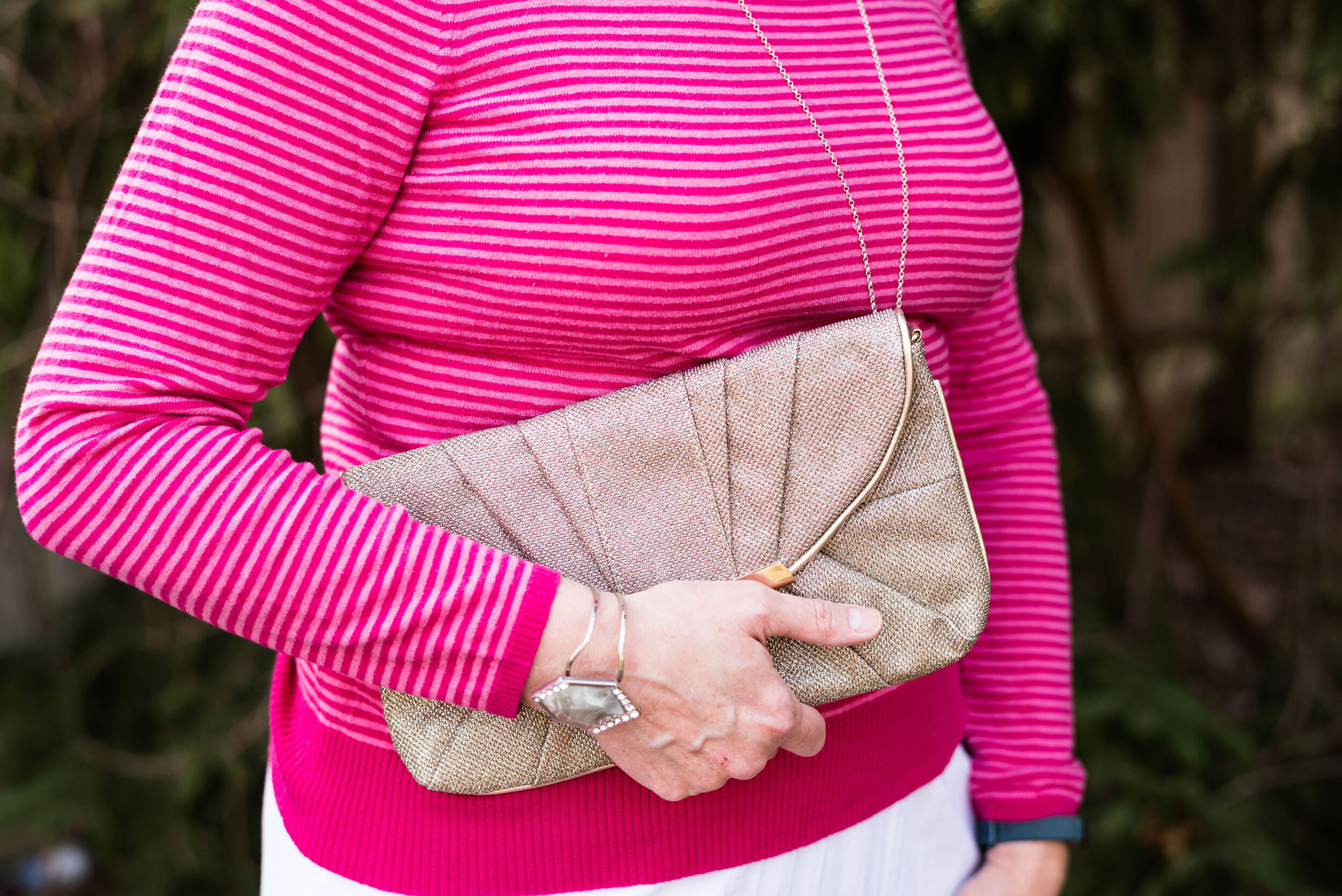
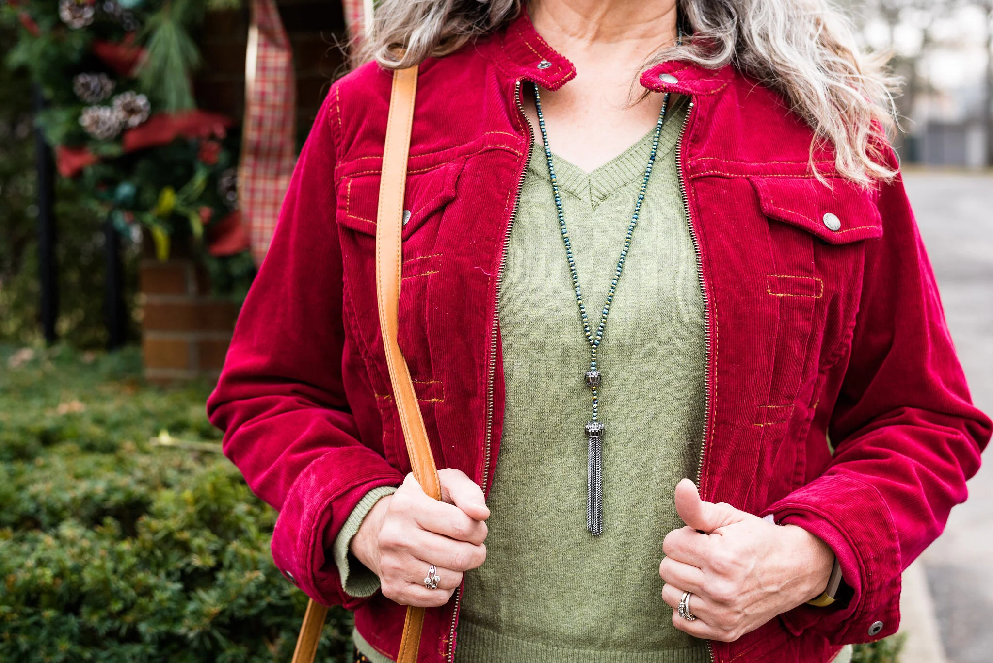
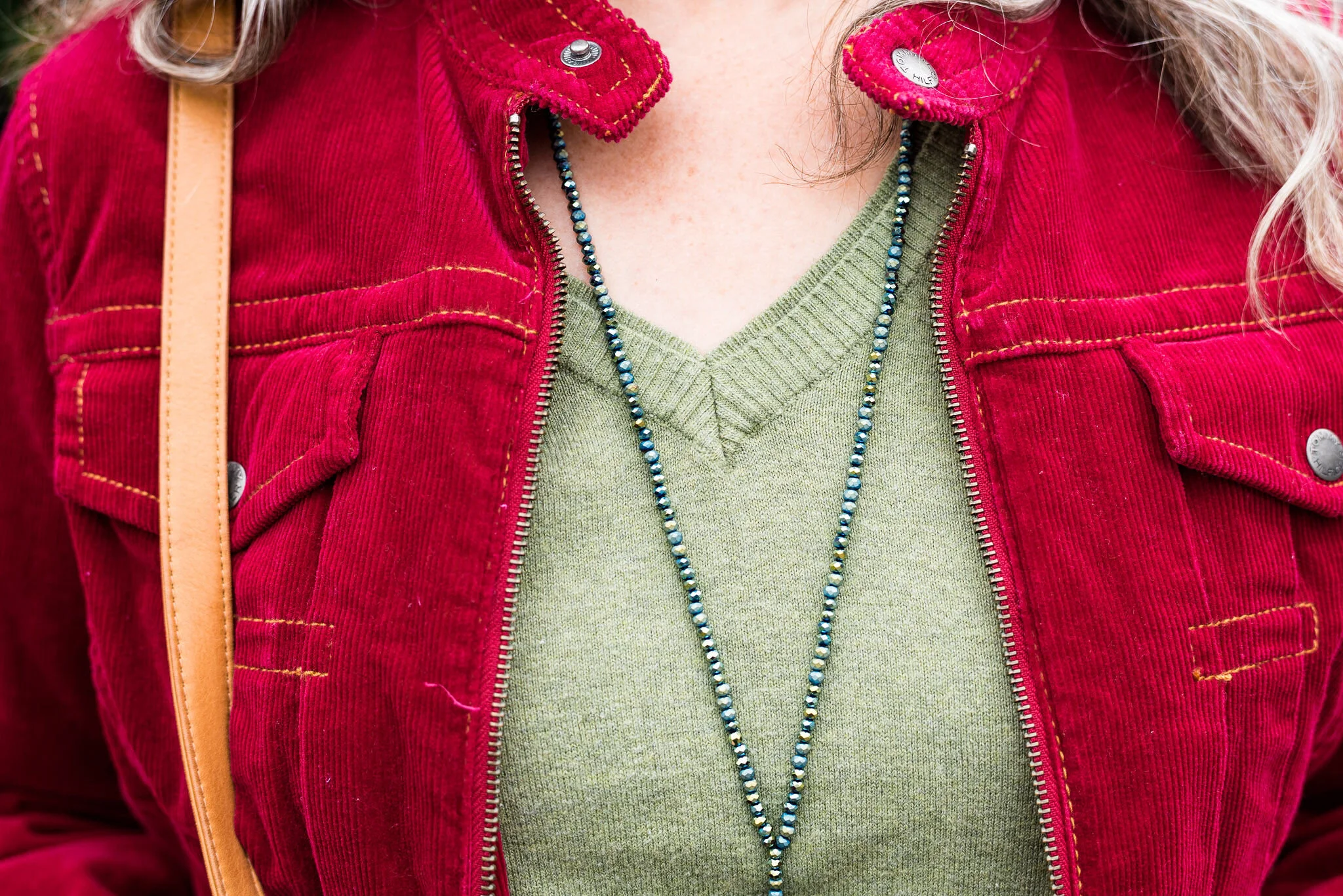
You can see my Fuchsia Fedora necklace and bracelets. I think I have jewelry in just about every color under the sun, but you know, a girl can never have too many fun accessories! Is that a rule, or a guideline? Ha, ha.

pantonefallcolortrendsfuchsiafedora-8.jpg

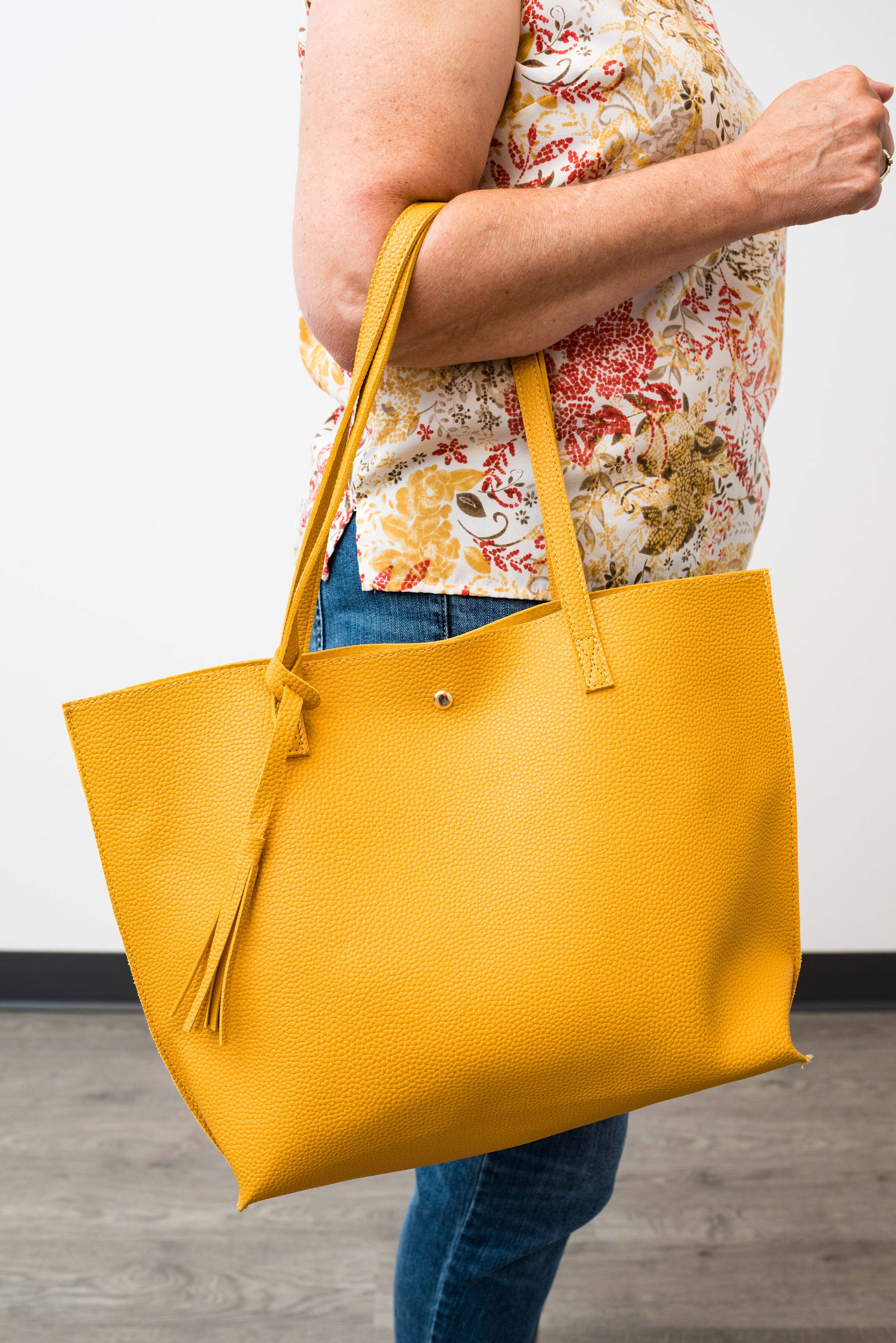
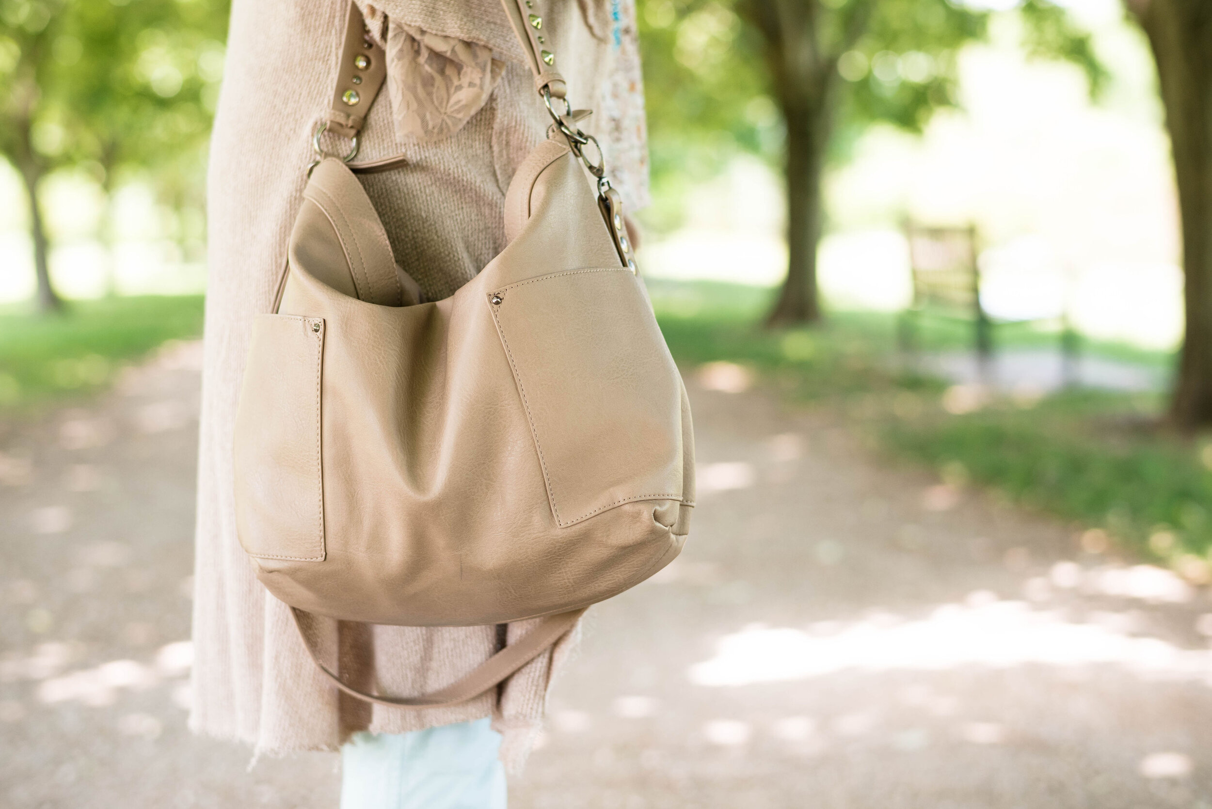
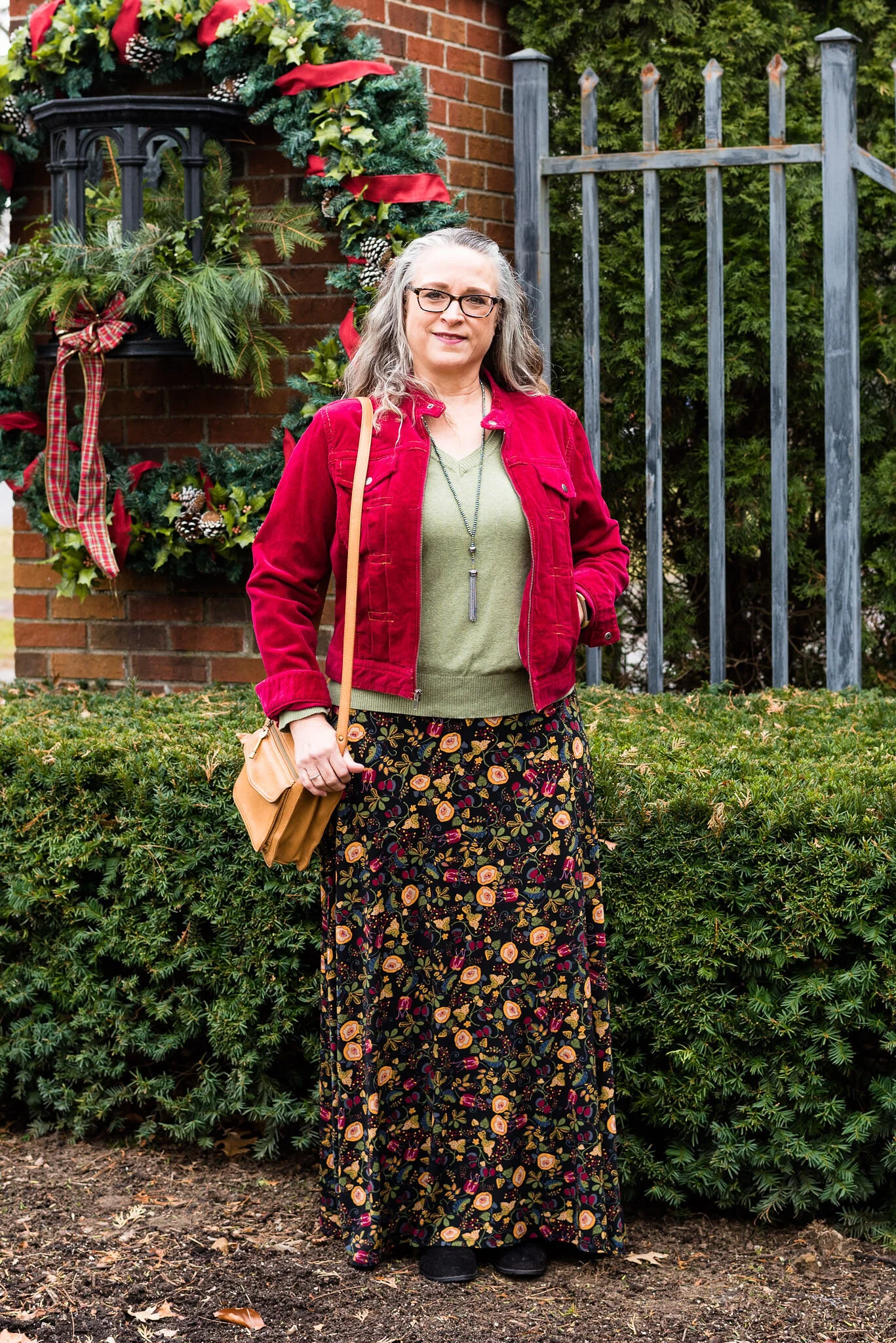
My bestie, Stacey, gave me this beautiful, leather the Sak bag last time she came to visit. I thought the berry color went perfectly with the darker berry color in the flowers on the skirt.

pantonefallcolortrendsfuchsiafedora-9.jpg

These beautiful black suede heels never get to go anywhere, so I do like to bring them out and show them off on the blog. These are Aerosoles and I bought them a few years ago at a Clarks shoe outlet. I like that they are comfortable, have a reasonable heel, stay perfectly in place and look classy.

pantonefallcolortrendsfuchsiafedora-2.jpg

What do you think of these colors? Do you like them for fall? Now that I am thinking about it, I might need to revisit the idea of fuchsia as a fall color. I could see it with other fall colors like golden yellow, burgundy and rusty orange. Hmmm. I may have to get a little further outside of my color box.

Let me know what you think. I’m including a few shopping links for things of similar color. These are affiliate links and are brought to you at no extra cost. If you click on a link, I get a few pennies. If you purchase something through my site, I get a few more. I appreciate every click.

Have a great day!

Photo credit Jessica Trumbull with Rebecca Trumbull.

Thinking About Fall - Transitional Style - Tank Top

Before I get into the Pantone color series for Autumn/Winter 2021, I wanted to look at a few options for taking your summer pieces into fall. It seems like common sense to add layers as the weather begins to cool, at least for those of us in the northern part of the country. Even in warmer states, and countries, there are always those rainy days, or cooler evenings where having a layer or two makes a person more comfortable. The question I have to ask myself is why bother transitioning? Why not just change out our summer wardrobes for those fall pieces in deep burgundies and rusty oranges?

I think there are several reasons we need to transition from summer into fall. First of all, even those of us who love fall and enjoy the cooler weather, hate to see summer come to an end. The end of summer means shorter days, and the loss of the freedom and fun we associate with summer. Being able to run around without heavy coats, mittens and scarves is something most of us love being able to do. Summer also means vacations and beach days for many. It is hard to say goodbye to these wonderfully long, lazy days.

Another reason is that transitioning our wardrobes to fall slowly, allows us to extend the life of those summer pieces we love. The tank tops, shorts, light weight dresses and kimonos are still usable as the weather cools if we remember how much fun layering can be. I have already seen many bloggers and Instagram gals showing off these types of outfits.

Today’s focus is on tank tops. This could be a simple ribbed tank, or something like this thrifted Christopher & Banks shell, that is more structured and workwear appropriate. Since I am not working, I am showing you a casual look that can easily be taken from summer into fall with three simple changes.

summerfalltransitionoutfit-7.jpg

My daughter hired an assistant and has started training her behind the camera. They asked if we could do pictures in the studio, to give her some practice, not only with outfit photos, but with indoor shots. I love outdoor photos because there are so many possibilities, but there is something to be said for studio photos, especially when the weather is hot, humid and buggy! We just used the wall as a backdrop, but it you follow Rebecca Trumbull Photography, you know she has all sorts of backdrop colors for headshots and puppy pictures.

This outfit is easy, peasy. A pair of thrifted Merona boyfriend ankle jeans, a tank top, shoes, bag and a little jewelry. Except for the bag and jewelry, everything in this outfit is thrifted.

summerfalltransitionoutfit-2.jpg

I chose this tank top for a few reasons. The first is, I have been trying to use pieces that I haven’t used in a while in my closet. I actually started keeping track of what I have worn. For my hanging pieces, I turn the hangers backwards after I wash and hang them back up. For my tees, I have started turning the ones I used neck line out, rather than fold out. It might seem silly, but it does help to see what I have been wearing and encourages me to choose other pieces.

For this easy summer look, I kept my jewelry light and simple.

summerfalltransitionoutfit-9.jpg
summerfalltransitionoutfit-12.jpg

I wanted to chose a bag that could make the transition to fall, so this bright yellow tote was perfect.

summerfalltransitionoutfit-10.jpg

My sneakers are thrifted Converse. I washed them in the washer, but they need a little TLC to make them look pristine, which I haven’t done yet.

summerfalltransitionoutfit-11.jpg

In order to make an outfit like this ready for the cooler weather and changes that fall bring with it, you only need to do three simple things.

1 - Swap out light, breezy jewelry for jewelry that is bold and chunky.

summerfalltransitionoutfit-26.jpg
summerfalltransitionoutfit-24.jpg

2 - Add a jacket, sweater or other topper.

Utility jackets are often my fall and spring go to’s for light layers. This Sonoma piece with its beautiful embroidered embellishments goes perfectly with the leafy print of the tank. Being that it is tan, rather than a darker olive or brown, also gives me that slow transition into the darker, richer colors of fall.

summerfalltransitionoutfit-21.jpg
summerfalltransitionoutfit-28.jpg

3 - Swap out sneakers for ankle boots.

These are my Sonoma suede heeled booties. They are a regular part of my fall, winter and spring wardrobe.

summerfalltransitionoutfit-23.jpg

Let’s take a look at the outfits side by side.

You can see that in the summer look I rolled the pants up and in the fall look I left them full length. I love ankle pants for this transition time, because they allow me to show off the ankle boots, and they are still not as warm as full length pants.

The other detail I changed was doing the front tuck on the top, to show off the belt and give the outfit a less casual vibe.

summerfalltransitionoutfit-27.jpg

How would you transition a tank top into fall? Do you have tank tops that you love to wear all year round? What do you think of this outfits?

summerfalltransitionoutfit-17.jpg

I’ve included a few shopping links for you to look over. These are affiliate links and are brought to you at no extra cost. If you click on a shopping link, I get a few cents. I appreciate all your clicks and all your comments.

Have a great Wednesday!

Photo credit Rebecca Trumbull.

Pantone - Spring/Summer - 2021 - London Palette - Beach Glass, Blue Atoll and Macchiato

We’ve reached the end of the Pantone - London Palette series with these last three colors which make me think of tropical seas and sandy beaches. Like Tuesday’s post, where I combined two different greens from the palette, today’s post combines two summery blues for a light, airy, warm weather look.

beachglass.jpg

I started figuring this outfit out with my light blue, thrifted Sonoma crop pants. Though they are a bit lighter than the Beach Glass color, I think they still work. I pull these out every spring and summer as a light weight alternative to denim.

beachglasspantoneoutfitideas-1.jpg

My multi-print top is another thrift store find. I just loved the soft colors and print on this popover blouse. It has no tag in it, so I have no idea what the brand was. The print has the light Beach Glass blue, as well as the darker Macchiato.. You’ll see a close up in the next photo.

For the darker Blue Atoll color I decided to add a few pieces of jewelry. I had some long, opera length beads and decided to do some layering with the necklaces. I also added a beaded bracelet, that appears to better match the Beach Glass color.

beachglasspantoneoutfitideas-7.jpg

For the Macchiato color, I played around with several pieces, but everything seemed too yellow. This longer sweater was a recent purchase from Cracker Barrel. While they are a restaurant, they also have what they call an Old Country Store. The store is filled with all sorts of items from old fashioned candy, beautiful home decor, quilts, jewelry, cards, music and clothing. If you click on the link, it will take you to the sweater and it is on sale. Whoo, hoo. If you like it snatch it up. Here are a few photos to show you the details of this pretty piece and the movement. It is a light weight material, so it will be great for spring, summer and fall.

beachglasspantoneoutfitideas-13.jpg
beachglasspantoneoutfitideas-14.jpg
beachglasspantoneoutfitideas-15.jpg
beachglasspantoneoutfitideas-16.jpg
beachglasspantoneoutfitideas-17.jpg
beachglasspantoneoutfitideas-18.jpg

My bag is Madden brand; a clearance find from Kohl’s. My perforated peep toe shoes are Sonoma brand and another Kohl’s purchase from a few years ago.

beachglasspantoneoutfitideas-9.jpg
beachglasspantoneoutfitideas-11.jpg
beachglasspantoneoutfitideas-12.jpg

What do you think of these three colors? I really like how this outfit turned out and think the color combination is great for summer. Do you have these colors in your closet?

beachglasspantoneoutfitideas-6.jpg

I’m including a few other shopping links for you to look over. The Cracker Barrel sweater link is not part of the affiliate program, but I wanted to offer it to you, in case you really like the sweater. The rest of the shopping links are through the affiliate program. Every time you click on a link I get a few pennies, and I appreciate every click.

Have a great weekend!

Graphic and photo credit Rebecca Trumbull.

Pantone - Spring/Summer - 2021 - London Palette - Pickled Pepper, Orange Ochre and Sphagnum

For today’s outfit I decided to combine the two greens that were on the London Palette. Both Pickled Pepper and Sphagnum are great green shades for summer time. While Pickled Pepper is one of the main palette colors, Sphagnum is one of the palette classic colors. Olive is a great neutral and goes with just about every color out there, so Sphagnum, (which is actually a type of moss), makes for the perfect classic color.

pickledpepper.jpg

My Pickled Pepper popover top is Sonoma from Kohl’s a few years ago. This top is easy to wear, as well as cool for these hot, humid days. I don’t usually prefer to wear sleeves with elastic, but as long as the elastic isn’t cutting off the circulation in my arms I’m okay with it.

pickledpepperpantoneoutfitideas-12.jpg

My Sphagnum utility vest is Mudd brand, and was another clearance purchase from Kohl’s a few seasons ago.

pickledpepperpantoneoutfitideas-4.jpg

These light wash jeans were a recent thrift find. A brand called Ella Moss, this brand is available at stores like Nordstrom, Bloomingdales, Amazon, Dillards, and others. I like the cropped length and the high waist of this pair.

For the Orange Ochre color, I grabbed my thrifted, orange suede bag and a fun pendant choker. It is much easier to include a brighter color, if you do it with accessories.

pickledpepperpantoneoutfitideas-9.jpg
pickledpepperpantoneoutfitideas-7.jpg

I had to show off my new clearance Converse sneakers from DSW. They are very comfy and I love the blue color. They are similar in color to my thrifted Keds, which are showing a bit of wear, so these were a great find.

pickledpepperpantoneoutfitideas-11.jpg

Here are a few silly pictures. I was jumping for joy. Ha, ha.

pickledpepperpantoneoutfitideas-5.jpg
pickledpepperpantoneoutfitideas-6.jpg

What do you think of these colors? Do you like to wear green? Do you have Sphagnum (olive) in your closet? I would love to hear from you. I’m including a few shopping links for you to look over. These are affiliate links. All opinions are my own.

pickledpepperpantoneoutfitideas-3.jpg

Graphic and photo credit Rebecca Trumbull.

Pantone - Spring/Summer - 2021 - London Palette - Pirouette, Indigo Bunting and Polar Night

As always, with the Pantone color series, I find their choice of names for their colors intriguing. Today’s colors center on a pretty purply pink, called Pirouette, which, of course, makes me think of a ballerina. Indigo Bunting is a pretty blue, much like the bird after which it is named. I have had the privilege of seeing an Indigo Bunting flitting through the trees at one of our local metro parks a few years back. They regularly reside in Ohio in the summer time, but like to hang out in abandoned fields, scrubby bush areas and areas with red cedar trees, none of which I have around my house. Polar Night, much like its New York partner Inkwell, is a very dark navy blue.

pirouette.jpg

This fun, multi-print dress is a few years old and was a Kohl’s clearance purchase. I really like many of the pieces by Vera Wang, made specifically for this retailer and called Simply Vera by Vera Wang. These are the pieces that real world women like myself can afford and wear. I have styled this dress, like a tunic for a trip we took to Florida a few years ago. You can see that post here. The dress really contains all three colors, except that its blue borders on being more of a teal.

londonpantonecoloroutfitideapiurouette-8.jpg

I decided to add the bright blue sweater, another Christopher and Banks cardi, as my attempt at the Indigo Bunting. It is a tad bit bluer and maybe brighter, but I think it works well. I would have never thought to pair it with this dress, but I like how it looks.

This is me being silly as I commune with nature. Ha, ha.

londonpantonecoloroutfitideapiurouette-5.jpg

I centered all my accessories around the necklace that is perfectly Pirouette. Since the beads are strung along a silver chain, I went for silver as my accessory color of choice. My thrifted silver clutch and my SO ballerina flats makes the outfit just a little more dressy.

londonpantonecoloroutfitideapiurouette-12.jpg
londonpantonecoloroutfitideapiurouette-14.jpg
londonpantonecoloroutfitideapiurouette-15.jpg

What do you think of these colors? Would you wear them? Do you have any of these colors in your closet? Let me know what you think by leaving me a comment here on the blog or on Facebook.

londonpantonecoloroutfitideapiurouette-9.jpg

Don’t forget, I also post on Instagram and typically you’ll see more of what I wear on a regular basis. Right now my daily looks are very casual, since I am not working, but you’ll definitely get to see more of my clothes, that don’t make it to the blog.

As usual, I am including a few shopping links for these colors. These are affiliate links, but all opinions are my own.

Have a great day!

Graphic and photo credit, Rebecca Trumbull.

Pantone - Spring/Summer - 2021 - London Palette: Illuminating, Marigold and Ultimate Gray

Illuminating and Ultimate Gray are the two colors of the year, so just like I did for the New York Palette, I decided to pair the two colors together and for this one I added Marigold, which was also on the New York palette.

illuminating.jpg

We decided to go to the Toledo Botanical Gardens again for these pictures and we did come across some beautiful blooms. This particular bush is a rhododendron. I just did some research and found out that all azaleas are rhododendrons, but not all rhododendrons are azaleas. Whether you like azaleas or rhododendrons they are all beautiful.

Once again, I chose my recently thrifted bright yellow jacket to serve as the Illuminating color. The jacket is D&Co. (Denim and Co.). It has a nice stretch to it and I like the 3/4 length sleeves for a change of pace.

londonpantonecoloroutfitideailluminating-8.jpg

I’ve styled my medium yellow tee on the blog before. You can see it styled with a leopard print skirt. Having tees in a variety of colors comes in handy when you want to put an outfit together. This thrifted tee is Apt. 9 brand.

My Gloria Vanderbilt jeans were another Kohl’s clearance find. They are soft and stretchy, so great for my fluctuating weight. I say fluctuating, but it really doesn’t go up and down. It either stays the same or goes up. Ha, ha.

londonpantonecoloroutfitideailluminating-11.jpg

I wanted my accessories to make a statement since the outfit itself was not overwhelmingly interesting. I found this pretty layered necklace in gray tones somewhere along the way. I think it was a thrift shop nearby. I added a few beaded bracelets to tie the jewelry together.

When I decided on the thrifted tan loafers, I knew my Nine West snakeskin print circle bag would be the perfect piece to complete the whole look and bring everything together.

londonpantonecoloroutfitideailluminating-13.jpg
londonpantonecoloroutfitideailluminating-15.jpg
londonpantonecoloroutfitideailluminating-16.jpg

What do you think of these colors together? Do you like the lighter yellow of Illuminating or the richer tone of Marigold? I’d love to hear your thoughts in the comments below. I appreciate when you give me your feedback. It can be kind of lonely as a blogger, when I don’t know if anyone is reading my content or looking at my posts, so I really love to hear from you.

londonpantonecoloroutfitideailluminating-10.jpg

I am including a few shopping link for you to enjoy. These are affiliate links and are brought to you at no cost. If you click on a link I get a few pennies and I appreciate all of your clicks. I do not get paid to write my blog, I do it as a hobby and as a service to whomever wants to follow along. I hope that I inspire you to take a second look at your wardrobe and see new ways to put things together, that you never thought of before.

Photo and graphic credit Rebecca Trumbull.

My Favorite Denim Pieces

For the last few week I have been looking back at some older posts, due to scheduling conflicts and my own lack of motivation and energy to bring you a lot of new content. I do apologize for that, but this does offer you a look at different pieces that are worth investing in due to their reusability. Since we as fashion bloggers, thrifters and purchasers of fashion are wanting to be more conscious of how our choices affect the environment we are learning that sustainable fashion is important for the future of our world.

Sustainability at its finest starts even before the actual manufacture of clothing. While more companies are jumping on the sustainability wagon, we must admit there are literally tons of used clothing going into landfills, that could be part of this sustainability loop. Thrift stores are part of this loop and are helping to give new life to second hand pieces. Bloggers, Instagrammers and others are working their accounts to show you new ways to wear the clothes that are already in your closet, or at least encourage you to shop second hand.

This week I decided to focus on the favorite denim pieces in my closet. Denim has always been my go to fabric for every day outfits. Whether you like jeans, denim skirts, or denim jackets, everyone can get onboard with having a few work horse denim pieces in their wardrobe.

Piece 1 - Cropped Denim Jacket

This is one of the first cropped pieces I found that I really liked and still use repetitively. There is something about the silhouette of a cropped denim jacket that to me, makes it a little more versatile. I feel like it dresses up better than a standard jean jacket, but some of that might also be the wash. A darker wash will always look more dressy as opposed to a lighter or more acid washed piece. You can wear a piece like this with a casual dress, a classy maxi dress, leopard print, a longer tunic and jeans, and a pair of utility pants.

Denim+jacket+outfit.jpeg
denim+jacket+outfit (1).jpeg
Piece+perfect+-+cropped+denim+jacket.jpeg
Picture by me.

Picture by me.

Summer+style+-+leopard+print+skirt+-+casual.jpeg
color+crash+course+-+brown+and+navy (1).jpeg
Actual+Amy+-+olive+pants,+graphic+tee+and+cropped+denim+jacket.jpeg

Piece 2 - Denim Skirt

Since jeans are my first choice for most of my causal outfits, I am not going to include them in this post, but I will say, that most of my favorite jeans I have picked up at thrift stores. The ability to try on different styles, silhouettes and brands, many of which I wouldn’t have ever thought to shop, have provided me with several pairs that are on repeat during most of the year. If you are more of a skirt or dress kind of girl, then a denim skirt is a great casual alternative to jeans.

Just so you know, the first skirt is from a few years ago and I got rid of it, because I outgrew it. The last two pieces were just unique, so I picked them up, but my most used piece would be the darker wash pencil skirt in the middle number of photos. If you are looking for a denim skirt, that is the wash and style I would recommend. I recently thrifted a longer light wash one, so we’ll see how that gets styled this summer. Stay tuned.

denim+skirt+outfit.jpeg
denim+skirt+outfit (1).jpeg
Denim+Daze+2.jpeg
Denim+Daze+2 (1).jpeg
Mavis+and+Maureen.jpeg
Photo by me.

Photo by me.

Print+mixing+-+spring+2019 (1).jpeg
Kickin+it+with+kimonos+-+yellow+floral.jpeg

Piece 3 - Denim Vest

Another piece that I really love is a denim vest. So far I only have one and that is my Christopher and Banks piece, but I would like to find a few others including a longer one that ties and a more traditional vest shaped piece. These are things I add to my thrifting list and keep and eye out for. If I never find one, no big deal, but if I do, I’ll grab it.

image-asset (1).jpeg
Pantone+Spring+2017+-+Niagara.jpeg
Holiday+outfit+-+casual+-+skirt.jpeg
Wearing+vests+in+the+summer+-+denim.jpeg
Denim+vest+-+casual.jpeg
Denim+Daze+2.jpeg
Spring+Trends+2020+-+Maxi+Dresses,+Psychedelic+Prints+and+Vests.jpeg

Unique Denim Pieces

Since my love for denim extends to all areas of my wardrobe, I also wanted to include a few unique pieces with their own special embellishments or characteristics.

Embroidery

Any sort of embellishment on denim is fun, but I do love embroidery.

Denim+Daze+2 (1).jpeg
color+play+-+bathroom+tiles.jpeg
Eyelettopspringtrends-2.jpeg

Chambray

While not technically denim, we group this with denim due to its similar washes and uses. Whether it is a button down, a popover or a dress, chambray is a great denim substitute for the warm temperatures of spring and summer.

chambray+shirt.jpeg
denim+with+denim.jpeg
Pantone+Spring_Summer+2020+-+Faded+denim,+Orange+Peel+and+Lark.jpeg
Denim+Daze+2 (2).jpeg
National+Wholesale.jpeg
Chambray+dress+with+pants+and+long+vest.jpeg

I hope you enjoyed this look back at a few of my favorite denim pieces. I am including a few shopping links for you to look over. These are affiliate links. All opinions are my own.

Photo credit where not specified, Rebecca Trumbull.

Why You Should have a Pair of Colored Pants - Orange

I thought I would do one more week on colored pants. This denim wearing diva, never imagined in all my years that I would learn to love brightly colored pants, but I have. I do remember when I was young, being a child of the sixties and seventies, I had a pair of bright red, cuffed bell bottom pants that I loved to wear to school. I am not sure what drew me away from the bright colored bottoms, except maybe that feeling of not wanting to be noticed or seen. I still struggle with that bit, but now I don’t worry so much about what other people are thinking or looking at. That is not my problem. I do try to dress modestly, but I love my bright colors and think they help to make me happy. This week I want to focus on my orange pants.

These orange pants were a clearance purchase at JC Penney about four years ago. They are Worthington brand, have a side zipper and an extra seam towards the front, giving the leg a long, lean line and less bulk around the middle, for a more streamlined look. The waist sits near my natural waist, so a little less of the spare tire problem. Here are past posts from the blog where I used these pants.

Outfit 1 - Orange with Sheer Light Blue Top

Pantone+Spring+2017+-+Island+Paradise.jpeg

I love the summery vibe of this outfit. The light blue, sheer top over the white tank combined with the bright orange pants seems very fitting for dinner under the palm trees at a tropical resort.

Outfit 2 - Orange Pants with a Dress

Spring+Transition+-+floral+dress.jpeg

This is one of my favorite outfits with these pants. It just happened that I found this dress at H&M and that the orange in the dress matched perfectly with the pants. I have no problem with women wearing shorter dresses. I know lots of women who will wear them with bike shorts underneath, so nothing is revealed if they blow up or if they bend over. I personally do not have the legs to wear a shorter dress, so wearing pants with a dress has become something I do more often. It is a fun way to display a short piece without any worry of revealing veiny legs or other leg flaws.

Outfit 3 - Orange with Bright Purple and Gray

Pantone+Fall+2018+-+Russet+Orange,+Ultra+Violet+and+Quiet+Gray.jpeg

Who would have thought to pair bright purple with orange? Well, I did and I think it turned out perfectly. I think the light gray jacket over the top helps to pull this whole look together. The pretty leaf necklace ties the orange pants to the purple top. This is a trick you can do to bring cohesiveness to an outfit that might seem a little outside the color box.

Outfit 4 - Orange with Dark Green

Pantone+-+Autumn_Winter+-+2019+-+Orange+Tiger+and+Eden.jpeg

Once again, you see a color block pattern, but one that is complimented by the printed accessories in the form of a leaf print scarf and a Vera Bradley tote bag. Since this was a more casual look, I added a hem roll to the bottom of the pants. This would be a great outfit to wear for an early fall shopping trip.

Outfit 5 - Orange with Marled Black Vest

Transitional+spring+outfit.jpeg

Vests are a great way to transition from cooler seasons to warmer ones and warmer ones to cooler ones. They keep our cores warm, but our arms from being bound under bulky sweaters or coats. The focal point of this outfit, was not the pants, but the scarf, but I drew on the colors in the scarf to create the complete look.

Outfit 6 - Orange with an Asymmetrical Vest

Pantone+Spring_Summer+2020+-+Flame+Orange,+Blossom+and+Cuban+Sand.jpeg

The solid colored orange pants are the grounding point in this outfit that is filled with busy prints. The floral tee, the open weave asymmetrical vest and the patchwork bag would probably be too much, if the pants were also printed. The bright orange once again announces that summer is just around the corner.

Outfit 7 - Orange with Teal, Gray and Yellow

Pantone+-+Autumn_+Winter+-+2020+-+London+Palette+-+Exuberance,+Ultramarine+Green+and+Sleet.jpeg

Here we are, back to fall. Orange is a no brainer for fall outfits, but we often reach for rust or darker versions of orange. However, I think I have shown that this bright orange is perfect spring through fall. You probably could even dress it up for winter with a chunky fisherman sweater and some suede ankle boots. This particular pair of pants is lighter weight, so if I wore them in the winter, I might put a pair of tights underneath.

So what do you think of orange pants? For all practical purposes I think more women would choose a bright blue pair rather than the orange, but what I wanted to show you is that there are so many different ways to style a bright colored pair of pants and still have a classy outfit that you can wear for a night out with the hubby, a lunch with friends or to a summer picnic. Pick your favorite color and get a pair of bright colored pants now.

I plan on showing you another outfit on Thursday with these same pants that has a more work oriented feel. Be sure to check back then.

I am leaving you with shopping links for a variety of bright colored pants. I hope you find a pair that will be perfect for you. These are affiliate links. All opinions are my own.

Photo credit Rebecca Trumbull.

Pantone - Spring/Summer - 2021 - New York Palette: French Blue, Cerulean and Buttercream

Today’s three color combo is the last of the Pantone Spring/Summer New York Palette. I am going to take a week off, as I hope to go visit my mom next week. In due time, I will proceed with the London Palette, but I haven’t even begun to pick out outfits. Breaking my wrist has really thrown a wrench into the works, so bear with me. I got my second Covid shot yesterday, so getting up this morning was grueling. I got the shot in my left arm, figuring it already hurts and I wanted my right arm to remain relatively pain free. I say relatively because there is some pain in my wrist and rib cage on that side, from having to do all the work. This is making me see how much I need to get back to exercising, especially weight lifting and walking since I have osteoporosis. We ladies need to take of them bones, and all the other parts as well. Ha, ha.

I thought it would be fun to pair these two blues, for a fun, casual summer look. Adding the off white of buttercream gives the outfit that perfect warm weather vibe. I kept my accessories casual to add to the picnic ready style. This would be a great outfit for a Fourth of July get together, just add some red jewelry or a bag.

frenchblue.jpg

French Blue and Cerulean are two cool colors that make me think of blue skies and water. I found this French blue plaid shirt while thrifting. I really like this medium blue for spring and summer, as opposed to a dark blue like navy. This button down is Faded Glory brand.

frenchbluepantonespringcoloroutfitideas-2.jpg

My Buttercream ankle pants have made an appearance on the blog before. These were thrifted St. John’s Bay. You can see these styled for two other Pantone series. This one is styled with a yellow button down and this with my Chevron print dress.

Cerulean is a different light blue. I like the sky blue feel of this color, yet it leans towards a bit more pastel. My top is a thrifted Ralph Lauren piece. I like that it has a lining that is similar t-shirt type material to the outside. It has a fun faux lace texture to it.

frenchbluepantonespringcoloroutfitideas-13.jpg

I kept my accessories simple. This thrifted French Blue bag was a recent find and I had to grab it since it matched the color perfectly. This is a nice small bag for carrying just the essentials.

frenchbluepantonespringcoloroutfitideas-7.jpg

My pendant necklace had little flecks of all the colors. I have been on the search for more of these large beads with the hole in the middle. It is so easy to make a necklace out of them.

frenchbluepantonespringcoloroutfitideas-5.jpg

Lastly, my thrifted Keds finally fit the Pantone color. Cerulean is the right name for these sneakers that are great for warm weather outfits.

frenchbluepantonespringcoloroutfitideas-8.jpg

What do you think of these colors? Do you have these blues in your closet? What about Buttercream? I’d love to hear your thoughts. I’d also love to hear which of these colors you would put together to make an outfit.

frenchbluepantonespringcoloroutfitideas-10.jpg

I hope you have enjoyed this look at the Pantone Spring/Summer 2021 New York Palette colors.

I am including a few shopping links, so be sure to check those out. These are affiliate links. I get a few pennies when you click on a link, so I appreciate all the clicks.

Photo credit and graphic Rebecca Trumbull.

Pantone - Spring/Summer - 2021 - New York Palette: Burnt Coral, Marigold and Desert Mist

Today’s outfit blends three colors that seem to epitomize summer with all of its beauty. The deep orange yellow of Marigold, combined with the rustic feel of Burnt Coral and the soft pastel of Desert Mist makes me think of picnics, outdoor parties and long walks on the beach. While my outfit today is probably too warm for summer temperatures, I works well for that in between time when the weather is still unsure of what it is going to do.

burntcoral.jpg

I ordered this waffle weave dolman sleeve top from Maurices earlier this year. It has elastic on the bottom, so has more of a cropped feel to it, which isn’t always my favorite, but I think this works well with pieces where the top can be worn without the need for tucking or wearing a belt.

burntcoralpantonespringcoloroutfitideas-10.jpg

I wasn’t going to use this Roz & Ali medallion print skirt again, but I was having a hard time finding things in my closet that were going to work with these colors. Besides this is a pretty skirt, so I don’t mind using it again. You can see how I styled this piece for several other Pantone color series. Last fall I styled it with a neon yellow short sleeve sweater, and the fall before that with a purple short sleeve sweater. I like that this skirt works perfectly for spring, summer and fall. The skirt contains all the colors from the graphic, even though you can’t see Marigold as well, you can definitely see the Burnt Coral and Desert Mist.

burntcoralpantonespringcoloroutfitideas-6.jpg

My Desert Mist sweater is a little light compared to the Pantone color, but again, this isn’t about having an exact match, but about giving you options that you can find in your closet. This is a thrifted St. John’s Bay piece. It is always good to have a neutral cardigan or jacket that will work well with many different outfits and colors.

burntcoralpantonespringcoloroutfitideas-8.jpg

For the Marigold color, I just added a few accessories, similar to what I did in last Thursday’s post with Raspberry Sorbet. The necklace and Sophia Caperelli bag are both thrift finds.

burntcoralpantonespringcoloroutfitideas-11.jpg

You were recently introduced to these Clark’s flats. They are perfect for wearing with a skirt, whether long or short.

burntcoralpantonespringcoloroutfitideas-13.jpg

What do you think of these colors? Do you have all of these in your closet? Would you wear them together? I’d love to hear your thoughts, so leave me some love.

burntcoralpantonespringcoloroutfitideas-4.jpg

I’m including a few shopping links. These are affiliate links. All opinions are my own. Here’s a picture, just for your enjoyment. Ha, ha.

burntcoralpantonespringcoloroutfitideas-7.jpg

Have a great evening!

Photo and graphic credit Rebecca Trumbull.

Pantone - Spring/Summer - 2021 - Raspberry Sorbet, Mint and Willow

Today’s Pantone outfit revolves around a tantalizing pink, a refreshing green and another earthy color reminiscent of the weeping willow trees that hug the banks of lakes and streams. Raspberry Sorbet, Mint and Willow combine in an outfit that is both sleek, colorful and casual.

raspberrysorbet.jpg

When I think of the color mint, I am more inclined to think of the light Green Ash color from Tuesday’s post. I guess my rendering of mint is based more on ice cream and Christmas candies than it is the actual plant. The mint plant is a bright, living green, so I think the Pantone color is much truer to the natural source. My Mint green top is a thrifted Falls Creek piece. I wore it for this shoot and then I got rid of it. It has been hanging in my closet for a while and I wasn’t certain, why I didn’t reach for it more often. After putting it on, I just didn’t like how stiff the fabric was. I’m all for structured pieces, but a piece has to move with me for me to want to wear it.

raspberrysorbetpantonecolorsoutfit-4.jpg

My camouflage pants, also Falls Creek, are a recent clearance find from Meijer. They are light weight, so good for summer. Unlike some camo that is more green, these tend towards more brown and gray. The Willow color is in there as you can see in the following picture. Willow was hard color to find. Most of my pieces are more olive green and Willow has more of a brown undertone.

raspberrysorbetpantonecolorsoutfit-10.jpg

Instead of choosing another clothing piece for the Raspberry Sorbet color, I opted to include it in my accessories. My necklace, bracelets, and the Vera Bradley tote were the perfect pop of this bright, saturated pink.

raspberrysorbetpantonecolorsoutfit-6.jpg
raspberrysorbetpantonecolorsoutfit-8.jpg

I went for my silver SO flats to tie in with the silver chains on the necklaces.

raspberrysorbetpantonecolorsoutfit-9.jpg

What do you think of these Pantone colors? Do you have the color Willow in your closet? I love to hear back from you, so leave a comment or two.

raspberrysorbetpantonecolorsoutfit-3.jpg

I’m including a few shopping links for you to peruse. These links are brought to you at no cost, but using them to purchase something gives me a few pennies as a kick back. I appreciate all your support. These are affiliate links. All opinions are my own.

Photo and graphic credit Rebecca Trumbull.

Have a great weekend everyone!

Pantone - Spring/Summer - 2021 - NY Palette - Amethyst Orchid, Green Ash and Inkwell

Today’s combination of Pantone colors from the New York palette is a study in contrasts. The dark, moody blue of Inkwell, which mimics a night sky is a type of color disparity when side by side with the pale pastel of Green Ash. When I pair colors I often go for bold with bold, or light with light, but I wanted to experiment by creating an outfit with an eye catching difference in color. The addition of Amethyst Orchid gives the perfect compliment of medium purple color.

amethystorchid.jpg

Let me start the outfit details by talking about this recently thrifted tee. I love the bold flower on the front and purple has long been a favorite color of mine, so I was glad it was on the palette. This tee is St. John’s Bay brand. The darker inner petals are actually separate pieces of material, which gives the tee added dimension.

To go along with the Amethyst Orchid color in the tee, I also added this recently thrifted scarf. I love the large gingham pattern. It was the perfect accompaniment to the whole look. Another interesting feature of this scarf is the ruching of elastic throughout its length adding texture.

amethystorchidpantonecolorsoutfit-9.jpg

These thrifted, Inkwell pants are a brand called Hydrant. A dark pant like this is great for making our lower halves look longer and slimmer. I really like these, but they are a lint magnate. Wearing them with a fuzzy sweater like this is probably not the best idea. Ha, ha. You can also see I added a wider, olive belt since belts are trending and did my usual front tuck.

My fuzzy Green Ash sweater might be a little light, but it is pretty close to the Pantone color. This was a Christopher and Banks purchase last year. Before I bought this piece I had very little of this color in my wardrobe. I have picked up a few things since then. It is a pretty pastel color to wear, especially in the spring and summer. I really like how well it goes with the Amethyst Orchid color.

amethystorchidpantonecolorsoutfit-6.jpg

I decided to go with white for my shoes and bag. White is definitely a go to in the warmer months. My white Keds will be on repeat. My white shoulder bag is a new thrift find. I have been searching for a different white bag and this one has plenty of room and can also be worn as a cross body bag. This is a brand called Bueno.

amethystorchidpantonecolorsoutfit-10.jpg
amethystorchidpantonecolorsoutfit-12.jpg

What do you think of these colors? Would you wear a light pastel with a dark color like navy or black? I’d love to hear your thoughts. Thanks so much for taking the time to comment.

amethystorchidpantonecolorsoutfit-15.jpg

I’m including a few shopping links. These are affiliate links. All opinions are my own.

Photo and graphic Rebecca Trumbull.

Pantone - Spring/Summer - 2021 - NY Palette - Illuminating, Rust and Ultimate Gray

I wanted to share this outfit with you first, because it contains the two colors that were chosen by the Pantone Color Institute as the colors of the year. Illuminating is a bright, sunny yellow. Pantone describes this yellow as, “Friendly and joyful, an optimistic yellow offering the promise of a sunny day.” Rust is typically a fall color, yet it is an earth tone, thus its inclusion in the spring palette. Ultimate Gray is a classic and comfortable gray that everyone can wear.

illuminating.jpg

I have plenty of yellow in my closet. It is a color that has quickly become a favorite. I love the many different shades of yellow. I have mustard, sunflower, lemon, blonde and pineapple. Look up shades of yellow in your search bar and see all the fun names they give for these lovely pieces of sunshine. Illuminating is not really a different shade, but a different name for a shade that might also be called bumblebee, butter or dandelion.

Since I love the color so much, it was a no brainer that I add this thrifted, bright yellow, denim jacket to my closet. This is a brand called d & co, or denim and company. When I looked it up, it is a brand that is sold at retailers like QVC, Walmart and others. I like the relaxed style of this piece, as well as the 3/4 sleeves. It will be a great topper for cooler summer days.

pantone2021illuminating-7.jpg

We were back at the Toledo Botanical Gardens for pictures and things are starting to bloom over there. This tree was gorgeous and I had no idea what is was because the blooms were so big. It turned out to be a white magnolia. I grew up with a pink magnolia in my parents’ yard. I didn’t even know there were white ones.

You’ve seen my boho skirt on the blog before. I looked at other Rust colored options in my closet, but just wasn’t satisfied with how the outfit looked. Choosing this skirt not only gave me a print, but the perfect blend of classic and bohemian. This skirt is a brand called Notations, but I can’t remember where I got it. Ha, ha. You can see it styled with a green top and a different gray top.

This simple Ultimate Gray tee is from Kohl’s and is SO brand. I got this one and a red one a few years ago. I love that they are light weight, but still provide coverage. The hemline is a straight cut and the length is shorter, so perfect for wearing out. I did the front tuck, just for a more polished look.

pantone2021illuminating-15.jpg

When I was rummaging through my necklaces, I saw this one and thought it would pull in both the rusty oranges in the skirt and the yellow of the jacket and bag. To go with the coppery colors I also put on my thrifted beaded bracelet. My yellow diamond patterned tote was a fun find at a thrift store. Another thrift store find, my ID Required combat boots get plenty of wear.

pantone2021illuminating-11.jpg
pantone2021illuminating-12.jpg
pantonespring2021preview-2.jpg

What do you think of these colors? Would you wear rust in the summer time or do you think it is a color strictly for fall? I’d love to hear your thoughts, so leave me some love in the comments. Your comments keep me motivated to keep providing content to you all.

pantone2021illuminating-1.jpg

I’m providing a few shopping links for you to look over in your spare time. These are affiliate links brought to you at no cost. When you click on a link, I get a few pennies, so I appreciate every click. All opinions are my own.

Photo and graphic Rebecca Trumbull.

Spring/Summer - 2021 - Lady with a Twist

Today’s final Spring/Summer 2021 Trend is called Lady with a Twist. The idea behind this trend is taking classic feminine workwear pieces and adding casual, athleisure pieces for a blend that I often refer to as dressy casual. This trend could certainly be worn in most work places, but it also could be worn for a day out shopping or a walk in the park. Just make sure you have on your walking shoes.

My outfit is less about going to the office and more about looking fun and comfortable. I would definitely wear this to the coffee shop to work on writing projects or for a day running around with a girlfriend.

sunflowermaxiskirt-4.jpg

Everything in this outfit is thrifted, except the bag, which was a gift from my youngest. I am a lover of all things Edgar Allen Poe. My shoes were also a new purchase from DSW a few years ago.

sunflowermaxiskirt-3.jpg

I am sure, I have a bit of Lucille Ball in me, with all my silly facial expressions and antics. Ha, ha. Anyway, this thrifted skirt was a recent find. It appeared to be a piece that was altered. It must have been a much larger size and was brought in to make it smaller, so it has no brand name on it. It has a bit of a fit and flare silhouette, so is more fitted through the hips and bum, then flares outward towards the knees and ankles. It is lined, so no worries about having to wear a slip. The material is a medium weight and is covered with stitching giving it a textured feel. What really drew me to it, were the yellow sunflowers!

sunflowermaxiskirt-11.jpg

You’ve see this thrifted Paris tee on the blog before. It is such a great summer piece because it keeps me cool and comfy. You can see it worn with another maxi skirt, and olive pants.

sunflowermaxiskirt-9.jpg

This pale yellow zip up hoodie is a nice alternative to a cardigan or more structured blazer or jacket. Another thrift store fine, this is a brand called SB Active.

Since the look was a combination of feminine workwear and althleisure, I didn’t want to over accessorize, but I did add a couple of necklaces for an interesting layered look. I used my Poe tote bag for my purse and donned my Saucony sneakers.

sunflowermaxiskirt-12.jpg
sunflowermaxiskirt-10.jpg
sunflowermaxiskirt-13.jpg

What do you think of the Lady with a Twist trend? You certainly could do this in many different ways. Instead of a maxi skirt, wear a pencil skirt with a fun sweatshirt and platform sneakers. If skirts are not your jam, then wear a pair of joggers with a structured blazer, heels and a clutch. There are a lot of ways to carry this trend off. It is completely up to you.

sunflowermaxiskirt-7.jpg

I am including a few shopping links. These are affiliate links. All opinions are my own.

Photo credit Rebecca Trumbull.

Spring/Summer Trends - 2021 - Wearing White, Bubblegum Pink and Ballerina Flats

You know how much I love color, so I was excited the Spring Trends for 2021 included a few fun colors. Once again, white is on the scene, and like pastels, seems to now be a year round staple. Winter whites this past winter were very popular and I felt it was an easier color for many to wear than a stark, brilliant white, but even bright white has a place, and this spring and summer it will have its day. In addition to white, this spring/summer season is heralding the addition of bubblegum pink. This bright, deep pink can be worn full on, or sprinkled. Just like ice cream toppings, you can decide if you want to drizzle or drench. Today’s outfit is a simple combination of these two colors. Let me know what you think.

pinkstripedtop-4.jpg

My bright pink striped sweater is a thrift find from a few years ago. This Old Navy brand top is comfortable and light weight, so perfect for these still chilly days of spring. My biggest problem with pullovers right now are my belly flaps, or as they are more commonly known - the spare tire. I don’t really have as much of a bulge in the front, but definitely on my sides. At the suggestion of my daughter, I am discreetly hiding the fact behind my clutch. Ha, ha.

pinkstripedtop-12.jpg

This picture is silly, but I put it in here for several reasons. First, I thought you might enjoy a good laugh. I think this was one of my dance moves: maybe the wave? The second reason has to do with what I did with my pullover top. I often do the front tuck. Doing this helps to hide some of the middle area bulge that many of us are carrying around. I did this as an after thought, so it isn’t as pretty as it could be, but you get the idea. Finally, I wanted you to see this maxi skirt that I have styled before on the blog. This St. John’s Bay skirt from JC Penny is one of my favorite summer pieces, as it is fully lined, has an elastic waist and groovy texture. You can see it styled with a green jacket and an orange striped tee.

I like to give you links to past posts, to show you the versatility of the pieces in your wardrobe and how they can be styled for different seasons and with different pieces. You don’t have to have a clothing fetish like I do to have a full and interesting wardrobe. Having a few key pieces, like a white skirt, whether maxi, midi or mini; a-line, pleated or pencil, will give you lots of options for warm weather looks.

I’ve included a couple of pictures that show you up close the details on the skirt.

pinkstripedtop-10.jpg
pinkstripedtop-11.jpg

Once again, I chose a long, pendant necklace. I also added a silver and gray stone bracelet. To keep my accessories similar I grabbed my silver clutch and my silver SO ballerina flats. As I said last week, low soles are back in style, so grab your flats and your sandals and walk in comfort.

pinkstripedtop-8.jpg
pinkstripedtop-7.jpg
pinkstripedtop-9.jpg

Do you wear white in the summer time? Do you like this bright, bubblegum pink? Let me know your thoughts in the comments below.

pinkstripedtop-1.jpg

I hope you enjoyed this post. I am including a few shopping links for you to look over. These are affiliate links. All opinions are my own.

Photo credit Rebecca Trumbull.

Spring/Summer - 2021 - Eyelet, Luxe Leather, and Long Necklaces

I am continuing my look at Spring/Summer trends today with a focus on eyelet, metallic faux leather, and long necklaces. I have always like eyelet. I think it is a pretty, feminine material that is light weight, making it perfect for the warmer weather. Besides the feminine aspect of eyelet, I also like the textural element that a fabric like this adds to the outfit.

Eyelettopspringtrends-2.jpg

This top is Universal Thread brand. I added a similar colored tank top underneath for warmth. I thought it was appropriate that this top also has puffed sleeves since these are trending as well, as you saw last week. I personally like the puffed sleeve better when it is puffed at the end of the sleeve on a long sleeve top like last week’s. However, when I saw this top at Target, I fell in love with it, and I do like the way it looks. It will be a fun piece for summer with cropped pants and sneakers, or a skirt and flats.

Eyelettopspringtrends-13.jpg

The choice to wear my straight leg high waisted Gloria Vanderbilt jeans was a no brainer. The embroidered flowers on the leg, not only fit in with the fantasy floral trend, but they also went so well with the top. As I have said before, I am not getting rid of my skinny jeans, but I will gladly wear a pair of straight leg jeans on occasion.

Eyelettopspringtrends-12.jpg

You’ve seen this metallic faux leather moto jacket on the blog before. I got it at Nordstrom Rack and is a brand called Coffee Shop NY. It is a tad tight right now, due to my excess pandemic bulge, but I can still wear it open and I think it looks perfect with this outfit. You can see how I styled it with a camo shirt, and with a graphic tee and pin striped shirt combo.

Eyelettopspringtrends-9.jpg

Long necklaces are in this spring, as I mentioned before. I have quite a collection of pendant necklaces, like the one above, but I don’t think the trend is strictly limited to pendants. I think long dainty chains and multiple layers are trending too, so it really is what you want to make of it. I find almost all of my jewelry on clearance racks and at thrift shops. Once in a while I’ll get something brand new from one of my family members as a gift for Christmas, Mother’s day or my birthday, but otherwise I prefer cheap. Ha, ha.

Eyelettopspringtrends-8.jpg

My large pale green tote is making another appearance. I have used this numerous times on the blog and it was a purchase a few years ago from Charming Charlie. Big tote bags are also trending for spring. I think this often comes around again, because people are looking forward to traveling and going to the beach. We will see if Covid allows these simple pleasures in life again.

Eyelettopspringtrends-14.jpg

I figured since I was styling a moto jacket I might as well add my moto boots as well. You’ve also see these on the blog before too. These were a Kohl’s clearance purchase and are Sonoma brand.

What do you think of this outfit? Do you like eyelet? Do you like to wear moto jackets? Wear do you get most of your jewelry from? I’d love to hear your thoughts in the comments below. You are what keeps this blog going. I know I don’t spend time talking about make up or hair products, and other fashion related ideas, but if you would like to see more of that kind of content, just leave a comment and let me know.

I am including a few shopping links. These are affiliate links, which means I get a few pennies if you click on a link. I appreciate all your clicks. All opinions are my own.

Have a great Tuesday!

Photo credit Rebecca Trumbull.

Spring/Summer - 2021 - Puffed Sleeves, Pastels and Pops of Blue

I think most of you who follow me regularly know I love to combine ideas. For example, when I do my Pantone color series, I try to combine several colors at the same time. Part of why I do this is to save time, but it also stretches myself outside the normal, jeans and tees, types of outfits. I wanted to do the same thing with the Spring Trends, and today’s outfit also added the fun literary technique called alliteration. If you don’t already know what that is, it is the combining of words that all start with the same beginning sound. My grandson recently finished up a poetry unit at school. Why they think ten years olds need to know all the poetry terms and examples to go with them is beyond me. My grandson, came away with an unfortunate loathing for poetical form, which makes this writer sad. But I digress!

Today’s outfit revolves around three spring trends that we have seen before. Puffed sleeves keep coming back around, as do pastels. I think pastels are here to stay, as they can be used in so many ways as neutrals. The color blue is always classic, but I really liked the idea of using it as a pop of color in any outfit, so I might try to incorporate this trend into some of my future looks, just for fun.

Spring Trends - 2021 - Puffed sleeves, pastels and pops of blue

I started this outfit with a recently thrifted top by John Paul Richard. I love the pattern and the puff sleeves. We often think of puffed sleeves as being puffy on the top, but on this particular top the puff is on the lower part of the sleeve. I won’t get a ton of wear out of this before the warmer weather hits as it is a heavier weight material, but it is perfect for those in between days. I also love the smocking on the bodice, through the back and upper sleeves. Having it loose through the body is a plus right now too, for my lovely love handles.

Spring trends 2021 - Puffed sleeves, pastels and pops of blue

At first I had the top paired with some jeans that were more of a cognac color, but then I pulled out these blush Christopher & Banks trousers and thought it worked quite well. As you can see there is a light pink in the top, so my matchy mind likes the combination. However, I did like the way the top looked with the other colored pants as well, but I was trying to triple up on my trends. Ha, ha.

Spring trends 2021 - Puffed sleeves, pastels and pops of blue

For my pops of blue, I added a beaded necklace, I got two Christmases ago, a couple of beaded bracelets with a few blue beads and my thrifted blue Nine & Co. bag.

Spring trends 2021 - puffed sleeves, pastels and pops of blue
Spring trends 2021 - Puffed sleeves, pastels and pops of blue
Spring trends 2021 - puffed sleeves, pastels, and pops of blue

The warmer weather always brings out my SO ballerina flats, and this year they are back on trend. However, the colors are more metallics and statement making patterns, but flat soles are in.

Spring trends 2021 - Puffed sleeves, pastels and pops of blue

What do you think of these three trends? Do you like puffed sleeves? Do you like to wear pastels? Do you have any blue accessories that you can boost up your outfits with? I’d love to hear your thoughts, so leave me a comment or two. Your comments help keep me blogging.

Spring trends 2021 - Puffed sleeves, pastels and pops of blue

I’m including a few shopping links. These are affiliate links. All opinions are my own.

Have a great weekend!

Photo credit Rebecca Trumbull.

A Look Back at 2020 - My Favorite Outfits

Before I launch into a short series on some of the current winter trends, i wanted to revisit my favorite outfits from this past year. 2020 was a year unlike any other with the Covid Pandemic, racial unrest and the election overwhelming our newsfeeds. There were times where I just didn’t feel like being a blogger any more. I just wanted to crawl into a nice, cozy hole and not come out until all of the bad news went away. Fortunately, I didn’t do that. I had a sense that every single one of you that regularly follow me, needed a brief respite from all the bad that was going on around us. The normalcy of looking at and talking about faith and fashion, just seemed to be a good thing to do, so I kept at it.

I have a feeling that 2021 is not going to be a whole lot different from 2020. Change is going to continue to happen and change is what often pushes us well outside of our comfort zones. However, my little blog is still going to be here, as long as God gives me the health, energy and brain power to continue, I will do so. Many of you have become like family to me. Those of you who have regularly commented or even taken the time to send me a personal email have been a great source of encouragement to me, so thank you.

Here is a look back at 2020. As I have done before, I go month by month and pick out my faves. I’d love to know which outfit really inspired you.

January

Actual Amy - Waterfall Cardigan

Actual Amy - Waterfall Cardigan

Why I like It: This whole outfit is very much me. I love the rusty textures of the waterfall cardigan and faux suede boots. As you all know, I love my jeans and the striped long sleeve tee is the perfect choice for this ultra casual outfit. I also like the subtle print mixing going on between the stripes, snakeskin patterned bag and the speckled bead pendant.

February

Seeing Red - Thrifted Thursday - Burgundy Skirt

Seeing Red - Thrifted Thursday - Burgundy Skirt

Why I Like It: In all honesty, I had three outfits, all together, that I liked from February. I decided to post this one as my favorite, because it was totally unexpected. I honestly did not think this outfit was going to look as good as it did when I started putting it together. I wasn’t sure about the color combo or the mix of smooth faux leather pencil skirt with oversized textured sweater, but I absolutely love everything about this outfit. The color combo was perfect and the unexpected mix of textures and lengths honestly works well. The only thing I might have changed is the shoes. I’m wondering if a burgundy shoe would have been a better choice, but overall it worked. The other two that I liked from February were, Seeing Red - Red with Tan - Velvet Jacket, and Seeing Red - Actual Amy - Plaid Jacket.

March

Spring Trends 2020 - Maxi Dresses, Psychedelic Prints and Vests

Spring Trends 2020 - Maxi Dress

Why I Like It: March was the month I focused on the Spring Trends for the year. I will do that again this year. I like the boho, hippy vibe of this outfit with the medallion printed maxi dress, the striped tee and the denim vest. It just presents a fun, eclectic mix that makes for a great casual date night look.

April

Transitional Spring Outfit

Photo credit Rachel Christensen

Photo credit Rachel Christensen

Why I Like It: Who doesn’t like a kimono? They are just fun, fabulous pieces and every woman should have one or two in her closet. I have many more than that, but there are so many pretty styles, prints and colors. This pink, burgundy and white piece is no exception. I especially like the fringe on the sleeve and bottom hems. Every since I learned about print mixing, I have become obsessed and nothing pairs better than stripes and flowers. The burgundy colored accessories complete the look perfectly.

May

Pantone Spring/Summer - 2020 - Sunlight, Flame Scarlet and Ash

Photo credit Amy Christensen

Photo credit Amy Christensen

Why I Like It: There is nothing special about this outfit, other than it is something I would actually wear. Though all of the outfits I post are things I actually own, I don’t necessarily wear everything that you see, exactly as you see it. The reason for this is, I am trying to show a varied audience outfits that could be used for every day, work, going out or traveling. Right now I am not working outside the home and we really aren’t going anywhere, yet this outfit is something I would still wear.

June

Pantone Spring/Summer - 2020 - Tanager Turquoise, Heritage Blue and Blanc de Blanc

Pantone Spring/Summer - 2020

Why I Like It: This look is classic. It could be worn by any woman, anywhere. It is a great outfit for work, but could also be worn for a date night, or lunch with the girls. It also exudes spring and summer with the bright floral top, crisp white ankle pants and silver ballerina flats. The blue bag, beaded necklace and bracelets add fun matching elements to the ensemble.

July

Summer Outfit - Geometric Maxi Dress - Casual

Summer Outfit - Geometric Maxi Dress - Casual

Why I Like It: Honestly, I like this outfit, because I think it is fun! I love the hat, the tee and the geometric print on the maxi dress. The top is a light weight sleeveless tee material, so adding the other tee did not add bulk, weight or make it hotter. This would be a great look for traveling, going to the beach or on a picnic.

August

Outfit Inspiration - Dressed Up Casual Style

Outfit Inspiration

Why I Like It: What is not to love about this dressy casual look. The star piece is the thrifted kimono. It took a simple white tee and boyfriend jeans up to a new level of style. The fringe necklace compliments the purples in the kimono and the rusty orange bag the oranges. This was a nice transitional outfit for the waning days of summer.

September

Pantone Fall/Winter 2020 - Samba, Fired Brick and Sleet

Pantone Fall/Winter 2020

Why I Like It: September was another month where I had several favorite outfits, but this one still stands out as a winner. Once again, the combination of colors, as well as the print mixing, really goes a long way to making this dressier outfit perfect for the office. I also like how my last minute addition of blush accessories pulled everything together. Two of my other faves were, Pantone Fall Winter 2020 - Peach Nougat, Sandstone and Military Olive, and Color Play - Fall Mix.

October

Pantone - Autumn/Winter 2020 - London Palette - Samba, Tawny Birch and Sheepskin

Pantone Autumn Winter  2020

Why I Like It: I don’t wear neutrals all that often, but a combination like this really pops. The neutral palette colors of Tawny Birch and Sheepskin, combined with the bright Samba red makes an exceptional outfit. The added joy is that everything in this outfit is thrifted, except the pearls. When I can put a whole outfit together with thrifted pieces and it ends up looking like this, I am all for it.

November

Fall/Thanksgiving Outfits - Harvest Tee and Distressed Jeans - Dressy

Fall/Thanksgiving Outfit

Why I Like It: This outfit is just very me. I love wearing tees, and jeans and throwing a nice blazer and a pair of boots on really levels up a very casual outfit. The addition of a fun statement necklace and a cute bag also provide a dressier look, even with the distressed jeans.

December

A Dickens’ Christmas - The Ghost of Christmas Past

A+Dickens'+Christmas+-+The+Ghost+of+Christmas+Past.jpeg

Why I Like It: Out of my whole Christmas series, I think this outfit and these photos were my faves. Winter white is really trending right now and when I put these pieces together for my Ghost of Christmas Past persona, I didn’t realize how popular these creamy whites were. The outfit itself was cozy and in keeping with my love for pants and flats. Ha, ha.

There you have it, my favorite picks from 2020. What were your faves? I would love to hear back from you. Also, if there is anything you would like to see more of on the blog, or a different topic you would like me to talk about, please let me know.

I hope your New Year is off to a great start. Check back on Thursday for a look at some of the current winter trends.

Photo credit unless otherwise stated, Rebecca Trumbull Photography.

Color Play - The Grinch - Green, Red and Brown

When it comes to Christmas we are inundated with red, green, silver and gold, but today people are using blues, teals, purples and pinks to decorate their homes and wrap their presents. Check out Liz from With Wonder and Whimsy. I adore her whimsical style and her love for all things pastel. She does such an amazing job decorating for all occasions and Christmas in her home is simply beautiful. See her Holiday Home Tour by clicking on the link.

I love the red and green color combo for Christmas, but it really doesn’t work for many people in a fashion sense. I wanted to show how you could put together a fun, festive red and green outfit that could be easily worn for work and give a nod to our friend, The Grinch.

Color Play - the Grinch - Green, Red and Brown

What could possibly be more fun, than styling my very “Grinchy” work outfit in front of something that looks like it was taken right out of Whoville? This colorful 3D mural is another of the fascinating places at the Toledo Botanical Gardens. This little scene is just outside the Unruly Arts Studio, which is a studio that focuses on providing a creative space for artists with developmental disabilities. Check out their site at UnrulyArts.org , their Instagram page @unrulyartsstudio or their Facebook page.

Color Play - the Grinch - Green, Red and Brown

I have always loved The Grinch by Dr. Suess and my favorite holiday movie version is the animated one narrated by Boris Karloff. I think part of my affection for that version was that I was a fan of Karloff and his horror movies like Frankenstein and The Mummy. However, the movie that came out in 2018, where Benedict Cumberbatch plays our grumbling, green friend, is now my second fave. I actually was reluctant for a long time to watch the Jim Carey version, since I am not a big fan, but I finally did watch it and I was pleasantly surprised. I will say that Jim’s version which was directed by Ron Howard is much more geared toward adult humor, so not as appropriate for younger kids.

I got this Grinch sweater last year when I was working at Kohl’s for the holiday season. I knew I wanted a more typical ugly Christmas sweater and I thought this one was more gaudy with its candy cane stripes and the Grinch’s face plastered across the front, but I still thought it was cute.

My plaid trousers are a thrift store find and are Mossimo brand. I do love plaid in all its forms and while these slacks would feel a little better if I were a few pounds lighter, they still fit. I love that they have the green stripes throughout, and that they have a bootcut silhouette.

Color Play - The Grinch - Green, Red and Brown

My brown, faux leather moto jacket was a thrifted piece from a few years ago and I have styled it on the blog a few different times. You can see it with a maxi dress, a maxi skirt and a pair of plaid crop pants. The name of the brand is Celebrity Pink.

Color Play - The Grinch - Green, Red and Brown

You can see in the above picture I also added a little bit of red jewelry in my wrap around red beads. When these are not doubled they are more of an opera length string. I also threw on a red bracelet.

Color Play - The Grinch - Green, Red and Brown

I decided to use brown for the bag and boots to add to the more grounded vibe. You’ve seen this thrifted brown, corduroy, hobo bag on the blog before. The ankle boots are a Nine West purchase from Kohl’s.

Color Play - The Grinch - Green, Red and Brown

What do you think of this outfit? Do you like How the Grinch Stole Christmas? Which movie version is your favorite? I’d love to hear your thoughts in the comments.

Color Play - The Grinch - Red, Green and Brown

I hope you enjoyed this post. Be sure to check back next week for the final two outfits in my Christmas series. I’ve included a few shopping links for you to check out. These are affiliate links. All opinions are my own.

Photo credit, Rebecca Trumbull.


A Dickens' Christmas - The Ghost of Christmas Present

If you have seen any of the more recent versions of A Christmas Carol, the Ghost of Christmas Present is the one that exudes the festive, living presence of the holiday season. In both the George C. Scott version and the Muppet Christmas Carol version the being known as the Ghost of Christmas present is a jovial, boisterous giant of a character who escorts Scrooge on a tour of Christmas day. The day is filled with food, singing, gift giving and game playing. The joyful Ghost, shows Ebenezer a day made even more beautiful by the love of family and the generosity of his fellow man.

When I began thinking about how i wanted this outfit to look, I knew I wanted it to be bright and colorful. I wanted to present Christmas as a joyful celebration full of life and beauty.

A Dickens' Christmas - The Ghost of Christmas Present

Once again, the Toledo Botanical Gardens provided the back drop for our pictures. They have the entryway into the park so festive and pretty.

Everything in this outfit is thrifted, except for the necklace and boots.

A Dickens' Christmas - The Ghost of Christmas Present

My skirt is another LuLaRoe piece that I found at a thrift store just around the corner from me. It really is a little too long and a tad too big (I rarely have that problem…ha, ha), but I love the floral pattern and it seemed perfect for representing the spirit of Christmas.

My daughter was playing around when she was editing the picture and added a smattering of festive green bubbles.

A Dickens' Christmas - The Ghost of Christmas Present

I found this fabulous Tommy Hilfiger red corduroy jacket at one of our local Goodwills. I haven’t really had a chance to show it off, until I thought about this outfit. I definitely wanted to stick with the more traditional Christmas colors of red and green, so this jacket and the lighter green Sonoma v-neck were a good combination.

A Dickens' Christmas - The Ghost of Christmas Present

I found this long, sparkly, fringe pendant necklace at a thrift store as well. You can’t see it real well in this picture, but the beads have a sparkly, iridescent quality. The picture below, shows you a closer look at the textures of the necklace, sweater and jacket.

A Dickens' Christmas - The Ghost of Christmas Present

You’ve seen this faithful leather, Fossil bag on the blog numerous times. I need to find a smaller wallet to use with this purse, as my current one is too big.

A Dickens Christmas - The Ghost of Christmas Present

I wanted comfortable boots with this festive outfit, so I chose my suede Massini boots that I found on clearance at Meijer a few seasons ago.

A Dickens' Christmas - The Ghost of Christmas Present

What do you think of this outfit? Do you think it represents the Ghost of Christmas Present and all the symbolism that goes with it? I thought it exemplified the idea of life, celebrations and festiveness; all the things that the Ghost of Christmas Present is fond of.

A Dickens' Christmas - The Ghost of Christmas Present

I hope you enjoyed this post and are enjoying my movie inspired outfits this month. It has been fun to see what sort of outfits I could come up with.

I am including a few shopping links to look over. These are affiliate links. All opinions are my own.

Have a wonderful day!

Photo credit Rebecca Trumbull.