Pantone Fall 2018 - Quetzal Green, Crocus Petal and Meerkat

I am on my last Pantone Fall 2018 post. I hope you have enjoyed seeing these colors and the way I have managed to put outfits together using the inspiration from the 2018 Fall palette. As in anything where fashion is concerned we can take it our leave it. Fashion is for you. It is about putting together outfits and colors that you like, make you feel confident and that you will enjoy wearing. In some ways what we wear is like our second skin. It provides a covering for a bodies and how we put that cover together can boost our self-image and help us better manage our wardrobes and our pocket books.

I have found, in the fashion realm, just like in cooking, having a source of inspiration really helps. Whether you follow a recipe or cook from memories of you and your mom or grandmother working together to make wonderful creations in the kitchen, you use that inspiration to put food on your table. In the same way inspiration for fashion can come from magazines, bloggers, color palettes or even things out in nature. That is the reason I always like to use the Pantone color palettes as a spring board for creating fun and interesting outfits.
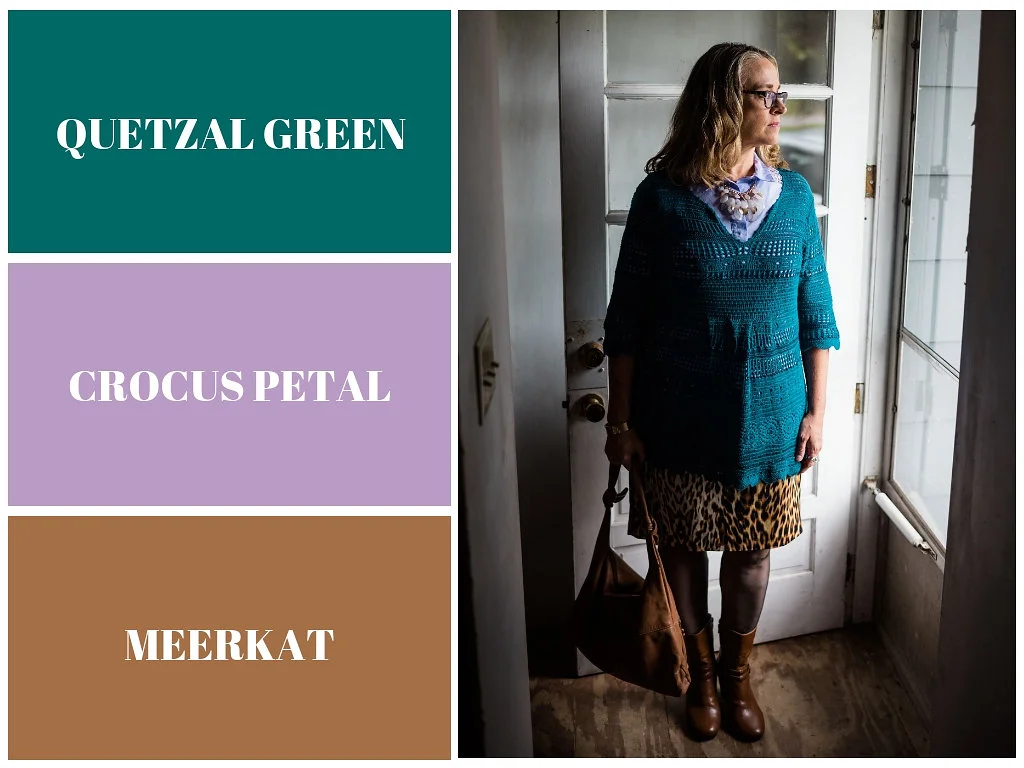
These last two colors, Quetzal Green and Crocus Petal, I decided to pair, once again, with Meerkat. Crocus Petal is a lighter, more spring like color found on the London palette. I feel that pairing it with Quetzal Green and Meerkat was the perfect way to keep the light color grounded and more fall like.
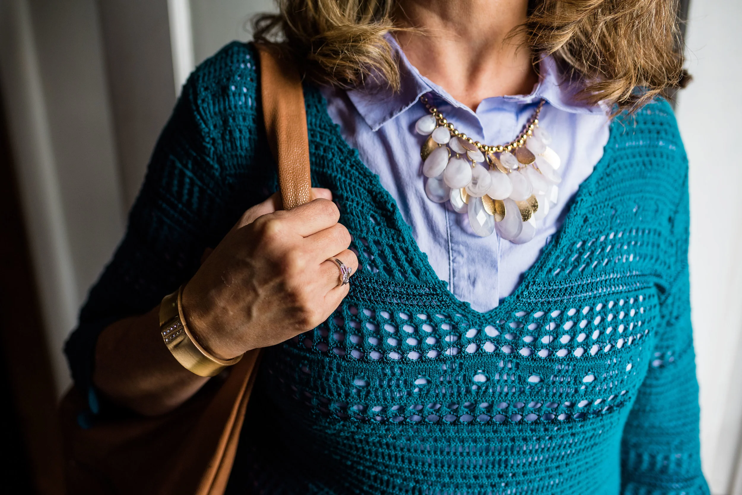
This top is a Kohl’s clearance find and is Dana Buchman brand. It is a button up with 3/4 length sleeves and a longer silhouette. It has some stretch and is more fitted. I opted to wear this bead and metal statement necklace, which incorporates the Crocus Petal color as well. I wore a simple gold cuff on my arm.

I found the open weave sweater thrifting, I love the variations in the knit. I am not a yarn girl, though I would love to be. I think this is crocheted, but it might be knit. Can any of you readers tell? Whatever it is I love the different stitch sizes and open versus more closed aspect to the piece. Here we are talking about texture again and how essential is is to making an outfit more interesting.
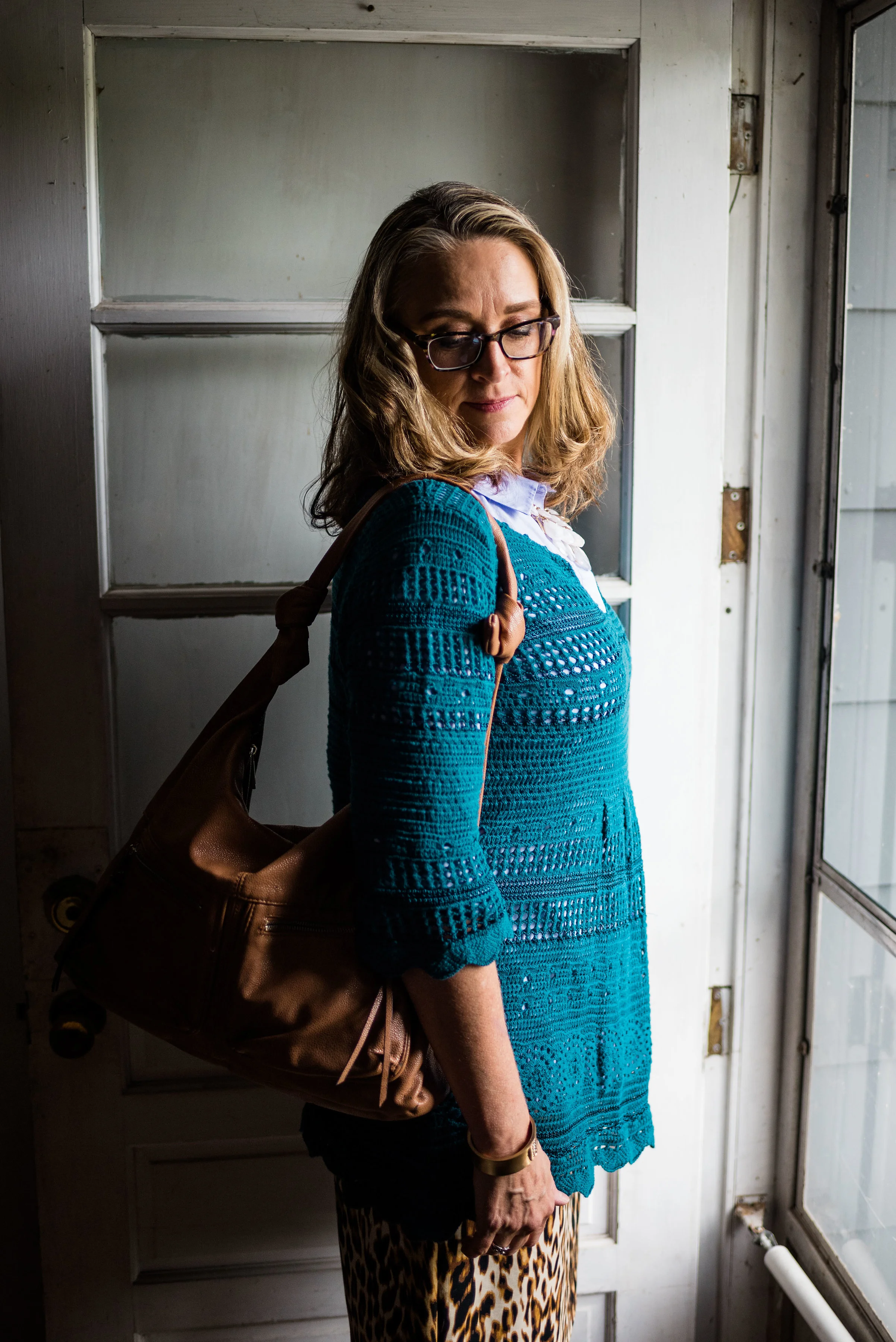
I thought these two colors when great with the browns, black and cream of my leopard print pencil skirt. This skirt is another JC Penney find and is Worthington brand.

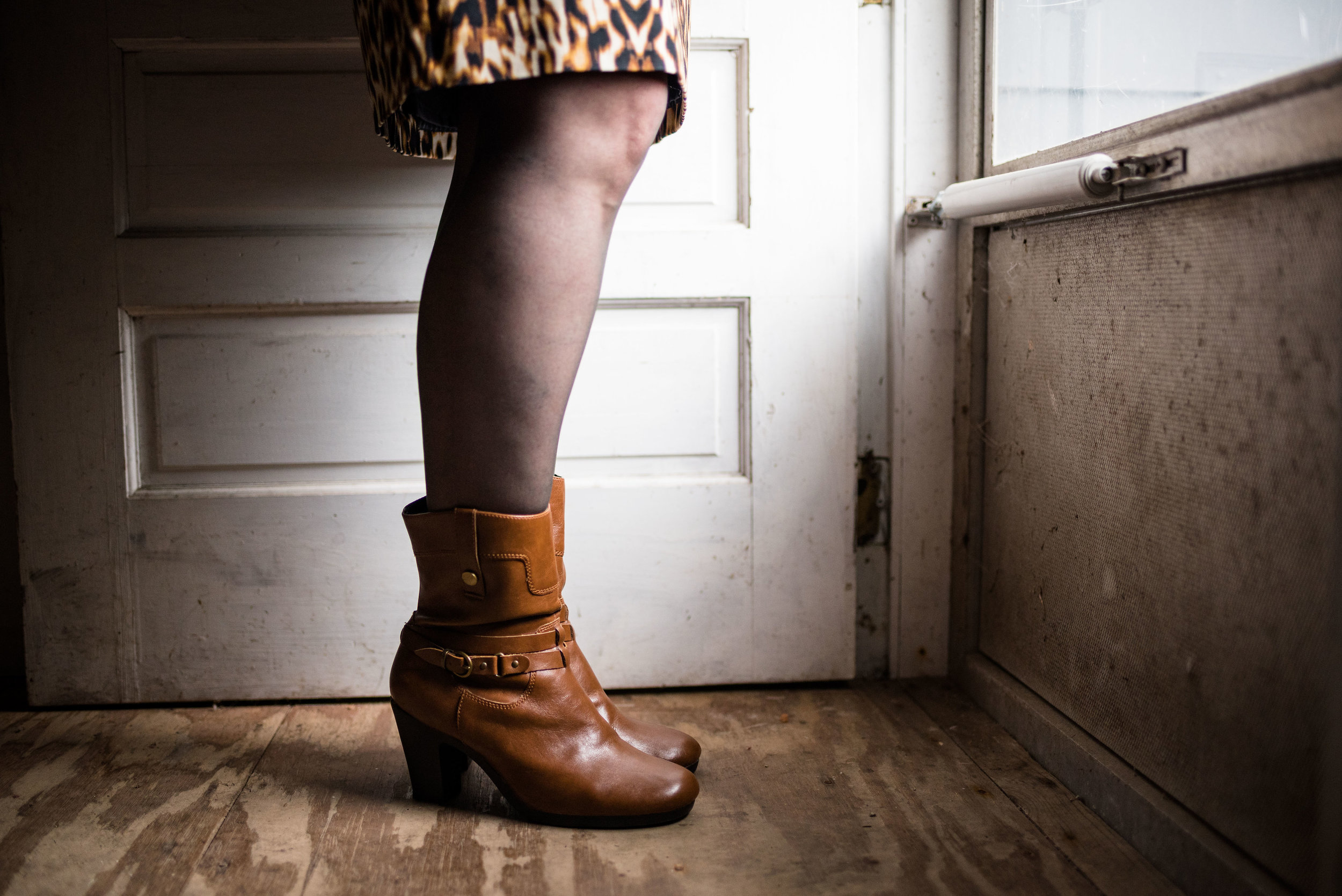
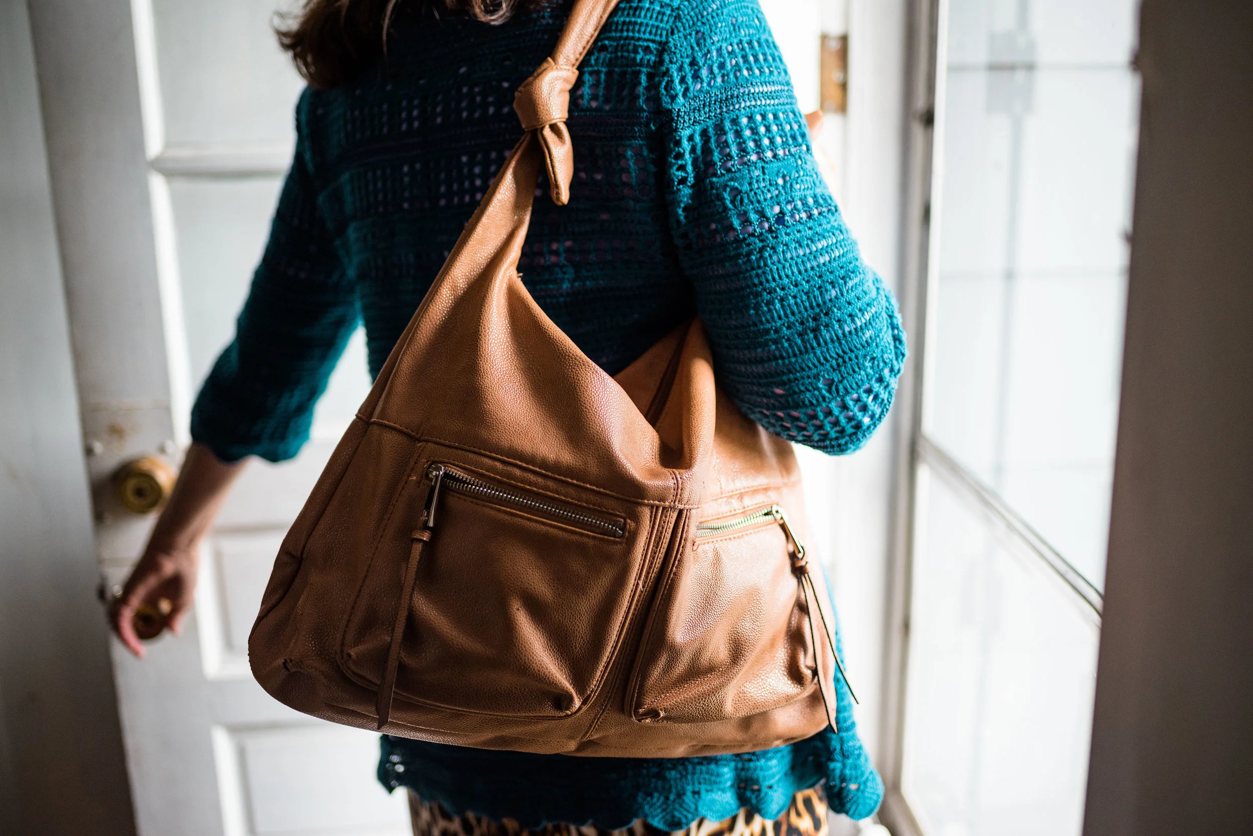
The boots, Aerosoles and bag, both thrifted were the perfect accessories to pair with this outfit. I think black would have worked well or even a cream colored boot, which are trending right now, but I love the luxe feel of the Meerkat color.
Next week I’ll have a recap of all the Pantone Fall 2018 colors. I hope you’ve enjoyed this series and that it provided you with some inspiration for trying new color combinations. Always shop your closet before going out to purchase what is currently trending. You might already have a leopard print top or the perfect color piece that matches with one of the Pantone seasonal colors.

I’ve included a few shopping links. These are affiliate links. All opinions are my own.

Have a great day.

Photo credit Rebecca Trumbull.
Old Becomes New - Multi-print Blazer

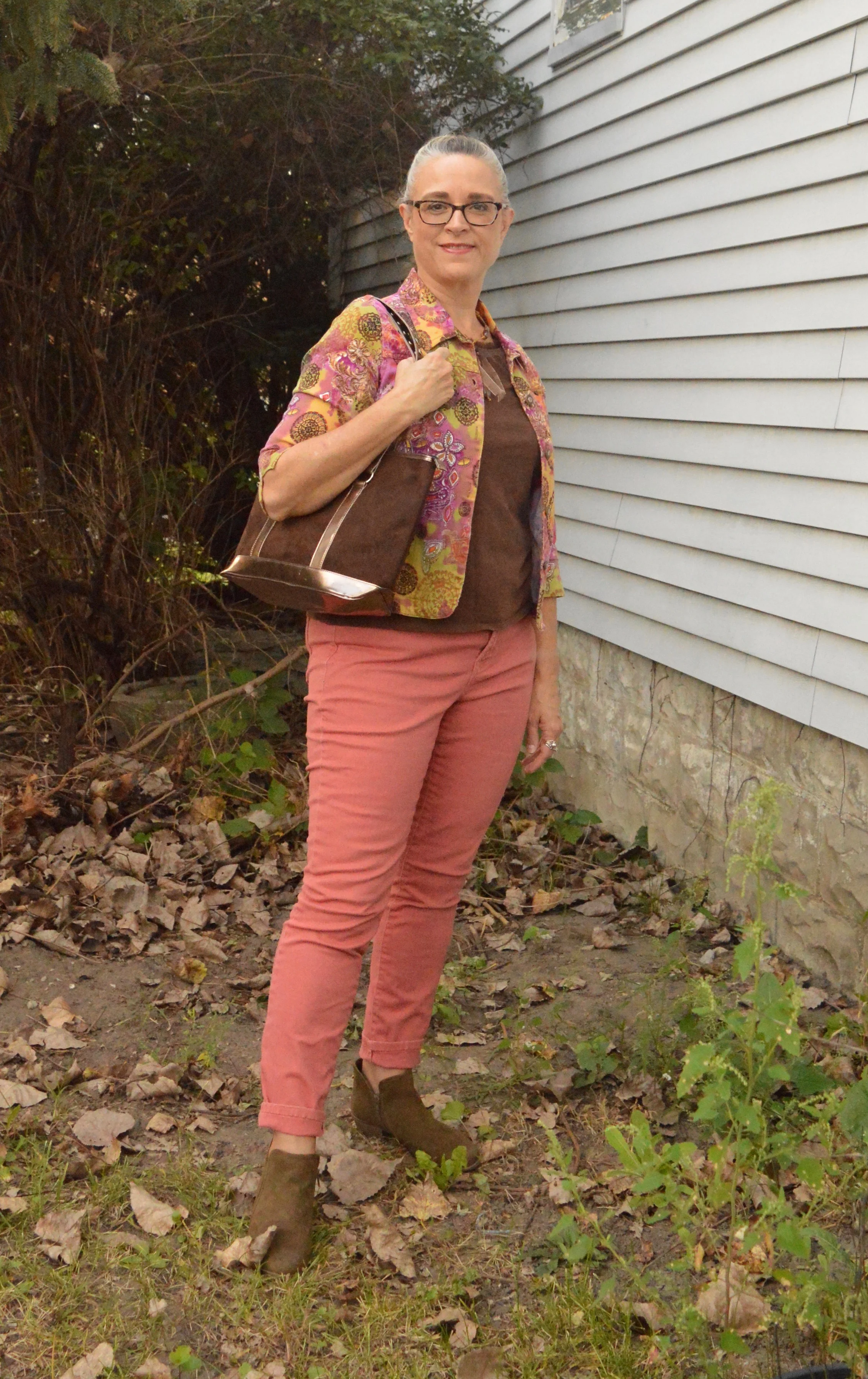
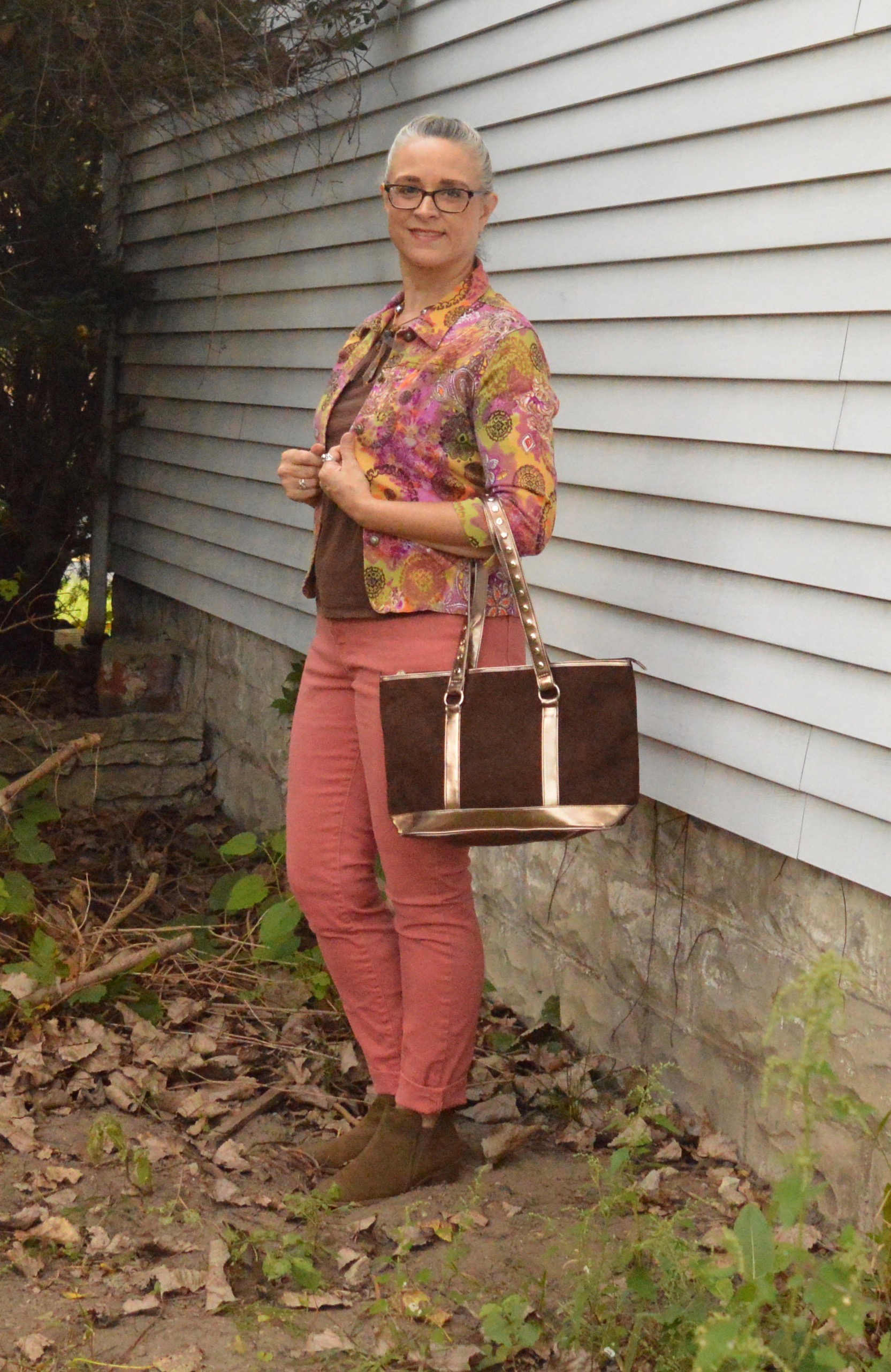
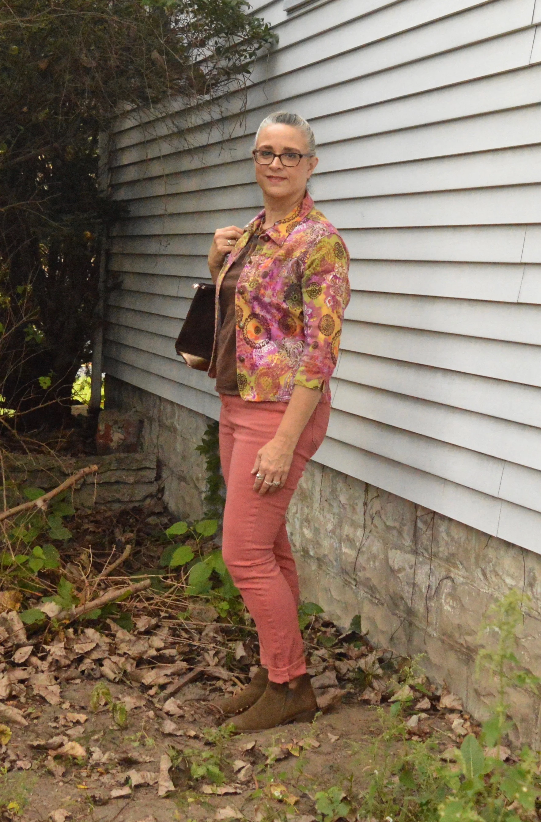
For this month’s Old Becomes New column, I am featuring a short, 3/4 sleeve blazer that I found at a thrift store a few years back. What drew me to it was the amazing, eclectic color palette. My first thought was that I could wear it with so many things. After I tried it on and loved its’ stretchy feel, I had to take it home. Unfortunately, I’ve only worn it less than a handful of times. I decided to revisit it and make the tough choice as to whether I should keep it our not.

I honestly believe this jacket is meant for a smaller person than me. I am 5’ 5” and hover around 163 pounds. While it tends, on me, as more of a crop jacket, I’m just not sure. I am asking for your help friends. What do you all think? Does my outfit look disproportionate?

I chose my dressbarn W62 jeans. I bought this pair last year and they no longer carry this color. I love that they are so comfortable and stretchy, however, I feel like they are almost too big. I lost a few pounds this past spring, so I don’t know if that is what made the difference, but they seem to have a lot more wrinkles. Do you ever buy something, put it on and think, “It just doesn’t have the magic, I thought it had?”

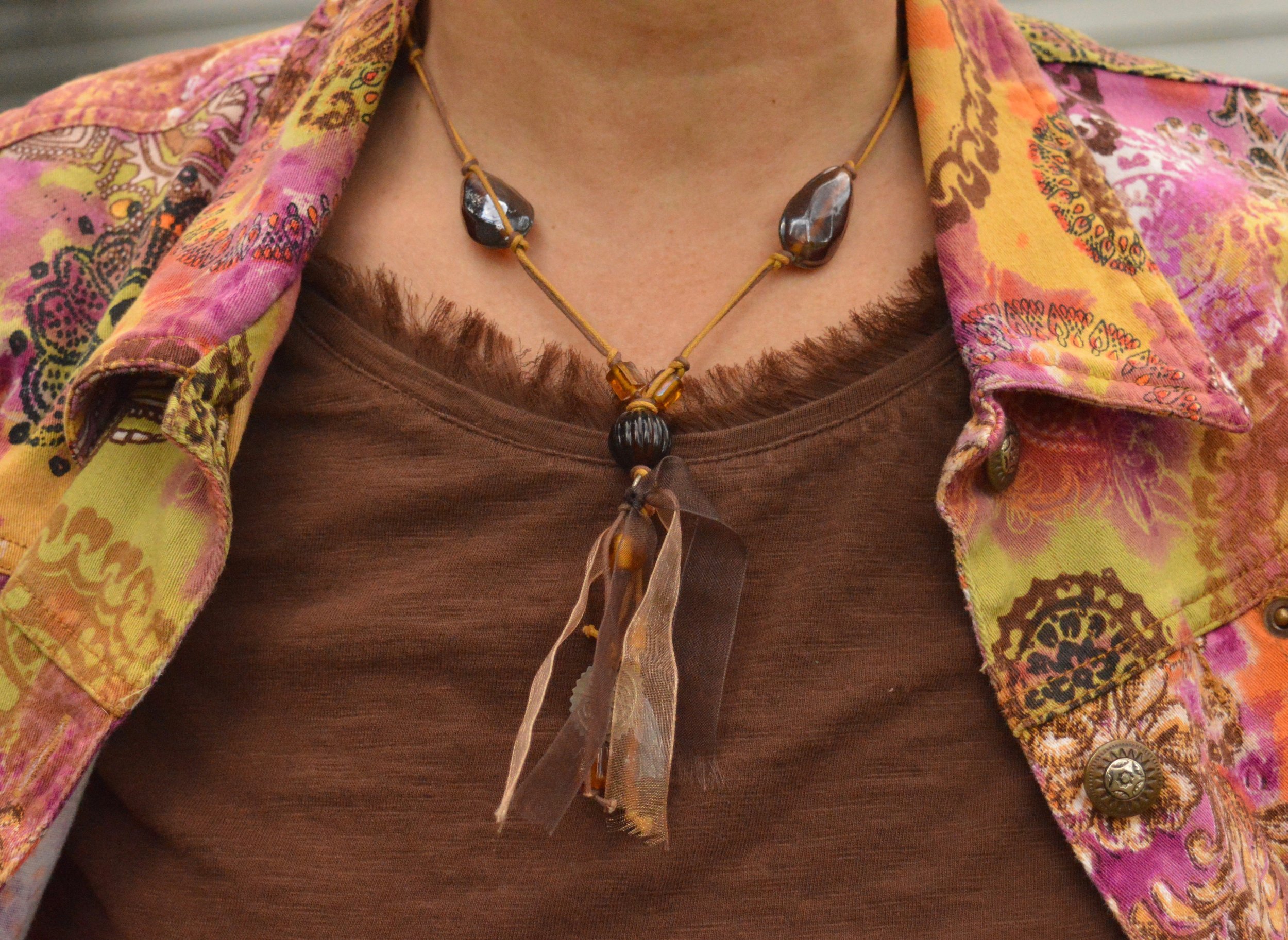
I went with this thrifted brown tee and a necklace that was in some of my daughter’s stuff to be gotten rid of. Hey, I’m not afraid to find treasure in the strangest of places. I like the brown and yellow cord, the beads, ribbon and the charms, which you can’t see much of in this picture. It seemed a prefect fall accessory.

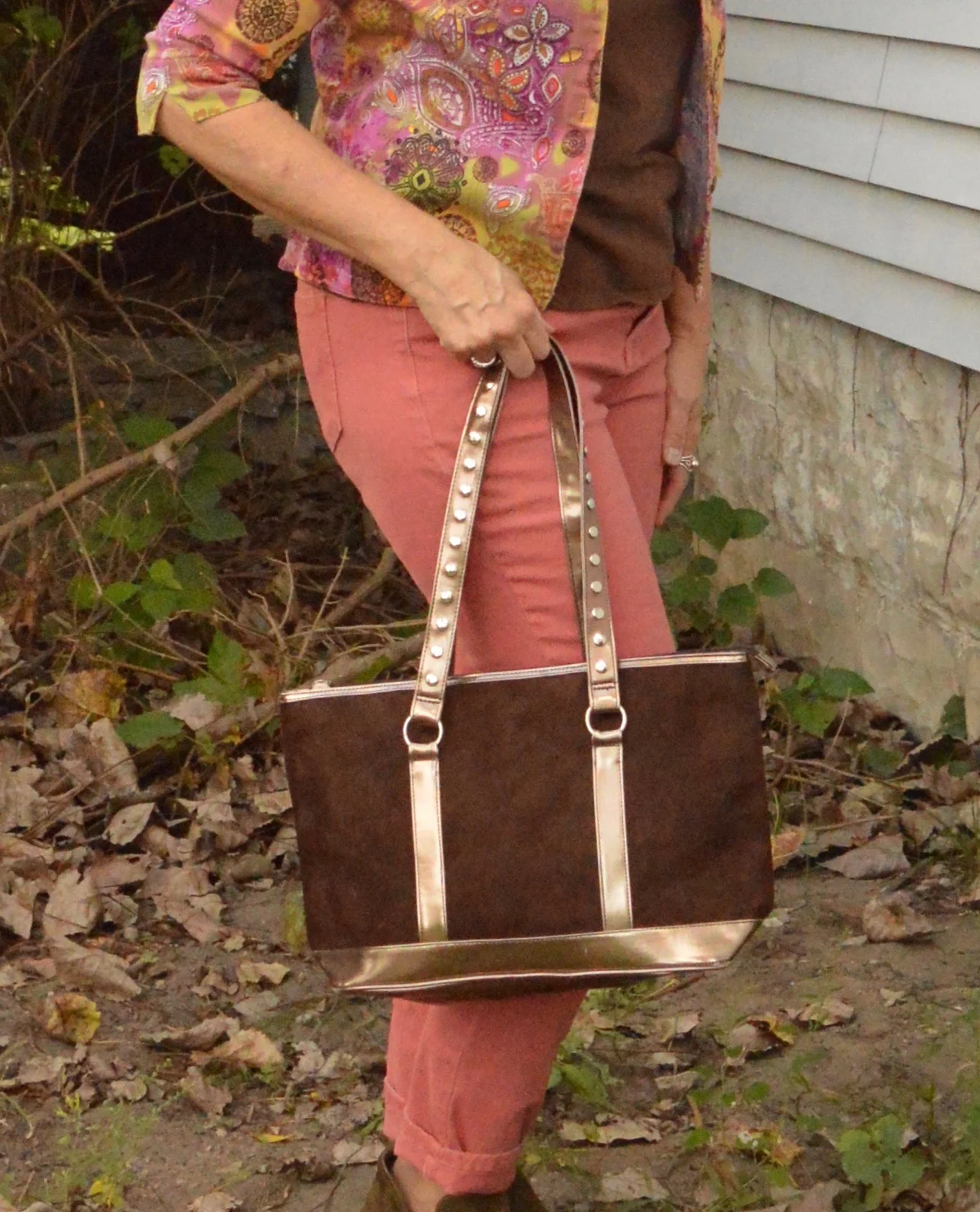
My bag is another thrift find. I felt the brown tee and the brown bag pulled in more of a fall feel with this blazer that could be worn in any season.

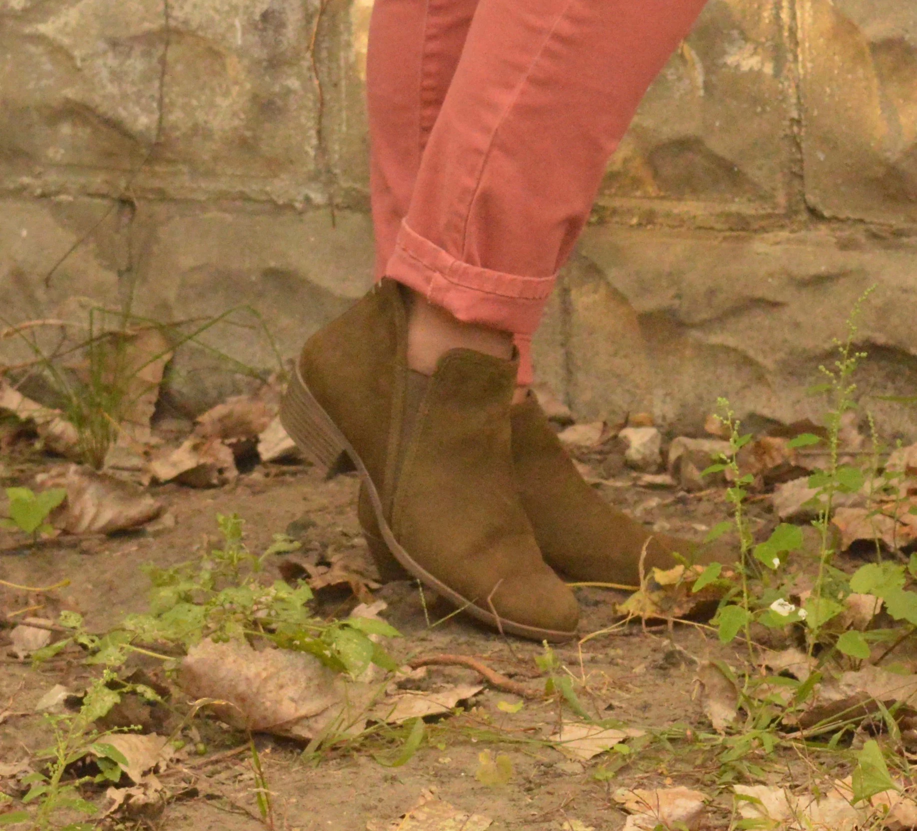
Once again, I chose my SO olive ankle boots. These are perfect for the cool temps of fall when you are not quite ready for mid-calf or knee high boots. You can see more fun colors here. The price point on these is not bad at all and they are very comfortable. I typically wear an 8.5 or a 9 and went with a 9 in these so I have more room for heavier socks as the days get cooler.

What is your verdict? Is this a jacket I should keep or should I let it go free? Ha, ha. I’d love to hear your thoughts.

I hope you all have a wonderful weekend. I have to work Friday and Saturday and try to play catch up with all the other stuff that I don’t get done during the week. Ha, ha. Take care and always choose to be kind.

Pantone Fall 2018 - Pink Peacock, Valiant Poppy and Almond Buff

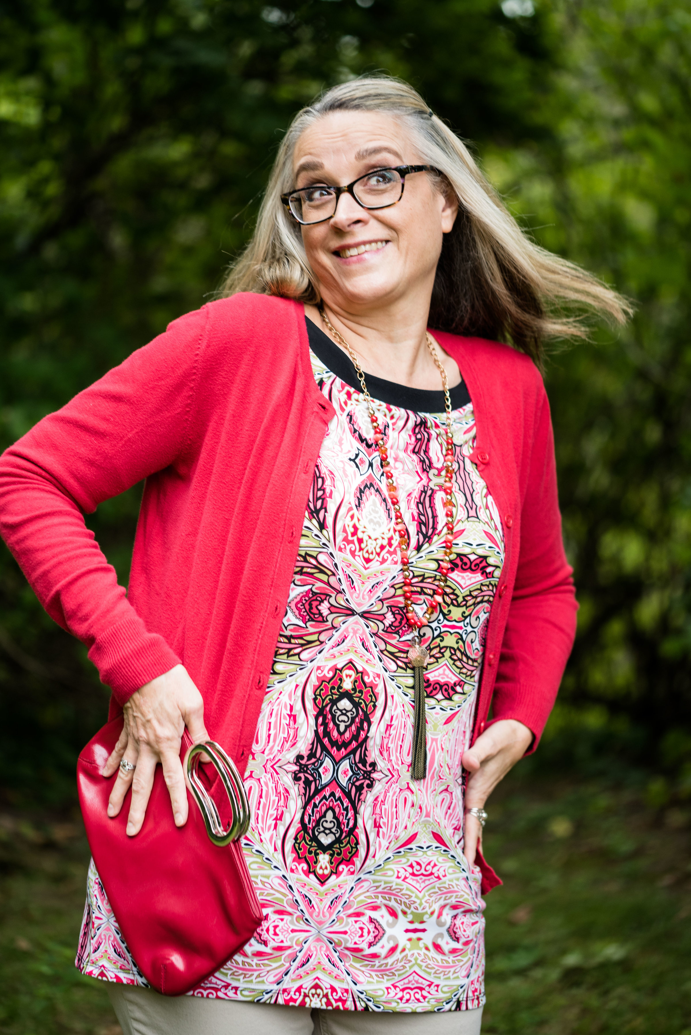
Welcome back to outfit number three in this fall’s Pantone color series. Today I am featuring two colors which the Pantone site describes as a “bright and bold dramatic pink” and a “brave and outgoing red.” I didn’t go into this series thinking I would pair these two colors, but when I started looking for the pink and decided on this multi-print tunic, it was only natural to choose another color in the tunic to pair with it, which obviously turned out to be red. I have always thought of pairing red and pink as a Valentine’s Day idea, but when I began putting this outfit together, I saw a subtle shift from cupids and hearts to fall apples and fuzzy pink slippers.

This tunic is a brand called East Fifth and while I can’t remember, I think I got it at JC Penney. Although, when I checked on their website, it looks like they currently only carry East Fifth shoes. and a few bags. I have styled this tunic on the blog before. You can see that post here.

When I realized I had this thrifted Merona cardigan, I knew that would add the perfect pop of red, in addition to my red clutch.

To keep the outfit grounded I picked the Pantone color Almond Buff from the classic palette. These pants are a little on the light side to truly mimic the color, but my swede ankle boots are a closer match. Yes, I am doing the Robot.

The pants are Croft and Barrow brand. The boots are Sonoma. Both items were from Kohl’s.

I chose my bright red clutch to add to the Valiant Poppy vibe. Because the tunic is so busy the only jewelry I added was a gold bangle bracelet and the pink and red tassel necklace, which as you can see, blends in with the top, but still adds a little textural detail.

Isn’t it funny that I bought this necklace a while back, never realizing that Pink Peacock and Valiant Poppy would be a thing, or that I would end up pairing these two colors on the blog? This next picture is just me at my silliest! Ha, ha.

Would you combine these two colors? Do you think they are what we would classify as fall colors? I’d love to hear you thoughts. It means a great deal to me when you take the time to stop by, read my posts and comment (when technology is cooperating). I have learned a lot from your comments, especially when you share, how you would have done it differently or what you like about a particular post, so keep it up.

Be sure to check back Thursday for a new Old Becomes New post, where I’ll be sharing a colorful blazer styled in a fall outfit. I need your help to decide whether I should keep it or not. Until then, have a great day.

I’ve included a few shopping links for pink tops and red bags, just for fun. These are affiliate links which means I get a penny or two when you click on a link. If you purchase something through my site, I get a little commission.

Photo credit Rebecca Trumbull.