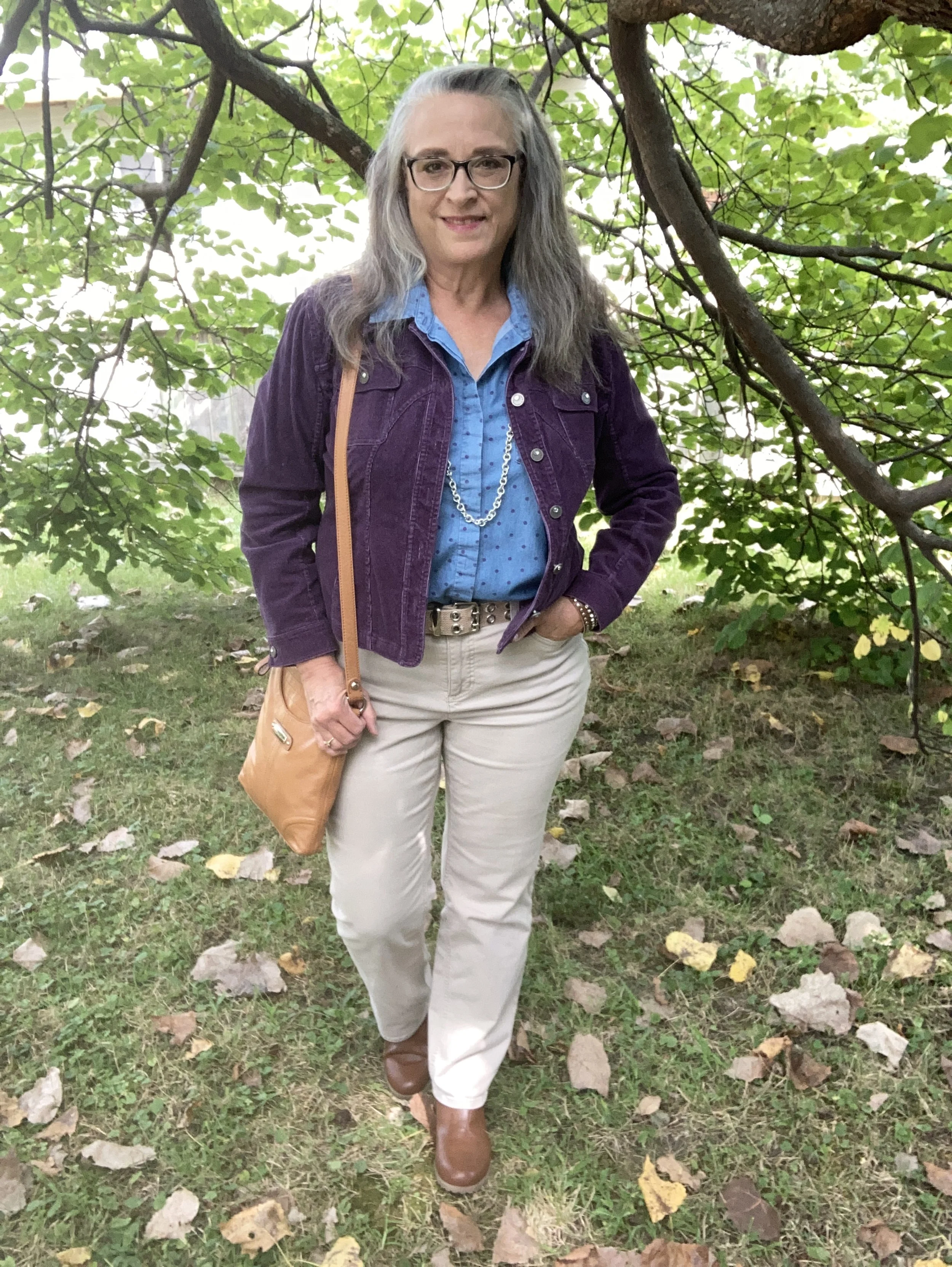
Outfit Inspiration: Pantone Autumn/Winter 2024 NY Palette: Italian Plum, Winter Sky, and White Swan

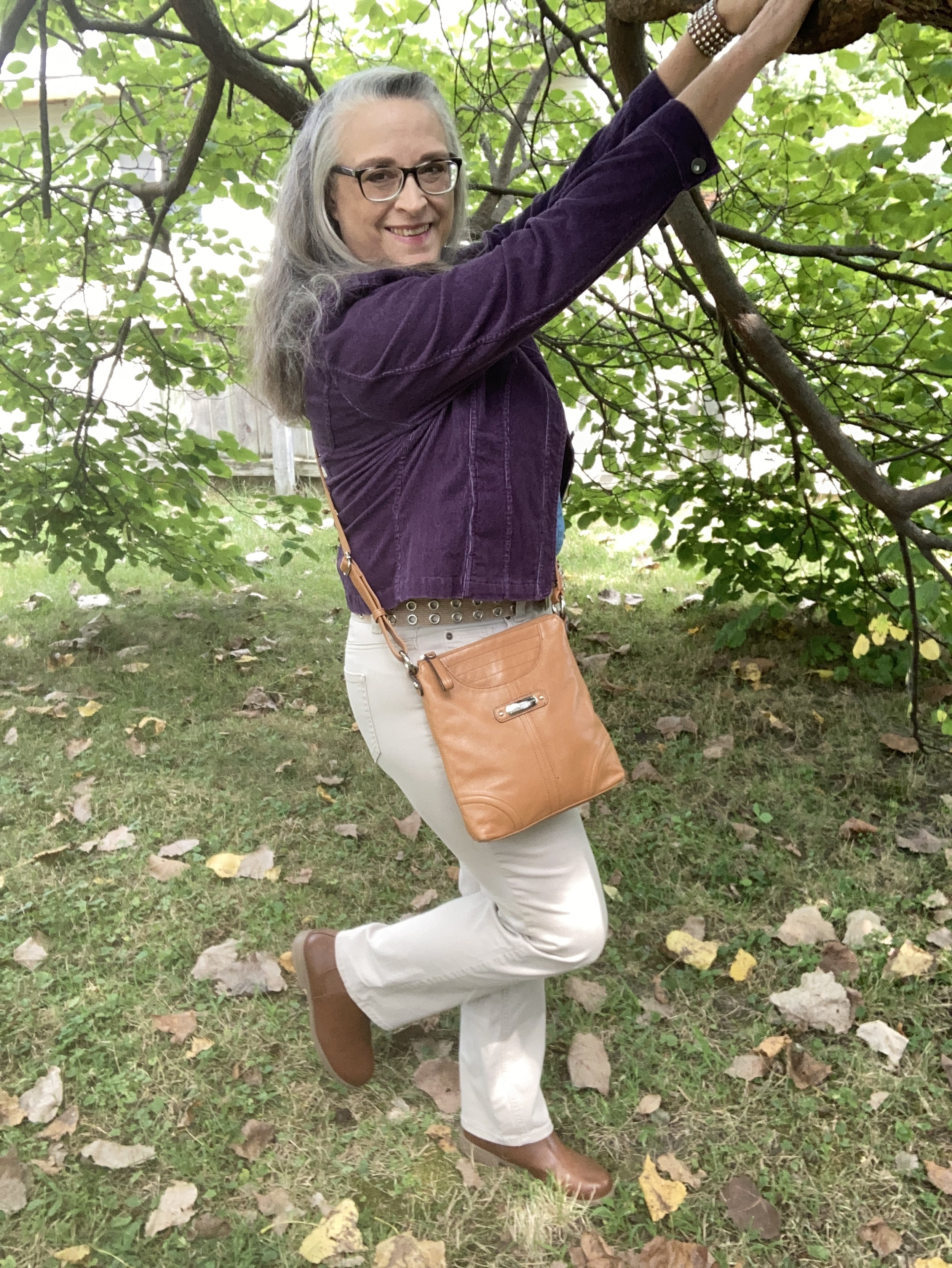
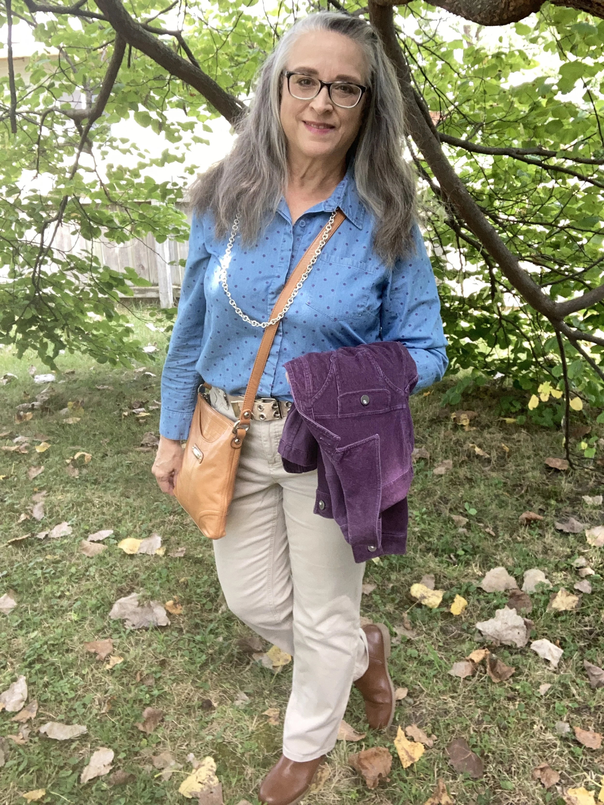
This week’s inspiration came from the Pantone Color Institute’s Autumn/Winter 2024 New York Palette. The three colors I am featuring were fairly easy to find in my wardrobe. My colors may not match spot on, but they are close enough. Feel free to look at the exact colors as given by the Pantone company by clicking on the above link. This week the two main palette colors are the dark purple called Italian Plum, and the blue called Winter Sky. The creamy color is from the classics palette and is called White Swan.

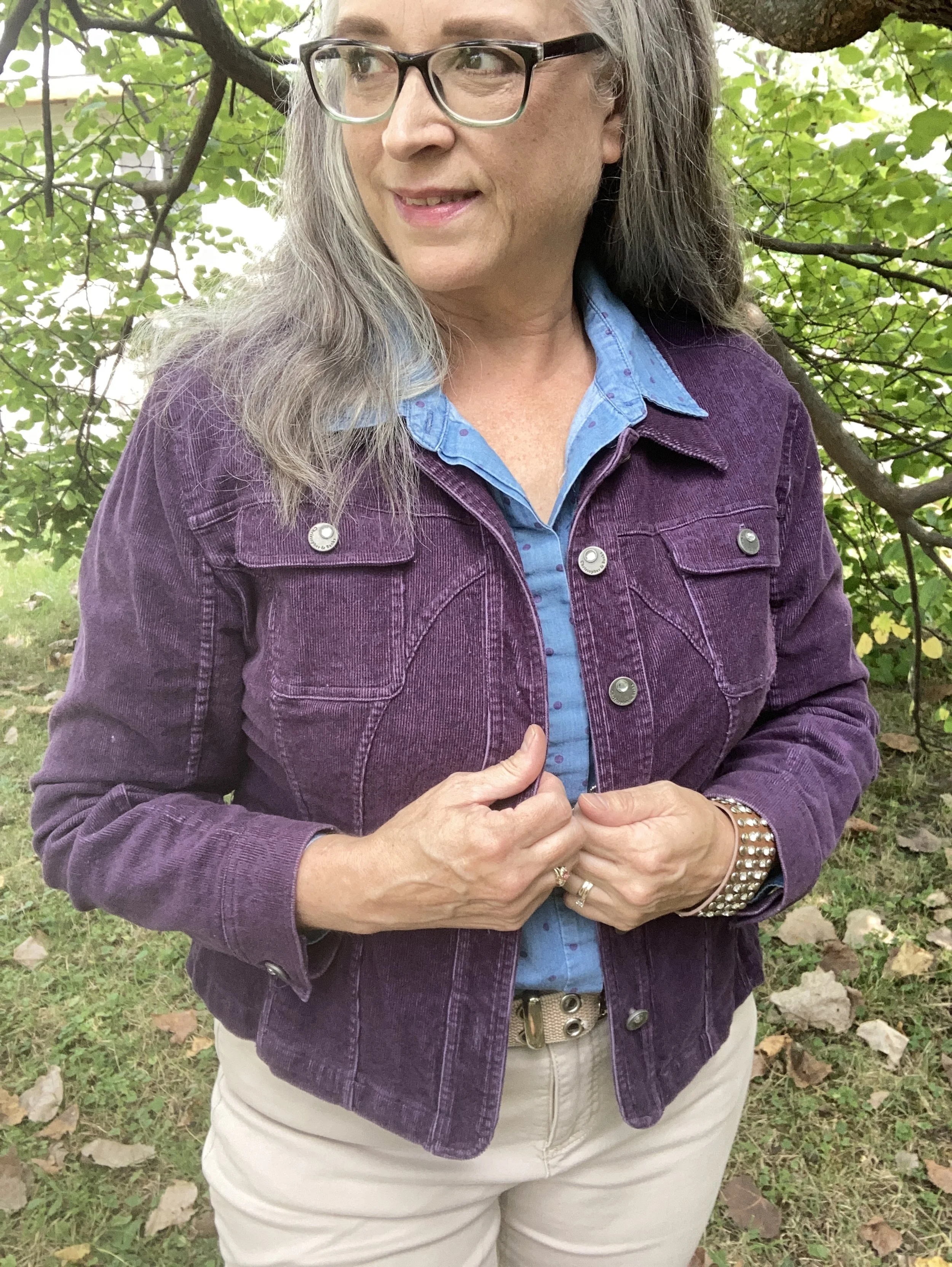
My Italian Plum corduroy jacket is a thrifted Christopher & Banks piece. It is actually a petite large, but I like that it has more of a cropped look. I like the different seams on this piece, and corduroy is perfect for cooler weather.

Style Tip: Shop sizes outside your normal because sizing is different across many manufacturers, and you might like how the piece looks if it is a bit shorter, longer or oversized.

Here are a few possibilities, but there isn’t much out there in this color.

My polka dot Winter Sky top is another Christopher & Banks piece that I bought on a sale back when we had a store in our area. A chambray piece the purple dots were a fun addition to the normal denim style shirt.

My light colored White Swan pants are Croft & Barrow brand from Kohl’s clearance a few years ago. They are plain and simple and sometimes that is just what an outfit calls for.

Style Tip: Not every outfit needs pants or skirts that are texturized or embellished. Sometimes, the simpler the better. Plain pants are typically better for work if you don’t have a uniform provided by the company.

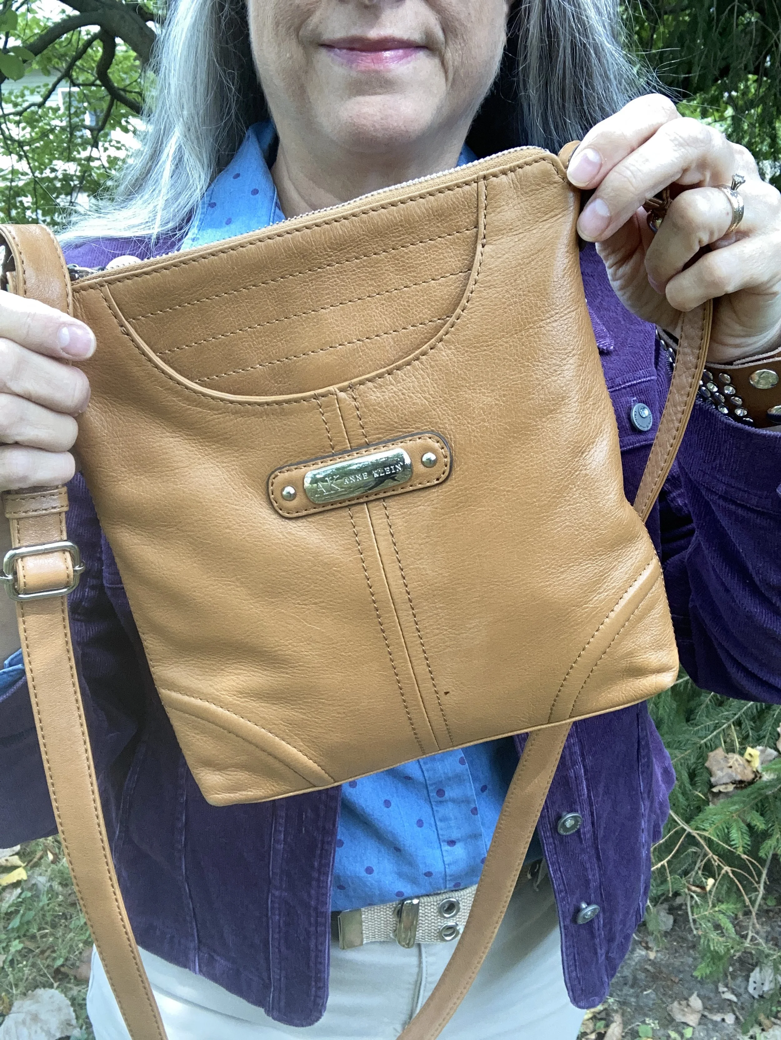
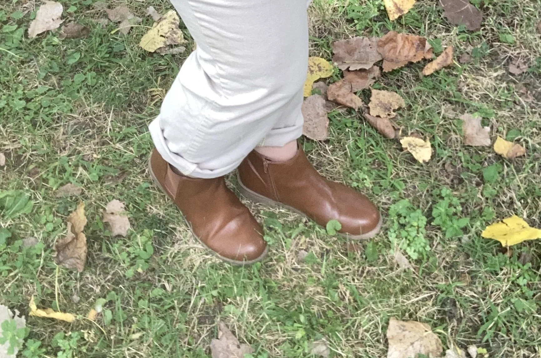
I kept my accessories fairly simple as well. I opted for tan as my color of choice for both my bag and boots since that seems to be trending this fall. I also chose silver as my jewelry color.

What do you think of these Pantone colors? I love purple anyway, so this darker color is a fave, especially for fall. Do you think the a chambray shirt would have worked with this purple jacket and lighter colored pants even if it didn’t have the purple dots on it?

I hope you enjoyed this post. Let me know your thoughts on these colors. Have a great week!

Shopping links are affiliate links, but all opinions are my own.

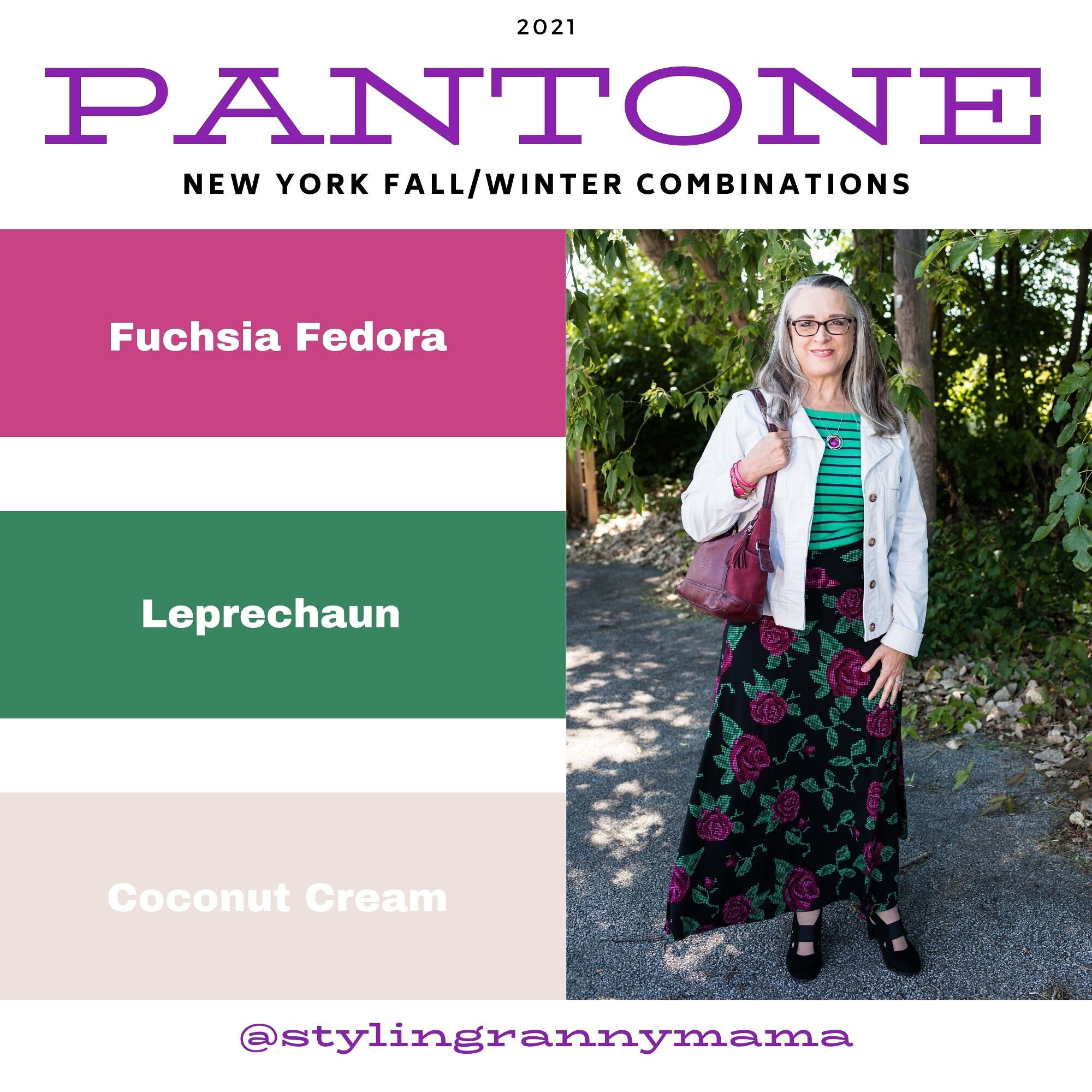
Pantone - Autumn/Winter - 2021 - New York Palette: Fuchsia Fedora, Leprechaun, and Coconut Cream

The colors I am showing you today were ones that surprised me a bit for a fall palette. The bright Fuchsia Fedora is not a color that I have very many pieces in, thus why I used it more as an accessory color. Leprechaun was also a different choice. I was thinking there would be a darker, more forest green color, but this bright, cheeky color is what appeared on the palette. However, that is one of the reasons I like doing this color series. It forces me to think outside the box.

FuschiaFedora.jpg

Even though I wasn’t particularly fond of these colors for fall, I actually liked the way this outfit turned out. Even though the light jacket looks nothing like Coconut Cream, these colors and their combinations are just guidelines for us. Not rules…and just for fun….

I loved The Pirates of the Caribbean movie, and that whole idea of rules versus guidelines was amusing as it kept coming up in the movie and was used according who benefited the most. I guess we could take a lesson from that when we look at our closets. The combinations you put together are for your benefit. You get to decide what you like and what you don’t. You make the choice of what colors or prints to put together, and whether you want to buy into the trends or not. I think we can safely say those fashion “rules”, are really more like “guidelines.” My job as a fashion blogger is to give you ideas of how to make these combinations and hopefully inspire you to think outside your own boxes.

pantonefallcolortrendsfuchsiafedora-10.jpg

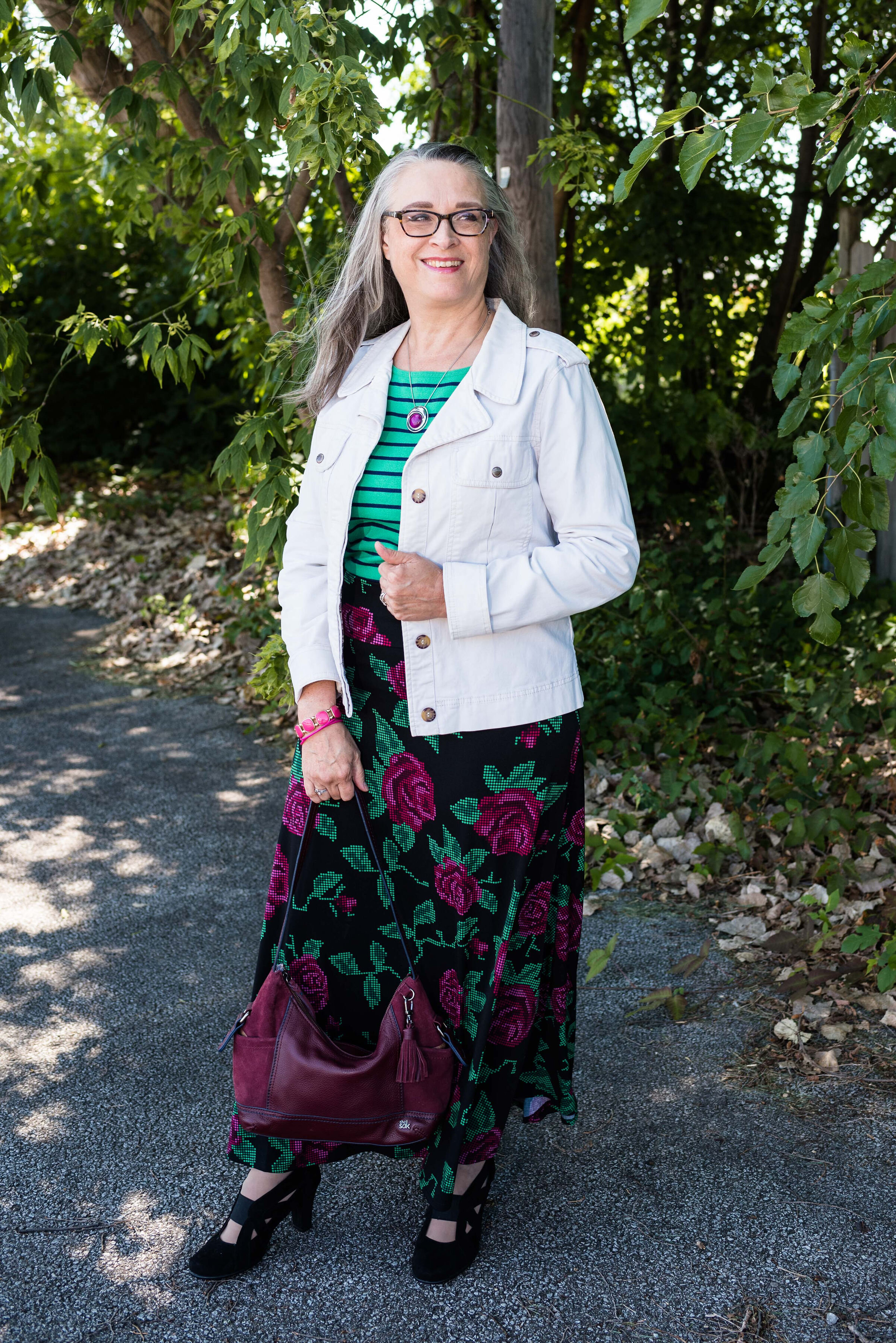
My LuLaRoe skirt was the perfect choice to build this outfit around. I actually had the thrifted striped tee already pulled out as a match for Leprechaun, and as I started figuring out which colors and pieces to put together, I remembered this skirt. I always have a little celebration party when pieces come together. When I try things on I do a little dance in front of the mirror and say, “This is it!” Ha, ha. The stripes in the tee are actually navy, but with the two prints taking center stage, you can’t really tell the colors are different.

pantonefallcolortrendsfuchsiafedora-3.jpg

My cream jacket by Sanctuary is a thrifted piece you have seen before on the blog. You can see it with a leopard print skirt and with my bright blue pants. It is actually more of a canvas than a denim, but it works much the same as a denim jacket providing light weight coverage for cooler weather and adding a casual touch to a dressier outfit.

pantonefallcolortrendsfuchsiafedora-5.jpg

You can see my Fuchsia Fedora necklace and bracelets. I think I have jewelry in just about every color under the sun, but you know, a girl can never have too many fun accessories! Is that a rule, or a guideline? Ha, ha.

pantonefallcolortrendsfuchsiafedora-8.jpg

My bestie, Stacey, gave me this beautiful, leather the Sak bag last time she came to visit. I thought the berry color went perfectly with the darker berry color in the flowers on the skirt.

pantonefallcolortrendsfuchsiafedora-9.jpg

These beautiful black suede heels never get to go anywhere, so I do like to bring them out and show them off on the blog. These are Aerosoles and I bought them a few years ago at a Clarks shoe outlet. I like that they are comfortable, have a reasonable heel, stay perfectly in place and look classy.

pantonefallcolortrendsfuchsiafedora-2.jpg

What do you think of these colors? Do you like them for fall? Now that I am thinking about it, I might need to revisit the idea of fuchsia as a fall color. I could see it with other fall colors like golden yellow, burgundy and rusty orange. Hmmm. I may have to get a little further outside of my color box.

Let me know what you think. I’m including a few shopping links for things of similar color. These are affiliate links and are brought to you at no extra cost. If you click on a link, I get a few pennies. If you purchase something through my site, I get a few more. I appreciate every click.

Have a great day!

Photo credit Jessica Trumbull with Rebecca Trumbull.

Pantone - Autumn/Winter - 2020 - London Palette - Burnt Henna, True Blue and Dress Blues

This is the last color combo in the Pantone - Autumn/Winter - 2020 - London Palette series. On Thursday I will have a recap post of all of the outfits from both palettes. Today’s outfit revolves around a cranberry red, a blue that is much like Classic Blue and navy.

sdf.jpg

Both of the Pantone palettes for fall were filled with blues and reds, but they also had plenty of other options, so if you are not a blue or red wearer, you still have other fabulous colors to wear. My Christopher and Banks ankle pants are not exactly Burnt Henna, but they will due. I got these and a pair of green ones when they were on clearance. They are stretchy, which allows for ease of movement. The only thing I don’t like about them is they have no belt loops. If a pair of pants fits perfectly you don’t really need a belt, but a belt always makes me feel more secure. Otherwise, I always feel like I am pulling my pants up. These are a size 12, which is usually my normal for Christopher and Banks.

Pantone - Autumn/Winter - 2020 - Burnt Henna, Strong Blue and Dress Blues

True Blue is very much like Classic Blue. It is not a dark navy, like the Dress Blues, but a nice medium blue that almost everyone can wear. I wanted to wear layers, so I added a Christopher and Banks cardi and the scarf.

My Dress Blues jacket is a thrifted Ruff Hewn piece. It is a moto jacket, but instead of being strictly leather, or faux leather, it is made of a linen/cotton blend and faux leather for the leather like portions.

Pantone - Autumn/Winter - 2020 - Burnt Henna, True blue and Dress Blues

My plaid button down shirt is also a Christopher and Banks purchase from this year. It is a little bit textured which gives it an added dimension, even though in these pictures you can’t see it very well.

Once again, with all the layers and textures, I kept my accessories very simple. I have a navy flower pendant necklace, but unlike many pendant necklaces, mine is shorter.

Pantone - Autumn/Winter -2020 - Burnt Henna, True Blue and Dress Blues

You’ve see this Simply Vera Vera Wang bag on the blog before. This was a thrifted piece and provides a nice, roomy area which is especially good for traveling to pack a few extras like a notebook or reading book. I also added a few beaded bracelets with blues.

Pantone - Autumn/Winter -2020 - Burnt Henna, True Blue and Dress Blues

Finally, these are my newer ankle boots. Once again, these are SO brand, which are my go to faves for ankle boots from Kohl’s. They fit (size up a half size if you want to be able to wear extra thick socks in the colder temps), are easy to get on an off and seem to hold up quite well in our ever changing weather here in the mid west. These are the first pair I’ve gotten that actually have the zipper on the outside of the foot rather than the inside, which is a nice contrast.

Pantone - Autumn/Winter - 2020 - Burnt Henna, True Blue and Dress Blues

What do you think of this outfit? Do you like these colors? Would you put these colors together, or would you find some other color to pair each of these with? I love hearing your thoughts, so be sure to leave me some love in the comments.

Pantone - Autumn/Winter - 2020 - Burnt Henna, True blue and Dress Blues

I am including a few shopping links. You can use these links to shop for yourself or for future Christmas presents for others. There is no extra cost to you to shop through my links. In fact, what it does is generates a tiny bit of income for me. Every click you do, gives me a few pennies. These are affiliate links. All opinions are my own.

Photo and graphic credit Rebecca Trumbull.


Color Play - Bathroom Tiles

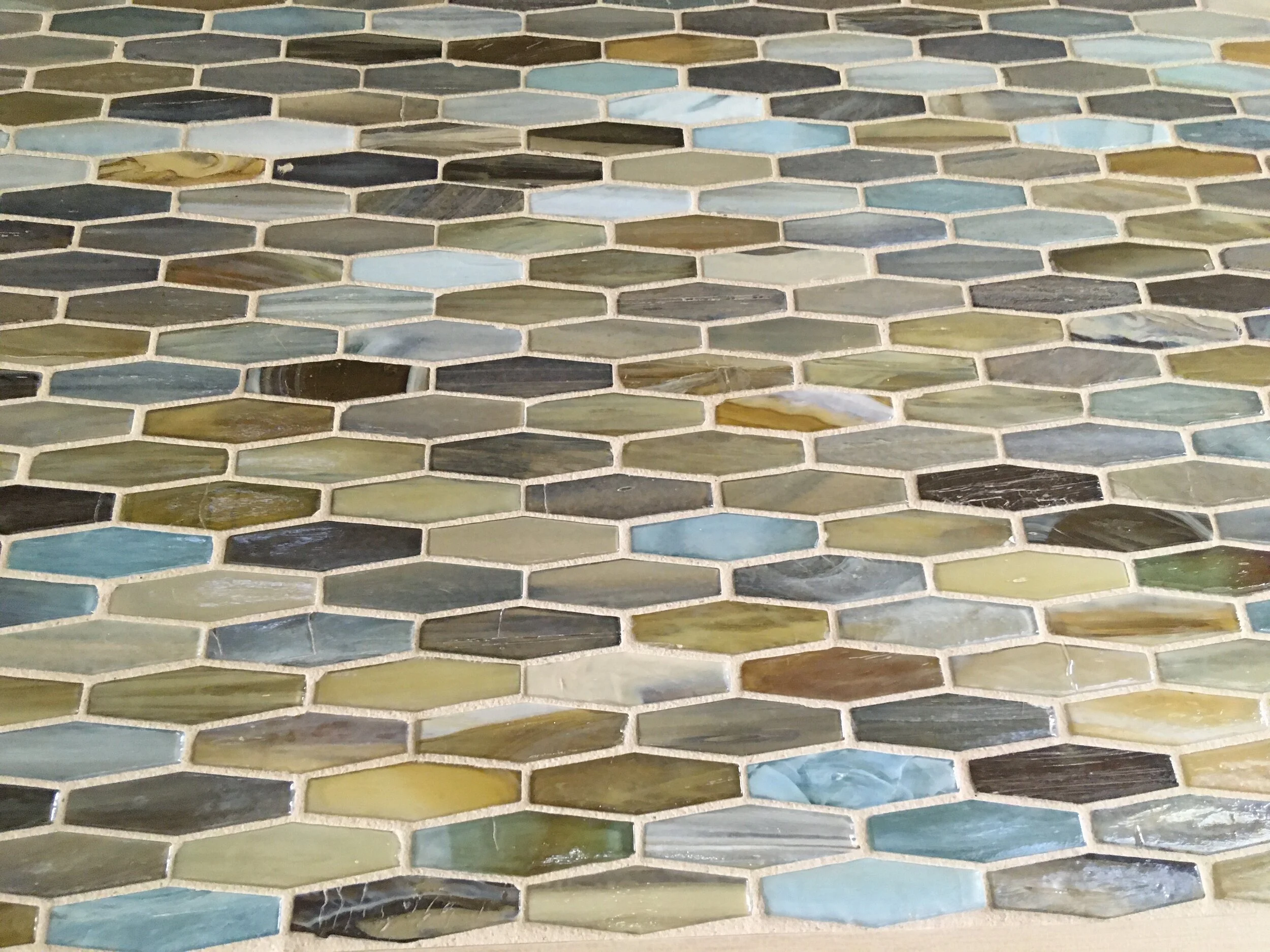
You might think by the title of my post, that I am going to talk about the tiles in my bathroom. That would not be very entertaining, as my downstairs bath has white tiles and the upstairs bath is in dire need of repair. I took a picture of these bathroom tiles at the public library nearby, as a source of inspiration for putting an outfit together. I have been trying to think of more creative ways to look at color, not only in the world around me, but for the purpose of using those colors as inspiration for outfits.

Picture taken by me on my phone.

Picture taken by me on my phone.

There is a lot going on with these tiles. I see several shades of blue, gray, brown and a sort of mustardy yellow tan. Ha, ha. I’m sure there is a correct color name, but who knows what it is. I was originally going to post this outfit back in July, so I had chosen to go with the white tiles rather than the darker grays.

color play - bathroom tiles

This outfit is perfect for the transition from summer to cooler fall temps and frankly, while there is still a whole month of summer left, I am looking forward to the temps cooling off, the leaves changing and all the other tantalizing fall aromas and tastes.

Color Play - bathroom tiles

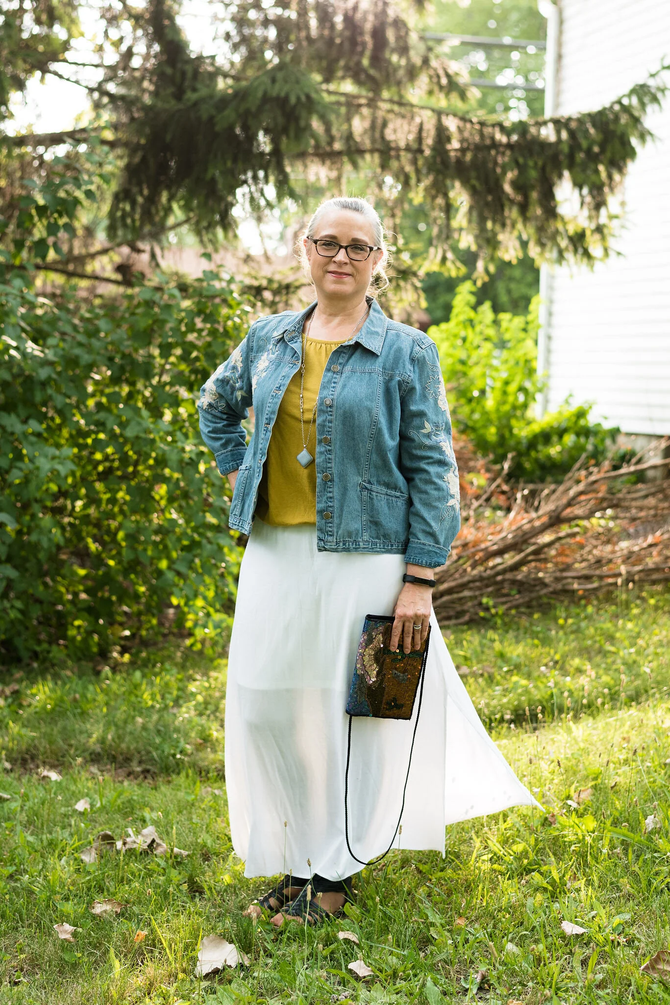
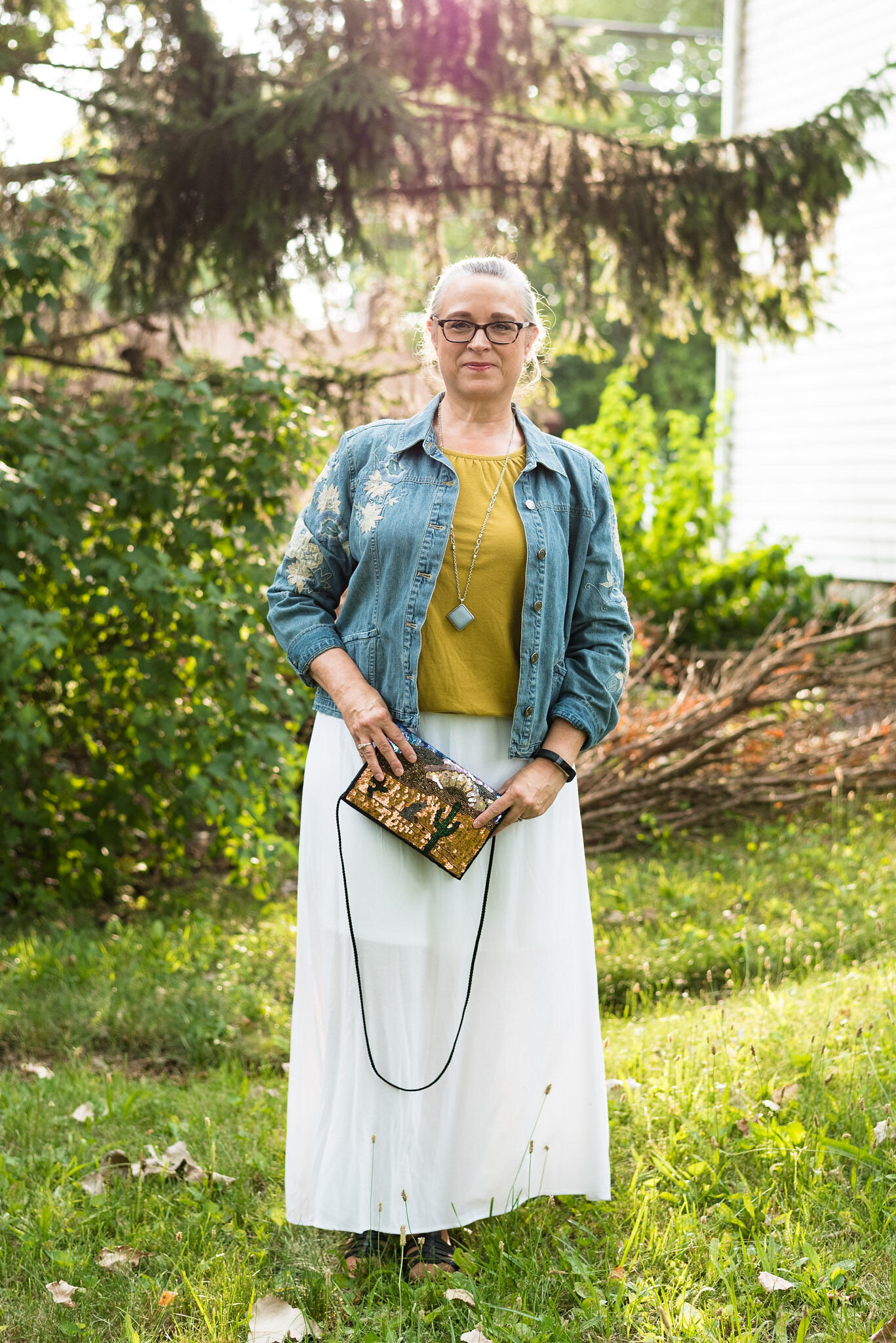
Everything in this outfit was thrifted. My white skirt, a brand called VLD was styled last year in my Wearing White series. You can see the skirt worn with a blue top and fall colored scarf, here.

The thrifted 3/4 length sleeve, mustard tee is Sonoma brand. This is another piece that gets regular wear in the cooler temps. You can see it styled with a snakeskin print skirt, purple maxi skirt, and a brown cardigan,

Color Play - bathroom tiles

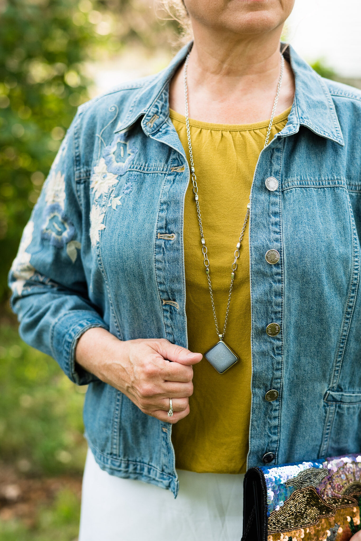
You have also seen this thrifted J.Jill jacket on the blog before too. See it styled with my head to toe denim outfit from this last spring’s trend post.

Color play - bathroom tiles

I added the blue pendant necklace as an additional pot of color against the yellow background.

Color Play - bathroom tiles

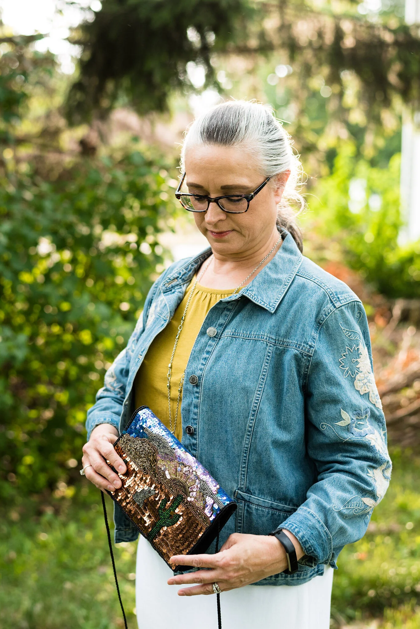
When I was putting this outfit together and wondering what bag to use, it came to me that this little thrifted piece of bling would be the perfect accompaniment. The browns also mimic some of the brown tiles in my inspirational picture. I love the little southwestern scene done in sequins and beads on this fun piece.

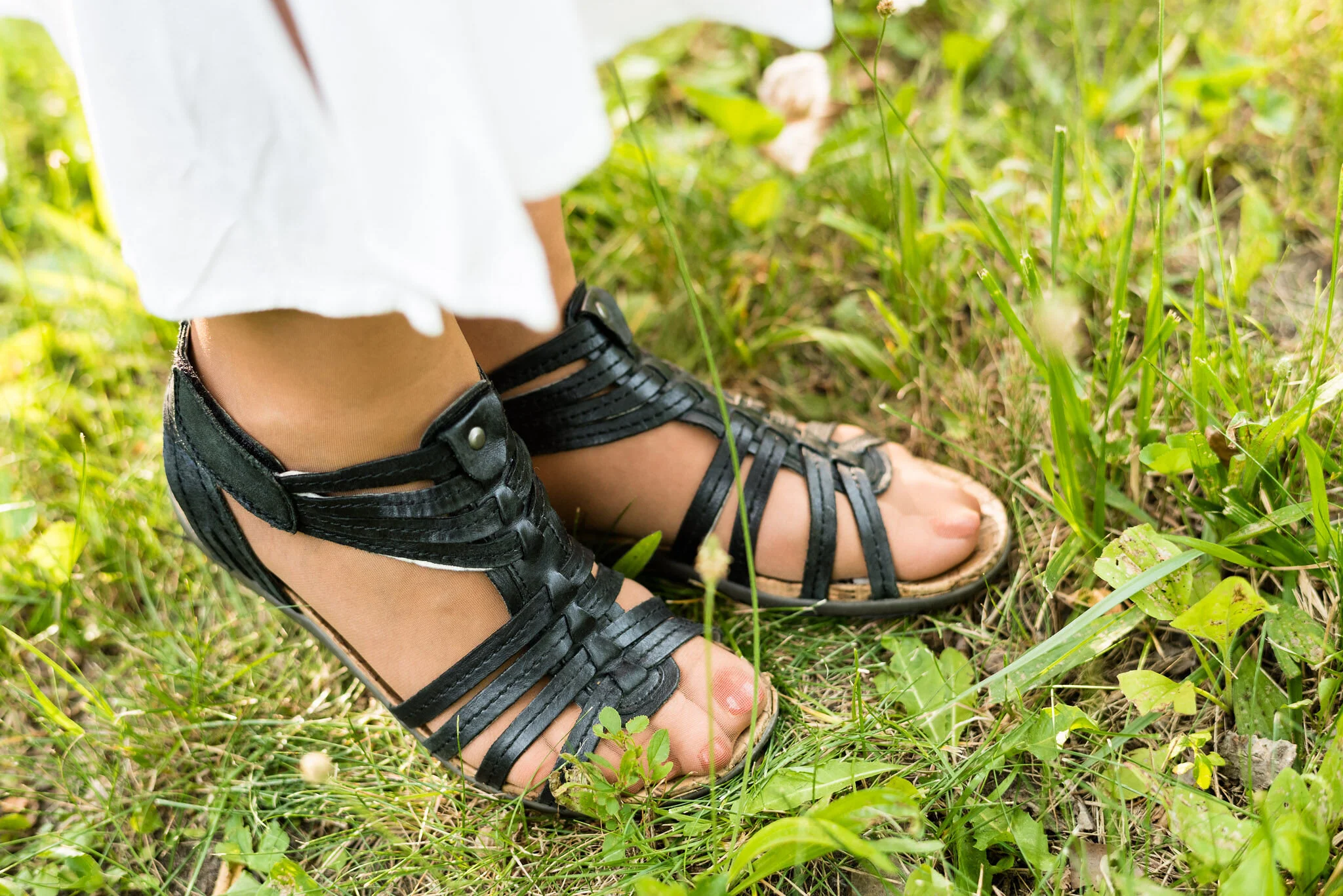
The black casing of the bag and the little black cord strap caused me to reach for my thrifted, black, Baretraps sandals.

Color play - bathroom tiles

What do you think? Did I mimic the bathroom tile colors? What sorts of things do you get your outfit inspiration from besides bloggers or models? I’d love to hear your thoughts, so leave me some love in the comments.

Here I am kicking 2020 to the curb! Ha, ha.

Color play - bathroom tiles

Here is a look at the tiles and my outfit side by side.

I hope you enjoyed this post and that you come away from it with new eyes to look for added sources of outfit inspiration.

I’m including a few similar piece shopping links, so feel free to peruse. These are affiliate links. All opinions are my own.

Photo credit (except for the tiles) Rebecca Trumbull.


Old Becomes New - Multi-print Blazer

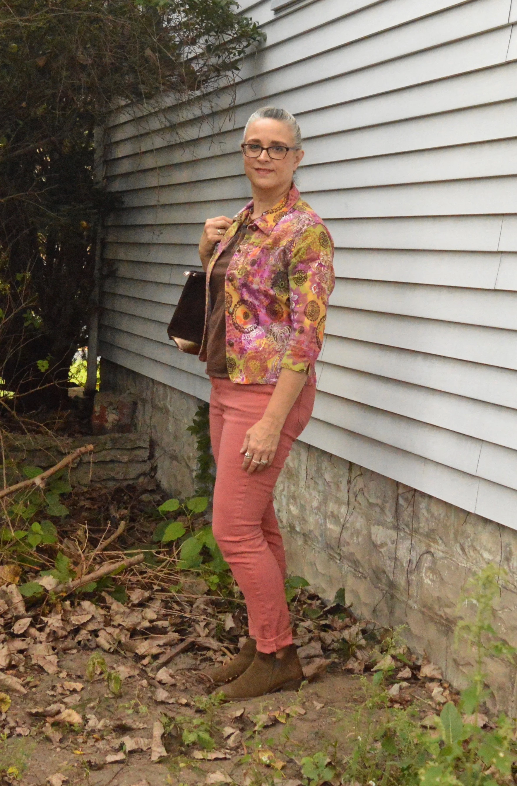
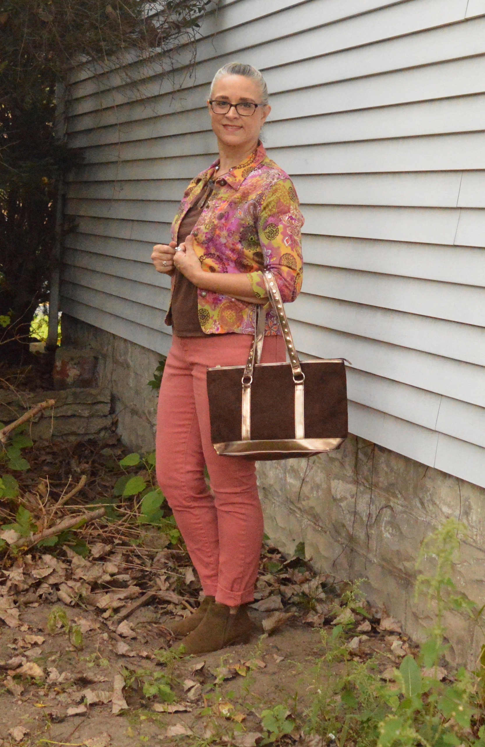
For this month’s Old Becomes New column, I am featuring a short, 3/4 sleeve blazer that I found at a thrift store a few years back. What drew me to it was the amazing, eclectic color palette. My first thought was that I could wear it with so many things. After I tried it on and loved its’ stretchy feel, I had to take it home. Unfortunately, I’ve only worn it less than a handful of times. I decided to revisit it and make the tough choice as to whether I should keep it our not.

I honestly believe this jacket is meant for a smaller person than me. I am 5’ 5” and hover around 163 pounds. While it tends, on me, as more of a crop jacket, I’m just not sure. I am asking for your help friends. What do you all think? Does my outfit look disproportionate?

I chose my dressbarn W62 jeans. I bought this pair last year and they no longer carry this color. I love that they are so comfortable and stretchy, however, I feel like they are almost too big. I lost a few pounds this past spring, so I don’t know if that is what made the difference, but they seem to have a lot more wrinkles. Do you ever buy something, put it on and think, “It just doesn’t have the magic, I thought it had?”

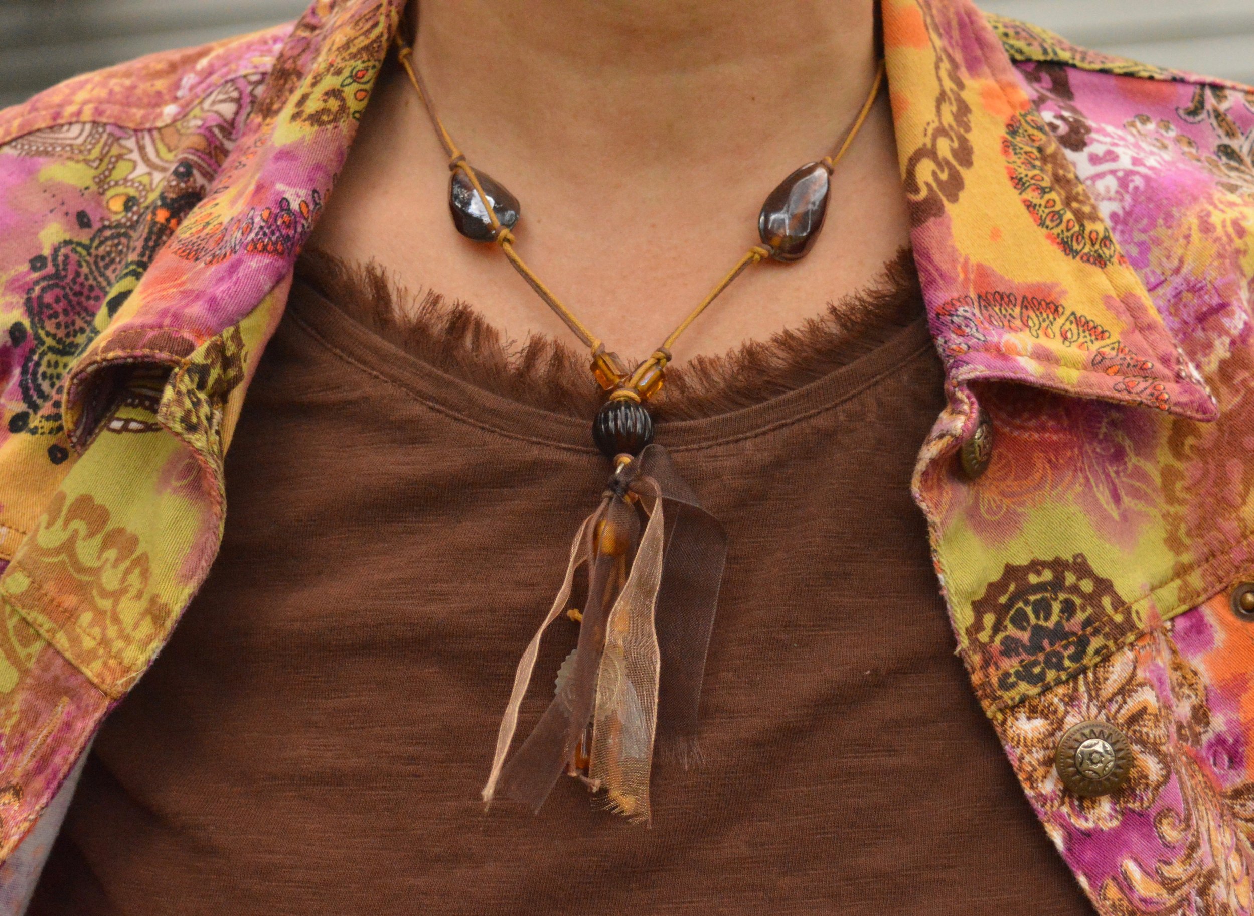
I went with this thrifted brown tee and a necklace that was in some of my daughter’s stuff to be gotten rid of. Hey, I’m not afraid to find treasure in the strangest of places. I like the brown and yellow cord, the beads, ribbon and the charms, which you can’t see much of in this picture. It seemed a prefect fall accessory.

My bag is another thrift find. I felt the brown tee and the brown bag pulled in more of a fall feel with this blazer that could be worn in any season.

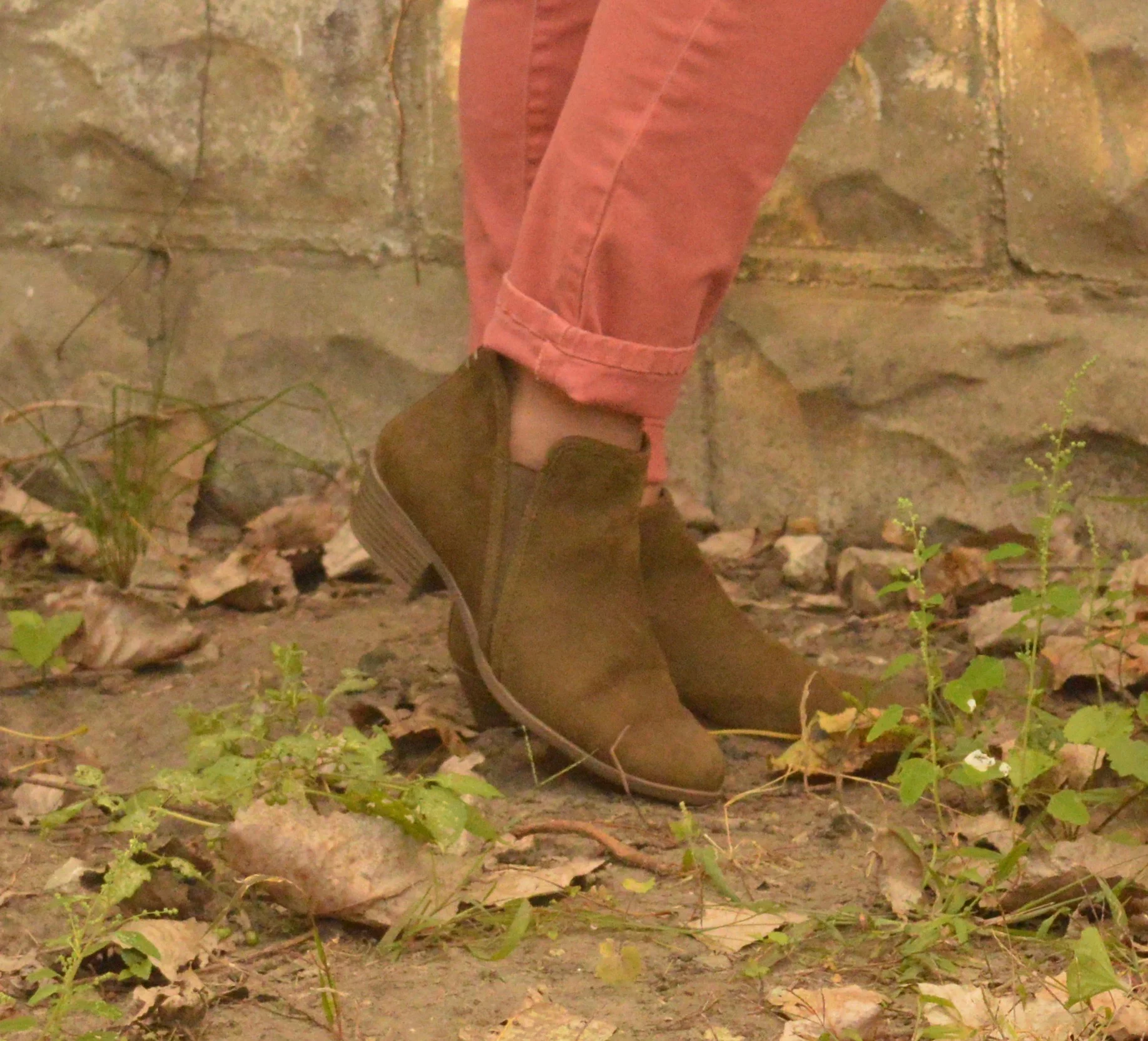
Once again, I chose my SO olive ankle boots. These are perfect for the cool temps of fall when you are not quite ready for mid-calf or knee high boots. You can see more fun colors here. The price point on these is not bad at all and they are very comfortable. I typically wear an 8.5 or a 9 and went with a 9 in these so I have more room for heavier socks as the days get cooler.

What is your verdict? Is this a jacket I should keep or should I let it go free? Ha, ha. I’d love to hear your thoughts.

I hope you all have a wonderful weekend. I have to work Friday and Saturday and try to play catch up with all the other stuff that I don’t get done during the week. Ha, ha. Take care and always choose to be kind.