Outside the Box - Floral Dress with Combat Boots

I have never been especially adventurous with fashion. My style is somewhat classic with a tomboy edge and a dash of boho meets warrior princess, or at least that is what I would like to think. I am not overtly feminine, though I do like pink and especially love lace. As I revealed in last week’s Ordinary Amy post, I like motorcycle jackets, blue jeans and boots or tennis shoes. The premise for having a column called Outside the Box, is exactly that, to get me thinking outside my own fashion box.

This week’s outfit is what I would call motorcycle mayhem meets feminine flirt. Let me know if you agree.

I often see bloggers who put together outfits that I would have never dreamed of doing. Not because they are so bold or daring, but because my mind would just never think to combine combat boots, fishnet stockings and a floral dress.

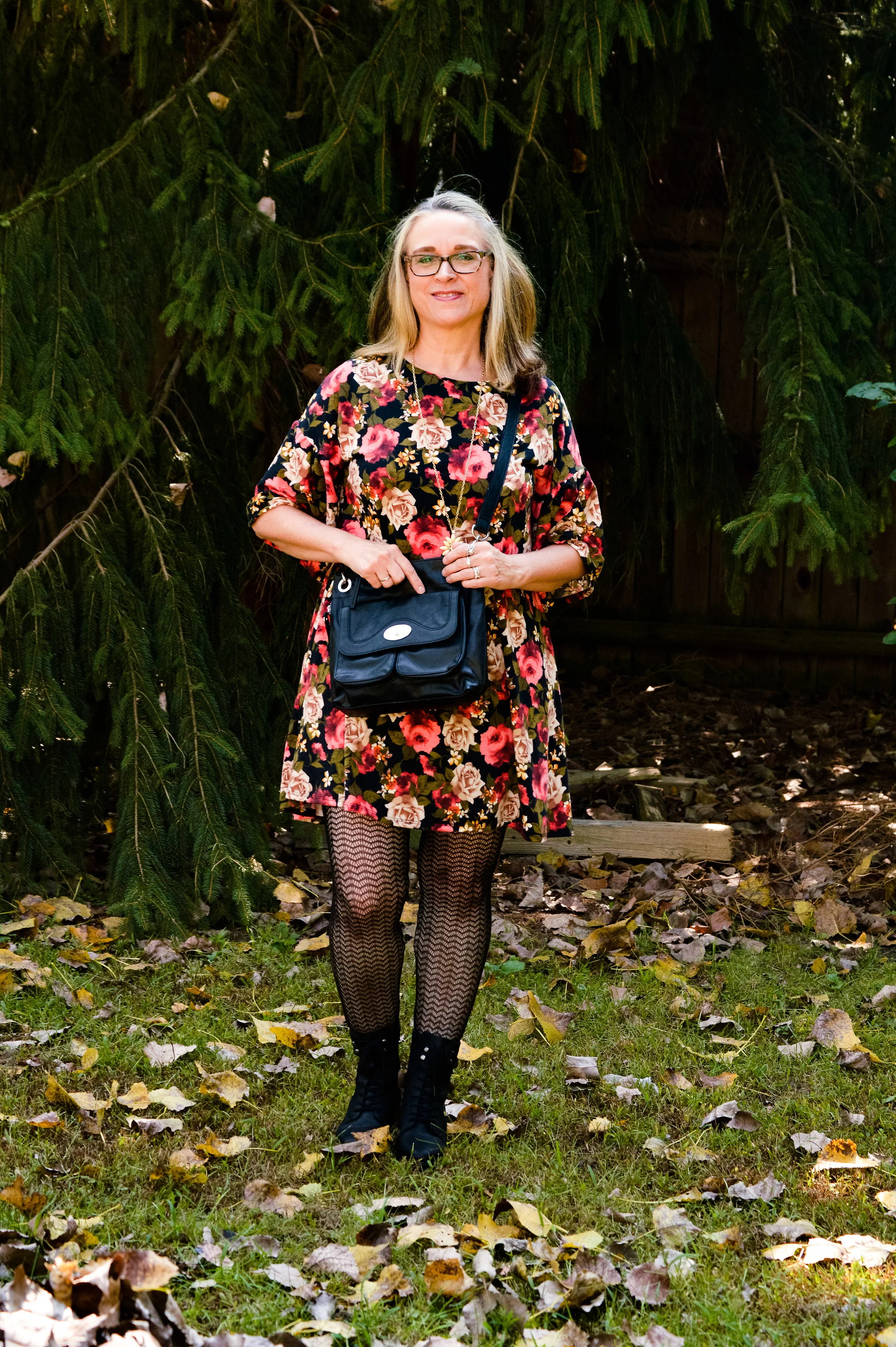
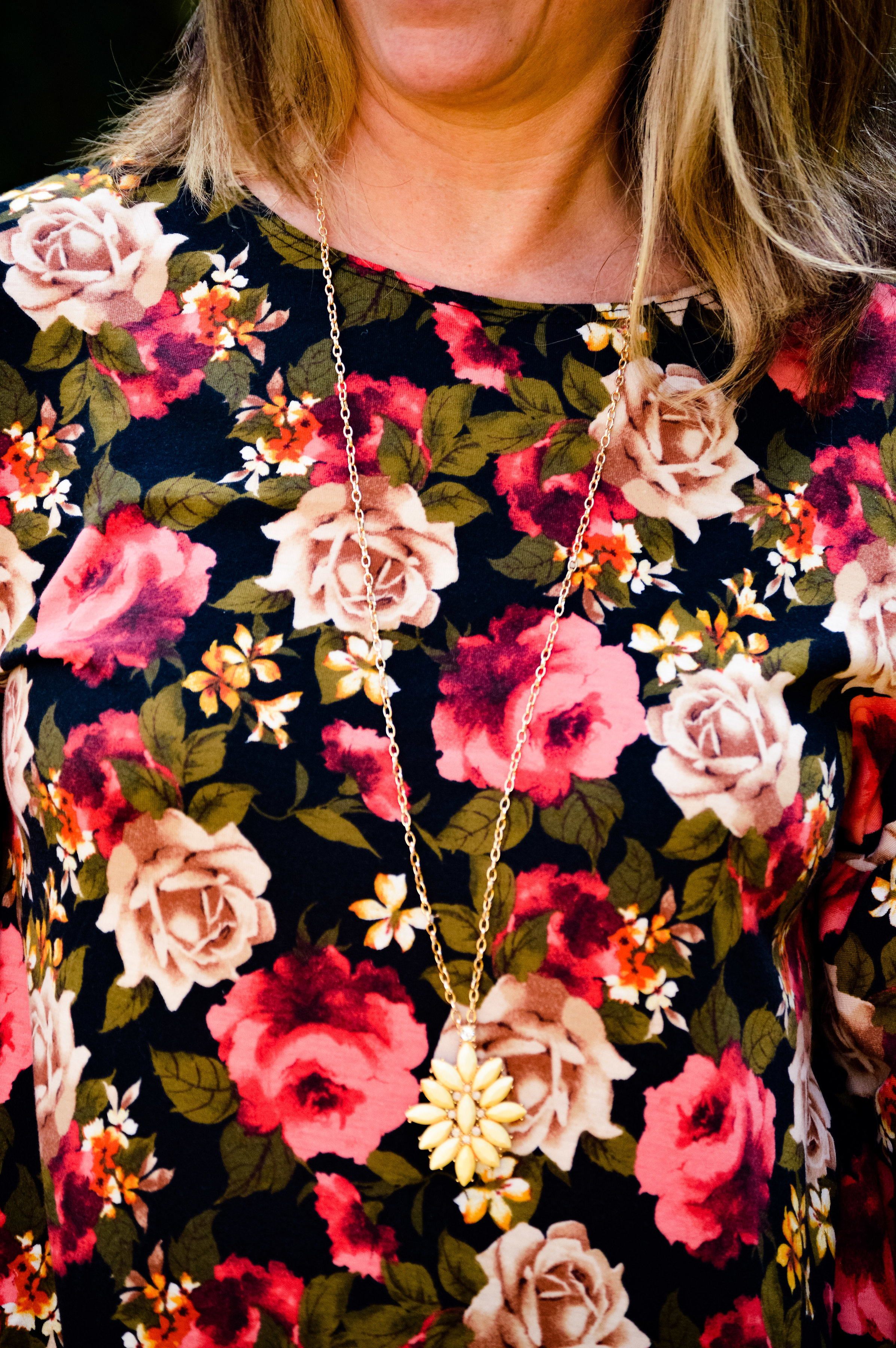
I began this outfit journey with the floral dress. I picked this up at Gabes this past spring with the thought in mind that it would be a great fall piece. Bright florals on a dark background make me think more of cooler weather and sipping hot cocoa. It’s not that you couldn’t wear these colors in the spring and summer, but there is something seasonal about certain color combinations.

I know fashion is not contained neatly in one box and many in the fashion world are strongly pushing against the stereotypes of weight and age, which is awesome, and I fully support. However, there is also a push against traditional fashion ideas, such as not wearing white before or after the summer months, or allowing seasonal color changes to affect what we wear. I’m fine with many of these ideas, but fashion is also about wearing what we want to wear. I like darker colors in the fall and winter and brighter colors in the spring and summer. That is just me!

What really drew me to this little floral number besides the print were the bell sleeves. You can’t see them really well in these photos, but they add a fun element to the piece.

During the summer, when my hubby and I were on vacation in Wisconsin, I went with my mother-in-law to a department store that was going out of business. They were just getting started with their sales and we spent our time looking at shoes. It was then, I came across these boots.

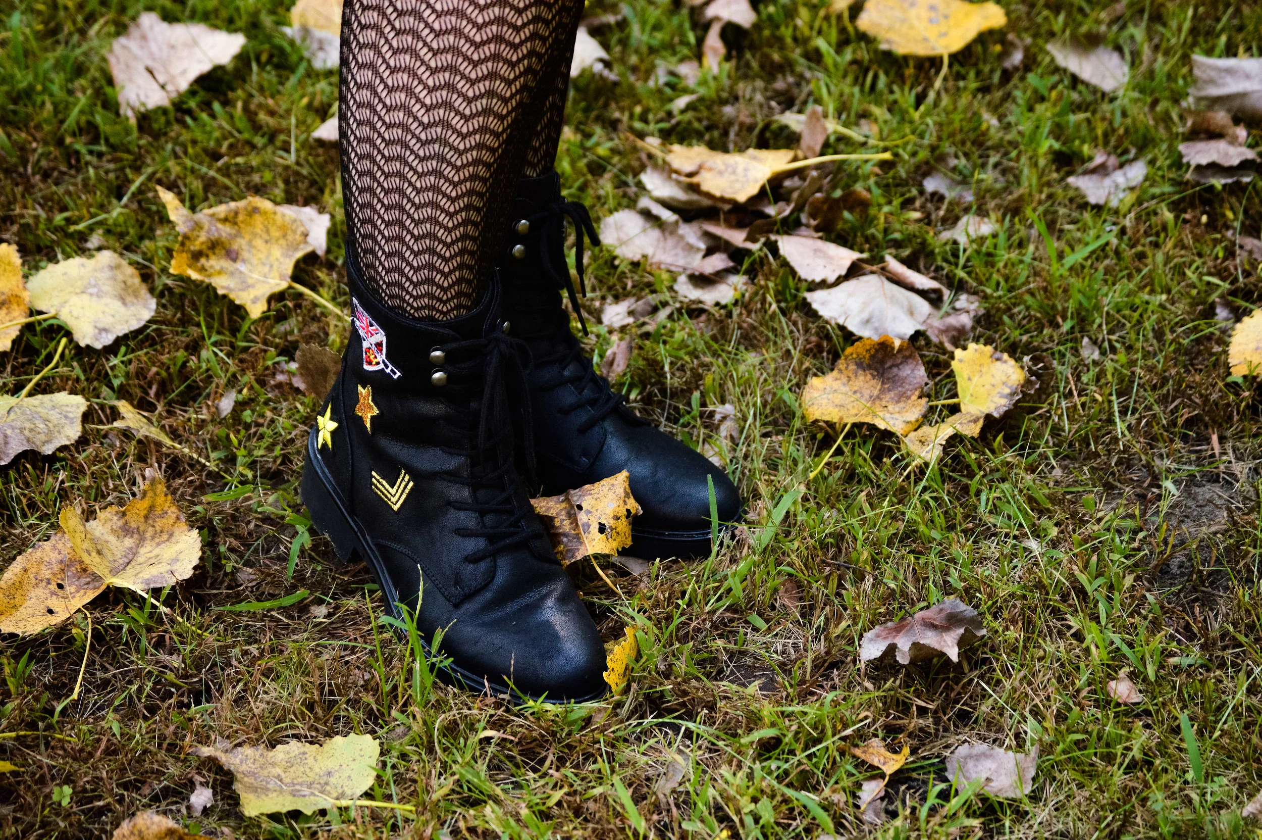
Just like motorcycle jackets, I love combat boots. This is now my third pair and I love the embellishments on these. I’ve included a few shopping links at the end of similar pairs. These zip on the inner ankle so are easy to get on and off. I thought the contrast of the floral dress with the combat boots was a look that was outside my norm.

To give the outfit another more feminine edge I added the fishnet tights. These are a heavier weight than true fishnet stockings. I didn’t even remember I had these until I started looking through my hose bin! I saw these and said, “Yes, this is it!” The outfit would be just as fun with a pair of sweater tights in a dark or a bright color like red or cream. I do like darker on the bottom for the thinning factor.

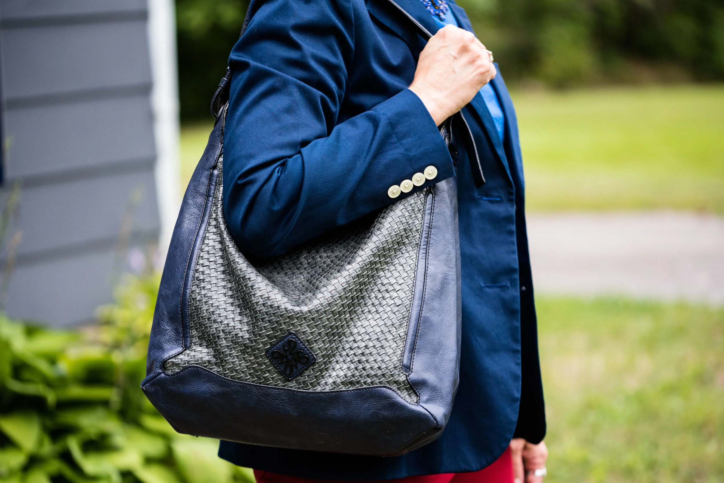
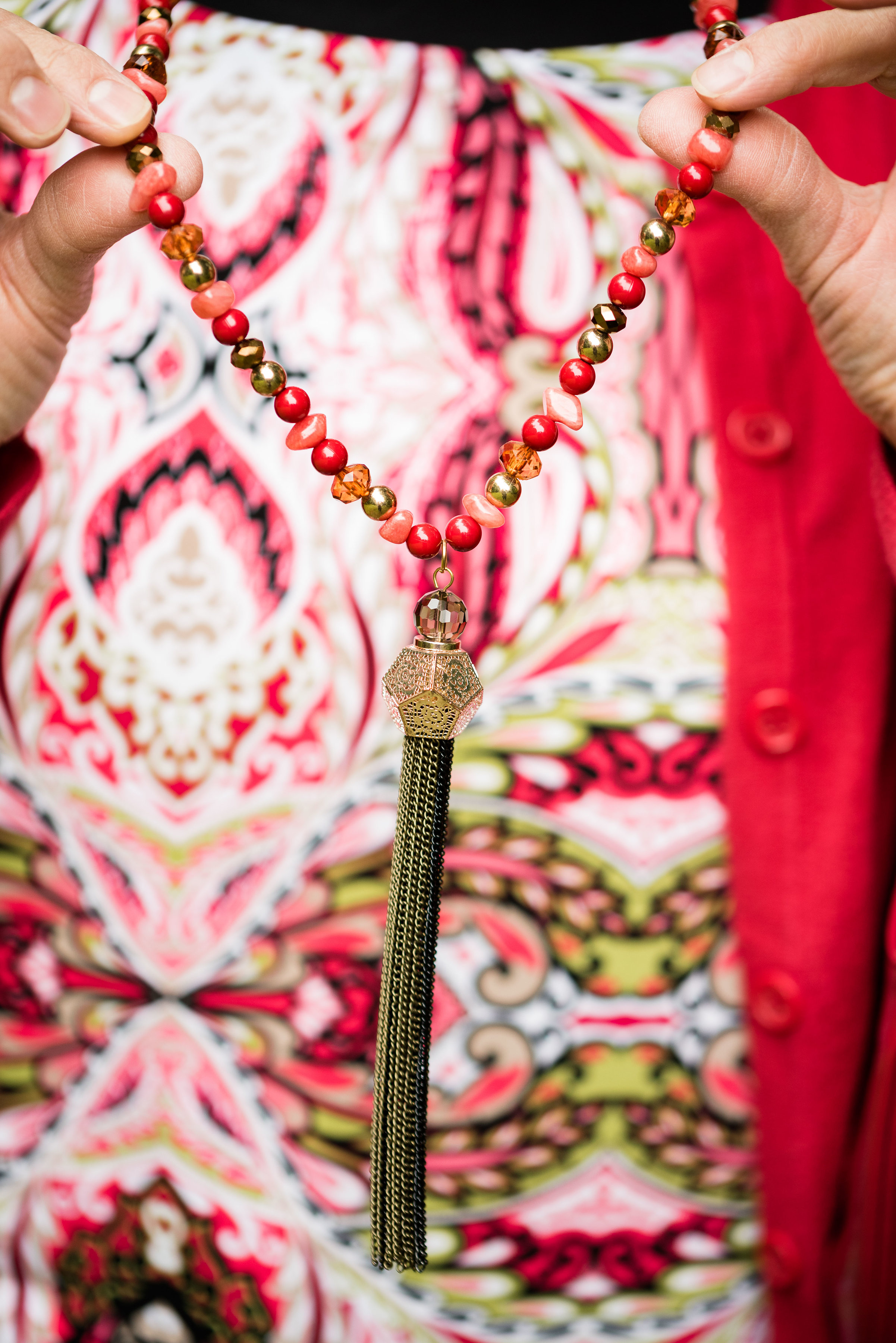
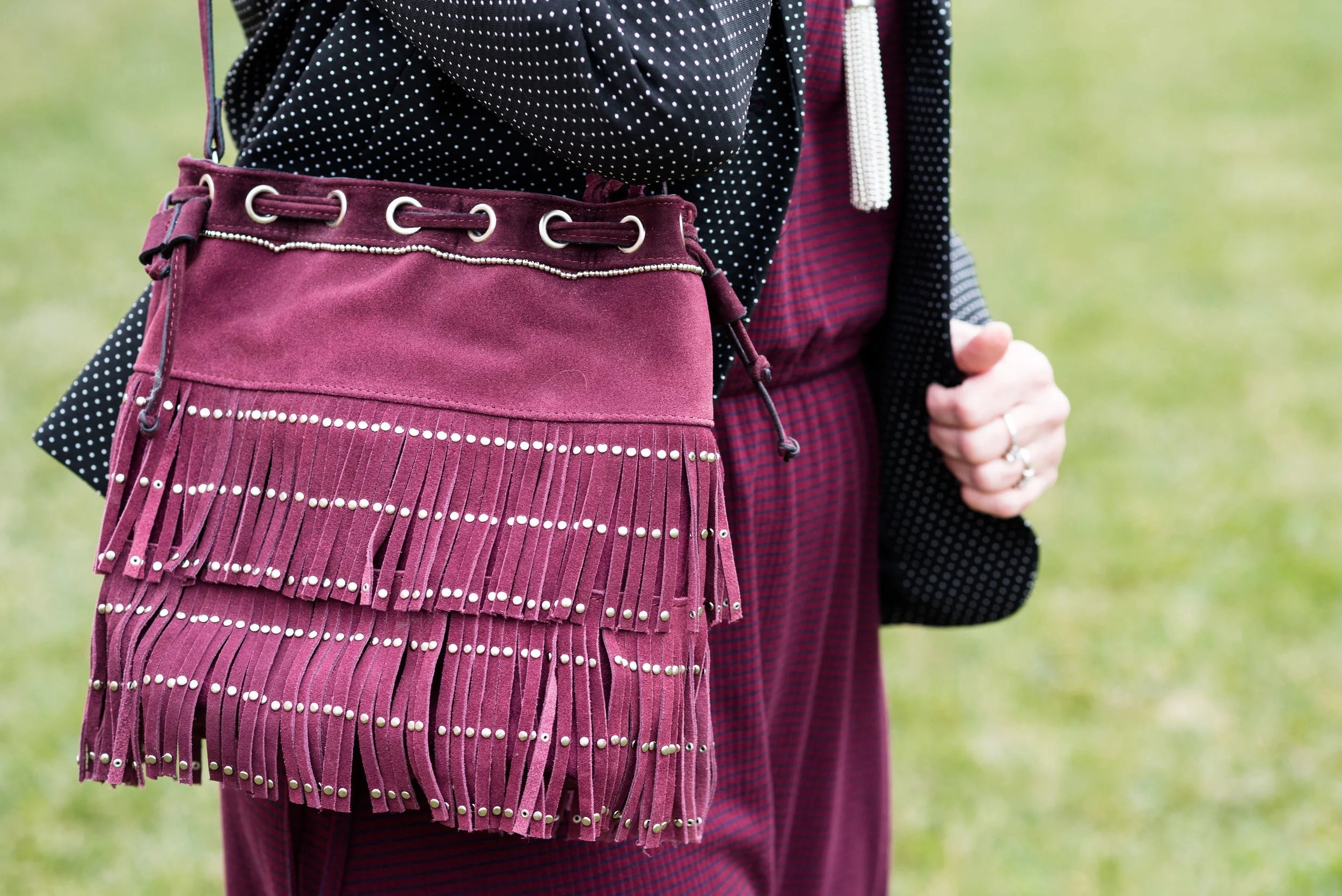
Because the dress is so busy, I kept my accessories minimal. I put on my yellow pendant necklace and added a faux leather cross body bag for a last touch of tough girl.


This bag makes me think of a motorcycle saddle bag. I’m a little preoccupied! My hubby had a Harley before we ever met, and I keep trying to convince him we need to get one in our old age. Ha, ha.

What do you think? Would you wear combat boots with fishnet stockings and a dress? It even sounds odd, but I actually think it works. I’d love to hear your thoughts.

I have been having some issues with people commenting on my blog. For some reason it lets some people comment and not others. I have contacted my platform support team to see if the issues are on my end. Sometimes it can be the browser you are using. Squarespace tries to keep current with changes and updates in multiple browsers so it can take time. If you can’t comment right away, please try again later. I do apologize for the problems. You can also give me feedback on Facebook as well. I appreciate your thoughts and support.

Have a great weekend!


Pantone Fall 2018 - Martini Olive, Ceylon Yellow and Tofu

I will confess, these colors are not my favorites. It might be due to the fact that I decided to combine them into one outfit.

Martini Olive is more of a gray or brown based olive. I honestly like an olive that is more green. However, for the sake of being open minded this would be a good neutral that could go with many different colors including navy, black or even a rich deep red. Maybe I should have paired Martini Olive with Red Pear. What do you think? These jeans are thrifted and Gloria Vanderbilt brand.

Ceylon Yellow has a bit of a bite. It is not really a mustard, but has a bit of spice underlying it. I have fallen in love with yellow, but my personal tastes tend more towards the yellows that are sunflower or goldenrod. The top is thrifted and Merona brand.

I opted for orange, as the pop of color I felt this outfit needed. Orange bag, orange necklace and bracelet: I feel like it epitomizes the mix of colors in the fall that we so often see in the trees.

This jacket I found at H&M on the clearance rack. Once again, it is a moto type jacket, but tends more towards a tweedy look, which gives it an entirely different vibe from last week’s metallic blush moto jacket. The color is in line with the Pantone classic color labeled Tofu. Not a true white, but not a true cream, it seems to fall somewhere in between. I love the texture details, including the frayed sleeves and bottom hem.

Once again, I am wearing my olive SO ankle boots. Just like my SO ballet flats these boots are very comfortable and look nice. I love the rich texture of the faux suede.

I am not completely satisfied with this look. I don’t like what I did with my hair, even though that is something I do from time to time and this outfit doesn’t have enough color contrast for me. I like bright, rich colors and this palette just leaves me looking washed out. But hey, not every outfit can be a winner. I’m still learning and growing.

I do think these colors would be better paired with another color. The yellow would look pretty with a blue shade or even a rich chocolate brown and like I said earlier, the Martini Olive would pair well with a navy, burgundy or even a purple.

As always, I’d love to hear your thoughts, both good and bad! I’ve included a few shopping links for you to look over. These are affiliate links. All opinions are my own.

Ordinary Amy: Blush Moto Jacket

I have gotten away from my monthly columns for a while, but now feel like I can get back at it. For today’s Ordinary Amy post, I chose to build my outfit around a blush moto jacket that I found at Nordstrom Rack back in May. I had been looking for a lighter colored moto jacket and this one fit the bill perfectly.

I know I am not the only gal that has a love affair with motorcycle jackets. They have always been a favorite of mine, for as long as I can remember. When I was young, my brothers used to race dirt bikes (motocross) and I loved the thrill, the noise and the dirt of going to watch them ride. I always thought that would have been so much fun. Needless to say, growing up with the two wheeled noise makers around gave me an earthy, edgy perspective on life.

Another factor that solidified my love for moto jackets, motorcycles and writing, was a book that I had to read in my 8th grade English class. The Outsiders, by S.E. Hinton was a coming of age story about a group of boys from the poor side of town and how they dealt with the difficulties of broken homes, strained relationships and maneuvering adolescence in the midst of night time rumbles with the rich kids and running away from home. Some of the first stories I wrote followed a very similar thread to S.E. Hinton, as I struggled with my own acceptance of adolescence, my place in the socioeconomic strata and who I was becoming as a young woman.

Just as my fashion sense has grown and changed, so has my writing ability and interest. I still love to revisit those early stories and remember the feelings associated with them. I’m now trying to learn new genres of writing, in the hopes that one day, I might actually make publishing a reality. In the mean time, here is an outfit for you to peruse.

My daughter quickly took these pictures on my camera while she was over with her pups to help me rake my yard. Cottonwood trees are big and give plenty of shade, but they shed terribly and the leaves they drop in the fall are exactly as you see here, brown and crunchy. This was after my spouse and I had already raked a good portion of the yard into huge piles.

This jacket is a crop length and has a beautiful metallic sheen. I am excited to see how many different ways this can be styled, both casual and dressy. Since this is about my regular way of dressing I paired it with a blush and camo knit top, a pair of Rock & Republic jeans and my SO olive booties.

Do you like moto jackets? Do you have any in your closet? I think everyone, should have at least one. They can be a very versatile piece and are perfect for the cooler weather of fall.

I hope you enjoyed this post and reading more about extraordinary me. Ha, ha.

I’ve included a few shopping links for you to look over. These are affiliate links. All opinions are my own.

Saturday linking up with Rena of It’s All Fine. Whatever…

Pantone Fall 2018 - Red Pear, Nebulas Blue and Sargasso Sea

Last week, I introduced you to this fall’s Pantone color palette. Now that I am just getting started with my series, I noticed their website already has the color palettes up for Spring 2019. I understand that in the fashion and interior design industries they always need to be one step ahead, or all of a sudden things have gone out of trend and disappeared. That reminds me of a verse from the book of Ecclesiastes which was written by King Solomon.

That which has been is that which will be,
And that which has been done is that which will be done.
So there is nothing new under the sun.
— Ecclesiastes 1:9 (NASB)

Even a man as wise as Solomon, knew there was nothing new under the sun. Look at the movies and books that are currently out. It is pretty much the same story, just written with different characters and a different setting. Heck, how many times have they revisited Spider Man and Predator? Ha, ha. That being said, the color palettes that come out are really nothing new. They call them by different names, make one a little more blue based or yellow based and say they are fresh and new.

However, I do enjoy color and I like to create outfits using color in combinations that may be new or different, at least for me. Following the color palettes that Pantone puts out each season allows me to do just that.

Here are the first of this fall’s palette.

Red Pear and Nebulas Blue are on both the London and New York palettes. Sargasso Sea is one of the classic colors or what I like to refer to as a grounding color. Red Pear borders on a maroon and my pants are really too red, while my version of Nebulas Blue appears spot on. Sargasso Sea is navy by any other name, but even there you can see all the different shades of navy. My Ralph Lauren thrifted blazer is almost too blue, while Sargasso Sea seems to have more gray in it. I think my loafer heels and bag are a little bit closer to the Pantone color.

I added this colorful bandana for a scarf as a way to bring together the red and blue and add a pop of yellow.

The blazer, shoes and bag were all thrifted. The bag is Simply Vera Wang; the blazer is Ralph Lauren and the loafer heels are Relativity. Everything you see in this outfit with the exception of the scarf I have styled on the blog before. It just goes to show that our closets are a great place to look for new color combinations and outfits.

What do you think of these colors? Do you think these colors represent the fall season? Why or why not? I’d love to hear your thoughts.

I have received a few messages that people are having problems commenting on my blog posts. If you an issue, please let me know. I contacted the help team for the platform that I use when I had a problem in the past and they said they couldn’t see any problem on their end. If you have an issue, please shoot me an email, so I can see how widespread the problem is.


I’ve included a few shopping links. These are affiliate links, which means I get a few cents if you click on it. All opinions are my own.

Fall Collaboration with Ethyl Clothing

I was recently contacted by a clothing retailer named Ethyl Clothing. Ethyl Clothing has been around for over 30 years. Based out of Seattle, Washington, founders and designers, Alan and Kathy Schulz, continue to be actively involved in bringing their quality products to over 3000 boutiques across the country. They now have an online store, which makes shopping their classic clothing pieces even easier.

When I went to their website, I was pleased to see models that look like average sized women. In other words, these women look like me. That alone, intrigued me. While I was informed that Ethyl clothing originally was geared to the younger woman, their clothing line has developed over the years to encompass and cater to the “baby-boomer” generation. These are women like me, who are busy and enjoy clothing that looks nice, but feels soft and comfortable with some amount of stretch and give.

When I received my pieces, I was not disappointed. Because these are vanity sized, I was told to size down from what I would normally wear. Sizes run from XS to XXXL on most. For both the tunic sweater and the jacket I chose a medium. For the jeans I went with a size 10, where I normally wear a size 12. Everything fit exactly as it should.

Each of the following pieces was gifted to me. No money was exchanged and all opinions are my own. After a short description of each piece, I will give it a review by listing positive and/or negative points, along with suggestions for wearing.

Like many smaller clothing retailers today, Ethyl Clothing names each of their pieces. Let me introduce you.

1. The Anne 2 - Kenzi

The Kenzi boasts a long, gracious tunic silhouette, a comfortable cowl neckline and roomy, pleated front pockets that add interest and texture.

Positive Points - flattering silhouette, silky material drapes well and holds its shape, roomy - doesn’t bind or pinch.

Negative Points - sleeves are a bit long. For me this is not an issue, but if you have short arms you may need to have them altered or roll them up.

Style suggestions: Wear with skinny jeans or leggings; pair with various jackets either long or short; wear with a skirt, either tucked, belted or just left long; slip on over a dress that will show a little at the bottom.

2. The Jaqueline Flair Jean - Abigail

These boot cut, dark wash jeans are made of a medium weight denim woven from a poly-cotton blend with a dash of rayon and spandex for stretch, comfort and ease of wear.

Positive points - good stretch, not too heavy, hold their shape, dark wash, figure flattering.

Negative points - very long, narrow through the thighs. If you have heavier legs or short legs I would suggest trying their pants with the shorter inseam. The Abigail only comes in the longer (31”to 34”) inseam.

Style Suggestions: Boot cut jeans always look good with heeled boots, but these would also dress up well with a pair of heels. They fall just below the natural waist so could be easily paired with shorter tops and sweaters.

3. The Margot - Blake

The Blake is meant to be a style piece not an actual jacket. A medium weight cotton-poly blend with spandex this black denim jacket is the perfect add on piece to take any outfit up a notch. The bling detail on the lapels and the frayed hems, give it a vibe that says both edgy and party ready. The non-closure, open front allows you to show off, not only the jacket, but a statement piece underneath.

Positive points - easy on and off, no buttons or zippers to snag sweaters or scarves, plenty of stretch, longer length for better back side coverage.

Negative points - this is less a negative than it is a personal opinion. When I first received this jacket I did not like the way it fit and after working with the rep from the company was sent a large to try on. The piece is designed to not come together in the front, which to me seemed odd, but this is the way the designers intended the jacket to be. It was created this way to allow exposure of the top you are wearing underneath. After having the two sizes to try on I ended up sending the large back. It really was too big. Now that I’ve seen the two sizes and have a better understanding of what the piece is intended to do, I like it. I am looking forward to wearing it with other outfits to see its full potential as a fun add on piece, almost more like an accessory.

Style suggestions: This would look great with a shift dress, pencil skirt or skinny pants. It will also allow for many different top choices including tunics and vests. The Blake will also allow your fun scarves and statement necklaces to still take center stage while providing a backdrop of bling, warmth and fun.

My overall opinion of Ethyl Clothing is that it is a woman friendly retailer with a strong classic, casual line structured for comfort and ease of wear. While they are not offering a discount through my site, if you spend over $100 you get free shipping. The pieces you order also come with free return labels, so that if you are not completely satisfied you can return your purchases for a full refund.

I hope you enjoyed this look at Ethyl Clothing. Head on over to their site and take a few minutes to shop. Just click on the link, Ethyl Clothing.

Photo credit Rebecca Trumbull.

Pantone Fall 2018 - Introduction to the Color Palette

Once again, I am visiting the Pantone fall color palette. If you are unfamiliar with the Pantone Institute of Color, they are considered to be the leaders in color technology. Here is a quote from the About Us portion of their website.

Pantone provides a universal language of color that enables color-critical decisions through every stage of the workflow for brands and manufacturers. More than 10 million designers and producers around the world rely on Pantone products and services to help define, communicate and control color from inspiration to realization – leveraging advanced X-Rite technology to achieve color consistency across various materials and finishes for graphics, fashion and product design. Pantone Standards feature digital and physical color specification and workflow tools. The Pantone Color Institute™ provides customized color standards, brand identity and product color consulting as well as trend forecasting inclusive of Pantone Color of the Year, Fashion Runway Color Trend Reports, color psychology and more. Pantone B2B Licensing incorporates the Pantone Color System into different products and services, enabling licensees to communicate and reproduce approved Pantone values and improve efficiencies for their users. Pantone Lifestyle brings color and design together across apparel, home, and accessories
— Pantone website

There are two major cities in the fashion industry that put out their corresponding color palettes for each season. The graphic below shows a combination of the New York and London Fall palettes.

This year’s fall palette is a blend of traditional seasonal hues, soft pastels and pops of bright color making for an interesting color mix. You could pick one color from this palette or all of the colors and when combined with other seasonal trends such as animal prints, plaid and camo make amazing outfits that go beyond our normal expectations for fall.

In addition to the twelve colors above, last spring Pantone also began putting out a classic color palette. While these colors remain more neutral and unchanged, thus the classic descriptor, they present an option for what I call a “grounding” color for our outfits. While some people like to wear color on color, others like to have small pops of color with a more classic foundation to keep their outfits grounded and impeccable.


Next week, I will begin showing you how I put these colors together to form outfits that are both classic and colorful. For now, here are few sneak peeks. I hope you’ll join me then.

Photo credit Rebecca Trumbull.

Texture Talk - Part 3

You might be thinking I covered everything I could when it came to texture and fashion in the last two posts I did on this quick texture series, however, there are two other areas I wanted to address. They both have to do with adding texture to outfits, but in completely different ways. The first deals with adding texture by using patterns. The second will look at taking a monochrome outfit and making it visually interesting by adding texture. 

Adding Texture by Using Patterns

We talk a lot about patterns on our clothing. Everything from stripes and flowers, to plaid and polka dots are part of the clothing we choose to wear. I personally love prints and since I have been blogging, I love to mix prints. When I started thinking about this series on texture, I suddenly realized that prints and patterns do add dimension and depth to our outfits, so therefore, must be a component of a series on texture.

The following pictures all are examples of patterns that add an interesting dimension to each outfit.

These first two are in black and white, because I thought that it makes the point even more dramatically. Not only does the pattern of my clothing add texture to the outfit, but you can see all the texture in the back ground from the trees and landscape. 

These next two are jackets. The first is a sleek bomber jacket, but it gives the illusion of texture by placing bold colored flowers on a black back ground. 

In my opinion patterns like houndstooth. herringbone, sharkskin and others are the perfect textural patterns. We see these a lot in suits for men and women. I found this houndstooth jacket at a nearby thrift store 

An all over pattern gives the illusion of texture while hiding some of my more prominent bulges. 

The sweater by itself provides texture, but the pattern across the top and shoulder area, as well as the buffalo plaid bag add interest and depth. 

This outfit has many textural components, but they all play so well together, what's not to love? The sweater has ribbing, the vest is embellished at the top, the belt, jewelry and bag provide other interesting elements and the patterned skirt is also made of corduroy, thus more texture. This type of outfit, with all of it's textures still looks chic and classy, but is warm and comfortable. 

The same goes for this outfit as well. The striped dress is knit, the jacket has polka dots and the bag is not only made of suede, but has fringe. Texture upon texture, upon texture. Going back to my initial post about texture, I showed some photos of textural elements in nature. If you go for a walk in a park or even in the city, you will see layer, upon layer, upon layer of texture. It is perfectly okay to wear lots of texture in your outfits, as long as you think about how you are putting things together. You can see my original post here

Adding Texture to a Monochrome Outfit

This first outfit from my Spring 2017 Pantone series featuring a color called Pale Dogwood. This pale pink is a great backdrop for adding pattern and texture. Other than the laces on my shoes, the knit fabric of the sweater and the necklace it is the addition of the bold pattern on the scarf that gives the outfit a texturized look. If you wanted to go for a complete monochrome look you could have added a fuzzy pink boa or a wide pink belt with some sort of texture. 

Even though this outfit has a patterned dress the look is still monochromatic because the entire look is basically a conglomeration of earthy browns. The pattern and the open weave knit are the texture winners in this look.

Just to give you an idea of what an actual monochrome outfit looks like, I threw these next two in from last years holiday outfit series. The black top adds texture with its draping neckline. The over piece adds texture with shear sleeves. Isn't it funny that something sheer can actually add texture, but think about things like neglige and wedding dresses.

This gray outfit is, perhaps, one of my favorites for a monochromatic look with loads of texture. The sheer drape, the pleated neckline of the sweater, the pleats on the skirt as well as my heels which have almost an alligator pattern on them are all textural components in this outfit.

Now that you have seen a few examples I hope you will give more thought as to how to add more texture to your outfits. With the onset of fall it will be much easier to add texture through fun pieces like scarves, hats and boots. 

Let me know if you liked this series on texture. If there are other fashion ideas you are interested in having me do a series on, let me know and I'll give it some thought. 

Have a great weekend, everyone!

Photo credit Rebecca Trumbull. Make up Rachel Christensen.

What to Wear to a Family Photo Shoot

Today I am a guest writer for Rebecca Trumbull Photography. If you are thinking about having family photos done, you will want to read my blog post on Rebecca's website. Family photos are a wonderful investment and a way to capture a moment in time. 

I can remember at every family gathering, my Dad getting out the camera and often the movie camera as well. It has been twelve years since he passed away, but we still have loads of pictures to remind us of the fun gatherings we had with immediate and extended family. The pictures were often under exposed, over exposed, blurry and full of people with missing heads, arms and feet. That's why I would encourage you to get family photos done by a professional photographer. 

As I point out in the post on Rebecca's blog, getting ready for family photos can often be a challenge, especially if you've never done it before. Figuring out what to wear when you have a family with age ranges from teens to toddlers provides an added challenge. That is exactly why we collaborated on this post. Rebecca and I want you make it easier for you to have family portraits that will provide beauty, and cohesiveness, but also provide images that are uniquely your family. 

Be sure to click on the image below and read the article. Leave some love on Rebecca's blog and let us know your thoughts. 

Rebecca Trumbull is a professional photographer based out of Northwest Ohio. Rebecca is easy to work with and for those of you uncomfortable in front of the camera like I am, she is great at giving directions and making your portrait session fun and painless. In addition to being the main photographer for Stylin' Granny Mama, and taking fabulous family portraits, Rebecca also shoots high school seniors, pets, maternity, weddings and commercial photos. To see more of her work or contact her about scheduling photos just click the link.