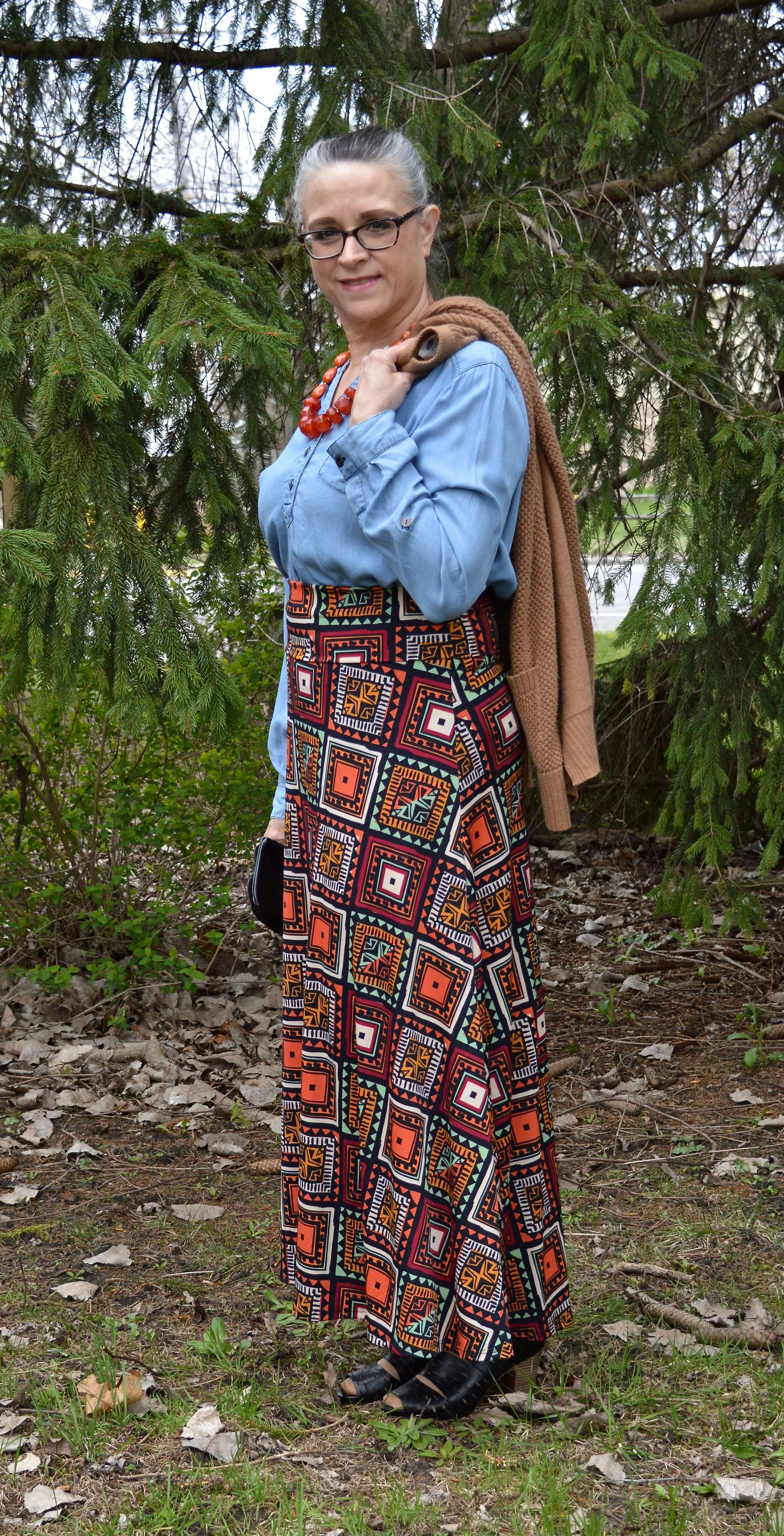
Thrifted Thursday - Casual Summer Style
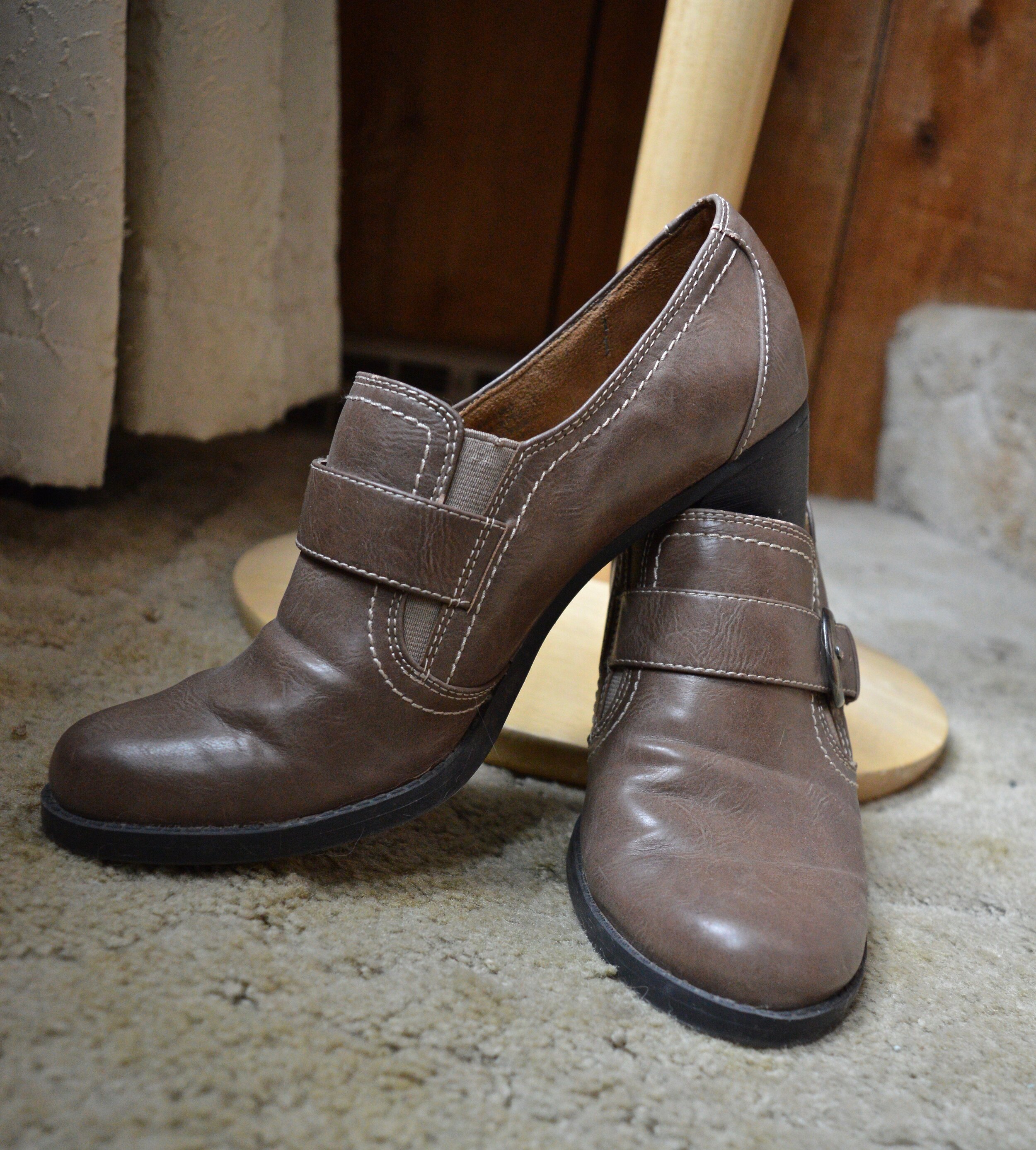
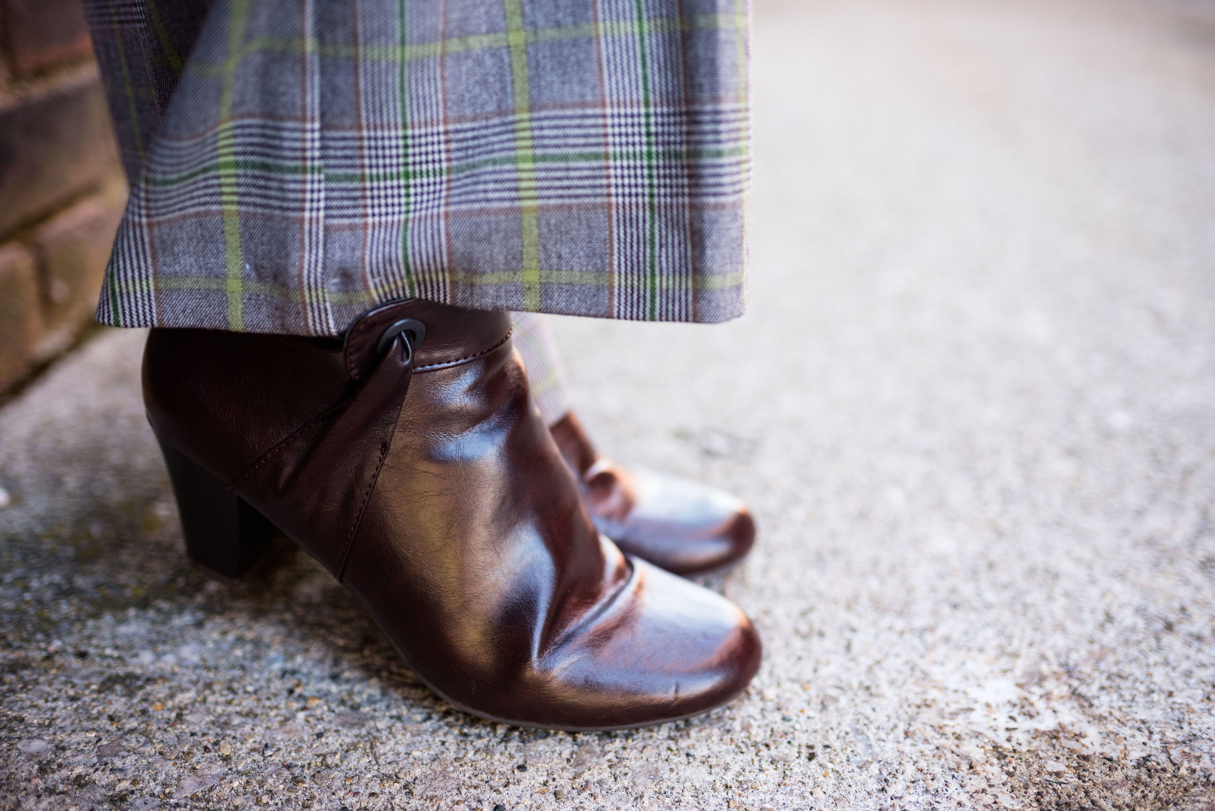
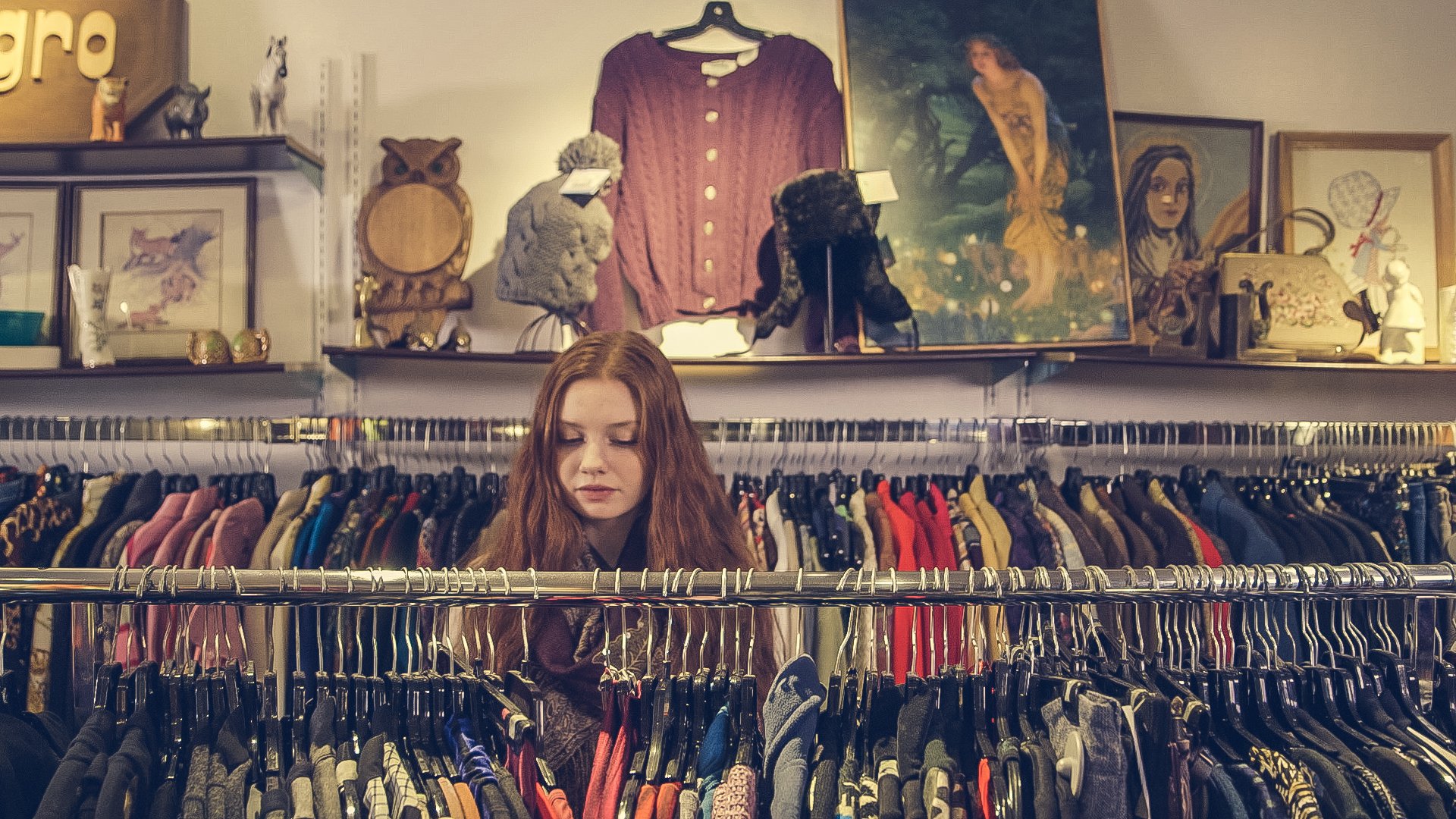
As you all know I am a regular thrifter. Thrifting is a great way to get quality clothing pieces at very low prices. You can find name brands like Coach, Ralph Lauren, Vera Wang, and many more at drastically reduced prices. I personally don’t look for name brands, because brands are not as important to me as fit, ease of wear and care, and low price points. I have found things like my navy Ralph Lauren blazer and black heeled leather boots. I know there are many bloggers who score big finding very expensive brands for just a few dollars. Whatever you are looking for, thrift stores can be a great place to dig for treasure. During this time of Covid, you can also shop second hand on line, with retailers like Poshmark, thredUP and even Goodwill.
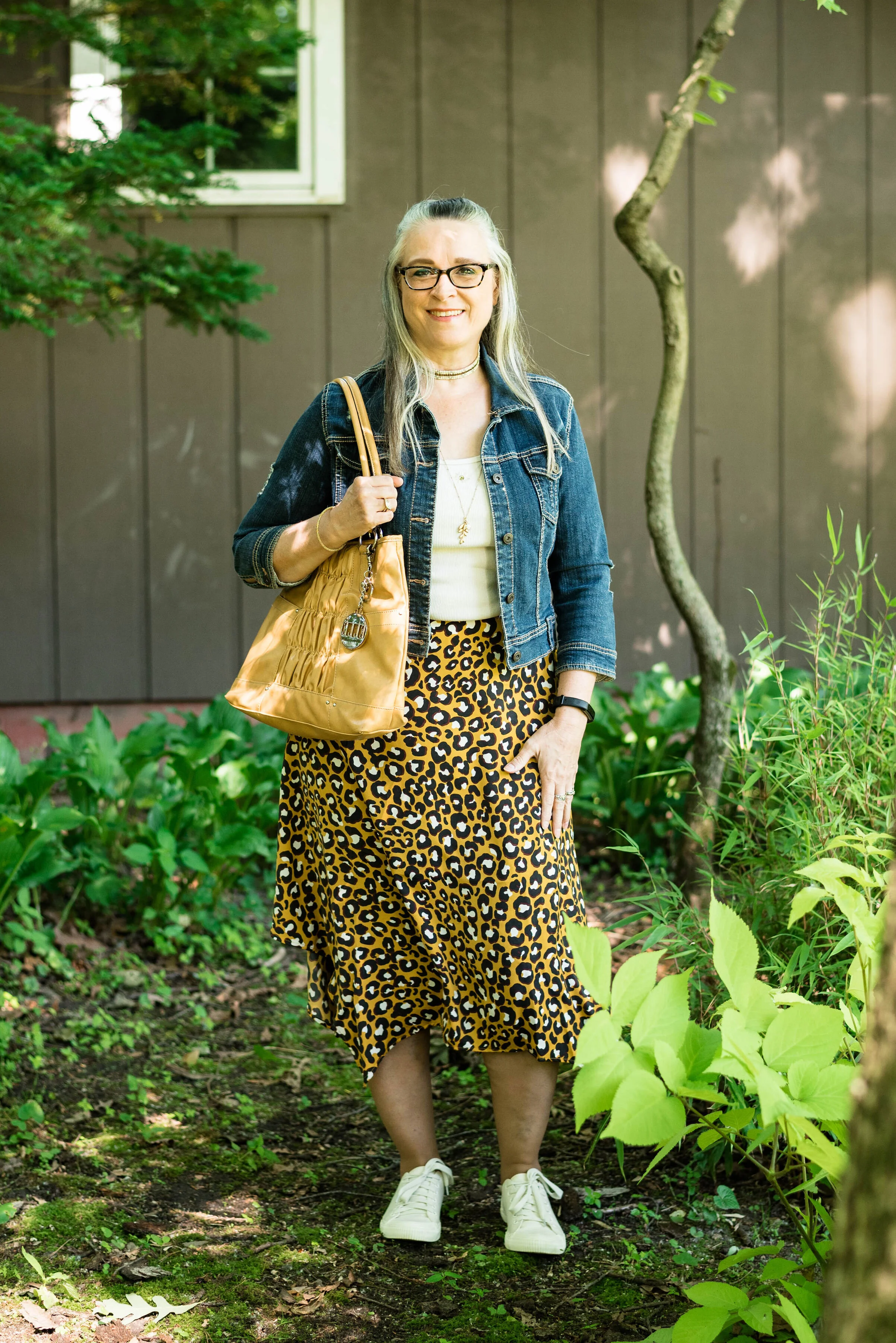
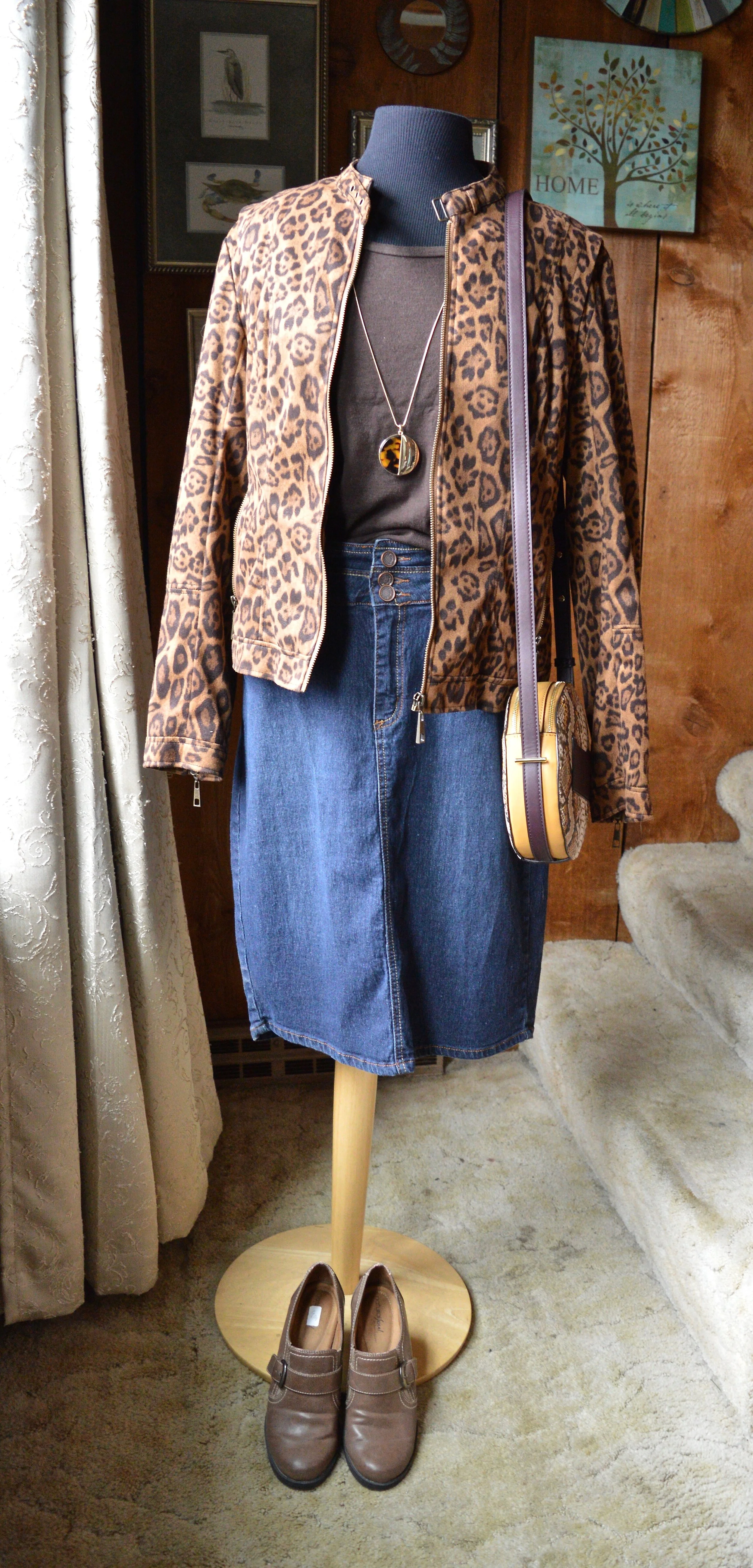
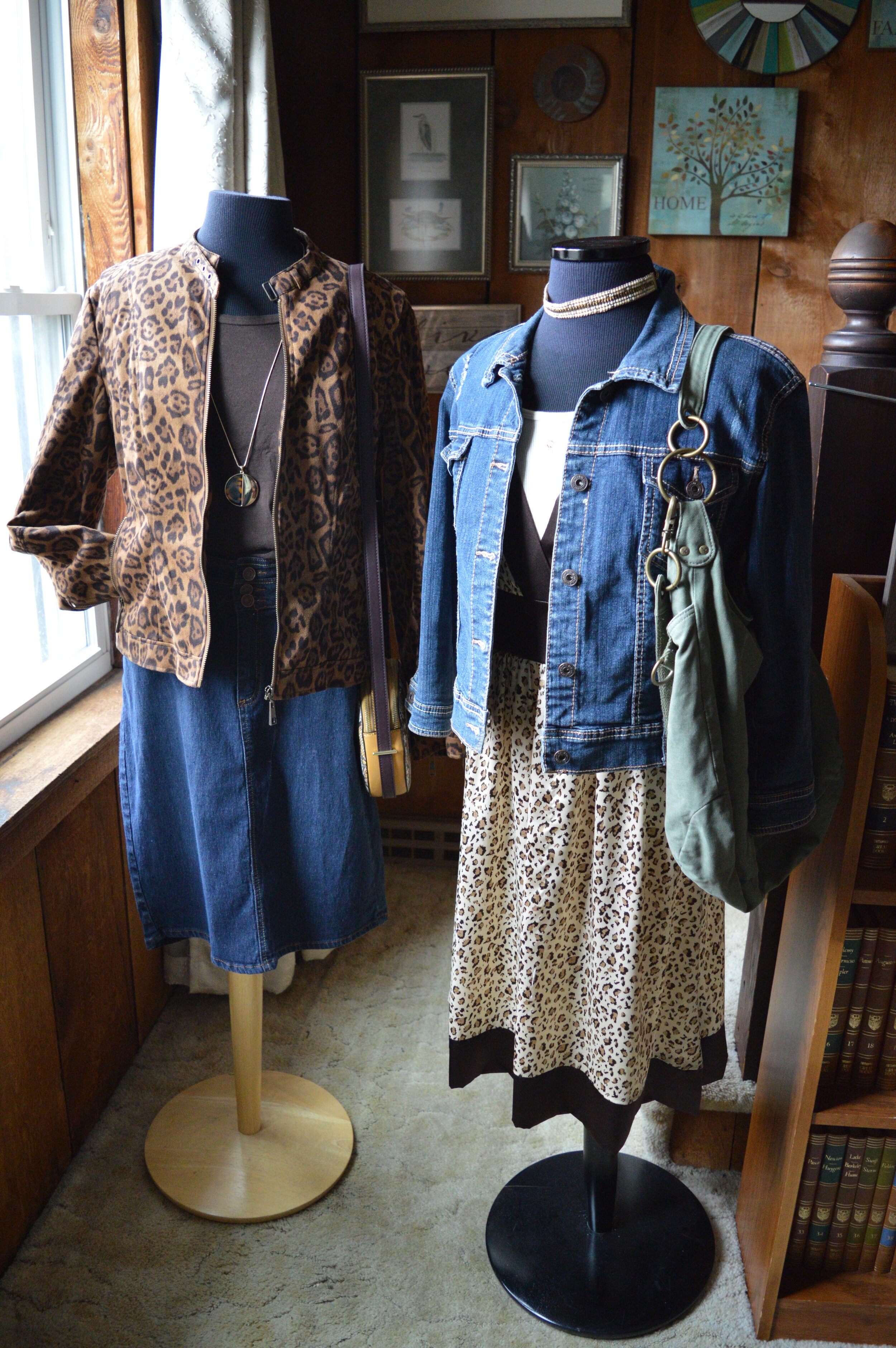
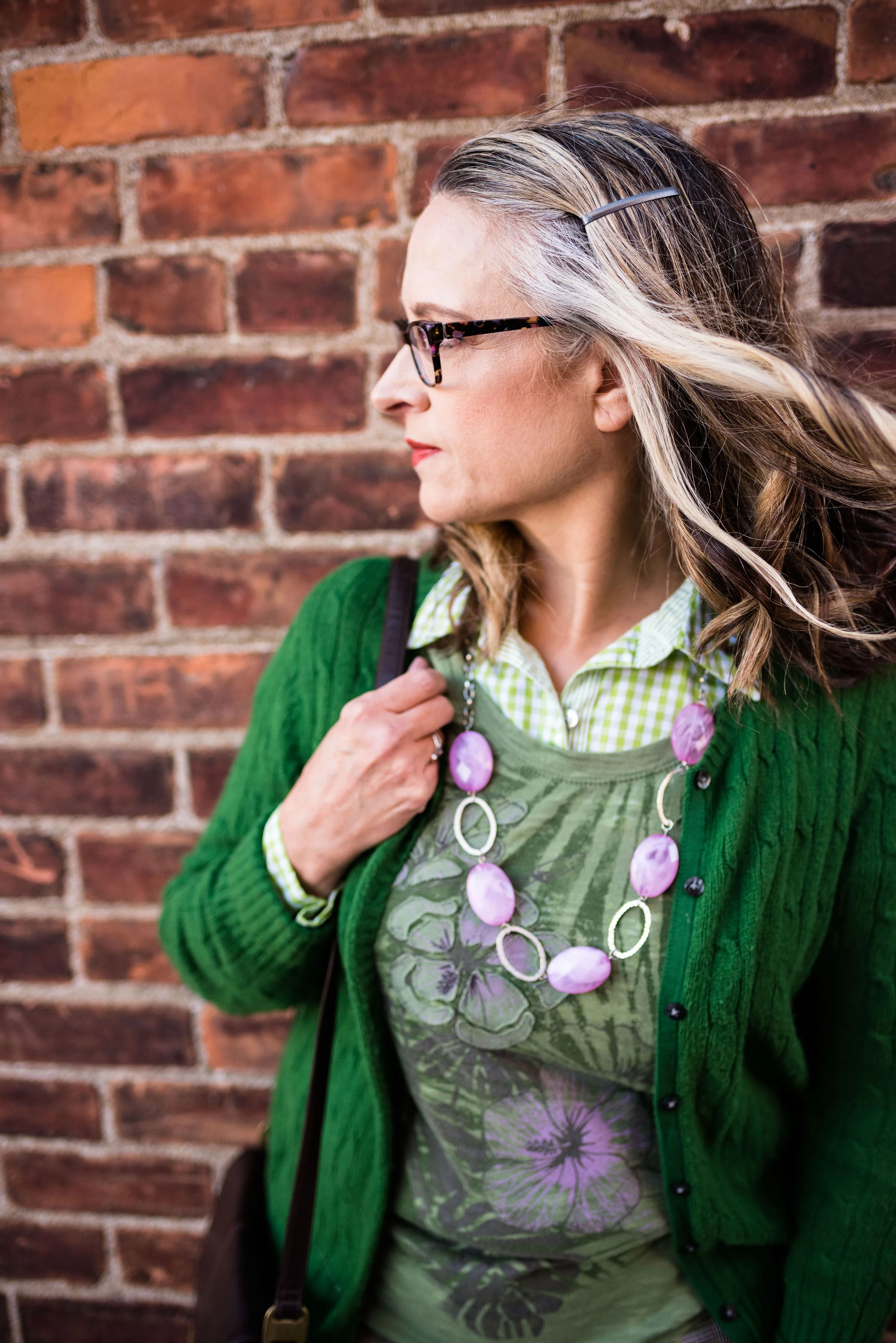
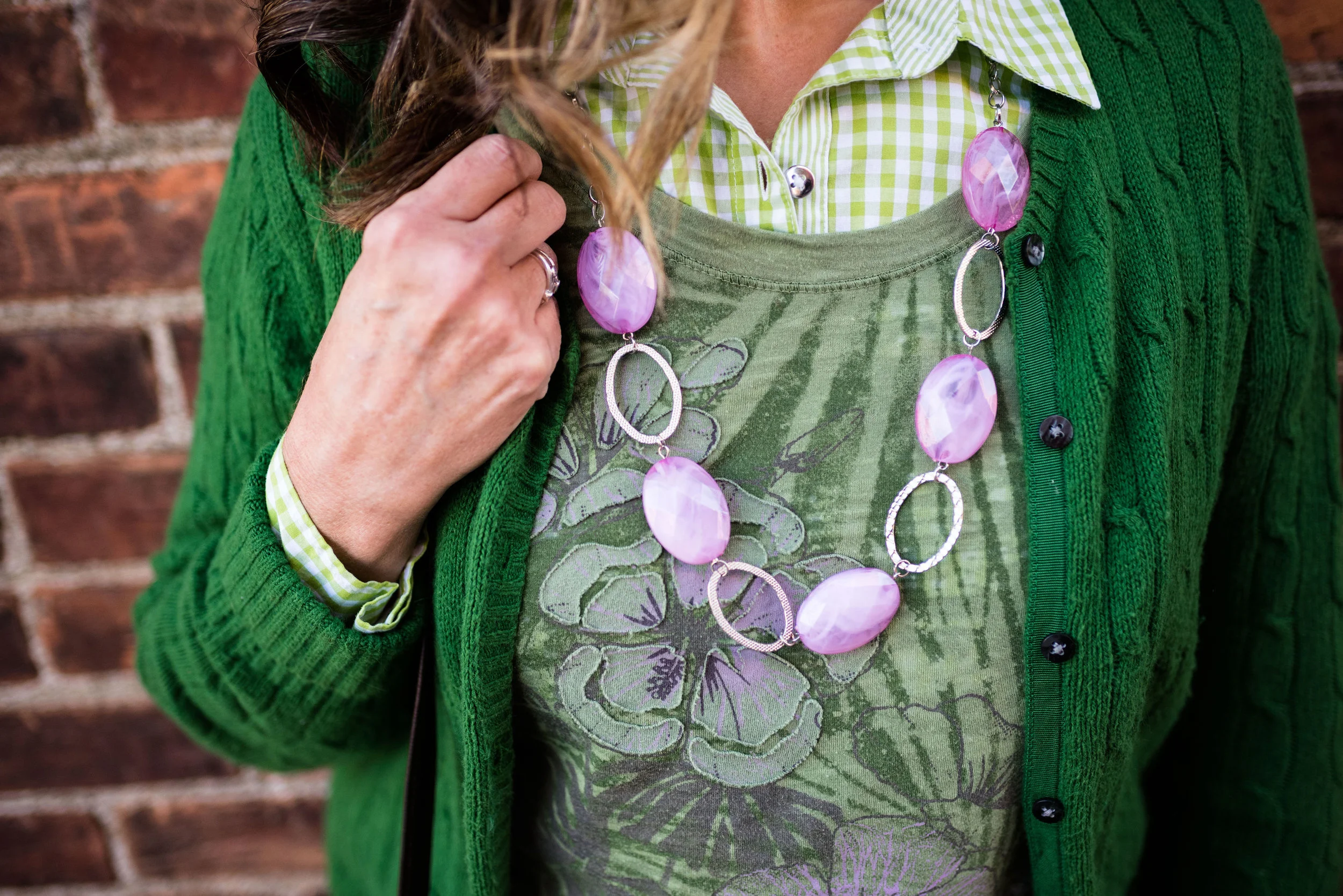
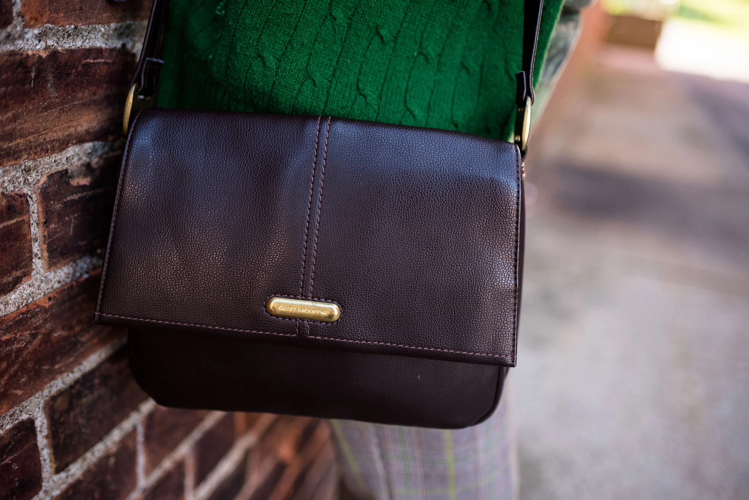
Thrifted Thursday is all about outfits pulled from my closet made entirely of pieces I have found thrifting. It challenges me to take a purposeful look at my thrift finds and come up with new ways to style them. There are many times I put an outfit together and it is entirely thrifted, but more often, my outfits are a blend of thrifted and regular retail priced pieces from stores like Christopher and Banks, Kohl’s, JCPenney and Maurices.

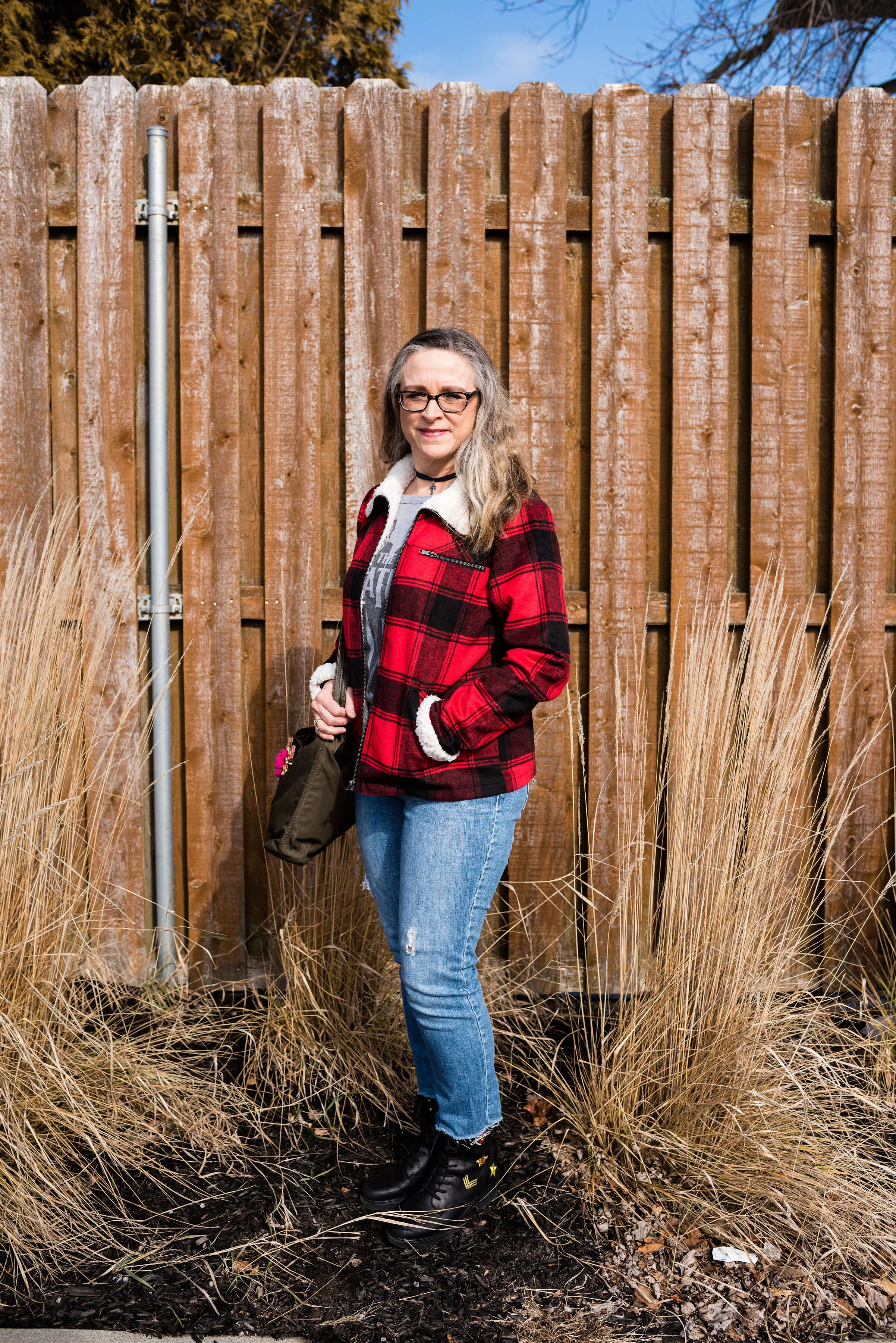
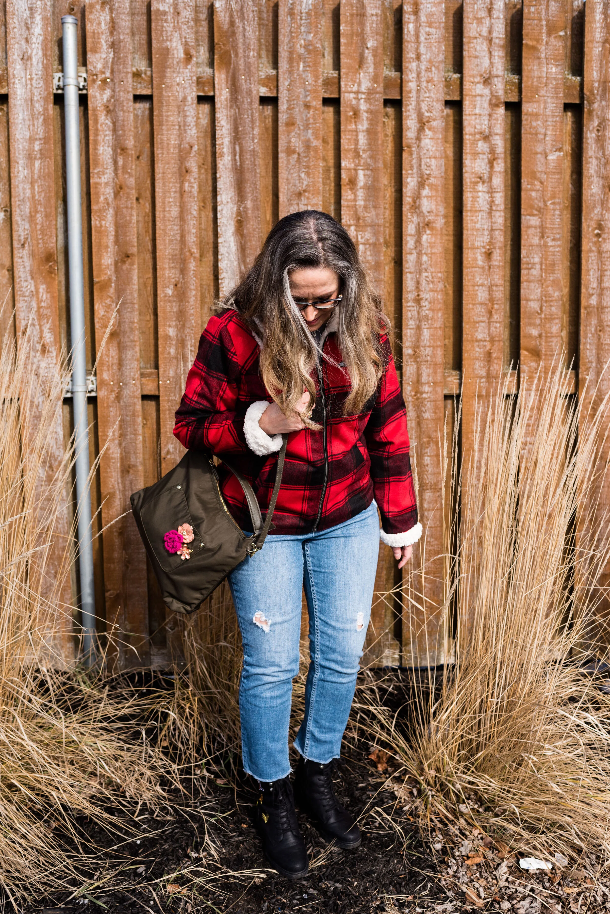
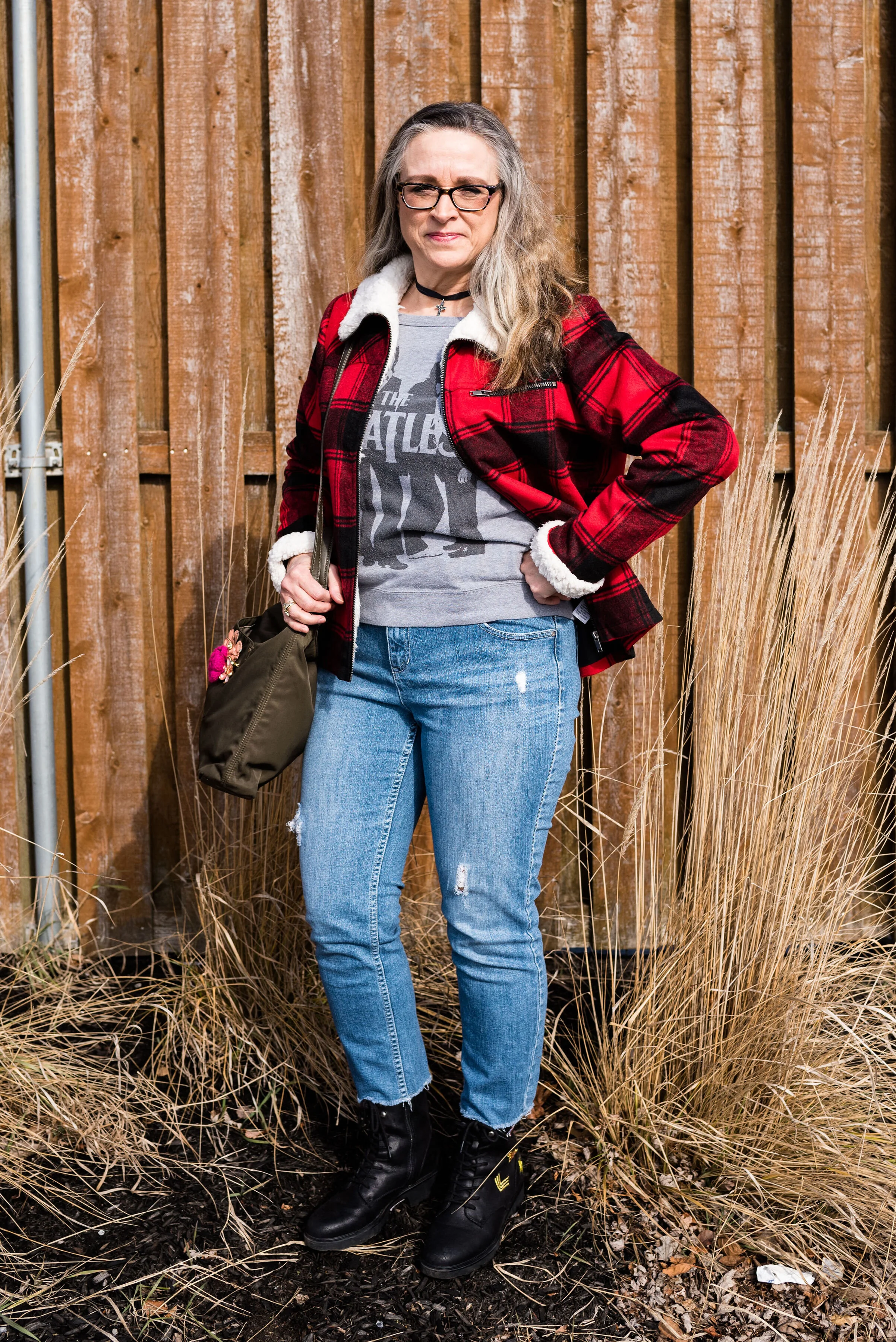
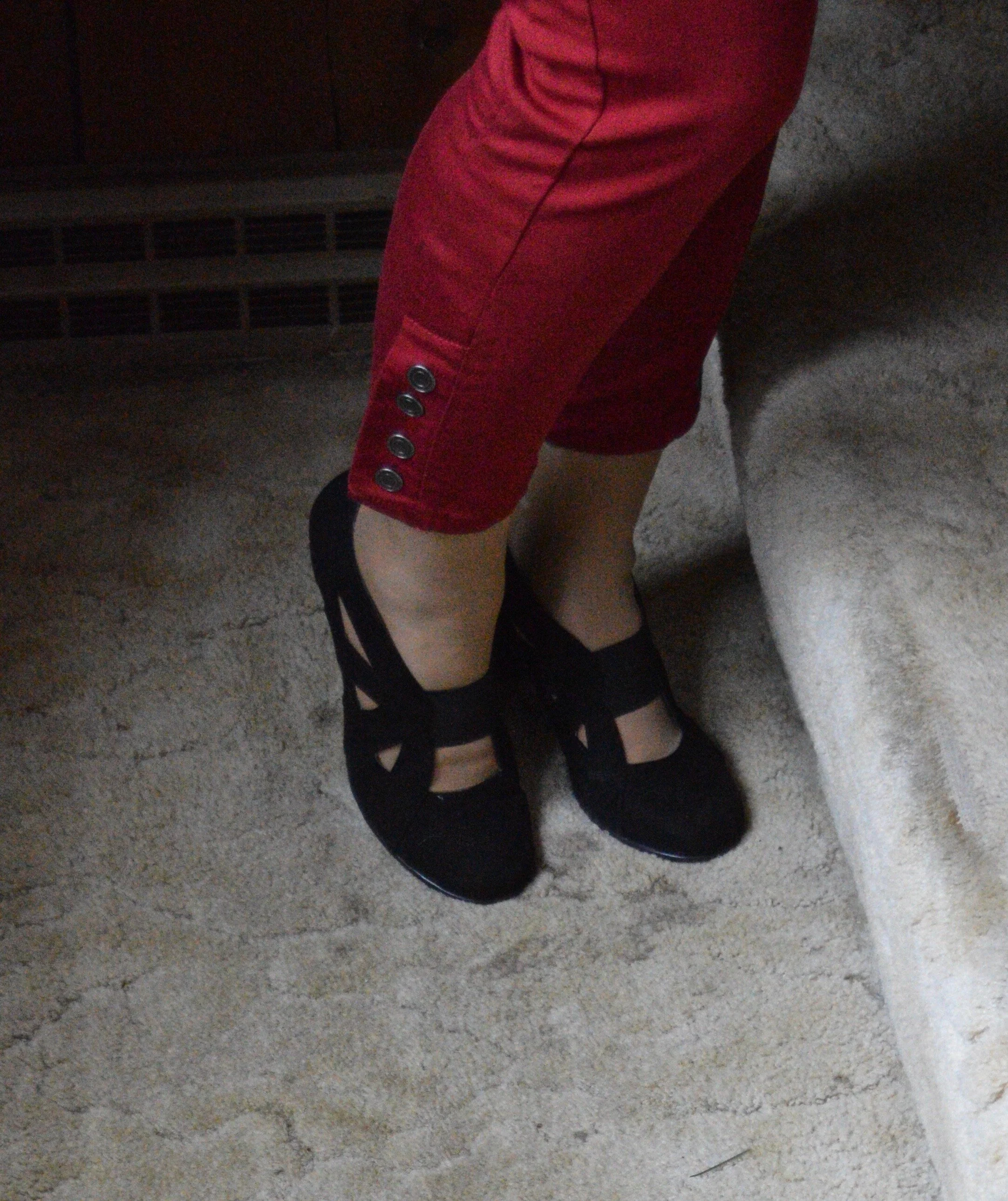
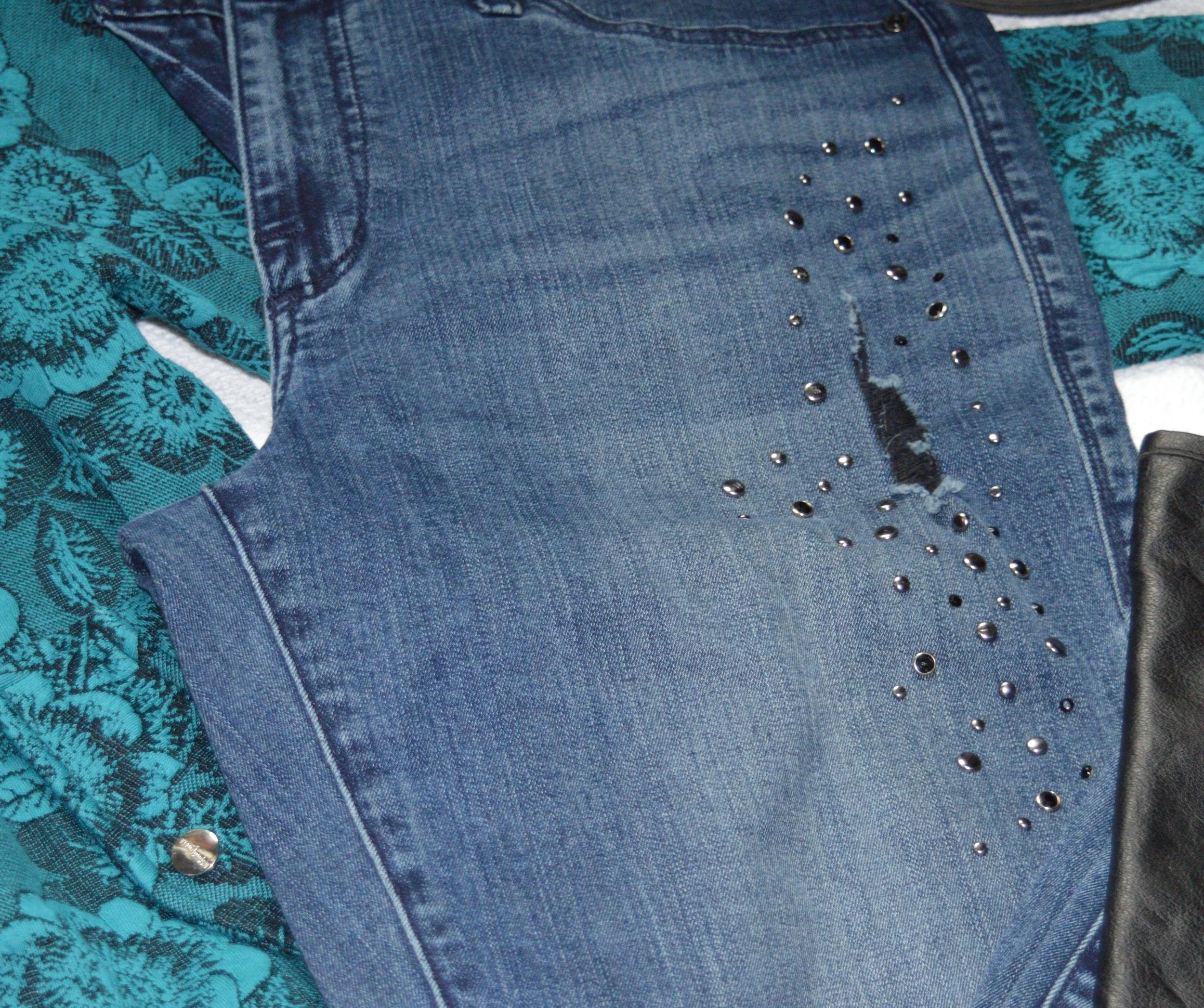
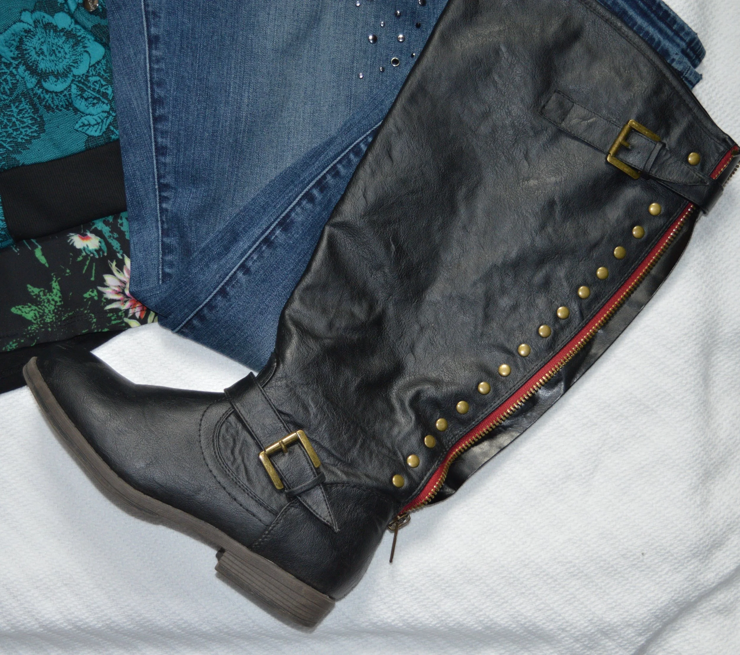
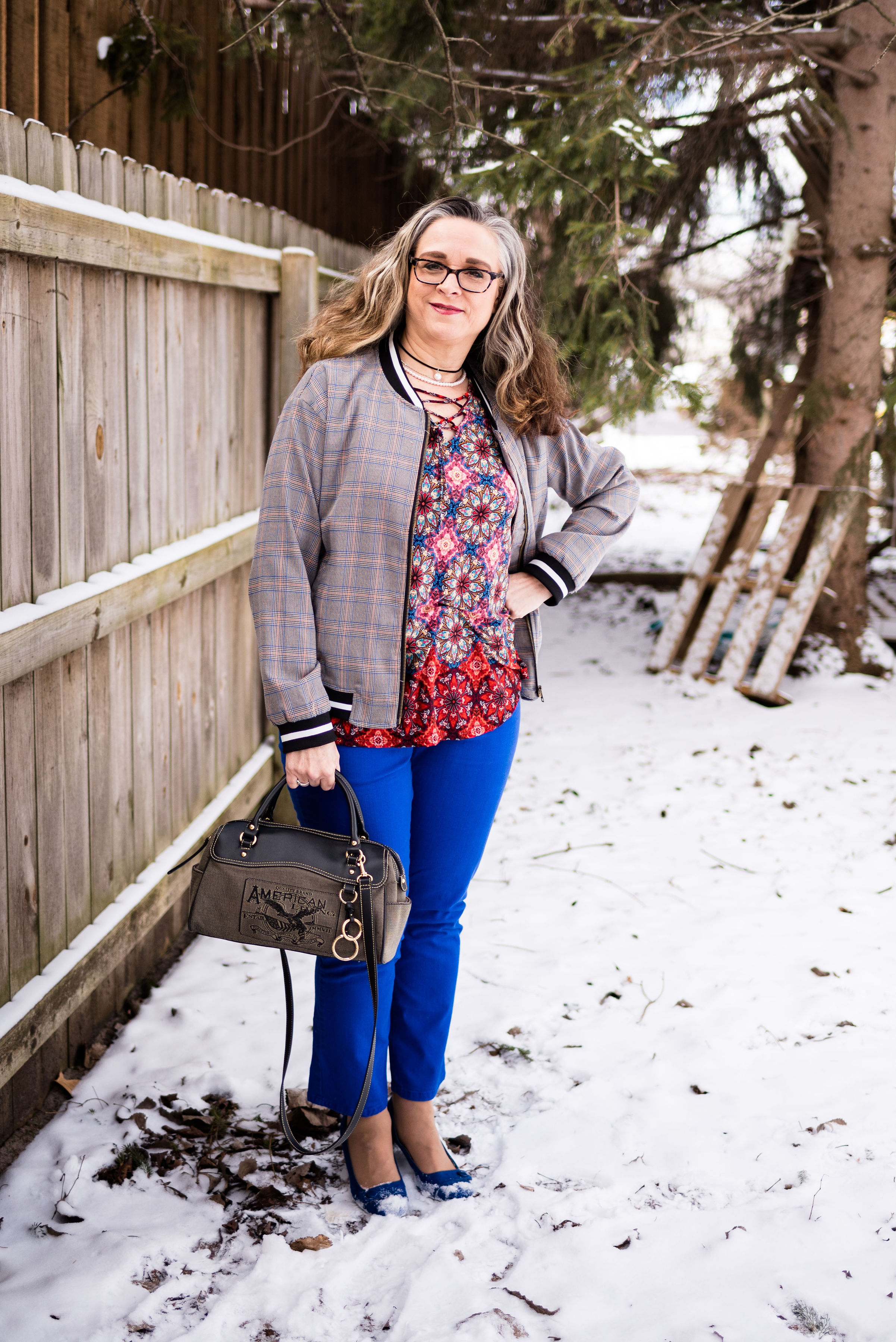
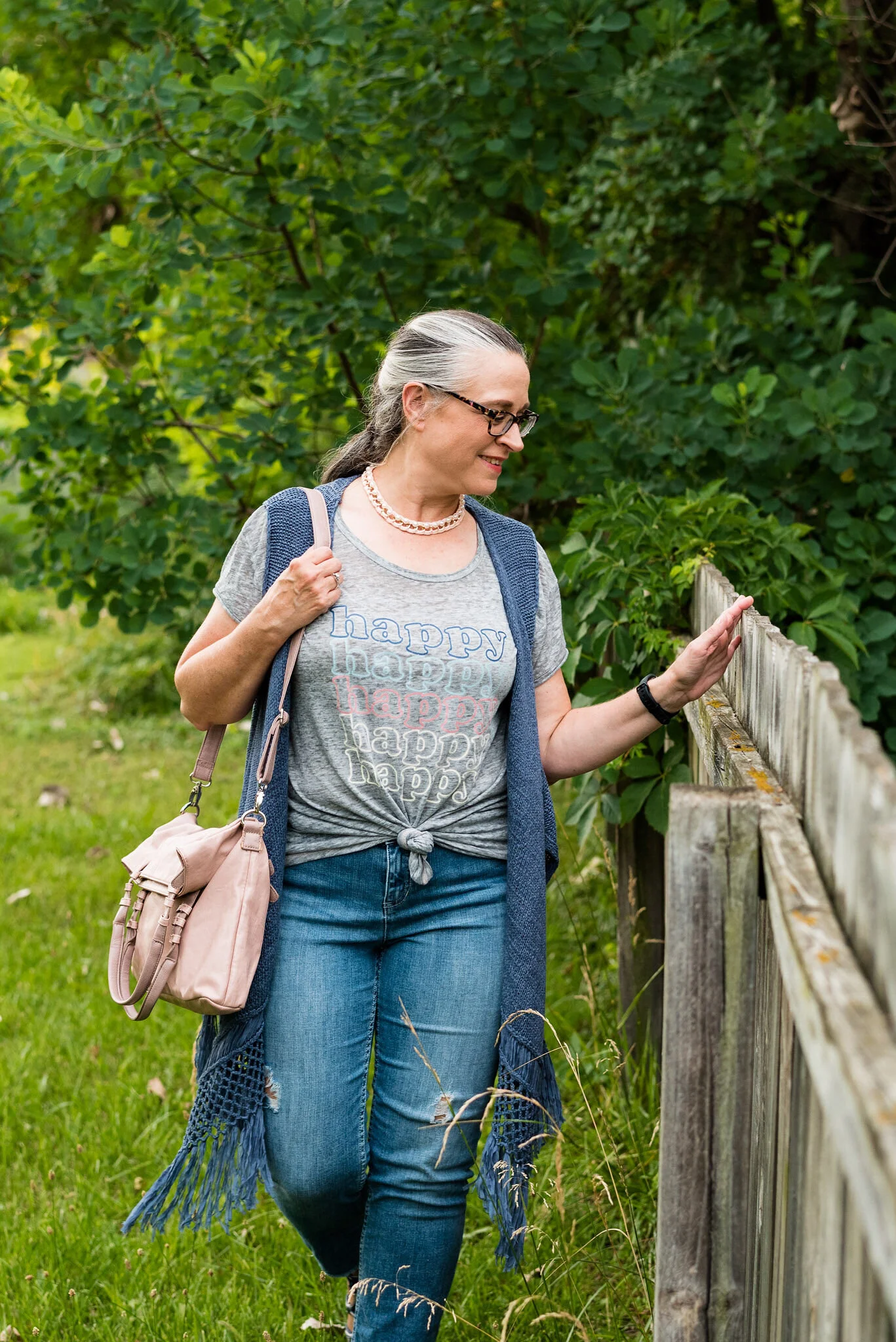
Both this graphic tee and my distressed cropped jeans have been on the blog before. You can see the tee styled with a denim skirt and the jeans styled with a green and white popover top, holiday sweater and a red plaid jacket. My Happy tee is No Boundaries brand. The distressed jeans are Simply Vera brand.
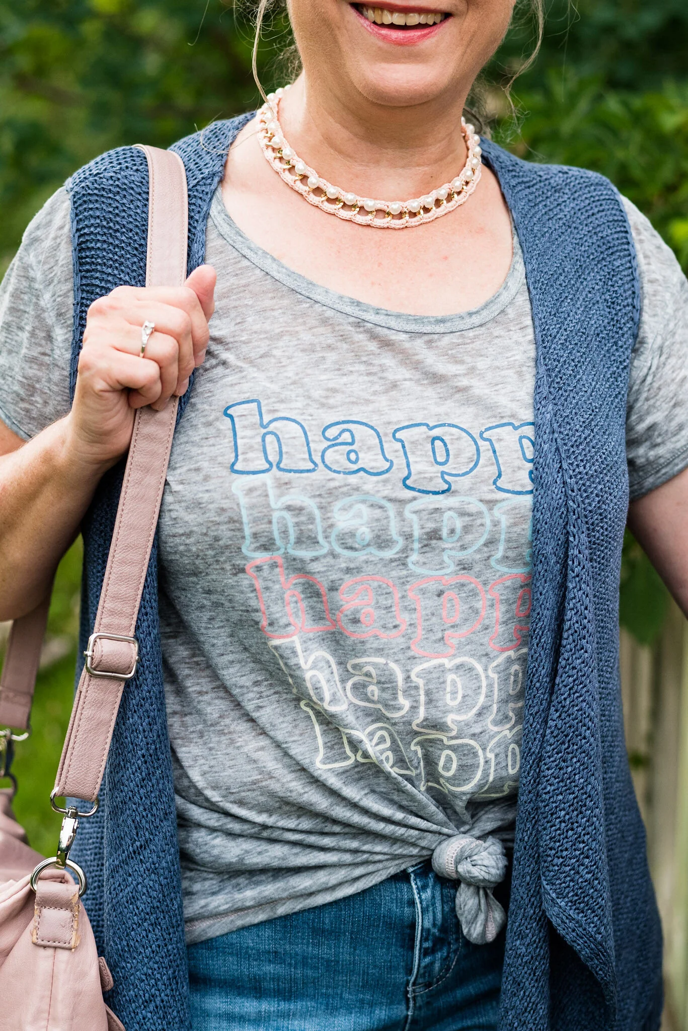
Since my tee is fairly loose and long, I thought to tie it at the front to give me a more defined waist. The tee is very thin, and almost distressed like my jeans. That is part of why I thought they went well together.
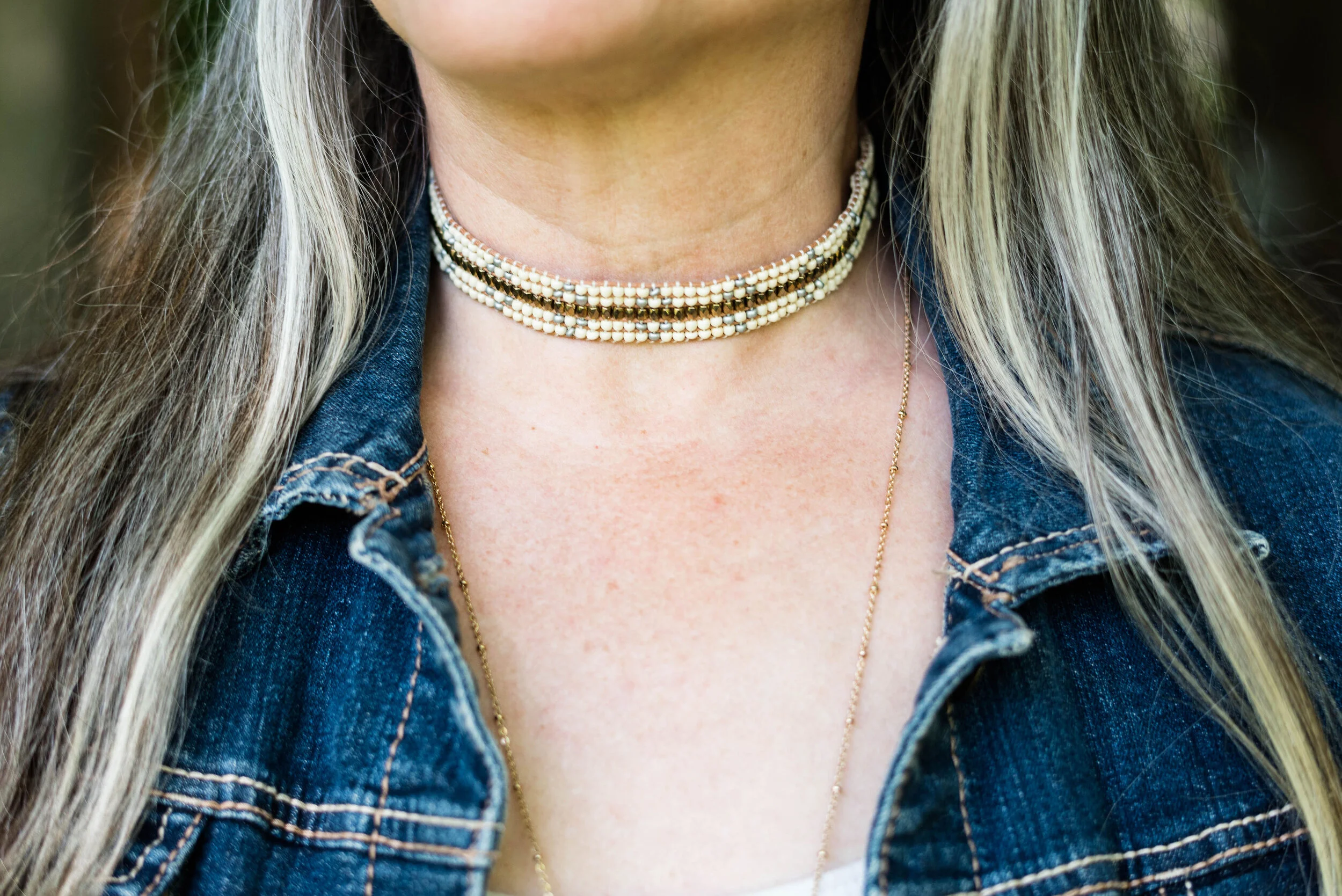
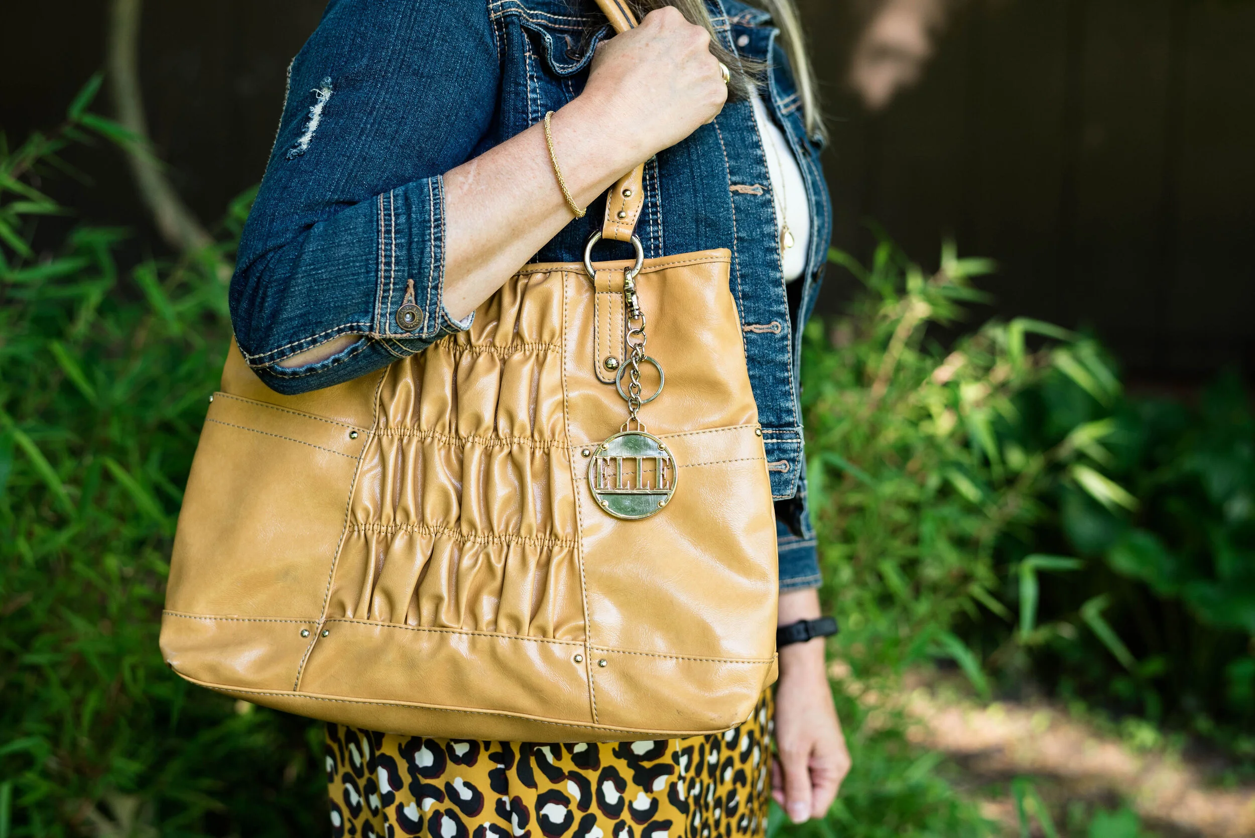
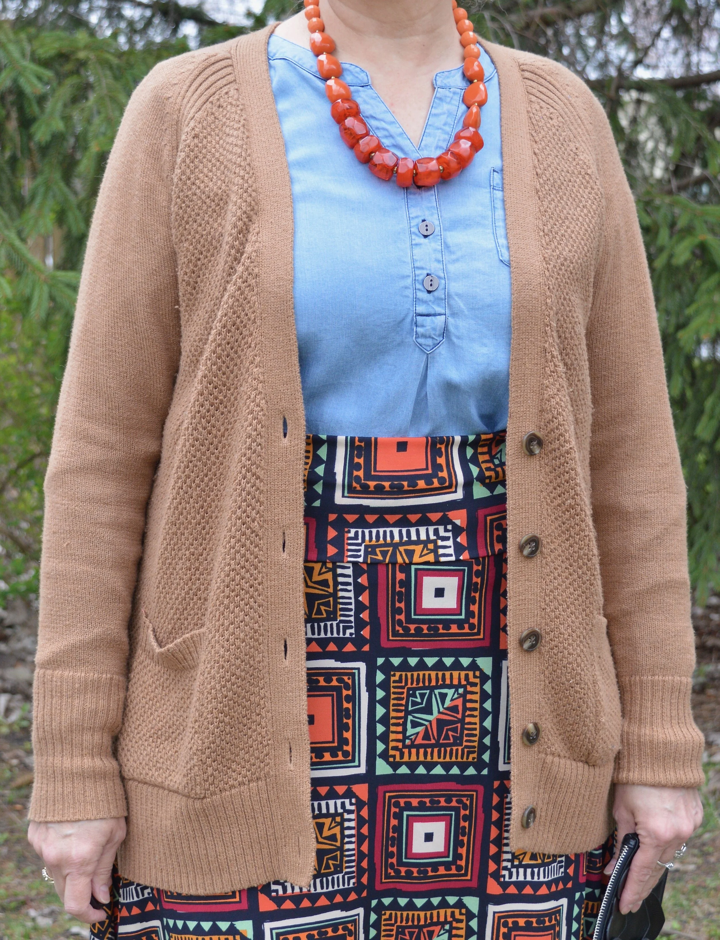
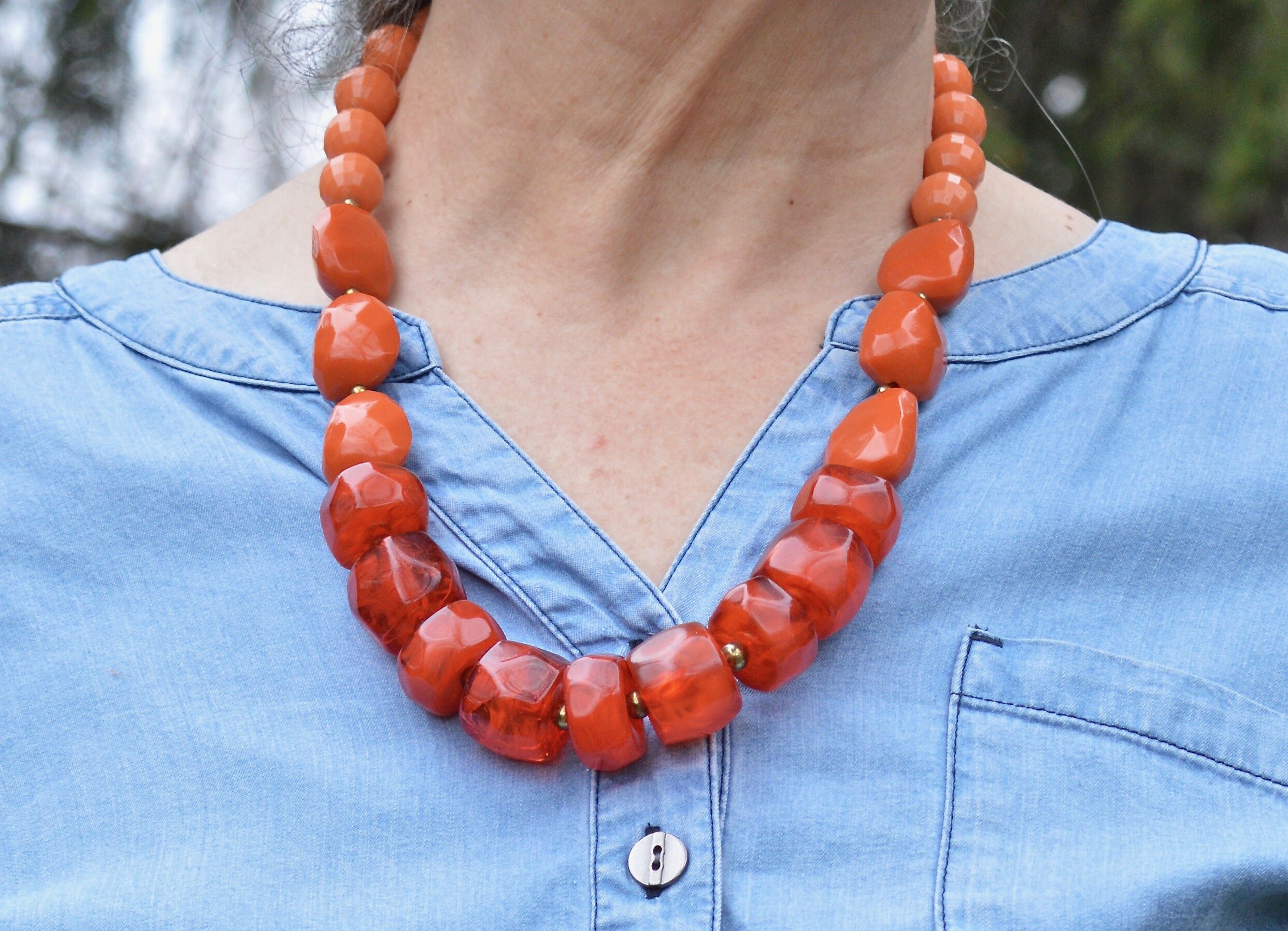
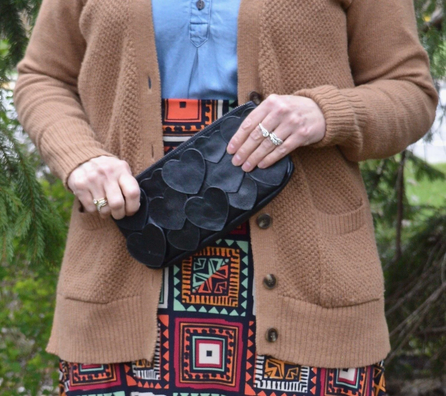
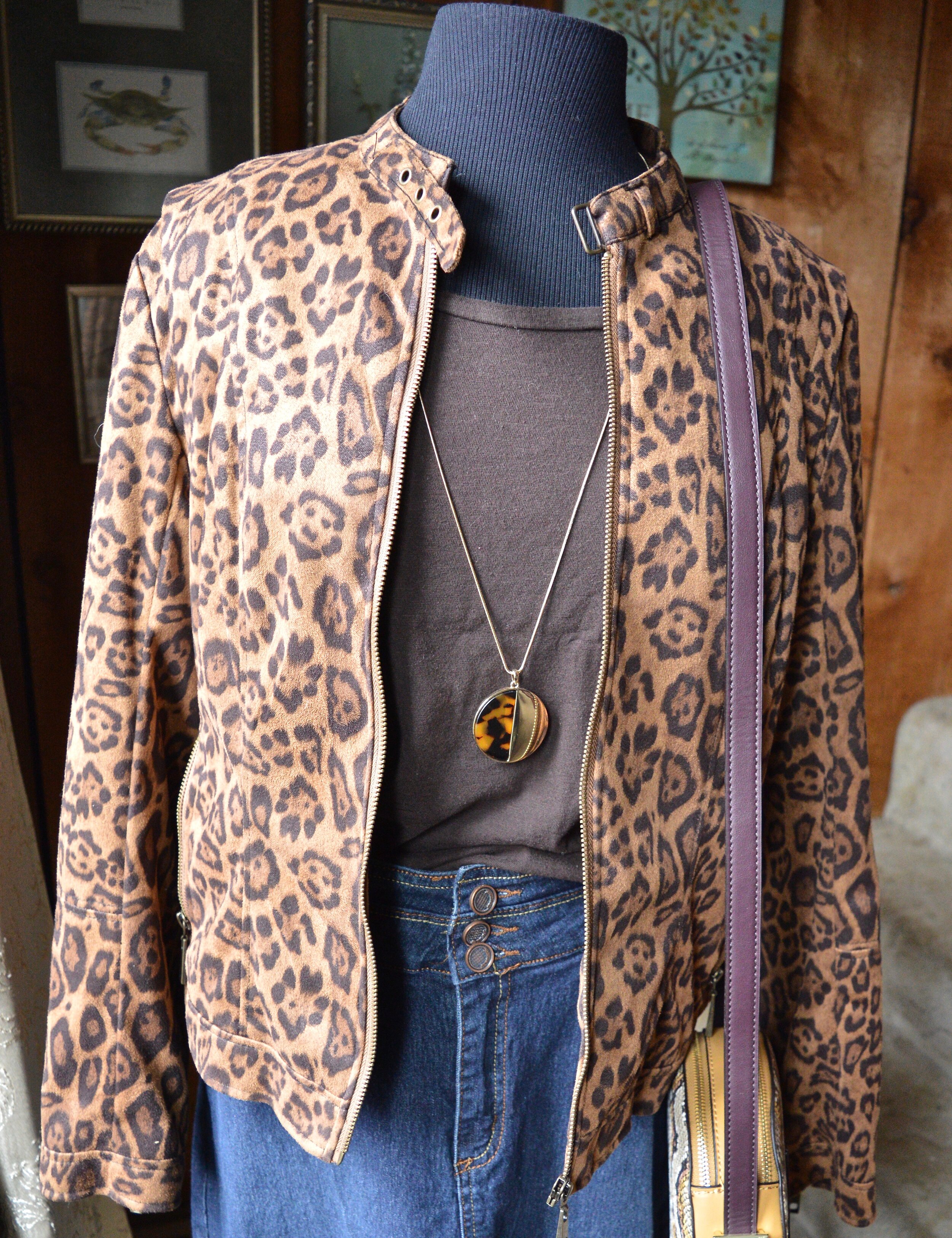
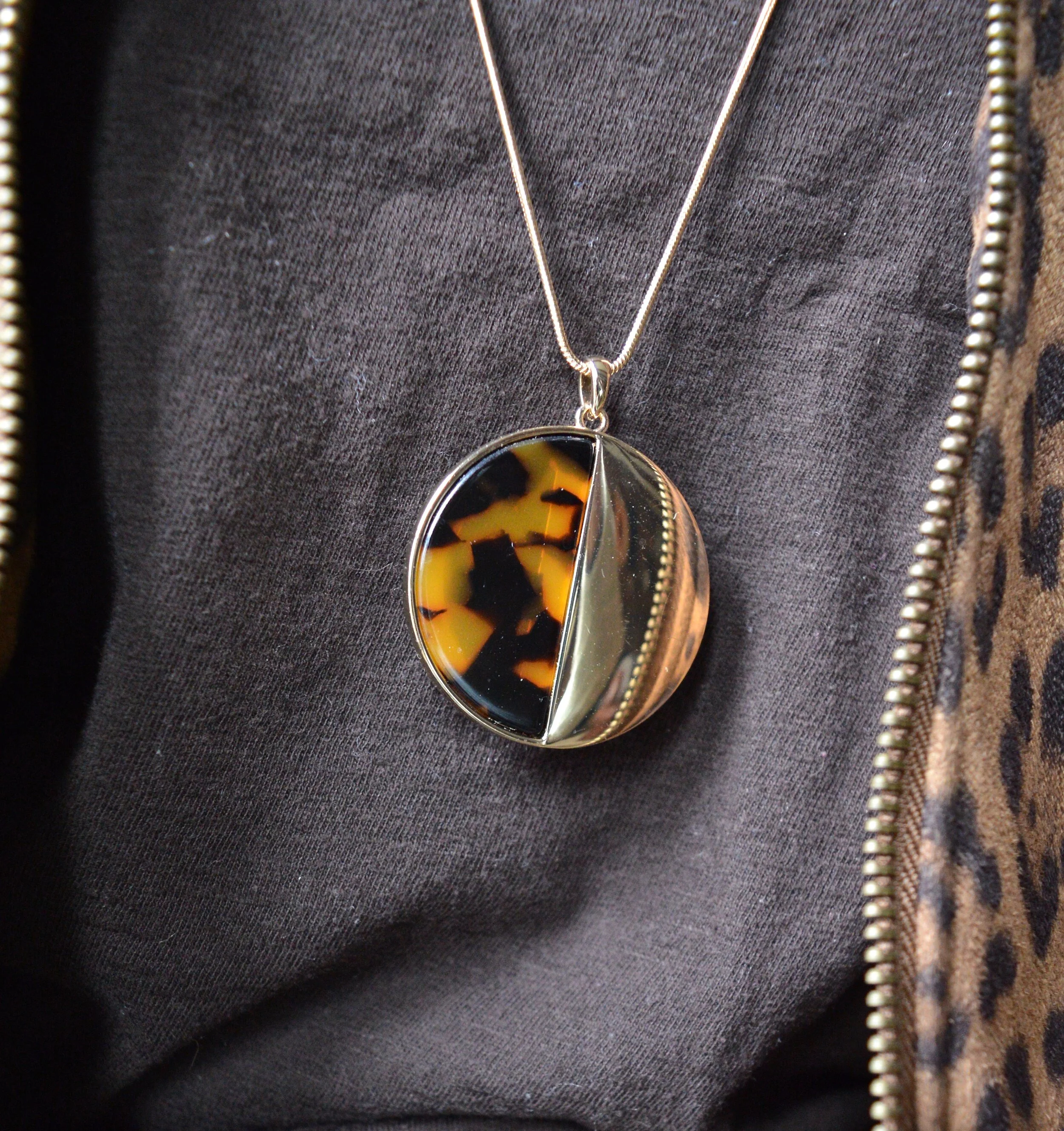
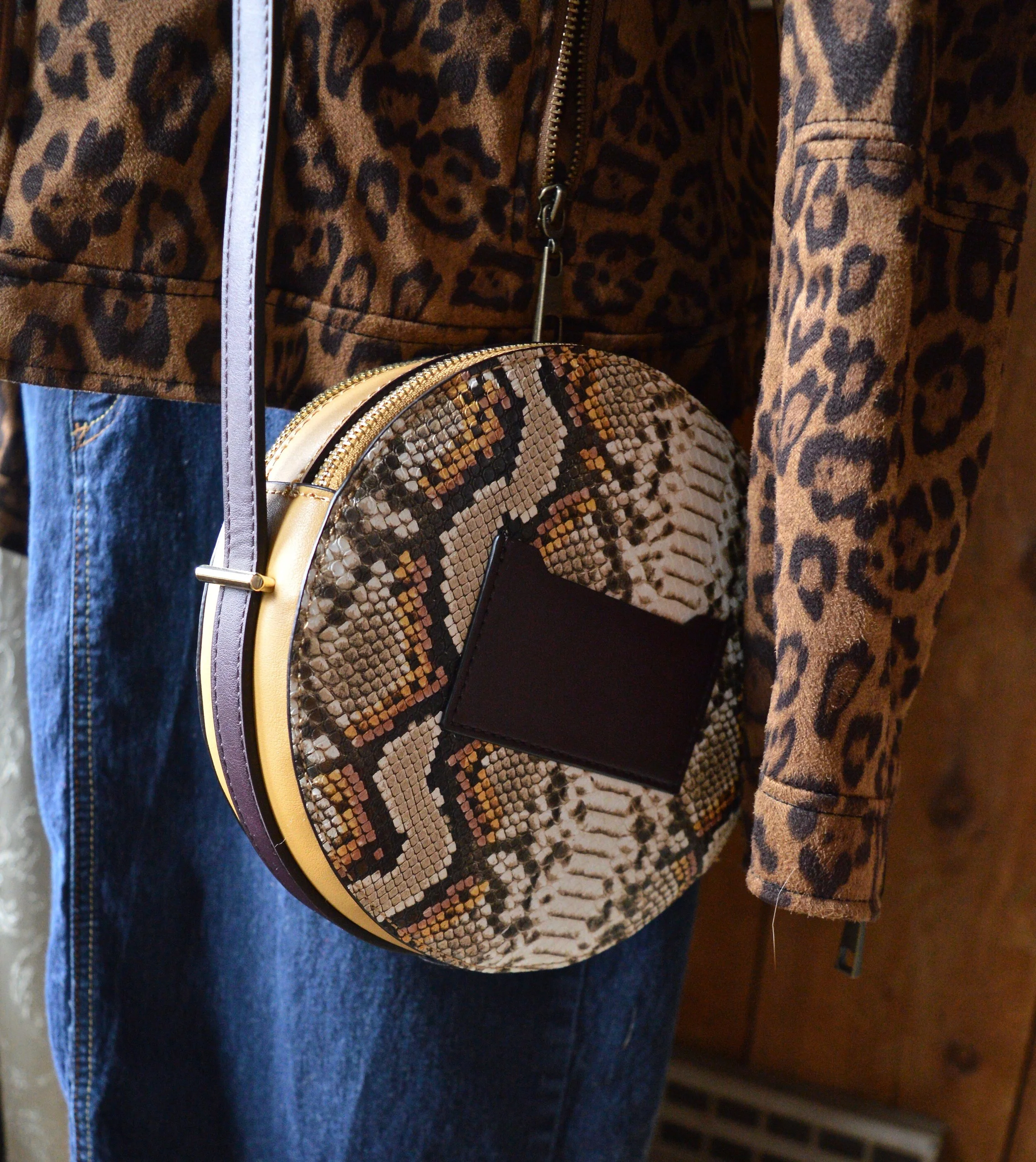
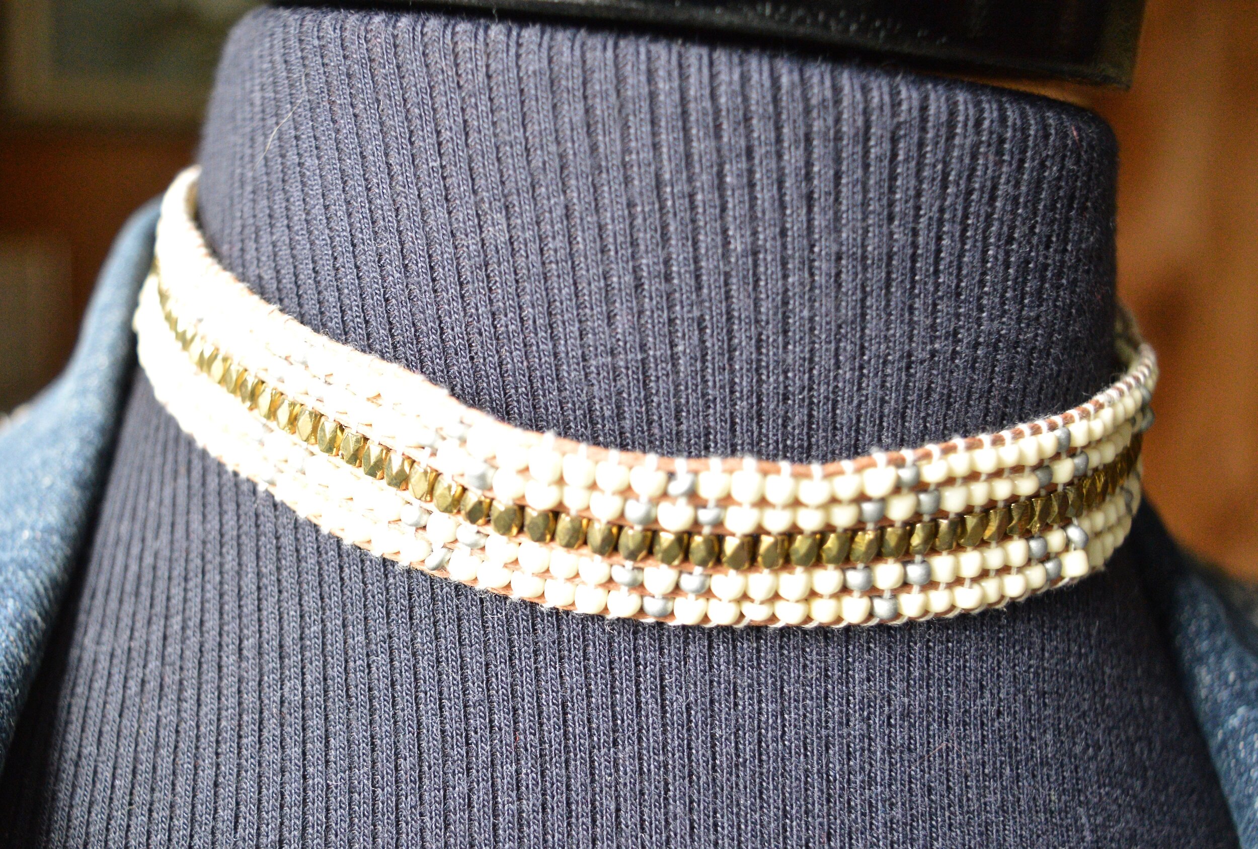
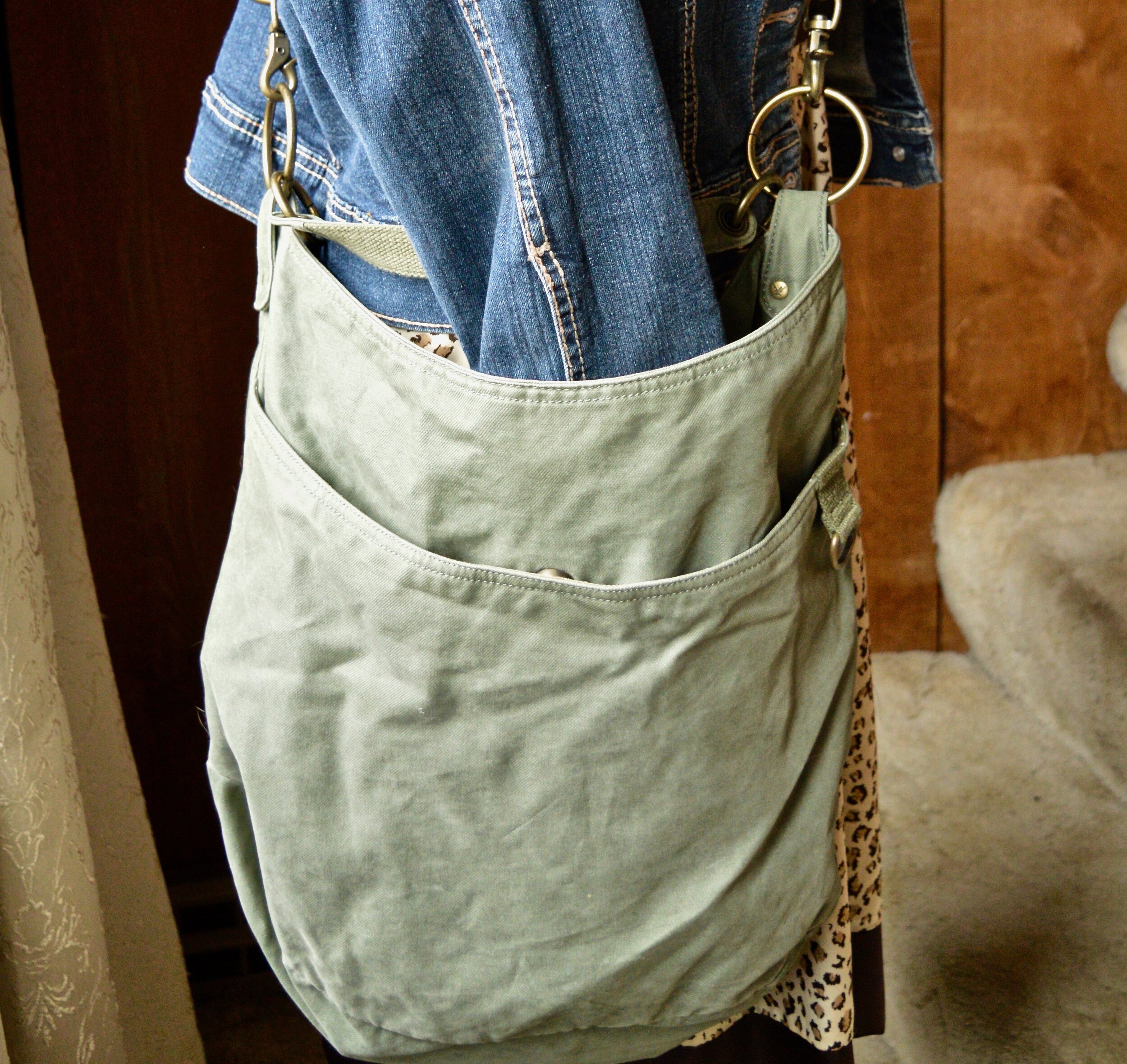
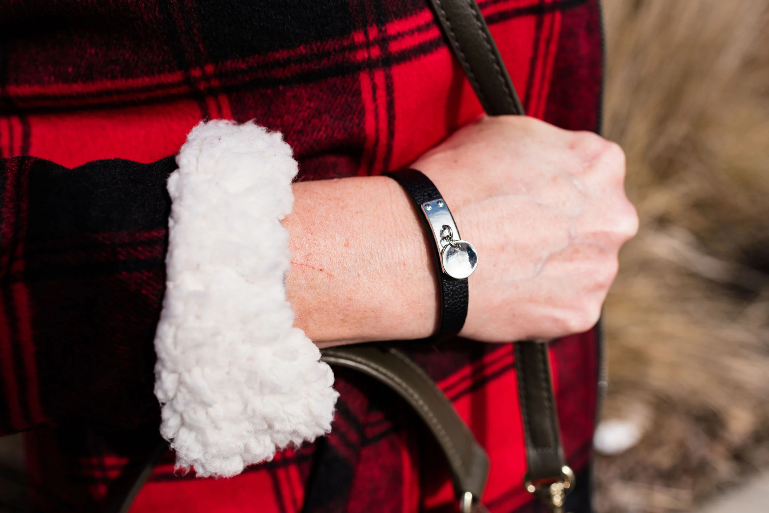
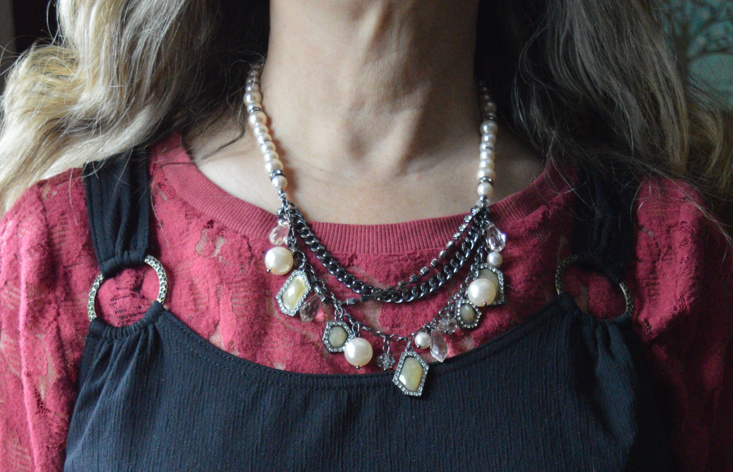
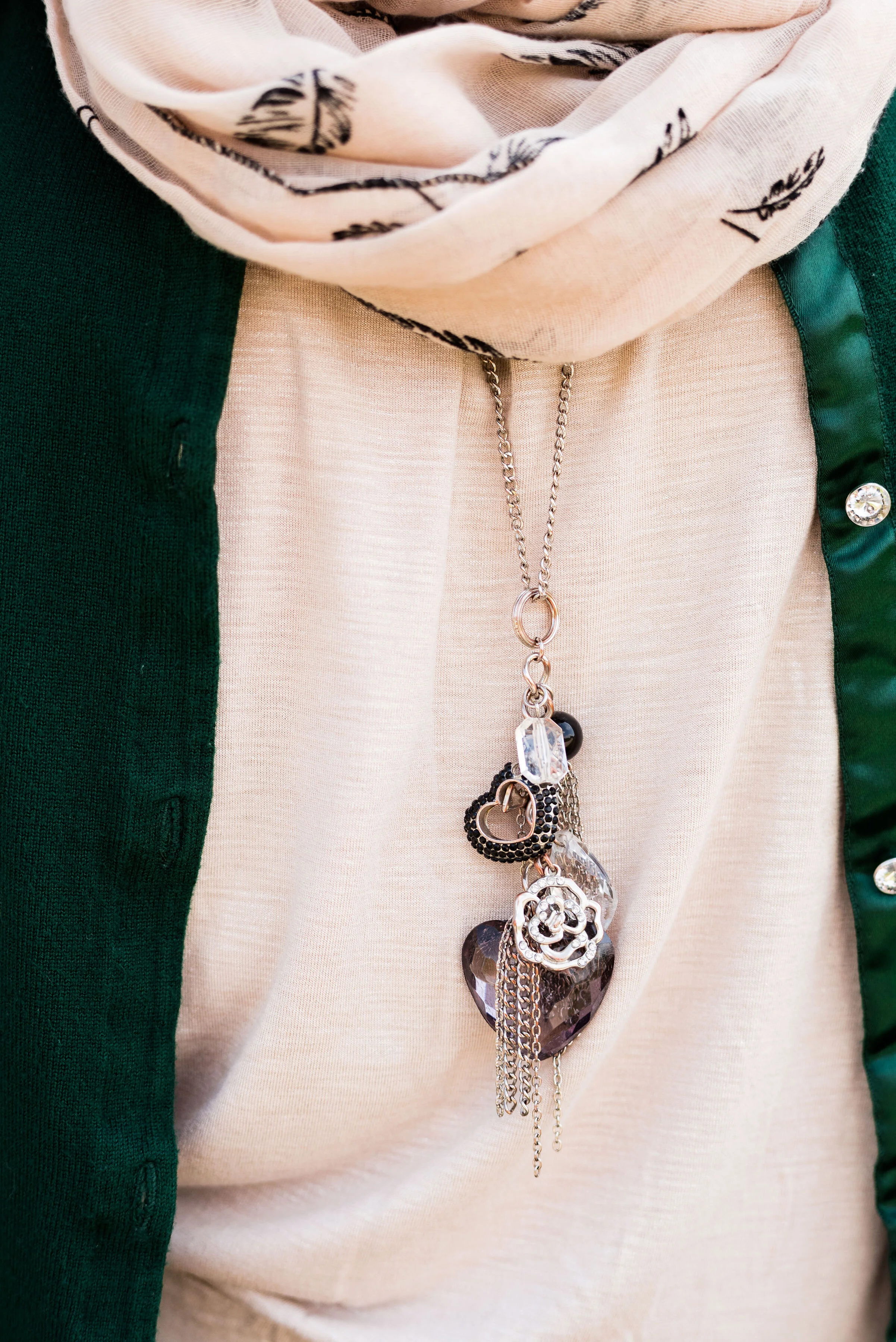
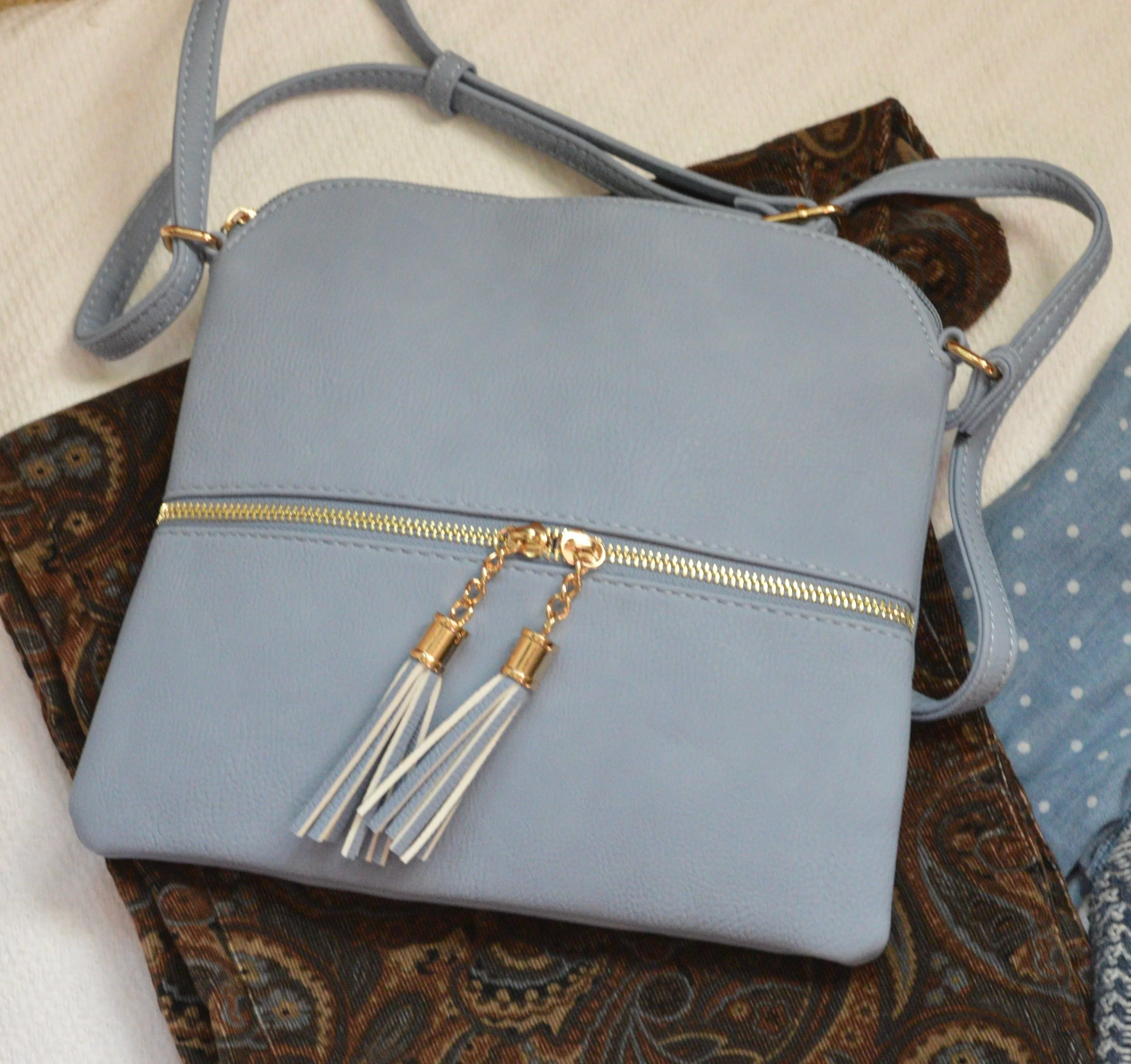
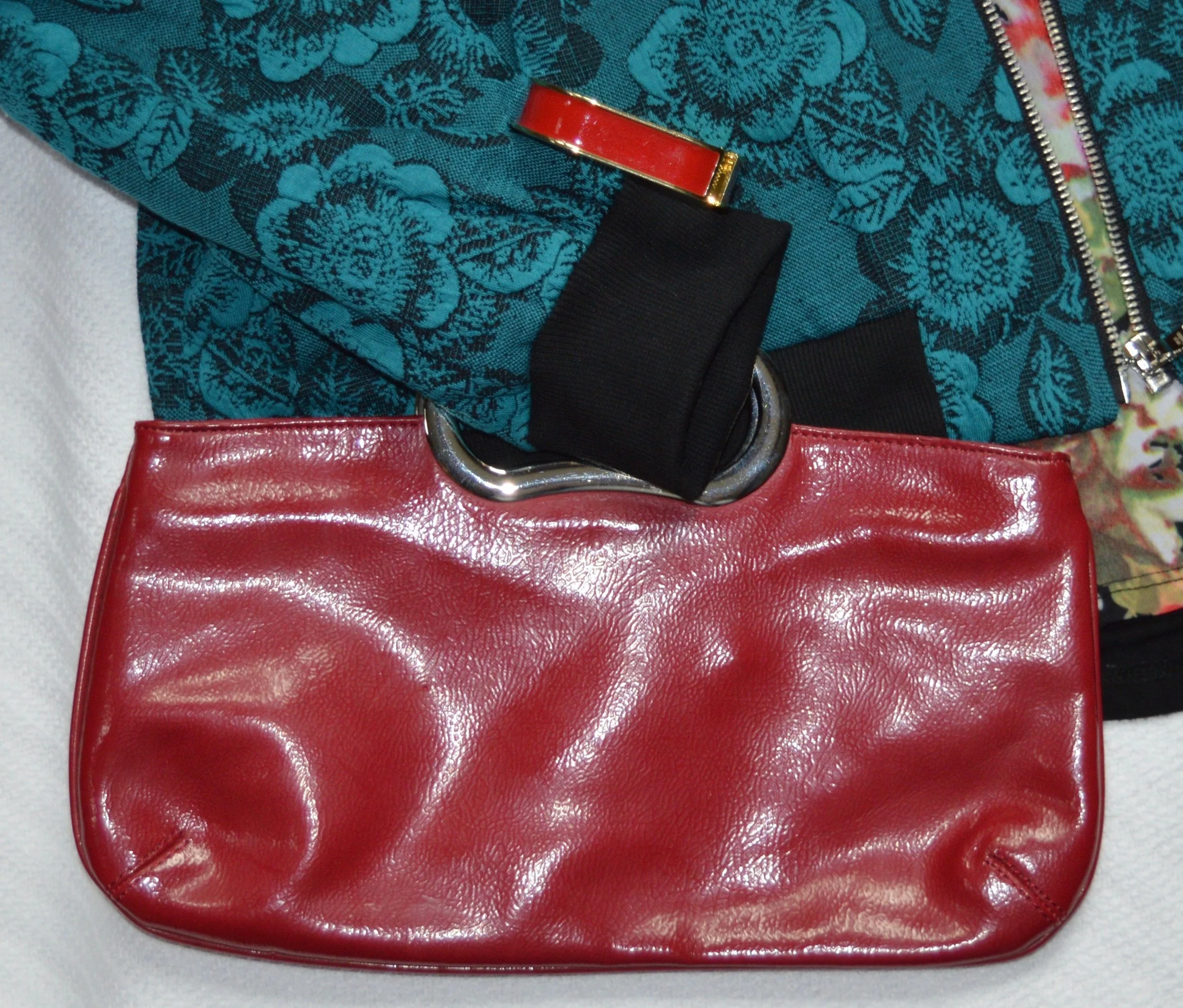
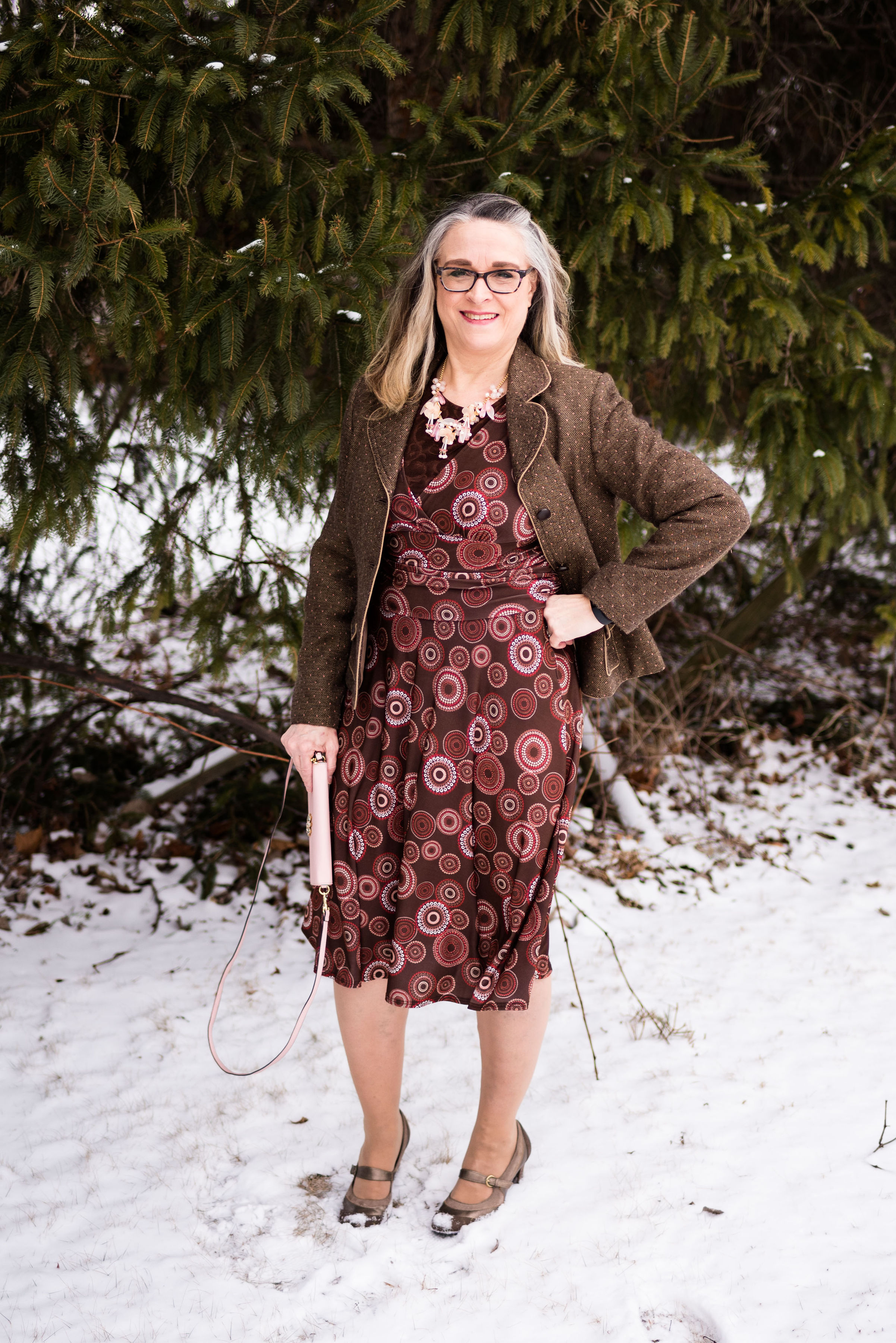
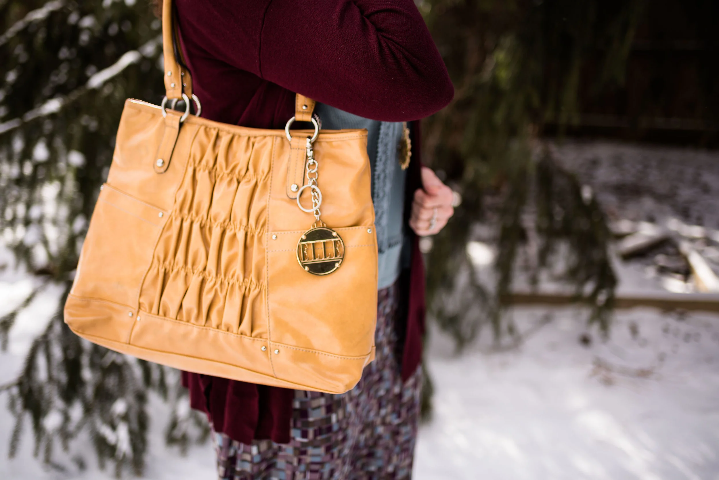
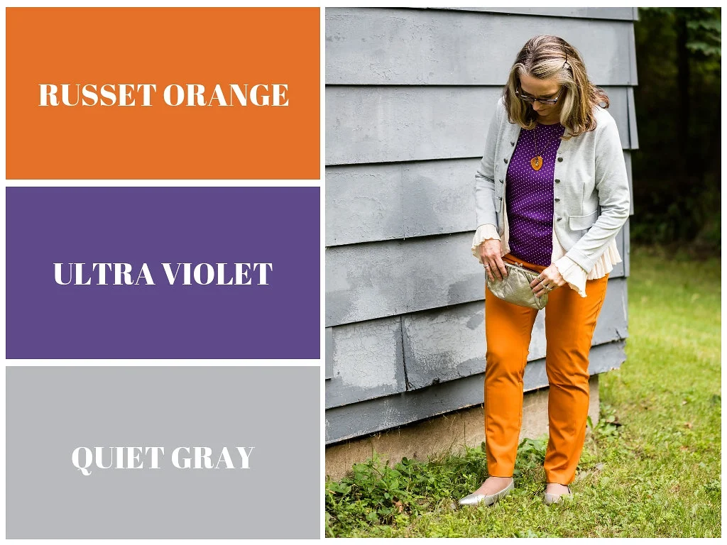
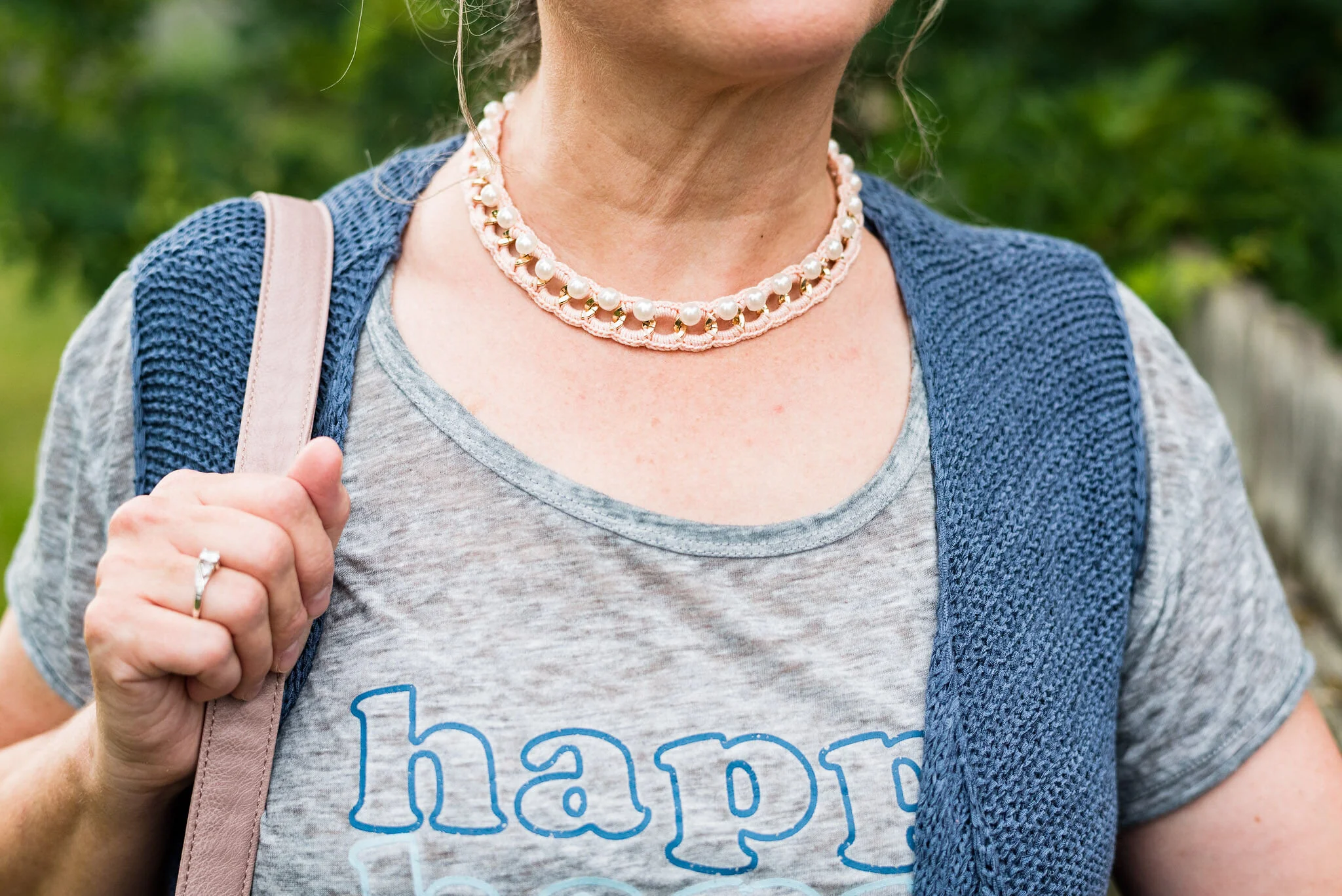
For my accessories, I chose my blush and pearl choker, which is not thrifted, but I thought it went well with the outfit. I also chose my thrifted, blush, NY & Co. bag.

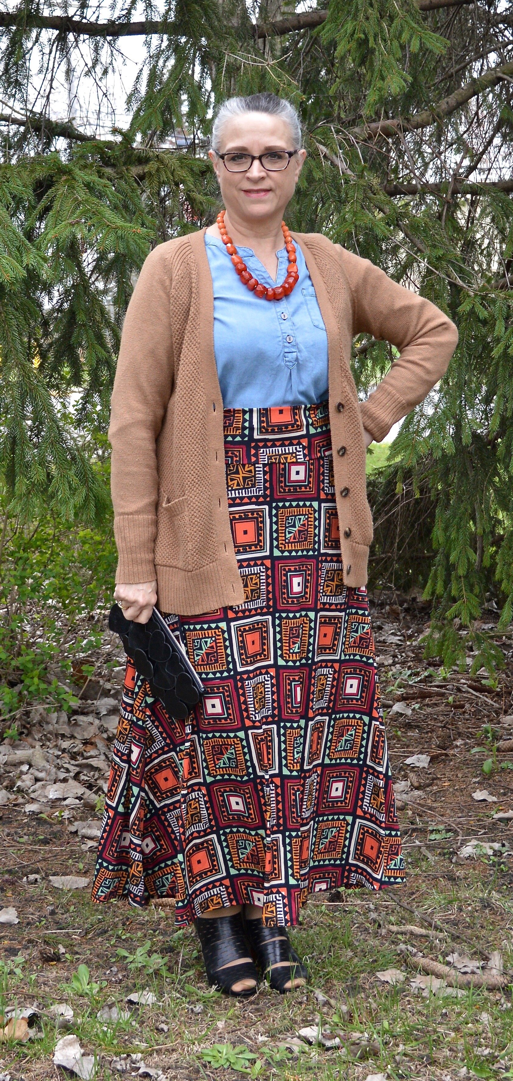
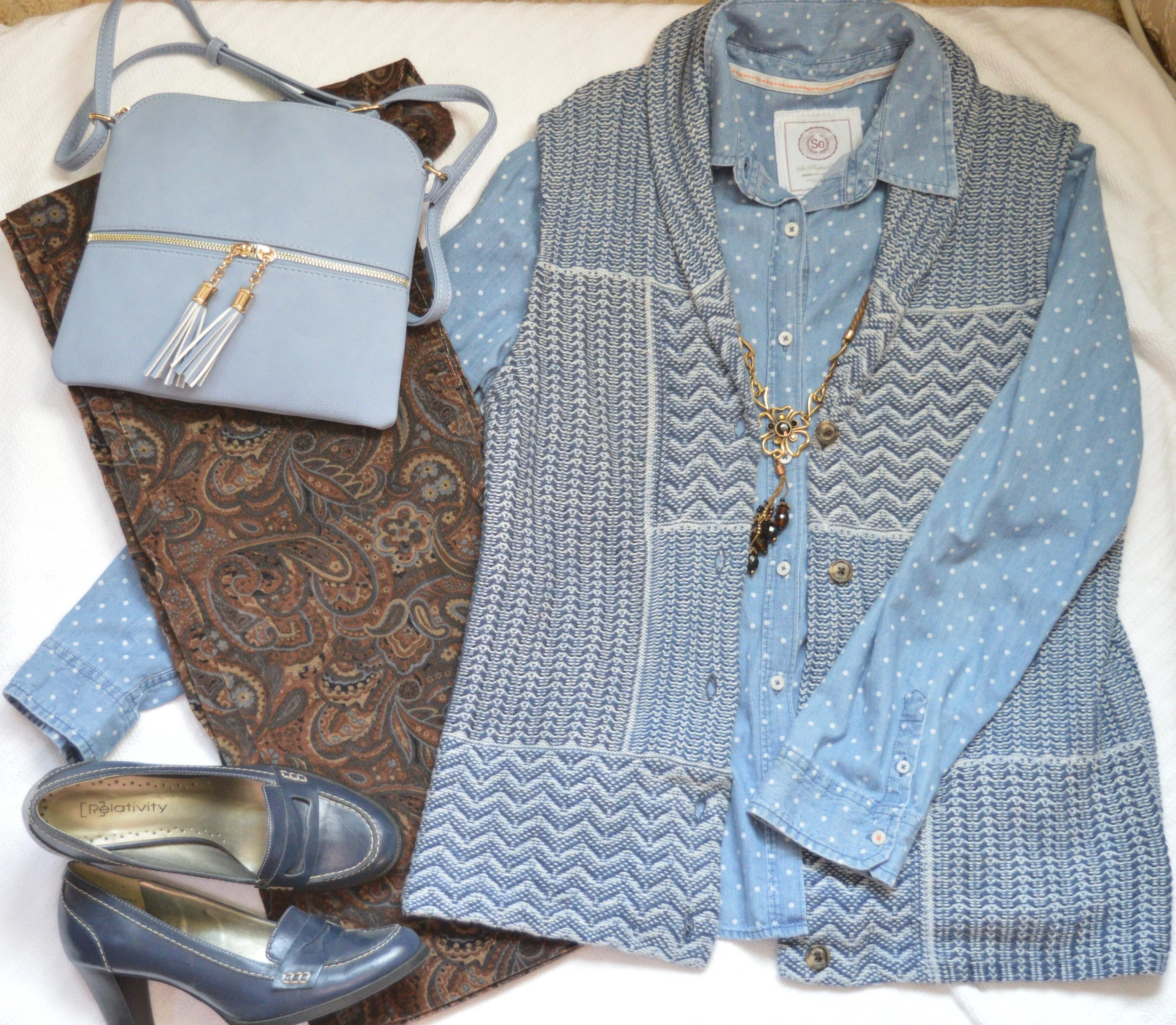
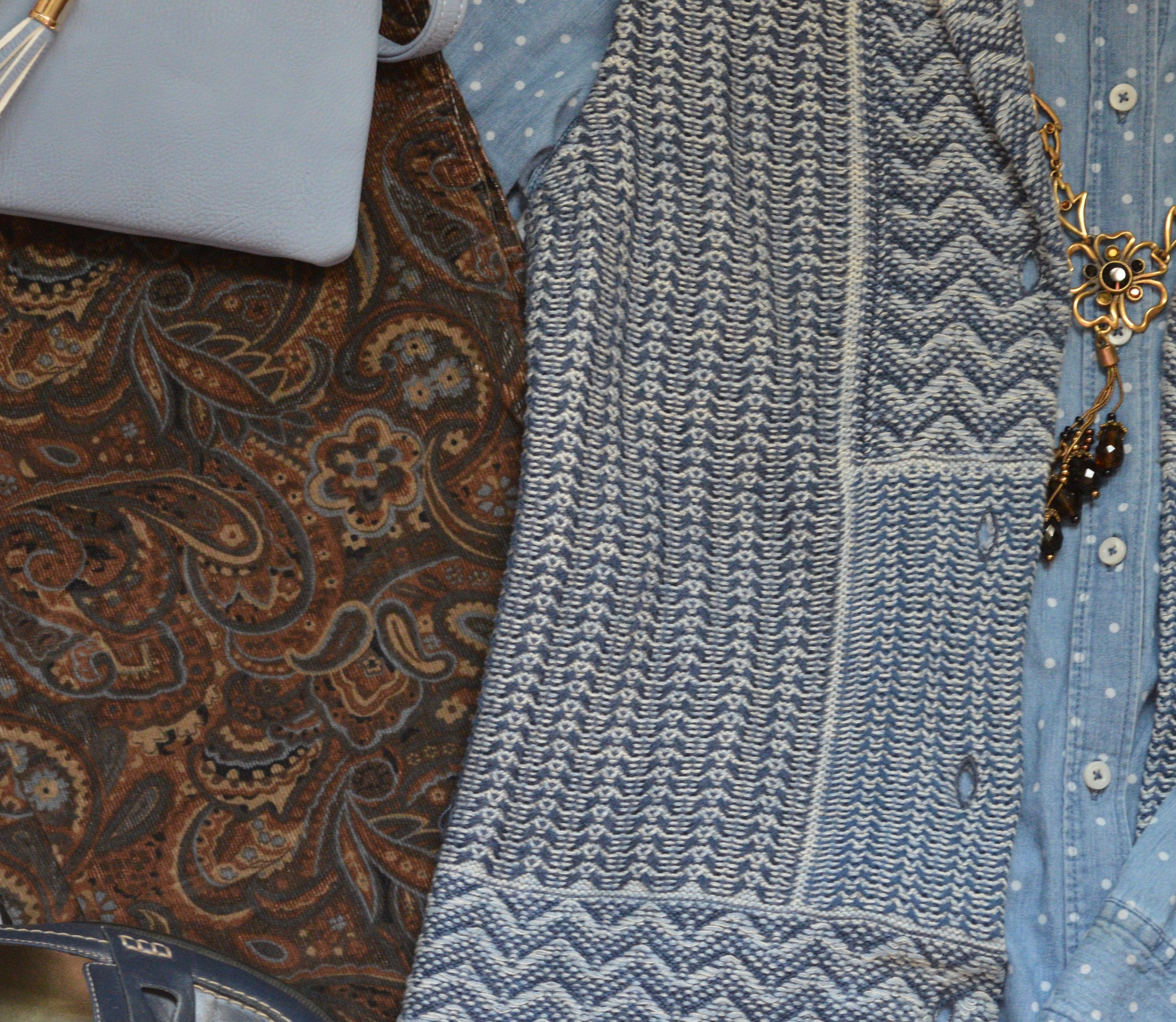
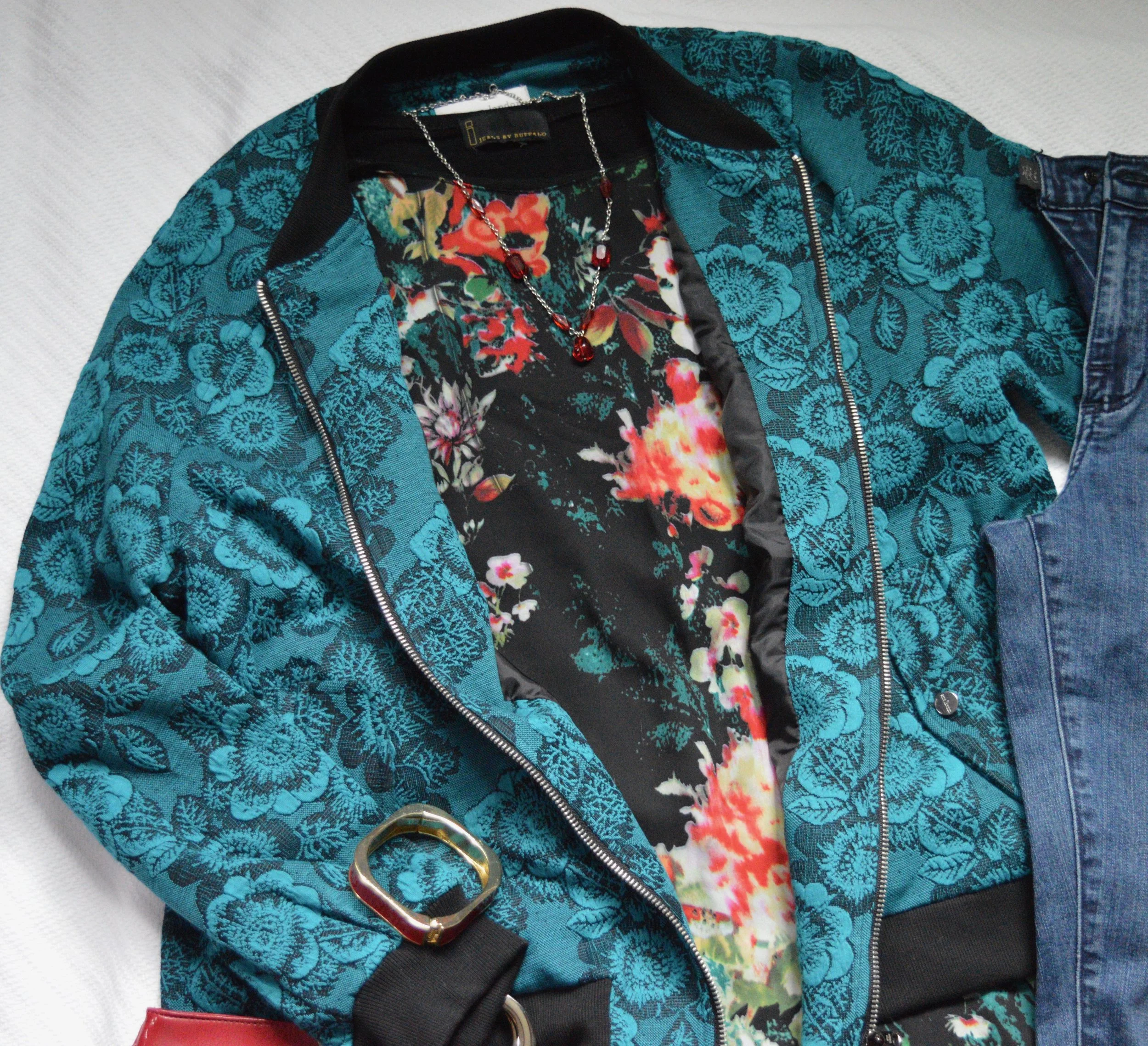
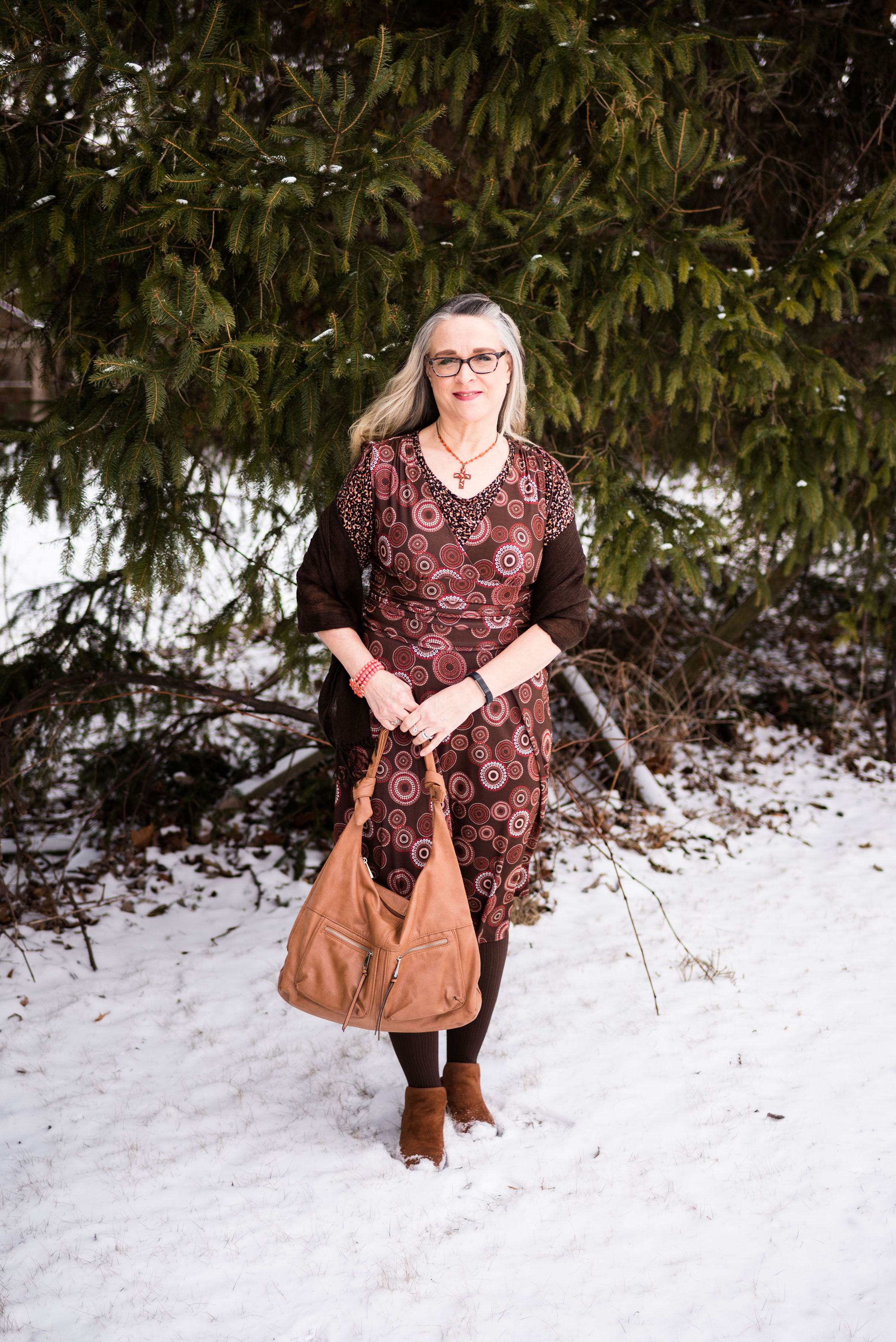
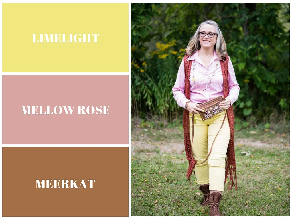
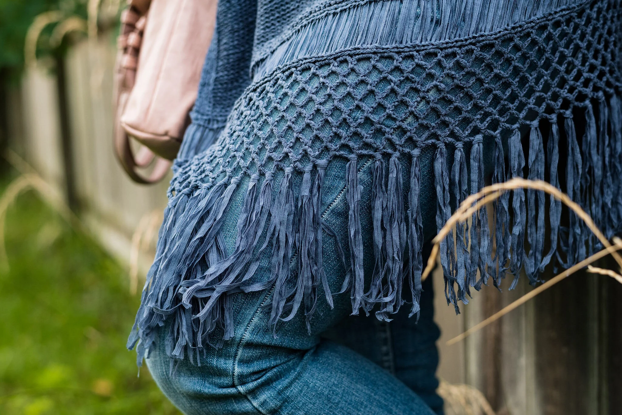
This sweater vest was another fun thrift find. I was shopping with my best friend back in NY and she pointed this out to me. I tried it on and loved it. It is Relativity brand. What sold me on this piece was the fringe.
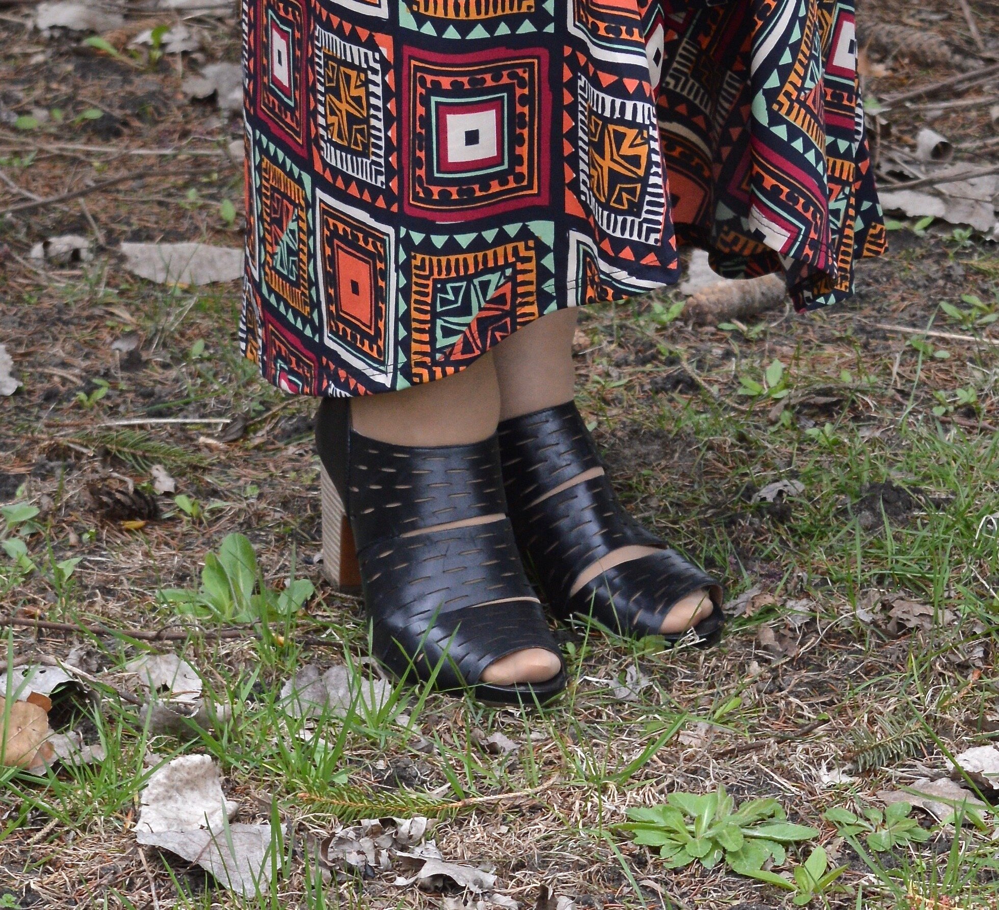
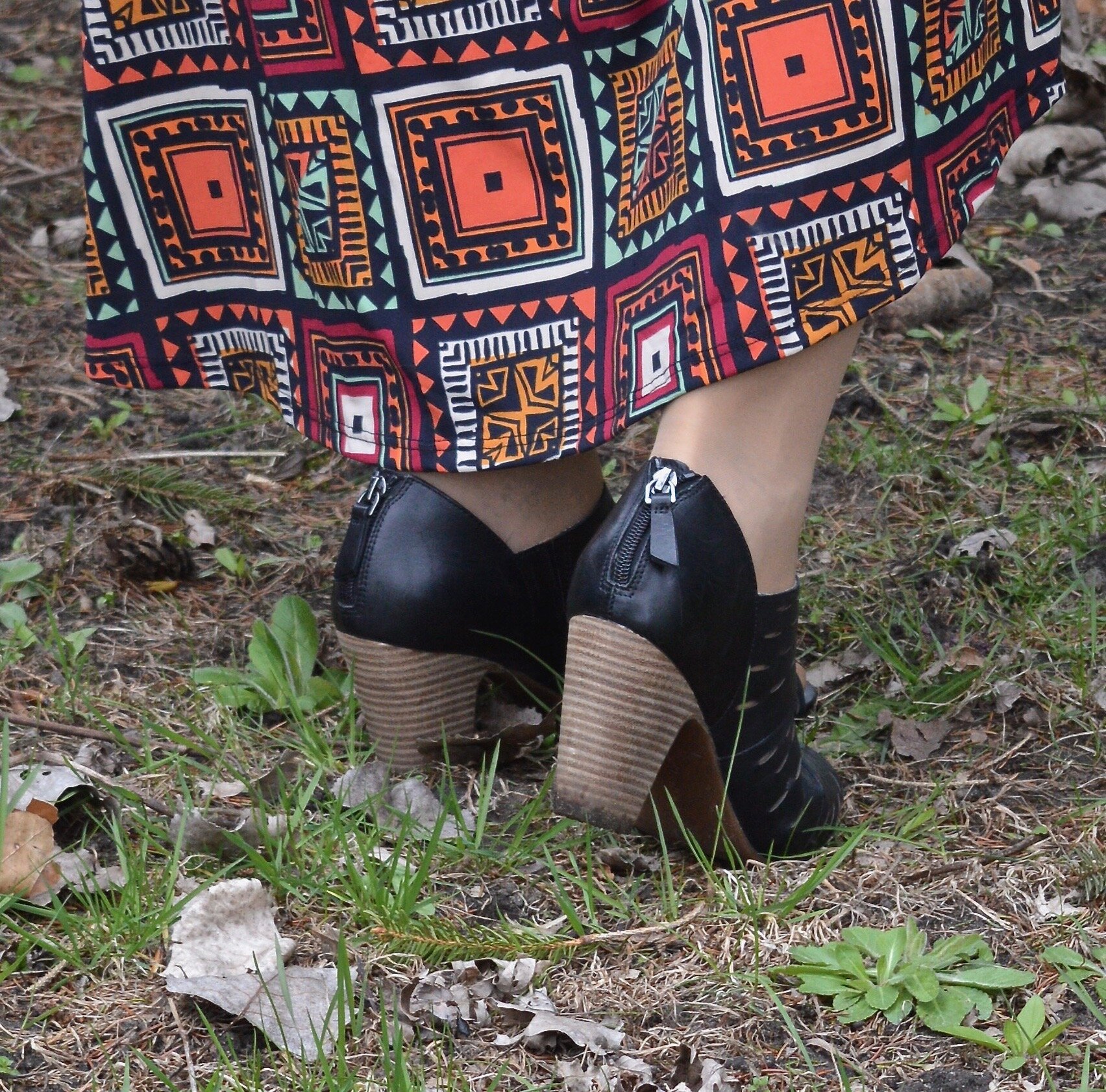
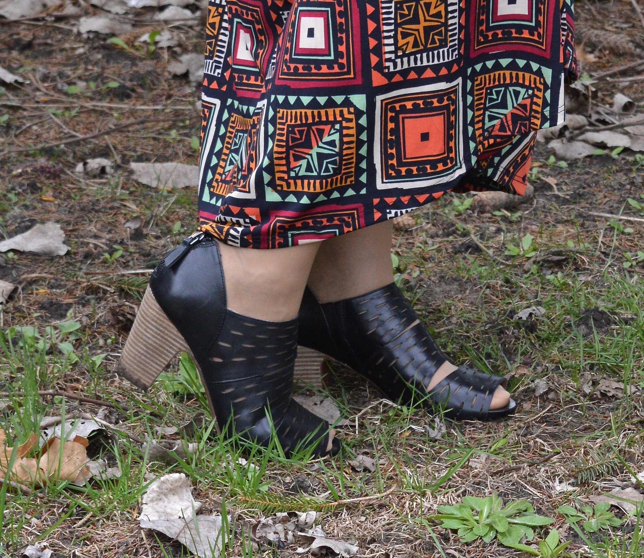
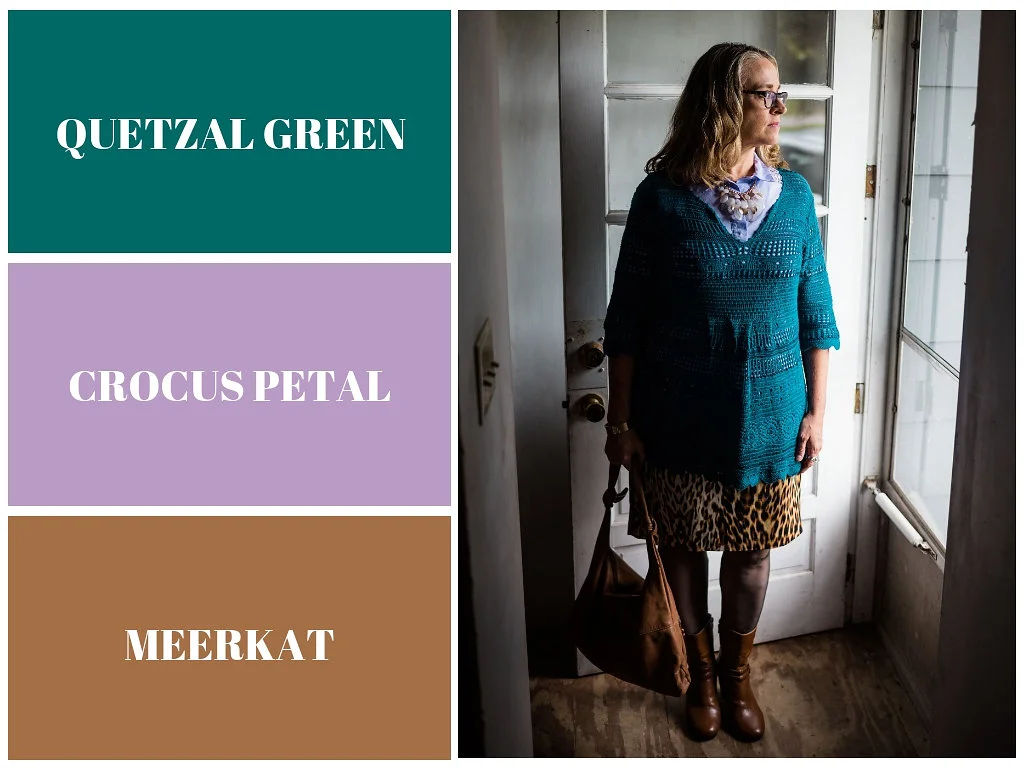
Since I was grooving on a blue theme, I chose my thrifted blue and silver, YNot brand cage sandals.

It is fun to put together an outfit made entirely, or mostly out of pieces I have found at a thrift store. Do you like this outfit? Do you like to go thrift shopping? What thrift stores do you like to shop at? I’d love to hear your thoughts.
I’ve included a few shopping links. These are affiliate links. All opinions are my own. I hope you have a wonderful weekend. I’ll see you next week.
Photo credit Rebecca Trumbull.