Color Play: Red Orange with Shade of Purple and Brown
This week I am showing you an outfit I actually wore all day. This colorful combination was inspired this past week by my husband’s Aunt Lynn who always wears skirts. I have so many fun skirts that I never wear and I thought, well, why not? Last week while she and my mother-in-law were visiting I donned this purple and blue skirt for a trip to our favorite British Tea Garden restaurant a little ways north of us. This week I decided to pull out this fabulous bohoesque piece. Keep reading for all the details.
Lighting makes such a huge difference in picture quality, as my daughter who is a professional photographer will tell you. It also makes a difference what sort of camera you use, time of day and so on. More expensive phones can take great pictures, and my little IPhone SE does okay, but on a bright, sunny day in the shade it just doesn’t capture the true essence of the colors in my outfit. My top definitely leans more towards a red orange, but in these phots it looks more red.
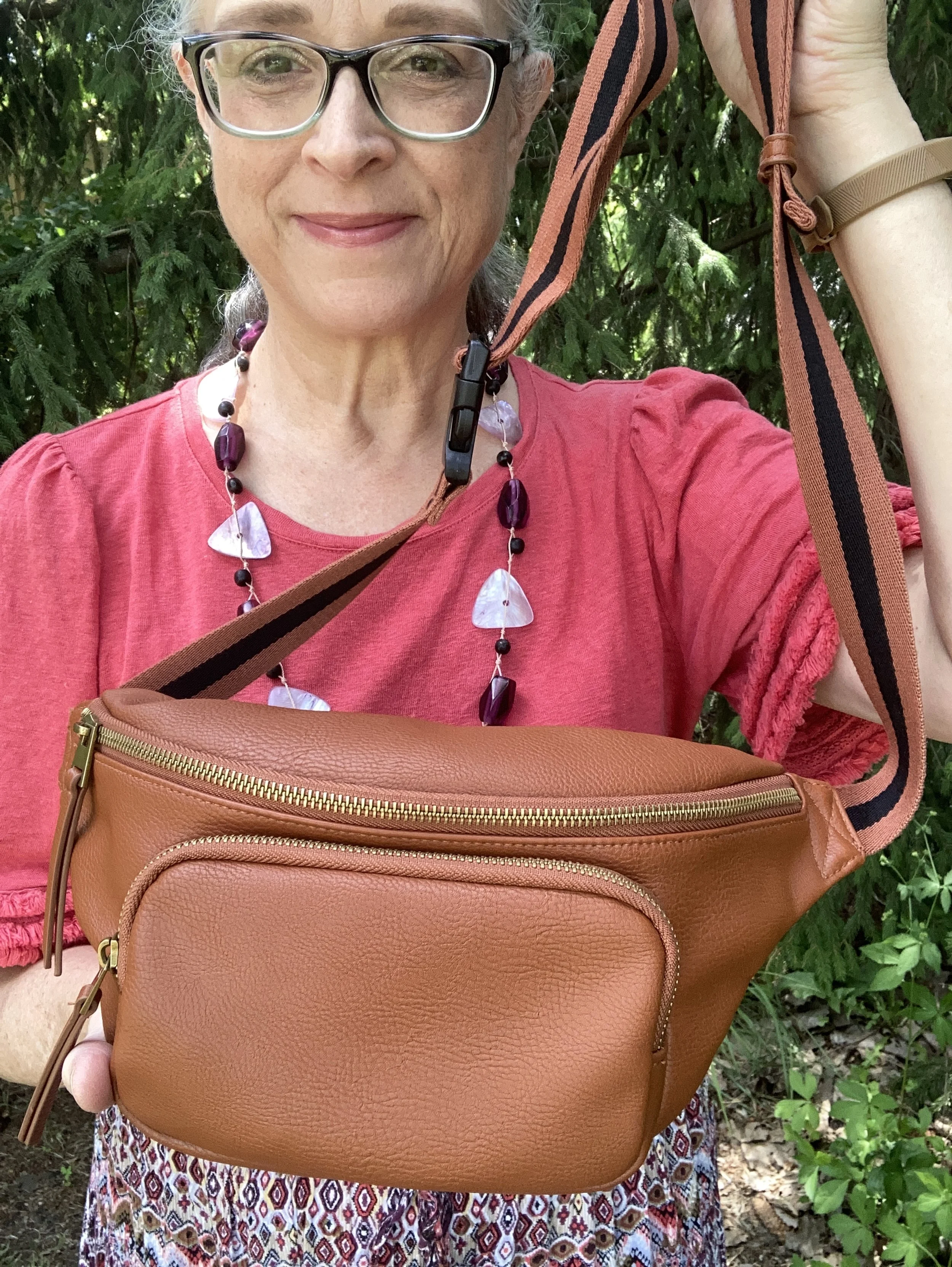
My top is a very recently thrifted Chico’s piece and is a linen blend. I’m not a huge linen fan as I have said before, but I do like the cool factor of linen, and a blend shows a little less wrinkling, but what really sold me on this piece were the sleeves. Aren’t they fun? Three layers of fringe add to the Bohemian vibe of this look.
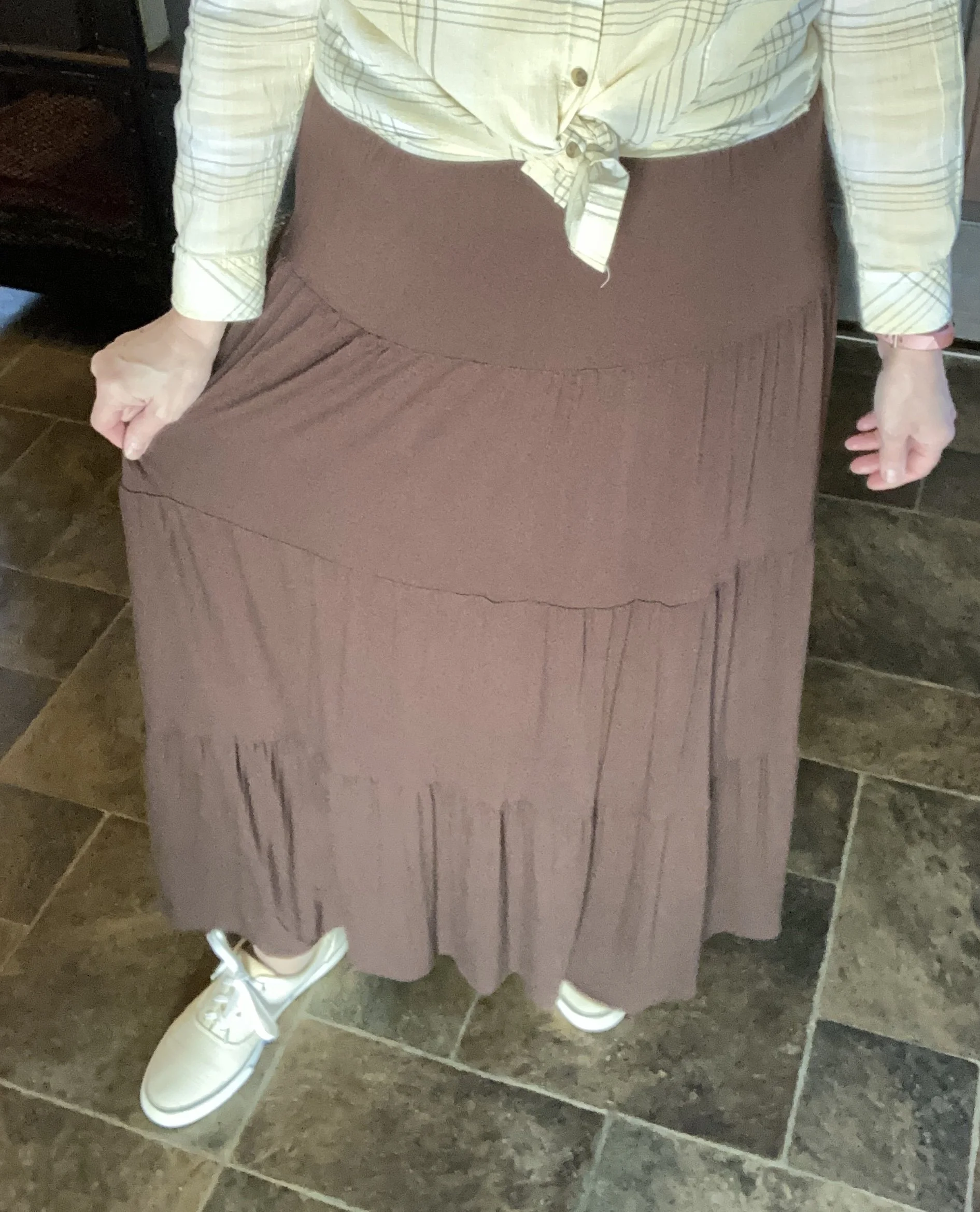
This thrifted, colorful skirt is Notations brand. I like that it has a bit of a crinkle to it. Does anyone remember the old “broomstick skirts” from back in the 90’s? I had several back in the day, but ended up getting rid of them. They, like many trends come and go, but if you are into Boho or Cottage Core aesthetics in your fashion then you’ll want to keep a few of these long, wrinkly pieces. I have incorporated a couple back into my rotation, thus my desire to show off my skirts here and there.
The skirt has, not only the red orange color, but dark purple, a medium brown, a subtle olive green, and a periwinkle blue. For today’s outfit I wanted to emphasize the purple and brown in part to show off this fabulous glass bead necklace I found at the thrift shop around the corner from my house. They have so many awesome treasures. My grandson, who I have been watching this week said he loved my necklace and that the dark purple beads looked like candy. Ha, ha.
Another second hand find, this Universal Thread cross body bag was exactly what I had been on the hunt for. Obviously, it is more like the old fashion “butt packs” that we used to carry back in the 80’s. What I like about this version is being able to wear it across my chest. It makes it feel more secure and is very easy to access. This is a soft, buttery faux leather and, while small, it holds my wallet, phone, keys and a tube of lip gloss. What more does a girl need?
If I look a bit tired in the above picture it’s because I am exhausted. With my spouse being disabled from his gimpy ankles, having company last week and now watching a very energetic, stubborn, and loud three year old, I am pooped! But God is good and we will persevere, not because of who I am, but because of who He is!
For shoes I went with my older, tan Keds. While they are not as cute as a pair of sandals would be, they are much more practical for chasing a rambunctious toddler.
What do you think of this outfit? Do you have a colorful skirt that you like to pull out in the warmer weather? What colors does your skirt have in it? I love to hear your thoughts and ideas so leave a comment or two.
I’ve included shopping links interspersed throughout the article to give you options if you want to shop. These are affiliate links and are brought to you at no charge. If you purchase through a link I provided I get a small commission. Thank you for all your clicks, likes and comments. I treasure each and every one.
Have a great Tuesday!


