Outfit Inspiration: Summer Trends - Checked Skirt Outfit

The fashion world always puts out their spring and fall trend lists long before the season ever starts. Lesser known, but still available are the summer and winter trend lists. Since summer officially starts later this month, I decided to feature a few of the patterns, colors and styles on the docket for summer.

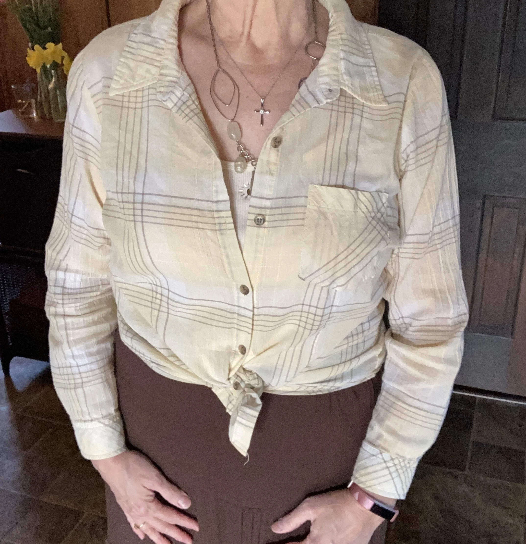
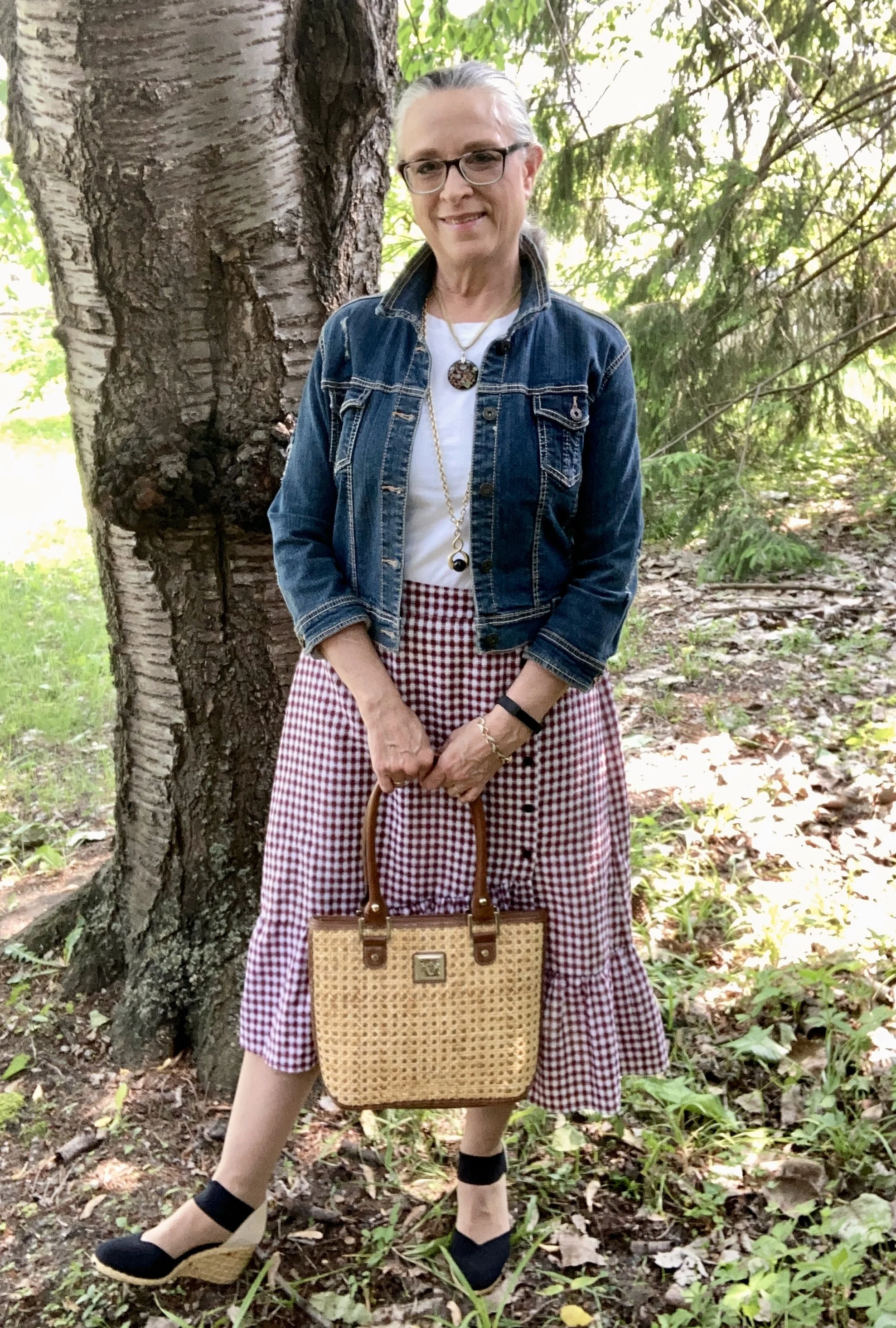
Today’s outfit revolves around what Glamour calls Retro Gingham. The transition to clothing came as early as the early 1900’s, but it was Dorothy in the 1930 Wizard of Oz that made it a fashion statement. It took off in the 1950’s and 60’s being donned by actresses like Brigitte Bardot, and Marylyn Monroe. Gingham has continued to cycle through the fashion world much like leopard print, coming and going with ease.

Gingham always makes for a fun outfit, whether it is work as a skirt, shirt, or in the form of accessories like scarves or bags.

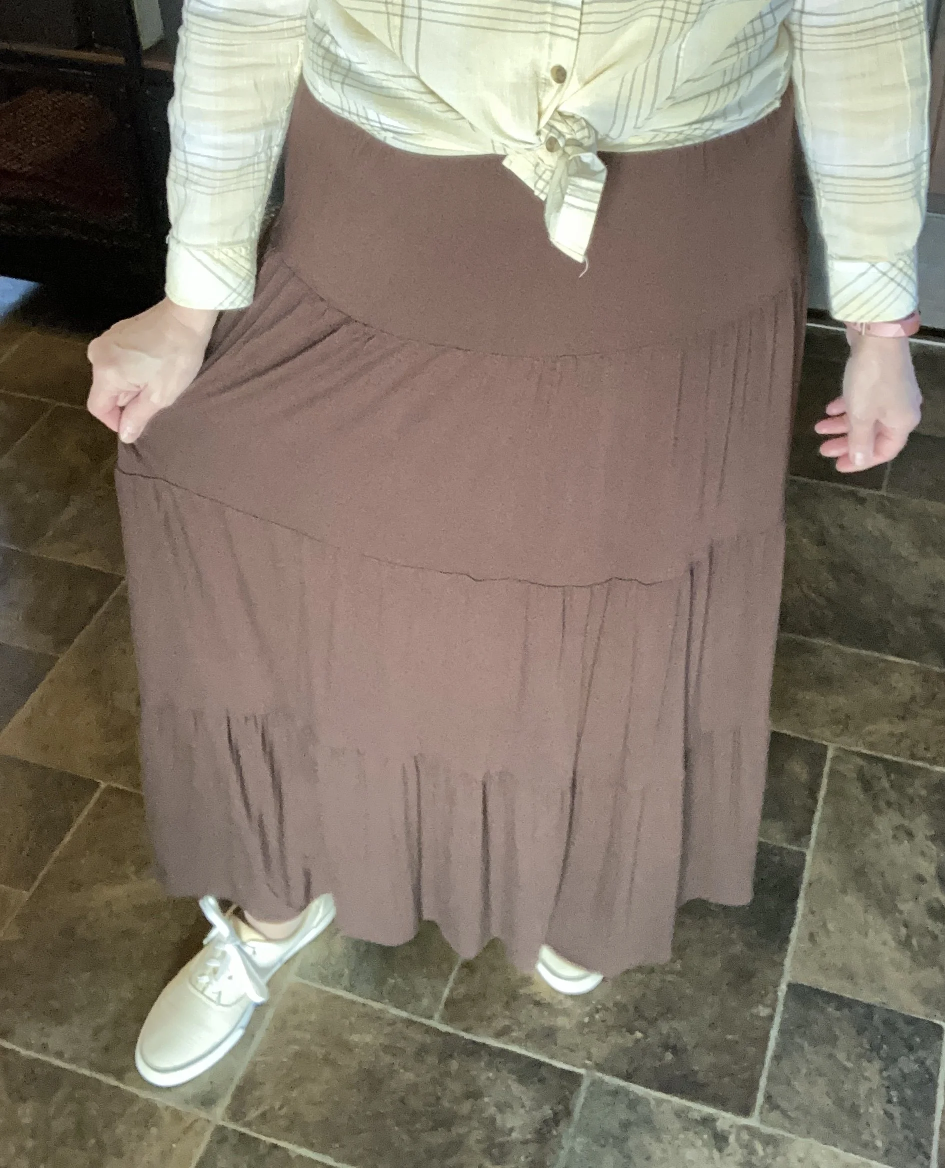
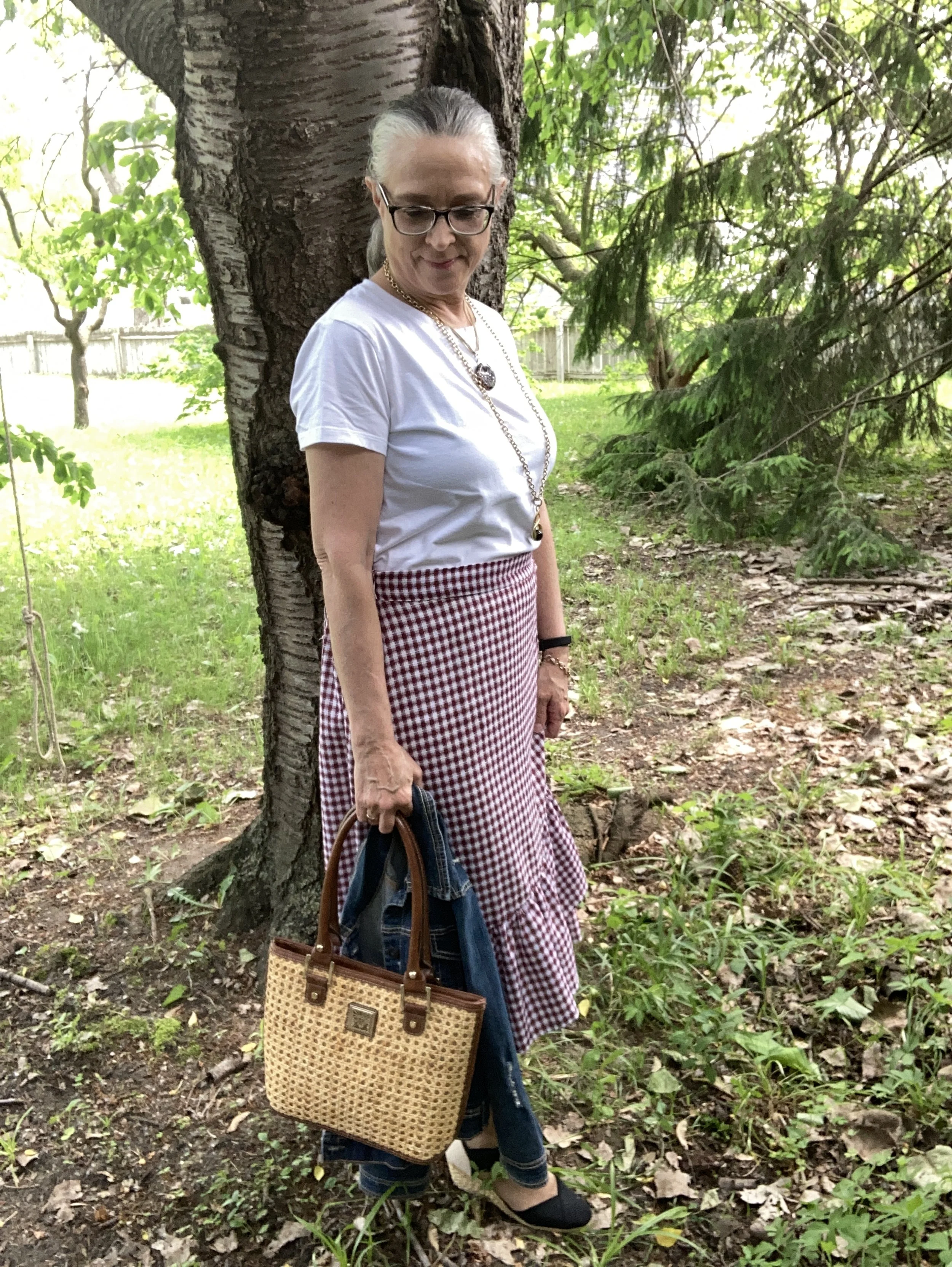
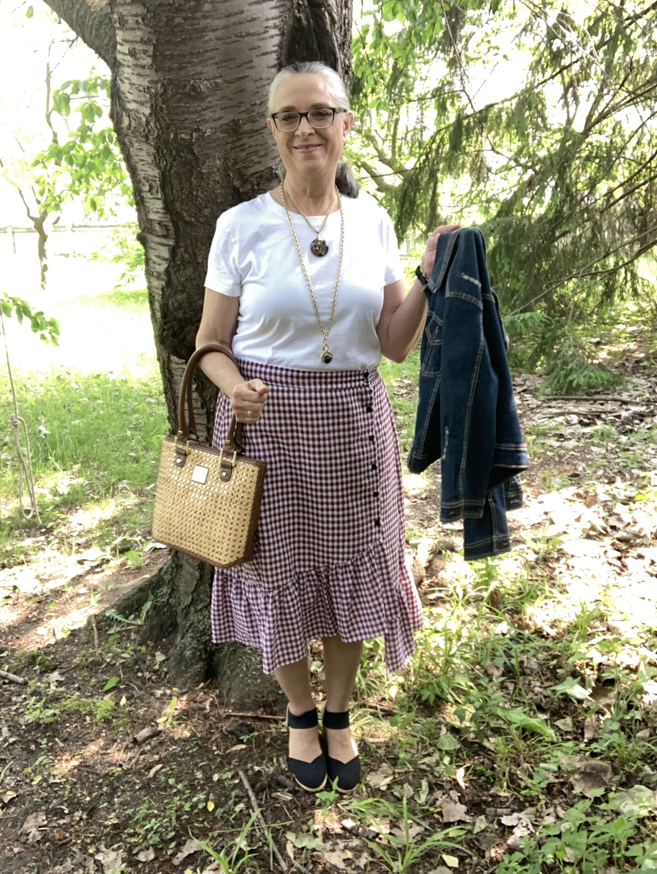
I have styled this skirt on the blog one other time since I thrifted it a couple years ago. I have no idea what the brand is, but I love the asymmetrical hem, the ruffle and the buttons off to the side. You can see how I styled it for the 4th of July last year.

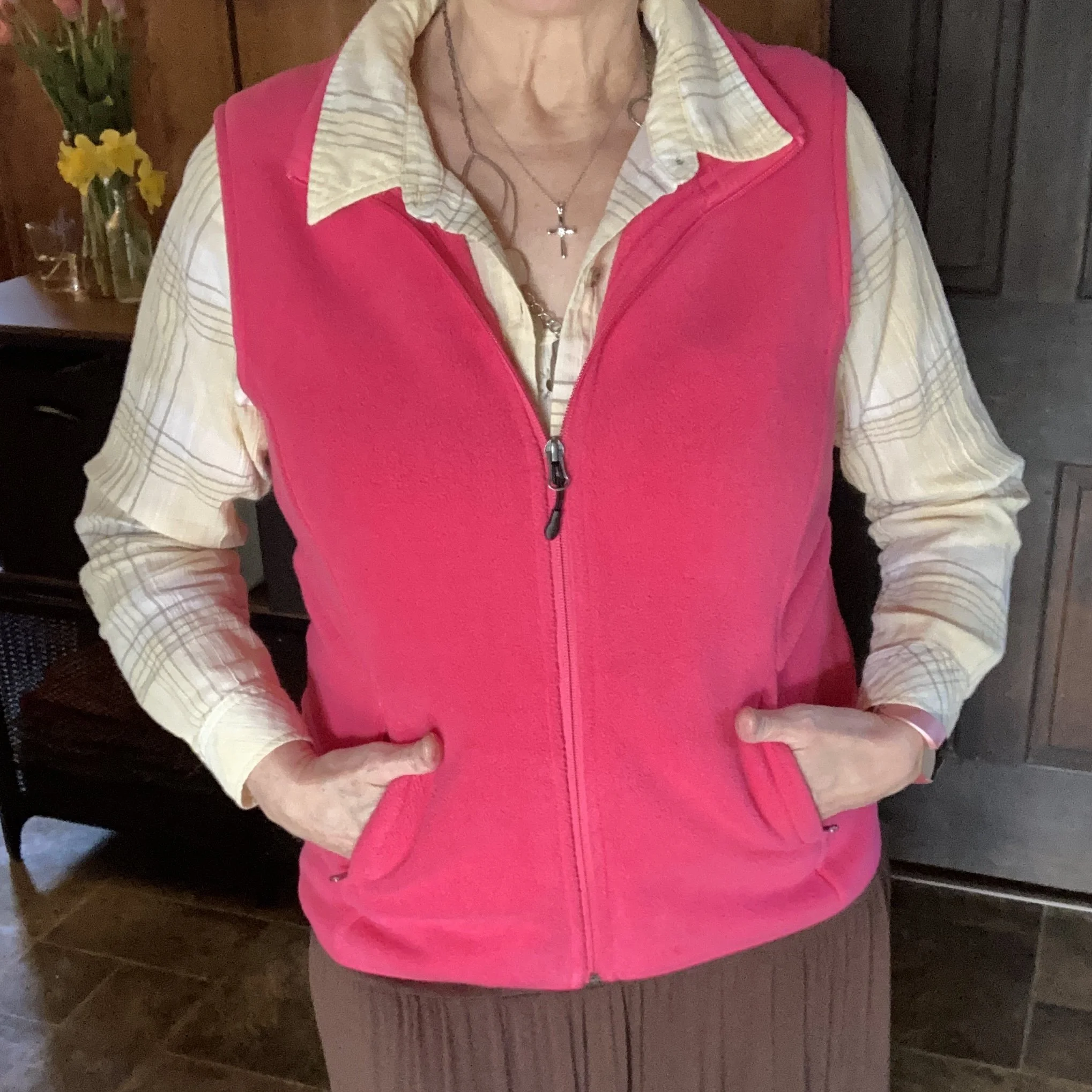
I once again styled it with a white tee, and denim, but this time chose a classic crew neck, thrifted Great Northwest brand, and my 3/4 length sleeve thrifted Rue 21 cropped denim jacket.

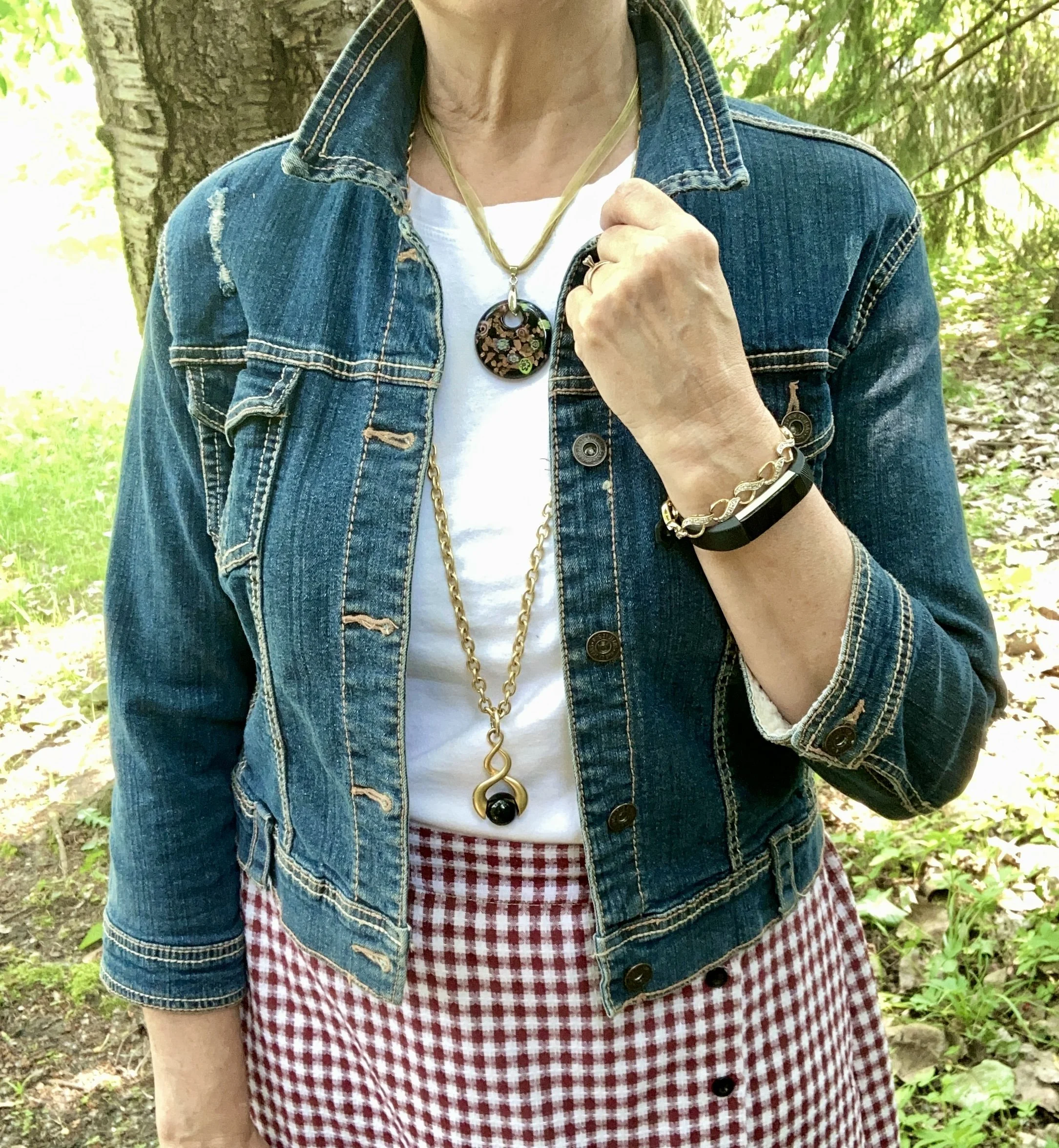
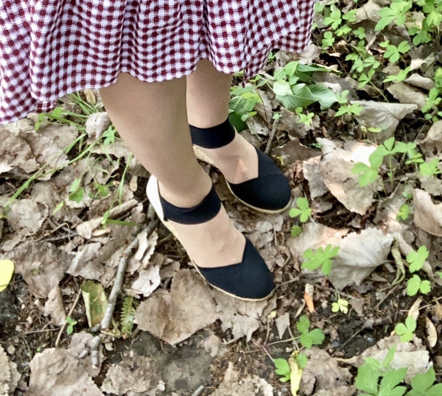
You can see my jewelry in the above picture. I love the layer necklaces and there is no reason to think they have to match. I did think the gold ribbon on the multicolored bead, and the gold chain went well together. Both pieces pulled in the black Chaps espadrille shoes. I got these at Kohl’s a few years ago.

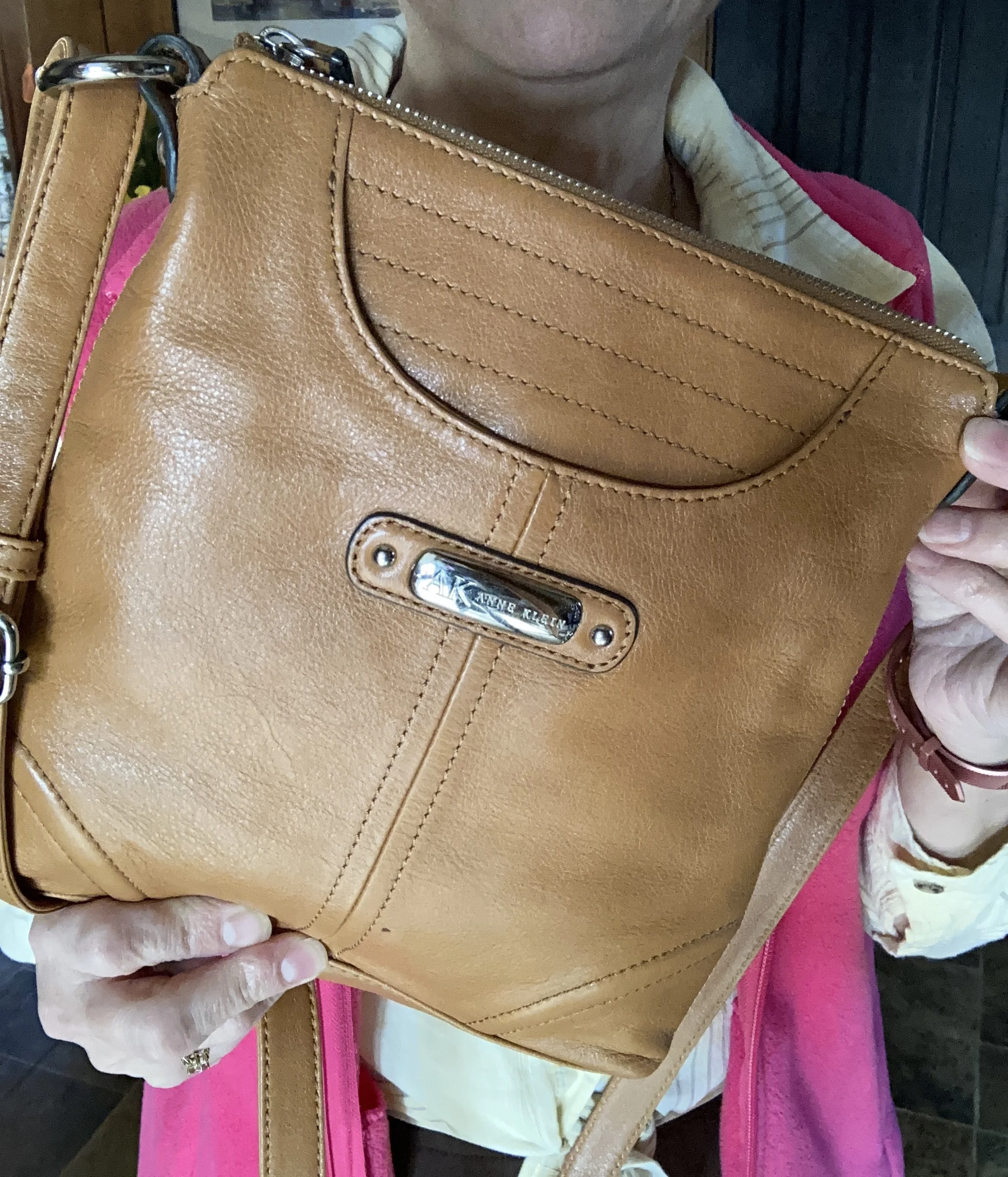
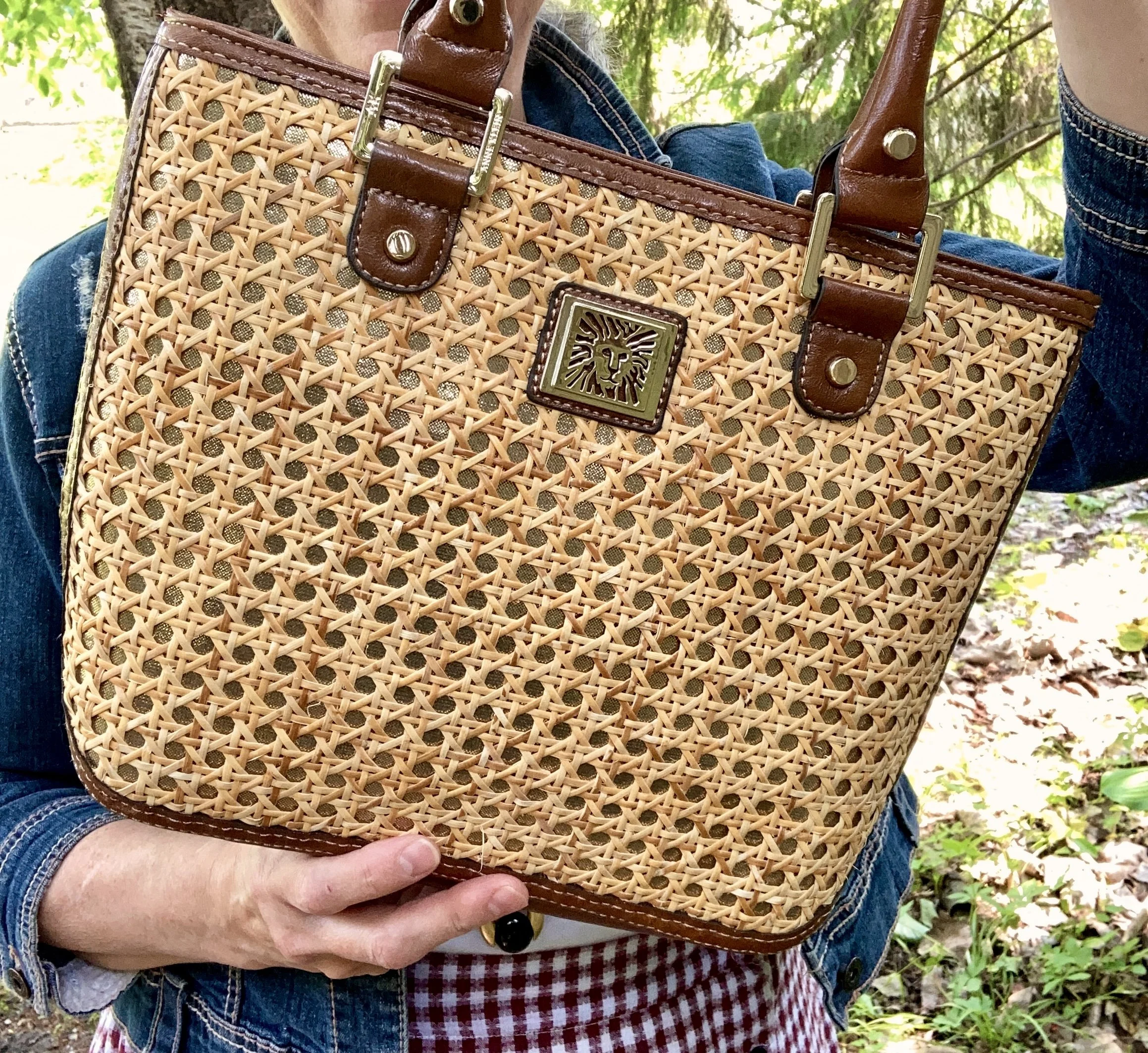
I wanted a summery bag, so I grabbed this Anne Klein piece that I thrifted about a month ago. I really like the straw weaving on the front, and it definitely says warm weather.

I think this is a great outfit for a summer graduation or casual wedding. What do you think? Do you like the gingham trend? Do you think plaid is perfect for summer, or do you think it should be reserved for cold weather? I’d love to hear your thoughts.

I hope you enjoyed this post. I have included a few shopping links for you to enjoy. These are affiliate link. All opinions are my own.

Have a great Wednesday eve!

Outfit Inspiration: Pantone Spring/Summer 2025 London Palette Colors - Pear Sorbet, Hibiscus and Cocoa

I got my month all off kilter and I haven’t even been able to get my Faith posts out, so bear with me as I try to get back to my regular posting schedule. This column, Outfit Inspiration, usually happens the first Tuesday of the month, but for some reason I got completely off this month. Oh well, I know you all are very understanding so I appreciate the support even when I am losing the plot. Ha, ha.

I know a few weeks ago, I said I wasn’t going to cover all of the Pantone 2025 colors, but I got sucked in and am having fun shopping my closet for this year’s Spring/Summer palette. Currently, I am covering the London Palette after which I will decide if I am going to continue with the New York Palette. To see the current London palette you can see the pin I added to my board a few months ago with all of the colors. So far I have shown you Airy Blue and Passion Flower, and White Grape, Veridian Green, and Curds & Whey.

Today’s outfit is a mix of a bright jewel tone pinky red, a pastel very pale yellow, and one of the classic colors from their palette, a dark chocolate brown. May I introduce you to Pear Sorbet, Hibiscus, and Cocoa.

When deciding which of the remaining colors to put together I had to play around for a few hours to find the right pieces in the right combinations. I like how this turned out and it all started with this pale, Pear Sorbet, thrifted Christopher & Banks, plaid shirt. I am not as much into really pale colors like this, but I do think there is a place for them in our closets, especially in the warm weather months. This piece is as light weight as it is pale and will be great for when the temperatures go up.

The other piece I knew I wanted to use for the bright pinky red Hibiscus color was this thrifted Amazon Essentials vest. It is interesting how these darker or brighter shades of pink can look so vastly different. If I compare this to pink it looks almost red. If I compare it to red it looks pink. The wonderful world of color!

I have worn this tiered, knit maxi skirt on the blog numerous times. It is one of my regular go to’s in the the warmer months and is so comfortable. This is St. John’s Bay brand and is from JC Penney. You can see it styled with a spotted top, a green moto jacket, a bookish vest, and a long fringe vest.

To make the look more spring/summer like, I added a thrifted, pale yellow, St. John’s Bay tank top under the button down and left the upper buttons undone. I also added some layered jewelry.

I added my thrifted, leather Anne Klein crossbody bag.

Finally, I dug out this pale yellow pair of Universal Thread sneakers I found on clearance at Target a few summer’s ago, to complete the look. Sorry for the crummy picture.

What do you think of these colors? Do you like this combination of colors? Do you like pastels, and how do you like to wear them? I love to have your feedback, so please leave a comment or two.

When the weather does finally stay warm this bright vest will be put away until the cold weather returns, but I was glad to get one more wear in before summer actually arrives.

I’m including a few shopping links below. These affiliate links are brought to you at no extra cost. If you purchase an item through one of my links I get a little kick back. I appreciate all your clicks and purchases.

Have a great week!