Pantone Spring/Summer 2026 - New York Palette: Burnt Sienna, Alexandrite and Coffee Bean
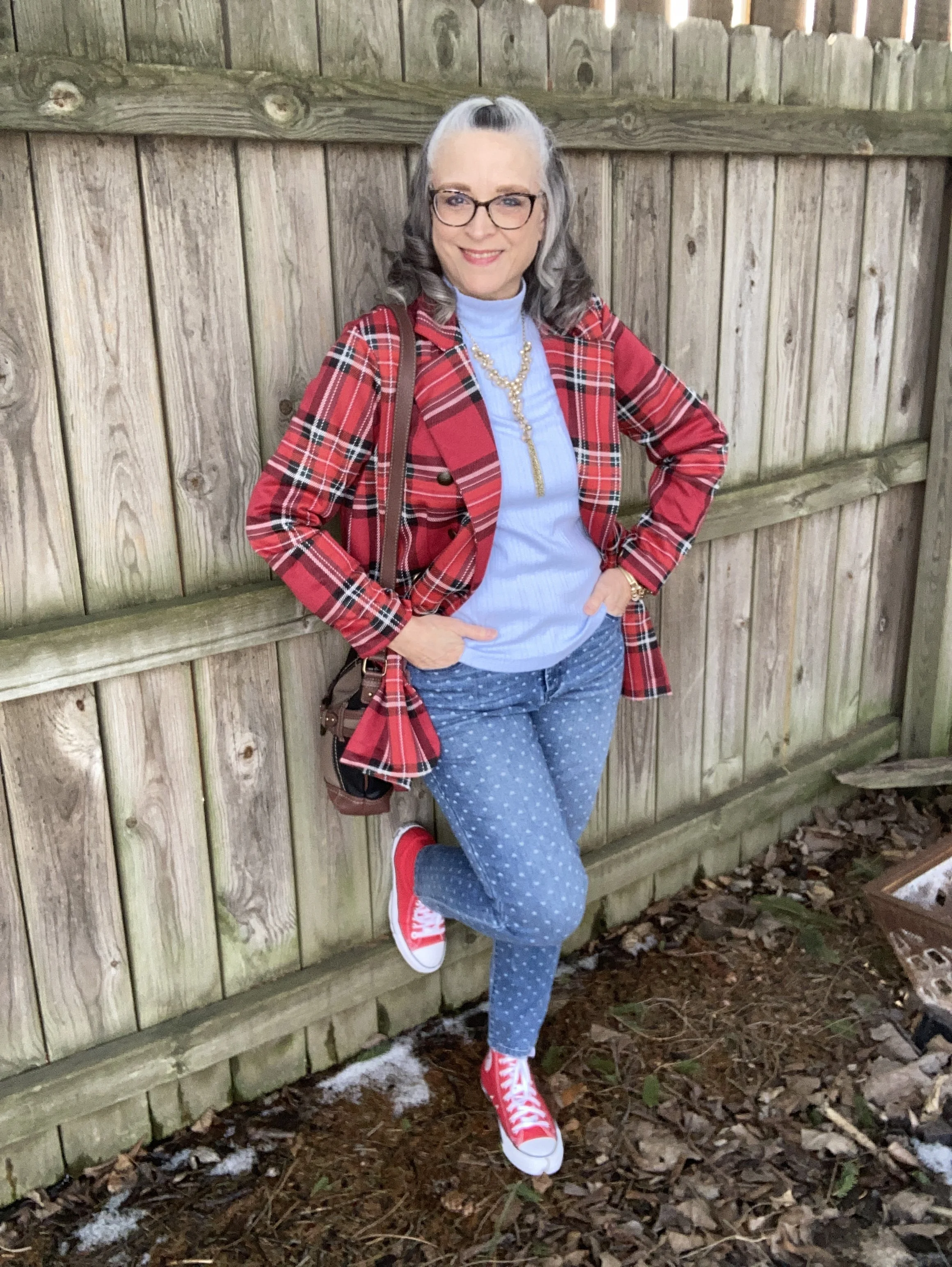
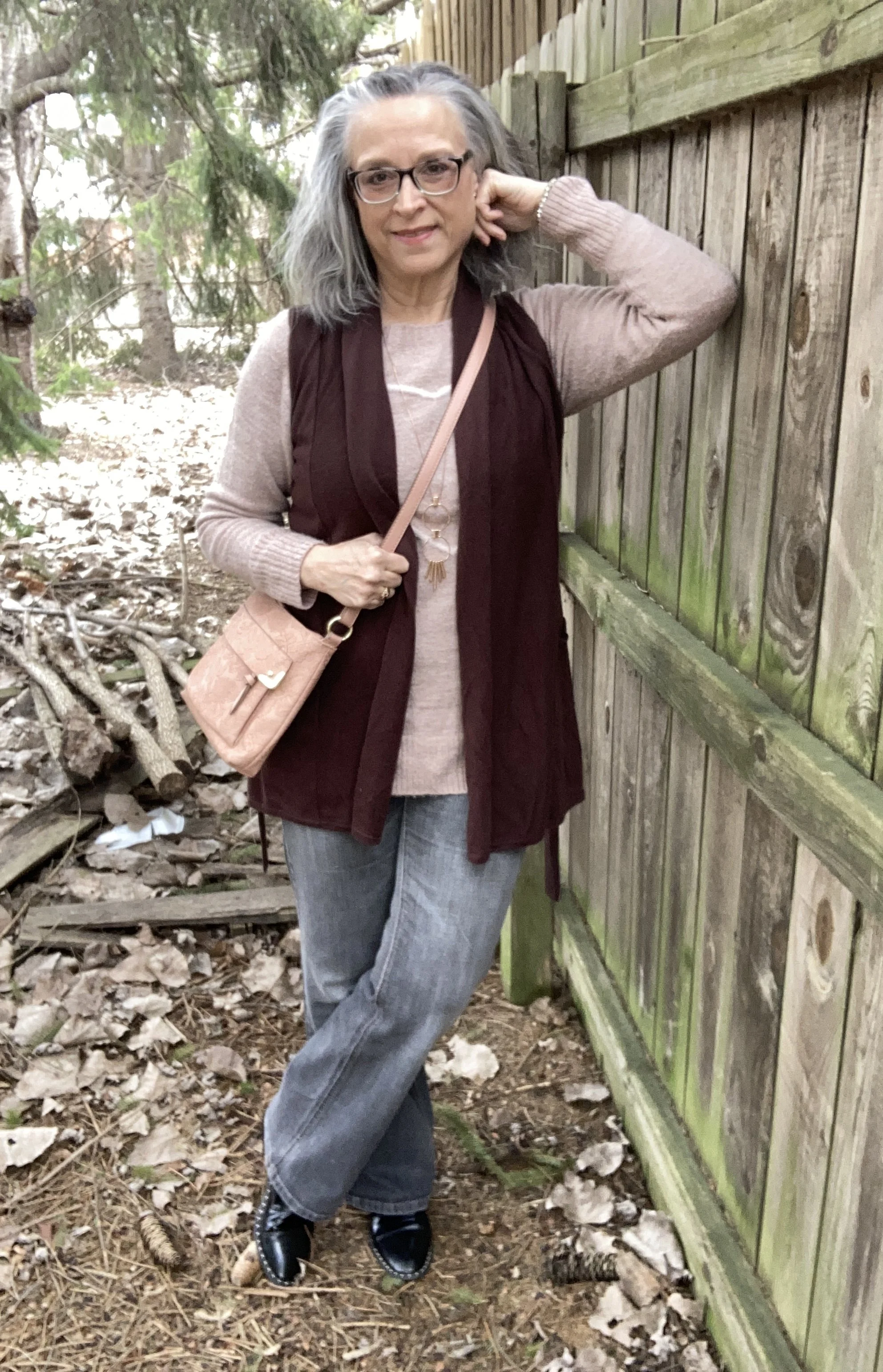
I hope you all had a wonderful Easter weekend this past weekend. We went to Wisconsin to visit family. We had a good time with lots of yummy food and the warm chaos of children enjoying time together. We are fully into the season of spring, but the temperatures are doing their usual roller coaster pattern. Today as I type this it is a balmy 34 degrees (F), and the furnace is continuing to keep us warm. These temperature fluctuation make getting dressed a challenge, but as usual I enjoy the many aspects of layering.
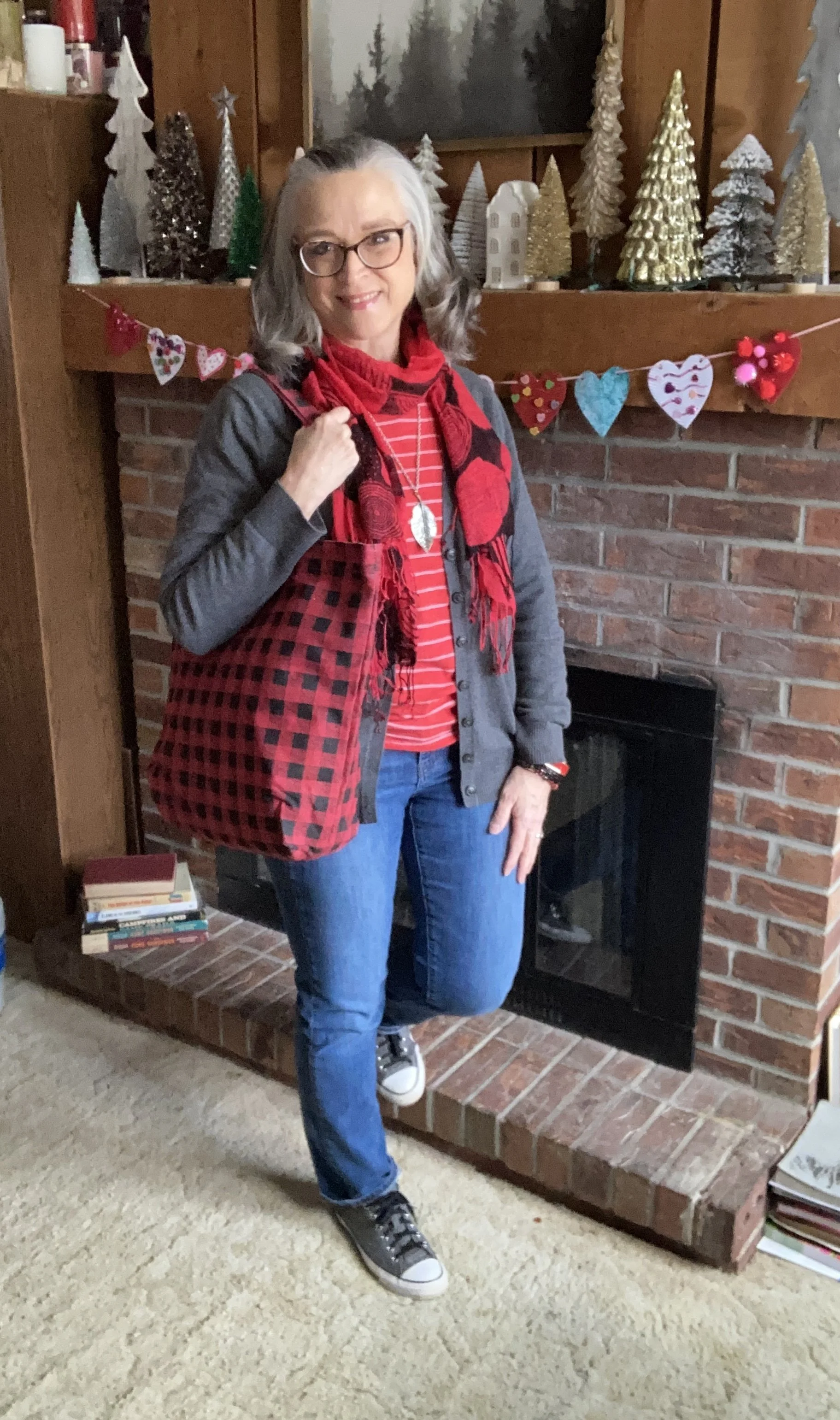
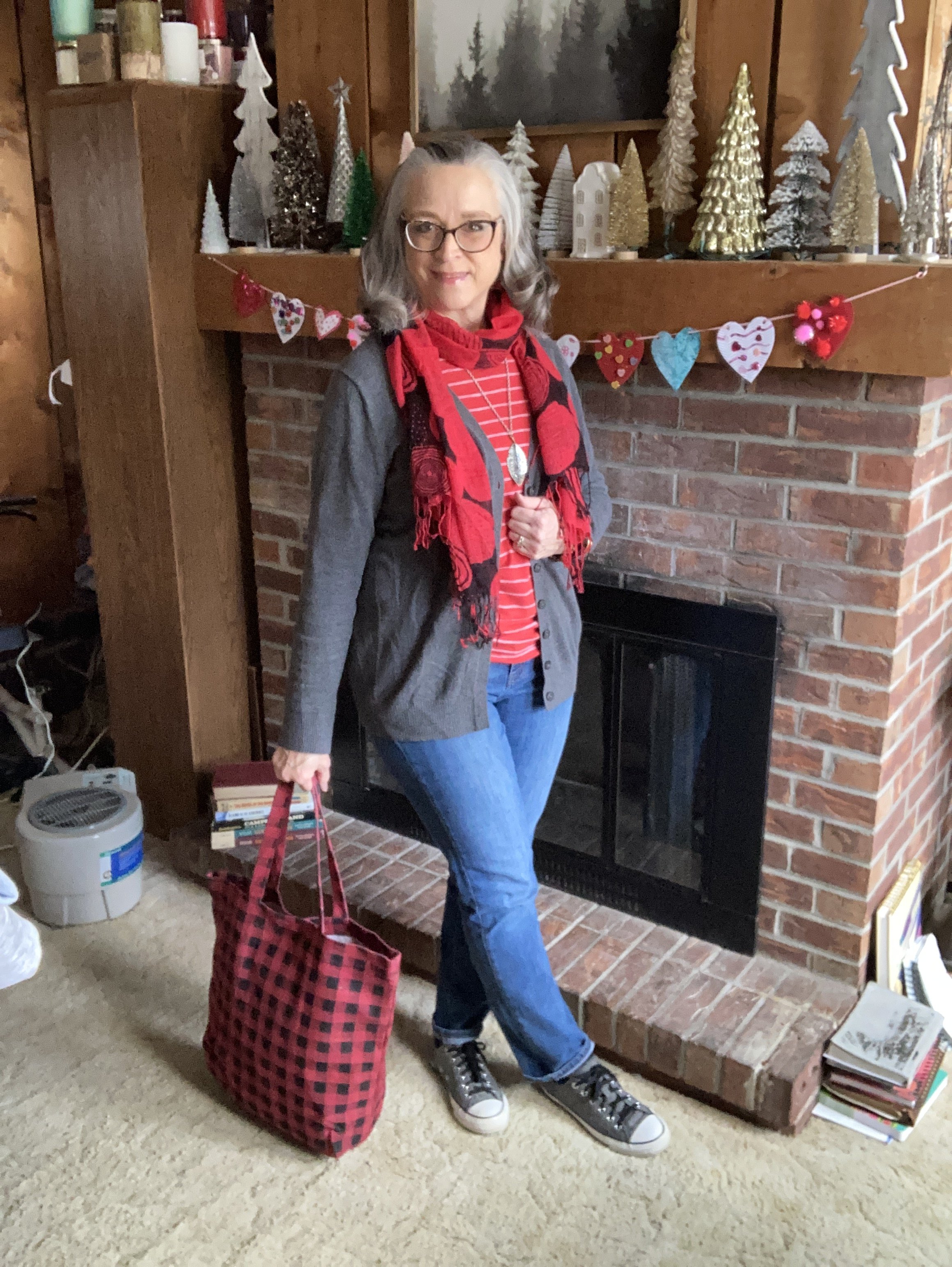
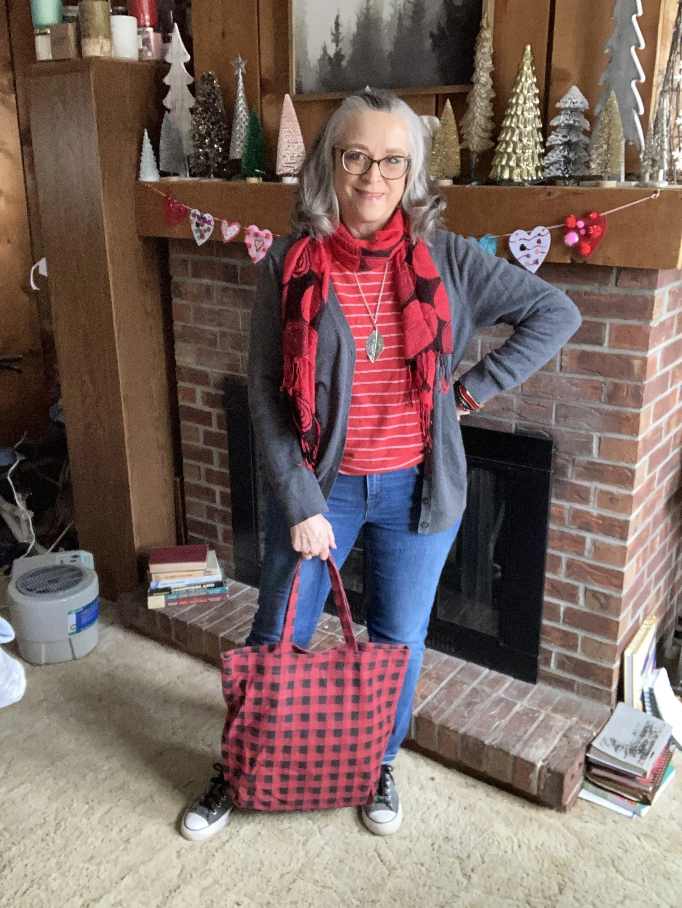
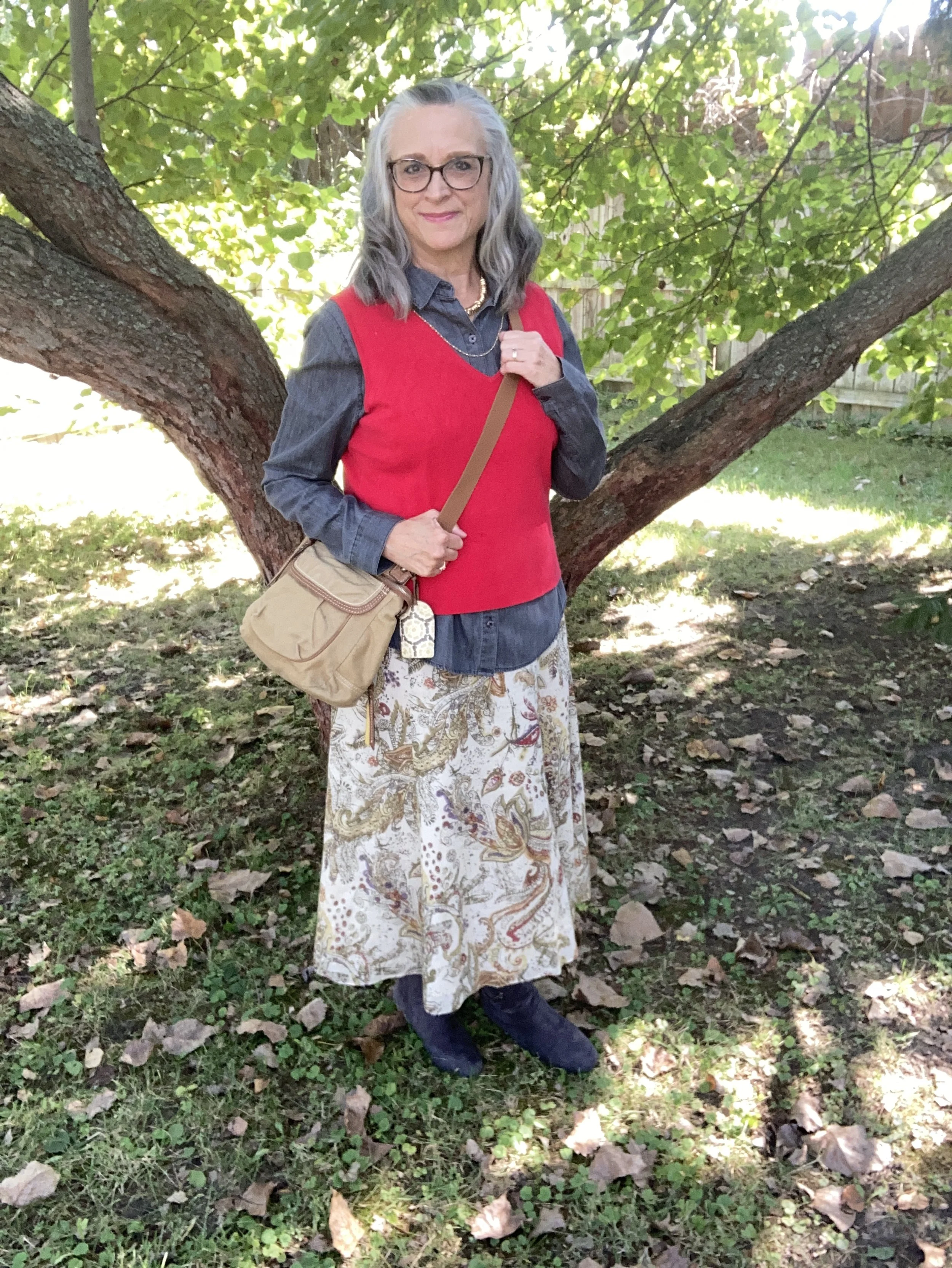
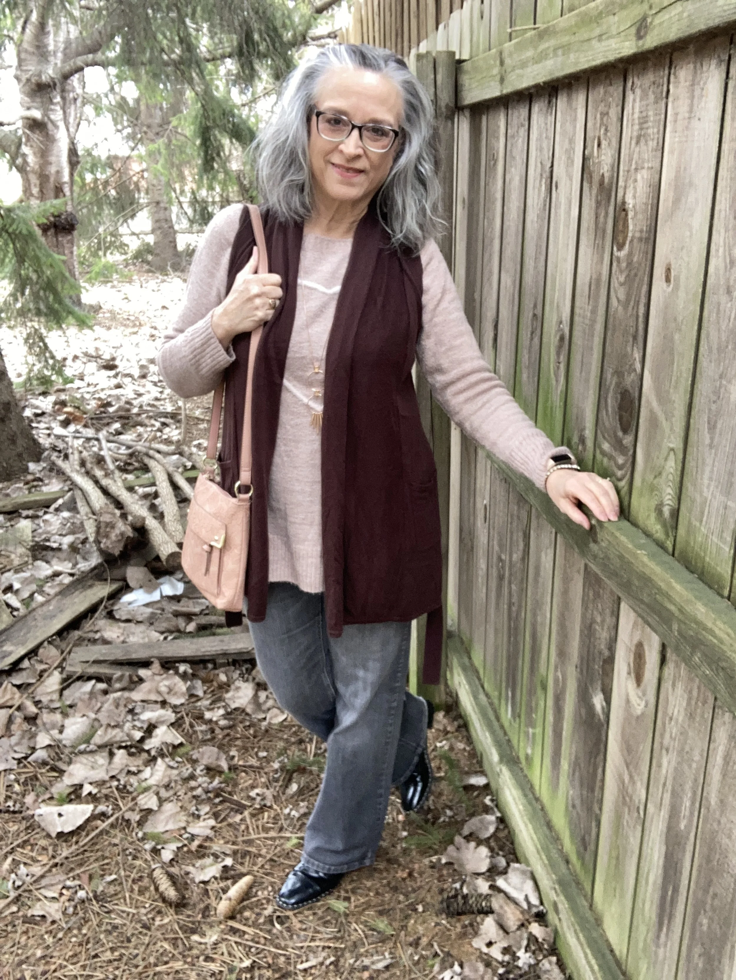
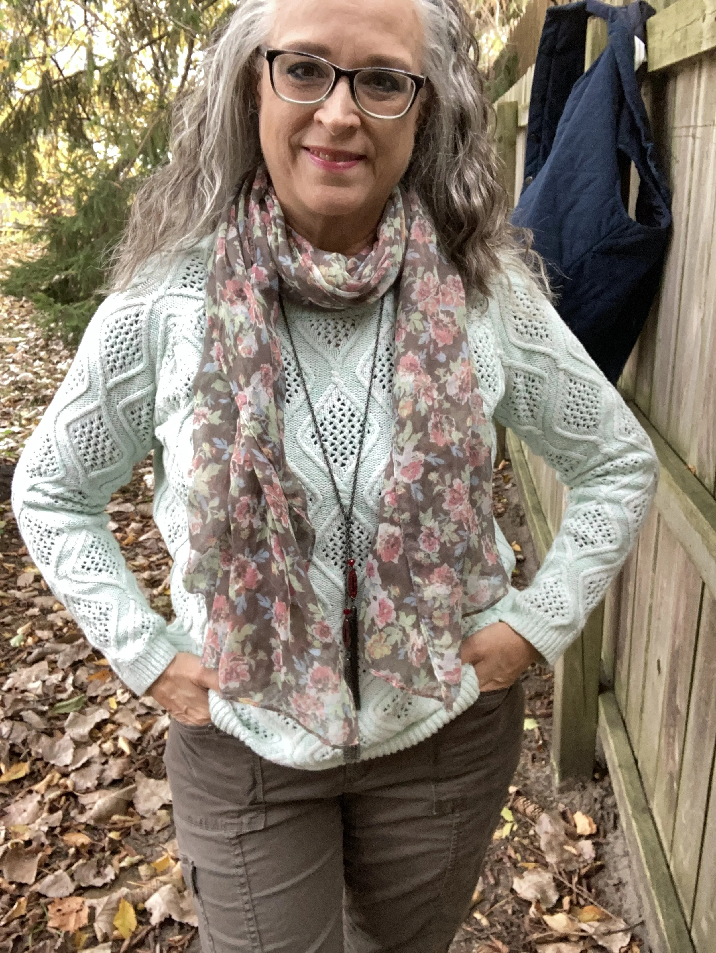
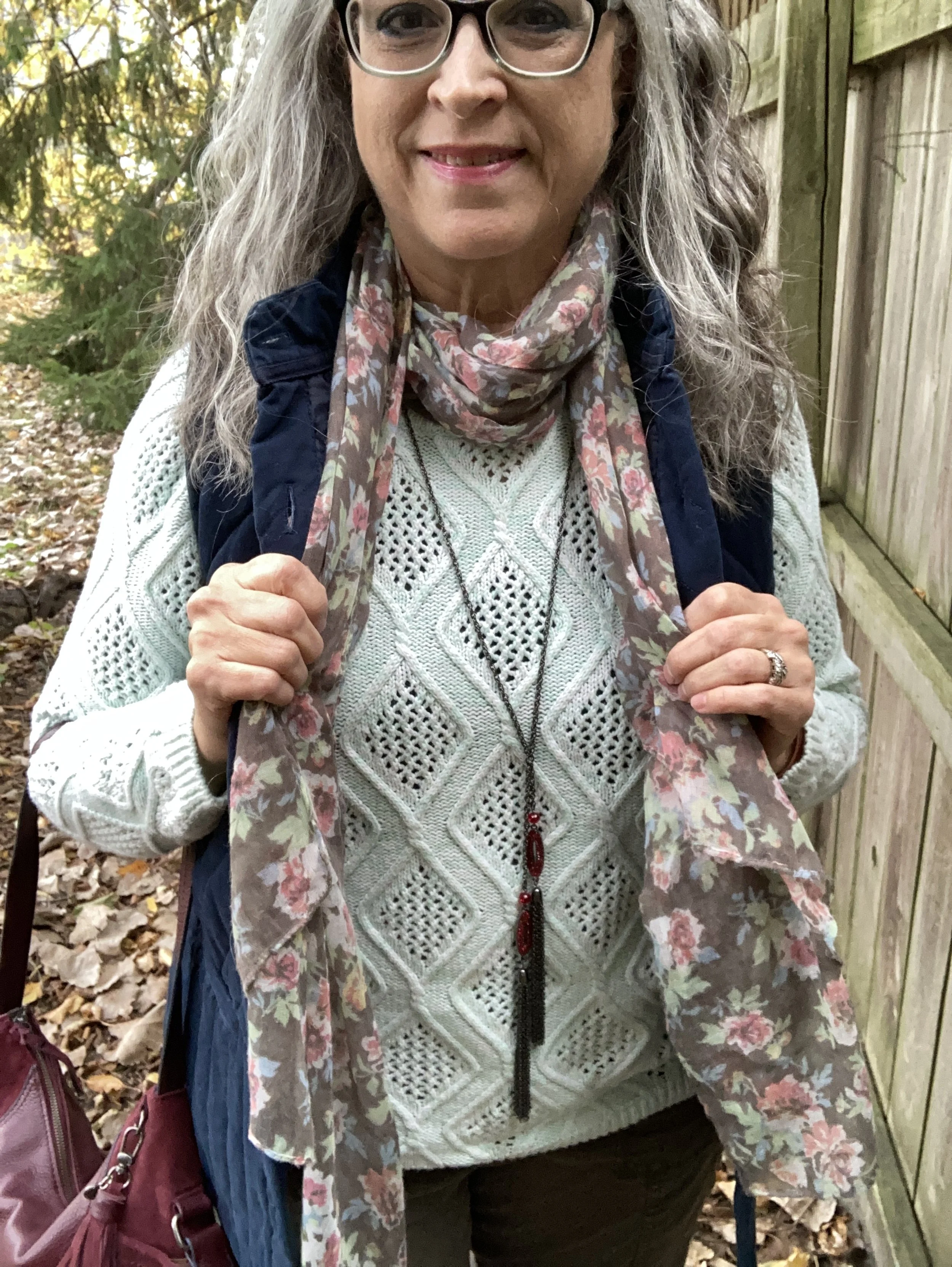
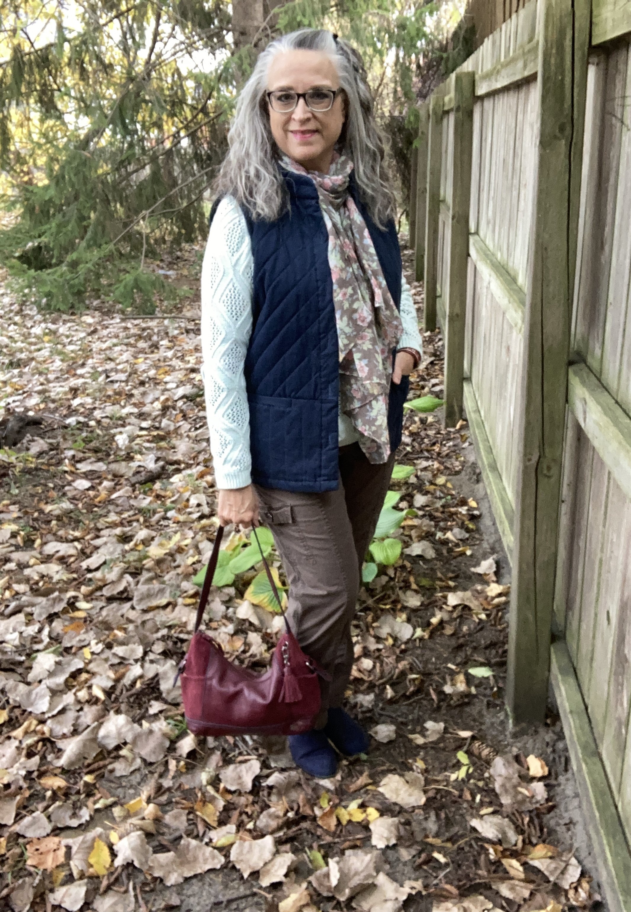
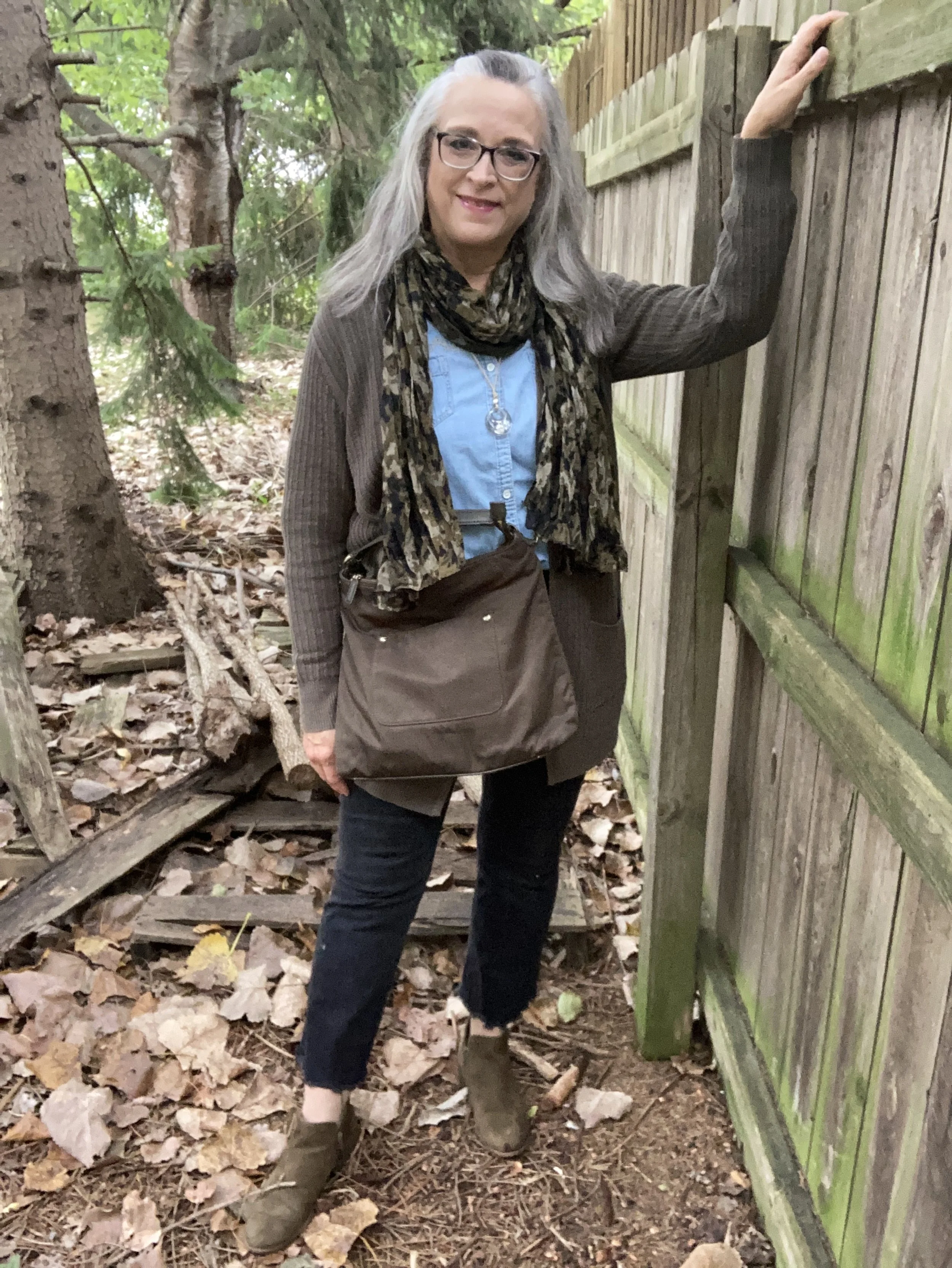
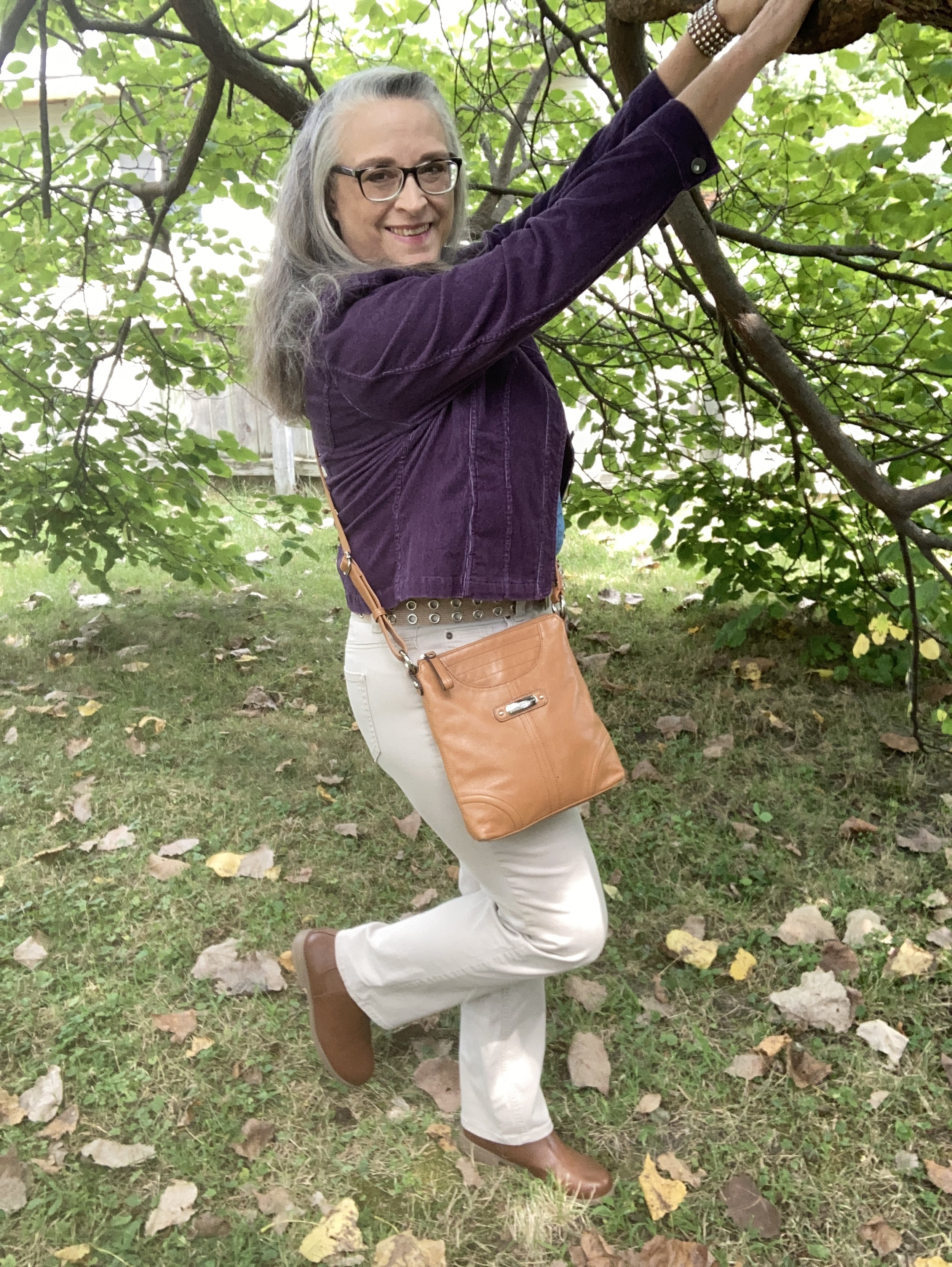
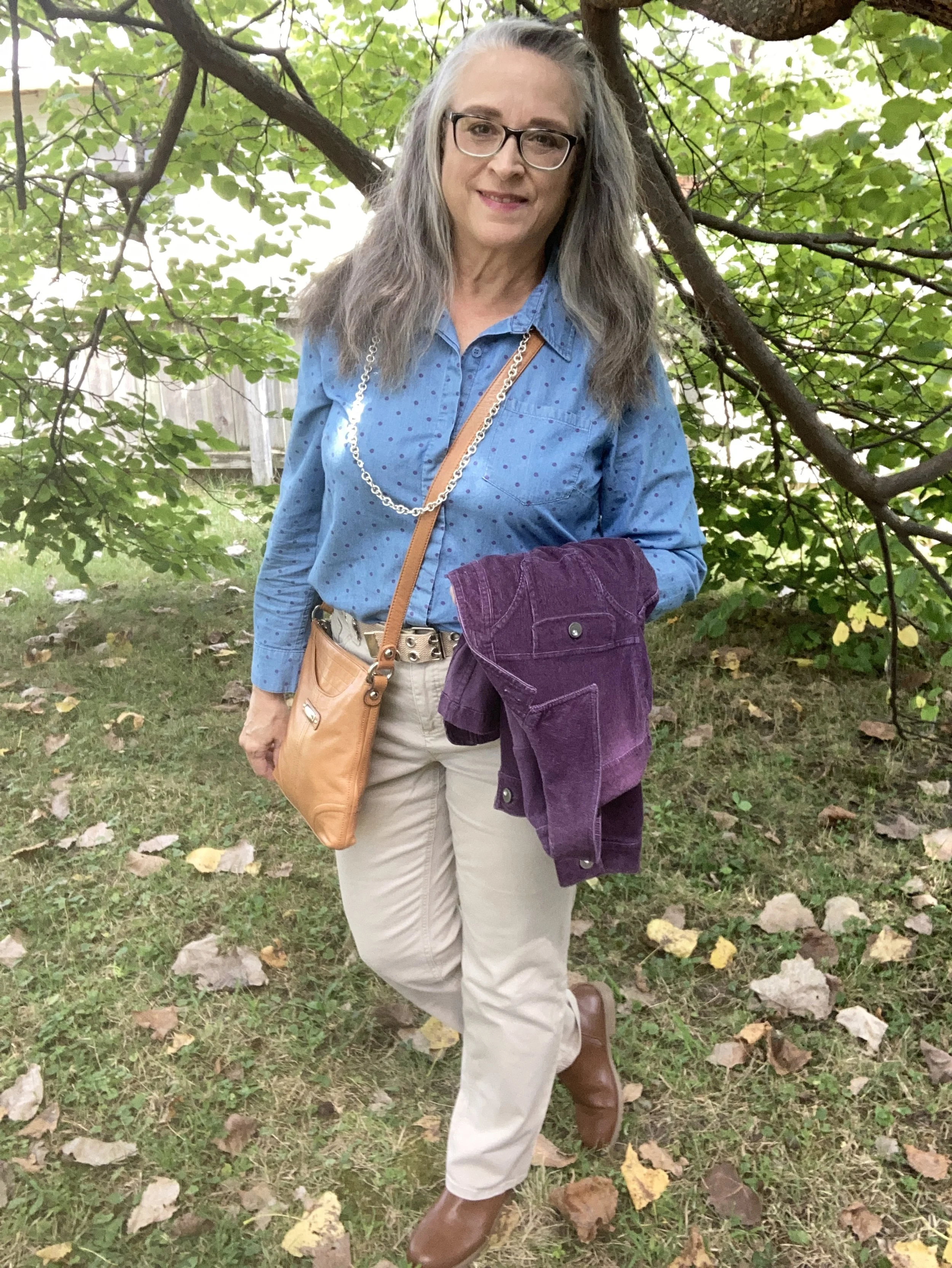
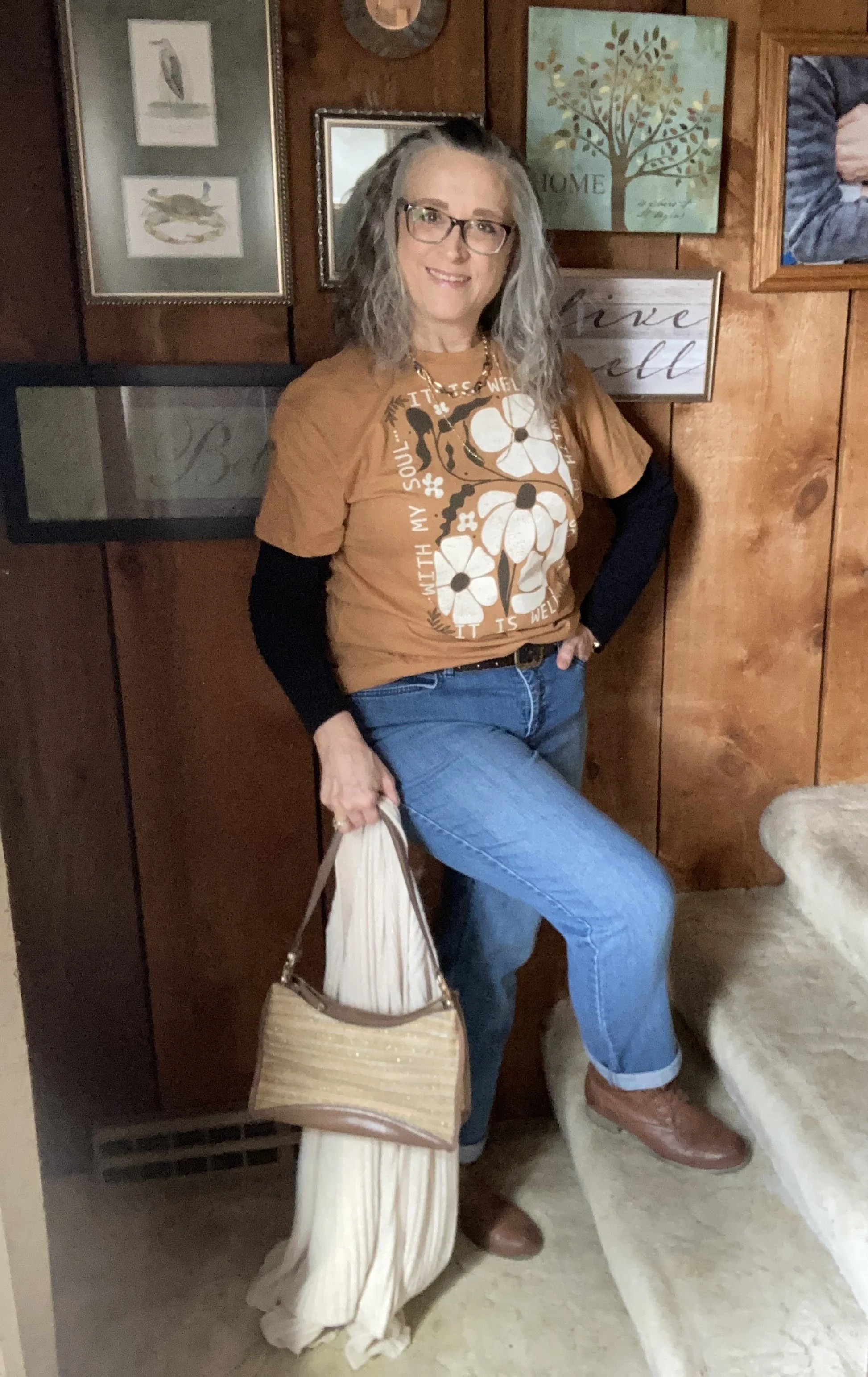
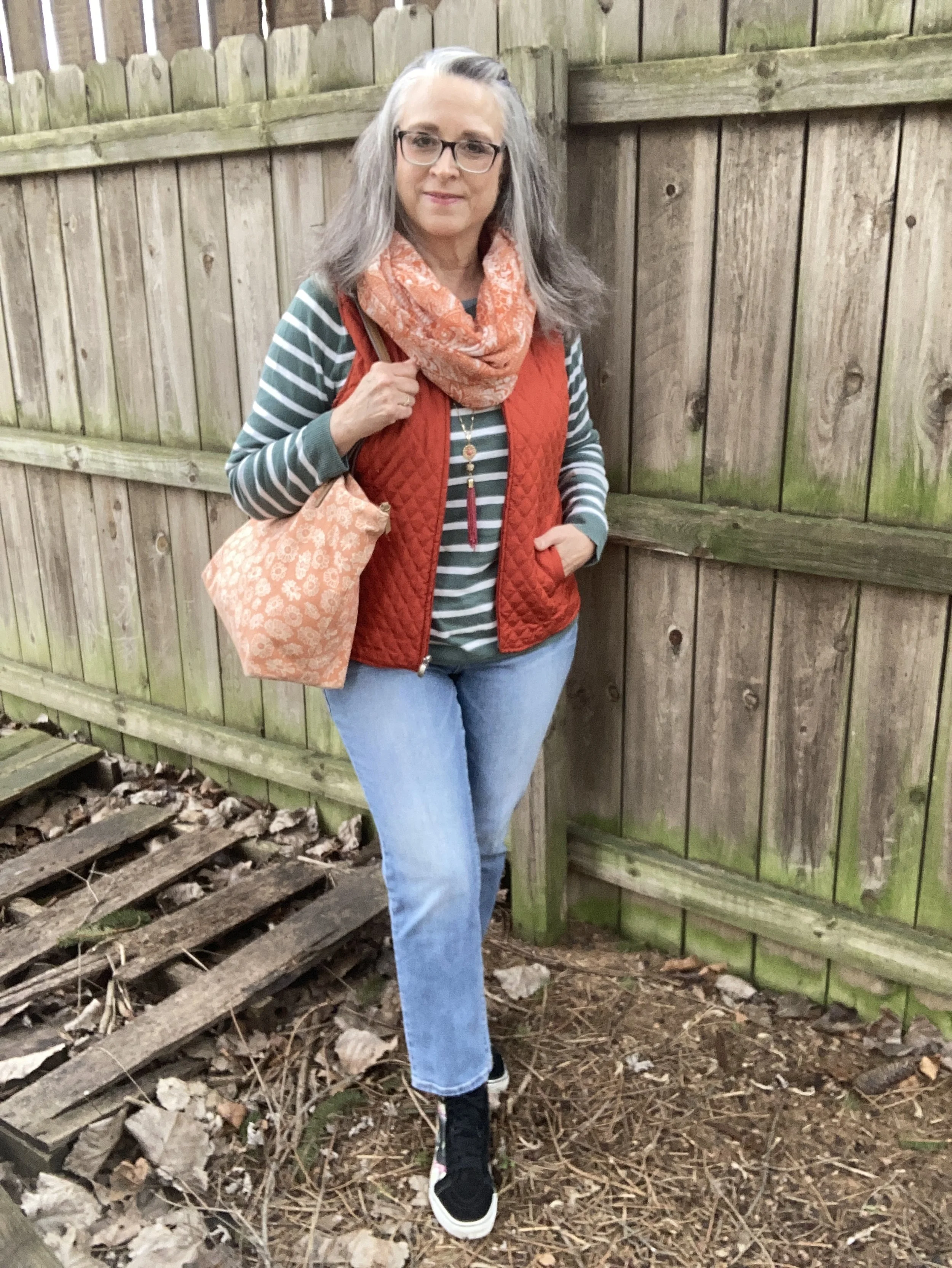
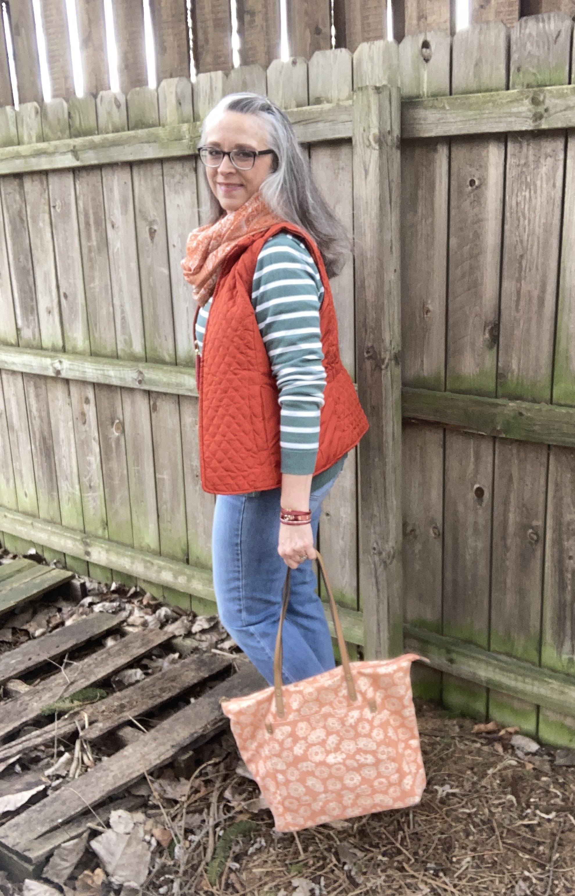
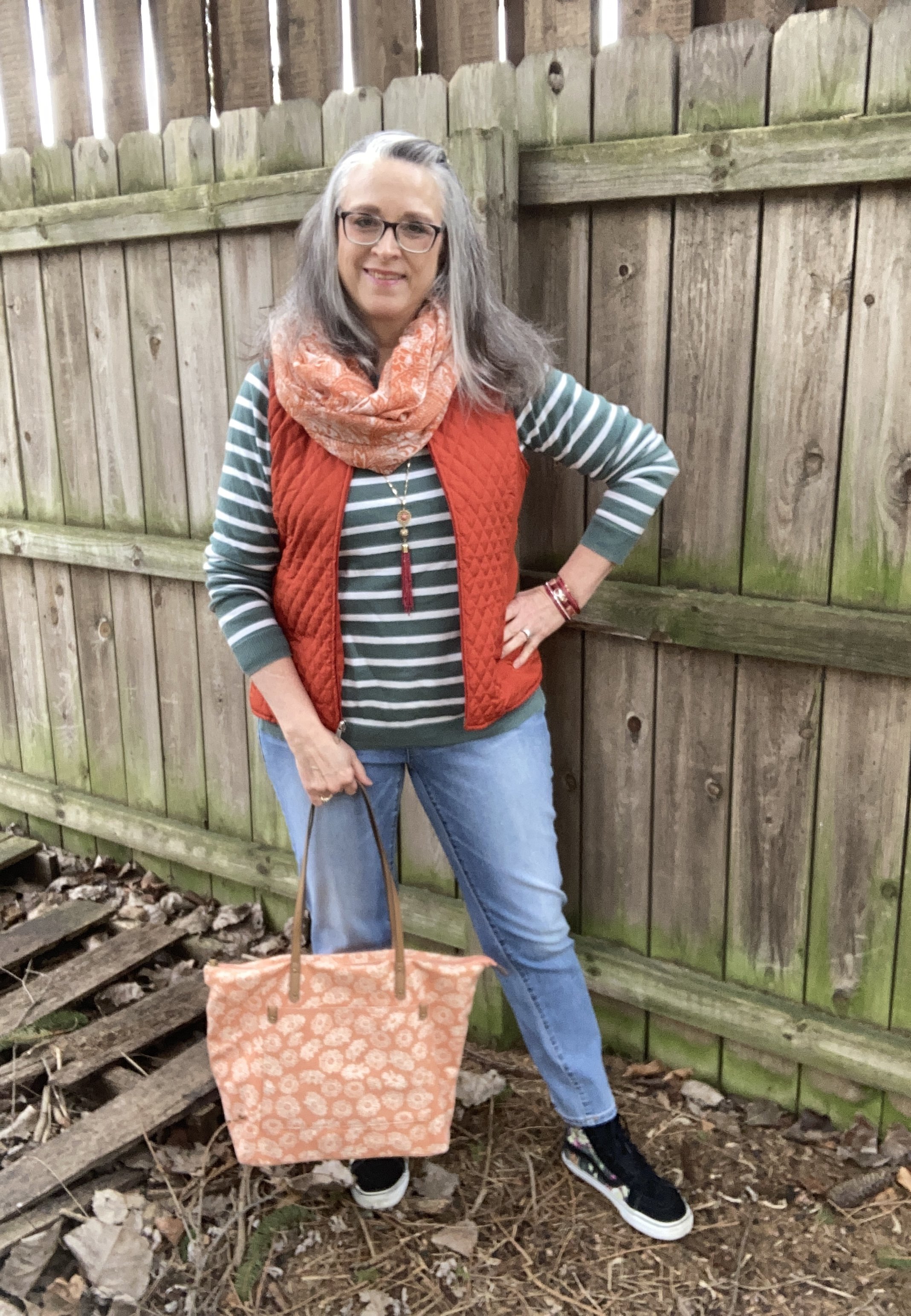
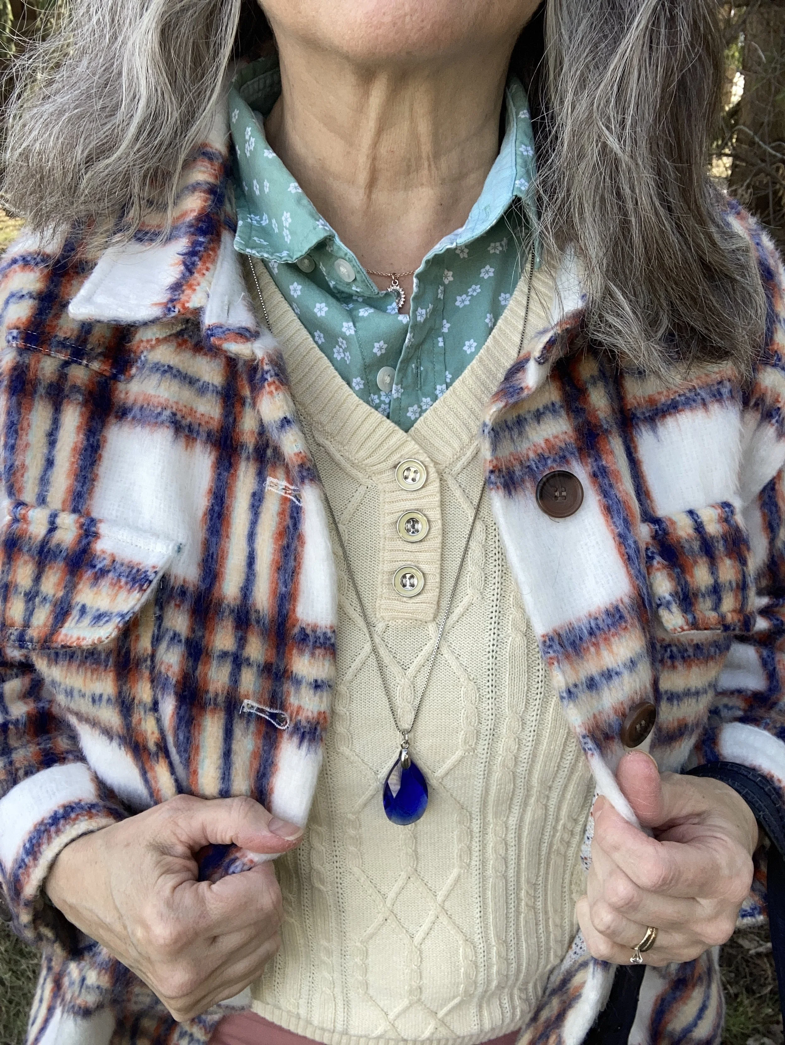
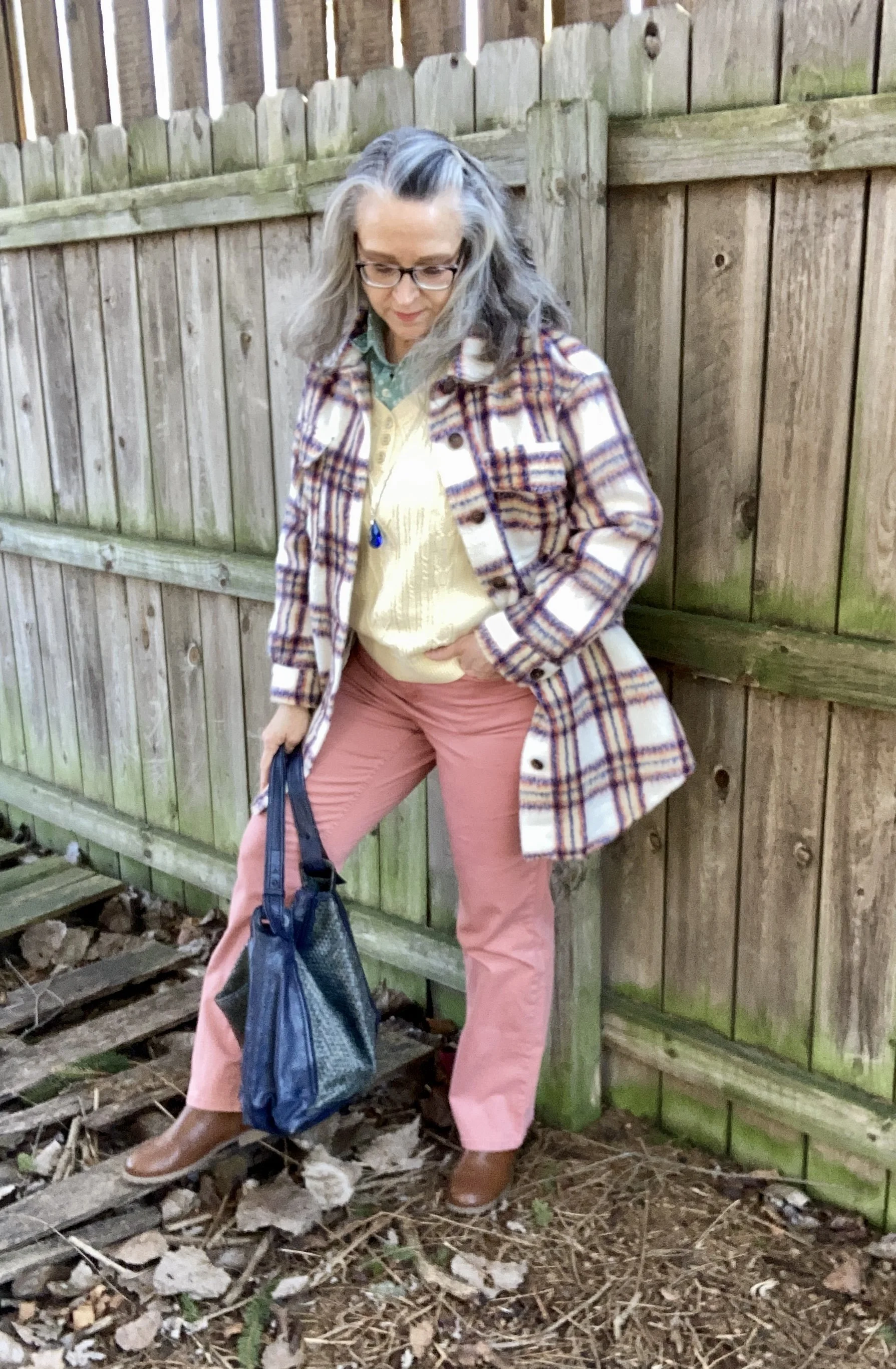
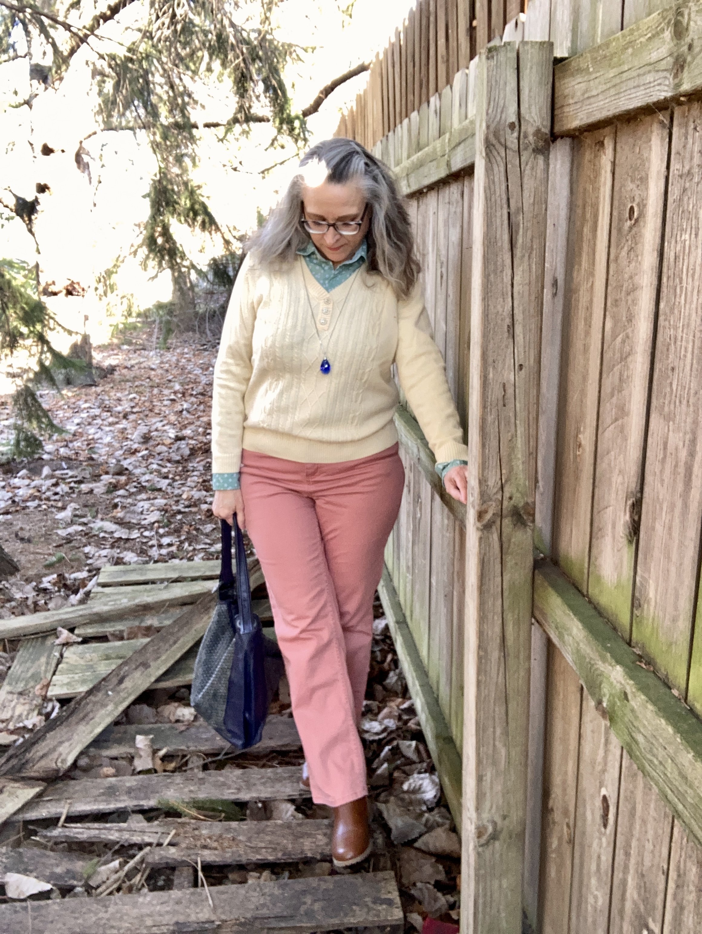
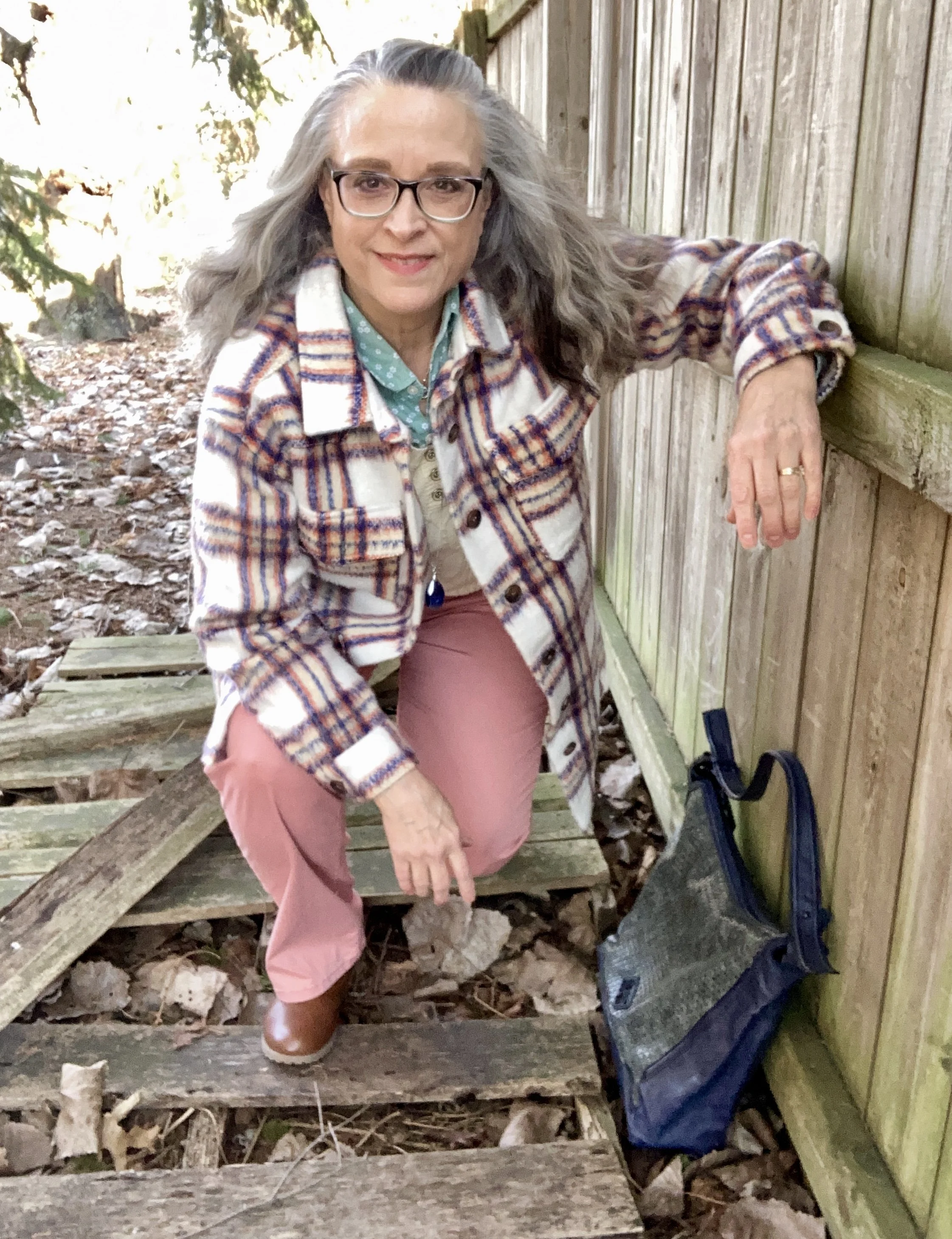
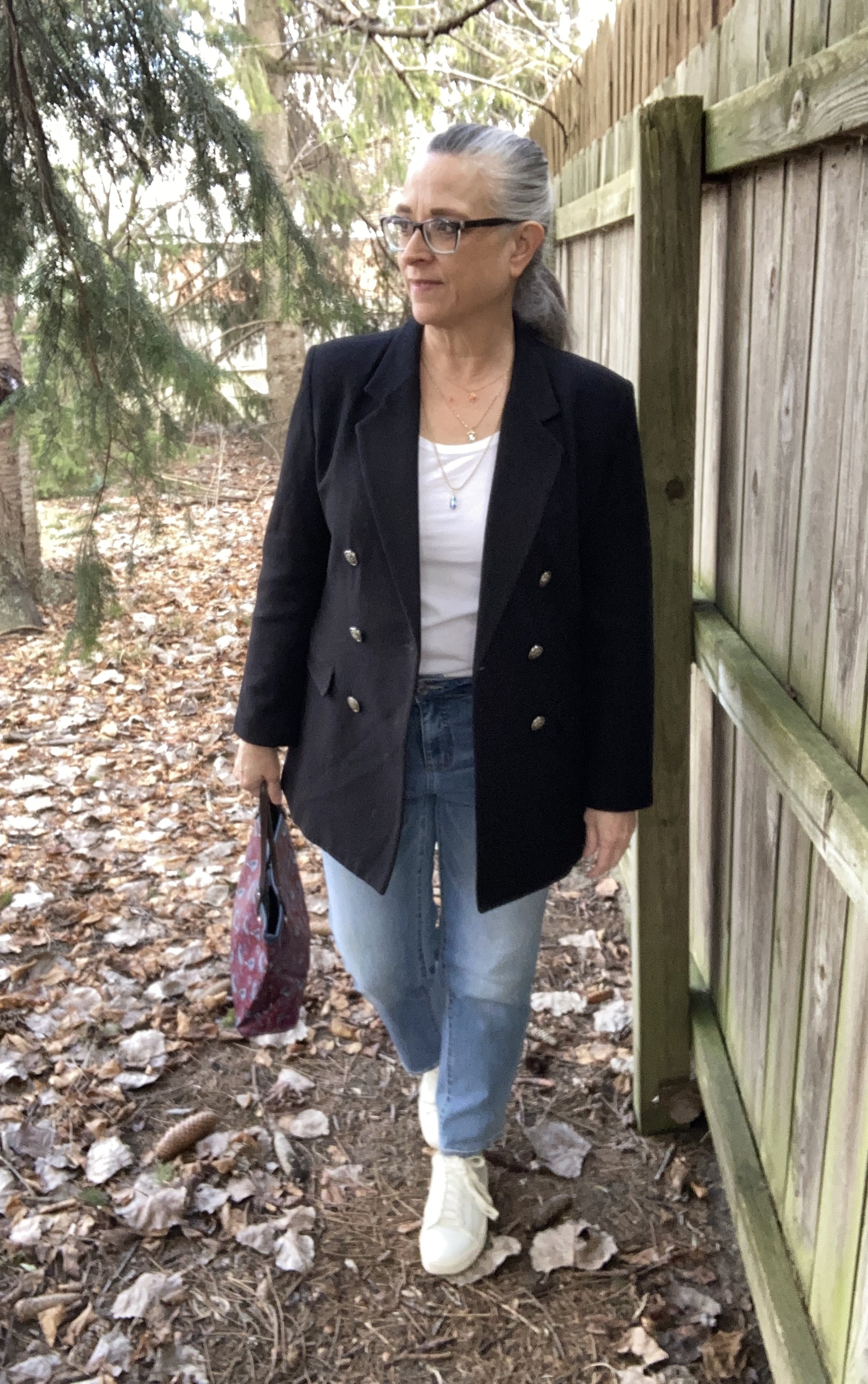
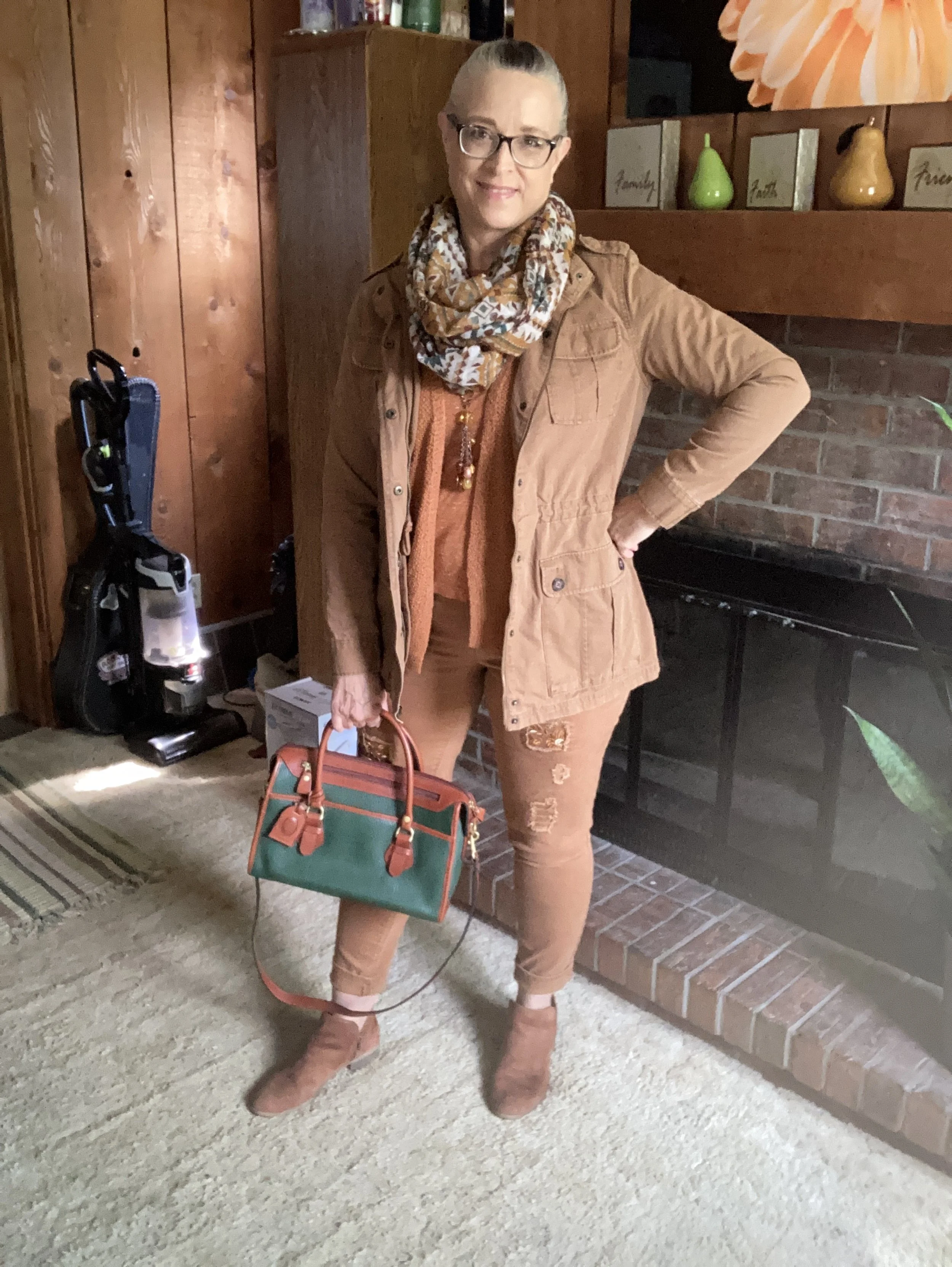
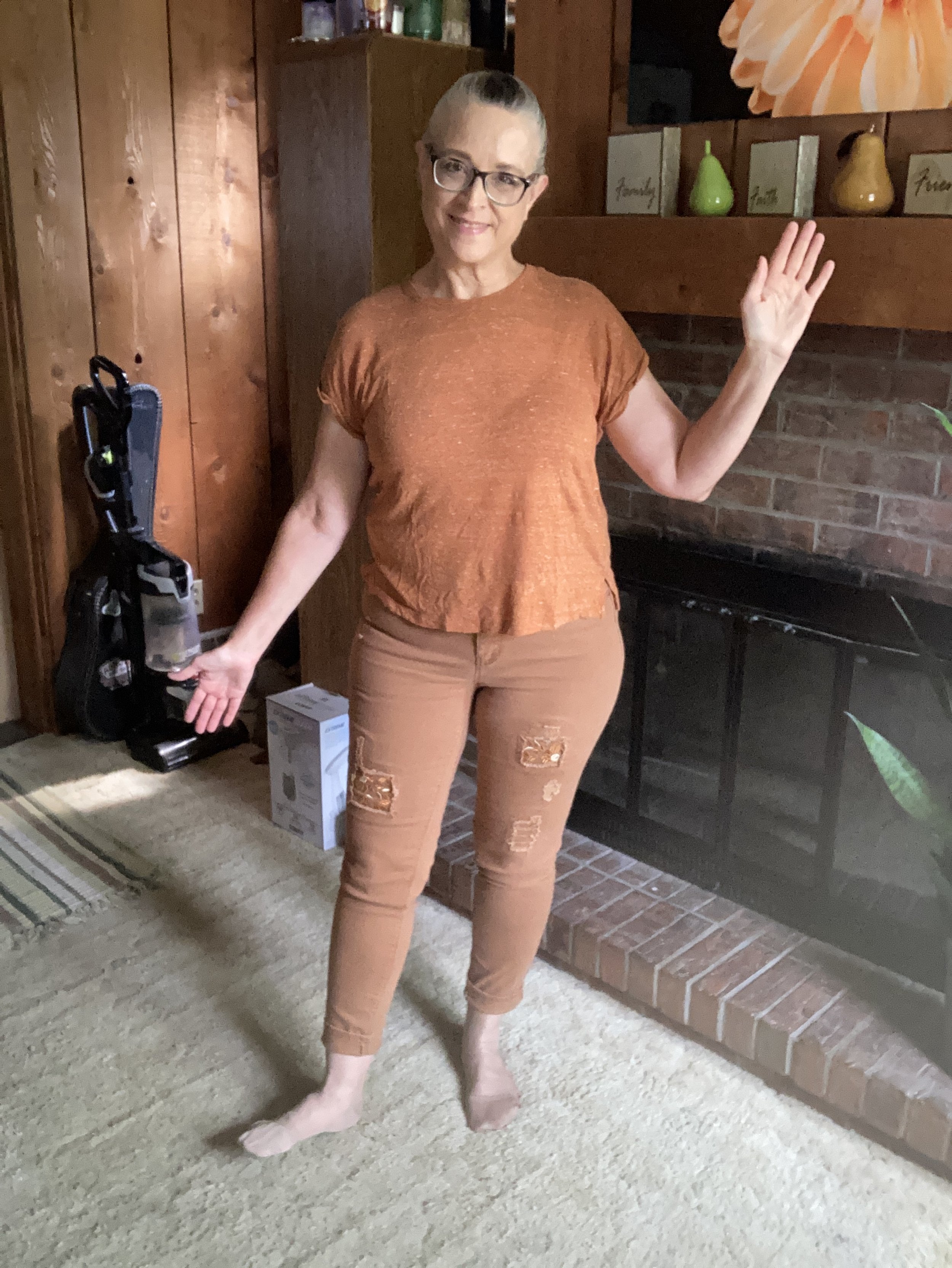
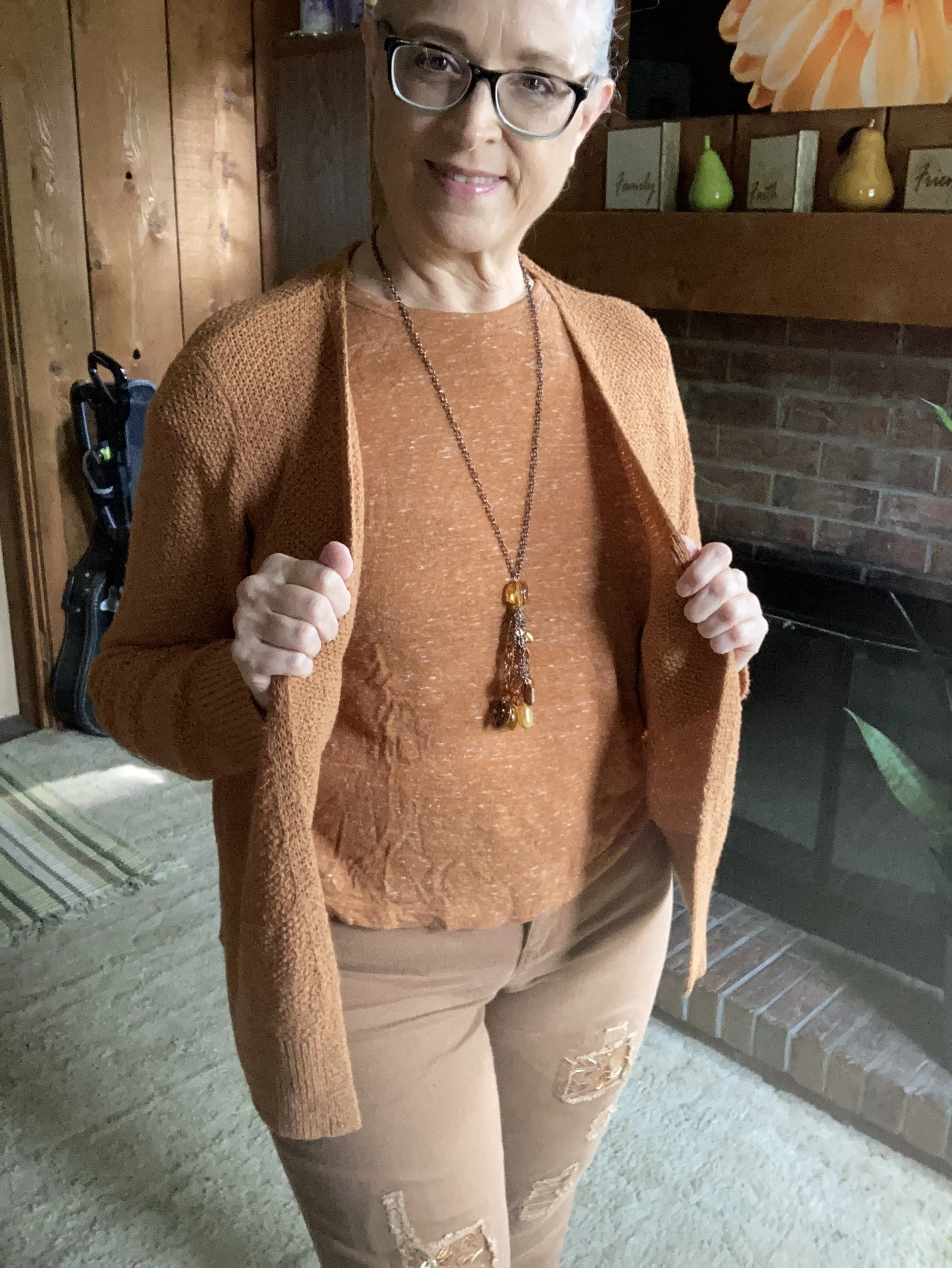
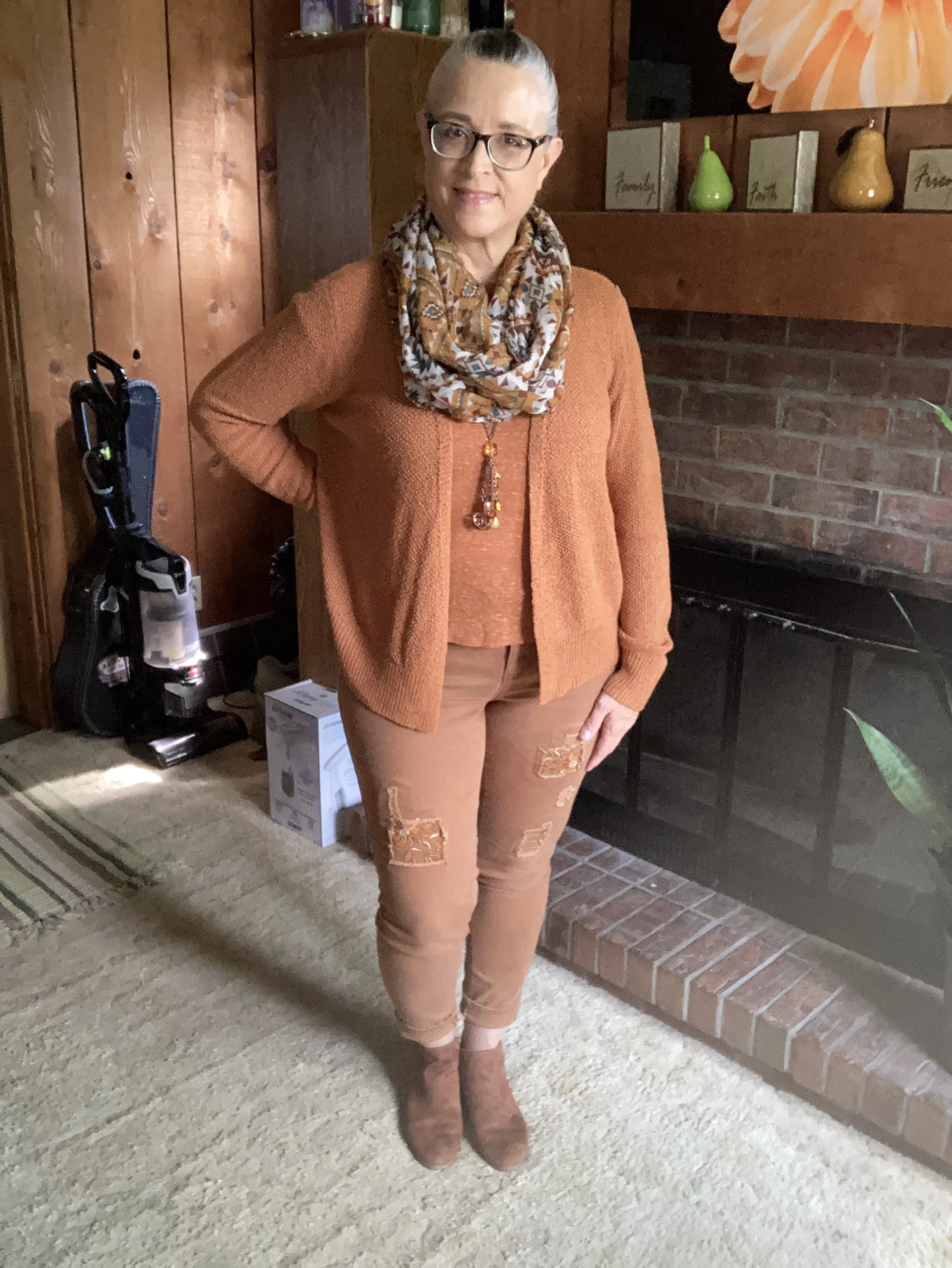
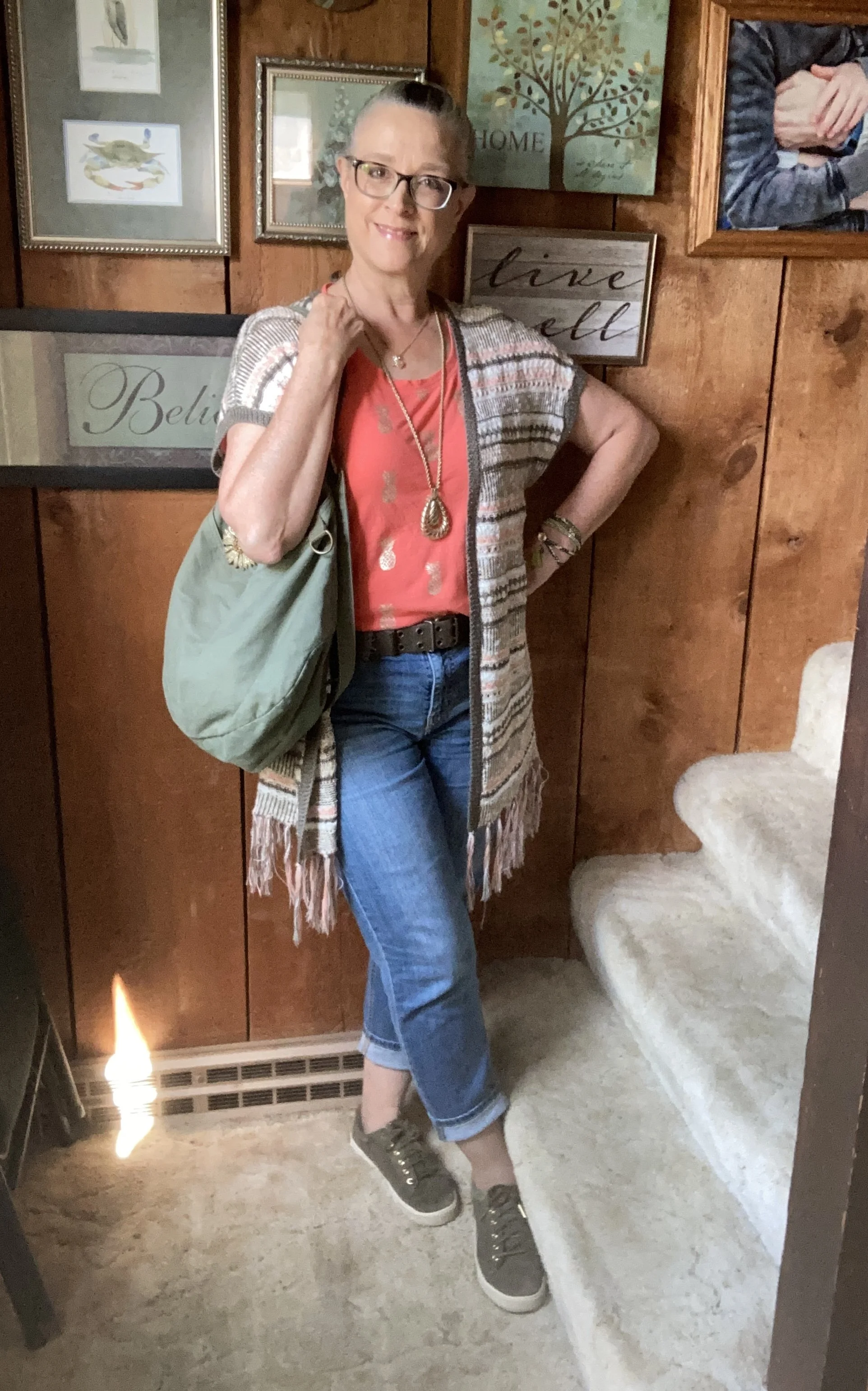
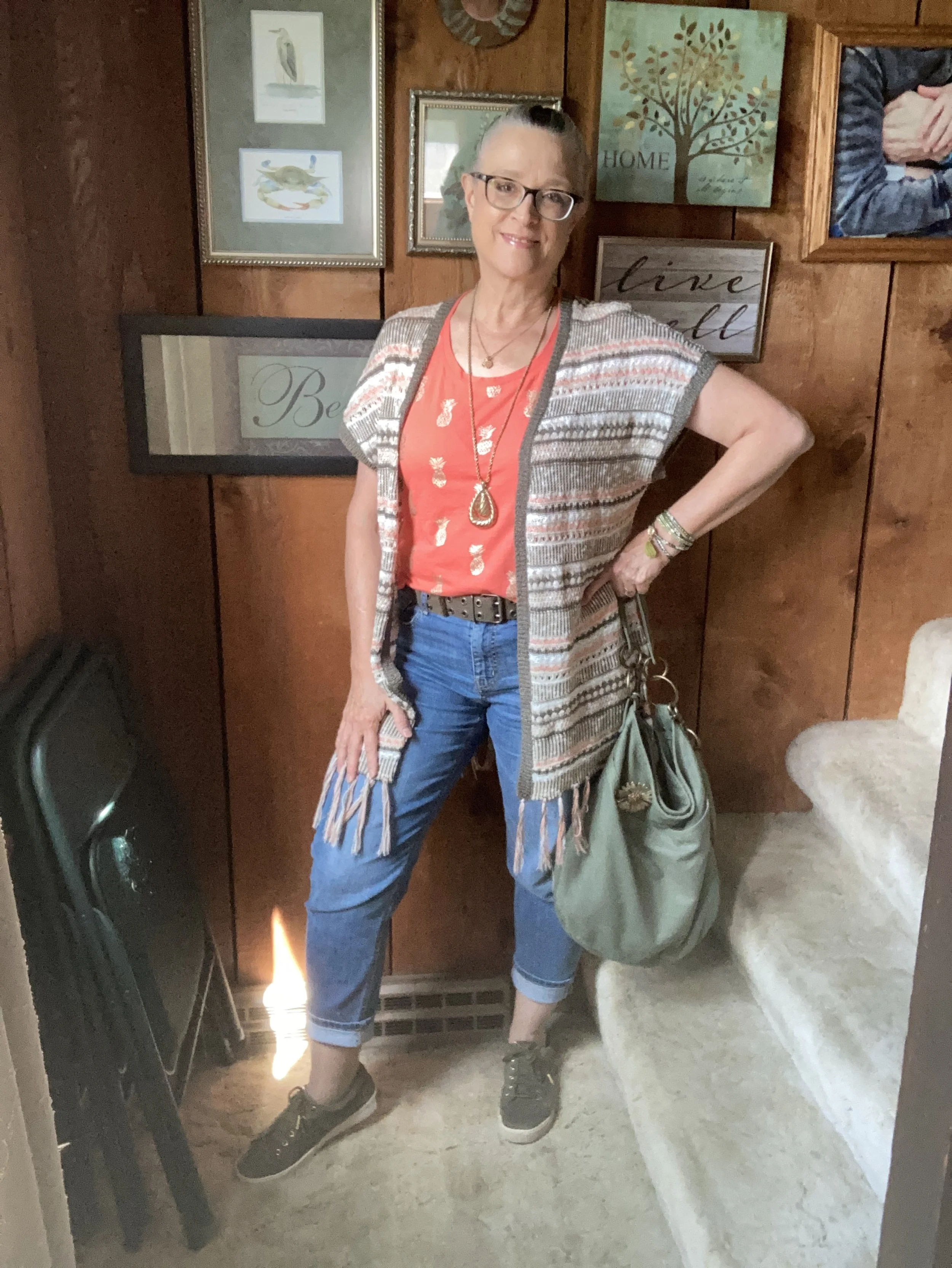
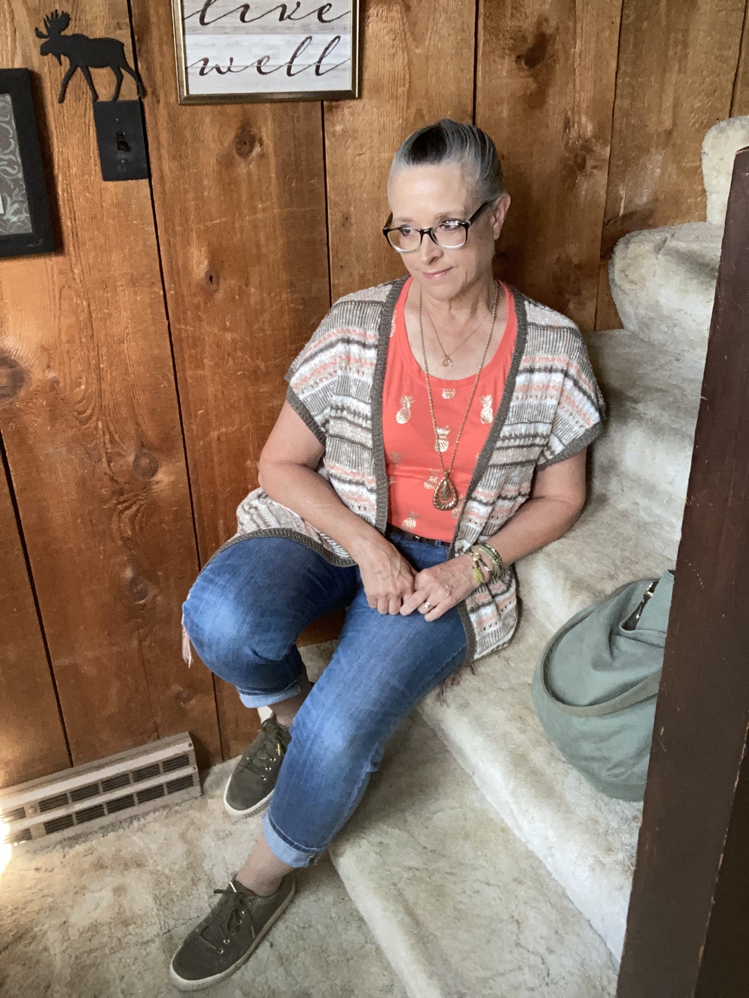
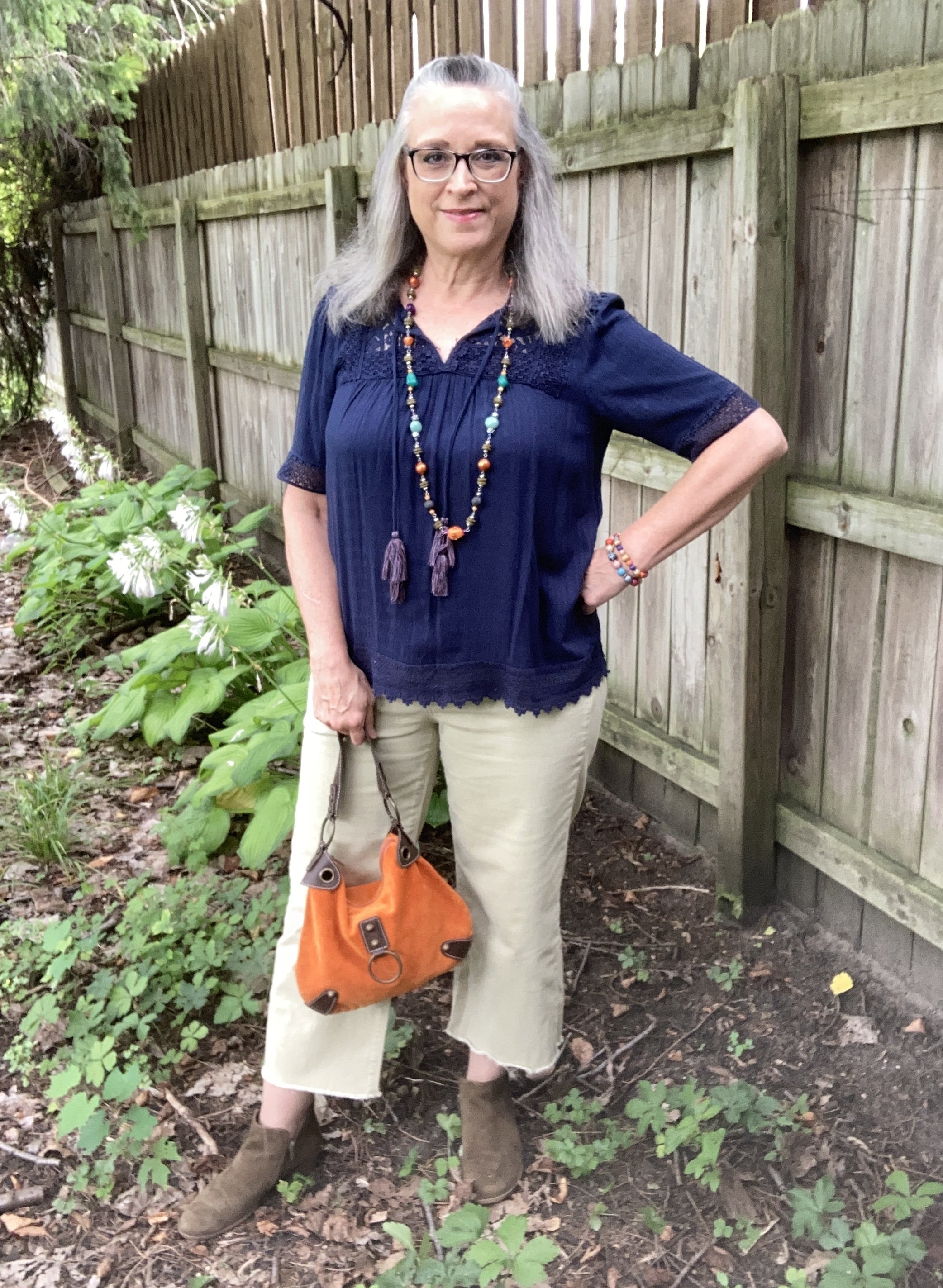
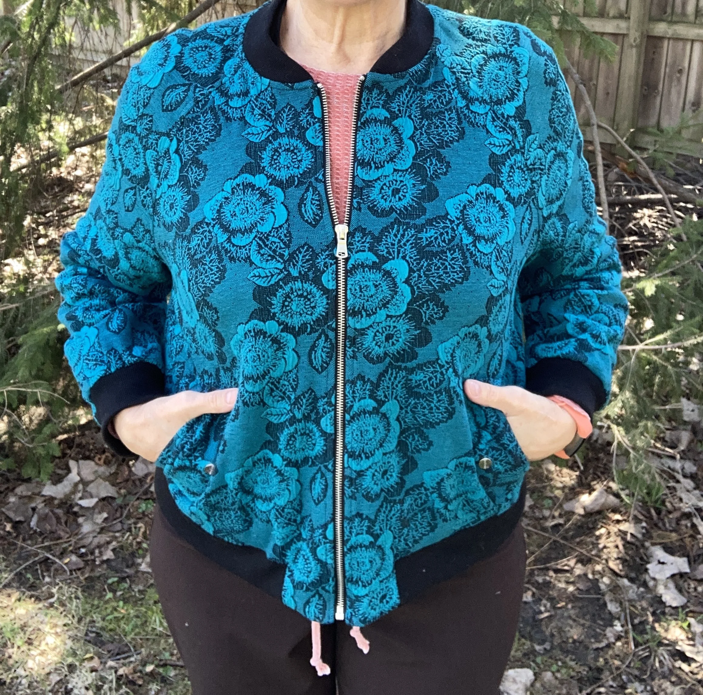
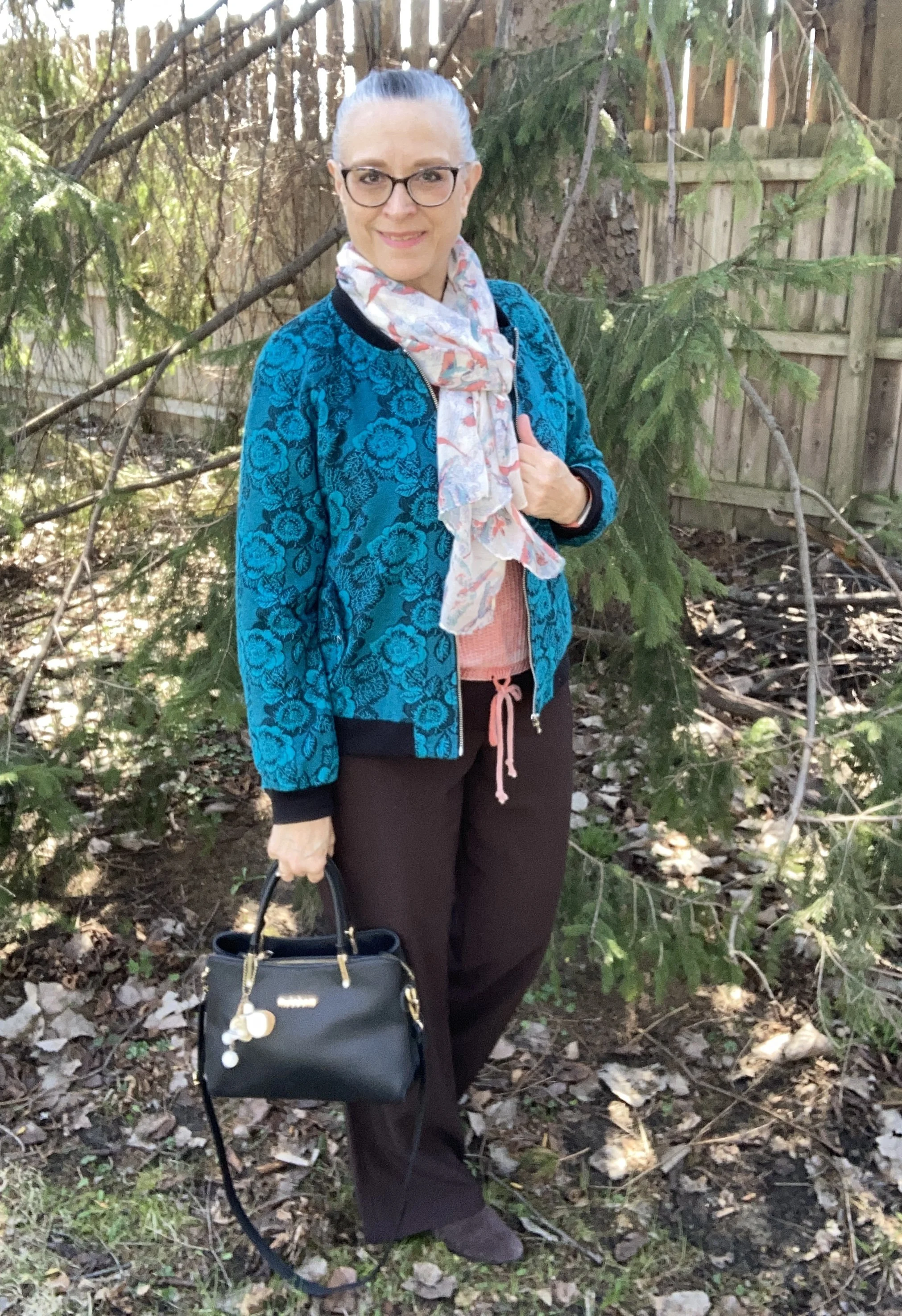
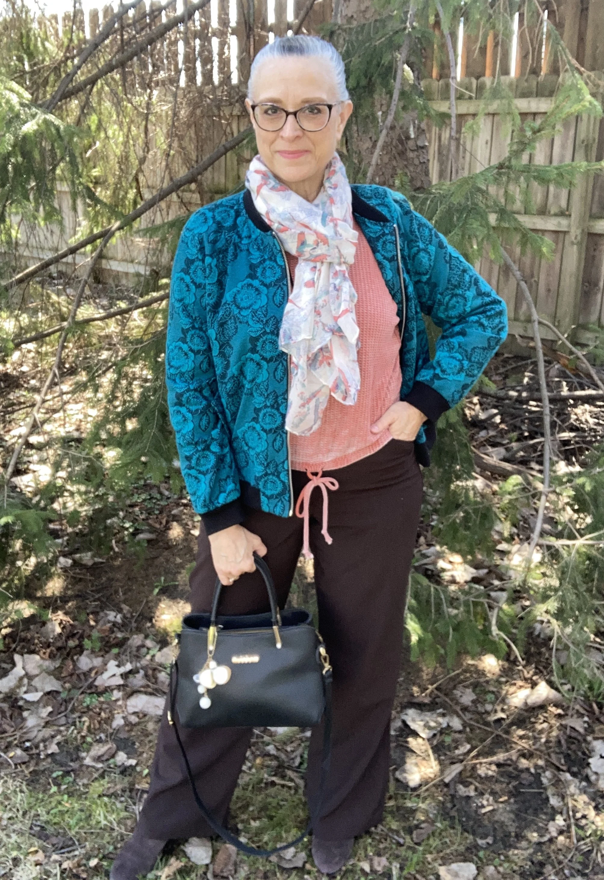
Today’s outfit revolves around layers in the next three Pantone colors: Burnt Sienna, Alexandrite and Coffee Bean. You can see the actual colors here. My Alexandrite is definitely more blue than the actual color, but as I have said before these are guidelines for you to shop your own closets for similar colors.
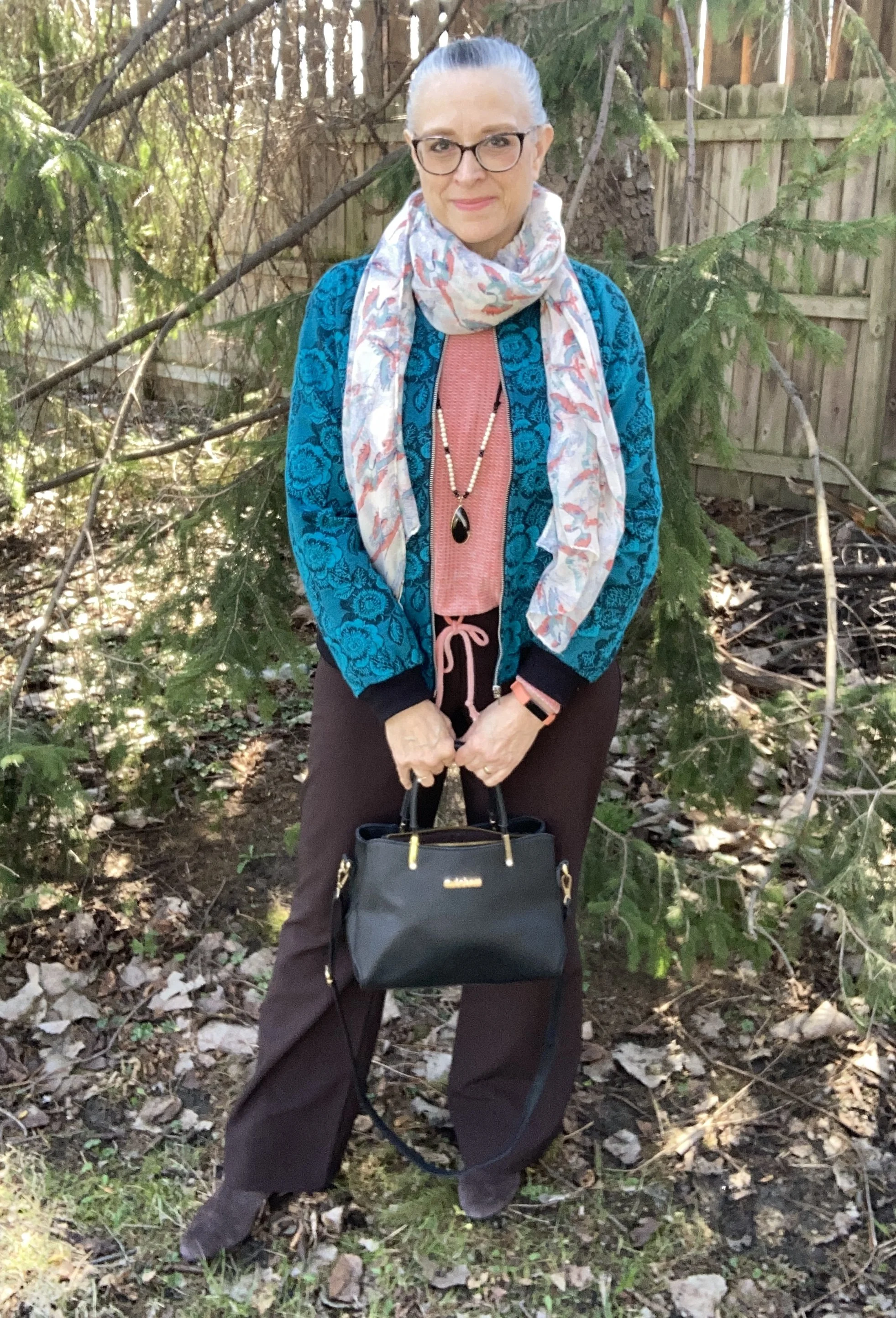
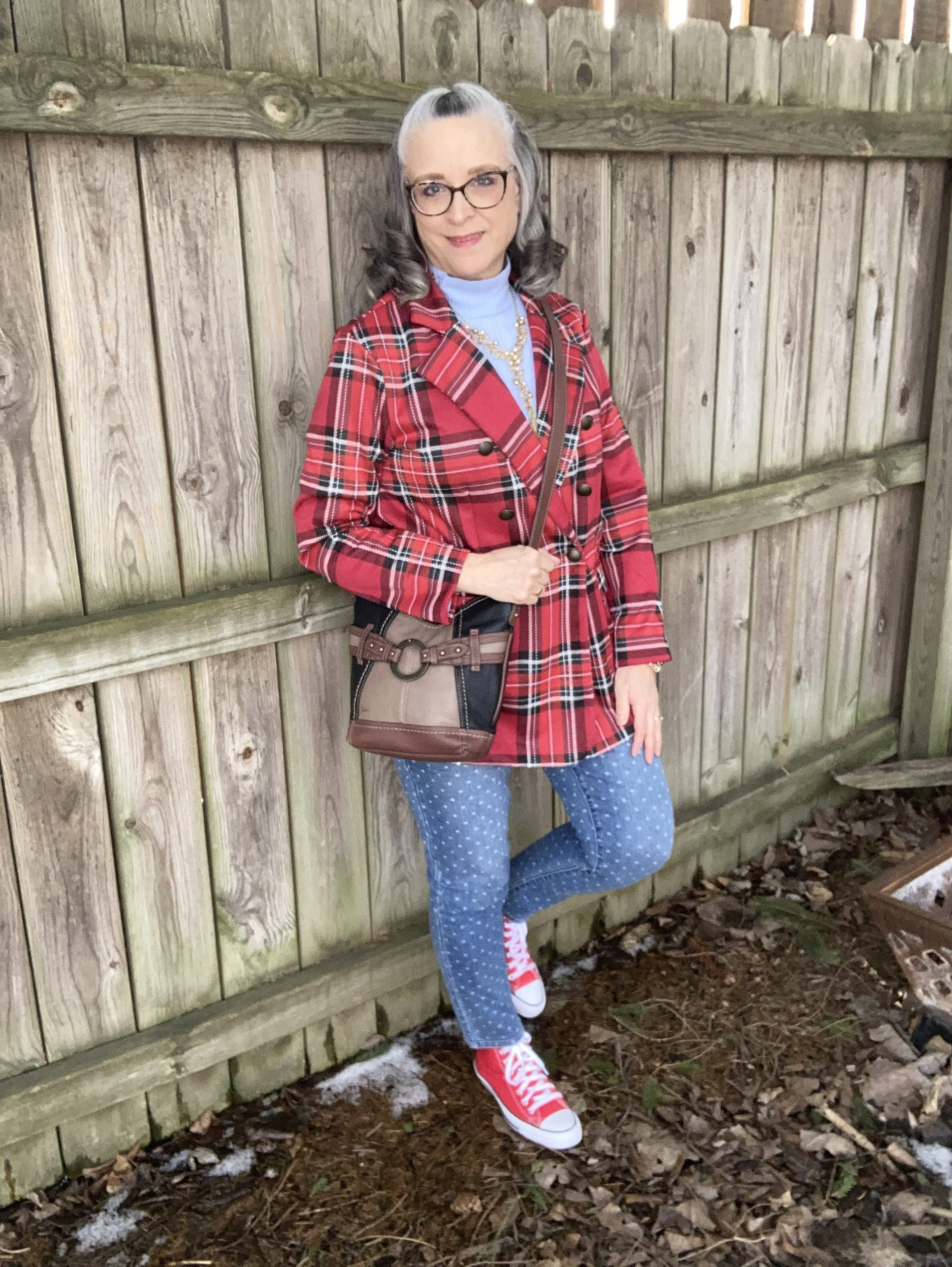
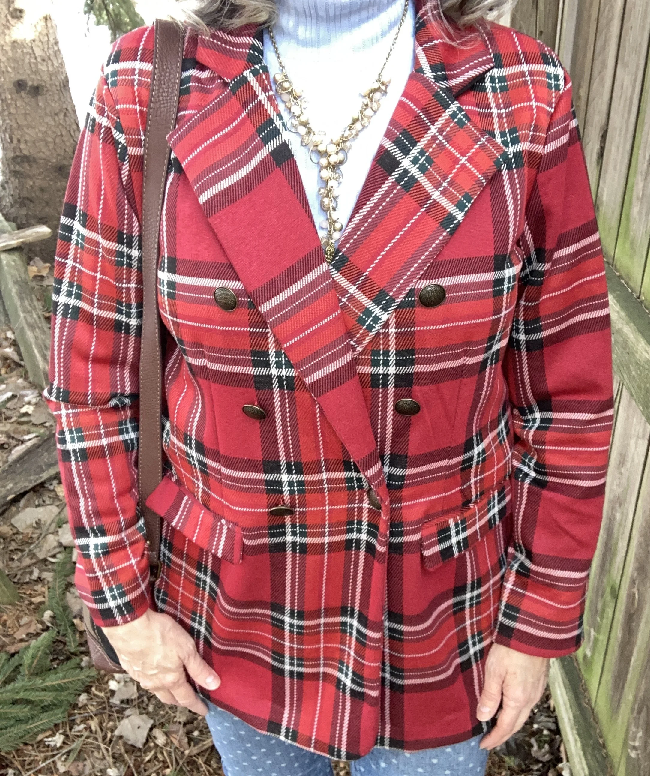
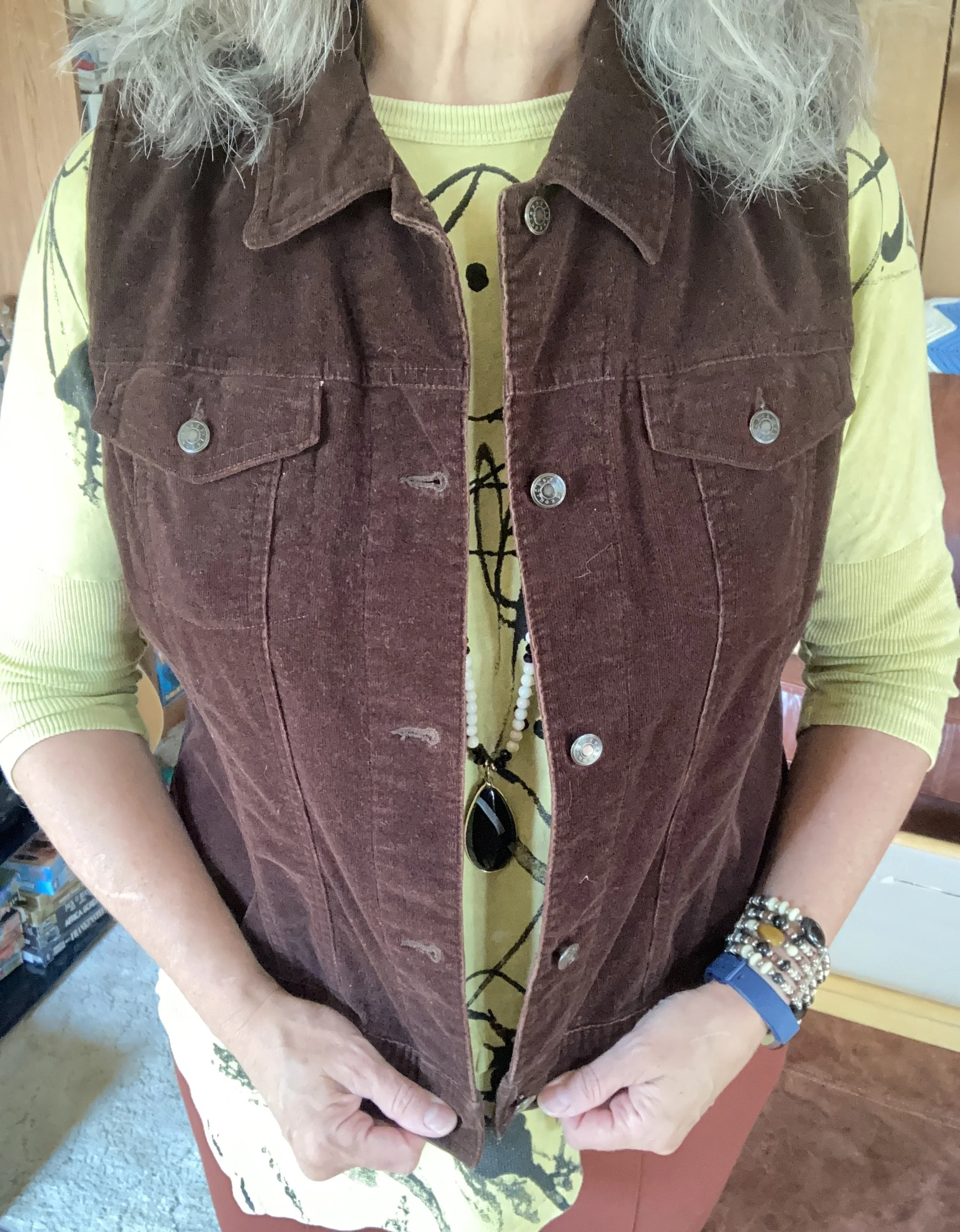
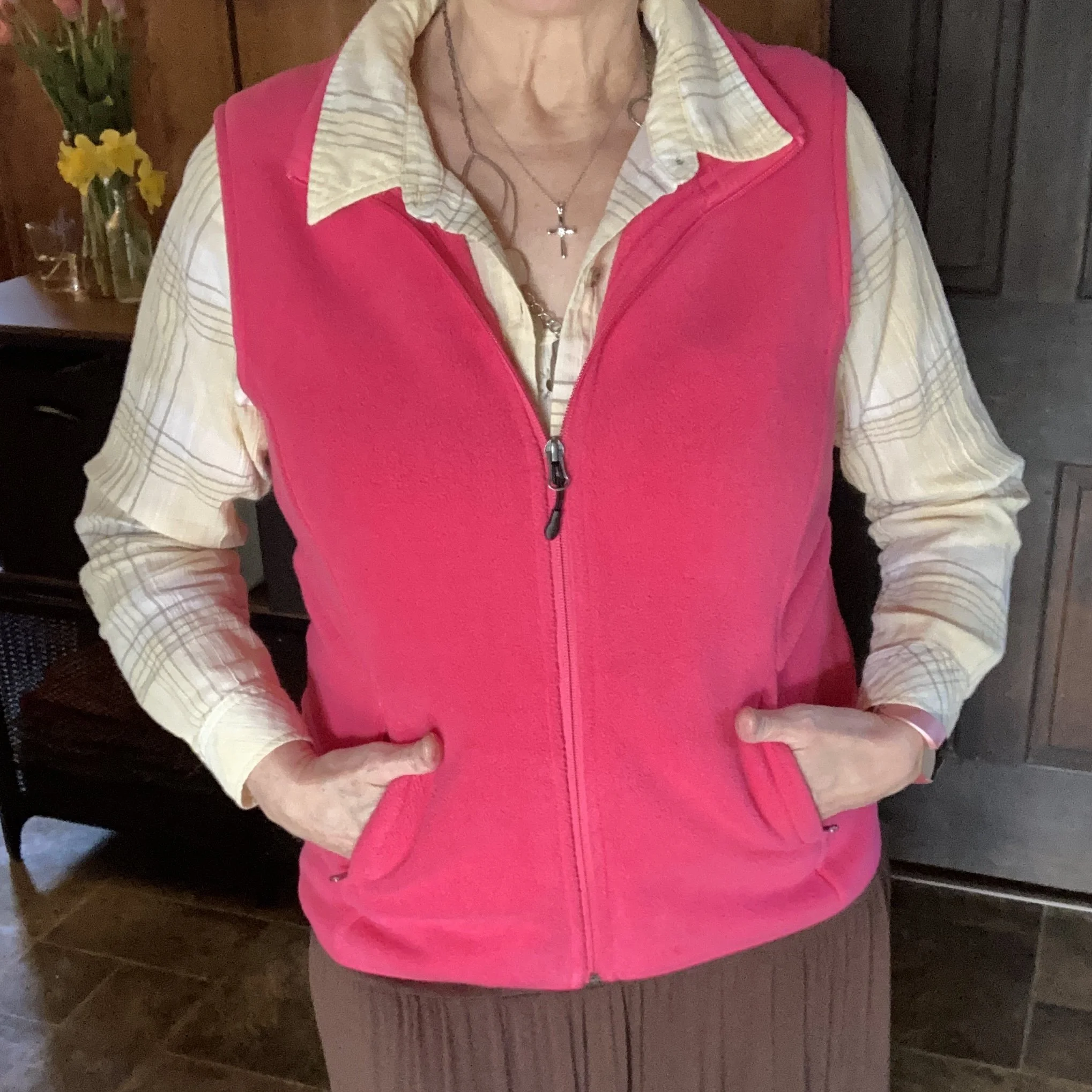
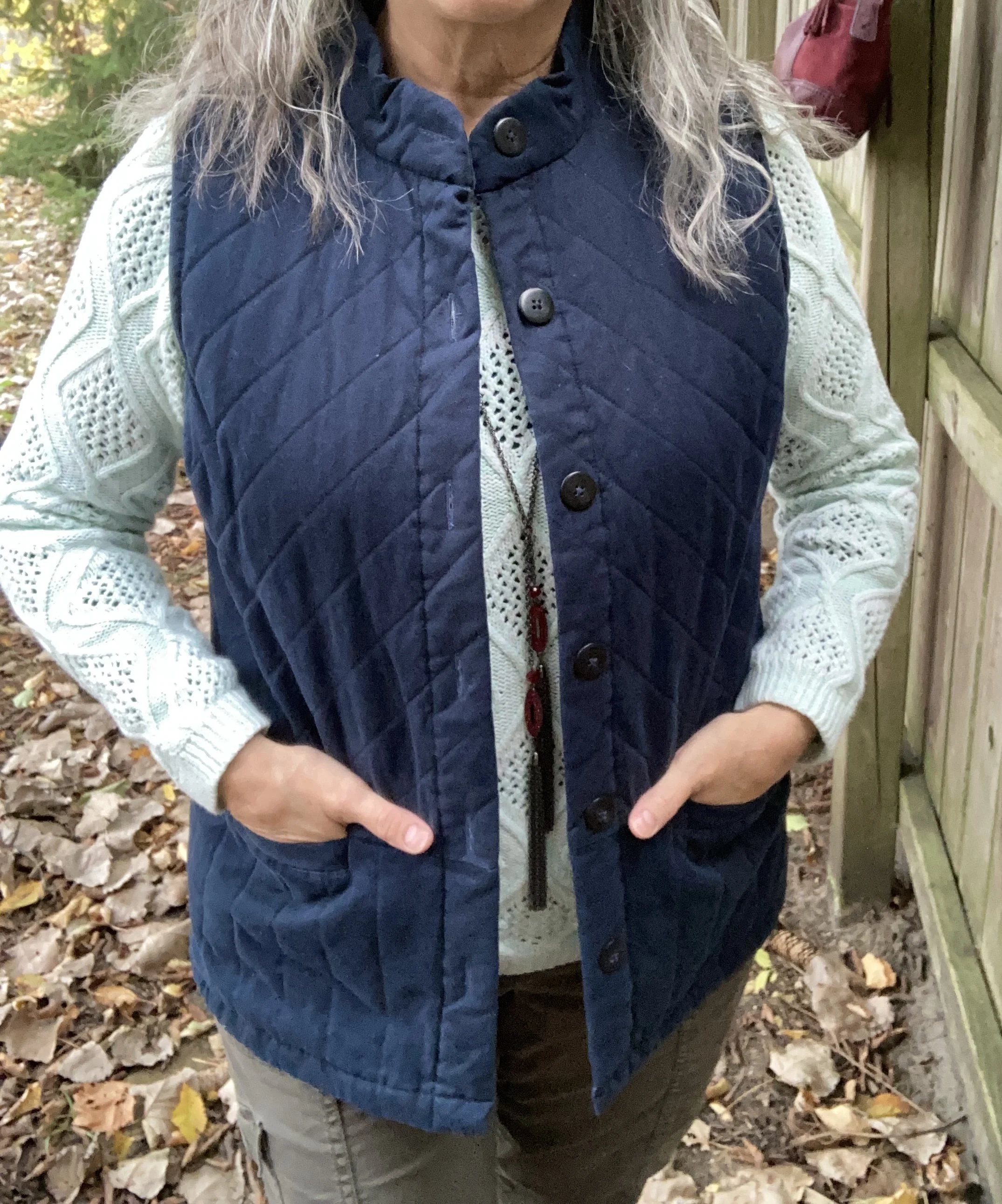
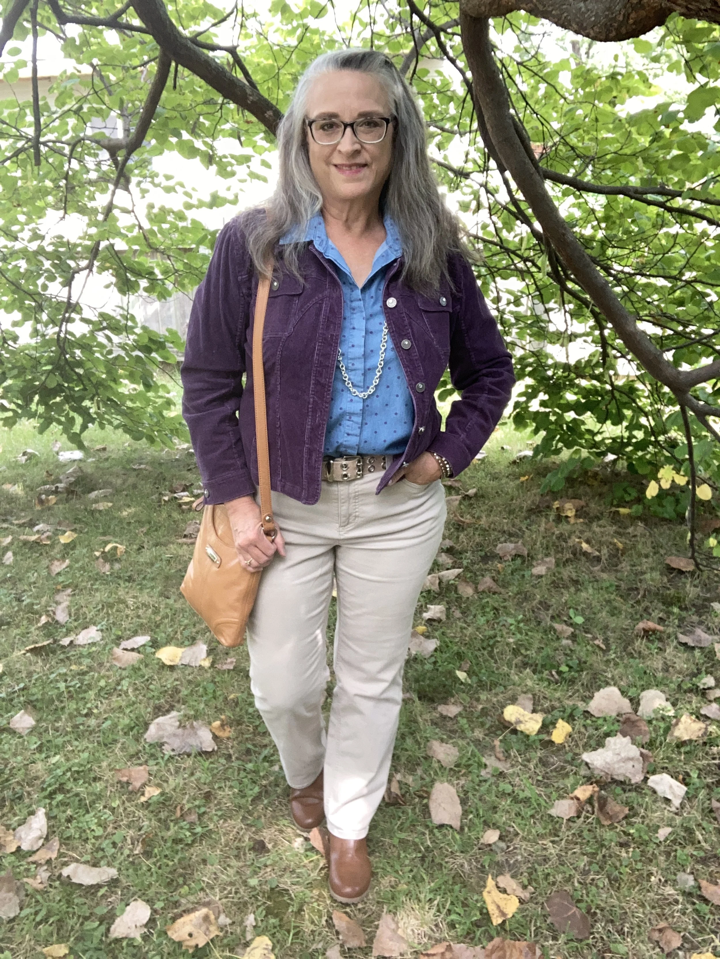
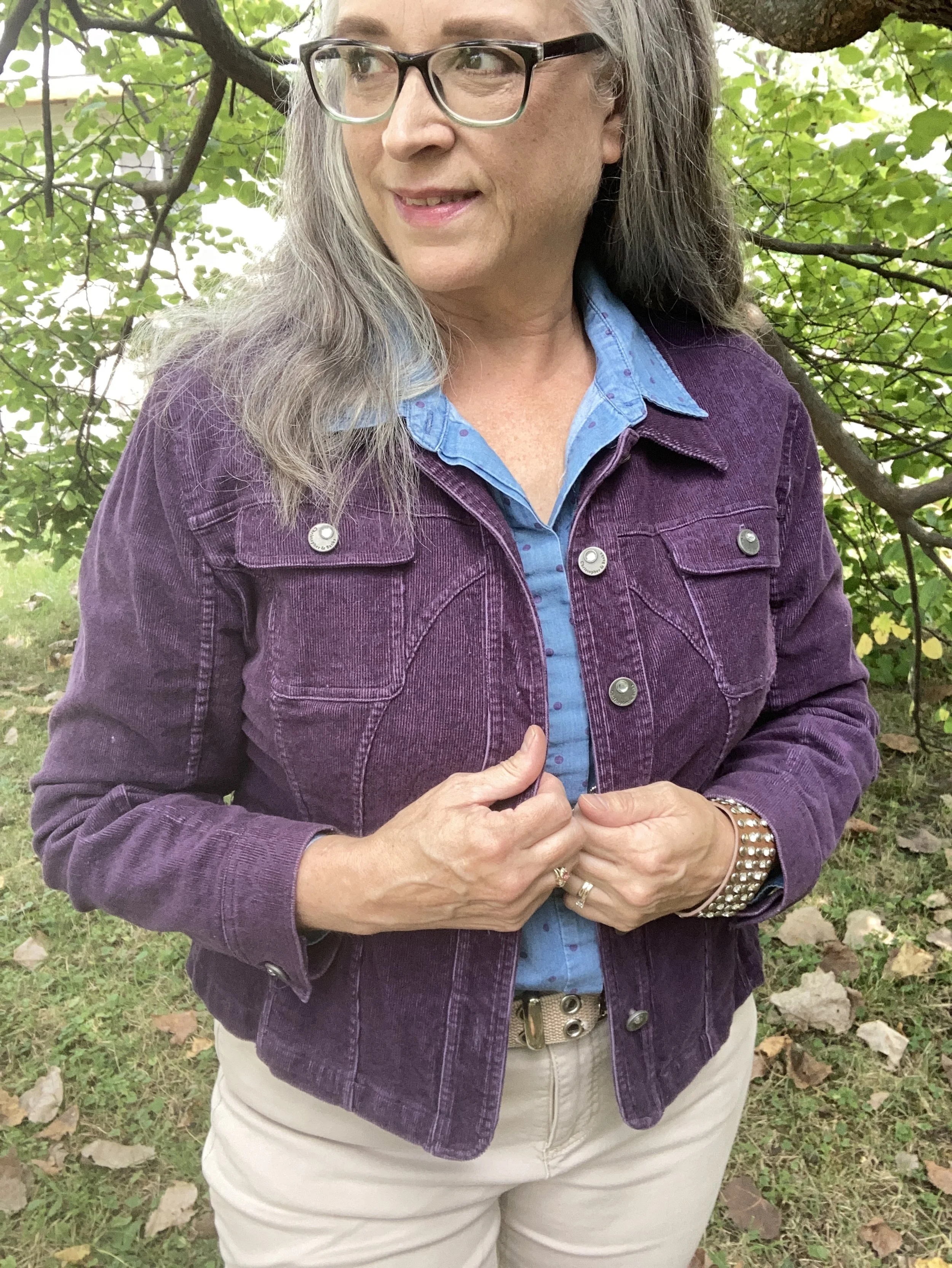
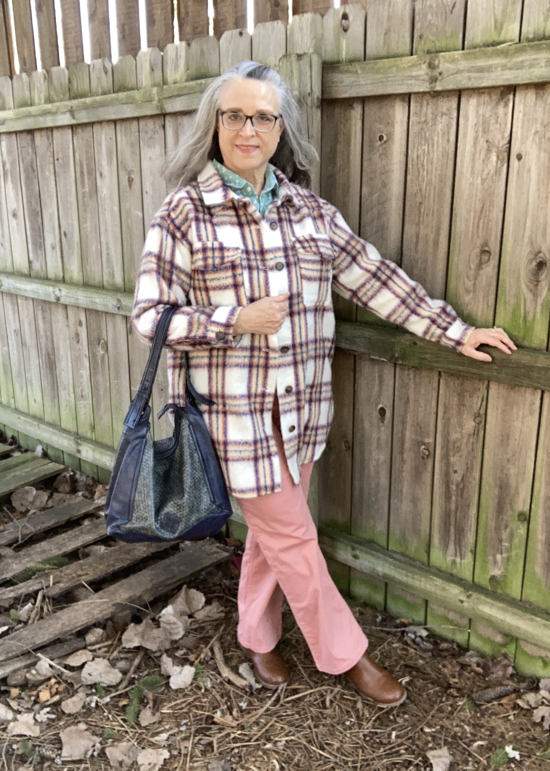
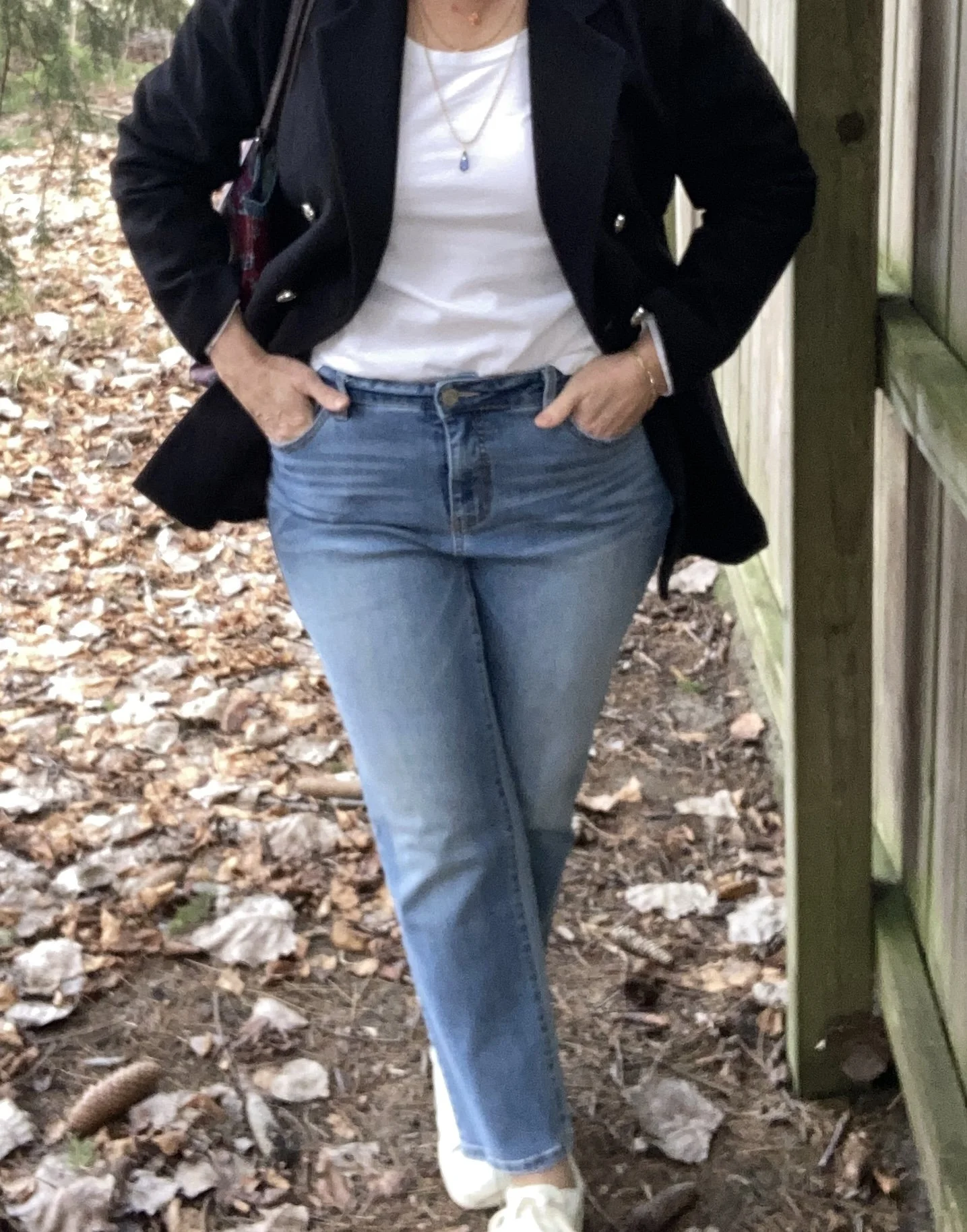
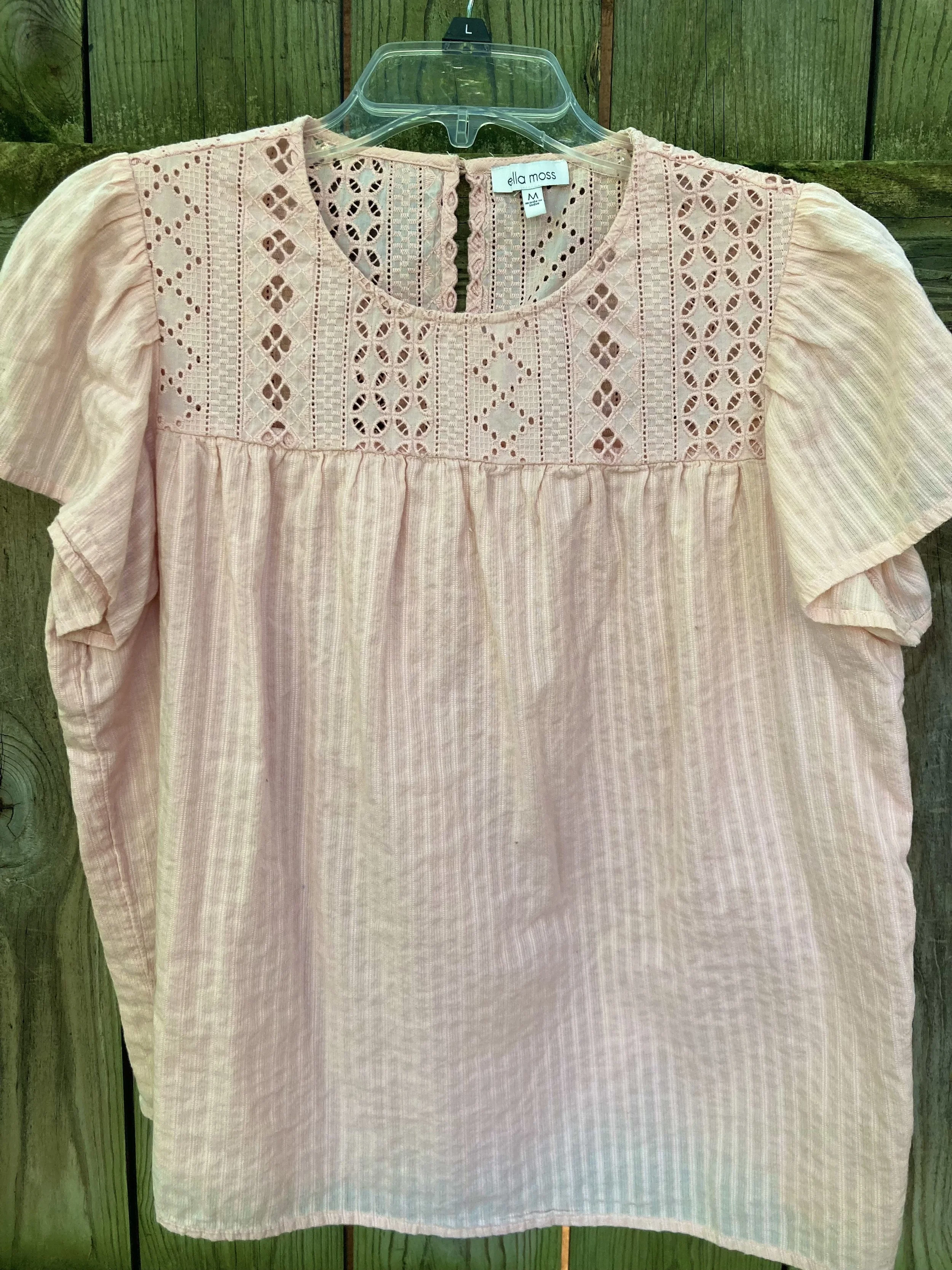
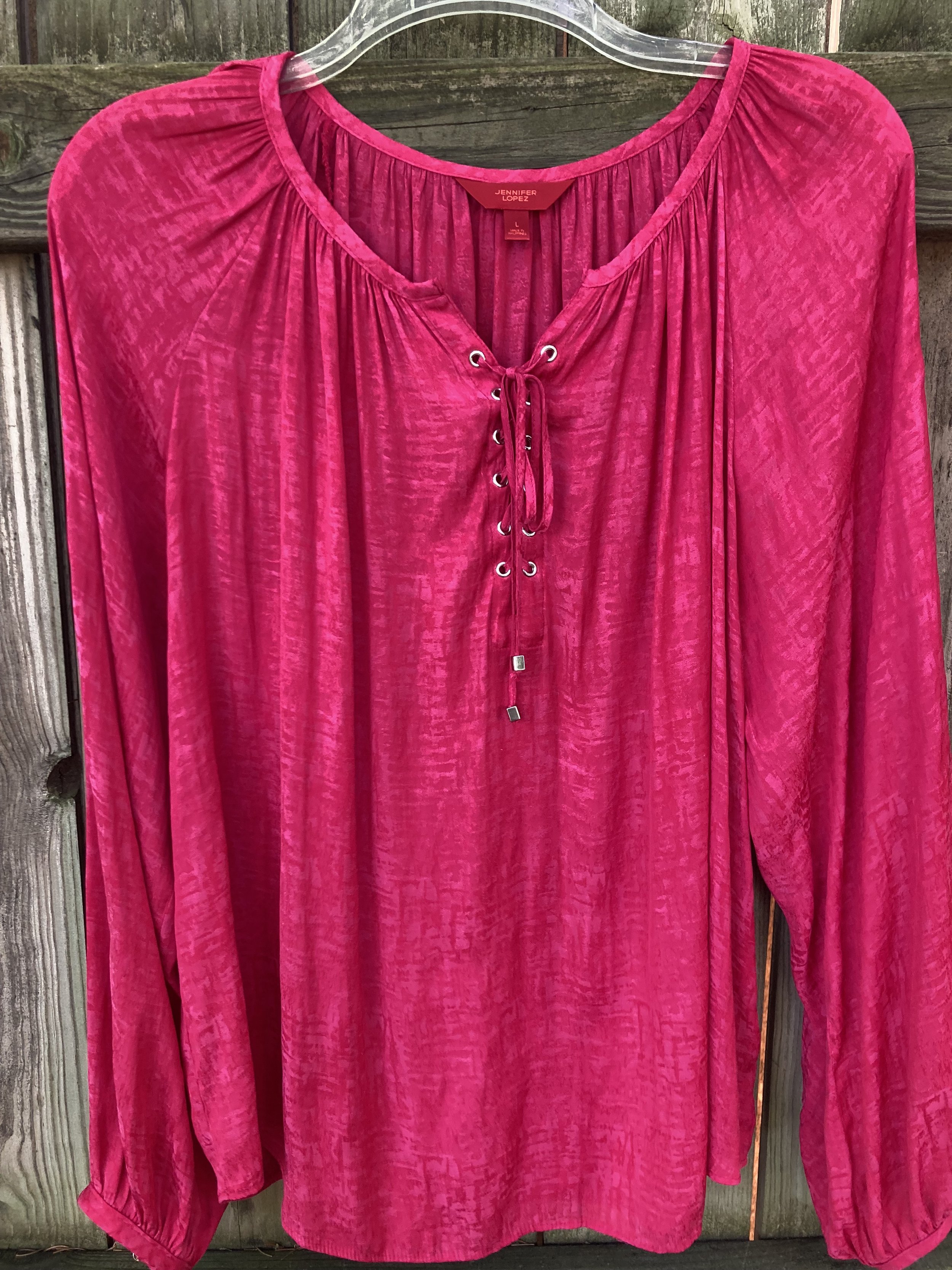
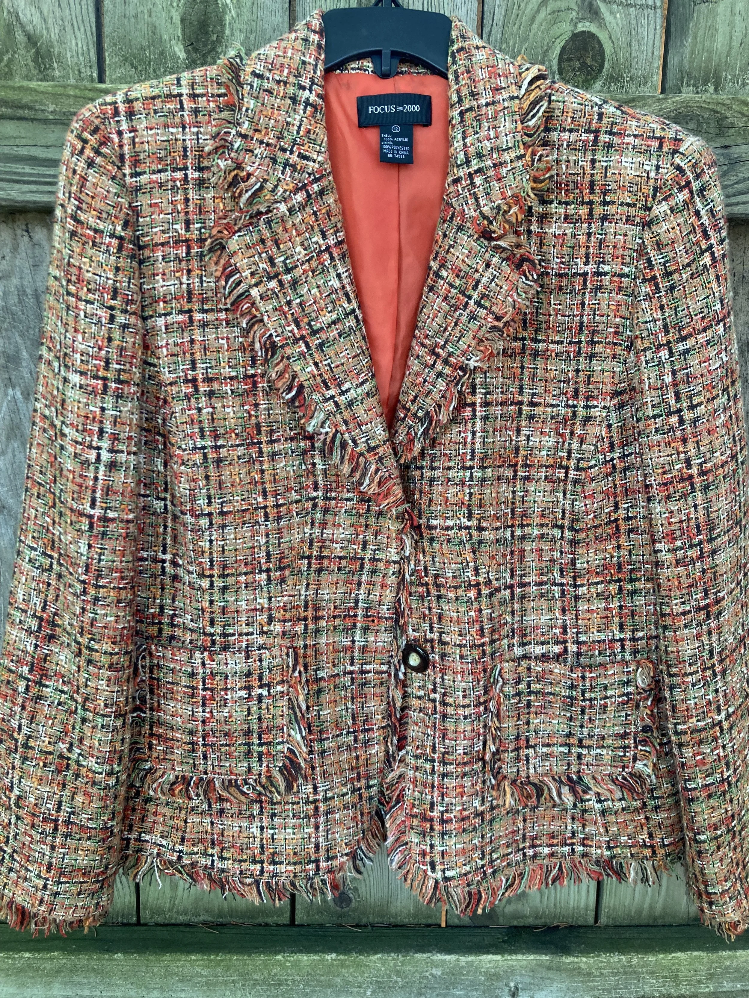
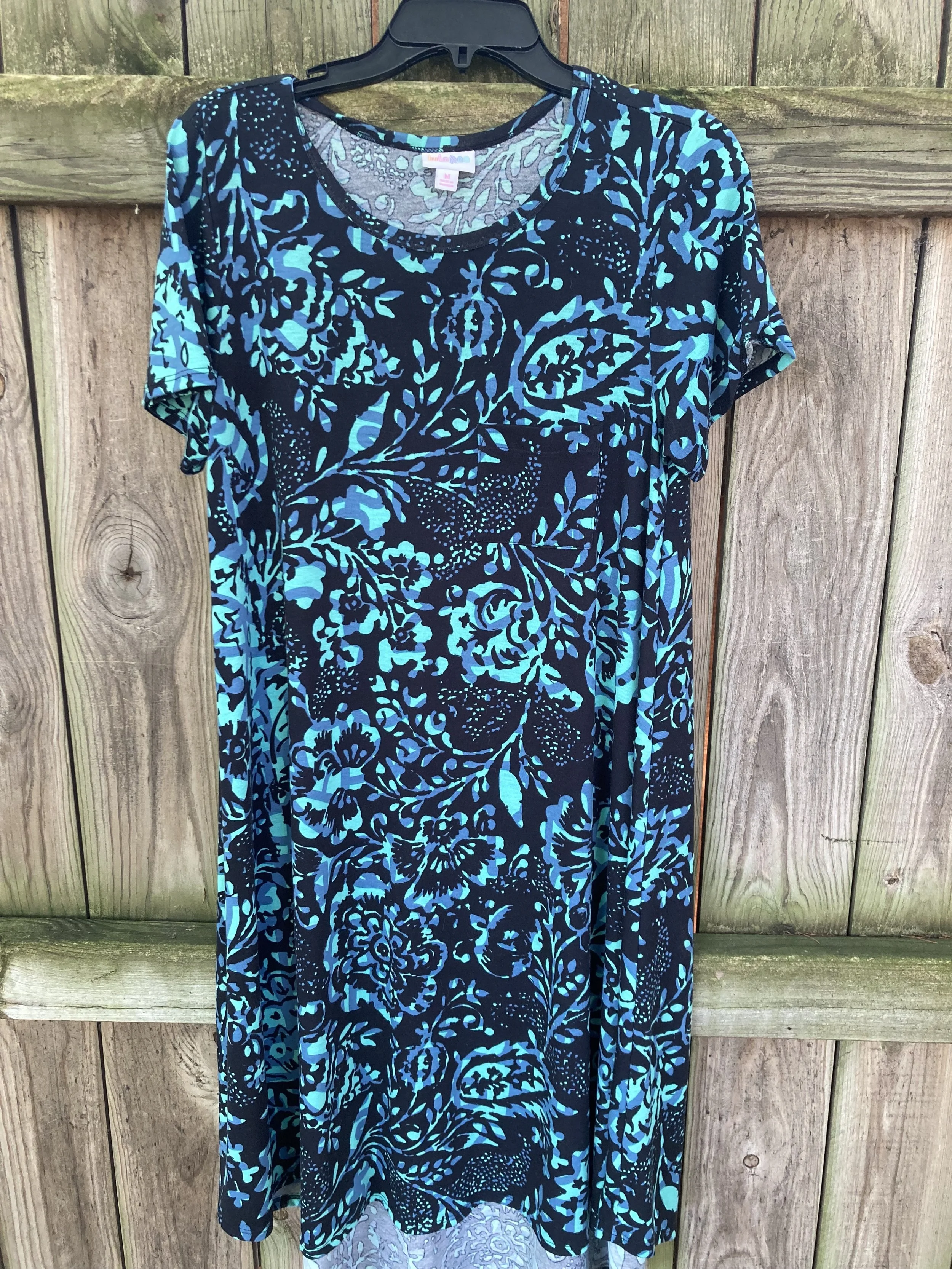
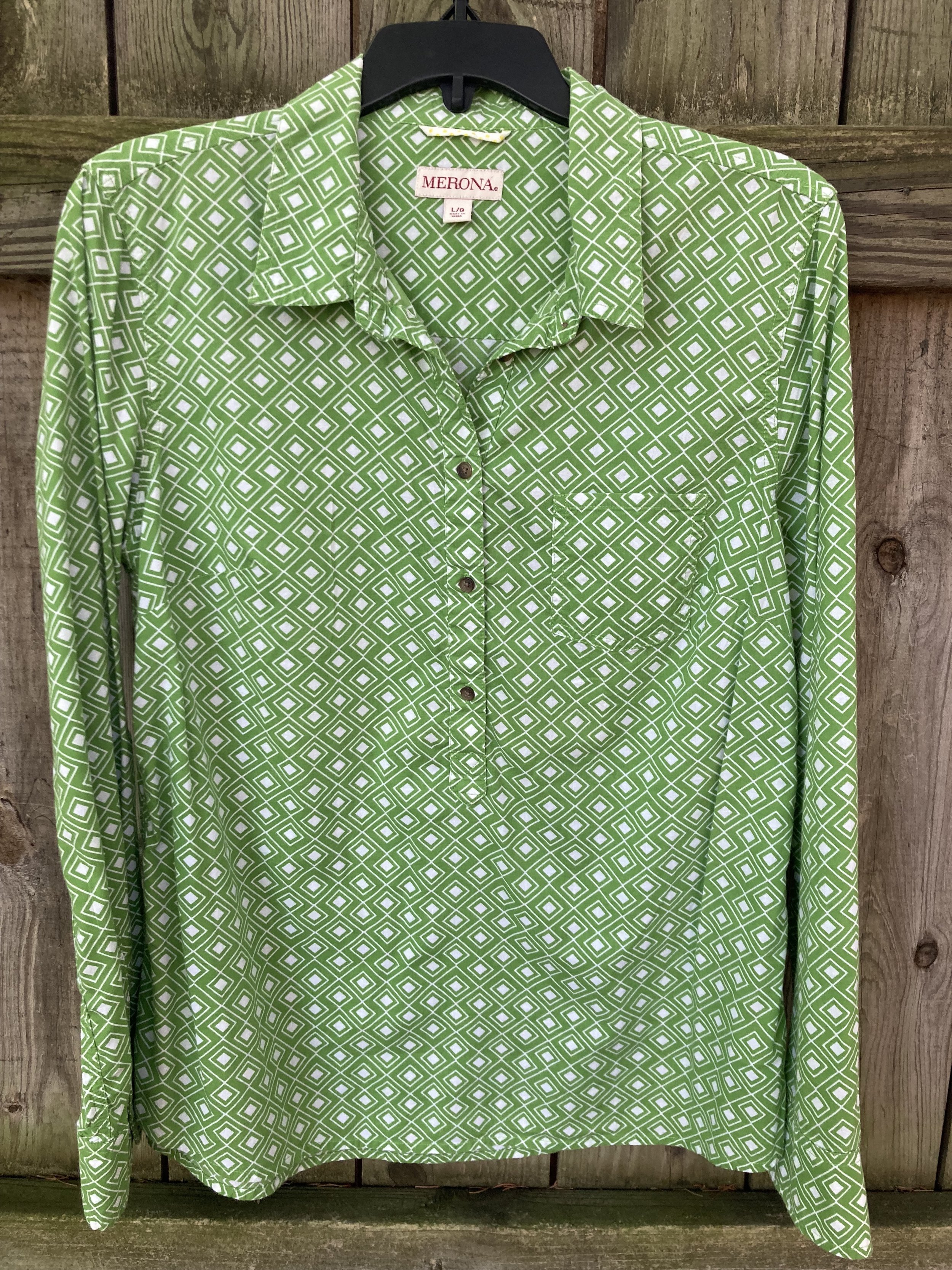
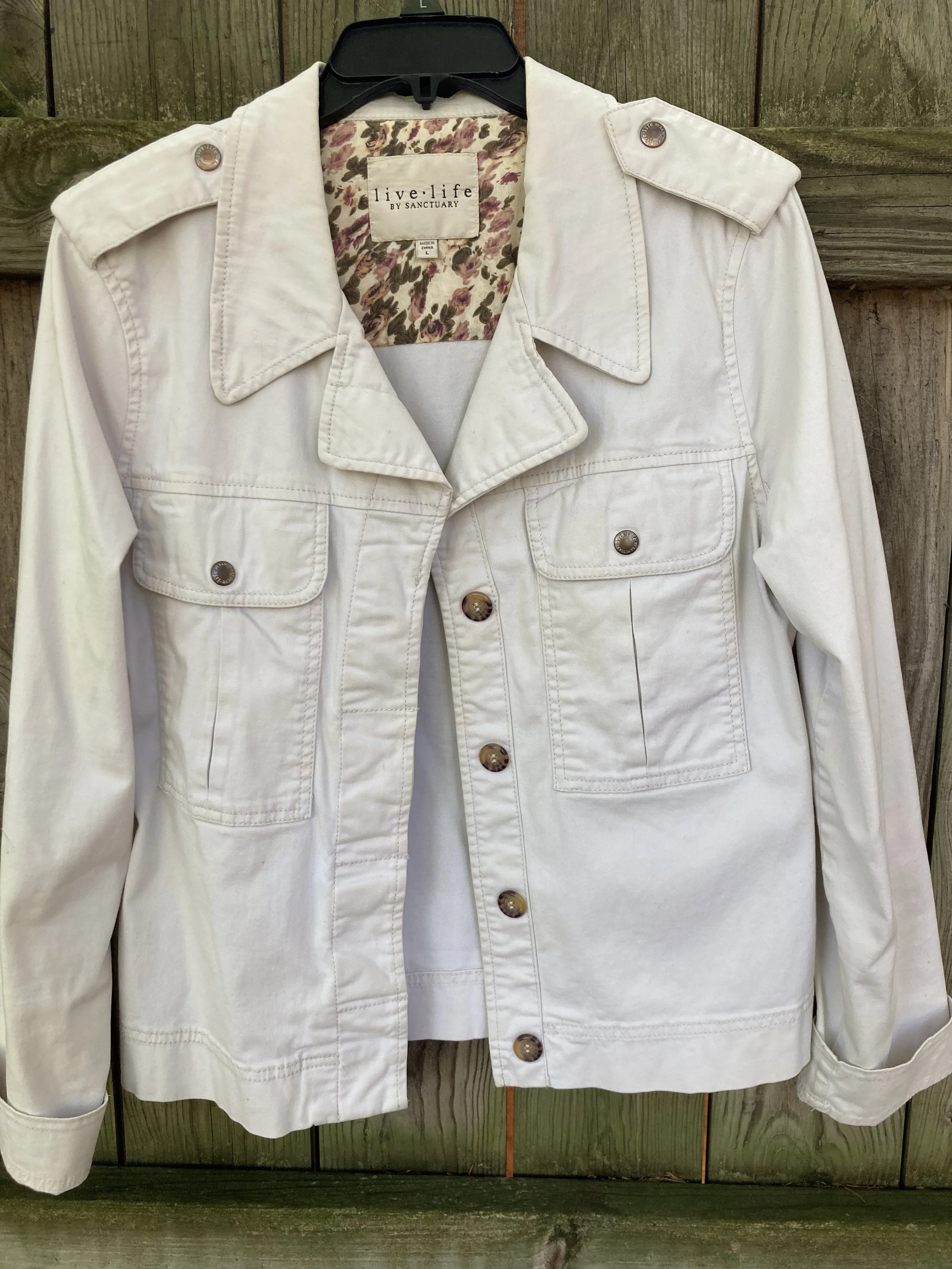
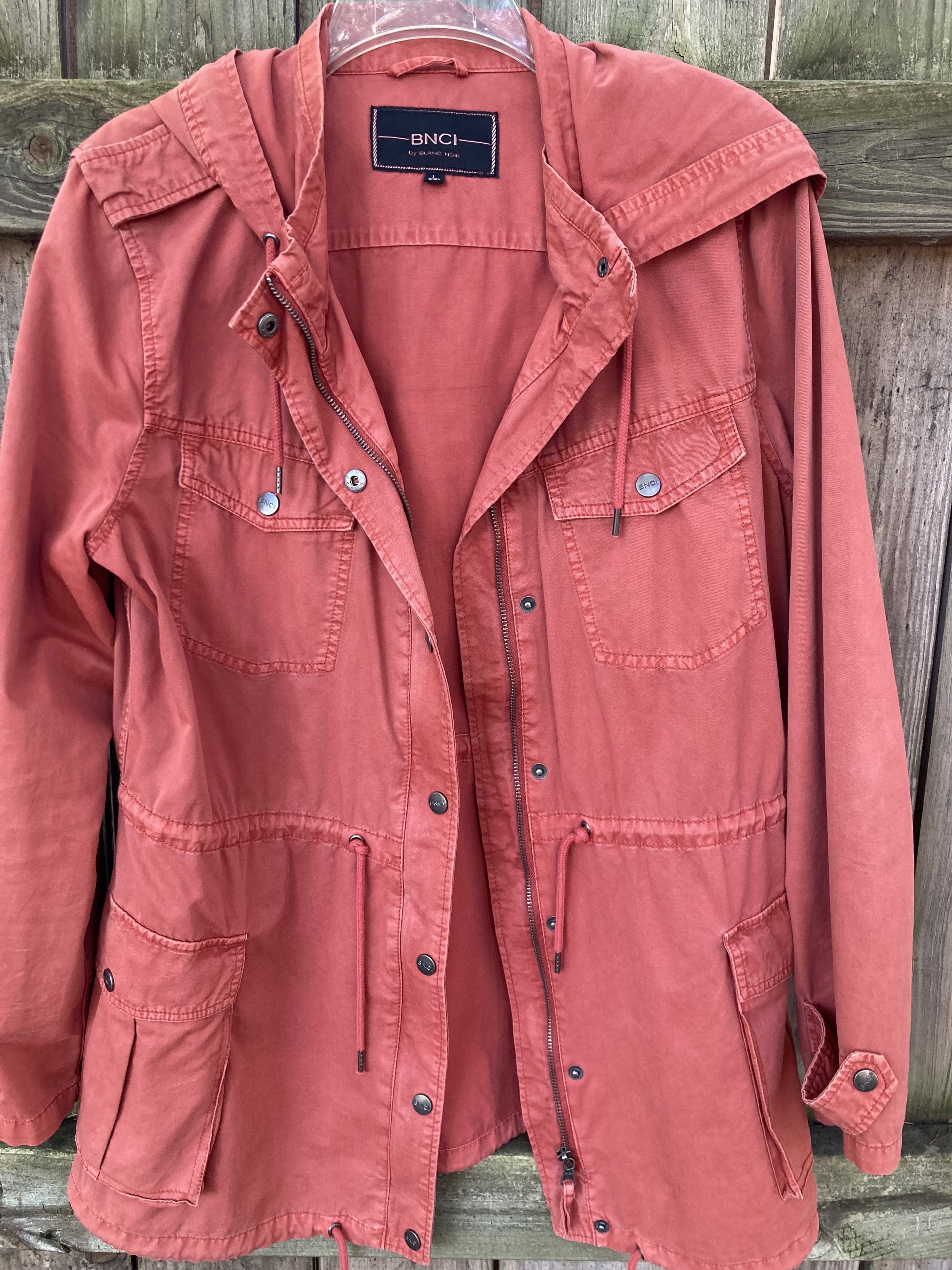
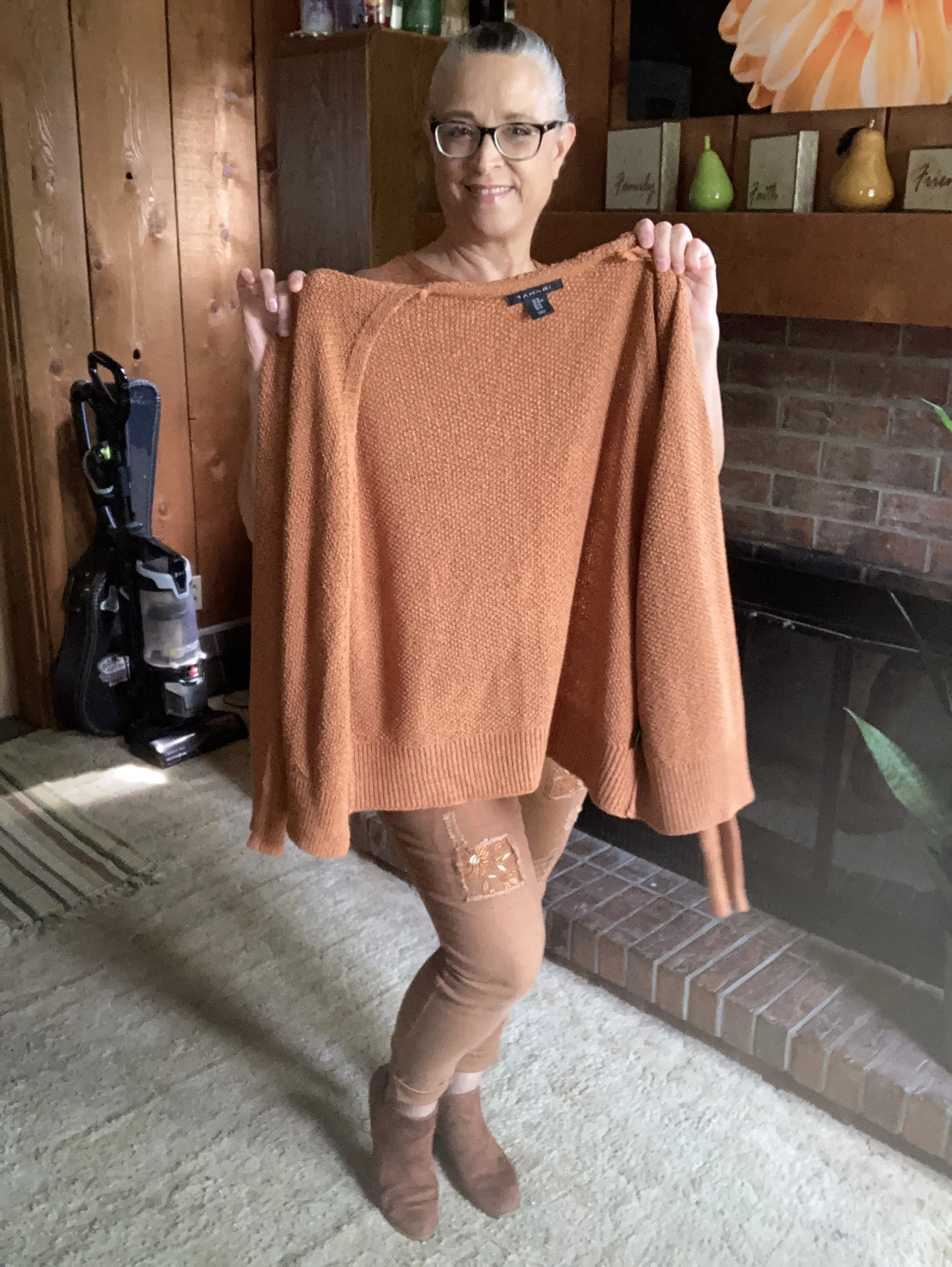
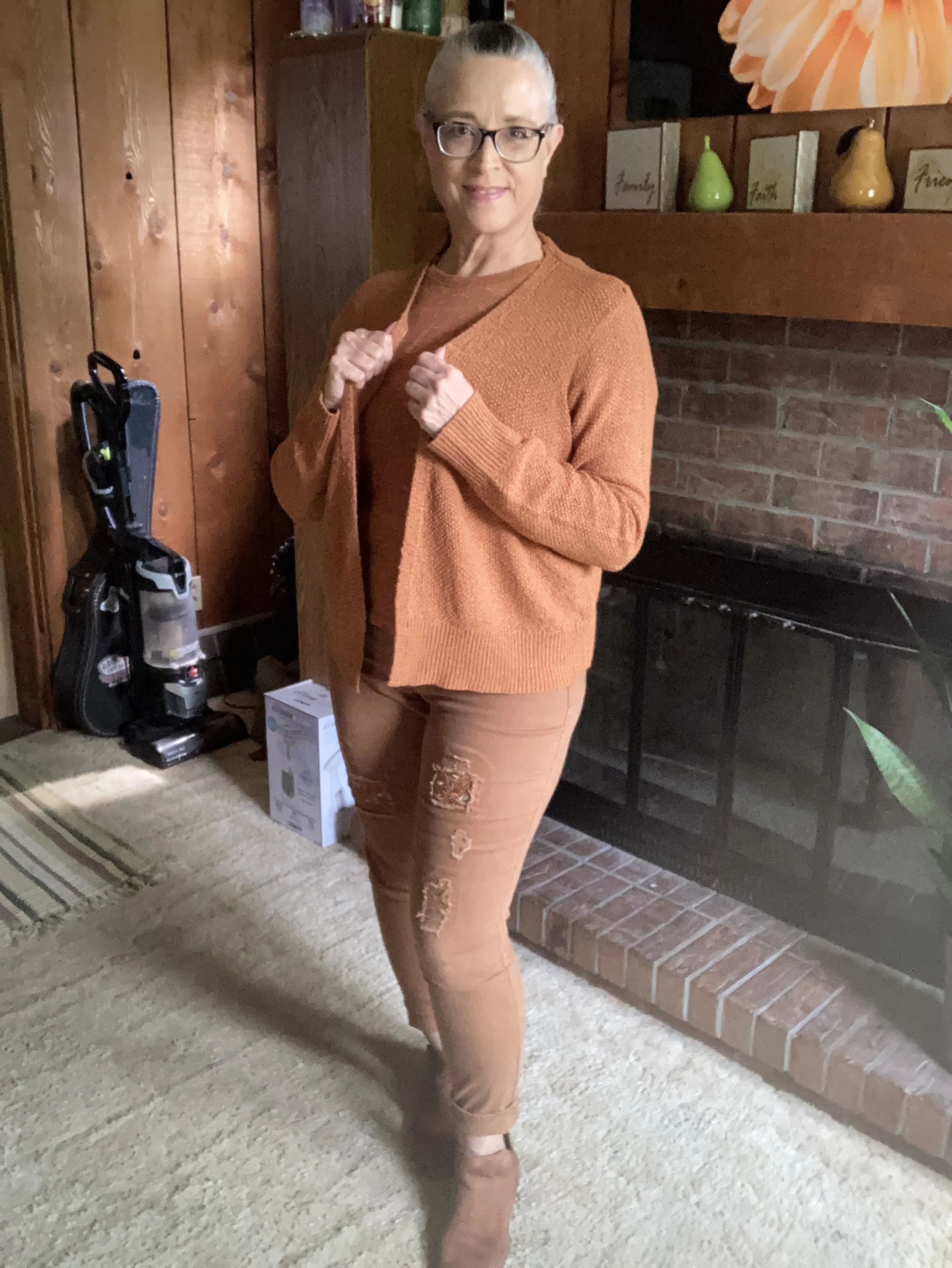
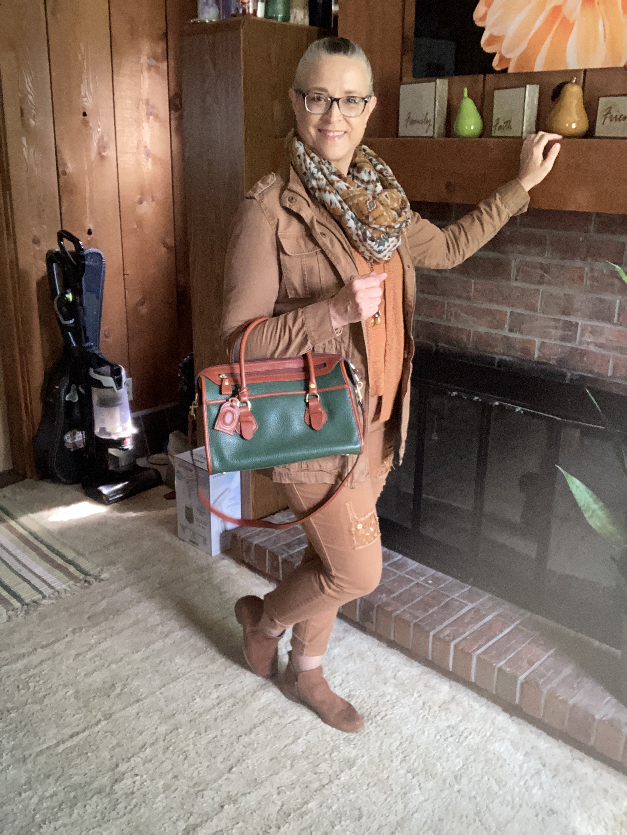
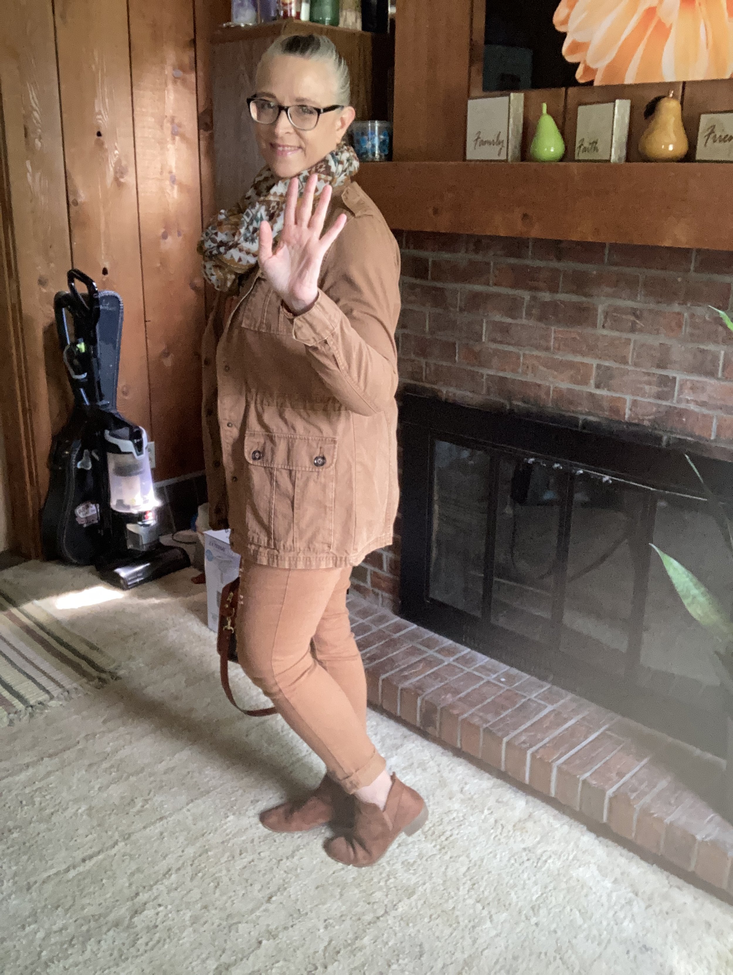
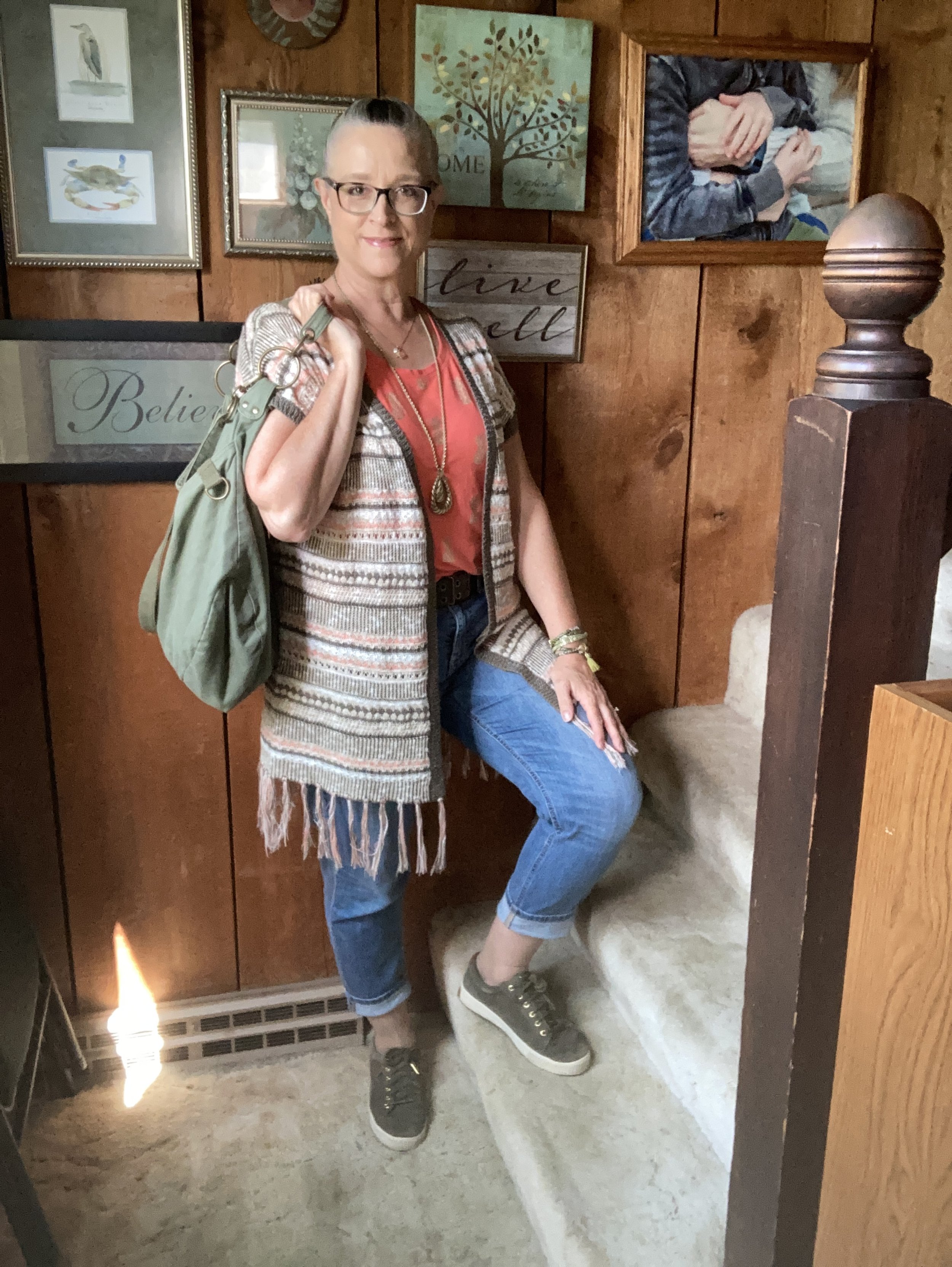
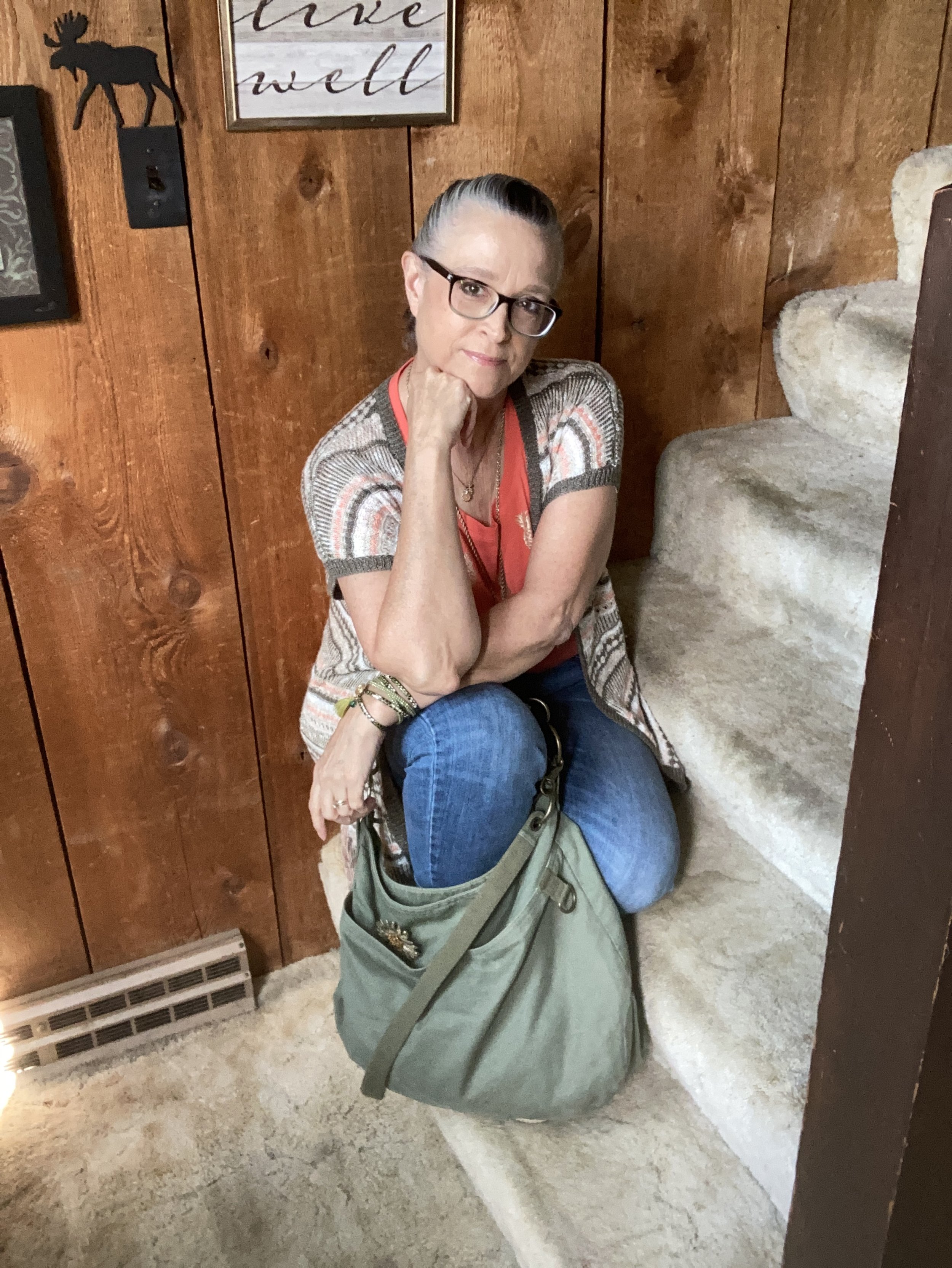
Let’s start with that jacket. This is a piece was a clearance purchase from the online retailer called ShopNational, which actually ended their operations in February of 2024. The brand name of this jacket is Erin London. You can see how I styled this piece with a floral top, and with a purple print tee. Christopher and Banks has a similar color. J. Jill has this Light Sage quilted piece. Here is one from Coldwater Creek that is closer to the color.
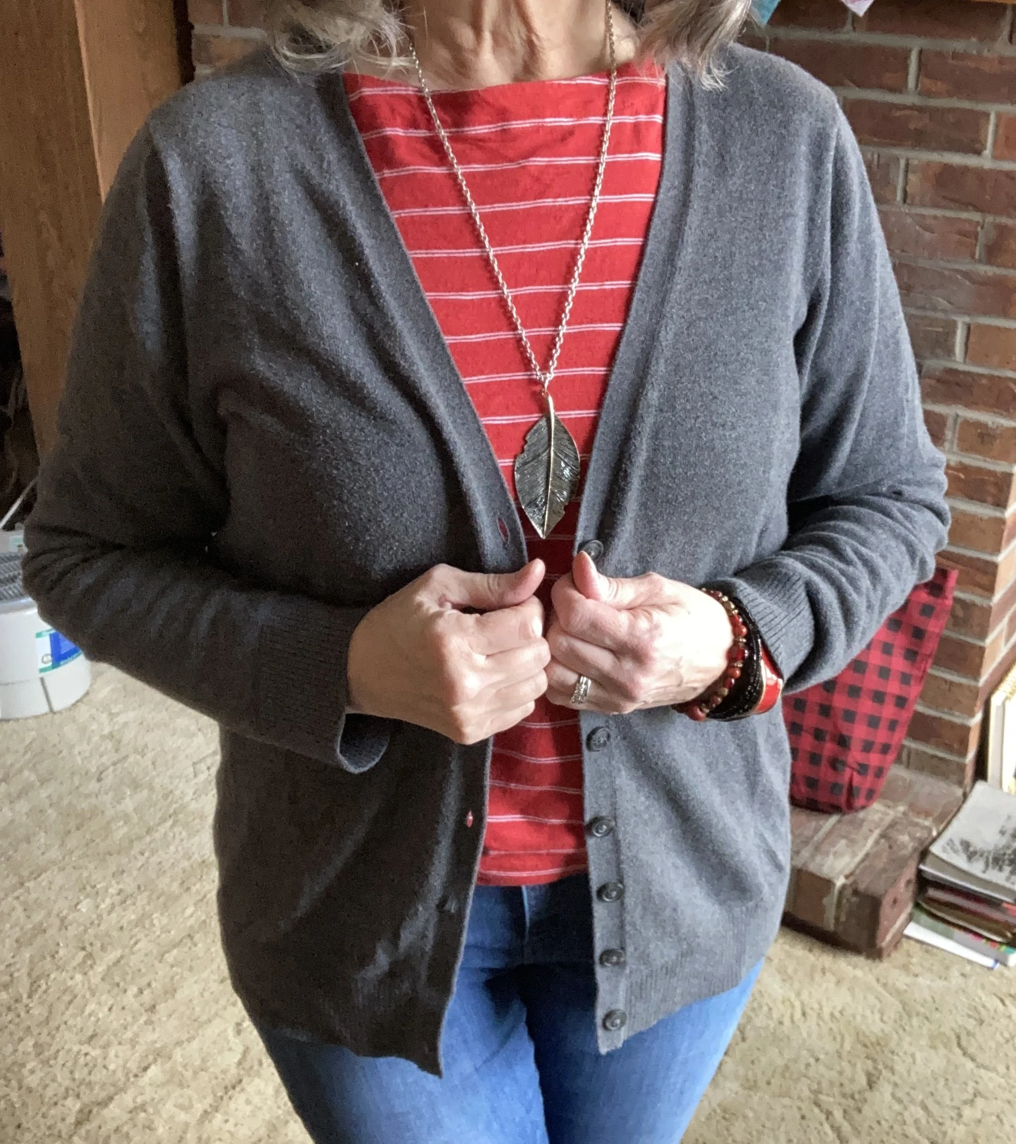
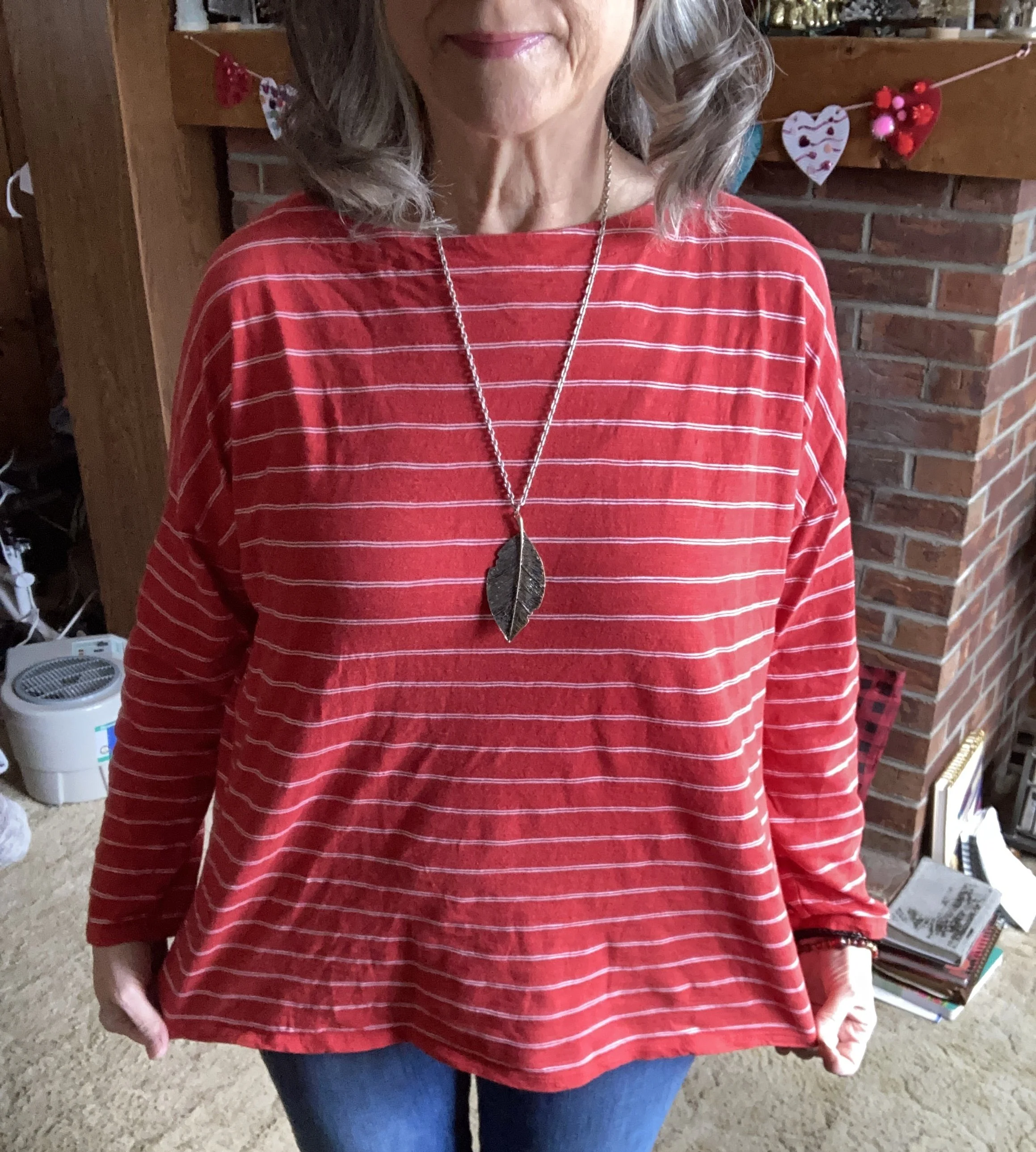
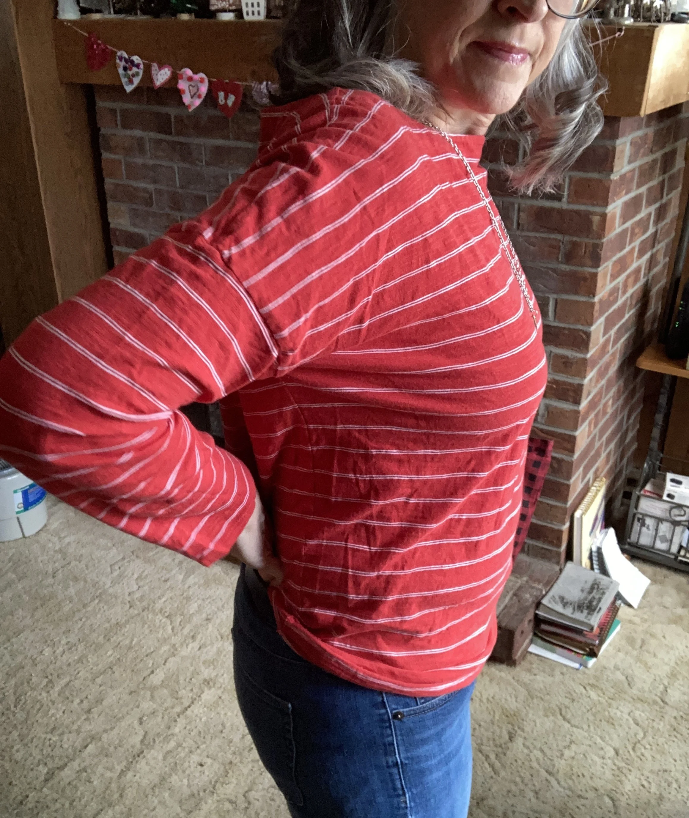
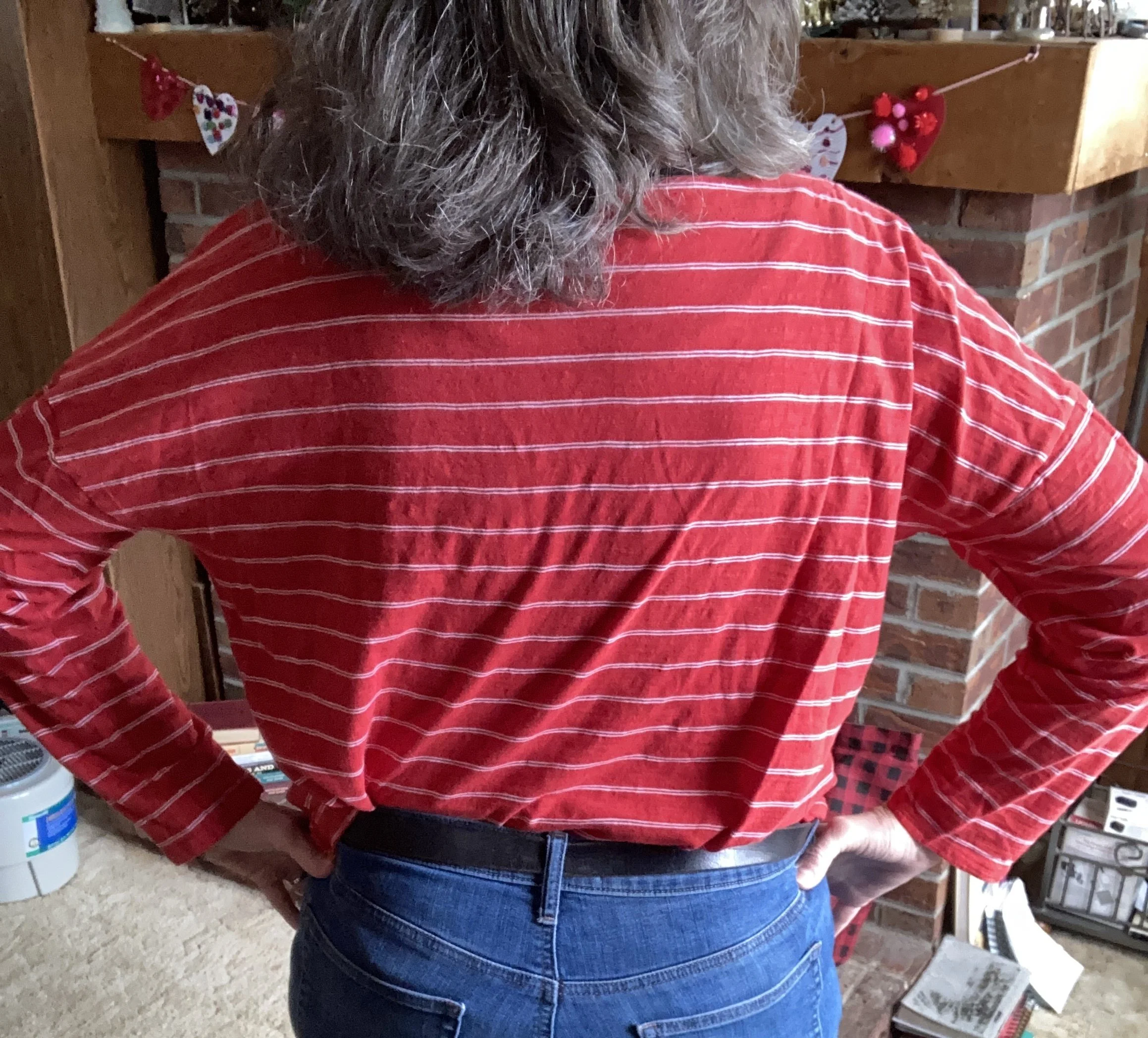
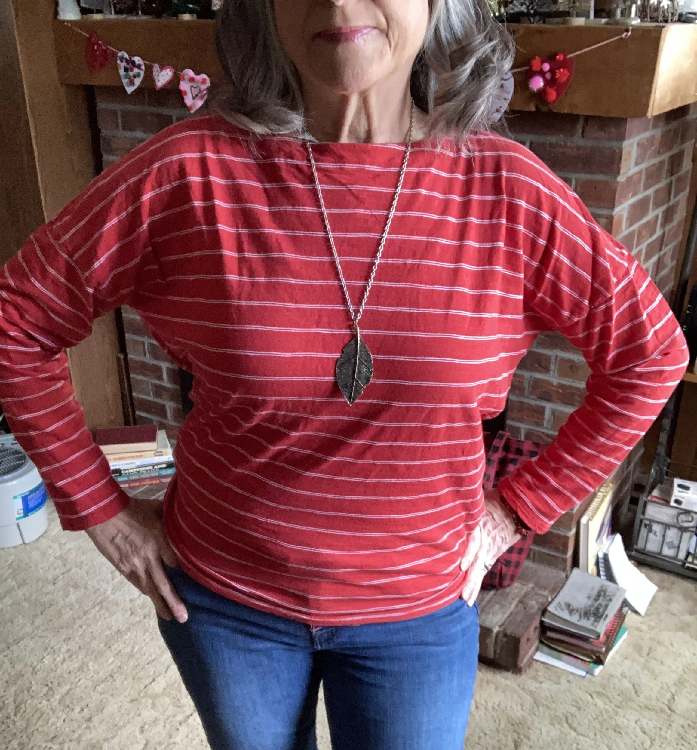
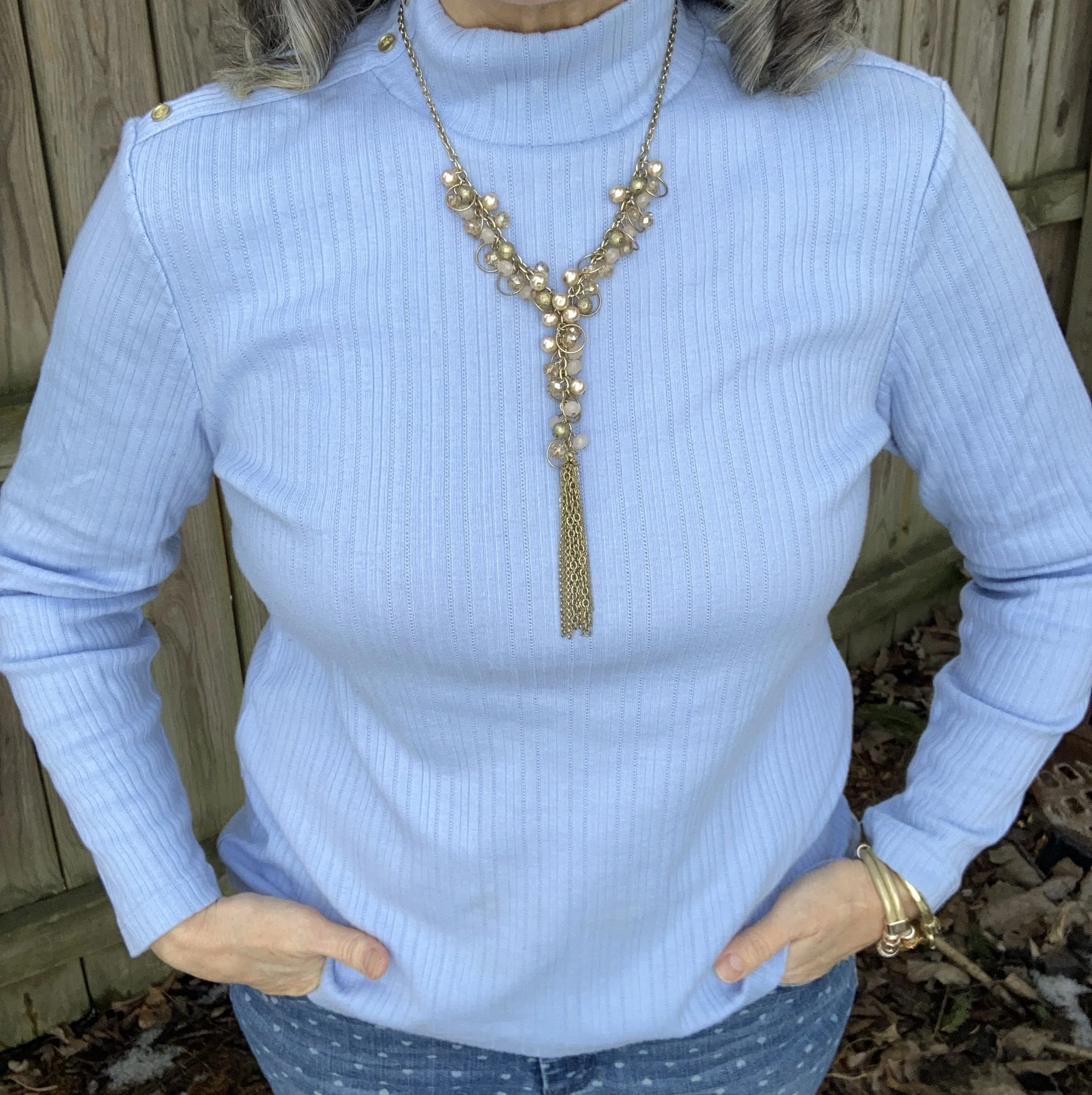
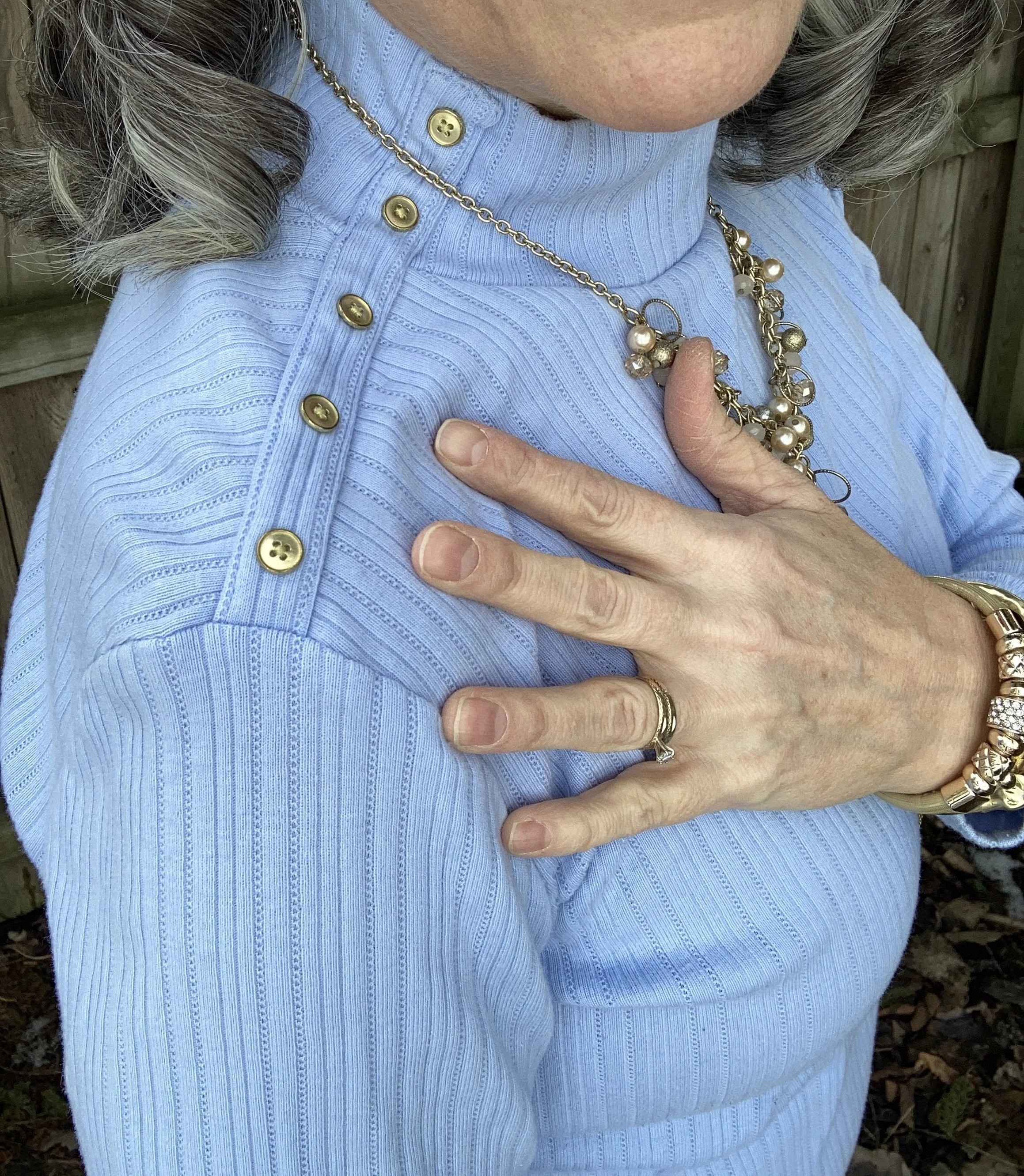
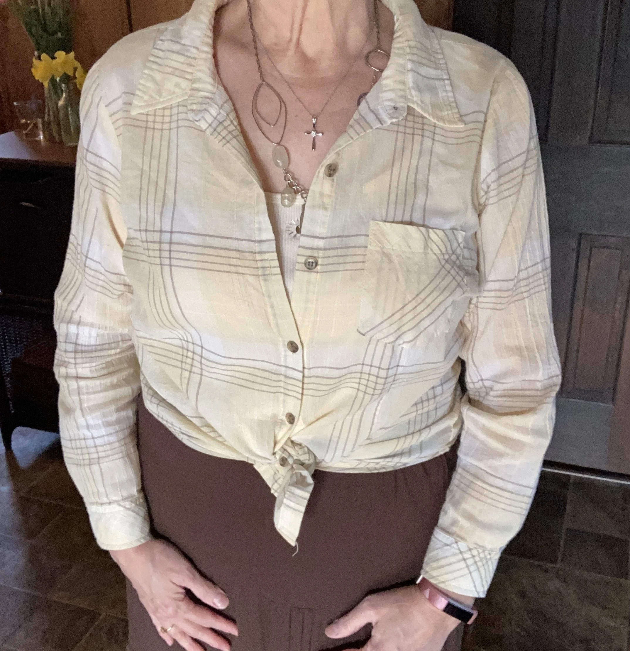
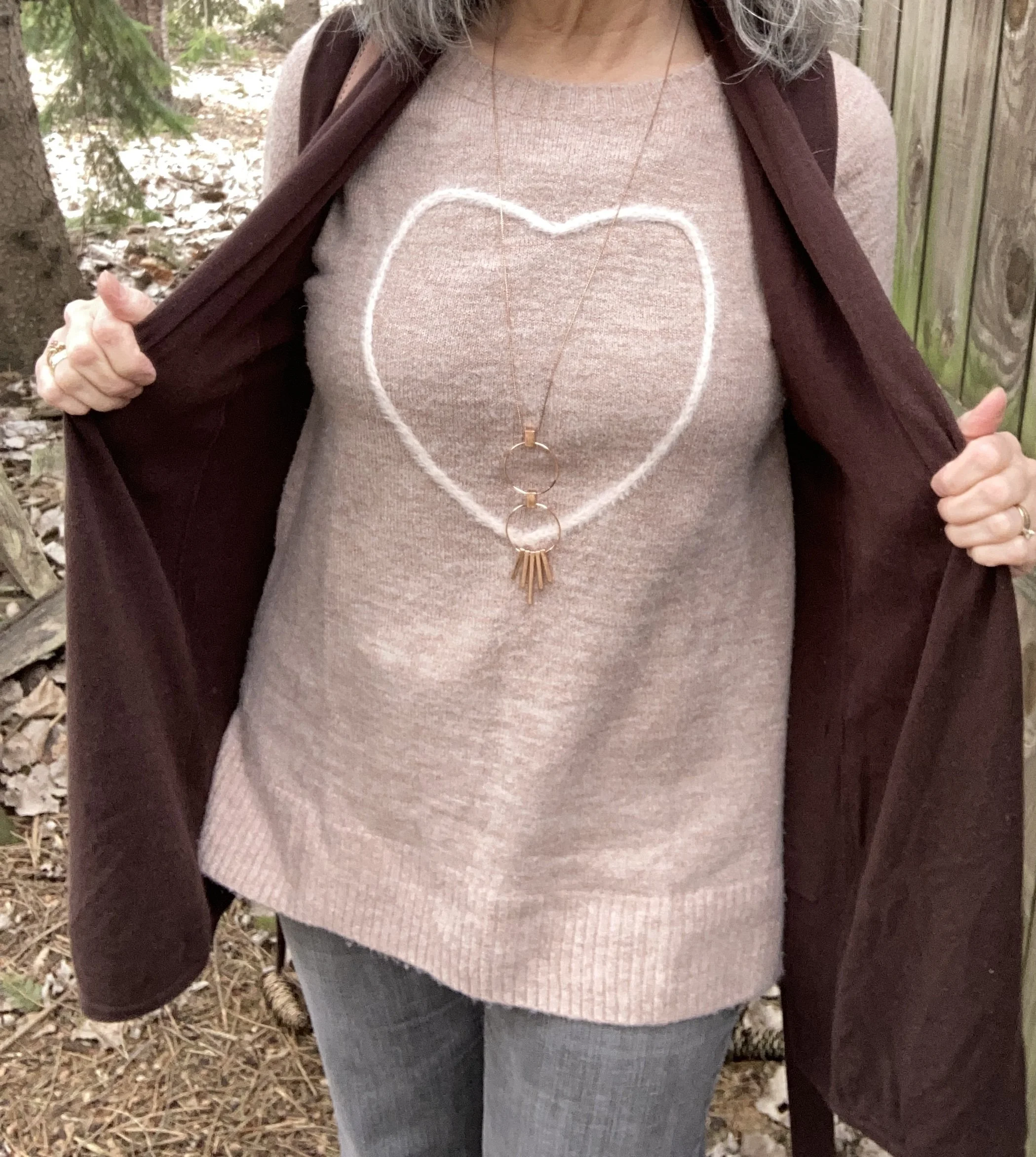
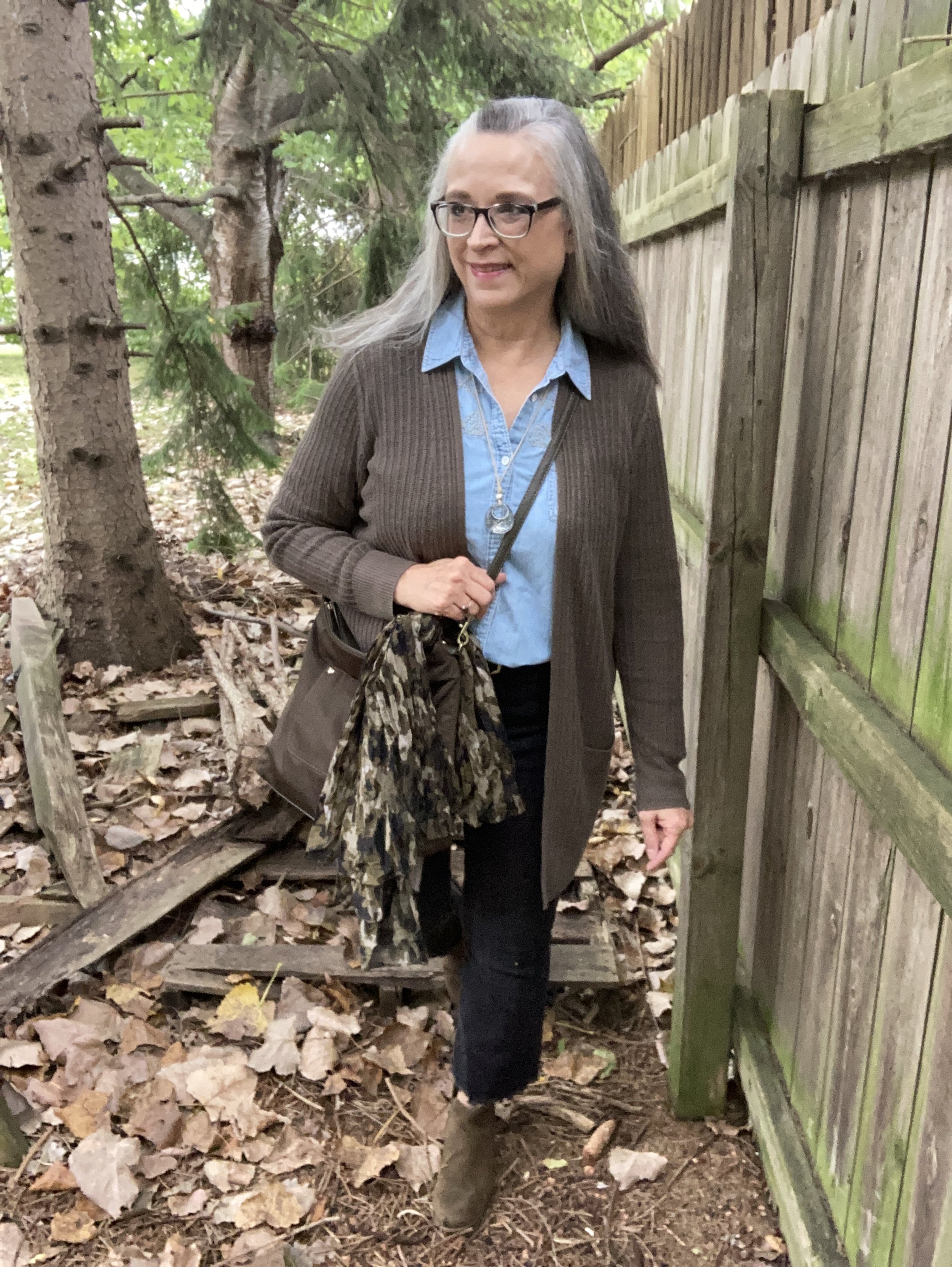
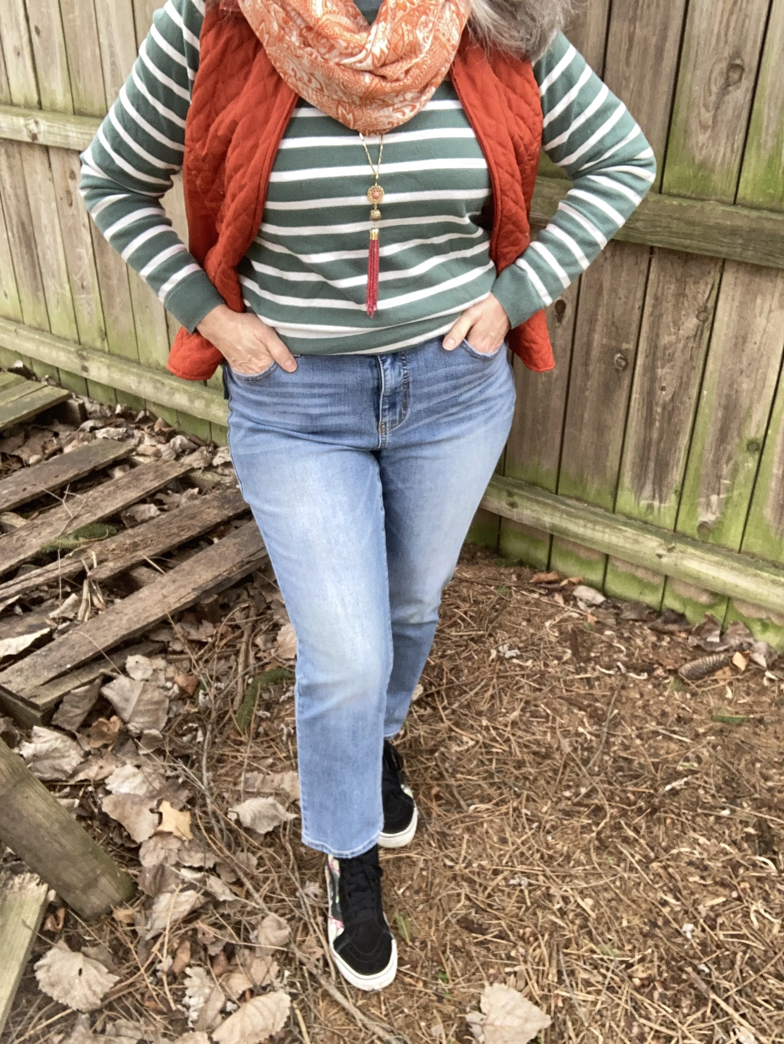
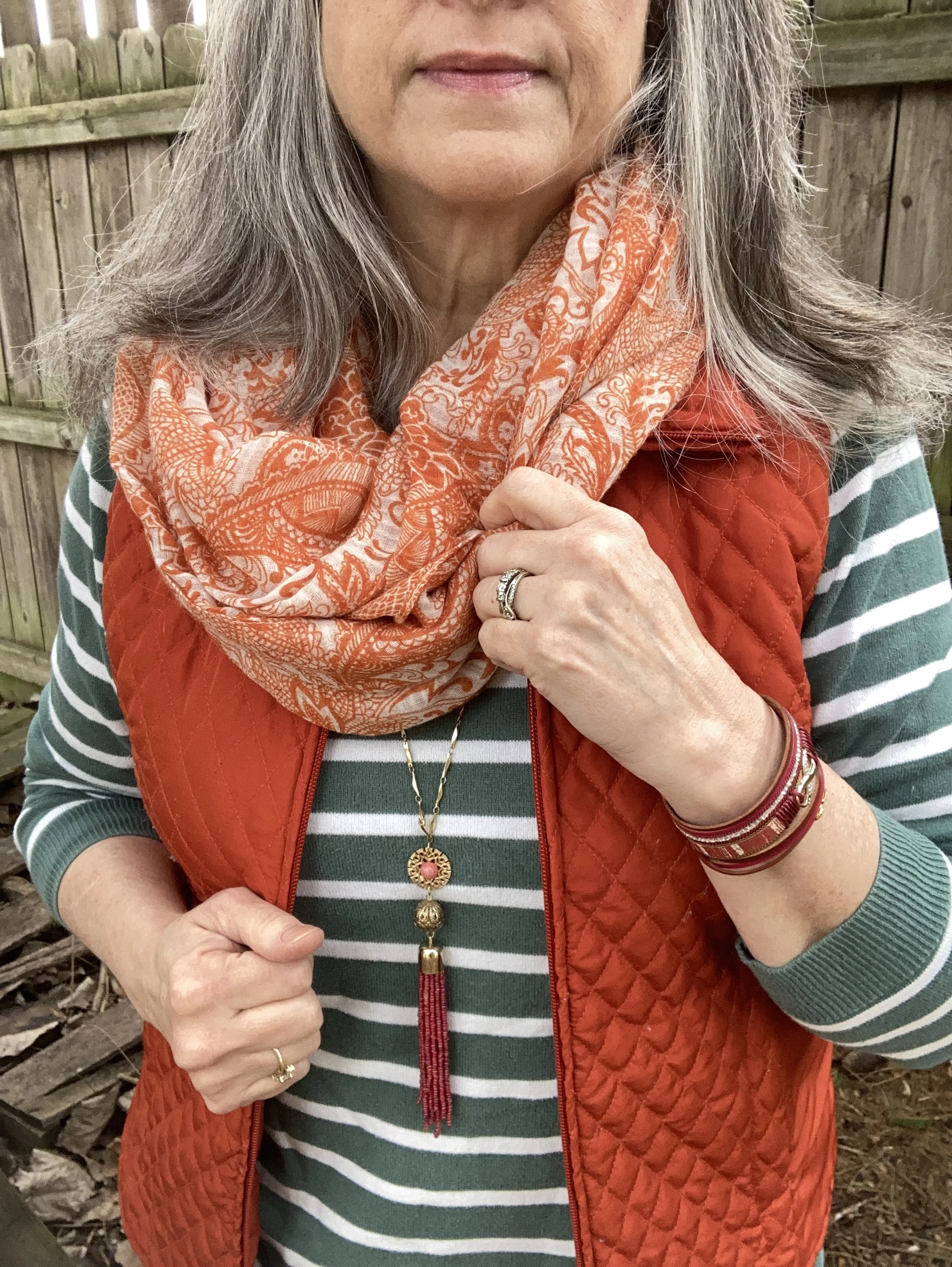
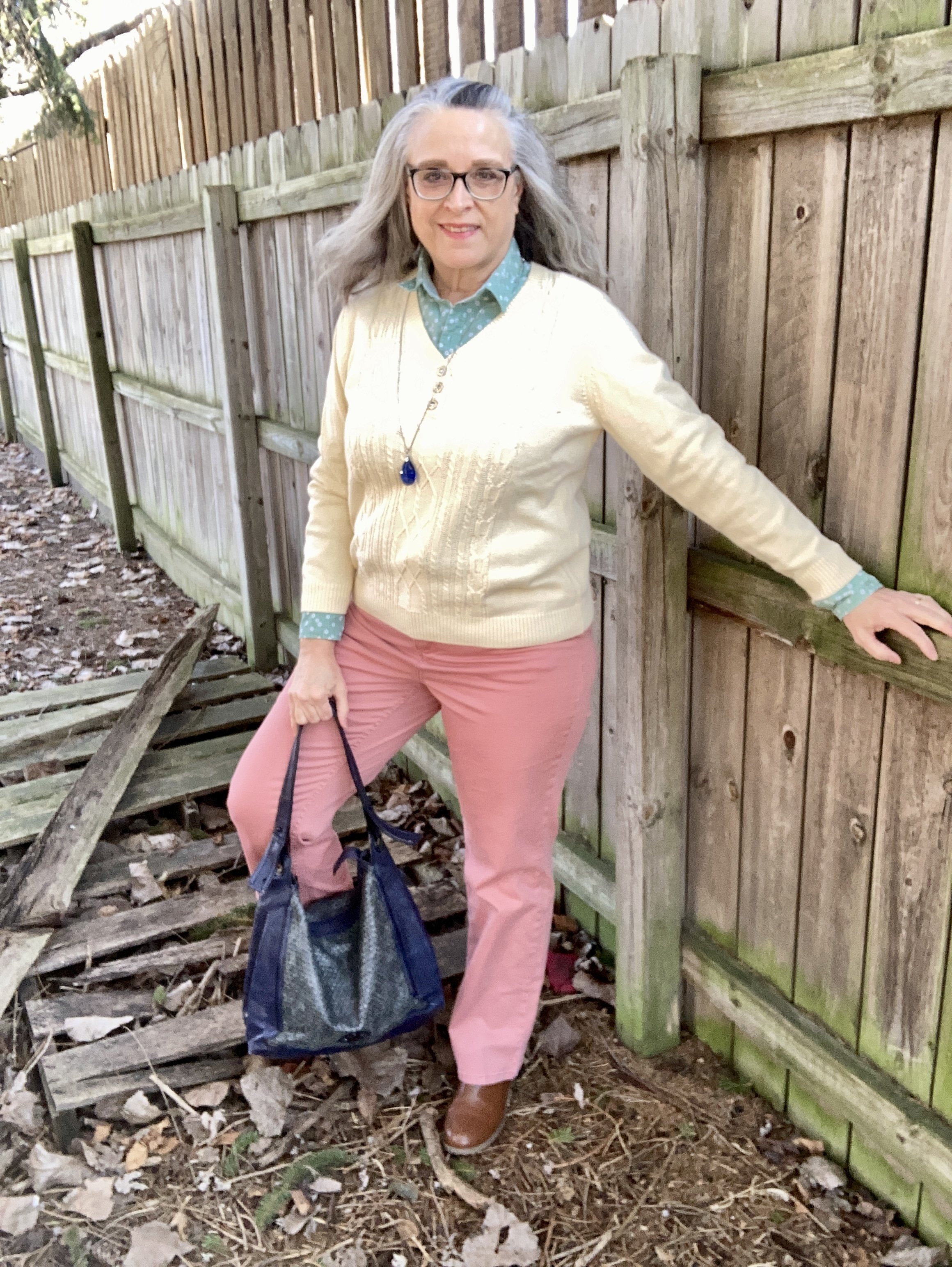
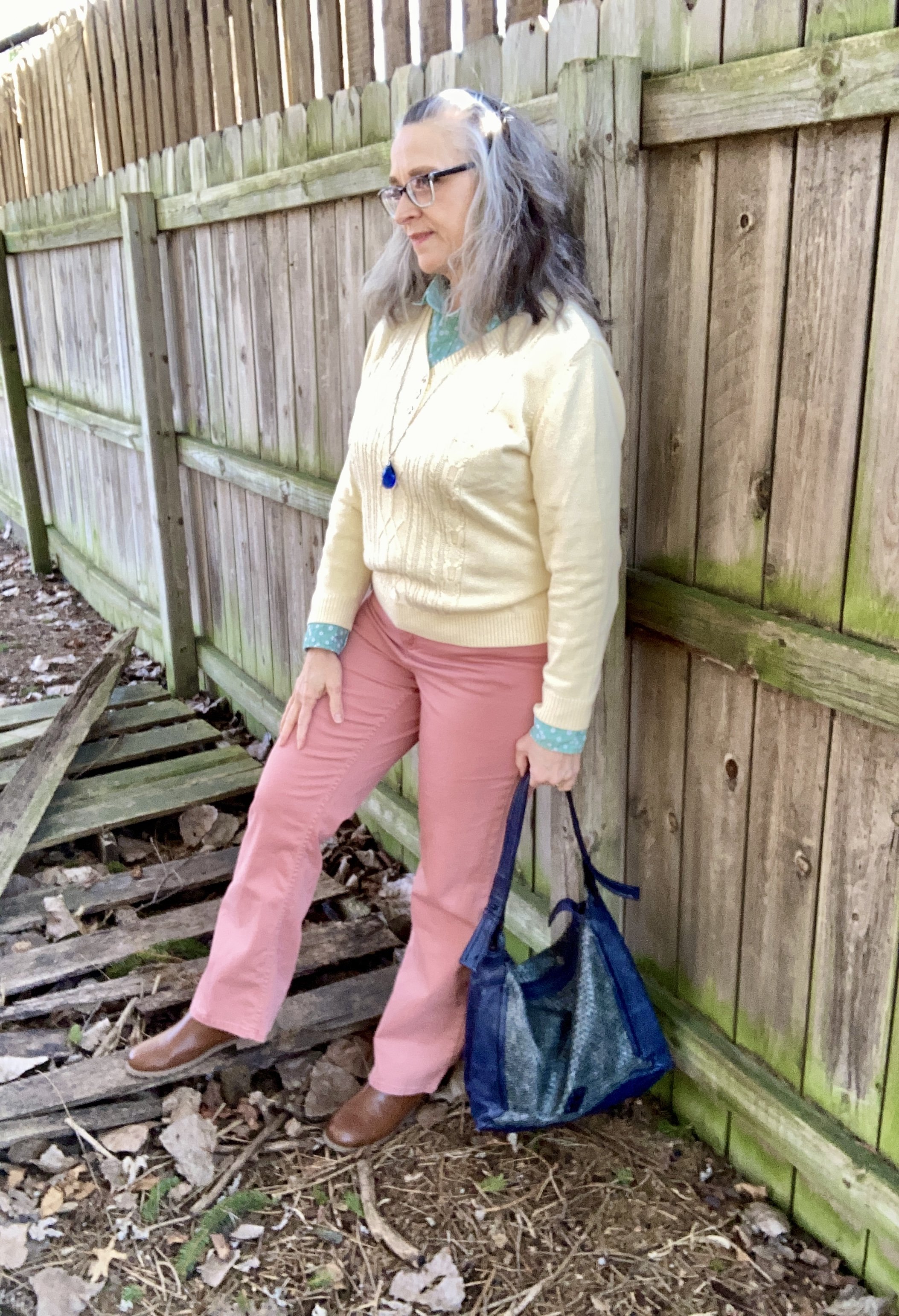
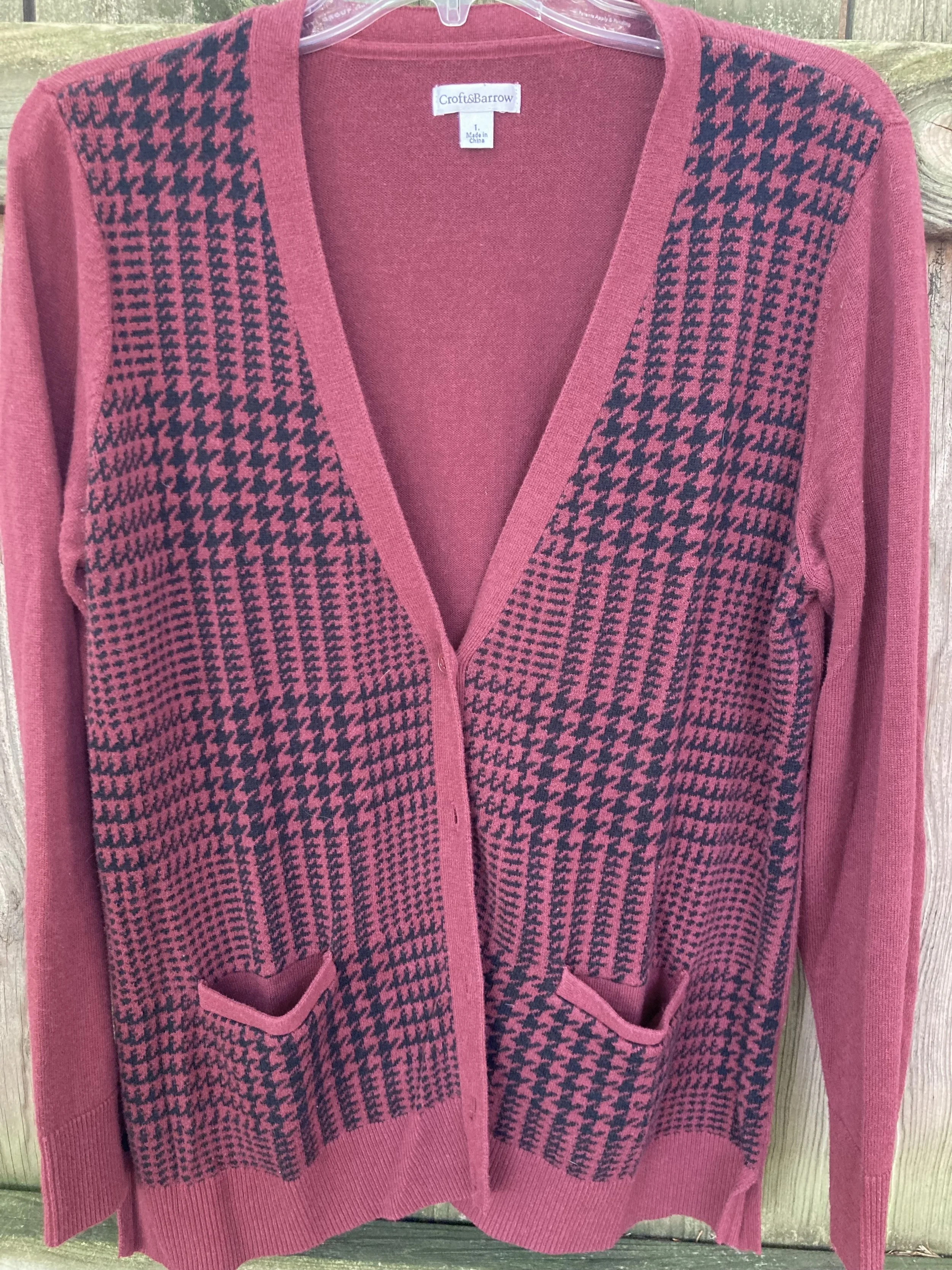
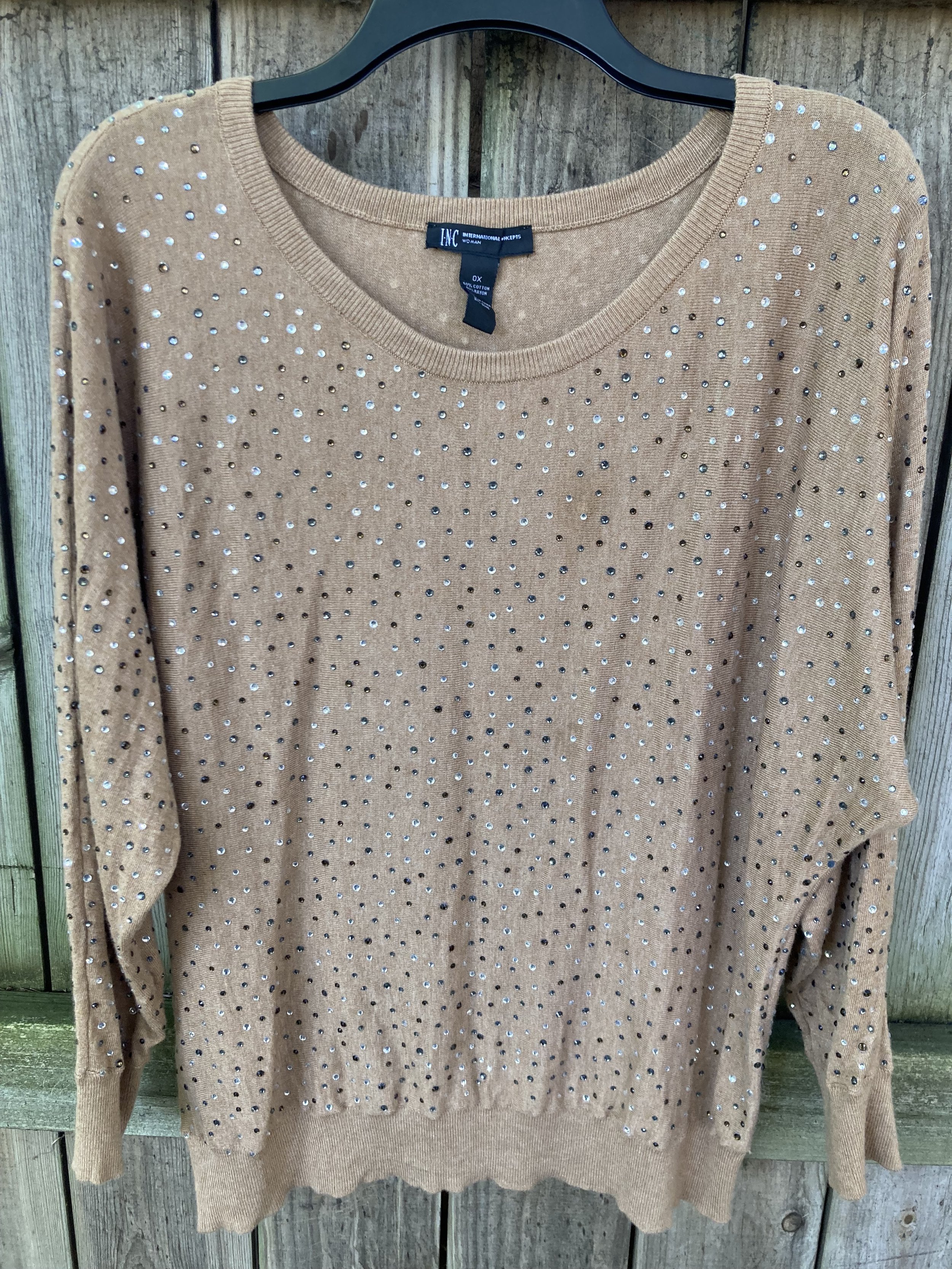
For the Burnt Sienna color I chose this waffle weave pullover, that I think I got at Kohl’s. For some reason the tag is gone, but it is probably Croft and Barrow. Here’s a long sleeve tee in that color from Land’s End; a linen top from Old Navy; a cute lattice sleeve top from Christopher & Banks, and a pretty textured piece from Mayberry.
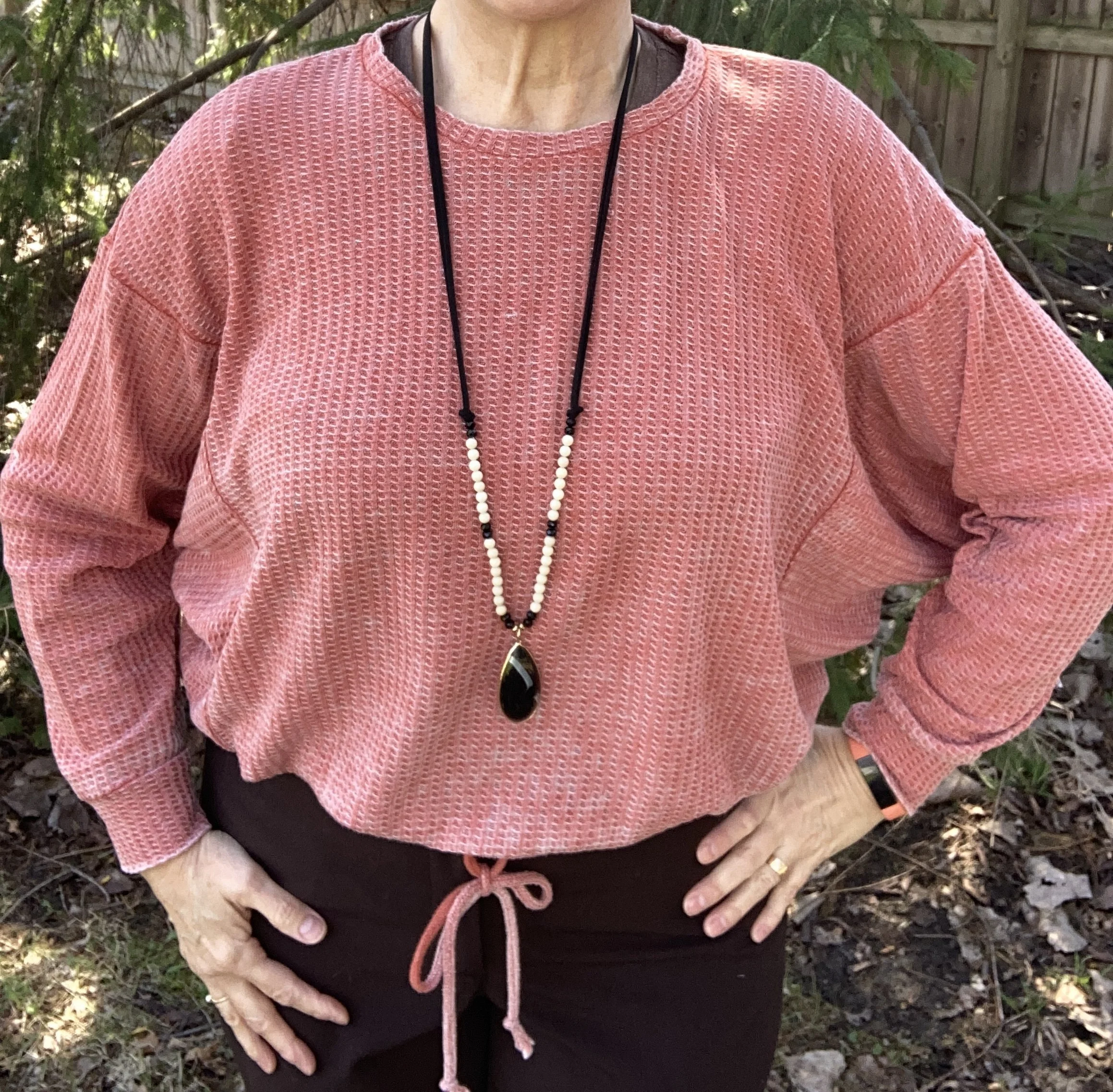
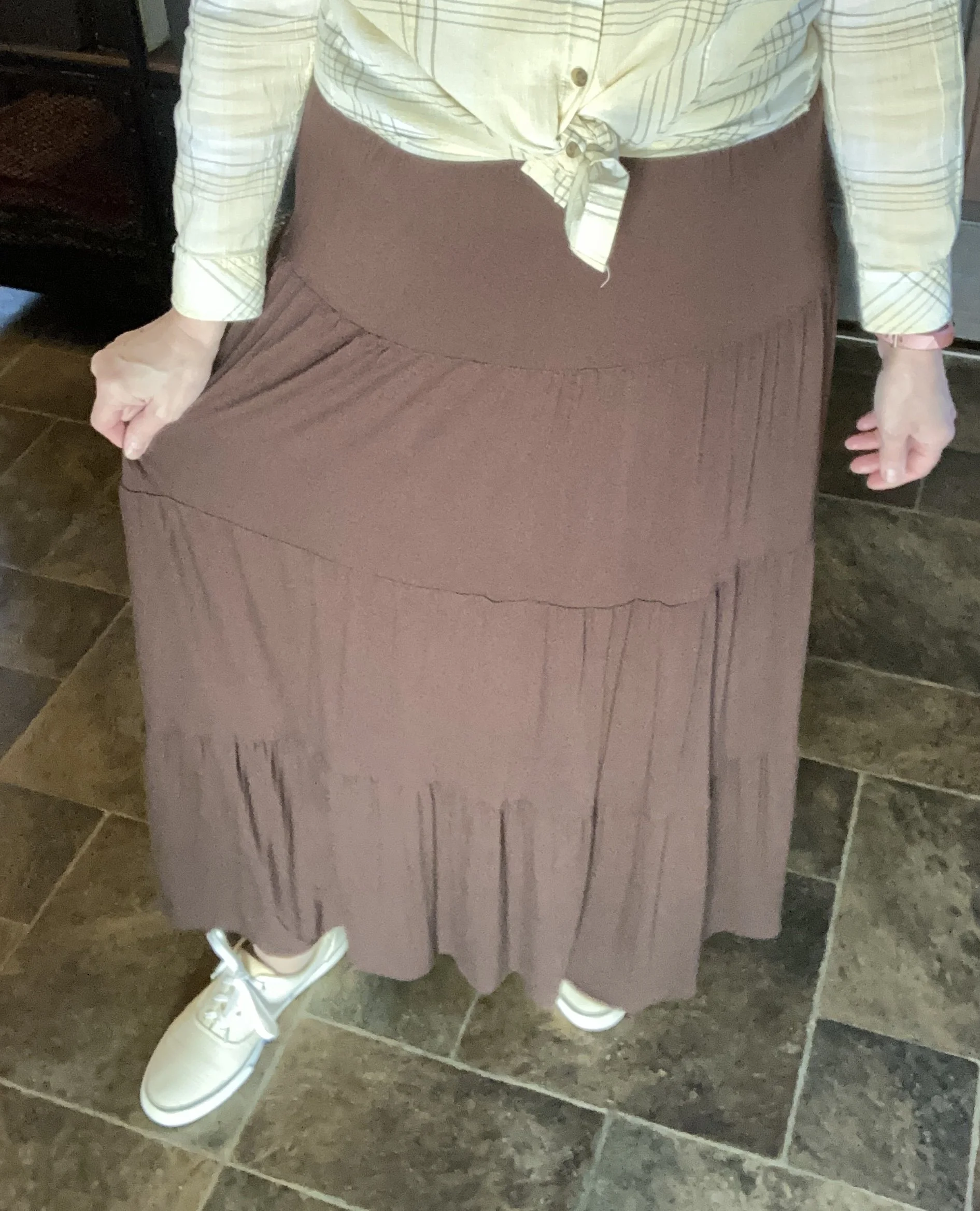
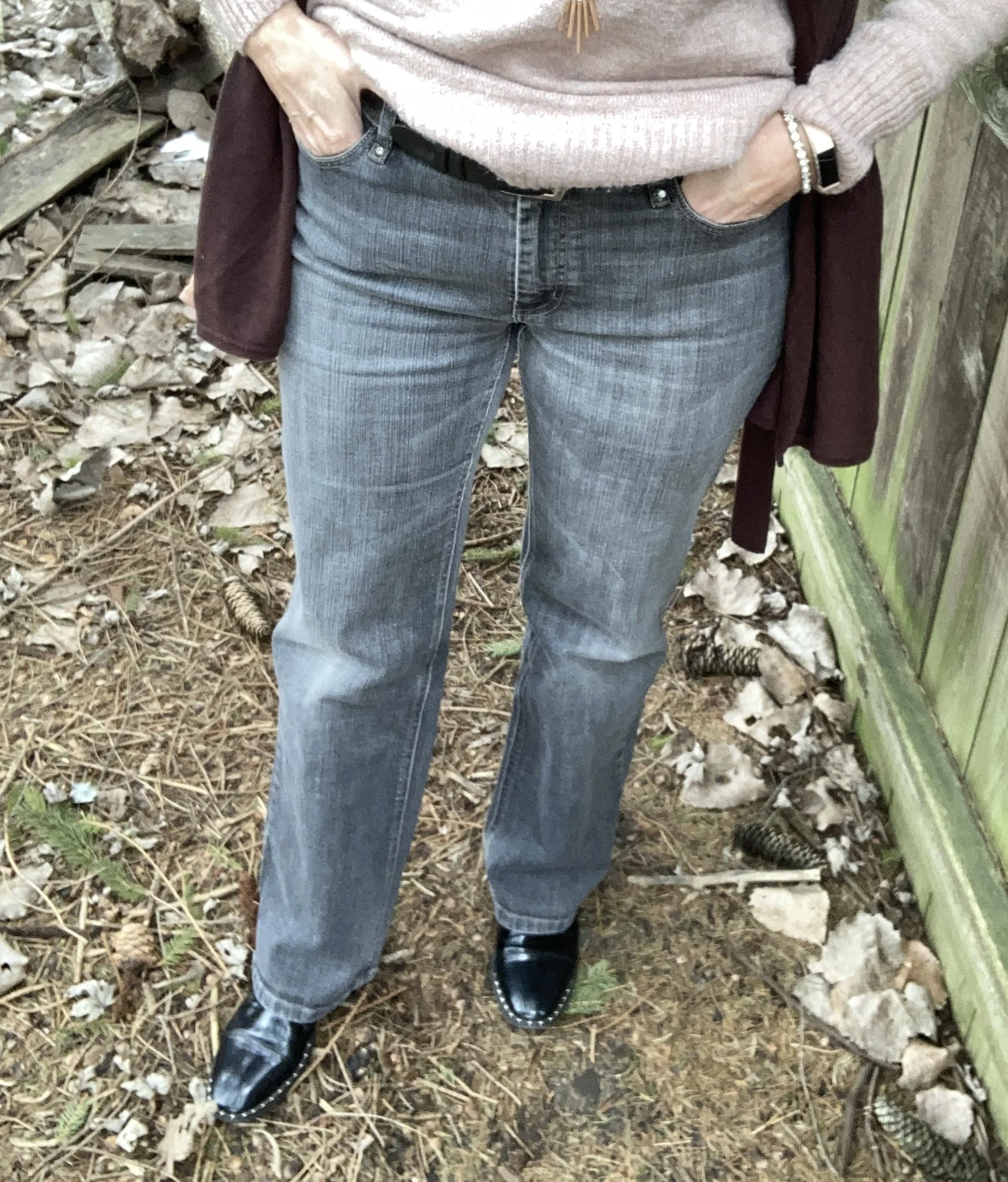
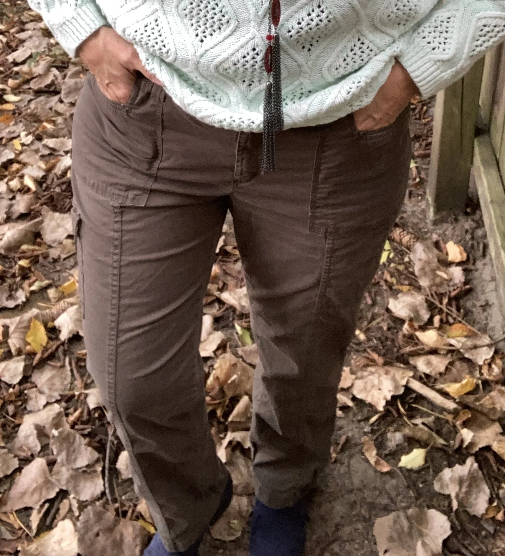
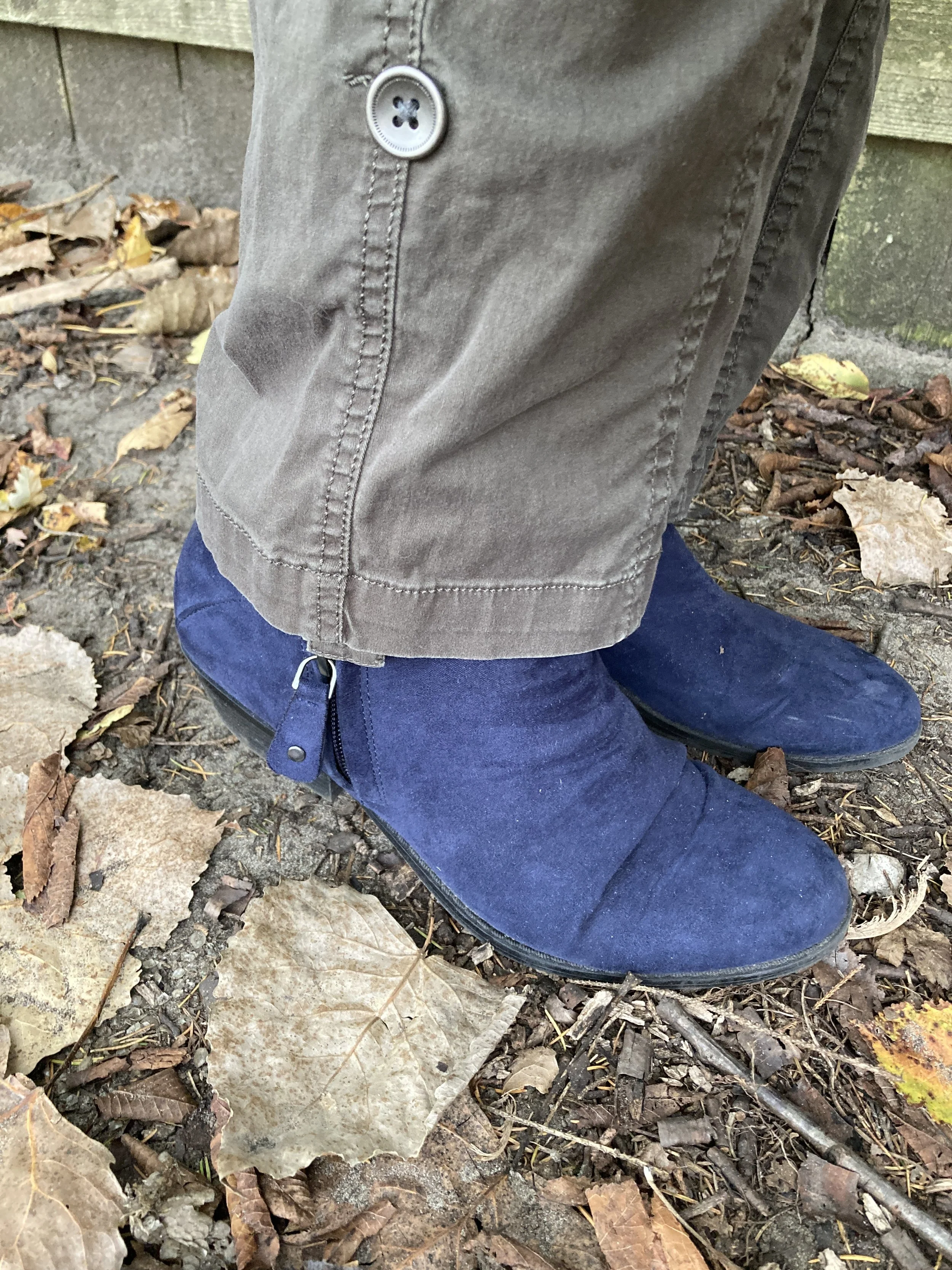
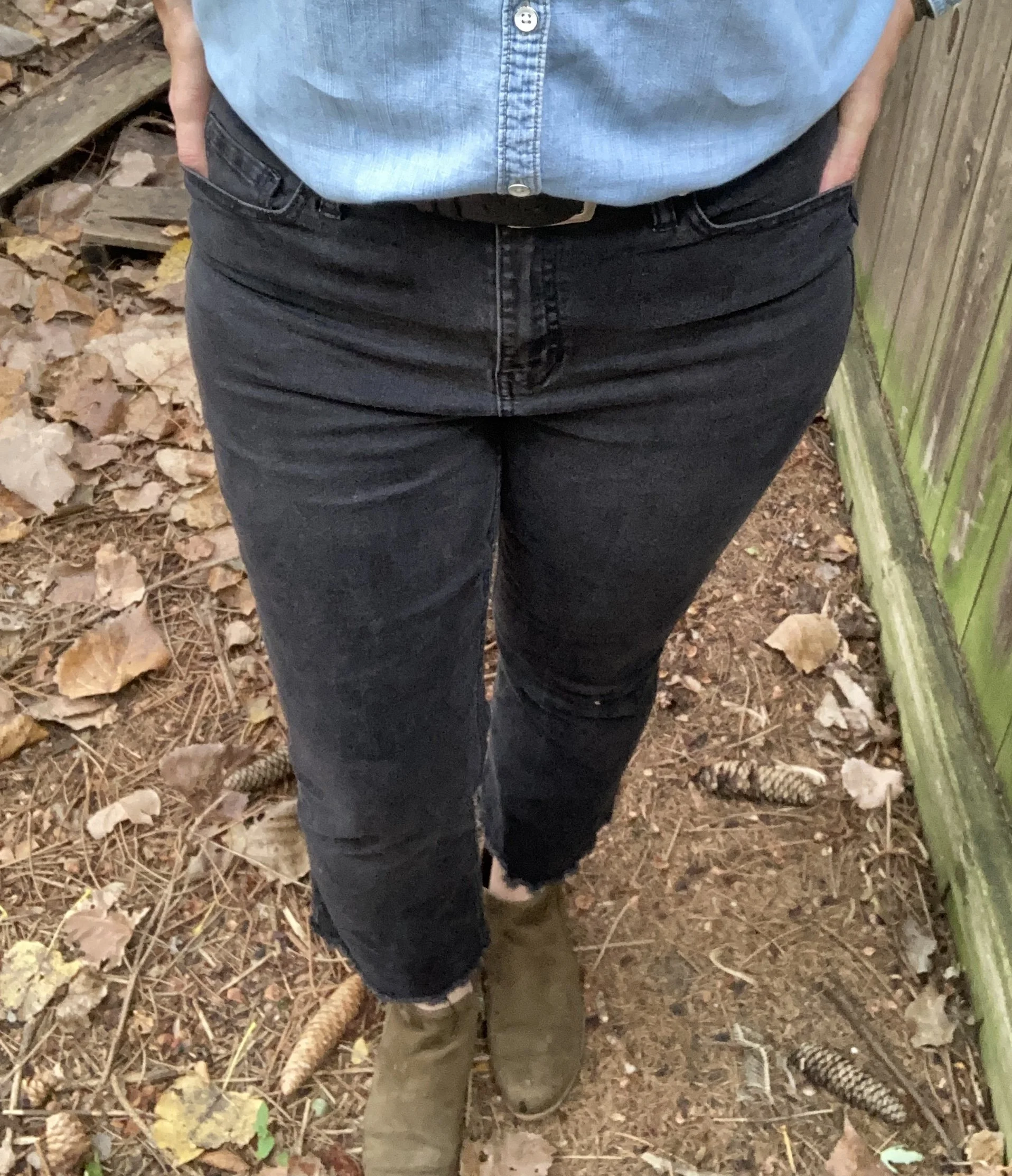
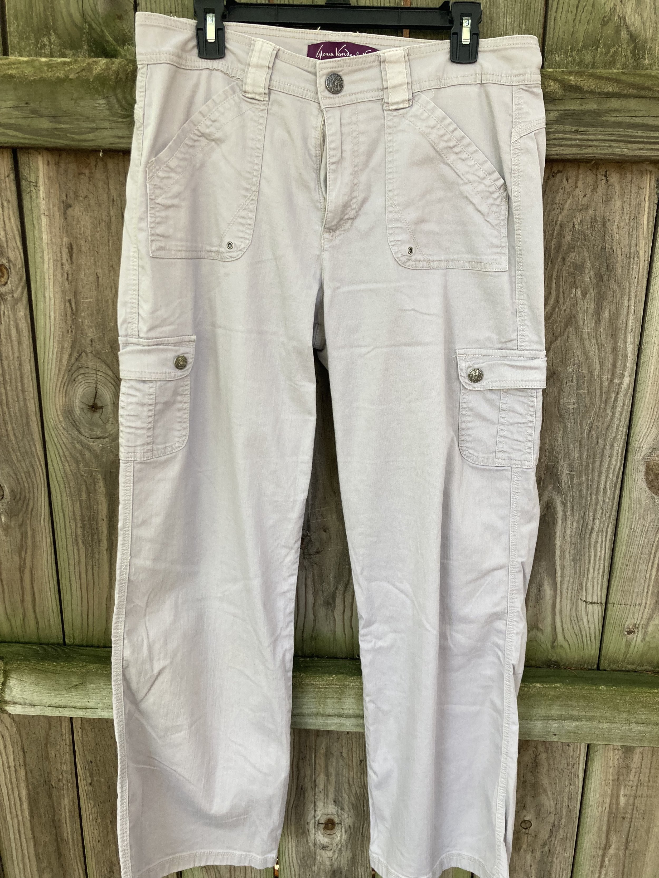
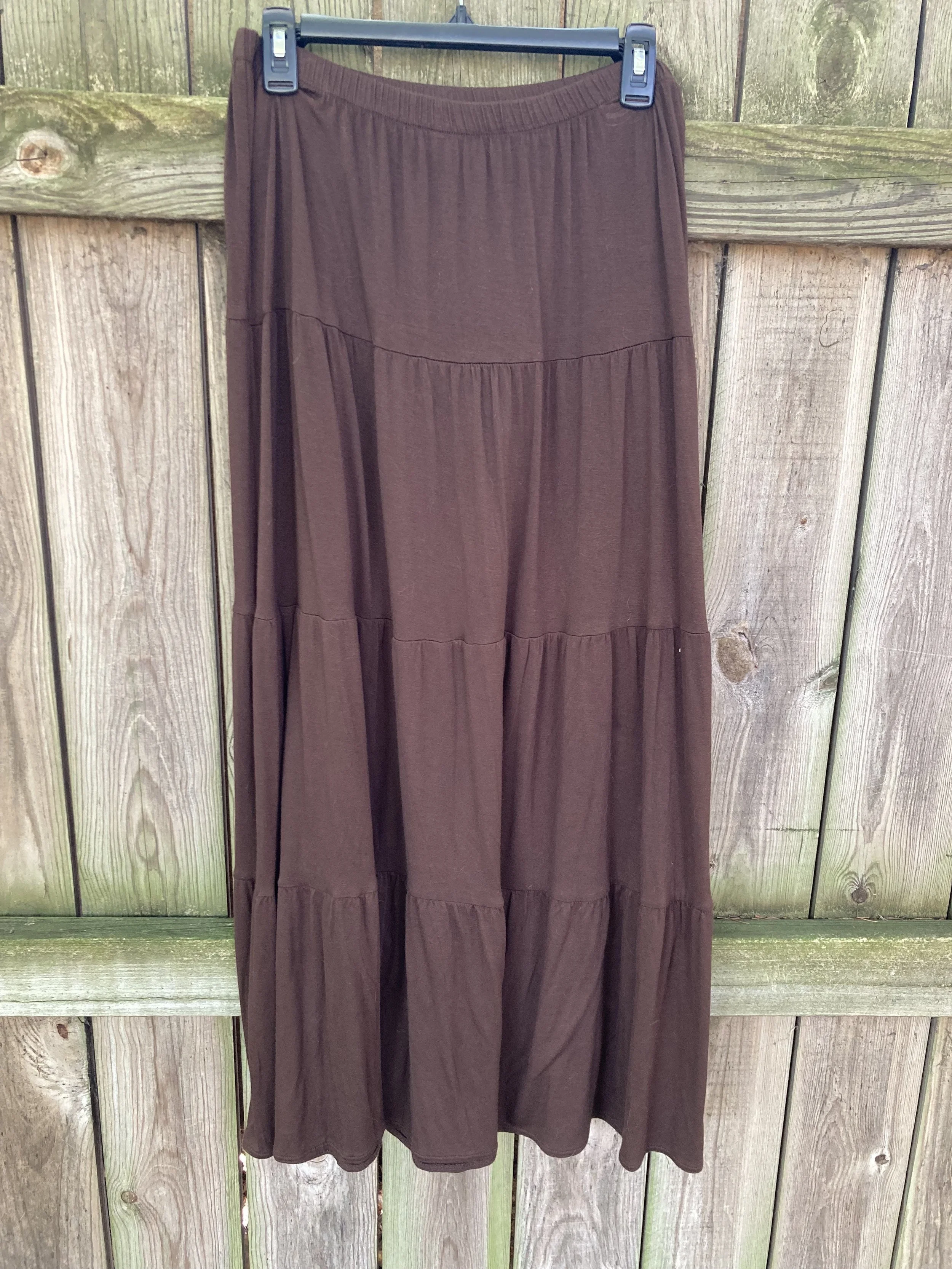
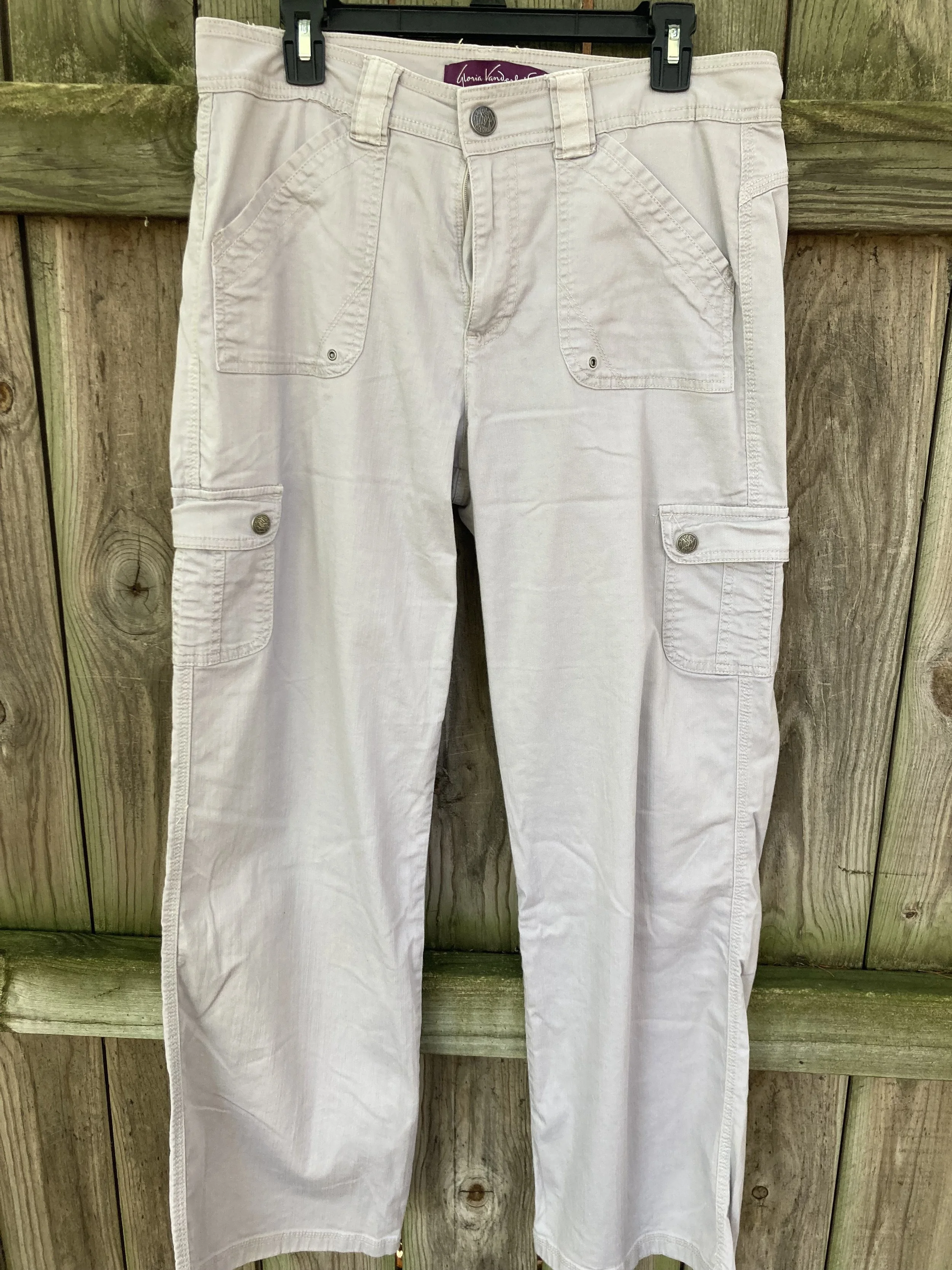
Coffee Bean is one of the Classic colors off the palette and is a deep, rich brown. I have a couple pairs of brown dress pants from when I was still working and these were the perfect color. These were a JC Penney purchase from a number of years ago and are Worthington brand. Here’s a few from LL Bean, Coldwater Creek, Kohl’s, and Target.
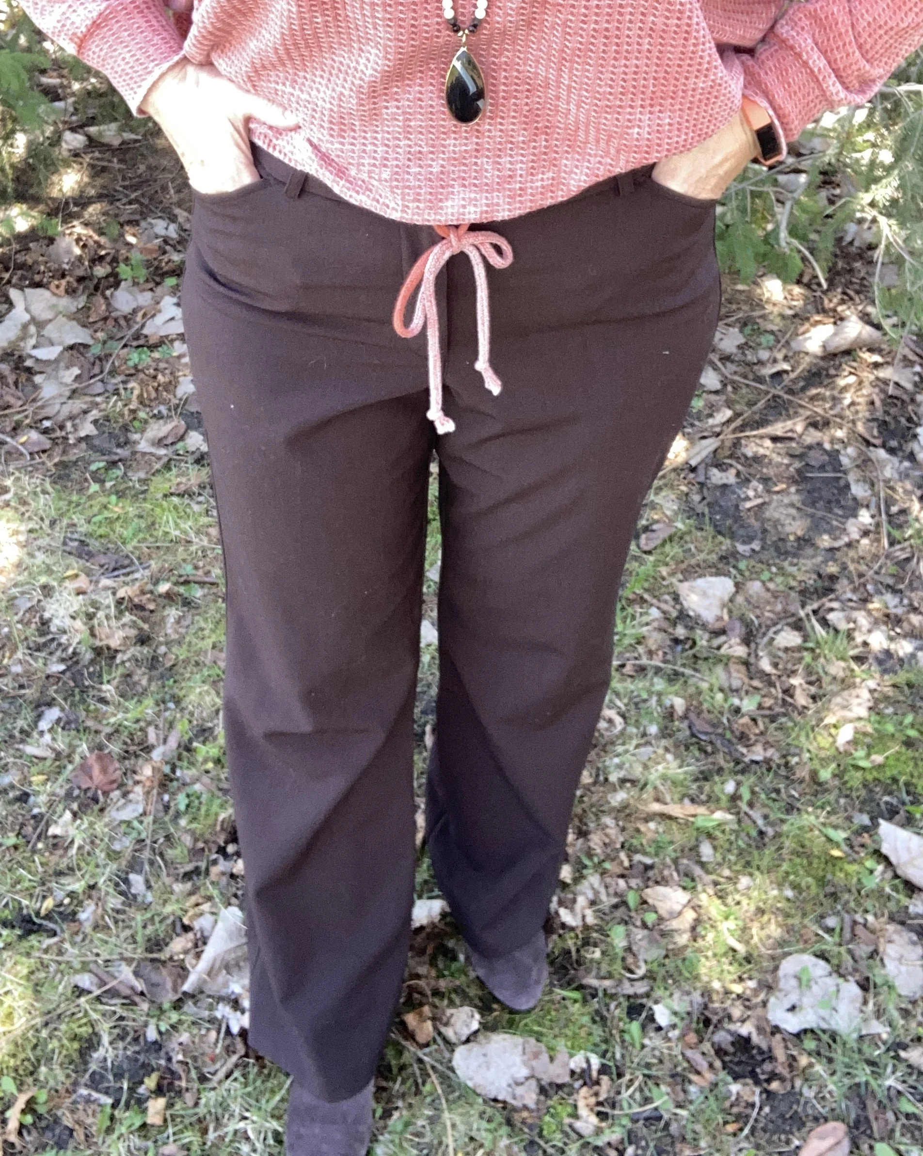
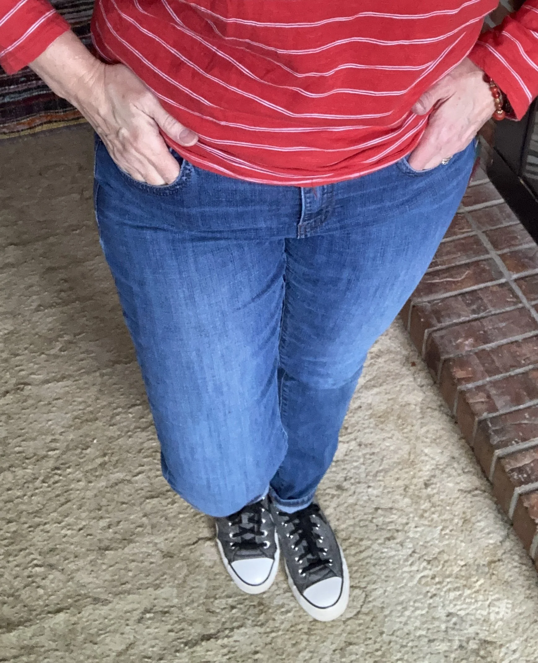
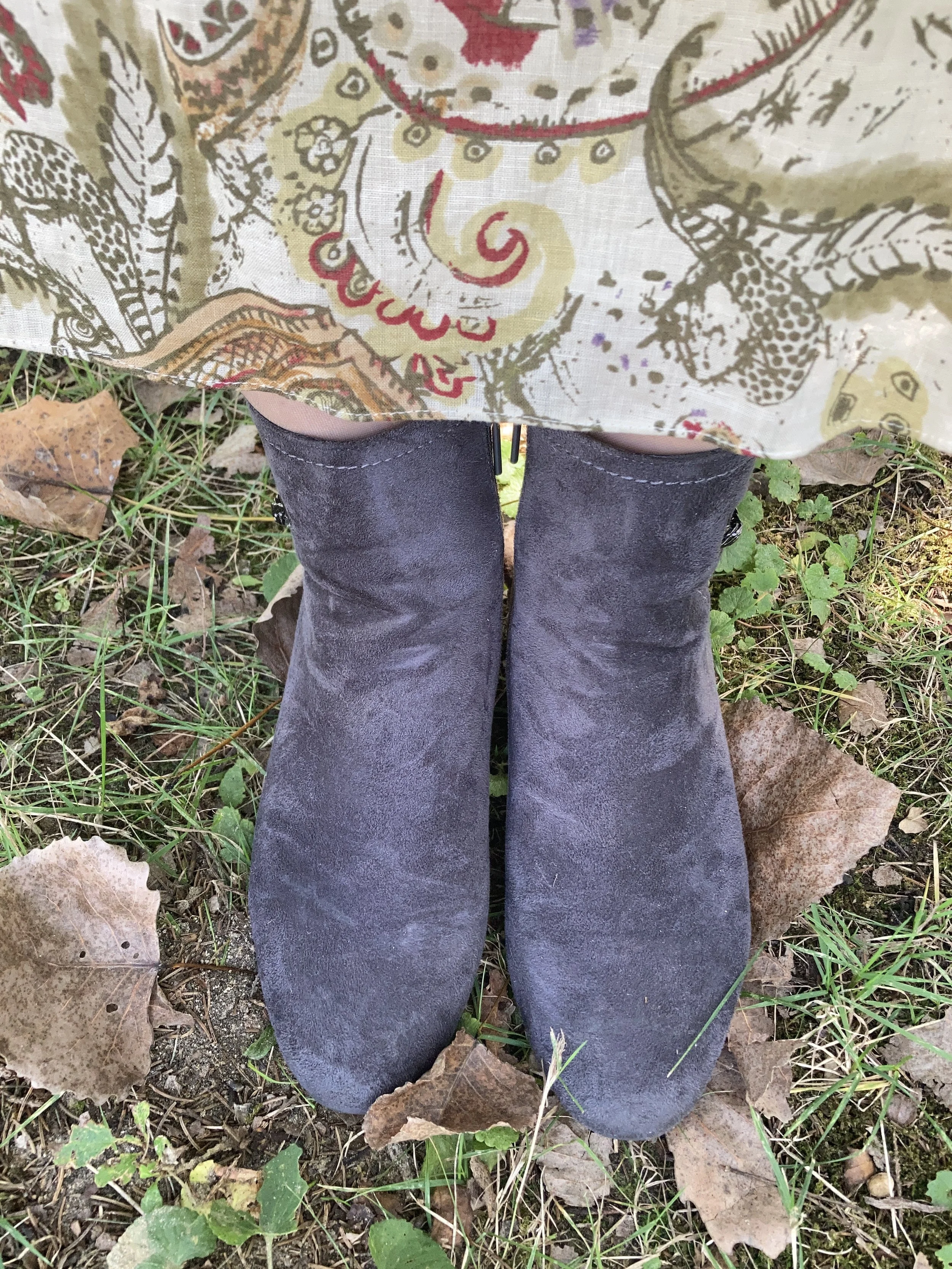
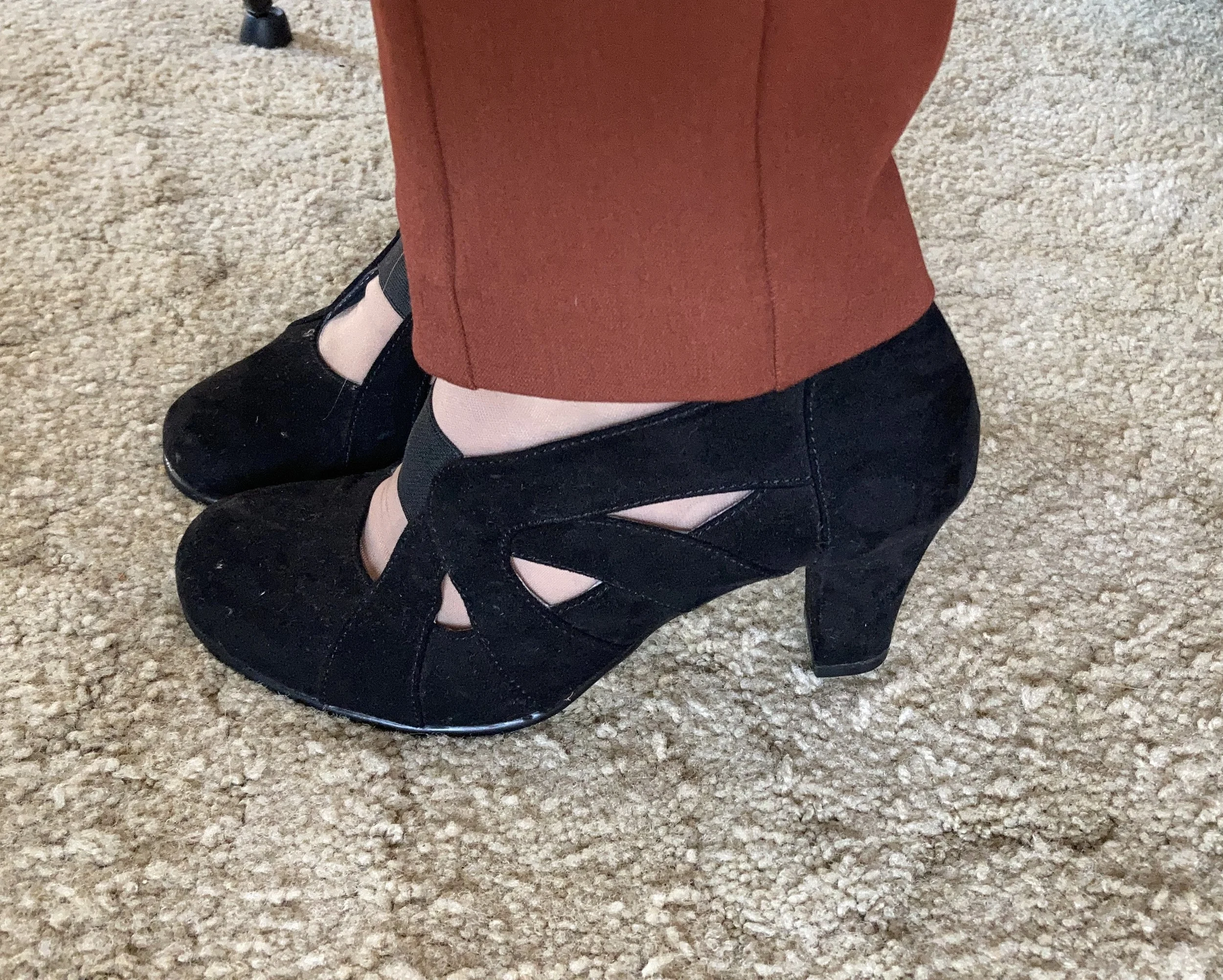
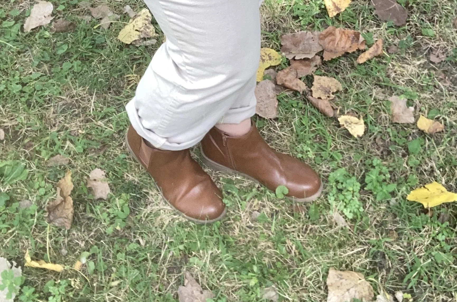
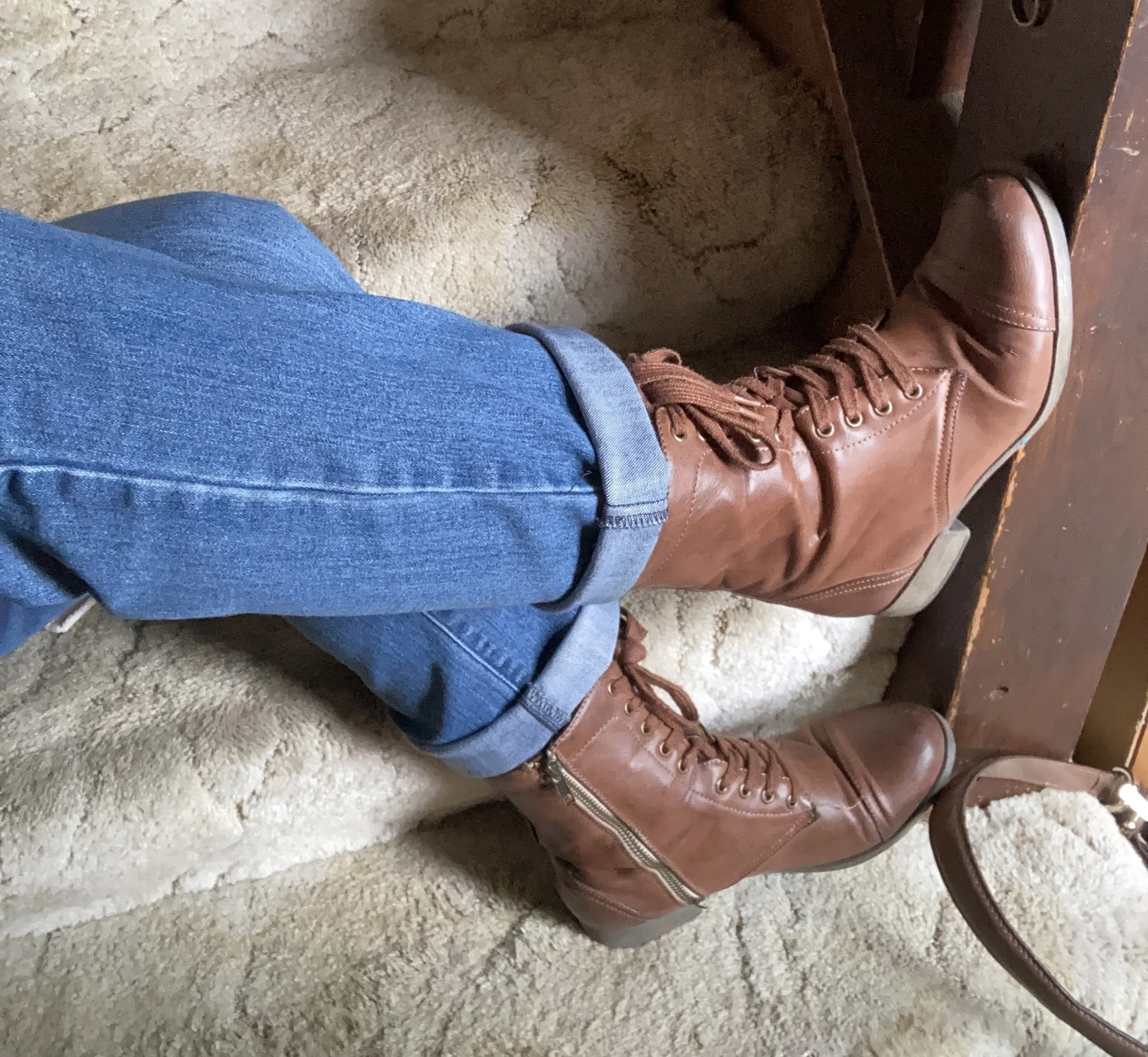
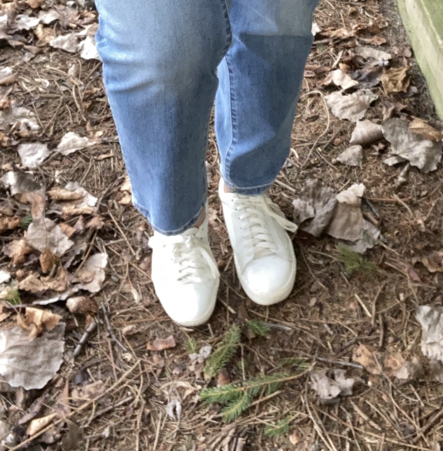
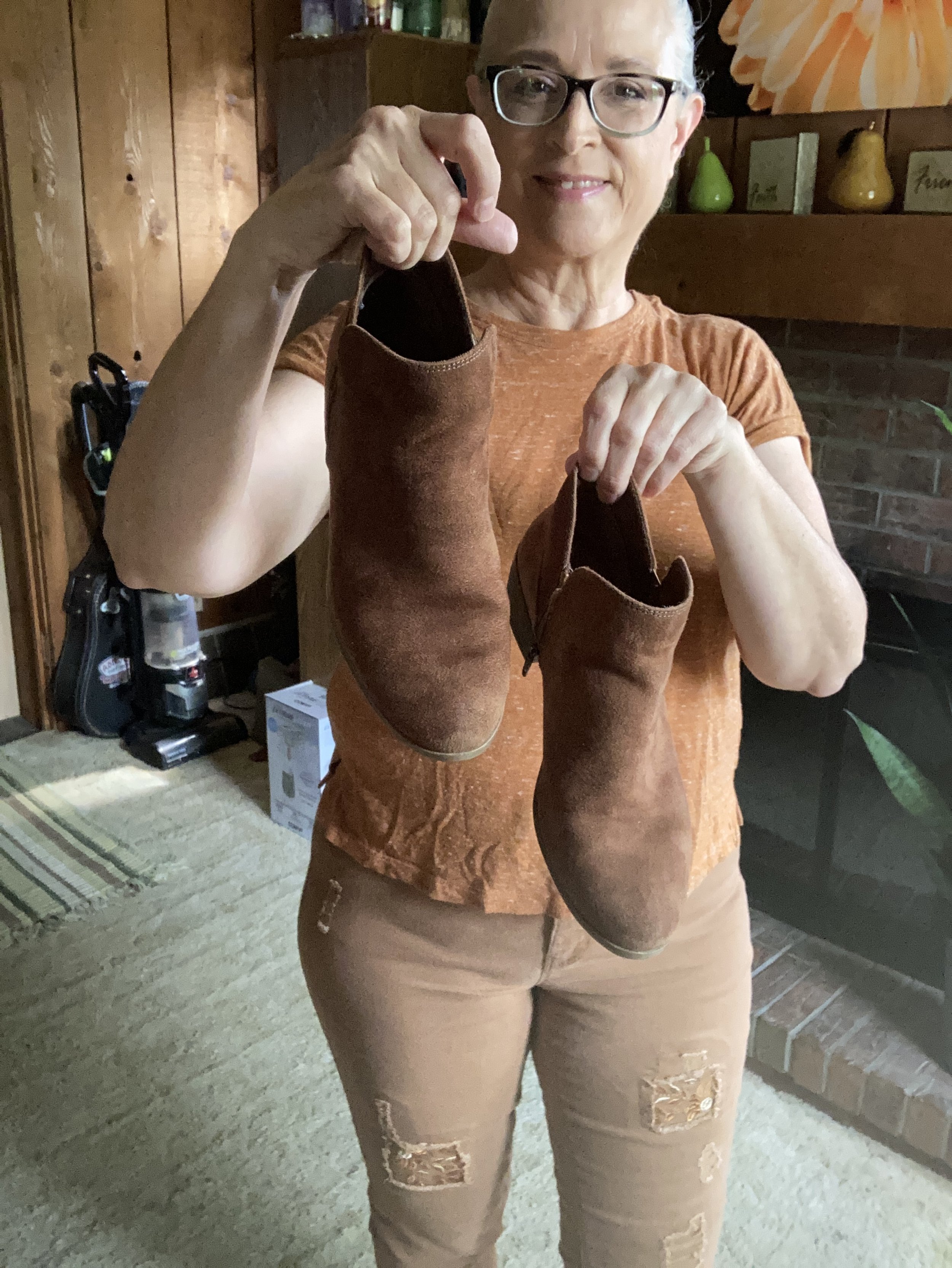
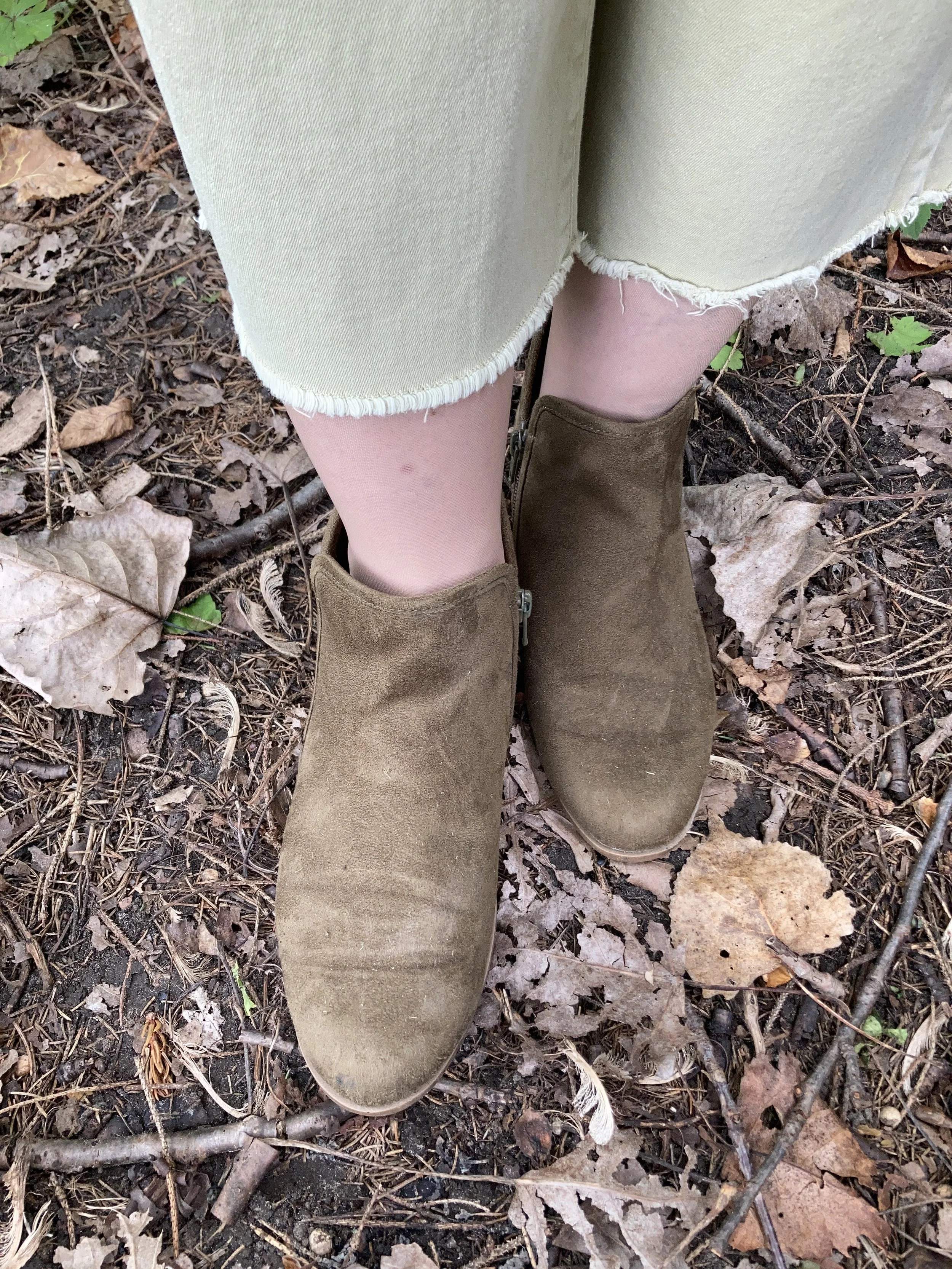
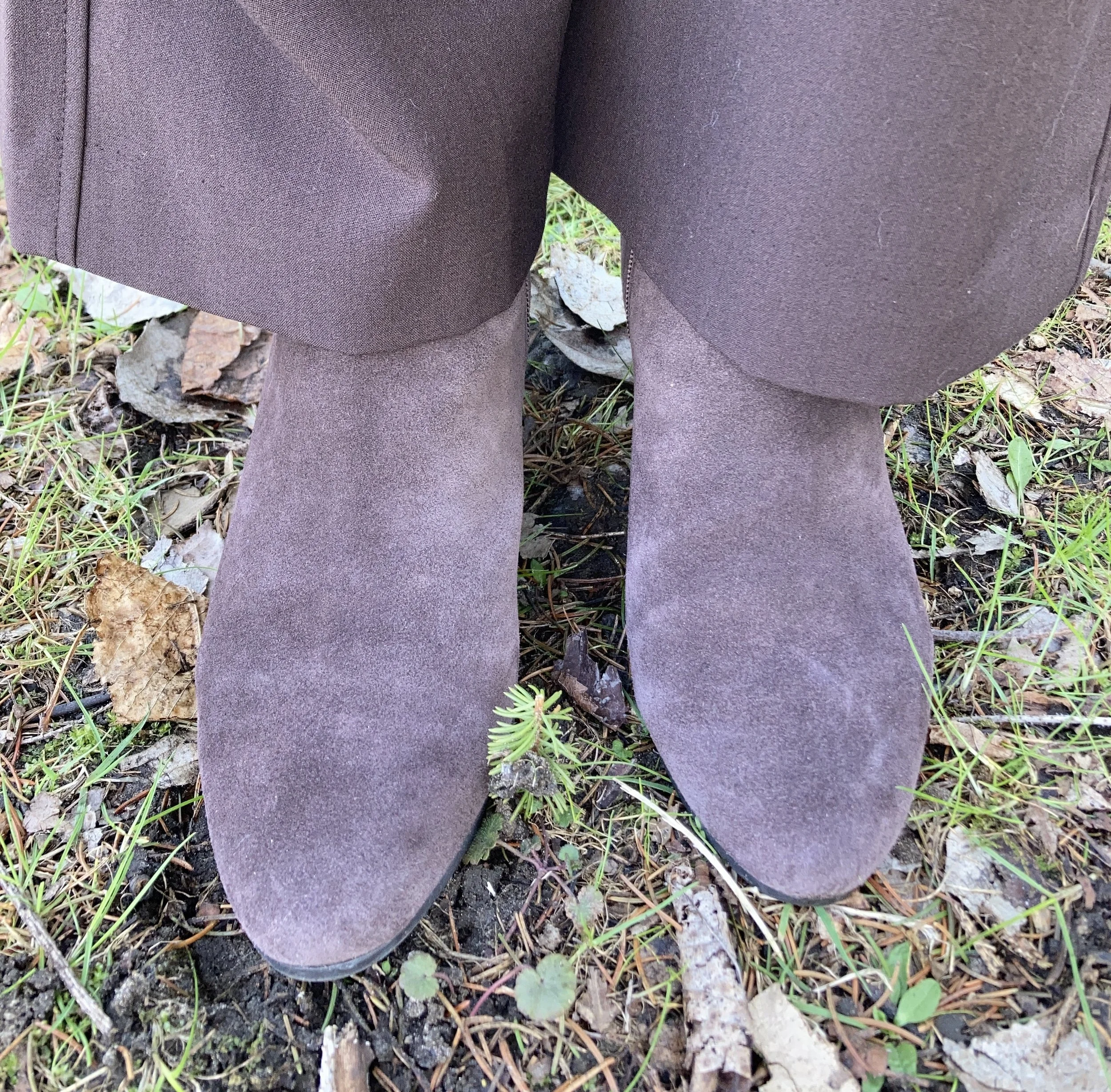
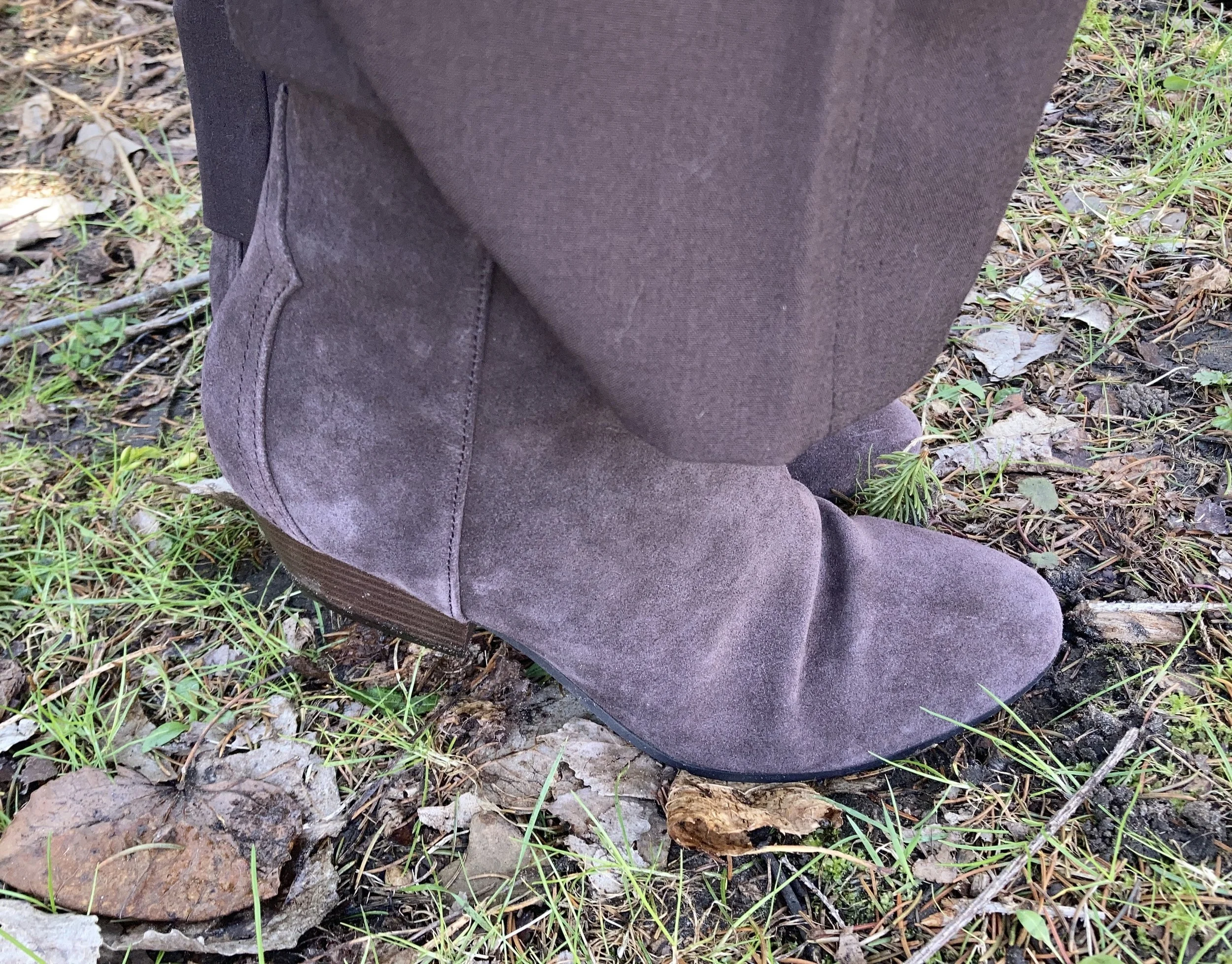
I decided to wear my Nine West ankle boots from Kohl’s to elongate my leg and give me a small heel for these longer trousers. Here are a few options from DSW.
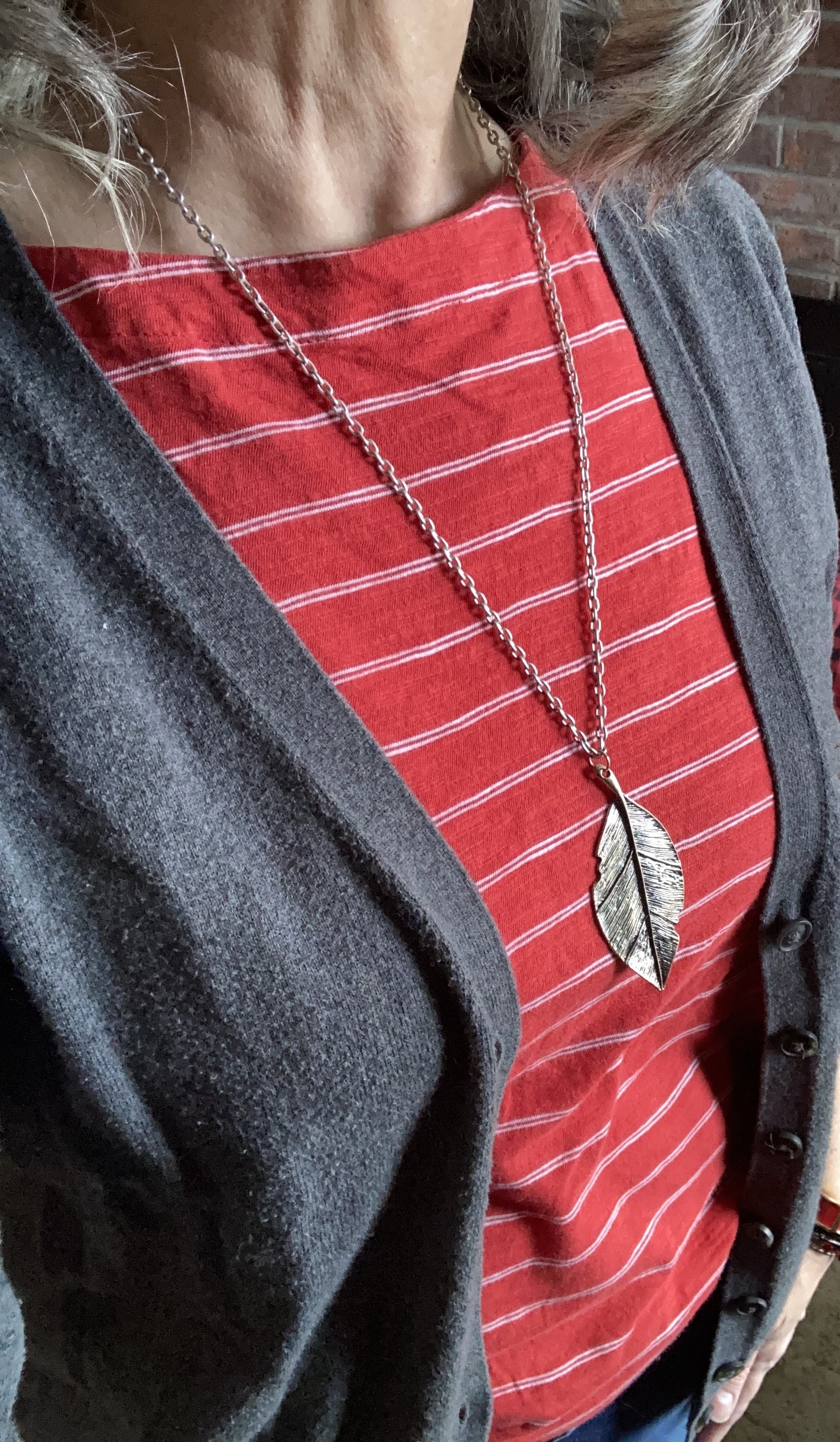
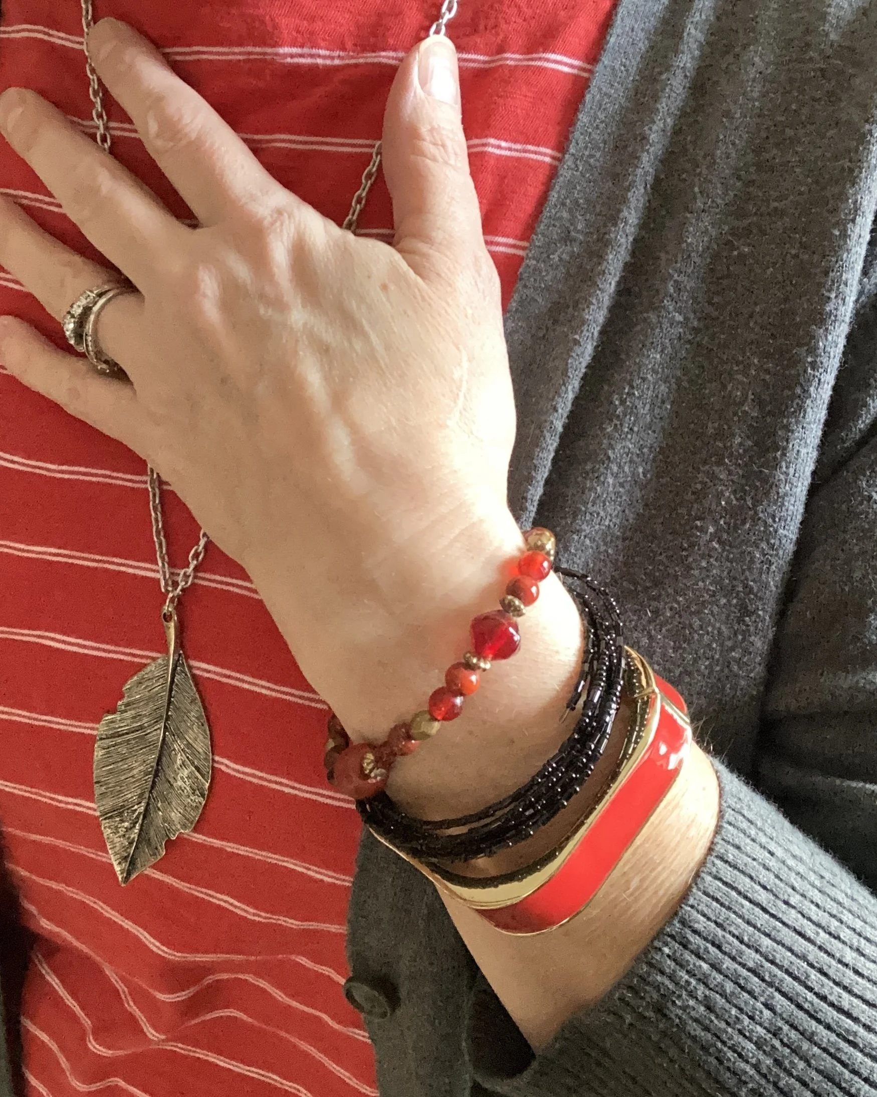
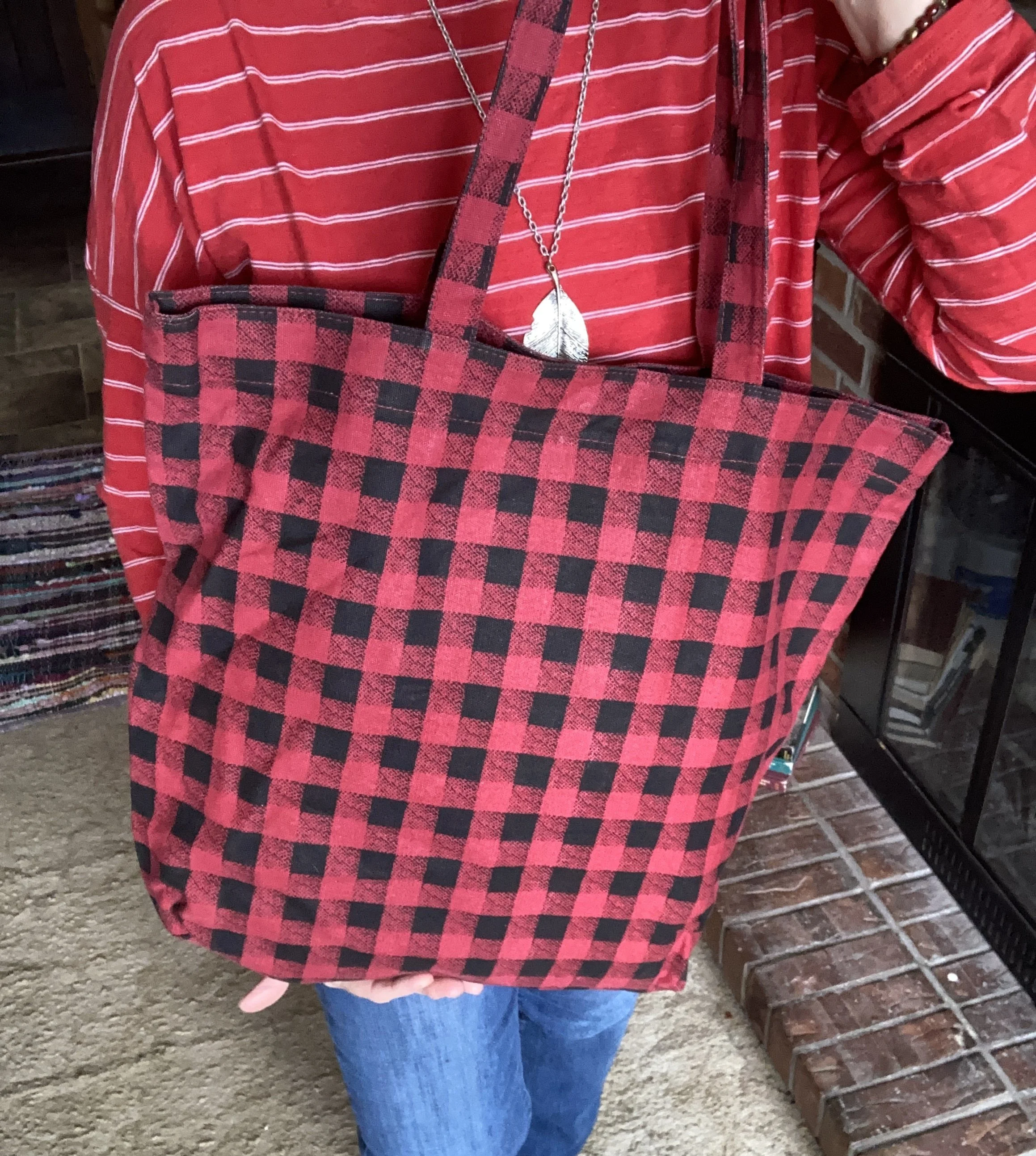
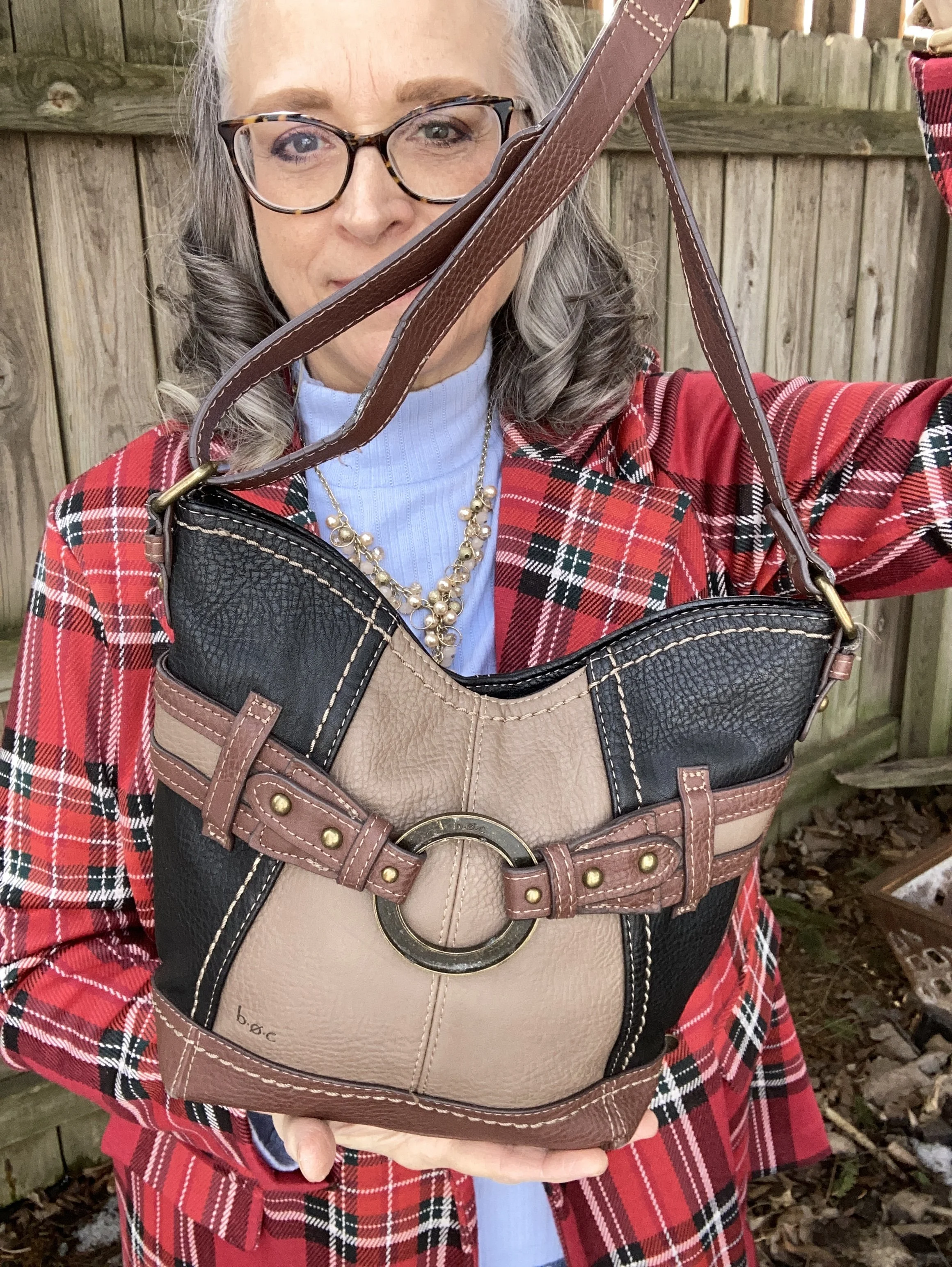
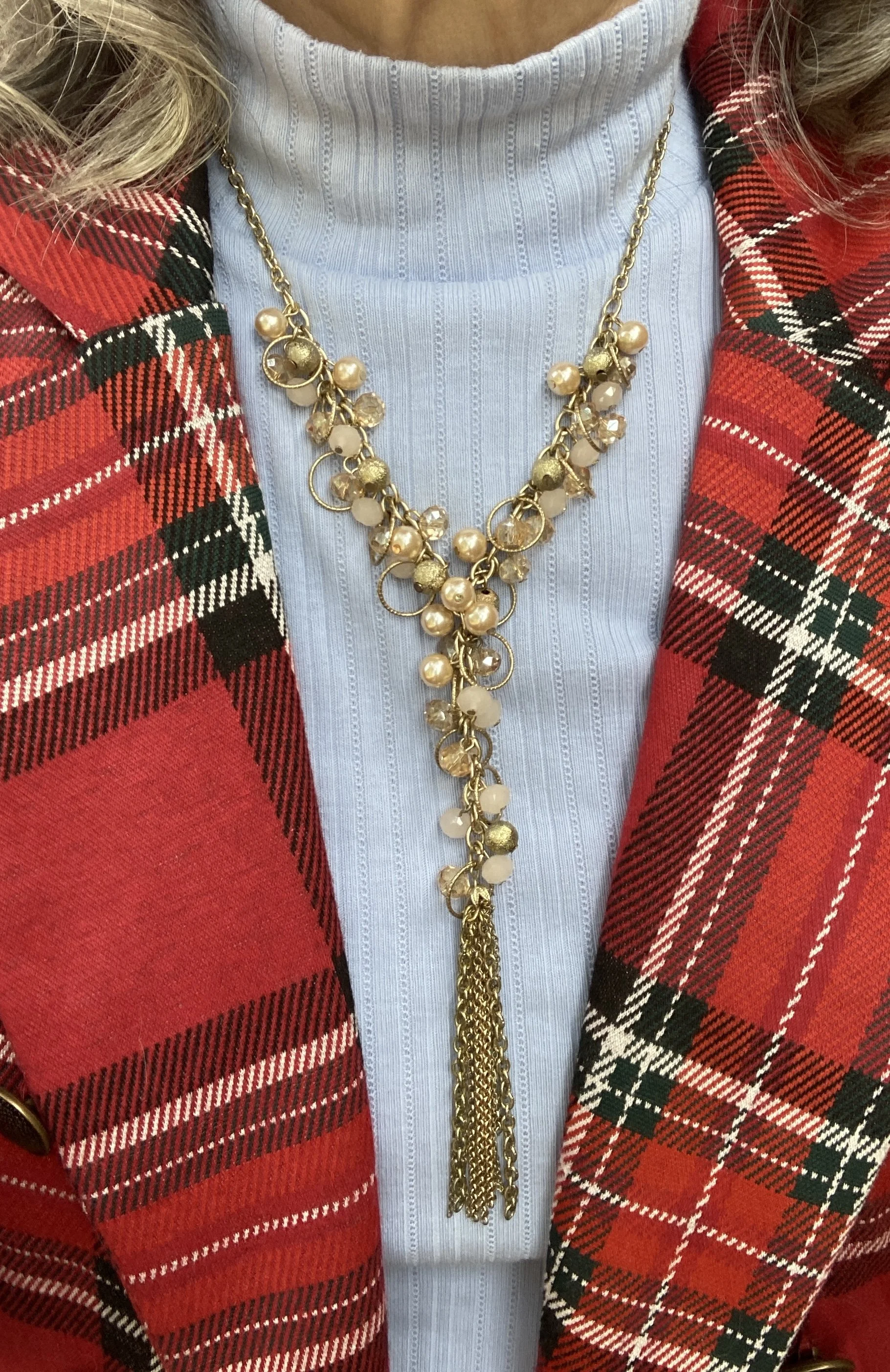
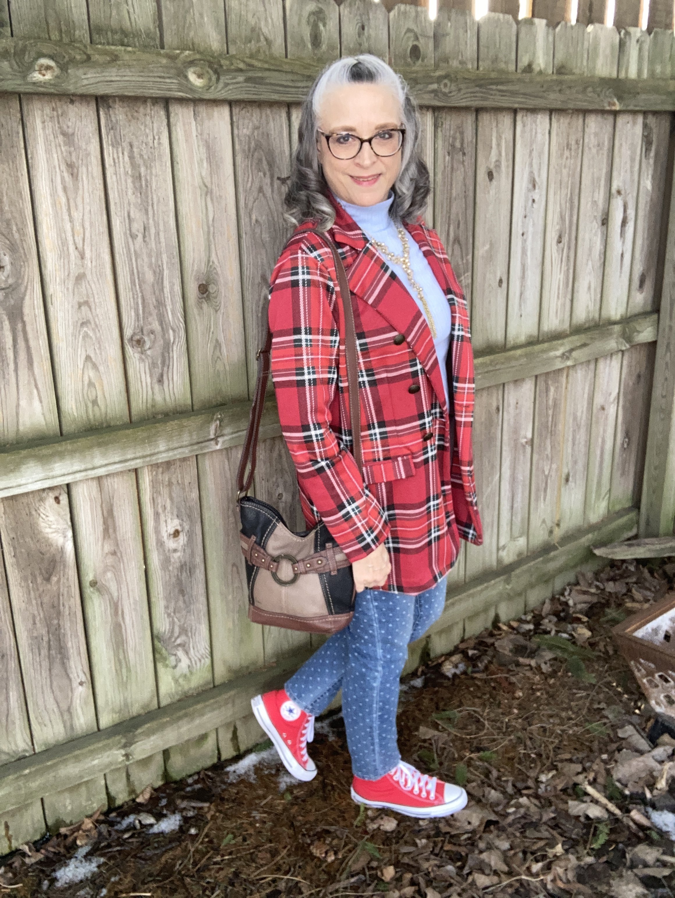
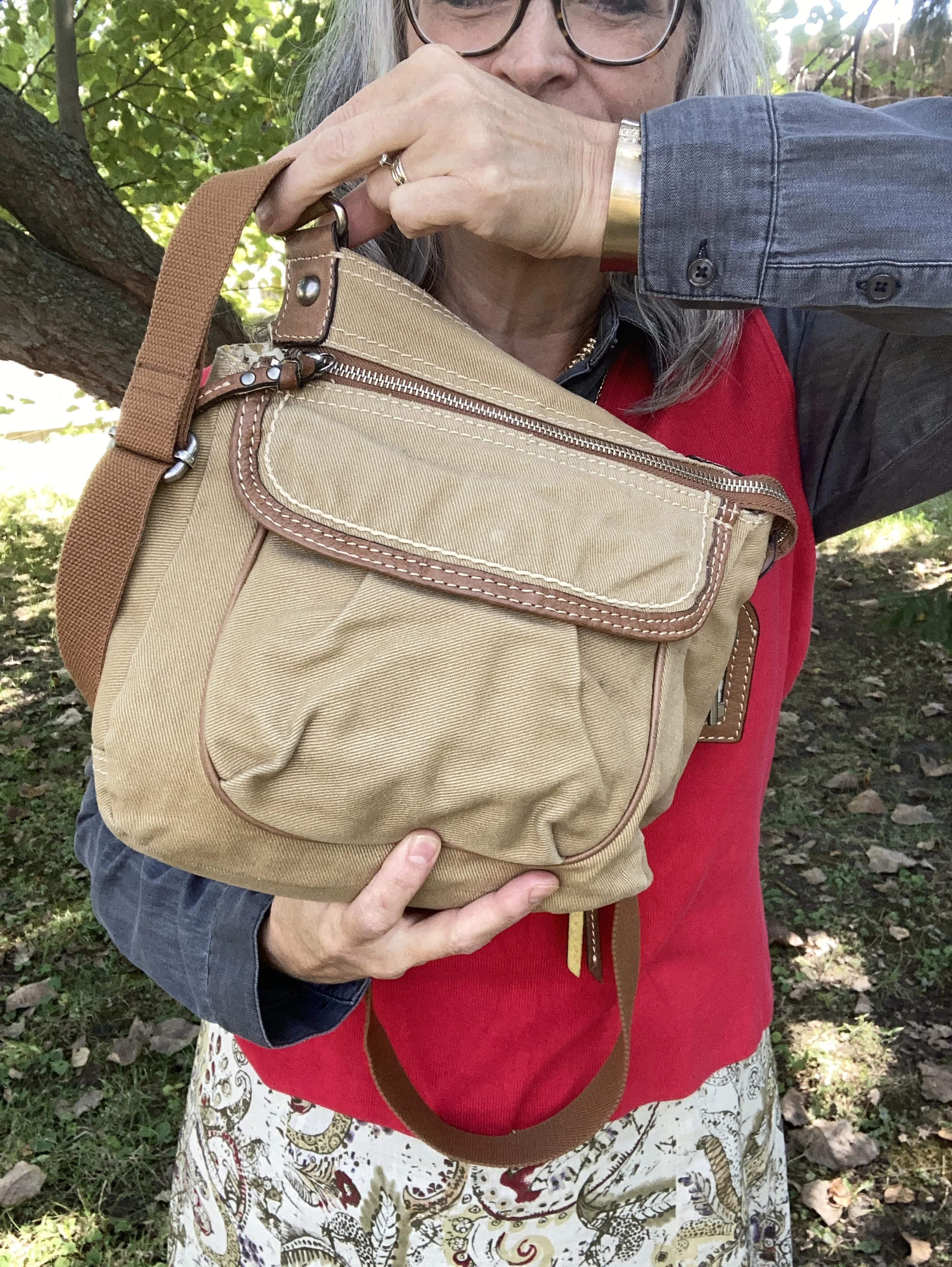
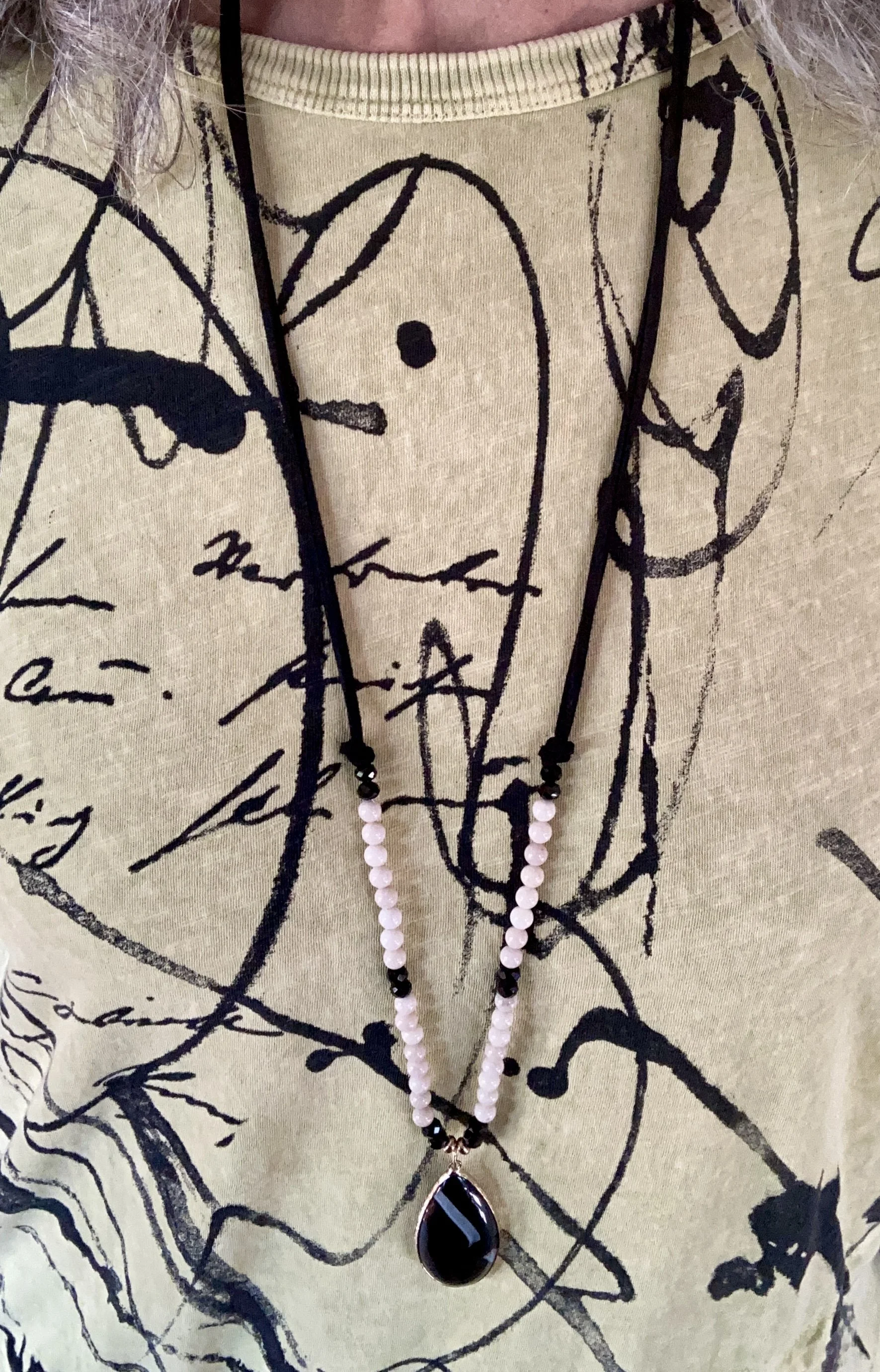
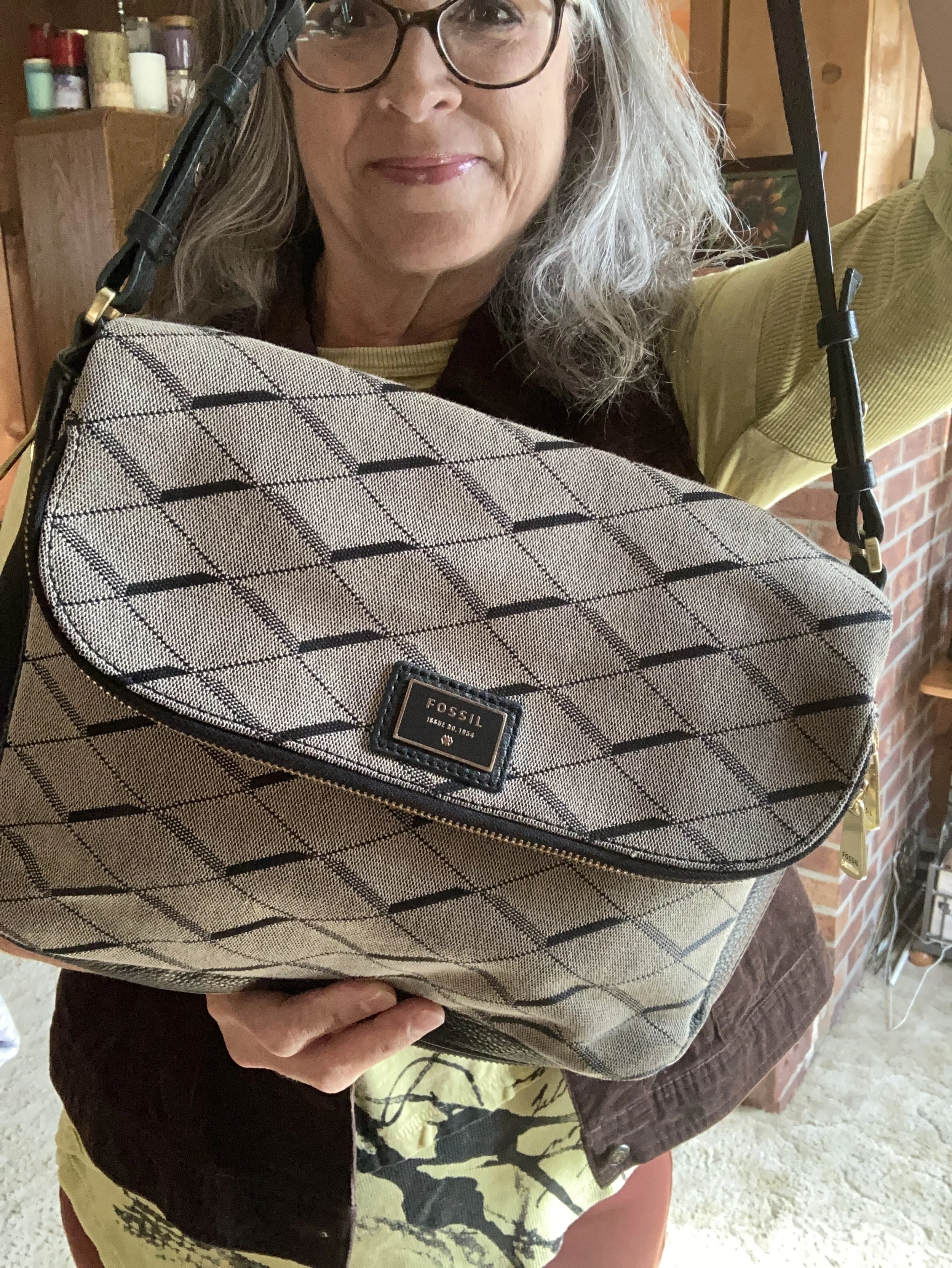
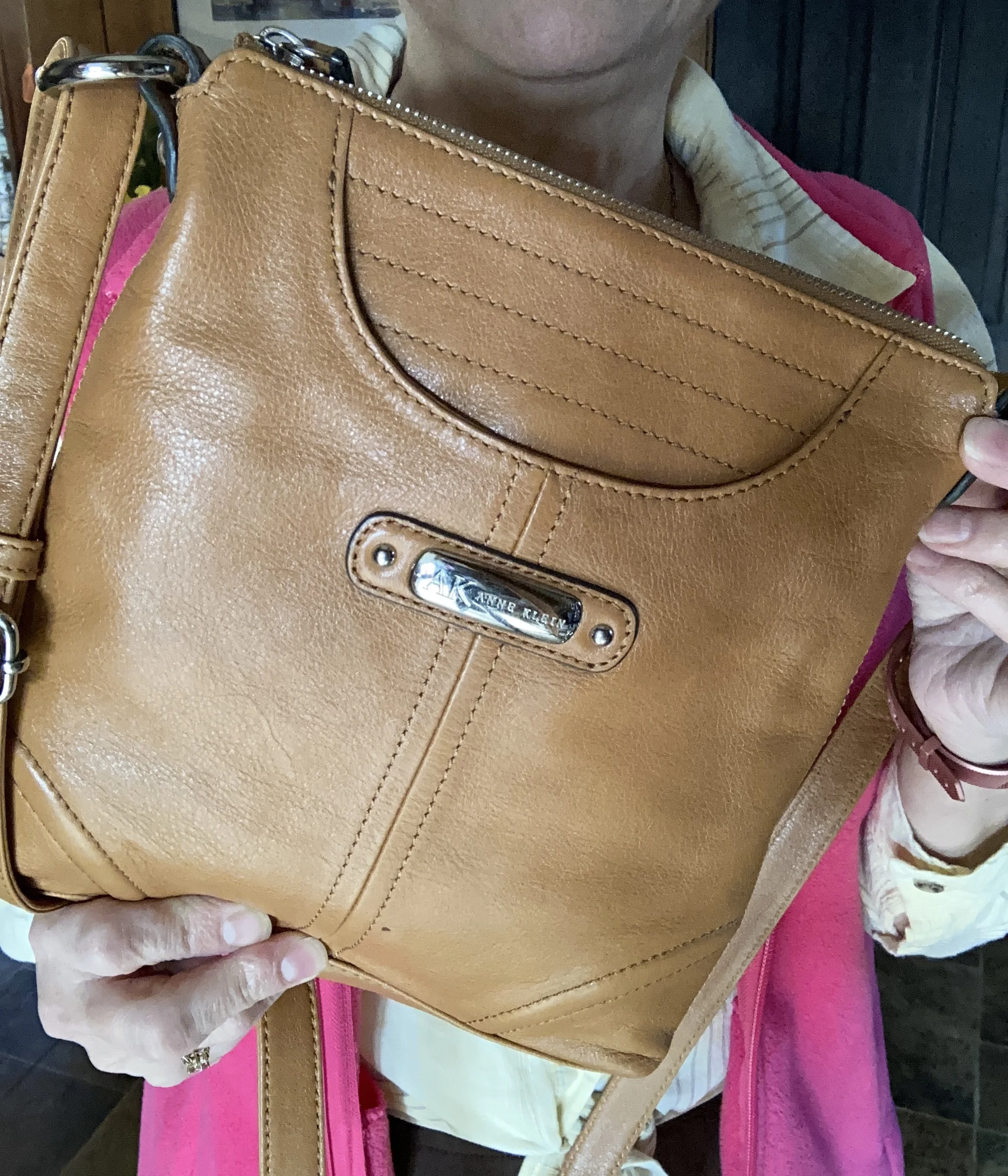
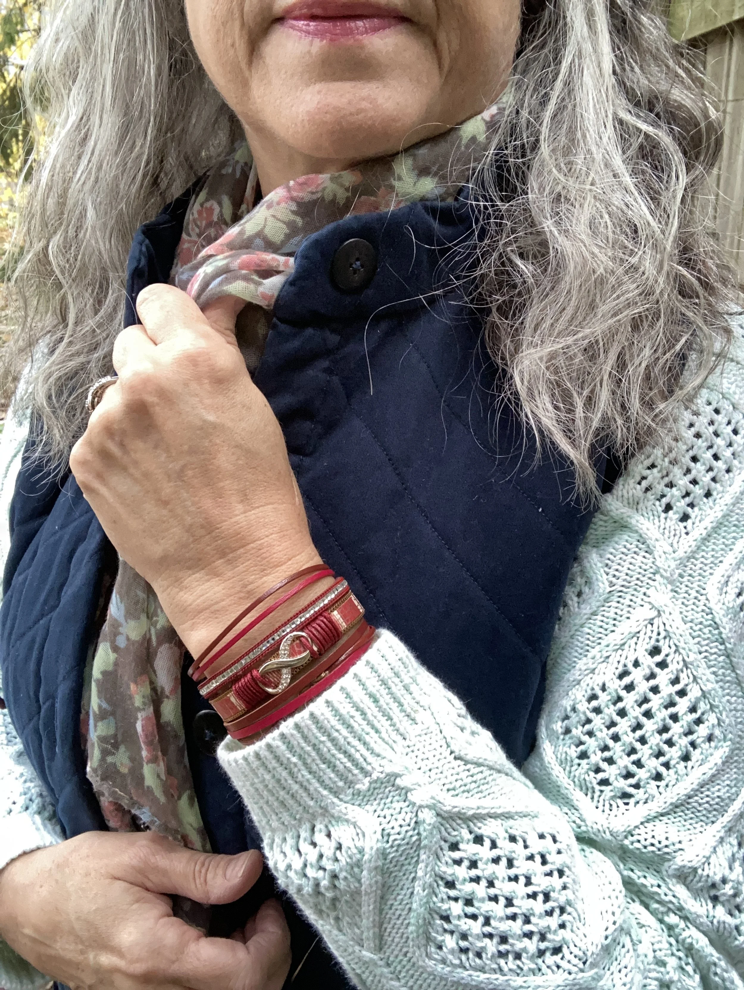
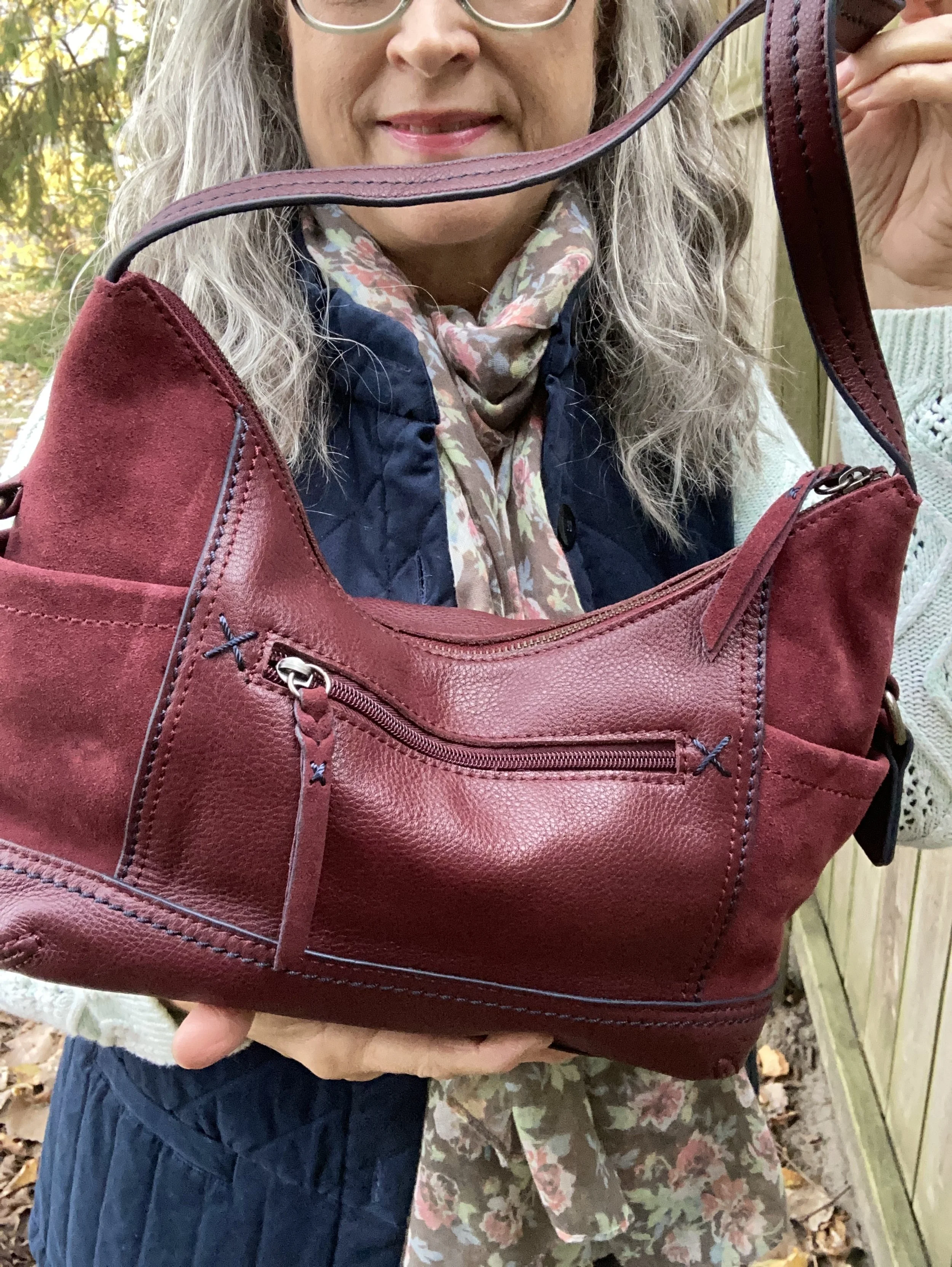
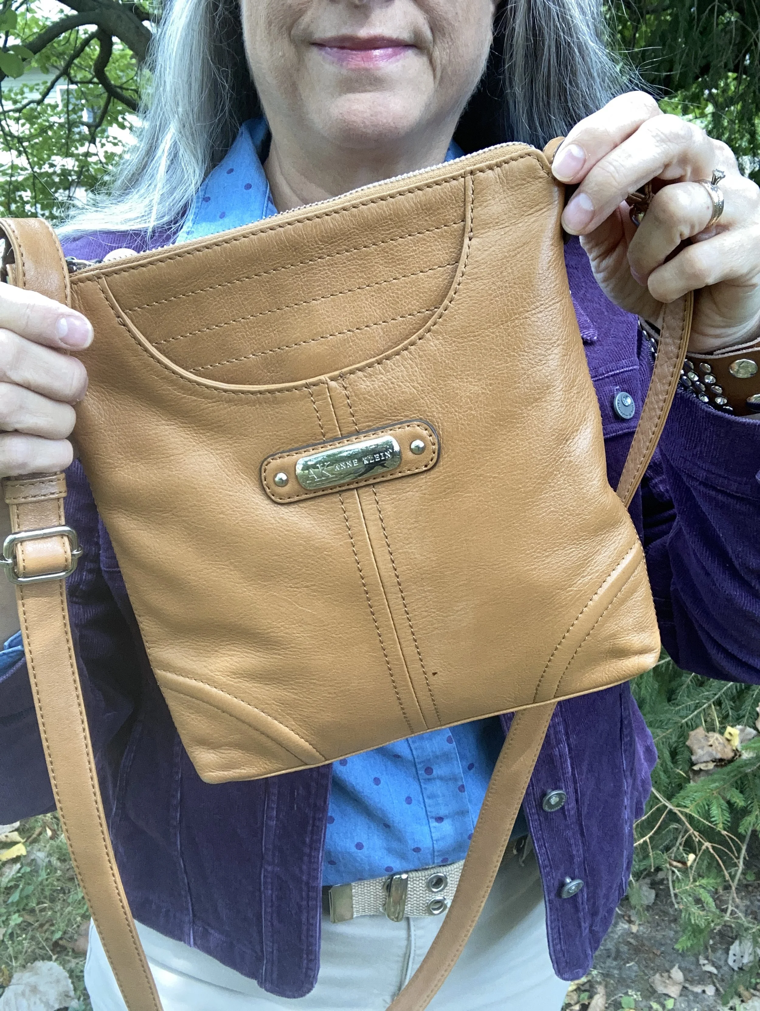
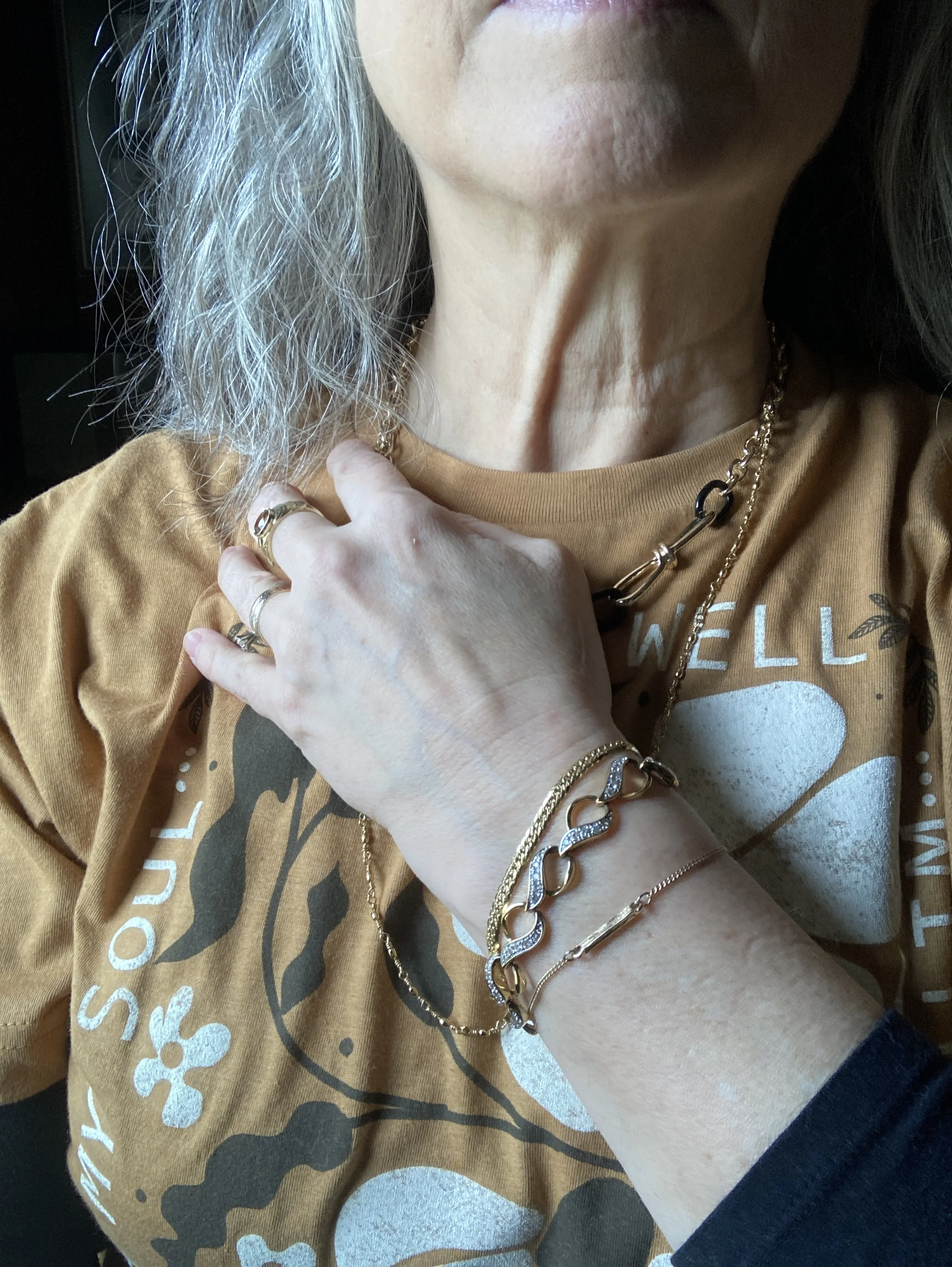
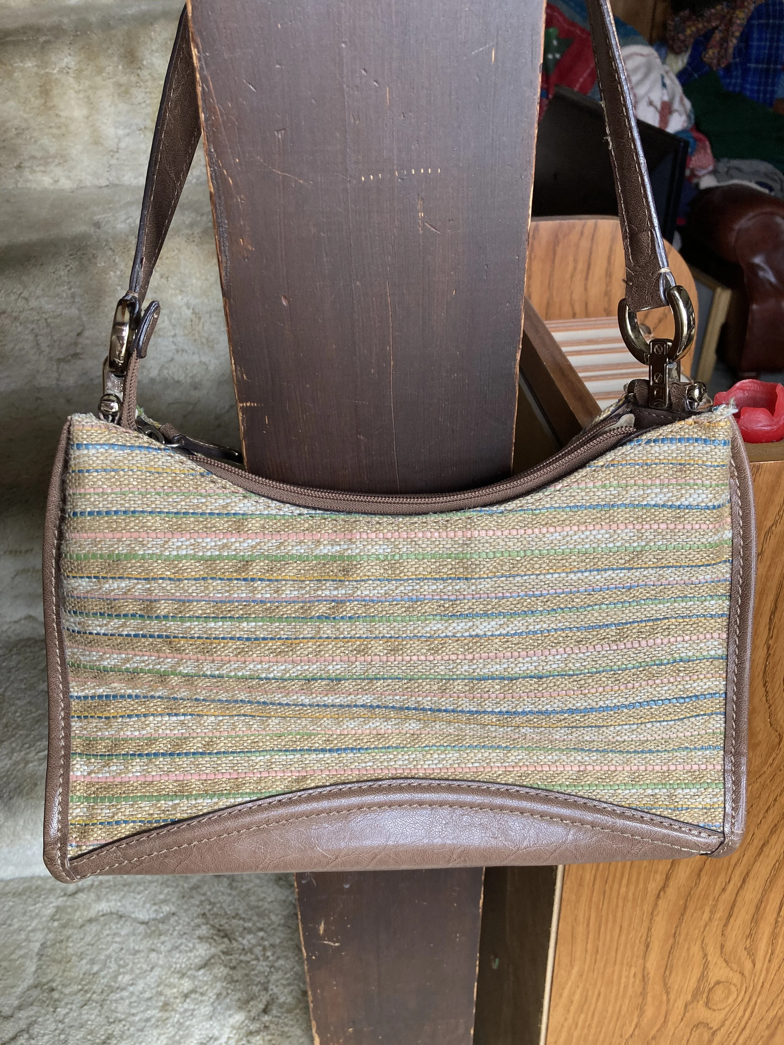
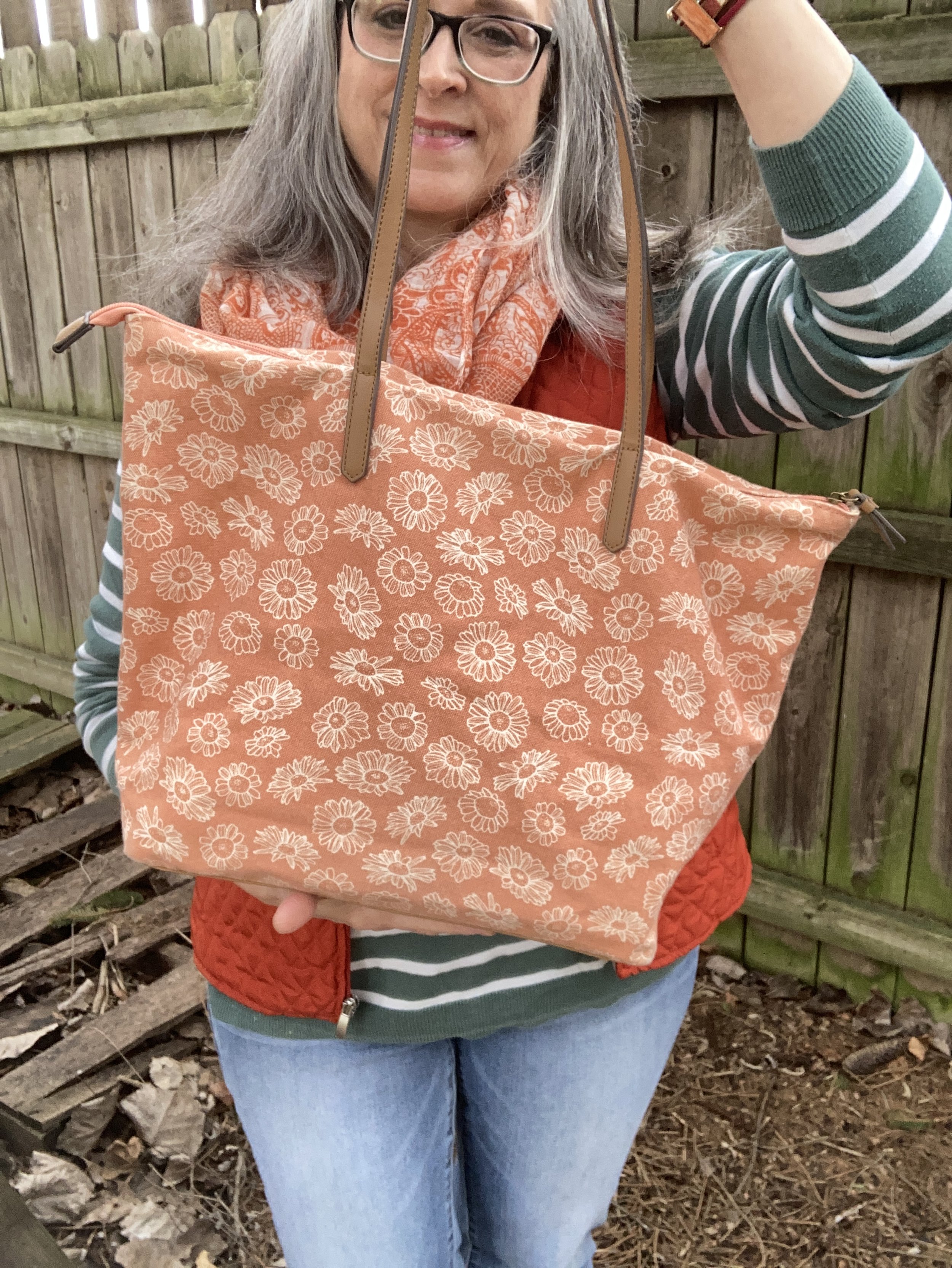
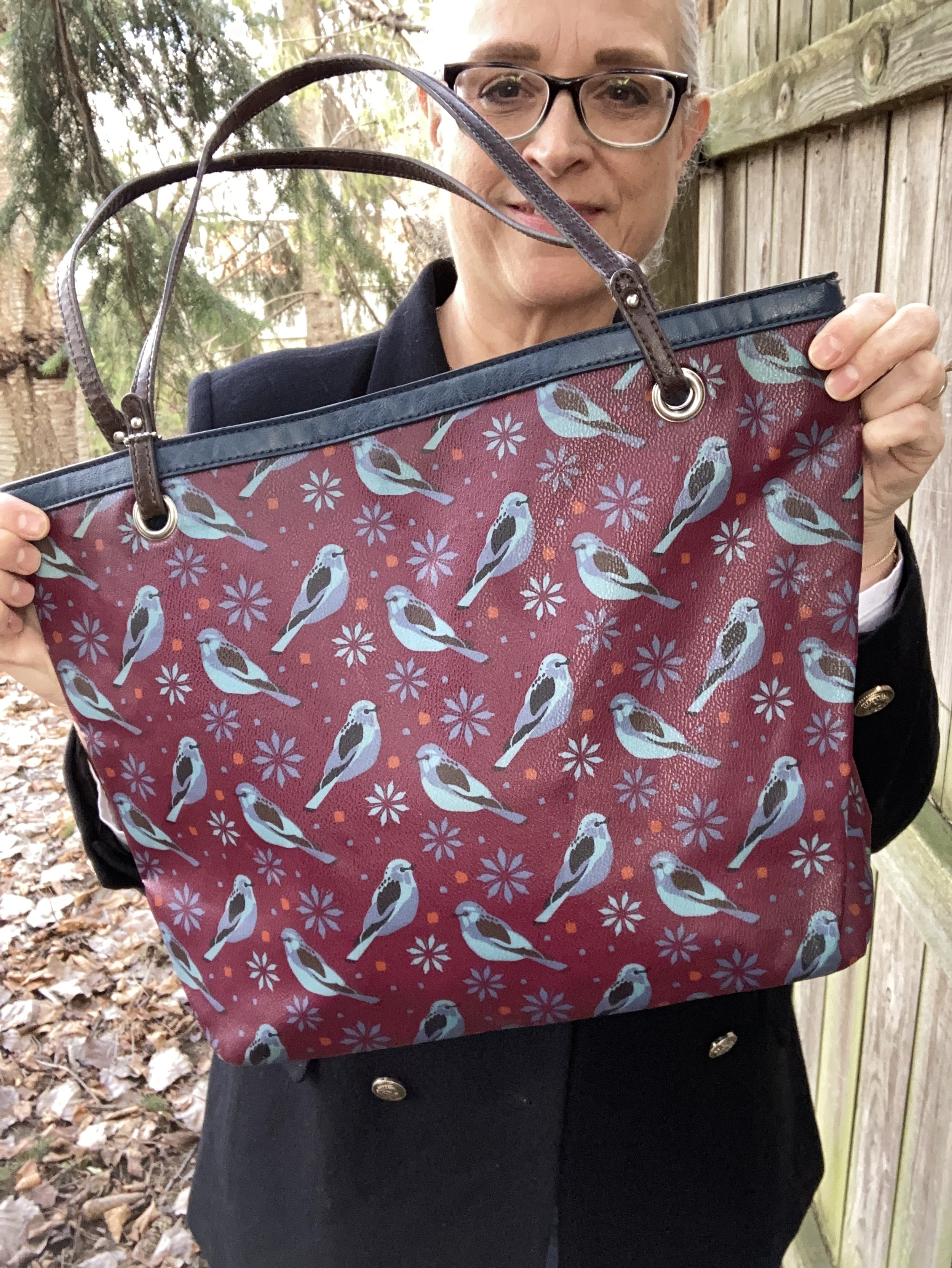
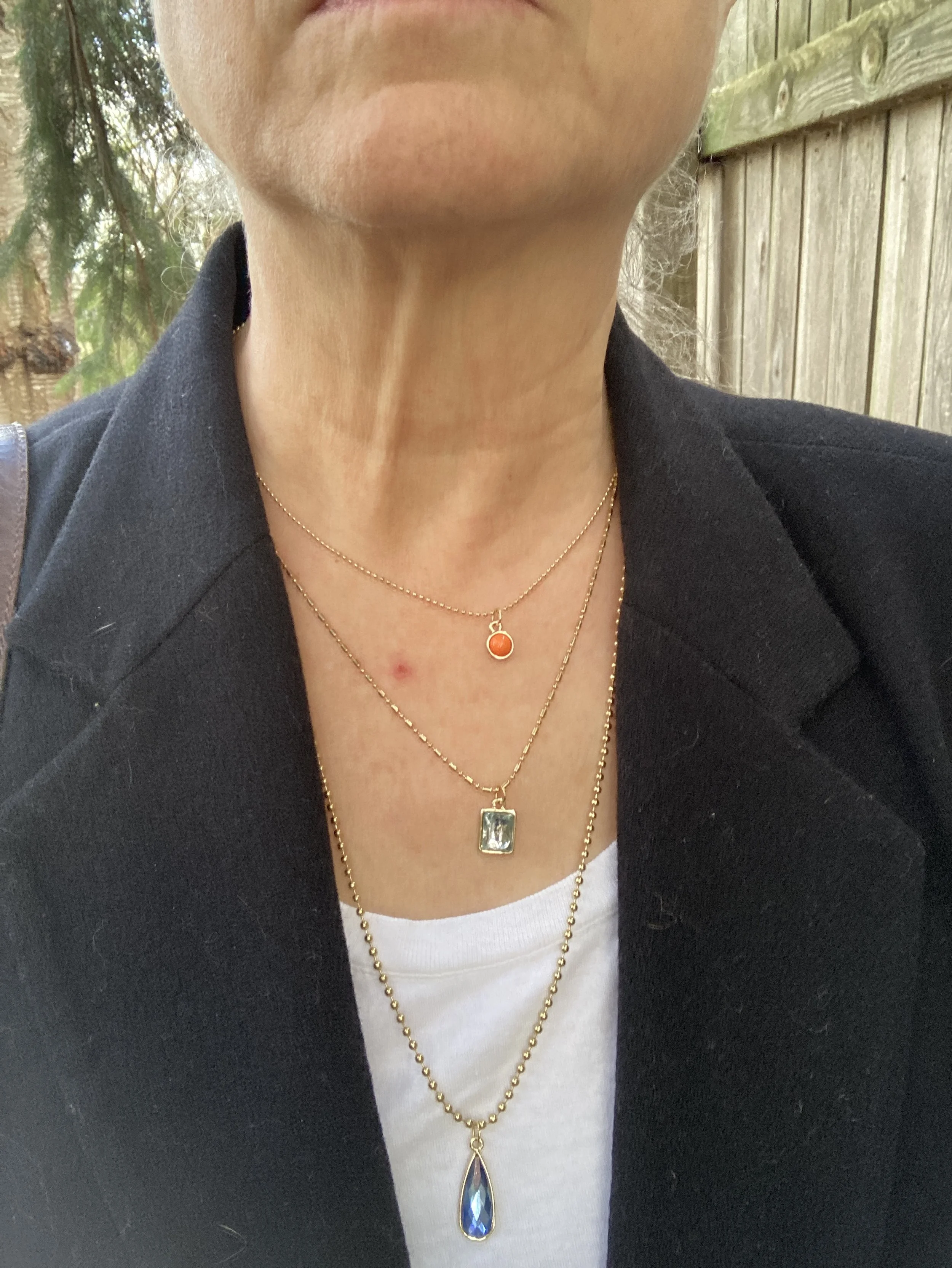
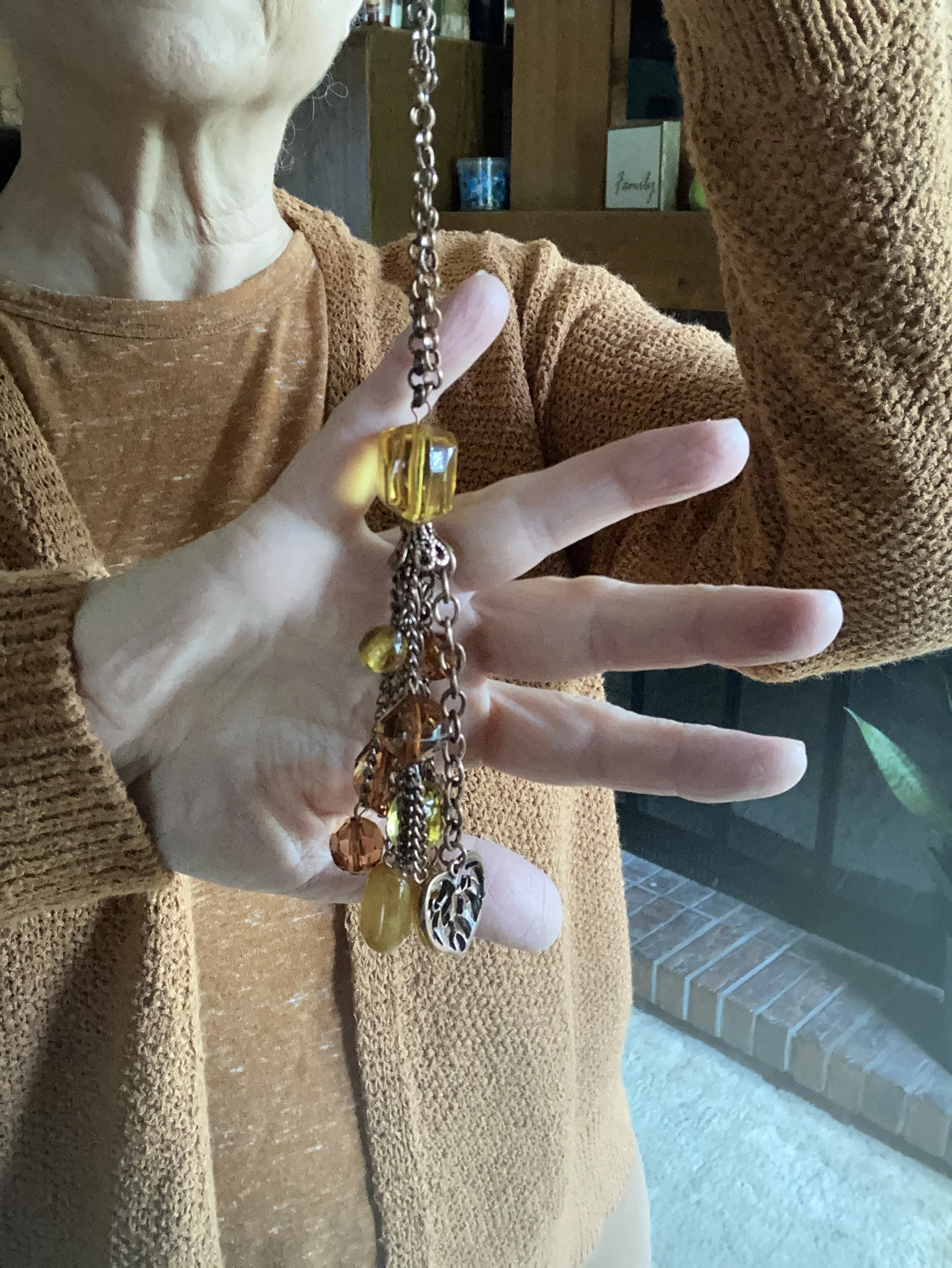
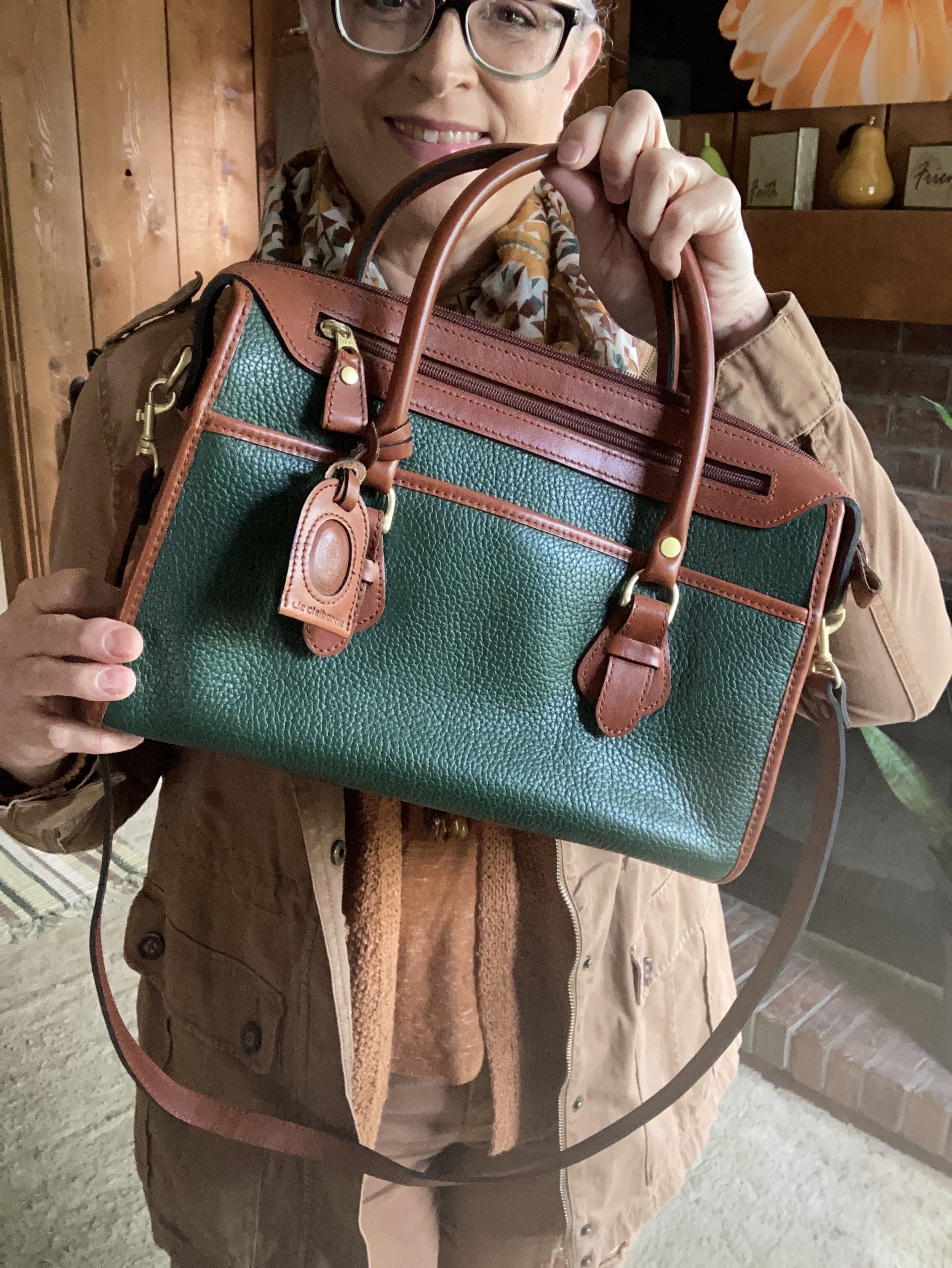
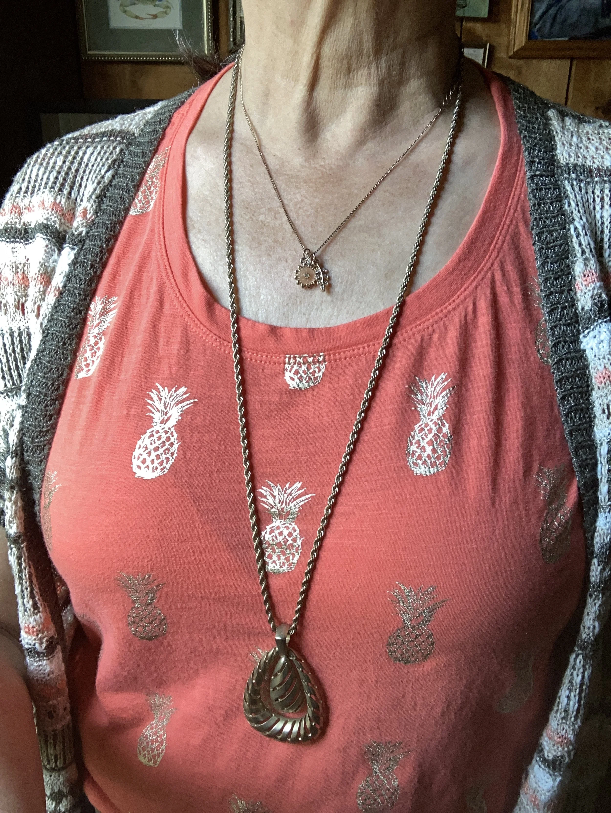
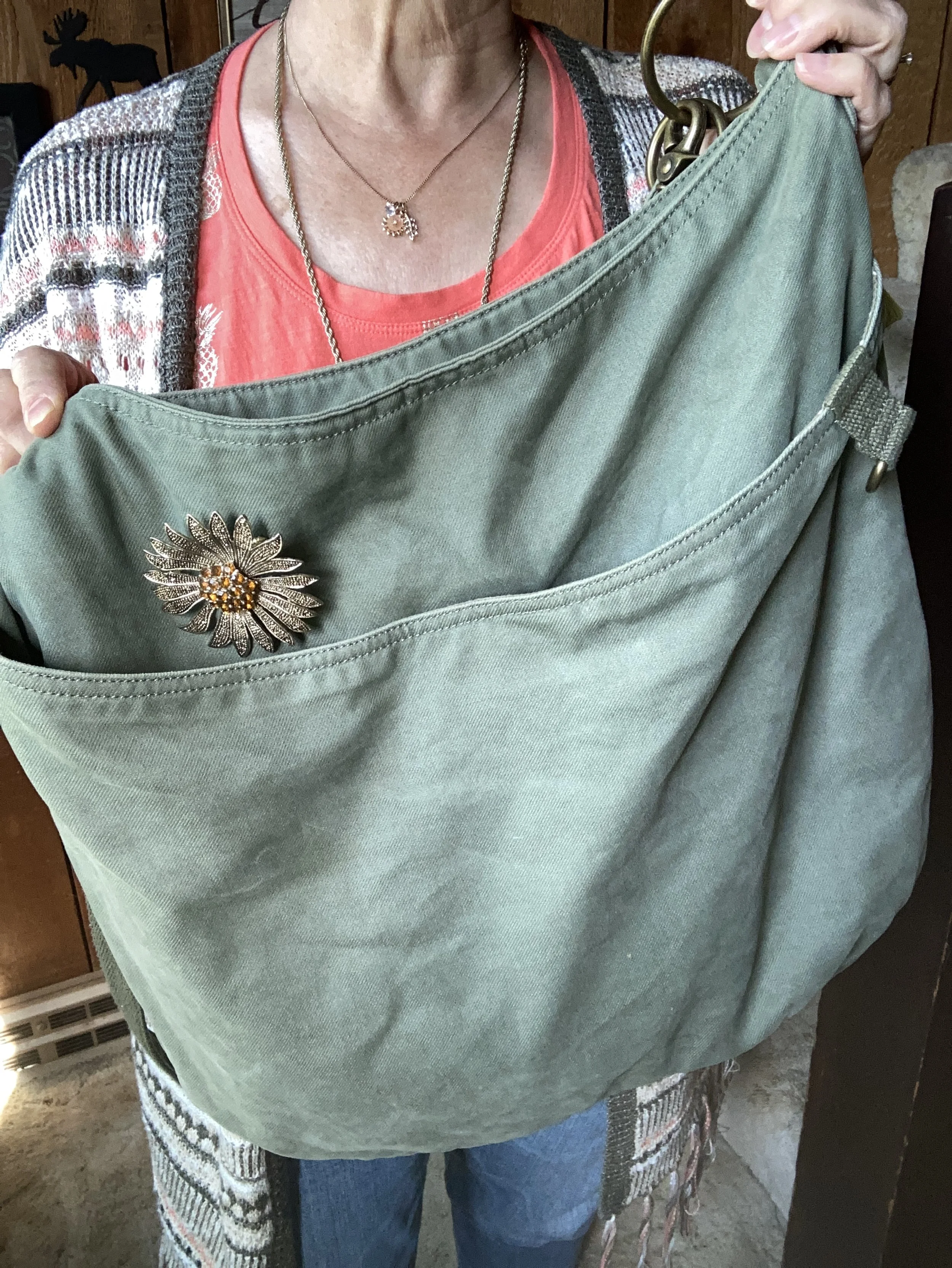
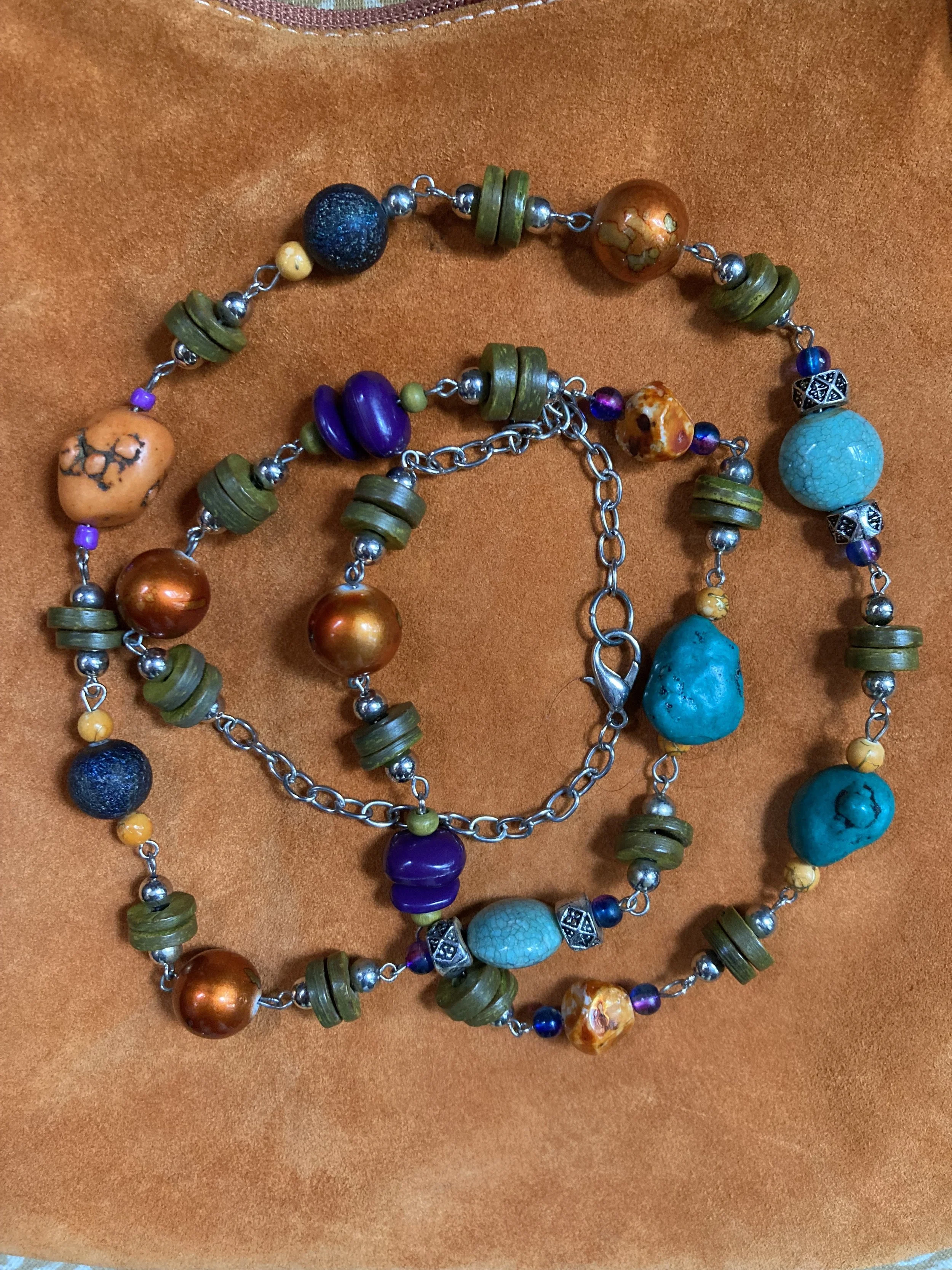
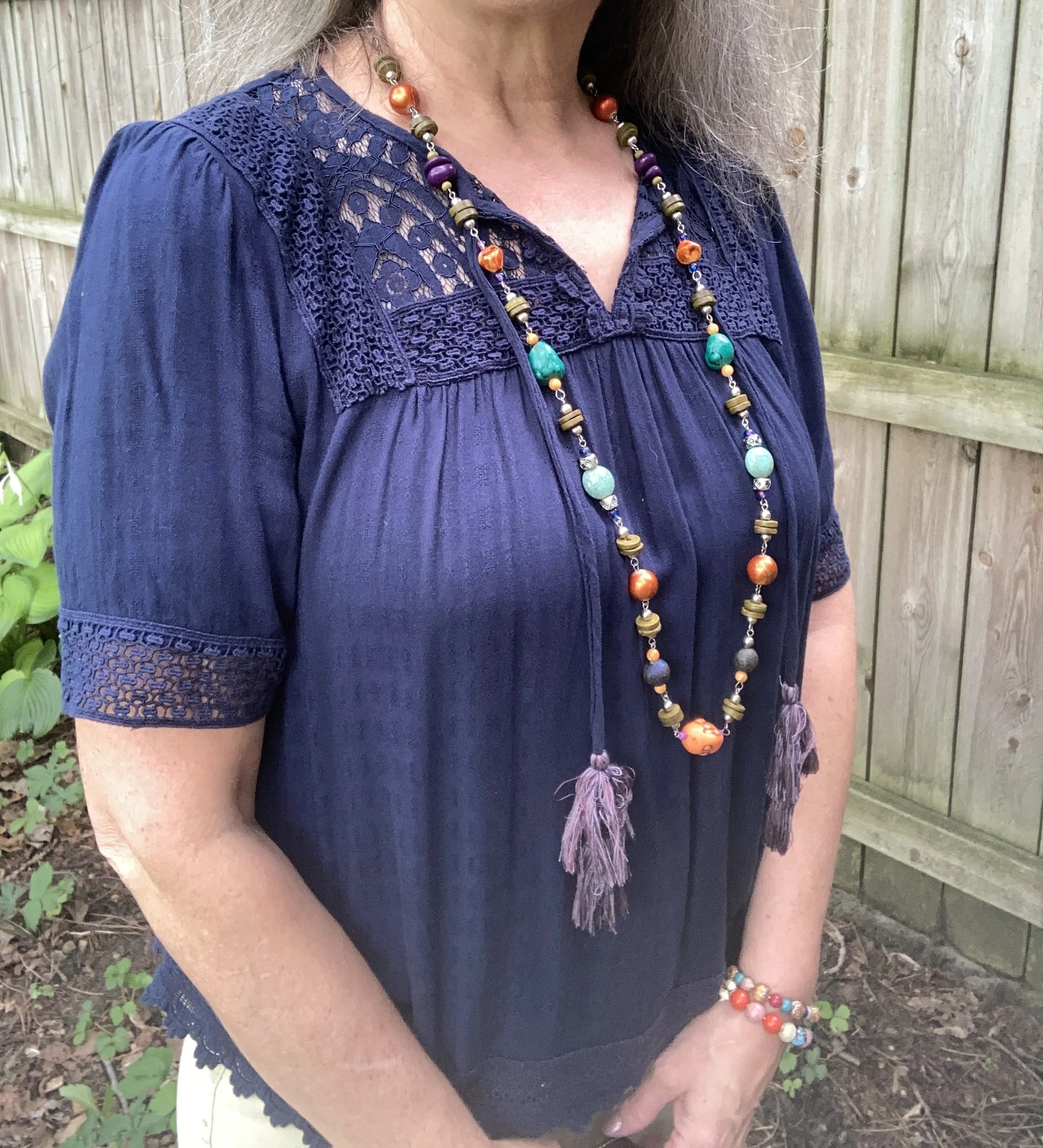
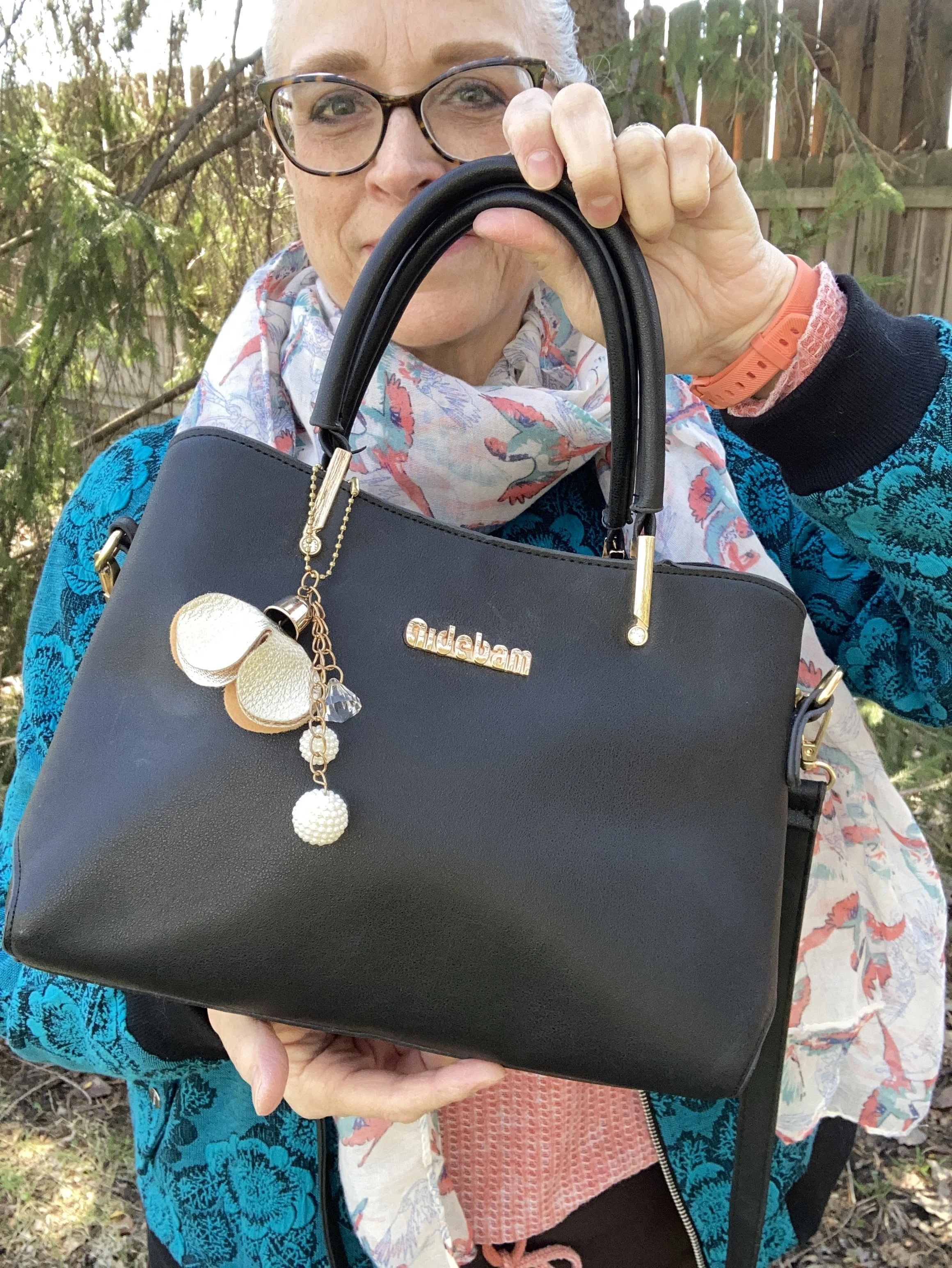
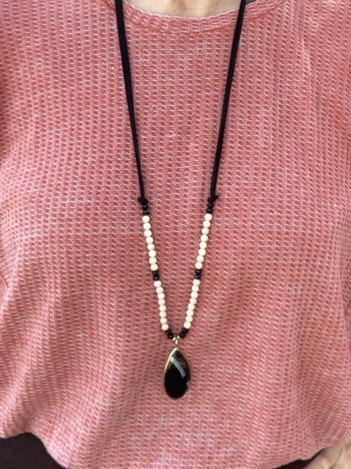
I chose black for my necklace and bag to go along with the black on the jacket. I thought the beaded necklace a fun choice that creates extra interest against the waffle weave background. The bag you’ve see before and is Aidebaum from Amazon.
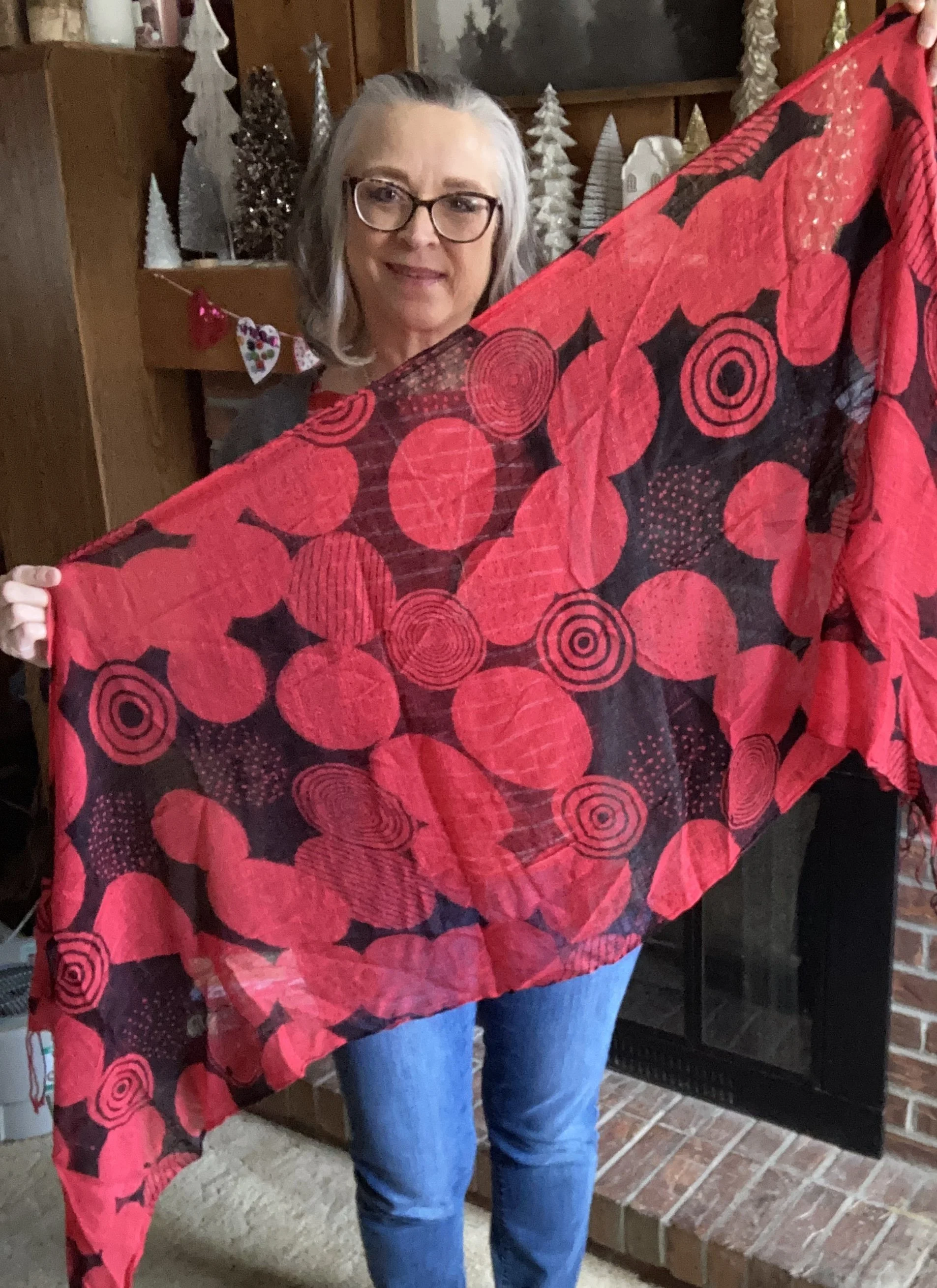
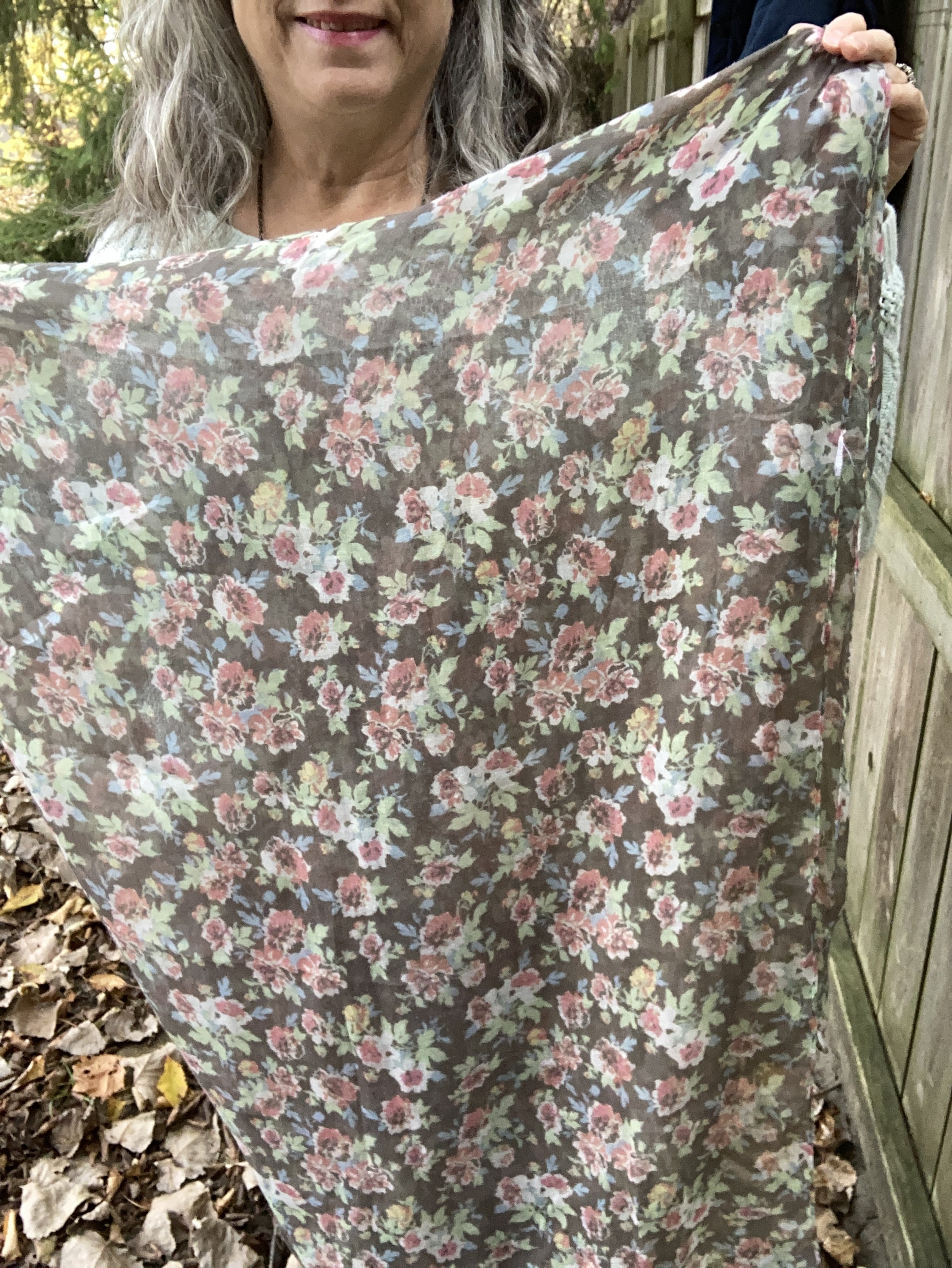
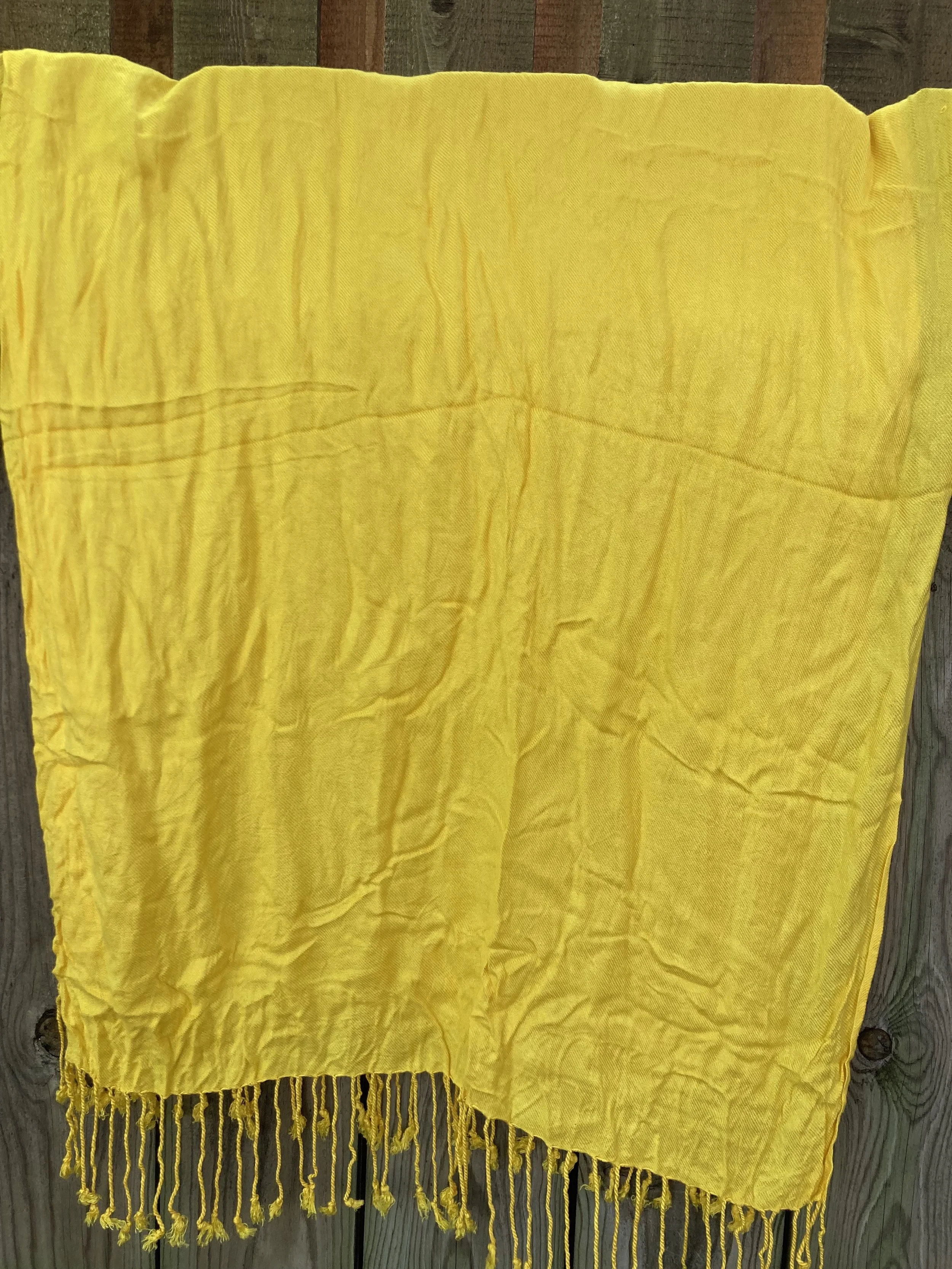
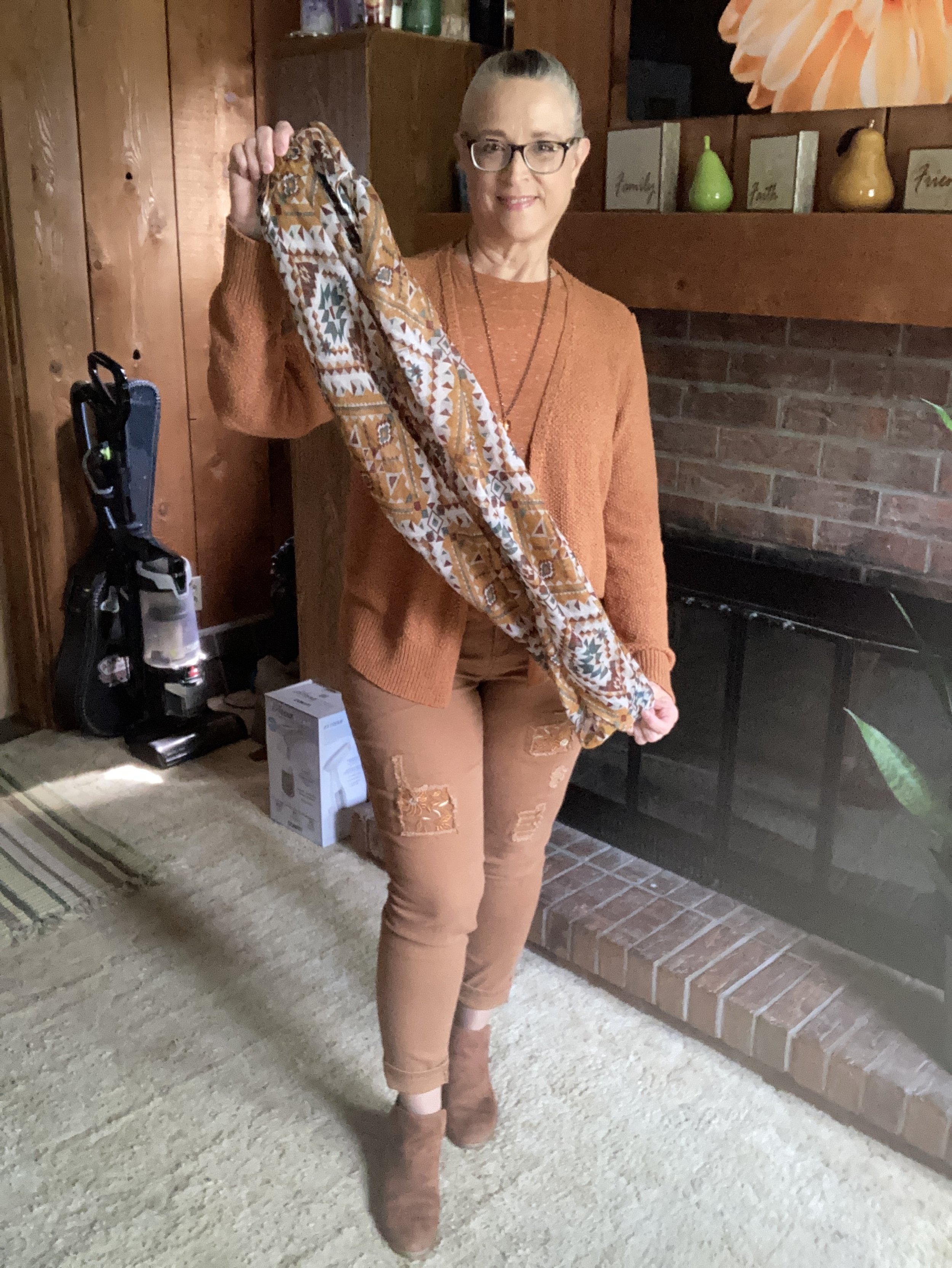
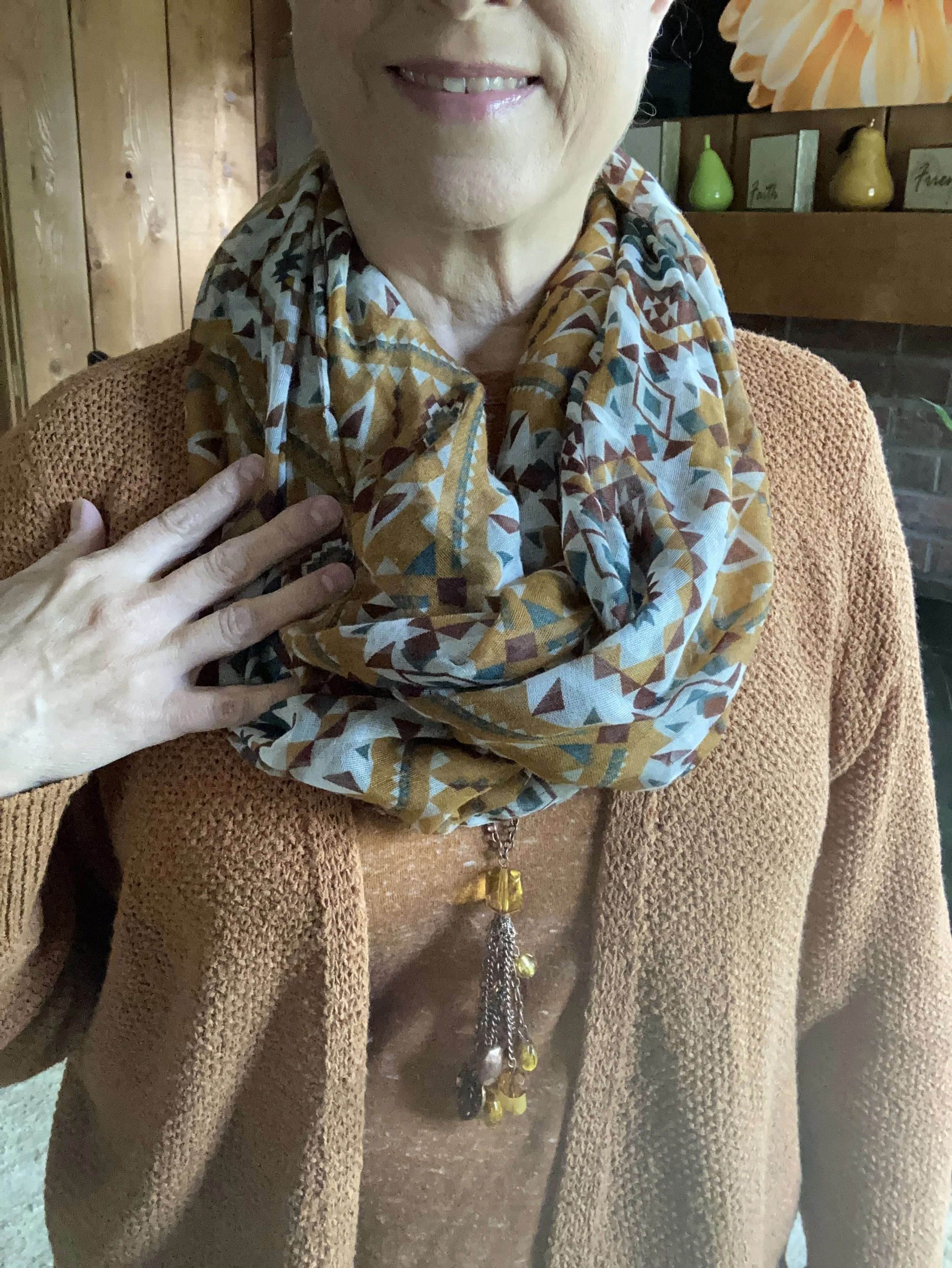
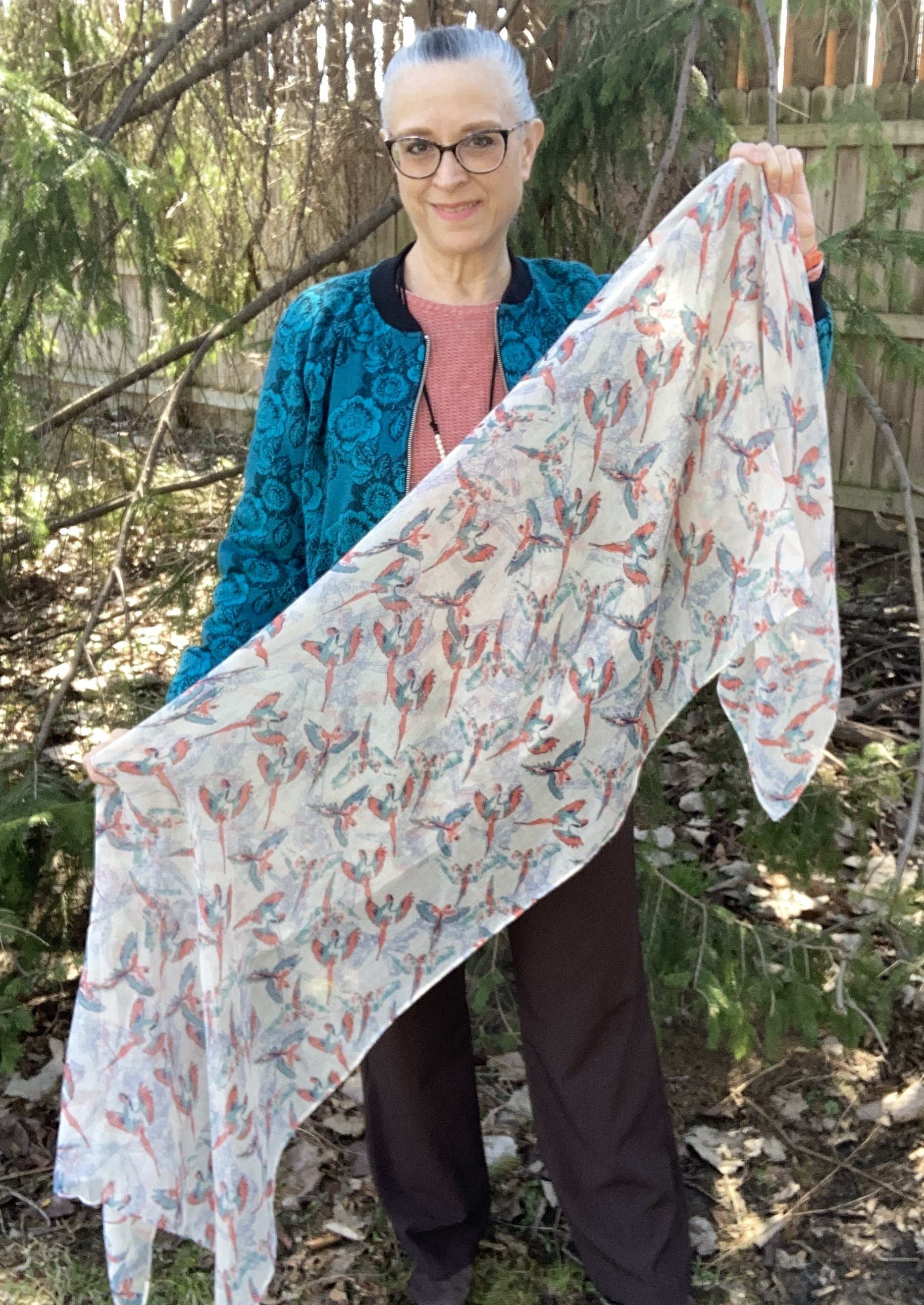
I added the scarf to pull the whole look together and on the day I was taking pictures it was only in the 30’s. Brrrr.
I hope you enjoyed this post. As always I love to hear your thoughts so leave me a comment or two.
Have a great day!