February Outfits: Colorful Combos - I've Got the Red Plaid Blues!
I’m doing it. I am going to start naming my outfits. At least when I can think of a name. Ha, ha. I hope you enjoy this added bit of Stylin’ Granny creativity.
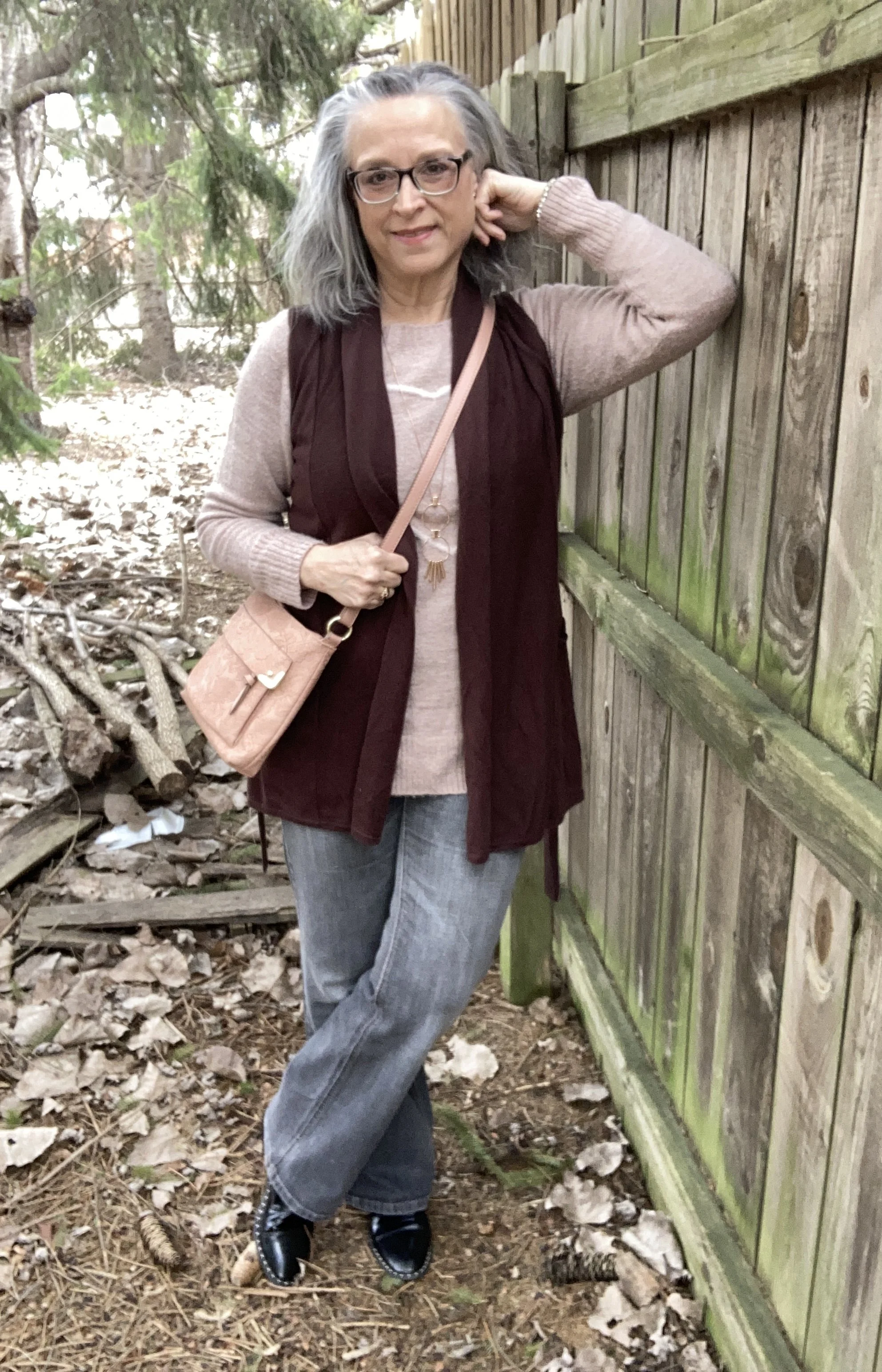
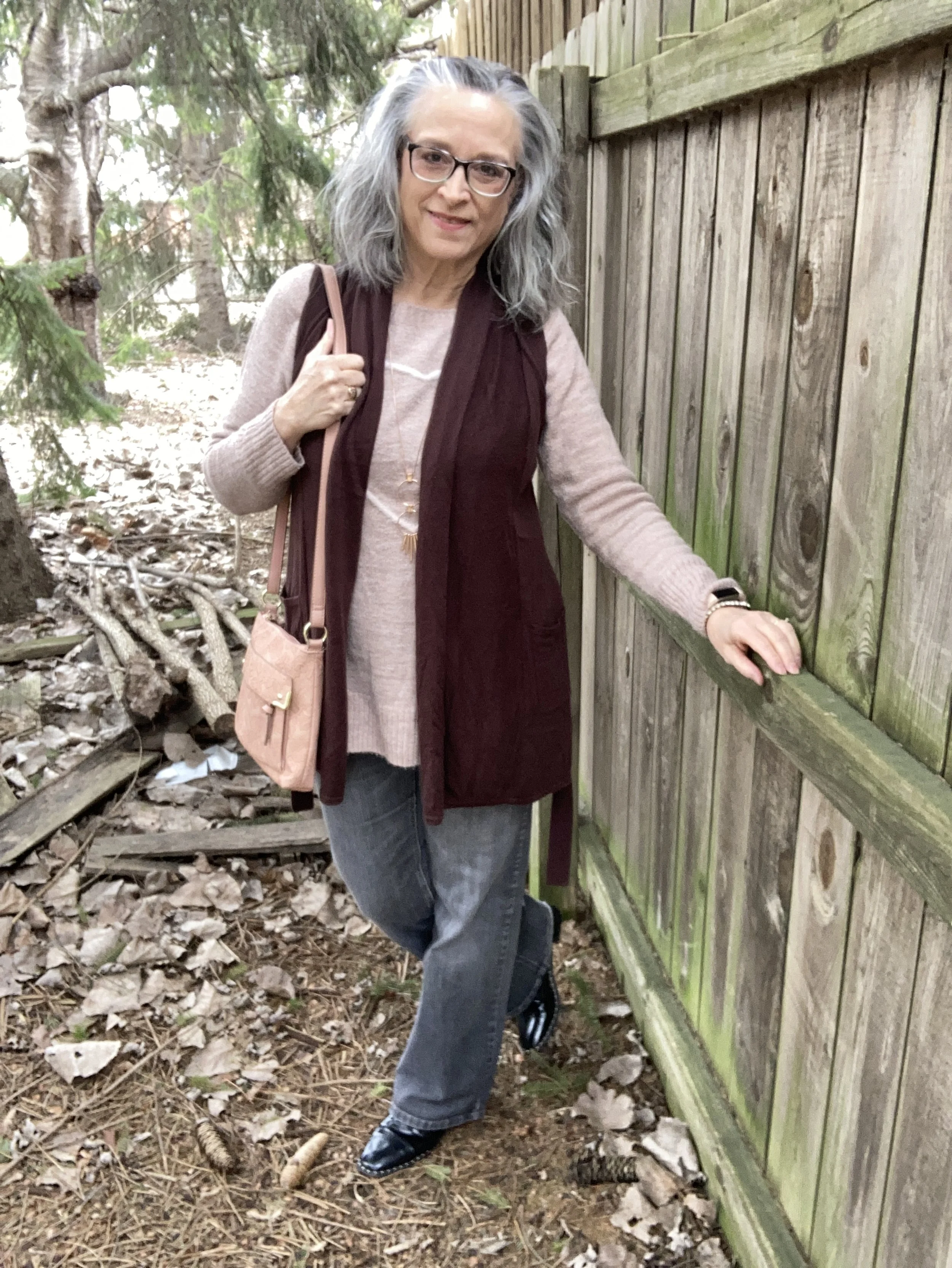
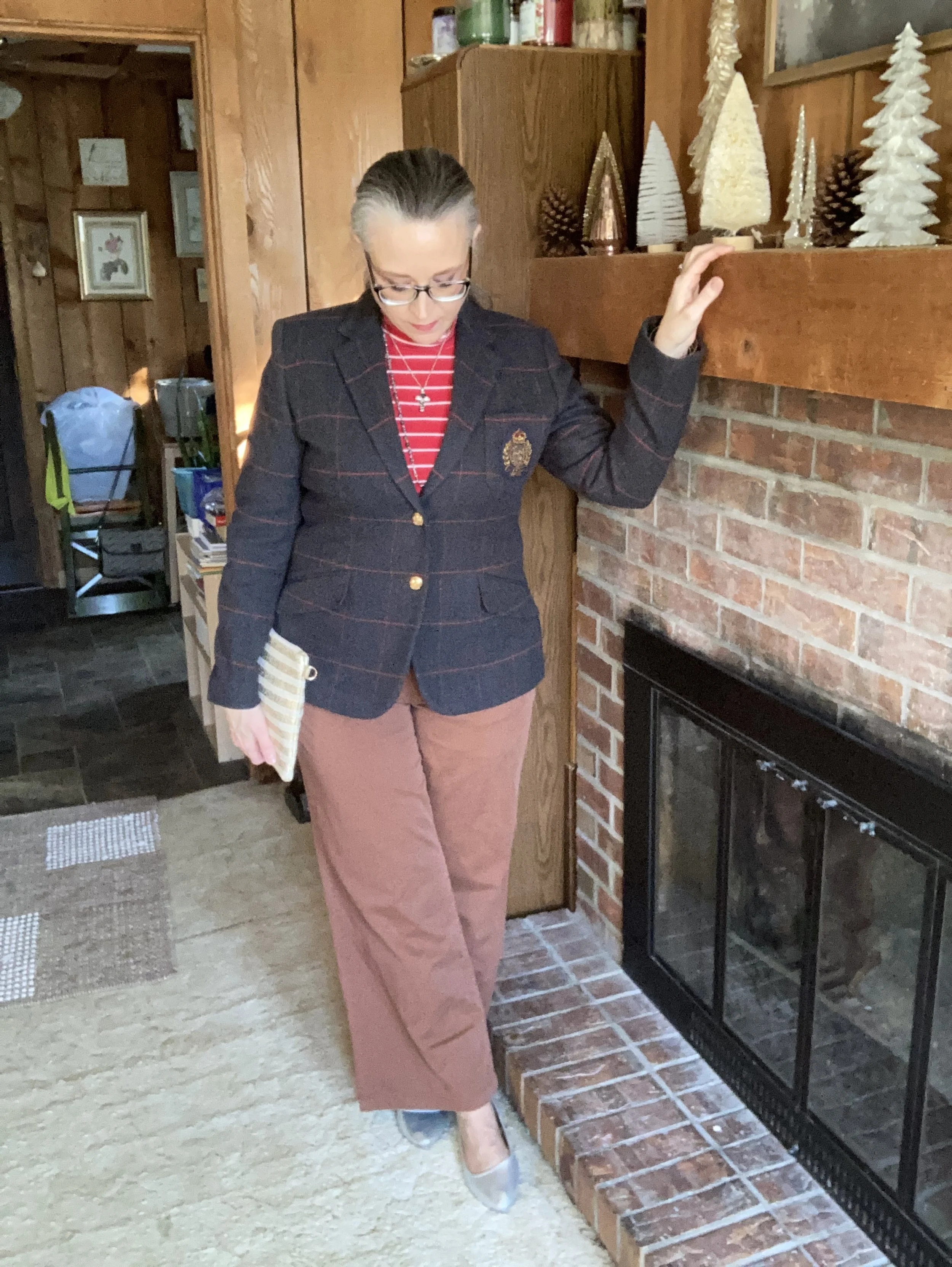
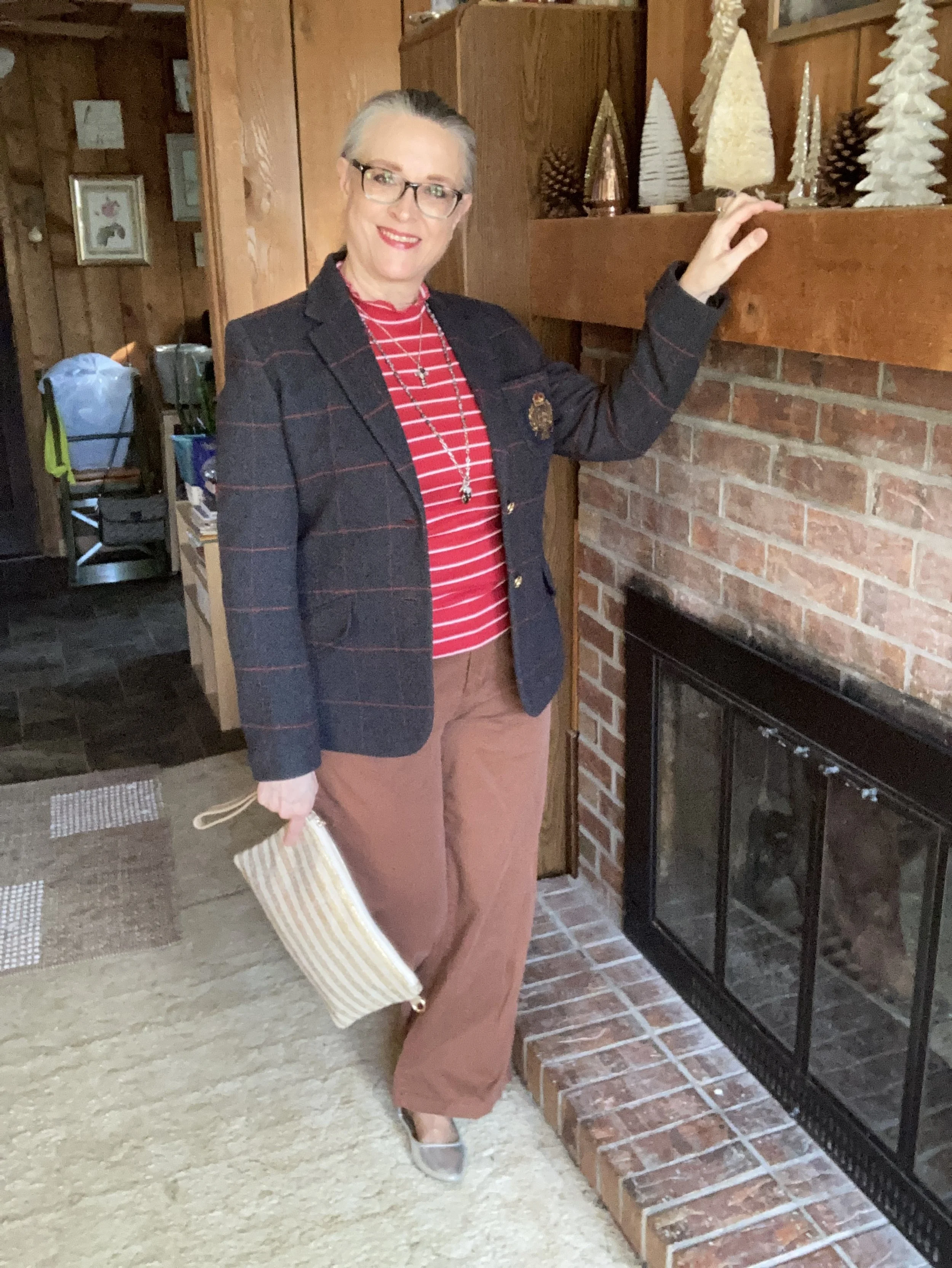
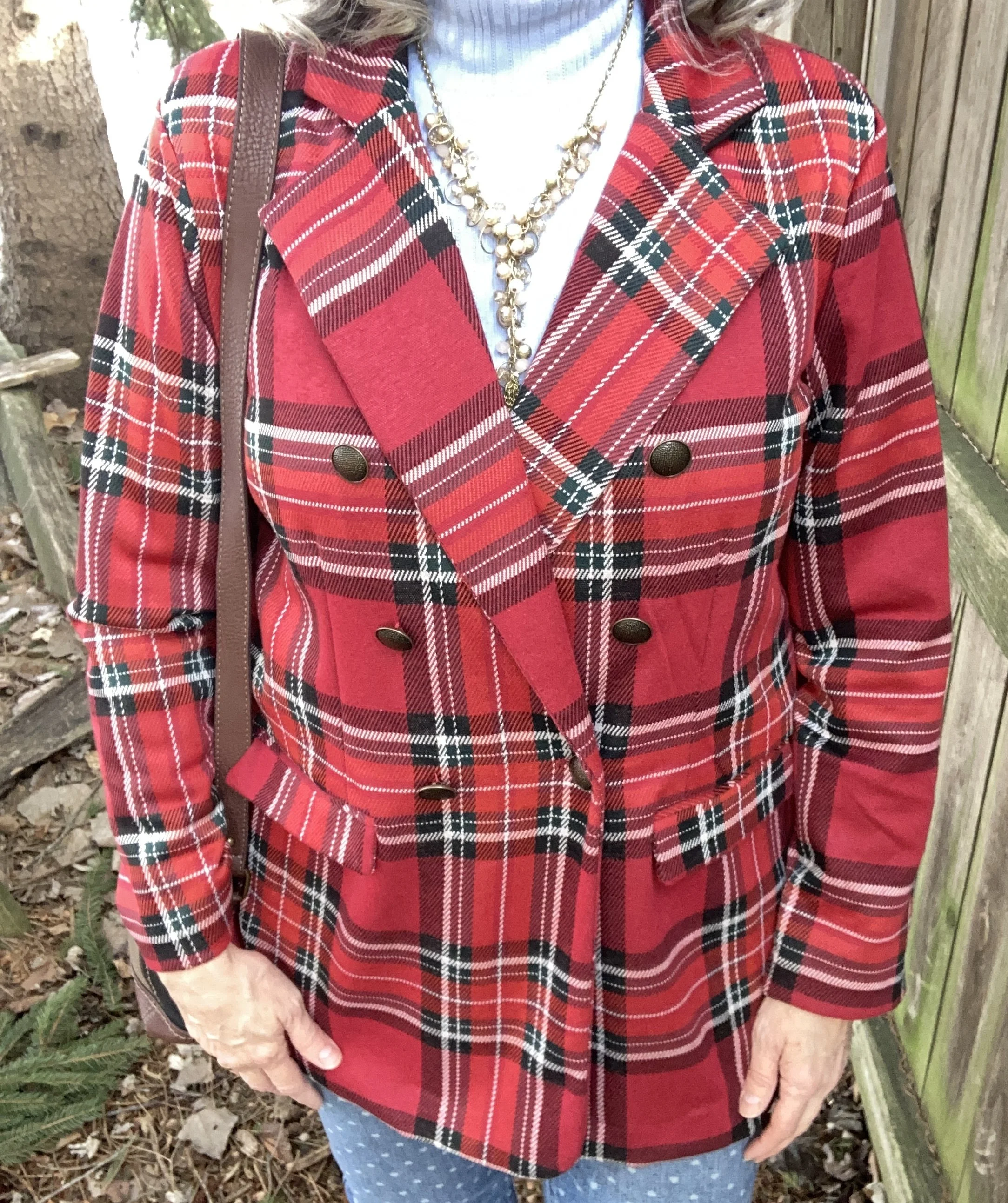
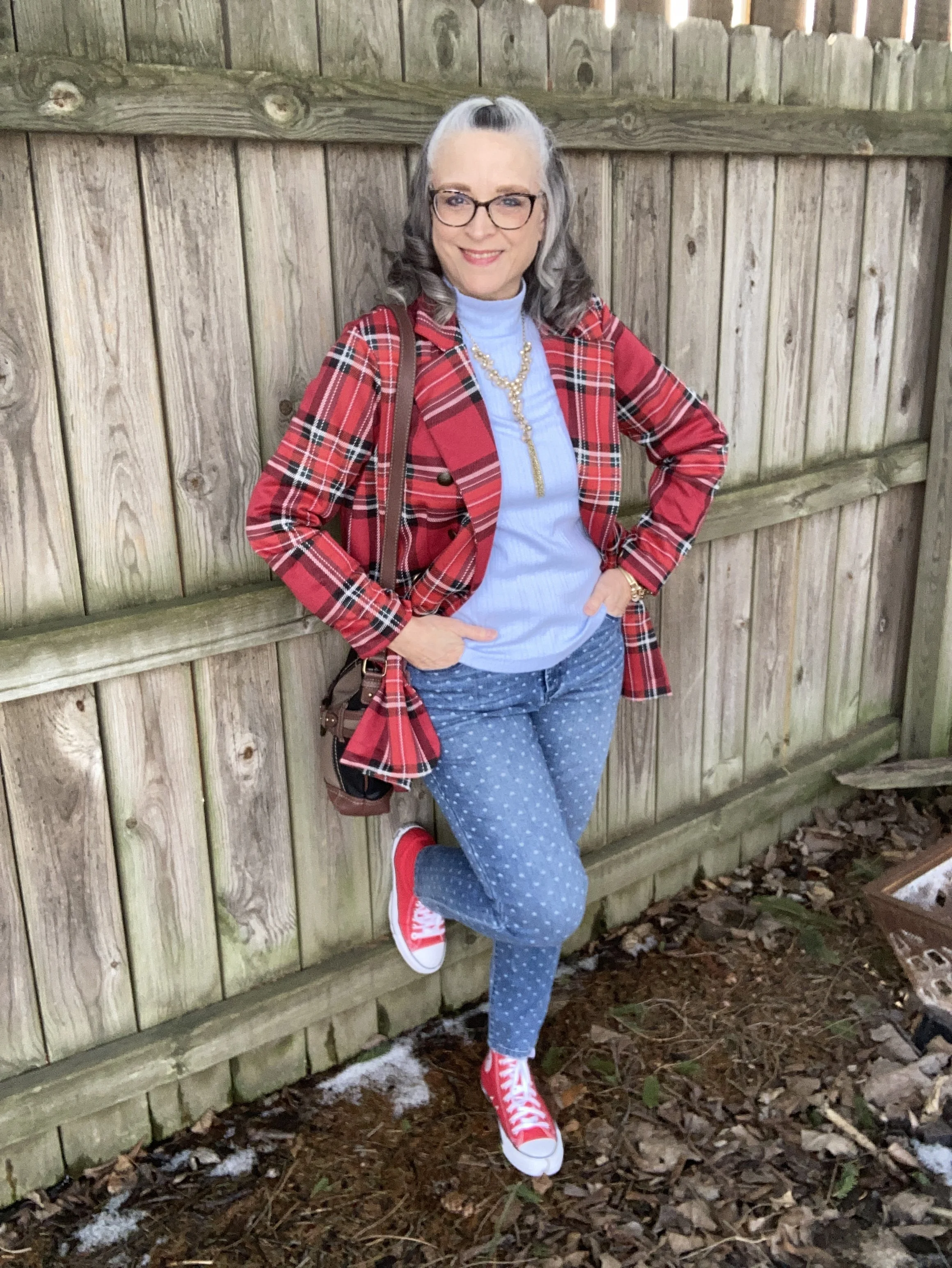
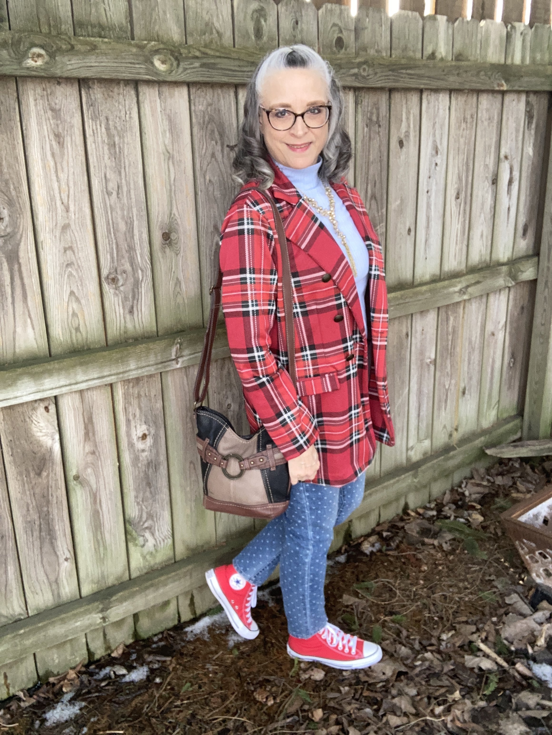
Today’s look revolves around a splendid plaid blazer that I ordered from Maurice’s three years ago. I haven’t worn it too much, in part because I have way too many clothes and can’t possibly wear everything. Yes, it is a problem, but a fun one. Ha, ha. You can see how I styled this same blazer with distressed jeans and converse sneakers here.
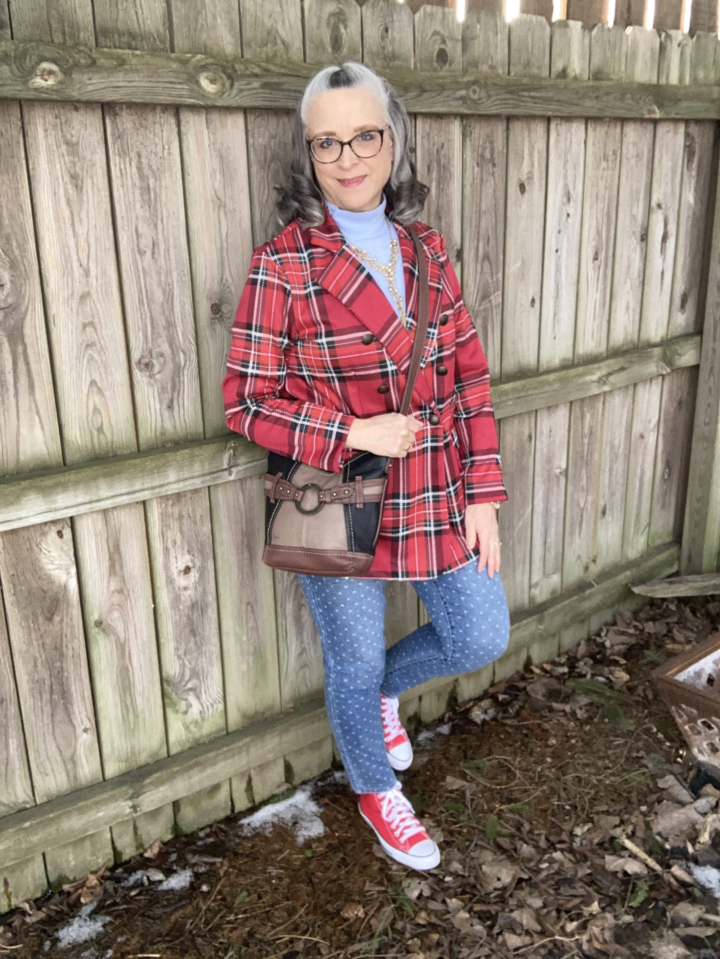
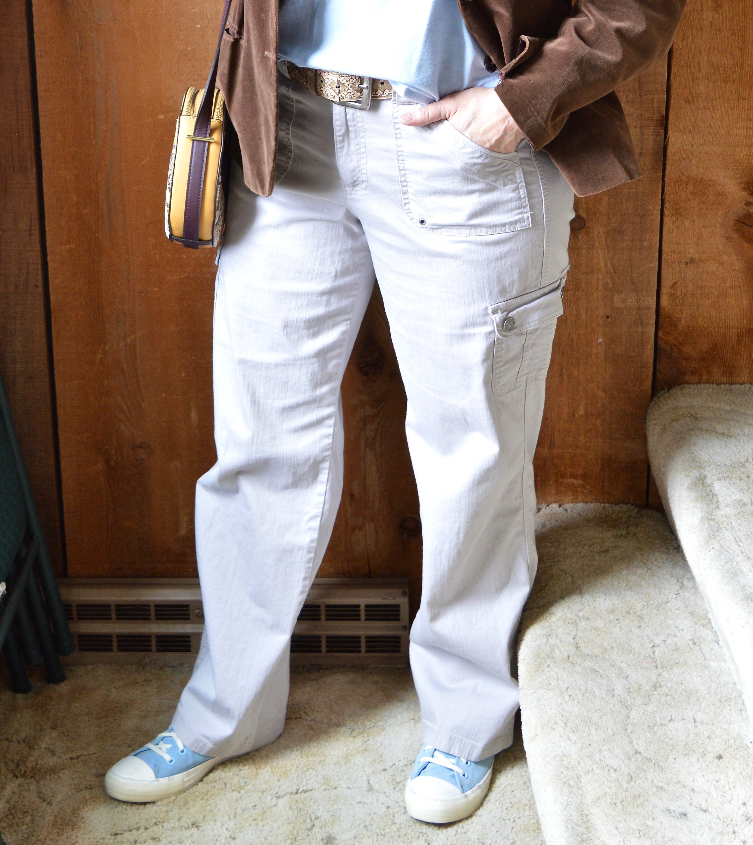
This plaid jacket is a heavy knit, so very comfortable and easy to move in. It has a double breasted vibe with a two button closure; one button is on the inside, the other on the outside. Unfortunately, the pockets are merely for show and not functional.
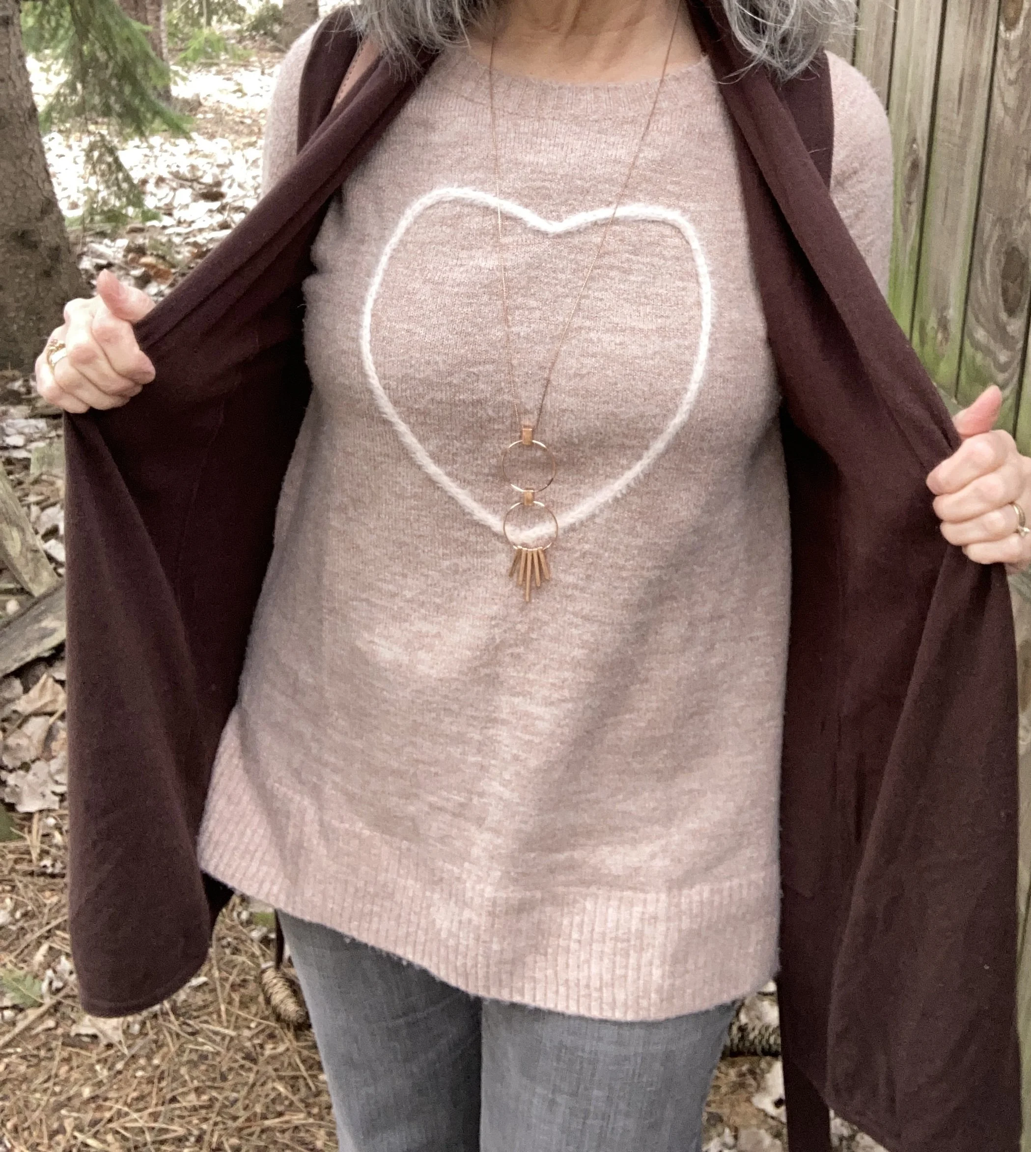
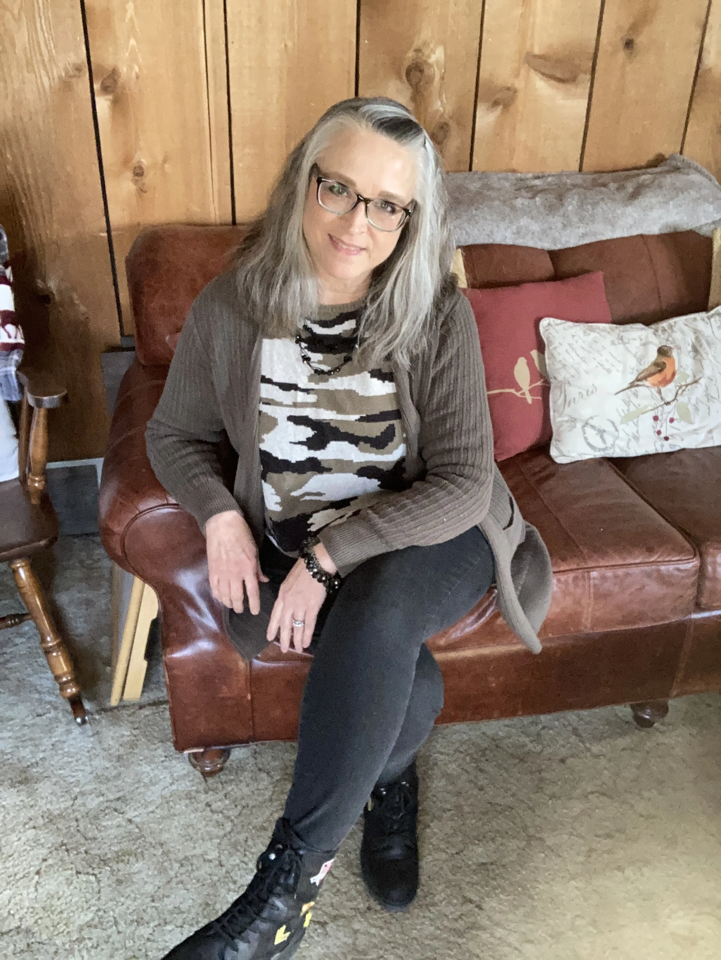
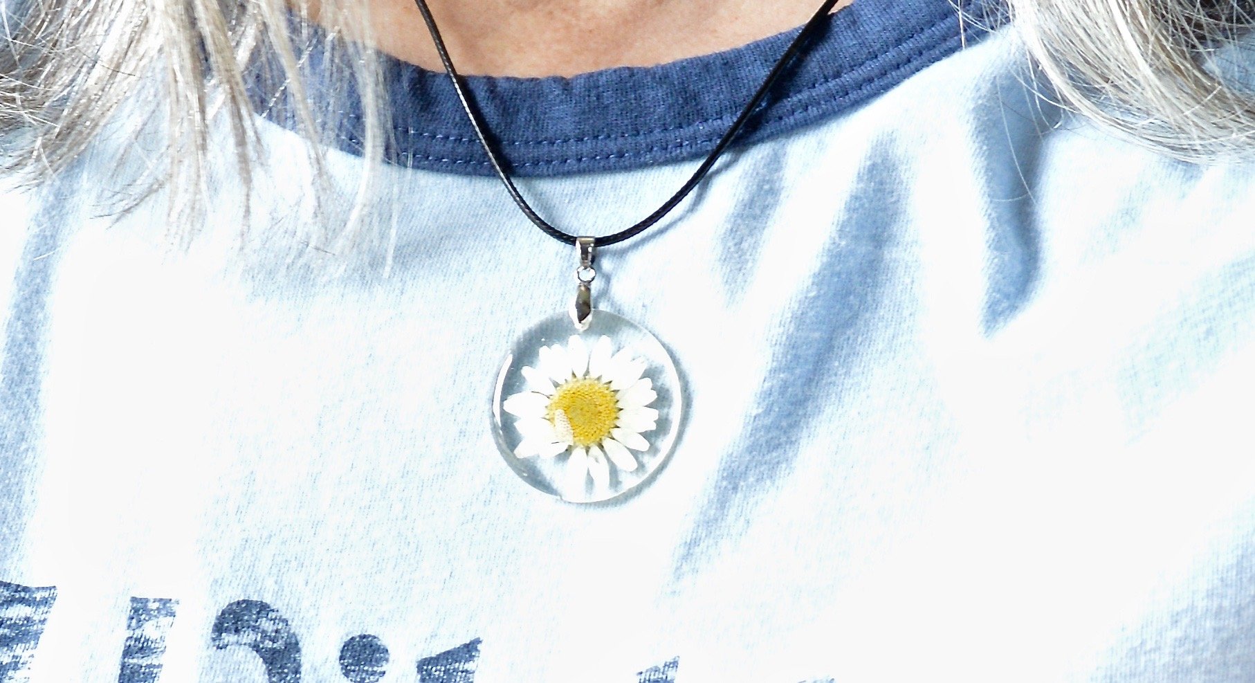
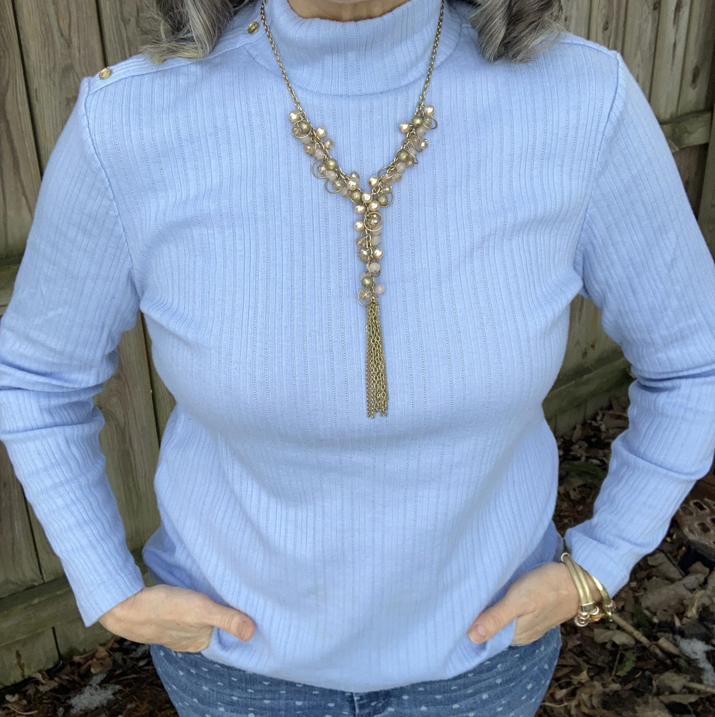
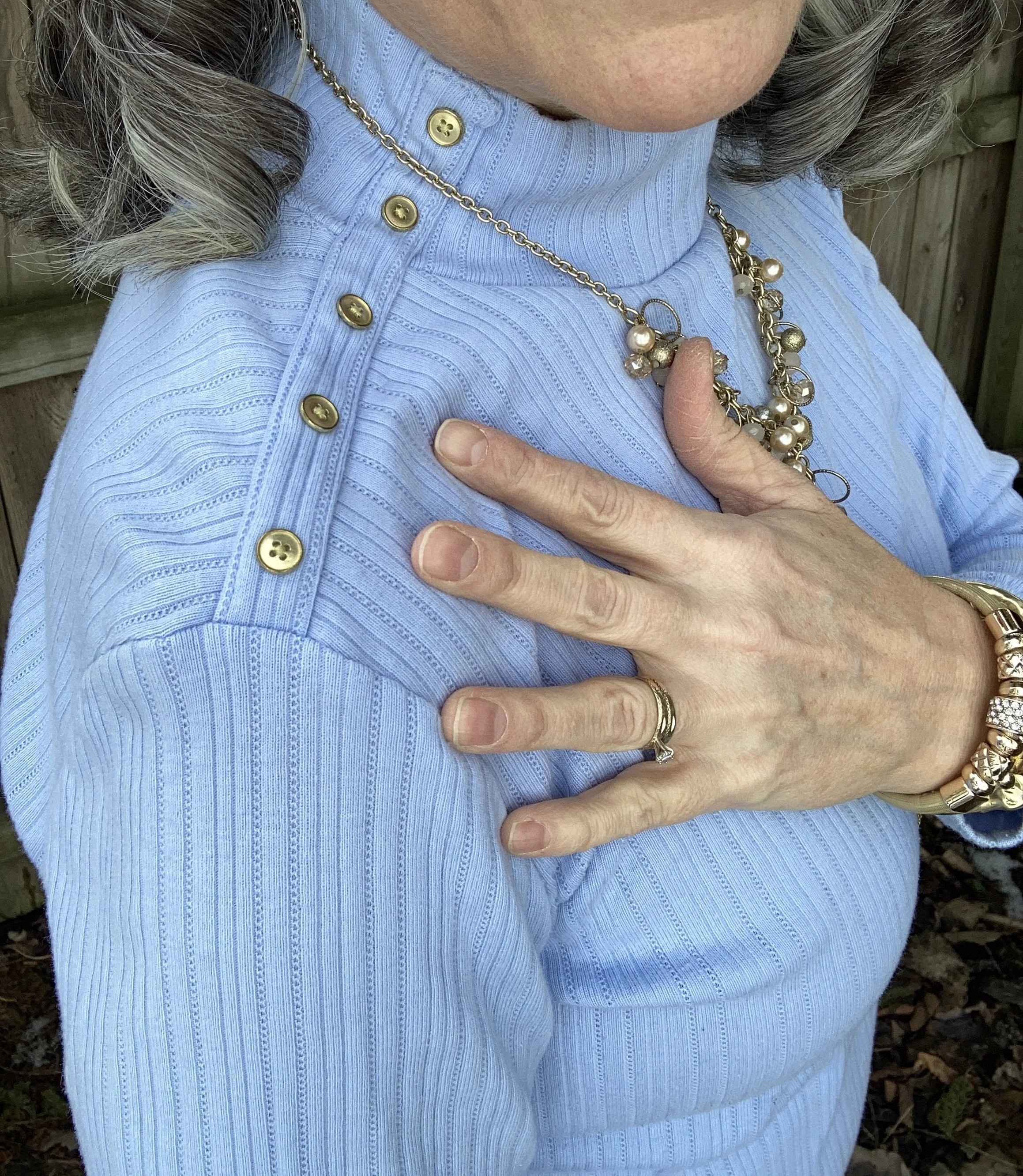
When I was trying to figure out what color combo I wanted to pair the jacket with, I came across this thrifted, light blue, Croft & Barrow turtleneck. I love the button detail on the right shoulder of this piece. It is soft and comfy, and I liked how it looked with the blazer; not patriotic, but classy.
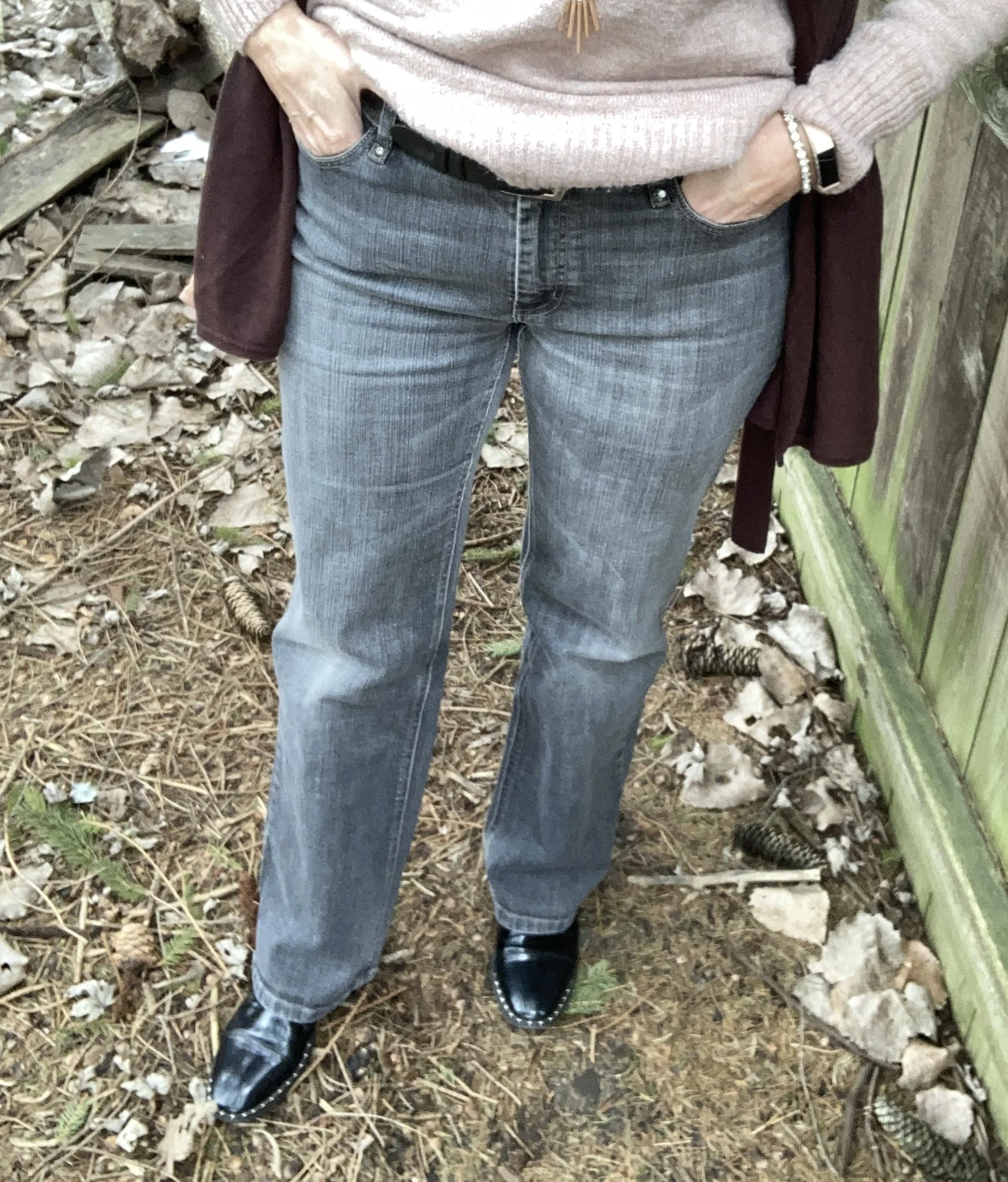
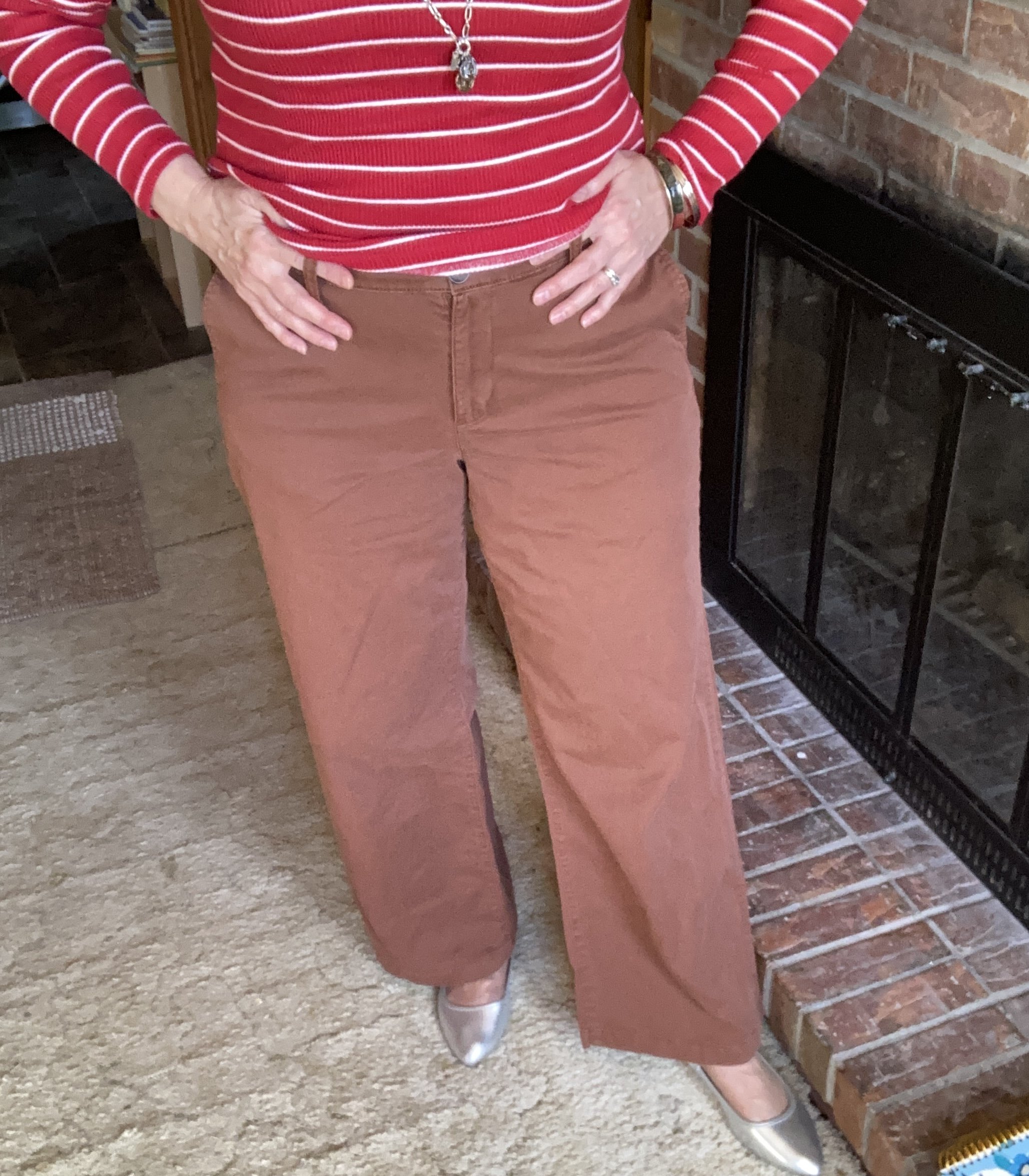
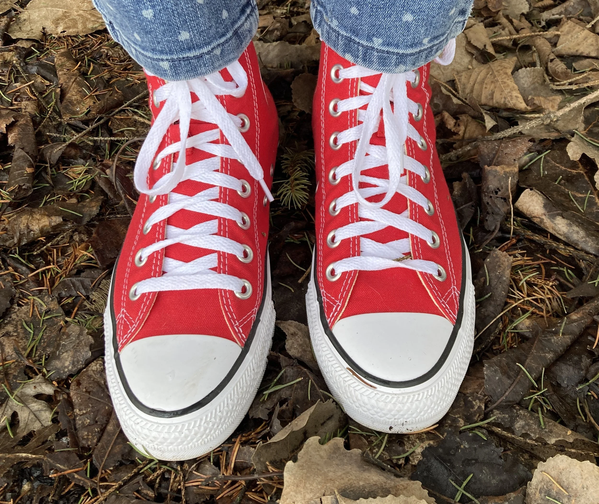
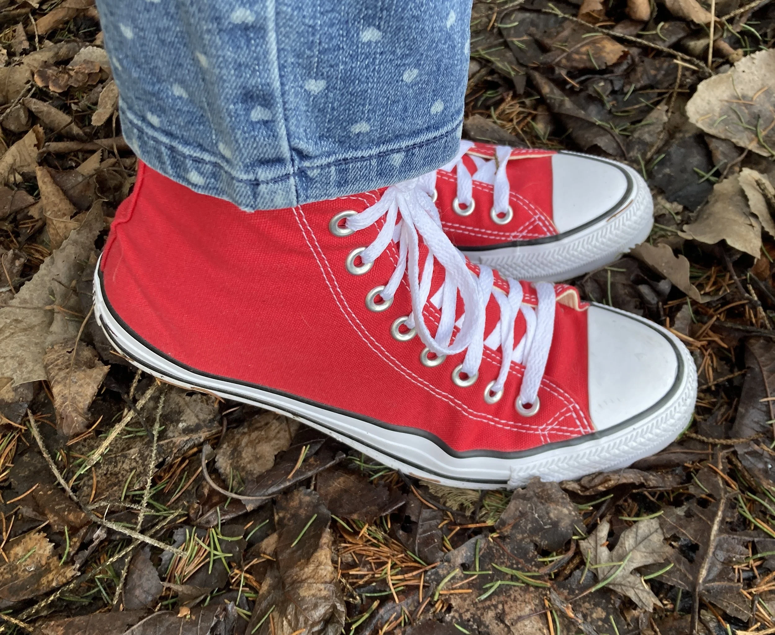
These heart print jeans were also a second hand find. They are Lauren Conrad brand. Seeing as they are skinny jeans, they aren’t really in right now, but as I have said before, I like to keep a few pairs around, because you never know when you might need, or want to wear them.
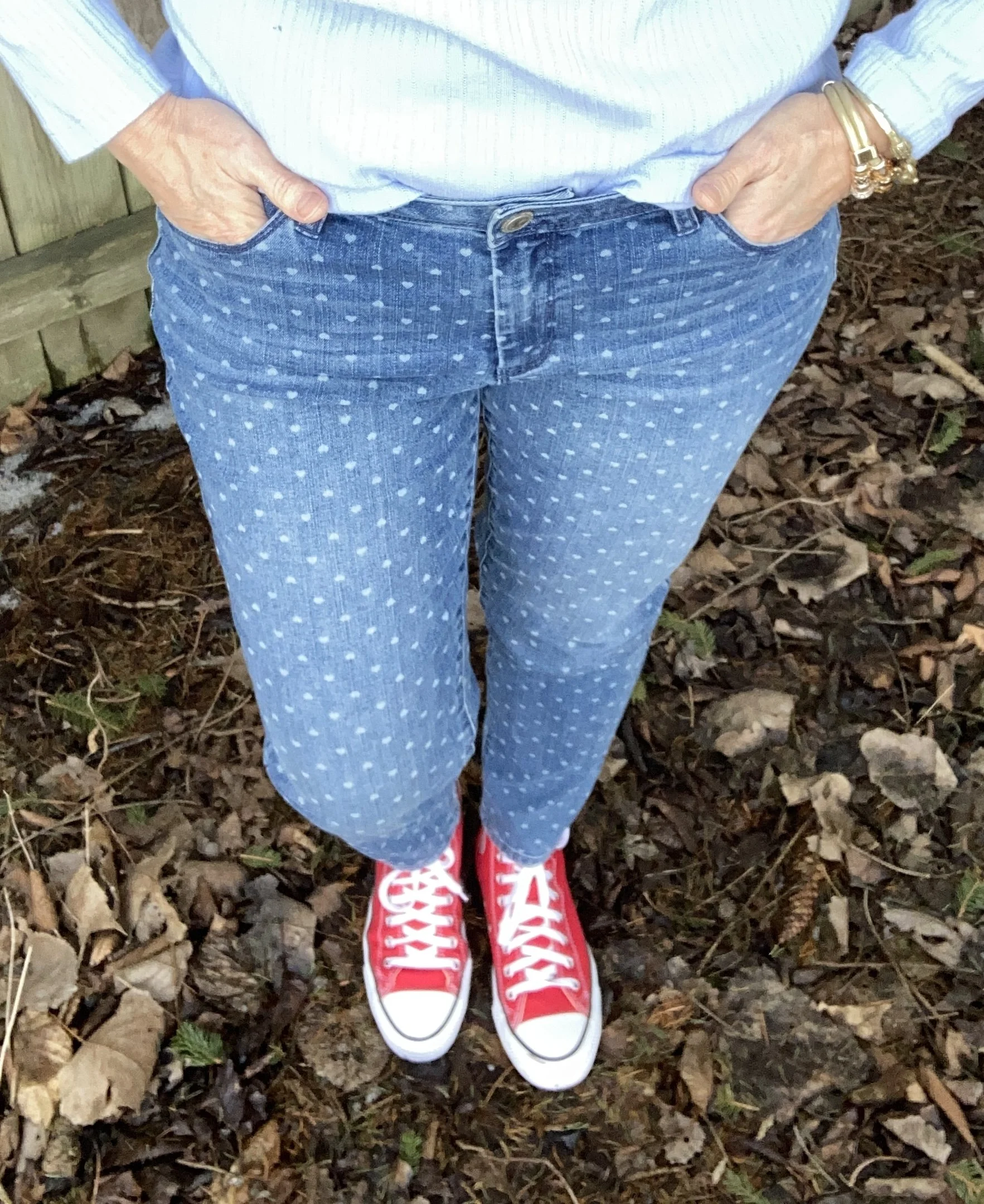
I wanted to take my bright red Converse sneakers from DSW for another spin. I am not sure if I like this look with the skinny jeans. Converse always make my skinny feet look like skis, but I still love them. Just call me ski feet! Ha, ha. If you click on the link it will take you to the DSW website and the Converse high-top page.
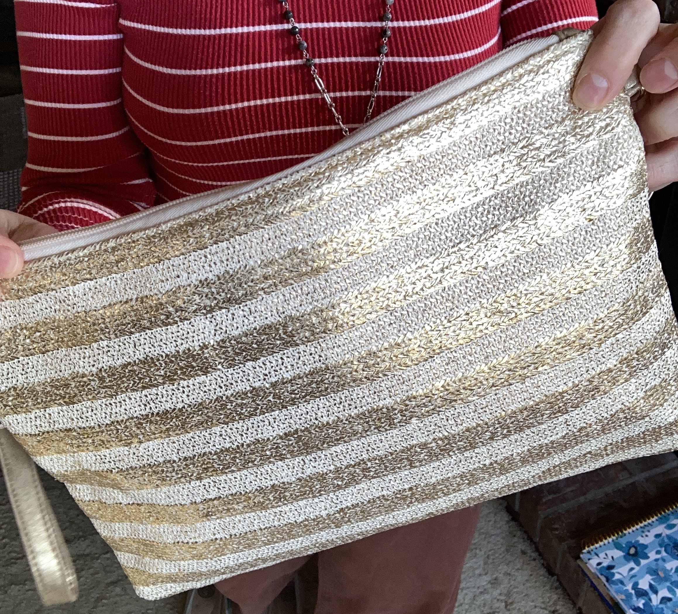
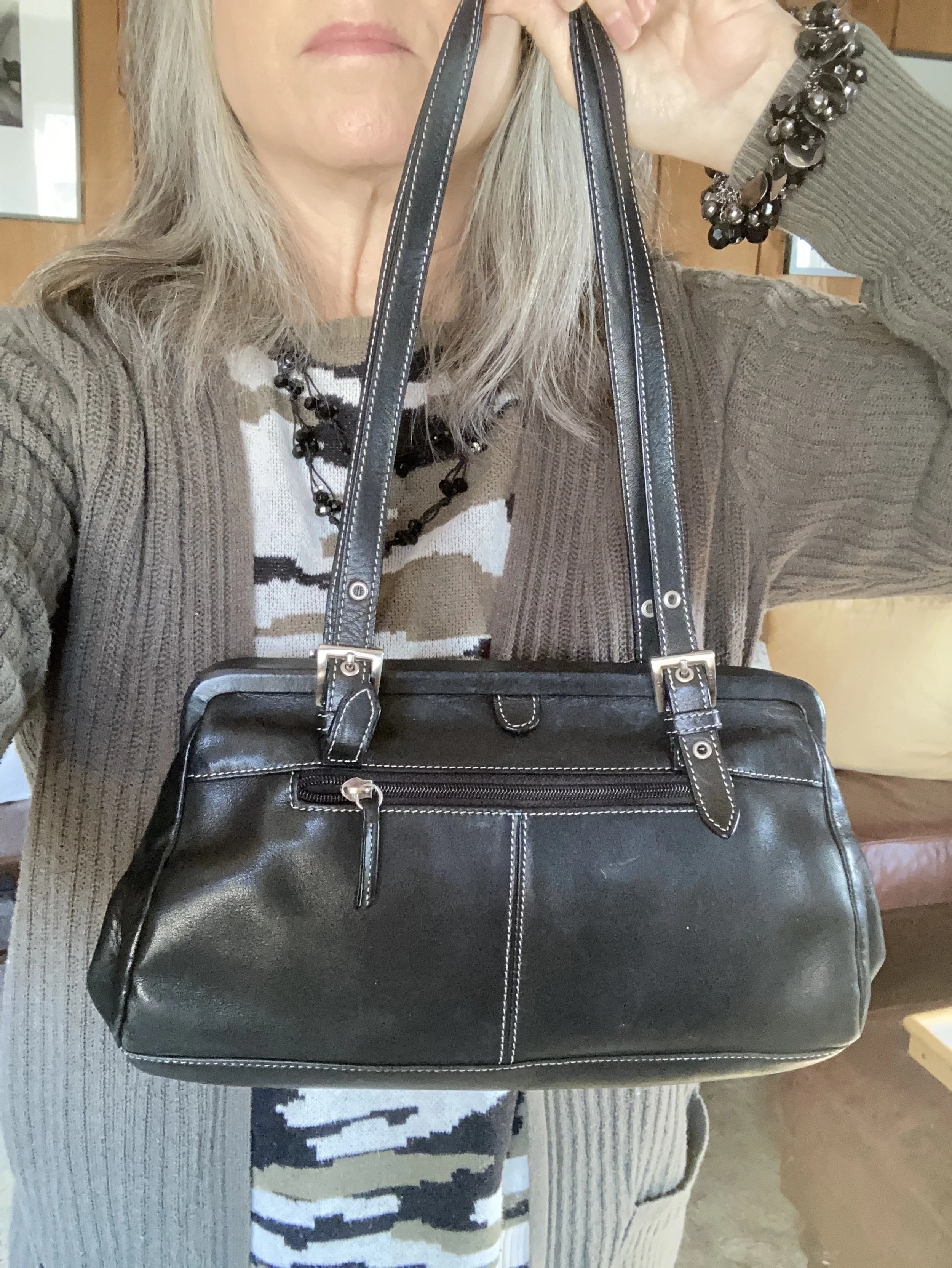
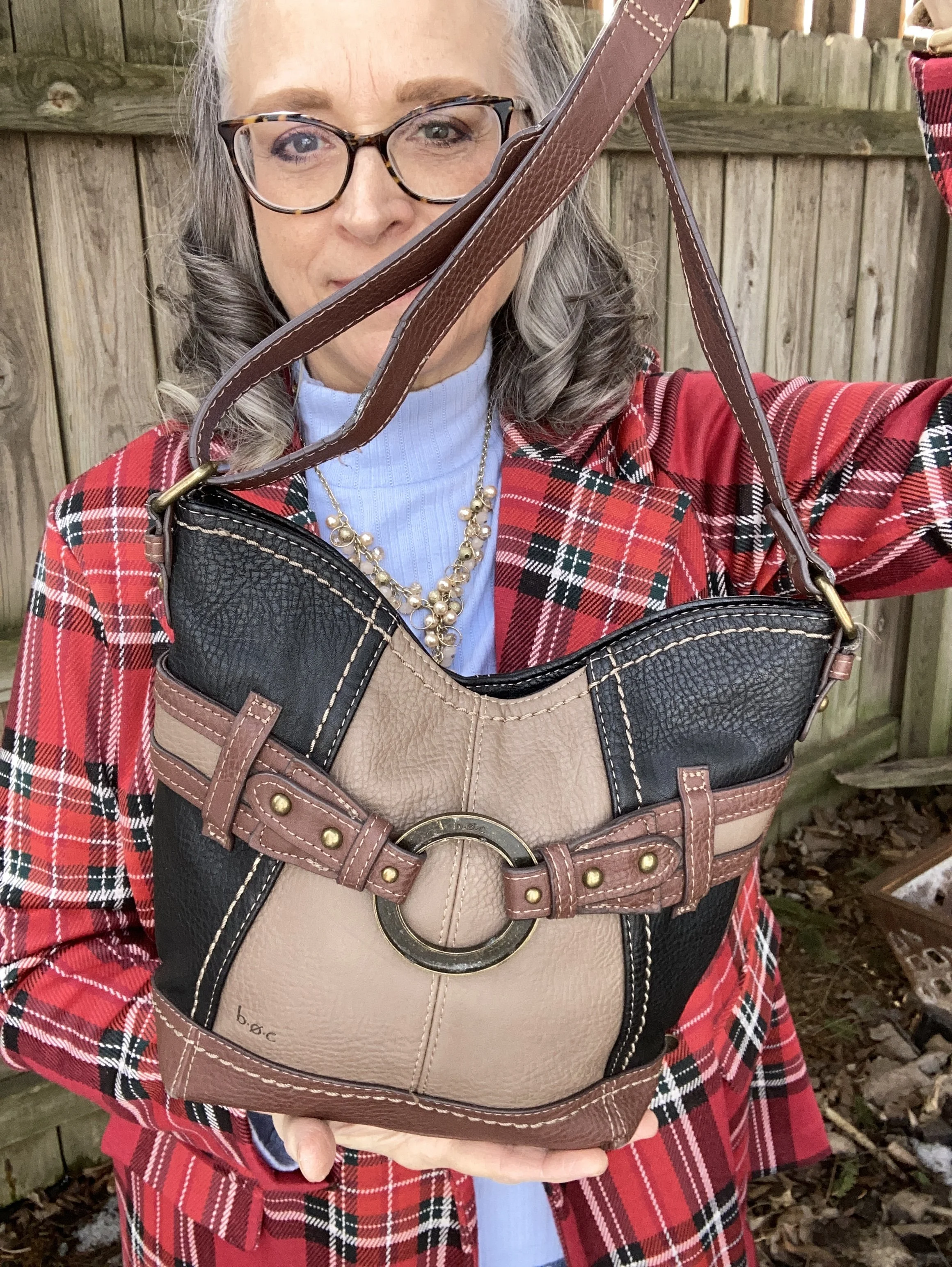
My bag is also second hand and is a brand called b.o.c. This piece works well as a cross body bag. Do you think this bag was a good choice or do you think I should have went with a solid black bag, or possibly a red or blue? Let me know what you think.
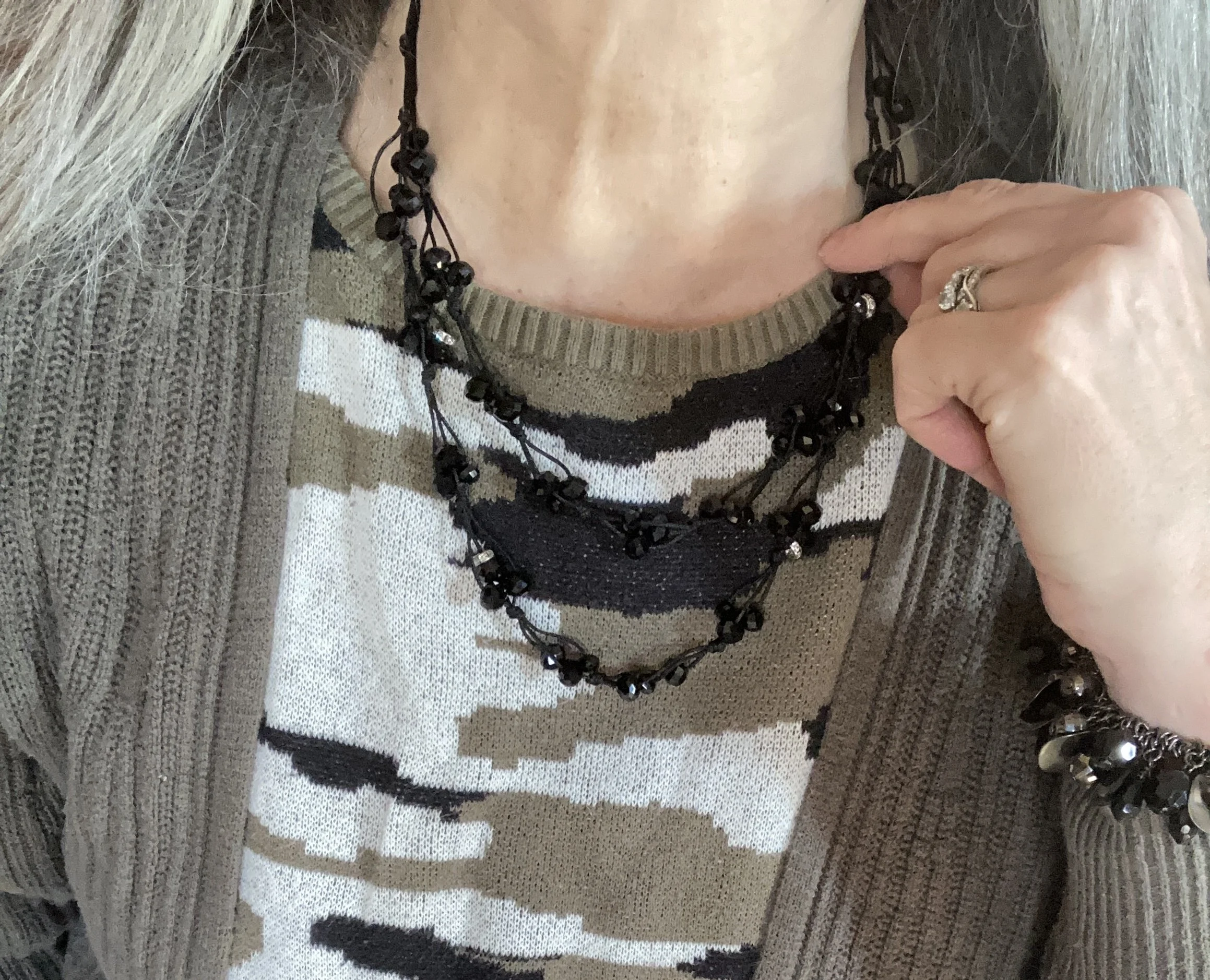
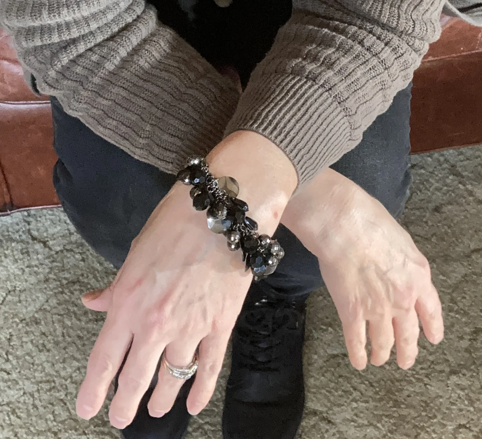
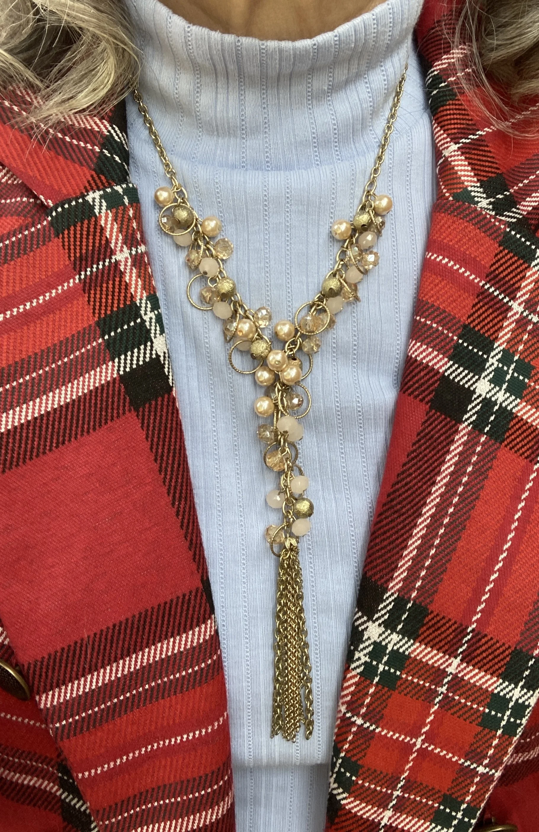
I chose gold for my jewelry and everything except the elephant bracelet is second hand. The elephant bracelet was a gift from my oldest daughter a few years ago.
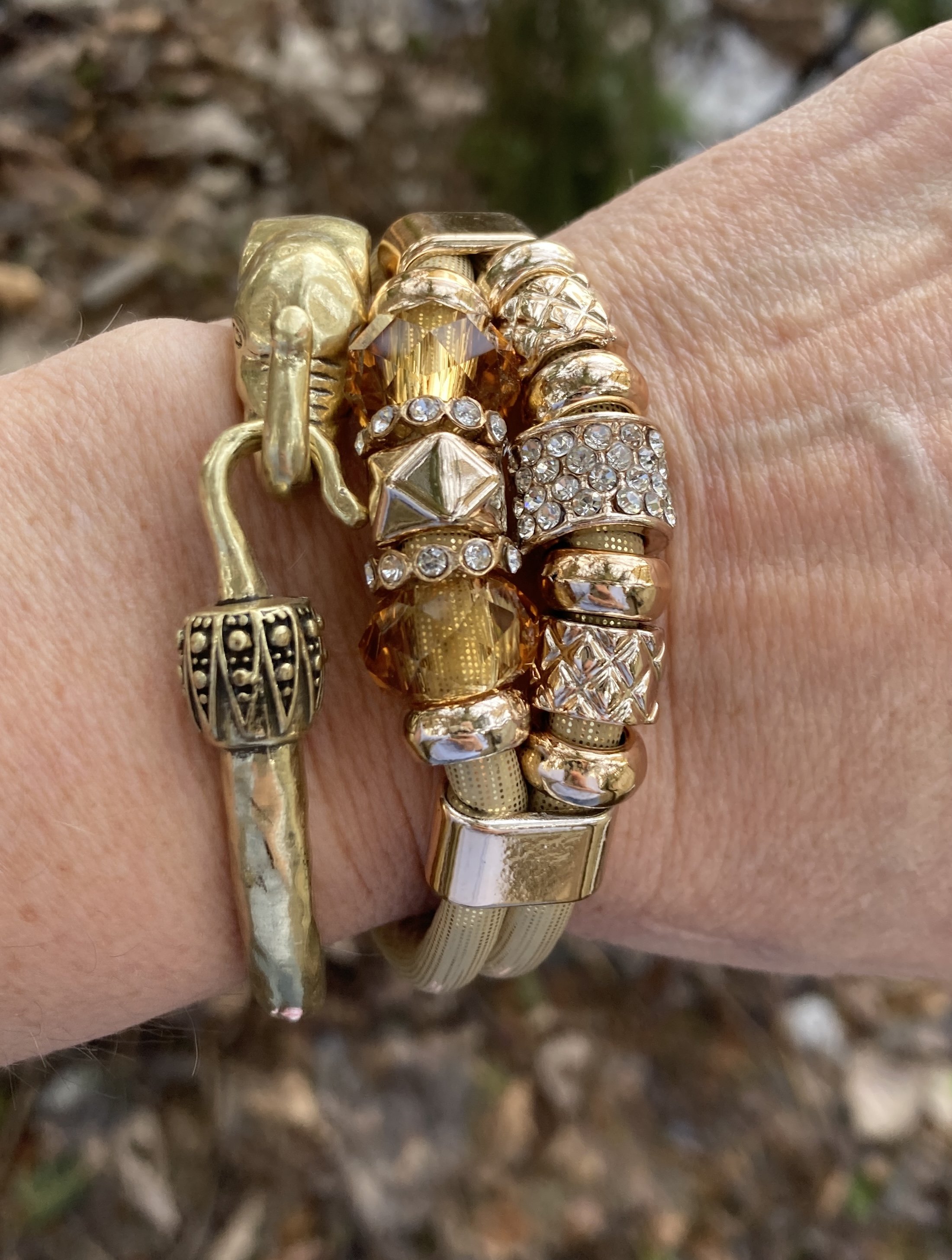
Here is a cute elephant charm bracelet from Etsy.
I hope you enjoyed this outfit. Please tell me what you thought of this combination. What would you have done differently? How would you have made it your own? I love to hear your thoughts and ideas, so leave a comment or two.
At the moment I am going to try to provide a few links here and there within the text to shops or stores that might have similar items. It seems there are very few affiliate programs that are still free, and I am not going to pay for links when I am using this space as a hobby and a place for you to get inspiration. Shopping for me isn’t the main thing.
If you have been following me for a while, I apologize that I have not been sending out weekly emails. Life has bee a little overwhelming, but I will keep trying.
Have a great week, and please stop back later this week for a children’ s book review, and for another Faith post on Peace in the Chaos.