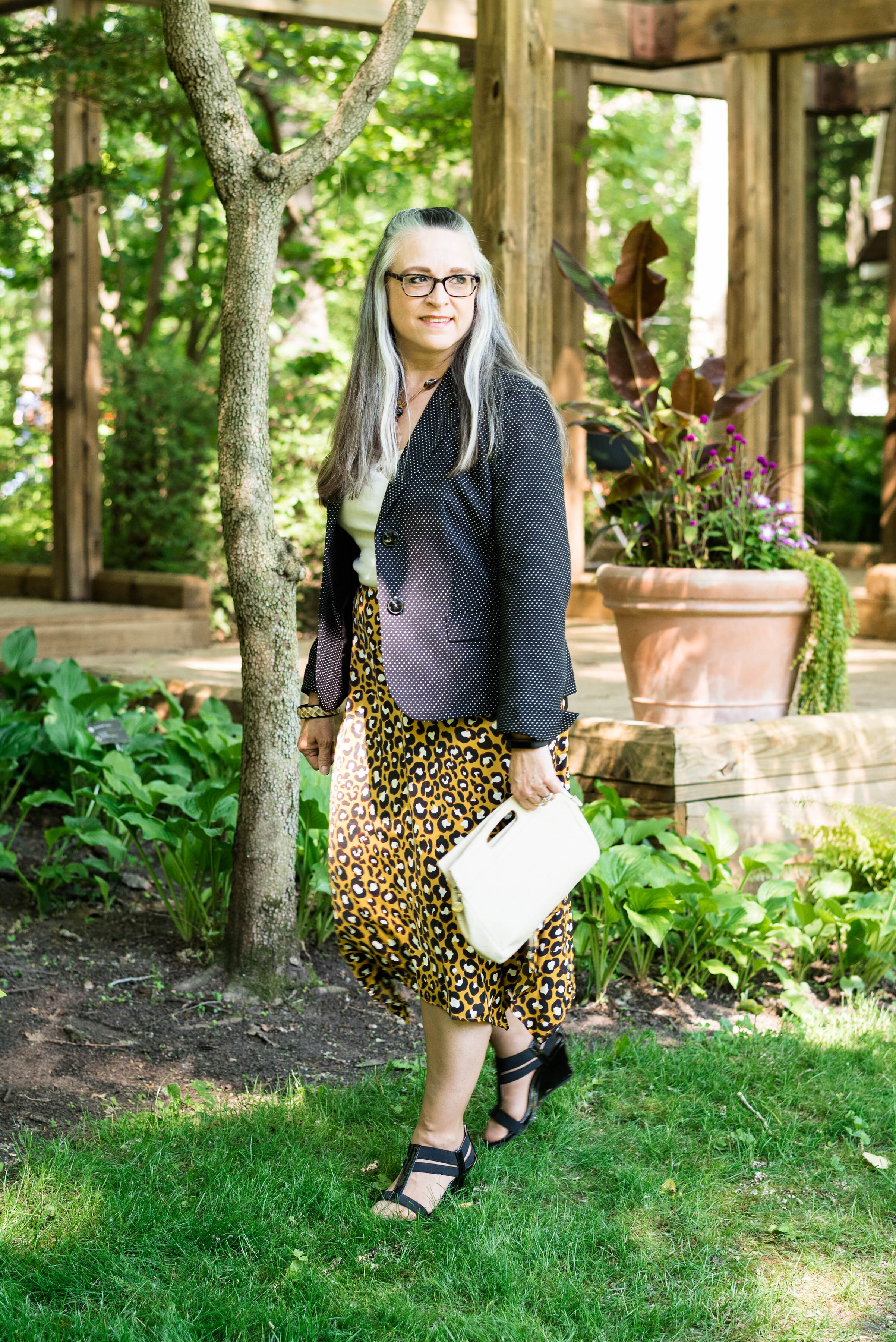
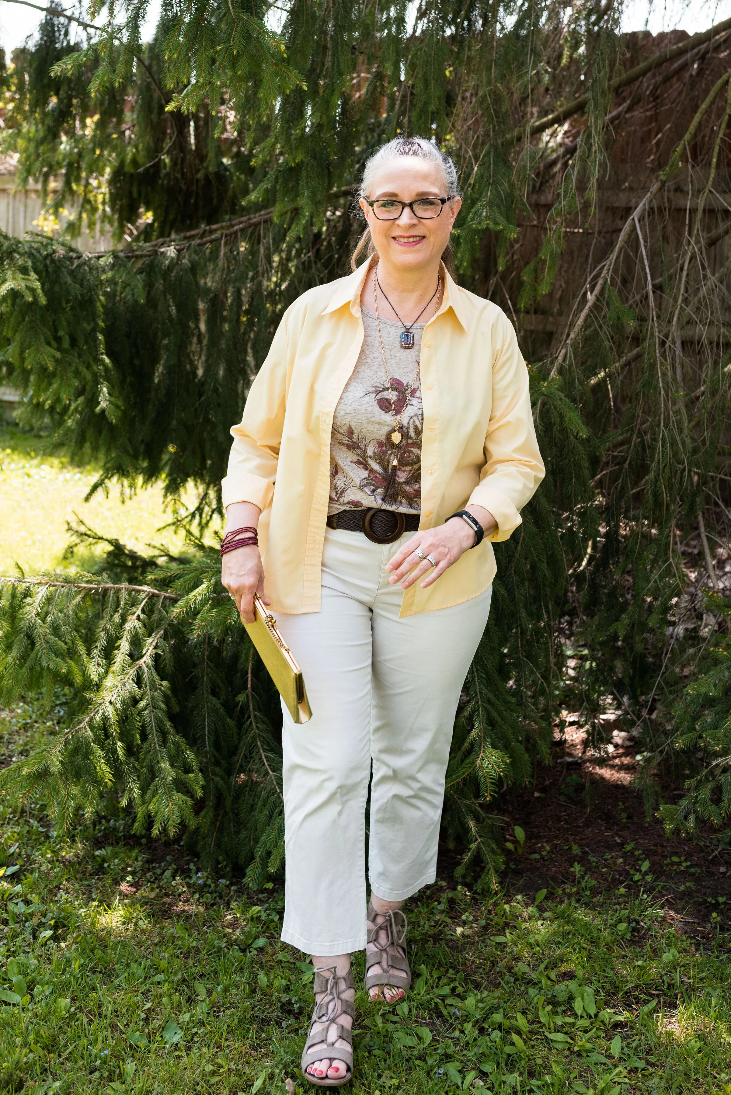
Color Play - A Pinterest Fall Color Palette

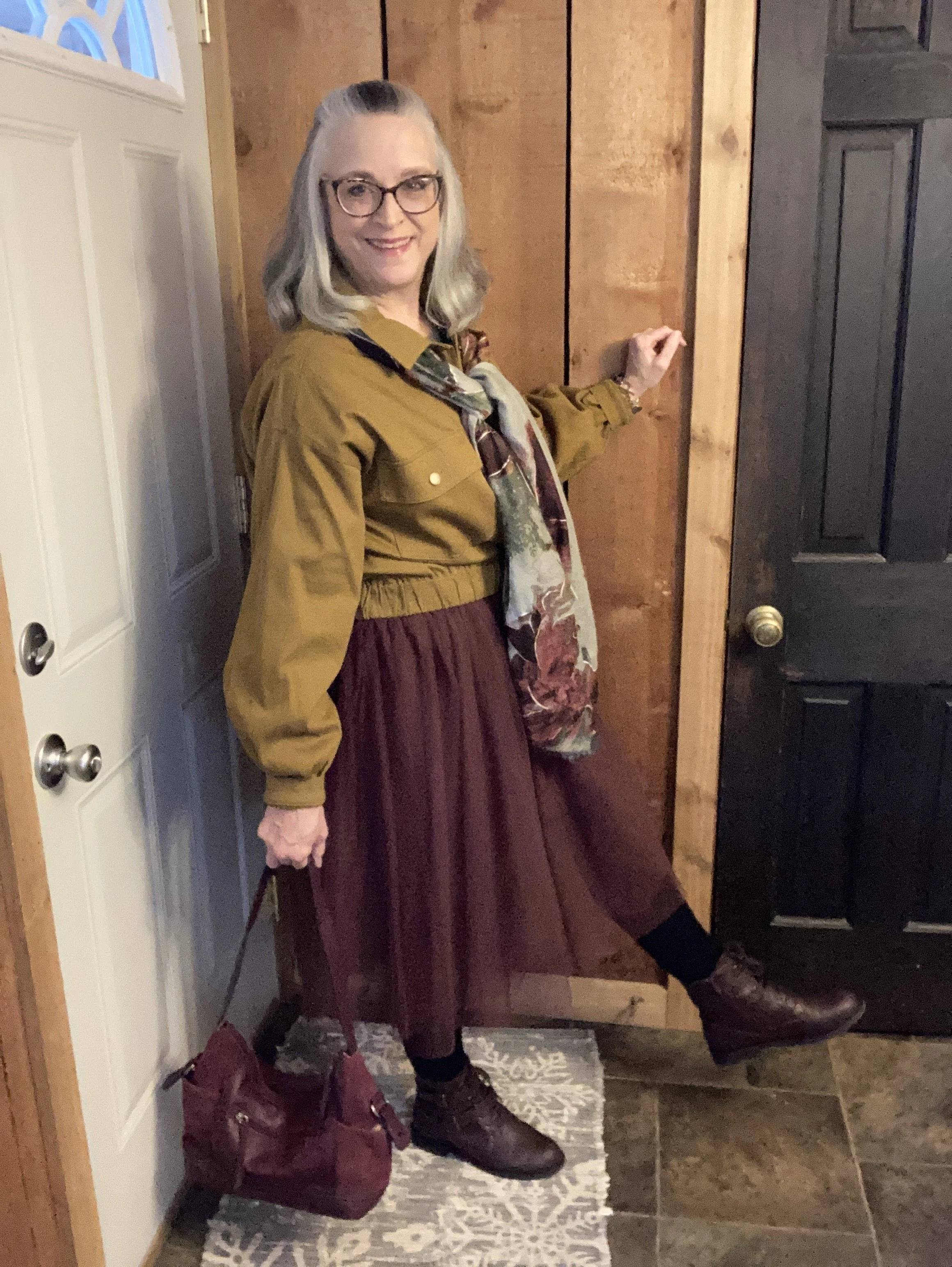
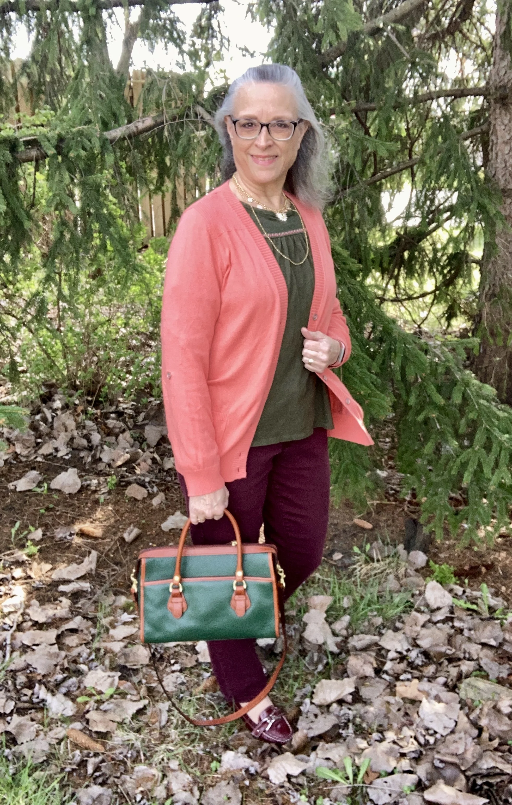
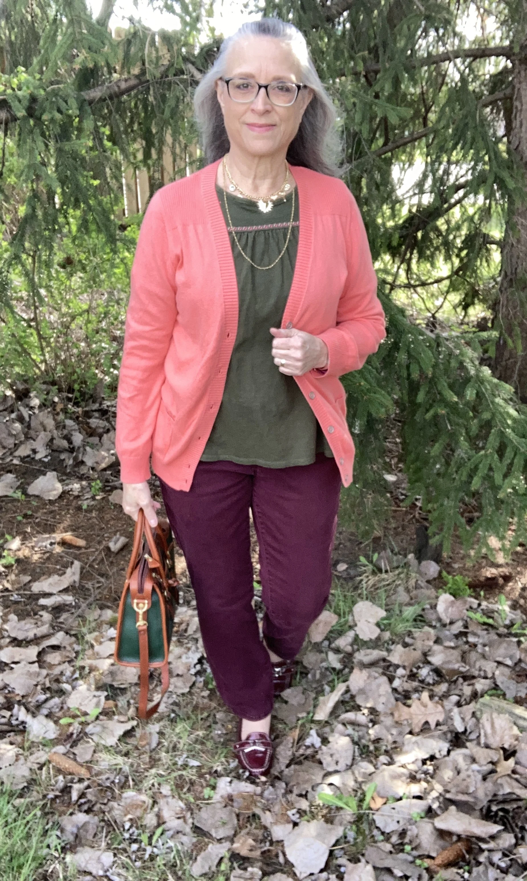
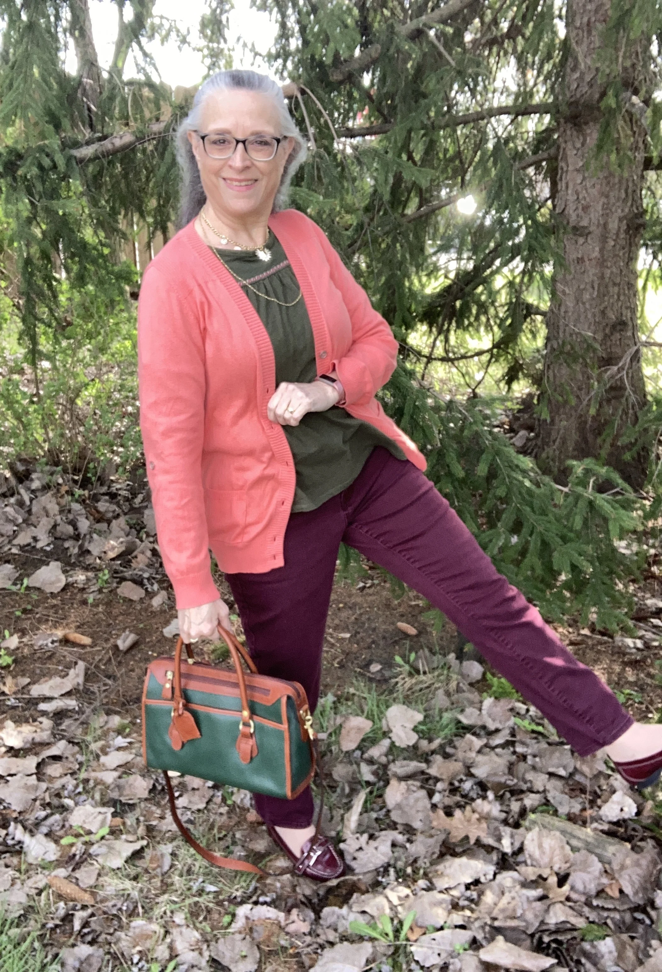
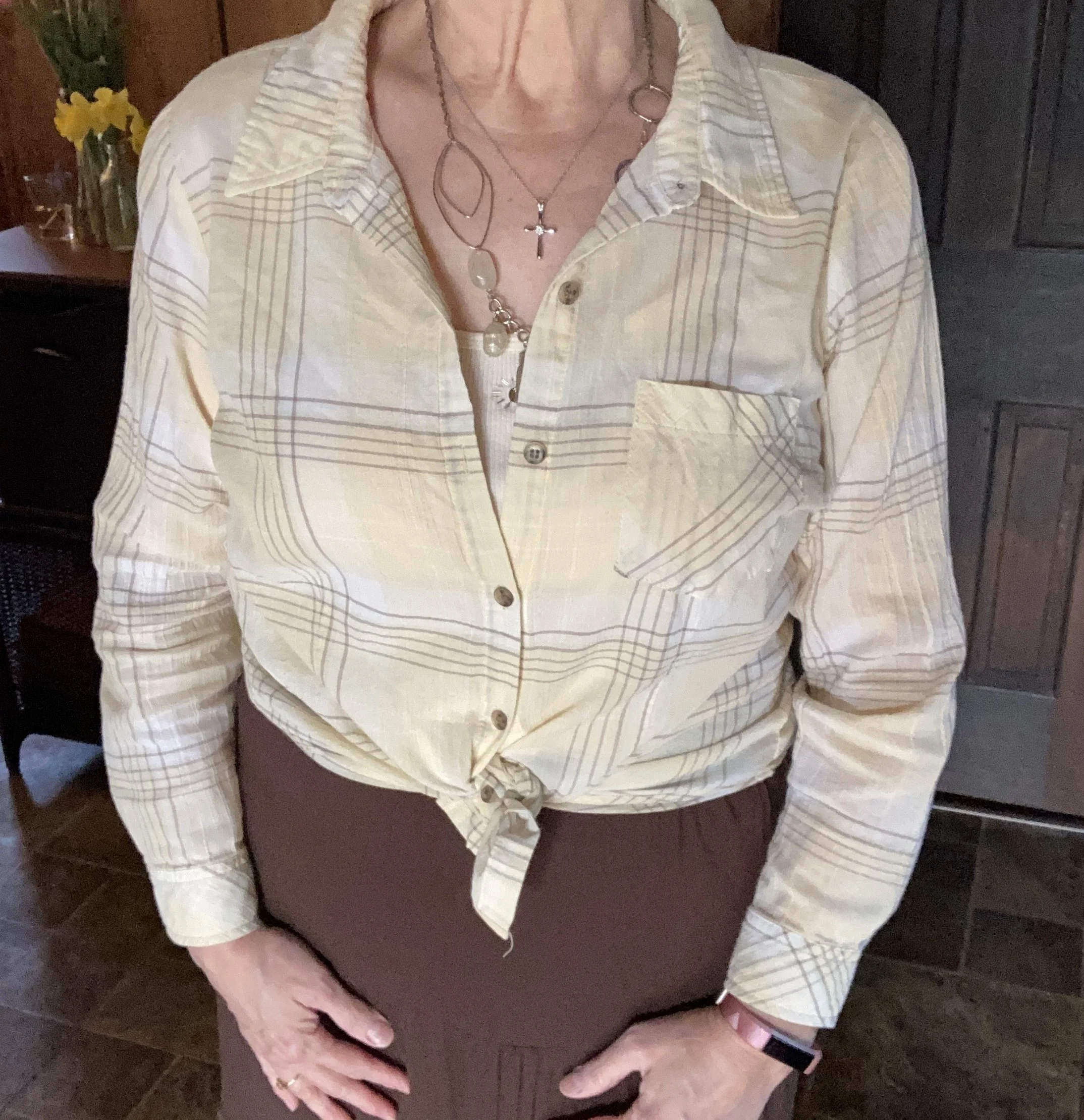
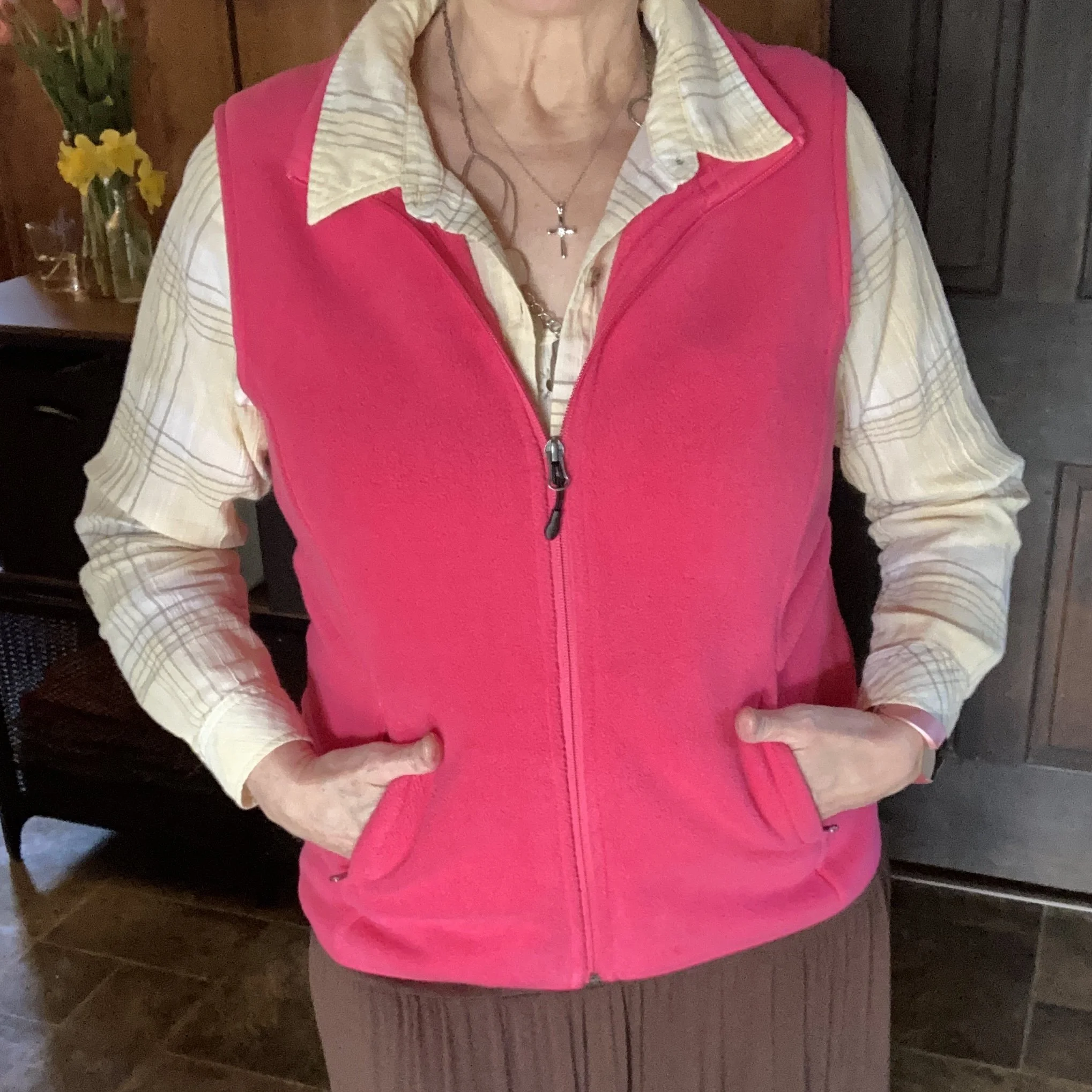
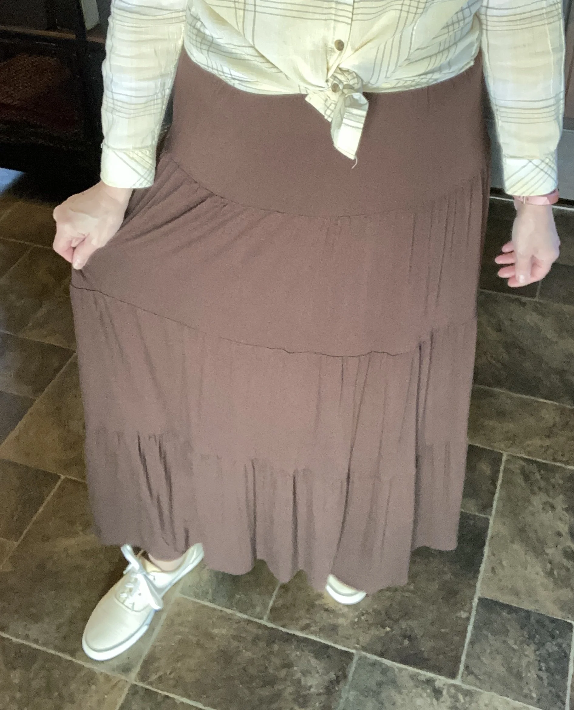
I have been collecting color palettes on Pinterest for quite a while, so I thought it would be fun to revisit that board and see what I could pull up for a fun fall color combination. This is the pin I drew my inspiration from and I used the swatch labeled Fall Fashion. I liked all the color combos, but I guess I wasn’t feeling overly adventurous, so went with the more conservative of the bunch.

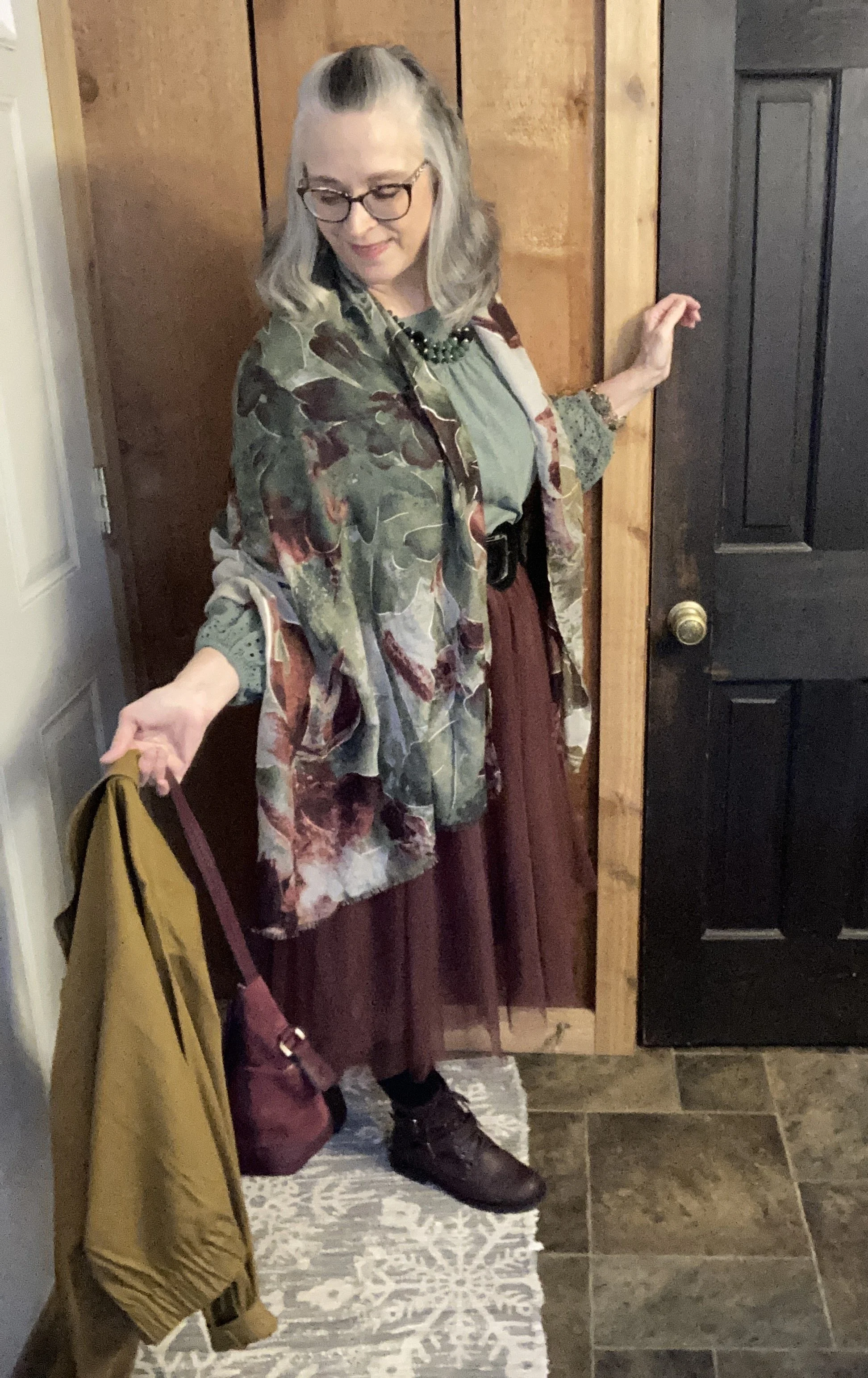
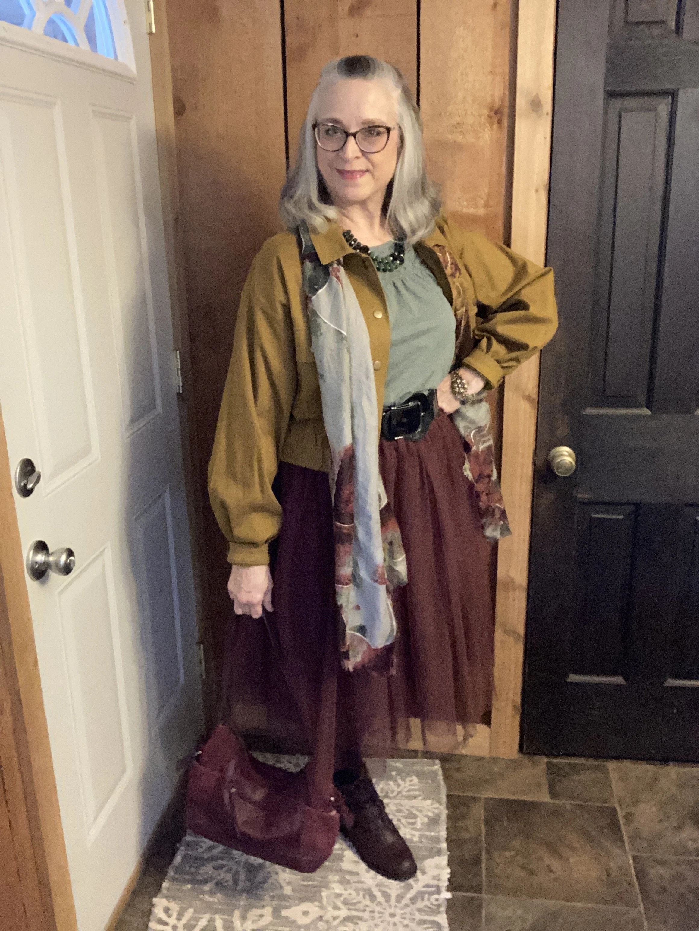
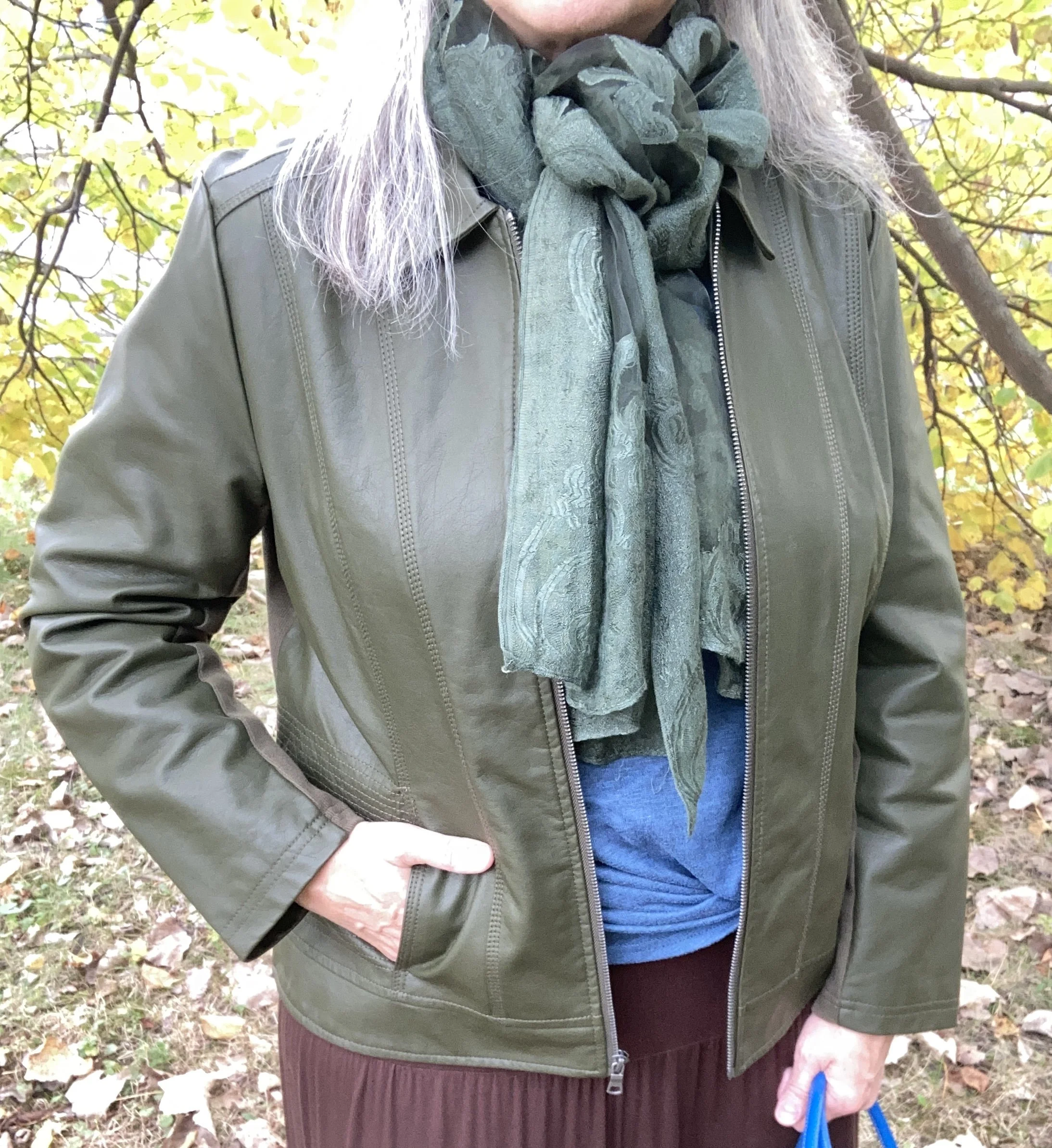
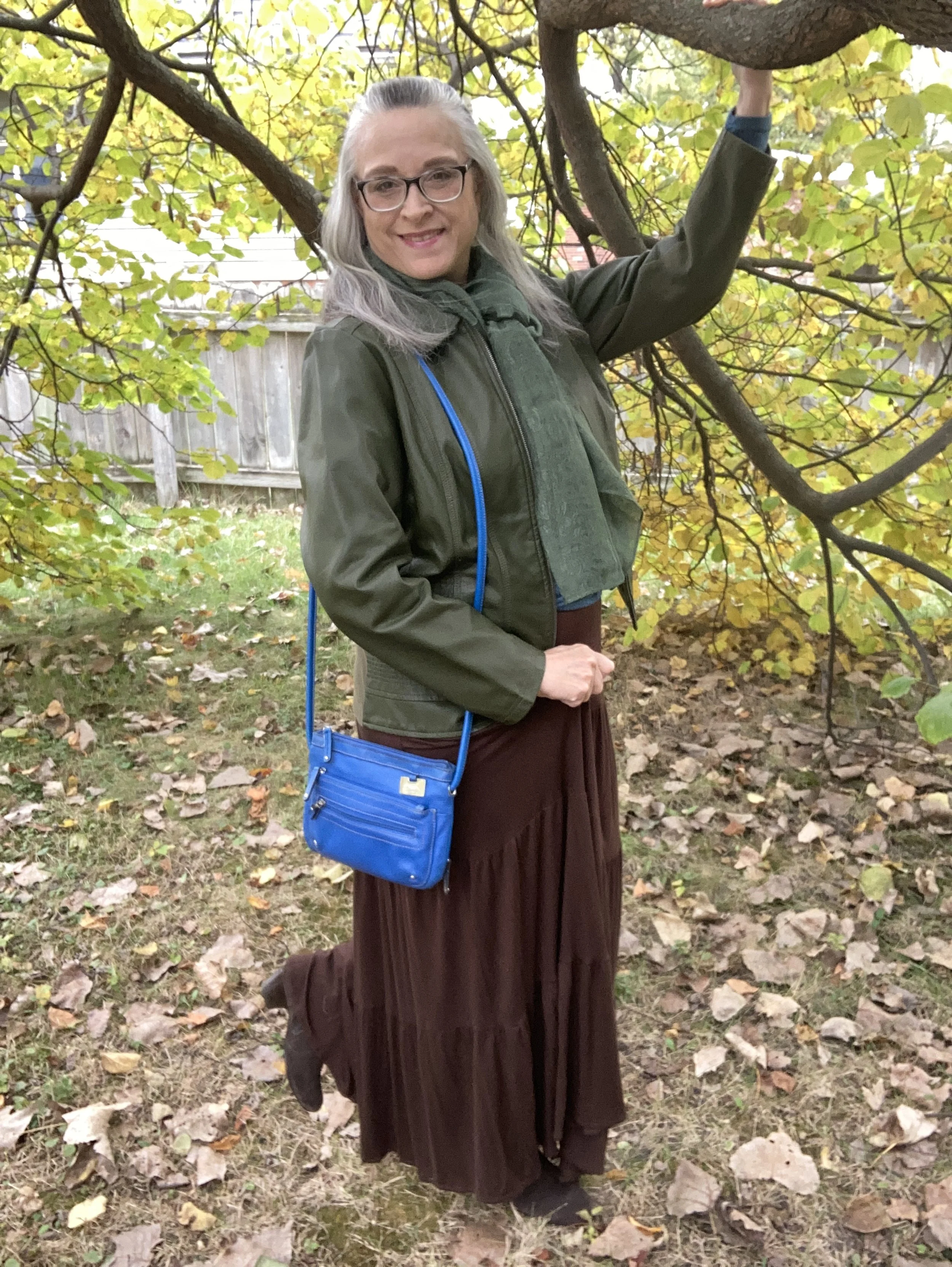
This is a rich, earthy combination for fall, and I like how the green and brown are more sedate while the bright blue is a lovely pop of color. When I saw the color swatch I knew the olive would be a good color choice for a topper, as I have a number of sweaters and jackets in that color.

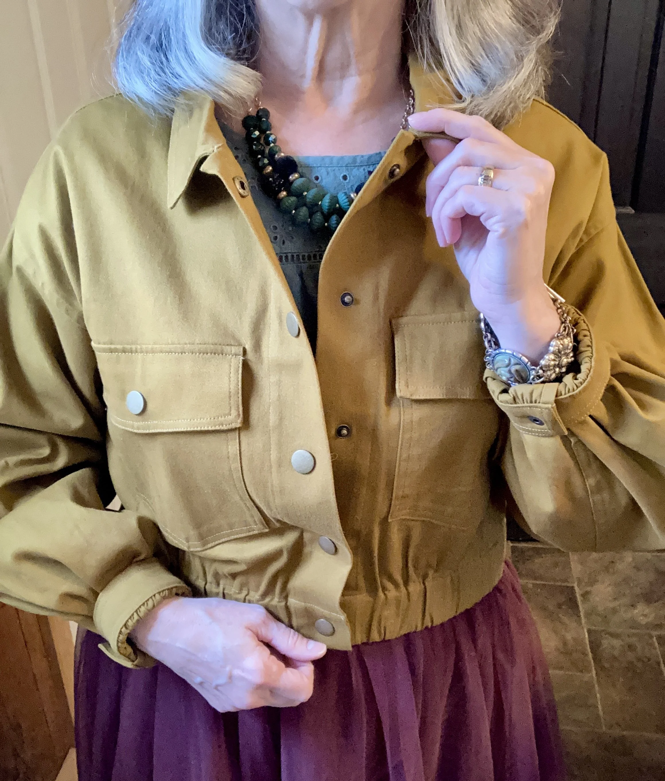
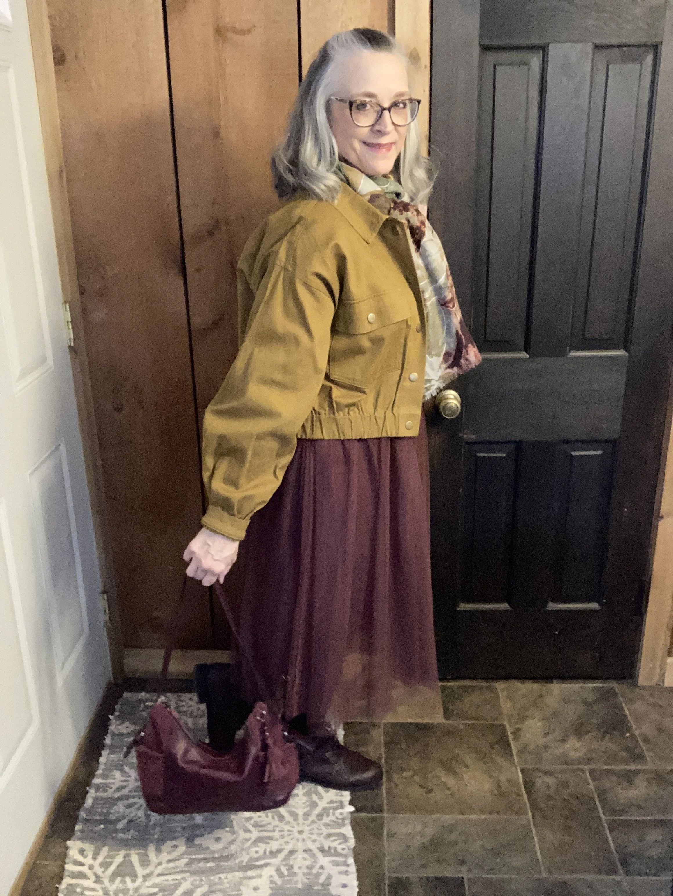
My faux leather moto jacket is an older Christopher and Banks piece. I like that it is simple, light weight and it has stretchy cloth panels on both sides and along the backs of the sleeves. They no longer seem to make these types of jackets, but always keep an eye out at thrift stores. In addition, real leather is always more suitable for longer wear and tear. Be sure to check out the Jacket Maker website for quality leather pieces at more reasonable prices.

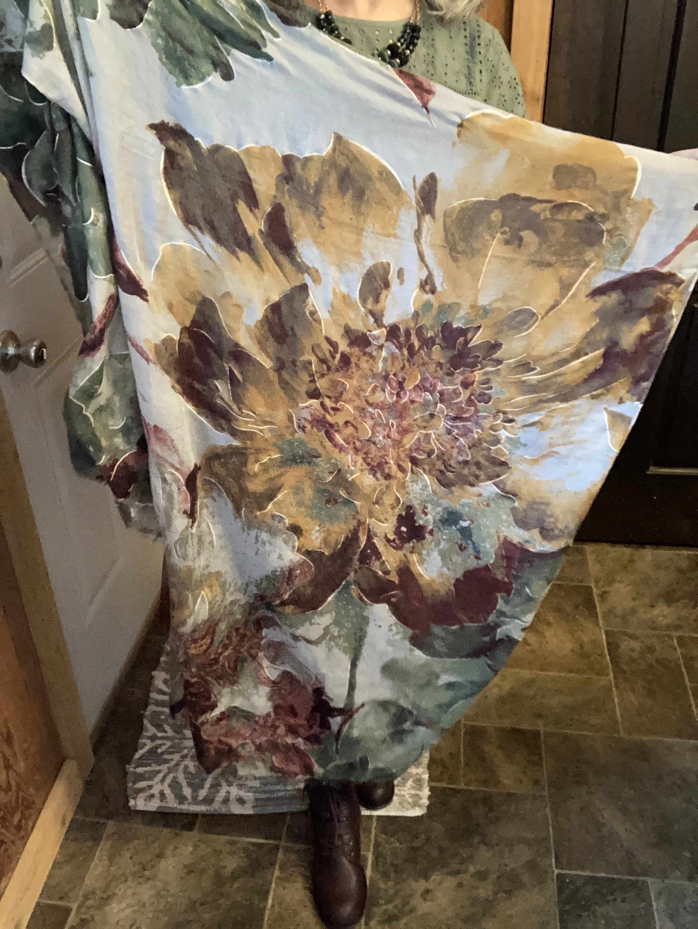
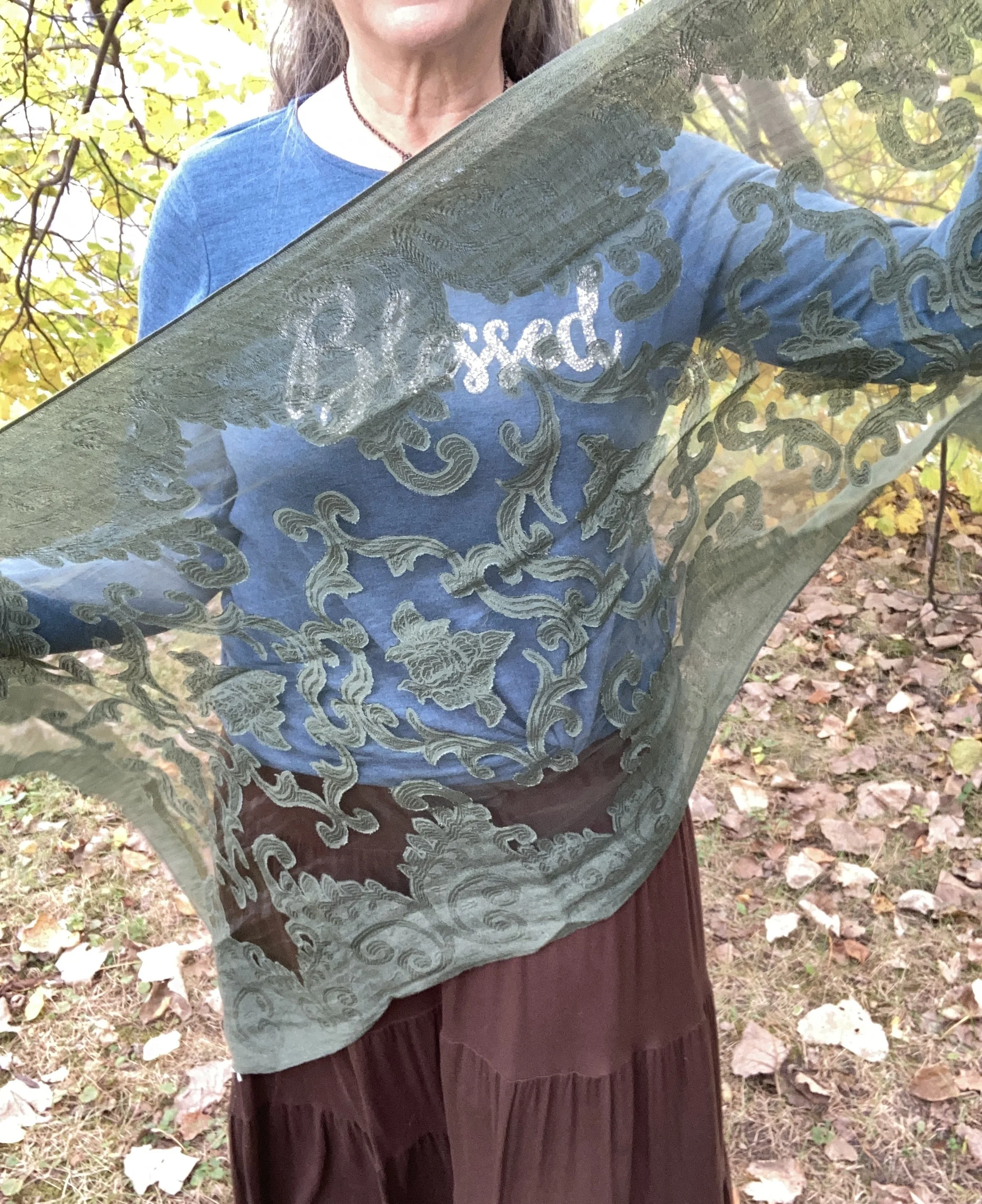
I added this thrifted green scarf, because fall is always a good time for a scarf! This was a fun find as I didn’t have too many green scarves and I love the delicate look of it.

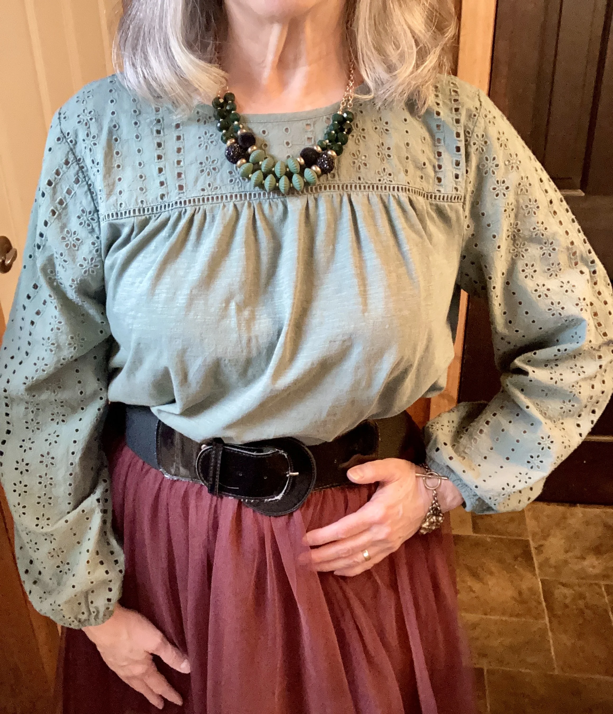
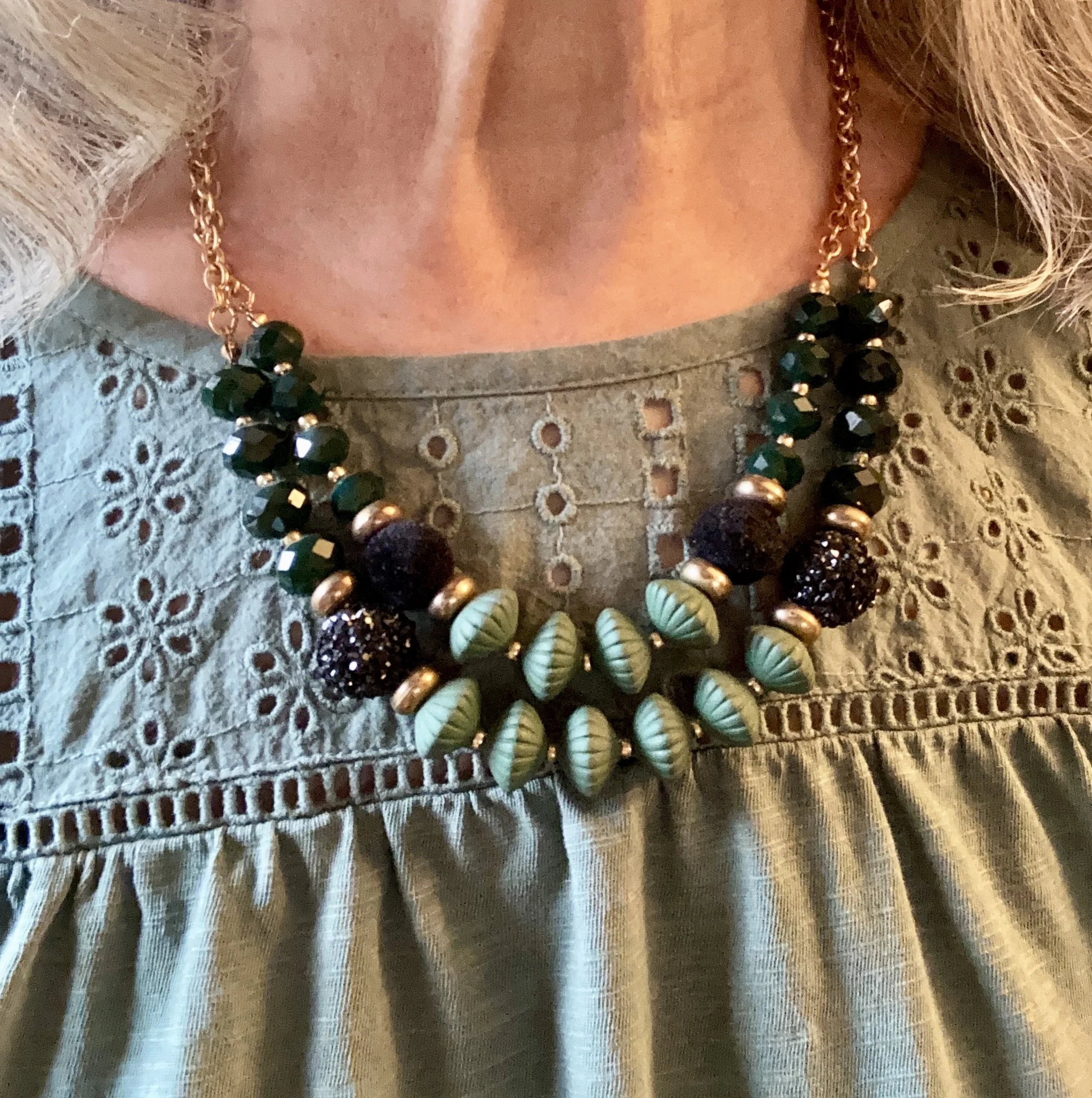
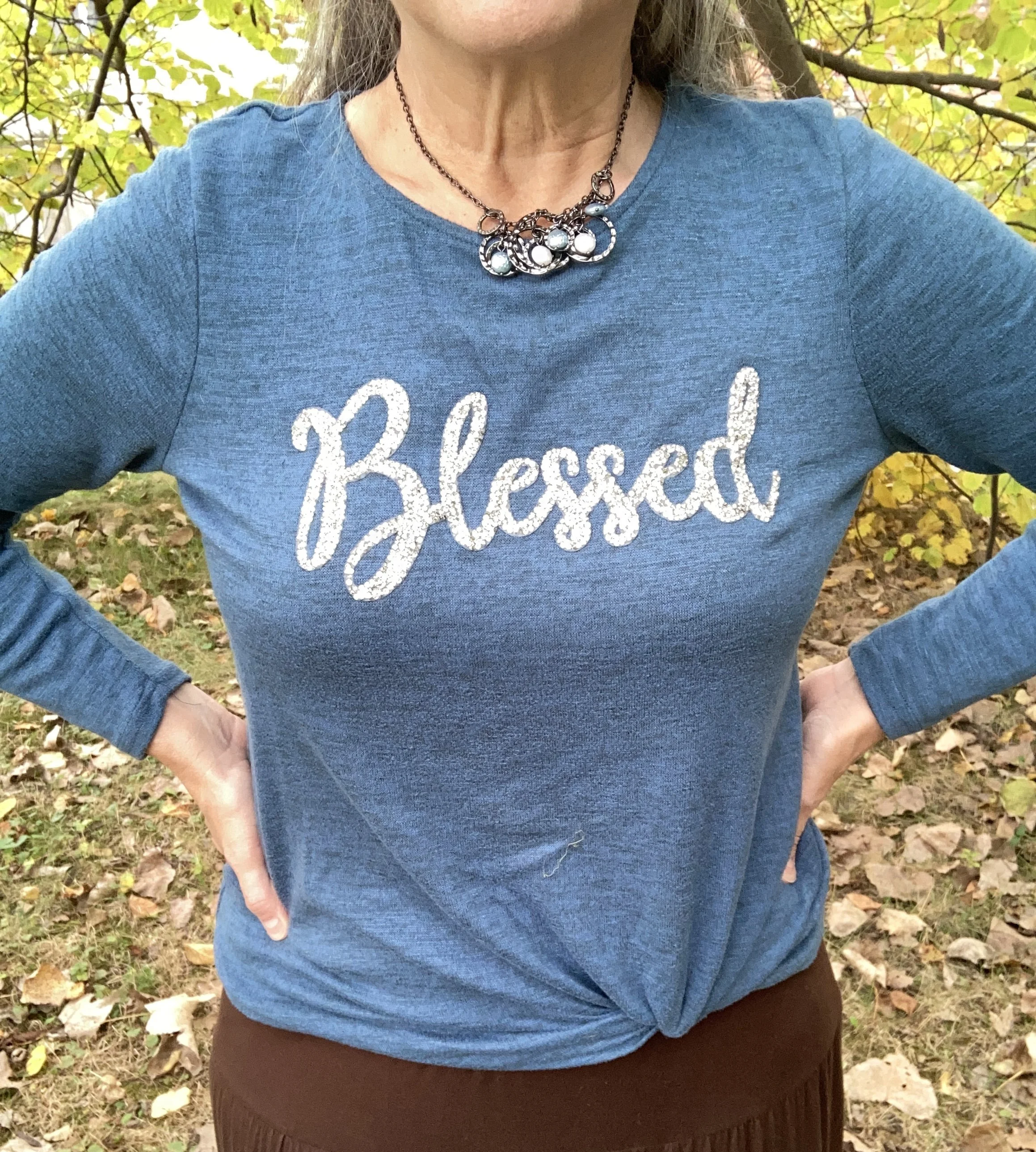
I was also dressing for an Instagram challenge today and the theme had to do with bling. This cute joei & iBlessed” top was a gift from my oldest a few years ago and I do love it. It is the perfect weight for a cool fall day, and the sparkle makes it top notch in my book. You can also see the necklace I added. One can never have too many accessories on at one time, right? Ha, ha. In reality, if this was a work outfit, I would most likely take the jacket and scarf off while at the office, so the necklace works.

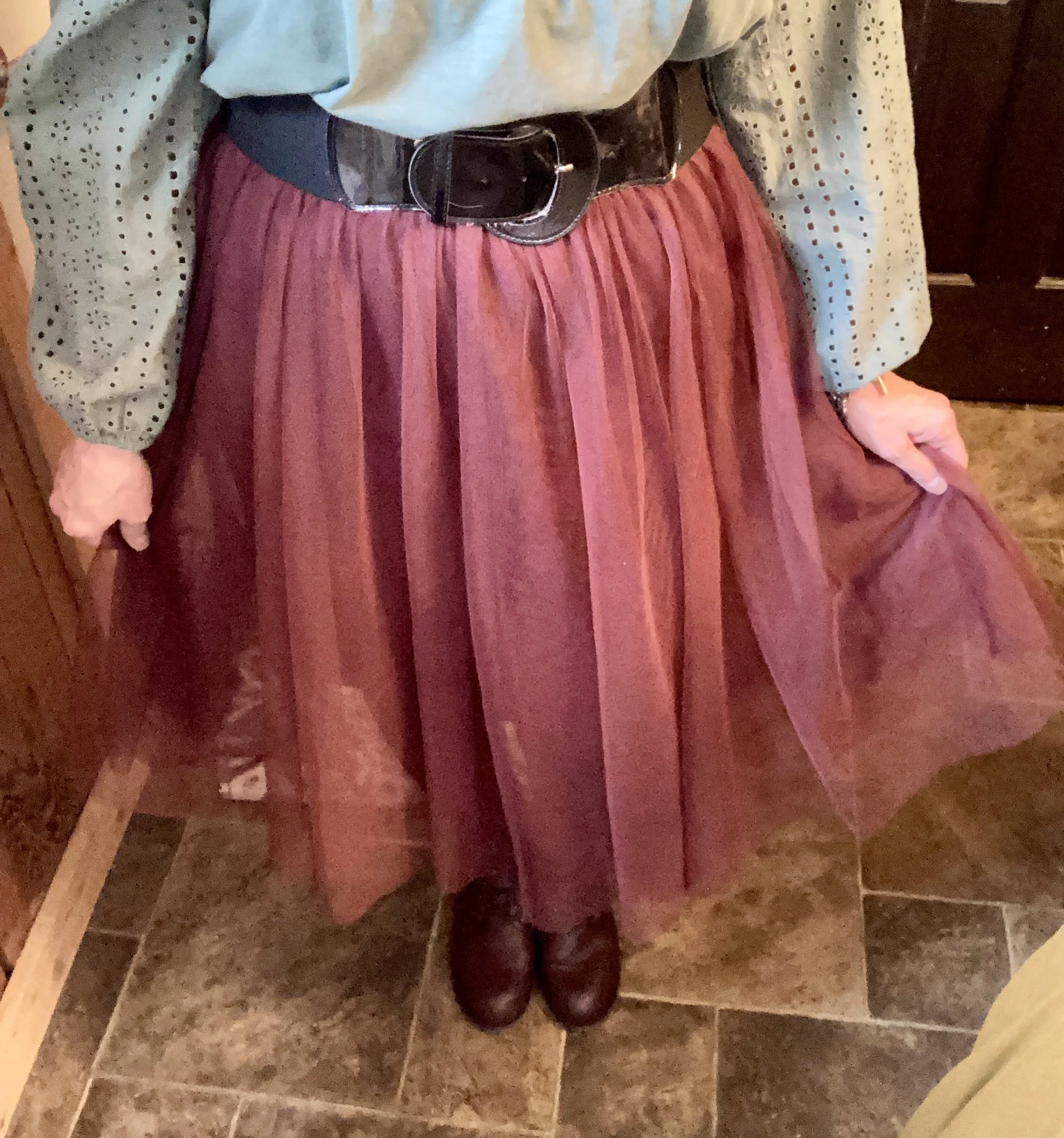
I have worn this skirt multiple times on the blog. It is St. John’s Bay brand and was purchased from JCPenney a number of years ago. You can see this skirt paired with a spotted tee, a bookish vest, and more recently a fringe vest.

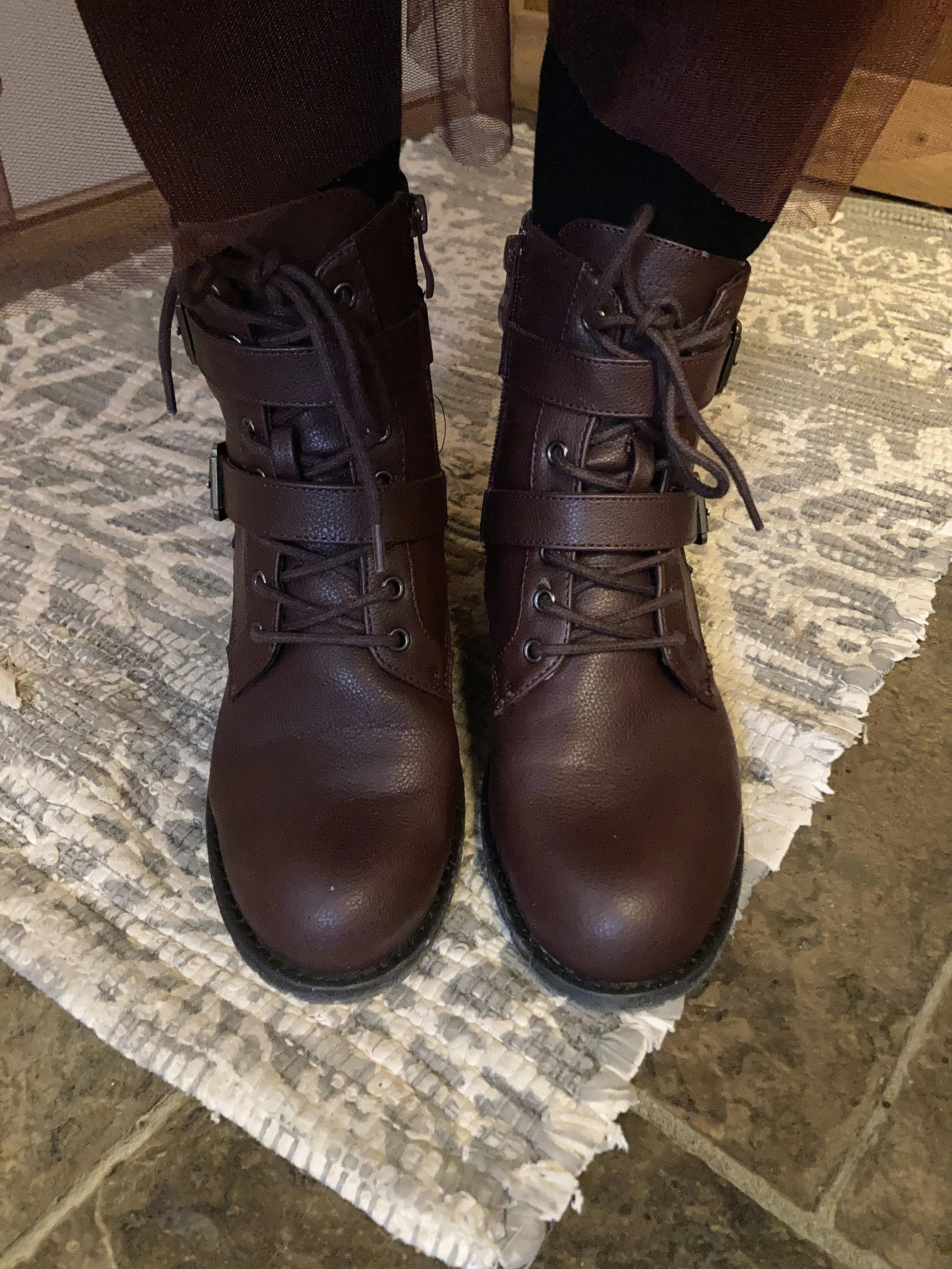
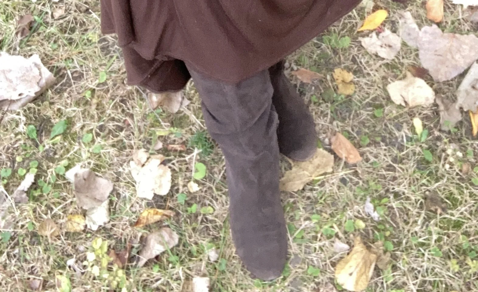
My boots are second hand old, but they are real suede, so with a little TLC I will keep them indefinitely. They are a brand called Kelly & Katie.

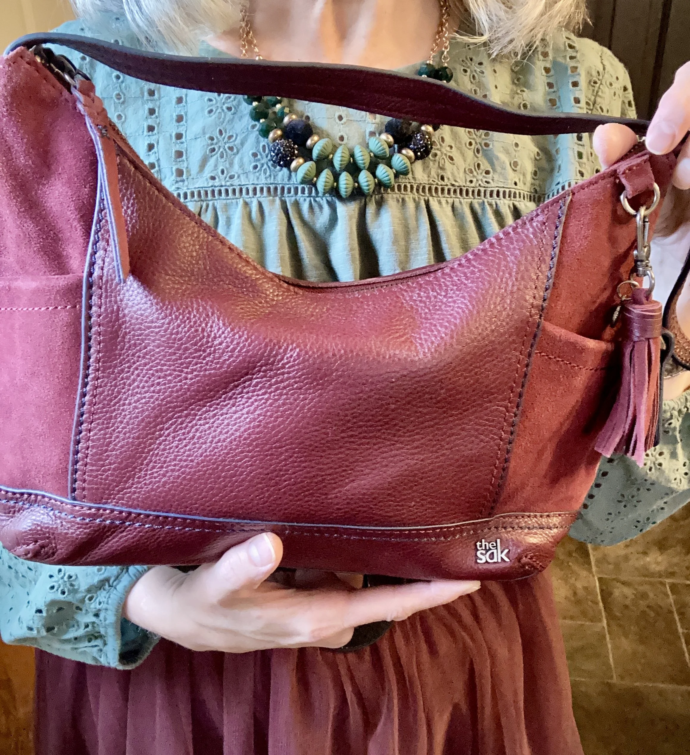
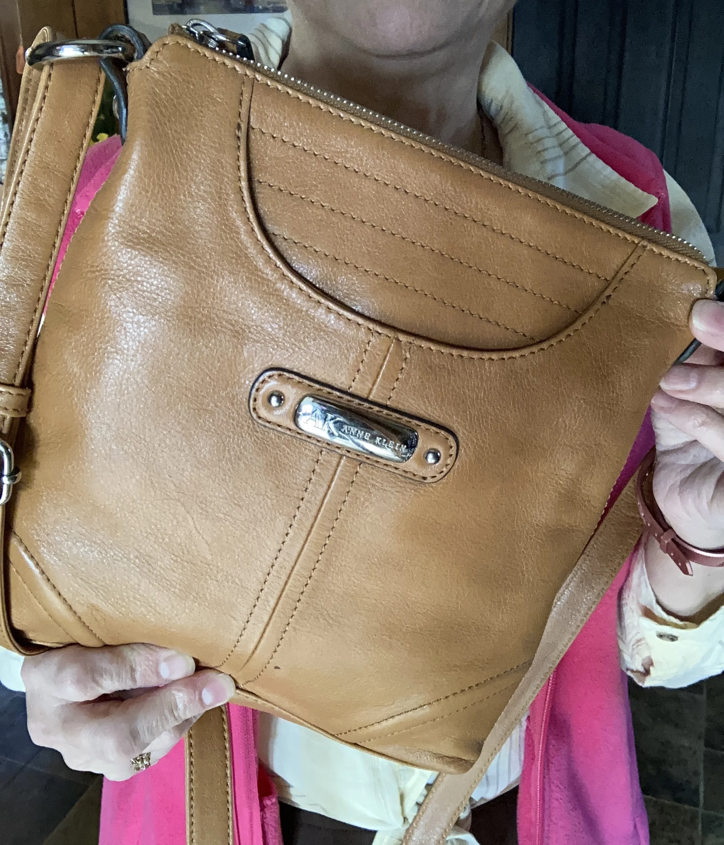
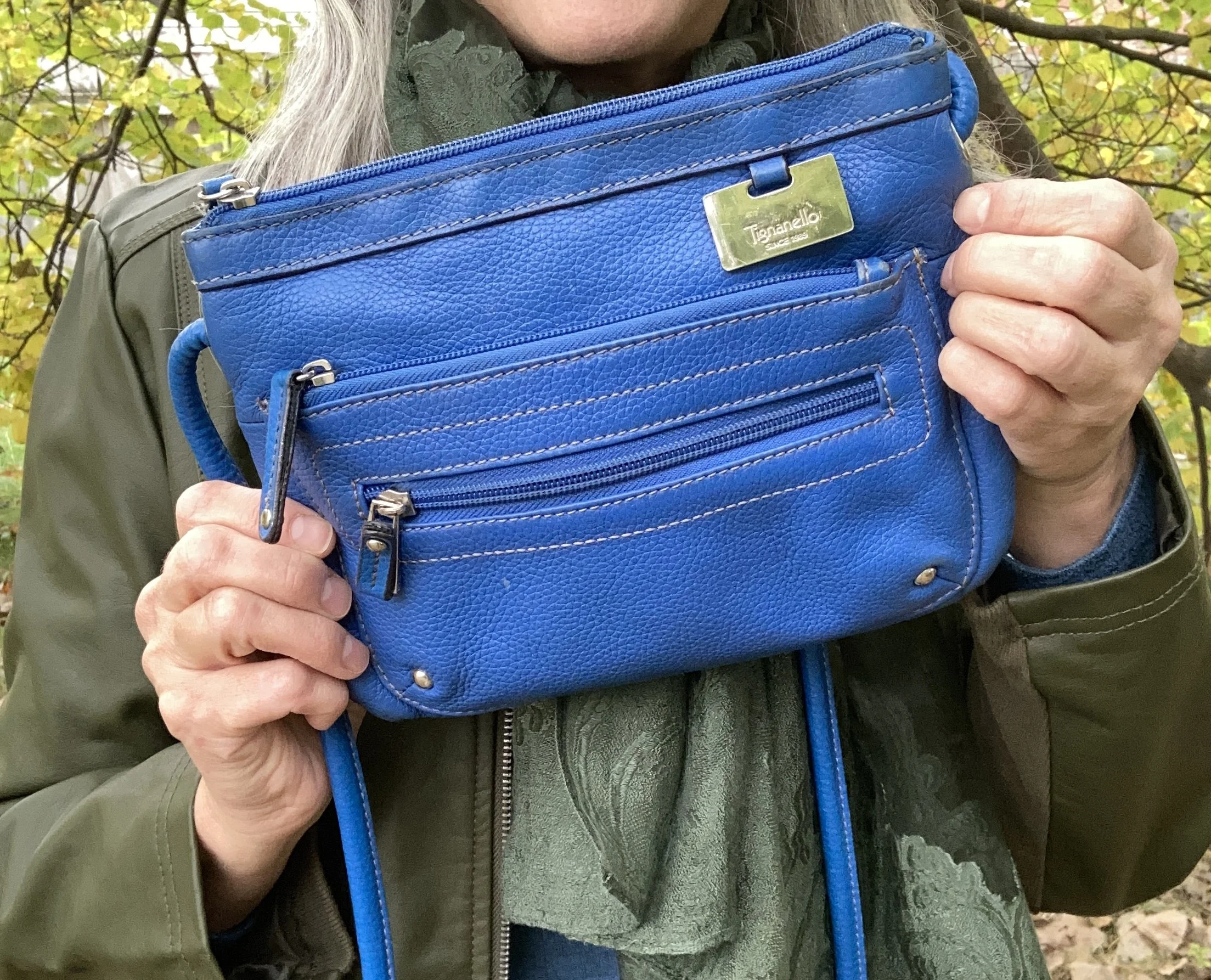
My blue cross body bag is thrifted Tignanello brand.

Do you think these colors work well together? What colors from the Pinterest Autumn palette did you like best? Please leave a comment or two. I appreciate your input.

I’m including a few shopping links for block heeled boots, tiered skirts and faux leather moto jackets. These are affiliate links brought to you at no extra cost. All opinions are my own.

I hope you are having a great week!

Color Play: Pantone Autumn/Winter 2024 - Golden Palm, Lucent White and Raw Umber

I have decided to revisit the Pantone Color series that I have done in the past. You know how I love color and trying new ways of combining colors in outfits that not only stand out, but that make us feel comfortable and confident. I am going to start with the New York Palette, after which I will decide if I am going to continue with the London Palette or move on to other things.

If you are not familiar with the Pantone Color Institute, they are “recognized globally as a leading source of color expertise.” (Pantone home page.) They work across many disciplines and areas to provide color inspiration and education. The fashion industry is just one of many areas where Pantone has input. Every year they typically post two seasonal color palettes, one for Spring/Summer and one for Autumn/Winter. These palettes vary between two main fashion centers - New York and London.

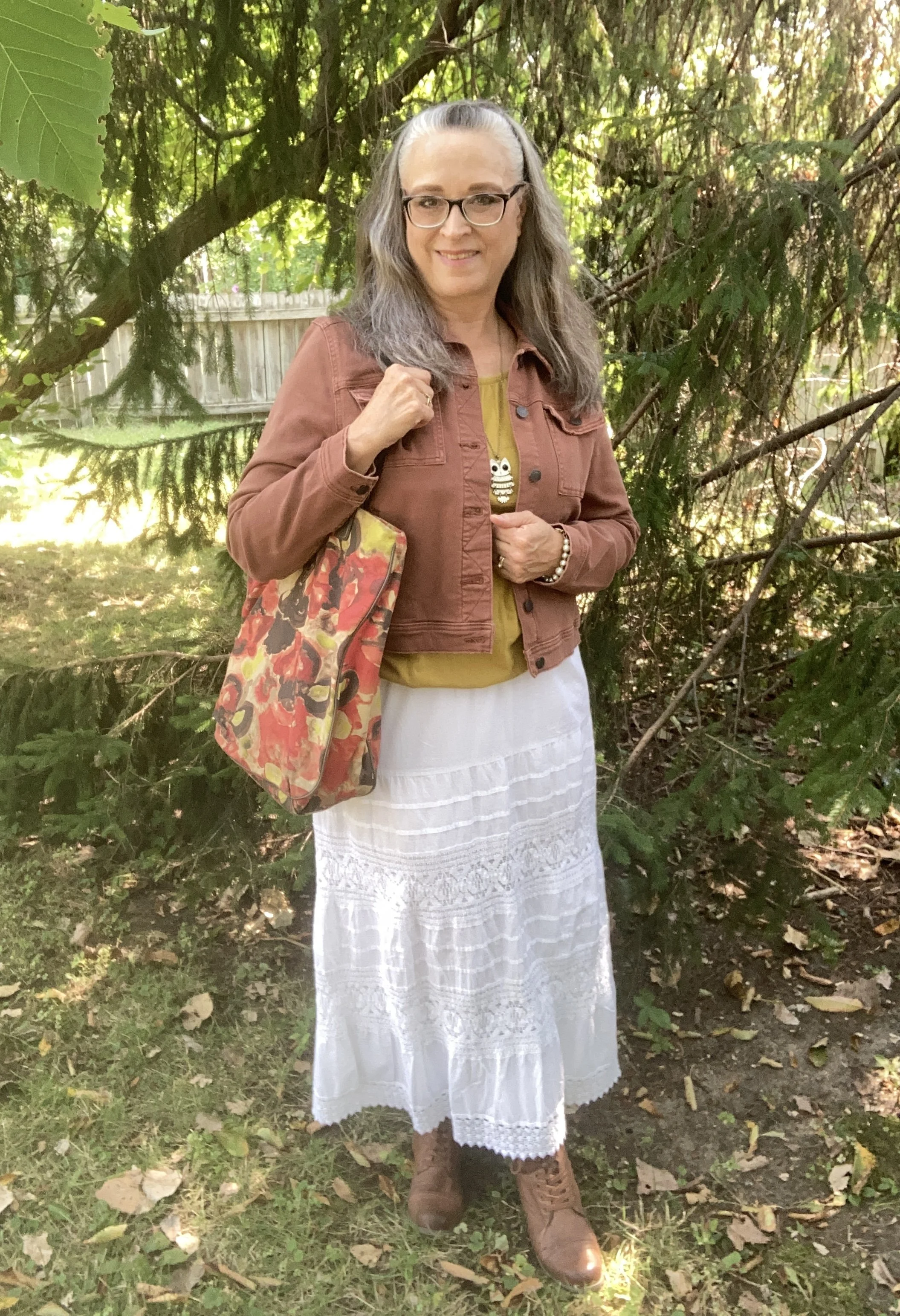
As I have done in the past, I am going to combine three colors in each outfit; two from the main color palette and one from the classics color palette. Today’s outfit revolves around the following colors: Golden Palm, a bright mustardy yellow; Lucent White, a bright, pure white; and Raw Umber, a medium earthy brown.

It always seems to be the case that when I am going to take pictures of fall outfits it is hot and humid! Ha, ha. It was almost 90 when I took these pictures, so if I seem to be glowing that is why.
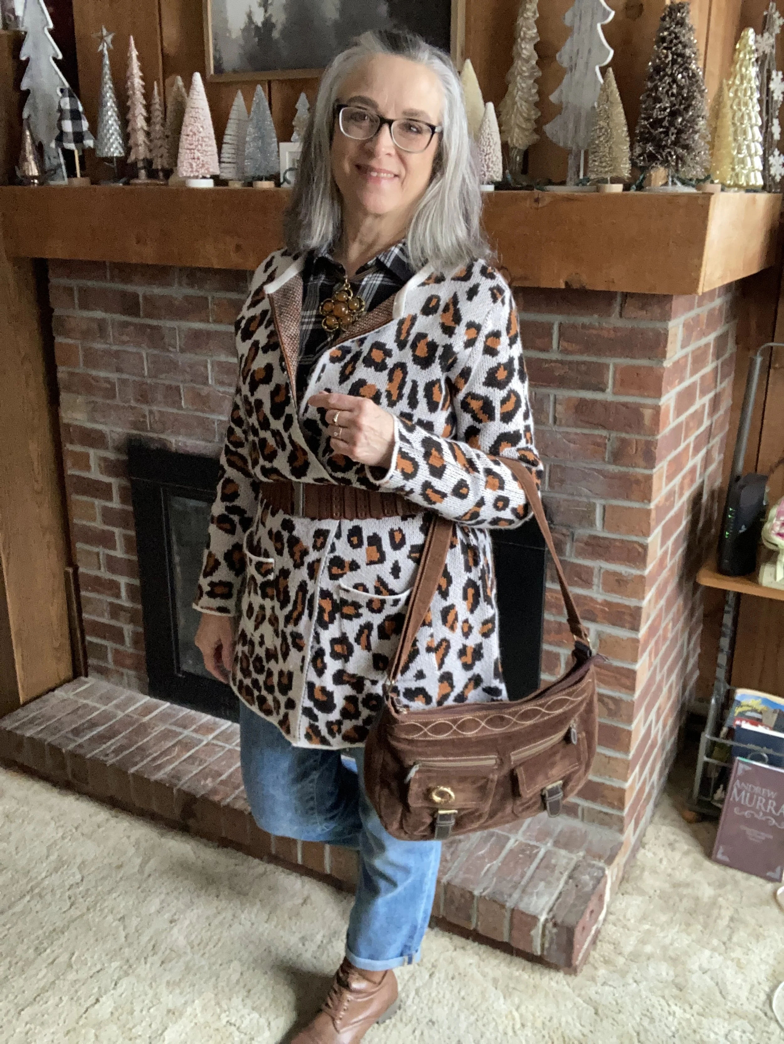
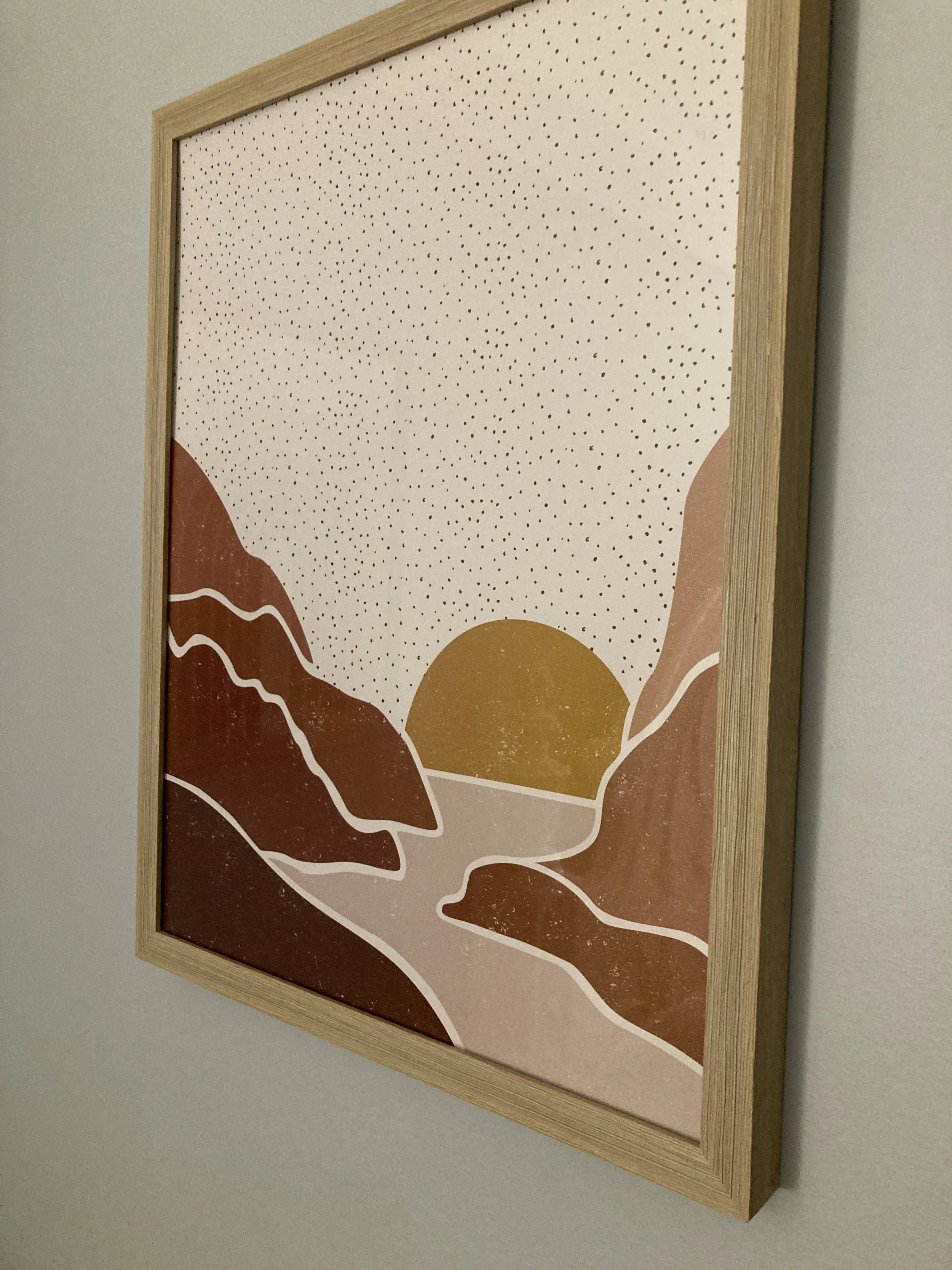
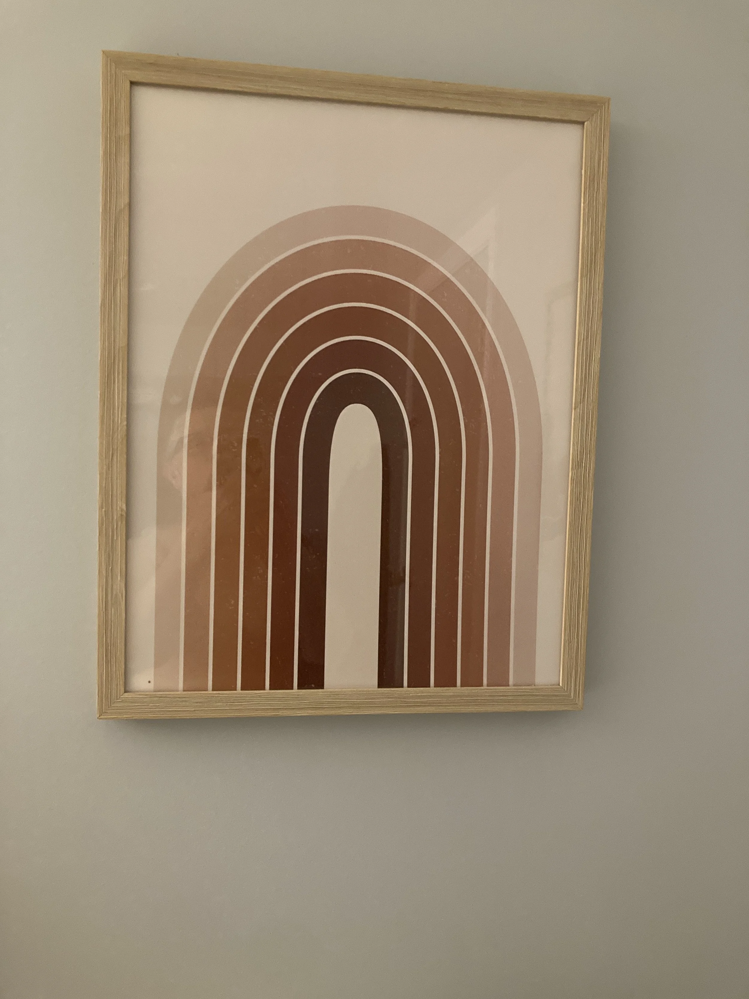
The inspiration for this outfit actually came from a piece of artwork hanging in the little apartment we rented on our last getaway to central Ohio. These two pieces of artwork hung in the bedroom, and so I took a couple of pictures, knowing I would use them for outfit inspiration at some point. How fun that three of the colors were on the Pantone Autumn/Winter 2024 New York Palette!
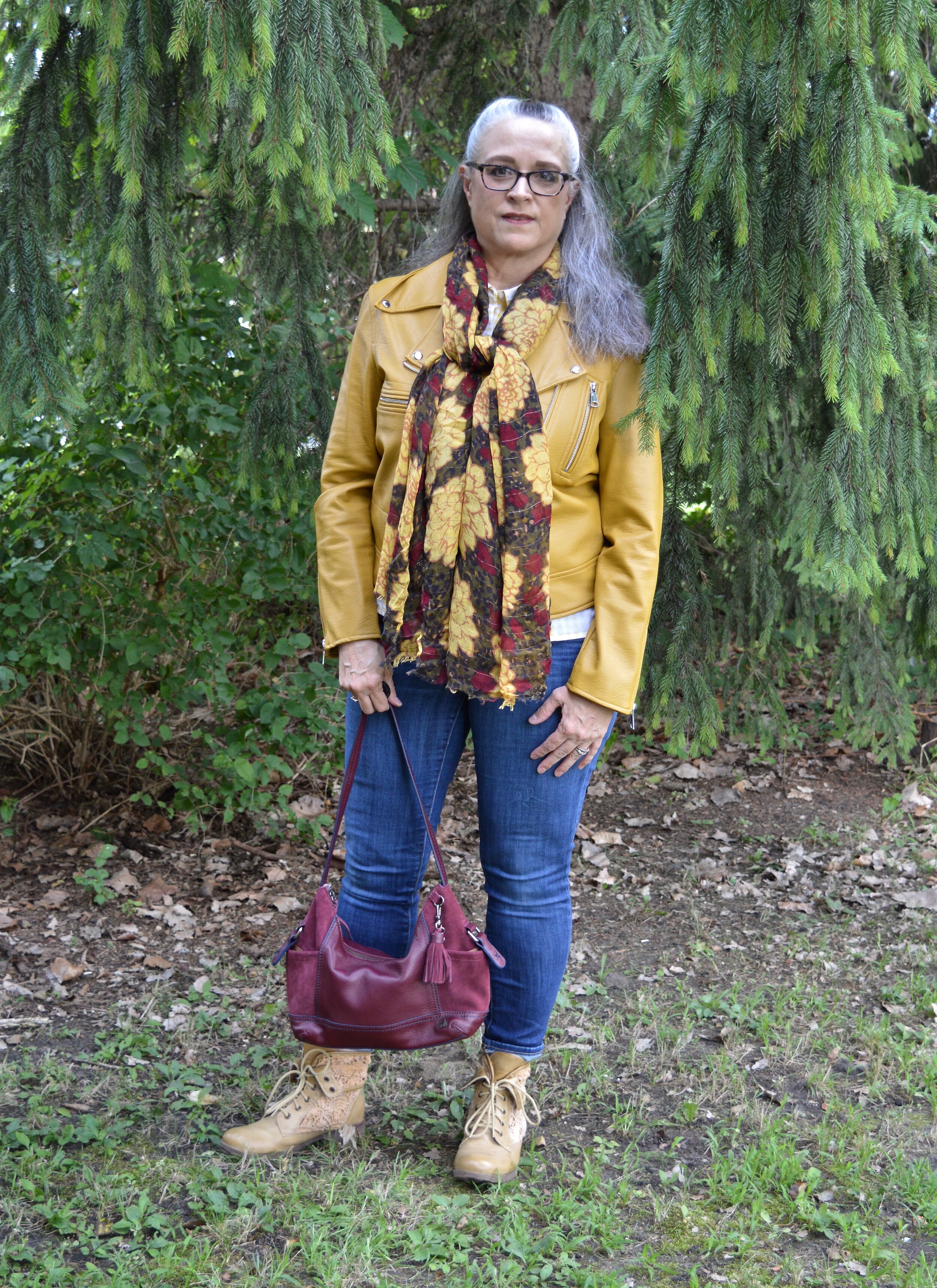
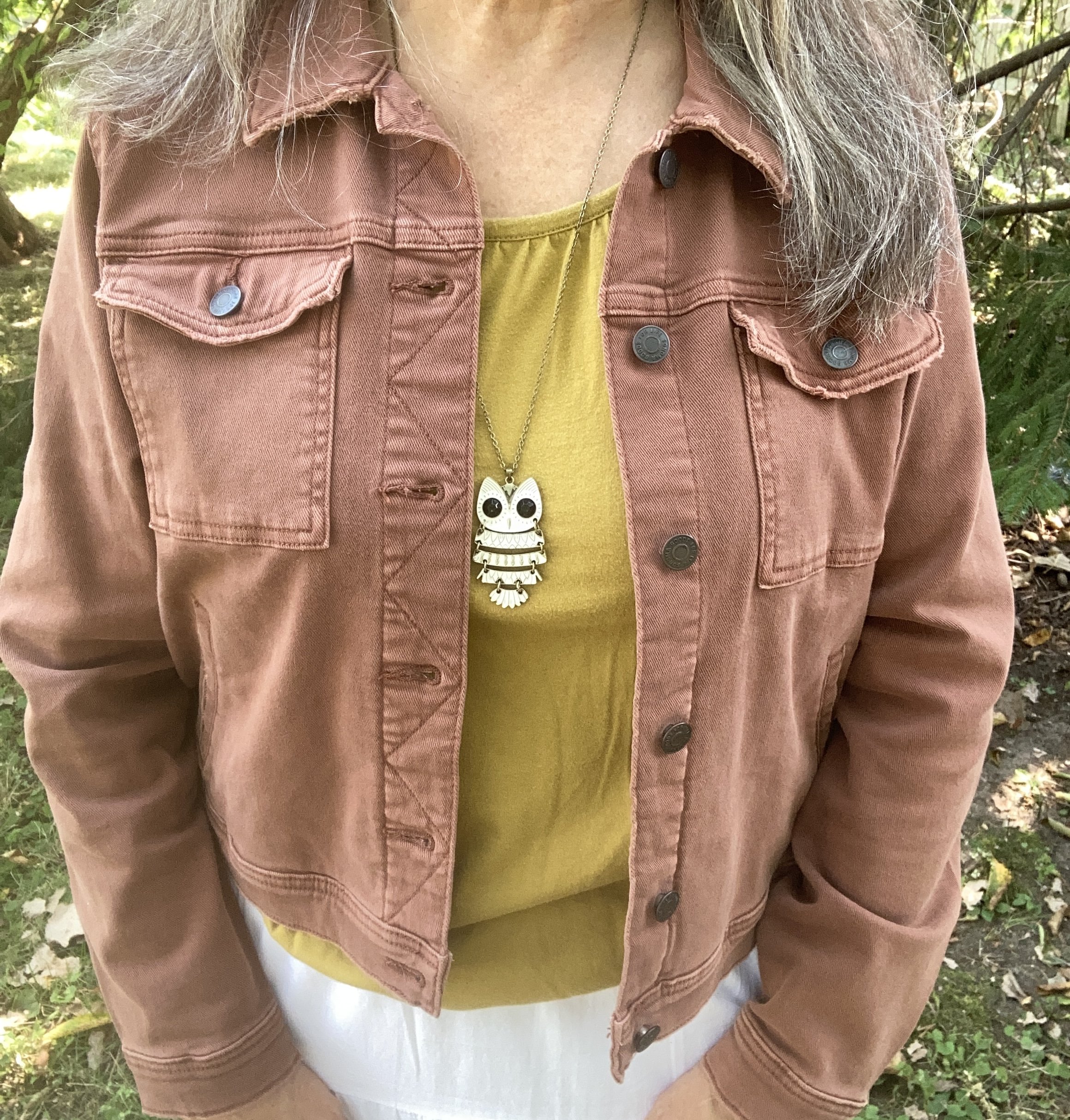
The first piece I chose for this outfit was the Golden Palm Sonoma tee. I have had this for years. A thrifted piece, I have used it in other outfits on the blog. You can see it with a brown cardigan, a snakeskin print skirt, a purple skirt, and an embroidered denim jacket.

This picture also shows you a close up of the jewelry I chose for this look. I thought the white owl, and the pearly gold mix of the bracelets tied in quite well with the skirt.

My Lucent skirt is another piece I have had for a number of years. I love a tiered maxi as it speaks to my inner boho soul. This one is especially fun with its lace and textured details. This is St. John’s Bay from JC Penney. You can see how I styled this on the blog before with a striped tee, a pink striped sweater, a green top and jacket, and a brown moto jacket.

My cropped, Raw Umber, denim jacket is a newer piece. I bought this last year from Kohl’s and it is Sonoma brand.

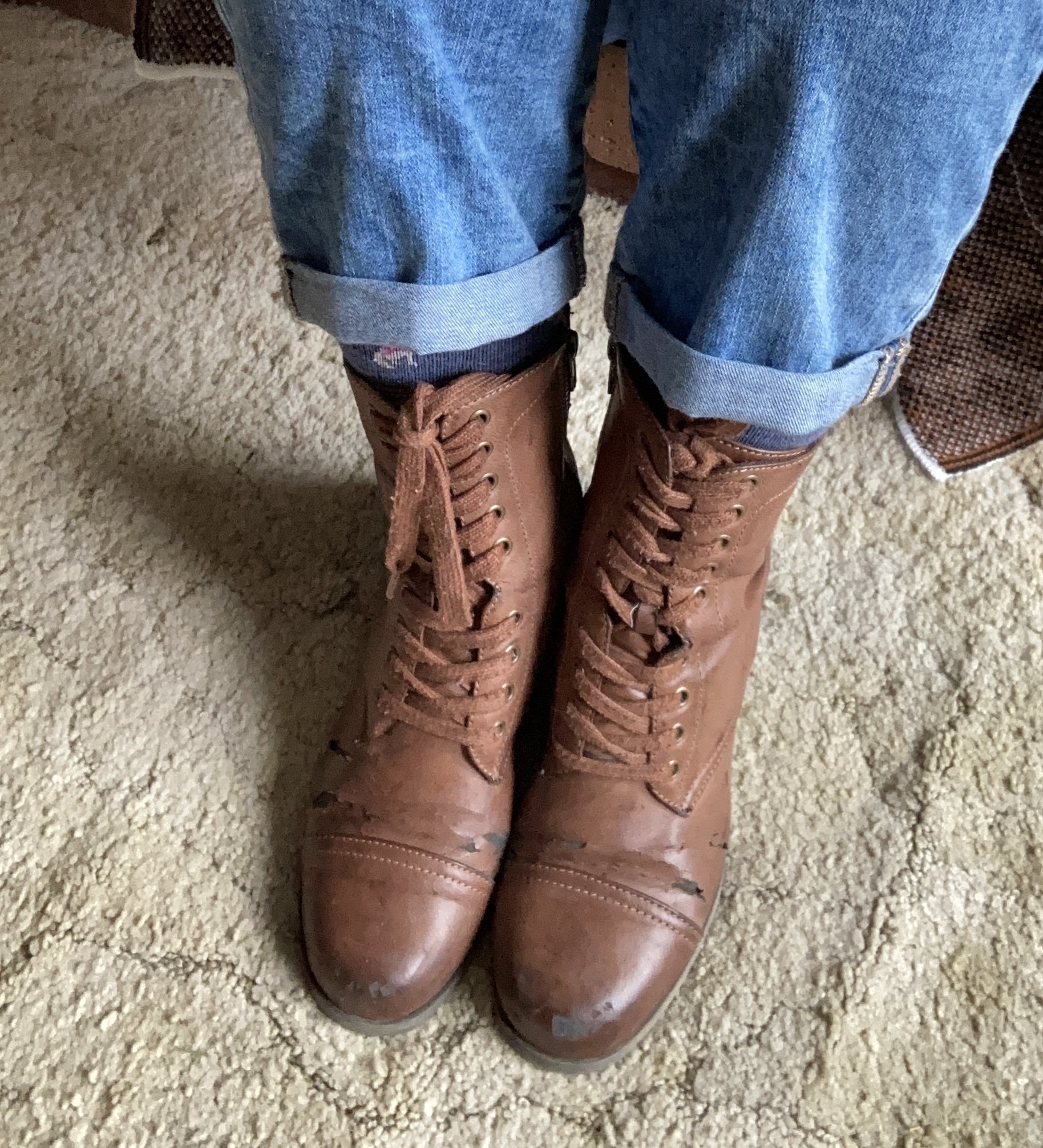
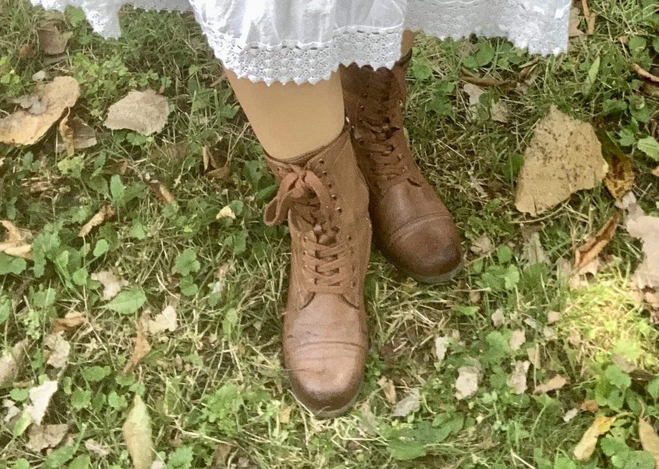
For my accessories, besides my white jewelry, I chose my colorful, fall-ish tote bag. This is a Simply Vera, by Vera Wang piece that I found on clearance at Kohl’s a number of years ago. I also added my thrifted brown combat boots.

What do you think of Golden Palm, Lucent White and Raw Umber? Do you have any of these colors in your closet? What other colors do you think any of these would look good with? Let me know your thoughts in the comments. I always enjoy hearing from you!

I am providing a few shopping links for similar items. These shopping links are brought to you at no additional cost. These affiliate links which when purchased through a link gives me a few cents as a commission. All opinions are my own.

Color Play - Red and Orange Cream

As you know, the reason I like to play with color is to force myself to get out of my own preconceived box regarding color combinations. Most of us are familiar and comfortable with combinations like navy with white in the summer, or rust with yellow in the fall. We tend to stay away from those combinations that look like restaurant decor - think yellow and red (McDonalds), or team colors - yellow and green (Green Bay Packers), unless we are putting on our work uniform or going to a football game. However, I like the challenge of finding different or unusual color combinations allowing me to make better use of the clothing I already have in my closet.

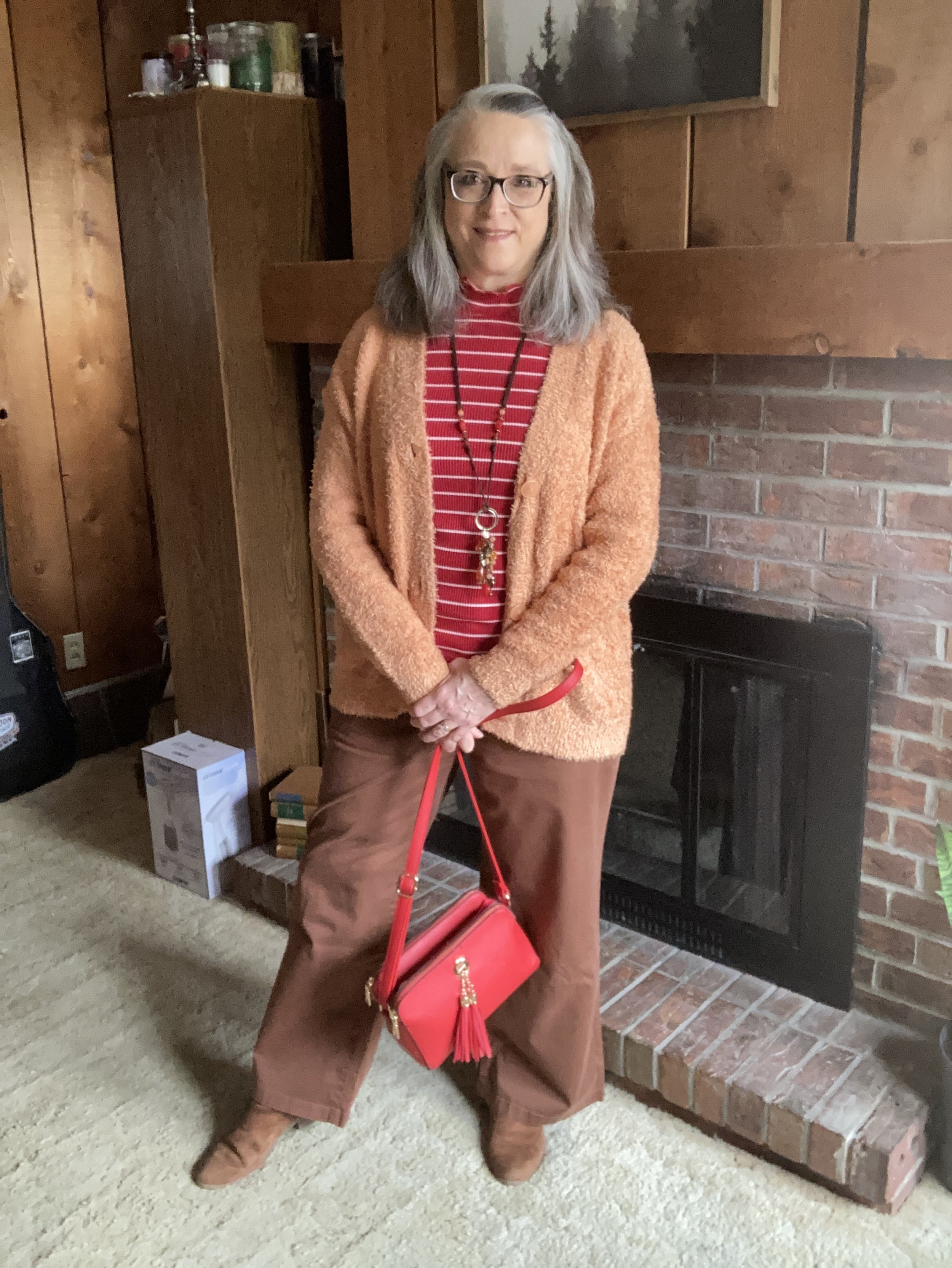
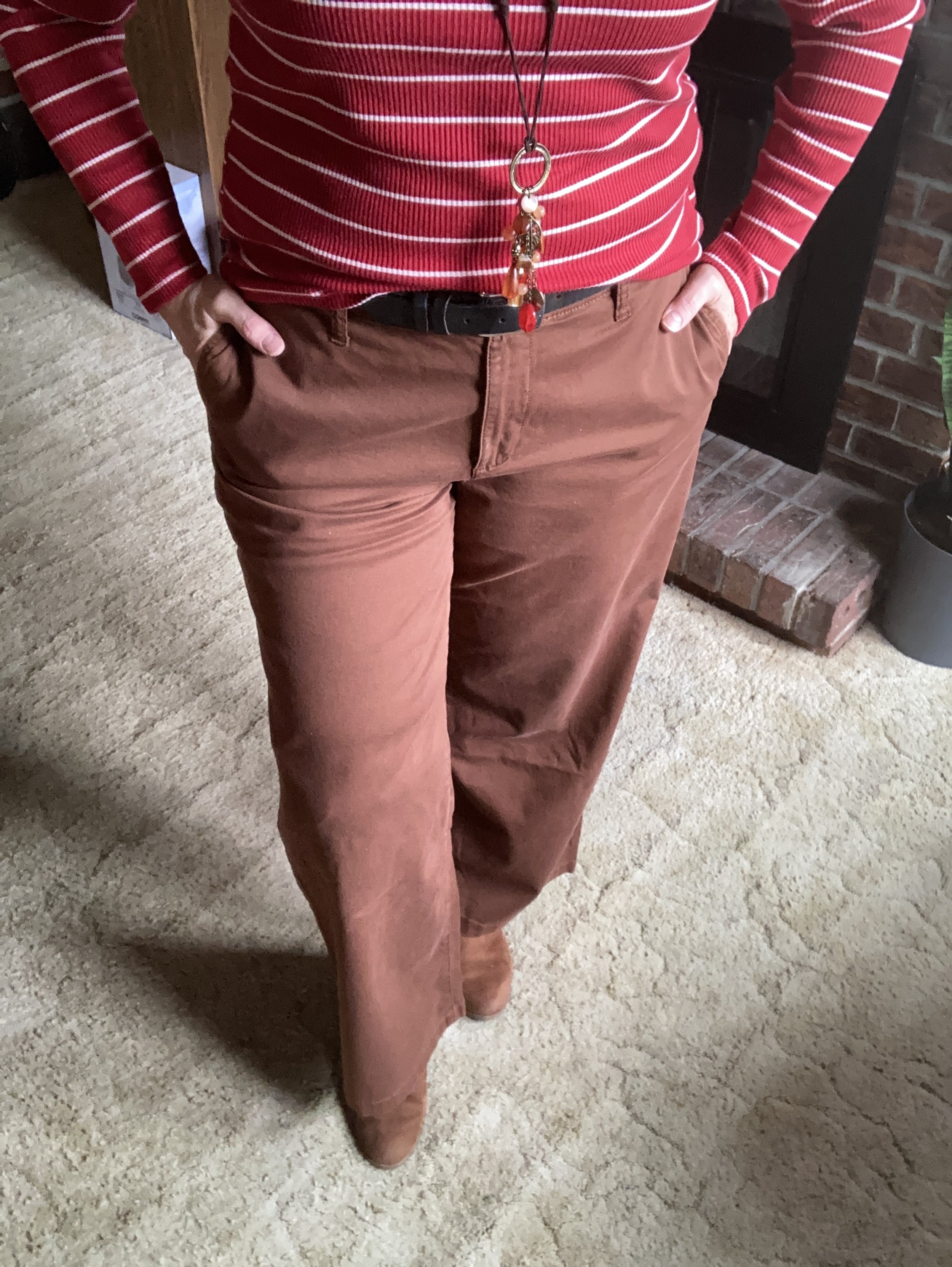
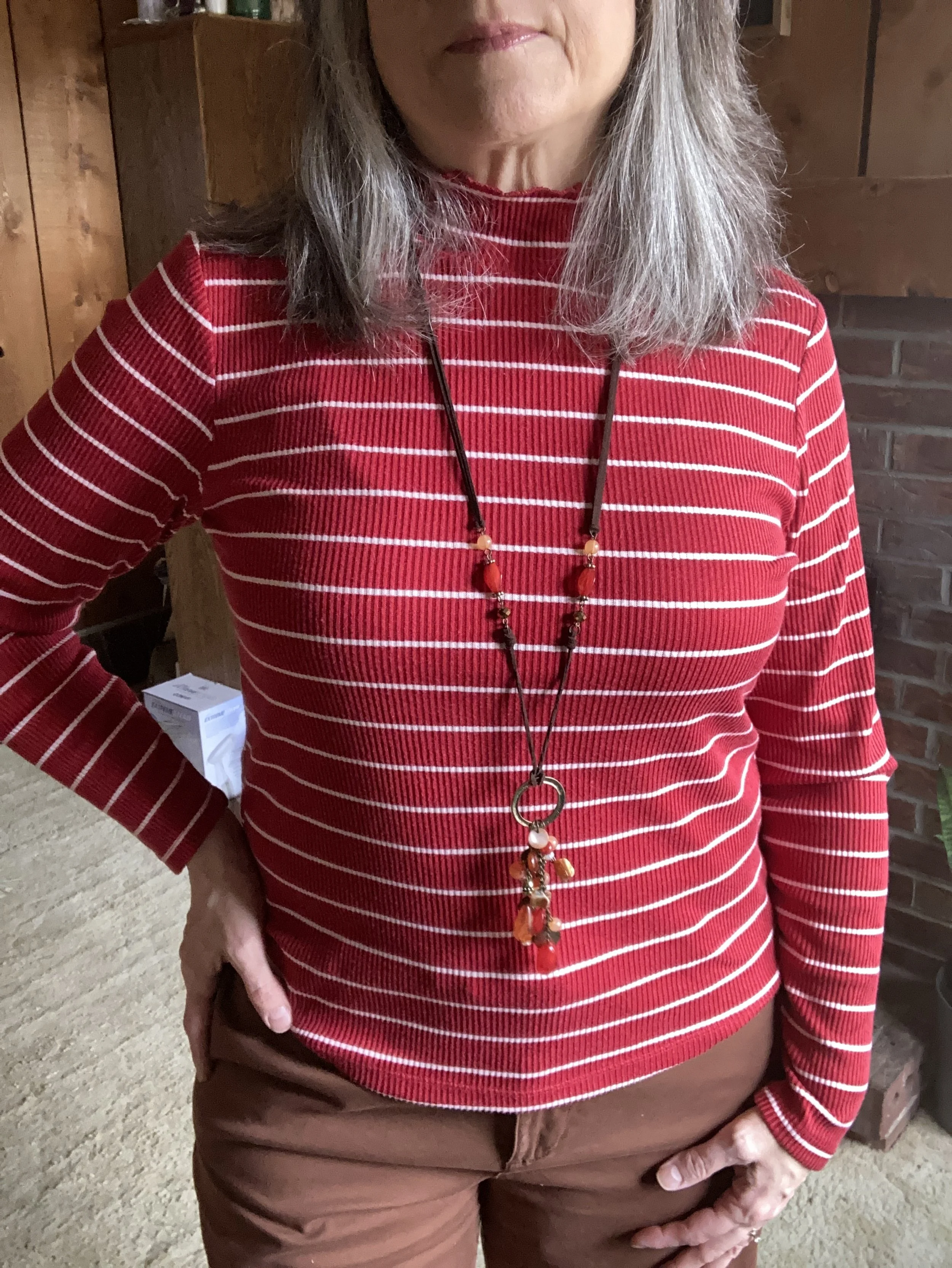
Today’s outfit revolves around two new pieces I got in the last month: a red and white striped top and a creamy light orange eyelash cardigan.

I pulled out my thrifted St. John’s Bay wide leg pants. The only reason I chose these was so I could wear my knee brace without it being seen. Ha, ha. But I actually like the way the outfit turned out. Wide legs seemed to have jumped off the trend-go-round until next time, but that is no reason to get rid of them, if you have a pair. Every once in a while it is nice to wear something outside the trend box, just because it is comfortable and the right color.

My bright red striped mock turtleneck tee is from Maurices and was another great deal. I love stripes anyway. I have a few tops that are white with red stripes, but when I saw this red with skinny white stripes, I grabbed it. It is very soft and comfortable.

I also added a long pendant necklace with reds for a bit of fun.

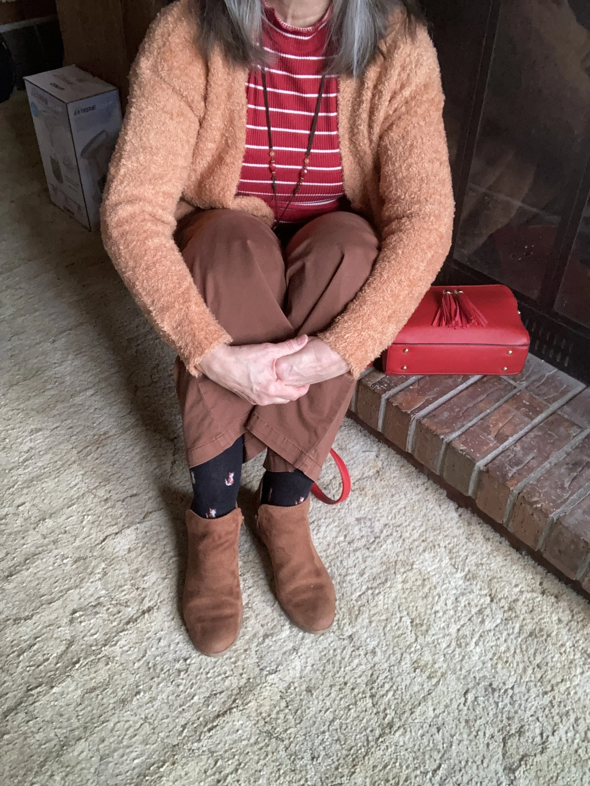
This wonderfully fuzzy chenille eyelash sweater is the bomb. I love the fun texture and the luxurious softness of the knit. It is also extra cozy, so I have a feeling it will be popping up here and there throughout the chaotic weather of spring. I found this on the clearance rack at our local Meijer.

I used my red top handle bag again for the Valentine’s red color and added my SO ankle boots which matched my pants fairly well. However, silly me, didn’t think to put on my brown socks…ha, ha. Oh well, the little foxes match quite well.

Style Tip: To make your legs look longer and leaner match your shoe to your pants (and your socks :)). You can get the same effect with tights and boots of the same color.

What do you think of this color combination? I think it is fun and different, but not so different that it doesn’t work. Let me know what you think by leaving me some love in the comments.

I am including a few shopping links for you to look over. These are affiliate links, but all opinions are my own. These are provided for your benefit and do not cost you anything to click on.

Have a wonderful Tuesday!

Fall Trends 2022 - My Take: Outfit 3

For today’s look I am combining the Fall 2022 trends of a fitted vest, feminine sheer top, floor length maxi skirt, and western style boot into a trendy boho style outfit. Let me know what you think at the end and whether you think I pulled it off.

When I first started putting this outfit together I originally had a black pleated type skirt, but I got to thinking I wanted something that gave the look a more boho vibe, and there is nothing like a tiered skirt and a fringe bag to add that element. This brown skirt, has been in my closet for a while. You can see how I styled it before with a dot print shirt. It is St. John’s Bay brand and I got it from JCPenney.

I’ve styled this Manteau gold dot blouse from Macy’s on the blog before. You can see it styled with jeans, and with a leopard print blazer. Sheer is in, and while I appreciate a pretty sheer blouse with the appropriate coverage underneath, I do not feel the sheer outfits I have seen on the runways and the celebrity news photos are justified, practical or modest. Ladies, please show a little respect for yourself and leave something to the imagination.

My Cabin Creek vest was thrifted and it really is too big. However, once in a while a piece is just worth the problems. How could a book nerd, writer like myself say no to this fun piece? I am going to try to make some adjustments to it, so it fits a little better.

This fun Mossimo fringe bucket bag has made multiple appearances on the blog. Here it is with a navy blazer and jeans, an olive utility vest and pink sweater, a burgundy dress. a burgundy pleated skirt, a grey city scape cardigan, and a floral pleated skirt.

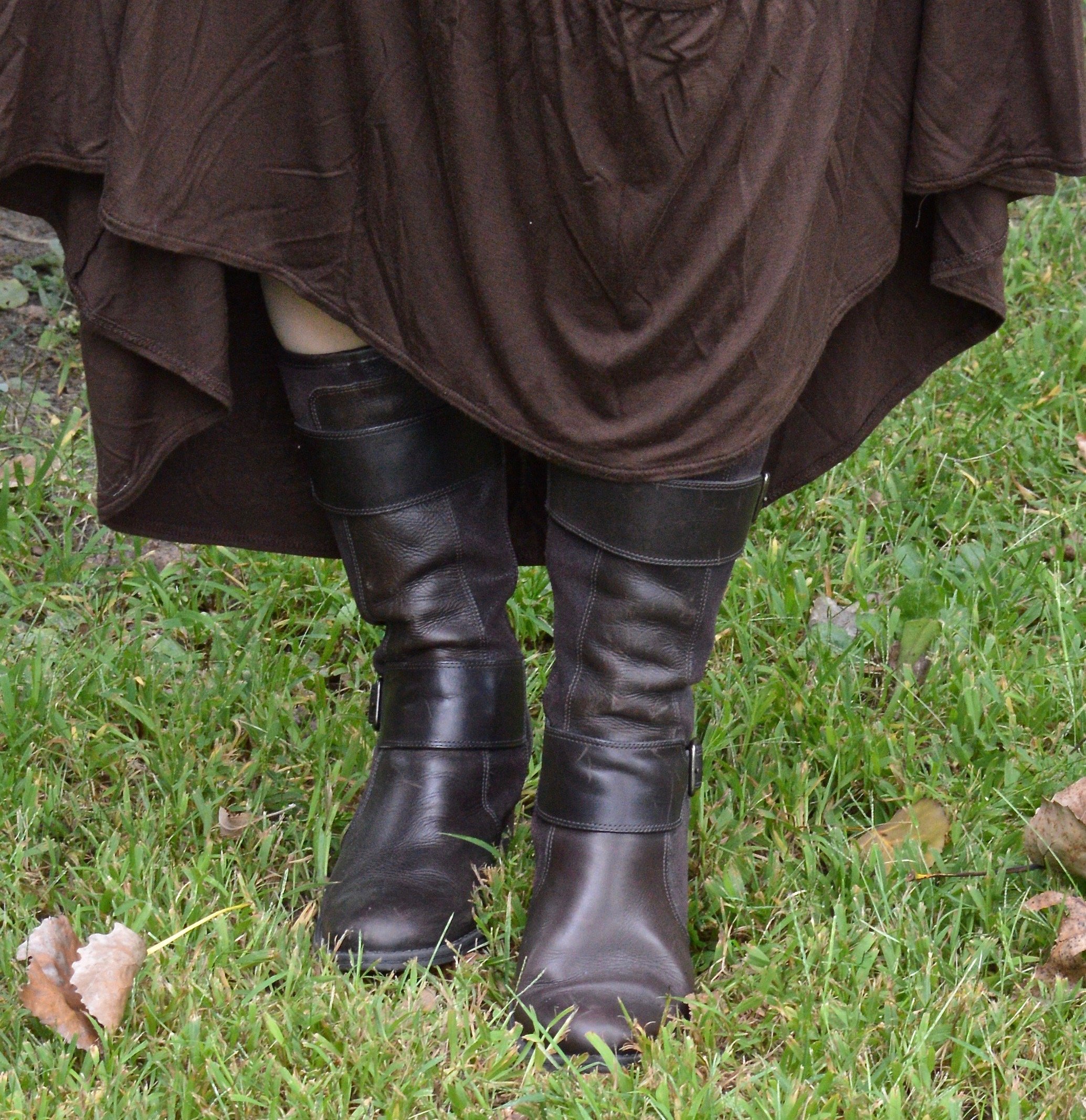
These thrifted boots are not truly Western gear, but they have just a little bit of that vibe and apparently Western is also trending this fall. These lovely leather boots were made in Brazil and are a brand called Nurture. Apparently this brand is no longer viable, but you can find the brand second hand on Ebay, and on Poshmark.

What do you think of this outfit? Do you like longer maxi skirts? Do you like button down vests? I love hearing your thoughts, so leave me a comment or two.

I’m including a few shopping links for you. These particular styles might be better found in thrift stores or shops like Poshmark, Ebay or Facebook Marketplace. These are affiliate links. All opinions are my own.

Have a great week.


Thinking About Fall - Transitional Style - Button Down Short Sleeve Top

I hope those of you who have subscribed to my blog are content with what I have been posting lately. I have fallen into a rhythm of only posting twice a week, but for now that is the best I can do. Real life is never as pretty as it looks on a blog post or Instagram. Real life is messy and often requires more of our energy and time than we have to give. That being said, I want you to know, I am trying to bring you content that goes along with the seasons and what is going on in the fashion world, as well as to encourage you in your faith. I will probably spend a few more weeks on these transitional looks and then I hope to start that infamous Pantone series. Ha, ha. Stay tuned.

DSC_0028.jpg

Last week, I took myself on a little shopping trip. I went to two stores, Kohl’s and JC Penney. These have long been my go to’s when I am looking for new items. In my town, these two stores are only a few blocks apart, making it even easier to justify stopping at both. As you know by now, I shop the clearance racks and I really found some great pieces, including this yellow and white gingham, St. John’s Bay button down. I actually purchased these in two different prints, the other being a blue, yellow and white mini floral.

The thing I like about these is the light weight cotton material, which is perfect for these hot summer days, and the high-low square hem. You can see that better in the picture below. This makes it easy to wear the top out, like I did in this outfit, or you could tuck it in for a more polished look.

DSC_0033.jpg

To keep my look light and cool, I accessorized with light, neutral colors and added a bracelet as my only piece of jewelry. My bag is from a few summers ago and is Sonoma brand. A woven bag is always a great summer piece. My off white sneakers were thrifted and they are Mossimo brand.

DSC_0034.jpg
DSC_0032.jpg
DSC_0035.jpg

To make the outfit ready for cool weather, I made a few simple adjustments. I added a fun yellow moto jacket that I ordered from Kohl’s last year that was on clearance. This is Elizabeth and James brand. I fell in love with the color and it is a heavy, sturdy piece that can be worn as a jacket, not just a show piece.

DSC_0041.jpg

I love this scarf and I think the colors are perfect for fall. The yellow mums, the burgundy splashes and there is also a little bit of an olive leopard print throughout. I should have straightened it out a bit more, since the ends look a but rumpled. My hair looks crazy too, so no worries. Ha, ha.

DSC_0044.jpg

I swapped out my woven bag for a cute burgundy leather and suede shoulder bag my bestie gave me that she found thrifting. I also added my thrifted Rock & Candy by Zigi ankle boots. These are such a fun boot with the lace overlay. One of the reasons I love to thrift is finding fun, unique pieces like these boots.

DSC_0046.jpg
DSC_0043.jpg

Here are the outfits side by side. What do you think? Did I make a good transition to fall? What would you have done differently? I love to hear your thoughts.

I’m including a few shopping links for you to look over. Moto jackets are a great way to take your clothes from one season to the next. They provide an added layer of warmth in the cooler weather and a lighter layer as the temperatures start to warm up in the spring.

These are affiliate links. When you click on a link I get a few cents. All opinions are my own. I appreciate all your support and all your clicks.

Have a great week.

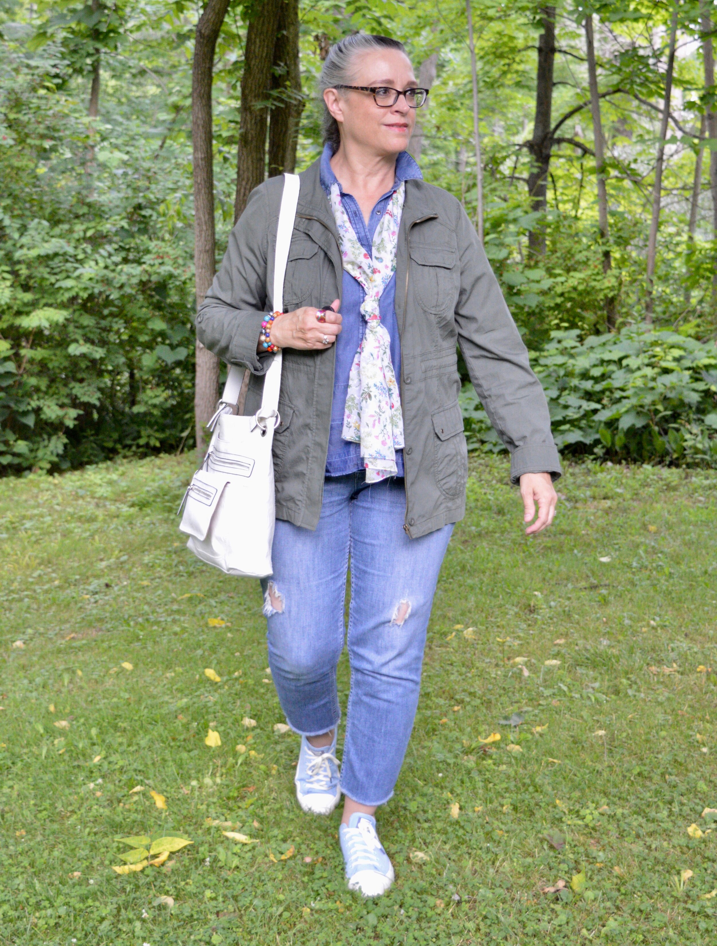
Oh, Olive! Utility Jacket - Casual

I am back from visiting my mom and ready to get back to posting here on the blog. I wasn’t feeling well, the first couple of days after I got home, but I think most of it was fatigue and allergies. They seem to be beating on everyone this year. While I was at my mom’s I didn’t have internet, but I was able to get some photos taken and was pretty pleased with the result. I hope you will be as well.

I am continuing my look at a few of my different olive pieces and how they can be used with just about any outfit and any color. I do like to think outside the box, at least my box, so I hope you will find some of these outfits inspirational for your own wardrobes. The week before last I showed you a casual and a workwear look using an olive pair of pants. Today and Thursday, I want to take a look at ways to style an olive utility jacket. You can see how I styled this same jacket on the blog before with a striped tee and distressed jeans, another striped tee, and a polka dot chambray top.

Another thing, I decided to add to this little series, is to give you a few peaks at what is trending for fall. I’ll point it out as we go along. Let’s take a look at the olive utility jacket.

DSC_0011.jpg

I have had this olive utility piece for a number of years now. St. John’s Bay brand, I got it at JCPenney. Since then I have accumulated a few other utility jackets in other colors. I like that they are so versatile. In fact, I may have to do a post on that at a future date. Most of my pieces, including this one are lighter weight, so a great topper for spring, summer and fall. While they do tend towards more casual, I will show you on Thursday how to make one look appropriate for work.

What makes a piece utility? I think it has to do with the pockets and the details like drawstrings, snaps and metal zippers. Next week I will be showing you an olive utility vest.

Fall Trend Alert - Denim on Denim

Once again, it seems denim with denim is trending for fall. While I wouldn’t wear this regularly, it does have a casual appeal. Monochrome is always a good way to get a longer, sleeker line. Most of what I saw on the runway were pieces of the same wash. See this post on Fall 2021 trends from Marie Claire. However, there is a sense of personal creativity in putting together pieces with different washes, as I did in this outfit.

DSC_0010.jpg

My chambray top is a thrift find from earlier in the summer. It is a brand called Cremieux. Apparently, Daniel Cremieux started a men’s clothing line in Saint Tropez, on the French Riviera in the mid 70’s. It looks like he designed women’s clothing for a time as well. Both lines were sold at Dillards, but the women’s line is no longer available in the US. The fun things you find when you thrift.

You’ve seen my thrifted, distressed Simply Vera, Vera Wang jeans plenty of times on the blog. They are getting rattier looking as time goes along, but I guess that is the point. Ha, ha. If the holes get to big for my comfort zone, I may make a few patches, which actually could be fun.

DSC_0013.jpg

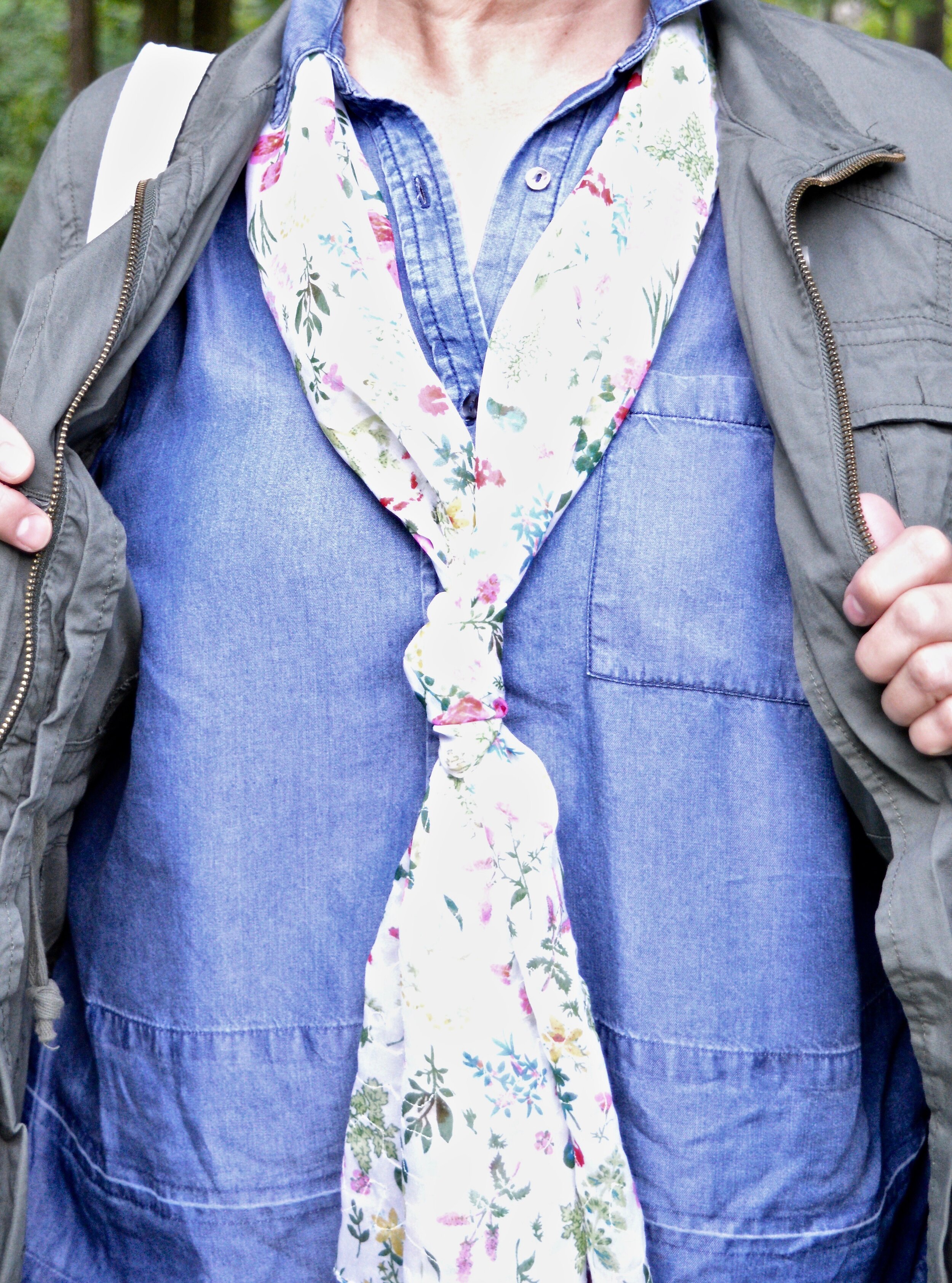
I decided to add this floral mini print scarf just for a little extra color. I don’t use my scarves much in the heat of the summer. I sweat just sitting still on these humid days. Last night, I was working on this post and I was dripping with sweat. Of course we hadn’t turned our air conditioners on. Sometimes, we have to choose between a little bit of inconvenience and being able to pay the electric bill. My husband always runs colder, so he’s not as hot unless he is doing yard work or something. Today is supposed to be even warmer. I think the air will be on later, so this woman doesn’t get too cranky. Ha, ha.

If you follow my Instagram account, you may have seen that I rearranged my scarves. Just like with all of my clothes, I have way more than I need, but I am trying to make everything more accessible and visible, so it is easier to sort through and find. Do you have a special way of arranging your scarves?

DSC_0014 (1).jpg

My blue Converse are making another appearance. While I still think this brand of sneaker makes me look even more like I have ski feet, I am trying to embrace those long skinny things on the ends of my legs.

The last accessory I have is my white cross body bag. This was another thrift find. I like that it is a little bit larger than many cross body bags, so I can actually fit everything in it, without having to squeeze it in. I am not sure what the brand is, but it was still very clean and unworn, so I snatched it up.

DSC_0015 (1).jpg

Do you own an olive utility jacket? How do you like to wear it? I love hearing from you, so be sure to leave me some love in the comments. I hope your summer is going swimmingly well!

DSC_0019.jpg

I’m including a few shopping links for denim pieces and utility jackets. I hope you’ll look those over. Every time you click on a link, I get a few cents and I appreciate it. All opinions are my own.

Have a great Tuesday!

Pantone - Spring/Summer - 2021 - London Palette - Purple Rose, Lava Falls and Baby's Breath

Today’s colors are a blend of pastel purple, bold red and creamy off white. I have always loved purple, but it really isn’t a color I regularly wear. I easily got on board with Purple Rose which is a medium purple that goes well with many other colors, especially things like brown, olive and navy. Why, then did I decide to pair it with a fierce red like Lava Falls? Because I always like to show you things outside the box. It is not very often, that I think to put purple and red together.

purplerose.jpg

The factor that clinched the deal on putting these colors together, was that my thrifted Old Navy, Lava Falls, paisley popover top had both of these colors in it. How fortuitous was that? Ha, ha. This is a fun, tunic type shirt that has short sleeves, and the interesting details of a shirt tail hem line and a lace up v-neck. I love the paisley print too, which always reminds me of the 70’s.

The Croft and Barrow cardigan is older and I like I said, doesn’t get a lot of regular wear, but i just love the color so I keep it around.

purplerosepantoneoutfitideas-2.jpg

You’ve seen these creamy, Baby’s Breath, thrifted, St. John’s Bay ankle pants on the blog before. I really think this look would have been cuter with a creamy denim pencil skirt or a pair of Bermuda shorts, but I don’t have either of those. I am not as fond of the silhouette, but it is okay, just not great.

purplerosepantoneoutfitideas-7.jpg

I didn’t need to wear a necklace and this long opera length beaded strand is exactly the same color as the top, but sometimes I like the subtle texture and shine of a piece, even if it is a similar color. Wrapping this long strand of beads around my neck makes it look like I have on a choker.

purplerosepantoneoutfitideas-8.jpg

I added a few beaded bracelets with similar reds, although there is plenty going on in the top, so it wasn’t really needed. Often, less is more.

purplerosepantoneoutfitideas-9.jpg

My thrifted Simply Vera, Vera Wang cross body bag is making another appearance. This is a great little bag for the warmer months. The off white color goes perfectly with the Baby’s Breath color of the pants.

purplerosepantoneoutfitideas-10.jpg

These Steve Madden platform sneakers were a new purchase from DSW. I had a coupon and I had been looking at this type of sneaker since last summer. I finally took the plunge. They are not something I would use for walking, but they are cute for a casual day of picnicking or window shopping.

purplerosepantoneoutfitideas-4.jpg

What do you think of these colors? Do you think you would ever combine red with purple? I’d love to hear your thoughts, so leave me some love.

I am including a few shopping links in these colors, so if you have time, give those a look. I hope you have a wonderful weekend!

Graphic and photo credit, Rebecca Trumbull.

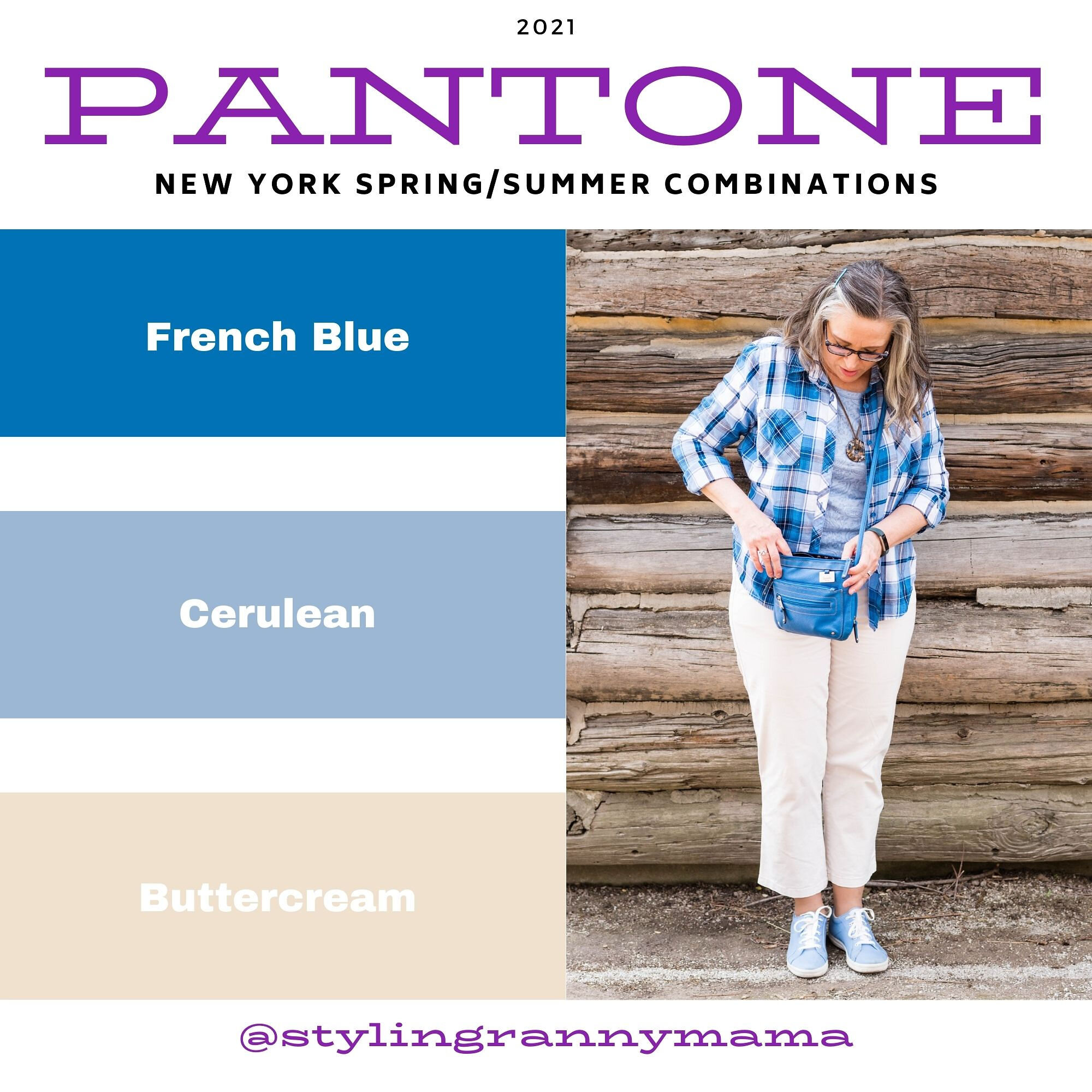
Pantone - Spring/Summer - 2021 - New York Palette: French Blue, Cerulean and Buttercream

Today’s three color combo is the last of the Pantone Spring/Summer New York Palette. I am going to take a week off, as I hope to go visit my mom next week. In due time, I will proceed with the London Palette, but I haven’t even begun to pick out outfits. Breaking my wrist has really thrown a wrench into the works, so bear with me. I got my second Covid shot yesterday, so getting up this morning was grueling. I got the shot in my left arm, figuring it already hurts and I wanted my right arm to remain relatively pain free. I say relatively because there is some pain in my wrist and rib cage on that side, from having to do all the work. This is making me see how much I need to get back to exercising, especially weight lifting and walking since I have osteoporosis. We ladies need to take of them bones, and all the other parts as well. Ha, ha.

I thought it would be fun to pair these two blues, for a fun, casual summer look. Adding the off white of buttercream gives the outfit that perfect warm weather vibe. I kept my accessories casual to add to the picnic ready style. This would be a great outfit for a Fourth of July get together, just add some red jewelry or a bag.

frenchblue.jpg

French Blue and Cerulean are two cool colors that make me think of blue skies and water. I found this French blue plaid shirt while thrifting. I really like this medium blue for spring and summer, as opposed to a dark blue like navy. This button down is Faded Glory brand.

frenchbluepantonespringcoloroutfitideas-2.jpg

My Buttercream ankle pants have made an appearance on the blog before. These were thrifted St. John’s Bay. You can see these styled for two other Pantone series. This one is styled with a yellow button down and this with my Chevron print dress.

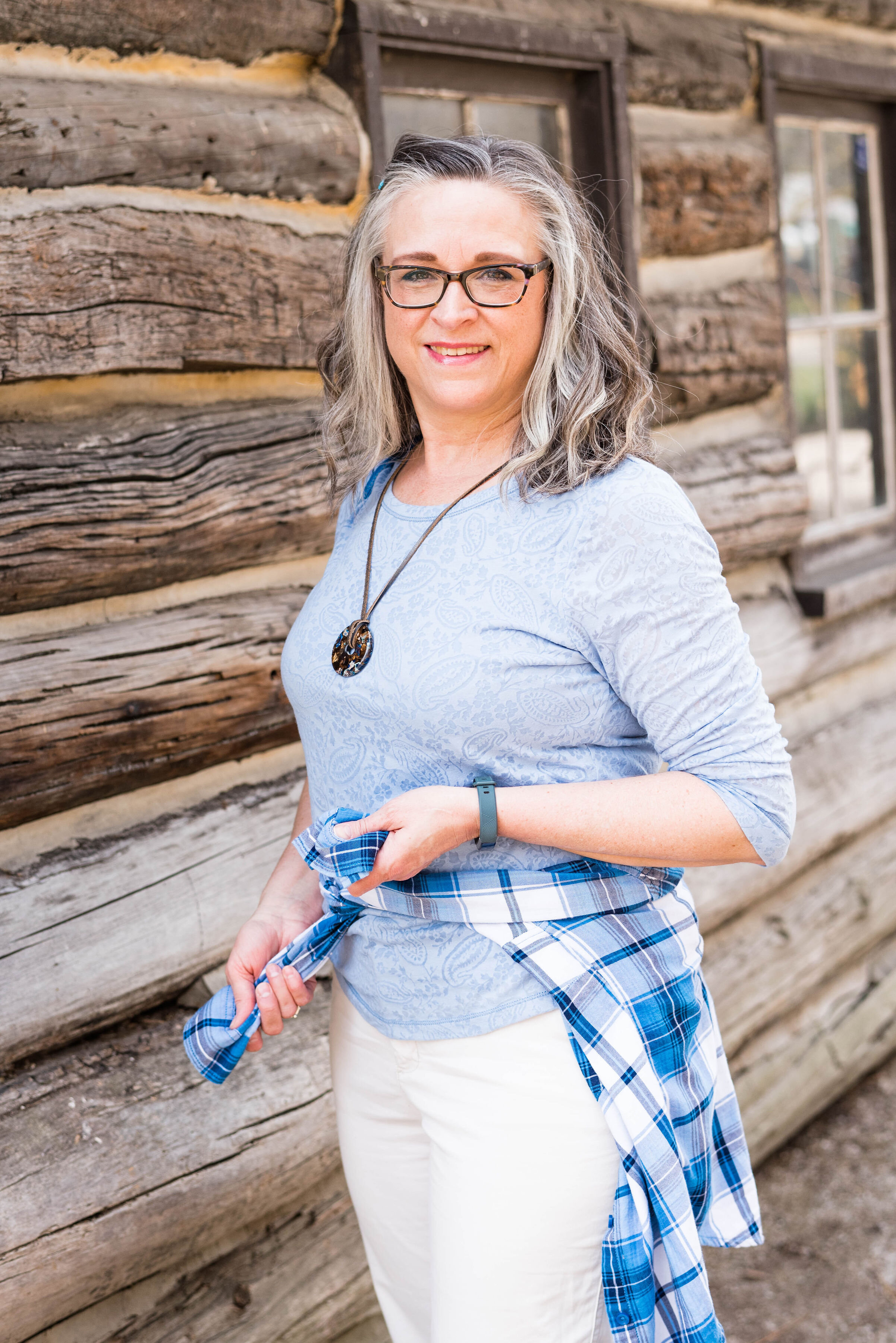
Cerulean is a different light blue. I like the sky blue feel of this color, yet it leans towards a bit more pastel. My top is a thrifted Ralph Lauren piece. I like that it has a lining that is similar t-shirt type material to the outside. It has a fun faux lace texture to it.

frenchbluepantonespringcoloroutfitideas-13.jpg

I kept my accessories simple. This thrifted French Blue bag was a recent find and I had to grab it since it matched the color perfectly. This is a nice small bag for carrying just the essentials.

frenchbluepantonespringcoloroutfitideas-7.jpg

My pendant necklace had little flecks of all the colors. I have been on the search for more of these large beads with the hole in the middle. It is so easy to make a necklace out of them.

frenchbluepantonespringcoloroutfitideas-5.jpg

Lastly, my thrifted Keds finally fit the Pantone color. Cerulean is the right name for these sneakers that are great for warm weather outfits.

frenchbluepantonespringcoloroutfitideas-8.jpg

What do you think of these colors? Do you have these blues in your closet? What about Buttercream? I’d love to hear your thoughts. I’d also love to hear which of these colors you would put together to make an outfit.

frenchbluepantonespringcoloroutfitideas-10.jpg

I hope you have enjoyed this look at the Pantone Spring/Summer 2021 New York Palette colors.

I am including a few shopping links, so be sure to check those out. These are affiliate links. I get a few pennies when you click on a link, so I appreciate all the clicks.

Photo credit and graphic Rebecca Trumbull.

Pantone - Spring/Summer - 2021 - New York Palette: Burnt Coral, Marigold and Desert Mist

Today’s outfit blends three colors that seem to epitomize summer with all of its beauty. The deep orange yellow of Marigold, combined with the rustic feel of Burnt Coral and the soft pastel of Desert Mist makes me think of picnics, outdoor parties and long walks on the beach. While my outfit today is probably too warm for summer temperatures, I works well for that in between time when the weather is still unsure of what it is going to do.

burntcoral.jpg

I ordered this waffle weave dolman sleeve top from Maurices earlier this year. It has elastic on the bottom, so has more of a cropped feel to it, which isn’t always my favorite, but I think this works well with pieces where the top can be worn without the need for tucking or wearing a belt.

burntcoralpantonespringcoloroutfitideas-10.jpg

I wasn’t going to use this Roz & Ali medallion print skirt again, but I was having a hard time finding things in my closet that were going to work with these colors. Besides this is a pretty skirt, so I don’t mind using it again. You can see how I styled this piece for several other Pantone color series. Last fall I styled it with a neon yellow short sleeve sweater, and the fall before that with a purple short sleeve sweater. I like that this skirt works perfectly for spring, summer and fall. The skirt contains all the colors from the graphic, even though you can’t see Marigold as well, you can definitely see the Burnt Coral and Desert Mist.

burntcoralpantonespringcoloroutfitideas-6.jpg

My Desert Mist sweater is a little light compared to the Pantone color, but again, this isn’t about having an exact match, but about giving you options that you can find in your closet. This is a thrifted St. John’s Bay piece. It is always good to have a neutral cardigan or jacket that will work well with many different outfits and colors.

burntcoralpantonespringcoloroutfitideas-8.jpg

For the Marigold color, I just added a few accessories, similar to what I did in last Thursday’s post with Raspberry Sorbet. The necklace and Sophia Caperelli bag are both thrift finds.

burntcoralpantonespringcoloroutfitideas-11.jpg

You were recently introduced to these Clark’s flats. They are perfect for wearing with a skirt, whether long or short.

burntcoralpantonespringcoloroutfitideas-13.jpg

What do you think of these colors? Do you have all of these in your closet? Would you wear them together? I’d love to hear your thoughts, so leave me some love.

burntcoralpantonespringcoloroutfitideas-4.jpg

I’m including a few shopping links. These are affiliate links. All opinions are my own. Here’s a picture, just for your enjoyment. Ha, ha.

burntcoralpantonespringcoloroutfitideas-7.jpg

Have a great evening!

Photo and graphic credit Rebecca Trumbull.

Pantone - Spring/Summer - 2021 - NY Palette - Amethyst Orchid, Green Ash and Inkwell

Today’s combination of Pantone colors from the New York palette is a study in contrasts. The dark, moody blue of Inkwell, which mimics a night sky is a type of color disparity when side by side with the pale pastel of Green Ash. When I pair colors I often go for bold with bold, or light with light, but I wanted to experiment by creating an outfit with an eye catching difference in color. The addition of Amethyst Orchid gives the perfect compliment of medium purple color.

amethystorchid.jpg

Let me start the outfit details by talking about this recently thrifted tee. I love the bold flower on the front and purple has long been a favorite color of mine, so I was glad it was on the palette. This tee is St. John’s Bay brand. The darker inner petals are actually separate pieces of material, which gives the tee added dimension.

To go along with the Amethyst Orchid color in the tee, I also added this recently thrifted scarf. I love the large gingham pattern. It was the perfect accompaniment to the whole look. Another interesting feature of this scarf is the ruching of elastic throughout its length adding texture.

amethystorchidpantonecolorsoutfit-9.jpg

These thrifted, Inkwell pants are a brand called Hydrant. A dark pant like this is great for making our lower halves look longer and slimmer. I really like these, but they are a lint magnate. Wearing them with a fuzzy sweater like this is probably not the best idea. Ha, ha. You can also see I added a wider, olive belt since belts are trending and did my usual front tuck.

My fuzzy Green Ash sweater might be a little light, but it is pretty close to the Pantone color. This was a Christopher and Banks purchase last year. Before I bought this piece I had very little of this color in my wardrobe. I have picked up a few things since then. It is a pretty pastel color to wear, especially in the spring and summer. I really like how well it goes with the Amethyst Orchid color.

amethystorchidpantonecolorsoutfit-6.jpg

I decided to go with white for my shoes and bag. White is definitely a go to in the warmer months. My white Keds will be on repeat. My white shoulder bag is a new thrift find. I have been searching for a different white bag and this one has plenty of room and can also be worn as a cross body bag. This is a brand called Bueno.

amethystorchidpantonecolorsoutfit-10.jpg
amethystorchidpantonecolorsoutfit-12.jpg

What do you think of these colors? Would you wear a light pastel with a dark color like navy or black? I’d love to hear your thoughts. Thanks so much for taking the time to comment.

amethystorchidpantonecolorsoutfit-15.jpg

I’m including a few shopping links. These are affiliate links. All opinions are my own.

Photo and graphic Rebecca Trumbull.

Having Fun with Layers - Light Weight Kimono

I am sure most of us have one or two kimonos in our closets. Typically, we only pull out these light weight pieces when the weather warms up enough that we can show them off over our spring or summer outfits. Kimonos are really more of an accessory than they are an actually clothing item. They are meant to accentuate or be the focal point of an outfit, much like a statement necklace or a scarf. For this reason, I thought it would be fun to show how we can use a kimono while it is still cold, by using it in the same manner, but over an outfit with heavier layering pieces.

Having fun with layers - light weight kimono
Having Fun with layers - light weight kimono

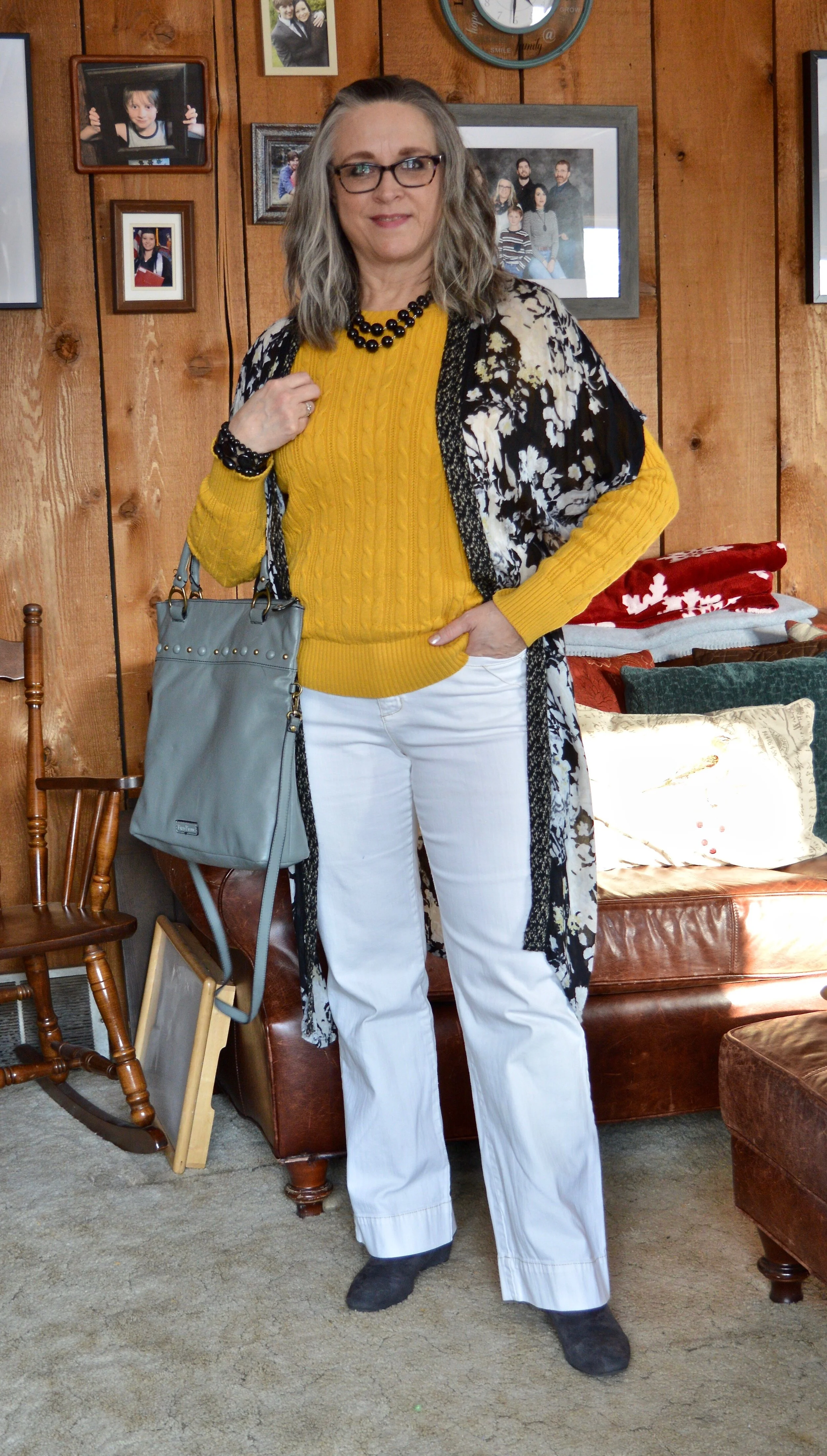
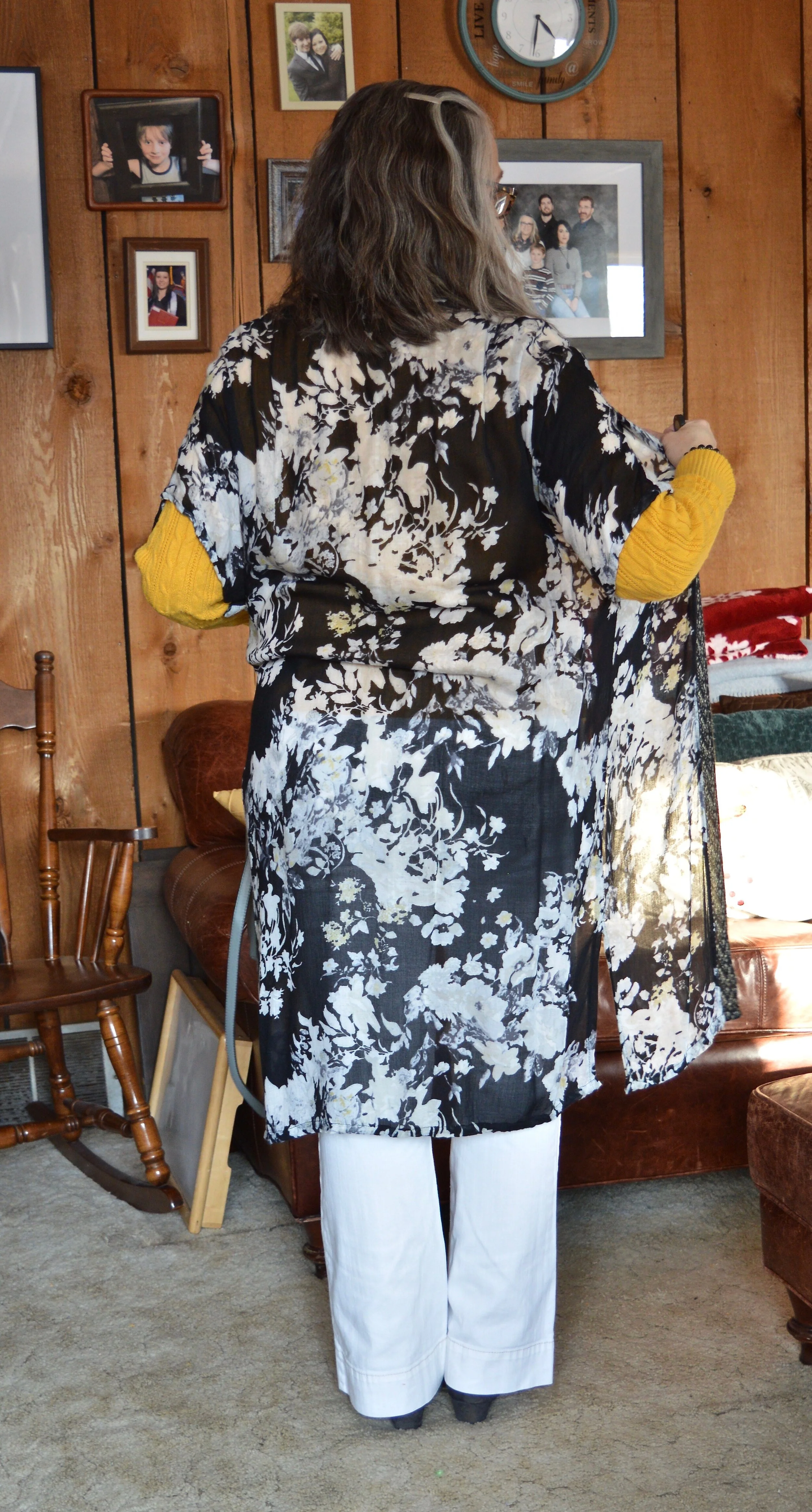
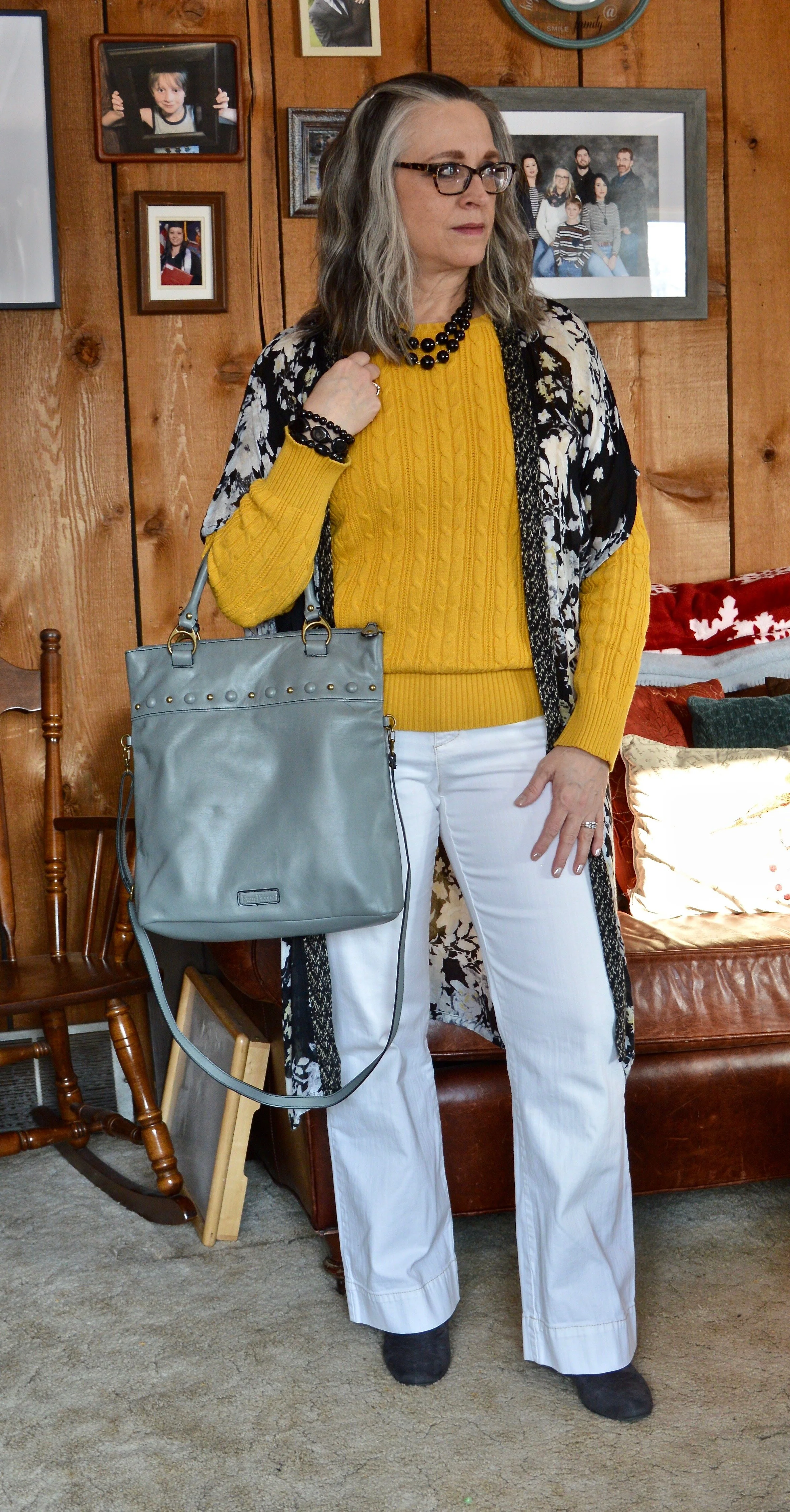
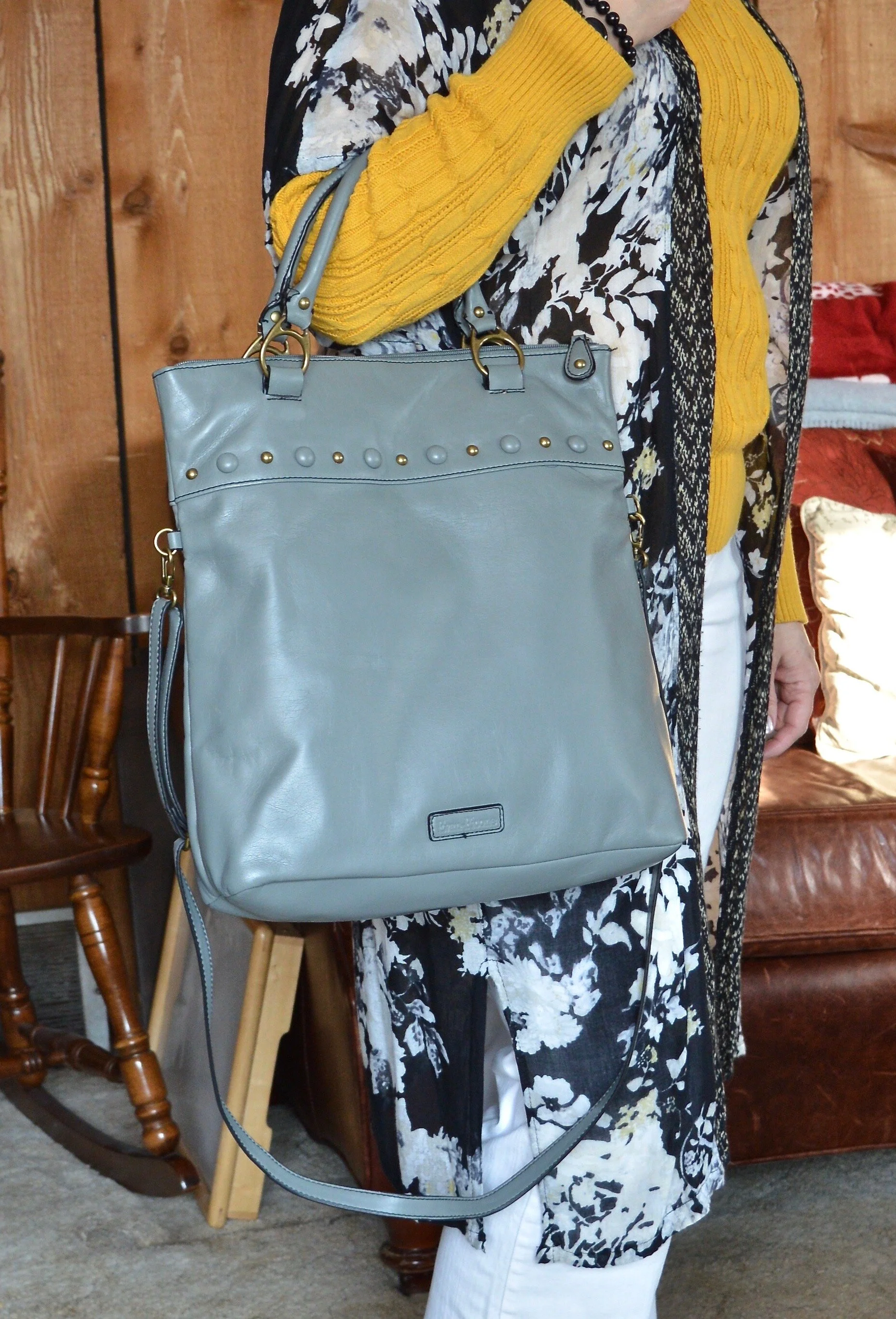
This kimono was a clearance find at Kohl’s a few summers ago. It is actually a bit small for me, but since I don’t have to worry about closing the front, I just let it hang open, almost more like an open front cardi or vest. You can see the pretty floral detail, but what you can’t see is that there is also a spattering of light yellow here and there in the pattern. That is why I wore it over the bright yellow sweater.

Having fun with layers - light weight kimono

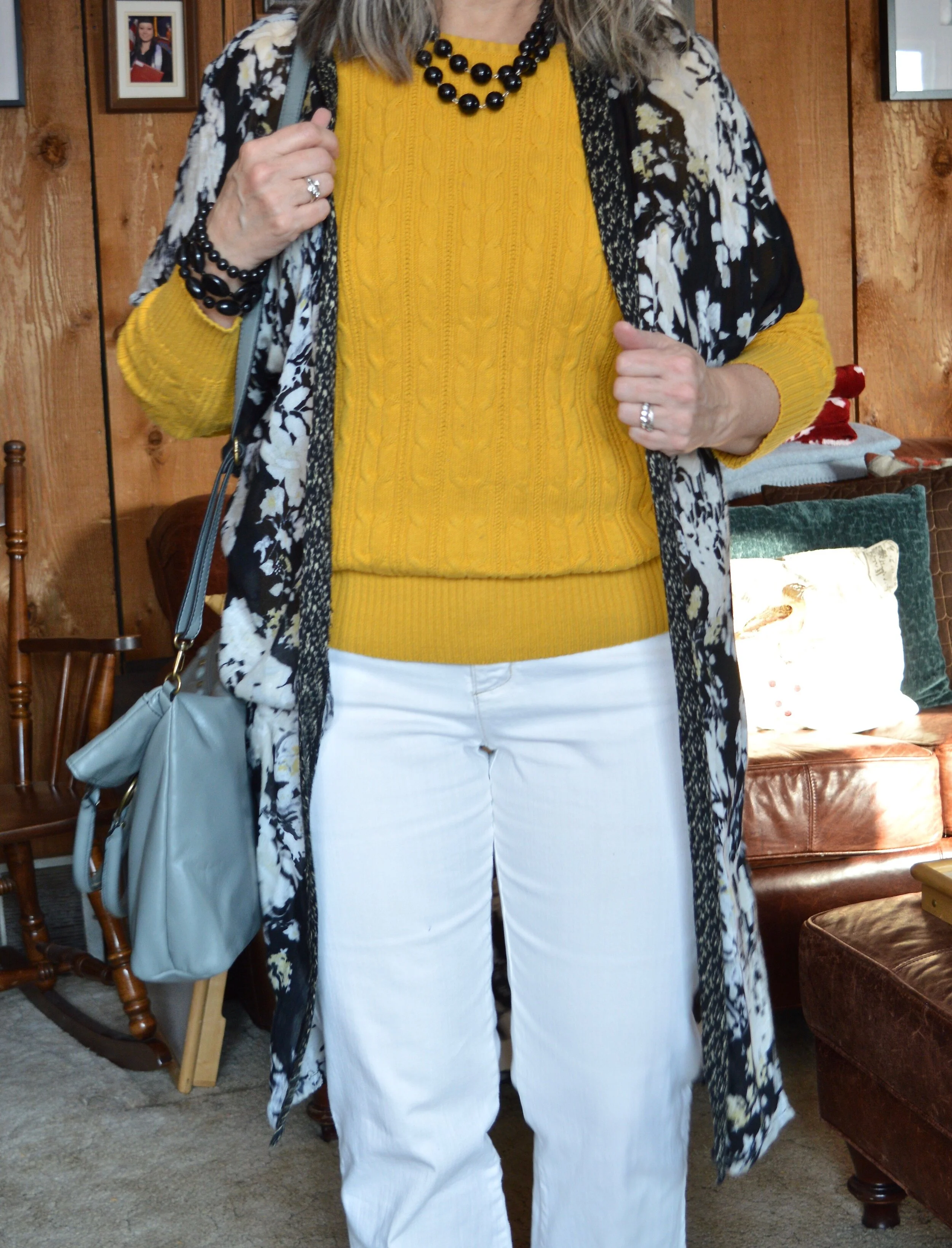
I love this pretty yellow, St. John’s Bay, cable knit sweater that I got at JC Penney over a year ago. Cable knit sweaters are definitely a staple in my cold weather wardrobe. They are comfortable and can be worn along or with a collared shirt sticking out as an additional layer.

You’ve seen these Gloria Vanderbilt jeans on the blog many times and I swear by this particular pair of white jeans. So far I can still fit into them, which is a good thing, because a heavy weight pair of white jeans, that don’t show through are hard to come by. Ha ha.

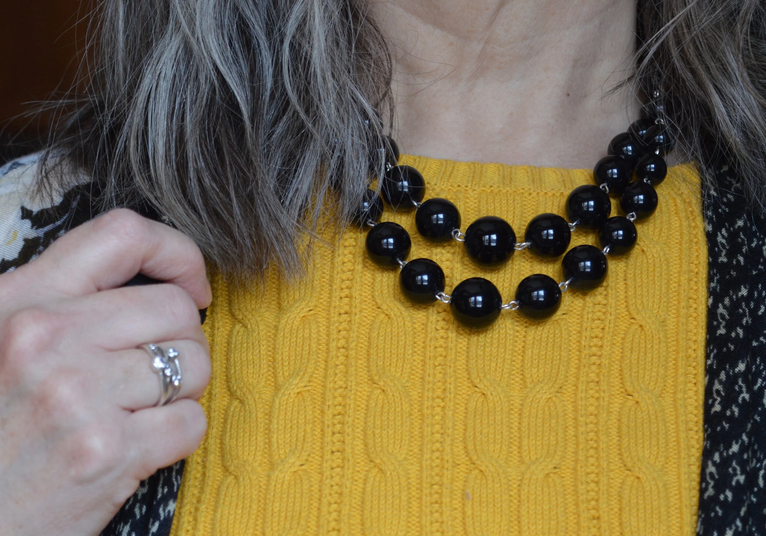
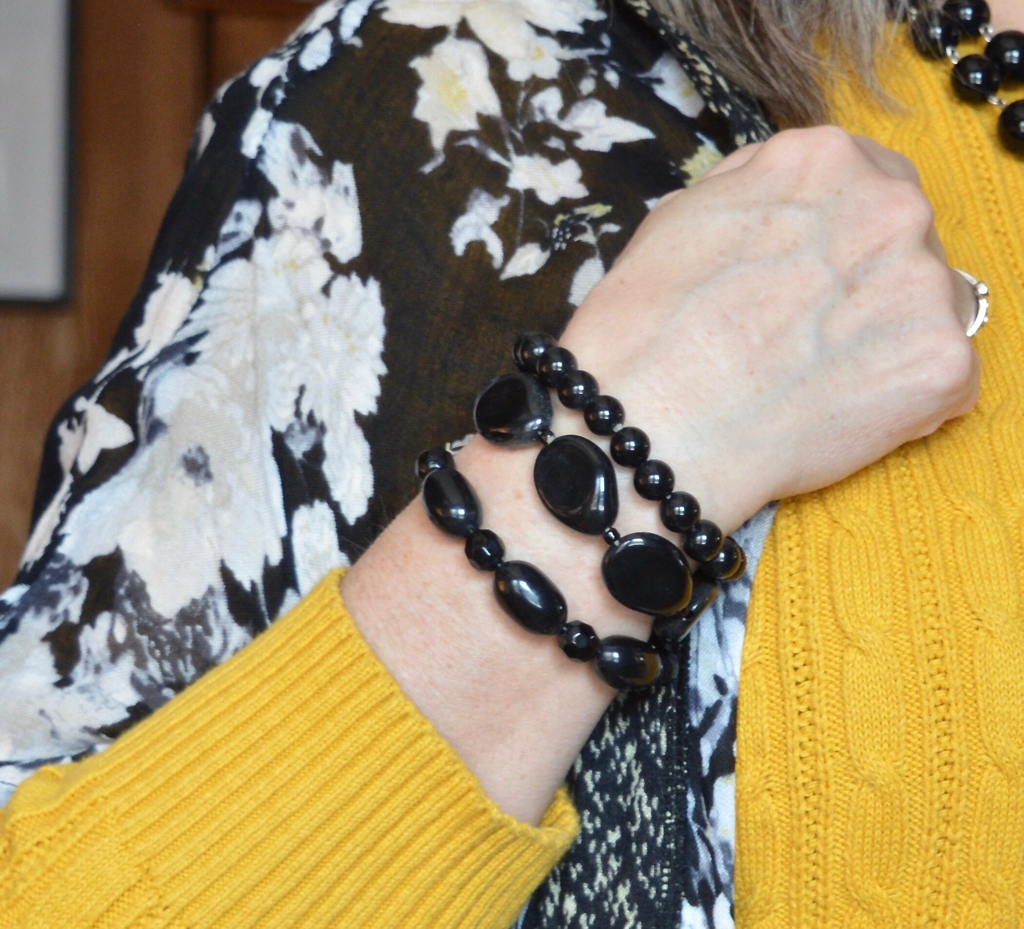
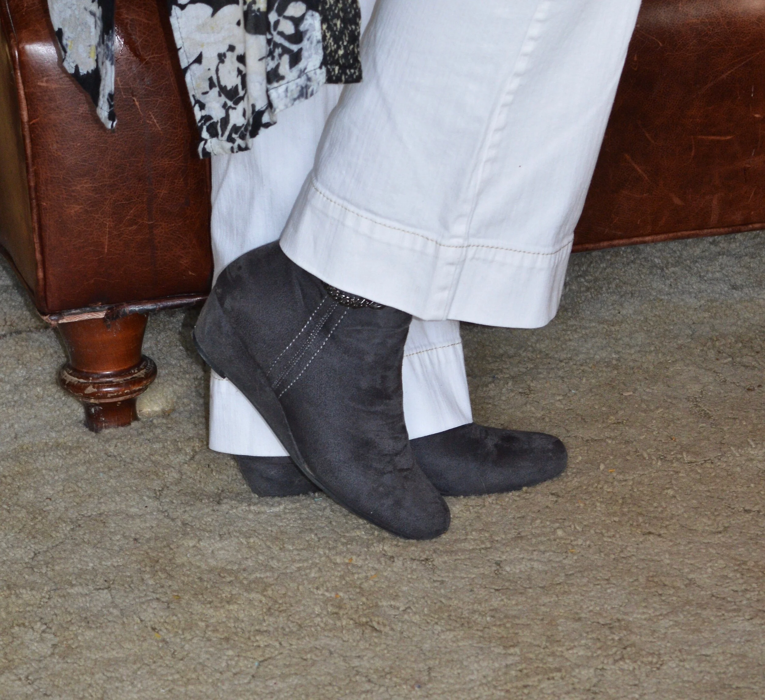
I didn’t really need to add a whole lot to my look since the kimono does the bulk of the work. I added some black beads, both at the neck and on my wrist. I also opted for gray Impo ankle boots, and a thrifted Evan-Picone bag. Like my blush New York and Co. bag, this gray piece serves as both a tote, a crossbody and a clutch.

Having fun with layers - light weight kimono

I hope this post will inspire you to pull out that kimono in your closet and give it some love.

I’m including a few shopping links for you to look over. These are affiliate links. All opinions are my own.

Have a great evening.

A Dickens' Christmas - The Ghost of Christmas Past

Today’s outfit draws its inspiration from Charles Dickens’ ghostly apparition of Christmas Past. Before the visitation of the three ghostly characters, Scrooge is visited by the ghoulish presence of his former business partner in life, Jacob Marley. Jacob warns Scrooge that he will be visited by three spirits, for the hopeful purpose of his redemption. The first of these paranormal beings makes their appearance when the bell tolls one.

The idea of drawing fashion inspiration from a ghost, might seem a stretch of the imagination, but I do like a challenge. If you have watched a version of A Christmas Carol, you probably saw the Ghost of Christmas Past as a being dressed in white garments, sometimes shining and sometimes in an unearthly, ethereal manner as if floating and flowing in some unseen breeze. Two of my favorite movie versions of A Christmas Carol are the 1984 drama with George C. Scott, and the 1992 musical, The Muppet Christmas Carol. Surprisingly, the Muppet version stays fairly true to the original tale by Charles Dickens. Both versions are filled with amazing scenery, typical old time London and excellent veteran actors, (the Muppet version stars Michael Caine as Scrooge).

A Dickens' Christmas - The Ghost of Christmas Past

We often shy away from white in the colder weather. It has long been a color we wear in spring and summer. Obviously, things have changed immensely over the last decade, especially as more and more women have access to fashion blogs and more reasonably priced clothing. White is now a year round color choice. It stands true to reason, that if we live in colder areas in the winter, our white pieces will have to be compatible for those frigid temps. This is where layering, fabric choices and textures all come into play.

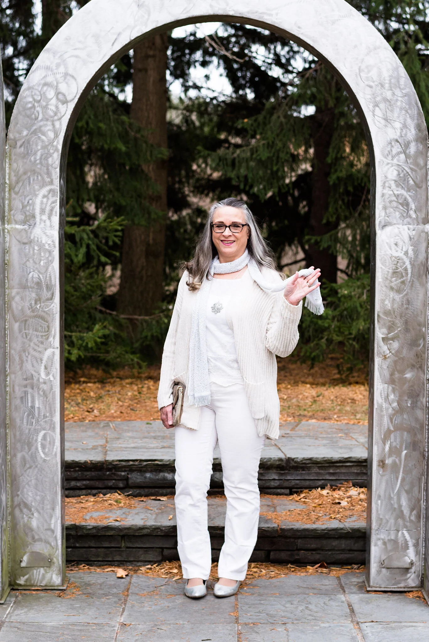
My daughter and I didn’t have a lot of time for pictures, so we went, once again, to the Toledo Botanical Gardens. They have so many interesting sculptures, garden areas and small buildings used for various events. These metal arches provided the perfect backdrop for an other worldly vibe.

A Dickens' Christmas - The Ghost of Christmas Past

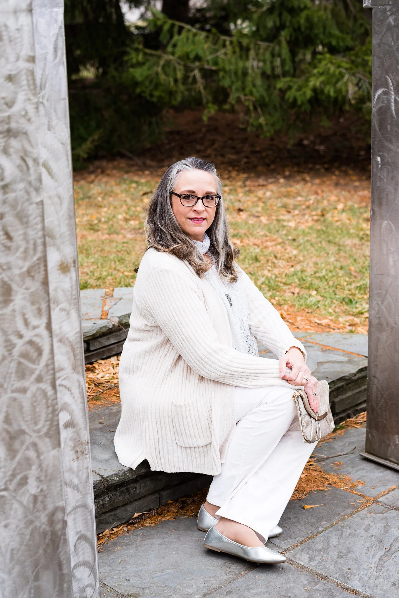
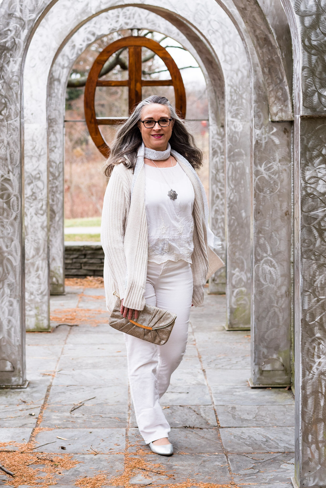
When I started thinking about an all white outfit, I knew that most of my pieces were not a true white. Not everyone can wear a crisp white near their face, but most people can pull off an ivory or a cream. All of these pieces, except the scarf, have more of a cream, or ivory tint to them.

A Dickens' Christmas - The Ghost of Christmas Past

My long, Apt. 9, chenille sweater was a piece my daughter was getting rid of. It wasn’t really her style, so when I saw it, I took it home, figuring I could always just wear it around the house as a cozy topper for casual days. As I thought about how to make this outfit look flowing, but also updated and fashionable, I knew this sweater would be perfect.

A Dickens' Christmas - The Ghost of Christmas past

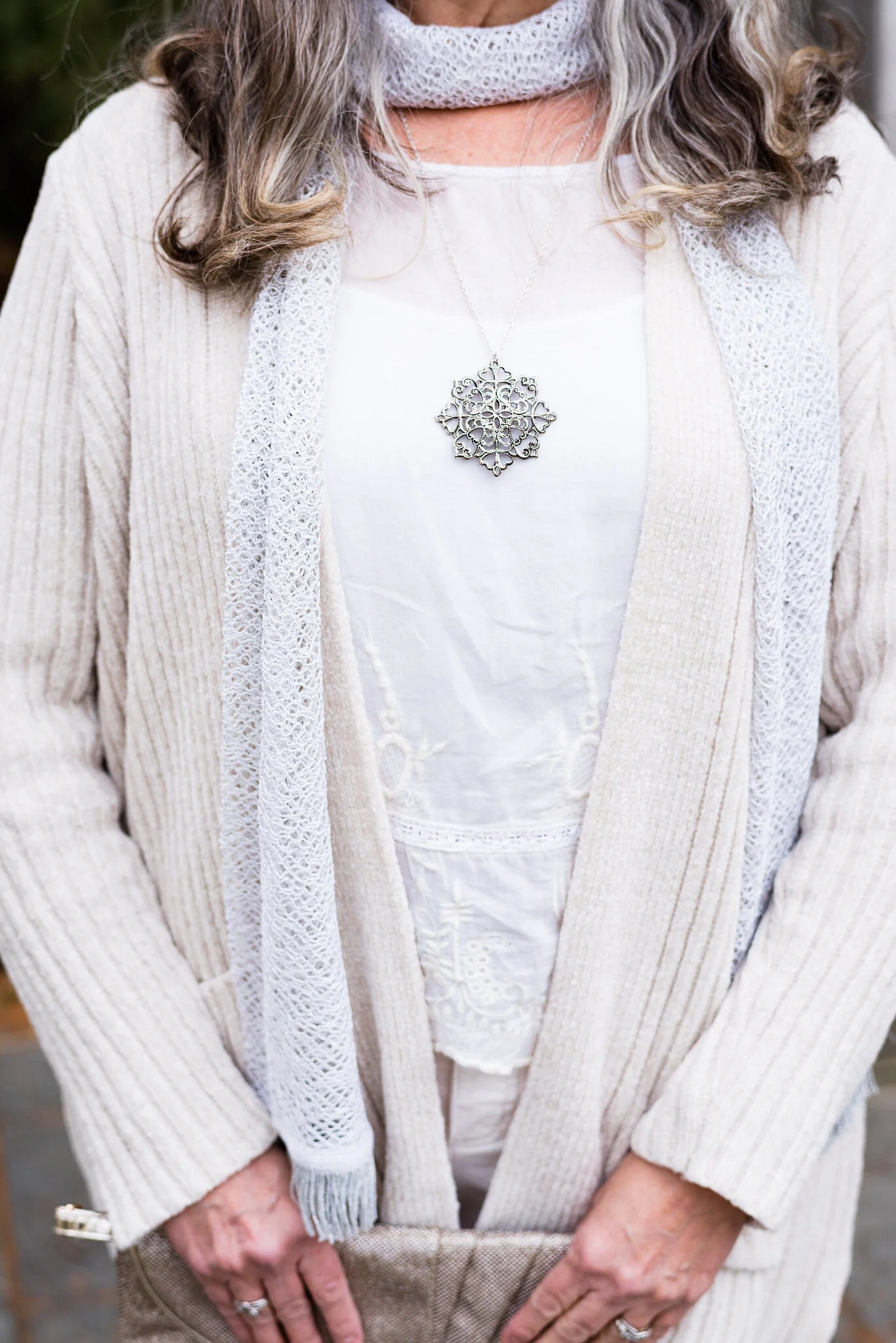
The blouse I have on under the sweater is a recent thrift store find and will be more useful in the warmer weather, but the color went well with everything else. The brand is called Mango, and when I saw the embroidery on it, I knew it was calling my name.

I also added this white scarf from The Jacket Society, that I bought a few years ago. You can’t see it in this photo, but the scarf has tiny silver threads through out, so I thought it added an extra element of texture and shine.

The silver snowflake pendant just seemed appropriate for a ghostly, Christmas outfit.

A Dickens' Christmas - The Ghost of Christmas Past

I chose silver for my accessories, to represent the shimmering appearance that many of the Ghosts of Christmas past seemed to have. Perhaps the shimmering details represented good memories from Christmases long ago; or maybe the light represents the idea that we can learn from our past, thus becoming better people. Whatever your interpretation of the details, I think silver looks very pretty with white.

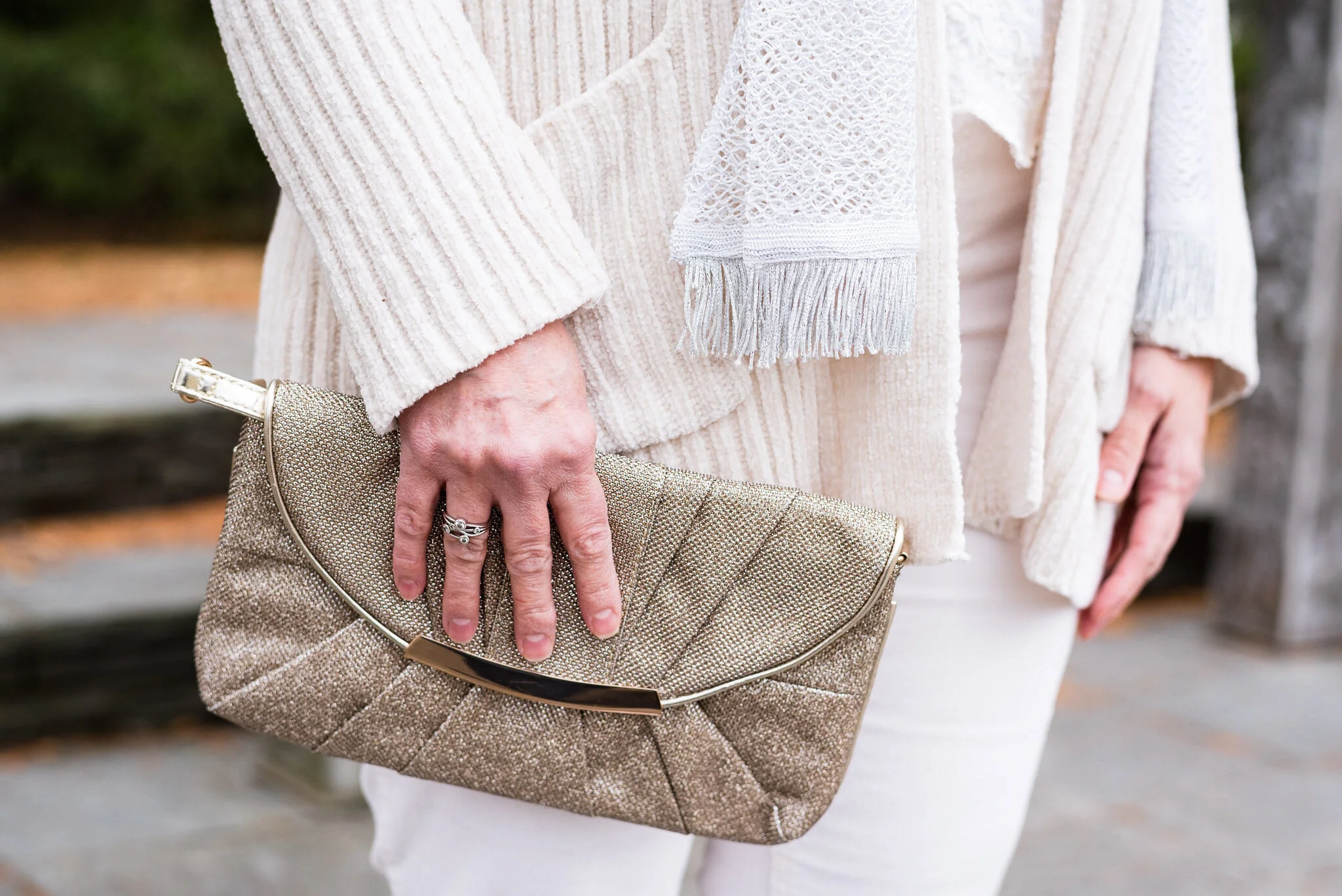
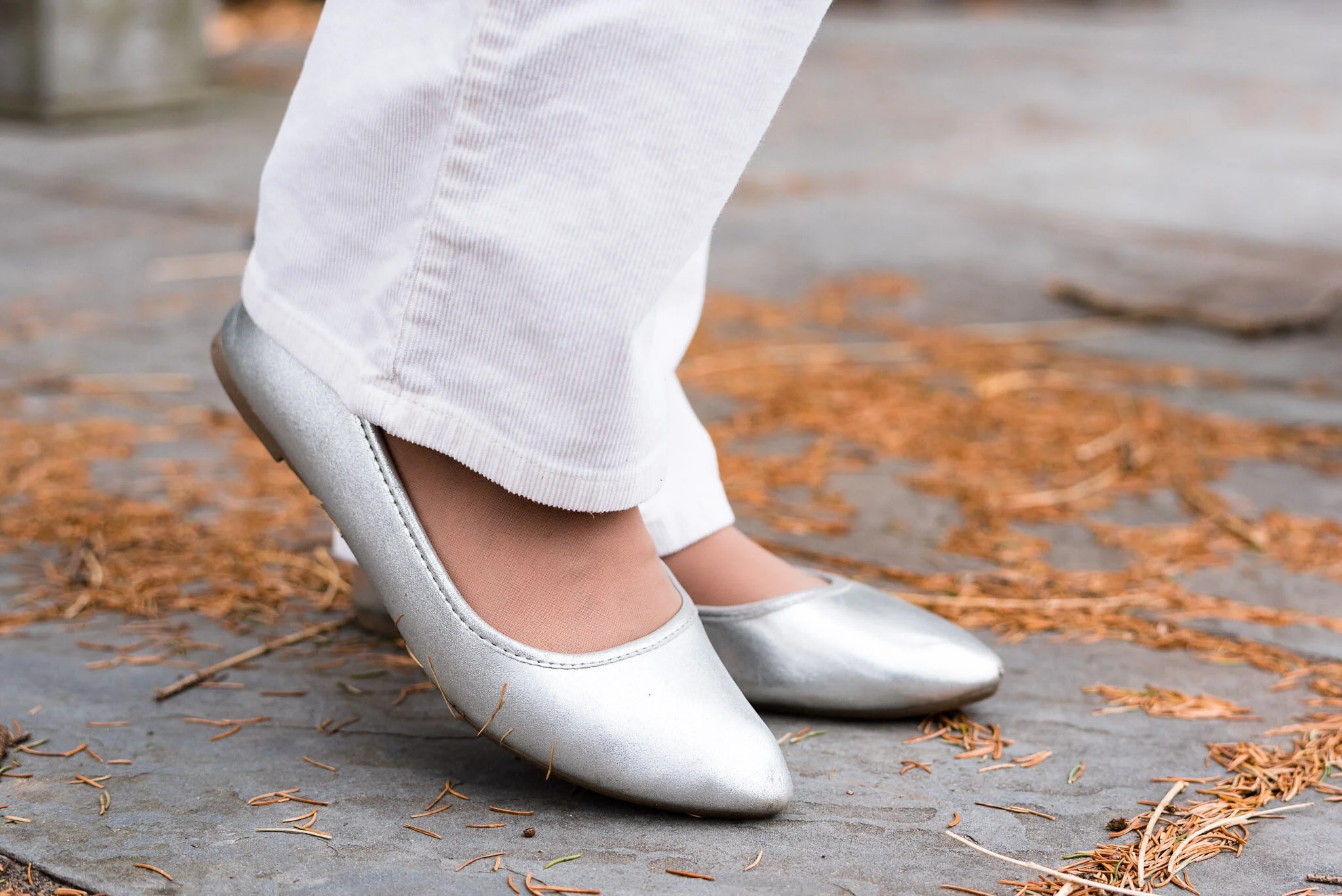
My silver, sparkly clutch has been a regular on the blog. My SO ballerina flats are from Kohl’s.

A Dickens' Christmas - The Ghost of Christmas Past

My cream colored St. John’s Bay corduroys have been around for a few years and were an original purchase at JC Penney.

A Dickens' Christmas - The Ghost of Christmas Past

I really like this outfit. It is something I would feel completely comfortable and warm in and could be worn to a special Christmas outing or just a family dinner, where I don’t have to do the cooking. If I cooked in this it wouldn’t be white anymore. Ha, ha. Here are a few other fun pictures from our shoot.

A Dickens' Christmas - The Ghost of Christmas Past

The wind was helping me look a little more ghostly. Too bad we didn’t have fog. Ha, ha.

What did you think of this outfit? Do you think I pulled off showing how taking inspiration from the Ghost of Christmas Past translated into a chic, modern look that could be worn to work, out on a date or to a Christmas concert?

I’m including a few shopping links for you to look over. These are affiliate links. All opinions are my own.

Be sure to stop back on Thursday for another Christmas movie inspired outfit.

Photo credit Rebecca Trumbull.


Summer Outfit - Leopard Print Skirt - Casual

Hi everyone. How are you doing? I just finished reading an article written by a woman whose whole family contracted COVID. They are all struggling through it. Her husband was in the hospital, but now is home. Both of her kids got it, but they are slowly progressing. She has it as well, but is managing at home with oxygen. I also read another article this morning that yesterday was the highest recorded day of new cases in the US since April. It is very disheartening and discouraging, but it is, what it is. Don’t stop taking precautions. Wear a mask. Wash your hands. Keep your distance. Okay, enough on that, now time for an outfit.

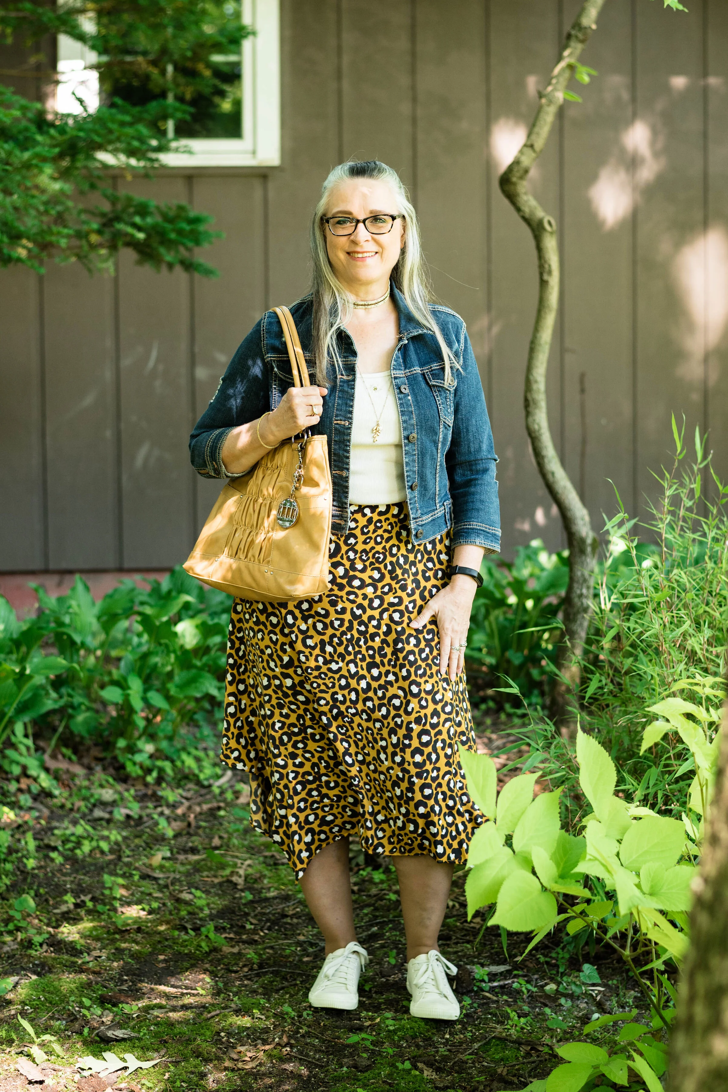
Tuesday I showed you my thrifted leopard print skirt in a more dressy, work wear friendly style. Today, I am showing off that same skirt, but with a more fun, casual flair.

Summer style - leopard print skirt - casual

If you didn’t read the last post, this thrifted skirt is a brand called Who, What, Wear. It is a very light weight material, but it did seem to get full of static when I put it on. I am going to have to see if washing it with fabric softener makes any difference, plus I dried it on the line, since I don’t have a dryer at the moment. As long as the weather is good, I like to hang clothes out in the warmer weather anyway, so I decided I wanted to get the dish washer, which we just replaced last month, paid off, before we purchase a new dryer. The joys of real life. Ha, ha.

Summer style - leopard print skirt - casual

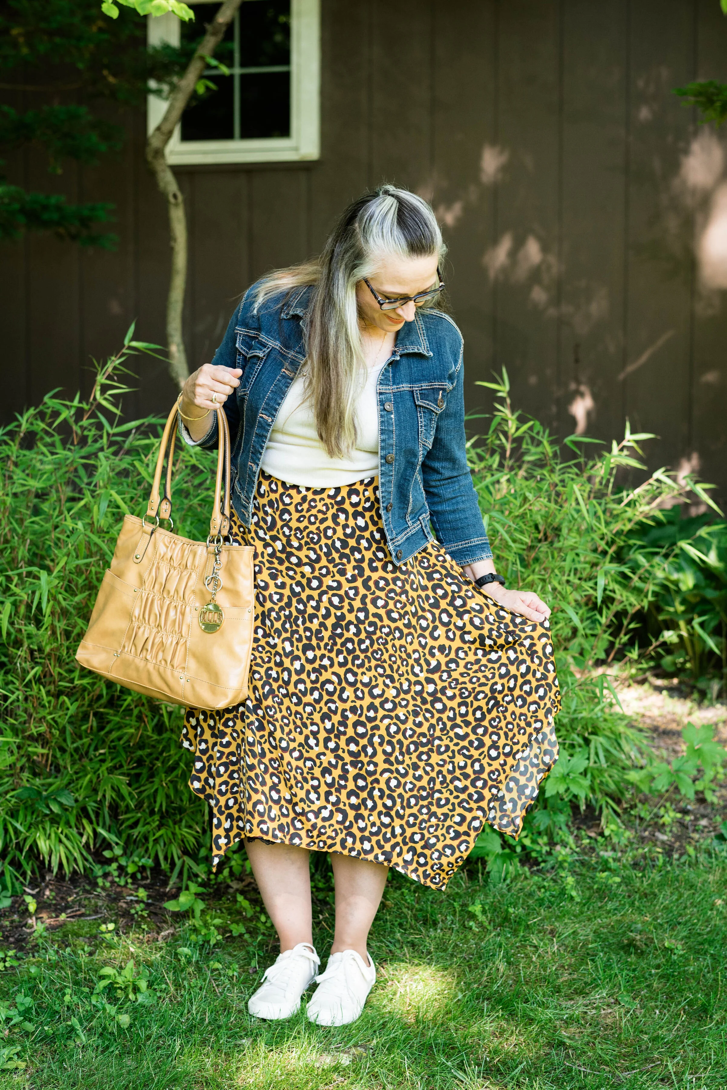
I kept the same off white thrifted St. John’s Bay tank top, but swapped out the black polka dot blazer for my thrifted Rue 21 cropped denim jacket. This is one of my favorite thrifted pieces. It is so versatile and I pair it with everything. The fact that it is cropped with 3/4 length sleeves makes it the perfect piece for summer outfits, when you don’t really need a full blown jacket.

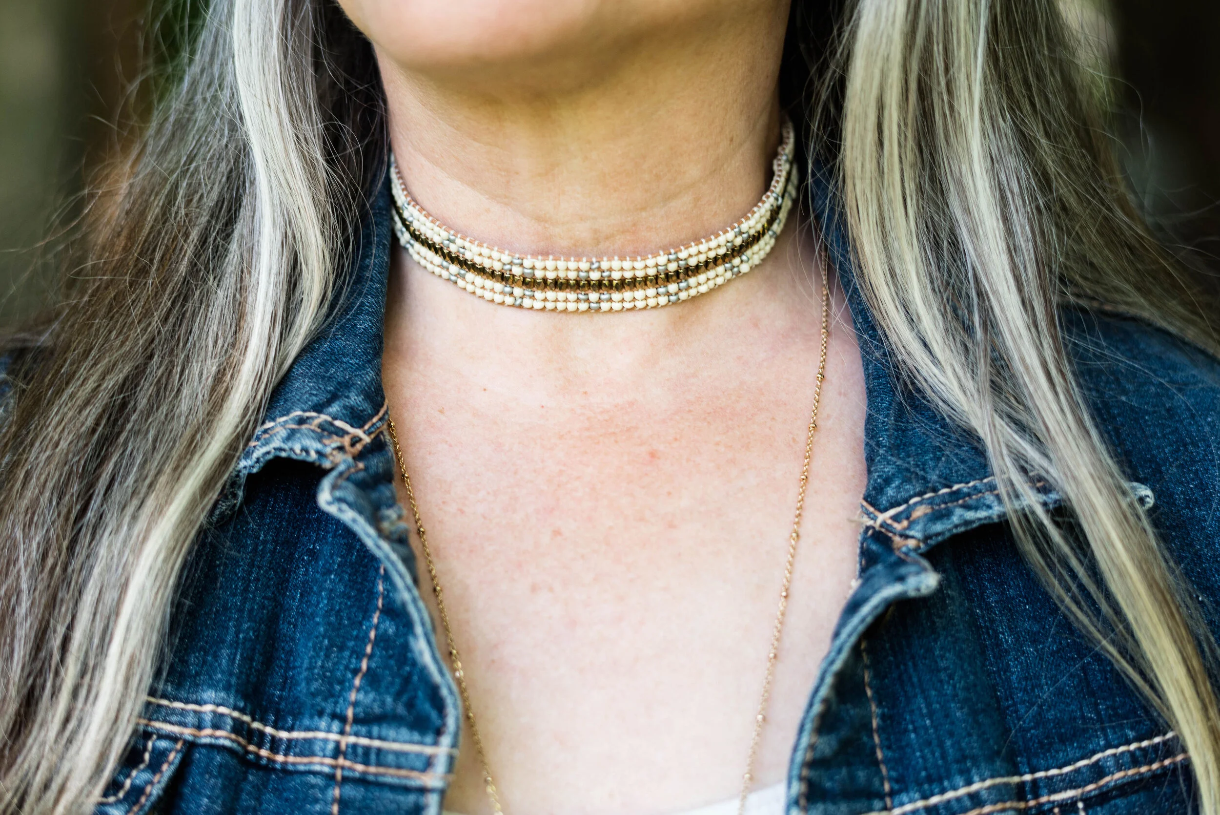
I changed my accessories to reflect a more casual vibe. Sometimes it is fun to wear multiple necklaces together, so I wore a gold and cream beaded choker with a longer gold charm pendant necklace.

Summer style - leopard print skirt - casual

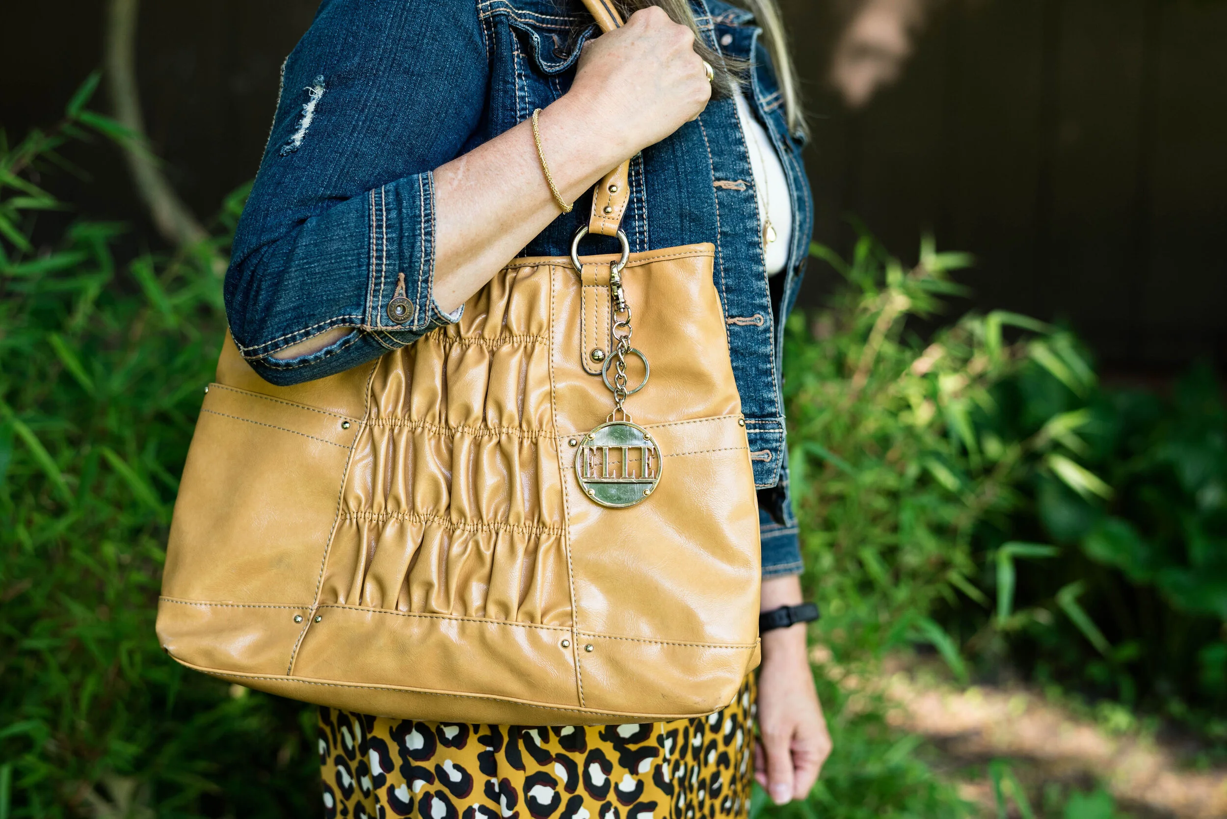
I chose my thrifted yellow, Elle tote bag because I like the way it went with the skirt and I thought it added another dimension of texture and interest to the outfit.

Summer style - leopard print skirt - casual

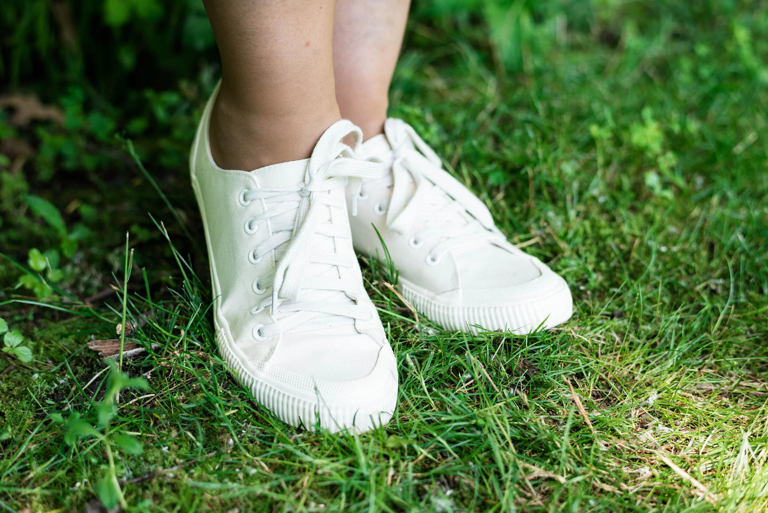
My Mossimo sneakers were also a thrift find. One of the Goodwill stores I go to has multiple new items from Target. They must be items that are discontinued, but they are brand new with the labels still on. How fun is that! These are not sneakers I would wear for a long day on my feet, but I thought they were fun for occasional wear and for the blog.

Summer style - leopard print skirt - casual

What do you think of this casual interpretation for this skirt? Do you think it works? Would you wear a skirt in this way. Leave me your thoughts in the comments. I love to hear your ideas and thoughts.

Summer style - leopard skirt - casual

Here are the two outfits side by side. Which one did you like better?

I’ve included a few shopping links to look over. These are affiliate links. All opinions are my own.

Photo credit Rebecca Trumbull.

Have a great weekend everyone and stay safe!


Pantone Spring/Summer - 2020 - Yellow Iris, Rose Brown and Cuban Sand

Today I am featuring two colors I was not quite sure what to do with. When I began searching for these colors in my closet I was sure I wasn’t going to be able to find them. Rose brown is an odd color; not exactly brown, but not really pink, it has a purplish feel to it. Yellow Iris was another tough one for me. I don’t have a ton of pastels in my wardrobe. I like jewel tones and earthy colors, so this pale yellow was stumping me. I have a lot of yellow in my wardrobe; bright yellow, mustard yellow, sunflower yellow, and so on, but not a lot of pale yellow. While Sunlight from the New York palette had an almost light beige or tan vibe to it, this Yellow Iris is strictly a pale yellow. This is what I came up with. Let me know what you think.

Pantone - Spring/Summer 2020 - Yellow Iris, Rose Brown and Cuban Sand

I found this floral embellished tee first when looking for these colors. The flowers bear a close resemblance to Rose Brown. This is a thrifted Christopher and Banks tee. The Yellow Iris button up is a thrifted White Stag piece and while not quite as dark as the Pantone color is similar enough. The next pieces I had that were a light yellow were too yellow. Ha, ha.

Pantone - Spring/Summer - 2020 - Yellow Iris, Rose Brown and Cuban Sand

I added this brown woven belt, because it has a bit of that Rose Brown vibe going on as do the two necklaces I chose. They are definitely a darker brown color, but different than a regular brown, and I thought they went well with the tee.

Pantone - Spring/Summer 2020 - Yellow Iris, Rose Brown and Cuban Sand

The gold in the longer necklace made me reach for my gold clutch. You can also see that I added a few simple seed bead bracelets to add a touch more of the Rose Brown color.

Pantone - Spring/Summer 2020 - Yellow Iris, Rose Brown and Cuban Sand

My white crop pants I have styled on the blog before. You can see them styled with a dress in another Pantone shoot here. These are a thrifted St. John’s Bay brand.

Pantone Spring/Summer 2020 - Yellow Iris, Rose Brown and Cuban Sand

I looked up the difference between a caged sandal and a gladiator sandal and discovered that there really is no difference. Many gladiator styles come up higher on the leg, much like a boot and involve some sort of lacing, but both gladiator and caged sandals are basically an open style of sandal with numerous straps coming across the foot. They can be open toe, thong or closed toe in variety. The gladiator style ones I have on are Massini brand. I like that they cover more of my foot than a sandal with only a few straps. They also have a small block heel, which I think makes them a little more dressy.

Pantone Spring/Summer 2020 - Iris Yellow, Rose Brown and Cuban Sand

What do you think of these colors? Are they colors you would wear? Do you have pale yellow, this purply brown in your closet? I’d love to hear your thoughts.

I am leaving you with a few shopping links. These are affiliate links. All opinions are my own.

Photos and graphic Rebecca Trumbull.


Pantone Spring/Summer - 2020 - Biscay Green, Saffron and Brilliant White

Today’s outfit revolves around three colors from the Pantone Spring 2020 New York Palette that are described as flavorful, cleansing and pristine. Saffron is a rich orangey yellow color, while Biscay Green leans towards a more soothing aqua. Both colors to me are perfect for summer and when paired with a bright white give a warm weather, party ready look.

When I saw Biscay Green on the palette, I knew that I had nearly nothing in my closet that was this pretty greenish blue, so I started keeping an eye out at my local thrift stores last fall for an item or two that would add this medium green to my closet. This oversized button-up caught my eye. It is a brand called Zylos, which appears to be a past men’s brand in dress shirts and ties. As I have mentioned before, I am liking the oversized button up shirts for a fun, casual way to dress up a pair of jeans or in this case a skirt. For this outfit, I tied the bottom of the shirt and buttoned two buttons.

Pantone Spring/Summer 2020 - Biscay Green, Saffron and Brilliant White

The Saffron colored Apt. 9 tee, is another thrift find and I have used it on the blog before for another Pantone series. Last year a similar color was called Mango Mojito and I used this same tee to represent that color. You can see that post here. I thought the color was independent enough that I didn’t need the whole tee shirt to show. The bright pop of yellow orange stands out quite nicely with the peaceful green.

Pantone Spring/Summer 2020 - Biscay Green, Saffron and Brilliant White

I’ve styled this skirt on the blog before. It is St. John’s Bay brand and I got it at JC Penney a few years ago. I was drawn to it for two reasons. The first was that it was white and it was lined. It is so hard to find white you can wear in the summer that doesn’t require a slip or some other underwear that won’t show. This skirt is completely lined. You can still see through it if you have on a dark pair of panties, like red, black or navy, but for the most part they won’t be noticeable. The other reason was the beautiful lace detailing. It is a very pretty piece and can be dressed up or down, depending if you are feeling classic or boho.

DSC_0012 (2).jpg

I have had this layered beaded necklace for a while. I really like it, but don’t think to wear it that much. When I saw how well it complimented this outfit I was excited to include it. So much of my jewelry I can’t even remember where or when I got it. Ha, ha. Maybe that’s because I have so much of it. I also included a navy beaded bracelet, which you will see in the next picture, to pair with the navy beads in the necklace.

Pantone Spring/Summer 2020 - Biscay Green, Saffron and Brilliant White

I found this bag at another thrift store when my girls took me thrifting back on my birthday in January. Ahh, those were the days, when we could get together, go shopping and get lunch. Hopefully, those days will come again. I love the color and feel of this bag. It is a brand called Stone Mountain and is very well made. It has a long handle which can be adjusted, so you can either use it for a shoulder bag or a cross body bag.

Pantone Spring/Summer 2020 - Biscay Green, Saffron and Brilliant white

My perforated peep toe shoeties are Sonoma brand and from Kohl’s. I need to paint my toes. I don’t wear sandals a lot because my feet are like my legs and covered with nasty looking varicose veins. Last fall I went to a vascular surgeon who did an ultra sound to see what could be done. Unfortunately, most of the veins in my legs are in the same bad condition, so having them worked on would provide some temporary relief, but over the course of time, they would develop the same issues. I am putting that off for now, but one day may revisit the idea.

Pantone Spring/summer -Biscay Green, Saffron and Brilliant White

Do you like these colors? How would you wear them? Remember you don’t have to put the colors together as I do. I am simply trying to show you what the colors are for the Pantone seasons and ways you might combine them. Do you wear white in the summer? Do you have a white skirt or do you prefer to wear pants, capris or shorts? I’d love to hear from you, so leave a comment or two.

Graphic designed by Rebecca Trumbull.

I’ve included a few shopping links for you. These are affiliate links. All opinions are my own.

Have a great day and be safe as the world begins to open back up!

.

Pantone Autumn/Winter - 2019 - Chili Pepper and Bluestone

Before I get started showing the outfits I put together for this color series, let me refresh what the Pantone colors are. The Pantone Color Institute is an entity that provides color related solutions across the industry for designers of graphics, products and fashion. It is their color choices for seasons and color of the year that influence the fashion and interior design fields. You can read more on their About Page.

When I began blogging over three years ago, I decided to include the Pantone seasonal color series as a regular feature of my blog. Many bloggers share their favorites with you, but I like to really explore how each of these colors can be combined to make creative outfits that are both fashionable and reasonable financially as almost all of these colors are already in my wardrobe.

This season’s outfits turned out a bit differently than some of the specific colors due to shade variances on different computers, phones and so on. However, the point is not to get perfect matches, but to broaden our thinking about color over all. I ask myself questions like, “How can I combine these colors into one outfit? How can I take this color I am not fond of and use it? How can colors in an outfit make us feel happier, more put together and more confident?”

Today’s outfit combines a cool grayish blue with a spicy red. Meet Bluestone and Chili Pepper. The third color is from Panone’s Classics palette, which I have tried to incorporate into each outfit.

This bright red top is most definitely not the exact same red at Chili Pepper. It was rather strange. I have used my phone before to look at the colors when trying to pick things out of my closet and for some reason I really thought this red was good. However, I think I just wanted to wear this Popsugar top from Kohl’s again because it’s so cute. Ha, ha. I styled this same blouse last spring in another Pantone series. You can see that post here.

My denim jacket is from Christopher & Banks and isn’t exactly Bluestone either, but I was having trouble finding that exact color.

For these pictures we went to Middlegrounds Metropark in downtown Toledo. What a beautiful park right close to the downtown area of our city. I just love the urban chic vibe that these pictures have. I don’t do a lot in the city, but there is a lot more there than I realized. Unfortunately, I may get more familiar with it, as I got summoned for jury duty in October and the Common Pleas court is downtown. Ha, ha.

I decided to pair my top and jacket with my dark blue printed St. John’s Bay, skirt from JC Penney. I thought it matched well with the Pantone classics color Evening Blue. This is a fun, easy to wear skirt with a wide elastic waist, and tiered layers which gives it swing.

Since I had a lot going on in this outfit with prints and textures I wanted to keep my accessories fairly simple. My thrifted Relativity loafer heels are a go to for a look that is classy and work ready.

I thought this pendant necklace a good piece that makes its own statement with this outfit.

Adding this Aerosmith tote bag was my way to show off my inner rocker. Ha, ha.

What do you think of Chili Pepper and Bluestone? Do you have these colors in your closet? How would you wear these?

I’d love to hear your thoughts, so leave me some love in the comments.

I’m including a few shopping links to look at. These are affiliate links. All opinions are my own.

Photo and graphic credit, Rebecca Trumbull.


Summer Pieces - Water Color Maxi Skirt

With my photographer on vacation I have to resort to taking pictures myself for a week or two, meaning relearning how to use my camera. Ha, ha. I thought I would talk about a few of the fun summer pieces I have recently acquired. Every seasonal change, I have to go through my wardrobe to purge what I do not wear, what no longer fits or what I realize was one of those, why did I buy this, moments. As I have said before, I love clothes and I love shopping, so you can imagine that I am inundated with clothing. I also, (true confession time), often shop in spurts, somewhat like an addict trying to get my fix. It is sad, really, but for many of us, shopping is a hobby. To keep myself from ending up on the show, Hoarders, I decided that when I buy, I also need to purge. I am in the middle of this process right now and the fun part of it is, I get reminded of all the fun pieces I do have, and it inspires me to put together a few new outfits.

This water color maxi skirt, I found at a Goodwill store along the way, when my hubby and I were on vacation. It is a brand called eci New York. Macy’s does carry a few eci pieces that revolve around bright, bold florals and patterns. I love all the colors, because it provides a myriad of options for putting outfits together. Made of a medium weight polyester, this piece is easy wash and wear with no ironing needed. It has a wider elastic waist which provides comfort, as well as ease of wear.

I first thought of pairing the skirt with a light pink top, but then when I pulled this top from last year out of hibernation, I knew that was it. The yellow, St. John’s Bay top, from JC Penney, has a bit of a boho vibe already so I thought it was the perfect companion for this unique skirt. I love the textured aspect of this top, from the eyelet on the bodice, to the poms along the bodice edge, to the tasseled cords. I also like the flowy sleeves.

When I started veering towards the Bohemian feel, I chose a woven belt that ties, leaving long fringe hanging along the skirt. You could position this belt wherever you wanted, with the fringe in the front, back or off to either side. I chose the left side, since I typically carry my bag on my right side.

I also chose jewelry that I felt epitomized that characteristically gypsy feel, like a multi-layered beaded bracelet with a dollop of fringe and a unique amber pendant choker with an aesthetically pleasing swirl.

My bag, bought many years ago, is the only true macrame piece I own and what says boho more than macrame? Ha, ha. It is small, but I have used this piece over and over as a cross body bad when we travel. It is big enough to hold the essentials, but not so big that it hurts your neck. This probably could use another washing. Bags like this are easy to wash. Be sure to put it in a laundry bag, then throw it in with your lights or towels. It isn’t meant to be a true white, but more of a cream.

For shoes I chose my No Boundaries black, gladiator sandals. These are ankle high gladiators, unlike the ones that go all the way up the calf. I’ve had these for a long time. They are comfy for a flat sandal and easy to pair with so many outfits for summer. I finally painted my toes, so summer must be pretty well here to stay. It is not that warm, but perfect in my opinion. If I owned a pool, I’d be happy with temps in the mid eighties, but as it is, I really like it to be about seventy five with a slight breeze.

Do you like this outfit? Would you wear a skirt like this? What sort of artsy or uniques pieces do you have in your closet? I’d love you hear from you. I don’t mean to be a nag, but I really do like when my followers give me a little feedback. It is good for my blog as well. It helps me to know what you like and what sorts of things you would like to see on the blog. Even if you made a commitment to comment once a month, that would mean a great deal to me. Thank you so much, for all of your support, whether you comment or not! I appreciate you.

I’ve included a few shopping links. These are affiliate links. When You click on a link, I receive a few cents. Every little bit helps. These links are to things I think you might like and that follow along with the outfits I am posting. All opinions are my own.

Have a great Tuesday.


Is It a Kimono or a Ruana? Week 4

Here I am, once again, taking a look at kimonos versus ruanas. Both of these over pieces are excellent additions to your wardrobe. They help spruce up a more plain outfit and add a lovely, interesting, layer to a work outfit or a date night look. The lighter layers not only add interest, but a little extra warmth for those overly air conditioned offices and restaurants. If you didn't see my previous three posts you can look at those by clicking on the link. Week 1, Week 2 and Week 3. Week 2 gives a good overview of the difference between the kimono and the ruana, if you were wondering.

This week's post centers around a hybrid piece that I am going to call a "kiana", as I feel it has both the cut and fit of a ruana, but the essence of the kimono. This is another online purchase from Christopher and Banks that I got for a good deal. 

For this outfit, I wore a pair of Sonoma olive trousers, a cream colored St. John's Bay tank, and my blue SO flats. 

I am calling this a "kiana" because it is shaped like a ruana, but is sewn on the sides, creating the illusion of sleeves, thus the kimono. Once again, you can see that the outfit by itself is rather plain, but adding this sheer over piece makes the outfit really pop.

I received this fun textured clutch for Christmas from my younger daughter a few years ago. I love the color and the texture. Texture is another way to add interest to an outfit. Think about adding texture in the form of a jacket, a scarf or a bag like this one. Jewelry can also be a way to add more texture. Think pendant necklaces with fringe or even a beaded bracelet like this one I am wearing that I found in a clearance basket at Chicos

Here is another look at the entire outfit. 

What do you think of this piece? Do you think calling it a "kiana" is a good name? What are some ways you style your kimonos or ruanas? What are some ways you add texture to your outfits? I'd love to hear your feedback in the comments section below. 

I've included a few shopping links below for you to peruse. These are affiliate links. All opinions are my own. 

Have a wonderful day. 

Photo credit Rebecca Trumbull. Make up Rachel Christensen

InVESTments: Wearing Vests in the Summer - Denim

I've been taking you on a tour of my vest collection and showing you ways to style these fun pieces for warmer weather. Today I am styling two denim vests to show you how these can be used with various pieces, including capris and a skirt.

Look 1 - Medium Wash

For this first look I wore a medium wash vest from Christopher and Banks. Here is an embroidered option here and a dark wash version here

To keep the look casual I paired the vest with my olive colored capris. I really like the look of blue denim with olive. Olive has become one of my faves for a different color to turn to for a neutral. When you think about it, olive really pairs well with many other colors. These thrifted capris are Sonoma brand with a modern fit, which simply means they sit a little lower on the waist and have a roomier fit through the hips and legs. Here is a utility style from Kohl's.

The top I wore was a sleeveless Izod popover, with a fun tropical floral design in pinks and purples. Here is a possible version from JC Penney. I thought the sleeveless top worked with this sleeveless vest. It gives the outfit an edgier vibe. 

I kept the accessories simple with a stretchy cuff bracelet from Chicos and a silver necklace. Here is another pretty option for the bracelet. 

My tote is from Charming Charlie and is a very light sage green, which I thought went well with the whole outfit. They don't have this version any more, but here is another pretty one. 

I finished off this casual look with my bright blue Keds. Keds are a great sneaker for summer. They are comfortable, cute and reasonably priced. These I found thrifting, but I've brought a few pairs at Kohl's. They don't have anything this bright, but here is a cute striped version. 

Look 2 - White

For the other denim look, I went with a white St. John's Bay vest that I got at a thrift store. This time I paired the vest with a blue striped tee and a navy and white maxi skirt.

You can see I was doing a little print mixing for this outfit. I thought the colors went well together and the narrow stripes on the tee, didn't overwhelm the geometric pattern on the skirt. This skirt was from Christopher and Banks also. 

For my bag I chose this fun little straw number. Straw handbags were on trend this summer and I came upon this little treasure when my husband and I were on a weekend away, while I was perusing a second hand shop.

For my accessories I went with my "stained glass" necklace and two bracelets. I like the contrast of the gold with the blue and white. 

Keeping the look casual I wore my navy Candies canvas sneakers. My husband reminded me the other day that I have numerous pairs of navy or blue sneakers! Ha, ha. I think I counted four pairs, but no two pairs are the same! 

Here are the two looks side by side. 

Do you have a denim vest in your closet that you have neglected to wear? These are versatile pieces that you can wear all year long through all four seasons. 

Have a great week. Be sure to check back Thursday for another post on thrifting. 

Photo credit Rebecca Trumbull. Make up Rachel Christensen.

This post contains affiliate links. All opinions are my own. 

Monday linking up with Catherine of Not Dressed as Lamb. Tuesday linking up with Shelbee of Shelbee on the Edge