Print Mixing Mash Up - Striped Tee - Outfit 1

As i started pulling pieces out of my closet to do this print mixing series, I had no idea how much fun it would be and how many outfits I would come up with. It is amazing how many pieces I have that actually go together in a way that creates real life, wear it to work, outfits. The way I decided to put this together, was to feature one printed piece a week that will be the foundational piece that I build the rest of each outfit around. For this week it is a yellow striped Sonoma tee. The outfit you see today and the outfit on Thursday’s post will both be built around this same piece.

Let me preface this by saying, it was 18 degrees with a wind chill factor that made it feel like 4, when we were taking these photos. It was cold and that wind bit, but we got it done. My daughter is pretty quick at taking pictures, although in those temps, even the camera wasn’t always willing to work properly.

Today’s outfit was a casual look, that I might wear to a get together with friends, or a fun date night with my hubby.

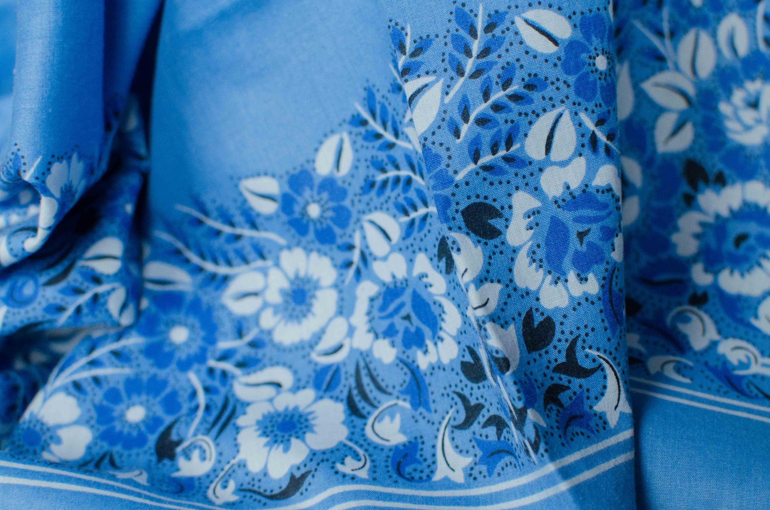
It’s a little hard to see the print mix in these photos, but I showed the top and this kimono in last Thursday’s introduction to print mixing. You can see that post here, if you missed it.

This yellow striped long sleeved Sonoma tee is a recent purchase from Kohl’s. It is light weight and a great layering piece for spring.

This floral kimono was a clearance find at DSW. If you are a clearance shopper like me, it is always a good idea to check out the clearance rack at all stores you go into. DSW is a great place to find shoes on clearance, and I would have never thought to go in there to look for a pretty kimono like this, but there it was. In fact I got two other ones that will no doubt make it on to the blog at some point.

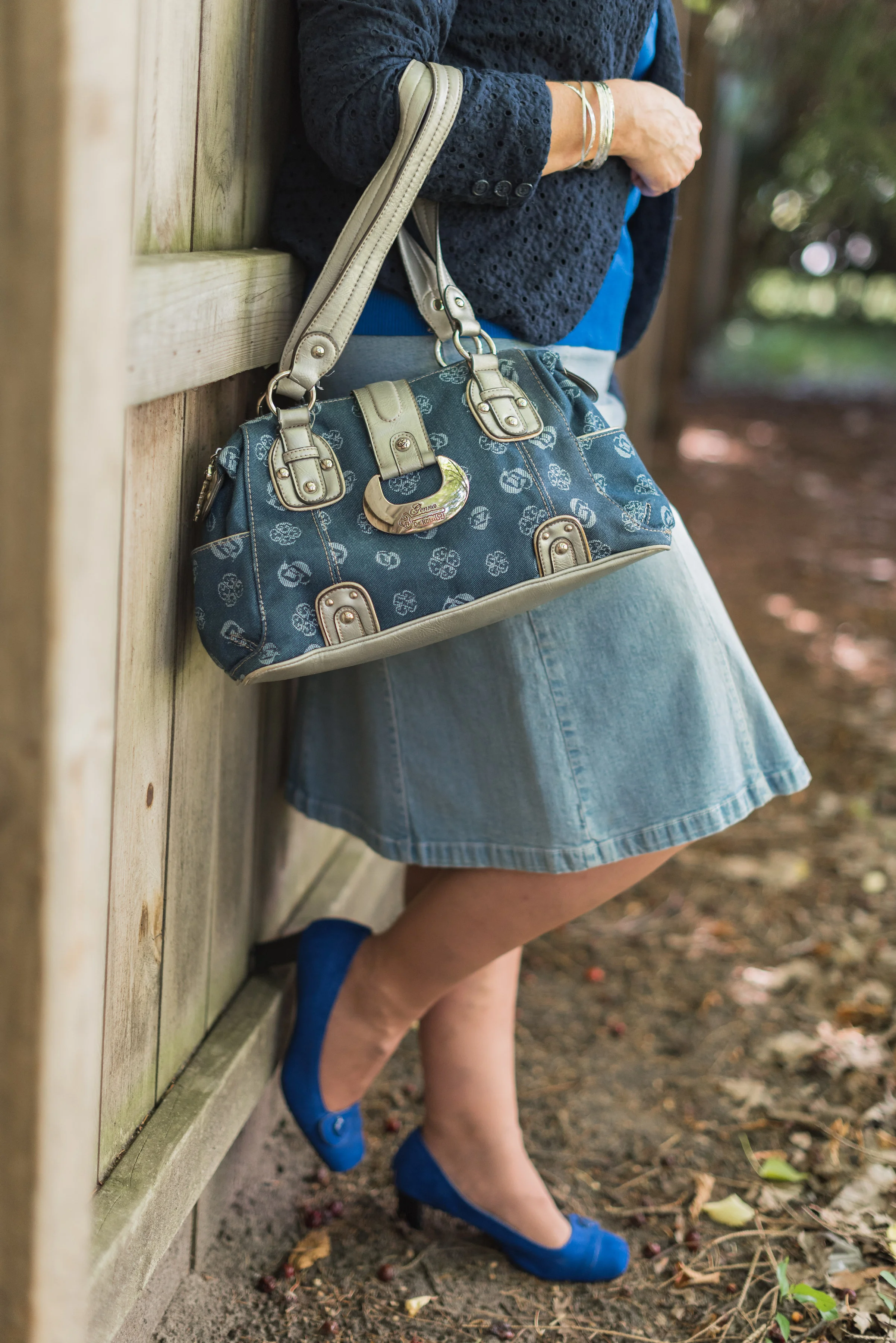
These white Gloria Vanderbilt jeans you just saw on the blog, last week when I was wearing them with my scarf print blouse. You can see that post here. These are my favorite white jeans. They are thick enough that my underwear don’t show through and I like the wider leg.

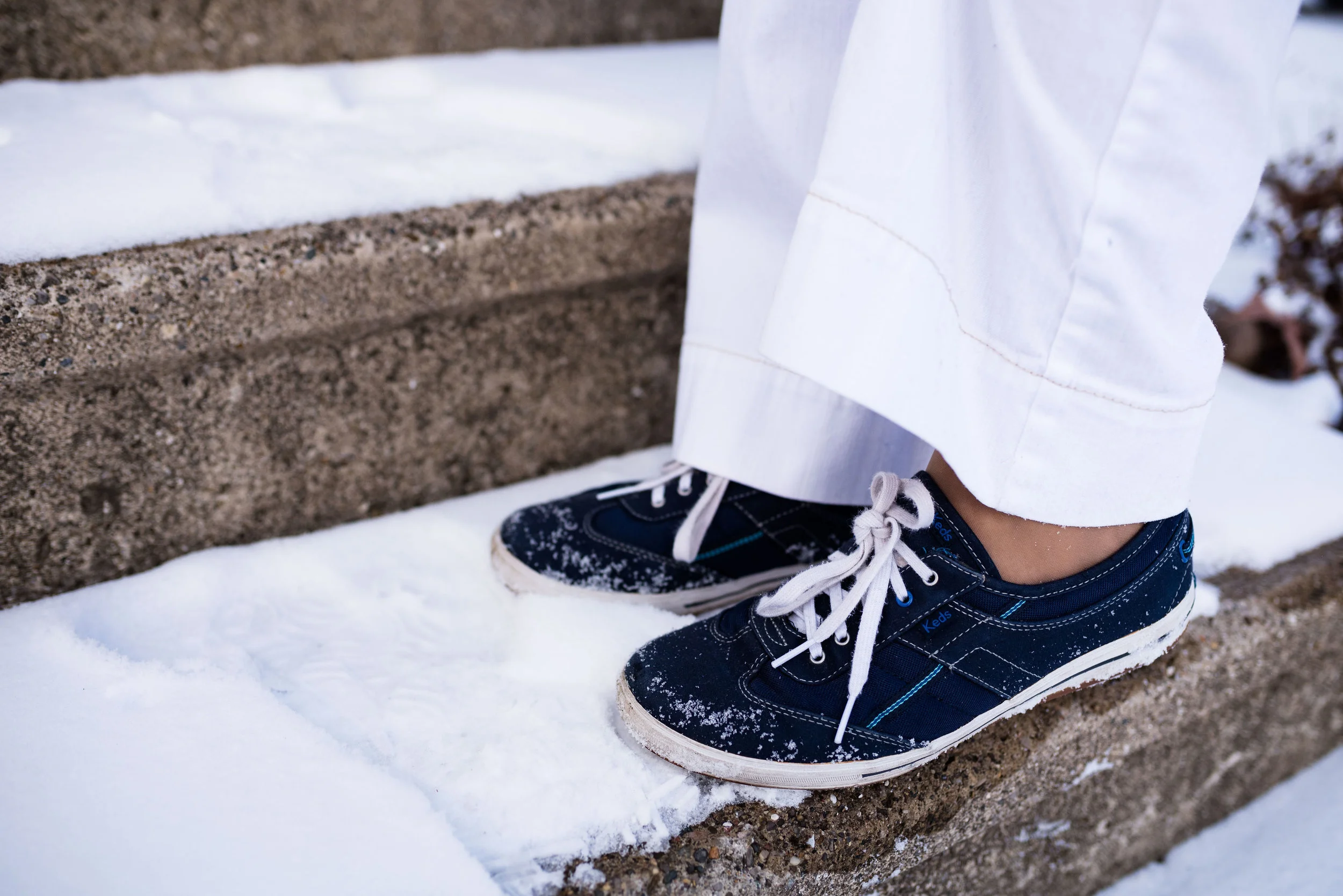
I wanted to keep this look more casual so I opted for my navy blue Keds. After we took these photos are were on the way back into the house, I realized we needed to take a picture of my shoes, thus the snow.

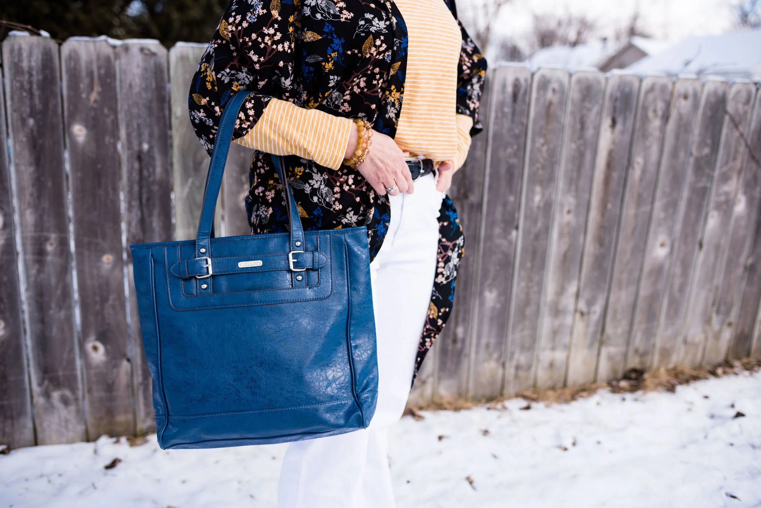
I grabbed this bright blue tote to go with the bright blue in the kimono. This bag is thrifted and Nine & Co. brand. I do like a good sized tote bag like this for traveling. I can fit a lot more in it, like a book and a pad of paper, in case i get the urge to read or write. I know there are electronic versions available, but I still like the feel of a book in my hand or moving a pen on a piece of paper.

You could easily replicate this look by using a color of your choosing for the striped tee and then picking a piece with a complimentary color for the kimono or even a floral cardigan or bomber jacket. It’s not that you create an outfit that looks just like mine, but that you find things in your own closet that will give you a similar look. You wouldn’t have to wear white jeans. Any wash of denim would look cute with a print mix like this or pick out another color that goes with one of the other colors in your print pieces. For instance, my kimono also contains brown and is on a black background. Either color could have worked for my bottom piece.

Why this works:

The main reason this works is the color. The yellow of the striped tee goes perfectly with the yellow in the kimono. The other reason it works is that the stripes are small and narrow, which works well with the busier, bolder pattern of the kimono.

What do you think? Do you like this outfit? Do you have pieces like this in your closet that you like to pair together for a fun print mixing look? I’d love to hear your thoughts. Leave me some love in the comments section.

I’ve included a few shopping links for you. These are affiliate links. All opinions are my own.

Color Crash Course - Print Mixing

It is a beautiful day today, but the wind chill is only seventeen, so as much as I want to go outside and take pictures, I am going to be a wimp and stay inside in a sunny window and use some pics from past posts. 

We hear many things about print mixing and a plethora of bloggers do a wonderful job of mixing all sorts of patterns and colors. What follows are some tips on learning to piece together an outfit that has a mix of patterns and colors that will leave you feeling confident and stylish. 

1. Choose a mix of bold/large patterns with more subtle/small patterns

In the above post from January 24th (click on the date and it will take you to the original post), I wore a maxi dress with a bold black pattern around the hem line. The dress also has a more subtle print throughout. To top the dress off, after adding a similar blue pullover sweater I added a black blazer that has small white polka dots. 

2. Stripes can be mixed easily with anything

If you are at all trendy, then you know one of the big trends this spring is the mix of floral with stripes. I'm seeing this pattern mix everywhere and it works. 

This was my post from Tuesday, the start of my series on the Pantone Spring 2017 colors. The tee from Jacket Society is the perfect mix of stripes and floral. But for another take on this trend see Catherine of Not Dressed as Lamb for her interpretation on floral and stripes together using her own pieces. 

Here is a different idea for mixing stripes with another pattern. This outfit was from a Color Crash Course column. In this outfit the stripes are vertical on the brown sweater. The scarf provides the other pattern. One reason this works is because the scarf pattern is kept tight around my neck and face, while my body is elongated by the stripes on the sweater. They are not competing with one another, but complementing one another. That leads me to the third tip for pattern mixing.

3. When mixing it up, think color, color, color -

Most people who do pattern mixing well, would probably tell you it has to do with choosing a color that complements both pieces. For instance in the above outfit, the taupe is found in both the scarf and the sweater. The blue is also found in the jacket and pants, but I am speaking directly to pattern mixing.

In this post from last week the pattern mix is masculine chic with the blue background of my top bringing up the blue stripe in my plaid trousers.

This outfit from my Denim Days series late last summer mixes different size polka dots on the chambray shirt and pink jeans. Part of what makes this work is the varied size of the dots, but also the muted, soft colors mixed with the more subdued neutral accessories. 

This next outfit was from my Fall 2016 Pantone series and actually fits into two of my mixing tips, so I'll start with it in this color category.

Originally this was just the skirt and top, which is its own version of print mixing. I will address that under the next tip. I added the scarf for a post I did on styling a pashmina scarf, only because the green in the scarf matched the green of the top. Voila! Print mixing with similar colors. 

4. Consider mixing prints with texture

If you a bit hesitant about mixing prints, try mixing a print with a texture. 

My Lush Meadow top is a textured pattern. My maxi skirt is obviously a print. Part of what makes this work is the pattern shape. The diamond shapes on the top are similar to the diamond shapes on the skirt. The other trick to making this look work well is adding the belt. The belt divides the patterns and keeps it from looking too busy. Adding a solid piece, like a belt, vest, cardi or jacket can help tone the busyness of prints down and give the outfit a cohesive look.

In this picture you can see the textured lace pattern of the top works beautifully with the leopard print cardigan. Inspired by Jennie of A Pocketful of Polka Dots, you can see my original post here.  If you still feel a bit intimidated by mixing patterns. try envisioning this same look with a black lace top or a more neutral tan. You are still mixing prints because of the texture, but it will be more subdued. 

5. Go for a monochrome look

This outfit was based on a post by Liz of With Wonder and Whimsy (see her post here). Instead of trying to pull one central color out of two crazy patterned pieces, going for a monochrome look allows print mixing with a crisp, clean vibe. I seem to have this thing for polka dots that I didn't even know I had. Ha, ha. See my original post here

6. Try an accessory

If you want a more subtle look, try just adding a simple patterned accessory to your print. Check out the following ideas:

Patterned Scarf

Adding this scarf to my snake skin jeans is a perfect pattern mix.

Textured Bag

Patterned Bag

Textured jacket

Print mixing can be intimidating, but you probably are already doing it and you didn't even know it. Don't be afraid to mix it up. Print mixing can be fun and it can also make your outfit more colorful and interesting.

Even my daughter likes to print mix. She sent me this pic of her most recent attempt. She pulled this off by using the base color of both her top and her scarf as well as mixing the larger scarf print with the smaller dots on the top. 

We'd love to hear from you. Leave me some love in the comments section!

Have a great weekend!

Photo credit Rebecca Trumbull. Make up Rachel Christensen.

Thursday linking up with Nicole of High Latitude Style.    Friday linking up with Nancy of Nancy's Fashion Style, Jennie of A Pocketful of Polka Dots, Shelbee of Shelbee on the Edge, 

Color Crash Course

The forth in a series of monthly columns on Thursdays, the Color Crash Course, will focus on color. Color is an important part of how we dress. Sometimes I pick my outfits according to color. Let's say pink. Maybe for a few days I pick something pink to center my outfits around. Usually it is a top or a cardigan or jacket. Now that I am learning more, I might pick a bag with pink in it and center my outfits around that bag, or maybe it is a statement necklace or a scarf. Color brings depth and dimension to our outfits.

Pantone is the gold standard in the fashion and interior design industry for determining seasonal colors. For example in the spring they came out with colors called Serenity Blue and Rose Quartz. You can see the outfits I designed around those colors here (Serenity) and here (Rose Quartz). Fall colors are now out and include names like Airy Blue, Sharkskin and Lush Meadow. I look forward to Pantone's seasonal color report because I like to draw on their ideas as a spring board for my own outfits. You might wonder how I do this without going out and buying a whole new wardrobe. Think small. I recently found a clutch at a thrift store in the green spectrum of Lush Meadow. I also own a number of items that would qualify as Sharkskin. My colors may not be exact matches to Pantone's, but again, they provide a spring board for my own fashion designs. Cyndi Spivey of Grace and Beauty did a great overview of Pantone's Fall color line up in her post Fall Fashion Color Report.

While I will be focusing in September on those fall colors put out by Pantone, this column will not be limited to those colors only. I want to use this 4th Thursday of the month to encourage you to try different color combinations as well as revisit some of the old classics. Have you ever thought, "I would never wear those colors together!" You know the saying, never say never! These days anything goes. Brown with black, red with pink, orange and green, you name it, it can go together. It's all about shades and undertone. Maybe you have also thought, "I'd never wear denim with denim or like color with like color." Again, never say never. Next month this column will feature a post on wearing denim with denim. If you can't wait that long, see what Janeane did of Designing From My Closet. She nailed the denim with denim look.

Occasionally, I will also look at pattern mixing. Mixing patterns is new to me, so I am still learning, but it will be fun to experiment. I would love your input. In the comments section below let me know what colors you like to wear, or what colors you have never thought to put together. Let's have fun with color!

Top pictures Pixabay. Bottom pictures Rebecca Trumbull.