Color Play - Building Outfits Around an Abstract Print Skirt
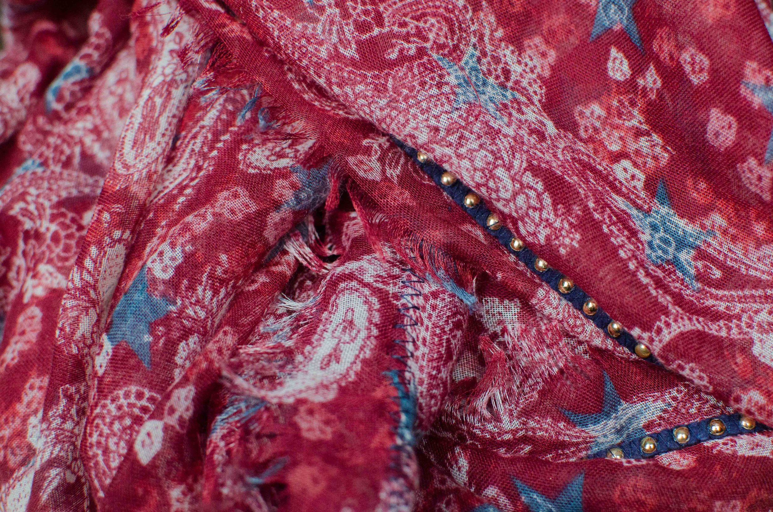
I have been wanting to build an outfit around this pretty abstract print maxi skirt ever since I thrifted it a few seasons ago. In order to get a bit outside my normal jeans and tees kind of casual outfits, I have been purposefully meandering through my maxi skirts in an effort to build a few fun, summer outfits that would work for backyard bbq’s, dressy casual dates with a friend or significant other, work or a more casual summer wedding. Today, I am showing you two different outfits using the same skirt.
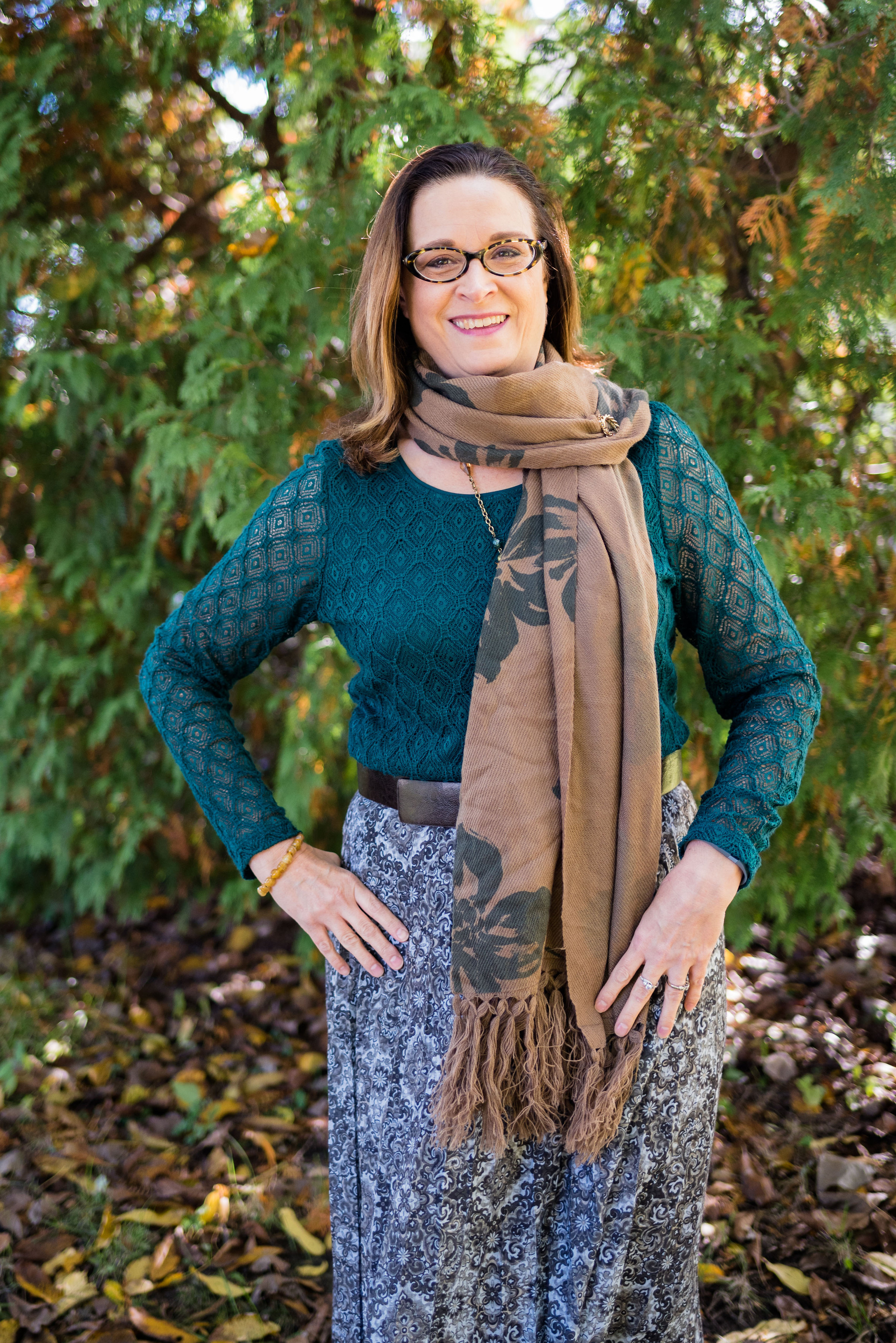
Outfit 1 - Dressed Up
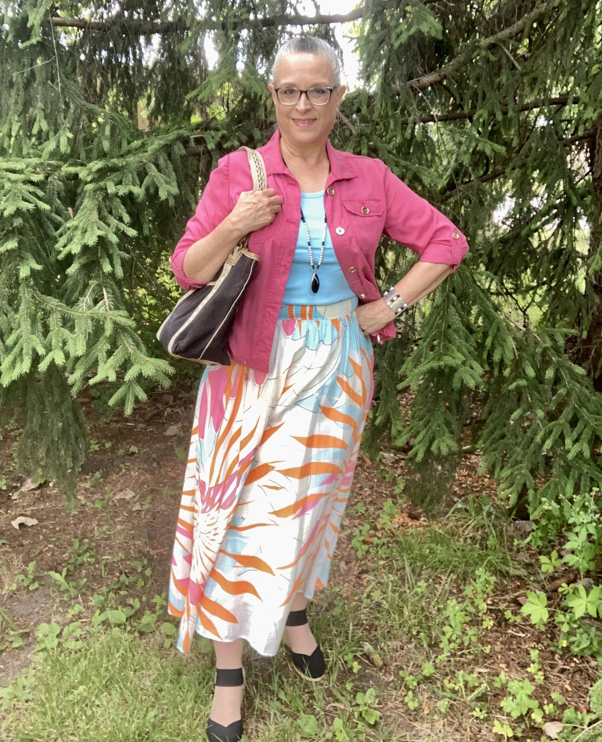
This skirt is a brand called Maeve by Anthropololgie. The outer layer is cotton, and it has an attached slip, making it easy to wear with no show through. The wide elastic band is comfortable, and easily covered with a wide belt, as you’ll see in the next outfit.
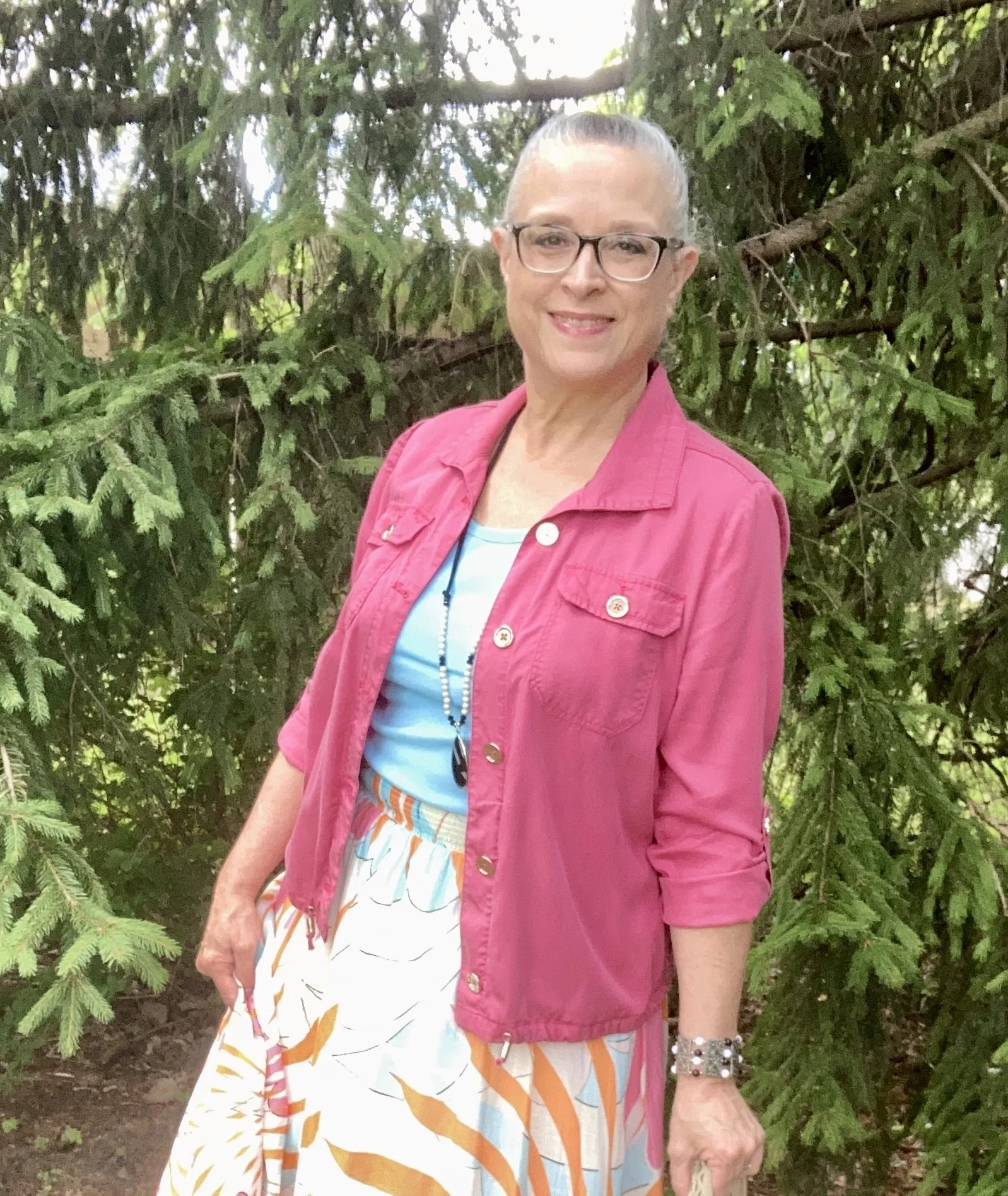
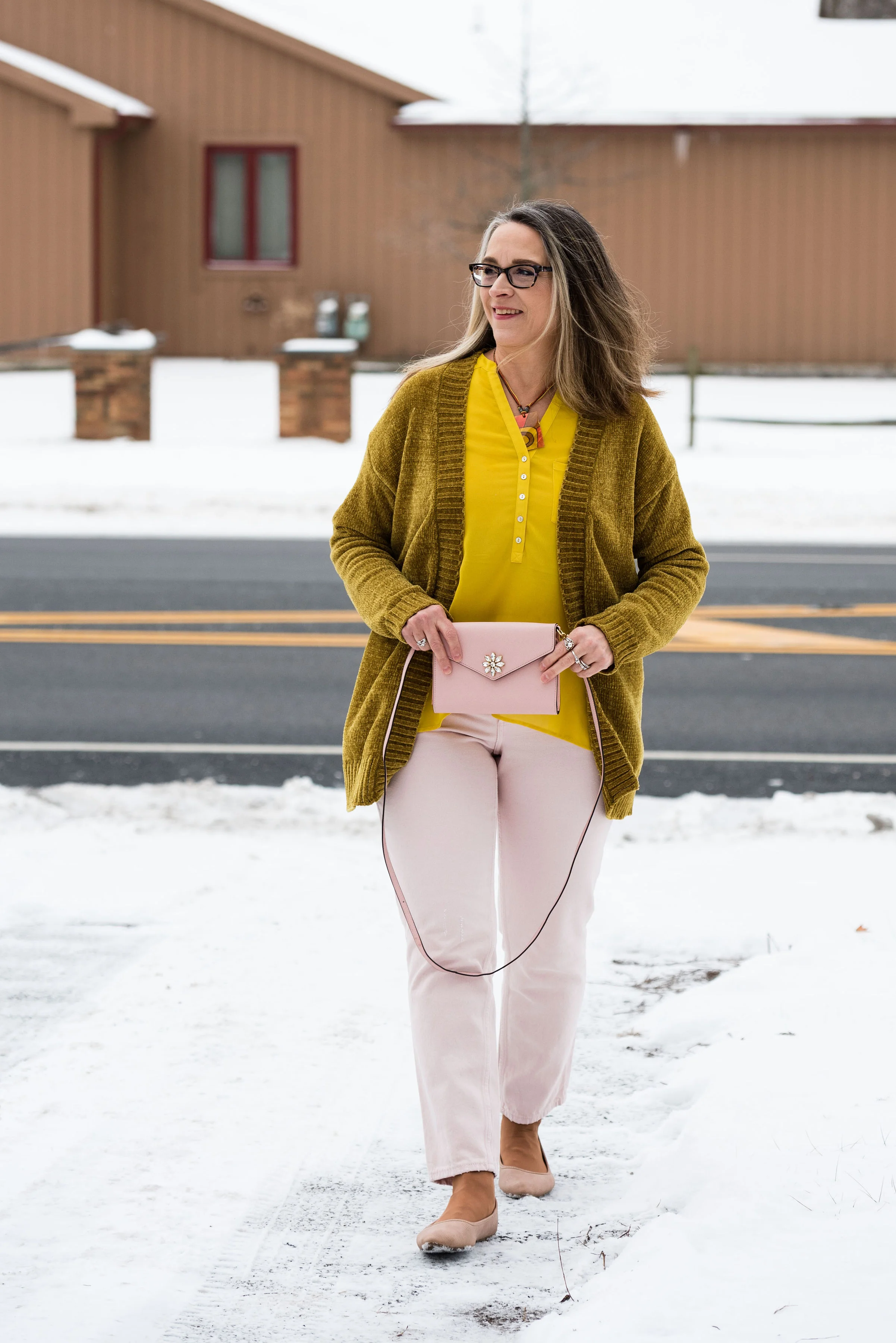
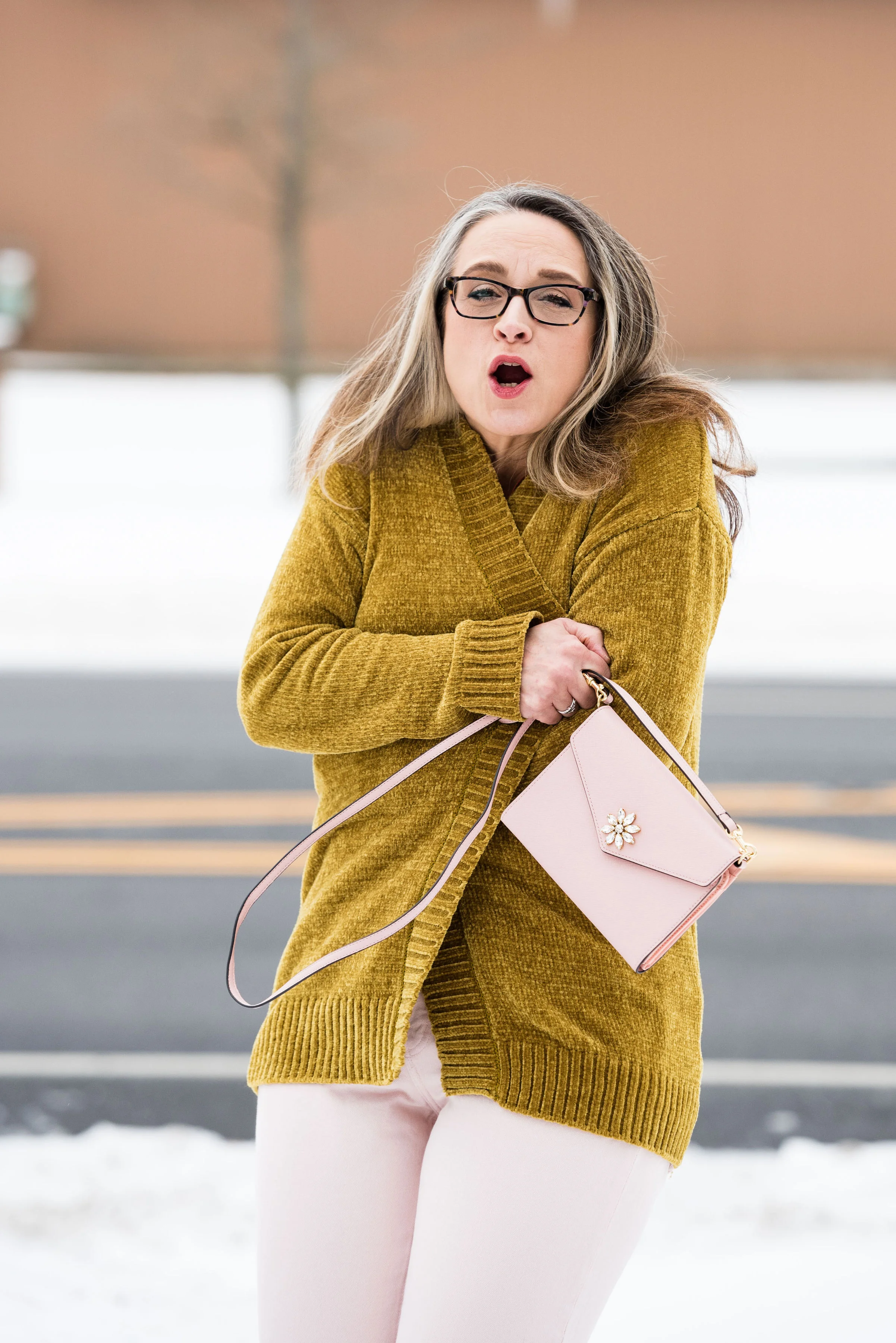
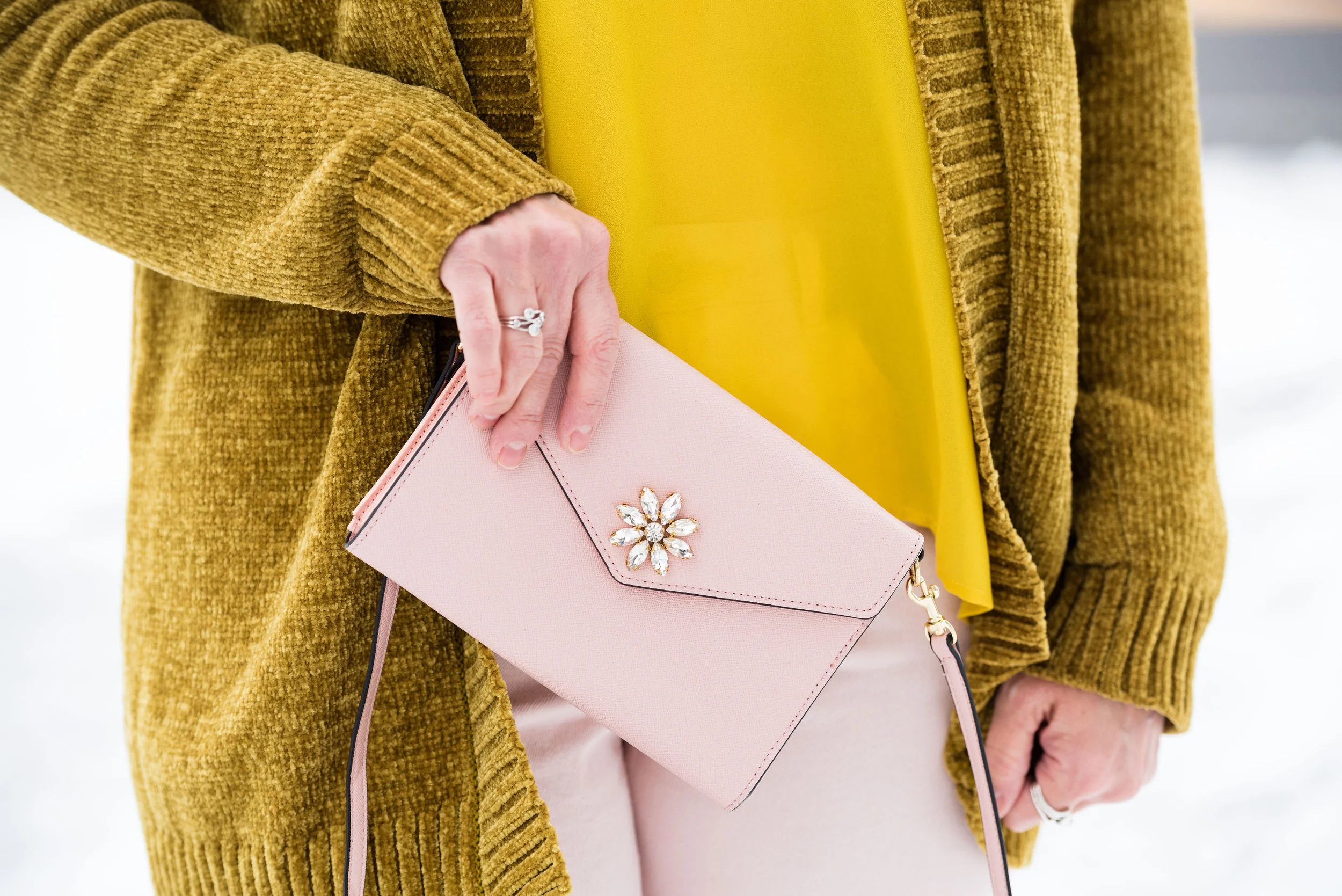
My bright pink jacket is a Chico’s thrift find. It is actually a petite, but I don’t have a super long torso, so I occasionally can get away with a petite size. You don’t really notice, especially if the sleeves are rolled up.
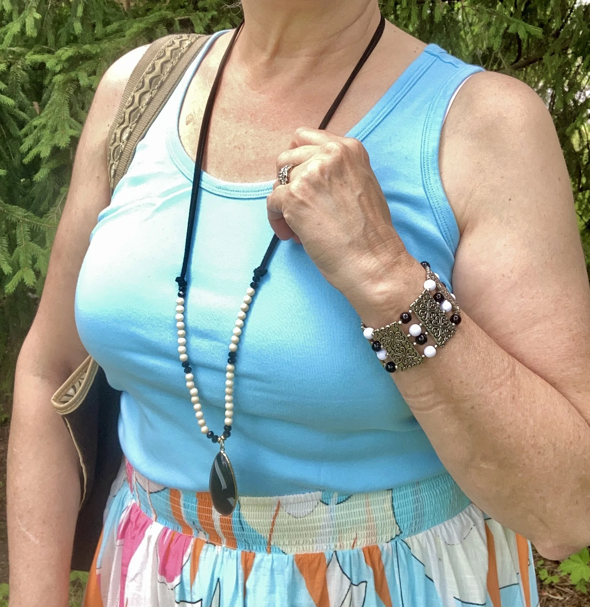
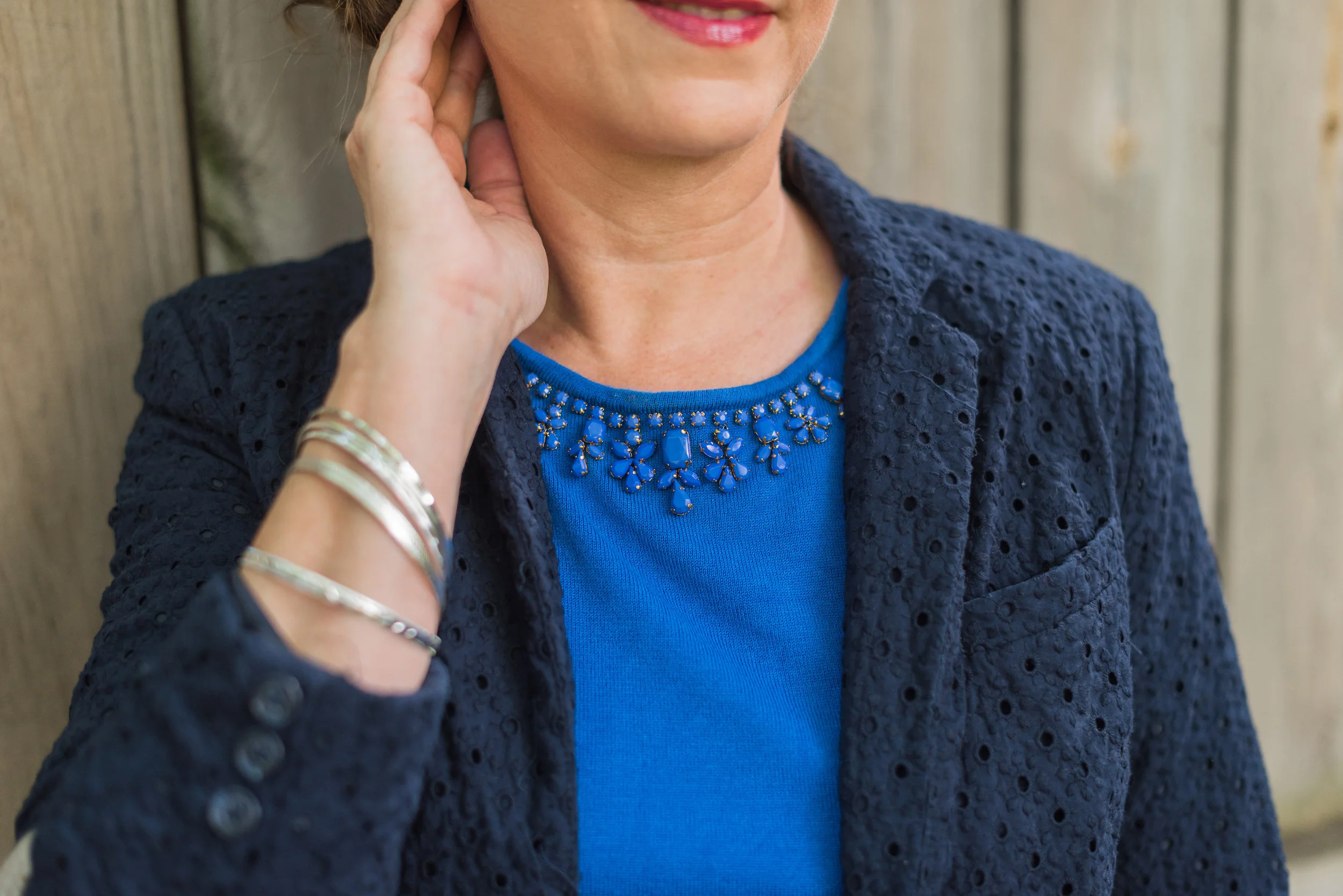
My tank top was a St. John’s Bay basic that I got at JC Penney a few seasons ago. I was excited to see it matched the blue in the skirt spot on. Of course with this skirt you could use pink, orange, white or black, or even mix it up with a totally different color like mint green, or sunflower yellow. That is exactly why I like to call this monthly column, Color Play, to stretch our minds as to what sorts of colors go together.
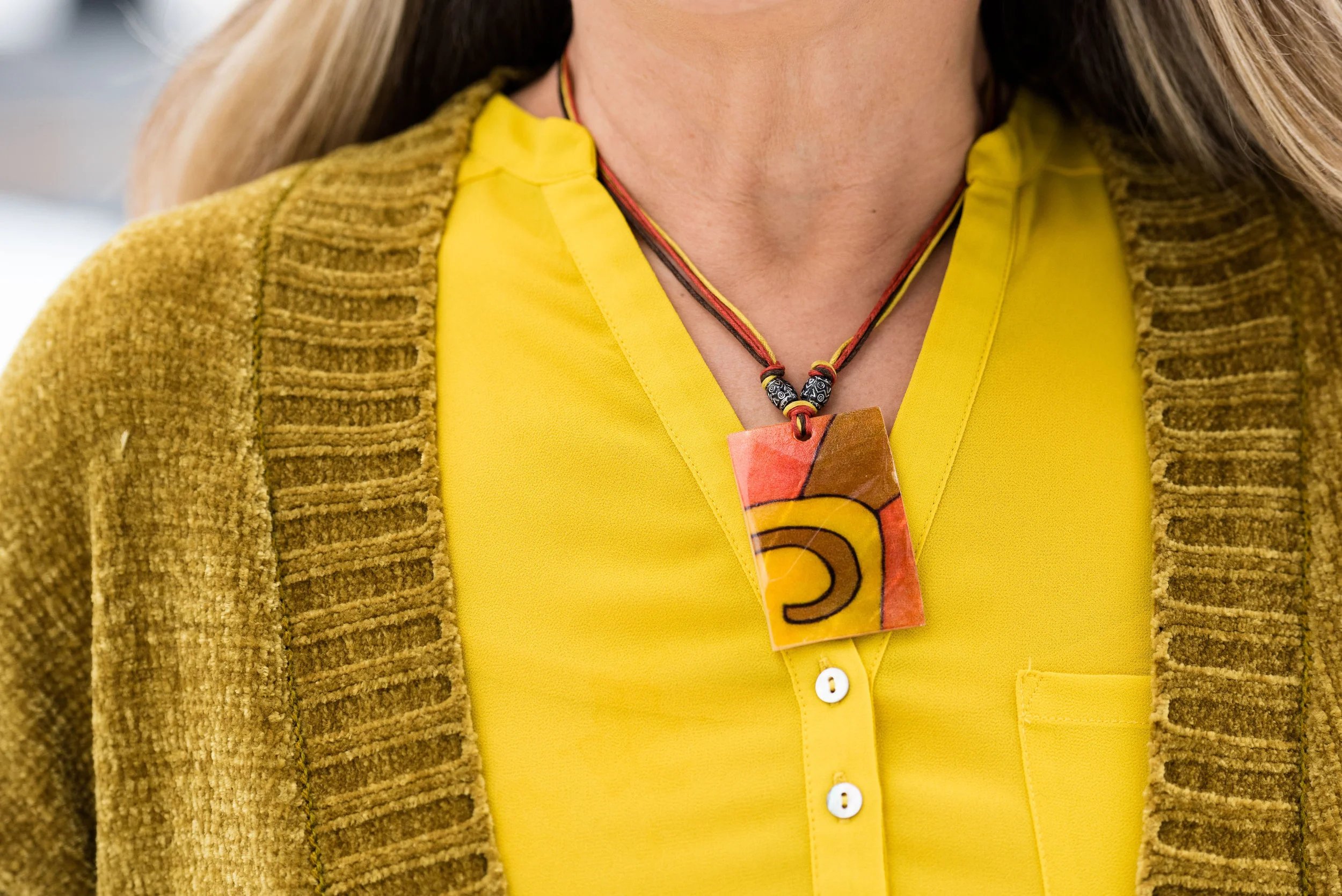
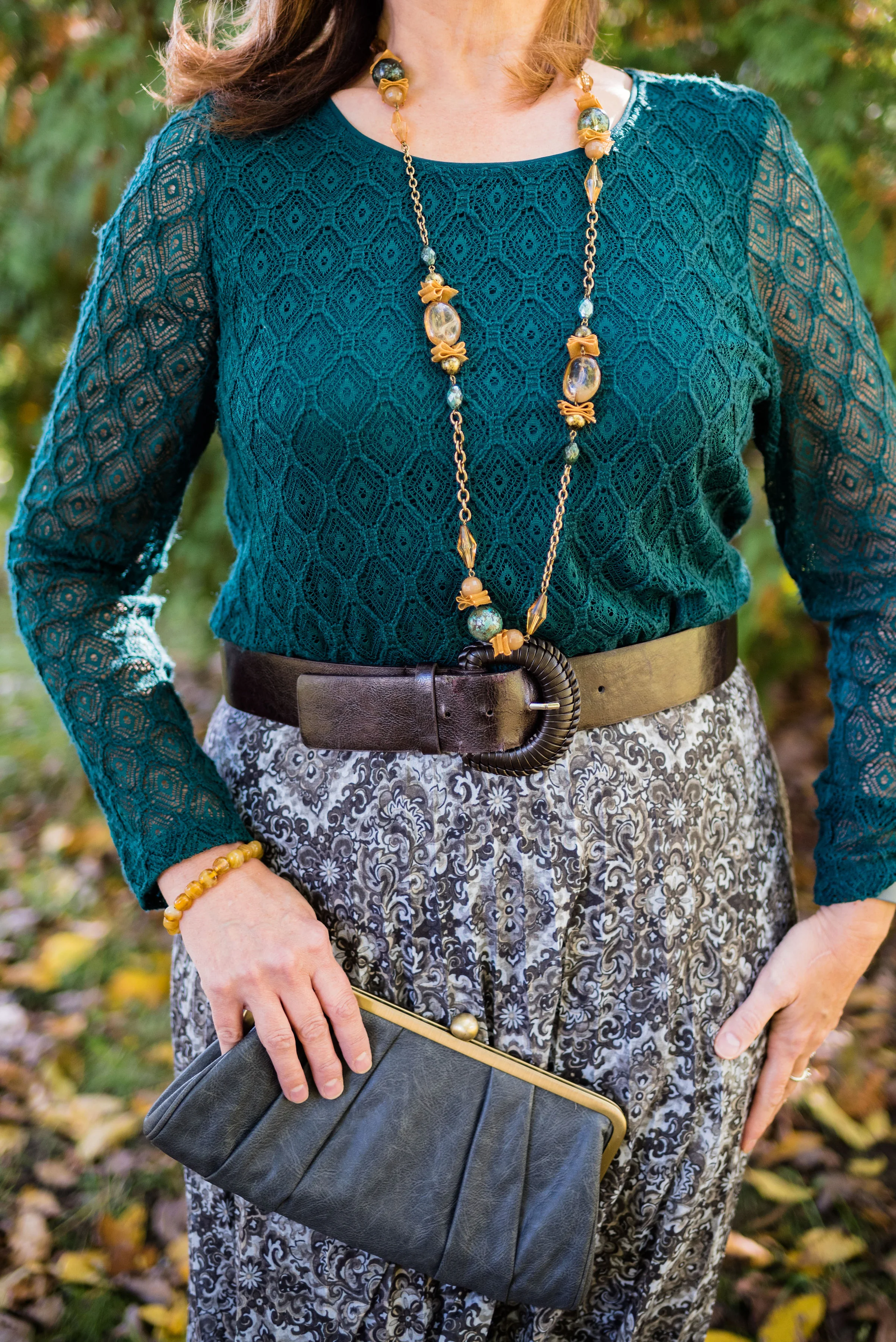
The jewelry wasn’t made to go together, but they certainly work well together. The necklace I got a few months ago at my favorite thrift store around the corner. The bracelet was a clearance purchase probably from Kohl’s or Penneys.

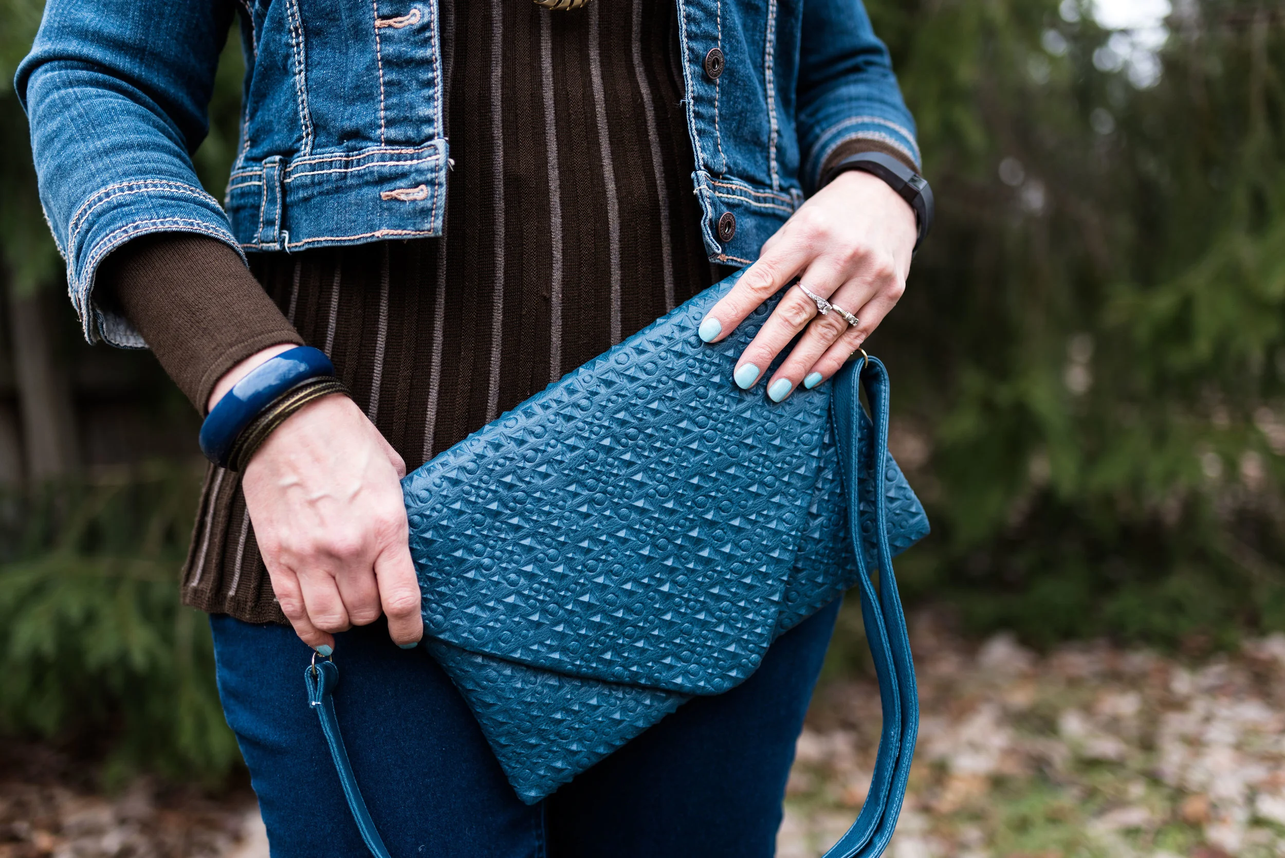
I have had this Relic canvas tote for a number of years, and it is a great work horse for summer. While I regularly carry a cross body bag, I occasionally reach for a tote bag to run to the coffee shop or library, or when packing for a trip. Sorry about the bits of cat hair. You can’t have a pet without there being a bit of fall out, especially in these warm temps. Ha, ha.
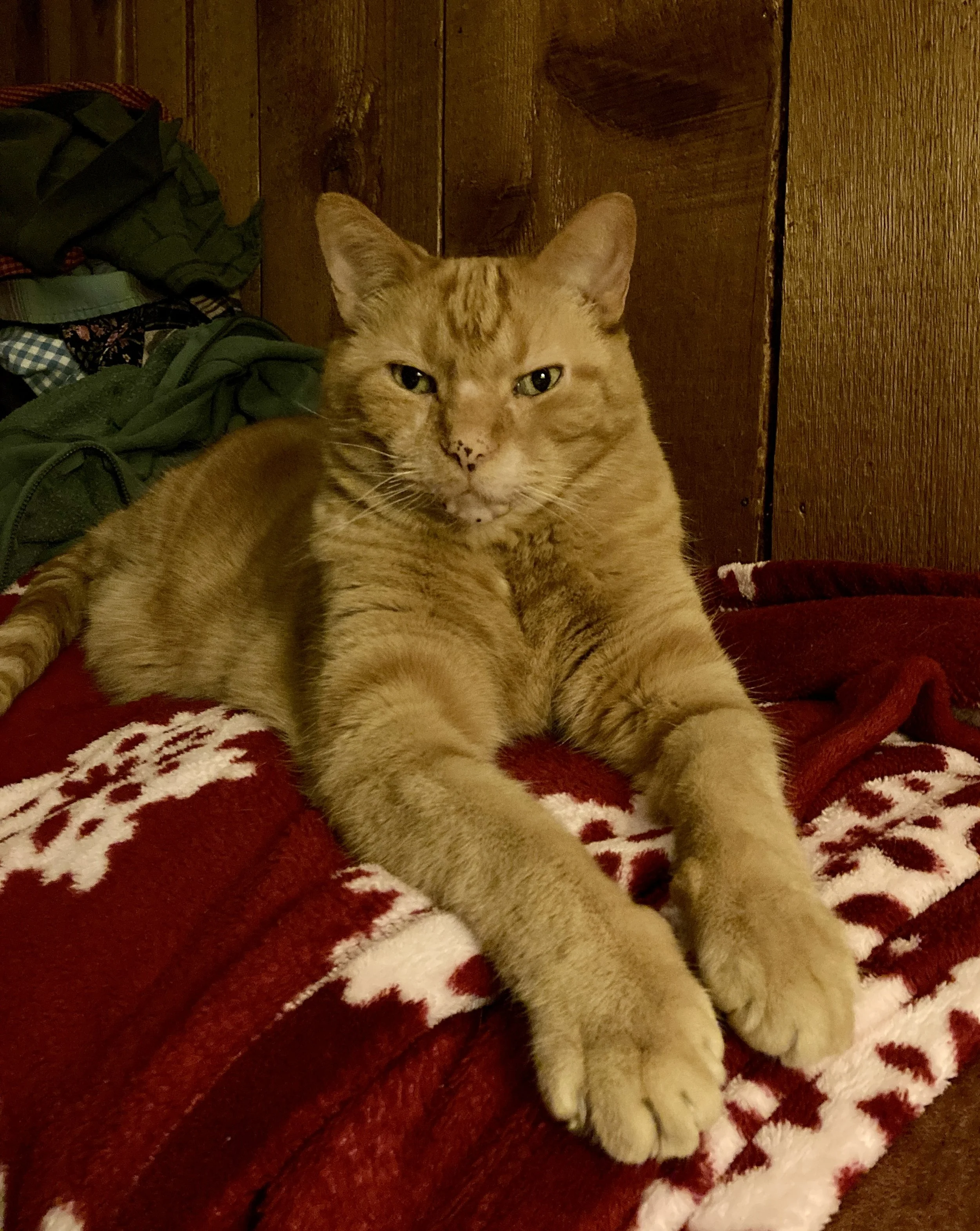
Our silly curmudgeon, Plato Aristotle Radcliffe Christensen. A large cat had to have a large name!
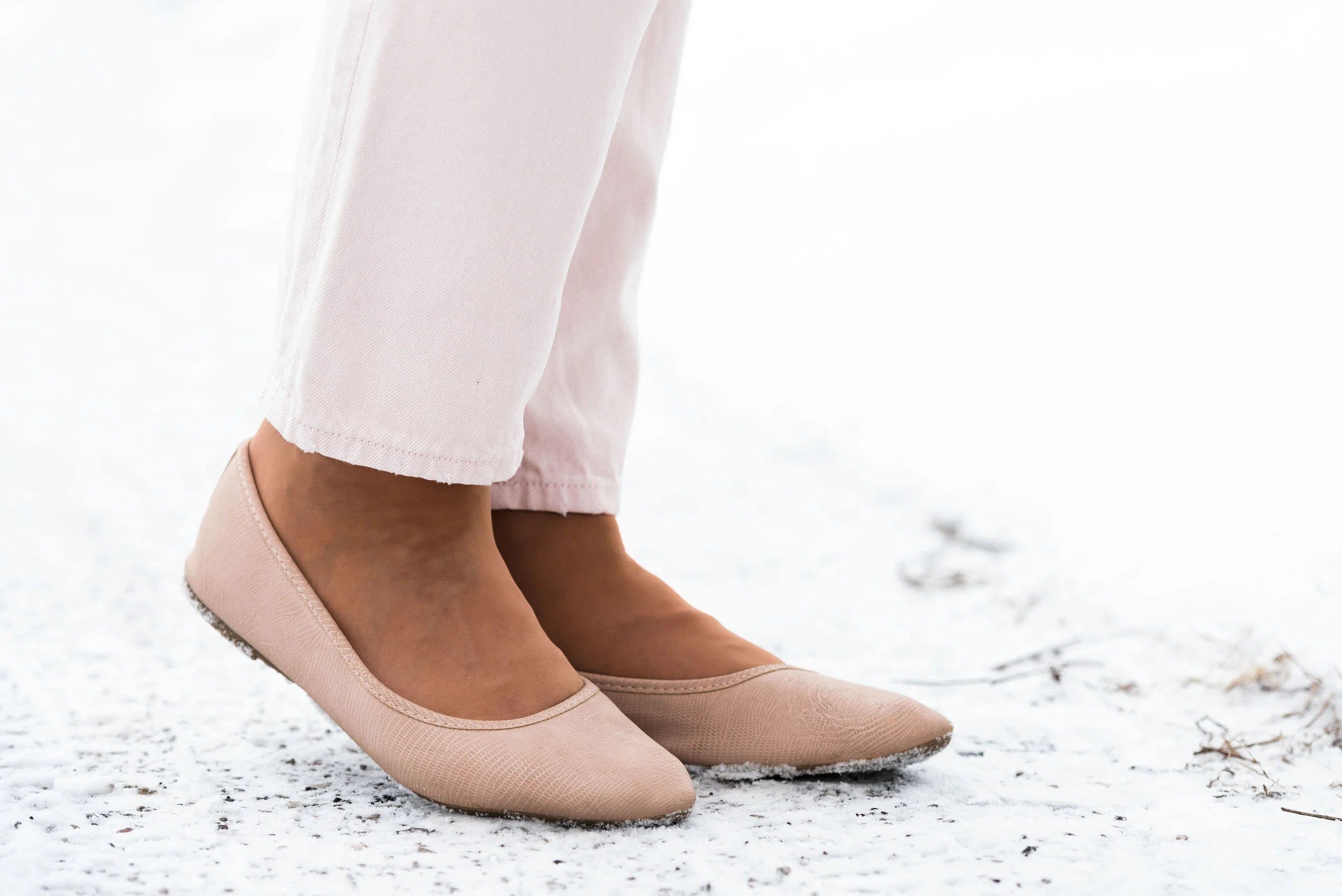
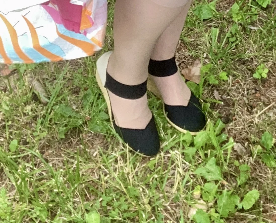
I had to rummage through my shoe boxes to find these cute espadrilles. These are Chaps brand and were a Kohl’s purchase a few years ago.
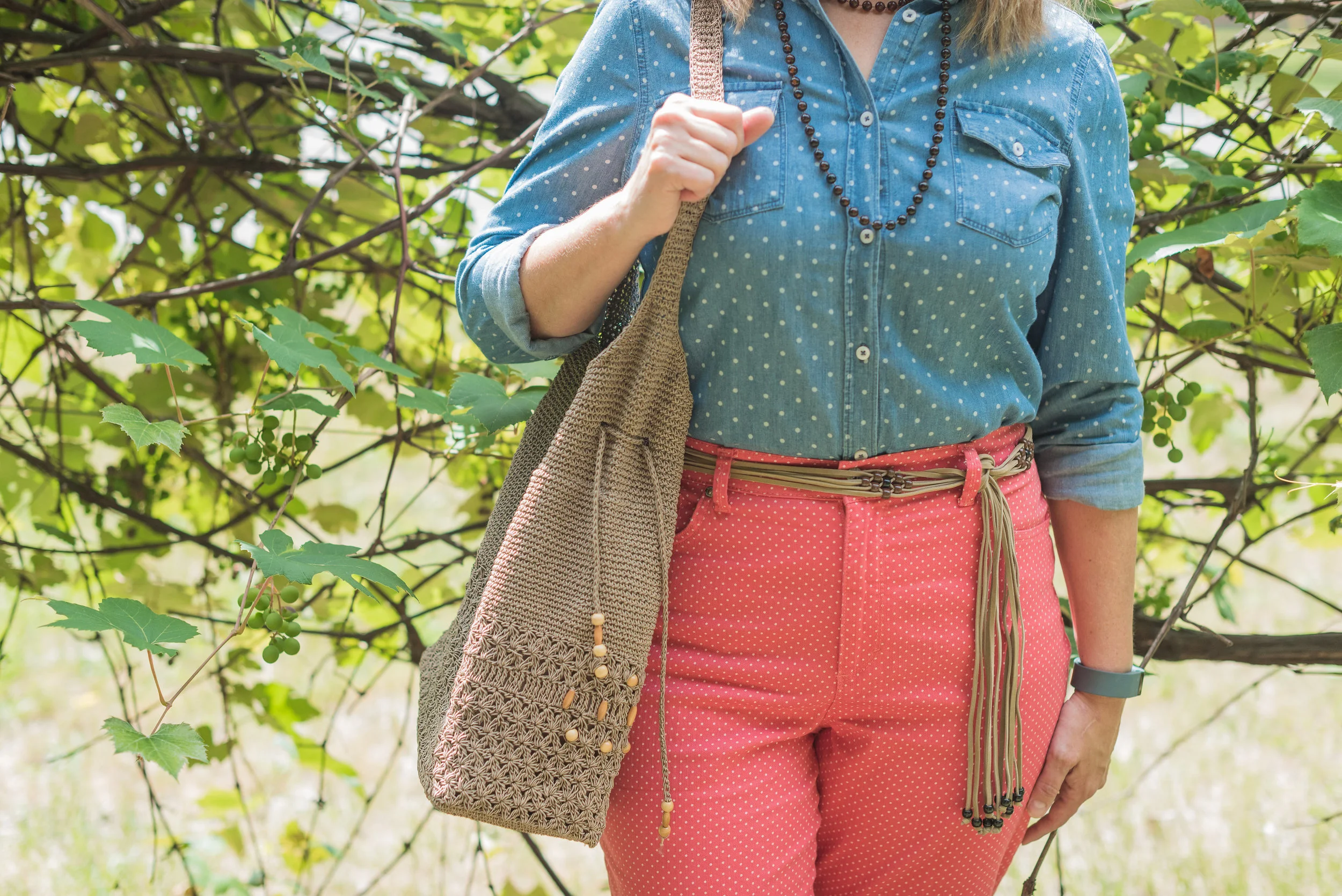
Outfit 2 - More Casual
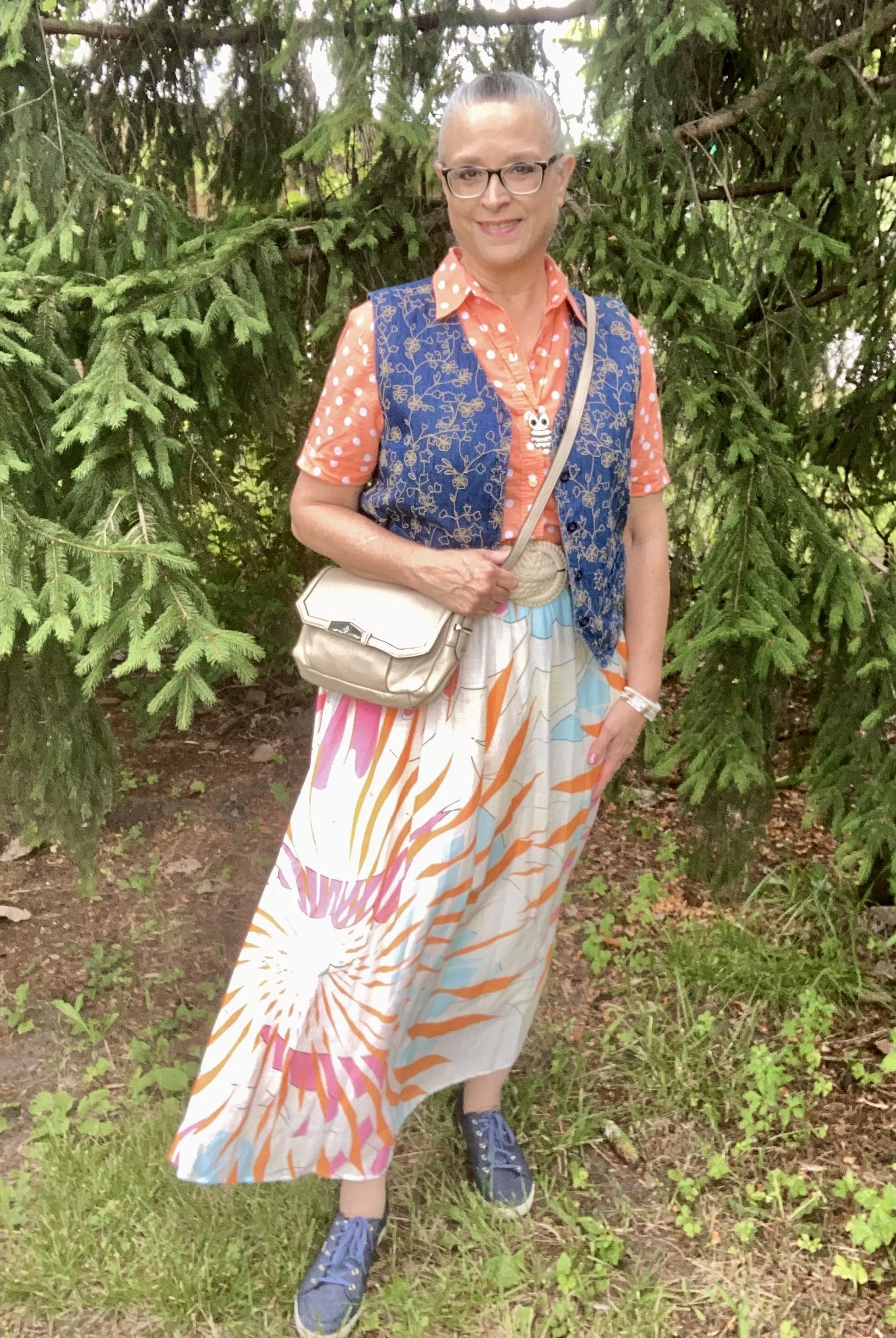
I couldn’t resist doing a bit of print mixing with this fun skirt, and polka dots and embroidery seemed a great companion for the abstract print.

Both of these pieces were second hand finds. Like so many pieces that I thrift, I don’t always have an idea in mind of what they are going to go with, but find I am pleasantly surprise when things line up. My button down is Jones New York Sport, and the embroidered vest is Van Heusen. I’ve heard of Van Heusen in men’s shirts, but this is clearly a women’s vest, although a man might like it as well, but it is cut more for a feminine body. Walmart and a few other stores carry this brand.

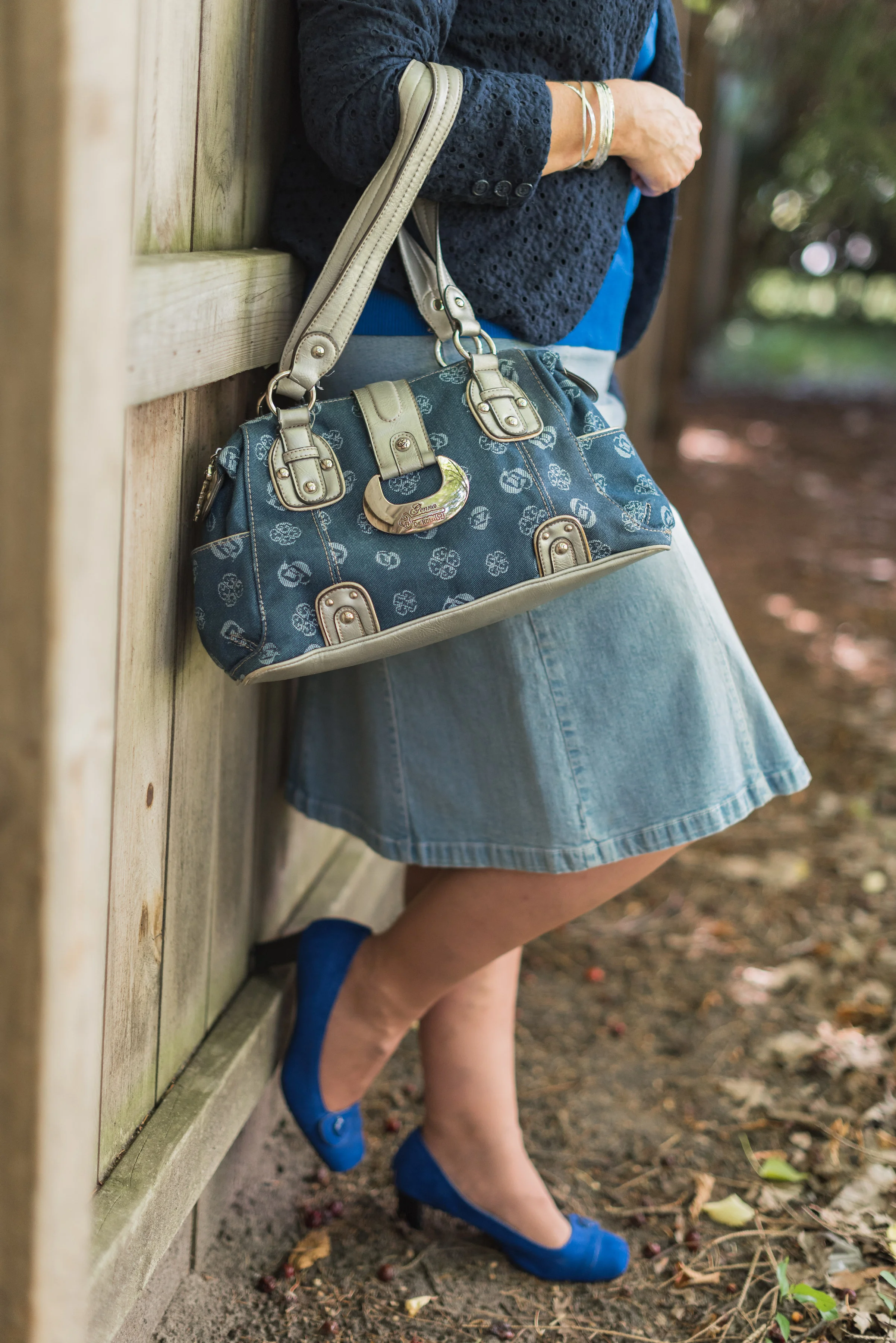
I decided to add a wide belt for this look. Another thrift find, this wide braided belt is a soft material that adds interest and texture. I thought the belt and my Vera Wang bag were a good match. You can also see I swapped out the black pendant necklace for my lovable owl, and replaced the metal and bead bracelet for some fun white and gold stretchies.


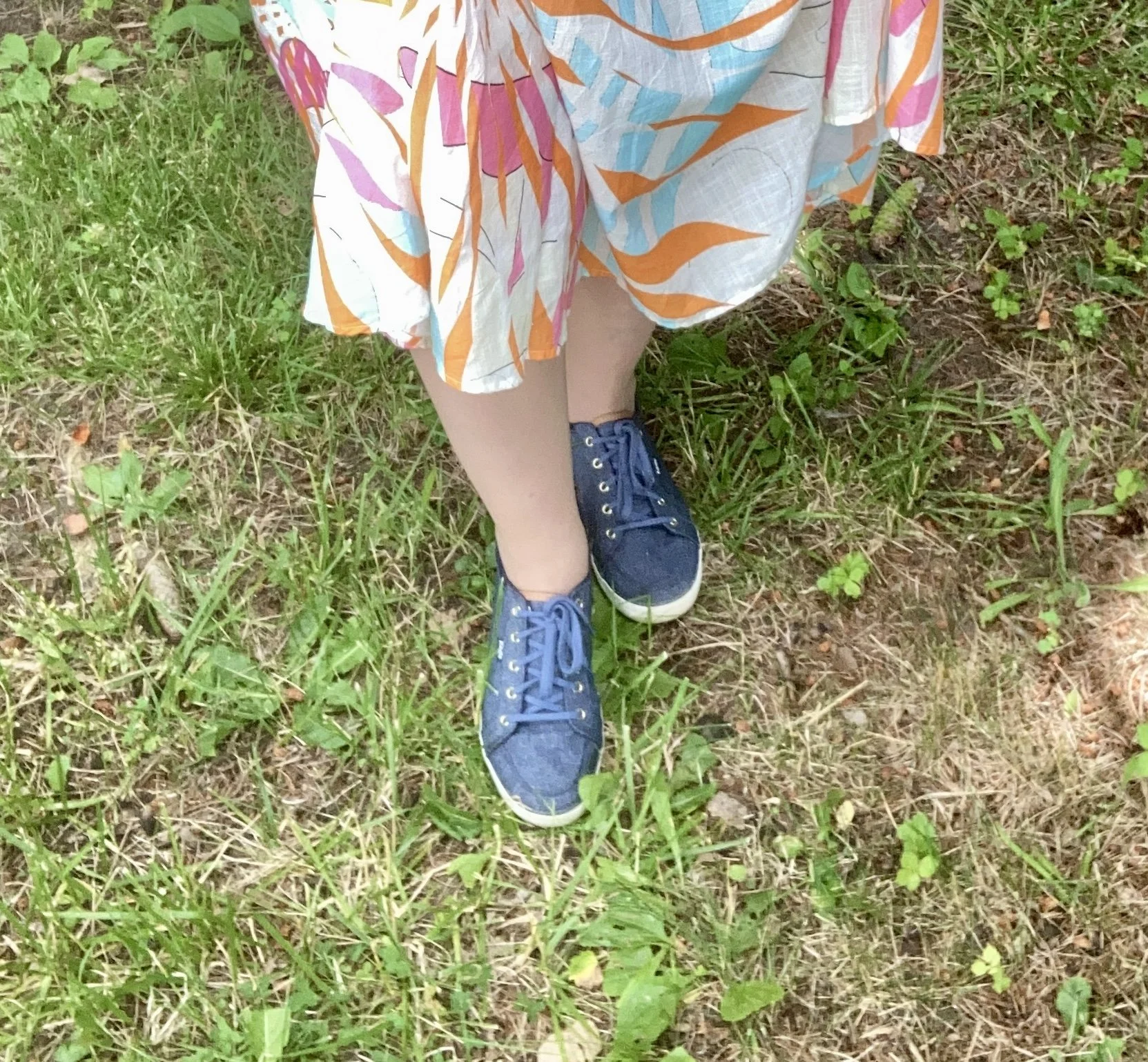
I chose my denim Keds as a way to compliment the vest and create more continuity to a busy printed outfit.
So which look do you like better? Would you have purchased a skirt like this? Do you have any skirts in your closet that you are just not sure how to style? I hope this post gave you a little inspiration for shopping your closet and thinking outside your color box.


I’m including a few shopping links for you to look over. These are affiliate links. If you purchase something through one of my links I get a tiny percent. I appreciate every click and purchase. All opinions are my own and you are not charged anything extra for purchasing through my site.
Thank yo for all you do. I hope you are having a great week.