Shopping Our Closets: Print Mixing Style
It has been almost a month since I posted here and I do apologize. Our summer seemed to get increasingly busy and we had additional bumps along the way. In May I was dealing with another sinus infection and was back on antibiotics and steroids. In June my spouse was dealing with an old ankle injury from decades ago that has decided to act up. The end result of several doctor’s appointments and an MRI is an eventual invasive surgery that for the time being we are choosing to put off. He is doing okay as long as he doesn’t overdo. That also has meant taking on the responsibility of mowing the lawn for me. I honestly don’t mind, but it does take up another day and leaves me feeling pretty tired. However, God is good and always gives the strength I need to get the job done. Right now I am putting it off due to the increased heat. The grass will have to wait.
I decided to take a few pictures of the outfit I wore today and try to get it posted for this week. I have another very busy week coming up as I will have a few extra days of babysitting my grandson as his other grandma is taking the week off. I am hoping to do a few fun things with the three year old as these days of summer are quickly passing by.
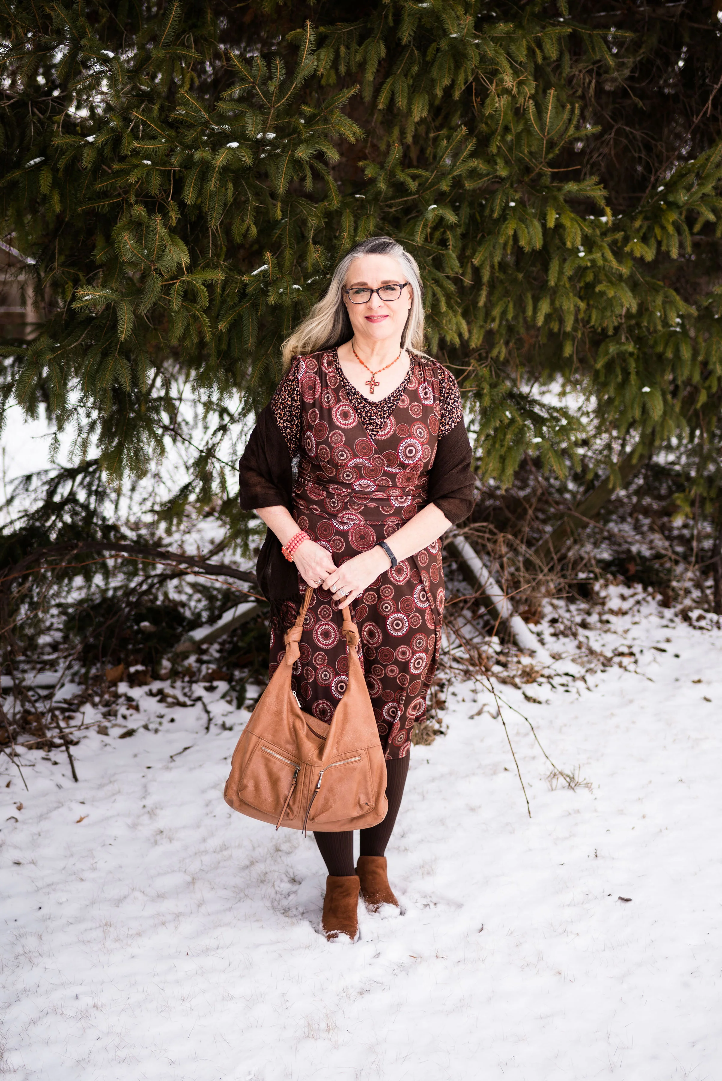
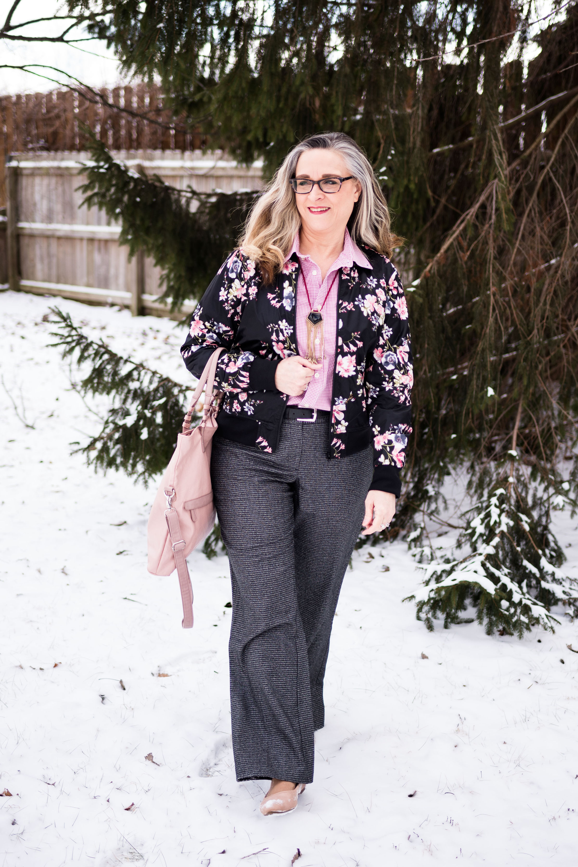
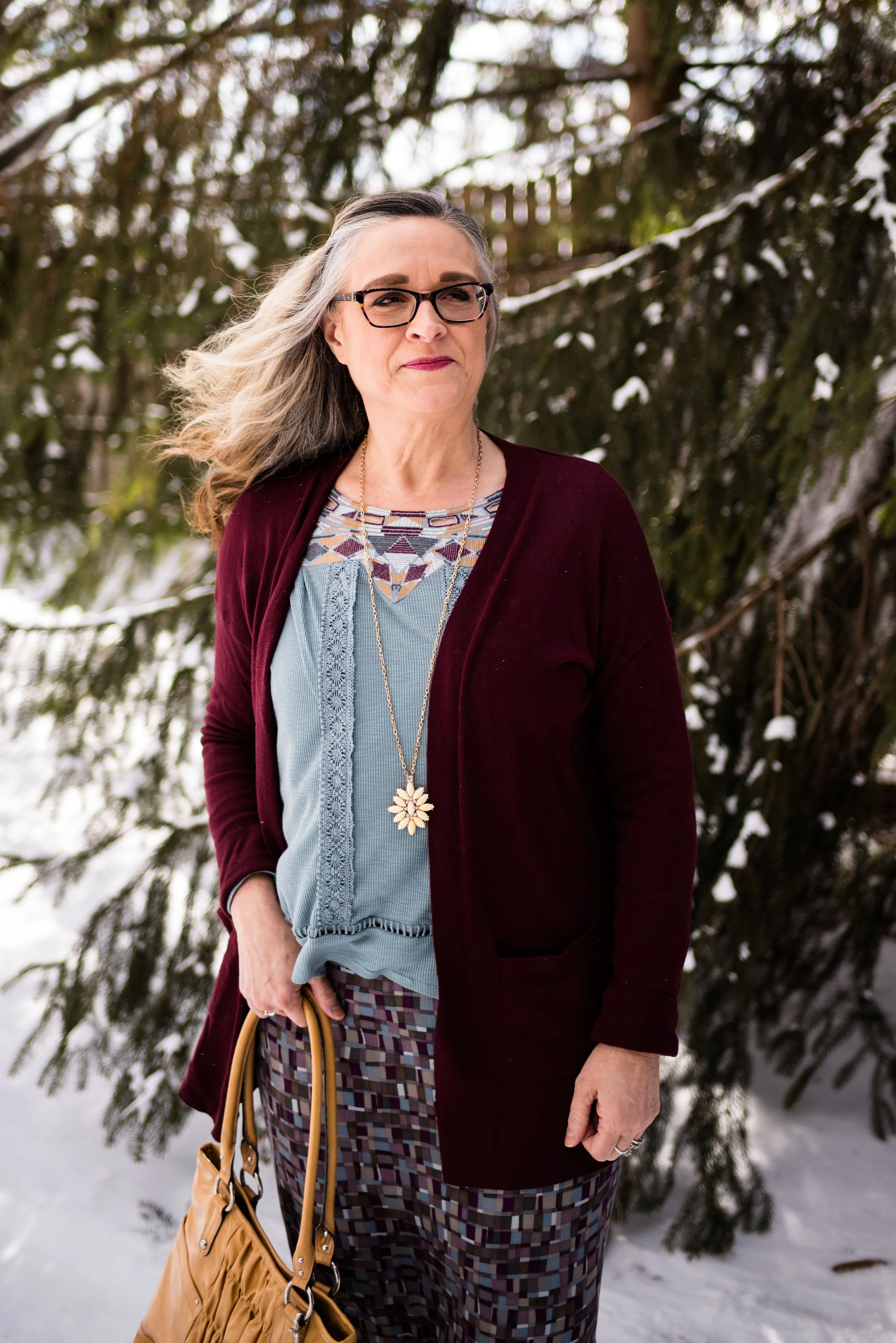
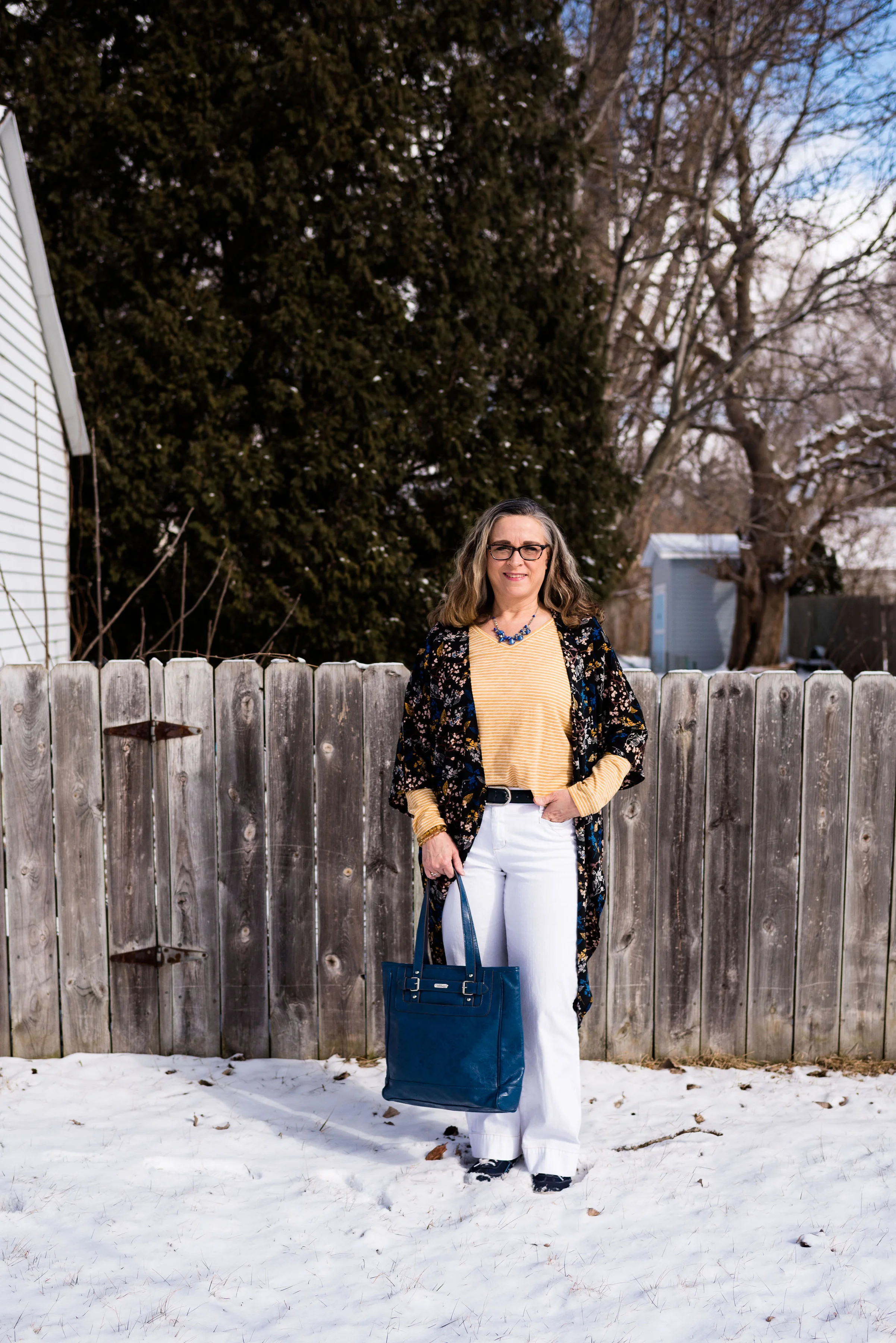
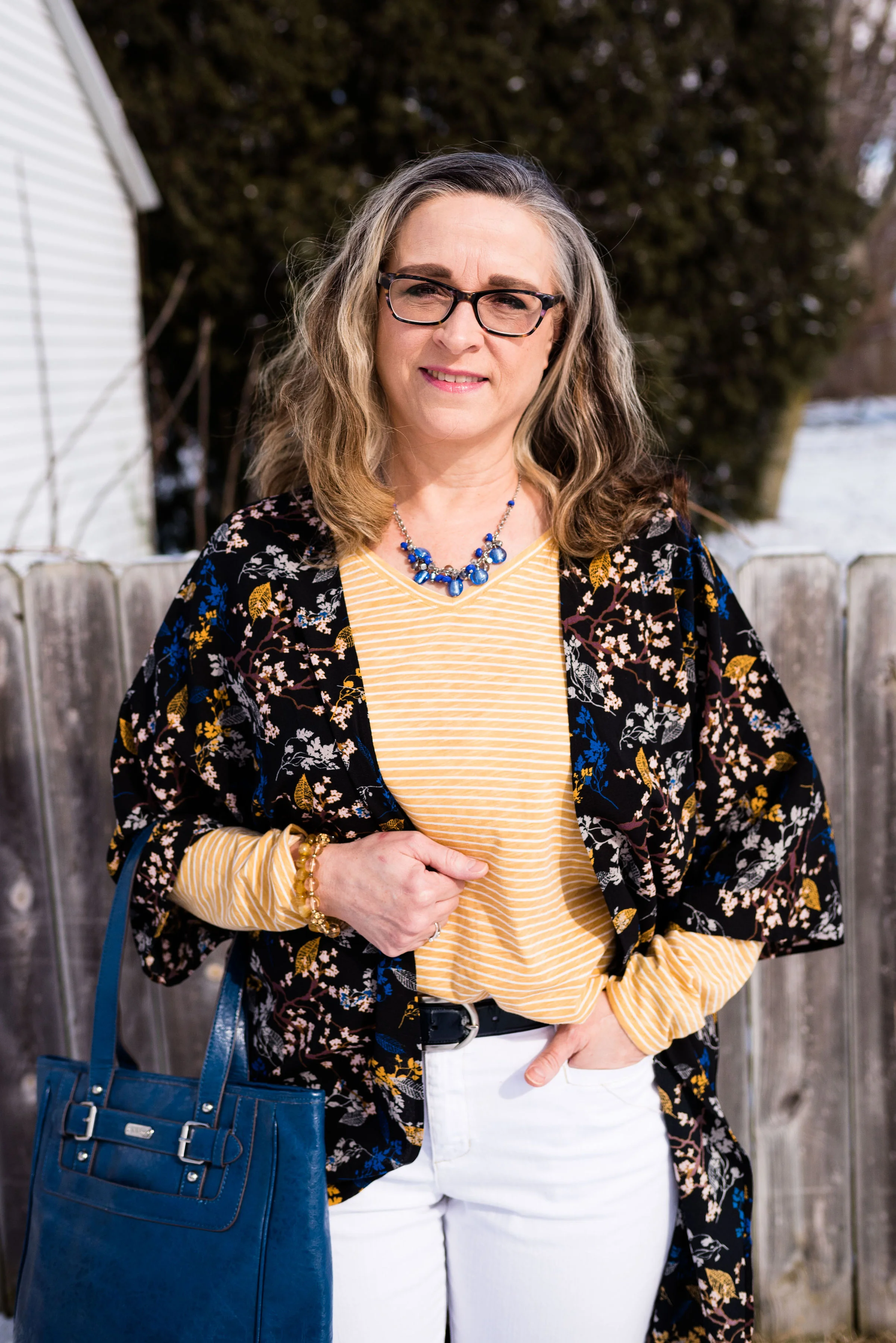
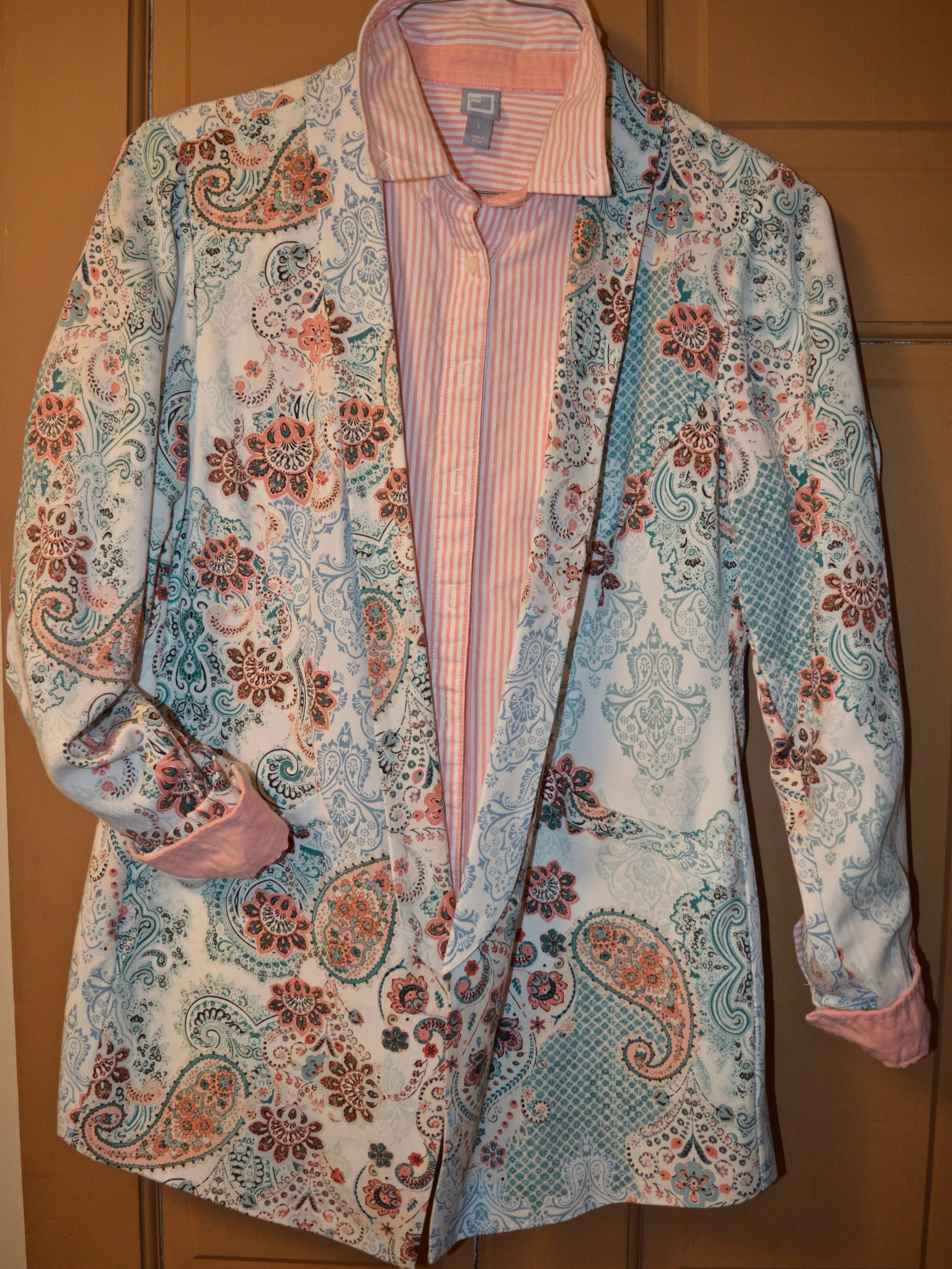
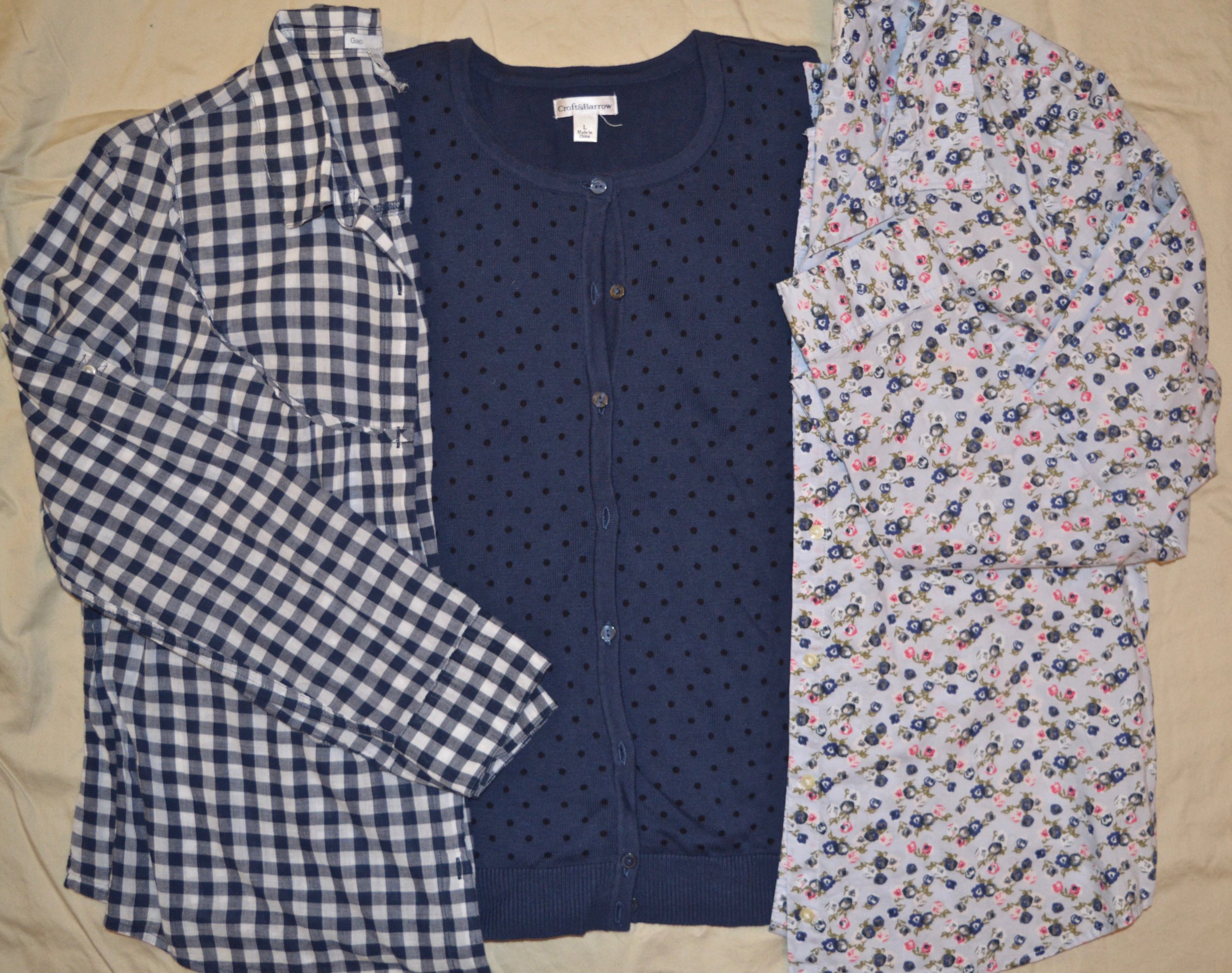
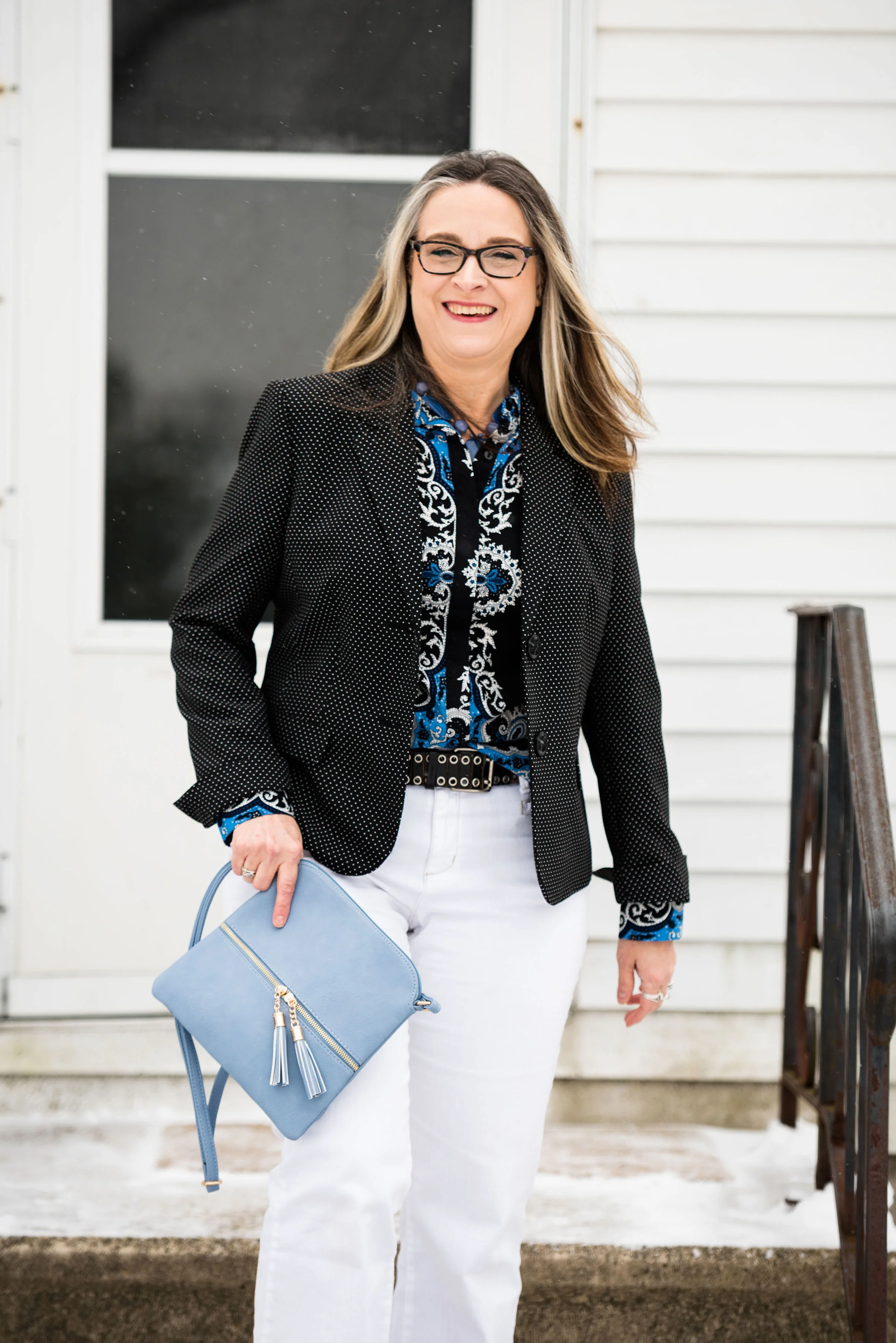
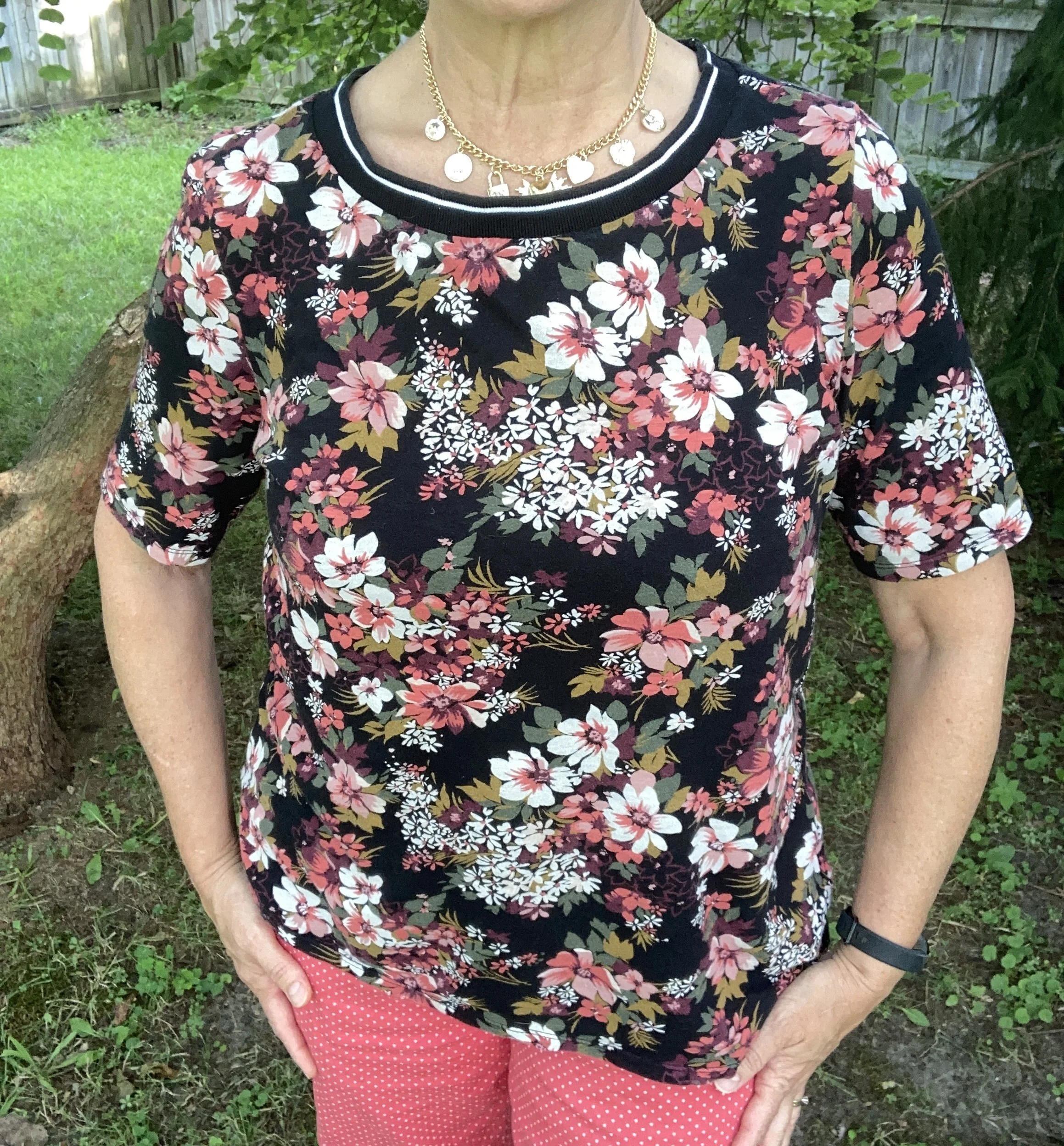
Today’s look revolves around a few different prints that I think work very well together. I find it very fun to mix prints together, and it is much easier to do than you realize. The basic guidelines are as follows:
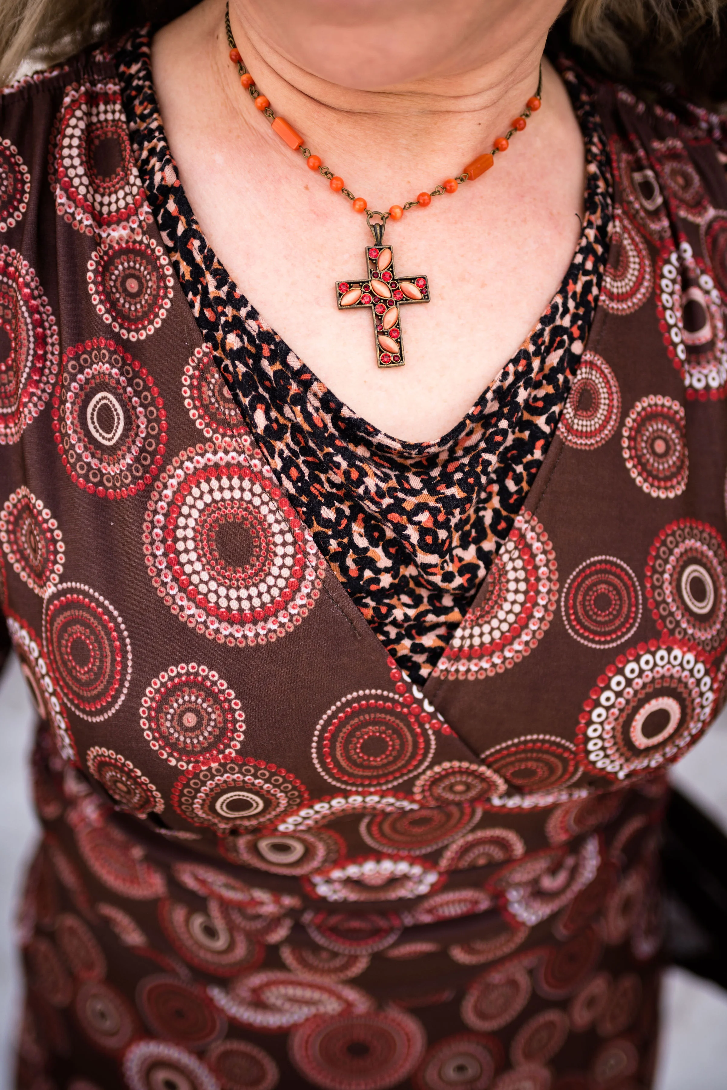
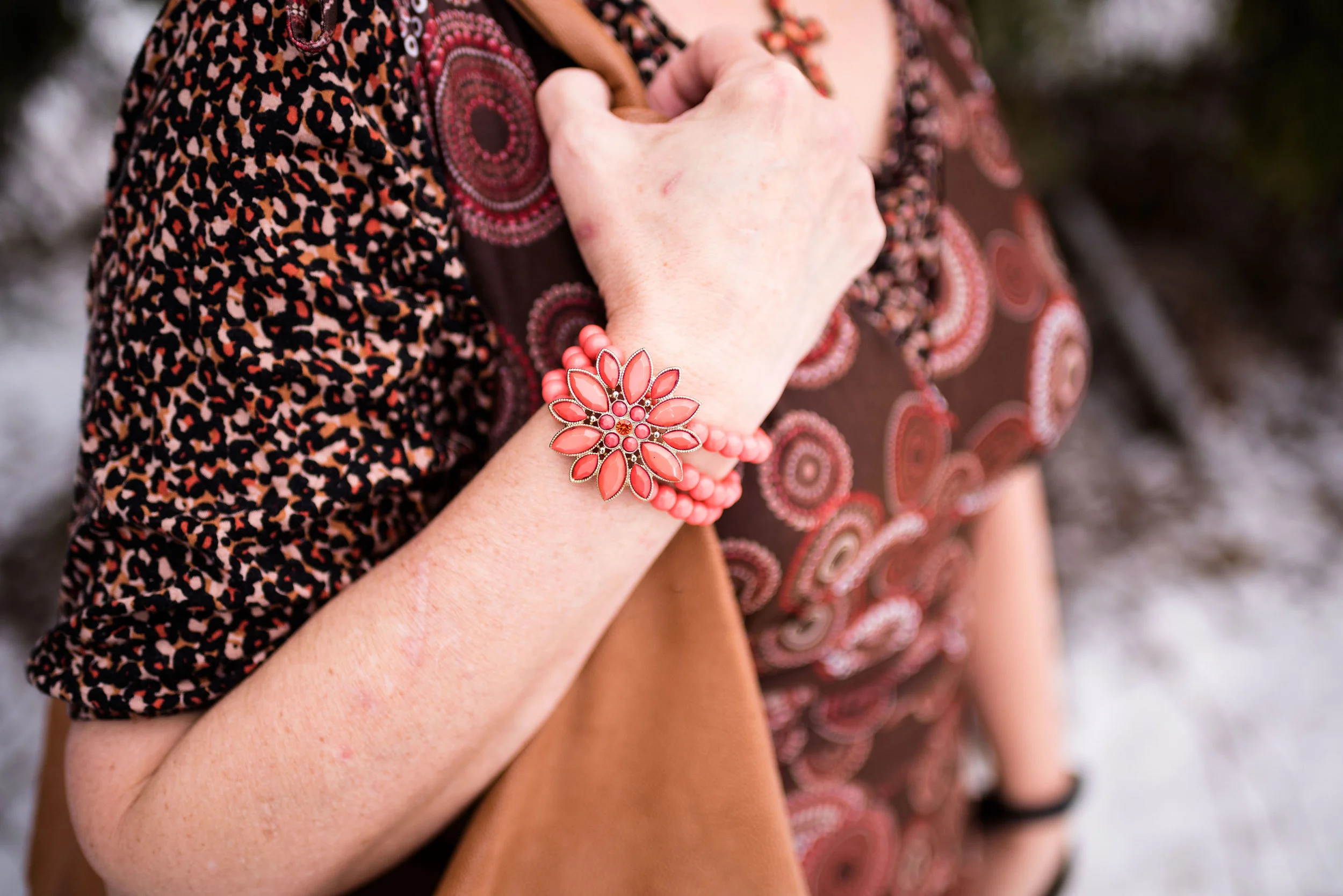
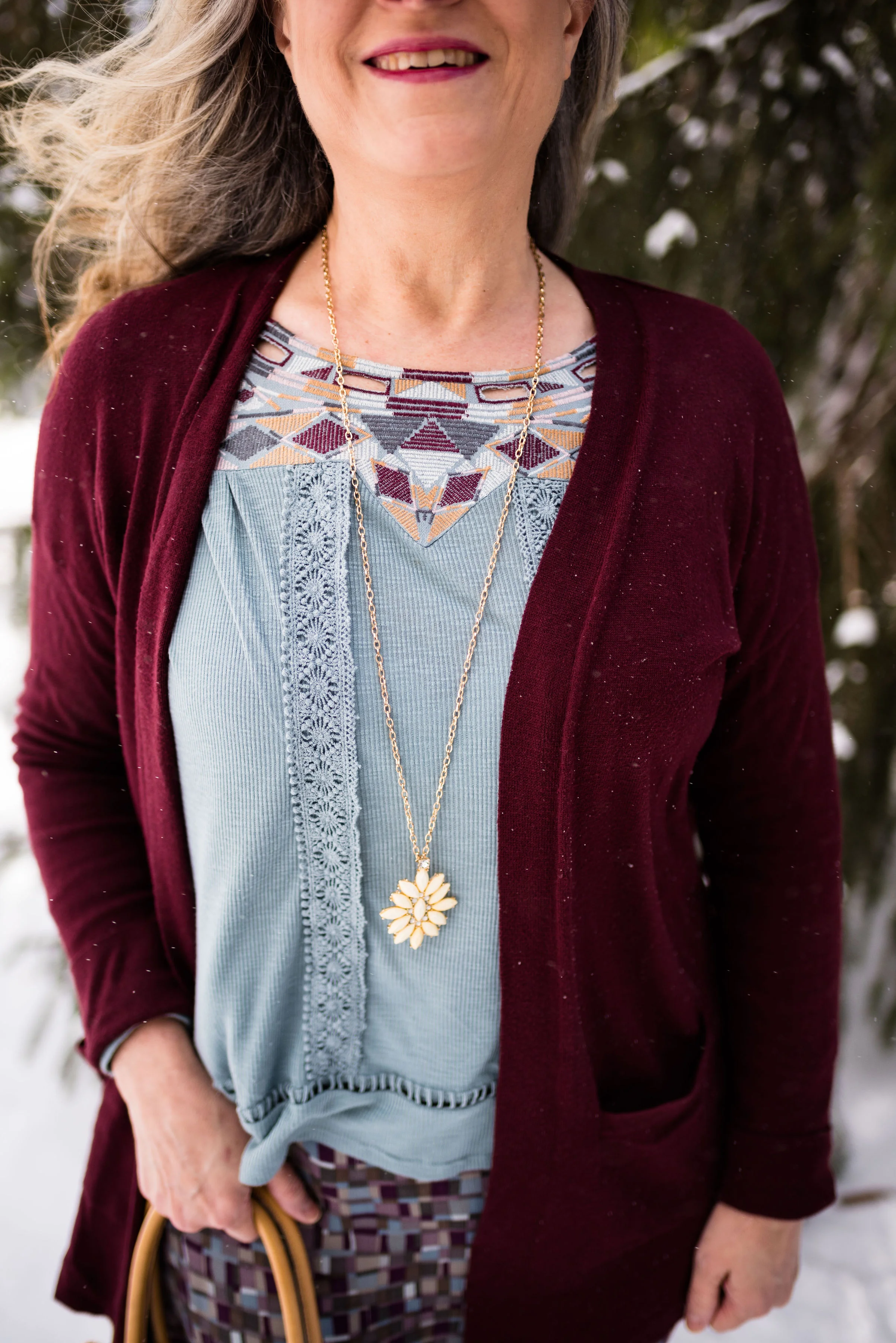
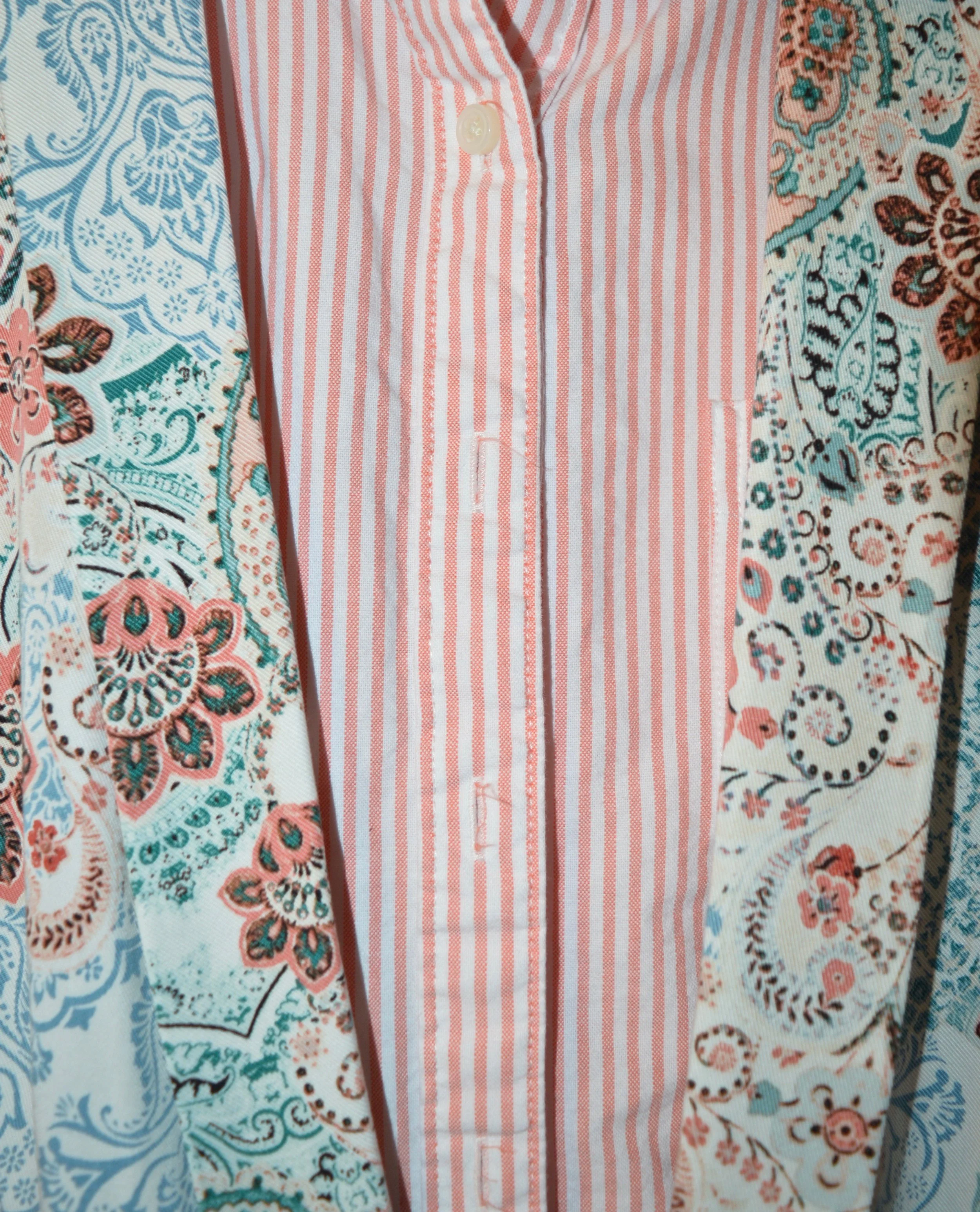
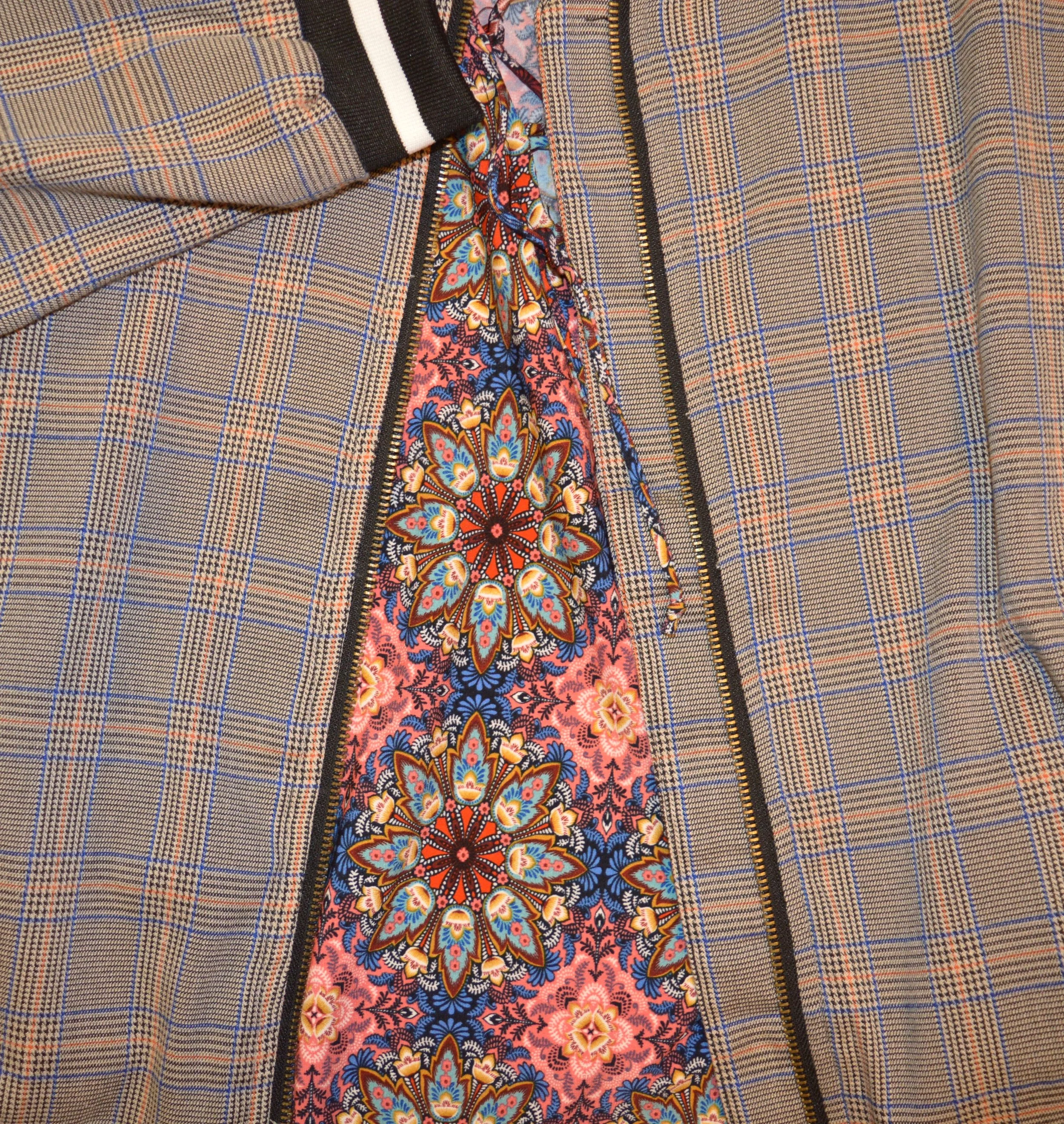
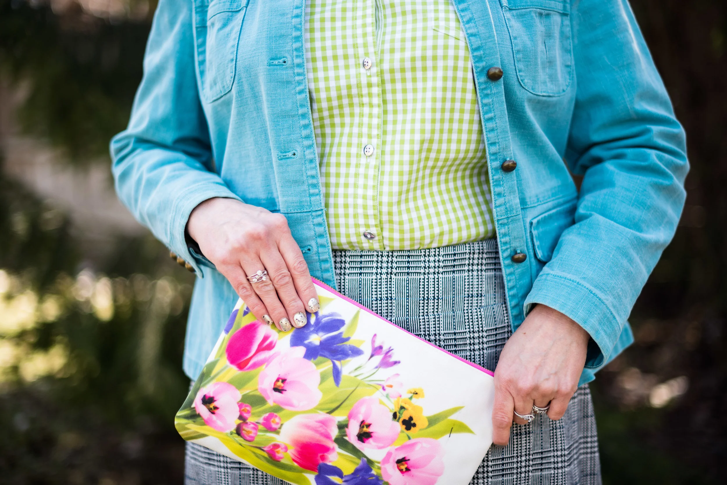
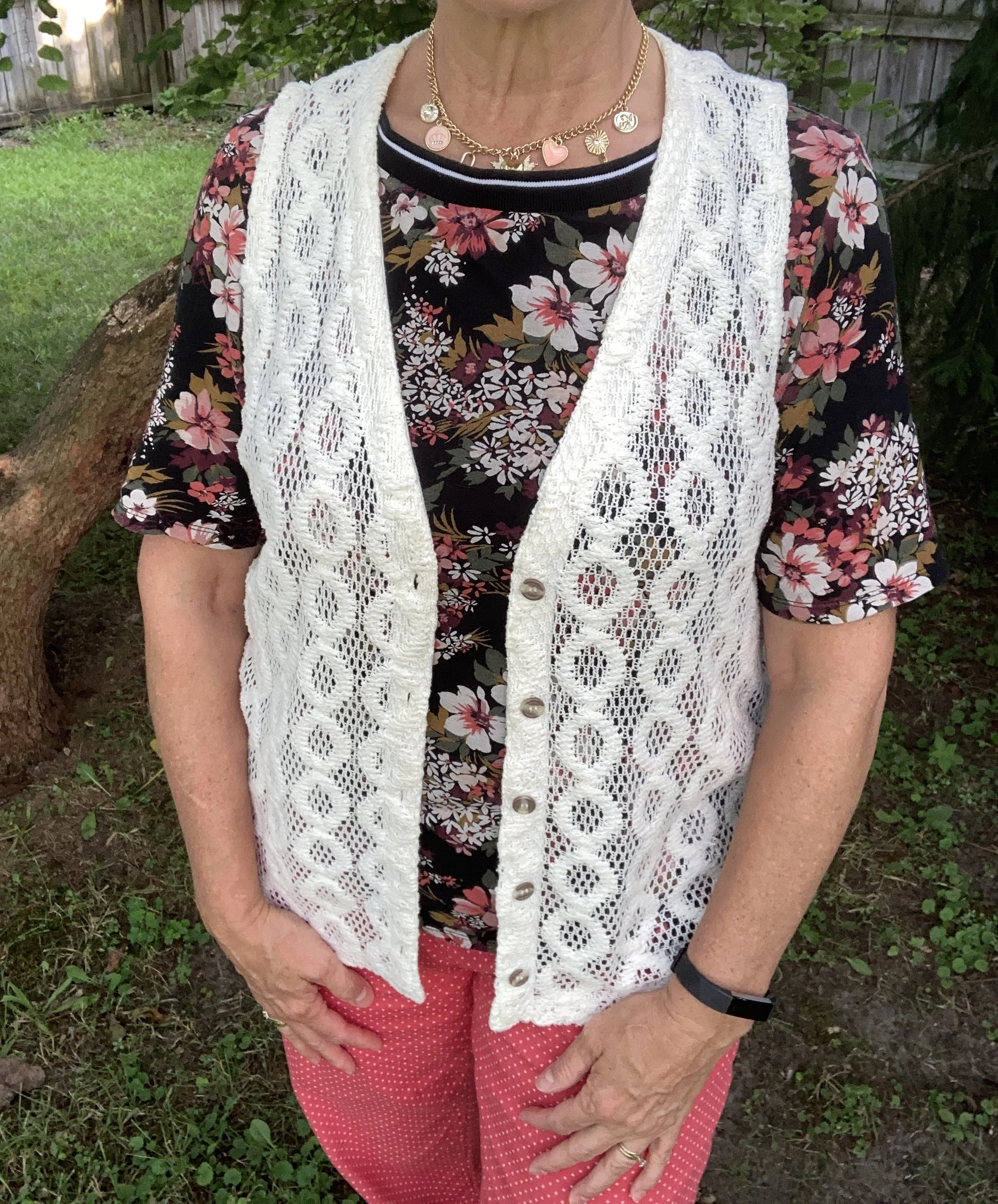
1- Pick similar color prints. As you will see in my outfit, the floral top has the some of the same coral shades as the pants, and it also contains the creamy white like my vest.
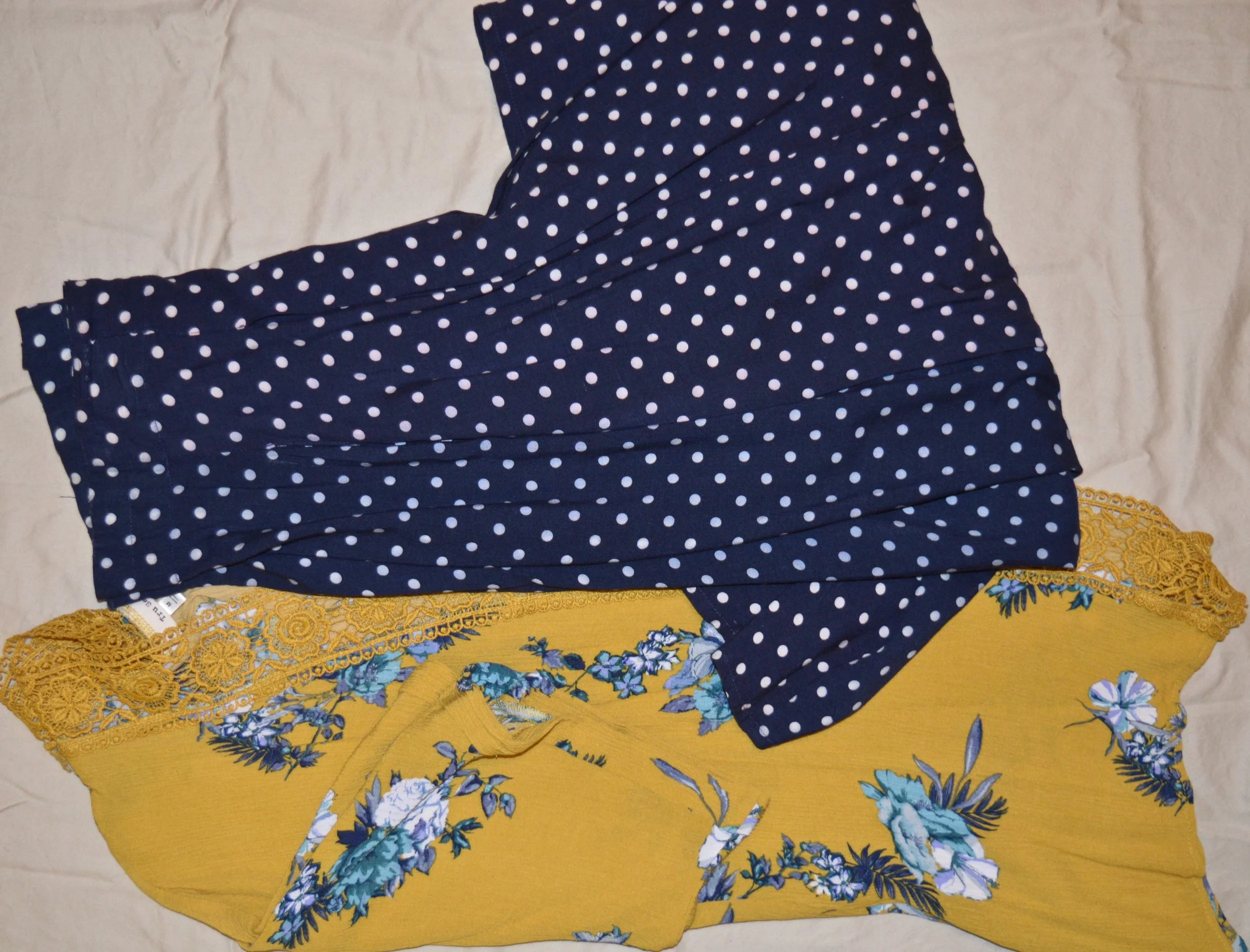
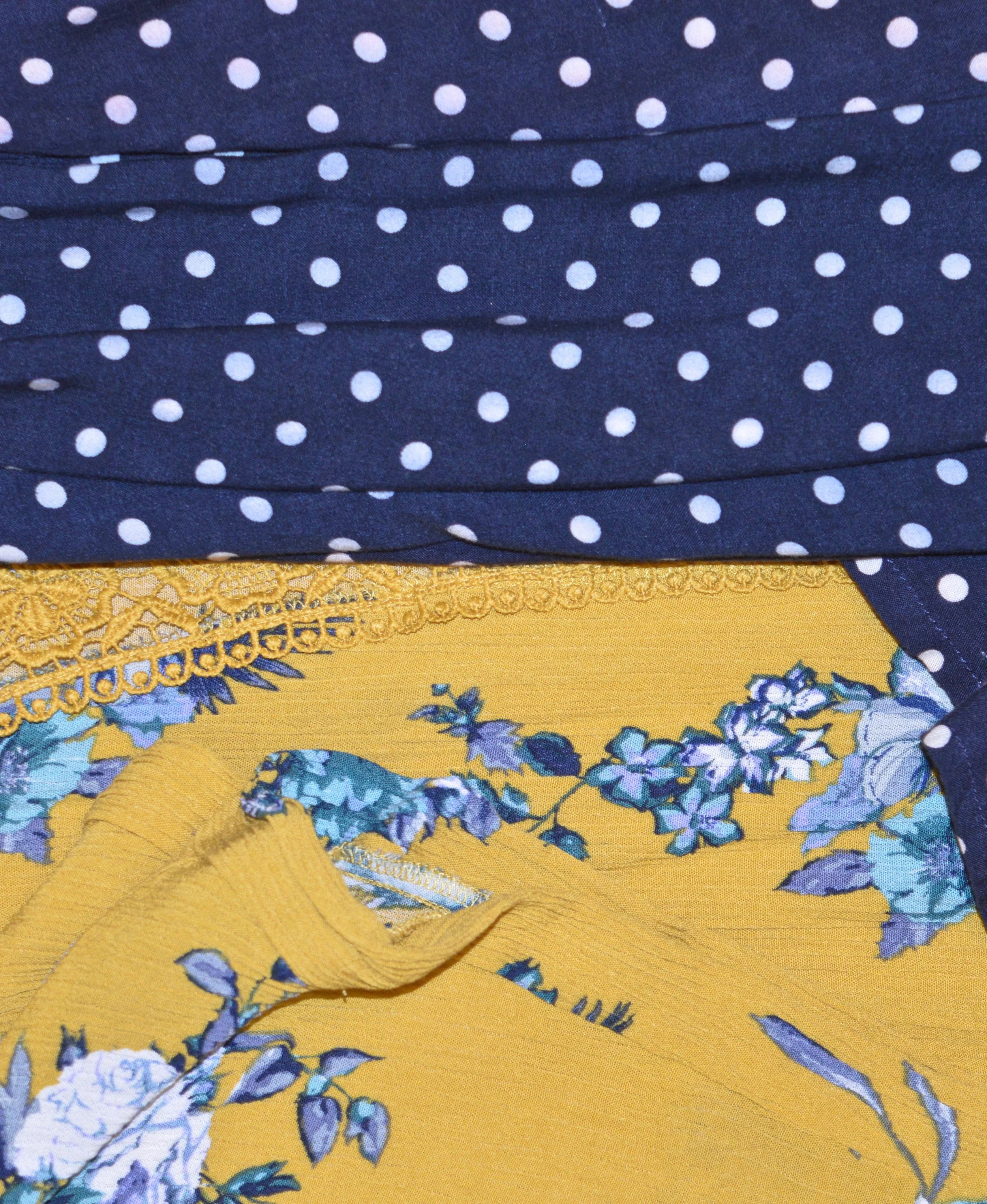
2 - Pair larger prints with smaller ones. This is not a rule, but for a beginner this makes it easier to decide which prints you will be comfortable pairing. For my look I paired the busy, larger floral print with the very small polka dots on my pants.
3 - If you are not sure about colored prints remember that textures count as prints as well. For instance, my crocheted vest is a print and pairs beautifully with the florals on the top and the polka dots on the pants. I could have just as easily paired the floral print with the textures of the vest and had a perfect print mix.

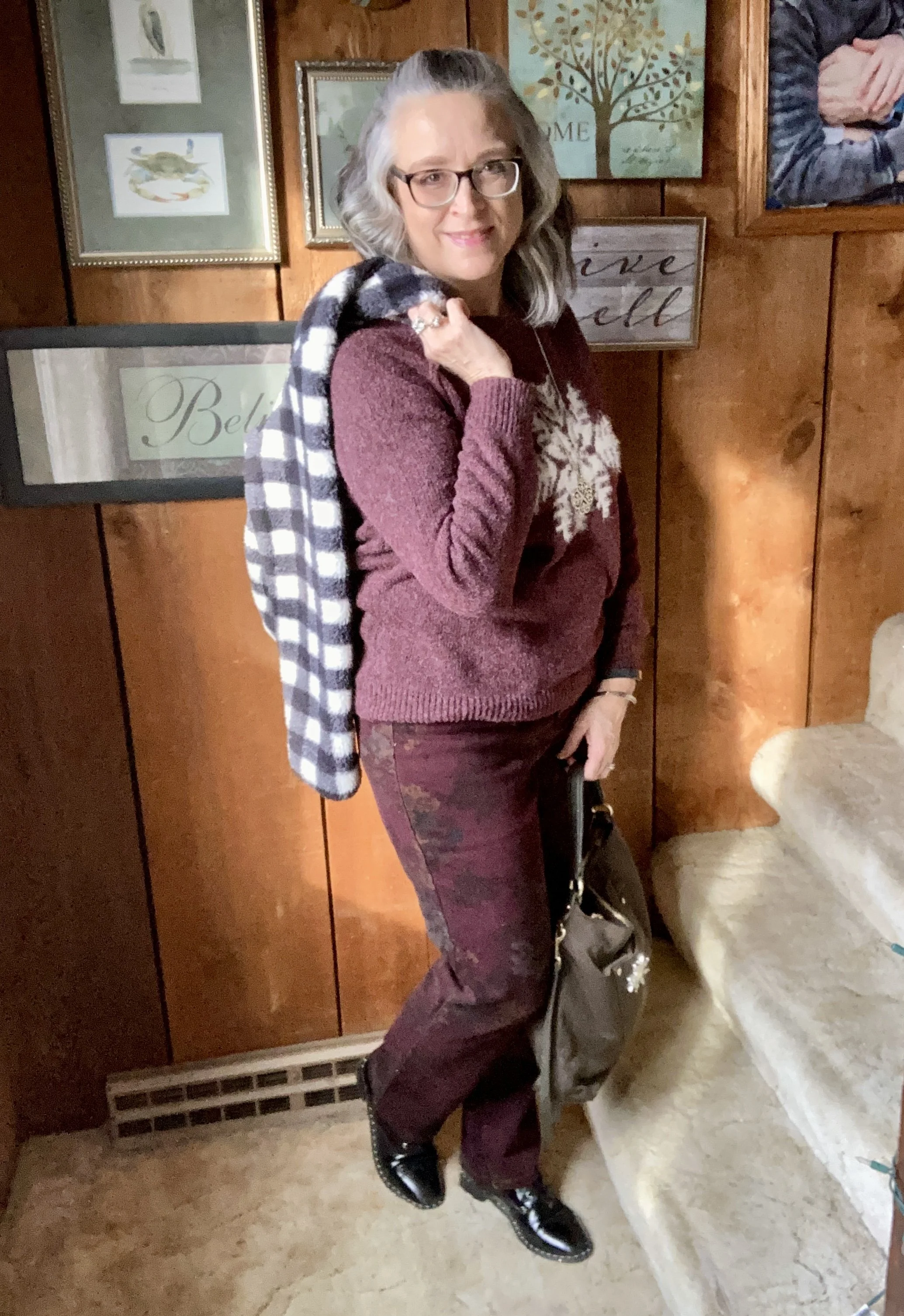
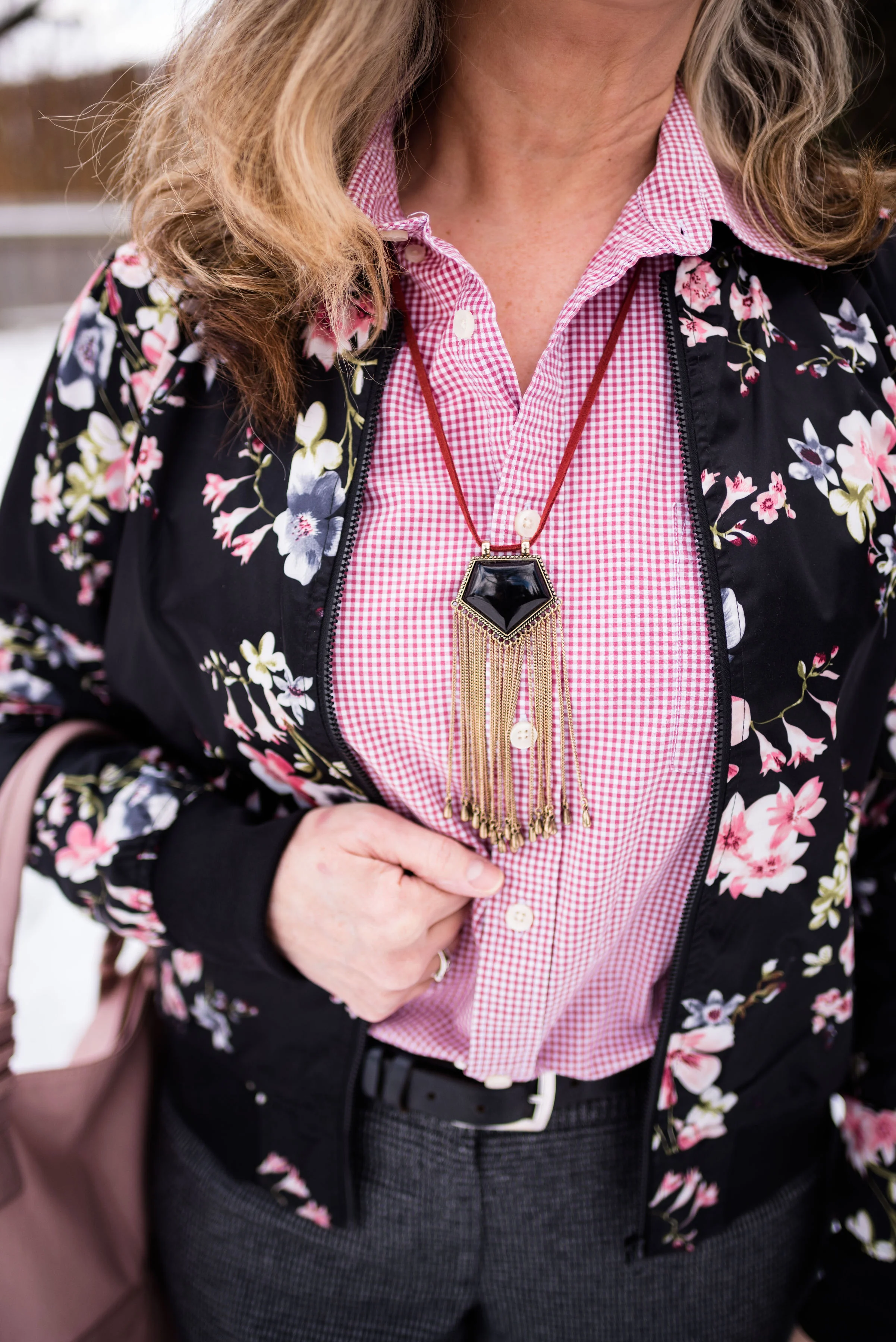
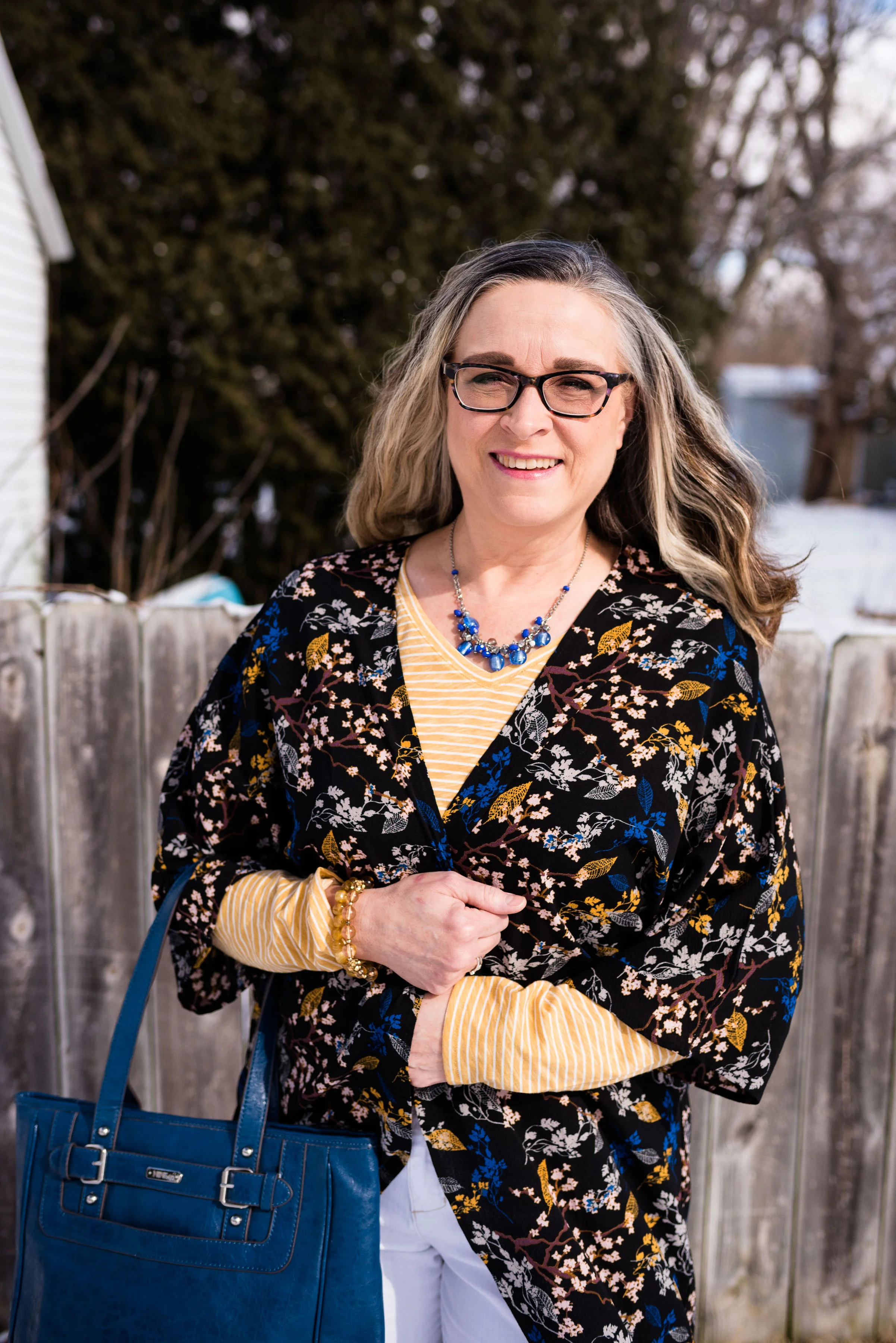
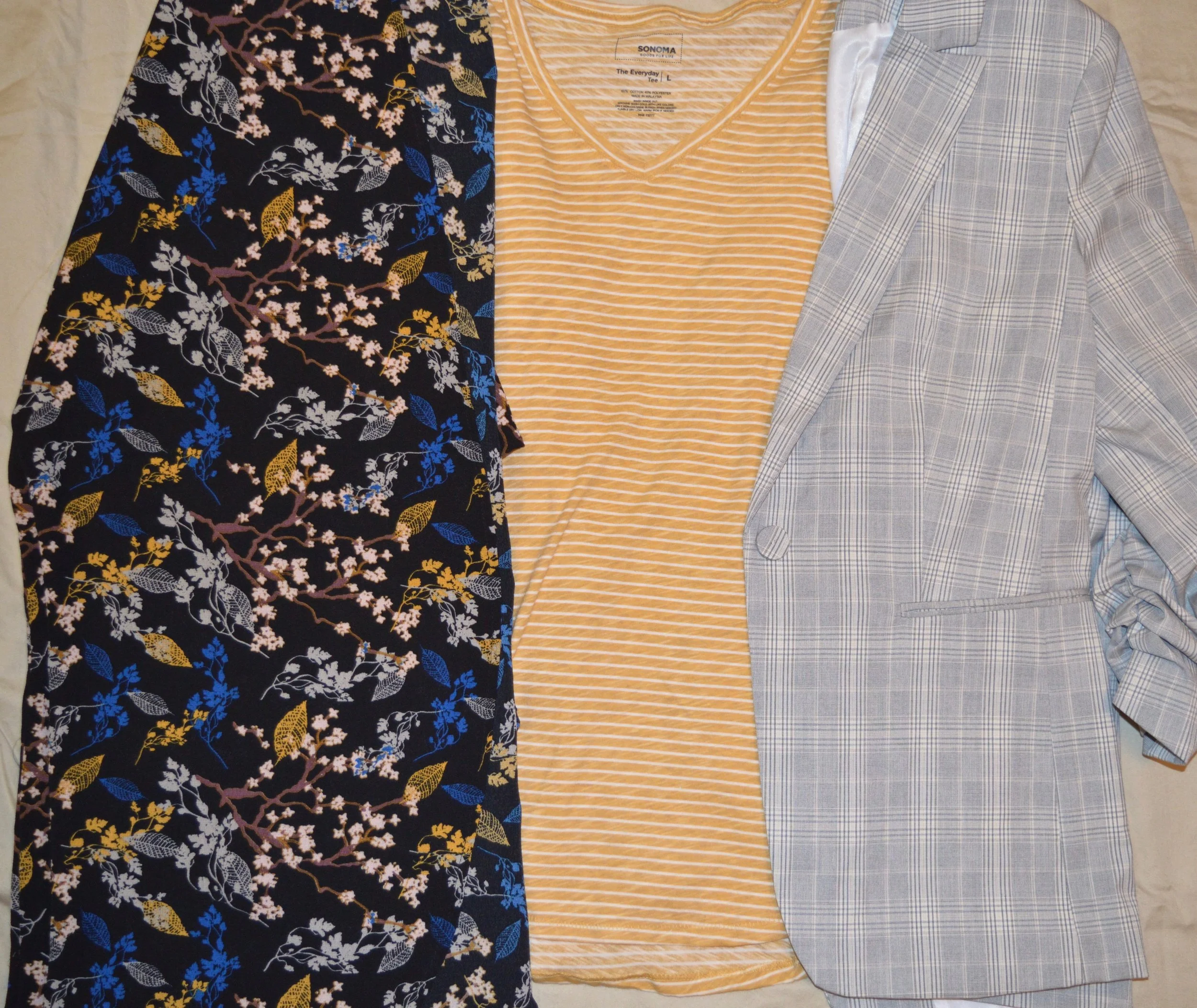
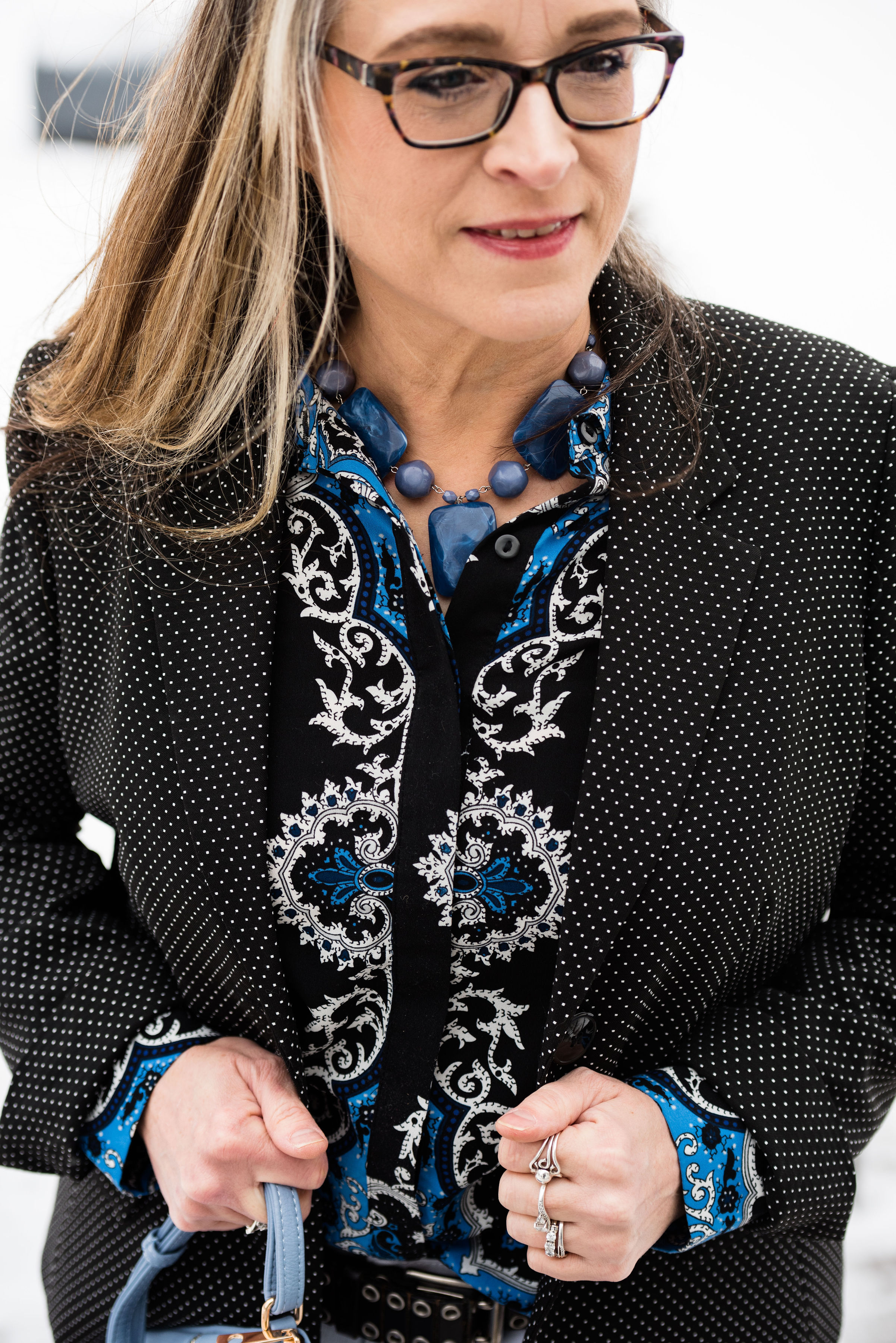
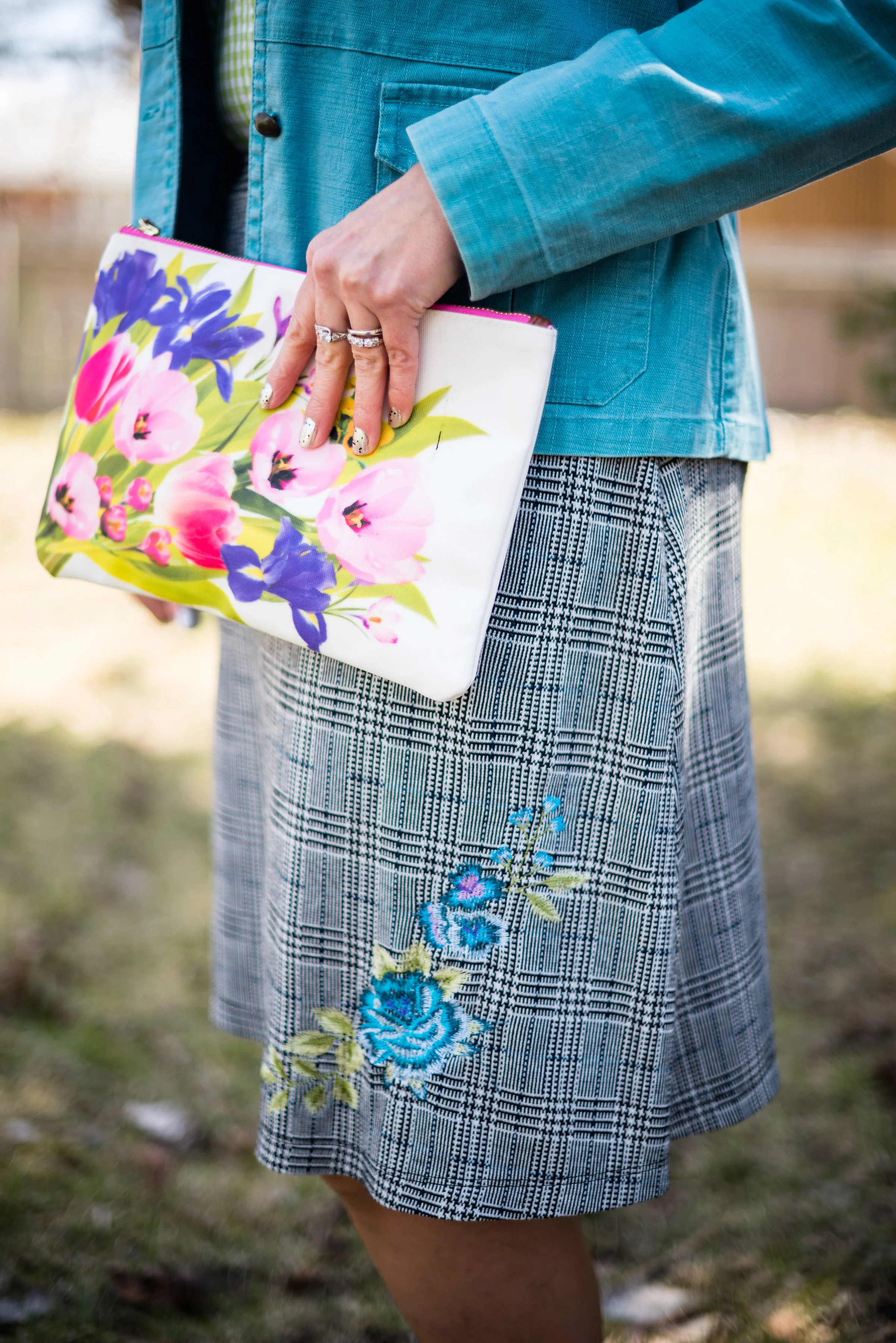
This floral tee was a thrift find this summer and is Loft brand. I love florals, especially dark florals, and this top caught my eye for the pretty colors, making me think of fall, and for the elbow length sleeves. I also like the neckline which gives it added interest.
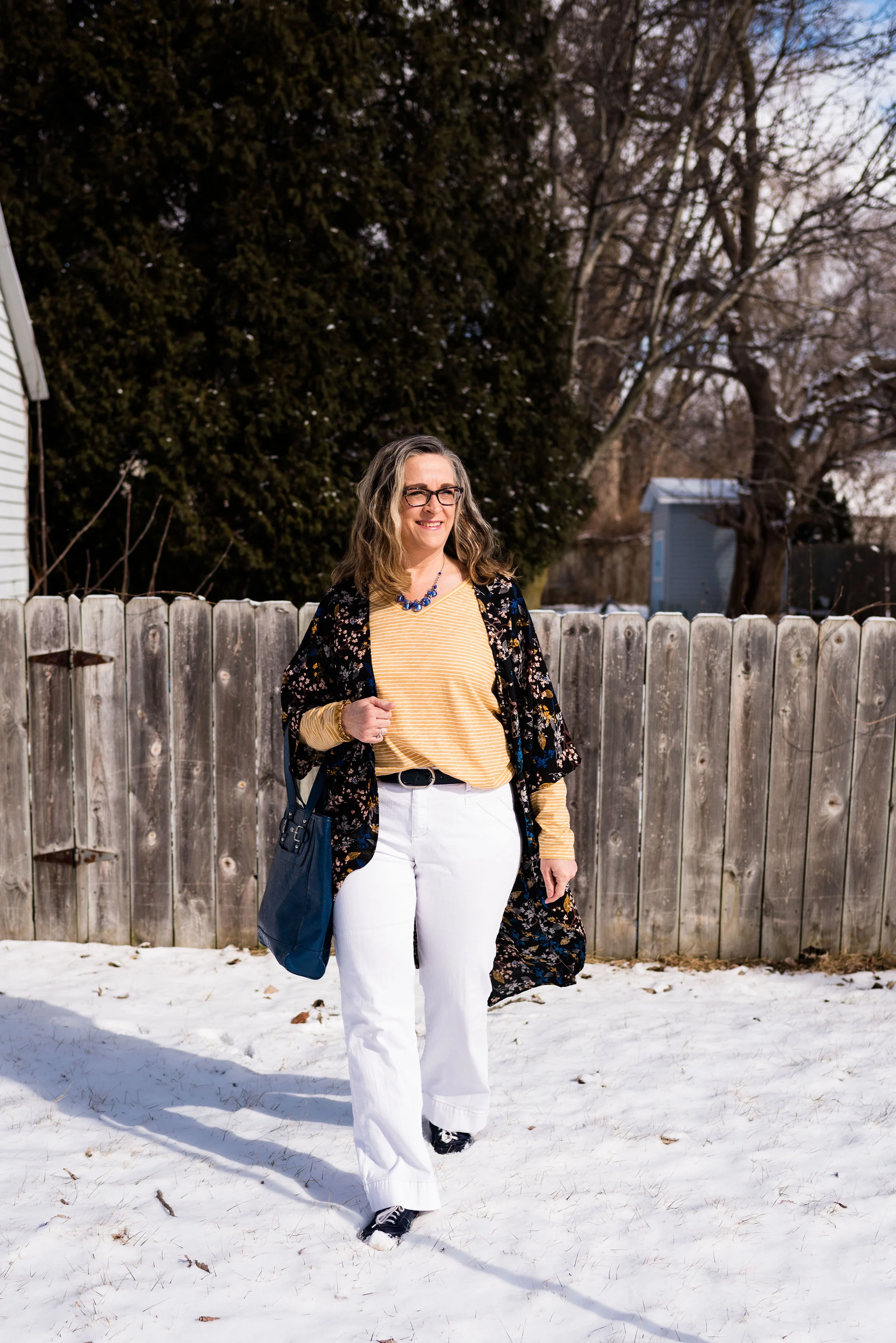
Since the top is a little wide, adding the vest helped to give the outfit a little more shape. I was wearing this to church this morning, so I didn’t want to look too casual. Another second hand piece, this Jordache vest makes multiple appearances all year round. (I do not believe this manufacturer to be the same one that makes the jeans.) You can see the vest styled with olive pants here.
These polka dot Gloria Vanderbilt jeans were in a box to donate, but since I lost a little bit of weight, I decided to revisit the boxes that I hadn’t dealt with yet, trying everything on and setting aside things I still wanted to hang on to. I don’t wear these often, but I do like them as an alternative from regular blue denim. Plus with the polka dots it makes them a good choice for a print mix like this. You can see I folded the hems a few times to give them more the appearance of cropped pants.


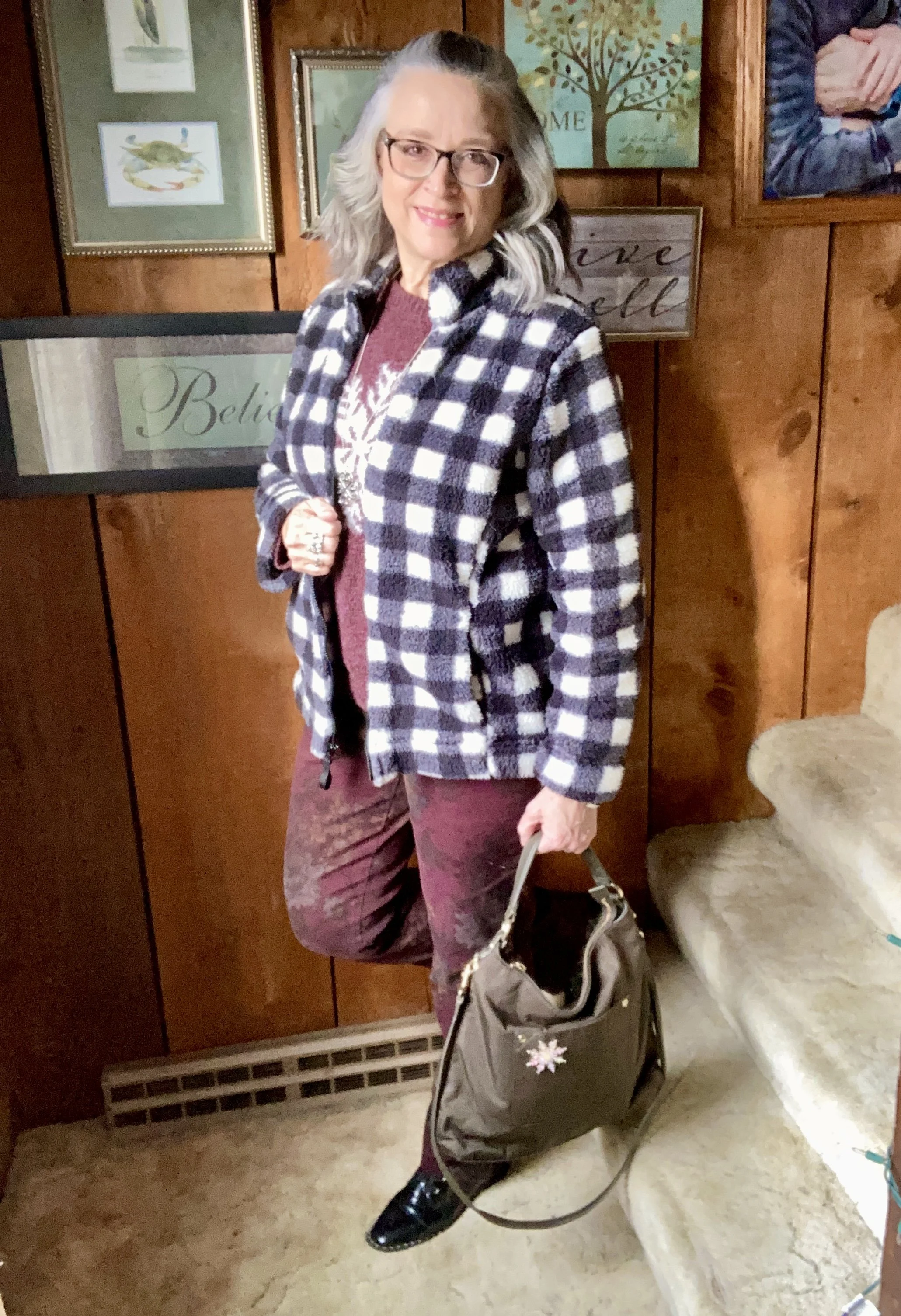
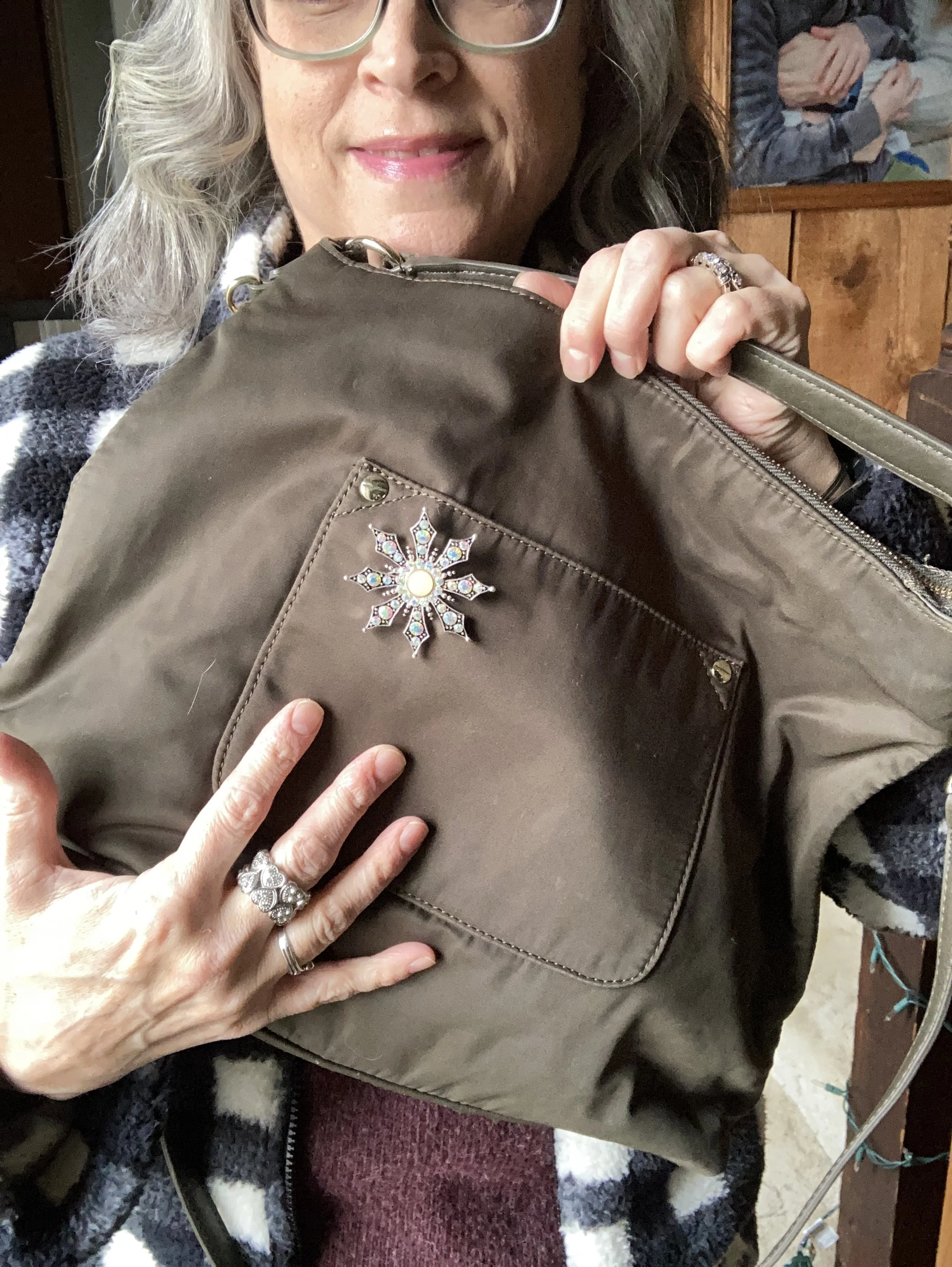
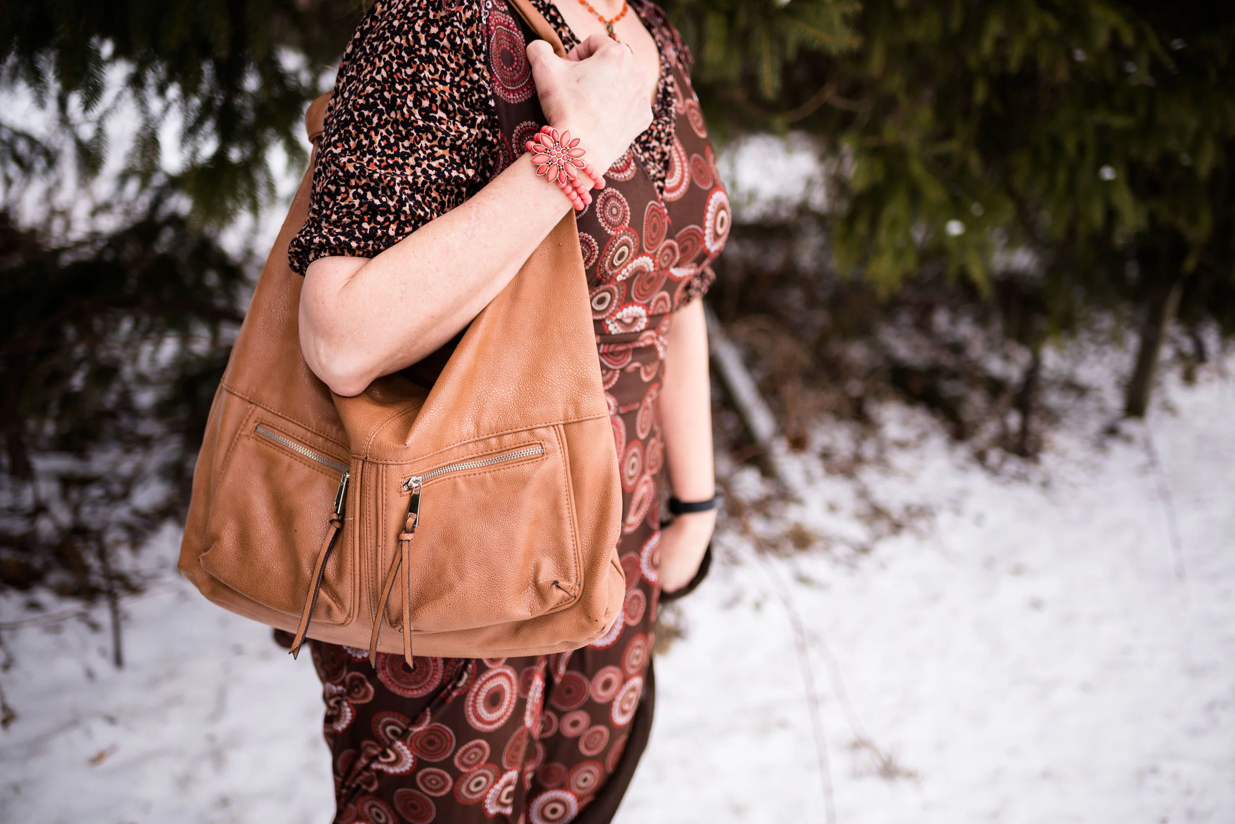
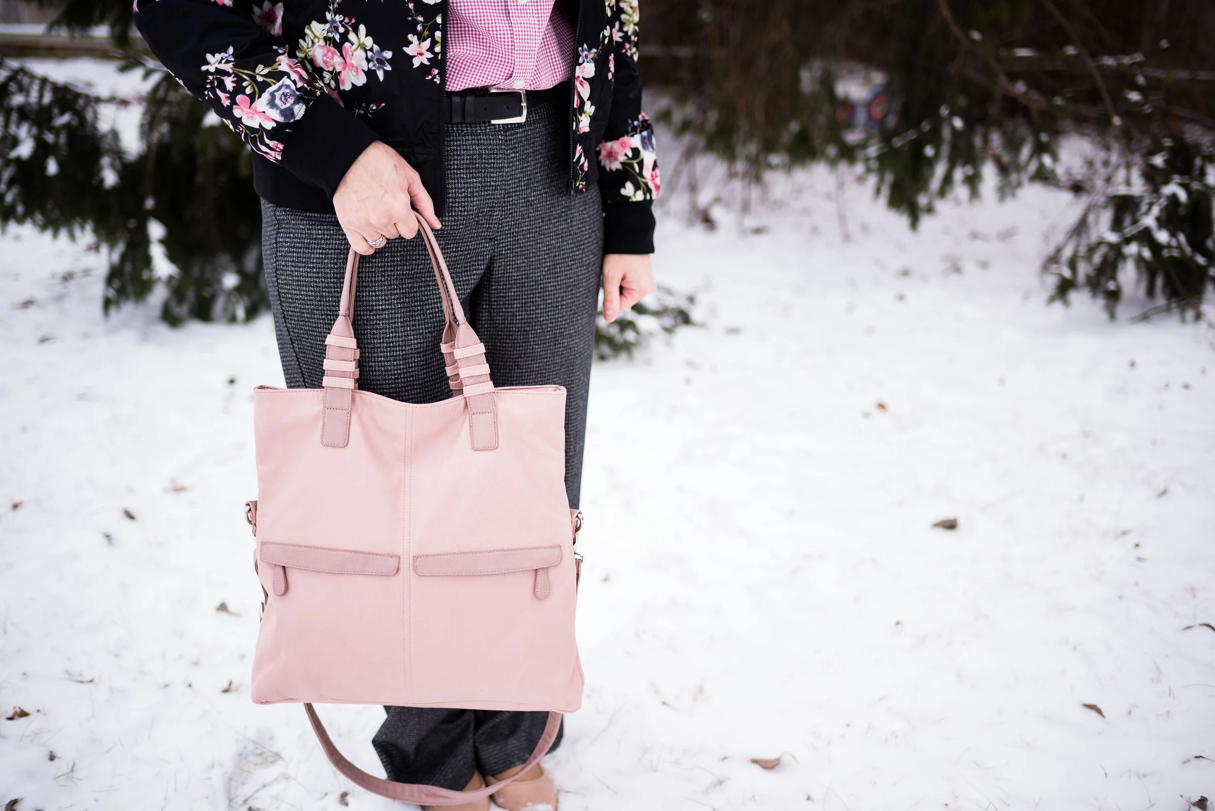
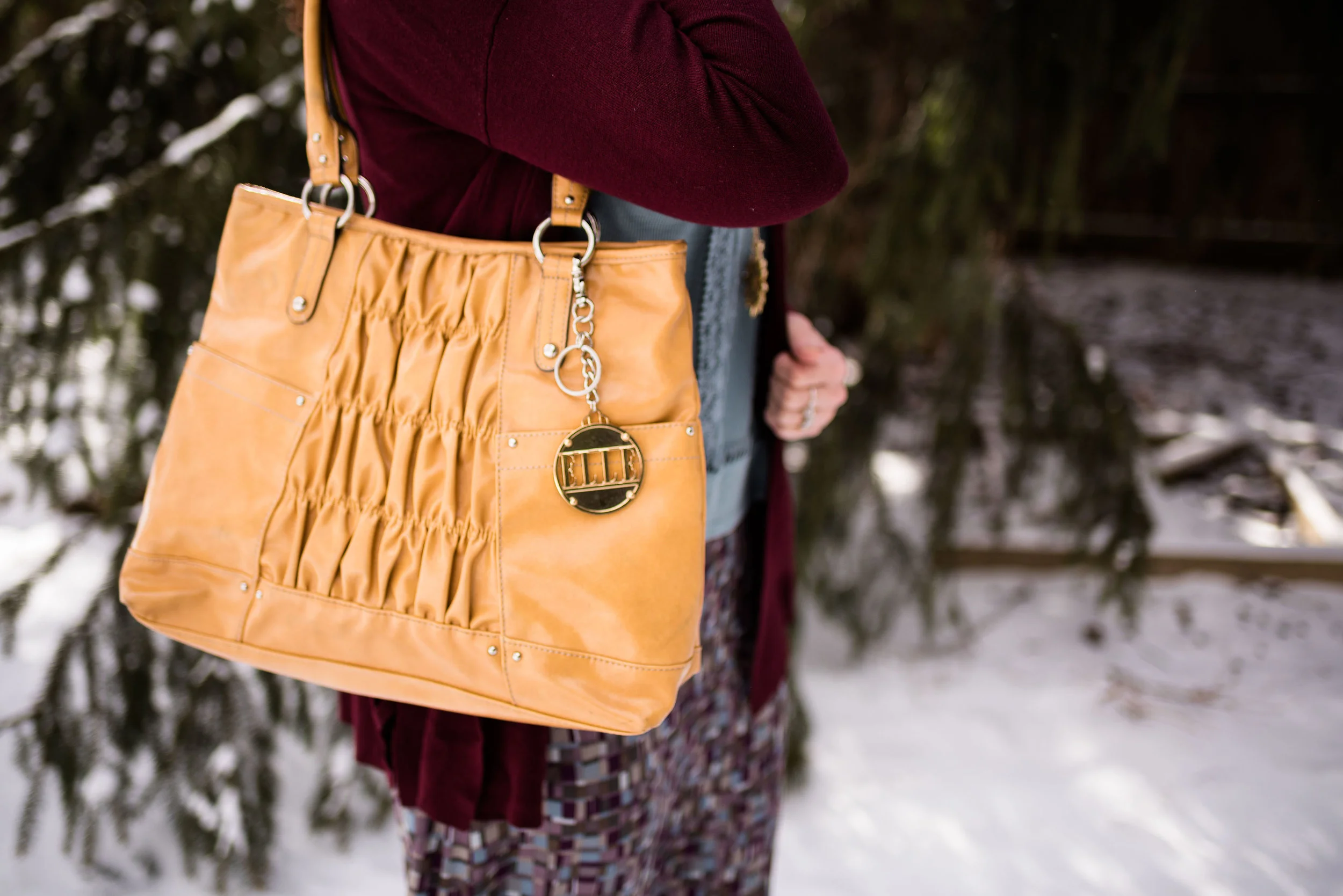
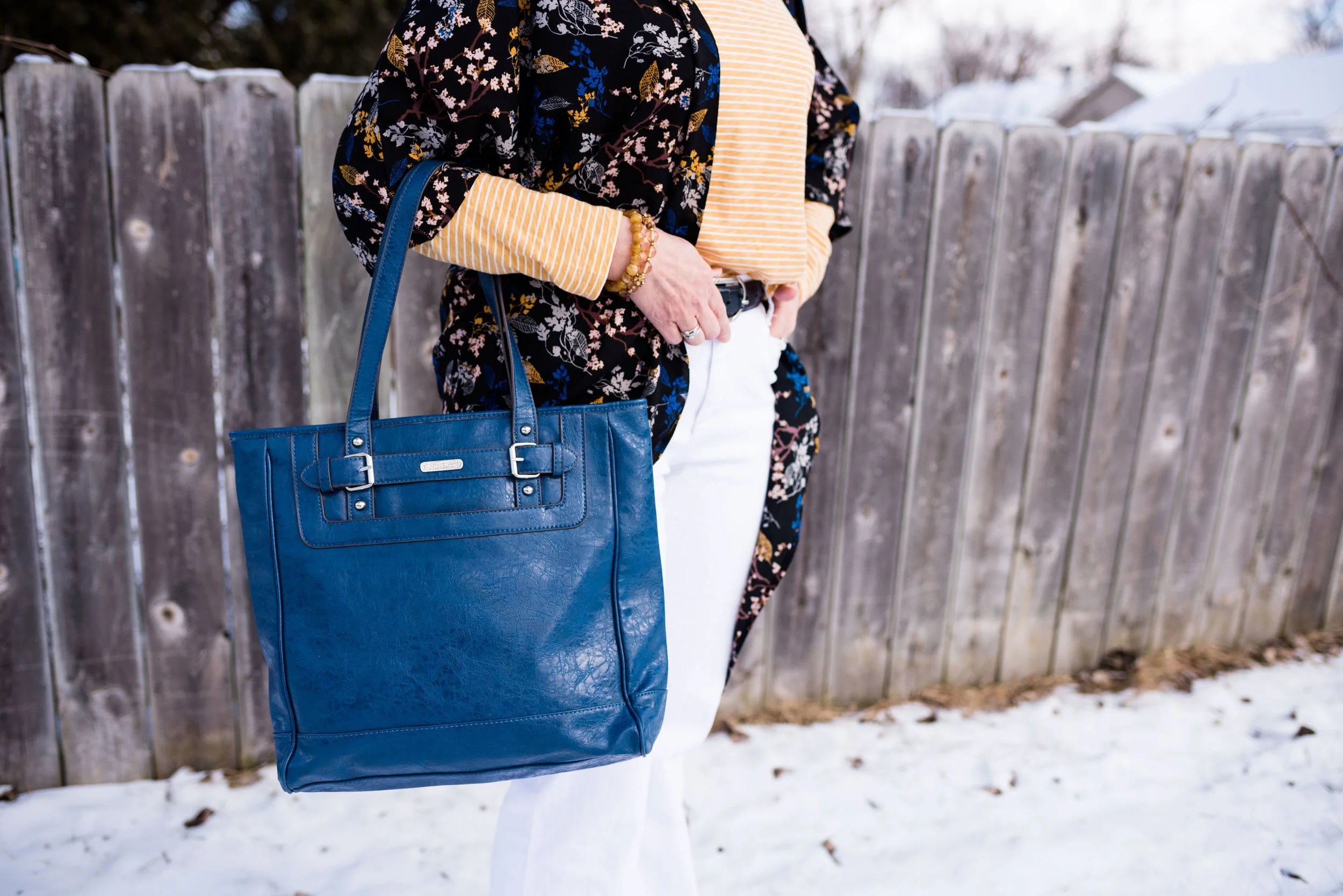
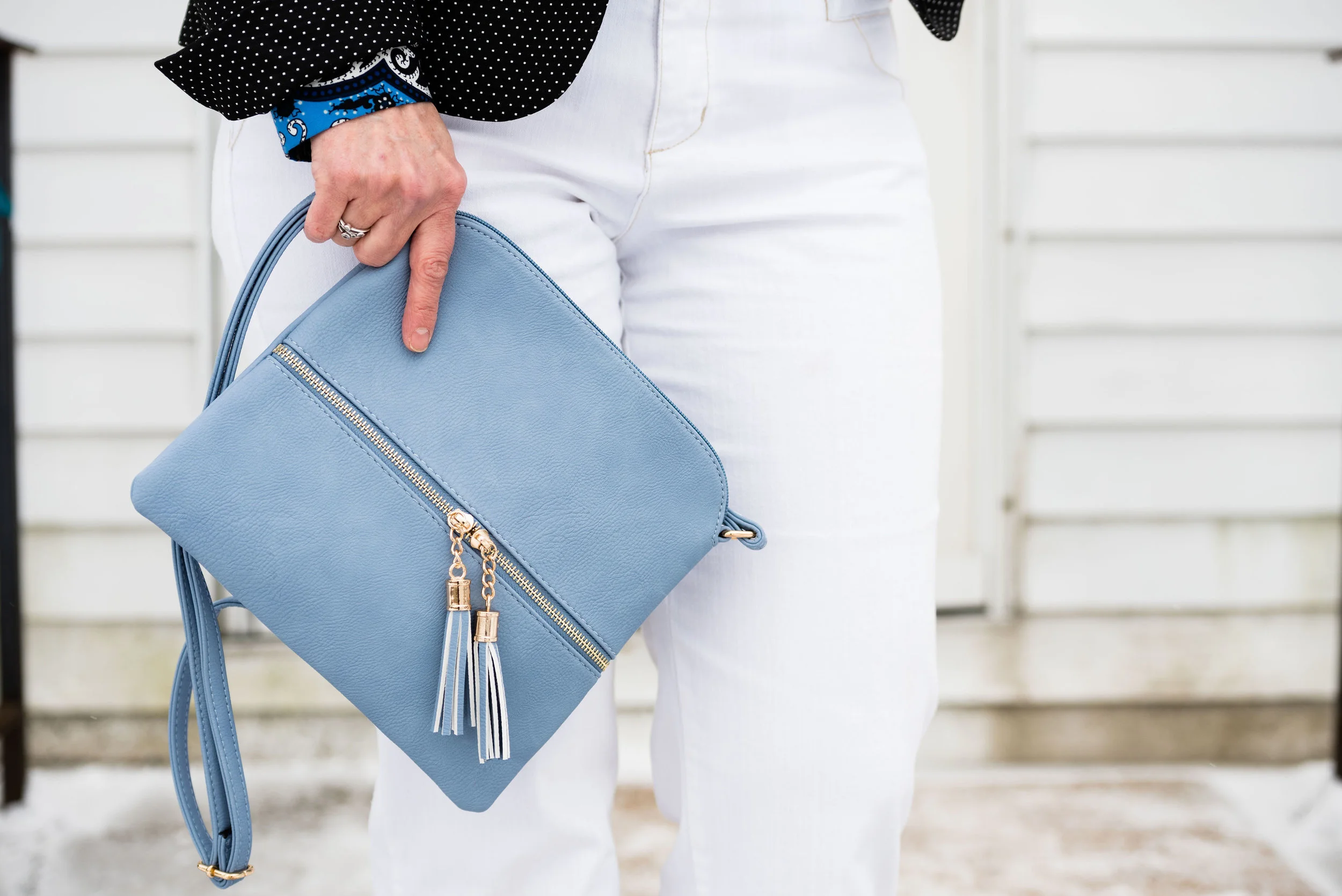
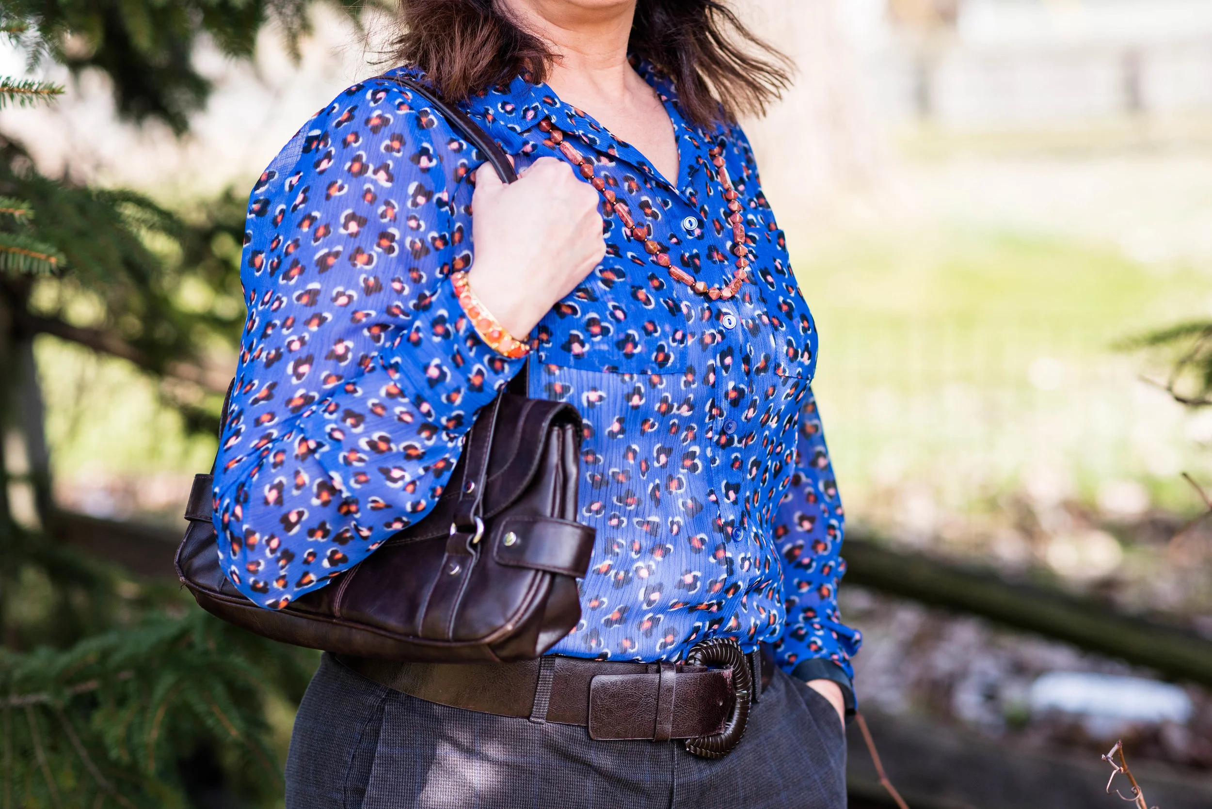
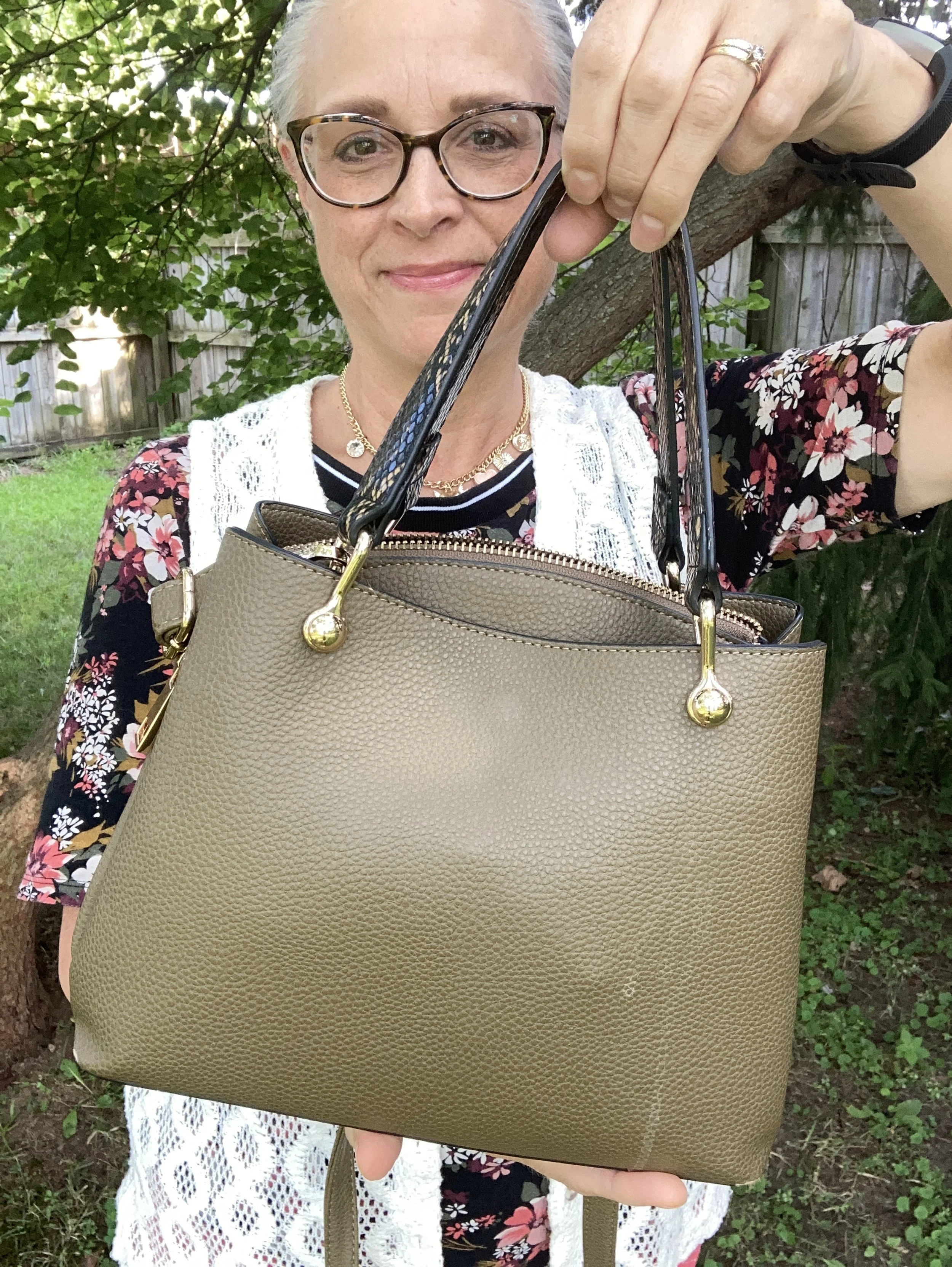
My Aldo bag is the current one I use, and was another thrift find. Sorry about the stain. I didn’t even look it over before I went outside to take pictures. I have been using this one all spring and summer.
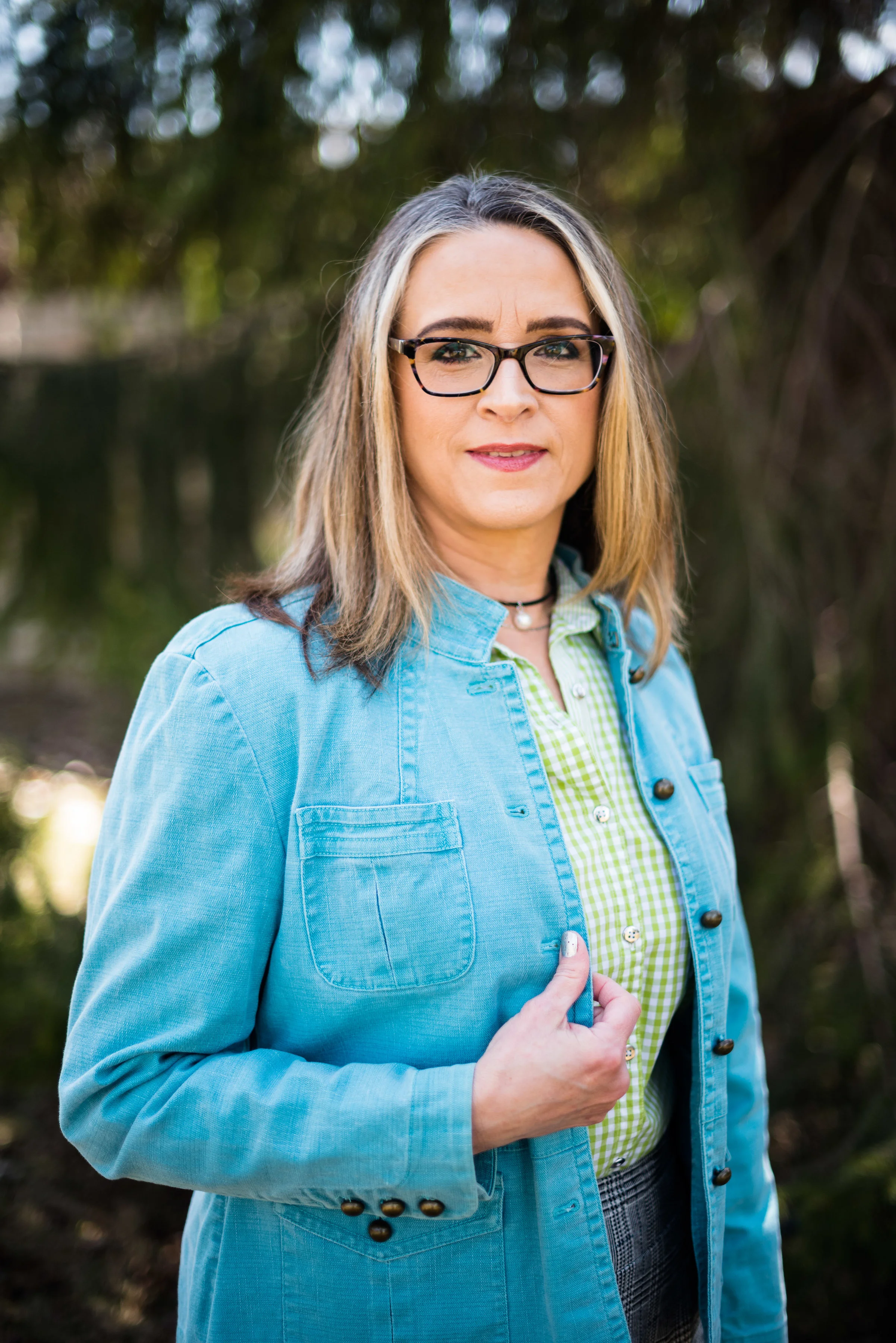
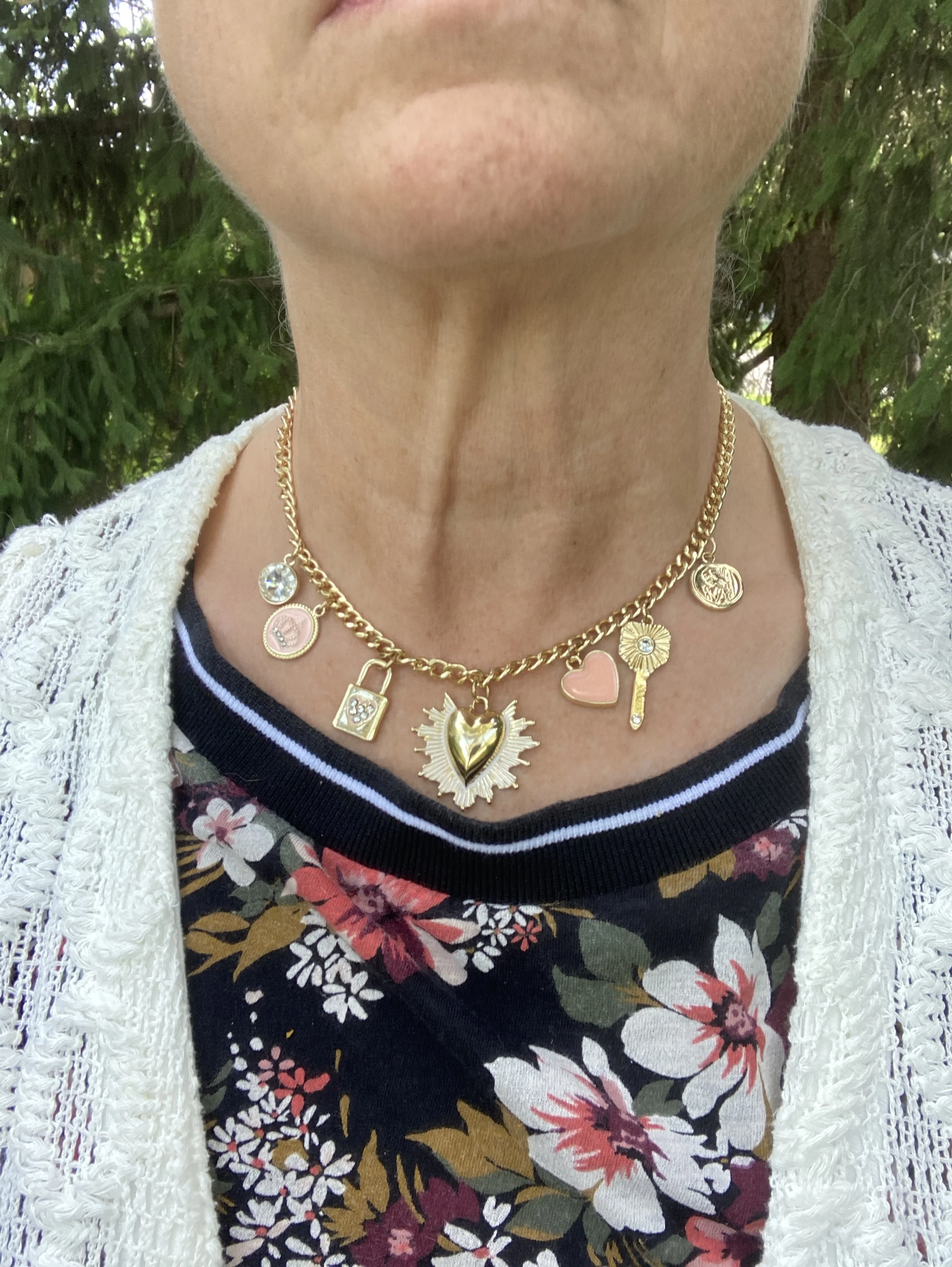
I added the charm necklace right before we left for church, thinking that it dressed up the outfit just a little bit more.
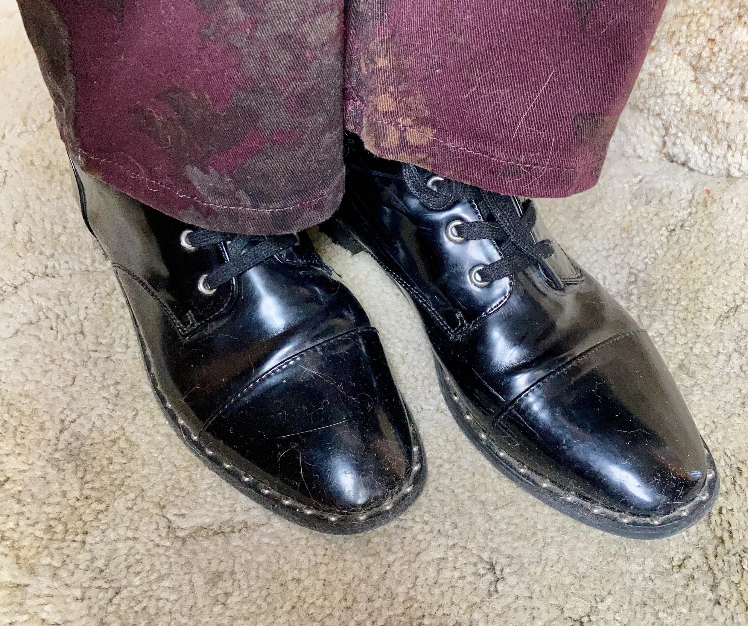
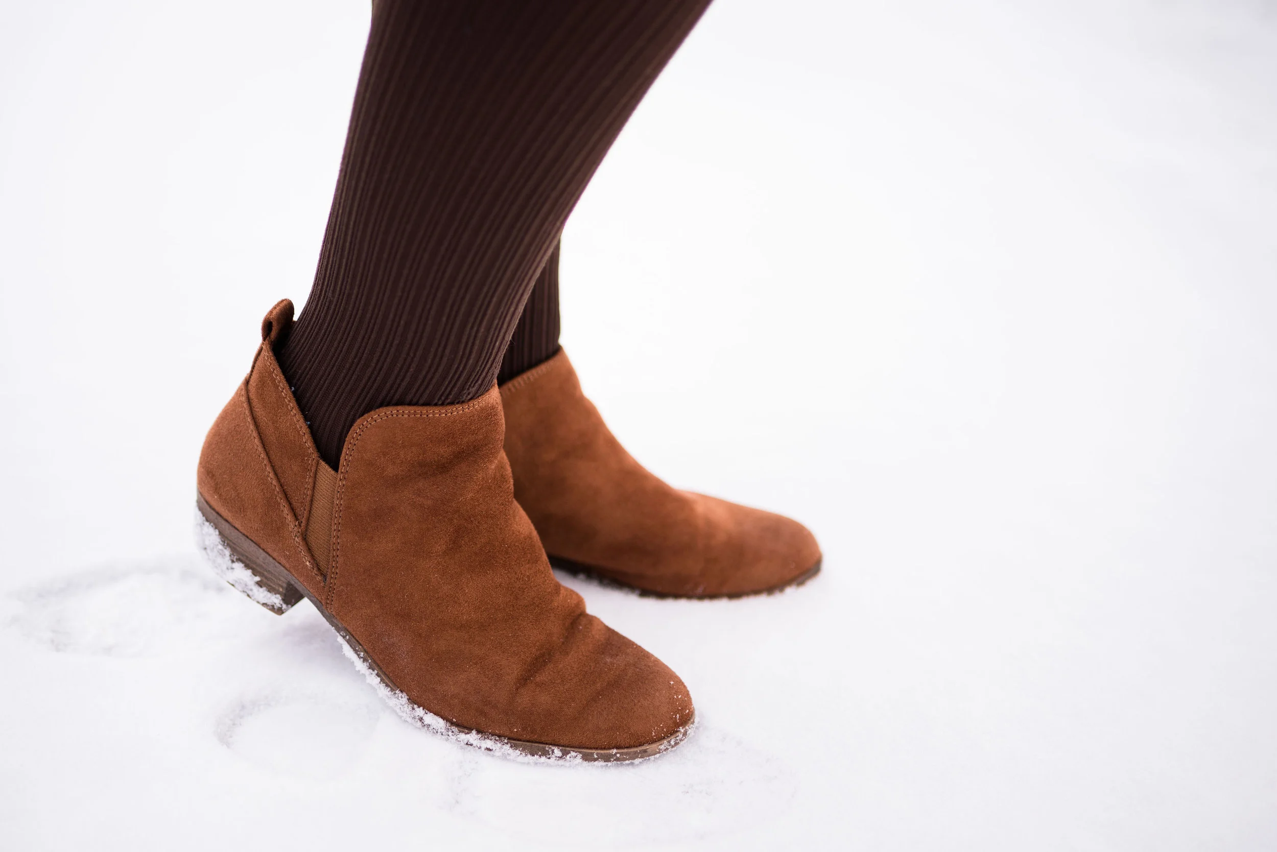
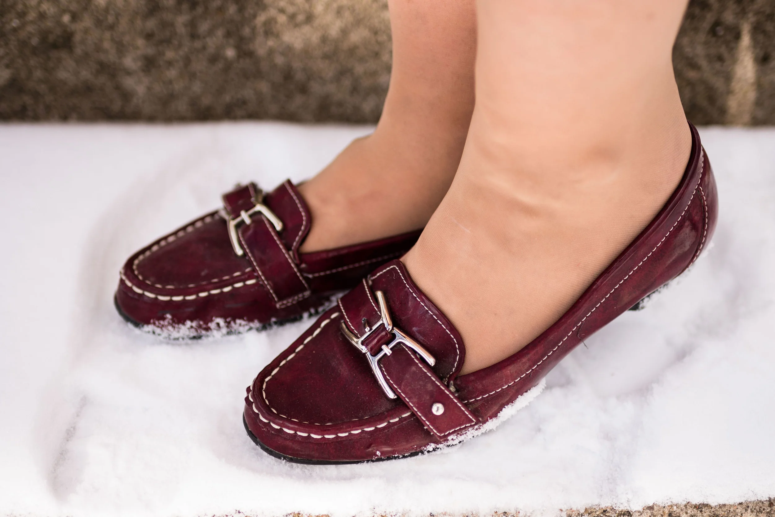
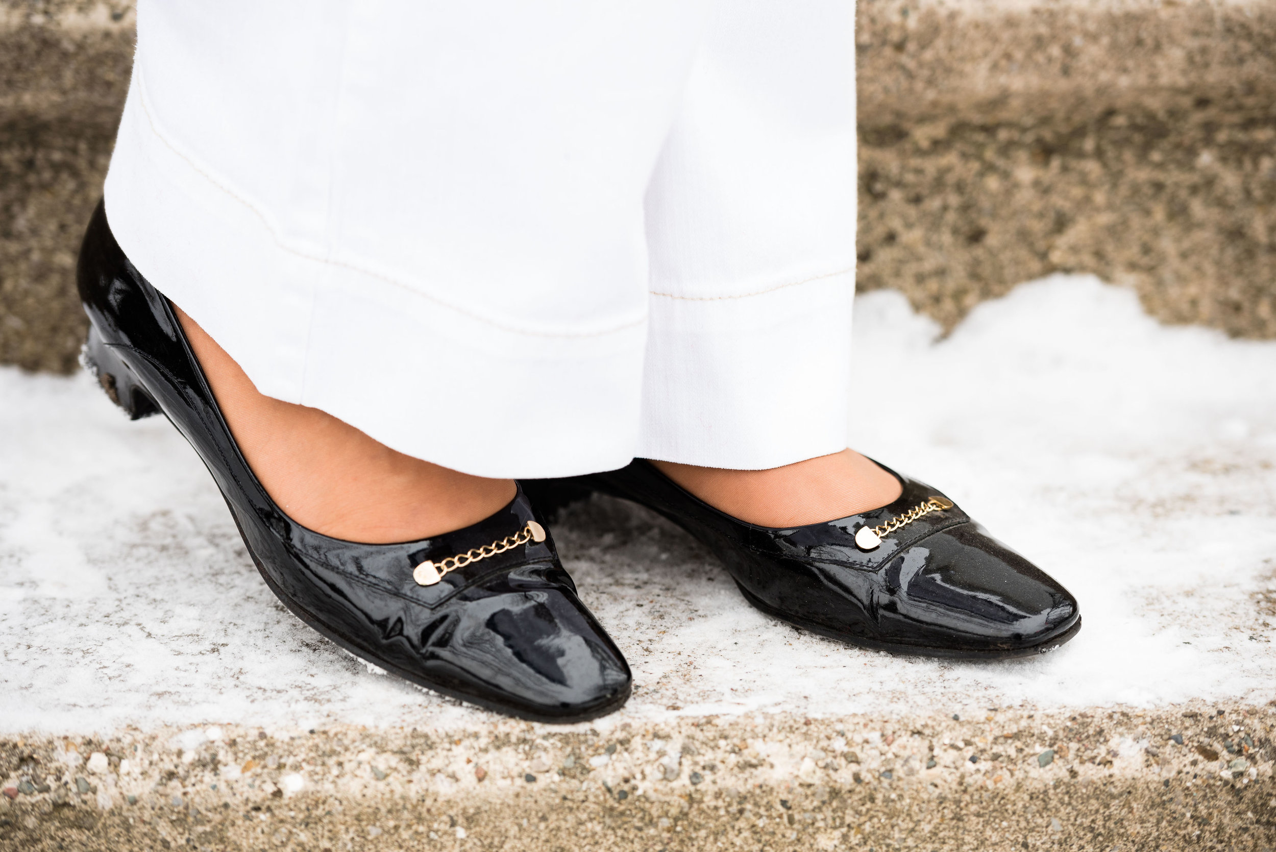
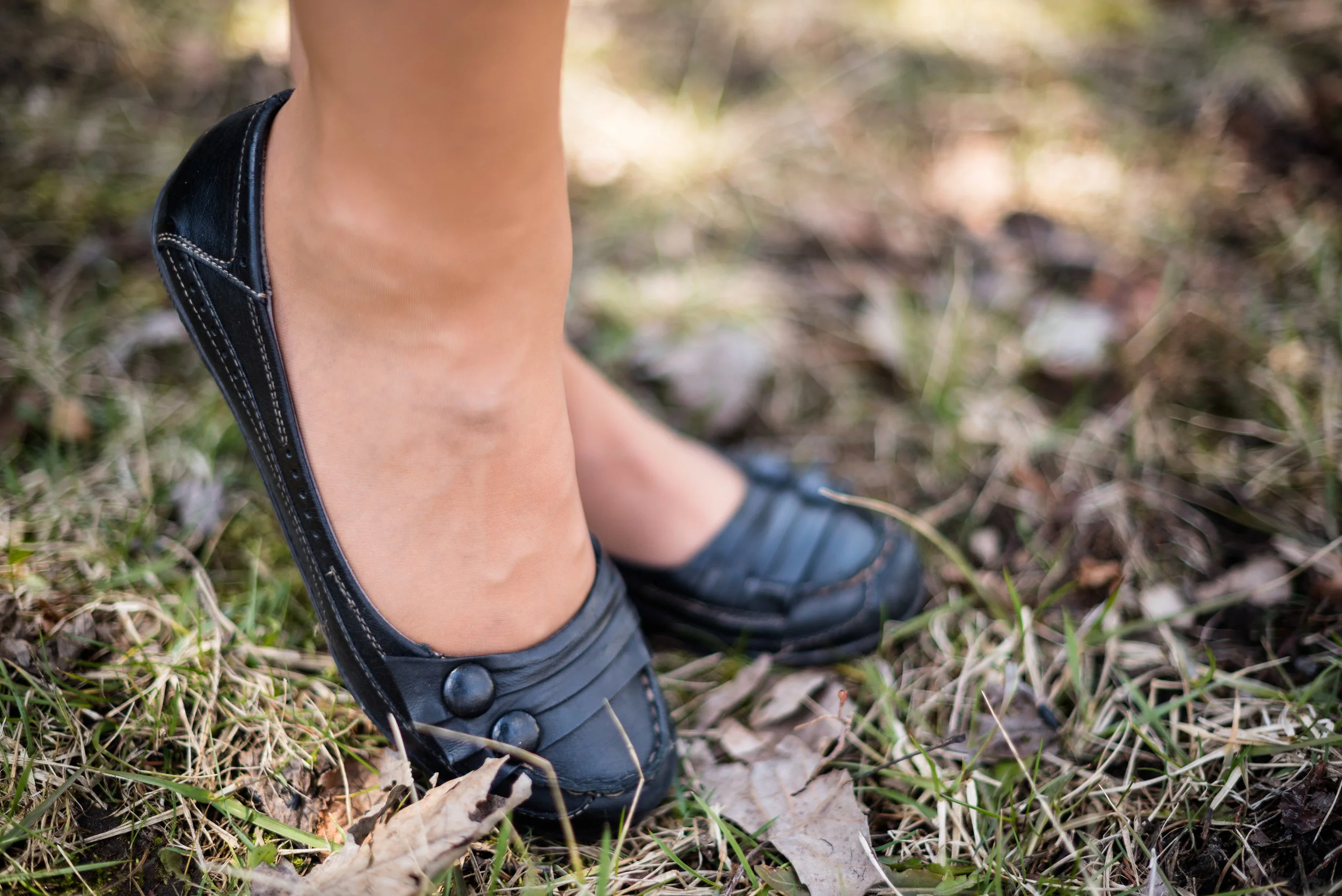
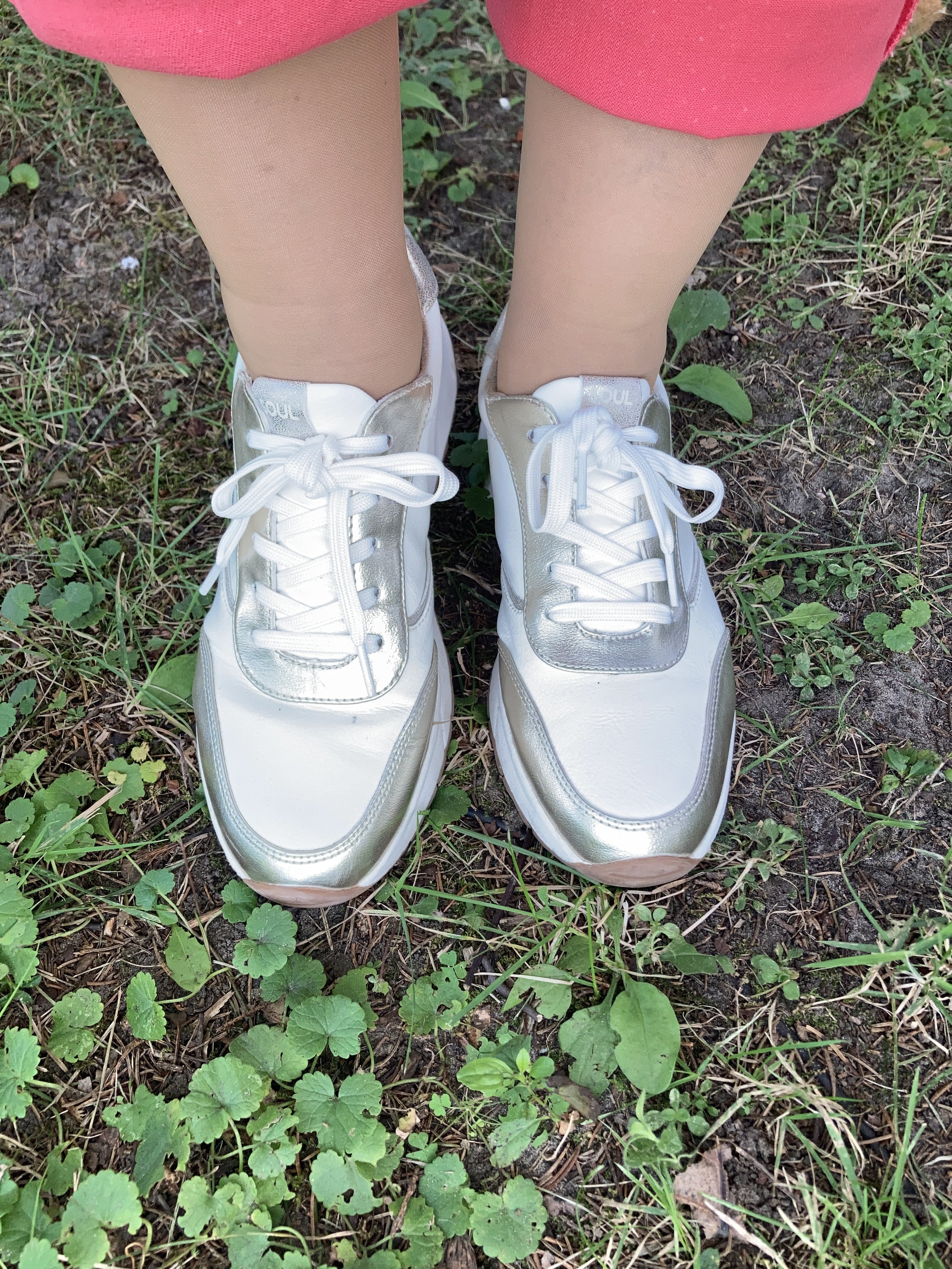
Finally, I wasn’t sure what shoe to wear, and still am not certain that these white and gold ones were the right choice but it seemed to work okay. I’m sure sandals would have been better, but I don’t wear those as often with my veiny feet. I found these at DSW on the clearance rack. They are Soul brand by Naturalizer.
What did you think of this look? Do you regularly print mix? What prints do you like to put together? Let me know in the comments. I always love to have your feedback.


I hope you are having a great week!