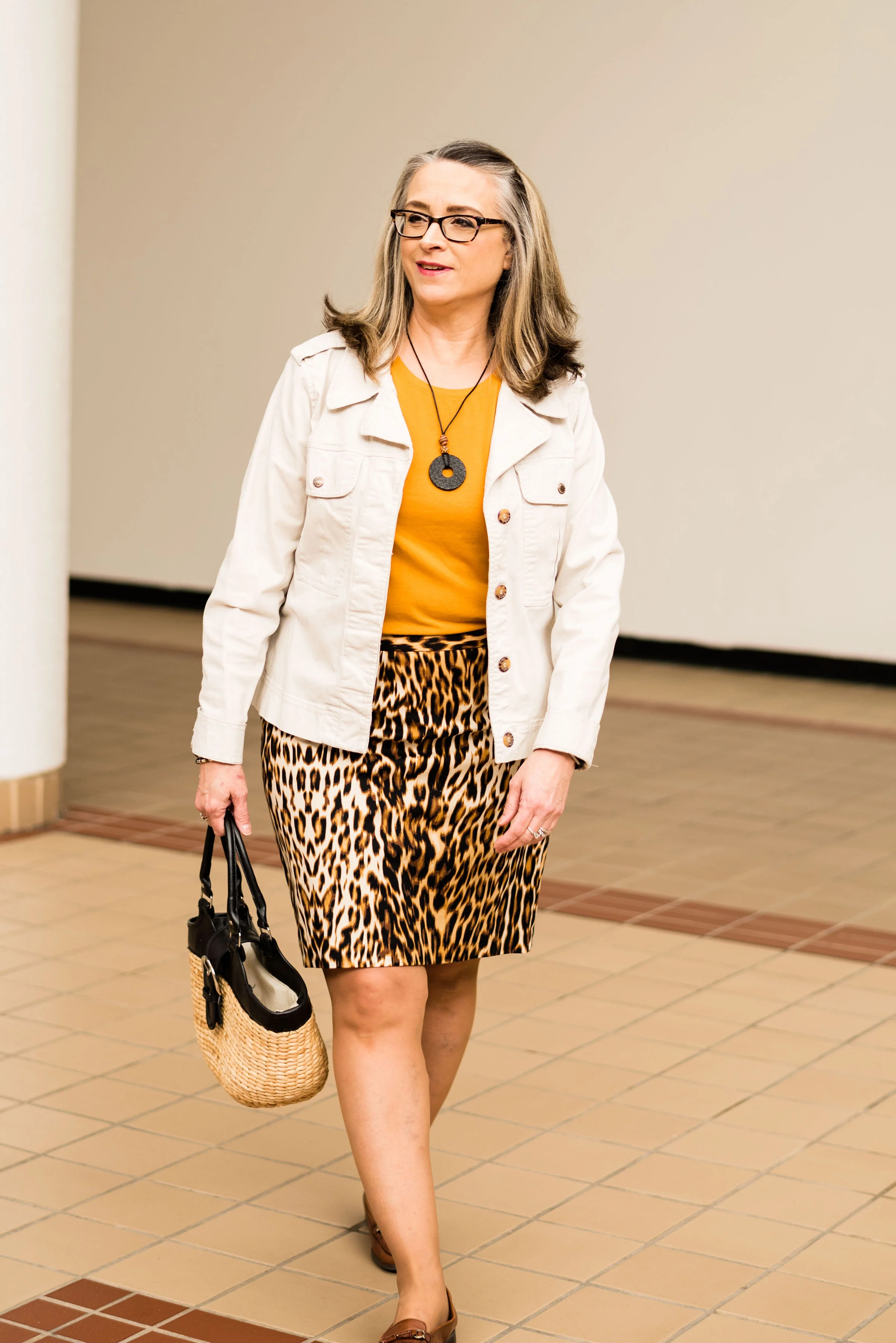
Pantone Spring/Summer - 2019 - Toffee & Mango Mojito

I am continuing my Pantone Spring/Summer - 2019 series with two more fun colors called Toffee and Mango Mojito. I was glad to see this lighter brown on the palette this year. Usually brown doesn’t show up until fall and often it is more of an orangey brown, so this brown is a perfect neutral. I absolutely love this pretty yellow and I think the name is perfect. It makes me think of sunflowers and sunshine and what could be more reminiscent of summer.

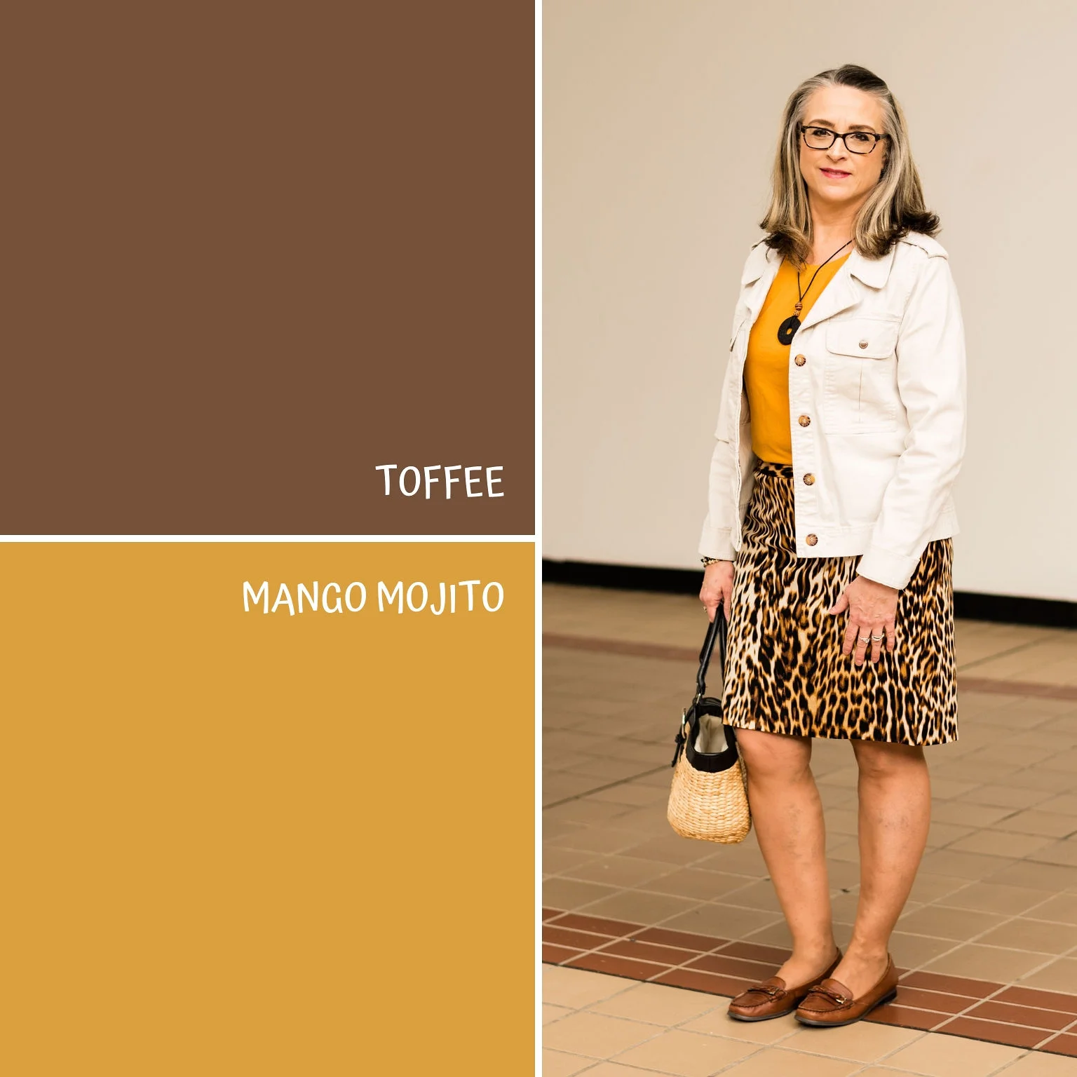
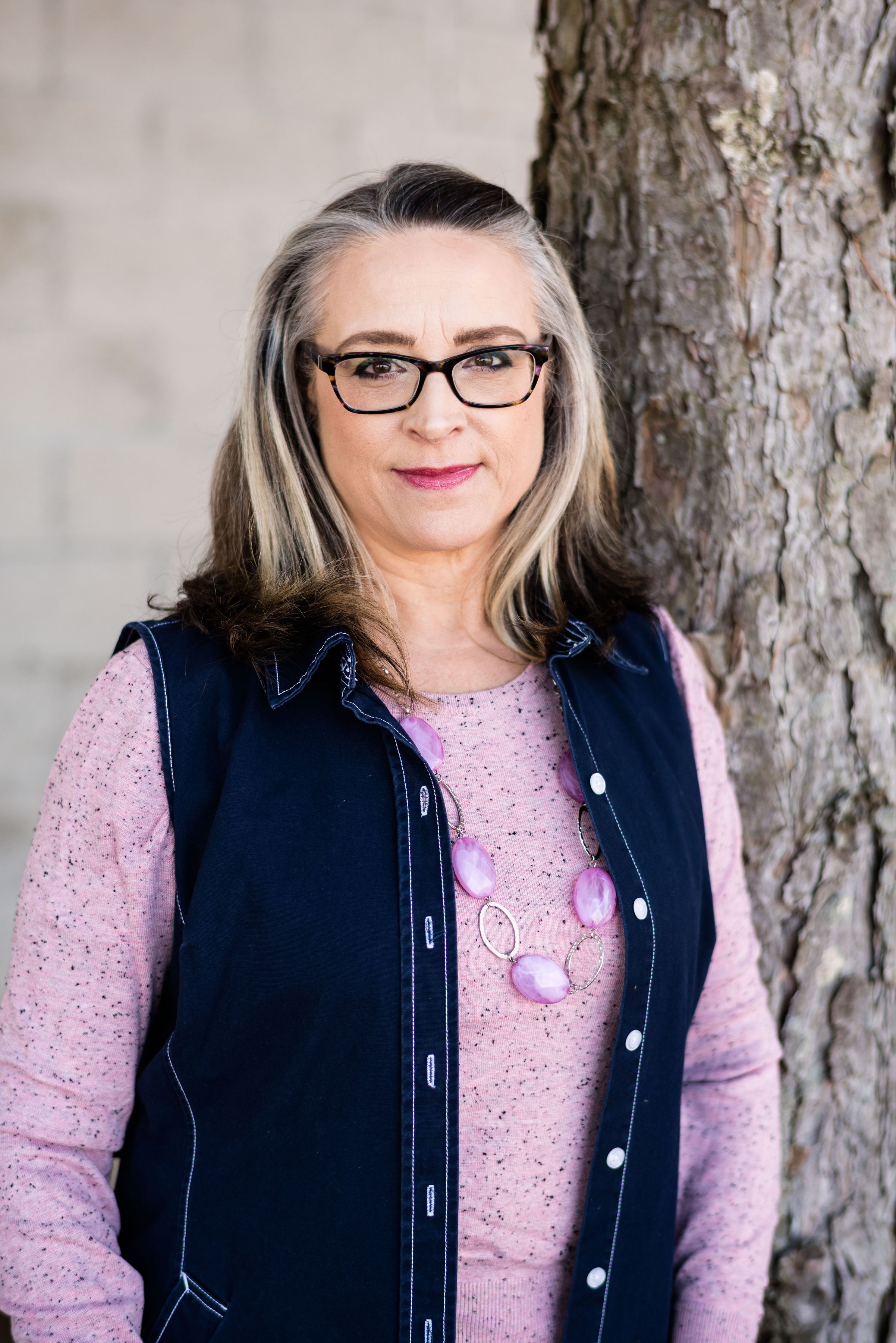
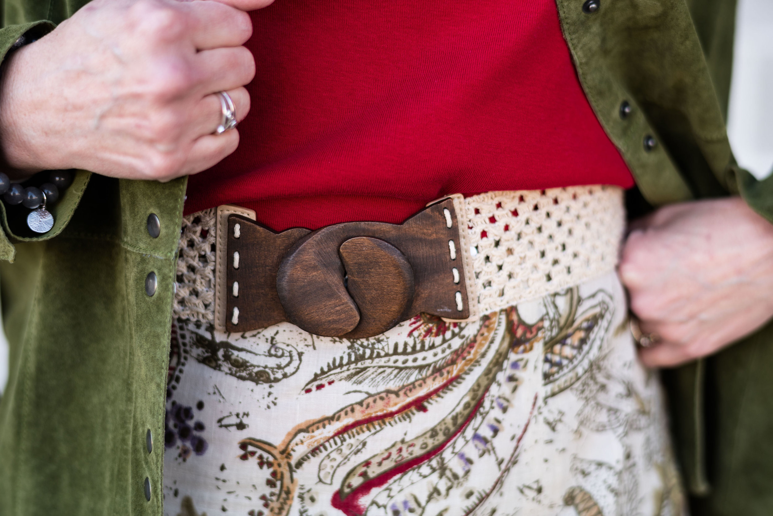
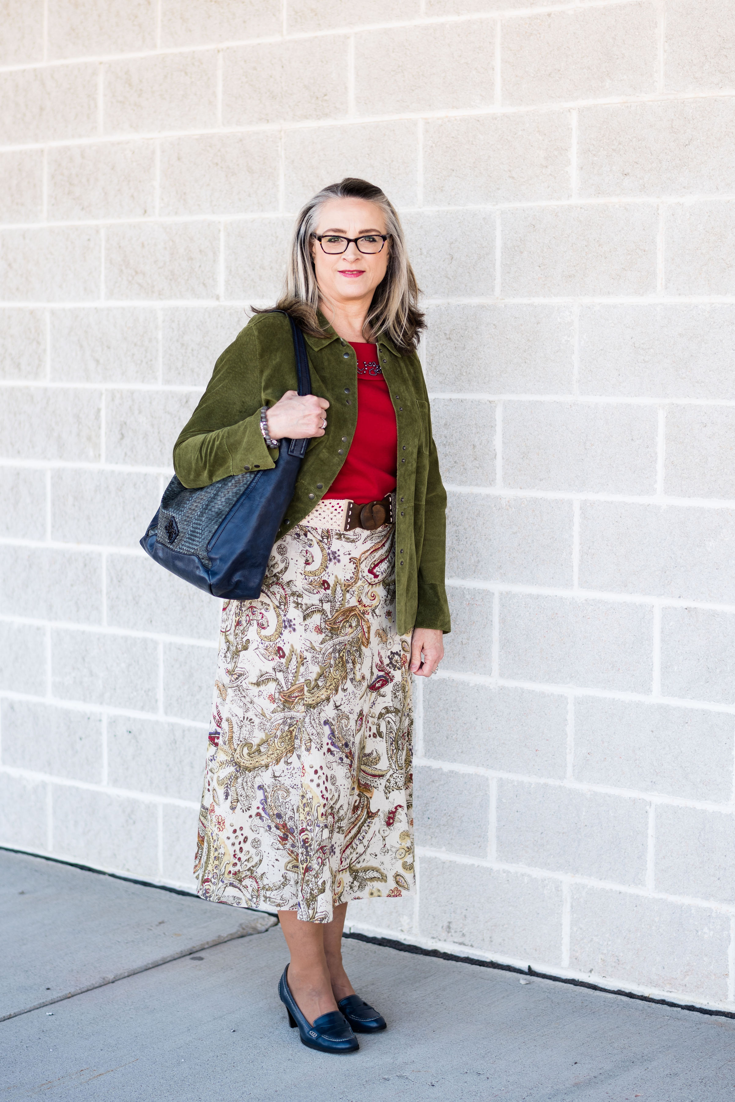
I didn’t really have anything that was this particular brown. As I have said before, when I talked about Brown Granite in the last Pantone post I did, I like brown, but it is not something I have a lot of in my closet. For this Toffee color, I decided to use my Worthington leopard print skirt. Animal prints are still in, so hang onto your snakeskin, zebra and leopard.

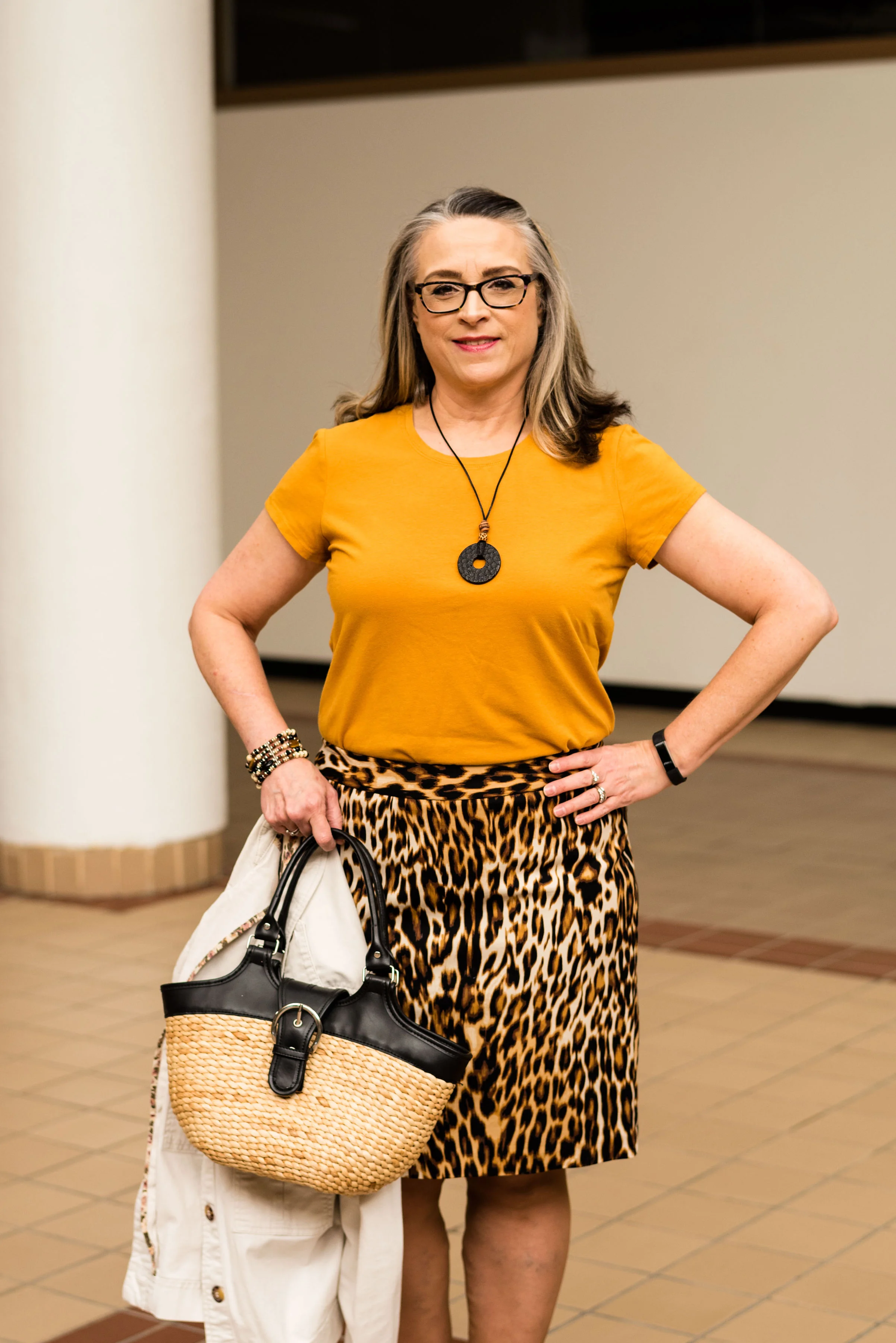
When I saw this Apt. 9 tee at a thrift store, I chose it for the color alone, not realizing how perfectly it would mimic the Mango Mojito color. Then when I chose the skirt, I knew this tee would be the right piece to pair with it.

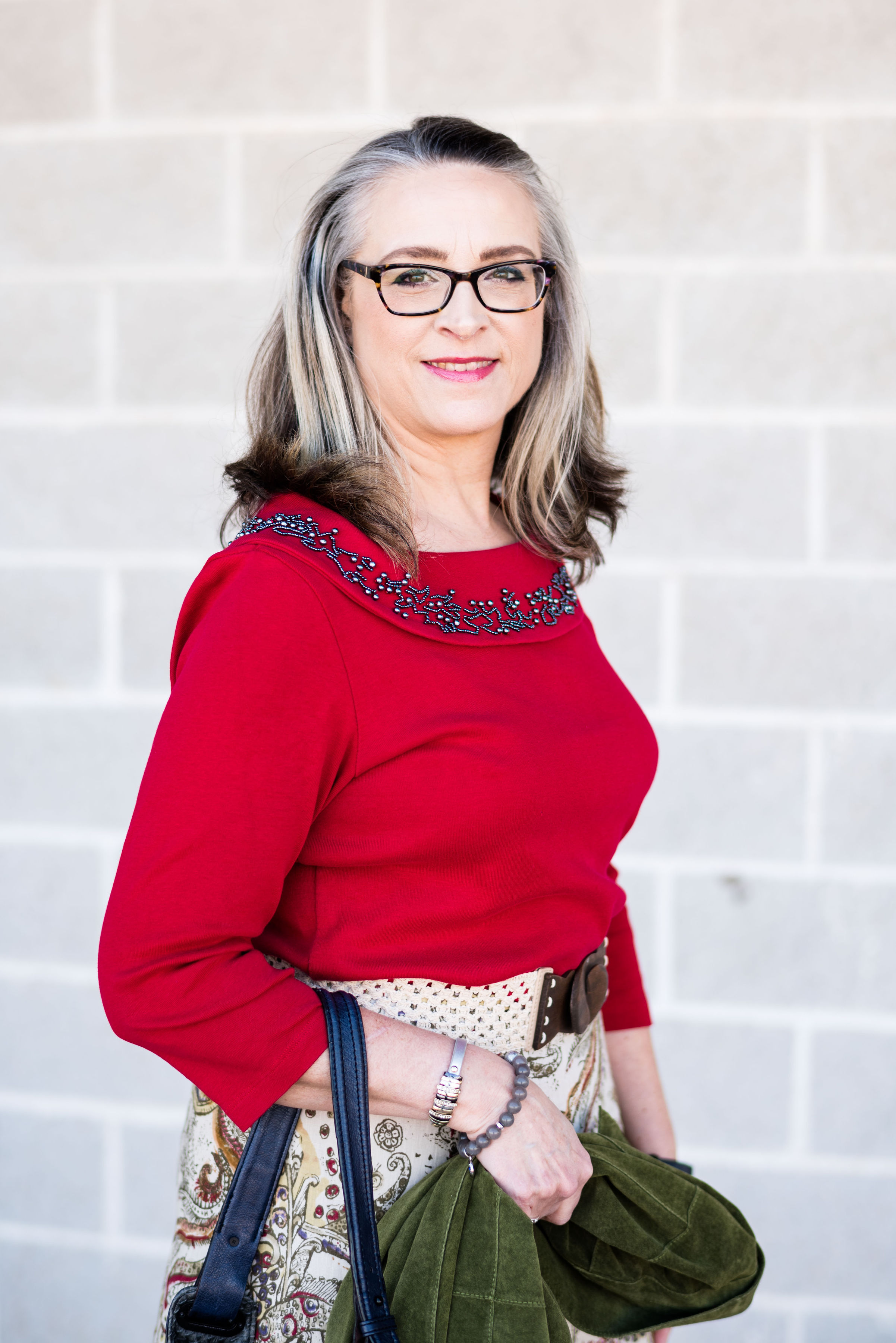
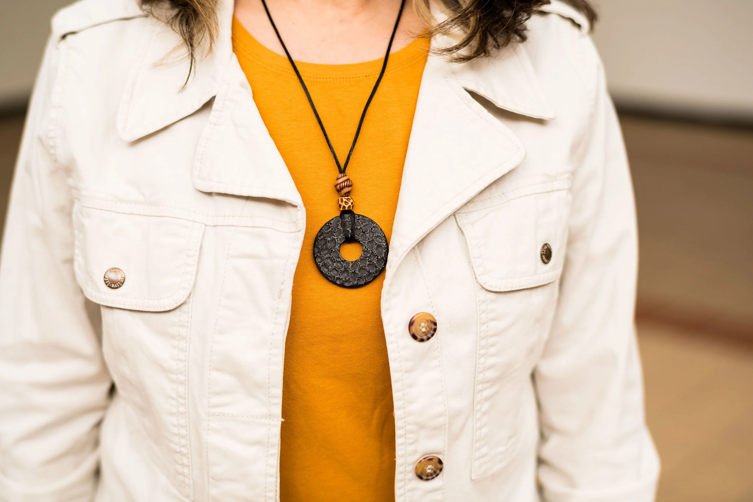
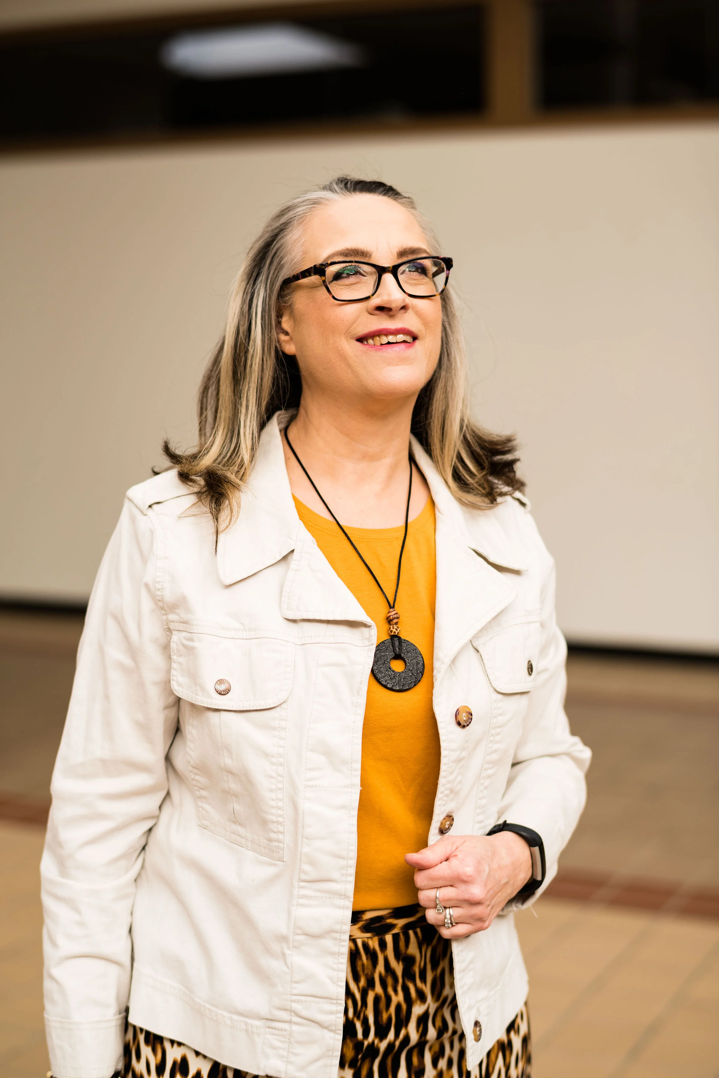
As with any outfit, accessories can make everything even better. I’ve had this thrifted white jean jacket by Sanctuary, for a few years and pull it out every now and then for the warmer weather. I thought it was the perfect topper for this outfit.

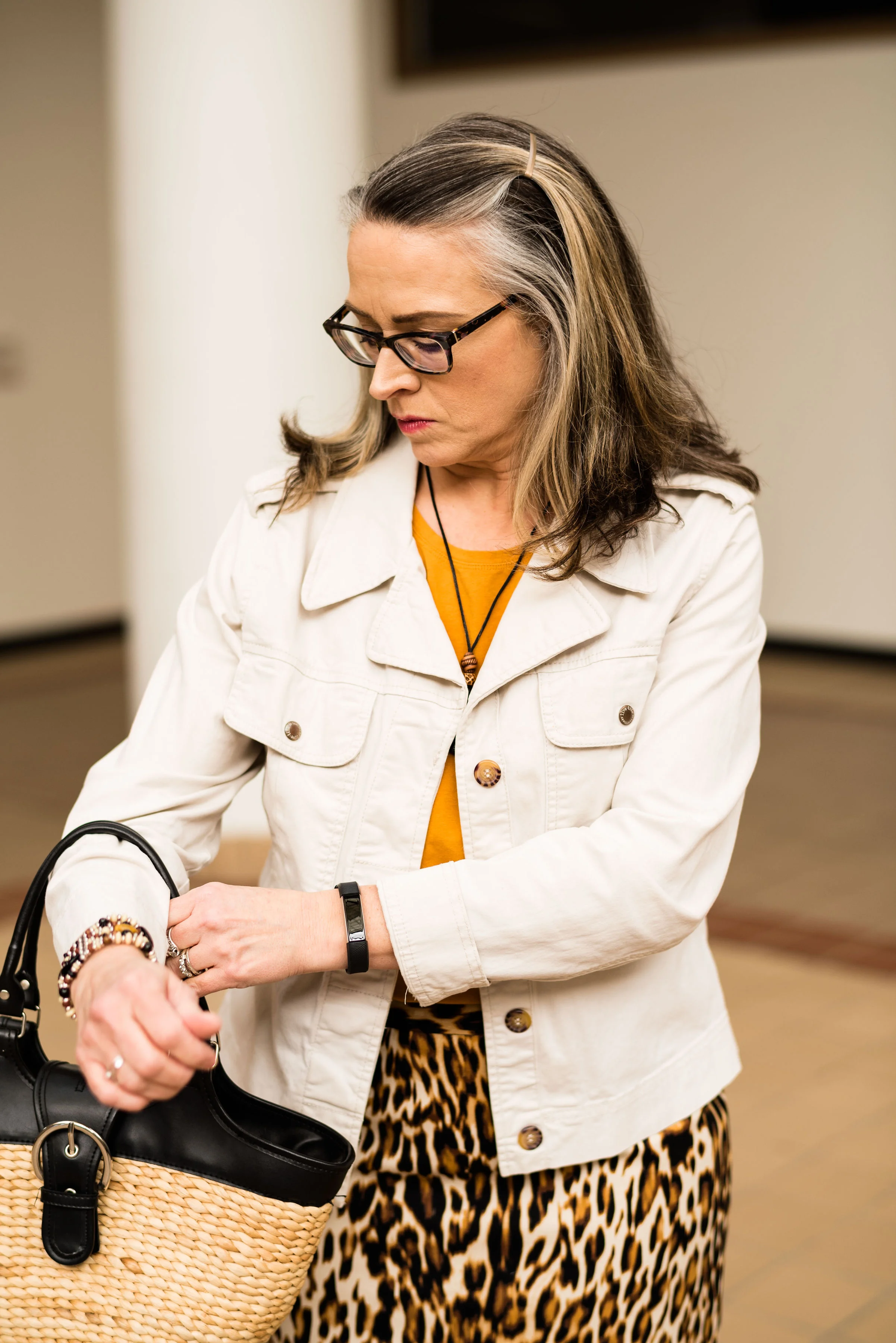
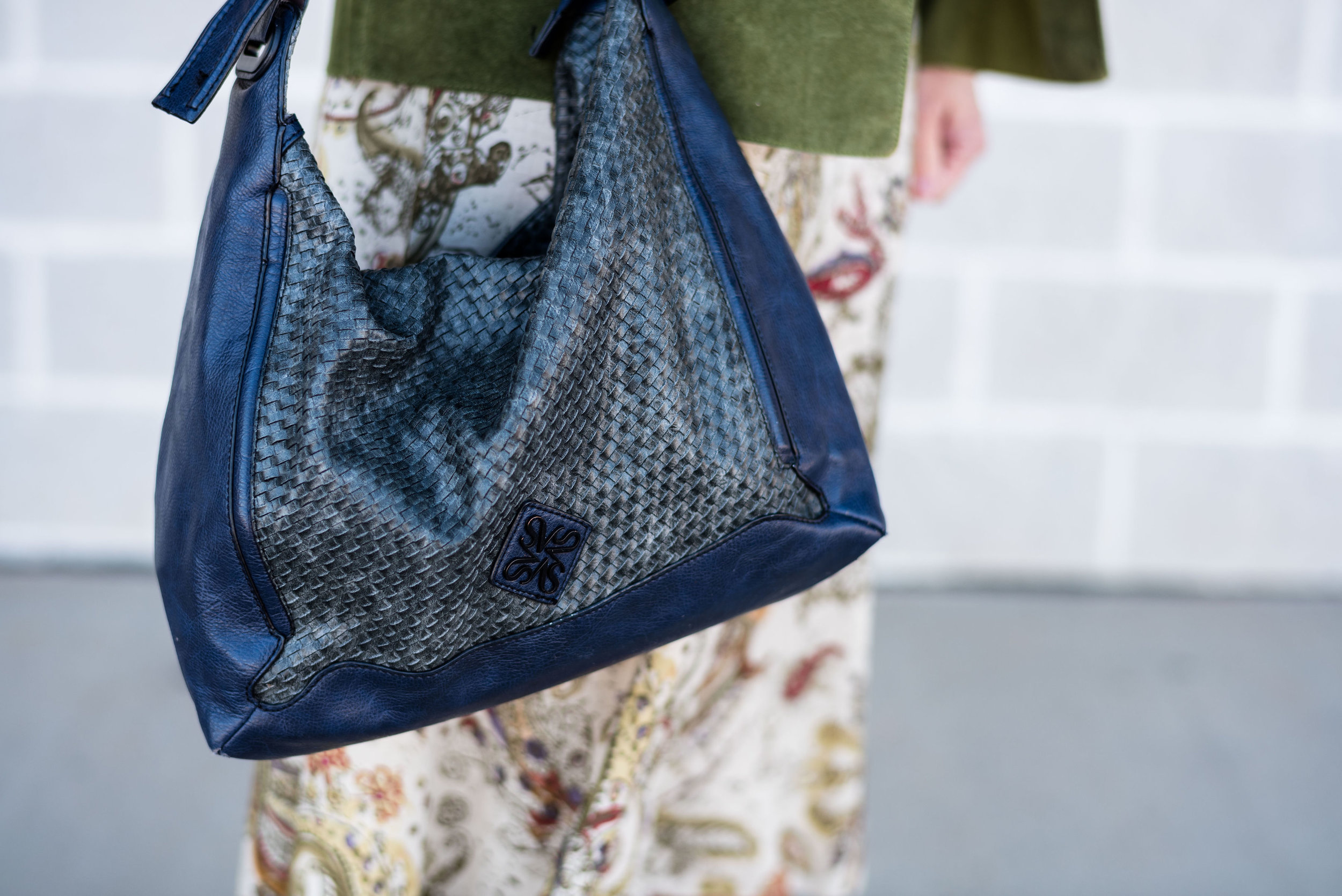
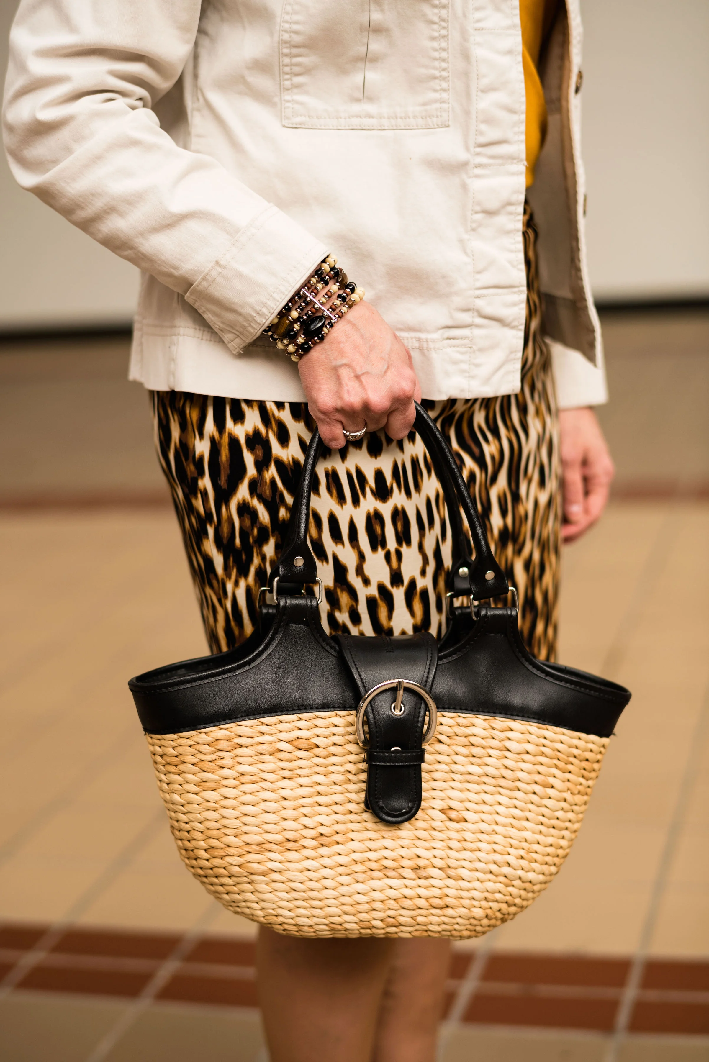
I kept my other accessories simple and earthy in keeping with the leopard print. A black pendant necklace, a beaded bracelet and my woven basket bag with black trim seemed the perfect accompanying pieces for this outfit. Do you own a basket bag? They are fun, and much more versatile than I once thought, especially in the summer.

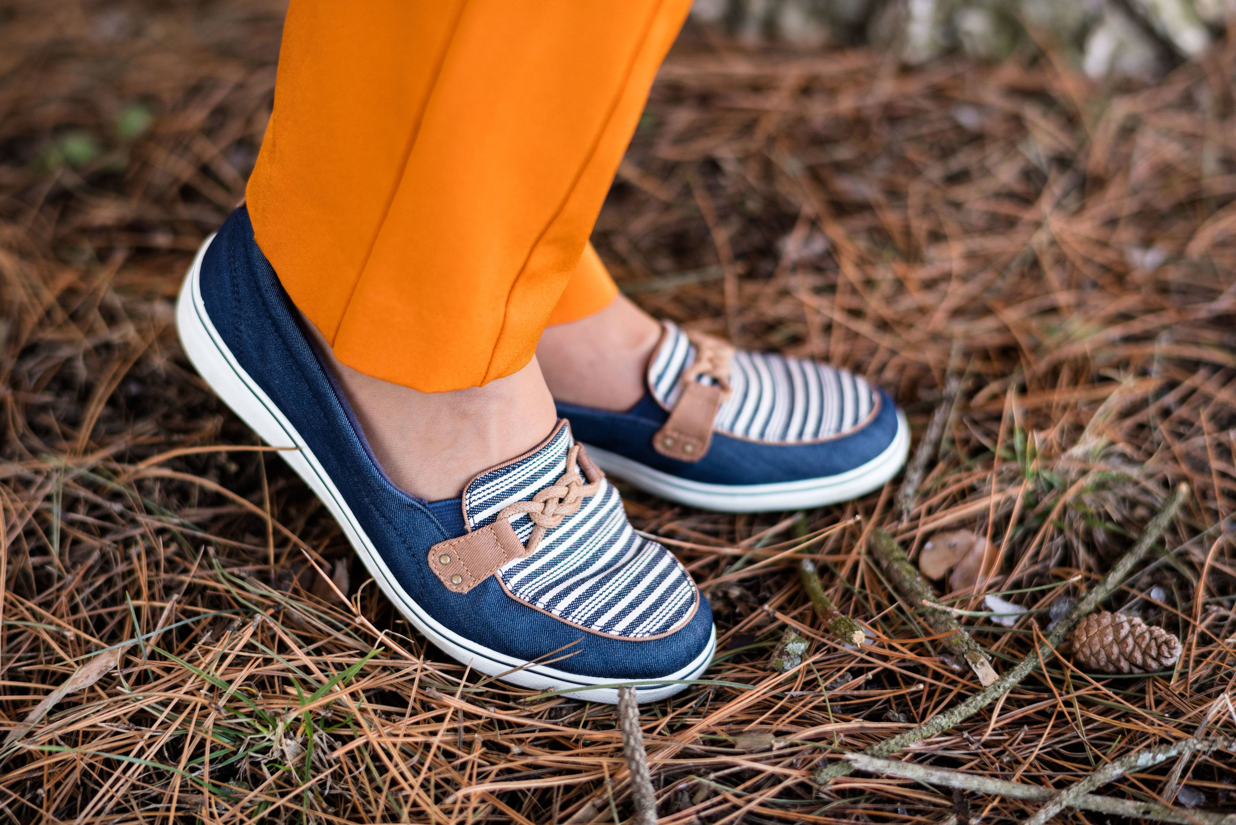
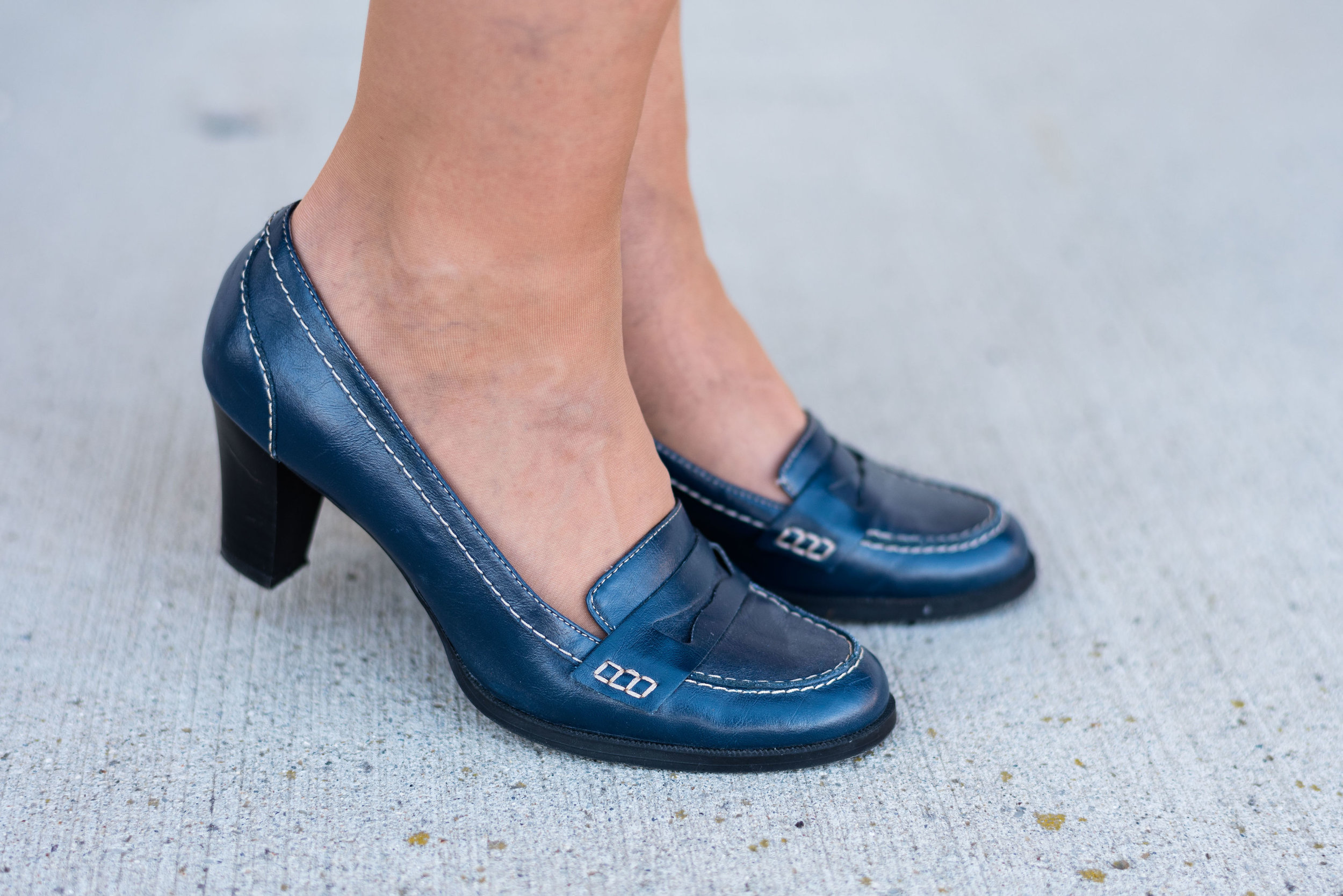
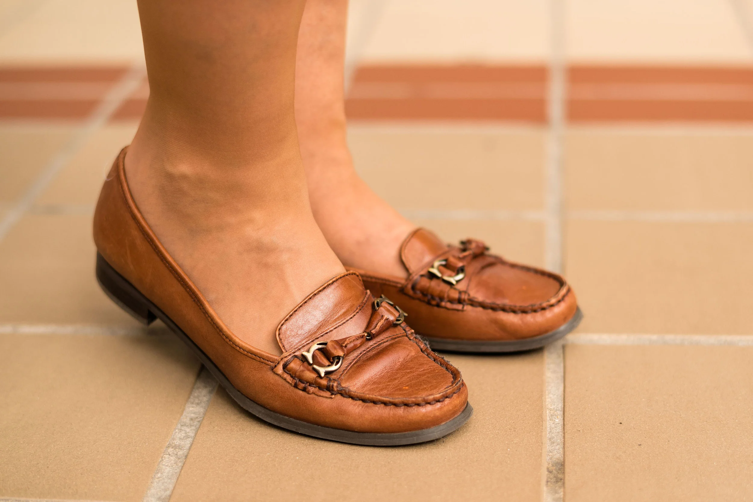
I decided to wear these thrifted loafers to keep the look more casual. You could easily take this outfit up a notch by adding a sweater instead of the jacket, a sparkly clutch and heels, along with some jewelry with a bit more bling. As is, it is a nice outfit for work.

We had fun taking these pictures inside a local mall that is no longer a “normal” mall.

What sort of photos do you like best? Outdoor or indoor? I’ve always been a fan of natural light, but I think these indoor shots are kind of fun, don’t you?

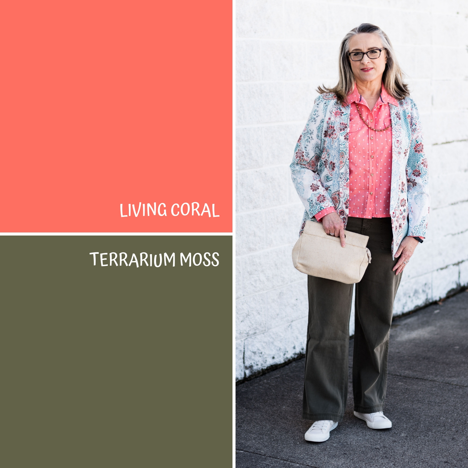
Do you like these Pantone colors? I think Mango Mojito is one of my favorites. I know not everyone will like it, because not everyone can wear it, but remember, you don’t have to wear a color that’s not really good with your complexion, you can always carry it in the form of a bag, wear it on your feet, or even tie a scarf in the color to your purse.

I hope you enjoyed this post. I’ve included a few shopping links. These are affiliate links, which means, when you click on a link, I get a few pennies. All opinions are my own. Thanks for all of your support. If you know someone you think might enjoy my blog, be sure to tell them about it. If you aren’t already a subscriber, please subscribe. It keeps my blog going.

Have a great week.

Photo credit Rebecca Trumbull. Make up Rachel Christensen.


Pantone Spring/Summer - 2019 - Pink Peacock & Pressed Rose

Today’s Pantone Spring/Summer colors include a hot pink and a pastel pink. Pink Peacock could be a close cousin of fuchsia and reminds me of the bright pink flowers that begin to appear in many people’s gardens at this time of the year. Pressed Rose is a medium pink that appears only on the London color palette as a companion to New York’s Sweet Lilac. To me it is a more adult version of pink, that almost any woman could wear.

For this series, I thought it would be fun to pair colors that had similar roots, so for this pairing it was pink with pink. You will see another post where I pair yellow with yellow. Whereas, in last Thursday’s post with Turmeric and Sweet Lilac, the colors were quite different, almost to the point of being too different to put together. However, as we are beginning to realize with many fashion faux pas, never say never.

This bright pink thrifted, Worthington sweater was a purchase I made, just for this series. I have a number of bright pink things, but nothing seemed quite right, a little too red, or a little too purple, so when I saw this for a dollar I snapped it up without even trying it on. I like the ribbing around the neck line. Little added details like that are part of what make clothes special.

This David & Young kimono was a clearance find from DSW. Who thinks to shop for kimonos at a shoe store? Me, that’s who. Ha, ha. They have all sorts of great accessories there, like bags, wallets, key chains and of course shoes!

It is hard to see in these pictures, but the kimono’s flowers include the Pressed Rose color. I like the fringy details on the sleeves and it is also on the hem line. This will be a great topper for the warmer weather.

For this outfit I decided to try finding a piece that would mimic the Brown Granite color from the classic neutral palette. It is not often we see an actual brown on this palette. More often they choose a gray. I was disappointed there wasn’t a gray, but then I realized it would force me to think outside my box again. I actually like brown and my hubby loves when I wear it as it brings out my brown eyes, however, it is hard to find brown pieces that aren’t just drab and boring.

I got these brown Worthington trousers at JC Penney. You can obviously tell, I have a lot of Worthington pieces. For me it is a brand that fits my figure pretty well and has a lower price point. I think they make great work wear pieces. Here are a few pairs of pants in various colors: gray, various, bright pink, pull on skinny (similar to the orange ones from last Thursday’s post). This pair is more of a wide leg and very comfortable.

These cute ankle boots I found at Kohl’s in the clearance section. Do you shop clearance? It really pays off at Kohl’s as long as you don’t mind getting stuff at the end of the season. I don’t worry about being spot on as far as the trends and timing. I like what I like and I will wear it, whether it is trending or not.

Along with my light pink ankle boots I grabbed my little pink clutch, and added a few simple pieces of jewelry to keep the kimono and sweater center stage.

What do you think of these colors? Do you wear pink? My husband does not like pink, not even on me, but I wear it anyway. I’m such a bad wife. Ha, ha. But he puts up with me and loves me even in my pink moments.

As always, I’ve included a few shopping links for all things pink! Enjoy shopping. These are affiliate link, which means I get a few cents when you click on a link. All opinions are my own.

Photo credit Rebecca Trumbull. Make up Rachel Christensen.


Pantone Spring/Summer - 2019 - Turmeric & Sweet Lilac

Today’s outfit revolves around two more colors from the Pantone New York and London Spring/Summer 2019 color palettes. As I stated in my introduction to this series, the two palettes concurred on ten of the twelve palette colors, but each also included two of their own colors. This week I’ve paired the spicy orange Turmeric with New York’s pretty pastel, Sweet Lilac.

I’ve styled these Worthington brand pants from JC Penney, several other times on the blog. You can see those three posts here, here, and here. The reason I refer back to other posts where I have worn a piece is to show you the versatility of the individual pieces in your wardrobe. It is not unusual for us to wear the same jeans, our favorites, over and over again, but a piece like this pair of more dressy pants that keeps showing up again and again, shows its versatility and its value in taking up precious space in our closets.

Before I became a fashion blogger, I would have never thought to pair orange and pink. That is why I love doing this color series so much. It makes me think outside my comfort zone. Who says we can’t pair orange and pink? Pairing colors is really no different than print mixing. With a little practice you will be a color mixing pro in no time.

This crew neck, H&M, sweater was a thrift store find. It is lighter weight which makes it perfect for spring or even a chilly summer evening once the sun goes down. I like the speckling through out. When I searched my closet for a piece to use for the Sweet Lilac color, I thought this came the closest to the warmth and femininity the color was trying to display. Once, I added this silver and bead necklace, which can be pink or a light purple, I knew I had made the right choice.

I decided to pair this look with the Eclipse classic color again, along with another classic color labeled Soybean. I do like, that the Pantone Color Institute has included a palette of neutral, classic colors that can be used with any of the other color palettes. These four colors give you options for how to put your outfits together. You could have an entire outfit of Eclipse (navy) with just a few fun pops of other palette colors for your jewelry, bag or shoes. You could even throw on a scarf or a hat. Now, that sounds like a good idea for another series. Ha, ha. I love color, can’t you tell?

This long, Isaac Mizrahi, trench vest is actually a heavy weight stretch denim dress. Right now, at my current weight it is a little snug to use as a dress, but I think it makes a great vest. When I got it a few years back at a thrift store, I knew I could use it either way.

I’m a big fan of Keds. I like the look of Converse sneakers on other people, but I always feel that they make my feet look like skis. I have a rather narrow foot, to begin with, so I don’t want a shoe that is going to make them look even longer and skinnier. Ha, ha. I know that seems silly. This pair of shoes are called Grasshoppers. I also like the way these fit. They are pretty comfy and have a pretty reasonable price point. You can see more of these here.

This thrifted Simply Vera/Vera Wang cross body bag is a great size for shopping. I am a fan of cross body bags, simply because they are easier to carry for hands free shopping. I don’t like to be fumbling with my purse if I want to take items off the rack to look at. I also think it is more secure to keep it attached to my person rather than leaving it in a cart , where I might not be paying attention.

What do you think of these colors? Would you wear pink and orange together? Have you ever worn a button up dress as a vest or even as a jacket? I’d love to have your feedback.

I’ve included a few shopping links for all things Turmeric and Sweet Lilac. Be sure to check those out. These are affiliate links. All opinions are my own.

Photo credit Rebecca Trumbull. Make up Rachel Christensen.


Pantone Spring/Summer - 2019 - Jester Red & Pepper Stem

Today’s Pantone colors are the rich saturated relatives of red and green. These two pair perfectly for a tropical vibe mixed with a punch. Jester Red jams with a touch of blue and Pepper Stem is green with lilting yellow tones. I love how these two mix together to create a colorful summer vibe.

This Jones Wear printed midi-skirt is a great piece for spring, summer and fall. It is fully lined, so in the summer you don’t have to worry about wearing a slip. The length is modest, and pairs well with anything from heels to flats to flip flops. I’ve featured this skirt on the blog before in a fall Pantone palette. You can see that post here.

This Field Gear jacket is thrifted. I have also featured this on the blog before too. You can see that post here. If you take a look at that post, you’ll see it was also for the Pantone palette from last spring, where the color of the year was Greenery. This is a softer, light weight suede, which makes it the perfect piece for spring and summer.

This 3/4 length sleeve tee is a bit more red than the Jester Red color, but I thought it was pretty close. What drew me to this Rafaella Studio thrifted piece was the embellished neckline. The cowl neck is covered with beads in a hematite type sheen. I didn’t need any necklaces with this pretty piece in place. Tops with embellished necklines are a nice, easy way to dress up an outfit, without having to think about jewelry. You can see the intricate beading below.

For my accessories, I chose a thrifted Simply Vera/Vera Wang navy bag and thrifted Relativity loafer heels, to go along with the classic color Eclipse. Once again, let me reiterate, this is not a contest to see how close to the Pantone color palette you can get, but a spring board for inspiration and new color combinations that you may not have thought of before. We often think of red and green as a Christmas color combo, but when you make the green a little more tropical it pairs well with any red without looking Christmasy.

I added this belt too, just to make the outfit a little more polished. This is a stretchy belt that just clasps together in the front. A stretch belt is a fun way to add fun to an outfit and cinch in our waists.

I thought this was a fun, festive outfit that could be worn to a party. If the weather is hotter, sub out the 3/4 length sleeve tee for a tank top and use a light weight sweater or hoodie with flip flops or sneakers for a more casual look.

What do you think of Jester Red and Pepper Stem? Do you have any of these colors in your closet? If you do, have you ever worn them together? I love to hear you feedback.

I’ve included a few shopping links for similar colored items. Have fun perusing. These are affiliate links. All opinions are my own.

Photo credit Rebecca Trumbull. Make up Rachel Christensen.


Pantone Spring/Summer - 2019 - Living Coral & Terrarium Moss

I want to take a moment to apologize for my absence this past week. I went to visit my mom and ended up bringing her home with me for a couple of weeks. We came back on Monday, and between unpacking, work and getting ready for Easter weekend, I just didn’t have the time or energy to get my blog posts done. I promise, I did try a few times, in the evening to get them written, but always ended up getting bleary eyed and needing to go to bed. Ha, ha. However, I hope to get back to a normal schedule this week, if I can get my computer to upload my pictures accurately. It’s always something!

Every year the Pantone Color Institute puts together a palette of colors that are the basis for the fashion and interior design color choices. Since I started blogging three years ago, I decided to draw upon these palettes as a source of inspiration for putting outfits together. I do a series using these colors in both the spring and the fall, as these are the two palettes Pantone puts out each year. Pantone, also, chooses a color of the year. This year that color is Living Coral. I wanted to feature this pretty pinky orange color to kick off this spring’s Pantone series and decided to pair it with the darker green of Terrarium Moss.

For my Living Coral piece I chose a thrifted Liz Claiborne polka dot blouse. I actually have quite a bit of this color, so I was pleased that this was chosen as the color of the year. However, as lovely of a color as it is, it is not my favorite color, so I don’t reach for it with regularity. I’m not sure why, because it is a great color for spring and summer and it goes well with many other colors.

This fun paisley jacket was a recent clearance find at Chico’s. I don’t shop frequently at Chico’s as their prices are a bit higher than what I would normally pay for a single item of clothing. However, if you have a coupon and can use it on clearance, then you can find colorful and fun pieces like this at a significantly reduced rate.

My Sonoma pants were a clearance find from Kohl’s. They are a tad darker than the Terrarium Moss, but basically are an olive green. These are a nice weight for spring, not too heavy and not too light.

As I have done before, I wanted to incorporate one of the neutrals with each outfit. For this one I chose Sweet Corn. This is a light, airy color that reminds us of the lighter kernels of mouthwatering sweet corn. I used this canvas clutch and my thrifted Sonoma sneakers to represent this summery neutral.

What do you think of these two colors? I know many people who have Living Coral already in their closets. It is a good color for the warmer weather, as the sun begins to shine more regularly. It always makes me think of the seaside. Where as, Terrarium Moss makes me think of hiking under a canopy of trees in full leaf mode, in a place that is quiet and cool.

I’ve included a few shopping links for you to peruse featuring the colors Living Coral and Terrarium Moss. These are affiliate links, which means I get a few cents when you click on a link. I get a tiny bit more, when you make a purchase through my page. All opinions are my own.

Photo credit Rebecca Trumbull. Make up Rachel Christensen.