Pantone Autumn/Winter 2026: Neptune Green, Festival Fuchsia, and Toffee

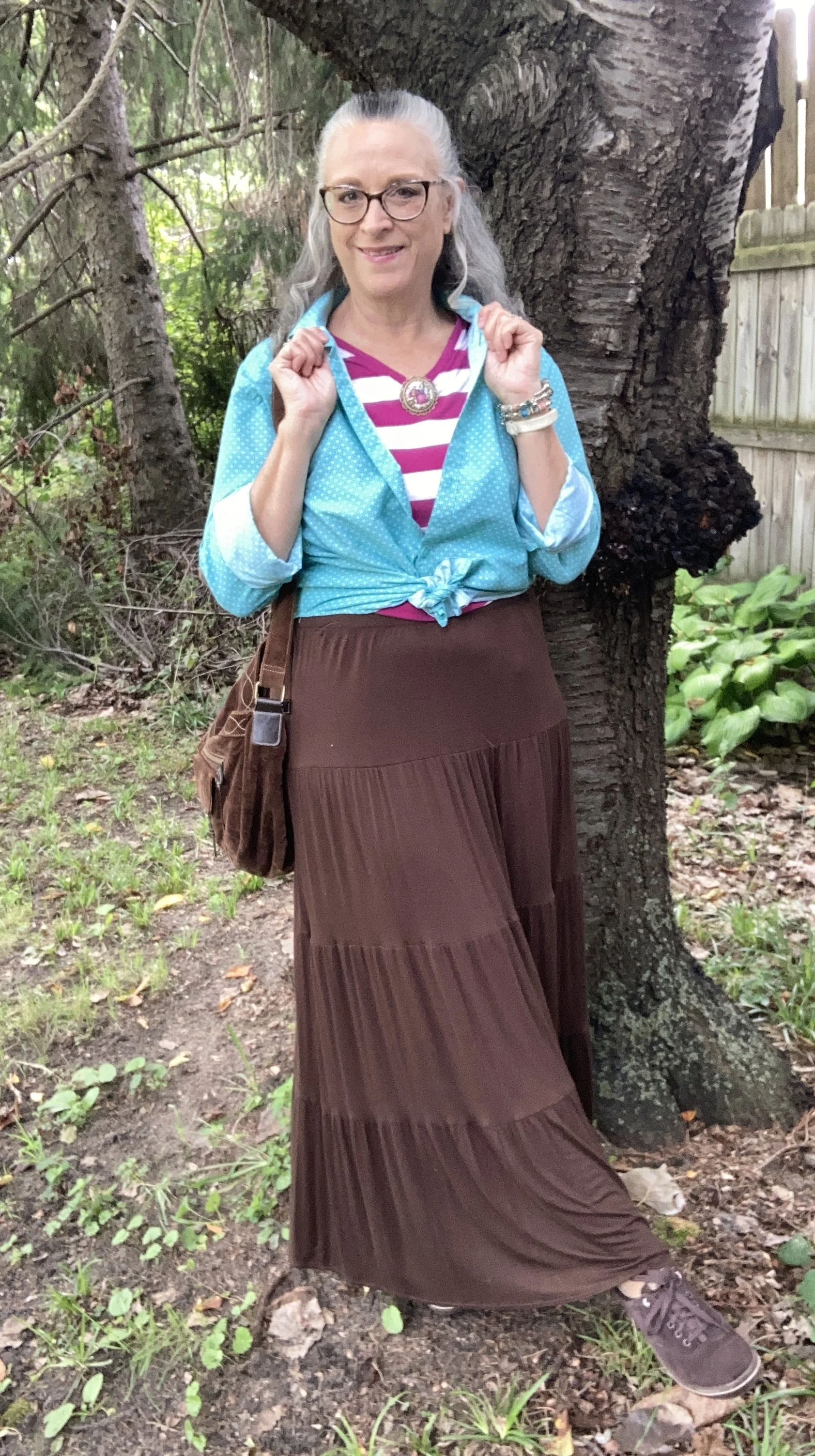
Today I am showing you another outfit with three more colors from the New York, Autumn/Winter palette. Today’s outfit includes Neptune Green, a bright green similar to a sea foam; Festival Fuchsia, a party ready purple, and Toffee, a classic medium brown. I wouldn’t naturally think to put these colors together, though I could easily see the green with the brown, or even the purple with the brown. Combining bright colors like Neptune Green and Festival Fuchsia has never been easy for me, but I love when other people are not afraid to wear the bold, bright colors. This is one way, I have been trying to get outside my own outfit “rut”. You can see the actual Pantone colors here.
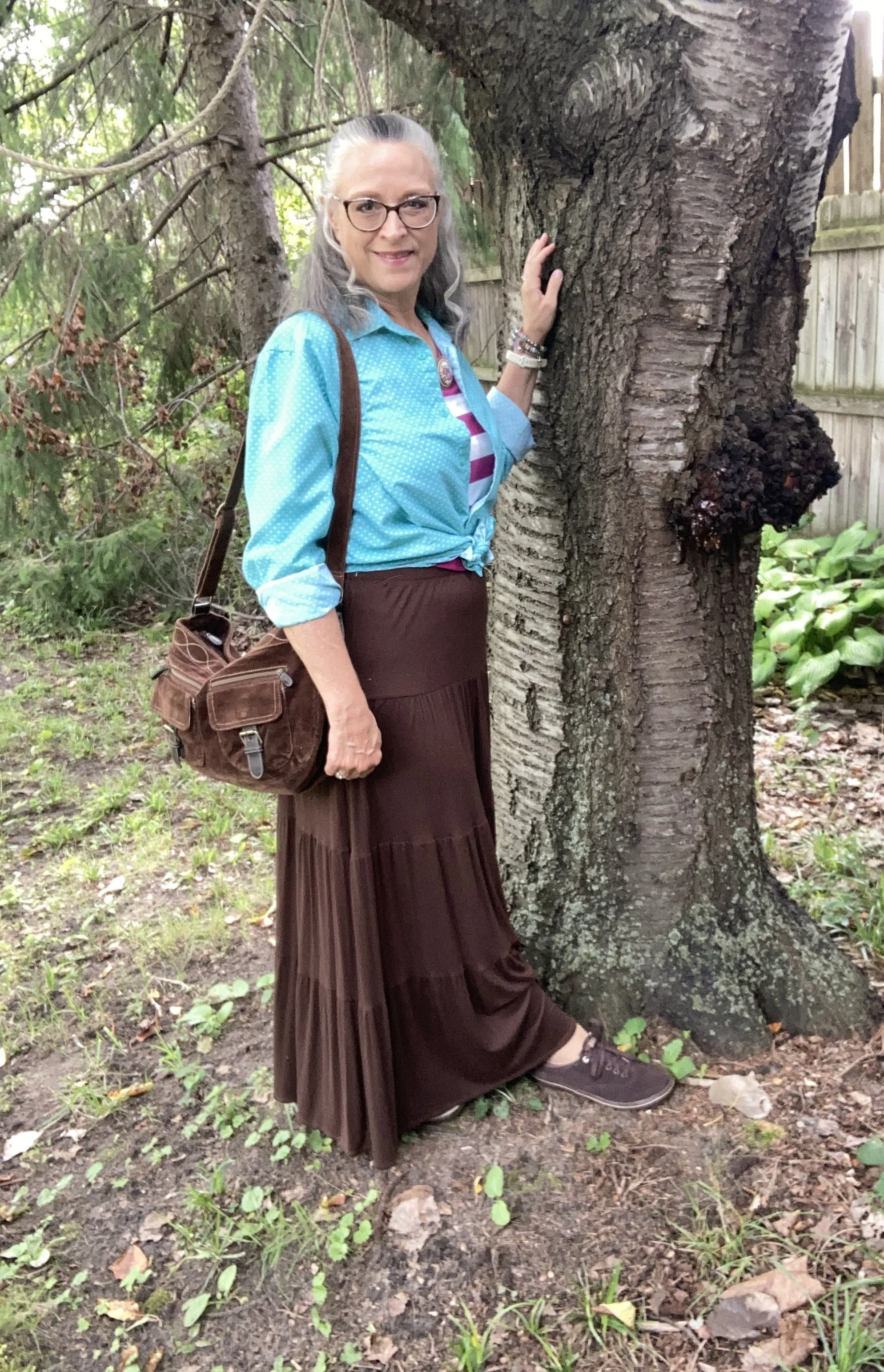
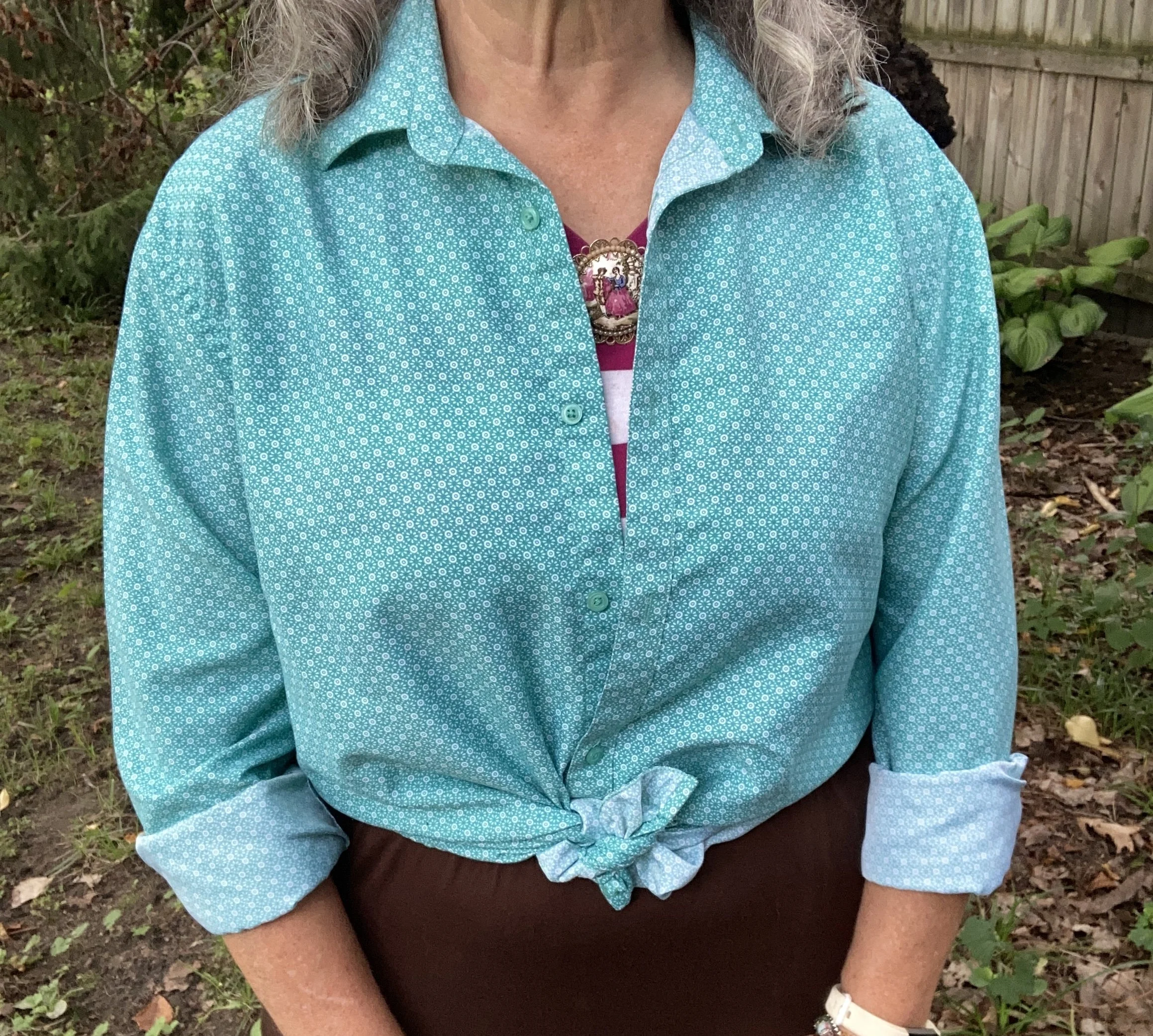
For Neptune Green I chose my thrifted Zylos men’s button down. I do like this color. It is not your typical grass, olive, or forest green. My personal “color brain” - yes, I just made that up - thinks this is a better color for spring and summer.

Personal Fashion Philosophy: Let me just sit here for a moment. I guess it is true that for most of our lives, those of us who grew up in the mid twentieth century, were trained to accept certain seasonal color choices: white for summer, rust and burgundy for fall, black and orange for Halloween, red and green for Christmas, icy blues for winter, and pastels for spring and Easter. How many of you know what I am talking about?

Now, let me take that a little further. We all know that certain smells, sights and sounds remind us of certain holidays, childhood experiences and so on. What if part of my “color brain” is my own way of finding peace, coziness and hope during seasonal change? To me there is just something about digging into those dark, rich colors for the fall season as life begins a transition from long, sunny days spent outside to the shorter, cooler months of spiced cider, snuggly layers and blankets, and gatherings in doors. Just something to think about. Let me hear your ideas about seasonal color change.
This is a darker long sleeve choice from Cabela’s; a short sleeve tee, closer to the actual Pantone color from Old Navy (and not a bad price currently); and I really like this print tee from Life is Good. There is also this 3/4 length sleeve tee from LLBean.

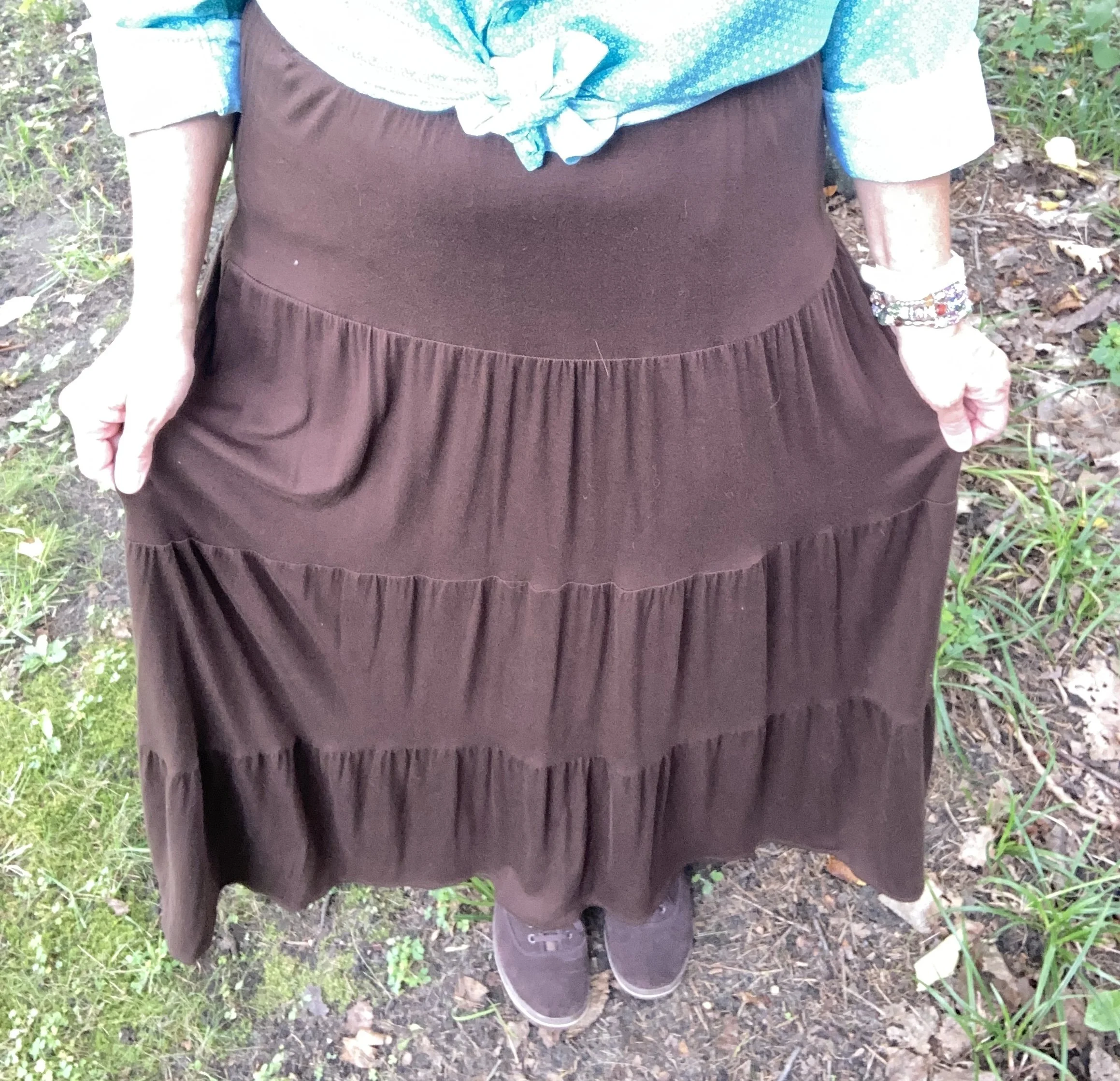
The next piece I chose was the skirt. It seems whenever brown is once again on the Classic palette I reach for this skirt. I have many times thought of getting rid of it since I rarely wear skirts, but it always gets pulled out for something or other. My skirt is a bit darker than the actual Pantone Toffee color, but you get the idea. I do this series to inspire you to shop your closet, not match the color palette’s exactly. This skirt is St. John’s Bay brand from JC Penney and is old. Here is a few versions from Target, a patterned print from Natural Life, a midi length from JC Penney, and a pull on faux suede version from a place called The Vermont Country Store.
I chose this thrifted Faded Glory striped tee for Festival Fuchsia. The combination of Neptune Green and this pretty purple is a fun vibe, though I certainly wouldn’t think of it for fall. Here is a striped boat neck version from JCPenney; an embellished top from Kohl’s; and a peasant style from JC Penney.
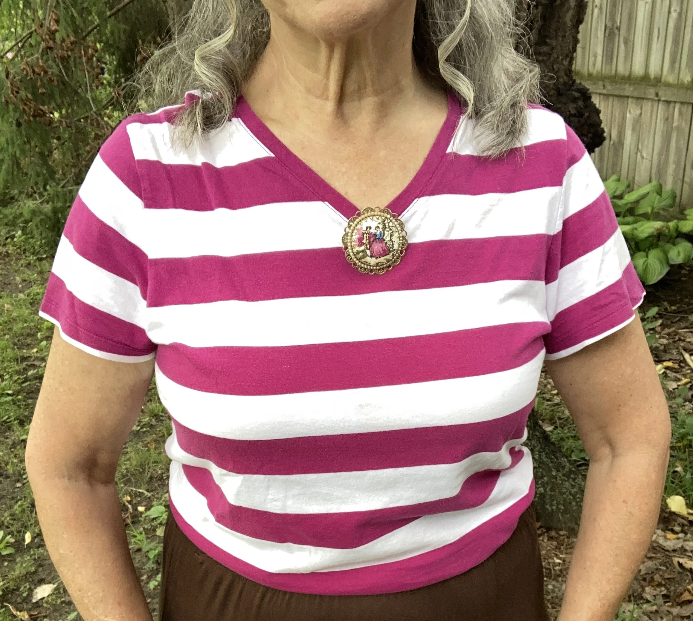
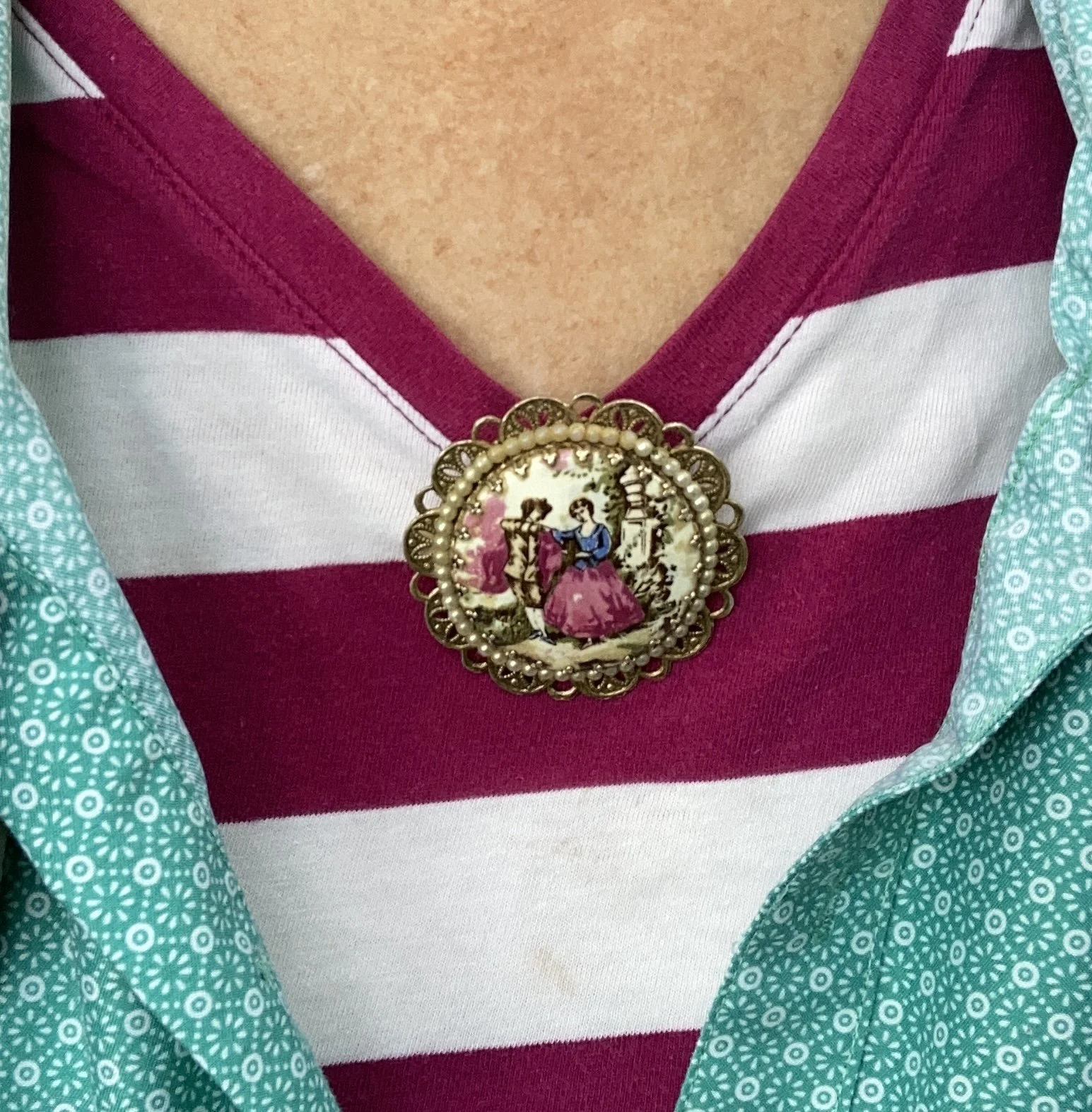
Instead of a necklace I chose a large brooch and pinned it right at the point of the v. I like how it looks. What do you think. I want to incorporate my pins and brooches more often, as they are such fun pieces to use, but often get overlooked.
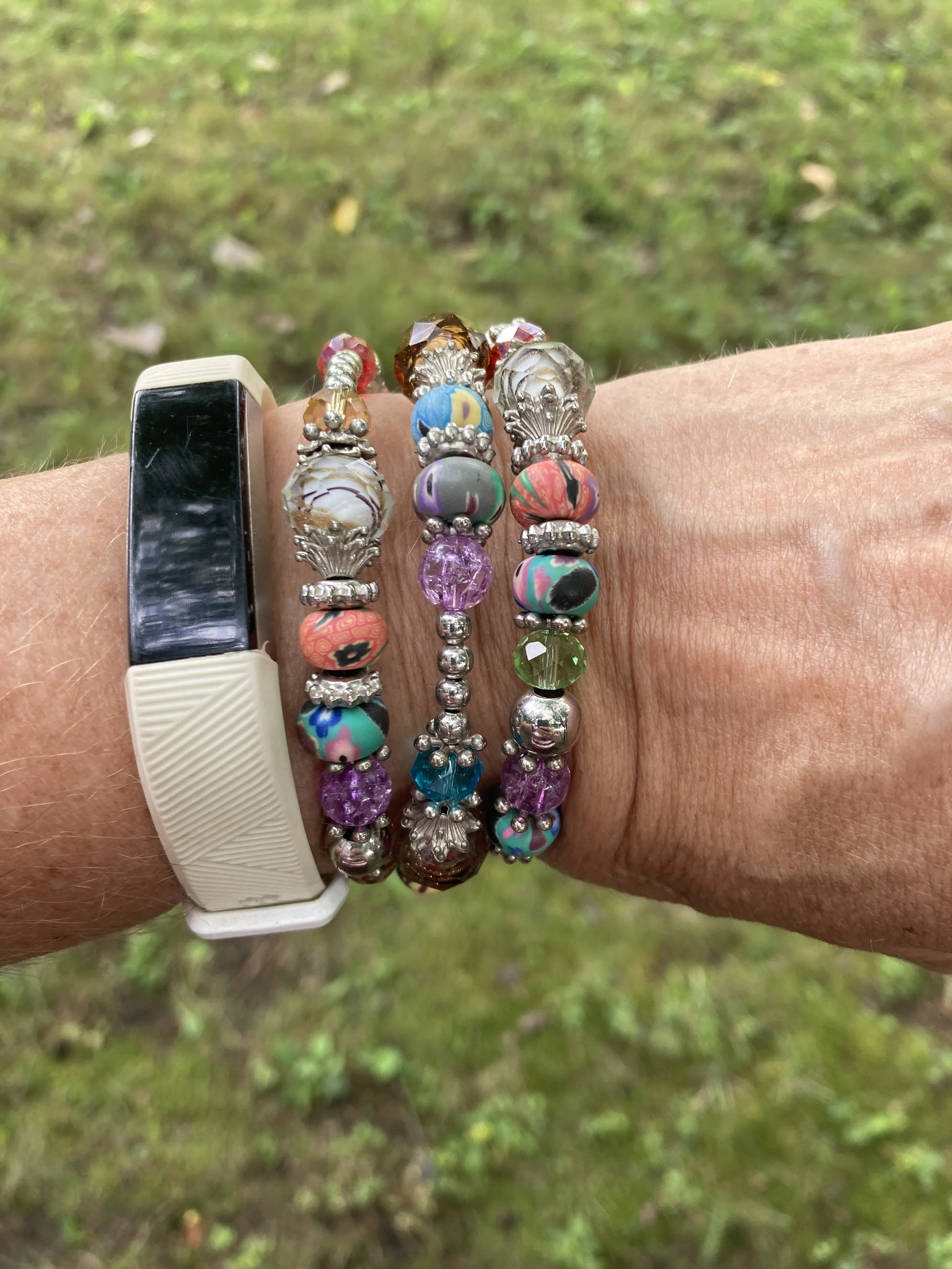
My wrap bracelet was a fun thrift find from a few years ago. I like all the different colors of the beads, so it can be worn with many different things.
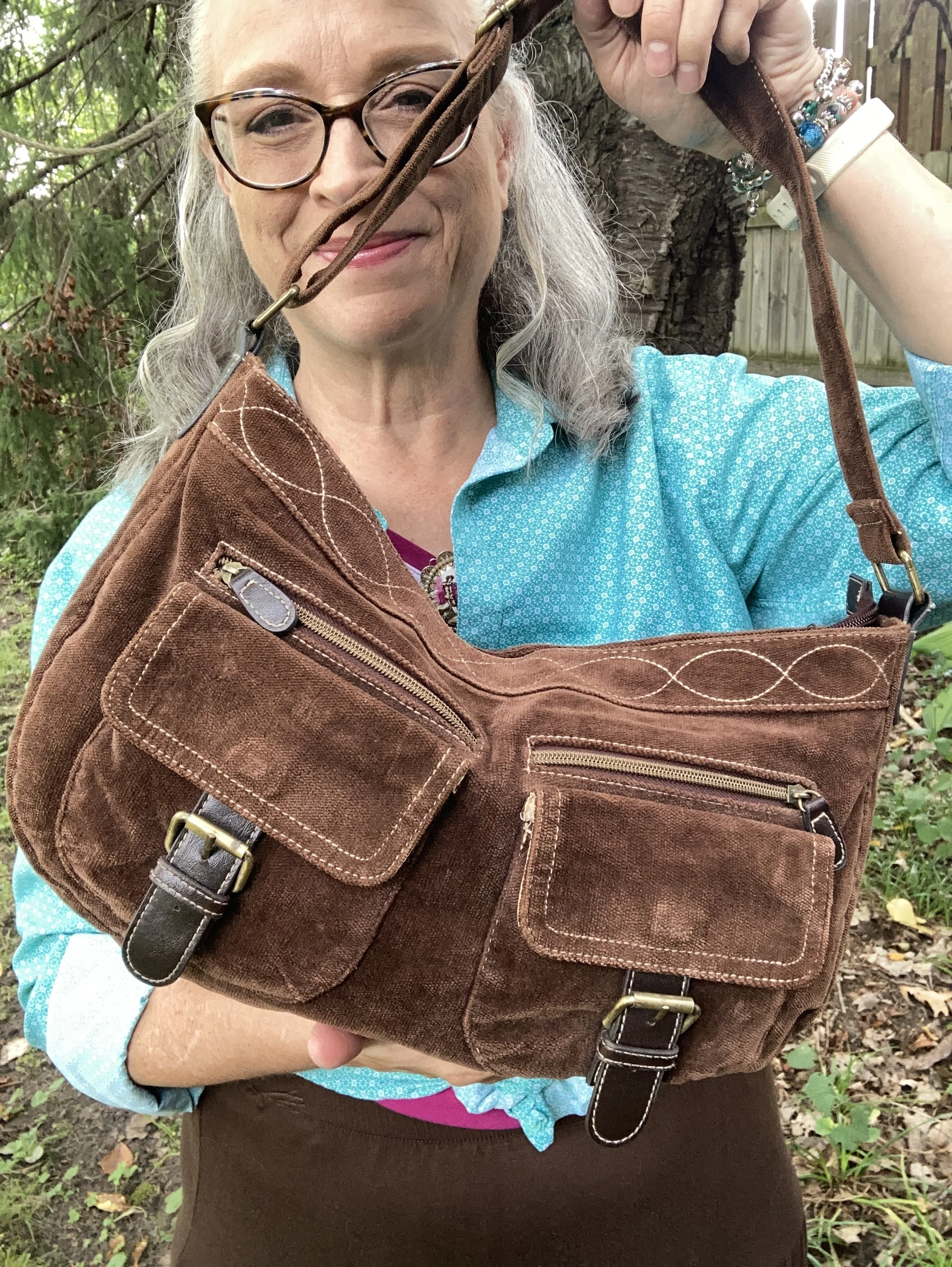
If you have been following me for a while then you know I have had this thrifted corduroy hobo bag for a number of years. Here are a few different ones: Kohl’s, JCPenney, and DSW.

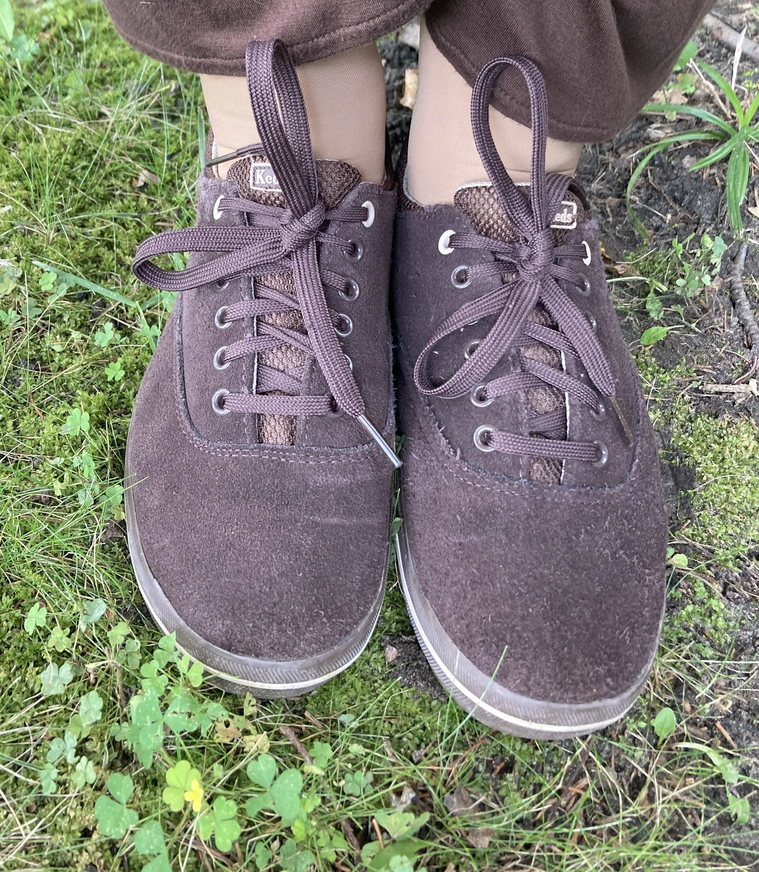
My second hand, brown, suede Keds are getting old, but I still use them regularly. I should probably try to spiff them up with a brush and some suede spray. Here are numerous brown sneaker/shoes from DSW.
What do you think of these colors? Do you suffer from “color brain” like I do? What are some things that are part of your fashion philosophy? If you are interested here is an article I wrote a few years ago on what is behind my Fashion Philosophy. I would love it if you stopped by and read that article too, and leave a comment or two!
I have included a few shopping links for you to look over. These are just suggestions and I do not make any money through them. I do, however, appreciate so much when you leave a comment on the blog. Your thoughts and friendship really do warm my soul and remind me I am not doing this just for myself. Thank you.

Have a wonderful day!

Pantone Spring/Summer - 2019 - Recap

I think it is always good to do a recap of these series so that you can see all of the outfits in one post. This is especially helpful, when I have had a few interruptions in the flow of the series. When I do a recap, I like to spend a little time talking about various things related to my fashion journey.

Growing up I wasn’t really that fashion conscious, although looking back, I remember my love for bell bottoms and tie dye in the early to mid seventies. I remember having a pair of red bell bottoms that were cuffed. Oh my goodness, how fashionable I was and I didn’t even know it. Ha, ha. Obviously, with a love for red bell bottoms, I had no fear of color. I have never been a black and white sort of girl. I have always loved color and for a long time purple was my fave. Now I love all color, including black, white and gray. Yes, those are colors too.

With my love of color, it only made sense once I became a fashion blogger, that I figured out how to make color a central part of my blog. Once I found out about the Pantone Color Institute and their twice yearly color palettes, I knew I would have to do a regular series on color, thus the Pantone Spring and Pantone Fall series. All that being said, here is a recap of this Spring/Summer 2019 series that I just finished.

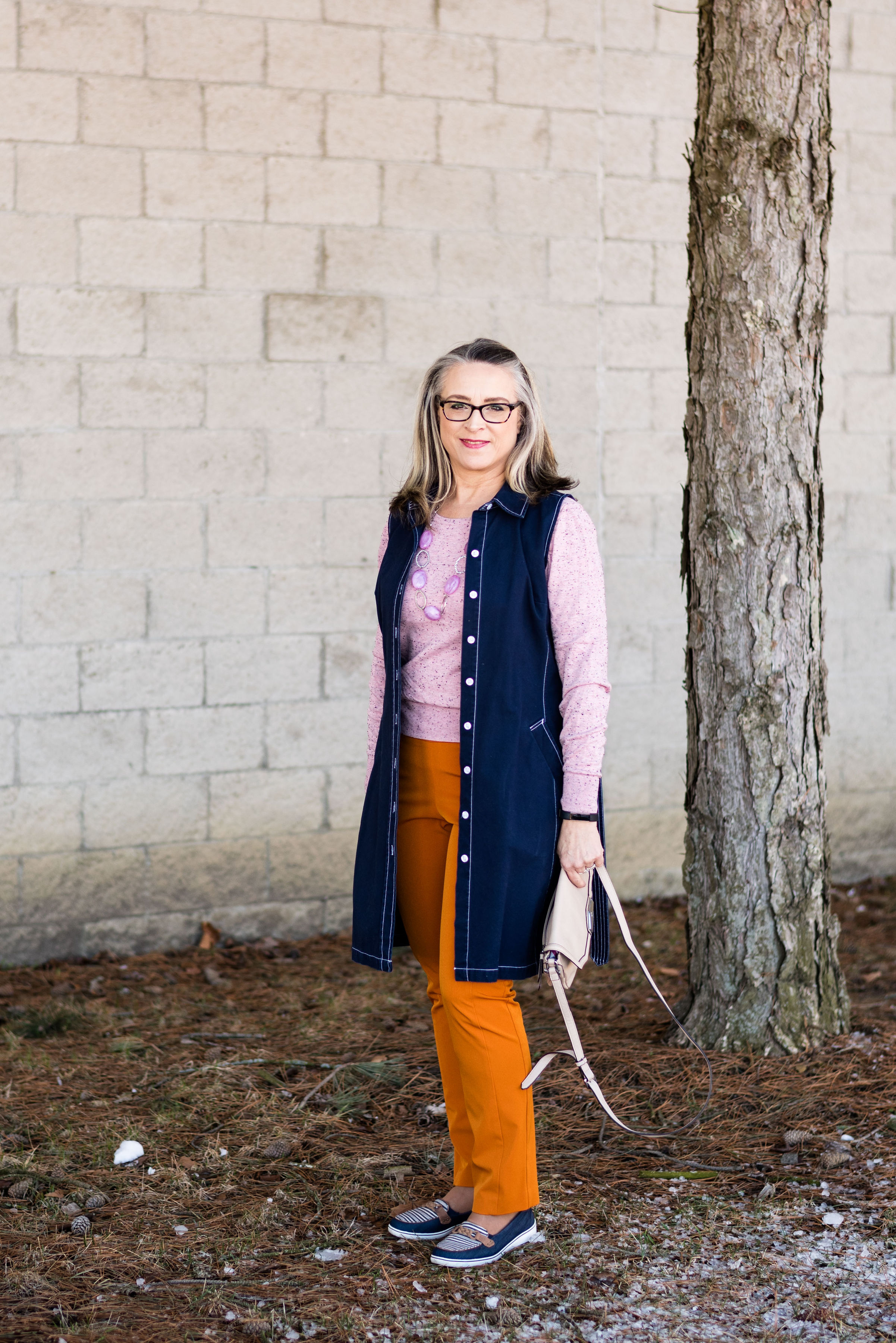
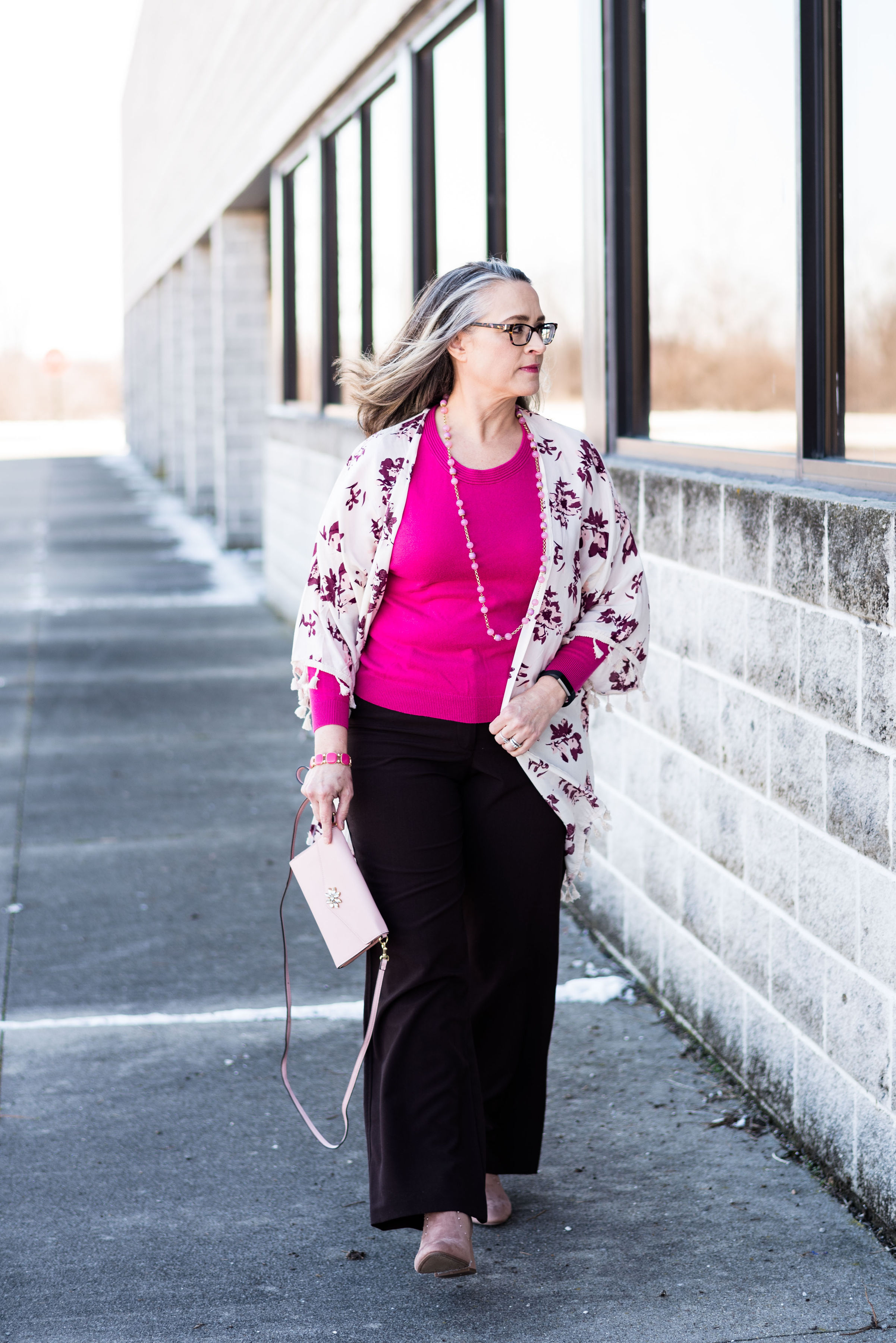
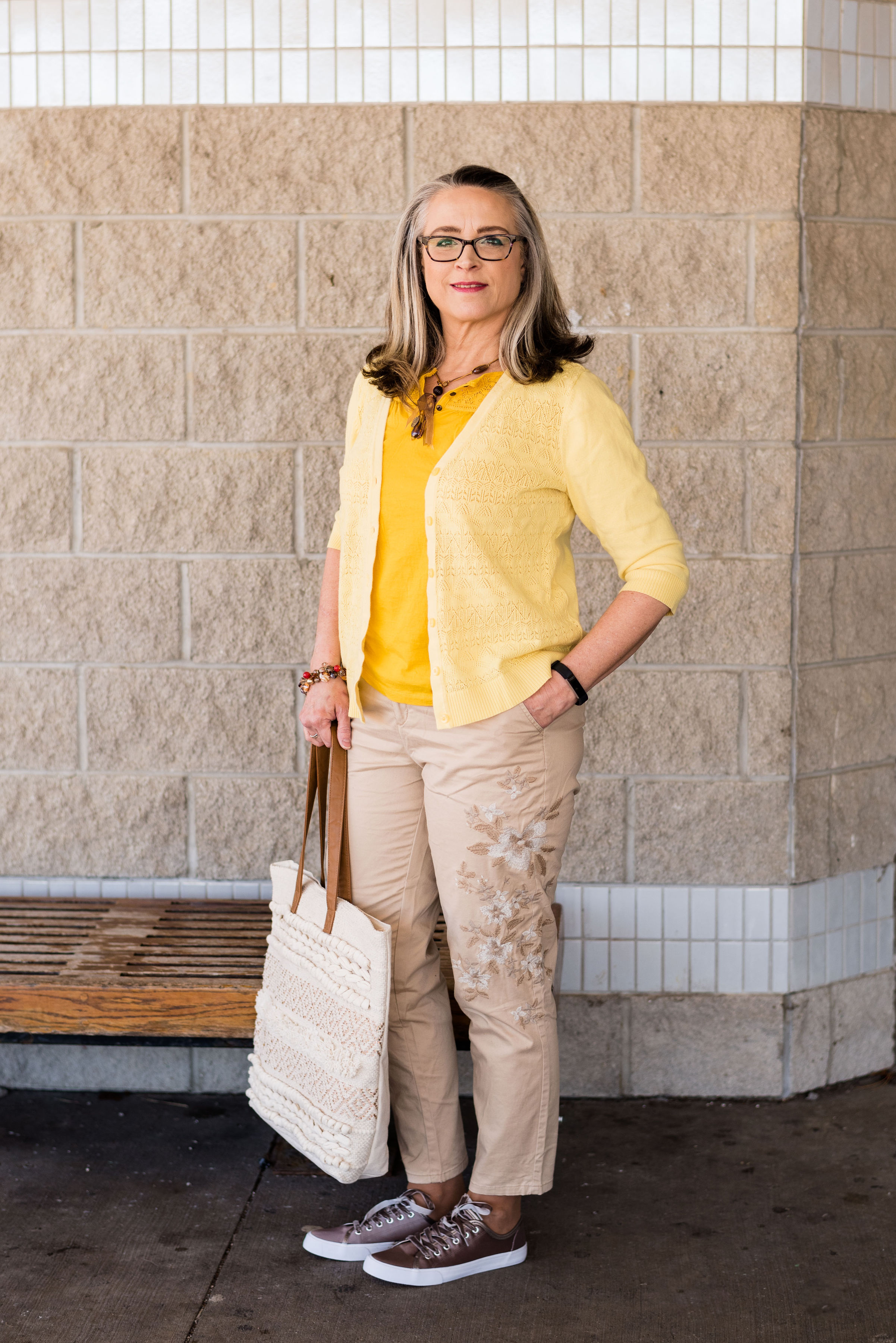
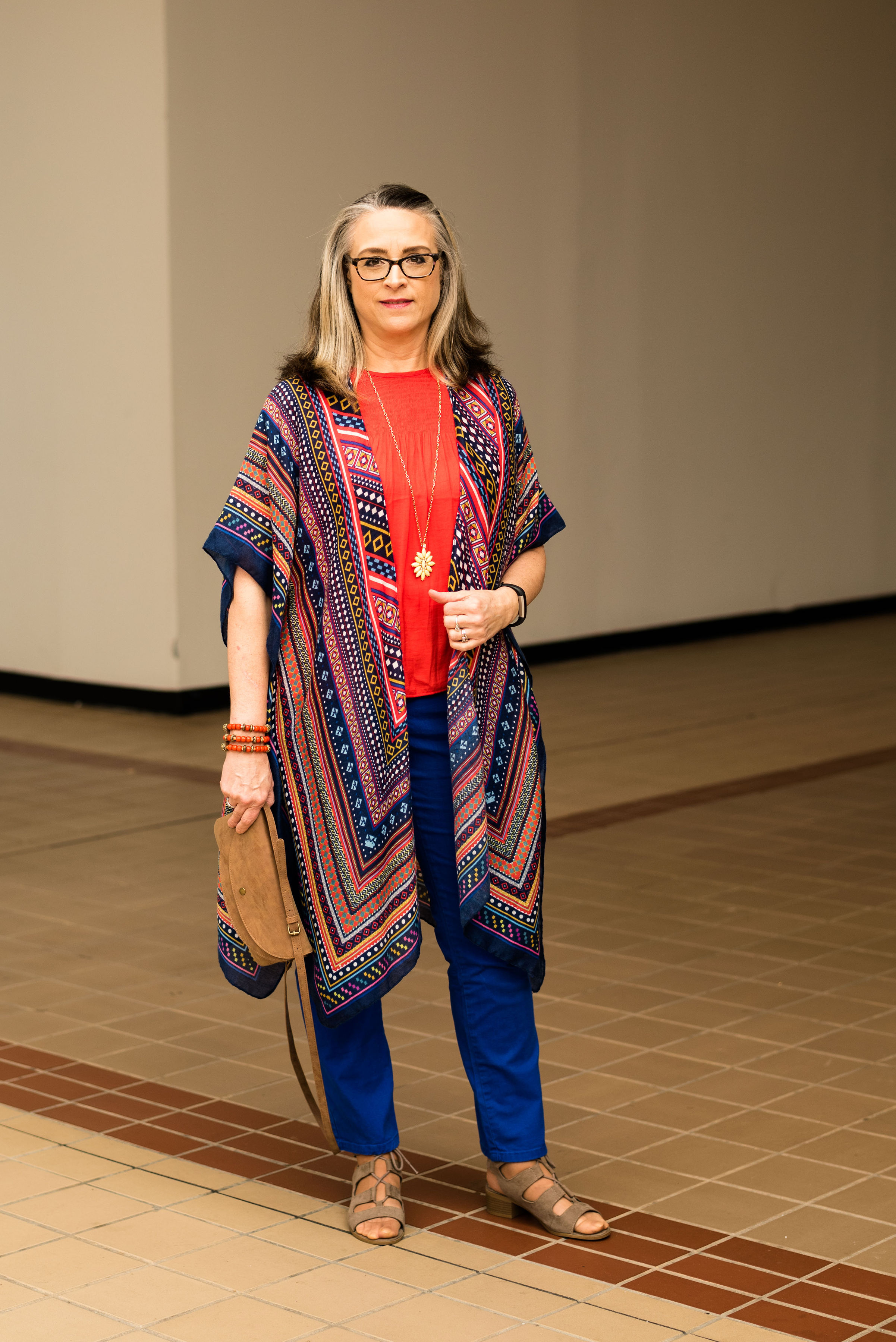
Living Coral & Terrarium Moss

Here are each of the outfits side by side.

Which colors are your favorites? Which of my outfits do you like the most? What makes it your favorite? Which of my outfits do you like the least and why? I love to hear from you. Even if you think you have nothing to say, I love to know what you are thinking and your feedback is what helps me make a better blog. Just leave a comment below.

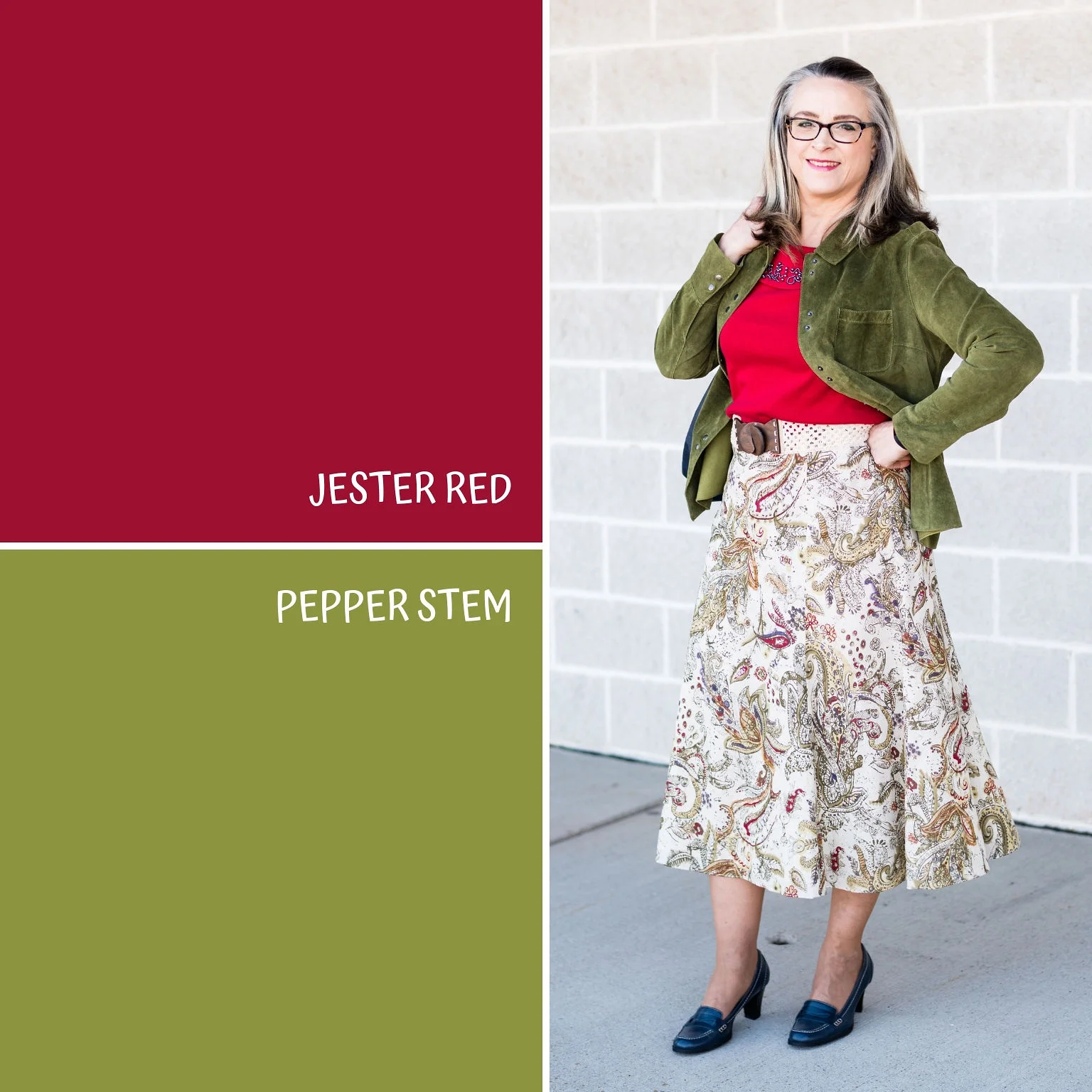
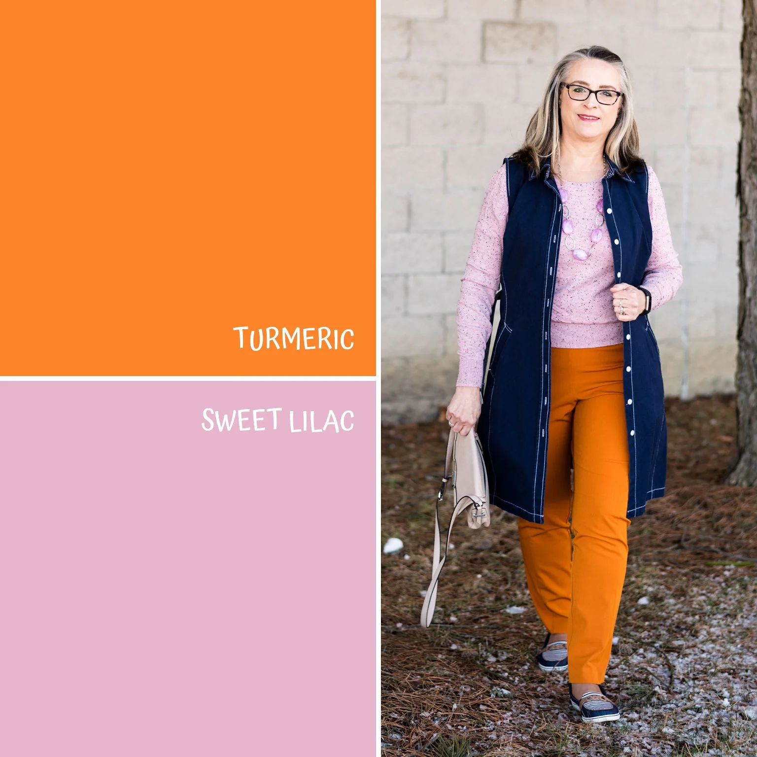
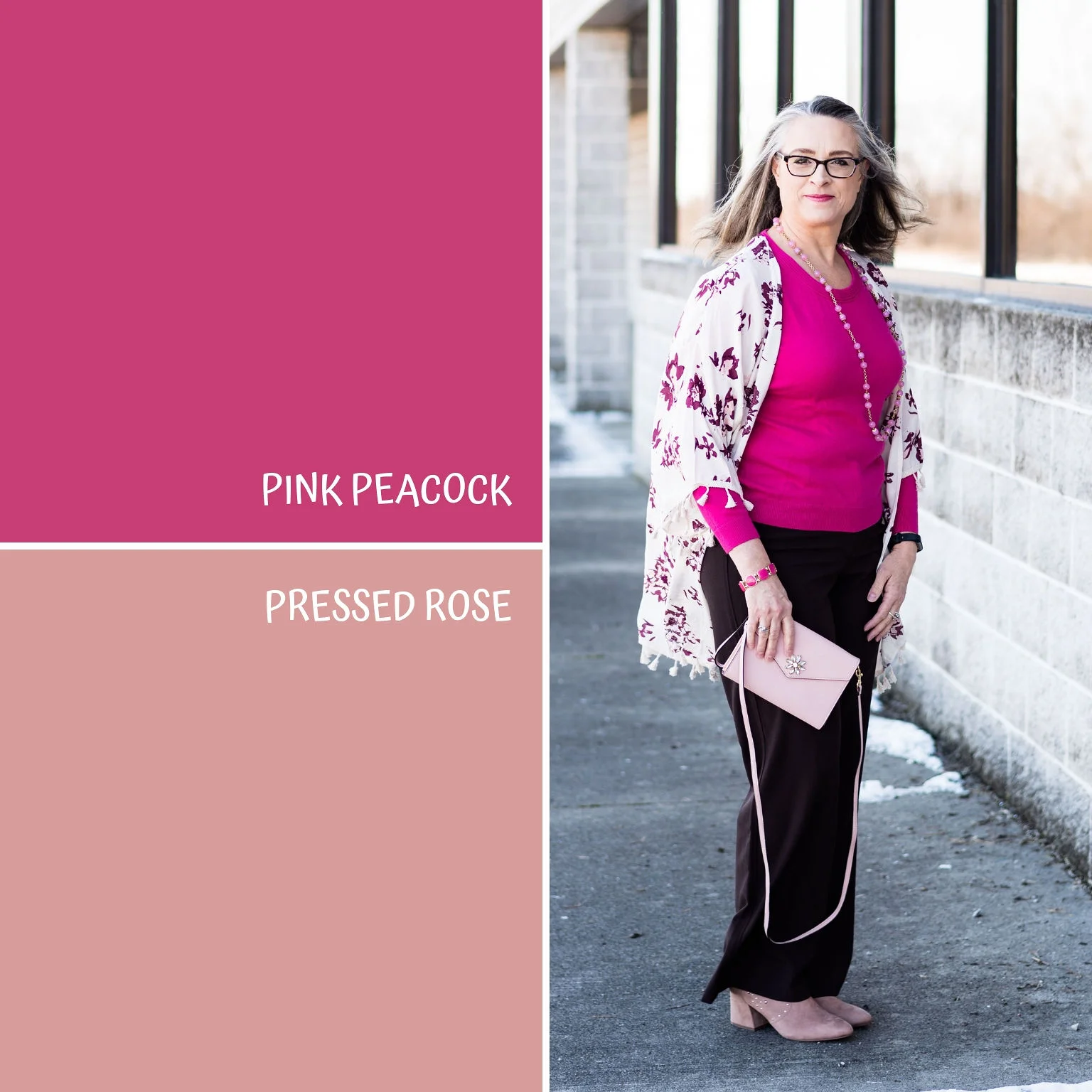
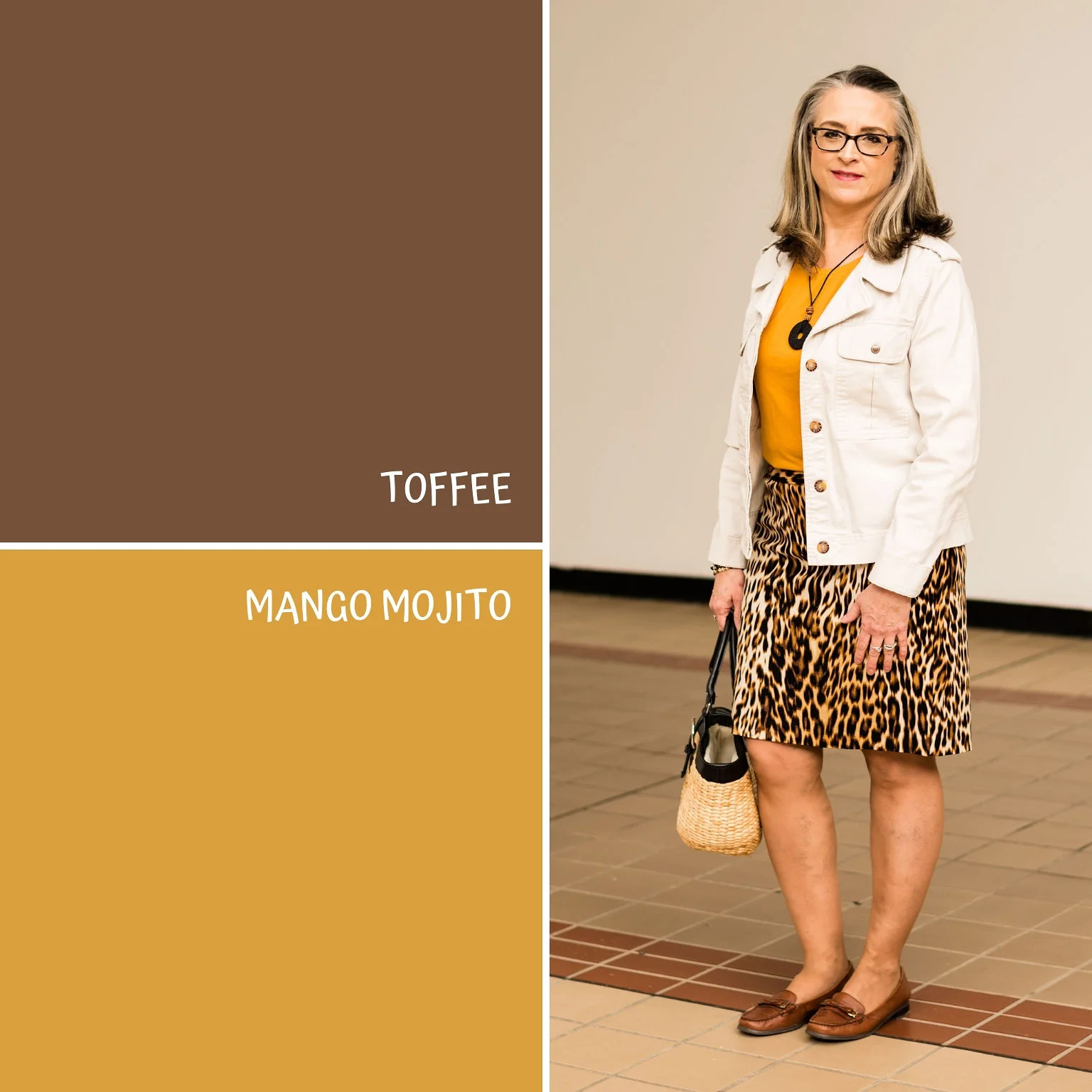
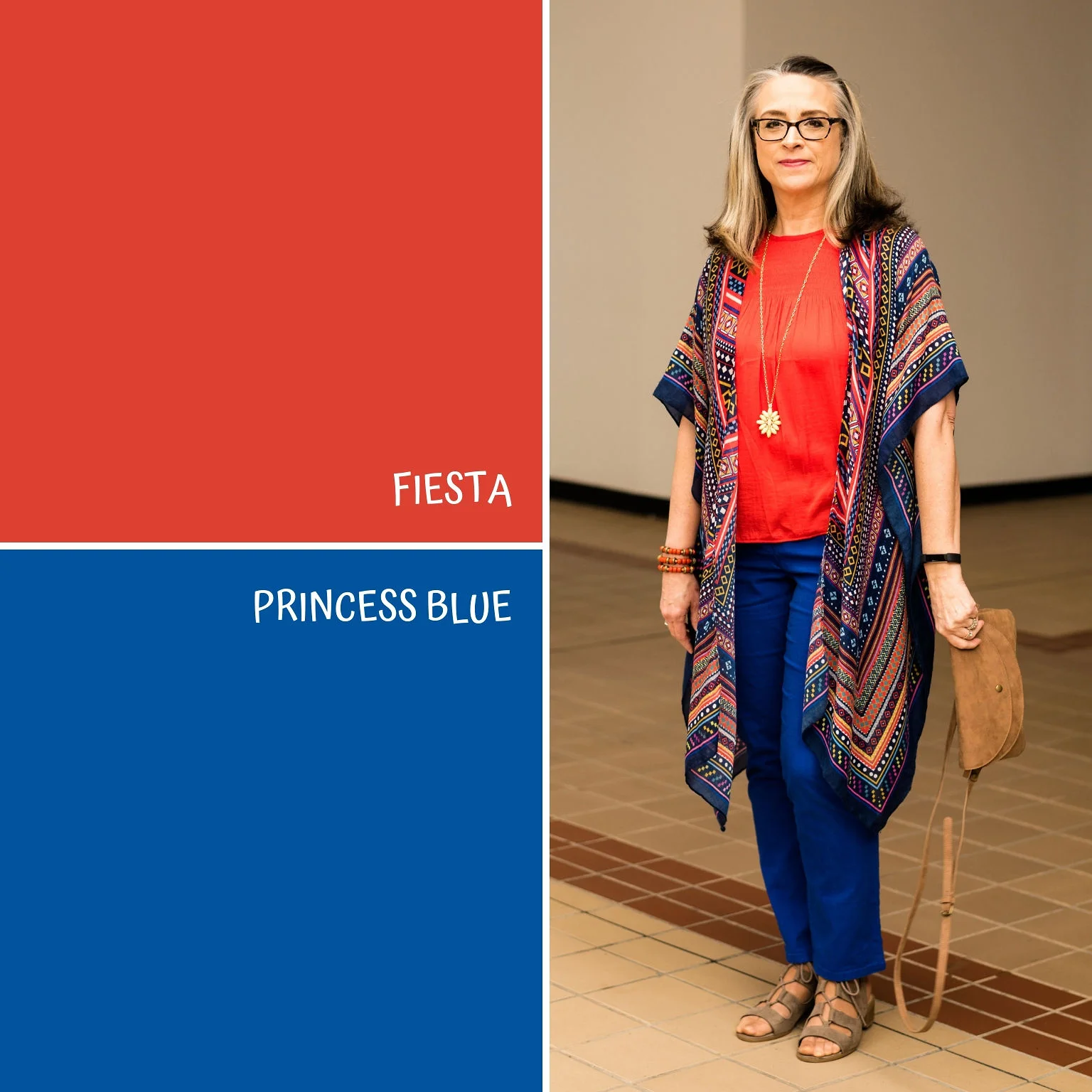
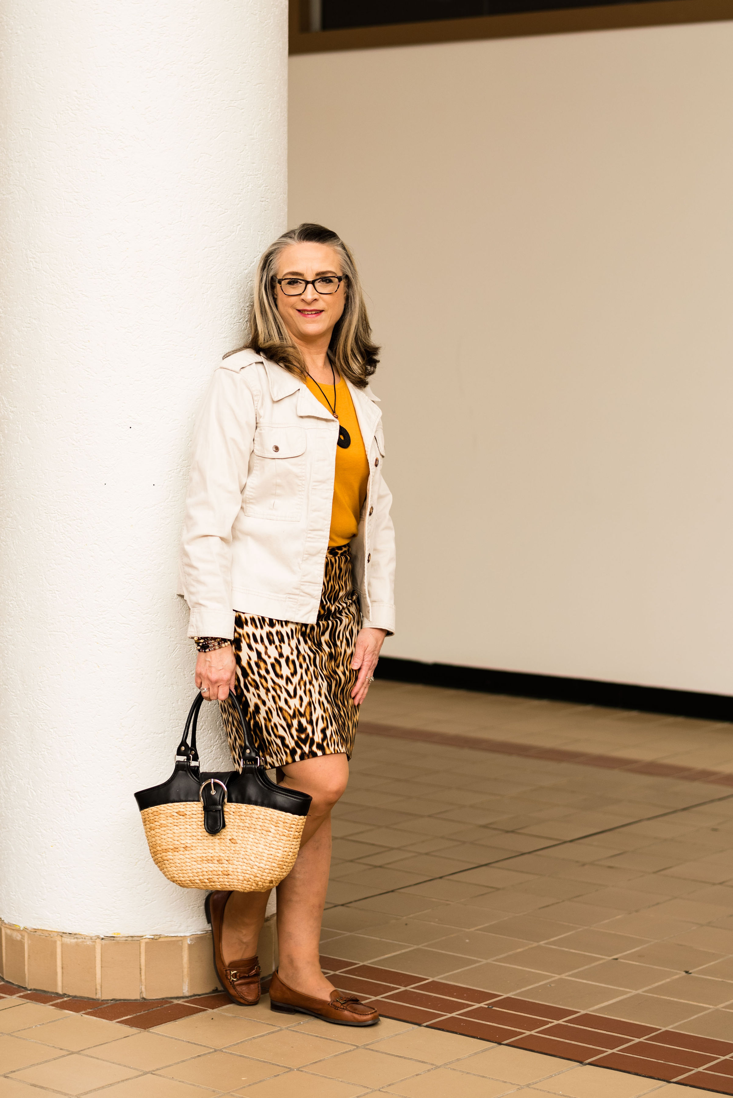
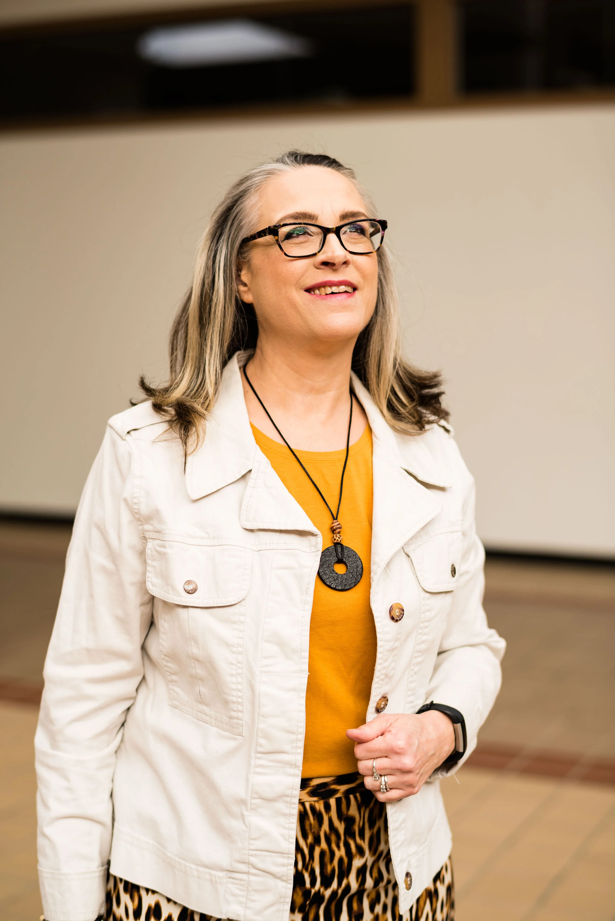
I think my favorite outfit is the Toffee and Mango Mojito. I just love how the leopard print skirt and the tee went together so well and how the white jacket added a crisp, polished look to the outfit. I also love the Fiesta Red and Princess Blue colors. They are so bright and happy and it makes me smile when I look at that outfit! Overall, I was pleased with this whole series. I loved all of the colors and had an easy time finding most of these in my closet and putting outfits together.

I hope you have enjoyed this series. I will be on vacay for the next week with my hubby, but I am hoping to still get a few posts up about our travels. Have a wonderful Memorial Day everyone!

Photo credit Rebecca Trumbull. Make up Rachel Christensen.


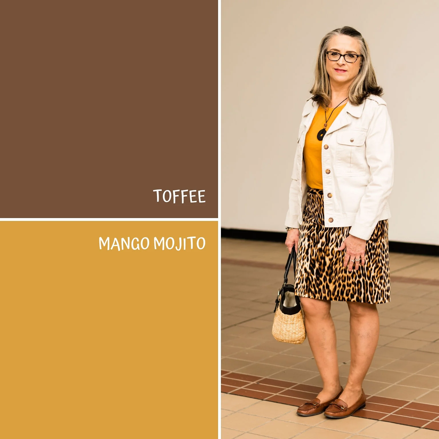
Pantone Spring/Summer - 2019 - Toffee & Mango Mojito

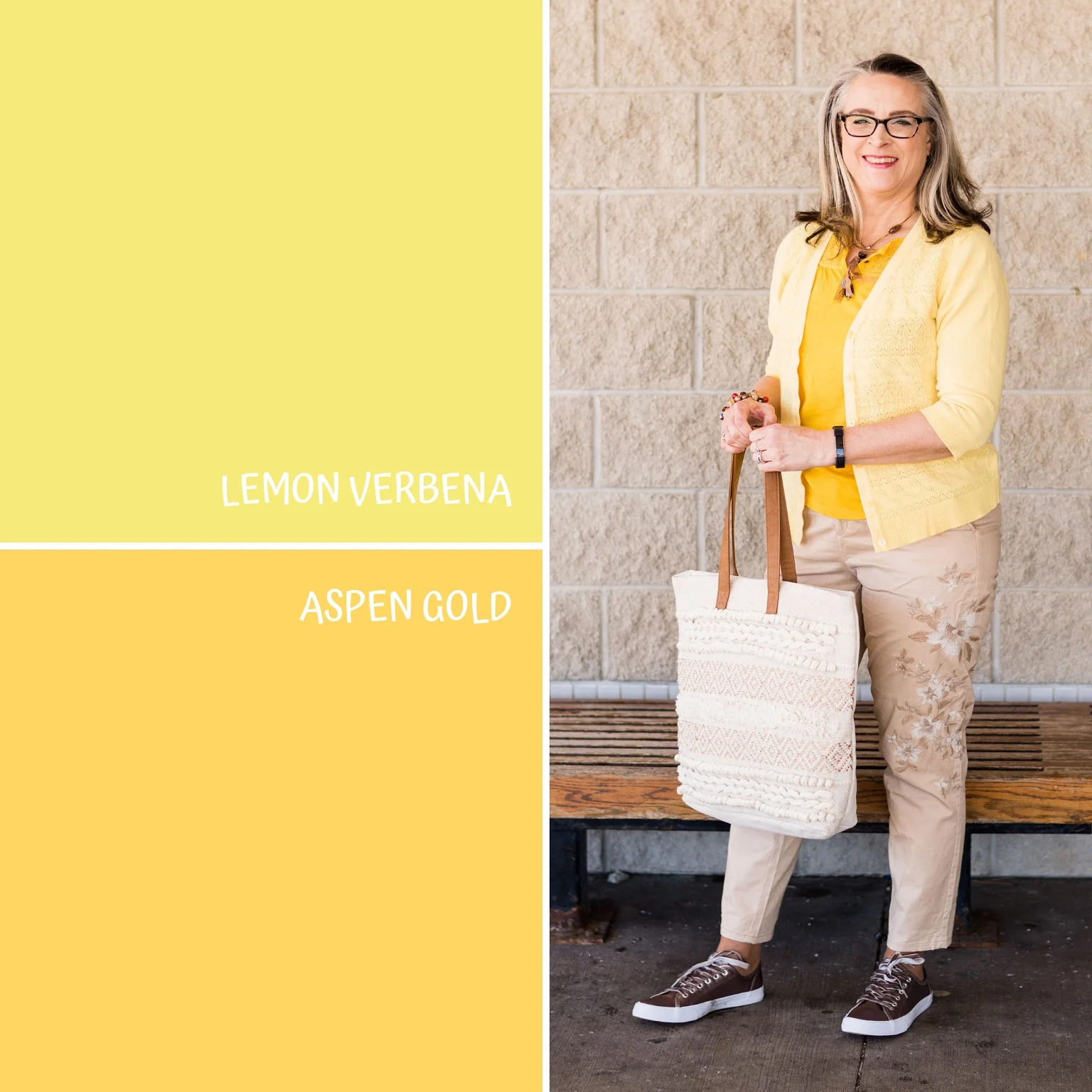
I am continuing my Pantone Spring/Summer - 2019 series with two more fun colors called Toffee and Mango Mojito. I was glad to see this lighter brown on the palette this year. Usually brown doesn’t show up until fall and often it is more of an orangey brown, so this brown is a perfect neutral. I absolutely love this pretty yellow and I think the name is perfect. It makes me think of sunflowers and sunshine and what could be more reminiscent of summer.

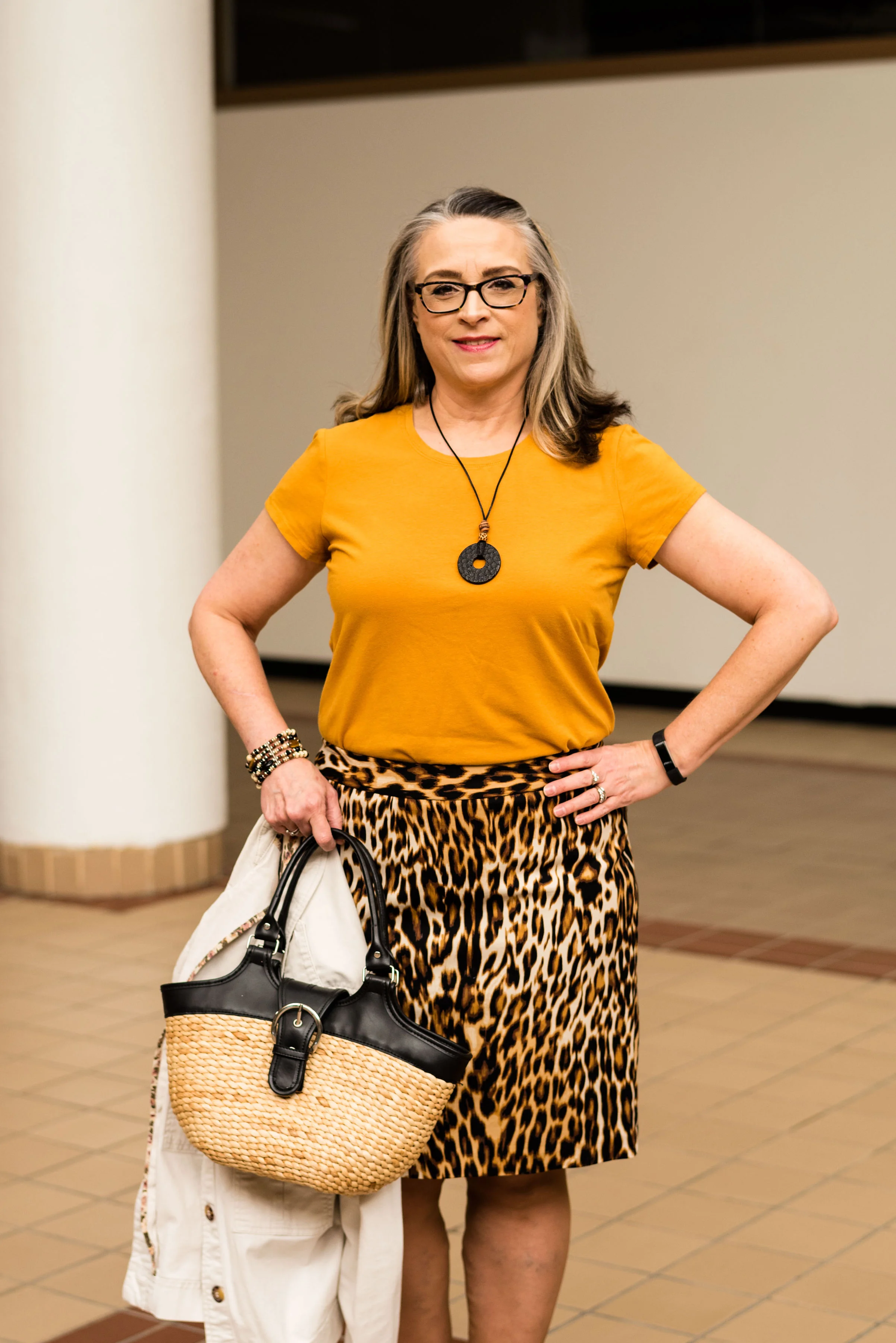
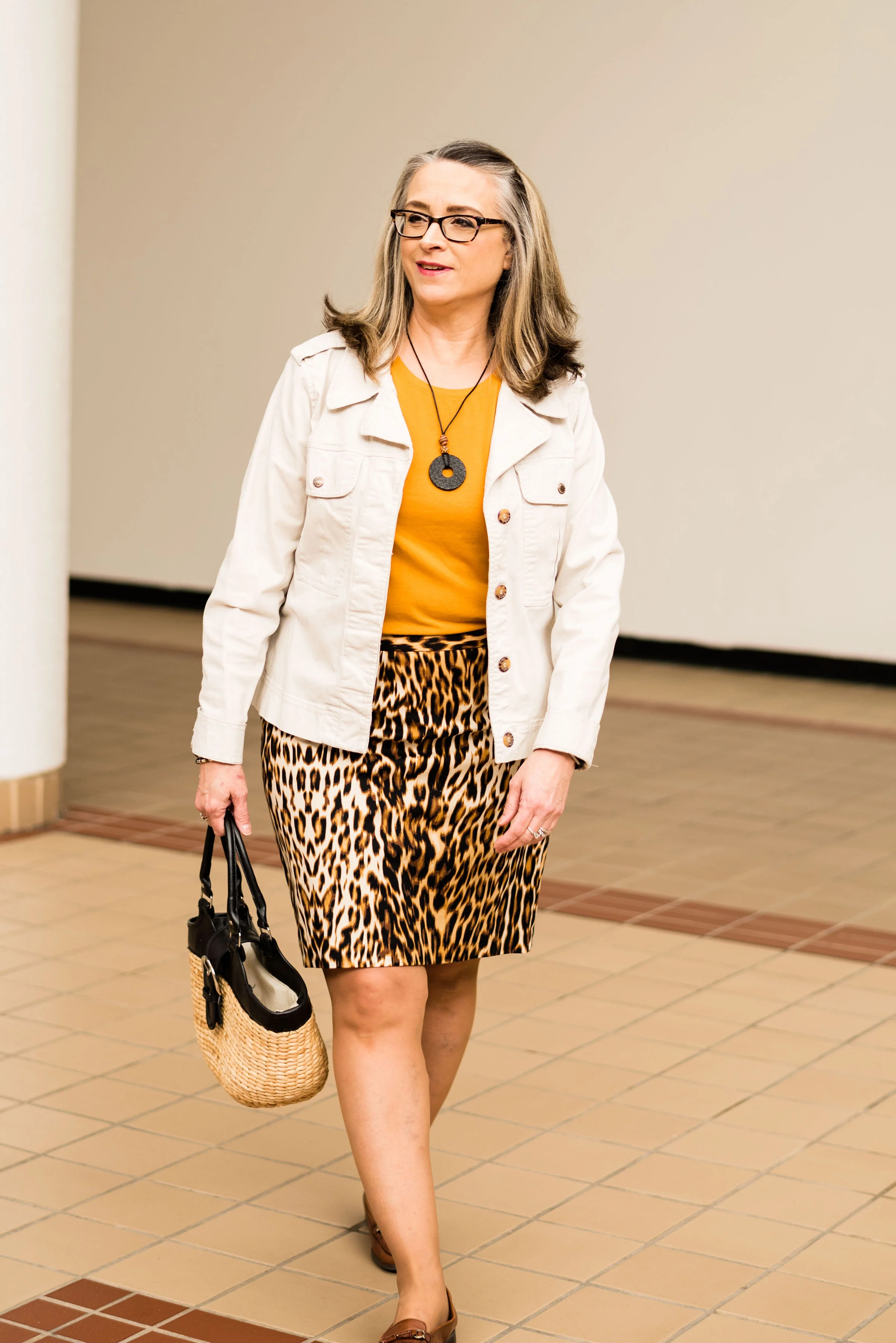
I didn’t really have anything that was this particular brown. As I have said before, when I talked about Brown Granite in the last Pantone post I did, I like brown, but it is not something I have a lot of in my closet. For this Toffee color, I decided to use my Worthington leopard print skirt. Animal prints are still in, so hang onto your snakeskin, zebra and leopard.

When I saw this Apt. 9 tee at a thrift store, I chose it for the color alone, not realizing how perfectly it would mimic the Mango Mojito color. Then when I chose the skirt, I knew this tee would be the right piece to pair with it.

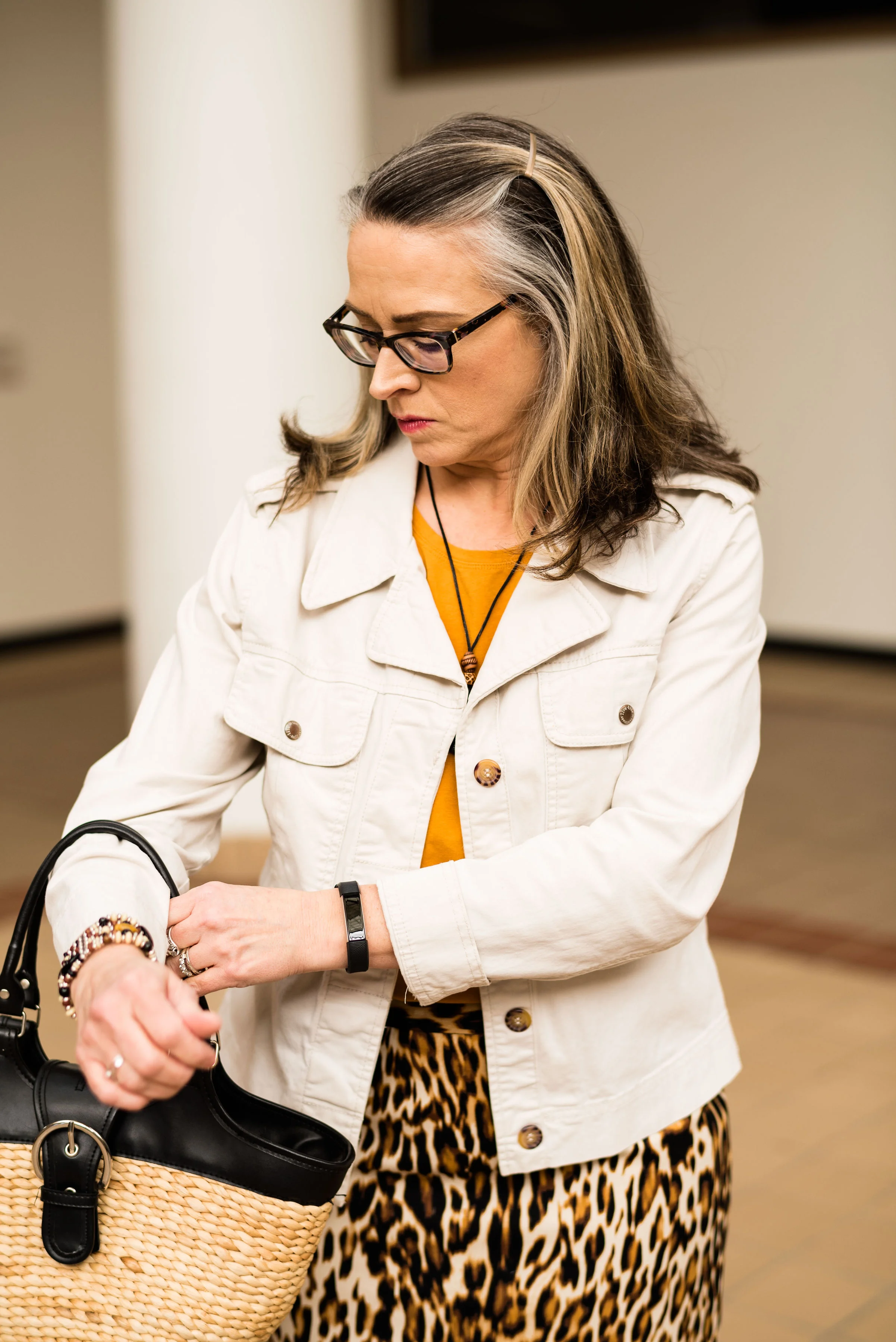
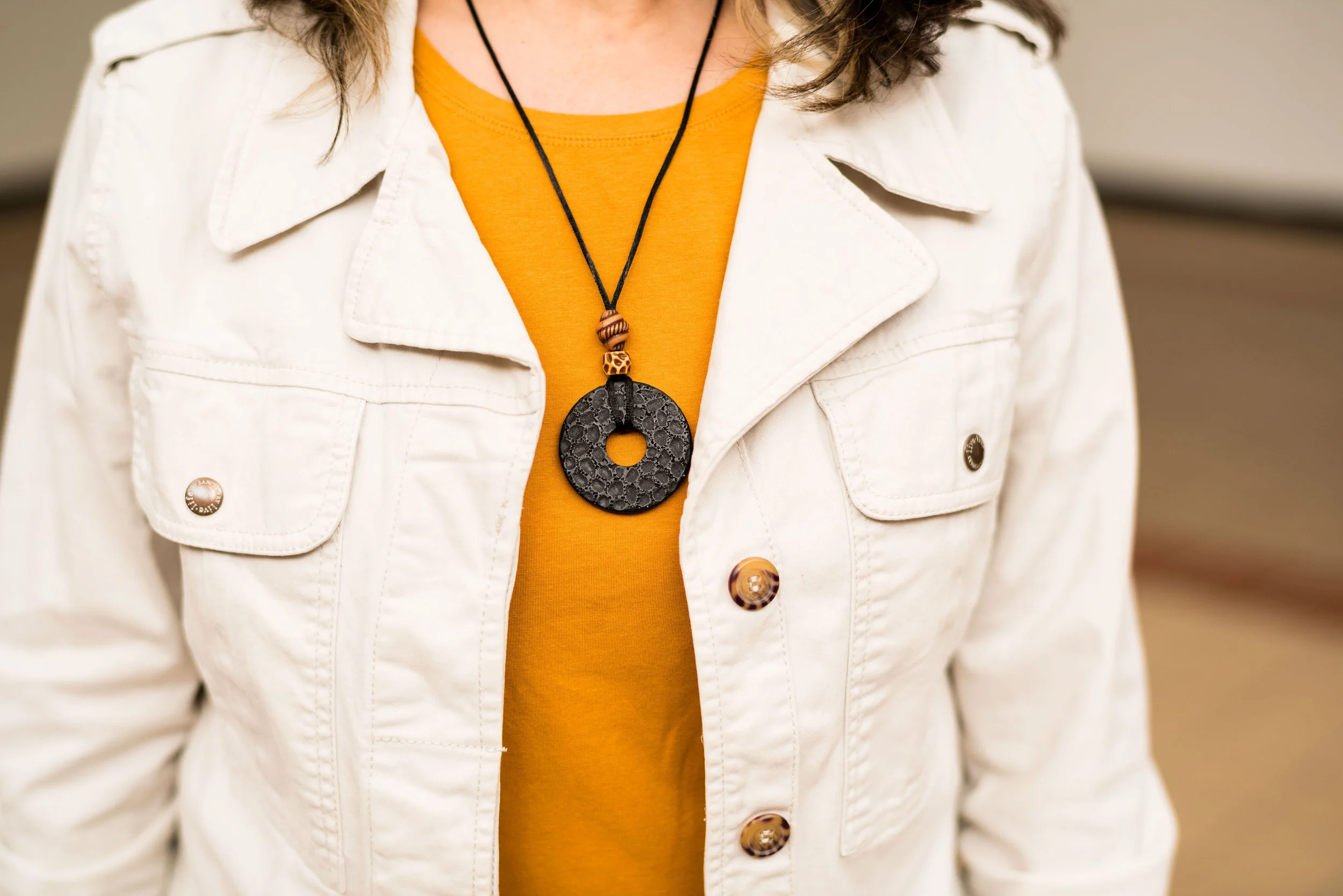
As with any outfit, accessories can make everything even better. I’ve had this thrifted white jean jacket by Sanctuary, for a few years and pull it out every now and then for the warmer weather. I thought it was the perfect topper for this outfit.

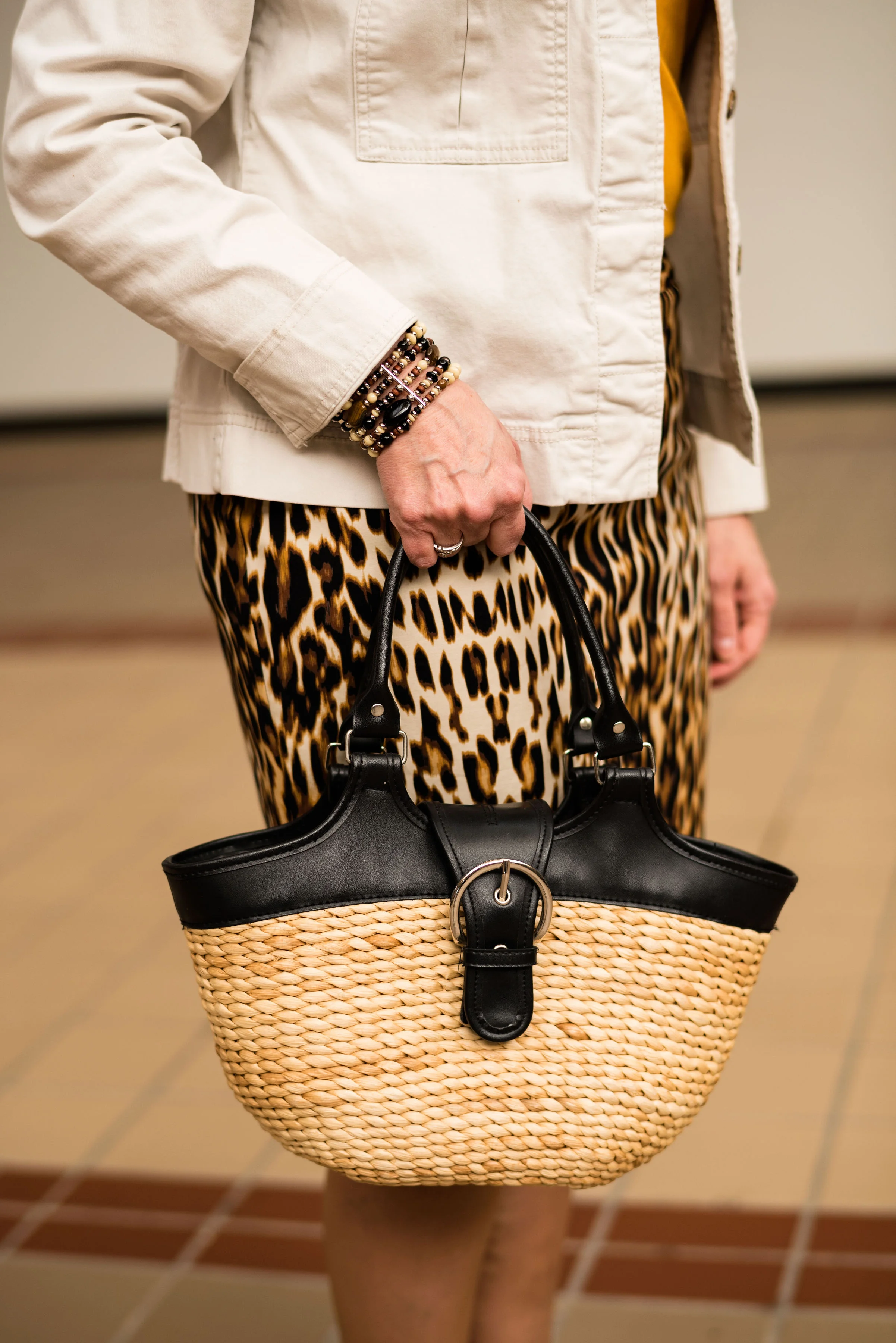
I kept my other accessories simple and earthy in keeping with the leopard print. A black pendant necklace, a beaded bracelet and my woven basket bag with black trim seemed the perfect accompanying pieces for this outfit. Do you own a basket bag? They are fun, and much more versatile than I once thought, especially in the summer.

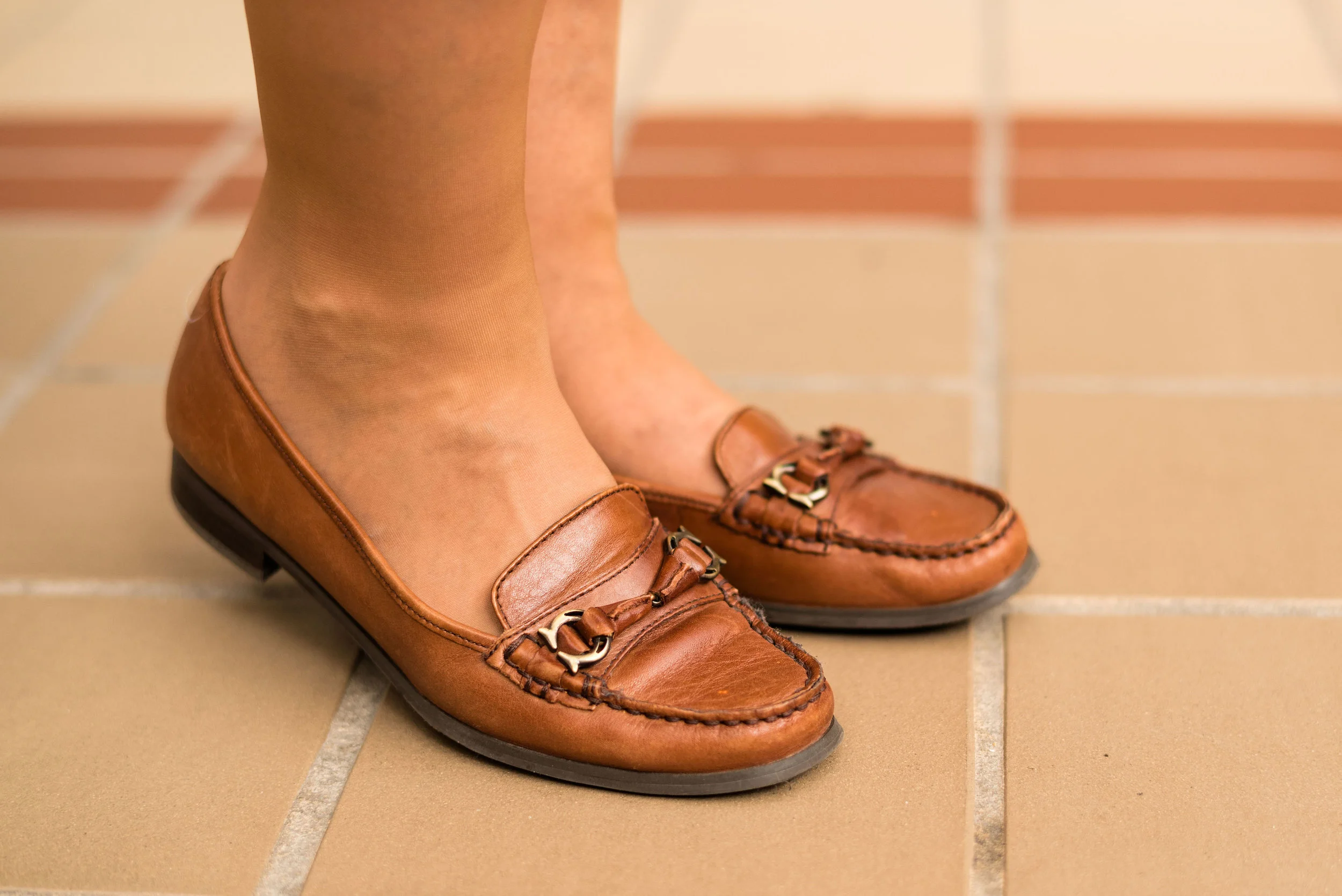
I decided to wear these thrifted loafers to keep the look more casual. You could easily take this outfit up a notch by adding a sweater instead of the jacket, a sparkly clutch and heels, along with some jewelry with a bit more bling. As is, it is a nice outfit for work.

We had fun taking these pictures inside a local mall that is no longer a “normal” mall.

What sort of photos do you like best? Outdoor or indoor? I’ve always been a fan of natural light, but I think these indoor shots are kind of fun, don’t you?

Do you like these Pantone colors? I think Mango Mojito is one of my favorites. I know not everyone will like it, because not everyone can wear it, but remember, you don’t have to wear a color that’s not really good with your complexion, you can always carry it in the form of a bag, wear it on your feet, or even tie a scarf in the color to your purse.

I hope you enjoyed this post. I’ve included a few shopping links. These are affiliate links, which means, when you click on a link, I get a few pennies. All opinions are my own. Thanks for all of your support. If you know someone you think might enjoy my blog, be sure to tell them about it. If you aren’t already a subscriber, please subscribe. It keeps my blog going.

Have a great week.

Photo credit Rebecca Trumbull. Make up Rachel Christensen.