Color Play: Pantone Color of the Year Mocha Mousse with Brown and Gray
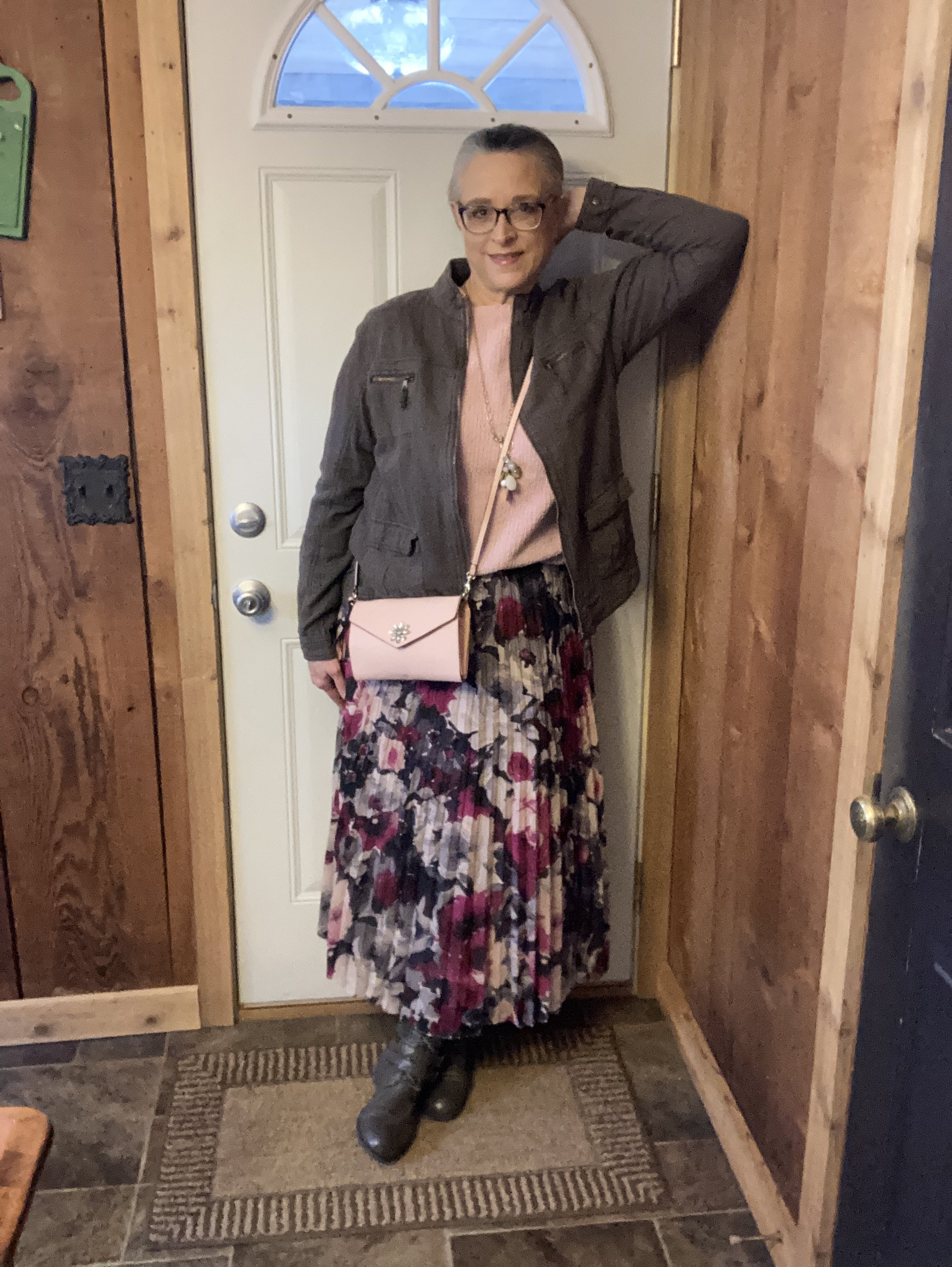
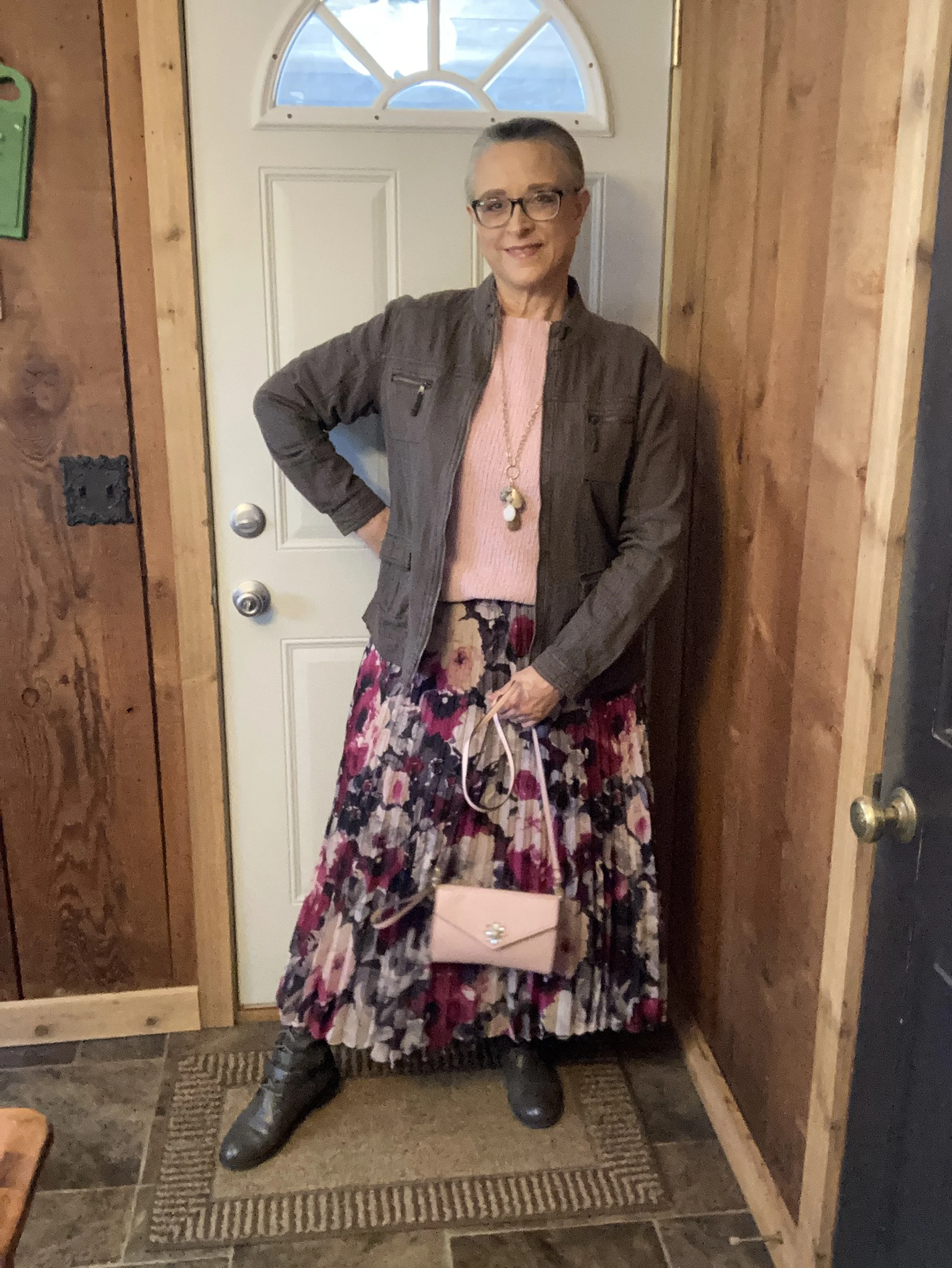
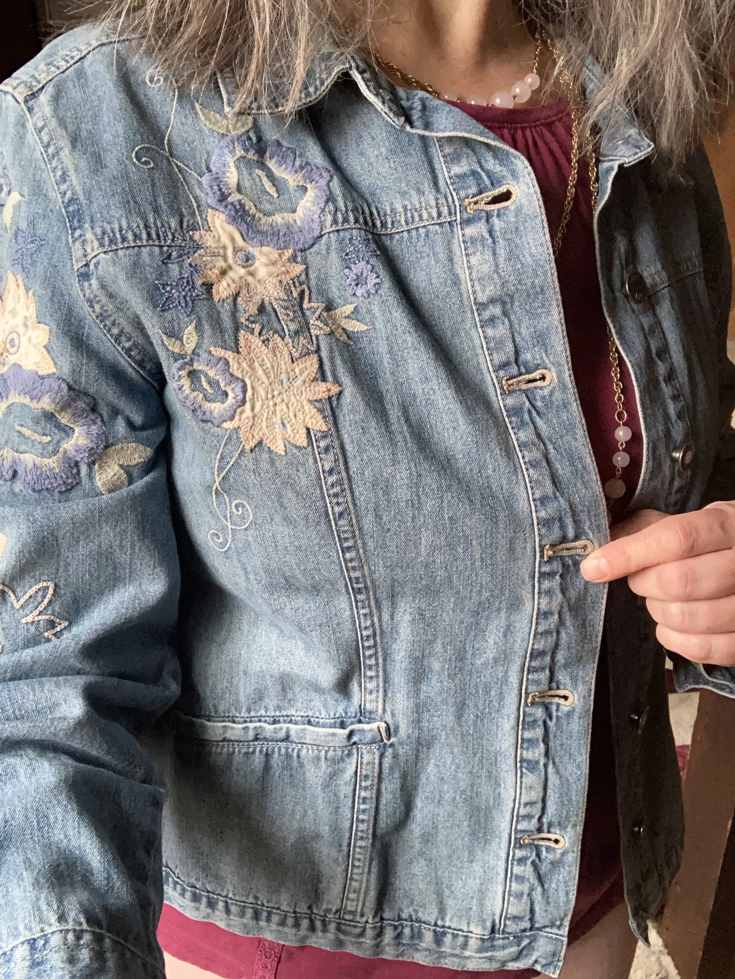
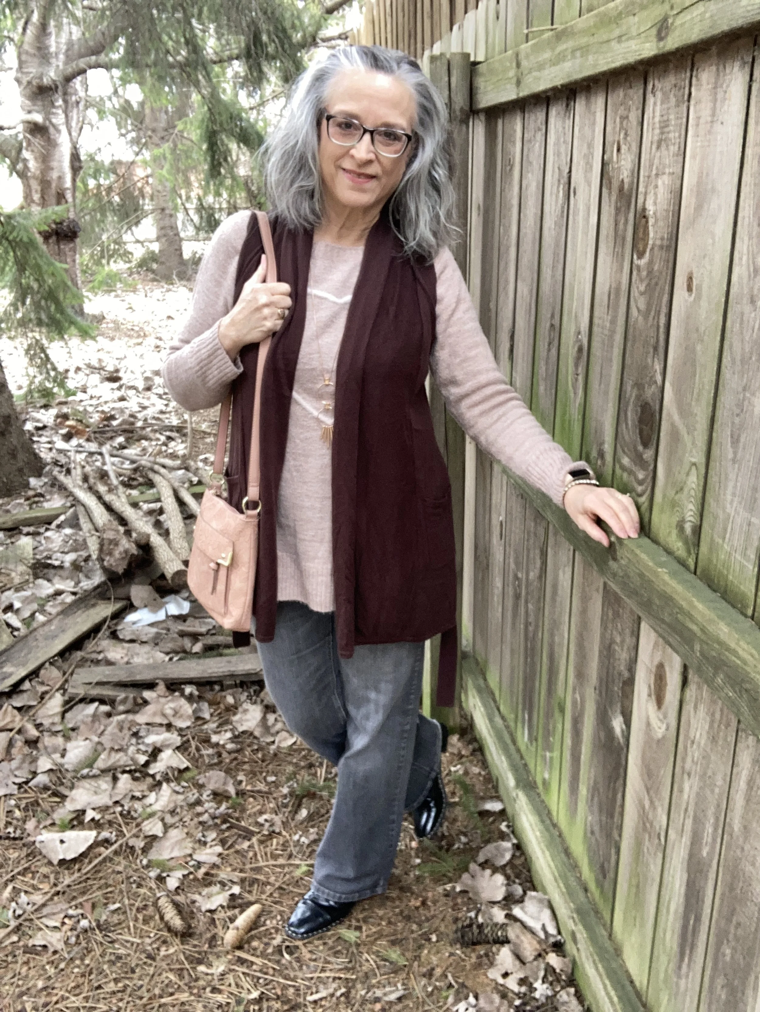
If you keep up with the Pantone Color of the Year, you know that this year’s color is a creamy brown with rosy undertones looking much like the dessert it is named after, Mocha Mousse. Click on the link to see the actual color. As I began looking through my closet, which contains almost every color under the sun, I realized I don’t have anything this exact color. The closest I came was a piece that is a little bit lighter version of the actual color, but I thought it would do for this post.
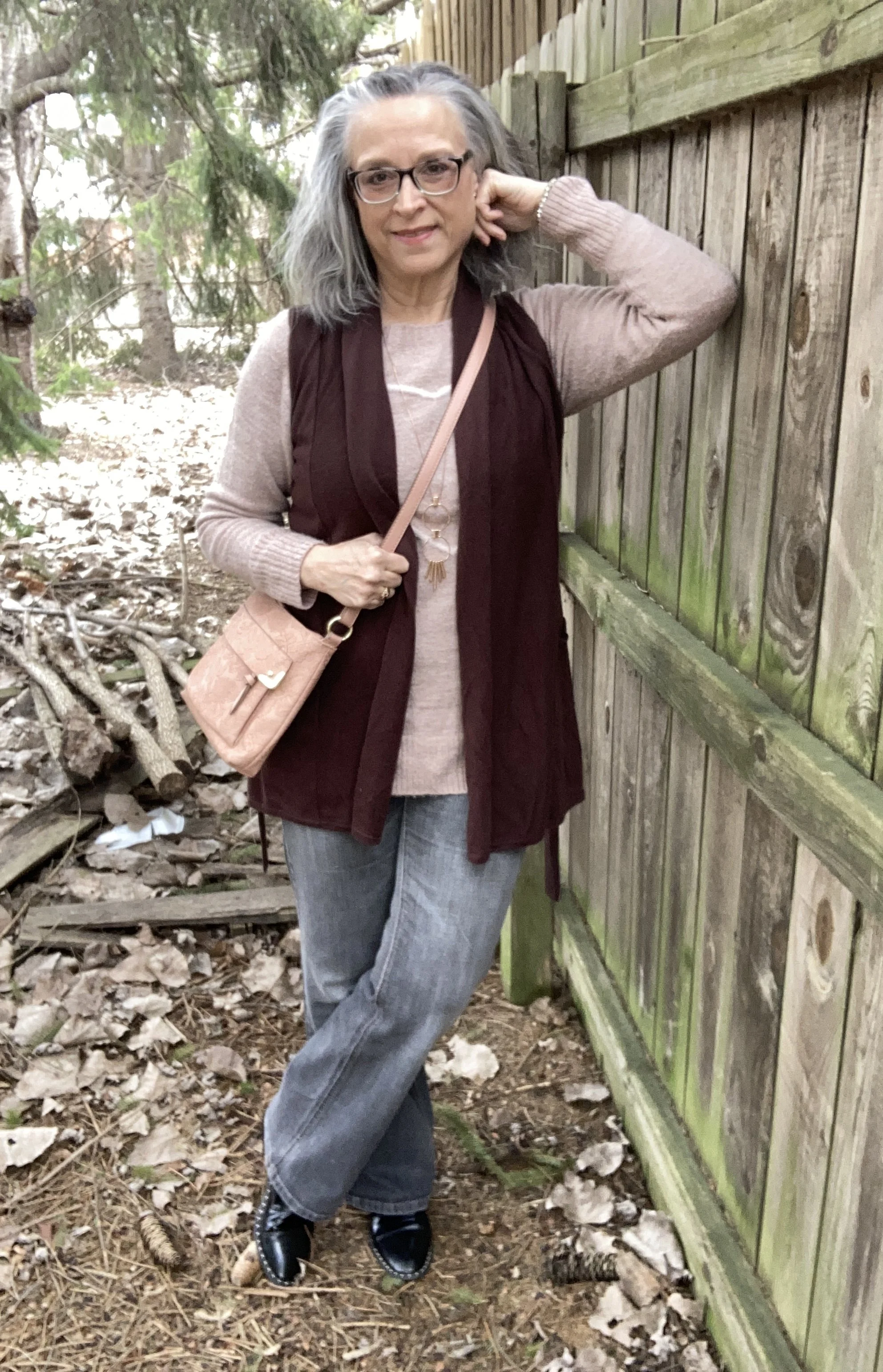
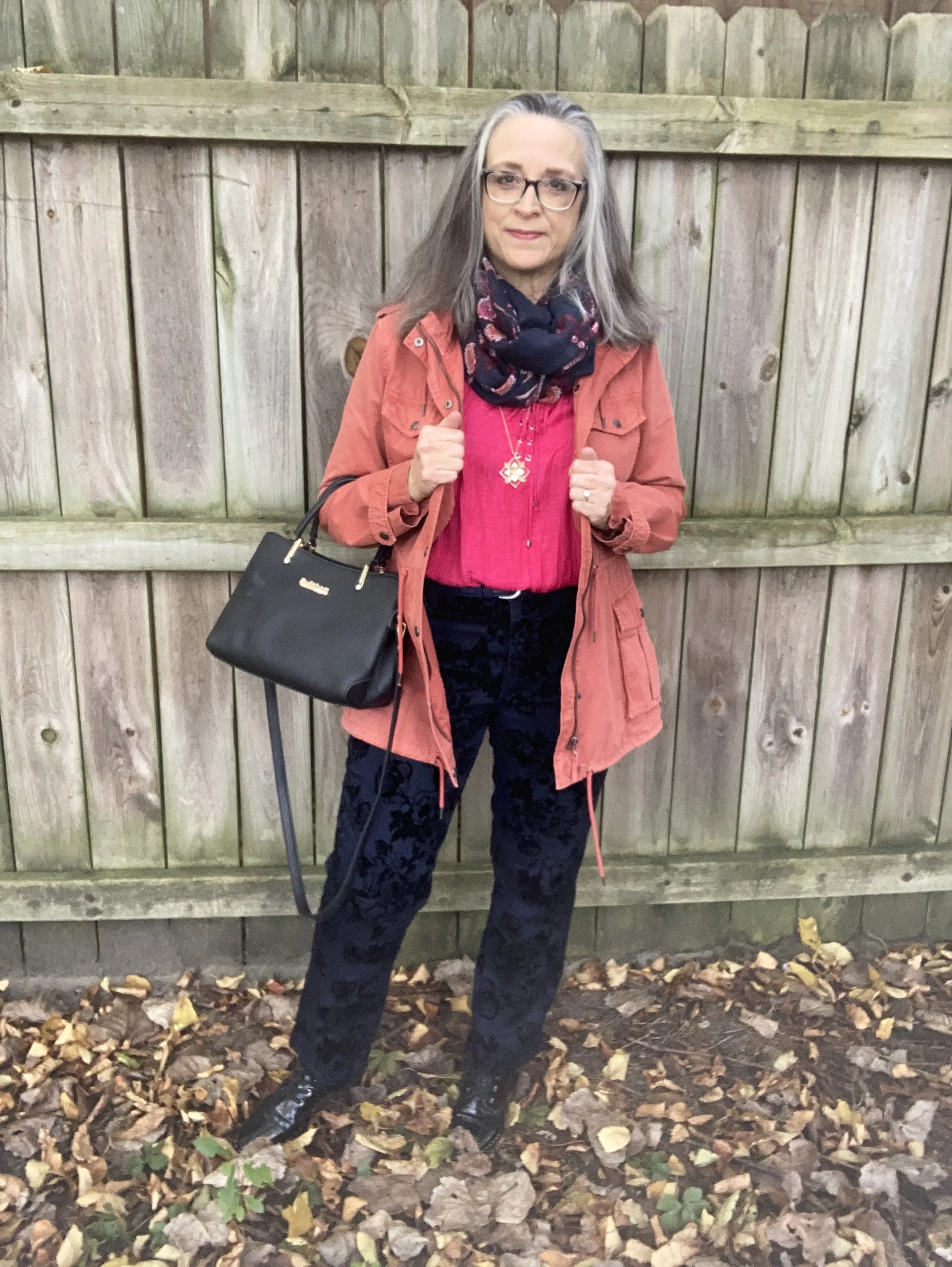
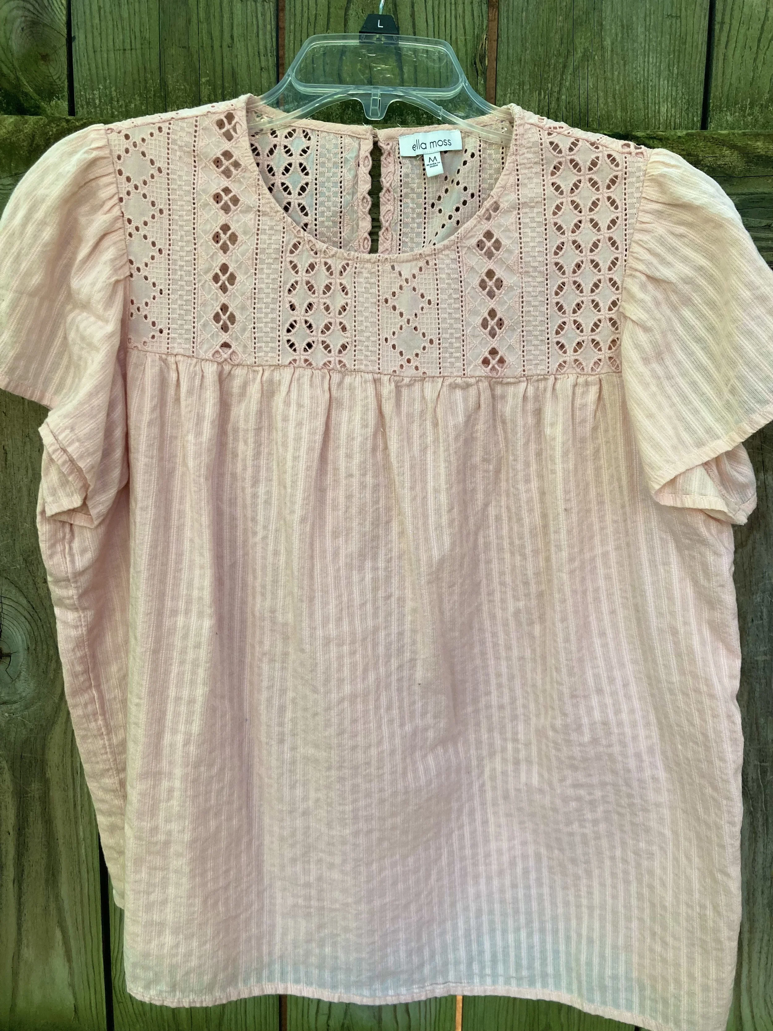
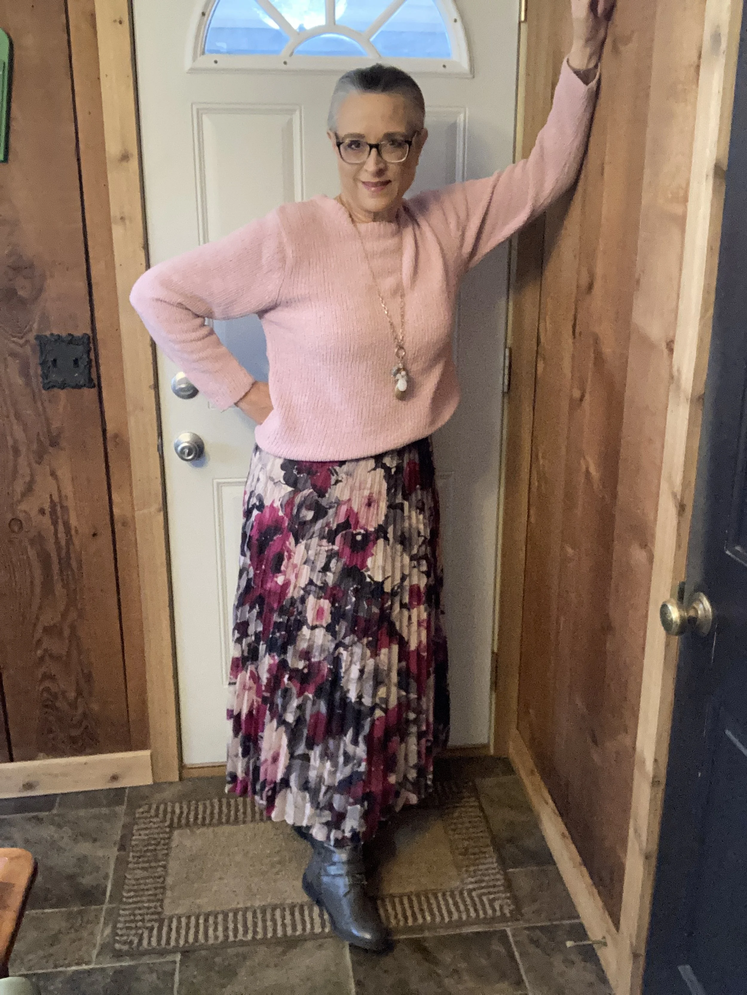
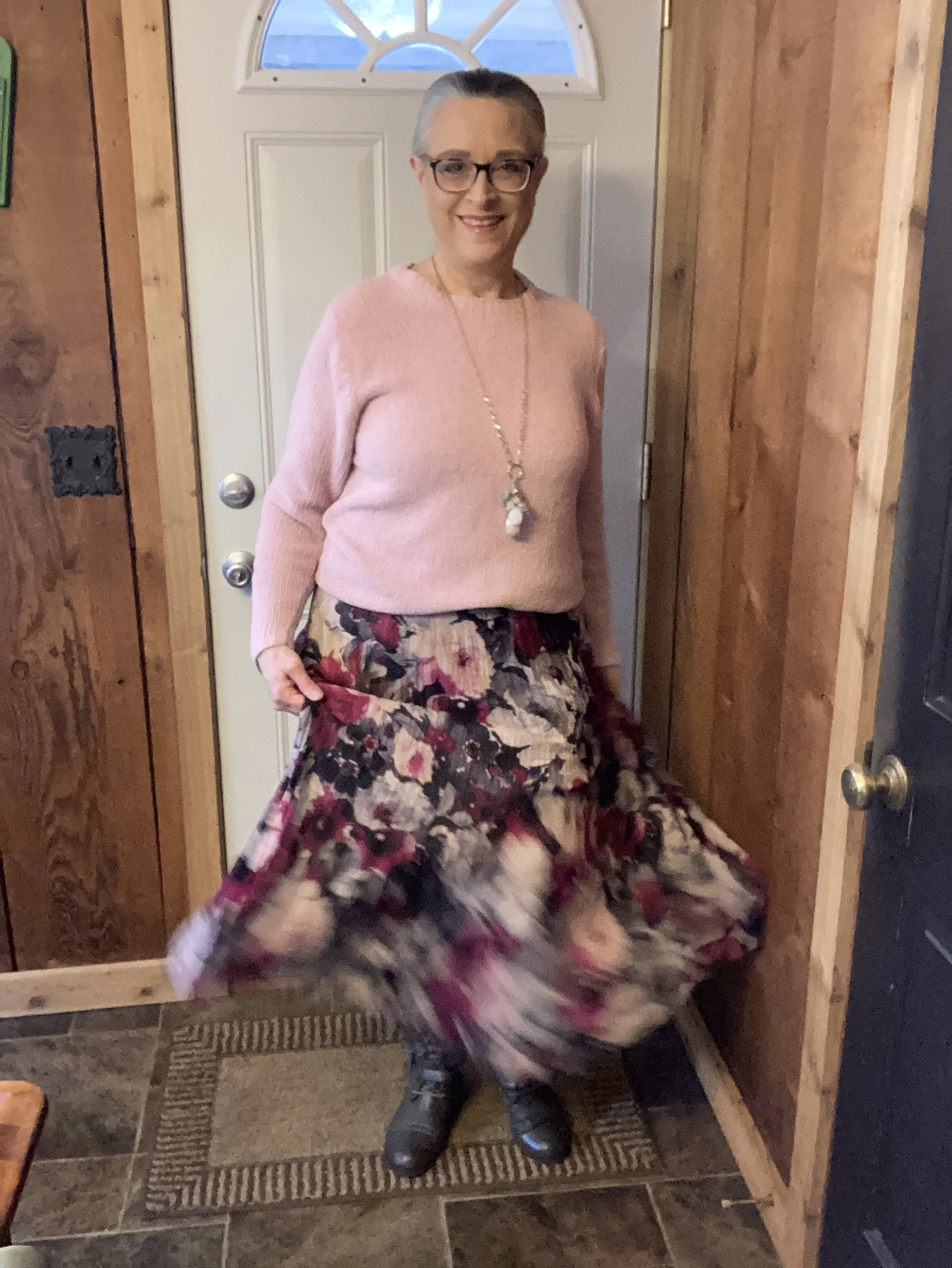
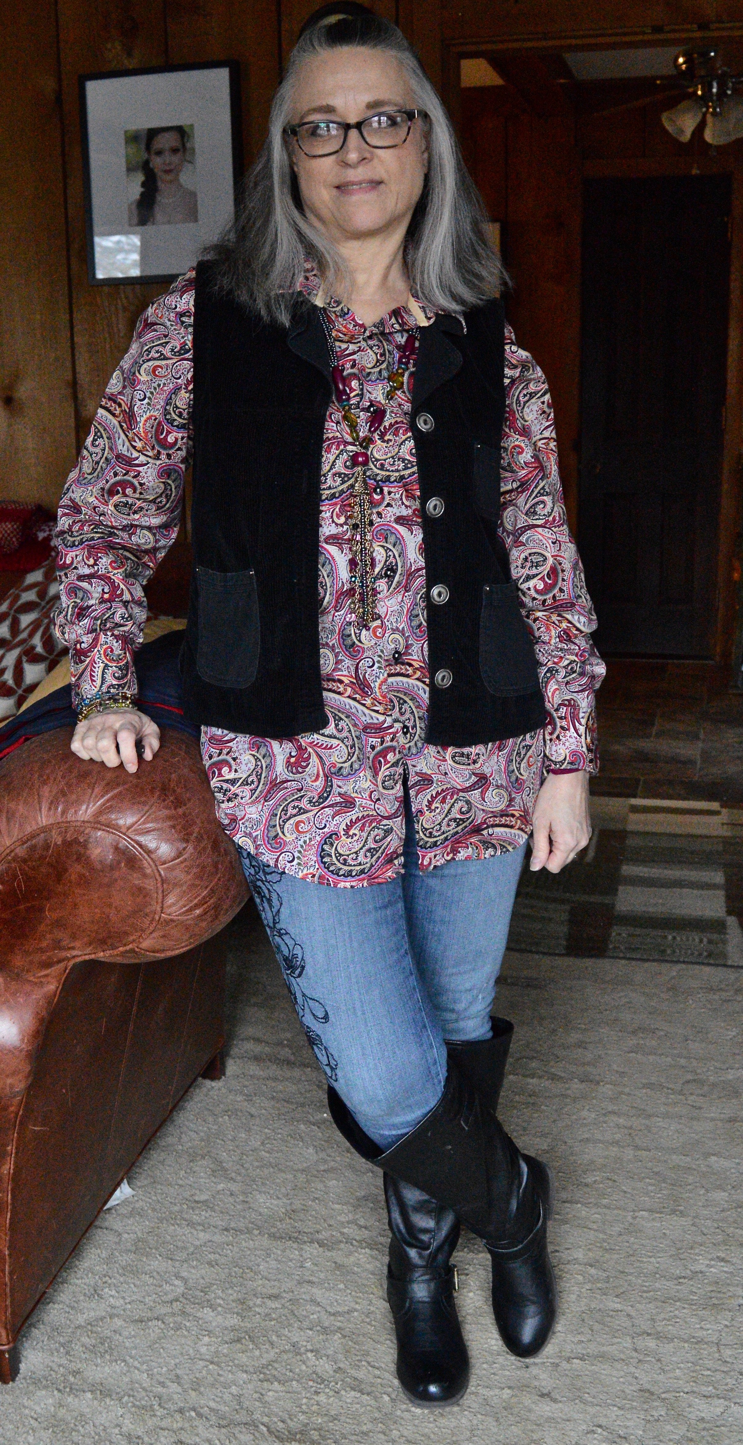
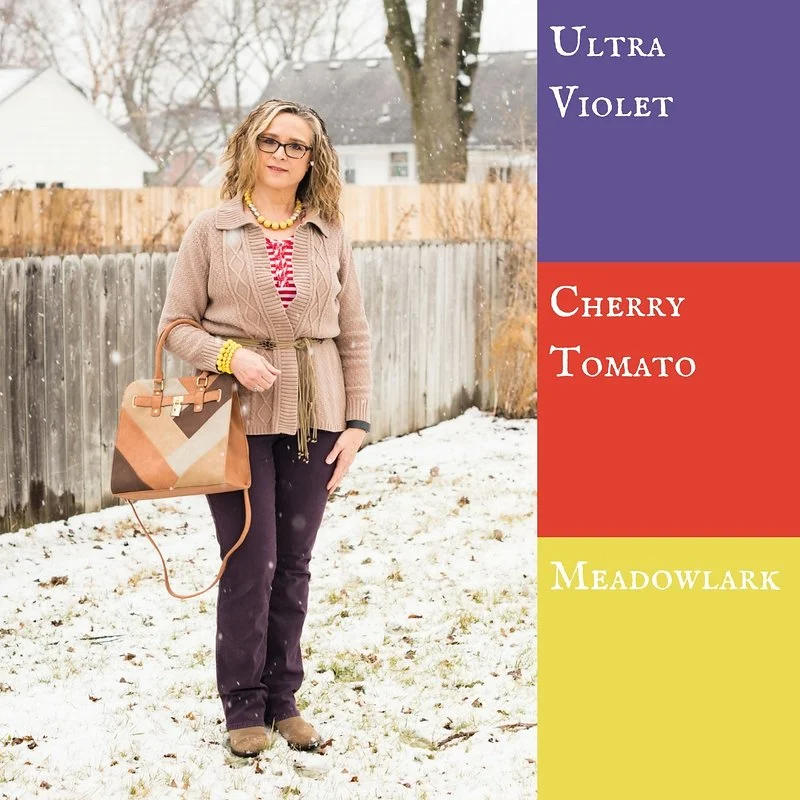
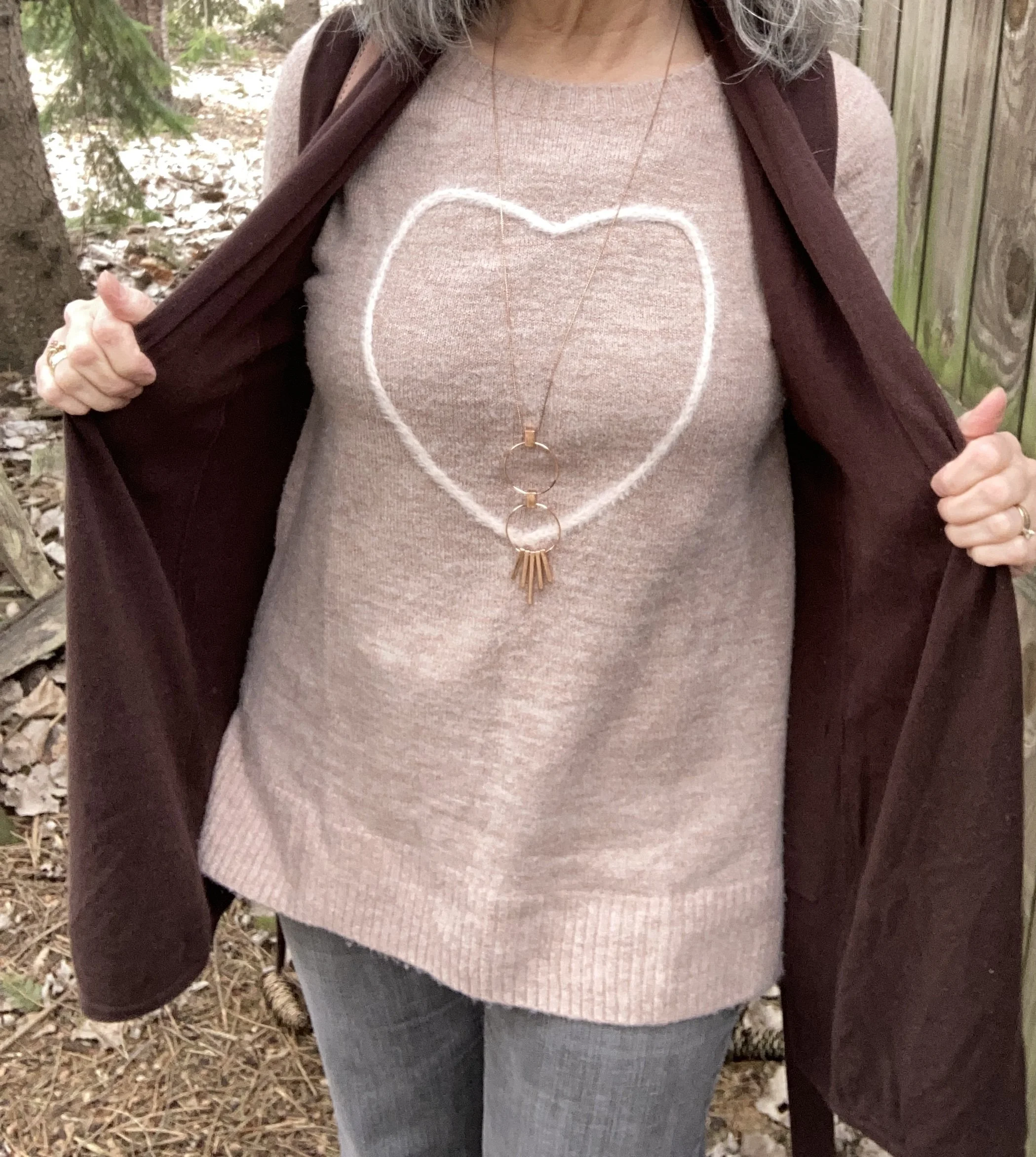
This tunic length sweater was a thrift find from last year. It is Lauren Conrad brand and I love the soft texture and the cute heart
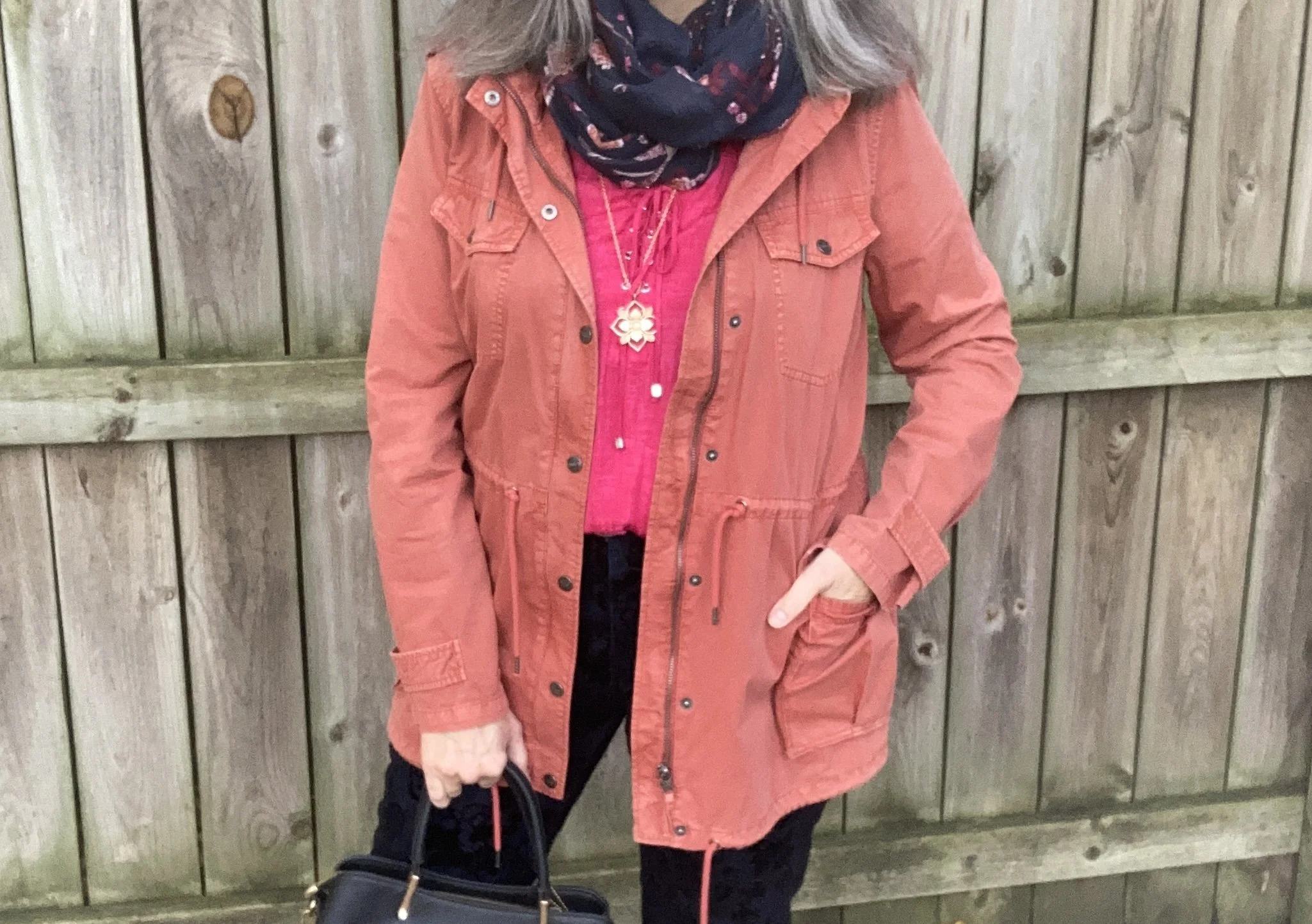
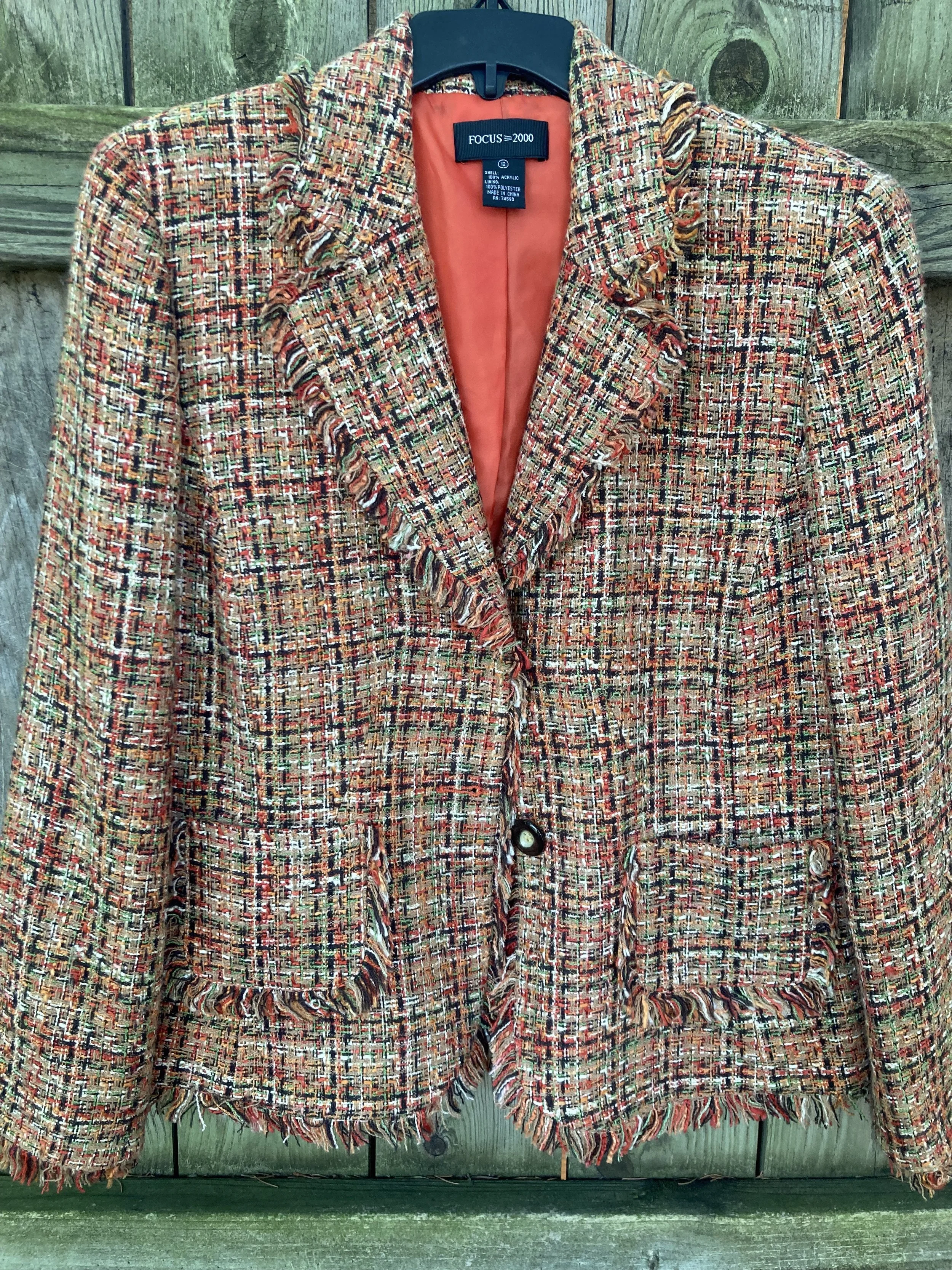
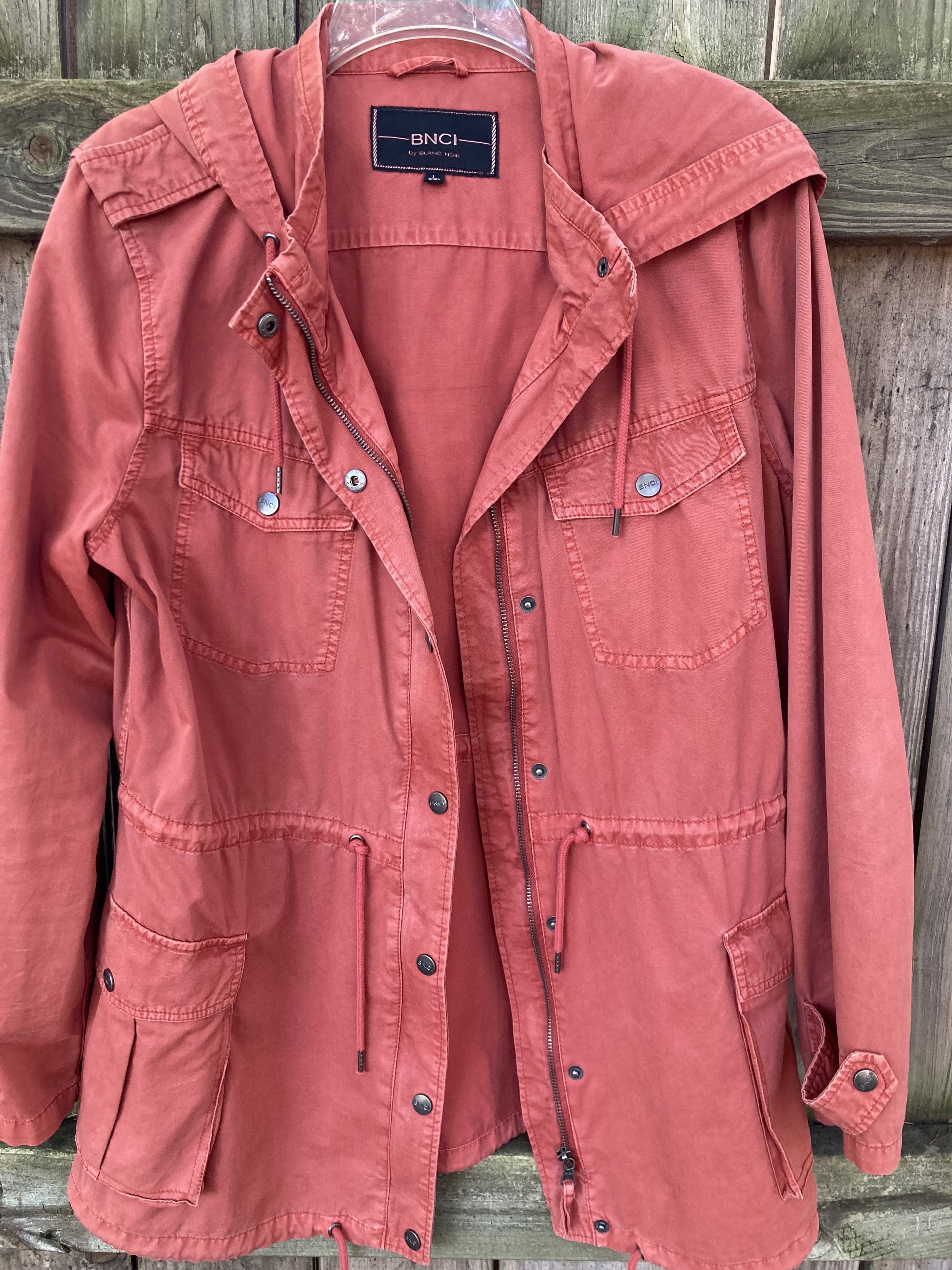
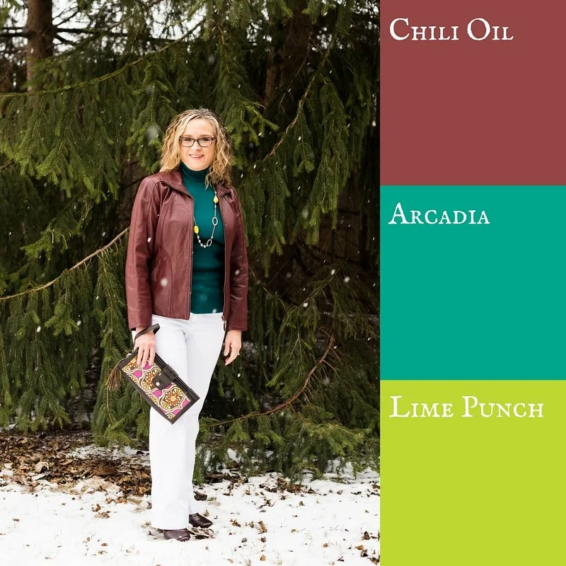
I thought adding this thrifted, brown Fever vest a good way to further infuse the idea of the chocolatey goodness of mousse.

Style Tip: Adding a vest is a great way to have the fun of layering without the added weight and warmth. Vests are perfect for these transitional times between winter and spring, and summer and fall. Look for lighter weight, flowy vests that still provide coverage, but don’t add too much heat.
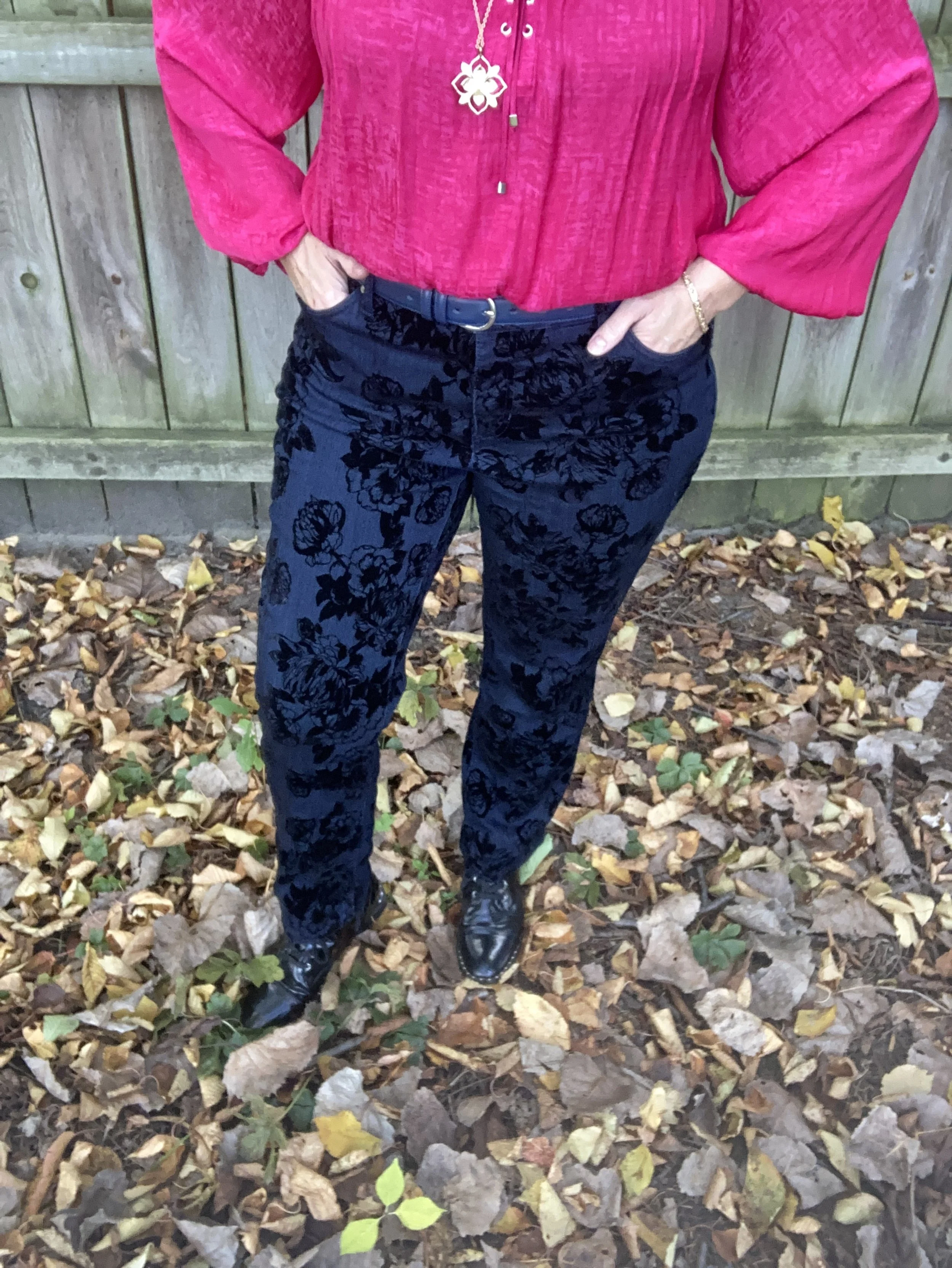
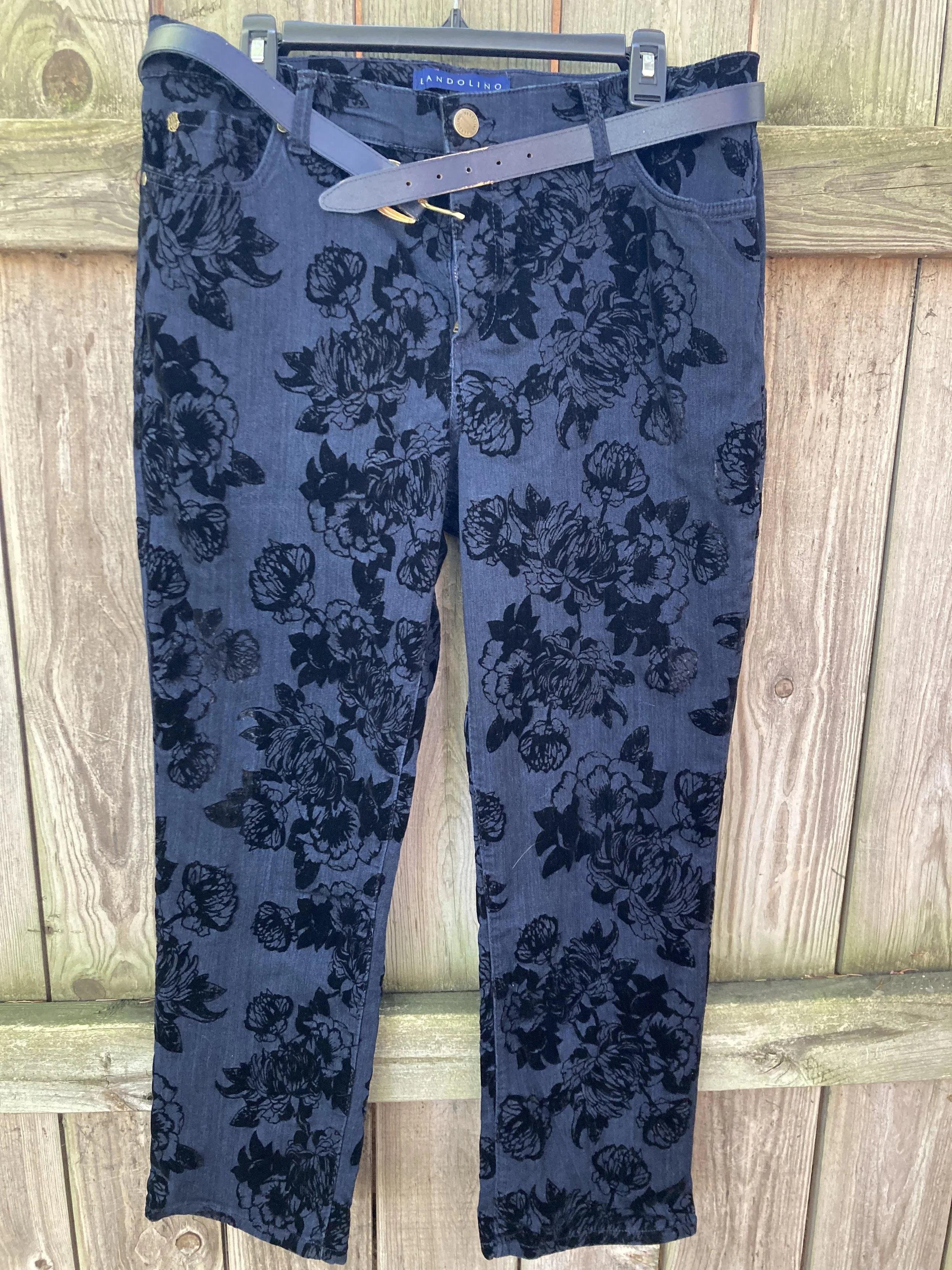
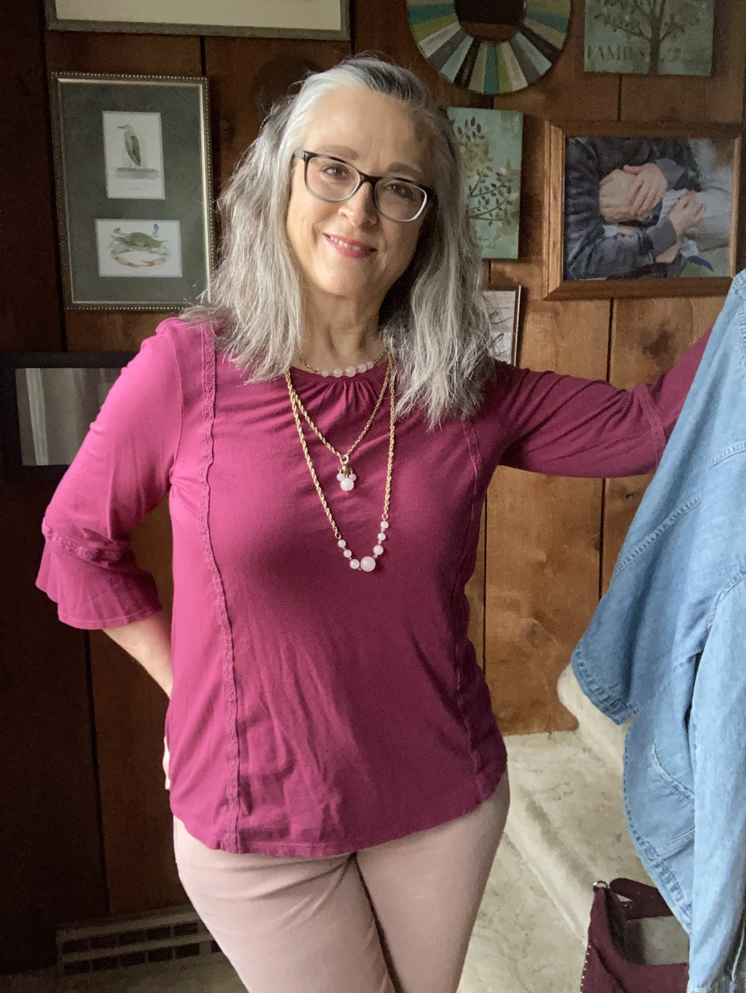
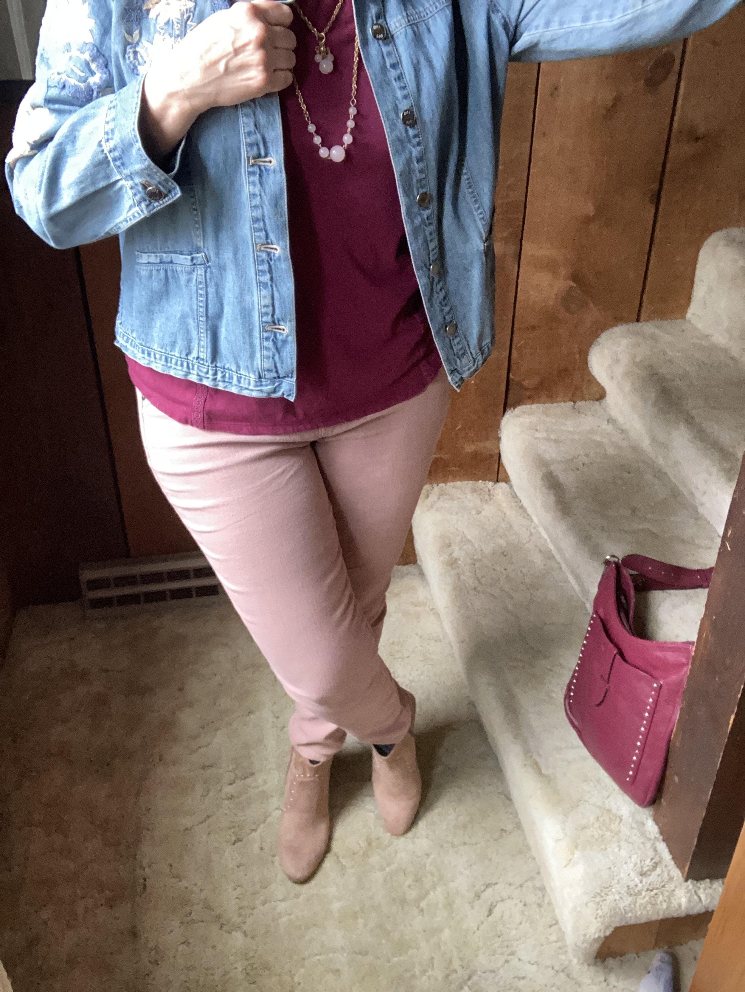
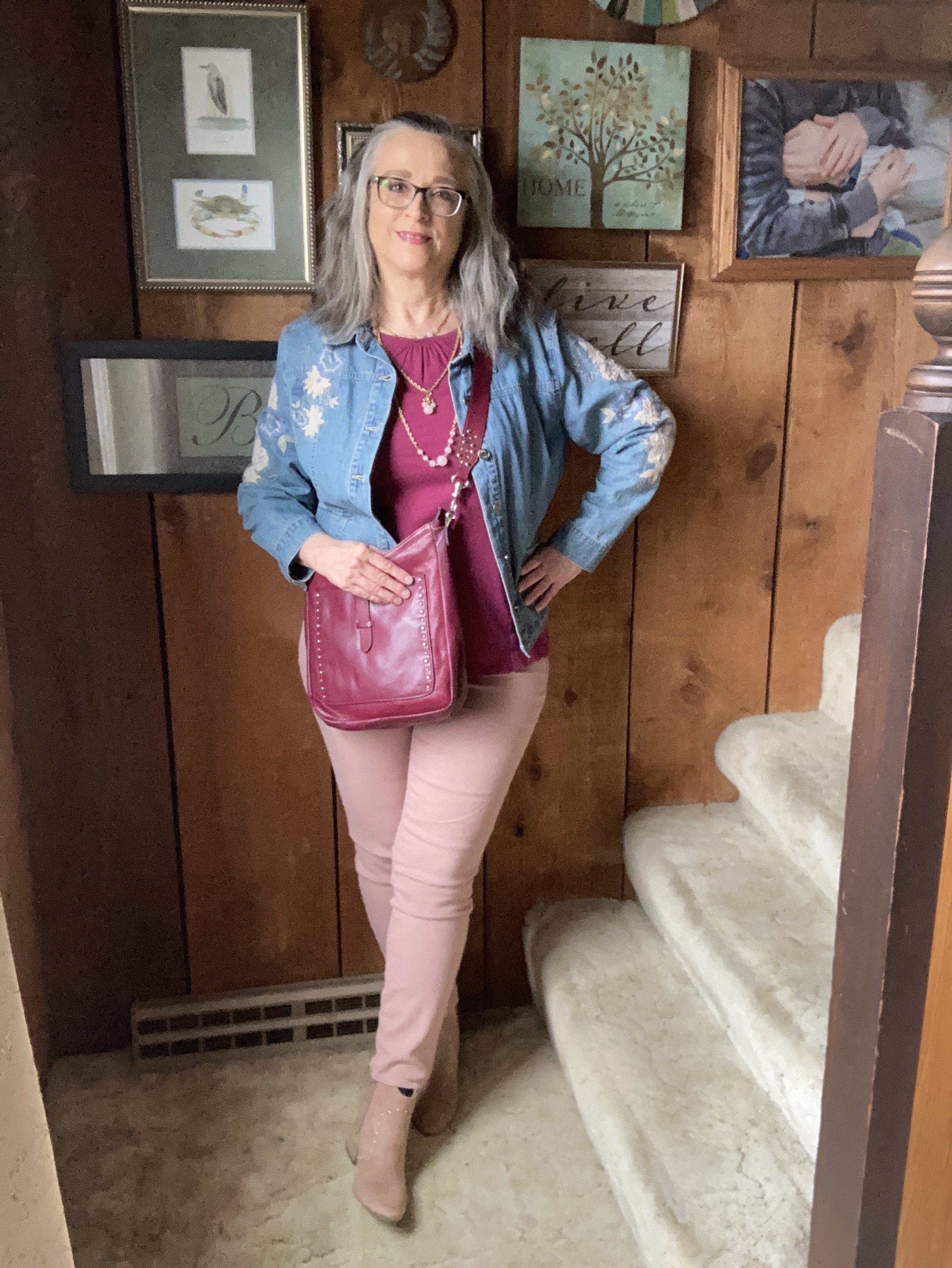
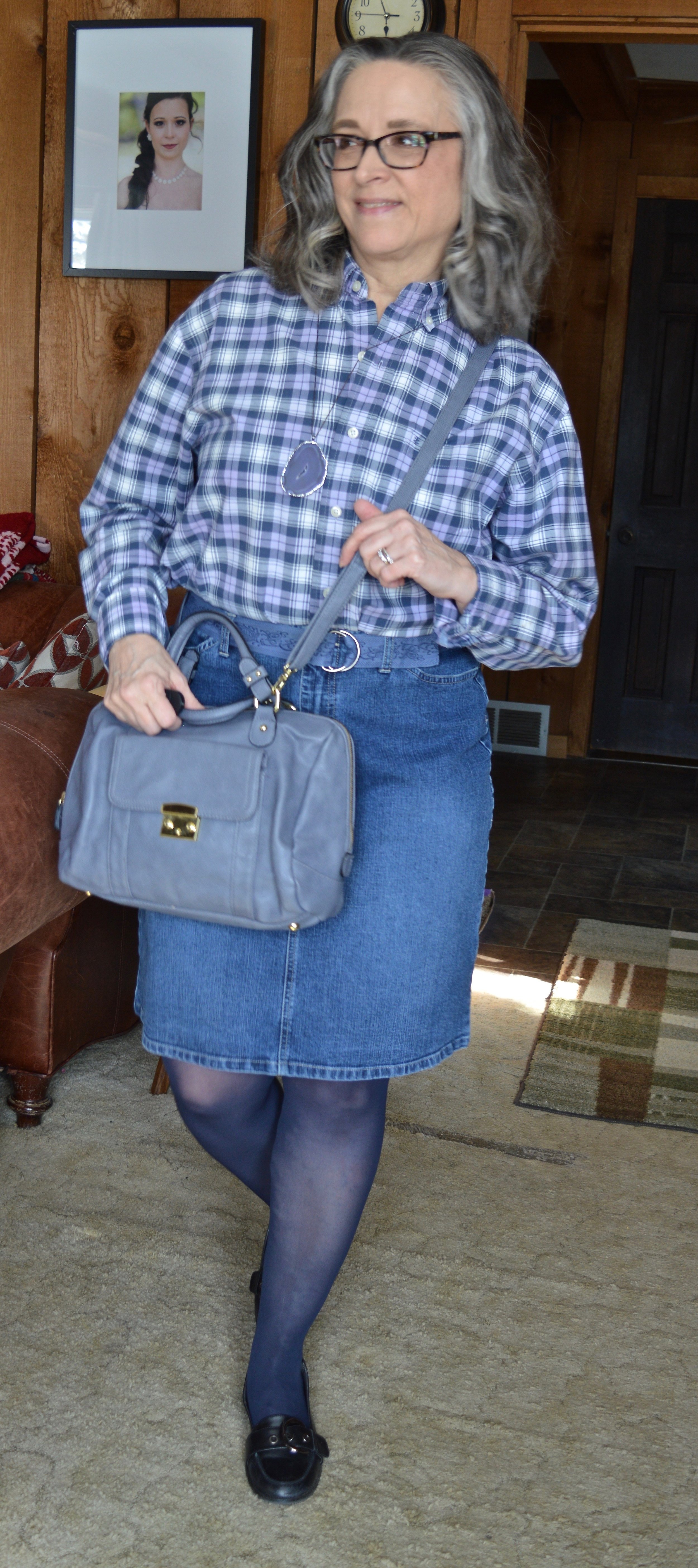
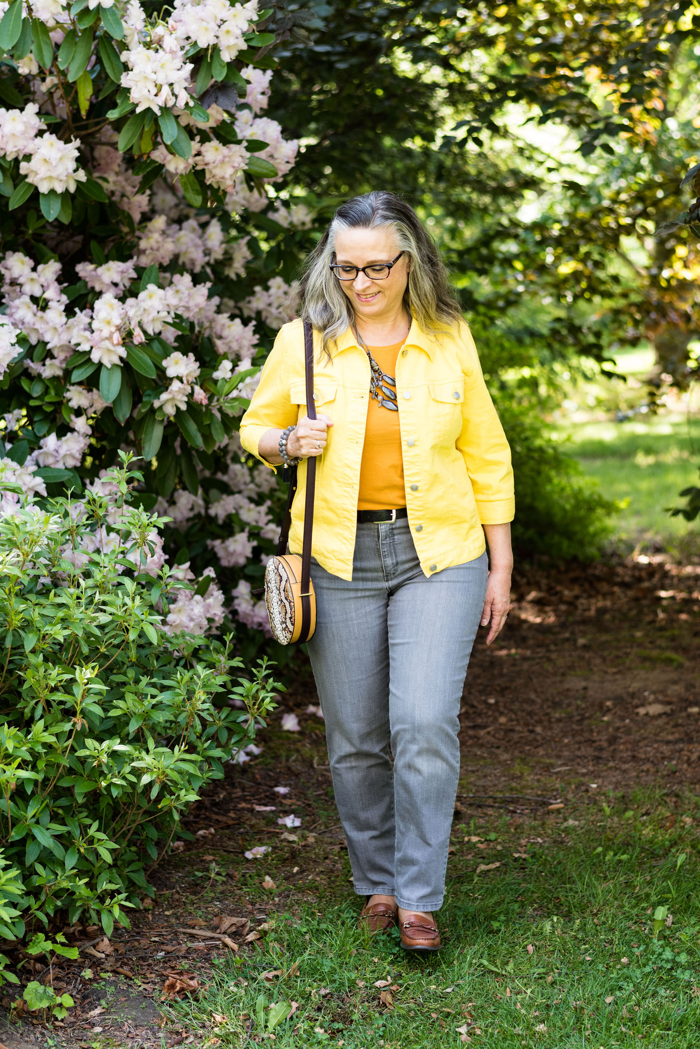
I decided to use my second hand White House Black Market Blanc jeans. It is nice to fit back into this trouser type pant to take a casual look up a notch.
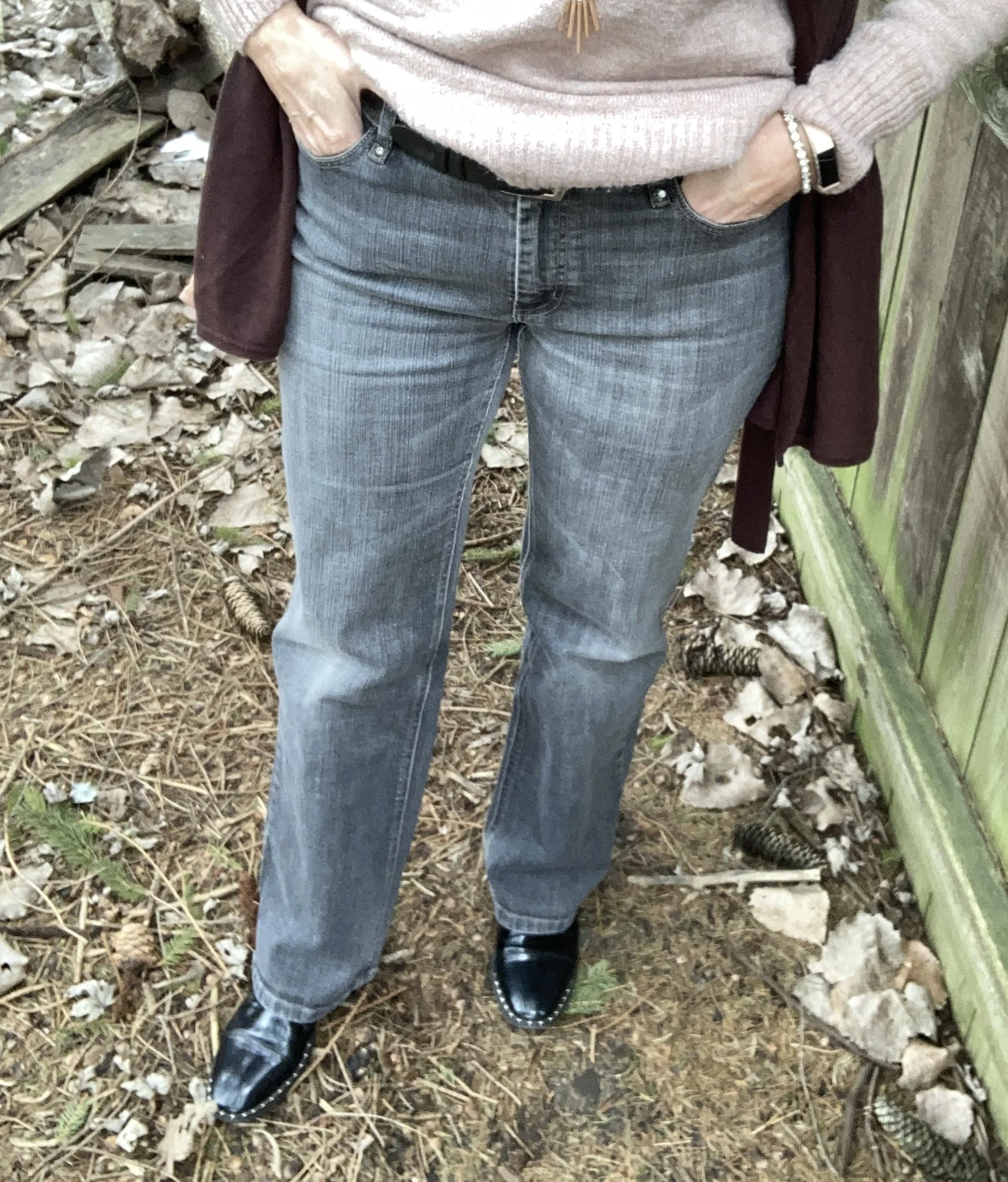
Style Tip: Adding a pair or two of trouser type jeans, which have a somewhat wider silhouette allows you to dress up an outfit without going outside your “jeans box”. You know I am an avid fan of jeans and they are what I wear most of the time, but it is nice to have the option of a jean in a different style and/or color for a completely different look.
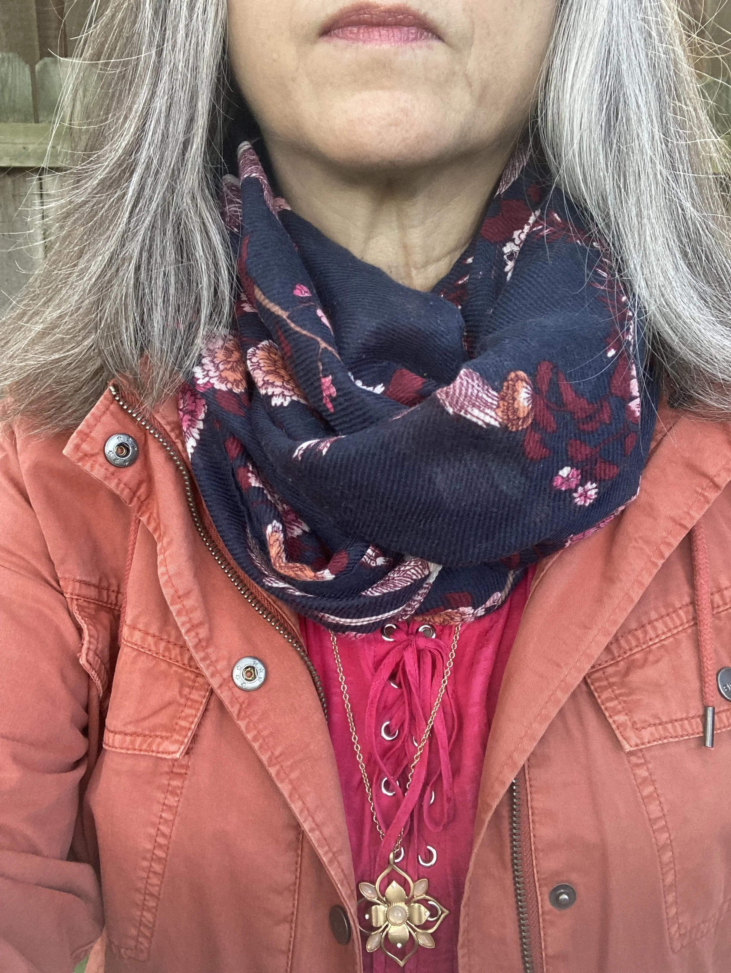
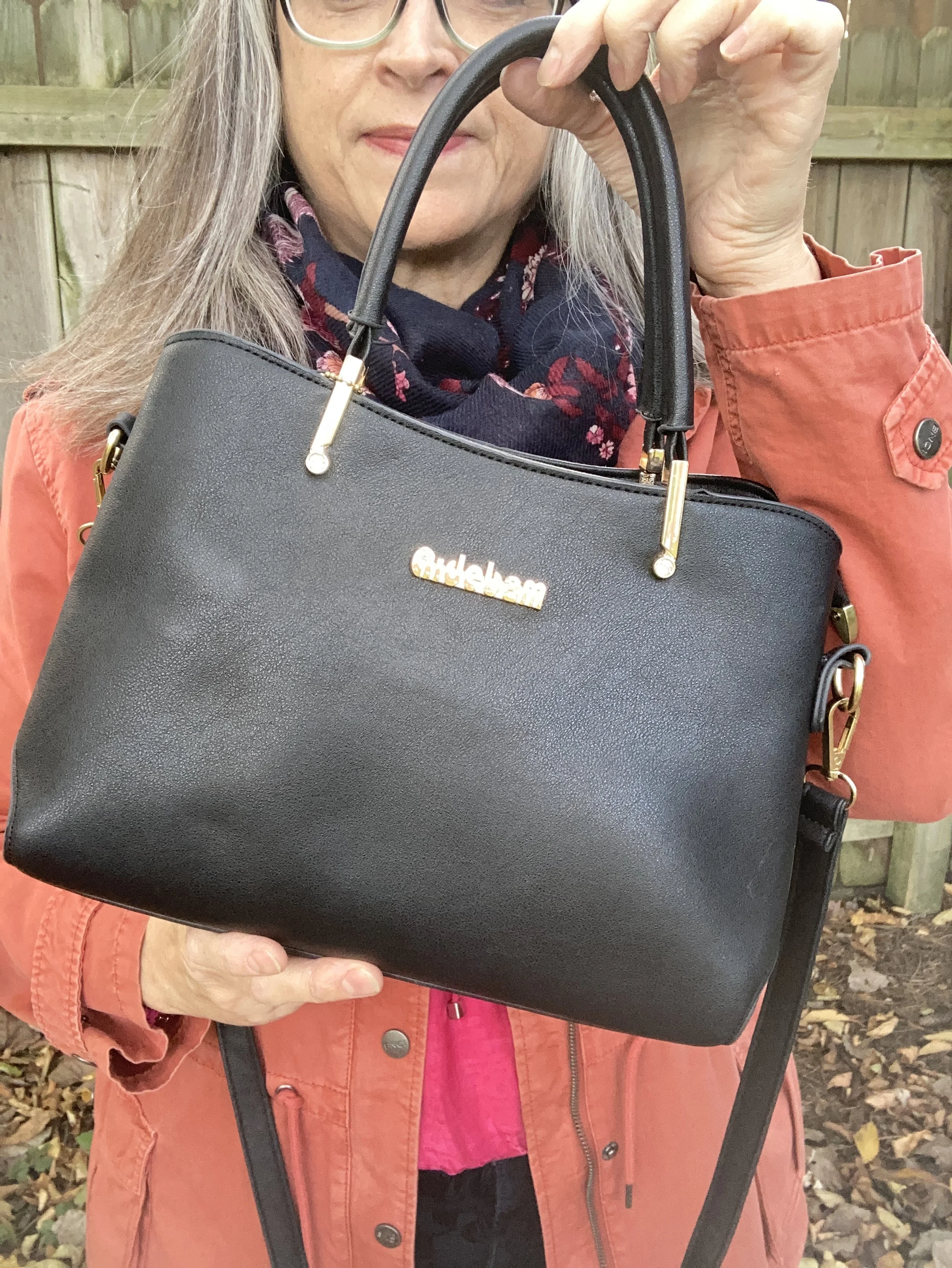
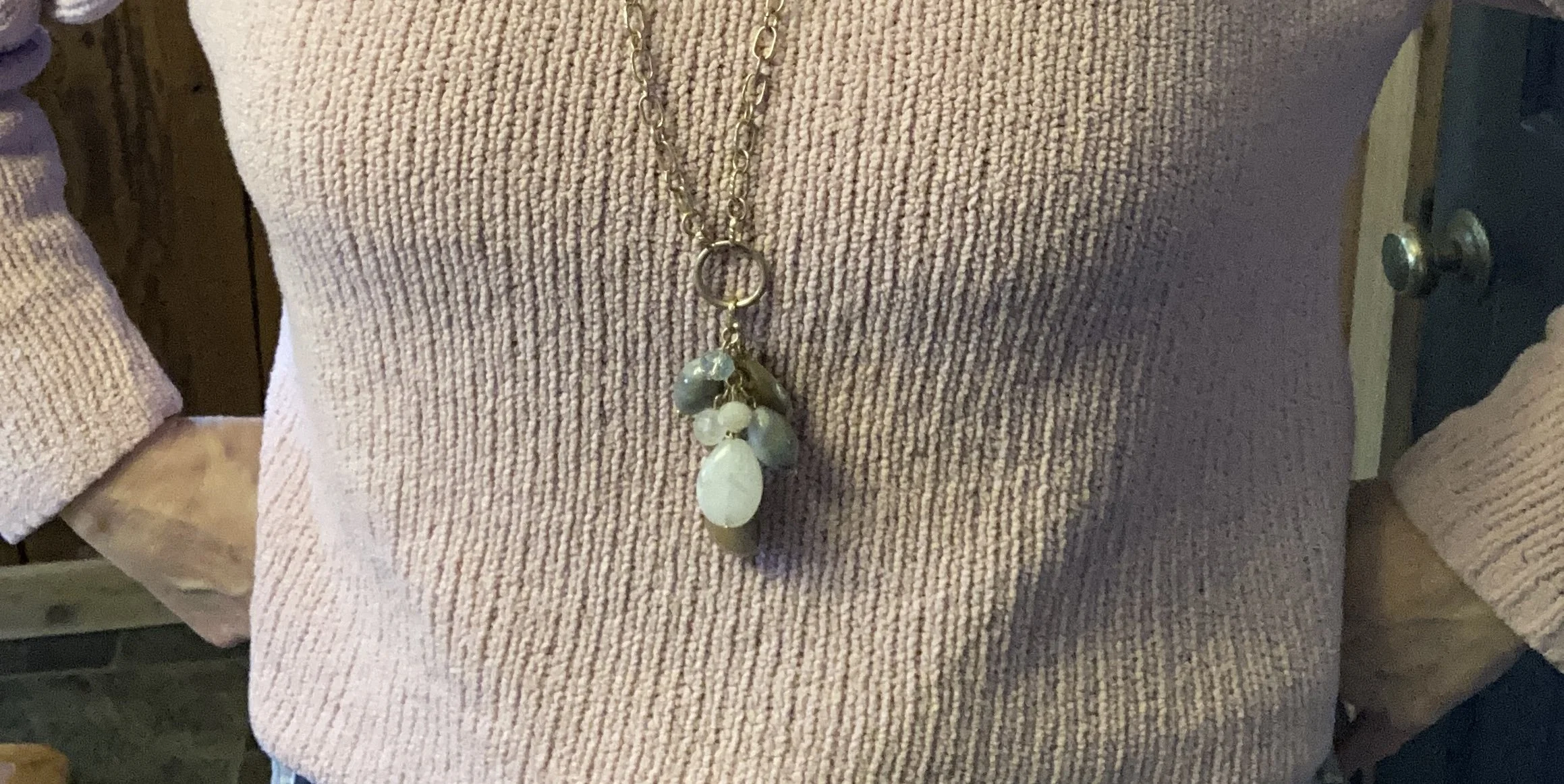
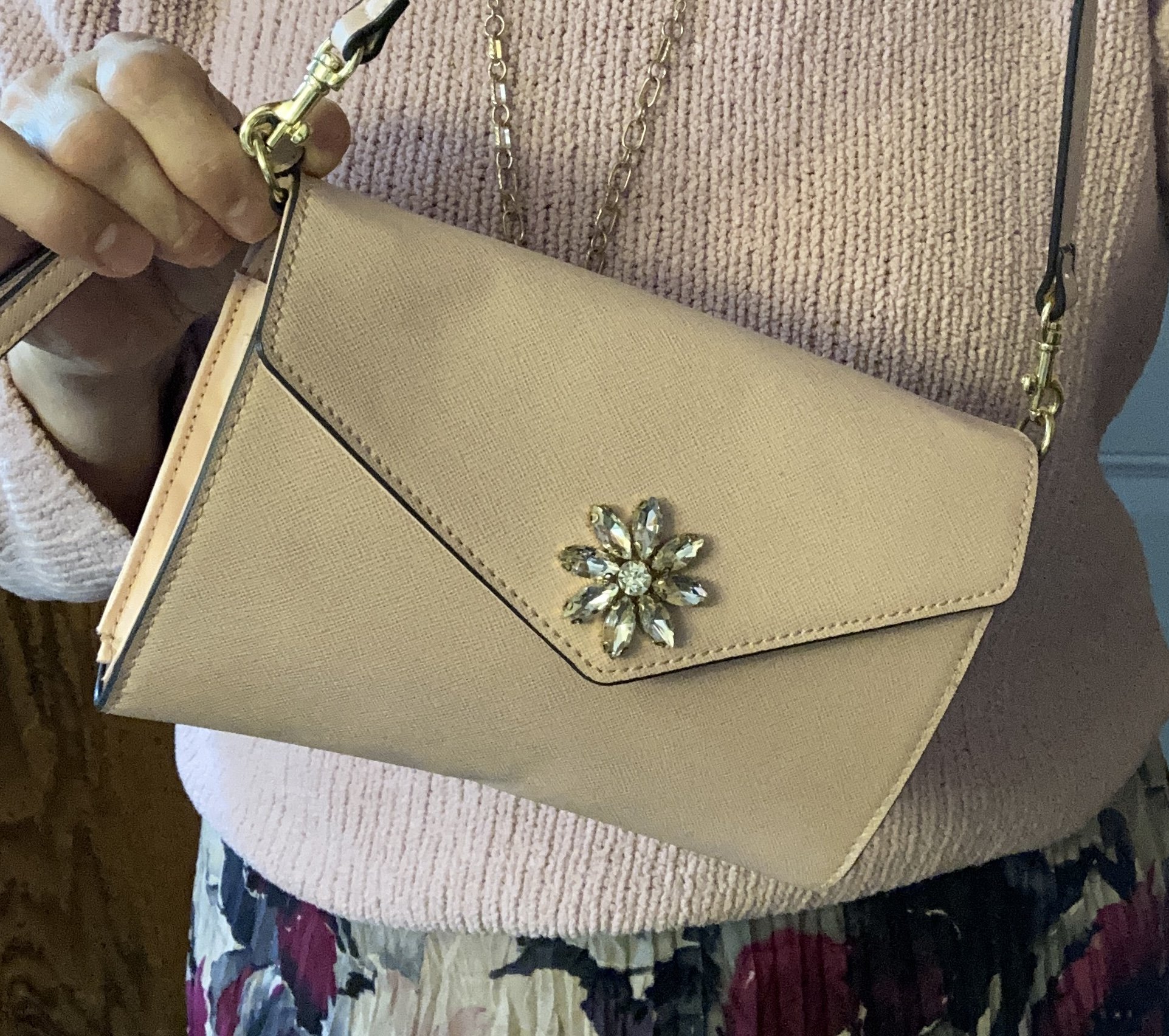
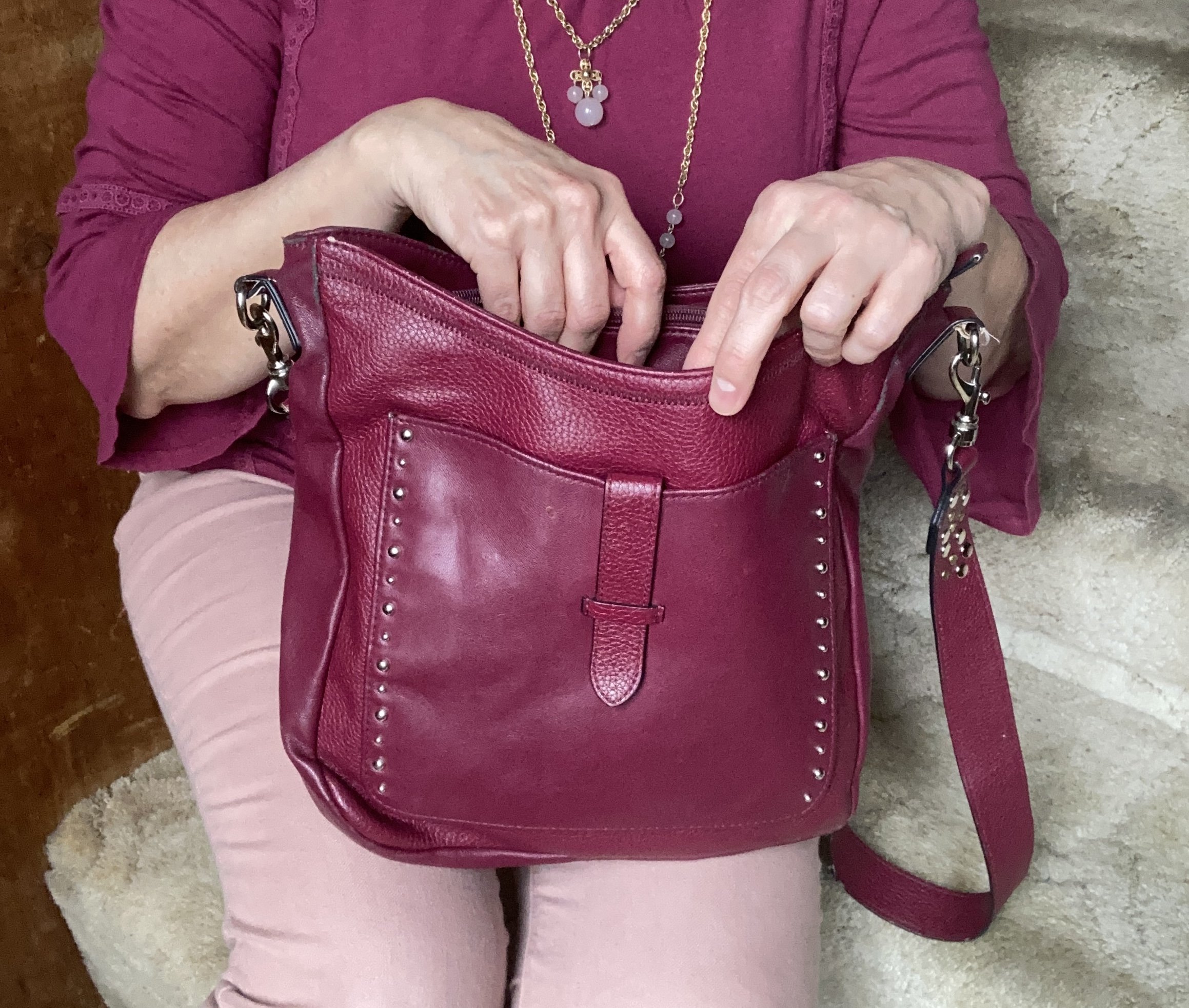
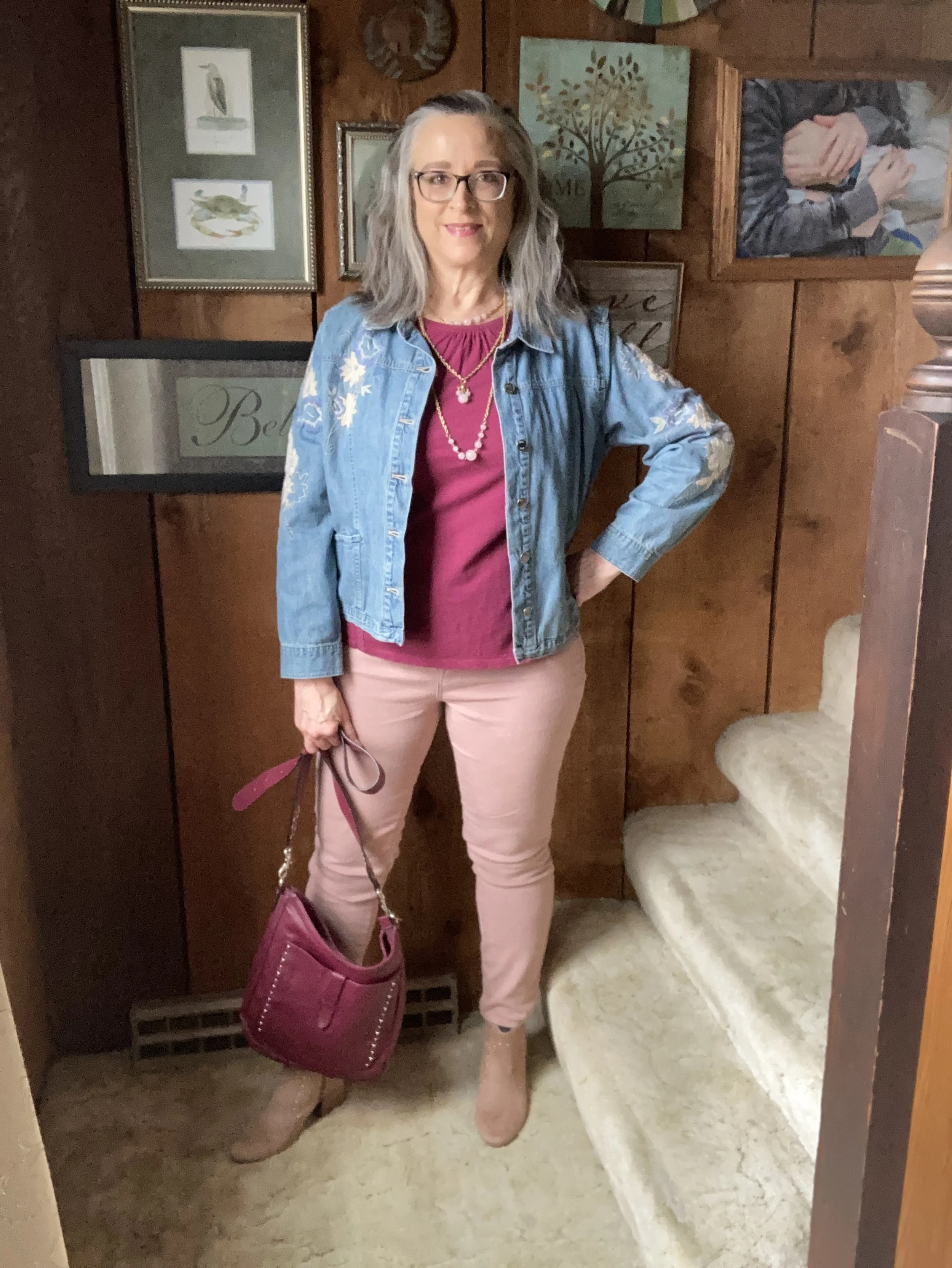
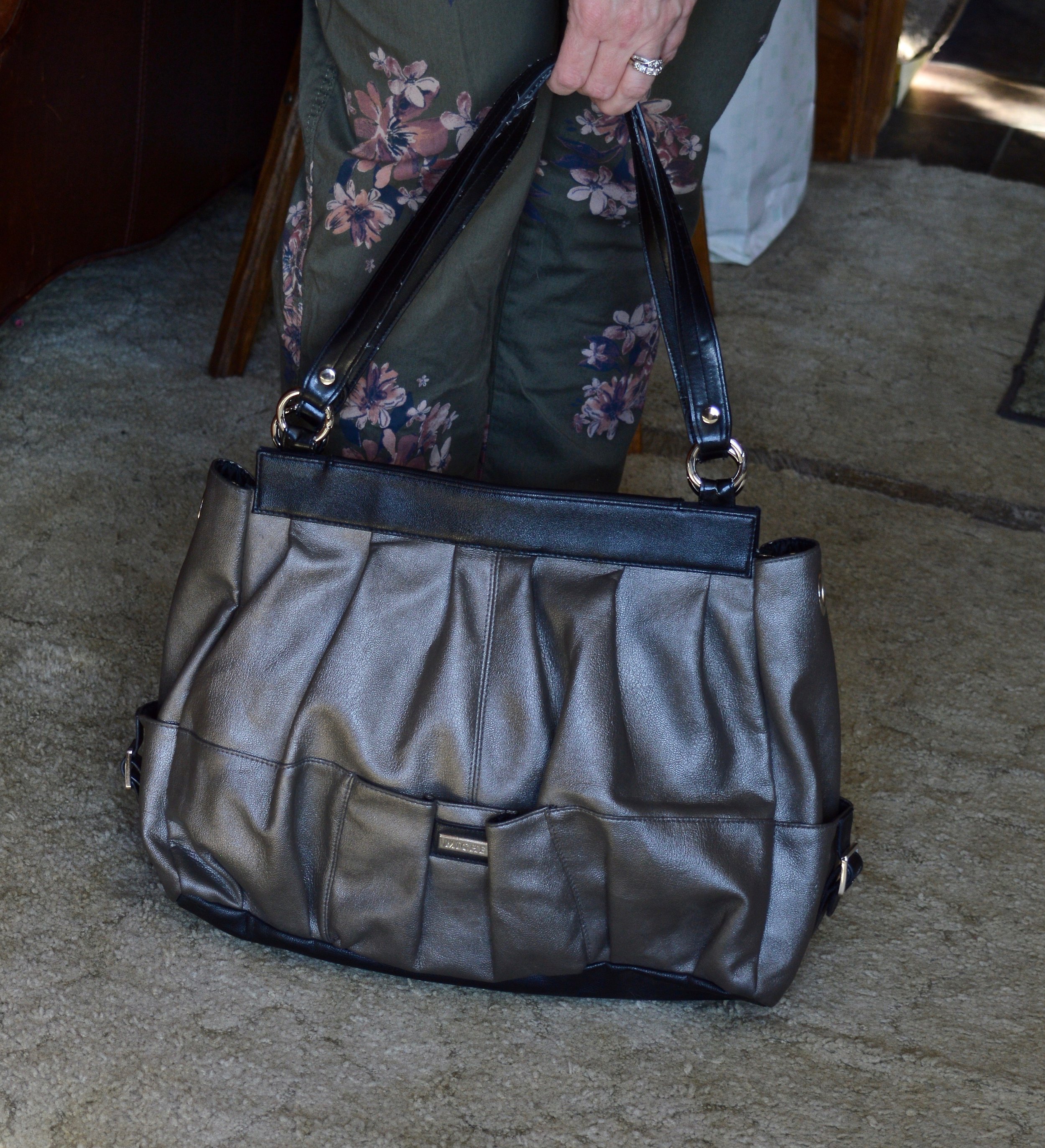
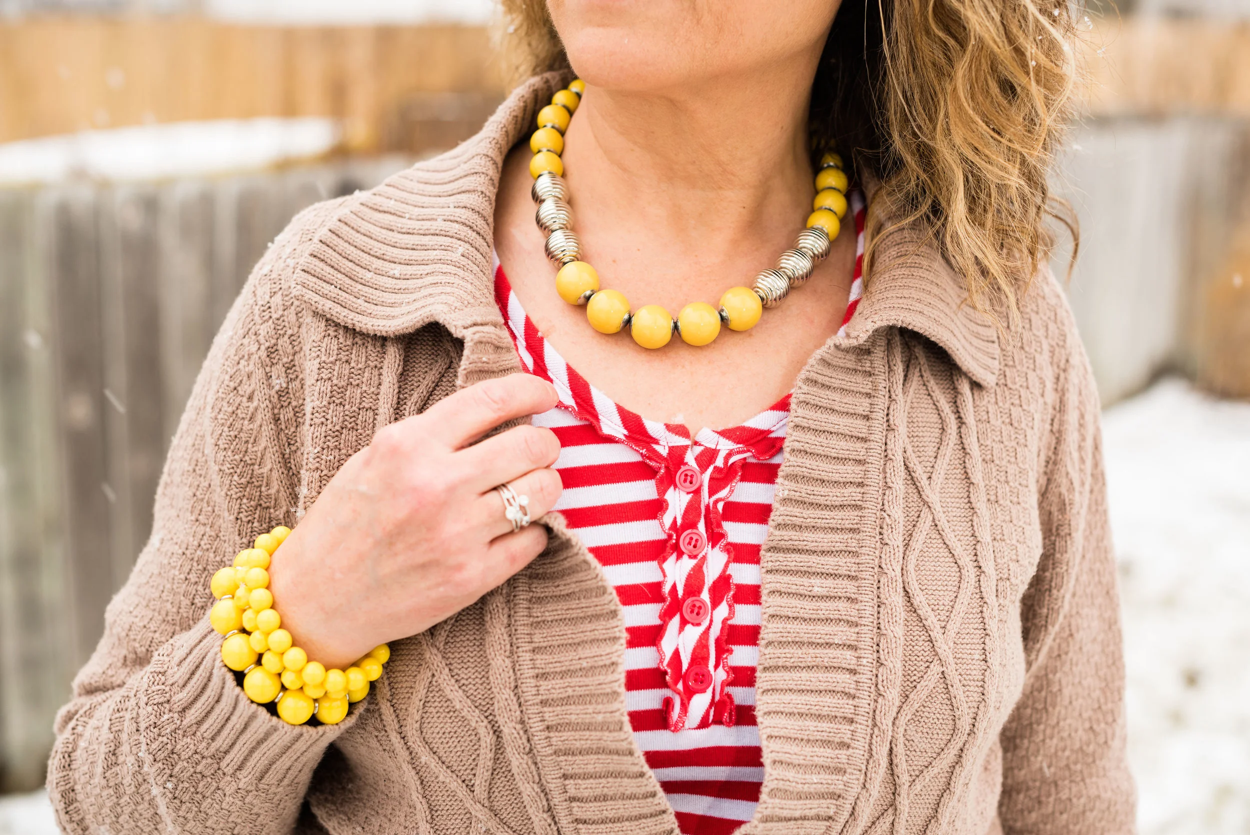
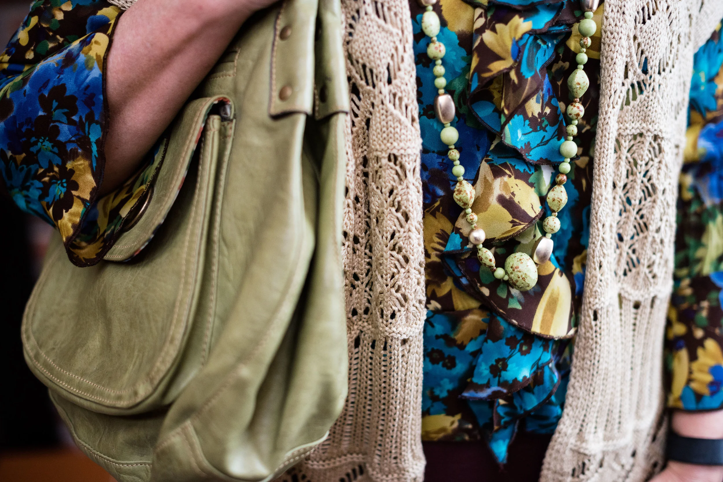
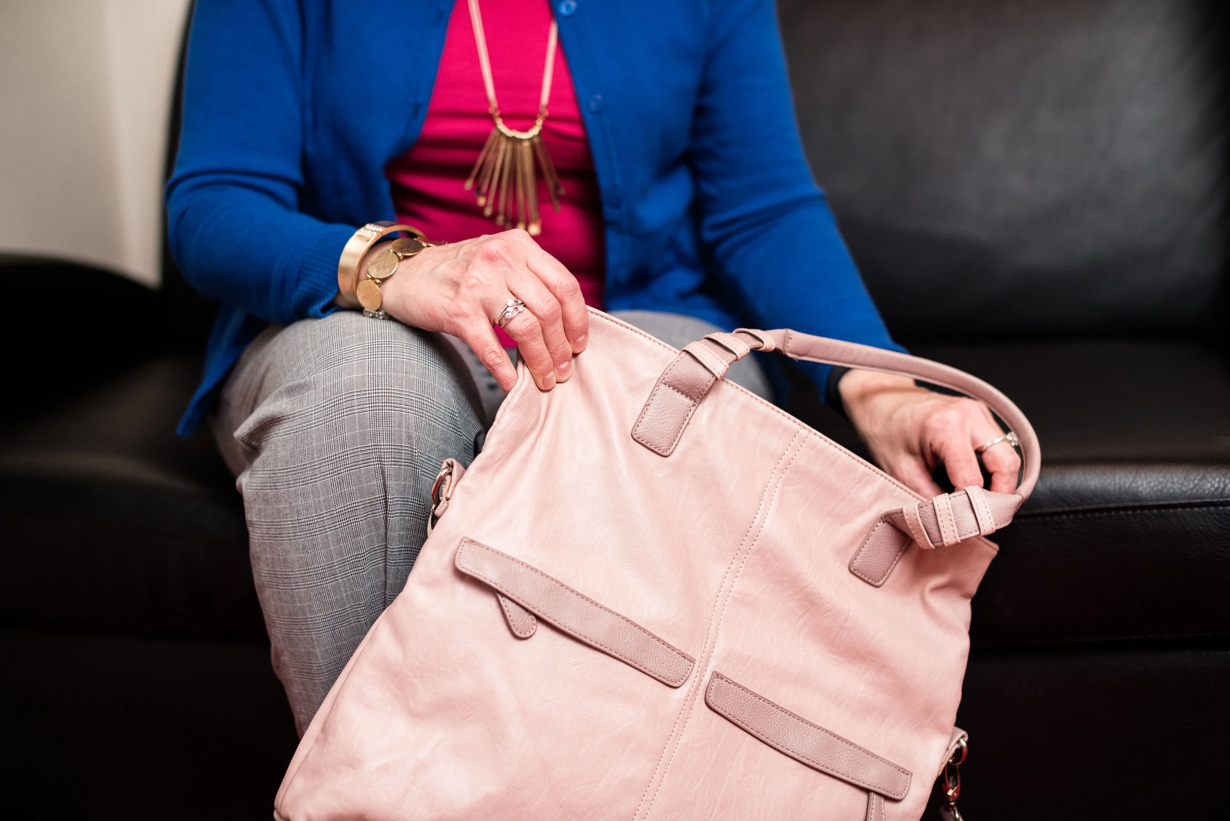
I decided to go for rose gold in my jewelry which I think goes well with the brown and the Mocha Mousse colors. I also added my pink Bueno crossbody bag which was a gift from my younger daughter a few years ago.


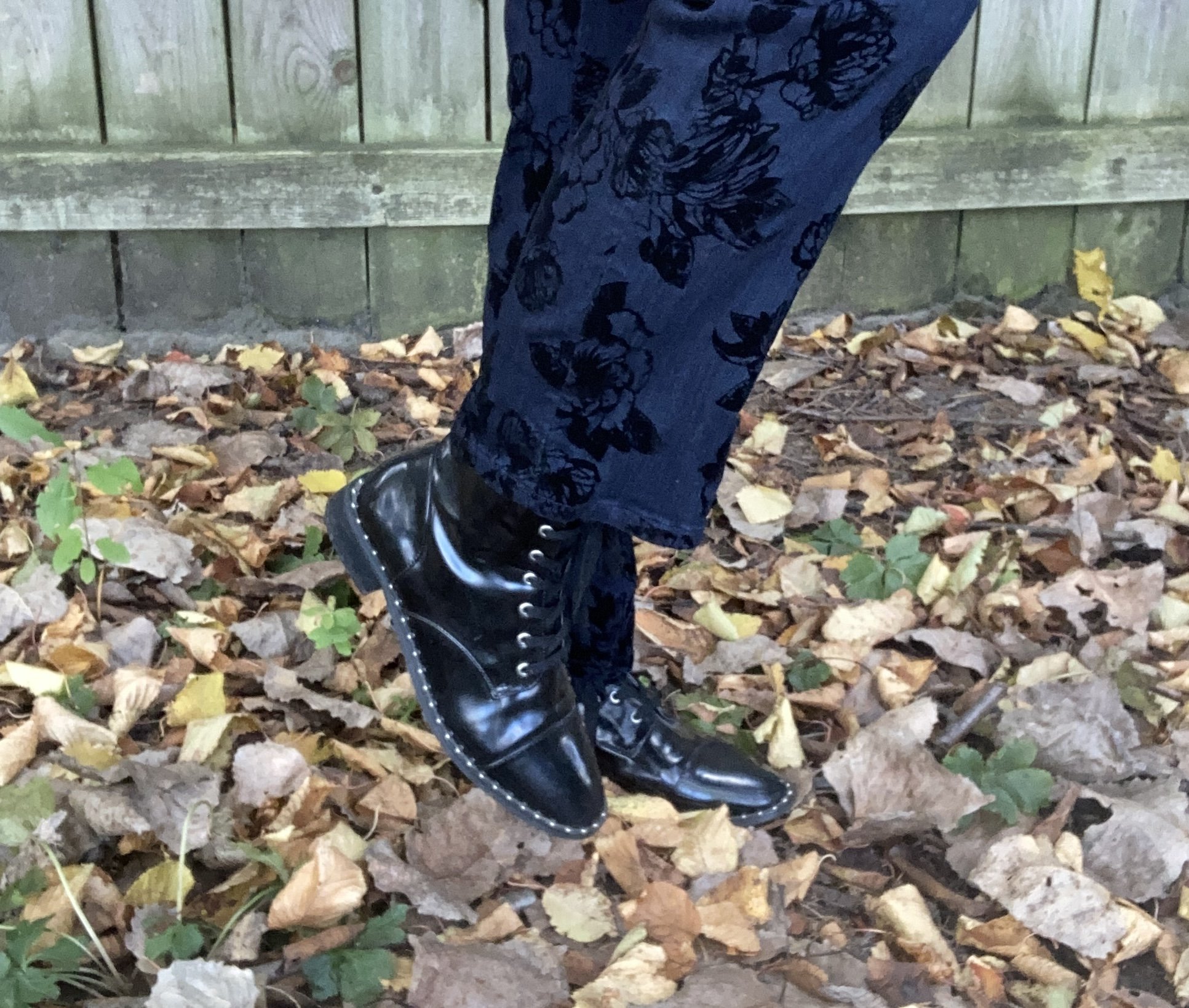
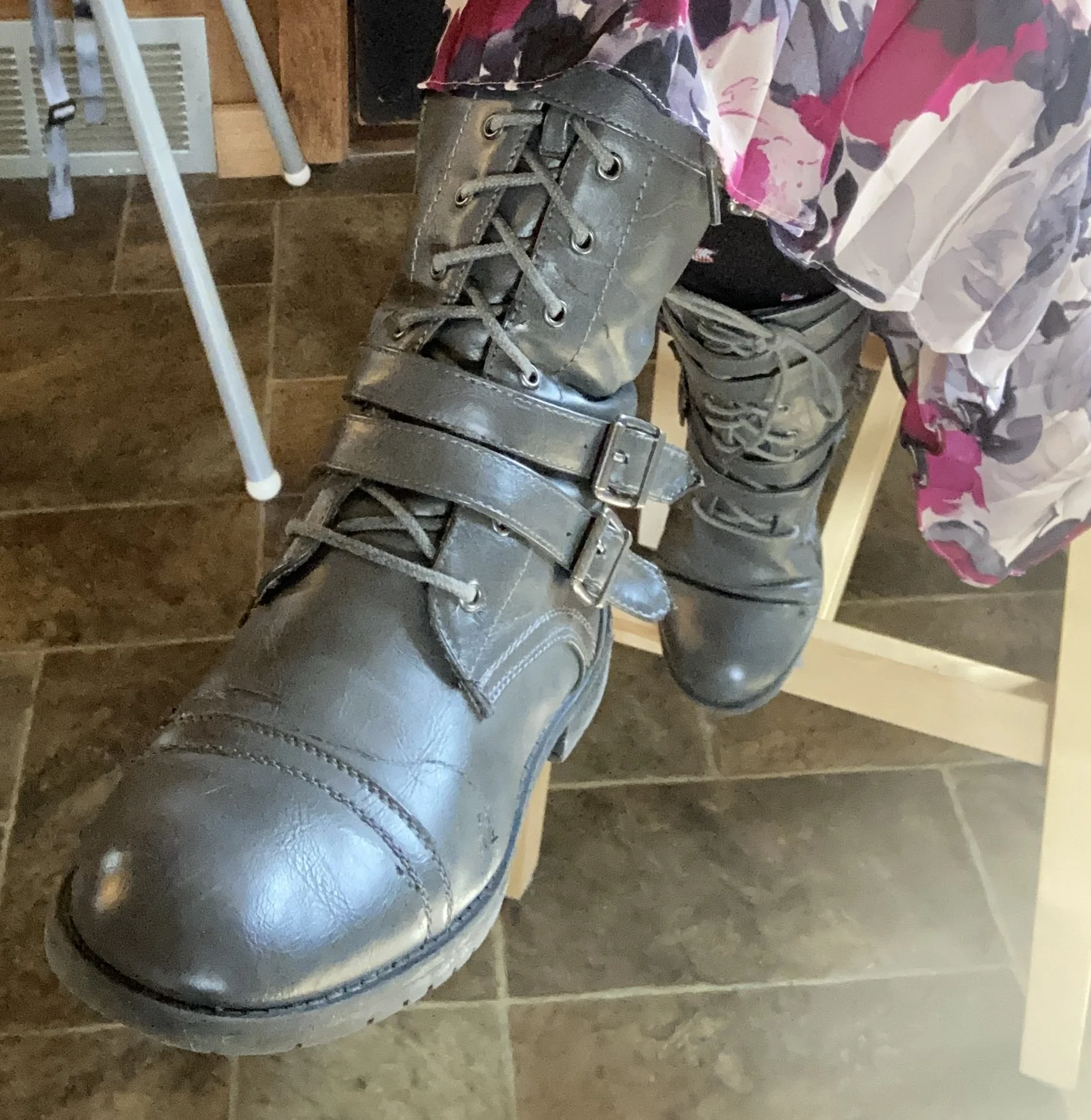
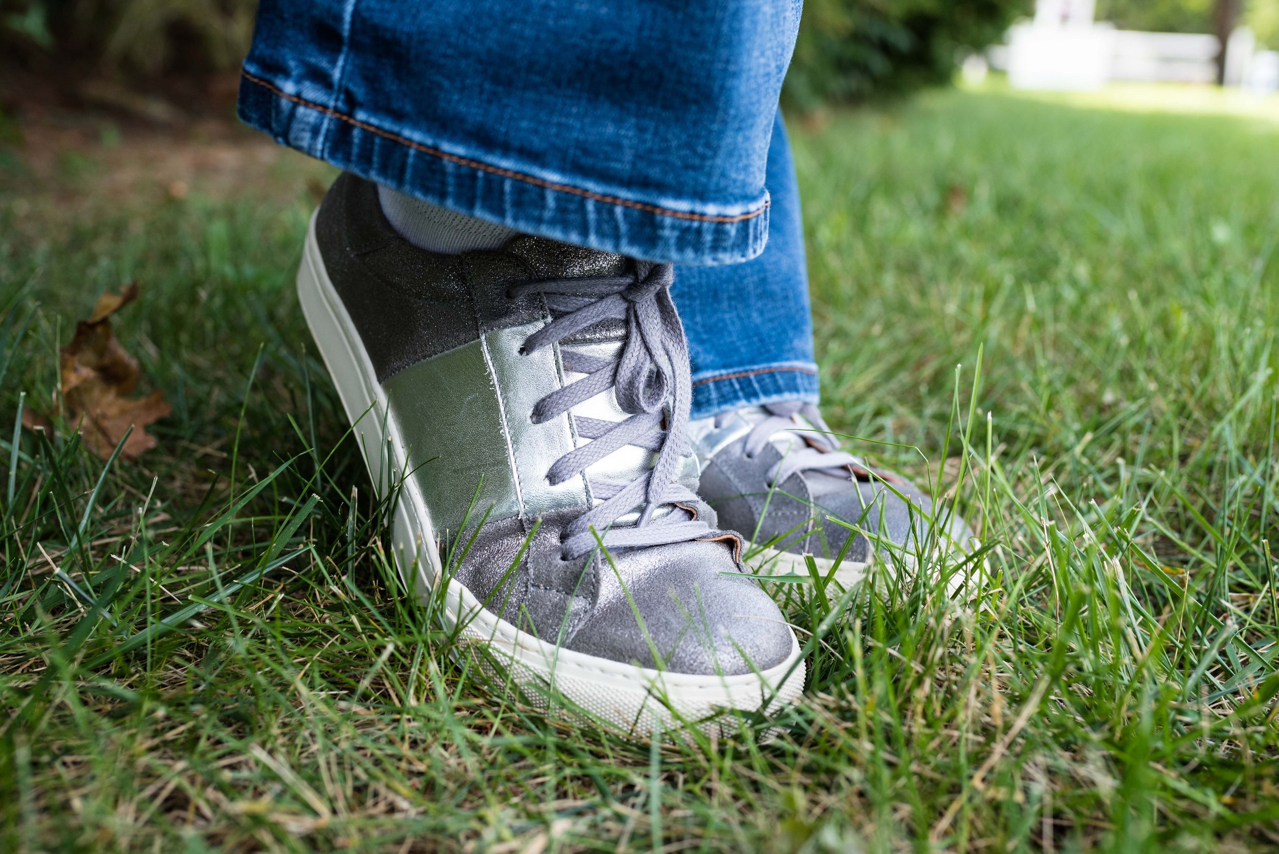
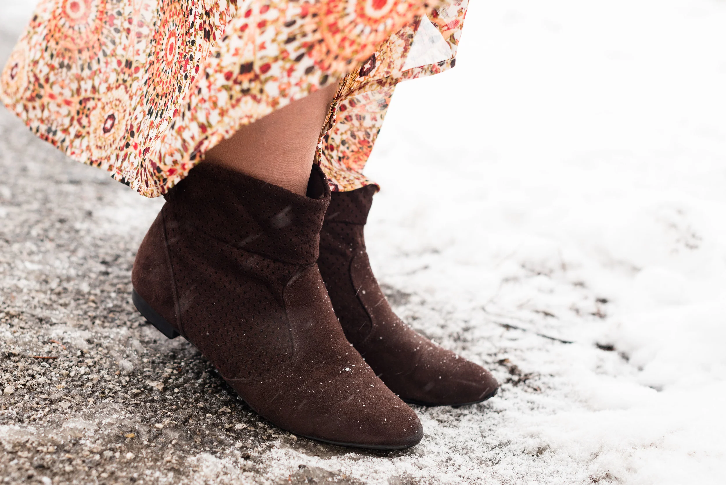
My thrifted patent leather ankle boots have made an appearance on the blog before and are Forever 21 brand. Apparently patent leather is making a come back this year, so if you have any of those in the shoe direction get them out of the dark corners of your closet and let them shine.

What do you think of Mocha Mousse? Do you like this color? Do you like the combination of brown with gray? How about brown with black? Please leave me your thoughts in the comments section below, or leave a comment on Facebook. I always love to hear your ideas.


I’m including a few shopping links for you to look over. These are affiliate links. All opinions are my own.
I hope you all are having a great week!