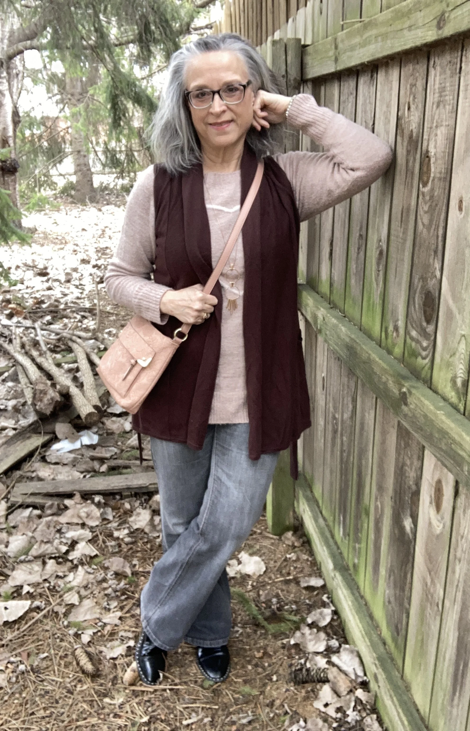
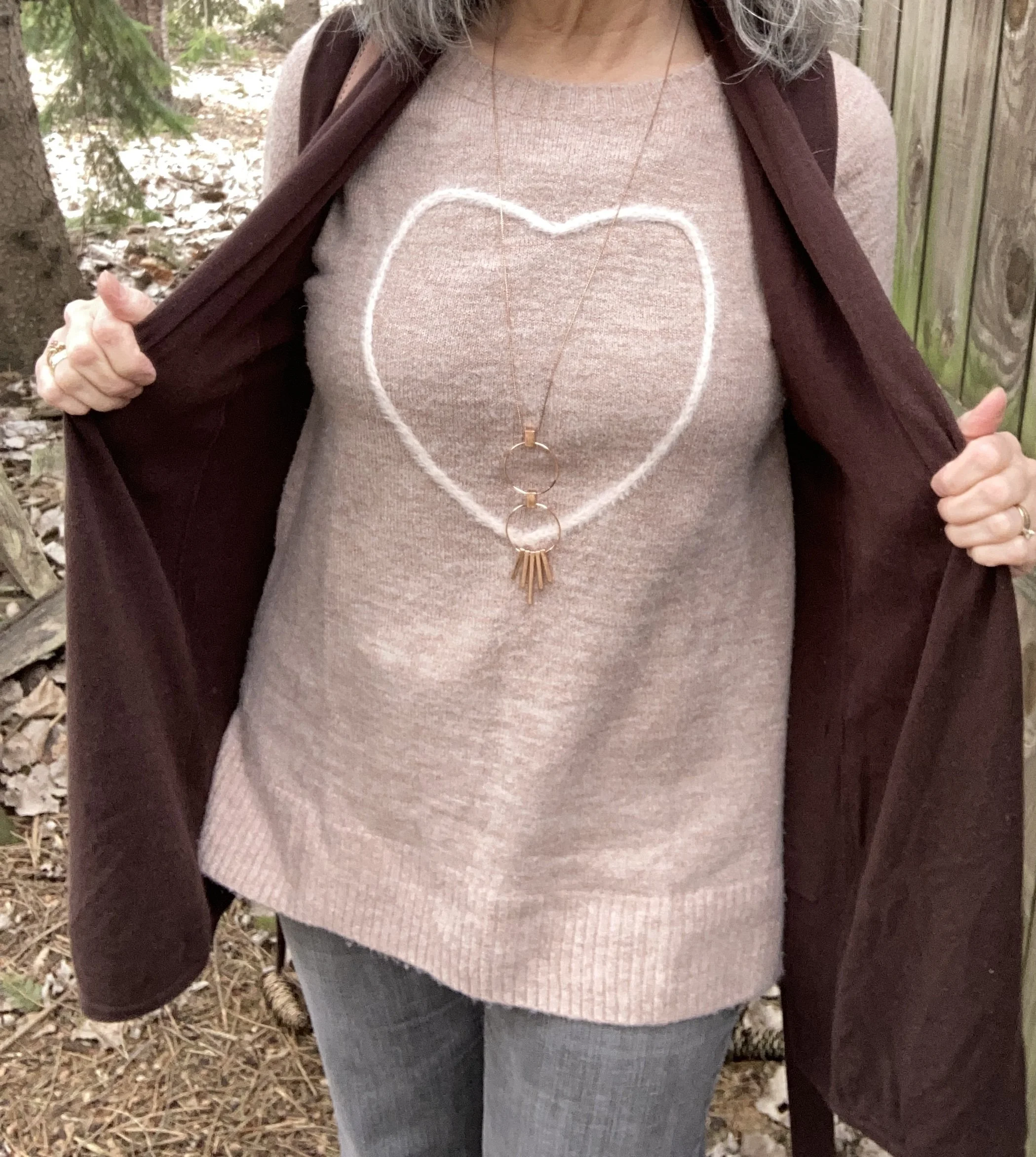
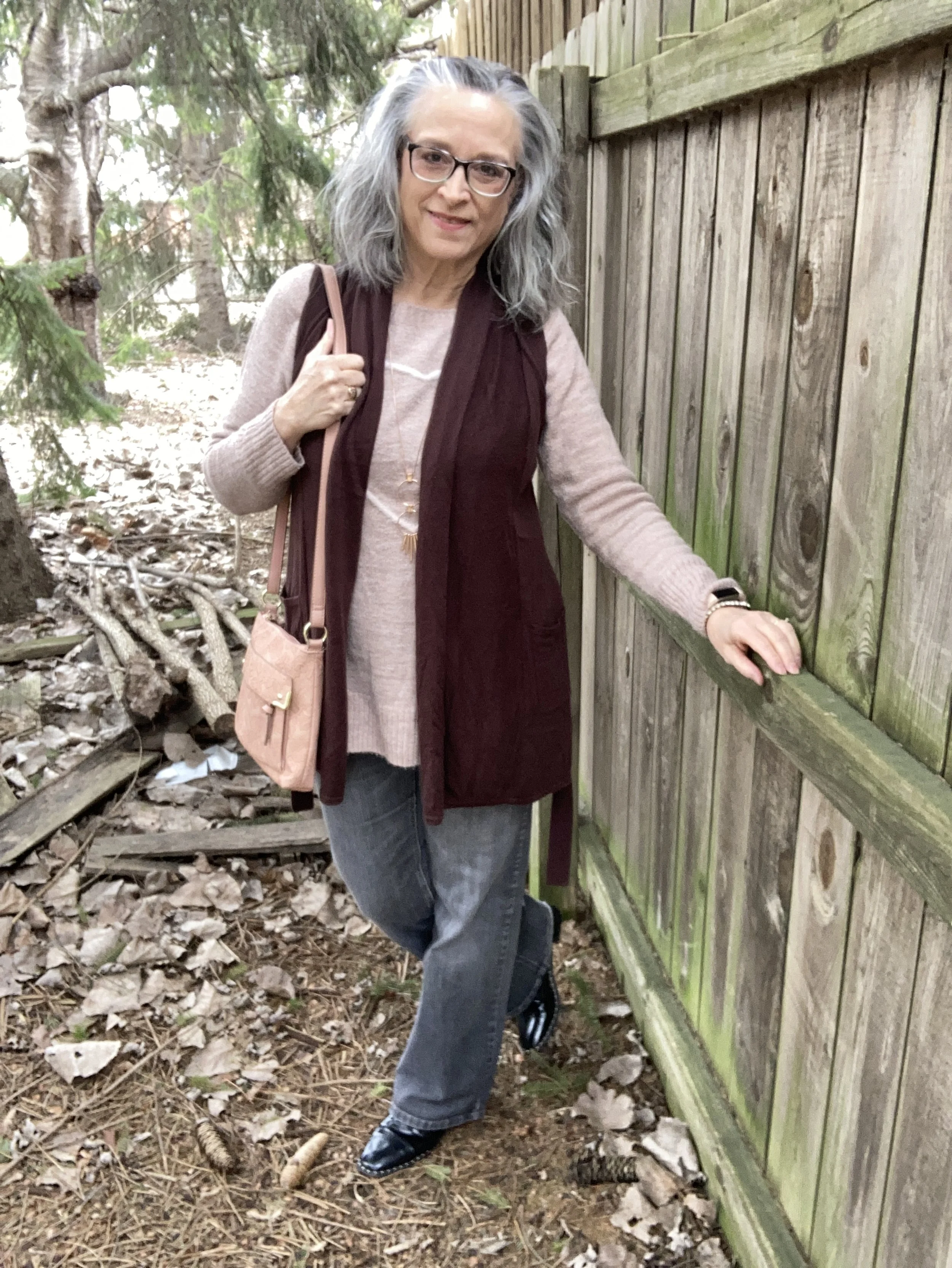
Pantone Autumn/Winter 2023 - New York Palette

The following are my renderings of the Pantone Color Institute’s Fall 2023 New York Palette. These are not going to be exact representations, but close to what the palette consists of. For actual color comparisons go to Pantone.

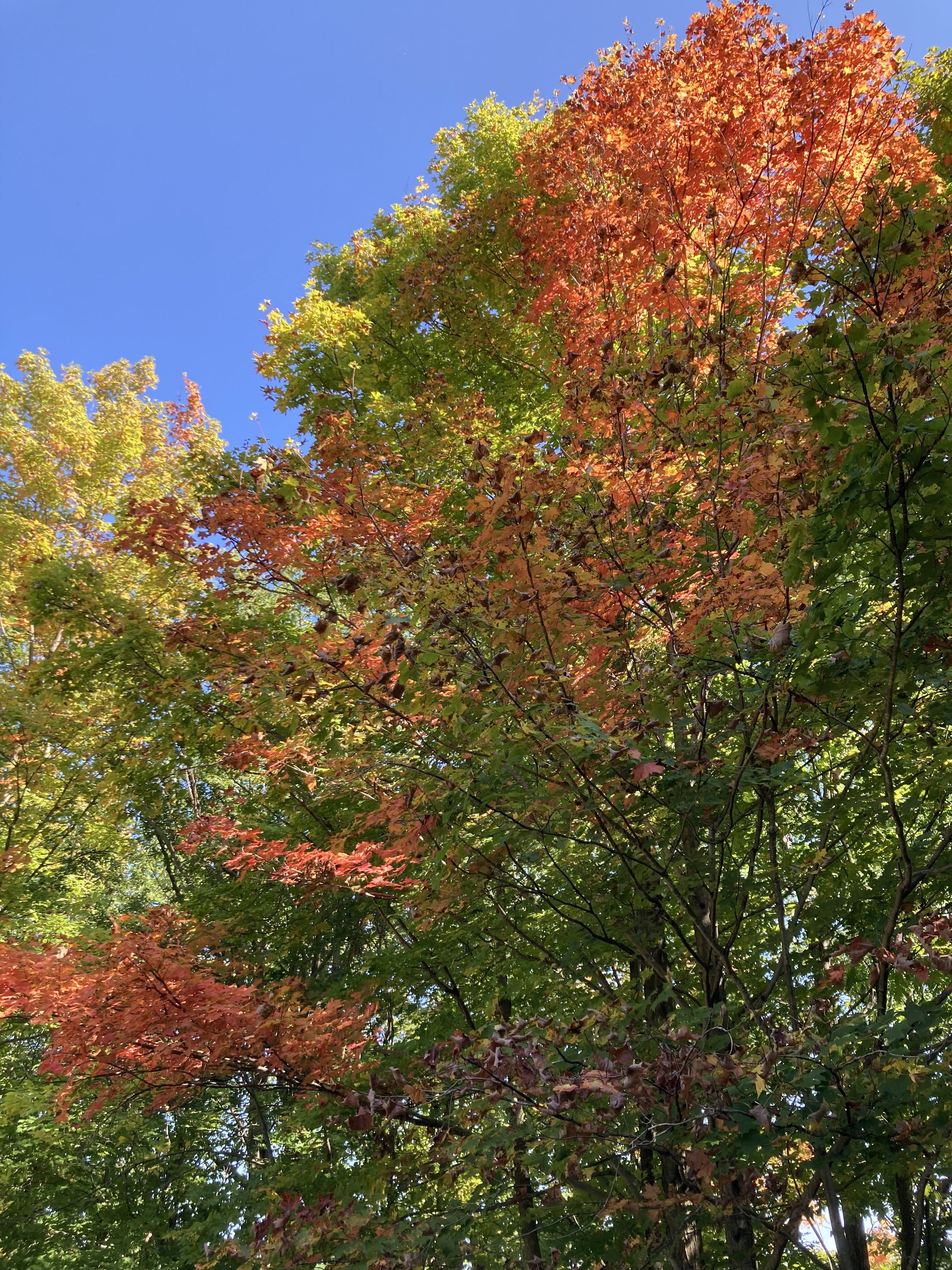
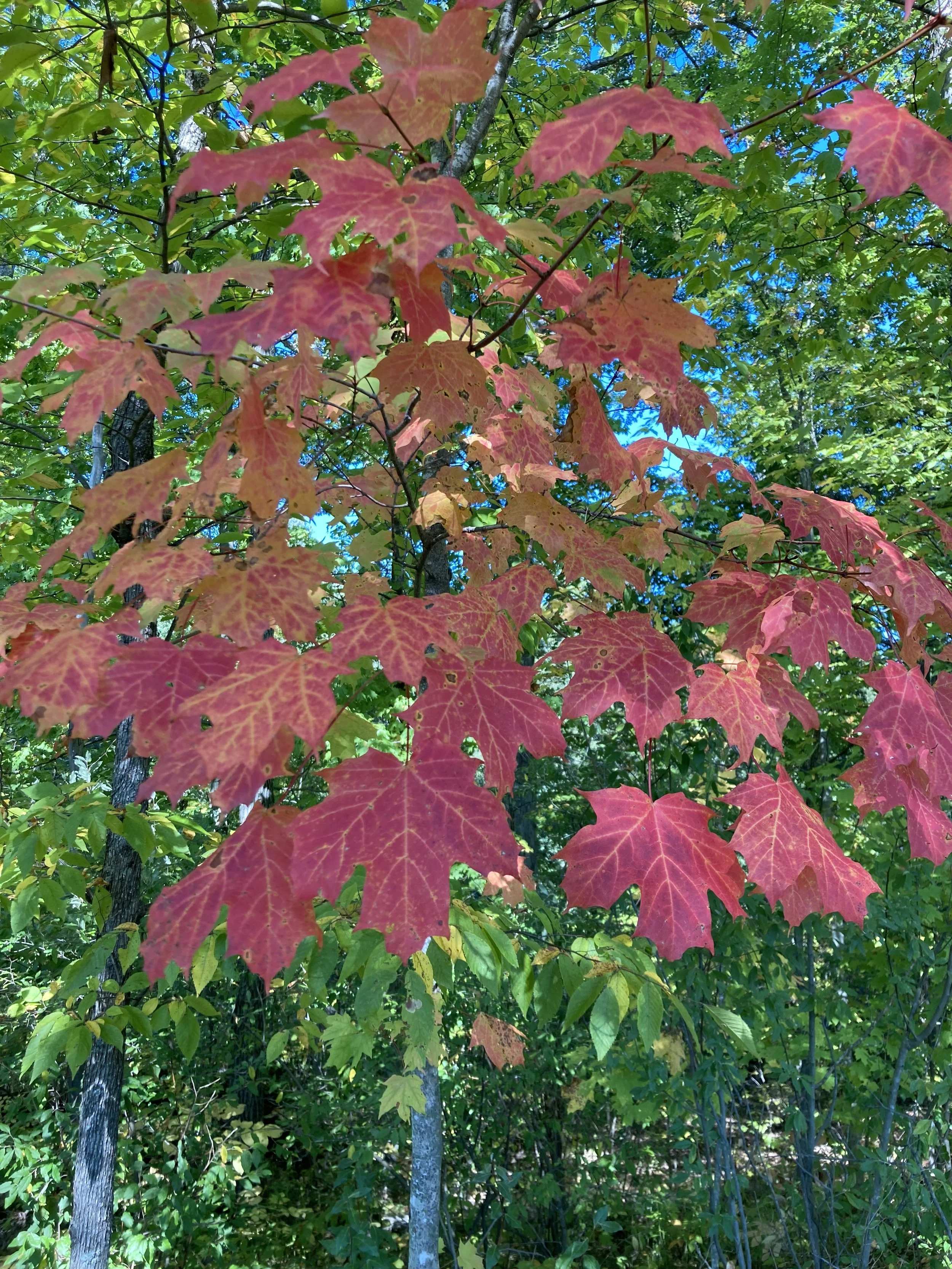
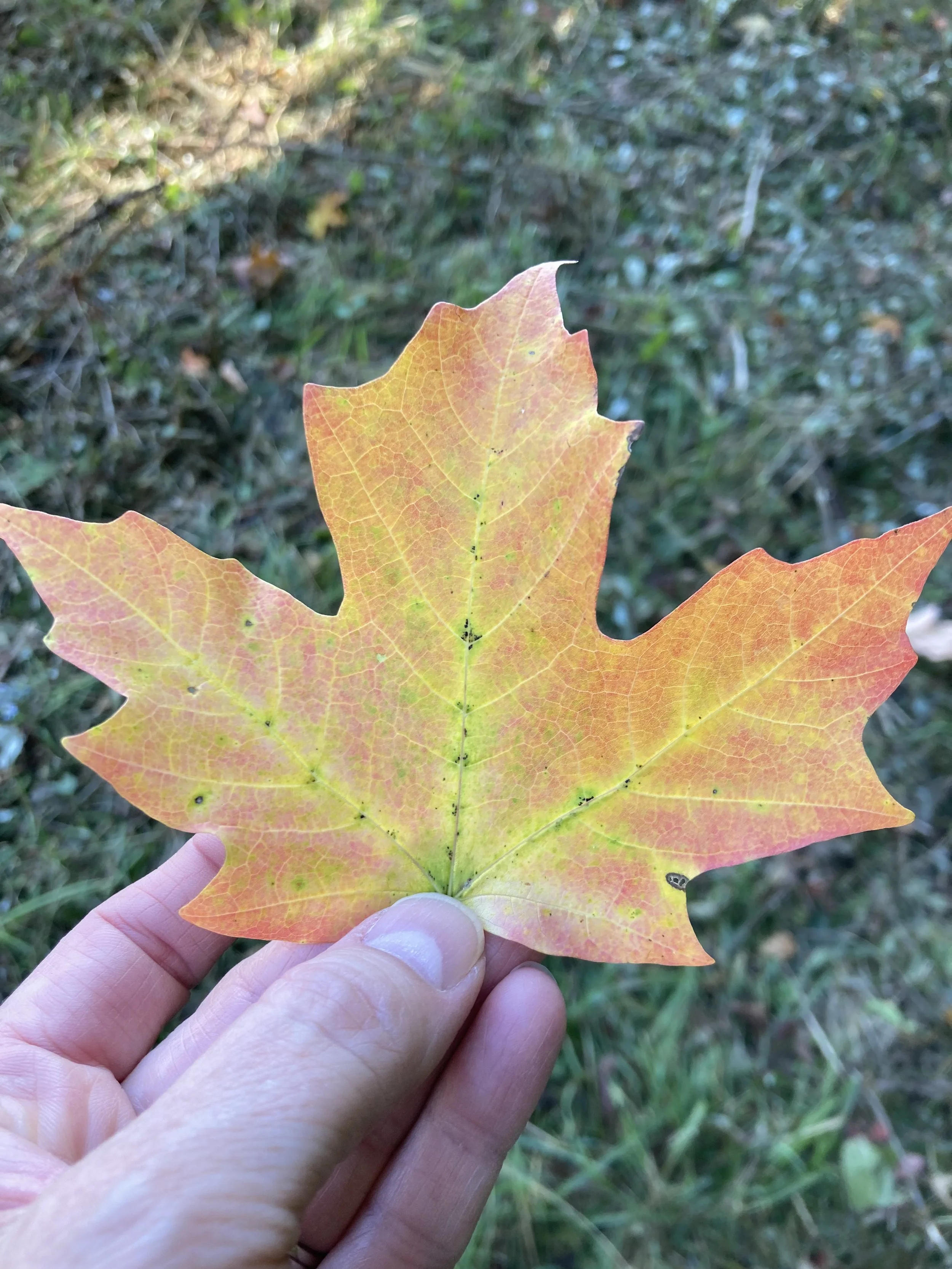
Happy fall everyone! The season is official and the leaves are beginning their seasonal change here in the midwest. My husband and I got out for a hike on Sunday afternoon and it was beautiful. It was actually a little warm for my preferences, but a lovely day to take a walk. The leaves around here are just showing touches, but many of those swatches are vibrant. I’m sorry Pantone, but no one creates a color palette like the God of Creation! These are few shots I took with my phone.

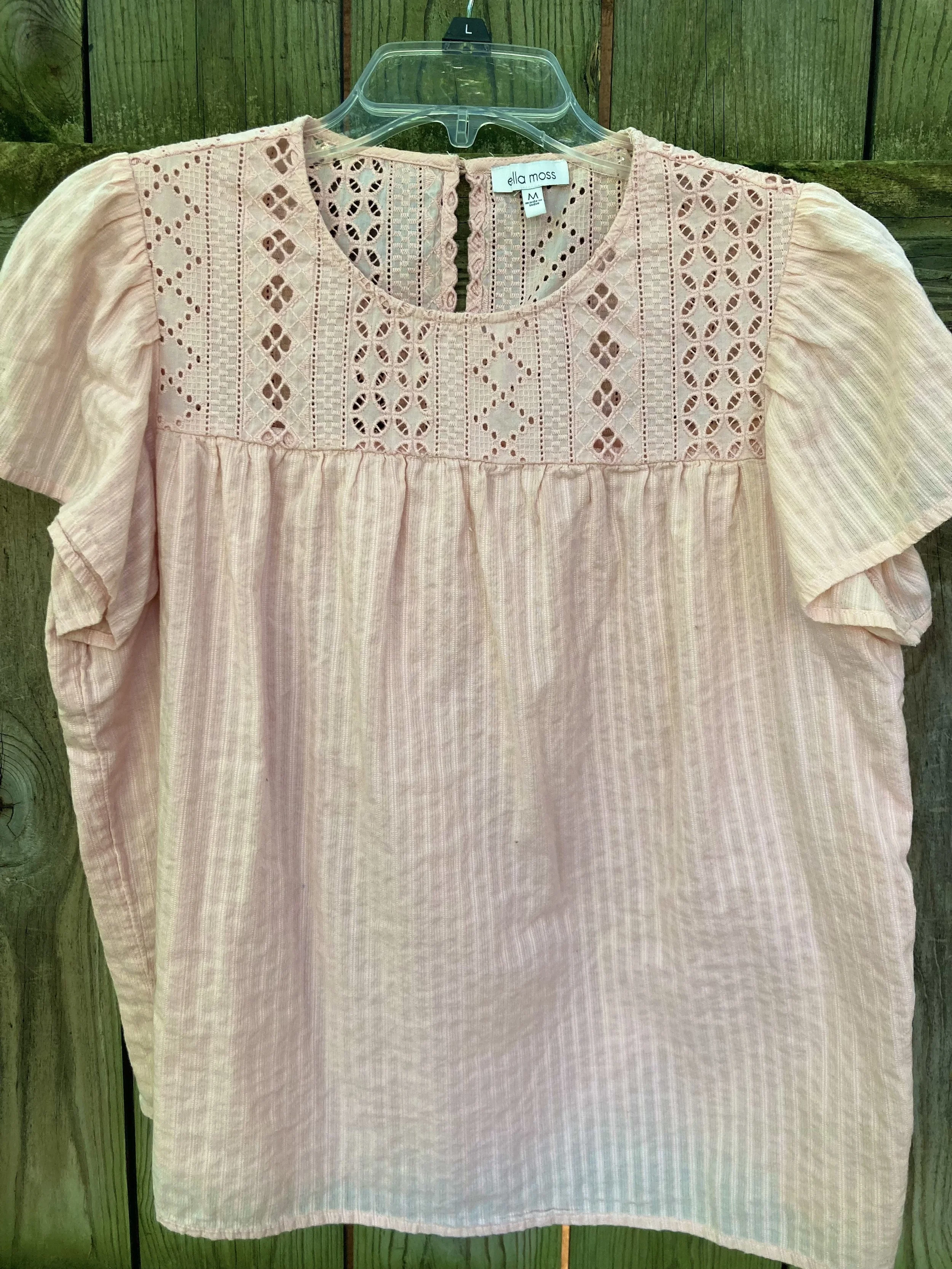
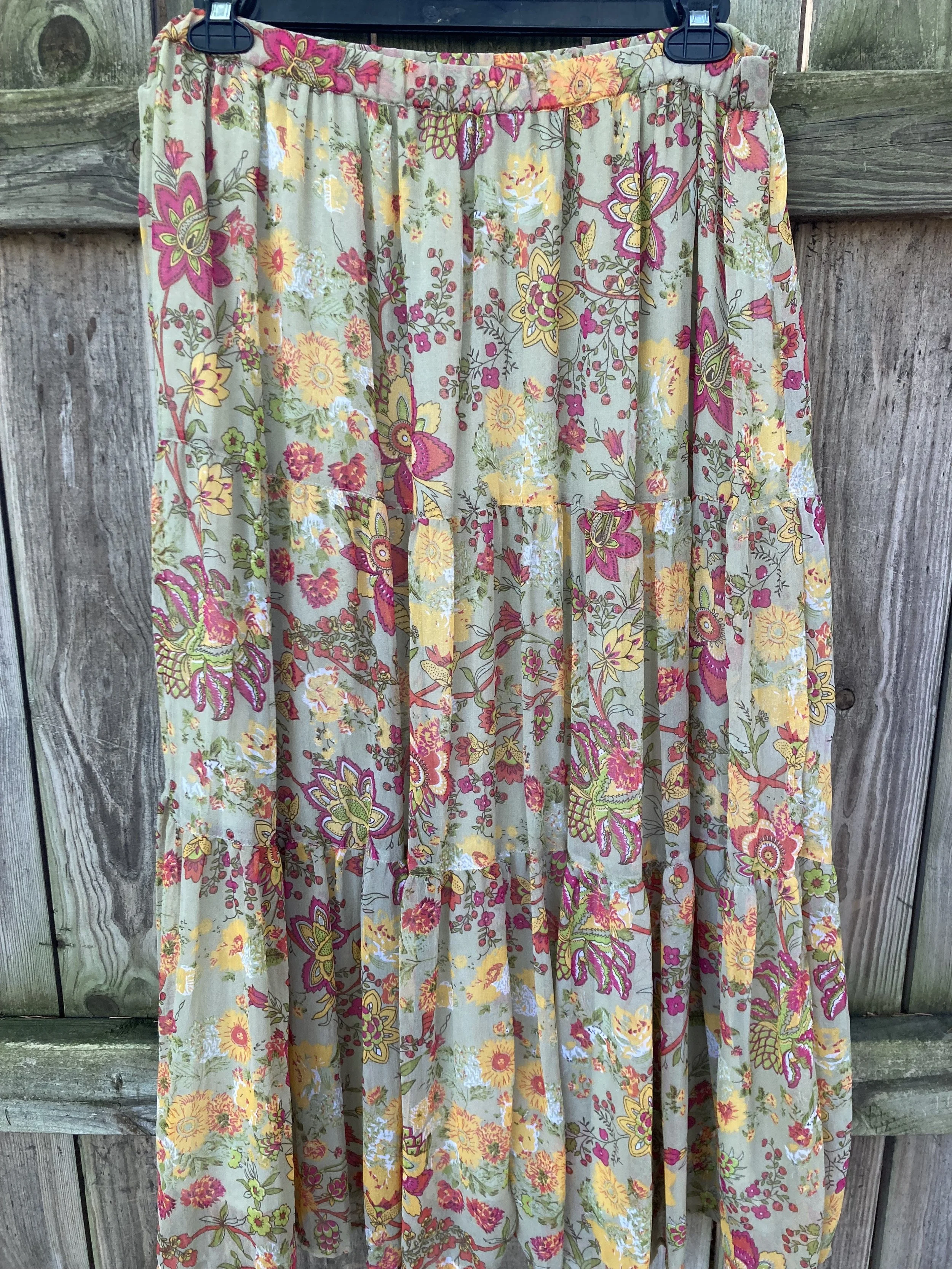
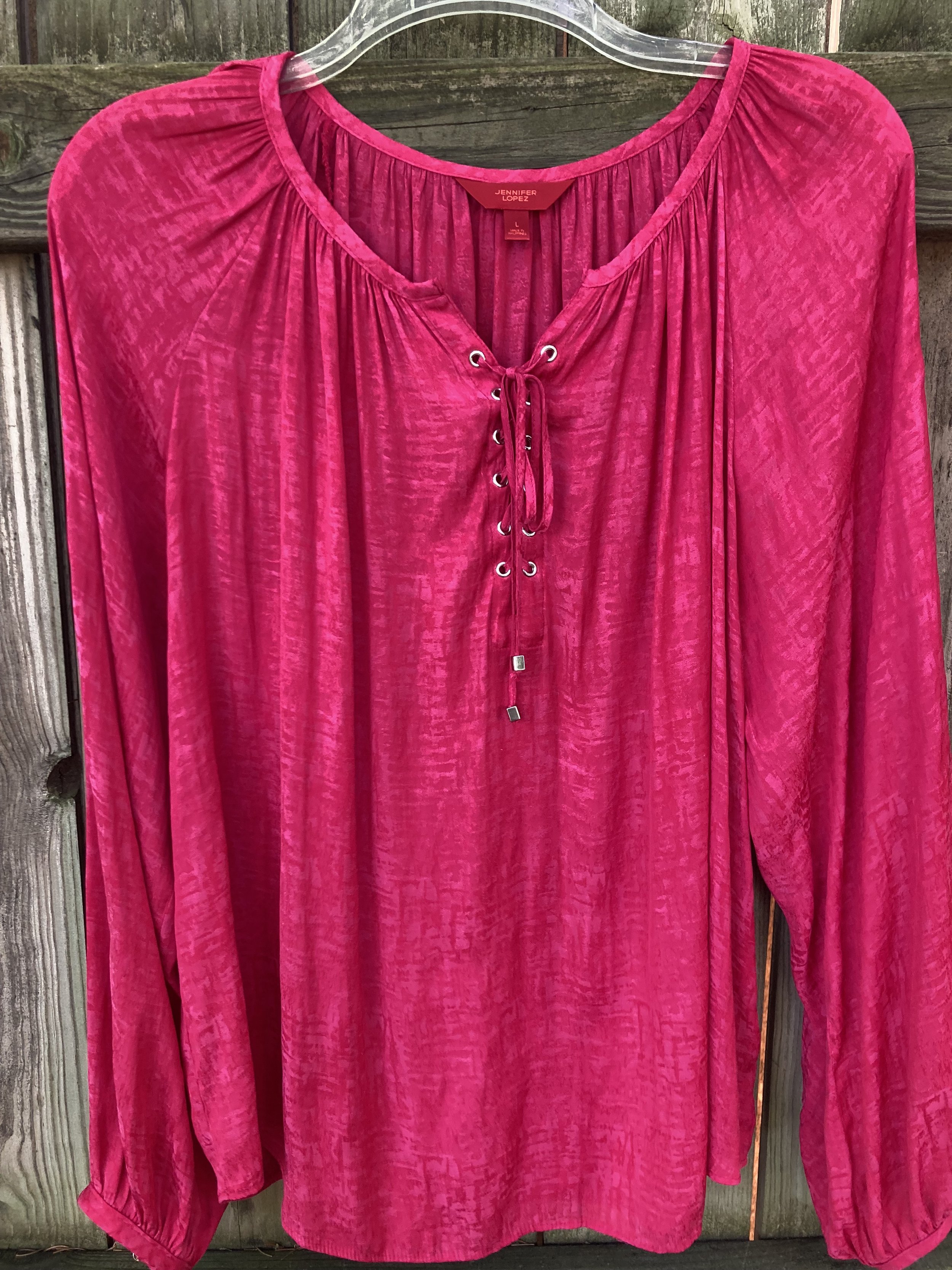
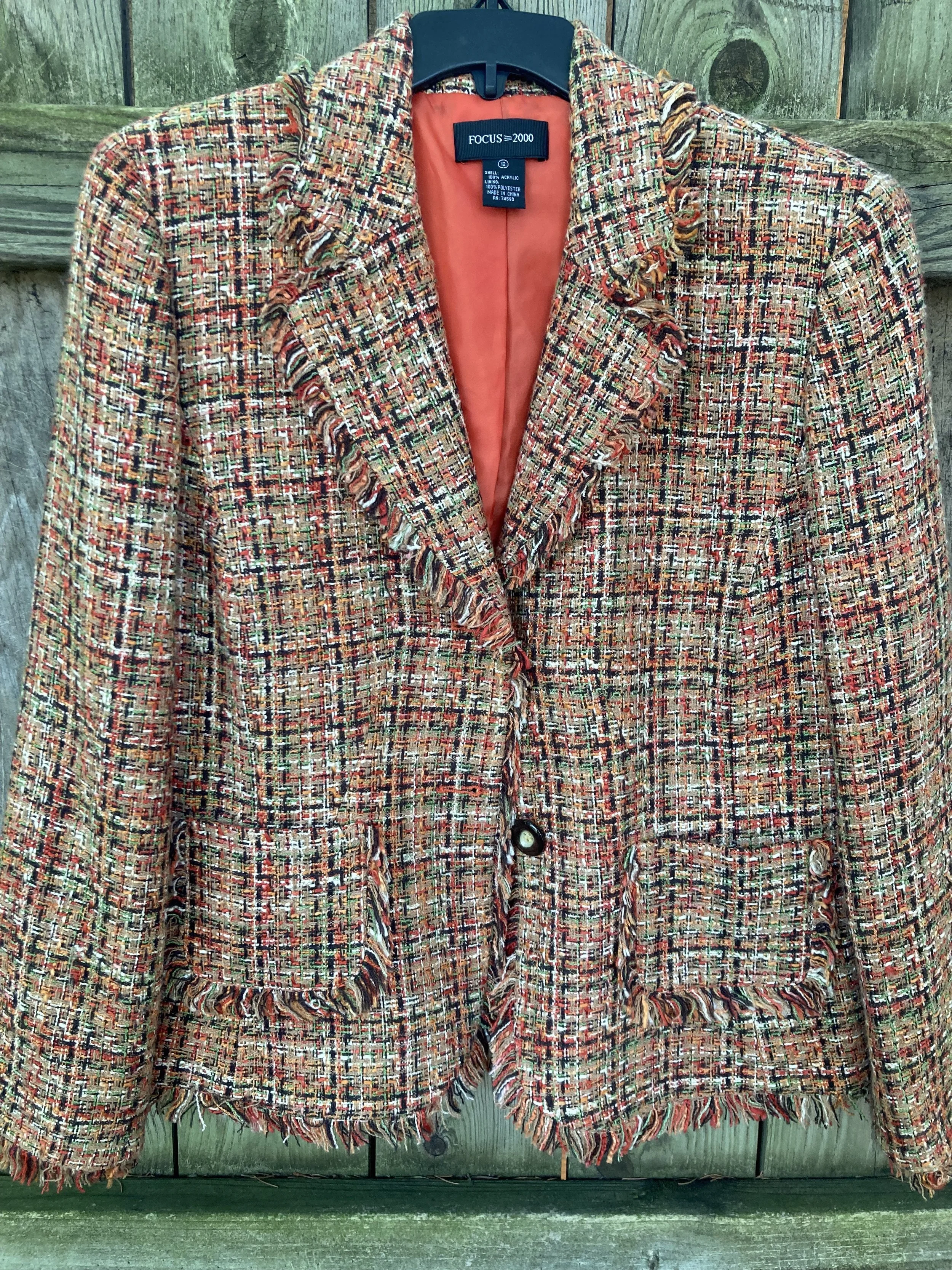
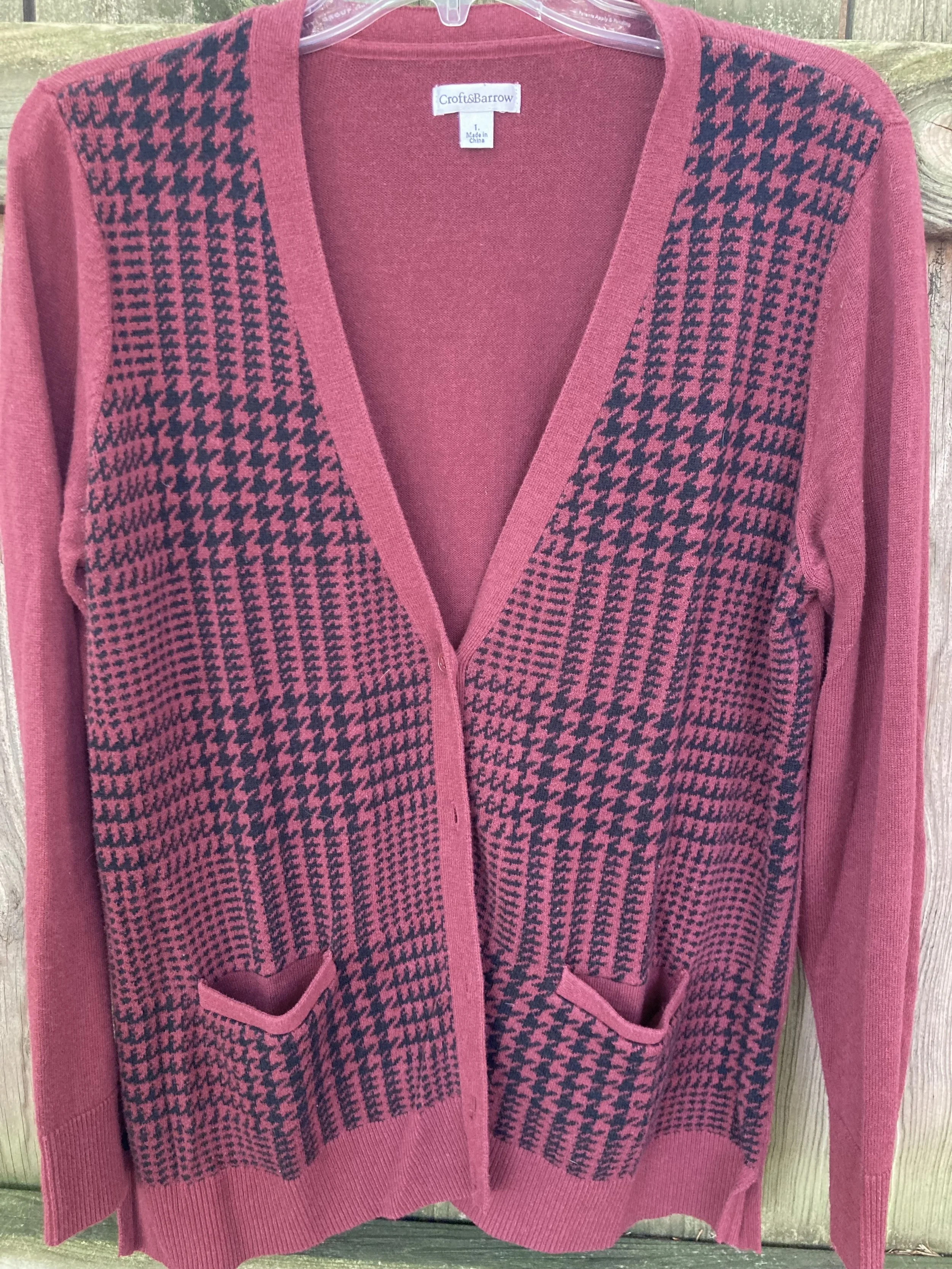
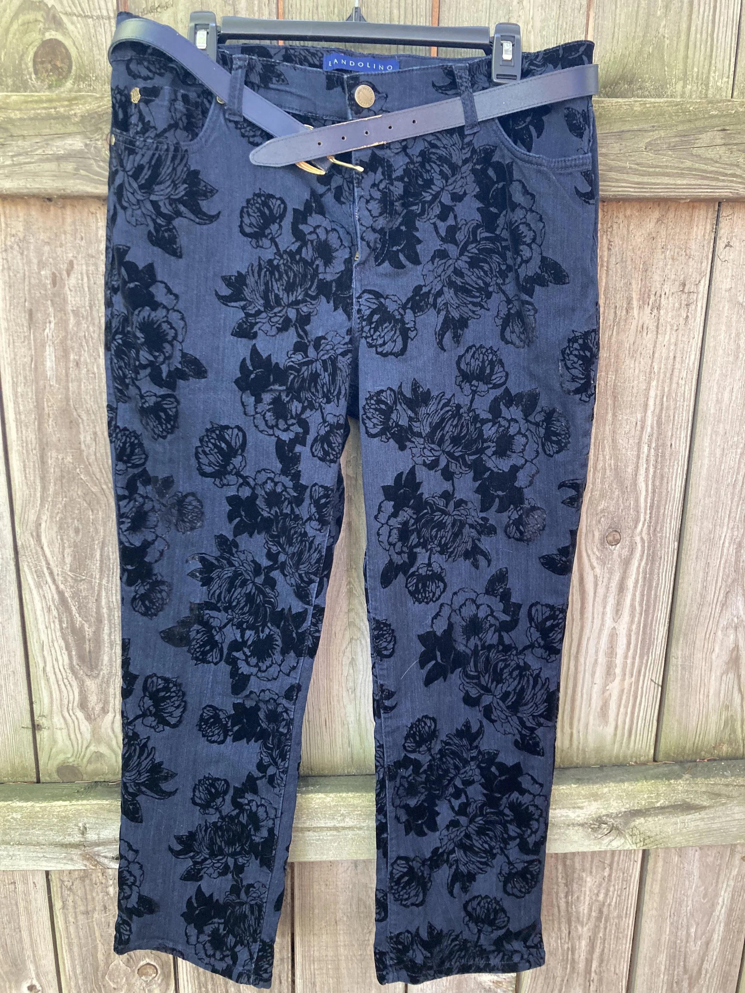
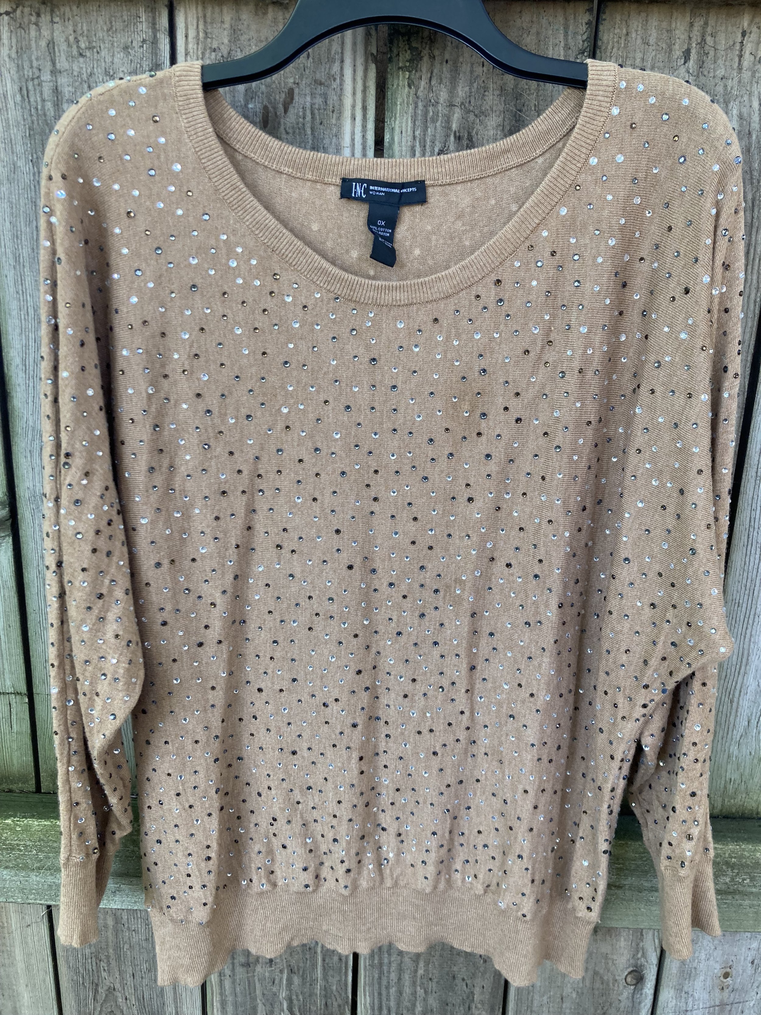
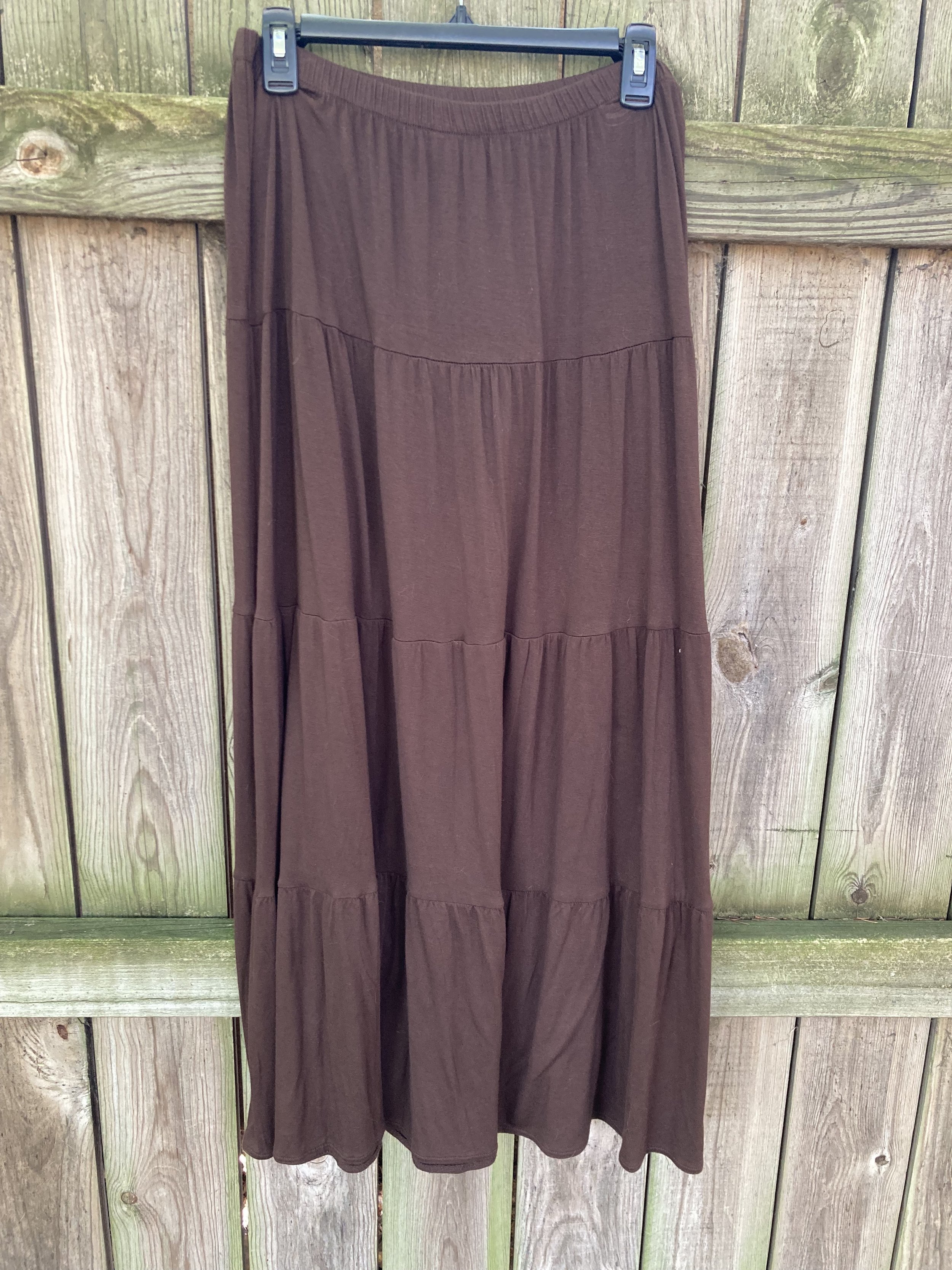
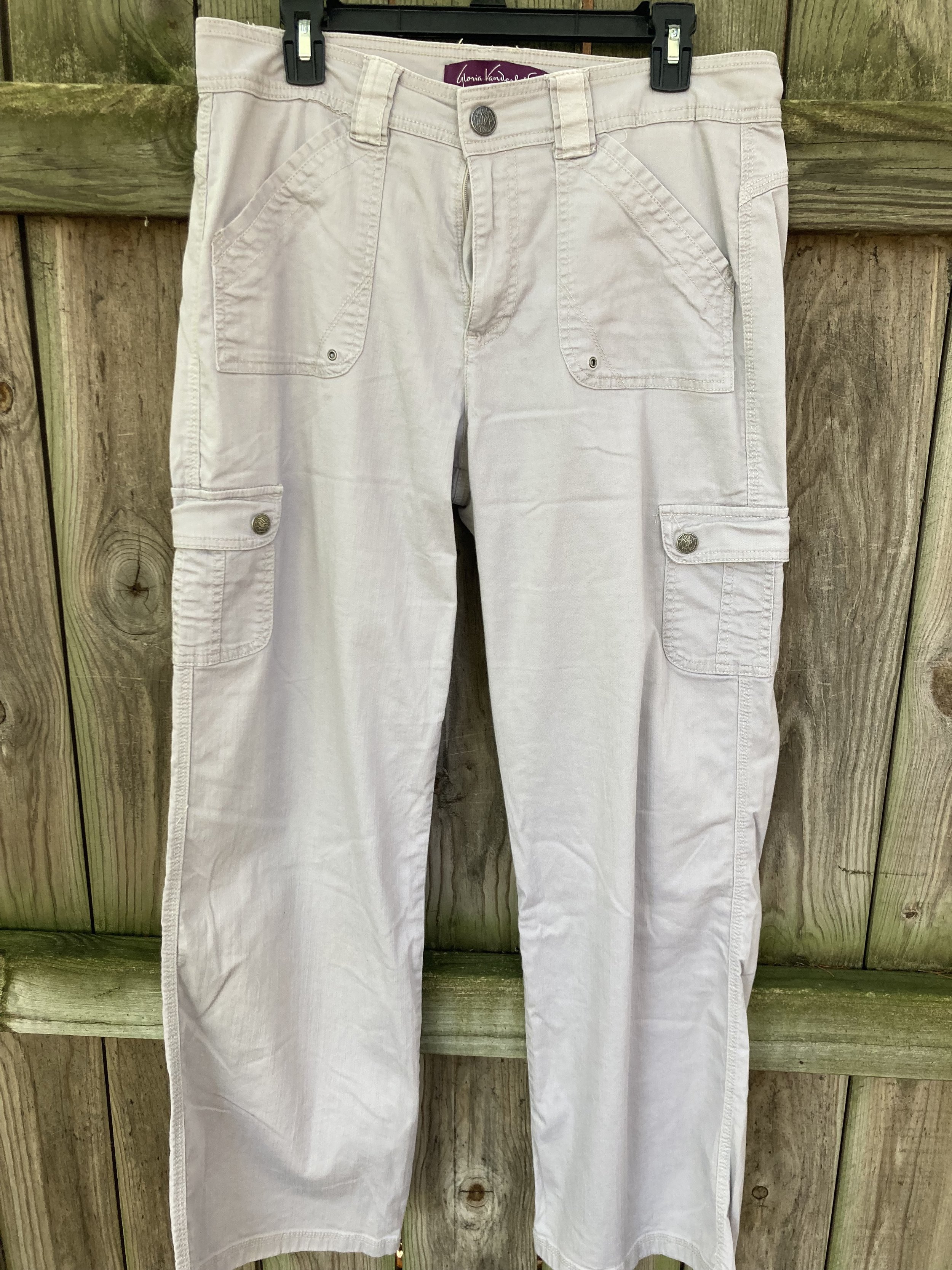
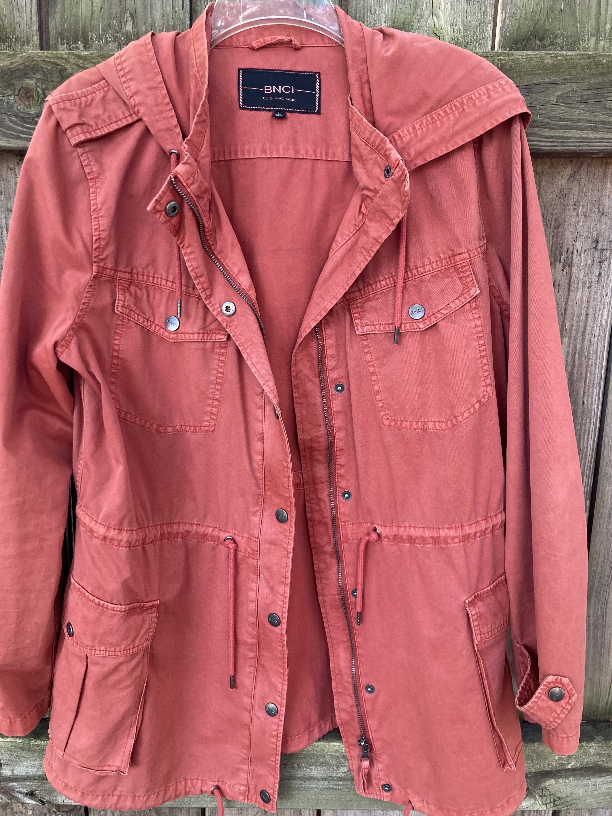
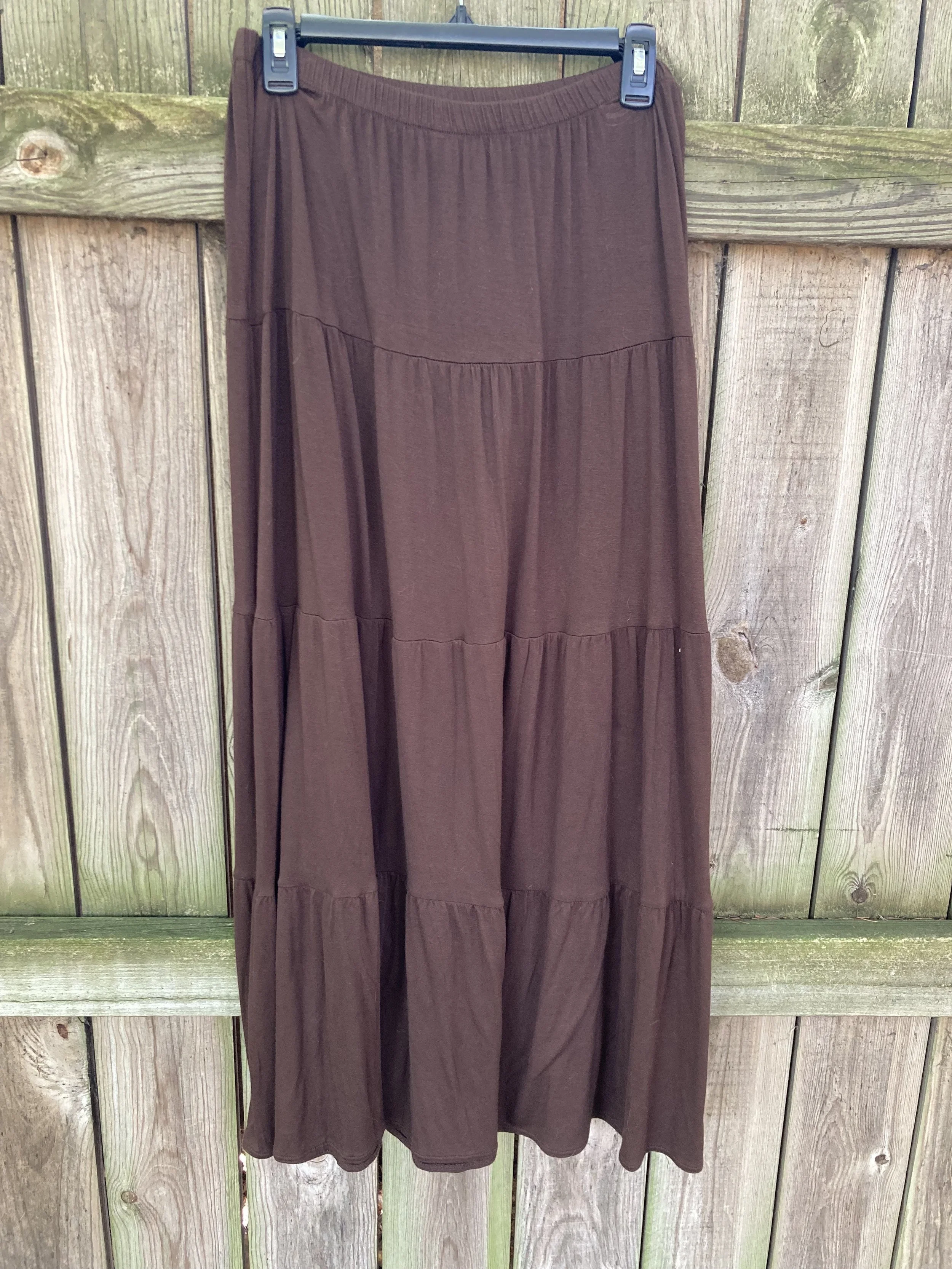
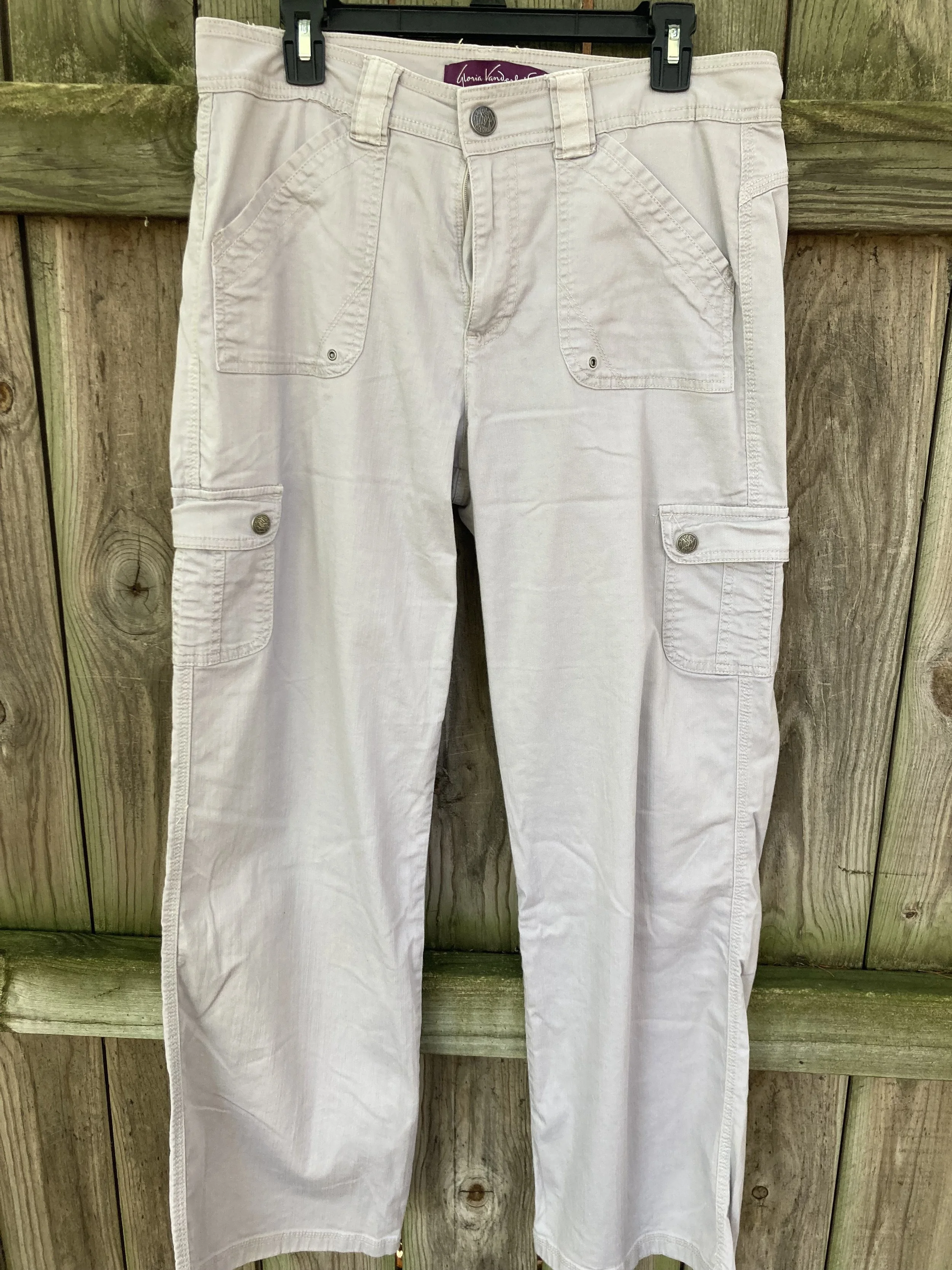
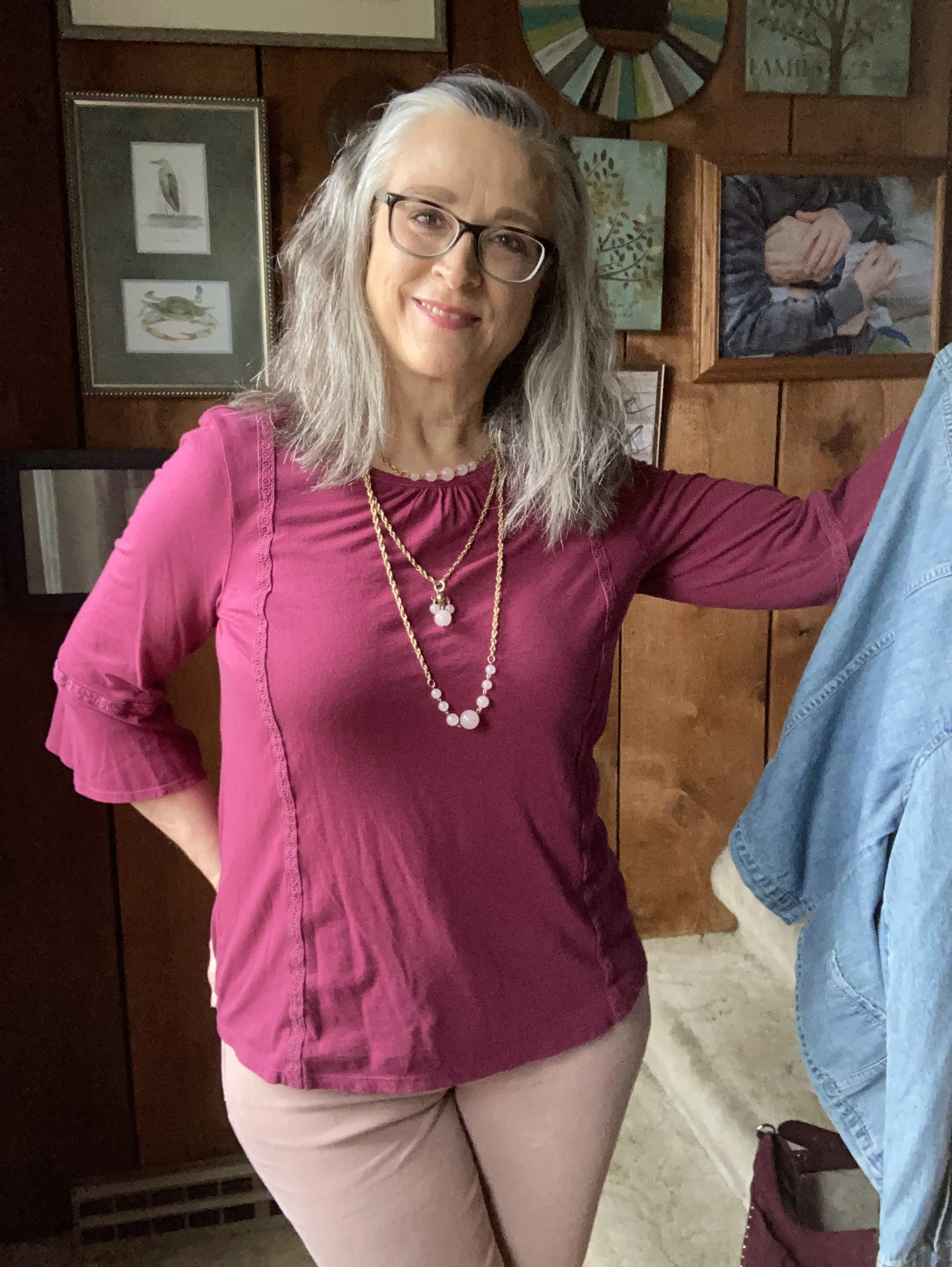
I am going to introduce the New York fall palette to you today. I decided to take pictures of the corresponding color pieces from my wardrobe to give you an idea of what the colors look like. Next week I will actually start showing you the outfits. In the mean time you can try to guess how I might put these pieces together, or you can come up with your own combinations, just for fun. Let me know in the comments which colors you would put together.

Tender Peach

As Pantone often does they include a few pastels. I am not as much a pastel girl, but I know many of you are, so it is fun to think about how I would include a pastel in a fall outfit.

Rose Violet

This hot pink fuchsia color is bright and sassy. Originally, I was going to use my fuchsia dress from Closet52, but it just wasn’t coming together, so I opted for this thrifted skirt with the Rose Violet flowers. I am not even sure what happened to Closet52. I can no longer find their website. So crazy, the way things come and go so fast.

Viva Magenta

This is the Pantone Color of the Year. You can see the post I did on that earlier this year. This is a lovely, bright color that really works in all seasons, and just about everyone can wear it, but it is hard to find.

Red Orange

This is a color we often equate with fall, especially when we think of changing leaves. The red orange can be easier to wear for some than a true orange. Either way it is a great fall color.

Red Dahlia

Fall wouldn’t be complete without some sort of maroon, burgundy or berry color. Red Dahlia is more towards the maroon side. This picture doesn’t really do it justice. The sweater is a dark maroon, but for some reason it kept looking lighter and more red. Silly phone photos!

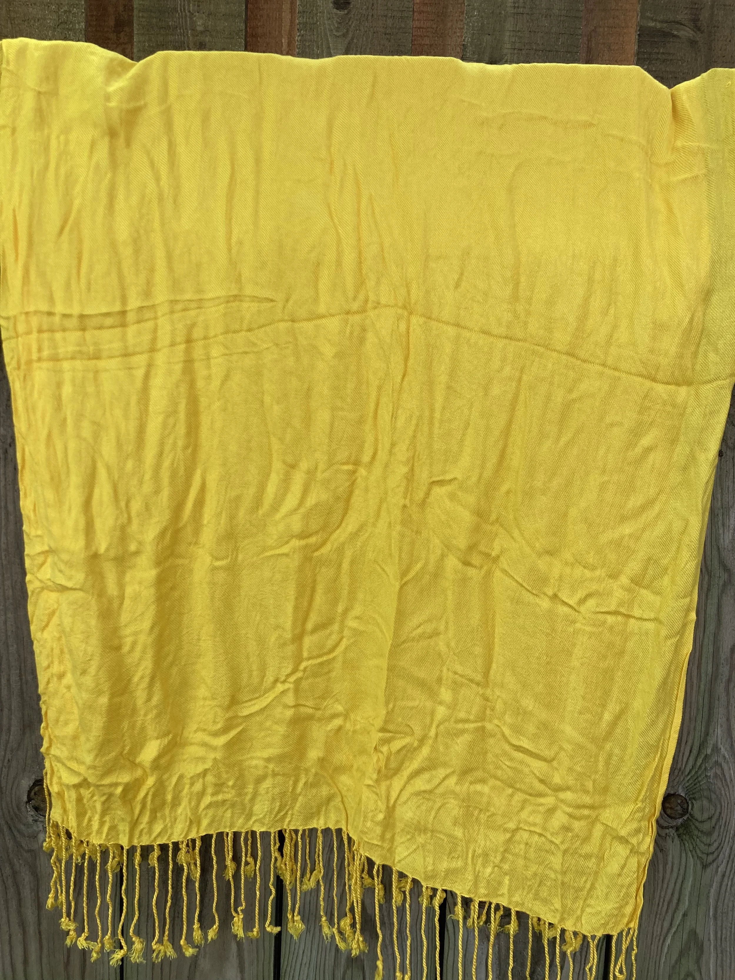
High Visibility

Pantone almost always has some sort of bright yellow on its fall palettes. This is another color reminiscent of the changing leaves and sunflowers that are in full bloom at the end of summer.

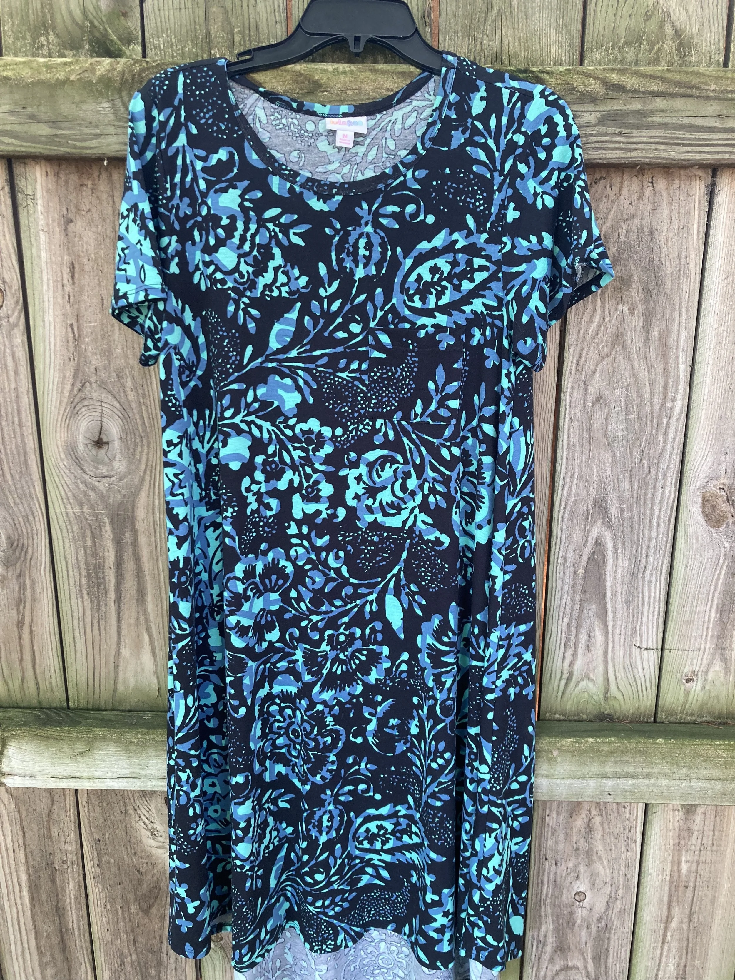
Persian Jewel and Carnival Glass

These two colors you know will go together for my future outfits. They both were hard colors to find in my closet. I actually had a few pieces that met the Carnival Glass qualifications, but the Persian Jewel is a particular blue akin to Periwinkle, which is a purply blue. I do not have much of that particular blue in my wardrobe.

Burnt Sienna

This earthy orange is another fall staple in my opinion. It goes so well with many other colors and exudes that autumn feel.

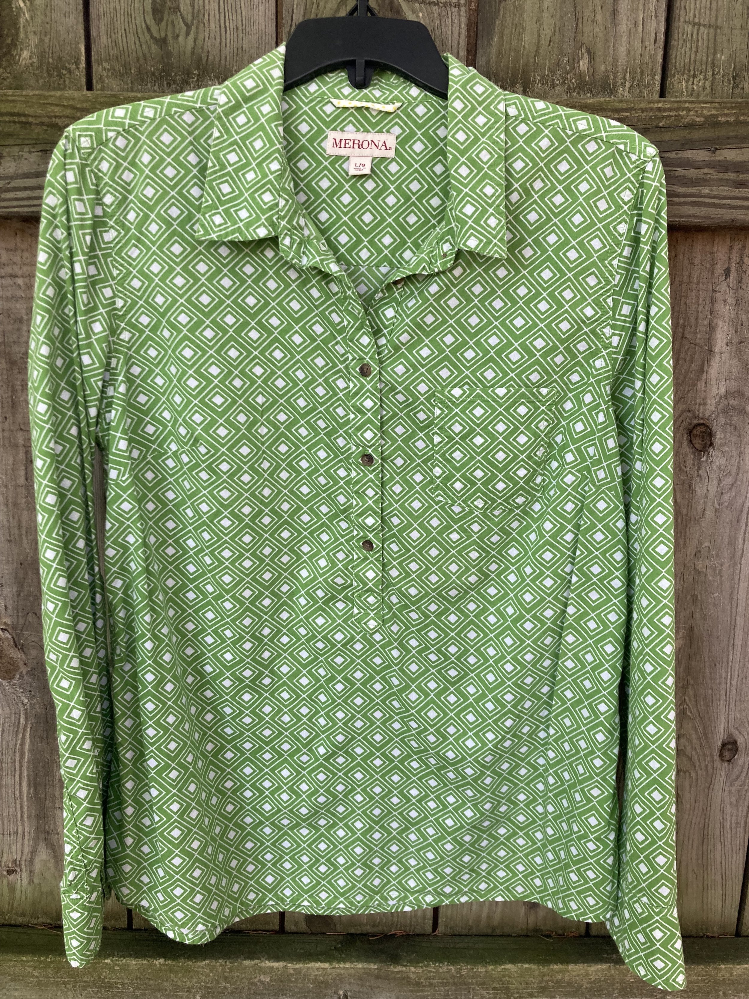
Kohlrabi

This bright green works well with the fall palette, once again mimicking the changing tones of the leaves as they grown pale in comparison to their spring attire.

Classic Colors

As always the Pantone color palettes include a few classic colors that work well as foundational or accessory colors.

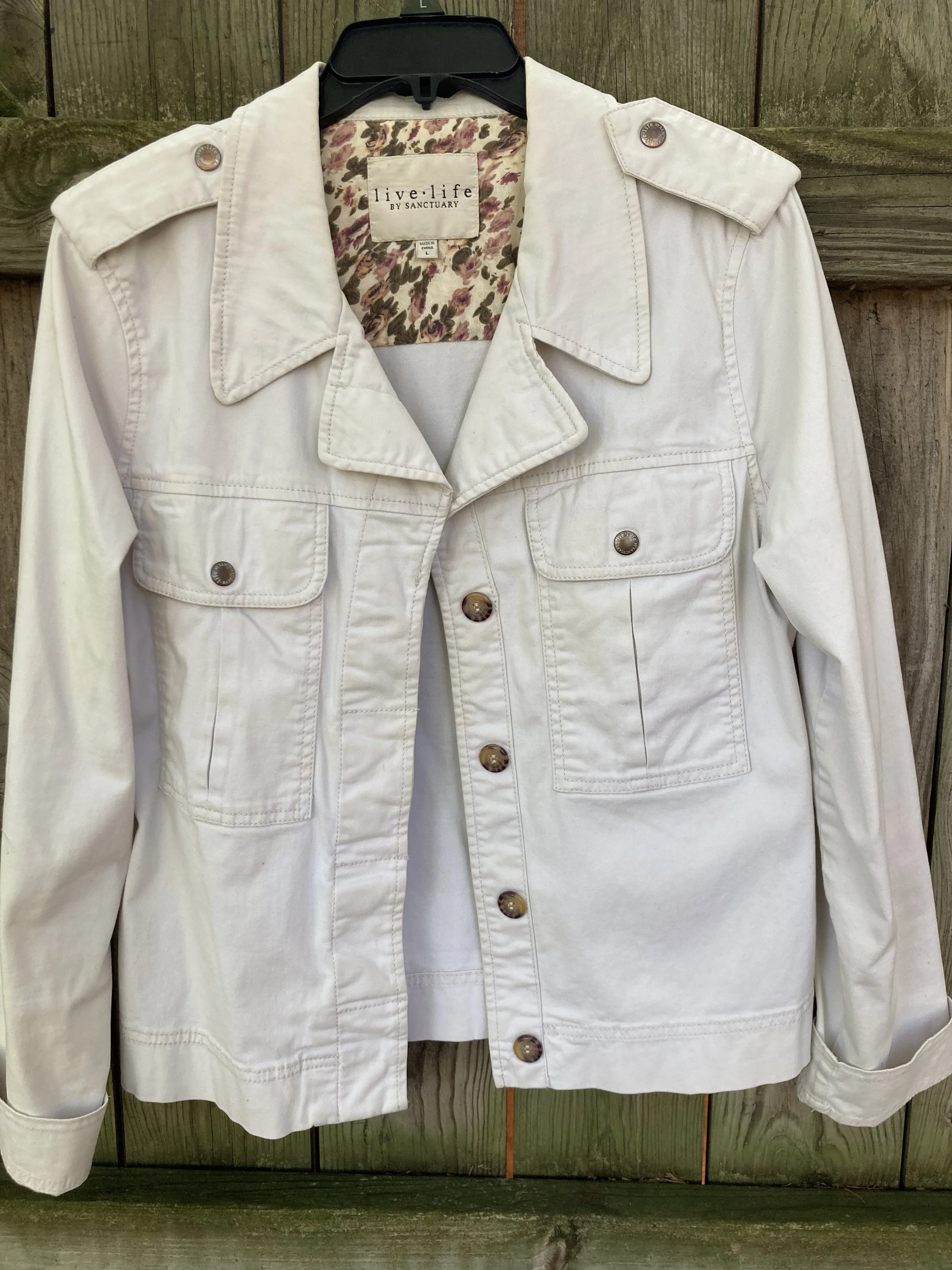
Coconut Milk

Not a pure, snow white, but not a true cream or ivory, this white does well for casual pieces like this jacket.

Eclipse

This dark, midnight blue is reminiscent of a fall, night sky as after the sun has completely set. A close cousin to navy, this blue is versatile enough to wear with any color.

Doe

This soft, light brown exudes warmth and can replace other common neutral colors like beige, tan, or camel.

Hot Fudge

A dark brown that can be the perfect color to ground an outfit, weather as a skirt or pair of pants or as a pair of boots or leather bag.

Silver Birch

This light gray is the perfect transition color for fall, when you are not ready for the dark grays like oxford or charcoal. This is another color that will combine with just about anything.

So there you have all the fall colors. The next few weeks I will show you which colors I combined to make five fall worthy looks.

What are your favorite colors? Which colors would you combine to make an outfit? Which of these colors do you have in your closet. I look forward to hearing your thoughts.

Have a great Tuesday!

Outfit Inspiration: Pantone's Color of the Year - Viva Magenta

I still want to bring you a look at the Pantone Color Institutes color selections for this year, so this month I am going to feature a few of the New York Palette Spring/Summer 2023 colors for each of my monthly columns. The Pantone website has become increasingly user unfriendly for just the average joe. If you want to buy their services and products they are great, but I can no longer get specific color info. If you look at their page for the Palettes, the colors are now featured as these tiny, almost imperceptible to the human eye, swatches. Ha, ha.

Before I start, let me reiterate, these are my interpretations of the Pantone colors. They are not exact matches, but correspond as closely as I am able to make them with my limited information from the website and my limited wardrobe.

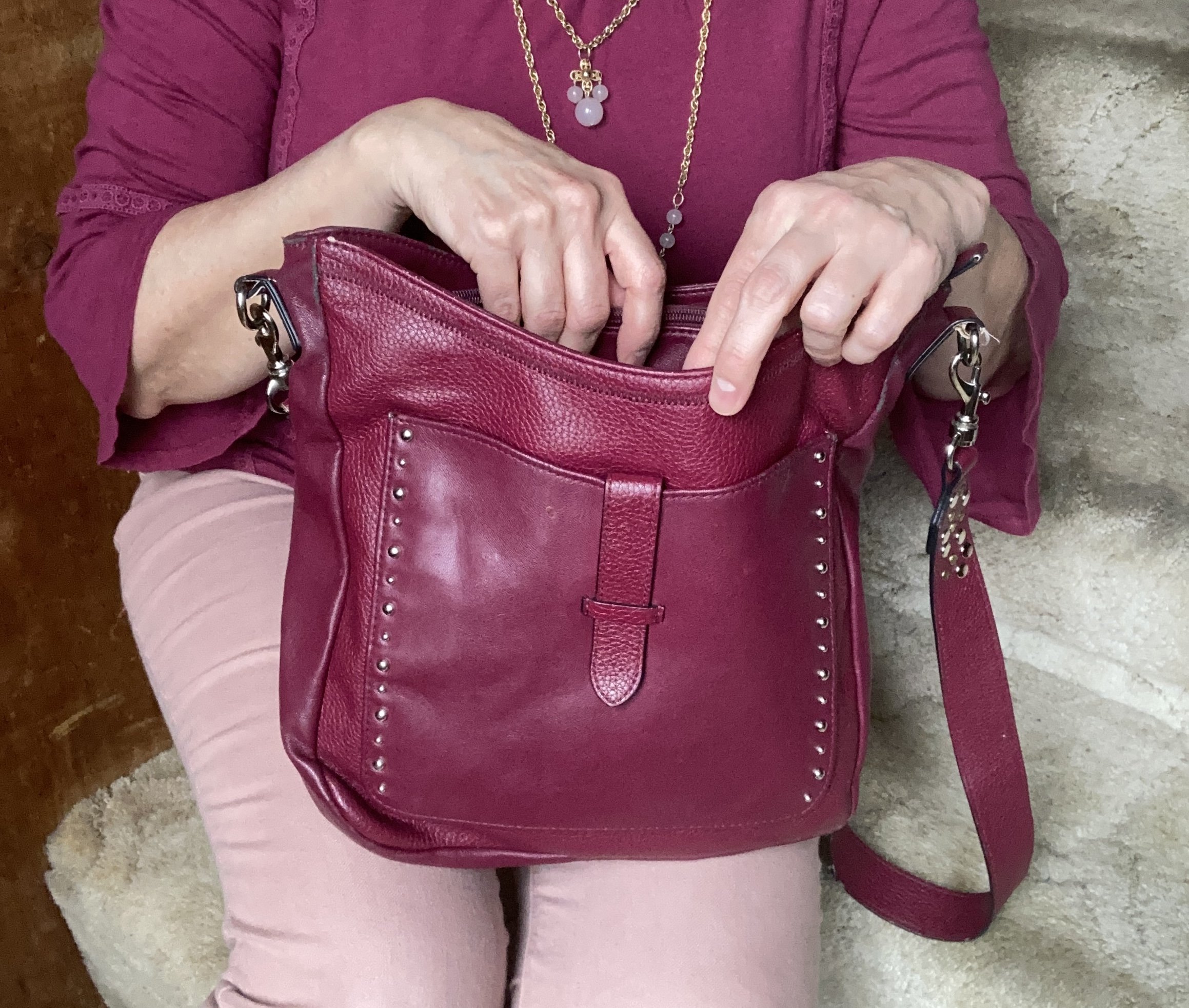
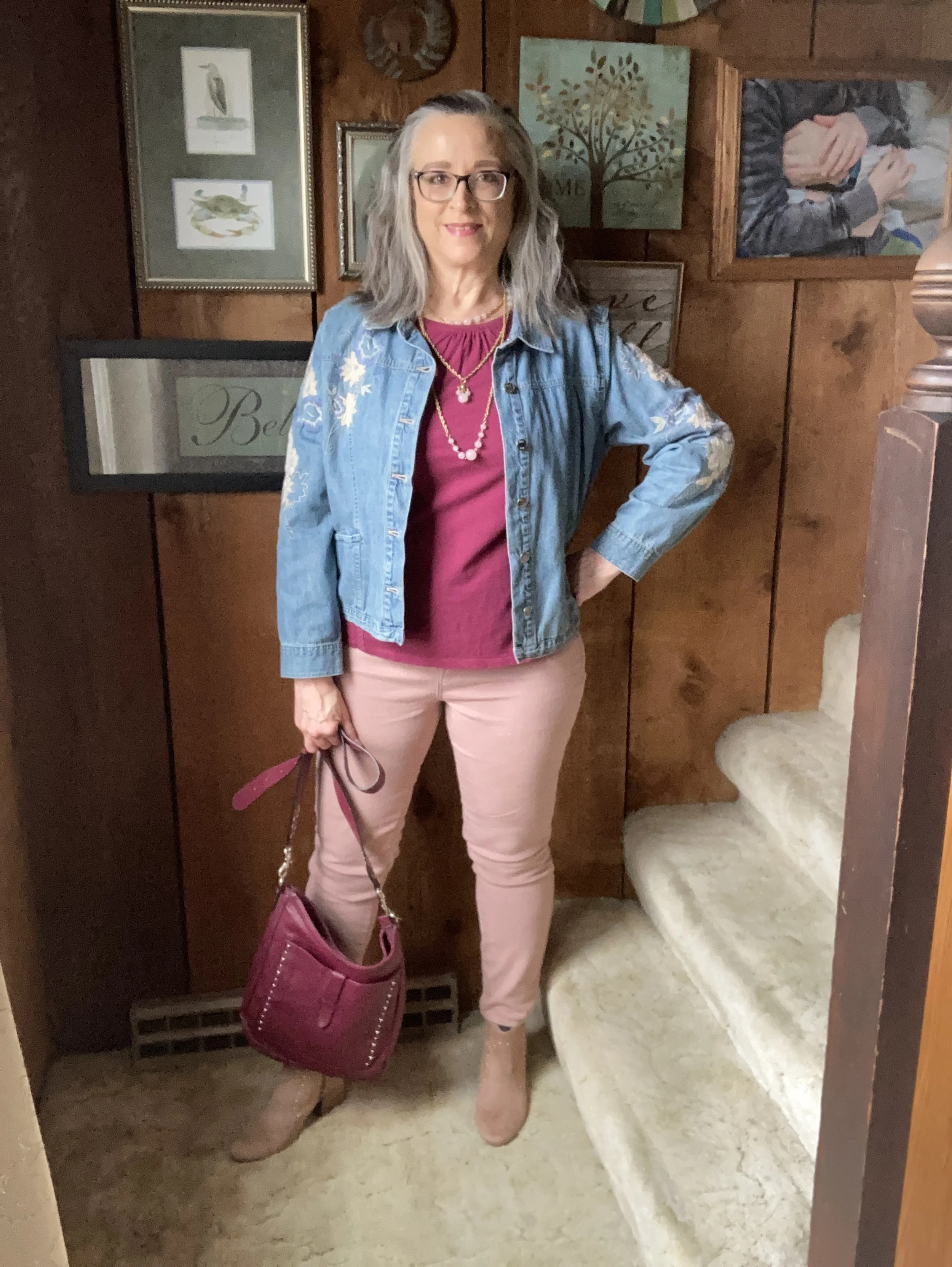
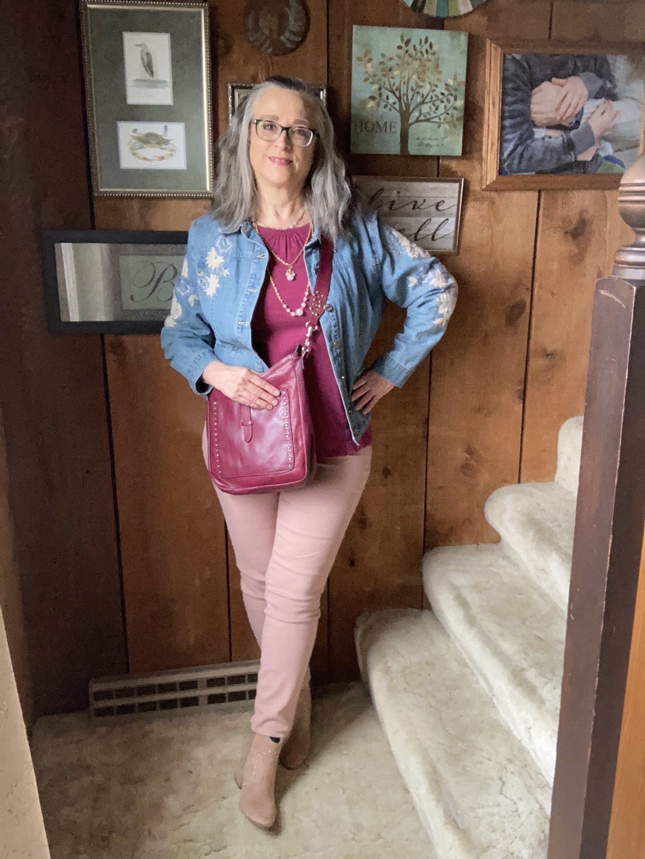
Viva Magenta is a bright, rich pinky red that easily catches the eye. It is a pretty color that can be combined with loads of other shades for a spring and summer worthy outfit palette. I don’t have a lot of pieces this color in my closet, so I was glad to see I had this Sonoma 3/4 bell sleeve top and the thrifted Libby Edelman shoulder bag.

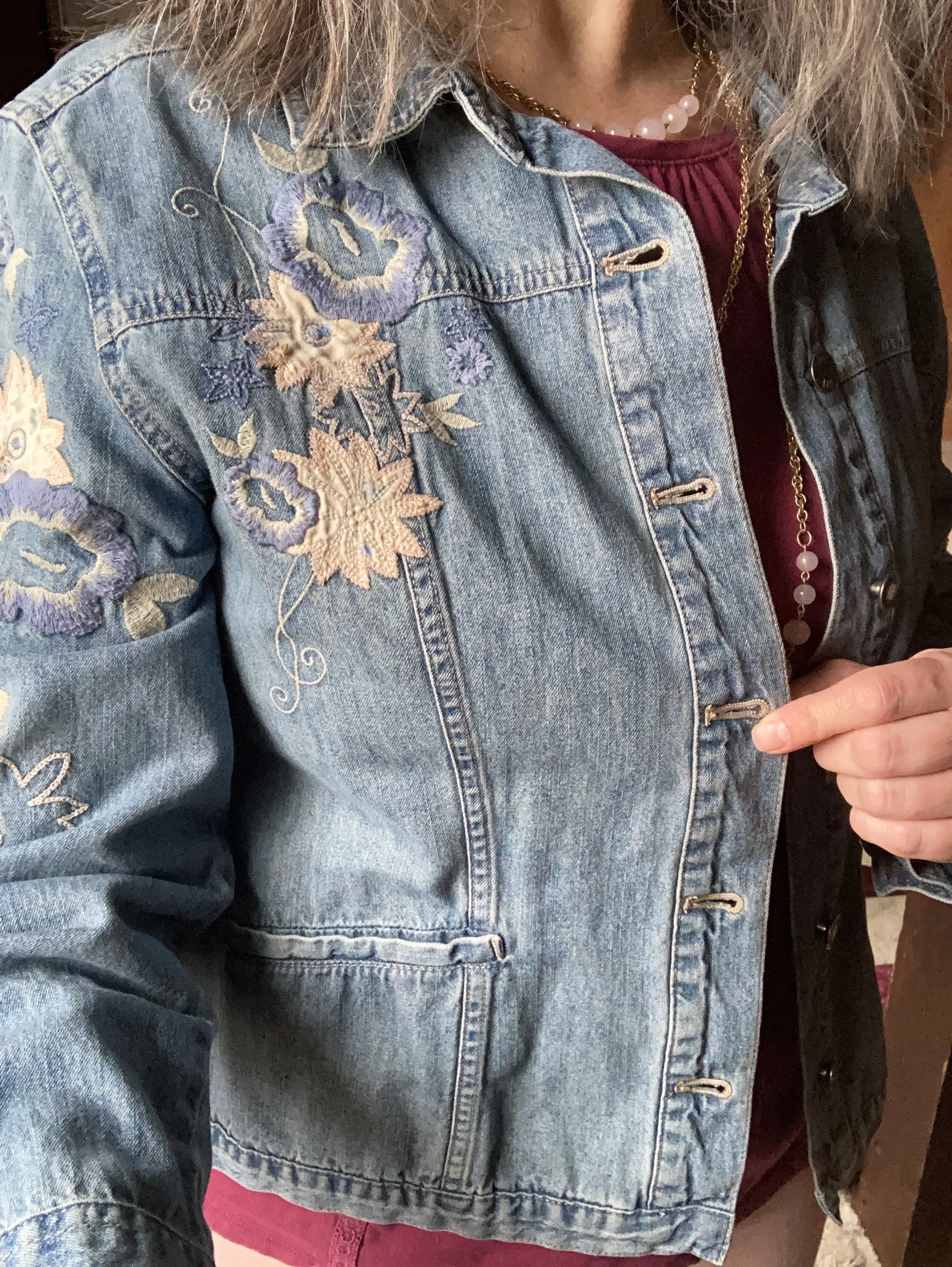
I decided to combine the Viva Magenta with two of the other colors from the Spring New York Palette. Summer Song is a soft, light blue that reminds me of a light wash denim, which is why I chose my thrifted J. Jill - Out of the Blue embroidered, jacket as a topper. I love the embroidered details on this piece. I’ve worn this on the blog before. You can see it with a white skirt for summer, and with a pair of wide leg jeans.

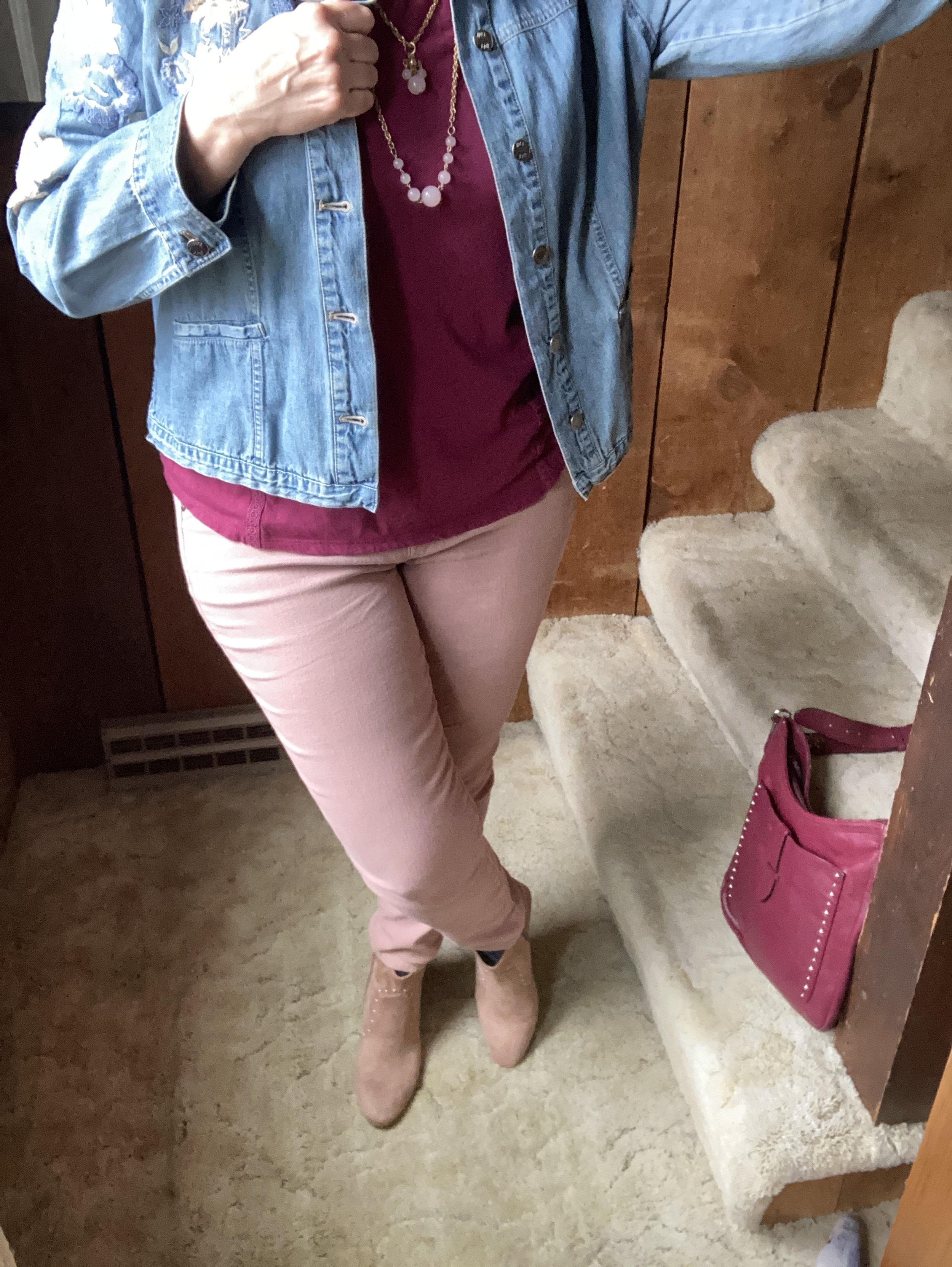
Vanilla Cream is one of the classic colors on the palette this year. I would say it is a cross between a pale pink and a pale coral. The Crayola Crayon box might call this one Flesh, ha, ha! These thrifted Refuge jeggings, seemed to come pretty close to the Pantone color. I don't typically wear leggings or jeggings without a longer top, but these have back pockets and do look more like jeans than leggings, even though they are incredibly soft and stretchy. You can see how I styled these with a black floral top, a belted orange tank top, in a pink monochrome look, and in a flat lay.

My SO ankle boots were a clearance find from Kohl’s a number of years ago. You can see how I styled them with my cognac jeans, a yellow knit cape, dark pink cords, and gray plaid cropped pants.

Are you a fan of Pantone’s color of the year, Viva Magenta? Do you like it combined with these other spring Pantone colors? Do you have any of these colors in your wardrobe? Leave me a comment or two. I always love to hear your thoughts. I do try to respond to all of your comments, so be sure to check back after a few days.

I am including a few shopping links for you to look over. I do apologize that I have not yet gotten linked up with some other affiliate partners. It’s all about the research which takes time. I haven’t given up, but for now I will keep bringing you at least some possible options through my ShopStyle affiliate program. These are brought to you at no additional cost, unless you purchase something of course. Ha, ha.

Pantone - Autumn/Winter - 2021 - New York Palette: Intro

Here we are again, looking at starting another Pantone series. As we quickly ride out these last few weeks of summer most of us are already thinking about fall. We are anxious even, for our layers, cozy sweaters and boots. We like the idea of putting on a jacket as the evening cools and watching the leaves change from their varied greens to their beautiful reds, oranges and golds.

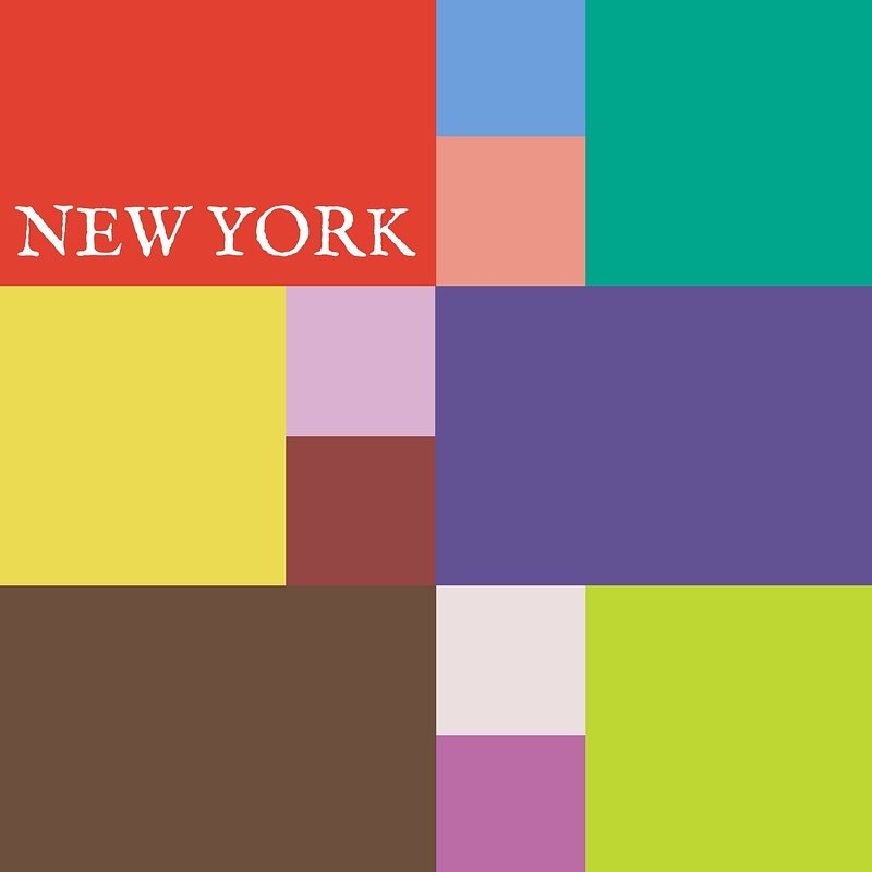
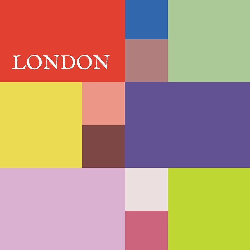
This autumn the Pantone New York palette contains a variety of colors that are both bright and light with a few that are more what we tend to say are traditional fall shades. In addition to rusty brown and fierce red, we also have a light pastel pink, a soothing green and three very different shades of blue. Illuminating and Ultimate Gray grace both the New York and London palette as they continue their year long stint as colors of the year.

NYGraphic.jpg

I hope you will join me as I begin the series next week. Hopefully I will be able to inspire you with color combinations that are slightly outside the box, but still stylish and fashionable.

Here are a few sneak peaks at what is coming up.

pantonefallcolortrendsfirewhirl-7.jpg
pantonefallcolortrendsspringlake-19.jpg
pantonefallcolortrendsfuchsiafedora-9.jpg
pantonefallcolortrendspalerosette-9.jpg
pantonefallcolortrendsadobe-12.jpg

Have a great week everyone!

Photo credit Jessica Trumbull with Rebecca Trumbull.

Pantone Spring/Summer 2020 - Recap

I hope you have enjoyed this Pantone color series. Today I just want to show you a recap where you can see all the outfits in one post. Here we go.

New York Palette

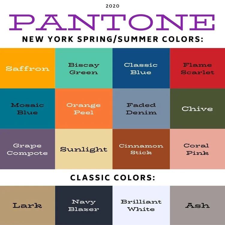
Pantone Spring/Summer 2020 - New York Palette

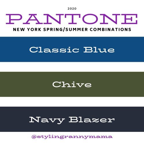
Classic Blue, Chive and Navy Blazer

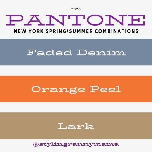
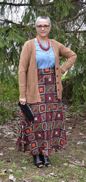
Faded Denim, Orange Peel and Lark

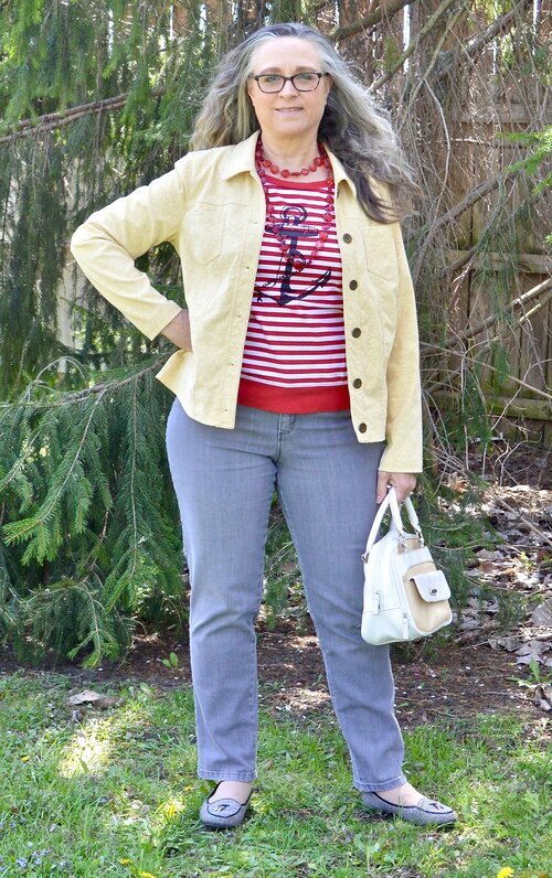
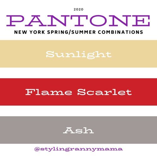
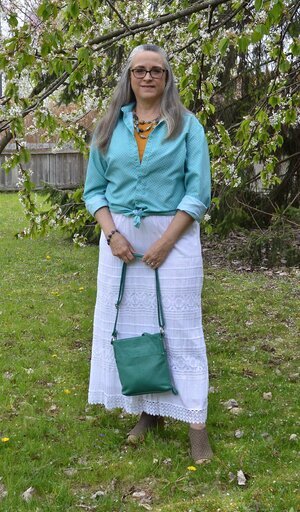
Sunlight, Flame Scarlet and Ash

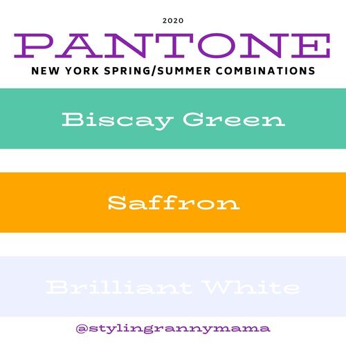
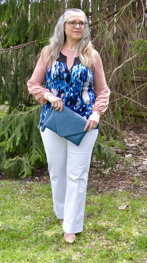
Biscay Green, Saffron and Brilliant White

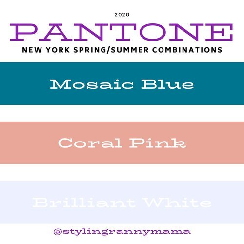
Mosaic Blue, Coral Pink and Brilliant White

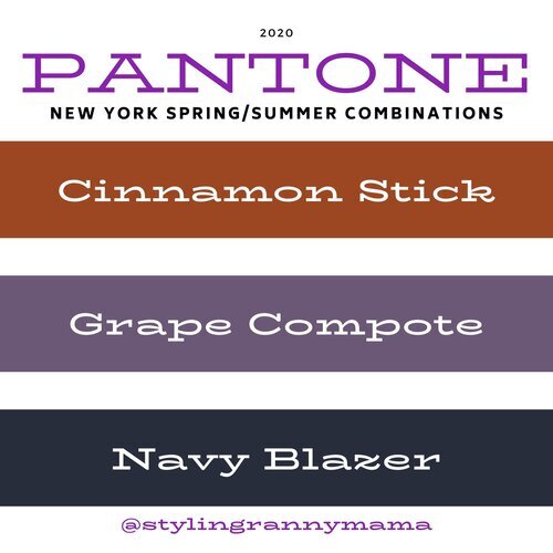
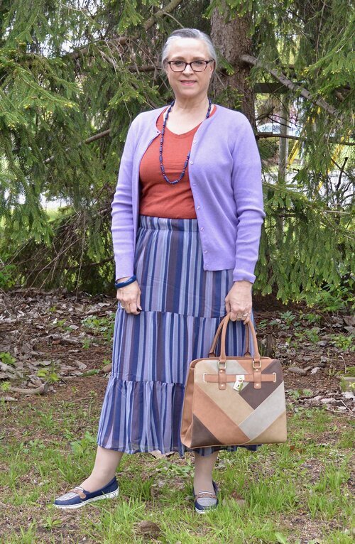
Cinnamon Stick, Grape Compote and Navy Blazer

London Palette

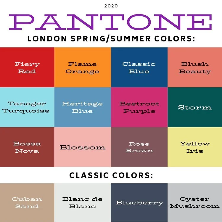
Pantone Spring/Summer 2020 London Palette

Classic Blue, Beetroot Purple and Oyster Mushroom

Pantone Spring/Summer - London Palette

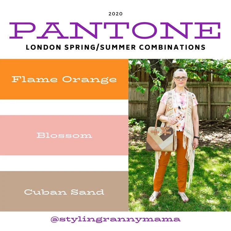
Flame Orange, Blossom and Cuban Sand

Pantone Spring/Summer 2020 - London Palette

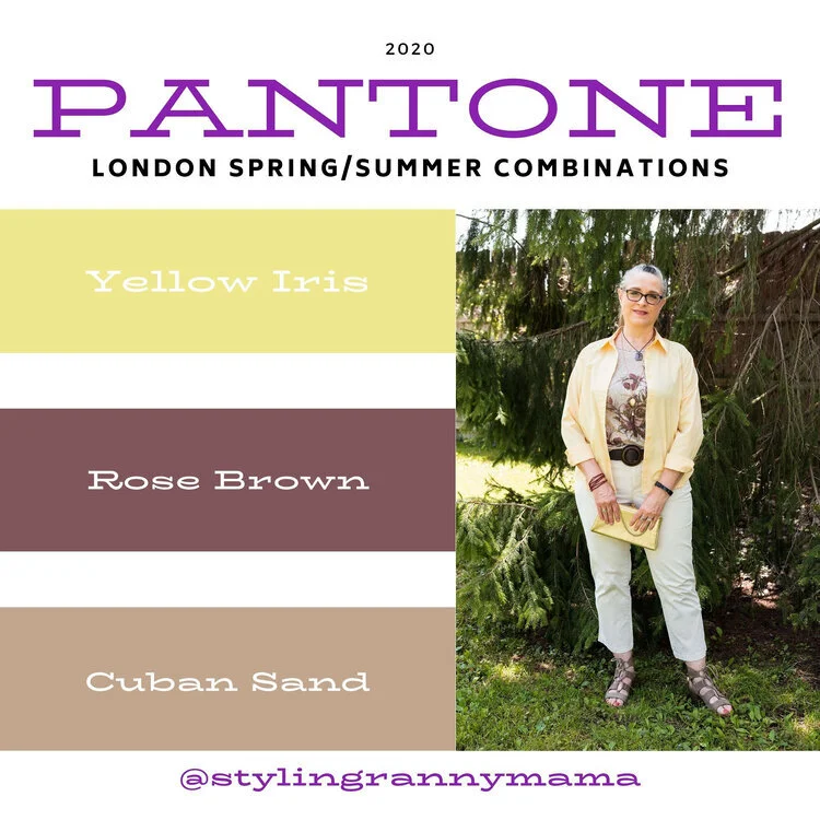
Yellow Iris, Rose Brown and Cuban Sand

Pantone Spring/Summer 2020 - London Palette

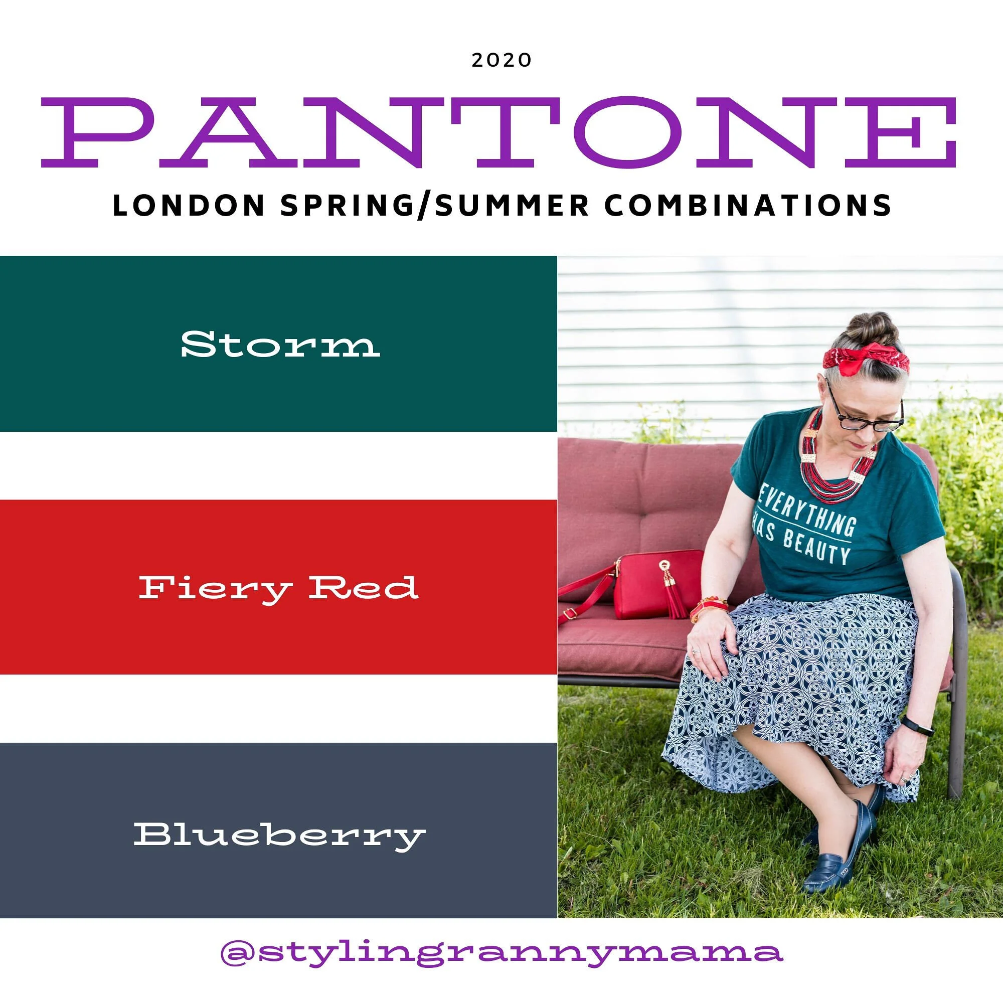
Storm, Fiery Red and Blueberry

Pantone Spring/Summer 2020 - London Palette

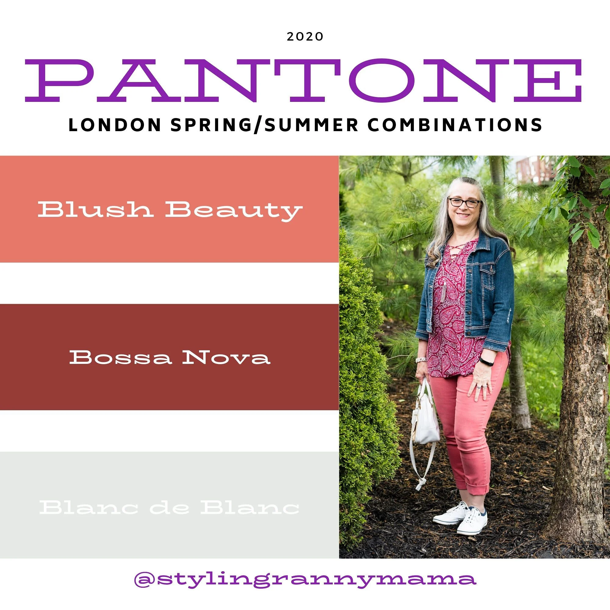
Blush Beauty, Bossa Nova and Blanc de Blanc

Pantone Spring/Summer 2020 - London Palette

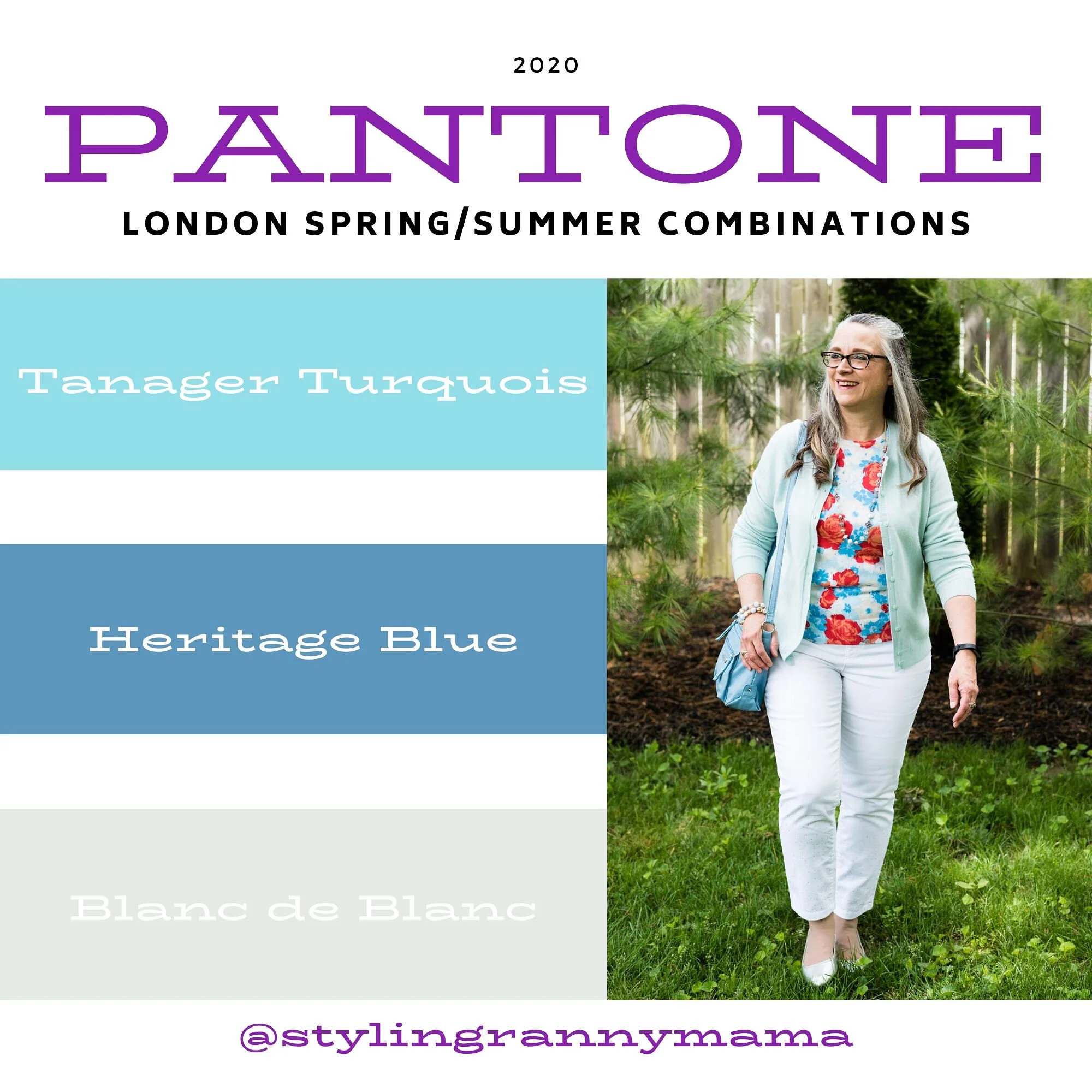
Tanager Turquoise, Heritage Blue and Blanc de Blanc

Pantone Spring/Summer 2020 - London Palette

Which color palette was your favorite? Which outfit did you like the best? I would love to hear your thoughts. I hope you all have a wonderful weekend. We will be celebrating Father’s Day with our kids on different days, since schedules wouldn’t allow for everyone getting together. God bless each of you with peace and joy.

All graphics and London color palette photos by Rebecca Trumbull.

Pantone Spring/Summer - 2020 - Classic Blue, Chive and Navy Blazer

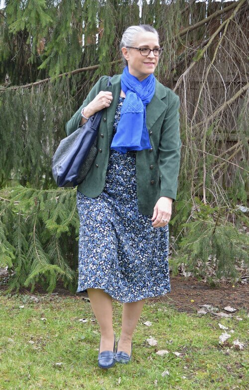
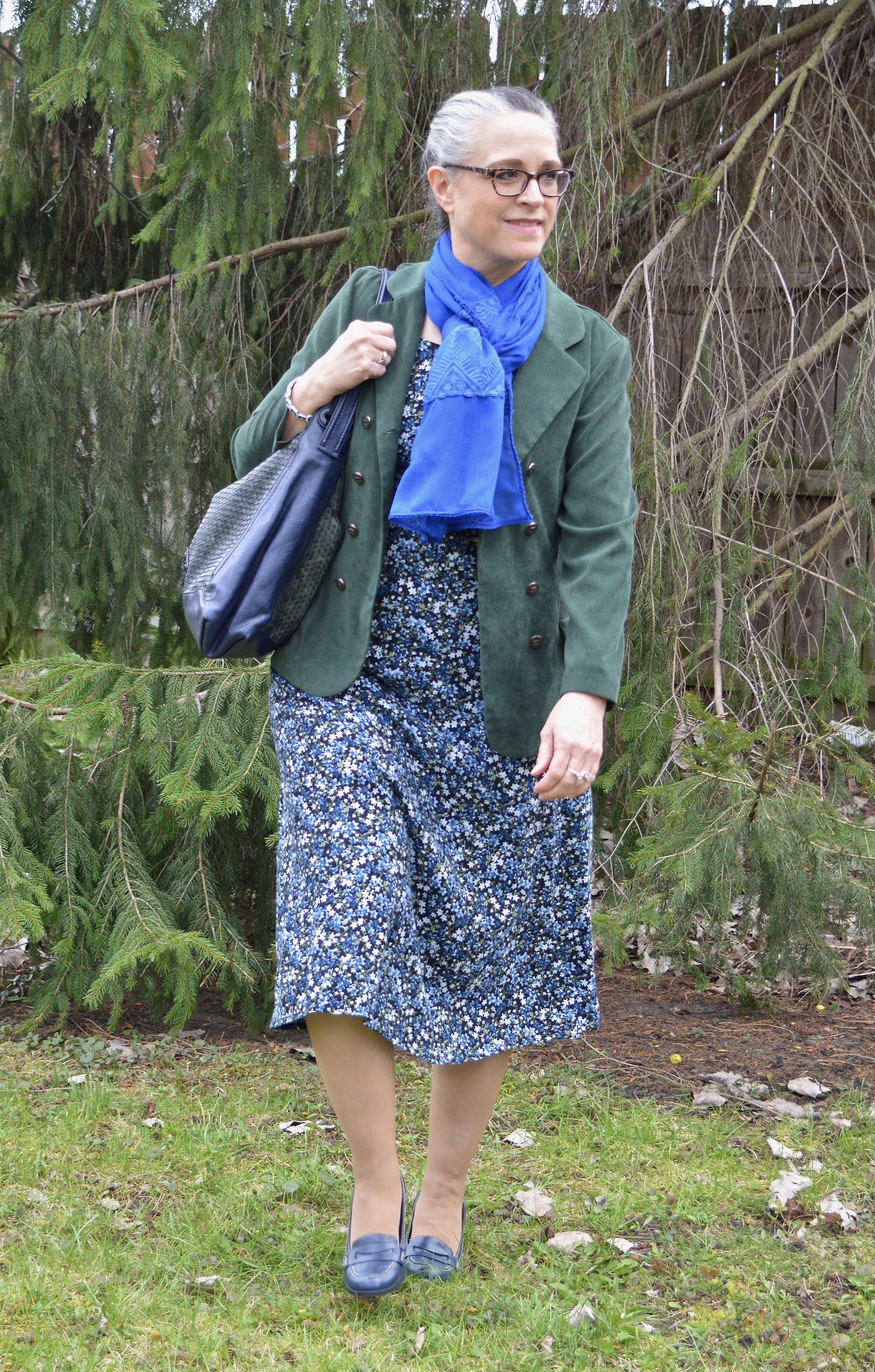
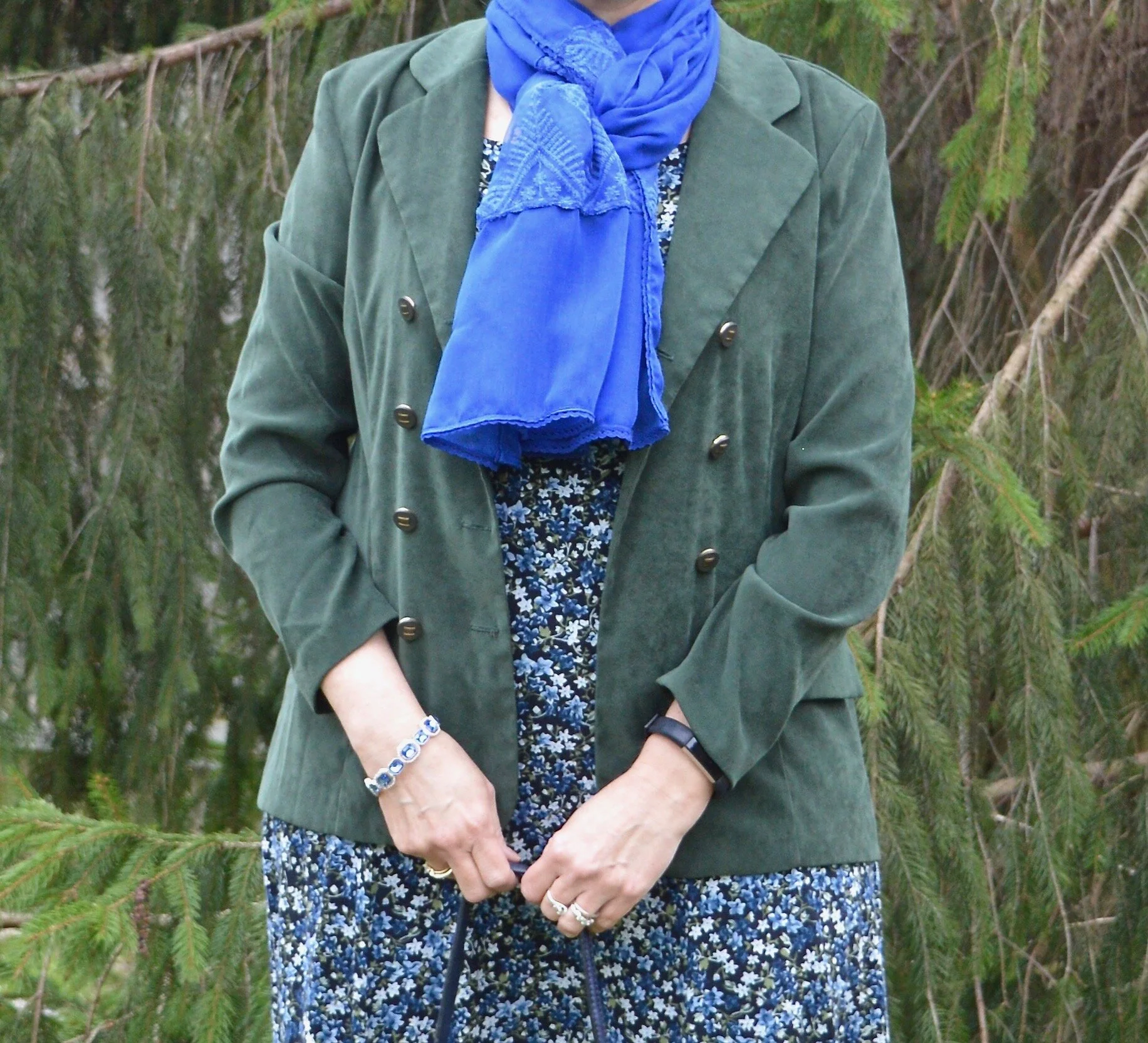
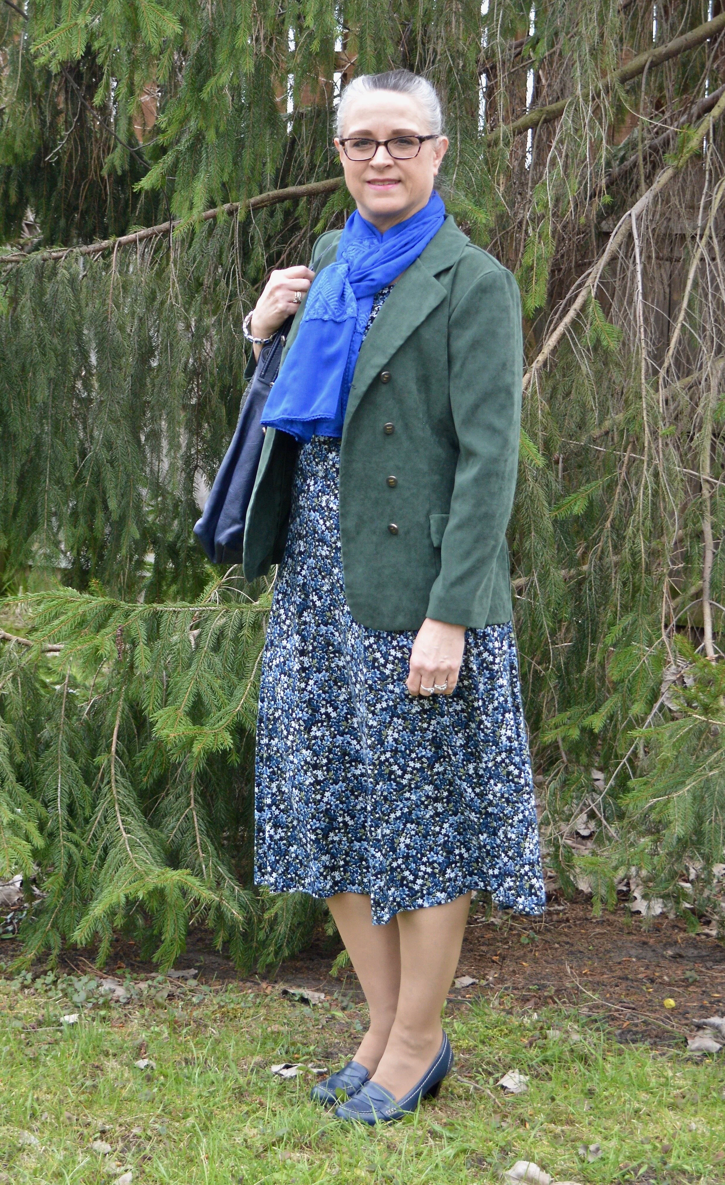
As usual, the names for the Pantone colors always amuse me. Classic Blue is pretty normal. Obviously, Chive makes me think of green onions and as you will see, the color is a pretty dark green. Navy Blazer is one of the classic colors and is your typical navy staple, which many of us have a piece or two in our closets. Since Classic Blue is the color of the year, I decided to start with it. The idea to combine it with Chive was a natural progression when I pulled out this thrifted summer midi dress.

This outfit centers around this thrifted OliviaRose dress that I got numerous years ago. Its pretty floral print combines blue, white and green a black background. I didn’t even have to think when I pulled this out of my closet. Classic Blue and Chive were the perfect pairing. An outfit like this really can be worn year round.

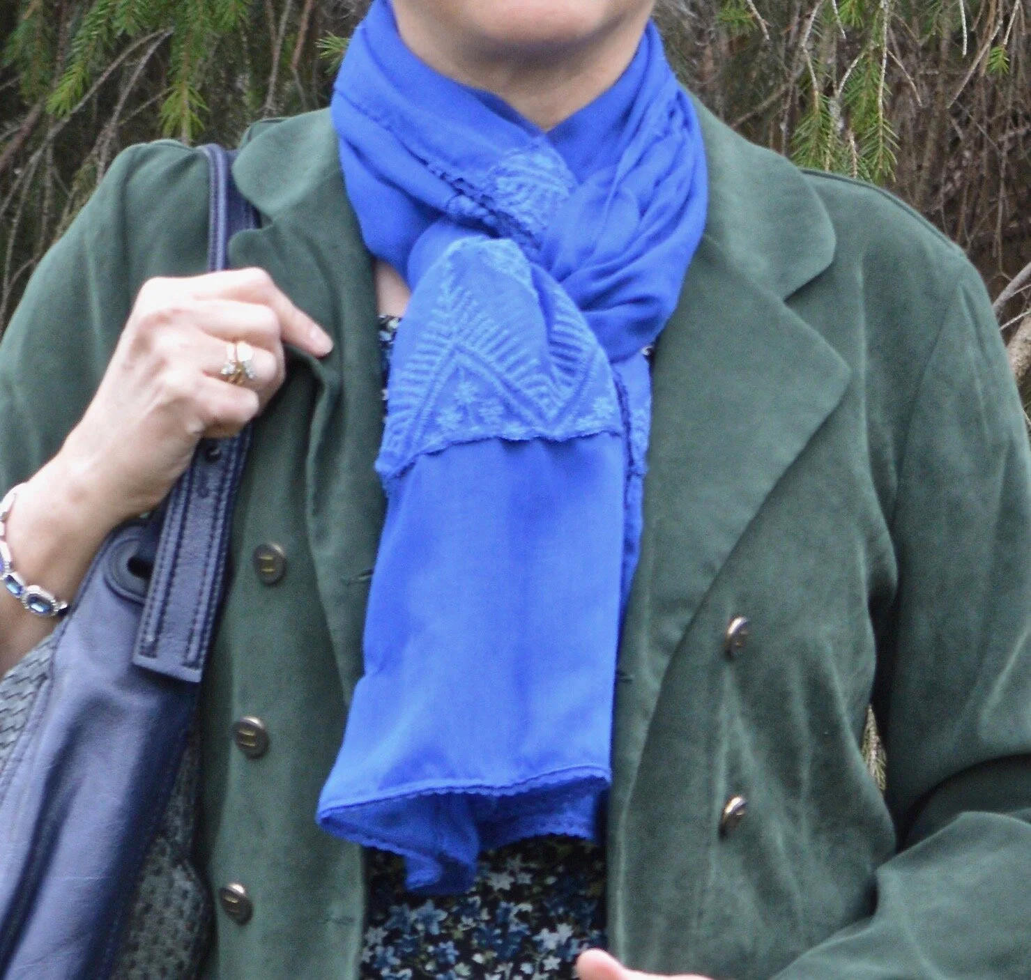
This bright blue scarf was gifted to me for Christmas and I used it to introduce the Pantone Color of the Year back in January. You can see that post here.

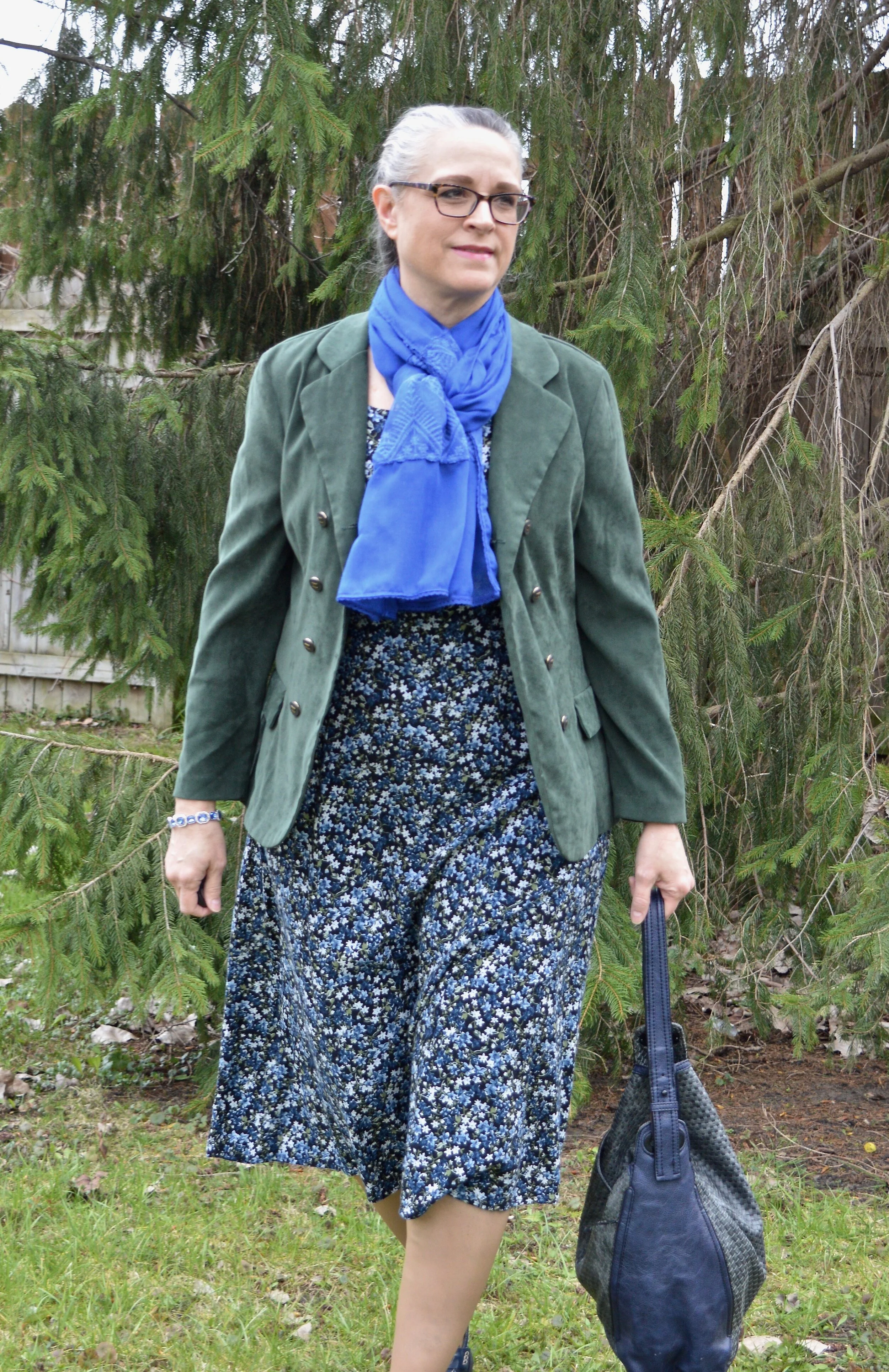
My faux suede blazer has a little more of a blue undertone than the Chive color, but I thought it was pretty close. This thrifted ISB Inc. blazer is meant to have a double breasted appearance when buttoned, but my figure right now will not allow for that. However, I think it looks just as nice left open since there are buttons on both sides.

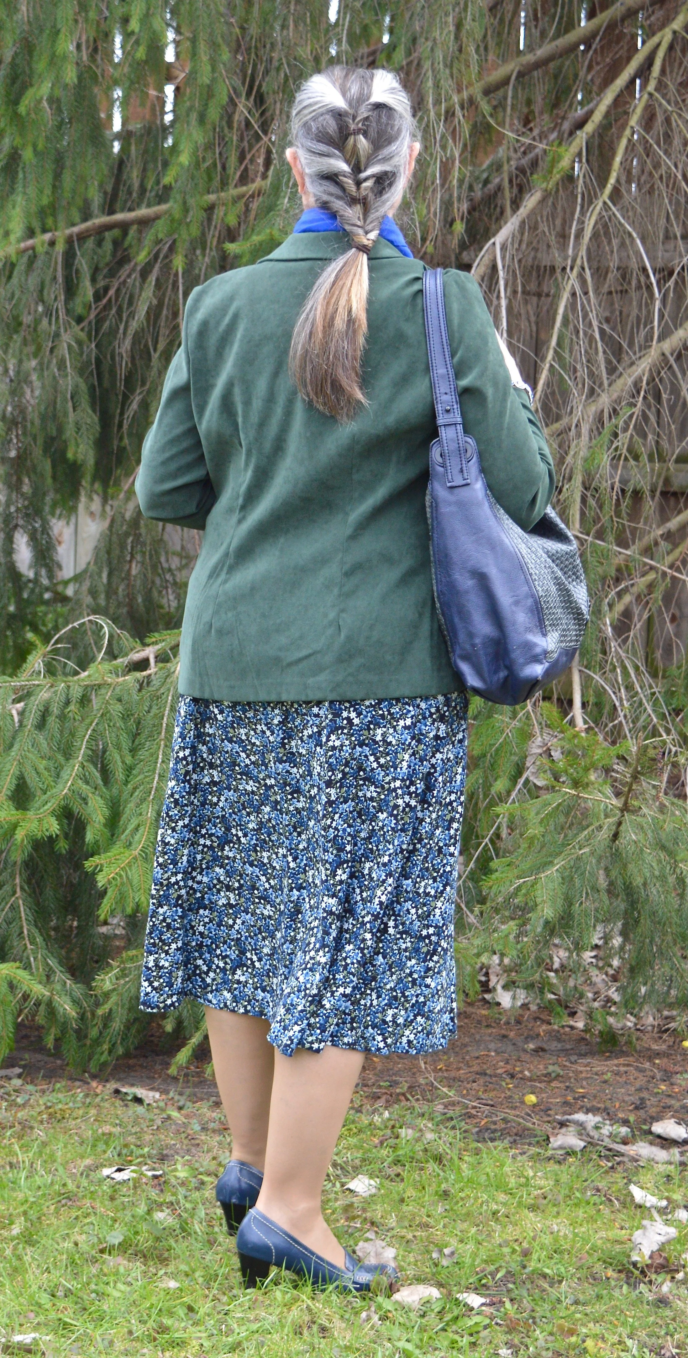
You can see in the next picture how nicely the blazer fits through the back. I like that it is more fitted, rather than boxy. I was also trying something different with my hair.

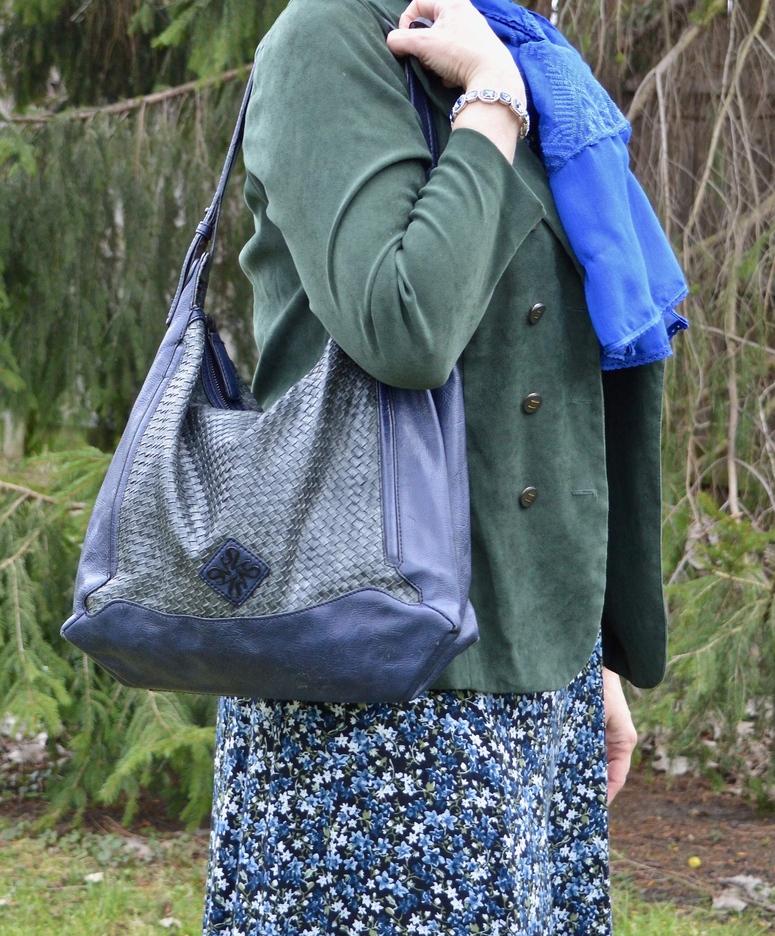
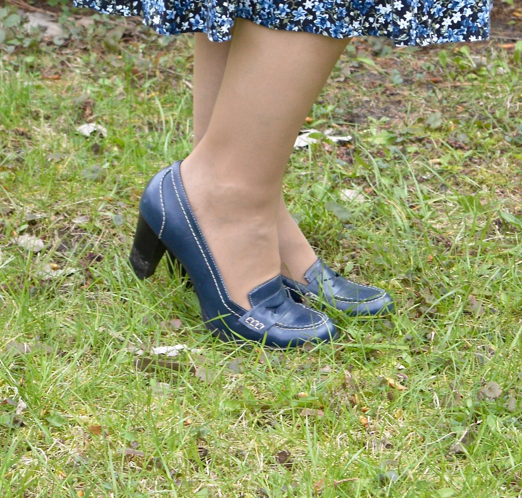
This thrifted Simply Vera/Vera Wang bag has made multiple appearances on the blog as has my thrifted Relativity loafer heels.

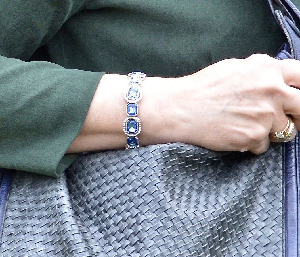
I also added my sparkly Classic Blue bracelet, which was also a Christmas gift.

If you are not into wearing bold, bright colors, then these colors would be the perfect choice for you. You could easily make this pairing more summery by adding a white skirt or crop pants instead of the darker print dress. You could also wear head to toe white with a Chive colored blazer or sweater and just a few pops of Classic Blue jewelry. There are so many options, so never say never to any color.

Do you like these colors? How would you wear them? Is this the sort of outfit you would wear? If not, what kind of outfit would you put together? I would love to hear back from you. Things are a little lonely around here. Ha, ha. I am sure you all can relate. We really need the world to get back to something more normal, even if it is not perfect.

I hope you enjoyed this post everyone. Until next time. Stay safe and healthy.

Graphic by Rebecca Trumbull.

I’ve included a few shopping links just for something to look at. These are affiliate links. All opinions are my own.


Pantone Spring/Summer - 2019 - Jester Red & Pepper Stem

Today’s Pantone colors are the rich saturated relatives of red and green. These two pair perfectly for a tropical vibe mixed with a punch. Jester Red jams with a touch of blue and Pepper Stem is green with lilting yellow tones. I love how these two mix together to create a colorful summer vibe.

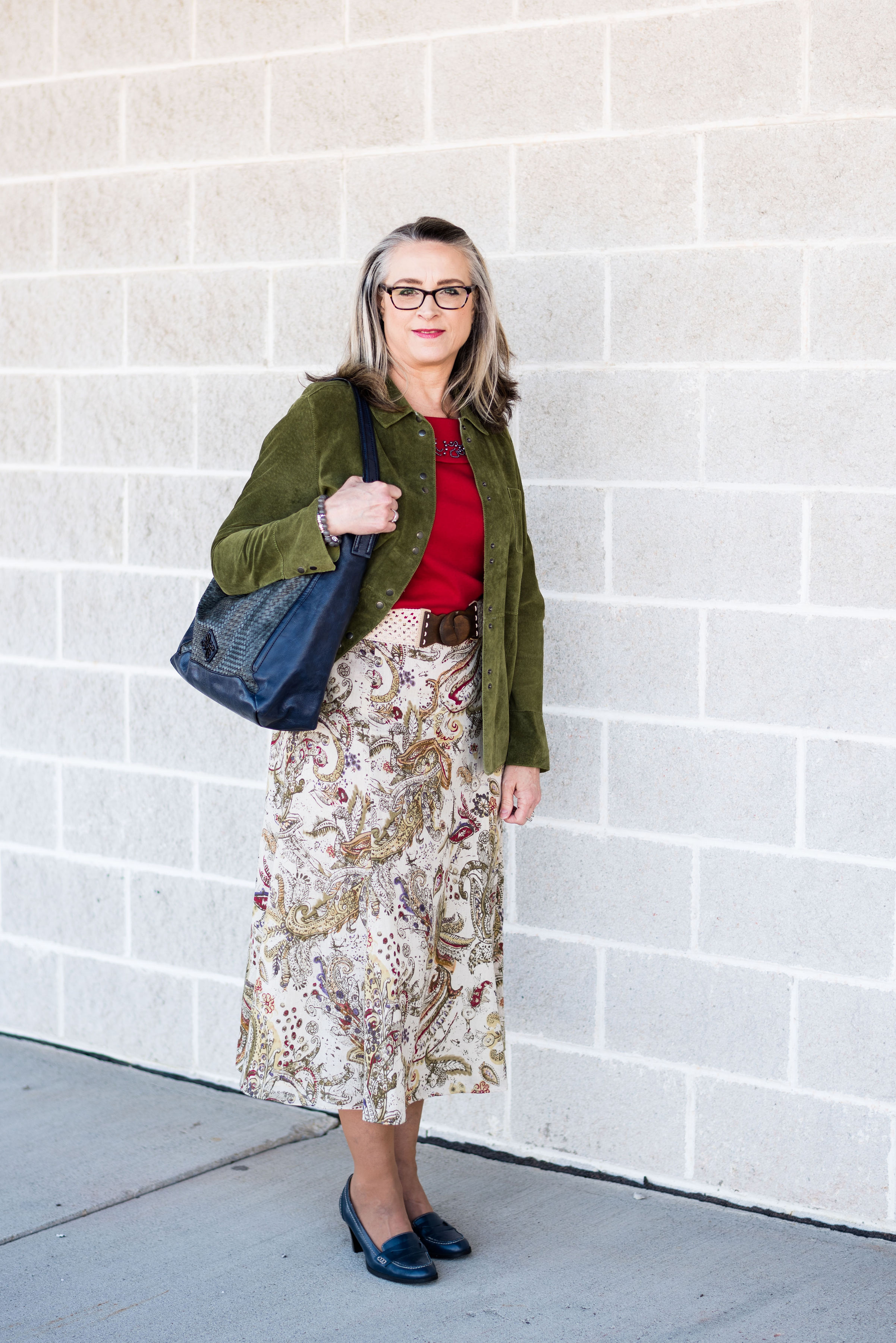
This Jones Wear printed midi-skirt is a great piece for spring, summer and fall. It is fully lined, so in the summer you don’t have to worry about wearing a slip. The length is modest, and pairs well with anything from heels to flats to flip flops. I’ve featured this skirt on the blog before in a fall Pantone palette. You can see that post here.

This Field Gear jacket is thrifted. I have also featured this on the blog before too. You can see that post here. If you take a look at that post, you’ll see it was also for the Pantone palette from last spring, where the color of the year was Greenery. This is a softer, light weight suede, which makes it the perfect piece for spring and summer.

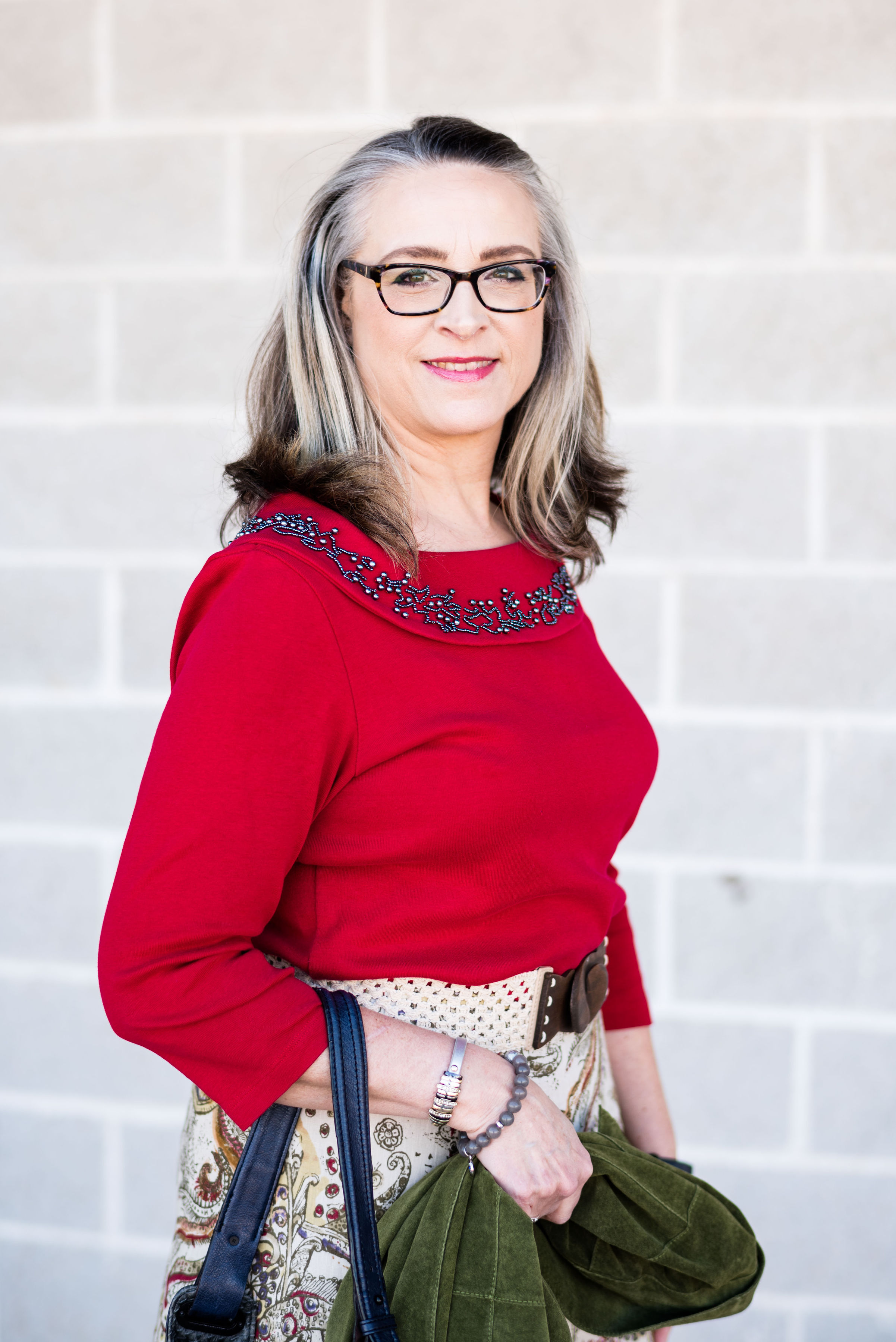
This 3/4 length sleeve tee is a bit more red than the Jester Red color, but I thought it was pretty close. What drew me to this Rafaella Studio thrifted piece was the embellished neckline. The cowl neck is covered with beads in a hematite type sheen. I didn’t need any necklaces with this pretty piece in place. Tops with embellished necklines are a nice, easy way to dress up an outfit, without having to think about jewelry. You can see the intricate beading below.

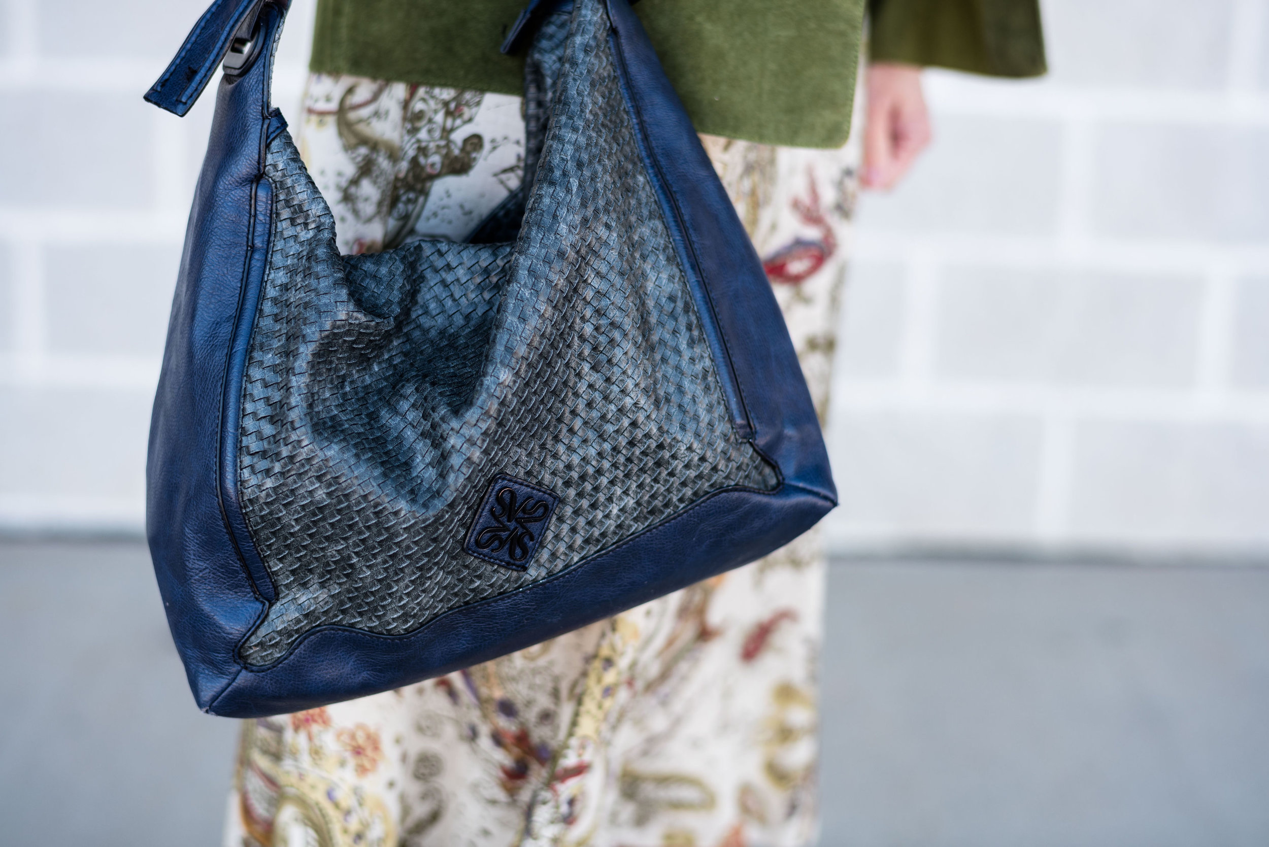
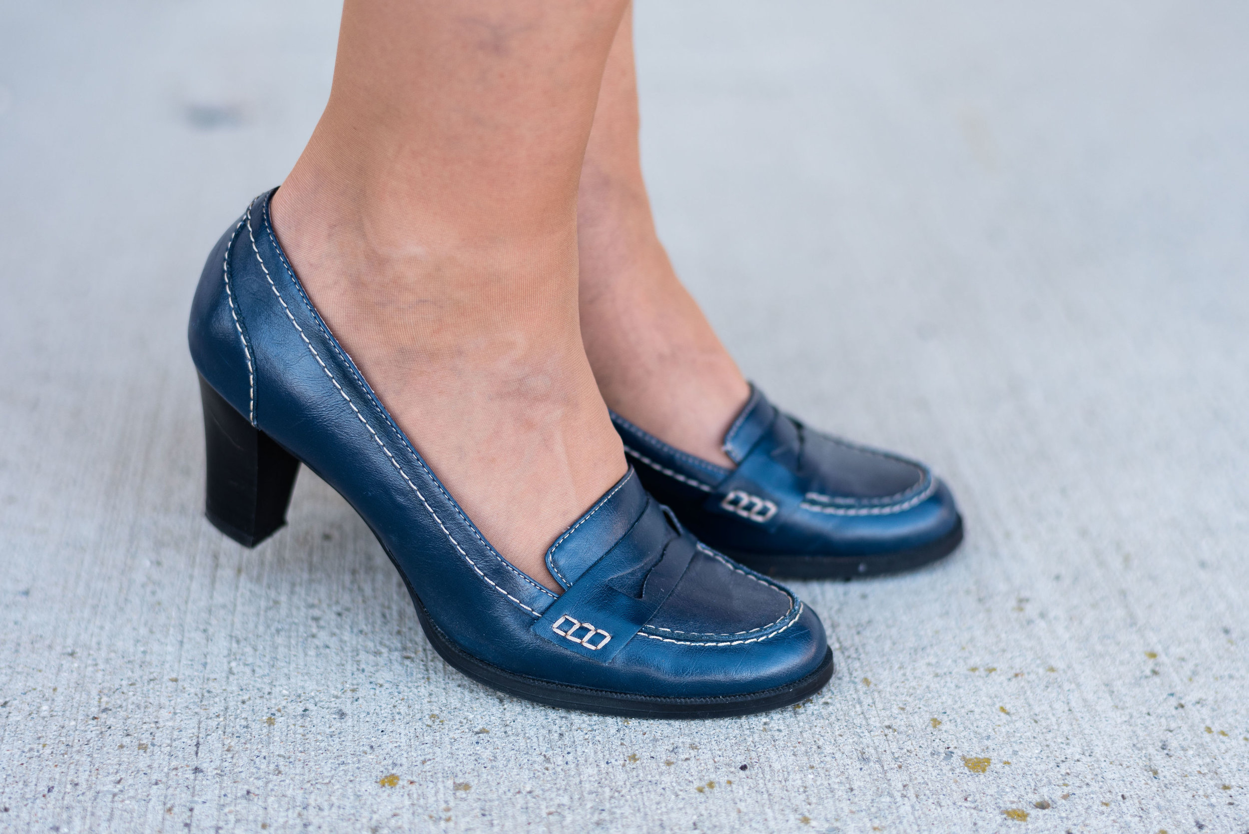
For my accessories, I chose a thrifted Simply Vera/Vera Wang navy bag and thrifted Relativity loafer heels, to go along with the classic color Eclipse. Once again, let me reiterate, this is not a contest to see how close to the Pantone color palette you can get, but a spring board for inspiration and new color combinations that you may not have thought of before. We often think of red and green as a Christmas color combo, but when you make the green a little more tropical it pairs well with any red without looking Christmasy.

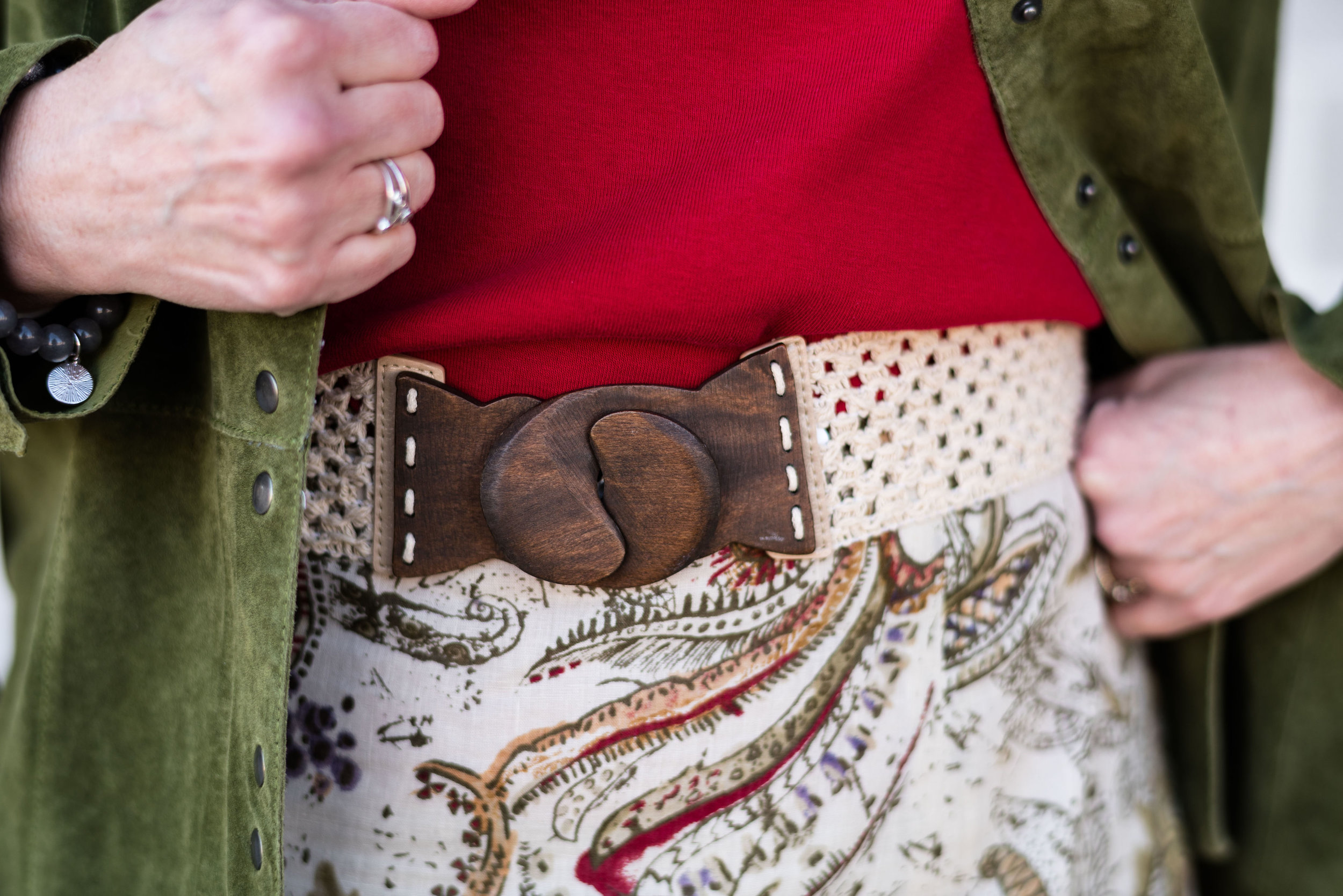
I added this belt too, just to make the outfit a little more polished. This is a stretchy belt that just clasps together in the front. A stretch belt is a fun way to add fun to an outfit and cinch in our waists.

I thought this was a fun, festive outfit that could be worn to a party. If the weather is hotter, sub out the 3/4 length sleeve tee for a tank top and use a light weight sweater or hoodie with flip flops or sneakers for a more casual look.

What do you think of Jester Red and Pepper Stem? Do you have any of these colors in your closet? If you do, have you ever worn them together? I love to hear you feedback.

I’ve included a few shopping links for similar colored items. Have fun perusing. These are affiliate links. All opinions are my own.

Photo credit Rebecca Trumbull. Make up Rachel Christensen.


Pantone Spring/Summer - Introduction

I’m a little late, putting this series together this spring, but the Pantone colors are really for two seasons, spring/summer and fall/winter. Since the colors bleed over into summer, I figured it would be okay if my series started a little later.

Once again, we are introduced to both the New York and London color palettes, but the overlap between the two is substantial, so we’ve combined all the colors, so you can see the whole palette at once.

This spring/summer palette is full of rich, saturated colors, but also has sweet, light pastels that will appeal to the little girls in us. As usual the Pantone Color Institute has named these colors with fun foodie words like Pepper Stem, Turmeric, Toffee, Mango Mojito and Lemon Verbena. Other names convey the beauties of the natural world, such as Living Coral (the Pantone Color of the Year), Aspen Gold, Terrarium Moss, Sweet Lilac and Pressed Rose. Finally, summer wouldn’t be complete without a few colors that remind us of cookouts, parties and fun times: Fiesta, Jester Red, Pink Peacock and Princess Blue.

I liked all of the colors on this palette. I had fun choosing outfits around these colors and when we get to the actual outfit posts, I’ll explain my rationale for each outfit more fully.

I addition to the 14 colors above both the New York and London palettes both share the four neutral palette shown below.

I wish they had included a gray, like they’ve done in the past, but I don’t begrudge them for changing things up a bit. The Brown Granite is a nice choice, but I find, that it is easier to locate a gray piece than a color like this. Gray seems to be more classic, but maybe things will change and this brownish gray will take over.

Here are a few sneak peeks at what is to come over the next few weeks.

If you like color and like to challenge yourself to try new things, be sure to join me for this Spring/Summer Pantone 2019 series, beginning next Tuesday.

What do you think of this spring’s color palette? I’d love to hear your thoughts.

Have a great weekend!

Photos and graphics, Rebecca Trumbull.

Pantone Fall 2018 - Russet Orange, Ultra Violet and Quiet Gray

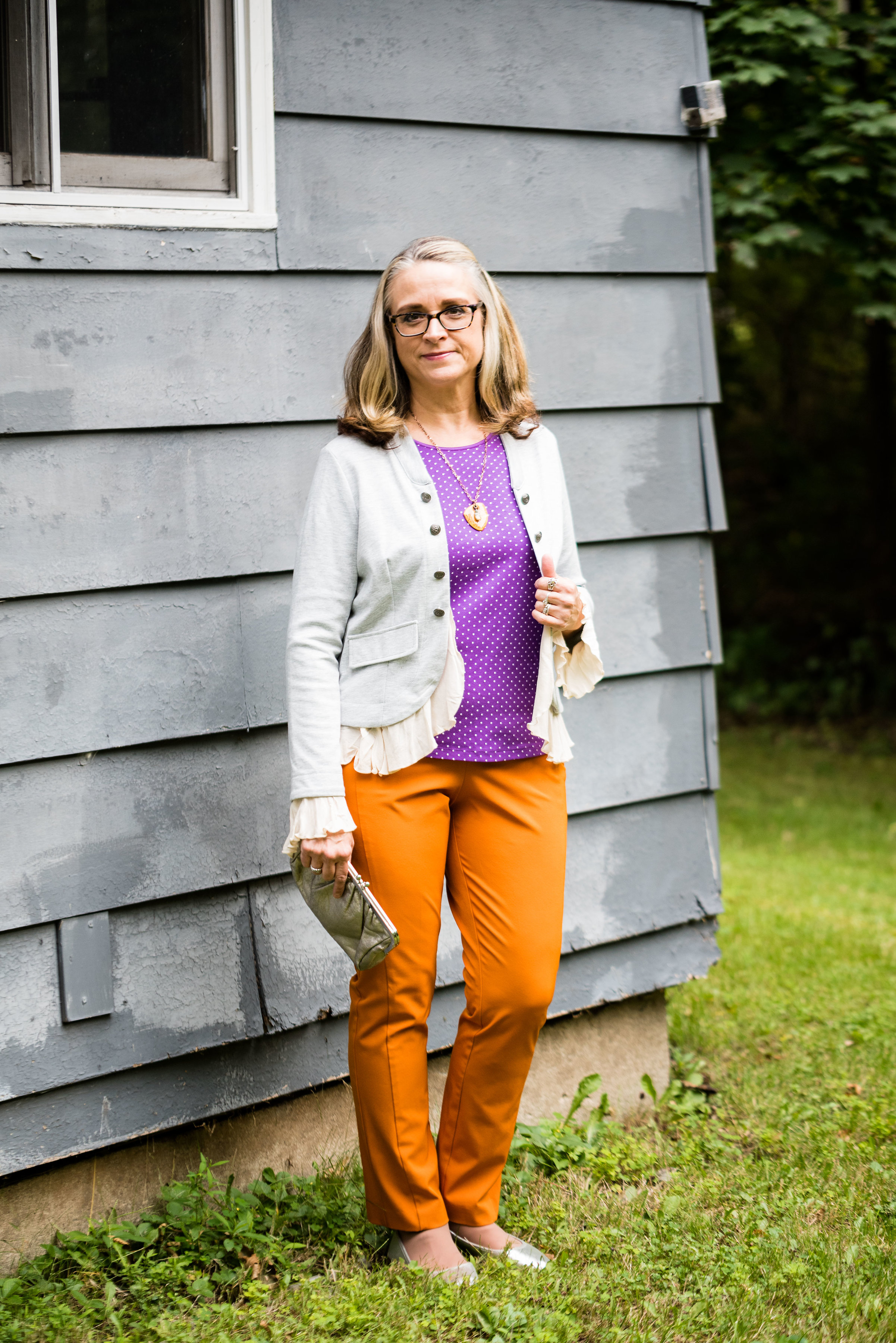
This week’s Pantone Fall 2018 colors are a bright pumpkin orange and a deep purple we met last spring, that won Color of the Year. Russet Orange is an easy color on the eye and reminds us of those beautiful Maple trees that boast red, yellow and orange leaves. Ultra Violet might be part of your Halloween decorating. Since the combination of orange and purple has become a less dark and more party friendly Halloween pairing, I thought it would be fun to put these two colors together.

These pants I’ve worn on the blog before, here, here and here. They are Worthington brand from JC Penney. These have a side zipper and sit higher on the waist, so help to create a more smooth silhouette.

My top is an older tee from Christopher & Banks. I love the color of this top. To keep the bright colors from being too overwhelming, I chose the Pantone color Quiet Gray as a topper to polish off the look. This fun piece is from the Kohl’s clearance rack and is a brand called About A Girl. I really like the double breasted look and the feminine detailed ruffles.

I kept my accessories fairly simple. This lovely leaf necklace I found at a shop in Grayling, MI called The Main Branch Gallery. Boasting art work and crafts from local artisans it is a great place to visit if you are ever up that way.

I then finished off the look with my silver clutch and silver SO flats that I recently added to my SO shoe collection from Kohl’s. Here is a link if you are interested in other colors. They are on sale right now for only $21.99, which is a good deal for a fairly comfortable shoe that makes any outfit look a little more dressed up. I normally wear an 8.5 or a 9 and I get these in a 9.

What do you think of these two colors? Would you wear Russet Orange and Ultra Violet together? I’ve included a few shopping links below. These are affiliate links, but all opinions are my own.

Pantone Spring 2018 - Recap

Now that my series is over, I thought I would show you all of the outfits together for a fun review. Just a refresher, the Pantone Color Institute puts out a palette of colors twice a year, once in the spring and once in the fall. These colors are the basis from which designers, both fashion and interior, draw their inspiration for fabrics, clothing, paint and furnishings. I always consider it a challenge to draw outfit inspiration from these colors, even the ones I may personally not like. Let's face it, not all colors are necessarily pretty in everyone's eyes. However, I think it can be good for our brains to think outside the box and try new things. 

These were the two palettes. Many of the colors overlapped and I made reference to that in the posts. I personally think these two palettes were perfect for spring. Most of the colors were bright or light, with a few more earthy tones, which combined rendered great spring outfits. 

Here were my outfits. If you click on the picture it will take you to the original post.

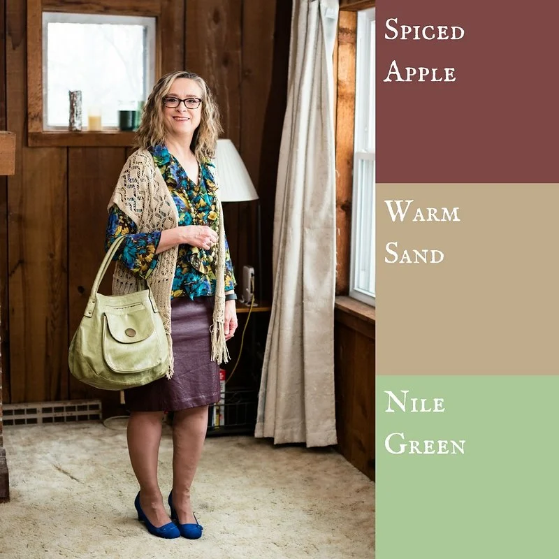
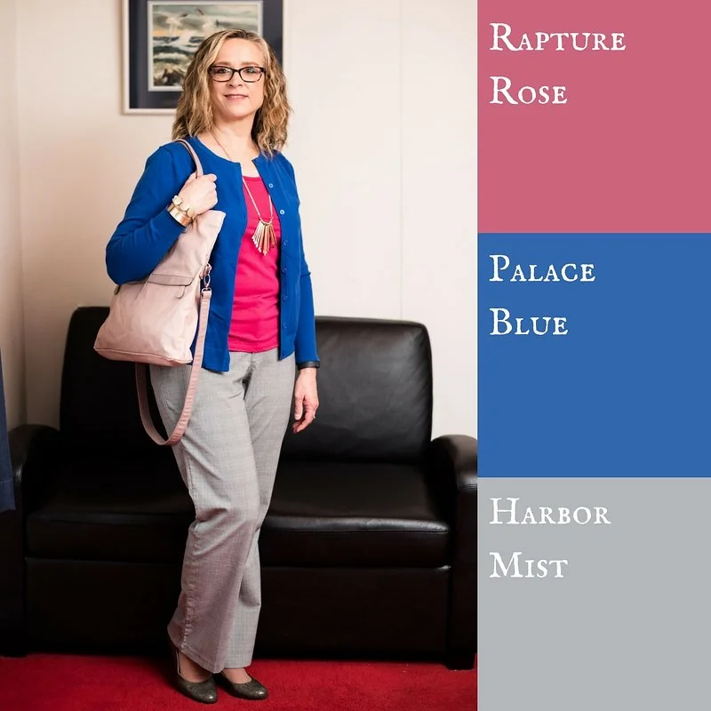
I was glad that Pantone added the four classic colors of Sailor Blue, Harbor Mist, Warm Sand and Coconut Milk. These colors are perfect for grounding an outfit and keeping it from getting too over the top with color. Is there such a thing? Ha, ha. 

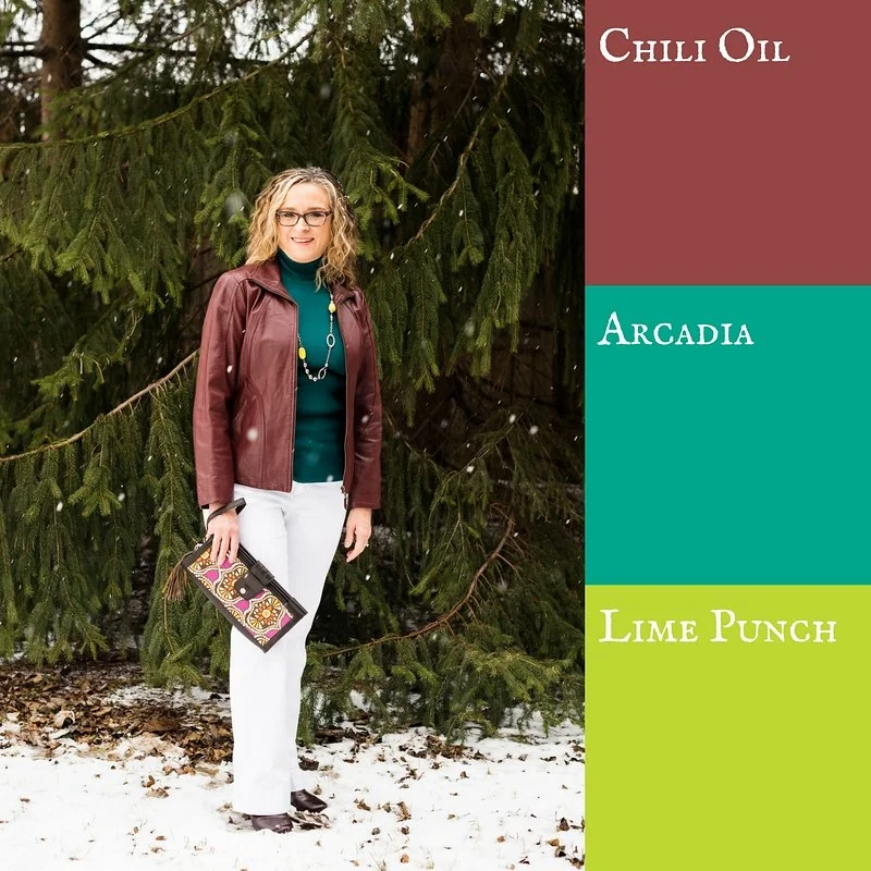
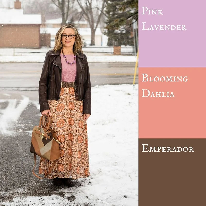
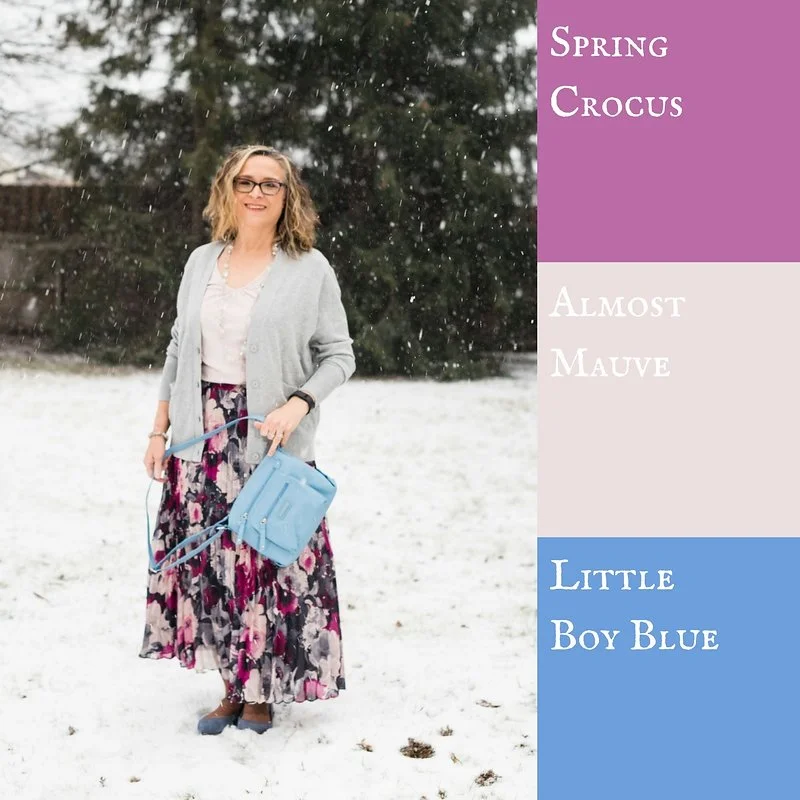
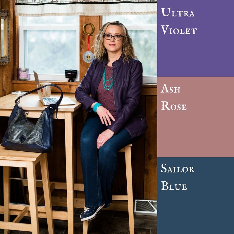
I think out of all of the colors from both palettes my favorites are Ultra Violet, (no surprise there, since I love purple), Arcadia, Pink Lavender and Ash Rose. All but Arcadia fall into the purple range. What can I say, I love purple! If I ever had a sports car it would be dark sparkly purple. Ha, ha. 

I hope you enjoyed this series. Let me know in the comments what your favorite colors were from this spring's two palettes. I always love to hear what you are thinking. 

Join me on Thursday for my Outside the Box column. You never know what I'll be showing off there. If you follow my Faith page, check back tomorrow for more on my Mulling It Over series as we delve further into 2 Timothy 2. 

Have a great Tuesday!

Photo credit Rebecca Trumbull. Make up Rachel Christensen.

Monday linking up with Catherine of Not Dressed as Lamb. Tuesday linking up with Jess of Elegantly Dressed and Stylish and Shelbee of Shelbee on the Edge

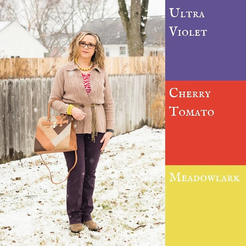
Pantone Spring 2018 - Ultra Violet, Cherry Tomato and Meadowlark

Welcome to the second installment in my Pantone Spring 2018 series. Since last fall the Pantone Color Institute has been featuring two color palettes for both the fall and spring seasons. With two palettes to choose from there are so many more color combinations to create fun outfits. 

For today's outfit I combined three more colors. All three of these colors are found on both the New York and London palettes. This week my classic grounding color is Warm Sand. I am glad that the four classic colors were added this year to the palette. Sailor Blue, Harbor Mist, Warm Sand and Coconut Milk are the perfect colors to either use as a foundation for an outfit or to accent a more colorful outfit with accessories. Last week I wore Coconut Milk (white) jeans as the grounding color for my three more colorful pieces. You can see that post here

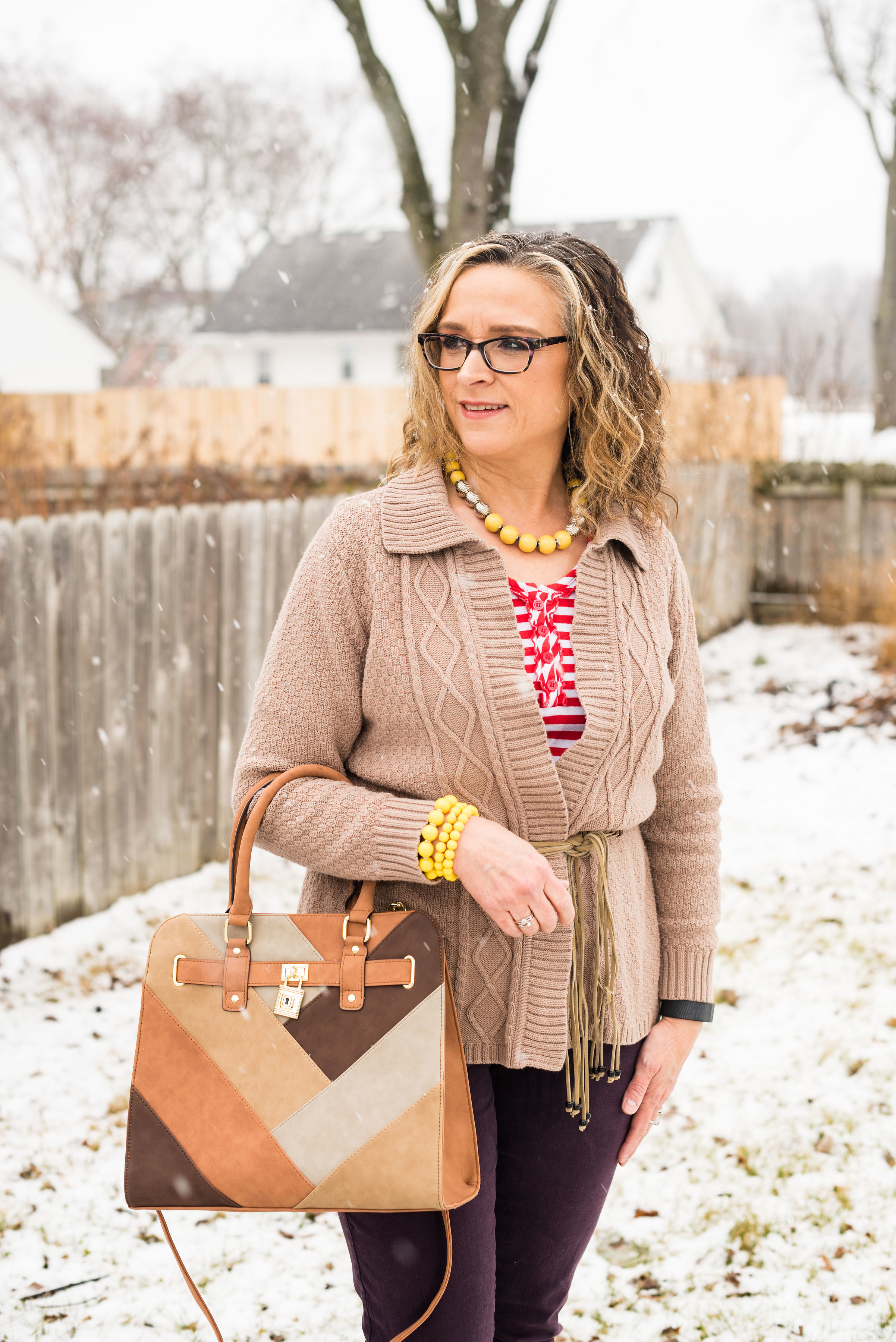
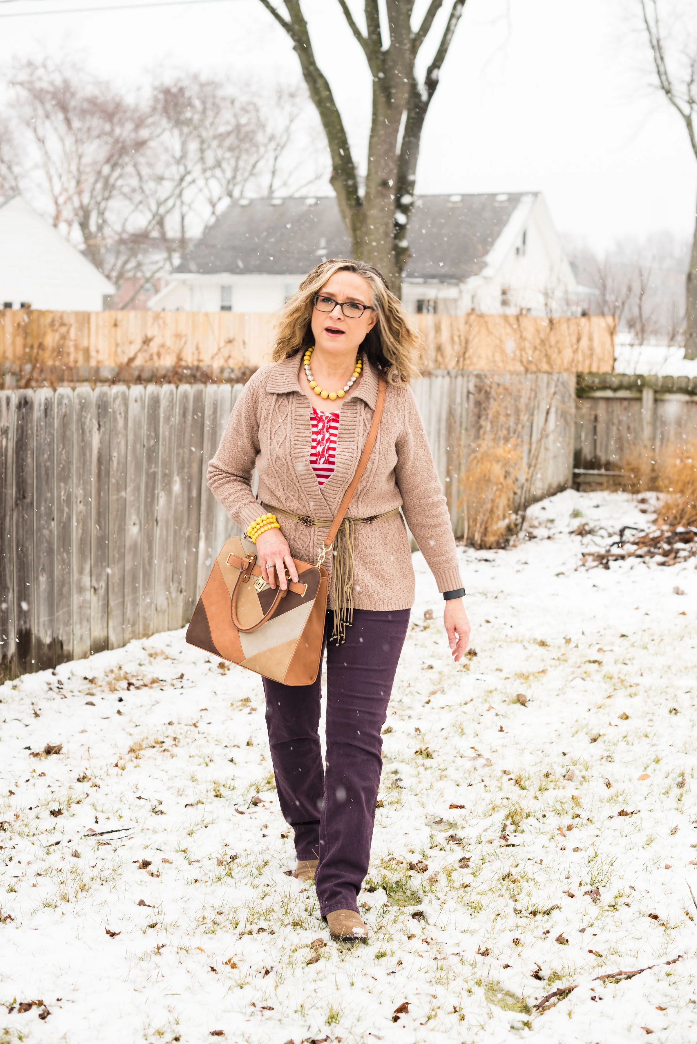
Ultra violet is a lively medium purple. These jeans, which are Not Your Daughter's Jeans, are not truly Ultra Violet, but these colors serve as guidelines for putting an outfit together, not rules. If you don't have the exact shade in your wardrobe, then try a different shade. The outcome will still be a stylish, colorful outfit.

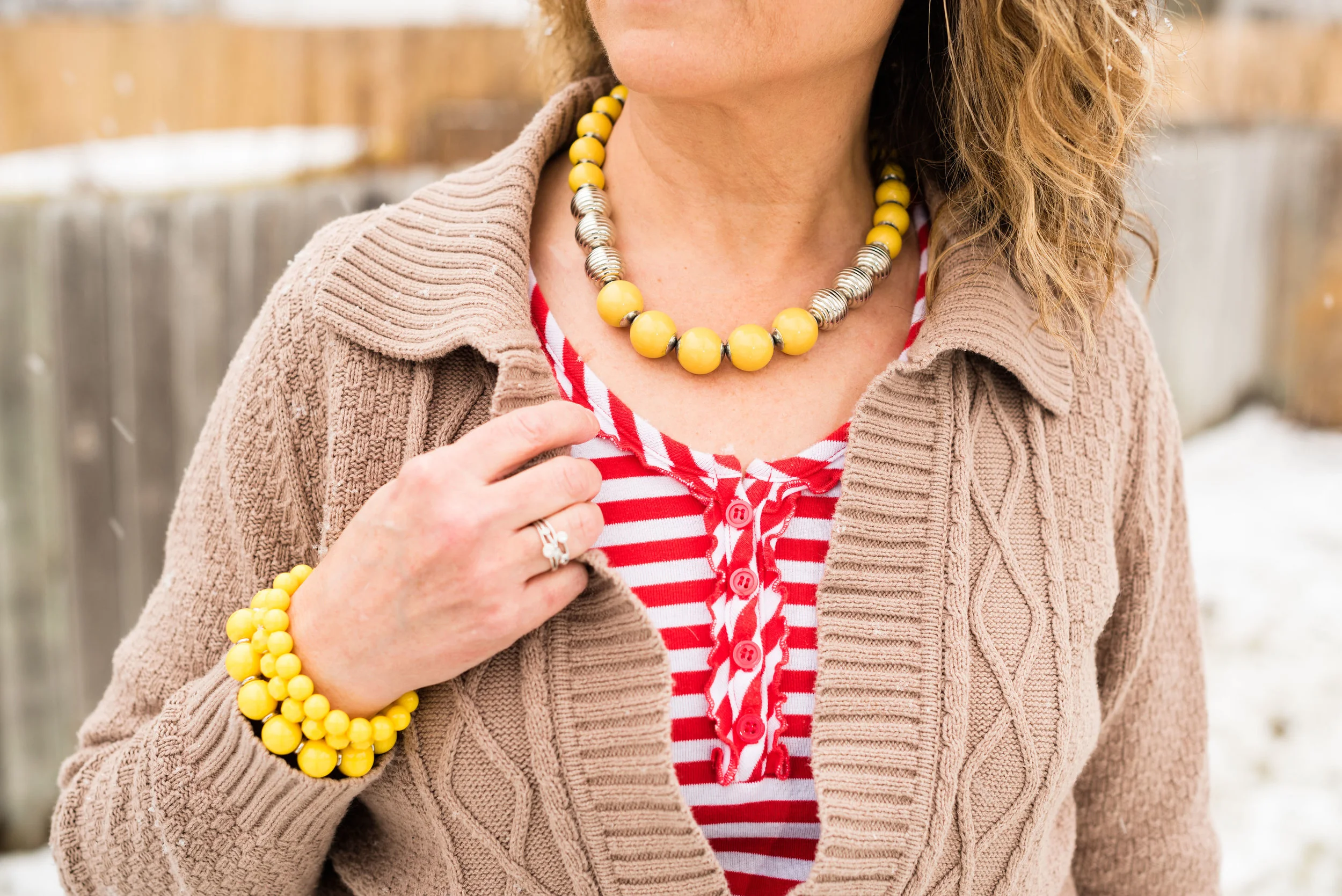
The Cherry Tomato striped tee is has 3/4 length sleeves and a small line of ruffles around the button area at the top. 

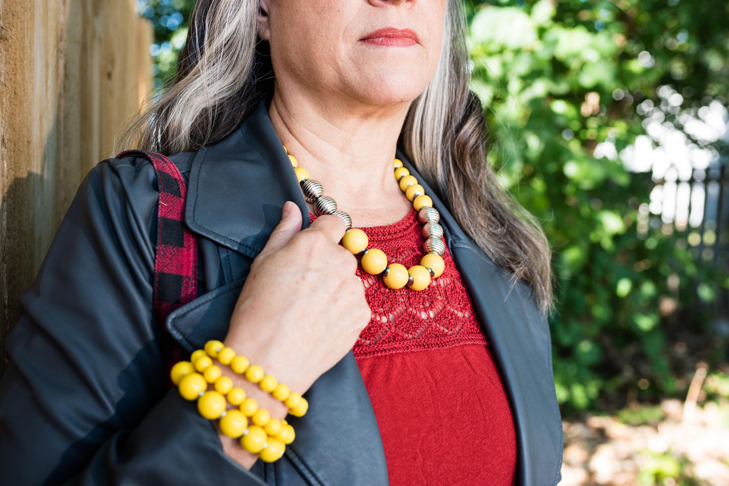
For Meadowlark yellow, I added my bright yellow bracelets and necklace. I love how adding just a touch of color can really make a statement. I don't wear a lot of yellow, but using it as an accent in my accessories is a great way to still incorporate the color into my outfit. 

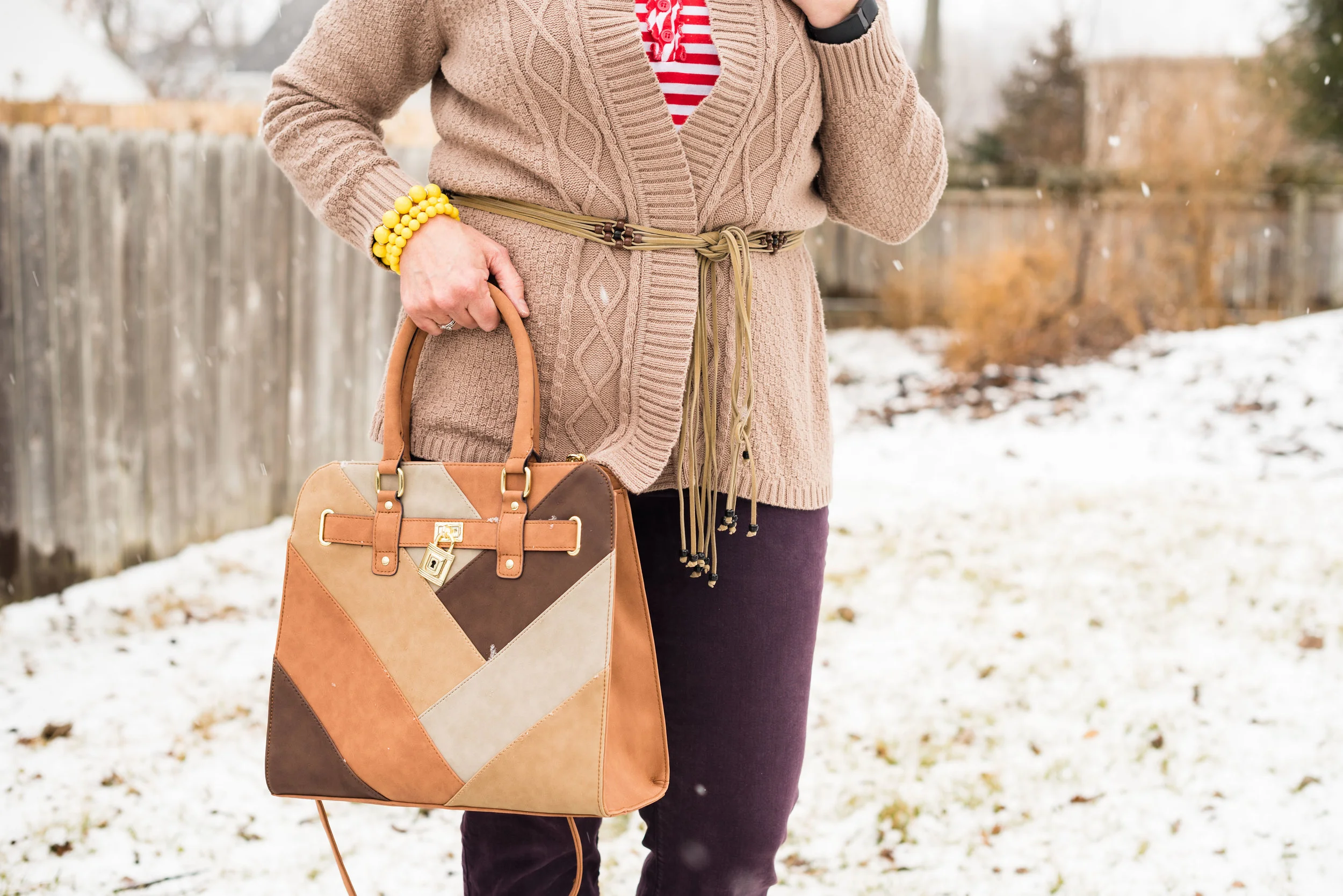
Everything in this outfit is thrifted except the jewelry, purse and shoes. When I bought this sweater it had toggle closures. I'm not a big fan of toggles, so I took them off and simply use the sweater as an open front cardi, or in this case, I added a belt. I thought this worked quite well, as pairing purple and red can be a little bit overwhelming. The sweater really helps to break up the two more bold colors. 

My suede Sonoma ankle boots are old, but I thought they were perfect for this outfit. The pants are very long, so the heel on the boot helps and they are that sandy color, like the sweater, belt and bag. The bag was a recent purchase from Walmart

Do I look like I'm running for the house in this last pic? Ha, ha. It was a cold day when we took these photos as you can no doubt tell by the snow.

I hope you enjoyed this look at more of the Pantone Spring 2018 colors. Dig around in your closet and see if you have any of these colors. I bet you would be surprised at how many you do have!

I've shared a few shopping links below. These are affiliate links. All opinions are my own. 

Photo credit Rebecca Trumbull. Make up Rachel Christensen.

Monday linking up with Catherine of Not Dressed as Lamb. Tuesday linking up with Shelbee of Shelbee on the Edge and Jess of Elegantly Dressed and Stylish