Pantone Autumn/Winter 2025 - Desert Sun, Magical Forest, and Wispy Clouds

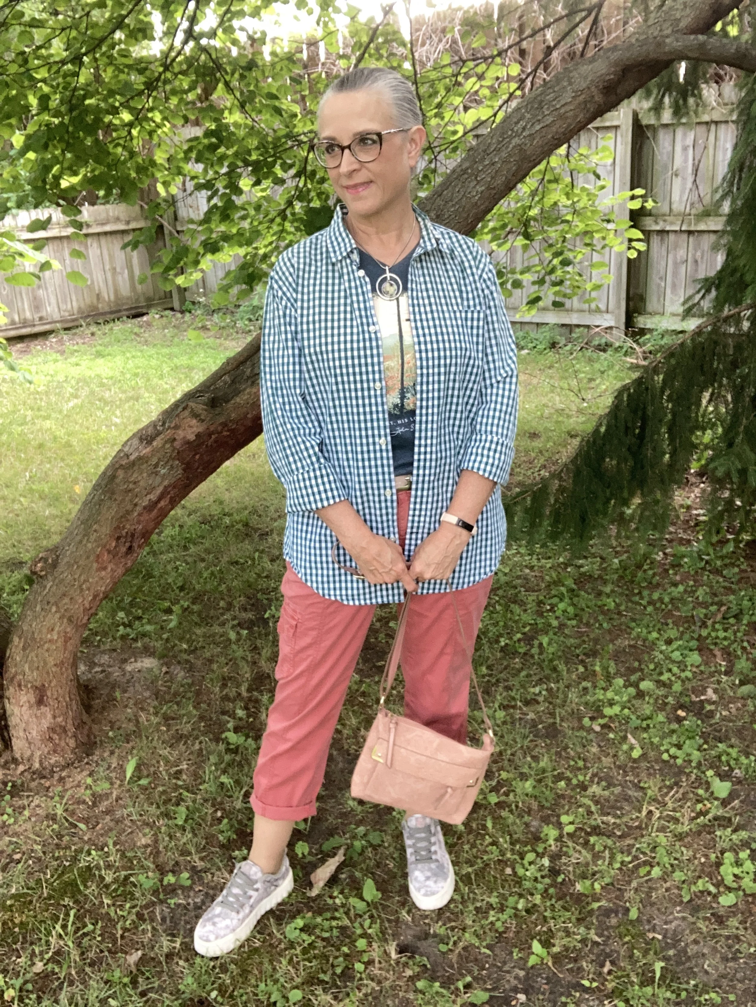
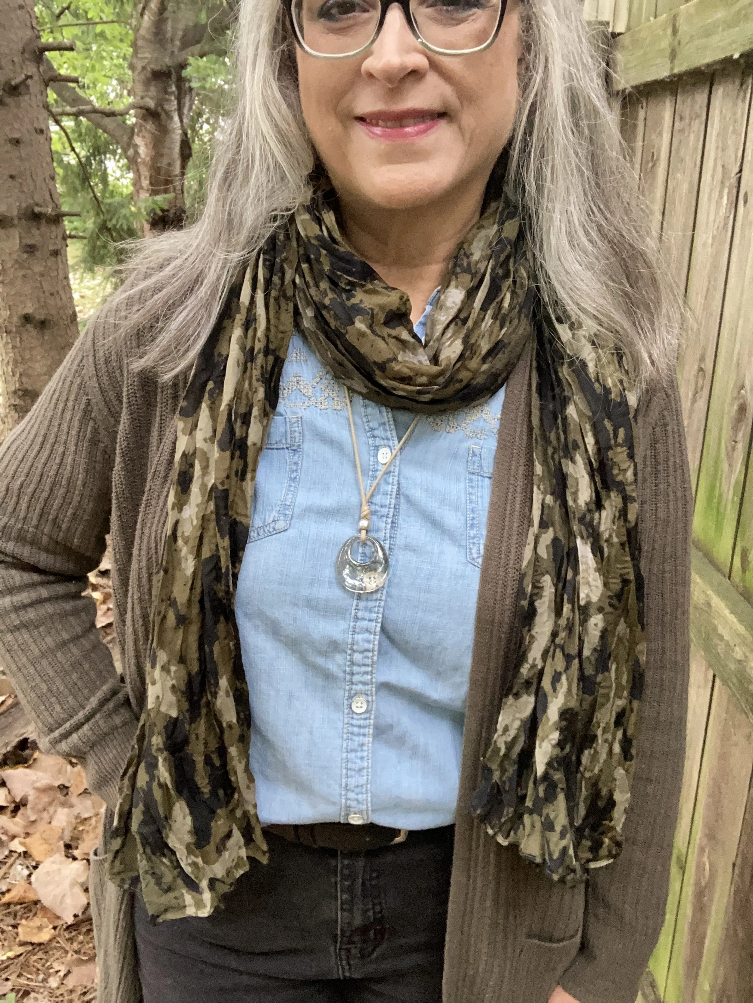
This week we are looking at three more colors from the Pantone London Palette for Autumn/Winter 2025. Today’s colors include, Desert Sun, a rich, golden yellow; Magical Forest, a dark green reminiscent of the deepest woods, and a light, airy grayish white called Wispy Clouds. You can see the actual colors in this pin.

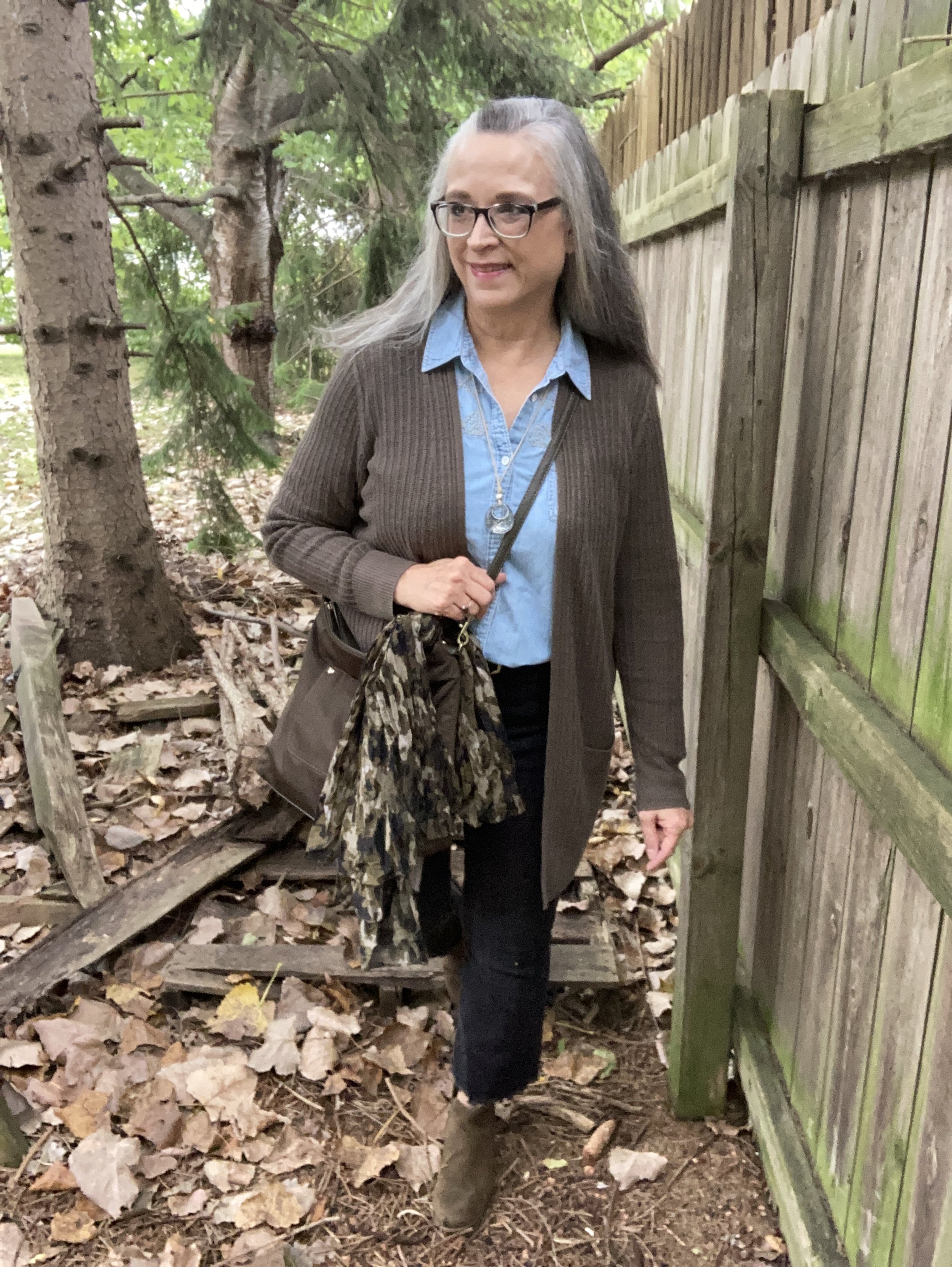
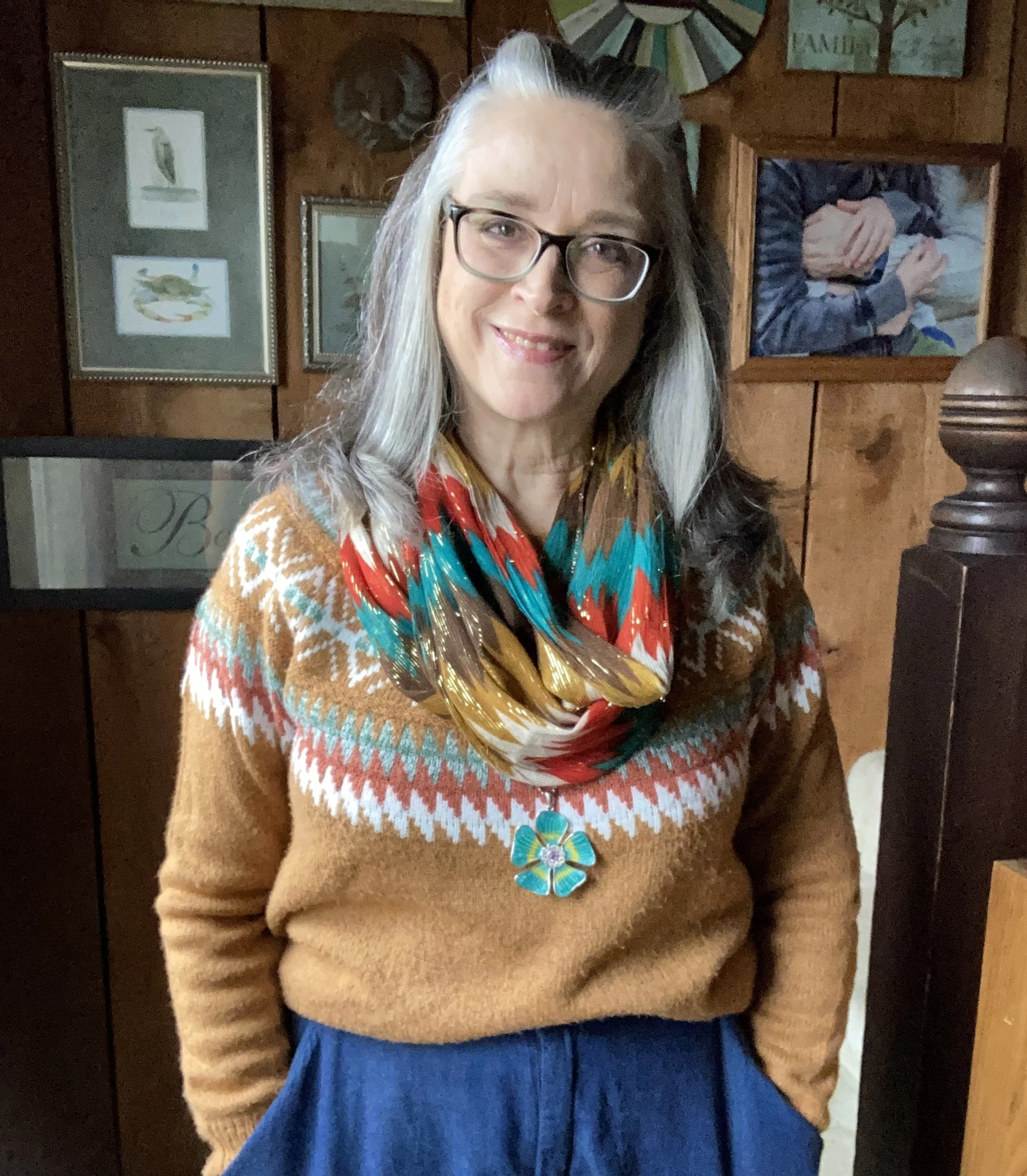
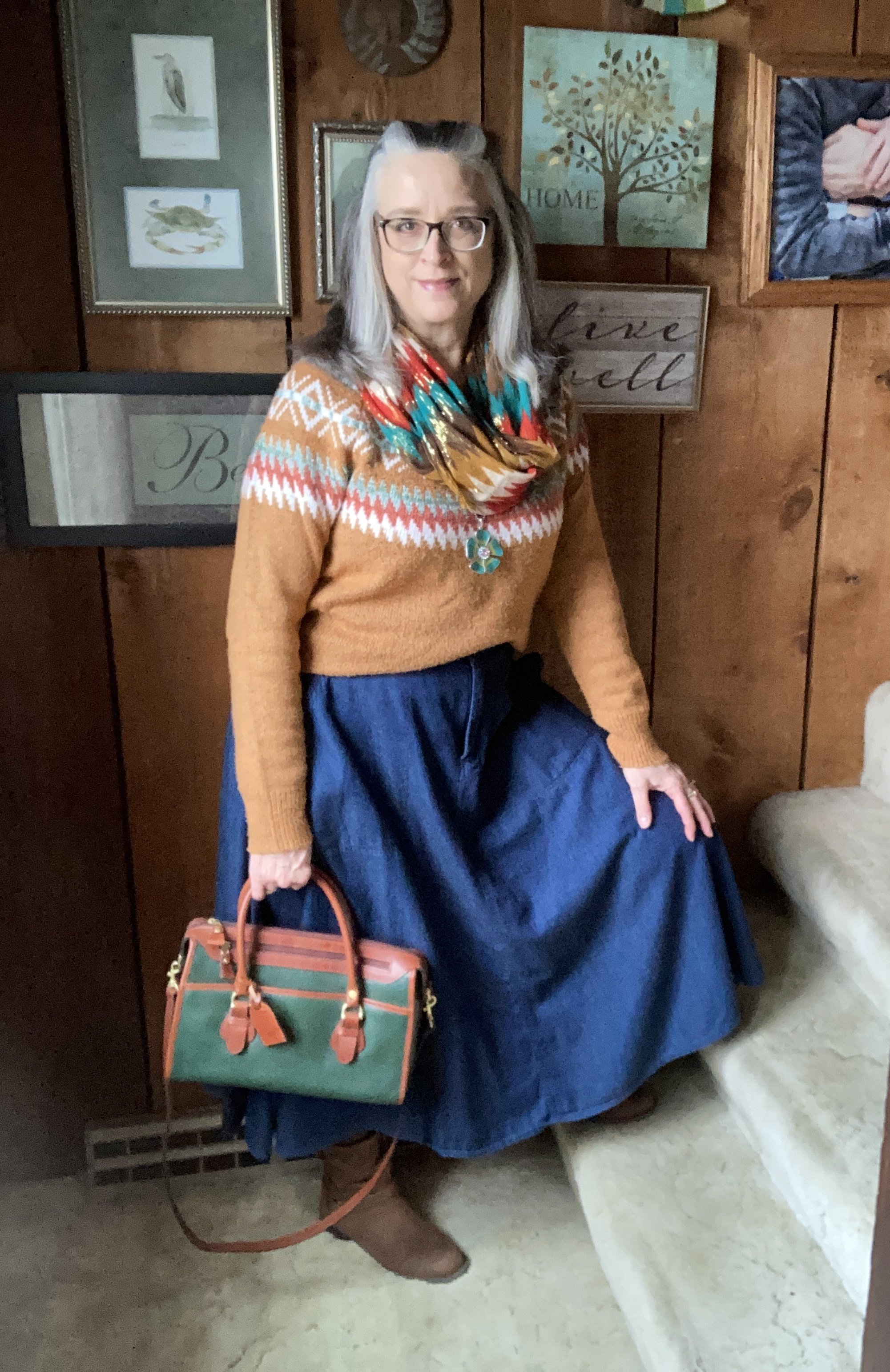
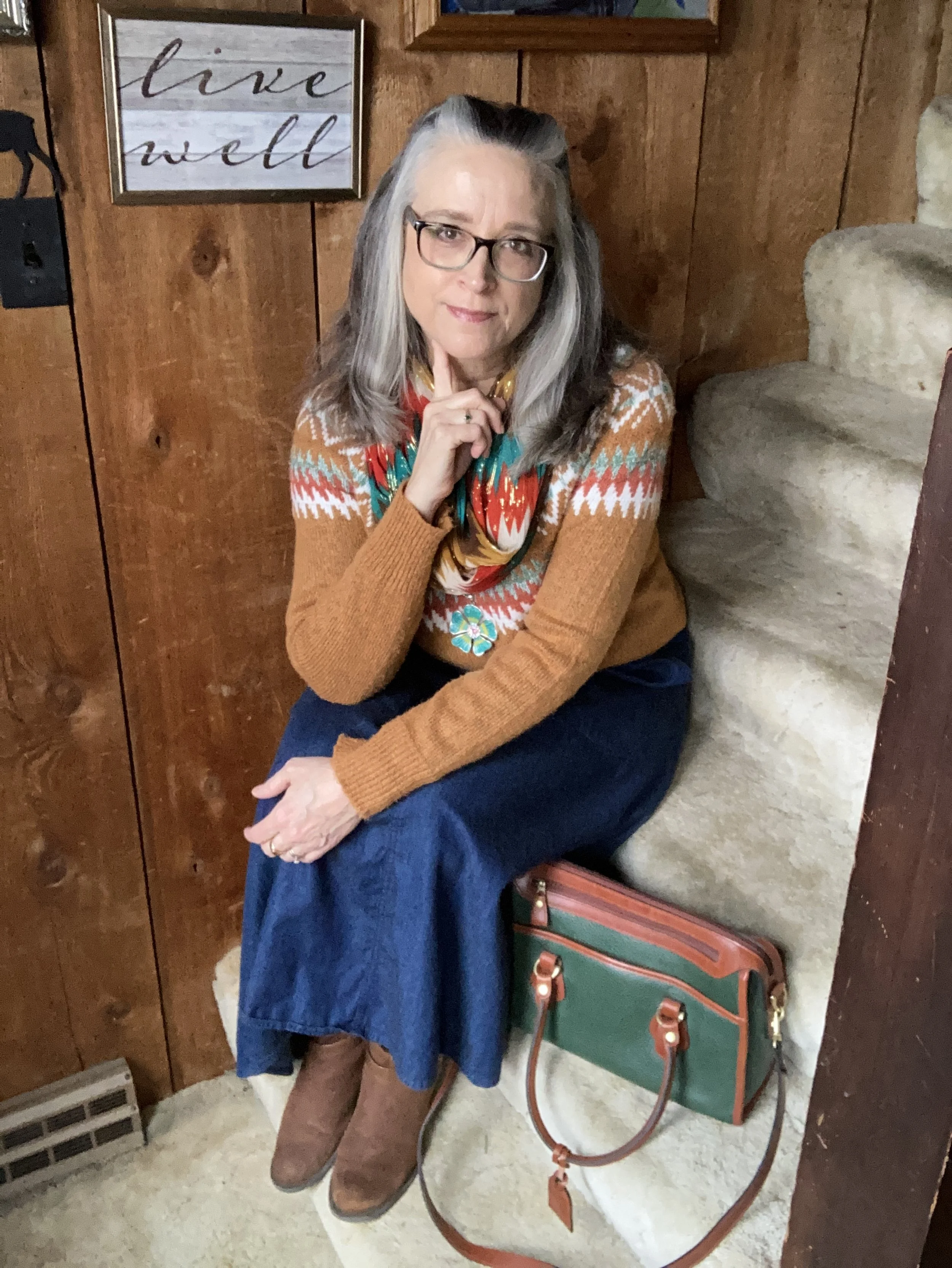
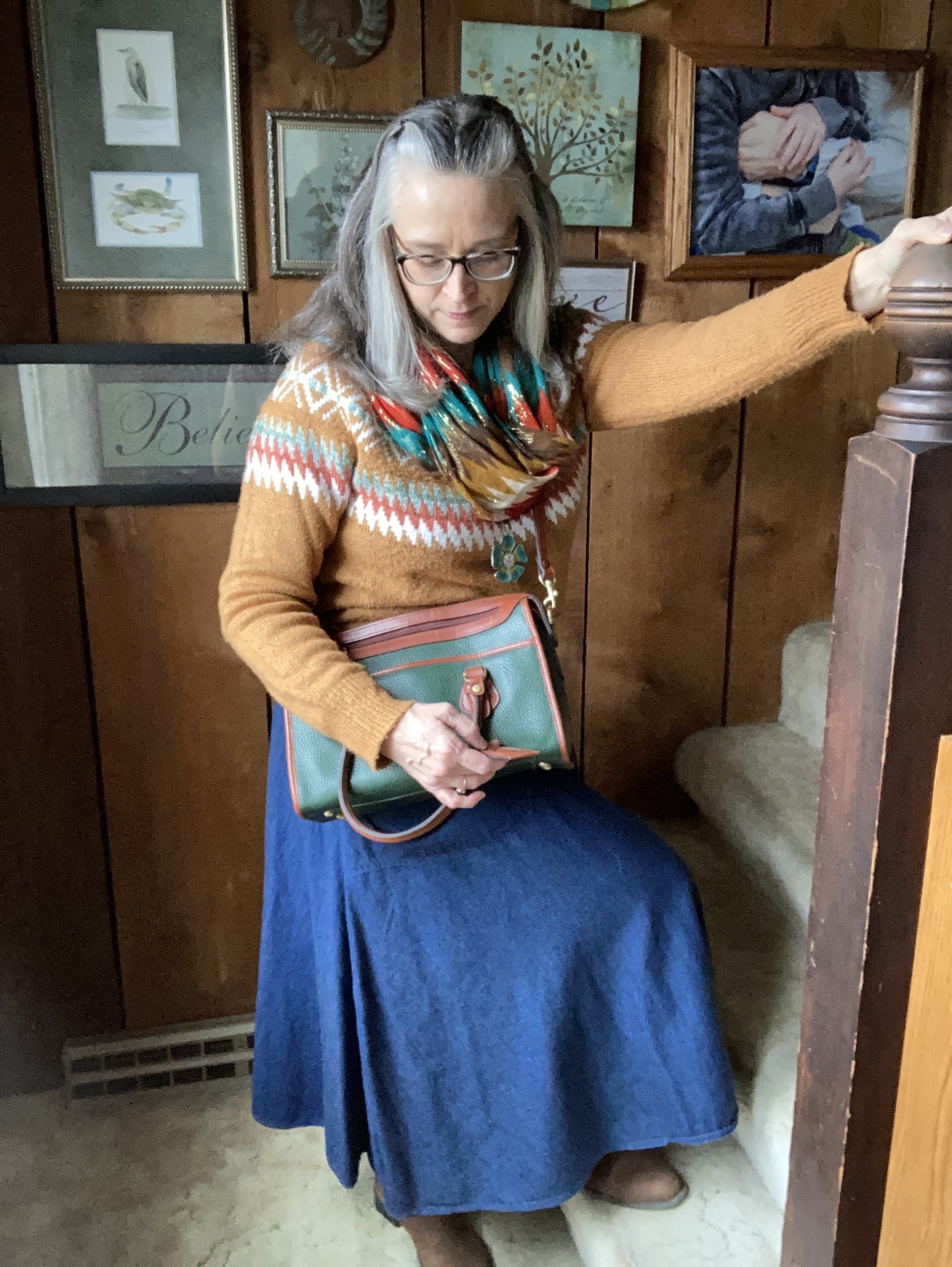
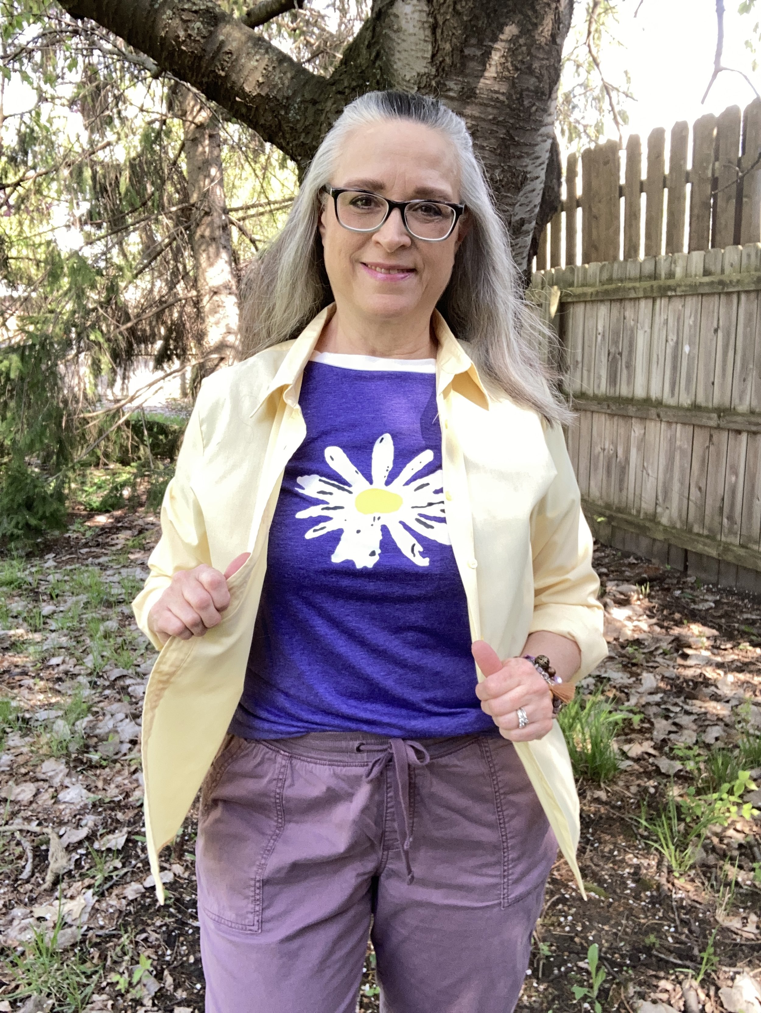
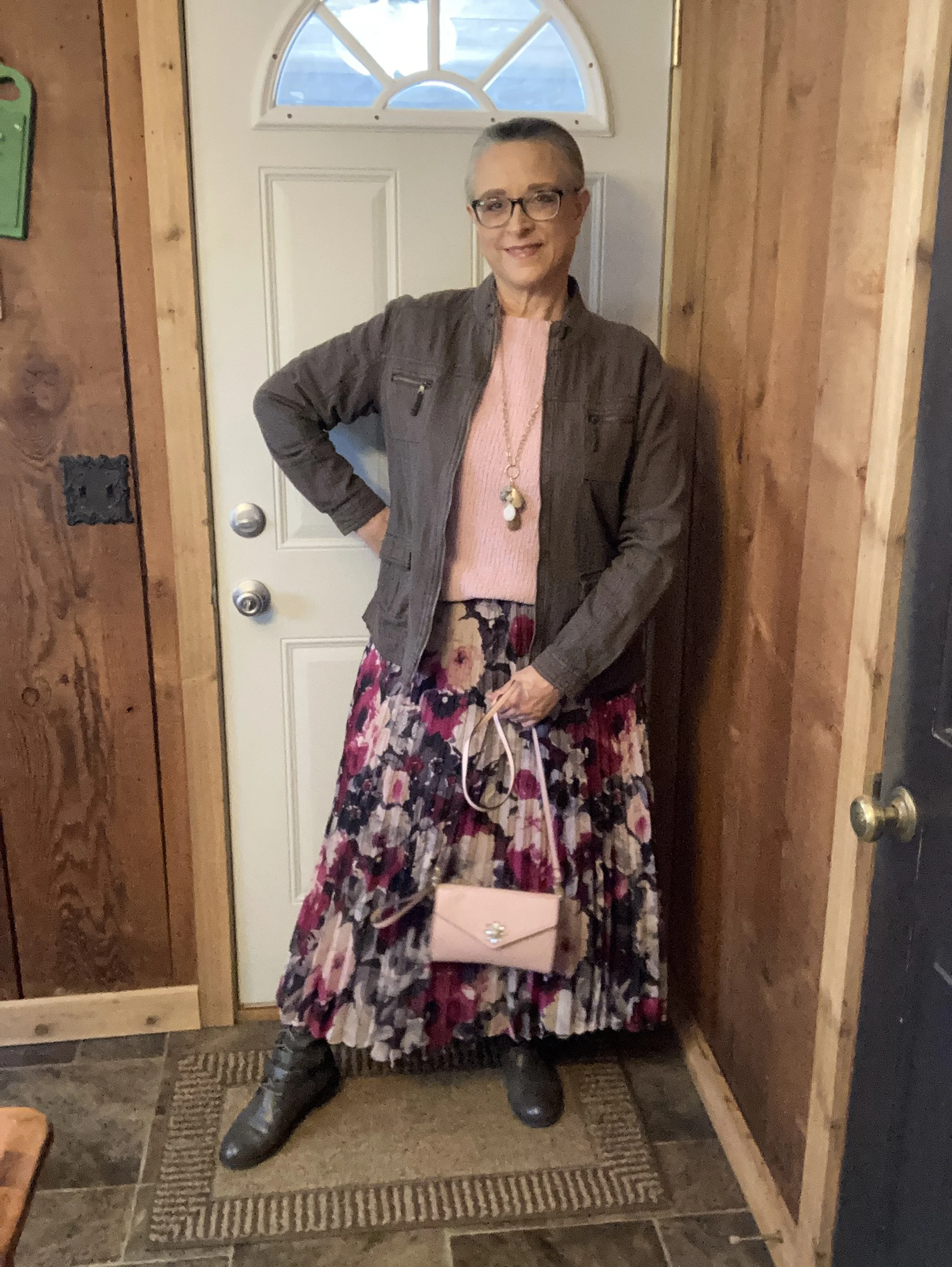
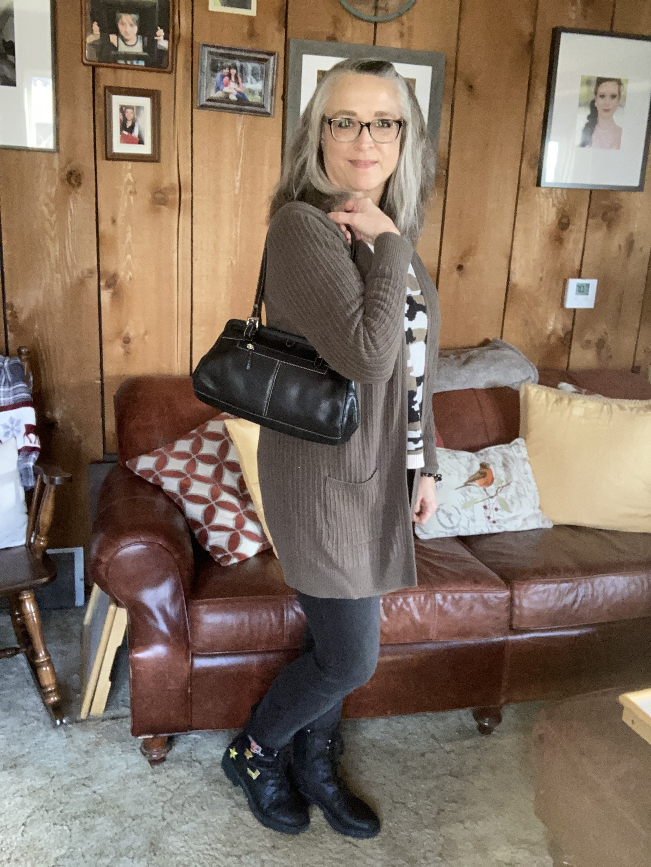
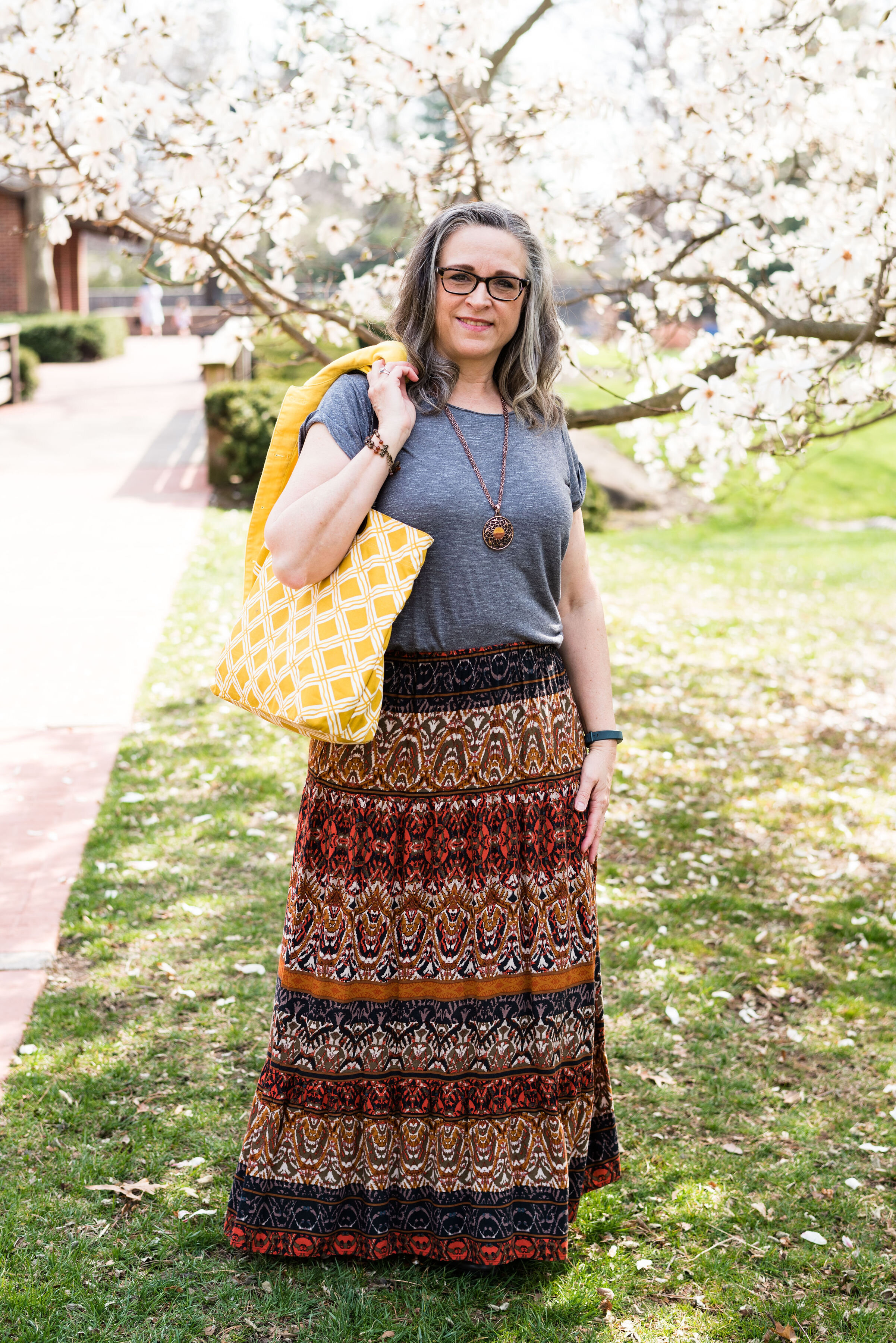
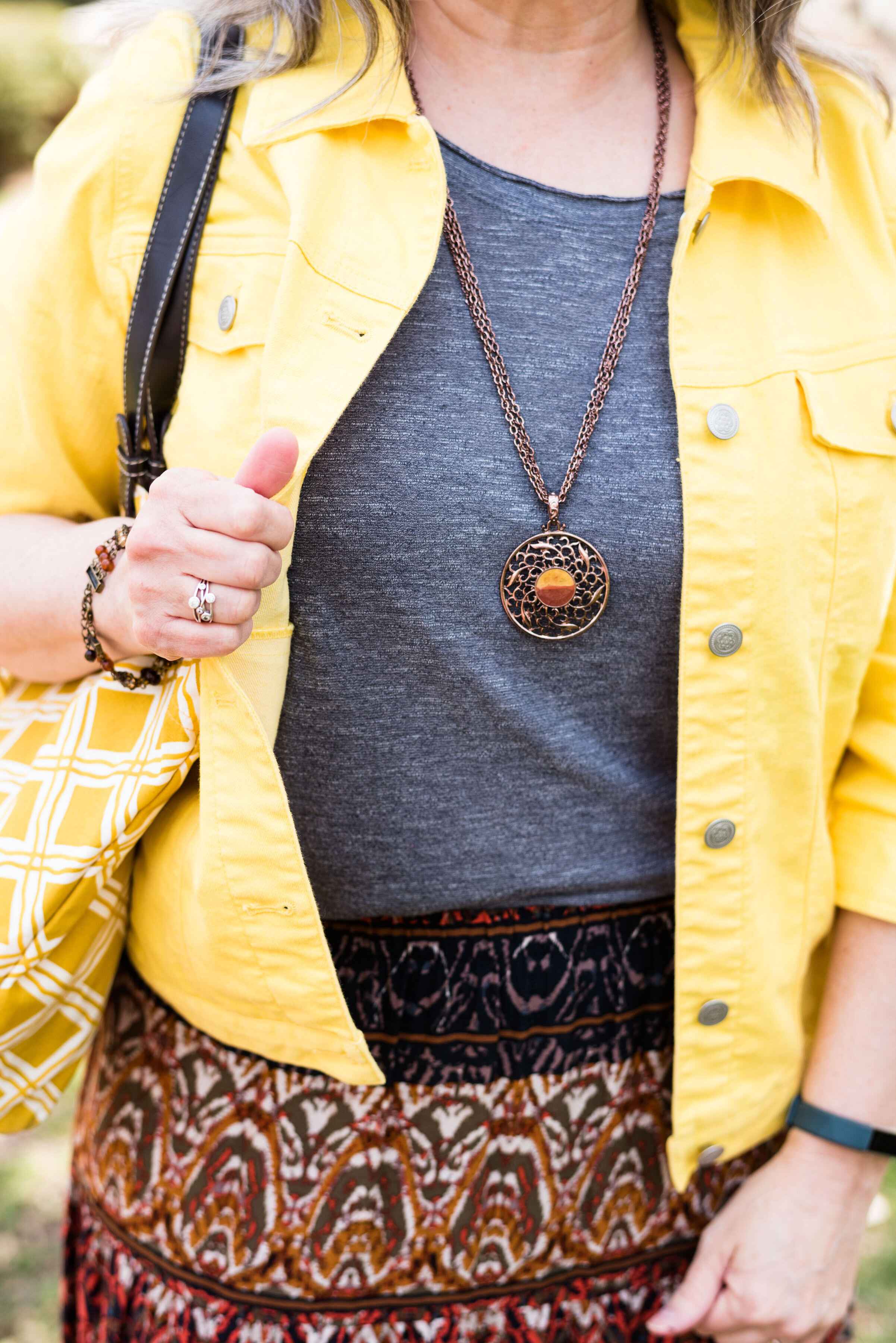
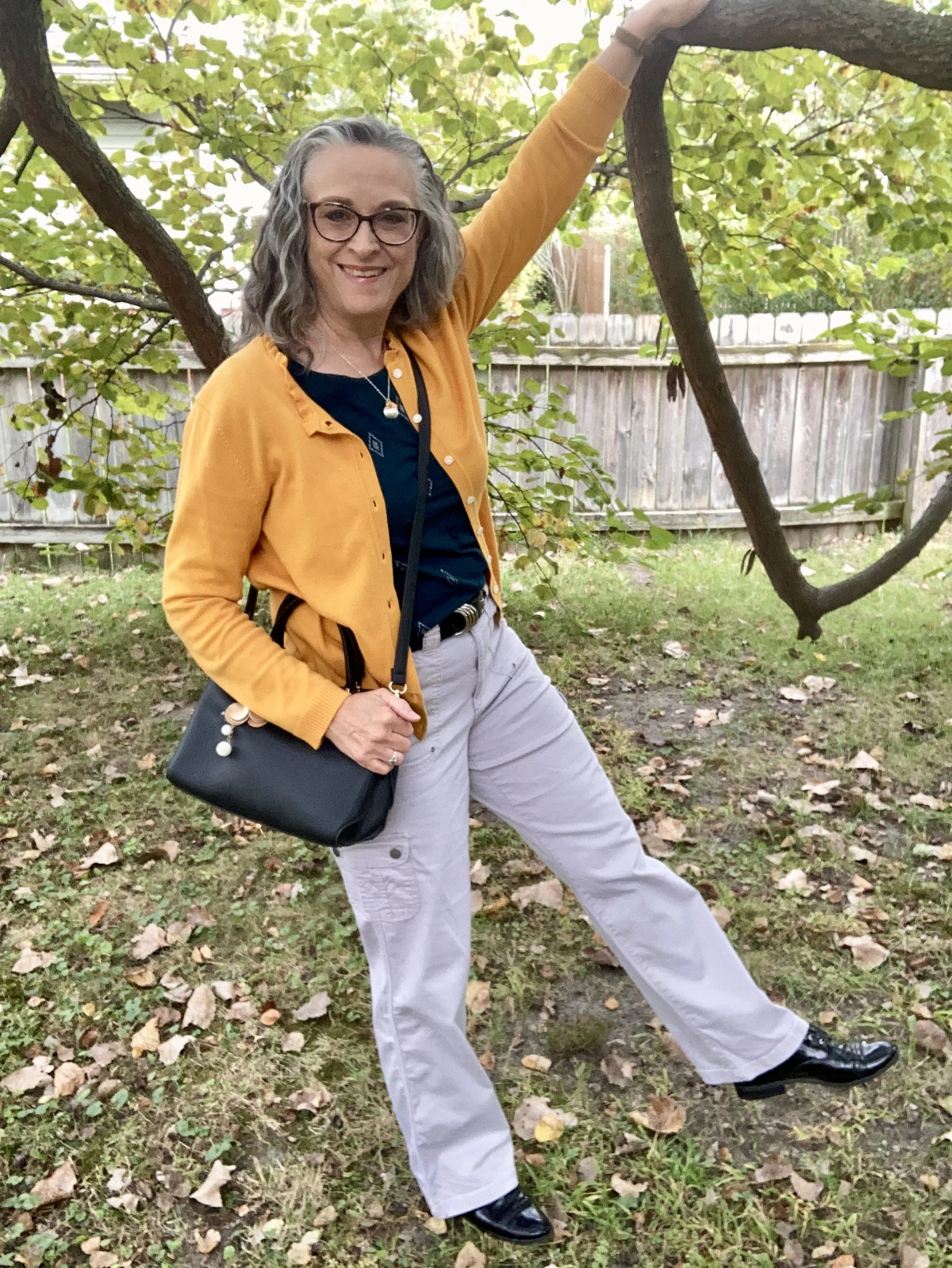
My Desert Sun cardigan is a brand called Callaway V and was a thrift find a few years ago. I love the fun details on this piece including the ruffle around the neck line and the tiny jewels at the center of each button. My phone does not do closeups well, so I didn’t bother trying to get a photo, but trust me those tiny jewels are there. Ha, ha. This golden yellow is a perfect color for fall. You can see how I styled this cardigan with a multi print maxi dress here.

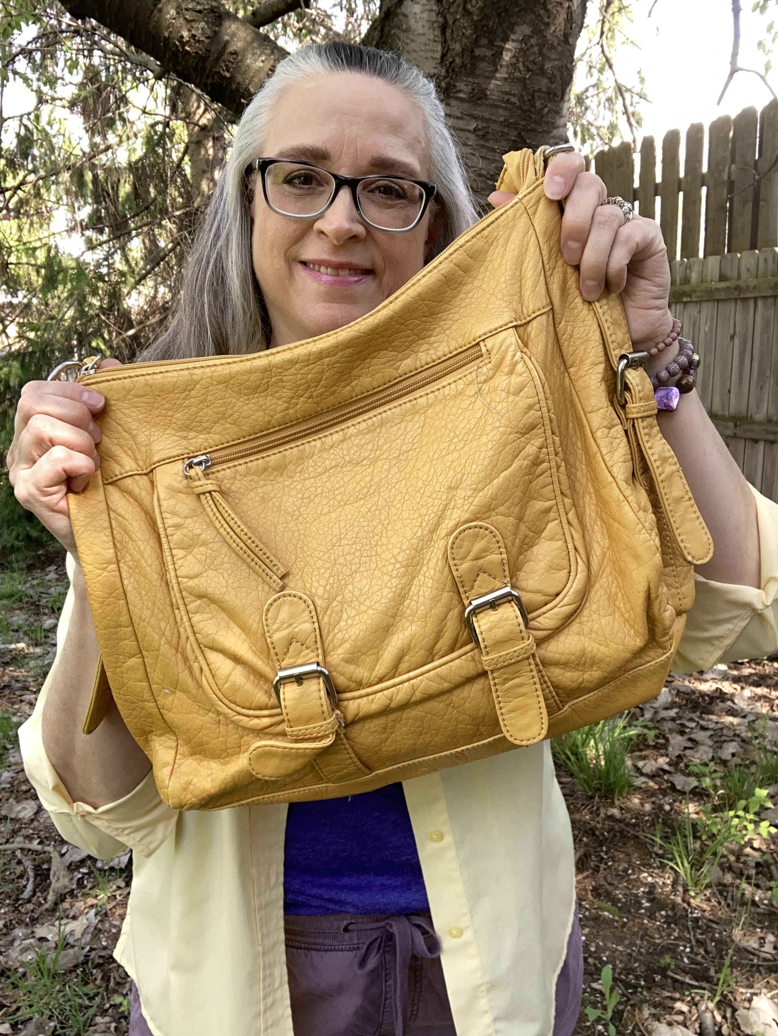
It was hard to find any cardigans in this color so I added a few other Desert Sun items.

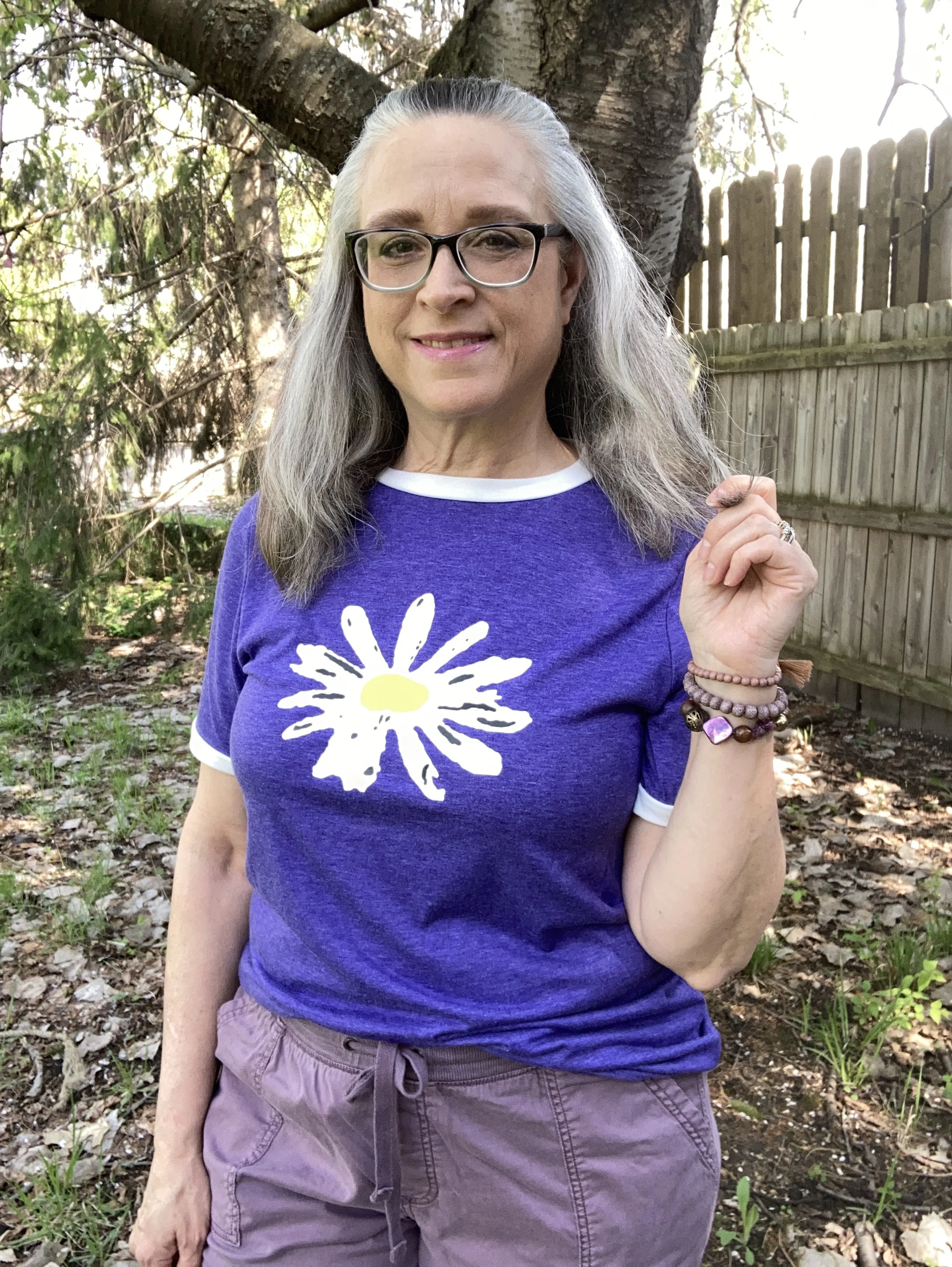
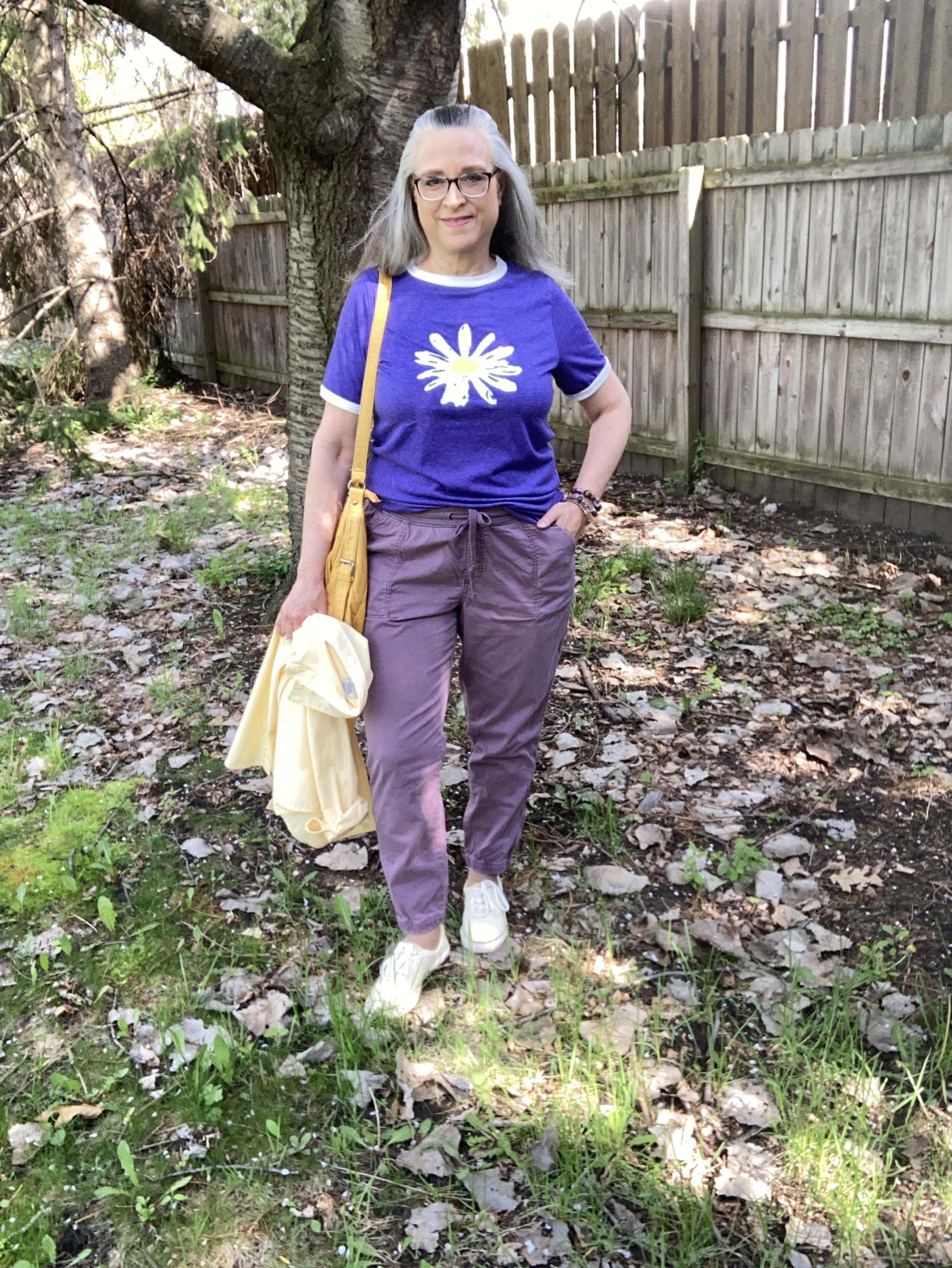
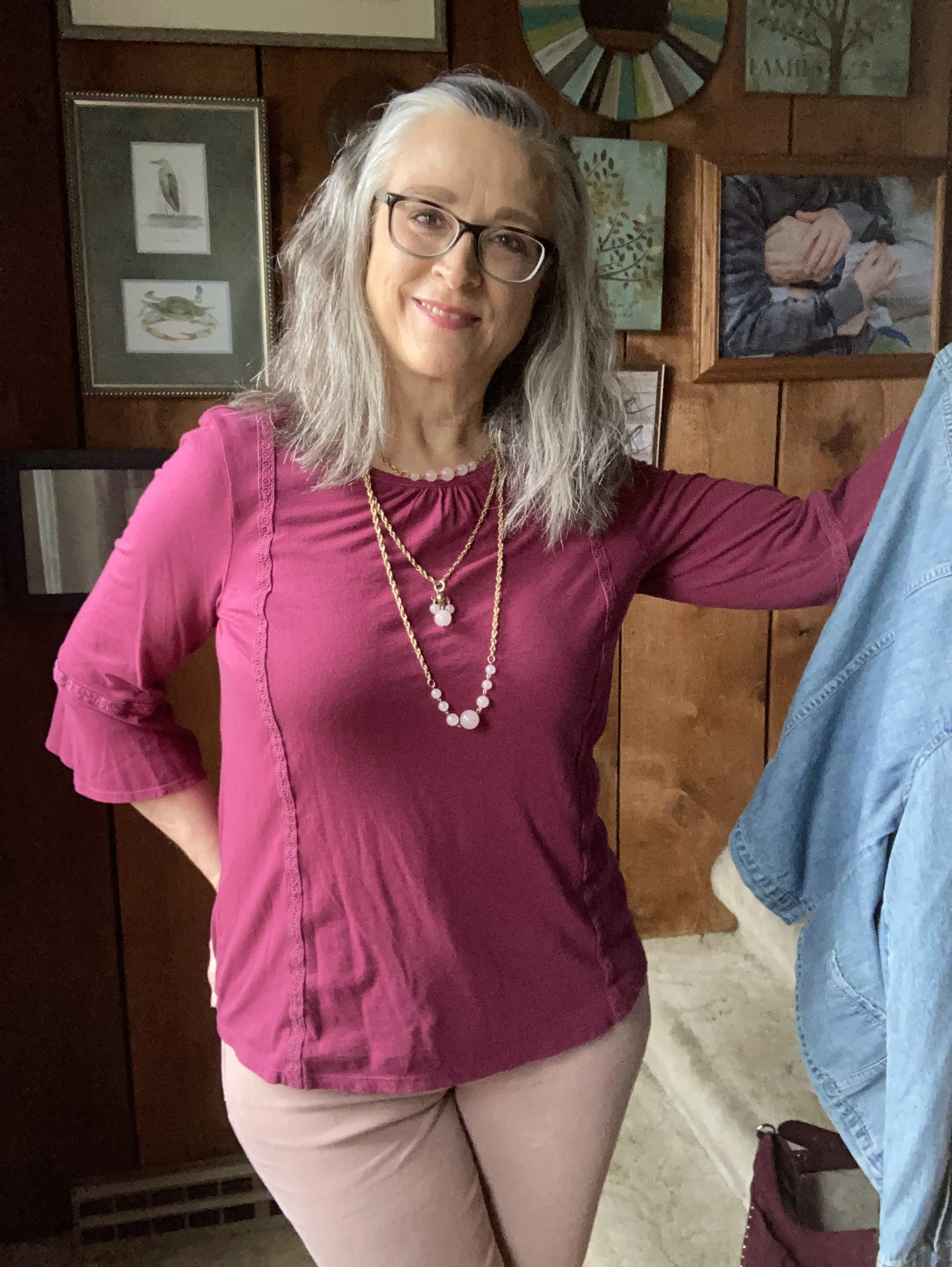
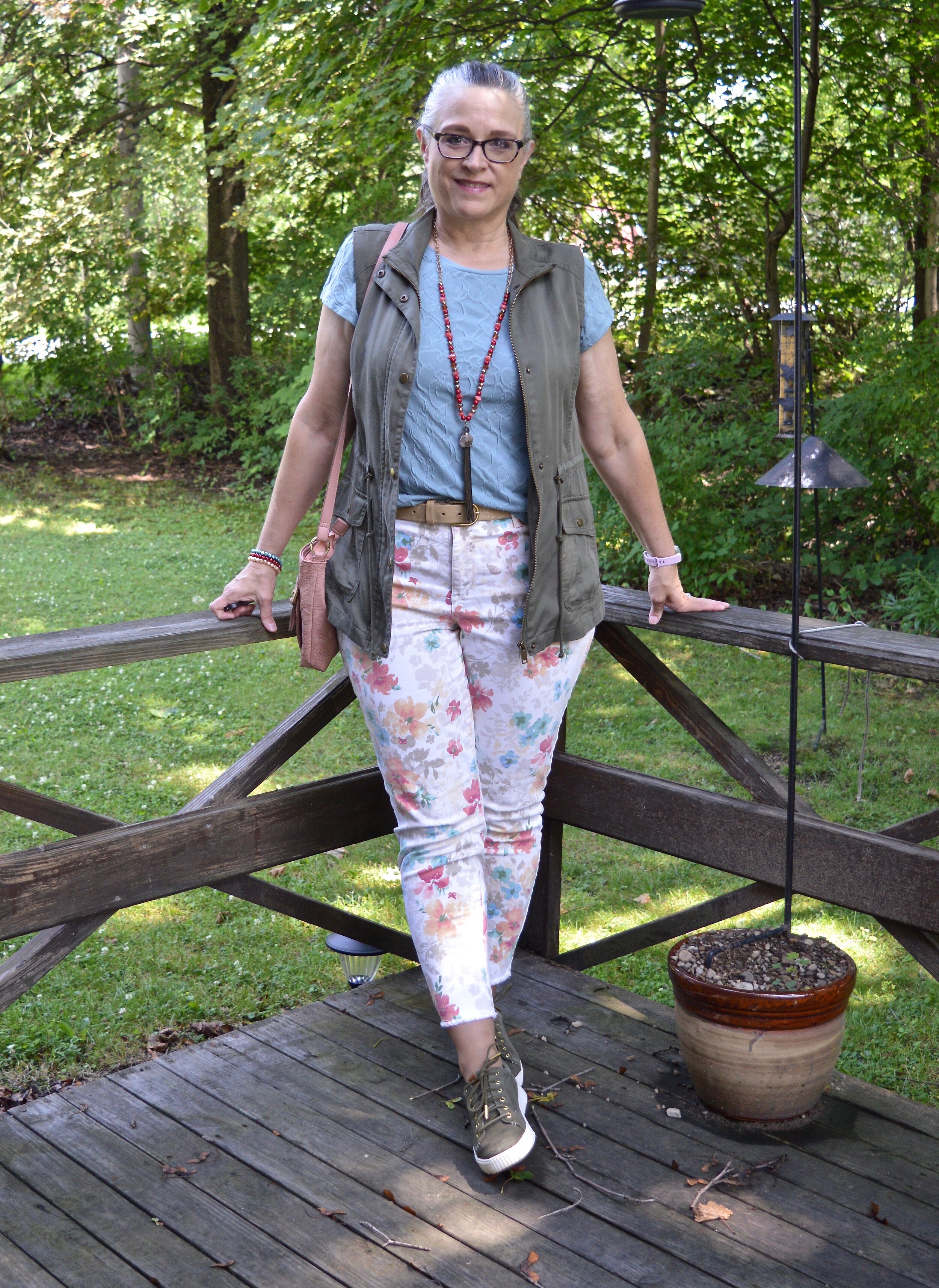
My Magical Forest tee is Sonoma brand and was a piece I found at Kohl’s a few seasons ago. Being a not-so-basic sort of girl, most of my basics have to have a few details like interesting prints and even a bit of bling.

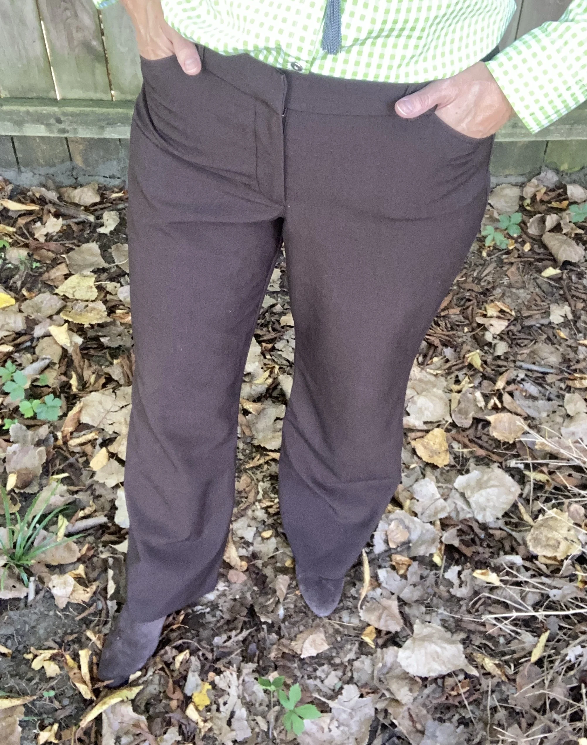
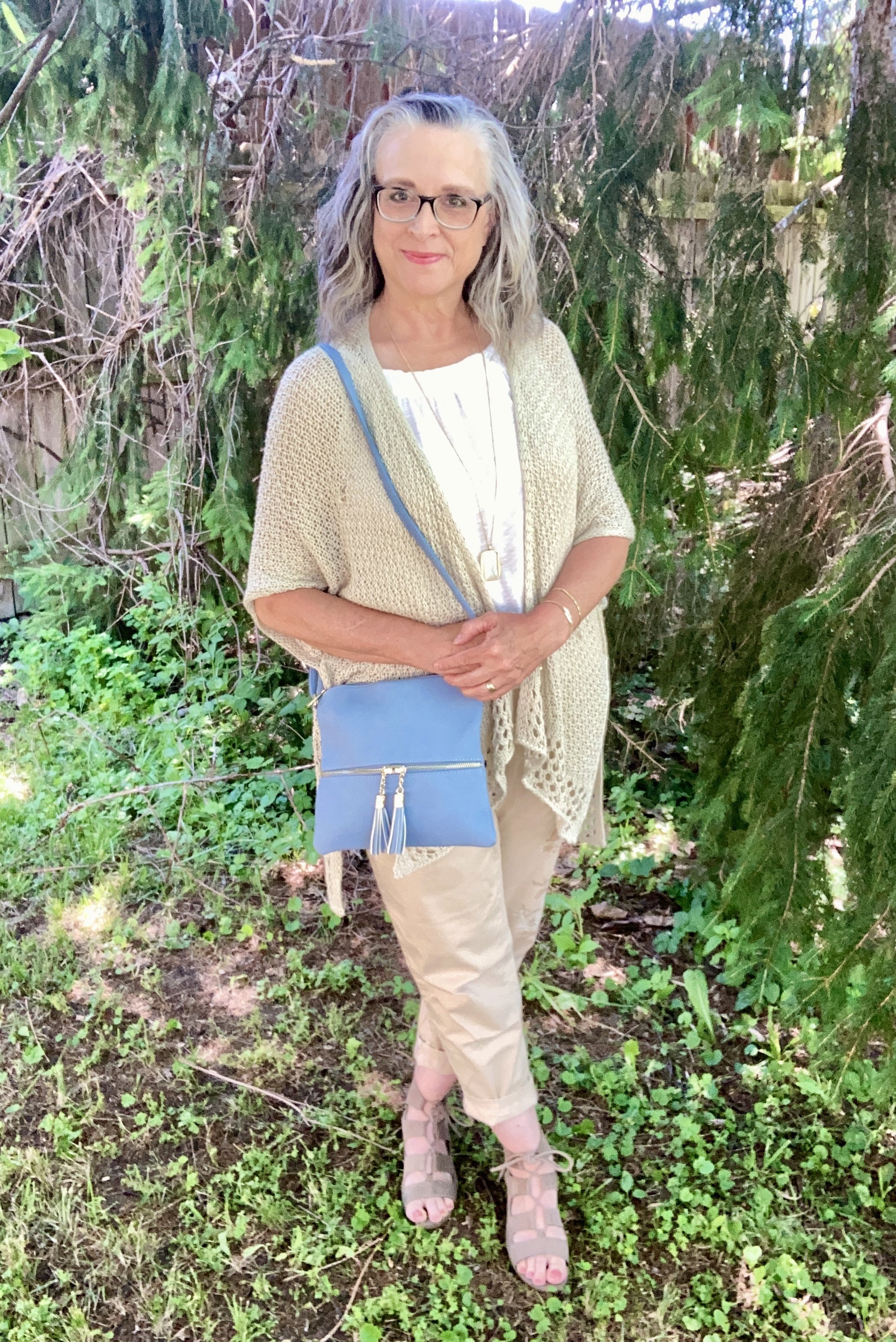
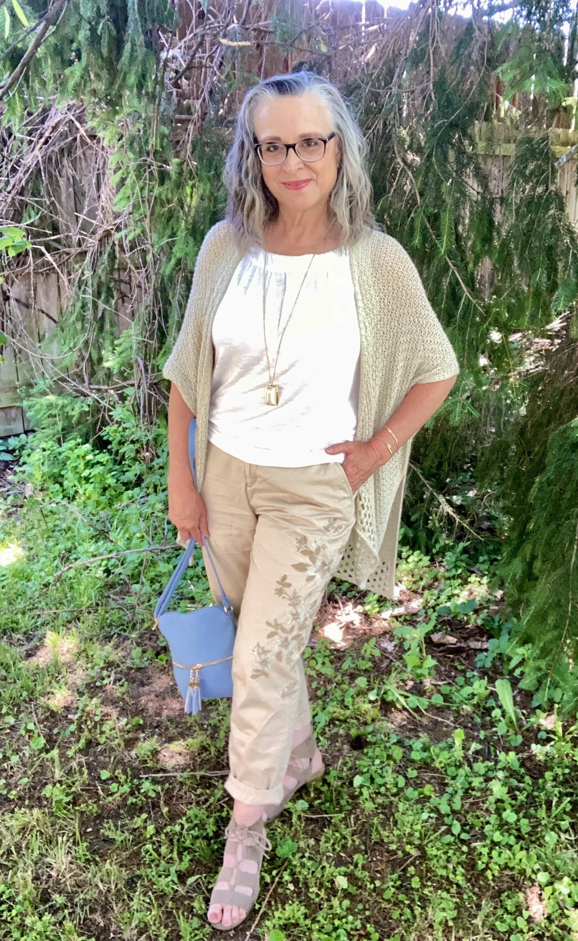
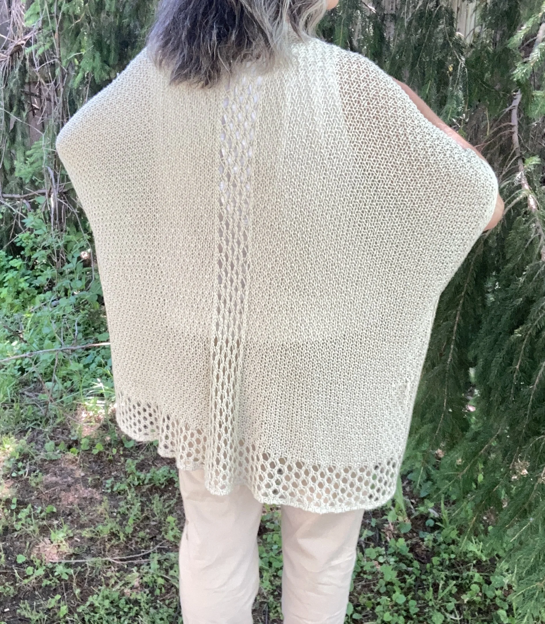
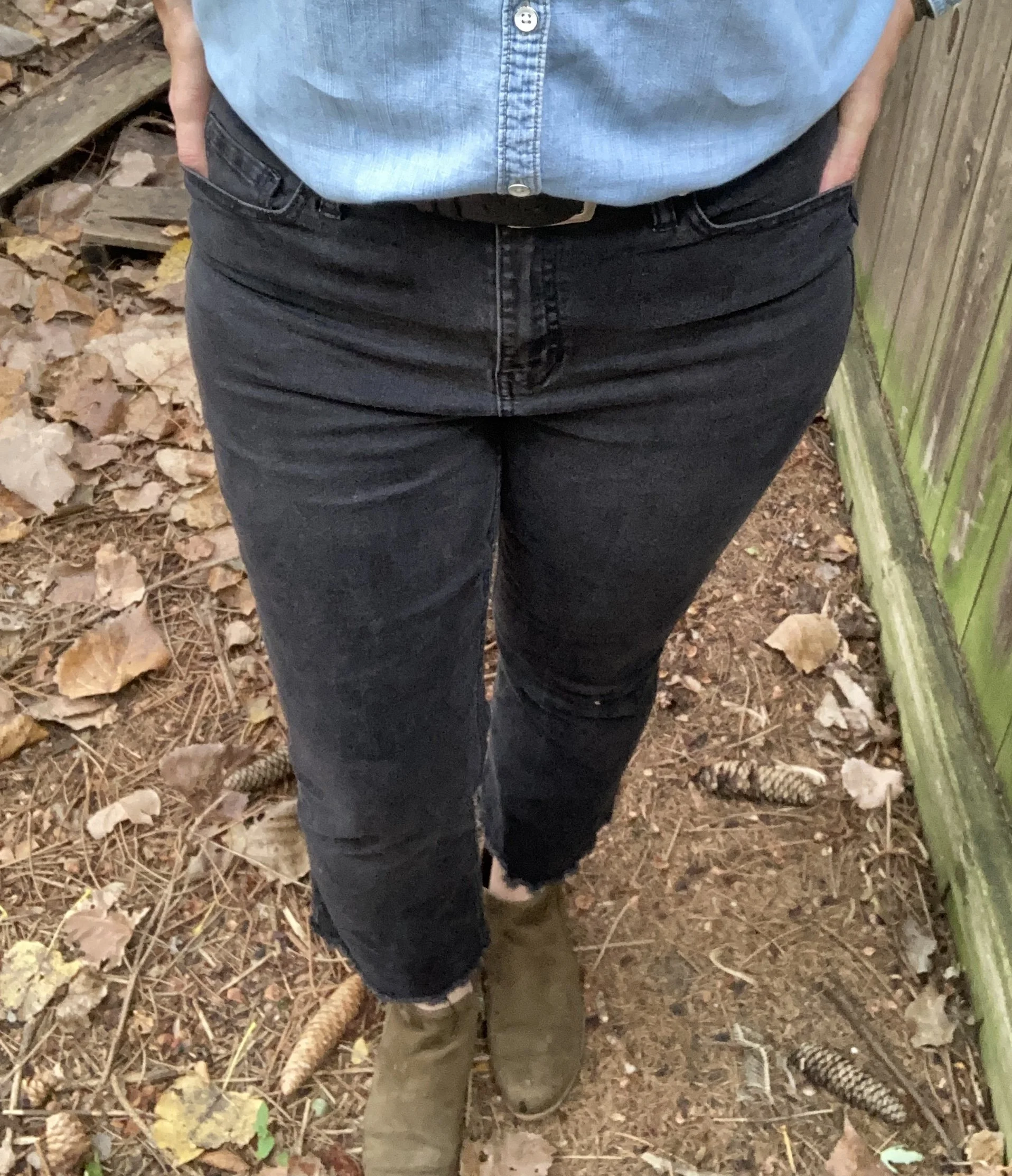
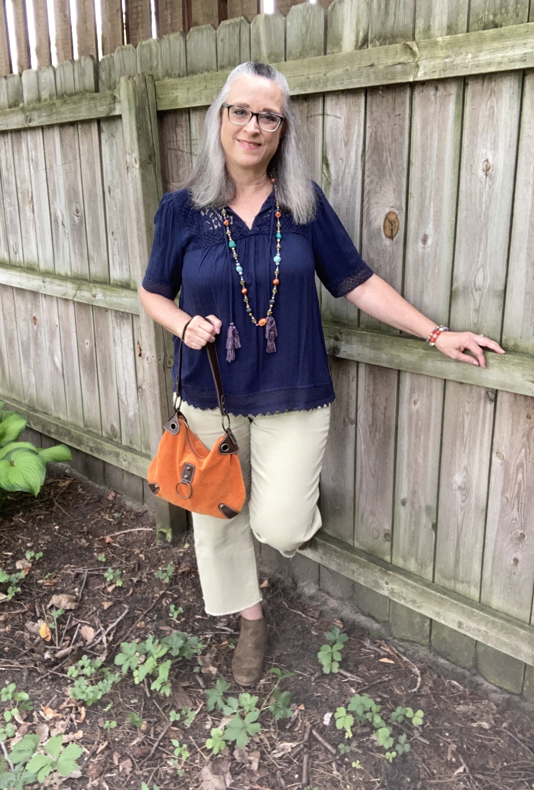
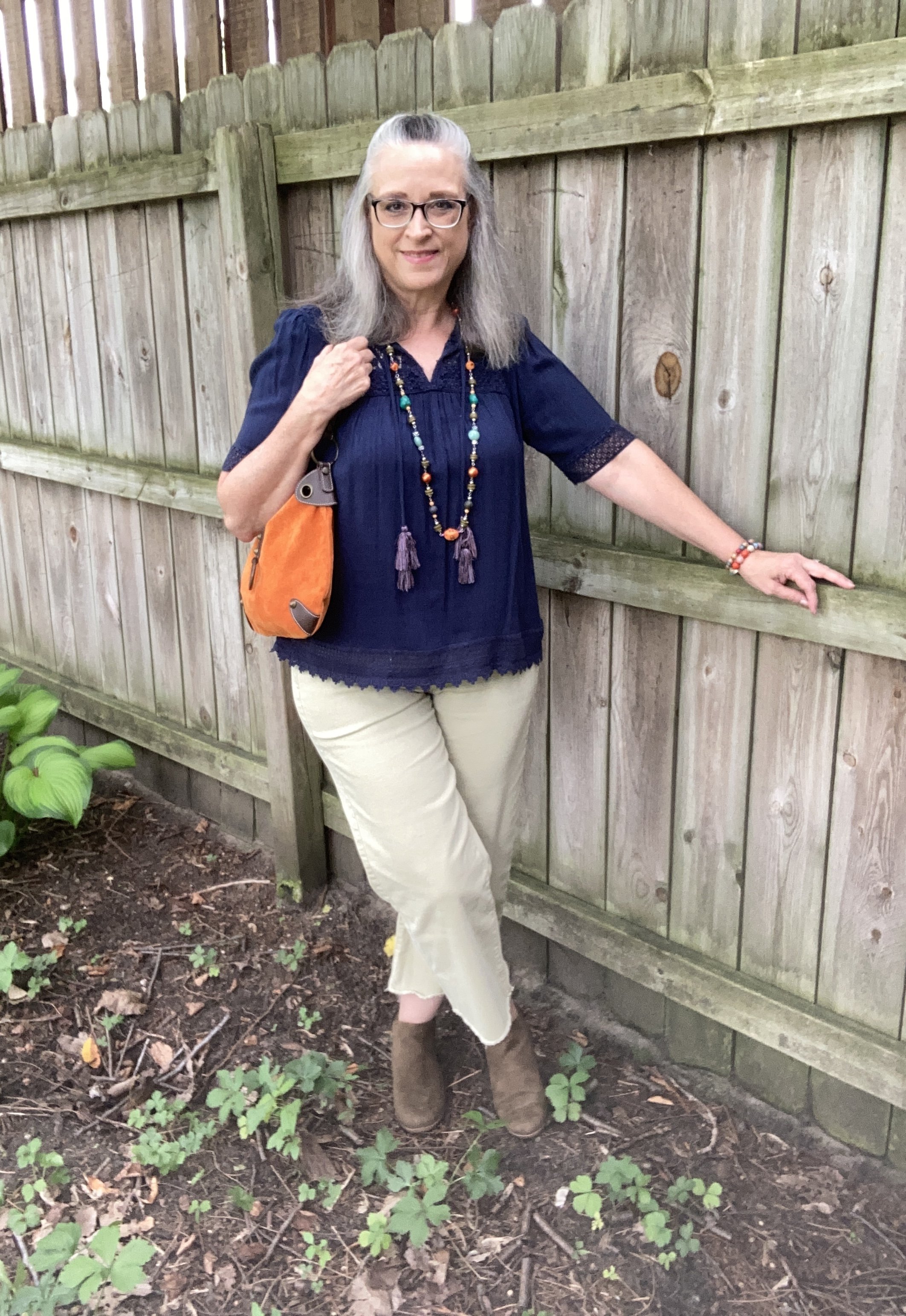
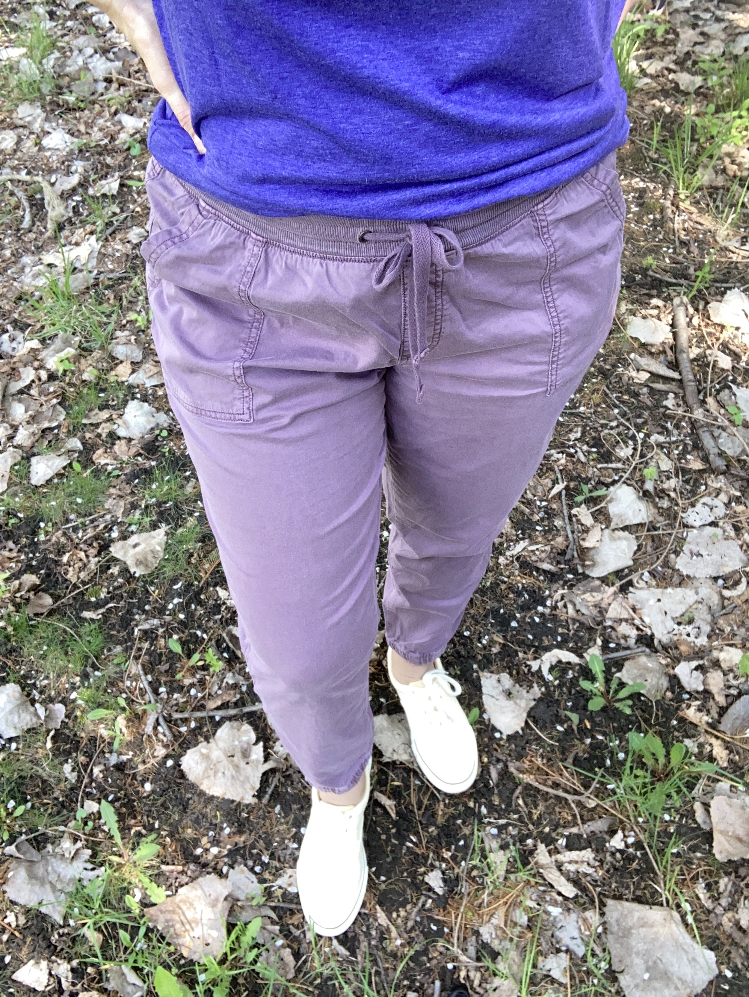
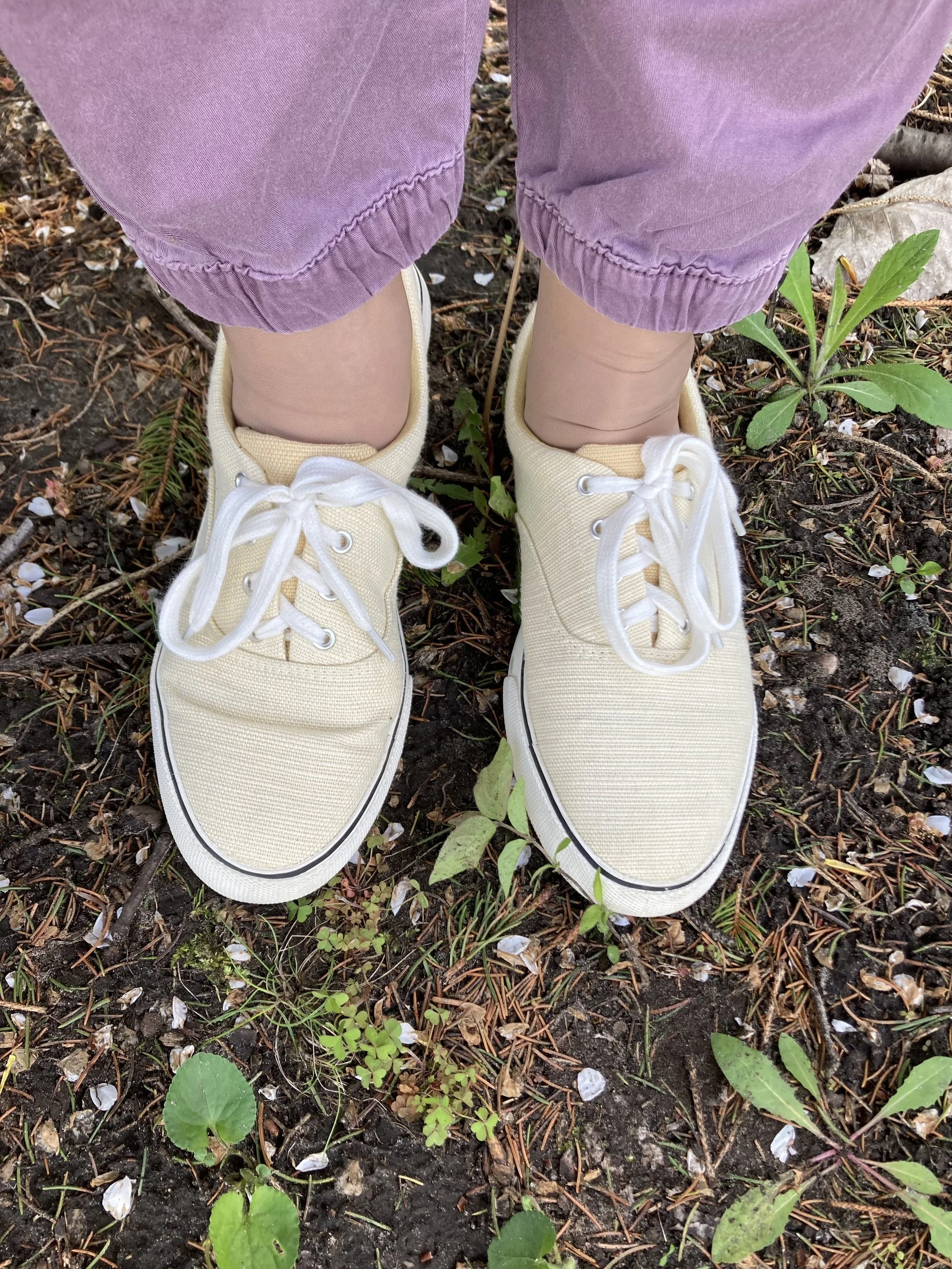
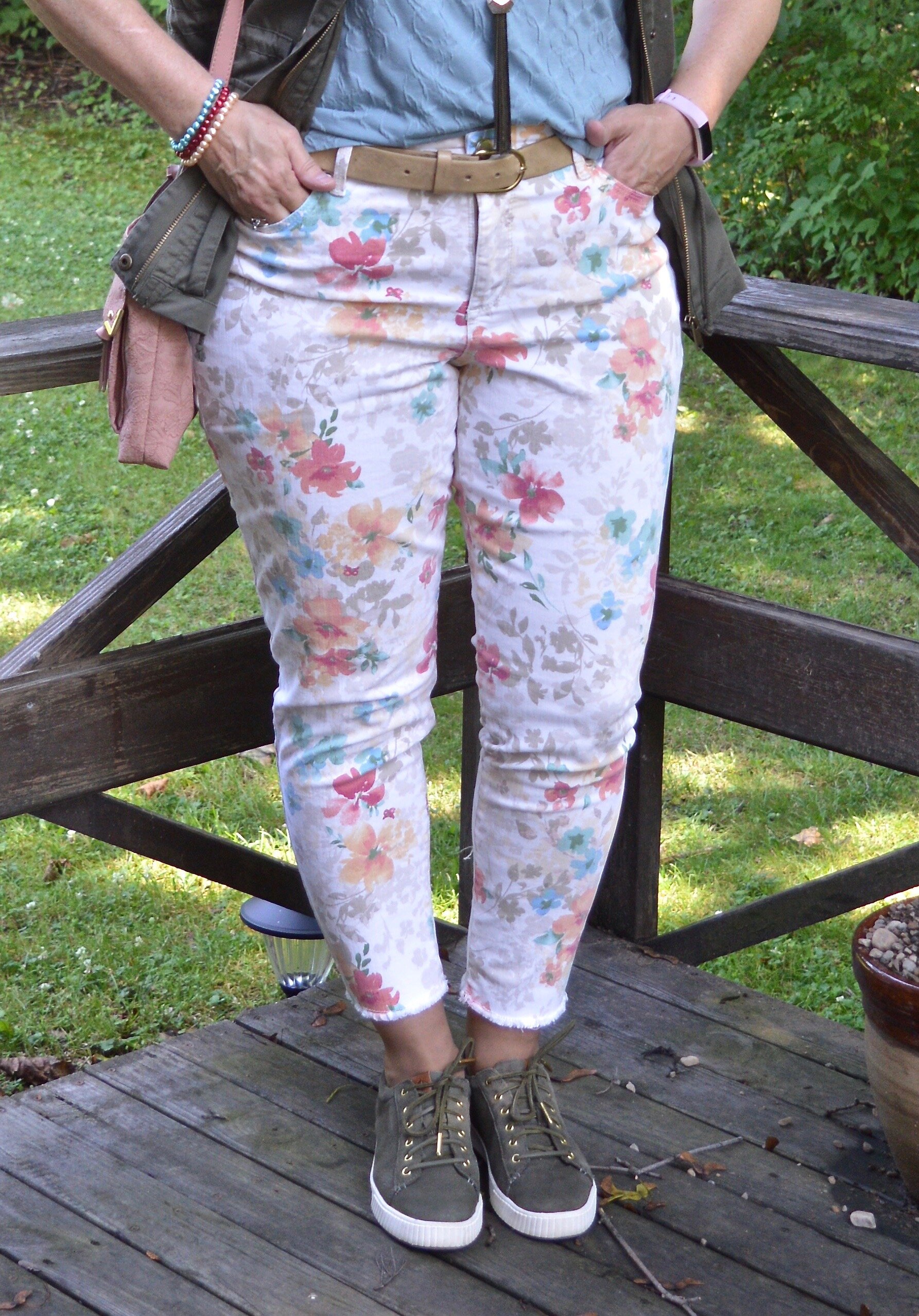
I thought these second hand, Gloria Vanderbilt utility pants were a close match to Wispy Clouds. They are a lighter weight so will be put away for the winter, but they are a great pair of pants for a dressy casual vibe. The utility details of extra pockets and rivets make it more casual, but the wider legs give them a dressier trouser vibe.

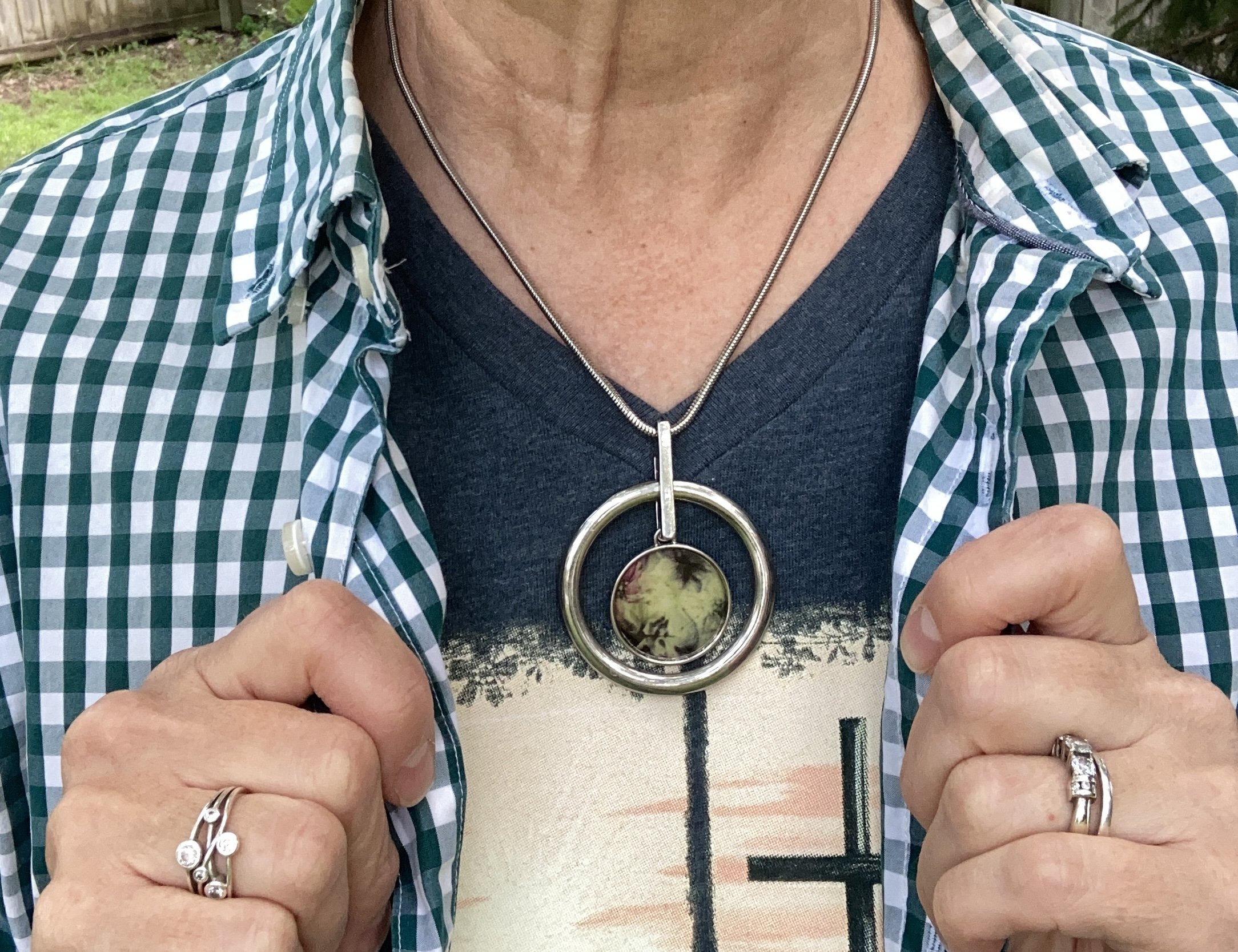
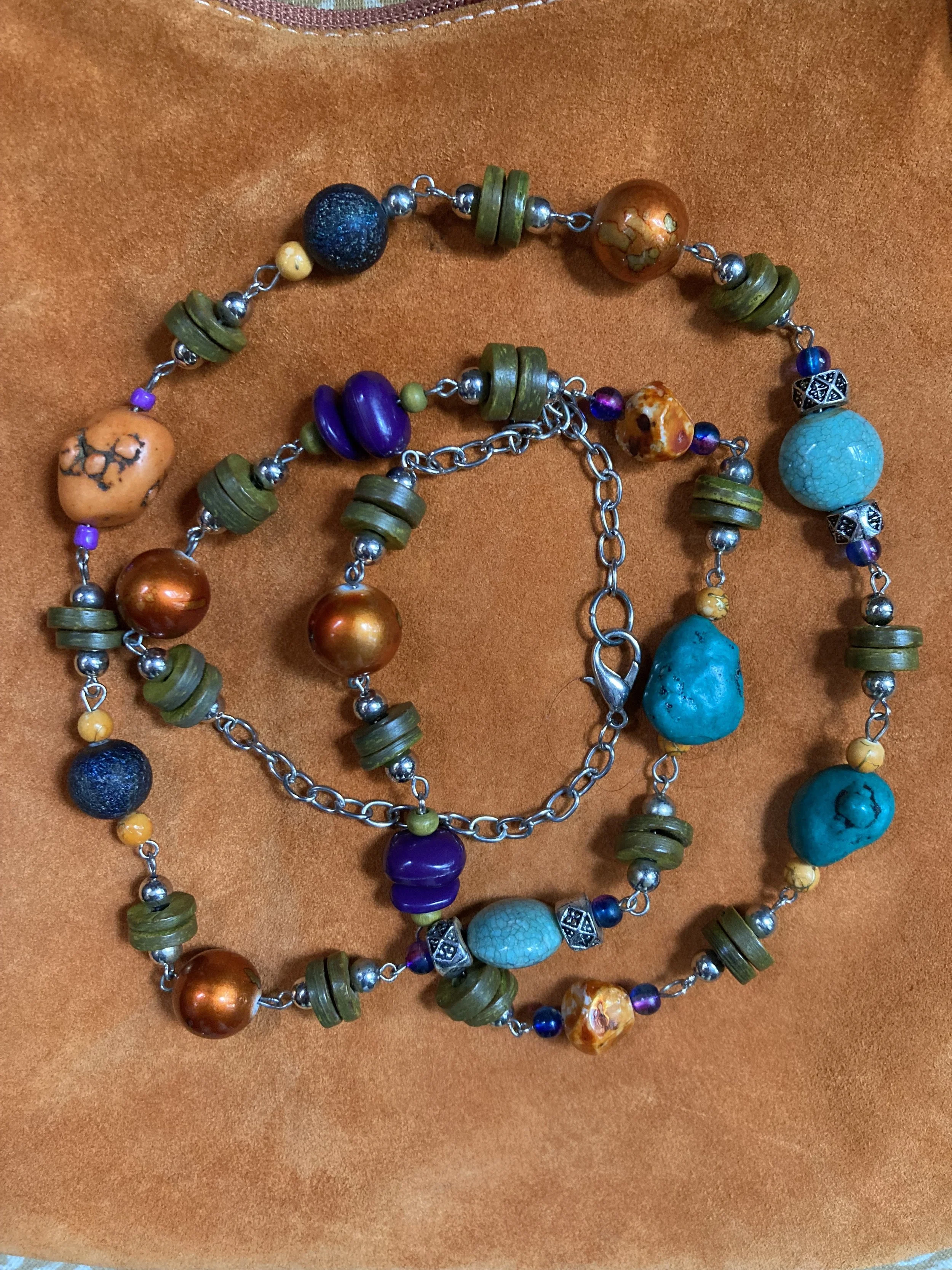
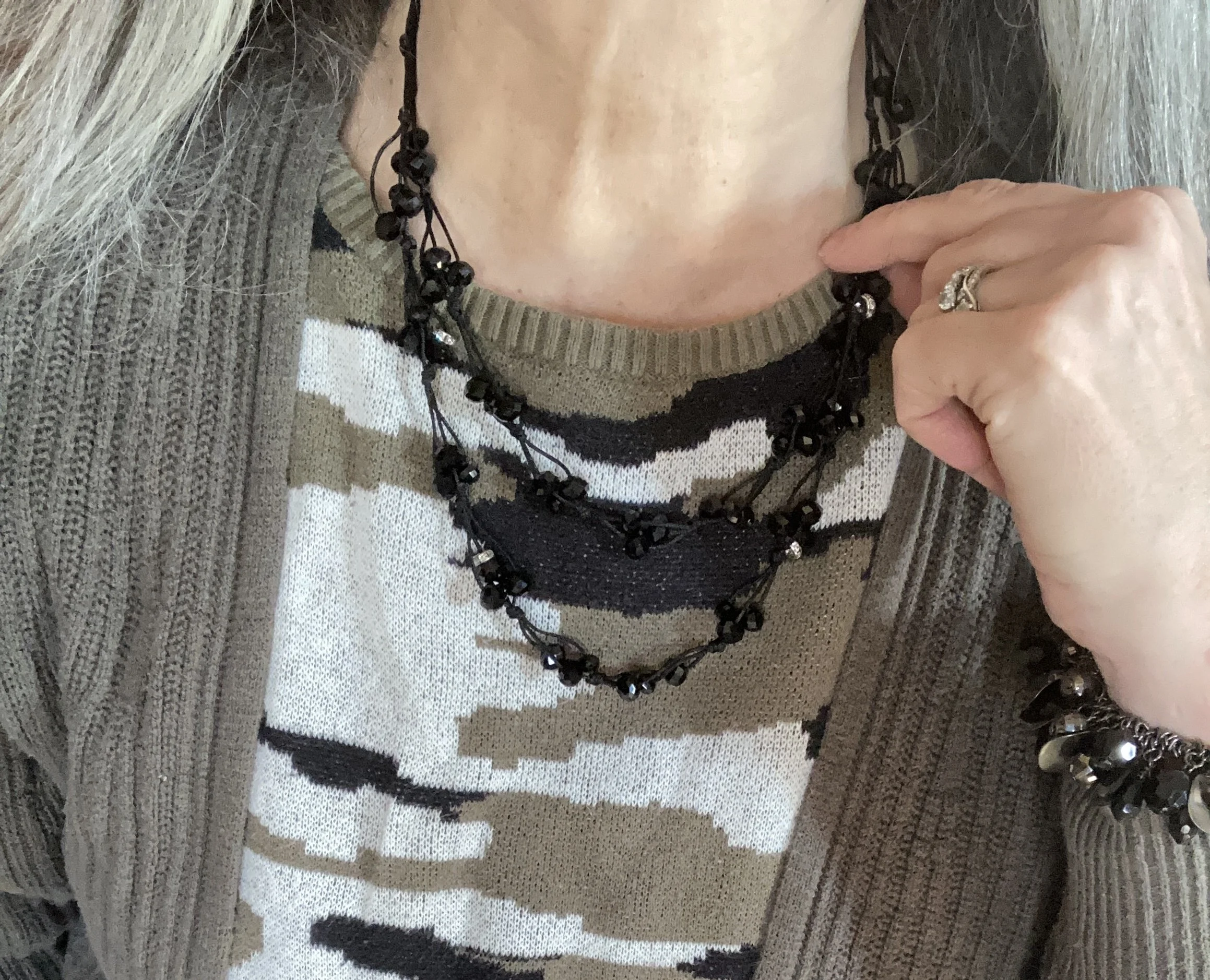
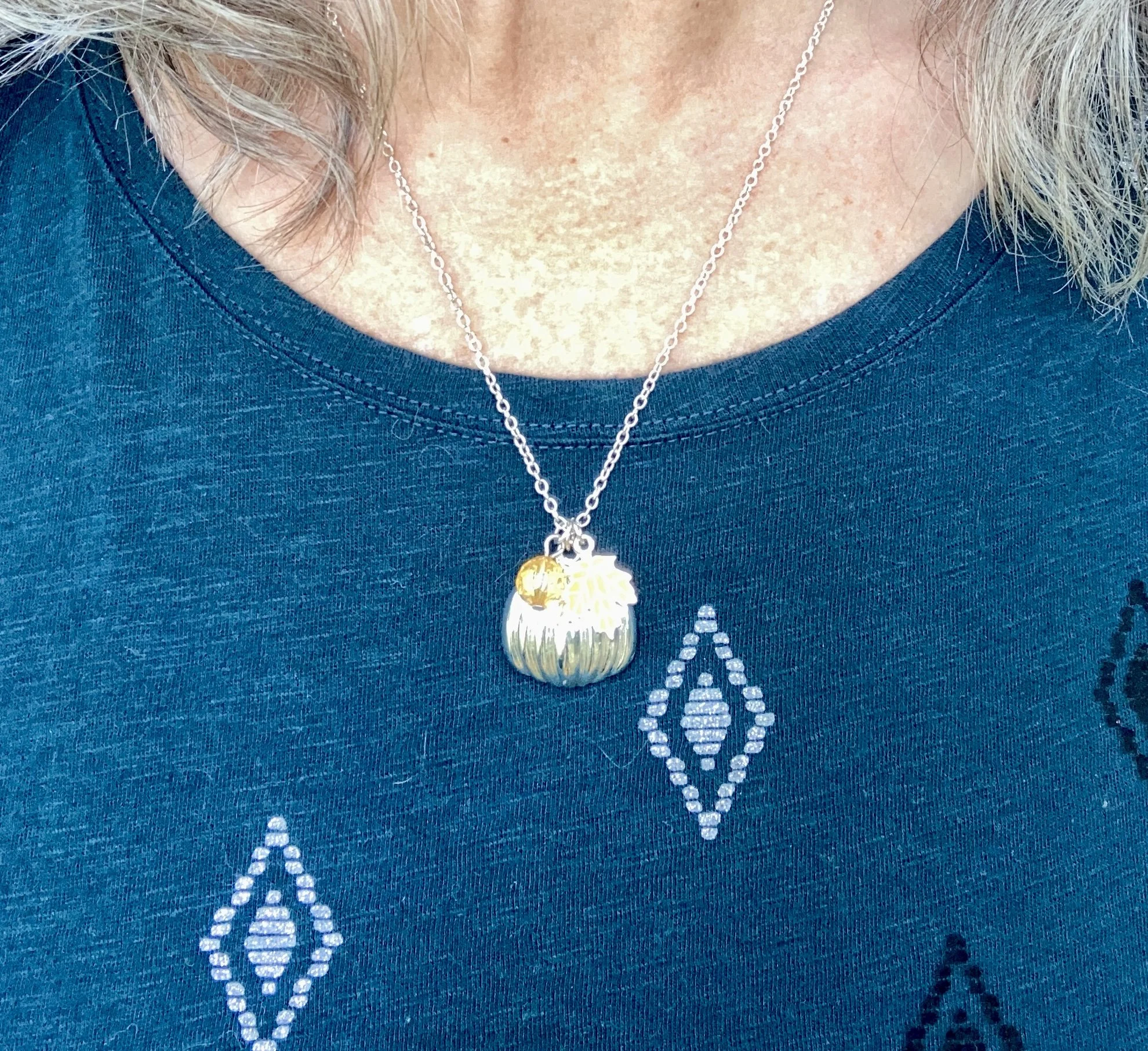
I kept my jewelry minimal with my fall themed, silver pumpkin necklace. This is a fun piece, with an orange leaf and an orange bead, making it perfect to wear all fall long. I honestly can’t remember where I got this. Ha, ha.

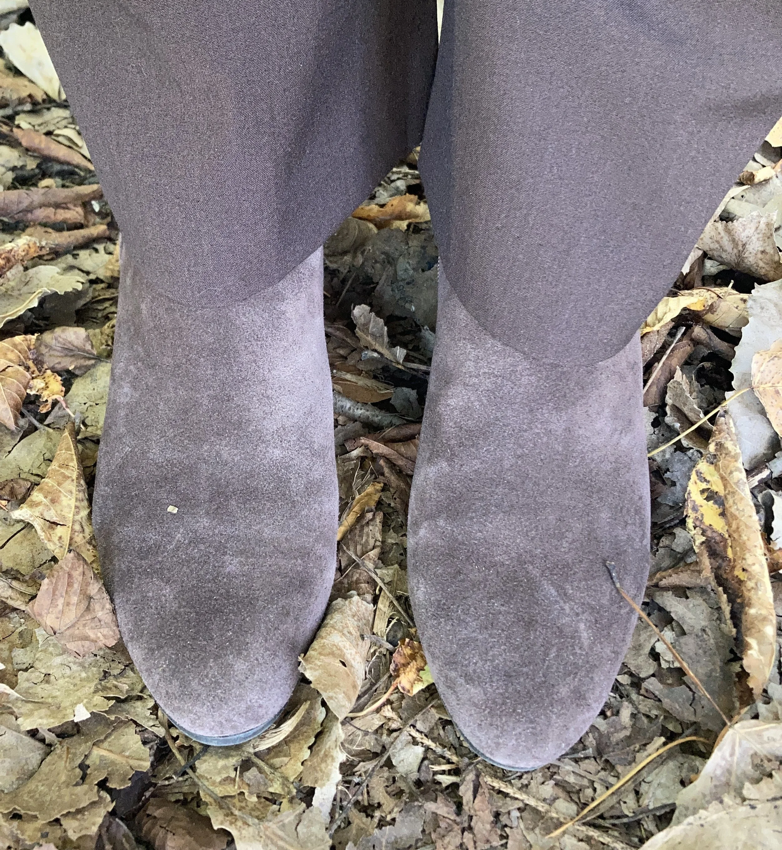
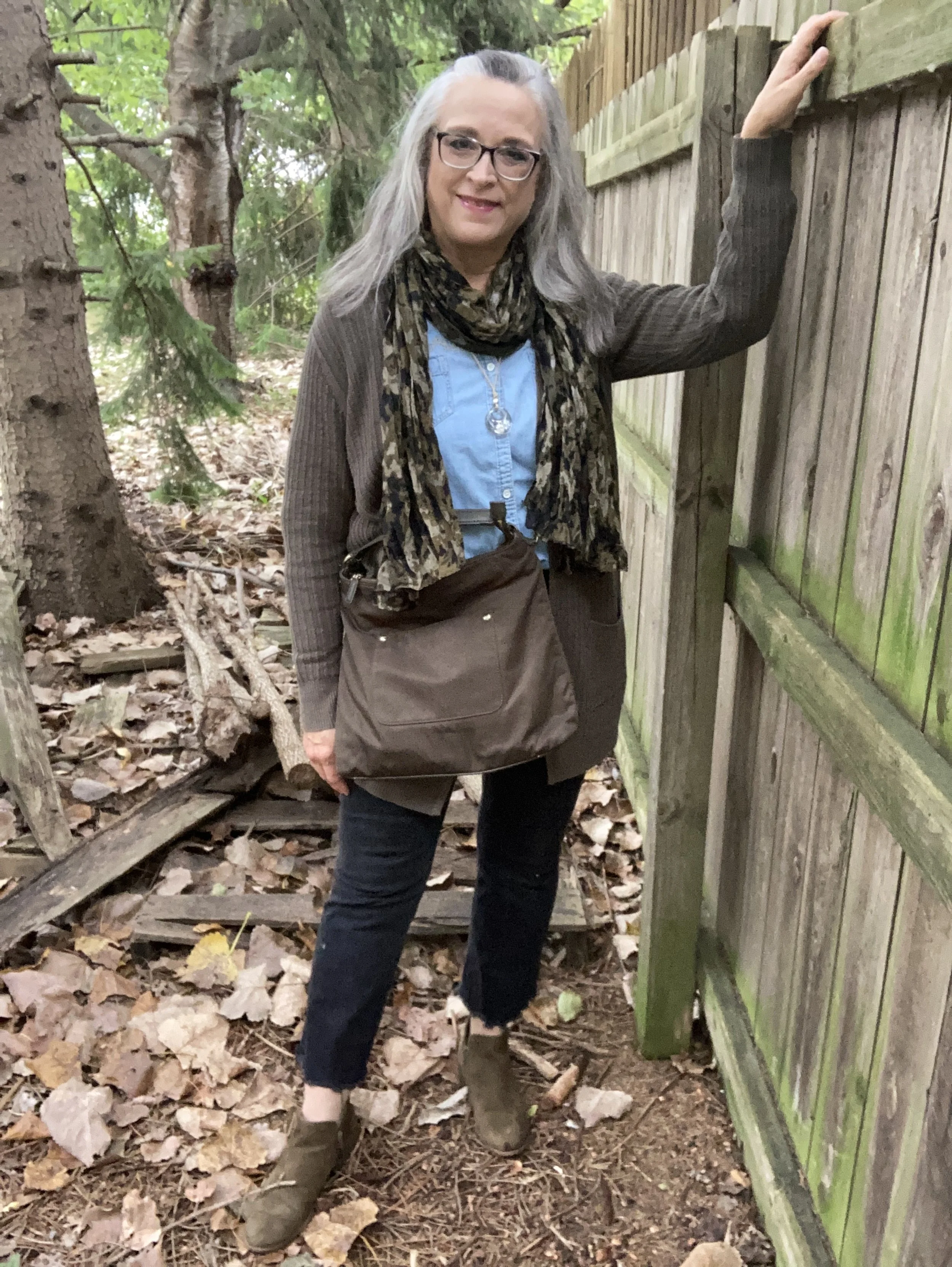
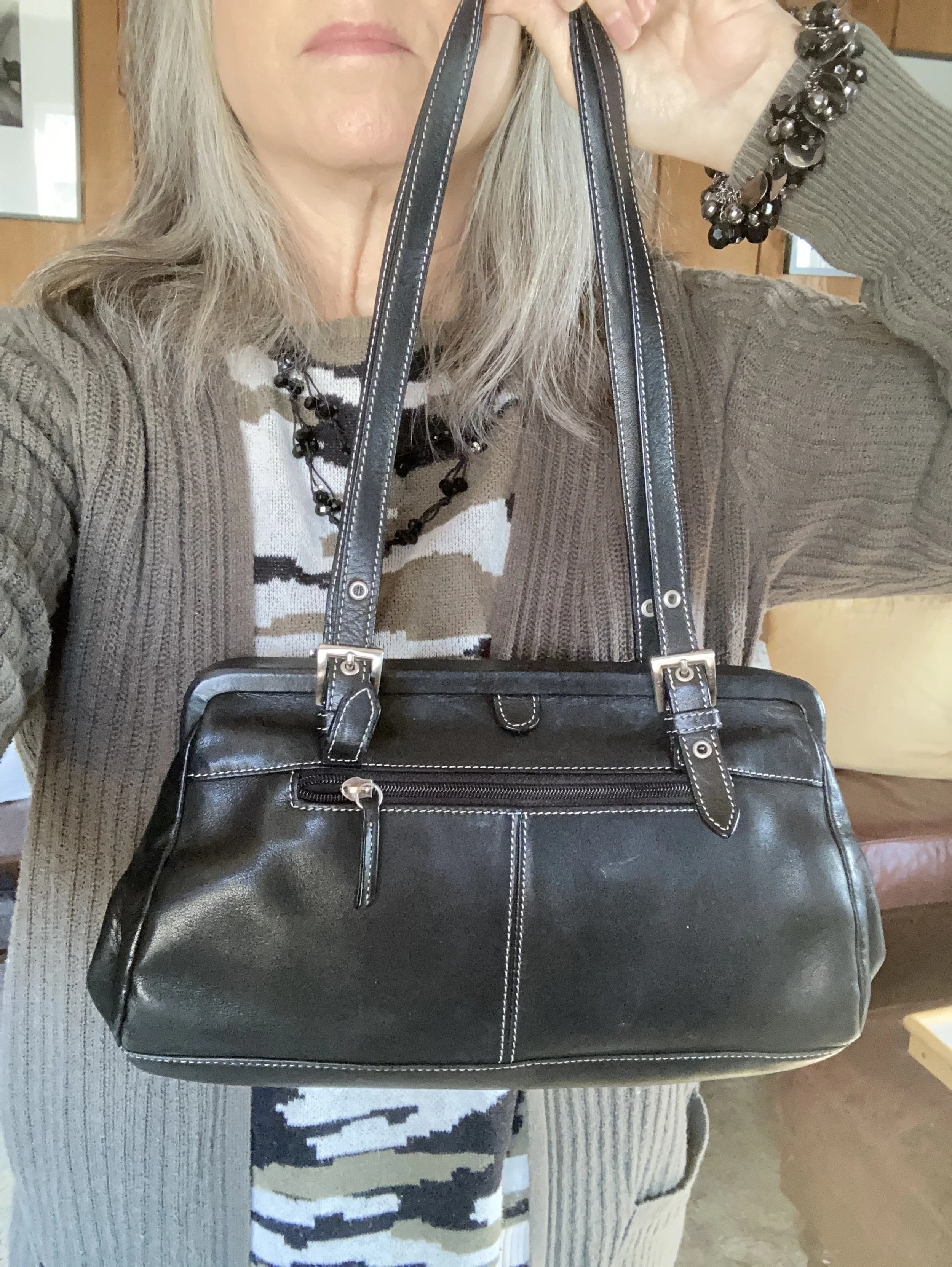
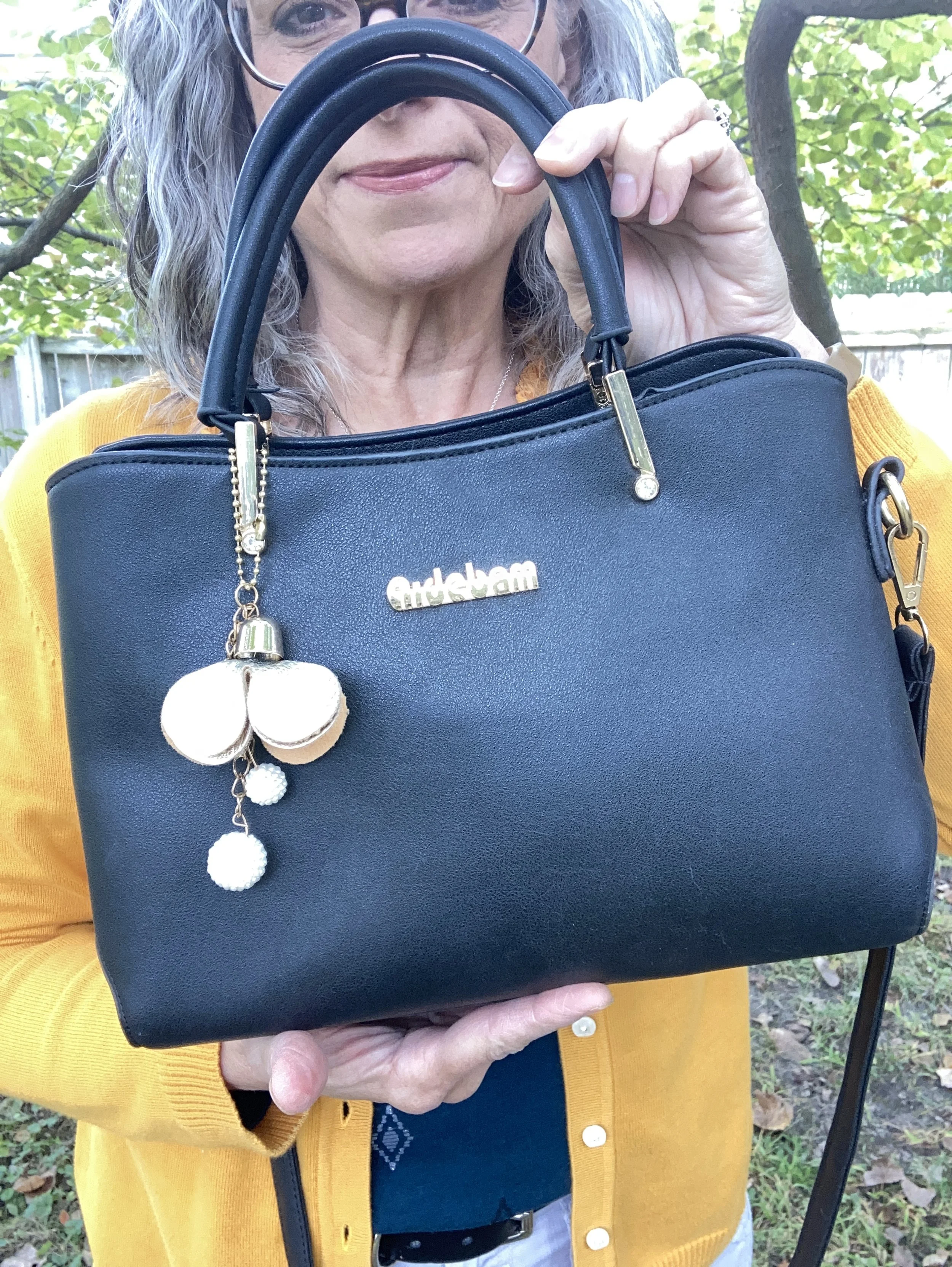
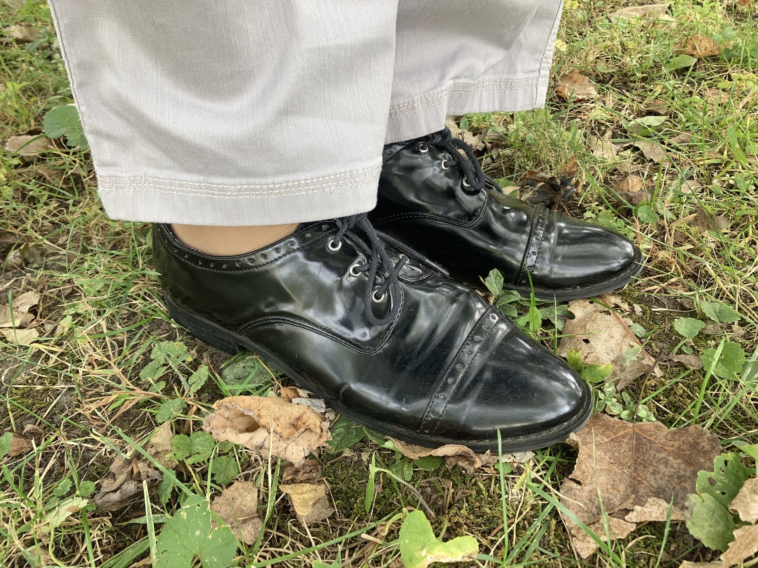
I chose black for my shoes, belt and bag. Honestly, I like how matching a shoe and bag, or a belt with a bag makes an outfit look polished and finished off, but that is just my opinion. Matching is a matter of personal taste these days, so do what works for you.

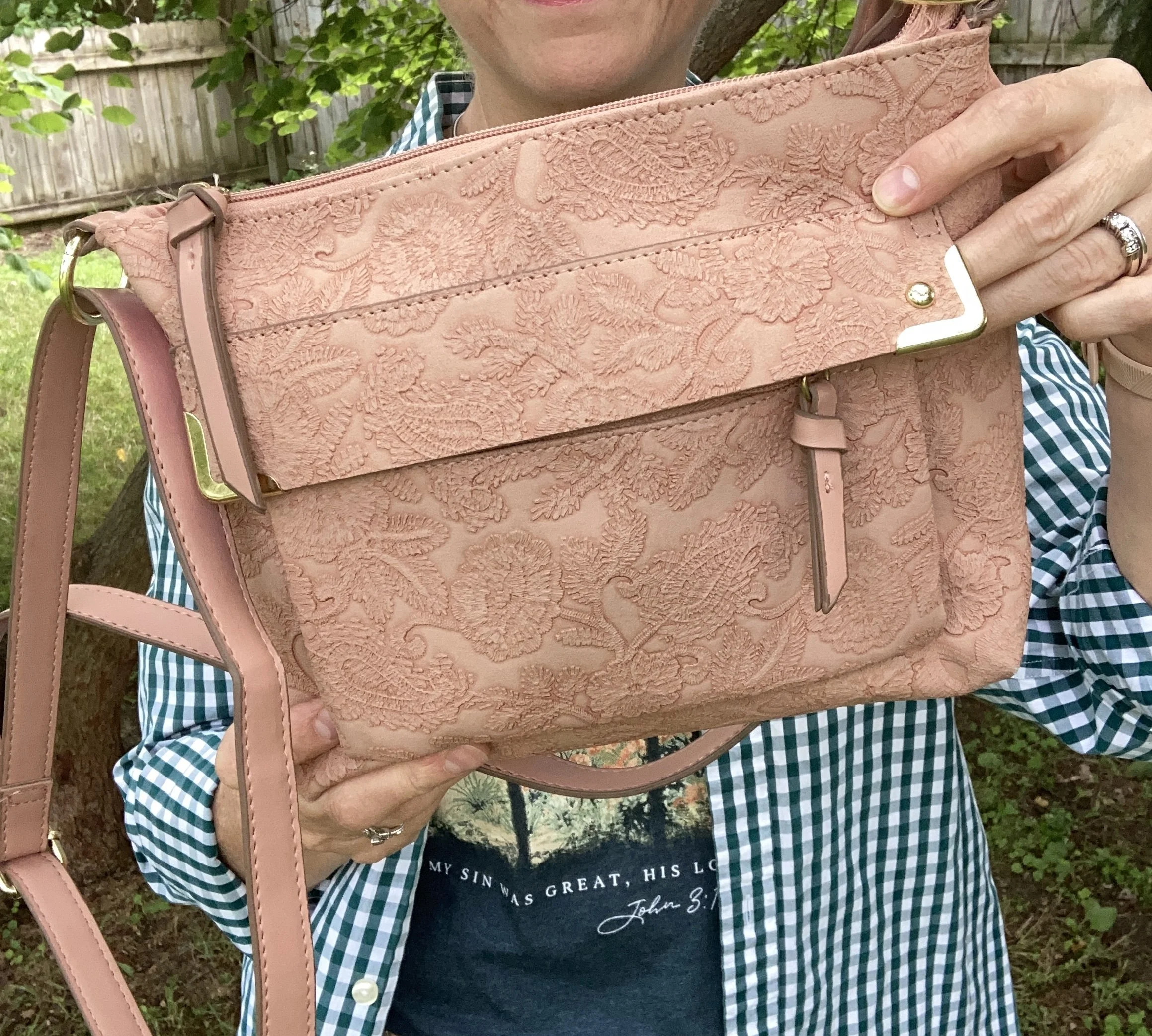
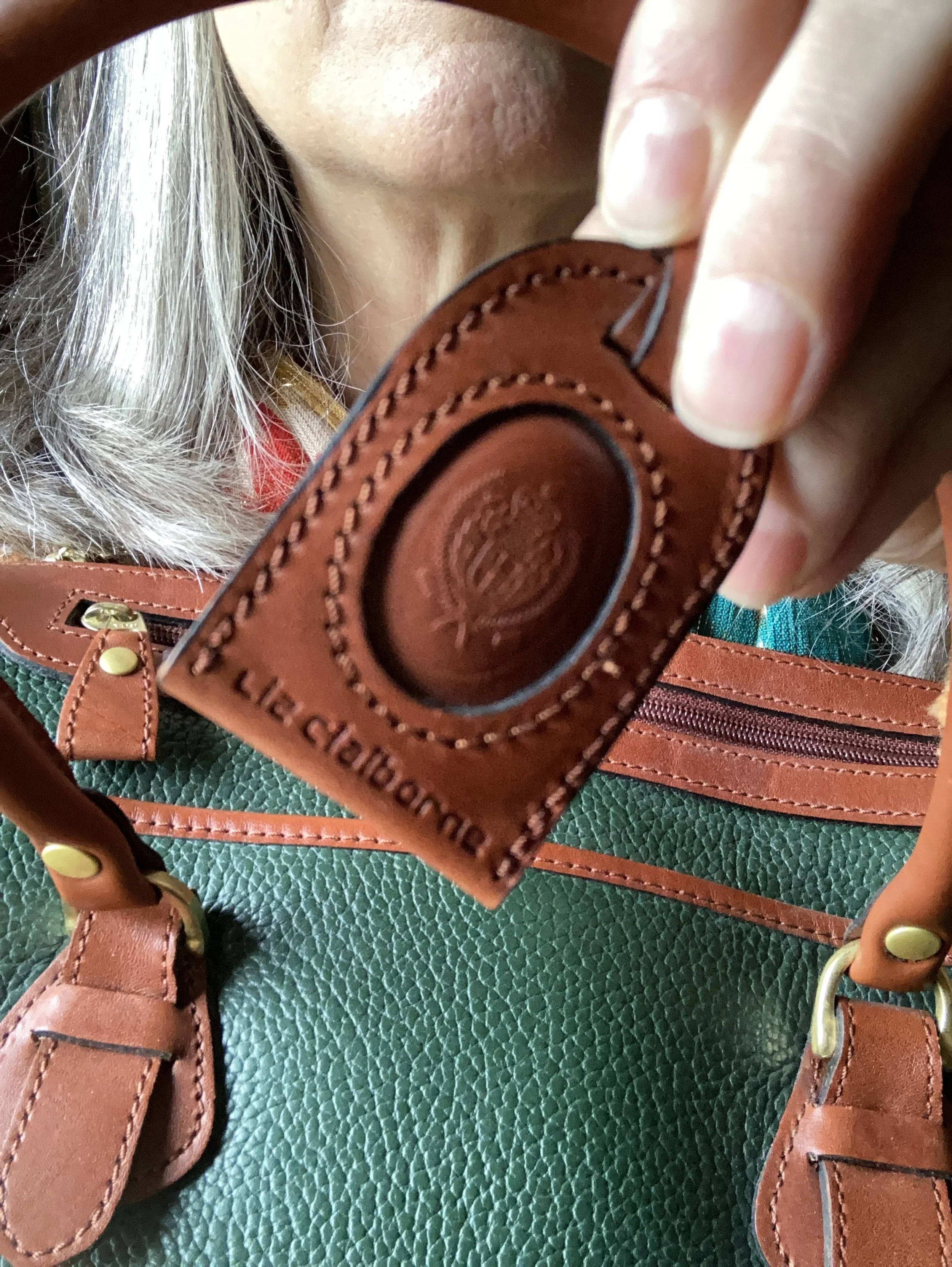
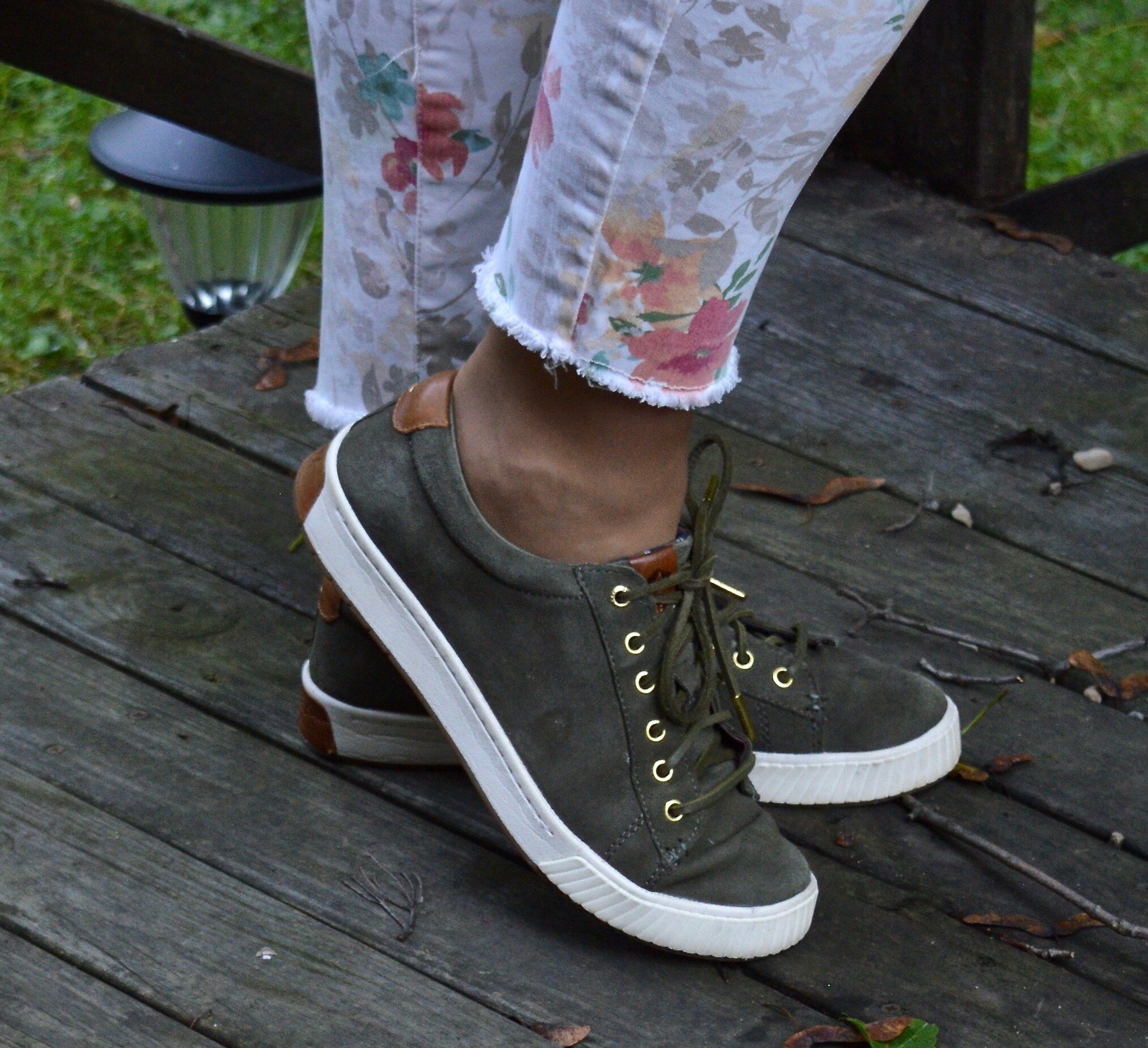
My belt was thrifted. My bag was a gift from my daughter and is Aidebam brand. My shiny Oxfords are a brand called Sugar. I have had these for a number of years, because I used to wear them to work and I haven’t worked at the bookstore since fall of 2019. Yikes! It’s been six years since I lost my job. Wow! Where does the time go?

What do you think of these colors? Do you like this combination? What colors would you have combined with this golden yellow or this dark green?

I have included a few shopping links. These are affiliate links brought to you at no cost to give you possible shopping options for similar items or colors. Not every color is easy to find, so that is where your closet or a thrift store come in handy. You would be surprised how often I have these colors in my closet, or a close enough match to make it unnecessary to go shopping…although I enjoy that too. Ha, ha.

Thank you for following along on the blog. I appreciate all your support. Have a great day.

Pantone Autumn/Winter 2025 - London Palette: Salted Lime, Fanfare and Chocolate Martini

We are well into October and the last four days have felt like the middle of July rather than fall. We are hopefully heading into a cool down in a day or two. Midwest weather has always been rather chaotic with fluctuating temperatures, times of endless rain, or months of drought. Right now things are very dry, the trees have hardly any color to them, and our cars are regularly covered with dust.

For today’s look I wanted to combine the two greens on the Pantone Autumn/Winter London palette. Just like I combined Lavender Blue and Crown Blue, today I am pairing Salted Lime, a medium, citrus green, and Fanfare, a tealy green. I chose Chocolate Martini for my classic color and I like the earthy vibe of this look. You can see the London palette colors by clicking on this link.

The star of this show is the Fanfare, velvet jacket that I recently thrifted. While not true velvet, it certainly looks the part. I found this piece and immediately threw it into my cart. When I tried it on, I knew it was coming home with me. It was obviously hand made as it still had the rough, inner seams with no finished edges, and no label of any kind.

Salted Lime is not a color I have a lot of. When it comes to greens I like the darker more moody hues of olive and forest green. I also like deep tones like emerald and jungle green. However, I do keep a few pieces that are this lime color. This thrifted, Jaclyn Smith, gingham button down has been around for a number of years. You can see this top as a shacket over a graphic tee, worn under a graphic tee, and worn with a plaid skirt,

My Chocolate Martini pants were purchased new when I was still working as an assistant manager at a university bookstore. These are Worthington brand and I got them at JCPenney. They have a wider leg and are a bit long so I like to pair them with something that has a small heel.

I chose my Nine West heeled ankle boots, which match the pants perfectly. A tip for making your legs look longer and leaner is to match your pants and your shoes. I got these a couple of years ago at Kohl’s.

I went for a layered jewelry look with a short wood bead necklace and a long beaded pendant necklace with fringe.

I wanted to add a pop of color and remembered this cute color block bag I had thrifted last year. It is just a cheap bag and has no brand name in it, but I thought it was extremely cute and fun. I think it works beautifully to add an element of extra color to this outfit.

What do you think of these colors? Do you have any of these in your closet? If not, which one would you like to add? Be sure to leave a comment or too. It helps my blog and it always encourages me.

This picture below, definitely needs a caption! What would you put on it?

I have included a few shopping links. These are affiliate links and are brought to you at no extra cost. These are retailers that are available through the affiliate and I cannot speak as to the quality of the pieces offered, so just be sure before you order something that you know the retailer’s return policy. If you purchase an item through my blog using one of my links, I get a little commission. I appreciate all your purchases as they help me keep the blog going. All opinions are my own.

Have a great week!

My Style: Casual with a Graphic Tee

I have been struggling to get things posted on the blog. It seems our summer has been busier than I thought it was going to be, and the heat, and added responsibilities have made it hard to find the time and the energy to put outfits together or write on my Faith page. However, here I am trying again. This is a piece of advice my mental health therapist often says, “Begin again.” There is something freeing about those two words. The fact that I can start over and begin again reminds me that, not only am I not perfect, but that it is okay. The important thing is that I keep trying.

For today’s outfit I decided to show you an outfit that is very much me. I am pretty simple when it comes to my style, and over the years I have showed you glimpses of what style types I pull from and for the most part these styles are casual and practical.

I like this combination of teal green with salmon. For this outfit, the first this I did was pick the tee shirt. I got another order from Love In Faith. I love their tees and place an order about once or twice a year. The fall and Christmas ones are always hard to resist, but this summer they had a number of cute graphics and colors. As always they are faith based. I am not an affiliate for them, I just love their products and they are always having good sales and are a faith based company so I like to buy from them.

I love the words on this tee, and the picture, of course, but the colors are lovely and so summery. The words printed at the bottom say, “My sin was great, His love was greater….Joh 3:16:” Obviously, I could have gone for a more orange color, but there are also slight shades of the salmon in the tee as well, which don’t show as well in my photo. In case you are ever interested in purchasing from Love In Faith, I typically get a large, because I like the extra room, but I could wear a medium. Since I have lost a few pounds, mediums are beginning to fit better, but I still like my tops roomy, and they do not shrink.

I bought light weight utility ankle pants a few years ago from Kohl’s and they are Sonoma brand. I was looking for a good alternative to jeans. These are perfect for hotter weather and though I could wear them ankle length in the summer I like to roll my pants so they come half way between my ankle and my knee. It is my alternative to shorts.

I found this fabulous green gingham number a few weeks ago. While I can’t really wear it yet, because it is so hot, I am looking forward to bringing it out more often when it gets cooler. It is actually a men’s shirt from JCPenney It is a stiffer cotton fabric, almost like a smooth canvas, and at first I wasn’t sure I would like it, but I am glad I took it. The stiffer feel gives it a bit more structure, which is great when wearing a piece like this as a shacket.

I added a bit of silver bling just to keep the outfit from getting too casual. You can see a little bit of the pinkish color I was talking about on the tee above, thus I also added my embellished Bueno pink cross body bag. I love the fake embroidery on this bag. This was another gift given to me by one of my daughers.

For shoes I pulled out my platform sneakers. I bought these back when platform sneakers were just becoming a thing a few years ago. It looks like we will have a bit of the platform trend sticking around, so I figured I was doing okay to wear these. These are a brand called Roxy and I found them on clearance at DSW.

What do you think of this outfit? What do you like to wear in the summer to look casual but put together? Leave me a comment or two below. I always like to hear your thoughts.

No shopping links today. Just take this as inspiration to shop your own closet and see what you can come up with.

Have a great day!

Outfit Inspiration: Cool, Coastal Vibes

Another trend that is around this summer is one I feel is always on repeat. Whether you call it coastal or nautical this summer trend seems to be veering away from the traditional red, navy and white color palette and is leaning more towards soft neutrals and pastels, while still giving a nod to the more traditional nautical stripes. For today’s outfit I decided to stick with a neutral palette, leaving out the stripes for a soft, feminine outfit that would be great for a casual dinner out followed by a walk on the beach.

I looked at Pinterest for inspiration for this coastal trend, and I found a number of outfits with a similar color palette to what I have put together here. White, light tan, with a light version of blue often seen in chambray pieces like button downs or skirts. What seemed to dominate the looks I found on Pinterest were white tops and bottoms with layered pieces, bags, shoes and a bit of jewelry taking on the other colors. To make this look completely my own, I decided to use the neutral tan color as my overall grounding color and just add in a little white, and blue.

My knit ruana is a fabulous Sonoma piece I got a number of years ago at Kohl’s and use it every so often to help build an outfit with texture. You can see how I styled it on the blog as a work wear look, and a boho look.

My white tank is a thrifted Loft piece. It has a bit of an iridescent sheen, so it didn’t show up real well in some of the pictures. You can also see the simple pendent necklace I chose to keep the outfit more low key.

My pants have made the rounds and were a JC Penney’s clearance find years ago. They are Liz Claiborne brand. How could I resist these with their beautiful embroidery? You can see how I styled them on the blog with a yellow top and cardigan.

My gladiator sandals are older and Massini brand, and my bag was gift a number of Christmases ago from my younger daughter. I also added my woven hat as you can see in the final pictures below.

What do you think of this outfit? Do you think it is giving off coastal vibes? How would you do it differently? How would you make it your own? I love to have your feedback, so be sure to leave a comment or two below.

I have included shopping links with similar items for you to enjoy. These are affiliate links. If you purchase something through one of my links I get a little commission. I appreciate all your support.

Have a great week!

Color Play: Pantone Spring/Summer 2025 London Palette - Camellia, Windsor Wine and Garden Green

This week’s colors really seem more fall friendly, but it appears the Pantone Color Institute is taking to heart the idea of no more fashion rules. You know the kinds of things I am talking about: wearing white only between Easter and Labor Day, dark colors in the fall and winter, light colors in the spring and summer, and all the “rules” about age appropriate fashion. That last one is one I am personally glad we have more or less thrown out the window, but I still have my own opinions about what is appropriate to wear for any female versus what isn’t. However, I will save that rabbit trail for another day.

Today’s look revolves around a bright orangey coral, a dark burgundy and a deep green. These colors not only seem to be ready for Autumn, but I thought they would make an interesting combination, thus the reason I put this under my Color Play column. Welcome Camellia, Windsor Wine, and Garden Green from the Classic palette. You can see these colors on my Pinterest board by clicking here.

As you can see it was super windy when I took these pictures. The wind also made it chilly. I was intending to do photos for several outfits, but if you saw last week’s post you can see I finally went inside. Ha, ha.

I have had this orangey coral cardigan for several years. It is Sonoma brand and I got it at Kohl’s. It is a great sweater for the warmer weather as it is light weight. It also has the tabs and buttons on the sleeves so you can roll it up to make them shorter if you want. It also has patch pockets on the lower front on both sides.

My Windsor Wine colored pants are thrifted Westport brand. I really would like to say I will wear these again this summer, but I have so many other things to wear in the warm weather that I find more appealing to my desired spring and summer color palette, so these will, most likely, be lovingly packed away until fall.

You can also see I pulled out my similarly colored loafers. These are a thrifted pair of Naturalizers, called Natural Soul. I used to wear these to work, back in the day when I was employed. Ha, ha. I like that they are patent leather, but not the typical black.

For the Garden Green classic color I chose this St. John’s Bay top that I’ve had for a while. I didn’t get a picture of the sleeves, but they are approximately elbow length bell sleeves. I did want you to see a little bit of the pretty embroidery on the top. You can also see my layered necklaces. The top leans a bit more towards the olive direction, but I felt it worked for the Pantone color.

My bag is also green, but compared to the Garden Green it is a bit too bright. This was another thrift find and is Liz Claiborne brand.

What did you think of this color combination? Do you like darker colors all year round, or do you think there is a better time of year to wear them? Let me know by leaving some love in the comments.

I supplied a few shopping links. Please feel free to use these links to buy items for yourself or someone else. If you shop a link through my site then I get a token commission. I appreciate all your support!

Have a great week everyone!

Styling into the Holidays - Part 2: Holiday Work Party

It’s been five years since I lost my job at the university bookstore. As an assistant manager I was lucky to be able to wear business casual attire and sometimes went to work wearing a sweatshirt and jeans, especially if I was going to be book slamming - unpacking and shelving textbooks. However, once in a while I liked to get more dressed up to at least give the appearance that I was the second in command. Ha, ha. Today’s look is one that I might have worn during our holiday sales events.

When I was getting ready for my little photo shoot I decided to put volumizing powder in my hair. Unfortunately, I ended up putting too much in and I couldn’t even get a brush through my hair without nearly pulling my head off. Ha, ha, ha! I tell you what, us girls go through such feats to look beautiful. I tried to add some waves, but even the straight iron couldn’t make headway with my mess. So silly. There are times I really do feel like Lucille Ball. Ha, ha.

My thrifted, plaid Requirements blazer has been styled on the blog before. You can see that post here. It is a great piece, but doesn’t get as much love as it should since I only use it during the holiday season, which is very short. That is exactly why I pulled it out for this post. I really should try to wear it after the holidays. What do you think? Would you wear this before or after the Christmas season?

Denim skirts are trending right now, so I was glad to have another opportunity to wear this thrifted St. John’s Bay piece. This is a great pencil maxi whether you dress it up or down. My belt was also a thrift find.

I love this black turtleneck top that I found second hand. It is a brand called united.states.sweaters. It is soft and stretchy. A basic black turtleneck can be very flattering and can be dressed up or down. Just add gold or silver jewelry or a bright colored scarf and you take your outfit up a notch without really trying.

For my accessories I chose black for bag and boots and gold for my jewelry. My blag top handle hobo bag was a thrifted piece and a brand called Scarleton. You can find this brand on Amazon and they are very reasonably priced.

My black boots were a Black Friday purchase last year from Kohl’s and are Journee brand.

These gold tone jewelry pieces have been around for years, but always seem to keep their shine.

What do you think of this outfit? Would you have worn something like this to a holiday office party? What would you do with the pieces in your closet?

I hope you enjoyed this post and that it provided a little inspiration for your holiday get togethers, or just gave you an excuse to get dressed up to go to the mall or out to lunch with a friend. I have provided a few shopping links for similar items and I try to keep the price points more reasonable. These are for you to shop or to just draw inspiration from. These are affiliate links, brought to you at no extra cost. If you purchase something through one of my links I get a little kickback. I appreciate all of your support.

Leave me a comment or two. I always love to hear from you!

Outfit Inspiration: Fall Look Inspired by Pinterest

As I finished up the Pantone Autumn/Winter 2024 NY Palette last Tuesday, I thought about where I wanted to go from there. Should I follow that up with the Autumn/Winter 2024 London Palette, or do I just let that go and do posts that are fall oriented, but of my own making? For today I chose to create my own outfit with just a little inspiration from Pinterest.

As you will see, I drew inspiration from the pin in the black pants and chambray top, but I opted to use a different color for the cardi, boots and bag, and I added a scarf.

Style Tip: Use things like Pinterest, art, magazines, and other inspiring ideas as a jumping off point. If you want to copy the style or the colors exactly that’s great, but leave room for you own interpretations. Not every style is for every woman, and not every woman wears every color, and so on. Inspiration is to be just that, something from which you get ideas and direction on where you want your style to go.

I started with my long sleeve chambray shirt. This Sonoma button down has been a work horse for years every since I purchased it at Kohl’s. I just love the embroidery on this piece.

Style Tip: Chambray comes in various washes, just like any denim, so don’t be afraid to experiment with various shades to see what works best for you and for the outfit you are trying to put together. I liked the contrast of the black with this lighter shade.

These black, cropped, raw hem jeans were a thrift find. They are very stretchy and have a higher waist, so are great if I want a smoother look under a top or sweater.

Style Tip: Be aware that most black jeans will look “weathered” after a number of washings, but here is an article on how to keep them looking top notch. In addition, if you want to keep a black pant truly black, and don’t want to re-dye them, look for a trouser with fabrics like polyester, rayon or viscose. These fabrics hold their color better than cotton or cotton blends.

My olive duster has also been one that gets regular wear in the cooler weather. This is another Sonoma piece from Kohl’s. The weight of this piece is perfect for these transitional temperatures, and it has pockets!

As I said previously I opted for all olive colored accessories: SO Ankle boots, thrifted hobo bag, and thrifted camo scarf. However, you could easily take this outfit formal and change up the color and style of sweater, boots and bag and have a completely different look.

Unfortunately, it has been too warm here in the midwest to wear an outfit like this. I did wear the pants, boots and button down the rest of the day, but it was too warm for a scarf and sweater. Okay summer, you can go now! Ha, ha.

Would you wear an outfit like this? What is the weather like where you are?

I hope you enjoyed this outfit. How would you style an outfit like this? Would use olive, tan, gray or some other color to top black pants and a chambray shirt? As always, I love to hear your thoughts.

I’m including a few shopping links for you to look over. These are affiliate links brought to you at no additional charge. If you purchase an item through one of my links I get a little commission. All opinions are my own.

I appreciate all you support. Thank you for continuing to following the blog.


Shopping Our Closets: Pantone Autumn/Winter 2024 NY - Red Orange, Scarlet Smile and Baritone Blue

The best part about having a closet full of color is that I can almost always come close to matching the Pantone color palettes, whether for spring or fall. I do try to come as close as possible to the palette colors, but it is not a science. It is meant to be a fun exercise in trying new color combinations that you might not normally try.

Today’s outfit is a fun combination of Red Orange, Scarlet Smile, and Baritone Blue. I think this look would be great for work, or for a fall festival or party.

For this outfit I started with this recently thrifted Notations prairie skirt. It has the Red Orange color throughout. I am a sucker for tiered maxi skirts and especially like the boho feel of the fall colored print. Seeing as the skirt has a variety of colors I am looking forward to trying out a few other ways to style this. It is light weight, so for this shoot I added a slip, but that’s just my personal preference. In the cooler weather I would also add heavier tights.

I had a different top picked out that leaned more towards a reddish pink, but looking at Scarlet Smile again, I opted for this men’s Van Heusen, plaid, short sleeve number. It gives the look a touch of a masculine feel. You certainly could make it much more feminine by choosing a top with ruffles, lace or puffy sleeves.

To bring in the darker classic Baritone Blue, which is basically navy, I chose my Sonoma utility jacket from Kohl’s with the embroidered sleeves. I thought the embroidery added a nice element and pulled the whole look together.

Once I had the outfit figured out, it was an easy choice to add a simple bead and metal necklace in the Red Orange color, my brown, thrifted combat boots, and my thrifted Simple Vera, Vera Wang, bag. Unfortunately, once I was finished with the shoot this bag went in the dumpster. I know of no way to stop the fake leather bags from peeling. If anyone knows a cure, let me know. Ha, ha.

What do you think of these colors? do you have any of these in your closet? Would you wear these colors together? I love to hear your thoughts, so be sure to take the time to comment.

I’m including a few shopping links for you to look at. These are affiliate links. All opinions are my own.

Have a great day!

Hello 60! A Woman of Faith

Out of everything in my life that is important, my faith in Jesus Christ is at the top. I was raised in a Christian home, attending a small Bible church from the time I was small. My mother still has pictures of her and I going to church in matching dresses that she made for us. It wasn’t until I was twelve that I truly committed my life to Jesus. I always felt a pull toward Him, from the time I was very small, but at twelve, the same age I began to write, I finally understood He wanted my whole heart, and He wanted me to commit to believing in Him.

I honestly believe God’s hand was on me, and it was Him who kept me from going down a much different path. Just as with most junior and senior high schools there were plenty of opportunities to get involved in activities that weren’t glorifying to Him, but for some reason, I didn’t want that. I didn’t want to party. I didn’t want to drink, smoke, or do drugs. I was boy crazy, but most of it was worship from afar. It wasn’t until I had graduated from high school and was looking to go to Bible college that I got involved with a guy who didn’t know Jesus. I met him at the grocery store I was working at in my home town. If it was a test, I was going to fail, but God. He protected me from going too far physically, and helped me to break up with him. I was going to Bible college. I was going to be a missionary, because I couldn’t outrun the burning flame of His love.

I would not trade my three years at Moody Bible Institute in Chicago, IL for anything. All of the learning, and experiences are part of who I am today. I grew in my knowledge and understanding of His word and of Biblical history. I participated in ministries, and mission trips that stretched my ability to get along with others, and die to my own selfish desires. It was during my time there on one of those trips that I met my husband Mark. I never did end up on the mission field, other than a summer trip to Africa where I almost died from Malaria. Mark and I married after I graduated in 1987.

Becoming a wife, and eventually a mom, and now a grandmother has brought about growth in my Christian life that I may never have experienced on the mission field. There are certainly other struggles and challenges for missionaries in addition to marriage and family. Perhaps God saw that I would not have been able to handle it. Perhaps, I would not have been a good fit in an intense ministry situation. The only thing that matters is trusting that He has it all figured out, and that He knows what is best.

I continue to grow in my faith, and God is amazing. He daily meets me right where I am and I try to remember to invite Him in to whatever I am doing, and feeling. He is certainly capable of handling my “issues”, and He gives me the strength and help to handle them as well.

Today’s outfit is truly a tribute to what I deem important in my day to day outfits: comfort, warmth (in the winter), texture, and modesty.

My pullover, Fair Isle type sweater was a Maurice’s piece from a few years ago. I love the colors. I found the Chevron print scarf at a thrift store this past year. I thought the colors very similar to those in the sweater, so I thought a bit of print mixing might be fun. I also added the flower medallion pendant necklace as another nod to the 70’s decade.

Style Tip: Choose similar colors in prints for print mixing ease.

This lovely thrifted denim midi skirt is so roomy and versatile. I used it for my Murder Mystery birthday party when I dressed up as Jessica Fletcher. This is a piece I will be able to use all year round. Right now it is perfect to pair with tall boots, for a fun dressy casual vibe.

Style Tip: Basics always stay in style. A denim skirt is essential for any wardrobe, but you don’t have to have a voluminous circle skirt. Go for a simple a-line or even a pencil shape for a more narrow silhouette.

This Liz Claiborne bag was another thrift treasure. I love the rich green color and the brown trim. I may just fill this up in the next few days and use it for a while. It isn’t there just to look at. Although with all the bags I have you would think that is the case. Ha, ha.

Style Tip: Purses are expensive, even the ones that aren’t leather. Try shopping second hand, or wait for end of season sales to help take the hit out of your pocket book.

These brown faux suede Sonoma boots were on clearance at Kohl’s, again from a few years ago. These are one of my favorite pairs of boots. I like the color, the strap and buckle and the slouch. I think this skirt would also look cute with ankle boots and cute tights or knee highs.

What do you think of this outfit? Would you wear something like this? What is your go to style? I’d love to hear your thoughts so leave me a comment or two.

I’m including a few shopping links for you to look over. I hope you enjoyed this post.

Color Play - Building an Outfit Around Jewelry

Since my Color Play column can encompass all aspects of color, I thought it would be fun to show you how I build an outfit around a colorful piece of jewelry. Let’s face it, not all of us are into fine jewelry. Yes, I do have a few silver and gold items that my spouse gave me over the years, but those are mainly rings and a few chain necklaces. Most of my jewelry is costume jewelry that I have either found on clearance at regular retail stores like Kohl’s, JC Penney, or Maurice’s, or it is from a thrift store. The piece I will be using today was actually gifted to me by a friend.

I love all the colors in this piece, but it does make it more difficult to combine with printed pieces, of which I have many. However, that makes it more challenging, which I love. Today, I decided to go for more of a color block style, and used solid colors for each of the pieces in my outfit. Take a look.

I am grooving on my wide leg cropped pants right now, so if they are not your cup of tea, then just swap them out for your own version of pants. You could also just as easily choose a skirt. Remember my job is to inspire you to look at your own clothes in a new and innovative way, to make them work for you and your style preferences.

Today’s style tips are going to cater to styling an outfit around a piece of jewelry.

Style Tip 1 - Choose a piece of jewelry that makes a statement, then figure out how to monopolize on that statement effect.

As you can see in the first picture my necklace contains so many colors: orange, dark blue, turquoise, or aqua, purple, olive, light green, orange and a light yellowy orange. If I wore this piece with a printed top it might easily get lost, but pairing it with this navy popover blouse was the perfect way to make the colors of the necklace pop. You could have used any of the colors in the necklace, but I love the way it looks against the navy.

I have two of these Knox Rose tops. The other is a pale purple color. I love the lace, the longer length short sleeves and the flowy silhouette. The trim on the bottom is pretty as well. I honestly can’t remember if I found these on the clearance rack at Target, or at a Goodwill store where I often find like new Knox Rose items.

Style Tip 2 - Choose pieces that go with the colors in the jewelry or at least compliment it.

The navy top almost matched exactly the navy beads on the necklace. However, I chose to wear a pair of pants that was less matchy and more complimentary. The light green borders on olive, but not exactly. It’s almost a very pale chartreuse. I know in the picture they look more gray or beige than green, but believe me they have a green cast to them.

These raw hem jeans are Sonoma brand and they were a clearance find at Kohl’s a summer season ago.

After choosing my main two pieces I decided on shoes and a bag. I also added a few other bright beaded bracelets for fun. My SO ankle boots have been around for a while. I thought it appropriate to start throwing in a few fall like pieces since we all know it is coming at some point. My thrifted orange suede bag is not one I use very often, but I simply love the bright color, and it works so well as an accent piece.

Style Tip 3 - Pull in one or two other colors from you chosen piece of jewelry (if it has more than two colors) by adding them in as accessories: shoes or boots, bags, scarves or a sweater or jacket.

I thought about adding a sweater to this, but I wanted to still look summery, and it was nearing 90F when I took these pictures. I was already beginning to sweat. Ha, ha.

What do you think of this outfit? Have you ever styled an outfit around a piece of jewelry? If so, what was it? I’d love to hear your thoughts. You feedback is always welcome, good or bad.

I’m including a few shopping links for fun necklaces. These are affiliate links. All opinions are my own. Have a great day!

My Style: Bluer than Blue

Today’s outfit came from shopping my closet. My thoughts revolved around the desire to give you an outfit that is completely me, but also something you can easily replicate from pieces in your closet. Who doesn’t have a pair of jeans, a blue or chambray top and some sort of soft knit topper? Your outfit doesn’t have to use rolled up skinny cropped pants, use your simple straight leg jeans. Your outfit doesn’t have to include a sleeveless chambray lace up tunic top, grab that light blue short sleeve sweater top or that sky blue tee. Your topper need not be an open weave poncho, use that blue cardigan or long sleeve chambray shirt that is tucked away in your closet. Use my outfit and my style to create an outfit that is uniquely you!

There is no deep philosophy to what makes our style. It is simply what we feel comfortable and confident in. Ever since I was a young girl I was a tom boy. I didn’t like wearing dresses, and I loved my jeans. This still holds true today. I’m still a bit of a tom boy, feeling much more comfortable in jeans, tees and sneakers than in frilly dresses and heels. It is also practical and easier to dress this way. The few times I wear heels now I get cramps in the arches of my feet, and getting on the floor to play with my toddler grandson is so much easier if I am not wearing a dress or skirt. Ha, ha. Let’s look at the details.

This flowy chambray top is a brand called Earl Jeans and was thrifted. I never used to own anything that was chambray, but over the last decade I have added numerous pieces to my wardrobe. Chambray is basically a lightweight fabric that usually looks like denim. It is typically made from cotton or linen and its uses vary, but it is most often seen in the clothing industry for everything from tops, to pants, to jackets to shoes. Here is an interesting article on the fabric that is known as chambray, cambric, or batiste.

My cropped skinny jeans are old and are A.N.A brand. I believe I got them at JCPenney. Here is a similar style at a decent price.

My open weave poncho has been around for a long time. I have no idea where I got it, but it is a cute piece that I hang onto for just this type of occasion where I want a little extra texture, and it adds a little warmth in an air conditioned coffee shop (where my hubby went after I took these pictures). I can wear it with the two points down the front and back, which it a more traditional way of wearing a poncho. Or, I can wear it with the points extending down the length of the arms.

A few easy accessories and I was good to go. My crossbody wallet is a great piece for shopping and doesn't allow for all the weight a more typical cross body bag would. I found this on clearance at Kohl’s a number of summers ago. Jewelry is a hodgepodge of pieces I have collected over the years, and my Keds were also a Kohl’s clearance find.

What do you think of this outfit? Do you own any chambray? How do you like to wear it? I love to get your feedback. Your thoughts are always important to me, so thank you.

I hope you all are having a great week. Check back later in the week for a new Faith post revolving around those Wonderful Words of Life.

I’m including a few shopping links for you to peruse. These are affiliate links brought to you at no cost. If you purchase something through one of these links I might get a little kickback. I appreciate all the support. All opinions are my own.

Shopping Our Closets - Light Weight Joggers and a Button Down Shirt

This week I want to share with you two pieces I think are essential to a warmer weather wardrobe: light weight joggers and a button down shirt. These two are practical and versatile and able to be used for so many outfits. For today’s post I combined these pieces to make a comfortable ensemble easily worn to a summer graduation party, a casual night out, or a trip to the zoo with the kids or grandkids.

I was never a jogger sort of gal. Jeans have always been my go to, and occasionally dress pants for work when I had an office job. Joggers were for exercise, not daily wear. However, I came across a floral Sonoma pair at Kohl’s a couple of years ago and thought I would give them a try, since I loved the floral pattern. You can see those styled here. Now I have this purple pair, and a blue pair. In addition I have added a few pairs that I thrifted.

Those of us who have very bad varicose veins do not really like to show our legs off on a regular basis, but we also like to be cool in the hot weather, so a light weight, comfy pant like these joggers is the perfect compromise. They are completely versatile as well, so you can make them super casual, or add a silky top and heels for a more dressed up vibe.

Style Tip: Never say never when it comes to clothing. Trying new styles and pieces is exactly how you grow your wardrobe and how you really hone in on your exact style. Style, just like many things in life, is a trial and error type of thing. Try something and if you don’t like it, move on to the next thing.

I went for a purple with purple combo in this outfit, but I wouldn’t call it monochrome, because the purples are quite different. My tee seems to lean in the blue direction, although if you saw it by itself you would definitely say it is purple. I love graphic tees, and this thrifted Misslook piece is spot on my style. You can also see my purple hued bracelets that I added for jewelry interest.

Style Tip: If you like to wear tee shirts think outside the box as to how you style them. A nice, crisp white tee is just as much a work wear piece as a nice, crisp button down. Add a neck scarf or some layered necklaces, top it with a structured blazer and you’ll look ready to take on the world. On the other side, tees, especially graphic ones with words or designs, can be uniquely yours and tell a lot about your personality and what you value.

Once again, I am using a classic button down as a shacket. This thrifted yellow piece is White Stag. I have hung onto a few more structured, solid colored button downs as layering pieces that can be used all year round.

I chose this bright yellow bag as I thought it drew out the bright yellow in the center of the daisy on my shirt and compliments the pale yellow button down. This was a thrift find and is a brand called Bueno.

I got these pale yellow Universal Thread sneakers at Target on clearance a few seasons ago.

What do you think of this look? Do you wear button down’s as light weight layering pieces? Do you like to wear tee shirts? How do you like to style them? I always love to hear your thoughts, so please feel free to leave a comment or two.

As usual I ‘m including a few shopping links for you to peruse. Please feel free to use these links as inspiration for your own wardrobe. I only make money on these links if you use the link to purchase something. These are affiliate links, but all opinions are my own.

Buy Me a Coffee.

Shopping our Closets - Colorful Skirt and Pantone Spring 2023 NY: Beetroot, Crystal Rose, Gray Lilac

(The colors used in these Pantone posts are approximations and not exact matches. The reference to the Pantone Color Institute is meant as a guide and only for your consideration. I do not receive any money from Pantone for these posts. I do it because I love color.)

This week we are shopping our closets looking for a colorful printed skirt to build an outfit around. I chose this floral maxi skirt that I have styled on the blog before as the place to start. Once again, I am incorporating three of the colors from the New York color palette just to give you a sampling of what the Color Institute came up with for this spring and summer.

These colors definitely fall into our radar for spring and summer. For some people pastels are a year round affair. For me, I tend to reach for these lighter, pale colors in the summer months as a way to stay and look cool. In my opinion Beetroot is very similar to Viva Magenta, although a bit more pink. Unlike years past, this year, the Color of the Year is not on the New York or London palettes. I guess they decided they could add one more color on each if they left the Color of the Year as its own entity.

My pleated maxi skirt was a clearance find from Kohl’s a few years ago. Chaps brand, it has a full lining and is very fun to style with its swishy, pleated loveliness. You can see this skirt styled with a gray tee and pink cardigan another Pantone season a few years ago.

Style Tip: As with our unique cardigan from last month’s Shopping our Closets post, start with your printed skirt and build your outfit around it, either focusing on one color in the skirt or a few different colors.

My Crystal Rose pullover sweater is a brand called Colorado Clothing and was thrifted. One of the reasons I give you the brand names on my thrifted pieces is so that if you like the brand you can take the name and plug it in on second hand clothing apps like Ebay or Poshmark and maybe find something you like.

My utility jacket from Maurices is the closest thing I have to the color called Gray Lilac. I had a bag, but in my messiness of clutter, I couldn’t find, it and might have gotten rid of it, but don’t remember. Oh dear, my brain! Ha, ha. It is a darker shade, but if you look it up on the Pantone Spring/Summer 2023 New York Palette page on their website you can see that it is similar.

I kept the accessories fairly simple as I wanted the skirt to be the focal point. I also made it my own by adding combat boots with a blingy clutch.

Style Tip: Make outfits about you and your personality. Just because a particular outfit typically is worn with a certain type of shoe or blazer, doesn’t mean you can’t mix it up a bit and choose pieces that are more to your liking and make your personality shine. The necklace and clutch were both clearance finds; the clutch at Kohl’s and the necklace at Meijer. My boots are a brand called ID Required and are thrifted.

What do you think of these Pantone colors? Do you have these in your closet? Do you have a love/hate relationship with pastels? Share your thoughts in the comments below or on Facebook. I’d love to hear from you.

How would you change up a style like this to make it your own? What do you like about this outfit? What do you not like? Let me know what you think!

I’m including a few shopping links for you to look over. These are affiliate links. All opinions are my own. Have a great day!

You can now also buy me a cup of coffee by clicking on this link. I appreciate all of your support.

Outfit Inspiration: Pantone's Color of the Year - Viva Magenta

I still want to bring you a look at the Pantone Color Institutes color selections for this year, so this month I am going to feature a few of the New York Palette Spring/Summer 2023 colors for each of my monthly columns. The Pantone website has become increasingly user unfriendly for just the average joe. If you want to buy their services and products they are great, but I can no longer get specific color info. If you look at their page for the Palettes, the colors are now featured as these tiny, almost imperceptible to the human eye, swatches. Ha, ha.

Before I start, let me reiterate, these are my interpretations of the Pantone colors. They are not exact matches, but correspond as closely as I am able to make them with my limited information from the website and my limited wardrobe.

Viva Magenta is a bright, rich pinky red that easily catches the eye. It is a pretty color that can be combined with loads of other shades for a spring and summer worthy outfit palette. I don’t have a lot of pieces this color in my closet, so I was glad to see I had this Sonoma 3/4 bell sleeve top and the thrifted Libby Edelman shoulder bag.

I decided to combine the Viva Magenta with two of the other colors from the Spring New York Palette. Summer Song is a soft, light blue that reminds me of a light wash denim, which is why I chose my thrifted J. Jill - Out of the Blue embroidered, jacket as a topper. I love the embroidered details on this piece. I’ve worn this on the blog before. You can see it with a white skirt for summer, and with a pair of wide leg jeans.

Vanilla Cream is one of the classic colors on the palette this year. I would say it is a cross between a pale pink and a pale coral. The Crayola Crayon box might call this one Flesh, ha, ha! These thrifted Refuge jeggings, seemed to come pretty close to the Pantone color. I don't typically wear leggings or jeggings without a longer top, but these have back pockets and do look more like jeans than leggings, even though they are incredibly soft and stretchy. You can see how I styled these with a black floral top, a belted orange tank top, in a pink monochrome look, and in a flat lay.

My SO ankle boots were a clearance find from Kohl’s a number of years ago. You can see how I styled them with my cognac jeans, a yellow knit cape, dark pink cords, and gray plaid cropped pants.

Are you a fan of Pantone’s color of the year, Viva Magenta? Do you like it combined with these other spring Pantone colors? Do you have any of these colors in your wardrobe? Leave me a comment or two. I always love to hear your thoughts. I do try to respond to all of your comments, so be sure to check back after a few days.

I am including a few shopping links for you to look over. I do apologize that I have not yet gotten linked up with some other affiliate partners. It’s all about the research which takes time. I haven’t given up, but for now I will keep bringing you at least some possible options through my ShopStyle affiliate program. These are brought to you at no additional cost, unless you purchase something of course. Ha, ha.

Color Play - Black and Olive

I love color. Bright color, dark color, bold color, muted color, neutral color, pastel color, and all manner of prints and print mixes. I do not think I have met a color I didn’t like, or at least that I didn’t see potential for its use. Many people will disagree with me when I say, every woman can wear every color, but my reasoning is based on two factors: the shade or hue of the color, and where the color is worn on the body. While it is true that not every woman can wear a stark black next to her face, there are numerous shades and hues of black from gray black, to blue black and even brown black. In addition, if a woman just doesn’t like any shade of black near her face, there is no reason she can’t wear black pants, or have plentiful black shoes and bags.

My desire with this monthly look at color is to open your mind to embracing colors outside your normal comfort zone. There is no problem with being an all neutrals kind of gal, but start thinking about adding a little pizzazz to your outfit with a bright pink beaded necklace and earrings , or a lovely printed scarf with rusty oranges, reds and yellows. This isn’t just about how you look to the outside world. This is also about loving yourself and enjoying all the beautiful color in this world we live in.

For today’s post, I decided to start with two colors that are fairly classic and unobtrusive: black and olive.

Let me first say, having a daughter who is a professional photographer always makes me keenly aware of what I lack in the picture taking realm. I will give you pictures. I will either take them on my phone or on my camera, but they won’t be to the standard I would like, ha, ha. Now that I have said my piece, on with the post.

Olive is one of those greens that can come in a variety of shades. Check out this page from when I Googled olive color shades. The olive color of my older Sonoma cardigan from Kohl’s, and on this thrifted, Forever 21, camouflage sweater is what I would call olive drab, or military olive. It leans more towards brown than a true olive green. However, if you put it next to a brown sweater, it definitely looks green.

It is easy to pair olive with black. For that matter, any color pairs just as well with black as with white. Just envision this same outfit with a pair of white wide leg jeans instead of the black skinnies. It would work perfectly and give the look a whole new vibe.

My black skinnies are Simply Vera by Vera Wang and I either got them on the clearance rack at Kohl’s or at a thrift store. I really can’t remember. Yes, I know! I am still wearing my skinnies. They will likely come back around, as most things do, so I won’t be getting rid of them.

My Seven Dials combat boots are starting to show some wear, but they are one of my faves and so comfortable.

I added a few pieces of jewelry and a thrifted Tignanello bag.

I actually got this cute little bag when we were in Wisconsin for my father-in-law’s funeral. Since we ended up staying the whole week we were a bit underprepared, so I went to a thrift store to get us a few things for the funeral.

Olive and black are a great color combination for any season. In the spring you could combine a pair of black joggers with an olive zip up hoodie for a cozy, casual lunch as the temps are still cool. In the summer try pairing olive trousers with a black silky sleeveless for a classic work look. In the fall reach for that warm olive pullover to wear with your black maxi skirt.

Remember you don’t have to go full bore with these colors. You can just use each of these colors as accents with any other colored outfit. Wearing a navy dress? Reach for a set of olive beads and an olive bag and shoes. You can still have fun with a variety of colors without having to invest a lot of money.

What do you think of these colors? Do you wear olive and black together, or do you wear them separately? I’d love to hear your thoughts so leave me some love in the comments.

I’m including a few shopping links. I am going to try to find a few other affiliate programs so I can bring you more moderately priced shopping and brands you know and love. Keep an eye out for that.

Have a great Tuesday. Be sure to check back on Thursday for the first installment in a creative fiction series brought to you by me. Ha, ha.

Love and hugs!

Outfits with Sweaters

Hey everyone! I am trying to bring you content at least once a week, but time got away from me this past weekend and I wasn’t able to get pictures taken. I thought, instead, I would show you some of the the outfits I have been posting on Instagram. I know, not all of you have an Instagram account, and maybe not a Facebook account either, so you wouldn’t be getting that content.

Anyway, I recently styled four different sweaters and thought I would show you those outfits. I love my sweaters in the winter time. Anything to add extra layers on these frigid days is exactly what I want and need. We live in a drafty old house and over the years we have added insulation, new windows and things like that, but it is still a drafty, old, house. Ha, ha.

All of these outfits were made using a few of my longer cardigans. I love a long cardigan in the winter in our house, because my legs often feel cold, even with the extra bits on my thighs! Having a longer, cozy cardi makes me feel like I am wearing a blanket around my body.

After each outfit explanation you will see a new feature called a Style Tip. Be sure to check those out for easy ways to update your looks.

Outfit 1 - Mint Green Bubble Cardigan

This is a Christopher and Banks piece I bought a few years ago. The bubble texture is soft and cozy. For this outfit I decided to pair the sweater with a pale, lavender long sleeve top and a printed scarf which also had navy accents in addition to the mint and purple. That is why I chose my navy, SO ankle boots and a few navy bracelets. Here is a similar pair of boots at Kohl’s. My jeans are from Maurices. Click on the link to a similar pair.

Style Tip:

Trying pairing pastels with other pastels, then throw in a bit of a primary color like red, bright yellow or dark blue for an interesting contrast.

Outfit 2 - Leopard Print Cardigan

I found this great piece while thrifting and I grabbed it. I had been on the hunt for a longer, heavier, leopard print cardigan and this one was perfect. This cardigan, like the last one is an open front piece, with no zippers, buttons or snaps. I have grown to really like these types of cardi’s because they provide warmth, but still allow you to show off the top underneath, as well as any accessories like scarves or jewelry.

For this outfit, I chose my rusty brown, thrifted turtleneck, which happens to be Chico’s brand and is very soft. My jeans are my trusty old Rock & Republic brand from Kohl’s. My boots are clearance Sonoma brand, also from Kohl’s a few seasons ago. Here is a different gray pair, a brown pair, and a black pair.

Style Tip:

Adding a belt to a longer cardigan can give you an entirely new look, accenting your waist and making the outfit more streamlined.

Outfit 3 - Camouflage Waffle Weave Cardigan

This purple camo piece I found recently at my local Meijer. Not only was it on clearance, it was an additional 50% off. Yay! Being that is was such a different piece with the color and the texture, I grabbed it. I had just been thinking I want to add a few other purple pieces to my closet and this was perfect. In addition, it is a medium weight so I will be able to wear it for three seasons instead of just one. You can try finding a long light weight cardi here on Amazon.

This look was very casual, with a thrifted light weight pullover sweater, thrifted jeans and my sherpa lined ankle boots. Another clearance Sonoma pair. I wore this to go meet friends at a nearby BBQ place.

Style Tip:

Add layers of fun jewelry to a casual look to take it up a notch, making it social engagement ready.

Outfit 4 - Bright Blue Bubble Sweater

Apparently, bubble sweaters were a thing, but now they are not. I think I got the mint one, and this bright blue one the same year. This one I found at a local shop last year when my girls took me birthday shopping. My sparkly, red, long sleeve tee is a recent online purchase from Kohl’s. Tee’s are definitely a staple in my closet: short sleeves for spring and summer, and long sleeves for fall and winter.

The jeans are a stretchier version of my other Rock & Republic jeans. The boots are a hand me over from my oldest. Since her pregnancy her feet got a tad bigger. These are tight on me too and I almost wonder if they were mislabeled. I wear them around the house and places where I don’t have to walk a lot. Do you wear shoes at home? Many days I wear my slippers, but I will also get fully dressed, just to feel like I am not frittering away time. Since I am currently working from home with my little freelance jobs, it makes me feel like I am accomplishing something if I get dressed. Ha, ha.

Style Tip:

Color block an outfit by adding two, three or more different solid colors, then add a fun printed scarf for warmth and interest. Don’t forget to accent your scarf with a pretty pin/brooch.

I hope you enjoyed this post. These are a few of my every day outfits. I love to get dressed and to add interest and color to my outfits, even if I am just staying at home. I provided a few shopping links within the article that you can check out. Some of these are affiliate links. All opinions are my own.

Have a great evening.

Oh, Olive! Utility Vest - Casual

Another olive work horse in my closet is this utility vest. I have a number of vests. My fuzzy and quilted ones are great for fall and winter, while a vest like this, that is lighter weight, is perfect for spring, summer and into fall. I have been focusing on these olive pieces as the perfect neutral add on for a variety of outfits. I have been styling both casual and workwear looks, so that you have more to think about.

DSC_0058.jpg

This olive, Mudd brand, vest was a clearance find a few seasons back from Kohl’s. I was paying attention when olive was becoming popular as the new neutral, so I snatched this up. That, and I love vests. They are a great way to add warmth, interest and texture to an outfit. I made my outfit extra colorful, but you could easily tone a look like this down by going for monochrome layers topped by the vest. A black maxi dress, a tan tee and capris or a navy top and denim skirt would look fabulous topped by an olive vest like this. Let me know if you would like to see me style a few monochrome looks with this vest or the jacket from last week.

Fall Trend Alert - Florals

Florals are still in. Harper’s Bazaar listed florals in Finding Patterns on their fall list, and WhoWhatWear called theirs Charming Chinz. However, you label it, it seems that florals are holding their own as a print that is here to stay.

DSC_0061.jpg

My Bandolino floral jeans are thrifted. They definitely brighten up any summer outfit. I love the floral print and the raw hem on the bottom. It also helps that they have some stretch and are very comfy.

DSC_0068.jpg

My textured tee is a thrifted Simply Vera, Vera Wang. I love the textured floral print and thought the color and print went perfectly with my pants. You can also see here, I added the long bead and fringe pendant necklace and a few freshwater pearl bracelets in similar colors for an added party vibe. I did the front tuck with the tee and added a gold belt.

DSC_0069.jpg

Wearing my olive Sperry’s again. These have become a favorite in my summer show wardrobe. I grabbed these instead of the white Steve Madden’s, because I like how the olive on top and on the bottom made the whole look more unified. You could wear any color with this outfit, like my blue Converse or my tan Keds.

Fall Trend Alert - Blush

Bright colors are definitely in for fall, but so are pastels. It seems any more that you really can wear whatever you want and at least a few things in your closet will be on trend.

DSC_0070.jpg

I didn’t plan it this way, but it seems, most of my outfit has some sort of floral theme. It’s funny when it works out that way. This pretty blush bag was a gift from my younger daughter. Both my girls give me wonderful presents and they are very good at knowing my tastes.

DSC_0062.jpg

What do you think of this outfit? Do you like the combination of olive with blue? Do you like florals and will you be wearing them this fall? I’d love to hear you thoughts. I’m sorry that I have gotten a little bit behind in responding to your comments, but I promise, I will respond. I appreciate your input.

I’m including a few shopping links for you to look over. These are affiliate links. All opinions are my own.

Have a great day!

Pantone - Spring/Summer - 2021 - London Palette - Pickled Pepper, Orange Ochre and Sphagnum

For today’s outfit I decided to combine the two greens that were on the London Palette. Both Pickled Pepper and Sphagnum are great green shades for summer time. While Pickled Pepper is one of the main palette colors, Sphagnum is one of the palette classic colors. Olive is a great neutral and goes with just about every color out there, so Sphagnum, (which is actually a type of moss), makes for the perfect classic color.

pickledpepper.jpg

My Pickled Pepper popover top is Sonoma from Kohl’s a few years ago. This top is easy to wear, as well as cool for these hot, humid days. I don’t usually prefer to wear sleeves with elastic, but as long as the elastic isn’t cutting off the circulation in my arms I’m okay with it.

pickledpepperpantoneoutfitideas-12.jpg

My Sphagnum utility vest is Mudd brand, and was another clearance purchase from Kohl’s a few seasons ago.

pickledpepperpantoneoutfitideas-4.jpg

These light wash jeans were a recent thrift find. A brand called Ella Moss, this brand is available at stores like Nordstrom, Bloomingdales, Amazon, Dillards, and others. I like the cropped length and the high waist of this pair.

For the Orange Ochre color, I grabbed my thrifted, orange suede bag and a fun pendant choker. It is much easier to include a brighter color, if you do it with accessories.

pickledpepperpantoneoutfitideas-9.jpg
pickledpepperpantoneoutfitideas-7.jpg

I had to show off my new clearance Converse sneakers from DSW. They are very comfy and I love the blue color. They are similar in color to my thrifted Keds, which are showing a bit of wear, so these were a great find.

pickledpepperpantoneoutfitideas-11.jpg

Here are a few silly pictures. I was jumping for joy. Ha, ha.

pickledpepperpantoneoutfitideas-5.jpg
pickledpepperpantoneoutfitideas-6.jpg

What do you think of these colors? Do you like to wear green? Do you have Sphagnum (olive) in your closet? I would love to hear from you. I’m including a few shopping links for you to look over. These are affiliate links. All opinions are my own.

pickledpepperpantoneoutfitideas-3.jpg

Graphic and photo credit Rebecca Trumbull.

Pantone - Spring/Summer - 2021 - NY Palette - Illuminating, Rust and Ultimate Gray

I wanted to share this outfit with you first, because it contains the two colors that were chosen by the Pantone Color Institute as the colors of the year. Illuminating is a bright, sunny yellow. Pantone describes this yellow as, “Friendly and joyful, an optimistic yellow offering the promise of a sunny day.” Rust is typically a fall color, yet it is an earth tone, thus its inclusion in the spring palette. Ultimate Gray is a classic and comfortable gray that everyone can wear.

illuminating.jpg

I have plenty of yellow in my closet. It is a color that has quickly become a favorite. I love the many different shades of yellow. I have mustard, sunflower, lemon, blonde and pineapple. Look up shades of yellow in your search bar and see all the fun names they give for these lovely pieces of sunshine. Illuminating is not really a different shade, but a different name for a shade that might also be called bumblebee, butter or dandelion.

Since I love the color so much, it was a no brainer that I add this thrifted, bright yellow, denim jacket to my closet. This is a brand called d & co, or denim and company. When I looked it up, it is a brand that is sold at retailers like QVC, Walmart and others. I like the relaxed style of this piece, as well as the 3/4 sleeves. It will be a great topper for cooler summer days.

pantone2021illuminating-7.jpg

We were back at the Toledo Botanical Gardens for pictures and things are starting to bloom over there. This tree was gorgeous and I had no idea what is was because the blooms were so big. It turned out to be a white magnolia. I grew up with a pink magnolia in my parents’ yard. I didn’t even know there were white ones.

You’ve seen my boho skirt on the blog before. I looked at other Rust colored options in my closet, but just wasn’t satisfied with how the outfit looked. Choosing this skirt not only gave me a print, but the perfect blend of classic and bohemian. This skirt is a brand called Notations, but I can’t remember where I got it. Ha, ha. You can see it styled with a green top and a different gray top.

This simple Ultimate Gray tee is from Kohl’s and is SO brand. I got this one and a red one a few years ago. I love that they are light weight, but still provide coverage. The hemline is a straight cut and the length is shorter, so perfect for wearing out. I did the front tuck, just for a more polished look.

pantone2021illuminating-15.jpg

When I was rummaging through my necklaces, I saw this one and thought it would pull in both the rusty oranges in the skirt and the yellow of the jacket and bag. To go with the coppery colors I also put on my thrifted beaded bracelet. My yellow diamond patterned tote was a fun find at a thrift store. Another thrift store find, my ID Required combat boots get plenty of wear.

pantone2021illuminating-11.jpg
pantone2021illuminating-12.jpg
pantonespring2021preview-2.jpg

What do you think of these colors? Would you wear rust in the summer time or do you think it is a color strictly for fall? I’d love to hear your thoughts, so leave me some love in the comments. Your comments keep me motivated to keep providing content to you all.

pantone2021illuminating-1.jpg

I’m providing a few shopping links for you to look over in your spare time. These are affiliate links brought to you at no cost. When you click on a link, I get a few pennies, so I appreciate every click. All opinions are my own.

Photo and graphic Rebecca Trumbull.

Spring/Summer - 2021 - Eyelet, Luxe Leather, and Long Necklaces

I am continuing my look at Spring/Summer trends today with a focus on eyelet, metallic faux leather, and long necklaces. I have always like eyelet. I think it is a pretty, feminine material that is light weight, making it perfect for the warmer weather. Besides the feminine aspect of eyelet, I also like the textural element that a fabric like this adds to the outfit.

Eyelettopspringtrends-2.jpg

This top is Universal Thread brand. I added a similar colored tank top underneath for warmth. I thought it was appropriate that this top also has puffed sleeves since these are trending as well, as you saw last week. I personally like the puffed sleeve better when it is puffed at the end of the sleeve on a long sleeve top like last week’s. However, when I saw this top at Target, I fell in love with it, and I do like the way it looks. It will be a fun piece for summer with cropped pants and sneakers, or a skirt and flats.

Eyelettopspringtrends-13.jpg

The choice to wear my straight leg high waisted Gloria Vanderbilt jeans was a no brainer. The embroidered flowers on the leg, not only fit in with the fantasy floral trend, but they also went so well with the top. As I have said before, I am not getting rid of my skinny jeans, but I will gladly wear a pair of straight leg jeans on occasion.

Eyelettopspringtrends-12.jpg

You’ve seen this metallic faux leather moto jacket on the blog before. I got it at Nordstrom Rack and is a brand called Coffee Shop NY. It is a tad tight right now, due to my excess pandemic bulge, but I can still wear it open and I think it looks perfect with this outfit. You can see how I styled it with a camo shirt, and with a graphic tee and pin striped shirt combo.

Eyelettopspringtrends-9.jpg

Long necklaces are in this spring, as I mentioned before. I have quite a collection of pendant necklaces, like the one above, but I don’t think the trend is strictly limited to pendants. I think long dainty chains and multiple layers are trending too, so it really is what you want to make of it. I find almost all of my jewelry on clearance racks and at thrift shops. Once in a while I’ll get something brand new from one of my family members as a gift for Christmas, Mother’s day or my birthday, but otherwise I prefer cheap. Ha, ha.

Eyelettopspringtrends-8.jpg

My large pale green tote is making another appearance. I have used this numerous times on the blog and it was a purchase a few years ago from Charming Charlie. Big tote bags are also trending for spring. I think this often comes around again, because people are looking forward to traveling and going to the beach. We will see if Covid allows these simple pleasures in life again.

Eyelettopspringtrends-14.jpg

I figured since I was styling a moto jacket I might as well add my moto boots as well. You’ve also see these on the blog before too. These were a Kohl’s clearance purchase and are Sonoma brand.

What do you think of this outfit? Do you like eyelet? Do you like to wear moto jackets? Wear do you get most of your jewelry from? I’d love to hear your thoughts in the comments below. You are what keeps this blog going. I know I don’t spend time talking about make up or hair products, and other fashion related ideas, but if you would like to see more of that kind of content, just leave a comment and let me know.

I am including a few shopping links. These are affiliate links, which means I get a few pennies if you click on a link. I appreciate all your clicks. All opinions are my own.

Have a great Tuesday!

Photo credit Rebecca Trumbull.