Pantone Spring 2018 - Recap

Now that my series is over, I thought I would show you all of the outfits together for a fun review. Just a refresher, the Pantone Color Institute puts out a palette of colors twice a year, once in the spring and once in the fall. These colors are the basis from which designers, both fashion and interior, draw their inspiration for fabrics, clothing, paint and furnishings. I always consider it a challenge to draw outfit inspiration from these colors, even the ones I may personally not like. Let's face it, not all colors are necessarily pretty in everyone's eyes. However, I think it can be good for our brains to think outside the box and try new things. 

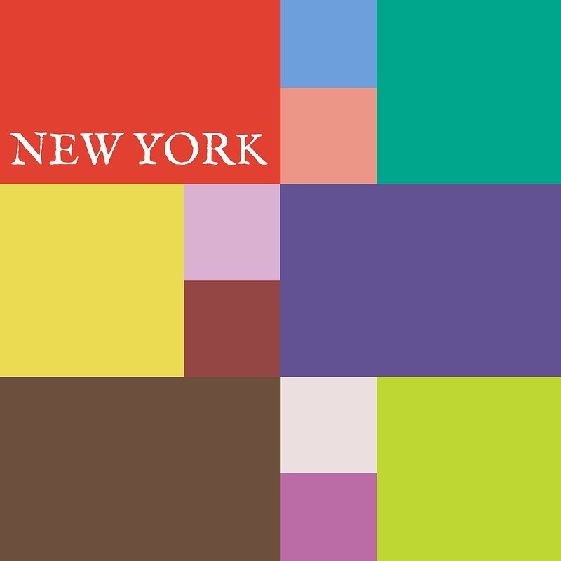
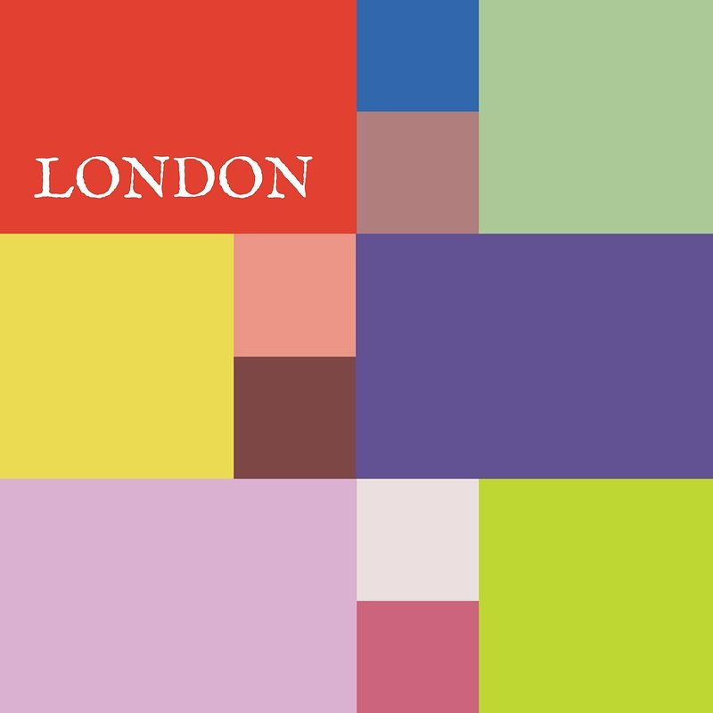
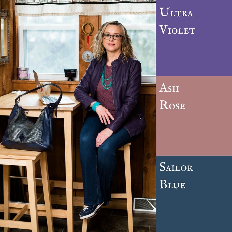
These were the two palettes. Many of the colors overlapped and I made reference to that in the posts. I personally think these two palettes were perfect for spring. Most of the colors were bright or light, with a few more earthy tones, which combined rendered great spring outfits. 

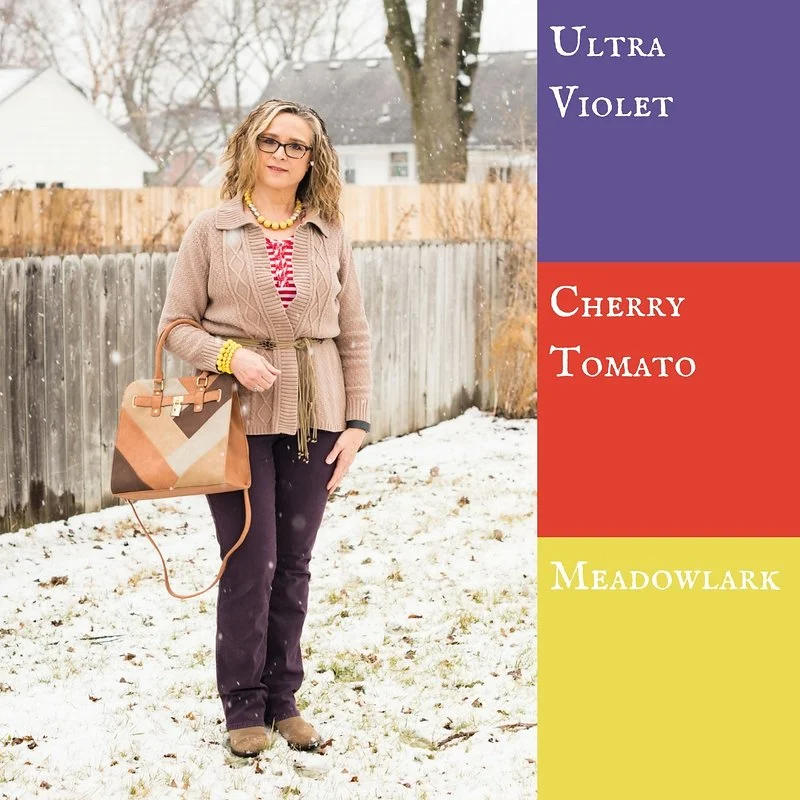
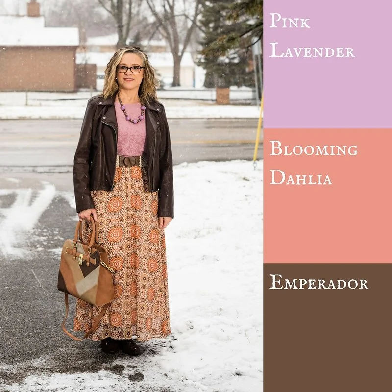
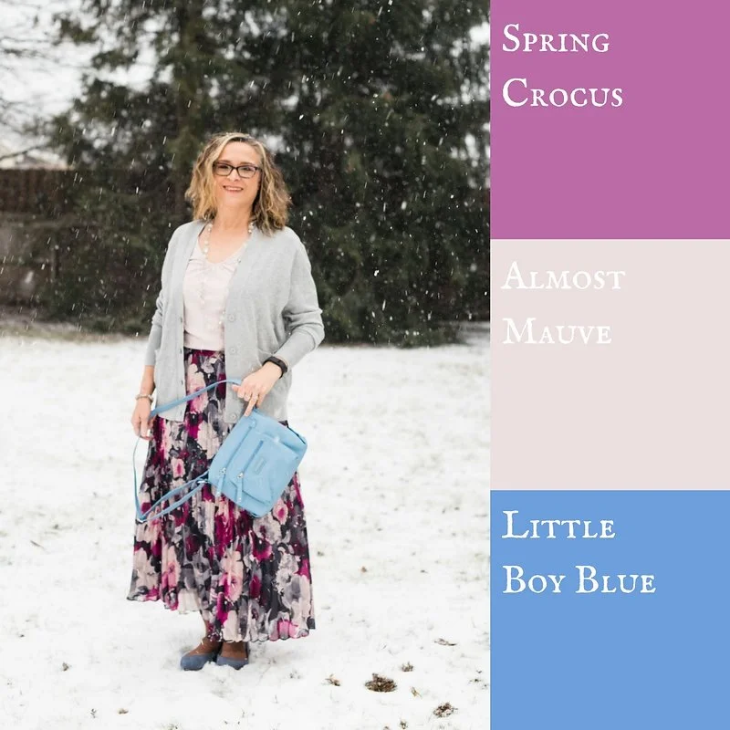
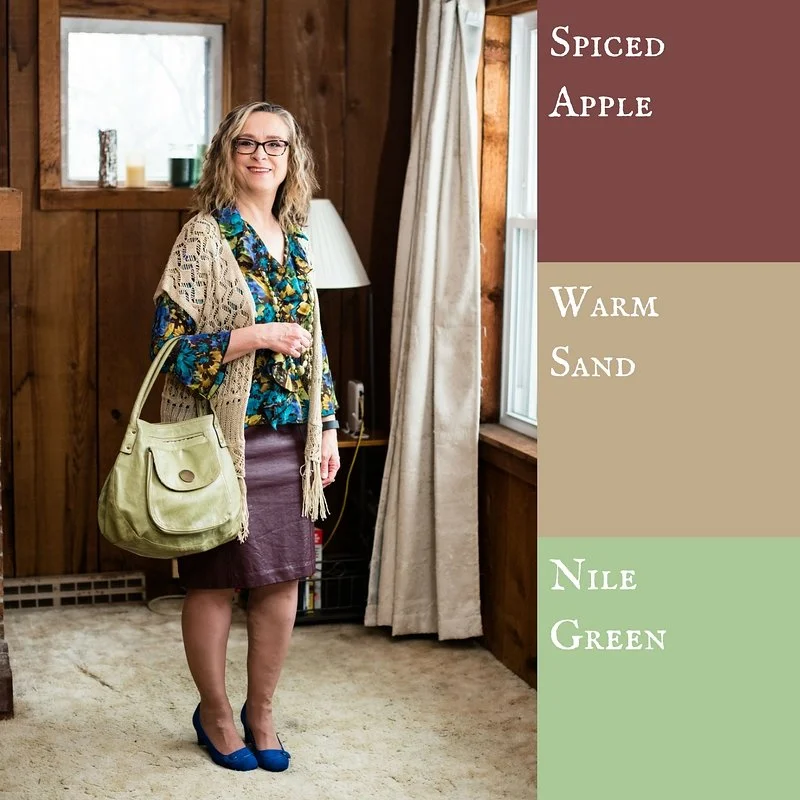
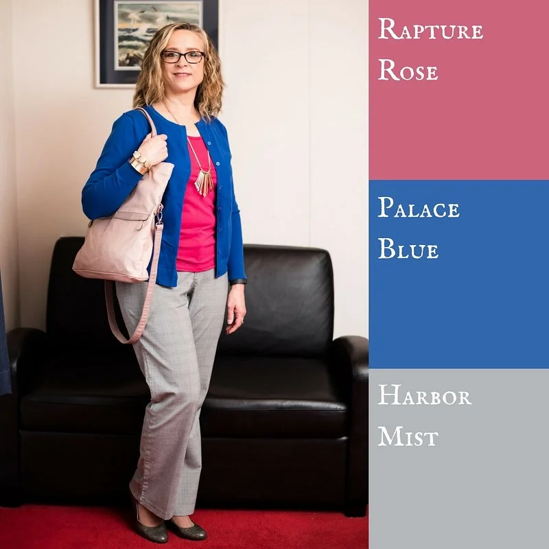
Here were my outfits. If you click on the picture it will take you to the original post.

I was glad that Pantone added the four classic colors of Sailor Blue, Harbor Mist, Warm Sand and Coconut Milk. These colors are perfect for grounding an outfit and keeping it from getting too over the top with color. Is there such a thing? Ha, ha. 

I think out of all of the colors from both palettes my favorites are Ultra Violet, (no surprise there, since I love purple), Arcadia, Pink Lavender and Ash Rose. All but Arcadia fall into the purple range. What can I say, I love purple! If I ever had a sports car it would be dark sparkly purple. Ha, ha. 

I hope you enjoyed this series. Let me know in the comments what your favorite colors were from this spring's two palettes. I always love to hear what you are thinking. 

Join me on Thursday for my Outside the Box column. You never know what I'll be showing off there. If you follow my Faith page, check back tomorrow for more on my Mulling It Over series as we delve further into 2 Timothy 2. 

Have a great Tuesday!

Photo credit Rebecca Trumbull. Make up Rachel Christensen.

Monday linking up with Catherine of Not Dressed as Lamb. Tuesday linking up with Jess of Elegantly Dressed and Stylish and Shelbee of Shelbee on the Edge

Pantone Spring 2018 - Chili Oil, Arcadia and Lime Punch

As I sit here beginning to type this, it is snowing some of the largest snowflakes I have ever seen! Just two days ago it was almost sixty and now Old Man Winter is back. We expected that, however. Winter will end and spring will come. To help us along it is time to start my Spring Pantone color series. 

I feature the Pantone colors twice a year, spring and fall. The reason I do this is simple. I love color! When I first discovered the Pantone Institute and began keeping track of their seasonal color palettes, I thought it was fun to see all the pretty colors they came up with. Frankly, now I am obsessed. I love to see the new colors each season and try to build outfits around those colors. 

Last week I introduced you to this year's spring palettes for both New York and London. There is a good deal of overlap this year. Considering there are twelve colors on each palette I was relieved for the duplicates. I wasn't about to subject you to that long of a series, just on color. This time around I am combining up to three colors in each outfit, plus a foundational color using one of the featured classic colors as well. 

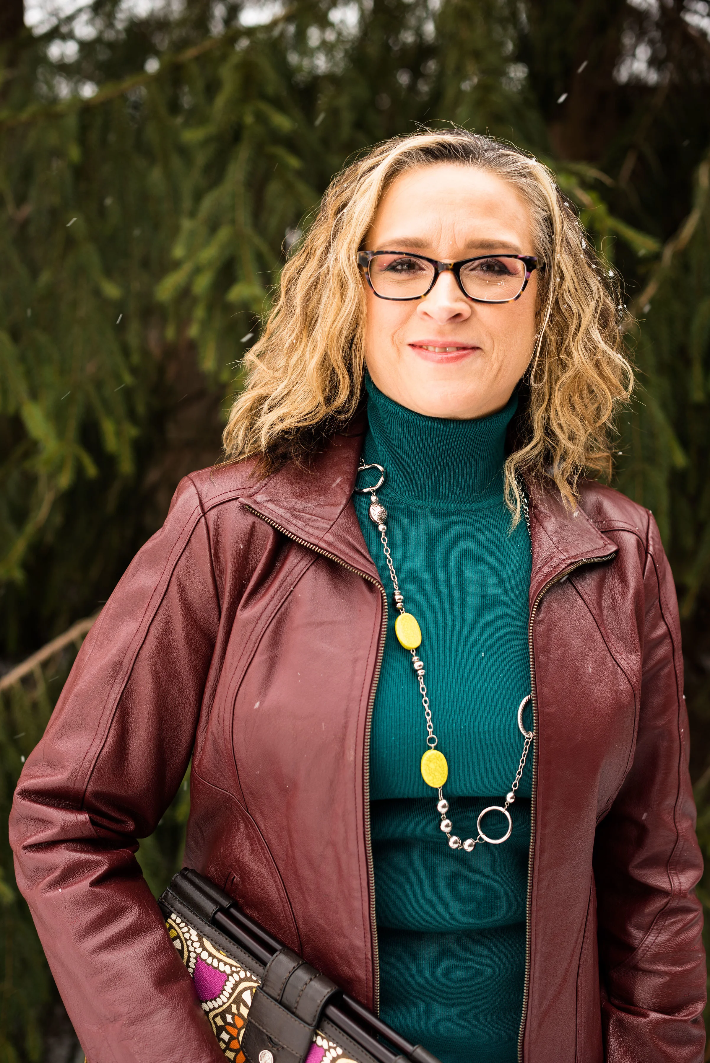
These pictures will not look very springy, seeing as it was a blustery, snowy day when we had our shoot, but I think they look pretty, even if the wind was whipping and I was freezing. 

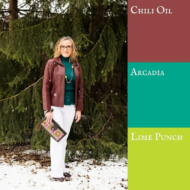
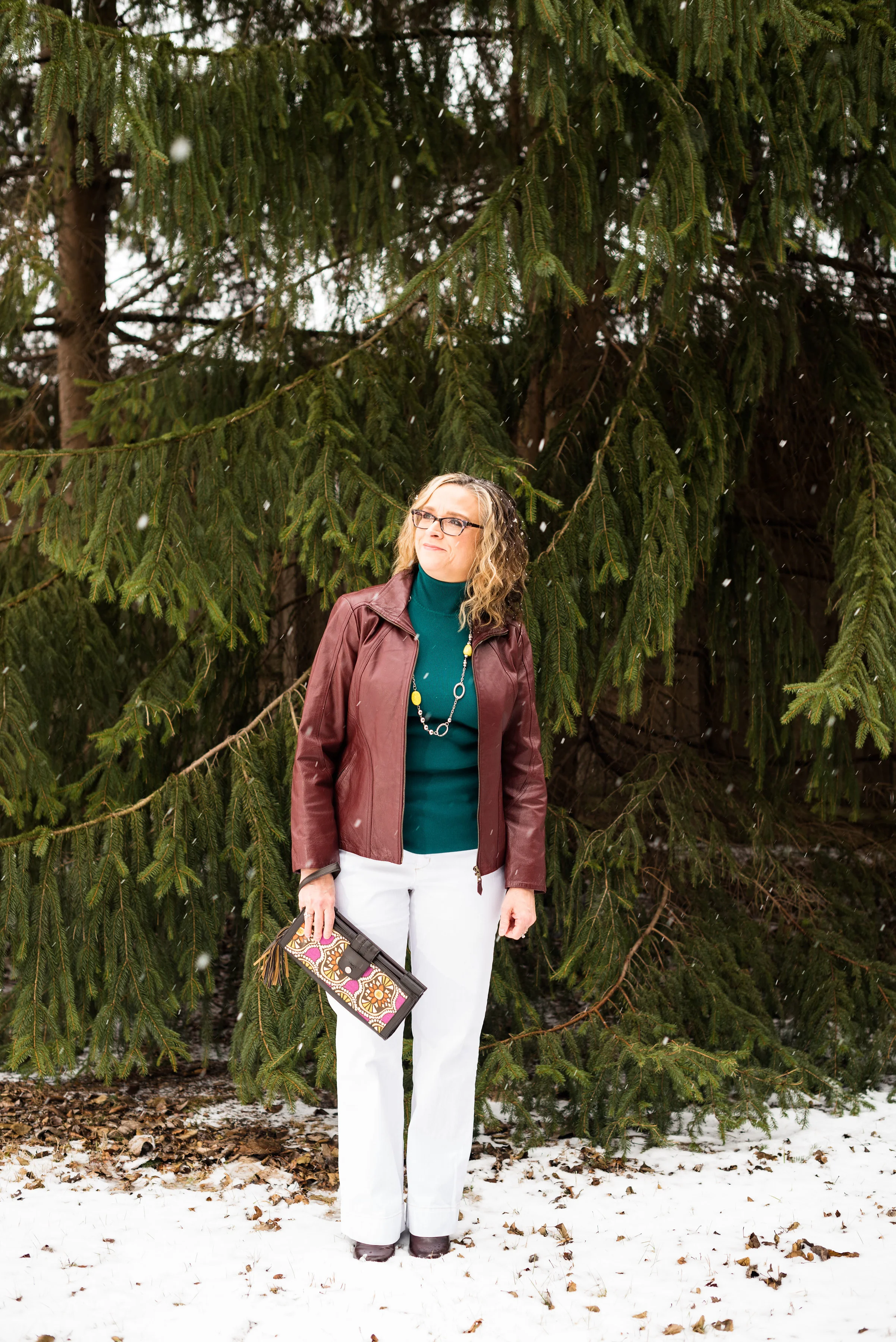
These three colors are spicy and fun! Chili Oil and Arcadia are on the New York palette, while Lime Punch is featured on both. My classic color for this outfit is Coconut Milk, or white. 

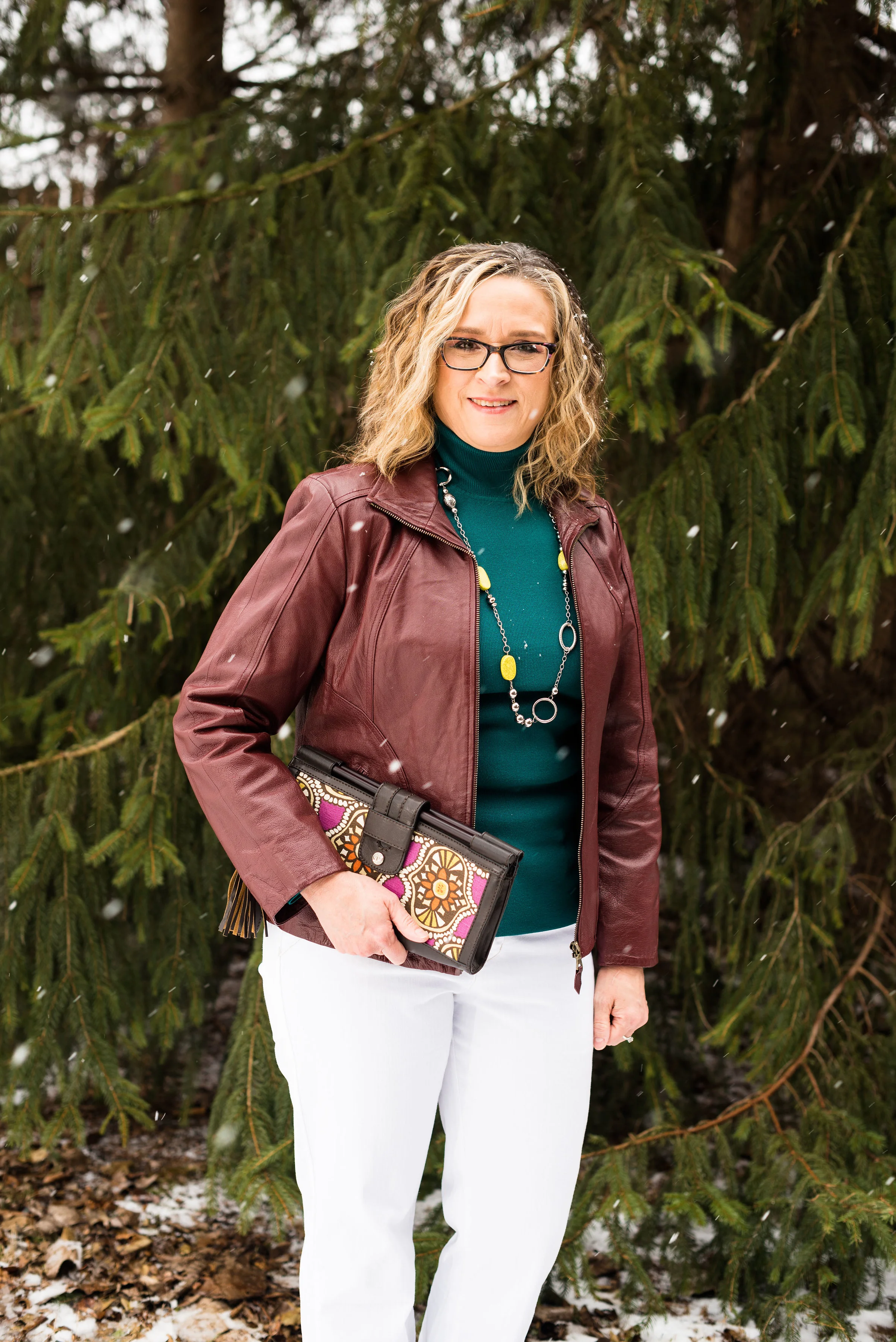
This thrifted Covington jacket worked perfectly as a Chili Oil piece. Not quite brown and not quite red, this color makes me think of Mexican fiestas and earthy tones. Arcadia partners well with the heat of Chili Oil, as if to cool the temperatures before things get too hot. Then throw in just a smidge of Lime Punch and you have a great transitional outfit. Still warm and grounded, but with just enough color to make you giddy for spring. 

The Arcadia turtleneck sweater is a recent purchase from Chico's. This sweater is soft, stretchy and not at all itchy. They don't seem to have this color any more, unfortunately, but I'll include a few links at the end for similar colored items. 

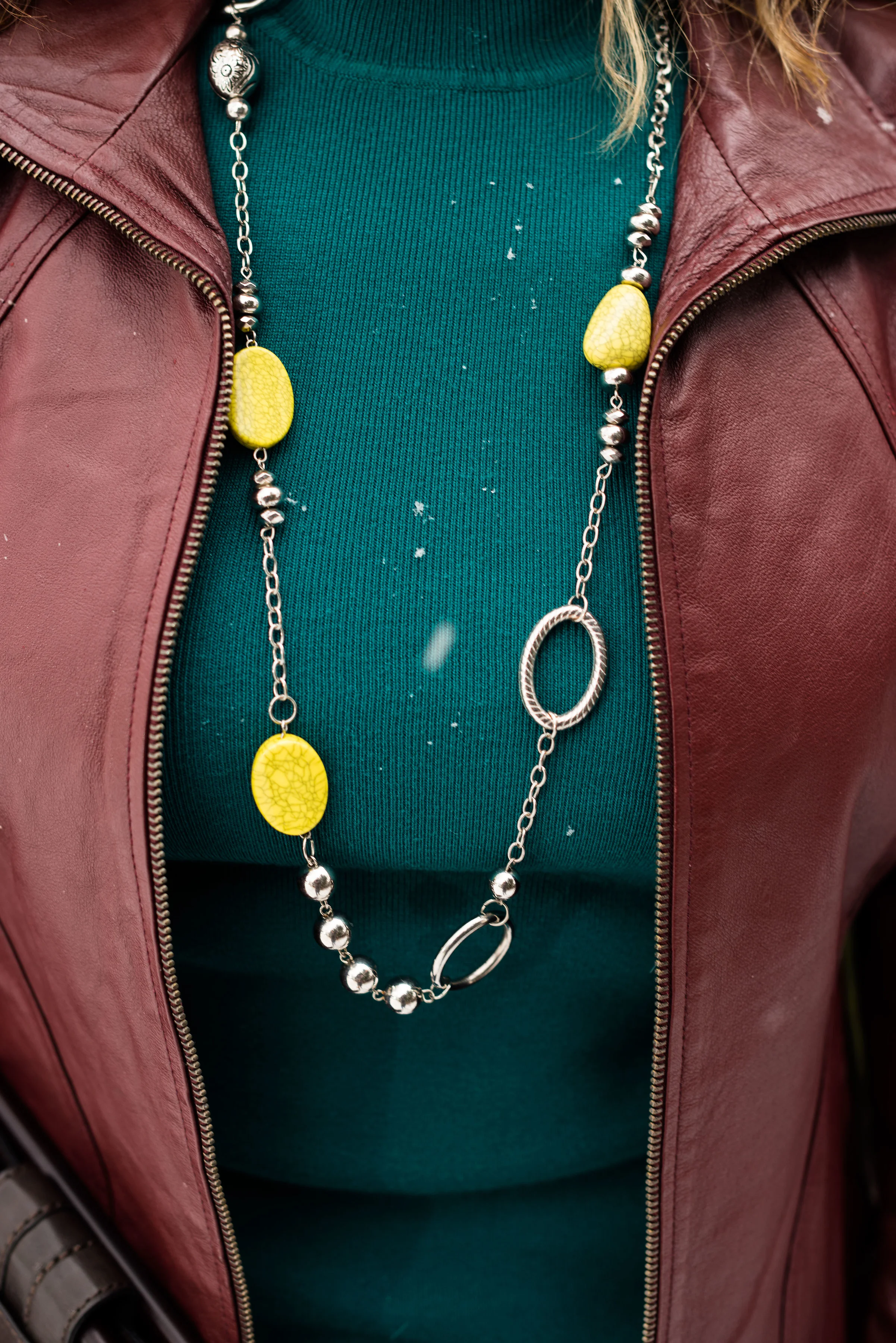
I found this cute metal and bead necklace at a thrift store. The Lime Punch beads are a nice contrast from yellow or green. 

Once again, I am wearing my Gloria Vanderbilt white jeans. I think white really helped this outfit to pop and to be a great transitional outfit for spring. 

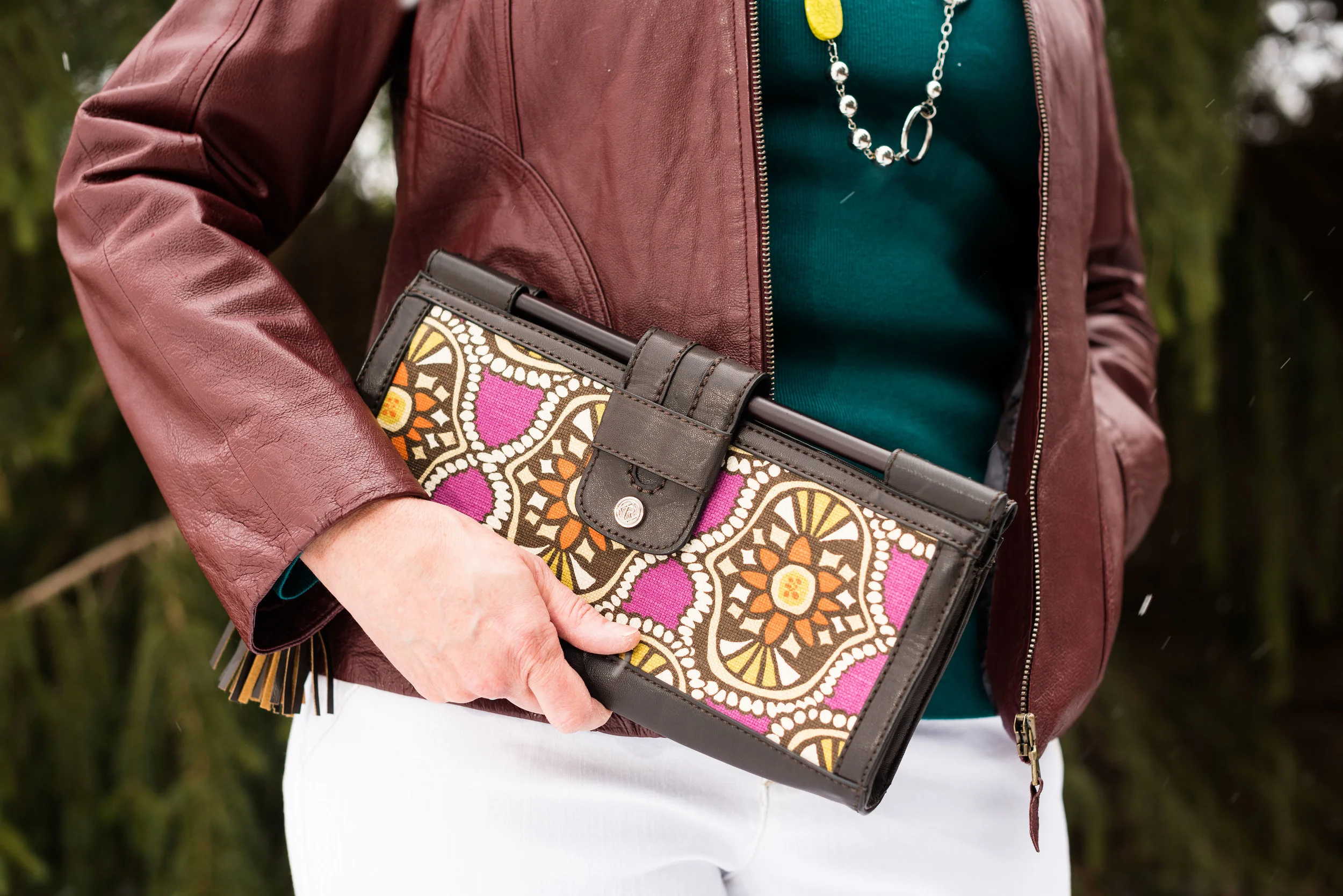
For my bag I chose this cute little thrift store find from Relic. The yellows in the bag are very similar to the Lime Punch color of my necklace. I thought this was a unique piece and I think it works very well to add print to this otherwise solid colored outfit. 

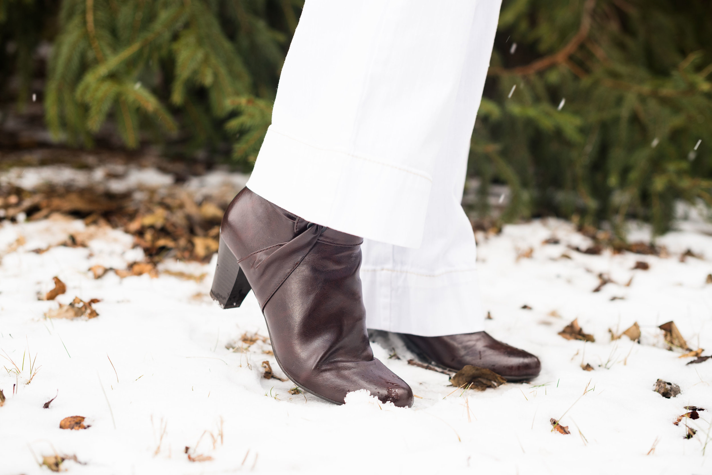
For my shoes I chose this pair of dark burgundy heeled ankle boots. I like the different twist these Life Stride boots have on the side. It is sort of like ruching for a shoe!

What do you think of these Pantone colors? Which is your favorite on this outfit? I've been seeing a lot of Arcadia various places, but Lime Punch is a fun color for the warmer weather. I also like the international flavor of Chili Oil....so many colors and so little time! Ha, ha.

I hope you enjoyed this post. I'd love to hear from you, so leave me some love! 

Photo credit Rebecca Trumbull. Make up Rachel Christensen

This post contains affiliate links. If you click on a shopping link I get a few pennies, if you purchase something through one of my links, I get a little commission. All opinions expressed are my own. 

Monday linking up with Catherine of Not Dressed As Lamb. Tuesday linking up with Jess of Elegantly Dressed and Stylish and Shelbee in the Spread the Kindness link up. Friday linking up with Jennie of A Pocketful of Polka Dots and Jo-Lynne of Jo-Lynne Shane