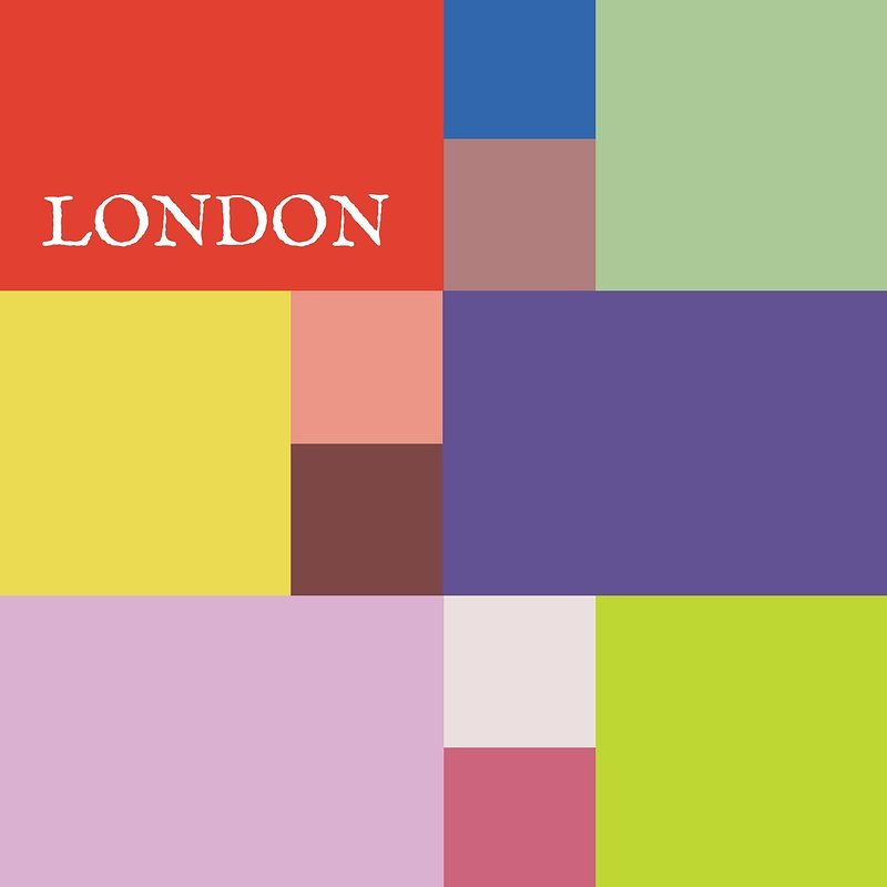
Pantone Autumn/Winter 2025 - London Palette: Lavender Blue, Chili Oil and Crown Blue

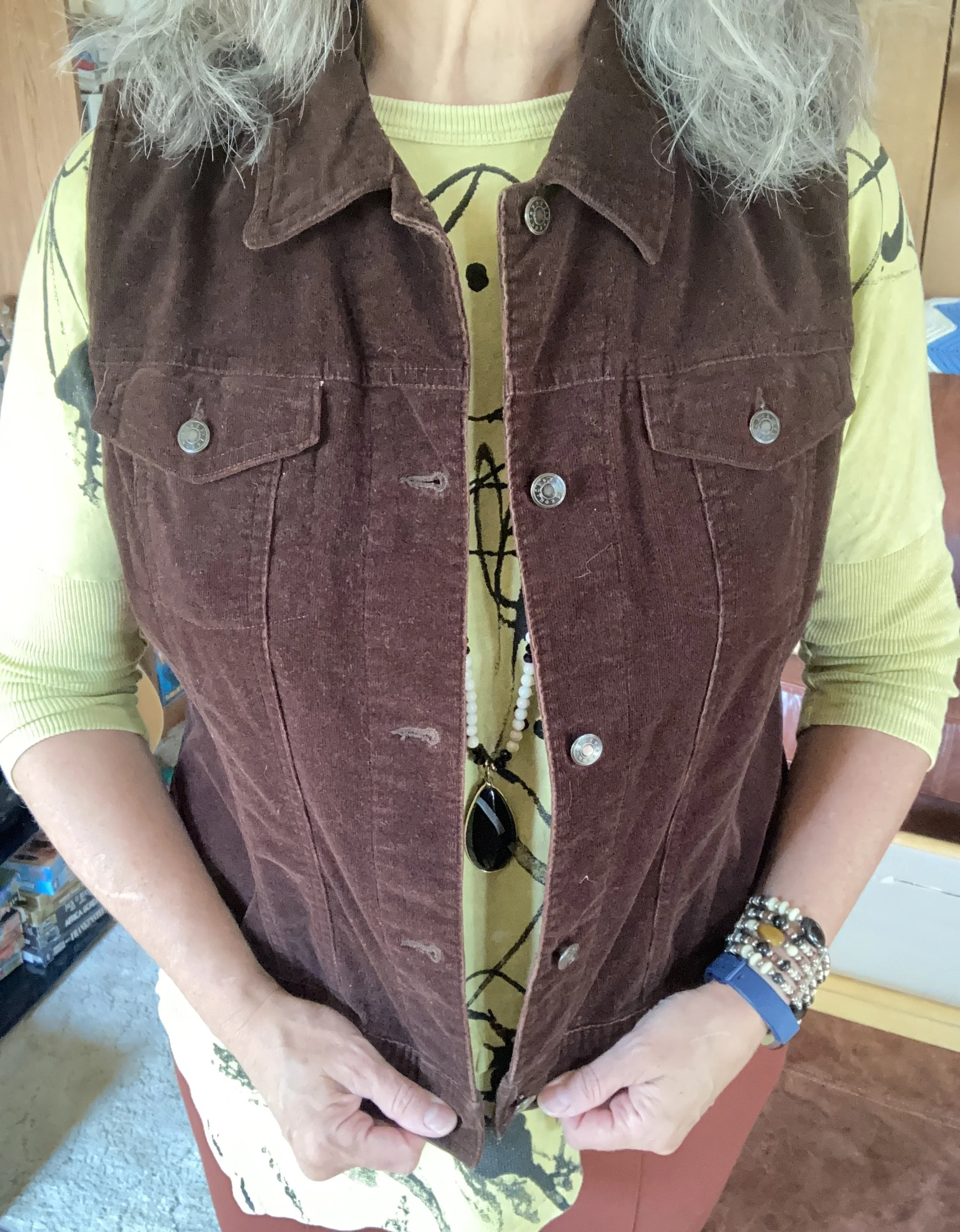
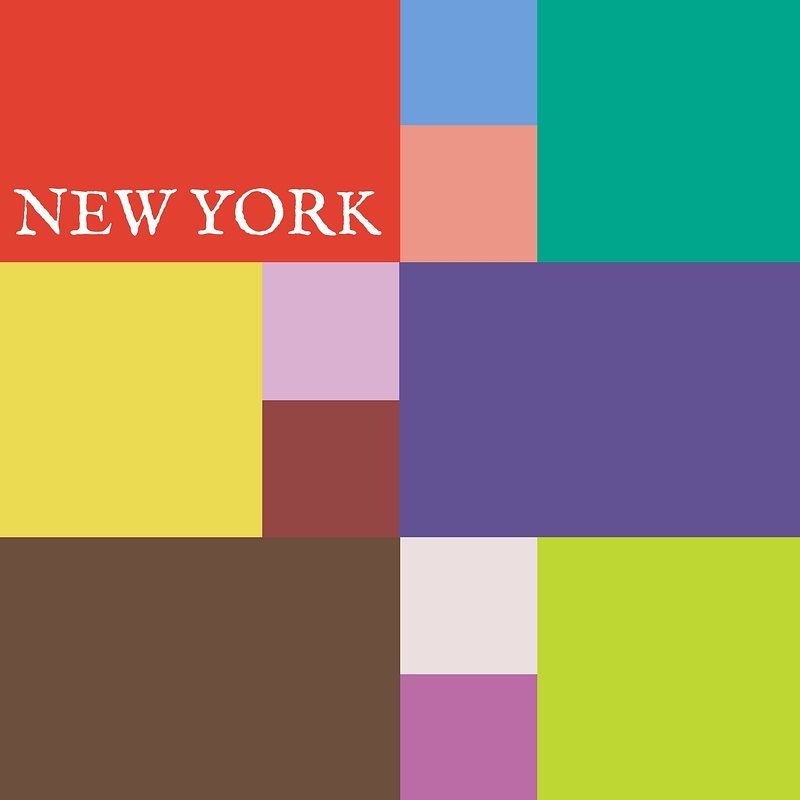
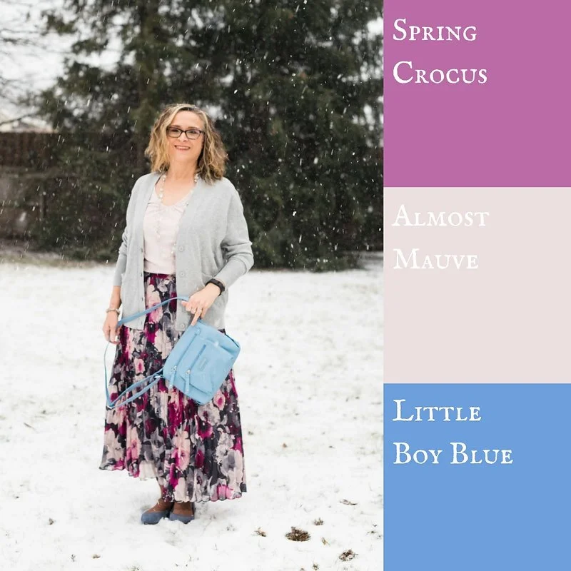
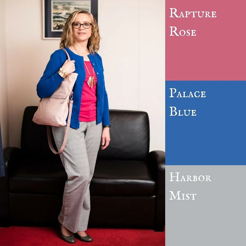
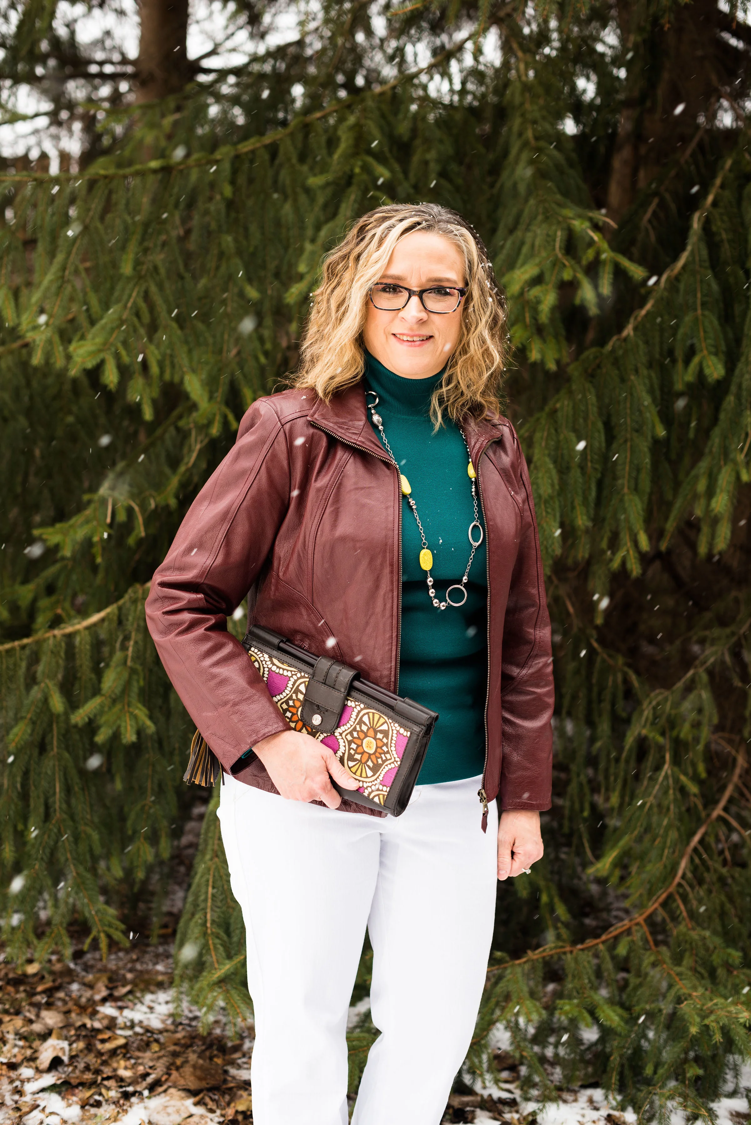
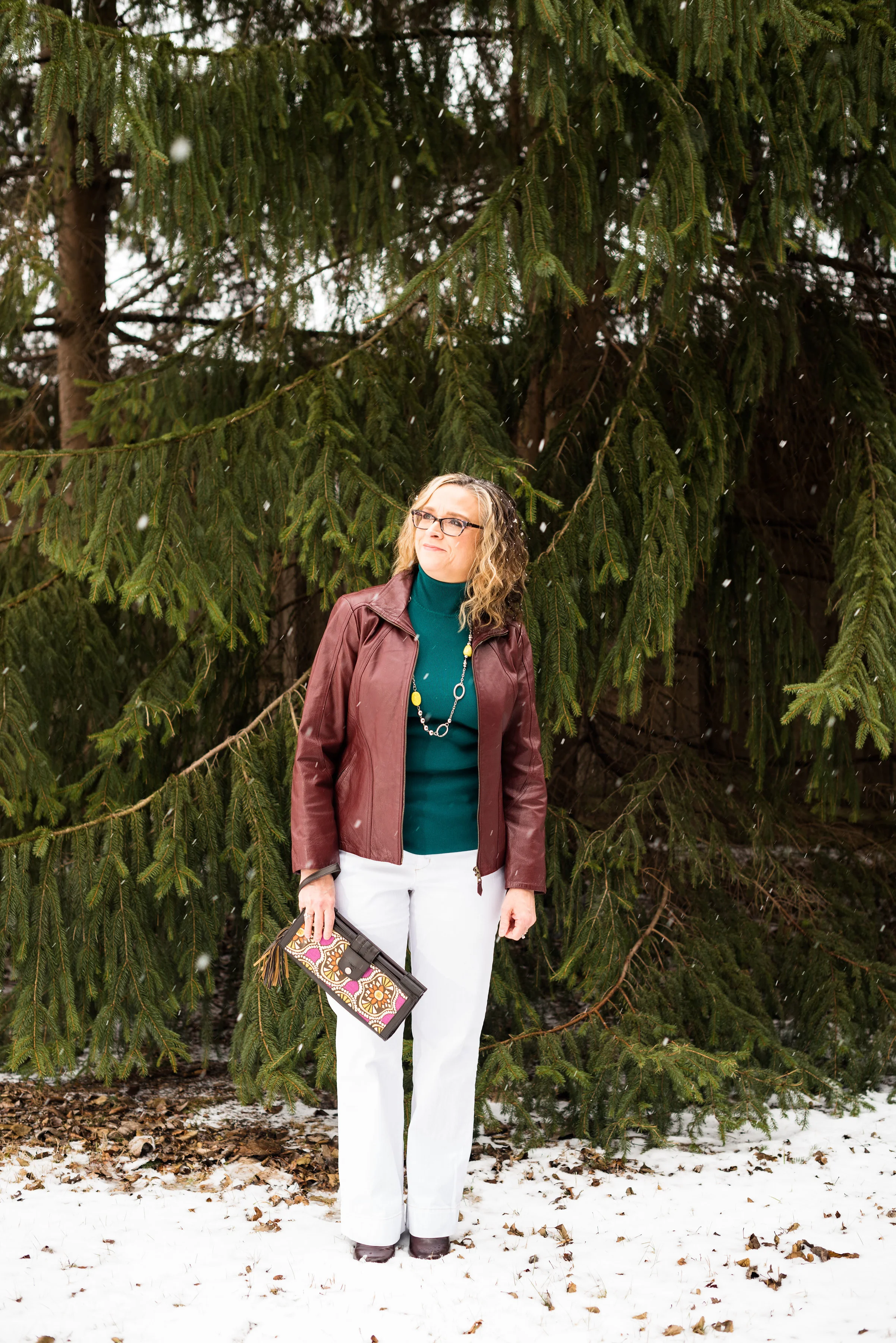
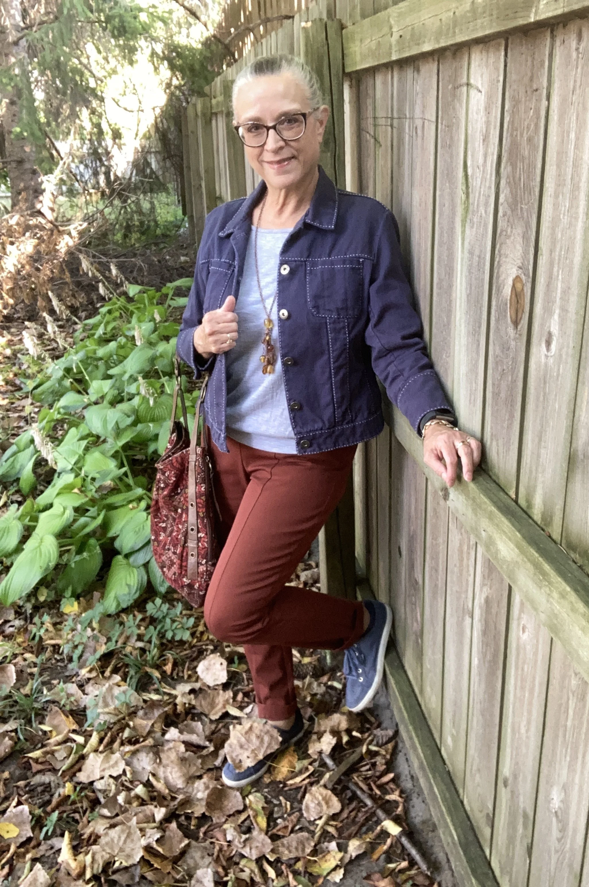
As we start the London Color Palette this week you will recognize a few of the same colors that were on the New York Palette. Chili Oil and Crown Blue are two of those. You can see the London palette colors by checking out this pin on my Pinterest board. For today’s look and a one other look from this palette I decided to combine colors that fall into the same color category. Today I combined the pastel Lavender Blue with the classic Crown Blue, along with Chili Oil for a casual chic color block look.

The leaf is not part of the outfit! Ha, ha. Watch the following and you’ll know why. We have an immense Cottonwood tree in our yard and the leaves start to carpet the grass from the beginning of August. Even with all the leaves on the ground there are still leaves on the tree…and the sticks!! Eye, yie, yie. The stick shed from Cottonwoods is crazy.

You saw this Crown Blue thrifted Coldwater Creek piece just a few weeks ago. See the post here in case you missed it. This is a retailer that has many pretty and practical pieces, but they are a touch out of my price range, that is why I like to find different brands at thrift stores to try them out.

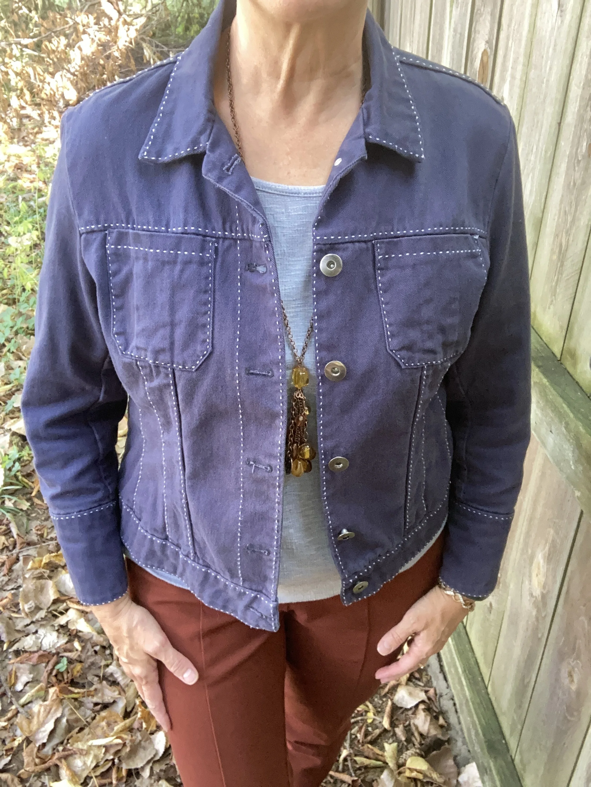
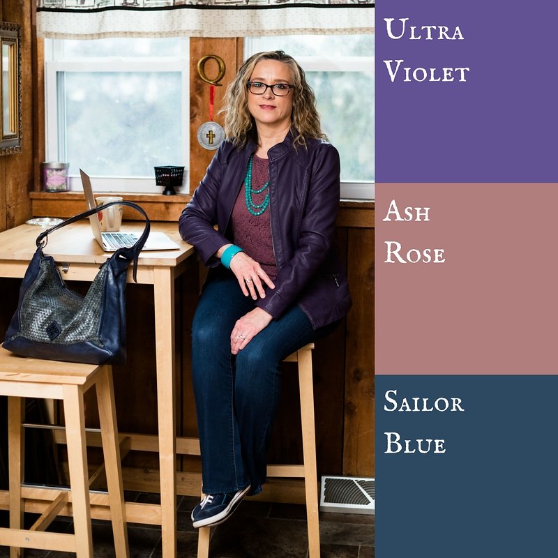
Lavender Blue is the London pallet’s pastel. I have two pullover tops in this color. It is a purply blue that is hard to match with anything, so an outfit like this allows it to stand on its own. This piece is Apt. 9 and was purchased at Kohl’s a number of years ago. I had to show off the beautiful lace inset on the back, even though it was concealed under the jacket. You can see how I styled this in another fall outfit with a white skirt.

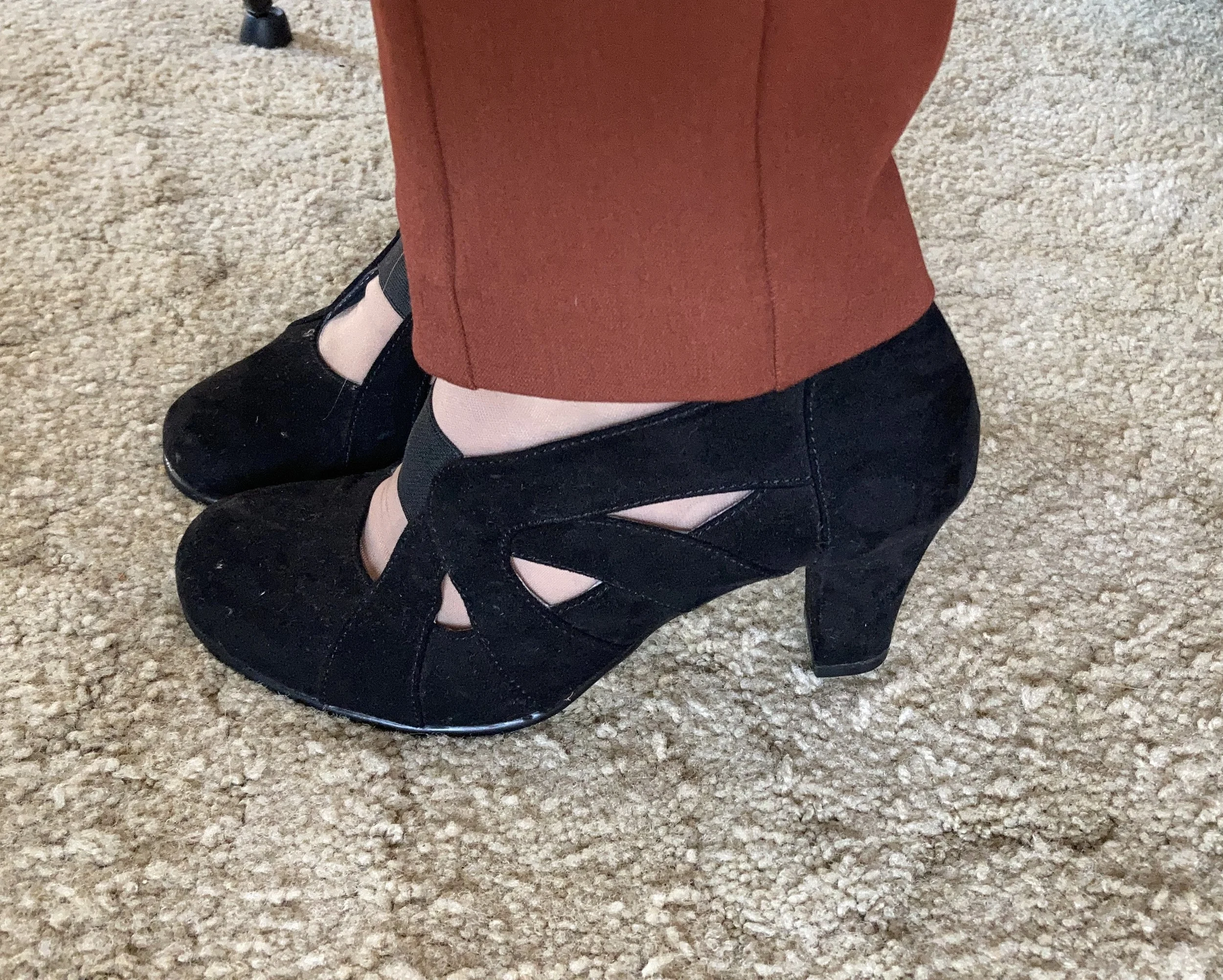
My Chili Oil pants are Chico’s So Slimming, which I bought on sale a number of years ago. These are ponte pants. I never thought I would like a knit pant like this, but I do. I do not wear them often as I look at them more as a dress or work pant, but it was fun to get them out for this outfit. You saw them a few weeks ago when I styled them with Lemon Grass and French Roast.

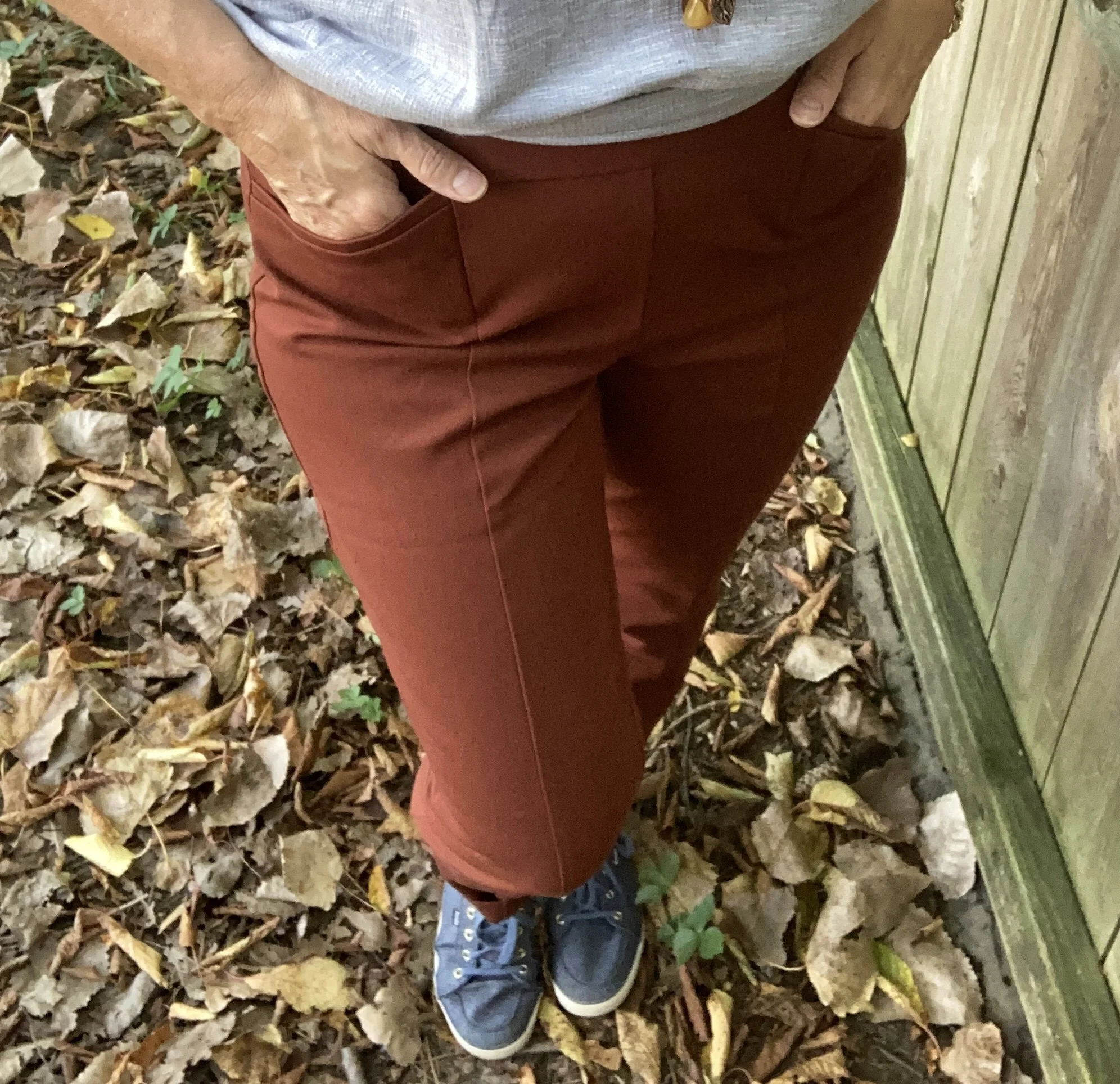
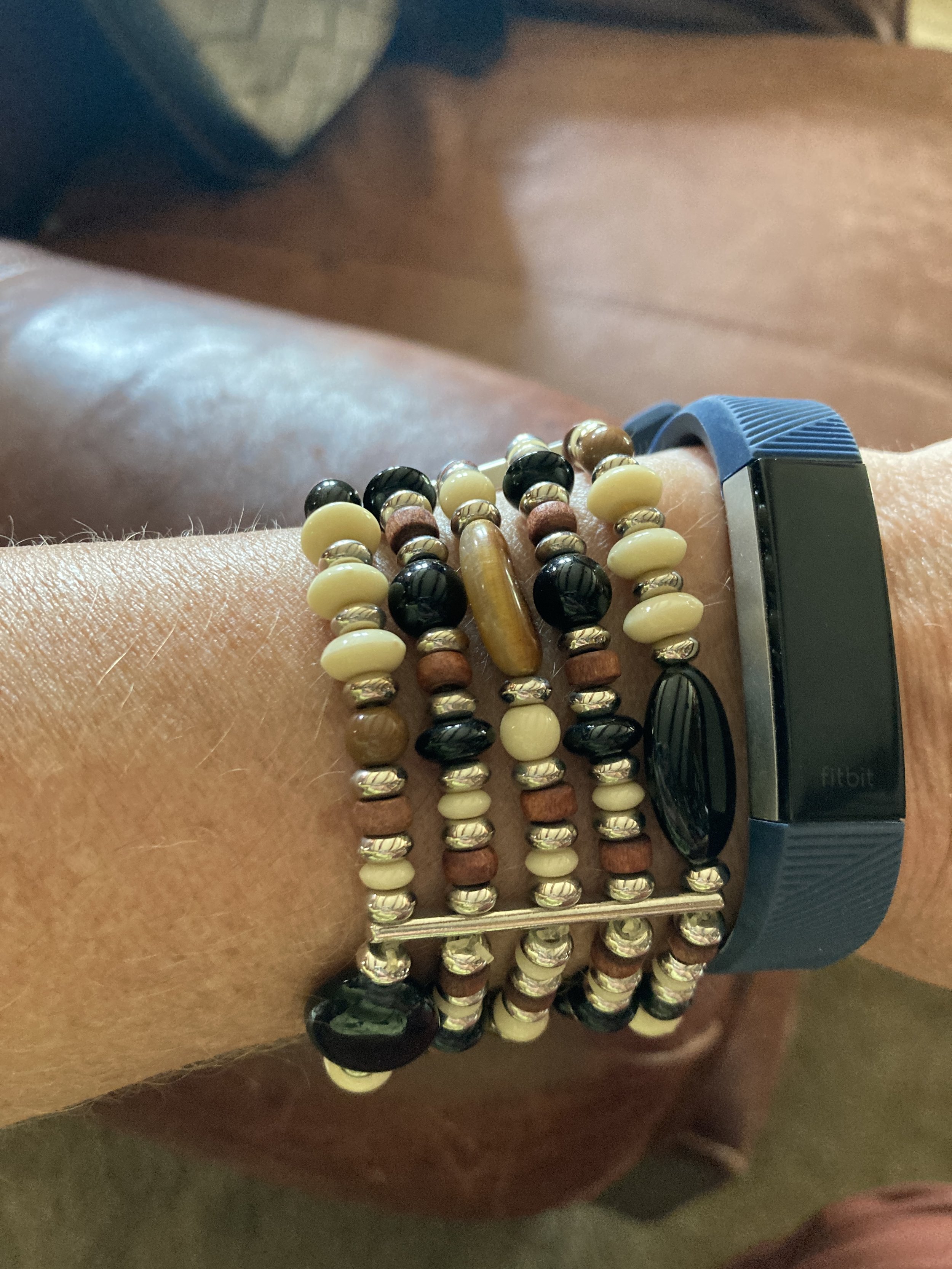
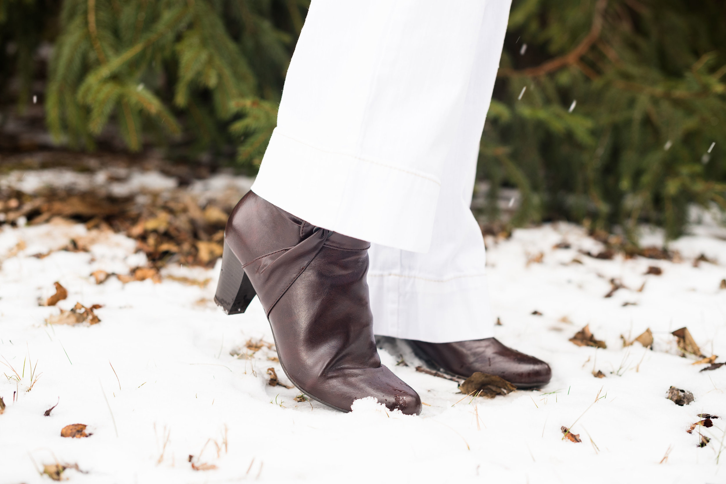
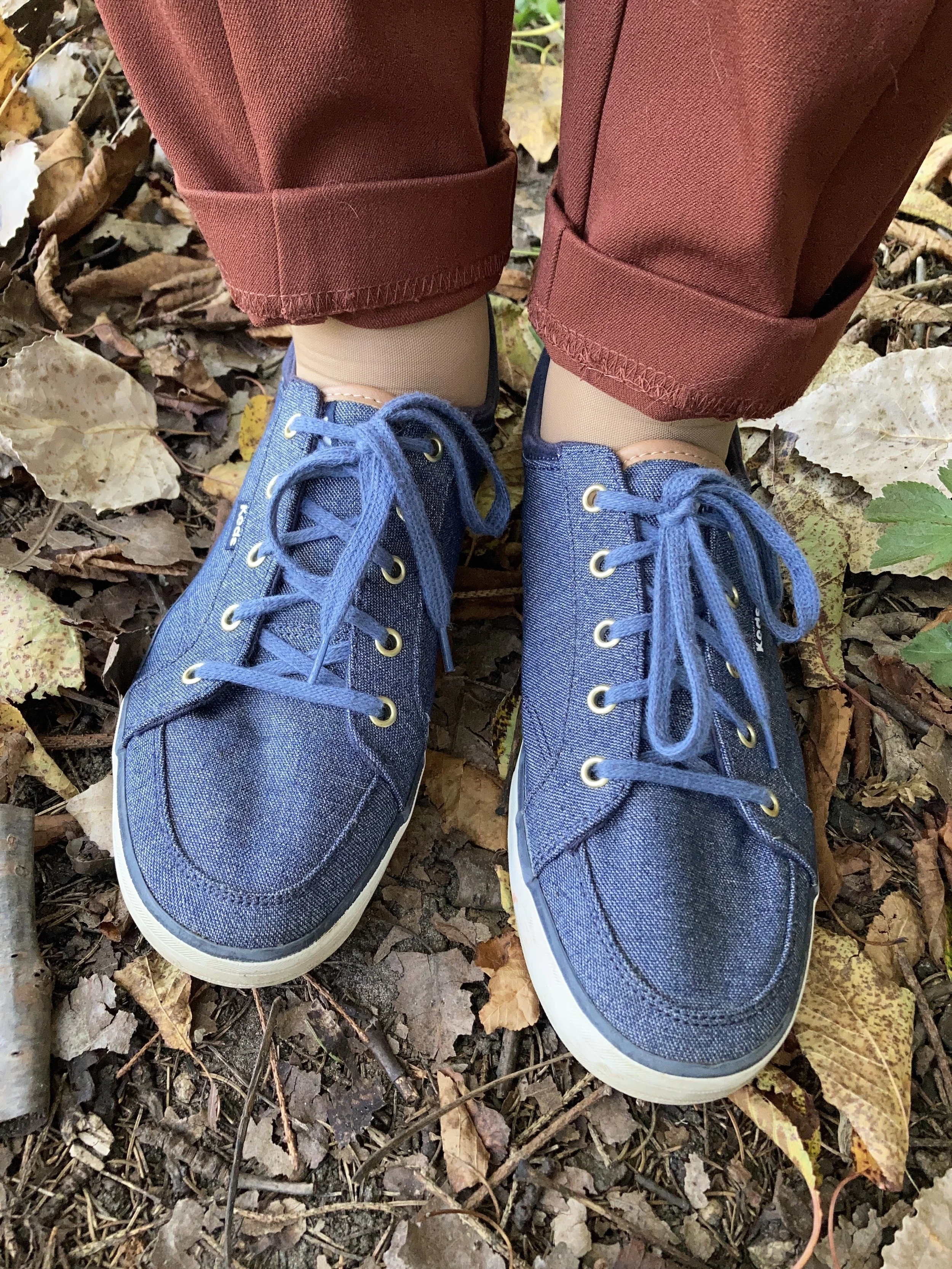
I felt like keeping it casual, and thought it would be a nice contrast to the previous look with these pants which was more dressed up. It is amazing how accessories like shoes and bags can change a look. I chose my denim Keds as a nod back up to Crown Blue jacket. I also gave the pants a cuff, which in this look keeps it a bit more casual.

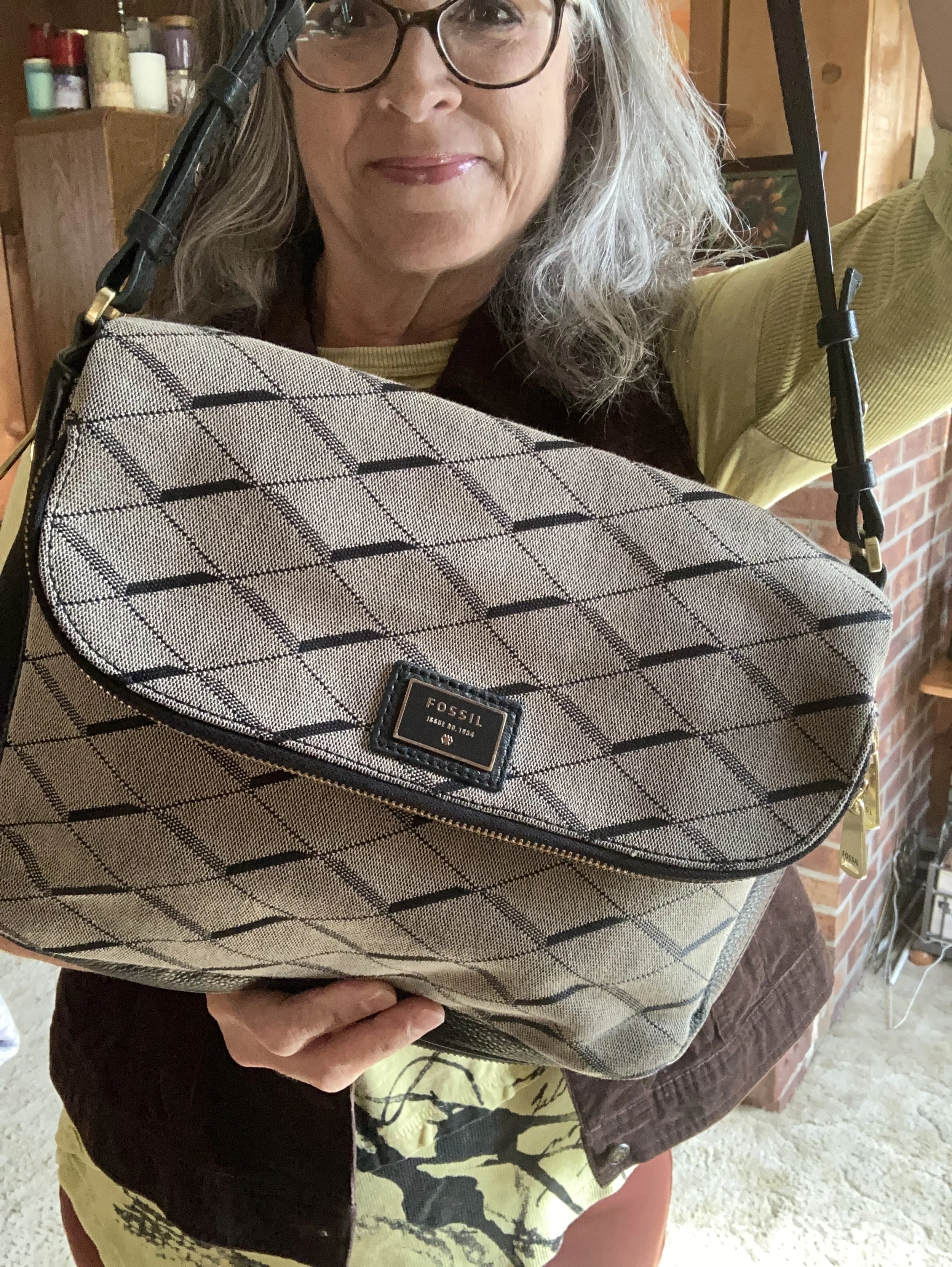
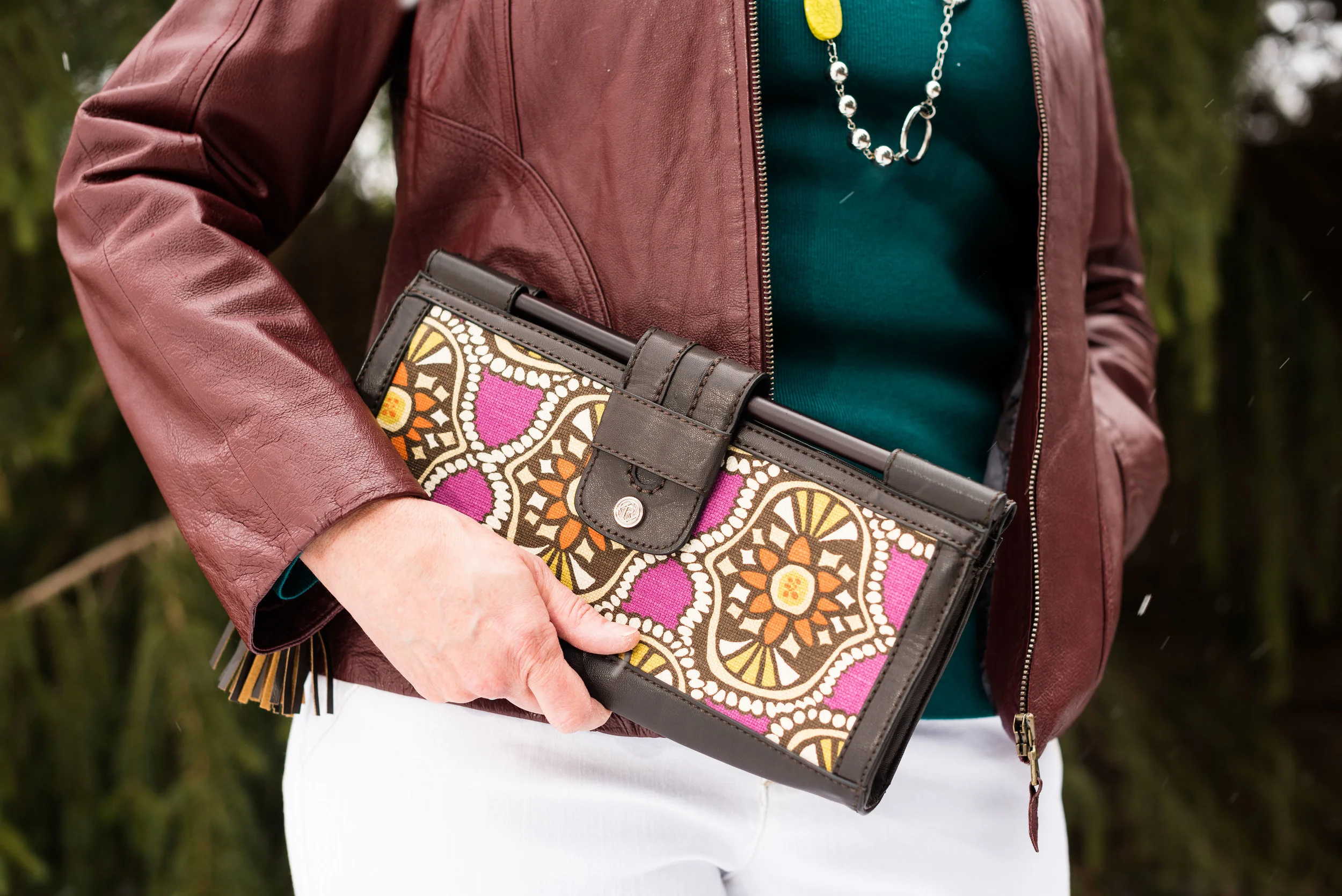
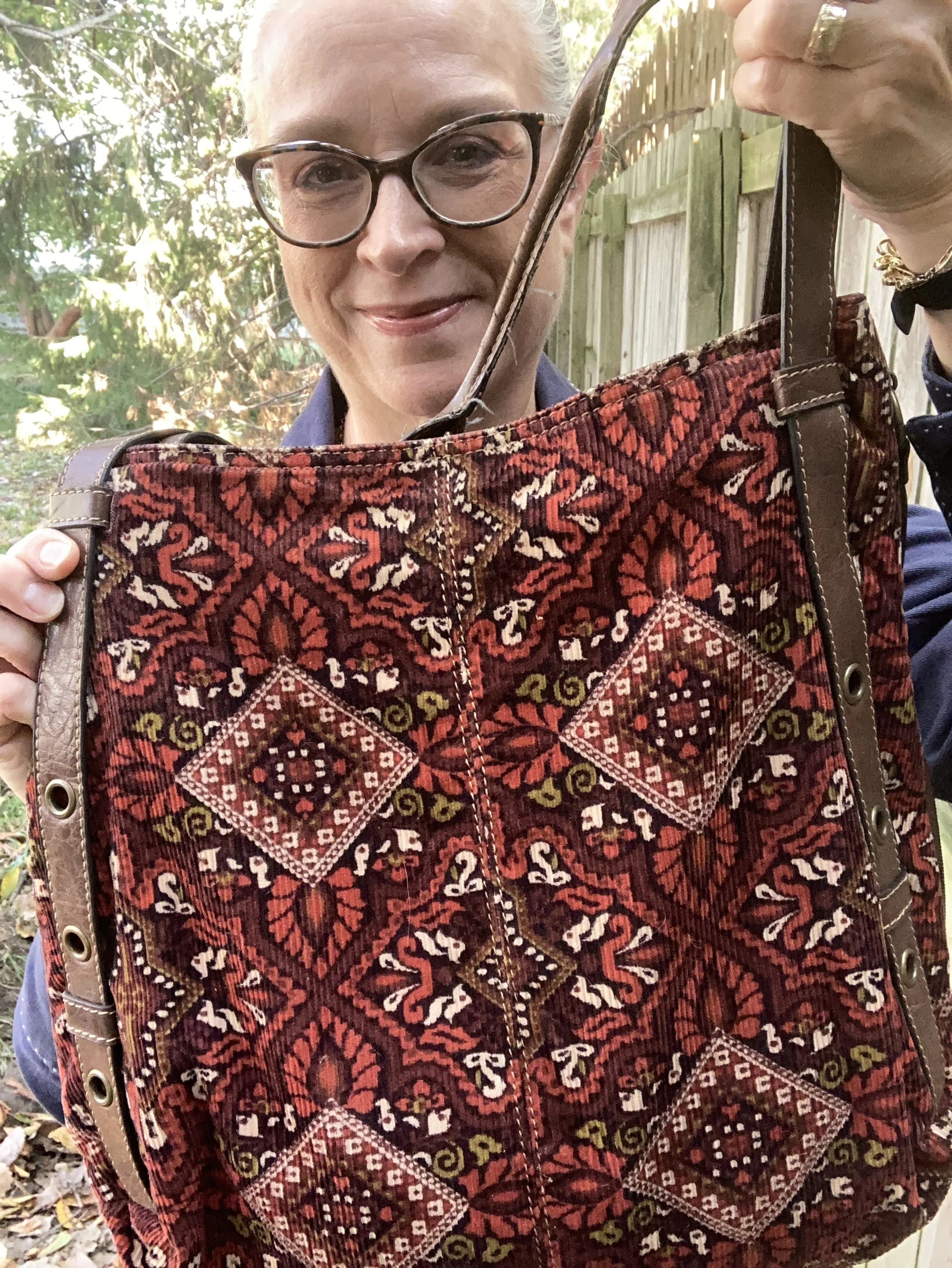
My corduroy axcess bag is very old, but I love the colors and keep it hanging around, even though my current go to’s for bags are cross body and smaller.

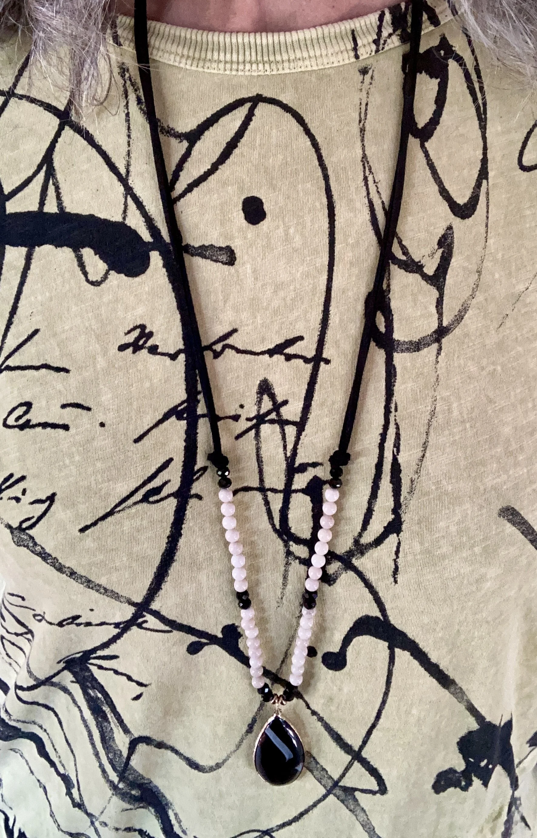
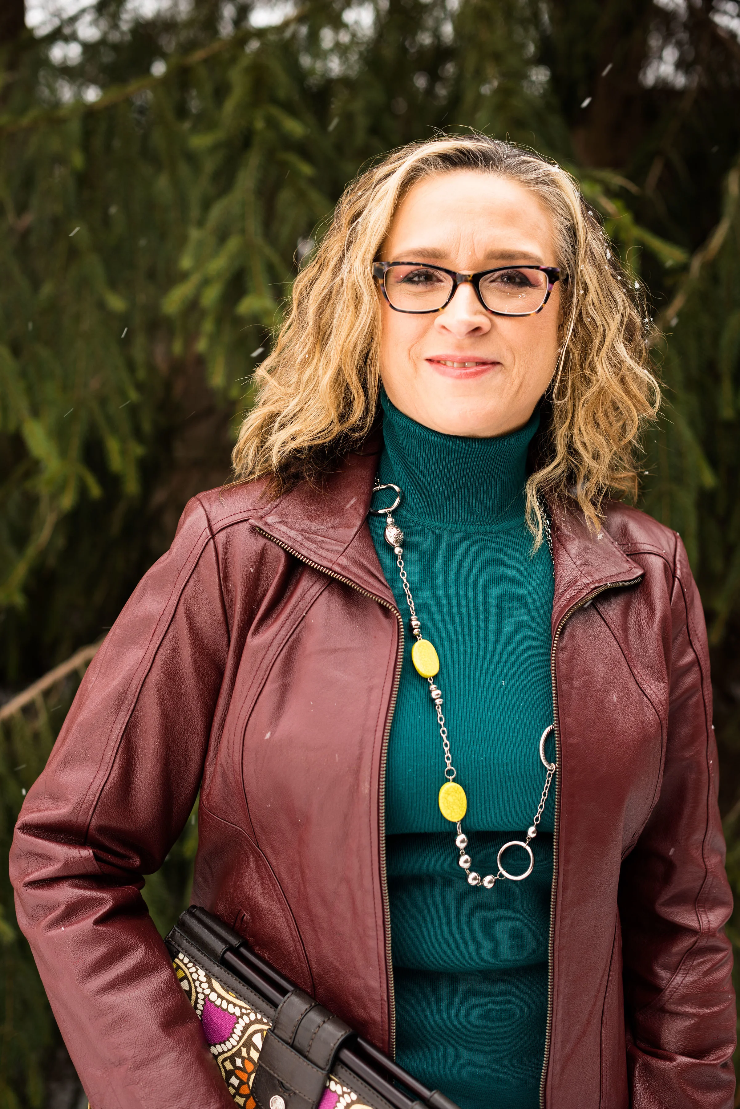
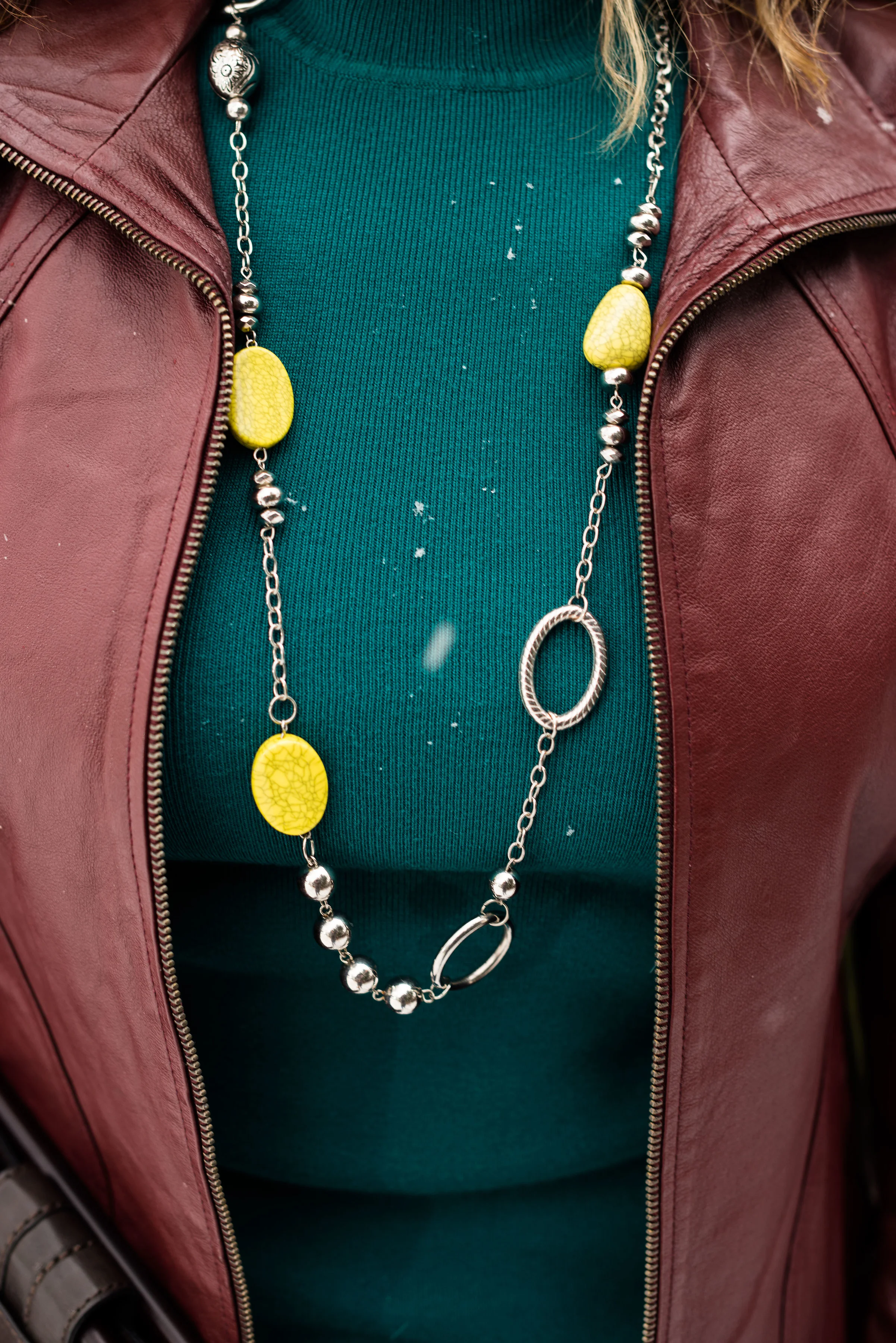
My jewelry is a simple pendant charm necklace. I like that the coppery color goes with the Chili Oil vibe of the pants, and makes the pastel top seem more fall appropriate.

What do you think of this outfit? Do you like these colors? Do you like to wear a color block look?

I am including a few shopping links for you. These are affiliate links and are provided to give you ideas, inspiration and possible shopping options. If you use one of my links to make a purchase, I get a little commission, and believe me at this point in time, all the pennies count.

Have a super Tuesday!

Pantone Autumn/Winter 2025 - New York Palette: Lemon Grass, Chili Oil, and French Roast

This week brings you another collection of colors from the Pantone Autumn New York color palette. Remember, I am combining colors as they inspired me, but you can take any of the colors from the palette and put them together, or maybe there are only one or two colors that you like and plan on adding to your wardrobe. This is always about what you like and how you can be inspired to look at your closet differently.

Today’s outfit is a contrast of light and dark combining the yellowy green of Lemon Grass with the classic French Roast along with the spice of Chili Oil. You can see the actual Pantone colors here.

This pale yellow top, is not a true yellow, but has just a hint of green, making it the perfect selection from my closet for the Pantone Lemon Grass. I found this a few years ago while thrifting and it is a brand called Jess & Jane. I discovered that Jess & Jane is a California based wholesale clothing company who only sells to specialty boutiques, so who knows where this piece originated from. It’s kind of fun to think of the roads some of our second hand pieces have traveled. I like the asymmetrical hemline and the funky ink spray pattern on the front. I also like the sleeve length, which is perfect for the transitional days between summer and fall.

I remembered that I still had these rusty, Chili Oil, Chico’s So Slimming ponte pants that I had purchased on sale a few years ago. Ponte pants are made from a thick, stretchy, double-knit fabric called Ponte di Roma. They offer a more flattering line than regular leggings due to the specially made seams and more support. I don’t wear dress pants very often these days as I no longer have an office job, but I hang onto things for now, because who knows when I may have to go back to work outside the home.

To add a bit of texture and a layer for cooler temps I reached for this thrifted Crazy Horse by Liz Claiborne corduroy vest. It does a fairly good job of mimicking the French Roast dark brown color on the New York classic palette. I love this piece as it is structured, but also has a bit of stretch making it easier to wear.

I kept my jewelry simple, as the top, vest and pants do the talking. A long black and white, beaded pendant necklace, and a stack, bead bracelet with browns, creams, blacks and a touch of yellow threw in a bit more texture and interest. I didn’t think to swap out my blue Fit Bit band for a brown or white one. Ha, ha.

I chose black for my shoes and bag to tie to the black print on the top. My bag is a thrifted Fossil shoulder bag, and my shoes are Aerosoles that I purchased a number of years ago from DSW. I really like both of these. The bag is a great fall and winter choice, and the heels are comfortable (for as comfy as a heeled shoe can be when you don’t wear them very often - ha, ha).

What do you think of these Pantone colors? Would you wear these colors together? Do you like Lemon Grass, Chili Oil or French Roast the best? Which of these colors do you already have in your closet? Leave me a comment or two. It helps my blog to grown and reminds me why I do this!

I have included a few shopping links. Thank you so much for making an occasional purchase through my links. That gives me a tiny bit of income. I cherish all of your support. These are affiliate links brought to you at no cost. All opinions are my own.

I hope you are having a great week!

Pantone Spring 2018 - Recap

Now that my series is over, I thought I would show you all of the outfits together for a fun review. Just a refresher, the Pantone Color Institute puts out a palette of colors twice a year, once in the spring and once in the fall. These colors are the basis from which designers, both fashion and interior, draw their inspiration for fabrics, clothing, paint and furnishings. I always consider it a challenge to draw outfit inspiration from these colors, even the ones I may personally not like. Let's face it, not all colors are necessarily pretty in everyone's eyes. However, I think it can be good for our brains to think outside the box and try new things. 

These were the two palettes. Many of the colors overlapped and I made reference to that in the posts. I personally think these two palettes were perfect for spring. Most of the colors were bright or light, with a few more earthy tones, which combined rendered great spring outfits. 

Here were my outfits. If you click on the picture it will take you to the original post.

I was glad that Pantone added the four classic colors of Sailor Blue, Harbor Mist, Warm Sand and Coconut Milk. These colors are perfect for grounding an outfit and keeping it from getting too over the top with color. Is there such a thing? Ha, ha. 

I think out of all of the colors from both palettes my favorites are Ultra Violet, (no surprise there, since I love purple), Arcadia, Pink Lavender and Ash Rose. All but Arcadia fall into the purple range. What can I say, I love purple! If I ever had a sports car it would be dark sparkly purple. Ha, ha. 

I hope you enjoyed this series. Let me know in the comments what your favorite colors were from this spring's two palettes. I always love to hear what you are thinking. 

Join me on Thursday for my Outside the Box column. You never know what I'll be showing off there. If you follow my Faith page, check back tomorrow for more on my Mulling It Over series as we delve further into 2 Timothy 2. 

Have a great Tuesday!

Photo credit Rebecca Trumbull. Make up Rachel Christensen.

Monday linking up with Catherine of Not Dressed as Lamb. Tuesday linking up with Jess of Elegantly Dressed and Stylish and Shelbee of Shelbee on the Edge

Pantone Spring 2018 - Chili Oil, Arcadia and Lime Punch

As I sit here beginning to type this, it is snowing some of the largest snowflakes I have ever seen! Just two days ago it was almost sixty and now Old Man Winter is back. We expected that, however. Winter will end and spring will come. To help us along it is time to start my Spring Pantone color series. 

I feature the Pantone colors twice a year, spring and fall. The reason I do this is simple. I love color! When I first discovered the Pantone Institute and began keeping track of their seasonal color palettes, I thought it was fun to see all the pretty colors they came up with. Frankly, now I am obsessed. I love to see the new colors each season and try to build outfits around those colors. 

Last week I introduced you to this year's spring palettes for both New York and London. There is a good deal of overlap this year. Considering there are twelve colors on each palette I was relieved for the duplicates. I wasn't about to subject you to that long of a series, just on color. This time around I am combining up to three colors in each outfit, plus a foundational color using one of the featured classic colors as well. 

These pictures will not look very springy, seeing as it was a blustery, snowy day when we had our shoot, but I think they look pretty, even if the wind was whipping and I was freezing. 

These three colors are spicy and fun! Chili Oil and Arcadia are on the New York palette, while Lime Punch is featured on both. My classic color for this outfit is Coconut Milk, or white. 

This thrifted Covington jacket worked perfectly as a Chili Oil piece. Not quite brown and not quite red, this color makes me think of Mexican fiestas and earthy tones. Arcadia partners well with the heat of Chili Oil, as if to cool the temperatures before things get too hot. Then throw in just a smidge of Lime Punch and you have a great transitional outfit. Still warm and grounded, but with just enough color to make you giddy for spring. 

The Arcadia turtleneck sweater is a recent purchase from Chico's. This sweater is soft, stretchy and not at all itchy. They don't seem to have this color any more, unfortunately, but I'll include a few links at the end for similar colored items. 

I found this cute metal and bead necklace at a thrift store. The Lime Punch beads are a nice contrast from yellow or green. 

Once again, I am wearing my Gloria Vanderbilt white jeans. I think white really helped this outfit to pop and to be a great transitional outfit for spring. 

For my bag I chose this cute little thrift store find from Relic. The yellows in the bag are very similar to the Lime Punch color of my necklace. I thought this was a unique piece and I think it works very well to add print to this otherwise solid colored outfit. 

For my shoes I chose this pair of dark burgundy heeled ankle boots. I like the different twist these Life Stride boots have on the side. It is sort of like ruching for a shoe!

What do you think of these Pantone colors? Which is your favorite on this outfit? I've been seeing a lot of Arcadia various places, but Lime Punch is a fun color for the warmer weather. I also like the international flavor of Chili Oil....so many colors and so little time! Ha, ha.

I hope you enjoyed this post. I'd love to hear from you, so leave me some love! 

Photo credit Rebecca Trumbull. Make up Rachel Christensen

This post contains affiliate links. If you click on a shopping link I get a few pennies, if you purchase something through one of my links, I get a little commission. All opinions expressed are my own. 

Monday linking up with Catherine of Not Dressed As Lamb. Tuesday linking up with Jess of Elegantly Dressed and Stylish and Shelbee in the Spread the Kindness link up. Friday linking up with Jennie of A Pocketful of Polka Dots and Jo-Lynne of Jo-Lynne Shane