Pantone Spring 2018 - Recap

Now that my series is over, I thought I would show you all of the outfits together for a fun review. Just a refresher, the Pantone Color Institute puts out a palette of colors twice a year, once in the spring and once in the fall. These colors are the basis from which designers, both fashion and interior, draw their inspiration for fabrics, clothing, paint and furnishings. I always consider it a challenge to draw outfit inspiration from these colors, even the ones I may personally not like. Let's face it, not all colors are necessarily pretty in everyone's eyes. However, I think it can be good for our brains to think outside the box and try new things. 

These were the two palettes. Many of the colors overlapped and I made reference to that in the posts. I personally think these two palettes were perfect for spring. Most of the colors were bright or light, with a few more earthy tones, which combined rendered great spring outfits. 

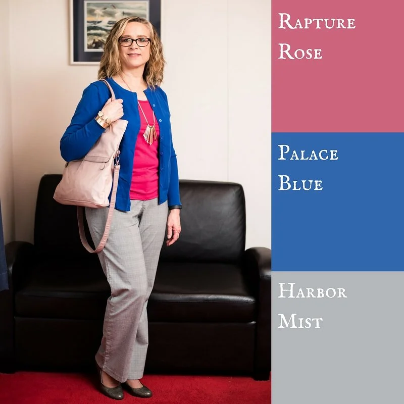
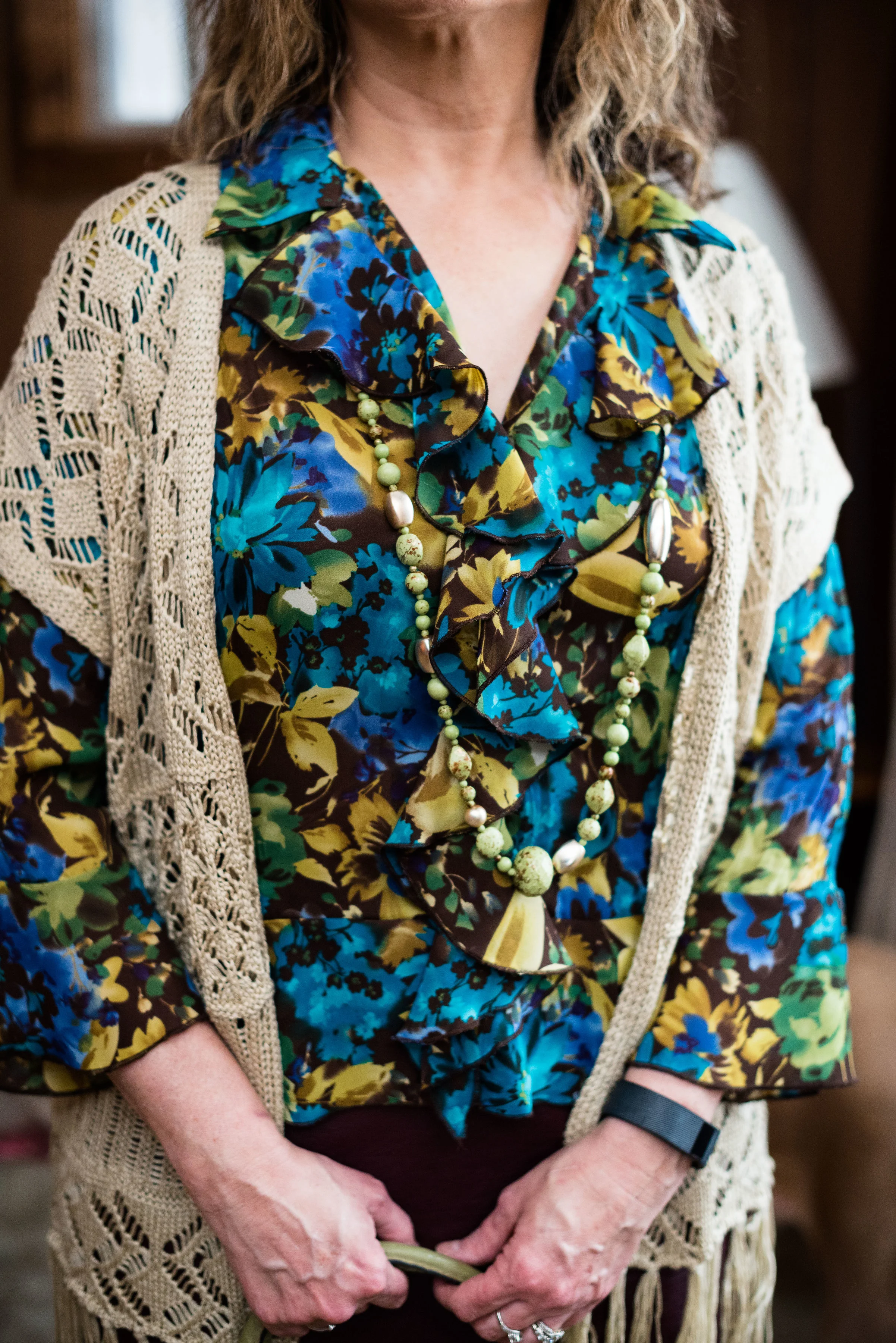
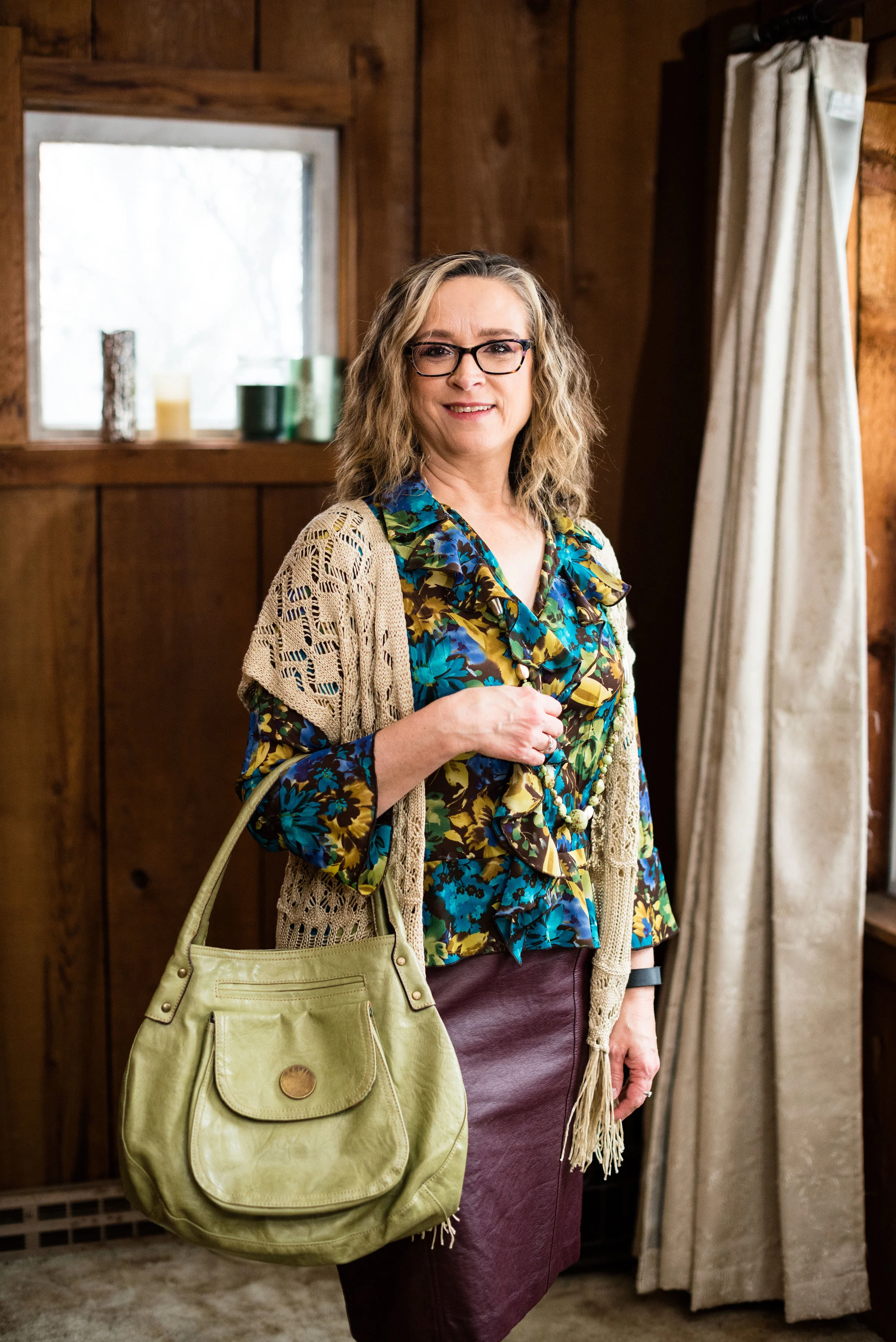
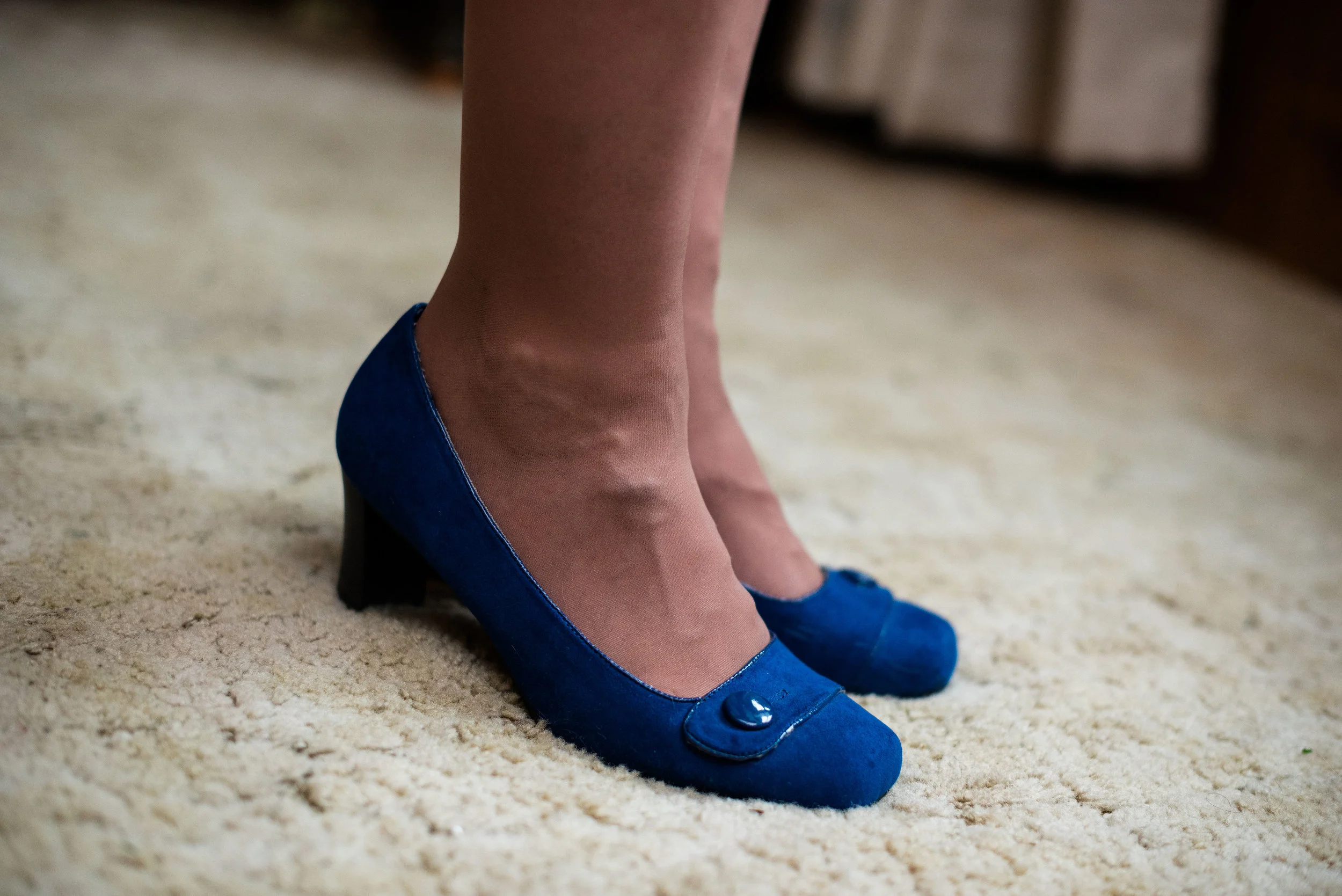
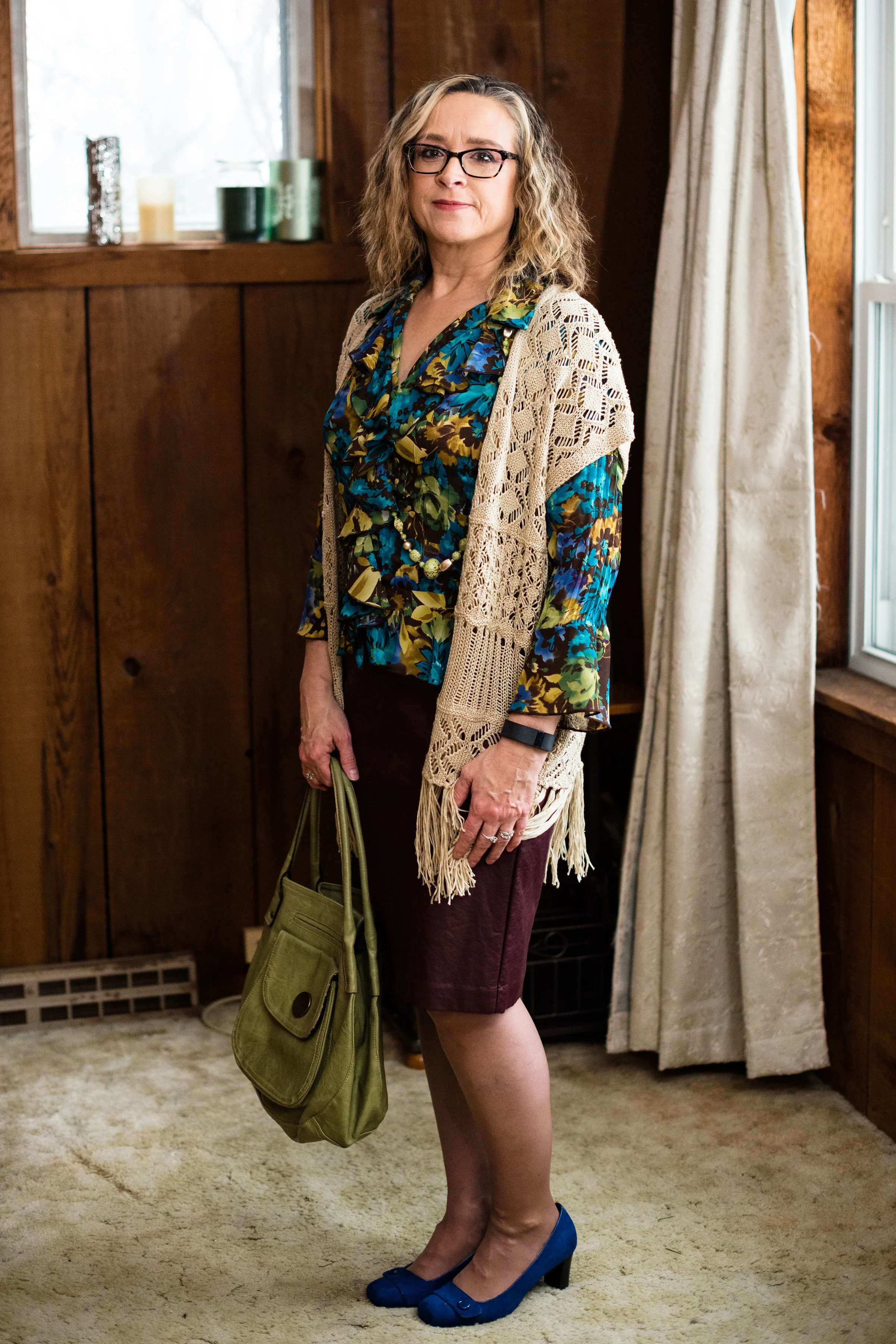
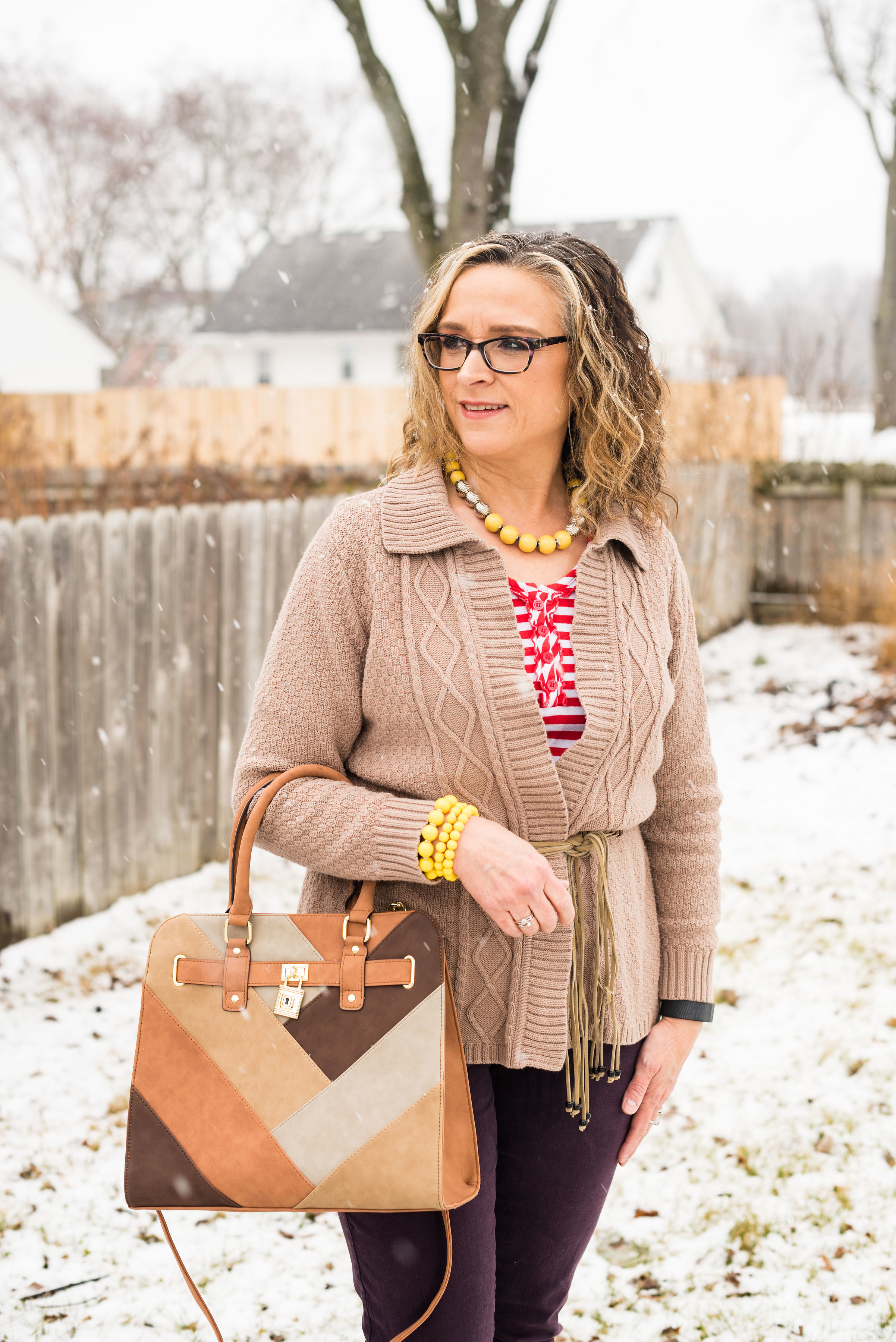
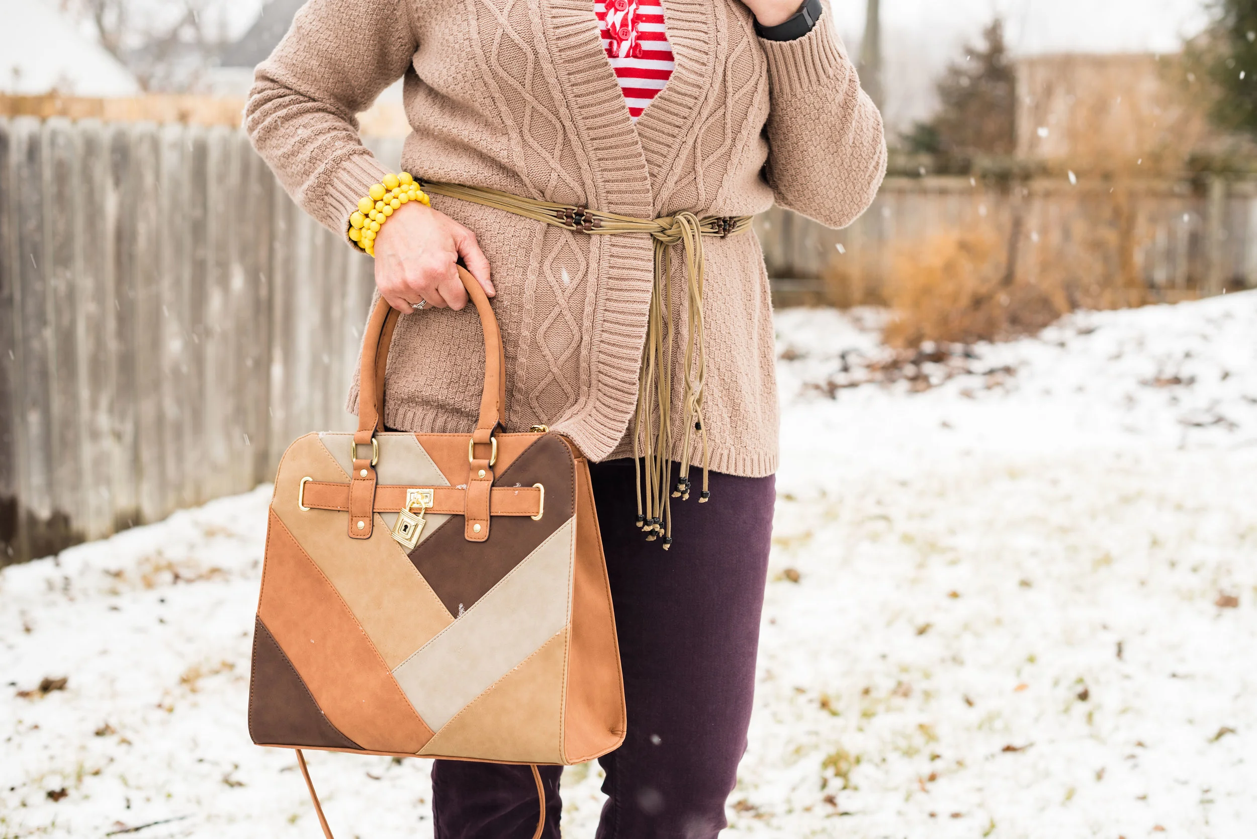
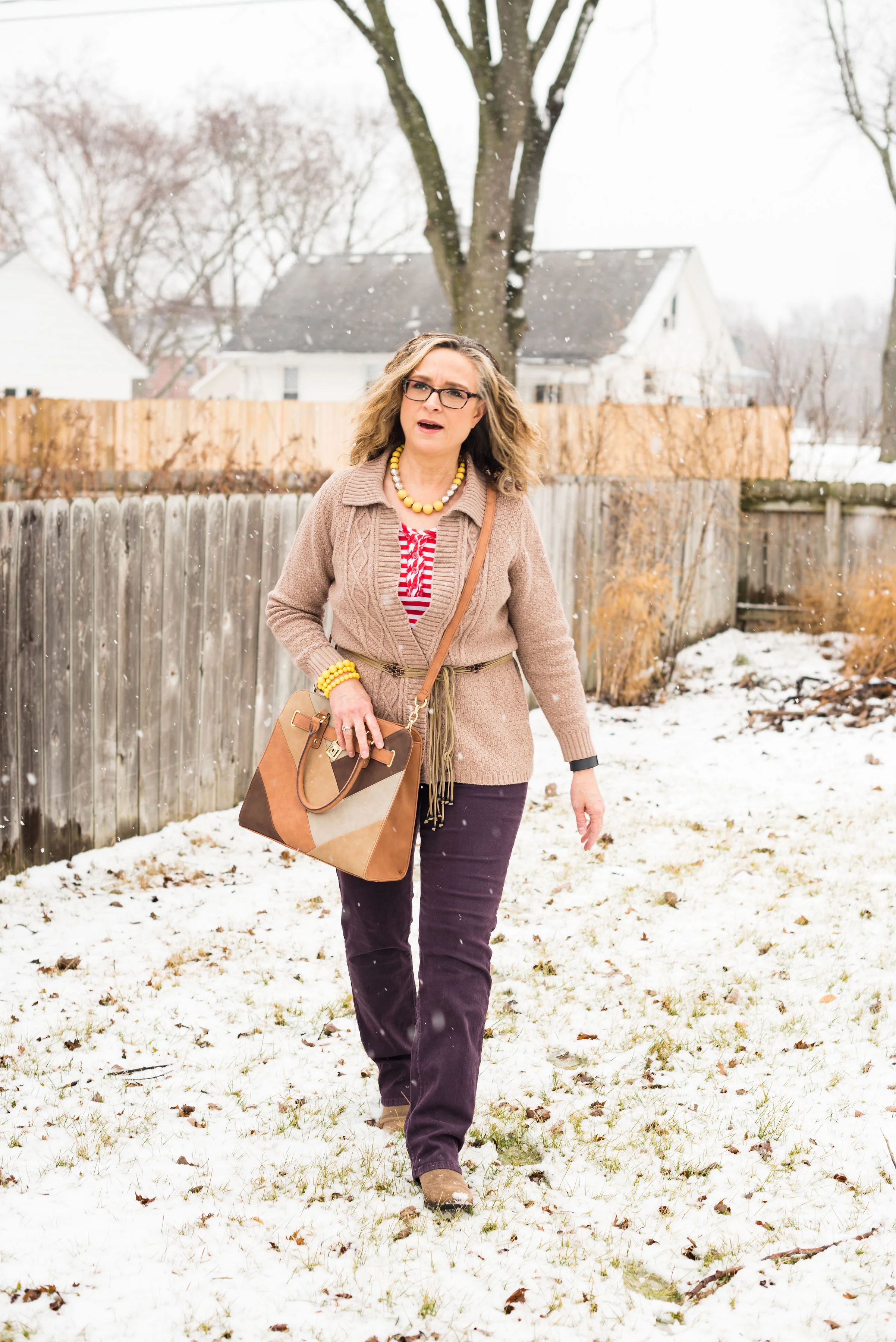
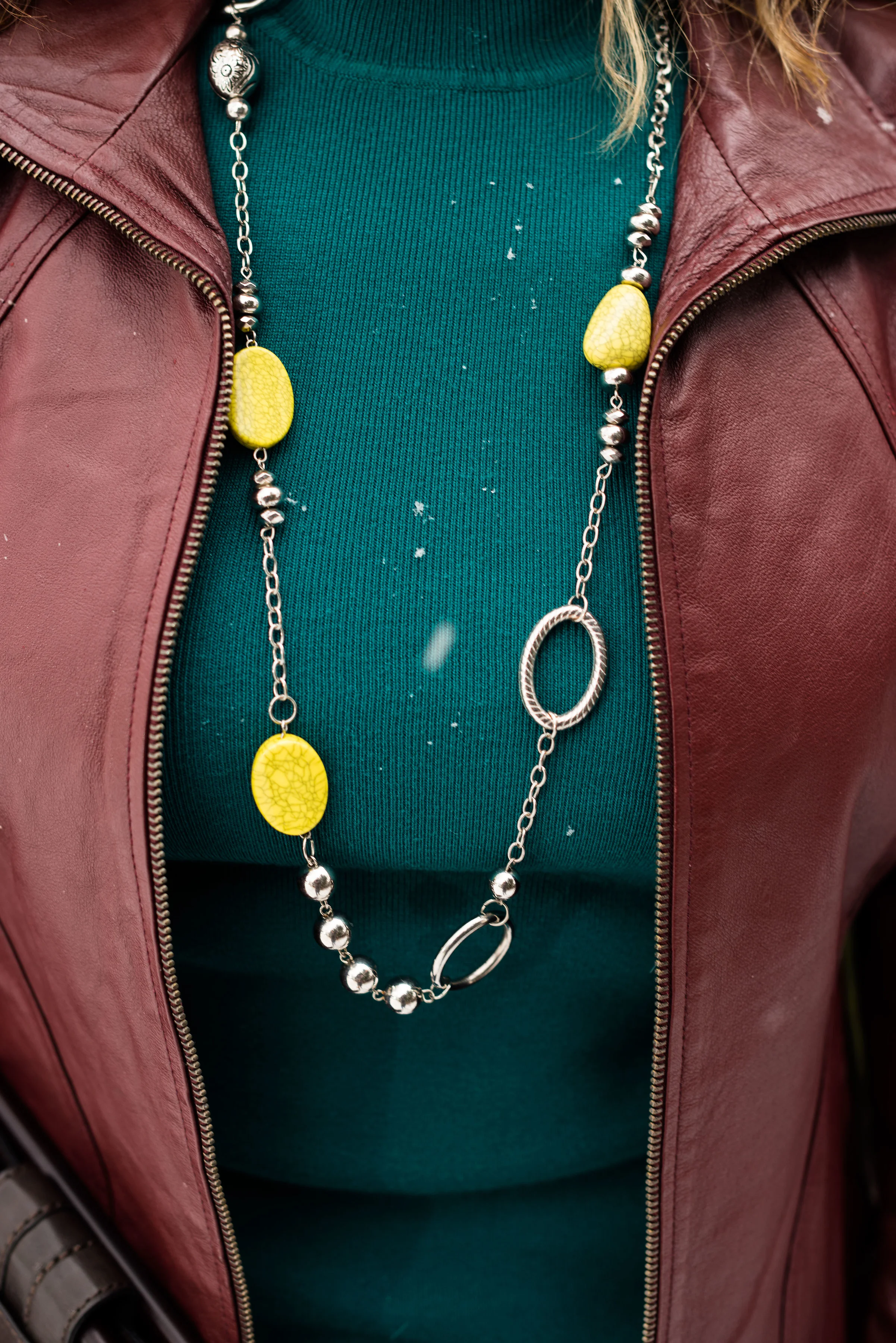
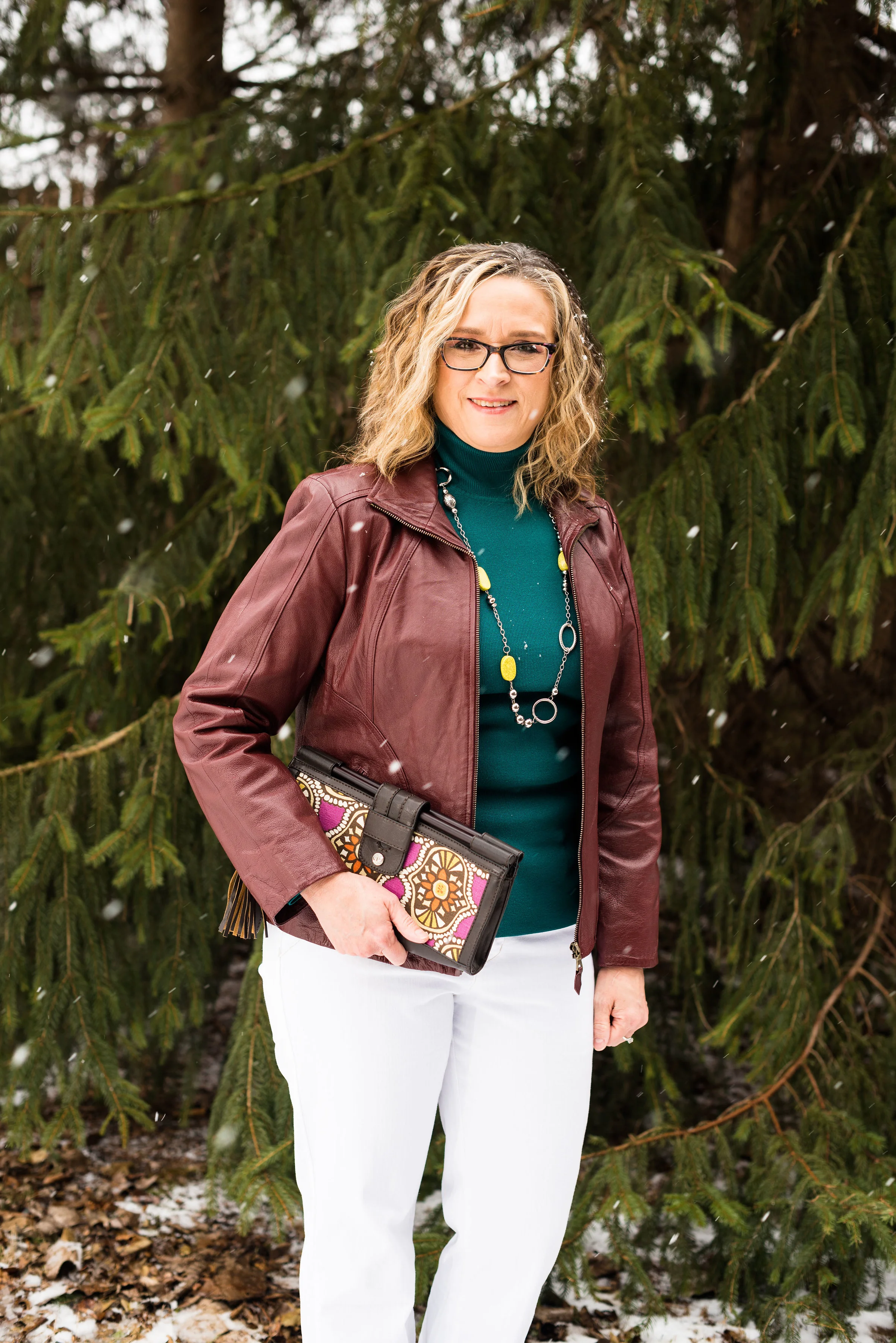
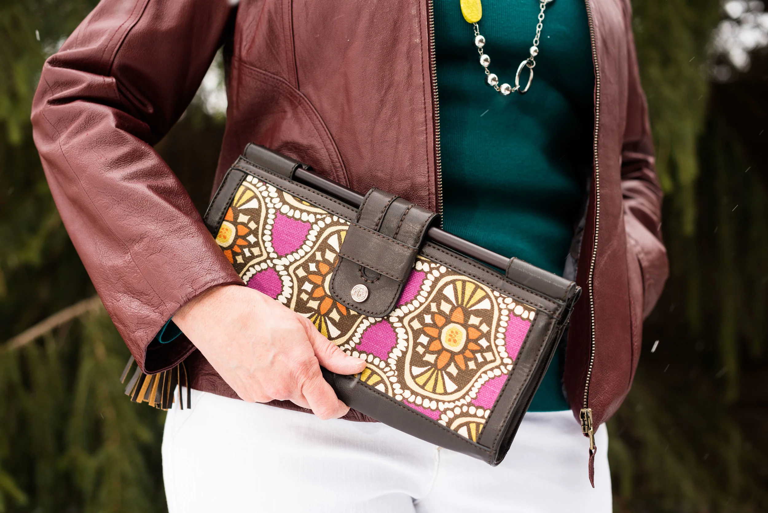
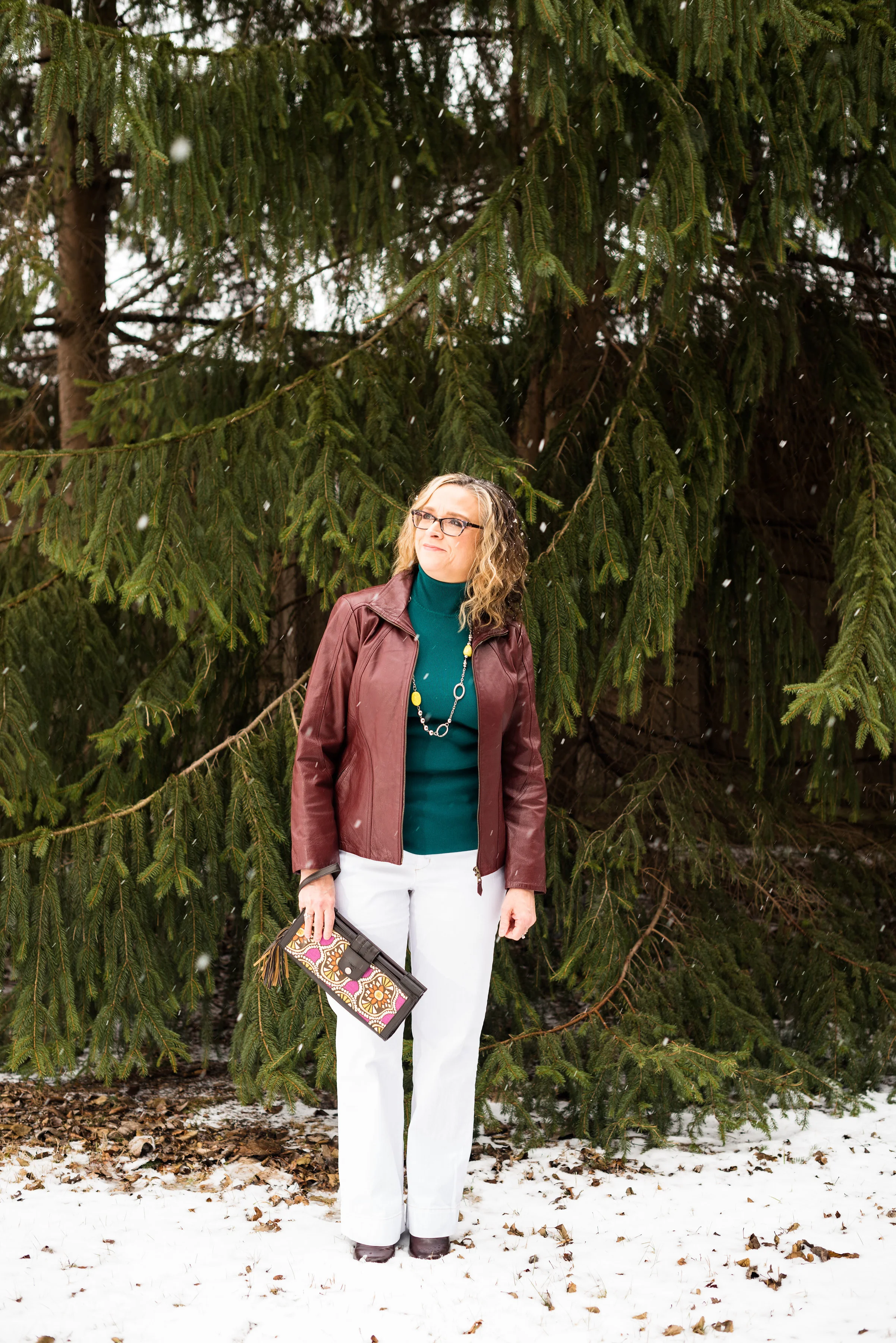
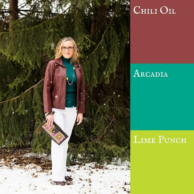
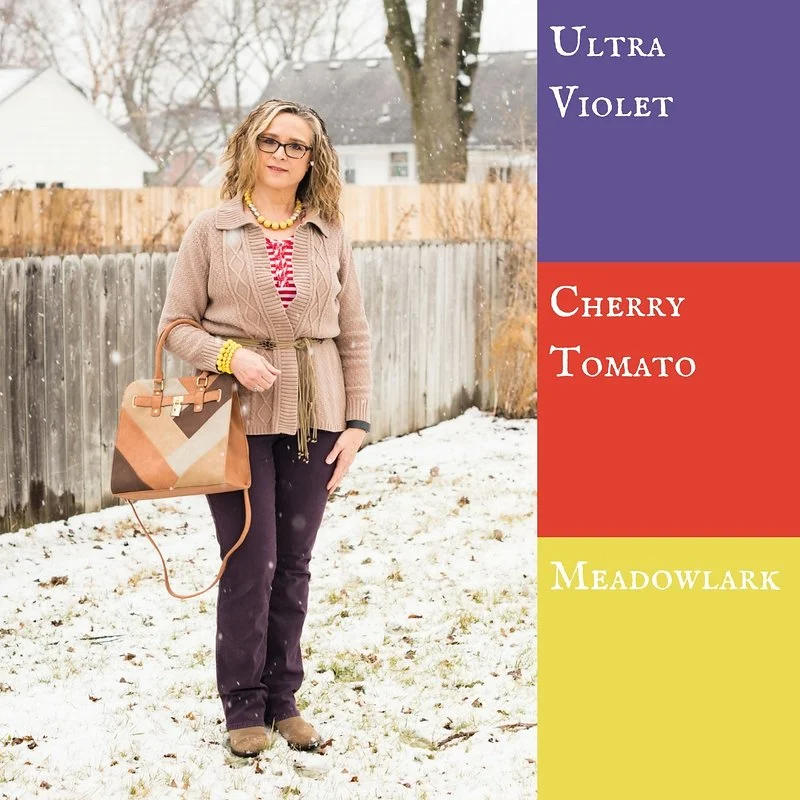
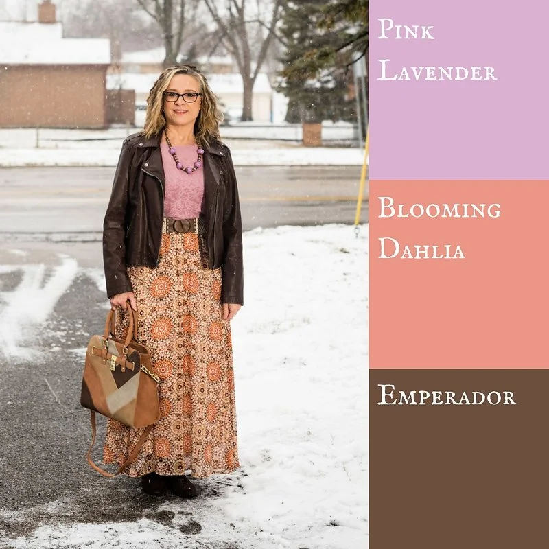
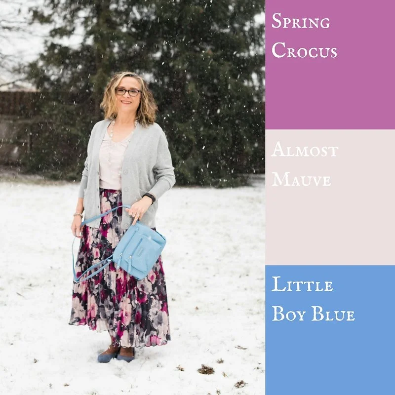
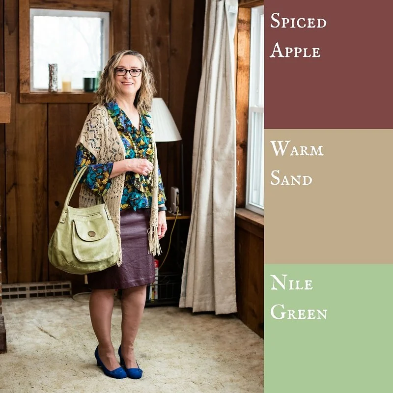
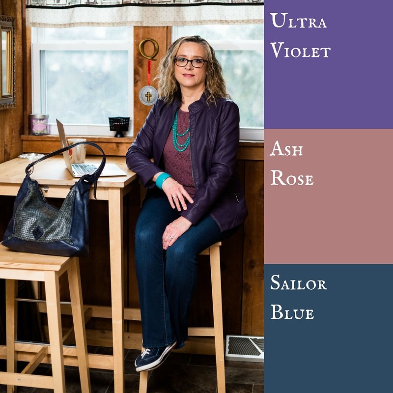
Here were my outfits. If you click on the picture it will take you to the original post.

I was glad that Pantone added the four classic colors of Sailor Blue, Harbor Mist, Warm Sand and Coconut Milk. These colors are perfect for grounding an outfit and keeping it from getting too over the top with color. Is there such a thing? Ha, ha. 

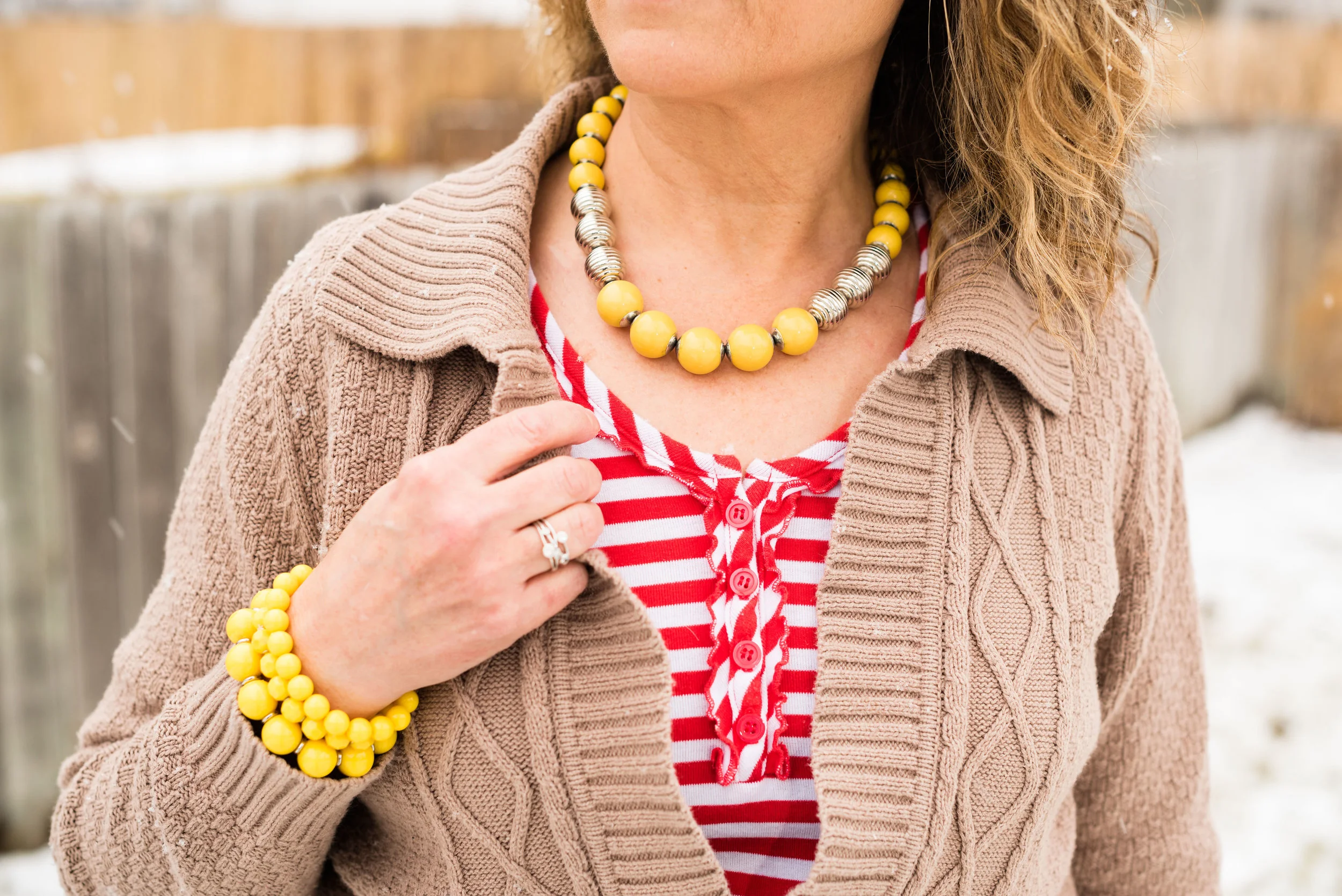
I think out of all of the colors from both palettes my favorites are Ultra Violet, (no surprise there, since I love purple), Arcadia, Pink Lavender and Ash Rose. All but Arcadia fall into the purple range. What can I say, I love purple! If I ever had a sports car it would be dark sparkly purple. Ha, ha. 

I hope you enjoyed this series. Let me know in the comments what your favorite colors were from this spring's two palettes. I always love to hear what you are thinking. 

Join me on Thursday for my Outside the Box column. You never know what I'll be showing off there. If you follow my Faith page, check back tomorrow for more on my Mulling It Over series as we delve further into 2 Timothy 2. 

Have a great Tuesday!

Photo credit Rebecca Trumbull. Make up Rachel Christensen.

Monday linking up with Catherine of Not Dressed as Lamb. Tuesday linking up with Jess of Elegantly Dressed and Stylish and Shelbee of Shelbee on the Edge

Pantone Spring 2018 - Ultra Violet, Ash Rose and Sailor Blue

This is the final installment in my Pantone Spring 2018 color series. I love doing this series, because using color as a spring board for putting together an outfit makes getting dressed so much easier. I know not everyone loves color, but I really enjoy the challenge of trying to make each of these colors work for me. After all, if we ladies, who are over 50, are not limited by the styles of the outfits we wear, why should we be limited by the colors we wear? 

This week's color line up features Ultra Violet, which appears on both the New York and London color palettes. You can see my first pairing with Ultra Violet here. Ash Rose is only found on the London Palette and is one of my favorite colors from this spring line up. Sailor Blue is one of the classic colors that appeared on both palettes this season and I feel is a perfect color to ground an outfit to keep it from getting to clownish. I also threw in a touch of Arcadia for an additional pop. You can see how I originally paired Arcadia here. 

If I had a choice, this is how I would dress most of the time. I love my jeans, a fun moto jacket, basic tee with fun details and sneakers. Throw on some easy jewelry and a roomy bag and voila, the writer's outfit. It's comfy, but stylish. I think my daughter did a great job of capturing me in my element. Ha, ha. 

These jeans are my Rock & Republic bootcut pair from Kohl's. Here are a similar pair

In this next pic you can see my Arcadia colored beads and bracelet. I love the way the necklace pops against the Ash Rose color of the shirt. Doesn't that green look so pretty with these two very different purples? You can also see the lace detail on my thrifted long sleeve tee. This one is Van Heusen brand It really takes a tee up a notch to have some sort of lace overlay or embellishment. Here is a  Croft and Barrow short sleeve one that comes in many different colors.  

My bag is Simply Vera, by Vera Wang. Here is a really cute one from Kohl's. 

Keds are always my go to for stylish, simple sneakers. I don't wear these when I want to hike or take a long walk, but for just hanging out, going to the mall or shopping, etc. they work great. Here, here and here are three cute pairs that would be perfect for summer. 

These were the last pictures my daughter took that day and we neglected to do a shot of me standing, so this is the best you get. 

What do you think of these colors? What is your go to outfit when you want to be stylish and comfy? I'd love to hear your thoughts, so leave me a comment or two in the comments section. Or you can leave me some love on Facebook. Also, feel free to check out my Instagram and Pinterest accounts too. 

This post contains affiliate links. If you click on a link, I get a few pennies. If you purchase something through one of the links, I get a small commission. Thank you for all of your support. 

If you enjoy reading my Faith page, be sure to check back tomorrow for another Walk with the Psalmist. Check back on Thursday to see how I styled my Eva Trends lace body kimono two more ways in my Ordinary Amy column. 

Photo credit Rebecca Trumbull. Make up Rachel Christensen. 

Monday linking up with Catherine of Not Dressed as Lamb. Tuesday linking up with Jess of Elegantly Dressed and Stylish and Shelbee of Shelbee on the Edge. Thursday linking up with Jacqui of mummabstylish

Pantone Spring 2018 - Rapture Rose, Palace Blue and Harbor Mist

Once again, this week, I am featuring two more Pantone Spring 2018 colors from the London palette, along with another of the classic colors, Harbor Mist. Rapture Rose is a bright pinkish red that adds a perfect pop of color to any outfit. Palace blue evokes a feeling of royalty and will add a classic element that says regal, complimenting any style. Grounding the whole look is a soft, light gray reminiscent of mists coming off the ocean. 

My sleeveless top, doesn't quite match the Pantone color, but it is clearly a mix of pink and red, so you get the gist of the idea. My Palace Blue cardigan is from Christopher and Banks

Someone was over visiting while we were taking pictures! She's such a ham!

My trousers are Lee brand, and have a classic fit. I use this pair more often in the summer for work, as they are lighter weight. Here is a pair from Kohl's and a pair from Macy's.

You've seen this NY & Co. bag on the blog before. I thought the blush color was a good compliment to the brighter pink and blue, as well as the gray pants. 

For jewelry I went with gold accents on my necklace and bracelets. 

I thought my Comfort Plus heels by Predictions were a good work wear option. 

I think this outfit is a good option for a work day, especially if you work in an office. It shows confidence and style, as well as comfort and ease. The bright blue sweater is a great option for summer, when many places are overly air conditioned. Although, the way our weather is going here in the mid west, it might be August before we have to turn the air on. 

What do you wear to work? Would you be comfortable in an outfit like this? Do you like these colors? I'd love to hear your comments.

Here are a few more pics of my grandpuppy, Beatrice. 

i've included a few shopping links. These are meant to serve as inspiration for you, as well as provide an easy link through which you can shop. These are affiliate links, which means I get a few pennies when you click on a link and a small commission if you purchase something through my site. All opinions are my own. 

Photo credit Rebecca Trumbull. Make up Rachel Christensen

Thursday linking up with Nicole of High Latitude Style and Jacqui of Mummabstylish. Friday linking up with Nancy of Nancy's Fashion Style

Pantone Spring 2018 - Spiced Apple, Warm Sand and Nile Green

We are moving right along in our Pantone Spring 2018 color series. For those of you who may be new to my blog, the Pantone Color Institute are the go-to entity for fashion and design color choices. Twice a year, spring and fall, the Institute puts out a palette of colors, from which many designers find their color inspiration. As a blogger, who loves color, I enjoy building outfits around these colors as well. 

This week, I am featuring two of the colors from the London Palette along with the foundational color of Warm Sand. Say hello to Spiced Apple and Nile Green. 

As I said, last week, the last three posts for this spring series will feature indoor pictures. My daughter and I finally gave up on the snow that was falling fast and wet on the day we took these photos. 

Spiced Apple is a brownish red, bordering on maroon. My skirt might be a tad dark, but you get the idea. This faux leather skirt is a fun, thrifted piece that I have found to be quite versatile. This one is Worthington brand. I topped the skirt with another thrifted piece. This floral, ruffled, bell sleeve blouse is a brand called Sunny Leigh. The blouse contains snippets of Nile Green and I thought it went well with the reddish brown skirt. I added a beaded necklace that also was the Nile Green color. 

I threw the Warm Sand open weave vest over the top as my grounding color. I feel the vest not only adds a layer of warmth for these chilly spring days, but also adds textural interest. 

The bag I am carrying is a bit more yellow than the Nile Green, but it works with the outfit as a whole and without having the color tab right next to the bag, you wouldn't be able to really tell. 

You've seen these cobalt blue heels before on the blog. They go perfectly with the darker shade of blue in the top, so I thought they would be a good pop of color to complete the outfit. 

What do you think of these colors? While I do like both colors, I would not say these are my favorites. Nile Green is a tad light for my taste and the Spiced Apple is a color I would fee better in, come fall. However, it is fun to try out these different colors, because you never know when one of them will strike you in a way that makes you fall in love with it. 

I've included a few shopping links. These are affiliate links, which means if you click on a link, I get a few cents. If you purchase something through one of my links, I get a little commission. All opinions are my own. 

Photo credit Rebecca Trumbull. Make up Rachel Christensen

Monday linking up with Catherine of Not Dressed as Lamb. Tuesday linking up with Shelbee of Shelbee on the Edge and Jess of Elegantly Dresses and Stylish

Pantone Spring 2018 - Spring Crocus, Almost Mauve and Little Boy Blue

This is already week four of my Pantone Spring 2018 series. You can check out the previous weeks' posts by clicking on the links: Week 1, Week 2, and Week 3. This week I am featuring the colors: Spring Crocus, Almost Mauve and Little Boy Blue.

Since my daughter and I have to arrange time to get together for photos, we often shoot as many outfits as we can fit in at a time. If you follow me regularly you already know these pictures were all shot on a wintery day. Not very spring like, but then spring is taking its sweet time to make an appearance this year, so I guess this is appropriate. 

I found this Chaps maxi skirt on the clearance rack at Kohl's back in January. When I began looking for pieces for this Pantone series, I thought the flowers on the skirt were a good representation of both Spring Crocus and Almost Mauve. 

My NY & Co tee is also Almost Mauve. I tucked the tee in to give more definition to my waist and topped it with an H & M Harbor Mist cardigan. Pantone has included four classic foundational colors with their palette this year, which serve as a great way to keep an outfit from getting too overwhelmed with color.

I decided to add the Little Boy Blue color as a bright pop against the floral back ground. It makes me think of a sunny blue spring sky. The crossbody bag is Rosetti brand. My SO flats are also blue and probably a tad bit closer to the actual Little Boy Blue color. 

For jewelry I wore a necklace and bracelet with light blue colored beads and silver embellishments. 

Here are a couple of pictures of me being cold! Ha, ha. Don't I make the goofiest faces? I have always thought I could mimic Lucille Ball and some of her funniest looks. Sound like a future blog post.

The things we do for the blog! Ha, ha. This was the last picture we took outside that day, so the next three weeks you'll see indoor pictures. We had had enough. 

I hope you enjoyed this look at three more of the Pantone Spring 2018 colors. Which one do you like the most? I really love Spring Crocus, but Almost Mauve makes a great neutral that can be paired with almost any color. Little Boy Blue will be great color for the transition from spring into summer. 

I've included a few shopping links. These are affiliate links, which means I get a few cents if you click on a link. I really don't make any money on this blog, but your clicks will add up, so that maybe in the future I will. I appreciate all your support. All opinions are my own. 

Photo credit Rebecca Trumbull. Make up by Rachel Christensen

Monday linking up with Catherine of Not Dressed as Lamb. Tuesday linking up with Jess of Elegantly Dressed and Stylish and Shelbee of Shelbee on the Edge

Pantone Spring 2018 - Pink Lavender, Blooming Dahlia and Emperador

Welcome to the third installment in my Pantone Spring 2018 series. The first week I showed you Chili Oil, Arcadia and Lime Punch.  Last week I featured Ultra Violet, Cherry Tomato and Meadowlark.  This week I am going to style an outfit that revolves around Pink Lavender, Blooming Dahlia and Emperador. 

I wish these photos were a little more spring like; more like the weather today, when I am working on this post which is brilliant sunshine and temps in the 50's, However, working with my photographer means scheduling shoots when she is available, so we make the best of it. In this pic, it almost looks like I am at a studio with a winter background, but I can tell you we were definitely outside and it was cold!!

Pink lavender is a very pretty purply pink. I happened to have this short sleeve Croft and Barrow faux lace tee in my closet and it matched perfectly. My husband also picked up this necklace at a garage sale and thought I would like it. I did! I've told him, any time he sees costume jewelry at estate sales or garage sales to take a peek and pick up things he thinks I might like. I'm pretty easy to please when it comes to jewelry! 

Emperador is a chocolate brown. I often wonder at how they come up with the names for the colors on each season's palette. Some are obvious. Pink Lavender looks like pink and lavender mixed together, but Emperador? I googled the word and a brandy company came up. Brandy is more of an amber color, so I am not sure if that is what they were thinking when they gave this brown it's name. I'm not an alcohol drinker, at all, but if you are interested here is a link to Emperador

My moto jacket is thrifted and is a brand called Celebrity Pink. This brand is sold at stores like Macy's and Burlington Coat Factory. Here is a similar jacket. Mine is a nice faux leather with a silver zipper and snaps. I should have taken a picture with the jacket zipped up. 

This skirt from dressbarn I have featured on the blog last summer in my Marvelous Maxis series. It is roz & Ali brand. The skirt with its fun, whimsical, floral pattern is fully lined and the perfect transition piece for spring. I thought it gave the illusion of Blooming Dahlia, even though it isn't an exact representation. Plus I felt the outfit benefited from a pattern. 

I added a stretchy woven belt to the skirt and chose to carry my George satchel for a bit of that classic color, Warm Sand. I also slipped on my suede American Eagle ankle boots. 

What do you think of these colors? Do you have any of these in your closet? I think all three of these can be great to combine with stronger classic colors like navy, green or black. If you are not real fond of a particular color because you don't think it looks good on you, don't be afraid to try a smattering of the color in the form of an accessory such as a necklace, bracelet or even a bag. That is a wonderful way to add color without letting it overwhelm you. 

Let me know your thoughts on these colors and my outfit. I love hearing from you! 

Here are a few shopping links for you. These are affiliate links which means if you click on a link I get a few pennies. If you purchase through one of my links I get a little commission. I appreciate your clicks! All opinions are my own. 

Photo credit Rebecca Trumbull. Make up Rachel Christensen

Thursday linking up with Nicole of High Latitude Style. Friday linking up with Nancy of Nancy's Fashion Style. 


Pantone Spring 2018 - Ultra Violet, Cherry Tomato and Meadowlark

Welcome to the second installment in my Pantone Spring 2018 series. Since last fall the Pantone Color Institute has been featuring two color palettes for both the fall and spring seasons. With two palettes to choose from there are so many more color combinations to create fun outfits. 

For today's outfit I combined three more colors. All three of these colors are found on both the New York and London palettes. This week my classic grounding color is Warm Sand. I am glad that the four classic colors were added this year to the palette. Sailor Blue, Harbor Mist, Warm Sand and Coconut Milk are the perfect colors to either use as a foundation for an outfit or to accent a more colorful outfit with accessories. Last week I wore Coconut Milk (white) jeans as the grounding color for my three more colorful pieces. You can see that post here

Ultra violet is a lively medium purple. These jeans, which are Not Your Daughter's Jeans, are not truly Ultra Violet, but these colors serve as guidelines for putting an outfit together, not rules. If you don't have the exact shade in your wardrobe, then try a different shade. The outcome will still be a stylish, colorful outfit.

The Cherry Tomato striped tee is has 3/4 length sleeves and a small line of ruffles around the button area at the top. 

For Meadowlark yellow, I added my bright yellow bracelets and necklace. I love how adding just a touch of color can really make a statement. I don't wear a lot of yellow, but using it as an accent in my accessories is a great way to still incorporate the color into my outfit. 

Everything in this outfit is thrifted except the jewelry, purse and shoes. When I bought this sweater it had toggle closures. I'm not a big fan of toggles, so I took them off and simply use the sweater as an open front cardi, or in this case, I added a belt. I thought this worked quite well, as pairing purple and red can be a little bit overwhelming. The sweater really helps to break up the two more bold colors. 

My suede Sonoma ankle boots are old, but I thought they were perfect for this outfit. The pants are very long, so the heel on the boot helps and they are that sandy color, like the sweater, belt and bag. The bag was a recent purchase from Walmart

Do I look like I'm running for the house in this last pic? Ha, ha. It was a cold day when we took these photos as you can no doubt tell by the snow.

I hope you enjoyed this look at more of the Pantone Spring 2018 colors. Dig around in your closet and see if you have any of these colors. I bet you would be surprised at how many you do have!

I've shared a few shopping links below. These are affiliate links. All opinions are my own. 

Photo credit Rebecca Trumbull. Make up Rachel Christensen.

Monday linking up with Catherine of Not Dressed as Lamb. Tuesday linking up with Shelbee of Shelbee on the Edge and Jess of Elegantly Dressed and Stylish

Pantone Spring 2018 - Chili Oil, Arcadia and Lime Punch

As I sit here beginning to type this, it is snowing some of the largest snowflakes I have ever seen! Just two days ago it was almost sixty and now Old Man Winter is back. We expected that, however. Winter will end and spring will come. To help us along it is time to start my Spring Pantone color series. 

I feature the Pantone colors twice a year, spring and fall. The reason I do this is simple. I love color! When I first discovered the Pantone Institute and began keeping track of their seasonal color palettes, I thought it was fun to see all the pretty colors they came up with. Frankly, now I am obsessed. I love to see the new colors each season and try to build outfits around those colors. 

Last week I introduced you to this year's spring palettes for both New York and London. There is a good deal of overlap this year. Considering there are twelve colors on each palette I was relieved for the duplicates. I wasn't about to subject you to that long of a series, just on color. This time around I am combining up to three colors in each outfit, plus a foundational color using one of the featured classic colors as well. 

These pictures will not look very springy, seeing as it was a blustery, snowy day when we had our shoot, but I think they look pretty, even if the wind was whipping and I was freezing. 

These three colors are spicy and fun! Chili Oil and Arcadia are on the New York palette, while Lime Punch is featured on both. My classic color for this outfit is Coconut Milk, or white. 

This thrifted Covington jacket worked perfectly as a Chili Oil piece. Not quite brown and not quite red, this color makes me think of Mexican fiestas and earthy tones. Arcadia partners well with the heat of Chili Oil, as if to cool the temperatures before things get too hot. Then throw in just a smidge of Lime Punch and you have a great transitional outfit. Still warm and grounded, but with just enough color to make you giddy for spring. 

The Arcadia turtleneck sweater is a recent purchase from Chico's. This sweater is soft, stretchy and not at all itchy. They don't seem to have this color any more, unfortunately, but I'll include a few links at the end for similar colored items. 

I found this cute metal and bead necklace at a thrift store. The Lime Punch beads are a nice contrast from yellow or green. 

Once again, I am wearing my Gloria Vanderbilt white jeans. I think white really helped this outfit to pop and to be a great transitional outfit for spring. 

For my bag I chose this cute little thrift store find from Relic. The yellows in the bag are very similar to the Lime Punch color of my necklace. I thought this was a unique piece and I think it works very well to add print to this otherwise solid colored outfit. 

For my shoes I chose this pair of dark burgundy heeled ankle boots. I like the different twist these Life Stride boots have on the side. It is sort of like ruching for a shoe!

What do you think of these Pantone colors? Which is your favorite on this outfit? I've been seeing a lot of Arcadia various places, but Lime Punch is a fun color for the warmer weather. I also like the international flavor of Chili Oil....so many colors and so little time! Ha, ha.

I hope you enjoyed this post. I'd love to hear from you, so leave me some love! 

Photo credit Rebecca Trumbull. Make up Rachel Christensen

This post contains affiliate links. If you click on a shopping link I get a few pennies, if you purchase something through one of my links, I get a little commission. All opinions expressed are my own. 

Monday linking up with Catherine of Not Dressed As Lamb. Tuesday linking up with Jess of Elegantly Dressed and Stylish and Shelbee in the Spread the Kindness link up. Friday linking up with Jennie of A Pocketful of Polka Dots and Jo-Lynne of Jo-Lynne Shane


Pantone Spring 2018 - Introduction to the New York and London Palettes

This spring, the Pantone palette is full of pastels. Both the New York and the London palette have a number of overlapping colors that instantly say spring. I am excited about introducing this series to you and even though the colors have been on the Pantone website since last fall, I feel that the end of February and beginning of March are the perfect times to introduce spring colors. 

I'll confess, up until a few days ago, I couldn't even think about spring. As much as I want it to be here, I know there are still cold days ahead. However, with a forecast of temps in the forties and fifties, I think I can finally blog about spring, knowing that it will soon be here in all of its splendor.

The above graphic as well as the photos in this post are done by Rebecca Trumbull. Rebecca, not only takes amazing photos of all varieties from pets, to weddings, to seniors, to models, she also dabbles with managing social media accounts. If you need someone to manage your social media Rebecca might be a good choice. She is organized, has strong business savy and knows her way around the internet. (She didn't ask me, or pay me to advertise, I get something better, she's my daughter!)

As you can see by comparing the two palettes there are seven overlapping colors that appear on both palettes. These are :

Cherry Tomato - an orangey red described as "...impulsive....demanding attention...courageous..."

Blooming Dahlia - a peachy salmon.."subtly alluring...with understated appeal."

Meadowlark - a pretty yellow, described by Pantone as "glistening with joy and illuminating the world around us."

Pink Lavendar - lavender with a little more pink and a little less blue. Described as, "..soft and romantic...that charms with its soothing sense of quiescence."

Ultra Violet - Medium purple with a "complex and magical" hue. This is Pantone's choice for Color of the Year

Almost Mauve - this ultra light blush is perfect for using as a neutral and pairing with any other color. 

Lime Punch - appropriately named, this color makes me think of citrus fruit and warm sunny days. 

In addition to these duplicate colors each palette has five other colors:

New York Palette

Little Boy Blue - the color of sunny skies and a feeling of "expansiveness"

Chili Oil - think spicy for this deep reddish brown. 

Arcadia - a green with blue undertones, reminiscent of tropical waters.

Emperador - a rich chocolate brown.

Spring Crocus - described as a "...witty and flamboyant...fuchsia shade...."

London Palette

Palace Blue - not quite royal, but "...sparkling with energy...."

Ash Rose - a more earthy darker pink.

Nile Green - reminiscent of sage and honeydew melons.

Spiced Apple - similar to Chili Oil, but with a deeper brown.

Rapture Rose - a pinky red "...that brings flirtatious charm to the Spring 2018 palette."

In addition to each palettes' twelve colors, this year they added four Classic Colors which can be used with any palette choice for a foundation from which to build an outfit. These are the same for both New York and London and are:

Sailor Blue - dark navy.

Harbor Mist - light to medium gray.

Warm Sand - tan with more yellow tones.

Coconut Milk - white to off white. 

The following photos are some sneak peaks at my series that will start next week, where I will feature outfits using two or three of the palette colors as well as a classic color. 


I hope you'll join me next week as I begin my Pantone Spring 2018 series. Check back on Thursday for my Old Becomes New column. 

Have a great day. 

Monday linking up with Catherine of Not Dressed as Lamb. Tuesday linking up with Shelbee in The Spread the Kindness link up and Jess of Elegantly Dressed and Stylish. Friday linking up with Nancy of Nancy's Fashion Style