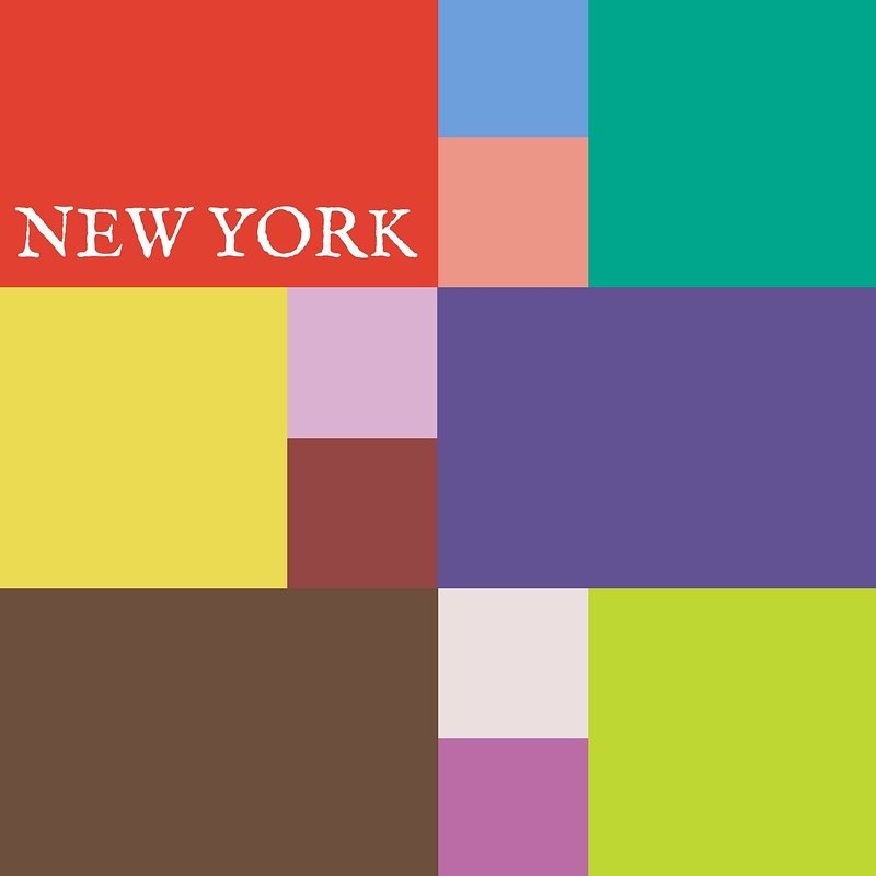
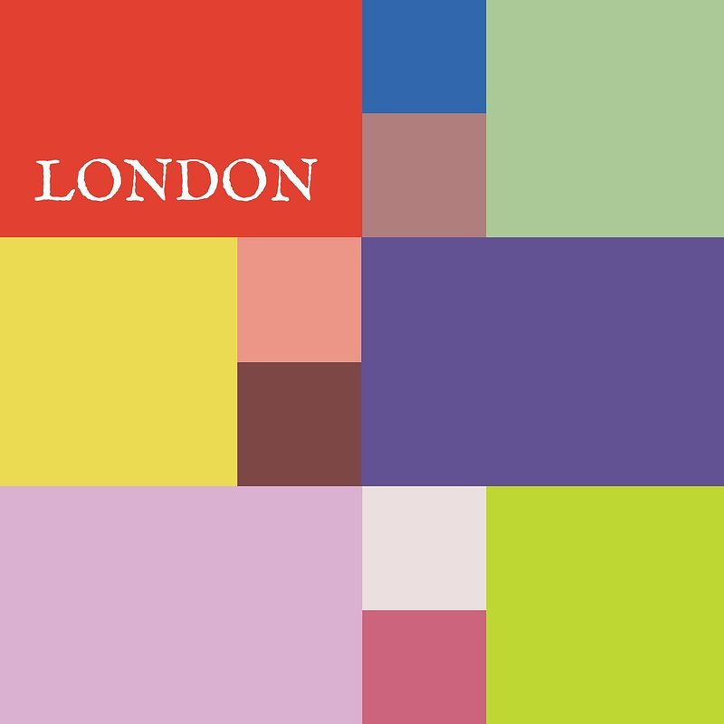
Pantone Autumn/Winter 2025 - London Palette: Lavender Blue, Chili Oil and Crown Blue
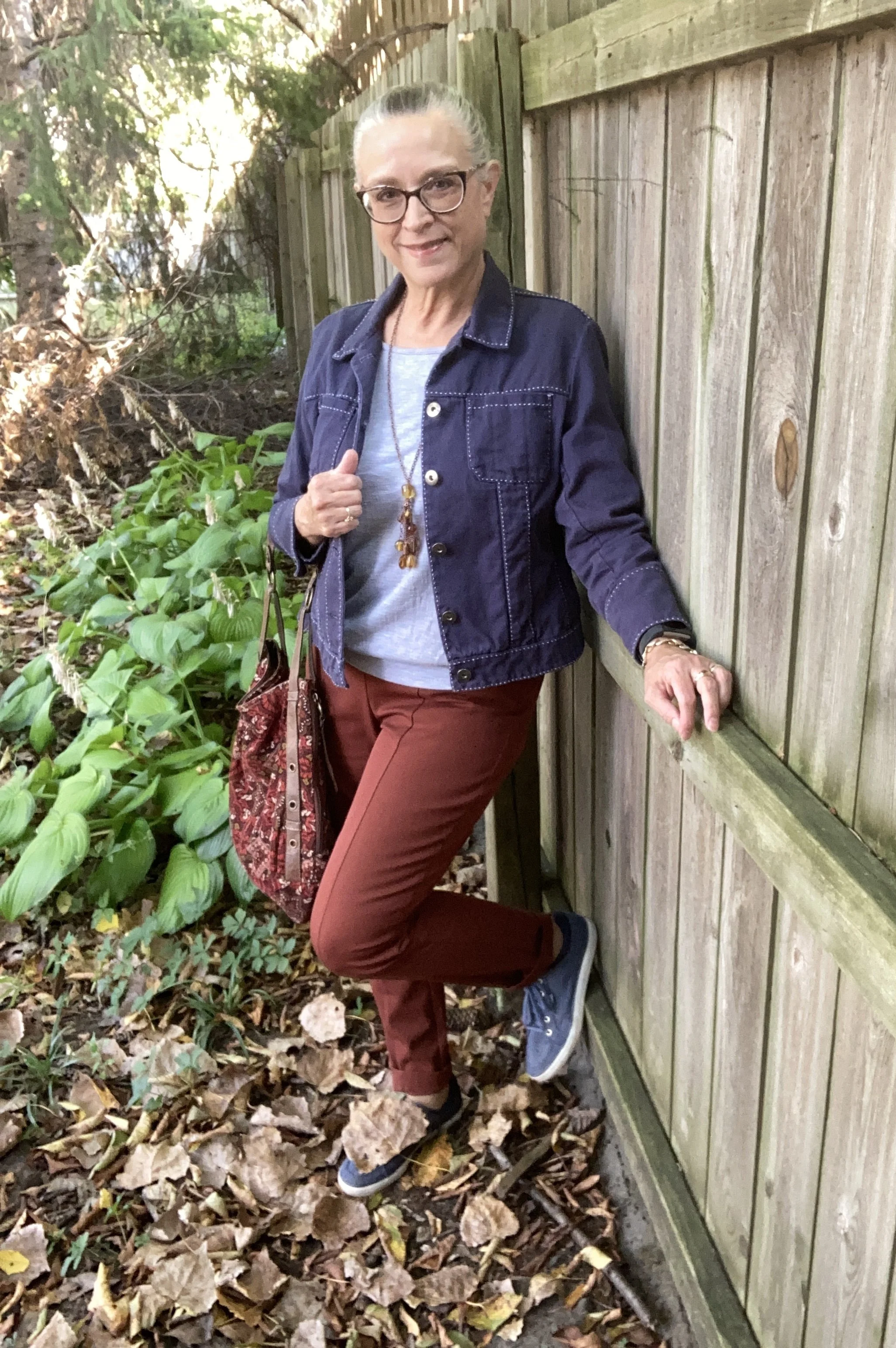
As we start the London Color Palette this week you will recognize a few of the same colors that were on the New York Palette. Chili Oil and Crown Blue are two of those. You can see the London palette colors by checking out this pin on my Pinterest board. For today’s look and a one other look from this palette I decided to combine colors that fall into the same color category. Today I combined the pastel Lavender Blue with the classic Crown Blue, along with Chili Oil for a casual chic color block look.
The leaf is not part of the outfit! Ha, ha. Watch the following and you’ll know why. We have an immense Cottonwood tree in our yard and the leaves start to carpet the grass from the beginning of August. Even with all the leaves on the ground there are still leaves on the tree…and the sticks!! Eye, yie, yie. The stick shed from Cottonwoods is crazy.
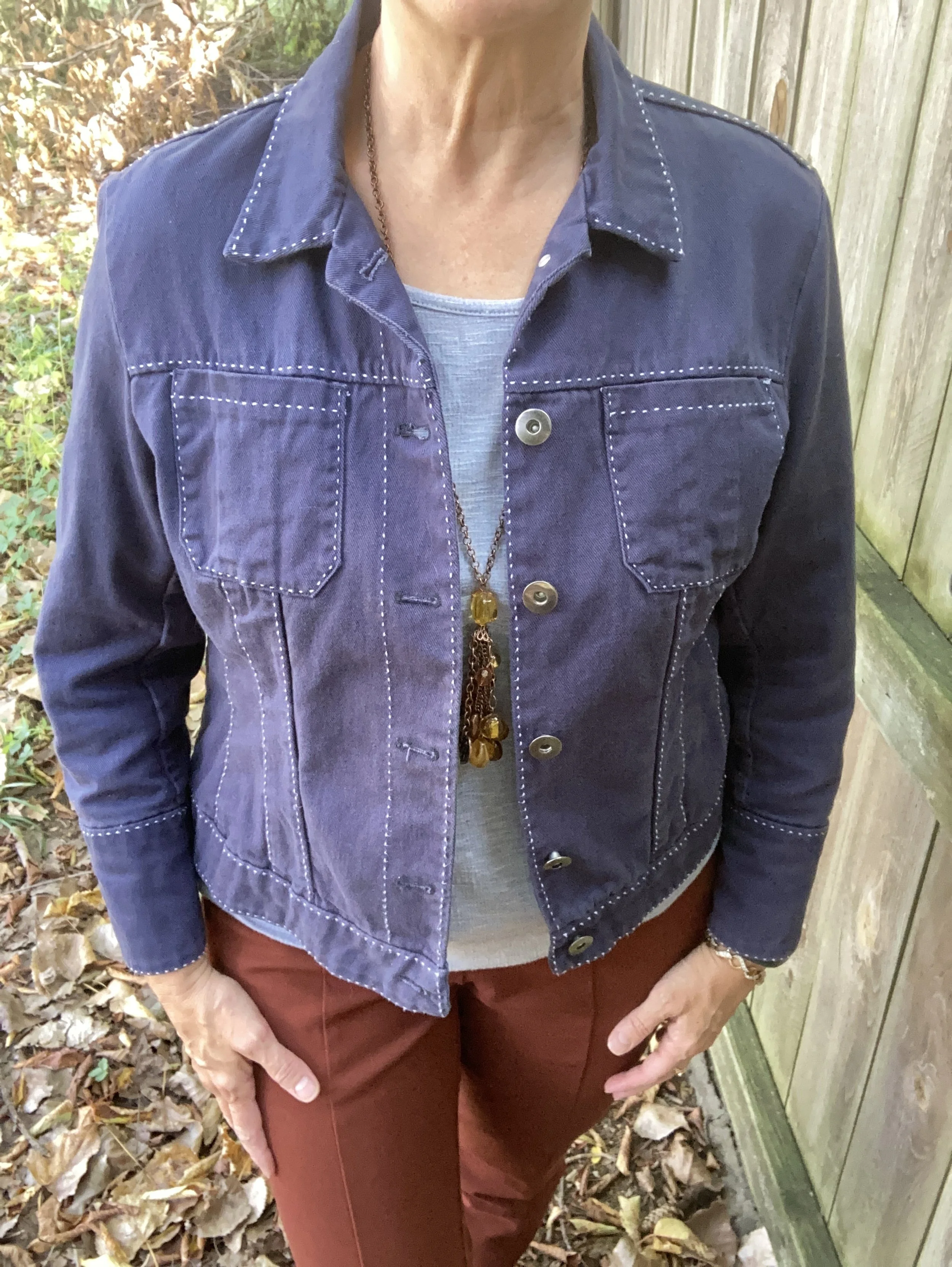
You saw this Crown Blue thrifted Coldwater Creek piece just a few weeks ago. See the post here in case you missed it. This is a retailer that has many pretty and practical pieces, but they are a touch out of my price range, that is why I like to find different brands at thrift stores to try them out.
Lavender Blue is the London pallet’s pastel. I have two pullover tops in this color. It is a purply blue that is hard to match with anything, so an outfit like this allows it to stand on its own. This piece is Apt. 9 and was purchased at Kohl’s a number of years ago. I had to show off the beautiful lace inset on the back, even though it was concealed under the jacket. You can see how I styled this in another fall outfit with a white skirt.
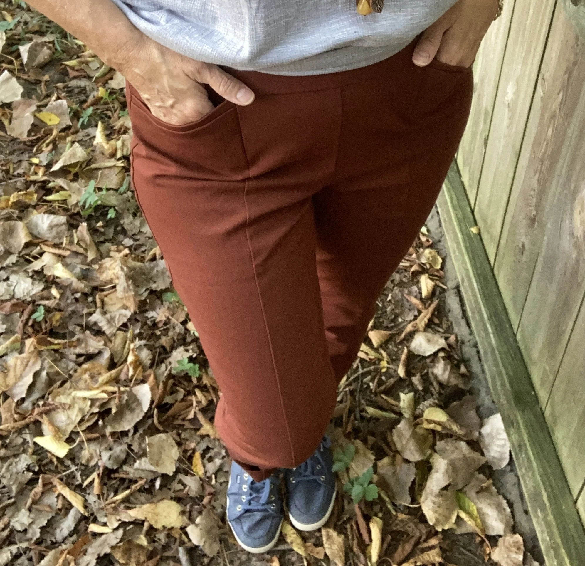
My Chili Oil pants are Chico’s So Slimming, which I bought on sale a number of years ago. These are ponte pants. I never thought I would like a knit pant like this, but I do. I do not wear them often as I look at them more as a dress or work pant, but it was fun to get them out for this outfit. You saw them a few weeks ago when I styled them with Lemon Grass and French Roast.
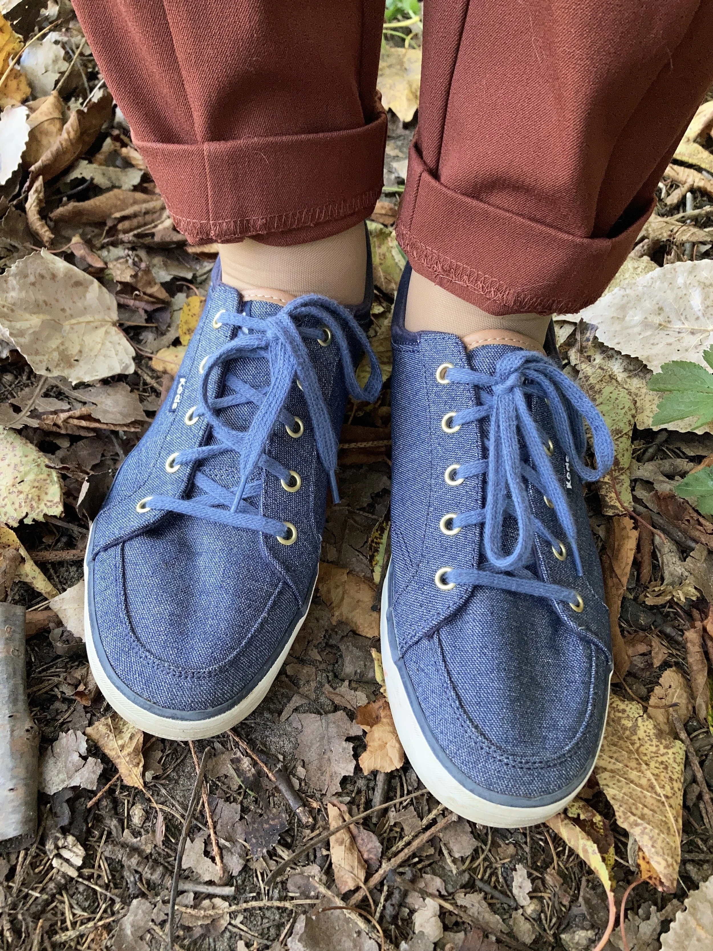
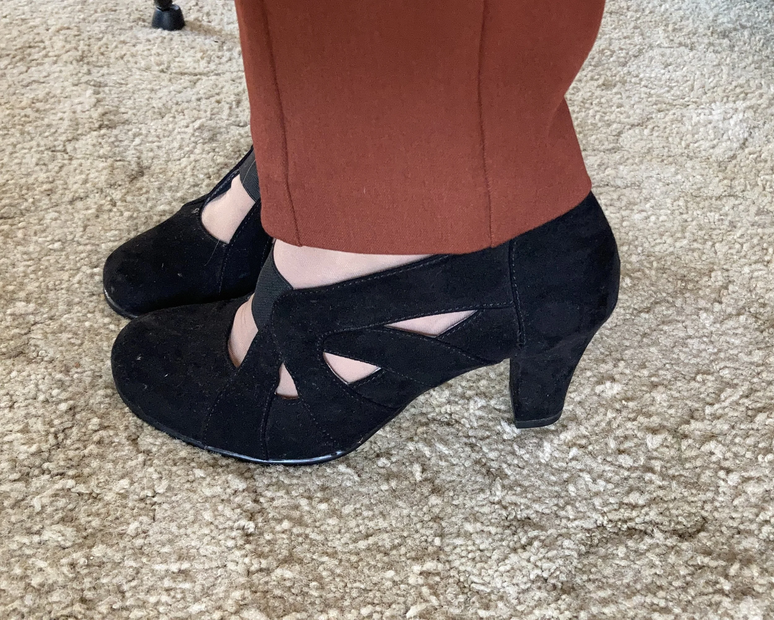
I felt like keeping it casual, and thought it would be a nice contrast to the previous look with these pants which was more dressed up. It is amazing how accessories like shoes and bags can change a look. I chose my denim Keds as a nod back up to Crown Blue jacket. I also gave the pants a cuff, which in this look keeps it a bit more casual.
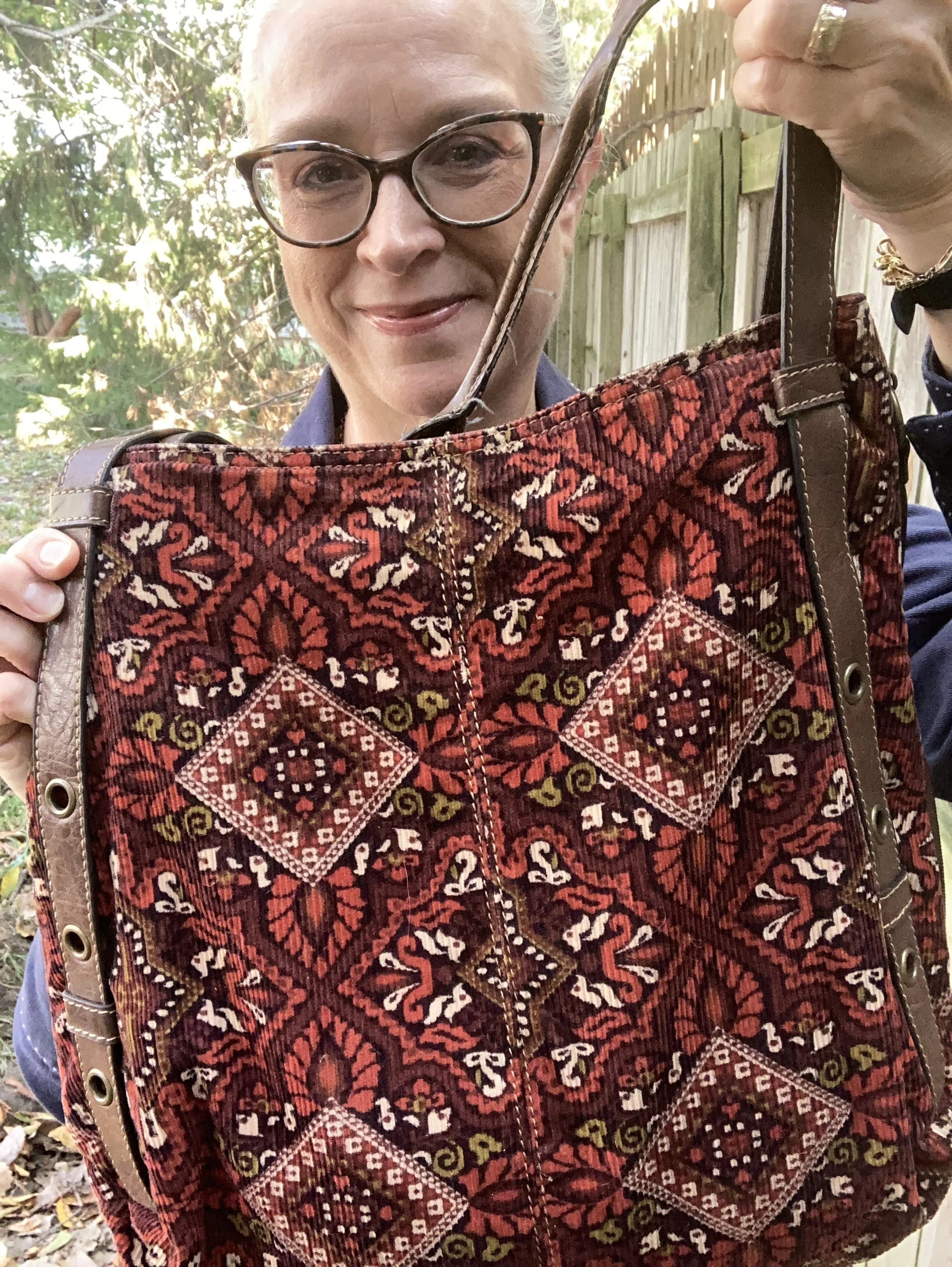
My corduroy axcess bag is very old, but I love the colors and keep it hanging around, even though my current go to’s for bags are cross body and smaller.
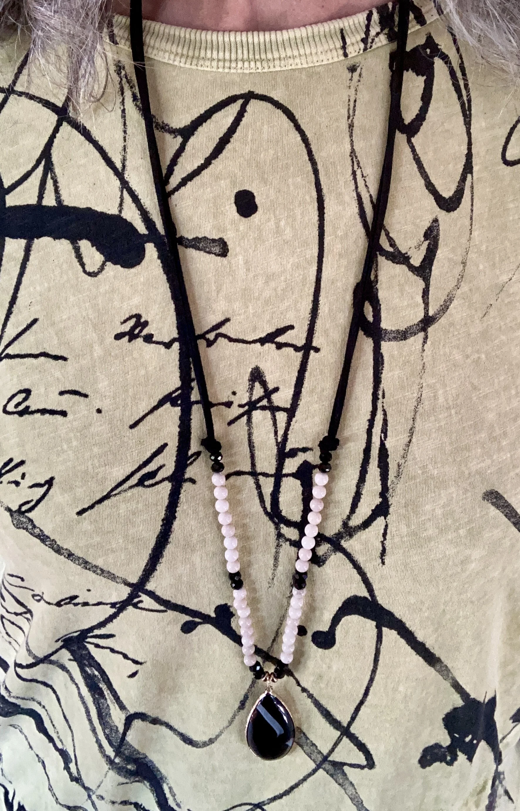
My jewelry is a simple pendant charm necklace. I like that the coppery color goes with the Chili Oil vibe of the pants, and makes the pastel top seem more fall appropriate.
What do you think of this outfit? Do you like these colors? Do you like to wear a color block look?
I am including a few shopping links for you. These are affiliate links and are provided to give you ideas, inspiration and possible shopping options. If you use one of my links to make a purchase, I get a little commission, and believe me at this point in time, all the pennies count.
Have a super Tuesday!

